4
MY FILM POSTER
| Date post: | 21-Jan-2018 |
| Category: |
Education |
| Upload: | josh-mcnee |
| View: | 22 times |
| Download: | 0 times |

MY FILM POSTER
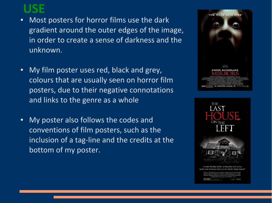
USE● Most posters for horror films use the dark
gradient around the outer edges of the image, in order to create a sense of darkness and the unknown.
● My film poster uses red, black and grey, colours that are usually seen on horror film posters, due to their negative connotations and links to the genre as a whole
● My poster also follows the codes and conventions of film posters, such as the inclusion of a tag-line and the credits at the bottom of my poster.
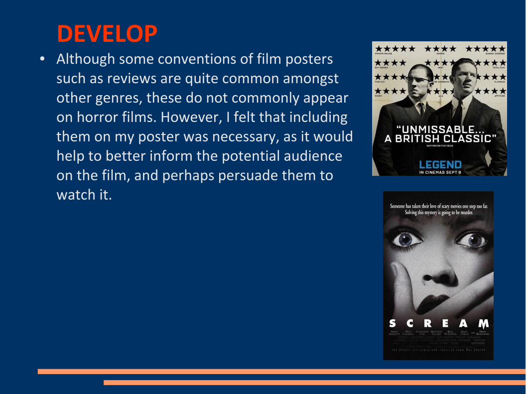
DEVELOP● Although some conventions of film posters
such as reviews are quite common amongst other genres, these do not commonly appear on horror films. However, I felt that including them on my poster was necessary, as it would help to better inform the potential audience on the film, and perhaps persuade them to watch it.

CHALLENGE● Film posters in general do not regularly include the
film's age rating. However I felt that his was something that should be include, so that the audience is fully aware of what to expect from the film, which is especially important for a genre such as horror.
●
● Although my poster uses red, black and grey, I also use the colour pink on my main character, which is an unusually bright colour for horror posters. I chose to do this in order to reflect the innocence of the main character, rather than dressing her in dark clothes that would suggest something negative about her.
●
● Lots of horror posters that feature the main character use close-ups. However, I chose to use a mid shot, as it allowed me to present some kind of action, creating and atmosphere of suspense.


