12
Melissa Sebata Melissa Sebata
| Date post: | 09-Aug-2015 |
| Category: |
Education |
| Upload: | melissasebata |
| View: | 27 times |
| Download: | 0 times |
Melissa Sebata
Melissa Sebata

Before constructing my actual cover, contents and double page spread, I created a preliminary pages featuring the different features I wanted to include; I did this for several reasons. Firstly, it gave me more practice at using Photoshop and Quark and it also allowed me to experiment with typefaces, logo’s, house style. Moreover, I included the kind of pictures that I wanted to take for my own magazine pages.

The Front Page

Front Cover Picture• I took pictures according to the outcome of my preliminary front page and according to the codes and
conventions of pictures featured in rock magazine – specifically Rolling Stone since that was what was voted for in my research questionnaire.
I chose this picture because:1. Highlights the lead band member like most magazines do
2. Their facial expression is of a serious demeanor and their pose is simple, which is a evident theme of Rolling stone
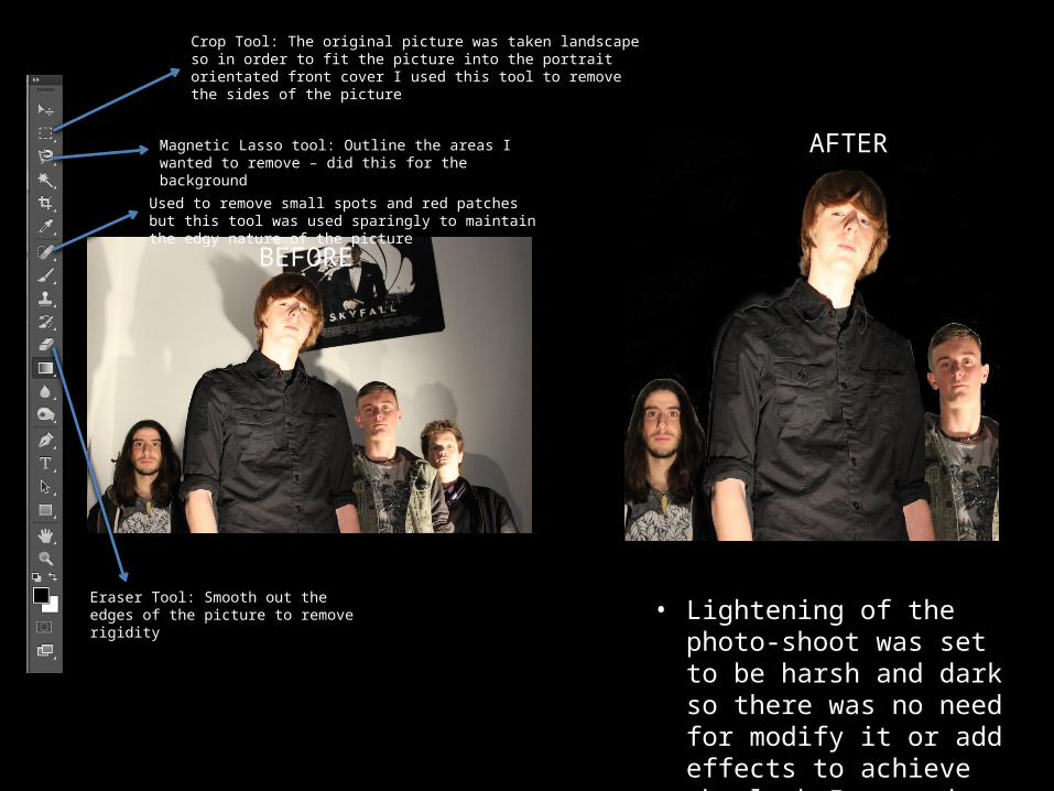
Since the picture was landscape and its intended use favored portrait orientation , I had to crop a member of the band to accommodate.
BEFORE
AFTERMagnetic Lasso tool: Outline the areas I wanted to remove – did this for the background
Eraser Tool: Smooth out the edges of the picture to remove rigidity
Used to remove small spots and red patches but this tool was used sparingly to maintain the edgy nature of the picture
• Lightening of the photo-shoot was set to be harsh and dark so there was no need for modify it or add effects to achieve the look I wanted
Crop Tool: The original picture was taken landscape so in order to fit the picture into the portrait orientated front cover I used this tool to remove the sides of the picture

Front Cover Text
• I used 4 different typefaces – Chalk duster, Defused Extended Bold, Music Warrior, Gill Sans Light – and each one was used for various parts of the page.
• For instance, I used Music Warrior only for the names of the band (Prospectus) because bands usually have a typeface specific to them so they can be easily recognized by fans.

House Style
• I kept the colors of the different typefaces simplistic, using only purple and black. Since I was creating my magazine in the style of Rolling Stone, I followed the conventions of the magazine by only using multiple colors can distract and overwhelm the reader.

The Contents Page

Contents Page Picture• The pictures I used in my final contents page shared similarities to the ones I use in my
preliminary contents page and each picture was edited in the same way with very little Photoshop worked required.
• The only tool used to edit all the pictures was the spot healing tool because the lighting was manipulated in such a way that it only required this tool. For example:
BEFORE AFTER

Contents Page Text• I kept the colors and typefaces consistent to those used on the front page
except for the white text on the contents pictures. I did this deliberately to have a balance of colors. In other words, having those numbers purple resulted in too much purple on one page and having them black made them hard to decipher as the pictures and the color were both dark. Hence, I settled on using white.
• For the actual contents page, I used a combination of my own stories and those I heard on the news to fill the contents page.
• In addition, I tried to fit 4 boxes of the same size to fit all the 3 different bands as as another picture for another part story in the magazine. However, having 4 boxes meant the images were too small, and the only solution to that would be to have less boxes. Hence, I used a strip at the bottom for one story then used 3 same sized boxes. After arranging the page, the overall look of it didn’t fit the simple nature of Rolling Stone because 3 out of the 4 pictures had the same pose and expression, whilst 1, which was the pop punk band, had a very playful expression and pose. Thus, I decided not to include the band on my contents page in order to keep uniformity of the pictures.

The Double Page Spread
Due to the set up of the photo-shoot, the picture I used only required the spot healing tool to remove redness.

Contents Page Text
• I structured my page layout with the convention of music magazines in mind so this meant having a big picture on one page and text on the other. Again, I used the same colors with the addition of white to balance the colors on the page.
• The text was organized into to columns and there was a caption explaining the page as well as small a drop capital at the beginning, photo credits and an outstanding quote – other conventions of music magazines.
• Realistically, there would be another page to the contents which include other elements such as a message from the editor.


