93


PRINCETON ECONOMICS MODELS & METHODOLOGIES
An explanation of the terminology, methodology and computer system models employed by Princeton Economics, Armstrong Economics, and the Global Economic Institute in its various communications and publications and remains the personal property of Martin Armstrong, Copyright 2011 All Rights Reserved. This Manual may not be reprinted in part or in whole nor may this be freely quoted by the press without prior written permission. This may not be redistributed in part or in whole in any media bet electronic or print whatsoever.
The material contained in this report is strictly

INTRODUCTION This is a manual describing the Models & Methodologies employed in the various reports that are published concerning the world economy and financial markets. It is NOT another technical analysis guide on how to use RSI, Stochastic, MACD or any other technical indicator you may have read about in the past. This is NOT another text on how to measure momentum or construct an advance/decline lines. Moreover, this does not teach pattern recognition according to the standard textbooks. This is NOT about head and shoulders, saucer bottoms, wedges, flagpoles, or triangles. This is NOT about moon phases, planetary conjunctions or any other astrological phenomena nor is this about the works of Gann or the subjective analysis of Elliot waves. Is there anything left to discuss in respect to analysis and market behavior? Most definitely! There is a completely different school of innovative thinking that is based on the non-subjective interpretation of market and economic movement that is essential in understanding the development of the world economy and financial markets.
No matter what method of analysis one employs, if you do not understand the market behavior, you will lose your shirt, pants, and probably your home. NOBODY should ever follow any analyst blindly. There are no gurus in trading. Anyone who claims they never took a loss is a disaster waiting to happen. Losses are more important than the wins. Why? Wins are times for celebration as everyone pats each other of the back. If you blame your loss on someone else, you are paying dearly for the experience which is real knowledge and missing the point. Losses are more valuable than a win because they are a time for reflection when you gain understanding and ascend that ladder of knowledge toward experience. You can study any subject. Read every book. But until you do it, you have no real knowledge.
Hopefully, this manual will accomplish two things depending upon your level of knowledge. If you have been a trader as contrasted with just a buy-and-hold investor, what you should try to get out of this manual is a resurfacing of knowledge you may have acquired, yet have not quite brought out into the open field of thought. When it comes to trading, charts allow you to visually see the market like a roadmap. In the good old days of a paper tape, it was the sound that would catch your attending to let you know something was happening out of the norm. Secondly, it will identify different dimensions to market activity that you should start to pay attention to. Yet through it all, you can only trade when you have the conviction of your belief. NEVER trade blindly. You must always agree with what you are doing. That is acquiring the “feel” for the market essential to surviving your own trading decisions.
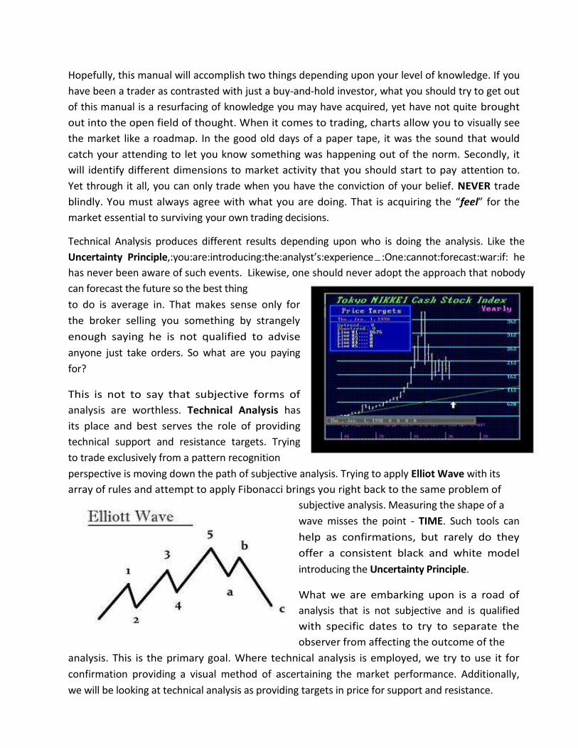
Technical Analysis produces different results depending upon who is doing the analysis. Like the Uncertainty Principle,:you:are:introducing:the:analyst’s:experience :One:cannot:forecast:war:if: he has never been aware of such events. Likewise, one should never adopt the approach that nobody can forecast the future so the best thing to do is average in. That makes sense only for the broker selling you something by strangely enough saying he is not qualified to advise anyone just take orders. So what are you paying for?
This is not to say that subjective forms of analysis are worthless. Technical Analysis has its place and best serves the role of providing technical support and resistance targets. Trying to trade exclusively from a pattern recognition perspective is moving down the path of subjective analysis. Trying to apply Elliot Wave with its array of rules and attempt to apply Fibonacci brings you right back to the same problem of
subjective analysis. Measuring the shape of a wave misses the point - TIME. Such tools can help as confirmations, but rarely do they offer a consistent black and white model introducing the Uncertainty Principle.
What we are embarking upon is a road of analysis that is not subjective and is qualified with specific dates to try to separate the observer from affecting the outcome of the
analysis. This is the primary goal. Where technical analysis is employed, we try to use it for confirmation providing a visual method of ascertaining the market performance. Additionally, we will be looking at technical analysis as providing targets in price for support and resistance.

The greatest danger in analysis is the Uncertainty Principle for the experience of the analyst becomes the most critical role. There is the hidden problem or bias and preconceived notions. To illustrate this point, consider the story of the ship's Captain standing on the bridge of his giant supertanker on a very dark night. Out in the distance, the captain sees what appear to be the lights of another ship. He turns to his signalman and says, "Use your signal-lamp and send a message to that ship to turn to starboard (turn to the right) 10 degrees." The message is sent and very quickly, a reply is flashed back which states, "YOU turn to port (left) 10 degrees." The captain becomes annoyed and tells his signalman to flash another message, "I am a Captain and I insist that you turn to starboard 10 degrees." Back comes a message, "I am a seaman first-class, and I insist that YOU turn to port 10 degrees." The captain becomes very angry and shouts at his signalman to send the message, "I am standing on the bridge of a giant supertanker and as a Captain, I demand that you turn to starboard 10 degrees immediately." Very quickly came the reply, "I am a seaman first-class, and I am standing in a lighthouse"!
Just as the Captain thought the distant lights were a ship and didn't consider any other possibility, the market participant, be he trader, corporate treasurer or portfolio manager, must always consider all possibilities. This is one of the great difficulties in fundamental analysis. How do you know you have considered all possibilities? Quantitative analysis provides the sum of all knowledge and fears within the marketplace. What will not go up goes down and vice versa, Markets are never efficient for they will respond to what people BELIEVE even if that belief is clearly not true. This has given rise to the maxim - sell the rumor, then buy the news!
Therefore, we present this manual designed to form the background for the proper use and interpretation of a truly unique analytical service. Unique means "one of a kind" and we do not use this word loosely. Some of our terms may seem familiar but our use of them may surprise you. Our methods can produce extraordinary results, but the value that one obtains from our product is directly dependent on one's understanding of the terminology and methodology.
The experienced person, whose job it may be to deal with the global free market system, knows all too well that forecasts concerning a particular price level may be of interest but unless a specific time can also be qualified, the best price forecast is nothing more than an odd curiosity since even a broken clock is right twice a day. It is obvious that a successful forecast must consist of a merger of time and price. However, the third dimension of a forecast is also important - volatility! Market and economic movements can take many forms. Any trend can unfold in a steady manner for a specific period of time however it may also unfold in a sudden panic either to the upside or the downside. The character of market movement, as normally expressed through volatility, can be the final determining factor in the success or failure of any forecast.
Given the three primary dimensions of market and economic movement (time-price-volatility), a fourth dimension exists - interrelationships. It is within this realm that most fundamental analysis concentrates attempting to draw correlations between various statistics and market

movement, the greatest flaw is the outer-boundary of fundamentals being considered. For example, most fundamentals are strictly domestic oriented following earnings, changes in interest rates, or philosophic swings in politics centered on austerity or let the good times roll. There is always a critical role played by fundamentals insofar as providing reasoning, yet at the same time, some of the greatest crashes such as 1987 take place in a vacuum with no domestic change in any fundamentals. For this reason, fundamental analysis more often than not leads to tremendous confusion among investors as the same fundamental appears to provide opposite reactions. This is largely caused by the desire in fundamental analysis to reduce everything to a single cause and effect that is never reality. It is the interrelationships and interconnectivity on a global scale that really matters so that a rise in earnings of a company can be seen as bullish in one: moment and “not good enough” in another all because of a change in international fundamentals that swamp domestic issues. Within this realm, the fundamental approach must be global in nature and never isolated to purely domestic trends.
Our work in the area of interrelationships has moved far beyond simplistic comprehension of stocks and currencies relative to interest rates and unemployment. Our field of research has yielded a completely new form of global fundamental principles we call "International Capital Flow Analysis" that conforms to quantitative standards. By monitoring the interaction of all major world economies, consistent long-term forecasts become possible. The 1987 Crash was

set off NOT by domestic fundamentals. There was nothing that had changed. Interest rates did not move. There was no change in earnings. There was no political turmoil. The fundamental was the G5 (now G20) manipulating the dollar lower by 40% starting in 1985. Foreign investors sold because of a drop in the dollar. Would you hold Mexican assets if they said they would devalue the peso by 40%?

ANALYTICAL METHODOLOGIES
Understanding the actual trends that are driving the world capital markets is not that difficult once you abandon most commonly accepted maxims about why markets move in one direction versus another. In numerous studies conducted at a variety of universities around the world, analytical methodologies have been compared in an attempt to determine just what does work when it comes to forecasting. One of the best known papers on the subject was published in 1981 by R.M. Hogarth and S. Makridakis (The Value of Decision Making in Complex Environment). Hogarth and Makridakis arrived at some very interesting conclusions after studying a variety of forecasts rendered during the 1970s.
1) Forecasting beyond the short-term (three months) can be very inaccurate due to changes in long-established trends, systematic bias or errors and historical data may provide conflicting
scenarios with future trends. 2) Forecasts based upon different methods, systems, assumptions or models usually vary
considerably. Whenever more than one method is used, a new problem is then introduced stemming from the evaluation of which forecast shall be employed. This can often present insurmountable problems in decision making or take longer than the process of forecasting
itself. 3) Objective approaches to forecasting have performed as well or better than judgmental
(fundamental) analysis. In fact this was the same conclusion arrived at by Dawes 1976 and Camerer 1981.
4) Short-term forecasts tend to be more reliable due to the considerable inertia which prevails during the course of a given trend.

One primary example in the Hogarth/Makridakis study was based upon the crude oil forecasts of the 1970s. In 1972 the generally accepted forecasts predicted a continued trend in oil prices with no substantial rise. Crude oil was trading just under $2 per barrel at the time. Following the OPEC oil crisis, sentiment began to turn very negative (bullish) suggesting that oil prices would continue to advance between 1974 and 1979 with no end in sight. Forecasts during this period of $100 a barrel by 1990 formed the consensus of opinion. During 1979-1982, the oil glut perception emerged and forecasts were revised to $20-$15 a barrel by 1990. In 1988 the consensus shifted to $5 per barrel with forecasts of oil remaining under $10 for the balance of the century.
The Hogarth/Makridakis study illustrated that forecasts tend to reflect that whatever trend was currently in motion would stay in motion. Hence, if oil was continuing to rise, the trend was forecast to continue unabated and likewise declining prices brought forth forecasts of a long-term decline without end.
In 1976 V.A. Mabert published his paper "Statistical Versus Sales-Force Executive Opinion Short Range Forecasts: A Time Series Analysis Case Study." In this enlightening discussion, Mabert took sales forecasts that had been based upon the opinions of corporate and sales force personnel. He then studied the accuracy of those forecasts and compared them to three different quantitative methodologies. The comparisons were conducted on a mean absolute deviation basis and on a mean absolute percentage error basis. Mabert found that over the case study period of 5 years, the judgmental (opinion) forecasts proved to be the most inaccurate methodology while the simple BoxJenkins method provided the best forecast of the four methods involved.
Another area of highly dangerous subjective analysis has been termed Fundamental Analysis. Here it is pretended that knowing facts such as earnings or changes in interest rates for example is the more reliable method of analysis. How many times have earnings come out and they should have been positive for a stock, yet at the stock declines and the: commentators: say : “it wasn’t good enough” : We: are: back to the glass being half full or half empty and whatever trend is in motion will stay in motion.
The greatest danger with Fundamental Analysis is the inability to know whether or not you have ALL the facts (fundamentals). More often than not, it is like politics. Certain people are predisposed to be bullish or bearish and will interpret the fundamentals in a way that supports their own prejudice.

Here is a chart of book value of the Dow Jones Industrials. We can easily see that fundamentals really mean nothing alongside the general attitude within the market that is prejudiced be it bullish or bearish. That tone dictates how the news
will be interpreted. We can see that the take-over boom of the 1980s was caused NOT by inside trading, but by the fact that the REAL low in Dow Jones Industrials as measured in book value relative to price took place 51.6 years after the 1926 high! Empirical price of shares is not the only way to look at a market.
The object of modeling is to reduce that bias. Therefore, fundamental analysis and tools that are subjective open the door to being wiped out. There are those who see
the Great Depression with every crash. When the market makes new highs against them, it is merely a short-cover rally and just wait you will see they will be right. There are others who see only blue skies, and if the market falls, it must have been manipulated for surely they were not wrong.
Learn from your losses. You paid for that training experience. EVERYONE takes a loss; if they never have, then they are not really a trader. The object of modeling is to eliminate human emotion and judgment.

SEPARATING MYTH FROM REALITY
There are many market myths that adversely affect investment and government intervention. Just a few of these myths include those involving short-selling and how government always seeks to suspend short-selling in an effort to support a market but in fact they undermine the support in markets making the situation far worse. Then there is the myth that rising interest rates are bearish for stocks. When you correlate interest rates and stock prices, you find that interest rates decline with the economy as we see right now and rise during booms simply on a supply and demand basis. Yet the worst myth of all is simply that government can even stimulate or suppress the domestic economy. The assumption that the central bank can buy back government bonds thus injecting cash into the system to stimulate the economy is a fallacy because the assumption is that all bonds are held only by domestic investors. If the bonds are held by foreigners, as is the case generally for about 40% of all sovereign debt, then buying back such bonds sees the cash exported and no stimulation is possible.
The Myth About Short-Selling
The classic example of myth adversely affecting the general understanding of events has always been whenever the stock market has crashed. The popular belief that short positions are the cause of panic declines has been the topic of government investigations during every panic since 1907 including even 1987. A short position in stocks is created by borrowing stock and then selling it on the market. Therefore, every short position actually results in creating two long positions. The first is the long position from whom the short borrows. The second is the long position created by the person who buys the stock from the short seller. So at any given time, short positions are always outnumbered by 2 to 1 in share markets assuming that 100% of

all outstanding stock was borrowed originally. In reality, short positions typically make up only a few percent of total outstanding positions. Therefore, it is impossible for short positions to ever outnumber long positions unless there was unlimited naked short selling, which has never happened. In a study of April 2007 by James Langton, not only was there no evidence of excessive naked short selling that was 0.7%, there was no evidence of failed trades that was excessive. In futures, every contract must be balanced by two players - one short and one long. Therefore, in commodities, short positions at best can only match long positions - never outnumber them, even during the most bearish moments.
Despite these facts, short players have been blamed for virtually every panic in stock & commodity market in history. As part of its response to the 2008 Financial Crisis, the SEC issued a temporary order restricting short-selling in the shares of 19 financial firms deemed systemically important, by reinforcing the penalties for failing to deliver the shares in time. Effective September 18th, 2008, claims that aggressive short selling had played a role in the failure of financial giant Lehman Brothers, the SEC extended and expanded the rules to remove exceptions and to cover all companies, including market makers. Herbert Hoover wrote in his Memoirs about the 1929 Crash that “Insiders "sold short" and then by propaganda and manipulation which lowered stock prices caught investors who could no longer support loans they had obtained on stocks and were obliged to sell. The shorts bought the in.” (Vol 3, p125) The Senate investigation hauled in everybody but found no such massive pool of shorts. Hoover apologized for what took place writing: “when representative government becomes angered it will burn down the barn to get a rat out of it.” (Vol 3, p129).
Blaming shorts is standard operational procedure. During 1733 in England, short selling was forbidden, yet it failed to prevent stock market crashes and was finally repealed in 1860. Napoleon considered banning short selling largely because the English had, but was convinced otherwise by his finance minister. Still, the French outlawed short selling later only to repeal it when again there was no evidence of preventing any crash. New York also outlawed short- selling in 1812, but it too was forced to repeal the ban in 1858 when it became obvious that the lack of shorts transformed into the lack of buyer during a panic as took place in 1857. Despite this history where short-selling was overall outlaws until generally 1858-1860, with every crash there comes the mad rush to hunt down those shorts and hang them. In August 2011, France, Italy, Spain and Belgium banned short-selling on select stocks amid efforts to calm market turmoil that had sent bank shares gyrating wildly and aggravated worries about Europe's Sovereign Debt Crisis.
The Panic of 1907 was followed by a very hostile legislative investigative body known as the Pujo Committee that investigated short selling in 1913. They dragged even J.P. Morgan before them and trashed everyone they could find. Yet despite the grandstanding, they were forced to

conclude: that,: “there seems no greater reason for prohibiting speculation by way of selling stock in the expectation of buying it back later at lower prices, than by way of purchasing it in anticipation of at once reselling it at higher prices”
Jesse Lauiston Livermore (1877-1940) was perhaps the greatest trader that ever lived. Livermore became famous after the Panic of 1907 when he was a short-seller as it crashed. Jesse noticed the real secret to market collapses that I maintain follows the principles of Entropy and he expressed as conditions where a lack of capital existed to buy stock. In other words, everyone who intended to buy is in. There are no more buyers waiting in the wings. Accordingly, he predicted that there would be a sharp drop in prices when many speculators would be simultaneously forced to liquidate as margin calls came in and the lack of credit is matched by its sharp rise in price (interest rate). With the lack of fresh capital, there would be no buyers in sight to absorb the sold stock, further driving down prices. Jesse made a fortune on that short position - $3 million when a monthly skilled labor wage was $20.
Jesse lost most of that fortune looking for the short during the flat markets from 1908–1912. He was more than $1 million in debt and declared bankruptcy. He proceeded to regain his fortune repaying his creditors during the commodity bull market going into World War I that was followed by the Panic of 1919. Jesse had become a seasoned trader by now and he made still more money during the Roaring Bull Market of the 1920s. In 1929, Jesse could smell the blood waiting to be spilled as it was in 1907 and 1919. He began shorting various stocks when almost everyone in the markets lost money after being caught up in the bullish bubble. Jesse was then worth $100 million after his short-selling profits. Jesse would come to write:
“ll through time, people have basically acted andreacted the same way in the market as a result of: greed, fear, ignorance, and hope. That is why the numerical formations and patterns recur on a constant basis.”
Jesse Livermore was the exception, and certainly not the rule. As David Hume argued, man is not ruled by logic, but by his passions. Indeed, the myth persists and the first thing they attack is always the short-seller. However, what people do not realize is that someone like Jesse Livermore makes a fortune on the short-side, but if it were not for his short positions, what bull has the courage to step up and buy when the market is in sheer panic? Often one finds that in the midst of panic, it is the short player who alone possesses the courage to buy during a falling market. Such actions serve as a major component in providing market stability and liquidity. For when short players are wrong, they add fuel to the rally and when they are right they provide support in times of great need.

The Myth Interest Rates
Another classic example of myth adversely affecting the general understanding of the world economy stems directly from interest rates. Constantly we hear that interest rates provide the incentive to buy or sell stocks, bonds and real estate at the expense of all other stimuli.
Interest rates rise during bull markets and decline in bear markets. There is absolutely no empirical evidence to support the idea that lowering interest rates will stimulate anything. In fact, when the interest rates are lowered, you are reducing income earned by those who have cash. In the case of the elderly, you then reduce their income removing them from then stimulating the economy by reducing their demand for goods.
People will still not borrow at 1% if they do not see a profit. Interest rates always decline during a depression as seen here during the 1930s and we have seen in Japan post-1989 and now in the United States. Low interest rates in Japan created the incentive to invest overseas. Japanese bought US debt post-1995 earning up to 8% in the USA when local Japanese rates were 0.1%. When capital cannot earn money domestically, it then begins to migrate overseas. Lower interest rates will not stimulate the economy without a perceived opportunity to invest.

If a nation raises its base interest rates, most people believe that the currency will rise because international capital will be attracted by a greater return. The problem that emerges is the lack of depth in this crude form of analysis. Nothing takes place for any single reason. It is always, and without exception, the combination of numerous trends. If this notion that a higher interest rate brings about a stronger currency is correct, then explain why the US dollar rose sharply during the first half of 1991 when US rates have been declining relative to Japan and Germany? An even more challenging period is none other than 1981-1985. US interest rate peaked in 1981 and declined in a deflationary mode until April 1986. However, the US dollar rose to its greatest historical high during this period from a major low in 1980 simultaneously with declining interest rates (figure #1a-b).
The inconsistent relationship of interest rates to the value of any currency is the result of a wealth of other factors that contribute to the underlying confidence in a nation and the ultimate value of its currency. If interest rates were the ONLY determining factor in the preeminent value of a currency, then everyone would be running to place like Argentina when interest rates rose to 300% per month or to Europe in the midst of a debt crisis.

The misconceptions of interest rates and their effect within the global economy by no means is a one-dimensional relationship. If high interest rates alone attract capital then why do interest rates rise when capital flees? It is like a loan shark. If your credit is not good enough for a bank, then you turn to a loan shark at much higher rates. Capital follows a bell curve and it is attracted to higher rates only to a point. Once capital becomes frightened, it flees and interest rates begin to rise exponentially as CONFIDENCE collapses. Interest rates will also rise exponentially under periods when the value of the currency collapses in value. As the dollar fell, interest rates rose to 17% at the Fed into 1981. As deflation appeared, interest rates declined but the dollar rose to record highs going into 1985. Consequently, no relationship remains linear. It will typically change direction following a bell curve.
The greatest myth of today in the world capital market system is none other than the ridiculous belief that when interest rates rise, stock prices decline and should interest rates decline then the stock market will rise. It would be wonderful if all we had to do is watch this childish rendition of what makes the stock market move back and forth. Surely, each and every reader of this discussion should be a billionaire by now if this were true. If things were this easy the world must be made up of sublimely ignorant souls who are unable to follow such a simple rule.

We all know that the major high in the US stock market for the first half of this century was firmly established during 1929 at the 381 level basis the Dow Jones Industrials. Previously, the Dow had experienced great difficulty exceeding the 100 level on any sustained basis. The interesting aspect about this market myth regarding stocks and interest rates is clear that if the interest rates and stock prices had any hint of a correlated relationship, then we should see the highest rate of interest correspond with the highest level on the Dow Jones Industrial Index. That would be 1981, but let us put that aside. Let us take the performance of the Dow Jones Industrials just between 1876 and 1932 and correlate that with Call Money Interest Rates from the New York Stock Exchange. The assumption would suggest that the peak in interest rates should correspond with the highest price in the Dow Jones Industrials. We are now about to see how this relationship is pure myth.

(Figure #2 - US Call Money Rates 1876-1933 Source: New York Stock Exchange)
Here is the chart of US Call Money Rates 1876-1932 (figure #2) basis the NY Stock Exchange. You will note that the high took place in 1899, not 1929. Look even closer. You will see that with each peak in the stock market, 1907, 1919, and 1929, the Dow Jones Industrials scored major new highs yet each time the interest rate peak was declining. If interest rates truly correlated with stock prices, then we should see rising peaks in interest rates with rising stock prices. The peak in US call money rates came during 1899 at 187% while in 1929 the high was merely 20%. In fact, a historical review of the so-called interest rate/stock market relationship reveals that there is no such relationship whatsoever. Interest rates have never been at the same level more than once when a major high has been reached.
The greatest danger presented by these types of market myths exposes the fallacy of fundamental analysis. Man has a tendency to try to reduce the complexity of the world down to a single cause and effect. We live in a Complex Adaptive Dynamic System where everything is truly connected on a global scale. We simply cannot reduce everything to a one-line cause and

effect. The question become why would the peaks in interest rates decline as the peaks in the stock market increased? To answer that question we need only look at the chart covering the capital flows for the United States between 1919 and 1940. Because of World War I, capital poured into the USA peaking in 1919. As capital accumulated in the USA, the money supply increased and thus the rate of interest declined compared to 1899. Keep in mind the USA was virtually bankrupt and in 1896 J.P. Morgan organized a $100 million loan to the US Treasury. Britain was the Financial Capital of the world until 1914. After that, the title migrated to the United States. Thus, we can see the peak in capital inflows to the USA took place in 1919. Thereafter, capital was attracted to the USA like it had been to Japan going in 1989. The peak in 1929 was a bubble top and the USA was the bug light attracting capital from around the world. Consequently, we achieved the highest level on the Dow Jones Industrials in 1929 with the lowest peak in interest rates.
One such example of how judgmental analysis has undergone cyclical trends as well over time is best illustrated by going to the library and reading the market commentary from the 1920s. The popular view of the day held that if interest rates declined then the stock market would fall and rising interest rates were, in fact, bullish for the stock market. Consider that during every major recession or depression, interest rates decline. During every bull market interest rates rise. It was viewed that during bull markets the economy was booming. This in turn produced a greater demand for money which caused a trend toward higher interest rates. When a depression unfolded, interest rates declined because no one was interested in borrowing money. Indeed, one can see the logic in this popular view of the Roaring '20s and therein lies the problem with judgmental (fundamental) analysis. As shown here, without question, stocks rose with interest rates during the boom and collapsed with declining interest rates as has taken place in Japan.
What really counts in the relationship between stocks and bonds is none other than CONFIDENCE, which swings cyclically back and forth between these two instruments. Only when "all things remain equal" do we find that stocks and bonds trade together in sympathy together. Whenever the underlying CONFIDENCE is shaken in one sector and not the other, huge historical divergences take place.

Figure #4
Cyclical trends are not restricted to a single market. Spread traders know firsthand that huge divergences always occur between any two given instruments. Our illustration of the Gold/Silver ratio (figure #4) demonstrates this quite clearly. The former major high on this ratio came in 1940 at the 100:1 ounces of silver per ounce of gold. Historically, this ratio over the last several thousand years has varied from 5:1 to nearly 500:1 revealing that there is no direct relationship as is the case between interest rates and share prices.
On the following pages you will find a comparative study of US long bond prices versus the Dow Jones Industrial average expressed on a rate of change basis (month over month) for the period of 1918 through 1978 (figures #4.1-#4.6). A close look at this 60 year time frame illustrates that not only is there no constant direct relationship between interest rates and the stock market, but also that there is no relativity insofar as percentage change movement. You can find countless periods where stocks rose when bonds declined and vice versa. Furthermore, big moves in the stock market have taken place at times with only very small changes in bond prices. Anyone attempting to incorporate this so called relationship between stocks and bonds will undoubtedly encounter problems. Even quantitative models that assume such a relationship will fail to produce any consistent long-range forecasting.

Nothing but nothing remains constant. Everything within the global economy vibrates with oscillating trends back and forth. Vast long-term trends exist in every aspect from capital flows to unemployment. Even the wealth of nations shift in accordance with the cost of labor. The US was the cheap labor source for Europe during the eighteenth and nineteenth centuries. As a result, by the end of World War II the US ended up with 76% of free world gold reserves. By 1966, US labor became so overpriced by international standards that American manufacturers began to shift to Asia and to this day over 60% of the US trade deficit is made up of US companies importing their own goods manufactured offshore. Today the cycle continues. Japan is now the most expensive labor source and Japanese manufacture is shifting to Korea and other Asian nations. Eventually, the cycle will cause a shift once more and in the future the flow of manufacture will once again be pointing to North America.
At this very moment, there are numerous major trends at work within the global economy. Perhaps none is more important than the trend in debt growth itself. Our illustrations on the Dow Jones Industrials and that of Long Bonds for the period 1921-1941 (figure #6) bring into focus a major issue that is misunderstood in most analytical circles. Notice that when all things remained equal, bonds and stocks traded together between 1921 and 1927. The rate of growth in world debt began to reach a staggering level.
When concern over sovereign debt began to emerge in Europe during 1927 as the result of massive borrowings to fund rearmament following World War I, confidence in the bond markets began to decline sharply. Governments formed a G-4 during 1927 in an attempt to

lower the value of the dollar thereby deflecting capital flows back to Europe. The tool employed was interest rates. The interest rate differential stood as high as 7% between US rates and those in Europe. It was hoped that by lowering US rates this shift in capital movement would unfold thereby reducing interest rates in Europe.
This intervention measure failed and instead the market realized that the rumors of debt problems must have been very real indeed. European stock markets declined along with their currencies and bond markets. Capital rushed into the United States causing the Dow to double in price. The Fed, realizing the speculative trend was developing, responded by raising the discount rate from 3.5% to 6% between 1927 and 1929 (figure #8). Despite the sharply rising interest rates, stock prices doubled.
We can also see by comparing the three illustrations covering stocks, bonds and the Fed -/for the period 1929 through 1933 that again the myth that stocks rise with declining interest rates is about as valid as trying to find the pot of gold at the end of a rainbow. The Fed did respond to the start of the Great Depression much faster that its critics would have us believe. The discount rate was cut from 6% back to 1.5% by 1931 - the most dramatic cut on a percentage basis in the history of the Fed itself. Despite the trend to lower interest rates, the bond markets collapsed along with stocks b.0ecause confidence was cracked!

Although many would argue that confidence is some sort of nebulous element that is impossible to survey, the best method of determining confidence is the ultimate survey of all time - market price movement. One need only monitor market price movement and world capital trends to gain a true sense of confidence in the underlying economy. Without confidence, investors sell and won't buy. Figure #9 illustrates that even though the US government did not default on its debt, the sheer fact that confidence was lacking caused even the US treasuries to decline in price while interest rates declined and capital began to shift from PUBLIC debt to PRIVATE DEBT. As we can see, the premium for corporate debt declined over treasury rates contrary to the myth that the Great Depression was caused by corporate greed.
Whenever the gurus claim that the market should go up because of lower interest rates and it does not unfold, it is not the market which is wrong - it's the guru. The market itself is the only infallible source. It can never be wrong in the final analysis. If we are confused by lower discount rates and falling bonds, the market is trying to tell us something very important. It is up to us to at least listen.
While some will disagree that history repeats, it is very difficult, if not impossible, to find a point in time when history has repeated precisely in the same manner throughout all economic sectors simultaneously. What does tend to repeat are the overall trends toward oscillating

divergences and interrelationships? Whenever bonds begin to decline and stocks begin to rise, along with interest rates, historically one will also find that the root cause is none other than a sharp rise in the rate of growth in new debt offerings. This contango (interrelationship of 3 or more independent factors extending out in time) is not one that exists on a daily basis. In fact, it tends to arrive only at the extreme end of the oscillation toward the final peak in debt growth rates. On the opposite side of this oscillation, one will find very low interest rates combined with a positive bond market and stocks that tend to underperform. Between these two extremes lie the normal day to day relationships when most people form their theories assuming that "all things remain equal" and that whatever trend is in motion will stay in motion.
The brief periods when this contango moves to extremes on either side of the equation are regarded as "abnormal" and the popular view holds that we should simply ignore the extremes since they will never happen again. To the contrary, it is when this contango moves to the ultimate extremes on either side that we experienc35e our most dramatic economic change. Such changes have caused international war as well as countless revolutions. It was the ultimate cause for the decline of the Greek and Roman empires and the spark that gave life to communism and the Russian Revolution. It is hardly a matter that one should ignore only because it occurs so infrequently. The extremes within the contango are the source of major political change.
Our final two illustrations clearly show the current trend in motion. The US bonds peaked wi46th the bottom in rates during 1986 (US 30 Year Bond Chart figure #11) while the Dow has been making new highs ever since (figure #10). The 1987 Crash was merely a dry-run for the future much as the panics of 1903, 1907 and 1919 were a prelude to 1929. Undoubtedly, there will be yet another great crash in the stock market and more importantly the world economy. However, the first crash will be seen not in stocks but in bonds and the divergence which began in 1927 is already underway today. The rate of growt57h in world debt has become critical once more. Even in the US, the national debt finally reached the $1 trillion level in 1980 after some 50 years. By 1985 it reached $2 trillion and by 1989 we exceeded $3 trillion. Next year, the debt will reach $4 trillion and by 1998 it will be in excess of $10 trillion.
It is not merely a matter of balancing the budget or arguing over defense versus social programs. Eventually, each can be cut to zero but the one area that cannot be cut is the interest expenditures 6which are currently approaching the 15% level. In the United States, we are spending more on interest than on social security. In Canada, interest expenditures are nearing 40% of total government expenditure. In Japan it is running at 18% and in Europe it is over 20% on average. Only two nations have a balanced budget and have been retiring debt - Australia and Great Britain.

The stock markets have been rising while the bonds have lagged for the simple reason that the supply of new debt is growing by nearly $50 billion on average every month globally! The laws of supply and demand DO APPLY to the bond market and this is the same trend that emerges every time growth rates in debt exceed that of economic growth on a sustained basis.
There are many things within the global economy that have changed considerably within this century alone. Where in 1900 41% of the civil work force in the United States was once employed in the commodity sector, today that has declined to only 3% - replaced by services and government while manufacturing has remained fairly constant. Thus, dramatic declines in agriculture have helped in reducing inflation during the 1980s and no major depression unfolded with sharply rising unemployment - which was the case during the 1930s.
Another major change within the economy has been the monetary system itself. One might ask why the divergence between bonds and stocks lasted only for the period of 1927-1929 while today9; it has already been in existence between 1986 and 1991. Might this infer that history will not repeat? The answer to this question lies in the fact that during the 1920's we had a gold standard with a fixed exchange rate. Consequently, such a rigid system did not allow government debt to grow unchecked thus forcing a collapse as soon as government was unable to honor its commitments. Under the floating exchange rate system, government does NOT guarantee the value of the currency. Thus, the currency itself has become the buffer that stands between the stock and bond markets. These record swings in currency value of 40% in the course of two years is the evidence of the lack of confidence in the world system. When that confidence declines, people sell the currency into the marketplace rather than redeeming them at the treasury. Therefore, the pressure on government is indirect rather than direct, as was the case during the 1920's. A divergence can exist for a much greater period of time today causing higher volatility in the free markets while government remains oblivious to the issue at hand.
There is a lot more to analyzing the global economy than simply analyzing stock prices in isolation and trying to call for the next Great Depression just because new highs are made and interest rates won't drop to zero. Until we begin to analyze and correlate the results on a global scale, in conjunction with the major structural changes, the secrets to major oscillations will never be revealed. To believe i<n cycles and then to assume that relationships involving interest rates or any statistic are constant is the end result of the ultimate form of hypocrisy. It is a dynamic world which calls for new horizons to be explored. When the markets respond differently to what the fundamentalists claim is happening, the answer is not an old cliché that it's already factored into the price or something of the sort. The market is always right - it cannot be wrong! Only man, through his fallible opinions that weave such myths, is capable of error. For he and he alone is the ultimate fool who cannot see beyond myth and remains blind to the delicate order that lies hidden just below the chaotic surface of time and price

GLOBAL MODEL WORLD CAPITAL FLOWS
Since the dawn of time, man has tried desperately to predict the future gazing into the heavens to watch the movement of the stars, summoning soothsayers, mystics, psychics and even sought guidance in the patterns of tea leaves of entrails of various animals. To appease the gods, he has sacrifices animals, virgins, and enemies alike. He has studied the movements of planets, comets, and even the flight of an owl. However, no matter what methods man has tried in his attempt to pull back the curtain which stands guard between the present and the future, nothing has ever provided that infallible key to reveal the mysteries that lie beyond the threshold of the future.
In this age of modern wisdom, where we look back upon our forefathers as perhaps silly and superstitious beings running around chucking spears and rocks at each other, after centuries of constraint of superstition, he finally broke out during the Age of Enlightenment putting aside his prejudices of perception that the world was flat and one could sail off the edge along with his bag of leaches, progress at last returned to every field except economics which was biased by its beginning in moral philosophy. Instead of observing HOW the economy functioned as Adam Smith and David Ricardo set out to do, economics descended into the depths of prejudice as men set out not to discover HOW it operated, but to alter the very way it functioned trying to play God in redesigning human nature.

Unfortunately, economics has been plagued by this prejudice. Far too often economists seek to change "what is" into what they believe "should be", thereby reducing the science of economics to nothing more than a corrupt political social movement. It was, after all, the conflicting economic theories of Smith and Marx that built the Berlin Wall. While Marx was correct in identifying the source of man's booms and busts as human nature, his error was in believing that government officials were somehow so virtuous and competent that they would be the exception to human nature.
Effectively, if a model cannot be built on "what is" then there is no point in creating something that will "never be". I do not subscribe to a form of economic theory that advocates government control as the exception to human nature, but believe firmly that Adam Smith was correct in his observation of the "Invisible Hand", which is really the divine design of how complexity produces a synergy that is greater than the sum of the parts.
Understanding the nature of our global economy is not that difficult once we abandon unrealistic social dreams of creating utopia and we observe HOW it functions instead of trying to force it to operate as we desire. The seemingly chaotic or random behavior of our economy is due to the enormous amount of complex variables involved that determine the final outcome. Our global economy is not unlike the dynamic system of the weather where the final outcome is caused by numerous combinations of variables. A small change in just one variable, such as water temperature in the Pacific, can result in dramatic changes within the overall global weather patterns.
Another example from nature can be seen in the work of ecologists' studies of rain forests. Science has come to understand that man cannot create a rain forest by merely planting a group of trees. There are millions of species of bacteria and insects in addition to the thousands of plants and animals that interact to form a balance within nature. Man cannot duplicate a rain forest due to his lack of knowledge concerning such a wealth of intricate variables interacting with one another to produce the final balanced system.
Another problem for man in grasping a full understanding of market and economic behavior lies in his conscious thought process. In our natural state, our mind processes and records data in a nonlinear fashion. When we meet someone special, perhaps in a restaurant, our subconscious mind records the music and setting of the moment. It is quietly observing what the other person is wearing, the color of the table cloth, the flicker of candlelight, the background music and so on. Our conscious mind focuses on the conversation at hand. Months or even years later, if we hear that particular background music our mind suddenly retrieves the experience and consciously we relive the event right down to the twinkle of candlelight. We may access this memory by visual stimulation returning to the same place, or perhaps by a taste. The mind is recording the event by every sense we have storing the experience in many levels that remain accessible.

Economic and market behavior is quite similar to the operation of our mind. There are numerous variables hidden within the equation that determine the end result. Consciously we focus on only a small fraction of the variables involved desperate to reduce every event to a single cause. For example, we may pay a lot of attention to interest rates and stock market behavior or unemployment and its influence upon interest rates. We then try to interpret and make a judgment as to what the trend will be based upon just a handful of simplistic fundamental relationships. Inevitably, such analysis proves to be incorrect due to the lack of attention paid to the wealth of other variables that will influence the final outcome. Normally, our subconscious mind would record these types of things for us in a social setting. Yet, in financial analysis we are ignoring the actual process of collecting knowledge by continually trying to reduce the entire fate of the world down to a few simplistic relationships such as interest rates, trade, corporate profits, or whatever.
The global economy is like the mind. The collective consciousness of:Smith’s:“Invisible Hand”:is:driven by the sum of the parts of all investors globally. Each one reacts in their own self-interest measured by their domestic currency that is the economic language by which everyone makes investment decisions. Each person will convert a foreign investment back into their domestic currency in order to make any decision to buy or sell. The Dow in Swiss francs illustrates how different things look around the world. The drop during the 1970s over the fear that the dollar would collapse after Nixon closed the gold window on August 15th, 1971, fell even below the 1929 high. In nominal dollar terms, the Dow was still almost twice that of the 1929 high. Foreigners sold US assets aggressively after 1971.

We all act according to our own self-interests as Smith makes clear in his Wealth of Nations. However, today that is magnified as currencies have become far more visible on a global scale and the percentage swings of even 40% in two years has become much more commonplace. Only a global model which filters in all key economic data along with free market movements that include everything from bonds
and stocks to wheat and aluminum can hope to ascertain the trend. Here is an illustration of gold in nominal US dollar terms. We can see the 1985 low penetrated that of 1982 while the 1987 high retested the 1983 high but it did not exceed that level.
Now let us look at gold expressed for the same period in a Basket of Currencies. This gives us a bird’s: eye: view: of: gold:from a true collective international perspective. We can see that to the American he thought gold was in a bull market when in fact it was very much in a bear market that would eventually lead to a final low in 1999.
This basket of currencies amounted to 35 different at the time PRE-Euro. The test of a REAL bull or bear market is one rising or falling respectively on a global scale not purely
limited:to:one’s:domestic:currency:perspective The rise in gold into 1987 exceeding the 1986 high in terms of dollars, simply reflected the decline in the dollar thanks to the Plaza Accord in 1985.

1985 Plaza Accord
From left are Gerhard Stoltenberg of West Germany, Pierre Bérégovoy of France, James A. Baker III of the United States, Nigel Lawson of Britain and Noboru Takeshita of Japan
The formation of the G5 known as the Plaza Accord (now G20) was intent upon forcing the dollar down by 40% to ease the trade deficit. In terms of the Basket of Currencies, gold was declining as 1987 produced a lower high than 1986. The brilliant idea was to manipulate the currency to affect the trade balance. Politicians always have to play games and pretend they are the financial god on Mount Olympus. They simply should be prohibited from manipulating the economy because whatever they do,
it is always for personal gain at the expense of liberty.
We warned the White House in 1985 not to engage in such a curreny manipulation, for the consequence would be rising volatility and a stock market crash as foreign capital took flight. Beryl Sprinkle replied stating we were the only firm with volatility models back then and until someone else could collaborate our forecasts, they could not rely on only one firm.

The intervention of the G5 created the 1987 Crash. Yes the idiots would make US goods cheaper and in theory more competitive in international markets. However, at the same time you make all US ASSETS also cheaper. This, not merely did you see gold decline, but the stock market crashed in 1987 when there were NO domestic fundamentals that had changed. What did change was that foreign investors saw the VALUE of their US stocks declining in terms of their domestic currency. The prudent thing to do was to sell all US assets. We were then summoned by the Brady Commission investigating the 1987 Crash. We succeeded in getting them to state that they believed it had something to do with foreign exchange leaving it at that.

In 1997, less than two years from the major high in the yen (dollar low) in 1995, the US Treasury was at it again. Once more Rubin was complaining that the yen was declining and the dollar was rising. As we can see, this was just off the historic dollar low in 1995. Politicians are just never satisfied and Rubin, ex-Goldman Sachs, was really just a bureaucrat. He was not a real trader for had he been, he would have respected this long-term trend.
Nevertheless, Secretary of the Treasury Robert Rubin was at it again trying to talk the dollar down for trade purposes. Here is someone who you would think knew better. Unfortunately, the answer was no. Once again we wrote warning what they were doing would lead to sheer economic chaos and was based upon erroneous economic statistics. We pointed out that trade is measured ONLY by the amount of currency flowing back and forth. Rubin was
complaining about a 50% rise in the Japanese trade surplus. We had to point out that trade is NOT measured by goods but by currency and that the rise was purely currency and not an increase in actually tangible goods being shipped to the USA from Japan.
Government is simply brain-dead. It is an accumulation of people with no real world experience stuck in a time warp assuming the statistics they collect based upon a world of fixed exchange rates are even still relevant. Once the world embarked upon a floating exchange rate system, NOT a single statistic remains valid in international commerce.
While Rubin perhaps did not appreciate being lectured as an idiot who should have known better, his second in command responded for him. Ironically, that reply was from now Secretary of the Treasury Timothy F. Geithner who basically back tracked stating that the US now believed in a “strong and stable currency.”

Understanding international capital flows is the key to understanding the global economy. The capital flows that we were warning the White House about back in 1985 shifted thanks to the G5 intervention that not merely created the 1987 Crash, but sent capital packing as the Japanese bailed out over everything, including the resale of Rockefeller Center in New York City.
As we can see from the illustration above, the capital contracted back into Japan. What was then created was the Bubble Top in the Nikkei 225 (Japanese Share Market). When G5 was formed at the Plaza Accord in 1985, the Nikkei closed that year at 13011. By the end of 1989, it closed at 38915. This was a gain of almost 300% in yen. The yen was 199 at the end of 1985 and fell to 120 in 1988 closing 1989 at 157 or 381% gain in dollars.

Perhaps now you can see clearly that when you are looking at a domestic trend, you may in fact be misled by the currency. What can appear to be bullish in local currency can look dramatically different as we can easily see comparing the 30 year US bonds in dollars and yen during this period. Currency has become everything. If you do not understand international capital flows, you are more likely than not going to have your head handed to you.
The global trends that are set in motion are the result of smaller trends emerging from every economy around the world. The trends in international capital movement are set in motion by the forces of taxation, inflation, geopolitical and financial security, foreign exchange, the cost of labor, and of course the meddling of politicians. There are some additional minor influences, such as interest rate
differentials. Nevertheless, capital is continually flowing from one economy to another in search of profit and/or financial stability. Investing in foreign emerging markets began with the Mississippi Bubble and South Sea Bubbles in 1720. So capital has been very much moving between nations since then in modern times. Even in ancient times, Cicero wrote about lending money into the Asian markets where interest rates were 10 to 20 times that of Rome. So there is nothing new in this respect. Capital has been global for a very long time. There was even the Silk Road between the West and the East that dates back into the Stone Age.

ECONOMIC DIFFRACTION
We must also keep in mind that cycles are capable of dissipating. In other words, like a sound wave, it will grow fainter with distance. As that takes place, the wavelength will widen until it eventually fades away like a sound of a train as it passes. This is caused by resistance provided by the medium through which the energy is traveling. The most interesting aspect of ECONOMIC DIFFRACTION is that a major event will continue to ripple through as a separate cyclical occurrence that will be felt for centuries later as the impact dissipates. If you throw a stone into a still pool of water, there will be the initial shock as the energy is transferred to the water causing waves to now emerge from the point of impact. As the energy dissipates, the waves subside.
Economic Diffraction takes place as well yet its subtle effects are often never noticed. The height of the panic sell off in 1929 took place on October 29th. That fateful day saw the massive liquidation of stocks. The volume traded that day remained as the all-time record for 40 years. Transcribing that date into a decimal format gives us 1929.827. Incrementing that date in 8.6 year intervals using the (ECM) Economic Confidence Model frequency, we arrive at 2007.227. That is March 23rd, 2007.
While the Panic took place on the target of the ECM, the reaction rally following the low in March was precisely Friday March 23rd. The Dow retreated for three days before it rallied once again. These specific days of important events fade with time, but they still produce effects decades later.
Just another quick example of this most interesting aspect of cyclical analysis I call Economic Diffraction can be shown in Gold. Here the major high in 1980 took place on January 21st which works out to be 1980.057. Again using the ECM frequency of 8.6 years we obtain 1988.657, 1997.257, 2005.857, and in the future 2014.457, which works out to be about June 16th, 2014.

Presented here is the target 2005.857, which is November 9th, 2005. This was a clear Directional Change for that specific day began the breakout to the upside. It is curious that this specific event comes on the precise 8.6 year anniversary of the 1980 high at $875. These are just two small examples of Economic Diffraction that imply there is incredible order behind the scenes that we have only begun to scratch the surface.
Take the fall of Constantinople on May 29th, 1453 (1453.408). Applying the 8.6 year frequency produces 1917.808 giving us October 22nd, 1917. It was October 21st when the Americans first appeared in WWI and the 23rd when the first American shot was fired. However, it was the 21st when the Petrograds (St Petersburg) garrison accepted the
Revolutionary Military Committee in Russia while on the 23rd Lenin speaks against Kamenev, Kollontai, Stalin & Trotsky. On the 25th, in Russia, Bolsheviks led by Vladimir Lenin seized power as capitalism falls on the anniversary of the Fall of Constantinople. The precision of Economic Diffraction is fascinating.

60
THE SHAPE OF THE WAVE
One of the great misconceptions in cycle theory is that cycles unfold in purely a symmetrical wave formation Transverse in its structure. This is simply not true, as we will explore. There are also Longitudinal Wave structures where there is no symmetrical distance between each peak. Both: the: Kondratieff: Wave: and: Samuel: Benner’s: Wave: structures: are: Longitudinal and not Transverse. Samuel Benner clearly understood cyclical shapes perhaps instinctively and thus saw the repetitive patterns. (18-20-16) Kondratieff merely identified three cyclical waves of
varying duration (wavelength) and failed to address any real repetitive patterns.
Another fallacy that has prevented many from understanding cyclical movements has been this concept of efficient markets or some mysterious "equilibrium" that forms a magic balancing act such as the idea of "supply and demand” inherently within the system. The idea of "equilibrium" is like drawing a center line in the path of the swing
involving a pendulum. It is not the center line that provides the attraction and driving force of the pendulum. That is always the two extreme forces either side.

61
There:is:no:state:of:perfect:“equilibrium”:that:is:some:mysterious:attracting:force:There:is:no:efficient center force that the economy tries to achieve. To a large extent, David Hume (1711-1776) argued that man is not driven by logic, but by his passions. In this respect, there is also no such:logical:“equilibrium”:that:is:being:sought,:but:always:the:two:extremes:driven:by:passionAdam Smith wrote in his celebrated Wealth of Nations: in: 1776: “Nothing, however can be more absurd than this whole doctrine of the balance of trade.”: (Book: IV,: chp: III,:part II).
Benner, unlike Kondratieff, saw an inherent tendency to build also in intensity. His wave he broke down as a repetitive pattern of 18 –20 -16 intervals that built in intensity into a 54 year wave structure. What he saw was the volatility.
For this very reason, the "shape" of the wave is not uniform with a nice balanced structure. The Economic Confidence Model is a wave structure that builds in intensity through six individual waves of 8.6 years forming a major wave of 51.6 years that in turn builds once again into a
309.6 year structure and so on. There is a fractal nature to the wave structure. In addition, this incorporates what appears to come from nowhere like a great "rogue” wave of combined force in the ocean. It is by no means a nice neat one-dimensional Bell Curve. The shape of the wave structure is vital to understand.

62
There are two overall cyclical patterns that are general in description rather than a precise formula. Cycle Pattern #1 is a pattern that is generally short, sweet, and to the point. It is what I call a self-ordered motion within the system whereby the resolution of an overbought state is extinguished rapidly. This is a pattern such as that of the 1929 Crash where the empirical bottom was established quickly in 1932. This tends to be the general pattern of the free market when left to its own devices. A free market may be more pain in the instant situation, but it is as Schumpeter said, a force of Creative Destruction.
Cycle Pattern #2 is generally what emerges from some government intervention. By preventing the decline between points 4 and 5, government tends to prevent resolution that leaves market participants holding waiting the day when they will be made whole. One example of this is the transition from the Continental Congress to the United States government. The outstanding debts and currency the politicians claimed they would make good. So much of this currency remains: in: collector’s: hands: because: people: believed: government: would: honor: that: claim,:which they did not. Gold also followed this pattern peaking in 1980 but not bottoming until
1999. The Japanese Nikkei 225 index is another aspect where we see government intervention extends the cycle from Pattern #1 into Pattern #2. Also, real estate tends to follow Pattern #2 largely due to the fact that it is based upon mortgages and once burnt, banks then shy away from real estate largely due to the fact that it is not a liquid market once the cycle turns down.

63
THE PHASE-TRANSITION
In Physics, there exists what is called a Market Phase-TransitionTM. A physical system that crosses the boundary between two phases changes its properties in a fundamental way. It may, for example, melt changing the state from a solid back to a liquid or it may freeze going from a liquid to a solid. We can boil water creating a Phase-Transition moving from water to gas. Whatever exists in physical systems also exists within the world of economics for we may be biological organisms, but there is no exception to the laws of physics. A Phase-Transition on the one hand is a change in state from one form to another. However, it is by no means a linear progression.
In Physics, even when we look at the macroscopic changes, we see that they are driven by microscopic fluctuations. When the temperature of the system approaches zero, all thermal fluctuations die out. This actually prohibits Phase-Transitions in classical systems at zero temperature, as their opportunity to change has vanished. However, still their quantum mechanical counterparts can show fundamentally different behavior. In a quantum system, fluctuations are present even at zero temperature, due to Heisenberg's Uncertainty Principlerelation. These quantum fluctuations may be strong enough to drive a transition from one phase to another, bringing about a macroscopic change. Therefore, in Physics what may appear

64
to be a state of suspension at zero temperature, there is still activity at the quantum state. This is precisely why communism failed. It was unable to suspend human nature (quantum level) despite freezing the free markets eliminating the appearance of the business cycle.
In markets, the Market Phase-TransitionTM explains the abrupt movements in price that gather the majority of participants and causes them to become exuberant expecting that there is nothing but blue skies ahead. We can track the bullish-bearish consensus and see how it moves between two extremes. However, what is happening is a Market Phase-TransitionTM insofar as in market terminology we are changing states from bullish to bearish or vice versa. This change in state is certainly not linear. It very much follows the same general course as boiling water. Notice this is not a steady linear progression.
At the Nucleate boiling point we see the characteristic growth of bubbles on the heated surface, that rise from discrete points on a surface that are not uniform, and whose temperature is only slightly above the overall liquid. Normally, the number of nucleation irregular surface points is increased as the surface temperature increases.
The next stage is the Transition boiling point that is usually defined as the “unstable” boiling point, which occurs at surface temperatures between the maximum attainable in nucleate and the minimum attainable in the final film boiling stage. This
becomes the most chaotic stage in the process. The formation of bubbles in a heated liquid is a complex physical process which often involves cavitation (forming of cavities in a liquid) and acoustic effects, such as the “hiss” one hears in a kettle before the water boils with bubbles forming on the surface.
The final film phase is also known as the Leidenfrost effect. If a surface heating the liquid is significantly hotter than the liquid then film boiling will occur, where a thin layer of vapor, which has low thermal conductivity, insulates the surface. This condition of a vapor filminsulating the surface from the liquid characterizes film boiling stage. You can see this if you heat a skillet and then sprinkle: drops: of: water: on: it: and: watch: what: happens: When: the: skillet’s:temperatures is at or above the Leidenfrost point, the water beads up and moves across the skillet and takes actually longer to evaporate than it would in a skillet that is above boiling temperature, but below the temperature of the Leidenfrost point.

65
Here is another example of what I call a Market Phase-TransitionTM that took place in gold during 1980. Note that there is a doubling in price that took place in a very short compress period of time. Because this is also a FRACTAL phenomenon, the duration interval remains the same, but the fractal level of time differs. Here we accomplish the same doubling effect as we saw during the last 12 months in the Dow Jones Industrials leading into the 1929 high. Here in 1980, this interval of 12 remains constant but we are now at the weekly level.
A Market Phase-TransitionTM accomplishes the same end game as in physics where it is the change state for example in water were you can go from a solid frozen state, liquid state, and to a steam state. Here in economics, we move from a bearish state, a neutral state where bulls and bears tug back and forth, to a bullish state. The two extremes mark the dramatic conviction that swings the opposite force converting them causing the Market Phase-TransitionTM to unfold. This is not a normal bearish or bullish state. It is a compressed state of time that convinces the majority within the marketplace to switch sides.

66
Here we have the Market Phase-TransitionTM in the Japanese Nikkei 225 stock index. Note that on the monthly level we have the doubling in market price, however, this took place in 24 months following the 1987 Crash and peaking on the next Economic Confidence Model turning point 1989.95 in December that year. The time also doubled from 12 months to 24 months to accomplish the same doubling in price.
Understanding this Market Phase-TransitionTM phenomenon is critical to understanding how to trade. If you do not understand how markets function, you will not survive your own trading decisions. NEVER get caught up in the fundamentals. That is always a trap for the same fundamentals can be in place for decades, yet nothing happens like the abandonment of the gold standard in 1971. Gold still declined between 1980 and 1999 yet the currency was still paper. Unless you understand both TIME and the shape of the wave structure, you might as well write a check now to the big boys in New York and write it off as a donation for they will take it anyway.
The greatest amount of gain AND loss is accomplished in the shortest amount of time. So like that surfer sitting in the ocean waiting for just the right wave to ride, we must accomplish the same goal. It is your personal emotions that will be your greatest enemy – not the market. In 1998, the ability to make 60-70% return in a few weeks as the world crashed around Long Term

67
Capital Management, centered also on knowing when to walk away as the New Yorker Magazine reported:
“The hedge-fund manager who used to work for Armstrong remembers him coming out of his office. in.September,.1998,. two.months.after.he’d.got.short. in. front.of. the.ruble.crisis. Monica Lewinsky was on TV. ‘My oscillators just turned,’ Armstrong announced. He booked his profits, pulled out of the market, and went to his beach house, on the Jersey Shore.”
THE NEW YORKER, OCTOBER 12, 2009 p73
In Time Magazine, Justin Fox wrote that Armstrong's model "made several eerily on-the-mark calls using a formula based on the mathematical constant pi." (Pg 30; Nov. 30, 2009). Our famous forecast regarding the collapse of Russia in 1998 in Russia made even the CIA stand on its head. Understanding the wave structure is critical. A system can crash from exhaustion in what we call the Waterfall Event as was the case with Rome, or it can go through a Market Phase-TransitionTM that creates the exponential rally such as
the .Com Bubble. Nikkei 1989, or gold jumping from $400 to $875 in about 12 weeks for the high in 1980. The Market Phase-TransitionTM is not the collapse of a system but form spike highs that may last for decades. The far more serious economic death takes place with the far more devastating collapse by exhaustion in the Waterfall Event.
Let us look at the .COM BUBBLE of 2000. Here when we begin looking at the yearly level, we can see a nice spike high and we can clearly see that the interval of TIME being 12 still is present even in the yearly level. Here the Market Phase-TransitionTM takes place with an advance of 1560%. The maximum this type of advance has ever taken place is 2600% that we have investigated to date.

68
The .COM Bubble in 2000 was a Market Phase-TransitionTM
also on the Monthly Level still shows the doubling in price in 12 months. So again we have the price advance in a compressed period of TIME that is still confined to the interval of 12. Compared to the Yearly Level, where we had a 12 year period with a 1560% gain, here we have a 12 month period with about a 200% gain clearly marking this as a major bubble top.
Now let us turn to the Weekly Level on the NASDAQ Composite. Here we have still a doubling in price gain with a doubling of the TIME interval of 12 to 24 weeks. The formation is still the same and this is what we need to look for as the computer scan the world looking to that perfect next wave to ride to outstanding potential gains.
Science has studied this process which has revealed the nature such changes in the subject of all things. It requires an increase in energy to accomplish each transition between states. This clearly fractal in nature insofar as this Market Phase-TransitionTM is part of the science of "chaos”: yet it is a natural development that takes place in many fields of science and is not something that government can outlaw or imprison people for doing just because they do not understand its function within nature. It:is:part:of:the:mechanism:of:Schumpeter’s:observation:of a force that is Creative Destruction. Each such event set in motion changes that merely lead to the next event.

69
HOW TO USE TIME
Using timing models to enhance your investment or corporate strategy decisions may take some getting used to. On the one hand, huge portfolios become unmanageable without a sense of TIME. If there is no understanding of TIME, then you NUST take a loss for all you can do is buy and hold. If you do not have a concept of TIME, then you will lose your shirt, pants, home, and career after a Market Phase-TransitionTM event. For huge portfolios, TIME is essential because you cannot turn a battle-ship on a dime. You need to know when changes in trend will appear and begin to shift direction and the event is unfolding in advance.
Many people assume that forecasts concerning TIME may possibly be accurate in the short-term, but they remain skeptical about long-term timing forecasts. Many argue that major political events, such as the 1998 upheavals in Russia, or the 1989 collapse in Communism in China and the fall of the Berlin Wall a few months later cannot possibly be forecast. To the contrary, such events would NOT take place unless the economic conditions had been in a
steep decline. Computers cannot predict what type of revolution will unfold as a result of a collapsing economy, but they can predict when some sort of political change will take place due to economic pressures as we were able to do with Russia in 1998. Since the dawn of civilization, no revolution has ever taken place unless man has been economically deprived first.

70
Understanding TIME is essential and perhaps the most important of all aspects. Technical Analysis is excellent for providing resistance and support targets, but trying to ascertain the future unfolding based upon subjective pattern recognition is not something that is very reliable. Any form of analysis that is subjective is open for interpretation. TIME is something that is quantified. Everything has a cycle to it, including politics.
Contrary to popular belief, quantitative long-term timing forecasts actually tend to display a greater degree of accuracy than short-term. The reason for this phenomenon is found in the laws of physics. Consider for a moment the example of a river. Long-term analysis is very much like a huge aircraft carrier. It is impossible to turn that ship around as fast as it is for a tiny speed-boat. Long-term trends are set in motion by a combination of forces. These forces cannot be turned around on a dime like a speed-boat.
Short-term trends involve a lot of noise. People can get excited and think the trend is changing rushing in where only fools would really go, The trend fails to turn and suddenly they bail out and the market reverts back to its longer term trend. It is like gold between 1980 and 1999. How many times was it reported this time it is different. The same fundamentals about a fiat currency that appeared in the 1970s, were again articulated in the 1980s, and again in 1990s, all proved to be just words. Now that gold has rallied, they drag out the same fundamentals to claim this time it is different. The short-term is highly volatile. The long-term trend is actually easier to predict than the short-term noise.
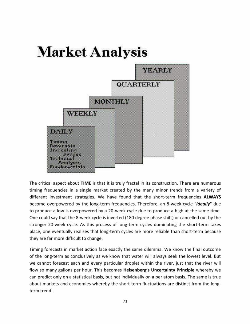
71
The critical aspect about TIME is that it is truly fractal in its construction. There are numerous timing frequencies in a single market created by the many minor trends from a variety of different investment strategies. We have found that the short-term frequencies ALWAYSbecome overpowered by the long-term frequencies. Therefore, an 8-week cycle "ideally" due to produce a low is overpowered by a 20-week cycle due to produce a high at the same time. One could say that the 8-week cycle is inverted (180 degree phase shift) or cancelled out by the stronger 20-week cycle. As this process of long-term cycles dominating the short-term takes place, one eventually realizes that long-term cycles are more reliable than short-term because they are far more difficult to change.
Timing forecasts in market action face exactly the same dilemma. We know the final outcome of the long-term as conclusively as we know that water will always seek the lowest level. But we cannot forecast each and every particular droplet within the river, just that the river will flow so many gallons per hour. This becomes Heisenberg’s Uncertainty Principle whereby we can predict only on a statistical basis, but not individually on a per atom basis. The same is true about markets and economies whereby the short-term fluctuations are distinct from the long-term trend.

72
There are two main groups in markets (bulls & bears) just as there are in politics (left & right). Between these two hardcore groups exists a flexible group who change their mind and are independent. This group provides the swing basis adding a cycle to everything. Because mankind is made up of individuals, there are many different minor trends within the collective whole. We can predict the statistical trend direction, but not which individual will take up which side. It is far easier to predict the collective sum of many small individual trends that compose the long-term than it is to forecast the course of each and every minor individual trend within the whole.
The driving force behind the cycle is always two opposing forces. It will turn when it reaches the point of maximum Economic Entropy that we will define later. Like a pendulum, the driving for is actually these two extremes be it markets or politics. It is a self-propelling mechanism. Then there a multiple levels of time and interconnectivity between markets where wavelengths differ greatly.

73
The cyclical process is how ALL forms of energy move. It is how light moves, sound, and even electricity. The attraction of two opposite forces sets up a self-propelling mechanism that then operates according to Economic Entropy which is the measure of the driving forces (energy) as it is expended and is no longer available to continue to drive the cycle in that direction. Once the bullish energy is expended, then the attractive force in the opposite direction (bearish) overpowers the remaining bullish force and compels the cycle to then change direction back to the bearish attractor. It becomes a self-perpetuating endless cycle of life that drives the entire mechanism.
This is why short are vital because when they are wrong, the have to buy and add to the direction of the bullish trend. When they are right, then as the market collapses, only the short player has the courage to stand up and buy in the middle of a panic providing desperately needed liquidity. Outlawing short positions is always the first step in a panic decline. It is always the best way to ensure further decline. The presumption is that the ONLY seller is the short. In fact, the bulk of sellers during a panic are the longs that can no longer stand the pain. Once they witness a decline, they will sell any rally that gets them out near a break-even. Consequently, as the Japanese discovered, rallies lack depth and are always capped whenever there is a substantial pool of longs trapped within a market that are praying for just a break-even trade to then exit the market and never return again. It is always a balance between two opposite forces like a pendulum. Outlaw one side, and you destroy the entire mechanism.
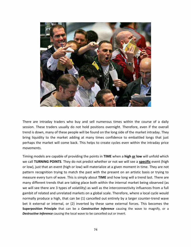
74
There are intraday traders who buy and sell numerous times within the course of a daily session. These traders usually do not hold positions overnight. Therefore, even if the overall trend is down, many of these people will be found on the long side of the market intraday. They bring liquidity to the market adding at many times confidence to embattled longs that just perhaps the market will come back. This helps to create cycles even within the intraday price movements.
Timing models are capable of providing the points in TIME when a high or low will unfold which we call TURNING POINTS. They do not predict whether or not we will see a specific event (high or low), just that an event (high or low) will materialize at a given moment in time. They are not pattern recognition trying to match the past with the present on an artistic basis or trying to measure every turn of wave. This is simply about TIME and how long will a trend last. There are many different trends that are taking place both within the internal market being observed (as we will see there are 3 types of volatility) as well as the interconnectivity influences from a full gambit of related and unrelated markets on a global scale. Therefore, where a local cycle would normally produce a high, that can be (1) cancelled out entirely by a larger counter-trend wave bet it external or internal, or (2) inverted by these same external forces. This becomes the Superposition Principle that can be a Constructive Inference causing the wave to magnify, or a Destructive Inference causing the local wave to be cancelled out or invert.

75
Timing models are best suited to identify when a change in trend will unfold on short-term price activity, but they do not always forecast whether that change in trend will leave behind a specific high or low since there can be a Cycle Inversion or a Cycle Cancellation due to the Superposition Principle. However, it becomes obvious that if a market is declining moving into a turning point, then that turning point will most likely produce a price low to form instead of a high. Computer models can pinpoint the "ideal" periods where a high or low will unfold, but one must use some common sense given the current trend in motion. Sophisticated global correlation models can ascertain whether a Cycle Inversion or a Cycle Cancellation will unfold, but this takes tremendous computing power.
The reason why turning points can be identified in the short-term, yet not always qualified, whereas the long-term rarely undergoes a Cycle Inversion or a Cycle Cancellation, tends to indicate that at the lower echelons of TIME, the influences are much more numerous. As we graduate up the scale in TIME, the numerous individual trends combine to produce larger waves and the complex composite does not allow for alternations so easily.

76
TIMING MODELS
There are three primary methodologies to cyclical analysis, but then there are numerous layers of inherent complexity within each major category. These three main methodologies are:
•:Composite:Timing:Models - (Longitudinal Cyclical Waves) •:Empirical:Timing:Models - (Transverse Cyclical Waves) •:Trading:Timing:Models - (Differential Cyclical Waves)
COMPOSITE TIMING MODELS
Our Composite Timing Models are Longitudinal Cyclical Waves that expand and contract with no definitive fixed duration between each wave and overall repeat in a broader group pattern. One wave might be 13 days, the next 34 days followed by another of 17 day cycle finishing up with an 8 day cycle. This may generate a pattern group of 72 days, which then repeats. This type of cyclical activity is addressed by "Composite Timing Models” for they are the result of a harmonic mix of many other timing elements. Composite frequencies form not only from cyclical frequencies within the same market but also from external influences from other markets around the globe.

77
EMPIRICAL TIMING MODELS
Fixed length timing frequencies also exist with a market that is symmetrical in shape and thus is what is known:as:a:Transverse:Wave:structure:that:we:call:our:Empirical:Timing:Models:meaning:“fixed”:in:wavelength. For example, gold has historically had an 8 week cycle. At times because of the Superposition Principle, this cycle will undergo Destructive Inference and fail to produce a turning point. This will at times cause the cycle to often appear Longitudinal in construction, yet it still remains very much Transverse mere affected by the Superposition Principle.
Illustrated here is gold going into the 1999 low. Each 8 week period had been highlighted. Out of 26 times, four produced the actual high for a given rally. The interval between the 8 week turning points all varied. Nevertheless, because the same 8 week cycle returned and produced highs on this frequency, it is a Transverse wave merely subjected to the Destructive Inference of the Superposition Principle.
Indeed, a fixed length cycle of 8 weeks may produce a high and low precisely every 8 weeks for a brief period in time. This cycle may suddenly disappear as it becomes overpowered by a longer timing frequency from monthly, quarterly or even yearly levels of activity within the same market or influenced by interconnectivity of other market trends. After a few apparent failures, this 8-week cycle will suddenly reappear exactly on target as if nothing had happened. This is a fixed length cycle that never changes in duration. When it stops working it is only because a frequency of greater importance is taking control. This greater force may be from within the same market or the result of global interrelationships.

78
One of the primary Empirical Timing Models in the Dow Jones Industrials Index is the 18-year cycle. The targets produced by this one cycle during the 20th century have been quite impressive on an annual basis (Table #1). While 1902 did not provide the intraday low, it did mark the beginning of a decline known as the "Rich Man's Panic" that led to the final low in 1903. The next target of 1920 produced the majority of the decline for this panic which followed the end of World War I. While new intraday lows were formed in early 1921, the market closed higher and began its
long ascent into the famous 1929 high. 1938 produced the first major low following the 1937 high, producing a mini-panic at the time and raising fears of a renewed depression which failed to materialize. The next target of 1956 produced a temporary high at 524.4 on the Dow. This was the first temporary high followed by a sharp 20% correction the following year. The last target was the major low established in 1974 at 570.0 which ended a 46% correction from the high of 1973 (1067.2). The next target of 1992 marked the breakout in a Directional Change, and 2010 was another Directional Change following the 2009 low.
The 18-year cycle has one more curious trait worth mentioning. Major highs also formed in 1901, 1919, 1937 and 1973, one year prior to each turning point. The only exception was 1956 where a major low formed to the right side in time (1957). In the case of 2010, the major low was 2009 one year prior. This
Table #118 Year Cycle: 1902 (Directional Change) 1920 (Lowest Close) 1938 (Low) 1956 (High) 1974 (Major Low) 1992 (Directional Change) 2010 (Directional Change)

79
means that the extremes of the price movements from high to low were all contained within a 2-year period centered on this 18 year cycle.
Empirical Models are very important timing elements. Just because a particular timing frequency may appear to be successful on a few occasions DOES NOT guarantee its validity. Each timing frequency employed in our Empirical models has been historically tested as far back as possible and under all conditions. Any frequency is ONLY valid if it is as consistent during a bull and bear market. The majority of mistakes made by analysts are caused by the use of timing models that have not been tested in both bull and bear market climates.
TRADING TIMING MODELS
Our Trading Timing Models are concerned strictly with the nominal differences between bull and bear markets frequencies and traits. Our turning points generated by this model reflect the statistical differences between these opposing trends without consideration of various timing frequencies or intermarket relationships. This model specifically states what the expected event should be (high or low) at a particular time interval. Unlike Composite or Empirical Models, our Trading Timing Models offer a union of time and direction and thus enable the end-user to qualify the forecast. Consequently, our Trading Timing Models can offer a completely independent view as to what should be expected. Because trends become much clearer during violent price action, this tool performs best during panics in either direction. The periods when this tool provides a lower degree of accuracy is during quiet non-trading periods. These are periods when both forces are about equal and tend to cancel each other out.
Another important aspect of this model recognizes that each market and sector has its own unique frequency. Agricultural markets are greatly influenced by weather and the crop or plating cycles and are thus highly prone to greater volatility than you find in other commodities, bonds, or stocks.

80
REAL ESTATE CYCLES The sector with the longest frequency tends to be real estate. This cycle appears to follow a generational cycle which in many ways is like planting a new crop of soybeans. The period between planting is a generation rather than planetary seasons. Therefore the Trading Timing Models are independent for each market or sector reflecting the uncorrelated results.
Real estate is above all other markets, the largest asset class. Where the stock market, gold, commodities, and even bonds are interesting investments, they are by far, still the minority insofar as participants. There is just no market that draws to itself more people than real estate. At the peak in 2007, the mortgage market stood at about $9.5 trillion. It is this key cycle in Real Estate that truly affects the sustainable length of profound economic depressions. This cycle breaks down as a harmonic or a derivative of the Economic Confidence Model (ECM) since it is composed of a broader period of time with a duration in total of 78 years (6 x 13). When this cycle turns down, it is a profound event for it effects the entire population on a wide scale. The decline from the major high consists of a period duration of 26 years. This leaves us with a wave of generally rising prices (through short-term recessionary periods) of roughly 52 years (51.6 years to be precise). In other words, we are dealing with the ECM that has been extended through a longer contraction phase of 26 years that combines into a major wave of 78 years.

81
The Great Depression saw the value of real estate simply collapse. Land that had sold for $2 and acre during the mid-1800s fell to a mere 30 cents and acre. Foreclosures were massive and auctions for pennies on the dollar became very commonplace as pictured here in 1935.
Franklin Roosevelt on June 16th, 1933, signed the Banking Act of 1933, a part of which established the FDIC. However, part of the banking crisis was the typical model where they borrowed short-term and lent long-term, especially into mortgages. The concept of mortgages to buy property has been around since ancient times. Nonetheless, the 30-year property mortgage is a much newer idea. The 30-year mortgage came into existence as a solution to financial problems that were common during the Great Depression. The idea was to extend the time to enable people to buy property with little down. This was seen as a way of reviving the bear market in real estate.
Prior to the Great Depression, home buyers were typically asked to make a down payment of one-third of the sales price and loans were only extended for periods of five to 10 years with interest rates reaching at their peak 8 percent. This presented a major problem. Not merely were people unable to make their mortgage payments, trying to sell such properties were limited by financing as well. This restrictive lending system fed into the economic crisis and the number of mortgages collapsed from 5,778 in 1928 to just 864 in 1933.
Faced by this massive collapse in mortgages and widespread foreclosures, President Roosevelt pressed for the passage of the Home Owners' Loan Act in 1933. This bill established the creation of the Home Owners' Loan Corporation, which made loans to those in danger of losing their homes. The lending terms were much more generous than were found in previous mortgage loans, as loan amounts of up to 80 percent of a home's value were made and the interest rate was five percent. Additionally, home owners could borrow money for up to 25 years.

82
The idea behind the Home Owners' Loan Corporation proved to be extremely popular, with nearly 40 percent of all buyers applying for the new loans. Not all of the applicants could be accepted, so Roosevelt established the Federal Housing Administration in 1934 to promote home loans by the private sector, as FHA loans were guaranteed by the government. The FHAextended mortgages to 30 years to make purchasing a home even more affordable. The FHAloans prompted the creation of the Federal National Mortgage Association in 1938 to make even more money available for home buyers.
There:had:been:differences:in:sectors:as:always:During:the:Roaring:‘20s,:Florida:became:both:the hot spot for vacations and the vision of an emerging market for land speculation. In 1922, the Miami Herald was actually the thickest newspaper in the United States all because of the massive land advertisements. As the commodities crashed in 1919, capital was shifting to real estate in Florida. The prices soared and finally in 1925, the inevitable began to occur in the real estate industry. Land prices had reached their peak and there were no more fresh buyers. It quickly:became:a:seller’s:market:and:the:price:collapsed:With:that:collapse:came:the:contagion:with the municipal debt collapse. St. Petersburg was the most indebted per citizen town in the United States with Key West ranked second. Capital then moved to equities shift into the stocks. Then the bottom fell out of everything and farm land values fell to about 30 cents an acre.

83
FIBONACCI TIMING
Much ado has been given to the Fibonacci sequence. Some analysis, lacking their own ability to do original work, cling to such things as this mathematical progression and try to force rules out of something that is interesting, but certainly far from definitive in any real tradable way other than as a general rule based system. Here is the Nikkei 225 from the ’89:high:Project:from:that:high is both a Fibonacci Price (percentages in a vertical plat) and a Time projection (sequence projecting out in the TIME interval under consideration). Not merely did the percentages in a price fail to provide definitive targets but neither did the time projects highlight anything significant.

84
Looking at gold from the 1980 high we come to the same realization that there is no definitive application of Fibonacci in TIME or PRICE that you can hang your hat on for trading purposes. We are back to generalized rules that can be used as a confirmation tool, but certainly not as an initialization trading tool.
The only market where we found that Fibonacci was at least on target with TIME was the Dow Jones Industrials during the 1929 Crash. The low took place on a Fibonacci TIME sequence 34 months from the September 1929 high – July 1932. Nonetheless, once again the percentage targets in price (horizontal) failed to work other than in a general guide sort of way.

85
BIFURCATION MODELS AND THE SCIENCE OF CHAOS
Bifurcation Theory may seem way over the top. Effectively, it is a mathematical study of changes in the qualitative structure of a dynamic system that is nonlinear based including integral curves of a group of vector fields, and the solutions of a group of differential equations. This is applied to the markets on a global interactive perspective providing a mathematical study of dynamical systems. This enables the computer to observe a bifurcation which occurs when a small subtle change takes place in one of the inputs that form the parameter values (the bifurcation parameters) within a system that then causes a sudden “qualitative” or topological change in its behavior. A Bifurcation takes place in a continuous system such as a trading market, which is what we are interest in at this time.
Bifurcation analysis is the process of attempting to find a specific point in TIME and PRICE that acts as a "strange attractor" in market or economic movement. Here: is: the:D.X:where: one:of: these:“strange attractors”:appeared:starting:the:month:of:January:1991:If:you:look:closely,:you:will:see:that:the:month:prior, the system begins to breakout of the confined spar between the arc and the diagonal moving straight down. Now January 1991 appears and the second input forms a square around the cross of the arc and the diagonal in time. This is an unusual occurrence and it did what the model called for – it made the low there in January 1991 that was the lowest point with the rally taking on a Phase Transition into July 1998 with the turn on the Economic Confidence Model 1998.55.

86
The Bifurcation Theory as we have applied it in economics is that at certain intervals in TIME and levels of PRICE (Time-Price Continuum), a given market is compelled to move to a point of maximum entropy (trend), be it overbought or oversold. This type of analysis takes the form of what we refer to as a "logistics map" which involves both TIME and PRICE in an interlocked continuous space.
Our Bifurcation Analysis is accomplished by first establishing a Primary Time Interval between two major points of an opposite trend (high and low) which is then projected forward in time on an equal proportional basis. A box is then drawn around this TIME continuum determining the width while the height is defined by the full distance in PRICE between the extremes of high and low. This box we call the ''Time & Price Window". A proprietary formula is then introduced to create what we call the "Parabolic of Time & Price" which is then plotted within our Time & Price Window. A diagonal is then drawn from the lower left corner to the upper right corner. Once this framework is established, the Bifurcation plot begins.
Each time the Bifurcation plot turns vertically we obtain a time projection. All horizontal plots offer a price projection. Extremely well behaved markets will contain this plot between the diagonal and the parabolic. Occasionally, a strong strange attractor will appear around the juncture of the diagonal and the parabolic which will be evident by the plot forming a box around this area. Very chaotic markets will show the plot suddenly breaking out of the confining area between the parabolic and the diagonal.

87
The time and price targets that are derived from a Bifurcation plot will often line up with targets derived by cyclical and technical models, even though there is no similarity between these methodologies. At other times, the targets highlighted through our Bifurcation plots cannot be determined by any other form of analysis.
The purpose of our Bifurcation Model is to determine whether or not there will be any major strange attractors in the future that seem to help pinpoint major changes in trend as illustrated earlier in the German DAX share market index. This can be very helpful in warning about dramatic changes in trend such as the 1987 stock market crash, the collapse of Russia and the future Sovereign Debt Crisis. We use this model mainly as a confirming tool rather than an exclusive tool by itself. However, we do interface this model with that of our timing models to help filter out which timing targets will be stronger than others.
The Bifurcation Model has been one of our most astonishing discoveries. It is purely a tool of chaos and by no means is this within the realm of linear thinking. The Bifurcation Model is our window in to the deep crevasses of a fully integrated dynamic nonlinear system.

88
VOLATILITY MODELS
Volatility has many dimensions. There are three primary types of volatility that we measure and forecast. The first is what perhaps most people see and experience gaining the headline news. Picture here is what we call the INTERNAL RATE OF VOLATILITY. This is measured solely on a trading session basis be it a day, week, month, quarter, or year. In other words, this is the percentage price movement between the high and low strictly for that session. You will notice that on this basis, the volatility during the Great Depression actually increased going into the lows while it did not capture the headlines, However, a 20 point move when the market is trading at 60 points is a 33% price movement whereas the big point drops. For example, the week of October 28th, 1929 where there was the biggest point drops in a single day moved only 295 to 252 internally for the week. This was a 14.49% rate of volatility.
Measuring the INTERNAL RATE OF VOLATILITY (high-low) we actually reached the peak AFTER the week of July 4th when the low was established. This high came 4 weeks after the low during the week of August 1st, 1932. This produced a 22.48% percentage move to the upside. This is what most would call a short-cover rally. Therefore, measuring volatility only on an internal rate perspective, the high was a short-cover rally AFTER the major low rather than in a panic sell-off from the high.

89
Now let use look at the Closing Rate of Volatility measure between the close of the previous session to the close of the current session. Here once again, we have the high forming the week of August 1st, 1932 whereas the previous week close was 54.3 and the current week closed at 66.6. This represented a 22.65% gain. The sharpest decline came during the week of November 4th, 1929 with a 12.85% decline on a closing basis. Once again, what we are seeing here is the largest
percentage movement actually took place after the low in 1932 and NOT at the high in 1929.
Our third view of volatility is the Overnight Volatility. This is measured between the close of the previous day and the opening bell of the current trading session. Now when we look at volatility in this perspective the actual peak in Overnight Volatility took place the week of June 17th, 1929 which is the breakout to the upside moving into the final high that comes in the week of August 26th, 1929. The week of November 4th, 1919 opened down 4.15% which was the biggest overnight drop. Nonetheless, this is just a sample of how we look at volatility on many different facets.
It is of critical importance to also understand that markets move in many different ways. What appears to be one dimension is actually highly complex and pealing back each layer reveals some very interesting perspectives.
Our Volatility Models accomplish by design a unique view of markets that is typically overlooked by many. There are in total 14 different volatility perspectives employed by the computer. The results have always been fascinating.

90
FORECAST ARRAYS
The Forecast Arrays provide a quick graphical representation of a number of independent forecasting models including Composite (Longitudinal) and Empirical (Transverse) Timing Models, Long-Term Empirical Timing Models, Trading Cycle Models, Alpha Cycle (derived from highs), Beta Cycle (derived from lows), Directional Change, Panic Cycle and Volatility Models. The Forecast Array will enable you to quickly see when our computer models are looking for ideal highs or lows in addition to important changes in trends and volatility.
Each model includes numerous variations, some as much as 72 actual separate models. Each model study is plotted and thus the bar that appears increases with each model targeting that specific time period. As the bars are plotted, a change in direction is noted by a change in color. The Trading Cycle Model is plotted in green for idea highs and red for ideal lows. When the bar appears in yellow, then there is a convergence in the cycles from both highs and lows appearing at the same time. The greater the number of individual timing frequencies that converge during a specific time period results in a greater amplitude. Therefore, the tallest bar reflects the greatest number of independent targets.

91
The proper use of our Forecast Array is fairly straight forward. The plots within each model provide a guide as to where a turning point in price or volatility should unfold. With the exception of the Trading Cycle indicator, each model is designed ONLY to provide an indication of when the market will change trend at a specific point in time. Turning points in price (high or low) unfold on BOTH the highest and lowest bars. There is NO direct relationship between turning points and highs and lows in the array. A low in price may unfold with the highest plot and a high could form on the lowest plot or vice versa.
Composite The top of the Forecast Array provides the COMPOSITE, which is in truth the combination of all models converged to provide a good perspective of important dates ahead. Each separate model from timing to volatility is taken as a sum and reflected in this combined COMPOSITE portion of the array.
Comp-II Models This is a representation of our actual Longitudinal based Composite Timing Models which expand and contract in time. The cyclical frequencies are generated solely by our Artificial Intelligence computer system without human interference or "hard-wired" rules. We merely taught our computers the methodology of timing theory and it provides its own analysis, much as if it were a human analytical researcher.
Empirical Models The Empirical Timing Models provide the Transverse form of cyclical frequency analysis. This form of analysis is what we call "hard-wired" insofar as the frequencies are fixed. These are frequencies of a fixed duration that have been determined manually through research over the years that are unique to each market.

92
Long-term Models The Long-Term Timing Models provide the Transverse form of cyclical frequency analysis, but from a long-term perspective typically 3 times the duration of the normal Empirical Timing Models. This level of model analysis is still what we call "hard-wired" insofar as the frequencies are fixed. Again, they are unique to each market.
Trading Cycle The Trading Cycle Models provide the Transverse form of cyclical frequency analysis; however, this is done by a strict wavelength adherence whereby there is a separation between highs and lows. Cycles are projected on a basis of highs to highs and lows to lows. They are thus plotted for each event. Bars that appear in yellow represent a convergence where there is a projection for a high and a low during the:same:time:interval:This:model:will:reflect:the:“ideal”:event,:but:by:no:means:is:this:assured:since:cycle can be subjected to Destructive Inference under the Superposition Principle.
Alpha Cycle The Alpha Cycle Models provide the Transverse form of cyclical frequency analysis; however, this is done strictly from highs to highs. They are thus plotted for each event and rise and fall depending upon the number of independent frequencies converge on that time slot.
Beta Cycle The Beta Cycle Models provide the Transverse form of cyclical frequency analysis; however, this is done strictly from lows to lows. They are thus plotted for each event and rise and fall depending upon the number of independent frequencies converge on that time slot.

93
Directional Change Models A Directional Change differs from a Turning Point in that Directional Change targets need NOT be the an actual high or low. Instead, a Directional Change is the target where the market actually begins to make a decisive move. For example, it is possible to find the intraday high or low take place 1to 3 time units (days, weeks, months, etc.) preceding the Directional Change target. On a weekly level, the actual high might form on Wednesday while the market moves sideways within a narrow trading band until the Directional Change comes into play, perhaps the following week. During periods of high volatility it will be more common to find the Turning Point and Directional Change converge during the same time period. This normally occurs when a market is making a spike low or high. Illustrated here is the Dow during the Flash Crash of May 2010. Here the Directional Change moves tended to form rather quickly generally the very next day after the high or low. However, when the high was concerned, the Directional Change came 6 days afterwards and the Flash Crash took place on a Panic Cycle two days later.

94
Panic Cycle A Panic Cycle differs from a Turning Point or a Directional Change insofar as it reflects neither a high nor a guaranteed low and it is not the beginning of a change in trend. Here we are concerned solely with the confusing abrupt move. These targets again need NOT be the actual high or low, yet on occasion they will provide such targets if extreme as was the case in 1987. Instead, a Panic Cycle more often than not is an outside reversals or just a capitulation. Once more, it is neither a target for a specific high or low, just greater price movement that can be dramatic in one direction, or an outside reversal exceeding the:previous:session:high:and:penetrating:it’s:low
Here we provide a Forecast Array on the German Dax published in 1999. We can see it had dforecast correctly a Panic Cycle for 2008. It correctly pinpointed the high for 2000 and the low in 2003 as noted on the Composite, Empirical, Trading Cycle, and Volatility. This will give you an idea how these forecasts have been highly reliable.
Volatility Models The Volatility Models provides an indication as to when a change in the current volatility trend will take place. Unlike timing, volatility is only concerned with percentage movement and NOT the DIRECTION or whether this is a high or low. Again, the targets reflect "turning points" but in volatility. Thus, the low in volatility might form on the highest bar while the high in volatility could unfold on the lowest bar.

95
THE REVERSAL SYSTEM
Perhaps the most important discovery ever made concerning economic and market behavior has been the fact that the market system is a Complex Adaptive Dynamic Network of nonlinear activity possessing an incredible degree of inherent order and global interconnectivity. The seemingly random appearance of price activity is merely a mask that hides the true nature of events. The proof of this statement is found most vividly in what we call our Reversal System which cuts through the complexity and provides specific price objectives. Our Reversal System stands alone in the midst of conflicting economic theories and simplistic one-dimensional trading system. Its very existence is based on the key principles of physics.
The formula behind our Reversal System is strictly proprietary cloaked in physics. Nevertheless, the numbers generated by this system we refer to as Reversal Points. Our Reversal System fulfills a very simple purpose. In any market or economic statistic, there is some point, if crossed, which marks the beginning of a change in trend. For example, during 1987 there must have been some specific price barrier that was penetrated which forced the long positions to start selling. These specific price levels exist in all forms of a time series and might be thought of as key pressure points. They reflect the invisible inflection point related to entropy.

96
By viewing economic and market behavior as a Complex Adaptive Dynamic Network of nonlinear activity, we were able to focus on the development of a model that was completely non-judgmental, thus avoiding any human interpretation. Working on a pure physics-based mathematical model that was designed for nonlinear activity, our goal was eventually achieved. Since 1970 the research, observation and implementation of our Reversal System has led to a new level of understanding markets and their behavior.
Reversal Points are generated each time a market or economic statistic produces a new isolated high or low, either on an intraday or closing basis. We classify our Reversals as Major, Intermediate or Minor depending upon the importance of the particular high or low. For example, the Reversals generated from the 1980 $875 high in gold would be classified as “Major", whereas the 1983 high of $514.30 would be referred to as "Intermediate" Reversal Points. Any reaction high along the way would be classified as a "Minor" Reversal Point. The same is true when dealing with lows with the deepest low being referred to as the "Major" Reversal.
We also differentiate between Reversals generated from highs and lows through the use of our terms "Bullish" and "Bearish". The Reversals generated from a HIGH are referred to as "Bearish Reversals". If the market should close below these points, then the uptrend will have been "reversed" into a bearish or declining trend. Likewise, Reversals generated from a LOW are referred to as our "Bullish Reversals". Should the market closes ABOVE these new Reversal Points, then the downtrend will have been "reversed" back into a bullish trend.

97
Unlike many of our other models, the election of our Reversal Points provides an actual BUY or SELL signal. The "election" of a Reversal is achieved only on a CLOSING BASIS! The Reversals themselves offer key areas of support and resistance within any market. They are the primary pressure points within the price activity. Often, minor fluctuations tend to BOUNCE off of these Reversal Points so precisely that this model, above all others, tends to offer proof to our clients that there is indeed a hidden order within what may appear to be chaos.
However, whenever a market executes a Reversal on a closing basis but it closes well ABOVE a Bullish Reversal or BELOW a Bearish Reversal, then often it will move counter-trend back to retest the ReversalBEFORE following through. Therefore, the most dynamic election of a Reversal seems to be one that is elected by only a few ticks. That is the type that more often produces immediate follow-through.
Our Reversal Points are also generated with a view toward defining trend in the most detailed fashion possible. From each and every high and low, the Reversals that are generated come in sets of four

98
precise points. Each of these four Reversal Points classifies the current trend by Immediate, Short, Intermediate, and Long-Term price activity. Only when ALL FOUR Reversals have been elected do we consider that there has been an important shift in trend.
The election of the first Reversal warns that a move to the second is likely. An election of the second signifies a move to the third and so on. It was also discovered that, on occasion, two or more of the Reversals generated from the same high or low would line up precisely or be separated by a single basis point, such as 10 cents on gold. When this occurred, the election of such price levels sparked an immediate and abrupt change in trend. We came to respect these Reversal Points more so than individual Reversals and began to refer to them as: “DOUBLE" Reversals. Through years of historical research, we also discovered that on even rarer occasions, three of the four Reversals would line up which:we:called:a:“TRIPLE" Reversal. Double Reversals materialize a few times during the course of one year on a daily level, on a weekly level they may only develop once every two or three years. As for the Triple Reversal, we saw this live only once in the US Treasury Bond futures in 1989. Otherwise, this Triple Reversal has not been generated in any US market on any level since 1929 other that that one time in Treasury Bonds.
Our Reversal System was originally discovered on intraday trading on a tick by tick basis. It was later discovered that this model was equally accurate when extending it to daily, weekly, monthly, quarterly and yearly levels of price activity. It was during the 1970s when it was first noticed that there was what has later been called: a: “Fractal”: structure: whereby: the: same: pattern: replicates: itself: through: every:timing level.
The uniqueness of the Reversal System and its accuracy is a result of the model taking into consideration the global Complex Adaptive Dynamic Network. Its projection is fixed because it has figured out continuum between TIME and PRICE and this very interesting interaction between complex relationships. The difficult part is to try and figure out what fundamentals could cause such a projection five years from the date it was generated. Yet, the Reversal System is invaluable in quickly revealing the long-term character of a given market. Here we have presented three markets on the yearly level. While gold declined for 19 years, it failed to ever elect a Yearly Bearish Reversal. The Dax fell sharply from the 2000 high, yet again there was no Yearly Bearish Reversal elected. However, this was not the case with the Nikkei 225 index in Japan. Here it appears that the final low has still not been established and we could see this market move into a 26 year bear market before it reverses.
For more than 40 years we have been studying this model in live markets as well as in historical research. The following offers just a few interesting observations we have made since 1970.
•.…t.very major highs and lows in activity, it is normal to generate a "Double Reversal" on a weekly or monthly price level or higher.
•.Each.market.reacts.in.a.slightly.different.manner.to.the.Reversals. The metals, currencies and bonds have a high degree of precision. Market movements will bounce precisely on these specific Reversal points. Stock indexes, on the other hand, will find that absolute precision is rare. For example, the Monthly Bearish Reversal generated from the 1987 major high in the S&P 500

99
nearest futures was 18100. The actual intraday low during the 1987 Crash was 18130.This tends to suggest that since the S&P is introducing a series of 500 variables into the equation, it is possible that absolute precision begins to suffer. Whereas absolute precision is far more common in the cases of gold and many other singular commodity markets.
•.Once.a.Reversal has been executed, its validity as a Buy or Sell signal is ended. Nevertheless, old Reversals of major or intermediate levels have often reappeared again from completely different highs or lows. This was the case in gold between 1983 and 1984. The Reversal in question was $404.60. This number was generated more than 10 times from separate and distinctly different highs and lows. Initially, $404.60 was a Bearish Reversal. Once elected, it suddenly became a Bullish Reversal. Eventually, this Reversal provided the precise highest daily closing in March 1984 just before the major decline down to $280.50 began.
•.….Reversal is NOT elected should the market close precisely on it. In the case of Bullish Reversals, a successful election requires that the market close ABOVE the Reversal. Likewise, an election of a Bearish Reversal requires that the closing be BELOW the Reversal.
•.…lthough.once.a.Reversal has been elected and it can NO LONGER provide a buy or sell signal, elected Reversals may still provide resistance or support at times during reaction price movements.
•.…t.times,.a.market.will.elect.a Reversal by barely one or two basis points. This frequently results in an immediate move in the expected direction of the Buy or Sell signal.
•.When.a.Reversal.is.elected.by.a.close.greater.than.15%.away.from.the.actual.number,.the.market will usually re-trace back to the Reversal Point and test that price level before moving in the anticipated direction of the signal. For example: a Bearish Reversal in gold at $400 is elected by a closing at $390. Gold might rally the next day reaching $400 intraday and then decline to the next level of support thereafter. This may NOT be the case when dealing with several Reversals elected simultaneously.
•.Reversals are generated on all levels of price activity from daily to yearly. Daily Reversals are elected on a daily closing basis. However, in each case, the next higher level of price activity will override the signal of a lower price level. Therefore, a Weekly Reversal will override that of a Daily when it is the last trading session of that particular week. Monthly Reversals will override both daily and weekly Reversals on the last trading day of the month. A daily or weekly closing below a Monthly Reversal during the course of a month DOES NOT constitute an election of the Monthly Reversal Elections of Weekly, Monthly, Quarterly, and Yearly Reversals take place ONLY on the last trading session of a given week, month, quarter or year respectively!
•.The.election.of.a.Reversal normally indicates that the expected high or low that should unfold could take place in as short a time span as 1 to 3 units of time, be it daily, weekly, monthly or quarterly. Therefore, a low might develop the very next day following the election of a Daily Bearish Reversal or within the next few days. The same is true for all price activity levels.

100
USING THE REVERSAL SYSTEM
Time Magazine’s Justin Fox wrote that this model "made several eerily on-the-mark calls” (Pg 30; Nov. 30, 2009). Even pro-Government Bloomberg News begrudgingly had to admit this model: “called. Russia's. financial. collapse. in. 1998,. . also. pointed. to. a. peak. just. before. the.Japanese stock market crashed in 1989.” Even they hated to admit that anyone outside of the NY fold could ever do anything right conceding we wrote in 1997 that the creation of the euro "’will merely transform currency speculation into bond speculation,’ leading to the system's eventual collapse.” (Bloomberg News 2011). New Yorker Magazine wrote:this:“model singled out, in advance, the day of the October, 1987, crash.”:They continued reporting that this model correctly: forecast: even: the: Japanese: market: where: “December, 1989, which marked the Nikkei’s. peak. before. it. crashed. This. call. earned.him. the.magazine. Equity’s award as the top North. …merican. economist”: .nother: big: forecast: “was July 20, 1998, which turned out to mark the high point in the S. & P. just before a Russian default broke the giant hedge fund Long Term Capital Management and nearly wrecked the financial system.”: (Oct: 2009) Barrons on June 25th, 2011 reported:that:this:model:was:“best known for calling the crash of 1987 to the very day.”

101
DEFINING THE GAP:
While our timing models told us when, the Economic Confidence Model gave us the precise day of October 19th, 1987, it was the Reversal System that gave us the price. There:is:something:even:more:“eerily on-the-mark calls”:that has been provided by this incredible discovery of a secret hidden order within the seemingly chaotic price movement: : This: is: what: we: call: “Defining the Gap”: for:this system ALSO defines those air pockets where no support appears and the price collapses in sheer panic.
One extremely useful discovery in actual market experience with the Reversal System has been the manner in which markets establish secret gaps in support or resistance between key Reversals. A “GAP” is a void between two Reversals or groups of Reversals. Whenever a GAP has formed within a market, significant sharp swings become possible as the market moves from one side of the GAP to the other. These are not gaps in charts, but GAPS in where the Reversals have formed between clusters.
For example, perhaps one of most famous calls was the 1987 Crash both in TIME and PRICE. The US stock market established a wide GAP in support from the August 1987high which appeared was excessively large. In the S&P 500 futures, that gap formed between 28610 and 18100. The model defined various levels of technical support between 330 and 286, but between 286 and 181 there was nothing that could be found on our models.
Once the S&P 500 closed below the 28610 level on that fateful Friday, the GAP was filled on Black Monday! All big panic moves take place ONLY when such GAPS exist within our Reversal System. Where the 1987 Crash filled the GAPbottoming at 18100 near the Reversal at 18130, looking at the 1989 Crash it filled the GAP as well between 345 and 318 bottoming less precisely at 313.85.
If you are actively trading a particular market, we suggest that you write down the Reversals and Indicating Ranges from our reports in a vertical format. This will enable you to quickly see where these gaps exist so you will NOT be taken by surprise in your trading.

102
Therefore, while the Economic Confidence Model called the 1987 Crash precisely to the day, it was the Reversal System that provided the PRICE target for the low at 18100. Since the Monthly Bearish Reversal of 18130 was NOT elected during the '87 Crash, the long-term uptrend had NOT been reversed! This was one vital factor in the forecast that new highs would be achieved by 1989 the very day the market bottomed! The Reversal System not only provides us with specific buy and sell signals, it also provides us with a clear indication of a market's strength or weakness.
It is also possible for the experienced trader to use our Reversal Points in the OPPOSITE intended use. For example, one could place an order to buy against a Bearish Reversal with a protective stop just below. Using this methodology, one may have attempted a long position at the 1987 low in the S&P 500 just above 181.30 using a protective stop at 178.90. If it is going to work at all, it must work in a precise manner. The same strategy could have been used in reverse we ourselves did selling the dollar at 14700 in September 1998 as it crashed to 10300.
Another one of our more famous forecasts was projecting the major high for the Nikkei to within a few basis points for the last week in 1989, as well as the precipitous decline down to the 19000 level in 1990.This example illustrates another important indication that is provided by our Reversal System. The degree of the move can be classified, to some extent, by HOW FAST the Reversals are elected from a MAJOR high or low. Here, ALL four Major Weekly Bearish Reversals were elected by 11 weeks from the major high! This was a staggering event, for the speed with which this took place herald in what appears to be a 26 year bear market.

103
In November 1989, we projected a "final major top" to occur ideally in the last week of December 1989 near the 39000 level. Our exact target was 38773. The actual high occurred at 38957 the week of December 25.The price and time was provided by our Technical Projectionand Empirical Timing Models. Nevertheless, it was our Reversal System which mapped out the events that would unfold thereafter.
This first Monthly Bearish Reversal in the Nikkei was elected on the closing of March 1990 and was the first Monthly Bearish Reversal to be elected in 7 years! This enabled our models in April 1990 to project a target low of 19000 which actually occurred the first week of October 1990. Whenever ALL daily and weekly reversals are elected in conjunction with AT LEAST ONEMonthly Reversal from a Major high or low within 3 months of that major event, the momentum of the move thereafter will be exceptionally strong. This was the case concerning the Nikkei in 1990. It was NOT the case for gold in 1980 nor did this occur in the heat of passion during the 1987 Crash.
Once the Nikkei elected its first Monthly Bearish Reversal at the 32854 level, there was no effective long-term support according to our Reversal System until this market reached the 19000-17337 area. With hindsight, all our forecasts to this effect proved to be correct as the Nikkei fell into October 1990.
Just how soon a market begins to elect its Reversals from a major high or low is very important. In gold, from the February 1983 high, the first Monthly Bearish Reversal was NOT elected until November that same year. Therefore, the subsequent decline was sharp yet orderly and was contained within a 40% range from that high. In the case of the Nikkei, a Monthly BearishReversal being elected within 3 months warned of a steeper decline which was closer to the 50% level.
We have found the longer it takes to elect a Reversal the lower the degree of volatility thereafter!
We have also noticed, over time, that the best and most powerful signals generated by the Reversal System are ALWAYS the signals which fundamentally appear to make the least amount of sense. You could also rephrase this to simply say that the strongest signals are ALWAYS the ones that take the greatest amount of courage to trade! Yet at the same time this makes a lot of sense. If you find it difficult to believe a particular buy or sell signal on this model in the midst of wild trading patterns, then it is likely that no one else will believe it either. This normally occurs at the point of maximum Economic Entropy in a market which means that the smallest amount of pressure at that moment will indeed create the greatest amount of change.

104
THE REVERSAL SYSTEM: HEDGING VERSUS SPECULATING
TRADING STRATEGIES
One of the purposes of our Fractal Design of the models is to deal with the many levels of activity within a given market and be able to differentiate between short-term:“trading”:moves:and:the:“big changes in trend”:where:hedging:comes:into:play:since:you:can’t:turn:a:battleship:around as fast a speedboat. The model is capable of trading aggressively for speculation or step back and be solely a hedger where you are either short or long, but never in excess of the amount being hedged. The computer recommendations must therefore adapt to the objective of the client. Furthermore, the use of the Reversal System for hedging or aggressive speculation is totally different from conservative speculation.
As stated previously, the Reversal System maps out a market into areas of key support and resistance. For example, if we look at the 1987 high in the S&P 500, the Reversal System had mapped out the key levels to watch. The Daily Bearish Reversals were clustered between 330 and 318. Then the Major Weekly Bearish Reversals lay at 30630 and 30215 with the critical Double Reversal at 28610 followed by 18030. We can look at this is a straight flat manner, or we can employ them in a variety of different ways to achieve different goals – namely hedging versus speculating.

105
Pictured here are just four different uses of the same system design all using the Dow Jones Industrials for a 20 year period. This is of course a hypothetical result of trading the model design since we are not soliciting for management and we are not making any representation that this was the result of live trading. This is purely offered for educational purposes using the actual historical price movements of the Dow Jones Industrials cash index (not a futures contract or ETF).
The top representation is showing how using the Long-term level of the system purely for hedging produced a good steady result over a 20 year period. Since this is hedging, it is either long or short. There is no “adding”: to: positions,: simply: a:hedge against a theoretical cash position in the underlying equities. The total return is 12,455 points.
Now the next illustration shows a speculative position still only using the long-term design to avoid the high frequency trading involved in short term. The total return is 13, 943 points.
Our third illustration shows the same model now using both the short and long term levels of the model design. Here the trading frequency rises dramatically. However, the total return now jumps to 41,216 points.

106
Up until now, the buying or selling decisions are purely confined to the Reversal System. We have not introduced cycles or pattern recognition to try to enhance that performance in any way. There are four other levels and each can be turned on or off giving the computer a matrix of trading options per market.
Nonetheless, this brings us to the most aggressive level possible where we also introduce pattern recognition attempts by the computer that are distinguished by yellow and red entries. By doing this we are making a point. The total profits fell to 20,614. Clearly, giving the computer the ability to do what humans do be its using technical analysis or Elliot waves where one is trying:to:“anticipate”:what:the:pattern:will:be,:is:obviously:not:as:successful::as:the:plain:vanilla:variety of following:the:trend:This:certainly:gives:meaning:to:the:old:adage:“the Trend is your Friend”

107
In the case of the 1987 Crash, there were no other Reversals to be found on the Daily or Weekly levels after 28610 until 18030. The key points on the Monthly Bearish Reversal System. were 27500, 24060, followed by 22675 and 18030. Therefore, the 18030 number appeared to be FRACTAL showing up on both the weekly and monthly levels. Consequently, the Reversal System defined two gap areas: 318-303 and 286-181. Electing all the Daily Bearish Reversalsbrought us to the beginning of this first gap at 318-302. Since there was nothing within that price area, it was logical to assume that eventually the market will gravitate down to fill that gap and find support, which would then start again at 302. The S&P 500 worked its way through that area and continued downward penetrating 286, where another gap was encountered. This signaled a move to the 181 level which, in fact, occurred with the October '87 low forming at 18100 precisely on October 19th, 1987 in line with the Economic Confidence Model.
The Monthly Bullish Reversals are instantaneously generated as the market is falling. The instant the price touched 18100 the Bullish Reversals are mathematically generated. Here you will see 21430, 25520, 31070, and 33300. By the close of October 1987 at 25935, the first two were already elected CONFIRMING the low was in place! The third was elected on the close of April 1989 at 31155 and the fourth was elected by July 1989 at 34830. The market rallied peaking one year later in July 1990 and fell back to curiously retest the 28600 level bottoming at 29560 when the Monthly Bearish Reversal generated from the July 1990 high was again 28610. There is tremendous hidden order in all market activity.

108
The Reversal System has worked better than any other system we have seen for defining the GAPS within a market. Most of the time when one level is penetrated the market price activity will continue to the next available Reversal. Normal markets have Reversals fairly evenly dispersed above and below the current price activity. It is when large GAPS exist between levels that we find greater potential for panic. Simply put: when Reversals are evenly dispersed, there are a greater number of support and resistance levels to penetrate. This requires more energy within the system to create a panic situation. But when Reversals are clustered together in particular areas leaving GAPS between them, then price movement can become much more abrupt.
The strangest outcome to keep in mind with this Reversal System is that it works best under extreme volatility rather than the opposite; the greater the panic the higher the accuracy. That means that some of the best calls take experience, confidence, and above all courage. When this system has been infallible, it has always come at the peak in emotional stress. During extremely narrow sideways congested patterns, it is best to avoid the Reversals generated from every minor temporary high and low with the trading range and focus on the intermediate Reversals.

109
HOW TO USE THE
INDICATING RANGES
Our Indicating Ranges provide an invaluable tool to assess the strength (or lack of strength) in a given market on all levels of price activity and from several different perspectives. The numbers provided in our Indicating Ranges are not derived from moving averages, oscillators or stochastics, nor are they generated through technical charting. This study is based purely upon models that merge both time and price and therefore incorporate certain timing qualities that cannot be obtained through any linear form of analysis.
Our Indicating Ranges are actually divided into 7 categories:
Immediate Trend / Short-Term Momentum / Short-Term Trend / Intermediate Momentum / Intermediate Trend / Long-Term Trend / Cyclical Strength
We normally refer to only the first three Indicating Ranges in our reports for various price levels monthly price levels. The purpose of these Indicating Ranges is quite simple. Each provides an indication as to a specific aspect of market activity based upon the CLOSING of the current trading session. The numbers will also supply system support and resistance.

110
We refer to this tool as "Indicating Ranges" because they provide an "indication" as to a specific aspect of the market based on the market’s close. Looking at the first illustration on gold we can see that in October 2011, just one month from the intraday high, the first indicator turned neutral. Looking at the NASDAQ Composite on a weekly basis, the Bubble top formed the week of March 10th, 2000. Within three weeks just before the collapse began, both the Immediate and Short-term Trend had turned neutral and the short-term Momentum turned bearish:This:was:“indicating”:it:was:time:certainly:to:get:of:this:market
The three possible indications are Negative, Neutral and Positive.
(BELOW = Negative) – (WITHIN = Neutral) – (ABOVE = Positive)
All indicators were in a bullish mode going into these highs. They do not flip back and forth so easily. These Indicating Ranges thus provide a good assessment of the market condition as well as providing support and resistance targets.

111
When we look at their performance during the 1987 Crash, again we see an immediate turn to a bearish mode took place just one week from the high on the Immediate Trend and Short-term Momentum indicators while short-term trend shifted to neutral. One week after the low, the first Immediate Trend indicator shifted back into neutral. This indicator turned bullish by the week of 12/07/1987 with the top four indicators all turning bullish by the week of December 21st, 1987 confirming as we had forecast that the low was in place and that new highs would be made by 1989.
Immediate Trend: The Immediate Trend indicator is the fastest moving indicator to shift position. Again, a neutral indication on the Immediate Trend range suggests that there is at least a brief pause in the trend. This will normally be the first indicator to provide some warning of a change in trend is taking place.
Short-Term Momentum: Momentum refers to the market's ability to move quickly in either direction on a short-term basis. When a market remains in a neutral position, abrupt price movement in either direction is unlikely. Markets that turn positive are capable of a sustained rally. Likewise, markets that remain in a negative position are capable of a further decline.

112
Short-Term Trend: The Trend indicator refers to short-term or the immediate trend at hand. Again, a neutral indication on the trend range suggests a sideways trend is likely whereas a positive indication suggests a continued rally. A negative indication warns of a further decline. The period that the trend range is concerned with is one week on a daily basis, one month on a weekly and one quarter on a monthly basis.
Intermediate Momentum: Intermediate Momentum refers to the market's ability to move more decisively in either direction. Changing the status at this level tends to suggest a more sustained change in trend is developing.
Intermediate Trend: The Intermediate Trend range provides an indication of the broader trend defined as changing trend on a more sustainable basis. Once this indicator starts to shift, we generally have a correction process underway.
Long-term Trend: The Long-Term Trend range provides an indication of the much broader trend defined more or less as a 10 to 15 interval of time. In other words, a shift on this indicator tends to imply a sustained change in trend say on the monthly level is for one year.
Cyclical Strength: Our Cyclical Strength Indicating Range is rarely discussed. This particular indicator tends to be more important during abrupt moves in the short-term time frame that exceed 15% from the last important low or high. This level of our model incorporates the fixed timing elements of our Empirical Timing Models. Normally, the very definition of a bull or bear market is defined by this level on a model when on a monthly price level. Therefore, a bearish monthly indication suggests a bear market, positive - a bull market and neutral indications warn of a market in transition or consolidation.
Proper Use: While the monitoring of 7 different indicators may at first appear to be a bit confusing, the practical use of these indicators is quite simple. As we mentioned earlier, the actual indication comes on a closing basis. For example, let us say that gold closes at $1367 and the ranges for the day are as follows:
MOMENTUM: 1365.00 - 1360.80 TREND: 1372.00 - 1362.00
113
A closing at $1367 would suggest that momentum is still positive, warning that if an uptrend is in place, it should still continue. But, in regard to trend, the close was neutral because it was within the range. This warns that resistance is still overhead at $1372 and only a close above that price would suggest that the market is breaking out to the upside.
The use of the Indicating Ranges in trading has been twofold. Besides offering an indication on a closing basis, they often provide the highs and lows of a day or week, particularly during sideways markets when dealing with the shorter ranges. Cyclical Strength tends to pick the highs and lows of major moves. All our ranges are also excellent tools for traders who are looking for points against which to buy or sell during the trading session.
For position traders, the closing indications can provide an excellent overall guide for exiting a market. For example, bull markets can often be very deceiving, throwing several quick downdrafts in your path only to be followed by another rally to new highs. The indicating ranges will follow the market higher, as do the reversals. Nevertheless, the first time a bull market closes neutral on the Momentum Range is a sign that at least a temporary top has been made because the market has lost the ability to move up quickly. Also, the first time a bull market closes neutral on the Trend Range is a sign that the Trend has shifted from up to sideways.
Therefore, if you are looking for a signal as to when to take profits, this indicator will be among the best for a simple, straightforward decision based upon a given close. Of course the same is true in the opposite direction. The first NEUTRAL closing within a persistent declining market will normally signal that at least a temporary low has been established. Accordingly, it would be prudent to take profits and step out of all short positions.
As always, our models are divided into various planes of activity - daily through yearly. Each model is run totally independent of the other on each plane of activity. Using this method, we can easily differentiate between reactions and a serious change in trend.
For a bull market to tum into a bear market, the price activity must move below all four of the first indicating ranges - Momentum through Cyclical Strength. When concerned with the short-term view, (1 to 2 years), this would then be relevant to the daily through monthly levels of activity. When dealing in views beyond 2 years and out to 10to 15years, then we also include the quarterly and yearly models.

114
As an example, we were able to forecast that the bull market in stocks had not come to an end following the Crash of 1987 because the market did not penetrate the Intermediate Trend, Long-Term Trend or Cyclical Strength Ranges on the monthly levels. That was a mandatory classification requirement for a bear market. By those indicators remaining positive, the market clearly demonstrated that we were dealing with only a pause in the short-term trend and not a major change in the long-term trend.
In the very short-term trading perspective, the ranges can be invaluable during periods of false moves. For example, the daily indications can be negative while the weekly indications are still positive. This indicates only a short-term reaction. If the market begins to shift into a neutral position on the weekly ranges, then we are looking at a change in actual trend which could last for several months or more.
The primary objective of the Indicating Ranges is to once again eliminate subjective interpretation:Once:any:analyst:“interprets”:what:he:thinks:will:happen,:the:game:is:reduced:to an opinion that is purely based upon the experience of the person offering that statement.

115
GLOBAL MARKET WATCH

116
One of our most popular services has been the Global Market Watch. Here at a glance, all the major markets are provided and on a Weekly, Monthly, and Quarterly level where the computer is also engaging in pattern recognition. The four narrow columns are the Indicating Ranges, which are followed by a mathematical oscillator.
These indicators are followed by a comment, which is based upon the pattern developing in the market. This is a complex pattern that is not merely the pattern within a chart, but the pattern relative to these indicators. Here the computer has categorized countless patterns of price movement relative to these indicators. Whether a rally is taking place when everything is bullish and the timing is correct on a Trading Cycle Model or whether such a rally is taking place when the indicators are still bearish makes the difference between a major high or mere reaction short-cover rally.
Once again, the primary objective of this model is to eliminate human subjective opinion. An analysis may not be at the top of his game and becomes distracted by personal issues. Here, the “opinion”:of:the:computer:is:consistent:It:is:this:consistency:that:allows:you:to:gain:confidence:in the computer models.
The Global Market Watch is a collective process of model interaction. It is not one dimensional by any means. This is a unique dynamic approach to the markets offered by many models interpreted by the computer on a market by market basis. The results are thus provided on an individual market perspective.


