43
Proceedings of the 10 th Winona Computer Science Undergraduate Research Symposium April 19, 21, 2010 Winona, MN http://cs.winona.edu/CSConference

Proceedings of the 10th Winona Computer Science
Undergraduate Research Symposium April 19, 21, 2010
Winona, MN
http://cs.winona.edu/CSConference

1
Table of Contents
Title Author Page
Workflow for Mapping Fuzzy Clusters to Genes of Biological Pathways
Beya Adamu Winona State University
2
Power or Portability? Creating a Connection Between Mobile Devices and Workstations to Enhance User Experience
Eric Busch Winona State University
7
Smart Cruise Control for Curvy Roads David Garvey Winona State University
12
The Point of Diminishing Returns in Autonomous Reconnaissance
Aaron Gehri Winona State University
17
Comparing the Efficiency of NIO Model to Thread-per-Connection Model in Java
Jared Gommels Winona State University
23
Scanning Email Content for Malicious Links Troy Metz Winona State University
28
Sensor Equipped Parking Solution
Prapti Shrestha Winona State University
33
Political Campaigns for the 21st Century: Are Electronic Records More Efficient?
Gerald Strauss
Winona State University
38

2
Workflow for Mapping Fuzzy Clusters of Genes to Biological Pathways
Beya Adamu
Department of Computer Science Winona State University
Winona MN, 55987
ABSTRACT
A new fuzzy clustering algorithm was developed to identify
relationships between fuzzy cluster of genes and biological
pathways, and the result is promising. With new relationships
identified using this algorithm, there emerges a need for a
workflow to relate the fuzzy gene clusters to pathways. We
designed software that implements the required workflow. We
validated the software with the information obtained from the
KEGG database. The software is able to identify and reveal
relationships between un-annotated genes and pathways.
Keywords
Clustering algorithm, Fuzzy logic, Bioinformatics, Gene Ontology
1. INTRODUCTION
Scientists today have sequenced the entire human genome,
however roles played by the various genes are not well understood
yet. The study of the human genome involves a tremendous
amount of data and computers are used to perform the required
data mining and extensive computational analysis. Biological
pathways are a sequence of enzymatic reactions by which one
biological material is converted to another. They capture the role
genes play in biochemical reactions that help sustain life. For
example, over 10 enzymes mapped to specific genes play a role in
the Glycolysis Pathway to help convert glucose into pyruvate [1].
The goal of biological research in pathways is to develop a library
of pathways for all biological processes that manifests in all living
organisms. There is a direct and an important relationship between
genes and pathways.
There are bioinformatics databases used by biologists to store and
share biological information. These databases contain raw
information collected from past experimental results and analysis.
They provide descriptive genomics, gene annotations, modeling
and simulation of biological data in addition to millions of
scientific publications [2]. Most of these databases have web
interfaces to search for data. Examples of these databases are the
NIH's National Center for Biotechnology Information (NCBI), the
European Molecular Biology Laboratory (EMBL) and EXPASY
Swiss Institute of Bioinformatics. Scientists rely on these
databases to obtain certain information needed to perform
scientific experiments.
Identifying genes in biological pathways is an important
instrument for early disease detection and diagnosis [3]. They
provide clues about what went wrong when disease strikes.
Determining the relationship between gene expression data and
biological pathway maps is a challenging task. Often, clustering
algorithms are used as the first step. With a clustering algorithm,
genes are grouped together based on certain common
characteristics that they share in common, revealed from the use
of explorative computational analysis. Wide ranges of clustering
algorithms have been proposed to analyze gene expression data.
Various methods have been applied such as hierarchical
clustering, self organizing maps, K-Means algorithms, and more
recently, graph analysis by biclustering [4]. However, gene
clustering results are pure analytical, they are seldom related to
existing biological knowledge such as biological pathways.
Research has shown that most crisp clustering algorithms were
unable to identify genes whose expression is similar to multiple,
distinct gene groups. However, fuzzy clustering method is able to
identify clusters of genes that were not identified by other
hierarchical or standard k-means clustering [4]. As a result, a new
demand has emerged to map the fuzzy cluster genes to biological
pathways. Currently, different pathway mapping tools are
available for annotation and visualization of collections of genes.
What lacked is a tool that allows the mapping of genes with fuzzy
membership to biological pathways. In order to mitigate the
problem, we propose a new workflow as well as its software
implementation to integrate the fuzzy genes with existing gene
oncology, map the relationships to pathway maps, and annotate
previously non-annotated genes.
Permission to make digital or hard copies of all or part of this work for personal or classroom use is granted without fee provided that
copies are not made or distributed for profit or commercial advantage
and that copies bear this notice and the full citation on the first page. To copy otherwise, or republish, to post on servers or to redistribute
to lists, requires prior specific permission and/or a fee.
Proceedings of the 10th Winona Computer Science Undergraduate
Research Seminar, April 19-21, 2010, Winona, MN, US.

3
fuzzy gene clusters gene/pathway annotation
pathway analysis
Bioinformatics databases
FCM clustering
DNA expression pathway listgene list
FUZZY MAPPING TOOL
Significance test p-value
Figure 1. Data flow
As Figure 1 illustrates, three datasets are used in the workflow of
mapping/annotating the fuzzy clusters of genes to biological
pathways. Using gene expression microarray data, a fuzzy c-
means clustering algorithm is applied to produce fuzzy clusters of
genes [5]. To each gene in the fuzzy cluster, a membership value
is apportioned on the basis of similarity between the gene's
expression pattern and that of each cluster centroid [5]. A gene
has a total membership value of 1.0 across the cluster centroids
and each gene's membership value indicates it's proximity to the
centroid. As Figure 2 indicates, gene's fuzzy cluster values are
used together with gene's pathway annotation to determine a
pathway's proximity to clusters. A hypergeometric
gene m-value
p-value
calculation
pathway annotation
pathway p-value
Figure 2. P-value calculation
probability is calculated to determine the significance of a relation
between a fuzzy cluster and a pathway [6]. The lower the p-value,
the higher a pathway's believability to the cluster is. Often, a value
of 0.05 is chosen.
To implement the workflow, we have designed an application that
maps a fuzzy cluster of genes to pathway based on a gene's fuzzy
membership and the pathway's p-value. The application allows
user to identify cluster and set value thresholds to cluster genes
and cluster pathways. Having such tool provides an advantage in
gene identification to biological pathways.
2. A MAPPING TOOL
Architecture of the application consists of three components:
Cluster Data Uploader (CDU), Cluster Data Processor (CDP) and
Cluster Data Analyzer (CDA). The application interfaces with
users via web browsers. Java Servlets and jsp pages are utilized.
Apache Derby is used to build, store and query biological data
from local server. System can remotely utilize the KEGG database
to obtain bioinformatics data.
To identify non-annotated gene, the application requires the three
datasets to initialize. These are a) gene clusters with fuzzy
memberships, b) pathways with p-value and c) pathway
annotation data that indicates annotated relationship between
genes and pathways.
2.1 Cluster Data Uploader
The task of the CDU is to allow users to upload data into the
system. Using a loader object, CDP assists user to control and
manage the two objects. The Loader object prompts user to
upload three files in sequential orders. User will browse and
selects the files to upload for local file holders. The loader will
establish an input stream to the files and transfer the data into a
local buffer. After successfully uploading the three files, the
loader object will verify and validate the data uploaded. Each file
will be assigned a batch id to associate the three files and allow
additional clusters to be uploaded.
A user may analyze multiple gene clusters derived using multiple
algorithms.
2.2 Cluster Data Processor
The CDP is used to process, update and maintain biological data
stored in local tables. It manages and controls an XML Parser and
a Remote Reader Object. The XML parser reads a System
Biology Markup Languages (SBML) from bioinformatics
databases. SBML is machine readable language based on an XML
format representing models of biological processes [7].
Bioinformatics data are also available in other machine reading
formats such as text files. The CDP's Remote Reader makes an ftp
connection with remote bioinformatics servers to read and store
bioinformatics data. Biologists update these databases by
regularly modifying and adding new information. The mapping
application will routinely seek updated information from the
servers. One commonly used bioinformatics database is KEGG
[1]. The KEGG Pathway database provides collection of
metabolic pathway annotation classified in GO terms [8], with
information describing the biological interactions and the
interacting compounds in the activity. Pathway data obtained from
KEGG database is used in this experiment.
The CDP's table builder reads and validates uploaded cluster files
as well as raw biological data obtained from remote databases. It
does this by parsing the files from local server and creating
relational tables. Figure 3 illustrates the relationship between the
data sets. If unable to build the required relational table, the
builder will not validate the upload. Each table is unique to a user
session and the files are assigned with batch identifiers. Each
batch will have three files. For each batch and gene to pathway
relationship data, there is a file that describes a gene's relationship
to the cluster (fuzzy membership value) and another file that
describes pathways relationship to the cluster (p-value). The table
builder will enforce these constraints. If all files are uploaded
successfully, the application will issue a confirmation batch id.
This batch id can be used to reference uploaded clusters for future
use.

4
Gene InformationPathway
Information
Cluster Membership
ValueCluster p-value
has ahas a
id
symbol
name
id
name
id
gene(FK) pathway(FK)
Gene to Pathway
relationship
1
1
* * 1
1
id
Node n Node n
id
Batch has ahas a
id batch
has a1
1
1
1
1
1
Figure 3. ER diagram depicting relationship among the datasets
2.3 Cluster Data Analyzer
The CDA component of the application will provide resources for
user to execute the required workflow and perform analysis on the
fuzzy clusters. It provides tools for user to select a set of clusters
from uploaded cluster datasets. The application also provides a
tool to enter threshold values to extract genes from the fuzzy
cluster set. Genes with membership value greater than a
membership threshold and pathways with p-values less than a user
entered value are selected and displayed. The CDA also builds an
appropriate data structure to manage the selected data, and guide
user through the steps needed to reveal fuzzy relationship between
pathway and genes.
Cluster Data
Uploader
Cluster Data
Analyzer
Cluster Data
Processor
derby.jdbc
jsp, servelets
Fuzzy cluster database Remote bioinformatics database
Fuzzy Cluster Data Fuzzy gene annotation
Figure 4. Basic application components
The CDA implements two classes, Table and Drawer. Table class
provides primitives for the CDA to manipulate attributes of a
cluster. Table may contain more than one Cluster class based on
biologist's analysis needs. For this experiment one Cluster class is
used. The Table class will interface with the database to request
and process biological data for the cluster. The table class
populates Cluster object with collection of genes and pathways
that fall within user selected threshold value in the cluster. Each
gene in gene collection has an array of pathway objects that it is
related to according to KEGG's annotation. The cluster object also
has a collection of pathways. Each pathway has a p-value that
associates it to a fuzzy cluster. A pathway has a collection of
genes that are active in its biological reactions. There is a many to
many relationship between the cluster object's gene collection and
pathway collection. Each gene object in the cluster has unique
membership value.
Table
Cluster
GENES PATHWAYS G2P
Draw
CLUSTER DATA ANALYZER
Figure 5. CDA components
In addition to gene and pathway collection, table's cluster object
maintains a data structure that maintains the relationship between
the gene and pathway objects. Figure 5 shows objects of the
cluster. A gene may be identified to multiple pathways and a
single pathway often consists of multiple genes. Using these three
data structures, the cluster object facilitates the required workflow
analytical functions.
The Draw object utilizes java applet to draw and annotate fuzzy
genes to a pathway map. Information needed to draw the map is
obtained from KEGG pathway database provided in KEGG
Markup Language format (KGML). KGML format is an exchange
format used for KEGG's pathway graph objects. KGML enables
automatic drawing of KEGG pathways and provides facilities for
computational analysis and modeling of protein networks and
chemical networks [1]. CDP's XML parser described earlier will
be used to parse KGML data.
3. VALIDATION
We validated the application using the datasets obtained from
KEGG database. We collected a total of 605 genes and 126
pathway annotations. Based on the annotation, we found 1923
relationships between the genes and the pathway. A fuzzy c-
means algorithm developed in-house was used to cluster 375
genes into 32 groups. P-values were computed for the 126
pathways based on hypergeometric distribution.
Table 1(c) Gene to pathway mappings
Gene symbol Cluster 1 Cluster 2
PAPSS2 0.000898 0.000028
SULT1A2 0.004431 0.00038
GPD1 0.000699 0.000134
Table 1(a) Gene’s fuzzy membership values.
Pathway Cluster 1 Cluster 2
Anthocyanin_biosynthesis 0.000898 0.000028
Betalain_biosynthesis 0.004431 0.00038
Geraniol_degradation 0.000699 0.000134
Table 1(b) Pathway p-values
Gene Pathway
ADH1A 1-_and_2-Methylnaphthalene_degradation
ADH1A Drug_metabolism_-_cytochrome_P450
ADH1C 1-_and_2-Methylnaphthalene_degradation
CYP1A2 Androgen_and_estrogen_metabolism
YARS2 Aminoacyl-tRNA_biosynthesis

5
The application tool is initialized with fuzzy clusters of genes,
pathway annotations and gene/pathway relationship datasets. The
Uploader copied the files to a local folder, added a batch id to the
file names and returned data validation with batch id. The
application successfully created the tables for the uploaded data
and displayed a cluster selection menu. The software application
prompted user to select a cluster node from the uploaded files,
enter a membership value and p-value thresholds for genes and
pathways respectively (Figure 7).
Figure 7. Cluster selection
We selected cluster 4 for our testing. First, we set the membership
threshold value to 0.8 in order to extract genes that are close to the
centroid with at least 80% similarity. Then, we entered 0.01 for p-
value threshold to filter pathways that are significantly related to
the fuzzy clusters. With these three inputs, the cluster data
analyzer initialized the table and all the necessary application
components. The System displayed the following list of genes and
pathways that met our membership value and p-value criteria. See
Table 2 below.
Table 2(a). List of genes that have fuzzy cluster membership
value greater than 0.8
Gene membership value
1 GPD1 0.861694
2 PAPSS2 0.955509
3 SULT1A2 0.862279
Table 2(b). List of pathways that have fuzzy cluster probability
value less than 0.01
pathway p-value
1 Sulfur Metabolism 0.0054757
2 Purine Metabolism 0.007608376
There is a relationship between the genes and pathways listed
above. These genes have high similarity to the cluster centroid as
indicated by their membership value. For example, gene PAPSS2
has 95% similarity to the centroid and is the closest from the other
two genes listed. Table 2(b) lists pathways and their p-values to
the cluster. Low p-value indicates high probability that the
interacting genes and enzymes in the pathway have close affinity
to cluster 4.
We chose gene PAPSS2 to view lists of pathways that it is
annotated to (Figure 9). The two fuzzy cluster pathways listed in
Table 2(b) are also listed as being annotated to gene PAPSS2.
Figure 9. Annotated pathways for gene PAPSS2
This result confirms the effectiveness of the FCM Clustering
algorithm; it successfully identified pathways that significantly
related to a cluster as both pathways that the algorithm returned
are already annotated to the gene. Since the two fuzzy pathways
are already annotated to the gene, there is no new pathway in the
fuzzy cluster pathway to which we may discover a new
relationship.
Next, we selected gene GPD1 from our initial cluster result (Table
2(a)) to view its annotated pathways. The fuzzy mapping tool
returned the following results as shown in Figure 10.
Figure 10. Pathway results for gene PAPSS2
As the figure shows, gene GPD1 is annotated to pathway
Glycerophospholipid metabolism but Sulfur and Purine
metabolism (table 2) pathways are not on the list. The fuzzy
cluster algorithm has produced for us a gene with 0.8617 affinity
to cluster 4 and two metabolic pathways with p-values less that
0.01. Given Dr. Zhang's hypothesis [4], there is a good chance
that gene GPD1 is dangling somewhere inside the Sulfur or Purine
pathway and is yet to be annotated. Thus, we selected the Sulfur
metabolism pathway to display its map (Figure 11). Examining
the map, a biologist sees relations between gene, proteins, and
enzymes within Sulfur Metabolism pathway.

6
3.6.2.2
3.6.2.1
2.7.7.4
2.7.7.52.7.1.25
3.1.3.7
1.8.3.1
1.8.2.1
1.8.99.2
2.8.2.3
2.8.2.5
2.8.2.1
2.8.2.4
2.8.2.6
2.8.2.2
1.13.11.18
3.12.1.1
1.8.4.8
1.8.7.1
1.8.1.21.8.99.1
2.8.1.5
4.4.1.2
4.4.1.8 2.5.1.48
2.3.1.46
2.3.1.46
2.5.1.652.5.1.47
3.12.1.1
L-Serine
Sulfate
O-Acetyl-L-serine
Sulfur
Thiosulfate
Trithionate
L-Cysteine
Acetate
H2S
L-Homocysteine
Cystathionine
O-Acetyl-L-
homoserine L-Homoserine
O-Succinyl-L-
homoserine
Adenosine-3',5'-bisphosphate
(PAP)
3'-
Phosphoadenylyl-
sulfate (PAPS)
Adenylysulfate
SULFUR METABOLISMCLUSTER : 04
GENE: GPD1
PATHWAY P-VALUE: 0.0054757
Figure 11. Sulfur Metabolism pathway map (KEGG).
5. CONCLUSION AND FUTURE WORK
We have successfully materialized a workflow for mapping fuzzy
clusters of genes to the existing biological pathways. With the
software application, we have isolated an un-annotated gene and
mapped it to a metabolic pathway.
Bioinformatics databases contain large and complex informations.
There is not a standard way of identifying biological pathways.
The Gene Ontology project aims to create a uniform and
standardized biological data naming process. Standardized
naming protocol will help reduce the size of table currently
needed to process bio-informations. Another functionality that
needs study and implementation is to compare the fuzzy gene with
other genes on the pathway map and estimate its location. This
process can also be automated and integrated to function with
mapping tools such as this.
ACKNOWLEDGMENTS
Special thanks to Dr. Joan Francioni, Dr. Mingrui Zhang, Dr. Chi-
Cheng Lin and Dr. Nicole Anderson for giving me the guidance,
advice and encouragement to produce this paper.
REFERENCES
[1] Kyoto Encyclopedia of Genes and Genomes,
http://genome.jp/kegg
[2] Andres Kriete and Roland Eils, Introducing Computational
Systems Biology, Burlington, MA : Elsevier Academic
Press, c2006
[3] Brian Quanz, Meeyoung Park, Jun Huan, Biological
Pathways as Features for Microarray Data Classification.
DTMBIO’08, October 30, 2008, Napa Valley, California,
USA.
[4] Zhang Mingrui, Zhang Wei, Sicotte Hugues, Yang Ping, A
new validity measure for a correlation-based fuzzy c-means
clustering algorithm.
[5] Audrey P. Gasch, Michael Eisen, Exploring the conditional
coregulation of yeast gene expression through fuzzy K-
means clustering, [---]
[6] Mingrui Zhang, Terry Therneau, Michael McKenzie, Peter
Li, Ping Yang, Fuzzy C-Means Algorithm Using a
Correlation Metrics and Gene Ontology, ICPR, 2008
[7] .Hucka M, Finney A, Sauro HM, Bolouri H, Doyle JC,
Kitano H et al. (2003). "The systems biology markup
language (SBML): a medium for representation and
exchange of biochemical network models." Bioinformatics
19 (4): 524-31. PMID 1261180
[8] The Gene Ontology http://www.geneontology.org/

7
Power or Portability? Creating a Connection Between Mobile Devices and Workstations to
Enhance User Experience
Eric Busch
Department of Computer Science Winona State University
Winona MN, 55987
ABSTRACT
Many people own both a smartphone and a workstation
computer. The reason for this is clear; there are advantages to
both mobile devices and workstations that don’t exist for both
sides. While one can put a mobile device in one’s pocket or
wear it on one’s arm, you can’t say the same for a workstation.
Meanwhile, a workstation has advantages of its own. One of the
biggest reasons large applications can be used on workstations is
because of their workstation setup. If we could take advantage
of the workstation’s setup and the portability of the mobile
device together the advantage would be partially carried across
both platforms. By creating a real-time connection between the
two devices we could increase efficiency in many areas, most
notably perhaps, data entry.
Categories and Subject Descriptors
B.4.4 [Input/Output and Data Communications]:
Performance Analysis and Design Aids
General Terms
Measurement, Performance, Design, Experimentation, Human
Factors, Theory.
Keywords
Data entry, iPhone, keyboard, efficiency, software testing, Mac
OS X, smartphones, touch-screens.
1. INTRODUCTION
The computing industry is always changing, but that may not
have ever been truer than it is now. The biggest influence of
computing has shifted away from features and technical
specifications and towards user-experience. Users want to be
able to accomplish their tasks easily and with attractive user-
interfaces. Another huge push in the computing industry has
been the emergence of mobile computing, including
smartphones. Smartphones have become more and more popular
and significant to users, and as a result, over the past few years
smartphones have seen large increases in sales as is shown in
Figure 1 and Figure 2.
With a smartphone one can have this user-experience no matter
where they go. Many users of smartphones choose to share
emails, calendars and notes from their smartphone with their
workstations. This creates a wonderful user-experience for the
users of these devices, in fact, in a survey conducted by RBC
Capital and ChangeWave Research, they found that 99% of
iPhone 3GS users were satisfied with their iPhone 3GS.
However, this user-experience could be taken even further. [1,5]
2. PROBLEM AND SOLUTION
Perhaps the largest difference could be made using a real-time
connection between one’s workstation and one’s smartphone to
keep notes updated and synchronized. In this case, these
specifics will be regarding the iPhone and its operating system.
The iPhone, as well as many other smartphones, offers the
ability to share notes with one’s workstation; one method of
doing this is to create a note in the mail application (Apple Mail,
Microsoft Outlook, etc.) and synchronize the device through
iTunes. The other approach to creating a note on your device is
to simply type it into the Notes app directly on your device. If
you choose to go this route the note will synchronize into your
mail application once the device is synchronized as well. So
where is the issue? One can create a note directly on the device,
or one can create a note using their workstation’s keyboard and
synchronize it that way. If the user-experience approach is
Permission to make digital or hard copies of all or part of this work for personal or classroom use is granted without fee provided that
copies are not made or distributed for profit or commercial advantage
and that copies bear this notice and the full citation on the first page. To copy otherwise, or republish, to post on servers or to redistribute
to lists, requires prior specific permission and/or a fee.
Proceedings of the 10th Winona Computer Science Undergraduate
Research Seminar, April 19-21, 2010, Winona, MN, US.

8
2007 Units 2008 Units 2009 Units 2009 Market Share
Symbian 77,684.0 72,933.5 80,878.6 46.9%
Research in Motion 11,767.7 24,149.0 34,346.6 19.9%
OS X 3,302.6 11,417.5 24,889.8 14.4%
Windows Mobile 14,698.0 16,498.1 15,027.6 8.7%
Linux 11,756.7 11,262.9 8,126.5 4.7%
Android - - 6,798.4 3.9%
WebOS - - 1,193.2 0.7%
Palm OS 1,762.7 2,507.2 - -
Other 1,344.0 1,519.7 1,112.4 0.6%
Totals 122,315.6 139.287.9 172,373.1 100%
Figure 1 – Gartner, Inc. Smartphone Sales Statistics as provided in Thousands of Unit
taken, we can enhance this ability even more. Imagine the case
in which a family’s shopping list is being created. Surely, one
could create the note directly on the iPhone or create it inside of
their mail application and synchronize their device, but this may
take more time than it should. If there was a pairing between the
two devices that could be used to automatically carry the notes
over the air, then time could be saved and productivity could be
increased. In fact, this connection could be shared across many
devices and many workstations, meaning entire families could
work on these notes together and they’re all constantly in sync
with each other. It’s possible that an average shopping list could
even be created in half of the time.
Figure 2 - Gartner, Inc. Smartphone Sales Statistics identical to those found in Figure 1 [3] [4]
0.00
20,000.00
40,000.00
60,000.00
80,000.00
100,000.00
120,000.00
140,000.00
160,000.00
180,000.00
2007 Units 2008 Units 2009 Units
Other
Palm OS
WebOS
Android
Linux
Windows Mobile
OS X
Research in Motion
Symbian

9
3. METHODS
3.1. TECHNOLOGY
As is mentioned earlier, the iPhone is the primary mobile device
for these tests, and in the tests the desktop class OS X will also
be used. OS X apps, if they are for the iPhone or for the Mac,
use referred to as Cocoa apps. The main idea of this is that
they’re written using Objective-C, which is a superset of C, and
the full set of APIs that are very similar between the two
platforms. The connection itself will use the local wireless
network and a technology called Bonjour. [2] Bonjour allows
the two devices to communicate over the network and share
information in packets. Each time a key is pressed on the Mac
keyboard or the iPhone keyboard a packet is sent to the other
device with the updated information. Because this is a push
method rather than a ping method it is extremely fast and saves
on battery life.
3.2. TESTING
The testing will be based around the idea of a generic shopping
list. The shopping list, as shown in Figure 3, will be used in
three stages. Each stage will be timed as a total from the time in
which typing starts until it is then on the device. Then this data
can be compared to test the efficiency gained. In the first stage
the users will enter the shopping list directly on the iPhone in the
Notes application using the on-screen keyboard. During the
second test, the user will enter the shopping list into a note in
Apple Mail and will then sync the iPhone device using iTunes.
In this case, the timer cannot stop until the sync is complete
since before this happens, the shopping list isn’t actually on the
device yet. The third test will be when the user enters the
information into the Mac application that was created for this
purpose. This will then send the note to the device in real time
and as such the timer will stop as soon as the note on the device
is completely transferred.
Target Shopping List
-Hand soap refills
-Antiperspirant
-Sunblock
-Toothpaste
-Diapers
-Paper towels
-Gallon of milk
-1 loaf of bread
-Mountain Dew
-Cool Ranch Doritos
-Red 5 subject notebook
-24” Windshield wiper blade for car
-Nike One Platinums
-Blokus board game
-Black dress socks
Figure 3 – The list of items testers entered
There are 20 test subjects, ranging in age from 20 to 23. The
abilities of the subjects varied greatly. While some of the
subjects were very proficient with both an iPhone and a full
keyboard, some were familiar with neither.
4. RESULTS
The results, much like the testers, are varied. But if you look
beyond the differences in the testing results, you can find
commonalities that show the true findings. The data is shown in
a raw form in figure 4, and the most obvious observation might
be that the lowest time for every single tester was the written
iPhone application.
Tests Notes App Mail +
Sync
Written
App
Tester 1 04:30.00 04:16.00 01:56.00
Tester 2 01:40.00 02:12.00 00:43.00
Tester 3 05:20.00 03:53.00 02:41.00
Tester 4 03:26.00 03:13.00 02:57.00
Tester 5 01:59.00 02:39.00 01:22.00
Tester 6 03:48.00 03:39.00 02:07.00
Tester 7 02:29.00 02:33.00 01:28.00
Tester 8 03:52.00 03:12.00 01:49.00
Tester 9 03:11.00 03:01.00 01:56.00
Tester 10 02:48.00 03:13.00 01:58.00
Tester 11 04:56.00 04:10.00 02:59.00
Tester 12 04:16.00 03:41.00 02:39.00
Tester 13 04:36.00 03:52.00 02:51.00
Tester 14 01:52.00 02:30.00 00:49.00
Tester 15 02:12.00 02:33.00 01:02.00
Tester 16 05:39.00 04:31.00 03:36.00
Tester 17 04:24.00 04:11.00 02:57.00
Tester 18 05:12.00 04:50.00 03:50.00
Tester 19 03:27.00 02:58.00 01:42.00
Tester 20 02:57.00 02:31.00 01:16.00
Averages 03:37.70 03:22.90 02:07.90
Figure 4 – Raw test results of all 20 testers as well as averages
This is a very easy observation to make, but is perhaps the most
important. The reason it is seen is because of two reasons. The
first reason is that everyone who has taken the test, and probably
almost everyone else as well, is a faster typing on a full sized
keyboard rather than an iPhone on-screen keyboard. The second
reason is that this has completely eliminated the synchronization
time. While it was expected that the average amount of time
would be lower, it was largely unknown how much lower it
would be. Figure 5 shows the amount of time saved as a unit of
time for each tester, while figure 6 shows the average amount of
time saved as a percentage of time for each tester.

10
Figure 5 – Amount of time saved as a unit of time
Figure 6 – Amount of time saved as a percentage of next best time
As is seen in the figures above, the most amount of time
saved was with tester 1, who saved 2 minutes and 20
seconds. The most amount of time saved as a percentage of
the previous time was tester 2, who saved 57% of their
entry time. The average amount of time saved was 67
seconds and the average amount of time as a percentage
was 36.43%.
Surprisingly, very few subjects were able to use a full
keyboard very quickly, yet showed very slow speed
00:00.0
00:17.3
00:34.6
00:51.8
01:09.1
01:26.4
01:43.7
02:01.0
02:18.2
02:35.5
Test
er 1
Test
er 2
Test
er 3
Test
er 4
Test
er 5
Test
er 6
Test
er 7
Test
er 8
Test
er 9
Test
er 1
0
Test
er 1
1
Test
er 1
2
Test
er 1
3
Test
er 1
4
Test
er 1
5
Test
er 1
6
Test
er 1
7
Test
er 1
8
Test
er 1
9
Test
er 2
0
Ave
rage
s
Time Saved
0.00%
10.00%
20.00%
30.00%
40.00%
50.00%
60.00%
Test
er 1
Test
er 2
Test
er 3
Test
er 4
Test
er 5
Test
er 6
Test
er 7
Test
er 8
Test
er 9
Test
er 1
0
Test
er 1
1
Test
er 1
2
Test
er 1
3
Test
er 1
4
Test
er 1
5
Test
er 1
6
Test
er 1
7
Test
er 1
8
Test
er 1
9
Test
er 2
0
Ave
rage
s
Percentage Saved
11
proportionally on the iPhone’s on-screen keyboard, and this
is supported by the fact that the percentage of time saved is
fairly consistent.
5. CONCLUSION
It was estimated that one would be able to save
approximately half of the data entry time. Through tests
marking average user times in various data entry methods, I
have shown that data entry on an iPhone can become more
efficient. While the 50% target wasn’t realized for the
average user, it was seen in the results of testers numbered
1, 2, 14 and 15. Meanwhile, the average user saving
36.43% of their time is a pretty strong result. If an iPhone
user were entering data quite often this would be a
remarkable improvement for them.
Not only could this method be used to enhance data entry,
it could also enhance many other areas. The same type of
connection could share many other types of data as it is
created or modified. When a user downloads a new song or
changes the album artwork that change could be carried out
to all that users devices wirelessly. Perhaps another very
large improvement could be seen with pictures. Today
pictures contain a great deal of metadata. They contain
information such as where the picture was taken or who is
in the picture. Not only could changes to this data be
shared across the network like in the previous examples,
but also pictures could be shared wirelessly using this
platform across devices the moment they’re taken. An
iPhone could take the picture and it would instantly be on
the shared computers. The user experience could be
enhanced greatly using the foundation and methods
presented here.
6. ACKNOWLEDGMENTS
I would like to extend special thanks to Jeff LaMarche who
helped me gain a further understanding of Bonjour as well
as other core principles of Mac OS X and iPhone OS
development.
7. REFERENCES
[1] Jean Crumrine. "Apple Soars Behind IPhone 3GS
Momentum."ChangeWave HotWire Blog. Web. 15
Mar. 2010.
<http://blog.changewave.com/2009/10/smart_phone_
market_a apl_soars_rimm_palm.html>.
[2] Apple Inc. "Cocoa - Mac OS X Technology
Overview." Apple Developer. Web. 16 Mar. 2010.
<http://developer.apple.com/technologies/mac/cocoa.h
tml>.
[3] Christy Pettey. "Gartner Says Worldwide Mobile
Phone Sales to End Users Grew 8 Per Cent in Fourth
Quarter 2009; Market Remained Flat in 2009."
Gartner Technology Business Research Insight. Web.
16 Mar. 2010.
<http://www.gartner.com/it/page.jsp?id=1306513>.
[4] Holly Stevens. "Gartner Says Worldwide Smartphone
Sales Reached Its Lowest Growth Rate With 3.7 Per
Cent Increase in Fourth Quarter of 2008." Gartner
Technology Business Research Insight. Web. 16 Mar.
2010.
<http://www.gartner.com/it/page.jsp?id=910112>.
[5] "Palm Pre, IPhone 3GS Owners' Satisfaction Polled,
Compared in New Study --." Engadget. Web. 15 Mar.
2010. <http://www.engadget.com/2009/08/14/palm-
pre-iphone-3gs-owners-satisfaction-polled-compared-
in-ne/>.

12
Smart Cruise Control for Curvy Roads
David Garvey
Department of Computer Science Winona State University
Winona MN, 55987
ABSTRACT
This research creates an alternative to cruise control that aims to
improve gas mileage for a car. By taking into account the
driving terrain we propose a heuristic that considers the forces
on a car while it goes up and down steep hills. This research
suggests a method to decrease fuel consumption by slowing
down while going up hills and regaining that energy while going
down a hill. The system uses pre-set parameters of a maximum
and minimum speed, while the algorithm controls the
accelerator, considering the effects of air resistance, gravity,
rolling resistance and how they change based upon the road
topology in order to minimize the amount of coasting and
acceleration. This has the effect of reducing fluctuations in the
engine and maintains the energy output closer to a happy
medium instead of fluctuating while going up and down hills.
General Terms
Heuristic, Resistance (air, rolling, drag), grade.
Keywords
Energy preservation, Physics modeling,
1. INTRODUCTION
With the daily price of gasoline increasing, we are becoming
increasingly conscious of fuel consumption; in order to meet
EPA guidelines there are more and more electronic processors in
cars today. This research aims to find fuel saving measures that
produce significant gains in mileage over the common Cruise-
Control by factoring in the topological information of a route.
Our objective is to retrieve terrain information from maps, GPS
signals or any other source that lists elevation as a third
dimension for a route; then use that information to make a
decision about what speed will produce the best fuel economy.
Using the topology of a route is also seen in commercial
trucks[1]. There are commercial trucks available that use
proprietary systems that we do not have access to. What is
available is some research within this field that uses more
advanced techniques to reduce fuel consumption, but these
systems are more complex than what this paper proposes. This
research expands on some of the research used in the truck
industry by applying it to smaller vehicles and uses fuel saving
techniques such as preventing idling while going downhill to
achieve gains in gas mileage[4].
2. BACKGROUND RESEARCH
There are systems available that take into consideration the
upcoming road terrain on the performance of a vehicle. We have
come across research designed with considerations towards the
commercial trucking industry with a complex least-cost
algorithm that models the engine and physical forces to reduce
fuel consumption. Our research uses some of the same physical
models to make a generalized model [1]. We are using data that
is readily available from any vehicle specifications such as
weight, car dimensions and the coefficient of drag in order to
calculate air resistance. With this information we will be able to
apply an algorithm to reduce gas consumption.
3. HYPOTHESIS
There is a system that can consider the upcoming road topology
that result in better gas mileage in comparison to standard
Cruise-Control that produces a 7% gain in fuel economy over a
road with 40-60% grade hills that are 25 feet or higher. We
attempt to show there are gains that can be made in comparison
to Cruise Control given the specified terrain.
4. METHODS
There are several steps for conducting this research. First,
modeling the external forces that are applied to a car specifically
air resistance, gravity and rolling friction while allowing for
other factors to be considered that act upon the car causing
changes to speed and fuel economy. Second creating a heuristic
to take these factors into account and using that data to decide
the vehicle’s speed based upon the grade of the road for the
route being tested. Next, the tests are conducted for three
different routes that consider cases that were laid out in the
model. The results of these tests are recorded using an Auto Tap
streamer. This device connects to the OBDII port within the car.
This has been an industry standard since 1996 and sends out
Permission to make digital or hard copies of all or part of this work for personal or classroom use is granted without fee provided that
copies are not made or distributed for profit or commercial advantage
and that copies bear this notice and the full citation on the first page. To copy otherwise, or republish, to post on servers or to redistribute
to lists, requires prior specific permission and/or a fee.
Proceedings of the 10th Winona Computer Science Undergraduate
Research Seminar, April 19-21, 2010, Winona, MN, US.

13
data about sensor readings in the car such as MPH, RPM,
percent throttle or brake switch status. We use this to record
speed, fuel consumption and distance for our tests. Our heuristic
is implemented by taking the speed and distance of the car.
Using this information we compute the recommended speed of
our model and tell the driver the difference from the actual
speed. Finally we tested our heuristic over a range of topologies
(a low grade road that is relatively flat, a medium grade road
with 40-60% grade hills that are 25 feet or higher, a high grade
road with more than 60% grade hills that are 25 feet or higher)
and compare this to using Cruise-Control. This allows us to
show whether or not the heuristic allowed significant gains in
fuel economy.
Our heuristic takes elevation data that was acquired from The
National Map Seamless Server [6] for any given route. This site
contains satellite scans of the USA that can range from 3 to 10
meters apart. Then with this data we can calculate the slope of
the road and adjust the forces that are acting on the car at any
given moment. The main objective is to minimize fluctuations in
the engine’s work so our model has the energy output for the
engine set to a level that would maintain the average speed on
level ground. We do this to prevent the radiator from removing
too much heat from the engine. If the car is left to idle then
when the pistons fire the engine is cooled down by the radiator
significantly. Since “lower temperatures mean lower pressure,
(Ideal Gas Law) [then] less pressure is left to push down on the
piston” [5]. Thus by keeping the force constant the engine heat
should be closer to constant. Once the engine is modeled as
outputting a constant force the ideal speed is estimated by
factoring in air resistance (EQ. 1), gravity (EQ. 2) and rolling
friction (EQ. 3). These three forces are important because
gravity and friction vary depending on the slope of the road and
air resistance increases exponentially as the car gains speed.
When we created this algorithm some considerations had to be
made for the driver to ensure that the speed was not out of the
range that they could drive safely. To take this into
consideration we allow the user to specify a range within which
they can safely drive their car. Once the range is known the
sections that are outside of the desired speed are decreased or
increased before the car gets outside of the range. We were
unable to use data such as changes in speed limits to alter the
car’s speed. Although this feature could be added in future
models.
Figure 1. Model of the different forces on a vehicle. [1]
Fd =
Doa V2 Acs Cd (EQ. 1)
Doa Density of air.
V Velocity.
Acs Area of a vertical cross section.
Cd Coefficient of drag.
Fg = G sin Θ (EQ. 2)
G Gravity.
Θ Slope/grade.
Frf = Crf Nf (EQ. 3)
Frf force of rolling friction.
Crf coefficient of rolling friction.
Nf normal force.
Figure 2. Equations describing the forces in Figure 1.[1]
We conducted three tests on Highway 61 in Minnesota from
Wabasha to Lake City and from Red Wing to the intersection of
Highway 61 and Highway 316. On Highway 61 in Red Wing to
Highway 316 there is a section with large hills and a flat section
so it was split into two different tests. Using an Auto Tap
streamer on a 2002 Buick Century we collected data from the
car’s sensors for speed and fuel tank level. This data was used to
determine the gas mileage, the distance the car has gone and
what speed was desired based on our heuristic. In order to do
each test, our routes had a fixed starting point so the heuristic
had a reference point to know where the car was on the road, the
air conditioning was turned off and the windows were rolled up.
Once everything was setup our tests were conducted by driving
three times using cruise control and another three times using
our variable speed heuristic. Our heuristic was implemented
using cruise control and manually changing the speed by one
MPH when the model specified. There were two people in the
car one to drive and one with a laptop connected to the auto tap
streamer. The passenger recorded the data on the laptop and told
the driver when they should increase or decrease the speed of
the car.

14
5. RESULTS
The tests that were conducted on flat terrain had results that
were expected; the speed stayed relatively close to the speeds
that were produced with cruise control as shown in Figure 3. We
can assume that with a flat surface it is optimal to set the speed
as a constant since all forces on the car will stay the same.
Figure 3. Speed data for a low grade road test.
The test conducted on a section of road with large hills can be
seen in Figure 4. This test also shows what was expected from
the heuristic because the road starts with a large hill going down
and ends with a large hill going up. We can see that for the first
two kilometers the car is moving close to or at the set maximum
of 63 MPH. The car reaches a flat section for about one
kilometer after the first hill and we can see that the car begins to
reduce speed and soon after goes slower than the average speed
of 60 MPH as the car begins to climb a hill. We can see that in
between 3 and 4 kilometers the speed is close to 58.5 MPH
when the minimum speed is set to 57 MPH. This is because the
car is on a section of road with a lower grade than the section
around 5 kilometers. At 5 kilometers when the car is at the
steepest section of grade we hit the minimum speed because of
steep grades along this path. This shows that our heuristic
matches our intuition that the car will speed up while going
down a hill and slowdown while going up a hill.
Figure 4. Speed data for a high grade road test.
The route used for Figure 5 had plenty of ups and downs and
we can see that the speed adjusts accordingly. When comparing
the speed held by cruise control and the speed recommended by
our heuristic, we can see that both of these speeds fluctuate
similarly. When cruise control fluctuates below the set speed our
heuristic is moving at its minimum speed. This is expected
variance for the speed of cruise control because the engine
cannot keep the car at the exact value it was set to. The
heuristics varies the speed of the car because it takes into
consideration the terrain of the road.
Using Auto Tap it was hard to calculate meaningful data from
the sensor that read the gas tank level. This was a challenge
because the sensor is getting data directly from the tank’s float
readings and the tank sways when the car is moving thus it will
return skewed data unless the car is resting on a flat surface. The
first way we tried to compensate for this was to analyze the tank
level using a regression line to find out the average fuel
consumption per mile. Figure 6 shows how our data from the
fuel tank sensor has been fitted to a regression line.
Figure 5. Speed data for a medium grade road test.
0 2000 4000 6000 8000 10000 12000 14000 16000
49
50
51
52
53
54
55
56
57
Meters
MP
H
X Cruise control
Heuristic
15
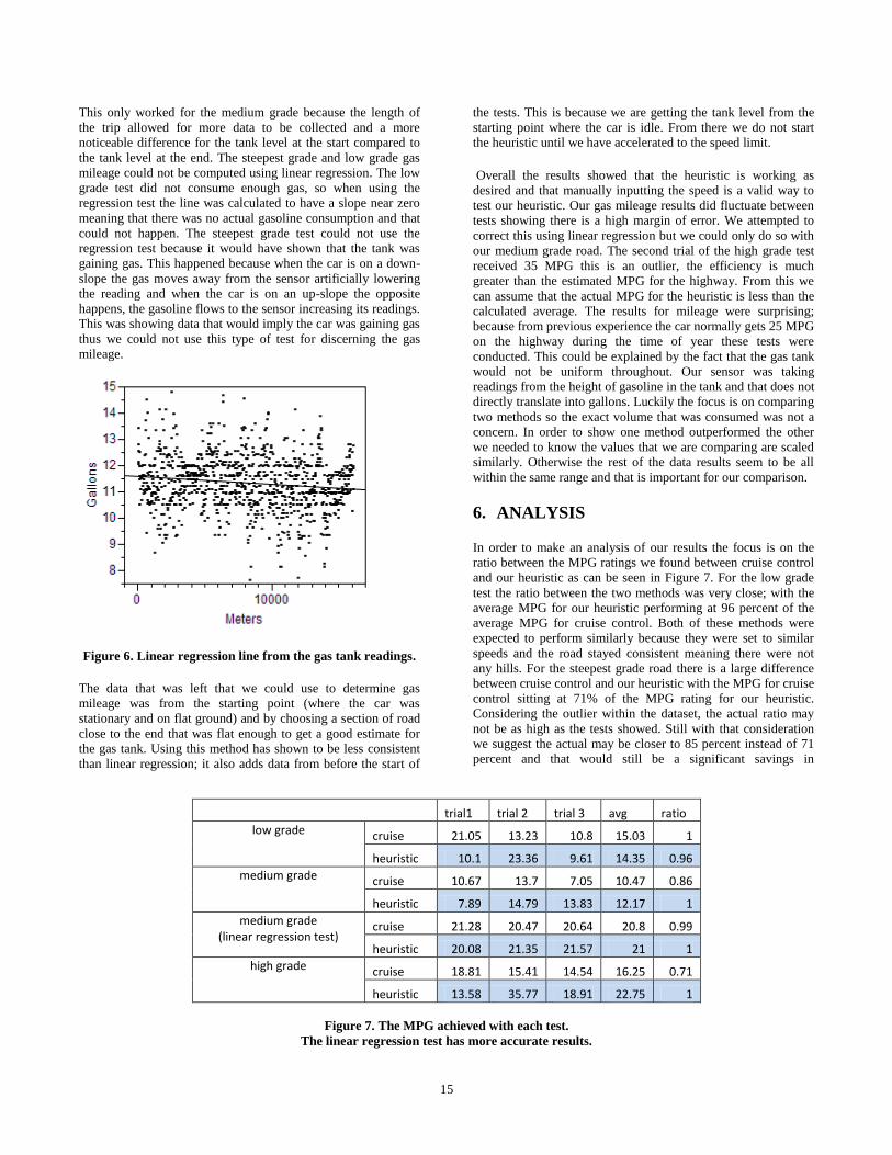
This only worked for the medium grade because the length of
the trip allowed for more data to be collected and a more
noticeable difference for the tank level at the start compared to
the tank level at the end. The steepest grade and low grade gas
mileage could not be computed using linear regression. The low
grade test did not consume enough gas, so when using the
regression test the line was calculated to have a slope near zero
meaning that there was no actual gasoline consumption and that
could not happen. The steepest grade test could not use the
regression test because it would have shown that the tank was
gaining gas. This happened because when the car is on a down-
slope the gas moves away from the sensor artificially lowering
the reading and when the car is on an up-slope the opposite
happens, the gasoline flows to the sensor increasing its readings.
This was showing data that would imply the car was gaining gas
thus we could not use this type of test for discerning the gas
mileage.
Figure 6. Linear regression line from the gas tank readings.
The data that was left that we could use to determine gas
mileage was from the starting point (where the car was
stationary and on flat ground) and by choosing a section of road
close to the end that was flat enough to get a good estimate for
the gas tank. Using this method has shown to be less consistent
than linear regression; it also adds data from before the start of
the tests. This is because we are getting the tank level from the
starting point where the car is idle. From there we do not start
the heuristic until we have accelerated to the speed limit.
Overall the results showed that the heuristic is working as
desired and that manually inputting the speed is a valid way to
test our heuristic. Our gas mileage results did fluctuate between
tests showing there is a high margin of error. We attempted to
correct this using linear regression but we could only do so with
our medium grade road. The second trial of the high grade test
received 35 MPG this is an outlier, the efficiency is much
greater than the estimated MPG for the highway. From this we
can assume that the actual MPG for the heuristic is less than the
calculated average. The results for mileage were surprising;
because from previous experience the car normally gets 25 MPG
on the highway during the time of year these tests were
conducted. This could be explained by the fact that the gas tank
would not be uniform throughout. Our sensor was taking
readings from the height of gasoline in the tank and that does not
directly translate into gallons. Luckily the focus is on comparing
two methods so the exact volume that was consumed was not a
concern. In order to show one method outperformed the other
we needed to know the values that we are comparing are scaled
similarly. Otherwise the rest of the data results seem to be all
within the same range and that is important for our comparison.
6. ANALYSIS
In order to make an analysis of our results the focus is on the
ratio between the MPG ratings we found between cruise control
and our heuristic as can be seen in Figure 7. For the low grade
test the ratio between the two methods was very close; with the
average MPG for our heuristic performing at 96 percent of the
average MPG for cruise control. Both of these methods were
expected to perform similarly because they were set to similar
speeds and the road stayed consistent meaning there were not
any hills. For the steepest grade road there is a large difference
between cruise control and our heuristic with the MPG for cruise
control sitting at 71% of the MPG rating for our heuristic.
Considering the outlier within the dataset, the actual ratio may
not be as high as the tests showed. Still with that consideration
we suggest the actual may be closer to 85 percent instead of 71
percent and that would still be a significant savings in
trial1 trial 2 trial 3 avg ratio
low grade cruise 21.05 13.23 10.8 15.03 1
heuristic 10.1 23.36 9.61 14.35 0.96
medium grade cruise 10.67 13.7 7.05 10.47 0.86
heuristic 7.89 14.79 13.83 12.17 1
medium grade (linear regression test)
cruise 21.28 20.47 20.64 20.8 0.99
heuristic 20.08 21.35 21.57 21 1
high grade cruise 18.81 15.41 14.54 16.25 0.71
heuristic 13.58 35.77 18.91 22.75 1
Figure 7. The MPG achieved with each test.
The linear regression test has more accurate results.
16
comparison to cruise control. Even though the high grade road
showed results that would suggest our heuristic is getting better
gas mileage than cruise control, we cannot support this due to
our inability to have an accurate gas reading. For the medium
grade road we used two methods. For all three scenarios we
measured the gas tank by taking samples from the start and end
of a test. For a medium grade road we used data that was
analyzed using linear regression to achieve more accurate
results. This was not feasible for the data collected on our low
and high grade roads. When analyzing the data for a medium
grade road using a regression test we found that the two methods
produced almost identical results.
After conducting these tests we found some things in our
methodology that could be improved upon. The main problem is
the evaluation of the cars fuel consumption lost a significant
amount of accuracy due to the gas tank reading fluctuating
because the liquid was moving around in the tank. If the car had
sensors that would give the instantaneous gas mileage by
monitoring the gas line (as can be found in more modern
vehicles) it would greatly simplify the process of analyzing the
results. Another problem that was noticed after running the tests
is that when we retrieved data for our route it was in latitude and
longitude which did not have a direct mapping to miles so we
considered the distance for one degree latitude and one degree
longitude to be the same distance. This was incorrect because
the length of the longitudinal degree becomes smaller when you
move away from the equator. This did not have a noticeable
effect on our experiments; because the change in the distance
from the equator during our tests was negligible. In practice this
could be corrected for simply by calculating the distance of a
longitudinal degree.
7. CONCLUSION
Our goal was to show that we could make a heuristic that would
consider the upcoming terrain in order to get better mileage.
Considering our most accurate results for the medium grade
road contradict our hypothesis we cannot support our claim. Our
control tests were as we expected so we cannot point to any
major errors within our test methods. We also cannot make a
strong conclusion for a high grade road. Even though our results
might suggest that our heuristic preformed favorably,
considering the high margin of error within the data collected for
the high grade road we cannot make a strong conclusion about
how well our heuristic performs with large hills.
8. FUTURE WORK
There were some problems with reading the gas tank. This could
be corrected by using a sensor that would read the amount of gas
going through the gas line to produce an instantaneous MPG
rating. There were also some factors that we were aware of but
had left out of our considerations such as wind direction, the
change of forces based on turns and rain causing the tires to lose
traction. A good addition to this project would be to add
considerations for when the transmission changes gears and try
to optimize based upon what gear the car will be using. We also
could have improved accuracy by having an odometer reading
from our Auto Tap device that had an accuracy of 10-25 meters
instead of calculating the distance based off of the speed of the
car.
9. REFERENCES
[1] Neiss, Konstantin, and Terwen, Stephan, and Connolly,
Thomas. Predictive Speed Control for a Motor Vehicle.
U.S. Patent Pub. No. US 2004/0068359, 2004
[2] Stanton, Neville A., and Young, Mark S. A Proposed
Psychological Model of Driving Automation. Brunel
University Research Archive, 2000. Theoretical Issues in
Ergonomics Science, Volume 1, Issue 4 October 2000 ,
pages 315 – 331.
[3] Ivarsson, Maria, and Aslund, Jan, and Nielsen, Lars.
Optimal Speed on Small Gradients. The International
Federation of Automatic Control 17th IFAC World
Congress Seoul, Korea, July 6-11, 2008.
[4] Fuel Economy Guide. U.S. Department of Energy, and U.S.
Environmental Protection Agency. 2007.
(http://www.fueleconomy.gov)
[5] Johnson, C. Physics In an Automotive Engine. (http://mb-
soft.com/public2/engine.html) last updated: 22 Nov 2009.
Accessed: February 5th 2010.
[6] The National Map Seamless Server. USSG.
(http://seamless.usgs.gov/) Accessed: March 19th 2010.

17
The Point of Diminishing Returns in Autonomous Reconnaissance
Aaron Gehri
Department of Computer Science Winona State University
Winona MN, 55987
ABSTRACT
This research project will attempt to find the point of
diminishing returns for the amount of time it takes to search a
room/area while increasing the number of robots. The
independent variables were the number of robots and the size of
the areas/rooms and the dependent variable was the amount of
area searched in a given amount of time. To help uncover a
general formula for calculating the point of diminishing returns,
this research project will use different size rooms/areas and
multiple robots. We were thinking that while adding more
robots, the amount of area covered should theoretically double
for each robot added. This would also depend on what kind of
algorithm would be used to search the room/area. A more
thorough algorithm is going to search less area but be more
accurate than a more exploratory algorithm. For the purposes of
this research project, we implemented a random, wall-avoiding
algorithm.
General Terms
Measurement, Performance, Experimentation, Theory.
Keywords
Robotics, Autonomous, Reconnaissance, Point of diminishing
returns.
1. INTRODUCTION This research project attempted to find the point of diminishing
returns for the amount of time it takes to search a room/area
while increasing the number of robots. The independent
variables were the number of robots and the size of the
areas/rooms. We had 15 robots to use and 3 different size
areas/rooms. The areas/rooms were squares made out of section
of wood, 7 by 7 feet, 10 by 10 feet, and 13 by 13 feet. The
dependent variable was the amount of area searched in a given
amount of time. For this project, we ran two sets of tests, one
set at one minute for each test run and another set at two minutes
for each test run. Collecting this data helped to uncover a
general formula for calculating the point of diminishing returns.
We were thinking that while adding more robots, the amount of
area covered should theoretically double for each robot added.
This would also depend on what kind of algorithm is used to
search the room/area. A more thorough algorithm is going to
search less area but be more accurate than a more exploratory
algorithm. For the purposes of this research project, we
implemented a more or less random, wall avoiding algorithm.
This provided a good average of all the different types of
algorithms.
The hypothesis for this research project was: as the number of
autonomously controlled robots increases, the amount of area
observed has an initial growth rate of 100% but decreases until a
point of diminishing returns.
2. RELATED WORK There are many aspects to robotics: movement, sensing,
communication, teamwork, reconnaissance and the task of
dealing with humans. One of the bigger topics is what type of
algorithm to use to search or traverse an area. This is an
important topic, because a good or bad algorithm can make or
break any of the other aspects.
There are many different kinds of research projects being done
on the topic algorithms. For example, what kind of search
pattern searches the most efficiently [4], [5]. Another important
topic is how robots could move around in the most efficient way
given the environment it is in [1]. Once a robot is able to move
around, the next task is location and mapping. Another aspect is
position, as in the robot being able to know where it is and
where the other robots are. Mapping is closely related with
position; mapping is keeping track of where the robot has been
and how to convey this location information to other robots [2],
[3], [6]. Moving, sensing, and communication are all very
important because the robot would not be able to do much
without being able to perform some basic tasks.
3. PROJECT IMPORTANCE Knowledge gained from a project like this is important because
as robots become more prevalent in society, they will begin to
work together to perform more complex tasks. Obviously, as
more robots work together on a task, the task will be completed
quicker and quicker; but just like any task when there are too
many people working together, people start to get in each
other’s way. When dealing with robots searching a room or an
area, there is a clear upper limit--the case when there are
thousands or millions of robots. It just might be physically too
many robots to fit in the area and still be able to move around, or
Permission to make digital or hard copies of all or part of this work for personal or classroom use is granted without fee provided that
copies are not made or distributed for profit or commercial advantage
and that copies bear this notice and the full citation on the first page. To copy otherwise, or republish, to post on servers or to redistribute
to lists, requires prior specific permission and/or a fee.
Proceedings of the 10th Winona Computer Science Undergraduate
Research Seminar, April 19-21, 2010, Winona, MN, US.

18
it might be so many robots that the communication channels
between the robots are completely clogged with traffic.
There is a variety of situations and other projects or areas of
study that could benefit from the knowledge gained this project.
For example, humans could use the right amount of robots to
rapidly search for victims in potentially dangerous areas like
earthquake ruble while not redundantly or inefficiently using
resources. Another example is using teams of robots to explore
uncharted areas of foreign planets. The weight of a mission is
very critical because it is expensive to launch rockets into space.
The results from this research would be valuable to be able to
calculate the optimal number of robots to use and still get the
task done in a timely manner. The military also uses robots to
investigate hostile areas; it would be beneficial to know how
many robots it will take to search an area. The list goes on, but
basically any task where the time and speed of a task could be
reduced by adding more robots.
4. METHODS To test this hypothesis, the research project was set up to use
three different room sizes: a small area (7 feet by 7 feet), a
medium area (10 feet by 10 feet), and large area (13 feet by 13
feet). This provides an incremental increase, which helped us to
find a formula.
We had 15 robots available for this research project. This was
enough to be able to analyze the amount of change of the
observed area for each additional robot. The amount of robots
was just enough to uncover where the point of diminishing
returns is located.
The area searched was calculated by measuring the 12 inch tile
grid on the floor. The robots were set to only 12 inches in front
of them, so when the robot stopped to search for a wall, we
estimated a foot of searched area around the robot.
4.1 HARDWARE The robots that we used were RidgeSoft IntelliBrain-Bot
educational robots. They use Java as the programming
language. The IntelliBrain controller has support for a number of
sensors, for this research project the robots used infrared
sensors, and ultrasonic sensors.
The infrared sensors are used for watching the spokes of wheels
and keeping track of the position of the robot. This is done by
counting the spokes and then using the size of the wheel to know
how fast the wheel is turning and how far the robot has traveled.
The sensor works by returning the distance; when there is a
wheel spoke the distance will be very close, and when there is
not the distance will be far away.
The ultrasonic sensors are used for searching. Again, searching
is just simply looking around for walls and then avoiding any
walls. The sensor returns the distance by sending out a ping—a
high pitch sound wave that is beyond the threshold of human
hearing—and timing how long it takes to return to the robot.
For this research project, we have set the limit of the sensor to
12 inches.
4.2 SOFTWARE The algorithm used for this research project was a pseudo-
random turning, wall avoiding algorithm. The robot randomly
picks an angle in the range of negative 90 and positive 90, with
zero being no change in heading. Then the robot drives 12
inches and searches the visible area—looking around for a wall.
We set the sensors to be able to see only 12 inches. If a wall
was found then the robot determines the angle of the wall and
modifies the range for random angles. This ensured that the
robot does not drive into the wall and only traveled parallel with
or away from the wall.
We set up the algorithm to work off of a framework. Figure 0
shows the pseudo code for the algorithm used in this research
project.
Figure 0.
The details of the algorithm are contained in a few sub methods.
The first one is the search-for-wall method, which involves
moving the sonar sensor around and reading the values to
determine if there is a wall. This sub method returns a Boolean
as the result.
Another sub method was modify-turn-range to avoid hitting the
wall. It took the angle of the sensor when the wall was closest
and subtracted 90 from that angle to return a range of negative
90 to this newly calculated value; or if the angle of the sensor
was less than zero, then the algorithm added 90 to return a range
of this newly calculated value to positive 90.
The last two sub methods we used were a turning method and a
driving method. The main algorithm would pass the angle to
turn or the distance to drive, and these methods would manage
the wheel servos to drive straight, or to turn clockwise or
counter-clockwise.
Setting up this framework and having sub methods handle the
details allows the program to be very human readable and
flexible to how the details are preformed.
RidgeSoft has setup the robot to use Java and provides an
extensive API to help programmers. For this research project,
we wanted to use a robot that runs Java because that is the main
programming language taught here at Winona State University
Computer Science Department. Furthermore, RidgeSoft has a
broad framework of pre-built methods that deal with hardware
details. For example, instead of controlling the details of how to
make the servo rotate, we only have to program how fast we
wanted the servo to rotate.
5. RESULTS We started with taking a base measurement of how much area
was searched while using one robot within a particular area in
both of the time frames: one minute and two minutes. More
tests were run using the same area and increasing the number or
robots. The results from this were graphed to show a curve and
they illustrate where the point of diminishing returns is located.
While remaining time is less than time limit:
Search-for-wall();
If wall exists then
Modify-turn-range() to avoid wall;
Else
Set turn range to random(-90,+90;
Endif
Turn amount in turn range;
Drive 12 inches.

19
The results appendix shows the data that we have collected for
each of the areas: 7x7, 10x10, and 13x13. The data is also
sorted by how long the test runs were: 1 minute and 2 minutes.
Figures 1 and 2 show the results from the one minute and two
minute test runs.
Figure 1.
Figure 2.
The data confirms that the amount of area observed doubles per
robot, but quickly diminishes and produces a logarithmic-
looking curve. Using this data, we have created a formula that
closely estimates the gathered data, shown in Equation E1. This
formula was created by combining and substituting formulas of
trend lines produced by excel. The goal was to make a formula
that produced a trend line for all of the curves grafted.
Equation E1.
This formula in Eqution E1 produces the following trend lines as
shown in Figures 3, 4, and 5.
Figure 3
Figure 4.
Figure 5.
0
20
40
60
80
1 2 3 4 5 6 7 8 9 10 11 12 13
7x7
10x10
13x13
0
20
40
60
80
100
120
1 2 3 4 5 6 7 8 9 10 11 12 13
7x7
10x10
13x13
0
20
40
60
80
100
0 2 4 6 8 10 12 14
Am
ou
nt
of
Sear
che
d A
rea
Number of Robots
13x13 Area Test Results
1 min
Formula
2 min
Formula
0
20
40
60
80
0 1 2 3 4 5 6 7 8 9 10
Am
ou
nt
of
Sear
che
d A
rea
Number of Robots
10x10 Area Test Results
1 min
Formula
2 min
Formula
0
10
20
30
40
50
0 1 2 3 4 5 6 7
Am
ou
nt
of
Sear
che
d A
rea
Number of Robots
7x7 Area Test Results
1 min
Formula
2 min
Formula
S = B*R2 + M*R + E, where:
S = Amount of area searched
A = Area of the testing area R = Number of robots
T = Time of the run
B = 0.0061A – 1.48 M = –0.0005A2 + 0.1019A + 8.1743
E = (0.25T – 14)

20
From this data, we have also created a formula to estimate the
point of diminishing returns, shown in Equation E2. We came
up with this formula by just noticing a pattern between the area
and the point of diminishing returns. For the one minute test
runs, that point appeared to be at 2 minus the square root of the
total area; and for the two minute test runs, the point of
diminishing returns appeared to be at 3 minus the square root of
the total area. We drew the conclusion that point of diminishing
returns is the square root of the area minus the sum of time plus
one.
Equation E2.
Figures 6, 7, and 8, show where the cutoff is for the point of
diminishing returns.
Figure 6.
Figure 7.
Figure 8.
The formula produces a number that is close to a number that a
human would suggest as the point of diminishing returns. After
this point, the amount of additional searched area produced by
using one more robot is slim to none. This negligible gain in
performance is the definition of the term, the point of
diminishing returns.
6. CONCLUSION Within the given parameters, the hypothesis has been confirmed.
As the number of autonomously controlled robots increases, the
amount of area observed has an initial growth rate of 100% but
decreases until a point of diminishing returns. We have
discussed and shown where the point of diminishing returns is;
additionally we have provided two formulas. A formula that
gives the position of the point of diminishing returns, and a
formula that estimates the curve of searched square footage
while increasing the number of robots.
7. FUTURE WORK The formula is based solely on the data collected in the research
project, so there will need to be a variety of future testing done
on this formula; using different types of areas, a variety of range
sensors, longer run times, and altogether different robots.
Different types of areas include: rounded areas, areas with
obstacles, areas shaped like a building floor plan, and many
other types. Along with the different types of environments,
there are many other types of sensors. Some can very quickly
scan and return the distances in 360 degrees. Furthermore, with
the advancement of robotics there are many different types of
robots; some that walk on 2, 4, 6, or even 8 legs; some that
balance on 2 wheels; and some that are much bigger and have
more wheels. There are many more tests and studies to be done;
which will provide many opportunities to add to and adjust the
formula provided by this research project.
8. ACKNOWLEDGMENTS Dr. Joan Francioni – Advisor for this research project, Winona
State University Computer Science Professor.
Chris Bischke – Assisted with the inception, planning, and
design, La Crescent High School Student, member of the La
Crescent FIRST Robotics Team.
R = Number of robots
A = Total testing area (feet)
T = Time of the run (seconds)

21
Dr. Gary Bunce – Loaned the robots to make this research
project possible, Winona State University Computer Science
Professor.
9. REFERENCES [1] Challou, Daniel J.; Gini, Maria; Kumar, Vipin; and
Karypis, George. "Predicting the Performance of
Randomized Parallel Search: An Application to Robot
Motion Planning", Journal of Intelligent and Robotic
Systems, Volume 38, Issue 1 (September 2003)
[2] Hoppenot, Philippe; Colle, Etienne; and Barat, Christian.
"Off-line localisation of a mobile robot using ultrasonic
measurements", Robotica, Volume 18, Issue 3 (May 2000)
[3] Munguía, Rodrigo; and Grau, Antoni. "Single Sound
Source SLAM", Proceedings of the 13th Iberoamerican
congress on Pattern Recognition: Progress in Pattern
Recognition, Image Analysis and Applications, Havana,
Cuba, 2008
[4] Price, Ian C.; and Lamont, Gary B. "GA directed self-
organized search and attack UAV swarms", Proceedings of
the 38th Winter Simulation Conference, Monterey,
California, 2006
[5] Rybski, Paul E.; Larson, Amy; Veeraraghavan, Harini;
Anderson, Monica; and Gini, Maria. "Performance
Evaluation of a Multi-Robot Search & Retrieval System:
Experiences with MinDART", Journal of Intelligent and
Robotic Systems, Volume 52, Issue 3-4 (August 2008)
[6] Rybski, Paul E.; Roumeliotis, Stergios; Gini, Maria; and
Papanikopoulos, Nikolaos. "Appearance-based mapping
using minimalistic sensor models", Autonomous Robots,
Volume 24, Issue 3 (April 2008)

22
Appendix 1: Results of Test Runs
Number
of
Robots
Area
Searched
Percent of
Area
Searched
Percent of
Additional
Area Searched
1 12 24%
2 21 43% 18%
3 27 55% 12%
4 31 63% 8%
5 32 65% 2%
6 32 65% 0%
Figure A1. 1 Minute; 7 x 7’ Area
Number
of
Robots
Area
Searched
Percent of
Area
Searched
Percent of
Additional
Area Searched
1 13 13%
2 22 22% 9%
3 30 30% 8%
4 38 38% 8%
5 45 45% 7%
6 50 50% 5%
7 51 51% 1%
8 52 52% 1%
9 52 52% 0%
Figure A2. 1 Minute; 10 x 10’ Area
Number
of Robots
Area
Searched
Percent of
Area Searched
Percent of
Additional Area
Searched
1 13 8%
2 24 14% 7%
3 33 20% 5%
4 41 24% 5%
5 47 28% 4%
6 56 33% 5%
7 60 36% 2%
8 64 38% 2%
9 67 40% 2%
10 68 40% 1%
11 69 41% 1%
12 70 41% 1%
13 70 41% 0%
Figure A3. 1 Minute; 13 x 13’ Area
Number
of
Robots
Area
Searched
Percent of
Area
Searched
Percent of
Additional
Area Searched
1 29 59%
2 38 78% 18%
3 43 88% 10%
4 45 92% 4%
5 45 92% 0%
6 45 92% 0%
Figure A4. 2 Minutes; 7 x 7’ Area
Number
of
Robots
Area
Searched
Percent of
Area
Searched
Percent of
Additional
Area Searched
1 25 25%
2 36 36% 11%
3 45 45% 9%
4 53 53% 8%
5 60 60% 7%
6 65 65% 5%
7 70 70% 5%
8 71 71% 1%
9 71 71% 0%
Figure A5. 2 Minutes; 10 x 10’ Area
Number
of
Robots
Area
Searched
Percent
of Area
Searched
Percent of
Additional
Area Searched
1 24 14%
2 36 21% 7%
3 46 27% 6%
4 55 33% 5%
5 62 37% 4%
6 69 41% 4%
7 81 48% 7%
8 85 50% 2%
9 89 53% 2%
10 94 56% 3%
11 95 56% 1%
12 96 57% 1%
13 96 57% 0%
Figure A6. 2 Minutes; 13 x 13’ Area

23
Comparing the Efficiency of NIO Model to Thread-per-Connection Model in Java
Jared Gommels
Department of Computer Science Winona State University
Winona MN, 55987
ABSTRACT
NIO, or “New Input/Output”, is a Java API that uses non-blocking
IO as opposed to the old Java IO API which uses thread-per-
connection blocking IO. It is commonly believed that the thread-
per-connection model is not as efficient as the NIO model and
thus should not be used anymore. The aim of this research is to
find if this is indeed true, and to determine if there are any
situations in which using non-blocking NIO is as efficient as or
even less efficient than the thread-per-connection IO model in
Java.
Categories and Subject Descriptors
D.3.3 [Networking]: Input/Output Types – Blocking IO, Non-
Blocking IO. Networking Transport – TCP.
General Terms
Performance, Design, Experimentation.
Keywords
Java, Networking, Input/Output.
1. INTRODUCTION The Java New I/O (NIO) API offers several new features in
comparison to the old IO API, but our focus is specifically on the
non-blocking aspect of the NIO API. Because the NIO API in
Java uses non-blocking IO unlike the thread-per-connection
model, it is often assumed to be more efficient than the latter [1].
However, this may not be the case in all situations. The overall
performance relies heavily on the underlying operating system
that is managing the context switching between threads. There are
many claims that newer versions of the Linux kernel handle
threads quite efficiently; efficient thread-handling could make a
difference in the efficiency between non-blocking IO and thread-
per-connection IO.
The advantage of blocking IO is that it is significantly less
difficult to implement and debug than NIO. This is because the
programmer need only implement a thread class to handle a single
connection, and spawn a new thread every time a connection is
initiated. Switching between the connection requests is simple,
because it can be left to simple context switching of the threads,
which is carried out by the underlying operating system. With
NIO, the programmer needs to be concerned with more problems,
such as how many threads to use for the connections based on the
nature of the application. Since NIO’s implementations are
usually more complicated, it is generally more default to debug
than blocking IO. Due to its greater implementation complexity,
NIO should only be preferred if the performance increase is
significant.
2. HYPOTHESIS There is an operating system environment where the thread-per-
connection model requires less CPU processing time and
introduces less connection request latency than the NIO model.
3. METHODS This research involved various experiments that compare the use
of the Java NIO API (non-blocking IO) to the older IO API
(blocking thread-per-connection IO), with everything else being
equal.
The experiments were performed using two custom Java
programs: a client and a server. During the experiments, there
were five clients and one server, as shown in Figure 1. Each client
had hundreds or thousands of TCP connections to the server. This
was strictly a server-side analysis, so although the performance of
the clients was monitored, we are only concerned with the results
of the server’s performance. The only piece of information that is
gathered from the clients is the latency experienced with the
server; this is determined by calculating the difference in time
from when a client sends a request to the server to the time that it
receives a response.
Figure 1. Server connected to five clients.
In each experiment, there was a distributed load on all the
connections to the server. Each client sent a 1 KB request every
three seconds on each connection to the server. When the server
received a request, it then performed a minor simulated process,
Permission to make digital or hard copies of all or part of this work for personal or classroom use is granted without fee provided that
copies are not made or distributed for profit or commercial advantage
and that copies bear this notice and the full citation on the first page. To copy otherwise, or republish, to post on servers or to redistribute
to lists, requires prior specific permission and/or a fee.
Proceedings of the 10th Winona Computer Science Undergraduate
Research Seminar, April 19-21, 2010, Winona, MN, US.

24
as well as a small disk access. It then simply echoed the request
data back to the client. This process was intended to make the test
environment slightly more realistic and to put a greater load on
the CPU.
The operating systems that were tested in the research are the
following:
· Windows Server 2003
· Windows Server 2008
· Ubuntu Server
· Solaris
The MINA (Multipurpose Infrastructure for Network
Applications) NIO Framework is used for the NIO server
implementation. This is a Java framework that is commonly used
for NIO implementations [2]. The thread-per-connection model is
simple to implement in Java, so the Java API could be used
directly when implementing it.
The analysis of these experiments was based on three criteria:
CPU utilization, memory usage, and latency. CPU and memory
usage were primarily evaluated from the output of the Java
Monitoring and Management Console, which is a cross-platform
tool included in the Java Development Kit (JDK). CPU utilization
was also monitored with the resource monitoring tools provided in
each operating system to get more detailed information of how
each core of the CPU was being utilized. Since the thread-per-
connection model will almost always have a significantly greater
number of threads than the NIO model, it is almost a guarantee
that thread-per-connection experiments will have greater memory
utilization; thus, although memory utilization is used in
comparing the different experiments, we are primarily concerned
with comparing CPU utilization and latency between the two
models.
The Java Virtual Machine (JVM) used for all of these experiments
was the Java Hotspot Server Virtual Machine, which is included
with the JDK. There were a number of settings that needed to be
changed to the JVM and the operating system environments to
make these experiments work. The heap space for the JVM had to
be increased to 512 MB to allow for the greater memory that the
blocking IO model requires. Additionally, since thread-per-
connection by definition will result in thousands of threads during
the experiments, the JVM thread execution stack size had to be
decreased down to 128 KB to prevent too much memory from
being used. In Ubuntu Server, the maximum number of file
descriptors (sockets) had to be increased from the default value of
1,024.
The number of connections initiated in all the experiments was
6,000. Since it is not feasible to initiate this many connections
instantaneously, each client initiated a connection every 500
milliseconds. The number of six thousand connections was
decided for circumstantial reasons. Initially it was decided to use
three different test scenarios of the number of connections,
ranging up to 25,000. However, it was very difficult to obtain this
number for a variety of reasons. Despite making several changes
in the JVM and the underlying operating systems, only about
6,000 – 7,000 connections could be established in each
experiment in the thread-per-connection model, despite having
plenty of memory resources left in the system. This could be due
to a limitation in the JVM on the number of threads, or even a
limit in the underlying OS on the number of threads per process.
Despite this, six thousand connections is still a large enough
number to make comparisons between the two models. Indeed,
many real environments do not need more connections than this.
4. RESULTS AND ANALYSIS Most of the graphs that are shown in this paper are taken from the
Java Management Console, which was used to dynamically
capture information about resource utilization as the server was
handling requests on the connections. It is important to note that
the Java Management Console automatically adjusts the scale of
these graphs dynamically, so one should pay close attention to the
scale of each graph in this paper to properly make comparisons.
As expected, the server consumed much more memory when
using the thread-per-connection model than when using the NIO
model. This difference can be seen when comparing Figures 2 and
3. The thread-per-connection model used over 300 MB of heap
space, while the NIO model used less than 40. The linear growth
in memory usage is simply due to the steady increase of
connections to the server; the line flattens out due to the server
completing the initiation of all connections.
One interesting difference here is that the NIO heap usage does
not seem to increase as steadily as the heap usage of the thread-
per-connction model. Note that as the number of connections is
increasing, the clients are already sending requests on the existing
connections, so this affects the heap usage on the server as well.
The most likely cause for the difference in “noisiness” is that the
MINA Framework’s implementation for some reason causes the
Java garbage collection to be run more often. Again, the scales are
different in the two graphs, so this difference is not as great as it
seems.
Figure 2. Thread-per-connection heap usage.

25
Figure 3. NIO heap usage.
Figures 4 and 5 show the difference between the two models in
terms of the number of threads used and how that number
increases as more connections are initiated. As mentioned earlier,
the number of connections was purposely increased in a linear
fashion by initiating a new connection from each client every 500
milliseconds. As expected, the graph of the thread count for the
thread-per-connection model reflects this linear increase. The
graph shows that the thread count stops at 6,011; six thousand of
the threads are connection threads, and the other eleven threads
are handling other tasks.
Figure 5 shows how the NIO thread count increases in a step
fashion rather than a linear one. As the number of connections
increases, the MINA Framework allocates more threads as
necessary to handle them. Here, the thread count stops at 30,
which is a significant difference from 6,011.
Figure 4. Thread-per-connection thread count.
Figure 5. NIO Thread count.
The results of the CPU utilization from the experiments are
interesting. In each case, the thread-per-connection
implementation actually used significantly less percentage of the
CPU than the NIO model. Figures 4 and 5 demonstrate how both
models utilized the four cores of the CPU and to what extent.
Here it can be seen that in both cases, all four cores are utilized
nearly equally. However, the NIO model consumed more CPU
resources.
Figure 6. Thread-per-connection CPU utilization on
Windows Server 2003.
Figure 7. NIO CPU utilization on Windows Server 2003.
The following graphs compare the CPU utilization of the server
for the two models across the four operating systems that were
tested. Again, these graphs are taken from the Java Management
Console.

26
Figure 8. Thread-per-connection on Windows Server 2003.
Figure 10. Thread-per-connection on Windows Server 2008.
Figure 12. Thread-per-connection on Ubuntu Server 9.
Figure 14. Thread-per-connection on Solaris 10.
Figure 9. NIO on Windows Server 2003.
Figure 11. NIO on Windows Server 2008.
Figure 13. NIO on Ubuntu Server 9.
Figure 15. NIO on Solaris 10.

27
Windows Server 2003 and 2008 showed very similar results. In
both, the CPU usage of the thread-per-connection ranged from
approximately 4% to 7%, while the NIO CPU usage tended to
range from 40% to 50%. This is roughly a tenfold increase.
Ubuntu Server 9 and Solaris 10 also had very similar results to
each other. In both cases, the thread-per-connection model usually
did not exceed 5% CPU utilization. Interestingly, in Solaris 10
there are a few brief dramatic spikes in CPU usage; the exact
reason for this is unknown, but it is perhaps that garbage
collection is running briefly and is for some reason taking up
more CPU than in the other cases.
With the NIO model in Ubuntu Server 9 and Solaris 10, the CPU
utilization did not exceed 10%. Again, this is a significant
increase in CPU usage, but only twofold, unlike the Windows
systems.
Again, the thread-per-connection model surprisingly
outperformed the NIO model in all cases in terms of CPU
utilization. This could be for a variety of reasons. One logical
reason is that it is partially due to the extra overhead the MINA
Framework (or any NIO implementation) has of context switching
between connections. In the thread-per-connection model, the
context switching is handled by the operating system, and it could
be that this overhead is not as great. However, Figures 8-15 do not
fully capture the CPU utilization for things like thread context
switching, because the graphs are specific to the Java application.
Figures 6 and 7 do show the full comparison of CPU utilization,
but it is still clear that thread-per-connection outperformed NIO in
these experiments. It is important to consider that, although there
may be thousands of threads in the thread-per-connection model,
in many circumstances most of the threads are sleeping due to
waiting for a request to be received; thus those threads are not
taking up any CPU time. They are, however, taking up a
considerable amount of memory.
It is also possible that the implementation of NIO using the MINA
Framework used in these experiments could be further improved
to be more efficient. One improvement may involve finding ways
to reduce the frequency that garbage collection is run. However,
even if it were possible to drastically improve the efficiency of the
NIO implementation, it is important to note that the measurements
of CPU utilization of the thread-per-connection model in our
environment were quite minor; thus, this model is certainly
reasonable in a similar environment if memory usage is not a
major concern.
It is interesting to see how Ubuntu Server and Solaris do seem to
handle threads more efficiently than the Windows environments.
The NIO model in Windows uses approximately five times more
CPU than the other two operating systems, however there is not a
significant difference of CPU efficiency across operating systems
for the thread-per-connection model,
No accurate analysis could be performed on latency since the
average latency in every test case was less than 10ms. This is
mostly due to the fact that the clients and the server were on the
same Local Area Network (LAN). Despite efforts to put a greater
load on the server to induce higher latency, an average latency
greater than 10ms could not be produced. This is not a great
enough distribution to derive conclusions about latency.
5. CONCLUSION In environments with a similar workload to these experiments, the
IO model used is a tradeoff between CPU processing time and
memory utilization. This paper demonstrates how the NIO model
can be less efficient than the thread-per-connection model in some
environments, depending on its implementation. Even if the
efficiency of the NIO implementation in this research could be
improved, it is clear that it is more difficult to gain this efficiency,
and this is something programmers should be aware of. Since the
thread-per-connection model uses a minimal amount of CPU
resources in these experiments, it is sufficient for this kind of
workload.
6. FUTURE WORK More research needs to be done to see how blocking and non-
blocking IO perform when there are more connections and when
there is more bandwidth used than in these experiments. There are
many other test cases that could be performed which may produce
useful results. One such experiment would involve many
connections being connected and disconnected throughout the
experiment; this would be a more realistic test case for many
environments.
6. ACKNOWLEDGEMENTS I would like to thank Dr. Cichanowski, Christopher Popp, Andrew
Popp, and Danish Shrestha for their input and guidance
throughout this research.
7. REFERENCES [1] New I/O APIs. (2002). Retrieved February 2010, from Sun
Developer Network: http://java.sun.com/j2se/1.4.2/docs/guide/nio
[2] Lee, T. (2010, January 15). FAQ. Retrieved March 15, 2010,
from Apache MINA: http://mina.apache.org/faq.html
[3] Beloglavec, S., Heričko, M., Jurič, M. B., and Rozman, I.
2005. Analysis of the limitations of multiple client handling in a
Java server environment. SIGPLAN Not. 40, 4 (Apr. 2005), 20-28.
DOI=http://doi.acm.org/10.1145/1064165.1064170
[4] Taboada, G. L., Tourino, J., and Doallo, R. 2009. Java for high
performance computing: assessment of current research and
practice. In Proceedings of the 7th international Conference on
Principles and Practice of Programming in Java(Calgary,
Alberta, Canada, August 27 - 28, 2009). PPPJ '09. ACM, New
York, NY, 30-39.
DOI=http://doi.acm.org/10.1145/1596655.1596661
[5] Li, P. and Zdancewic, S. 2007. Combining events and threads
for scalable network services implementation and evaluation of
monadic, application-level concurrency primitives. In
Proceedings of the 2007 ACM SIGPLAN Conference on
Programming Language Design and Implementation (San Diego,
California, USA, June 10 - 13, 2007). PLDI '07. ACM, New York,
NY, 189-199. DOI=
http://doi.acm.org/10.1145/1250734.12507

28
Scanning Email Content for Malicious Links
Troy Metz
Department of Computer Science Winona State University
Winona MN, 55987
ABSTRACT
Email is a common attack vector for phishing, spam and other
malicious attacks. Undesired email messages are received by
users on a daily hourly or even minutely basis. Currently, there
are tools that will scan email attachments for viruses or won’t
display content until the user allows it; however, there seems to be
a lack of tools to analyze other parts of an email. One of these
areas is the links contained within an e-mail. In November 2009
ICANN officially started supporting the use of non-Latin
characters in URLs. This opens up a whole new attack vector for
malicious users to create links that look like credible URLs even
when the actual URL is examined. The use of multiple character
sets in a URL and links that don’t resolve to a credible DNS
lookup are things that should make a user more cautious of an
email.
General Terms
Algorithms, Experimentation, Security.
Keywords
Email, Security
1. INTRODUCTION
It is common for hackers to send malicious links in an email in
attempt to trick users to clicking on them either to send them to a
phishing website to collect personal information or to collect
information about valid email addresses to compile quality mailing lists to sell.
Distributed Checksum Clearinghouses or DCC has over 250
servers that use a checksum based method for detecting spam
emails. Their servers tracked over 300 million email transactions
on an average day in 2009. Figure 1 shows a graph from DCC
that shows the total number of email transactions along with the
possible and probable portions of that email that was spam [2].
The bottom area of the graph in pink shows the number of those
emails that are spam, the middle red section is possible spam, with
the remainder in blue showing the remainder of the total email
going through DCC servers. According to their estimates 53% of
the email transactions are likely to be spam with as much as 67%
possibly being spam mail. Not only is there a huge volume of
email being sent on a daily basis but also over 50% of that traffic
is malicious or undesired. This is made possible due to the
relative ease and low cost in creating email accounts and sending messages.
Figure 1. Graph of email and spam mail [2]
On November 16, 2009 ICANN, the Internet Corporation for
Assigned Names and Numbers, launched its Fast Track Process
which allows countries to include non-Latin characters in Domain
Names [4]. While this is a big step forward toward a more
internationalized Internet it also provides new issues in the realm
of security. Already, the use of characters that look very similar
to each other is causing concern and problems in computer
security. At the 2008 RSA Conference, Chris Novak talked about
how letter substitution is being used as an anti-forensics measure
and to perform phishing scams through email. You can see in
Figure 2 that the “a” characters look the same in both instances of
the word “hack”. The top instance uses a Cyrillic character that
looks like “a” mixed into the Latin characters where the bottom
uses all Latin characters [1].
Figure 2. Different characters that look the same [1]
For a human it would be nearly impossible to tell the difference
but as the figure shows, if the numeric or byte value of the
Permission to make digital or hard copies of all or part of this work for personal or classroom use is granted without fee provided that
copies are not made or distributed for profit or commercial advantage
and that copies bear this notice and the full citation on the first page. To copy otherwise, or republish, to post on servers or to redistribute
to lists, requires prior specific permission and/or a fee.
Proceedings of the 10th Winona Computer Science Undergraduate
Research Seminar, April 19-21, 2010, Winona, MN, US.

29
characters are examined the difference becomes apparent. Most
commonly letter substitution is used to hide files on a machine so
a directory looks correct when inspected visually. Letter
substitution could also be used to trick users by making new malicious URLs that look like common trusted links.
Which of the following links would bring you to a popular social networking site?
http://facebook.com
or:
http://fаcebook.com
Would you believe that one of those links contains non-Latin
Characters? No matter how closely they are examined it is
visually impossible to tell the difference, but the byte value of the
“a” in the second link would show that it is Cyrillic not Latin.
In the past attackers have made links such as
“http://fake.ru/usersBankSite/login” to try to trick careless users
into thinking that the link is going to their bank’s website. Now,
that visual clue at the beginning “fake.ru” is not required for the
attackers. When users see a link such as “usersBankSite.com”
they must take a step back and ask if that is the link for their bank,
or is that “a” actually from a different character set being used to
trick the user into going to a malicious website.
Even for a careful user who is aware of this kind of trick it could
be very hard, (if not impossible) to spot a good letter substitution.
Microsoft Power Point uses the same visual character for Cyrillic
and the Latin “a” which would make it impossible to tell the
difference without looking at the byte value. The problem with
this is that for a human, inspecting the numeric value of these
links would be extremely tedious. Because of this, software is
needed to aid users in identifying possible security threats of this
kind.
Blacklists are lists of IP addresses that are thought to be
associated with spam. Many different approaches are used to
create these lists but the purpose is all the same. They provide a
means to look up an IP address and see if it is known to be spam.
Most email clients compare the IP addresses of incoming email
traffic against some form of blacklist. This technology could also
be used to do lookups on the IP addresses obtained from a DNS lookup on a link contained within in an email.
Currently many spam attacks have to be sent using many
hundreds, thousands or millions of computers to avoid having the
spam marked as junk mail by the blacklist filters. If the IP
addresses associated with the links within these emails were also
blacklisted attackers would have to not only send their spam
emails from many locations but also host their malicious content at different IP addresses to try to avoid blacklisting.
We created a tool which when provided a pool of emails would
parse through the text to find links. Then once the link is
identified could look for multiple language sets in the links and if
this test is passed it would do a DNS lookup on the link and
compare the resulting IP addresses with a blacklist site. This tool
is to be a proof of concept for using this kind of threat analysis
and hopefully similar functionality will be added to email clients
in the future.
2. METHODS
2.1 System Overview
Our system was developed in Java using the JavaMail API. The
basic flow of the system is to open a specified folder in an inbox
reading in each email one at a time. As the emails are read into
the system it parses out the links from the body of the email and
passes the links as strings to a checking method. In this method
the links are parsed through byte by byte and the character set for
each byte is stored. Once all bytes of the link have been
processed heuristics are used to determine whether or not the
character sets in the link should be cause for alarm.
If this test is passed the IP addresses associated with the link are
then compared to several blacklisting servers to add another layer
of checking for malicious links.
2.2 Link Parsing
Each email client has its own method for identifying the links in
an email to make them be clickable. If the email is html based
this is easy; however, finding a link in plain text email can be
tricky. Gmail for instance appears to split the text by spaces and
certain special characters and then does DNS lookups on the
resulting strings. Outlook Express on the other hand looks for
“www” and “http” as a signal that the text is a link and doesn’t
check what follows. Because of the inconsistencies in how a link
is identified by email clients we decided to use a fairly simple
method knowing that any email client that implemented this tool
would use their own link parsing method. With this in mind the
tool simply splits the text by spaces and “<” or “>”. The angle
brackets are used to separate out the links from html. After
splitting the text into smaller strings the system checks for strings
that begin with “www.”, and “http” (which includes https).
2.3 Character Set Checking
Once a link has been identified it is passed as a String to a method
that looks through the link one byte at a time, categorizing the
bytes by Unicode character set. Before this byte by byte checking
is performed all “.”, “/” are removed, as well as any “www”,
“http://” and “https://” that start the string. This is done because
those characters would still be used by URLs that are created with
a different alphabet. Once those characters are removed the string
is examined one byte at a time to determine which Unicode block
each character fits into.
A Unicode byte that starts with a 0 tells us that it represents a full
character by itself. When a byte is in the form 110xxxxx we
know that the next byte is also part of the same character and is of
the form 10xxxxxx [3]. When the value of the byte is less than
128 we know that the byte represents a basic Latin character. If
the byte is 128 or greater we need to look at the next byte or two
depending on the value of the first byte.
Once we have all the bytes for the character it is converted to
binary and the leading bits that are used for the Unicode encoding
are removed. For a two byte character this gives us a total of 11
bits. These strings of bits are then put together in order. This
leaves us with the binary bits that make the actual decimal value
of the character. Once converted to a decimal value it can easily
be compared to the decimal ranges for the Unicode character

30
blocks. The character block that the character came from is then
identified and a counter for that block is incremented.
2.4 Blacklist Lookup
Once the entire link has been examined the counters are analyzed.
Percentages are created for what percent of the URL is in each
character set. For this experiment, it is assumed that if 100% of
the characters are not from the same character set, the link is most
likely malicious and the tool will return a failure.
If a link passes the character set test it then goes through a
blacklist check. The system does a DNS lookup on the link to
retrieve all IP addresses associated with that URL. Then a lookup
is done for each of those IP addresses against two blacklist sites.
More sites could easily be added and there are many more to
choose from. For our proof of concept it was decided that two
blacklists would be sufficient. If the lookup succeeds, the link is
considered to be malicious because it is listed on one of the
blacklist sites.
2.5 Output
For our prototype system the results of the character set checking
and the blacklist lookup are summarized and displayed in the
consol for easy analysis. If this were to be implemented into an
email client the return values from those methods could be used to
filter the emails into a junk mail box or to alert users of a potential
problem.
2.6 Testing the System
The original plan was to test our application against a large pool
of real spam mail that was known to have examples of the target
problems; however, the use of non-Latin character sets is so new
we could not find any examples of this in real world emails or “in
the wild”. To combat this we had several of my colleagues send
hand crafted emails to an email address that was specifically setup
for testing this tool. They sent emails with many to no links,
some with multiple character sets, some with just one, and some
with URLs acquired from the blacklist sites the tool is using for
blacklist lookups. This way all of the aspects of the tool received
testing to show that the concept is a possible solution.
The test emails contained 23 valid Latin based links, eight links
that were supposed to represent what a possible valid non-Latin
link would look like, 27 were Latin URLs with non-Latin
characters mixed in, and 15 came from blacklists. Within the
eight non-Latin URLs two of them were predominately from a
non-Latin Character set with the corresponding country code or
top-level domain in Latin characters. The 27 Latin URLs with
non-Latin Characters contained a valid URL with mostly Latin
characters but also contained Japanese characters which led to a
Japanese wiki article. In addition to these artificial emails, the tool
was run against a personal junk mail folder containing over 600
emails with and without links.
3. RESULTS
3.1 Artificial E-Mails After running the artificial test emails the results showed almost
exactly what was expected. One problem that showed up was
some of the links with non-Latin characters seemed to become
split at the non-Latin character. This is due to some email clients
creating an html version of the email automatically. When this
happens href tags which are used to identify a link in html are put
around the front part of the link and the part after the non-Latin
character was left as plain text. However in these cases the links
also appeared in a plain text section of the emails and so each link
did properly go through the tool’s analysis.
Table 1. Test Results
Every fully Latin URL such as www.google.com, passed the test
without being flagged. In every case where a link used a non-
Latin character the use of these characters was correctly
identified. When a link does contain more than one character set,
like this one http://tēst.com, it is assumed to be malicious.
However, one of the instances in our test cases was a non-
malicious link that used Japanese characters mixed in with Latin
characters. The URL "http://ja.wikipedia.org/wiki/日本語”,
points to a valid Wikipedia page, but the Japanese characters on
the end cause it to be marked as malicious by our tool. This shows
that our original assumption, that any URL with more than one
character set used can be assumed to be malicious, is incorrect.
In the cases where links were simulating a link that is mostly non-
Latin all but two passed. One that failed was using Chinese
characters with “.cn” for the top level domain. The other was
"http://क्स्व्ववजक््स्वनन्द्फ्नन्द्फज ्् ्न्क.np” which is Nepali characters
with the “.np” country code for Nepal. Depending on how the
non-Latin character sets become used in real links something may
need to be done to account for Latin top level domains with non-
Latin characters for the rest of the URL, such as checking the
country code and the character sets.
One thing that was not considered before this was links leading to
file downloads. One of the artificial links that was provided led to
a .doc file. The method for link parsing proposed here was able to
handle this correctly. The special characters were removed and
the remaining characters were categorized. But this would not
work for a file name that is in a different character set that is
hosted on a Latin URL. File names may need to be excluded from
this type of character analysis.
Each of the 15 instances of blacklisted links that were included in
the artificial test emails were identified without any issue. One
problem that was discovered with the blacklisting feature is it can
add a significant amount of time to processing an email. Links
that are not found on a blacklist must timeout. This means an
email with a significant amount of valid links could take a
frustratingly long time to load for today’s impatient users.
Because of this the blacklists used must be carefully chosen and
using more than one or two would probably not be practical in a
real world application.
3.2 Real Spam Surprisingly out of the 600 emails we ran through our tool not a
single blacklisted IP address was found. There were also no non-
Latin characters identified. Because the ability to use these
characters is so new, this is not a surprise.
Type of Link Total Expected results Failures
Latin Valid URL 23 23 0
non-Latin URL 8 6 2
Latin URL with non-Latin
Characters 27 26 1
Known Blacklisted URL 15 15 0

31
4 ANALYSIS
4.1 Artificial Emails
The results of these tests shows that by going through a link byte
by byte an email client could identify when more than one
character set is being used to create a link. The test case of a valid
URL with Japanese and Latin characters tells us that more
sophisticated parsing will be needed. The only real clue that the
Japanese characters should be allowed is the “ja.” at the beginning
of the URL. One possible idea is to look for the top level domain
or country code of the URL. Then, if the non-Latin character set
is from a character set associated with that code a less severe
warning could be provided or mixing between those characters
and Latin characters could be viewed as safe.
The results seen in the blacklisted links shows us that we can
expand the use of a well known technology to provide greater
protection for email users.
4.2 Real Emails
Being that the application found no malicious content in the links
of the real emails tells us two things. First, using multiple
character sets to trick users into following a malicious link has not
become main stream. While this was not found in the wild in this
project, it is a problem that will be used to attack users in the
future. The sooner counter measures are implemented to prevent
this from happening; the harder attackers will have to work to
utilize this attack vector. Secondly, blacklist sites currently are
unable to provide the information needed to assist in identifying
malicious links. That being said they could be. If blacklisting
services began collecting data based on the IP addresses in the
links that are contained within emails that are known to be spam,
better blacklists for this information could be created, making
them a very useful tool for stronger spam filtering.
5. CONCLUSION
Well over 95% of the malicious links in our test email were
identified by this tool. This tells us that the methods we used for
analyzing links to identify multiple character sets and performing
blacklist lookups are possible to use. If this tool were to be
implemented into an email client that client would provide
another layer of protection to the user from malicious content.
While there were no instances of the use of multiple character sets
found in the wild this is a very real attack vector that is more than
likely going to become a problem in the future. By implementing
protections against the attack before it becomes common could
potentially stop many early attacks from being successful. The
problem; however, is that a very large percentage of non-
malicious links were flagged as malicious. Most of these
problems arose from the initial assumption that any link
containing a mixture of character sets must be malicious. When
the use of non-Latin character sets for URLs becomes more
common work will need to be done to modify this tool to account
for how these character sets will be used for non-malicious links.
It may require ignoring the top level domains, allowing for a small
percentage of Latin characters in a non-Latin link, ignoring certain
characters that are used universally, or something currently
unforeseen. By its nature heuristics are not perfect, but if the
methodology can be refined to not provide many false positives,
having protection that works some of the time is usually much
better than having no protection at all.
The most surprising result was that not a single link, in over 600
spam emails, lead to a blacklisted IP address. More research
needs to be done on this to determine if it is because the IP
addresses that these links point to, are so spread out that
blacklisting will not work, or if the issue is simply that the IP
addresses associated with these links are not being blacklisted. If
it is the later, we can start blacklisting the IP addresses found from
links in known spam emails and build new blacklists to be used to
block messages coming from new senders but trying to attack
users with links that lead to known malicious hosts.
6. Future work
The main improvements the tool needs are better heuristics for
identifying when mixed character sets should be flagged as a
possible threat. Experiments with the country codes and character
sets especially need to be done. The two areas where the tool did
not perform as needed were cases when the alternate character set
matched the country code. A new heuristic that allows for mixing
Latin characters with those from the character set associated with
the country code would be one possibility. Another possibility
would be to assign different levels to the threat and mark those
links as less severe of a threat than ones with a country code that
does not match the character sets.
Work should also be done to determine the validity of using
character set analysis for links to documents. A study could be
done to determine the likely hood of someone receiving a non-
malicious file that has non-Latin characters in the name. If it is
highly unlikely then the same or a similar approach could be taken
as with links to web pages. Otherwise, something else could be
done to make the tool customizable so certain character sets are
allowed by the user. This way a Chinese user could allow Latin
and Chinese file names, while disallowing Korean characters to be
mixed in.
Chris Novak pointed out in his presentation that certain Latin
characters (a, c, e, l, i, o, p, s, x, y), were more commonly used in
letter substitution than others [1]. Research needs to be done to
determine if there is a significantly smaller subset of characters to
actually be concerned about. If there is, character analysis tools
could be refined to specifically look for those problem characters
and hopefully provide greater accuracy and usability.
More testing with blacklisting sites still needs to be done. Only
two blacklist services were used in our tool and while they could
find links that we knew lead to IP addresses on the blacklist, none
of the 600 real emails that we tested had a link that was on either
of those blacklists. With so many blacklist providers out there it
is possible that one would be better for checking links than others,
and comparative testing could be done to look for that. Blacklists
are an imperfect solution. It would be impossible to blacklist all
malicious URLs due to new URLs or improper identification.
There is a new tool proposed that does analysis on a URL and
classifies the URL without knowing the contents of the page that
it takes a user to. This classification is then used to determine
whether or not the site it leads to is malicious in some way [5]. If
proven to be effective, this technology could be combined with
traditional blacklisting and character analysis to prove a more
robust defense for user’s email contents.
7. ACKNOWLEDGMENTS My thanks go out to my advisor Dr. Gerald Cichanowski for help
in refining and developing this project. Also I want to extend a

32
special thank you to my colleagues in the Software Testing and
Development lab at WSU for providing me with test data.
8. REFERENCES [1] Christopher Novak. (2008). Cyber CSI: How Criminals
Manipulate Anti-Forensics to Foil the Crime Scene.
Proceedings of the RSA Conference.
[2] Distributed Checksum Clearinghouse. Distributed Checksum
Clearinghouse Graphs. http://x.dcc-
servers.net/dcc/graphs/#graph2 accessed: Apr. 15,
2010.
[3] FileFormat.info. UTF-8 Encoding.
http://www.fileformat.info/info/unicode/utf8.htm accessed:
Apr. 15, 2010.
[4] ICANN, ICANN Bringing the Languages of the World to the
Global Internet. Oct. 30, 2009, accessed: Apr. 15, 2010.
[5] Ma, J., Saul, L. K., Savage, S., & Voelker, G. M. (2009).
Beyond Blacklists: Learning to Detect Malicious Web Sites
from Suspicious URLs. Proceedings of the SIGKDD
Conference. Paris, France.

33
Sensor Equipped Parking Solution
Prapti Shrestha
Department of Computer Science Winona State University
Winona MN, 55987
ABSTRACT
Everyone who drives a car has at one point or the other come
across situations where he or she deals with parking issues. This
is seen happening in parking lots of shopping malls to daily
work places. As a result of this, people trade off between fuel
energy, time and finding parking spaces. In order to reduce this
problem, an intelligent parking solution can save much of
people’s important time and resources. Thus, in this paper, we
suggest the use of distance sensors in a parking lot within a
zigbee network, to develop a mobile device application to help
people find available parking spaces without too much loss of
their valuable resources. One main concern with the distance
sensors that need to be tested is their usability and accuracy in
different weather conditions. Once this is tested, a parking lot
will be set up with the distance sensors and implemented within
a zigbee network, which will provide the necessary data to feed
the mobile phone application; and hence the application users
will be notified of their closest parking space.
General Terms
Design, Testing Environment, Parking Space
Keywords
Parking, Distance Sensor, Infrared Proximity Sensor, Zigbee,
Mobile Phone Application, Wireless Network
1. INTRODUCTION
Parking lot problems have been of great issue for many years.
Many research projects have been carried out to come up with
reasonable solutions to create a problem-free parking lot. There
have also been researches trying to find out the solution with
respect to parking lot designs to make people fight less for
parking spaces [1].
Efforts have also been made by comparing different types of
sensors, for example acoustic, visible – light, ultrasound,
temperature sensors etc. to find out which one would be the best
to use in a parking lot [2].
The aim in conducting this particular research is to use distance
sensors in creating an intelligent zigbee – enabled parking lot to
assist in easy parking solutions.
This research will also help in finding out if the sensors give
accurate results in different environmental settings such as
temperature that’s too low or too high, in a normal day and
under rain etc. For example, the distance sensors that may work
just fine at 60F may not produce the same, rather reliable
results at -15F; similarly, the sensors that are dependable in
normal dry days may not give consistent outcomes when it rains
heavily.
After testing the distance sensor in a variety of weather
conditions, a mobile device (iPhone) application can be
developed that will assist the vehicle owners to find an
unoccupied parking spaces in the parking lot.
The importance of this research study is that the answers
obtained through this research can provide a new dimension to
the study of the Parking Lot Problem and can prove to be
beneficial to the vehicle owners, as they will not have to spend
the extra time and fuel looking for vacant parking spaces.
2. HYPOTHESIS
By integrating zigbee nodes in a distance sensors equipped
parking lot system, is it possible for the system to function in
80% of the various weather conditions including weather at
temperature ranges between below freezing (-20F) and very high
temperature (115 F), rainfall, cloudy condition, in a dusty
environment and also very humid environment.
3. METHODOLOGY
3.1 Testing Environments
In order to perform this study, the distance sensor was used in
the different natural or simulated environments. For instance, to
test the sensor at a very low temperature, it was planted
underneath a snow pile as well as inside the freezer where the
temperature is relatively low (below freezing). To test the sensor
under rainy condition, the environment was simulated using
water spray. Similarly, the sensor can also be tested for windy
and hot weather conditions by using a powerful hair dryer and
also by performing the experiments in natural settings.
Permission to make digital or hard copies of all or part of this work for personal or classroom use is granted without fee provided that
copies are not made or distributed for profit or commercial advantage
and that copies bear this notice and the full citation on the first page. To copy otherwise, or republish, to post on servers or to redistribute
to lists, requires prior specific permission and/or a fee.
Proceedings of the 10th Winona Computer Science Undergraduate
Research Seminar, April 19-21, 2010, Winona, MN, US.

34
Testing environments for the distance sensor:
Low temperature, without snow
Low temperature, with snow
High temperature
All the temperature range between the lowest to the
highest
Rainy weather
Dusty environment
Windy weather
3.1 Working of the Distance Sensor
The infrared proximity sensor was connected with the zigbee
such that any distance sensed by the sensor would go as a data to
the zigbee.
Figure 1. Set up of distance sensor with zigbee
3. 2 Design of the Parking Lot
The parking lot was set up with an infrared proximity sensor. To
differentiate between an actually parked car and other objects
lying around in the parking lot, for example, twigs and branches,
rocks, soda cans etc. two distance sensors were used at the two
ends of a parking spot. Thus the proximity sensor was implanted
in the parking spot, in the ground so that a parked car would
come between these two sensors.
Figure 2. Top view of parked car between sensors
Figure 3. Side view of parked car between sensors
With this setup, a minimum and a maximum distance were set
for each sensor. If there is a car parked in a particular spot, the
data yield from both the sensors will be much different than that
obtained in a vacant parking space. If the data received from the
sensor was more than the maximum value set, then the result
obtained from the sensor was false for a parked car. The data
obtained from the sensors can be translated as follows:
The data obtained such that both the sensors showed
the presence of some object within a certain range at
the same time, would translate the data for a parked
car.
o Car_parked = true
If the data yielded from only one sensor showed the
presence of some object within a range and the
distance obtained from the second sensor was
comparatively out of the range, the data translated into
the presence of other small bodies and not a parked
car.
o Car_parked = false
For the prototype and research purposes, only one of this
parking lot was established.
3.3 Data Collection
Since zigbee technology is evolving as a form of efficient
wireless network technology, we decided to use this very
equipment in establishing our required wireless network.
Multiple zigbee nodes were used including the gateway to
establish the wireless network between the sensors and the idigi
platform and the server.
Once the parking lot was set up with the necessary equipments,
the infrared proximity sensor and the zigbee network, some raw
data were collected to ensure the proper working of the zigbee
network. The data was then collected from the sensor which sent
the data to the idigi website through a gateway. Our application
then received the required data of a particular time from the idigi
platform.

35
Figure 4. Flow of data from sensor to gateway to
iDigi to iPhone
This system was tested in weather conditions whose temperature
range from below freezing (1.39 F) to high heat (115.75 F). Also
in rainfall and dry days with varying humidity. When the
information was gathered under which the system’s performance
was satisfactory, the following step was to gather the acquired
data in a simple mobile device application to let the app users
know about the parking availability.
After completing the necessary tests for the distance sensor, an
iPhone application can be developed that will communicate with
the sensors via the zigbee network and provide a real-time
parking solution to the drivers using the application by directing
him/her to the closest available parking spot.
Although, for the research’s scope and testing purposes, the
prototype system could be tested with only two zigbee networks,
one in the proximity sensor and the other in the gateway, our
system was tested with four zigbee nodes: two in each of the
proximity sensors, one in the router, and one in the gateway. The
results obtained can be extrapolated towards the communication
in the system across any number of zigbee nodes and will help
in the expansion of the system easily.
3.4 Mobile Device (iPhone) Application
A simple iPhone application will be developed using an iPhone
simulator in an Apple Macbook. XCode is the IDE that will be
used to code in Objective C and run and test the application.
It will also be interesting to analyze if all or many of the parking
lots can be equipped with this kind of wireless system. Thus
making a standardized parking lot with this wireless system and
the possibility of making the mobile device application available
to all will can be studied and analyzed.
4. RESULTS
4.1 Results from the Experiments of Distance
Sensor
The results obtained from the experiments performed showed
that the infrared proximity sensor provided satisfactory results in
most of the weather conditions. The two summary table given
below show the range of temperature in which the experiments
were performed, what weather conditions were the sensor tested
under and what kind of results were obtained from each of the
experiments.
Table 1. Results from tests in varying temperatures
As shown in the table the proximity sensor worked very well for
the temperature ranging between 1.39 F to 115.75 F but did not
work for temperature below 1.39 F. It also yielded very accurate
results for very high temperature (115 F). Considering the fact
that the temperature of 115 F is very high and the record high
temperatures in the last 15 years has not exceeded 106 F,
experiments were not performed for temperatures higher than
115 F.
Similarly, experiments were also performed to test the results of
the sensors in varying levels of precipitation, windy and dusty
environments. The sensors worked normally under most kinds of
precipitation environment including drizzle, rain, and light
snowfall.
Table 2. Result from tests in different precipitation
However, if there is a considerable amount of snow piled in
front of the proximity sensor, the sensor will return a value for
the presence of some object in the parking spot. Since the
infrared proximity sensor used in this research emits the
infrared, which propagates through the air and is reflected back
on the sensor once it hits any object, it does pretty much the
same thing for the snow during snowfall. The proximity sensor
does not tell us what object is right in front of it but only tell us
that there is some object present before it.
The following graph summarizes the accuracy of data obtained
from the distance sensor with the increased level of
precipitation.

36
Figure 4. Accuracy of data obtained at different
precipitation levels
4.2 iPhone Application
After all the tests were performed and the data were received,
the next step was to be able to export the data on to the iPhone in
real time. A sample application was created using the
java.net.URL library in Java to request the data from the device,
which gave an expected output of the data from the experiments.
Similar approach can be considered while developing the iPhone
application to help the app users to find an available parking in a
parking lot that uses this system. Following are the screen shots
of the input and output screen of the iPhone application.
Figure 4. Screenshot of iPhone app input screen
Figure 5. Screenshot of iPhone app output screen
5. ANALYSIS
Use of zigbee nodes to establish a wireless network proved to be
an efficient, energy saving tool in the overall design of the
parking lot. It is indeed possible to get real time data from the
parking lot where the infrared proximity sensor used to let the
users know of what parking spaces are available.
One helpful observation made from the experiment was the fact
that using two distance sensors in the parking lot was more
beneficial than using just one. This helped us differentiate a
parked car from the other objects such as a soda can, twig,
human being or any other object present in the parking spot. The
use of one distance sensor did give the desired result when an
object came before the sensor; but since any other object would
give the same result as a parked car, using two of the distance
sensors helped in figuring out the difference between them. This
was possible by giving each of the sensors a maximum value to
check.
From the experiments, we can see that it is possible for the users
of the application to be notified of the available parking space
closer to them. Since this parking system will help the drivers
find a parking space much faster, it will contribute towards
saving his time, fuel, money and his anxiety.
One thing to keep in mind however is the fact that from the
experiments conducted, we can see that the infrared proximity
sensor did not give us any result below 1.39 F. However, it
worked perfectly for a very high temperature of up to 115 F (and
could yield results for even higher temperature). Similarly, the
experiments in a clear weather condition, without any rain or
snow proved the sensor to work fine. But the sensor only gave a
50% accurate result for weather conditions with rainfall and only
33% accuracy during snowfall. Also, the sensor worked very
satisfactorily under windy and dusty environments.
These results help us understand that using infrared proximity
sensors in an area which may get heavy snow or whose

37
temperature can go below 1F during cold seasons is not a good
idea. The system that uses the infrared proximity sensor can be
very helpful in areas such as southern United States which does
not receive snowfall for a long period of time or whose
temperature is stable between 35 F and 98 F around the year.
But areas in the colder part of the United States such as
Minnesota, Wisconsin etc. that receive a record low of -20 F and
snowfall for a considerably larger time period, such smart
parking lot systems may have to be designed using appropriate
proximity sensors.
The other point to be noted in this system is positioning of the
sensors in the parking lot. Many different parking lots are
designed in different ways. In some parking lots, placing the
sensors in the ceiling can be more effective than planting them
on the ground. For parking areas nearby the curb, planting the
sensors right on the curb can be one way to set up, but in parking
areas with open spaces and without a ceiling, a different
approach may have to be applied.
Wherever the sensors are placed, we need to ensure that it has
been placed in the parking spot such that it does not get
destroyed by a vehicle.
With the parking lot set up with all the necessary sensors and the
system ready to work, one problem to address would be to
handle a situation when the system returns the same parking
space at one time for two or more vehicles trying to find a
parking lot.
If these issues are worked on according to how a particular
parking lot is designed, setting up the system can be a task that
can begin without much problem.
6. CONCLUSION
The main objective of this research project was aimed to
understand whether or not the using the distance sensor in
establishing a smart parking lot was possible under various
weather conditions. Thus by integrating zigbee nodes in a
distance sensors equipped parking lot system, we found out that
is it possible for the system to function in 67% of the various
weather conditions including weather at temperature ranges
between below freezing (1 F) and very high temperature (115 F),
rainfall, cloudy condition, in a dusty environment and also very
humid environment. And if it worked in the different weather
conditions, a mobile device application such as an iPhone app
can be developed by acquiring the data from the sensor. This
will help the vehicle owners using the app, find a parking spot
very easily in a busy parking lot. In addition to this, this system
will contribute towards saving fuel, time and energy of the app
user.
7. FUTURE WORK
The addition to this project will be developing a complete
mobile device application that is integrated with the parking lots
to use the data in helping the users find a free parking space.
This can done by creating a protocol that can talk to the GPS
system to start downloading the details of the parking lot as an
app user approaches near it, so that the application can display
where all the available spots are.
Another good implementation that can be done using this system
is the improvised parking reservation mechanism. With the help
of this parking system, the vehicle owners will be able to reserve
a parking space in a lot so that the reserved spot does not show
up for any other driver in the parking lot. This way, the one who
has not reserved the parking spot will not be directed to that spot
but someone who reserved that spot will have a secured parking
spot.
The system can also be useful in integrating with the parking lot
billing system. This can help to figure out how long the car was
parked, and how much the person should be charged if he needs
to be charged in an hourly basis.
Since the mobile device application is not device specific, the
application for the system can also be developed in devices with
different platform. In this paper, we have discussed about
developing the application in the iPhone. But the same
implementation can be done in other platforms and devices such
as Android, Windows mobile devices, Blackberry, or the
parking lots’ own digital display device such as a wide screen
monitor to locate a driver’s current location and the closest
parking spot.
8. ACKNOWLEDGEMENT
A sincere thanks to the Department of Computer Science at
Winona State University for their support and encouragement.
Special thanks to the advisors of the project Dr. Tim Gegg-
Harrison, Dr. Gerald Cichanowski, Dr. Joan Francioni, also
Danish Shrestha for his help in understanding how zigbee
works.
9. REFERENCES
[1] Rumble, R. T. (1970). A Computer Solution of Parking Lot
Problem. US Department of Health, Education and
Welfare, Office of Education.
[2] Ghosh, A., Yoon, D., & Lee, S. Intelligent Parking Lot
Application Using Wireless Sensor Networks . University
of Southern California, Los Angeles.
[3] Internet – scale Resource – Intensive Sensor Network
Service , http://www.intel-iris.net.
[4] Paradiso, J., & Knaian, A. (2000). Responsive Roadways.
Massachussetts Institute of Technology, MIT EECS
Department and The MIT Media Lab. Retrieved January
18, 2010 from the World Wide Web:
http://www.media.mit.edu/resenv/vehicles.html.
[5] Responsive Roadways. Massachussetts Institute of
Technology, Intelligent Transportation Systems Program.
Retrieved January 20, 2010 from the World Wide Web:
http://mit.edu/its/

38
Political Campaigns for the 21st Century: Are Electronic Records more Efficient?
Gerald Strauss
Department of Computer Science Winona State University
Winona MN, 55987
ABSTRACT
The intent of this research paper was to examine whether
migrating data for political campaigns to twenty-first century
technologies will increase the efficiency of collecting data. A
usability study was conducted that consisted of a sample
population of ten students from Winona State University. The
results of the usability study indicate that using an iPhone, as a
vehicle for collecting voter preferences is more efficient than the
traditional paper walk-lists that are currently being used during
political campaigns.
General Terms
Measurement, Reliability, Design, Human Factors,
Experimentation
1. INTRODUCTION The election of Barack Obama in 2008 brought computer science
to the forefront of political campaigns. The rise of social
networking sites such as Facebook and Twitter increased
participation among young people in an unprecedented way. SMS
text messaging, YouTube, and dynamic web applications
provided a vehicle for supporters to tune into every moment of the
campaign, and this is just the beginning. Political campaigns are
transforming into technological machines. The Obama campaign
developed a program called “Houdini,” which allowed the
campaign to verify every identified supporter of Barack Obama
and whether they voted on Election Day [1].
Every year in this country there is an election, whether it is
Congress, the Presidency, or a local school board race. There is a
need to collect data from voters, perform analysis on that data,
and target voters who are likely to agree with a particular
candidate or campaign on the issues. Currently, major political
parties have a central database of voter information.
They have identified by a number of factors which indicate who is
likely to be a Democrat, Republican, or an independent.
Volunteers call potential voters or go door-to-door asking voters
their preferences. Volunteers write down responses given to them
by voters they have contacted. Once the volunteers finish the
walk or call list, the data collected is entered into a database.
Mistakes are frequently made during this transaction of data.
Incomplete or poor handwriting leads to inaccurate information.
Digital medical records have increased accuracy, legibility, and
reduced costs in our health care system [2], and the same rationale
should be applied to transitioning the archaic system of
identifying voters to increase efficiency in the data collection
process. The Mayo Clinic in Rochester, Minnesota, implemented
digital medical records to improve patient care [3]. The same
approach can be applied to elections and the ways in which
campaigns and parties contact voters. Many other questions can
be raised when discussing digital campaign walk lists. Do digital
campaign walk lists increase voter contact? Can fewer volunteers
contact more voters? Although these are important questions, they
are outside of the scope of this project. The focus of this project
is to determine if contacting voters can become more efficient.
Electronic Health Records (EHRs) have made patient care more
efficient [4]. We believe that electronic voter records and the
electronic acquisition of voter data will provide the same benefit
to the political world.
2. BACKGROUND The motivation behind the creation of electronic medical records
was to improve the quality of patient care [2]. The same
motivation can explain the recent increase in electronic voter
records that major political campaigns/parties have been using
throughout the past decade. Political parties using electronic
records will allow political campaigns to easily access their
supporters. In other words, political parties would contain a
“master list” of voter information gathered from the several states,
and various political campaigns can utilize this information to
benefit their campaigns.
Electronic voter records have helped change the landscape of
elections for the distant future. In local and statewide races,
electronic voter records have served as a pseudo-means for
campaign finance reform. Local races are usually not allowed to
spend as much money as federal elections [2]. However, having a
nationally compiled list of voters, local and statewide candidates
Permission to make digital or hard copies of all or part of this work for personal or classroom use is granted without fee provided that
copies are not made or distributed for profit or commercial advantage
and that copies bear this notice and the full citation on the first page. To copy otherwise, or republish, to post on servers or to redistribute
to lists, requires prior specific permission and/or a fee.
Proceedings of the 10th Winona Computer Science Undergraduate
Research Seminar, April 19-21, 2010, Winona, MN, US.

39
can focus more on talking with voters, and determining what
needs to be improved within the area, rather than focusing on
fundraising.
The purpose of using electronic voter records has two distinct
advantages. Foremost, the ability to utilize mobile devices to
connect with a centralized voter database, and secondly, to
improve the efficiency of entering data from newly contacted
voters. Using mobile devices to collect voter information,
specifically party, candidate, and issue preferences, will greatly
increase the efficiency of collecting voter data.
3. HYPOTHESIS Migrating campaign walk lists to a mobile device will increase
efficiency by at least twenty-five percent.
4. METHODS Software development was utilized in order to shed light on the
hypothesis. This project has two major software components: a
desktop application and an iPhone application. The software
engineering practice that was used for this project was agile
development. Agile development worked well for this project
because it was broken up into one-week sprints, which composed
of a realistic task list. The project was completed early in the
semester to perform a usability study on the software.
Both the iPhone and desktop applications were developed
following object oriented design principles. The strategy that will
be followed to complete this project is as follows:
Prototype of desktop application
Prototype of iPhone application
Write pseudocode of algorithms
Create skeleton of desktop application
Create skeleton of iPhone application
Implement algorithms from pseudocode
Document code
These steps were refined and broken into sprints with specific
tasks for each sprint, and these were completed each week.
In order to verify that the proposed hypothesis is correct we
conducted usability studies on a sample population of students.
The hypothesis proposes that the efficiency of digital records will
increase the process of collecting voter preference data by at least
twenty-five percent. The sample population was ten students
from Winona State University, and they filled out ten different
campaign walk lists. They then wrote down notes for each person
that they interview to collect voter preference data. Once the
voter preference data was collected, the student then entered their
findings into the Java desktop application. The time was recorded
to determine how long it took the students to enter data into the
application. Once the data was entered into the voter preference
application, the first part of the study was complete.
The second part of the study will be conducted with the same
students from the first part of the study. The only difference is
they will be using the iPhone voter preference application. Ten
students will once again ask their partners to simulate an exchange
between a potential voter and a volunteer. The students will enter
in the information provided by their partners. The data collected
from part two will be compared with part one. Calculations will
then be conducted to see if the mobile application is more
efficient. It could be argued that collecting voter preference data
with the iPhone second supports a bias. This argument is not
valid due to the directions given to the student participants. The
students asking the questions were given a script from which they
read, which explained why they were speaking with them today,
who they supported in the upcoming election, and what they
thought was the most important issue of this election. The
students responded to questions from a uniform script, but the
responses to each question verified. Occasionally, the participants
agreed to follow along with the questioner, and at other times
acted like they were not home, or choose not to respond at all.
This experiment truly was a theatrical display of actual
conversations that occur when door knocking.
The results from the second part of the study were compared with
the first part of the study. In order for the hypothesis to be
correct, the second part of the study should take significantly less
time to complete reporting.
A few things need to happen before the previous statement can be
addressed. First, an application must be created on both a mobile
device and a desktop computer. For this particular problem,
iPhone OS will be the platform of choice. IPhone applications are
written in Objective C, Xcode, and Interface
5. EXPERIMENT The experiment was designed to determine whether it was more
efficient to use an iPhone application over traditional campaign
walks lists. Campaign walk lists are a targeted list of voters that a
campaign needs to communicate with. Each voter name on the
walk list is associated with preference data. The preference data
can range from whom they feel will best represent the country as
president through which issue they feel is most important this
election season. The following diagram will provide an
illustration of a segment of a campaign walk list.
As you can see there are three different things that are of interest
when talking with a voter: candidate preferences, issue preference,
and whether or not they were available to speak. Candidate
preferences are labeled one through five, one being strong
Democrat and five being Strong Republican. Issue preferences
are labeled one through eight and have the following meaning:
1. Education
2. Labor
3. Health Care
4. Jobs
Gerald Strauss Candidate: 1 2 3 4 5
426 West 8th Street Issue: 1 2 3 4 5 6 7 8
Winona, MN 55987 Availability: H, NH, MV, RF

40
5. Economy
6. Energy Reform
7. Urban Planning
8. Social Security
Availability is concerned with whether the volunteer was able to
speak with the voter, and the abbreviations are defined as (H)
Home, (NH) Not Home, (MV) Moved, (RF) and Refused. It was
explained to all of the students what these abbreviations meant
before the experiment took place.
The experiment consisted of students role-playing a volunteer
speaking with a voter. The students proceeded to ask each other
questions that would yield a result from each possibility. By
doing so resulted in a real-world set of results. The students
queried each other using paper walk-lists, and then entered their
findings into a Java desktop application. Once the students
completed entering their results into the Java desktop application
the experiment was repeated using the iPhone application. Again,
students queried each other maintaining integrity in the results by
going through all possible responses.
6. RESULTS The results from the experiment confirmed the hypothesis. It is
more efficient to enter voter preference data on an electronic
device than it is handwriting voter preference data, and then
entering that data into a computer application. There are two
graphs displayed in this section; Graph 1 and Graph 2, which
display the times of entry for the iPhone and desktop applications.
For the most part, people who work on campaigns tend to be more
tech savvy, and it is reflected in the campaign portion of the
experiment. The argument could be made that if experiment was
conducted with an older generation that the iPhone application
would have had slower times.
Graph 1. Paper walk-list plus data entry time
Graph 2. IPhone data entry time
7. SOFTWARE USED Two pieces of software were required for this experiment; a
desktop application and an iPhone application. The requirements
for the desktop application are as follows.
Retrieve voter information
Enter new voters
Enter updated voter information
Search for voters
The requirements for the iPhone application are similar in nature.
Display a list of voters to contact
Selection box for candidate preference
Selection box for issue preference
Selection box for voter availability
The desktop application was written in Java and has a graphical
user interface (GUI) that users interact with. The GUI was
designed using NetBeans GUI developer for Windows. The
iPhone application was written in Objective C with the assistance
of Interface Builder and XCode for Mac OS X. Tables 1, 2 and 3
display how the iPhone and Java desktop applications look, and
how the users would interact with them.
Table 1. IPhone List View

41
Table 2. IPhone Voter Preference View
Table 3. Java Application View
8. ANALYSIS There was a 54% improvement over the traditional paper-walk
lists, and the iPhone application. This is not surprising
considering there are two steps involved with the traditional
paper-walk lists compared with one for the iPhone. The spread of
improvement was 19% through 85%. Some students took longer
to gather information because of the confusing process involved
with paper walk-lists. Often times when students entered data
into the desktop application it took longer than expected due to
the quick writing involved and the resulting difficulties in reading
the handwriting. This is a potential issue for errors with the paper
walk-lists.
9. FUTURE WORK Looking forward there are several enhancements that could be
made to this software to make it an actual campaigning tool:
adding functionality such as database connectivity, Google maps,
and adding additional views to the application, specifically
detailed voter data. Having the iPhone application connect to a
remote database will allow each user to contact voters within a
specific precinct [5] mimicking existing practices within political
campaigns. Once the list of voters is loaded into the application,
all of the houses to be contacted will appear on a Google map that
is customized for that particular precinct. As volunteers are
guided through their assigned precincts by the GPS connectivity
that is built into the application, contacting voters may no longer
be a choir. Something else that is lacking from the existing
iPhone application is specific information about the voter. When
contacting voters door-to-door it is useful to ask them if they
would like to volunteer, host a yard sign, and give monetary
contributions. If the iPhone application had these functionalities
incorporated it would be an even more useful campaign tool.
10. CONCLUSION The purpose of this project was to determine whether mobile
devices in political campaigns made a difference. After
examining the results from this experiment it is evident that
mobile devices can speed up the voter contact process. The ten
test subjects verified this by completing paper walk-lists and
entering the results in a computer application, then repeating the
experiment using an iPhone application to record voter
preferences. The students were confused while using the paper
walk-lists to record information. The walk-lists have a lot of
information and it is difficult to fit everything in the small space
provided, therefore it is necessary to have voter preference data
assigned to a key value. The key value can be determined by
looking at an additional piece of paper that identifies each piece of
voter preference data, and displays the assigned value. The results
reflect the difficulties the students had when completing the
experiment. Students were much more receptive to the iPhone
application as they only needed to enter voter preference data
once. As most students have already had previous experience
using iPhone and Android applications, the learning curve was
minimal.
11. ACKNOWLEDGEMENTS I would like to thank Dr. Tim Gegg-Harrison for being my advisor
for this project. I would also like to thank my friends for helping
out with the experiment portion of the research.
12. REFERENCES [1] Herbert, David. ‘Project Houdini’ Revealed.
NationalJournal.com, National Journal Online. Obama’s
November 10, 2008
[2] Hoffmann, Leah. Communications of the ACM:
Implementing Electronic Medical Records. Vol. 52 No. 11,
November 2009
[3] Hamilton, Byron. Electronic Health Records. McGraw-Hill
Higher Education. 2009
[4] Thomas-Brogan, Teri. Health Information Technology
Basics. Jones and Bartlett Publishers, LLC. 2009
[5] Venkatraman, Srinivasan. Communications of the ACM: Six
Strategies for Electronic Medical Records Systems. Vol. 51,
No.11, November 20

42


