89
PRODUCING GRAPHS WITH SAS by Elvira Agrón TASC/Advanced Support Team Center for Information Technology National Institutes of Health December 14-15, 2000 12/4/2000
PRODUCING GRAPHS WITH SAS
by Elvira Agrón
TASC/Advanced Support Team Center for Information Technology
National Institutes of Health
December 14-15, 2000
12/4/2000

Contents Course Description........................................................................................................................... iii Objectives ........................................................................................................................................ iii Prerequisites ..................................................................................................................................... iii 1. Introduction...................................................................................................................................1
1.1 The SAS/GRAPH Software......................................................................................................1 1.2 Documentation..........................................................................................................................2
2. Getting Started with SAS/GRAPH.................................................................................................3
2.1 Data Used in the Examples........................................................................................................3 2.2 Displaying a List of Graphics Device Drivers..............................................................................5 2.3 Selecting a Graphics Device Driver............................................................................................5 2.4 Displaying the List of Colors of the Device.................................................................................5 2.5 Displaying Fonts .......................................................................................................................7
3. Graphics Options ...........................................................................................................................8
3.1 The GOPTIONS Statement ......................................................................................................8 3.2 Resetting the Values of the Graphics Options...........................................................................11
4. Writing Titles and Footnotes.........................................................................................................12
4.1 The TITLE and the FOOTNOTE Statements.........................................................................12 4.2 Cancelling Title and Footnote Lines........................................................................................14
5. Producing Text Graphs................................................................................................................15 6. RUN-Group Processing...............................................................................................................16 7. Producing Bar Charts...................................................................................................................17
7.1 Introduction to the GCHART Procedure ................................................................................17 7.2 Creating a Vertical Bar Chart .................................................................................................18 7.3 Creating a Horizontal Bar Chart .............................................................................................26 7.4 Grouping and Subgrouping Options for Bar Charts .................................................................28
7.4.1 The GROUP= Option......................................................................................................28 7.4.2 The SUBGROUP= Option...............................................................................................29 7.4.3 Using Both the GROUP= and the SUBGROUP= Options ................................................30
7.5 Enhancing a Bar Chart ...........................................................................................................31 7.5.1 The PATTERN Statement ................................................................................................31 7.5.2 The AXIS Statement ........................................................................................................33
ii
7.5.3 The RAXIS=, MAXIS= and GAXIS= Options ...............................................................37 7.5.4 The PATTERNID= Option..............................................................................................38 7.5.5 The LEGEND Statement and the LEGEND= Option........................................................40
7.6 Displaying Statistic Values......................................................................................................43 7.7 Displaying Error Bars.............................................................................................................44
Workshop 1 ....................................................................................................................................47 8. Producing Two-Dimensional Plots................................................................................................50
8.1 Introduction to the GPLOT Procedure ...................................................................................50 8.2 The PLOT Statement.............................................................................................................51 8.3 The SYMBOL Statement ......................................................................................................52 8.4 Creating a Scatter Plot ...........................................................................................................55 8.5 Joining the Plotting Symbols ...................................................................................................56 8.6 Producing Multiple Plots ........................................................................................................57 8.7 Specifying a Grouping Variable ..............................................................................................60 8.8 Producing Regression Curves and Confidence Limits ..............................................................56 8.9 Creating Box and Whisker Plots.............................................................................................58 8.10 Other Types of Line Graphs.................................................................................................59
Workshop 2 ....................................................................................................................................67 9. New Graphs Available in Version 8..............................................................................................62
9.1 Quantile-Quantile Plots, Probability Plots and Histograms ........................................................62 9.2 Box-and-Whiskers Plots.........................................................................................................62 9.3 Survival Estimates Plots...........................................................................................................63
10. Placing Multiple Graphs on One Page.........................................................................................64 11. Exporting SAS/GRAPH Output .................................................................................................75 Appendix A: Sending your Graphs to a Hardcopy Device in Windows.............................................69 Appendix B: Sending your Graphs to a Hardcopy Device in MVS ...................................................70 Workshop Solutions.........................................................................................................................71
iii
Course Description In this course you will learn how to produce high-quality graphics using SAS/GRAPH, the graphics module of the SAS System. Workshops are included in the course so you can practice what you learn. Although the contents of this course is applicable to any environment where the SAS System runs, during the workshops you will use the Windows environment.
Objectives Topics to be covered include: • scatter plots • line plots • regression lines and confidence limits • bar charts • text graphs • options and statements to enhance your graphs • exporting graphs • printing graphs • producing multiple graphs on a page • new version 8 features
Prerequisites You should have completed courses 212 SAS Programming Fundamentals I and 213 SAS Programming Fundamentals II or have equivalent experience.

iv
1
1. Introduction 1.1 The SAS/GRAPH Software SAS/GRAPH is the graphics component of the SAS System. It can • analyze your data and visually represent your values as scatter plots, line charts, bar charts, pie charts and maps • create presentation graphs that include text • generate graphics output that you can display at your terminal, save as a file, send to a hardcopy
device, or export to another application. The procedures in the SAS/GRAPH software produce high resolution graphs as opposed to the few graphics procedures available in the Base SAS Software (i.e. procedures PLOT and CHART) that produce line printer graphs. With SAS/GRAPH options and procedures you can control many graphics elements. For example, you can • add text anywhere on the graph
• choose from a wide selection of fonts
• select any color available on your graphics device
• select patterns for bar charts and maps
• group and subdivide bars in a bar chart
• specify an interpolation method for your line charts
• request a regression line and confidence limits
• edit your graph using the graphics editor
• create HTML output
2
1.2 Documentation The following documents discuss the use of the SAS/GRAPH Software.
• SAS/GRAPH Software: Reference, Volumes 1 and 2, Version 8 • Using SAS/GRAPH at NIH, Version 6
The Version 8 documentation for the SAS System is available online in the following website. Mainframe (MVS OS/390) initials and password are required to view it: http://statsoft.nih.gov/pubs/onldoc.htm Another good source for learning SAS/GRAPH is the online tutor available through our website: http://statsoft.nih.gov
3
2. Getting Started with SAS/GRAPH 2.1 Data Used in the Examples The following SAS data sets are used in the class notes.
The HIGHWAY data set contains motor vehicle accident data. The variables are: STEERING status of energy-absorbing steering SEATBELT seatbelt usage SPEED speed of car prior to impact STATUS driver’s injury status COUNT frequency of observations in category This is the SAS data set HIGHWAY:
STEERING SEATBELT SPEED STATUS COUNT
1 absent no 0-29 serious 31 2 absent no 0-29 not 1419 3 absent no 30-49 serious 191 4 absent no 30-49 not 2004 5 absent no 50+ serious 216 6 absent no 50+ not 1030 7 absent yes 0-29 serious 6 8 absent yes 0-29 not 255 9 absent yes 30-49 serious 14 10 absent yes 30-49 not 339 11 absent yes 50+ serious 19 12 absent yes 50+ not 200 13 present no 0-29 serious 22 14 present no 0-29 not 652 15 present no 30-49 serious 57 16 present no 30-49 not 928 17 present no 50+ serious 108 18 present no 50+ not 515 19 present yes 0-29 serious 4 20 present yes 0-29 not 199 21 present yes 30-49 serious 11 22 present yes 30-49 not 265 23 present yes 50+ serious 20 24 present yes 50+ not 157
4
The FITNESS data set contains information on a fitness study. The variables are: AGE age in years WEIGHT weight in kg RUNTIME minutes to run 1.5 miles RSTPULSE heart rate while resting RUNPULSE heart rate while running MAXPULSE maximum heart rate OXYGEN oxygen consumption GROUP experimental group (numeric variable) This is the SAS data set FITNESS:
AGE WEIGHT RUNTIME RSTPULSE RUNPULSE MAXPULSE OXYGEN GROUP
1 57 73.37 12.63 58 174 176 39.407 2 2 54 79.38 11.17 62 156 165 46.080 2 3 52 76.32 9.63 48 164 166 45.441 2 4 50 70.87 8.92 48 146 155 54.625 2 5 51 67.25 11.08 48 172 172 45.118 2 6 54 91.63 12.88 44 168 172 39.203 2 7 51 73.71 10.47 59 186 188 45.790 2 8 57 59.08 9.93 49 148 155 50.545 2 9 49 76.32 9.40 56 186 188 48.673 2 10 48 61.24 11.50 52 170 176 47.920 2 11 52 82.78 10.50 53 170 172 47.467 2 12 44 73.03 10.13 45 168 168 50.541 1 13 45 87.66 14.03 56 186 192 37.388 1 14 45 66.45 11.12 51 176 176 44.754 1 15 47 79.15 10.60 47 162 164 47.273 1 16 54 83.12 10.33 50 166 170 51.855 1 17 49 81.42 8.95 44 180 185 49.156 1 18 51 69.63 10.95 57 168 172 40.836 1 19 51 77.91 10.00 48 162 168 46.672 1 20 48 91.63 10.25 48 162 164 46.774 1 21 49 73.37 10.08 76 168 168 50.388 1 22 44 89.47 11.37 62 178 182 44.609 0 23 40 75.07 10.07 62 185 185 45.313 0 24 44 85.84 8.65 45 156 168 54.297 0 25 42 68.15 8.17 40 166 172 59.571 0 26 38 89.02 9.22 55 178 180 49.874 0 27 47 77.45 11.63 58 176 176 44.811 0 28 40 75.98 11.95 70 176 180 45.681 0 29 43 81.19 10.85 64 162 170 49.091 0 30 44 81.42 13.08 63 174 176 39.442 0 31 38 81.87 8.63 48 170 186 60.055 0
5
2.2 Displaying a List of Graphics Device Drivers To produce graphics output using SAS/GRAPH you must choose the graphics device driver where the output will be displayed. The GDEVICE procedure may be used to display a list of all the graphics device drivers available with SAS/GRAPH. The following program illustrates the use of the GDEVICE procedure to view a list of device drivers. If you are using SAS in batch mode, add the NOFS option to the PROC statement.
proc gdevice catalog=sashelp.devices; list _all_; run;
2.3 Selecting a Graphics Device Driver The GOPTIONS statement can be used with the DEVICE= option to select a graphics device driver for your SAS session. The graphics device driver specifies where the output is displayed. To specify a device driver submit a GOPTIONS statement as in the following program, replacing device_name by the name of your choice.
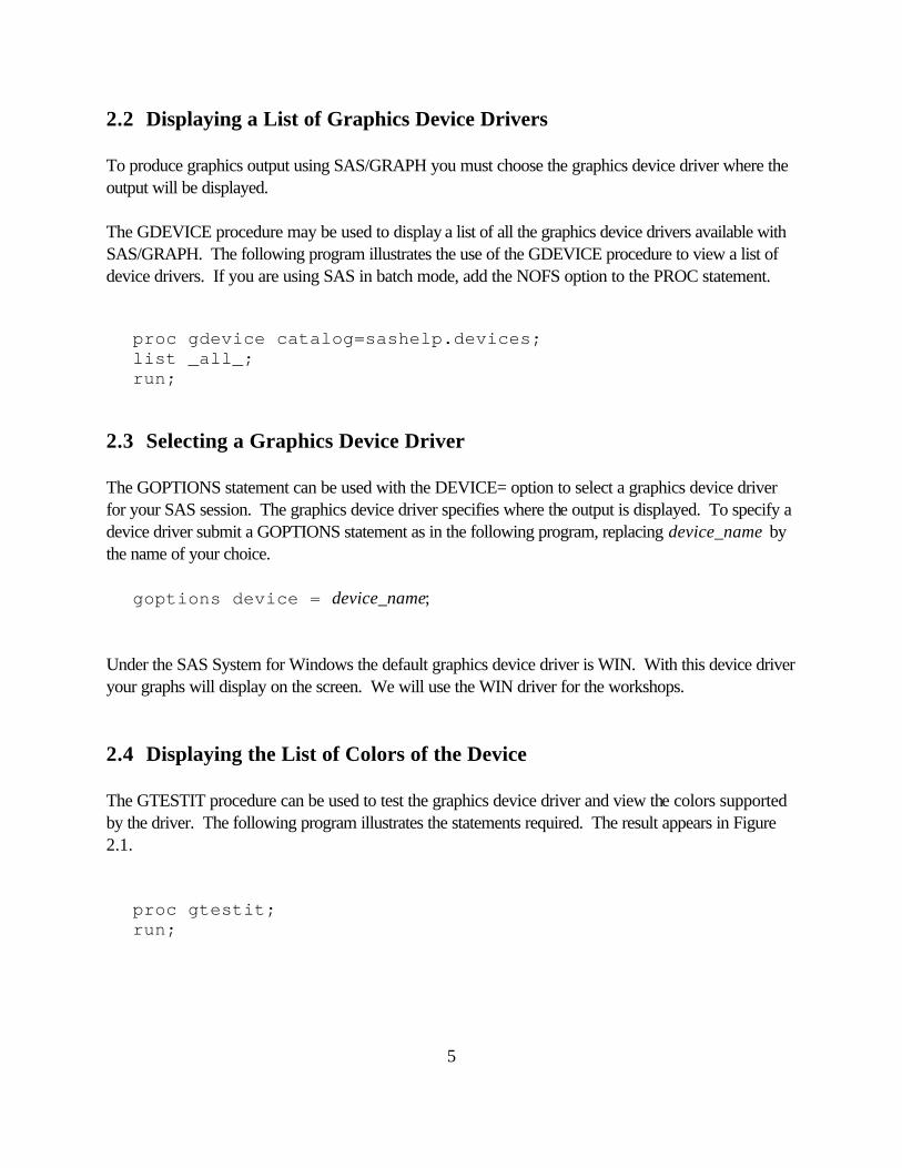
goptions device = device_name; Under the SAS System for Windows the default graphics device driver is WIN. With this device driver your graphs will display on the screen. We will use the WIN driver for the workshops. 2.4 Displaying the List of Colors of the Device The GTESTIT procedure can be used to test the graphics device driver and view the colors supported by the driver. The following program illustrates the statements required. The result appears in Figure 2.1.
proc gtestit; run;
6
Figure 2.1
D=CGMMWWC B=1200 R= 48 C= 72 P=256H=527 W=455 MAX= 0 D=0000000000000000RF=8000800000000000 S=7000000000000000OPTS=F512304020000000 NCOLORS= 7
BLACK RED GREEN BLUE CYAN MAGENTA YELLOW
F=*
LEFT
RIGHT
SASGDCGMSAMPLE
C
BOTTOM SAS/GRAPH TEST PATTERN
TOP
E S R1 L1 X1 R5 L5 X5
A C E G I K
7
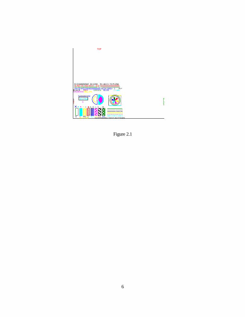
2.5 Displaying Fonts There are many fonts you can choose from in SAS/GRAPH. Some valid font names are: SWISS, CENTX, ZAPF, ITALIC, MARKER and MATH. See Chapter 6: SAS/GRAPH Fonts of the guide SAS/GRAPH Software: Reference, Version 8 for samples of all the fonts. The following figure shows the font MARKER.
Figure 2.2 To display a sample of the font characters of a specific font with the keyboard character codes used to produce the font characters, you can use the procedure GFONT as follows:
proc gfont name=font_name nobuild showroman; run;
A B C D E F G H I J K L M
N O P Q R S T U V W X Y Z a
8
3. Graphics Options 3.1 The GOPTIONS Statement Graphics options control the attributes of graphs and graphics device drivers. They can be specified with the GOPTIONS statement to change the defaults that are set by the SAS/GRAPH software. The form of the GOPTIONS statement is:
GOPTIONS options; The GOPTIONS statement can be placed anywhere in your program. The options stay in effect until you cancel or change them, i.e. the GOPTIONS statement is global. Some graphics options are listed below: BORDER frames the display
GUNIT= specifies the unit of measurement for height specifications. Valid values are CELLS (default), CM (centimeters), IN (inches) and PCT (percent of the graphics output area)
HSIZE= sets the horizontal size of the graphics output area
VSIZE= sets the vertical size of the graphics output area
ROTATE rotates the graph 90 degrees from the default orientation
CBACK= selects the background color
CTEXT= selects the color for all text
FTEXT= selects the font for all text
HTEXT= selects the height for all text
CTITLE= selects the color for titles, footnotes and notes
FTITLE= selects the font for the titles, footnotes and notes
HTITLE= selects the height for titles, footnotes and notes
CSYMBOL= selects the color for all SYMBOL statements
CPATTERN= selects the color for all PATTERN statements
DEVICE= specifies the graphics device driver to use
TARGET= previews the output as it would appear on the device specified

9
RESET= resets graphics options to the default values
10
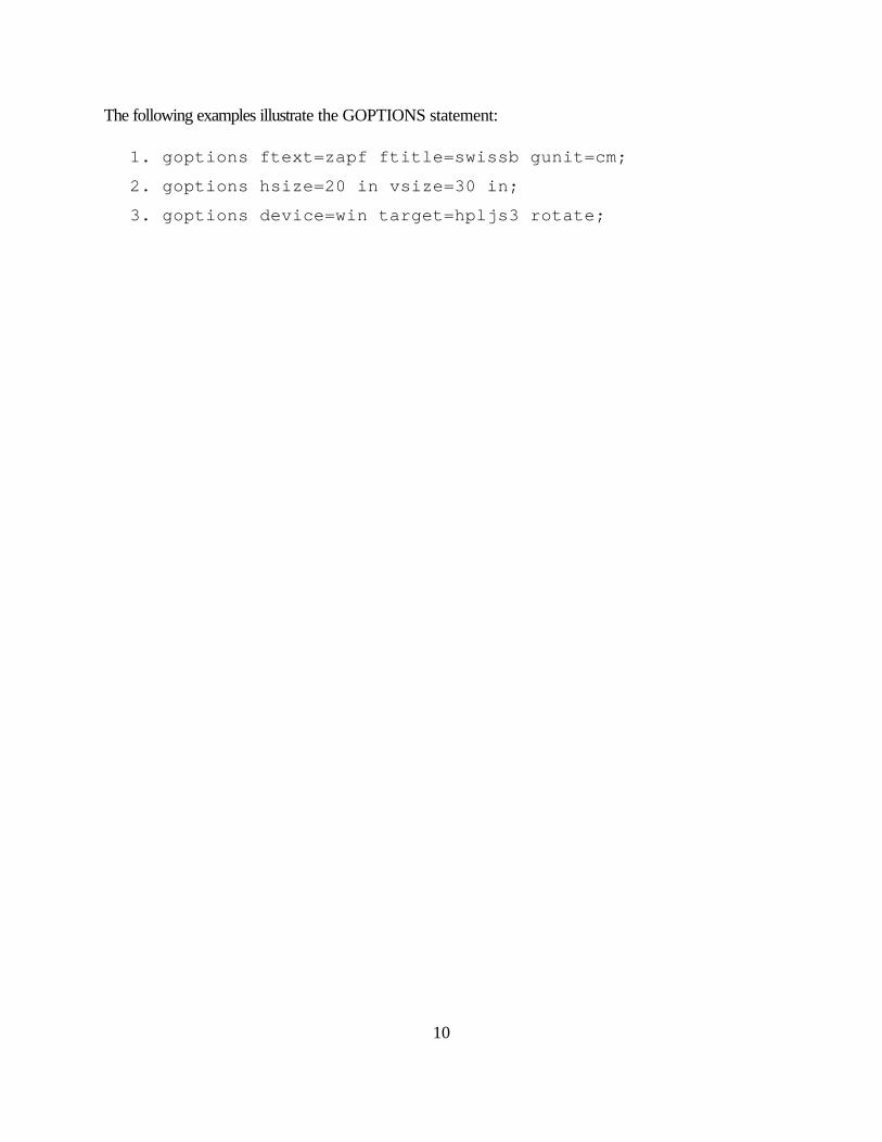
The following examples illustrate the GOPTIONS statement: 1. goptions ftext=zapf ftitle=swissb gunit=cm;
2. goptions hsize=20 in vsize=30 in;
3. goptions device=win target=hpljs3 rotate;
11
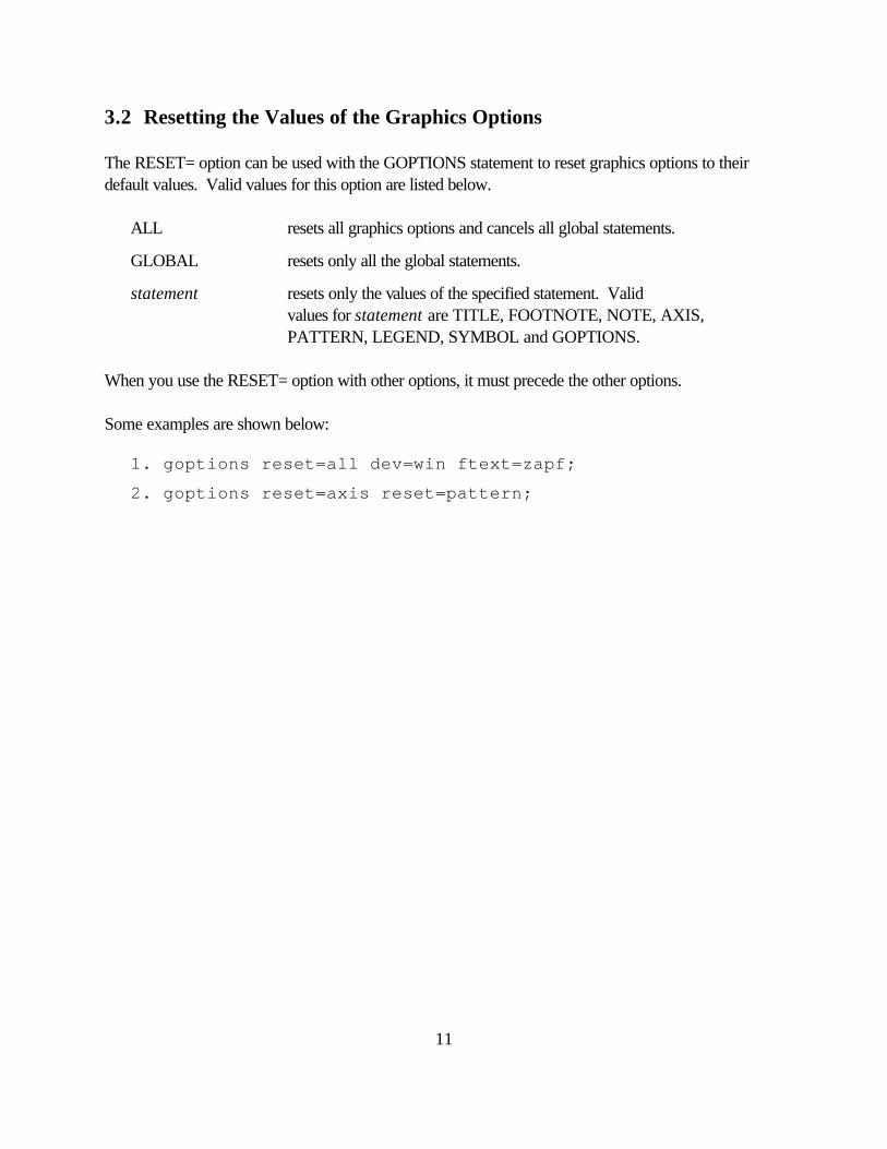
3.2 Resetting the Values of the Graphics Options The RESET= option can be used with the GOPTIONS statement to reset graphics options to their default values. Valid values for this option are listed below.
ALL resets all graphics options and cancels all global statements.
GLOBAL resets only all the global statements.
statement resets only the values of the specified statement. Valid values for statement are TITLE, FOOTNOTE, NOTE, AXIS, PATTERN, LEGEND, SYMBOL and GOPTIONS. When you use the RESET= option with other options, it must precede the other options. Some examples are shown below:
1. goptions reset=all dev=win ftext=zapf;
2. goptions reset=axis reset=pattern;
12
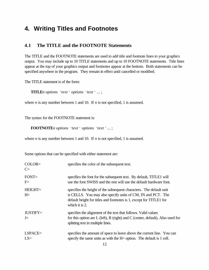
4. Writing Titles and Footnotes 4.1 The TITLE and the FOOTNOTE Statements The TITLE and the FOOTNOTE statements are used to add title and footnote lines to your graphics output. You may include up to 10 TITLE statements and up to 10 FOOTNOTE statements. Title lines appear at the top of your graphics output and footnotes appear at the bottom. Both statements can be specified anywhere in the program. They remain in effect until cancelled or modified. The TITLE statement is of the form:
TITLEn options 'text' options 'text' ... ; where n is any number between 1 and 10. If n is not specified, 1 is assumed. The syntax for the FOOTNOTE statement is:
FOOTNOTEn options 'text' options 'text' ... ; where n is any number between 1 and 10. If n is not specified, 1 is assumed. Some options that can be specified with either statement are: COLOR= specifies the color of the subsequent text. C=
FONT= specifies the font for the subsequent text. By default, TITLE1 will F= use the font SWISS and the rest will use the default hardware font.
HEIGHT= specifies the height of the subsequent characters. The default unit H= is CELLS. You may also specify units of CM, IN and PCT. The default height for titles and footnotes is 1, except for TITLE1 for which it is 2.
JUSTIFY= specifies the alignment of the text that follows. Valid values J= for this option are L (left), R (right) and C (center, default). Also used for
splitting text in multiple lines. LSPACE= specifies the amount of space to leave above the current line. You can LS= specify the same units as with the H= option. The default is 1 cell.
13
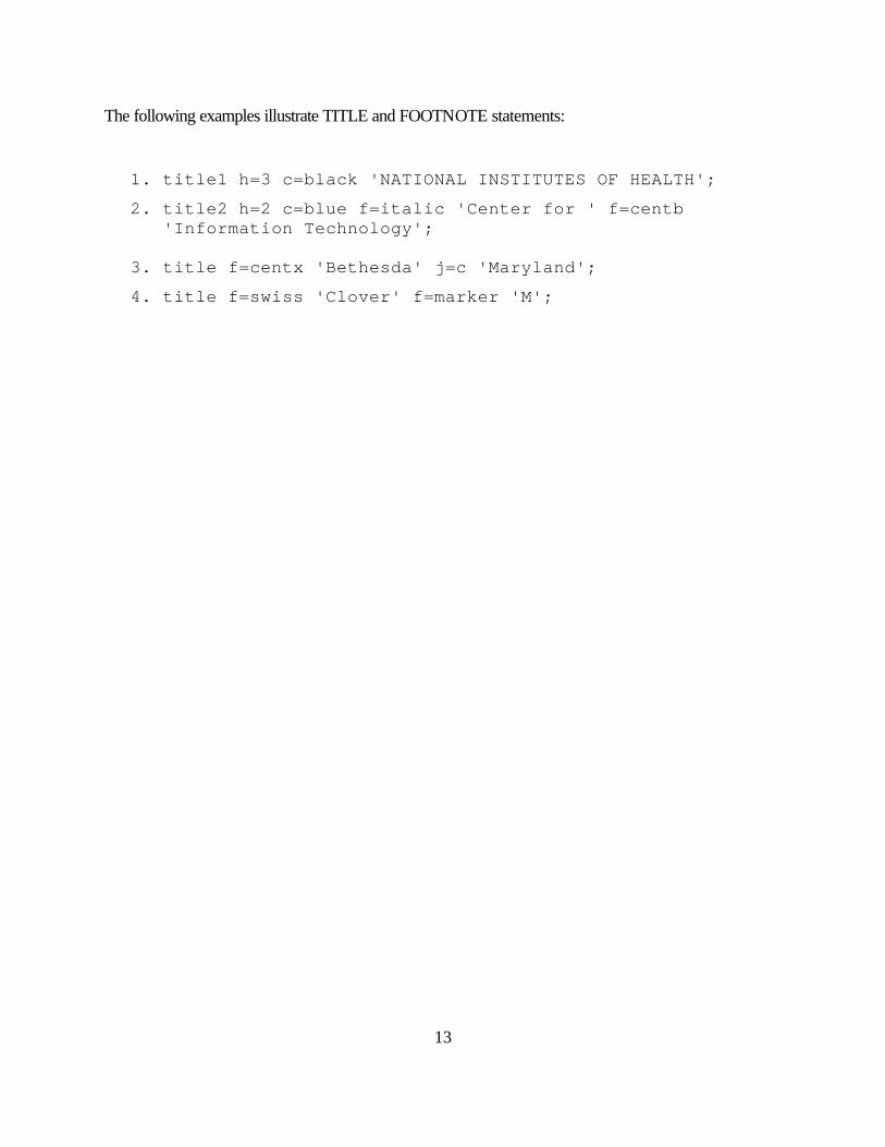
The following examples illustrate TITLE and FOOTNOTE statements:
1. title1 h=3 c=black 'NATIONAL INSTITUTES OF HEALTH';
2. title2 h=2 c=blue f=italic 'Center for ' f=centb 'Information Technology';
3. title f=centx 'Bethesda' j=c 'Maryland';
4. title f=swiss 'Clover' f=marker 'M';
14
4.2 Cancelling Title and Footnote Lines TITLE and FOOTNOTE statements stay in effect until new TITLE or FOOTNOTE statements are submitted or until you cancel them. To cancel a TITLE or FOOTNOTE statement, you can submit a TITLE or FOOTNOTE statement with no options. For example, the statement titlen; cancels the previous TITLEn statement and any titles with a higher number.
15
5. Producing Text Graphs The GSLIDE procedure is used to create text graphs. The procedure can be invoked with the statement: PROC GSLIDE; With the PROC statement you can specify TITLE and FOOTNOTE statements that include the text you want to display. Since TITLE and FOOTNOTE statements are global, they can appear before or after the PROC GSLIDE statement. The following example uses five TITLE statements and produces the result shown in Figure 5.1. goptions ftext=centx htext=2; proc gslide; title1 'CIT Training' ls=2 in; title2 'Spring 1996'; title3 f=zapfb h=3 'Producing Graphs with' ls=3 j=c 'the SAS' f=special h=2 'R' f=zapfb h=3 ' System'; title4 'March 27-29' ls=3; title5 '9 am - 4 pm'; run;
Figure 5.1
16
6. RUN-Group Processing RUN-group processing is a feature available with some procedures of the SAS System. This feature allows you to run groups of statements that end with a RUN statement without resubmitting the PROC statement. It is only used in interactive mode. Using run-group processing is more efficient than resubmitting the PROC statement. In SAS/GRAPH, this feature is available with the procedures GCHART, GMAP, GPLOT and GSLIDE. When the program below is submitted it produces a graph with the title “Hello World!” in the SWISS font (default). proc gslide; title 'Hello World!'; run; After viewing the graph you may decide to change the font to ITALIC. You only need to resubmit the TITLE statement with the F=option and the RUN statement. It is not necessary and is less efficient to resubmit the PROC GSLIDE statement. You could submit the following two statements to reproduce the graph with the font ITALIC: title f=italic 'Hello World!'; run; Using RUN-group processing saves time since the procedure does not need to be reloaded and all the statements will not have to be processed again.
17
7. Producing Bar Charts 7.1 Introduction to the GCHART Procedure The procedure GCHART can be used to produce bar charts, pie charts and donut charts. It provides many options that you can use to customize your graph. You can also use PATTERN and AXIS statements to control the pattern and the color of the bars or the slices and to enhance the appearance of the axes. You can produce charts of either character or numeric variables. When you create a bar chart for a character variable, a separate bar is drawn for each unique value. If you specify a numeric variable each bar represents a range of values. However, you can create the chart so that a separate bar is drawn for each value. We will use the following terminology in subsequent sections: midpoint variable the variable being charted
midpoint axis the horizontal axis in a vertical bar chart, or the vertical axis in a horizontal bar chart
response axis the vertical axis in a vertical bar chart, or the horizontal axis in a horizontal bar chart
To produce bar charts, pie charts and donut charts you must invoke the GCHART procedure with the PROC GCHART statement. The general syntax of the statement is: PROC GCHART options; See the SAS/GRAPH reference guides for the list of options you can use with this statement.
18
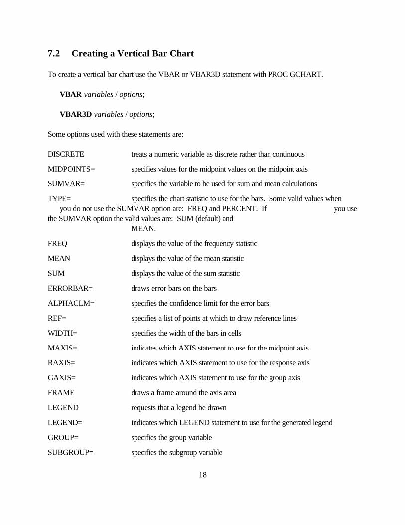
7.2 Creating a Vertical Bar Chart To create a vertical bar chart use the VBAR or VBAR3D statement with PROC GCHART.
VBAR variables / options; VBAR3D variables / options;
Some options used with these statements are: DISCRETE treats a numeric variable as discrete rather than continuous
MIDPOINTS= specifies values for the midpoint values on the midpoint axis
SUMVAR= specifies the variable to be used for sum and mean calculations
TYPE= specifies the chart statistic to use for the bars. Some valid values when you do not use the SUMVAR option are: FREQ and PERCENT. If you use the SUMVAR option the valid values are: SUM (default) and MEAN.
FREQ displays the value of the frequency statistic
MEAN displays the value of the mean statistic
SUM displays the value of the sum statistic
ERRORBAR= draws error bars on the bars
ALPHACLM= specifies the confidence limit for the error bars
REF= specifies a list of points at which to draw reference lines
WIDTH= specifies the width of the bars in cells
MAXIS= indicates which AXIS statement to use for the midpoint axis
RAXIS= indicates which AXIS statement to use for the response axis
GAXIS= indicates which AXIS statement to use for the group axis
FRAME draws a frame around the axis area
LEGEND requests that a legend be drawn
LEGEND= indicates which LEGEND statement to use for the generated legend
GROUP= specifies the group variable
SUBGROUP= specifies the subgroup variable

19
PATTERNID= specifies which variable controls the assignment of the patterns
20
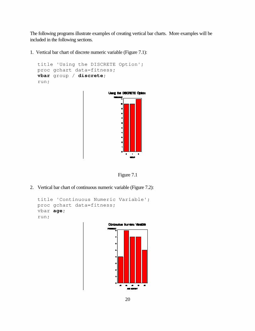
The following programs illustrate examples of creating vertical bar charts. More examples will be included in the following sections. 1. Vertical bar chart of discrete numeric variable (Figure 7.1):
title 'Using the DISCRETE Option'; proc gchart data=fitness; vbar group / discrete; run;
Figure 7.1 2. Vertical bar chart of continuous numeric variable (Figure 7.2):
title 'Continuous Numeric Variable'; proc gchart data=fitness; vbar age;
run;

21
Figure 7.2
22
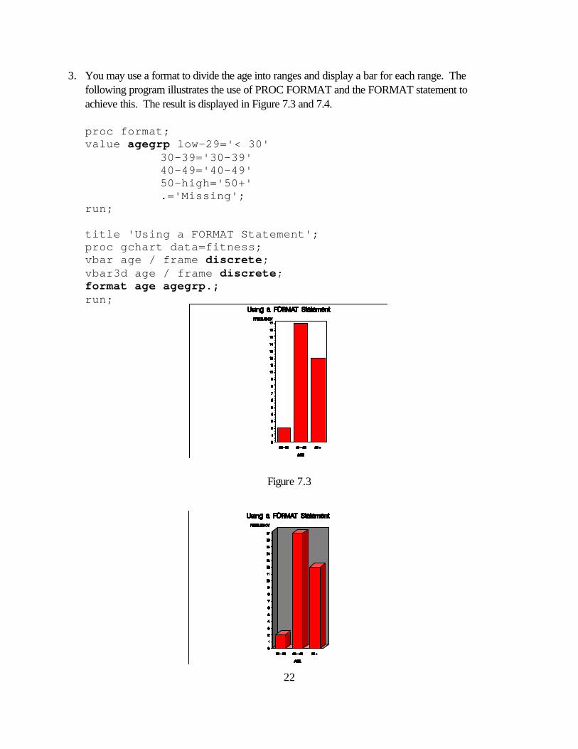
3. You may use a format to divide the age into ranges and display a bar for each range. The following program illustrates the use of PROC FORMAT and the FORMAT statement to achieve this. The result is displayed in Figure 7.3 and 7.4.
proc format; value agegrp low-29='< 30'
30-39='30-39' 40-49='40-49' 50-high='50+' .='Missing';
run;
title 'Using a FORMAT Statement'; proc gchart data=fitness; vbar age / frame discrete; vbar3d age / frame discrete; format age agegrp.;
run;
Figure 7.3

23
Figure 7.4
24
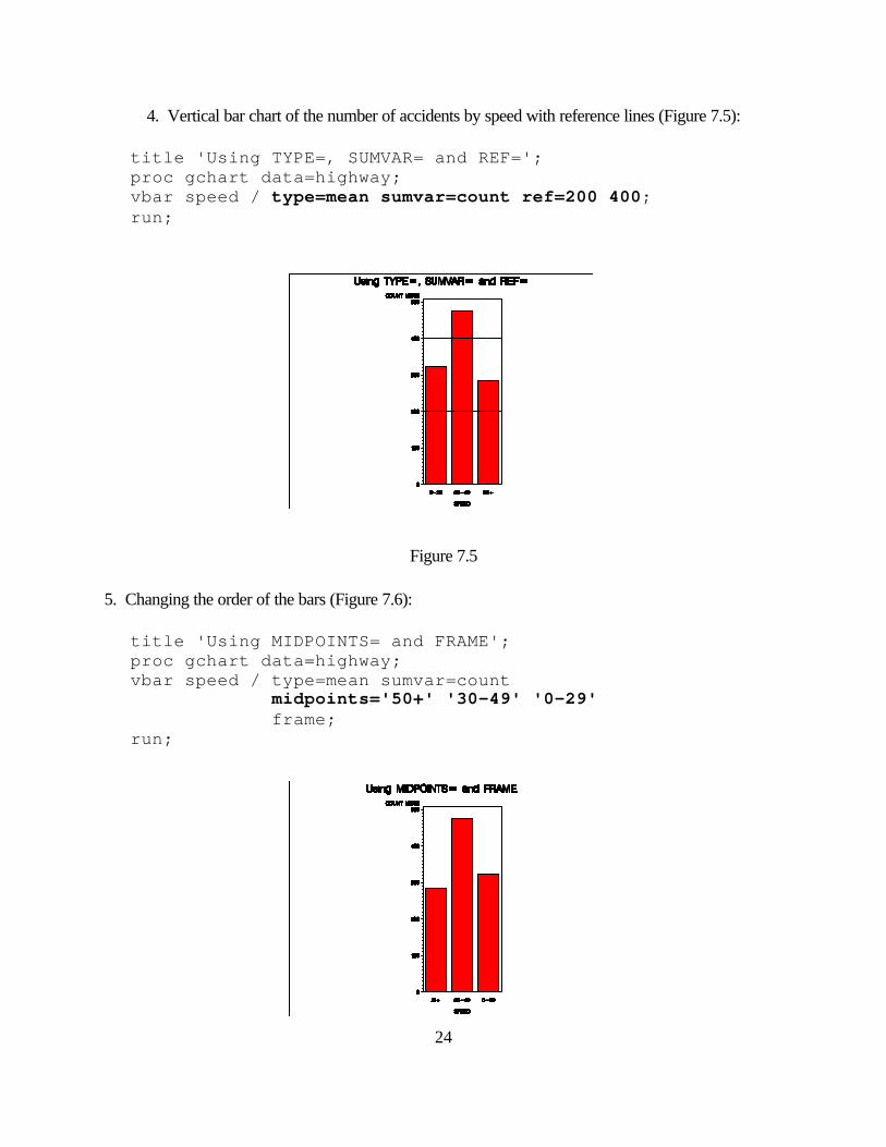
4. Vertical bar chart of the number of accidents by speed with reference lines (Figure 7.5):
title 'Using TYPE=, SUMVAR= and REF='; proc gchart data=highway; vbar speed / type=mean sumvar=count ref=200 400;
run;
Figure 7.5 5. Changing the order of the bars (Figure 7.6):
title 'Using MIDPOINTS= and FRAME'; proc gchart data=highway; vbar speed / type=mean sumvar=count midpoints='50+' '30-49' '0-29' frame; run;

25
Figure 7.6
26
7.3 Creating a Horizontal Bar Chart To create a horizontal bar chart, use the HBAR statement of PROC GCHART:
HBAR variables / options; HBAR3D variables / options;
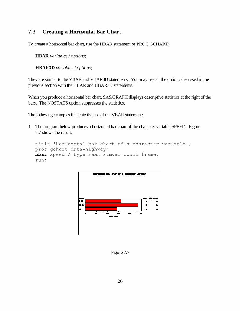
They are similar to the VBAR and VBAR3D statements. You may use all the options discussed in the previous section with the HBAR and HBAR3D statements. When you produce a horizontal bar chart, SAS/GRAPH displays descriptive statistics at the right of the bars. The NOSTATS option suppresses the statistics. The following examples illustrate the use of the VBAR statement: 1. The program below produces a horizontal bar chart of the character variable SPEED. Figure 7.7 shows the result.
title 'Horizontal bar chart of a character variable'; proc gchart data=highway; hbar speed / type=mean sumvar=count frame; run;
Figure 7.7
27
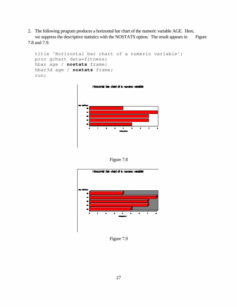
2. The following program produces a horizontal bar chart of the numeric variable AGE. Here, we suppress the descriptive statistics with the NOSTATS option. The result appears in Figure 7.8 and 7.9.
title 'Horizontal bar chart of a numeric variable'; proc gchart data=fitness; hbar age / nostats frame; hbar3d age / nostats frame; run;
Figure 7.8
Figure 7.9
28
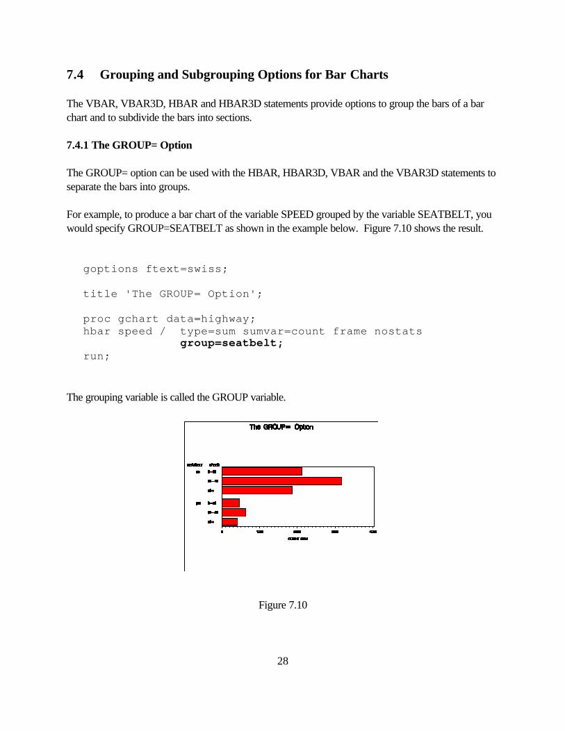
7.4 Grouping and Subgrouping Options for Bar Charts The VBAR, VBAR3D, HBAR and HBAR3D statements provide options to group the bars of a bar chart and to subdivide the bars into sections. 7.4.1 The GROUP= Option The GROUP= option can be used with the HBAR, HBAR3D, VBAR and the VBAR3D statements to separate the bars into groups. For example, to produce a bar chart of the variable SPEED grouped by the variable SEATBELT, you would specify GROUP=SEATBELT as shown in the example below. Figure 7.10 shows the result.
goptions ftext=swiss;
title 'The GROUP= Option';
proc gchart data=highway; hbar speed / type=sum sumvar=count frame nostats
group=seatbelt; run;
The grouping variable is called the GROUP variable.
Figure 7.10
29
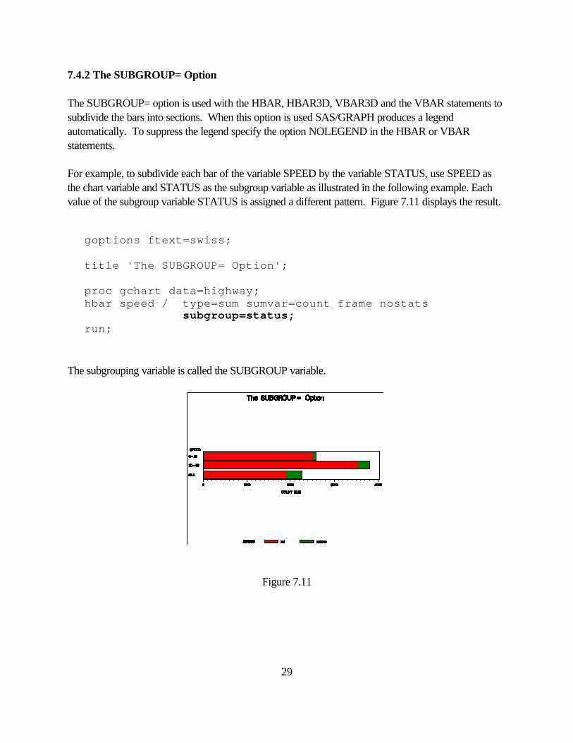
7.4.2 The SUBGROUP= Option The SUBGROUP= option is used with the HBAR, HBAR3D, VBAR3D and the VBAR statements to subdivide the bars into sections. When this option is used SAS/GRAPH produces a legend automatically. To suppress the legend specify the option NOLEGEND in the HBAR or VBAR statements. For example, to subdivide each bar of the variable SPEED by the variable STATUS, use SPEED as the chart variable and STATUS as the subgroup variable as illustrated in the following example. Each value of the subgroup variable STATUS is assigned a different pattern. Figure 7.11 displays the result.
goptions ftext=swiss;
title 'The SUBGROUP= Option';
proc gchart data=highway; hbar speed / type=sum sumvar=count frame nostats
subgroup=status; run;
The subgrouping variable is called the SUBGROUP variable.
Figure 7.11
30
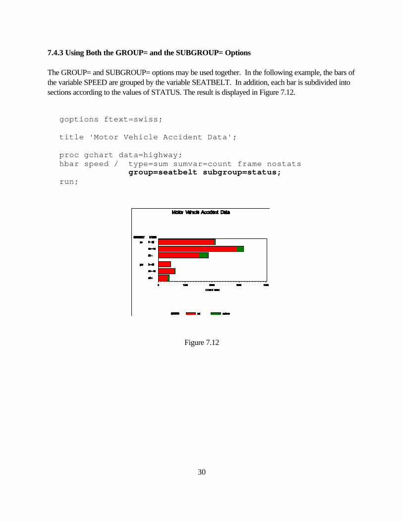
7.4.3 Using Both the GROUP= and the SUBGROUP= Options The GROUP= and SUBGROUP= options may be used together. In the following example, the bars of the variable SPEED are grouped by the variable SEATBELT. In addition, each bar is subdivided into sections according to the values of STATUS. The result is displayed in Figure 7.12.
goptions ftext=swiss;
title 'Motor Vehicle Accident Data';
proc gchart data=highway; hbar speed / type=sum sumvar=count frame nostats
group=seatbelt subgroup=status; run;
Figure 7.12
31
7.5 Enhancing a Bar Chart You can enhance the appearance of a bar chart by using TITLE, FOOTNOTE, PATTERN and AXIS statements. 7.5.1 The PATTERN Statement The PATTERN statement defines patterns and colors for the bars. It is of the form:
PATTERNn COLOR=color VALUE=pattern REPEAT=m ; where n can be any number from 1 to 99. If n is not specified, 1 is assumed. The COLOR= option specifies a valid color of the device. It may be abbreviated as C= . If neither the COLOR= option nor the CPATTERN graphics option are used, the PATTERN statement cycles through each color in the device’s colors list before the next PATTERN statement is used. The VALUE= option specifies the pattern to use for the bars. It can be abbreviated as V= . Some valid values for bar charts are:
EMPTY requests an empty pattern (abbreviated as E)
SOLID requests a solid pattern (abbreviated as S)
Xn draws crosshatched lines of density n, n=1,2,3,4,5
Ln draws left-slanting lines of density n , n=1,2,3,4,5
Rn draws right-slanting lines of density n, n=1,2,3,4,5
The REPEAT= option specifies the number of times a PATTERN is applied before using the next PATTERN statement. PATTERN statements are assigned to the values of the chart variable in alphabetical or numerical order of the values. PATTERN statements stay in effect until you reset them with a GOPTIONS statement or until you specify new patterns or cancel them with a PATTERN statement with no options.
32
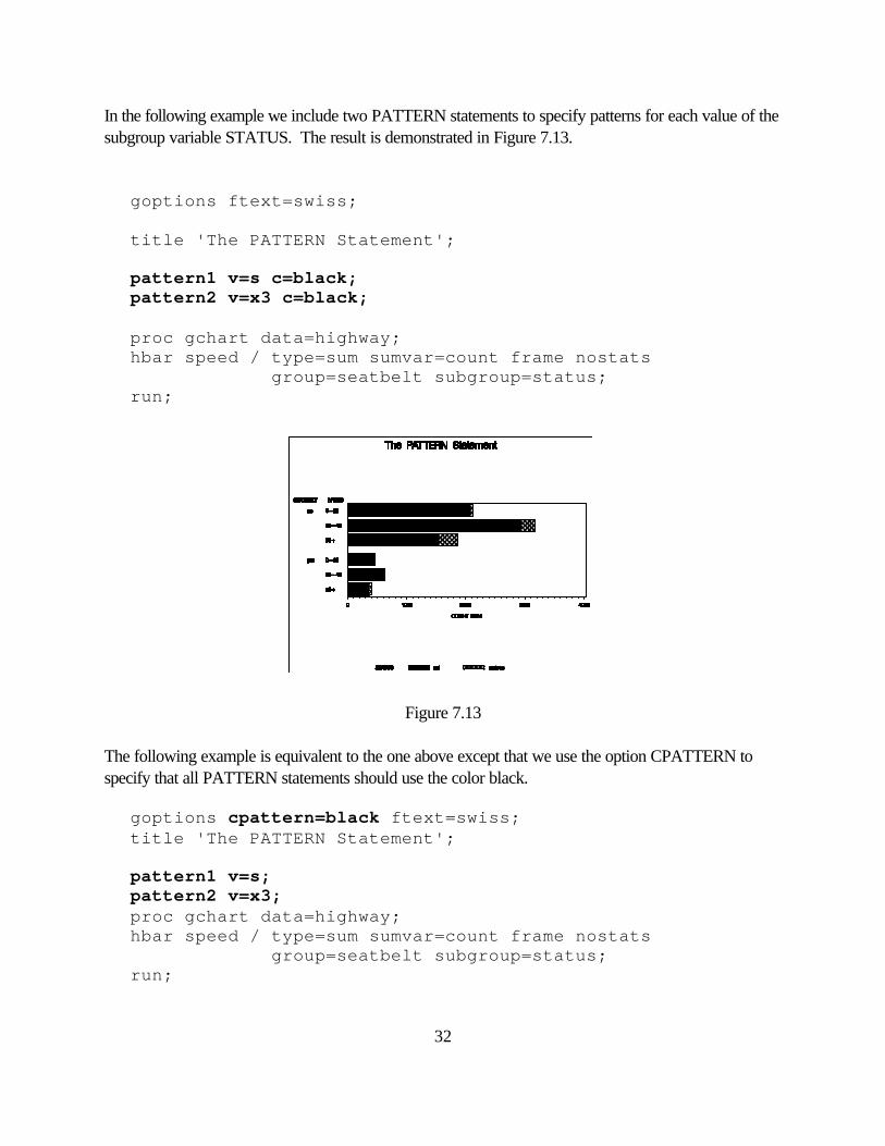
In the following example we include two PATTERN statements to specify patterns for each value of the subgroup variable STATUS. The result is demonstrated in Figure 7.13. goptions ftext=swiss; title 'The PATTERN Statement'; pattern1 v=s c=black; pattern2 v=x3 c=black; proc gchart data=highway; hbar speed / type=sum sumvar=count frame nostats group=seatbelt subgroup=status; run;
Figure 7.13 The following example is equivalent to the one above except that we use the option CPATTERN to specify that all PATTERN statements should use the color black. goptions cpattern=black ftext=swiss; title 'The PATTERN Statement'; pattern1 v=s; pattern2 v=x3; proc gchart data=highway; hbar speed / type=sum sumvar=count frame nostats group=seatbelt subgroup=status; run;
33
7.5.2 The AXIS Statement The AXIS statement is used to control the appearance of the axes. It is of the form:
AXISn options; n can be any integer from 1 to 99. If n is not specified, 1 is assumed. AXIS statements stay in effect until you reset them with a GOPTIONS statement or until you specify new axis options or cancel them with an AXIS statement with no options. Some of the options you can specify are: LABEL=(text_description) or NONE
defines the appearance of the text of an axis label. Using NONE suppresses the label on the axis. See text_description later in this section.
VALUE=(text_description) or NONE
defines the appearance of the text of the major tick marks. Specify NONE to suppress the text. See text_description later in this section. ORDER=(data_values)
specifies the data values in the order they should appear on the axis. The list can specify explicit values separated by blanks or commas, or a starting and ending value with an increment. For example,
order=(0 to 80 by 20) order=(0 10 20 40) order=('15JAN94'D '15FEB94'D '15MAR94'D) order=('M' 'F')
LOGBASE=base or E or PI requests a logarithmic axis with a base of base, E (exponential) or PI (π). The value of base must be greater than 1. LOGSTYLE=EXPAND or POWER specifies if the values on the axis represent the values of the base or the values of the power LENGTH=
specifies the length of the axis in number of units. Valid values for the units are: CELLS, CM, IN and PCT. The default unit is CELLS.
34
STYLE= specifies the line type. Valid values are 0 through 46. Specifying a value of 0 eliminates the axis line. WIDTH=
specifies the thickness of the axis line. The default is 1. COLOR= specifies the color of the axis line. MAJOR=(tick_mark_description) or NONE
defines the appearance of the major tick marks. Specify NONE so that no major tick marks appear. See tick_mark_description later in this section. MINOR=(tick_mark_description) or NONE
defines the appearance of the minor tick marks. Specify NONE so that no minor tick marks appear. See tick_mark_description later in this section. NOBRACKETS eliminates the brackets from the group axis. OFFSET=(x y) units x specifies the space to leave between the origin and the first major tick mark and y specifies how much space to leave between the last tick mark and the end of the axis. You can specify units of: CELLS, CM, IN and PCT. The default unit is CELLS.
35
text_description Text parameters are used with the LABEL= and VALUE= options. They are specified in parentheses and are separated by blanks. Some parameters are: COLOR= specifies the color for the text C=
FONT= specifies the font for the text F=
HEIGHT= specifies the height for the text H=
ANGLE= specifies the degrees at which the baseline of the text is rotated A= with respect to the horizontal. A positive value moves it counterclockwise. A negative value moves it clockwise. ROTATE= specifies the degrees at which each character is rotated with R= respect to the baseline of the text string JUSTIFY= specifies the alignment of the text. It can be set to LEFT, CENTER or J= RIGHT. In addition to the parameters listed above, you can use the TICK= parameter with the VALUE= option to specify the tick mark value you want to change. For example, to display the text “Drug B” in red for the second tick mark, use the following option in the AXIS statement:
value=(tick=2 color=red 'Drug B') With the JUSTIFY= option you can produce text strings that contain multiple lines by repeating the option for each line. For example, to display the text “Not Serious” under bar number 1, with the word “Serious” centered under the word “Not” you could use the following option in the AXIS statement: value=(tick=1 'Not' j=c 'Serious')
36
tick_mark_description Tick mark parameters are used with the MAJOR= and the MINOR= options. They affect the appearance of the tick marks. Specify them in parenthesis and separate them with blanks. Some of the parameters you can specify are: COLOR= specifies the color for the tick mark C= HEIGHT= specifies the height of the tick mark. The default height is 0.5 H= cells for the major tick marks and 0.25 cells for the minor tick marks. You may specify units of CELLS, CM, IN or PCT. NUMBER= specifies the number of tick marks to draw N= WIDTH= specifies the thickness of the tick mark. The default is 1. W=
37
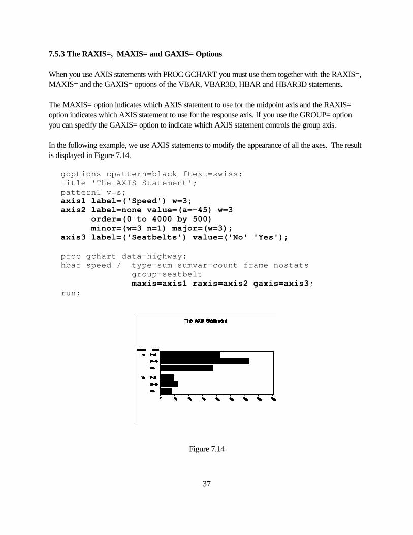
7.5.3 The RAXIS=, MAXIS= and GAXIS= Options When you use AXIS statements with PROC GCHART you must use them together with the RAXIS=, MAXIS= and the GAXIS= options of the VBAR, VBAR3D, HBAR and HBAR3D statements. The MAXIS= option indicates which AXIS statement to use for the midpoint axis and the RAXIS= option indicates which AXIS statement to use for the response axis. If you use the GROUP= option you can specify the GAXIS= option to indicate which AXIS statement controls the group axis. In the following example, we use AXIS statements to modify the appearance of all the axes. The result is displayed in Figure 7.14.
goptions cpattern=black ftext=swiss; title 'The AXIS Statement'; pattern1 v=s; axis1 label=('Speed') w=3; axis2 label=none value=(a=-45) w=3 order=(0 to 4000 by 500) minor=(w=3 n=1) major=(w=3); axis3 label=('Seatbelts') value=('No' 'Yes'); proc gchart data=highway; hbar speed / type=sum sumvar=count frame nostats
group=seatbelt maxis=axis1 raxis=axis2 gaxis=axis3;
run;
Figure 7.14
38
7.5.4 The PATTERNID= Option The PATTERNID= option can be used with the HBAR, HBAR3D, VBAR and the VBAR3D statements to select which variable controls the assignment of PATTERN statements to the bars. By default, a different pattern is used when the subgroup variable value changes. If you do not use the SUBGROUP= option, each bar will be drawn using the same pattern. Valid values of the PATTERNID= option are: BY, MIDPOINT, GROUP and SUBGROUP. The pattern changes as explained below:
MIDPOINT when the midpoint variable changes GROUP when the group variable changes SUBGROUP when the subgroup variable changes BY when the BY variable changes if you use a BY statement
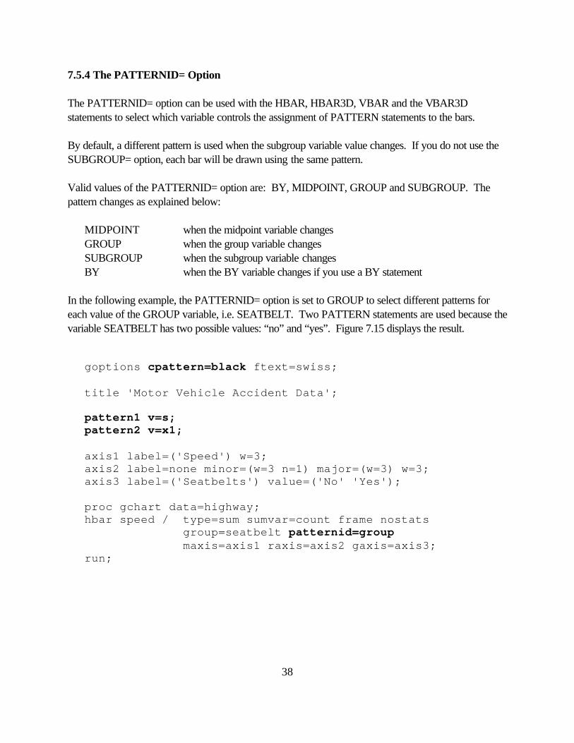
In the following example, the PATTERNID= option is set to GROUP to select different patterns for each value of the GROUP variable, i.e. SEATBELT. Two PATTERN statements are used because the variable SEATBELT has two possible values: “no” and “yes”. Figure 7.15 displays the result.
goptions cpattern=black ftext=swiss;
title 'Motor Vehicle Accident Data';
pattern1 v=s; pattern2 v=x1; axis1 label=('Speed') w=3; axis2 label=none minor=(w=3 n=1) major=(w=3) w=3; axis3 label=('Seatbelts') value=('No' 'Yes'); proc gchart data=highway; hbar speed / type=sum sumvar=count frame nostats
group=seatbelt patternid=group maxis=axis1 raxis=axis2 gaxis=axis3;
run;
39
Figure 7.15
40
7.5.5 The LEGEND Statement and the LEGEND= Option SAS/GRAPH automatically produces a legend when the SUBGROUP= option is used in the HBAR, HBAR3D, VBAR or the VBAR3D statement. However, if you would like to make any modifications to the default attributes of the legend it is necessary to use both a LEGEND statement and the LEGEND= option. The NOLEGEND option suppresses the legend. The general form of the LEGEND statement is:
LEGENDn options; n can be any integer from 1 to 99. If n is not specified, 1 is assumed. LEGEND statements stay in effect until you reset them with a GOPTIONS statement or until you specify a new legend or cancel it with a LEGEND statement with no options. Some of the options you can specify are:
LABEL= (text_description) or NONE
VALUE= (text_description) or NONE
ACROSS=n where n is the number of entries in each row of the legend
POSITION=(y x z) where y is either BOTTOM, MIDDLE or TOP, x is either LEFT, CENTER or RIGHT, and, z is either OUTSIDE or INSIDE
FRAME draws a frame around the legend
CFRAME specifies a color for the legend’s background
CBORDER specifies a color for the legend’s border
CSHADOW draws and colors a shadow behind the legend
CBLOCK draws and colors a block behind the legend
The text_description parameters are described in section 7.5.2. For the LABEL= option you can also use the POSITION= parameter. This parameter specifies the placement of the legend’s label with respect to the entries. The syntax of this parameter is: POSITION=(y x)
41
where y is BOTTOM, MIDDLE or TOP, and x is LEFT, CENTER or RIGHT. The default value is LEFT. For example, to display the string “Condition of Driver” in two lines centered above the legend, specify the following option in the LEGEND statement: label=(position=top 'Condition' j=c 'of Driver') In the following example, we modify the legend generated in the last example. The result is displayed in Figure 7.16.
goptions cpattern=black ftext=swiss;
title 'The LEGEND Statement';
pattern1 v=s; pattern2 v=x1; axis1 label=('Speed') w=3; axis2 label=none minor=(w=3 n=1) major=(w=3) w=3; axis3 label=('Seatbelts') value=('No' 'Yes');
legend1 label=(position=top 'Driver Status') value=('Not Serious' 'Serious') position=(bottom right inside) across=1;
proc gchart data=highway; hbar speed / type=sum sumvar=count frame nostats
group=seatbelt subgroup=status maxis=axis1 raxis=axis2 gaxis=axis3 legend=legend1;
run;
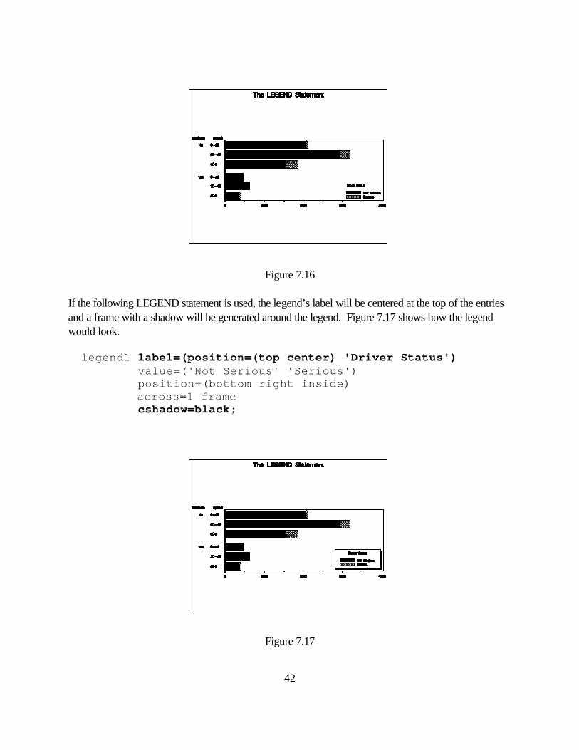
42
Figure 7.16 If the following LEGEND statement is used, the legend’s label will be centered at the top of the entries and a frame with a shadow will be generated around the legend. Figure 7.17 shows how the legend would look. legend1 label=(position=(top center) 'Driver Status') value=('Not Serious' 'Serious') position=(bottom right inside) across=1 frame cshadow=black;
Figure 7.17
43
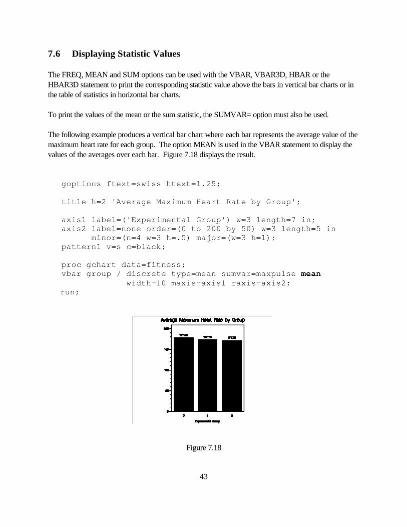
7.6 Displaying Statistic Values The FREQ, MEAN and SUM options can be used with the VBAR, VBAR3D, HBAR or the HBAR3D statement to print the corresponding statistic value above the bars in vertical bar charts or in the table of statistics in horizontal bar charts. To print the values of the mean or the sum statistic, the SUMVAR= option must also be used. The following example produces a vertical bar chart where each bar represents the average value of the maximum heart rate for each group. The option MEAN is used in the VBAR statement to display the values of the averages over each bar. Figure 7.18 displays the result. goptions ftext=swiss htext=1.25; title h=2 'Average Maximum Heart Rate by Group'; axis1 label=('Experimental Group') w=3 length=7 in; axis2 label=none order=(0 to 200 by 50) w=3 length=5 in minor=(n=4 w=3 h=.5) major=(w=3 h=1); pattern1 v=s c=black; proc gchart data=fitness; vbar group / discrete type=mean sumvar=maxpulse mean width=10 maxis=axis1 raxis=axis2; run;
Figure 7.18
44
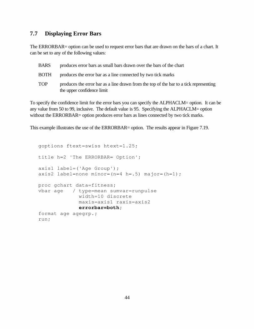
7.7 Displaying Error Bars The ERRORBAR= option can be used to request error bars that are drawn on the bars of a chart. It can be set to any of the following values: BARS produces error bars as small bars drawn over the bars of the chart
BOTH produces the error bar as a line connected by two tick marks
TOP produces the error bar as a line drawn from the top of the bar to a tick representing the upper confidence limit To specify the confidence limit for the error bars you can specify the ALPHACLM= option. It can be any value from 50 to 99, inclusive. The default value is 95. Specifying the ALPHACLM= option without the ERRORBAR= option produces error bars as lines connected by two tick marks. This example illustrates the use of the ERRORBAR= option. The results appear in Figure 7.19. goptions ftext=swiss htext=1.25; title h=2 'The ERRORBAR= Option'; axis1 label=('Age Group'); axis2 label=none minor=(n=4 h=.5) major=(h=1); proc gchart data=fitness; vbar age / type=mean sumvar=runpulse width=10 discrete maxis=axis1 raxis=axis2 errorbar=both; format age agegrp.; run;
45
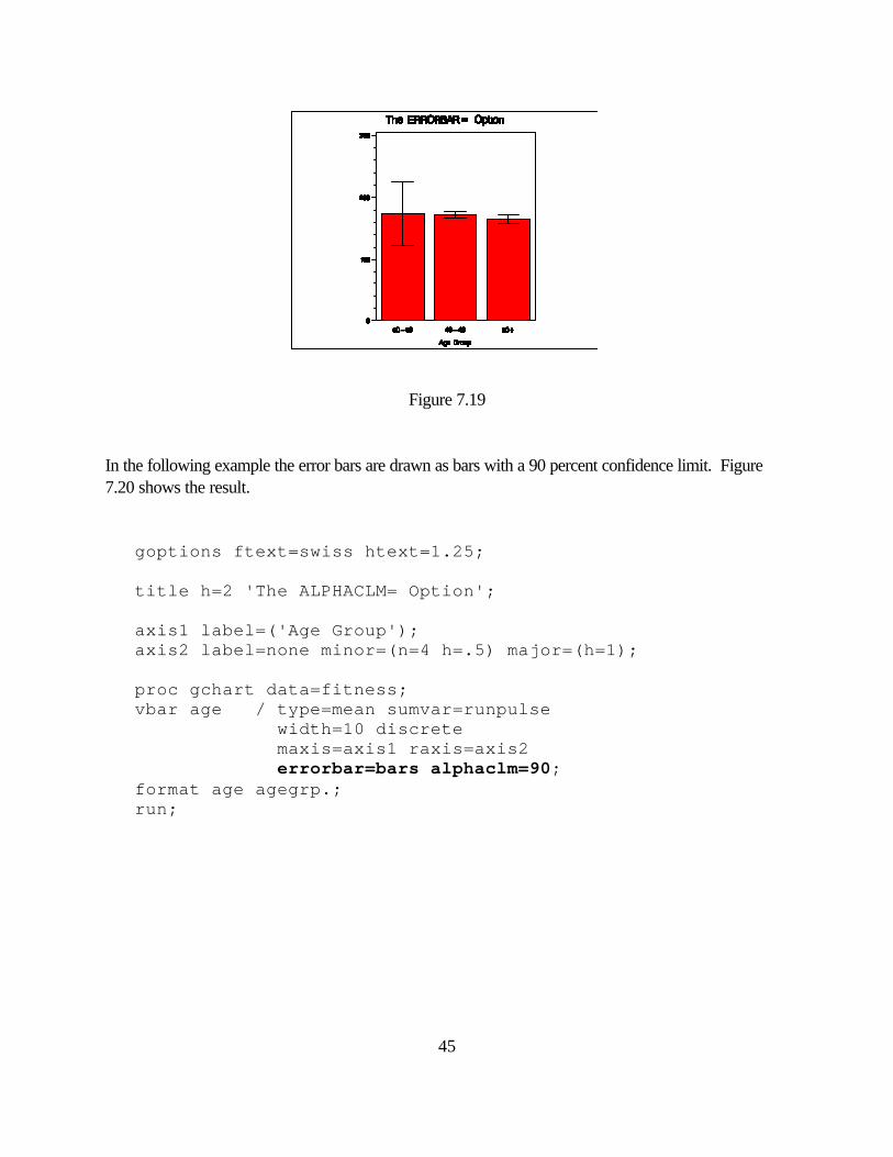
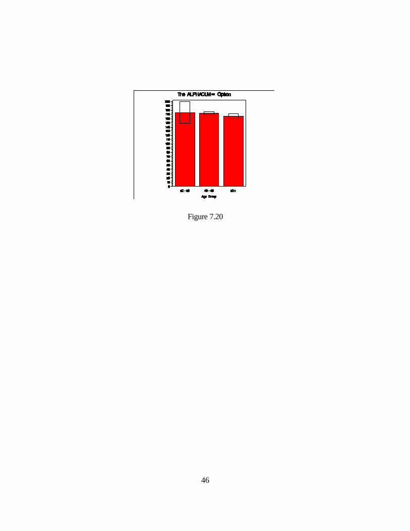
Figure 7.19 In the following example the error bars are drawn as bars with a 90 percent confidence limit. Figure 7.20 shows the result. goptions ftext=swiss htext=1.25; title h=2 'The ALPHACLM= Option'; axis1 label=('Age Group'); axis2 label=none minor=(n=4 h=.5) major=(h=1); proc gchart data=fitness; vbar age / type=mean sumvar=runpulse width=10 discrete maxis=axis1 raxis=axis2 errorbar=bars alphaclm=90; format age agegrp.; run;
46
Figure 7.20
47
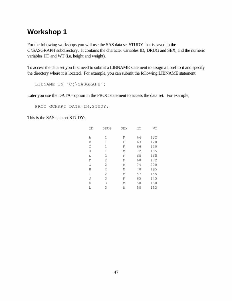
Workshop 1 For the following workshops you will use the SAS data set STUDY that is saved in the C:\SASGRAPH subdirectory. It contains the character variables ID, DRUG and SEX, and the numeric variables HT and WT (i.e. height and weight). To access the data set you first need to submit a LIBNAME statement to assign a libref to it and specify the directory where it is located. For example, you can submit the following LIBNAME statement: LIBNAME IN 'C:\SASGRAPH'; Later you use the DATA= option in the PROC statement to access the data set. For example, PROC GCHART DATA=IN.STUDY; This is the SAS data set STUDY: ID DRUG SEX HT WT A 1 F 64 132 B 1 F 63 120 C 1 F 66 130 D 1 M 72 135 E 2 F 68 165 F 2 F 60 172 G 2 M 74 200 H 2 M 70 195 I 2 M 57 155 J 3 F 65 145 K 3 M 58 150 L 3 M 58 153
48
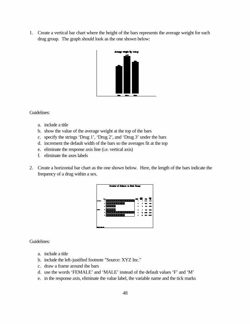
1. Create a vertical bar chart where the height of the bars represents the average weight for each drug group. The graph should look as the one shown below: Guidelines: a. include a title b. show the value of the average weight at the top of the bars c. specify the strings ‘Drug 1’, ‘Drug 2’, and ‘Drug 3’ under the bars d. increment the default width of the bars so the averages fit at the top e. eliminate the response axis line (i.e. vertical axis) f. eliminate the axes labels 2. Create a horizontal bar chart as the one shown below. Here, the length of the bars indicate the
frequency of a drug within a sex. Guidelines: a. include a title b. include the left-justified footnote "Source: XYZ Inc." c. draw a frame around the bars d. use the words ‘FEMALE’ and ‘MALE’ instead of the default values ‘F’ and ‘M’ e. in the response axis, eliminate the value label, the variable name and the tick marks
49
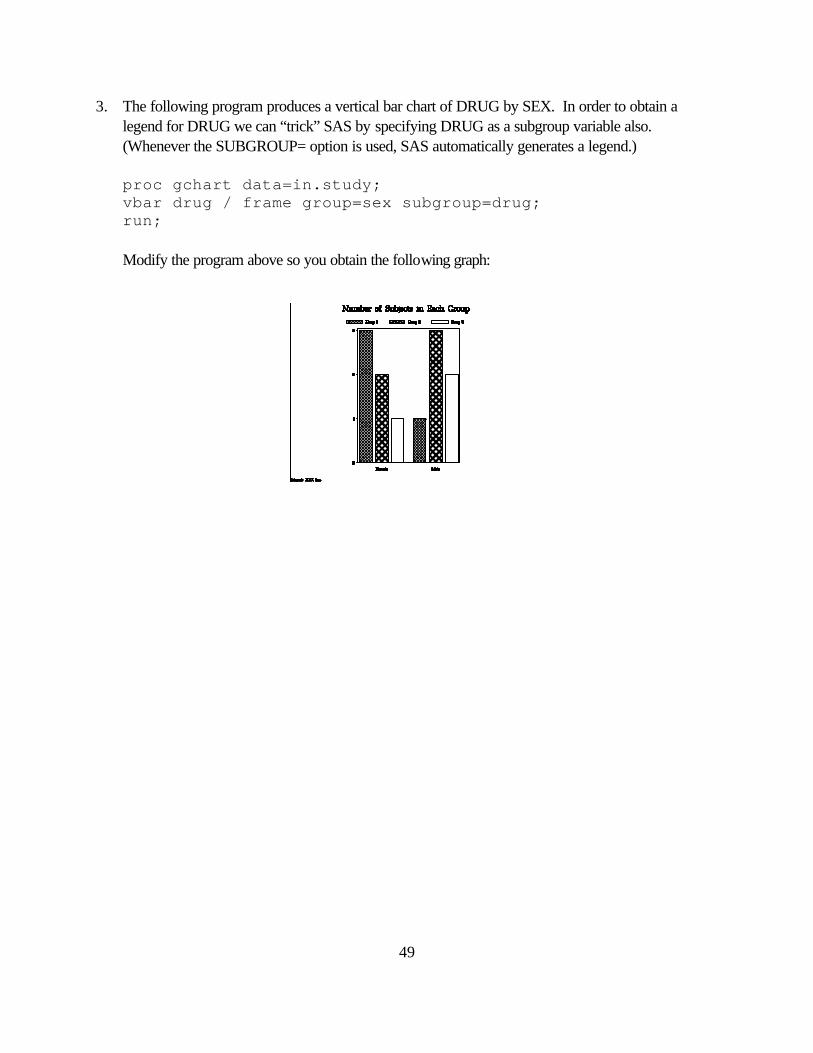
3. The following program produces a vertical bar chart of DRUG by SEX. In order to obtain a legend for DRUG we can “trick” SAS by specifying DRUG as a subgroup variable also. (Whenever the SUBGROUP= option is used, SAS automatically generates a legend.) proc gchart data=in.study; vbar drug / frame group=sex subgroup=drug; run; Modify the program above so you obtain the following graph:
50
8. Producing Two-Dimensional Plots 8.1 Introduction to the GPLOT Procedure With the procedure GPLOT you can create two-dimensional plots where one variable is plotted against another. There are different types of graphs that you can produce with this procedure, some of them are: • scatter plots • join plots • multiple plots • high-low plots • box and whisker plots • step plots • needle plots • and, regression curves and confidence intervals. The type of graph generated is determined by the SYMBOL statement and the PLOT statement. This chapter will explain how to create these kinds of plots with these statements. To produce a plot you first invoke the procedure with the PROC GPLOT statement: PROC GPLOT options; See the SAS/GRAPH reference guide for a list of options you can specify with this statement.
51
8.2 The PLOT Statement The PLOT statement is used to specify the variables you want to display in your plot. The general form of this statement is: PLOT y*x=z / options; Here, y is the variable displayed on the vertical axis, x is the variable displayed on the horizontal axis and z an optional grouping variable. Several plots can be requested with one PLOT statement by separating your requests with blanks: PLOT y1*x1 y2*x2 ... yn*xn / options; If the horizontal variable is the same you can use the following syntax: PLOT (y1 y2 ...yn)*x / options; Some valid options that can be specified in the PLOT statement are: AREAS= indicates the areas under the curves to fill with patterns
LEGEND= indicates which LEGEND statement to use
NOLEGEND suppresses the legend
HREF= specifies a list of points at which to draw vertical reference lines
VREF= specifies a list of points at which to draw horizontal reference lines
AUTOHREF draws reference lines at each major tick mark of the horizontal axis
AUTOVREF draws reference lines at each major tick mark of the vertical axis
GRID same as specifying both AUTOHREF and AUTOVREF
HAXIS= indicates which AXIS statement to use with the horizontal axis
VAXIS= indicates which AXIS statement to use with the vertical axis
FRAME draws a frame around the axis area
OVERLAY overlays the plots requested with the PLOT statement
52
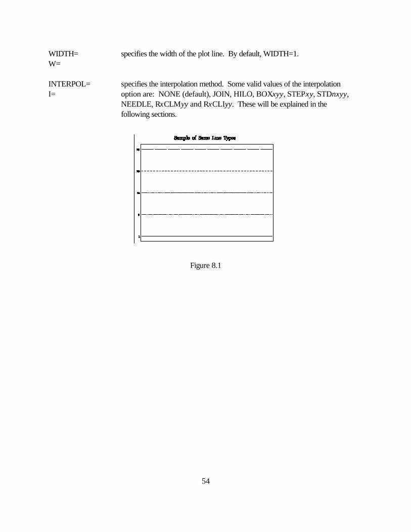
8.3 The SYMBOL Statement The SYMBOL statement is used with the GPLOT procedure to control the type and appearance of the plot lines. With the SYMBOL statement you can specify an interpolation method, a line type, a plotting symbol and the color to use for the plot. If no SYMBOL statement is used, SAS/GRAPH does not connect the points. The SYMBOL statement can be placed before or after the PROC GPLOT statement and remains in effect until you specify new options or cancel it with a SYMBOL statement with no options. For a multiple line graph you need to specify a SYMBOL statement for each line drawn. The syntax of the SYMBOL statement is: SYMBOLn options; where n can be any integer from 1 to 99. If n is not specified, 1 is assumed. Some valid options of the SYMBOL statement are: COLOR= specifies the color to use for the plot line, the plotting characters and the C= confidence limits. If this option is omitted SAS/GRAPH will use the first color of the colors list and cycle through the colors of the device’s colors list. REPEAT= specifies how many times to use the SYMBOL statement R= CV= specifies the color for the plotting symbols FONT= specifies the font for the plotting symbols F= HEIGHT= specifies the height of the plotting symbols. You may specify units of H= CELLS, CM, IN or PCT. The default unit is CELLS. LINE= specifies the line type to use. It can be any value from 1 to 46, inclusive. L= By default, LINE=1. Figure 8.1 shows some of the available line types. VALUE= specifies the plotting symbol to use. By default, SAS/GRAPH uses the V= plus sign. Some valid values are the keywords: DOT, CIRCLE, SQUARE and STAR. You can also specify a string in quotes together with the F=

53
option.
54
WIDTH= specifies the width of the plot line. By default, WIDTH=1. W= INTERPOL= specifies the interpolation method. Some valid values of the interpolation I= option are: NONE (default), JOIN, HILO, BOXxyy, STEPxy, STDnxyy, NEEDLE, RxCLMyy and RxCLIyy. These will be explained in the following sections.
Figure 8.1
55
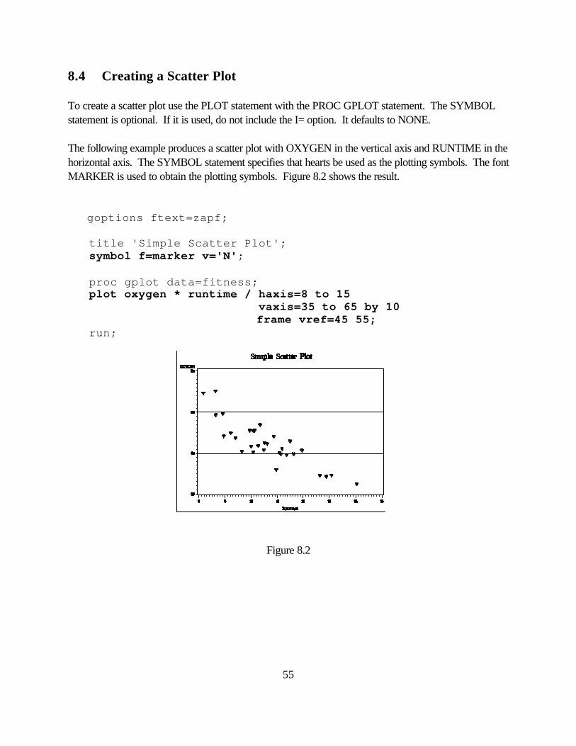
8.4 Creating a Scatter Plot To create a scatter plot use the PLOT statement with the PROC GPLOT statement. The SYMBOL statement is optional. If it is used, do not include the I= option. It defaults to NONE. The following example produces a scatter plot with OXYGEN in the vertical axis and RUNTIME in the horizontal axis. The SYMBOL statement specifies that hearts be used as the plotting symbols. The font MARKER is used to obtain the plotting symbols. Figure 8.2 shows the result. goptions ftext=zapf; title 'Simple Scatter Plot'; symbol f=marker v='N'; proc gplot data=fitness; plot oxygen * runtime / haxis=8 to 15 vaxis=35 to 65 by 10 frame vref=45 55; run;
Figure 8.2
56
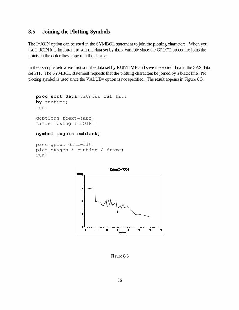
8.5 Joining the Plotting Symbols The I=JOIN option can be used in the SYMBOL statement to join the plotting characters. When you use I=JOIN it is important to sort the data set by the x variable since the GPLOT procedure joins the points in the order they appear in the data set. In the example below we first sort the data set by RUNTIME and save the sorted data in the SAS data set FIT. The SYMBOL statement requests that the plotting characters be joined by a black line. No plotting symbol is used since the VALUE= option is not specified. The result appears in Figure 8.3. proc sort data=fitness out=fit; by runtime; run; goptions ftext=zapf; title 'Using I=JOIN'; symbol i=join c=black; proc gplot data=fit; plot oxygen * runtime / frame; run;
Figure 8.3
57
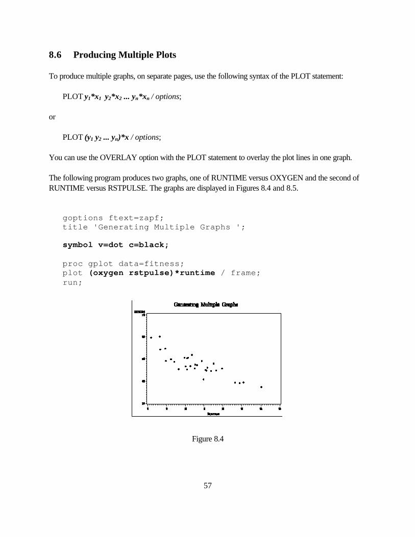
8.6 Producing Multiple Plots To produce multiple graphs, on separate pages, use the following syntax of the PLOT statement: PLOT y1*x1 y2*x2 ... yn*xn / options; or PLOT (y1 y2 ... yn)*x / options; You can use the OVERLAY option with the PLOT statement to overlay the plot lines in one graph. The following program produces two graphs, one of RUNTIME versus OXYGEN and the second of RUNTIME versus RSTPULSE. The graphs are displayed in Figures 8.4 and 8.5. goptions ftext=zapf; title 'Generating Multiple Graphs '; symbol v=dot c=black; proc gplot data=fitness; plot (oxygen rstpulse)*runtime / frame; run;
Figure 8.4
58
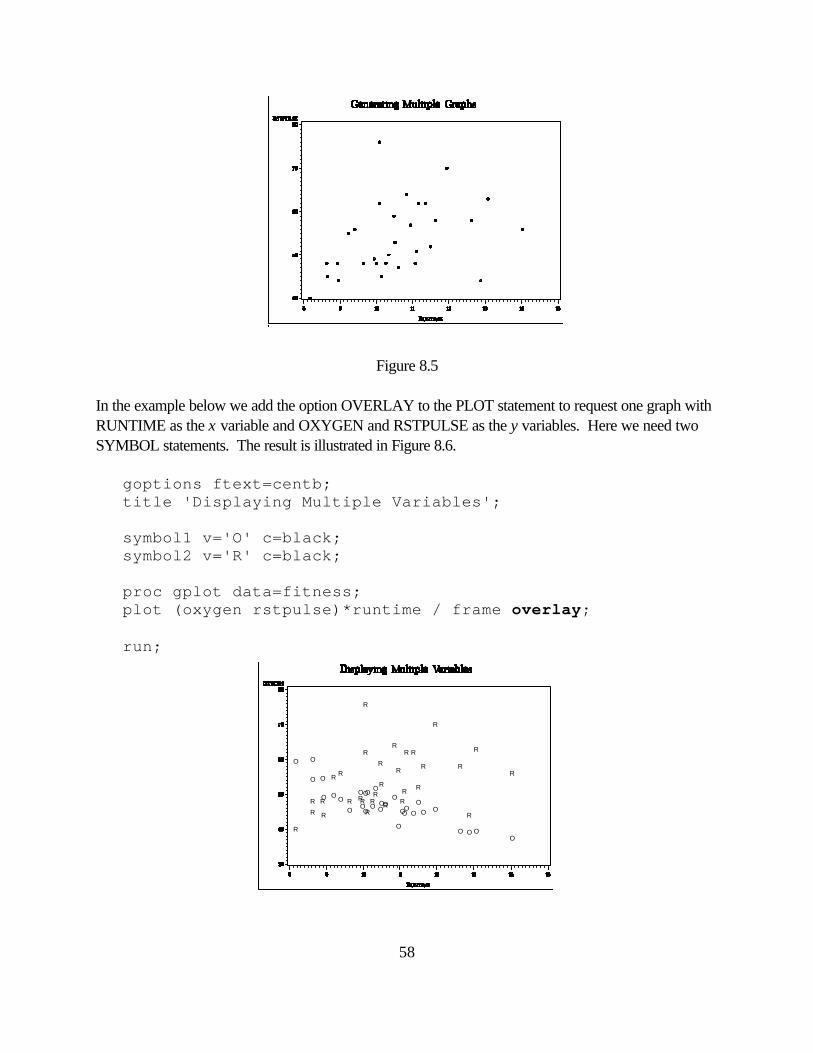
Figure 8.5 In the example below we add the option OVERLAY to the PLOT statement to request one graph with RUNTIME as the x variable and OXYGEN and RSTPULSE as the y variables. Here we need two SYMBOL statements. The result is illustrated in Figure 8.6. goptions ftext=centb; title 'Displaying Multiple Variables'; symbol1 v='O' c=black; symbol2 v='R' c=black; proc gplot data=fitness; plot (oxygen rstpulse)*runtime / frame overlay; run;
O
OO
O
O
O
O
OO OO
O
O
OO
OO
O
O O
O
OO
O
O
O
O O
O
O
OR
R
RR R
R
R
R
R
RR
R
R
R
R
R
R
R
R R
R
RR
R
R
R
R
R
R R
R

59
Figure 8.6
60
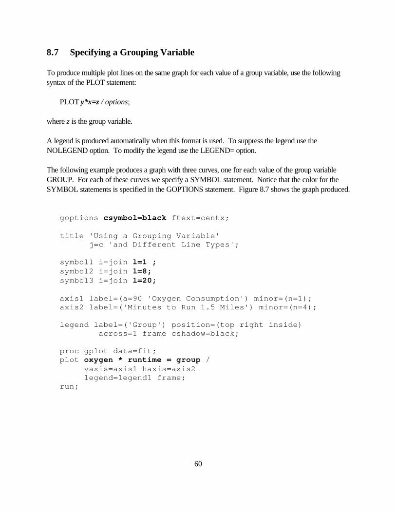
8.7 Specifying a Grouping Variable To produce multiple plot lines on the same graph for each value of a group variable, use the following syntax of the PLOT statement: PLOT y*x=z / options; where z is the group variable. A legend is produced automatically when this format is used. To suppress the legend use the NOLEGEND option. To modify the legend use the LEGEND= option. The following example produces a graph with three curves, one for each value of the group variable GROUP. For each of these curves we specify a SYMBOL statement. Notice that the color for the SYMBOL statements is specified in the GOPTIONS statement. Figure 8.7 shows the graph produced. goptions csymbol=black ftext=centx; title 'Using a Grouping Variable' j=c 'and Different Line Types'; symbol1 i=join l=1 ; symbol2 i=join l=8; symbol3 i=join l=20; axis1 label=(a=90 'Oxygen Consumption') minor=(n=1); axis2 label=('Minutes to Run 1.5 Miles') minor=(n=4); legend label=('Group') position=(top right inside) across=1 frame cshadow=black; proc gplot data=fit; plot oxygen * runtime = group / vaxis=axis1 haxis=axis2 legend=legend1 frame; run;
61
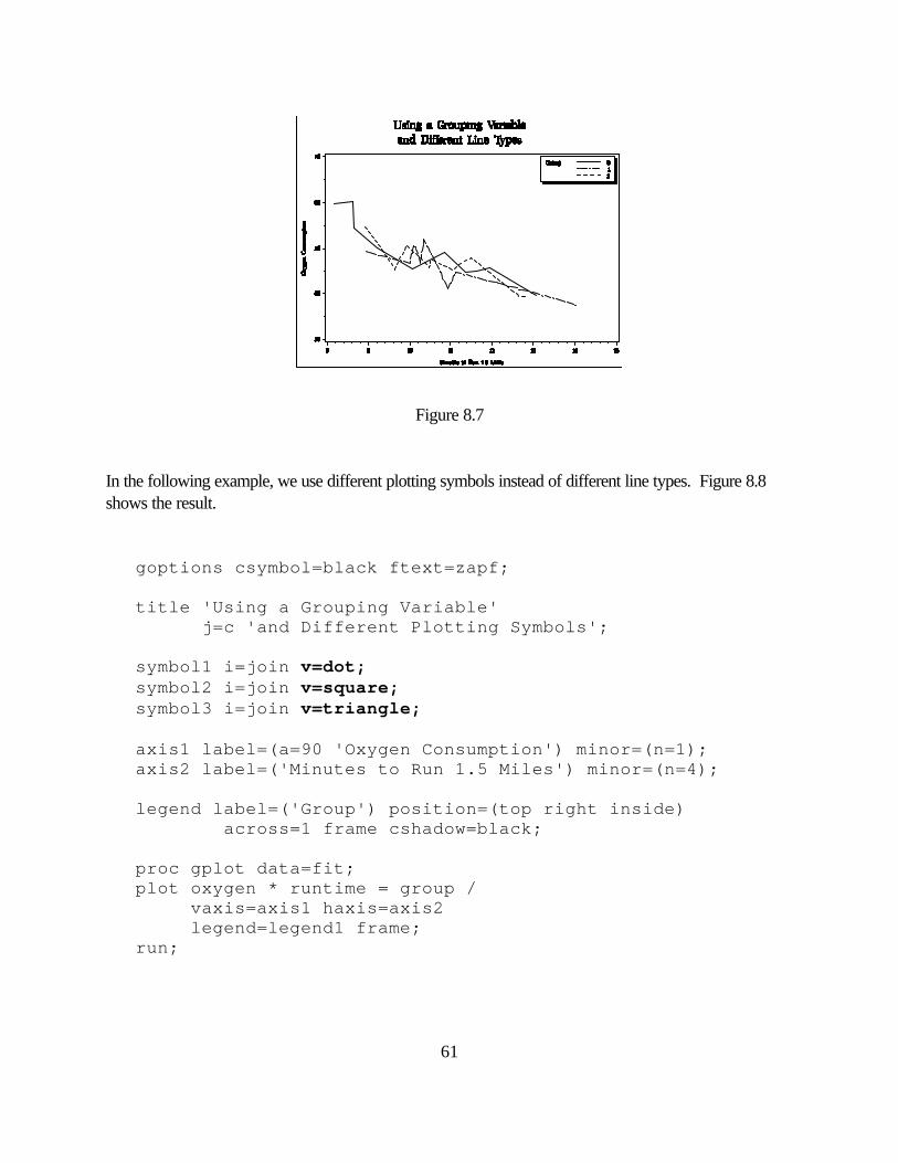
Figure 8.7 In the following example, we use different plotting symbols instead of different line types. Figure 8.8 shows the result. goptions csymbol=black ftext=zapf; title 'Using a Grouping Variable' j=c 'and Different Plotting Symbols'; symbol1 i=join v=dot; symbol2 i=join v=square; symbol3 i=join v=triangle; axis1 label=(a=90 'Oxygen Consumption') minor=(n=1); axis2 label=('Minutes to Run 1.5 Miles') minor=(n=4); legend label=('Group') position=(top right inside) across=1 frame cshadow=black; proc gplot data=fit; plot oxygen * runtime = group / vaxis=axis1 haxis=axis2 legend=legend1 frame; run;
62
Figure 8.8
63
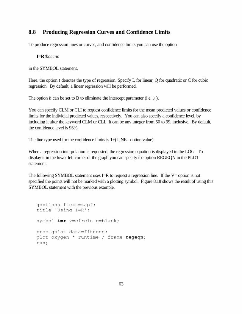
8.8 Producing Regression Curves and Confidence Limits To produce regression lines or curves, and confidence limits you can use the option I=Rtbcccnn in the SYMBOL statement. Here, the option t denotes the type of regression. Specify L for linear, Q for quadratic or C for cubic regression. By default, a linear regression will be performed. The option b can be set to B to eliminate the intercept parameter (i.e. βo). You can specify CLM or CLI to request confidence limits for the mean predicted values or confidence limits for the individial predicted values, respectively. You can also specify a confidence level, by including it after the keyword CLM or CLI. It can be any integer from 50 to 99, inclusive. By default, the confidence level is 95%. The line type used for the confidence limits is 1+(LINE= option value). When a regression interpolation is requested, the regression equation is displayed in the LOG. To display it in the lower left corner of the graph you can specify the option REGEQN in the PLOT statement. The following SYMBOL statement uses I=R to request a regression line. If the V= option is not specified the points will not be marked with a plotting symbol. Figure 8.18 shows the result of using this SYMBOL statement with the previous example. goptions ftext=zapf; title 'Using I=R'; symbol i=r v=circle c=black; proc gplot data=fitness; plot oxygen * runtime / frame regeqn; run;
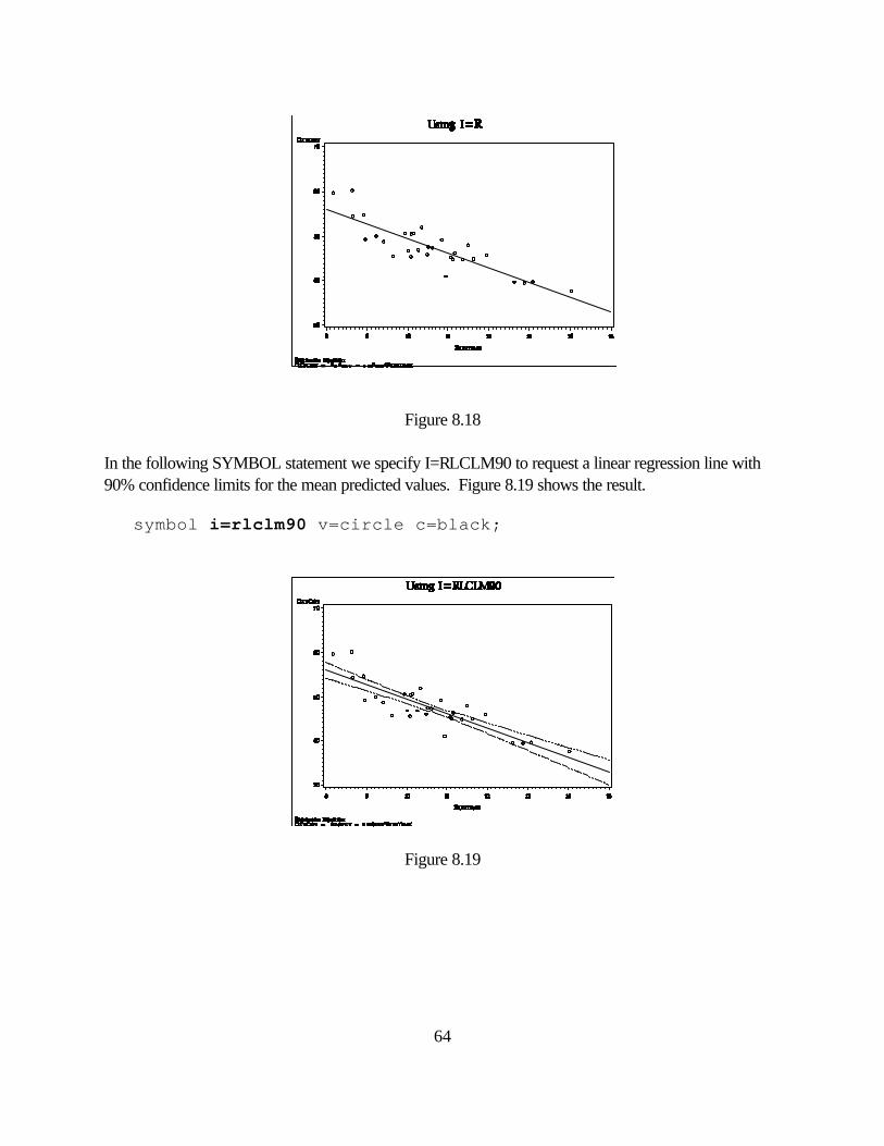
64
Figure 8.18 In the following SYMBOL statement we specify I=RLCLM90 to request a linear regression line with 90% confidence limits for the mean predicted values. Figure 8.19 shows the result. symbol i=rlclm90 v=circle c=black;
Figure 8.19
65
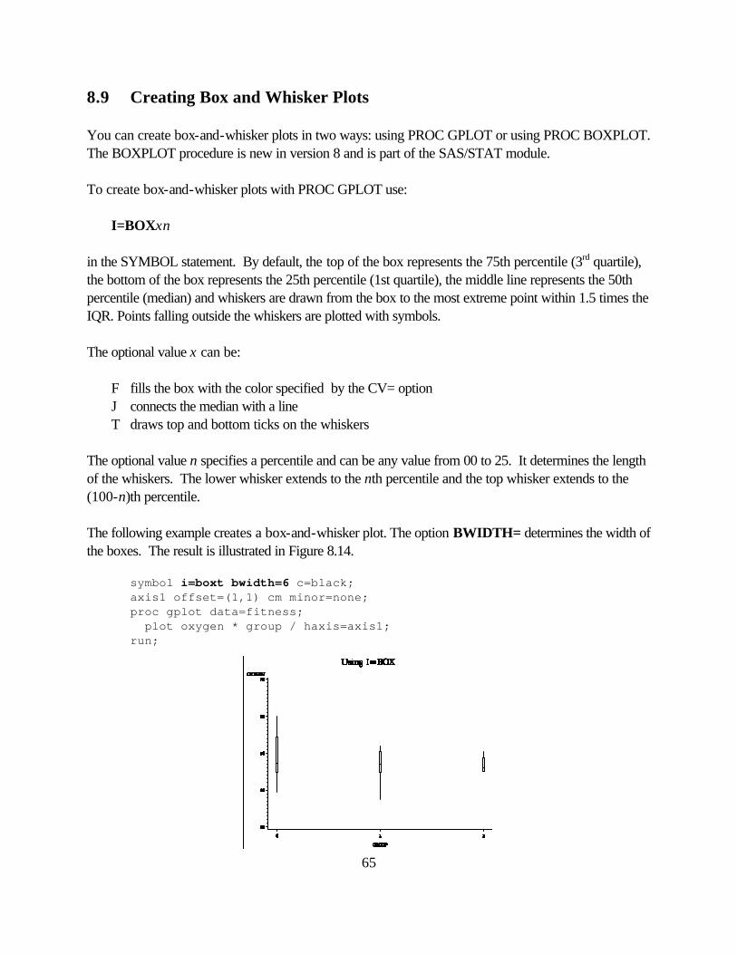
8.9 Creating Box and Whisker Plots You can create box-and-whisker plots in two ways: using PROC GPLOT or using PROC BOXPLOT. The BOXPLOT procedure is new in version 8 and is part of the SAS/STAT module. To create box-and-whisker plots with PROC GPLOT use: I=BOXxn in the SYMBOL statement. By default, the top of the box represents the 75th percentile (3rd quartile), the bottom of the box represents the 25th percentile (1st quartile), the middle line represents the 50th percentile (median) and whiskers are drawn from the box to the most extreme point within 1.5 times the IQR. Points falling outside the whiskers are plotted with symbols. The optional value x can be: F fills the box with the color specified by the CV= option J connects the median with a line T draws top and bottom ticks on the whiskers The optional value n specifies a percentile and can be any value from 00 to 25. It determines the length of the whiskers. The lower whisker extends to the nth percentile and the top whisker extends to the (100-n)th percentile. The following example creates a box-and-whisker plot. The option BWIDTH= determines the width of the boxes. The result is illustrated in Figure 8.14. symbol i=boxt bwidth=6 c=black; axis1 offset=(1,1) cm minor=none; proc gplot data=fitness; plot oxygen * group / haxis=axis1; run;
66
Figure 8.14
8.10 Other Types of Line Graphs In addition to the line graphs discussed so far you can set the I= option to the following suboptions to produce various types of graphs: NEEDLE needle plots STEP step plots or any of the smoothing techniques: L Lagrange SM Reinsch spline routine SPLINE Pizer's spline routine For more information see "SAS/GRAPH Software: Reference, Volumes 1 and 2, Version 8".
67
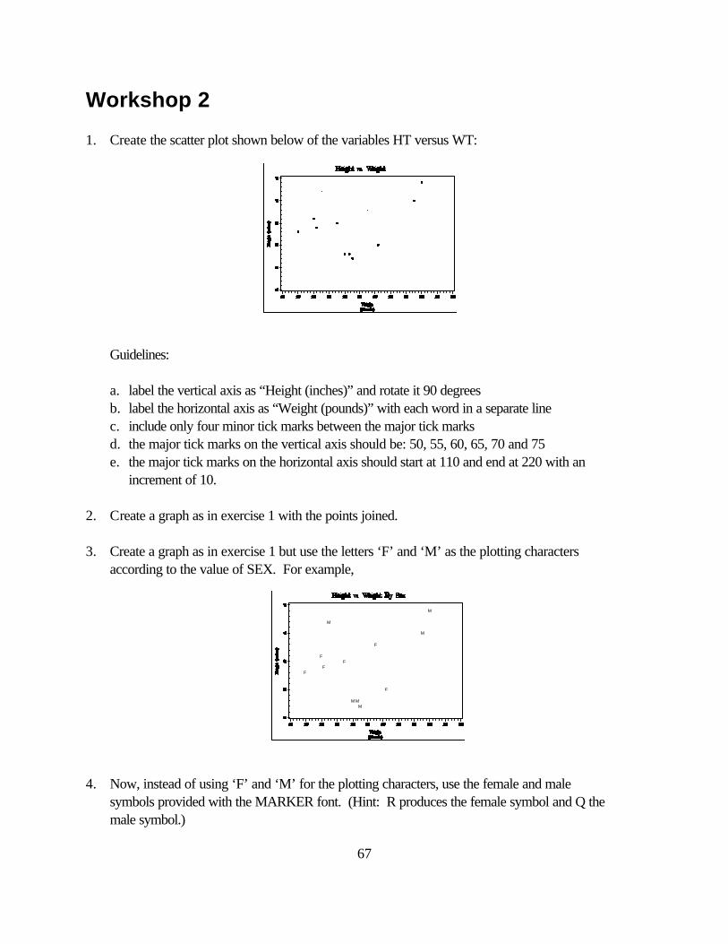
Workshop 2 1. Create the scatter plot shown below of the variables HT versus WT: Guidelines: a. label the vertical axis as “Height (inches)” and rotate it 90 degrees b. label the horizontal axis as “Weight (pounds)” with each word in a separate line c. include only four minor tick marks between the major tick marks d. the major tick marks on the vertical axis should be: 50, 55, 60, 65, 70 and 75 e. the major tick marks on the horizontal axis should start at 110 and end at 220 with an increment of 10. 2. Create a graph as in exercise 1 with the points joined. 3. Create a graph as in exercise 1 but use the letters ‘F’ and ‘M’ as the plotting characters according to the value of SEX. For example, 4. Now, instead of using ‘F’ and ‘M’ for the plotting characters, use the female and male symbols provided with the MARKER font. (Hint: R produces the female symbol and Q the male symbol.)
F
F
FF
F
F
M
M MM
M
M
68
Optional
5. Add a regression line to the graph in exercise 1. 6. Create a graph with box plots of the weight for each drug group.
69
9. New Graphs Available in Version 8
The Base SAS and SAS/STAT modules contain new options under version 8 to produce the following high resolution graphics:
• quantile-quantile plots (PROC UNIVARIATE) • probability plots (PROC UNIVARIATE) • histograms and comparative histograms (PROC UNIVARIATE) • box-and-whisker plots (PROC BOXPLOT in SAS/STAT module) • survival estimates plots (PROC LIFETEST in SAS/STAT module)
Even though these are not part of the SAS/GRAPH module you must install SAS/GRAPH to view and enhance them. 9.1 Quantile-Quantile Plots, Probability Plots and Histograms The UNIVARIATE procedure is part of Base SAS. With it you can produce quantile-quantile plots, probability plots and histograms using the statements: HISTOGRAM, PROBPLOT, and QQPLOT, respectively. With the HISTOGRAM statement you can:
• create a SAS data set with the histogram information • fit a density curve and specify the density parameters • enhance the appearance of the density curve and histogram • request comparative histograms
Use the PROBPLOT statement to create probability plots. These plots compate ordered values of a variable with the percentiles of a specified theoretical distribution. Use the QQPLOT statement to create quantile-quantile plots which compare ordered values of a variable with the quantiles of a specified theoretical distribution. See the “SAS Procedures Guide” for the full documentation of these statements.
9.2 Box-and-Whisker Plots The BOXPLOT procedure creates side-by-side box-and-whisker plots organized by groups. The data must be sorted by the group variable. There are several styles of box-and-whisker plots you can request: schematic and skeletal.
70
See the "SAS/STAT User's Guide" for the complete documentation of the BOXPLOT procedure. 9.3 S urvival Estimates Plots You can now request survival estimates plots with PROC LIFETEST. You request it by including the PLOTS= option in the PROC statement. You can request the following types of plots:
• plots censored observations by strata • plots the estimated SDF versus time • plots the -log( estimated SDF) versus time • plots the log(-log( estimated SDF) versus log( time) • plots the estimated hazard function versus time • plots the estimated probability density function versus time
See the "SAS/STAT User's Guide" for the complete documentation of the LIFETEST procedure.
71
10. Placing Multiple Graphs on One Page General Syntax for Using PROC GREPLAY in Line Mode: proc greplay nofs igout=input_catalog_name; tc template_catalog_name; tdef template_name panel_number1 / ulx=upper_left_x uly=upper_left_y urx=upper_right_x ury=upper_right_y llx=lower_left_x lly=lower_left_y lrx=lower_right_x lry=lower_right_y panel_number2 / ulx=upper_left_x uly=upper_left_y urx=upper_right_x ury=upper_right_y llx=lower_left_x lly=lower_left_y lrx=lower_right_x lry=lower_right_y etc. ; template template_name; treplay panel_number1:graph_number panel_number2:graph_number etc. ; quit; input_catalog_name specifies where the graphs are saved. If they were saved temporarily in the default graphics catalog then specify GSEG. template_catalog_name specifies the name of the template catalog. It could be your own template catalog (permanent or temporary) or SAS's template catalog SASHELP.TEMPLT. template_name the name of the template to use from the template catalog. The name is at most eight characters long and must start with a letter. panel_number any integer; specifies the panel number within the template. graph_number the graph number. SAS numbers the graphs starting with 1 and incrementing by 1 each time a graph is generated.
72
proc greplay nofs igout=gseg; tc mycat; tdef four 1 / ulx=0 uly=100 urx=100 ury=100 llx=0 lly=0 lrx=100 lry=0 2 / ulx=0 uly=80 urx=33 ury=80 llx=0 lly=0 lrx=33 lry=0 3 / ulx=33 uly=80 urx=66 ury=80 llx=33 lly=0 lrx=66 lry=0 4 / ulx=66 uly=80 urx=100 ury=80 llx=66 lly=0 lrx=100 lry=0; quit;
Preview of template created by TDEF statement above: (0,100) (100,100)
(0,0) (100,0)
73
* Delete any existing graphs from WORK.GSEG; proc datasets library=work nolist; delete gseg / mt=catalog; run; quit; * Set graphics options; goptions reset=all dev=win target=hpljs3 rotate=landscape ftext=swissb ftitle=zapfb; * Create one graph for each group; *set size for the graphs of each group and don't display graphs now; goptions hsize=3.66 in vsize=6.8 in nodisplay; proc sort data=sg.fitness out=fit; by runtime; run;
74
symbol1 i=join c=black v=dot; axis1 label=(a=90 'Oxygen Consumption') order=(35 to 65 by 5) minor=none value=(f=zapfb); axis2 label=('Minutes to Run 1.5 Miles') order=(8 to 14) minor=none value=(f=zapfb); proc gplot data=fit; title 'Group 0'; where group=0; plot oxygen * runtime / frame haxis=axis2 vaxis=axis1; run; title 'Group 1'; where group=1; plot oxygen * runtime / frame haxis=axis2 vaxis=axis1; run; title 'Group 2'; where group=2; plot oxygen * runtime / frame haxis=axis2 vaxis=axis1; run; quit; * Create the first line of the title with GSLIDE; *set size to be the whole page; goptions hsize=11 in vsize=8.5 in; proc gslide; title h=3 'Oxygen Consumption vs Run Time'; run; * Now place all four graphs on one page; goptions display; *can display combined graph now; proc greplay nofs igout=gseg; tc mycat; tdef four 1 / ulx=0 uly=100 urx=100 ury=100 llx=0 lly=0 lrx=100 lry=0 2 / ulx=0 uly=80 urx=33 ury=80 llx=0 lly=0 lrx=33 lry=0 3 / ulx=33 uly=80 urx=66 ury=80 llx=33 lly=0 lrx=66 lry=0 4 / ulx=66 uly=80 urx=100 ury=80 llx=66 lly=0 lrx=100 lry=0; template four;
75
treplay 1:4 2:1 3:2 4:3; quit;
11. Exporting SAS/GRAPH Output SAS/GRAPH allows you to export graphics output to many other applications. Among the different types of graphics formats it supports are: BMP, GIF, TIFF, PS, EPS, WordPerfect, Microsoft Word, Harvard Graphics, PageMaker and Framemaker. If you use SAS in interactive full-screen mode, you can export graphs from the Graph window by selecting Export from the File menu, then choosing the type of file. Alternatively, you can create a graphics stream file. Graphics stream files contain device-dependent graphs. To create a graphics stream file under Windows, include the following statement in your program: filename gout 'filename.ext'; goptions dev=device gsfname=gout gsfmode=replace; Here, filename.ext is the name of the file in which you want to save the graph and device is the SAS/GRAPH device driver name. To create a GSF under the MVS system, you can use the same GOPTIONS statement listed above. The FILENAME statement would need to be of the form: filename gout 'aaaaiii.dsn' unit=file disp=(mod,catlg) recfm=vb space=(trk,(a,b)); where aaaaiii is your Wylbur account and initials and a,b is the number of tracks to allocate. For more information on the FILENAME statement see “Using SAS at NIH: Batch Mode.” All the figures in your class notes were created using SAS/GRAPH by saving them as graphics stream files and later including them to a Word for Windows document. The following program created the graphics stream file for Figure 2.2. filename gout 'c:\graphs\marker.cgm'; goptions dev=cgmmwwc gsfname=gout gsfmode=replace; proc gfont name=marker nobuild showroman; run;

76
77
Appendix A: Sending your Graphs to a Hardcopy Device in Windows There are several ways of sending graphics output to a hardcopy device. You can: 1. View the graphics output on your screen (i.e using device WIN) then send it to a hardcopy device by selecting Print from the File menu. The graph may have some distortion. 2. Preview the graphics output on your screen as it would look on the target device then choose Print from the File menu. To specify the target device use the TARGET= option in a GOPTIONS statement before your procedure statements, for example: GOPTIONS TARGET=HPLJS3; 3. Send the graphics output directly to the hardcopy device without previewing it by specifying the device name with the DEVICE= option in a GOPTIONS statement, for example: GOPTIONS DEVICE=HPLJS3; With SAS/GRAPH you can specify two types of hardcopy devices: the SAS/GRAPH drivers or the WINPxxx drivers. The SAS/GRAPH drivers are the drivers that are listed by the procedure GDEVICE. The WINPxxx drivers use the Windows printing drivers. With them you can choose device specific characteristics like color, patterns and fonts. There are four WINPxxx drivers: WINPLOT for plotters WINPRTC for color printers WINPRTG for gray-scale printers WINPRTM for monochrome printers

78
Appendix B: Sending your Graphs to a Hardcopy Device in MVS For information on how to obtain SAS/GRAPH hardcopy output using the MVS system at NIH, see the document Using SAS/GRAPH at NIH.
79
Workshop Solutions Workshop 1 1. title 'Average Weight By Group'; axis1 label=none value=none major=none minor=none style=0; axis2 label=none value=('Drug 1' 'Drug 2' 'Drug 3') width=2; pattern v=s c=black; proc gchart data=in.study; vbar drug / sumvar=wt type=mean mean raxis=axis1 maxis=axis2 width=8; run; 2. title 'Number of Subjects in Each Group'; footnote j=l 'Source: XYZ Inc.'; goptions cpattern=black; pattern v=x1 c=black; axis1 label=none value=none minor=none major=none; axis2 label=none value=('FEMALE' 'MALE'); proc gchart data=in.study; hbar drug / group=sex frame raxis=axis1 gaxis=axis2; run; 3. title 'Number of Subjects in Each Group'; footnote j=l 'Source: XYZ Inc.'; goptions cpattern=black; axis1 label=none minor=none; axis2 label=none value=none; axis3 label=none value=('Female' 'Male') nobrackets; pattern1 v=x1; pattern2 v=x5;
80
pattern3 v=e; legend label=none value=('Drug 1' 'Drug 2' 'Drug 3') position=top; proc gchart data=in.study; vbar drug / group=sex frame subgroup=drug raxis=axis1 maxis=axis2 gaxis=axis3 legend=legend1; run; Workshop 2 1. title 'Height vs. Weight'; symbol v=dot c=black; axis1 label=(a=90 h=1.25 'Height (inches)') minor=(n=4) order=(50 to 75 by 5); axis2 label=(h=1.25 'Weight' j=c '(pounds)') minor=(n=4) order=(110 to 220 by 10); proc gplot data=in.study; plot ht*wt / vaxis=axis1 haxis=axis2; run; 2. proc sort data=in.study; by wt; run; title 'Height vs. Weight'; symbol v=dot i=join c=black; axis1 label=(a=90 h=1.25 'Height (inches)') minor=(n=4) order=(50 to 75 by 5); axis2 label=(h=1.25 'Weight' j=c '(pounds)') minor=(n=4) order=(110 to 220 by 10); proc gplot data=in.study; plot ht*wt / vaxis=axis1 haxis=axis2; run;
81
3. goptions csymbol=black; title 'Height vs. Weight By Sex'; symbol1 v='F'; symbol2 v='M'; axis1 label=(a=90 h=1.25 'Height (inches)') minor=(n=4) order=(55 to 75 by 5); axis2 label=(h=1.25 'Weight' j=c '(pounds)') minor=(n=4) order=(110 to 220 by 10); proc gplot data=in.study; plot ht*wt=sex / vaxis=axis1 haxis=axis2 nolegend; run; 4. goptions csymbol=black; title 'Height vs. Weight by Sex'; symbol1 f=marker h=1.5 v='R'; symbol2 f=marker h=1.5 v='Q'; axis1 label=(a=90 h=1.25 'Height (inches)') minor=(n=4) order=(55 to 75 by 5); axis2 label=(h=1.25 'Weight' j=c '(pounds)') minor=(n=4) order=(110 to 220 by 10); proc gplot data=in.study; plot ht*wt=sex / vaxis=axis1 haxis=axis2 nolegend; run;
82
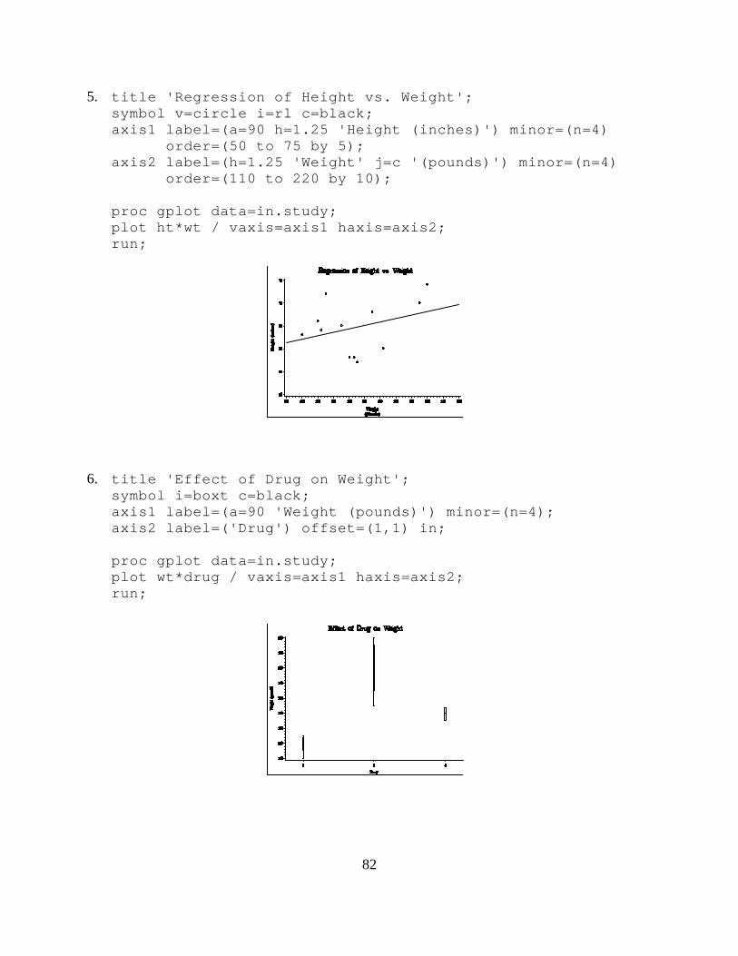
5. title 'Regression of Height vs. Weight'; symbol v=circle i=rl c=black; axis1 label=(a=90 h=1.25 'Height (inches)') minor=(n=4) order=(50 to 75 by 5); axis2 label=(h=1.25 'Weight' j=c '(pounds)') minor=(n=4) order=(110 to 220 by 10); proc gplot data=in.study; plot ht*wt / vaxis=axis1 haxis=axis2; run; 6. title 'Effect of Drug on Weight'; symbol i=boxt c=black; axis1 label=(a=90 'Weight (pounds)') minor=(n=4); axis2 label=('Drug') offset=(1,1) in; proc gplot data=in.study; plot wt*drug / vaxis=axis1 haxis=axis2; run;

83


![Tasc Basic[1]](https://static.documents.pub/doc/80x56/5449bfc5af795984188b45cc/tasc-basic1.jpg)


