13
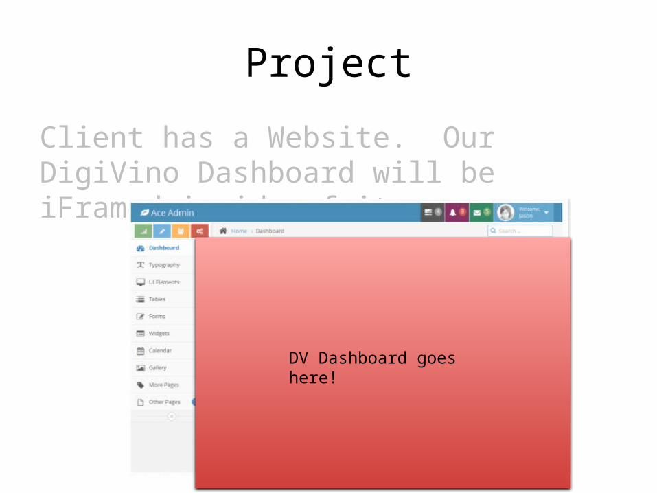
Project Client has a Website. Our DigiVino Dashboard will be iFramed inside of it. DV Dashboard goes here!
| Date post: | 30-Dec-2015 |
| Category: |
Documents |
| Upload: | shavonne-nelson |
| View: | 213 times |
| Download: | 0 times |
Project
Client has a Website. Our DigiVino Dashboard will be iFramed inside of it.
DV Dashboard goes here!
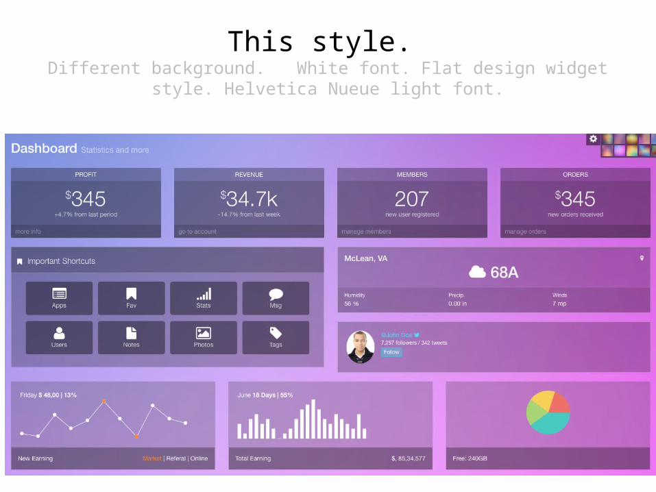
This style. Different background. White font. Flat design widget style. Helvetica Nueue
light font.
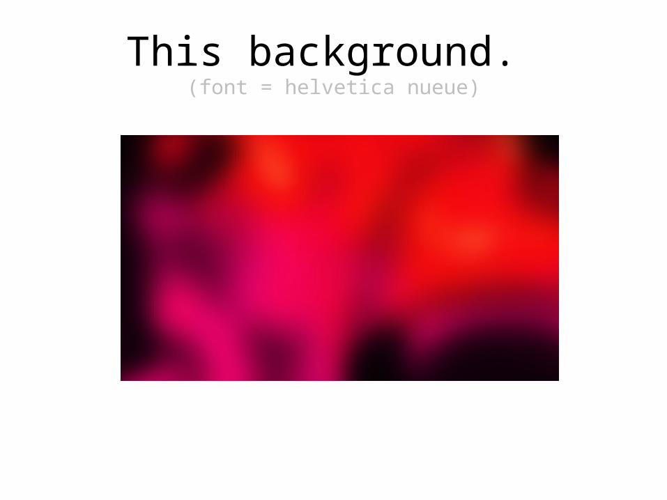
This background. (font = helvetica nueue)
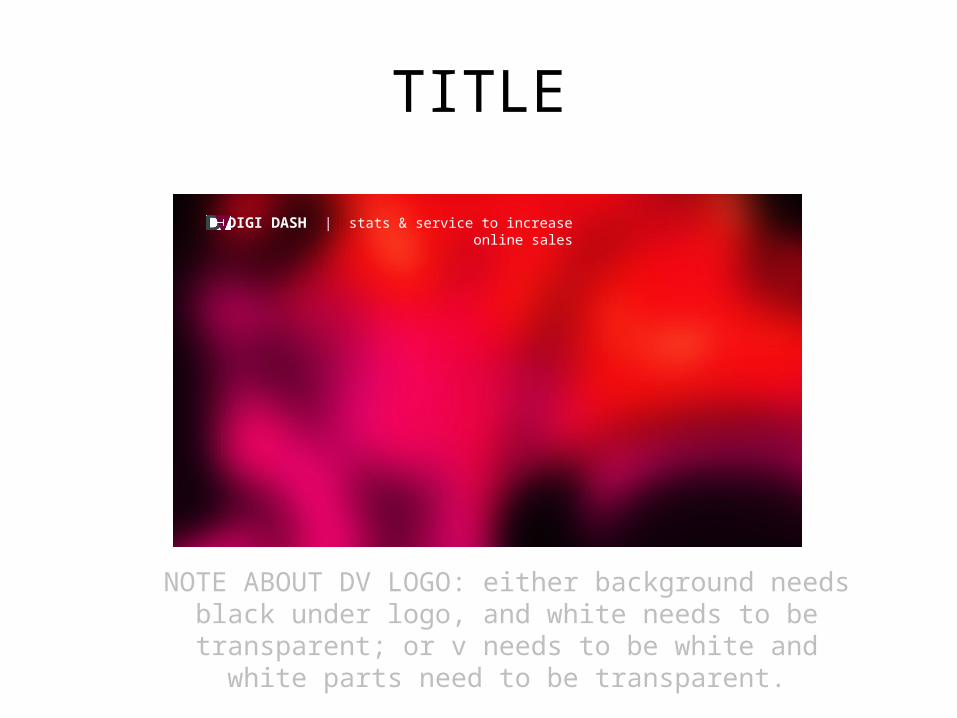
NOTE ABOUT DV LOGO: either background needs black under logo, and white needs to be transparent; or v needs to be white
and white parts need to be transparent.
DIGI DASH | stats & service to increase online sales
TITLE

FOOTER
DigiVino.com ©2014

Content by widget box follows.(See corresponding page letter.)
A B C D
E F
H I J
G

A, B, C, D• A = change $345 to $3,450, links reads “more info”,
which is correct.• B = change week to period; link should read “more
info”• C = change “users” to “prospects”; change “members”
at top to “PROSPECTS; link should read “more info”• D = change $345 to $7,988; change “new orders
received” to “new SEO-motivated sales” ; link should read “more info”; changes “orders” at top to “SEO SALES”

EClosed accordion Opened
Be sure to provide design for open box too!Closed version titles should read:
Biggest Opportunities to Increase Sales
SEO – Search engine optimization
UX – Online User Experience
MARCOM – Smart marketing communications
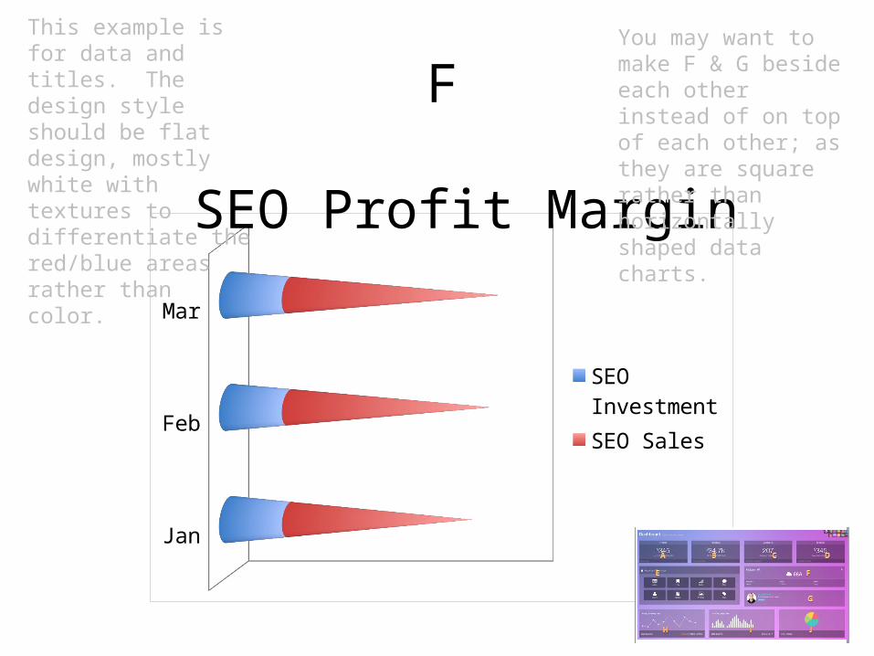
Jan
Feb
Mar
SEO InvestmentSEO Sales
F
SEO Profit Margin
This example is for data and titles. The design style should be flat design, mostly white with textures to differentiate the red/blue areas rather than color.
You may want to make F & G beside each other instead of on top of each other; as they are square rather than horizontally shaped data charts.

Yelp
Google+
ParticipantsEngagementOpportunity
Online OpportunityG
This example is for data and titles. The design style should be flat design, mostly white with textures to differentiate the red/blue/green areas rather than color.

HShould read instead:
Wins vs. LossesDo your customers come back for more? Club members stay for more than 5 years? Would-be shoppers fail to complete purchases?
You could be winning more sales. We’ll show you how!

Emails
I(ROHAN: here’s an expanded view so you can read copywriting)
Right (blue) box should say:
Resulting Sales
You received
$12,838 In sales from your last eblast.
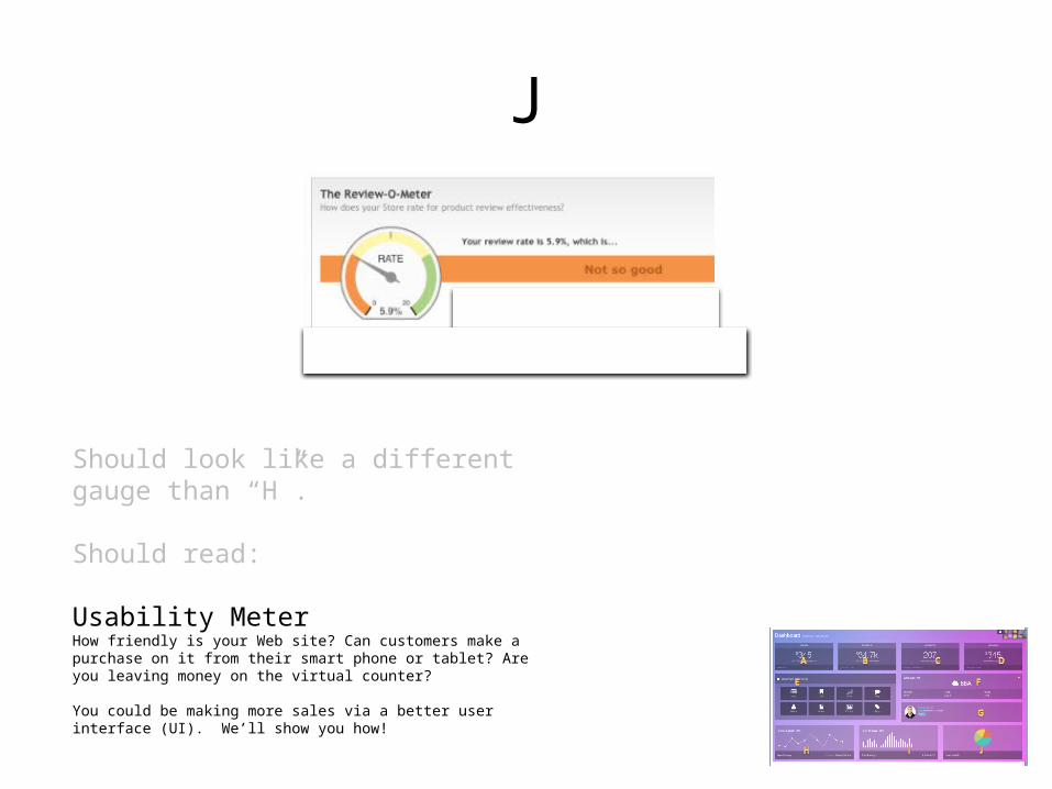
J
Should look like a different gauge than “H”.
Should read:
Usability MeterHow friendly is your Web site? Can customers make a purchase on it from their smart phone or tablet? Are you leaving money on the virtual counter?
You could be making more sales via a better user interface (UI). We’ll show you how!


