Page 1
Project Number: MQP-GTH-MQIS
CLUSTER ANALYSIS USING QUANTILE PLOTS WITH APPLICATIONS IN
COMPUTATIONAL CHEMISTRY
A Major Qualifying Project Report
Submitted to the Faculty
of the
WORCESTER POLYTECHNIC INSTITUTE
in partial fulfillment of the requirements for the
Degree of Bachelor of Science
in Computer Science
by
___________________________
Michael Tessier
Date: 17 October, 2008
Keywords
1. Clustering
2. Quantile Plots
3. AutoDock _____________________________
4. N-Dimensions Professor George Heineman
5. GLYLIB
Page 2
2
Abstract
The project is about finishing and then proving that a program can determine the clustering of
points in space, with or without the need of a user defined cutoff. The program uses a statistical method
called quantile-quantile plots to find clusters of points based on their locations in space. As part of the
project, it will be proven that the program can correctly cluster multi-dimensional points regardless of the
distances between them. Then the program will be tested by seeing how well it can cluster data from
datasets that exist in computational chemistry. The program will be used to determine likely binding sites
in carbohydrate-protein docking simulations, and then compare the programs results with results generated
by AutoDock versions 3 and 4. The program will also try to and identify molecular epitopes, which can be
represented by more than three dimensions.
Page 3
3
Acknowledgements
This project would not be possible were it not for the effort of people both at Worcester
Polytechnic Institute and the University of Georgia. I would fist like to thank my advisor at WPI,
Professor George Heineman, for his enthusiasm towards this project and his continual support and
guidance. I would also like to thank Professor Krzysztof J. Kochut who helped advise me while I was at
the University of Georgia. His ideas and suggestions helped keep the project running smoothly and on
time.
I would also like to thank Dr. Robert Woods of the Woods Research Group at the Complex
Carbohydrate Research Center for creating the project and allowing me to work in conjuncture with his
group. I would like to thank Dr. Lachele Foley who helped out with many debugging issues and with my
acclimation to GLYLIB. I would also like to thank the Woods Research Group as a whole for welcoming
me into their group making this experience both educational and fun. Finally I would like to thank
Matthew Tessier and Tzafra Matin for providing me lodging during my stay in Georgia.
Page 4
4
Table of Contents
Abstract ..................................................................................................................................... 2
Acknowledgments ..................................................................................................................... 3
List of Figures ........................................................................................................................... 6
List of Tables ............................................................................................................................ 7
Executive Summary .................................................................................................................. 8
1. Introduction ...................................................................................................................... 11
2. Background ...................................................................................................................... 13
2.1. Quantile-Quantile Plots ............................................................................................... 13
2.2. Molecular Simulation and AutoDock ........................................................................... 14
2.3. Carbohydrate Conformation ........................................................................................ 16
2.4. GLYLIB ....................................................................................................................... 17
3. Methodology ..................................................................................................................... 19
3.1. Qliinc ........................................................................................................................... 19
3.1.1. Writing the Clustering Algorithm ........................................................................ 19
3.1.2. Writing the Cutoff Function ................................................................................ 22
3.1.3. Writing the Analysis ........................................................................................... 22
3.2. GLYLIB Functionality .................................................................................................. 25
3.3. Testing the Clustering ................................................................................................. 26
3.3.1. Defining the Metric ............................................................................................ 26
3.3.2. Data Generation Program ................................................................................. 27
3.3.3. Defining the Datasets ........................................................................................ 28
3.4. Testing the Timing ...................................................................................................... 28
3.4.1. Defining the Tests ............................................................................................. 28
3.4.2. Defining the Datasets ........................................................................................ 29
3.5. Testing against AutoDock ........................................................................................... 29
3.5.1. Defining the Tests ............................................................................................. 29
3.5.2. Defining the Datasets ........................................................................................ 30
4. Results ............................................................................................................................. 31
4.1. Clustering Test ............................................................................................................ 31
4.1.1. Minimum Number of Points ............................................................................... 31
Page 5
5
4.1.2. n-D Tests with Metric ......................................................................................... 32
4.1.3. Tests with Poor Results ..................................................................................... 33
4.2. Time Tests .................................................................................................................. 36
4.3. AutoDock Tests ........................................................................................................... 38
4.4. n-Dimensional Experimental Tests.............................................................................. 40
5. Conclusions and Recommendations ................................................................................ 43
6. References ....................................................................................................................... 47
7. Appendices ...................................................................................................................... 48
7.1. Appendix A: Time Test Results per Machine .............................................................. 48
7.2. Appendix B: Time Test Results per Dimension ........................................................... 51
Page 6
6
List of Figures
Figure 1: Time test results for quantile and cutoff methods…………………………………….9
Figure 2: A quantile-quantile plot of data………………………………………………………....13
Figure 3: Plot of 2-Dimensional data……………………………………………………………..13
Figure 4: The clustered original data and its grouped quantile plots……………………….…14
Figure 5: The sub-group of a dimension…………………………………………………………21
Figure 6: Example of 2-D data using 1-D element numbers…………………………………...24
Figure 7: Data with poor clustering………………………………………………………………..44
Figure 8: Programs clustering of data……………………………………………………………..34
Figure 9: Distribution of x and y values for Figure 8……………………………………………..35
Figure 10: Programs clustering of data…………………………………………………………....35
Figure 11: Distribution of x and y values for Figure 10…………………………………………..36
Figure 12: Results from clustering Niceria data…………………………………………………..40
Figure 13: Data showing shifts in torsional angles……………………………………………....42
Figure 14: Each point in a sorted distribution…………………………………………………….43
Figure 15: Line of distribution points (not smoothed)…………………………………………….44
Figure 16: Line of distribution data applied to spline curve……………………………………...43
Figure 17: Line of distribution data applied to Bezier curve……………………………………..44
Page 7
7
List of Tables
Table 1: Scoring of Clustering Test………………………………………………………………....32
Table 2: Results of AutoDock comparisions………………………………………………………39
Page 8
8
Executive Summary
There are a number of methods for clustering information. Finding an appropriate method
depends on the data being used, the amount of data being worked with and what is expected of the
analysis. Specifically the issues to be addressed when choosing a method are time versus accuracy. Once
you define all of those parameters, you begin looking at a clustering methodology.
This project focused on the use of quantile-quantile plots to cluster data of varying sizes and
dimensions. It was the goal of the project to show that this method will allow for quick, fairly accurate
analysis in datasets that have both small and large numbers of points, with both small and large numbers
of dimensions. It was also the goal of the project to find and show any problems that may occur in
determining clusters using this method, and if, or in any ways, they can be addressed.
It was the objective of this project to then take this method, and create an algorithm out of it.
Then apply that algorithm to a program that allowed users options for the amount of accuracy they want
in their analysis. This program takes in data from a text file, where each line represents a point, and each
column represents a dimension of that point. Then time tests will be run on the program using data with
varying numbers of points and dimensions to show the speed of the program under varying conditions.
It was also the objective of the project to run data commonly found in computational chemistry
through the program. It was the intent of the project to test this program against the clustering analysis
generated by AutoDock versions 3.x and 4.x. Then compare and contrast the results from know, and well
defined sets as well as sets that performed poorly in one or both versions. It is also the intention of the
project to run torsional angles of carbohydrates in aqueous solutions through the clustering the program to
see if it can separate out unique conformations.
Page 9
9
The clustering tests
showed a few things. It showed
that the program has limitations
given the orientation of the data.
Under specific circumstances the
program will fail to find clusters.
Aside from these cases, the tests
also showed that the program can
accurately cluster data with up
two thirty-two dimensions. The
time tests showed the program
could process small amounts of
data quickly, within a couple of
seconds, and large amounts of data in less then an hour. When compared to the competing method used
for clustering by the Woods Research Group, the quantile method proved to be substantially faster in
almost every case. At its worst, the quantile method took just as long to run. The AutoDock tests showed
the program did just as well or better then AutoDock at finding more clusters with higher numbers of
members and lower energy scores. The program didn't do well with experimental data. When trying to
find conformational states, the program failed to find any of them. In the best case, the program could
identify major changes in torsional data that signaled a possible change in conformational state.
Some of the problems that exist with the program are a result of the method used to cluster the
data. These problems are because the method looks at only one dimension at a time when separating out
clusters, and therefore data cannot distinguish clusters that are surrounded by or obscured by other clusters
in one or more dimensions. The problems found when trying to cluster the torsional rotation data have
50
100
500
1,000
5,000
10,000
50,000
100,000
500,000
1,000,000
-6.00
-4.00
-2.00
0.00
2.00
4.00
6.00
8.00
Time Test with 3D Data
using both methods
Q – Xeon
Q – P3
Q – Itan.
C – P3
C – Itan.
# of points
ln(T
ime
) [S
eco
nd
s]
Figure 1: Time test results for quantile “Q” and cutoff “C” methods with three
dimensional data
Page 10
10
possible solutions though. By using a smoothing function to decrease the noise in the data, this allows the
program to increase the accuracy of finding clusters in data. The problem with this is that it will increase
the amount time it takes the program to run. With the AutoDock data, the program showed promise as a
better way of finding locational clustering of data, but more testing needs to be done to confirm this. The
time tests show that with small amounts of data, the time difference between using the quantile method
and the cutoff method are negligible. For larger datasets, both in numbers of points and dimensions, the
quantile method is substantially faster.
Page 11
11
1. Introduction
The idea behind clustering is simple, separate out groups of data from a dataset that share
relatively similar characteristics. While the idea is simple, the methods are numerous and can all yield
different results given the same data. When trying to find a method for clustering you must ask
yourself, how would you like to cluster the information? What do you value more, accuracy or speed?
How much data do you have to work with? How would you like to define what constitutes a cluster?
These are just some of the questions that have to be asked when trying to determine how you want to
cluster data.
When answering these questions, you first have to take into account the kind of data you're
using, and its applications. If you wanted to analyze of, or even a series of, datasets quickly you would
want to make sure that the method you use is time cheap and fairly, but not necessarily hyper, accurate.
On the other hand, if you wanted to get a very accurate analysis of a dataset, you would be more
willing to sacrifice time to increase accuracy. If the data being dealt with is relatively small, then the
method has to be able to work with a limited number of points. If the data is relatively large, then the
method will have to be efficient in terms of time and system resources. After identifying the size of the
data you will be working with and the level of accuracy you are looking for, you can then begin
looking for a clustering method to use.
In Computational Chemistry, it is not uncommon to deal with large and small datasets in terms
of not only size, but the number of dimensions. A researcher may want to know the most likely site a
carbohydrate will bind to a protein or determine the conformation of a carbohydrate in a solvent. When
identifying a binding site the datasets only deal with three dimensions, the location of the site in space,
and a small number of points, anywhere from fifteen to two hundred on average. When trying to find
the conformation of a carbohydrate, most research looks at nano to micro second time scales, which
show the change in torsional angles in anywhere from thousands up to millions of time steps. The
Page 12
12
number of torsional rotations being compared means that the data could have anywhere from two to
twenty-four dimensions on average.
For the purposes of this project we have already identified the kinds of data, and what it is being
used for, so that we can determine how important accuracy and time are. When dealing with possible
binding sites we know the number of data points is relatively small, teens to hundreds, with only a few
dimensions. Since the amount of data is relatively small, time is not as much of an issue. On the other
hand, when trying to find a conformation, the large number of data points and dimensions means that
analysis will take longer. This means that we would need a method that can give fairly accurate results
quickly. Since accuracy can be obtained outside of the clustering method, through pre-defined
specifications or re-analysis of the data, it would be better to find a method that can deliver results
quickly.
This makes the goal of the project clear, to create a program that allows researchers to define
clusters of points, in data of varying sizes and dimensions, quickly as well as accurately given the data
that researcher is working with. These issues will have to be addressed by defining a clustering method
that allows for fairly accurate clustering very quickly, and then creating an algorithm out of it. Then we
can apply this algorithm to a program that will allow the user to control, to some extent, the amount of
accuracy they want and the amount of time they want to spend. The program, called qliinc which
stands for QuantiLe IdentifIcation of N-dimension Clustering, is designed to address the issue of
clustering datasets that are both large and small. It will also try to cluster things in a relatively speedy
manner.
Page 13
13
2. Background 2.1. Quantile – Quantile Plots
A Quantile – Quantile plot is a statistical method for showing the distribution of a data set
(Quantile-Quantile 2008). This is done by ordering all of the data and then plotting the data by its position
in the y-axis over its datum number in the x-axis. This
will show a distribution similar to Figure 2.
This plot shows that when there are large
distances between points either a noticeable break
occurs, or the data curves upward forming an almost
vertical line. In Figure 2 a break can be seen between
15000 and 20000 x-axis and -50 and 50 y-axis, and a
near vertical line can be seen between 40000 to 45000
x-axis and 100 to 150 y-axis. These are signs of a
change in the slope of data mainly that the slope of
the curve has gone from a positive-increasing slope to a positive decreasing slope.
According to Lindsey et. al., in order to determine a cluster you first have to set a cutoff point.
This cutoff determines how much of a difference between points in the distribution there needs to be,
before it can be considered a separate cluster. Put more simply, the cutoff is used to determine at what
point the slope of the curve goes from positive increasing
to positive decreasing. In order for this cutoff to be
relevant to the data that it's being applied to, it needs to be
determined from the data itself. This can be determined
many different ways, but how it is determined in the
algorithm is discussed in Section 3.1 of this paper.
Now that there is a cutoff, we can apply it to the
Figure 3: Plot of 2 dimensional data
Figure 2: A quantile-quantile plot of data
Page 14
14
distribution. Again, using the method prescribed by Lindsey et. al., we find the distance between each
point. Now if the distance between two points in the distribution is greater than the cutoff that signifies a
new cluster. After applying that, you get results that look like distributions in Figure 4.
To apply this process to data similar to that in Figure 3, we need to change a few steps in order for
the method to work. To begin with, instead of ordering the data using both of its dimensions at once, the
program will separate out a point by its dimensions. Then it will sort the dimensional value of each point,
getting quantile plots for every dimension of the data. After using the method described above, you get
separations for each dimension of the data. Now that the program knows where the major separations are
in each dimension, it can recombine the dimensions with the separations given by the quantile plots. When
combining this data, you get the clusters that are present in the original data. In Figure 4, the graphs on
top left and bottom right are the quantile
plots for the y-axis and x-axis data,
respectively. It has been clustered and
oriented to show how the distribution and
clustering line up with the original data, on
the top-right. It also shows how
dimensional grouping applies to the
original data, and clusters it.
2.2. Molecular Simulation and AutoDock
One aspect of Computational
Chemistry is to try and predict how
molecules will interact with each other, without having to spend the time and resources on experiments
which may give ambiguous results. This requires the use of programs that have been designed to take into
Figure 4: The clustered original data, and grouped quantile plots
for its dimensions
Page 15
15
account the different parameters and can quickly and accurately describe the chemical interactions. There
are many programs that exist for just this purpose, including AMBER, NWChem, and AutoDock.
AutoDock is a program that predicts how a molecule will interact with a protein using classical
mechanics (AutoDock Home Page 2008). It gets spacial coordinate information about these molecules
through files called pdb's (H.M. Berman et. al. 2003). These are text files that adhere to a format that
standardizes how to describe a molecule using the Cartesian coordinate system (H.M. Berman et. al. 2003).
AutoDock uses a modified form of a pdb that also includes additional parameters necessary to describe
the molecule's charge and atom type (Morris et. al. 2001). AutoDock performs several docking runs
(anywhere from 15 – 200 are normal) on the same molecule-protein complex to acquire adequate sampling
of the protein surface. After running the docking simulation, the program returns its analysis in the form
of a log file. The analysis includes the different sites where the the molecule would likely bind to the
protein. It also includes an analysis of the energy difference between the molecule and protein being free
in solvent and being docked to one another. Through this information, researchers can determine if a
molecule will bind with a receptor (protein), and if so what would be the most likely orientation for the
two binding together. Determining binding is often a mix between optimal binding energies and
localization of the docking runs to a given area on the protein. Analyzing the spacial localization of each
of the docking runs is done through a clustering analysis.
As part of its analysis, AutoDock clusters the binding sites that it finds in its simulations. It
clusters based on the root mean square deviation, RMSD, of the same atom in all of the binding sites
(Morris et. al. 2001). In other words, it clusters based on the distance between each binding site. In order
for the program to know an acceptable distance that a site can be in order for it to be a part of a cluster,
the program requires a user defined cutoff. The program then checks the RMSD value for each binding
site, and any that are under the cutoff are clustered together (Morris et. al. 2001). It then ranks the clusters
based on the previously mentioned energy difference.
It is the hope of this project that this project to compare and contrast the results of the clustering
Page 16
16
program against the latest version, and previous version of AutoDock. Through this information we hope
to gain two things, conformation that the program is generating proper results in the case of already
known and well established interactions and a comparison for interactions that were thought to work well,
but whose AutoDock clustering analysis showed an unlikely probability of interaction. We also hope to see
if there are major differences in accuracy of clustering between AutoDock versions 3 and 4.
2.3. Carbohydrate Conformation In recent years carbohydrates have become a popular topic of discussion among many people, even
those that are not biochemists or researchers. Due in large part to peoples dietary habits many people,
including those without extensive backgrounds in biology or chemistry, have been talking about
carbohydrates and what affect they have on the human body. While this discussion has obvious
implications on human health and research, it only deals with carbohydrates as a source of energy.
Carbohydrates are essentially sugars that contain at least three carbon atoms but no more then nine (Davis
and Fairbanks 2004). While present in foods, other well known structures such as DNA and cellulose are
also carbohydrates (Davis and Fairbanks 2004). On top of being the building blocks for both plant and
animal life, carbohydrates also appear to have an effect on how bodies deal with infection, reproduction,
and even cancer (Davis and Fairbanks 2004).
An issue Computational Chemists face when dealing with carbohydrates is the flexibility of the
molecule (DeMarco and Woods 2008). Since carbohydrates are so flexible, this allows them rotate into
many different states, each of which can interact differently with other molecules. So a major goal is to
determine the conformation of a carbohydrate when it is interacting with another molecule. Since much
of the interest for the Woods' Research Group was on the interaction of carbohydrates with proteins, this
research focused on 1) predicting binding for a large library of carbohydrates to proteins, 2) predicting the
conformation of carbohydrate when bound to a protein, and 3) defining unbound-carbohydrate
conformations, called “epitopes”, that could be initially recognized by a protein (Woods Group 2008).
Due to the interest in studying the interactions between proteins and carbohydrates, there has been a lot
Page 17
17
work and research put into predicting the dynamics of proteins through simulations, but these methods do
not directly carry over for carbohydrates (DeMarco and Woods 2008).
Using Molecular Dynamics programs such as AMBER, researchers can generate time-dependent
information about the conformation of a carbohydrate in water which can be used to describe how it
interacts with a protein (Amber Home Page 2008). The conformation of carbohydrates is primarily
described by the rotation of the bonds between the sugar residues in a carbohydrate, which can be used to
explain the binding of a specific sequence of sugars to a particular protein (DeMarco and Woods 2008).
Examining differences in torsion angle data between similar carbohydrates that either bind or do not bind
to a particular protein will show researchers how to develop more specific targets for that protein or ways
to modify the protein to alter it's carbohydrate recognition (Yongye et. al.). It is the hope of this project
that the clustering program can separate out unique conformations from the torsional data.
2.4. GLYLIB Programming libraries are often created to address issues faced by programmers on a regular basis.
These could be something as simple as a few functions or sub-routines that address common problems, or
a specific collection of classes, structures, methods, functions, and nomenclature designed to standardize
how programmers deal with very specific data and interactions. In either case, the point of the library is to
improve the ability of the programmer to create an effective and understandable program.
Computational Chemistry, as its name implies, relies heavily on computing and programming.
Programmers in this field, like many others, range from working alone or in small groups creating
programs with very specialized tasks, or working in large research groups or companies that produce
comprehensive simulation or diagnostic tools. All of these programmers, when dealing with either large
programs or little scripts, work with essentially the same information. The only real difference is in how
they process it. Those working on large projects and programs would likely use an in-house or program
specific library that is never meant to be used outside of an application. Smaller groups or individuals
either create their own libraries or none at all depending on how much programming they plan on doing.
Page 18
18
GLYLIB is an example of the ladder.
GLYLIB, created by Dr. B Lachele Foley of the Woods Research Group, is a C library designed to
standardize how programs take in, store, manipulate, and return chemical data. The library was originally
created to stop programmers in the group from constantly re-writing similar functions and storing the
same data in different ways, across multiple programs. Although still in its early stages, the library contains
many structures that use much of the same nomenclature scientists are familiar with. Atoms, residues,
molecules and vectors are all examples of structures that exist in the library. Many of the structures are
interconnected to show an association that is normally implied by the data. As an example, a molecule can
have a name, center of mass and an array of residues that can be associated with it. A residue can also
have a name, center of mass, molecular weight and array of atoms that are associated with it. The library
also includes many functions for taking in data from formats common in computational chemistry,
including Protein Data Bank file formats (H.M. Berman et. al. 2003), and AutoDock log files (Morris et all
2001). The goal of GLYLIB is to provide a free open source standard for dealing with chemical
information that any programmer working on any scale program can use.
As part of the project, the program took advantage of the various structures, and functions that
are in GLYLIB. Also, as part of the project functions and structures needed to be rewritten or added to in
order for the library to take into account new file formats and unusual but output files. The specific
contributions made by this project to GLYLIB are discussed in Section 3.2.
Page 19
19
3. Methodology 3.1. Qliinc
When the project first began, creating a program that could cluster n-dimensional data was
made easier due to an existing program that was used as a guide. This program used the same idea, the
quantile-quantile clustering method, but only worked in for two or three dimensional data, was not tested,
and was still incomplete. Through this program the basic premises for the functionality its users wanted
and how to go about addressing these issues could be inferred. When looking at this program, its
efficiency became an issue, and any functionality that was to be ported over needed to minimized to reduce
the amount of time it would take to run.
3.1.1. Writing the Clustering Algorithm
The first and most important part of the program to be rewritten was the clustering
algorithm. Using the original program as a guide, two structures were created. The first is called clust_nD
and it contains three fields, two of which are pointers with one meant to hold an array of non-integer
numbers that make up a data point and the other which holds the dimensional sub-groupings, and the third
field which is where the number of elements in the arrays is stored. The intention behind the data array is
that each element represented one of the dimensions of the data. For instance, a point in (x,y,z) space
would have x stored in element 0, y in element 1, and z in element 2. The dimensional sub-groupings are
created during the clustering process, and represent the different areas separated by major divisions in
quantile plots. The second structure, called sort_nD, is similar to the first in that it contains two arrays, and
the number of elements in them. The main difference is that one array is meant to hold the sorted indices
of the previous structure, and the other holds the dimensional sub-groupings. With these two structures,
the program can now hold, sort and manipulate the data easily.
After defining how the data will be stored, the program moves onto the first step in the
clustering process, sorting the data. Taking a fairly simple approach to this, a basic merge sort function is
used to sort the data. The average runtime for a merge sort is O(n * log(n)) where n is the number of
points, but because each dimension of the data must be sorted it would be more appropriate to say that the
Page 20
20
average time is O(nd * log(nd)), where n is the number data points and d is the number of dimensions. The
other major difference between this merge sort and most merge sorts, is that it does not actually sort the
data. If each dimensions was sorted then used, it would take more time to try and reassemble or reread, all
of the original data and apply changes to it. Instead, it sorts the indices of each point for each dimension.
Using an array of sort_nD's the same size as the array of clust_nD's, the program stores the sorted order of
the original data for each dimension. For example, let’s say you have an array of data called “R”, using the
clust_nD structure, with 3 dimensions of data. Now let’s say you sort the data with the above merge sort,
and store the results in an array of sort_nD's called “S”. If you want to the point with the lowest value in
the first dimension, you would have to call R[S[0].dimension[0]].
Once the sorting is done, the program can then begin to try and cluster the data. The first
step in the process is defining a cutoff. Similar to the tolerance used in Lindsey et. al., the cutoff is used to
denote a substantial change in the data, but not necessarily a new cluster. The cutoff is found by
subtracting the lowest value in a dimension from the highest value, and then dividing by two thousand the
get a resolution of 2000:1. This generates a cutoff unique to each dataset and to each of its dimensions.
The resolution was found in the original program and was determined by observing the results of data
running through the algorithm. Since the program already has a sorted version of the data, the time it
takes to find this number is constant but must be done for every dimension in the data. After getting the
cutoff, the program then finds a noise level. This is found by going through each dimension once, and
finding the average difference between the current sorted number in a dimension and the previous sorted
number in a dimension. This requires that the program go though all but one data point for each
dimension, which means it takes d*(n-1) to find the noise. After these values are found, the program can
begin to find the sub-clusters.
The program then looks at each sorted dimension separately. The process is similar to
finding the noise level. It looks at the current sorted number and gets the difference between it and the
previous sorted number. It then compares the difference with the previously defined cutoff. If the
Page 21
21
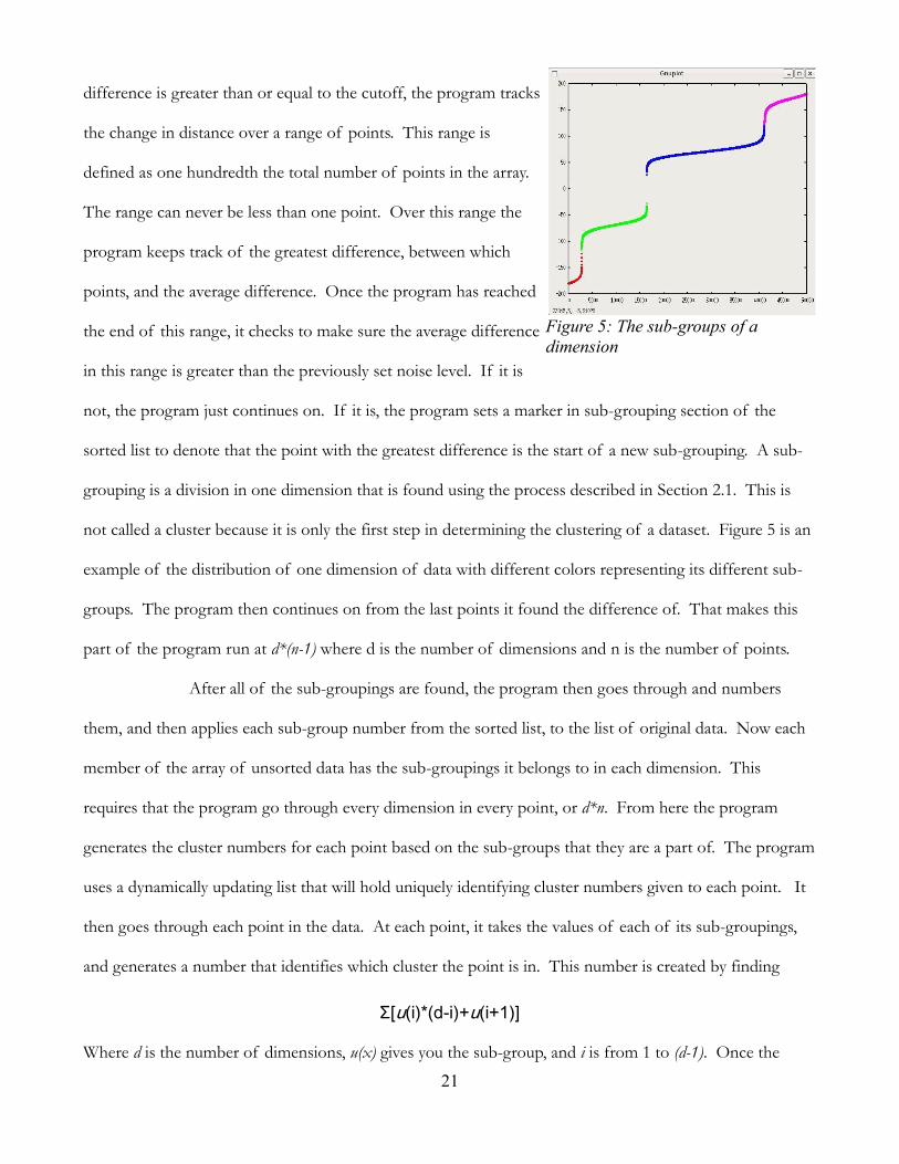
difference is greater than or equal to the cutoff, the program tracks
the change in distance over a range of points. This range is
defined as one hundredth the total number of points in the array.
The range can never be less than one point. Over this range the
program keeps track of the greatest difference, between which
points, and the average difference. Once the program has reached
the end of this range, it checks to make sure the average difference
in this range is greater than the previously set noise level. If it is
not, the program just continues on. If it is, the program sets a marker in sub-grouping section of the
sorted list to denote that the point with the greatest difference is the start of a new sub-grouping. A sub-
grouping is a division in one dimension that is found using the process described in Section 2.1. This is
not called a cluster because it is only the first step in determining the clustering of a dataset. Figure 5 is an
example of the distribution of one dimension of data with different colors representing its different sub-
groups. The program then continues on from the last points it found the difference of. That makes this
part of the program run at d*(n-1) where d is the number of dimensions and n is the number of points.
After all of the sub-groupings are found, the program then goes through and numbers
them, and then applies each sub-group number from the sorted list, to the list of original data. Now each
member of the array of unsorted data has the sub-groupings it belongs to in each dimension. This
requires that the program go through every dimension in every point, or d*n. From here the program
generates the cluster numbers for each point based on the sub-groups that they are a part of. The program
uses a dynamically updating list that will hold uniquely identifying cluster numbers given to each point. It
then goes through each point in the data. At each point, it takes the values of each of its sub-groupings,
and generates a number that identifies which cluster the point is in. This number is created by finding
Σ[u(i)*(d-i)+u(i+1)]
Where d is the number of dimensions, u(x) gives you the sub-group, and i is from 1 to (d-1). Once the
Figure 5: The sub-groups of a
dimension
Page 22
22
number is created, it is checked against a list of similarly generated numbers, and assigns the point a cluster
number accordingly. This process takes roughly d*n. It takes the program approximately O(4dn-2d) to
cluster data using this process, where n is the number of points of data and d is the number of
dimensions.
3.1.2. Writing the Cutoff Function One of the functions in the first version of the program allowed users to set a minimum
distance that must exist between two points in a cluster. It was originally created for use with data taken
from AutoDock, but needed to be re-written because of its possible applications with non-AutoDock data.
This was called the cutoff function.
The program uses the sorted version of the data, generated during the clustering process,
to make checking the distances easier and faster. The program starts with the first sorted point in the first
dimension, and then walks the sorted version of the array until it finds a distance in the first dimension,
between the original point and the current point, that is greater than the cutoff. Then it to the next point,
and repeats this process until it reaches the last point. The program uses the root mean square deviation
formula
square root(Σ[(∆i)²])
This formula assures us that any dimension with a difference greater than the cutoff if beyond the
minimum distance. This process takes n*m where n is the number of points of data in the array, and m is
the average number of elements beyond the current element that are inside the cutoff. Unfortunately m
has a large range, anywhere from 1 to n-1, which varies from point to point, and dataset to dataset.
The other important thing to note about this functionality is that it works in conjunction
with the clustering, not in place of it. This means that the cutoff is applied after all of the data has been
clustered, and that the cutoff would not create new clusters, but merge existing ones. In the worst case, it
would take O(n*([n-1]/2)).
3.1.3. Writing the Analysis The most important and arguably the most time consuming part of the program is the
Page 23
23
functions responsible for generating and returning analysis of the clusters that were found. This includes
rather simple information, such as the number of clusters and their members, to more involved
information such as the approximate area, volume or hyper-volume of a cluster. There are three major
parts in the analysis of the data, two of which require a substantial amount of effort on the part of the
program to generate.
The first part of the analysis generates the volume and center of the cluster. The simplest
piece of information that the program finds here is the geometric center of the cluster. This is found by
getting the difference between the largest and smallest values in each dimension, and dividing them by two.
After this, the program attempts to find the approximate space that the cluster occupies. In the original
program, this would be done by creating a series of cubes that divide up the space the cluster occupies.
The program would then place each point into a cube based on its position in space. It would then make
sure all of those cubes that contained points were connected, and then multiply the volume of one by the
number of occupied ones to estimate the volume of the cluster. Given the complexities of creating an
array with an unknown number of dimensions, this approach was changed. Instead, the program creates a
one dimensional array that is Di^(d) long, where Di is the number of divisions and d is the number of
dimensions in the data. The program the goes through each point in a given cluster, and determines which
element in the array it should occupy. It finds this element using the equation
Σ[p(xi)*((d-i)*Di)]
Where d is the number of dimensions, i is from 1 to d, Di is the number of divisions, xi is the value of the
point in dimension i, and p(x) = floor[(x-MAX)*s/(MIN-MAX)] where MAX is the highest point in
dimension i, and MIN is the lowest point in dimension i. This requires that the program goes through
every dimension of every point. The program then makes sure that every element that contains at least
one point is connected to every other element in the array that contains at least one point, using the above
method. In order for the program to be sure it checked all of the elements, it goes through every point in
the cluster and finds the element in the array it corresponds to. When it finds an element in the array that
Page 24
24
is not vacant and not been looked at, it marks the element
as found, and then searches all elements that are touching
it in each dimension. Since this idea is difficult to
visualize, look at Figure 6 for an example. If you were
working with two dimensional data, ranging from 1 to 10
that had 10 subdivisions per dimension, Figure 6 would
help you find what element in a 1-D array each point
would be put into. For instance, the point (5,7) would be
placed in element 64 according to this chart. If we wanted to check all of the elements that are “adjacent”
to it, we would have to look in 53, 54, 55, 63, 65, 73, 74, and 75. This whole process takes the program n*u
where n is the number of points in the cluster, and u is the number of elements in the array that contain at
least one point.
Once the program has this information it then figures out the overall volume the “box”
taken up by multiplying the length of each dimension together. It then finds the estimated volume of the
cluster by dividing that number by the total number of division, and multiplying that by the number of
occupied ones. It also singles out the division with greatest number of points in it, and returns its density.
The program also gets the “dense center” of the cluster by getting the average of all of the points in this
division. The program also singles out the least dense cluster in a similar function, and returns its volume
as well. The average volume is the estimated volume of the cluster divided by the total number of points
in it. This is done for every cluster that has more than one member in it.
The second part of the analysis done by the program was added during the rewrite since it
was forgotten when the original program was written. In this part, the program computes the approximate
distance between clusters. In the interest of simplicity, these measurements were based of the geometric
centers of mass found in the previous part. Since every cluster needed to be checked against every other
cluster, it takes the program nc! where nc is the number of clusters. Given the inefficient nature of this
10 90 91 92 93 94 95 96 97 98 99
9 80 81 82 83 84 85 86 87 88 89
8 70 71 72 73 74 75 76 77 78 79
7 60 61 62 63 64 65 66 67 68 69
6 50 51 52 53 54 55 56 57 58 59
5 40 41 42 43 44 45 46 47 48 49
4 30 31 32 33 34 35 36 37 38 39
3 20 21 22 23 24 25 26 27 28 29
2 10 11 12 13 14 15 16 17 18 19
1 0 1 2 3 4 5 6 7 8 9
1 2 3 4 5 6 7 8 9 10
Figure 6: Example of 2-D data using 1-D
element numbers
Page 25
25
part, it is not included in the basic output.
The last part of the analysis does not apply to every dataset put through the program. It
only affects data taken from AutoDock files. While much of the information needed is already gleaned
from the file during the process of reading in the information, the program still needs to find the average
and lowest energy for each cluster. Fortunately, since the program can get it from an existing structure that
already has the information; all the program has to do is find these values for each point.
3.2. GLYLIB Functionality The main contribution of this project to the GLYLIB library was updating the functions
responsible for extracting data from AutoDock log files. While the existing function worked, it had some
limitation, such as an inability to handle residue numbers that were not contiguous and did not begin at the
number one. The other major problem was that the function was written based on AutoDock 3.x style
output, and could not glean most information out of an AutoDock 4.x file.
The first step in updating the functions was to look at the information that needed to be
extracted, and then compare their locations in both AutoDock versions 3.x and 4.x. A good portion of the
information is stored in a section that looks a lot like a pdb file, and is almost exact in its format. Aside
from those pieces of information, everything else that needed to be found was buried in text throughout
the log file, including the torsional data and energies for each run. As part of a request, one additional
piece of information was asked to be extracted, which version of AutoDock generated the file.
The next part was to try and separate out the process of reading in the pdb style data from
everything else. The data found in these sections are copies of the original ligand. The first one is an exact
copy of the original, and all of the subsequent copies are the different locations the ligand occupies in each
run. Since the information in these sections follows the format of a pdb, using the functions that extract
information from pdb files in the library was the easiest way to get it. In order to use them though, some
preprocessing had to be done to the data in the log file. Each section needed to be separated out of the
log file, and the words in front of the line identifiers needed to be stripped away. Once this is done, the
Page 26
26
data can be put through the pdb processing functions.
After that, the function has to extract the torsional data for each run. Fortunately, the location
of this information doesn't change between the different versions of AutoDock. From there the function
has to get the different energy calculations for each run. This information does change based on the
version of AutoDock that was used. In order to take this into account, two different functions were
written to extract the energy information, each tailored to the two different version of AutoDock. The
information taken from the log file is then placed in library structures designed to store docking
information.
The changes made to this function were critical to allow the program to be able to test
AutoDock data. Since the changes were made to the library, this means that this will allow future
programmers the functionality of reading in this data without having to recreate the same function. This
allows the project to contribute, not only directly through the clustering program but through any future
programs that want to read in this information.
3.3. Testing the Clustering In order to determine how well the clustering program works we need to define a series of
tests, designed to show how well the program clusters different kinds of data. With the help of Dr. B.
Lachele Foley, we created a program that would simulate data similar to what the group normally deals
with. Using this program, tests were created to check the programs ability to cluster by applying the results
to a metric that was created through the assistance of members of the group.
3.3.1. Defining the Metric The first part of the metric is to give every cluster an initial score of 100%. For every
member that is left out of the cluster, or every outlier that is added in, points must be taken away. The
amount of points to be taken away is determined by applying each point lost or added to a standard
normal distribution curve. This is done by first finding the mean and standard deviation of each
dimension of the cluster. With these, we find out where on the normal distribution curve a point is. In
the case of a point that was left out of a cluster, each dimension will be subtracted by the clusters mean in
Page 27
27
each dimension, and then divided by the standard deviation for each dimension. Then those numbers are
run through the error function (Erf 2008) to find out how far from the center of the cluster the point is.
The dimension with the highest percent is the point with the greatest distance. We then take one minus
that number, and subtract that percentage from the score of the cluster. In the case of an outlier, it is only
slightly different. Instead of putting each dimension through the error function, we use the following
function
f(x)=100*ln(x/m)
Where x is the number found by subtracting the mean and dividing by the standard deviation and m is
highest deviation of a number in the cluster for that dimension. Then we subtract this number from the
clusters score. If there are more than one point added or taken away in a cluster, then the process is
repeated until all unintended points are accounted for. Despite the subtractions have been made, a clusters
score can go no lower than 0. After each cluster has been given a score, then the totals are averaged for
each expected cluster, and that is the score given to that test. 100% is a perfect score, 90% or greater is a
good score, 80% or great is fair, 70% or greater is questionable, and anything less than 70% is
unacceptable.
3.3.2. Data Generation Program This program was written with the sole intent of creating data that simulates data similar to
what the program would see when used by the Woods Research Group. It used a Monte Carlo method
for generating pseudo-random numbers that fell within a specific distribution. Each dimension of a point
that is generated has four numbers associated with it, two pseudo-random numbers, a width, and a
probability. The two generated numbers we'll call D and v, the width we'll call w and the probability we'll
call p. The width must be a non-negative number greater than but not equal to 0. D and v must be
between or include 0 and 1. The important thing to note about the width, is that the larger the value, the
smaller the width becomes. For instance, a width of 700 may mean points in that dimension only vary by
.05 from the center, where as a width of 10 means they may vary up to 1 unit. For the purposes of
automating the program, the width is also chosen randomly.
Page 28
28
When generating the data, after finding a number for D and v, the program then sets p as
p(i) = e^(w(i)*D(i)²)
Where i is between 1 and the number of dimensions you want in the data. The program then checks to
see if v(i) is greater than p(i). If it is, then that means the random value is outside of the probability, and
cannot be used. The process is repeated until the program finds numbers for every dimension that meet
this requirement.
3.3.3. Defining the Datasets Using the aforementioned program, a series of datasets were created. They varied in size,
anywhere from two to over eleven thousand points of data with two, three, found, eight and sixteen
dimensions. Since this is mostly a test to prove that the program can cluster well regardless of the number
of dimensions, ten tests per dimension were generated. Five tests were nothing but expected clusters, data
that should be easily clustered together. The other five tests were copies of the first five, but will also
include random extra points dotted throughout the data. These points are called outliers. The difference
between a clusters and outliers are that outliers are widely dispersed and clusters are relatively compact.
They will range anywhere from .1 to greater than 2 units in diameter in any given dimension, although their
diameter will be generated pseudo-randomly. Each cluster and outlier is placed pseudo-randomly inside of
a defined system whose limits were set so that clusters would not be a large distance away. Then the metric
is applied to the results generated from the data to give an idea of how well the program clustered each
dataset. Experimental data, for which there is no known or easily recognizable answer, will also be run
through the program. This will be a test to see if, and if so how well, the program can separate out
conformation states of rotating carbohydrates. Some will be based off of know work (Younge et. al.)
while others may be from works in progress.
3.4. Testing the Timing 3.4.1. Defining the Tests
The other main point of the program is that it can cluster data relatively quickly. Since relative
is a rather loose term, it is the intent of this project to compare the method against a rather simple form of
Page 29
29
clustering. Since one of the main strengths of this clustering method is that it can define its own cutoffs, it
would be unfair to try and directly compare it against a clustering method that only uses a cutoff.
Unfortunately given the time constraints of this project, it would be impossible to develop another
clustering method that does not use a predefined cutoff. So instead we will create a basic clustering
method and replace the current method in the program with a method that only checks to see if points are
within a tolerance of one another. Then compare it against the existing method with the same datasets.
3.4.2. Defining the Datasets All of the data for the time trials will be generated using the program mentioned in Section
3.2.2. The data will be generated in the same ways as before, except that the number of points in each
dataset will be monitored more closely. Specifically, datasets with three, four, eight, sixteen, twenty-four,
and thirty-two dimensional data each with fifty, one-hundred, five-hundred, one-thousand, five-thousand,
ten-thousand, fifty-thousand, one-hundred-thousand, five-hundred-thousand, and one million points of
data. These tests were run on three different systems of varying RAM and processer speeds. The first
machine was an Intel Xeon 800Mghz with one gigabyte of RAM. The second machine was an Intel
Pentium 3 800Mghz with one-half a gigabyte of RAM. The last machine was an Intel Itanium 1.3Gighz
with two gigabytes of RAM.
3.5. Testing against AutoDock 3.5.1. Defining the Tests
The program will be tested against AutoDock to see how well the program can generate
positional clusters. AutoDock tries to generate positional and conformational clustering’s. The difference
between them is that positional clustering takes into account the orientation of the atoms of the structure
that is docking, where positional doesn't. This means that AutoDock can account for structures that have
rotated out of position when it generates its clustering analysis, the program cannot. An analogy to
contrast the two types would be to say that positional clustering can tell you where you are on a map, and
conformational clustering will tell you what direction you are facing. This means there is still an entire
other aspect to AutoDock's clustering that the program does not take into account. For the purposes of
Page 30
30
this project thought, that aspect is not relevant.
The results of the program will be compared by looking at the top five clusters, ranked
according to the member with the lowest energy. The number of members and which members are in
each cluster will be the primary areas of comparison.
3.5.2. Defining the Datasets The data for these tests will be generated by AutoDock itself using tested and proven
proteins and carbohydrates (Reily et. al.). As part of an AutoDock log file, the structure, location and
energies can easily be found. The program will extract this data from each log file using functions from the
GLYLIB library. In comparison with previous tests, these will only be using a small amount of data, no
more than a couple hundred points with only three dimensions. The only major departure from previous
tests is that clusters will be renumbered according by a ranking of lowest energy of a run. This energy
changes between AutoDock versions 3 and 4.
Page 31
31
4. Results
4.1. Clustering Tests
4.1.1. Minimum Number of Points
One of the first series of tests was on the minimum number of points needed for the program to
be able to distinguish clusters. These tests used small numbers of points, in specially oriented positions so
that it would be easy to test if the program had correctly found the clusters. No metric was applied for this
test, other than a pass fail based on the known number of clusters in each test.
There were five tests, with two, three, four, five and ten points in each, respectively. When run,
every test but the one with two points returned the correct number of clusters. After getting these results,
the first step was to confirm that the failure to cluster the two points was a result of the algorithm, and not
the result of their distance from one another. The distance between the two points was approximately
13.61 units. For the purposes of the tests, the units are arbitrary and don't represent any real
measurements, and therefore have no specific title attached to them. When compared to the distances
between the points in the three point data, 9.01 units, 10.82 units, and 14.37 units, and the fact that all three
points were considered separate clusters, the issue of distance becomes irrelevant.
The only other reason it might fail to cluster out the points is that the distance relative to the
number of dimensions is not large enough. To test this, the distances were changed between points in the
three and four point data. After altering the data a few times, the program managed to get three points
within less than 2 units of each other before they began to cluster together. Their distances from one
another were 1.05 units, 1.75 units, and 1.01 units. With the four points, the program could deal with
points within two to three units of each other before they started to cluster together. Their distances from
one another ranged from 1.937 units to 3.58 units. While it seemed the distance between the points in the
two point data seemed sufficient enough to warrant separation given the previous findings, to make sure
the distance was pushed to a point where there were no doubts that the two points should not be clustered
together. Even at a distance of 1346.28 units, the two points were still considered part of the same cluster.
Page 32
32
4.1.2. n-D Tests with Metric
The second batch of tests run on the program was to determine its ability to properly cluster
randomly generated data, using a specific distribution.
These tests varied in size from a couple hundred to
tens of thousands of points of data, spanning across
multiple dimensions. The results of these runs were
then compared against a metric designed to score the
program's ability to cluster. Table 1 displays the
scores for each test. Tests one through five are
similar to tests six through ten for each dimension,
except that six through ten include randomly
generated “outlier” points that are not meant to be part of any cluster. Scores of 90% or better are
considered good, greater than 80% are a fair score, greater than 70% are a questionable score, and anything
less than that is considered failing.
One of the interesting things to note about the results of the metric is how outliers affect how
accurately the program clustered the data. In the case of the 3D data, the outliers were not generated
randomly, but were intentionally placed in positions that were distant, but very far from were the clusters
were generated. This is different from how the locations of all of the other outliers were generated, which
was pseudo-randomly. While this does not explain away the poor performance of the program under
these circumstances, it does offer an explanation as to why the other dimensions did better with outliers
and three dimensional data did worse. In those cases, namely tests six, seven, and eight, the scores were
directly related to the fact that these clusters were taking in outliers that were a great distance away from
where the cluster was located. Some things to note from these tests, the average number of outliers taken
in were 2.5, with the highest number in one cluster being 6. Two-thirds of the clusters that failed had only
3D 4D 8D 16D
Test 1 91.67% 100.00% 100.00% 100.00%
Test 2 95.00% 100.00% 98.51% 98.93%
Test 3 100.00% 100.00% 99.40% 100.00%
Test 4 100.00% 100.00% 100.00% 95.34%
Test 5 91.67% 100.00% 100.00% 100.00%
Test 6 66.67% 100.00% 100.00% 100.00%
Test 7 50.00% 100.00% 100.00% 99.99%
Test 8 0.00% 100.00% 100.00% 100.00%
Test 9 100.00% 100.00% 100.00% 100.00%
Test 10 83.33% 100.00% 100.00% 100.00%
Table 1: Scoring of Clustering Tests
Page 33
33
one or two outliers in them.
The other interesting thing to note about the scores is the perfect scores in the four dimensional
data. Given that the data, their positions, and area of the clusters and outliers were all generated pseudo-
randomly, it is likely that these scores are the result of using purely pseudo-random data.
4.1.3. Tests with Poor Results
In the process of running experimental data generated by the research group, some situations were
identified that cause the program to return incorrect results. After reviewing them further with Dr. Lachele
Foley, we came to the conclusion that these poor results were a result of the method itself, and should not
affect the use of the program with AutoDock data, and not likely affect most of the experimental n-
Dimensional data.
The dataset that brought these issues to light is show in Figure 7. The data was originally meant to
test out how well the program could handle more
ambiguous clusters, in this case clusters that were
close together and surrounded by a good number of
points that could belong to any cluster. The program
had a hard time finding the clusters that the
researchers had expected it to. Instead, it returned
clustering’s that made little sense according to them.
While they had expected to see the green group as its
own cluster, they did not expect the points off to the far left of it to be clustered in with it. they had also
expected the section on the bottom left side of the green cluster to be made its own cluster, instead of a
series of different clusters. That also applies to the section on the bottom right side of the green cluster,
and just below the red cluster. This part was expected to become its own cluster, and not a collection of
smaller clusters. The results seemed to make no sense. Then after looking at the distributions it became
clearer.
Figure 7: Data with poor clustering
Page 34
34
Since the quantile method takes into account each dimension separately, and then applies the
results from each dimension back on the data as a whole, the process has a hard time distinguishing
clusters that cannot be easily distinguished in at least one dimension. In the case of Figure 7, the clusters
that were expected were being obscured because of the large amount of data that surround it. This
allowed us to form other test cases that we felt should produce similarly bad results. Each one, when run
through the program produced results that made no sense, but unlike the above experimental data, these
failures are more obvious. All of these examples were created in two dimensions because they are easier to
create using 2D data, but can appear in any number of dimensions. Figures 8 and 10 are examples of data
that will cause the program to generate poor clustering results.
Page 35
35
The problem that occurs in Figure 8 could best be described
as “cluster swallowing.” These are cases where a larger
cluster surrounds a smaller one in all dimensions. In this
case, the smaller cluster is en-circled by a large one, but this
is just one way for the problem to present itself. In any case,
the cluster being “swallowed” blends in with cluster that is
surrounding it, so when looking at it in only one dimension
at a time, as in Figure 9, the is no distinguishable difference
between the two. Since there is no substantial change in the curving of the distributions that would signify
a cluster, the method fails to find the cluster. This same problem is also the reason why Figure 10 will not
cluster properly.
In this case, what are obviously three separate clusters are
only separated out into two. These cases are different then
ones like Figure 8 because there is no real overarching cluster
that sounds the data. Instead, data from other clusters seems
to interfere with the separation of clusters in one dimension,
causing problems with separating the data.
This is evident when looking at the distributions for the data
Figure 8: Programs clustering of data
Figure 9: Distribution of X (left) and Y (right) values for Figure 8
Figure 10: Programs Clustering of data
Page 36
36
in Figure 11. They have been colored to show where the separations have been made in the dimensions.
In the X dimension data, you can see there is a minor change in the curving of the data, but not enough to
cause a break, as opposed to the Y dimension distribution which breaks at a substantial curve.
These cases show that the clustering method suffers from a problem of dimensional blindness.
Since the method only views that data in one dimension at a time, any clusters that may be obscured in one
or more dimensions, by other clusters, becomes difficult to separate. A couple of possible methods for
dealing with these problems are discussed in the Section 5.
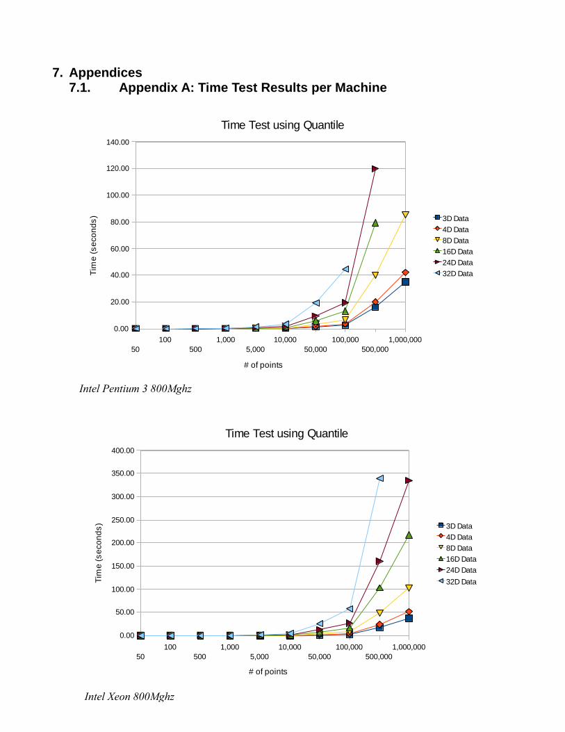
4.2. Time Tests
The last set of tests to be run on the program was the time tests. These were meant to test just the
time it took for the Quantile Plot method and the competing clustering method to cluster out data of
various sizes and dimensions. For these test the program was altered so that it didn't write any output files,
or do any special post-processing. The data that was generated used a program made specifically for
creating testing data, described in more detail in Section 3.2. For the quantile method, the tests were run
on three computers, of varying processor speeds and sizes of RAM. For the competing method, called the
“Cutoff Method”, the tests were run on only two of the machines. For details of the results of the runs
see Appendix A and B.
When looking at the results of the time trials on the quantile method, there are a few things to
Figure 11: Distribution of X (left) and Y (right) values for Figure 10
Page 37
37
note. For starters, regardless of the machine and the number of dimensions, the amount of time it took
for the algorithm to cluster fifty to five-thousand was insignificant. At around fifty-thousand, a noticeable
separation occurs between the different numbers of dimensions, which expands as the number of point’s
increases. The other thing to note in the results is that some of the tests were not completed. These were
due to the limitations of the amount of memory. The machine with the Pentium 3 in it only had .5 Gb of
RAM in it, where as the Xeon had 1 Gb, and the Itanium had 2 Gb. The data in these cases were so large
that it began to take up more room then was allotted in memory and swap space. This showed another
limit to the program, the amount of memory needed to run the program given the number of dimensions
and points in the data. The last thing to note is that while the difference between dimensions increased
greatly as the number of points is increased, from 29 to 471 seconds in one case, the difference between
run times on machines increase slowly. As an example the average time difference between machines for
one million points with three dimensions was 4.15 seconds, which increased to an average of 15.75
seconds with eight dimensions.
When looking at the results from the cutoff method, two things stand out immediately. First, the
tests were done on two, not three computers. It was decided to run the tests on the two faster computers
because of the time limits left on the project. The other noticeable issue is that not all of the tests were
run. This was also the result of limited time left on the project, except this was not planned for. The
cutoff time tests ended up taking more time then expected, and so were forced to be cut short. As an
example, when trying to expand out to the next few tests in three dimensions, the five-hundred-thousand
point test had to be stopped after twenty-three hours to free up much need time on the processing node.
While the data found is incomplete, the trend it shows is undeniable. While they seem strikingly
similar to the quantile results between fifty and five-thousand, the two methods begin to distinguish
themselves after that. The sharp jump at fifty-thousand points shows that the amount of time needed by
the algorithm increases greatly as the number of points increases, and is only compounded by the number
dimensions. In order to compare the two methods side by side, we had to use the natural log of the results
Page 38
38
when graphing them, due to the large distance in time in the fifty-thousand point test. Since the accuracy
of the time was taken no lower than a hundredth of a second, -5 is the number assigned to results of zero
seconds.
The graphs comparing the two algorithms show that they distinguish themselves almost
immediately. The cost of the cutoff method increased at far more rapid rate, regardless of the number of
dimensions, and speed of the processor.
4.3. AutoDock Tests
The greatest interest of the Woods Research Group was to see how well this clustering method
worked when applied to data generated by AutoDock. These tests pitted the program against a few
different challenges. It checked to see how well the program did against results from AutoDock version 3
and 4, using data that was created through x-ray crystallography experiments (RCSB Website) and data that
was generated through computational simulations, GLYCAM06 (Woods Group Website). For each run
there are two different things being compared. Bolded and underlined is the number of clusters found,
and the numbers below it are the number of members in the top ten, or fewer, clusters ranked according to
the lowest energy score based on the version of AutoDock.
AD3 PDB Ligand AD3 GLYCAM06
Ligand
AD4 PDB Ligand AD4 GLYCAM 06
Ligand
PDB id
[Chain]
AD3 Clustering
Program
AD3 Clustering
Program
AD4 Clustering
Program
AD4 Clustering
Program
1ELJ
[Alpha]
5
195
2
1
1
4
195
2
2
1
31
61
5
8
33
12
157
10
10
3
96
5
5
2
12
21
2
1
117
6
73
4
3
34
3
23
4
2
114
1
Page 39
39
1
10
8
11
3
10
9
5
1
2
2
2
2
10
4
4
17
2
4
2
1
1
1
15
26
20
5
5
2
1
2
4
1
1
1
1
1
1ELJ [Beta] 3
198
1
1
3
198
1
1
30
23
61
26
20
11
2
2
1
4
1
6
179
3
15
1
1
1
96
10
1
2
3
7
11
2
4
1
14
19
4
99
1
24
1
7
5
11
8
6
91
38
3
1
4
2
1
4
1
6
13
21
2
107
3
9
1
1
1
1
2
17
1A3K 69
5
7
15
2
2
28
9
6
1
3
36
11
2
20
11
7
3
7
1
18
5
74
11
26
25
22
1
2
2
6
4
1
30
1
4
55
42
1
2
14
24
2
1
139
2
2
1
4
6
8
3
2
1
3
30
1
4
1
14
1
10
20
77
2
2
162
2
1
1
2
4
2
3
5
1
2
40
1
1
1
19
2
3
1
21
16
9
Table 2: Results of AutoDock comparison
Page 40
40
While there were only a small number of tests done, the results are very promising. There are a
few things to note when looking at the results. 1ELJ, both Alpha and Beta, have a deep pocket at the
expected binding site, narrowing the majority of possible binding sites down to a very small area. This is
why the clusters are so largely populated for these tests. Overall the program managed to find overall
fewer clusters, and therefore more clusters with higher numbers of members.
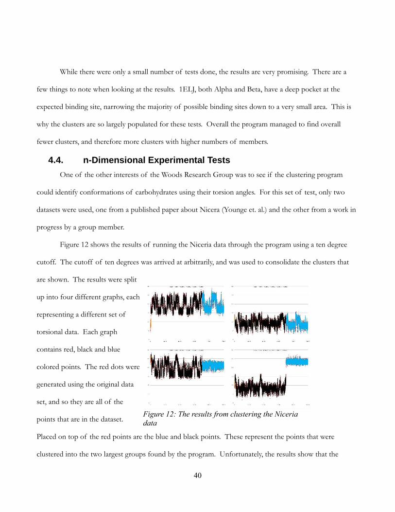
4.4. n-Dimensional Experimental Tests
One of the other interests of the Woods Research Group was to see if the clustering program
could identify conformations of carbohydrates using their torsion angles. For this set of test, only two
datasets were used, one from a published paper about Nicera (Younge et. al.) and the other from a work in
progress by a group member.
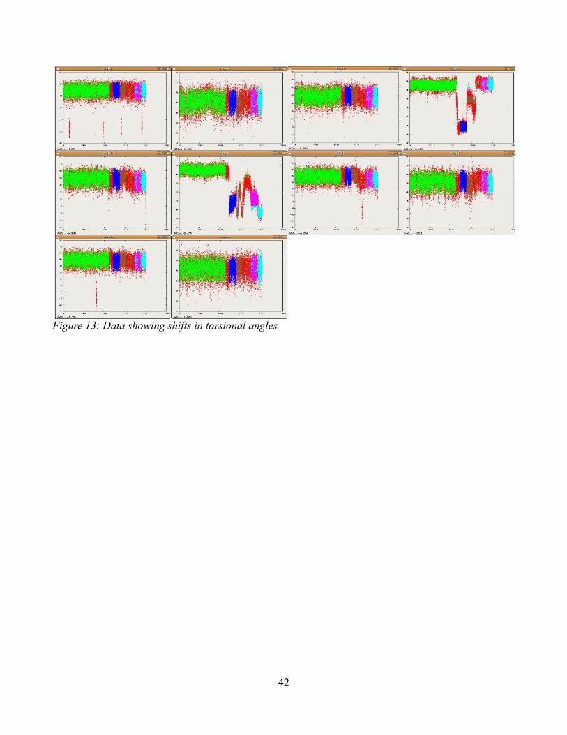
Figure 12 shows the results of running the Niceria data through the program using a ten degree
cutoff. The cutoff of ten degrees was arrived at arbitrarily, and was used to consolidate the clusters that
are shown. The results were split
up into four different graphs, each
representing a different set of
torsional data. Each graph
contains red, black and blue
colored points. The red dots were
generated using the original data
set, and so they are all of the
points that are in the dataset.
Placed on top of the red points are the blue and black points. These represent the points that were
clustered into the two largest groups found by the program. Unfortunately, the results show that the
Figure 12: The results from clustering the Niceria
data
Page 41
41
program did not separate out the conformations of the structure. This is most evident in the graph in the
top left. Notice how the data oscillates back and forth. The different sections the data oscillates between
are the conformation states. Thinking that the data might be too broad to separate out these states, we
then took these clusters, and ran them back through the program. The results were exactly the same.
After looking at the distribution of the data in the top left graph, we came to conclusion that this was a
problem similar to the one mentioned in Section 4.1.3. A possible way of countering this problem is
discussed in Section 5.
The other set of experimental data, as seen in Figure 13, is the same type of data as the other
experimental data. It is the angles of the torsions in a structure, in this case a carbohydrate. The idea
behind running this data through the program was to see how well the program could identify major shifts
in the angles of the torsions. The graphs in Figure 13 are similar to those in Figure 12 in that it shows all
of the data in one color, and then the top few groups overlaid in different colors. In this case, the original
data is colored red, while the top five groups are colored green, blue, light blue, purple, and brown. As you
can see, two of the dimensions show major shifts in the angles at one point in the data, but that the
program managed to separate out some groups in these areas. While the separations are not perfect, they
do show that the data has massive shifts by creating a number of decently populated clusters that would
not be there if there were no major shifts. In this case, the amount of points in each of the top clusters
would give the user an idea of how much change existed in the data.
Page 42
42
Figure 13: Data showing shifts in torsional angles
Page 43
43
5. Conclusions and Recommendations
Using quantile analysis is fast but
flawed. When applying it to data that does
not have distinct or easily recognizable
clusters, or to data with overlapping
clusters, the program can not accurately
separate out clusters. When dealing with
sparse or distinct groupings in datasets, the
program can easily extract the correct
clusters. This is caused, in large part, by
how the program processes the data.
After sorting the data, the program
finds a noise level for the data and a cutoff
level. These are used because the positive
slope is not constantly increasing or
decreasing, but instead varies from point to
point, and the program needs to
distinguish between a significant change
and a minor variation. Figure 14 shows a
blown up graph of a distribution of sorted
points. In it you can see the distances
between the points, and how they are
increasing but constantly changing. The
cutoff point is the distance that two points
must be from one another in order for the program to consider creating a separate grouping. The program
Figure 14: Each point in a sorted distribution
Figure 16: Line of distribution data applied to a spline curve
Page 44
44
then takes the average distance of a
relatively small number of points after it.
As long as that average is above the noise
level, then the program separates the data
into two distinct groups. It is possible that
this is the problem.
Instead of using a signal to noise
ration method, the program should use
data smoothing methods, such as applying
the data to a Bezier curve, and then looking
at the data. Smoothing out the data means
that less of or no tolerance would be
needed to look for changes in the slope of
the data. Figure 15 shows the same
distribution as in Figure 14, but instead of
showing the point, shows the line
generated by the data. As you can see the
line is very craggy. Figure 16 shows the
same distribution, but the data was fit to a
spline curve. As you can see, the data is
still noisy, with quite a few peaks and
valleys, but they are not as prominent as
they were in the unmodified data set.. Figure 17 is similar, except it applied the data to fit a Bezier curve
instead. As you see, this data looks like a smooth line. With the noise reduced to a minimum, this allows
for an increase in the sensitivity with which the program can detect changes in the slope. This in turn
Figure 15: Line of distribution points (Not Smoothed)
Figure 17: Line of distribution data applied to a Bezier Curve
Page 45
45
should increase the accuracy of the algorithm, but will take more time.
The tests involving AutoDock and its clustering methods showed some of the programs strong
and weak points. When the program analyzed data where the ligand was not in the proper state to dock
with a protein, the program returned results that suggested that in its current state, the ligand bound very
well to a specific area. This proves that the programs usefulness is limited to interactions where the ligand
is in its proper conformation. The tests, while preliminary, show the program not only does well at
identifying higher concentrated cluster, but can actually do better than AutoDock in some cases. In
particular, against AutoDock 4.0 clustering results, the program returned better results on average. It
should be noted though, that AutoDock's clustering method does take into account the positions of the
molecules involved in the interactions, whereas the program does not. It should also be noted that these
are just preliminary results and that more tests need to be run to determine the full limitations and
effectiveness of the program when applied to AutoDock data.
The time tests proved to be very successful. They showed a marked improvement over its
competing method. One of the major points the time tests help illustrate, aside from the speed of the
program, was its limitations in terms of memory. When trying to run some of the larger tests, both in
terms of numbers of points and dimensions, some of the systems could not process the data without
having to expand their page file sizes. This showed that there is a finite limit as to the number of points
and dimensions that the program can handle given the amount of memory in a system and that these limits
are easily achievable. The other major point made because of these tests was the ability of the program to
determine the volume and density of the data at higher dimensions. This was found as a result of trying to
run the time test data through the output function. Using the method in the program, trying to find these
values became impossible once the program reached 14 or more dimensions. This means that future
versions of the program will need to have a method for determining volume and density that will not be
problematic at higher, fifteen to at least thirty-two, dimensions.
While the experimental n-Dimensional data showed that there was possibly room for improvement,
Page 46
46
those methods cannot fix the issues of dimensional blindness found during the accuracy testing. While the
improved accuracy may mean the clusters that are obscured or surrounded by near-by clusters can be
separated out, this means that it will also be dividing up the over-arching cluster or clusters. This means
that the program no has to try to put clusters back together after being separated. This could be done by
setting a low cutoff value, but more tests would have to be done in order to prove this. Requiring a small
cutoff would also remove the programs ability to cluster without having any user input regarding the
specifics of the properties of a cluster.
The program has shown that it has limited capabilities, in terms of memory and data. Given
enough memory and easily separated data, the program can accurately cluster the data in a relatively short
amount of time. The program has also showed promise for being able to identify binding sites in ligand-
protein interactions, and with a little more modification may be able to expand the accuracy with which it
separates out clusters.
Page 47
47
6. References
Autodock Home Page. http://autodock.scripps.edu/ (accessed September 1, 2008)
Amber Home Page. October 10 2008. http://ambermd.org/#code (accessed October 10, 2008)
Davis, Benjamin G. and Antony J. Fairbanks. 2004. Carbohydrate Chemistry. Oxford University Press
Inc.
DeMarco, Mari L. and Woods, Robert J. April 4 2008. Structural glycobiology: A game of snakes and
ladders. Glycobiology 18, no. 6: 426-440
H.M. Berman, K. Henrick, H. Nakamura. 2003. Announcing the worldwide Protein Data Bank.
Nature Structural Biology 10 (12): 980.
http://www.rcsb.org/pdb/static.do?p=file_formats/pdb/index.html (accessed
September 1, 2008)
Lindsey, Jane C., Agnes M. Herzberg, Donald G. Watts. June 1987. A Method for Cluster Analysis
Based on Projections and Quantile-Quantile Plots. Biometrics 43, no. 2: 327-341. (Accessed
May 2008) http://www.jstor.org/stable/2531816
Morris, Garrett M., David S. Goodsell, Ruth Huey, William E. Hart, Scott Halliday, Rik Belew, Arthur
J. Olson, November 20 2001. AutoDock: Automated Dockingof Flexible Ligands to Receptors.
http://autodock.scripps.edu/faqs-help/manual/autodock-3-user-s-
guide/AutoDock3.0.5_UserGuide.pdf (accessed September 1, 2008)
Weisstein, Eric W. "Quantile-Quantile Plot." From MathWorld--A Wolfram Web Resource.
http://mathworld.wolfram.com/Quantile-QuantilePlot.html (accessed August 28, 2008)
Weisstein, Eric W. "Erf." From MathWorld--A Wolfram Web Resource.
http://mathworld.wolfram.com/Erf.html (accessed September 17, 2008)
Woods Group. (2005-2008) GLYCAM Web. Complex Carbohydrate Research Center, University of
Georgia, Athens, GA. (http://www.glycam.com) (accessed August 31, 2008)
Yongye, Austin D., B. Lachele Foley, Robert J. Woods. November 1 2007. On Achieving Experimental
Accuracy from Molecular Dynamics Simulations of Flexible Molecules: Aqueous Glycerol. The
Journal of Physical Chemistry 112: 2634-2639.
Page 48
48
7. Appendices 7.1. Appendix A: Time Test Results per Machine
50
100
500
1,000
5,000
10,000
50,000
100,000
500,000
1,000,000
0.00
50.00
100.00
150.00
200.00
250.00
300.00
350.00
400.00
Time Test using Quantile
3D Data
4D Data
8D Data
16D Data
24D Data
32D Data
# of points
Tim
e (
se
co
nd
s)
Intel Xeon 800Mghz
50
100
500
1,000
5,000
10,000
50,000
100,000
500,000
1,000,000
0.00
20.00
40.00
60.00
80.00
100.00
120.00
140.00
Time Test using Quantile
3D Data
4D Data
8D Data
16D Data
24D Data
32D Data
# of points
Tim
e (
se
co
nd
s)
Intel Pentium 3 800Mghz
Page 49
49
50
100
500
1,000
5,000
10,000
50,000
100,000
500,000
1,000,000
0.00
50.00
100.00
150.00
200.00
250.00
300.00
350.00
400.00
450.00
500.00
Time Test using Quantile
3D Data
4D Data
8D Data
16D Data
24D Data
32D Data
# of points
Tim
e (
se
co
nd
s)
Intel Itanium 1.3Gighz
50
100
500
1,000
5,000
10,000
50,000
100,000
500,000
1,000,000
0.00
2000.00
4000.00
6000.00
8000.00
10000.00
12000.00
Time Test using Cutoff
3D Data
4D Data
8D Data
16D Data
24D Data
32D Data
# of points
Tim
e (
se
co
nd
s)
Intel Pentium 3 800Mghz
Page 50
50
50
100
500
1,000
5,000
10,000
50,000
100,000
500,000
1,000,000
0.00
2000.00
4000.00
6000.00
8000.00
10000.00
12000.00
Time Test using Cutoff
3D Data
4D Data
8D Data
16D Data
24D Data
32D Data
# of points
Tim
e (
se
co
nd
s)
Intel Itanium 1.3Gighz
Page 51
51
7.2. Appendix B: Time Test Results per Dimension For all subsequent graphs “Q” stands for “Quantile Method” and “C” stands for “Cutoff Method” or
“Competing Method.”
50 100 500 1,000 5,000 10,000 50,000 100,000 500,0001,000,000
-6.00
-4.00
-2.00
0.00
2.00
4.00
6.00
8.00
Time Test with 3D Data
Q – Xeon
Q – P3
Q – Itan.
C – P3
C – Itan.
# of points
ln(T
ime
) [S
eco
nd
s]
50 100 500 1,000 5,000 10,000 50,000 100,000 500,0001,000,000
-6.00
-4.00
-2.00
0.00
2.00
4.00
6.00
8.00
Time Test with 4D Data
Q – Xeon
Q – P3
Q – Itan.
C – P3
C – Itan.
# of points
ln(T
ime
) [S
eco
nd
s]
Page 52
52
50 100 500 1,000 5,000 10,000 50,000 100,000 500,0001,000,000
-6.00
-4.00
-2.00
0.00
2.00
4.00
6.00
8.00
10.00
Time Test with 8D Data
Q – Xeon
Q – P3
Q – Itan.
C – P3
C – Itan.
# of points
ln(T
ime
) [S
eco
nd
s]
50 100 500 1,000 5,000 10,000 50,000 100,000 500,0001,000,000
-6.00
-4.00
-2.00
0.00
2.00
4.00
6.00
8.00
10.00
Time Test with 16D Data
Q – Xeon
Q – P3
Q – Itan.
C – P3
C – Itan.
# of points
ln(T
ime
) [S
eco
nd
s]
Page 53
53
50 100 500 1,000 5,000 10,000 50,000 100,000 500,0001,000,000
-6.00
-4.00
-2.00
0.00
2.00
4.00
6.00
8.00
10.00
Time Test with 24D Data
Q – Xeon
Q – P3
Q – Itan.
C – P3
C – Itan.
# of points
ln(T
ime
) [S
eco
nd
s]
Page 54
54
50
100
500
1,000
5,000
10,000
50,000
100,000
500,000
1,000,000
-6.00
-4.00
-2.00
0.00
2.00
4.00
6.00
8.00
10.00
12.00
Time Test using 32D Data
Q – Xeon
Q – P3
Q – Itan.
C – P3
C – Itan.
# of points
ln(T
ime
) [S
eco
nd
s]