Tu torial 10: Colo r & Shades of Gray Page 253 P RACTICAL P HOTOSHOPCS5, L EVEL 2 TUTORIAL 10: C OLOR & S HADESOF G R A Y OVERVIEW In the color theory you took a first look at the differences between RGBand grayscaleimages. In this chapter, you will convert images from RGBto grayscale, and acquire some practical techniques for making grayscalelook as good as possible. Conversely, you will colorize grayscaleimages, and also use colorization techniques to alter selections of RGBimages. As you work on these images, you will gain a better understanding of blending modes. OBJECTIVES ■ Us e the fo ll owing techn iques to convert the same image f rom RGBcolor to grayscaleand compare the results: • Straight conversion • Desaturateimage b efore conversion • Base the conversion on an individual color channel • Channel Mixeradjustment layer • Black & Whiteadjustment layer ■ Partiall y desaturate images wi th the Channel Mixerand Black & Whiteadjustment layers for special effects. ■ Experiment with Opacitysettings and blend modesfor more special effects.
Transcript
8/9/2019 PS2_10
http://slidepdf.com/reader/full/ps210 1/42
Tutorial 10: Color & Shades of Gray Page 253
PRACTICAL PHOTOSHOP CS5, LEVEL 2
TUTORIAL 10: COLOR & SHADES OF GRAY
OVERVIEW
In the color theory you took a first look at the differences between RGB
and grayscale images. In this chapter, you will convert images from
RGB to grayscale, and acquire some practical techniques for making
grayscale look as good as possible.
Conversely, you will colorize grayscale images, and also use
colorization techniques to alter selections of RGB images.
As you work on these images, you will gain a better understanding of
blending modes.
OBJECTIVES
■ Use the following techniques to convert the same image from RGB
color to grayscale and compare the results:
• Straight conversion
• Desaturate image before conversion
• Base the conversion on an individual color channel
• Channel Mixer adjustment layer
• Black & White adjustment layer
■ Partially desaturate images with the Channel Mixer and Black &
White adjustment layers for special effects.
■ Experiment with Opacity settings and blend modes for more
special effects.
8/9/2019 PS2_10
http://slidepdf.com/reader/full/ps210 2/42
Tutorial 10: Color & Shades of Gray Page 254
■ Convert images from grayscale to RGB color, and then colorize the
resultant color image or parts of it by applying layer masks with:
• Color Fill, Gradient Fill, and Pattern Fill layers
• Hue/Saturation adjustment layers
• Hand painting on a blank pixel layer set to Color blend mode
• The Photo Filter adjustment layer
■ Employ the Match Color command to synchronize the tone and
color of a group of images.
■ Use the Color Replacement Tool.
CONVERTING FROM RGB TO GRAYSCALE
Sometimes you need a grayscale printout of a color image. For
example, you might need to include the image in a black and white
publication. Or, you just like the way some grayscale images look.Here are some techniques to achieve that conversion.
When you convert an image’s mode from RGB color to Grayscale, you
decrease image tonality from three color channels to one. Thus, before
you convert, you want to take some precautions:
1. Do as much editing as possible in RGB because you have more
tonal information and selections can be easier to make.
2. Duplicate the original image, and convert the duplicate to
grayscale. That way, you won’t accidentally lose your color
original.
3. If the source document has layers, flatten the image before
converting it. The interaction of colors between layer blendingmodes will change when the mode changes. However, flattening
will not delete any alpha channels the image contains.
8/9/2019 PS2_10
http://slidepdf.com/reader/full/ps210 3/42
Tutorial 10: Color & Shades of Gray Page 255
GUIDED EXERCISE 10.1:
EXPLORE RGB TO GRAYSCALE CONVERSION TECHNIQUES
In this guided exercise you will convert the colored iris image you
examined in an earlier tutorial into a variety of grayscale images. You may
be surprised to see how different these images will be from one another.
1. Either restore Photoshop’s default settings or reset its tools, colors,
and the Photography workspace.
2. In the location of your choice, make
a folder called irises where you will
save your iris images.
3. Open 10-iris.jpg. It is the same
image you used in an earlier tutorial
but renamed here.
4. Save the file as iris_rgb.psd in the irises folder.
5. Do a direct conversion of the image from RGB to grayscale:
a. Choose Image > Duplicate to
duplicate the image and save the
duplicate as iris_gr1.psd.
b. Choose Image > Mode >
Grayscale to convert the image
from RGB to grayscale.
Photoshop will
warn you that
direct conversion
is not the optimal
technique.
c. Click Discard and
then save iris_gr1.psd. (Remember, this is for experimentation.
8/9/2019 PS2_10
http://slidepdf.com/reader/full/ps210 4/42
Tutorial 10: Color & Shades of Gray Page 256
d. Compare the RGB and grayscale versions of the image.
Compared to the color version, the grayscale seems dull
and flat. This is a very typical problem when images are just
converted without taking some extra steps. Here, most of theimage is in the same tonal range, but the color flower is very
distinct from the foliage because the colors are so different.
In grayscale, the flower just blends into the foliage.
6. Desaturate before converting to produce different tones.
a. Activate iris_rgb.psd.b. Choose Image > Duplicate to duplicate the image and save
the duplicate iris_gr2.psd in the irises folder.
c. Choose Image > Adjustments > Desaturate to remove all
color from the image.
d. ChooseImage > Mode > Grayscale
to convert the image from
RGB to grayscale.
e. Save iris_gr2.psd.
f. Compare the two grayscale
versions of the image.
Desaturating before converting
gave better results. The
flower no longer blends into the foliage. That is because the
desaturation command takes into account the color balance
between the color channels in the original image.
7. Make a grayscale image from an individual color channel.
Each color channel in an RGB image is actually a grayscale document
that shows light in some places and not in others. Use that knowledge
advantageously when converting from RGB to grayscale.
8/9/2019 PS2_10
http://slidepdf.com/reader/full/ps210 5/42
Tutorial 10: Color & Shades of Gray Page 257
a. Activate iris_rgb.psd.
b. Choose Image > Duplicate to duplicate the image, name the
duplicate iris_gr3.psd and save it in the irises folder.
c. In the Channels panel, examine each of the color channels
individually.
Notice that the flower almost pops out of the background in
the Blue channel.
That is because this iris is
a blue flower. The floweris slightly more distinct in
the Red than the Green
channel, so the Red
channel may also be useful
down the road.
d. For now, click the Blue channel to activate it and choose Image > Mode > Grayscale
to convert the image from RGB to grayscale.
e. Click OK when you see
the discard other channels
warning. You are working
on a duplicate of theoriginal, right?
f. Save iris_gr3.psd and compare the RGB and grayscale
versions of the image.
g. Now the flower really shows
up in grayscale mode. Theonly problem is that the flower
itself is so light that it has lost
some richness of detail. But
8/9/2019 PS2_10
http://slidepdf.com/reader/full/ps210 6/42
Tutorial 10: Color & Shades of Gray Page 258
you can use your channel study for the next adjustment.
8. Make a Channel Mixer adjustment layer.
The Channel Mixer desaturates images by combining specified
percentages of each of the original color channels.
a. Activate iris_rgb.psd.
b. Choose Image > Duplicate to duplicate the image and save
the duplicate as iris_gr4.psd in the irises folder.
c. Reveal the Adjustments panel, and click the Channel
Mixer button.
The Output Channel is
set to the Red channel by
default, and any changes
you make by moving the
sliders will affect only the
Red channel.
d. Just below Output
Channel, check
Monochrome to change
the Output Channel
to Gray to make your
adjustments to the image
tonality, not to its colors.
When you check
Monochrome, all
the Channel Mixer
percentages change to 40% Red, 40% Green, and 20% Blue because for many images these percentages work well. The
Blue channel is minimized because although Blue holds detail,
it is also the channel that is most likely to contain digital noise.
8/9/2019 PS2_10
http://slidepdf.com/reader/full/ps210 7/42
Tutorial 10: Color & Shades of Gray Page 259
e. Save iris_gr4.psd.
How do these numbers compare with our 100% Blue version?
100% Blue, shown on the top, has more contrast between the
flower and its background, but the lower default Monochrome version has more flower detail.
The Histogram panel shows
the loss of highlight detail in
the 100% Blue adjustment,
blown out highlights indicated
by the red rectangle here.
f. Adjust the Red, Green, and
Blue sliders so that the
final version is mostly Blue,
but with some Red to provide highlight detail.
We used 85% Blue, and 22% Red. Then, we lowered the Green
channel to -7%, so that the total percentage is 100%. Notice that
8/9/2019 PS2_10
http://slidepdf.com/reader/full/ps210 8/42
Tutorial 10: Color & Shades of Gray Page 260
the percentages are calculated right in the panel for you.
How does a negative value like
-7% Green affects the image?
The negative value inverts thesource channel before combining
it with the other channels to give
the output results.
Here is how we came up with
our percentages. Lowering
the Blue channel to 85% andraising the Red channel to
15% gave more highlight
detail, but it also lightened
the background so it diminished the contrast between the
flower and the leaves.
Lowering the Green
channel to -7%, and then
adjusting the Red channel
up to 22% still gave 100%
overall tonality, but with
nice detail throughout the
tonal range. The Histogram panel supports what we see
visually. Your values do not need to be exactly the ones used here.
As you adjust them, examine both the image on screen and the
Histogram panel to get the tonality you desire. The goal is to have
the flower be distinct from the background with as much flower
detail as possible, with no blown highlights.
g. Save iris_gr4.psd.
9. Note that iris_gr4.psd is still in RGB image mode. Here are the
8/9/2019 PS2_10
http://slidepdf.com/reader/full/ps210 9/42
Tutorial 10: Color & Shades of Gray Page 261
steps to make a grayscale version:
a. Save the Channel Mixer version you like the best.
b. Choose Image > Duplicate to duplicate the image and save
the duplicate as iris_gr5.psd in the irises folder.
c. Flatten iris_gr5.psd, and change its image mode from RGB
color to grayscale.
d. Save iris_gr5.psd.
10. Close all open documents.
THE BLACK & WHITE ADJUSTMENT PANEL
Now that you have struggled through the
Channel Mixer, let’s examine a much easier
way to convert color images to grayscale: the
Black & White Adjustment. Designed
specifically to maximize image detail, the
Black & White Adjustment analyzes not just
the Red, Green, and Blue components of an
image, but also its Cyan, Yellow, and Magenta
components to provide more precise
conversions than the Channel Mixer which
only uses Red, Green, and Blue.
The Black & White Adjustment panel opens
with the Default preset applied to the image, as
shown above. There are other presets that simulate
using a color lens on a camera when taking a
photo such as Blue Filter and Infrared. But
probably the most important element in the Black
& White Adjustment panel is the Auto button.
Auto analyzes the color values of the image, and
8/9/2019 PS2_10
http://slidepdf.com/reader/full/ps210 10/42
Tutorial 10: Color & Shades of Gray Page 262
produces a grayscale version that maximizes the distribution of tonal
values. In other words, Auto hunts out detail. In our experience, Auto
works really, really well.
To the far left of the Auto button is the On-image Adjustment Tool.When the On-image Adjustment Tool is active (click to toggle it on or
off) and dragged on the image, Photoshop identifies the predominant
color at that location, and highlights that color’s amount in the
Adjustments panel. Here, Blues were highlighted when clicking on
the iris flower. Dragging to the left will darken that color’s tones in the
image; dragging to the right will lighten the
tones.
GUIDED EXERCISE 10.2: USE THE BLACK & WHITE ADJUSTMENT PANEL
In this guided exercise you will use the Black & White Adjustment
panel to convert the iris photo to grayscale, and compare your results
to your Channel Mixer conversion.
1. Open iris_rgb.psd and save it as
iris_bw1.psd in the irises folder.
2. In the Adjustments panel, click the
Black & White Adjustment button to
view the Default adjustment.
This adjustment gives rich image detail, but does not optimally
differentiate between the flower and its leaves.
3. Click the On-image Adjustment Tool to
activate it and press and drag slowly to the
right to lighten the Blue regions of the image.
4. With the On-image Adjustment Tool active, click on one of the darker areas in the
background and drag slowly to the left to
darken the background. Much better!
8/9/2019 PS2_10
http://slidepdf.com/reader/full/ps210 11/42
Tutorial 10: Color & Shades of Gray Page 263
5. Hide the Black & White 1 layer, activate the Background
layer, and click the Black & White Adjustment button in the
Adjustments panel.
These steps produce a second Black & White adjustment layerwith the Default settings.
6. Click the Auto button the Adjustments panel.
On-image Adjustment Tool Auto
The Auto results are very similar to what we achieved manually
using the On-image Adjustment Tool, but Auto was simpler.
7. Fine tune your Auto black and white conversion with the
On-image Adjustment Tool.
We chose to lighten the flower a bit
just like we did in step 3 above.
8. Save iris_bw1.psd and leave it openfor the next guided exercise.
BLACK & WHITE ADJUSTMENT SUGGESTIONS AND ISSUES
The Black & White adjustment only works on RGB images.
When working with CMYK or LAB images (we have not used those
here) you would need to convert the source image to RGB Color mode before you could make a Black & White adjustment.
Images with Black & White adjustment layers cannot be opened in
very early versions of Photoshop.
8/9/2019 PS2_10
http://slidepdf.com/reader/full/ps210 12/42
Tutorial 10: Color & Shades of Gray Page 264
Duplicate the source image, and merge or flatten the Black &
White adjustment layer as appropriate. The duplicate should open
just fine in older versions of Photoshop.
No matter what you do, the Black & White conversion looks lousy.
■ Black and white images need lots more contrast than color images
because grayscale images have fewer tones to provide their detail.
■ Adjust your image to increase its contrast applying the Black &
White command.
PARTLY DESATURATED IMAGES
An effective design technique is to
desaturate an entire image using a Black
& White, Hue/Saturation or Channel
Mixer adjustment layer, and then to paint
on the adjustment layer mask to bringback some or all of the color in chosen
parts of the image.
GUIDED EXERCISE 10.3: MAKE A PARTLY DESATURATED IMAGE
In this guided exercise you will mask some of the Black & White 2
adjustment layer in image iris_bw1.psd.
1. Open iris_bw1.psd if it is not already open and save it as
iris_mixed.psd in the irises folder.
2. Delete the Black & White 1 adjustment layer because you don’t
need it.
3. Click the Black & White 2 layer mask to activate the layer and its mask.
Make sure the mask thumbnail is
outlined.
8/9/2019 PS2_10
http://slidepdf.com/reader/full/ps210 13/42
Tutorial 10: Color & Shades of Gray Page 265
4. Choose the Brush Tool and set its brush options to 50 px soft
brush at about 35% Opacity.
5. Reset the Foreground and Background colors to the defaults and
paint with black on just the flower to lightly restore some of its color.
As long as you don’t release the mouse button, you will continue to
remove 35% of the mask as you paint with light gray. If you release
the mouse and then paint over an area a second time, it becomes
twice as dark, or about 70%. Here is
the image view on the left side and
the mask view on the right.
6. Continue painting on the mask until you have revealed a pleasing
amount of color in the flower.
7. Feather the layer mask to give it softer
transitions.
a. Make sure the mask thumbnail is still active.
b. Choose Filter > Blur >Gaussian Blur.
You will see the grayscale mask in the
filter window and the color image in the
document window.
c. Blur the mask just enough to soften the transitions, but not somuch that it leaks color out beyond the flower, and click OK.
A Radius of 6 pixels worked for us.
8. Save iris_mixed.psd.
BLENDING DESATURATED LAYERS
Layer blending modes can give very
interesting effects when blended with
the gray version of the same image.
8/9/2019 PS2_10
http://slidepdf.com/reader/full/ps210 14/42
Tutorial 10: Color & Shades of Gray Page 266
Guided Exercise 10.4:
Apply Layer Blend Modes to a Partly Desaturated Image
In this guided exercise you will experiment with blend mode options
to further change the look and feel of the iris image.
1. Open iris-mixed.psd if it is not already open and save it as iris-
mixed2.psd in the irises folder.
2. Click the Black & White 2 layer mask to activate the adjustment
layer and its mask.
3. Shift + Click the layer mask to
disable it.
The entire document will be in
shades of gray.
4. Experiment with the Overlay
blend mode.
a. Shift + Click the layer mask
again to enable it.
b. Change the layer blend mode
from the default Normal to
Overlay.
Notice that the flower is deeper in color and its colors have moregradual transitions from one shade to another.
5. Experiment with other blend modes to see how they affect the
document’s appearance.
6. Save one or more new versions of
the iris document, naming them
iris-mixed3.psd, etc.
This version uses Color Burn at
60% to darken the iris a little and
8/9/2019 PS2_10
http://slidepdf.com/reader/full/ps210 15/42
Tutorial 10: Color & Shades of Gray Page 267
the background more but still preserves some background detail.
ADOBE BRIDGE: OUTPUT TO PDF
In the first four guided exercises in this tutorial you made multiple versionsof the iris image. The Output panel in Adobe Bridge will allow you to
combine these images onto one or more pages of a PDF document,
depending on how large you wish to display each image. You can then
print the PDF, email it to someone, or upload it to a web page.
GUIDED EXERCISE 10.5: USE ADOBE BRIDGE TO COMBINE THE IRIS IMAGES
INTO A S INGLE PDF FILE FOR PRINTING
In this guided exercise you will make a PDF from all the images in your
irises folder. In this case, all the images have the same pixel
dimensions, but you could apply the same technique to any group of
images that you placed into a folder. They do not need to be the same
size; Bridge will resize duplicates when assembling the PDF.
1. Launch Bridge.
2. Using the
Essentials
workspace,
navigate to your
irises folder.
3. Choose the
Output workspace. If its name does not show in the Application bar,
you will need to click the Workspace menu arrow to choose it.
4. Examine the Output panel. At the
top of the panel, you have two
output choices: PDF and Web Gallery. Choose PDF.
PDF output is used for making contact sheets, printing multiple
copies of the same image on a page, and for making PDF slideshows.
8/9/2019 PS2_10
http://slidepdf.com/reader/full/ps210 16/42
Tutorial 10: Color & Shades of Gray Page 268
You will be making a CONTACT SHEET, a set of multiple images
printed at the same size on one or more page.
The Output panel contains a series
of panes where you can configureyour contact sheet.
5. Begin by picking 4 x 5 Contact
Sheet from the Template drop-
down menu.
The 4 x 5 Contact Sheet template will place 20 images on a page,
5 rows of 4 images each printed portrait or tall.
In the Output workspace, there is a big Preview pane in the center of
the window, and a filmstrip of images beneath it in the Content pane.
6. Click one of the
thumbnails in the
Content paneand then choose
Edit > Select All
(Command/Ctrl
+ A) to select all
the thumbnails in
the folder, eventhe ones you
can’t see without
scrolling.
7. Click Refresh
Preview in the
Output paneland wait while Bridge
creates the preview.
8/9/2019 PS2_10
http://slidepdf.com/reader/full/ps210 17/42
Tutorial 10: Color & Shades of Gray Page 269
The preview shows how the Contact Sheet will look.
8. Configure the Document tab, just
below the Refresh Preview button.
a. Change the Page Preset from
International Paper to U.S. Paper (8.5 x 11
inches) and click Refresh Preview.
Notice that each image in the
Preview pane enlarges slightly
because U.S. Paper is larger than
International Paper.
b. Observe the default Portrait
button to the far right of Height.
Notice the two Quality settings.
The top or Output Quality is set
in ppi (pixels per inch) for printedor screen PDF s. The default 300 ppi is for print.
The lower or JPEG Quality is like the Save for Web and
Devices dialog box. The default 70 is High, good for most
screen purposes. When a document will only be printed,
you may want to drag the slider all the way to the right , for
maximum quality. Likewise, you can drag the slider to the left to reduce file size, but that will increase JPEG artifacting in the
images.
The Document tab also gives you the opportunity to
password protect your PDF, and to allow it to be viewed on
screen but not printed. This option is useful for professional
photographers to permit a client to view photographs on
screen (at low resolution) but not to be able to print them.
8/9/2019 PS2_10
http://slidepdf.com/reader/full/ps210 18/42
Tutorial 10: Color & Shades of Gray Page 270
c. Click the triangle to the right of the Document tab to collapse it.
9. Configure the Layout tab to
customize your image layout.
a. Change the Columns from 4
to 3 and click Refresh Preview
to enlarge each image in your
Contact Sheet.
b. Click the triangle to the right of
the Layout tab to collapse it.
Rotate for Best Fit is typically used to print images of different
sizes on one sheet of paper. Each image will be of maximum size
for the PDF layout, and you can cut them apart after printing.
Repeat One Photo Per Page will fill a page with the same image.
Check this option if you want multiple copies of the same image,
again to cut apart after printing. Refresh Preview will only show thefirst page of the PDF.
Typically you should only have one photo active in the
Contents panel when choosing this option. Otherwise you
would generate multiple pages, one for each source image.
But that could be useful, such as when printing photographs
for sharing among, say, a kids sports team.
10. Examine the Overlays tab. We are not going to change these
settings, but you can on your own to format file names or to hide
them. Likewise, you can format
page numbering for multiple page
PDFs.
11. Add a header to the PDF.
a. Minimize the Overlays tab and
view the Header tab under it.
8/9/2019 PS2_10
http://slidepdf.com/reader/full/ps210 19/42
Tutorial 10: Color & Shades of Gray Page 271
If necessary, use the scroll bar on the right side of the Output
panel to see the settings.
b. In the Text box, type the
title of your PDF,Iris Gallery here.
c. Set the Font, Size, and
Color as desired.
d. The Divider is a solid
horizontal line, 1-5 px thick.
We set ours to white to give a little more white space. On white
paper the divider will not print.
e. Click the Refresh Preview button to view the header’s
appearance. To adjust it, make changes in the Header tab, and
Refresh Preview until you are pleased with your results.
12. Add a footer to the PDF.
a. Minimize the Header tab and view the Footer tab under it. If
necessary, use the scroll bar on the right side of the Output
panel to see the settings.
b. In the Text box, type the
your name.
c. Set the Font, Size, and
Color as desired.
d. It isn’t shown here, but we
set our divider to None.
e. Refresh Preview and tweak as desired.
13. Save and view your PDF.
The bottom of the output panel has two items:
8/9/2019 PS2_10
http://slidepdf.com/reader/full/ps210 20/42
Tutorial 10: Color & Shades of Gray Page 272
The View PDF After Save checkbox and the Save button.
The Save button works like in other applications. We saved our
PDF as irises.pdf . Bridge let us know when it was completed.
When View PDF
After Save is
checked, your PDF
will open in the
default PDF VIEWER
for your computer, typically either Adobe Acrobat or Adobe Reader.
14. Leave Bridge open for the
next guided exercise
GUIDED EXERCISE 10.6: USE
ADOBE BRIDGE TO COMBINE THE
IRIS IMAGES INTO A S INGLE PDF
FILE FOR SCREEN VIEWING
In this guided exercise you will
tweak the Output settings
from your initial PDF to make a
version for screen viewing.
1. Document tab changes:
a. Orientation from
Portrait to Landscape.
b. Output Quality lowered to
72 ppi for screen viewing.
c. Background color changed
from the default White toBlack (or whatever other
color you prefer).
8/9/2019 PS2_10
http://slidepdf.com/reader/full/ps210 21/42
8/9/2019 PS2_10
http://slidepdf.com/reader/full/ps210 22/42
Tutorial 10: Color & Shades of Gray Page 274
COLORIZING
GRAYSCALE
IMAGES
Sometimes you have a
grayscale image that you
wish to colorize, such as
an old photograph, or
one that has such “bad” or
distracting colors that youdecide to start neutral and just place the color where you choose. This
next section will provide several techniques for grayscale colorization.
But first, practice grayscale conversion one more time.
GUIDED EXERCISE 10.7: CONVERT FROM RGB TO GRAYSCALE AND BACK
In this guided exercise, you will open a color image and make agrayscale version of it. Then you will convert the grayscale back to RGB.
1. Either restore Photoshop’s default settings or reset its tools, colors,
and the Essentials workspace.
2. In the location of your choice, make a folder named snails.
3. Open 10-snail.jpg and save it inside the snails folder as snail-gr.psd.4. Select the snail and save your selection as an
alpha channel named snail.
It is much easier to make selections on color than grayscale images
because you can use the Quick Selection Tool and other tools and
commands that select by both color and tone to help make and
refine your selection. Alpha channels are retained when the image
is converted to grayscale.
5. Add a Black & White adjustment to snail-gr.psd to remove all
iris_bw1.psd
iris_gr2.psd
iris_gr5.psd
iris_mixed3.psd
iris_bw2.psd
iris_gr3.psd
iris_mixed1.psd
iris_rgb.psd
iris_gr1.psd
iris_gr4.psd
iris_mixed2.psd
Barbara Heiman
Iris Gallery
8/9/2019 PS2_10
http://slidepdf.com/reader/full/ps210 23/42
Tutorial 10: Color & Shades of Gray Page 275
color from the image but keep as much tonal detail as possible.
We began with Auto and then fine-tuned
the adjustment with the On-image
Adjustment Tool.
6. Change the Image Mode to Grayscale.
a. Choose Image > Mode > Grayscale.
You will see a dialog box asking
whether or not to flatten the
image because image modeconversion of layered documents
is more precise when the document is flattened first.
b. Click Flatten to flatten the image before conversion.
A second dialog box appears confirming that you want to
discard the image’s color information as it will be permanently
removed from the image.
Notice that Adobe
recommends using the Black
& White adjustment first, as
you have already done.
c. Click Discard to complete the image mode conversion.
d. Save the image to update its changes.
7. Confirm that snail-gr.psd really is a grayscale image.
a. Examine the image’s title bar to read where it says Gray/8meaning it is an 8-bit Grayscale image.
b. View the Channels panel to observe that there are only two
8/9/2019 PS2_10
http://slidepdf.com/reader/full/ps210 24/42
Tutorial 10: Color & Shades of Gray Page 276
channels: the Gray color channel and the snail alpha channel.
c. Sample a red
Foreground color to
attempt to paint on theimage in Red. The Foreground color
shows up in gray because snail-gr.psd is a
grayscale image.
8. Make an RGB version of snail-gr.psd.
a. Duplicate snail-gr.psd and name the duplicate snail-gr-rgb.psd.
b. With snail-gr-rgb.psd the active
document, choose Image > Mode > RGB
Color.
Although the image looks exactly the
same, it now has three color channels
plus the composite, and the foregroundcolor is red, not gray.
c. Save snail-gr-rgb.psd so that you have
its RGB version.
9. Examine the properties of your three snail files in Adobe Bridge.
a. Close any open images and then click the Go to Bridge buttonin the Options bar, and wait until Bridge opens.
b. Within Bridge, choose the Essentials Workspace, and then
choose Reset Standard Workspaces from the Workspaces drop
down menu in the Application bar so that your Bridge panels
resemble the ones described here.
c. Navigate to the snails folder, and open it to display your three
snail files inside the Content pane.
8/9/2019 PS2_10
http://slidepdf.com/reader/full/ps210 25/42
Tutorial 10: Color & Shades of Gray Page 277
d. Click the image named 10-snail.jpg, and reposition the otherpanes if necessary so that you can see the Metadata pane.
The Document Type is JPEG File, the File Size is 611 KB, and
the Color Mode is RGB.
e. Next activate snail-gray.psd inside the Content pane and
examine its File Properties.
The Document Type is Photoshop document, the File Size is
509 KB, and the Color Mode is B & W.
f. Finally, activate snail-gr-rgb.psd inside the Content pane and
examine its File Properties.
The Document Type is Photoshop document, the File Size is
1.18 MB, and the Color Mode is RGB.
The psd image, even with all its colors gone, in larger than the
8/9/2019 PS2_10
http://slidepdf.com/reader/full/ps210 26/42
Tutorial 10: Color & Shades of Gray Page 278
original color JPEG which has compression applied to it.
When you are converting images, Bridge’s Metadata pane lets you
compare the File Properties of images without having to open
them in Photoshop. That way, when you have a number of similar
images, you can open the one you need.
10. Double-click the snail-gr-rgb.psd thumbnail inside the BridgeContent pane to open that image in Photoshop.
11. Save it as snail-rgb.psd and leave it open for the next guided
exercise.
GUIDED EXERCISE 10.8: USE COLOR, GRADIENT, AND PATTERN F ILL
LAYERS WITH LAYER BLENDING OPTIONS
This guided exercise and the ones that follow provide a sampling of
colorization techniques for you to try. Once you practice them here,
you will probably want to try them on your own images.
1. Begin in Photoshop (not Bridge) with snail-rgb.psd open and the
Foreground color set to red.
2. Add color with a Color Fill layer.
a. Click the Create new fill or adjustment layer button and
choose Solid Color from the top of the pop-up menu.
b. Click OK in the Color Picker to create a solid red fill layer.
Photoshop displays the Color Picker to let you choose a
different color from your foreground color. When you click OK,
the solid red layer fills the document window.
8/9/2019 PS2_10
http://slidepdf.com/reader/full/ps210 27/42
Tutorial 10: Color & Shades of Gray Page 279
c. Change the blend mode of the Color Fill 1 layer to Color.
Although you can see the
image, but the red is very
bright.
d. Experiment with other blend
modes.
Here are Overlay, which brings
out some of the darker tones,
and Soft Light, which gives a
gentler colorization.
e. Double click the Color Fill
thumbnail to open the Color
Picker and sample a different
color.
Here we sampled a warm brown
tone by sliding to an orange
tone in the Hue slider in the center of the Color Picker, and then
sampling the tone from inside the Color Field to the left.
This shows the new color at
100% Opacity with Soft Light
blending mode. Lowering
the Opacity of the Color Fill
layer provides more subtle
colorization.
Color Blend Mode
Overlay Blend Mode
Soft Light Blend Mode
8/9/2019 PS2_10
http://slidepdf.com/reader/full/ps210 28/42
Tutorial 10: Color & Shades of Gray Page 280
3. Combine a Gradient Fill layer with a layer mask to colorize only
the snail.
a. Hide or delete the Color Fill 1 layer, activate the Background
layer, and load the snail alpha channel as a selection.
b. Click the Create new fill or
adjustment layer button and
choose Gradient Fill from near the
top of the pop-up menu, and click
OK to use the default settings.
c. Change the Gradient
Fill 1 blend mode to
Multiply.
The mask is not as precise
as it should be, leaving a
sloppy light gray edge.
d. Zoom in to 300%, and
paint on the edges of
the mask with white
using a small, soft brush
at 100% Opacity to
enlarge the selected area. Swap your colors to black to add tothe mask as needed.
4. You will need to use the saved selection again. Update the alpha
channel to include your refinements:
a. Alt/option + click the mask
thumbnail to reveal it in the
document window.
8/9/2019 PS2_10
http://slidepdf.com/reader/full/ps210 29/42
Tutorial 10: Color & Shades of Gray Page 281
b. Choose Select > Select All (Command/Ctrl + A) and then
Edit > Copy (Command/Ctrl + C).
c. In the Channels panel, activate the snail alpha channel and
then choose Edit > Paste (Command/Crtl + V) to replace theold mask with the new one.
d. Deselect and return to the Layers panel.
5. Save the document as snail_rgb2.psd.
6. Change the Gradient Fill settings:
a. Double click the Gradient Fill thumbnail in the Layers panel
to reopen the Gradient Fill
dialog box.
b. Change the Gradient to
Rainbow, its Style to Radial,
and uncheck Align with
Layer to place the gradient into the center of the image.
c. Adjust the Angle and Scale until you get
interesting results and click OK.
d. Adjust layer Opacity and Blend Mode
to soften the colorization. We used SoftLight at 50% Opacity.
7. Combine a Pattern Fill layer with the Gradient Fill layer.
a. Command/Ctrl + click on the mask thumbnail in the Gradient
Fill layer to simultaneously activate that layer and load the
mask as a selection.
b. Click the Create new
fill or adjustment
8/9/2019 PS2_10
http://slidepdf.com/reader/full/ps210 30/42
Tutorial 10: Color & Shades of Gray Page 282
layer button and choose Pattern Fill from near the top of the
pop-up menu.
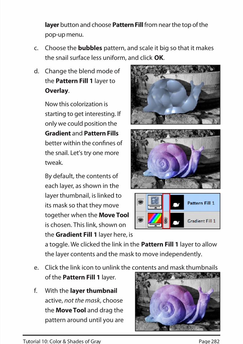
c. Choose the bubbles pattern, and scale it big so that it makes
the snail surface less uniform, and click OK.
d. Change the blend mode of
the Pattern Fill 1 layer to
Overlay.
Now this colorization is
starting to get interesting. If
only we could position the
Gradient and Pattern Fills
better within the confines of
the snail. Let’s try one more
tweak.
By default, the contents of
each layer, as shown in the
layer thumbnail, is linked to
its mask so that they move
together when the Move Tool
is chosen. This link, shown on
the Gradient Fill 1 layer here, is
a toggle. We clicked the link in the Pattern Fill 1 layer to allow
the layer contents and the mask to move independently.
e. Click the link icon to unlink the contents and mask thumbnails
of the Pattern Fill 1 layer.
f. With the layer thumbnail
active, not the mask , choosethe Move Tool and drag the
pattern around until you are
8/9/2019 PS2_10
http://slidepdf.com/reader/full/ps210 31/42
Tutorial 10: Color & Shades of Gray Page 283
happy with its position.
8. Save the image again to update your changes, and leave it open
for the next guided exercise.
You might be asking if you can use the unlinking trick to independently
move the Gradient Fill within its mask . We tried it unsuccessfully. The
gradient moved temporarily, but then jumped back.
Next you will try a few different colorization techniques for the image
background.
GUIDED EXERCISE 10.9: COLORIZE WITH HUE/SATURATION ADJUSTMENT LAYERS WITH MASKS
Photoshop has many, many techniques for colorization. In this
guided exercise you will use just two. First you will use a Black &
White adjustment layer to colorize the overall background. Then you
will paint on a blank pixel layer
set to Color Blend mode tocomplete the colorization.
1. Open snail_rgb2.psd if
necessary.
2. Load the snail alpha channel as a
selection, being sure to check Invert
to select everything but the snail.
3. Activate the top layer, click the
Black & White button in the
Adjustments panel, and check Tint in the Adjustments
panel to add a sepia tint to the background.
4. Click the Color Box next to the word Tint to open the ColorPicker, and sample a different color if you like.
8/9/2019 PS2_10
http://slidepdf.com/reader/full/ps210 32/42
Tutorial 10: Color & Shades of Gray Page 284
No matter what color you sample, keep it light to avoid
overpowering the image.
5. Mask the rocks beneath the snail
as they are gray in color.
a. Click the mask of the Black & White 1 layer to activate it.
b. Choose the Brush Tool and paint on the rocks with a soft 50
px brush set to 35% Opacity to gradually remove color from
the rocks.
c. While you are at it, also partiallymask the barrel staves, which
are iron not bronze.
6. Colorize the foliage.
a. Make a new blank pixel layer at
the top of the layer stack and
name it foliage.
b. Set the blend mode of the foliage layer to Color.
c. Sample a first foliage green color for your foreground color.
HINT: to find appropriate colors for colorization, locate another
image that has appropriate
colors and sample from it to
pick the color(s) you like.
d. Keeping the same Brush Tool
settings as before, paint on
what looks like leaves and
stems of the plants in the barrel
and on its side. It’s OK to be a
little abstract.
8/9/2019 PS2_10
http://slidepdf.com/reader/full/ps210 33/42
8/9/2019 PS2_10
http://slidepdf.com/reader/full/ps210 34/42
Tutorial 10: Color & Shades of Gray Page 286
PHOTO FILTER ADJUSTMENT
When you take a picture, its colors can be greatly affected by the
scene’s lighting conditions. The overall color cast provided by the
lighting conditions is called the COLOR TEMPERATURE. Traditionally,photographers have used colored lens filters to change the color
temperature, to warm up or cool down the scene. Photoshop’s Photo
Filter adjustment is designed to work like a colored lens filter, with
presets for the commonly used color lens filters. You can either apply a
Photo Filter adjustment from the Image > Adjustments submenu, or
as an adjustment layer. Of course, we prefer the latter.
More flexible than a colored lens, you can adjust the Density slider
to set the opacity of the warming or cooling tint, or change its color
altogether.
GUIDED EXERCISE 10.10:
EXPERIMENT WITH THE PHOTO F ILTER
In this short guided exercise you will apply different
Photo Filter settings to a picture of “Hamlet’s”
Castle, in Denmark.
He was apparently never there.
1. Open 10-arch.jpg and save it as arch.psd.
2. In the Adjustments panel, click the Photo Filter button to activate
the adjustment.
3. The Photo Filter
opens with its first
preset, Warming
Filter (85). The Filter menu
includes a number
8/9/2019 PS2_10
http://slidepdf.com/reader/full/ps210 35/42
Tutorial 10: Color & Shades of Gray Page 287
of other common filters and settings.
4. Choose Cooling Filter (80).
Compare both of these
adjustments to the original.
Each changes the “feel” of the
photograph.
On your own, experiment with
the other two settings. Color
lets you choose your own color
with which to alter the overall image; Density lets you
control how strongly the chosen color or filter should be applied.
THE MATCH COLOR COMMAND
Occasionally, you need to use a set of images together, such as in
a magazine, web site, or photo exhibit. The images look their bestwith consistent tonal values. The Match Color command will let you
synchronize the tonality for the images so that they display better as
a group.
GUIDED EXERCISE 10.11: MATCH THE COLORS OF A GROUP OF IMAGES
In the dinosaurs folder you will find three images taken with different
camera settings. In this guided exercise you will use Match Color to
better synchronize them.
1. Open dino1.jpg, dino2.jpg, and dino3.jpg inside the dinosaurs
folder.
2. Arrange the windows of the three images so that you can see most
of each image on your monitor.
a. In the Application bar, locate the Arrange Documents
button, and click it to see its visual menu of document setups.
8/9/2019 PS2_10
http://slidepdf.com/reader/full/ps210 36/42
Tutorial 10: Color & Shades of Gray Page 288
b. Choose the three up version that has
a portrait image on the left side and
two landscape images on the rightside.
3. Decide which image has the colors you
like the best.
4. We prefer dino2.jpg
although dino1.jpg and
dino2.jpg look similar
enough that we only need
to synchronize dino3.jpg
in the lower right corner,
which appears very blue.
5. Activate dino3.jpg.
6. Duplicate the
background layer
because Match
Color works on
actual pixels, not on
an adjustment layer.Rename the new
layer Match Color.
7. Activate the Match
Color layer and
choose Image >
Adjustments >Match Color.
8. Near the bottom of
8/9/2019 PS2_10
http://slidepdf.com/reader/full/ps210 37/42
Tutorial 10: Color & Shades of Gray Page 289
the dialog box, choose dino2.jpg from the Source pop-up menu.
Any open document may be used as a matching source. If a
document has more than one layer, you need to specify which
individual layer to use as your source.
9. If desired, you can make other adjustments in the Image Options
section of the dialog box.
Luminance adjusts the overall brightness of the image. Make
sure to watch the histogram panel as you change luminance to
preserve good image tonality.
Color Intensity adjusts saturation.
Fade can be used to lessen the effects of the adjustment.
The Neutralize check box can be used to remove color casts.
10. Click OK to match the image with its source.
Match Color can alsobe used on selections,
to match a single
area of color between
two photos. This is
particularly useful
for advertisers, whowant the same color
item, like a sweater, to
appear in a series of
shots or to quickly change the sweater to match several different color
swatches.
Another use of Match Color is to predetermine important colordecisions, such as what color roof to put on a home. Here, you would
take pictures of the house at different angles and at different times
8/9/2019 PS2_10
http://slidepdf.com/reader/full/ps210 38/42
Tutorial 10: Color & Shades of Gray Page 290
of the day. Then you would go to the roofing company web site, and
download their roofing color swatches. Finally, you would select the
roof on your roof photos, and match the color to various samples to
determine which color looks best.
THE COLOR REPLACEMENT TOOL
In Course 1, you worked with the
Replace Color command to create a
temporary mask around specific
image colors and then replace thosecolors by adjusting their hue, saturation, and lightness. The Color
Replacement Tool, grouped with the Brush and Pencil Tools, works
similarly but it provides a lot more control because you paint the new
colors with a brush. As the Color Replacement Tool paints a new
color, it attempts to preserve the original image tone and detail.
GUIDED EXERCISE 10.11: USE THE COLOR REPLACEMENT TOOL
In this exercise, you’ll use the Color Replacement Tool to quickly
change the color of several elements of an image.
1. Either restore Photoshop’s default settings or reset its tools, colors,
& panel locations.
2. Open 10.foxes.jpg. It is a group of
three foxes made from Legos.
They are awfully red. Let’s changethem to a nice fox-like color.
3. Click on the Color Picker and choose a reddish-brown color, such
as R 120, G 61, B 8.
8/9/2019 PS2_10
http://slidepdf.com/reader/full/ps210 39/42
8/9/2019 PS2_10
http://slidepdf.com/reader/full/ps210 40/42
Tutorial 10: Color & Shades of Gray Page 292
your own images to:
■ “Develop” color photos into black and white images