Pulse: Toward a Smart Campus by Communicating Real-time Wi-Fi Access Data Aoyu Wu * Bon Kyung Ku * Furui Cheng * Xinhuan Shu * Abishek Puri * Yifang Wang * Huamin Qu * The Hong Kong University of Science and Technology Figure 1: The Pulse interface communicates the campus crowd information to the lay public on a projection screen: (A) The Map View provides a holistic view of the crowd distribution on the satellite map (A 2 ), with a pop-up window (A 1 ) displaying the derived information of campus facilities in loop; (B) The Chart View presents the statistical information including the crowd ranking of functional zones (B 1 ), the total and predicted count (B 2 ), the crowd movement among functional zones (B 3 ), and the buildings with top incoming and outgoing crowd (B 4 ). ABSTRACT To enhance the mobility and convenience of the campus community, we designed and implemented the Pulse system, a visual interface for communicating the crowd information to the lay public including campus members and visitors. This is a challenging task which could require analyzing and reconciling the demands and interests of data as well as visual design among diverse target audiences. Through an iterative design progress, we study and address the diverse preferences by the lay audiences, whereby design rationales are distilled. The final prototype combines a set of techniques such as chart junk and presenting competitive data. Initial feedback from wide audiences confirms the benefits and attractiveness of the system. * e-mail: {awuac, bkku, xshuaa, fchengaa, apuri, ywangjh, huamin}@ust.hk Index Terms: H.5.m [Information Interfaces and Presentation]: Miscellaneous 1 I NTRODUCTION With the ever-growing scale of higher education, crowdedness in campus facilities arises as a major issue which causes inconvenience and hinders mobility. However, this could be palliated if people are provided with crowd information for making decisions on mobil- ity. Therefore, we have witnessed various approaches for sensing and visualizing the crowd data on campus. Among various data resources, the Wi-Fi access log information stands out because of its availability and reliability [2]. With this capacity comes the task for designing visualization sys- tems for communicating the crowd information to the audiences. Specifically, we were asked to develop such communicative visual- ization on the projection screens within campus. This is challenging due to the difficulty of conveying the huge amount of data on a non-interactive interface. Furthermore, it is non-trivial to address the diverse audiences who vary in demands and interests of both data and visualizations. Through an iterative design process - via individual interviews,
Transcript
Pulse: Toward a Smart Campus by Communicating Real-time Wi-FiAccess Data
The Hong Kong University of Science and Technology
Figure 1: The Pulse interface communicates the campus crowd information to the lay public on a projection screen: (A) The MapView provides a holistic view of the crowd distribution on the satellite map (A2), with a pop-up window (A1) displaying the derivedinformation of campus facilities in loop; (B) The Chart View presents the statistical information including the crowd ranking offunctional zones (B1), the total and predicted count (B2), the crowd movement among functional zones (B3), and the buildings withtop incoming and outgoing crowd (B4).
ABSTRACT
To enhance the mobility and convenience of the campus community,we designed and implemented the Pulse system, a visual interface forcommunicating the crowd information to the lay public includingcampus members and visitors. This is a challenging task whichcould require analyzing and reconciling the demands and interestsof data as well as visual design among diverse target audiences.Through an iterative design progress, we study and address thediverse preferences by the lay audiences, whereby design rationalesare distilled. The final prototype combines a set of techniques suchas chart junk and presenting competitive data. Initial feedbackfrom wide audiences confirms the benefits and attractiveness of thesystem.
Index Terms: H.5.m [Information Interfaces and Presentation]:Miscellaneous
1 INTRODUCTION
With the ever-growing scale of higher education, crowdedness incampus facilities arises as a major issue which causes inconvenienceand hinders mobility. However, this could be palliated if people areprovided with crowd information for making decisions on mobil-ity. Therefore, we have witnessed various approaches for sensingand visualizing the crowd data on campus. Among various dataresources, the Wi-Fi access log information stands out because ofits availability and reliability [2].
With this capacity comes the task for designing visualization sys-tems for communicating the crowd information to the audiences.Specifically, we were asked to develop such communicative visual-ization on the projection screens within campus. This is challengingdue to the difficulty of conveying the huge amount of data on anon-interactive interface. Furthermore, it is non-trivial to addressthe diverse audiences who vary in demands and interests of bothdata and visualizations.
Through an iterative design process - via individual interviews,
paper- and code-based prototyping - we studied and distilled thedesign rationales for communicating crowd information to the lay au-diences. Specifically, we observed the difference among audiences’preferences for visual formats including texts and charts. We alsofound that audiences tended to attract attention by competitive datasuch as rankings. In addition, we took a look at how redundant en-coding and animation could promote effective communication. Webelieve that our lessons could contribute to the continued researchin similar application areas for visualizing crowd information.
2 RELATED WORK
Much work has been proposed to analyze the Wi-Fi access datafor behavior analysis [7, 9] or facility management [5]. However,there were few visualization systems proposed to communicate thoseinformation. A typical visualization approach is the heat map [3, 8].Other systems display crowd sizes at different locations using circleson a 2D map [1]. These approaches could deliver spatial distributioninformation, but could lack in sense of dynamic and realistic becausethe 2D maps do not provide intuitive representation of differentlocations. In addition, the exclusion of statistical information couldmake it impractical for real-life usage.
To address those issues, a recent system called Wi-Crowd [2] vi-sualizes real-time crowd distribution on campus using a 3D buildingmap, and a 2D information panel which includes useful numericalinformation such as top buildings of this hour. While it is shown tobe useful and engaging, it remains unclear how those decisions ondata and designs are made and whether the approaches are effective.For instance, 3D models and design used in the project were notsufficiently representative of the different locations on campus andtherefore, showing weakness in intuitive information delivery.
Our work adds to this conversion by contributing a set of designrationales that guide communicative visualization for this applicationarea. Meanwhile, we reported on the decision choices that wemade based on successful or failed prototypes, providing anecdotalevidence on several visualization techniques that might be helpfulfor such system.
3 DESIGN RATIONALES
Our first contribution is the derivation of design rationales for sys-tems which communicates Wi-Fi access data. The goal of the Pulsesystem is to communicate the Wi-Fi access data and derived usefulinformation to the university community and visitors, promoting theidea of smart campus.
Through the design progress, we have worked with a varietyof audiences including 4 administration staffs, 10 undergraduatestudents, 14 postgraduate students, and 6 external personnel. Weadopted different design approaches including individual interviewswhere we directly asked for their interests, paper- and code-basedprototyping where we gathered feedback. In the following text, wesummarize the design rationales that we distilled during the iterativedesign progress:
R1: Data visualization must come with geographical context.Audiences need to be cognizant of the geographical locations toenhance the sense of realistic and engagement. This is particularlyimportant for visitors which are unfamiliar with the environment.
R2: Persevere visual redundancy by dual-modality of textand visualization. We found that audiences tended to fall into twocategories: those who preferred graphical charts and those who likedtextual information such as tables. We believe that both types arevalid and our system shall address them by redundancy.
R3: Adopt simple understandable charts. We observed anoverall negative altitude towards complex visualization. Therefore,the system shall adopt simple, daily-used charts. Complex visualiza-tion shall emerge step-by-step to promote understanding.
R4: Involve competitive information. We noted that audiencestended to get attracted by competitive information such as rankings.
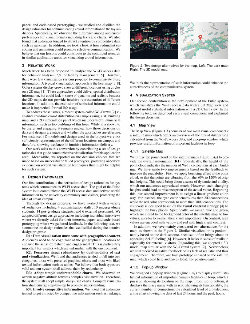
Figure 2: Two design alternatives for the map. Left: The dark map;Right: The 3D model map.
We think the representation of such information could enhance theattractiveness of the communicative system.
4 VISUALIZATION SYSTEM
Our second contribution is the development of the Pulse system,which visualizes the Wi-Fi access data with a 3D Map view andderived useful statistical information with a 2D Chart view. In thefollowing text, we described each visual component and explainedthe design decisions.
4.1 Map ViewThe Map View (Figure 1.A) consists of two main visual components:a satellite map which offers an overview of the crowd distributioncalculated from the Wi-Fi access data, and a pop-up window whichprovides useful information of important facilities in loop.
4.1.1 Satellite Map
We utilize the point cloud on the satellite map (Figure 1.A2) to pro-vide the overall information (R1). Specifically, the height of thepoint cloud indicates the number of Wi-Fi connections at each build-ing. We have made two improvements based on the feedback toimprove the readability: First, we apply bouncing effect to the pointcloud, so that the points are vibrating from the 80% to 120% of orig-inal heights. This could bring about a sense of dynamic and vitality,which our audiences appreciated much. However, such changingheights could lead to misconception of the actual value. Regardingthis, our second improvement is to assign a linear gradient color-way. For instance, the cyan color denotes less than 200 connections,while the red color corresponds to more than 1000 connections. Thecolorway is designed based on the visual contrast strategy [4] tohighlight the busy places. Specifically, we assign blue and green,which are closed to the background color of the satellite map, to lowvalues, in order to weaken their visual importance. On contrast, highvalues are encoded with yellow and red with high visual contrast.
In addition, we have mainly considered two alternatives for themap, as shown in the Figure 2. Similar visualization is predomi-nantly based on the dark scheme, because it often brings about anappealing Sci-Fi feeling [6]. However, it lacks in sense of realisticespecially for external visitors. Regarding this, we adopted a 3Dmodel map similar with the Wi-Crowd system [2]. Nevertheless,we still received negative feedback on its lack of realistic and thusengagement. Therefore, our final prototype is based on the satellitemap, which could help audiences locate the position easily.
4.1.2 Pop-up Window
We designed a pop-up window (Figure 1.A1) to display useful sta-tistical information of important campus facilities in loop, which apin icon showing its location on the map. From top to bottom, itdisplays the place name with an icon showing its functionality, thecurrent number of connection, the calculated level of crowdedness,a line chart showing the data of last 24 hours and the peak hours.
Figure 3: Two design alternatives for the bar chart. Left: Uniformcolor; Right: Infographics with customized marks.
We apply a visual redundancy method [4] for showing the peakhours. Specifically, the line chart and peak hour stable represent thesame information but in different forms. We adopt both textual andvisual form to support different user preferences (R2).
4.2 Chart View
The Chart view (Figure 1.B) presents the statistical informationincluding the crowd ranking of functional zones, the total and pre-dicted count, the crowd movement along functional zones, and thebuildings with top incoming and outgoing crowd.
We adopt simple, daily-used charts (i.e. bar and line charts) forthe crowd ranking and total count (R3). During the design progress,we mainly compared two design alternatives (Figure 3). First, wefound that the usage of gradient color as a junk chart componenthad received more positive feedback, compared with uniform colorscheme (Figure 3. Left). Second, while some audiences reported thatthe infographics with customized marks was interesting, this designwas not preferred because it could be unfamiliar, non-intuitive andtherefore take time to comprehend.
In order to visualize the campus movement, we use the stan-dard approach in the visualization community - the Chord diagram.However, we received many complainants from the audiences sincethey found it difficult to understand. We utilized the anchoring andredundancy technique [4] in response. Specifically, we calculateand set the top ten movement path as anchoring points, at whichwe highlighted the corresponding edge. Meanwhile, we providedtextual information of that edge as redundancy. We got positivefeedback that these improvements had made it easier to understand.
We additionally designed a ladder to display the building withmost incoming and outgoing crowd (R4). This idea was inspiredduring the initial interview where four audiences mentioned that theywere interested in such ranking data. We also showed this design toother audiences during the prototyping stage and received positivefeedback.
5 EVALUATION
Our third contribution is a user study to evaluate the benefits andattractiveness of the visualization design. Each user study sessioninclude a two-minute demonstration, a questionnaire, and a five-minute interview. There are totally 33 participants (18 males, 15females) between the age of 19 and 39 (mean 24.94, std 4.937).Those participants are excluded from the design progress.
Figure 4 shows the description and results of questionnaires. Asa whole, the visualization system receives an average score of 6.14,suggesting that the participants agree that it is useful, clear, interest-ing and engaging. However, participates reported less sanctificationwith the clearness. During the interview, two participants reportedthat it was still difficult to understand the Chord diagram. This indi-cates the needs for more effective methods for such communicativevisualization.
Figure 4: Description and results of questionnaires. The rightmostcolumn denotes the average score using 7-Likert scale.
6 DISCUSSION
Our work has two major limitations. First, our design decisions weremainly driven by anecdotal evidence gathered during the designprogress, which might be biased. We plan to conduct statisticalexperiments to verify those assumptions. Second, our evaluationmethodology was based on questionnaires and interviews. We intendto measure the success of the communication for more systematicevaluation in future.
7 CONCLUSION
We report on our design progress of the Pulse system, a commu-nicative visualization for Wi-Fi access data and crowd analytics oncampus. During an iterative design progress, we studied the userpreferences on different visual designs, and distilled four rationalesthat guides the design of such visual system. The final prototypecombines different visualization techniques such as redundancy toenhance the effectiveness of communication. Feedback gatheredfrom a user study indicates the benefits and attractiveness of ourapproach. We believe that our work could contribute to a growingscholarship on such application area.
ACKNOWLEDGMENTS
This work was supported by the grant XXX.
REFERENCES
[1] D. Ahlers, K. G. Aulie, J. Eriksen, and J. Krogstie. Visualizing acity within a city mapping mobility within a university campus. InInternational Summit, Smart City 360, pp. 492–503, 2016.
[2] A. Binthaisong, S. Phithakkitnukoon, and J. Srichan. Wi-crowd: Sens-ing and visualizing crowd on campus using wi-fi access point data. InProceedings of the 2017 ACM International Joint Conference on Per-vasive and Ubiquitous Computing and Proceedings of the 2017 ACMInternational Symposium on Wearable Computers, pp. 441–447, 2017.
[3] J. Horwitz. Wechat’s new heat map feature lets users-and chineseauthorities-see where crowds are forming, 2018.
[4] J. Hullman and N. Diakopoulos. Visualization rhetoric: Framing effectsin narrative visualization. IEEE Transactions on Visualization andComputer Graphics, 17, 2011.
[5] M. B. Kergaard and P. Nurmi. Challenges for social using wifi sig-nals. In Proceedings of the 1st ACM workshop on Mobile systems forcomputational social science, pp. 17–21, 2012.
[6] D. O’Shea. Sci-fi ui colour scheme and style, 2016.[7] P. Prasertsung and T. Horanont. How does coffee shop get crowded?:
using wifi footprints to deliver insights into the success of promotion.In Proceedings of the 2017 ACM International Joint Conference onPervasive and Ubiquitous Computing and Proceedings of the 2017 ACMInternational Symposium on Wearable Computers, pp. 421–416, 2017.
[8] I. Rudomn, G. V. Solar, J. E. Oviedo, H. Prez, and J. L. Z. Martini.Modelling crowds in urban spaces. In computacion y sistemas, Centrode Investigacin en computacin, pp. 57–66, 2017.
[9] Y. Zeng, P. H. Pathak, and P. Mohapatra. Analyzing shopper’s behaviorthrough wifi signals. In Proceedings of the 2nd workshop on Workshopon Physical Analytics, pp. 13–18, 2015.