9
Q1. In What Ways Does Your Media Product Use, Develop or Challenge Forms and Conventions of Real media products?

Q1. In What Ways Does Your Media Product Use, Develop or Challenge
Forms and Conventions of Real media products?

Conventions of a music magazine • Masthead- Large, original, memorable • House Style • Cover Star- takes up the majority of the front cover • Issue Date • Barcode • Price • Puff Post • Buzz Words • Cover lines (Main Cover line) • Incentive banner • Page Numbers • Pull Quote • Main article • Main Image • Features • Review • Drop Cap • Features • Regular Content

My front cover Q front cover

Similarities with the magazines making my media using the conventions: • Large bold headers (title of magazine), contrasting colour, original name, short. • Cover star takes up the majority of the page • Both got fairly bright puff posts • Cover lines majority down to the left side of the page • Main cover line by itself on the right hand side so it stands out • Names of artists in bold/capitals to capture the readers attention • Url of the website on the top of the pages for more access The way it develops or challenges the conventions: • An incentive bar at the bottom which also includes other articles in the magazine • The cover star is in the middle instead of closer to one side • It has a brick wall behind the cover star instead of being a studio shoot

Q Magazine contents page My contents page

Similarities with the magazines making my media using the conventions: • Both have a review at the bottom of the page- music related • Both have the magazine’s name at the top left of the page • Both have the date/ issue number at the top of the page • The columns are both on the left hand side and have contrasting colours to stand out
(white, red, black) • Both have multiple images about what is to come in the magazine The way it develops or challenges the conventions: • I do not have a “main image”, they are all around the same size • I only have 2 main columns and a review box instead of 3 columns
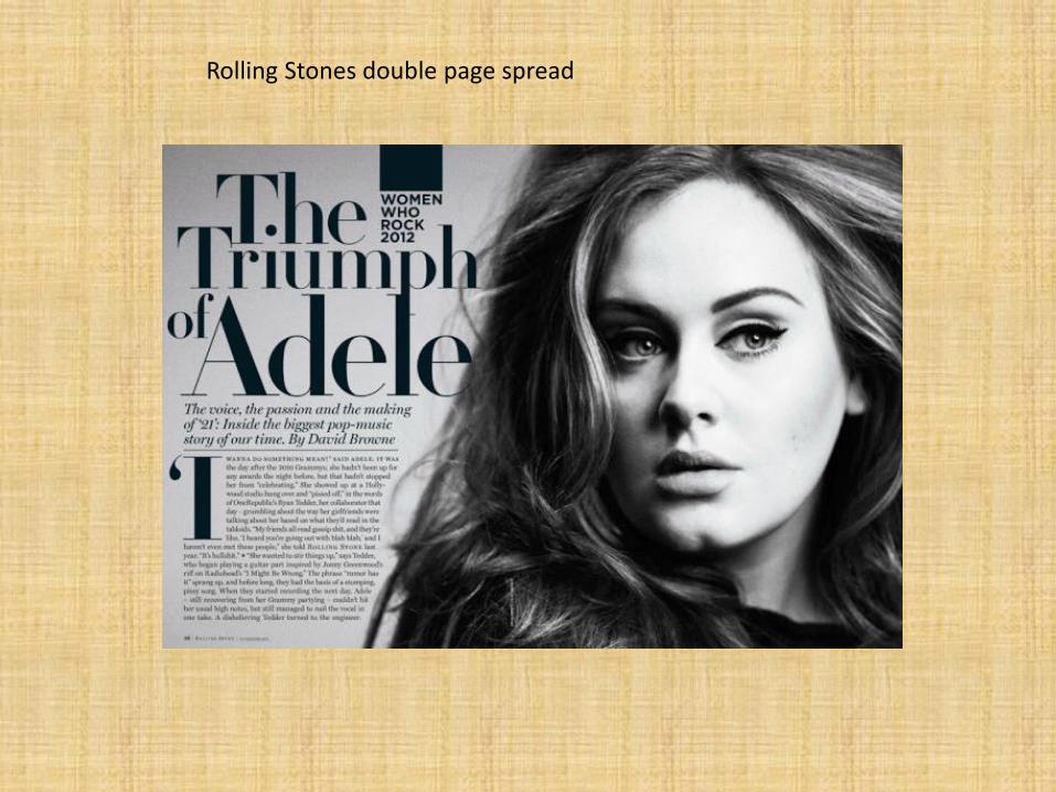
Rolling Stones double page spread

My double page spread

Similarities with the magazines making my media using the conventions: • The image is on the right side taking up the whole or more of the one page • The title is black, bold, eye catching and memorable- more than just the artists name-may
play with words • Black, bold drop cap on the first paragraph • The image looks professional and edited by Photoshop The way it develops or challenges the conventions: • Mine is a lot more colourful, where as rolling stones sticks to black and white • My article is an interview where as the Rolling Stones are on the majority writing about
the artist • There is one column in Rolling Stones, where as mine has three. • Mine has the page number clear in the corner where as Rolling Stones have left it out. • My interview has a pull quote in the middle of the column where as Rolling Stones hasn’t


