Quality Control ✓ ✒ ✏ ✑ 46.2 Introduction Quality control via the use of statistical methods is a very large area of study in its own right and is central to success in modern industry with its emphasis on reducing costs while at the same time improving quality. In recent times, the Japanese have been extremely successful at applying statistical methods to industrial quality control and have gained a significant advantage over many of their competitors. One need only think of the reputations enjoyed by Japanese motor, camera, TV, video, DVD and general electronics manufacturers to realize just how successful they have become. It is because of the global nature of modern industrial competition that quality control, or more precisely, statistical quality control has become an area of central importance to engineers. Manufacturing a product that the public want to buy is not longer good enough, the product must be of sufficiently high quality and sufficiently competitive price- wise that it is preferred to its competitors. Without statistical quality control methods it is extremely difficult, if not impossible, to either attain or maintain a truly competitive position. ★ ✧ ✥ ✦ Prerequisites Before starting this Section you should ... ① be able to calculate means and standard deviations from given data sets ② be able to estimate population means and standard deviations from samples Learning Outcomes After completing this Section you should be able to ... ✓ understand what is meant by the term statistical quality control. ✓ understand why different types of control charts are necessary. ✓ be able to construct and interpret a small variety of control charts, in particular those based on means and ranges. ✓ be able to describe in outline the rela- tionship between hypothesis testing and statistical quality control.
Transcript
Quality Control�
�
�
�46.2Introduction
Quality control via the use of statistical methods is a very large area of study in its own right andis central to success in modern industry with its emphasis on reducing costs while at the sametime improving quality. In recent times, the Japanese have been extremely successful at applyingstatistical methods to industrial quality control and have gained a significant advantage overmany of their competitors. One need only think of the reputations enjoyed by Japanese motor,camera, TV, video, DVD and general electronics manufacturers to realize just how successfulthey have become. It is because of the global nature of modern industrial competition thatquality control, or more precisely, statistical quality control has become an area of centralimportance to engineers. Manufacturing a product that the public want to buy is not longergood enough, the product must be of sufficiently high quality and sufficiently competitive price-wise that it is preferred to its competitors. Without statistical quality control methods it isextremely difficult, if not impossible, to either attain or maintain a truly competitive position.
�
�
�
�
PrerequisitesBefore starting this Section you should . . .
① be able to calculate means and standarddeviations from given data sets
② be able to estimate population means andstandard deviations from samples
Learning OutcomesAfter completing this Section you should beable to . . .
✓ understand what is meant by the termstatistical quality control.
✓ understand why different types of controlcharts are necessary.
✓ be able to construct and interpret a smallvariety of control charts, in particularthose based on means and ranges.
✓ be able to describe in outline the rela-tionship between hypothesis testing andstatistical quality control.
1. Quality ControlBackgroundTechniques and methods for checking the quality of materials and the building of houses, temples,monuments and roads have been used over the centuries. For example, the ancient Egyptianshad to make and use precise measurements and adopt very high standards of work in orderto build the Pyramids. In the Middle Ages, the Guilds were established in Europe to ensurethat new entrants to the craft/trade maintained standards. The newcomer was required toserve a long period of apprenticeship under the supervision of a master craftsman, and had todemonstrate his ability to produce work of the appropriate quality and standard before becominga recognized tradesman. In modern times the notion of quality has evolved through the stagesoutlined below.
Inspection
The industrial revolution introduced mass production techniques to the workplace. By the endof the19th century, production processes were becoming more complex and it was beyond thecapabilities of a single individual to be responsible for all aspects of production. It is impossibleto inspect quality into a product in the sense that a faulty product cannot be put right bymeans of inspection alone. Statistical quality control can and does provide the environmentwithin which the product is manufactured correctly the first time. A process called acceptancesampling improves the average quality of the items accepted by rejecting those items which areof unacceptable quality. In the 1920s, mass production brought with it the production line andassembly line concepts. Henry Ford revolutionised car production with the introduction of themass production of the ‘Model T.’
Mass production resulted in greater output and lower prices, but the quality of manufacturedoutput became more variable and less reliable. There was a need to tackle the problem of theproduction of goods and parts of a fixed quality and standard. The solution was seen to be inthe establishment of inspection routines, under the supervision of a Quality Inspector. The firstinspection procedures required the testing of the entire production - a costly, time consumingand inefficient form of sorting out good and defective items.
Quality Control
The Second World War brought with it the need for defect-free products. Inspection depart-ments now came to control the production process, and this resulted in the conformance toset specifications (the reduction of variability and the elimination of defects) being monitoredand controlled throughout production. Quality Control departments were separate from, andindependent of, the manufacturing departments.
Quality Assurance
In turn, Quality Control evolved into Quality Assurance. The function of Quality Assurance isto focus on assuring process and product quality through operational audits, the supplying oftraining, the carrying out of technical analysis, and the giving of advice on quality improvement.The role of Quality Assurance is to consult with the departments (design and production forexample) where responsibility for quality actually rests.
Total Quality Management
Quality Assurance has given way to Company Wide Quality Management or Total QualityManagement. As the names imply, quality is not longer seen to be the responsibility of a
HELM (VERSION 1: April 8, 2004): Workbook Level 146.2: Quality Control
2
single department, but has become the responsibility and concern of each individual within anorganisation. A small executive group sets the policy which results in targets for the varioussections within the company. For example, line management sets ‘do-able’ objectives; engineersto design attractive, reliable, and functional products; operators to produce defect-free productsand staff in contact with customers to be prompt and attentive. Total Quality Managementaims to measure, detect, reduce, eliminate, and prevent quality lapses, it should include not onlyproducts but also services, and address issues like poor standards of service and late deliveries.
Statistical Quality Control
As a response to the impracticality of inspecting every production item, methods involvingsampling techniques were suggested. The behaviour of samples as an indicator of the behaviourof the entire population has a strong statistical body of theory to support it.
A landmark in the development of statistical quality control came in 1924 as a result of the workof Dr. Walter Shewhart during his employment at Bell Telephone Laboratories. He recognisedthat in a manufacturing process there will always be variation in the resulting products. Healso recognized that this variation can be understood, monitored, and controlled by statisticalprocedures. Shewhart developed a simple graphical technique - the control chart - for determin-ing if product variation is within acceptable limits. In this case the production process is saidto be ‘in control’ and control charts can indicate when to leave things alone or when to adjustor change a production process. In the latter cases the production process is said to be ‘outof control.’ Control charts can be used (importantly) at different points within the productionprocess.
Other leading pioneers in the field of quality control were Dr. H. Dodge and Dr. H. Romig.Shewhart, Dodge and Romig were responsible for much of the development of quality controlbased on sampling techniques. These techniques formed what has become known as ‘acceptancesampling.’
Although the techniques of acceptance sampling and control charts were not widely adoptedinitially outside Bell, during the 1920s many companies had established inspection departmentsas a means of ensuring quality.
During the Second World War, the need for mass produced products came to the fore and inthe United States in particular, statistical sampling and inspection methods became widespread.After the Second World War, the Japanese in particular became very successful in the applicationof statistical techniques to quality control and in the United States, Dr. W.E. Deming and Dr.J.M. Duran spread the use of such techniques further into U.S. industry.
Statistical Process Control
The aim of statistical process control is to ensure that a given manufacturing process is as stable(in control) as possible and that the process operates around stated values for the product withas little variability as possible. In short, the aim is the reduction of variability to ensure thateach product is of a high a quality as possible. Statistical process control is usually thought of asa toolbox whose contents may be applied to solve production-related quality control problems.Essentially the toolbox contains the major tools called:
3 HELM (VERSION 1: April 8, 2004): Workbook Level 146.2: Quality Control
• the Histogram; • scatter diagrams;• the Pareto chart; • check sheets;• cause-and-effect digrams; • control charts;• defect-concentration diagrams; • experimental design methods;• sampling inspection.
Note that some authors argue that experimental design methods should not be regarded asa statistical process control tool since experimental design is an active process involving thedeliberate change of variables to determine their effect, while the other methods are basedpurely on the observation of an existing process.
Control charts are a very powerful tool in the field of statistical process control. Before lookingin some detail at control charts in general we will look at the relationship between specificationlimits and tolerance limits since this can and does influence the number of defective itemsproduced by a manufacturing process. It is this quantity that control charts seek to minimize.
Tolerance Limits and Specifications
An example of a specification for the manufacture of a short cylindrical spacer might be:
diameter: 1 ± 0.003 cm; length: 2 ± 0.001 cm.
Even though the ± differences here are the same (±0.003 in the case of the diameters and ±0.002in the case of the lengths), there is no reason why this should always be so. These limits arecalled the specification limits. During manufacture, some variation in dimensions will occur bychance. These variations can be measured by using the standard deviation of the distributionfollowed by the dimensions produced by the manufacturing process. Figure 1 below shows twonormal distributions each with so-called natural tolerance limits of 3σ either side of the mean.
Taking these limits implies that virtually all of the manufactured articles will fall within thenatural tolerance limits. Notice that in the top part of the figure the specification limits arerather wider than the natural tolerance limits and that little if any wastage will be produced.One could argue that in this case the manufacturing process is actually better than it needs to beand that this may carry unnecessary costs. In the lower part of the figure the specification limitsare narrower than the natural tolerance limits and wastage will occur In general, a productionprocess should aim to equate the two types of limits to minimize both costs and wastage.
Control Charts
Any production process is subject to variability. Essentially, this variability falls into two cate-gories called chance causes and assignable causes. A production process exhibiting only chancecauses is usually described as being ‘in control’ or ‘in statistical control’ whereas a productionprocess exhibiting assignable causes is described as being ‘out of control.’ The basic aim ofcontrol charts is the improvement of production processes via the detection of variability dueto assignable causes. It is then up to people such as process operators or managers to findthe underlying cause of the variation and take action to correct the process. Figure 2 belowillustrates the point.
HELM (VERSION 1: April 8, 2004): Workbook Level 146.2: Quality Control
4
Specification Limits
Idea
lV
alue
Tolerance Limits
Wastage
Production Line
ApplyCorrectiveAction
IdentifyBasicCause
VerifyActionandFollow-up
DetectAssignableProblem
Statistical Quality Control
Diagram 1 - Specification and Tolerance Limits
Diagram 2 - Correcting Assignable Variation
Idea
lV
alueWastage
3σ 3σ
3σ 3σTolerance Limits
A control chart basically consists of a display of ‘quality characteristics’ which are found fromsamples taken from production at regular intervals. Typically the mean, together with a measureof the variability (the range or the standard deviation) of measurements taken from the itemsbeing produced may be the variables under consideration. The appearance of a typical controlchart is shown below in Figure 3.
The centre line on the figure represent the ideal value of the characteristic being measured.Ideally, the points on the figure should hover around this value in a random manner indicatingthat only chance variation is present in the production process. The upper and lower limitsare chosen in such a way that so long as the process is in statistical control, virtually all of thepoints plotted will fall between these two lines. Note that the points are joined up so that itis easier to detect and trends present in the data. At this stage, a note of caution is necessary.The fact that a particular control chart shows all of its points lying between the upper andlower limits does not necessarily imply that the production process is in control. We will look
5 HELM (VERSION 1: April 8, 2004): Workbook Level 146.2: Quality Control
at this aspect of control charts in some depth later in this booklet. For now simply note thateven points lying within the upper and lower limits that do not exhibit random behaviour canindicate that a process is either out of control or going out of control.
Sam
ple
Char
acte
rist
ic
Upper Limit
Ideal Value
Lower Limit
Sample Number
Figure 3 - A Typical Control Chart
It is also worth noting at this stage that there is a close connection between control charts andhypothesis testing. If we formulate the hypotheses:
H0 : the process is in control
H1 : the process is not in control
then a point lying with the upper and lower limits is telling us that we do not have the evidenceto reject the null hypothesis and a point lying outside the upper and lower limits is telling us toreject the null hypothesis. From previous comments made you will realize that these statementsare not an absolute truth but that they are an indicative truth.
Control charts are very popular in industry. Before looking at particular types of control charts,the following reasons are given for their popularity.
(a) They are simple to use. Production process operators do not need to be fluent instatistical methods to be able to use control charts.
(b) They are effective. Control charts help to keep a production process in control. Thisavoids wastage and hence unnecessary costs.
(c) They are diagnostic in the sense that as well as indicating when adjustments need tobe made to a process, they also indicate when adjustments do not need to be made.
(d) They are well-proven. Control charts have a long and successful history. They wereintroduced in the 1920s and have proved themselves over the years.
(e) They provide information about the stability of a production process over time. Thisinformation is of interest to production engineers for example. A very stable processmay enable fewer measurements to be taken - this has cost implications of course.
HELM (VERSION 1: April 8, 2004): Workbook Level 146.2: Quality Control
6
Control Chart Construction
In order to understand how control charts are constructed, consider the following scenario. Partof a production line used by a manufacturer of instant coffee involves the use of a machine whichfills empty packets with coffee. The filler is set to fill each empty packet with 200 grams of coffee.As this is an electro-mechanical process, repeated over a long period of time, it is inevitable thatthere will be some degree of variation in the amounts of coffee dispensed. The question thatproduction engineers will need to answer is ‘Is the variation sufficient to result in a significant‘underfilling’ , or ‘overfilling’ , of the packets?’
The following data (which represents the weights of a sample of 50 packets) of 200 grams ofcoffee are obtained from the production line
Note that the summaries refer to a sample but, as the sample size is large (n = 50 ), these valuesmay be taken as estimates for the population parameters and we shall take their values as:
µ = 200.30 grams, σ = 1.84 grams
A plot of the data from Excel gives the following figure.
7 HELM (VERSION 1: April 8, 2004): Workbook Level 146.2: Quality Control
210
205
200
195
190
1 10 20 30 40 50
Wei
ght
(gm
)
Number of Packets
Figure 4 - Data Plot Chart
To the plotted series of data are added:
(a) a horizontal line representing the process mean of 200.30 grams
(b) two further horizontal lines representing the upper and lower control limits. Thevalues of these limits are given by x̄ ± 3σ and are calculated as 205.8 and 194.8
These lines are called the ’Upper Control Limit’ (UCL) and the ’Lower Control Limit’ (LCL).
This process results in the Figure 4 below.
In a production process, samples are taken at regular intervals, say every 10 mins., 15 mins., 30mins, and so on, so that at least 25 samples (say) are taken. At this stage, we will be able todetect trends - looked at later in this workbook - in the data. This can be very important toproduction engineers who are expected to take corrective action to prevent a production processgoing out of control. The size of the sample can vary, but in general n ≥ 4. Do not confuse thenumber of samples taken, with the sample size n.
The centre line, denoted by ¯̄x is given by the mean of the sample means
¯̄x =x̄1 + x̄2 + . . . + c̄k
k
where k is the number of samples. ¯̄x is used as an estimator for the population mean µ.
Given that the sample size is n the upper and lower control limits are calculated as
UCL = ¯̄x +3s√n
LCL = ¯̄x − 3s√n
HELM (VERSION 1: April 8, 2004): Workbook Level 146.2: Quality Control
8
These limits are also known as ’action limits’; if any sample mean falls outside these limits,action has to be taken. This may involve stopping the production line and checking and/orre-seting the production parameters.
In the initial example, a single sample of size n = 50 was used. In reality, with samples beingtaken at short time intervals, e.g. every 10 min., there is not sufficient time to weigh this manypackages. Hence, it is common to use a much smaller sample size, e.g. n = 4 or 5.
Under these circumstances, it is not sensible (very small sample size may give inaccurate results)to use s as an estimate for σ the standard deviation of the population. In a real manufacturingprocess, the value of σ is almost always unknown and must be estimated.
210
205
200
195
190
1 10 20 30 40 50
Wei
ght
(gm
)
Upper Control Limit
MeanValue
Lower Control Limit
Number of Packets
Figure 5 - Control Chart with Centre Line and Limits.
Estimating the Population Standard Deviation.
It is worth noting that there is, in practice, a distinction between the initial setting up of a controlchart and its routine use after that. Initially, we need a sufficiently large sample to facilitatethe accurate estimation of the population standard deviation σ. Three possible methods usedto estimate are:
(a) Calculate the standard deviations of several samples, and use the mean of these valuesas an estimate for σ.
(b) Take a single, large size sample from the process when it is believed to be in control.Use the standard deviation s of this sample as an estimate for σ. Note that this wasthe method adopted in the initial example.
(c) In industry, a widely used method for obtaining an unbiased estimate for σ uses thecalculation of the average range R̄ of the sample results. The estimate for σ is thengiven by the formula:
9 HELM (VERSION 1: April 8, 2004): Workbook Level 146.2: Quality Control
σ̂ =R̄
d2
where d2 is a constant that depends on the sample size. For example, the table given at the endof this Workbook, show that for n = 5, d2 = 2.326.
The control limits can now be expressed in the form:
¯̄x ± 3R̄
d2
√n
and, by a further simplification as:
¯̄x ± A2R̄
Tables for the constant A2 are given at the end of this Workbook.
Example The following table shows the data obtained from 30 samples, each of sizen = 4 taken from the ’instant coffee’ production line considered above. Thetable has been extended to show the mean x̄ and the range R̄ of each sample.Find the grand mean ¯̄x, the upper and lower control limits and plot the controlchart. You are advised that all of the necessary calculations have been donein Excel and that you should replicate them for practice. You can, of course,use a dedicated statistics package such as MINITAB if you wish.
HELM (VERSION 1: April 8, 2004): Workbook Level 146.2: Quality Control
10
Solution
Using Excel, the following results are obtained:
¯̄x = 200.01 and R̄ = 5.56
Using these values, the control limits are defined as:
UCL = ¯̄x + A2R̄ = 200.01 + 0.729 × 5.56 = 204.06
and
LCL = ¯̄x − A2R̄ = 200.01 − 0.729 × 5.56 = 195.96
UCL = 204.06
¯̄x = 200.1
LCL = 195.96
205.00
203.00
201.00
199.00
197.00
195.0010 20 30
Note that if the process is in control, the probability that a sample mean will fall outside thecontrol limits is very small. From the Central Limit Theorem we know that the sample meansfollow (or at least approximately follow) a normal distribution and from tables it is easy to showthat the probability of a sample mean falling outside the region defined by the 3σ control limitsis about 0.3%. Hence, if a sample mean falls outside the control limits, there is an indicationthat there could be problems with the production process. As noted before the process is thensaid to be out of control and process engineers will have to locate the cause of the unusual valueof the sample mean.
Warning Limits
In order to help in the monitoring of the process, it is common to find additional warning limitswhich are included on the control chart. The settings for these warning limits can vary but acommon practice involves settings based upon two standard deviations. We may define warninglimits as:
¯̄x ± 2σ√n
Using the constant d2 defined earlier, these limits may be written as
11 HELM (VERSION 1: April 8, 2004): Workbook Level 146.2: Quality Control
¯̄x ± 2R̄
d2
√n
Example Using the data from the previous worked example, find the 2σ warning limitsand revise the control chart accordingly.
Solution
We know that ¯̄x = 200.01, R̄ = 5.56, and that the sample size n is 4. Hence:
¯̄x ± 2R̄
d2
√n
= 200.01 ± 2 × 5.56
2.059 ×√
4= 200.01 ± 2.70
The warning limits clearly occur at 202.71 and 197.31. The control chart now appears as shownbelow. Note that the warning limits in this case have been shown as dotted lines.
UCL = 204.06
¯̄x = 200.1
LCL = 195.96
205.00
203.00
201.00
199.00
197.00
195.0010 20 30
Detecting Trends
Control charts can also be used to detect trends in the production process. Even when all ofthe sample means fall within the control limits, the existence of a trend can show the presenceof one, or more, assignable causes of variation which can then be identified and brought undercontrol. For example, due to wear in a machine, the process mean may have shifted slightly.
Trends are detected by considering runs of points above, or below, the centre line. A run isdefined as a sequence of consecutive points, all of which are on the same side of the centre line.
Using a plus (+) sign to indicate a point above, and a minus (−) sign to indicate a pointbelow, the centre line, the 30 sample means used as the worked examples above would show thefollowing sequence of runs.
HELM (VERSION 1: April 8, 2004): Workbook Level 146.2: Quality Control
12
Considerable attention has been paid to the study of runs and theory has been developed. Simplerules and guidelines, based on the longest run in a chart have been formulated.
Listed below are eight tests that can be carried out on the chart. Each test detects a specificpattern in the data plotted on the chart. Remember that a process can only be considered tobe in control if the occurrence of points above and below the chart mean is random and withinthe control limits. The occurrence of a pattern indicates a special cause for the variation, onethat needs to be investigated.
The Eight Tests
• One point more than 3 sigmas from the centre line.
• Two out of three points in a row more than two sigmas from the centre line (same side)
• Four out of five points in a row more than 1 sigma from centre line (same side)
• Eight points in a row on the same side of the centre line.
• Eight points in a row more than 1 sigma either side of the centre line.
• Six points in a row, all increasing or all decreasing.
• Fourteen points in a row, alternating up and down.
• Fifteen points in a row within 1 sigma of centre line (either side)
The first four of these tests are sometimes referred as the Western Electric Rules. They werefirst published in the Western Electric Handbook issued to employees in 1956.
The RRR - Chart
The control chart based upon the sample means is only one of a number of charts used in qualitycontrol. In particular, to measure the variability in a production process, the chart is used. Inthis chart, the range of a sample is considered to be a random variable. The range has its ownmean and standard deviation. The average range R̄ provides an estimate of this mean, whilean estimate of the standard deviation is given by the formula:
σ̂R = d3 ×R̄
d2
where d2 and d3 are constants that depend on sample size. The control limits for the R-chartare defined as:
R̄ ± 3σ̂R = R̄ ± 3d3 ×R̄
d2
By the use of further constants, these control limits can be simplified to:
UCL = R̄ × D4 and LCL = R̄ × D3
Values for D3 and D4 are given in the table at the end of this workbook. For values of n ≤ 6the value of D3 is zero.
Note that if the R-chart indicates that the process is not in control, then there is no point intrying to interpret the x̄-chart.
Returning to the data we have used so far, the control limits for the chart will be given by:
13 HELM (VERSION 1: April 8, 2004): Workbook Level 146.2: Quality Control
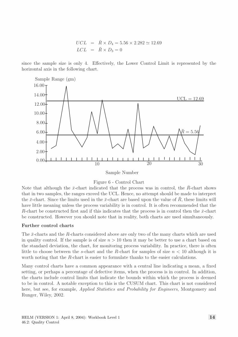
UCL = R̄ × D4 = 5.56 × 2.282 � 12.69
LCL = R̄ × D3 = 0
since the sample size is only 4. Effectively, the Lower Control Limit is represented by thehorizontal axis in the following chart.
10 20 300.00
2.00
4.00
6.00
8.00
10.00
12.00
14.00
16.00
UCL = 12.69
R̄ = 5.56
Sample Number
Sample Range (gm)
Figure 6 - Control ChartNote that although the x̄-chart indicated that the process was in control, the R̄-chart showsthat in two samples, the ranges exceed the UCL. Hence, no attempt should be made to interpretthe x̄-chart. Since the limits used in the x̄-chart are based upon the value of R̄, these limits willhave little meaning unless the process variability is in control. It is often recommended that theR-chart be constructed first and if this indicates that the process is in control then the x̄-chartbe constructed. However you should note that in reality, both charts are used simultaneously.
Further control charts
The x̄-charts and the R-charts considered above are only two of the many charts which are usedin quality control. If the sample is of size n > 10 then it may be better to use a chart based onthe standard deviation, the chart, for monitoring process variability. In practice, there is oftenlittle to choose between the s-chart and the R-chart for samples of size n < 10 although it isworth noting that the R-chart is easier to formulate thanks to the easier calculations.
Many control charts have a common appearance with a central line indicating a mean, a fixedsetting, or perhaps a percentage of defective items, when the process is in control. In addition,the charts include control limits that indicate the bounds within which the process is deemedto be in control. A notable exception to this is the CUSUM chart. This chart is not consideredhere, but see, for example, Applied Statistics and Probability for Engineers, Montgomery andRunger, Wiley, 2002.
HELM (VERSION 1: April 8, 2004): Workbook Level 146.2: Quality Control
14
Pareto Figures
A Pareto diagram is a special type of graph which is a combination line graph and bar graph.It provides a visual method for identifying significant problems. These are arranged in a bargraph by their relative importance. Associated with the work of Pareto is the work of JosephJuran who put forward the view that the solution of the ‘vital few’ problems are more importantthan solving the ‘trivial many’ . This is often stated as the ‘80 20 rule’ ; i.e. 20% of the problems(the vital few) result in 80% of the failures to reach the set standards.
In general terms the Pareto diagram is not a problem-solving tool, but it is a tool for analysis.Its function is to determine which problems to solve, and in what order. It aims to identify andeliminate major problems, leading to cost savings.
Pareto charts are a type of bar chart in which the horizontal axis represents categories of interest,rather than a continuous scale. The categories are often types of defects. By ordering the barsfrom largest to smallest, a Pareto chart can help to determine which of the defects comprise thevital few and which are the trivial many. A cumulative percentage line helps judge the addedcontribution of each category. Pareto charts can help to focus improvement efforts on areaswhere the largest gains can be made.
An example of a Pareto chart is given below for 100 faults found in the process considered abovewhere coffee is dispensed by an automatic machine.
10
1520
25
35
Num
ber
ofD
efec
ts
Blocked
disp
enserno
zzle
Lumpy
coffe
emix
Misa
ligne
dno
zzle
Faulty
coffe
eba
gs
Machine
failu
re
Figure 7 - A Pareto Chart
15 HELM (VERSION 1: April 8, 2004): Workbook Level 146.2: Quality Control
The following table shows the data obtained from 30 samples, each of size n = 4taken from a production line whose output is nominally 200 gram packets oftacks. Extend the table to show the mean x̄ and the range R̄ of each sample.Find the grand mean ¯̄x, the upper and lower control limits and plot the x̄-and R̄-control charts. Discuss briefly whether you agree that the productionprocess is in control. Give reasons for your answer. You are advised to do allof the calculations in Excel or use a suitable statistics package.