314 Quantitative and observer based print quality evaluation in coldset offset newspaper print Peter Nussbaum Gjøvik University College, Norway ABSTRACT: This paper is considered to be a review of my research and work that has been made during the CREATE period. My research interests cover issues in the field of print quality, colour management, colour science, digital image reproduction, colour measurement, standardization, process control and PSO (Process-Standard Offset). Currently my research is in the field of colour measurements, evaluating the performance of colour measurement devices in terms of precision (repeatability, reproducibility) and accuracy. Furthermore, the consequences of the inter-instrument reproducebility in a colour-managed workflow will be addressed [1]. However, I have decided to present in this paper a study [2], which aims to investigate print quality in newspaper print by considering the appropriate calibration standard and applying colour management. In particular, it looks at the colorimetric properties of eight newspaper printing presses in order to evaluate the relevant colour separation approach, either by applying custom separation profiles or by using an industry standard. According to the obtained colour measurements quantitative evaluation is made to determine the repeatability of each newspaper printing presse and the variations in terms of colour differences. A psychophysical experiment was carried out to determine the ‘pleasantness’ of the reproductions, which were produced using the three profiles. Finally, the results of the study show the performance of the appropriate profile, which is applied to the eight newspaper printing presses to obtain significant best print quality. It demonstrates the importance of adopting international standards instead of using insufficiently defined house standards to preserve equal results among different newspaper printing presses. 1 INTRODUCTION: Although process control parameters for the production of half-tone colour separations, proofs and production prints, are clearly defined [3], often, newspaper printing processes show significant variations which affect the appearance of print. Essentially, there are two different approaches considering printing press convention, namely optimized or standardized press behaviour. A fully optimized press aims at maximizing its capability in terms of lowest possible dot gain, highest ink densities and best contrast the individual printing press can achieve without regards to any external specifications or standards. Such individual parameters can create unique press conditions, which requires custom ICC profiles to create the appropriate separations. Another approach is to make the press conform to a certain reference or standard such as ISO 12647-3:2005. By using the second approach and by standardising the behaviour of the press, industry standard ICC profiles can be used. In terms of aiming for a common print appearance across printing plants (e.g. preserving print appearance of an ad campaign) the second approach including consistency will be the most suitable one to ensure a predictable and equivalent print result. However, the performance of the current Norwegian newspaper profile and the corresponding print quality has been considered as not satisfactory and demonstrates the need for further revison. Therefore, in collaboration with the Norwegian Newspaper Publishers’ Association the Norwegian Color Research Laboratory has carried out this print quality project with the aim to evaluate eight newspaper printing plants in terms of their conformance to specified values in accordance with the requirements of ISO 12647-3:2005. Furthermore, the assessment of each individual printing press and the variation within the 8 participants are important parts of this study to evaluate the appropriate colour separation approach, either by applying custom separation profiles or by using industry standard profiles such as ISOnewspaper26v4.icc.
Transcript
314
Quantitative and observer based print quality evaluation in coldset offset newspaper print
Peter Nussbaum
Gjøvik University College, Norway
Quantitative and observer based print quality evaluation in coldset offset newspaper print
Peter Nussbaum Gjovik University College ABSTRACT: This paper is considered to be a review of my research and work that has been made during the CREATE period. My research interests cover issues in the field of print quality, colour management, colour science, digital image reproduction, colour measurement, standardization, process control and PSO (Process-Standard Offset). Currently my research is in the field of colour measurements, evaluating the performance of colour measurement devices in terms of precision (repeatability, reproducibility) and accuracy. Furthermore, the consequences of the inter-instrument reproducebility in a colour-managed workflow will be addressed [1]. However, I have decided to present in this paper a study [2], which aims to investigate print quality in newspaper print by considering the appropriate calibration standard and applying colour management. In particular, it looks at the colorimetric properties of eight newspaper printing presses in order to evaluate the relevant colour separation approach, either by applying custom separation profiles or by using an industry standard. According to the obtained colour measurements quantitative evaluation is made to determine the repeatability of each newspaper printing presse and the variations in terms of colour differences. A psychophysical experiment was carried out to determine the ‘pleasantness’ of the reproductions, which were produced using the three profiles. Finally, the results of the study show the performance of the appropriate profile, which is applied to the eight newspaper printing presses to obtain significant best print quality. It demonstrates the importance of adopting international standards instead of using insufficiently defined house standards to preserve equal results among different newspaper printing presses. 1 INTRODUCTION: Although process control parameters for the production of half-tone colour separations, proofs and production prints, are clearly defined [3], often, newspaper printing processes show significant variations which affect the appearance of print. Essentially, there are two different approaches considering printing press convention, namely optimized or standardized press behaviour. A fully optimized press aims at maximizing its capability in terms of lowest possible dot gain, highest ink densities and best contrast the individual printing press can achieve without regards to any external specifications or standards. Such individual parameters can create unique press conditions, which requires custom ICC profiles to create the appropriate separations. Another approach is to make the press conform to a certain reference or standard such as ISO 12647-3:2005. By using the second approach and by standardising the behaviour of the press, industry standard ICC profiles can be used. In terms of aiming for a common print appearance across printing plants (e.g. preserving print appearance of an ad campaign) the second approach including consistency will be the most suitable one to ensure a predictable and equivalent print result. However, the performance of the current Norwegian newspaper profile and the corresponding print quality has been considered as not satisfactory and demonstrates the need for further revison. Therefore, in collaboration with the Norwegian Newspaper Publishers’ Association the Norwegian Color Research Laboratory has carried out this print quality project with the aim to evaluate eight newspaper printing plants in terms of their conformance to specified values in accordance with the requirements of ISO 12647-3:2005. Furthermore, the assessment of each individual printing press and the variation within the 8 participants are important parts of this study to evaluate the appropriate colour separation approach, either by applying custom separation profiles or by using industry standard profiles such as ISOnewspaper26v4.icc.
315
2 EXPERIMENTAL METHOD: Various studies and research have been done in the field of print quality and repeatedly it has been concluded as a very complex issue. The subject has been discussed at various conferences see e.g. [4], [5], [6].
Principally there are two different approaches to assess print quality. The first approach is by measurement, using instruments to determine values for the various quality factors. The second method is based on observation, using psychophysical experiments to gather the judgement of human observers. For instance, the rank order method is a robust approach where observers are asked to rank the image samples in order, from best to worst, along an attribute defined by the instructions, such as pleasantness. This method is based on Thurstone’s «law of comparative judgement» [7], [8]. Considering the print quality evaluation in this study both approaches have been applied, using quantitative analyses based on colour measurements, and using psychophysical experiments (Fig. 1).
Fig. 1 Overview of method
The purpose of quantitative evaluation is to determine the short and long term repeatability of each participant of the project. Furthermore the variation between the eight newspaper printing processes and the variation according to the colorimetric values of the ISO 12647-3:2005 are important parts of the assessment. Based on the colour measurements two custom ICC profiles were generated and an international standard profile was also used. The custom profile “NADA X” was generated using an averaged colour measurement data set of a first test print run. A second custom profile “NADA Y” was calculated using an averaged colour data set which included colour measurement data of the first test print run, and the characterization data set of the international standard profile ISOnewspaper26v4. The third profile is the international standard profile “ISOnewspaper26v4.icc” denoted as “NADA Z”. These three profiles were applied to four test images (Fig. 2) which were then printed by the eight newspaper printing presses.
Fig. 2 Test images: camera, car, portrait and flag. Images “camera” and “portrait” are reproduced with the permission of Ole Jakob Bøe
Skattum. The images “car”and “flag” are reproduced with the permission of Verdens Gang (VG).
A psychophysical experiment was carried out to determine the ‘pleasantness’ of the reproductions, which were produced using the three profiles. Each of the 25 observers was required to assess four different images. Each image is reproduced by three different separation algorithms and printed in eight different printing plants. The law of comparative judgement was applied and the method used was rank order [9]. The observer’s task was to rank the three prints in the viewing cabinet in order, from best to worst, in terms of preferred pleasantness.
3 RESULTS: Firstly the results of the quantitative evaluation will be presented. We received 20 Test Prints from each of the eight participants and measured a total of ten test charts (IT8.7-3 CMYK Target) from each participant to evaluate their colorimetric properties. The test charts have been chosen according to the density control on solid CMYK bars. 5 density measurements have been performed with the settings DIN E and polarisation filter on a black background on solids across the paper width from all 20-test prints in each colour have been averaged. Although ISO 12647-3:2005 is focusing on colorimetry in the informative annex B the reflection densities of the process colour solids on newsprints are
316
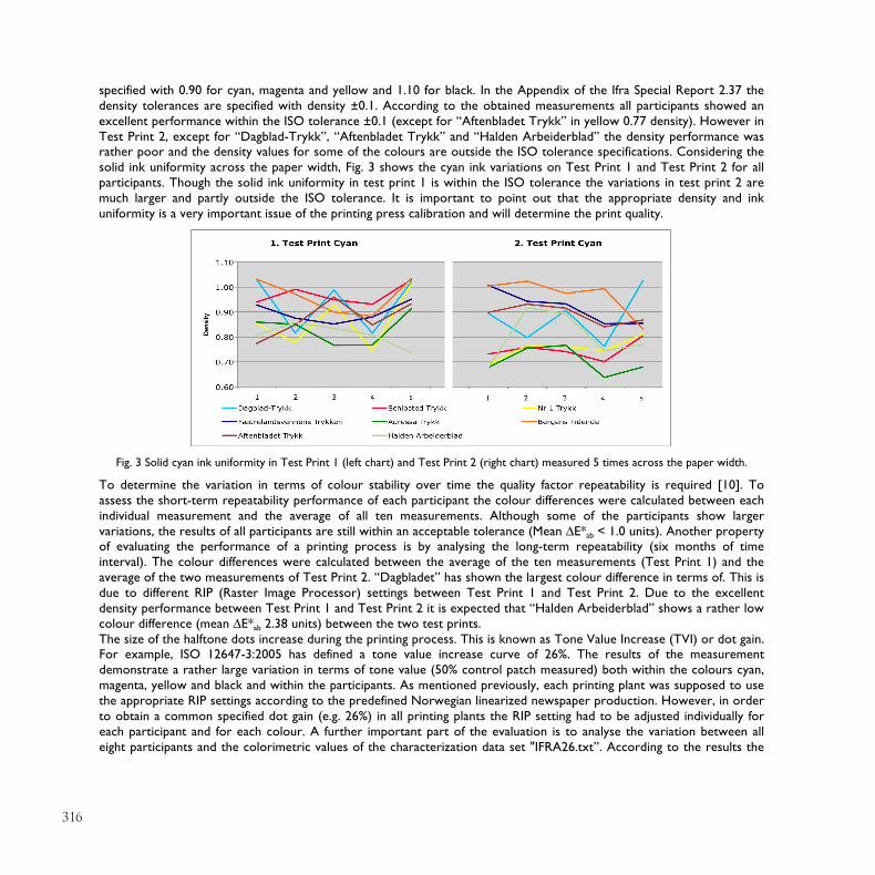
specified with 0.90 for cyan, magenta and yellow and 1.10 for black. In the Appendix of the Ifra Special Report 2.37 the density tolerances are specified with density ±0.1. According to the obtained measurements all participants showed an excellent performance within the ISO tolerance ±0.1 (except for “Aftenbladet Trykk” in yellow 0.77 density). However in Test Print 2, except for “Dagblad-Trykk”, “Aftenbladet Trykk” and “Halden Arbeiderblad” the density performance was rather poor and the density values for some of the colours are outside the ISO tolerance specifications. Considering the solid ink uniformity across the paper width, Fig. 3 shows the cyan ink variations on Test Print 1 and Test Print 2 for all participants. Though the solid ink uniformity in test print 1 is within the ISO tolerance the variations in test print 2 are much larger and partly outside the ISO tolerance. It is important to point out that the appropriate density and ink uniformity is a very important issue of the printing press calibration and will determine the print quality.
Fig. 3 Solid cyan ink uniformity in Test Print 1 (left chart) and Test Print 2 (right chart) measured 5 times across the paper width.
To determine the variation in terms of colour stability over time the quality factor repeatability is required [10]. To assess the short-term repeatability performance of each participant the colour differences were calculated between each individual measurement and the average of all ten measurements. Although some of the participants show larger variations, the results of all participants are still within an acceptable tolerance (Mean !E*ab < 1.0 units). Another property of evaluating the performance of a printing process is by analysing the long-term repeatability (six months of time interval). The colour differences were calculated between the average of the ten measurements (Test Print 1) and the average of the two measurements of Test Print 2. “Dagbladet” has shown the largest colour difference in terms of. This is due to different RIP (Raster Image Processor) settings between Test Print 1 and Test Print 2. Due to the excellent density performance between Test Print 1 and Test Print 2 it is expected that “Halden Arbeiderblad” shows a rather low colour difference (mean !E*ab 2.38 units) between the two test prints. The size of the halftone dots increase during the printing process. This is known as Tone Value Increase (TVI) or dot gain. For example, ISO 12647-3:2005 has defined a tone value increase curve of 26%. The results of the measurement demonstrate a rather large variation in terms of tone value (50% control patch measured) both within the colours cyan, magenta, yellow and black and within the participants. As mentioned previously, each printing plant was supposed to use the appropriate RIP settings according to the predefined Norwegian linearized newspaper production. However, in order to obtain a common specified dot gain (e.g. 26%) in all printing plants the RIP setting had to be adjusted individually for each participant and for each colour. A further important part of the evaluation is to analyse the variation between all eight participants and the colorimetric values of the characterization data set "IFRA26.txt”. According to the results the
317
participant “Dagblad-Trykk” shows a small colour difference (mean !E*ab 4.12 units) while, the participant “Adressa Trykk” shows the largest colour difference (mean !E*ab 7.67 units). This result agrees with the tone value increase result for 50% value which have shown a very small difference between “Dagblad-Trykk” and ISO 12647-3:2005 and a rather large difference between “Adressa Trykk” and ISO12647-3: 2005 respectively. Looking at the CIELAB values for the primary colours cyan, magenta, yellow and black specified in ISO 12647-3:2005, the differences between the actual values and the nominal values must not exceed the tolerances !E*ab 5.00 units. It is interesting to note that according to measurements of Test Print 1 almost all participants show colour differences within the ISO tolerance.
The following are the results in terms of z-scores, which have been obtained in the psychophysical experiment. The goal of the psychophysical experiment was to determine pleasantness of the reproductions made according to different newspaper prints. For each image and newspaper printing plant, the 3 x 1 matrices of ranking order results for each observer were arranged over the 25 observers and the raw data from the experiments were treated statistically to obtain z-scores. The precisions of the experimental results are described in terms of 95% confidence interval (CI), which is calculated using equation (1) which consists of the mean (R), standard deviation (
!
" ) and the number of observations (N).
Using case V of the method proposed by Thurstone, the standard deviation of the z-scores is assumed to be
!
" =1 2
!
CI = R ±1.96"
N
(1)
Fig. 4 Rank order z-scores for each newspaper printing press and separation.
Fig. 4 presents the results in terms of z-scores for each newspaper printing plant. For the number of images and observations, CI was calculated to be ±0.13. Overall it can be noticed that “NADA X” performs worst for all participants, except for “Adressa Trykk”. “NADA Z” performs significantly best for participant “Fædrelandsvennens Trykkeri”. On the other hand “NADA Y” was ranked significantly best for the participants “Schibsted Trykk”, “Adressa Tykk”, “Bergens Tidende” and “Aftenbladet Trykk”. Note that the profiles “NADA Y” and “NADA Z” do not indicate a significant difference either for “Dagblad-Trykk” nor ”Halden Arbeiderblad” in terms of preferred pleasantness.
Table 1 Ranking of separation profiles for each image (1=best, 3=worst).
Table 1 gives the ranking of the performance of the three separation profiles for the four images. As it can be seen the profile “NADA Y” was significantly best except for the image “Car” and the profile “NADA Z” was second.
318
4 CONCLUSION: As seen previously the results considering the short-term repeatability all participants are within an acceptable tolerance. By preserving the solid CMYK density values within +/-0.1 tolerance and reducing the density variations across paper width (uniformity) the long-term repeatability performance will improve. Considering Tone Value Increase the results have shown rather high variations due to inconsistent RIP compensation both within the colours cyan, magenta, yellow and black and within the participating printing plants and results in visually different grey balance. This might be explained due to missing “uniform” dot gain agreement within the Norwegian “newspaper standard” or might be forced by invalid measurement technology using dot meter technology on paper substrate [11]. The inconsistency of the density values on the solid primary colours, especially in Test Print 2, has affected the colorimetric values (CIELAB coordinates). Hence, for most of the participants the colour difference between Test Print 2 and CIELAB coordinates in ISO 12647-3:2005 has exceeded the ISO tolerance. As can be seen from the results of the psychophysical experiment the ICC profile “NADA Y” performs significantly better than the other two profiles, “NADA Z” and “NADA X” respectively. The colorimetric difference between the measurement data of “NADA Y” and “NADA Z” results in a colour difference !E*ab 2.5 which will be classified as rather small. On the other hand the print variations within the 8 newspaper printing plants in Test Print 2 are between !E*ab 2.2 and !E*ab 5 which means that the print variations are larger than the colorimetric difference between “NADA Y” and “NADA Z”. Hence, the print variations and not the profile information only may have determined the print quality. The outcomes in this study demonstrate an obvious need for standardising of coldset-offset newspaper printing to preserve best print quality. Furthermore, it shows the importance of adopting international standards instead of using insufficiently defined house standards to preserve equal results among different newspaper printing presses. This has been confirmed previously conducting a similar standardization project in heat-set web offset [12].
REFERENCES: [1] Nussbaum, P., Sole, A. and Hardeberg, J.Y.,(2009). ’Consequences of using a number of different colour measurement instruments in a colour managed printing workflow’, In TAGA Proceedings, 2009 [2] Nussbaum, P. and Hardeberg, J.Y. (2008). ‘Print quality evaluation and applied colour management in coldset offset newspaper print’. In TAGA Proceedings, San Francisco, US [3] ISO 2005 ISO 12647-3:2005 Graphic Technology – Process control for the production of half-tone colour separation, proof and production prints, Part 3: Coldset offset lithography on newsprint [4] Hardeberg J. Y. and Skarsbø, S. E. (2002). ‘Comparing color images quality of four digital presses’. Proceedings of the 11rd International Printing and Graphic Arts Conference, Bordeaux, France. [5] Nussbaum, P., Hardeberg, J.Y. and Skarsbø, S.E. (2004). ‘Print quality evaluation for governmental purchase decisions’, In Proceeedings of the 31st International Research Conference of IARIGAI, Copenhagen, Danmark [6] Nussbaum, P.and Hardeberg, J.Y. (2006). ‘Print quality evaluation and applied colour management in heat-set web offset’, In Proceeedings of the 33rd International Research Conference of IARIGA, Leipzig, Germany [7] Handley, J. (2001). Comparative Analysis of Bradley-Terry and Thurstone-Mosteller, ‘Paired Comparison, Models for Image Quality Assessment’, PICS 2001, 108-112. [8] Gescheider, G. A. (1985). Psychophysics, Method, Theory, and Application, Second Edition, Lawrence Erlbaum Associates, ISBN 0–89859–375–1, 152. [9] Engeldrum, P.G. (2000). Psychometric Scaling, A Toolkit for Imaging Systems Dvelopment, Imcotek Press, Winchester USA, 1st ed. [10] Morovic, J. and Nussbaum, P. (2003). ‘Factors Affecting The Appearance Of Print On Opaque and Transparent Substrates,’ Journal of Imaging Science and Technology, JIST 47 #6 pp 554-564 [11] Wroldsen, M., Nussbaum, P. and Hardeberg, J. Y. (2008) Densitometric and Planimetric Measurement Techniques for Newspaper Printing, In TAGA Journal Vol.4, [12] Nussbaum, P. and Hardeberg, J.Y. (2006) ‘Print quality evaluation and applied colour management in heat-set web offset’, Proceedings IARIGAI conference Leipzig, Germany