Page 1
Quarterly Report on the
New York ISO Electricity Markets
First Quarter of 2017
David B. Patton, Ph.D.
Pallas LeeVanSchaick, Ph.D.
Jie Chen, Ph.D.
Potomac Economics
Market Monitoring Unit
June 2017
Page 2
-2- © 2017 Potomac Economics
• This report summarizes market outcomes in 2017-Q1.
• The energy markets performed competitively and variations in wholesale prices were driven primarily by changes in fuel prices, demand, and supply availability.
However, we discuss concerns with performance of the reserve market. (see slide 5)
• The first quarter was characterized by mild winter weather conditions.
Average load levels was near the lowest levels in the last ten winters. (see slide 12)
Natural gas prices rarely increased to the level of oil prices due to scarcity.
• All-in prices averaged from $24/MWh in the North Zone to $46/MWh in NYC.
The range was due mainly to Central East congestion and capacity price differences.
Zone-level LBMPs rose from the previous year by 10 to 48 percent because of:
– Higher gas prices, which rose 20-40 percent in East NY and 100+ percent in West
NY. (see slide 13)
– Nuclear generation fell ~460 MW because of more deratings & outages. (see slide 16)
– However, these were offset by higher net imports (over 600 MW). (see slide 41)
Capacity costs fell 39 to 64 percent outside the Hudson Valley. (see slide 84)
Highlights and Market Summary: Energy Market Outcomes and Congestion
Page 3
-3- © 2017 Potomac Economics
Highlights and Market Summary:
Energy Market Outcomes and Congestion
PJM $29.68/MWh
ISO-NE $35.36/MWh
Ontario $21.72/MWh
Iroquois Waddington
$3.81/MMBtu
Transco Z6 NY
$3.39/MMBtu
Tennessee Z6
$4.59MMBtu Millennium Pipeline
$2.61/MMBtu
$22.50
$25.00
$27.50
$30.00
$32.50
$35.00
$37.50
$40.00
$42.50
Iroquois
Terminus
Average Price
($/MWh)
Iroquois Z2
$4.03/MMBtu
$68 MM
Page 4
-4- © 2017 Potomac Economics
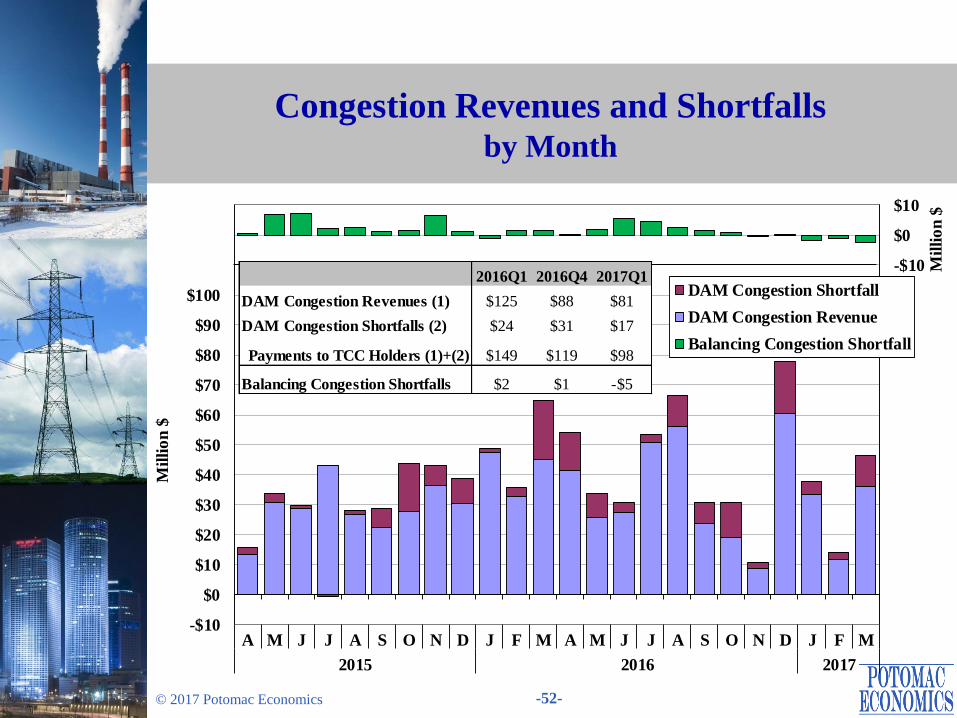
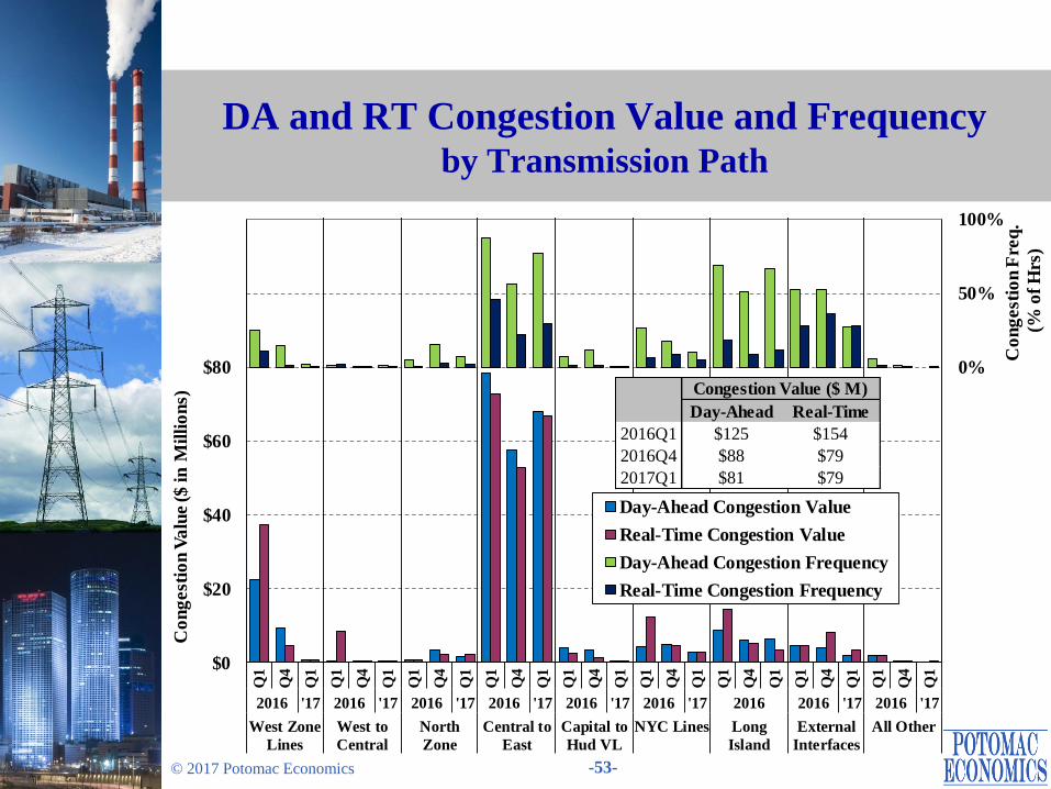
• DA congestion revenue totaled $81M, down 35% from 2016-Q1. (see slides 52-54)
Congestion across the Central-East interface (accounting for ~85% of congestion in
2017-Q1) fell ~10 percent from 2016-Q1.
– Lower gas spreads between West NY and East NY (see slide 13) reduced re-dispatch costs to manage congestion across the Central-East interface.
– Lower Ontario imports and higher PJM imports contributed to less frequent
congestion across the Central-East interface as well. (see slide 41)
West Zone 230 kV constraints were rarely binding, which was attributable to:
– Transmission upgrades in early 2016, which reduce congestion on 230 kV facilities;
– More frequent congestion on 115 kV facilities, since actions to manage congestion on
the 115 kV system often help reduce flows on the 230 kV system. (see slides 59-61)
• Managing 115 kV congestion using the DA and RT market systems would result in more efficient congestion scheduling and pricing.
• RT congestion costs for the Valley Stream load pocket on Long Island fell from a
year ago because of improved modeling of lines between NYC and Long Island.
Highlights and Market Summary: Energy Market Outcomes and Congestion
Page 5
-5- © 2017 Potomac Economics
• DA 30-minute reserve prices have been substantially elevated since the market rule
change in November 2015, driven primarily by:
The new limitation on scheduling reserves on Long Island (down 250-300 MW);
Increased 30-minute reserve requirement (up 655 MW); and
Higher reserve offer prices from some capacity.
• We have reviewed DA reserve offers and found many units that offer above the
standard competitive benchmark (i.e., estimated marginal cost).
This is partly because it is difficult to accurately estimate the marginal cost of
providing operating reserves.
DA offer prices may fall as suppliers gain more experience.
– This was evident in 2017-Q1 as a large amount of reserve capacity reduced its offer
prices from previous years. (see slides 31-33)
– This has helped reduce average DA 30-minute reserve prices. (see slide 30)
• We will continue to monitor DA reserve offer patterns and consider potential rule
changes including whether to modify the existing $5/MWh “safe harbor” for
reserve offers in the market power mitigation measures.
Highlights and Market Summary: Reserve Market Performance
Page 6
-6- © 2017 Potomac Economics
• Guarantee payments were $8.6M, up 21% from 2016-Q1 (see slides 70-73) due to:
Higher gas prices that increased the commitment costs of gas-fired units; and
Increased supplemental commitment for reliability in NYC, due partly to more
transmission outages. (see slides 65-68)
• Congestion shortfalls were $17M in the DAM and negative $5M (i.e., surpluses) in the RTM. Both were lower than in 2016-Q1. (see slides 54-55)
~90% of DA shortfalls accrued on the Central-East interface as multiple
transmission outages and other factors (including nuclear outages, unit
commitments, and the status of capacitors and SVCs) reduced the interface limit.
Nearly all of RT surpluses were associated with the Central-East interface as well.
– The RT PAR operation (including Ramapo, ABC, JK, and St. Lawrence PARs)
collectively accounted fo a large portion of surpluses.
Highlights and Market Summary: Uplift and Revenue Shortfalls
Page 7
-7- © 2017 Potomac Economics
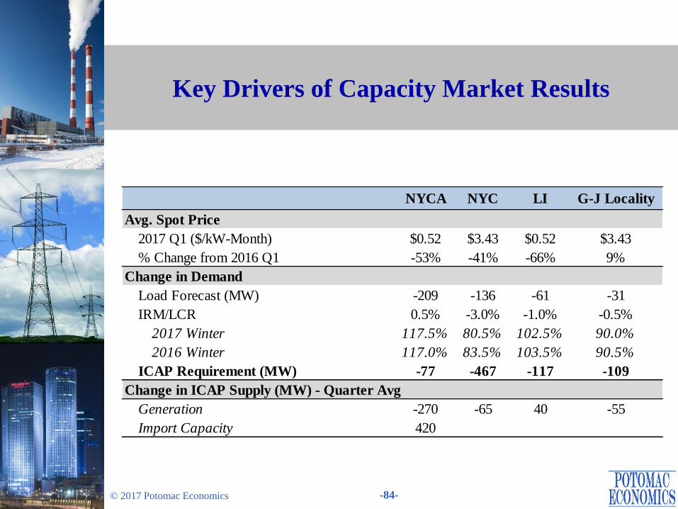
• In 2017-Q1, spot prices averaged $0.52/kW-month in Long Island and ROS, and
$3.43/kW-month in NYC and the G-J Locality. (see slides 82-84)
The UCAP requirements in Long Island and NYC were not binding, leading Long
Island and NYC prices to be same as ROS and G-J prices, respectively.
• Compared to 2016-Q1, average spot prices fell 41-66 percent in all regions except
the G-J Locality, where average prices rose 9 precent instead.
The large reductions in most regions were due primarily to lower ICAP
requirements that resulted from lower peak load forecast and lower LCRs.
– However, the IRM rose, partly offsetting the reduction in the NYCA load forecast.
Internal supply fell as a result of the Huntley retirement in March 2016 and
mothballing of multiple Astoria and Ravenswood GTs in NYC after 2016-Q1.
– However, this was offset by a net increase of over 400 MW in average imports.
• Changes in LCRs continue to be a key driver of the most significant year-over-year
capacity price changes.
Under the current methodology, variations in LCRs for local capacity zones are
inefficient and create significant market uncertainty. It is important to establish
LCRs that will procure capacity in a cost efficient manner.
Highlights and Market Summary: Capacity Market
Page 8
Energy Market Outcomes
Page 9
-9- © 2017 Potomac Economics
All-In Prices
• The first figure summarizes the total cost per MWh of load served in the New York
markets by showing the “all-in” price that includes:
An energy component that is a load-weighted average real-time energy price.
A capacity component based on spot prices multiplied by capacity obligations.
The NYISO cost of operations and uplift from other Rate Schedule 1 charges.
• Average all-in prices ranged from roughly $24/MWh in the North Zone to
$46/MWh in NYC in the first quarter of 2017. Compared to 2016-Q1:
All-in prices did not change significantly in NYC, Long Island, and the West Zone,
but they rose 13 to 29 percent in other regions.
LBMPs rose 10 to 48 percent.
– The increases were driven primarily by higher gas prices. (see slide 13)
– The West Zone and Long Island exhibited the smallest LBMP increases because of
reduced congestion in the two regions. (see slide 53).
Capacity costs fell 39 to 64 percent outside the Lower Hudson Valley, where
capacity prices rose 6 percent.
– Capacity prices fell in most areas primarily because of lower ICAP requirements.
(see slides 81-84)
Page 10
-10- © 2017 Potomac Economics
All-In Prices by Region
Note: Natural Gas Price is based on the following gas indices (plus a transportation charge of $0.20/MMbtu): the Dominion North
index for West Zone and Central NY, the Iroquois Waddington index for North Zone, the Iroquois Zone 2 index for Capital Zone
and LI, the average of Millennium East and Iroquois Zone 2 for LHV, the Transco Zone 6 (NY) index for NYC. A 6.9 percent tax
rate is also included NYC.
$0
$1
$2
$3
$4
$5
$6
$7
$8
$9
$10
-$10
$0
$10
$20
$30
$40
$50
$60
$70
$80
$90
$100
Q1
Q2
Q3
Q4
Q1
Q2
Q3
Q4
Q1
Q1
Q2
Q3
Q4
Q1
Q2
Q3
Q4
Q1
Q1
Q2
Q3
Q4
Q1
Q2
Q3
Q4
Q1
Q1
Q2
Q3
Q4
Q1
Q2
Q3
Q4
Q1
Q1
Q2
Q3
Q4
Q1
Q2
Q3
Q4
Q1
Q1
Q2
Q3
Q4
Q1
Q2
Q3
Q4
Q1
Q1
Q2
Q3
Q4
Q1
Q2
Q3
Q4
Q1
2015 2016'17 2015 2016'17 2015 2016'17 2015 2016'17 2015 2016'17 2015 2016'17 2015 2016'17
West
(Zone A)
Central NY
(Zones BCE)
North
(Zone D)
Capital Zone
(Zone F)
LHV
(Zones G-I)
NYC
(Zone J)
Long Island
(Zone K)
Na
tura
l G
as
Pri
ce ($
/MM
Btu
)
Avera
ge C
ost
($
/MW
h)
NYISO Operations
Uplift
Ancillary Services
Capacity
Energy
Natural Gas Price
Page 11
-11- © 2017 Potomac Economics
Load Levels and Fuel Prices
• The next two figures show two primary drivers of electricity prices in the quarter.
The first figure shows the average load, the peak load, and the day-ahead peak load
forecast error on each day of the quarter.
The second figure shows daily coal, natural gas, and fuel oil prices.
• Although peak load (23.5 GW) rose nearly 1 percent from the first quarter of 2016,
average load (17.6 GW) fell 0.3 percent.
Nonetheless, both values were near the lowest levels seen over the last ten winters,
reflecting the mild weather conditions.
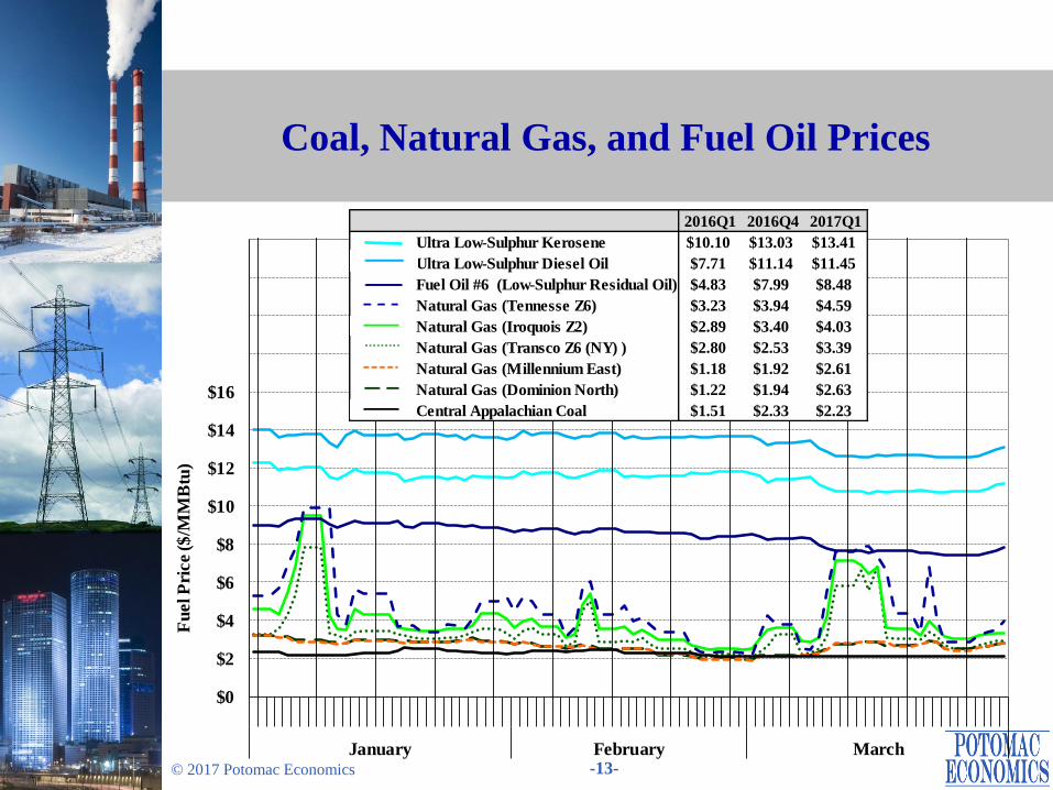
• All reported fuel prices rose substantially from 2016-Q1 to 2017-Q1.
Natural gas prices rose 20 to 40 percent in East NY and as much as 120 percent in
West NY.
– These increases reflected lower storage levels in the region.
– However, gas spreads between East NY and West NY fell from the first quarter of
2016, which reduced congestion across the Central-East interface (see slide 53).
Despite the increase in natural gas prices, gas-fired generation continues to be more economic than coal-fired and oil-fired generation.
Page 12
-12- © 2017 Potomac Economics
Load Forecast and Actual Load
-2000
-1000
0
1000
20000
5
10
15
20
25
January February March
Fo
reca
st E
rro
r (M
W)
Da
ily
Rea
l-T
ime
Lo
ad
(G
W)
Peak Load
Average Load
Peak Load Forecast (DA - RT)
Mon. - Sun.
Peak Avg. 26GW 30GW Avg. Avg. Abs.
2017 Q1 23.5 17.6 0 0 -77 284
2016 Q4 24.2 17.0 0 0 -94 308
2016 Q1 23.3 17.7 0 0 -17 333
Load (GW) # Hours > Peak Forecast Error (MW)Quarter
Page 13
-13- © 2017 Potomac Economics
Coal, Natural Gas, and Fuel Oil Prices
$0
$2
$4
$6
$8
$10
$12
$14
$16
January February March
Fu
el P
rice ($
/MM
Btu
)
2016Q1 2016Q4 2017Q1
Ultra Low-Sulphur Kerosene $10.10 $13.03 $13.41
Ultra Low-Sulphur Diesel Oil $7.71 $11.14 $11.45
Fuel Oil #6 (Low-Sulphur Residual Oil) $4.83 $7.99 $8.48
Natural Gas (Tennesse Z6) $3.23 $3.94 $4.59
Natural Gas (Iroquois Z2) $2.89 $3.40 $4.03
Natural Gas (Transco Z6 (NY) ) $2.80 $2.53 $3.39
Natural Gas (Millennium East) $1.18 $1.92 $2.61
Natural Gas (Dominion North) $1.22 $1.94 $2.63
Central Appalachian Coal $1.51 $2.33 $2.23
Page 14
-14- © 2017 Potomac Economics
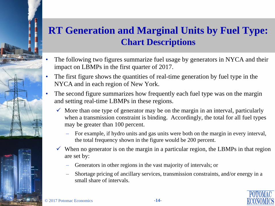
• The following two figures summarize fuel usage by generators in NYCA and their
impact on LBMPs in the first quarter of 2017.
• The first figure shows the quantities of real-time generation by fuel type in the
NYCA and in each region of New York.
• The second figure summarizes how frequently each fuel type was on the margin
and setting real-time LBMPs in these regions.
More than one type of generator may be on the margin in an interval, particularly
when a transmission constraint is binding. Accordingly, the total for all fuel types
may be greater than 100 percent.
– For example, if hydro units and gas units were both on the margin in every interval,
the total frequency shown in the figure would be 200 percent.
When no generator is on the margin in a particular region, the LBMPs in that region
are set by:
– Generators in other regions in the vast majority of intervals; or
– Shortage pricing of ancillary services, transmission constraints, and/or energy in a small share of intervals.
RT Generation and Marginal Units by Fuel Type: Chart Descriptions
Page 15
-15- © 2017 Potomac Economics
• Gas-fired (38 percent), nuclear (32 percent), and hydro (23 percent) generation
accounted for most of the internal generation in the first quarter of 2017.
Average nuclear generation fell 460 MW from the first quarter of 2016 because of
more deratings and outages in Central NY.
Average coal and oil-fired generation fell by a total of 180 MW from 2016.
– Coal-fired production fell due primarily to the retirement of Huntley units.
– Oil-fired production fell because gas prices rarely increased to the level of oil prices.
These reductions were offset by increases in:
– Hydro generation, which rose 100 MW because of higher output from the Niagara
facility; and
– Net imports, which rose more than 600 MW from 2016-Q1. (see slide 41)
• Gas-fired and hydro resources were on the margin the vast majority of time.
Hydro units in the West Zone were on the margin less frequently than in the first
quarter of 2016, reflecting changes in congestion patterns in the West Zone.
RT Generation and Marginal Units by Fuel Type: Market Results
Page 16
-16- © 2017 Potomac Economics
Real-Time Generation Output by Fuel Type
Notes: Pumped-storage resources in pumping mode are treated as negative generation.
“Other” includes Methane, Refuse, Solar & Wood.
0
3
6
9
12
15
18
21
0
1
2
3
4
5
6
7
J FM J FM J FM J FM J FM J FM J FM J FM J FM J FM J FM J FM J FM J FM J FM J FM
2016 2017 2016 2017 2016 2017 2016 2017 2016 2017 2016 2017 2016 2017 2016 2017
West
(Zone A)
North
(Zone D)
Central NY
(Zone BCE)
Capital
(Zone F)
LHV
(Zone GHI)
NYC
(Zone J)
Long Island
(Zone K)
NYCA
NY
CA
Gen
era
tio
n(G
W)
Avera
ge G
en
era
tio
n (G
W) Other Wind
Oil Coal
NG - Other NG - CC
Hydro Nuclear
Nuclear Hydro Coal NG-CC NG-Other Oil Wind Other Total
2017 Q1 4.54 3.23 0.09 4.60 0.66 0.04 0.59 0.27 14.01
2016 Q4 4.90 2.83 0.05 4.53 1.08 0.03 0.55 0.28 14.26
2016 Q1 5.00 3.13 0.16 4.79 0.74 0.14 0.60 0.29 14.85
QuarterAverage Internal Generation by Fuel Type in NYCA (GW)
Page 17
-17- © 2017 Potomac Economics
Fuel Type of Marginal Units in the RTM
Note: “Other” includes Methane, Refuse, Solar & Wood.
0%
30%
60%
90%
120%
150%
180%
210%
240%
0%
20%
40%
60%
80%
100%
120%
140%
160%
J FMJ FM J FMJ FM J FMJ FM J FMJ FM J FMJ FM J FMJ FM J FMJ FM J FMJ FM
2016 2017 2016 2017 2016 2017 2016 2017 2016 2017 2016 2017 2016 2017 2016 2017
West
(Zone A)
North
(Zone D)
Central NY
(Zn. BCE)
Capital
(Zone F)
LHV
(Zn. GHI)
NYC
(Zone J)
LI
(Zone K)
NYCA
NY
CA
Perc
en
t o
f In
terv
als
Perc
en
t o
f In
terv
als
Nuclear Hydro NG - CC NG - Other Coal Oil Wind Other
Intervals w/o
Marginal Units in This Region
Nuclear Hydro Coal NG-CC NG-Other Oil Wind Other
2017 Q1 0% 47% 1% 80% 15% 0% 5% 0%
2016 Q4 0% 47% 0% 70% 23% 1% 4% 0%
2016 Q1 0% 61% 1% 77% 19% 4% 4% 0%
QuarterMarginal Fuel Types in NYCA
Page 18
-18- © 2017 Potomac Economics
• The following three figures show: 1) load-weighted average DA energy prices; 2)
load-weighted average RT energy prices; and 3) convergence between DA and RT
prices for six zones on a daily basis in the first quarter of 2017.
• Average day-ahead prices ranged from $23/MWh in the North Zone to $41/MWh
on Long Island, up 22 to 50 percent from the first quarter of 2016.
The increases were driven primarily by higher natural gas prices. (see slide 13)
Lower nuclear production also contributed to higher LBMPs. (see slide 16)
However, these were partly offset by higher net imports. (see slide 41)
• Western NY (except the West Zone) exhibited a larger increase in LBMPs than
Eastern NY from 2016-Q1 to 2017-Q1, because:
The Central-East interface was binding less frequently (see slide 53), indicating that
Eastern NY generation set LBMPs for Western NY more often in 2017-Q1; and
Natural gas prices had a larger increase in Western NY.
However, the West Zone exhibited a small LBMP increase because of greatly
reduced congestion in 2017-Q1. (see slide 53)
Day-Ahead and Real-Time Electricity Prices
Page 19
-19- © 2017 Potomac Economics
• Prices are generally more volatile in the real-time market than in the day-ahead
market because of unexpected events.
This was typical on winter days with tight gas supply. For example:
– Both DA and RT prices were high and volatile during the weekend of January 7th &
8th because multiple pipelines issued hourly Operation Flow Orders (“OFO”) that
greatly limited gas availability in East NY.
• Random factors can cause large differences between DA and RT prices on
individual days, while persistent differences may indicate a systematic issue.
The table focuses on persistent differences by averaging over the entire quarter.
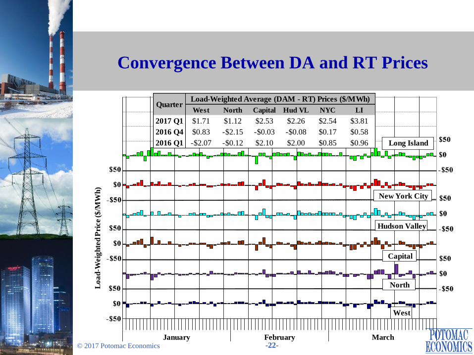
Average DA prices were higher than RT prices in all areas in the first quarter of
2017, with an average DA premium of 7 to 10 percent.
– The DA premium was higher than usually seen, which can occur if transient spikes
are less frequent than expected.
Day-Ahead and Real-Time Electricity Prices
Page 20
-20- © 2017 Potomac Economics
Day-Ahead Electricity Prices by Zone
-$20
$0
$20
$40
$60
$80
$100
$120
$140
$160
January February March
Lo
ad
Weig
hte
d A
vg
. Pri
ces
($
/MW
h)
Long Island
New York City
Hudson Valley
Capital
West
NorthTransmission
Congestion & Losses
West North Capital Hud VL NYC LI
2017 Q1 $26.32 $22.64 $38.37 $36.50 $36.99 $40.67
2016 Q4 $24.01 $17.94 $34.85 $31.92 $32.36 $36.10
2016 Q1 $20.31 $14.94 $31.42 $29.24 $29.74 $33.81
QuarterLoad-Weighted Average Prices ($/MWh)
Page 21
-21- © 2017 Potomac Economics
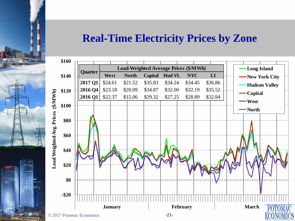
Real-Time Electricity Prices by Zone
-$20
$0
$20
$40
$60
$80
$100
$120
$140
$160
January February March
Lo
ad
Weig
hte
d A
vg
. Pri
ces
($
/MW
h)
Long Island
New York City
Hudson Valley
Capital
West
North
West North Capital Hud VL NYC LI
2017 Q1 $24.61 $21.52 $35.83 $34.24 $34.45 $36.86
2016 Q4 $23.18 $20.09 $34.87 $32.00 $32.19 $35.52
2016 Q1 $22.37 $15.06 $29.32 $27.25 $28.89 $32.84
QuarterLoad-Weighted Average Prices ($/MWh)
Page 22
-22- © 2017 Potomac Economics
Convergence Between DA and RT Prices
January February March
Lo
ad
-Weig
hte
d P
rice ($
/MW
h)
West
Long Island
Hudson Valley
New York City
North
Capital
West North Capital Hud VL NYC LI
2017 Q1 $1.71 $1.12 $2.53 $2.26 $2.54 $3.81
2016 Q4 $0.83 -$2.15 -$0.03 -$0.08 $0.17 $0.58
2016 Q1 -$2.07 -$0.12 $2.10 $2.00 $0.85 $0.96
QuarterLoad-Weighted Average (DAM - RT) Prices ($/MWh)
Page 23
-23- © 2017 Potomac Economics
• The following figure evaluates the efficiency of fuel usage in Eastern New York in
2017-Q1, showing daily averages for:
Internal generation by actual fuel consumed; and
Day-ahead natural gas price index for Iroquois Zone 2 and Transco Zone 6 (NY).
These quantities are also shown by month for the first quarters of 2015 to 2017.
• Oil-fired generation in East NY has been relatively low over the last two winters. It
was just 0.06 million MWh in 2017-Q1 and 0.3 million MWh in 2016-Q1, down
dramatically from the 1.6 million MWh in 2015-Q1.
Mild weather conditions in the past two winters were a key driver.
Gas supply constraints were much less frequent and severe, particularly in 2017-Q1.
– As a result, natural gas prices in Eastern NY never exceeded $10/MMbtu in 2017-Q1
(while gas prices exceeded $15/MMbtu on 22 days in 2015-Q1).
Although natural gas prices rose from 2016-Q1 to 2017-Q1, the increase in oil prices
was more significant over the same period.
Fuel Usage in the Winter Eastern New York
Page 24
-24- © 2017 Potomac Economics
Fuel Usage and Natural Gas Price Eastern New York
$0
$4
$8
$12
$16
0
2
4
6
8
10
12
15 16 17 January February March
Q1 2017 Q1
Na
tura
l G
as
Pri
ce
($/M
mb
tu)
Avera
ge G
en
era
tio
n (G
W/h
)
Nuclear Hydro Other
Natural Gas Oil Iroquois Z2
Transco Z6 (NY)
Page 25
Ancillary Services Market
Page 26
-26- © 2017 Potomac Economics
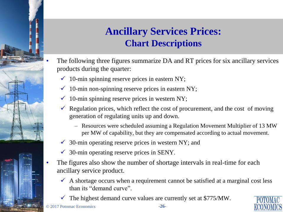
Ancillary Services Prices: Chart Descriptions
• The following three figures summarize DA and RT prices for six ancillary services
products during the quarter:
10-min spinning reserve prices in eastern NY;
10-min non-spinning reserve prices in eastern NY;
10-min spinning reserve prices in western NY;
Regulation prices, which reflect the cost of procurement, and the cost of moving
generation of regulating units up and down.
– Resources were scheduled assuming a Regulation Movement Multiplier of 13 MW
per MW of capability, but they are compensated according to actual movement.
30-min operating reserve prices in western NY; and
30-min operating reserve prices in SENY.
• The figures also show the number of shortage intervals in real-time for each
ancillary service product.
A shortage occurs when a requirement cannot be satisfied at a marginal cost less
than its “demand curve”.
The highest demand curve values are currently set at $775/MW.
Page 27
-27- © 2017 Potomac Economics
Ancillary Services Prices: Market Results
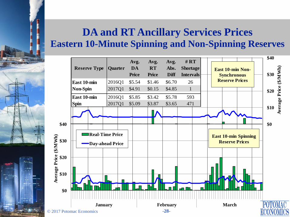
• The differences in DA prices between various reserve products have been small
since rule changes in November 2015 (Comprehensive Shortage Pricing Project).
The spreads between eastern reserve prices and western reserve prices have fallen
considerably since the rule changes were implemented.
This is because all reserve requirements except the statewide 30-minute
requirement have been rarely binding since the rule change.
• Average DA reserve prices were generally stable, but they rose during several
periods, especially in March.
Higher reserve prices occurred because of increases in the opportunity costs (of not
providing energy based on offers) for certain reserve providers rather than higher
offer prices.
Nonetheless, average DA reserve prices fell 9 to 13 percent from the first quarter
of 2016 despite higher natural gas prices and LBMPs.
• RT regulation prices rose notably on March 8 because of reduced regulation
capability that resulted from OOM actions on units in Western NY, which was
driven by multiple transmission outages resulting from high winds.
Page 28
-28- © 2017 Potomac Economics
DA and RT Ancillary Services Prices Eastern 10-Minute Spinning and Non-Spinning Reserves
$0
$10
$20
$30
$40
$0
$10
$20
$30
$40
January February March
Avera
ge P
rice (
$/M
Wh
)
Avera
ge P
rice (
$/M
Wh
) Real-Time Price
Day-ahead Price
East 10-min Non-
Synchronous
Reserve Prices
East 10-min Spinning
Reserve Prices
Reserve Type Quarter
Avg.
DA
Price
Avg.
RT
Price
Avg.
Abs.
Diff
# RT
Shortage
Intervals
2016Q1 $5.54 $1.46 $6.70 26
2017Q1 $4.91 $0.15 $4.85 1
2016Q1 $5.85 $3.42 $5.78 593
2017Q1 $5.09 $3.87 $3.65 471
East 10-min
Non-Spin
East 10-min
Spin
Page 29
-29- © 2017 Potomac Economics
DA and RT Ancillary Services Prices Western 10-Minute Spinning Reserves and Regulation
Note: RT Regulation Movement Charges are shown as averaged per MWh of RT Scheduled Regulation Capacity.
$0
$10
$20
$0
$10
$20
$30
$40
$50
$60
$70
$80
January February March
Avera
ge P
rice ($
/MW
h)
Avera
ge P
rice ($
/MW
h)
Regulation Movement Charge
Real-time Price
Day-ahead Price
Regulation Price
West 10-min Spinning
Reserve Price
Reserve Quarter Avg. DA Avg. RT Avg.Abs. # RT
2016Q1 $5.46 $1.73 $5.43 4
2017Q1 $4.95 $3.08 $3.58 0
Regulation
Capacity 2016Q1 $8.55 $8.54 $2.12 771
2017Q1 $9.50 $11.05 $4.03 2204
Movement 2016Q1 $2.57
2017Q1 $2.84
West 10-
Min Spin
Page 30
-30- © 2017 Potomac Economics
DA and RT Ancillary Services Prices Western and SENY 30-Minute Reserves
$0
$5
$10
$15
$0
$5
$10
$15
$20
January February March
Avera
ge P
rice ($
/MW
h)
Avera
ge P
rice ($
/MW
h)
Real-Time Price
Day-ahead Price
West 30-Min
Reserve Prices
SENY 30-Min
Reserve Prices
Reserve Type Quarter
Avg.
DA
Price
Avg.
RT
Price
Avg.
Abs.
Diff
# RT
Shortage
Intervals
2016Q1 $5.42 $0.02 $5.41 12
2017Q1 $4.90 $0.04 $4.85 34
2016Q1 $5.42 $0.02 $5.41 0
2017Q1 $4.90 $0.04 $4.85 0
West 30-min
SENY 30-min
Page 31
-31- © 2017 Potomac Economics
NYCA 30-Minute Reserve Offers in the DAM: Chart Descriptions
• The next figure summarizes the amount of reserve offers in the day-ahead market
that can satisfy the statewide 30-minute reserve requirement.
These quantities include both 10-minute and 30-minute and both spinning and non-
spin reserve offers. (However, they are not shown separately in the figure.)
Only offers from day-ahead committed (i.e., online) resources and available offline
quick-start resources are included, since they directly affect the reserve prices.
The stacked bars show the amount of reserve offers in each select price range for
West NY (Zones A to E), East NY (Zones F to J), and NYCA (excluding Zone K).
– Long Island is excluded because the current rules limit its reserve contribution to
the broader areas (i.e., SENY, East, NYCA) in the 30-minute reserve requirement.
– Thus, Long Island reserve offer prices have little impact on NYCA reserve prices.
The black line represents the equivalent average 30-minute reserve requirements
for areas outside Long Island.
– The equivalent 30-minute reserve requirement is calculated as NYCA 30-minute reserve requirement minus 30-minute reserves scheduled on Long Island.
– Where the lines intersect the bars provides a rough indication of reserve prices (however, opportunity costs are not reflected here).
Page 32
-32- © 2017 Potomac Economics
NYCA 30-Minute Reserve Offers in the DAM: Market Results
• DA 30-minute reserve prices became much higher than RT prices following the
market rule change in November 2015, which was driven primarily by:
The increased 30-minute reserve requirement (up 655 MW);
The limit on scheduled reserves on Long Island (down 250-300 MW); and
The increased reserve offers from some capacity.
• We have reviewed DA reserve offers and found many units that offer above the
standard competitive benchmark (i.e., estimated marginal cost).
This is partly due to the difficulty of accurately estimating the marginal cost of
providing reserves.
Thus, DA offer prices may fall as suppliers gain more experience. Compared to
the first quarter of the previous year:
– The amount offered below $3/MWh increased by an average of 880 MW; and
– The amount offered below $5/MWh increased by an average of 700 MW.
• We will continue to monitor DA reserve offer patterns and consider potential rule
changes including whether to modify the existing $5/MWh “safe harbor” for
reserve offers in the market power mitigation measures.
Page 33
-33- © 2017 Potomac Economics
DAM NYCA 30-Minute Operating Reserve Offers Committed and Available Offline Quick-Start Resources
0
1000
2000
3000
4000
5000
6000
7000
J F M J F M J F M J F M J F M J F M J F M J F M J F M
2015 2016 2017 2015 2016 2017 2015 2016 2017
West NY
(Zones A-E)
East NY
(Zones F-J)
NYCA
(Excluding LI)
Avera
ge O
ffer
Qu
an
tity
(M
W)
$7+
$6 to $7
$5 to $6
$4 to $5
$3 to $4
$2 to $3
$1 to $2
$0 to $1
NYCA 30-Minute Reserve
Requirement Minus Average 30-Minute Reserves Scheduled on
Long Island
Page 34
Energy Market Scheduling
Page 35
-35- © 2017 Potomac Economics
DA Load Scheduling and Virtual Trading: Chart Descriptions
• The next three figures summarize DA load scheduling and virtual trading activities.
The first figure summarizes the quantity of DA load scheduled as a percentage of
RT load in each of seven regions and state-wide by day.
– Net scheduled load = Physical Bilaterals + Fixed Load + Price-Capped Load + Virtual Load – Virtual Supply
The second figure shows monthly average scheduled and unscheduled quantities,
and gross profitability for virtual trades in the past 24 months.
– The table shows a screen for relatively large profits or losses, which identifies
virtual trades with profits or losses larger than 50% of the average zone LBMP.
– Large profits may indicate modeling inconsistencies between DA and RT markets, and large losses may indicate manipulation of the day-ahead market.
The third figure summarizes virtual trading by region.
– The top portion of the chart also shows average DA scheduled load (as a percent of real-time load) at each geographic region.
Virtual imports/exports are included as they have similar effects on scheduling.
– A transaction is deemed virtual if its DA schedule is greater than its RT schedule. So, a portion of these virtuals result from forced outages or curtailments by NYISO
or another control area (rather than the intent of the participant).
Page 36
-36- © 2017 Potomac Economics
DA Load Scheduling and Virtual Trading: Market Results
• For NYCA, 95 percent of actual load was scheduled in the DAM (including virtual
imports/exports) in peak load hours, comparable to prior quarters.
The scheduling pattern in each sub-region was also consistent with prior quarters.
• Net load scheduling and net virtual load tend to be higher in locations where volatile RT congestion is more common (e.g., NYC, LI, and the West Zone).
In the first quarter of 2017, net load scheduling fell in the West Zone and Long
Island, consistent with reduced congestion in these areas (see slide 53).
• Load was typically under-scheduled in the North Zone by a large margin because a
large quantity of virtual supply is often scheduled in the zone.
This is an efficient response to the scheduling patterns of wind generators in the
zone and imports from Canada, which typically increase in RT (over the DA).
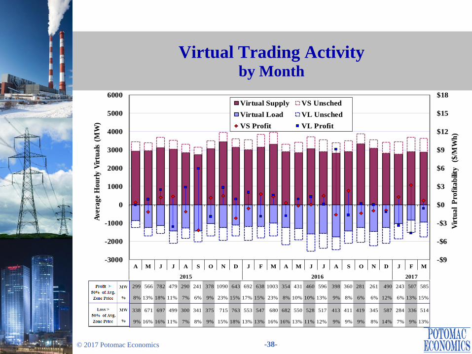
• Virtual traders netted a profit of $4.5 million in the first quarter of 2017. Profitable
virtual trades generally improve convergence between DA and RT prices.
• The quantities of virtual trades with substantial profits or losses were generally
consistent with prior periods.
These trades were primarily associated with high price volatility that resulted from
unexpected events, which do not raise significant concerns.
Page 37
-37- © 2017 Potomac Economics
Day-ahead Scheduled Load and Actual Load Daily Peak Load Hour
-20%
0%
20%
40%
60%
80%
100%
120%
140%
January February March
DA
Sch
ed
ule
d L
oa
d (
% o
f R
T L
oa
d)
Daily Average Net Day-ahead Scheduled Load, Peak Load Hours
NYCA (Load Zone) West ( A )
Capital ( F ) LHV (GHI)
NYC ( J ) LI ( K )
Central NY (BCE) North (D)
West
Zone
(A)
Central
NY
(BCE)
North
Zone
(D)
Capital
(F)
LHV
(GHI)
NYC
(J)
LI
(K)
NYCA
(Load Zones)
NYCA
(Load Zones +
External )
2017 Q1 110% 95% 56% 89% 86% 101% 104% 97% 95%
2016 Q4 119% 88% 51% 86% 79% 101% 107% 96% 94%
2016 Q1 118% 90% 58% 90% 80% 100% 112% 97% 95%
Avg DA Net Scheduled Load (% of RT Load)
Quarter
Page 38
-38- © 2017 Potomac Economics
Virtual Trading Activity by Month
-$9
-$6
-$3
$0
$3
$6
$9
$12
$15
$18
-3000
-2000
-1000
0
1000
2000
3000
4000
5000
6000
A M J J A S O N D J F M A M J J A S O N D J F M
2015 2016 2017
Vir
tua
l P
rofi
tab
ility
($
/MW
h)
Avera
ge H
ou
rly V
irtu
als
(M
W)
Virtual Supply VS Unsched
Virtual Load VL Unsched
VS Profit VL Profit
299 566 782 479 290 241 378 1090 643 692 638 1003 354 431 460 596 398 360 281 261 490 243 507 585
8% 13% 18% 11% 7% 6% 9% 23% 15% 17% 15% 23% 8% 10% 10% 13% 9% 8% 6% 6% 12% 6% 13% 15%
338 671 697 499 300 341 375 715 763 553 547 680 682 550 528 517 413 411 419 345 587 284 336 514
9% 16% 16% 11% 7% 8% 9% 15% 18% 13% 13% 16% 16% 13% 11% 12% 9% 9% 9% 8% 14% 7% 9% 13%
Page 39
-39- © 2017 Potomac Economics
Virtual Trading Activity by Location
Note: Virtual profit is not shown for a category if the average scheduled quantity is less than 50 MW.
-$8
-$4
$0
$4
$8
$12
$16
-1000
-500
0
500
1000
1500
2000
J F M J F M J F M J F M J F M J F M J F M J F M J F M J F M J F M
West Central
NY
North Capital LHV NYC LI Ontario NE
Primary
PJM
Primary
All
Other
Load Zones External Proxy
Pro
fita
bili
ty
($/M
Wh
)
Cle
are
d V
irtu
al
(MW
/h)
Virtual Load
Virtual Supply
VS Profit
VL Profit
DA Scheduled Load (% of RT Load)
Cleared
(MW/h)
Profit
($/MWh)
Cleared
(MW/h)
Profit
($/MWh)
Cleared
(MW/h)
Profit
($/MWh)
Cleared
(MW/h)
Profit
($/MWh)
2017 Q1 2364 $1.69 811 -$2.84 481 $1.57 143 -$2.61
2016 Q4 2598 -$0.80 1119 -$0.65 479 -$2.81 199 $1.56
2016 Q1 2677 $1.11 969 $0.80 481 -$0.67 155 -$0.85
Virtual Export
Year
Virtual Supply Virtual Load Virtual Import
Page 40
-40- © 2017 Potomac Economics
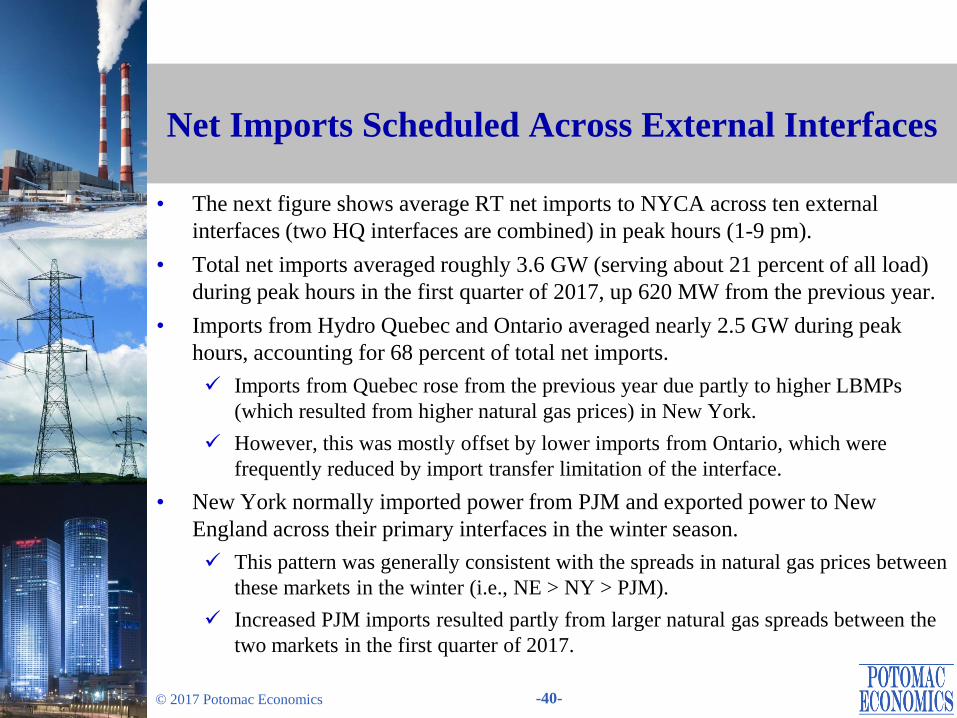
Net Imports Scheduled Across External Interfaces
• The next figure shows average RT net imports to NYCA across ten external
interfaces (two HQ interfaces are combined) in peak hours (1-9 pm).
• Total net imports averaged roughly 3.6 GW (serving about 21 percent of all load)
during peak hours in the first quarter of 2017, up 620 MW from the previous year.
• Imports from Hydro Quebec and Ontario averaged nearly 2.5 GW during peak
hours, accounting for 68 percent of total net imports.
Imports from Quebec rose from the previous year due partly to higher LBMPs
(which resulted from higher natural gas prices) in New York.
However, this was mostly offset by lower imports from Ontario, which were
frequently reduced by import transfer limitation of the interface.
• New York normally imported power from PJM and exported power to New
England across their primary interfaces in the winter season.
This pattern was generally consistent with the spreads in natural gas prices between
these markets in the winter (i.e., NE > NY > PJM).
Increased PJM imports resulted partly from larger natural gas spreads between the
two markets in the first quarter of 2017.
Page 41
-41- © 2017 Potomac Economics
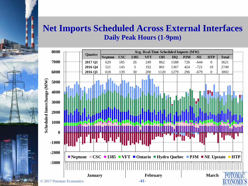
Net Imports Scheduled Across External Interfaces Daily Peak Hours (1-9pm)
-3000
-2000
-1000
0
1000
2000
3000
4000
5000
6000
7000
8000
January February March
Sch
ed
ule
d I
nte
rch
an
ge (M
W)
Average Daily Real Time Scheduled Net Imports from External Interfaces
Peak Hours (13:00 - 21:00)
Neptune CSC 1385 VFT Ontario Hydro Quebec PJM NE Upstate HTP
Neptune CSC 1385 VFT OH HQ PJM NE HTP Total
2017 Q1 629 185 26 249 862 1588 726 -644 0 3621
2016 Q4 521 143 3 192 801 1367 424 -721 19 2749
2016 Q1 618 139 30 200 1120 1279 296 -679 0 3002
Avg. Real-Time Scheduled Imports (MW)Quarter
Page 42
-42- © 2017 Potomac Economics
Efficiency of CTS Scheduling with PJM and NE: Chart Descriptions
• The next table evaluates the performance of CTS with PJM and NE at their
primary interfaces in the first quarter of 2017. The table shows:
The percent of quarter-hour intervals during which the interface flows were
adjusted by CTS (relative to the estimated hourly schedule).
The average flow adjustment from the estimated hourly schedule.
The production cost savings that resulted from CTS, including:
– Projected savings at scheduling time, which is the expected production cost savings
at the time when RTC determines the interchange schedule.
– Net over-projected savings, which is the portion of savings that was inaccurately
projected because of PJM, NYISO, and ISO-NE price forecast errors.
– Other Unrealized savings, which are not realized due to: a) real-time curtailment;
and b) interface ramping.
– Actual savings (= Projected – Over-projected – Other Unrealized).
Interface prices, which are forecasted prices at the time of RTC scheduling and
actual real-time prices.
Price forecast errors, which show the average difference and the average absolute
difference between actual and forecasted prices across the interfaces.
Page 43
-43- © 2017 Potomac Economics
Efficiency of CTS Scheduling with PJM and NE: Market Results
• The interchange was adjusted in 94 percent of intervals (from our estimated hourly
schedule) at the ISO-NE interface compared to 69 percent at the PJM interface.
This was partly attributable to the larger amount of low-price CTS bids at the ISO-
NE interface (compared to the PJM interface).
• Our analyses show that $1.2 million and $0.7 million of production cost savings were projected at the time of scheduling at the ISO-NE and PJM interfaces.
However, only an estimated $0.9 million and $0.2 million of savings were realized
largely because of price forecast errors.
– It is important to note that our evaluation may under-estimate both projected and actual savings, because the estimated hourly schedules (by using actual CTS bids)
likely include some of the efficiencies that result from the CTS process.
– Nonetheless, the results of our analysis are still useful for identifying some of the
sources of inefficiency in the CTS process.
• Projected savings were relatively consistent with actual savings when the forecast errors were moderate (e.g., less than $20/MWh), while the CTS process produced
much more inefficient results when forecast errors were large.
Therefore, improvements in the CTS process should focus on identifying sources
of forecast errors.
Page 44
-44- © 2017 Potomac Economics
Efficiency of Intra-Hour Scheduling Under CTS Primary PJM and NE Interfaces
Both Forecast
Errors <= $20
Any Forecast
Error > $20Total
Both Forecast
Errors <= $20
Any Forecast
Error > $20Total
78% 16% 94% 61% 8% 69%
Net Imports -3 4 -2 16 5 15
Gross 84 100 87 70 93 72
$0.8 $0.5 $1.2 $0.3 $0.4 $0.7
NY $0.00 -$0.1 -$0.1 -$0.1 -$0.1 -$0.2
NE or PJM -$0.01 -$0.1 -$0.1 -$0.1 -$0.2 -$0.3
-$0.04 -$0.08 -$0.1 -$0.02 -$0.04 -$0.1
$0.7 $0.1 $0.9 $0.2 $0.01 $0.2
Actual $29.24 $58.63 $34.16 $25.31 $61.37 $29.34
Forecast $29.80 $41.98 $31.84 $25.55 $42.70 $27.47
Actual $32.10 $41.16 $33.62 $27.41 $55.77 $30.58
Forecast $31.86 $47.33 $34.45 $28.08 $51.72 $30.73
Fcst. - Act. $0.55 -$16.66 -$2.33 $0.24 -$18.67 -$1.88
Abs. Val. $4.00 $34.99 $9.19 $3.60 $41.03 $7.79
Fcst. - Act. -$0.24 $6.16 $0.83 $0.67 -$4.04 $0.15
Abs. Val. $4.33 $25.58 $7.89 $2.75 $33.29 $6.17
Other Unrealized Savings
Average Flow Adjustment
( MW )
Average/Total During Intervals w/ Adjustment
Price
Forecast
Errors
($/MWh)
NY
NE or PJM
% of All Intervals w/ Adjustment
Production
Cost
Savings
($ Million)
Projected at Scheduling Time
Actual Savings
Net Over-
Projection by:
CTS - NY/NE CTS - NY/PJM
Interface
Prices
($/MWh)
NY
NE or PJM
Page 45
Day-Ahead and Real-Time
Transmission Congestion
Page 46
-46- © 2017 Potomac Economics
Transmission Congestion:
Chart Descriptions
• The next four figures evaluate the congestion patterns in the DAM and RTM and examine the following categories of resulting congestion costs:
Day-Ahead Congestion Revenues are collected by the NYISO when power is scheduled to flow across congested interfaces in the DAM, which is the primary funding source for TCC payments.
Day-Ahead Congestion Shortfalls occur when the net DA congestion revenues are less than the payments to TCC holders.
– Shortfalls (or surpluses) arise when the TCCs on a path exceed (or is below) its DAM transfer capability in periods of congestion.
– These typically result from modeling differences between the TCC auction and the DAM, including assumptions related to PAR schedules, loop flows, and transmission outages.
Balancing Congestion Shortfalls arise when DAM scheduled flows over a constraint exceed what can flow over the constraint in the RTM.
– The transfer capability of a constraint falls (or rises) from DA to RT for the similar reasons (e.g., deratings and outages of transmission facilities, inconsistent assumptions regarding PAR schedules and loop flows, etc.).
– In addition, payments between the NYISO and PJM related to the M2M process also contribute to shortfalls (or surpluses).
Page 47
-47- © 2017 Potomac Economics
Transmission Congestion:
Chart Descriptions
• The first figure summarizes day-ahead congestion revenue and shortfalls, and
balancing congestion shortfalls over the past two years on a monthly basis.
• The second figure examines in detail the value and frequency of day-ahead and
real-time congestion along major transmission paths by quarter.
The value of transfers is equal to the marginal cost of relieving the constraint (i.e.,
shadow price) multiplied by the scheduled flow across the transmission path.
In the day-ahead market, the value of congestion equals the congestion revenue
collected by the NYISO.
• The third and fourth figures show the day-ahead and balancing congestion revenue
shortfalls by transmission facility on a daily basis.
Negative values indicate day-ahead and balancing congestion surpluses.
• Congestion is evaluated along major transmission paths that include:
West Zone Lines: Primarily 230 kV transmission constraints in the West Zone.
West to Central: Including transmission constraints in the Central Zone and
interfaces from West to Central.
North Zone: The Moses-South interface and other lines in the North Zone and
leading into Southern New York.
Page 48
-48- © 2017 Potomac Economics
Transmission Congestion:
Chart Descriptions
(cont. from prior slide)
Central to East: The Central-East interface and other lines transferring power from
the Central Zone to Eastern New York.
Capital to Hudson Valley: Primarily lines leading into SENY (e.g., the New
Scotland-Leeds line, the Leeds-Pleasant Valley line, etc.)
NYC Lines: Including lines into and within the NYC 345 kV system, lines leading
into and within NYC load pockets, and groups of lines into NYC load pockets that
are modeled as interface constraints.
Long Island: Lines leading into and within Long Island.
External Interfaces – Congestion related to the total transmission limits or ramp
limits of the external interfaces.
All Other – All of other line constraints and interfaces.
Page 49
-49- © 2017 Potomac Economics
Day-Ahead and Real-Time Congestion
• Day-ahead congestion revenue totaled $81 million in the first quarter of 2017,
down 35 percent from the first quarter of 2016.
• West Zone 230 kV facilities accounted for the largest reduction from 2016.
Congestion was increased in March 2016 because of planned transmission outages,
which were necessary for transmission upgrades that have helped relieve
congestion on the 230 kV system since they were completed in May 2016.
The reduction was also attributable to lower Ontario imports and higher PJM
imports.
• The Central-East interface accounted for nearly 85 percent of congestion in the first quarter of 2017. This was down 10 percent from the previous year.
Lower gas spreads between Western NY and Eastern NY reduced re-dispatch costs
to manage congestion across the Central-East interface.
Lower Ontario imports and higher PJM imports contributed to less frequent
congestion across the Central-East interface as well.
• RT Congestion into the Valley Stream load pocket on Long Island fell notably from the first quarter of 2016 partly because of an improvement to the modeling of
the 901 and 903 lines in April 2016.
Page 50
-50- © 2017 Potomac Economics
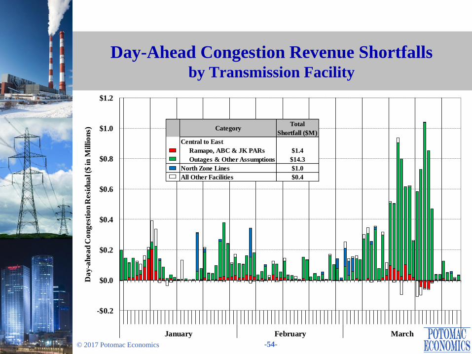
Day-Ahead Congestion Shortfalls
• Transmission outages accounted for most shortfalls in the first quarter of 2017.
Roughly $11.5 million (out of $17 million) was allocated to the responsible TO.
• More than 90 percent of shortfalls accrued on the transmission paths from Central
NY to East NY (primarily the Central-East interface).
Most of these shortfalls were attributable to the following transmission outages:
– The Fitzpatrick-EDIC 345 line was OOS from mid-January to mid-February.
– The EDIC-Fraser 345 line was OOS from early to mid-March.
– The Marcy-Coopers-Rock Tavern 345 lines were OOS for most of March.
– One Ramapo PAR were OOS during the entire quarter.
A significant portion of shortfalls (~$5M) resulted from other factors that include
nuclear outages, unit commitments, and the status of capacitors and SVCs.
– These affect the voltage limit on the Central-East interface and the resulting
shortfalls are currently allocated to statewide.
• Roughly $1 million of shortfalls accrued on the transmission paths following
power out of the North Zone because of transmission outages on several days that
reduced transfer capability on parallel paths.
Page 51
-51- © 2017 Potomac Economics
Balancing Congestion Shortfalls
• Nearly all of the balancing congestion surpluses in the first quarter of 2017 were
associated with the Central-East interface.
The operation of PAR-controlled lines (including the Ramapo, ABC, JK, and St.
Lawrence lines) collectively contributed nearly $3.5 million of surpluses.
Other factors, including the operation of capacitors and SVCs, contributed another
$1 million of surpluses.
In addition, $0.5 million was paid by PJM under M2M JOA.
• Nearly $0.8 million of shortfalls accrued on the Ontario interface in a few intervals
on March 8, partly offsetting the overall surplus.
The Ontario import limit was reduced to 300 MW because of multiple transmission
outages on the 230 and 115 kV networks in the West Zone due to high winds.
Page 52
-52- © 2017 Potomac Economics
Congestion Revenues and Shortfalls by Month
-$10
$0
$10
-$10
$0
$10
$20
$30
$40
$50
$60
$70
$80
$90
$100
A M J J A S O N D J F M A M J J A S O N D J F M
2015 2016 2017
Mil
lio
n $
Mil
lio
n $
DAM Congestion Shortfall
DAM Congestion Revenue
Balancing Congestion Shortfall
2016Q1 2016Q4 2017Q1
DAM Congestion Revenues (1) $125 $88 $81
DAM Congestion Shortfalls (2) $24 $31 $17
Payments to TCC Holders (1)+(2) $149 $119 $98
Balancing Congestion Shortfalls $2 $1 -$5
Page 53
-53- © 2017 Potomac Economics
DA and RT Congestion Value and Frequency by Transmission Path
0%
50%
100%
$0
$20
$40
$60
$80
Q1
Q4
Q1
Q1
Q4
Q1
Q1
Q4
Q1
Q1
Q4
Q1
Q1
Q4
Q1
Q1
Q4
Q1
Q1
Q4
Q1
Q1
Q4
Q1
Q1
Q4
Q1
2016 '17 2016 '17 2016 '17 2016 '17 2016 '17 2016 '17 2016 2016 '17 2016 '17
West Zone
Lines
West to
Central
North
Zone
Central to
East
Capital to
Hud VL
NYC Lines Long
Island
External
Interfaces
All Other
Co
ng
est
ion
Fre
q.
(% o
f H
rs)
Co
ng
est
ion
Va
lue ($
in
Mil
lio
ns)
Day-Ahead Congestion Value
Real-Time Congestion Value
Day-Ahead Congestion Frequency
Real-Time Congestion Frequency
Day-Ahead Real-Time
2016Q1 $125 $154
2016Q4 $88 $79
2017Q1 $81 $79
Congestion Value ($ M)
Page 54
-54- © 2017 Potomac Economics
Day-Ahead Congestion Revenue Shortfalls by Transmission Facility
-$0.2
$0.0
$0.2
$0.4
$0.6
$0.8
$1.0
$1.2
January February March
Da
y-a
hea
d C
on
gest
ion
Resi
du
al (
$ in
Mil
lio
ns) Category
Total
Shortfall ($M)
Central to East
Ramapo, ABC & JK PARs $1.4
Outages & Other Assumptions $14.3
North Zone Lines $1.0
All Other Facilities $0.4
Page 55
-55- © 2017 Potomac Economics
Balancing Congestion Shortfalls by Transmission Facility
Note: The BMCR estimated above may differ from
actual BMCR because the figure is partly based on
real-time schedules rather than metered values.
-$0.6
-$0.4
-$0.2
$0.0
$0.2
$0.4
$0.6
$0.8
$1.0
January February March
Ba
lan
cin
g C
on
gest
ion
Resi
du
al (
$ in
Mil
lio
ns)
Central to East
Ramapo, ABC & JK PARs -$2.9
St. Lawrence PARs -$0.4
Other Factors -$1.1
M2M Payment -$0.5
External Interfaces $0.6
All Other Facilities $0.5
CategoryTotal
Shortfall ($M)
Page 56
-56- © 2017 Potomac Economics
Operations under M2M with PJM: Chart Descriptions
• The following figure evaluates the operation of Ramapo PARs this quarter, which
compares the actual flows on Ramapo PARs with their M2M operational targets.
The M2M target flow has the following components:
– Share of PJM-NY Over Ramapo – Based on the share of PJM-NY flows that were
assumed to flow across the Ramapo Line.
– 80% RECo Load – 80 percent of telemetered Rockland Electric Company load.
– ABC & JK Flow Deviations – The total flow deviations on ABC and JK PAR-
controlled lines from schedules under the normal wheeling agreement.
– ABC & JK Auto Correction Factors – These represent “pay-back” MW generated
from cumulative deviations on the ABC or JK interfaces from prior days.
The figure shows these average quantities over intervals when M2M constraints for
Ramapo Coordination were binding on a daily basis (excluding days with fewer
than 12 binding intervals).
Page 57
-57- © 2017 Potomac Economics
• Active Ramapo Coordination (i.e., when M2M constraints were binding) occurred
in 29 percent of intervals, down from the first quarter of 2016 because of less frequent congestion across the Central-East interface.
Average actual flows exceeded the Target Flow by 420 MW, resulting in a small
amount of M2M payments (~$90K) from PJM to NY this quarter.
– The low Target Flow resulted from large negative deviations on the JK lines. This is represented by “JK auto correction” and capped at 200 MW.
• Ramapo Coordination under M2M with PJM has provided significant benefit to the NYISO in managing congestion on coordinated flow gates.
Balancing congestion surpluses have resulted from relief of the Central-East
interface, indicating that it reduced production costs and congestion.
• Beginning in May 2017, the ABC and JK lines were incorporated into the M2M process after the expiration of the ConEd-PSEG wheel agreement.
Many new coordinated flow gates (in NYC and West Zone) were added.
We will continue to report on the performance of the M2M process after these
changes go into effect.
Operations under M2M with PJM: Market Outcomes
Page 58
-58- © 2017 Potomac Economics
Actual and Target Flows for the Ramapo Line During the Intervals with Binding M2M Constraints
Note: This chart does not show the days during which M2M constraints were binding in less than 12 intervals.
-1600
-1200
-800
-400
0
400
800
1200
1600
January February March
Avera
ge F
low
(M
W)
80% RECO Load JK Auto Correction Factor
ABC Auto Correction Factor Share of PJM-NY Over Ramapo
ABC & JK Wheel Deviations Actual Flow
M2M Target Flow
80%
RECO
Share of
PJM-AC
ABC Auto
Correction
JK Auto
Correction
ABC & JK
Wheel
Deviation
Target Actual
2016 Q1 44% $0.004 122 110 -11 -1113 -51 -944 506
2017 Q1 29% $0.09 116 220 -11 -200 -118 8 426
Quarter
% of
Market
Intervals
PJM -> NY
Payments
(million $)
Average Flow Quantity on Ramapo PARs (MW)
Page 59
-59- © 2017 Potomac Economics
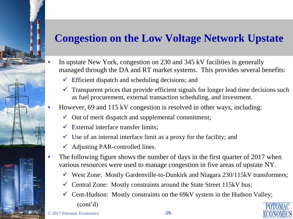
Congestion on the Low Voltage Network Upstate
• In upstate New York, congestion on 230 and 345 kV facilities is generally
managed through the DA and RT market systems. This provides several benefits:
Efficient dispatch and scheduling decisions; and
Transparent prices that provide efficient signals for longer lead time decisions such
as fuel procurement, external transaction scheduling, and investment.
• However, 69 and 115 kV congestion is resolved in other ways, including:
Out of merit dispatch and supplemental commitment;
External interface transfer limits;
Use of an internal interface limit as a proxy for the facility; and
Adjusting PAR-controlled lines.
• The following figure shows the number of days in the first quarter of 2017 when various resources were used to manage congestion in five areas of upstate NY.
West Zone: Mostly Gardenville-to-Dunkirk and Niagara 230/115kV transformers;
Central Zone: Mostly constraints around the State Street 115kV bus;
Cent-Hudson: Mostly constraints on the 69kV system in the Hudson Valley;
(cont’d)
Page 60
-60- © 2017 Potomac Economics
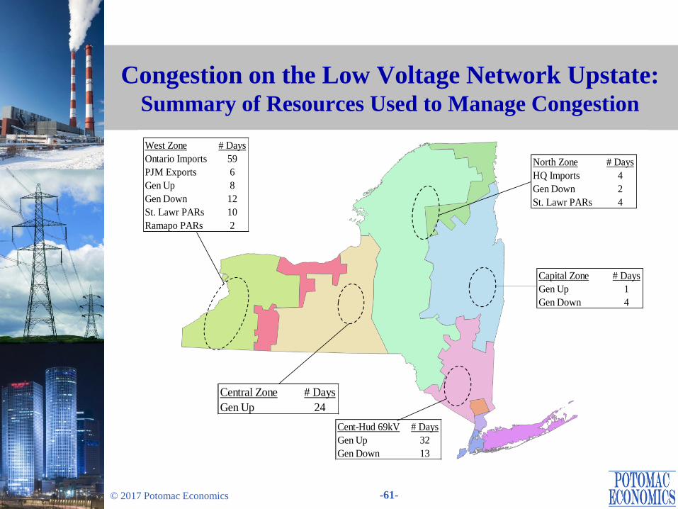
Congestion on the Low Voltage Network Upstate
North Zone: Mostly 115kV constraints coming south from the North Zone between the Colton 115kV and Taylorville 115kV buses; and
Capital Zone: Mostly Albany-to-Greenbush 115kV constraints.
• The West Zone contains the most frequently constrained 115kV facilities.
Ontario imports were limited on most days, while generation redispatch and PAR adjustments were used on a significant number of days.
West Zone congestion management affected other areas of New York by:
– Reducing low-cost imports from Ontario, which raised LBMPs in other areas; and
– Using the St. Lawrence PARs to relieve West Zone congestion tends to exacerbate congestion going south from the North Zone and across the Central East interface.
– Thus, the actions should be done in a manner that balances the benefits of relieving congestion in one area against the cost of exacerbating congestion in another.
• This can be done more effectively if low-voltage constraints were managed using the DA and RT market systems.
Although the PJM export limit bound on just 6 days, PJM imports are generally helpful for managing 115kV congestion in the West Zone and Central Zone.
– Modeling 115kV constraints in the market systems would provide incentives for PJM imports to relieve congestion in NY.
Page 61
-61- © 2017 Potomac Economics
Congestion on the Low Voltage Network Upstate: Summary of Resources Used to Manage Congestion
West Zone # Days
Ontario Imports 59
PJM Exports 6
Gen Up 8
Gen Down 12
St. Lawr PARs 10
Ramapo PARs 2
Capital Zone # Days
Gen Up 1
Gen Down 4
Cent-Hud 69kV # Days
Gen Up 32
Gen Down 13
North Zone # Days
HQ Imports 4
Gen Down 2
St. Lawr PARs 4
Central Zone # Days
Gen Up 24
Page 62
Supplemental Commitments, OOM Dispatch,
and Uplift Charges
Page 63
-63- © 2017 Potomac Economics
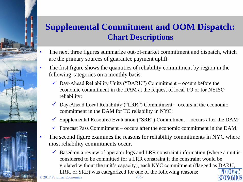
Supplemental Commitment and OOM Dispatch: Chart Descriptions
• The next three figures summarize out-of-market commitment and dispatch, which
are the primary sources of guarantee payment uplift.
• The first figure shows the quantities of reliability commitment by region in the
following categories on a monthly basis:
Day-Ahead Reliability Units (“DARU”) Commitment – occurs before the
economic commitment in the DAM at the request of local TO or for NYISO
reliability;
Day-Ahead Local Reliability (“LRR”) Commitment – occurs in the economic
commitment in the DAM for TO reliability in NYC;
Supplemental Resource Evaluation (“SRE”) Commitment – occurs after the DAM;
Forecast Pass Commitment – occurs after the economic commitment in the DAM.
• The second figure examines the reasons for reliability commitments in NYC where
most reliability commitments occur.
Based on a review of operator logs and LRR constraint information (where a unit is
considered to be committed for a LRR constraint if the constraint would be
violated without the unit’s capacity), each NYC commitment (flagged as DARU,
LRR, or SRE) was categorized for one of the following reasons:
Page 64
-64- © 2017 Potomac Economics
Supplemental Commitment and OOM Dispatch: Chart Descriptions
– NOx Only – If needed for NOx bubble requirement and no other reason.
– Voltage – If needed for ARR 26 and no other reason except NOx.
– Thermal – If needed for ARR 37 and no other reason except NOx.
– Loss of Gas – If needed for IR-3 and no other reason except NOx.
– Multiple Reasons – If needed for two or three out of ARR 26, ARR 37, IR-3. The
capacity is shown for each separate reason in the bar chart.
For voltage and thermal constraints, the capacity is shown by the following load
pocket that was secured:
– (a) AELP = Astoria East; (b) AWLP = Astoria West/Queensbridge; (c) AVLP =
Astoria West/Queensbridge/ Vernon; (d) ERLP = East River; (e) FRLP = Freshkills; (f) GSLP = Greenwood/ Staten Island; and (g) SDLP =
Sprainbrook/Dunwoodie.
• The third figure summarizes the frequency (measured by the total station-hours) of
Out-of-Merit dispatches by region on a monthly basis.
The figure excludes OOMs that prevent a generator from being started, since these
usually indicate transmission outages that make the generator unavailable.
In each region, the two stations with the highest number of OOM dispatch hours in
the current quarter are shown separately.
Page 65
-65- © 2017 Potomac Economics
Supplemental Commitment and OOM Dispatch: Supplemental Commitment Results
• Reliability commitment averaged 470 MW in the first quarter of 2017.
New York City accounted for 85 percent (or 400 MW on average), which was up
108 percent from the first quarter of 2016.
– Reliability commitments in NYC are frequently driven by transmission and
generation outages. More transmission and generation outages led to more reliability commitments in the first quarter of 2017.
– Most reliability commitments in the first quarter of 2017 were made to satisfy the
N-1-1 thermal requirements in the Astoria West/Queensbridge and Freshkills load
pockets.
Western NY accounted for 13 percent (or 60 MW on average), which was
comparable to the first quarter of 2016.
– These have fallen notably since recent transmission upgrades.
– The vast majority of DARU commitments occurred in the Central Zone at the
Cayuga (Milliken) plant for local voltage support and/or managing post-
contingency flows on 115kV facilities.
• Reliability commitments were rare in other areas in the first quarter of 2017.
Page 66
-66- © 2017 Potomac Economics
Supplemental Commitment and OOM Dispatch: OOM Dispatch Results
• The NYISO and local TOs sometimes dispatch generators out-of-merit in order to:
Maintain reliability of the lower-voltage transmission and distribution networks; or
Manage constraints of high voltage transmission facilities that are not fully
represented in the market model.
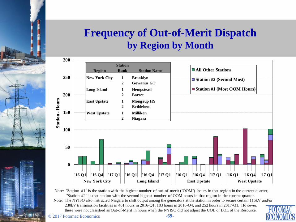
• OOM dispatched occurred for 372 station-hours in the first quarter of 2017.
• Overall, OOM dispatch has been relatively low since 2015.
The largest reduction occurred in Western NY because of transmission upgrades,
which allowed the retirement of several units that were frequently OOMed in the
past for local reliability needs.
– Modestly higher OOM dispatch in March 2017 resulted from increased local needs
on the 115 kV network because of transmission outages.
• Nonetheless, the Niagara facility was still often manually instructed to shift output
among its units to secure certain 115kV and/or 230 kV transmission constraints
(which was not included in the OOM counts in the chart).
In the first quarter of 2017, this manual shift was required in 236 hours to manage
115 kV constraints and in 16 hours to manage 230 or 345 kV constraints.
Page 67
-67- © 2017 Potomac Economics
Supplemental Commitment for Reliability by Category and Region
0
50
100
150
200
250
300
350
400
450
500
550
'16 Q1 '16 Q4 '17 Q1 '16 Q1 '16 Q4 '17 Q1 '16 Q1 '16 Q4 '17 Q1 '16 Q1 '16 Q4 '17 Q1
New York City Long Island East Upstate West Upstate
Avera
ge Q
ua
nti
ty (
MW
/h)
SRE
Forecast Pass
LRR
DARU
Total Min Gen
West East NYC LI
2017 Q1 0.9% 0.0% 6.2% 0.2%
2016 Q4 0.9% 0.1% 5.9% 0.2%
2016 Q1 0.9% 0.0% 3.0% 0.8%
QuarterSupplemental Commitment (% of Forecast Load)
Page 68
-68- © 2017 Potomac Economics
Supplemental Commitment for Reliability in NYC by Reliability Reason and Load Pocket
0
20
40
60
80
100
120
140
160
180
200
220
240
AW
LP
AV
LP
FR
LP
AW
LP
AV
LP
ER
LP
Voltage (ARR26) Thermal (ARR37) Loss of Gas
(IR-3)
Min
Gen
of
Ca
pa
cit
y F
lag
ged
as
DA
RU
/LR
R/S
RE
(G
Wh
)
Reliability Commitment Reason / Load Pocket
2016 Q1
2017 Q1
Thermal
90%
Voltage
4%
Multiple
Reasons
6%
Capacity by Commitment
Reason(s): 2017 Q1
Page 69
-69- © 2017 Potomac Economics
Frequency of Out-of-Merit Dispatch by Region by Month
Note: The NYISO also instructed Niagara to shift output among the generators at the station in order to secure certain 115kV and/or
230kV transmission facilities in 461 hours in 2016-Q1, 183 hours in 2016-Q4, and 252 hours in 2017-Q1. However,
these were not classified as Out-of-Merit in hours when the NYISO did not adjust the UOL or LOL of the Resource.
0
50
100
150
200
250
300
'16 Q1 '16 Q4 '17 Q1 '16 Q1 '16 Q4 '17 Q1 '16 Q1 '16 Q4 '17 Q1 '16 Q1 '16 Q4 '17 Q1
New York City Long Island East Upstate West Upstate
Sta
tio
n -
Ho
urs
All Other Stations
Station #2 (Second Most)
Station #1 (Most OOM Hours)
Note: "Station #1" is the station with the highest number of out-of-merit ("OOM") hours in that region in the current quarter;
"Station #2" is that station with the second-highest number of OOM hours in that region in the current quarter.
Region
Station
Rank Station Name
New York City 1 Brooklyn
2 Gowanus GT
Long Island 1 Hempstead
2 Barret
East Upstate 1 Mongaup HY
2 Bethlehem
West Upstate 1 Milliken
2 Niagara
Page 70
-70- © 2017 Potomac Economics
Uplift Costs from Guarantee Payments: Chart Descriptions
• The next two figures show uplift charges in the following seven categories.
Three categories of non-local reliability uplift are allocated to all LSEs:
– Day Ahead: For units committed in the DAM (usually economically) whose day-ahead market revenues do not cover their as-offered costs.
– Real Time: Typically for quick-start resources that are scheduled economically, or units committed or dispatched OOM for bulk system reliability whose real-time market revenues do not cover their as-offered costs.
– Day Ahead Margin Assurance Payment (“DAMAP”): For generators that incur losses because they are dispatched below their DA schedule when the RT LBMP is higher than the DA LBMP.
Four categories of local reliability uplift are allocated to the local TO:
– Day Ahead: From Local Reliability Requirements (“LRR”) and Day-Ahead Reliability Unit (“DARU”) commitments.
– Real Time: From Supplemental Resource Evaluation (“SRE”) commitments and Out-of-Merit (“OOM”) dispatched units for local reliability.
– Minimum Oil Burn Program: Covers spread between oil and gas prices when generators burn oil to satisfy NYC gas pipeline contingency reliability criteria.
– DAMAP: For units that are dispatched OOM for local reliability reasons.
The first figure shows these seven categories on a daily basis during the quarter.
The second figure summarizes uplift costs by region on a monthly basis.
Page 71
-71- © 2017 Potomac Economics
Uplift Costs from Guarantee Payments: Market Results
• Guarantee payments totaled $8.6 million this quarter, up 21 percent from the first
quarter of 2016. The increase was consistent with:
Increased supplemental commitment for reliability in NYC (see slide 67); and
Higher natural gas prices (see slide 13), which increased the commitment costs of
gas-fired units.
• Local uplift in Western NY totaled $2 million, accounting for 23 percent of total
guarantee uplift this quarter.
Nearly all of the local uplift was paid to units that were committed and/or OOMed
to manage congestion on the 115 kV system (see slides 67, 69).
• DAMAP uplift was high on March 8.
High winds led to multiple transmission outages during the afternoon on the 230
kV and 115 kV system in Western NY.
A large unit in Western NY was OOMed down to manage overloads on the
230/115 kV facilities and had to buy out its DAM schedules (energy, reserves, and
regulation) at high RT prices.
Page 72
-72- © 2017 Potomac Economics
Uplift Costs from Guarantee Payments Local and Non-Local by Category
Note: These data are based on information available at the reporting time and do not include some manual
adjustments to mitigation, so they can be different from final settlements.
$0.0
$0.1
$0.2
$0.3
$0.4
$0.5
$0.6
$0.7
$0.8
January February March
$ M
illi
on
s
EDRP/SCR Min Oil Burn
RT Statewide RT Local
DAMAP Statewide DAMAP Local
DAM Statewide DAM Local
Local Statewide Total
Day
Ahead
Real
TimeDAMAP
Min Oil
Burn
Day
Ahead
Real
TimeDAMAP
EDRP/
SCR
2017 Q1 $5.4 $0.6 $0.2 $0.0 $0.4 $1.2 $0.8 $0.0 $8.6
2016 Q4 $3.5 $0.6 $0.1 $0.0 $0.2 $1.1 $0.6 $0.0 $6.1
2016 Q1 $3.1 $0.3 $0.1 $0.0 $0.3 $1.8 $1.5 $0.0 $7.1
Quarter
Quarterly BPCG By Category (Million $)
Page 73
-73- © 2017 Potomac Economics
Uplift Costs from Guarantee Payments By Category and Region
Note: BPCG data are based on information available at the reporting time that can be different from final settlements.
$0.0
$0.5
$1.0
$1.5
$2.0
$2.5
$3.0
'16
Q1
'16
Q4
'17
Q1
'16
Q1
'16
Q4
'17
Q1
'16
Q1
'16
Q4
'17
Q1
'16
Q1
'16
Q4
'17
Q1
'16
Q1
'16
Q4
'17
Q1
New York City Long Island East Upstate West Upstate EDRP/SCR
$ M
illi
on
Min Oil Burn
RT Statewide
RT Local
DAMAP Statewide
DAMAP Local
DAM Statewide
DAM Local
New
York
Long
Island
East
Upstate
West
Upstate
EDRP/
SCR
2017 Q1 $5.2 $0.7 $0.6 $2.0 $0.0
2016 Q4 $3.0 $0.6 $0.5 $2.1 $0.0
2016 Q1 $2.6 $1.5 $0.5 $2.4 $0.0
BPCG By Region (Million $)
Year
Page 74
Market Power and Mitigation
Page 75
-75- © 2017 Potomac Economics
Potential Economic and Physical Withholding: Chart Descriptions
• The next two figures show the results of our screens for attempts to exercise market power, which may include economic and physical withholding.
• The screen for potential economic withholding is the Output Gap, which is the amount of economic capacity that does not produce energy because a supplier submits an offer price above the unit’s reference level by a substantial threshold.
We show output gap in NYCA and East NY based on:
– The state-wide mitigation threshold (the lower of $100/MWh and 300 percent); and
– Two other lower thresholds (100 percent and 25 percent).
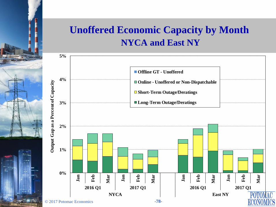
• The screen for potential physical withholding is the Unoffered Economic Capacity, which is the amount of economic capacity that is not available to the market because a supplier does not offer, claims a derating, or offers in an inflexible way.
We show the unoffered economic capacity in NYCA and East NY from:
– Long-term outages/deratings (at least 7 days);
– Short-term outages/deratings (less than 7 days);
– Online capacity that is not offered or offered inflexibly; and
– Offline GT capacity that is not offered in the real-time market.
Long-term nuclear outages/deratings are excluded from this analysis.
Page 76
-76- © 2017 Potomac Economics
Potential Economic and Physical Withholding: Market Power Screening Results
• The amount of output gap remained low in the first quarter of 2017 and raised no
significant market power concerns.
Output gap averaged less than 0.1 percent of total capacity at the mitigation
threshold and 0.7 to 1.3 percent at the lowest threshold evaluated (i.e., 25 percent).
Most of output gap occurred on several units that are owned by small suppliers and
located at regions with no significant local congestion.
• The amount of unoffered (including outages/deratings) economic capacity was
reasonably consistent with expectations for a competitive market.
Economic capacity on short-term outages/deratings was generally higher in the
colder months of the quarter (e.g., February 2016 & January 2017), reflecting that
cold temperatures tend to increase outage risks.
Economic capacity on long-term outages/deratings rose in March as suppliers
scheduled more maintenance expecting milder conditions.
– In some cases, it would have been efficient to postpone some of these outages
because it would have been economic to operate given actual market conditions.
Economic capacity on long-term outages/deratings were modestly higher in the
first quarter of 2016 because two combined-cycle units in NYC were partially
derated during most of the quarter for transmission line maintenance.
Page 77
-77- © 2017 Potomac Economics
Output Gap by Month NYCA and East NY
0%
1%
2%
3%
4%
5%
Ja
n
Feb
Mar
Ja
n
Feb
Mar
Ja
n
Feb
Mar
Ja
n
Feb
Mar
2016 Q1 2017 Q1 2016 Q1 2017 Q1
NYCA East NY
Ou
tpu
t G
ap
as
a P
erc
en
t o
f C
ap
acit
y Lower Threshold 1
Lower Threshold 2
Mitigation Threshold
Page 78
-78- © 2017 Potomac Economics
Unoffered Economic Capacity by Month
NYCA and East NY
0%
1%
2%
3%
4%
5%
Ja
n
Feb
Mar
Ja
n
Feb
Mar
Ja
n
Feb
Mar
Ja
n
Feb
Mar
2016 Q1 2017 Q1 2016 Q1 2017 Q1
NYCA East NY
Ou
tpu
t G
ap
as
a P
erc
en
t o
f C
ap
acit
y
Offline GT - Unoffered
Online - Unoffered or Non-Dispatchable
Short-Term Outage/Deratings
Long-Term Outage/Deratings
Page 79
-79- © 2017 Potomac Economics
Automated Market Power Mitigation
• The next figure summarizes the automated mitigation that was imposed in the
DAM and RTM (not including BPCG mitigation).
The upper panel shows the frequency of incremental energy mitigation, and the
lower panel shows the average mitigated capacity, including the flexible output
range (i.e., Incremental Energy) and the non-flexible portion (i.e., MinGen).
The left portion shows the amount of mitigation by the Automated Mitigation
Procedure (“AMP”) on economically committed units in NYC load pockets, while
the right portion shows for units committed for reliability.
• Most mitigation occurs in the DAM, since that is where most supply is scheduled.
Nearly all of mitigation occurred in the DAM in the first quarter of 2017.
– Local reliability (i.e., DARU & LRR) units accounted for 96 percent of DAM
mitigation. However, these mitigations generally affect guarantee payment uplift
but not LBMPs.
• The quantity of mitigation rose modestly from the first quarter of 2016 primarily
because of higher DARU and LRR commitments in New York City.
Page 80
-80- © 2017 Potomac Economics
Automated Market Power Mitigation
0%
2%
4%
0
10
20
30
40
50
60
DA
RT
DA
RT
DA
RT
DA
RT
DA
RT
DA
RT
DA
RT
DA
RT
DA
RT
DA
RT
DA
RT
DA
RT
DA
RT
DA
RT
DA
RT
DA
RT
2016 2017 2016 2017 2016 2017 2016 2017 2016 2017 2016 2017 2016 2017 2016 2017
Dunwood-
South
In-City
345/138kV
138kV Sub-
Pockets
Staten
Island
TSAs In-City Long Island Upstate
Automated Mitigation Procedure (AMP) Reliability Mitigation
Perc
en
t o
f H
ou
rs
Avera
ge M
itig
ate
d Q
ua
nti
ty (
MW
)
Quantity of MinGen Mitigation
Quantity of Incremental Energy Mitigation
Frequency of Incremental Energy Mitigation
111
Page 82
-82- © 2017 Potomac Economics
Spot Capacity Market Results
• The following two figures summarize capacity market results and key market
drivers in 2017-Q1.
The first figure summarizes available and scheduled Unforced Capacity (“UCAP”),
UCAP requirements, and spot prices that occurred in each capacity zone by month
(also compared to those from a year ago).
The next table shows: (a) the year-over-year changes in spot prices by locality; and
(b) variations in key factors that drove these changes.
• The average spot prices fell 41 to 66 percent from a year ago in all regions except
the G-J Locality, where prices rose modestly instead.
The large reductions in most regions were due primarily to lower ICAP
requirements that resulted from lower peak load forecast and lower LCRs.
– However, the IRM for NYCA was higher, partially offsetting the reduction in the
NYCA ICAP requirement.
Internal supply fell from a year ago as a result of the Huntley retirement in March
2016 and mothballing of multiple Astoria and Ravenswood GTs in NYC after
2016-Q1. This was offset by a net increase of over 400 MW in imports.
• Spot prices in NYC and the G-J Locality were identical in 2017-Q1 as NYC
requirement was not binding.
Page 83
-83- © 2017 Potomac Economics
Capacity Market Results 2016-Q1 & 2017-Q1
Note: Sales associated with Unforced Deliverability Rights (“UDRs”) are included in “Internal Capacity,” but unsold
capacity from resources with UDRs is not shown.
$0
$2
$4
$6
34
36
38
40
42
J F M J F M
2016 Q1 2017 Q1
NYCA
UC
AP
(G
W)
$0
$2
$4
$6
12
13
14
15
16
J F M J F M
2016 Q1 2017 Q1
G-J Locality
$/k
W-m
th
$0
$2
$4
$6
4.5
5.0
5.5
6.0
6.5
J F M J F M
2016 Q1 2017 Q1
Long Island
$0
$2
$4
$6
7.0
8.0
9.0
10.0
11.0
J F M J F M
2016 Q1 2017 Q1
New York City
Spot Price - LI
Component
Spot Price - NYC
Component
Spot Price - G-J
Component
Spot Price - ROS
Component
Internal Capacity
Unsold/Unoffered
Exported
External Capacity
SCRs
Internal Capacity
UCAP
Requirement
Page 84
-84- © 2017 Potomac Economics
Key Drivers of Capacity Market Results
NYCA NYC LI G-J Locality
Avg. Spot Price
2017 Q1 ($/kW-Month) $0.52 $3.43 $0.52 $3.43
% Change from 2016 Q1 -53% -41% -66% 9%
Change in Demand
Load Forecast (MW) -209 -136 -61 -31
IRM/LCR 0.5% -3.0% -1.0% -0.5%
2017 Winter 117.5% 80.5% 102.5% 90.0%
2016 Winter 117.0% 83.5% 103.5% 90.5%
ICAP Requirement (MW) -77 -467 -117 -109
Change in ICAP Supply (MW) - Quarter Avg
Generation -270 -65 40 -55
Import Capacity 420