7
In what ways does your music magazine use, develop or challenge forms and conventions of real music magazines? Charlie Harris
| Date post: | 06-Aug-2015 |
| Category: |
Education |
| Upload: | charris369 |
| View: | 42 times |
| Download: | 0 times |

In what ways does your music magazine use,
develop or challenge forms and conventions of real
music magazines?
Charlie Harris
Research
• Before I did my own magazine, I did my own research on the codes and conventions of rock music magazines.
• I chose conventions I thought still worked (for example putting texting boxes) and used them
• I chose conventions I thought were ok (for example the colour scheme) and developed them before using adding them to magazine
• I chose conventions I thought didn’t work and were out dated and challenged them (for example the stereotype of the modern day rock star), meaning I could update conventions, to make my magazine more updated and a real representation of the target demographic and of the rock genre.
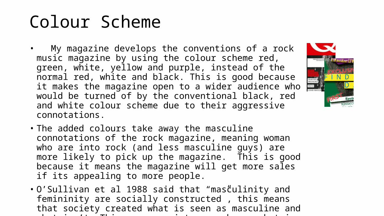
Colour Scheme• My magazine develops the conventions of a rock music magazine
by using the colour scheme red, green, white, yellow and purple, instead of the normal red, white and black. This is good because it makes the magazine open to a wider audience who would be turned of by the conventional black, red and white colour scheme due to their aggressive connotations.
• The added colours take away the masculine connotations of the rock magazine, meaning woman who are into rock (and less masculine guys) are more likely to pick up the magazine. This is good because it means the magazine will get more sales if its appealing to more people.
• O’Sullivan et al 1988 said that “masculinity and femininity are socially constructed”, this means that society created what is seen as masculine and what isn’t. This means society can change what is deemed masculine (an example of this is how pink used to be the masculine colour until society changed it)

Colour Scheme | Audience feedback• The original colour scheme was yellow and purple. I chose that because it
challenged the conventions of the rock genre and gave connotations of happiness and wealth/ power.
• I asked for some feed back about the colour scheme who said it did feel like a rock magazine is thought I was aimed more at over 50’s
• This meant that I had challenged the convention too extremely and had to change the colour scheme/ design to give it a more rock look and aim it at my target demographic.
• To do this I added more bright colours and made all the colours more vibrant and bright, this also makes the magazine stand out more like one of the rock magazines I researched.

Buzz words
• A convention of rock magazines are Buzz words to get the reader interested in the articles in the magazine. They help to make the page look exciting and busy, they add bright colours to the cover to help the page stand out on the newsstands. I used this convention I red righting contrasted the yellow and white boxes that cover the text
• The way the buzz words cover the text help to add depth to the page. This is because they overlap the text and glow.
• I developed the convention by instead of saying “first” and “plus” I used “1st” and “+”. This keeps a short mode of address with is a convention of the rock genre.

Women
• The magazine challenges the convention of woman being seen seductively. In my magazine I show woman covered up with “closed of” body language, representing woman seriously and independent, where as in “Q” they represent woman seductively (in the Cheryl Cole cover)
• This argues against Fowles 1996 who said “In advertising, males gaze and females are gazed at” as by having my female model covered up, she isn’t alluring the male gaze or giving of provocative ideas
• However• The high camera angle puts the model in the passive position which can be seen sexually
and seductively to a male reader.


![1 1 1 1 1 1 1 ¢ 1 1 1 - pdfs.semanticscholar.org€¦ · 1 1 1 [ v . ] v 1 1 ¢ 1 1 1 1 ý y þ ï 1 1 1 ð 1 1 1 1 1 x ...](https://static.documents.pub/doc/80x56/5f7bc722cb31ab243d422a20/1-1-1-1-1-1-1-1-1-1-pdfs-1-1-1-v-v-1-1-1-1-1-1-y-1-1-1-.jpg)


