7
IN WHAT WAYS DOES YOUR MEDIA PRODUCT USE, DEVELOP OR CHALLENGE FORMS AND CONVENTIONS OF REAL MEDIA PRODUCTS? Nicola Nightingale
| Date post: | 09-Aug-2015 |
| Category: |
Education |
| Upload: | nicolanightingale |
| View: | 146 times |
| Download: | 0 times |
IN WHAT WAYS DOES YOUR MEDIA PRODUCT USE,
DEVELOP OR CHALLENGE FORMS AND CONVENTIONS
OF REAL MEDIA PRODUCTS?
Nicola Nightingale

Front Cover - Similarities
Similar cover line design
Similar additional cover line
Similar medium shot
of main image
Similar layout of box along bottom
of page
Fashion included in
both
Similarly placed
additional cover lines
Barcode in same
position
Quotes used in both
magazines
Pictures of celebrities featured in both magazines

Front Cover Comparison My magazine’s front cover is very similar to a real-life magazine whereby the conventions and forms have been used.
Images of different celebrities are present on both front covers, fashion has been included in both front covers and additional cover lines have been placed in similar places are just some examples of the similarities between the magazines front covers. This shows how I have used forms and conventions of Pop Music Magazines. I think that reason Pop Music Magazines include images of different celebrities on the front cover is to attract the young teenage audience that they appeal to as many of these young teenagers are fans of different celebrities and would rather read about more than just one celebrity. I think that the reason why fashion is present on both front cover and is a convention of Pop Music Magazines is because they appeal to young teenage girls who would be interested in the latest fashion and what fashion labels celebrities are wearing. The additional cover lines have been placed in similar positions on both front covers which is a convention of Pop Music Magazines. I think this has been done because it is easy for readers to see what else is in the magazine and also because the audience of Pop Music Magazines are often teenagers who are interested in lots of different celebrities. Moreover, the additional cover lines on both front covers have their own coloured boxed background to the text. This is a convention of Pop Music Magazines because it will make them stand out and have a purpose for being there. They may also attract other readers if they see one of their favorite artists is featured in the magazine also. Both magazines’ front covers have used a medium shot of the artist and the artists also seem to be using the same facial expression – a smile. The eyes of the artists are both looking directly into the camera. I think that this facial expression and medium shot is a convention of Pop Music Magazines because Pop artists’ songs are usually very upbeat and happy which is portrayed through there facial expressions on the front covers. Furthermore, the medium shots in both magazines front covers shows the artist clearly to the reader and therefore will stand out and inform the reader that the main article in the magazine is about that particular artist. The cover lines in both magazines are big and bold, which I think is convention of magazines in general as they need to stand out and associate to the main image on the front cover of the artist so the reader can identify the image is linked to the cover line of the artists name if they do not know who it is. Another reason I think that this is a convention of magazines in general is because the reader will be able to clearly see who the main article is about and if they are a fan of the artist then they will be more likely to buy the magazine and read it. the barcode has been placed in similar places on the front cover which I think is a convention of Magazines in general and is done so they can be seen but aren't very noticeable. However, the Masthead’s of these magazines’ front covers have been positioned in different places. I placed my Masthead at the top of the page as I felt this would be the best way for it to be recognized. Although it is challenging the convention of a Pop Music Magazine as it is simple and does not include a symbol like the other magazine it is bold just like the other magazine too. The colours used in both magazines are bright, bold and include a range of different colours. I think this is a convention of a Pop Music Magazine because Pop artists songs are usually upbeat which is shown through the colours, as the range of colours used are bright and stand out.

Contents Page – Similarities
Name of magazine in same place
Similar message
style
Main featured artist is the
biggest image
Page number in similar place to image
Featured images included in both
Other articles and features both present
Page numbers next to other articles or
features both present
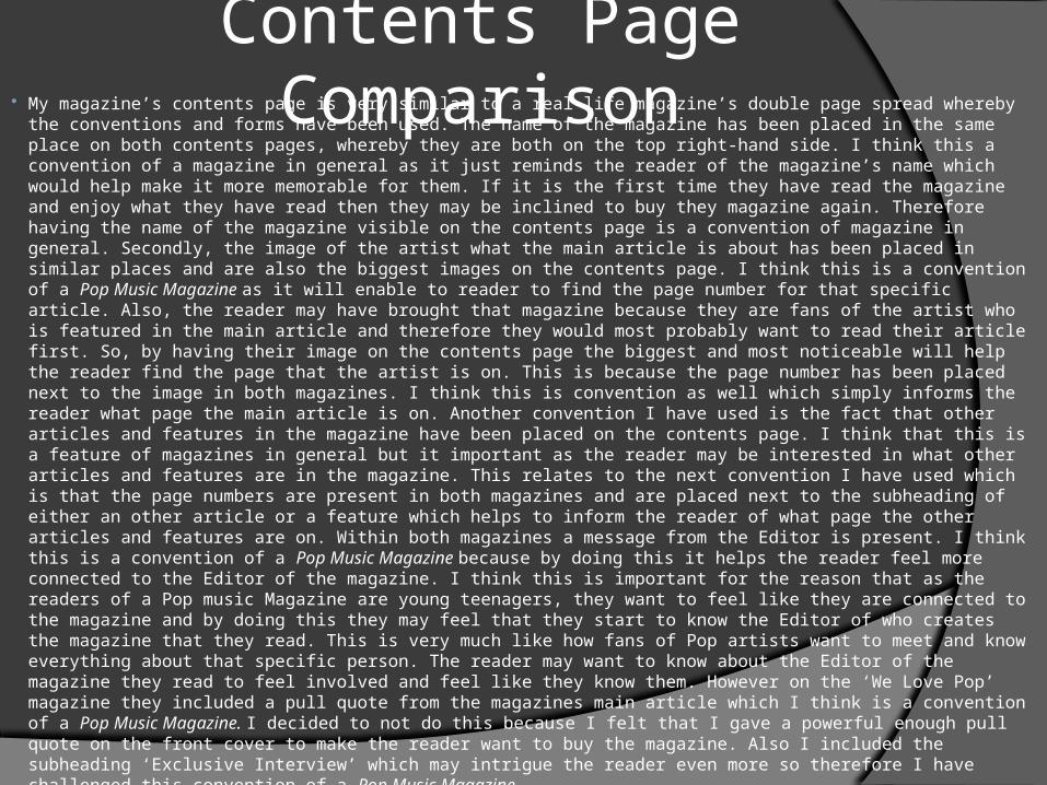
Contents Page Comparison My magazine’s contents page is very similar to a real-life magazine’s double page spread whereby the
conventions and forms have been used. The name of the magazine has been placed in the same place on both contents pages, whereby they are both on the top right-hand side. I think this a convention of a magazine in general as it just reminds the reader of the magazine’s name which would help make it more memorable for them. If it is the first time they have read the magazine and enjoy what they have read then they may be inclined to buy they magazine again. Therefore having the name of the magazine visible on the contents page is a convention of magazine in general. Secondly, the image of the artist what the main article is about has been placed in similar places and are also the biggest images on the contents page. I think this is a convention of a Pop Music Magazine as it will enable to reader to find the page number for that specific article. Also, the reader may have brought that magazine because they are fans of the artist who is featured in the main article and therefore they would most probably want to read their article first. So, by having their image on the contents page the biggest and most noticeable will help the reader find the page that the artist is on. This is because the page number has been placed next to the image in both magazines. I think this is convention as well which simply informs the reader what page the main article is on. Another convention I have used is the fact that other articles and features in the magazine have been placed on the contents page. I think that this is a feature of magazines in general but it important as the reader may be interested in what other articles and features are in the magazine. This relates to the next convention I have used which is that the page numbers are present in both magazines and are placed next to the subheading of either an other article or a feature which helps to inform the reader of what page the other articles and features are on. Within both magazines a message from the Editor is present. I think this is a convention of a Pop Music Magazine because by doing this it helps the reader feel more connected to the Editor of the magazine. I think this is important for the reason that as the readers of a Pop music Magazine are young teenagers, they want to feel like they are connected to the magazine and by doing this they may feel that they start to know the Editor of who creates the magazine that they read. This is very much like how fans of Pop artists want to meet and know everything about that specific person. The reader may want to know about the Editor of the magazine they read to feel involved and feel like they know them. However on the ‘We Love Pop’ magazine they included a pull quote from the magazines main article which I think is a convention of a Pop Music Magazine. I decided to not do this because I felt that I gave a powerful enough pull quote on the front cover to make the reader want to buy the magazine. Also I included the subheading ‘Exclusive Interview’ which may intrigue the reader even more so therefore I have challenged this convention of a Pop Music Magazine.
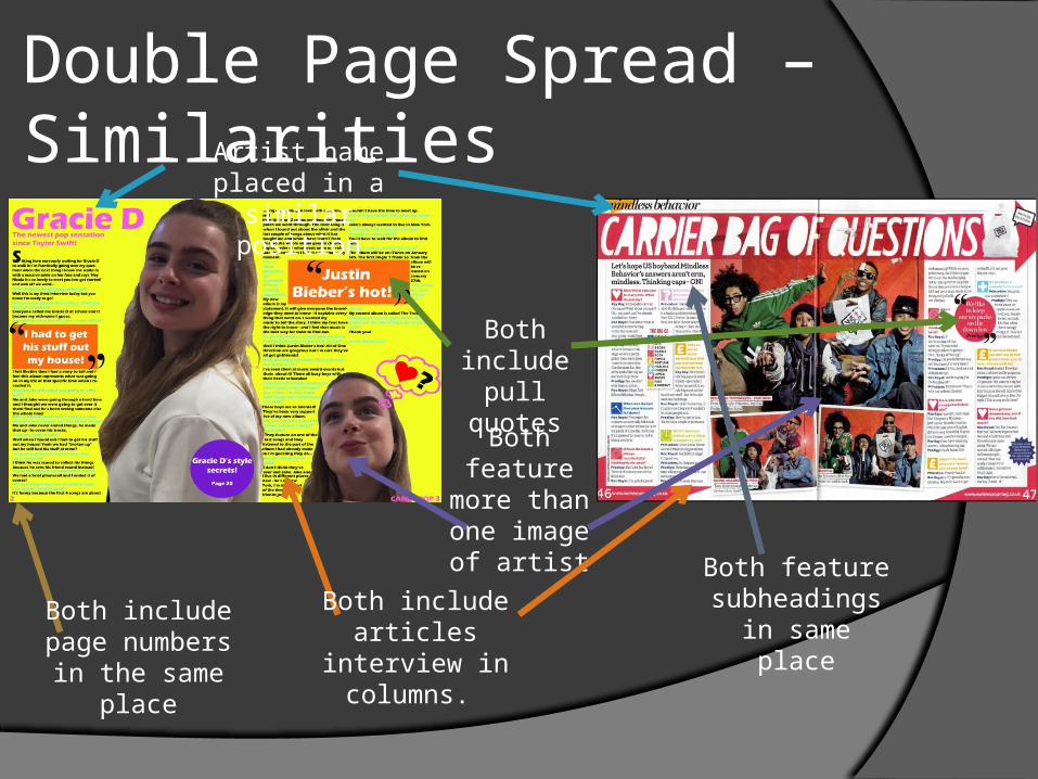
Double Page Spread – Similarities Artist name placed in
a similar position
Both include pull quotes
Both feature more than
one image of artist
Both include articles interview in
columns.
Both include page numbers
in the same place
Both feature subheadings in
same place
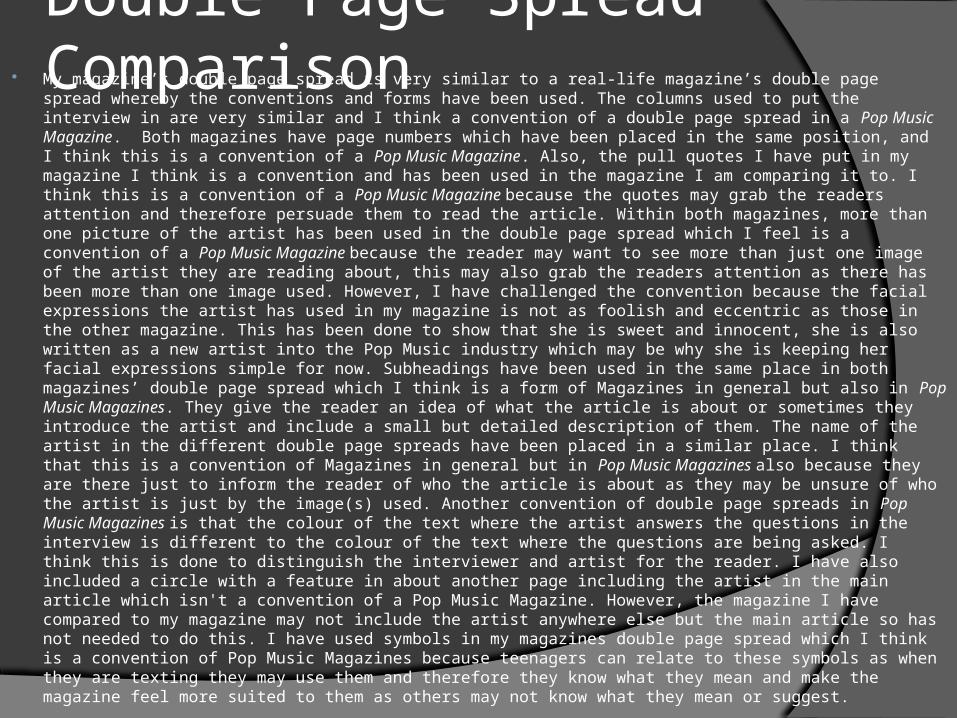
Double Page Spread Comparison My magazine’s double page spread is very similar to a real-life magazine’s double page spread whereby the conventions and forms have been used. The columns used to put the interview in are very similar and I think a convention of a double page spread in a Pop Music Magazine. Both magazines have page numbers which have been placed in the same position, and I think this is a convention of a Pop Music Magazine. Also, the pull quotes I have put in my magazine I think is a convention and has been used in the magazine I am comparing it to. I think this is a convention of a Pop Music Magazine because the quotes may grab the readers attention and therefore persuade them to read the article. Within both magazines, more than one picture of the artist has been used in the double page spread which I feel is a convention of a Pop Music Magazine because the reader may want to see more than just one image of the artist they are reading about, this may also grab the readers attention as there has been more than one image used. However, I have challenged the convention because the facial expressions the artist has used in my magazine is not as foolish and eccentric as those in the other magazine. This has been done to show that she is sweet and innocent, she is also written as a new artist into the Pop Music industry which may be why she is keeping her facial expressions simple for now. Subheadings have been used in the same place in both magazines’ double page spread which I think is a form of Magazines in general but also in Pop Music Magazines. They give the reader an idea of what the article is about or sometimes they introduce the artist and include a small but detailed description of them. The name of the artist in the different double page spreads have been placed in a similar place. I think that this is a convention of Magazines in general but in Pop Music Magazines also because they are there just to inform the reader of who the article is about as they may be unsure of who the artist is just by the image(s) used. Another convention of double page spreads in Pop Music Magazines is that the colour of the text where the artist answers the questions in the interview is different to the colour of the text where the questions are being asked. I think this is done to distinguish the interviewer and artist for the reader. I have also included a circle with a feature in about another page including the artist in the main article which isn't a convention of a Pop Music Magazine. However, the magazine I have compared to my magazine may not include the artist anywhere else but the main article so has not needed to do this. I have used symbols in my magazines double page spread which I think is a convention of Pop Music Magazines because teenagers can relate to these symbols as when they are texting they may use them and therefore they know what they mean and make the magazine feel more suited to them as others may not know what they mean or suggest.


