9
| Date post: | 05-Aug-2015 |
| Category: |
Education |
| Upload: | naomipalfreman36 |
| View: | 39 times |
| Download: | 0 times |

QUESTION 1 PART 2- IN WHAT WAYS DOES YOUR MEDIA PRODUCT USE DEVELOP OR CHALLENGE FORMS OR CONVENTIONS FOR REAL MEDIA
PRODUCTS.
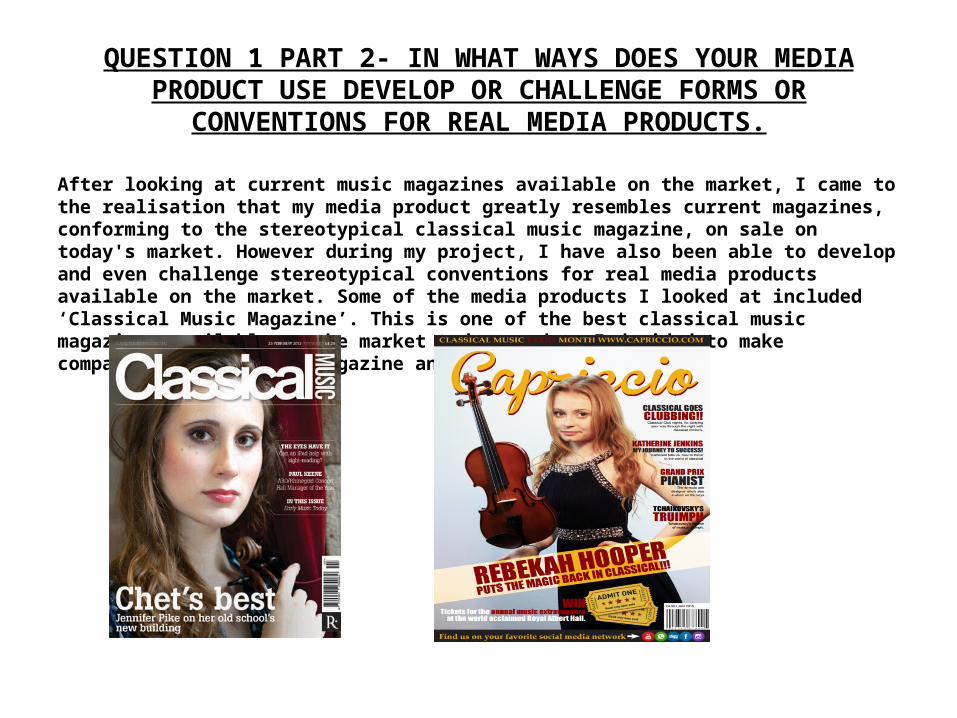
After looking at current music magazines available on the market, I came to the realisation that my media product greatly resembles current magazines, conforming to the stereotypical classical music magazine, on sale on today's market. However during my project, I have also been able to develop and even challenge stereotypical conventions for real media products available on the market. Some of the media products I looked at included ‘Classical Music Magazine’. This is one of the best classical music magazines available on the market today, and so I decided to make comparisons between my magazine and this.
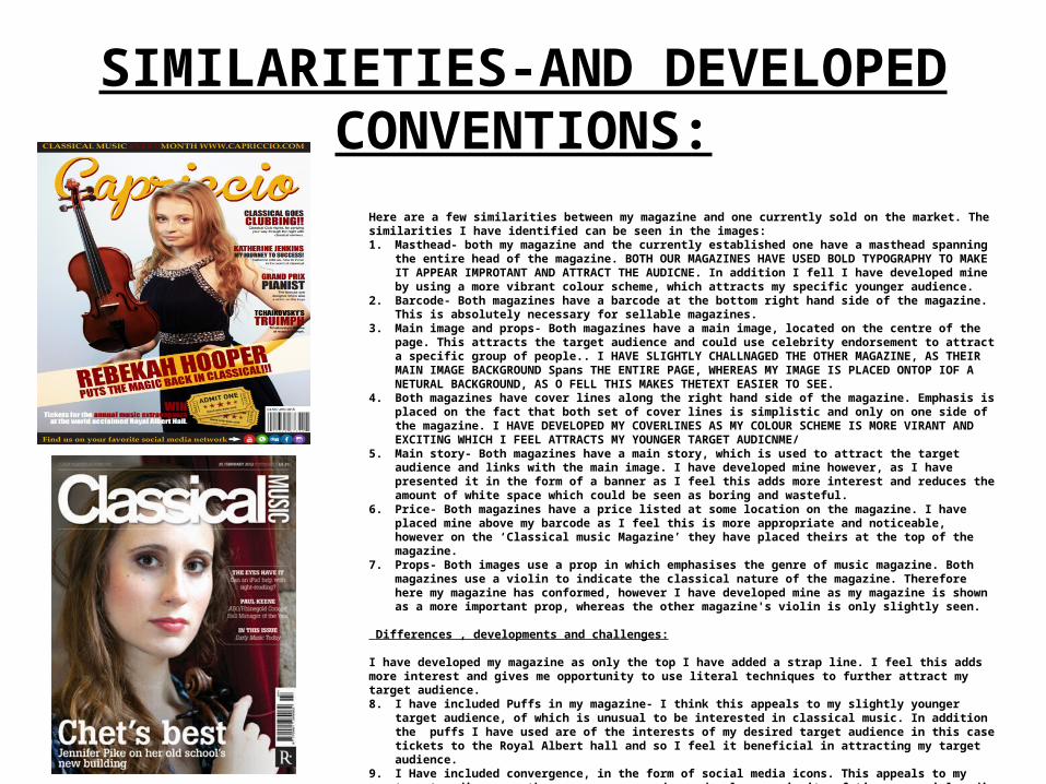
SIMILARIETIES-AND DEVELOPED CONVENTIONS:
Here are a few similarities between my magazine and one currently sold on the market. The similarities I have identified can be seen in the images:1. Masthead- both my magazine and the currently established one have a masthead spanning the entire head of the
magazine. BOTH OUR MAGAZINES HAVE USED BOLD TYPOGRAPHY TO MAKE IT APPEAR IMPROTANT AND ATTRACT THE AUDICNE. In addition I fell I have developed mine by using a more vibrant colour scheme, which attracts my specific younger audience.
2. Barcode- Both magazines have a barcode at the bottom right hand side of the magazine. This is absolutely necessary for sellable magazines.
3. Main image and props- Both magazines have a main image, located on the centre of the page. This attracts the target audience and could use celebrity endorsement to attract a specific group of people.. I HAVE SLIGHTLY CHALLNAGED THE OTHER MAGAZINE, AS THEIR MAIN IMAGE BACKGROUND Spans THE ENTIRE PAGE, WHEREAS MY IMAGE IS PLACED ONTOP IOF A NETURAL BACKGROUND, AS O FELL THIS MAKES THETEXT EASIER TO SEE.
4. Both magazines have cover lines along the right hand side of the magazine. Emphasis is placed on the fact that both set of cover lines is simplistic and only on one side of the magazine. I HAVE DEVELOPED MY COVERLINES AS MY COLOUR SCHEME IS MORE VIRANT AND EXCITING WHICH I FEEL ATTRACTS MY YOUNGER TARGET AUDICNME/
5. Main story- Both magazines have a main story, which is used to attract the target audience and links with the main image. I have developed mine however, as I have presented it in the form of a banner as I feel this adds more interest and reduces the amount of white space which could be seen as boring and wasteful.
6. Price- Both magazines have a price listed at some location on the magazine. I have placed mine above my barcode as I feel this is more appropriate and noticeable, however on the ‘Classical music Magazine’ they have placed theirs at the top of the magazine.
7. Props- Both images use a prop in which emphasises the genre of music magazine. Both magazines use a violin to indicate the classical nature of the magazine. Therefore here my magazine has conformed, however I have developed mine as my magazine is shown as a more important prop, whereas the other magazine's violin is only slightly seen.
Differences , developments and challenges:
I have developed my magazine as only the top I have added a strap line. I feel this adds more interest and gives me opportunity to use literal techniques to further attract my target audience.8. I have included Puffs in my magazine- I think this appeals to my slightly younger target audience, of which is unusual to be
interested in classical music. In addition the puffs I have used are of the interests of my desired target audience in this case tickets to the Royal Albert hall and so I feel it beneficial in attracting my target audience.
9. I Have included convergence, in the form of social media icons. This appeals to my target audience as they are younger and spend a large majority of time on social media networking sites, and therefore gives easy accessibility in which my target audience can access my magazine. This is not included in the current music magazine on the market today, as I think this is aimed at a more stereotypical older audience. Therefore my use of convergence is an example of challenging the stereotypical conventions of classical music magazines, and conforms to my subverting target audience/

Here I have used visual representation to identify ways in which my magazine develops, challenges and conforms to typical conventions present on current classical music magazines available on the market today. I have used red arrows to indicate areas where my magazine has challenged or developed typical conventions, green arrows to indicate where my magazine has conformed to typical conventions.
Masthead.
Main story in the form of a banner.
Barcode and price.
Cover lines.
Main image.
Strapline.
Puffs. Convergence.
As you can see here, my magazine has ultimately conformed to the typical conventions of other classical music magazines. However I have also demonstrated several developments o typical conventions and challenges that subvert to the typical conventions on classical music magazines.
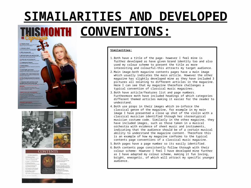
SIMAILARITIES AND DEVELOPED CONVENTIONS:
Similarities:
1. Both have a title of the page- however I feel mine is further developed as have given brand identity too and also used my colour scheme to present the title as more interesting and colourful-this attracts my target audience.
2. Main image-both magazine contents pages have a main image which usually indicates the main article. However the other magazine has slightly developed mine as they have included 3 pictures all relating to different articles in the magazine. Here I can see that my magazine therefore challenges a typical convention of classical music magazines.
3. Both have article/features list and page numbers. Furthermore moth have included headings of which categories different themed articles making it easier for the reader to understand.
4. Both use props in their images which re-inforce the classical genre of the magazine, for example in my main image I have presented a close up shot of the violin with a classical musician identified through her stereotypical musician costume code. Similarly in the other magazine, they have included images, such as those taken in a musical orchestra with evidence of sheet music and instruments, indicating that the audience should be of a certain musical ability to understand the magazine content. Therefore this is an example of how my magazine conforms to the typical contents page conventions of a classical music magazine.
5. Both pages have a page number so its easily identified.6. Both contents page consistently follow through with their colour
scheme- However I feel I have developed mine further as I have adapted my colour scheme, making it fun loving, bright, energetic, of which will attract my specific younger audience.
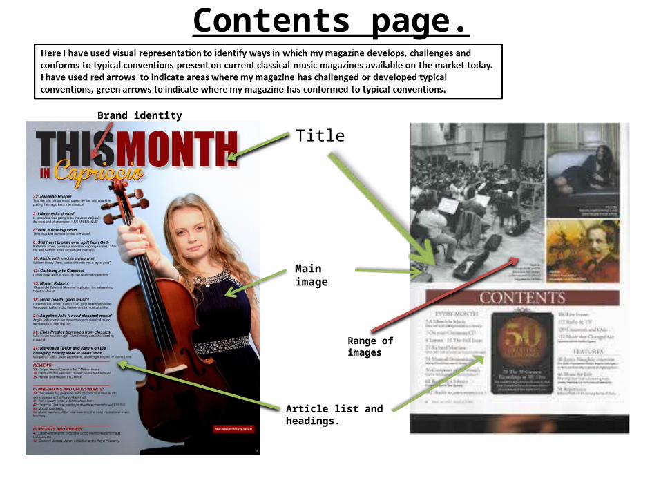
Contents page.
Title
Main image
Brand identity
Range of images
Article list and headings.
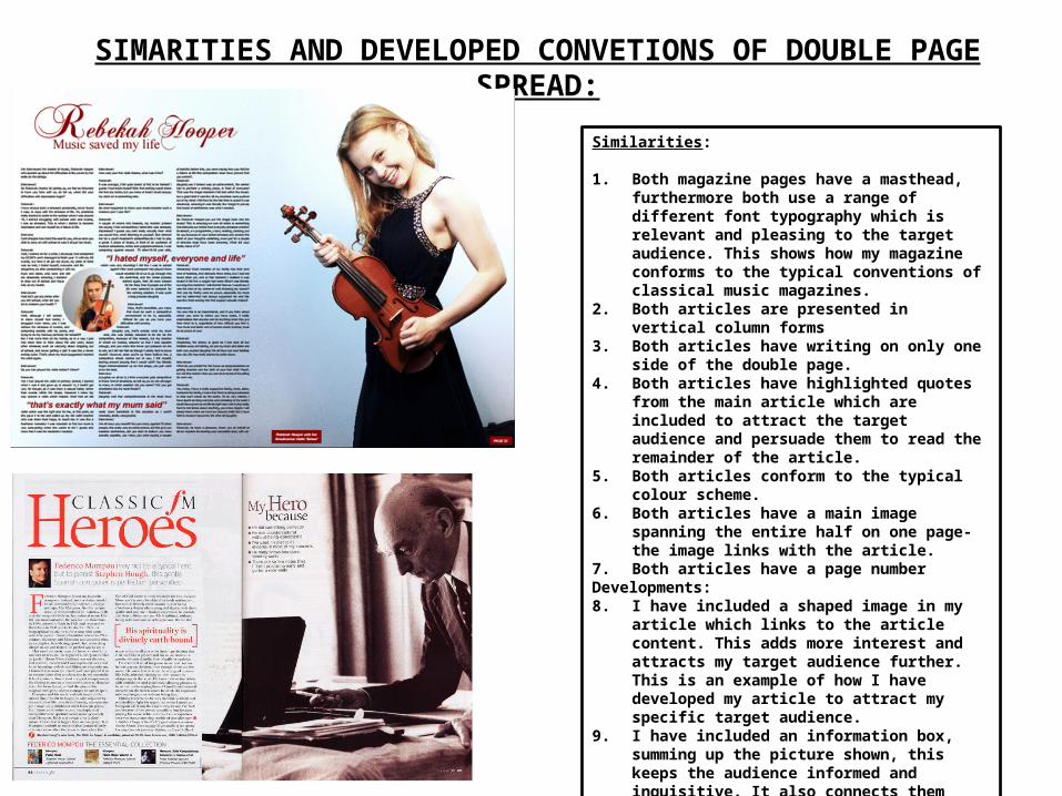
SIMARITIES AND DEVELOPED CONVETIONS OF DOUBLE PAGE SPREAD:
Similarities:
1. Both magazine pages have a masthead, furthermore both use a range of different font typography which is relevant and pleasing to the target audience. This shows how my magazine conforms to the typical conventions of classical music magazines.
2. Both articles are presented in vertical column forms3. Both articles have writing on only one side of the
double page.4. Both articles have highlighted quotes from the main
article which are included to attract the target audience and persuade them to read the remainder of the article.
5. Both articles conform to the typical colour scheme.6. Both articles have a main image spanning the entire
half on one page-the image links with the article.7. Both articles have a page numberDevelopments:8. I have included a shaped image in my article which links
to the article content. This adds more interest and attracts my target audience further. This is an example of how I have developed my article to attract my specific target audience.
9. I have included an information box, summing up the picture shown, this keeps the audience informed and inquisitive. It also connects them further with the article which entices them to read it.
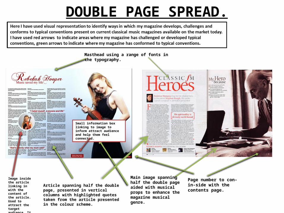
DOUBLE PAGE SPREAD.
Main image spanning half the double page aided with musical props to enhance the magazine musical genre.
Article spanning half the double page, presented in vertical columns with highlighted quotes taken from the article presented in the colour scheme.
Masthead using a range of fonts in the typography.
Image inside the article linking in with the content of the article. Used to attract the target audience. It is also presented in a shape to add interest.
Page number to con-in-side with the contents page.
Small information box linking to image to inform attract audience and help them feel connected.
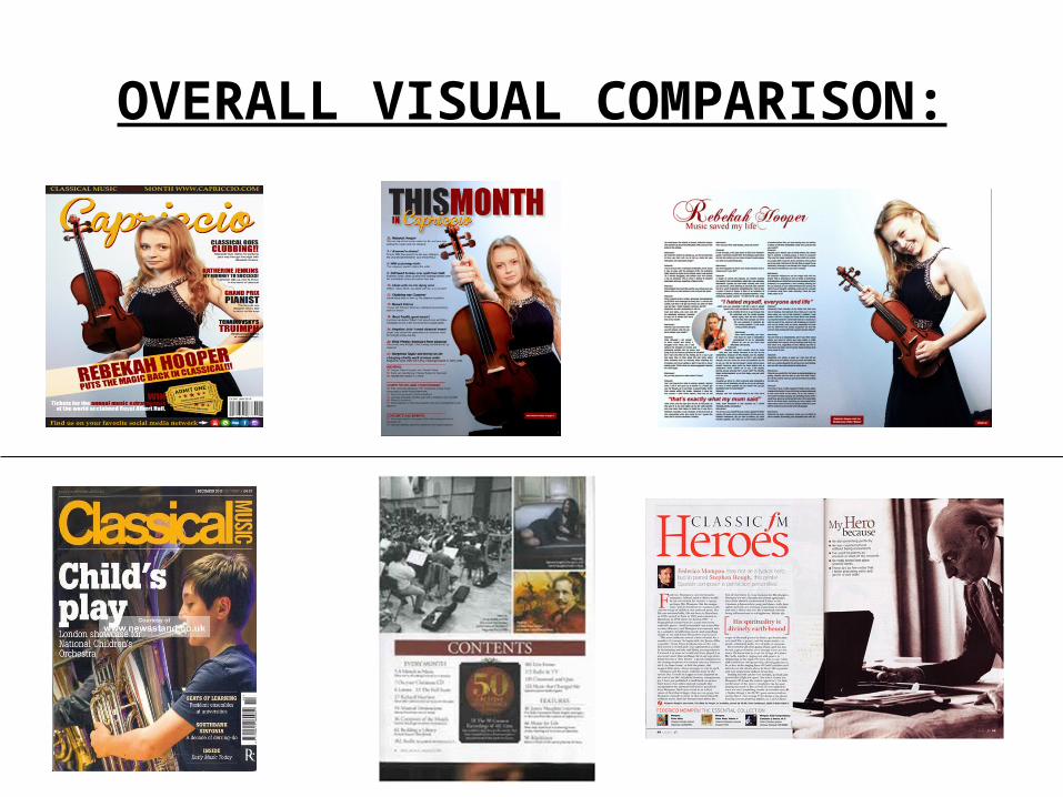
OVERALL VISUAL COMPARISON:


