QuickBooks Advanced Reporting Exercises Monday, November 02, 2015 Exercise #3: Sales Profitability by Customer Dashboard Objective – build a dashboard that shows your sales profitability by customer (can easily swap customer for rep, item, geography, custom field, etc.) Step 1: Build pivot table that shows Profitability by Customer. 1. From the Report List, open the Start from Scratch report. 2. In the Library, click Text & Utility. Double-click to add the following items: a. Report Title
Transcript
QuickBooks Advanced Reporting Exercises
Monday, November 02, 2015
Exercise #3: Sales Profitability by Customer Dashboard
Objective – build a dashboard that shows your sales profitability by customer (can easily
swap customer for rep, item, geography, custom field, etc.)
Step 1: Build pivot table that shows Profitability by Customer.
1. From the Report List, open the Start from Scratch report.
2. In the Library, click Text & Utility. Double-click to add the following items:
a. Report Title
b. Current Selection
3. In the Library, click Date.
4. Double-click Transaction to add it to the report.
5. Right-click Report Title and select Properties.
6. In the General tab, enter Sales Profitability by Customer Dashboard in Text.
7. Click OK.
8. Right-click on any white space and select New Sheet Object > Chart.
9. Enter Profitability by Customer in Window Title.
10. Select Pivot Table for Chart Type.
11. Click Next.
12. In the Dimensions window, look at the list of Available Fields/Groups. Tip: Either scroll
through the list or use Show Fields from Table to narrow down the fields you want to
add as dimensions (step 11 has the specific ones we’ll use for this exercise).
13. Add the following dimensions from Available Fields/Groups, label the column, and
specify that you don’t want to see anything that doesn’t have a value:
a. Transactions.Customer Full Name
i. Enter Customer in Label
ii. Select Suppress When Value is Null
14. Click Next.
15. In the Edit Expression window that pops up, type the following expression:
a. sum({<$(vExprSales)>}[Transactions.Amount With Sign])
16. Click OK.
17. Enter Sales Revenue in Label.
18. Use Add to enter each of these Expressions. Copy and paste these into the Edit
Expressions window:
a. sum({<$(vExprCogs)>}[Transactions.Amount With Sign])
i. Enter Cost in Label.
b. [Sales Revenue]-[Cost]
i. Enter Profit in Label.
c. [Profit]/[Cost]
i. Enter Profit Margin in Label.
19. Click Finish.
Step 2: Edit existing pivot table to create Profit Margin by Customer bar chart.
1. Right-click the Sales Revenue pivot table and click Clone.
2. Drag and drop the cloned pivot table to an open space.
3. Right-click on the cloned pivot table and select Properties.
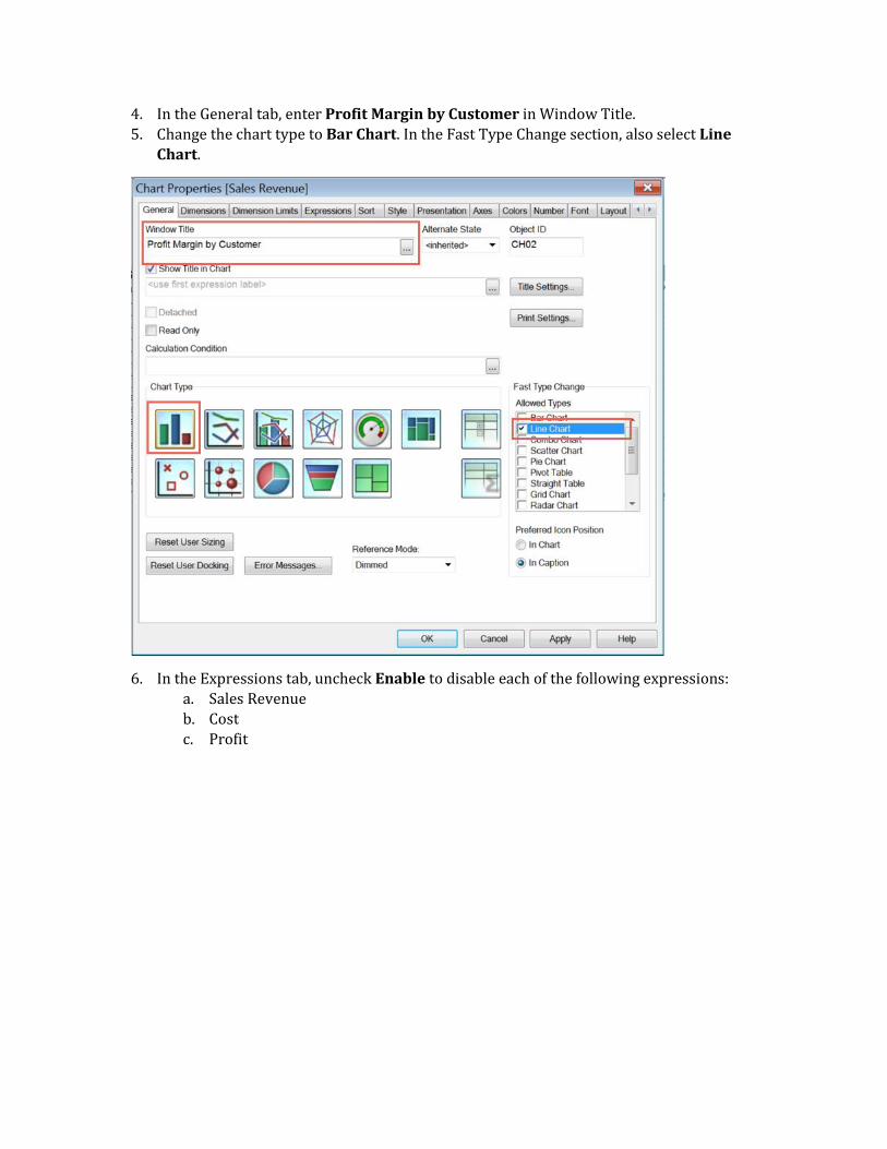
4. In the General tab, enter Profit Margin by Customer in Window Title.
5. Change the chart type to Bar Chart. In the Fast Type Change section, also select Line
Chart.
6. In the Expressions tab, uncheck Enable to disable each of the following expressions:
a. Sales Revenue
b. Cost
c. Profit
7. Double-click Profit Margin to open the Edit Expression window. Tip: You can
alternatively click […] under Definition.
8. Look at the current expression in the window. Profit Margin references two expressions
that we disabled (Profit and Cost). You need to edit the expression so that it no longer
references those expressions, but still shows profit margin.
9. Copy and paste this into the window:
a. (sum({<$(vExprSales)>}[Transactions.Amount With Sign])-
sum({<$(vExprCogs)>}[Transactions.Amount With
Sign]))/sum({<$(vExprCogs)>}[Transactions.Amount With Sign])
10. Click OK.
11. In the Axes tab, select the Primary Dimensions Label /.
12. To change the font size for the Dimension Axis, click Font > choose size > OK.