21
P ortfolio Rachel McIntosh
| Date post: | 22-Dec-2015 |
| Category: |
Documents |
| Upload: | rachel-mcintosh |
| View: | 21 times |
| Download: | 0 times |
PortfolioRachel McIntosh
Table of ContentsEvent AdFlierBrochureBusiness CardsLetterheadLogosWeb PageMontagePhotodesign
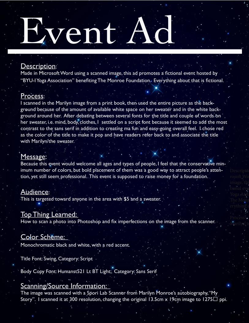
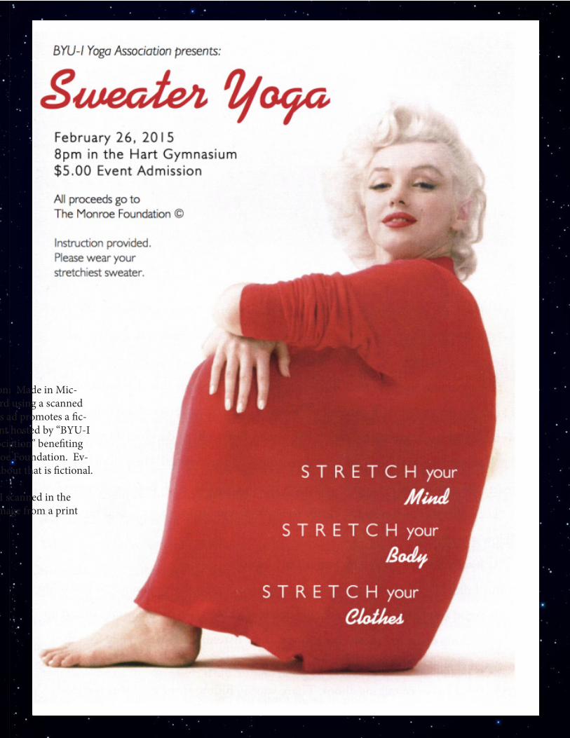
Description: Made in Microsoft Word using a scanned image, this ad promotes a fictional event hosted by “BYU-I Yoga Association” benefiting The Monroe Foundation. Everything about that is fictional.
Process: I scanned in the Marilyn image from a print book, then used the entire picture as the back-ground because of the amount of available white space on her sweater and in the white back-ground around her. After debating between several fonts for the title and couple of words on her sweater, i.e. mind, body, clothes, I settled on a script font because it seemed to add the most contrast to the sans serif in addition to creating ma fun and easy-going overall feel. I chose red as the color of the title to make it pop and have readers refer back to and associate the title with Marilyn/the sweater.
Message: Because this event would welcome all ages and types of people, I feel that the conservative min-imum number of colors, but bold placement of them was a good way to attract people’s atten-tion, yet still seem professional. This event is supposed to raise money for a foundation.
Audience: This is targeted toward anyone in the area with $5 and a sweater.
Top Thing Learned: How to scan a photo into Photoshop and fix imperfections on the image from the scanner.
Color Scheme: Monochromatic black and white, with a red accent.
Title Font: Swing, Category: Script
Body Copy Font: Humanst521 Lt BT Light; Category: Sans Serif
Scanning/Source Information: The image was scanned with a Spori Lab Scanner from Marilyn Monroe’s autobiography, “My Story”. I scanned it at 300 resolution, changing the original 13.5cm x 19cm image to 1275″ ppi.
Description: Made in Mic-rosoft Word using a scanned image, this ad promotes a fic-tional event hosted by “BYU-I Yoga Association” benefiting The Monroe Foundation. Ev-erything about that is fictional.
Process: I scanned in the Marilyn image from a print
Event Ad
Description: Made in Mic-rosoft Word using a scanned image, this ad promotes a fic-tional event hosted by “BYU-I Yoga Association” benefiting The Monroe Foundation. Ev-erything about that is fictional.
Process: I scanned in the Marilyn image from a print
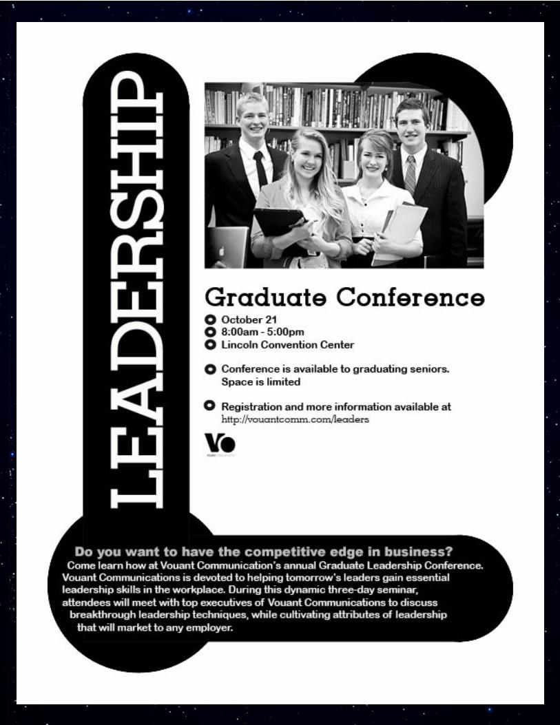
Description:This flier is meant to advertise a business-oriented graduate leadership conference.
Process:Using Adobe InDesign CC 2014, I tried to have the unifying theme of a simple circle echoed in different ways throughout the entire design. The focal word “leadership” was meant to draw the attention of those who want to get ahead in their career. Vital information (date, time, place, etc) was emphasized in the midst of white space near the center so that viewers don’t have to strain to find the information that they really are looking for.
Message:I chose the circle as the central design motif because it psychologically signifies community and working together. Such elements are important to those intended to benefit from the flier, i.e. busi-ness graduates who want to get ahead and become leaders in their field of work.
Top thing learned:“Less is more” applies when trying to make things pleasing to the eye or safe, but in order to make
things stand out, taking a bolder approach than one originally planned tends to be most effective.
Title Font and Name of Category:Geo Slabserif 703 BT – Slab Serif
Copy Font and Name of Category:Arial Rounded MT Bold – Sans Serif
Links to images used:https://130.commbyui.org/wp-content/uploads/2013/01/JuliePeterson-Leadership-conference-busi-ness-rexburg-Idaho_7530-as-Smart-Object-1.jpg
https://130.commbyui.org/wp-content/uploads/2013/01/VouantLogo2.png
Flier
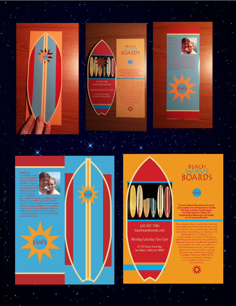
Description:Folding brochure for a surfing shop
Process:I decided to make the front fold a surfboard shape that overlapped and had a cutout, revealing part of the logo on the inside. All of the text on that inside page that matches up with the cover is hidden by the shape of the surfboard. There was a lot of experimenting with the star shape
that’s part of the logo, but I found a way for the cut-out to not be too distracting.
Message:Beach Wave Boards is a bright and fun place to buy all types of boards and accessories
Audience:California Surfers
Top Thing Learned:How to copy an image to the exact same place as its original position onto a different page
Color Scheme and Names:Cerulean, Red, and Blue
Word Count:265
Brochure
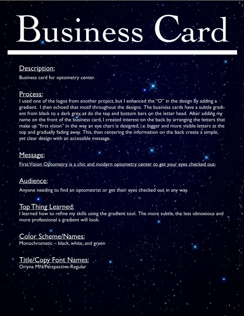
Description:Business card for optometry center.
Process:I used one of the logos from another project, but I enhanced the “O” in the design by adding a gradient. I then echoed that motif throughout the designs. The business cards have a subtle gradi-ent from black to a dark grey, as do the top and bottom bars on the letter head. After adding my name on the front of the business card, I created interest on the back by arranging the letters that make up “first vision” in the way an eye chart is designed, i.e. bigger and more visible letters at the top and gradually fading away. This, then centering the information on the back create a simple, yet clear design with an accessible message.
Message:First Vision Optometry is a chic and modern optometry center to get your eyes checked out.
Audience:Anyone needing to find an optometrist or get their eyes checked out in any way.
Top Thing Learned:I learned how to refine my skills using the gradient tool. The more subtle, the less obnoxious and more professional a gradient will look.
Color Scheme/Names:Monochromatic – black, white, and green
Title/Copy Font Names:Oriyna MN/Perspective-Regular
Business Card
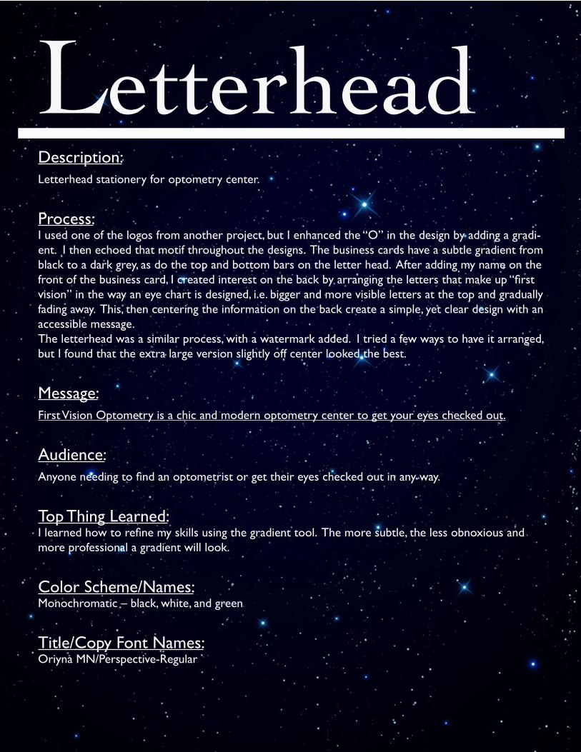
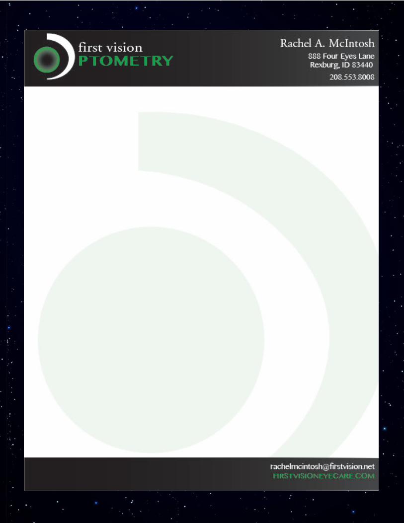
Description:Letterhead stationery for optometry center.
Process:I used one of the logos from another project, but I enhanced the “O” in the design by adding a gradi-ent. I then echoed that motif throughout the designs. The business cards have a subtle gradient from black to a dark grey, as do the top and bottom bars on the letter head. After adding my name on the front of the business card, I created interest on the back by arranging the letters that make up “first vision” in the way an eye chart is designed, i.e. bigger and more visible letters at the top and gradually fading away. This, then centering the information on the back create a simple, yet clear design with an accessible message.The letterhead was a similar process, with a watermark added. I tried a few ways to have it arranged, but I found that the extra large version slightly off center looked the best.
Message:First Vision Optometry is a chic and modern optometry center to get your eyes checked out.
Audience:Anyone needing to find an optometrist or get their eyes checked out in any way.
Top Thing Learned:I learned how to refine my skills using the gradient tool. The more subtle, the less obnoxious and more professional a gradient will look.
Color Scheme/Names:Monochromatic – black, white, and green
Title/Copy Font Names:Oriyna MN/Perspective-Regular
Letterhead
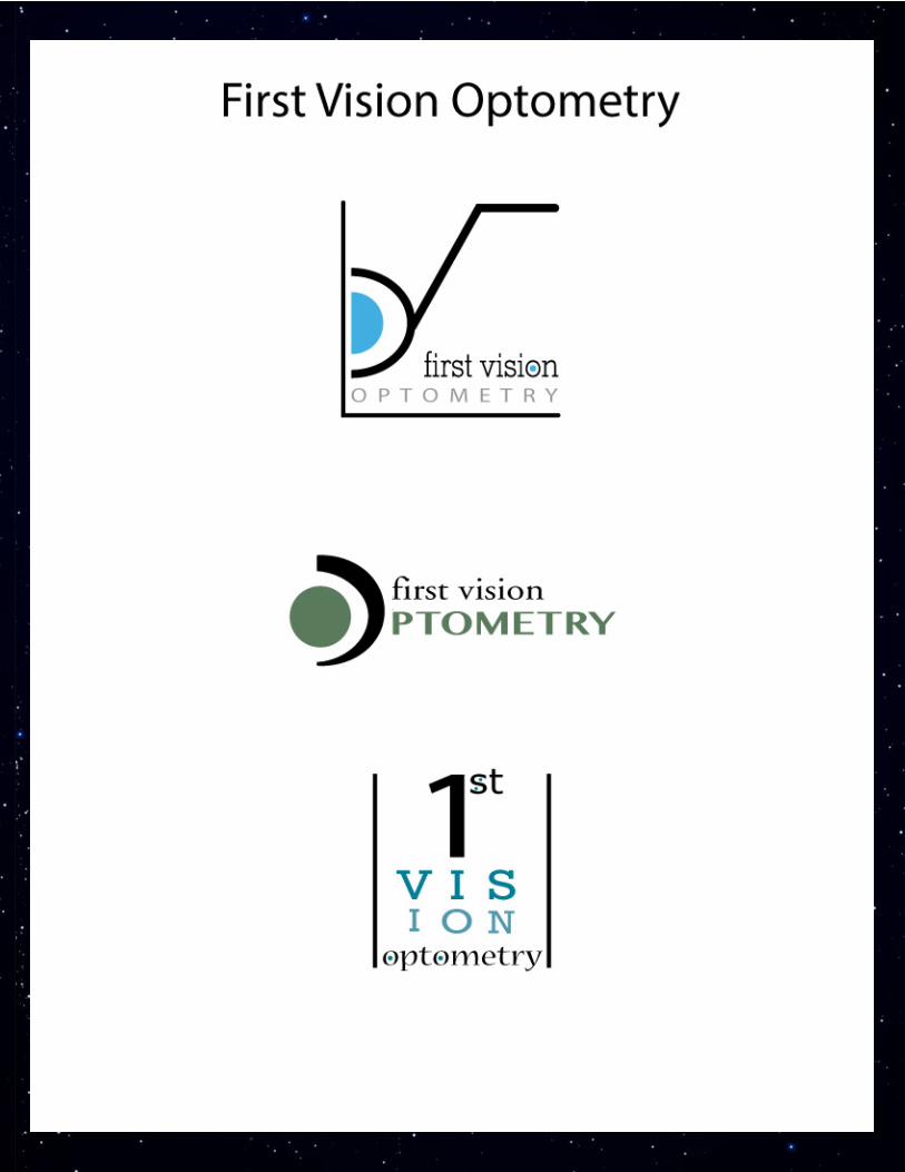
Description:Three logo variations for one optometry company
Process:Using Adobe Illustrator, I was able to learn a lot of things about layers (a different kind that what I learned in Photoshop) and the paths that shapes have. I used the ellipse and pen tool for all the shapes in the first logo, and stretched out the text to reach across the bottom and also leave ample white space for the rest of the design. The middle design was actually taken by modifying the “eye” of the first design. By changing the thickness in some parts and changing the color/sizes, the image functioned as a bold letter, but an overall simple look. Lastly, my final design is meant to imitate the look of eye charts used in optometrists’ offices. Using “1st” instead of “first” helps create a triangular hierarchy
meant to insinuate that this company is superior.
Message:First Vision Optometry is the best professional location to get your eyes worked on.
Audience:Anyone without perfect eyes
Top Thing Learned:Grouping/averaging two images helps create smoother lines
Color Schemes/Names:1. Monochromatic – aqua2. Monochromatic – forest green
3. Monochromatic – teal
Title/Body Copy Fonts:1. Myriad Pro/Rockwell2. Oriyna MN/Perspective-Regular
3. Rockwell/Nueva MN
Logos
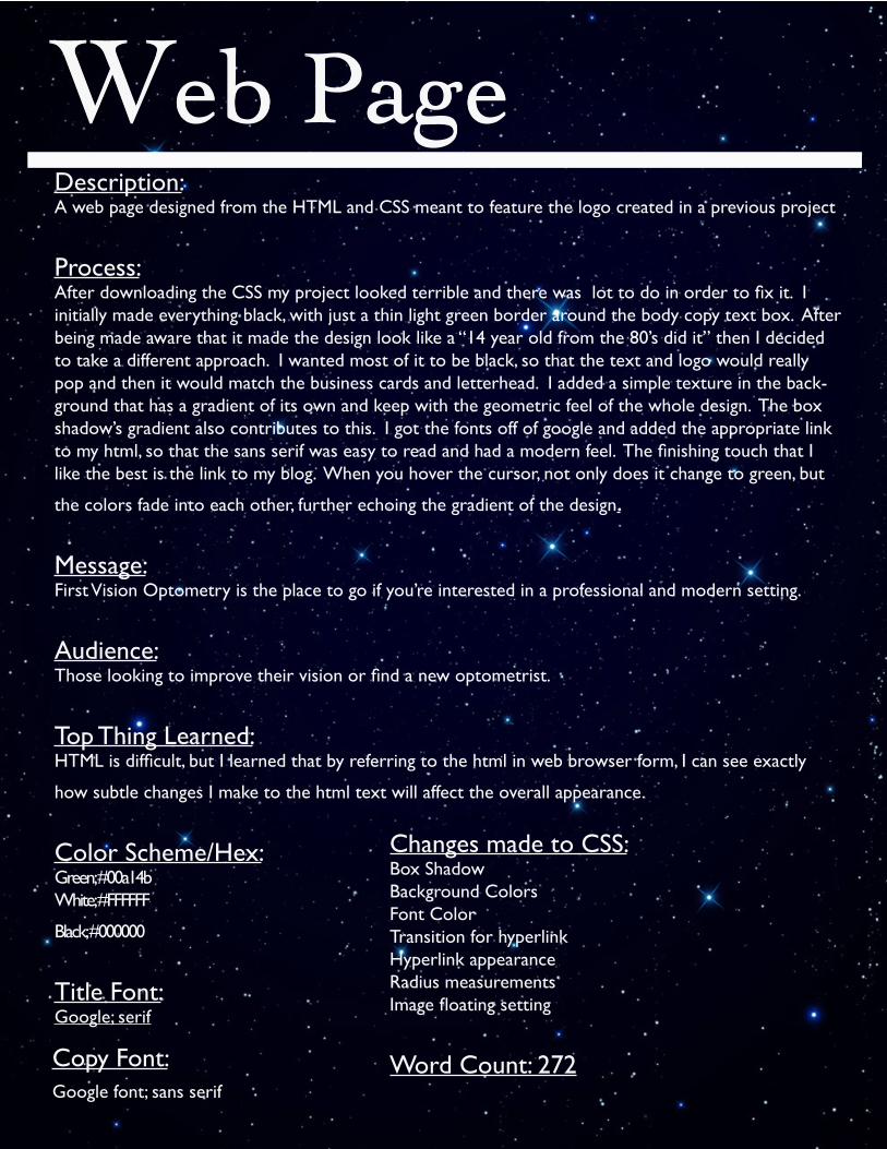
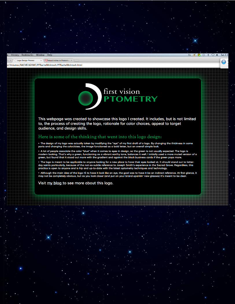
Description:A web page designed from the HTML and CSS meant to feature the logo created in a previous project
Process:After downloading the CSS my project looked terrible and there was lot to do in order to fix it. I initially made everything black, with just a thin light green border around the body copy text box. After being made aware that it made the design look like a “14 year old from the 80’s did it” then I decided to take a different approach. I wanted most of it to be black, so that the text and logo would really pop and then it would match the business cards and letterhead. I added a simple texture in the back-ground that has a gradient of its own and keep with the geometric feel of the whole design. The box shadow’s gradient also contributes to this. I got the fonts off of google and added the appropriate link to my html, so that the sans serif was easy to read and had a modern feel. The finishing touch that I like the best is the link to my blog. When you hover the cursor, not only does it change to green, but
the colors fade into each other, further echoing the gradient of the design.
Message:First Vision Optometry is the place to go if you’re interested in a professional and modern setting.
Audience:Those looking to improve their vision or find a new optometrist.
Top Thing Learned:HTML is difficult, but I learned that by referring to the html in web browser form, I can see exactly
how subtle changes I make to the html text will affect the overall appearance.
Color Scheme/Hex:Green; #00a14bWhite; #FFFFFF
Black; #000000
Title Font:Google; serif
Copy Font:Google font; sans serif
Changes made to CSS:Box ShadowBackground ColorsFont ColorTransition for hyperlinkHyperlink appearanceRadius measurementsImage floating setting
Word Count: 272
Web PageWeb Page
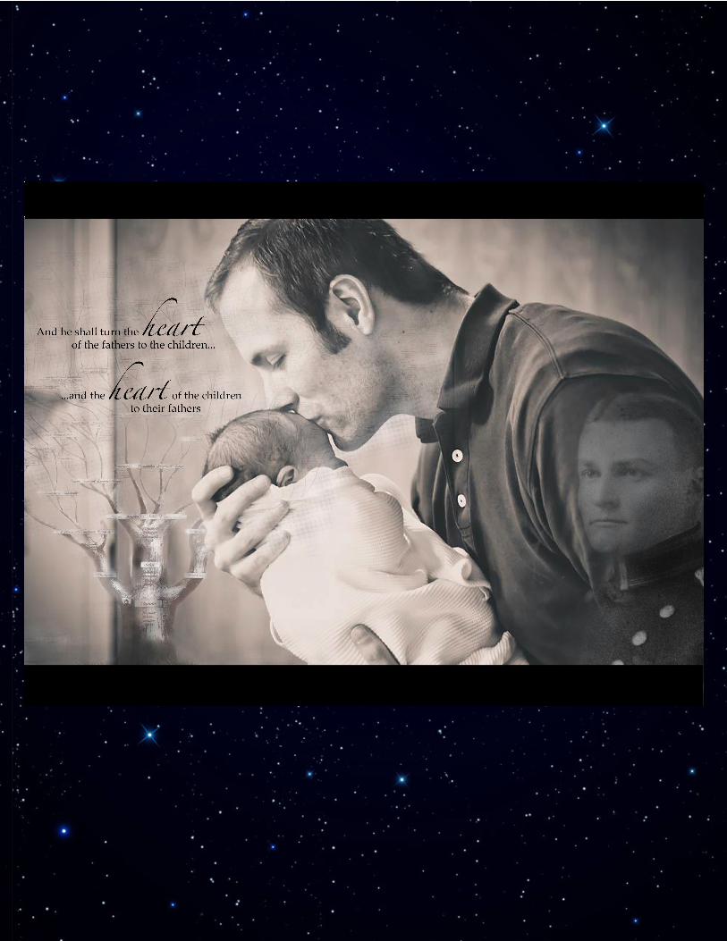
Description:Inspirational montage created from three separate images and added text
Process:I chose the background first, then the family tree next. Fading the tree was difficult, but I wanted it to be more prominent at the bottom, then have it fade out at it goes up the image. Each of the individual branches and names had to be compensated with the background picture between them. Next, when adding the “ancestor” it was hard to find a place on the man’s (his name is Jake) shirt where the ances-tor wouldn’t have a seam or wrinkle in his face, but I found that as I sized him down, it helped create Jake and the baby as the main focal point. Adding the borders on the top and bottom did contribute to the overall mood of completion and repetition (fathers to children, children to fathers) in addition to helping with the 11 in x 8.5 in ratio.
Message:The verse found in Malachi 4:6 is commonly associated with genealogy and family history work, a con-
cept that is common to all of us, because we all have ancestors and roots that we can connect with.
Audience:Anyone interested in the bible or connecting with their ancestral or literal roots
Top Thing Learned:Fading an image and adjusting the opacity to make the montage look natural
Colorization/Filter Application:I made the tree’s background color faded to match the jade sepia of the background picture
Color Scheme and Color Names:Monochromatic – Sepia, B&W Jade
Title Font:“love” | Zapfino Regular – Script
Montage
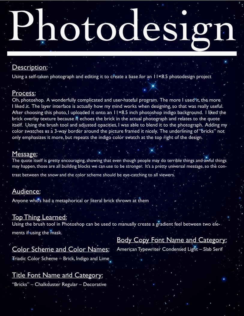
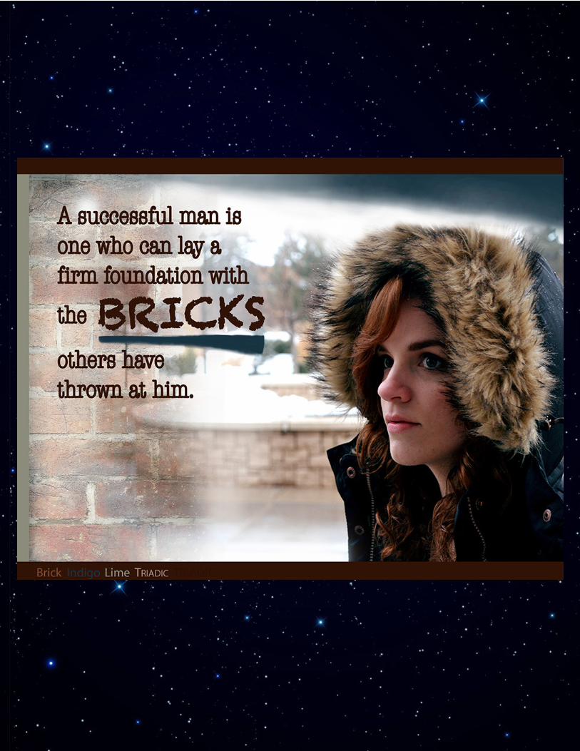
Description:Using a self-taken photograph and editing it to create a base for an 11×8.5 photodesign project
Process:Oh, photoshop. A wonderfully complicated and user-hateful program. The more I used it, the more I liked it. The layer interface is actually how my mind works when designing, so that was really useful. After choosing this photo, I uploaded it onto an 11×8.5 inch photoshop indigo background. I liked the brick overlay texture because it echoes the brick in the actual photograph and relates to the quote itself. Using the brush tool and adjusted opacities, I was able to blend it to the photograph. Adding my color swatches as a 3-way border around the picture framed it nicely. The underlining of “bricks” not only emphasizes it more, but repeats the indigo color swatch at the top right of the design.
Message:The quote itself is pretty encouraging, showing that even though people may do terrible things and awful things may happen, those are all building blocks we can use to be stronger. It’s a pretty universal message, so the con-
trast between the snow and the color scheme should be eye-catching to all viewers.
Audience:Anyone who’s had a metaphorical or literal brick thrown at them
Top Thing Learned:Using the brush tool in Photoshop can be used to manually create a gradient feel between two ele-
ments if using the mask.
Color Scheme and Color Names:Triadic Color Scheme – Brick, Indigo and Lime
Title Font Name and Category:“Bricks” – Chalkduster Regular – Decorative
Body Copy Font Name and Category:American Typewriter Condensed Light – Slab Serif
Photodesign
Photodesign