Introduction The genre of the magazine I have chosen to annotate is Pop. I have chosen to annotate two covers, two contents pages and two double page spreads of Q magazine and We Love Pop magazine. The genre can usually be identified through it’s use of bright colours, gossip talk and script text.
Transcript
IntroductionThe genre of the magazine I have chosen to
annotate is Pop. I have chosen to annotate two covers, two contents pages and two double page spreads of Q magazine and We Love Pop magazine. The genre can usually be identified through it’s use of bright colours, gossip talk and script text.
Masthead
Main Image Main Cover LineAnchorage
Secondary Cover LineSecondar
y Cover Line
Footer
Secondary Image
PuffMasthea
d
Puff
Main Cover Line
Secondary cover line
Anchorage
Secondary Cover line
Main Image
Secondary Cover Line
Secondary Cover Line
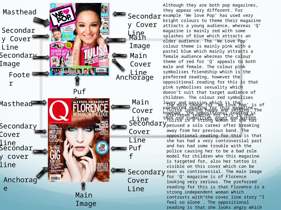
Although they are both pop magazines, they appear very different. For example ‘We love Pop’ has used very bright colours to theme their magazine attracts a young audience, whereas ‘Q’ magazine is mainly red with some splashes of blue which attracts an older audience. The ‘We Love Pop’ colour theme is mainly pink with a pastel blue which mainly attracts a female audience whereas the colour theme of red for ‘Q’ appeals to both male and female. The colour pink symbolises friendship which is the preferred reading, however the oppositional reading for this is that pink symbolises sexuality which doesn’t suit that target audience of children. The colour red symbolises lover and passion which is the preferred reading for this magazine, however, the oppositional reading is that red symbolises anger and hatred.
The main image for ‘We Love Pop’ is of Tulisa looking happy and smiling. The preffered reading for this is that Tulisa is a strong woman as she has perused a solo career after breaking away from her previous band. The oppositional reading for this is that she has had a very controversial past and has had some trouble with the police causing her to be a bad role model for children who this magazine is targeted for, also her tattoo is visible on this cover which can be seen as controversial. The main image for ‘Q’ magazine is of Florence looking very serious. The preferred reading for this is that Florence is a strong independent woman which contrasts with the cover line story “I feel so alone”. The oppositional reading is that she looks angry which may make someone hesitant to buy the magazine, also she is wearing a lot of makeup.
Masthead
Main Image Main Cover LineAnchorag
e
Secondary Cover LineSecondar
y Cover Line
Footer
Secondary Image
PuffMasthead
Puff
Main Cover Line
Secondary cover line
Anchorage
Secondary Cover line
Main Image
Secondary Cover Line
Secondary Cover Line
The text on the cover of ‘We Love Pop’ is informal to make it look more childish and appeal to a younger target audience whereas the text on the cover of ‘Q’ magazine is formal to make it look more classy and appeal to and older target audience. The oppositional reading for the ‘We Love Pop’ magazine is that the text varies on the cover making it look messy and confusing. The preferred reading for this is that it looks fun and busy for children who this magazine is targeted for. The text on the cover of ‘Q’ magazine is formal to make it look mature and appeal to an older target audience. The preferred reading for this is that it appears to be a classy and neat magazine making it easier to read and understand for adults. The oppositional reading for this is that the genre of Pop music is seen to be fun and young whereas the text presents this magazine to be classy which doesn’t really mirror the genre it’s based on. The storylines in ‘We Love Pop’ and ‘Q’ magazine are both very different even though they are about the same genre of Pop music. ‘We Love Pop’ covers storylines such as “I snogged 17 girls last Sunday” and “The Wanted’s latest crush” which are both very gossipy and immature story concepts. The preferred reading of this is that the stories appeal to a young audience to match the target audience. The oppositional reading is that the stories aren’t appropriate and are too mature for the audience this magazine is targeted for. The storylines for ‘Q’ magazine are mature for example “heroin, hookers & hair metal”. The preferred reading for this is that the stories are mature which match the target audience, however, the oppositional reading is that the stories are rude and inapropriate.
Headline
Main Image
Branding
Sections
Secondary image
Pull quote
BrandingHeadline
Main Image
Puff
Secondary Image Editors
Letter Sections
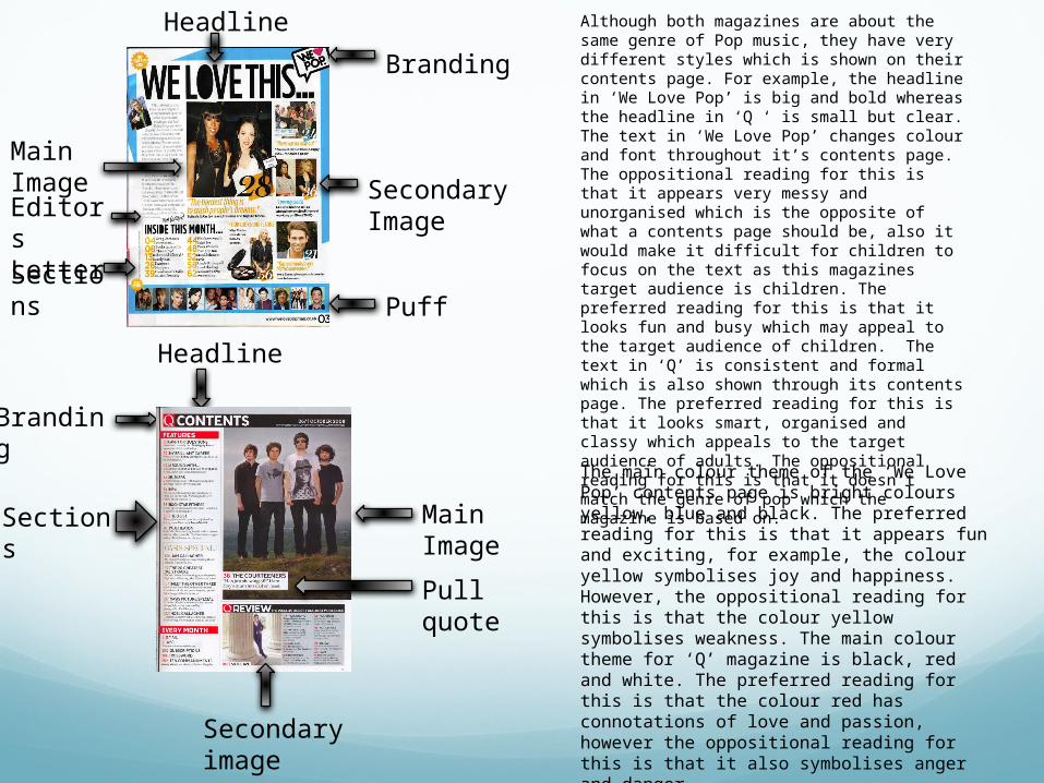
Although both magazines are about the same genre of Pop music, they have very different styles which is shown on their contents page. For example, the headline in ‘We Love Pop’ is big and bold whereas the headline in ‘Q ‘ is small but clear. The text in ‘We Love Pop’ changes colour and font throughout it’s contents page. The oppositional reading for this is that it appears very messy and unorganised which is the opposite of what a contents page should be, also it would make it difficult for children to focus on the text as this magazines target audience is children. The preferred reading for this is that it looks fun and busy which may appeal to the target audience of children. The text in ‘Q’ is consistent and formal which is also shown through its contents page. The preferred reading for this is that it looks smart, organised and classy which appeals to the target audience of adults. The oppositional reading for this is that it doesn’t match the genre of pop which the magazine is based on.The main colour theme of the ‘We Love Pop’ contents page is bright colours yellow, blue and black. The preferred reading for this is that it appears fun and exciting, for example, the colour yellow symbolises joy and happiness. However, the oppositional reading for this is that the colour yellow symbolises weakness. The main colour theme for ‘Q’ magazine is black, red and white. The preferred reading for this is that the colour red has connotations of love and passion, however the oppositional reading for this is that it also symbolises anger and danger.
Headline
Main Image
Branding
Sections
Secondary image
Pull quote
BrandingHeadline
Main Image
Puff
Secondary Image Editors
Letter Sections
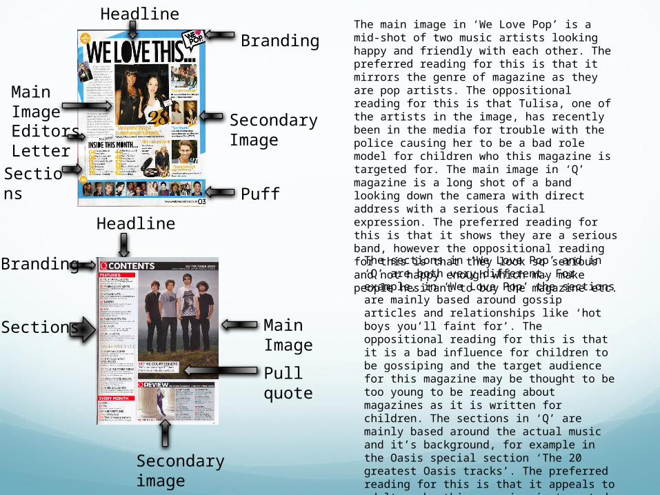
The main image in ‘We Love Pop’ is a mid-shot of two music artists looking happy and friendly with each other. The preferred reading for this is that it mirrors the genre of magazine as they are pop artists. The oppositional reading for this is that Tulisa, one of the artists in the image, has recently been in the media for trouble with the police causing her to be a bad role model for children who this magazine is targeted for. The main image in ‘Q’ magazine is a long shot of a band looking down the camera with direct address with a serious facial expression. The preferred reading for this is that it shows they are a serious band, however the oppositional reading for this is that they look so serious and not happy enough which may make people hesitant to buy the magazine etc.
The sections in ‘We Love Pop’ and in ‘Q’ are both very different. For example, in ‘We Love Pop’ the sections are mainly based around gossip articles and relationships like ‘hot boys you’ll faint for’. The oppositional reading for this is that it is a bad influence for children to be gossiping and the target audience for this magazine may be thought to be too young to be reading about magazines as it is written for children. The sections in ‘Q’ are mainly based around the actual music and it’s background, for example in the Oasis special section ‘The 20 greatest Oasis tracks’. The preferred reading for this is that it appeals to adults, who this magazine is targeted at, as it is informative and covers mature topics. The oppositional reading for this is that it may appear too serious and not entertaining enough.
Headline Main image
Branding
Columns
Headline
StraplineMain Image
Secondary Image
Branding
Columns
Block Quote
The main colour theme of the ‘We Love Pop’ double page spread is bright colours such as pink, black and yellow. The preferred reading for this is that it appears exciting and fun, for example the colour pink symbolises friendship and affection. The oppositional reading for this is that the colour pink also symbolises a lack of self worth. The main colour theme of the ‘Q’ magazine double page spread is dull colours such as red, white and black. The preferred reading for this is that it makes it look classy and easy to read, the colour red symbolises love and passion. The oppositional reading for this is that red also symbolises anger and danger.
The main image on both the ‘Q’ and ‘We Love Pop’ double page spread are very different. The image in ‘We Love Pop’ is a long shot of Cher Lloyd. The preferred reading for this is that she is a famous artist who matches the genre of this magazine. The oppositional reading for this is that Cher Lloyd has had some trouble with the press making her a bad role model for children who this magazine is targeted at. She is also wearing a lot of make up which some people may think isn’t a good image to be enforced on children. The image in ‘Q’ is a mid shot of Lady Gaga. The preferred reading for this is that Lady Gaga is a very big pop icon who stands up for individuality such as gay rights etc, however the oppositional reading for this is that she is a very controversial person, also she isn’t fully clothed in the picture making it provocative.
Headline Main
image
Branding
Columns
Headline
StraplineMain Image
Secondary Image
Branding
Columns
Block Quote
The text in ‘We Love Pop’ is in informal typography such as Sans Serif. It is also written in 3 different colours, pink, yellow and black. The preferred reading for this is that it is fun and exciting making it appeal to children, who are the target audience for this magazine. The oppositional reading for this is that it looks messy and therefore could be more difficult for people to read, especially children. The text in ‘Q’ magazine’s double page spread is also in informal typography such as sans serif, however the big letter ‘L’ going across the page is the main focus of this double page spread and is written in formal typography such as serif. The text is written in black and the capital ‘L’ is written in red. The preferred reading for this is that it looks classy and organised making it easier to read and more appealing for the target audience of adults. The oppositional reading for this is that the ‘L’ makes it difficult to read the text, also the colour red symbolises anger and hate.