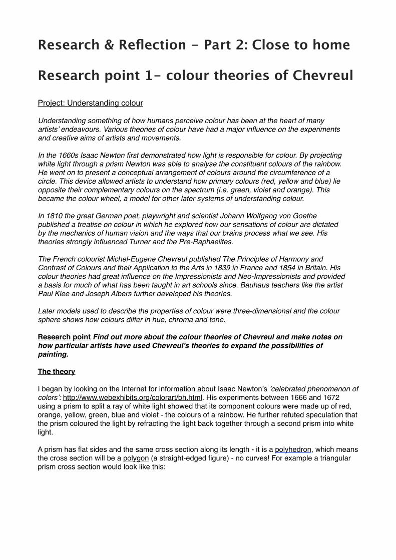
Research & Reflection - Part 2: Close to home Research point 1- colour theories of Chevreul Project: Understanding colour Understanding something of how humans perceive colour has been at the heart of many artists’ endeavours. Various theories of colour have had a major influence on the experiments and creative aims of artists and movements. In the 1660s Isaac Newton first demonstrated how light is responsible for colour. By projecting white light through a prism Newton was able to analyse the constituent colours of the rainbow. He went on to present a conceptual arrangement of colours around the circumference of a circle. This device allowed artists to understand how primary colours (red, yellow and blue) lie opposite their complementary colours on the spectrum (i.e. green, violet and orange). This became the colour wheel, a model for other later systems of understanding colour. In 1810 the great German poet, playwright and scientist Johann Wolfgang von Goethe published a treatise on colour in which he explored how our sensations of colour are dictated by the mechanics of human vision and the ways that our brains process what we see. His theories strongly influenced Turner and the Pre-Raphaelites. The French colourist Michel-Eugene Chevreul published The Principles of Harmony and Contrast of Colours and their Application to the Arts in 1839 in France and 1854 in Britain. His colour theories had great influence on the Impressionists and Neo-Impressionists and provided a basis for much of what has been taught in art schools since. Bauhaus teachers like the artist Paul Klee and Joseph Albers further developed his theories. Later models used to describe the properties of colour were three-dimensional and the colour sphere shows how colours differ in hue, chroma and tone. Research point Find out more about the colour theories of Chevreul and make notes on how particular artists have used Chevreul’s theories to expand the possibilities of painting. The theory I began by looking on the Internet for information about Isaac Newton’s ’celebrated phenomenon of colors’: http://www.webexhibits.org/colorart/bh.html. His experiments between 1666 and 1672 using a prism to split a ray of white light showed that its component colours were made up of red, orange, yellow, green, blue and violet - the colours of a rainbow. He further refuted speculation that the prism coloured the light by refracting the light back together through a second prism into white light. A prism has flat sides and the same cross section along its length - it is a polyhedron, which means the cross section will be a polygon (a straight-edged figure) - no curves! For example a triangular prism cross section would look like this:
Transcript
Research & Reflection - Part 2: Close to home !Research point 1- colour theories of Chevreul !Project: Understanding colour!Understanding something of how humans perceive colour has been at the heart of many!artists’ endeavours. Various theories of colour have had a major influence on the experiments!and creative aims of artists and movements.!In the 1660s Isaac Newton first demonstrated how light is responsible for colour. By projecting!white light through a prism Newton was able to analyse the constituent colours of the rainbow.!He went on to present a conceptual arrangement of colours around the circumference of a!circle. This device allowed artists to understand how primary colours (red, yellow and blue) lie!opposite their complementary colours on the spectrum (i.e. green, violet and orange). This!became the colour wheel, a model for other later systems of understanding colour.!In 1810 the great German poet, playwright and scientist Johann Wolfgang von Goethe!published a treatise on colour in which he explored how our sensations of colour are dictated!by the mechanics of human vision and the ways that our brains process what we see. His!theories strongly influenced Turner and the Pre-Raphaelites.!The French colourist Michel-Eugene Chevreul published The Principles of Harmony and!Contrast of Colours and their Application to the Arts in 1839 in France and 1854 in Britain. His!colour theories had great influence on the Impressionists and Neo-Impressionists and provided!a basis for much of what has been taught in art schools since. Bauhaus teachers like the artist!Paul Klee and Joseph Albers further developed his theories.!Later models used to describe the properties of colour were three-dimensional and the colour!sphere shows how colours differ in hue, chroma and tone.!Research point Find out more about the colour theories of Chevreul and make notes on!how particular artists have used Chevreul’s theories to expand the possibilities of!painting.!!The theory!!I began by looking on the Internet for information about Isaac Newton’s ’celebrated phenomenon of colors’: http://www.webexhibits.org/colorart/bh.html. His experiments between 1666 and 1672 using a prism to split a ray of white light showed that its component colours were made up of red, orange, yellow, green, blue and violet - the colours of a rainbow. He further refuted speculation that the prism coloured the light by refracting the light back together through a second prism into white light.!!A prism has flat sides and the same cross section along its length - it is a polyhedron, which means the cross section will be a polygon (a straight-edged figure) - no curves! For example a triangular prism cross section would look like this: !!!!
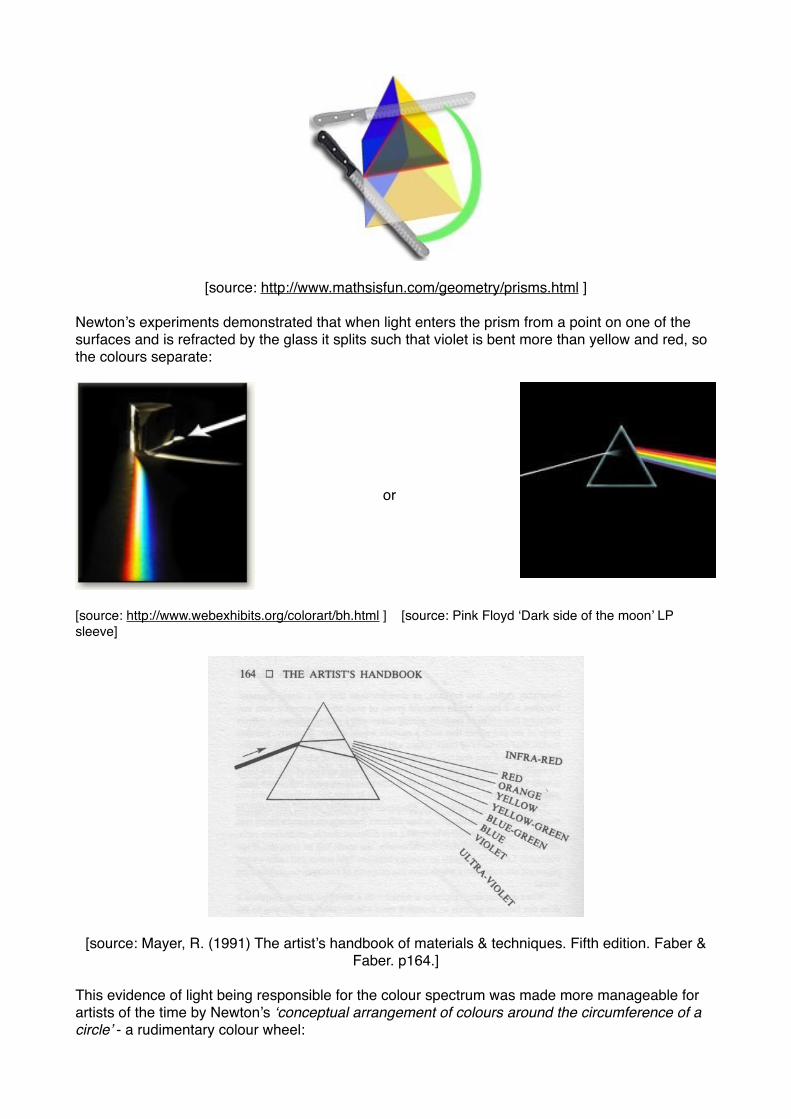
[source: http://www.mathsisfun.com/geometry/prisms.html ] !!Newton’s experiments demonstrated that when light enters the prism from a point on one of the surfaces and is refracted by the glass it splits such that violet is bent more than yellow and red, so the colours separate:! !!!!!!!
! ! or !!!!!!![source: http://www.webexhibits.org/colorart/bh.html ] [source: Pink Floyd ‘Dark side of the moon’ LP sleeve]!
[source: Mayer, R. (1991) The artist’s handbook of materials & techniques. Fifth edition. Faber & Faber. p164.]!!
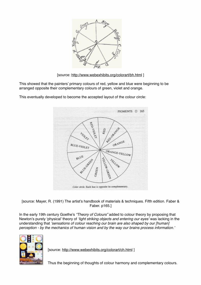
This evidence of light being responsible for the colour spectrum was made more manageable for artists of the time by Newton’s ‘conceptual arrangement of colours around the circumference of a circle’ - a rudimentary colour wheel:!
This showed that the painters’ primary colours of red, yellow and blue were beginning to be arranged opposite their complementary colours of green, violet and orange.!!This eventually developed to become the accepted layout of the colour circle:!
![source: Mayer, R. (1991) The artist’s handbook of materials & techniques. Fifth edition. Faber &
Faber. p165.]!!In the early 19th century Goethe’s “Theory of Colours” added to colour theory by proposing that Newton’s purely ‘physical’ theory of ‘light striking objects and entering our eyes’ was lacking in the understanding that ‘sensations of colour reaching our brain are also shaped by our [human] perception - by the mechanics of human vision and by the way our brains process information.’!!!!!
[source: http://www.webexhibits.org/colorart/ch.html ]!!!Thus the beginning of thoughts of colour harmony and complementary colours. !
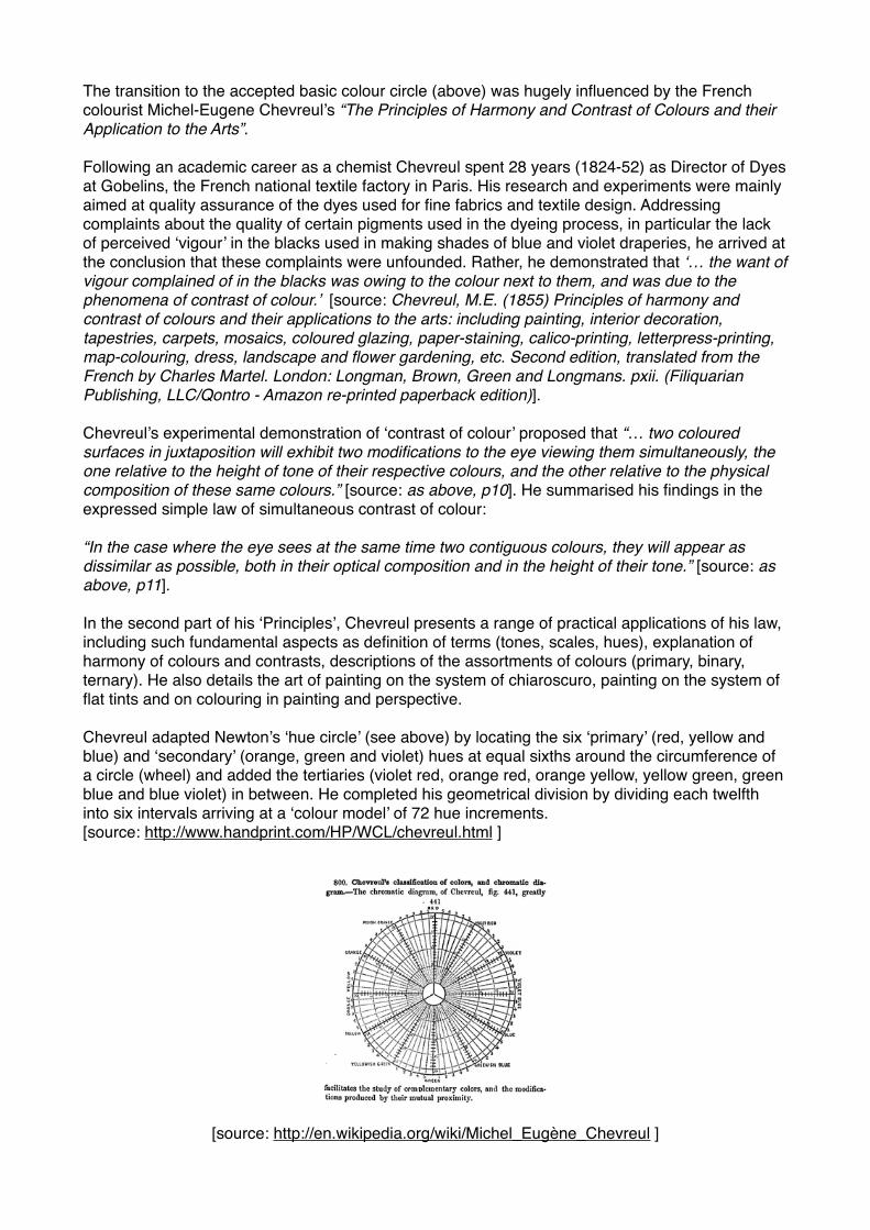
The transition to the accepted basic colour circle (above) was hugely influenced by the French colourist Michel-Eugene Chevreul’s “The Principles of Harmony and Contrast of Colours and their Application to the Arts”. !!Following an academic career as a chemist Chevreul spent 28 years (1824-52) as Director of Dyes at Gobelins, the French national textile factory in Paris. His research and experiments were mainly aimed at quality assurance of the dyes used for fine fabrics and textile design. Addressing complaints about the quality of certain pigments used in the dyeing process, in particular the lack of perceived ‘vigour’ in the blacks used in making shades of blue and violet draperies, he arrived at the conclusion that these complaints were unfounded. Rather, he demonstrated that ‘… the want of vigour complained of in the blacks was owing to the colour next to them, and was due to the phenomena of contrast of colour.’ [source: Chevreul, M.E. (1855) Principles of harmony and contrast of colours and their applications to the arts: including painting, interior decoration, tapestries, carpets, mosaics, coloured glazing, paper-staining, calico-printing, letterpress-printing, map-colouring, dress, landscape and flower gardening, etc. Second edition, translated from the French by Charles Martel. London: Longman, Brown, Green and Longmans. pxii. (Filiquarian Publishing, LLC/Qontro - Amazon re-printed paperback edition)].!!Chevreul’s experimental demonstration of ‘contrast of colour’ proposed that “… two coloured surfaces in juxtaposition will exhibit two modifications to the eye viewing them simultaneously, the one relative to the height of tone of their respective colours, and the other relative to the physical composition of these same colours.” [source: as above, p10]. He summarised his findings in the expressed simple law of simultaneous contrast of colour:!!“In the case where the eye sees at the same time two contiguous colours, they will appear as dissimilar as possible, both in their optical composition and in the height of their tone.” [source: as above, p11]. !!In the second part of his ‘Principles’, Chevreul presents a range of practical applications of his law, including such fundamental aspects as definition of terms (tones, scales, hues), explanation of harmony of colours and contrasts, descriptions of the assortments of colours (primary, binary, ternary). He also details the art of painting on the system of chiaroscuro, painting on the system of flat tints and on colouring in painting and perspective.!!Chevreul adapted Newton’s ‘hue circle’ (see above) by locating the six ‘primary’ (red, yellow and blue) and ‘secondary’ (orange, green and violet) hues at equal sixths around the circumference of a circle (wheel) and added the tertiaries (violet red, orange red, orange yellow, yellow green, green blue and blue violet) in between. He completed his geometrical division by dividing each twelfth into six intervals arriving at a ‘colour model’ of 72 hue increments. [source: http://www.handprint.com/HP/WCL/chevreul.html ] !!
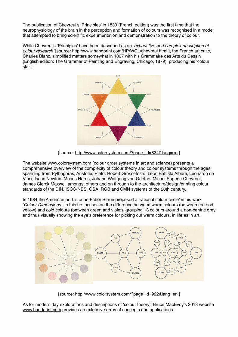
The publication of Chevreul’s ‘Principles’ in 1839 (French edition) was the first time that the neurophysiology of the brain in the perception and formation of colours was recognised in a model that attempted to bring scientific experimentation and demonstration to the theory of colour.!!While Chevreul’s ‘Principles’ have been described as an ‘exhaustive and complex description of colour research’ [source: http://www.handprint.com/HP/WCL/chevreul.html ], the French art critic, Charles Blanc, simplified matters somewhat in 1867 with his Grammaire des Arts du Dessin (English edition: The Grammar of Painting and Engraving, Chicago, 1879), producing his ‘colour star’: !
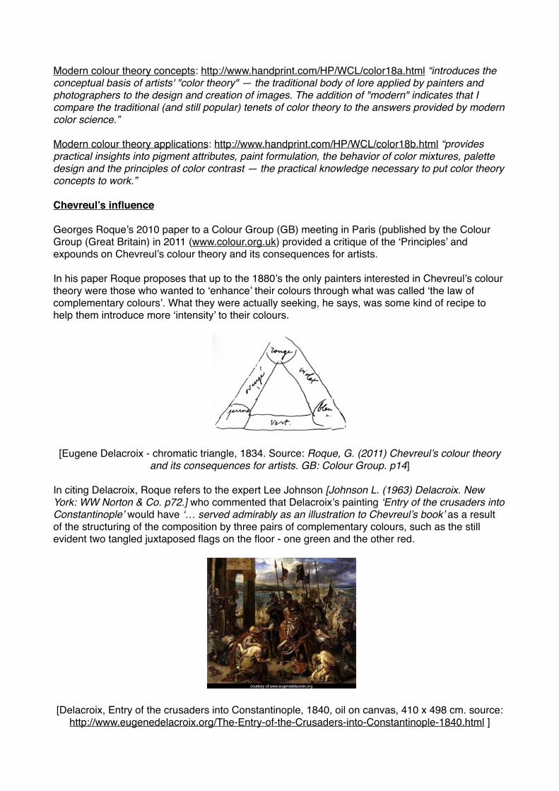
[source: http://www.colorsystem.com/?page_id=834&lang=en ] !!The website www.colorsystem.com (colour order systems in art and science) presents a comprehensive overview of the complexity of colour theory and colour systems through the ages, spanning from Pythagoras, Aristotle, Plato, Robert Grosseteste, Leon Battista Alberti, Leonardo da Vinci, Isaac Newton, Moses Harris, Johann Wolfgang von Goethe, Michel Eugene Chevreul, James Clerck Maxwell amongst others and on through to the architecture/design/printing colour standards of the DIN, ISCC-NBS, OSA, RGB and CMN systems of the 20th century.!!In 1934 the American art historian Faber Birren proposed a ‘rational colour circle’ in his work ‘Colour Dimensions’. In this he focuses on the difference between warm colours (between red and yellow) and cold colours (between green and violet), grouping 13 colours around a non-centric grey and thus visually showing the eye’s preference for picking out warm colours, in life as in art.!
As for modern day explorations and descriptions of ‘colour theory’, Bruce MacEvoy’s 2013 website www.handprint.com provides an extensive array of concepts and applications:!
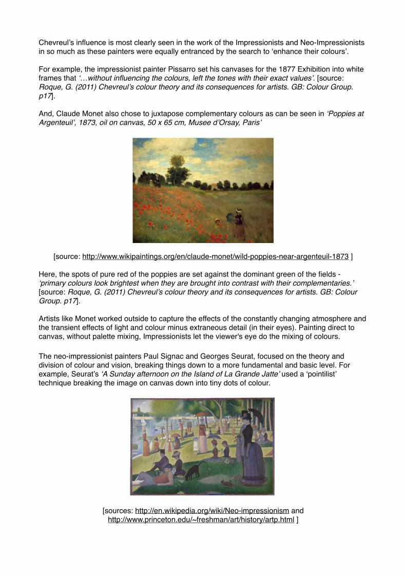
!Modern colour theory concepts: http://www.handprint.com/HP/WCL/color18a.html “introduces the conceptual basis of artists' "color theory" — the traditional body of lore applied by painters and photographers to the design and creation of images. The addition of "modern" indicates that I compare the traditional (and still popular) tenets of color theory to the answers provided by modern color science.”!!Modern colour theory applications: http://www.handprint.com/HP/WCL/color18b.html “provides practical insights into pigment attributes, paint formulation, the behavior of color mixtures, palette design and the principles of color contrast — the practical knowledge necessary to put color theory concepts to work.”!!Chevreul’s influence!!Georges Roque’s 2010 paper to a Colour Group (GB) meeting in Paris (published by the Colour Group (Great Britain) in 2011 (www.colour.org.uk) provided a critique of the ‘Principles’ and expounds on Chevreul’s colour theory and its consequences for artists. !!In his paper Roque proposes that up to the 1880’s the only painters interested in Chevreul’s colour theory were those who wanted to ‘enhance’ their colours through what was called ‘the law of complementary colours’. What they were actually seeking, he says, was some kind of recipe to help them introduce more ‘intensity’ to their colours. !!!!!!!!![Eugene Delacroix - chromatic triangle, 1834. Source: Roque, G. (2011) Chevreul’s colour theory
and its consequences for artists. GB: Colour Group. p14]!In citing Delacroix, Roque refers to the expert Lee Johnson [Johnson L. (1963) Delacroix. New York: WW Norton & Co. p72.] who commented that Delacroix’s painting ‘Entry of the crusaders into Constantinople’ would have ‘… served admirably as an illustration to Chevreul’s book’ as a result of the structuring of the composition by three pairs of complementary colours, such as the still evident two tangled juxtaposed flags on the floor - one green and the other red.!!!!!!!!!!!!!
[Delacroix, Entry of the crusaders into Constantinople, 1840, oil on canvas, 410 x 498 cm. source:
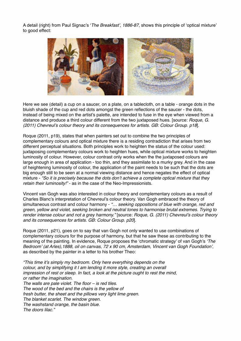
Chevreul’s influence is most clearly seen in the work of the Impressionists and Neo-Impressionists in so much as these painters were equally entranced by the search to ‘enhance their colours’. !!For example, the impressionist painter Pissarro set his canvases for the 1877 Exhibition into white frames that ‘…without influencing the colours, left the tones with their exact values’. [source: Roque, G. (2011) Chevreul’s colour theory and its consequences for artists. GB: Colour Group. p17].!!And, Claude Monet also chose to juxtapose complementary colours as can be seen in ‘Poppies at Argenteuil’, 1873, oil on canvas, 50 x 65 cm, Musee d’Orsay, Paris’!
[source: http://www.wikipaintings.org/en/claude-monet/wild-poppies-near-argenteuil-1873 ] !Here, the spots of pure red of the poppies are set against the dominant green of the fields - ‘primary colours look brightest when they are brought into contrast with their complementaries.’![source: Roque, G. (2011) Chevreul’s colour theory and its consequences for artists. GB: Colour Group. p17].!!Artists like Monet worked outside to capture the effects of the constantly changing atmosphere and the transient effects of light and colour minus extraneous detail (in their eyes). Painting direct to canvas, without palette mixing, Impressionists let the viewer's eye do the mixing of colours.!
The neo-impressionist painters Paul Signac and Georges Seurat, focused on the theory and division of colour and vision, breaking things down to a more fundamental and basic level. For example, Seurat’s ‘A Sunday afternoon on the Island of La Grande Jatte’ used a ‘pointilist’ technique breaking the image on canvas down into tiny dots of colour.!
[sources: http://en.wikipedia.org/wiki/Neo-impressionism and !http://www.princeton.edu/~freshman/art/history/artp.html ] !
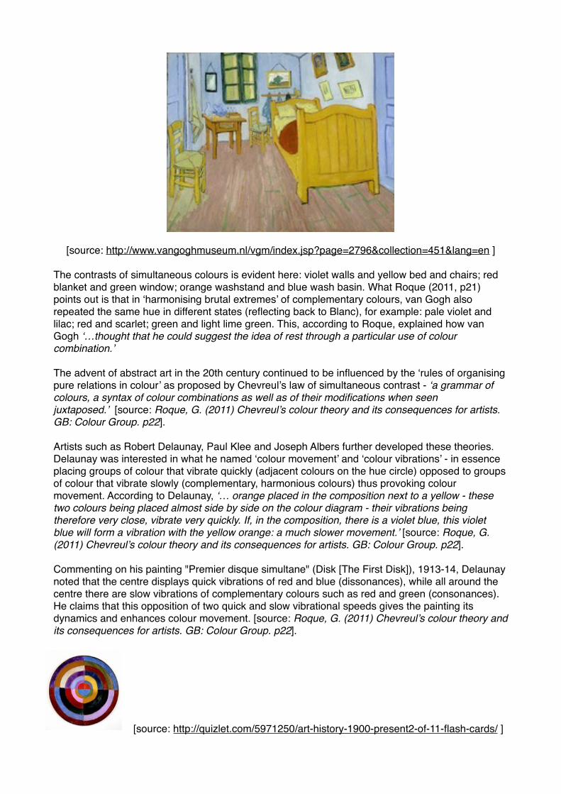
A detail (right) from Paul Signac’s ‘The Breakfast’, 1886-87, shows this principle of ‘optical mixture’ to good effect:!!!!!!!!!!!!!Here we see (detail) a cup on a saucer, on a plate, on a tablecloth, on a table - orange dots in the bluish shade of the cup and red dots amongst the green reflections of the saucer - the dots, instead of being mixed on the artist’s palette, are intended to fuse in the eye when viewed from a distance and produce a third colour different from the two juxtaposed hues. [source: Roque, G. (2011) Chevreul’s colour theory and its consequences for artists. GB: Colour Group. p18].!!Roque (2011, p19), states that when painters set out to combine the two principles of complementary colours and optical mixture there is a residing contradiction that arises from two different perceptual situations. Both principles work to heighten the status of the colour used: juxtaposing complementary colours work to heighten hues, while optical mixture works to heighten luminosity of colour. However, colour contrast only works when the the juxtaposed colours are large enough in area of application - too thin, and they assimilate to a murky grey. And in the case of heightening luminosity of colour, the application of the paint needs to be such that the dots are big enough still to be seen at a normal viewing distance and hence negates the effect of optical mixture - “So it is precisely because the dots don’t achieve a complete optical mixture that they retain their luminosity!” - as in the case of the Neo-Impressionists.!!Vincent van Gogh was also interested in colour theory and complementary colours as a result of Charles Blanc’s interpretation of Chevreul’s colour theory. Van Gogh embraced the theory of simultaneous contrast and colour harmony - “… seeking oppositions of blue with orange, red and green, yellow and violet, seeking broken and neutral tones to harmonise brutal extremes. Trying to render intense colour and not a grey harmony.” [source: Roque, G. (2011) Chevreul’s colour theory and its consequences for artists. GB: Colour Group. p20].!!Roque (2011, p21), goes on to say that van Gogh not only wanted to use combinations of complementary colours for the purpose of harmony, but that he saw these as contributing to the meaning of the painting. In evidence, Roque proposes the ‘chromatic strategy’ of van Gogh’s ‘The Bedroom’ (at Arles),1888, oil on canvas, 72 x 90 cm, Amsterdam, Vincent van Gogh Foundation’, as described by the painter in a letter to his brother Theo:!!“This time it’s simply my bedroom. Only here everything depends on the!colour, and by simplifying it I am lending it more style, creating an overall!impression of rest or sleep. In fact, a look at the picture ought to rest the mind,!or rather the imagination.!The walls are pale violet. The floor – is red tiles.!The wood of the bed and the chairs is the yellow of!fresh butter, the sheet and the pillows very light lime green.!The blanket scarlet. The window green.!The washstand orange, the basin blue.!The doors lilac.”!!
[source: http://www.vangoghmuseum.nl/vgm/index.jsp?page=2796&collection=451&lang=en ] !!The contrasts of simultaneous colours is evident here: violet walls and yellow bed and chairs; red blanket and green window; orange washstand and blue wash basin. What Roque (2011, p21) points out is that in ‘harmonising brutal extremes’ of complementary colours, van Gogh also repeated the same hue in different states (reflecting back to Blanc), for example: pale violet and lilac; red and scarlet; green and light lime green. This, according to Roque, explained how van Gogh ‘…thought that he could suggest the idea of rest through a particular use of colour combination.’!!The advent of abstract art in the 20th century continued to be influenced by the ‘rules of organising pure relations in colour’ as proposed by Chevreul’s law of simultaneous contrast - ‘a grammar of colours, a syntax of colour combinations as well as of their modifications when seen juxtaposed.’ [source: Roque, G. (2011) Chevreul’s colour theory and its consequences for artists. GB: Colour Group. p22].!!Artists such as Robert Delaunay, Paul Klee and Joseph Albers further developed these theories. Delaunay was interested in what he named ‘colour movement’ and ‘colour vibrations’ - in essence placing groups of colour that vibrate quickly (adjacent colours on the hue circle) opposed to groups of colour that vibrate slowly (complementary, harmonious colours) thus provoking colour movement. According to Delaunay, ‘… orange placed in the composition next to a yellow - these two colours being placed almost side by side on the colour diagram - their vibrations being therefore very close, vibrate very quickly. If, in the composition, there is a violet blue, this violet blue will form a vibration with the yellow orange: a much slower movement.’ [source: Roque, G. (2011) Chevreul’s colour theory and its consequences for artists. GB: Colour Group. p22].!!Commenting on his painting "Premier disque simultane" (Disk [The First Disk]), 1913-14, Delaunay noted that the centre displays quick vibrations of red and blue (dissonances), while all around the centre there are slow vibrations of complementary colours such as red and green (consonances). He claims that this opposition of two quick and slow vibrational speeds gives the painting its dynamics and enhances colour movement. [source: Roque, G. (2011) Chevreul’s colour theory and its consequences for artists. GB: Colour Group. p22].!!!!!!!!
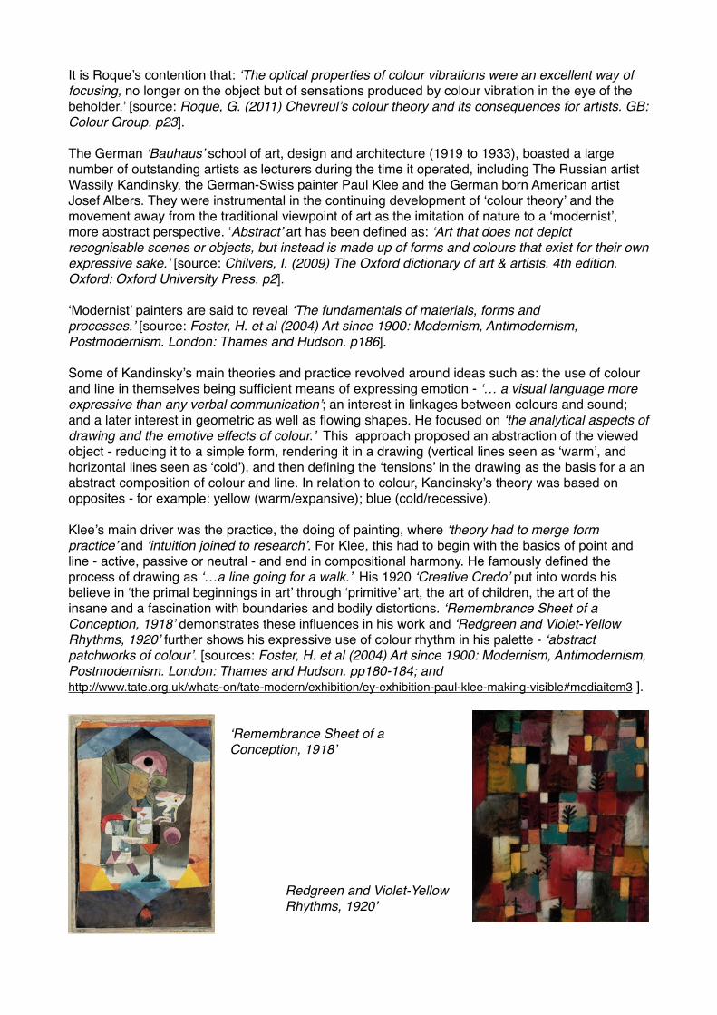
It is Roque’s contention that: ‘The optical properties of colour vibrations were an excellent way of focusing, no longer on the object but of sensations produced by colour vibration in the eye of the beholder.’ [source: Roque, G. (2011) Chevreul’s colour theory and its consequences for artists. GB: Colour Group. p23].!!The German ‘Bauhaus’ school of art, design and architecture (1919 to 1933), boasted a large number of outstanding artists as lecturers during the time it operated, including The Russian artist Wassily Kandinsky, the German-Swiss painter Paul Klee and the German born American artist Josef Albers. They were instrumental in the continuing development of ‘colour theory’ and the movement away from the traditional viewpoint of art as the imitation of nature to a ‘modernist’, more abstract perspective. ‘Abstract’ art has been defined as: ‘Art that does not depict recognisable scenes or objects, but instead is made up of forms and colours that exist for their own expressive sake.’ [source: Chilvers, I. (2009) The Oxford dictionary of art & artists. 4th edition. Oxford: Oxford University Press. p2].!!‘Modernist’ painters are said to reveal ‘The fundamentals of materials, forms and processes.’ [source: Foster, H. et al (2004) Art since 1900: Modernism, Antimodernism, Postmodernism. London: Thames and Hudson. p186]. !!Some of Kandinsky’s main theories and practice revolved around ideas such as: the use of colour and line in themselves being sufficient means of expressing emotion - ‘… a visual language more expressive than any verbal communication’; an interest in linkages between colours and sound; and a later interest in geometric as well as flowing shapes. He focused on ‘the analytical aspects of drawing and the emotive effects of colour.’ This approach proposed an abstraction of the viewed object - reducing it to a simple form, rendering it in a drawing (vertical lines seen as ‘warm’, and horizontal lines seen as ‘cold’), and then defining the ‘tensions’ in the drawing as the basis for a an abstract composition of colour and line. In relation to colour, Kandinsky’s theory was based on opposites - for example: yellow (warm/expansive); blue (cold/recessive). !!Klee’s main driver was the practice, the doing of painting, where ‘theory had to merge form practice’ and ‘intuition joined to research’. For Klee, this had to begin with the basics of point and line - active, passive or neutral - and end in compositional harmony. He famously defined the process of drawing as ‘…a line going for a walk.’ His 1920 ‘Creative Credo’ put into words his believe in ‘the primal beginnings in art’ through ‘primitive’ art, the art of children, the art of the insane and a fascination with boundaries and bodily distortions. ‘Remembrance Sheet of a Conception, 1918’ demonstrates these influences in his work and ‘Redgreen and Violet-Yellow Rhythms, 1920’ further shows his expressive use of colour rhythm in his palette - ‘abstract patchworks of colour’. [sources: Foster, H. et al (2004) Art since 1900: Modernism, Antimodernism, Postmodernism. London: Thames and Hudson. pp180-184; and http://www.tate.org.uk/whats-on/tate-modern/exhibition/ey-exhibition-paul-klee-making-visible#mediaitem3 ].!!!
‘Remembrance Sheet of a Conception, 1918’!!!!!!!!!! ! Redgreen and Violet-Yellow ! ! Rhythms, 1920’ !!!
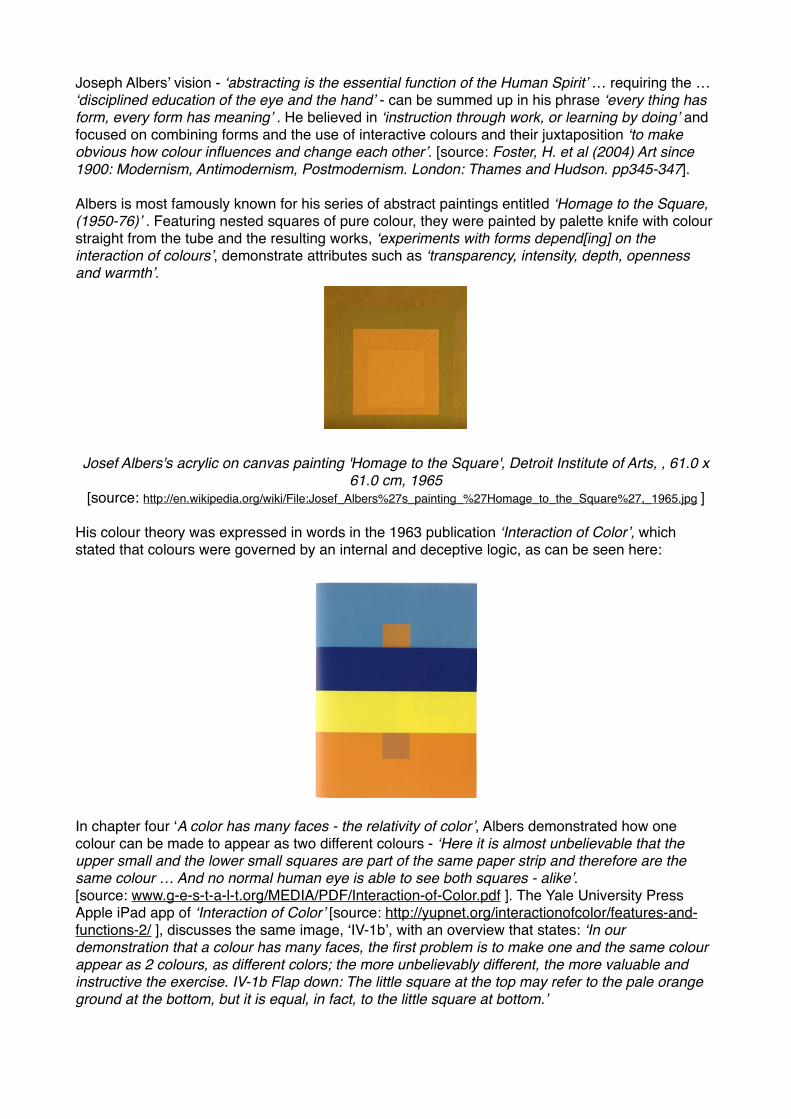
Joseph Albers’ vision - ‘abstracting is the essential function of the Human Spirit’ … requiring the … ‘disciplined education of the eye and the hand’ - can be summed up in his phrase ‘every thing has form, every form has meaning’ . He believed in ‘instruction through work, or learning by doing’ and focused on combining forms and the use of interactive colours and their juxtaposition ‘to make obvious how colour influences and change each other’. [source: Foster, H. et al (2004) Art since 1900: Modernism, Antimodernism, Postmodernism. London: Thames and Hudson. pp345-347].!!Albers is most famously known for his series of abstract paintings entitled ‘Homage to the Square, (1950-76)’ . Featuring nested squares of pure colour, they were painted by palette knife with colour straight from the tube and the resulting works, ‘experiments with forms depend[ing] on the interaction of colours’, demonstrate attributes such as ‘transparency, intensity, depth, openness and warmth’. !!!!!!!!!!!Josef Albers's acrylic on canvas painting 'Homage to the Square', Detroit Institute of Arts, , 61.0 x
61.0 cm, 1965 [source: http://en.wikipedia.org/wiki/File:Josef_Albers%27s_painting_%27Homage_to_the_Square%27,_1965.jpg ]!!
His colour theory was expressed in words in the 1963 publication ‘Interaction of Color’, which stated that colours were governed by an internal and deceptive logic, as can be seen here:!!!!!!!!!!!!!!!!In chapter four ‘A color has many faces - the relativity of color’, Albers demonstrated how one colour can be made to appear as two different colours - ‘Here it is almost unbelievable that the upper small and the lower small squares are part of the same paper strip and therefore are the same colour … And no normal human eye is able to see both squares - alike’. [source: www.g-e-s-t-a-l-t.org/MEDIA/PDF/Interaction-of-Color.pdf ]. The Yale University Press Apple iPad app of ‘Interaction of Color’ [source: http://yupnet.org/interactionofcolor/features-and-functions-2/ ], discusses the same image, ‘IV-1b’, with an overview that states: ‘In our demonstration that a colour has many faces, the first problem is to make one and the same colour appear as 2 colours, as different colors; the more unbelievably different, the more valuable and instructive the exercise. IV-1b Flap down: The little square at the top may refer to the pale orange ground at the bottom, but it is equal, in fact, to the little square at bottom.’ !!
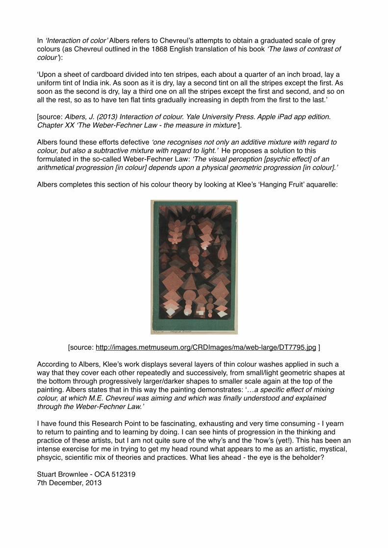
In ‘Interaction of color’ Albers refers to Chevreul’s attempts to obtain a graduated scale of grey colours (as Chevreul outlined in the 1868 English translation of his book ‘The laws of contrast of colour’):!!‘Upon a sheet of cardboard divided into ten stripes, each about a quarter of an inch broad, lay a uniform tint of India ink. As soon as it is dry, lay a second tint on all the stripes except the first. As soon as the second is dry, lay a third one on all the stripes except the first and second, and so on all the rest, so as to have ten flat tints gradually increasing in depth from the first to the last.’!![source: Albers, J. (2013) Interaction of colour. Yale University Press. Apple iPad app edition. Chapter XX ‘The Weber-Fechner Law - the measure in mixture’].!!Albers found these efforts defective ‘one recognises not only an additive mixture with regard to colour, but also a subtractive mixture with regard to light.’ He proposes a solution to this formulated in the so-called Weber-Fechner Law: ‘The visual perception [psychic effect] of an arithmetical progression [in colour] depends upon a physical geometric progression [in colour].’ !!Albers completes this section of his colour theory by looking at Klee’s ‘Hanging Fruit’ aquarelle:!!!!!!!!!!!!!!!!!!!
[source: http://images.metmuseum.org/CRDImages/ma/web-large/DT7795.jpg ] !!According to Albers, Klee’s work displays several layers of thin colour washes applied in such a way that they cover each other repeatedly and successively, from small/light geometric shapes at the bottom through progressively larger/darker shapes to smaller scale again at the top of the painting. Albers states that in this way the painting demonstrates: ‘…a specific effect of mixing colour, at which M.E. Chevreul was aiming and which was finally understood and explained through the Weber-Fechner Law.’ !!I have found this Research Point to be fascinating, exhausting and very time consuming - I yearn to return to painting and to learning by doing. I can see hints of progression in the thinking and practice of these artists, but I am not quite sure of the why’s and the ‘how’s (yet!). This has been an intense exercise for me in trying to get my head round what appears to me as an artistic, mystical, phsycic, scientific mix of theories and practices. What lies ahead - the eye is the beholder?!!Stuart Brownlee - OCA 512319!7th December, 2013