29
Reshaping SharePoint for Evolving Internet Devices Your SharePoint Branding Experts Eric Overfield SharePoint Branding and UI Lead PixelMill
| Date post: | 20-Aug-2015 |
| Category: |
Technology |
| Upload: | eric-overfield |
| View: | 476 times |
| Download: | 0 times |

Reshaping SharePoint for
Evolving Internet Devices
Your SharePoint Branding Experts
Eric Overfield
SharePoint Branding and UI Lead
PixelMill

Introduction – Eric Overfield
• Founder and SharePoint Branding Lead, PixelMill
• Working with SharePoint since 2004
• Web Designer since 1998
• Located in Davis, CA
blog.pixelmill.com/ericoverfield
@EricOverfield
linkedin.com/in/ericoverfield

PixelMill
• Developing SharePoint solutions since 2004
• SharePoint Branding and UI Specialists
• Developer of Cost effective SharePoint Templates
• Your SharePoint Branding Experts
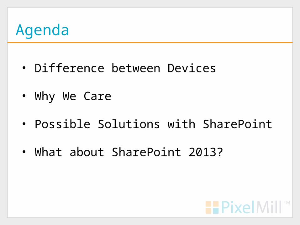
Agenda
• Difference between Devices
• Why We Care
• Possible Solutions with SharePoint
• What about SharePoint 2013?

What is the Difference Between Devices?
"There’s a plethora of devices out there with widely differing abilities
– it’s never been more confusing or challenging to create brilliant
interfaces that work across them all.” ~ Jeffery Zeldman
• Screen Size
• Functionality
• Usability

Why Do We Care?
• Mobile Devices are Invading
• If not now then in a few years.
• How old is your Intranet?
• Build towards the future, not the past

So What Do We Do?
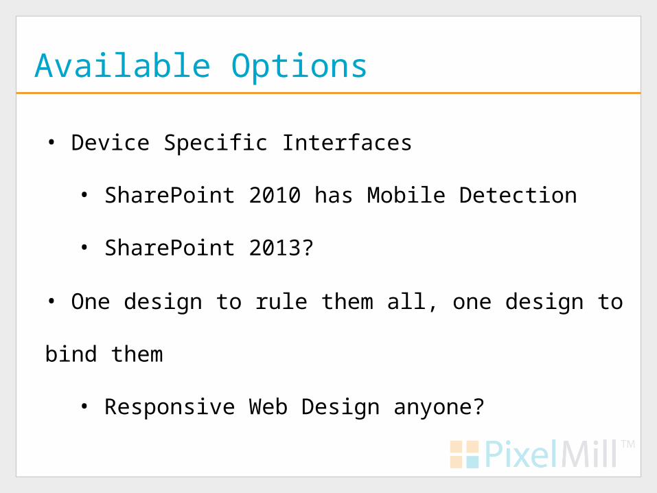
Available Options
• Device Specific Interfaces
• SharePoint 2010 has Mobile Detection
• SharePoint 2013?
• One design to rule them all, one design to bind them
• Responsive Web Design anyone?

The Mobile Interface
• SharePoint 2010 has a mobile interface
• Allows access to documents, lists, calendars, search, SMS alerts
• Controlled by USERAGENT
• App_Browsers\compat.browser
• Custom Web Parts, _layouts likely won’t work
• Difficult to customize

Code Once Use Everywhere
•Two primary methods
• Progressive Enhancement
• Responsive Web Design

Progressive Enhancement
• #1 trend for 2012 - .net Magazine
• Coined by Steven Champeon in 2003
• Content first, then add styling
• Separate Content from Presentation

SharePoint and Progressive Enhancement
• SharePoint was not built with PE in mind
• JavaScript and SharePoint
• Too much presentation baked into html
• i.e. Tables, Inline styles
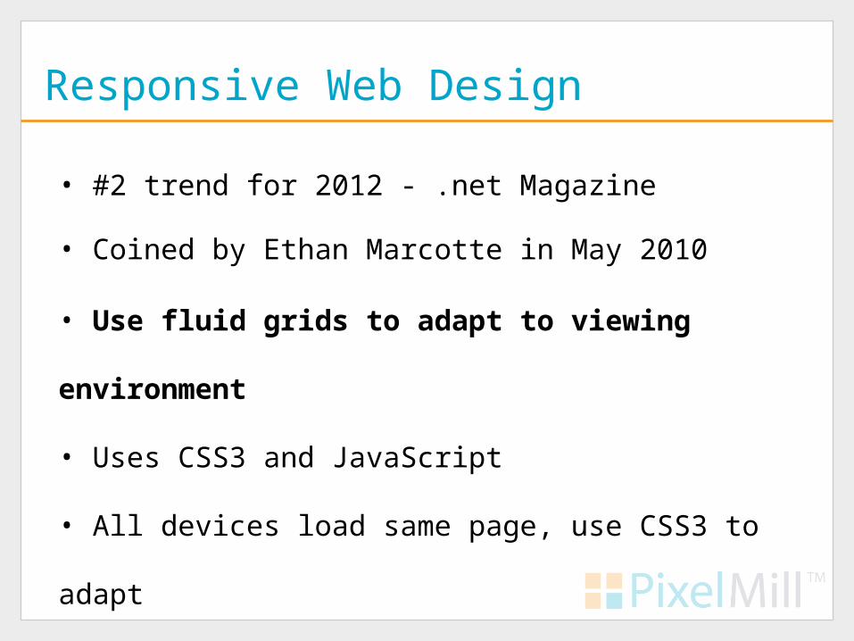
Responsive Web Design
• #2 trend for 2012 - .net Magazine
• Use fluid grids to adapt to viewing environment
• Uses CSS3 and JavaScript
• All devices load same page, use CSS3 to adapt
• Coined by Ethan Marcotte in May 2010

Responsive Design
Examples

www.its.ms.gov
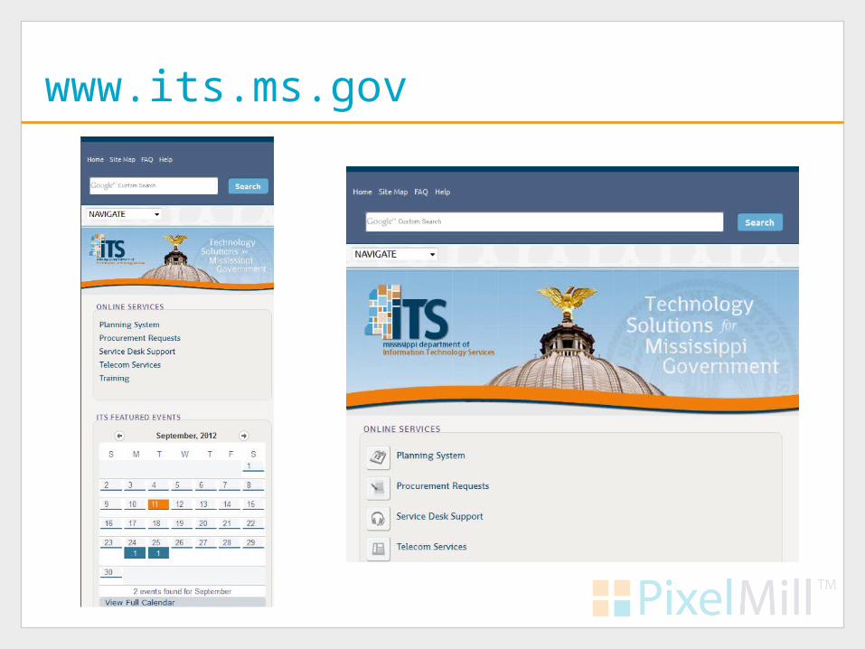
www.its.ms.gov

www.ariensco.com

www.ariensco.com

www.gse.it

www.gse.it

SharePoint and Responsive Design
• Uses CSS3 (media queries) and possibly HTML5.
• SharePoint already has a mobile view
• Configure with compat.browser
• Generally only one Master Page for all devices.
• Wide lists and Site Settings pages are not mobile friendly
• Primary issues are with RWD itself!
SharePoint and Responsive Design
• Additional overhead
• Does require CSS3
• Bandwidth Concerns
• Are mobile users and desktop users the same?
• Separate mobile vs Responsive? It’s political?

What to do?
• PE vs RWD vs Separate Mobile
• Define Project
• Limit overhead
• Find a CSS guru will be key
• Responsive Web Design is worth considering
• SharePoint limits our options
• One site is difficult enough to maintain

Device Channels Anyone?
• New to SharePoint 2013
• Interfaces tailored and maps to specific device(s)
• Custom Master Pages per Channel
• Custom DeviceChannelPanels

Devices Channels, the Good and Bad
• Tailored interfaces
• Only works with Publishing Sites
• Maintain multiple Master Pages and/or sites
• New devices? Maintain that list too?

The Best of Both Worlds?
• Responsive Design and Device Channels
• Built a Responsive site for all devices
• Use DeviceChannelPanels
• Create a Device Channel for special cases
• But we have to wait

Summary
• Build towards the future, not the past
• Mobile devices will penetrate the corporate firewall
• SharePoint 2010 – Response Design
• SharePoint 2013 – Responsive Design w/ Device Channels

Resources
• "Responsive Web Design" by Ethan Marcottes
http://bit.ly/bcKwQS
• Configure SharePoint Server 2010 for Mobile Device Access
http://bit.ly/cg6fYo
• SharePoint 2010 Responsive Web design Template by Luis Kerr
http://bit.ly/NKPjwX
• v5, the Responsive HTML5 Master Page for SharePoint 2010 by Kyle Schaeffer
http://bit.ly/n8VQZw
• Ethan Marcottes’ 20 Favorite Responsive Designs
http://bit.ly/ngkI8D

Thank You
Your SharePoint Branding Experts
Eric Overfield
@EricOverfield
blog.pixelmill.com/ericoverfield


