22
RESPONSIVE WEBDESIGN
| Date post: | 24-Jan-2017 |
| Category: |
Technology |
| Upload: | jan-klecka |
| View: | 57 times |
| Download: | 0 times |

RESPONSIVEWEBDESIGN
, , Justin14 IPhone 2G PSD Mock CC BY-SA 3.0
2007
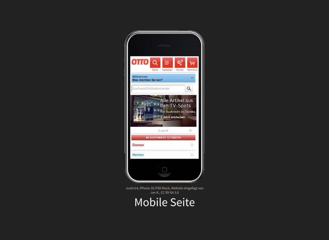
, , Website eingefügt vonJan K.,
Justin14 IPhone 2G PSD MockCC BY-SA 3.0
Mobile Seite
, , Justin14 IPad 1 PSD Mockup CC BY-SA 3.0
2010
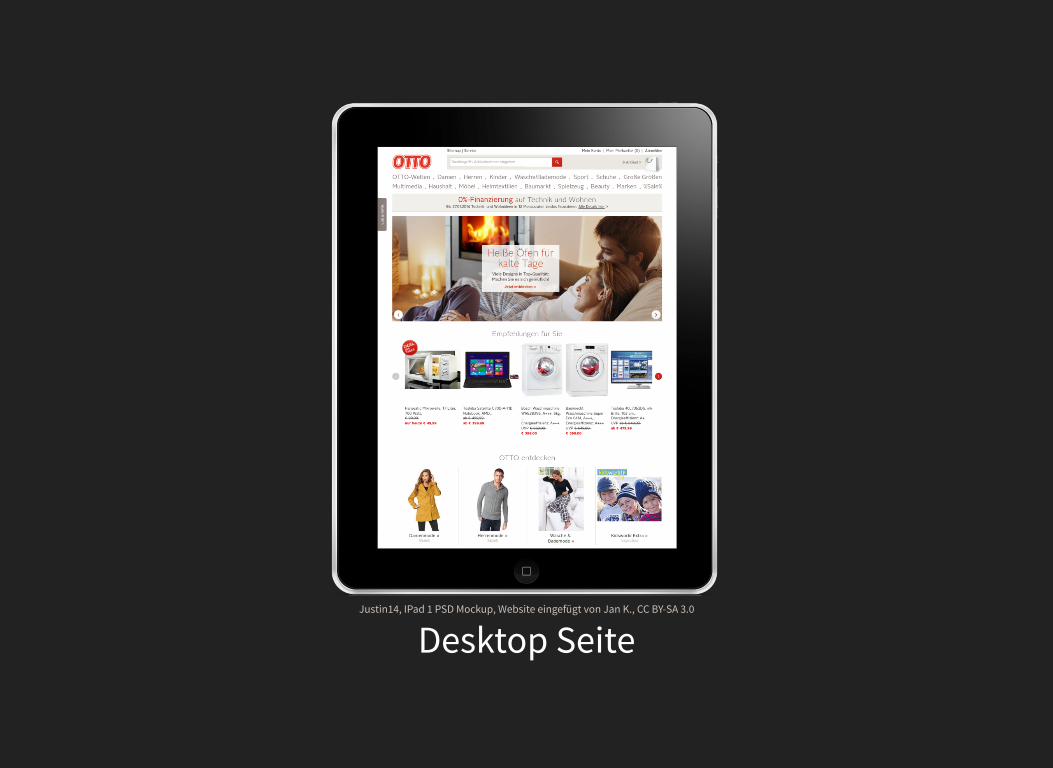
, , Website eingefügt von Jan K., Justin14 IPad 1 PSD Mockup CC BY-SA 3.0
Desktop Seite
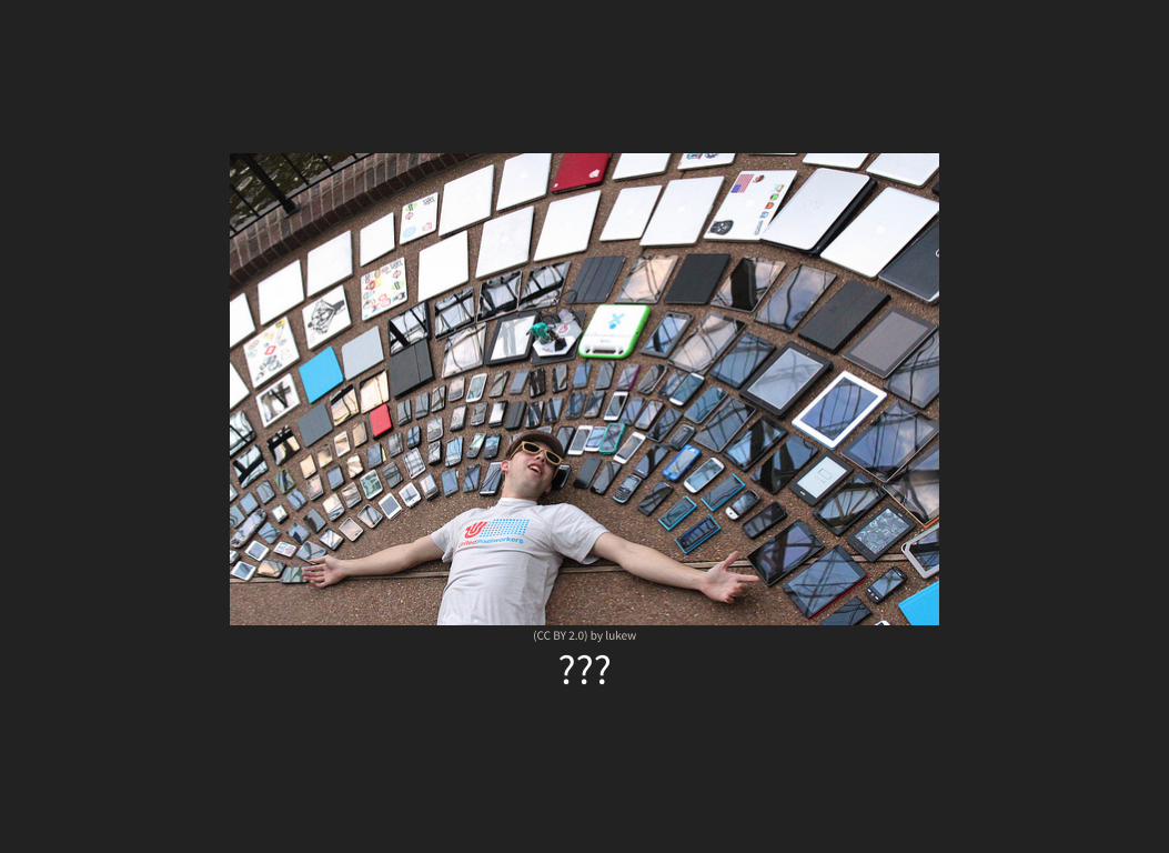
by (CC BY 2.0) lukew
???
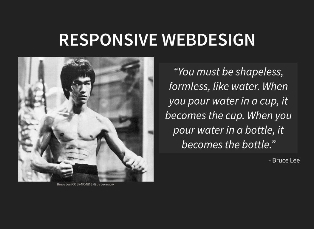
RESPONSIVE WEBDESIGN
by Bruce Lee (CC BY-NC-ND 2.0) Lexinatrix
- Bruce Lee
“You must be shapeless,formless, like water. Whenyou pour water in a cup, it
becomes the cup. When youpour water in a bottle, it
becomes the bottle.”
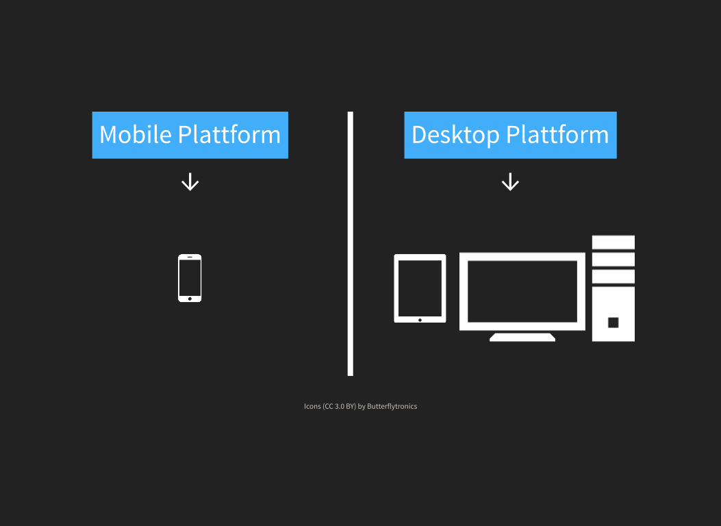
Mobile Plattform
↓Desktop Plattform
↓
Icons by (CC 3.0 BY) Butterflytronics
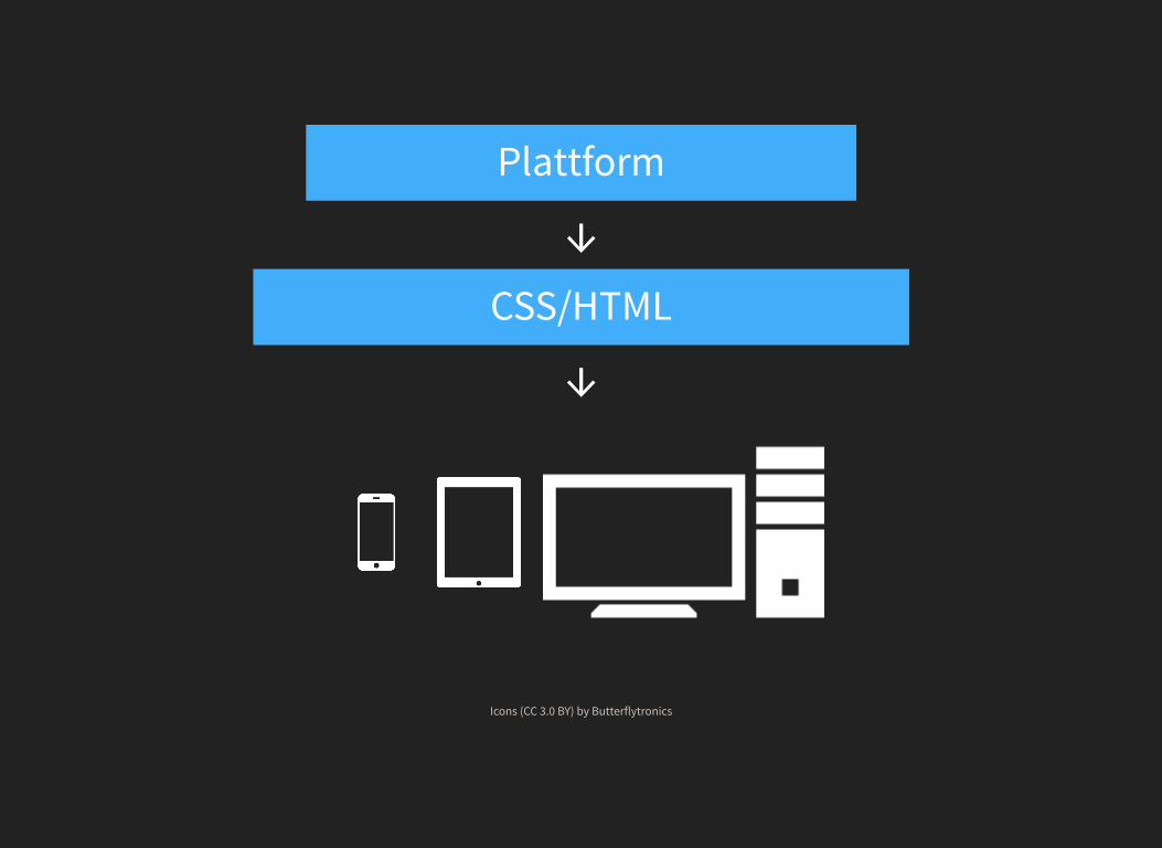
Plattform
↓CSS/HTML
↓
Icons by (CC 3.0 BY) Butterflytronics
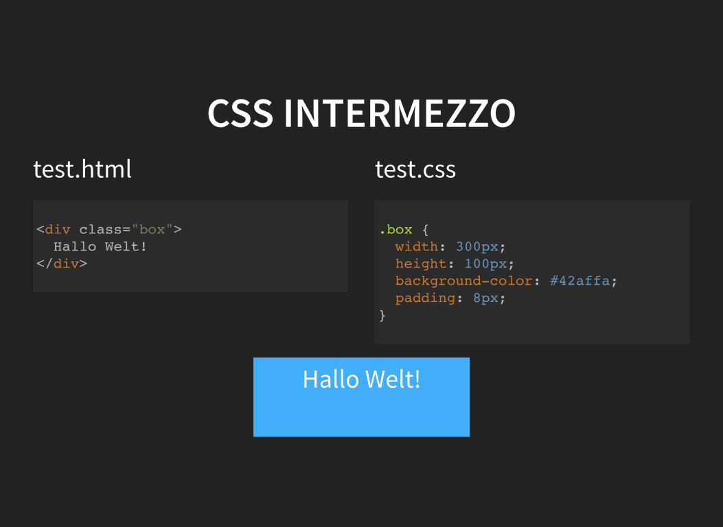
CSS INTERMEZZOtest.html test.css
<div class="box"> Hallo Welt! </div>
.box { width: 300px; height: 100px; background-color: #42affa; padding: 8px; }
Hallo Welt!
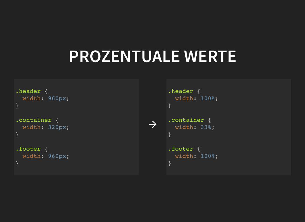
PROZENTUALE WERTE
.header { width: 960px; }
.container { width: 320px; }
.footer { width: 960px; }
→
.header { width: 100%; }
.container { width: 33%; }
.footer { width: 100%; }
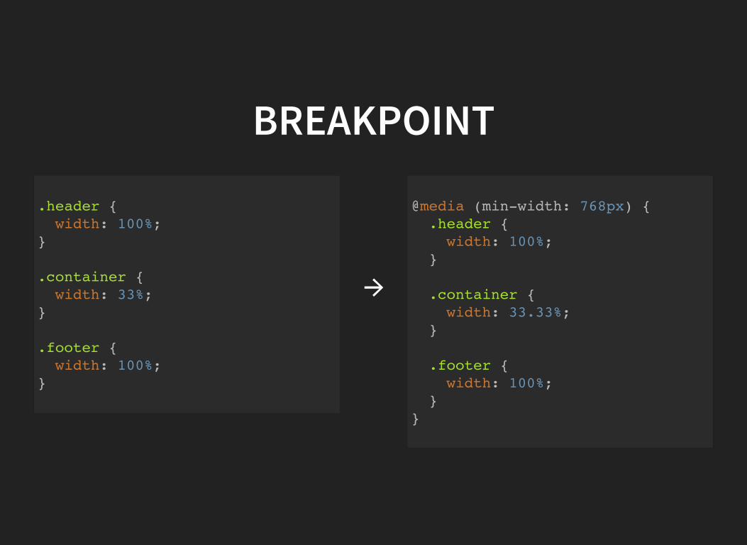
BREAKPOINT
.header { width: 100%; }
.container { width: 33%; }
.footer { width: 100%; }
→
@media (min-width: 768px) { .header { width: 100%; }
.container { width: 33.33%; }
.footer { width: 100%; } }
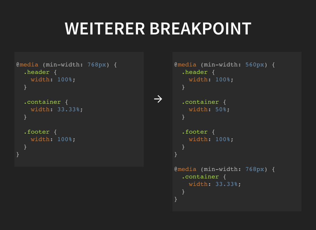
WEITERER BREAKPOINT
@media (min-width: 768px) { .header { width: 100%; }
.container { width: 33.33%; }
.footer { width: 100%; } }
→
@media (min-width: 560px) { .header { width: 100%; }
.container { width: 50%; }
.footer { width: 100%; } }
@media (min-width: 768px) { .container { width: 33.33%; } }
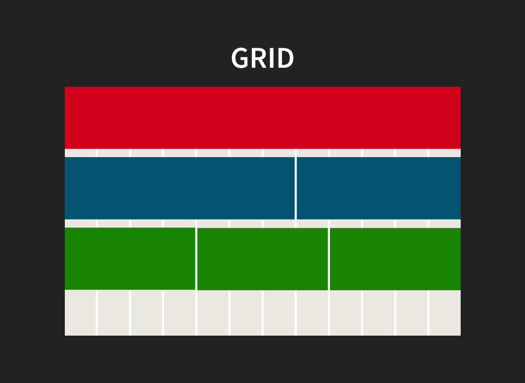
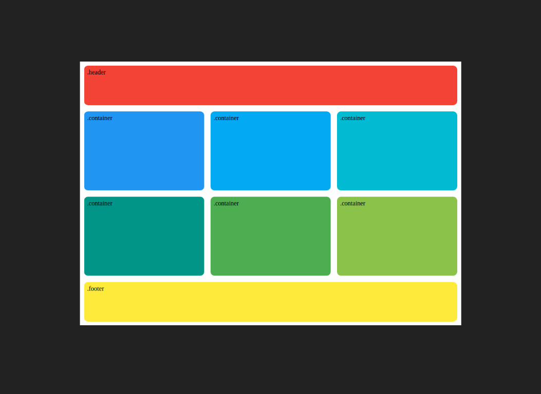
GRID
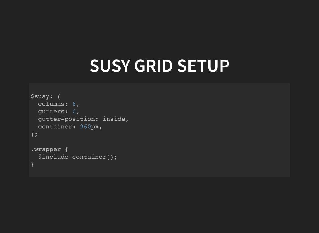
SUSY GRID SETUP$susy: ( columns: 6, gutters: 0, gutter-position: inside, container: 960px, );
.wrapper { @include container(); }
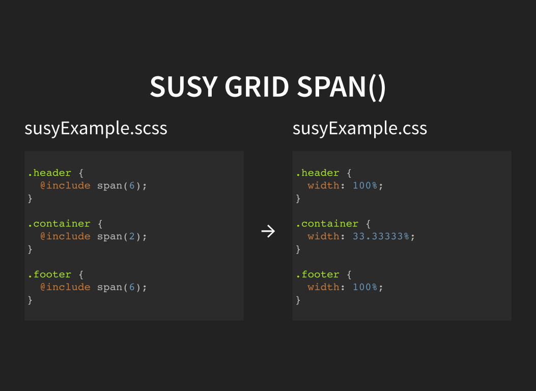
SUSY GRID SPAN()susyExample.scss susyExample.css
.header { @include span(6); }
.container { @include span(2); }
.footer { @include span(6); }
→
.header { width: 100%; }
.container { width: 33.33333%; }
.footer { width: 100%; }
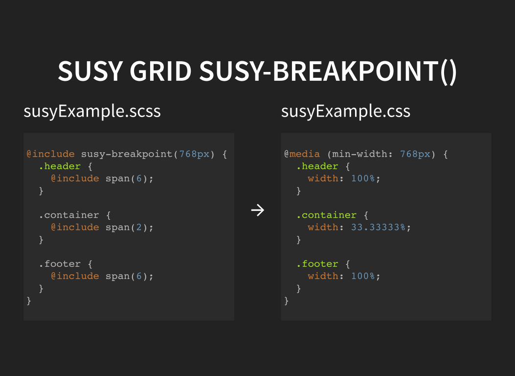
SUSY GRID SUSY-BREAKPOINT()susyExample.scss susyExample.css
@include susy-breakpoint(768px) { .header { @include span(6); }
.container { @include span(2); }
.footer { @include span(6); } }
→
@media (min-width: 768px) { .header { width: 100%; }
.container { width: 33.33333%; }
.footer { width: 100%; } }
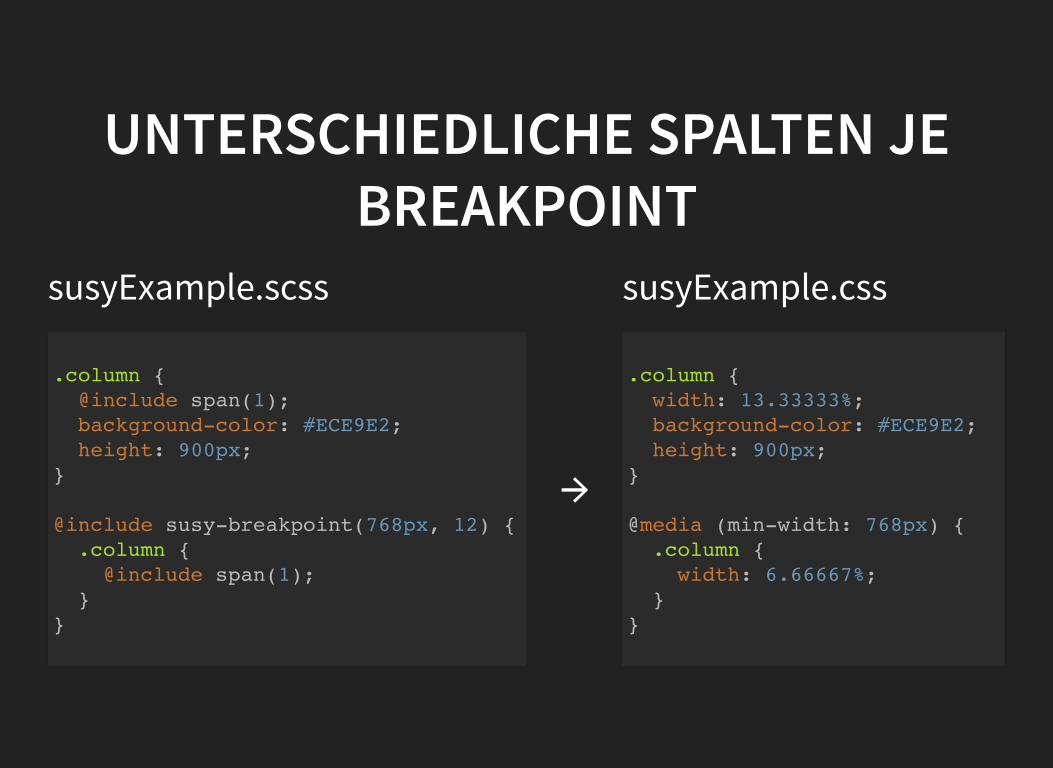
UNTERSCHIEDLICHE SPALTEN JEBREAKPOINT
susyExample.scss susyExample.css
.column { @include span(1); background-color: #ECE9E2; height: 900px; }
@include susy-breakpoint(768px, 12) { .column { @include span(1); } }
→
.column { width: 13.33333%; background-color: #ECE9E2; height: 900px; }
@media (min-width: 768px) { .column { width: 6.66667%; } }
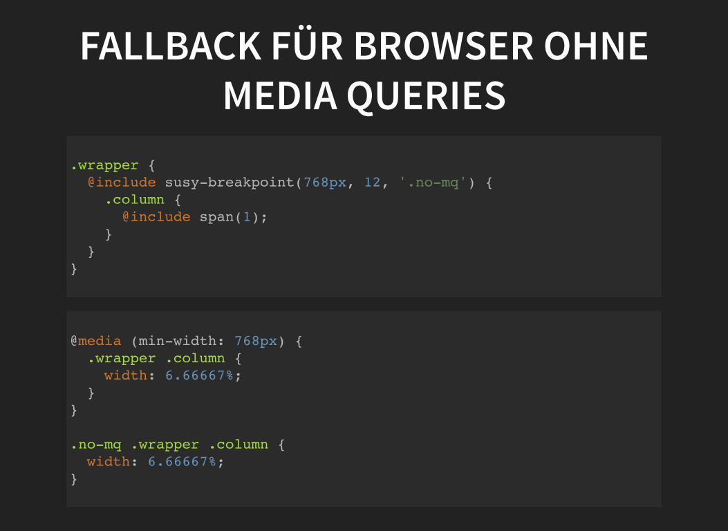
FALLBACK FÜR BROWSER OHNEMEDIA QUERIES
.wrapper { @include susy-breakpoint(768px, 12, '.no-mq') { .column { @include span(1); } } }
@media (min-width: 768px) { .wrapper .column { width: 6.66667%; } }
.no-mq .wrapper .column { width: 6.66667%; }

FRAGEN?
LINKSBeispiel RepositorySusy GridResponsive Web Design (A List Apart)Responsive Webdesign (OTTO Dev Blog)


