210
PUBLIC SAP Hybris Cloud for Customer Document Version: 1611 – 2017-03-01 SAP Hybris Cloud for Customer Business Analytics Guide
PUBLIC
SAP Hybris Cloud for CustomerDocument Version: 1611 – 2017-03-01
SAP Hybris Cloud for Customer Business Analytics Guide

Content
1 Overview of Analytics. . . . . . . . . . . . . . . . . . . . . . . . . . . . . . . . . . . . . . . . . . . . . . . . . . . . . . . . . . . 61.1 Data Source. . . . . . . . . . . . . . . . . . . . . . . . . . . . . . . . . . . . . . . . . . . . . . . . . . . . . . . . . . . . . . . . . . . 71.2 Key Figure. . . . . . . . . . . . . . . . . . . . . . . . . . . . . . . . . . . . . . . . . . . . . . . . . . . . . . . . . . . . . . . . . . . . 81.3 Key Figure Structure. . . . . . . . . . . . . . . . . . . . . . . . . . . . . . . . . . . . . . . . . . . . . . . . . . . . . . . . . . . . . 91.4 Key Figure Grid. . . . . . . . . . . . . . . . . . . . . . . . . . . . . . . . . . . . . . . . . . . . . . . . . . . . . . . . . . . . . . . . 101.5 Characteristic. . . . . . . . . . . . . . . . . . . . . . . . . . . . . . . . . . . . . . . . . . . . . . . . . . . . . . . . . . . . . . . . . 101.6 Characteristic Structure. . . . . . . . . . . . . . . . . . . . . . . . . . . . . . . . . . . . . . . . . . . . . . . . . . . . . . . . . .101.7 Report. . . . . . . . . . . . . . . . . . . . . . . . . . . . . . . . . . . . . . . . . . . . . . . . . . . . . . . . . . . . . . . . . . . . . . .111.8 Report Assignment. . . . . . . . . . . . . . . . . . . . . . . . . . . . . . . . . . . . . . . . . . . . . . . . . . . . . . . . . . . . . 121.9 Views. . . . . . . . . . . . . . . . . . . . . . . . . . . . . . . . . . . . . . . . . . . . . . . . . . . . . . . . . . . . . . . . . . . . . . . 12
2 Reports. . . . . . . . . . . . . . . . . . . . . . . . . . . . . . . . . . . . . . . . . . . . . . . . . . . . . . . . . . . . . . . . . . . . . 142.1 Design Reports Quick Guide. . . . . . . . . . . . . . . . . . . . . . . . . . . . . . . . . . . . . . . . . . . . . . . . . . . . . . . 14
Create a Report. . . . . . . . . . . . . . . . . . . . . . . . . . . . . . . . . . . . . . . . . . . . . . . . . . . . . . . . . . . . . 15Edit a Report. . . . . . . . . . . . . . . . . . . . . . . . . . . . . . . . . . . . . . . . . . . . . . . . . . . . . . . . . . . . . . . 16Assign a Report. . . . . . . . . . . . . . . . . . . . . . . . . . . . . . . . . . . . . . . . . . . . . . . . . . . . . . . . . . . . . 16Review Report Assignments. . . . . . . . . . . . . . . . . . . . . . . . . . . . . . . . . . . . . . . . . . . . . . . . . . . . .17Restrict Edit Rights to analytical objects based on an Org Unit or Business Role. . . . . . . . . . . . . . . . 17
2.2 Reports View. . . . . . . . . . . . . . . . . . . . . . . . . . . . . . . . . . . . . . . . . . . . . . . . . . . . . . . . . . . . . . . . . . 182.3 Viewing Reports with the Web Browser Option. . . . . . . . . . . . . . . . . . . . . . . . . . . . . . . . . . . . . . . . . . 19
Functions in the Navigation Pane. . . . . . . . . . . . . . . . . . . . . . . . . . . . . . . . . . . . . . . . . . . . . . . . . 21Toolbar Functions. . . . . . . . . . . . . . . . . . . . . . . . . . . . . . . . . . . . . . . . . . . . . . . . . . . . . . . . . . . 22
2.4 Viewing Reports with Web Browser — Quick Filter. . . . . . . . . . . . . . . . . . . . . . . . . . . . . . . . . . . . . . . 232.5 Working with Reports Using the Report Wizard. . . . . . . . . . . . . . . . . . . . . . . . . . . . . . . . . . . . . . . . . .252.6 Assign a Report. . . . . . . . . . . . . . . . . . . . . . . . . . . . . . . . . . . . . . . . . . . . . . . . . . . . . . . . . . . . . . . . 28
Assign Report to a work center view. . . . . . . . . . . . . . . . . . . . . . . . . . . . . . . . . . . . . . . . . . . . . . . 29Assign a Report to a Business Role. . . . . . . . . . . . . . . . . . . . . . . . . . . . . . . . . . . . . . . . . . . . . . . 30Change Report Assignment. . . . . . . . . . . . . . . . . . . . . . . . . . . . . . . . . . . . . . . . . . . . . . . . . . . . .30View Report Assignment. . . . . . . . . . . . . . . . . . . . . . . . . . . . . . . . . . . . . . . . . . . . . . . . . . . . . . . 31
2.7 Working with Reports in a Web Browser. . . . . . . . . . . . . . . . . . . . . . . . . . . . . . . . . . . . . . . . . . . . . . . 312.8 Working with Reports and Plans in Microsoft Excel®. . . . . . . . . . . . . . . . . . . . . . . . . . . . . . . . . . . . . . 32
Analytic Features. . . . . . . . . . . . . . . . . . . . . . . . . . . . . . . . . . . . . . . . . . . . . . . . . . . . . . . . . . . . 33Planning Features. . . . . . . . . . . . . . . . . . . . . . . . . . . . . . . . . . . . . . . . . . . . . . . . . . . . . . . . . . . .39
2.9 Working with Embedded Reports. . . . . . . . . . . . . . . . . . . . . . . . . . . . . . . . . . . . . . . . . . . . . . . . . . . 442.10 Working with Selections. . . . . . . . . . . . . . . . . . . . . . . . . . . . . . . . . . . . . . . . . . . . . . . . . . . . . . . . . .462.11 Working with Mobile Reports. . . . . . . . . . . . . . . . . . . . . . . . . . . . . . . . . . . . . . . . . . . . . . . . . . . . . . 492.12 Create and Edit a Navigation Target. . . . . . . . . . . . . . . . . . . . . . . . . . . . . . . . . . . . . . . . . . . . . . . . . 49
2 P U B L I CSAP Hybris Cloud for Customer Business Analytics Guide
Content
2.13 Role Based Access. . . . . . . . . . . . . . . . . . . . . . . . . . . . . . . . . . . . . . . . . . . . . . . . . . . . . . . . . . . . . 522.14 Configure End User Action in a Report. . . . . . . . . . . . . . . . . . . . . . . . . . . . . . . . . . . . . . . . . . . . . . . . 532.15 SAP Hybris Cloud for Customer Integration with Lumira (Beta). . . . . . . . . . . . . . . . . . . . . . . . . . . . . . 542.16 VIDEO: Adding Custom Fields to Reports. . . . . . . . . . . . . . . . . . . . . . . . . . . . . . . . . . . . . . . . . . . . . . 552.17 VIDEO: Setting Navigation Targets for Reports. . . . . . . . . . . . . . . . . . . . . . . . . . . . . . . . . . . . . . . . . .56
3 Additional Ways of Working with Reports. . . . . . . . . . . . . . . . . . . . . . . . . . . . . . . . . . . . . . . . . . . 573.1 Characteristic Settings. . . . . . . . . . . . . . . . . . . . . . . . . . . . . . . . . . . . . . . . . . . . . . . . . . . . . . . . . . .573.2 Chart Settings. . . . . . . . . . . . . . . . . . . . . . . . . . . . . . . . . . . . . . . . . . . . . . . . . . . . . . . . . . . . . . . . .59
Chart Types. . . . . . . . . . . . . . . . . . . . . . . . . . . . . . . . . . . . . . . . . . . . . . . . . . . . . . . . . . . . . . . .603.3 Key Figure Settings. . . . . . . . . . . . . . . . . . . . . . . . . . . . . . . . . . . . . . . . . . . . . . . . . . . . . . . . . . . . . 753.4 Table Settings. . . . . . . . . . . . . . . . . . . . . . . . . . . . . . . . . . . . . . . . . . . . . . . . . . . . . . . . . . . . . . . . . 773.5 Add a Field to a Report. . . . . . . . . . . . . . . . . . . . . . . . . . . . . . . . . . . . . . . . . . . . . . . . . . . . . . . . . . . 79
Configuration: Enable Reporting on Fiscal Year. . . . . . . . . . . . . . . . . . . . . . . . . . . . . . . . . . . . . . . 813.6 Analytical Navigation. . . . . . . . . . . . . . . . . . . . . . . . . . . . . . . . . . . . . . . . . . . . . . . . . . . . . . . . . . . . 833.7 Conditions. . . . . . . . . . . . . . . . . . . . . . . . . . . . . . . . . . . . . . . . . . . . . . . . . . . . . . . . . . . . . . . . . . . 853.8 Exceptions. . . . . . . . . . . . . . . . . . . . . . . . . . . . . . . . . . . . . . . . . . . . . . . . . . . . . . . . . . . . . . . . . . . 87
4 Data Sources . . . . . . . . . . . . . . . . . . . . . . . . . . . . . . . . . . . . . . . . . . . . . . . . . . . . . . . . . . . . . . . . 894.1 Types of Data Sources. . . . . . . . . . . . . . . . . . . . . . . . . . . . . . . . . . . . . . . . . . . . . . . . . . . . . . . . . . . 894.2 Design Data Sources Quick Guide. . . . . . . . . . . . . . . . . . . . . . . . . . . . . . . . . . . . . . . . . . . . . . . . . . . 934.3 Create and Edit a Combined Data Source. . . . . . . . . . . . . . . . . . . . . . . . . . . . . . . . . . . . . . . . . . . . . 944.4 Create and Edit a Joined Data Source. . . . . . . . . . . . . . . . . . . . . . . . . . . . . . . . . . . . . . . . . . . . . . . . 954.5 Create and Edit a Cloud Data Source. . . . . . . . . . . . . . . . . . . . . . . . . . . . . . . . . . . . . . . . . . . . . . . . . 97
Manual Upload. . . . . . . . . . . . . . . . . . . . . . . . . . . . . . . . . . . . . . . . . . . . . . . . . . . . . . . . . . . . . . 98Upload Using a Web Service. . . . . . . . . . . . . . . . . . . . . . . . . . . . . . . . . . . . . . . . . . . . . . . . . . . 100Data Types for Cloud Data Source Fields. . . . . . . . . . . . . . . . . . . . . . . . . . . . . . . . . . . . . . . . . . .104Create or Edit. . . . . . . . . . . . . . . . . . . . . . . . . . . . . . . . . . . . . . . . . . . . . . . . . . . . . . . . . . . . . . 105Examples. . . . . . . . . . . . . . . . . . . . . . . . . . . . . . . . . . . . . . . . . . . . . . . . . . . . . . . . . . . . . . . . . 109
4.6 Add an Extension Field to Data Sources and Reports. . . . . . . . . . . . . . . . . . . . . . . . . . . . . . . . . . . . . 111Working with a Multivalue List. . . . . . . . . . . . . . . . . . . . . . . . . . . . . . . . . . . . . . . . . . . . . . . . . . .114
4.7 Relative Selections Quick Guide. . . . . . . . . . . . . . . . . . . . . . . . . . . . . . . . . . . . . . . . . . . . . . . . . . . . 115
5 Key Performance Indicators (KPIs). . . . . . . . . . . . . . . . . . . . . . . . . . . . . . . . . . . . . . . . . . . . . . . 1185.1 Design KPI Quick Guide. . . . . . . . . . . . . . . . . . . . . . . . . . . . . . . . . . . . . . . . . . . . . . . . . . . . . . . . . .119
Create and Edit a KPI. . . . . . . . . . . . . . . . . . . . . . . . . . . . . . . . . . . . . . . . . . . . . . . . . . . . . . . . .120Configure a Headline KPI. . . . . . . . . . . . . . . . . . . . . . . . . . . . . . . . . . . . . . . . . . . . . . . . . . . . . . 126Configure KPI on the Headline Tile in the Homepage. . . . . . . . . . . . . . . . . . . . . . . . . . . . . . . . . . .127
6 Broadcasts. . . . . . . . . . . . . . . . . . . . . . . . . . . . . . . . . . . . . . . . . . . . . . . . . . . . . . . . . . . . . . . . . 1286.1 Broadcasts Quick Guide. . . . . . . . . . . . . . . . . . . . . . . . . . . . . . . . . . . . . . . . . . . . . . . . . . . . . . . . . 128
Create a Broadcast. . . . . . . . . . . . . . . . . . . . . . . . . . . . . . . . . . . . . . . . . . . . . . . . . . . . . . . . . . 129Manage Broadcasts and Schedules. . . . . . . . . . . . . . . . . . . . . . . . . . . . . . . . . . . . . . . . . . . . . . 130
SAP Hybris Cloud for Customer Business Analytics GuideContent P U B L I C 3
6.2 Configuration: Administrator Analytics - Settings. . . . . . . . . . . . . . . . . . . . . . . . . . . . . . . . . . . . . . . 1306.3 Configuration: E-Mail Encryption and Signature Check. . . . . . . . . . . . . . . . . . . . . . . . . . . . . . . . . . . .1316.4 Configuration: Load Certificates and Activate Signing and Encryption for E-Mails. . . . . . . . . . . . . . . . .133
7 Key Figures. . . . . . . . . . . . . . . . . . . . . . . . . . . . . . . . . . . . . . . . . . . . . . . . . . . . . . . . . . . . . . . . . 1367.1 Design Key Figures Quick Guide. . . . . . . . . . . . . . . . . . . . . . . . . . . . . . . . . . . . . . . . . . . . . . . . . . . 136
Create and Edit a Key Figure. . . . . . . . . . . . . . . . . . . . . . . . . . . . . . . . . . . . . . . . . . . . . . . . . . . .137Create a Dynamic UI Label for Restricted Key figures. . . . . . . . . . . . . . . . . . . . . . . . . . . . . . . . . . 139
7.2 Extension Fields as Key Figures. . . . . . . . . . . . . . . . . . . . . . . . . . . . . . . . . . . . . . . . . . . . . . . . . . . .1407.3 Formulas. . . . . . . . . . . . . . . . . . . . . . . . . . . . . . . . . . . . . . . . . . . . . . . . . . . . . . . . . . . . . . . . . . . . 141
Basic Functions. . . . . . . . . . . . . . . . . . . . . . . . . . . . . . . . . . . . . . . . . . . . . . . . . . . . . . . . . . . . 142Boolean Operators. . . . . . . . . . . . . . . . . . . . . . . . . . . . . . . . . . . . . . . . . . . . . . . . . . . . . . . . . . 142Mathematical Functions. . . . . . . . . . . . . . . . . . . . . . . . . . . . . . . . . . . . . . . . . . . . . . . . . . . . . . 143Data Functions. . . . . . . . . . . . . . . . . . . . . . . . . . . . . . . . . . . . . . . . . . . . . . . . . . . . . . . . . . . . . 144Trigonometric Functions. . . . . . . . . . . . . . . . . . . . . . . . . . . . . . . . . . . . . . . . . . . . . . . . . . . . . . 145
7.4 Aggregation. . . . . . . . . . . . . . . . . . . . . . . . . . . . . . . . . . . . . . . . . . . . . . . . . . . . . . . . . . . . . . . . . .1457.5 Exception Aggregation. . . . . . . . . . . . . . . . . . . . . . . . . . . . . . . . . . . . . . . . . . . . . . . . . . . . . . . . . . 1467.6 Local Calculation. . . . . . . . . . . . . . . . . . . . . . . . . . . . . . . . . . . . . . . . . . . . . . . . . . . . . . . . . . . . . . 1477.7 Conversion. . . . . . . . . . . . . . . . . . . . . . . . . . . . . . . . . . . . . . . . . . . . . . . . . . . . . . . . . . . . . . . . . . 149
Unit Conversion. . . . . . . . . . . . . . . . . . . . . . . . . . . . . . . . . . . . . . . . . . . . . . . . . . . . . . . . . . . . 149Currency Conversion. . . . . . . . . . . . . . . . . . . . . . . . . . . . . . . . . . . . . . . . . . . . . . . . . . . . . . . . 150
8 Upload and Download an Object. . . . . . . . . . . . . . . . . . . . . . . . . . . . . . . . . . . . . . . . . . . . . . . . . . 151
9 Buffer Hierarchies. . . . . . . . . . . . . . . . . . . . . . . . . . . . . . . . . . . . . . . . . . . . . . . . . . . . . . . . . . . . 153
10 Translate Analytical Report Texts. . . . . . . . . . . . . . . . . . . . . . . . . . . . . . . . . . . . . . . . . . . . . . . . 154
11 Dashboard Wizard in HTML5. . . . . . . . . . . . . . . . . . . . . . . . . . . . . . . . . . . . . . . . . . . . . . . . . . . . 15511.1 Creating Interactive Dashboards. . . . . . . . . . . . . . . . . . . . . . . . . . . . . . . . . . . . . . . . . . . . . . . . . . . 155
Creating a New Dashboard. . . . . . . . . . . . . . . . . . . . . . . . . . . . . . . . . . . . . . . . . . . . . . . . . . . . .15711.2 Working with Interactive Dashboards. . . . . . . . . . . . . . . . . . . . . . . . . . . . . . . . . . . . . . . . . . . . . . . .158
Accessing Dashboards. . . . . . . . . . . . . . . . . . . . . . . . . . . . . . . . . . . . . . . . . . . . . . . . . . . . . . . 159Configuring a Chart. . . . . . . . . . . . . . . . . . . . . . . . . . . . . . . . . . . . . . . . . . . . . . . . . . . . . . . . . .160Drilling Down Data. . . . . . . . . . . . . . . . . . . . . . . . . . . . . . . . . . . . . . . . . . . . . . . . . . . . . . . . . . . 161Annotating and E-Mailing Dashboards. . . . . . . . . . . . . . . . . . . . . . . . . . . . . . . . . . . . . . . . . . . . .162Using Report Connections. . . . . . . . . . . . . . . . . . . . . . . . . . . . . . . . . . . . . . . . . . . . . . . . . . . . . 162Analyzing Data. . . . . . . . . . . . . . . . . . . . . . . . . . . . . . . . . . . . . . . . . . . . . . . . . . . . . . . . . . . . . 163
12 Homepage. . . . . . . . . . . . . . . . . . . . . . . . . . . . . . . . . . . . . . . . . . . . . . . . . . . . . . . . . . . . . . . . . . 16412.1 SAP Hybris Customer Insight and Home Page Report Patterns. . . . . . . . . . . . . . . . . . . . . . . . . . . . . 167
Patterns for Custom Reports. . . . . . . . . . . . . . . . . . . . . . . . . . . . . . . . . . . . . . . . . . . . . . . . . . . 168Selecting a role. . . . . . . . . . . . . . . . . . . . . . . . . . . . . . . . . . . . . . . . . . . . . . . . . . . . . . . . . . . . . 179Defining tiles for each role. . . . . . . . . . . . . . . . . . . . . . . . . . . . . . . . . . . . . . . . . . . . . . . . . . . . . 180
4 P U B L I CSAP Hybris Cloud for Customer Business Analytics Guide
Content
Creating custom tiles. . . . . . . . . . . . . . . . . . . . . . . . . . . . . . . . . . . . . . . . . . . . . . . . . . . . . . . . 180Making settings for certain tiles. . . . . . . . . . . . . . . . . . . . . . . . . . . . . . . . . . . . . . . . . . . . . . . . . 181Previewing home page settings on SAP Customer Insight. . . . . . . . . . . . . . . . . . . . . . . . . . . . . . . 181
12.2 VIDEO: Setting Up the Home Page and SAP Customer Insight. . . . . . . . . . . . . . . . . . . . . . . . . . . . . . 18212.3 Adding Custom Reports to SAP Customer Insight. . . . . . . . . . . . . . . . . . . . . . . . . . . . . . . . . . . . . . . 182
13 Integration to Central Analytics. . . . . . . . . . . . . . . . . . . . . . . . . . . . . . . . . . . . . . . . . . . . . . . . . 18413.1 Monitoring Quick Guide. . . . . . . . . . . . . . . . . . . . . . . . . . . . . . . . . . . . . . . . . . . . . . . . . . . . . . . . . 18413.2 Retrieving Analytics Data Using OData. . . . . . . . . . . . . . . . . . . . . . . . . . . . . . . . . . . . . . . . . . . . . . . 18613.3 Configure Analytical URL Mashup for Third-Party. . . . . . . . . . . . . . . . . . . . . . . . . . . . . . . . . . . . . . . 18813.4 Integrating Analytics with an SAP NetWeaver Business Warehouse System. . . . . . . . . . . . . . . . . . . . 192
Source System: Implementation Sequence in the Solution. . . . . . . . . . . . . . . . . . . . . . . . . . . . . . 192Checklist of Information for SAP NetWeaver BW Administrator. . . . . . . . . . . . . . . . . . . . . . . . . . . 197Target System: Implementation Sequence in the SAP NetWeaver Business Warehouse. . . . . . . . . 197Source System: Expose Data Sources in the Solution. . . . . . . . . . . . . . . . . . . . . . . . . . . . . . . . . 200Target System: Extraction, Transformation and Loading (ETL) Process in the SAP NetWeaver Business Warehouse. . . . . . . . . . . . . . . . . . . . . . . . . . . . . . . . . . . . . . . . . . . . . . . . . . . . . . . . .201Source System: Monitor Data Replication. . . . . . . . . . . . . . . . . . . . . . . . . . . . . . . . . . . . . . . . . . 205
14 Integration with SAP BusinessObjects Cloud. . . . . . . . . . . . . . . . . . . . . . . . . . . . . . . . . . . . . . . 206
SAP Hybris Cloud for Customer Business Analytics GuideContent P U B L I C 5
1 Overview of Analytics
Analytics is integrated in the solution to support and monitor business processes, helping you to make informed decisions.
Using the extensive and flexible business analytics features, you can easily create custom reports using the guided procedures and then control the visibility of those reports by assigning them only to specific work centers as well as individual business roles. If you have defined custom fields in your solution, you can also add them to data sources or reports, your own or those delivered with the solution. In addition, you can join or combine heterogeneous data sources, again your own or those delivered with the solution, as well as create custom calculated measures and comparison metrics.
Reports can be accessed from the Reports work center view of work centers and are also embedded into Overview work center views, enabling transparency of data in system. The Analytics data in the solution is real time. There is no persistency in a separate Business Warehouse layer. Analytics data in the solution is also access context sensitive. This means that data sources are associated with access contexts to ensure that data is directed to users who are allowed to view the data.
Before You Get Started
● Determine whether or not you want to be able to assign reports to business roles. This option provides you more flexibility than just work center assignment alone. You have to enable role assignment during the fine tuning step of completing the activity list for your implementation. Refer to the guide for more information.
● If you want to see real data rather than just test data when you're creating and reviewing your custom reports, you must enable that option on the activity for Administrator Analytics — Setting.
● Also during Administrator Analytics — Setting, we recommend that you do not select the Extended Access checkbox, as this can cause reports to include and display data even if a user is not authorized to see that information.
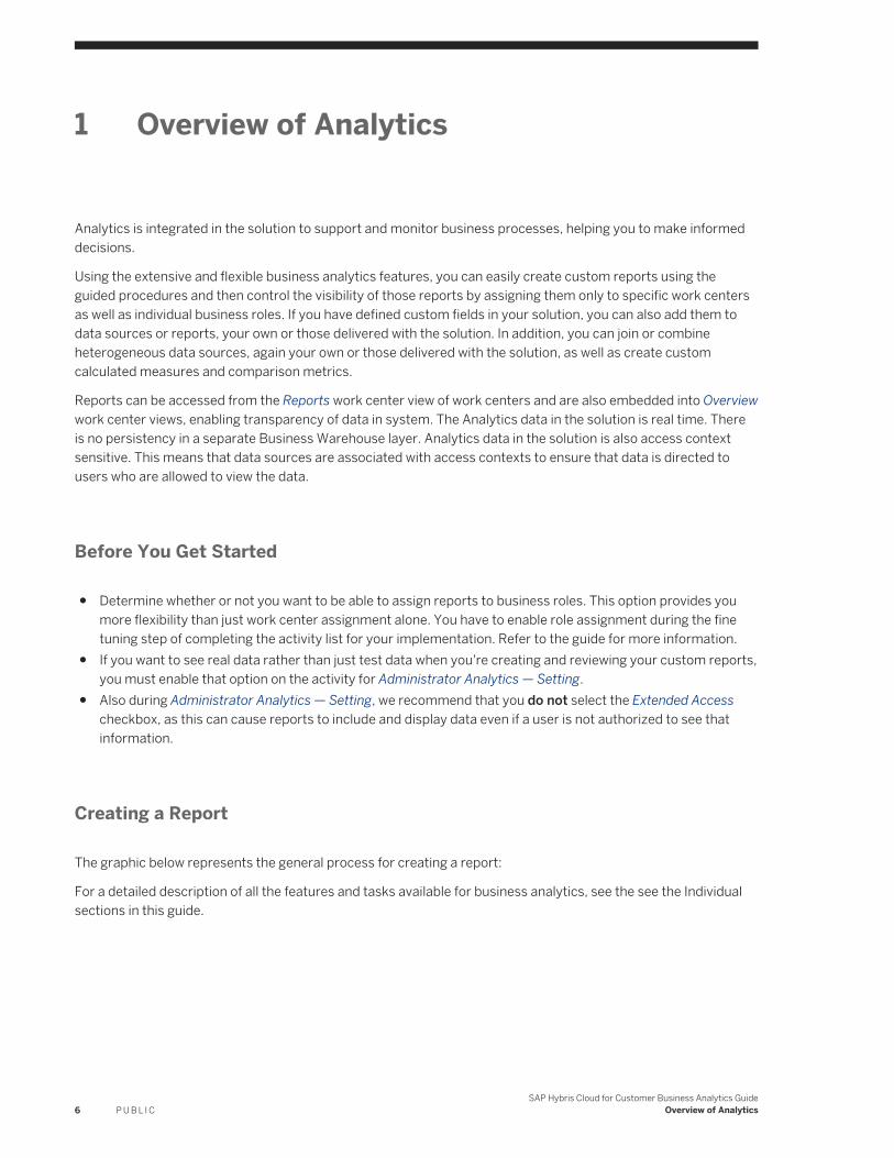
Creating a Report
The graphic below represents the general process for creating a report:
For a detailed description of all the features and tasks available for business analytics, see the see the Individual sections in this guide.
6 P U B L I CSAP Hybris Cloud for Customer Business Analytics Guide
Overview of Analytics
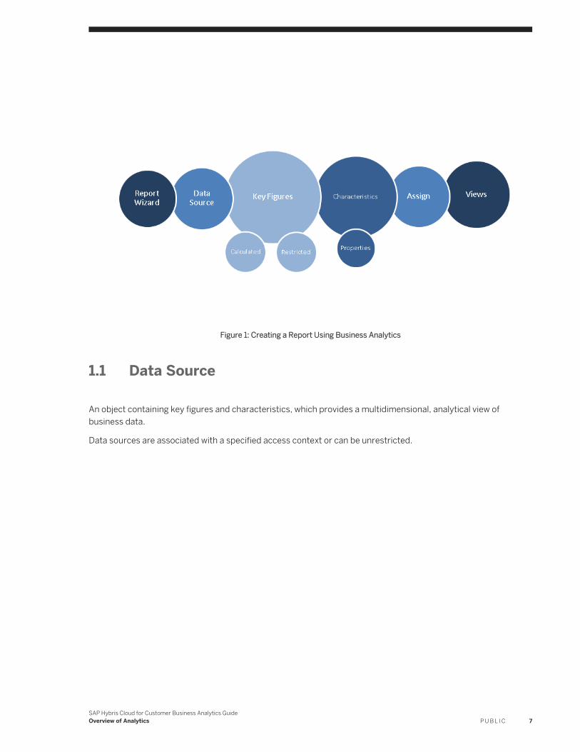
Figure 1: Creating a Report Using Business Analytics
1.1 Data Source
An object containing key figures and characteristics, which provides a multidimensional, analytical view of business data.
Data sources are associated with a specified access context or can be unrestricted.
SAP Hybris Cloud for Customer Business Analytics GuideOverview of Analytics P U B L I C 7
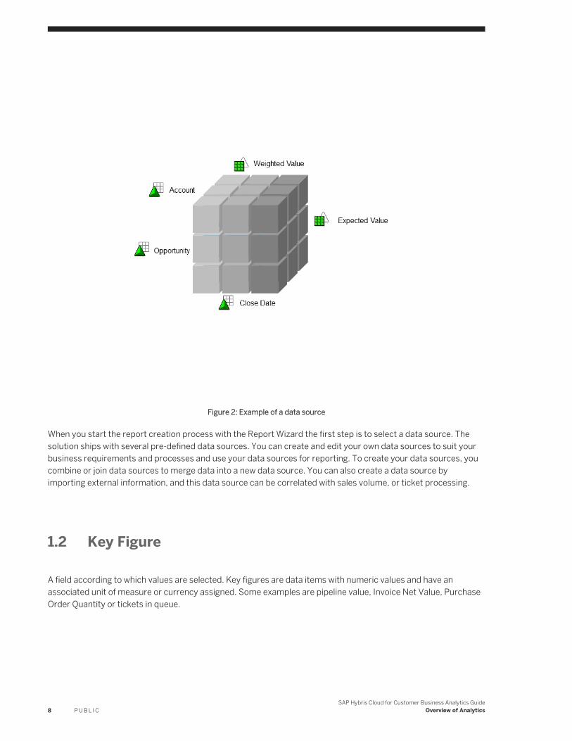
Figure 2: Example of a data source
When you start the report creation process with the Report Wizard the first step is to select a data source. The solution ships with several pre-defined data sources. You can create and edit your own data sources to suit your business requirements and processes and use your data sources for reporting. To create your data sources, you combine or join data sources to merge data into a new data source. You can also create a data source by importing external information, and this data source can be correlated with sales volume, or ticket processing.
1.2 Key Figure
A field according to which values are selected. Key figures are data items with numeric values and have an associated unit of measure or currency assigned. Some examples are pipeline value, Invoice Net Value, Purchase Order Quantity or tickets in queue.
8 P U B L I CSAP Hybris Cloud for Customer Business Analytics Guide
Overview of Analytics
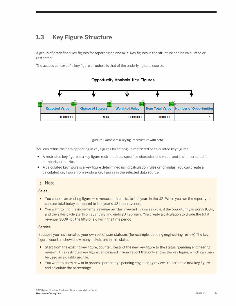
1.3 Key Figure Structure
A group of predefined key figures for reporting on one axis. Key figures in the structure can be calculated or restricted.
The access context of a key figure structure is that of the underlying data source.
Figure 3: Example of a key figure structure with data
You can refine the data appearing in key figures by setting up restricted or calculated key figures.
● A restricted key figure is a key figure restricted to a specified characteristic value, and is often created for comparison metrics.
● A calculated key figure is a key figure determined using calculation rules or formulas. You can create a calculated key figure from existing key figures in the selected data source.
NoteSales
● You choose an existing figure — revenue, and restrict to last year, in the US. When you run the report you can see total today compared to last year's US total revenue.
● You want to find the incremental revenue per day invested in a sales cycle, if the opportunity is worth 100K, and the sales cycle starts on 1 January and ends 20 February. You create a calculation to divide the total revenue (100K) by the fifty-one days in the time period.
Service
Suppose you have created your own set of user statuses (for example, pending engineering review) The key figure, counter, shows how many tickets are in this status
● Start from the existing key figure, counter. Restrict the new key figure to the status “pending engineering review”. This restricted key figure can be used in your report that only shows the key figure, which can then be used as a dashboard tile.
● You want to know new or in process percentage pending engineering review. You create a new key figure, and calculate the percentage.
SAP Hybris Cloud for Customer Business Analytics GuideOverview of Analytics P U B L I C 9
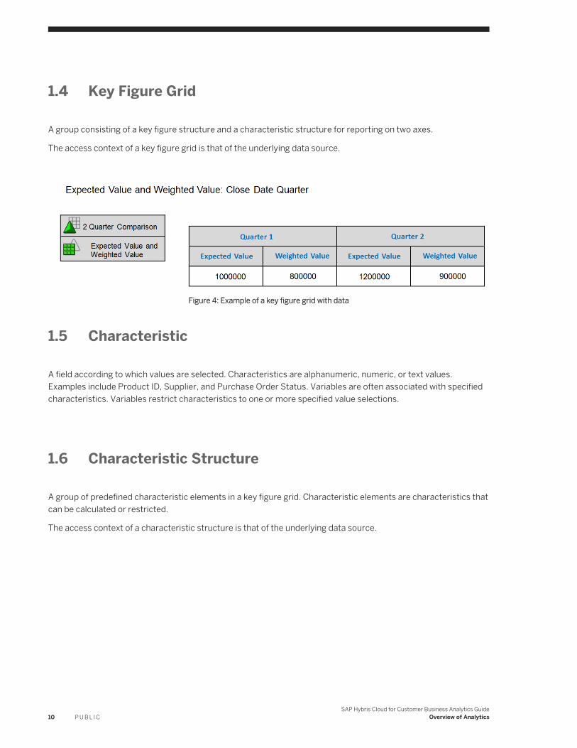
1.4 Key Figure Grid
A group consisting of a key figure structure and a characteristic structure for reporting on two axes.
The access context of a key figure grid is that of the underlying data source.
Figure 4: Example of a key figure grid with data
1.5 Characteristic
A field according to which values are selected. Characteristics are alphanumeric, numeric, or text values. Examples include Product ID, Supplier, and Purchase Order Status. Variables are often associated with specified characteristics. Variables restrict characteristics to one or more specified value selections.
1.6 Characteristic Structure
A group of predefined characteristic elements in a key figure grid. Characteristic elements are characteristics that can be calculated or restricted.
The access context of a characteristic structure is that of the underlying data source.
10 P U B L I CSAP Hybris Cloud for Customer Business Analytics Guide
Overview of Analytics
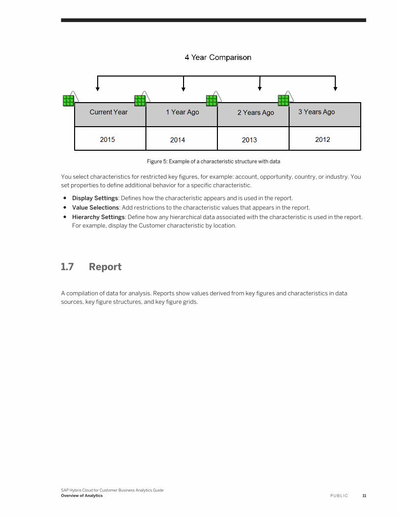
Figure 5: Example of a characteristic structure with data
You select characteristics for restricted key figures, for example: account, opportunity, country, or industry. You set properties to define additional behavior for a specific characteristic.
● Display Settings: Defines how the characteristic appears and is used in the report.● Value Selections: Add restrictions to the characteristic values that appears in the report.● Hierarchy Settings: Define how any hierarchical data associated with the characteristic is used in the report.
For example, display the Customer characteristic by location.
1.7 Report
A compilation of data for analysis. Reports show values derived from key figures and characteristics in data sources, key figure structures, and key figure grids.
SAP Hybris Cloud for Customer Business Analytics GuideOverview of Analytics P U B L I C 11
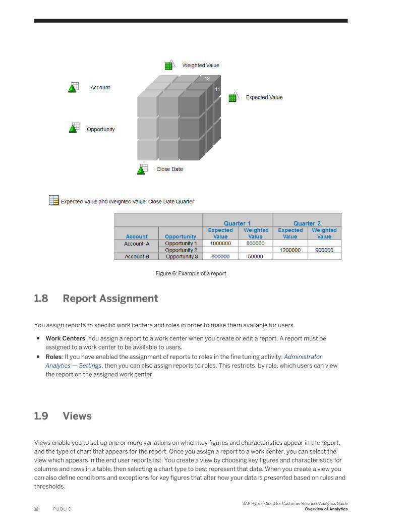
Figure 6: Example of a report
1.8 Report Assignment
You assign reports to specific work centers and roles in order to make them available for users.
● Work Centers: You assign a report to a work center when you create or edit a report. A report must be assigned to a work center to be available to users.
● Roles: If you have enabled the assignment of reports to roles in the fine tuning activity: Administrator Analytics — Settings, then you can also assign reports to roles. This restricts, by role, which users can view the report on the assigned work center.
1.9 Views
Views enable you to set up one or more variations on which key figures and characteristics appear in the report, and the type of chart that appears for the report. Once you assign a report to a work center, you can select the view which appears in the end user reports list. You create a view by choosing key figures and characteristics for columns and rows in a table, then selecting a chart type to best represent that data. When you create a view you can also define conditions and exceptions for key figures that alter how your data is presented based on rules and thresholds.
12 P U B L I CSAP Hybris Cloud for Customer Business Analytics Guide
Overview of Analytics
● Conditions: Create a condition to limit the data shown to that which fits the defined rules.● Exceptions: Set a threshold beyond which the data display is altered to display an alert indicator.
SAP Hybris Cloud for Customer Business Analytics GuideOverview of Analytics P U B L I C 13
2 Reports
A compilation of data for analysis. Reports show values derived from key figures and characteristics in data sources, key figure structures, and key figure grids.
For more information on how to work with Reports, follow the links below:
● Design Reports Quick Guide [page 14]● Reports View [page 18]● Viewing Reports with the Web Browser Option [page 19]● Viewing Reports with Web Browser — Quick Filter [page 23]● Working with Reports Using the Report Wizard [page 25]● Assign a Report [page 16]● Working with Reports in a Web Browser [page 31]● Working with Reports and Plans in Microsoft Excel® [page 32]● Working with Embedded Reports [page 44]● Working with Selections [page 46]● Working with Mobile Reports [page 49]● Create and Edit a Navigation Target [page 49]● Role Based Access [page 52]● Configure End User Action in a Report [page 53]● VIDEO: Adding Custom Fields to Reports [page 55]● VIDEO: Setting Navigation Targets for Reports [page 56]
2.1 Design Reports Quick Guide
In the Design Reports view, administrators can create and edit their own reports to suit their business requirements and processes.
You can access the Design Reports view from the Business Analytics or Administrator work centers.
Background
You use Analytics objects in the system to create your reports. Data from key figures and characteristics in a data source or a key figure group serves as the basis for your reports. For more information, see Overview of Analytics [page 6]
NoteYou can decide whether report data sent by e-mail is to be encrypted. If you want to encrypt outgoing e-mails, you must make changes to your scoping. From the E-mail Encryption and Signature Check fine-tune activity,
14 P U B L I CSAP Hybris Cloud for Customer Business Analytics Guide
Reports
you can specify for the Analytics - Send Report Data, Broadcasting outgoing e-mail scenario whether outgoing e-mails are encrypted and whether they are signed.
For more information, see Configuration: Load Certificates and Activate Signing and Encryption for E-Mails [page 133] and Configuration: E-Mail Encryption and Signature Check [page 131].
Tasks
You can perform the following tasks in this workcenter view:
● Create a Report [page 15]● Edit a Report [page 16]● Assign a Report [page 52]● Review Report Assignments [page 17]● Restrict Edit Rights to analytical objects based on an Org Unit [page 17]
Related Information
Add an Extension Field to Data Sources and Reports [page 111]
2.1.1 Create a Report
By clicking New, the following options are available.
● ReportAllows you to create a browser-based report based on a data source or key figure group using the Report Wizard.For more information, see Working with Reports Using the Report Wizard [page 25].
● Report As CopyAllows you to create a report based on a selected report using the Report Wizard.When you create a report based on a selected browser-based report, if you do not assign a valid report ID, the system generates a report ID.For more information, see Working with Reports Using the Report Wizard [page 25].
● Microsoft Excel-Based ReportAllows you to create a Microsoft Excel-based report using Microsoft Excel.For more information, see Working with Reports and Plans in Microsoft Excel [page 32].
● Report NavigationAllows you to create navigation targets in a selected target report to which business users can navigate from a source report.For more information, see Create and Edit a Navigation Target [page 49].
SAP Hybris Cloud for Customer Business Analytics GuideReports P U B L I C 15
2.1.2 Edit a Report
By clicking Edit With, the following options are available depending on the report type.
● Report WizardAllows you to edit browser-based reports that you or other administrators have created. For more information, see Working with Reports Using the Report Wizard [page 25].
● Web BrowserAllows you to execute ad hoc analyses and to change the layout of delivered reports and reports that you or other administrators have created.Note that when administrators open reports in a Web browser in the Business Analytics work center, only generated test data is displayed to ensure that they do not have access to sensitive data. Business users see real data when they open reports from the relevant Reports work center view.For more information, see Working with Reports in a Web Browser [page 31].
● Web Browser – Quick FilterAllows you to quickly filter data that can be displayed as a chart, table or both. You can open reports from the reports list in the Reports view and from embedded reports.For more information, see Viewing Reports with Web Browser – Quick Filter [page 23].
● Microsoft ExcelAllows you to execute ad hoc analyses and to edit Microsoft Excel-based reports.Note that when administrators open reports in Microsoft Excel in the Business Analytics work center, only generated test data is displayed to ensure that they do not have access to sensitive data. Business users see real data when they open reports from the relevant Reports work center view.For more information, see Working with Reports and Plans in Microsoft Excel [page 32].
2.1.3 Assign a Report
As an administrator, after you have created a report, you can assign it to work centers and work center views, making it available to business users. You can also restrict access to certain reports by additionally assigning a report to specific business roles.
Tasks
You can perform the following assigning activities:
● Assign Report to a work center view [page 29]● Assign a Report to a Business Role [page 30]● Change Report Assignment [page 30]● View Report Assignment [page 31]
16 P U B L I CSAP Hybris Cloud for Customer Business Analytics Guide
Reports
2.1.4 Review Report Assignments
From the Design Reports work center view, by clicking Assignment Overview, you can review the report assignments made by you and SAP by sorting, grouping, or filtering the list.
Note that from the list, you can only delete report assignments in the current version of the solution. You can remove up to 20 assignments at a time. If you select more than 20 assignments, the system runs a background job. To make assignments, see the Assign a Report [page 16] section of the document.
If you require the report ID, you can personalize the list by clicking Personalize This Screen .
2.1.5 Restrict Edit Rights to analytical objects based on an Org Unit or Business Role
You can restrict edit rights by assigning analytical objects such as, reports, key figures, data sources, KPIs, and relative selections, to one or more Org Units/Business Roles. To do this, follow the steps below:
1. In the Business Analytics workcenter view, navigate to a relevant view, such as, Design Report, Data Sources, Design KPIs, Design Key Figures, Broadcasts, select the analytical object and click Set Access to open a new window.
2. Under the Allow Access field, select the checkbox against one or more Org Units/Business Roles to assign editing rights to all administrators of those org units. Alternately, click Locate to find the org unit level that you require.If you want to provide access to a selected org unit and its immediate subordinates, click Grant Access. To remove access of a selected org unit and its immediate subordinates, click Remove Access.
3. Click Save to save your changes.
Note● This functionality only restricts the edit rights for administrators. It does not restrict end user
functionalities such as, viewing reports, creating new views, or editing existing views.● If you want to restrict edit rights to analytical objects in an Org Unit/Business Role, you must make
changes to your scoping. Go to Business Implementation Edit Project Scope Questions Built-in Support System Management Analytics and select the checkbox for Enable Global and Local Administrator for Analytics?
● You cannot restrict edit rights for Excel-based reports that are based on an org unit.● Once a report is restricted you cannot create new views unless you have edit rights.
SAP Hybris Cloud for Customer Business Analytics GuideReports P U B L I C 17
2.2 Reports View
The solution delivers predefined content for reports that are defined in your scope. Reports can also be defined by administrators for business users. The Reports view is a central access point to reports associated with a work center.
The following report types are available.
● Browser-Based ReportsConsists of a compilation of data for evaluation where analysis and drill-down is supported. You can open browser-based reports either in a Web browser or in Microsoft Excel.
● Microsoft Excel-Based ReportsUsing Microsoft Excel®, you can view and edit reports in spreadsheets.
NoteTo view and work with Microsoft Excel-Based reports, ensure that the add-in for Microsoft Excel is installed.
Depending on your authorization, you can download the add-in from the following locations:
○ From the top right corner of the screen by clicking Download.○ From the Download Center work center view of the Application and User Management work center.○ From the Self-Services work center view of the Home work center
● Mobile ReportsMobile reports are browser-based reports that are enabled for mobile devices.
Opening Reports
The report names are displayed as links. To open the report, click the relevant link . By clicking View With, you can open a report either in a Web browser or in Microsoft Excel®.
You can also open reports from the Gallery work center view in which you can browse reports.
Organizing Reports
By default, all reports associated with the work center are displayed and the Advanced find feature is closed.
From the Show dropdown list, you can choose whether to display reports by the following criteria:
● By Report Category● My Priority Reports
To include or remove a report from your priority list, select the report row, click Priority, and choose Mark as Priority or Remove from Priority.
● All Reports
18 P U B L I CSAP Hybris Cloud for Customer Business Analytics Guide
Reports
● All Reports - Quick ListDisplays a list of reports, providing only the names and descriptions of reports.
By default, the system displays reports grouped by report category.
Details
In the Details section below the reports list, you can find additional information about the selected report. There are three tab pages in the Details area of the Reports view.
● Report ViewsA report view is a modified view of the data available with a report. The Report Views tab page displays all existing views associated with a report. These are divided into four categories: views created by you, views created by an administrator, views delivered by SAP, and views created by SAP partners. Report views are displayed as links and can be opened directly from this tab page by clicking the corresponding link.
NoteWhen you create a report view from the Analysis work center, it will be available to you only as a local view when you are logged in to the system. When a report view is created from the Business Analytics work center, it will be available to all users. If you are an administrator, and want to publish a report view, you must create it from the Business Analytics work center.
● Report DetailsDisplays general information about a report, including creation and change data. Under Report Categories, all of the report categories to which a report is assigned are listed, for example, Supply Chain – Physical Inventory.
● Report AssignmentDisplays the work center views and subviews with which the selected report is associated. Note that the list can also include views and subviews from work centers other than the work center in which the report is currently displayed.
2.3 Viewing Reports with the Web Browser Option
Viewing reporting with the Web Browser option allows you to execute ad hoc analyses. You can open reports from the reports list in the Reports view and from embedded reports.
Administrators use a limited range of functions as described below to preview data sources.
Functions in the Content Area
Display
SAP Hybris Cloud for Customer Business Analytics GuideReports P U B L I C 19
In the content area for the report, data is displayed in a table or chart depending on settings. You can switch the display format of the report. You can also undo a step or revert to the last saved state of the report.
You can also sort data in ascending or descending order.
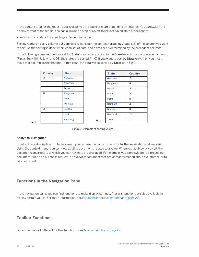
Sorting works on every column but you need to consider the context (grouping / data set) of the column you want to sort. So the sorting is done within each set of data, and a data set is determined by the precedent columns.
In the following example, the data set for State is sorted according to the Country which is the precedent column.(Fig 1). So, within US, IN, and DE, the states are sorted A ->Z. If you want to sort by State only, then you must move that column as the first one. In that case, the data will be sorted by State as in Fig 2.
Figure 7: Example of sorting values
Analytical Navigation
In cells of reports displayed in table format, you can use the context menu for further navigation and analysis. Using the context menu, you can view existing documents related to a value. When you double-click a cell, the documents and reports to which you can navigate are displayed. For example, you can navigate to a preceding document, such as a purchase request, an overview document that provides information about a customer, or to another report.
Functions in the Navigation Pane
In the navigation pane, you can find functions to make display settings. Analysis functions are also available to display certain values. For more information, see Functions in the Navigation Pane [page 21]
Toolbar Functions
For an overview of different toolbar functions, see Toolbar Functions [page 22]
20 P U B L I CSAP Hybris Cloud for Customer Business Analytics Guide
Reports
2.3.1 Functions in the Navigation Pane
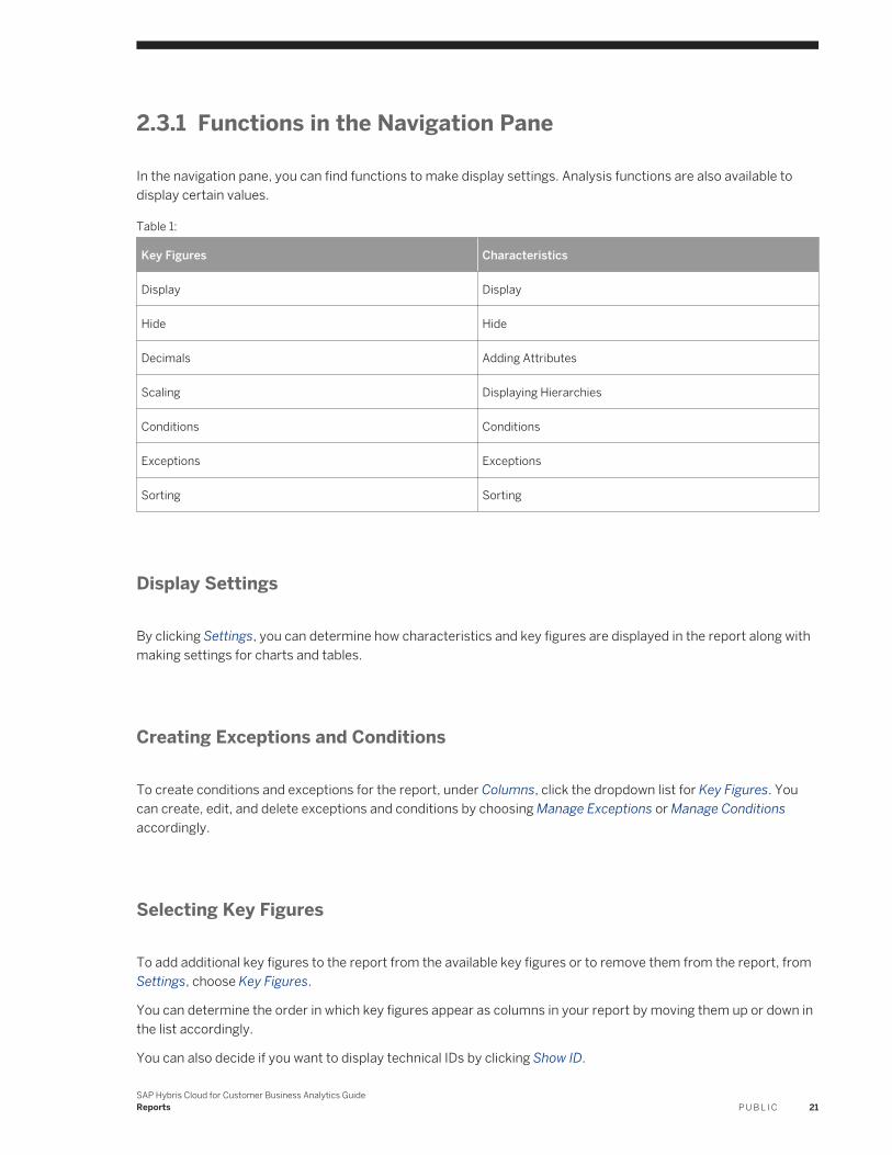
In the navigation pane, you can find functions to make display settings. Analysis functions are also available to display certain values.
Table 1:
Key Figures Characteristics
Display Display
Hide Hide
Decimals Adding Attributes
Scaling Displaying Hierarchies
Conditions Conditions
Exceptions Exceptions
Sorting Sorting
Display Settings
By clicking Settings, you can determine how characteristics and key figures are displayed in the report along with making settings for charts and tables.
Creating Exceptions and Conditions
To create conditions and exceptions for the report, under Columns, click the dropdown list for Key Figures. You can create, edit, and delete exceptions and conditions by choosing Manage Exceptions or Manage Conditions accordingly.
Selecting Key Figures
To add additional key figures to the report from the available key figures or to remove them from the report, from Settings, choose Key Figures.
You can determine the order in which key figures appear as columns in your report by moving them up or down in the list accordingly.
You can also decide if you want to display technical IDs by clicking Show ID.
SAP Hybris Cloud for Customer Business Analytics GuideReports P U B L I C 21
Displaying Characteristics and Key Figures
You can drag and drop characteristics and key figures in columns and rows to the Not Currently Shown list. To drag and drop, you use the Move function. This function is available from the dropdown list from the characteristics and key figures. If you select Remove, the characteristic or key figure is moved to the Not Currently Shown list.
NoteYou can add a maximum of 10 characteristics in a column drill down.
2.3.2 Toolbar Functions
● CloseCloses the Web browser window.
● ViewYou can save the current report view, save the report view under a different name, and manage the report views.Under Manage Views, you can set a report view as default, rename, or delete personal report views.
● SettingsYou can determine how characteristics and key figures are displayed in the report along with making settings for charts and tables.
● SelectionsYou can set values for filter and variables in the Selection area, and manage selections. You can decide whether to hide or show the Selection area before starting a report using the start options.The start options indicate whether the Selection area is displayed. By default, the Selection area is displayed, but the report is not started. Note that if you set the start option to Hide Selection Area and Start Report, the next time you start the report, the system uses the existing set of variables with the current value selections.To close the selection area, click the icon to the right of the Start Options dropdown list.
● Add FieldsYou can add fields, such as characteristics and attributes of a characteristic, to the report. You can also add variables and hierarchies as variables. For more information, see Add a Field to a Report [page 79].
● PrintAllows you to print the report using one of the printers connected to your computer.
● DownloadDownloads the report to Microsoft Excel® in XML or CSV format. Note that the report opens in read only mode. You can also download data sources in CSV format.The format and the available fields of the downloaded data source differ from a downloaded report. For example, in a downloaded report, the value and unit of measure are combined in one field whereas in the downloaded data source, the fields are separate. Another example is that there may be key figures only defined for the report, which are not available in the underlying data source.To perform ad-hoc analyses, you must open the report in Microsoft Excel®. From the Reports work center view, click View With, and choose the Microsoft Excel option.
● SendYou can send the report as an e-mail attachment or as a link.
22 P U B L I CSAP Hybris Cloud for Customer Business Analytics Guide
Reports
● Chart and TableSwitch the display of the report to a table, chart, or display both formats.
● Navigate ToYou can navigate to a different tool with which to view and analyze the report.
● ViewShows the report view that is displayed in the Web browser. The dropdown list displays the report views that are available with the corresponding report. A report view is a modified view of the data available with a report. You can also define one or more views for a report. You define a view by saving the current status of a report.
● SelectionShows the saved set of values for the filter and variables currently used with the report. The dropdown list shows the selections available with the report.
● Set as DefaultSets the current report view and defined selection as default. Selections can also be set as default in the Selection area. For selections, the last set default is valid whether the default is set in the Web browser or from the Selection area.
Report Header
The report header is located to the right of the toolbar. By clicking the Show Report Header icon, the system displays the access context, selection ID, and any filters set. If available, any information and warnings are also displayed. For example, if the display currency is set using key figure settings or variables.
You can also view technical information about the report, such as the report ID and the data source for the report.
Note that you can also undo the last step or go back to the default view and selection.
2.4 Viewing Reports with Web Browser — Quick Filter
Viewing reports with the Web Browser – Quick Filter option allows you to quickly filter data that can be displayed as a chart, table or both. You can open reports from the reports list in the Reports view and from embedded reports.
Toolbar Functions
For an overview of different toolbar functions, see Toolbar Functions [page 22]
SAP Hybris Cloud for Customer Business Analytics GuideReports P U B L I C 23
Quick Filter Area
In the Quick Filter area, from the Characteristics list box, you can select from all characteristics available with a report.
The Characteristics list box contains the characteristics available with the report. To display the values available with a characteristic, click the characteristic. The characteristic then appears to the right of the Characteristics list box.
Values can then be selected and deselected. To support a quick selection of values, the list boxes provide sorting and filter functions for values. The report data which is displayed in the chart and table changes when you change values in the Quick Filter area.
Note that when you remove a characteristic from the Quick Filter area, any values that you have selected for the filter are removed.
NoteThe values available with the characteristics are restricted to the value selections that you set using the variables in the Selection area.
Any changes you make to the value selections for variables in the selection affect the value selections available to be filtered for characteristic. The system resets any filter value selections you have made if you change the values selections set in the selection and start the report again by clicking Go.
The order of characteristics in the Characteristics list box and the order as displayed in the report is set using characteristic settings. The order of characteristics in the Characteristics list box is alphabetical, starting with selected characteristics, and then the available characteristics.
The order of characteristics that you have selected to filter in the Quick Filter area has no effect on the order of characteristics as displayed in the report.
Content Area
In the content area for the report, data is displayed as a table, chart, or both, depending on settings. You can switch the display format of the report.
Analytical Navigation
In cells of reports displayed in table format, you can use the context menu for further navigation and analysis. Using the context menu, you can view existing documents related to a value. When you click a cell, the documents and reports to which you can navigate are displayed. For example, you can navigate to a preceding document, such as a purchase request, an overview document that provides information about a customer, or to another report.
24 P U B L I CSAP Hybris Cloud for Customer Business Analytics Guide
Reports
2.5 Working with Reports Using the Report Wizard
Administrators can create and edit reports that they create using the Report Wizard.
The Report Wizard guided activity is available from the following locations:
● From the Design Reports work center view by clicking New, and then choosing Report or Report As Copy.● From the Design Data Sources work center view by clicking New, and then choosing Report.
After you have assigned reports to work center views, they are available in the Reports work center view of the relevant work centers. Business users can then create their own personal report views.
NoteAdministrators can create public report views and public selections, that is, a saved set of value selections for variables and filter values, in the Business Analytics work center. Administrators create public report views and public selections with the report in a Web browser.
The public report views and public selections are then available with the corresponding reports. For more information, see Working with Reports in a Web Browser [page 31] and Working with Selections [page 46].
Procedure
1. Define Report and Select Data SourceNote that due to the complexity of some SAP delivered Analytics content, not all data sources and the objects they include are available to administrators to create key figures, data sources, and reports.
NoteYou do not have to complete all steps; only the first step is mandatory. This is indicated by an asterisk (*).
You can create a report by entering a name, selecting a data source, and clicking Finish.
1. Enter a name and description for the report.We recommend providing a description for the report so that the business user can identify the use of the report after you have assigned the report to the relevant work center views and corresponding work centers.
2. Select a data source for the report. A data source provides the characteristics and key figures used in a report. It also serves as the basis for further reporting objects, such as key figure structures or grids.For more information about objects in Analytics, see Overview of Analytics [page 6].To select a data source, you can either enter the ID or select a data source from the value selection.
NoteWhen you select a data source, one or more supported access context are displayed. When you assign the report to a work center or work center view, the access context of the report and the work center or work center view should match.
SAP Hybris Cloud for Customer Business Analytics GuideReports P U B L I C 25
3. You can also set further properties for the report:○ Enable for Mobile Device
By selecting the checkbox, the report type is set to Mobile Report. For more information, see Working with Mobile Reports [page 49].
○ Only for Master Data By selecting the checkbox, you can create a report without any key figures. The system then skips step 2. This is useful if you want to create list reports, such as a list of customers.
○ If the report you want to create is a copy of a report that has navigation targets, the Copy With Navigation checkbox is also available. By selecting the checkbox, the system also copies the navigation targets in the source report to your report. Note that UI based navigation are not copiedFor information about creating navigation targets, see Create and Edit a Navigation Target [page 49].For information about how business users navigate in reports, see Analytical Navigation [page 83].
2. Select Key FiguresIn this step, you select the key figures to be used in the report. From the Show dropdown list, you have the following options:○ All
All key figures and key figure groups available in a data source are displayed.○ Customer Created Key Figures
Key figures created by administrators are displayed.○ Key Figure Group
Using this selection option, you can choose either a key figure structure or a key figure grid.○ Key Figures○ Selected Key Figure Group / Key Figures
You can also create calculated and restricted key figures by clicking Create. For more information, see Create and Edit a Key Figure [page 137].
3. Select CharacteristicsThe characteristics that are available in the data source are listed. Dimensions, that is, the criterion by which characteristics are categorized, can assist you in selecting relevant characteristics. Characteristics may be selected by default.To determine whether the characteristic has a predefined restriction or if it has a variable associated with it, you can add the Has Variable and Value Selection columns.To add the columns, click Personalize, choose the This Page option, and select the fields from the list.If the characteristic has No Value Selection, there are no predefined restrictions. You can create restrictions or add a variable in the next step.
4. Define Characteristic PropertiesFor each characteristic available, maintain the following properties.○ Display Settings
○ The Display in Report checkbox shows whether a characteristic is displayed in the Not Currently Shown list in the navigation pane when the report is displayed in a Web browser. If the checkbox is not selected, the characteristic can still be used in the Selection area in the report and for restricted key figures.
○ To change the name of characteristics that are displayed to business users in a report, you can rename characteristics. In the Rename Characteristic To field, enter the new name of the characteristic.
○ By selecting the Show Master Data Value checkbox, you can display the values of a characteristic in the report regardless of whether there are key figure values.
26 P U B L I CSAP Hybris Cloud for Customer Business Analytics Guide
Reports
NoteBy selecting the Show Master Data Value checkbox for the Customer characteristic, all customers are displayed in the report.
○ Value SelectionsAny defined value selections are also listed. The following table describes the options available under Value Selection.
Table 2:
Value Description
No Value Selection The characteristic is not restricted.
Using Variable The characteristic can be restricted using a variable.
If you select Using Variable, the characteristic can be restricted to one or more value selections using a variable. In the Define Variables step, you can maintain properties for the variable.
On the variable screen, you can restrict the characteristic using a variable or save a set of value selections for the selection.
Fixed Value Selection You can set fixed value selections for the selected characteristics.
Note that if the characteristic is already restricted to one or more fixed value selections you cannot change fixed value selections.
If you select Fixed Value Selection, Set Fixed Value Selections is active.
Using Complex Restriction The characteristic is restricted using one or more complex restriction rules that are defined in a key figure structure or key figure grid. You cannot change the restriction.
For example, the One Year Ago characteristic that is used in the key figure grid belonging to the data source is restricted using a relative selection.
Using Inherited Variable The characteristic is restricted using an inherited variable. You cannot change the restriction.
For example, the characteristic is restricted using a variable from an underlying data source.
○ Hierarchy SettingsAny defined hierarchy settings are also listed. The following table describes the options available under Hierarchy.
SAP Hybris Cloud for Customer Business Analytics GuideReports P U B L I C 27
Table 3:
Value Description
No Hierarchy No hierarchy is available for the characteristic.
Using Variable The characteristic hierarchy can be restricted using a variable.
Fixed Hierarchy The characteristic hierarchy is restricted to display the characteristic by an attribute. For example, to display the Customer characteristic by location.
Via Inherited Variable The characteristic hierarchy is restricted using an inherited variable.
You cannot change the restriction.
5. Define VariablesFor each variable available, maintain the selection type and any default values if necessary.The selection type indicates how values for the variable can be selected, such as single values, multiple values, interval, or any selection. You can also maintain default values.
6. Review and ConfirmationReview the report. In the Confirmation step, you can display the report in a Web browser to create a layout for the report, assign the report to a work center view, or create another report.
NoteIn the Business Analytics work center, when you view reports, generated test data is displayed regardless of whether the report is assigned to a work center view to which you have access rights as a business user.
To view the report with real data, you must open the report from a Reports work center view for which you have access rights as a business user.
Related Information
Assign a Report [page 16]
2.6 Assign a Report
As an administrator, after you have created a report, you can assign it to work centers and work center views, making it available to business users. You can also restrict access to certain reports by additionally assigning a report to specific business roles.
28 P U B L I CSAP Hybris Cloud for Customer Business Analytics Guide
Reports
Tasks
You can perform the following assigning activities:
● Assign Report to a work center view [page 29]● Assign a Report to a Business Role [page 30]● Change Report Assignment [page 30]● View Report Assignment [page 31]
2.6.1 Assign Report to a work center view
Procedure
1. From the Design Reports work center view, select the relevant report with the status Unassigned.2. Click Assign. This opens the Work center view tab.
Note that the system checks whether the access context of the report and the access context of the work center view conflict. The Conflict column indicates whether a conflict exists.
A check mark indicates that the access contexts match. An exclamation mark indicates that the access contexts conflict.
If you want to assign reports to work center view regardless of conflicting access rights, you must make changes to your fine tuning in the Business Configuration work center using the optional activity Administrator Analytics — Settings. For more information, see Configuration: Administrator Analytics - Settings [page 130].
3. The system assigns the report categories from the underlying data source to the report. You can change the report category assignment by selecting the corresponding work center view and making changes to the report category assignment in list. To do so, select the report categories by which the report can be grouped in the Reports work center view.
NoteSome delivered content has the Hidden status by default. For example, reports that are only displayed as embedded reports. If you want to have the report displayed in the Reports work center view, deselect the Hide in Reports View indicator.
4. Select the check box to assign the report. Click Save to save the work center view- based assignment.
NoteWhen you assign Microsoft Excel®-based reports, that is, workbooks, ensure that the reports embedded in the workbook are also assigned to the same work centers and work center views as the workbook to ensure that business users can view all reports embedded in the workbook. For each embedded report, note the report name and ID in the Report Name dropdown list of the workbook header and compare its assignment against the reports used in the workbook.
SAP Hybris Cloud for Customer Business Analytics GuideReports P U B L I C 29
For example, the administrator has assigned a Microsoft Excel-based report, that is, a workbook, to a work center view. The workbook is available to all users assigned to that work center view. A user executes the workbook but receives an error message, stating that she/he is not authorized to execute a report. The user received this error message because the report is not assigned to the same work center view as the workbook.
2.6.2 Assign a Report to a Business Role
Context
Note● You can assign a report to a business role only if you have selected the option in the fine tuning activities
for your solution. For more information, see Role Based Access [page 52].● You can only assign business roles to Browser- Based Reports.
Procedure
1. Select the report that you want to assign.2. Click Assign. In the screen that opens, go to Business Role tab.
A list shows all the business roles to which you can assign this report. This list is generated on the basis of the work centers and views that the selected report is assigned to. This allows you to make the report available to only selected users out of all the users which have access to a particular work center view.
3. Select the checkbox against the business roles for assigning the report.
If the report is in status Unassigned, the business roles list will be empty. Assign the report first to a work center view to be able to make assignments to business roles.
4. Save and close the screen once the assignment is complete.
2.6.3 Change Report Assignment
Context
You can unassign and reassign reports to work center views.
30 P U B L I CSAP Hybris Cloud for Customer Business Analytics Guide
Reports
Procedure
1. Go to Business Analytics Design Reports and click Assignment Overview. The system opens the Report Assignment Overview screen.
2. Choose Unassign All/Reassign All to select all the reports that you want to reassign/unassign from work center views. In the Change Assignment column of the table, the system displays all the work center assignments accordingly.
3. Click Save. The system schedules a background job if you select more than 20 reports.
Note that, if you unassign all reports, you can reassign only SAP reports. Customer reports cannot be reassigned.
2.6.4 View Report Assignment
Context
You can view all the assignments made for a report. To do so,
Procedure
● View assignments for all the reports
In the Administrator work center, go to Design Reports view, Click Assignment Overview. The screen displays all the work center and view assignments for the report. To modify the displayed data, choose from the available grouping option in the Group by drop down list.
● View work center and views assignments for a report
Select a report. In the Details section Assigned Work Centers shows the work centers this report has been assigned to.
● View business role assignments for a report
Select a report. In the Details section Assigned Business Roles shows the business roles this report has been assigned to.
2.7 Working with Reports in a Web Browser
Working with reports in a Web browser allows you to execute ad hoc analyses. You can open reports from the reports list in the Reports view and from embedded reports.
SAP Hybris Cloud for Customer Business Analytics GuideReports P U B L I C 31
The following two options are available to work with reports in a Web browser:
● Web BrowserThe Web Browser option provides standard functionality for working with reports.For more information, see Viewing Reports with the Web Browser Option [page 19].
● Web Browser — Quick FilterThe Web Browser — Quick Filter option is an alternative display that is intended to allow you to quickly analyze report data by filtering characteristics.The Web Browser — Quick Filter option offers fewer functions compared to the standard option. For example, you cannot define the layout of the report data or add fields.For more information, see Viewing Reports with Web Browser — Quick Filter [page 23].
To preview data sources, administrators use a limited range of available functions. For more information, see Design Data Sources Quick Guide [page 93].
2.8 Working with Reports and Plans in Microsoft Excel®
The SAP add-in for Microsoft Excel enables you to execute ad hoc analyses, create workbooks, create plan data, and define sales targets.
● Microsoft Excel-Based ReportingYou can open reports from the workbooks and reports list in a Reports work center view by clicking View With and choosing the Microsoft Excel option. You can also open reports directly in Microsoft Excel by logging on the SAP system.Administrators can create design workbooks and make them available for business users from the Business Analytics work center.
● Microsoft Excel-Based PlanningTo overcome the limitations of the conventional approach of planning in spreadsheets, business planning consists of features to enable planners to efficiently obtain and work with planning data in business environments.
The add-in tab has the following features:
● Analytic Features [page 33]● Planning Features [page 39]
NoteThe functions of the add-in for Microsoft Excel are restricted or not available when using the Microsoft object linking and embedding (OLE) feature. We therefore recommend not using this feature.
32 P U B L I CSAP Hybris Cloud for Customer Business Analytics Guide
Reports
2.8.1 Analytic Features
NoteTo view and work with Microsoft Excel-based reports and plans, ensure that the add-in for Microsoft Excel is installed.
Depending on your authorization, you can download the add-in from the following locations:
● By clicking Download in the top right corner of the solution.● From the Self-Services Overview work center view of the Home work center under Install Additional
Software.● From the Download Center work center view of the Application and User Management work center.
The analytic features in the add-in tab enables you to save workbooks to the solution system. You can also use available Microsoft Excel functions. Depending on your access rights, different workbooks and reports are available. Saved workbooks are then available from different work center views. Note that the functions available to you depend on your access rights and work center and work center view assignments; the reports you work with in a Web browser are also available using the add-in for Microsoft Excel.
For more information on analytic features, see the following:
● Administrators [page 33]● Workbook Group [page 34]● Refresh Group [page 39]● View Group [page 36]● Selection Group [page 36]● Header Group [page 37]● Report Group [page 37]● Assigning Workbooks [page 38]
2.8.1.1 Administrators
Context
Administrators can create and edit public workbooks as follows:
Procedure
1. Open the public or personal workbook.2. Switch to design mode by clicking Design Workbook.
SAP Hybris Cloud for Customer Business Analytics GuideReports P U B L I C 33
If you want to view the workbook with generated test data, refresh the workbook.3. Make any relevant changes and save.4. Assign the workbook to the relevant work center views to make it public.
Note that if the workbook has already been assigned and is public, you do not need to assign the workbook again.
2.8.1.2 Workbook Group
The workbook group provides functions to open and save workbooks and reports. You can also copy, remove, and protect reports and worksheets.
● OpenDownloads and opens a workbook from the solution system.
● SaveSaves the workbook back to the solution system as a public workbook. You have the following options to save workbooks to the solution system.
● Save AllThe following options are available○ Save All○ Save Workbook○ Save Plan Data○ Save Workbook As New
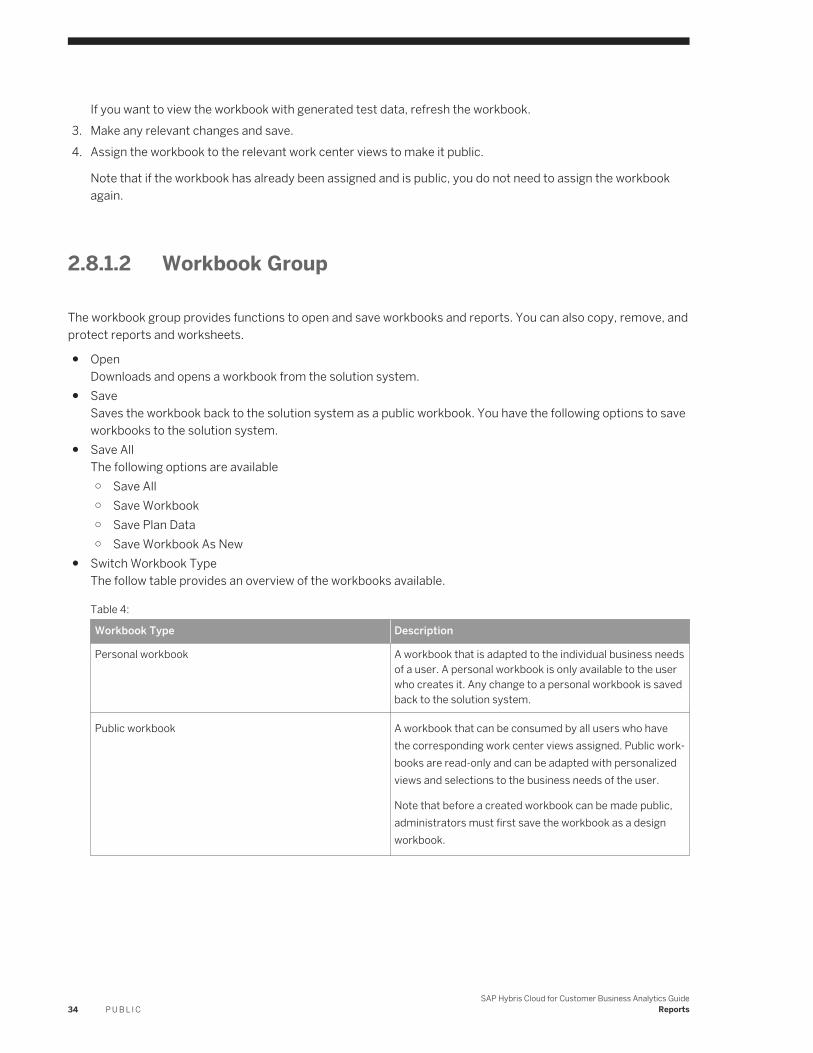
● Switch Workbook TypeThe follow table provides an overview of the workbooks available.
Table 4:
Workbook Type Description
Personal workbook A workbook that is adapted to the individual business needs of a user. A personal workbook is only available to the user who creates it. Any change to a personal workbook is saved back to the solution system.
Public workbook A workbook that can be consumed by all users who have the corresponding work center views assigned. Public workbooks are read-only and can be adapted with personalized views and selections to the business needs of the user.
Note that before a created workbook can be made public, administrators must first save the workbook as a design workbook.
34 P U B L I CSAP Hybris Cloud for Customer Business Analytics Guide
Reports
Workbook Type Description
Design workbook A workbook that only includes the layout without data and is only available from the Business Analytics work center. Since administrators in general are not allowed to view business data, the data is deleted whenever you store a design workbook. As soon as a design workbook is assigned to a work center view, business users can use it as a public workbook with real data.
● Insert ReportInserts a report into the worksheet starting in the active cell.
NoteBy selecting the Paging checkbox, the system displays the first 50 rows of the report including the column headers. Paging down shows the next 50 lines. This is useful if you want to start a report that has large amounts of data.
By limiting the number of rows displayed, the system can display the report more quickly. You can still filter or make value selections in order to display the data you want. Note that if you filter or make value selections, the system displays the first page with the specified number of rows.
● Copy ReportCopies the report and any report views and variable values in order to paste it in a different location.
● Paste ReportPastes the report and any report views and variable values that was last cut or copied into the active cell.
● Remove ReportRemoves the report and any report views and variable values in order to paste it in a different location.
● ProtectUses the Microsoft Excel function to protect the worksheet to prevent changes to all cells containing data from the solution system.
2.8.1.3 Refresh Group
Refreshes the data in the report. You can also defer refreshing the report.
● RefreshRefreshes the data in the report.○ Refresh Current Report
Refreshes the data in the report that is currently selected.○ Refresh Worksheet When Activated
If this feature is active for a workbook, any reports on a sheet in the workbook are automatically refreshed when the sheet is activated.
○ Refresh ReportYou can select a report to refresh from the list.
○ Refresh All● Defer Refresh
Defers refreshing the report until you refresh it manually. This function is useful, for example, if you make multiple changes to a report, such as to the layout or you add another key figure or column.
SAP Hybris Cloud for Customer Business Analytics GuideReports P U B L I C 35
● PagingYou can enter the number of rows you want to display. For example, rows 10 to 40. If you click the down arrow, the system displays the next page with 30 rows, including the column headers.
2.8.1.4 View Group
Displays the report views that are available with a report. You can change the current report view.
In the view pane, you can save changes as a new report view. The view pane also enables you to select the characteristics and key figures that are shown in the report.
● Displaying Characteristics and HierarchiesFor characteristics and hierarchies, you can specify in which format the individual characteristic values of the characteristic are displayed. You can display characteristics and hierarchies as name, ID, or a combination thereof.
● SortingYou can also specify how characteristic values are sorted. You can sort characteristics displayed in rows and columns according to the description or ID in ascending or descending order.
● Results RowUsing the values from the dropdown list, you can decide how the result is to be displayed. You can decide if results are to be displayed or if results are to be displayed when there are at least two single values.You can also activate and deactivate conditions that are either delivered with a report or that have been defined for the report or report view in a Web browser. For more information, see Conditions [page 85].
2.8.1.5 Selection Group
You can display the set of value selections for variables that are available with a report. You can change the current set of value selections. In the Selection pane, you can save changes as a new set of value selections for variables.
You can also set filter values by selecting values in the report and clicking the Filter icon in the Selection group. To remove the filter, click the corresponding icon.
NoteIf you have multiple reports in a workbook and want to apply the same set of value selections, you can use values from dedicated cells.
For example, you have multiple reports that all contain customers. You want to filter the data in the reports to show data related to customer 1001.
On sheet 2, in cell D14, you enter 1001. In the Selection pane of the report, in the Customer variable entry field, you enter =Sheet2!D14. After refreshing the report, data is filtered to customers 1001. Alternatively, using Microsoft Excel® functionality, you can define a name for the referenced cell, such as Customer, and enter the name instead of the address of the referenced cell in the Customer variable entry field; in this case, you enter =Customer.
Note that this tip does not work for advanced restrictions, such as excluding a value or using intervals.
36 P U B L I CSAP Hybris Cloud for Customer Business Analytics Guide
Reports
Also note that data in the workbook is not automatically refreshed if you change the entry in the referenced cell.
2.8.1.6 Header Group
Enables you to insert a report header.
You can specify if the report name is to be displayed along with technical information about the report. The header can be inserted either as a range of cells above the report or as a text box.
2.8.1.7 Report Group
Enables you to make further display settings.
● NavigateNavigates to another report or to an overview document.
● Insert ChartInserts a chart using Microsoft Excel functions. For information about Microsoft Excel chart types and functions, see Microsoft Excel documentation.
● Switch Display Mode of Current Report○ Grid Display
Displays the report using the solution cell styles in the Microsoft Excel grid.○ PivotTable Display
Displays the report as a PivotTable using Microsoft Excel functions. For information about Microsoft Excel PivotTable functions, see Microsoft Excel documentation.
○ Excel Table DisplayDisplays the report as a Microsoft Excel table. Note that if you select this display mode, the Microsoft Excel Design tab is displayed.This display mode is useful, for example, if you want to filter or to sort data using Microsoft Excel functions. For information, see Microsoft Excel documentation.
● Settings○ Freeze Panes
Uses the Microsoft Excel freeze pane function to fix the header columns and rows.○ Format Report
Formats the report using the default SAP Business solution cell styles as listed under the Microsoft Excel Home tab.
○ Adjust to Complete ColumnAdjusts the width of columns to the width of the longest value in each column.
○ Adjust to Report ResultAdjusts the column width to the width of the longest value in the column.
○ Use Outline for HierarchiesUses the Microsoft Excel outline function to group characteristic hierarchies by expansion level.
○ Expand Rows to Level
SAP Hybris Cloud for Customer Business Analytics GuideReports P U B L I C 37
Enables you to choose the hierarchy level up to which the hierarchy is to be displayed when it is expanded.
○ Merge Repeated CellsSpecifies whether every instance of a characteristic value is displayed in a row or column.
○ Show Results FirstSpecifies how results are to be displayed. You can decide if they are to be displayed above rows or to the left of columns.
○ Arrange As HierarchyArranges characteristics in rows and in columns as a hierarchy. The row or column further left serves as the tree structure into which characteristics to the right are inserted.
○ Invert HierarchiesInverts the hierarchy so that the hierarchy is displayed from bottom to top or from right to left. You can decide to invert a hierarchy in rows and in columns.
○ Suppress Zero ValuesEnables you to suppress columns or rows that contain zeros in your report.
○ Define Key FiguresConvert All Currencies: Converts all monetary key figure amounts into a common currency before they are displayed. The conversion rate used is the one that is current when the report is run.
○ Define Report DataShow Extended Text: Displays text with length of more than 60 characters. The system shows you up to 1024 characters for all the available fields in a report.
● Show / Hide○ View
Enables you to select the characteristics, key figures, and attributes that are displayed in the current report, and adapt their display settings.
○ SelectionDisplays and changes the selection values of the current report.
○ PlanningSpecifies input values for planning functions and runs the functions on the current report.
○ HeaderDisplays a Header containing additional information. You can rearrange or delete individual header items, and display teh header either by using Excel formulae in the grid, or by inserting text boxes.
○ MessagesSpecifies whether to display all messages or only errors. You can also decide if messages are displayed on user request.
○ Dynamic PagingFetches entire data in multiple chunks with the defined page size. Use this to retrieve huge amount of data all at once.
NoteIf you enable Dynamic Paging the filter function does not work.
2.8.1.8 Assigning Workbooks
Administrators can assign workbooks to work center views, make them available to business users.
38 P U B L I CSAP Hybris Cloud for Customer Business Analytics Guide
Reports

For more information, access the Help Center from the relevant screen.
2.8.2 Planning Features
The planning features of the add-in tab enables you to create and edit plan data. Cells that are enabled for input have a white background and become yellow when you change their value. Cell that are gray are read-only.
For more information on planning features, see the following:
● Refresh Group [page 39]● Planning Group [page 40]
2.8.2.1 Refresh Group
● RefreshRefreshes the data in the plan.Depending on the planning application you are using, when you make entries in cells, the changes you make are sent either synchronously or asynchronously.○ Upload Input (Asynchronous Sending including save)
When you click Upload Input, the changes you make to the plan data are transferred to the system asynchronously, values are calculated, and the data is saved. You may need to wait before you can make further changes to the plan.While the system is calculating and saving, the related data in the cells is locked and is read only. Although you can still change values in the sheet, you cannot upload the new values.The only option is to refresh the data. If the system has completed the upload when you refresh, the system reads the data again and overwrites all values. In this case, cells are available again for entries. If the calculation is still in progress, a message about the progress of the upload is displayed.Note that if you want all read-only cells to be protected against changes, click Protect in the Workbook group.
NoteTips and Tricks When Uploading Input
○ When you create a plan, reduce the amount of data to the relevant characteristic value combinations, for example, account and cost center, that are required from a business perspective.
○ Before changing plan values, restrict the amount of data as much as possible by using selection criteria for characteristic values in the Selection pane.
○ If when changing plan values, the system takes a long time to transfer the data, consider changing less data at one time. For example, you want to change the plan data in 500 cells; change the data of the first 250 cells, upload, and then change the next 250 cells.
○ If not needed from business perspective, avoid changing rows containing the Not Assigned characteristic value. If the value is required, upload rows containing this value separately from the rest of the data.
SAP Hybris Cloud for Customer Business Analytics GuideReports P U B L I C 39
○ If not needed from business perspective, avoid entering data on different aggregation levels, such as subtotals and totals in Result rows.
○ Send Input (Synchronous Sending excluding Save)The changes you make to the plan data are sent to the system synchronously. You can continue to make changes to the plan as soon as the system has finished calculating and is ready for data entry again. Click Save Plan Data to save the data in the system.
○ Refresh Current ReportRefreshes the data in the report that is currently selected.
○ Refresh Worksheet When ActivatedIf this feature is active for a workbook, reports on a sheet in the workbook are automatically refreshed when the sheet is activated.
○ Refresh ReportYou can select a report to refresh from the list.
○ Refresh All● Defer Refresh
Defers refreshing the report until you refresh it manually. This function is useful, for example, if you make multiple changes to a report, such as to the layout or you add another key figure or column.
● PagingYou can enter the number of rows you want to display. For example, rows 10 to 40. If you click the down arrow, the system displays the next page with 30 rows, including the column headers.
2.8.2.2 Planning Group
Enables you to plan at different levels and adjust values accordingly.
● Mark SelectedMarks cells that you select to be sent back to the system. By marking selected cells, you set the value for the cell. The value therefore does not change when you redistribute values by clicking Refresh.
● Unmark AllUnmarks all selected cells.
The following example illustrates how values for sales and target planning can be distributed. Note that the characteristics available for financial planning may differ.
NoteYou want to project revenue for your products and create a plan that contains the characteristics “Product” and “Customer”. Each product is sold to several different customers but you only want to see how much money you received for each product. You therefore choose a view that displays the aggregated revenue for your products. Any changes that you make to the product revenue on this aggregated view are distributed down to the individual customers for the relevant product.
The following figures are used to illustrate how the data is distributed.
40 P U B L I CSAP Hybris Cloud for Customer Business Analytics Guide
Reports
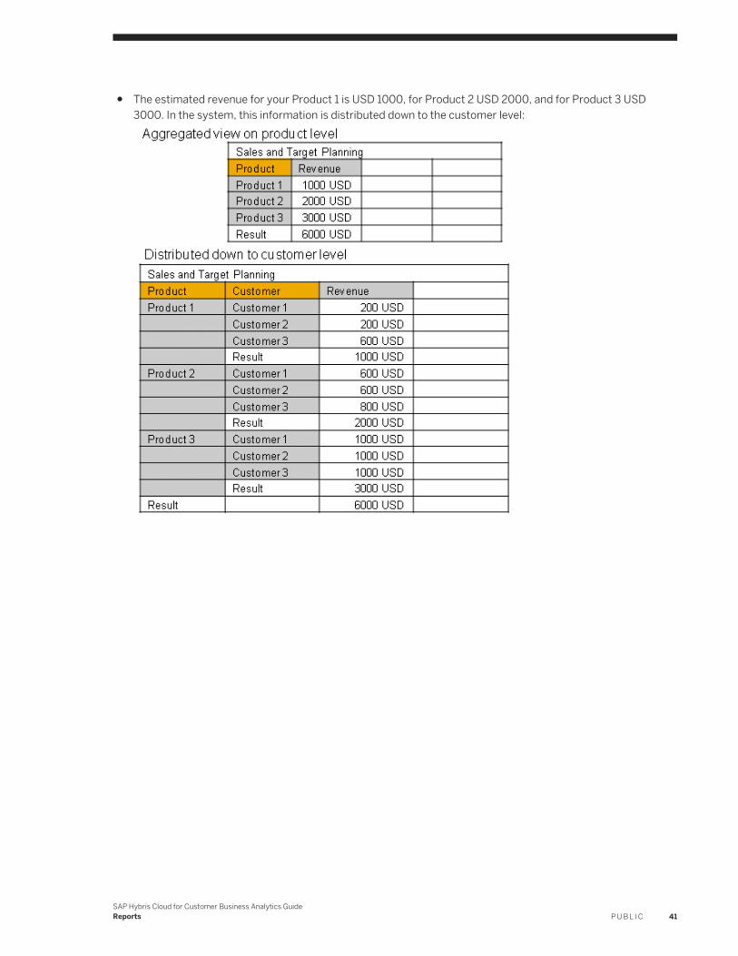
● The estimated revenue for your Product 1 is USD 1000, for Product 2 USD 2000, and for Product 3 USD 3000. In the system, this information is distributed down to the customer level:
SAP Hybris Cloud for Customer Business Analytics GuideReports P U B L I C 41
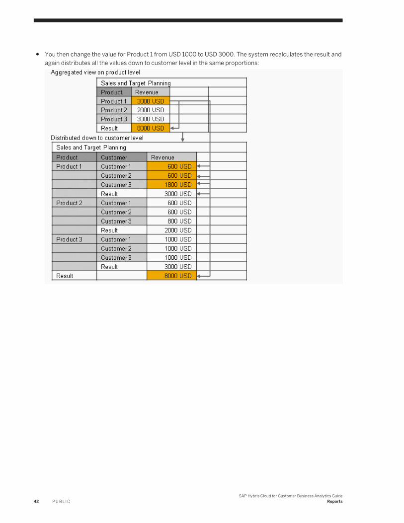
● You then change the value for Product 1 from USD 1000 to USD 3000. The system recalculates the result and again distributes all the values down to customer level in the same proportions:
42 P U B L I CSAP Hybris Cloud for Customer Business Analytics Guide
Reports
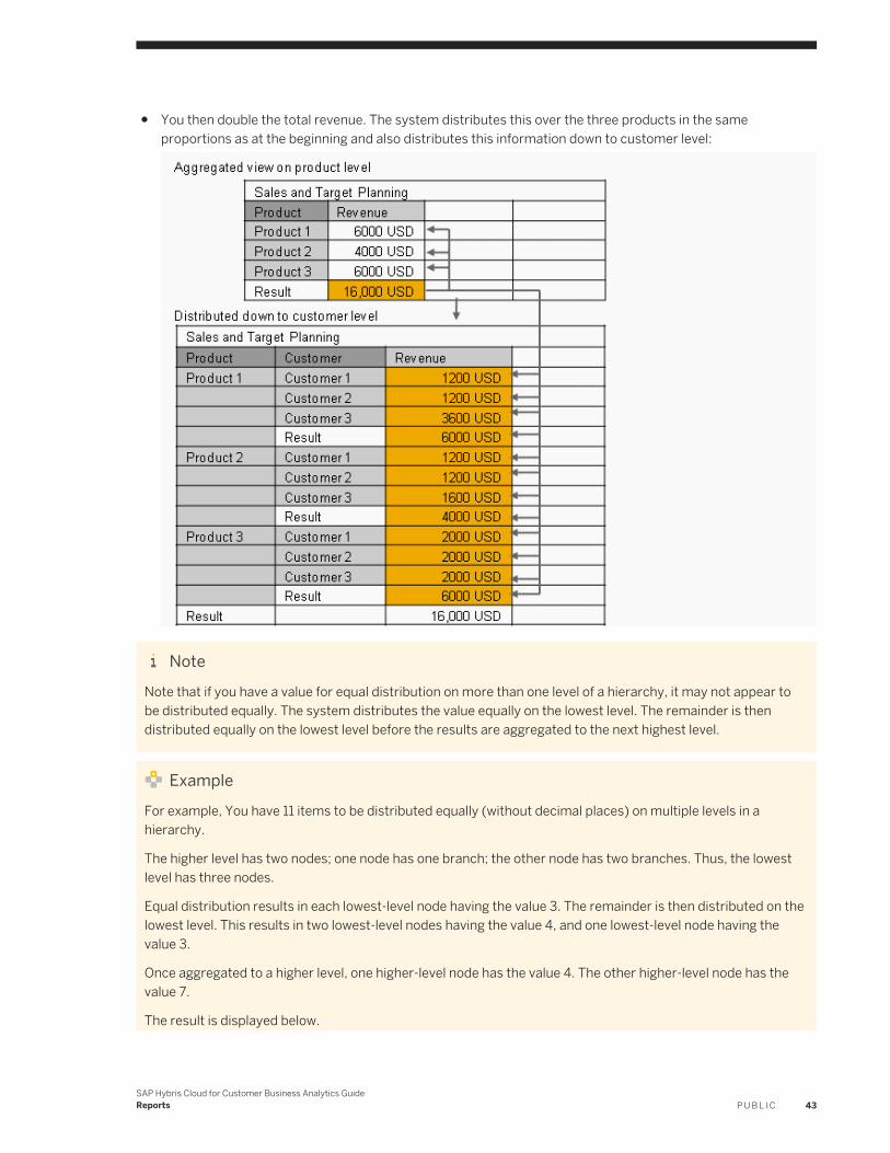
● You then double the total revenue. The system distributes this over the three products in the same proportions as at the beginning and also distributes this information down to customer level:
NoteNote that if you have a value for equal distribution on more than one level of a hierarchy, it may not appear to be distributed equally. The system distributes the value equally on the lowest level. The remainder is then distributed equally on the lowest level before the results are aggregated to the next highest level.
ExampleFor example, You have 11 items to be distributed equally (without decimal places) on multiple levels in a hierarchy.
The higher level has two nodes; one node has one branch; the other node has two branches. Thus, the lowest level has three nodes.
Equal distribution results in each lowest-level node having the value 3. The remainder is then distributed on the lowest level. This results in two lowest-level nodes having the value 4, and one lowest-level node having the value 3.
Once aggregated to a higher level, one higher-level node has the value 4. The other higher-level node has the value 7.
The result is displayed below.
SAP Hybris Cloud for Customer Business Analytics GuideReports P U B L I C 43
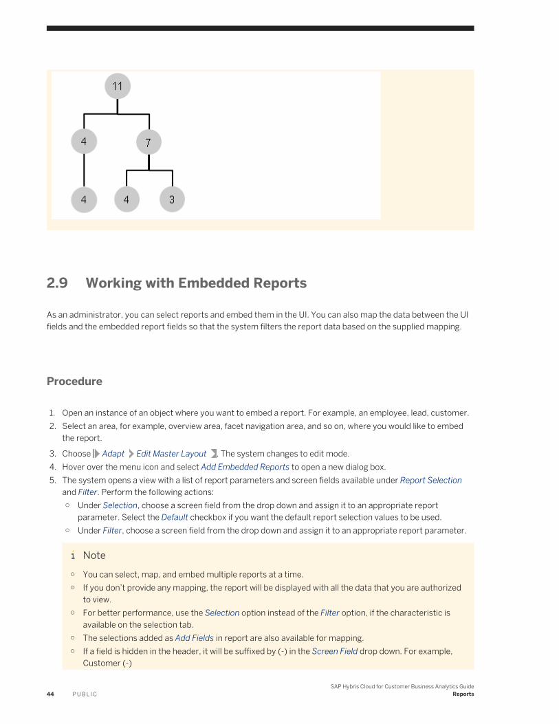
2.9 Working with Embedded Reports
As an administrator, you can select reports and embed them in the UI. You can also map the data between the UI fields and the embedded report fields so that the system filters the report data based on the supplied mapping.
Procedure
1. Open an instance of an object where you want to embed a report. For example, an employee, lead, customer.2. Select an area, for example, overview area, facet navigation area, and so on, where you would like to embed
the report.
3. Choose Adapt Edit Master Layout . The system changes to edit mode.4. Hover over the menu icon and select Add Embedded Reports to open a new dialog box.5. The system opens a view with a list of report parameters and screen fields available under Report Selection
and Filter. Perform the following actions:○ Under Selection, choose a screen field from the drop down and assign it to an appropriate report
parameter. Select the Default checkbox if you want the default report selection values to be used.○ Under Filter, choose a screen field from the drop down and assign it to an appropriate report parameter.
Note○ You can select, map, and embed multiple reports at a time.○ If you don’t provide any mapping, the report will be displayed with all the data that you are authorized
to view.○ For better performance, use the Selection option instead of the Filter option, if the characteristic is
available on the selection tab.○ The selections added as Add Fields in report are also available for mapping.○ If a field is hidden in the header, it will be suffixed by (-) in the Screen Field drop down. For example,
Customer (-)
44 P U B L I CSAP Hybris Cloud for Customer Business Analytics Guide
Reports
○ The key field is always suffixed by (*). For example, Lead (*)○ If a field is pulled from the header and dropped to one of the facets, it will be suffixed by (>) in the
Screen Field drop down.
6. In the Embedded Report Header field, define a display name for your report.7. Click Apply to add the report to your facet.
8. Click on Adapt End Layout Changes . The changes are saved and will be visible for all end users.
Result
You can view the embedded report in the facet navigation area.
Note that you can delete the report from the overview section by clicking on the X icon.
Standard Embedded Reports
SAP delivers some standard embedded reports that that you can find in the Overview view of work centers or in overview documents.
Features
The following feature are available with embedded reports.
● Select different report views from the View dropdown list.● Select different sets of saved value selections for variables from the Selection dropdown list.● From Actions, you can analyze the data of the report and set the refresh rate for the data. Note that by
default, the refresh rate is every 6 hours.● Switch between chart and table display.
Adding Standard Embedded Reports
You can add reports as embedded reports to Overview work center views of work centers by personalizing the work center views. This is useful if you often open a particular report. To add a report to the Overview work center view, click Personalize, and choose This Screen. Under Personalize Overview, a list of reports are available that can be added. You can choose the report view and selection to be displayed.
Note that embedded reports can only be displayed as table or chart. Displaying both table and chart is only possible when viewing reports in a Web browser.
SAP Hybris Cloud for Customer Business Analytics GuideReports P U B L I C 45
Related Information
Working with Selections [page 46]Working with Reports in a Web Browser [page 25]
2.10 Working with Selections
When you open a report in a Web browser, the data displayed in the report is restricted to the value selections set using variables in the Selection area above the report and any saved filter values.
Selection
A selection consists of the set of variables available for the report and any defined value selections. The selection you define determines the data to be displayed in the report. The value selections you make using variables for the selection also determine the characteristic value selections that can be further restricted using the filter function.
Note that you must specify a value for all mandatory variables. In the system, mandatory variables are indicated by an asterisk (*).
The Access Context variable is mandatory for all reports. This variable is defaulted to the access context to which the you are assigned. The system fills the variable with the access context available for the report. In this case, only one access context is assigned, and therefore the variable is not displayed.
NoteFor reports opened with Microsoft Excel®, the system also fills the variable with the initially saved access context.
ExampleFor example, you open the Project Cost – Overview report in two work centers and have saved the Access Context variable with different value selections in both work centers: in the first work center, you saved the access context as Company; in the second work center, you saved the access context as Project. The system proposes one of the two access contexts.
Filter
The value selections you make using variables for the selection also determine the characteristic value selections that can be further restricted using the filter function.
Note that you can filter data for all characteristics available with the report regardless of whether they are shown in the report.
46 P U B L I CSAP Hybris Cloud for Customer Business Analytics Guide
Reports
NoteIf you change the values selections set in the selection and start the report again by clicking Go, the system resets any filter value selections you have made. Changes you make to the value selections for variables in the selection affect the value selections available to be filtered for characteristic.
NoteExample
For example, for the Product variable in the selection, you select the following values: 10 , 20 , 30 , 40 , 50 . These are the values available to be filtered with the Product characteristic after you start the report.
You change the value selections set for the Product variable in the selection and make all values available. After clicking Go, you can now filter the Product characteristic to any available value selection.
Note that if you save a selection, the filter value selections you set are also saved.
Making Value Selections
Note that if you want to display the descriptions of values that you have selected, in the Selection area, click Show Text.
Note that if you want to enter values manually, the system supports manual entry of only the ID of variable or characteristic values.
For example, you know that you want to restrict the Supplier variable to 500001 (You cannot enter Miller and Son). You therefore enter 500001 in the Supplier variable field.
You can delete value selections by clicking the X icon. The delete function is always active.
Value Selection Help
By opening the value selection for a variable or for a characteristic, you can select single values, exclude values, set an interval, or a set of values, depending on how the content has been defined, or if you have set filter values.
The following options are available depending on the variable or characteristic selected:
● Basic SelectAllows you to restrict a specified characteristic to available values. Note that you can select multiple values by clicking the value and pressing CTRL .
● Advanced Select○ Allows you to restrict a specified characteristic using relational operators, such as greater than and less
than.○ Add More
You can enter a value or use the value selection to select a value.○ Relative Select
SAP Hybris Cloud for Customer Business Analytics GuideReports P U B L I C 47
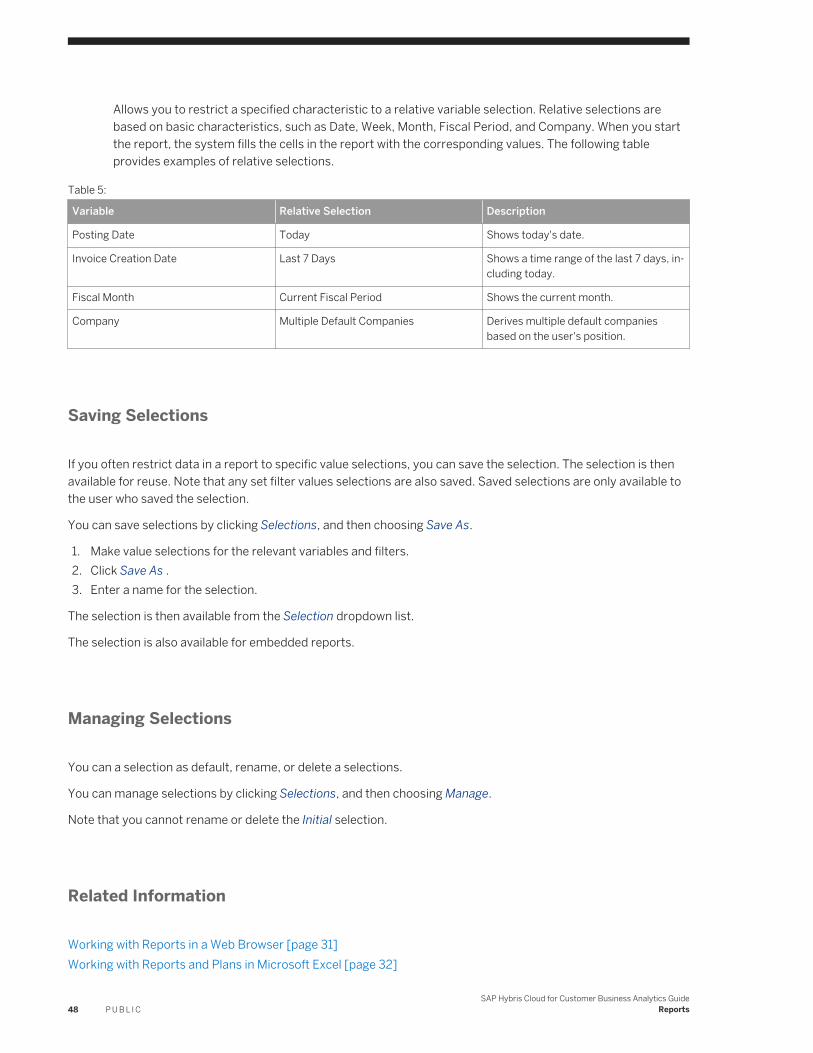
Allows you to restrict a specified characteristic to a relative variable selection. Relative selections are based on basic characteristics, such as Date, Week, Month, Fiscal Period, and Company. When you start the report, the system fills the cells in the report with the corresponding values. The following table provides examples of relative selections.
Table 5:
Variable Relative Selection Description
Posting Date Today Shows today's date.
Invoice Creation Date Last 7 Days Shows a time range of the last 7 days, including today.
Fiscal Month Current Fiscal Period Shows the current month.
Company Multiple Default Companies Derives multiple default companies based on the user's position.
Saving Selections
If you often restrict data in a report to specific value selections, you can save the selection. The selection is then available for reuse. Note that any set filter values selections are also saved. Saved selections are only available to the user who saved the selection.
You can save selections by clicking Selections, and then choosing Save As.
1. Make value selections for the relevant variables and filters.2. Click Save As .3. Enter a name for the selection.
The selection is then available from the Selection dropdown list.
The selection is also available for embedded reports.
Managing Selections
You can a selection as default, rename, or delete a selections.
You can manage selections by clicking Selections, and then choosing Manage.
Note that you cannot rename or delete the Initial selection.
Related Information
Working with Reports in a Web Browser [page 31]Working with Reports and Plans in Microsoft Excel [page 32]
48 P U B L I CSAP Hybris Cloud for Customer Business Analytics Guide
Reports
2.11 Working with Mobile Reports
Mobile reports are browser-based reports that are enabled for mobile devices.
Note that mobile reports are by default not displayed in the reports list. You can view mobile reports by choosing Mobile Report from the dropdown list.
Adapting Mobile Reports
You can either open the default of the mobile report on your mobile device, or you can adapt it to your own requirements.
1. Open the relevant mobile report.2. In the Selection area, make any relevant value selections for variables.
For more information, see Working with Selections [page 46].
NoteTo optimize using the report on your mobile device, we recommend setting the start option to Hide Selection Area and Start Report.
3. Save the set of value selections for variables.4. When the report is displayed in the Web browser, make any relevant changes to the layout and drilldown of
the report.For more information, see Working with Reports in a Web Browser [page 31].
5. Save the report view and set of value selections for Variables. To save the report view, from View, click Save As. To save the set of value selections for Variable, in the Selection area, select the Edit tab page, and click Save As.
6. Set both the report view and the Variables as default. To set the report view as default, from View, choose the Manage Views. To set the Variables as default, in the Selection area, select the Manage tab page.
7. In the Web browser, from the toolbar, click Set As Default.The adapted report is now set as default for the mobile report.Note for AdministratorsTo make a mobile report available to business users, administrators must assign the mobile report to a mobile-relevant work center and to a business-relevant work center. For more information, see Assign a Report [page 16].
2.12 Create and Edit a Navigation Target
From the Design Reports work center view, administrators can create navigation targets in a selected target report to which business users can navigate from a source report. You can also define how values are transferred to the corresponding characteristic or variable. Report-to-report navigation is useful for further analysis of report data. For example, a business user has the Purchase Orders per Supplier source report , containing purchase
SAP Hybris Cloud for Customer Business Analytics GuideReports P U B L I C 49

order IDs. When a business user clicks a purchase order ID in the report, such as 3141, the context menu displays the Purchase Orders per Product target report . The business user can then navigate to this report directly without returning to the Reports work center view. In this example, the business user can see what other purchase orders have the same product as in purchase order 3141.
Procedure
1. From the Design and Assign Report object worklist, select the relevant target report and click Create Navigation.
In the following screen, the target report and the corresponding characteristics and variables appear.
You can also decide if you want to create navigation targets for characteristics and variables in a report view.
Note that you cannot create a UI based navigation.2. To select a source report, click Add Source Report.
To remove a source report, click Remove Source Report.3. From the Select Source Report dropdown list, select the corresponding source report.
The source report along with the corresponding characteristics and variables are added.4. From the list of target characteristics and variables, select the relevant source characteristics and variables
from the dropdown lists in the relevant columns.
NoteIf you select a variable, you must change the transfer type to Ranked Transfer.
5. Define how value selections are to be transferred from the source report to the target report.
Note that if you check the Use Default Variable Value checkbox, the default variable value in the target report is used if no value is available from the source report.
Table 6:
Source Report Variable Target Report Variable
Variable is not filled Default variable value is used, regardless of transfer type.
Variable is filled Default variable value is not used.
50 P U B L I CSAP Hybris Cloud for Customer Business Analytics Guide
Reports
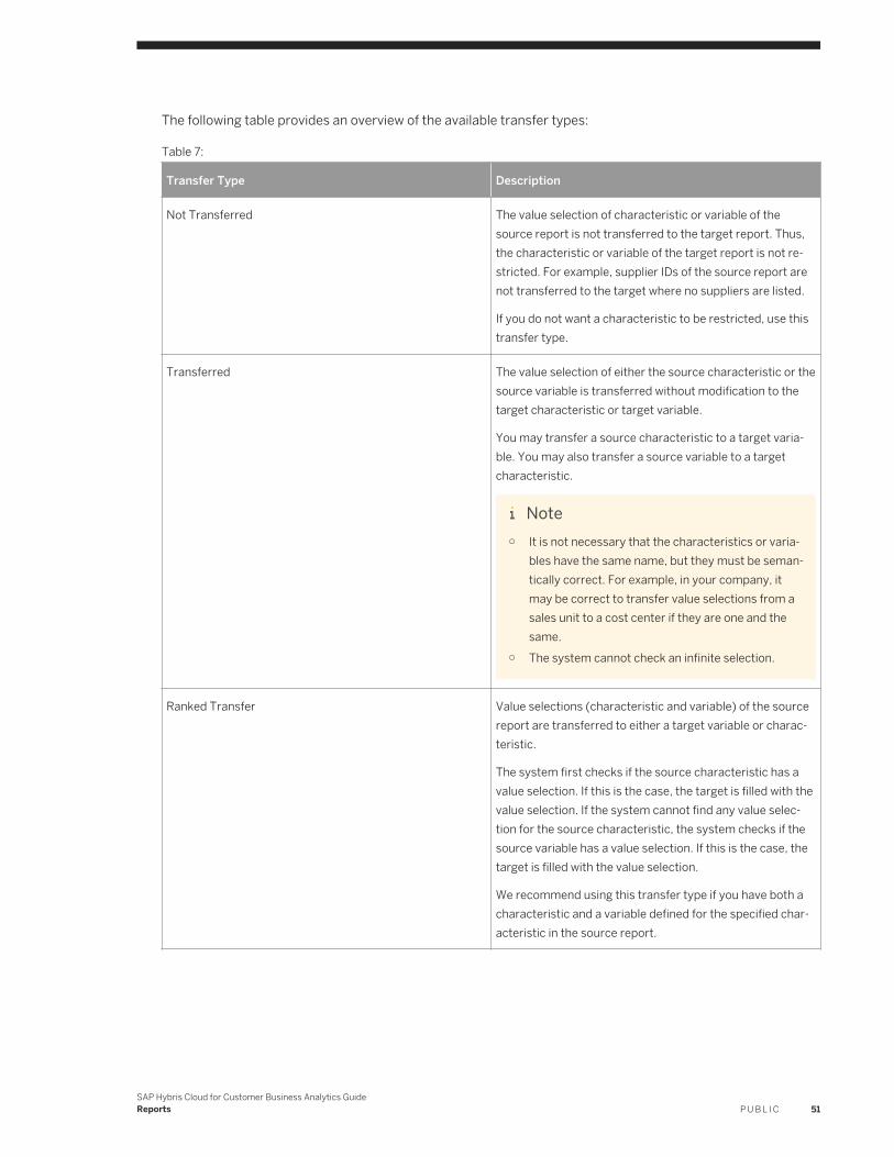
The following table provides an overview of the available transfer types:
Table 7:
Transfer Type Description
Not Transferred The value selection of characteristic or variable of the source report is not transferred to the target report. Thus, the characteristic or variable of the target report is not restricted. For example, supplier IDs of the source report are not transferred to the target where no suppliers are listed.
If you do not want a characteristic to be restricted, use this transfer type.
Transferred The value selection of either the source characteristic or the source variable is transferred without modification to the target characteristic or target variable.
You may transfer a source characteristic to a target variable. You may also transfer a source variable to a target characteristic.
Note○ It is not necessary that the characteristics or varia
bles have the same name, but they must be semantically correct. For example, in your company, it may be correct to transfer value selections from a sales unit to a cost center if they are one and the same.
○ The system cannot check an infinite selection.
Ranked Transfer Value selections (characteristic and variable) of the source report are transferred to either a target variable or characteristic.
The system first checks if the source characteristic has a value selection. If this is the case, the target is filled with the value selection. If the system cannot find any value selection for the source characteristic, the system checks if the source variable has a value selection. If this is the case, the target is filled with the value selection.
We recommend using this transfer type if you have both a characteristic and a variable defined for the specified characteristic in the source report.
SAP Hybris Cloud for Customer Business Analytics GuideReports P U B L I C 51
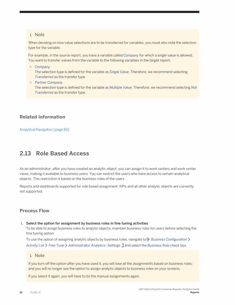
NoteWhen deciding on how value selections are to be transferred for variables, you must also note the selection type for the variable.
For example, in the source report, you have a variable called Company for which a single value is allowed. You want to transfer values from the variable to the following variables in the target report:
○ CompanyThe selection type is defined for the variable as Single Value. Therefore, we recommend selecting Transferred as the transfer type.
○ Partner CompanyThe selection type is defined for the variable as Multiple Value. Therefore, we recommend selecting Not Transferred as the transfer type.
Related Information
Analytical Navigation [page 83]
2.13 Role Based Access
As an administrator, after you have created an analytic object, you can assign it to work centers and work center views, making it available to business users. You can restrict the users who have access to certain analytical objects. This restriction is based on the business roles of the users.
Reports and dashboards supported for role based assignment. KPIs and all other analytic objects are currently not supported.
Process Flow
1. Select the option for assignment by business roles in fine tuning activitiesTo be able to assign business roles to analytic objects, maintain business roles for users before selecting the fine tuning option.To use the option of assigning analytic objects by business roles, navigate to Business ConfigurationActivity List Fine-Tune Administrator Analytics- Settings and select the Business Role check box.
NoteIf you turn off the option after you have used it, you will lose all the assignments based on business roles; and you will no longer see the option to assign analytic objects to business roles on your screens.
If you select it again, you will have to do the manual assignments again.
52 P U B L I CSAP Hybris Cloud for Customer Business Analytics Guide
Reports
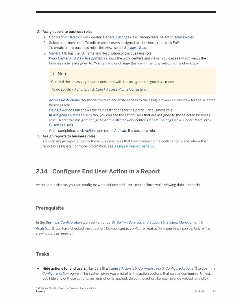
2. Assign users to business roles1. Go to Administrators work center, General Settings view. Under Users, select Business Roles2. Select a business role. To edit or check users assigned to a business role, click Edit.
To create a new business role, click New, select Business Role.3. General tab has the ID, name and description of the business role.
Work Center And View Assignments shows the work centers and views. You can see which views the business role is assigned to. You can add or change this assignment by selecting the check box.
NoteCheck if the access rights are consistent with the assignments you have made.
To do so, click Actions, click Check Access Rights Consistency.
Access Restrictions tab shows the read and write access to the assigned work center view for the selected business role.Fields & Actions tab shows the field restrictions for the particular business role.In Assigned Business Users tab, you can see the list of users that are assigned to the selected business role. To edit this assignment, go to Administrator work center, General Settings view. Under Users, click Business Users.
4. Once completed, click Actions and select Activate the business role.3. Assign reports to business roles
You can assign reports to only those business roles that have access to the work center views where the report is assigned. For more information, see Assign A Report [page 16].
2.14 Configure End User Action in a Report
As an administrator, you can configure what actions end users can perform while viewing data in reports.
Prerequisite
In the Business Configuration workcenter, under Built-in Services and Support System ManagementAnalytics , you have checked the question, Do you want to configure what actions end users can perform while viewing data in reports?
Tasks
● Hide actions for end users: Navigate Business Analysis Common Task Configure Actions to open the Configure Action screen. The system gives you a list of all the action buttons that can be configured. Unless you hide any of these actions, no restriction is applied. Select the action, for example, download, and click
SAP Hybris Cloud for Customer Business Analytics GuideReports P U B L I C 53
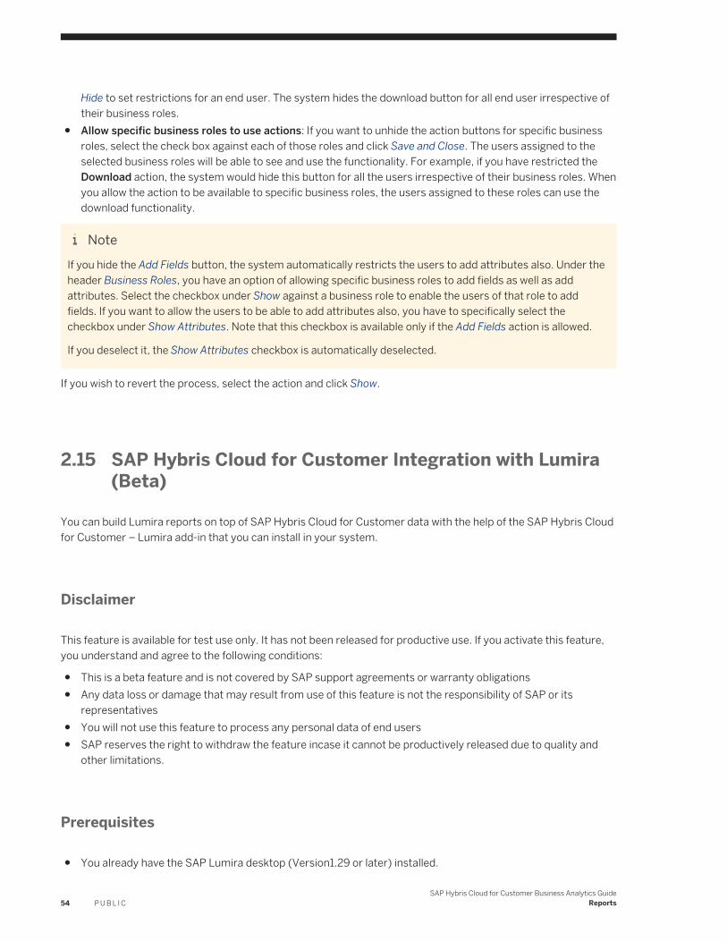
Hide to set restrictions for an end user. The system hides the download button for all end user irrespective of their business roles.
● Allow specific business roles to use actions: If you want to unhide the action buttons for specific business roles, select the check box against each of those roles and click Save and Close. The users assigned to the selected business roles will be able to see and use the functionality. For example, if you have restricted the Download action, the system would hide this button for all the users irrespective of their business roles. When you allow the action to be available to specific business roles, the users assigned to these roles can use the download functionality.
NoteIf you hide the Add Fields button, the system automatically restricts the users to add attributes also. Under the header Business Roles, you have an option of allowing specific business roles to add fields as well as add attributes. Select the checkbox under Show against a business role to enable the users of that role to add fields. If you want to allow the users to be able to add attributes also, you have to specifically select the checkbox under Show Attributes. Note that this checkbox is available only if the Add Fields action is allowed.
If you deselect it, the Show Attributes checkbox is automatically deselected.
If you wish to revert the process, select the action and click Show.
2.15 SAP Hybris Cloud for Customer Integration with Lumira (Beta)
You can build Lumira reports on top of SAP Hybris Cloud for Customer data with the help of the SAP Hybris Cloud for Customer – Lumira add-in that you can install in your system.
Disclaimer
This feature is available for test use only. It has not been released for productive use. If you activate this feature, you understand and agree to the following conditions:
● This is a beta feature and is not covered by SAP support agreements or warranty obligations● Any data loss or damage that may result from use of this feature is not the responsibility of SAP or its
representatives● You will not use this feature to process any personal data of end users● SAP reserves the right to withdraw the feature incase it cannot be productively released due to quality and
other limitations.
Prerequisites
● You already have the SAP Lumira desktop (Version1.29 or later) installed.
54 P U B L I CSAP Hybris Cloud for Customer Business Analytics Guide
Reports
● You must also have the C4C Lumira Integration extension set up. To do this, go to Downloads> SAP Hybris Cloud for Customer - Lumira Integration.To ensure that the extension has been successfully installed, go to File Extensions and open the Extension Manager pop-up. Here you can check if the extension has been installed.
Procedure
This section will give you a step by step instruction on you how you can access and edit SAP Hybris Cloud for Customer Reports in Lumira. You will also understand how to work with visualizations.
1. In the SAP Lumira desktop, navigate to File New Add New Dataset .You can see the recently used dataset on the right hand side of the screen.
2. Select (Beta) SAP Hybris C4C Lumira Integration and click Next to open the login pop-up.3. Enter the necessary details to login to your SAP Hybris Cloud for Customer system. You can see the report
view list on the left hand side panel.4. Select your report from the list and double-click on it to get the Selection details.5. Choose your variant from the dropdown and click Preview to check your data. For further details, click on the
information button next to the selection field.6. Click on Import to transfer the data set to the SAP Lumira desktop. You can see the details of the SAP Hybris
Cloud for Customer report on the Visualize tab. You have an option to do the following:
○ Go to Data Refresh document to get the latest content of the SAP Hybris Cloud for Customer reports.
○ Go to Data Edit Data Source to edit the metadata of the imported data
○ Go to Data Add New Dataset to add another SAP Hybris Cloud for Customer report to your current Lumira document
You can go to the Prepare tab to see the data set that you have imported. Here you also have an option to customize the data before visualization. On the Visualize tab, You can choose and filter content for visualization and display the results. Save your dataset.Note that Characteristics is imported as Dimensions on Lumira desktop, and Key Figuers as Measures.
2.16 VIDEO: Adding Custom Fields to Reports
For Administrators: find out how to add custom fields to objects in the solution and add those fields to reports.
SAP Hybris Cloud for Customer Business Analytics GuideReports P U B L I C 55
2.17 VIDEO: Setting Navigation Targets for Reports
For Administrators: find out how to set up navigation targets for reports so users can quickly navigate from report to report.
56 P U B L I CSAP Hybris Cloud for Customer Business Analytics Guide
Reports
3 Additional Ways of Working with Reports
This section gives you an overview of all the additional ways of working with reports.
For more information, follow the links below:
● Characteristic Settings [page 57]● Chart Settings [page 59]● Key Figure Settings [page 75]● Table Settings [page 77]● Add a Field to a Report [page 79]● Analytical Navigation [page 83]● Conditions [page 85]● Exceptions [page 87]
3.1 Characteristic Settings
When you work with reports, you can make a range of characteristic settings, such as how characteristics are displayed.
Characteristic settings are available from Settings
General Settings
On the General tab page, you can make settings that are applicable to characteristics displayed in the report.
Displaying Characteristics and Hierarchies
If hierarchies are enabled for the characteristic, you can decide how the hierarchy is displayed along with up to which level the hierarchy is displayed. Only when hierarchies are enabled for the characteristic is the dropdown list for the Display Hierarchy column enabled and is set by default to Do Not Show.
NoteFor characteristics to be displayed in hierarchies, the hierarchy should be displayed in rows.
Under Display As and Display Hierarchy, you can specify whether and in which format the individual characteristic values of the characteristic are displayed. You can display characteristics and hierarchies as name, ID, or a combination thereof.
By choosing Do Not Show under Display As, the characteristic is hidden. This function is useful, for example, with currency characteristics, since the currencies are also displayed in the key figures. You select this option if you want to show attributes or sort by the characteristic but do not want it to be displayed.
SAP Hybris Cloud for Customer Business Analytics GuideAdditional Ways of Working with Reports P U B L I C 57
Expansion Level
Choose the hierarchy level up to which the hierarchy is to be displayed when it is expanded. 3 is default.
Result Row
Using the values from the dropdown list, you can decide how the result is to be displayed:
● ShowA result row is displayed, starting at the characteristic following the selected characteristic.
● Do Not ShowNo result row is displayed at the corresponding characteristic in the row.
● Show If More Than One ValueResults rows are displayed when there are at least two single values, and any results row that only aggregates one value is suppressed.
Attribute Shown
Under Attribute Shown, you can add additional rows and columns to the report.
NoteFor the Company characteristic, you can display the Manager attribute. In the content area of the report, the system adds the Manager row, showing the corresponding manager of the respective company.
Sorting
The primary sorting sequence is set by the drilldown displayed in the report. The drilldown sets the order of the characteristics displayed in the report.
NoteKey figure sorting overrules any settings for characteristic sorting.
On the Sorting tab page, you can sort characteristics displayed in rows and columns according to the description or ID in ascending or descending order.
If a characteristic has attributes, you can also sort the characteristic by attribute. The attribute specified does not have to be selected for display. Only if you set an attribute for a characteristic, and want to sort by the attribute, is sorting by attribute taken as sorting.
NoteExample
58 P U B L I CSAP Hybris Cloud for Customer Business Analytics Guide
Additional Ways of Working with Reports
You want to sort by the Cost Center characteristic using the Manager attribute. By default, the system sorts the Company characteristic by the ID of the manager.
Note that you can make any sorting under Sort By, independent of the display settings you set on the General tab page.
3.2 Chart Settings
When you work with reports, you can make a range of chart settings, such as providing a legend for the chart.
By default, all of the following indicators are not set:
Legend
You can show the legend as well as determine where in the content area the legend is to be displayed.
Axis
You can provide labels for the X and Y axes as well as descriptions. Note that descriptions are displayed as tool tips.
Values
● Show Results and Overall Results If Displayed in TableYou use this indicator to specify whether the results and overall results are to be displayed. By default, these results are suppressed since the display of the chart may otherwise be adversely affected.
● Show Hierarchies If Displayed in TableYou use this indicator to specify whether hierarchy nodes are to be displayed.
● Display Chart ValuesYou use this indicator if you want to view the values on the chart. Note that you cannot save this setting. You need to enable it manually each time you open the report.
Zoom
You can now view zoomed in values in your chart. To do this, click on Enable Zoom and select a section of the chart to view the zoomed in data. You can continue to zoom further down until there are just two data points.
Note that when the zoom feature is active, navigation is not possible. In order to activate navigation targets, just toggle the zoom icon. The system retains the chart in the zoomed state and allows you to navigate.
To clear the zoomed data and go back to the original chart, click on Reset Zoom.
NoteZooming is available for only the following types of charts:
● Bar● Column● Line● Scatter
Since the zoom function is supported for the above charts only, all other chart types are disabled when the user is in zoom mode. Disable zoom to view data in other chart formats.
SAP Hybris Cloud for Customer Business Analytics GuideAdditional Ways of Working with Reports P U B L I C 59
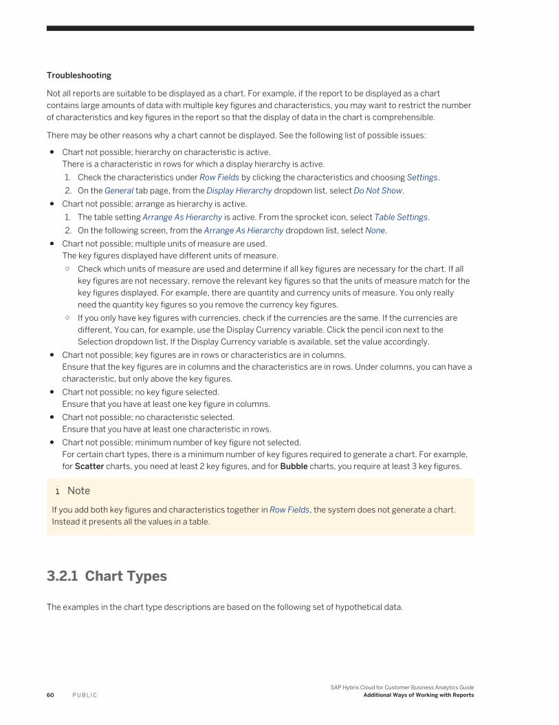
Troubleshooting
Not all reports are suitable to be displayed as a chart. For example, if the report to be displayed as a chart contains large amounts of data with multiple key figures and characteristics, you may want to restrict the number of characteristics and key figures in the report so that the display of data in the chart is comprehensible.
There may be other reasons why a chart cannot be displayed. See the following list of possible issues:
● Chart not possible; hierarchy on characteristic is active.There is a characteristic in rows for which a display hierarchy is active.1. Check the characteristics under Row Fields by clicking the characteristics and choosing Settings.2. On the General tab page, from the Display Hierarchy dropdown list, select Do Not Show.
● Chart not possible; arrange as hierarchy is active.1. The table setting Arrange As Hierarchy is active. From the sprocket icon, select Table Settings.2. On the following screen, from the Arrange As Hierarchy dropdown list, select None.
● Chart not possible; multiple units of measure are used.The key figures displayed have different units of measure.○ Check which units of measure are used and determine if all key figures are necessary for the chart. If all
key figures are not necessary, remove the relevant key figures so that the units of measure match for the key figures displayed. For example, there are quantity and currency units of measure. You only really need the quantity key figures so you remove the currency key figures.
○ If you only have key figures with currencies, check if the currencies are the same. If the currencies are different, You can, for example, use the Display Currency variable. Click the pencil icon next to the Selection dropdown list, If the Display Currency variable is available, set the value accordingly.
● Chart not possible; key figures are in rows or characteristics are in columns.Ensure that the key figures are in columns and the characteristics are in rows. Under columns, you can have a characteristic, but only above the key figures.
● Chart not possible; no key figure selected.Ensure that you have at least one key figure in columns.
● Chart not possible; no characteristic selected.Ensure that you have at least one characteristic in rows.
● Chart not possible; minimum number of key figure not selected.For certain chart types, there is a minimum number of key figures required to generate a chart. For example, for Scatter charts, you need at least 2 key figures, and for Bubble charts, you require at least 3 key figures.
NoteIf you add both key figures and characteristics together in Row Fields, the system does not generate a chart. Instead it presents all the values in a table.
3.2.1 Chart Types
The examples in the chart type descriptions are based on the following set of hypothetical data.
60 P U B L I CSAP Hybris Cloud for Customer Business Analytics Guide
Additional Ways of Working with Reports
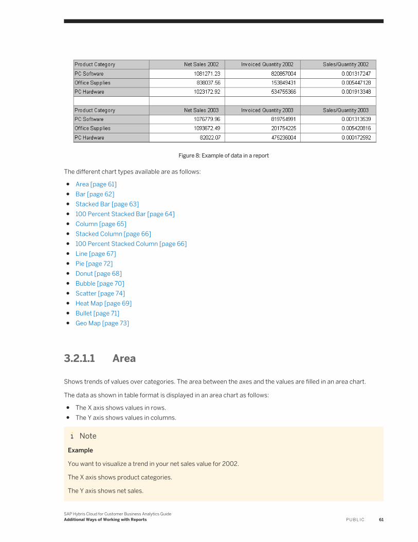
Figure 8: Example of data in a report
The different chart types available are as follows:
● Area [page 61]● Bar [page 62]● Stacked Bar [page 63]● 100 Percent Stacked Bar [page 64]● Column [page 65]● Stacked Column [page 66]● 100 Percent Stacked Column [page 66]● Line [page 67]● Pie [page 72]● Donut [page 68]● Bubble [page 70]● Scatter [page 74]● Heat Map [page 69]● Bullet [page 71]● Geo Map [page 73]
3.2.1.1 Area
Shows trends of values over categories. The area between the axes and the values are filled in an area chart.
The data as shown in table format is displayed in an area chart as follows:
● The X axis shows values in rows.● The Y axis shows values in columns.
NoteExample
You want to visualize a trend in your net sales value for 2002.
The X axis shows product categories.
The Y axis shows net sales.
SAP Hybris Cloud for Customer Business Analytics GuideAdditional Ways of Working with Reports P U B L I C 61
Figure 9: Example of an area chart
3.2.1.2 Bar
Shows comparisons between individual elements shown in a bar chart. Categories are arranged vertically and values are arranged horizontally. The emphasis is on the comparison of values and not on displaying a change during a period of time
The data as shown in table format is displayed in a bar chart as follows:
● The X axis shows the values in columns.● The Y axis shows the values in rows.
NoteExample
You want to visualize the difference in net sales value between 2002 and 2003 for each product category.
The X axis shows net sales for 2002 and 2003.
The Y axis shows product categories.
62 P U B L I CSAP Hybris Cloud for Customer Business Analytics Guide
Additional Ways of Working with Reports
Figure 10: Example of a bar chart
3.2.1.3 Stacked Bar
Shows comparisons between individual elements in a category. Categories are arranged vertically and values are arranged horizontally. The emphasis is on the comparison of values in a category.
NoteExample
You want to visualize the net sales value for 2002 and for 2003 for each product category.
The X axis shows net sales for 2002 and 2003.
The Y axis shows product categories.
SAP Hybris Cloud for Customer Business Analytics GuideAdditional Ways of Working with Reports P U B L I C 63
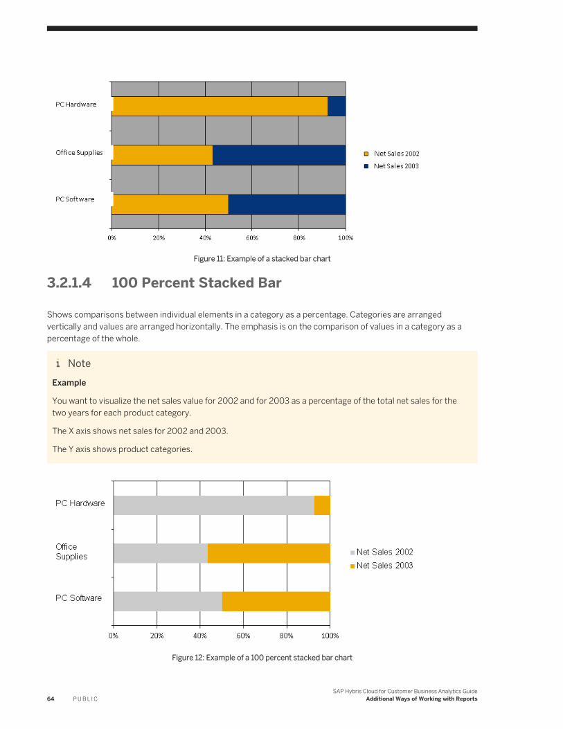
Figure 11: Example of a stacked bar chart
3.2.1.4 100 Percent Stacked Bar
Shows comparisons between individual elements in a category as a percentage. Categories are arranged vertically and values are arranged horizontally. The emphasis is on the comparison of values in a category as a percentage of the whole.
NoteExample
You want to visualize the net sales value for 2002 and for 2003 as a percentage of the total net sales for the two years for each product category.
The X axis shows net sales for 2002 and 2003.
The Y axis shows product categories.
Figure 12: Example of a 100 percent stacked bar chart
64 P U B L I CSAP Hybris Cloud for Customer Business Analytics Guide
Additional Ways of Working with Reports
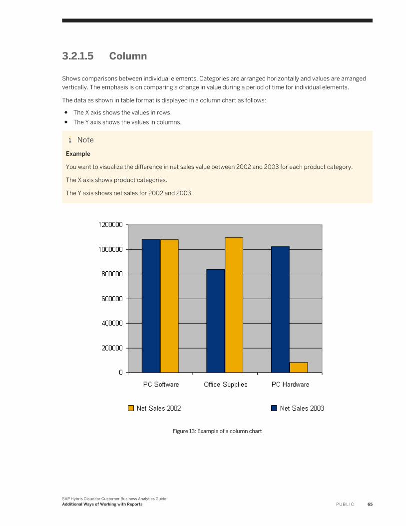
3.2.1.5 Column
Shows comparisons between individual elements. Categories are arranged horizontally and values are arranged vertically. The emphasis is on comparing a change in value during a period of time for individual elements.
The data as shown in table format is displayed in a column chart as follows:
● The X axis shows the values in rows.● The Y axis shows the values in columns.
NoteExample
You want to visualize the difference in net sales value between 2002 and 2003 for each product category.
The X axis shows product categories.
The Y axis shows net sales for 2002 and 2003.
Figure 13: Example of a column chart
SAP Hybris Cloud for Customer Business Analytics GuideAdditional Ways of Working with Reports P U B L I C 65
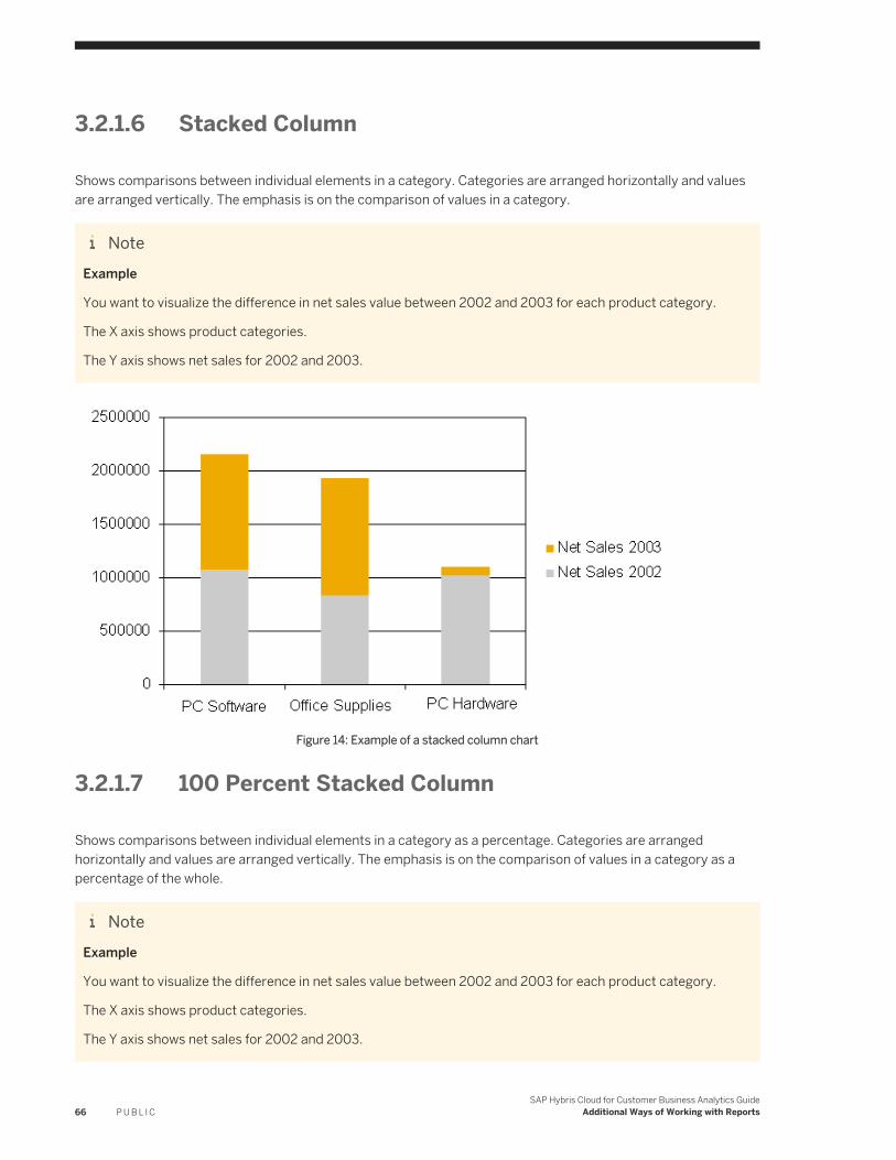
3.2.1.6 Stacked Column
Shows comparisons between individual elements in a category. Categories are arranged horizontally and values are arranged vertically. The emphasis is on the comparison of values in a category.
NoteExample
You want to visualize the difference in net sales value between 2002 and 2003 for each product category.
The X axis shows product categories.
The Y axis shows net sales for 2002 and 2003.
Figure 14: Example of a stacked column chart
3.2.1.7 100 Percent Stacked Column
Shows comparisons between individual elements in a category as a percentage. Categories are arranged horizontally and values are arranged vertically. The emphasis is on the comparison of values in a category as a percentage of the whole.
NoteExample
You want to visualize the difference in net sales value between 2002 and 2003 for each product category.
The X axis shows product categories.
The Y axis shows net sales for 2002 and 2003.
66 P U B L I CSAP Hybris Cloud for Customer Business Analytics Guide
Additional Ways of Working with Reports
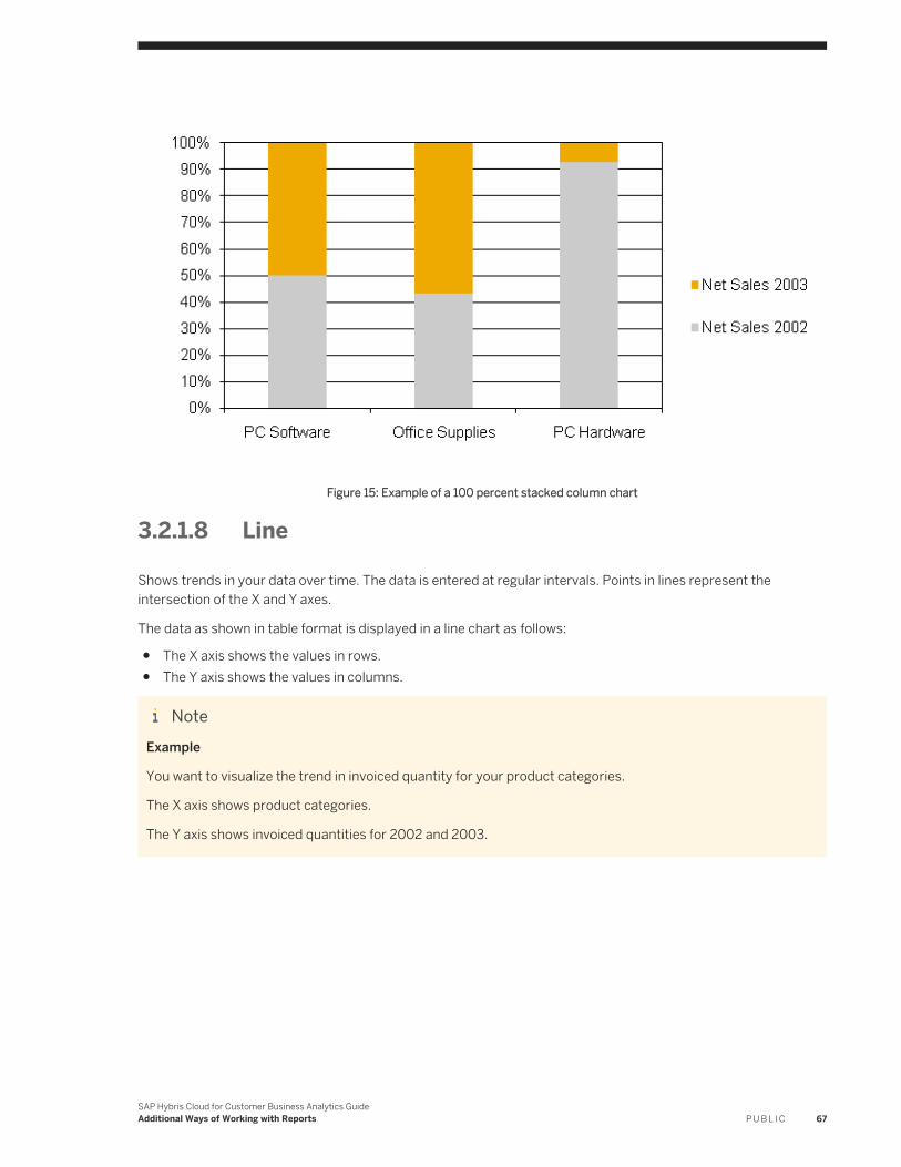
Figure 15: Example of a 100 percent stacked column chart
3.2.1.8 Line
Shows trends in your data over time. The data is entered at regular intervals. Points in lines represent the intersection of the X and Y axes.
The data as shown in table format is displayed in a line chart as follows:
● The X axis shows the values in rows.● The Y axis shows the values in columns.
NoteExample
You want to visualize the trend in invoiced quantity for your product categories.
The X axis shows product categories.
The Y axis shows invoiced quantities for 2002 and 2003.
SAP Hybris Cloud for Customer Business Analytics GuideAdditional Ways of Working with Reports P U B L I C 67

Figure 16: Example of a line chart
3.2.1.9 Donut
The donut chart is similar to a pie chart in that it shows values as segments. The segments represent values in rows. The size of the segments represent the values in columns as a percent of the whole.
68 P U B L I CSAP Hybris Cloud for Customer Business Analytics Guide
Additional Ways of Working with Reports
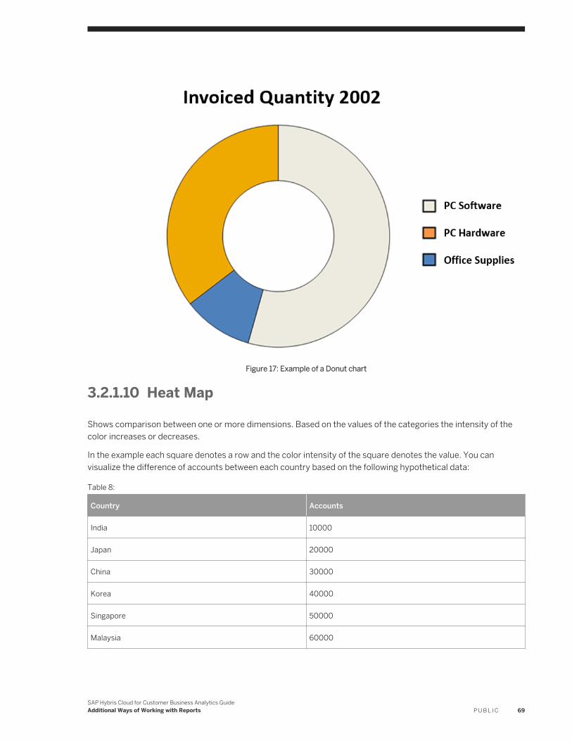
Figure 17: Example of a Donut chart
3.2.1.10 Heat Map
Shows comparison between one or more dimensions. Based on the values of the categories the intensity of the color increases or decreases.
In the example each square denotes a row and the color intensity of the square denotes the value. You can visualize the difference of accounts between each country based on the following hypothetical data:
Table 8:
Country Accounts
India 10000
Japan 20000
China 30000
Korea 40000
Singapore 50000
Malaysia 60000
SAP Hybris Cloud for Customer Business Analytics GuideAdditional Ways of Working with Reports P U B L I C 69
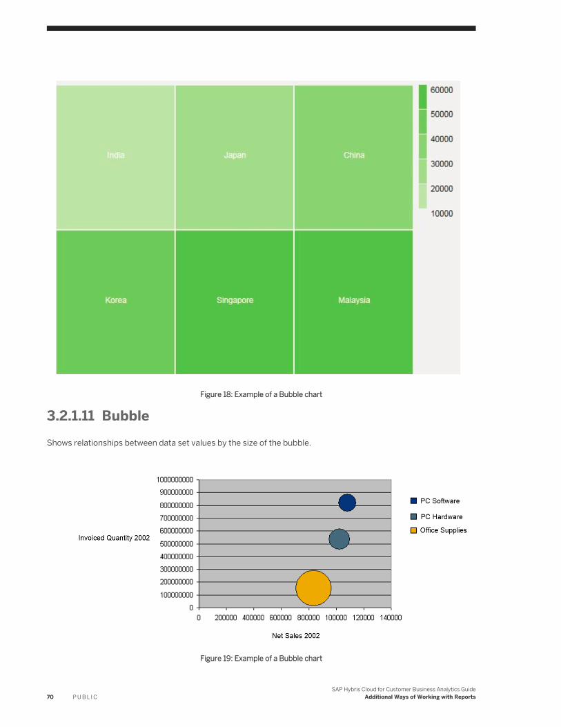
Figure 18: Example of a Bubble chart
3.2.1.11 BubbleShows relationships between data set values by the size of the bubble.
Figure 19: Example of a Bubble chart
70 P U B L I CSAP Hybris Cloud for Customer Business Analytics Guide
Additional Ways of Working with Reports
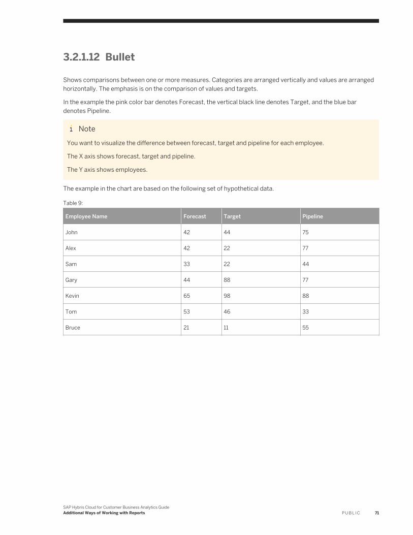
3.2.1.12 Bullet
Shows comparisons between one or more measures. Categories are arranged vertically and values are arranged horizontally. The emphasis is on the comparison of values and targets.
In the example the pink color bar denotes Forecast, the vertical black line denotes Target, and the blue bar denotes Pipeline.
NoteYou want to visualize the difference between forecast, target and pipeline for each employee.
The X axis shows forecast, target and pipeline.
The Y axis shows employees.
The example in the chart are based on the following set of hypothetical data.
Table 9:
Employee Name Forecast Target Pipeline
John 42 44 75
Alex 42 22 77
Sam 33 22 44
Gary 44 88 77
Kevin 65 98 88
Tom 53 46 33
Bruce 21 11 55
SAP Hybris Cloud for Customer Business Analytics GuideAdditional Ways of Working with Reports P U B L I C 71
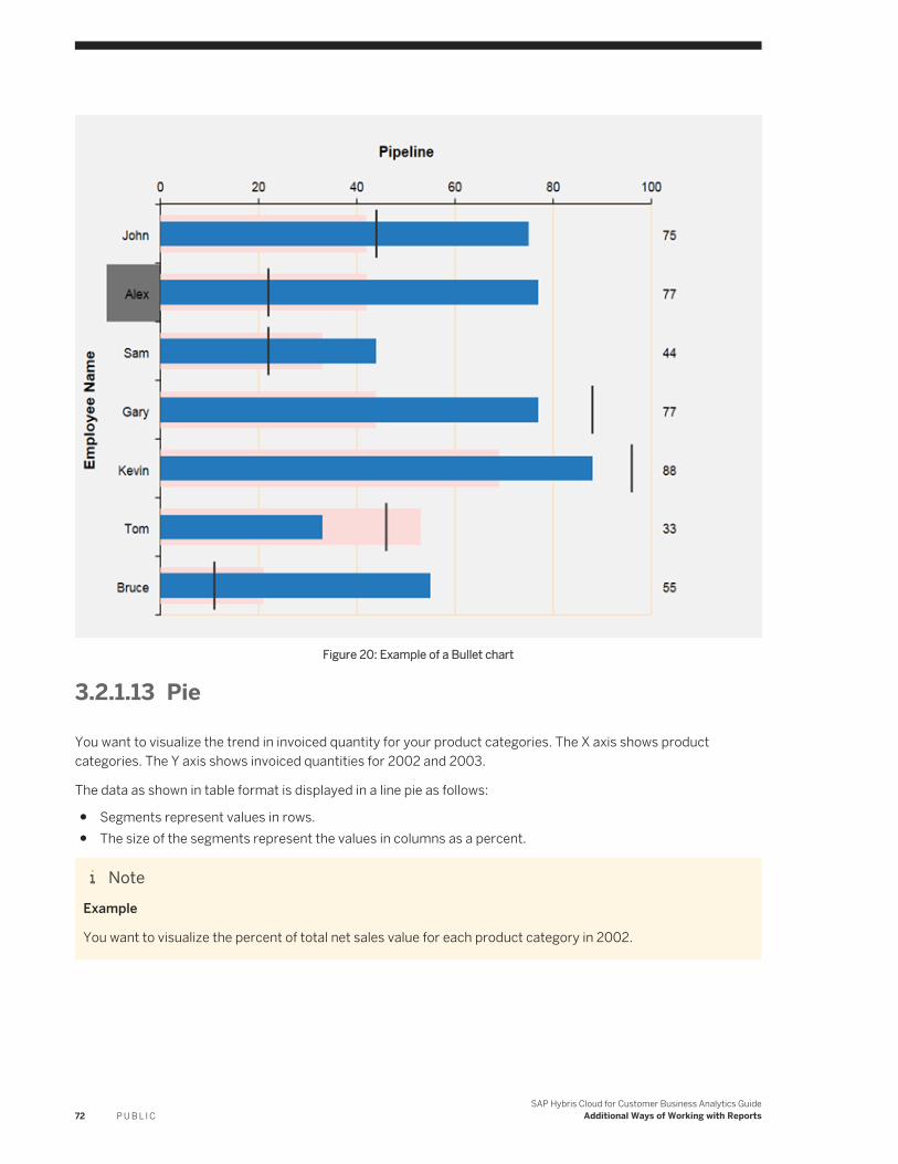
Figure 20: Example of a Bullet chart
3.2.1.13 Pie
You want to visualize the trend in invoiced quantity for your product categories. The X axis shows product categories. The Y axis shows invoiced quantities for 2002 and 2003.
The data as shown in table format is displayed in a line pie as follows:
● Segments represent values in rows.● The size of the segments represent the values in columns as a percent.
NoteExample
You want to visualize the percent of total net sales value for each product category in 2002.
72 P U B L I CSAP Hybris Cloud for Customer Business Analytics Guide
Additional Ways of Working with Reports
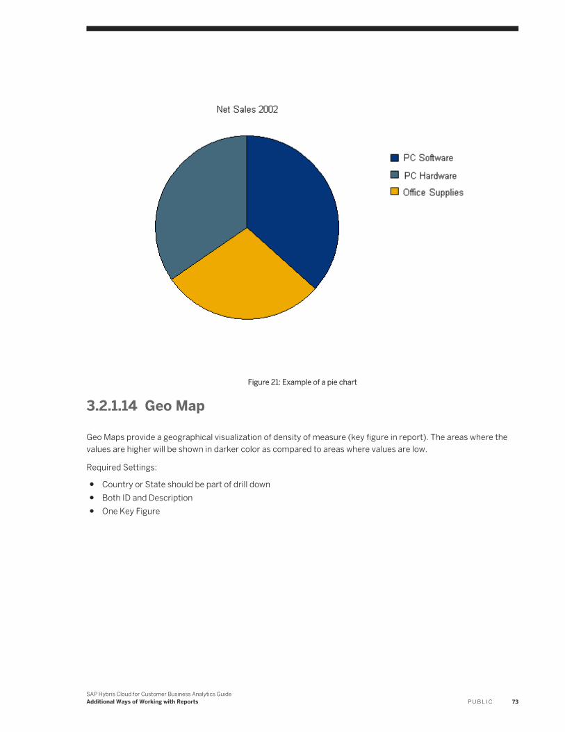
Figure 21: Example of a pie chart
3.2.1.14 Geo Map
Geo Maps provide a geographical visualization of density of measure (key figure in report). The areas where the values are higher will be shown in darker color as compared to areas where values are low.
Required Settings:
● Country or State should be part of drill down● Both ID and Description● One Key Figure
SAP Hybris Cloud for Customer Business Analytics GuideAdditional Ways of Working with Reports P U B L I C 73
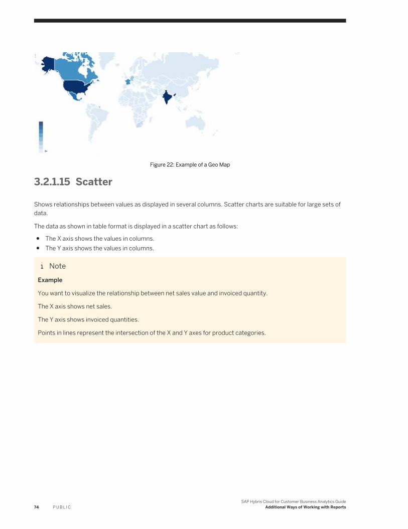
Figure 22: Example of a Geo Map
3.2.1.15 Scatter
Shows relationships between values as displayed in several columns. Scatter charts are suitable for large sets of data.
The data as shown in table format is displayed in a scatter chart as follows:
● The X axis shows the values in columns.● The Y axis shows the values in columns.
NoteExample
You want to visualize the relationship between net sales value and invoiced quantity.
The X axis shows net sales.
The Y axis shows invoiced quantities.
Points in lines represent the intersection of the X and Y axes for product categories.
74 P U B L I CSAP Hybris Cloud for Customer Business Analytics Guide
Additional Ways of Working with Reports
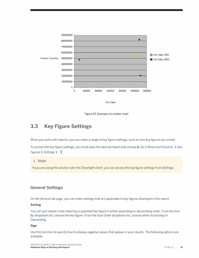
Figure 23: Example of a scatter chart
3.3 Key Figure Settings
When you work with reports, you can make a range of key figure settings, such as how key figures are sorted.
To access the key figure settings, you must open the desired report and choose Go Rows and Columns Key Figures Settings .
NoteIf you are using the solution with the Silverlight client, you can access the key figure settings from Settings.
General Settings
On the General tab page, you can make settings that are applicable to key figures displayed in the report.
Sorting
You can sort values in the report by a specified key figure in either ascending or descending order. From the Sort By dropdown list, choose the key figure. From the Sort Order dropdown list, choose either Ascending or Descending.
Sign
Use this function to specify how to display negative values that appear in your results. The following options are available:
SAP Hybris Cloud for Customer Business Analytics GuideAdditional Ways of Working with Reports P U B L I C 75
● Minus Sign Before Value● Minus Sign After Value● Value in Parentheses
Display Currency - Conversion Date: Today
You can display the currency in your results in a different currency. The default conversion date is the current date (Today). The most recent conversation rate is used.
NoteThe display currency you set using this key figure setting overrides the display currency set using the <Display Currency> variable.
Zero Suppression
You can suppress columns or rows that contain zeros in your report. By default, zeros are displayed. The following options are available:
● Do Not SuppressRows or columns with zeros are displayed.
● Suppress When All Values Equal ZeroFor key figures, columns or rows containing zero values are not displayed.
● Suppress When All Results Equal ZeroResult rows or result columns containing zero values are not displayed.
● By default, the Apply Suppression to Key Figure Group indicator is selected.
Show Zeros
The following options are available for displaying zeros:
● With Currency/UnitZeros are displayed with their respective currency or unit (for example, 0.00 EUR). This is the default setting.
● Custom StringWhen you select Custom String, an additional input field appears, in which you can enter how you want zeros to be displayed
● Without Currency/UnitZeros are displayed without a currency or unit entry, that is, 0.00.
● Do Not ShowCells containing a zero value are empty.
Specific Settings
On the Specific tab page, you can make settings that are applicable to all key figures available for the report.
Scale
Use the dropdown list to set a scaling factor of 1 to ten billion (10,000,000,000). As a result, the scaling factor is displayed in the column header for the key figure in the report.
NoteIf you set a scaling factor of 1,000, the value 3,000 is shown in the report as 3.
76 P U B L I CSAP Hybris Cloud for Customer Business Analytics Guide
Additional Ways of Working with Reports
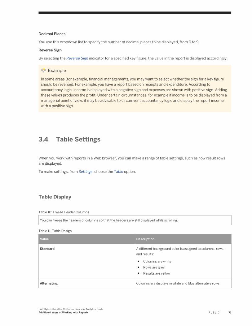
Decimal Places
You use this dropdown list to specify the number of decimal places to be displayed, from 0 to 9.
Reverse Sign
By selecting the Reverse Sign indicator for a specified key figure, the value in the report is displayed accordingly.
ExampleIn some areas (for example, financial management), you may want to select whether the sign for a key figure should be reversed. For example, you have a report based on receipts and expenditure. According to accountancy logic, income is displayed with a negative sign and expenses are shown with positive sign. Adding these values produces the profit. Under certain circumstances, for example if income is to be displayed from a managerial point of view, it may be advisable to circumvent accountancy logic and display the report income with a positive sign.
3.4 Table Settings
When you work with reports in a Web browser, you can make a range of table settings, such as how result rows are displayed.
To make settings, from Settings, choose the Table option.
Table Display
Table 10: Freeze Header Columns
You can freeze the headers of columns so that the headers are still displayed while scrolling.
Table 11: Table Design
Value Description
Standard A different background color is assigned to columns, rows, and results:
● Columns are white● Rows are grey● Results are yellow
Alternating Columns are displays in white and blue alternative rows.
SAP Hybris Cloud for Customer Business Analytics GuideAdditional Ways of Working with Reports P U B L I C 77
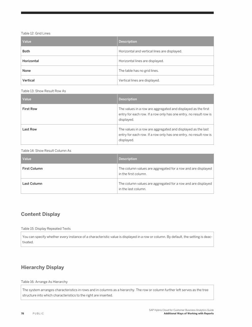
Table 12: Grid Lines
Value Description
Both Horizontal and vertical lines are displayed.
Horizontal Horizontal lines are displayed.
None The table has no grid lines.
Vertical Vertical lines are displayed.
Table 13: Show Result Row As
Value Description
First Row The values in a row are aggregated and displayed as the first entry for each row. If a row only has one entry, no result row is displayed.
Last Row The values in a row are aggregated and displayed as the last entry for each row. If a row only has one entry, no result row is displayed.
Table 14: Show Result Column As
Value Description
First Column The column values are aggregated for a row and are displayed in the first column.
Last Column The column values are aggregated for a row and are displayed in the last column.
Content Display
Table 15: Display Repeated Texts
You can specify whether every instance of a characteristic value is displayed in a row or column. By default, the setting is deactivated.
Hierarchy Display
Table 16: Arrange As Hierarchy
The system arranges characteristics in rows and in columns as a hierarchy. The row or column further left serves as the tree structure into which characteristics to the right are inserted.
78 P U B L I CSAP Hybris Cloud for Customer Business Analytics Guide
Additional Ways of Working with Reports
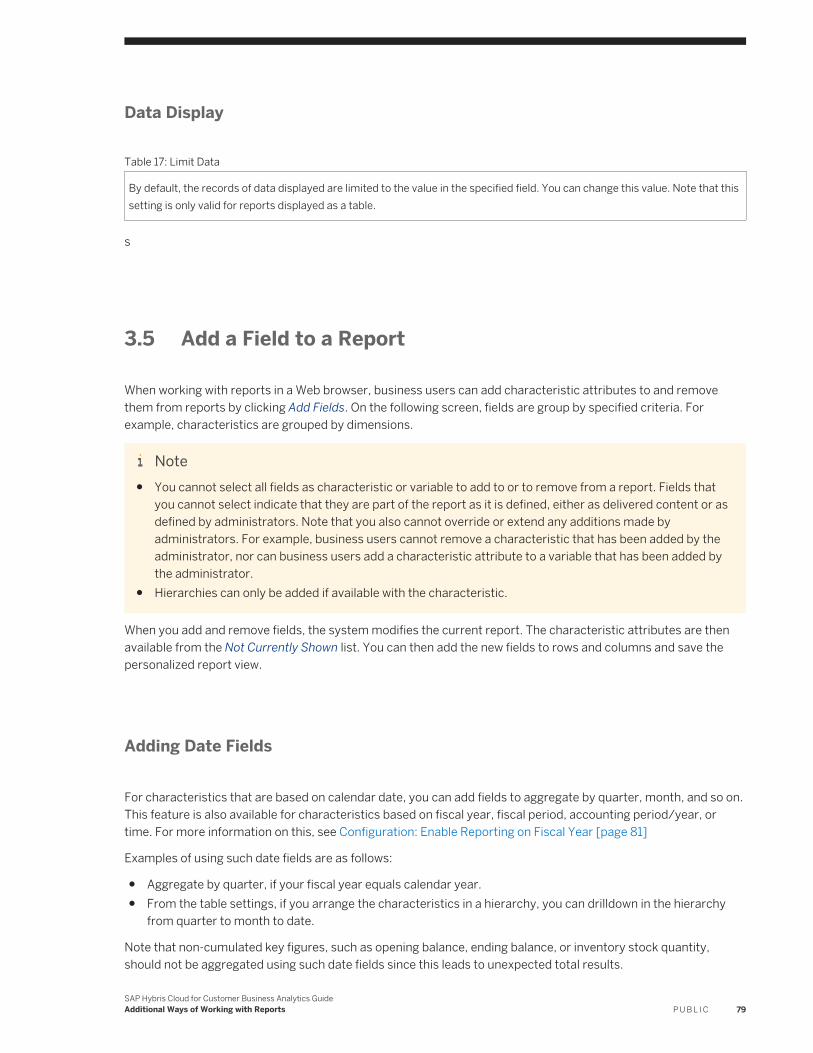
Data Display
Table 17: Limit Data
By default, the records of data displayed are limited to the value in the specified field. You can change this value. Note that this setting is only valid for reports displayed as a table.
s
3.5 Add a Field to a Report
When working with reports in a Web browser, business users can add characteristic attributes to and remove them from reports by clicking Add Fields. On the following screen, fields are group by specified criteria. For example, characteristics are grouped by dimensions.
Note● You cannot select all fields as characteristic or variable to add to or to remove from a report. Fields that
you cannot select indicate that they are part of the report as it is defined, either as delivered content or as defined by administrators. Note that you also cannot override or extend any additions made by administrators. For example, business users cannot remove a characteristic that has been added by the administrator, nor can business users add a characteristic attribute to a variable that has been added by the administrator.
● Hierarchies can only be added if available with the characteristic.
When you add and remove fields, the system modifies the current report. The characteristic attributes are then available from the Not Currently Shown list. You can then add the new fields to rows and columns and save the personalized report view.
Adding Date Fields
For characteristics that are based on calendar date, you can add fields to aggregate by quarter, month, and so on. This feature is also available for characteristics based on fiscal year, fiscal period, accounting period/year, or time. For more information on this, see Configuration: Enable Reporting on Fiscal Year [page 81]
Examples of using such date fields are as follows:
● Aggregate by quarter, if your fiscal year equals calendar year.● From the table settings, if you arrange the characteristics in a hierarchy, you can drilldown in the hierarchy
from quarter to month to date.
Note that non-cumulated key figures, such as opening balance, ending balance, or inventory stock quantity, should not be aggregated using such date fields since this leads to unexpected total results.
SAP Hybris Cloud for Customer Business Analytics GuideAdditional Ways of Working with Reports P U B L I C 79
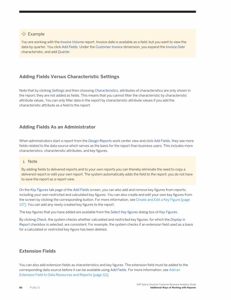
ExampleYou are working with the Invoice Volume report. Invoice date is available as a field, but you want to view the data by quarter. You click Add Fields. Under the Customer Invoice dimension, you expand the Invoice Date characteristic, and add Quarter.
Adding Fields Versus Characteristic Settings
Note that by clicking Settings and then choosing Characteristics, attributes of characteristics are only shown in the report; they are not added as fields. This means that you cannot filter the characteristic by characteristic attribute values. You can only filter data in the report by characteristic attribute values if you add the characteristic attribute as a field to the report.
Adding Fields As an Administrator
When administrators start a report from the Design Reports work center view and click Add Fields, they see more fields related to the data source which serves as the basis for the report than business users. This includes more characteristics, characteristic attributes, and key figures.
NoteBy adding fields to delivered reports and to your own reports you can thereby eliminate the need to copy a delivered report or edit your own report. The system automatically adds the field to the report; you do not have to save the report as a report view.
On the Key Figures tab page of the Add Fields screen, you can also add and remove key figures from reports, including your own restricted and calculated key figures. You can also create and edit your own key figures from the screen by clicking the corresponding button. For more information, see Create and Edit a Key Figure [page 137]. You can add any newly created key figures to the report.
The key figures that you have added are available from the Select Key figures dialog box of Key Figures.
By clicking Check, the system checks whether calculated and restricted key figures, for which the Display in Report checkbox is selected, are consistent. For example, the system checks if an extension field used as a basis for a calculated or restricted key figure has been deleted.
Extension Fields
You can also add extension fields as characteristics and key figures. The extension field must be added to the corresponding data source before it can be available using Add Fields. For more information, see Add an Extension Field to Data Resources and Reports [page 111].
80 P U B L I CSAP Hybris Cloud for Customer Business Analytics Guide
Additional Ways of Working with Reports
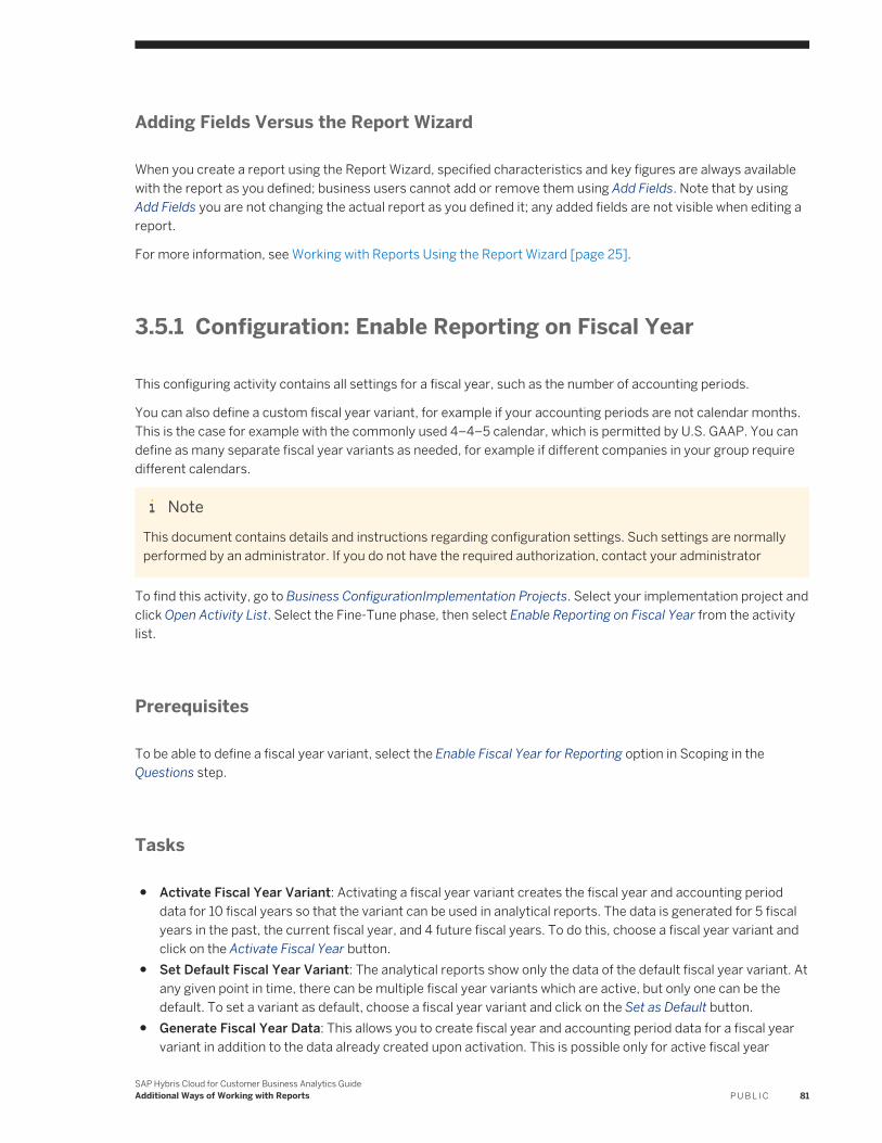
Adding Fields Versus the Report Wizard
When you create a report using the Report Wizard, specified characteristics and key figures are always available with the report as you defined; business users cannot add or remove them using Add Fields. Note that by using Add Fields you are not changing the actual report as you defined it; any added fields are not visible when editing a report.
For more information, see Working with Reports Using the Report Wizard [page 25].
3.5.1 Configuration: Enable Reporting on Fiscal Year
This configuring activity contains all settings for a fiscal year, such as the number of accounting periods.
You can also define a custom fiscal year variant, for example if your accounting periods are not calendar months. This is the case for example with the commonly used 4–4–5 calendar, which is permitted by U.S. GAAP. You can define as many separate fiscal year variants as needed, for example if different companies in your group require different calendars.
NoteThis document contains details and instructions regarding configuration settings. Such settings are normally performed by an administrator. If you do not have the required authorization, contact your administrator
To find this activity, go to Business ConfigurationImplementation Projects. Select your implementation project and click Open Activity List. Select the Fine-Tune phase, then select Enable Reporting on Fiscal Year from the activity list.
Prerequisites
To be able to define a fiscal year variant, select the Enable Fiscal Year for Reporting option in Scoping in the Questions step.
Tasks
● Activate Fiscal Year Variant: Activating a fiscal year variant creates the fiscal year and accounting period data for 10 fiscal years so that the variant can be used in analytical reports. The data is generated for 5 fiscal years in the past, the current fiscal year, and 4 future fiscal years. To do this, choose a fiscal year variant and click on the Activate Fiscal Year button.
● Set Default Fiscal Year Variant: The analytical reports show only the data of the default fiscal year variant. At any given point in time, there can be multiple fiscal year variants which are active, but only one can be the default. To set a variant as default, choose a fiscal year variant and click on the Set as Default button.
● Generate Fiscal Year Data: This allows you to create fiscal year and accounting period data for a fiscal year variant in addition to the data already created upon activation. This is possible only for active fiscal year
SAP Hybris Cloud for Customer Business Analytics GuideAdditional Ways of Working with Reports P U B L I C 81
variants. To do this, choose an active fiscal year variant and click on the Generate Fiscal Year Data button. This will open a dialog box where you can enter the fiscal years for which data should be generated.
● Create New Fiscal Year Template: You can define a custom fiscal year variant if your accounting periods are not calendar months, or if you want to create a variant that is already not delivered by SAP. You will need to specify the fiscal year variant details and define an accounting period template from which the actual fiscal year and accounting period data can be created. To create a fiscal year variant, follow the steps below:
1. Click New Custom Fiscal Year Template . This will open up a new window where you can specify the following details of the new variant:○ Fiscal Year Variant: A two-character code that starts with a letter.○ Number of Accounting Period: The number of accounting periods that your fiscal year covers in a
normal situation.○ Relationship of Fiscal Year to Calendar Year: If you define a non-calendar fiscal year, specify whether
the beginning or ending month is within the calendar year of a particular fiscal year.2. Click Create Periods to generate the default template accounting periods. You can specify which rules the
system uses to determine the accounting periods for a particular fiscal year by entering the following details:○ Start Day: Enter the calendar day on which the accounting period starts.○ Start Month: Enter the calendar month on which the accounting period starts.○ Description: You can enter a short and long description for the period. The descriptions are displayed
when the periods are opened and closed.○ Fiscal Quarter: Enter a single digit numeric value specifying the fiscal quarter to which the accounting
the period belongs. For example: 1,2, 3,4.○ Fiscal Half: Enter a single digit numeric value specifying the fiscal half to which the accounting the
period belongs. For example: 1,2.You can also change the number of accounting periods after specifying the accounting period details. To do this, click on the Delete Periods button. This will delete all the existing periods and make the Number of Accounting Periods fields editable once again.
3. Save your fiscal variant.Once this is done, you can go back to the previous screen to create the actual fiscal year and accounting period data for your new variant.
● Create Year-Specific Variant: You can also define a year-specific variant if your accounting periods are not calendar months, or if you want to create a variant that is already not delivered by SAP, or if the accounting period details vary for each fiscal year. You will need to specify the fiscal year variant details and define accounting periods and accounting period data for each fiscal year. To create a year-specific variant, follow the steps below:
1. Click New Year Specific Variant . This will open a new window where you can specify the following details of the new variant:○ Fiscal Year Variant: A two-character code that starts with a letter.○ Description: Enter a small description to identify your variant.
2. Click OK to create the variant. The system shows you the details of the fiscal year variant in the lower part of your screen.
3. In the Fiscal Year Details tab, enter the number of accounting periods for each fiscal year of the year-specific fiscal year variant.
4. In the Period Details tab, enter the following details:○ Start Date: Enter the date on which the accounting period starts.○ End Date: Enter the date on which the accounting period ends.
82 P U B L I CSAP Hybris Cloud for Customer Business Analytics Guide
Additional Ways of Working with Reports
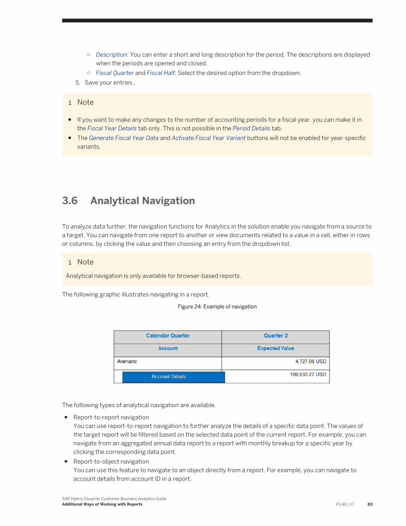
○ Description: You can enter a short and long description for the period. The descriptions are displayed when the periods are opened and closed.
○ Fiscal Quarter and Fiscal Half: Select the desired option from the dropdown.5. Save your entries..
Note
● If you want to make any changes to the number of accounting periods for a fiscal year, you can make it in the Fiscal Year Details tab only. This is not possible in the Period Details tab.
● The Generate Fiscal Year Data and Activate Fiscal Year Variant buttons will not be enabled for year-specific variants.
3.6 Analytical Navigation
To analyze data further, the navigation functions for Analytics in the solution enable you navigate from a source to a target. You can navigate from one report to another or view documents related to a value in a cell, either in rows or columns, by clicking the value and then choosing an entry from the dropdown list.
NoteAnalytical navigation is only available for browser-based reports.
The following graphic illustrates navigating in a report.
Figure 24: Example of navigation
The following types of analytical navigation are available.
● Report-to-report navigationYou can use report-to-report navigation to further analyze the details of a specific data point. The values of the target report will be filtered based on the selected data point of the current report. For example, you can navigate from an aggregated annual data report to a report with monthly breakup for a specific year by clicking the corresponding data point.
● Report-to-object navigationYou can use this feature to navigate to an object directly from a report. For example, you can navigate to account details from account ID in a report.
SAP Hybris Cloud for Customer Business Analytics GuideAdditional Ways of Working with Reports P U B L I C 83
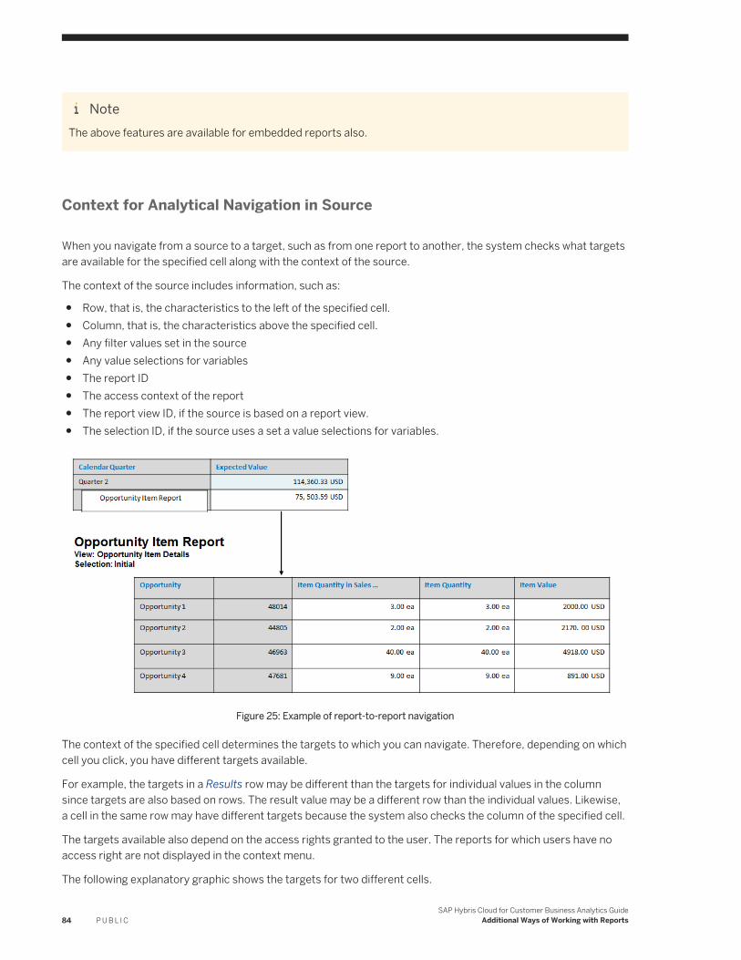
NoteThe above features are available for embedded reports also.
Context for Analytical Navigation in Source
When you navigate from a source to a target, such as from one report to another, the system checks what targets are available for the specified cell along with the context of the source.
The context of the source includes information, such as:
● Row, that is, the characteristics to the left of the specified cell.● Column, that is, the characteristics above the specified cell.● Any filter values set in the source● Any value selections for variables● The report ID● The access context of the report● The report view ID, if the source is based on a report view.● The selection ID, if the source uses a set a value selections for variables.
Figure 25: Example of report-to-report navigation
The context of the specified cell determines the targets to which you can navigate. Therefore, depending on which cell you click, you have different targets available.
For example, the targets in a Results row may be different than the targets for individual values in the column since targets are also based on rows. The result value may be a different row than the individual values. Likewise, a cell in the same row may have different targets because the system also checks the column of the specified cell.
The targets available also depend on the access rights granted to the user. The reports for which users have no access right are not displayed in the context menu.
The following explanatory graphic shows the targets for two different cells.
84 P U B L I CSAP Hybris Cloud for Customer Business Analytics Guide
Additional Ways of Working with Reports
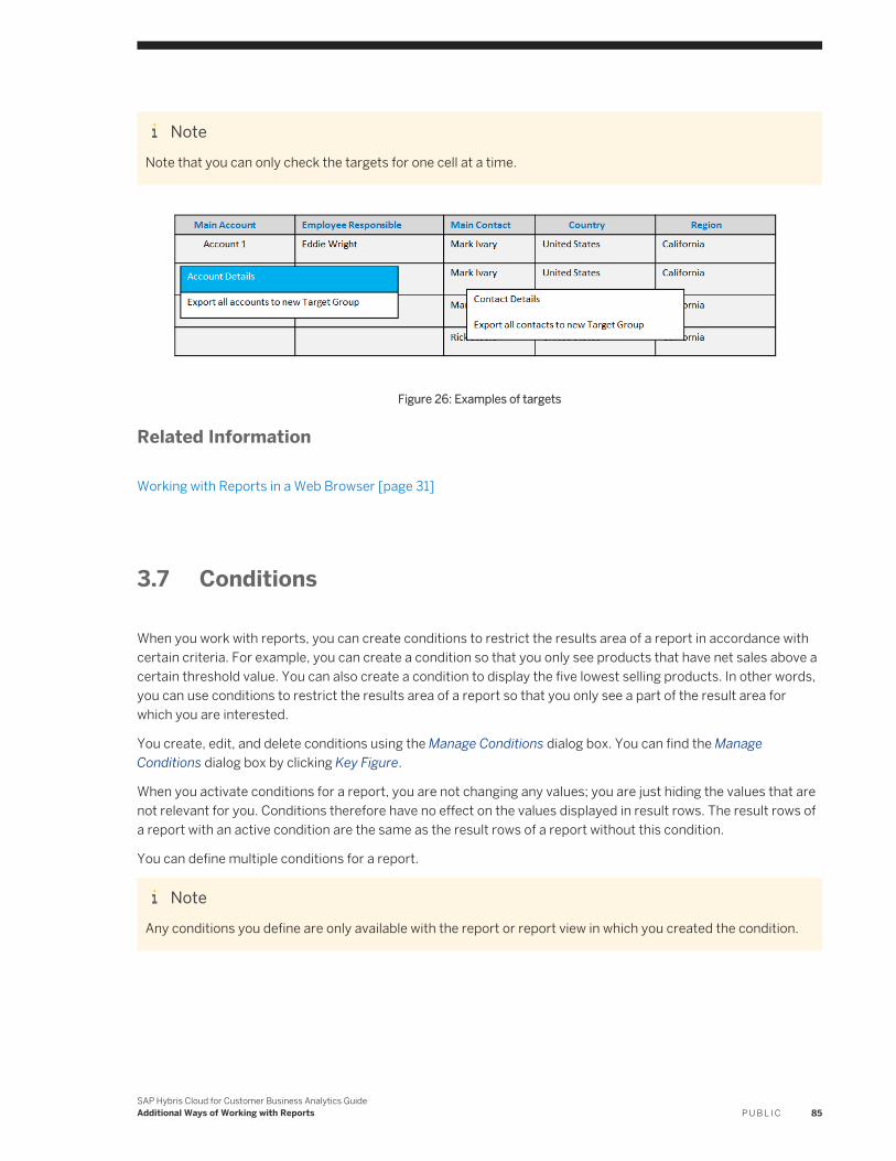
NoteNote that you can only check the targets for one cell at a time.
Figure 26: Examples of targets
Related Information
Working with Reports in a Web Browser [page 31]
3.7 Conditions
When you work with reports, you can create conditions to restrict the results area of a report in accordance with certain criteria. For example, you can create a condition so that you only see products that have net sales above a certain threshold value. You can also create a condition to display the five lowest selling products. In other words, you can use conditions to restrict the results area of a report so that you only see a part of the result area for which you are interested.
You create, edit, and delete conditions using the Manage Conditions dialog box. You can find the Manage Conditions dialog box by clicking Key Figure.
When you activate conditions for a report, you are not changing any values; you are just hiding the values that are not relevant for you. Conditions therefore have no effect on the values displayed in result rows. The result rows of a report with an active condition are the same as the result rows of a report without this condition.
You can define multiple conditions for a report.
NoteAny conditions you define are only available with the report or report view in which you created the condition.
SAP Hybris Cloud for Customer Business Analytics GuideAdditional Ways of Working with Reports P U B L I C 85
Simple Conditions
When you create a simple condition, you set thresholds for a specified key figure related to a characteristic using relational operators.
ExampleYou want to see all products for which invoiced net value is greater than 100 EUR. You set a condition on the Product characteristic for the Invoiced Net Value key figure. As an operator, you select Greater than, and enter 100 as the From Value. Result: The system returns a list of products for which invoiced net value is greater than 100 EUR and hides other values.
Ranked Conditions
The system compares all values for a specified key figure related to a characteristic that you set. All values that adhere to the rules that you define are displayed in a ranked list.
You use the following operators to define rules for ranked conditions:
● Bottom count / Top countThe ranked list is arranged according to a specified number.
NoteExample
Top 5 Customers by Net Sales
The system displays a ranked list of the 5 customers having the highest net sales.
● Bottom percent / Top percentThe ranked list is arranged according to a specified percent.
NoteExample
Top 25% of Customers by Net Sales
The system displays a ranked list of the highest net sales by customer until 25 percent of the total net sales is reached.
● Bottom sum / Top sumThe ranked list is arranged according to a particular results value.
NoteExample
Customers - Top Total 20,000 EUR of Net Sales
The system displays a ranked list of customers, sorted by net sales in descending order, until an aggregated net sales total greater than or equal to 20,000 EUR is reached. The result can be greater than
86 P U B L I CSAP Hybris Cloud for Customer Business Analytics Guide
Additional Ways of Working with Reports
20,000 EUR if the system has to add another customer to the ranked list to reach the threshold value but whose net sales then makes the aggregated net sales result greater than 20,000 EUR.
3.8 Exceptions
When you work with reports, you can create exceptions for key figures. An exception is a deviation from defined threshold values. You create exceptions by setting threshold values or intervals, for which you set an alert. Using exceptions, the system emphasizes key figure values that deviate from or adhere to threshold values or intervals. Key figure values that deviate from or adhere to the threshold are indicated using symbols or are highlighted in color. This enables you to identify immediately all relevant values.
You create, edit, and delete exceptions using the Manage Exceptions dialog box. You can find the Manage Exceptions dialog box by clicking Key Figure.
When you activate exceptions for a report, the system applies the exception to the data in the report.
You can define multiple exceptions for a report.
NoteAny exceptions you define are only available with the report or report view in which you created the exception.
Defining Exceptions
To define an exception, you select a key figure, decide how the exception is to be displayed and how it is to be applied.
Key Figure
From the dropdown list, you select the key figure for which you want to define an exception.
Alert Indicator
The following options are available for displaying exceptions in the report:
Arrow The alert level is represented as an arrow with five varying degrees of slant, corresponding to different levels of priority.
Background Color The alert level is represented by the value highlighted in various shades of green, yellow, and red. For each color, there are three shades, corresponding to different levels of priority.
Traffic Light The alert level is represented as a traffic light.
Apply To
The following options are available for applying exceptions to values that deviate from thresholds:
Data and Result The exception is applied to key figure values and result rows.
SAP Hybris Cloud for Customer Business Analytics GuideAdditional Ways of Working with Reports P U B L I C 87
Data The exception is applied to key figure values but not result rows.
Result The exception is only applied to result rows.
Defining Thresholds
You can restrict a specified key figure using relational operators, such as greater than and less than.
ExampleYou want to emphasize all products for which invoiced net value is greater than 100 EUR, which is a good value. You create an exception for the Invoiced Net Value key figure. As an operator, you select Greater than, and enter 100 as the From Value with an alert level as green. You have defined the alert indicator as background color. Result: The system highlights in green all values in the Invoiced Net Value column that are greater than 100 EUR.
88 P U B L I CSAP Hybris Cloud for Customer Business Analytics Guide
Additional Ways of Working with Reports
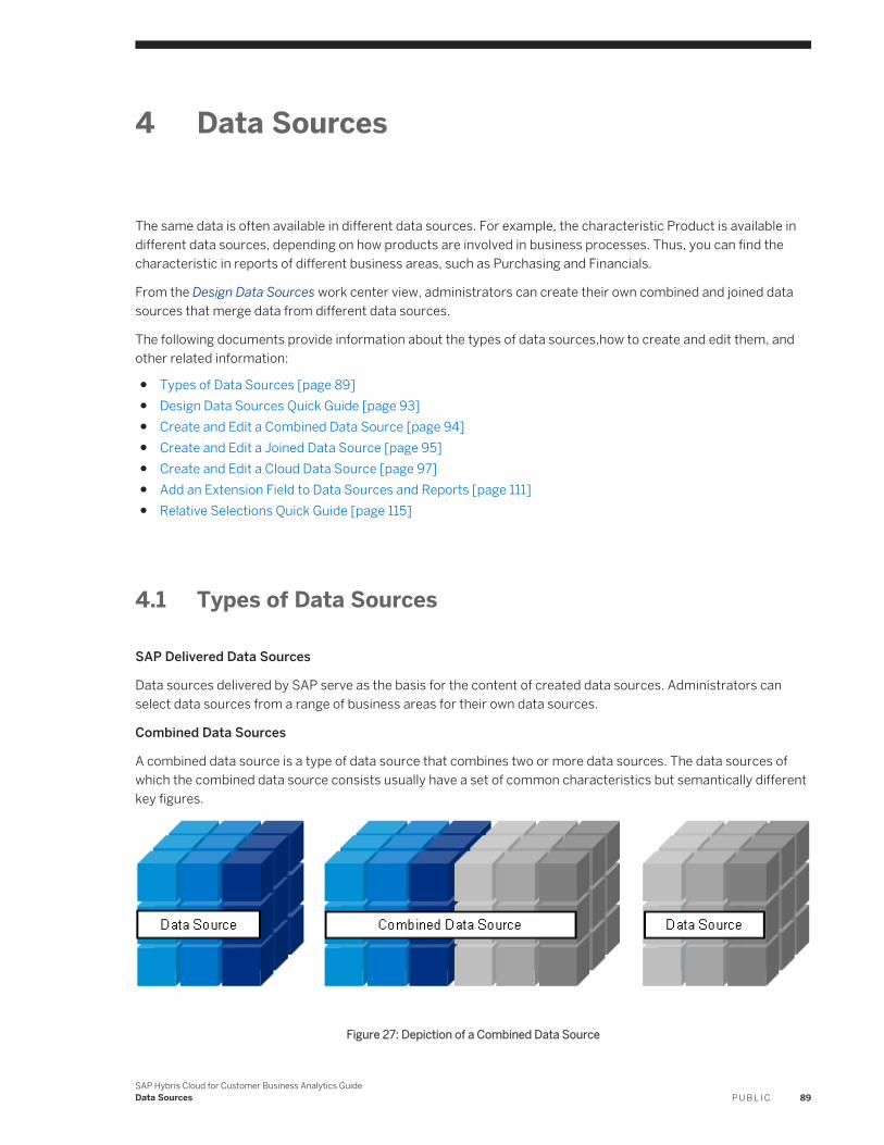
4 Data Sources
The same data is often available in different data sources. For example, the characteristic Product is available in different data sources, depending on how products are involved in business processes. Thus, you can find the characteristic in reports of different business areas, such as Purchasing and Financials.
From the Design Data Sources work center view, administrators can create their own combined and joined data sources that merge data from different data sources.
The following documents provide information about the types of data sources,how to create and edit them, and other related information:
● Types of Data Sources [page 89]● Design Data Sources Quick Guide [page 93]● Create and Edit a Combined Data Source [page 94]● Create and Edit a Joined Data Source [page 95]● Create and Edit a Cloud Data Source [page 97]● Add an Extension Field to Data Sources and Reports [page 111]● Relative Selections Quick Guide [page 115]
4.1 Types of Data Sources
SAP Delivered Data Sources
Data sources delivered by SAP serve as the basis for the content of created data sources. Administrators can select data sources from a range of business areas for their own data sources.
Combined Data Sources
A combined data source is a type of data source that combines two or more data sources. The data sources of which the combined data source consists usually have a set of common characteristics but semantically different key figures.
Figure 27: Depiction of a Combined Data Source
SAP Hybris Cloud for Customer Business Analytics GuideData Sources P U B L I C 89
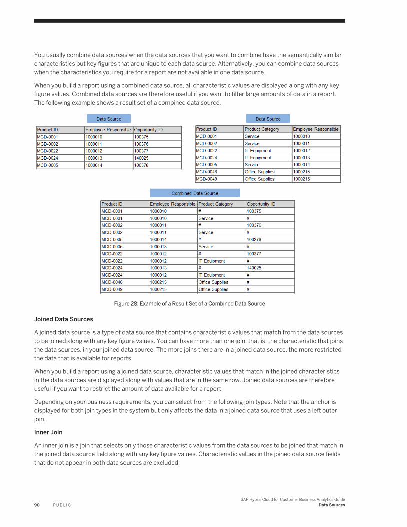
You usually combine data sources when the data sources that you want to combine have the semantically similar characteristics but key figures that are unique to each data source. Alternatively, you can combine data sources when the characteristics you require for a report are not available in one data source.
When you build a report using a combined data source, all characteristic values are displayed along with any key figure values. Combined data sources are therefore useful if you want to filter large amounts of data in a report. The following example shows a result set of a combined data source.
Figure 28: Example of a Result Set of a Combined Data Source
Joined Data Sources
A joined data source is a type of data source that contains characteristic values that match from the data sources to be joined along with any key figure values. You can have more than one join, that is, the characteristic that joins the data sources, in your joined data source. The more joins there are in a joined data source, the more restricted the data that is available for reports.
When you build a report using a joined data source, characteristic values that match in the joined characteristics in the data sources are displayed along with values that are in the same row. Joined data sources are therefore useful if you want to restrict the amount of data available for a report.
Depending on your business requirements, you can select from the following join types. Note that the anchor is displayed for both join types in the system but only affects the data in a joined data source that uses a left outer join.
Inner Join
An inner join is a join that selects only those characteristic values from the data sources to be joined that match in the joined data source field along with any key figure values. Characteristic values in the joined data source fields that do not appear in both data sources are excluded.
90 P U B L I CSAP Hybris Cloud for Customer Business Analytics Guide
Data Sources
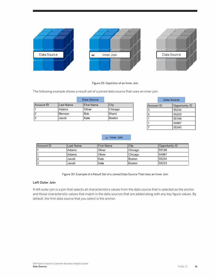
Figure 29: Depiction of an Inner Join
The following example shows a result set of a joined data source that uses an inner join.
Figure 30: Example of a Result Set of a Joined Data Source That Uses an Inner Join
Left Outer Join
A left outer join is a join that selects all characteristics values from the data source that is selected as the anchor and those characteristic values that match in the data sources that are added along with any key figure values. By default, the first data source that you select is the anchor.
SAP Hybris Cloud for Customer Business Analytics GuideData Sources P U B L I C 91
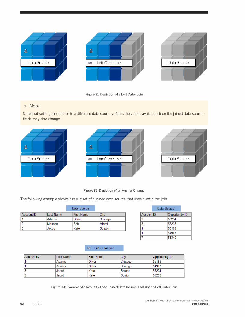
Figure 31: Depiction of a Left Outer Join
NoteNote that setting the anchor to a different data source affects the values available since the joined data source fields may also change.
Figure 32: Depiction of an Anchor Change
The following example shows a result set of a joined data source that uses a left outer join.
Figure 33: Example of a Result Set of a Joined Data Source That Uses a Left Outer Join
92 P U B L I CSAP Hybris Cloud for Customer Business Analytics Guide
Data Sources
4.2 Design Data Sources Quick Guide
In the Design Data Sources work center view, administrators can create and edit their own data sources to suit their business requirements and processes and to use the data sources for reporting. You can access the Design Data Sources view from the Business Analytics or Administrator work centers.
Business Background
You use Analytics objects in the system to create your own reports. Data from key figures and characteristics in data sources serves as the basis for reports. For more information, see Overview of Analytics [page 6]. For information about data sources, see Data Sources Business Concept [page 89].
Tasks
You can perform the following tasks in this view:
● Create a Combined Data Source: You can create and edit combined data sources to suit your business requirements and processes and use combined data sources for reporting.For information about this task, see Create and Edit a Combined Data Source [page 94]
● Create a Joined Data Source: You can create and edit joined data sources to suit your business requirements and processes and use joined data sources for reporting.For information about this task, see Create and Edit a Joined Data Source [page 95]
● Preview a Data Source: You can preview the data of data sources in a Web browser. In the preview mode, administrators can view the data similar to how end users view the data in a report. From the preview mode, administrators can then navigate to the Report Wizard from which they can create a report based on the data source.By default, key figures available with a data source are displayed in columns, rows are empty, and characteristics available with the data source are listed in the Not Currently Shown list.Since you preview the data similar to how end users view the data in a report, the functions available are the same as those available when working with a report in a Web browser; the range of functions available however are limited to those required to preview data in the data source. For example, when previewing a data source, the functions available for saving and managing report views are not available. For more information, see Viewing Reports with the Web Browser Option [page 19].
● Create a Key Figure: You can create your own calculated and restricted key figures for use in reports.For information about this task, see Create and Edit a Key Figure [page 137]
● Create a Report: You can create and edit reports that you create using the Report Wizard.For information about this task, see Working with Reports Using the Report Wizard [page 25]
● Download Template: The system gives you an option to download a template file for the selected cloud data source. The template has predelivered sample data and the format to assist you in filling your own data. Once you enter the data in the correct format, you can upload it to the selected cloud data source.
● Restrict Edit Rights to analytical objects based on an Org Unit: You can restrict edit rights by assigning analytical objects such as, reports, key figures, data sources, KPIs, and relative selections, to one or more Org Units.
SAP Hybris Cloud for Customer Business Analytics GuideData Sources P U B L I C 93
For information about this task, see Restrict Edit Rights to analytical objects based on an Org Unit [page 17]
Related Information
Add an Extension Field to Data Sources and Reports [page 111]
4.3 Create and Edit a Combined Data Source
From the Design Data Sources work center view, administrators can create and edit combined data sources to suit their business requirements and processes and to use combined data sources for reporting.
For information about the types of data sources, see Data Sources Business Concept [page 89].
Procedure
1. In the Design Data Source work center view, from New, choose the Combined Data Source option.By default, the combined data source contains the Counter key figure. The Counter key figure counts the number of instances of a specified object.
2. On the New Combined Data Source screen, click Add Data Source.3. On the Add Data Source dialog screen, select a data source from the dropdown list. You can then view which
characteristics and key figures are available in the selected data source. The initial selections serve as a basis for the combined data source. The characteristics and key figures are then displayed in the Combined Data Source Fields column.
NoteOnly data sources that have compatible access contexts can be added to the combined data source. For example, a data source can be added if the data source and the combined data source have a common access context. Data sources that have unrestricted as an access context can always be added.
Thereby the number of available data sources to be combined may be reduced.
4. Select one or more additional data sources for the combined data source and add the data sources accordingly.
NoteWhen you add data sources to the combined data source, the system checks whether the characteristics and key figures in the additional data sources are also available in the data source that you selected as a basis for the combined data source.
If the characteristic or key figure is already available in the combined data source, the system maps the characteristic or key figure and positions the characteristic or key figure in the same row across all data sources.
94 P U B L I CSAP Hybris Cloud for Customer Business Analytics Guide
Data Sources
If the characteristic or key figure is not already available in the combined data source, the system adds the characteristic or key figure to the combined data source.
Other Functions
Remove Data Source
The Remove Data Source dialog screen appears, showing the data sources that you have added. You can remove data sources by clicking the relevant checkbox.
Add Row Adds a row to be defined by you. Once you have added a characteristic or key figure, the system adds the characteristic or key figure to the relevant field type group.
Remove Row Deletes the selected row. Note that the selected characteristic or key figure is only removed from the combined data source.
Check Mapping Checks whether characteristics and key figures semantically match in the selected data sources. Note you can change the mapping. It is not necessary characteristics have the same name, but they must match semantically. For example, in your company, sales units and cost centers are one and the same.
Result
The combined data source is available for reporting. You can create reports using data from the combined data source. For information about creating reports, see Working with Reports Using the Report Wizard [page 25].
4.4 Create and Edit a Joined Data Source
From the Design Data Sources work center view, administrators can create and edit joined data sources to suit their business requirements and processes and to use joined data sources for reporting.
For information about the types of data sources, see Data Sources Business Concept [page 89].
Procedure
1. In the Design Data Source work center view, from New, choose the Joined Data Source option.By default, the joined data source contains the Counter key figure. The Counter key figure counts the number of instances of a specified object.
2. On the New Joined Data Source screen, click Add Data Source.Note that a maximum of 5 data sources can be joined.
3. On the Add Data Source dialog screen, select a data source from the dropdown list. You can then view which characteristics and key figures are available in the selected data source. The initial selections serve as a basis
SAP Hybris Cloud for Customer Business Analytics GuideData Sources P U B L I C 95
for the joined data source. The characteristics and key figures are then displayed in the Joined Data Source Fields column.
4. Select one or more additional data sources for the joined data source and add the data sources accordingly.
NoteWhen you add data sources to the joined data source, the system checks whether the characteristics and key figures in the additional data sources are also available in the data source that you selected as a basis for the joined data source.
If the characteristic or key figure is already available in the joined data source, the system positions the characteristic or key figure in the same row across all data sources.
If the characteristic or key figure is not already available in the joined data source, the system adds the characteristic or key figure to the joined data source.
If you are joining a cloud data source with any other data source, ensure that the characteristics involved in join conditions are not compound characteristics.
Note that if the characteristic is already available in the data source that is the anchor, the system creates a join. The more joins there are in a joined data source, the more restricted the data that is available for reports.
Other Functions
Remove Data Source
The Remove Data Source dialog screen appears, showing the data sources that you have added. You can remove data sources by clicking the relevant checkbox.
Add Row Adds a row to be defined by you. Once you have added a characteristic or key figure, the system adds the characteristic or key figure to the relevant field type group.
Remove Row Deletes the selected row. Note that the selected characteristic or key figure is only removed from the joined data source
Check Checks whether the joined data source is consistent.
Set Anchor Sets the anchor to the selected data source.The data source that is the anchor is the basis for any joins. Depending on the type of join, changing the anchor to a different data source can change the joined data source fields.
Set Access Context
Sets the access context to the access context of the selected data source.
Result
The joined data source is available for reporting. You can create reports using data from the joined data source. For information about creating reports, see Working with Reports Using the Report Wizard [page 25].
96 P U B L I CSAP Hybris Cloud for Customer Business Analytics Guide
Data Sources
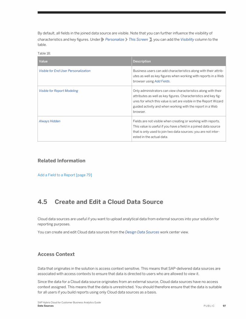
By default, all fields in the joined data source are visible. Note that you can further influence the visibility of characteristics and key figures. Under Personalize This Screen , you can add the Visibility column to the table.
Table 18:
Value Description
Visible for End User Personalization Business users can add characteristics along with their attributes as well as key figures when working with reports in a Web browser using Add Fields.
Visible for Report Modeling Only administrators can view characteristics along with their attributes as well as key figures. Characteristics and key figures for which this value is set are visible in the Report Wizard guided activity and when working with the report in a Web browser.
Always Hidden Fields are not visible when creating or working with reports. This value is useful if you have a field in a joined data source that is only used to join two data sources; you are not interested in the actual data.
Related Information
Add a Field to a Report [page 79]
4.5 Create and Edit a Cloud Data Source
Cloud data sources are useful if you want to upload analytical data from external sources into your solution for reporting purposes.
You can create and edit Cloud data sources from the Design Data Sources work center view.
Access Context
Data that originates in the solution is access context sensitive. This means that SAP-delivered data sources are associated with access contexts to ensure that data is directed to users who are allowed to view it.
Since the data for a Cloud data source originates from an external source, Cloud data sources have no access context assigned. This means that the data is unrestricted. You should therefore ensure that the data is suitable for all users if you build reports using only Cloud data sources as a basis.
SAP Hybris Cloud for Customer Business Analytics GuideData Sources P U B L I C 97
NoteIf you use a Cloud data source in a joined or combined data source with SAP-delivered data sources, then the access context of the corresponding SAP-delivered data source serves as the access context of the joined or combined data source.
Upload Options
You can upload data manually or through a web service.
Note● There are no upper limits to the number of records that you can upload to a cloud data source.● You can add a maximum of 100,000 records per upload.
● Manual Upload [page 98]● Upload Using a Web Service [page 100]
Data Types for Cloud Data Source Fields
When creating a Cloud data source, you need to decide how the data source is to be modeled. Depending on whether you want to create characteristics or key figures, set the data type accordingly. For more information on different types of data types, how to create and edit data sources, and examples, see the following:
● Data Types for Cloud Data Source Fields [page 104]● Create or Edit [page 105]● Examples [page 109]
4.5.1 Manual Upload
To upload data manually to your solution, when creating or editing a Cloud data source, ensure that the Manual Data Upload checkbox is selected. The data to be uploaded must be saved as a CSV file.
NoteWhile uploading CSV files, ensure the following:
● The maximum limit of entries per upload is 100,000.● The decimal separator is a period (.) and the field delimiter is a semicolon (;). Thousand separators are not
supported.● Enter the same delimiter that is used in the CSV file.
98 P U B L I CSAP Hybris Cloud for Customer Business Analytics Guide
Data Sources
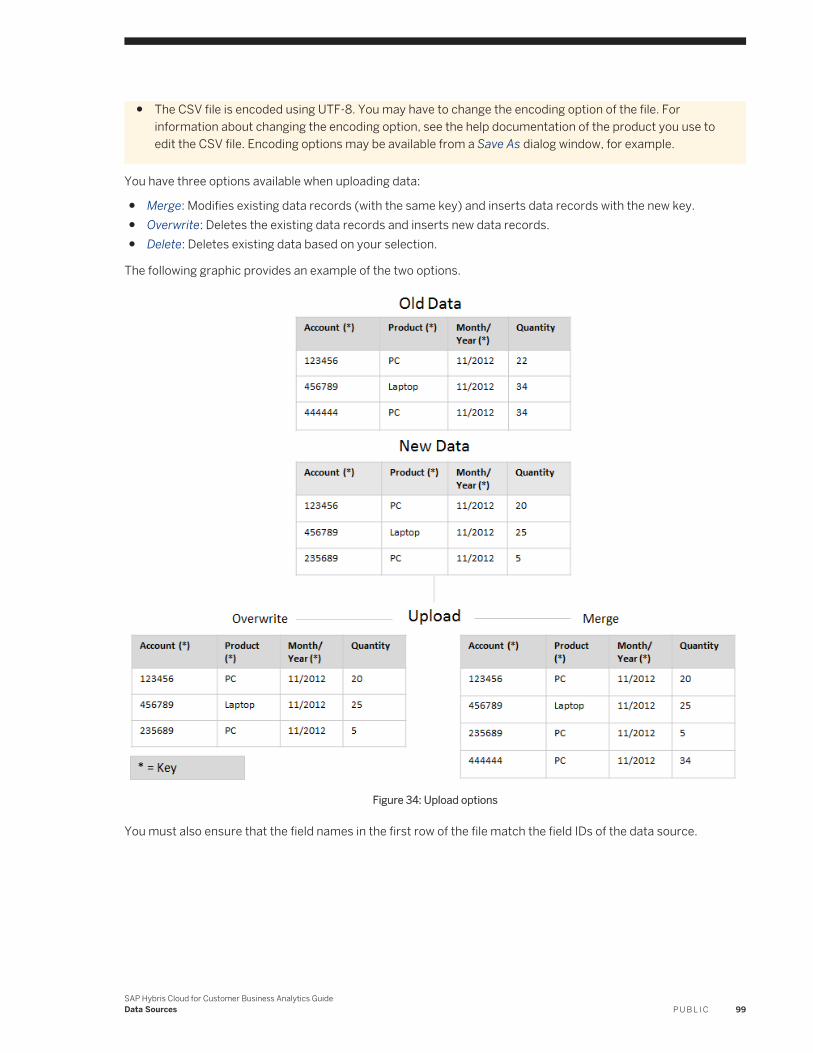
● The CSV file is encoded using UTF-8. You may have to change the encoding option of the file. For information about changing the encoding option, see the help documentation of the product you use to edit the CSV file. Encoding options may be available from a Save As dialog window, for example.
You have three options available when uploading data:
● Merge: Modifies existing data records (with the same key) and inserts data records with the new key.● Overwrite: Deletes the existing data records and inserts new data records.● Delete: Deletes existing data based on your selection.
The following graphic provides an example of the two options.
Figure 34: Upload options
You must also ensure that the field names in the first row of the file match the field IDs of the data source.
SAP Hybris Cloud for Customer Business Analytics GuideData Sources P U B L I C 99
4.5.2 Upload Using a Web Service
Context
To create and edit Cloud data sources using a Web service, you must set up a communication and system and arrangement, and use the service URL to pull the data into your solution.
Procedure
1. Create a communication system.a. In the Application and User Management work center, under Input and Output Management, choose the
Communication Systems view.b. In the Communication Systems view, click New.c. In the Communication System section, enter the details of the communication system, as follows:
○ ID is used as the template for the technical user in the communication arrangement.○ Host Name has to be supplied, but is not used.○ For the System Access Type, select Internet.
d. When you have entered all the details, click Save and Close to return to the Communication Systems view. The communication system you just created has the status In Preparation.
e. In the Communication Systems view, select the communication system you have created and click Actions, then choose Set to Active.
If the status changes to Active, the configuration is ready to be used.
For more information, see the Communication Systems Quick Guide.2. Create a communication arrangement.
a. In the Application and User Management work center, under Input and Output Management, choose the Communication Arrangements view.
b. To open the New Communication Arrangement guided activity, in the Communication Arrangements view, click New.
c. In the Select Scenario step, select Analytics Data Upload and click Next.d. In the Define Business Data step, enter business data.
○ In the System Instance ID field, choose or enter the communication system ID that you created.e. In the Define Technical Data step, define the technical settings for inbound communication.
○ For a communication method, select Direct Connection.○ For an application protocol, select Web Service.○ For an authentication method, select User ID and Password.○ Next to the User ID field, click Edit Credentials.
The user ID is automatically predefined, but you must create a password, as follows:○ Choose Change Password.
100 P U B L I CSAP Hybris Cloud for Customer Business Analytics Guide
Data Sources
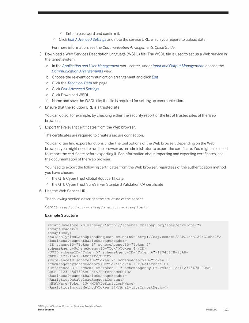
○ Enter a password and confirm it.○ Click Edit Advanced Settings and note the service URL, which you require to upload data.
For more information, see the Communication Arrangements Quick Guide.3. Download a Web Services Description Language (WSDL) file. The WSDL file is used to set up a Web service in
the target system.a. In the Application and User Management work center, under Input and Output Management, choose the
Communication Arrangements view.b. Choose the relevant communication arrangement and click Edit.c. Click the Technical Data tab page.d. Click Edit Advanced Settings.e. Click Download WSDL.f. Name and save the WSDL file; the file is required for setting up communication.
4. Ensure that the solution URL is a trusted site.
You can do so, for example, by checking either the security report or the list of trusted sites of the Web browser.
5. Export the relevant certificates from the Web browser.
The certificates are required to create a secure connection.
You can often find export functions under the tool options of the Web browser. Depending on the Web browser, you might need to run the browser as an administrator to export the certificate. You might also need to import the certificate before exporting it. For information about importing and exporting certificates, see the documentation of the Web browser.
You need to export the following certificates from the Web browser, regardless of the authentication method you have chosen:○ the GTE CyberTrust Global Root certificate○ the GTE CyberTrust SureServer Standard Validation CA certificate
6. Use the Web Service URL.
The following section describes the structure of the service.
Service: /sap/bc/srt/scs/sap/analyticsdatauploadin
Example Structure
<soap:Envelope xmlns:soap="http://schemas.xmlsoap.org/soap/envelope/"> <soap:Header/><soap:Body> <n0:AnalyticsDataUploadRequest xmlns:n0="http://sap.com/xi/SAPGlobal20/Global"> <BusinessDocumentBasicMessageHeader> <ID schemeID="Token 1" schemeAgencyID="Token 2" schemeAgencySchemeAgencyID="Tok">Token 4</ID><UUID schemeID="Token 5" schemeAgencyID="Token 6">12345678-90AB-CDEF-0123-456789ABCDEF</UUID><ReferenceID schemeID="Token 7" schemeAgencyID="Token 8" schemeAgencySchemeAgencyID="Tok">Token 10</ReferenceID><ReferenceUUID schemeID="Token 11" schemeAgencyID="Token 12">12345678-90AB-CDEF-0123-456789ABCDEF</ReferenceUUID><BusinessDocumentBasicMessageHeader><AnalyticsDataUploadRequestContent> <MDAVName>Token 13</MDAVDefinitionNName><AnalyticsImportMethod>Token 14</AnalyticsImportMethod>
SAP Hybris Cloud for Customer Business Analytics GuideData Sources P U B L I C 101
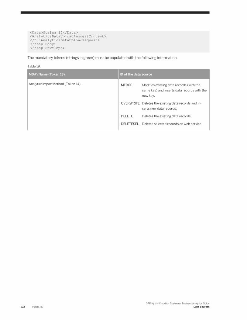
<Data>String 15</Data><AnalyticsDataUploadRequestContent></n0:AnalyticsDataUploadRequest></soap:Body></soap:Envelope>
The mandatory tokens (strings in green) must be populated with the following information.
Table 19:
MDAVName (Token 13) ID of the data source
AnalyticsImportMethod (Token 14) MERGE Modifies existing data records (with the same key) and inserts data records with the new key.
OVERWRITE Deletes the existing data records and inserts new data records.
DELETE Deletes the existing data records.
DELETESEL Deletes selected records on web service.
102 P U B L I CSAP Hybris Cloud for Customer Business Analytics Guide
Data Sources
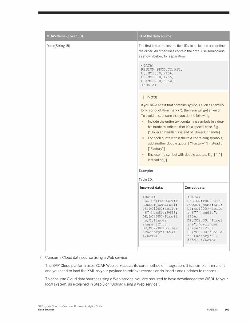
MDAVName (Token 13) ID of the data source
Data (String 15) The first line contains the field IDs to be loaded and defines the order. All other lines contain the data. Use semicolons, as shown below, for separation.
<DATA> REGION;PRODUCT;KF1;US;MC1000;9456;DE;MC2000;1255;DE;MC2200;3654;</DATA>
NoteIf you have a text that contains symbols such as semicolon (;) or quotation mark (“), then you will get an error. To avoid this, ensure that you do the following:○ Include the entire text containing symbols in a dou
ble quote to indicate that it’s a special case. E.g., [“Boiler 6” handle”] instead of [Boiler 6” handle]
○ For each quote within the text containing symbols, add another double quote. [““Factory””] instead of [“Factory”]
○ Enclose the symbol with double quotes. E.g, [ “;” ] instead of [;]
Example:
Table 20:
Incorrect data:
<DATA> REGION;PRODUCT;PRODUCT_NAME;KF1; US;MC1000;Boiler 6” handle;9456; DE;MC2000;Pipeline;Cylinder shape;1255; DE;MC2200;Boiler”Factory”;3654; </DATA>
Correct data:
<DATA> REGION;PRODUCT;PRODUCT_NAME;KF1; US;MC1000;”Boiler 6”” handle”;9456; DE;MC2000;”Pipeline”;”Cylinder shape”;1255; DE;MC2200;”Boiler””Factory”””;3654; </DATA>
7. Consume Cloud data source using a Web service
The SAP Cloud platform uses SOAP Web services as its core method of integration. It is a simple, thin client and you need to load the XML as your payload to retrieve records or do inserts and updates to records.
To consume Cloud data sources using a Web service, you are required to have downloaded the WSDL to your local system, as explained in Step 3 of “Upload using a Web service”.
SAP Hybris Cloud for Customer Business Analytics GuideData Sources P U B L I C 103
NoteSOAP UI is an open-source, diagnostic tool that can be used to test calling Web services in any SAP Cloud solution. It is not a production tool that can be used to perform the actual integration. With SOAP UI, you can diagnose issues — regardless of your environment, the network, and so on — that block your integration using the SAP Web service. SAP does not provide support for the tool, nor pay for the license. If you require support for the tool, then you must purchase the paid version. Please refer to the documentation available within the tool to help you carry out the necessary steps.
4.5.3 Data Types for Cloud Data Source Fields
When creating a Cloud data source, you need to decide how the data source is to be modeled. Depending on whether you want to create characteristics or key figures, set the data type accordingly.
Table 21: Data Types for Key Figures
Name Description
Amount A monetary sum with a currency unit.
28 integer places are allowed.
6 decimal places are allowed.
If the uploaded value has more than 6 decimal places, then the sixth decimal place value is rounded to the nearest number.
Quantity A definite amount of an item with a unit of measure. Note that you are allowed to enter only ISO codes as units of measure. For example, KGM (Kilogram), GRM (Gram), BG (Bag), BO (Bottle), EA (Each), and so on.
28 integer places are allowed.
6 decimal places are allowed.
If the uploaded value has more than 6 decimal places, then the sixth decimal place value is rounded to the nearest number.
Integer 4 byte integer, whole number with +/- sign.
Only values between -2147483648 and 2147483647 are allowed.
104 P U B L I CSAP Hybris Cloud for Customer Business Analytics Guide
Data Sources
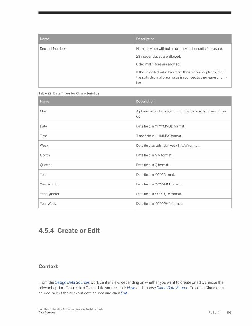
Name Description
Decimal Number Numeric value without a currency unit or unit of measure.
28 integer places are allowed.
6 decimal places are allowed.
If the uploaded value has more than 6 decimal places, then the sixth decimal place value is rounded to the nearest number.
Table 22: Data Types for Characteristics
Name Description
Char Alphanumerical string with a character length between 1 and 60.
Date Date field in YYYYMMDD format.
Time Time field in HHMMSS format.
Week Date field as calendar week in WW format.
Month Date field in MM format.
Quarter Date field in Q format.
Year Date field in YYYY format.
Year Month Date field in YYYY-MM format.
Year Quarter Date field in YYYY-Q-# format.
Year Week Date field in YYYY-W-# format.
4.5.4 Create or Edit
Context
From the Design Data Sources work center view, depending on whether you want to create or edit, choose the relevant option. To create a Cloud data source, click New, and choose Cloud Data Source. To edit a Cloud data source, select the relevant data source and click Edit.
SAP Hybris Cloud for Customer Business Analytics GuideData Sources P U B L I C 105
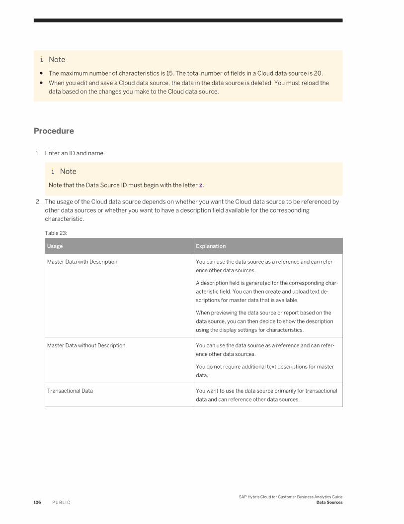
Note● The maximum number of characteristics is 15. The total number of fields in a Cloud data source is 20.● When you edit and save a Cloud data source, the data in the data source is deleted. You must reload the
data based on the changes you make to the Cloud data source.
Procedure
1. Enter an ID and name.
NoteNote that the Data Source ID must begin with the letter Z.
2. The usage of the Cloud data source depends on whether you want the Cloud data source to be referenced by other data sources or whether you want to have a description field available for the corresponding characteristic.
Table 23:
Usage Explanation
Master Data with Description You can use the data source as a reference and can reference other data sources.
A description field is generated for the corresponding characteristic field. You can then create and upload text descriptions for master data that is available.
When previewing the data source or report based on the data source, you can then decide to show the description using the display settings for characteristics.
Master Data without Description You can use the data source as a reference and can reference other data sources.
You do not require additional text descriptions for master data.
Transactional Data You want to use the data source primarily for transactional data and can reference other data sources.
106 P U B L I CSAP Hybris Cloud for Customer Business Analytics Guide
Data Sources
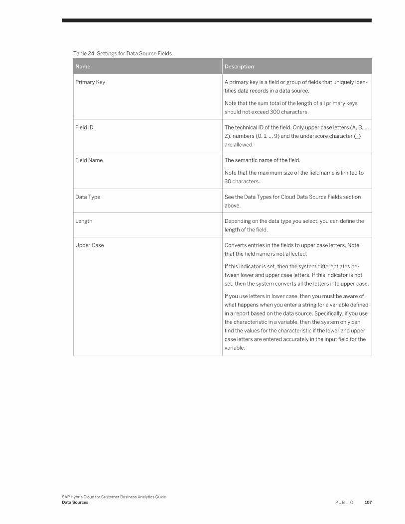
Table 24: Settings for Data Source Fields
Name Description
Primary Key A primary key is a field or group of fields that uniquely identifies data records in a data source.
Note that the sum total of the length of all primary keys should not exceed 300 characters.
Field ID The technical ID of the field. Only upper case letters (A, B, … Z), numbers (0, 1, … 9) and the underscore character (_) are allowed.
Field Name The semantic name of the field.
Note that the maximum size of the field name is limited to 30 characters.
Data Type See the Data Types for Cloud Data Source Fields section above.
Length Depending on the data type you select, you can define the length of the field.
Upper Case Converts entries in the fields to upper case letters. Note that the field name is not affected.
If this indicator is set, then the system differentiates between lower and upper case letters. If this indicator is not set, then the system converts all the letters into upper case.
If you use letters in lower case, then you must be aware of what happens when you enter a string for a variable defined in a report based on the data source. Specifically, if you use the characteristic in a variable, then the system only can find the values for the characteristic if the lower and upper case letters are entered accurately in the input field for the variable.
SAP Hybris Cloud for Customer Business Analytics GuideData Sources P U B L I C 107
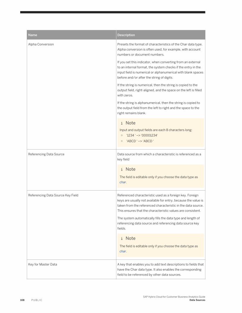
Name Description
Alpha Conversion Presets the format of characteristics of the Char data type. Alpha conversion is often used, for example, with account numbers or document numbers.
If you set this indicator, when converting from an external to an internal format, the system checks if the entry in the input field is numerical or alphanumerical with blank spaces before and/or after the string of digits.
If the string is numerical, then the string is copied to the output field, right-aligned, and the space on the left is filled with zeros.
If the string is alphanumerical, then the string is copied to the output field from the left to right and the space to the right remains blank.
NoteInput and output fields are each 8 characters long:○ '1234 ' –> '00001234'○ 'ABCD ' –> 'ABCD '
Referencing Data Source Data source from which a characteristic is referenced as a key field
NoteThe field is editable only if you choose the data type as char.
Referencing Data Source Key Field Referenced characteristic used as a foreign key. Foreign keys are usually not available for entry, because the value is taken from the referenced characteristic in the data source. This ensures that the characteristic values are consistent.
The system automatically fills the data type and length of referencing data source and referencing data source key fields.
NoteThe field is editable only if you choose the data type as char.
Key for Master Data A key that enables you to add text descriptions to fields that have the Char data type. It also enables the corresponding field to be referenced by other data sources.
108 P U B L I CSAP Hybris Cloud for Customer Business Analytics Guide
Data Sources
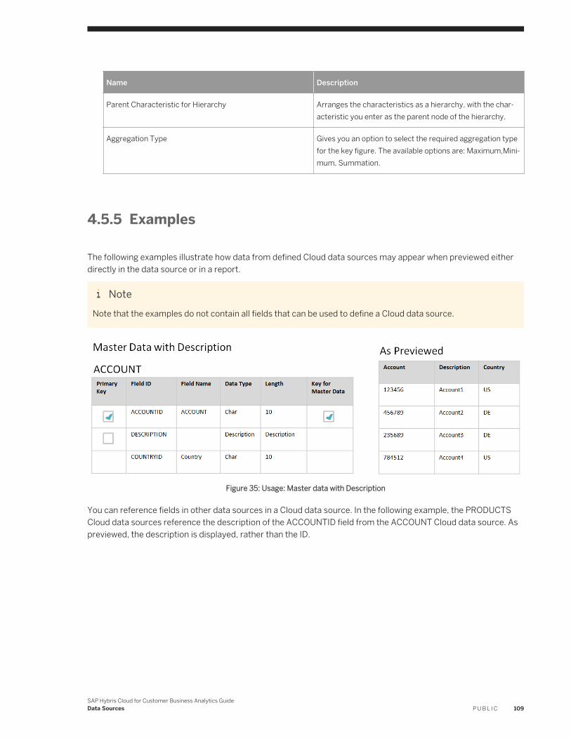
Name Description
Parent Characteristic for Hierarchy Arranges the characteristics as a hierarchy, with the characteristic you enter as the parent node of the hierarchy.
Aggregation Type Gives you an option to select the required aggregation type for the key figure. The available options are: Maximum,Minimum, Summation.
4.5.5 Examples
The following examples illustrate how data from defined Cloud data sources may appear when previewed either directly in the data source or in a report.
NoteNote that the examples do not contain all fields that can be used to define a Cloud data source.
Figure 35: Usage: Master data with Description
You can reference fields in other data sources in a Cloud data source. In the following example, the PRODUCTS Cloud data sources reference the description of the ACCOUNTID field from the ACCOUNT Cloud data source. As previewed, the description is displayed, rather than the ID.
SAP Hybris Cloud for Customer Business Analytics GuideData Sources P U B L I C 109
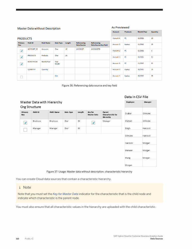
Figure 36: Referencing data source and key field
Figure 37: Usage: Master data without description, characteristic hierarchy
You can create Cloud data sources that contain a characteristic hierarchy.
NoteNote that you must set the Key for Master Data indicator for the characteristic that is the child node and indicate which characteristic is the parent node.
You must also ensure that all characteristic values in the hierarchy are uploaded with the child characteristic.
110 P U B L I CSAP Hybris Cloud for Customer Business Analytics Guide
Data Sources
4.6 Add an Extension Field to Data Sources and Reports
Administrators can add an extension field to a data source that is based on the same business context as the extension field. You can then add the field to any reports based on the data source.
The following table shows whether an extension field can be used as a key figure or characteristic.
Table 25: Analytics Usage for Extension Fields
Extension Field Type Analytics Usage
Amount Key Figure
Date Characteristic
Decimal Number Key Figure
E-Mail Address Characteristic
Indicator Characteristic
List Characteristic
Text Characteristic
Time Characteristic
Quantity Key Figure
Web Address Characteristic
Multivalue List Characteristic
Prerequisites
● You are an administrator and are assigned to the Business Analytics work center.● You have created an extension field in the relevant business context.
NoteSince data in data sources might contain data from multiple business contexts, you may want to add the same extension field to screens in additional business contexts
ExampleFor example, you have created an extension field as a characteristic in the Customer Return - General Information business context and want to add this extension field to the Customer Returns data source. Since this data source contains data from sales orders, the Sales Order - General Information business context is also available as an additional business context.
SAP Hybris Cloud for Customer Business Analytics GuideData Sources P U B L I C 111
To avoid reporting twice on the same business data, add the extension field as a characteristic in the relevant additional business context. If you were to create an another field with the same business logic in the Sales Order - General Information business context, and also add this field to the data source, two separate fields as characteristics appear in the data source.
Procedure for Silverlight Users
1. Navigate to a screen on which the extension field is available and select Enter Adaptation Mode from the Adapt menu. In adaptation mode, select Edit Screen from the Adapt menu.
2. In the adaptation panel, under Extension Fields, select the extension field from the list and, under Field Properties, click the Further Usage link.
3. On the Data Sources and Reports tab, you can view all data sources available for the business context in which you created the field. When you select a data source, all reports based on that data source are displayed in the lower table.Additional business contexts are listed on the Additional Business Context tab.
4. To add the field to a data source, select the data source and click Add Field.5. You have the following options:
○ To add the field to an existing report based on this data source, select the report from the lower table and click Add Field.The report opens in an administrator mode. In the Add Fields dialog box, select the Display in Report checkbox next to the extension field. Characteristics are added to the report under Not Currently Shown and key figures are available under Columns. Click OK and close the report without saving. The field will be available to all business users when they next access the report.
NoteNote that if you want to make further changes to the report, such as changing the layout, you need to create a new report view.
○ To create a new report based on the data source, navigate to the Business Analytics work center, Design Reports view and create a new report that uses this extension field.
NoteIf an error occurs while adding the extension field to the data source, the Field Status column displays a red icon. Click Repair to fix the error.
Procedure for HTML5 Users
1. Navigate to a screen on which the extension field is available and select Start Personalization for All Users from the Adapt menu.At the top of the screen the message Changes will be applied for All Users is displayed.
2. In adaptation mode, place your cursor over the newly created field that you want to add to data sources and
reports and choose .
112 P U B L I CSAP Hybris Cloud for Customer Business Analytics Guide
Data Sources
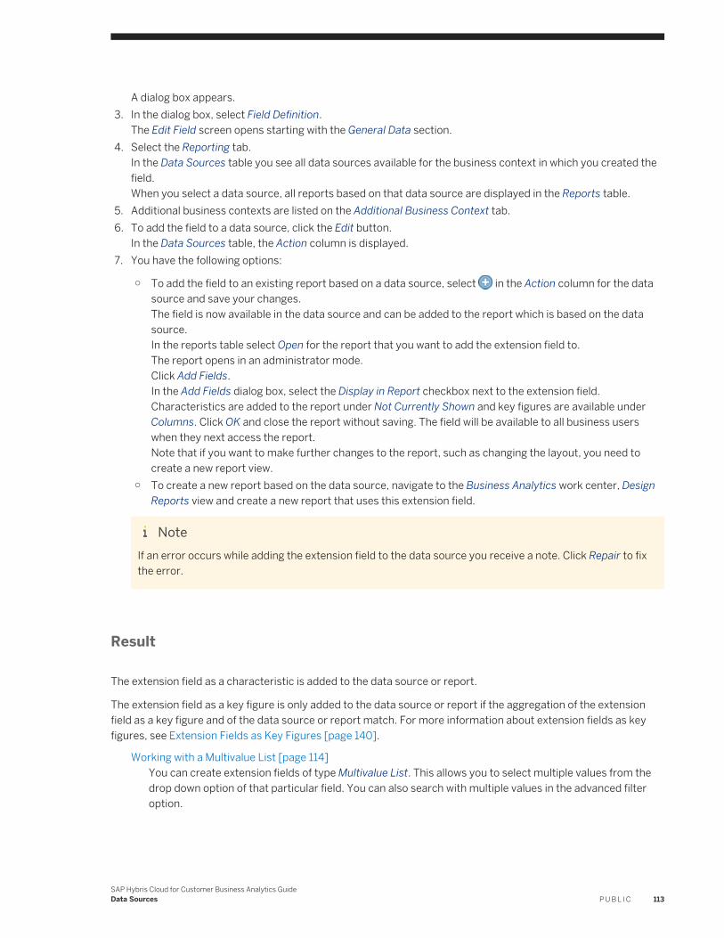
A dialog box appears.3. In the dialog box, select Field Definition.
The Edit Field screen opens starting with the General Data section.4. Select the Reporting tab.
In the Data Sources table you see all data sources available for the business context in which you created the field.When you select a data source, all reports based on that data source are displayed in the Reports table.
5. Additional business contexts are listed on the Additional Business Context tab.6. To add the field to a data source, click the Edit button.
In the Data Sources table, the Action column is displayed.7. You have the following options:
○ To add the field to an existing report based on a data source, select in the Action column for the data source and save your changes.The field is now available in the data source and can be added to the report which is based on the data source.In the reports table select Open for the report that you want to add the extension field to.The report opens in an administrator mode.Click Add Fields.In the Add Fields dialog box, select the Display in Report checkbox next to the extension field. Characteristics are added to the report under Not Currently Shown and key figures are available under Columns. Click OK and close the report without saving. The field will be available to all business users when they next access the report.Note that if you want to make further changes to the report, such as changing the layout, you need to create a new report view.
○ To create a new report based on the data source, navigate to the Business Analytics work center, Design Reports view and create a new report that uses this extension field.
NoteIf an error occurs while adding the extension field to the data source you receive a note. Click Repair to fix the error.
Result
The extension field as a characteristic is added to the data source or report.
The extension field as a key figure is only added to the data source or report if the aggregation of the extension field as a key figure and of the data source or report match. For more information about extension fields as key figures, see Extension Fields as Key Figures [page 140].
Working with a Multivalue List [page 114]You can create extension fields of type Multivalue List. This allows you to select multiple values from the drop down option of that particular field. You can also search with multiple values in the advanced filter option.
SAP Hybris Cloud for Customer Business Analytics GuideData Sources P U B L I C 113
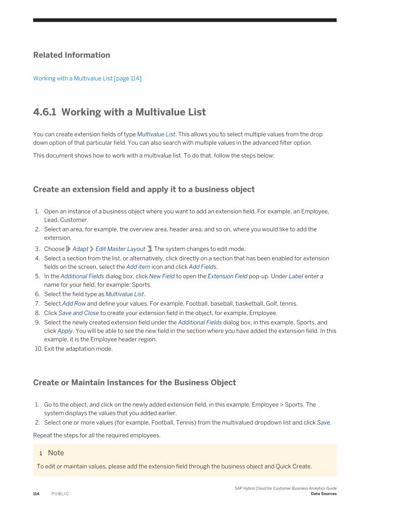
Related Information
Working with a Multivalue List [page 114]
4.6.1 Working with a Multivalue List
You can create extension fields of type Multivalue List. This allows you to select multiple values from the drop down option of that particular field. You can also search with multiple values in the advanced filter option.
This document shows how to work with a multivalue list. To do that, follow the steps below:
Create an extension field and apply it to a business object
1. Open an instance of a business object where you want to add an extension field. For example, an Employee, Lead, Customer.
2. Select an area, for example, the overview area, header area, and so on, where you would like to add the extension.
3. Choose Adapt Edit Master Layout . The system changes to edit mode.4. Select a section from the list, or alternatively, click directly on a section that has been enabled for extension
fields on the screen, select the Add item icon and click Add Fields.5. In the Additional Fields dialog box, click New Field to open the Extension Field pop-up. Under Label enter a
name for your field, for example: Sports.6. Select the field type as Multivalue List.7. Select Add Row and define your values. For example, Football, baseball, basketball, Golf, tennis.8. Click Save and Close to create your extension field in the object, for example, Employee.9. Select the newly created extension field under the Additional Fields dialog box, in this example, Sports, and
click Apply. You will be able to see the new field in the section where you have added the extension field. In this example, it is the Employee header region.
10. Exit the adaptation mode.
Create or Maintain Instances for the Business Object
1. Go to the object, and click on the newly added extension field, in this example, Employee > Sports. The system displays the values that you added earlier.
2. Select one or more values (for example, Football, Tennis) from the multivalued dropdown list and click Save.
Repeat the steps for all the required employees.
NoteTo edit or maintain values, please add the extension field through the business object and Quick Create.
114 P U B L I CSAP Hybris Cloud for Customer Business Analytics Guide
Data Sources
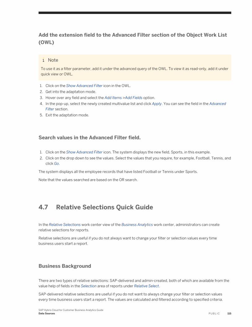
Add the extension field to the Advanced Filter section of the Object Work List (OWL)
NoteTo use it as a filter parameter, add it under the advanced query of the OWL. To view it as read-only, add it under quick view or OWL.
1. Click on the Show Advanced Filter icon in the OWL.2. Get into the adaptation mode.3. Hover over any field and select the Add Items >Add Fields option.4. In the pop-up, select the newly created multivalue list and click Apply. You can see the field in the Advanced
Filter section.5. Exit the adaptation mode.
Search values in the Advanced Filter field.
1. Click on the Show Advanced Filter icon. The system displays the new field, Sports, in this example.2. Click on the drop down to see the values. Select the values that you require, for example, Football, Tennis, and
click Go.
The system displays all the employee records that have listed Football or Tennis under Sports.
Note that the values searched are based on the OR search.
4.7 Relative Selections Quick Guide
In the Relative Selections work center view of the Business Analytics work center, administrators can create relative selections for reports.
Relative selections are useful if you do not always want to change your filter or selection values every time business users start a report.
Business Background
There are two types of relative selections: SAP-delivered and admin-created, both of which are available from the value help of fields in the Selection area of reports under Relative Select.
SAP-delivered relative selections are useful if you do not want to always change your filter or selection values every time business users start a report. The values are calculated and filtered according to specified criteria.
SAP Hybris Cloud for Customer Business Analytics GuideData Sources P U B L I C 115
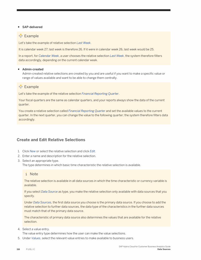
● SAP-delivered
ExampleLet's take the example of relative selection Last Week.
It is calendar week 27; last week is therefore 26. If it were in calendar week 26, last week would be 25.
In a report, for Calendar Week, a user chooses the relative selection Last Week, the system therefore filters data accordingly, depending on the current calendar week.
● Admin-createdAdmin-created relative selections are created by you and are useful if you want to make a specific value or range of values available and want to be able to change them centrally.
ExampleLet's take the example of the relative selection Financial Reporting Quarter.
Your fiscal quarters are the same as calendar quarters, and your reports always show the data of the current quarter.
You create a relative selection called Financial Reporting Quarter and set the available values to the current quarter. In the next quarter, you can change the value to the following quarter; the system therefore filters data accordingly.
Create and Edit Relative Selections
1. Click New or select the relative selection and click Edit.2. Enter a name and description for the relative selection.3. Select an appropriate type.
The type determines in which basic time characteristic the relative selection is available.
NoteThe relative selection is available in all data sources in which the time characteristic or currency variable is available.
If you select Data Source as type, you make the relative selection only available with data sources that you specify.
Under Data Sources, the first data source you choose is the primary data source. If you choose to add the relative selection to further data sources, the data type of the characteristics in the further data sources must match that of the primary data source.
The characteristic of primary data source also determines the values that are available for the relative selection.
4. Select a value entry.The value entry type determines how the user can make the value selections.
5. Under Values, select the relevant value entries to make available to business users.
116 P U B L I CSAP Hybris Cloud for Customer Business Analytics Guide
Data Sources
Tips and Tricks
You want to add a relative selection to a specific report.
In the Selection area of a report, you have a specific field for which you want to create a relative selection.
1. Note the data source that serves as a basis for the report.2. Decide if you want to add the relative selection only to the data source or if you want the relative selection to
be added to all applicable data sources.3. Once you've created the relative selection, go to the report and start it. From Add Fields, select the
corresponding characteristic and click Display in Selection Area. The field is added to the Selection area.4. Open the value selection help of the field. Click Relative Select. Your relative selection is available from the
Select dropdown list box.
You want to find out if your relative selection might be available in a specific data source
1. From the Design Data Sources work center view, check the documentation of the specific data source.2. In the documentation, check whether one or more characteristics with an appropriate data type are available.3. Start a report that uses the data source.
If you do not know of a report, you can find a report from the Design Reports work center view. You can see the name of the underlying data source in the Data Source column.
4. From Add Fields, select the corresponding characteristic and click Display in Selection Area.The field is added to the Selection area.
5. Open the value selection help of the field. Click Relative Select. Your relative selection is available from the Select dropdown list box.
SAP Hybris Cloud for Customer Business Analytics GuideData Sources P U B L I C 117
5 Key Performance Indicators (KPIs)
Key performance indicators are selected key figures from reports that have been restricted using specified selections for which you can define reference and target values along with thresholds.
Companies often used key performance indicators (KPIs) to evaluate a certain measure of their performance toward a goal or target. In order to determine what constitutes an improvement, the KPI value is often evaluated against reference or a target value. Depending on business requirements, you may not necessarily require a reference or target value to evaluate the KPI.
KPI Values and Thresholds
A KPI must have a current value and can have a reference value, target value, and thresholds, depending on business requirements.
NoteNote that a KPI key figure value is the key figure value that is displayed when you start the corresponding report in a Web browser in the solution and remove all characteristics from rows and columns; the resulting key figure value is the relevant value.
The different KPI values and thresholds are explained as follows:
Current Value The current value is the basis for calculating the KPI and represents the key figure value to be improved. It is a key figure from a report that is restricted using a specified selection. You can select the value selection for variables in the selection as your business requirements state.
Reference Value
A reference value is a key figure value which serves as a benchmark against which a change to the KPI current value can be interpreted as positive or negative.The reference value is used to determine the delta of the current value to the reference value.
Target Value The target value represents a goal to be reached and enables you to quantify an improvement of the current value. Target values are used to determine status; the relation of the target value to the current value determines the status.
NoteIf your business requirements state that you compare values between two time periods, such as last year and current year, we recommend using relative selections when you set values for the variables in your selection. Relative selections are based on basic characteristics, such as Date, Week, Month, Fiscal Period, and Company. Examples of relative selections include Last Year, Last 7 Days, and Current Year to Date.
118 P U B L I CSAP Hybris Cloud for Customer Business Analytics Guide
Key Performance Indicators (KPIs)
Thresholds Thresholds are used to determine the status of the KPI value. There are three statuses: alert, warning, and on track, represented by the colors, red, yellow, and green. The status is used to visualize and monitor the KPI.
ExampleYou have the Net Order Volume KPI; the KPI current value is 10 million. Without a reference or target value, you may not necessarily know how to interpret this value. You may need a means of comparison, such as net order volume from last year or last month, or, a target value of 100 million, in order to evaluate this KPI value correctly.
Depending on your business requirements, you may not necessarily need to set a reference or target value. For example, if you define a KPI to monitor the liquidity of your company, you would want to keep the liquidity in a certain range.
5.1 Design KPI Quick Guide
In the Design KPI work center view, administrators can create and manage key performance indicators (KPIs).
Key performance indicators are selected key figures from reports that have been restricted using specified selections for which you can define reference and target values along with thresholds.
Tasks
You can perform the following tasks in this workcenter view:
● Create and Edit a KPI [page 120]● Preview KPIs: You can preview customer-created KPIs. You can also view the context report in one of the
Web browser options. To do this, select the KPI and click Preview. The system shows all the details of the KPI. The preview is similar to the view that you get when you select the KPI tile on the home page.
● Delete KPIs: You can delete KPIs that are no longer in use. To do this, select the KPI and click Delete.● Define Life Cycle Status: The life cycle status of KPIs helps you keep track of the KPIs you create. Note that
the life cycle status of a KPI does not affect the visibility on the Overview work center view. When you set the status of a KPI to maintenance or obsolete, you can write a message that is displayed on the system. The maximum length of the message is 120 characters.
● Configure a Headline KPI [page 126]● Configure KPI on the Headline Title in the Homepage [page 127]● Restrict Edit Rights to analytical objects based on an Org Unit [page 17]
SAP Hybris Cloud for Customer Business Analytics GuideKey Performance Indicators (KPIs) P U B L I C 119
5.1.1 Create and Edit a KPI
From the Design KPIs work center view, depending on whether you want to create, edit, or copy a key performance indicator (KPI), select the relevant option.
When you create a KPI, you set values and thresholds that are used to evaluate the status of the KPI and determine to what degree the strategic goal of the KPI has been fulfilled. The KPI that you create is only available in the language with which you logged on to the system.
Most reports can serve as a basis for the values used in a KPI. Exceptions are master data reports (reports without key figures) and reports in which the key figures are in a key figure grid.
To know more about the different tabs, see the following sections:
● General [page 120]● Values and Thresholds [page 122]● Additional Contexts: You can make additional context reports available when viewing the details of the KPI.
You can also select multiple additional context reports for the KPI and view the details. You see the context reports according to your business role.
● Drill Characteristics: You can select the characteristics on which you want to define a headline.● Rules [page 123]
5.1.1.1 General
On the General tab page, you can enter general information about the KPI and make display settings.
Information
You can enter a name, description, along with information about how the KPI is to be interpreted and about how it is calculated.
NoteNote that the description, interpretation, and calculation formula are displayed to business users when they view the details of the KPI and click the information icon.
Current Value
The current value is the basis for calculating the KPI and represents the key figure value to be improved. It is a key figure from a report that is restricted using a specified selection.
Steps
120 P U B L I CSAP Hybris Cloud for Customer Business Analytics Guide
Key Performance Indicators (KPIs)
1. Select a report and then the relevant key figure.2. Restrict the current value by choosing a selection.
When you select a report for the current value, under Context Report, the Report field is filled with the same report that you selected for the current value.
Value Setting
You can determine how the value is to be displayed.
● Decimal PlacesYou use this dropdown list to specify the number of decimal places to be displayed, from 0 to 9.
● ScaleUse the dropdown list to set a scaling factor of 1 to ten billion (10,000,000,000). For example, if you set a scaling factor of 1,000, the value 3,000 is displayed as 3.
● Sign PresentationUse this function to specify how to display negative values that appear in your results.
● Reverse SignBy selecting the Reverse Sign indicator for a specified key figure, the value is displayed accordingly.
NoteExample
In some areas (for example, financial management), you may want to select whether the sign for a key figure should be reversed. For example, you have a report based on receipts and expenditure. According to accountancy logic, income is displayed with a negative sign and expenses are shown with positive sign. Adding these values produces the profit. Under certain circumstances, for example if income is to be displayed from a managerial point of view, it may be advisable to circumvent accountancy logic and display the report income with a positive sign.
● Representation TypeThe representation type determines how the KPI is represented on the mobile device.○ Absolute
The current value is displayed.○ Delta
Delta refers to the reference value.The result of the following calculation is displayed: current value - reference value.
○ Delta RelativeDelta refers to the delta to the reference value.The result of the following calculation is displayed: (current value - reference value) / reference value x 100%.
● Unit and CurrencyIf the KPI current value has a unit or currency, you can determine which unit or currency is used to visualize the KPI.
SAP Hybris Cloud for Customer Business Analytics GuideKey Performance Indicators (KPIs) P U B L I C 121
Context Report
You can determine which report view and selection is displayed when users open the details of the KPI. For example, you may want to select different report view or a different selection to compare the KPI to other key figures, values, or time ranges.
5.1.1.2 Values and Thresholds
On the Values and Thresholds tab page, you can determine how the KPI is to be interpreted.
Values
Depending on your business requirements, you can set reference and target values for your KPI. Reference and target values are compared to the current KPI value.
● Reference ValueA reference value is a key figure value which serves as a benchmark against which a change to the KPI current value can be interpreted as positive or negative.The reference value is used to determine the delta of the current value to the reference value. If you decide to set a reference value, you can get the value from a report or provide a fixed value.You must also specify to what degree deviation from the reference value is tolerated. The tolerance you specify determines how the change in the KPI current value is to be interpreted.
● Target ValueThe target value represents a goal to be reached and enables you to quantify an improvement of the current value.Target values are used to determine status; the relation of the target value to the current value determines the status.If you decide to set a target value, you can get the value from a report or provide a fixed value.
Thresholds
Thresholds are used to determine the status of the KPI value. There are three statuses: alert, warning, and on track, represented by the colors, red, yellow, and green. The status is used to visualize and monitor the KPI.
If you set a threshold, you have to determine the source of the threshold value along with what constitutes an improvement of the KPI. Note that you can determine what constitutes an improvement of a KPI independent of whether you set a threshold value source.
● Direction of ImprovementThe direction of improvement indicates in which direction a change to the KPI value can be interpreted as positive.○ Maximize
The KPI value should increase.
122 P U B L I CSAP Hybris Cloud for Customer Business Analytics Guide
Key Performance Indicators (KPIs)
○ MinimizeThe KPI value should decrease.
○ Keep in RangeThe KPI value should stay within a specified value range.If you select Keep in Range, warning and alert points are available on both sides of the track point.
● Value SourceDepending on what you choose as the direction of improvement, the alert and warning points change accordingly for the threshold.○ Not Used○ Fixed Value Is Provided○ Value Is Percentage of Target Value
NoteNote that this entry is only available if you have set a target value.
5.1.1.3 Rules
Here you define the rules for creation of headlines. Rule types depend upon the decomposition of a KPI along a drill characteristic. So, to be able to define rules, you have to select at least one drill characteristic.
Rule ID
Create a Rule ID.
Drill Characteristic
Select a drill characteristic from the drop down list.
Direction
You can define which headlines do you want to display.
● BothShows headlines from top and bottom of all the headlines that are created based on the selections.
● BottomShows the headlines at bottom of all the headlines that are created based on the selections.
● TopShows the headlines at top of all the headlines that are created based on the selections.
SAP Hybris Cloud for Customer Business Analytics GuideKey Performance Indicators (KPIs) P U B L I C 123
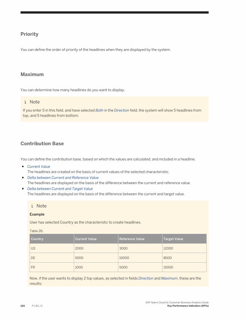
Priority
You can define the order of priority of the headlines when they are displayed by the system.
Maximum
You can determine how many headlines do you want to display.
NoteIf you enter 5 in this field, and have selected Both in the Direction field, the system will show 5 headlines from top, and 5 headlines from bottom.
Contribution Base
You can define the contribution base, based on which the values are calculated, and included in a headline.
● Current ValueThe headlines are created on the basis of current values of the selected characteristic.
● Delta between Current and Reference ValueThe headlines are displayed on the basis of the difference between the current and reference value.
● Delta between Current and Target Value The headlines are displayed on the basis of the difference between the current and target value.
NoteExample
User has selected Country as the characteristic to create headlines.
Table 26:
Country Current Value Reference Value Target Value
US 2000 3000 12000
DE 5000 10000 8000
FR 1000 5000 15000
Now, if the user wants to display 2 top values, as selected in fields Direction and Maximum, these are the results:
124 P U B L I CSAP Hybris Cloud for Customer Business Analytics Guide
Key Performance Indicators (KPIs)
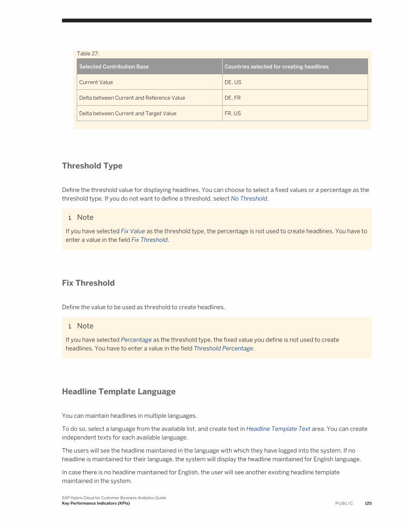
Table 27:
Selected Contribution Base Countries selected for creating headlines
Current Value DE, US
Delta between Current and Reference Value DE, FR
Delta between Current and Target Value FR, US
Threshold Type
Define the threshold value for displaying headlines. You can choose to select a fixed values or a percentage as the threshold type. If you do not want to define a threshold, select No Threshold.
NoteIf you have selected Fix Value as the threshold type, the percentage is not used to create headlines. You have to enter a value in the field Fix Threshold.
Fix Threshold
Define the value to be used as threshold to create headlines.
NoteIf you have selected Percentage as the threshold type, the fixed value you define is not used to create headlines. You have to enter a value in the field Threshold Percentage.
Headline Template Language
You can maintain headlines in multiple languages.
To do so, select a language from the available list, and create text in Headline Template Text area. You can create independent texts for each available language.
The users will see the headline maintained in the language with which they have logged into the system. If no headline is maintained for their language, the system will display the headline maintained for English language.
In case there is no headline maintained for English, the user will see another existing headline template maintained in the system.
SAP Hybris Cloud for Customer Business Analytics GuideKey Performance Indicators (KPIs) P U B L I C 125
Headline Template Text
Once you have defined all the parameters, the system collects a set of available text variables and formatting tags based on the selections. You can use these variables and tags to define how you would like to display the headlines.
5.1.2 Configure a Headline KPI
Context
You can now use dynamic headline capabilities with the option of monitoring a list of KPIs of your choice in the adapt mode. You can set thresholds for these KPIs based on report dimensions such as country, region, and product category. Based on the threshold set, the analytics framework calculates and displays the strongest deviations as headlines.
To configure a headline in KPI, follow the steps below
Procedure
1. Log on to the system as the administrator.
2. Go to Business Analytics Design KPI .3. Select a KPI which you would like to configure the headline for and click Copy. The system opens a new
window.4. Under General, enter all required information for the KPI based on the following parameters:
○ Name — name of the KPI○ Description — text explaining the purpose of the KPI○ KPI Category — displays work centers the KPI is assigned to
Current value — determines the current value from the report. For example, sales revenue for the current quarter.
○ Value settings — allows you to configure the display settings for the value to be displayed○ Context report — allows you to configure the displayed report when you open the KPI details
5. Next, go to Values and Thresholds to set the threshold which would be compared against the current value to predict trends. Set the threshold based on the following parameters:
○ Target value — defines the value to be compared with current value○ Reference value — defines the value to define trends○ Thresholds — defines limits set for measuring value
6. Go to Drill Characteristics to drill down into a report based on certain characteristics of a report. Click on Add Row to add the technical name for the data source behind the current value report.
126 P U B L I CSAP Hybris Cloud for Customer Business Analytics Guide
Key Performance Indicators (KPIs)
NoteThis characteristic is used for exception reporting for the headline. It will alert you if the sales revenue in a specific region is deviating from the threshold.
7. Now go to Rules to create rules for generating a headline for a selected KPI. To add a rule, click on Add Row and fill in information for the displayed columns to generate a headline for the KPI.
8. Once the headline is generated for a rule, you have the option of applying formatting tags which would be replaced with the actual values during runtime.
NoteSales in <CharText> is excellent would be displayed as: “Sales in US Region Midwest is excellent”.
5.1.3 Configure KPI on the Headline Tile in the Homepage
Context
To configure KPI on the headline tile in the Homepage, follow the steps below
Procedure
1. Log on to the system as a Key User and launch the Homepage.2. Click on the gear icon to switch to the Adapt mode.3. Next, select the role for which you would like to configure the headline.
NoteIf you do not see the headline in the adaptation screen, then click Edit.
4. Choose Score Cards and add the headline score card to the role. To display this tile, choose Publish.5. Hover over the headline tile and click on the gear icon. This will launch a list of KPIs that have been configured
for your headlines. Click on Show to view a specific KPI.6. On the headline tile, you can now see the reports if the data matches the KPI drill down definitions.7. You will also see the navigation arrows at the bottom of the headline tile to navigate between reports. When
you click on a report headline, the corresponding KPI details screen displays.
SAP Hybris Cloud for Customer Business Analytics GuideKey Performance Indicators (KPIs) P U B L I C 127
6 Broadcasts
Broadcasting reports and dashboards by e-mail enables business users to frequently analyze report data without necessarily having to log on to the system and navigate to the report.
To know more about how to perform all the tasks related to broadcasting, see Broadcasts Quick Guide [page 128]
6.1 Broadcasts Quick Guide
In the Broadcasts work center view, you can immediately broadcast reports and dashboards by e-mail and create schedules for when you want them to be broadcast.
You can access the Broadcasts work center view from the Business Analytics work center.
Business Background
Broadcasting reports and dashboards by e-mail enables business users to frequently analyze report data without necessarily having to log on to the system and navigate to the report.
There are two scenarios:
Periodic Scheduling
Periodic scheduling is useful if you want to broadcast a report or dashboard on a regular basis.For example, a sales manager wants to send sales reports to his field sales representatives on a monthly basis. He informs his administrator to set up a schedule by which the report is broadcast each month.
Ad-Hoc Broadcasting
Ad-hoc broadcasting is useful if a specific report or dashboard requires the attention of multiple users.
NoteNote that you can decide if report data sent by e-mail is to be encrypted. If you want to encrypt outgoing e-mails, you must make changes to your scoping. From the E-mail Encryption and Signature Check fine-tune activity, you can specify for the Analytics - Send Report Data, Broadcasting outgoing e-mail scenario whether outgoing e-mails are encrypted and whether they are signed.
For more information, see the following documents: Configuration: Load Certificates and Activate Signing and Encryption for E-Mails [page 133] and Configuration: E-Mail Encryption and Signature Check [page 131].
128 P U B L I CSAP Hybris Cloud for Customer Business Analytics Guide
Broadcasts
Tasks
You can perform the following tasks in this workcenter view:
● Create a Broadcast [page 129]● Manage Broadcasts and Schedules [page 130]● Restrict Edit Rights to analytical objects based on an Org Unit [page 17]
6.1.1 Create a Broadcast
Procedure
1. From the Broadcasts work center view, click New.2. On the following screen, enter a name for the broadcast and select the relevant report or dashboard.3. Add recipients.
NoteFor recipients who have a user in the solution, you can decide if the recipients are to receive data according to their authorizations or according to the authorizations of the user who creates the broadcast by checking the User specific indicator.
Note that if the report is to be broadcast using the authorizations of the user who creates the broadcast, ensure that the user has access rights to the work center views to which the report is assigned in order to start the report.
NoteUsing Broadcast Bursting
Bursting feature allows you to broadcast reports to multiple recipients by e-mail. If you have maintained the addresses of the recipients in the master data, you can select a characteristic in which the e-mail addresses are maintained. The system can determine the recipients from this information.
When you select the checkbox Use Broadcast Bursting, the section to add e-mail addresses of the recipients is hidden. For the new field Attribute For Email, select a characteristic, in which you have maintained the email address. Now, the report will be automatically sent to all the relevant recipients, without you having to add each individual e-mail addresses separately.
Unlike a normal broadcast, entire data is not sent to all recipients. The report data is filtered for each recipient based on their e-mail addresses, which is identified by the values of the attribute you select. This ensures that every recipient only receives the data filtered for their e-mail address.
If you wish to send the entire data to all the recipients, create a regular broadcast.
4. Under Format and Content, select if the report or the dashboard is to be broadcast as an attachment or as a link.
SAP Hybris Cloud for Customer Business Analytics GuideBroadcasts P U B L I C 129
○ If you want to broadcast the report as an attachment, note that reports broadcast in XML and CSV format open by default using Microsoft Excel®. If you want to broadcast the dashboard as an attachment, note that dashboards broadcast only in HTML format.
○ If you want to broadcast the report as a URL, you must also specify how the report is to be viewed. Reports can viewed in one of the Web browser options or using Microsoft Excel®.
○ If the broadcast report is to be viewed on a mobile device, we recommend the HTML format.
NoteBroadcast report is always sent as a table. Even if you broadcast a chart, the data will be converted to a table.
5. Decide if the report or dashboard is to be broadcast now or if it is to be broadcast periodically.
○ If you want to broadcast the report or dashborad ad-hoc, select No Schedule.○ If you want to schedule the broadcast for the report or dashboard, select Periodically, and set how
frequently the report is to be broadcast along with the start and end date for the schedule.The system saves the broadcast or schedule. You can then view the broadcast or schedule from the Broadcasts work center view.
6.1.2 Manage Broadcasts and Schedules
From the Broadcasts work center view, under Actions, you can edit, delete, or change the status of a schedule. You can start, pause, or resume broadcasts and schedules.
You can also edit broadcasts and schedules by clicking Edit. In addition, you can click View Logs and check all the logs related to a selected broadcast.
6.2 Configuration: Administrator Analytics - Settings
CautionThis document contains details and instructions regarding configuration settings. Such settings are normally performed by an administrator. If you do not have the required authorization, contact your administrator.
To find this activity, go to the Business Configuration Implementation Projects view. Select your implementation project and click Open Activity List. Select the Fine-Tune phase, then select the activity from the activity list.
Administrators for Analytics can assign browser-based reports and Microsoft Excel® workbooks to work center views. Business users are thereby granted the access to the report and the authorizations to start the report. The system checks if the data source of the report and the work center view have a common access context. This ensures that business users can only access data in the report that they are authorized to view. When business users are assigned access rights for a work center view in the User and Access Management work center view, access rights for specified reports are also assigned.
130 P U B L I CSAP Hybris Cloud for Customer Business Analytics Guide
Broadcasts
By default, the Extended Access to Report Data Allowed indicator is not set. If you set the indicator, you have to put other controls for your administrator for Analytics in place to ensure controlled read access of data. These controls must meet your compliance criteria. Note that the system tracks report assignments with non-matching access contexts for auditing reasons. You can view report assignments using the Report Assignment Details report.
By default, the Show real data instead of generic data indicator is not set. If you set the indicator, administrators for Analytics can view real data when they preview data sources in the Design Data Sources work center view. Real data is also then displayed when administrators for Analytics view reports in the Design Reports work center view.
By default, the Allow the assignment of Business Roles indicator is not set. If you set the indicator, administrators for Analytics can assign business roles to analytical objects. To be able to use this feature, maintain business roles for users before selecting this option. You must then assign all the reports to the business roles in the Design Reports work center view before they are available to the business users.
By default, the Select e-mail address is set to System. This means that when you send a report, the receiver will get an email from the default email ID that is set up by the administrators. However, if you select the option as Logged-in User, you can email a report using the e-mail ID that you are logged-in with. The receiver will be able to respond back to you on the same e-mail address.
Related Information
Assign a Report to a Business Role [page 30]
6.3 Configuration: E-Mail Encryption and Signature Check
CautionThis document contains details and instructions regarding configuration settings. Such settings are normally performed by an administrator. If you do not have the required authorization, contact your administrator.
To find this activity, go to the Business Configuration Implementation Projects view. Select your implementation project and click Open Activity List. Select the Fine-Tune phase, then select the activity from the activity list.
In your solution you can increase security in e-mails by decrypting incoming e-mails and checking them for trustworthy signatures, as well as by encrypting and signing outgoing e-mails. In this configuration activity, preconfigured e-mail scenarios are provided. You can specify e-mail encryption and signature check for each e-mail scenario as follows:
SAP Hybris Cloud for Customer Business Analytics GuideBroadcasts P U B L I C 131
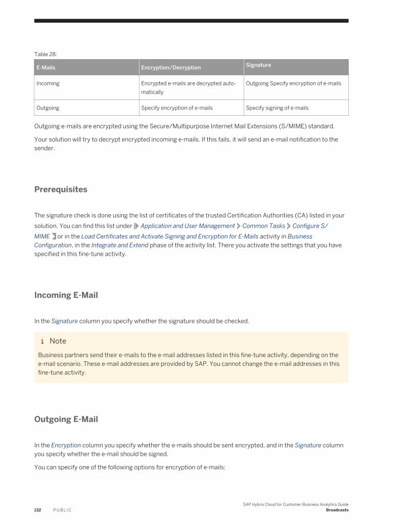
Table 28:
E-Mails Encryption/Decryption Signature
Incoming Encrypted e-mails are decrypted automatically
Outgoing Specify encryption of e-mails
Outgoing Specify encryption of e-mails Specify signing of e-mails
Outgoing e-mails are encrypted using the Secure/Multipurpose Internet Mail Extensions (S/MIME) standard.
Your solution will try to decrypt encrypted incoming e-mails. If this fails, it will send an e-mail notification to the sender.
Prerequisites
The signature check is done using the list of certificates of the trusted Certification Authorities (CA) listed in your solution. You can find this list under Application and User Management Common Tasks Configure S/MIME or in the Load Certificates and Activate Signing and Encryption for E-Mails activity in Business Configuration, in the Integrate and Extend phase of the activity list. There you activate the settings that you have specified in this fine-tune activity.
Incoming E-Mail
In the Signature column you specify whether the signature should be checked.
NoteBusiness partners send their e-mails to the e-mail addresses listed in this fine-tune activity, depending on the e-mail scenario. These e-mail addresses are provided by SAP. You cannot change the e-mail addresses in this fine-tune activity.
Outgoing E-Mail
In the Encryption column you specify whether the e-mails should be sent encrypted, and in the Signature column you specify whether the e-mail should be signed.
You can specify one of the following options for encryption of e-mails:
132 P U B L I CSAP Hybris Cloud for Customer Business Analytics Guide
Broadcasts
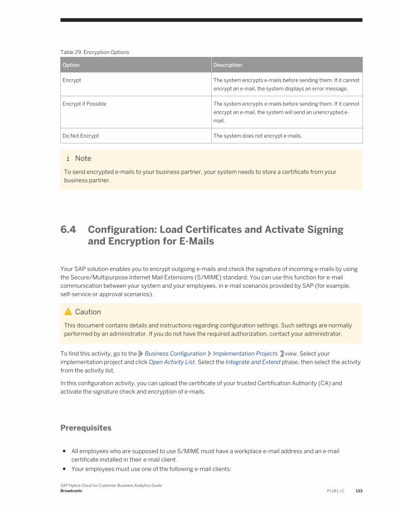
Table 29: Encryption Options
Option Description
Encrypt The system encrypts e-mails before sending them. If it cannot encrypt an e-mail, the system displays an error message.
Encrypt if Possible The system encrypts e-mails before sending them. If it cannot encrypt an e-mail, the system will send an unencrypted e-mail.
Do Not Encrypt The system does not encrypt e-mails.
NoteTo send encrypted e-mails to your business partner, your system needs to store a certificate from your business partner.
6.4 Configuration: Load Certificates and Activate Signing and Encryption for E-Mails
Your SAP solution enables you to encrypt outgoing e-mails and check the signature of incoming e-mails by using the Secure/Multipurpose Internet Mail Extensions (S/MIME) standard. You can use this function for e-mail communication between your system and your employees, in e-mail scenarios provided by SAP (for example, self-service or approval scenarios).
CautionThis document contains details and instructions regarding configuration settings. Such settings are normally performed by an administrator. If you do not have the required authorization, contact your administrator.
To find this activity, go to the Business Configuration Implementation Projects view. Select your implementation project and click Open Activity List. Select the Integrate and Extend phase, then select the activity from the activity list.
In this configuration activity, you can upload the certificate of your trusted Certification Authority (CA) and activate the signature check and encryption of e-mails.
Prerequisites
● All employees who are supposed to use S/MIME must have a workplace e-mail address and an e-mail certificate installed in their e-mail client.
● Your employees must use one of the following e-mail clients:
SAP Hybris Cloud for Customer Business Analytics GuideBroadcasts P U B L I C 133
○ Microsoft® Outlook®○ Mozilla® Thunderbird®○ Apple® Mail
● The Encryption and Signatures for E-Mails and Load Certificates and Activate Signing and Encryption for E-Mails configuration activities are enabled in your solution.To find the related business option, go to the Business Configuration work center and choose the Implementation Projects view. Select your implementation project and click Edit Project Scope. In the Scoping step of the project, under Built in Service and Support, ensure that System Management is selected. In the Questions step, expand the Built-in Service and Support scoping element and select System Management. Select Security and answer the question related to E-Mail Security.
● You have completed the Encryption and Signatures for E-Mails activity.To find this activity, go to the Business Configuration Implementation Projects view. Select your implementation project and click Open Activity List. Select the Fine-Tune phase, then select the activity from the activity list.
Tasks
● Upload Certificate of the Certification Authority1. Choose Manage CA Certificates.2. Select the e-mail addresses for which you want to upload the CA certificate.3. Click Upload CA Certificate and select the certificate of your trusted CA.
● Upload the Employee’s S/MIME Certificate for E-Mail EncryptionYou can upload the employee’s S/MIME certificate by performing one of the following options:○ Upload certificate automatically: The employee sends an e-mail to security@<system ID>.com. When the
system receives the e-mail, the certificate is automatically uploaded.○ Upload certificate manually by administrator:
1. Go to Application and User Management Business Users and select the business user for whom you want to upload the certificate
2. Click Manage Certificates.3. Click Upload S/MIME Certificate and choose the relevant certificate file4. Save your changes.
○ Upload certificate manually by employee:
1. Choose Personalize My Settings .2. Click Manage Certificates3. Click Upload S/MIME Certificate and choose the relevant certificate file.4. Save your changes.
● Activate E-Mail Encryption and Signature CheckOnce you have uploaded all employees’ S/MIME certificates, you can activate the S/MIME functions either in this business configuration activity or in Application and User Management Common Tasks Configure S/MIME at a later point in time.1. Choose Activate S/MIME.2. To activate the signature check set the Check Signature of Incoming E-Mails checkbox.3. To activate E-Mail encryption set the Encrypt Outgoing E-Mails checkbox.4. Save your changes.
134 P U B L I CSAP Hybris Cloud for Customer Business Analytics Guide
Broadcasts
● Renew S/MIME Certificate1. Select the certificate to be renewed.2. Click Renew S/MIME Certificate.3. Click Save.
SAP Hybris Cloud for Customer Business Analytics GuideBroadcasts P U B L I C 135
7 Key Figures
Key figures are data items with numeric values and have an associated unit of measure or currency assigned. Some examples are pipeline value, Invoice Net Value, Purchase Order Quantity or tickets in queue.
For more information about key figures, check the documents below:
● Design Key Figures Quick Guide [page 136]● Extension Fields as Key Figures [page 140]● Formulas [page 141]● Aggregation [page 145]● Exception Aggregation [page 146]● Local Calculation [page 147]● Conversion [page 149]
7.1 Design Key Figures Quick Guide
In the Design Key Figures work center view, administrators have an overview of calculated and restricted key figures and key figure structures available in data sources.
You can access the Design Key Figures view from the Business Analytics or Administrator work centers.
Business Background
An overview of calculated and restricted key figures in the system enables administrators to determine which data sources suit the business requirements for reports. It also enables administrators to determine whether they need to create any restricted or calculated key figures. For more information, see Overview of Analytics [page 6].
Tasks
You can perform the following tasks in this workcenter view:
● Create and Edit a Key Figure [page 137]● Create a Dynamic UI Label for Restricted Key Figures [page 139]● Restrict Edit Rights to analytical objects based on an Org Unit [page 17]
136 P U B L I CSAP Hybris Cloud for Customer Business Analytics Guide
Key Figures
7.1.1 Create and Edit a Key Figure
You can create your own calculated and restricted key figures for use in reports.
You can access this task from one of the following:
● Under Common Tasks● From the Design Reports work center view, in the Select Key Figures step of the Report Wizard● From the Design Key Figures work center view
Procedure
1. Define Key Figure and Select Data SourceWe recommend providing a name and description for the key figure so that the business user can identify its use in reports.Select a data source from which the key figure is to be selected. Note that if you have navigated to this activity from the Report Wizard, the data source is prefilled with the selection you made.Depending on the type of key figure you want to create, make the appropriate selection.
2. Restrict/Calculate Key Figure○ Create a Restricted Key Figure
A restricted key figure is a key figure that is restricted to a specified characteristic value.For the key figure you have selected to restrict, make settings for the relevant characteristics. Different restriction settings are available depending on the restriction type you choose for the selected characteristic. The following restriction types are available:○ Variable
Restricts the selected characteristic using the variable you have specified.
Table 30:
Restriction Setting Description
Variable Name You must select the variable with which the specified characteristic can be restricted.
Hierarchy For the specified variable, you can choose if hierarchy values are available using the More option to the left the variable entry field on the variables screen.
SAP Hybris Cloud for Customer Business Analytics GuideKey Figures P U B L I C 137
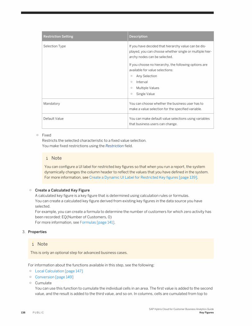
Restriction Setting Description
Selection Type If you have decided that hierarchy value can be displayed, you can choose whether single or multiple hierarchy nodes can be selected.
If you choose no hierarchy, the following options are available for value selections:○ Any Selection○ Interval○ Multiple Values○ Single Value
Mandatory You can choose whether the business user has to make a value selection for the specified variable.
Default Value You can make default value selections using variables that business users can change.
○ FixedRestricts the selected characteristic to a fixed value selection.You make fixed restrictions using the Restriction field.
NoteYou can configure a UI label for restricted key figures so that when you run a report, the system dynamically changes the column header to reflect the values that you have defined in the system. For more information, see Create a Dynamic UI Label for Restricted Key figures [page 139].
○ Create a Calculated Key FigureA calculated key figure is a key figure that is determined using calculation rules or formulas.You can create a calculated key figure derived from existing key figures in the data source you have selected.For example, you can create a formula to determine the number of customers for which zero activity has been recorded: EQ(Number of Customers, 0)For more information, see Formulas [page 141].
3. Properties
NoteThis is only an optional step for advanced business cases.
For information about the functions available in this step, see the following:○ Local Calculation [page 147]○ Conversion [page 149]○ Cumulate
You can use this function to cumulate the individual cells in an area. The first value is added to the second value, and the result is added to the third value, and so on. In columns, cells are cumulated from top to
138 P U B L I CSAP Hybris Cloud for Customer Business Analytics Guide
Key Figures
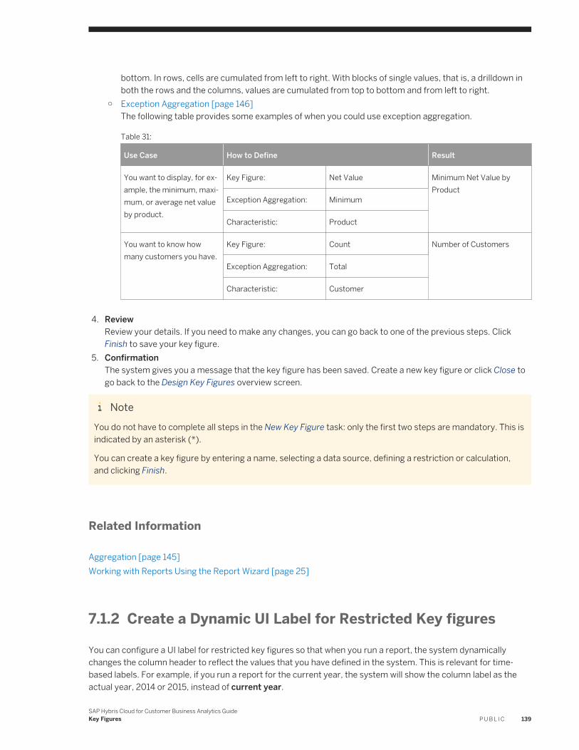
bottom. In rows, cells are cumulated from left to right. With blocks of single values, that is, a drilldown in both the rows and the columns, values are cumulated from top to bottom and from left to right.
○ Exception Aggregation [page 146]The following table provides some examples of when you could use exception aggregation.
Table 31:
Use Case How to Define Result
You want to display, for example, the minimum, maximum, or average net value by product.
Key Figure: Net Value Minimum Net Value by Product
Exception Aggregation: Minimum
Characteristic: Product
You want to know how many customers you have.
Key Figure: Count Number of Customers
Exception Aggregation: Total
Characteristic: Customer
4. ReviewReview your details. If you need to make any changes, you can go back to one of the previous steps. Click Finish to save your key figure.
5. ConfirmationThe system gives you a message that the key figure has been saved. Create a new key figure or click Close to go back to the Design Key Figures overview screen.
NoteYou do not have to complete all steps in the New Key Figure task: only the first two steps are mandatory. This is indicated by an asterisk (*).
You can create a key figure by entering a name, selecting a data source, defining a restriction or calculation, and clicking Finish.
Related Information
Aggregation [page 145]Working with Reports Using the Report Wizard [page 25]
7.1.2 Create a Dynamic UI Label for Restricted Key figures
You can configure a UI label for restricted key figures so that when you run a report, the system dynamically changes the column header to reflect the values that you have defined in the system. This is relevant for time-based labels. For example, if you run a report for the current year, the system will show the column label as the actual year, 2014 or 2015, instead of current year.
SAP Hybris Cloud for Customer Business Analytics GuideKey Figures P U B L I C 139
Procedure
1. Navigate to Business Analytics Design Figures and click New. The system opens a New Key Figure guided activity.
2. Under Key Figure, provide a Name and Description.3. Under Data Source, select a Name from the dropdown list.4. Under Type, choose Restricted Key Figure, and then select a key figure from the dropdown list.5. Click Next to go to the Restrict/Calculate Key Figure activity.6. Click Add Row and under Characteristic, select a value.
NoteNote that you can only select only a time-based characteristic.
7. Under Restriction Type, select Fixed.8. Click Set Fixed Value Selection and then click the More icon to open a new dialog box.9. Choose the Relative Select radio button and select your desired relative value from the dropdown. Click OK.
Example: If you choose, “Current year as YYYY”, when you run a report, the system will show the column label as 2014 or 2015, whatever is the actual year, instead of “current year”.
10. Click Next to move to Properties.11. Under the heading Key Figure Label, select the Variable Label checkbox. The system displays the Relative
Select field.12. Select the label you require and click Next.13. Review your details and click Finish to save your label.
7.2 Extension Fields as Key Figures
On the Data Sources and Reports tab of the Further Usage screen, you may not have any data sources or reports when you want to add an extension field as a key figure to data sources.
The system only allows you to add an extension field as a key figure to a data source and to corresponding reports when the aggregation of the key figure and data source match. The system thereby prevents incorrect results from being displayed in reports.
Hypothetical Example
The following example shows why the system does not allow you to add key figures to every report.
While in adaptation mode, you add the Freight Cost field to the sales order. Freight costs are due for the entire sales order and not for individual sales order items.
For Analytics usage, this extension field is a key figure since it displays an amount with a currency.
You now want to add the key figure to a report.
The first table shows what would be the expected result (1100 EUR).
140 P U B L I CSAP Hybris Cloud for Customer Business Analytics Guide
Key Figures
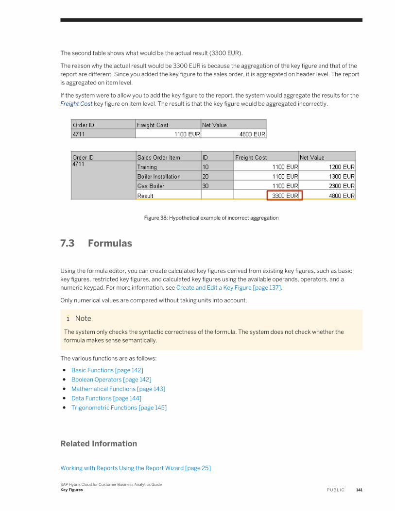
The second table shows what would be the actual result (3300 EUR).
The reason why the actual result would be 3300 EUR is because the aggregation of the key figure and that of the report are different. Since you added the key figure to the sales order, it is aggregated on header level. The report is aggregated on item level.
If the system were to allow you to add the key figure to the report, the system would aggregate the results for the Freight Cost key figure on item level. The result is that the key figure would be aggregated incorrectly.
Figure 38: Hypothetical example of incorrect aggregation
7.3 Formulas
Using the formula editor, you can create calculated key figures derived from existing key figures, such as basic key figures, restricted key figures, and calculated key figures using the available operands, operators, and a numeric keypad. For more information, see Create and Edit a Key Figure [page 137].
Only numerical values are compared without taking units into account.
NoteThe system only checks the syntactic correctness of the formula. The system does not check whether the formula makes sense semantically.
The various functions are as follows:
● Basic Functions [page 142]● Boolean Operators [page 142]● Mathematical Functions [page 143]● Data Functions [page 144]● Trigonometric Functions [page 145]
Related Information
Working with Reports Using the Report Wizard [page 25]
SAP Hybris Cloud for Customer Business Analytics GuideKey Figures P U B L I C 141
7.3.1 Basic Functions
Add (+) Calculates the sum of operand 1 and operand 2.
Subtract (-) Subtracts operand 2 from operand 1.
Multiply (*) Calculates the product of operand 1 and operand 2.
Divide (/) Divides operand 1 by operand 2.
Power (^) Returns the value of operand 1 raised to the power operand 2.
Percentage Deviation (%)
Calculates the percentage deviation between operand 1 and operand 2.
NotePlan Sales % Actual Sales shows the difference between the plan sales and the actual sales expressed as a percentage.
Percentage Share (%A) Calculates the percentage share of operand 1 and operand 2.
NoteFixed Costs %A Costs shows fixed costs as a percentage share of total costs.
Parentheses Groups and sets the order of operators.
Comma Denotes a series in a list.
7.3.2 Boolean Operators
A boolean value is one that can be either true or false. No other values are allowed.
For relational operators, such as Greater Than, the result is 1 if the relationship denoted by operator between operand 1 and operand 2 is true. Otherwise, the result is 0.
NoteCosts < Sales returns 1 if sales are greater than costs, and returns 0 if costs are greater than or equal to sales.
EQ Equal To
GE Greater Than or Equal To
GT Greater Than
LE Less Than or Equal To
LT Less Than
NE Not Equal To
142 P U B L I CSAP Hybris Cloud for Customer Business Analytics Guide
Key Figures

AND Logical ANDThe result is 1 if both operand 1 and operand 2 do not equal 0. Otherwise, the result is 0.
NOT Logical NOTThe result is 1 if the operand is 0. Otherwise, the result is 0.
OR Logical ORThe result is 1 if operand 1 or operand 2 does not equal 0. Otherwise, the result is 0.
XOR Logical Exclusive ORThe result is 1 if either operand 1 or operand 2 (but not both) does not equal 0. Otherwise, the result is 0.
LEAF Values in HierarchyThe result is 0 for results rows or real (inner) nodes of a hierarchy, and the value 1 for elementary rows or the leaves of a hierarchy. This operator allows you to carry out various calculations on results rows and elementary rows.
7.3.3 Mathematical Functions
ABS Absolute ValueReturns the value of the operand irrespective of its sign (+/-).
SIGN Sign of OperandReturns the value of the operand along with its sign (+/-).
CEIL CeilingReturns the next smallest integer value that is greater than the operand.
DIV DivisionInteger division operator: for example, 6 DIV 4 returns 1.
EXP ExponentialAn operand is raised to a variable power.
FLOOR FloorReturns the next greatest integer value that is less than the operand.
FRAC FractionReturns decimal part of the X.
LOG LogarithmReturns the natural logarithm of X.
LOG10 Base 10 LogarithmReturns the logarithm to the base 10 of X .
MAX MaximumReturns the greatest value in a range.
MAX0 Maximum of 0 and the Operand.
SAP Hybris Cloud for Customer Business Analytics GuideKey Figures P U B L I C 143
MIN MinimumReturns the smallest value in a range.
MOD RemainderInteger remainder operator: for example, 6 MOD 4 returns 0.5.
SQRT Square RootReturns the square root.
TRUNC TruncateReturns the integer part of X.
7.3.4 Data Functions
COUNTER CountValue equals 1 if operand equals 0. Otherwise, the result is 0
NDIV0 Divide by ZeroEquals 0 when divided by 0. Otherwise, the result is the value of the operand.
NOERR Zero If ErrorEquals 0 if the calculation of operand leads to an arithmetical error. Otherwise, the result is the value of the operand.
%CT Percentage Share of ResultShows results as a percentage share of the overall result.
%GT Percentage Share of Overall ResultShows values as a percentage share of the overall result.
%RT Percentage Share of Report ResultCalculates a result similar to (%GT).
DATE Value as DateReturns the integer value in date format.
DELTA DeltaReturns the value 1 if the expression is 0, else 1.
NODIM No Unit or CurrencyReturns numeric values of the operand and suppresses units and currencies.
SUMCT Sum of ResultReturns the result of the operands to all rows or columns.
SUMGT Sum of Overall ResultReturns the overall results of the operands.
SUMRT Sum of Report ResultReturns the report result of the operand.
144 P U B L I CSAP Hybris Cloud for Customer Business Analytics Guide
Key Figures
TIME Value As TimeReturns the integer value in time format.The system cuts off the decimal places, interprets the value as seconds, and displays the value in the form +-hh:mm:ss. For example, 4812 is displayed as 1:20:12.
7.3.5 Trigonometric Functions
ACOS Arc Cosine
ASIN Arc Sine
ATAN Arc Tangent
COS Cosine
COSH Hyperbolic Cosine
SIN Sine
SINH Hyperbolic Sine
TAN Tangent
TANH Hyperbolic Tangent
7.4 Aggregation
To enable the calculation of key figures, the system has to aggregate key figure values from the data source, and formulas may also need to be calculated. The system aggregates key figure values for multiple characteristics. The system can also aggregate key figure values for a specified characteristic; this is referred to as exception aggregation.
The system aggregates key figure values according to a specified order.
1. Standard aggregation is executed. Possible aggregation behaviors are summation, minimum, and maximum. Minimum and maximum can, for example, be used for date key figures.
2. Exception aggregation using a selected characteristic. Cases for exception aggregation include warehouse stock, for example, that cannot be totaled over time, or counters that count the number of characteristic values for a certain characteristic.For more information, see Exception Aggregation [page 146].
3. Aggregation using currencies and units is executed. The system outputs * when two numbers that are not equal to zero are aggregated with different currencies or units.For more information, see Conversion [page 149].
SAP Hybris Cloud for Customer Business Analytics GuideKey Figures P U B L I C 145
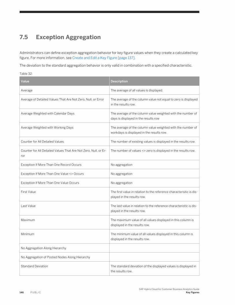
7.5 Exception Aggregation
Administrators can define exception aggregation behavior for key figure values when they create a calculated key figure. For more information, see Create and Edit a Key Figure [page 137].
The deviation to the standard aggregation behavior is only valid in combination with a specified characteristic.
Table 32:
Value Description
Average The average of all values is displayed.
Average of Detailed Values That Are Not Zero, Null, or Error The average of the column value not equal to zero is displayed in the results row.
Average Weighted with Calendar Days The average of the column value weighted with the number of days is displayed in the results row
Average Weighted with Working Days The average of the column value weighted with the number of workdays is displayed in the results row.
Counter for All Detailed Values The number of existing values is displayed in the results row.
Counter for All Detailed Values That Are Not Zero, Null, or Error
The number of values <> zero is displayed in the results row.
Exception If More Than One Record Occurs No aggregation
Exception If More Than One Value <> Occurs No aggregation
Exception If More Than One Value Occurs No aggregation
First Value The first value in relation to the reference characteristic is displayed in the results row.
Last Value The last value in relation to the reference characteristic is displayed in the results row.
Maximum The maximum value of all values displayed in this column is displayed in the results row.
Minimum The minimum value of all values displayed in this column is displayed in the results row.
No Aggregation Along Hierarchy
No Aggregation of Posted Nodes Along Hierarchy
Standard Deviation The standard deviation of the displayed values is displayed in the results row.
146 P U B L I CSAP Hybris Cloud for Customer Business Analytics Guide
Key Figures
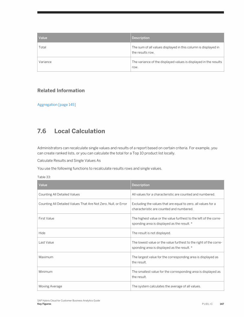
Value Description
Total The sum of all values displayed in this column is displayed in the results row.
Variance The variance of the displayed values is displayed in the results row.
Related Information
Aggregation [page 145]
7.6 Local Calculation
Administrators can recalculate single values and results of a report based on certain criteria. For example, you can create ranked lists, or you can calculate the total for a Top 10 product list locally.
Calculate Results and Single Values As
You use the following functions to recalculate results rows and single values.
Table 33:
Value Description
Counting All Detailed Values All values for a characteristic are counted and numbered.
Counting All Detailed Values That Are Not Zero, Null, or Error Excluding the values that are equal to zero, all values for a characteristic are counted and numbered.
First Value The highest value or the value furthest to the left of the corresponding area is displayed as the result. *
Hide The result is not displayed.
Last Value The lowest value or the value furthest to the right of the corresponding area is displayed as the result. *
Maximum The largest value for the corresponding area is displayed as the result.
Minimum The smallest value for the corresponding area is displayed as the result.
Moving Average The system calculates the average of all values.
SAP Hybris Cloud for Customer Business Analytics GuideKey Figures P U B L I C 147
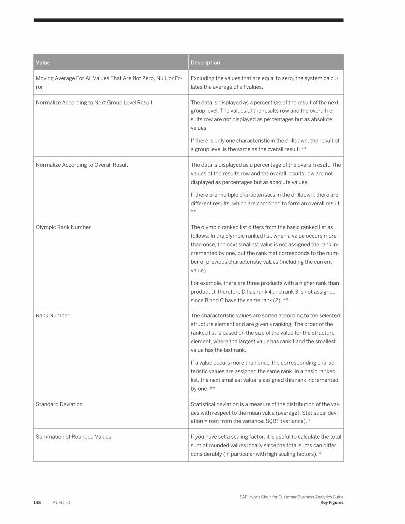
Value Description
Moving Average For All Values That Are Not Zero, Null, or Error
Excluding the values that are equal to zero, the system calculates the average of all values.
Normalize According to Next Group Level Result The data is displayed as a percentage of the result of the next group level. The values of the results row and the overall results row are not displayed as percentages but as absolute values.
If there is only one characteristic in the drilldown, the result of a group level is the same as the overall result. **
Normalize According to Overall Result The data is displayed as a percentage of the overall result. The values of the results row and the overall results row are not displayed as percentages but as absolute values.
If there are multiple characteristics in the drilldown, there are different results, which are combined to form an overall result. **
Olympic Rank Number The olympic ranked list differs from the basic ranked list as follows: In the olympic ranked list, when a value occurs more than once, the next smallest value is not assigned the rank incremented by one, but the rank that corresponds to the number of previous characteristic values (including the current value).
For example, there are three products with a higher rank than product D, therefore D has rank 4 and rank 3 is not assigned since B and C have the same rank (2). **
Rank Number The characteristic values are sorted according to the selected structure element and are given a ranking. The order of the ranked list is based on the size of the value for the structure element, where the largest value has rank 1 and the smallest value has the last rank.
If a value occurs more than once, the corresponding characteristic values are assigned the same rank. In a basic ranked list, the next smallest value is assigned this rank incremented by one. **
Standard Deviation Statistical deviation is a measure of the distribution of the values with respect to the mean value (average). Statistical deviation = root from the variance: SQRT (variance). *
Summation of Rounded Values If you have set a scaling factor, it is useful to calculate the total sum of rounded values locally since the total sums can differ considerably (in particular with high scaling factors). *
148 P U B L I CSAP Hybris Cloud for Customer Business Analytics Guide
Key Figures
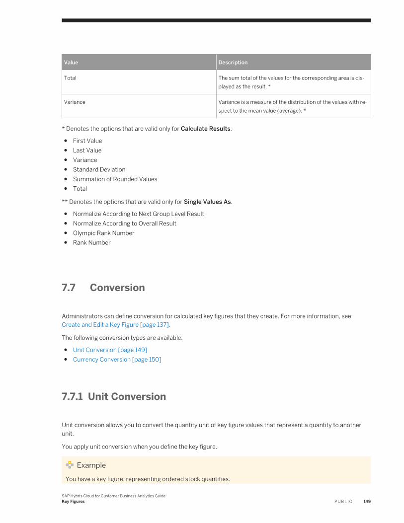
Value Description
Total The sum total of the values for the corresponding area is displayed as the result. *
Variance Variance is a measure of the distribution of the values with respect to the mean value (average). *
* Denotes the options that are valid only for Calculate Results.
● First Value● Last Value● Variance● Standard Deviation● Summation of Rounded Values● Total
** Denotes the options that are valid only for Single Values As.
● Normalize According to Next Group Level Result● Normalize According to Overall Result● Olympic Rank Number● Rank Number
7.7 Conversion
Administrators can define conversion for calculated key figures that they create. For more information, see Create and Edit a Key Figure [page 137].
The following conversion types are available:
● Unit Conversion [page 149]● Currency Conversion [page 150]
7.7.1 Unit Conversion
Unit conversion allows you to convert the quantity unit of key figure values that represent a quantity to another unit.
You apply unit conversion when you define the key figure.
ExampleYou have a key figure, representing ordered stock quantities.
SAP Hybris Cloud for Customer Business Analytics GuideKey Figures P U B L I C 149
You require this function, for example, if you want to report on key figures, such as ordered stock that use quantities in units common to different countries or industries. By converting the quantity unit to a common unit, such as kilograms for weight, you can compare ordered stock.
7.7.2 Currency Conversion
Currency conversion allows you to convert the currency unit of key figure values.
NoteNote that you do not apply currency conversion when creating the calculated key figure but rather define that currency conversion can be applied to the key figure if the key figure is used in reports.
When you define that currency conversion can be applied to the key figure, the system creates variables that are available with reports in which the key figure is used. The variables enable users to apply currency conversion to the key figure. Depending on how the report is defined, the variables may already exist.
The variables are as follows:
● Display CurrencyDepending on how the underlying data is defined, the variable may be defaulted to the company currency.
● Display Currency - Conversion Date
ExampleFor example, you want to report on key figures, such as net sales that balance in a different currency. By converting the currency unit to a common currency, such as the company currency, you can compare net sales.
150 P U B L I CSAP Hybris Cloud for Customer Business Analytics Guide
Key Figures
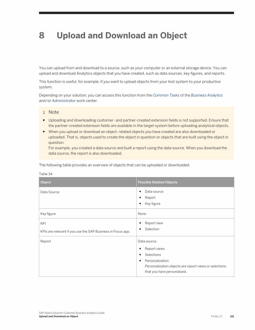
8 Upload and Download an Object
You can upload from and download to a source, such as your computer or an external storage device. You can upload and download Analytics objects that you have created, such as data sources, key figures, and reports.
This function is useful, for example, if you want to upload objects from your test system to your productive system.
Depending on your solution, you can access this function from the Common Tasks of the Business Analytics and/or Administrator work center.
Note● Uploading and downloading customer- and partner-created extension fields is not supported. Ensure that
the partner-created extension fields are available in the target system before uploading analytical objects.● When you upload or download an object, related objects you have created are also downloaded or
uploaded. That is, objects used to create the object in question or objects that are built using the object in question.For example, you created a data source and built a report using the data source. When you download the data source, the report is also downloaded.
The following table provides an overview of objects that can be uploaded or downloaded.
Table 34:
Object Possible Related Objects
Data Source ● Data source● Report● Key figure
Key figure None
KPI
KPIs are relevant if you use the SAP Business in Focus app.
● Report view● Selection
Report Data source
● Report views● Selections● Personalization
Personalization objects are report views or selections that you have personalized.
SAP Hybris Cloud for Customer Business Analytics GuideUpload and Download an Object P U B L I C 151
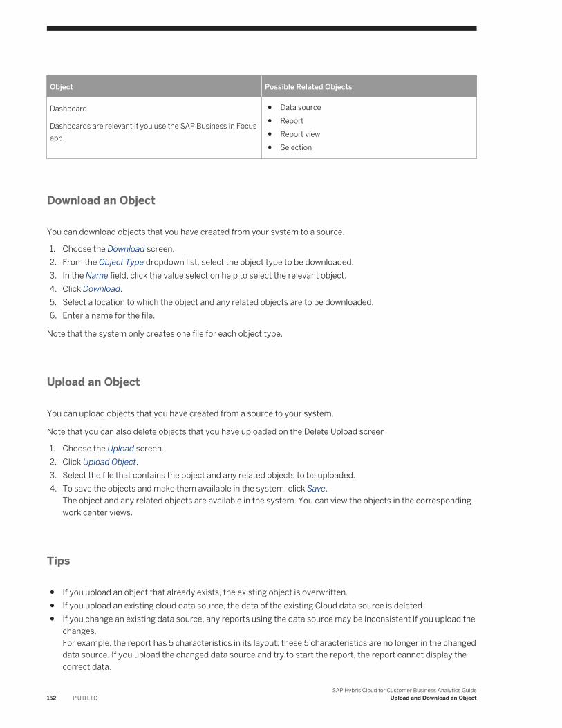
Object Possible Related Objects
Dashboard
Dashboards are relevant if you use the SAP Business in Focus app.
● Data source● Report● Report view● Selection
Download an Object
You can download objects that you have created from your system to a source.
1. Choose the Download screen.2. From the Object Type dropdown list, select the object type to be downloaded.3. In the Name field, click the value selection help to select the relevant object.4. Click Download.5. Select a location to which the object and any related objects are to be downloaded.6. Enter a name for the file.
Note that the system only creates one file for each object type.
Upload an Object
You can upload objects that you have created from a source to your system.
Note that you can also delete objects that you have uploaded on the Delete Upload screen.
1. Choose the Upload screen.2. Click Upload Object.3. Select the file that contains the object and any related objects to be uploaded.4. To save the objects and make them available in the system, click Save.
The object and any related objects are available in the system. You can view the objects in the corresponding work center views.
Tips
● If you upload an object that already exists, the existing object is overwritten.● If you upload an existing cloud data source, the data of the existing Cloud data source is deleted.● If you change an existing data source, any reports using the data source may be inconsistent if you upload the
changes.For example, the report has 5 characteristics in its layout; these 5 characteristics are no longer in the changed data source. If you upload the changed data source and try to start the report, the report cannot display the correct data.
152 P U B L I CSAP Hybris Cloud for Customer Business Analytics Guide
Upload and Download an Object
9 Buffer Hierarchies
You can enable buffering to improve the performance of hierarchical based reporting. You can either schedule it periodically by specifying the frequency or opt for ad hoc schedule to run it as required.
This function is useful, for example, if you have large hierarchies and extensive hierarchical reporting. On execution of this job, the system will buffer the hierarchies and keep the hierarchical data ready for quick reference during report execution thereby helping you improve the report execution performance.
Procedure
1. Go to Business Analytics Common Tasks and click on Buffer Hierarchies to open a new window. The system shows you a list of all the hierarchies for which buffering is supported.
2. Select a hierarchy and click on Schedule Buffering. You have an option of scheduling it in one of the following ways:○ Ad hoc: This allows you to buffer the hierarchy as and when required by manually clicking the Start Now
button on the Buffer Hierarchies screen.○ Periodically: This enables you to specify the frequency at which you would like to buffer the hierarchy.
3. Select your option and click Save and Close. Based on the settings, the system will execute the job periodically, or you can execute it manually when required.In the Buffer Hierarchies screen, you can stop, start or pause the buffering anytime you want.The Execution Status column shows you the last run status. If you want to see more details, refer to the Last Run Logs tab on your screen.
SAP Hybris Cloud for Customer Business Analytics GuideBuffer Hierarchies P U B L I C 153
10 Translate Analytical Report Texts
In the Language Adaptation tool, you can translate analytical report texts.
To do this, follow the steps below:
1. Go to Administrator Language Adaptations .2. From the Language Adaptations view click New to create a translation or adaptation.3. From the New Language Adaptation screen complete the following fields:
○ ID○ Name○ Select a language from the Source Language drop-down list.○ Select a language from the Target Language drop-down list.Name
4. Click Save or Save and Open.5. For all report texts, select the workcenter to which the report is assigned to. For KPI and Dashboard, select
the Business Analytics work center6. Under Text Pool Selection, select the Get Analytical Report Texts checkbox.7. Click Collect Texts. The system fills the Target Text column with the existing texts as delivered by or any
overrides you (or other administrators in your solution) may have made.8. Define your required texts in the Target Text field under the Report Texts tab.
154 P U B L I CSAP Hybris Cloud for Customer Business Analytics Guide
Translate Analytical Report Texts
11 Dashboard Wizard in HTML5
Yous can access the Dashboard work center view from the Analysis work center. Interactive dashboards allow you to look at all the relevant business information at one place, define connections and transfer filters between reports. In-place interactivity and drilldown helps users to slice and dice the data as per their requirement.
Tasks
You can perform the following tasks in this work center view:
● Creating Interactive Dashboards [page 155]● Using Interactive Dashboards [page 158]
Tips
● Visualize how your dashboard should look like. Define what types of charts you would like to use to represent your data. Determine how different reports in a dashboard are related and define connections accordingly. Once you have designed the Dashboard review existing reports and view. Create or modify view as per the design. You would also need to specify what selections will be used in the dashboard, e.g., if the dashboard is for the Current Quarter then you would need to specify this selection in your dashboard. Review and create selections accordingly.
● You can also use dashboards for KPI drill down. From a business case perspective, it often makes sense if the dashboard and KPI are based on the same data. For example, you use the same report as a basis for both..
● The Dashboard layout is a 3x3 matrix. We recommend that you use 2-3 reports in one row. If you use only one report the dashboard will contain a lot of white space. However for tables larger than 3 columns we recommend utilizing 1x2 space so that the table can be viewed properly. You can also view exceptions in the Dashboard. To do so select a report view where you have already defined exceptions.
11.1 Creating Interactive Dashboards
As an administrator you can create customized interactive dashboards that you publish to users. You can use these dashboards on the browser, responsive UI, as well as the SAP Customer Insight for iPad app. Use guided wizard to create and publish dashboards. You need not create new reports for dashboards. Existing reports can be used in Dashboards.
CautionPlease note that this document is relevant only for HTML5-based screens. Either the described function is available only in HTML5, or its HTML5 version differs from the Microsoft Silverlight® version. To use this
SAP Hybris Cloud for Customer Business Analytics GuideDashboard Wizard in HTML5 P U B L I C 155
function in the Microsoft Silverlight client, please log on to the Microsoft Silverlight-based screen and follow the instructions in the corresponding help document.
Your solution is HTML5-based if the system URL contains /HTML5 . Your solution is Microsoft Silverlight-based if a Silverlight pop-up window appears when you right-click anywhere on the screen.
Prerequisites
Before creating a custom dashboard, you should decide which reports you want to include as charts. Also consider how you want the charts to respond when the user selects a data element in a linked chart. You should be familiar with reports and report variants.
Tasks
● Create a Dashboard:1. Go to Analysis and choose Dashboard
NoteAs an administrator, when you navigate to the dashboard, you enter it in Design Mode by default. You can create or edit a dashboard in this mode. To run dashboards, click on the Execute Mode button.
2. Choose the + icon at the upper right of the dashboard area.The system opens the guided activity for dashboard creation. Enter the required information at each step. For more information about this task, see Creating a New Dashboard [page 157]
● Edit a Dashboard: Once you create a dashboard you can add, change or remove functionality.○ To edit a dashboard, choose the pencil icon at the top right of the page.
Editing a dashboard uses the same guided steps as creating a new dashboard. Step through the process and modify attributes as desired.
○ To remove a dashboard completely, open it for editing, then choose the delete icon.○ To hide SAP delivered dashboards from the list, an administrator can choose the pencil icon, click on Edit,
uncheck the Publish checkbox, and click Save. This will hide the standard dashboard for all the users. Note that the administrators can still see the hidden dashboard so that they can unhide it if required.
156 P U B L I CSAP Hybris Cloud for Customer Business Analytics Guide
Dashboard Wizard in HTML5
11.1.1 Creating a New Dashboard
Context
Once you begin the guided dashboard creation process, enter the required information at each step. Use the Next button to move to the next step and the Previous button to return to a prior step. The Next button is disabled until you have completed all actions required in the previous step.
Procedure
1. Start — Enter a name and optional description for your new dashboard.
You can choose to publish the dashboard right away or keep it in a draft state until you have finalized the new dashboard. End users cannot see the dashboard unless the administrator publishes it.
Define who will be able to access the dashboard in Authorization field. To make the dashboard accessible to all the users, select Public. You can restrict the users who have access to this dashboard. This restriction is based on the business roles of the users. To do so, select Custom. You get a list of all the business roles for your company. Select all the business roles which should be able to access this dashboard.
Note○ You can assign a dashboard to a business role only if you have selected the option in the fine tuning
activities for your solution. For more information, see Role Based Access [page 52].○ You cannot assign standard dashboards to a business role. Any user who has access to reports
available in a standard dashboard will be able to view it in the dashboard○ As an administrator, you can execute all dashboards irrespective of your dashboard assignment. This
will enable you to create and test dashboards.
2. Sources — Select report views to be included in the dashboard. Use the search box to find a specific report. Choose All to show all available reports, Selected to show only selected reports, and Unselected to display only the reports you have not selected. You can select only 9 report views for a dashboard.
You can also select hierarchical based reporting for both tabular and chart based visualizations. To configure hierarchical report in dashboard, create views with hierarchical property enabled and then add them to the dashboard. Hierarchical reports behave slightly different than other reports. Note the limitations below:○ You cannot navigate from hierarchical tables to a Business Object○ You cannot pass filters from hierarchical chart to other reports
During the process of creating a dashboard if you create a new view and want to include it in the dashboard, then you will have to close the current dashboard creation process and open it again.
Note○ If you have selected Custom in the first step, you will only see reports that are assigned to the selected
business roles.
SAP Hybris Cloud for Customer Business Analytics GuideDashboard Wizard in HTML5 P U B L I C 157
○ In case you have selected multiple business roles, the list will have an intersection of the reports. This means you will only see reports that are assigned to all of the selected business roles.
○ If there are no common reports for the selected business roles, the list will be empty.○ If you have report views where Characteristics are shown in column, do not use these reports for
dashboard or homepage reporting. The view might get distorted in the dashboards and homepage tile.
3. Variants — Select report variants to be used on the dashboard.
During the process of creating a dashboard, if you create a new variant and want to include it in the dashboard, then you will have to go back to the Sources step to make it available.
NoteYou can view exceptions defined on key figures of a report on the Dashboard. To do so select a report variant where you have already defined exceptions for key figures. To know more about how to use exceptions, see Exceptions [page 87].
4. Layout — The system does not propose any layout. You can define the layout by arranging the reports on the grids. Drag and drop to reposition tiles.
Note the following points while creating your layout:
○ Use the arrow (</>/^) buttons to expand tiles horizontally or vertically.○ Press the X button to remove the report from the grid and make it available in available reports list.○ For a single report, the dashboard report will be shown the way it is designed in the layout. If you want it to
be stretched to full page then you need to change the row/column span in the layout itself.5. Connections — Define connections to pass filters between reports. Set up the interactions between tiles.
Choose Auto Mapping to connect default mapping between two reports. You can also manually select a Source and a Target , if desired. If necessary you can also remove connections.
NoteConnections are not possible if you are using the following:
○ A single report○ A single report view with multiple selections: In this case two reports will be available. But connection is
not possible
6. Preview — Preview and save the new dashboard.
This screen shows how the dashboard will appear in the browser, responsive UI, or in the SAP Customer Insight app. Remember to save the dashboard when you are finished. Once saved, your new dashboard is available to select from the menu on the Dashboard tab.
Close the window at any time before you save to stop the process and discard changes.
11.2 Working with Interactive Dashboards
Interactive dashboards allow you to look at all the relevant business information at one place, define connections, and transfer filters between reports. In-place interactivity and drilldown helps you to slice and dice the data as per
158 P U B L I CSAP Hybris Cloud for Customer Business Analytics Guide
Dashboard Wizard in HTML5
your requirement. You can access interactive dashboards on your browser, responsive UI, or with the SAP Customer Insight iPad app.
Accessing Dashboards [page 159]Dashboards allow you to look at all the relevant business information at one place. You can access the dashboard and analyze data from multiple sources together.
Configuring a Chart [page 160]You have several options to control how the chart data appears on screen.
Drilling Down Data [page 161]Drill down data to view the information most relevant for you.
Annotating and E-Mailing Dashboards [page 162]If you are viewing the dashboard on the SAP Customer Insight for iPad app, you can add annotations and send an image of the annotated dashboard as an attachment via e-mail.
Using Report Connections [page 162]As an administrator, you can establish connections while creating dashboards.
Analyzing Data [page 163]If you want to further analyze a report in the dashboard, then you can click Analyze Data and open the report in Analysis Pattern.
11.2.1 Accessing Dashboards
Dashboards allow you to look at all the relevant business information at one place. You can access the dashboard and analyze data from multiple sources together.
Procedure
● Browser/Responsive UIa. Choose the Analysis tab.b. Choose Dashboard.c. Select the desired dashboard from the menu.
● SAP Customer Insight for iPad appa. Choose the sprocket icon at the upper right corner of the screen.b. Choose Dashboard.c. Select the desired dashboard from the menu.
Task overview: Working with Interactive Dashboards [page 158]
Related Information
Configuring a Chart [page 160]
SAP Hybris Cloud for Customer Business Analytics GuideDashboard Wizard in HTML5 P U B L I C 159
Drilling Down Data [page 161]Annotating and E-Mailing Dashboards [page 162]Using Report Connections [page 162]Analyzing Data [page 163]
11.2.2 Configuring a Chart
You have several options to control how the chart data appears on screen.
● Select a chart type from the settings menu.● Show or hide the chart legend. Find this option in the Settings menu on the browser, or on SAP Customer
Insight for iPad, choose the small icon at the upper left of the chart.● Choose a data element on a chart and linked reports update to reflect your selection. For example choose a
specific bar in a bar chart, and linked reports on the dashboard update to show data from the selected element.
Note● You cannot personalize and save these visualization changes in the dashboard.● Only the following charts are available in the dashboard:
○ Bar○ Pie○ Line○ Area○ Donut○ Column○ Stacked Column○ 100 Percent Stacked Column○ Bar○ 100 Percent Stacked Bar○ Funnel
● As a best practice, it is advisable that you do not add characteristics in columns if the report is used in the dashboard. This might not give you the desired results.
● Under Table Settings, if you select First Row in the Show Result Row As field, the chart visualization may be inconsistent.
Parent topic: Working with Interactive Dashboards [page 158]
Related Information
Accessing Dashboards [page 159]Drilling Down Data [page 161]Annotating and E-Mailing Dashboards [page 162]
160 P U B L I CSAP Hybris Cloud for Customer Business Analytics Guide
Dashboard Wizard in HTML5
Using Report Connections [page 162]Analyzing Data [page 163]
11.2.3 Drilling Down Data
Drill down data to view the information most relevant for you.
1. Open the drill down pane for a report by choosing the drill down icon.2. Select the Drill Down icon, and then select the desired characteristics. The report updates immediately to
reflect your selections.
NoteLinked reports do not update when the drill down pane is open.
Choose Reset dashboard to go back to the original state. This removes drill down characteristics and filters from all charts on the current dashboard.On SAP Customer Insight for iPad, from the dashboard list menu, choose Reset Current Dashboard.Choose Refresh to get the updated data in DashboardIf you choose a data element on a chart (by clicking in the browser or by selecting an area in the app), the filter is automatically transferred to the linked reports and they update to reflect your selection. For example, if you choose a bar showing data for Quarter 1 in a bar chart, all the linked reports will now show the data relevant for Quarter 1.
Parent topic: Working with Interactive Dashboards [page 158]
Related Information
Accessing Dashboards [page 159]Configuring a Chart [page 160]Annotating and E-Mailing Dashboards [page 162]Using Report Connections [page 162]Analyzing Data [page 163]
SAP Hybris Cloud for Customer Business Analytics GuideDashboard Wizard in HTML5 P U B L I C 161
11.2.4 Annotating and E-Mailing Dashboards
If you are viewing the dashboard on the SAP Customer Insight for iPad app, you can add annotations and send an image of the annotated dashboard as an attachment via e-mail.
Procedure
1. Choose Annotation from the Action menu.2. Select a color for freehand markup, or select the note icon to enter a text note.3. Draw your markup or enter text.4. Choose Send as E-Mail from the Actions menu to send an image of the annotated dashboard as an
attachment.5. Choose Cancel to exit annotation mode.
Task overview: Working with Interactive Dashboards [page 158]
Related Information
Accessing Dashboards [page 159]Configuring a Chart [page 160]Drilling Down Data [page 161]Using Report Connections [page 162]Analyzing Data [page 163]
11.2.5 Using Report Connections
As an administrator, you can establish connections while creating dashboards.
These connections will be used to pass filters between reports when you are interacting with the dashboard. To work with interactivity, select the relevant area of the chart which you want to pass as filter to connected reports. . As soon as the area is selected all the related reports will get filtered. These filters become visible when you click the funnel icon next to the reports. The system also allows you to delete a filter from a report if required. For example, If you want to analyze your forecast details for a region, you can select a region from the first report which can further filter other reports to show you details for this region. One report can be connected to all the reports or else you can establish one by one connections. For example, Report 1 connected to report 2; report 2 connected to report 3; report 3 connected to report 4 and so on. This way multiple filters can be passed from one report to the other.
162 P U B L I CSAP Hybris Cloud for Customer Business Analytics Guide
Dashboard Wizard in HTML5
NoteYou cannot pass filters/connections from a tabular report to another report. However a tabular report gets filtered based on connections passed from other reports.
Parent topic: Working with Interactive Dashboards [page 158]
Related Information
Accessing Dashboards [page 159]Configuring a Chart [page 160]Drilling Down Data [page 161]Annotating and E-Mailing Dashboards [page 162]Analyzing Data [page 163]
11.2.6 Analyzing Data
If you want to further analyze a report in the dashboard, then you can click Analyze Data and open the report in Analysis Pattern.
Parent topic: Working with Interactive Dashboards [page 158]
Related Information
Accessing Dashboards [page 159]Configuring a Chart [page 160]Drilling Down Data [page 161]Annotating and E-Mailing Dashboards [page 162]Using Report Connections [page 162]
SAP Hybris Cloud for Customer Business Analytics GuideDashboard Wizard in HTML5 P U B L I C 163
12 Homepage
Displays pre-configured business tiles that have been set up for you. You can click on a tile to see its details. For example, you can click on Today's Activities to see the details of your schedule and activities for today.
Learn how to change the look and feel of the homepage by either changing the homepage layout settings for all users or changing your individual settings.
Homepage Adaptation in extended edition
Note● Adaptation capability is not available in smartphones and in offline mode.● Tile navigation in offline is limited to Today’s Activities, Visits, Custom report and Floorplan tiles in browser
and tablet.● For an optimal performance experience, you will now get a warning message when you exceed the
recommended number of KPI and Report tiles on the homepage. The recommended maximum number of KPI tiles supported is 10 and the maximum number of Report based tiles (Custom pattern tiles like Bar Chart tiles) supported is 4. You still have the option to add additional tiles, but it will impact the performance.
● There is no limit on recommended number of List tiles, Tool tiles and Custom tiles.● Scorecard facet while selecting tiles is not available.
Adapt for user role
You can adapt the homepage screen for any user role with needed preferences. To adapt the homepage for a user role, you enter the adaptation mode by clicking the edit icon located inside the footer toolbar. This icon gives you the option to either personalize your homepage or configure home page for a user role.
Configure for a user role
1. Select Adapt.2. Select a user role to adapt by searching by keyword for the user role.3. Click Go.
NoteYou can see the role for which adaptation mode is triggered. The homepage now shows the navigation and tiles for the specific role.
4. You can rearrange tiles by dragging and dropping and also rearrange groups by dragging and dropping. Additionally, you can rename and delete groups.
5. Click Publish to save the changes you made for the user role and then click Leave Adaptation Mode to come back to your homepage. If you don’t want to save the changes, then leave adaptation mode.
Add Tiles
164 P U B L I CSAP Hybris Cloud for Customer Business Analytics Guide
Homepage
To add tiles, click/tap the+ icon, located at the end of each tile. As the administrator you have two options to add tiles-
● Create a custom tile from scratch● Add existing tile from the catalog
Create Custom Tile
When you click create custom tile, you can create 3 different types of custom tiles- URL, Floorplan or Ticket creation. This is similar to the HTML5 version.
1. Choose the custom tile you want to create.2. Add the required fields and click Save.3. Click Publish to include the custom tile on the homepage. Custom created tiles are stored in the Tile Catalog.
Edit Custom Tile
Once a custom tile is created it is placed on the user interface as available and visible.
To edit custom tiles, click on the tile and open the edit dialog as you would usually edit other tiles. The dialog includes details such as Title, Path, and Description that are editable. However, the type of the tile (URL vs. Floorplan cannot be changed).
Add Existing Tile
Choose an existing tile from the catalog to add it to the homepage.
You can also select hierarchical based reporting for both tabular and chart based visualizations. To configure hierarchical report in homepage, create views with hierarchical property enabled and then add them to the homepage. You can click on a hierarchical table tile for further interactions like opening and closing the hierarchical node Note that you cannot navigate from hierarchical tables to a Business Object.
Edit Existing tiles
Click/ Tap on a tile to open the settings screen for the respective tile. Turning off the Available switch will remove the tile from the homepage and this will automatically turn off the Visbile switch. To add back this tile, use the Add icon.
Group
A group created by the admin shows up for different user roles. As an admin user, you can switch the group functionality off. To do so,
1. Click the edit icon in the footer toolbar and select Adapt.2. Select the user role for which you want to disable group functionality.3. Click the gear icon in the header toolbar. Uncheck the checkbox Show Tiles in Groups in the Settings pop up
window and then click Save.
Homepage Personalization in extended edition
Note● Personalization capability is not available in smartphones.● Tile Navigation in offline is limited to Today’s Activities, Visits, Custom report and Floorplan tiles.
SAP Hybris Cloud for Customer Business Analytics GuideHomepage P U B L I C 165
● Personalization is not available in offline mode.
You can personalize your homepage screen with your preferences. To personalize your homepage, you enter the personalization mode by clicking the edit icon located inside the footer toolbar. Once you are in the personalization mode, you can hover over the content area and see that editable areas are highlighted and marked by a frame. You can select the icons which allows you to make the corresponding personalized changes.
In the personalize mode, you can make various changes to the current screen such as rearranging the tiles and groups by dragging and dropping them, adding and deleting tile and groups, renaming groups etc. You can make hidden items visible again by turning on the visible switch. All hidden and available items will appear in the list and you can add them again.
After completing the personalization of your homepage screen, you can exit the personalization mode by saving the changes you made. Or if you want to remove the changes, press cancel.
Tiles
You have three types of tiles available on the homepage: Report tiles, KPI tile and Tool tiles. You can rearranging these tiles by dragging and dropping them and also move them to different groups.
NoteFor an optimal performance experience, you will get a warning message when you exceed the recommended number of KPI and Report tiles on the homepage. The recommended maximum number of KPI tiles supported is 10 and the maximum number of Report based tiles (Custom pattern tiles like Bar Chart tiles) supported is 4. You still have the option to add additional tiles, but it will impact the performance. There is no limit on recommended number of List tiles, Tool Tiles and Custom Tiles.
Add Tiles
There is a + icon to add a new tile at the end of each tile. To add tiles, click/tap the + icon. You can also remove a tile not needed by making tile invisible by turning off the visible switch. If the tile preview shows a tile as visible, then tile is shown on the homepage.
Edit Tiles
A tap on a tile, opens the settings screen for the respective tile. Turning off the visible switch will remove the tile from the homepage. Here you can also change the group of the tile, for exaample, move the tile to a different group and then save your changes.
Groups
Based on your requirement and preference, you have the option to cluster the tiles into a logical group.
Add Group
You have the option to cluster tiles by creating new groups. There is a + icon to add at the end of each group. To add new groups, click/tap the + icon. You can also rename the supported groups.
Delete Group
You can also delete groups created by you besides rearranging groups by dragging and dropping them.
A group created by you shows a Delete button. Delete will simply remove the group permanently so that it will not be visible on the user interface any longer. You will get a warning message before removing the group.
For more information on how you can define the tile layout for different roles within the company and add custom reports to SAP Customer Insight, see the following:
166 P U B L I CSAP Hybris Cloud for Customer Business Analytics Guide
Homepage
● SAP Hybris Customer Insight and Home Page Report Patterns [page 167]● VIDEO: Setting Up the Home Page and SAP Customer Insight [page 182]● Adding Custom Reports to SAP Customer Insight [page 182]
12.1 SAP Hybris Customer Insight and Home Page Report Patterns
The appearance of custom reports in SAP Hybris Customer Insight or on the Home page is determined by the structure of the report. Four tile patterns are available for custom reports. The system uses the tile that most closely matches the structure of the report view you assign to the SAP Hybris Customer Insight workset. If a report view does not match any of the available tile patterns, then the tile shows a scaled image of the chart type selected for that report view.
Patterns for Custom Reports
Each pattern corresponds to a different tile appearance in SAP Hybris Customer Insight or on the Home page. The structure of the report view you assign to the SAP Customer Insight workset determines which tile type appears on the SAP Customer Insight mobile app for iPad.
NoteIf your custom report conforms to more than one pattern, the user will be able to choose a preferred visual representation.
You can find the different patterns for custom reports below:
● Absolute Value Pattern [page 169]● Percentage Coverage Pattern [page 169]● Top Three Pattern [page 171]● Aggregated Value Pattern [page 172]● Gauge Pattern [page 172]● Double Progress Bar Pattern [page 174]● Progress Bar Pattern [page 175]● Headline Pattern [page 177]● Trendline Pattern [page 179]
Setting Up Tiles for the Home Page and SAP Hybris Customer Insight
As an administrator, you can define the tile layout for different roles within the company. Certain tiles also require some setup information, which you can define.
SAP Hybris Cloud for Customer Business Analytics GuideHomepage P U B L I C 167
Some of the tasks that you can perform are described below:
● Selecting a role [page 179]● Defining tiles for each role [page 180]● Creating custom tiles [page 180]● Making settings for certain tiles [page 181]● Previewing home page settings on SAP Customer Insight [page 181]
Related Information
Adding Custom Reports to SAP Customer Insight [page 182]VIDEO: Setting Up the Home Page and SAP Customer Insight [page 182]
12.1.1 Patterns for Custom Reports
Each pattern corresponds to a different tile appearance in SAP Customer Insight or on the Home page. The structure of the report view you assign to the SAP Customer Insight workset determines which tile type appears on the SAP Customer Insight mobile app for iPad.
NoteIf your custom report conforms to more than one pattern, the user will be able to choose a preferred visual representation.
You can find the different patterns for custom reports below:
● Absolute Value Pattern [page 169]● Percentage Coverage Pattern [page 169]● Top Three Pattern [page 171]● Aggregated Value Pattern [page 172]● Gauge Pattern [page 172]● Double Progress Bar Pattern [page 174]● Progress Bar Pattern [page 175]● Headline Pattern [page 177]● Trendline Pattern [page 179]
168 P U B L I CSAP Hybris Cloud for Customer Business Analytics Guide
Homepage
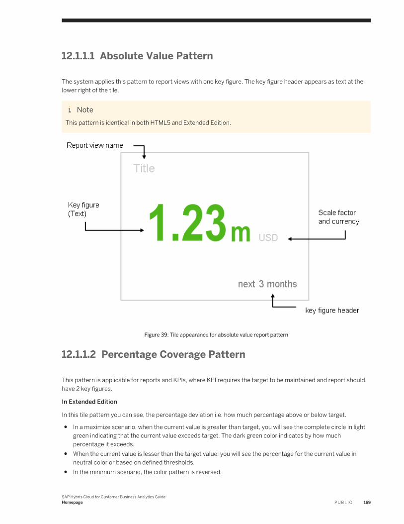
12.1.1.1 Absolute Value Pattern
The system applies this pattern to report views with one key figure. The key figure header appears as text at the lower right of the tile.
NoteThis pattern is identical in both HTML5 and Extended Edition.
Figure 39: Tile appearance for absolute value report pattern
12.1.1.2 Percentage Coverage Pattern
This pattern is applicable for reports and KPIs, where KPI requires the target to be maintained and report should have 2 key figures.
In Extended Edition
In this tile pattern you can see, the percentage deviation i.e. how much percentage above or below target.
● In a maximize scenario, when the current value is greater than target, you will see the complete circle in light green indicating that the current value exceeds target. The dark green color indicates by how much percentage it exceeds.
● When the current value is lesser than the target value, you will see the percentage for the current value in neutral color or based on defined thresholds.
● In the minimum scenario, the color pattern is reversed.
SAP Hybris Cloud for Customer Business Analytics GuideHomepage P U B L I C 169
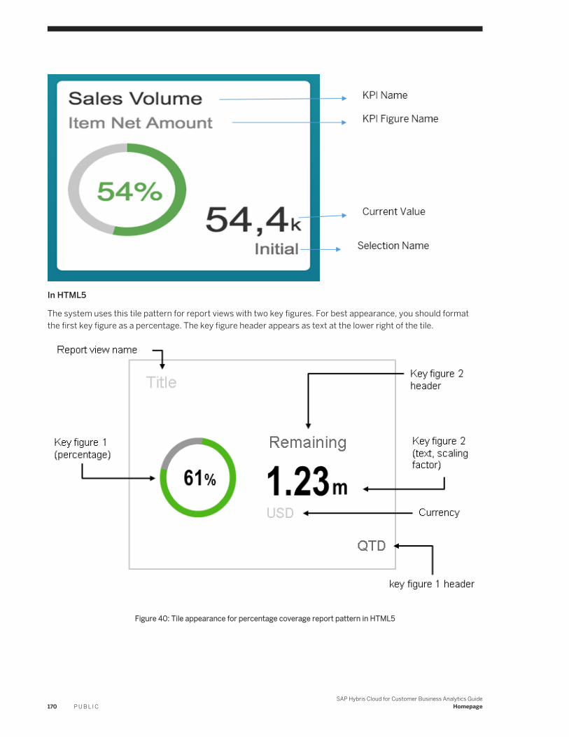
In HTML5
The system uses this tile pattern for report views with two key figures. For best appearance, you should format the first key figure as a percentage. The key figure header appears as text at the lower right of the tile.
Figure 40: Tile appearance for percentage coverage report pattern in HTML5
170 P U B L I CSAP Hybris Cloud for Customer Business Analytics Guide
Homepage
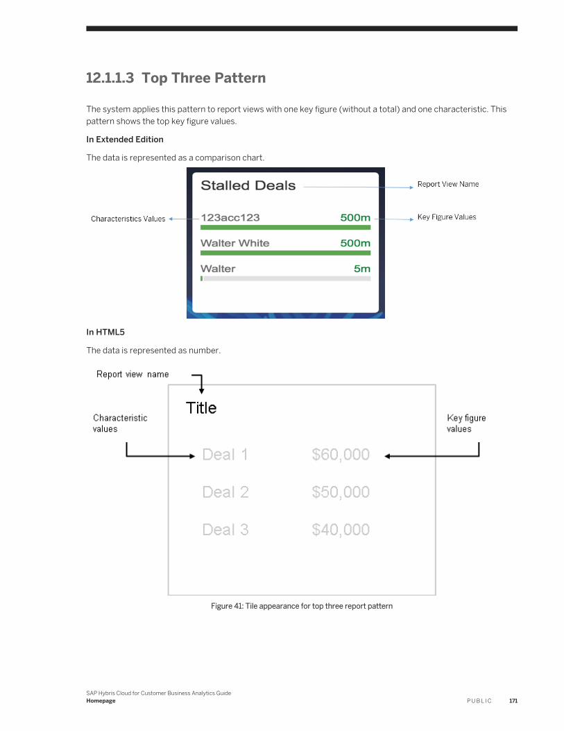
12.1.1.3 Top Three Pattern
The system applies this pattern to report views with one key figure (without a total) and one characteristic. This pattern shows the top key figure values.
In Extended Edition
The data is represented as a comparison chart.
In HTML5
The data is represented as number.
Figure 41: Tile appearance for top three report pattern
SAP Hybris Cloud for Customer Business Analytics GuideHomepage P U B L I C 171
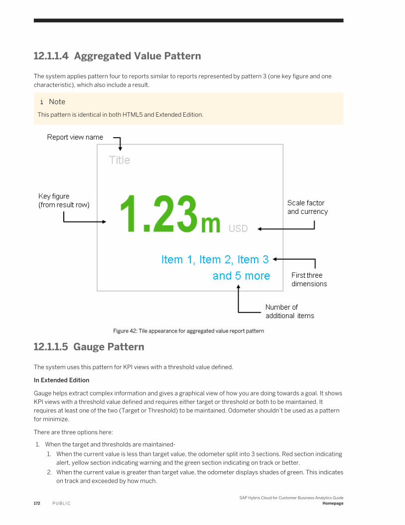
12.1.1.4 Aggregated Value PatternThe system applies pattern four to reports similar to reports represented by pattern 3 (one key figure and one characteristic), which also include a result.
NoteThis pattern is identical in both HTML5 and Extended Edition.
Figure 42: Tile appearance for aggregated value report pattern
12.1.1.5 Gauge PatternThe system uses this pattern for KPI views with a threshold value defined.
In Extended Edition
Gauge helps extract complex information and gives a graphical view of how you are doing towards a goal. It shows KPI views with a threshold value defined and requires either target or threshold or both to be maintained. It requires at least one of the two (Target or Threshold) to be maintained. Odometer shouldn’t be used as a pattern for minimize.
There are three options here:
1. When the target and thresholds are maintained-1. When the current value is less than target value, the odometer split into 3 sections. Red section indicating
alert, yellow section indicating warning and the green section indicating on track or better.2. When the current value is greater than target value, the odometer displays shades of green. This indicates
on track and exceeded by how much.
172 P U B L I CSAP Hybris Cloud for Customer Business Analytics Guide
Homepage
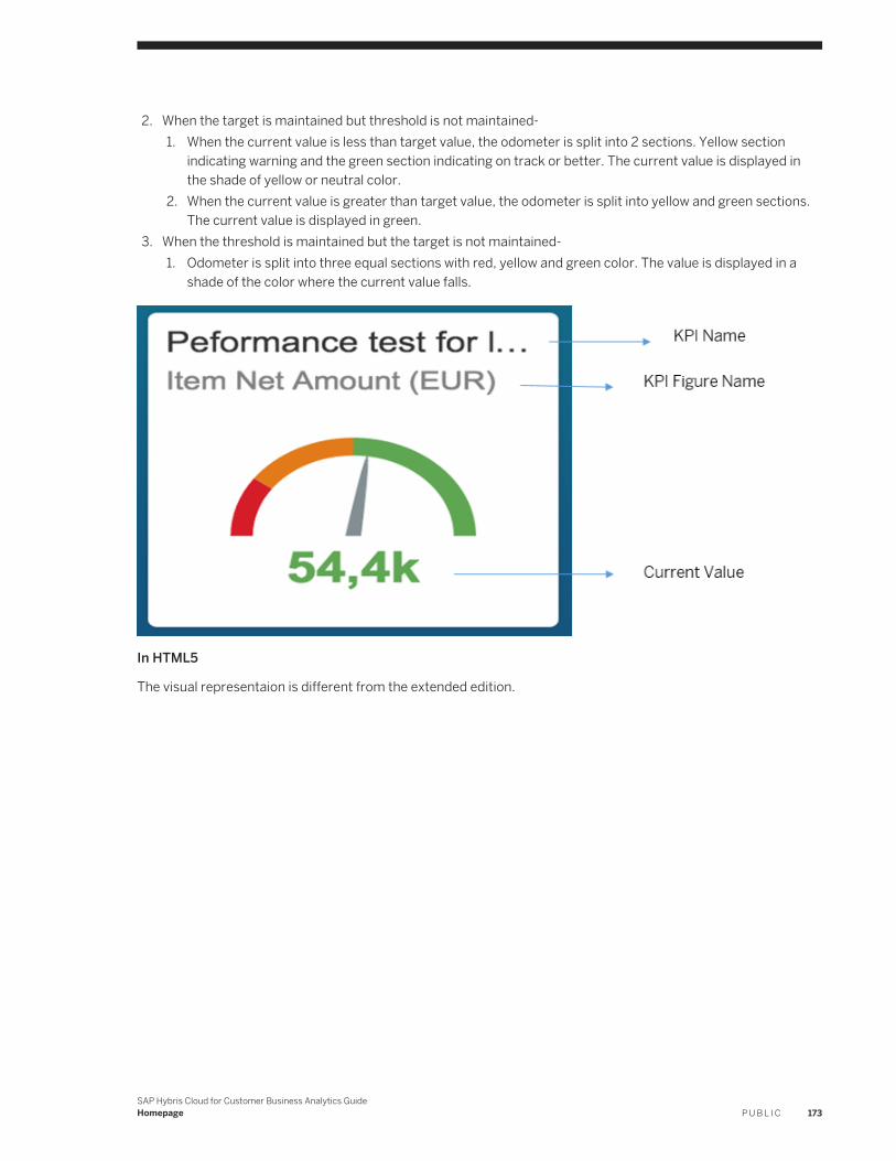
2. When the target is maintained but threshold is not maintained-1. When the current value is less than target value, the odometer is split into 2 sections. Yellow section
indicating warning and the green section indicating on track or better. The current value is displayed in the shade of yellow or neutral color.
2. When the current value is greater than target value, the odometer is split into yellow and green sections. The current value is displayed in green.
3. When the threshold is maintained but the target is not maintained-1. Odometer is split into three equal sections with red, yellow and green color. The value is displayed in a
shade of the color where the current value falls.
In HTML5
The visual representaion is different from the extended edition.
SAP Hybris Cloud for Customer Business Analytics GuideHomepage P U B L I C 173
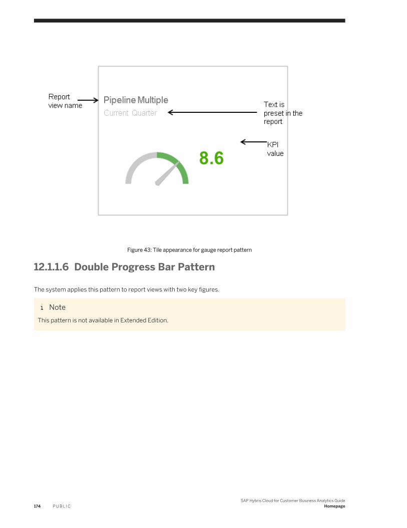
Figure 43: Tile appearance for gauge report pattern
12.1.1.6 Double Progress Bar Pattern
The system applies this pattern to report views with two key figures.
NoteThis pattern is not available in Extended Edition.
174 P U B L I CSAP Hybris Cloud for Customer Business Analytics Guide
Homepage
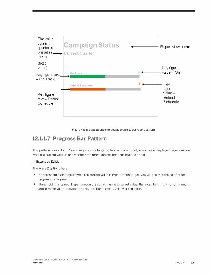
Figure 44: Tile appearance for double progress bar report pattern
12.1.1.7 Progress Bar Pattern
This pattern is valid for KPIs and requires the target to be maintained. Only one color is displayed depending on what the current value is and whether the threshold has been maintained or not.
In Extended Edition
There are 2 options here:
● No threshold maintained: When the current value is greater than target, you will see that the color of the progress bar is green.
● Threshold maintained: Depending on the current value vs target value, there can be a maximum, minimum and in range value showing the progress bar in green, yellow or red color.
SAP Hybris Cloud for Customer Business Analytics GuideHomepage P U B L I C 175
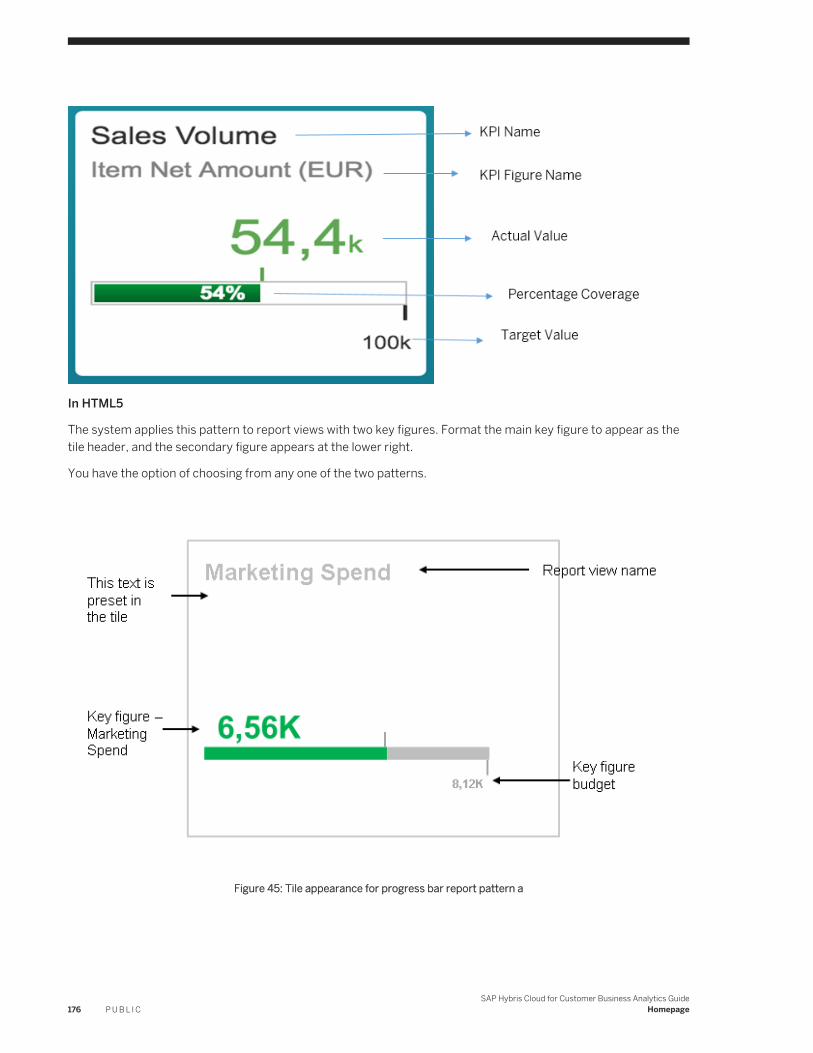
In HTML5
The system applies this pattern to report views with two key figures. Format the main key figure to appear as the tile header, and the secondary figure appears at the lower right.
You have the option of choosing from any one of the two patterns.
Figure 45: Tile appearance for progress bar report pattern a
176 P U B L I CSAP Hybris Cloud for Customer Business Analytics Guide
Homepage
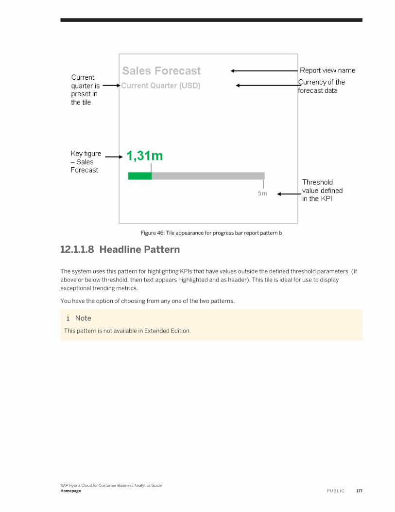
Figure 46: Tile appearance for progress bar report pattern b
12.1.1.8 Headline Pattern
The system uses this pattern for highlighting KPIs that have values outside the defined threshold parameters. (If above or below threshold, then text appears highlighted and as header). This tile is ideal for use to display exceptional trending metrics.
You have the option of choosing from any one of the two patterns.
NoteThis pattern is not available in Extended Edition.
SAP Hybris Cloud for Customer Business Analytics GuideHomepage P U B L I C 177
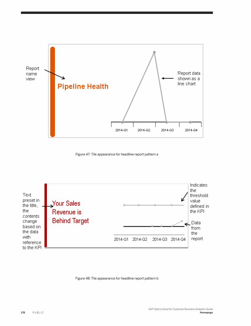
Figure 47: Tile appearance for headline report pattern a
Figure 48: Tile appearance for headline report pattern b
178 P U B L I CSAP Hybris Cloud for Customer Business Analytics Guide
Homepage
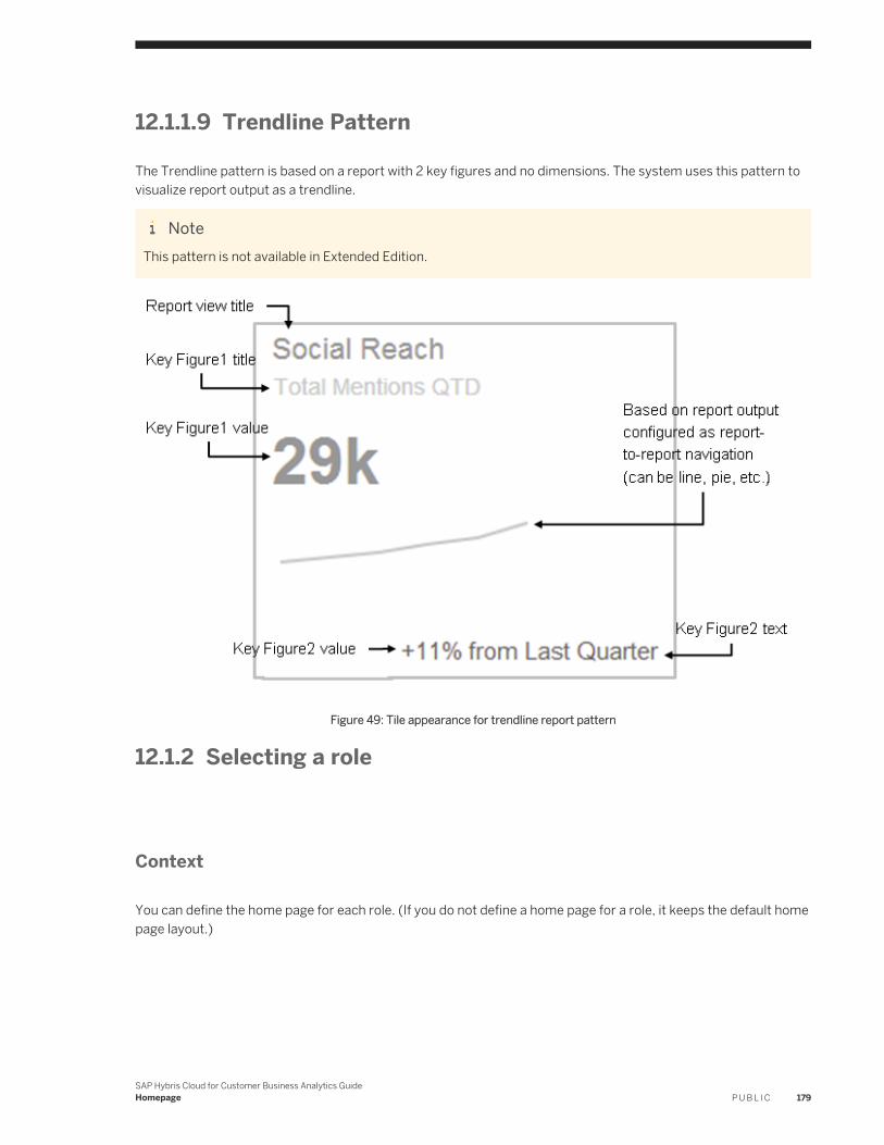
12.1.1.9 Trendline Pattern
The Trendline pattern is based on a report with 2 key figures and no dimensions. The system uses this pattern to visualize report output as a trendline.
NoteThis pattern is not available in Extended Edition.
Figure 49: Tile appearance for trendline report pattern
12.1.2 Selecting a role
Context
You can define the home page for each role. (If you do not define a home page for a role, it keeps the default home page layout.)
SAP Hybris Cloud for Customer Business Analytics GuideHomepage P U B L I C 179
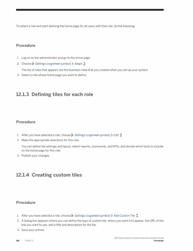
To select a role and start defining the home page for all users with that role, do the following:
Procedure
1. Log on as the administrator and go to the home page.
2. Choose Settings (cogwheel symbol) Adapt .
The list of roles that appears are the business roles that you created when you set up your system.3. Select a role whose home page you want to define.
12.1.3 Defining tiles for each role
Procedure
1. After you have selected a role, choose Settings (cogwheel symbol) Edit .2. Make the appropriate selections for this role.
You can define the settings and layout, select reports, scorecards, and KPIs, and decide which tools to include on the home page for this role.
3. Publish your changes.
12.1.4 Creating custom tiles
Procedure
1. After you have selected a role, choose Settings (cogwheel symbol) Add Custom Tile .2. A dialog box appears where you can define the type of custom tile, where you want it to appear, the URL of the
link you want to use, and a title and description for the tile.3. Save your entries.
180 P U B L I CSAP Hybris Cloud for Customer Business Analytics Guide
Homepage
12.1.5 Making settings for certain tiles
Context
When you hover on them, certain tiles display a cogwheel symbol in the corner. You can make settings for these tiles as follows:
NoteThis feature is available only in HTML5.
Procedure
1. After you have selected a role, find a tile with a cogwheel symbol in the corner and click on it.2. A dialog box appears, prompting you to enter settings for that tile.
Example1. Hover over the headline tile. Then click on the cogwheel symbol.2. A dialog box displays prompting you to choose KPIs from the displayed list for your headline tile.3. Choose the KPIs for your headline tiles and click OK to save.4. You have now successfully added KPIs for your headline tile.
Note that you cannot add KPIs if you are using the Silverlight client.
12.1.6 Previewing home page settings on SAP Customer Insight
The home page layouts that you define for each role are reflected on the SAP Customer Insight app.
You can check how your layout looks in the SAP Customer Insight app by choosing Settings (cogwheel symbol)Preview SAP Customer Insight .
NoteThe layout may look slightly different because only a subset of tiles are available for the SAP Customer Insight app.
SAP Hybris Cloud for Customer Business Analytics GuideHomepage P U B L I C 181
12.2 VIDEO: Setting Up the Home Page and SAP Customer Insight
For Administrators: Save your end users time and give them immediate value by predefining home page content and layout by role. You can also customize the SAP Customer Insight app right from the browser. This video shows you how!
12.3 Adding Custom Reports to SAP Customer Insight
As an administrator, you can create custom reports for use on the SAP Customer Insight mobile app for iPad.
Prerequisites
● You are familiar with working in adaptation mode, as described in the Administrator Adaptation Quick Guide.● You have created one or more custom reports, as described in under Working with Reports Using the Report
Wizard [page 25]. Be sure to save at least one named selection, as described under Working with Selections [page 46].
● If you want your custom report to have a specific visual representation on the SAP Customer Insight home screen, then ensure that your report conforms to one of the available patterns described under SAP Customer Insight and Home Page Report Patterns [page 167].
CautionThere are two important limitations to consider as you create reports for display on the iPad:
1. Total data size returned by the report should be 4 MB or less for display on the original iPad, and 8 MB or less for display on the iPad 2 or newer. This is a limitation of the device hardware. Export the report to Microsoft Excel® and check the file size to verify that your report meets this limitation.
2. Reports should be limited to a maximum of 15 rows by 15 columns for best results when rendering graphs on the iPad.
Procedure
1. In the Web browser, open the SAP Cloud for Customer home page.2. Choose the Settings icon, then choose Adapt.3. Select the role to which you are adding custom reports.
182 P U B L I CSAP Hybris Cloud for Customer Business Analytics Guide
Homepage
4. Choose Settings Edit .5. Select Reports.6. Select the Add to Role option for the desired reports.7. Toggle the Hide/Show option as desired.
If a report is hidden, it is not displayed on the home screen, but is available for the user to add via personalization.
8. Choose Publish.9. Choose whether you want to update only the tiles that you have changed, or to update all tiles. Your changes
overwrite personalization settings for every user assigned to the selected role.Your changes overwrite personalization settings for every user assigned to the selected role.
10. Confirm the publish options by choosing Publish on the Publish Changes dialog.
11. Preview how the changes will appear on the SAP Customer Insight iPad app by choosing Settings Preview SAP Customer Insight .
12. To finish and exit adaptation mode, choose Settings Leave Adaptation Mode .
Related Information
Working with Reports Using the Report Wizard [page 25]
SAP Hybris Cloud for Customer Business Analytics GuideHomepage P U B L I C 183
13 Integration to Central Analytics
This section gives you an overview of all the documents that describes how aministrators can monitor, replicate, and integrate data from the solution to an external SAP NetWeaver Business Warehouse (BW) system.
For more information, see the following:
● Monitoring Quick Guide [page 184]● Retrieving Analytics Data Using OData [page 186]● Integrating Analytics with an SAP NetWeaver Business Warehouse System [page 192]● Configure Analytical URL Mashup for Third-Party [page 188]
13.1 Monitoring Quick Guide
The Monitoring work center view enables administrators to monitor data sources that have been exposed for data replication to an external SAP NetWeaver Business Warehouse (BW) system.
You can access the Monitoring view from the Business Analytics work center.
Exposing data sources for data replication to an external SAP NetWeaver BW system is useful, for example, when a parent company, which runs an SAP ERP system, wants to create and run reports on the data gathered from its subsidiary companies, which run the solution. The data from data sources in the solution is replicated to the SAP NetWeaver BW system of the parent company.
Tasks
You can perform the following tasks in this view:
● Expose Data Sources in the Design Data Sources Work Center ViewIn the Design Data Sources work center view, administrators can expose or not expose data sources for data replication accordingly. To expose or hide data sources for data replication, click Expose and choose the relevant entry.
Note○ The Expose button is disabled for Cloud Data Sources and Joined Data Sources. For joined data
sources, you should expose the underlined join members○ For data sources that you expose, ensure that you also expose data sources that contain master data
that is referenced by the selected data source.You can find a list of any referenced data sources for the data source to be exposed under Details on the Referenced Data Sources tab page.
184 P U B L I CSAP Hybris Cloud for Customer Business Analytics Guide
Integration to Central Analytics
● Monitor the Replication of Data of Exposed Data SourcesYou can monitor the status of the data replication runs from the SAP NetWeaver BW system against data sources that are exposed in the solution.When the SAP NetWeaver BW administrator initiates a data replication run against the exposed data sources in the solution, the solution system creates an entry in the table of the Monitoring work center view.
NoteFor example, the SAP NetWeaver BW administrator previews data of a DataSource in the SAP NetWeaver BW system by clicking Read Preview Data on the Preview tab page of a DataSource. The solution system creates an entry accordingly.
Note that the system not does recognize the SAP NetWeaver BW administrator as the creator of the replication run in the Replicated By field, but rather the technical user that is created for the communication arrangement that is used to communicate with the SAP NetWeaver BW system.
When you monitor the status of replication runs against data sources that are exposed in the solution, the following statuses are possible:
Table 35:
Status Description
OK The run is successful.
Open The run is not yet complete.
Errors The run cannot be completed. You can check the log of the run by selecting the relevant entry and clicking Details.
Possible reasons for errors are:
○ The relevant data source is no longer exposed.Check in the Design Data Sources work center view if the data source is still exposed.
○ The SAP NetWeaver BW administrator stopped the run.
○ A technical error has occurred either in the SAP NetWeaver BW system.
○ The fine-tune activity for the function is no longer in scope for the solution.
Related Information
Design Data Sources Quick Guide [page 93]Integrating Analytics with an SAP NetWeaver Business Warehouse System [page 192]
SAP Hybris Cloud for Customer Business Analytics GuideIntegration to Central Analytics P U B L I C 185
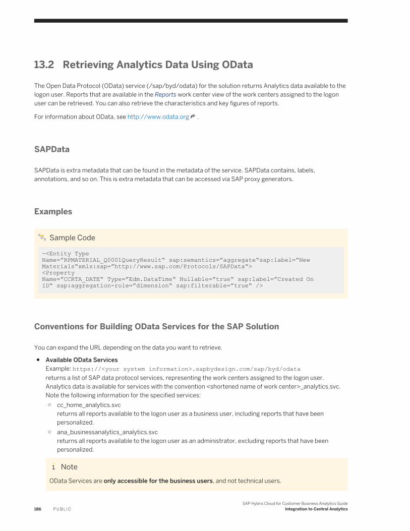
13.2 Retrieving Analytics Data Using OData
The Open Data Protocol (OData) service (/sap/byd/odata) for the solution returns Analytics data available to the logon user. Reports that are available in the Reports work center view of the work centers assigned to the logon user can be retrieved. You can also retrieve the characteristics and key figures of reports.
For information about OData, see http://www.odata.org .
SAPData
SAPData is extra metadata that can be found in the metadata of the service. SAPData contains, labels, annotations, and so on. This is extra metadata that can be accessed via SAP proxy generators.
Examples
Sample Code
-<Entity Type Name=”RPMATERIAL_Q0001QueryResult“ sap:semantics=”aggregate“sap:label=”New Materials“xmls:sap=”http://www.sap.com/Protocols/SAPData“> <Property Name=”CCRTA_DATE“ Type=”Edm.DataTime“ Nullable=”true“ sap:label=”Created On ID“ sap:aggregation-role=”dimension“ sap:filterable=”true“ />
Conventions for Building OData Services for the SAP Solution
You can expand the URL depending on the data you want to retrieve.
● Available OData ServicesExample: https://<your system information>.sapbydesign.com/sap/byd/odatareturns a list of SAP data protocol services, representing the work centers assigned to the logon user.Analytics data is available for services with the convention <shortened name of work center>_analytics.svc.Note the following information for the specified services:○ cc_home_analytics.svc
returns all reports available to the logon user as a business user, including reports that have been personalized.
○ ana_businessanalytics_analytics.svcreturns all reports available to the logon user as an administrator, excluding reports that have been personalized.
NoteOData Services are only accessible for the business users, and not technical users.
186 P U B L I CSAP Hybris Cloud for Customer Business Analytics Guide
Integration to Central Analytics
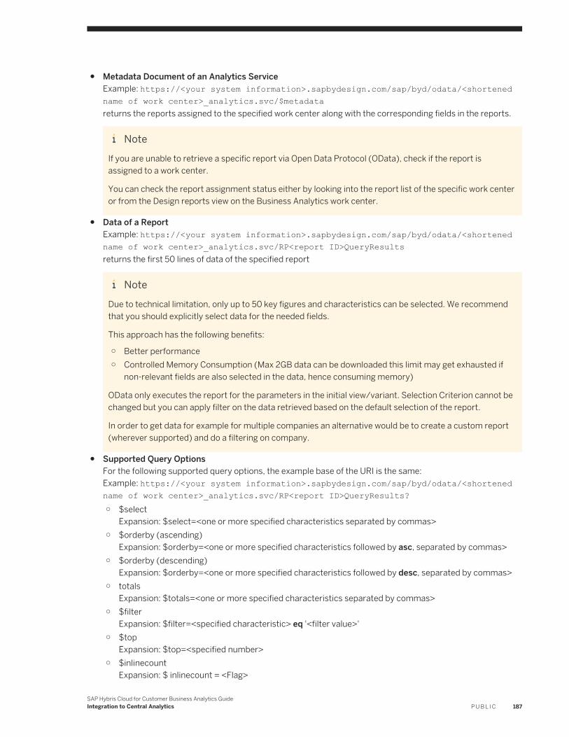
● Metadata Document of an Analytics ServiceExample: https://<your system information>.sapbydesign.com/sap/byd/odata/<shortened name of work center>_analytics.svc/$metadatareturns the reports assigned to the specified work center along with the corresponding fields in the reports.
NoteIf you are unable to retrieve a specific report via Open Data Protocol (OData), check if the report is assigned to a work center.
You can check the report assignment status either by looking into the report list of the specific work center or from the Design reports view on the Business Analytics work center.
● Data of a ReportExample: https://<your system information>.sapbydesign.com/sap/byd/odata/<shortened name of work center>_analytics.svc/RP<report ID>QueryResultsreturns the first 50 lines of data of the specified report
NoteDue to technical limitation, only up to 50 key figures and characteristics can be selected. We recommend that you should explicitly select data for the needed fields.
This approach has the following benefits:
○ Better performance○ Controlled Memory Consumption (Max 2GB data can be downloaded this limit may get exhausted if
non-relevant fields are also selected in the data, hence consuming memory)
OData only executes the report for the parameters in the initial view/variant. Selection Criterion cannot be changed but you can apply filter on the data retrieved based on the default selection of the report.
In order to get data for example for multiple companies an alternative would be to create a custom report (wherever supported) and do a filtering on company.
● Supported Query OptionsFor the following supported query options, the example base of the URI is the same:Example: https://<your system information>.sapbydesign.com/sap/byd/odata/<shortened name of work center>_analytics.svc/RP<report ID>QueryResults?○ $select
Expansion: $select=<one or more specified characteristics separated by commas>○ $orderby (ascending)
Expansion: $orderby=<one or more specified characteristics followed by asc, separated by commas>○ $orderby (descending)
Expansion: $orderby=<one or more specified characteristics followed by desc, separated by commas>○ totals
Expansion: $totals=<one or more specified characteristics separated by commas>○ $filter
Expansion: $filter=<specified characteristic> eq '<filter value>'○ $top
Expansion: $top=<specified number>○ $inlinecount
Expansion: $ inlinecount = <Flag>
SAP Hybris Cloud for Customer Business Analytics GuideIntegration to Central Analytics P U B L I C 187
This query provides the total number of results rows for ODATA. It may be different that the count key figure seen on the report.
Limitations
The following analytical features are not supported with OData:
● Variables and variants● Access to characteristic master data, associations to master data● Unit/currency determination for metadata when formulas or nested reuse key figure composite are used● Master data for unit/currency, associations to unit/currency● Hierarchies● Characteristic structure
NoteOnly the following use cases are supported for characteristics structure:
● In metadata: characteristic structure is exposed as a characteristic which needs to be filtered to a single value
● In data retrieval: characteristic structure is either filtered to a single value or is among the requested fields
13.3 Configure Analytical URL Mashup for Third-Party
You can view Cloud for Customer reports as a mashup in any third party system using this functionality. To achieve this you need to configure a URL that can be called from the third party system.
The system enables you to transfer parameters while calling a C4C report from a third party system. For example, if you want a contextual report based on city, then the city ID can be transferred as a parameter.
Procedure
Suppose you have an application X, where you have stored some cities and you want to see all the contacts from C4C which reside in that city . To build a bridge between the two applications, you can create an URL, save the parameters for the values that you want to see, and run the report when necessary. To do this, follow the steps below:
1. Logon to the C4C system and navigate to the Analysis work center.2. Open the report which you want to use as a mashup, for example, Account Contact Data.
3. Navigate to Report Header Technical Information , and record the following details for future use:○ Report ID○ View ID
188 P U B L I CSAP Hybris Cloud for Customer Business Analytics Guide
Integration to Central Analytics
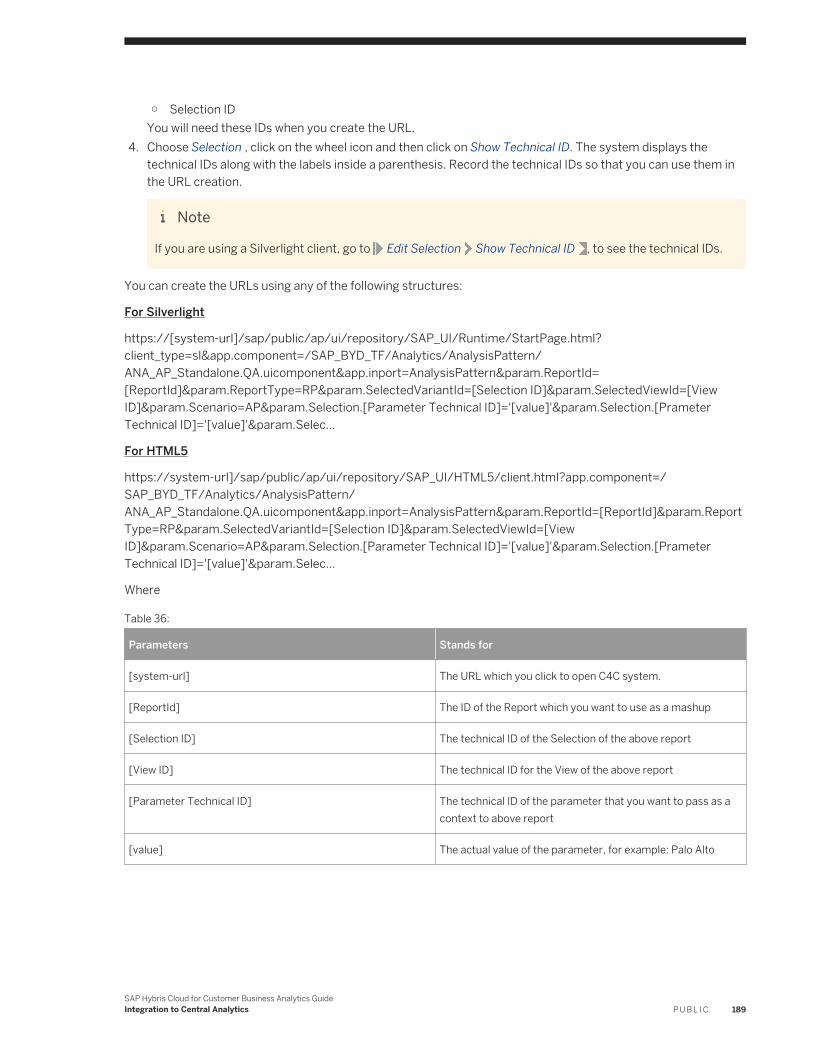
○ Selection IDYou will need these IDs when you create the URL.
4. Choose Selection , click on the wheel icon and then click on Show Technical ID. The system displays the technical IDs along with the labels inside a parenthesis. Record the technical IDs so that you can use them in the URL creation.
Note
If you are using a Silverlight client, go to Edit Selection Show Technical ID , to see the technical IDs.
You can create the URLs using any of the following structures:
For Silverlight
https://[system-url]/sap/public/ap/ui/repository/SAP_UI/Runtime/StartPage.html?client_type=sl&app.component=/SAP_BYD_TF/Analytics/AnalysisPattern/ANA_AP_Standalone.QA.uicomponent&app.inport=AnalysisPattern¶m.ReportId= [ReportId]¶m.ReportType=RP¶m.SelectedVariantId=[Selection ID]¶m.SelectedViewId=[View ID]¶m.Scenario=AP¶m.Selection.[Parameter Technical ID]='[value]'¶m.Selection.[Prameter Technical ID]='[value]'¶m.Selec...
For HTML5
https://system-url]/sap/public/ap/ui/repository/SAP_UI/HTML5/client.html?app.component=/SAP_BYD_TF/Analytics/AnalysisPattern/ANA_AP_Standalone.QA.uicomponent&app.inport=AnalysisPattern¶m.ReportId=[ReportId]¶m.ReportType=RP¶m.SelectedVariantId=[Selection ID]¶m.SelectedViewId=[View ID]¶m.Scenario=AP¶m.Selection.[Parameter Technical ID]='[value]'¶m.Selection.[Prameter Technical ID]='[value]'¶m.Selec...
Where
Table 36:
Parameters Stands for
[system-url] The URL which you click to open C4C system.
[ReportId] The ID of the Report which you want to use as a mashup
[Selection ID] The technical ID of the Selection of the above report
[View ID] The technical ID for the View of the above report
[Parameter Technical ID] The technical ID of the parameter that you want to pass as a context to above report
[value] The actual value of the parameter, for example: Palo Alto
SAP Hybris Cloud for Customer Business Analytics GuideIntegration to Central Analytics P U B L I C 189
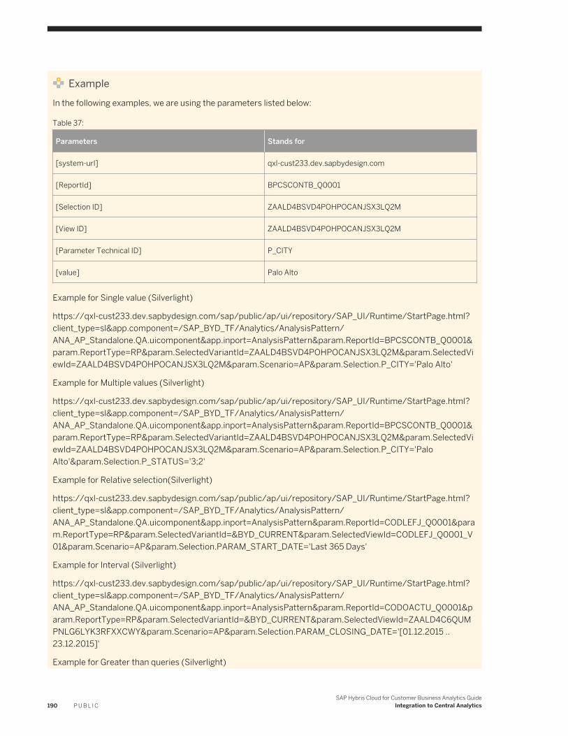
ExampleIn the following examples, we are using the parameters listed below:
Table 37:
Parameters Stands for
[system-url] qxl-cust233.dev.sapbydesign.com
[ReportId] BPCSCONTB_Q0001
[Selection ID] ZAALD4BSVD4POHPOCANJSX3LQ2M
[View ID] ZAALD4BSVD4POHPOCANJSX3LQ2M
[Parameter Technical ID] P_CITY
[value] Palo Alto
Example for Single value (Silverlight)
https://qxl-cust233.dev.sapbydesign.com/sap/public/ap/ui/repository/SAP_UI/Runtime/StartPage.html?client_type=sl&app.component=/SAP_BYD_TF/Analytics/AnalysisPattern/ANA_AP_Standalone.QA.uicomponent&app.inport=AnalysisPattern¶m.ReportId=BPCSCONTB_Q0001¶m.ReportType=RP¶m.SelectedVariantId=ZAALD4BSVD4POHPOCANJSX3LQ2M¶m.SelectedViewId=ZAALD4BSVD4POHPOCANJSX3LQ2M¶m.Scenario=AP¶m.Selection.P_CITY='Palo Alto'
Example for Multiple values (Silverlight)
https://qxl-cust233.dev.sapbydesign.com/sap/public/ap/ui/repository/SAP_UI/Runtime/StartPage.html?client_type=sl&app.component=/SAP_BYD_TF/Analytics/AnalysisPattern/ANA_AP_Standalone.QA.uicomponent&app.inport=AnalysisPattern¶m.ReportId=BPCSCONTB_Q0001¶m.ReportType=RP¶m.SelectedVariantId=ZAALD4BSVD4POHPOCANJSX3LQ2M¶m.SelectedViewId=ZAALD4BSVD4POHPOCANJSX3LQ2M¶m.Scenario=AP¶m.Selection.P_CITY='Palo Alto'¶m.Selection.P_STATUS='3;2'
Example for Relative selection(Silverlight)
https://qxl-cust233.dev.sapbydesign.com/sap/public/ap/ui/repository/SAP_UI/Runtime/StartPage.html?client_type=sl&app.component=/SAP_BYD_TF/Analytics/AnalysisPattern/ANA_AP_Standalone.QA.uicomponent&app.inport=AnalysisPattern¶m.ReportId=CODLEFJ_Q0001¶m.ReportType=RP¶m.SelectedVariantId=&BYD_CURRENT¶m.SelectedViewId=CODLEFJ_Q0001_V01¶m.Scenario=AP¶m.Selection.PARAM_START_DATE='Last 365 Days'
Example for Interval (Silverlight)
https://qxl-cust233.dev.sapbydesign.com/sap/public/ap/ui/repository/SAP_UI/Runtime/StartPage.html? client_type=sl&app.component=/SAP_BYD_TF/Analytics/AnalysisPattern/ANA_AP_Standalone.QA.uicomponent&app.inport=AnalysisPattern¶m.ReportId=CODOACTU_Q0001¶m.ReportType=RP¶m.SelectedVariantId=&BYD_CURRENT¶m.SelectedViewId=ZAALD4C6QUMPNLG6LYK3RFXXCWY¶m.Scenario=AP¶m.Selection.PARAM_CLOSING_DATE='[01.12.2015 .. 23.12.2015]'
Example for Greater than queries (Silverlight)
190 P U B L I CSAP Hybris Cloud for Customer Business Analytics Guide
Integration to Central Analytics
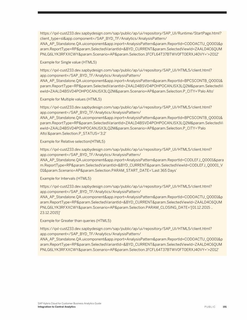
https://qxl-cust233.dev.sapbydesign.com/sap/public/ap/ui/repository/SAP_UI/Runtime/StartPage.html?client_type=sl&app.component=/SAP_BYD_TF/Analytics/AnalysisPattern/ANA_AP_Standalone.QA.uicomponent&app.inport=AnalysisPattern¶m.ReportId=CODOACTU_Q0001¶m.ReportType=RP¶m.SelectedVariantId=&BYD_CURRENT¶m.SelectedViewId=ZAALD4C6QUMPNLG6LYK3RFXXCWY¶m.Scenario=AP¶m.Selection.1FCFL64T37BTWV0FT0ERXJ40VY='>2012'
Example for Single value (HTML5)
https://qxl-cust233.dev.sapbydesign.com/sap/public/ap/ui/repository/SAP_UI/HTML5/client.html?app.component=/SAP_BYD_TF/Analytics/AnalysisPattern/ANA_AP_Standalone.QA.uicomponent&app.inport=AnalysisPattern¶m.ReportId=BPCSCONTB_Q0001¶m.ReportType=RP¶m.SelectedVariantId=ZAALD4BSVD4POHPOCANJSX3LQ2M¶m.SelectedViewId=ZAALD4BSVD4POHPOCANJSX3LQ2M¶m.Scenario=AP¶m.Selection.P_CITY='Palo Alto'
Example for Multiple values (HTML5)
https://qxl-cust233.dev.sapbydesign.com/sap/public/ap/ui/repository/SAP_UI/HTML5/client.html? app.component=/SAP_BYD_TF/Analytics/AnalysisPattern/ANA_AP_Standalone.QA.uicomponent&app.inport=AnalysisPattern¶m.ReportId=BPCSCONTB_Q0001¶m.ReportType=RP¶m.SelectedVariantId=ZAALD4BSVD4POHPOCANJSX3LQ2M¶m.SelectedViewId=ZAALD4BSVD4POHPOCANJSX3LQ2M¶m.Scenario=AP¶m.Selection.P_CITY='Palo Alto'¶m.Selection.P_STATUS='3;2'
Example for Relative selection(HTML5)
https://qxl-cust233.dev.sapbydesign.com/sap/public/ap/ui/repository/SAP_UI/HTML5/client.html? app.component=/SAP_BYD_TF/Analytics/AnalysisPattern/ANA_AP_Standalone.QA.uicomponent&app.inport=AnalysisPattern¶m.ReportId=CODLEFJ_Q0001¶m.ReportType=RP¶m.SelectedVariantId=&BYD_CURRENT¶m.SelectedViewId=CODLEFJ_Q0001_V01¶m.Scenario=AP¶m.Selection.PARAM_START_DATE='Last 365 Days'
Example for Intervals (HTML5)
https://qxl-cust233.dev.sapbydesign.com/sap/public/ap/ui/repository/SAP_UI/HTML5/client.html? app.component=/SAP_BYD_TF/Analytics/AnalysisPattern/ANA_AP_Standalone.QA.uicomponent&app.inport=AnalysisPattern¶m.ReportId=CODOACTU_Q0001¶m.ReportType=RP¶m.SelectedVariantId=&BYD_CURRENT¶m.SelectedViewId=ZAALD4C6QUMPNLG6LYK3RFXXCWY¶m.Scenario=AP¶m.Selection.PARAM_CLOSING_DATE='[01.12.2015 .. 23.12.2015]'
Example for Greater than queries (HTML5)
https://qxl-cust233.dev.sapbydesign.com/sap/public/ap/ui/repository/SAP_UI/HTML5/client.html? app.component=/SAP_BYD_TF/Analytics/AnalysisPattern/ANA_AP_Standalone.QA.uicomponent&app.inport=AnalysisPattern¶m.ReportId=CODOACTU_Q0001¶m.ReportType=RP¶m.SelectedVariantId=&BYD_CURRENT¶m.SelectedViewId=ZAALD4C6QUMPNLG6LYK3RFXXCWY¶m.Scenario=AP¶m.Selection.1FCFL64T37BTWV0FT0ERXJ40VY='>2012'
SAP Hybris Cloud for Customer Business Analytics GuideIntegration to Central Analytics P U B L I C 191
13.4 Integrating Analytics with an SAP NetWeaver Business Warehouse System
The following documentation describes how to replicate data from the solution to an existing SAP NetWeaver Business Warehouse (BW) system. These processes support a series of process steps across two different systems based on preconfigured communication scenarios between the solution and SAP NetWeaver BW. The data replication is done using operational data provisioning (ODP).
Prerequisites
● Relevant SAP Netweaver BW license● SAP Business Warehouse 7.30, SP8 or SAP Business Warehouse 7.40● Authorization to use common BW transactions, such as RSA1 and STRUST
For more information, see Authorizations.
When configuring the integration of your solution with SAP NetWeaver BW, there are dependencies between the activities in the different systems. Perform the procedures in the sequence outlined below.
1. Source System: Implementation Sequence in the Solution [page 192]2. Target System: Implementation Sequence in the SAP NetWeaver Business Warehouse [page 197]3. Source System: Expose Data Sources in the Solution [page 200]4. Target System: Extraction, Transformation and Loading (ETL) Process in the SAP NetWeaver Business
Warehouse [page 201]5. Source System: Monitor Data Replication [page 205]
13.4.1 Source System: Implementation Sequence in the Solution
Procedure
1. Ensure that the Integration with Central Analytics business option is included in your solution scope.a. To find this business option, open the Business Configuration work center and choose the Implementation
Projects view.b. Select your implementation project and click Edit Project Scope. The system will open a guided procedure
to lead you through the scoping steps.c. On the Country and Type of Business screen, review the settings and choose Next.d. On the Implementation Focus screen, choose Next.
192 P U B L I CSAP Hybris Cloud for Customer Business Analytics Guide
Integration to Central Analytics
e. On the Scoping screen, choose Communication and Information Exchange Integration with External Applications and Solutions Integration with Central Analytics , select the checkbox to set this option in scope, then choose Next.
f. On the Questions screen, choose Communication and Information Exchange Integration with External Applications and Solutions Integration with Central Analytics , and select the checkbox against the question: Do you want to make analytics data from the solution available to an SAP NetWeaver Business Warehouse system?
g. After you have reviewed and confirmed your entries, choose Finish.
NoteYou have defined the scoping of the solution. However, you have not yet deployed the scoping. To deploy the scoping, make sure that you confirm the Design Accepted milestone in the activity list of the project. You generally do this after you have completed all your activities. The system will display a message once the deployment is finished. If the milestone was completed earlier, the deployment will be done automatically.
Results:
○ The Analytics Integration communication scenario is available for creating communication arrangements.
○ The Monitoring work center view is available as an entry on the Access Rights screen when editing the access rights of business users.
○ The Monitoring work center view is available in the Business Analytics work center.○ In the Design Data Sources work center view, the Exposed column appears in the table. You can
expose or not expose data sources accordingly by clicking Expose.By exposing data sources, you make them available to a SAP NetWeaver BW system for data replication.
○ In the Design Data Sources work center view, under Details, the Referenced Data Sources tab page appears. The tab page shows data sources containing master data that is referenced by the selected data source.
2. Create a communication system.a. In the Application and User Management work center, Under Input and Output Management, choose the
Communication Systems view.b. In the Communication Systems view, click New.c. In the Communication System section, enter the details of the communication system:
○ ID is used as the template for the technical user in the communication arrangement.○ Host Name has to be supplied, but is not used.○ For the System Access Type, select Internet.
d. When you have entered all the details, click Save and Close to return to the Communication Systems view. The communication system you just created has the status In Preparation.
e. In the Communication Systems view, select the communication system you have created and click Actions, then choose Set to Active.
If the status changes to Active, the configuration is ready to be used.3. Create a communication arrangement.
SAP Hybris Cloud for Customer Business Analytics GuideIntegration to Central Analytics P U B L I C 193
a. In the Application and User Management work center, Under Input and Output Management, choose the Communication Arrangements view.
b. To open the New Communication Arrangement guided activity, in the Communication Arrangements view, click New.
c. In the Select Scenario step, select Analytics Integration and click Next.d. In the Define Business Data step, enter business data.
In the System Instance ID field, choose or enter the communication system ID that you created.e. In the Define Technical Data step, define the technical settings for inbound and outbound communication.
○ In the Application Protocol field, choose Web Service.○ Choose the relevant entry from the Authentication Method field.
Depending on the authentication method that you have agreed on with the SAP NetWeaver BW administrator, you need to define the credentials of the communication user as described in the following table. The user ID of the communication user is created automatically.Using user ID and password as an authentication method is in general less secure than SSL client certificates since the information must be shared in order to create a communication arrangement.If you choose to use PKCS#12 key pair file as SSL client certificate authentication method, you must download a new PKCS#12 key pair file once the existing one expires after a specified period of time, The BW administrator must import the new PKCS#12 key pair file and override the existing imported one.If you decide to use user ID and password as the authentication method, ensure that it is accordance with the security requirements of your company. Note that in order to avoid downtime, you must update the passwords in both systems at the same time.Next to the User ID field, click Edit Credentials.
194 P U B L I CSAP Hybris Cloud for Customer Business Analytics Guide
Integration to Central Analytics
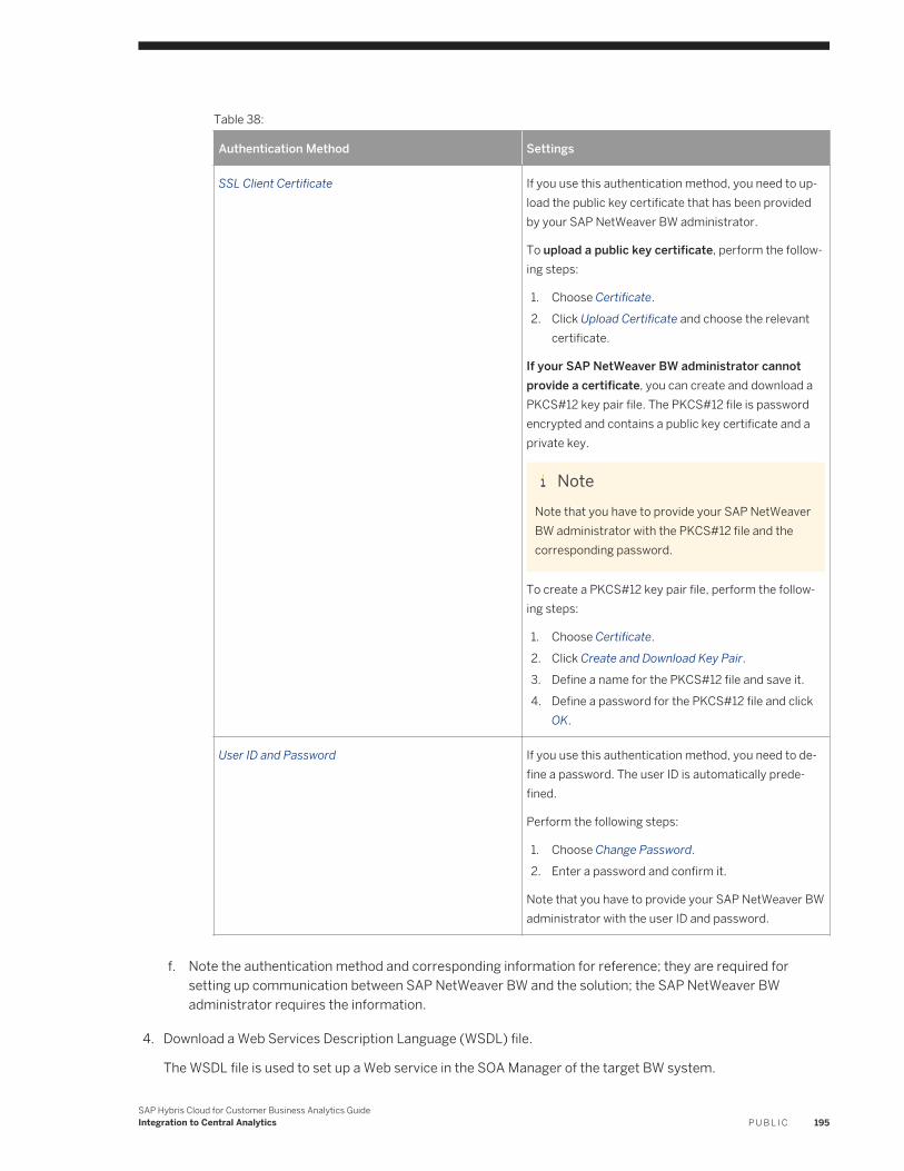
Table 38:
Authentication Method Settings
SSL Client Certificate If you use this authentication method, you need to upload the public key certificate that has been provided by your SAP NetWeaver BW administrator.
To upload a public key certificate, perform the following steps:
1. Choose Certificate.2. Click Upload Certificate and choose the relevant
certificate.
If your SAP NetWeaver BW administrator cannot provide a certificate, you can create and download a PKCS#12 key pair file. The PKCS#12 file is password encrypted and contains a public key certificate and a private key.
NoteNote that you have to provide your SAP NetWeaver BW administrator with the PKCS#12 file and the corresponding password.
To create a PKCS#12 key pair file, perform the following steps:
1. Choose Certificate.2. Click Create and Download Key Pair.3. Define a name for the PKCS#12 file and save it.4. Define a password for the PKCS#12 file and click
OK.
User ID and Password If you use this authentication method, you need to define a password. The user ID is automatically predefined.
Perform the following steps:
1. Choose Change Password.2. Enter a password and confirm it.
Note that you have to provide your SAP NetWeaver BW administrator with the user ID and password.
f. Note the authentication method and corresponding information for reference; they are required for setting up communication between SAP NetWeaver BW and the solution; the SAP NetWeaver BW administrator requires the information.
4. Download a Web Services Description Language (WSDL) file.
The WSDL file is used to set up a Web service in the SOA Manager of the target BW system.
SAP Hybris Cloud for Customer Business Analytics GuideIntegration to Central Analytics P U B L I C 195
a. In the Application and User Management work center, Under Input and Output Management, choose the Communication Arrangements view.
b. Choose the relevant communication arrangement and click Edit.c. Click the Technical Data tab page.d. Click Edit Advanced Settings.e. Click Download WSDL.f. Name and save the WSDL file; the file is required for setting up communication between SAP NetWeaver
BW and the solution; the SAP NetWeaver BW administrator requires the file.5. Ensure that the solution URL is a trusted site.
You can check whether the solution URL is a trusted site by, for example, checking the security report or by checking the list of trusted sites of the Web browser.
6. Export the relevant certificates from the Web browser.
The certificates are required to create a secure connection between the SAP NetWeaver BW system and the solution; the SAP NetWeaver BW administrator requires the certificates.
You can often find export functions under the tool options of the Web browser. Depending on the Web browser, you might need to run the browser as an administrator to export the certificate. You might also need to import the certificate before exporting it. For information about importing and exporting certificates, see the documentation of the Web browser.
You need to export the following certificates from the Web browser independent of the authentication method you have chosen:
○ The GTE CyberTrust Global Root certificate.○ The GTE CyberTrust SureServer Standard Validation CA certificate.
7. Assign the Monitoring work center view to the relevant administrators.a. In the Application and User Management work center, choose the Business Users view.b. Select the relevant business users, then click Edit, and choose Access Rights.c. Select the Monitoring view of the Business Analytics work center and save your changes.
Note that the user must log on again to view the changes in the authorization.
Related Information
Checklist of Information for SAP NetWeaver BW Administrator [page 197]
196 P U B L I CSAP Hybris Cloud for Customer Business Analytics Guide
Integration to Central Analytics
13.4.2 Checklist of Information for SAP NetWeaver BW Administrator
The administrator of the solution must provide the following information, as created from the steps above, to the SAP NetWeaver BW administrator:
● If you have chosen to use SSL client certificate as the authentication method:○ WSDL file○ GTE CyberTrust Global Root certificate○ Cybertrust SureServer Standard Validation CA certificate○ PKCS#12 key pair (if your SAP Netweaver BW administrator cannot provide a certificate)
● If you have chosen user ID and password as the authentication method:○ Technical user ID and password○ WSDL file○ GTE CyberTrust Global Root certificate○ Cybertrust SureServer Standard Validation CA certificate
13.4.3 Target System: Implementation Sequence in the SAP NetWeaver Business Warehouse
Context
NoteBefore importing the certificates to the SAP NetWeaver system, determine whether the release of your SAP NetWeaver BW system supports .p12 as a Personal Security Environment (PSE) file type.
If it does not, you must download the SAPGENPSE cryptography tool as part of SAP cryptographic software in order to convert the file type of the certificates to .pse.
For more information, see Downloading the SAP Cryptographic Library and Configuring SAPGENPSE for Use.
Use the following procedure if the target system is SAP Business Warehouse 7.30, SP8.
Procedure
1. Import certificates to the SAP NetWeaver BW system. Call transaction STRUST.
○ Under SSL client certificate, if you are using public key certificate as the authentication method:1. You have the SSLC/DFAULT identify available, import the GTE CyberTrust Global Root certificate and
the Cybertrust SureServer Standard Validation CA certificates to the identify folder.
SAP Hybris Cloud for Customer Business Analytics GuideIntegration to Central Analytics P U B L I C 197
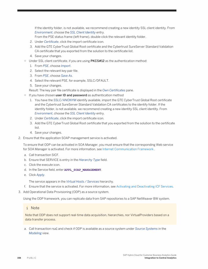
If the identity folder, is not available, we recommend creating a new identity SSL client identity. From Environment, choose the SSL Client Identity entry.From the PSE status frame (left frame), double-click the relevant identity folder.
2. Under Certificate, click the import certificate icon.3. Add the GTE CyberTrust Global Root certificate and the Cybertrust SureServer Standard Validation
CA certificate that you exported from the solution to the certificate list.4. Save your changes.
○ Under SSL client certificate, if you are using PKCS#12 as the authentication method:1. From PSE, choose Import.2. Select the relevant key pair file.3. From PSE, choose Save As.4. Select the relevant PSE, for example, SSLC/DFAULT.5. Save your changes.
Result: The key pair file certificate is displayed in the Own Certificates pane.○ If you have chosen user ID and password as authentication method
1. You have the SSLC/ANONYM identify available, import the GTE CyberTrust Global Root certificate and the Cybertrust SureServer Standard Validation CA certificates to the identify folder. If the identity folder, is not available, we recommend creating a new identity SSL client identity. From Environment, choose the SSL Client Identity entry.
2. Under Certificate, click the import certificate icon.3. Add the GTE CyberTrust Global Root certificate that you exported from the solution to the certificate
list.4. Save your changes.
2. Ensure that the application SOAP management service is activated.
To ensure that ODP can be activated in SOA Manager, you must ensure that the corresponding Web service for SOA Manager is activated. For more information, see Internet Communication Framework .
a. Call transaction SICF.b. Ensure that SERVICE is entry in the Hierarchy Type field.c. Click the execute icon.d. In the Service field, enter APPL_SOAP_MANAGEMENT.e. Click Apply.
The service appears in the Virtual Hosts / Services hierarchy.f. Ensure that the service is activated. For more information, see Activating and Deactivating ICF Services.
3. Add Operational Data Provisioning (ODP) as a source system.
Using the ODP framework, you can replicate data from SAP repositories to a SAP NetWeaver BW system.
NoteNote that ODP does not support real-time data acquisition, hierarchies, nor VirtualProviders based on a data transfer process.
a. Call transaction rsa1 and check if ODP is available as a source system under Source Systems in the Modeling view.
198 P U B L I CSAP Hybris Cloud for Customer Business Analytics Guide
Integration to Central Analytics
If ODP does not appear as a source system, complete the following steps:
1. Call transaction se38.2. Run report SAP_RSADMIN_MAINTAIN.3. In the Object field, enter ODP.4. In the Value field, enter X.5. Click the execute icon.
In Modeling view of the Data Warehousing Workbench, the system creates ODP under Source Systems.
4. Create an ODP source system.a. Call transaction rsa1.
b. Click Modeling Source Systems , and from the context menu of ODP, click Create.c. In the Logical System Name field, enter a technical name for the source system.d. In the Source System Name field, enter a name for the source system.e. Click the continue icon.f. On the Select Communication Channel screen, click HTTP/SOAP.g. On the Web Service Configuration screen, click SOA Manager.h. On the following logon screen, enter your SAP NetWeaver BW user ID and password.
5. Configure logical port for the consumer proxy in SOA Manager.
For each source system, a consumer proxy is generated, for example, CO_RSDSPX_ODP_IN .
To configure a consumer proxy to access the Web service of the solution, you need to create and configure one or more logical ports. A logical port references an endpoint, which is available at a unique location in the solution system. You can create one or more logical ports for the same consumer proxy.
For more information about the SOA Manager, see Working with SOA Manager.
a. In the SOA Manager, select the relevant consumer proxy and click Apply Selection.b. Go to the Configurations tab page.c. Click Create.d. On the SOA Management screen, enter the logical port name in the Logical Port Name field.
NoteNote that the logical port name must be the same as you entered for the ODP source system in the Data Warehousing Workbench.
e. For the configuration type, choose WSDL Based Configuration.f. For the WSDL base, choose Via File.g. Load the WSDL file that you downloaded from the solution and click Apply Settings.h. On the following screen click Apply Settings.i. Under Configuration of Logical Port, on the Consumer Security tab page, enter the user name and
password that have been created in the solution for the technical user in the communication arrangement.
j. On the Transport Settings tab page, ensure if the proxy settings are correct. Check whether there are entries in the Name of Proxy Host and Port Number of Proxy Host fields.
k. Ensure that the for the Maximum Wait for WS Consumer field, the value is set to 900. For more information see Configuring a Consumer Proxy .
l. Click Save.
SAP Hybris Cloud for Customer Business Analytics GuideIntegration to Central Analytics P U B L I C 199
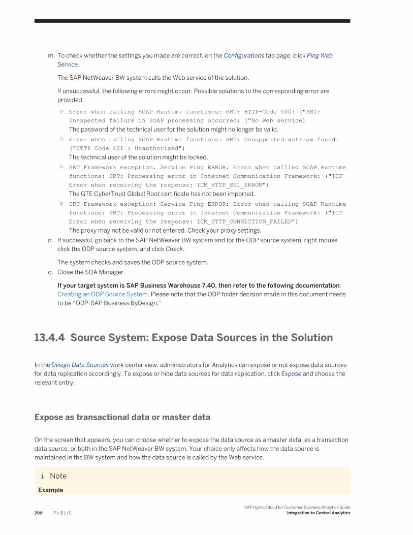
m. To check whether the settings you made are correct, on the Configurations tab page, click Ping Web Service.
The SAP NetWeaver BW system calls the Web service of the solution.
If unsuccessful, the following errors might occur. Possible solutions to the corresponding error are provided.
○ Error when calling SOAP Runtime functions: SRT: HTTP-Code 500: ("SRT: Unexpected failure in SOAP processing occurred: ("No Web service)The password of the technical user for the solution might no longer be valid.
○ Error when calling SOAP Runtime functions: SRT: Unsupported xstream found: ("HTTP Code 401 : Unauthorized")The technical user of the solution might be locked.
○ SRT Framework exception. Service Ping ERROR: Error when calling SOAP Runtime functions: SRT: Processing error in Internet Communication Framework: ("ICF Error when receiving the response: ICM_HTTP_SSL_ERROR")The GTE CyberTrust Global Root certificate has not been imported.
○ SRT Framework exception: Service Ping ERROR: Error when calling SOAP Runtime functions: SRT: Processing error in Internet Communication Framework: ("ICF Error when receiving the response: ICM_HTTP_CONNECTION_FAILED")The proxy may not be valid or not entered. Check your proxy settings.
n. If successful, go back to the SAP NetWeaver BW system and for the ODP source system, right mouse click the ODP source system, and click Check.
The system checks and saves the ODP source system.o. Close the SOA Manager.
If your target system is SAP Business Warehouse 7.40, then refer to the following documentation: Creating an ODP Source System. Please note that the ODP folder decision made in this document needs to be “ODP-SAP Business ByDesign.”
13.4.4 Source System: Expose Data Sources in the Solution
In the Design Data Sources work center view, administrators for Analytics can expose or not expose data sources for data replication accordingly. To expose or hide data sources for data replication, click Expose and choose the relevant entry.
Expose as transactional data or master data
On the screen that appears, you can choose whether to expose the data source as a master data, as a transaction data source, or both in the SAP NetWeaver BW system. Your choice only affects how the data source is maintained in the BW system and how the data source is called by the Web service.
NoteExample
200 P U B L I CSAP Hybris Cloud for Customer Business Analytics Guide
Integration to Central Analytics
The following is an example of the Web service.
P is for master data.
F is for transactional data.
If exposed as master data:
Sample Code
<NodeStructure> <NodeID>/MOM/JOB$P </NodeID><Description>Job Master Data</Description><SemanticsCode>P </SemanticsCode><DisplayID>/MOM/JOB</DisplayID> </NodeStructure>
If exposed as master data and as transactional data:
Sample Code
<NodeStructure> <NodeID>/MOM/JOB$P</NodeID><Description>Job Master Data</Description><SemanticsCode>P</SemanticsCode><DisplayID>/MOM/JOB</DisplayID></NodeStructure><NodeStructure><NodeID>/MOM/JOB$F</NodeID><Description>Job Master Data</Description><SemanticsCode>F</SemanticsCode><DisplayID>/MOM/JOB</DisplayID></NodeStructure>
For data sources that you expose, ensure that you also expose data sources that contain master data that is referenced by the selected data source.
You can find a list of referenced data sources for the data source to be exposed under Details on the Referenced Data Sources tab page.
13.4.5 Target System: Extraction, Transformation and Loading (ETL) Process in the SAP NetWeaver Business Warehouse
Context
In the SAP NetWeaver BW system, you prepare the system to use the replicated data from the solution source system.
SAP Hybris Cloud for Customer Business Analytics GuideIntegration to Central Analytics P U B L I C 201
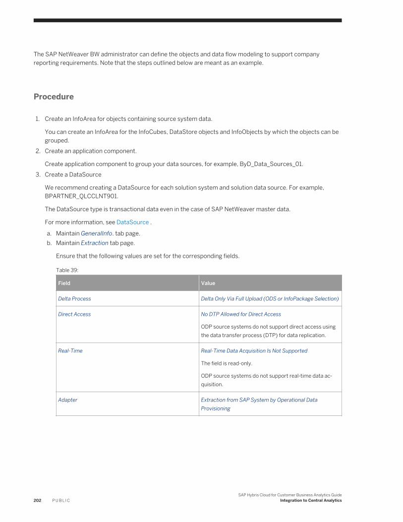
The SAP NetWeaver BW administrator can define the objects and data flow modeling to support company reporting requirements. Note that the steps outlined below are meant as an example.
Procedure
1. Create an InfoArea for objects containing source system data.
You can create an InfoArea for the InfoCubes, DataStore objects and InfoObjects by which the objects can be grouped.
2. Create an application component.
Create application component to group your data sources, for example, ByD_Data_Sources_01.3. Create a DataSource
We recommend creating a DataSource for each solution system and solution data source. For example, BPARTNER_QLCCLNT901.
The DataSource type is transactional data even in the case of SAP NetWeaver master data.
For more information, see DataSource .
a. Maintain GeneralInfo. tab page.b. Maintain Extraction tab page.
Ensure that the following values are set for the corresponding fields.
Table 39:
Field Value
Delta Process Delta Only Via Full Upload (ODS or InfoPackage Selection)
Direct Access No DTP Allowed for Direct Access
ODP source systems do not support direct access using the data transfer process (DTP) for data replication.
Real-Time Real-Time Data Acquisition Is Not Supported
The field is read-only.
ODP source systems do not support real-time data acquisition.
Adapter Extraction from SAP System by Operational Data Provisioning
202 P U B L I CSAP Hybris Cloud for Customer Business Analytics Guide
Integration to Central Analytics
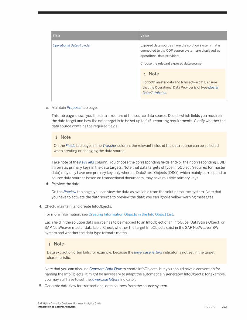
Field Value
Operational Data Provider Exposed data sources from the solution system that is connected to the ODP source system are displayed as operational data providers.
Choose the relevant exposed data source.
NoteFor both master data and transaction data, ensure that the Operational Data Provider is of type Master Data/Attributes.
c. Maintain Proposal tab page.
This tab page shows you the data structure of the source data source. Decide which fields you require in the data target and how the data target is to be set up to fulfil reporting requirements. Clarify whether the data source contains the required fields.
NoteOn the Fields tab page, in the Transfer column, the relevant fields of the data source can be selected when creating or changing the data source.
Take note of the Key Field column. You choose the corresponding fields and/or their corresponding UUID in rows as primary keys in the data targets. Note that data targets of type InfoObject (required for master data) may only have one primary key only whereas DataStore Objects (DSO), which mainly correspond to source data sources based on transactional documents, may have multiple primary keys.
d. Preview the data.
On the Preview tab page, you can view the data as available from the solution source system. Note that you have to activate the data source to preview the data; you can ignore yellow warning messages.
4. Check, maintain, and create InfoObjects.
For more information, see Creating Information Objects in the Info Object List.
Each field in the solution data source has to be mapped to an InfoObject of an InfoCube, DataStore Object, or SAP NetWeaver master data table. Check whether the target InfoObjects exist in the SAP NetWeaver BW system and whether the data type formats match.
NoteData extraction often fails, for example, because the lowercase letters indicator is not set in the target characteristic.
Note that you can also use Generate Data Flow to create InfoObjects, but you should have a convention for naming the InfoObjects. It might be necessary to adapt the automatically generated InfoObjects; for example, you may still have to set the lowercase letters indicator.
5. Generate data flow for transactional data sources from the source system.
SAP Hybris Cloud for Customer Business Analytics GuideIntegration to Central Analytics P U B L I C 203
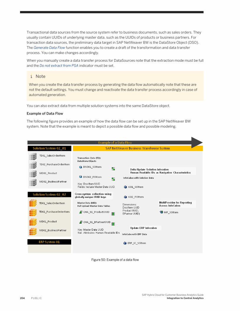
Transactional data sources from the source system refer to business documents, such as sales orders. They usually contain UUIDs of underlying master data, such as the UUIDs of products or business partners. For transaction data sources, the preliminary data target in SAP NetWeaver BW is the DataStore Object (DSO). The Generate Data Flow function enables you to create a draft of the transformation and data transfer process. You can make changes accordingly.
When you manually create a data transfer process for DataSources note that the extraction mode must be full and the Do not extract from PSA indicator must be set.
NoteWhen you create the data transfer process by generating the data flow automatically note that these are not the default settings. You must change and reactivate the data transfer process accordingly in case of automated generation.
You can also extract data from multiple solution systems into the same DataStore object.
Example of Data Flow
The following figure provides an example of how the data flow can be set up in the SAP NetWeaver BW system. Note that the example is meant to depict a possible data flow and possible modeling.
Figure 50: Example of a data flow
204 P U B L I CSAP Hybris Cloud for Customer Business Analytics Guide
Integration to Central Analytics
13.4.6 Source System: Monitor Data Replication
Administrators for Analytics can monitor the status of the data replication runs from the SAP NetWeaver BW system against data sources that are exposed in the solution.
When the SAP NetWeaver BW administrator initiates a data replication run against the exposed data sources in the solution, the solution system creates an entry in the table of the Monitoring work center view in the Business Analytics work center.
For more information, see Monitoring Quick Guide [page 184].
NoteFor example, the solution system creates an entry when the SAP NetWeaver BW administrator executes the following actions:
● Previews data of a DataSource in the SAP NetWeaver BW system by clicking Read Preview Data on the Preview tab page of a DataSource.
● Executes a data transfer process for a target object.
Note that the system not does recognize the SAP NetWeaver BW administrator as the creator of the replication run in the Replicated By field, but rather the technical user that is created for the communication arrangement that is used to communicate with the SAP NetWeaver BW system.
SAP Hybris Cloud for Customer Business Analytics GuideIntegration to Central Analytics P U B L I C 205
14 Integration with SAP BusinessObjects Cloud
SAP Hybris Cloud for Customer integrates with SAP BusinessObjects Cloud. The integration is available using Analytical ODATA as well as C4C ODATA. You can access the SAP Hybris Cloud for Customer reports directly in BO Cloud using analytical ODATA.
Procedure
Create a Connection
1. Log on to the BusinessObject Cloud system.
2. In the Connection area, go to Modeler Models and click on the + icon.3. Choose the Get data from an app option.4. Choose SAP Hybris Cloud for Customer Analytics. The Select Data Model window opens.5. Under Connection Type, choose SAP Hybris Cloud for Customer Analytics.6. In the Connection Name area, click Create New Connection. The system opens the New OData Connection
window.7. Enter the Connection Name and Description.8. Enter the Data Service URL in the following format: https://[system URL]/sap/byd/odata/
cc_home_analytics.svcFor example: https://my123456.vlab.sapbydesign.com/ sap/byd/odata/ cc_home_analytics.svc
9. Enter the SAP Hybris Cloud for Customer username and password.10. Click Create to create a connection
Create a BO query based on SAP Hybris Cloud for Customer report
1. Click Create New Query.2. Enter Query Name and Description.3. Search for and select a SAP Hybris Cloud for Customer report e.g. Opportunity Analysis. Click Next.
NoteReports with fixed and mandatory filters are not available for integration.
4. Drag and drop Measures and Dimensions (referred to as characteristics and key figures in SAP Hybris Cloud for Customers) under the Selected Dataand Filters area on the right panel of your screen.
5. Define your filter conditions and click OK to create a BO Query.
You can now create BO models that can be used for further analysis.
206 P U B L I CSAP Hybris Cloud for Customer Business Analytics Guide
Integration with SAP BusinessObjects Cloud
See Also
Import Data Connection to OData services
SAP Hybris Cloud for Customer Business Analytics GuideIntegration with SAP BusinessObjects Cloud P U B L I C 207
Important Disclaimers and Legal Information
Coding SamplesAny software coding and/or code lines / strings ("Code") included in this documentation are only examples and are not intended to be used in a productive system environment. The Code is only intended to better explain and visualize the syntax and phrasing rules of certain coding. SAP does not warrant the correctness and completeness of the Code given herein, and SAP shall not be liable for errors or damages caused by the usage of the Code, unless damages were caused by SAP intentionally or by SAP's gross negligence.
AccessibilityThe information contained in the SAP documentation represents SAP's current view of accessibility criteria as of the date of publication; it is in no way intended to be a binding guideline on how to ensure accessibility of software products. SAP in particular disclaims any liability in relation to this document. This disclaimer, however, does not apply in cases of willful misconduct or gross negligence of SAP. Furthermore, this document does not result in any direct or indirect contractual obligations of SAP.
Gender-Neutral LanguageAs far as possible, SAP documentation is gender neutral. Depending on the context, the reader is addressed directly with "you", or a gender-neutral noun (such as "sales person" or "working days") is used. If when referring to members of both sexes, however, the third-person singular cannot be avoided or a gender-neutral noun does not exist, SAP reserves the right to use the masculine form of the noun and pronoun. This is to ensure that the documentation remains comprehensible.
Internet HyperlinksThe SAP documentation may contain hyperlinks to the Internet. These hyperlinks are intended to serve as a hint about where to find related information. SAP does not warrant the availability and correctness of this related information or the ability of this information to serve a particular purpose. SAP shall not be liable for any damages caused by the use of related information unless damages have been caused by SAP's gross negligence or willful misconduct. All links are categorized for transparency (see: http://help.sap.com/disclaimer).
208 P U B L I CSAP Hybris Cloud for Customer Business Analytics Guide
Important Disclaimers and Legal Information

SAP Hybris Cloud for Customer Business Analytics GuideImportant Disclaimers and Legal Information P U B L I C 209
go.sap.com/registration/contact.html
© 2017 SAP SE or an SAP affiliate company. All rights reserved.No part of this publication may be reproduced or transmitted in any form or for any purpose without the express permission of SAP SE or an SAP affiliate company. The information contained herein may be changed without prior notice.Some software products marketed by SAP SE and its distributors contain proprietary software components of other software vendors. National product specifications may vary.These materials are provided by SAP SE or an SAP affiliate company for informational purposes only, without representation or warranty of any kind, and SAP or its affiliated companies shall not be liable for errors or omissions with respect to the materials. The only warranties for SAP or SAP affiliate company products and services are those that are set forth in the express warranty statements accompanying such products and services, if any. Nothing herein should be construed as constituting an additional warranty.SAP and other SAP products and services mentioned herein as well as their respective logos are trademarks or registered trademarks of SAP SE (or an SAP affiliate company) in Germany and other countries. All other product and service names mentioned are the trademarks of their respective companies.Please see http://www.sap.com/corporate-en/legal/copyright/index.epx for additional trademark information and notices.


