824
SAS/INSIGHT ® 9.1 User’s Guide SAS ® Documentation
SAS/INSIGHT® 9.1 User’s Guide
SAS® Documentation

The correct bibliographic citation for this manual is as follows: SAS Institute Inc. 2004. SAS/INSIGHT® 9.1 User’s Guide. Cary, NC: SAS Institute Inc.
SAS/INSIGHT® 9.1 User’s Guide
Copyright © 2004, SAS Institute Inc., Cary, NC, USA
ISBN 978-1-58025-697-1
All rights reserved. Produced in the United States of America.
For a hard-copy book: No part of this publication may be reproduced, stored in a retrieval system, or transmitted, in any form or by any means, electronic, mechanical, photocopying, or otherwise, without the prior written permission of the publisher, SAS Institute Inc.
For a Web download or e-book: Your use of this publication shall be governed by the terms established by the vendor at the time you acquire this publication.
U.S. Government Restricted Rights Notice: Use, duplication, or disclosure of this software and related documentation by the U.S. government is subject to the Agreement with SAS Institute and the restrictions set forth in FAR 52.227-19, Commercial Computer Software-Restricted Rights (June 1987).
SAS Institute Inc., SAS Campus Drive, Cary, North Carolina 27513.
1st printing, March 2004 2nd printing, November 2006 3rd printing, March 2008
SAS® Publishing provides a complete selection of books and electronic products to help customers use SAS software to its fullest potential. For more information about our e-books, e-learning products, CDs, and hard-copy books, visit the SAS Publishing Web site at support.sas.com/publishing or call 1-800-727-3228.
SAS® and all other SAS Institute Inc. product or service names are registered trademarks or trademarks of SAS Institute Inc. in the USA and other countries. ® indicates USA registration.
Other brand and product names are registered trademarks or trademarks of their respective companies.

Contents
Part 1. Introduction 1
Chapter 1. Getting Started . . . . . . . . . . . . . . . . . . . . . . . . . . . . . . . . . 3
Part 2. Techniques 23
Chapter 2. Entering Data . . . . . . . . . . . . . . . . . . . . . . . . . . . . . . . . . . 25
Chapter 3. Examining Data . . . . . . . . . . . . . . . . . . . . . . . . . . . . . . . . 47
Chapter 4. Exploring Data in One Dimension . . . . . . . . . . . . . . . . . . . . . . . 69
Chapter 5. Exploring Data in Two Dimensions . . . . . . . . . . . . . . . . . . . . . . 85
Chapter 6. Exploring Data in Three Dimensions . . . . . . . . . . . . . . . . . . . . . 107
Chapter 7. Adjusting Axes and Ticks . . . . . . . . . . . . . . . . . . . . . . . . . . . 123
Chapter 8. Labeling Observations . . . . . . . . . . . . . . . . . . . . . . . . . . . . . 133
Chapter 9. Hiding Observations . . . . . . . . . . . . . . . . . . . . . . . . . . . . . . 143
Chapter 10. Marking Observations . . . . . . . . . . . . . . . . . . . . . . . . . . . . 155
Chapter 11. Coloring Observations . . . . . . . . . . . . . . . . . . . . . . . . . . . . 167
Chapter 12. Examining Distributions . . . . . . . . . . . . . . . . . . . . . . . . . . . 177
Chapter 13. Fitting Curves . . . . . . . . . . . . . . . . . . . . . . . . . . . . . . . . . 199
Chapter 14. Multiple Regression . . . . . . . . . . . . . . . . . . . . . . . . . . . . . . 217
Chapter 15. Analysis of Variance . . . . . . . . . . . . . . . . . . . . . . . . . . . . . 241
Chapter 16. Logistic Regression . . . . . . . . . . . . . . . . . . . . . . . . . . . . . . 261
Chapter 17. Poisson Regression . . . . . . . . . . . . . . . . . . . . . . . . . . . . . . 277
Chapter 18. Examining Correlations . . . . . . . . . . . . . . . . . . . . . . . . . . . . 293
Chapter 19. Calculating Principal Components . . . . . . . . . . . . . . . . . . . . . . 303
Chapter 20. Transforming Variables . . . . . . . . . . . . . . . . . . . . . . . . . . . . 317
Chapter 21. Comparing Analyses . . . . . . . . . . . . . . . . . . . . . . . . . . . . . 337
Chapter 22. Analyzing by Groups . . . . . . . . . . . . . . . . . . . . . . . . . . . . . 355
Chapter 23. Animating Graphs . . . . . . . . . . . . . . . . . . . . . . . . . . . . . . 367
Chapter 24. Formatting Variables and Values . . . . . . . . . . . . . . . . . . . . . . . 375
Chapter 25. Editing Windows . . . . . . . . . . . . . . . . . . . . . . . . . . . . . . . 391

Chapter 26. Saving and Printing Data . . . . . . . . . . . . . . . . . . . . . . . . . . . 419
Chapter 27. Saving and Printing Graphics . . . . . . . . . . . . . . . . . . . . . . . . . 429
Chapter 28. Saving and Printing Tables . . . . . . . . . . . . . . . . . . . . . . . . . . 443
Chapter 29. Configuring SAS/INSIGHT Software . . . . . . . . . . . . . . . . . . . . 451
Chapter 30. Working with Other SAS Products . . . . . . . . . . . . . . . . . . . . . . 469
Part 3. Reference 483
Chapter 31. Data Windows . . . . . . . . . . . . . . . . . . . . . . . . . . . . . . . . 485
Chapter 32. Histograms and Bar Charts . . . . . . . . . . . . . . . . . . . . . . . . . . 497
Chapter 33. Box Plots and Mosaic Plots . . . . . . . . . . . . . . . . . . . . . . . . . . 505
Chapter 34. Line Plots . . . . . . . . . . . . . . . . . . . . . . . . . . . . . . . . . . . 519
Chapter 35. Scatter Plots . . . . . . . . . . . . . . . . . . . . . . . . . . . . . . . . . . 525
Chapter 36. Contour Plot . . . . . . . . . . . . . . . . . . . . . . . . . . . . . . . . . 533
Chapter 37. Rotating Plot . . . . . . . . . . . . . . . . . . . . . . . . . . . . . . . . . 543
Chapter 38. Distribution Analyses . . . . . . . . . . . . . . . . . . . . . . . . . . . . . 553
Chapter 39. Fit Analyses . . . . . . . . . . . . . . . . . . . . . . . . . . . . . . . . . . 611
Chapter 40. Multivariate Analyses . . . . . . . . . . . . . . . . . . . . . . . . . . . . . 705
Chapter 41. SAS/INSIGHT Statements . . . . . . . . . . . . . . . . . . . . . . . . . . 777
Index 791
iv

Part 1Introduction
Contents
Chapter 1. Getting Started . . . . . . . . . . . . . . . . . . . . . . . . . . . . . . . . . 3

Introduction
2

Chapter 1Getting Started
Chapter Contents
SUMMARY OF FEATURES . . . . . . . . . . . . . . . . . . . . . . . . . . 6
OF MICE AND MENUS . . . . . . . . . . . . . . . . . . . . . . . . . . . . 8Selecting Objects . . . . . . . . . . . . . . . . . . . . . . . . . . . . . . . 8Choosing from Menus . . . . . . . . . . . . . . . . . . . . . . . . . . . . . 10Pop-up Menus . . . . . . . . . . . . . . . . . . . . . . . . . . . . . . . . . 11Menu State Indicators . . . . . . . . . . . . . . . . . . . . . . . . . . . . . 13
LEARNING MORE . . . . . . . . . . . . . . . . . . . . . . . . . . . . . . . 15Using This Manual . . . . . . . . . . . . . . . . . . . . . . . . . . . . . . 15Conventions . . . . . . . . . . . . . . . . . . . . . . . . . . . . . . . . . . 15Getting Help . . . . . . . . . . . . . . . . . . . . . . . . . . . . . . . . . . 15
SAMPLE DATA SETS . . . . . . . . . . . . . . . . . . . . . . . . . . . . . . 18
REFERENCES . . . . . . . . . . . . . . . . . . . . . . . . . . . . . . . . . . 22

Getting Started
4

Chapter 1Getting Started
SAS/INSIGHT software is a tool for data exploration and analysis. With it you canexplore data through graphs and analyses linked across multiple windows. You cananalyze univariate distributions, investigate multivariate distributions, and fit explana-tory models using analysis of variance, regression, and the generalized linear model.
This introduction summarizes important features, describes how to use the product,and explains how to learn more about SAS/INSIGHT software.
Figure 1.1. Brushing Observations in SAS/INSIGHT Software

Introduction � Getting Started
Summary of FeaturesSAS/INSIGHT software provides a comprehensive set of exploratory and analyticaltools.
To explore data, you can
• identify observations in plots
• brush observations in linked scatter plots, histograms, box plots, line plots,contour plots, and three-dimensional rotating plots
• exclude observations from graphs and analyses
• search, sort, and edit data
• transform variables
• color observations based on the value of a variable
To analyze distributions, you can
• compute descriptive statistics
• create quantile-quantile plots
• create mosaic plots of cross-classified data
• fit parametric (normal, lognormal, exponential, Weibull) and kernel densityestimates for distributions
• fit parametric and empirical cumulative distribution functions
• test hypotheses of completely specified (known parameters) or specific (un-known parameters) parametric distributions based on Kolmogorov’s D statistic
To analyze relationships between a response variable and a set of explanatory vari-ables, you can
• fit curves with polynomials, kernels, and smoothing splines
• fit curves with nonparametric local polynomial smoothers using either a fixedbandwidth or loess smoothing
• add confidence bands for mean and predicted values
• fit surfaces with polynomials, kernels, and smoothing splines
• create residual and leverage plots
• fit the general linear model, including classification effects for analysis of vari-ance and analysis of covariance
• fit the generalized linear model, including logistic regression, Poisson regres-sion, and other models
6

Summary of Features
To analyze relationships between variables, you can
• calculate correlation matrices and scatter plot matrices with confidence ellipsesfor relationships among pairs of variables
• reduce dimensionality of interval variables with principal component analysis
• examine relationships between two sets of interval variables with canonicalcorrelation analysis and maximum redundancy analysis
• examine relationships between a nominal variable and a set of interval variableswith canonical discriminant analysis
In addition, you can
• process data by groups
• process multiple data sets
• store option settings to customize SAS/INSIGHT operation
• store results as SAS data sets, SAS/GRAPH catalogs, and text files
• record and submit SAS/INSIGHT statements
• obtain context-sensitive help
Finally, because it is a part of the SAS System, you can use SAS/INSIGHT soft-ware to explore results from any SAS procedure. Conversely, you can use any SASprocedure to analyze results from SAS/INSIGHT software.
7

Introduction � Getting Started
Of Mice and MenusThis section describes how to operate SAS/INSIGHT software and defines terms usedin the rest of this book.
Some details depend on your host, the specific system of computing hardware andsoftware you use. For example, all hosts present SAS/INSIGHT software in a systemof windows on the host’s display, but the appearance of your windows may differfrom the figures in this book. You can find more information in the SAS companionfor your host and in your host system documentation. On most hosts, you can pointto objects on the display by using a mouse. A mouse is a physical device that controlsthe location of a cursor, a small moveable symbol on the display. The mouse also hasbuttons that work like keys on the computer keyboard. By pointing with the mouseand clicking a button, you can indicate any object on the display. In SAS/INSIGHTsoftware, all operations you may want to perform are listed in menus. So to performany task, you point with the mouse and click the buttons to select objects and chooseoperations from menus.
Selecting Objects
Objects you can use in SAS/INSIGHT software include variables, observations, val-ues, graphs, curves, and tables. You select an object to indicate that it is an objectyou want to work with. On most hosts, you can select an object by pointing to itand clicking the leftmost button on the mouse. To click, press the button down andrelease it without moving the mouse. Figure 1.2 illustrates the selection of a variableby pointing and clicking.
Figure 1.2. Selecting by Clicking
You can select multiple objects by dragging the mouse. To drag, press the leftmostmouse button down, move the mouse across the objects of interest, then release themouse button. This selects the object at the cursor location when you pressed the
8

Of Mice and Menus
mouse button, the object where you released the button, and all objects in between.Figure 1.3 illustrates the selection of three variables by pointing and dragging.
Figure 1.3. Selecting by Dragging
When objects are far apart, it is convenient to use modifier keys with the mouse button.On many hosts, you can use the Shift key to extend a selection. In Figure 1.4, the firstobservation was clicked on, then the one hundredth observation was clicked on whileholding down the Shift key. This selects the first observation, the one hundredthobservation, and all observations in between.
Figure 1.4. Extended Selection
On many hosts, you can use the Ctrl key to make a noncontiguous selection – that is,a selection of multiple objects not located next to each other. In Figure 1.5, the firstobservation was clicked on, then the fifth observation was clicked on while holdingdown the Ctrl key. This selects the first observation and the fifth observation without
9

Introduction � Getting Started
selecting the observations in between.
Figure 1.5. Noncontiguous Selection
Some hosts use different modifier keys instead of the Shift and Ctrl keys, so thesenames do not appear in the remainder of this book. Instead, the terms extended se-lection and noncontiguous selection are used. Using single, multiple, extended, andnoncontiguous selection, you can precisely indicate the objects you want to workwith.
Choosing from Menus
In SAS/INSIGHT software, operations you can perform include creatinggraphs and analyses, transforming variables, fitting curves, and saving re-sults. On most hosts, you can choose these operations by pulling downa menu from a menu bar. To pull down a menu, press the left mousebutton and hold it down while you drag the cursor across the menu.Figure 1.6 shows the Analyze menu pulled down to create a scatter plot.
File Edit Analyze Tables Graphs Curves Vars HelpHistogram/Bar Chart ( Y )Box Plot/Mosaic Plot ( Y )Line Plot ( Y X )Scatter Plot ( Y X )Contour Plot ( Z Y X )Rotating Plot ( Z Y X )Distribution ( Y )Fit ( Y X )Multivariate ( Y X )
Figure 1.6. Analyze Menu
Depending on your host, each window may display its own menu bar or all windowsmay share a single menu bar. Workstations with large displays usually provide mul-
10

Of Mice and Menus
tiple menu bars. Personal computers with small displays may allow only one menubar.
Your host may provide additional choices on the menu bar and within the File andHelp menus. These additional menu choices, if present, are described in the SAScompanion for your host.
Pop-up Menus
Pop-up menus enable fast action by providing choices appropriate for the object youpoint to. Pop-up menus operate on all appropriate selected objects. If no objects areselected, they operate on the object at the cursor location.
Pop-up menus are displayed when you click on menu buttons in the data windowand in the corners of graphs and tables. On some hosts, you can also display pop-upmenus by pressing the right mouse button.
The data window displays a variety of pop-up menus. To display the pop-up menufor data, either click the left mouse button in the upper left corner, as in Figure 1.7,or click and hold the right mouse button anywhere in the data window. See Chapter31, “Data Windows,” for a complete description of the pop-up menu choices in thedata window.
Figure 1.7. Data Pop-up Menu
To display pop-up menus in a graph or table, either click and hold the right mousebutton anywhere in the graph or table, or click on the menu button in the corner of thegraph or table. Figure 1.8 shows the pop-up menu for a histogram in a distributionanalysis.
11

Introduction � Getting Started
Figure 1.8. Histogram Pop-up Menu
When you are not pointing at a table, graph, or other object, the right mouse buttondisplays the central menu bar, as in Figure 1.9. For more information on pop-up menuchoices, see the chapter for the graph or table of interest in the Reference part of thismanual.
File �
Edit �
Analyze �
Tables �
Graphs �
Curves �
Vars �
Help �
Figure 1.9. Default Pop-up Menu
12

Of Mice and Menus
Menu State Indicators
Menu state indicators are either check marks or radio marks. The graphic represen-tation of these marks depends on your host.
Menus with check marks always act as toggles: they turn a feature on or off. Thepresence of a check mark indicates the presence of that feature. Toggles are especiallyuseful in graphs, since most graphic features are either on or off.
Menus with radio marks do not toggle; they indicate the current state among multiplechoices. As with check marks, radio marks help when the current state is not obvious.
13

Introduction � Getting Started
For example, the pop-up menu in Figure 1.10 is from a scatter plot. The check marksindicate that axes and observations are displayed and that the marker size is chosenautomatically to fit the graph. The radio mark indicates that the current marker sizeis 4.
Ticks...� Axes� Observations
Reference LinesMarker Sizes �
123
� 45678
� Size to Fit
Figure 1.10. Scatter Plot Pop-up Menu
14

Learning More
Learning More
Using This Manual
The remainder of this manual is divided into two parts: Techniques and Reference.
Techniques are instructional chapters that explain how to accomplish particular tasks.These chapters use sample data sets shipped with the product, so you can read thetechniques and follow the steps on your host at the same time. For more informationabout sample data sets, see the “Sample Data Sets” section in this chapter.
Reference chapters provide comprehensive descriptions of data, graphs, and analysesin SAS/INSIGHT software. Use these chapters to answer specific questions aboutproduct features.
If you are experienced with SAS/INSIGHT software or experienced using mice andmenus, you may learn most quickly by just invoking SAS/INSIGHT software andexploring its capabilities. Use the Table of Contents and the Index to find specifictechniques and reference information.
Conventions
This user’s guide employs three special symbols:
=⇒ This symbol and font marks one step in a technique.
⊕ Related Reading: This symbol and label marks a reference to a related chapter.
† Note: This symbol and label marks an important note or performance tip.
This user’s guide employs four special typefaces:
• Bold is used for steps in techniques.
• Italic is used for definitions and for emphasis.
• Helvetica is used for words you see on the display.
• Courier is used for examples of SAS statements.
Menu items in this user’s guide are separated by colons. For example, the Bar Chart( Y ) item in the Analyze menu is written as Analyze:Bar Chart ( Y ).
Getting Help
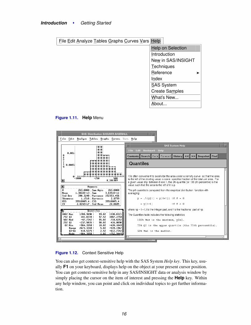
Both beginning and expert users can take advantage of SAS/INSIGHT software’scontext-sensitive help system. To receive context-sensitive help, select any graph ortable by clicking on its border. Then choose Help:Help on Selection, as illustratedin Figure 1.11. Figure 1.12 shows the context-sensitive help when the Quantiles tableis selected.
15
Introduction � Getting Started
File Edit Analyze Tables Graphs Curves Vars Help
Help on SelectionIntroductionNew in SAS/INSIGHTTechniquesReference �
IndexSAS SystemCreate SamplesWhat’s New...About...
Figure 1.11. Help Menu
Figure 1.12. Context Sensitive Help
You can also get context-sensitive help with the SAS System Help key. This key, usu-ally F1 on your keyboard, displays help on the object at your present cursor position.You can get context-sensitive help in any SAS/INSIGHT data or analysis window bysimply placing the cursor on the item of interest and pressing the Help key. Withinany help window, you can point and click on individual topics to get further informa-tion.
16

Learning More
The Help menu entries correspond to parts of this manual. ChooseHelp:Introduction to learn about SAS/INSIGHT software; Help:Techniquesto learn how to perform a particular task; Help:Reference to look up detailedinformation; or Help:Index to see an index of all SAS/INSIGHT topics.
Figure 1.13. Help Index
Choose Help:SAS System to see a general index of SAS System topics. ChooseHelp:Create Samples to create sample data sets; examples throughout this manualrefer to these data sets. See the following section for more information.
17

Introduction � Getting Started
Sample Data SetsThe following sample data sets are included with SAS/INSIGHT software.
The AIR data set contains measurements of pollutant concentrations from a city inGermany during a week in November 1989. Variables are
DATETIME date and hour in SAS DATETIME format
DAY day of the week
HOUR hour of the day
CO carbon monoxide concentration
O3 ozone concentration
SO2 sulfur dioxide concentration
NO nitrogen oxide concentration
DUST dust concentration
WIND wind speed
The BASEBALL data set contains performance measures and salary levels for reg-ular hitters and leading substitute hitters in major league baseball for the year 1986(Collier 1987). There is one observation per hitter. Variables are
NAME the player’s name
NO–ATBAT number of times at bat in 1986
NO–HITS number of hits in 1986
NO–HOME number of home runs in 1986
NO–RUNS number of runs in 1986
NO–RBI number of runs batted in in 1986
NO–BB number of bases on balls in 1986
YR–MAJOR years in the major leagues
CR–ATBAT career at bats
CR–HITS career hits
CR–HOME career home runs
CR–RUNS career runs
CR–RBI career runs batted in
CR–BB career bases on balls
LEAGUE player’s league at the end of 1986
DIVISION player’s division at the end of 1986
18

Sample Data Sets
TEAM player’s team at the end of 1986
POSITION positions played in 1986
NO–OUTS number of put outs in 1986
NO–ASSTS number of assists in 1986
NO–ERROR number of errors in 1986
SALARY salary in thousands of dollars
The POSITION variable in the BASEBALL data set is encoded as follows:
13 first base, third base CS center field, shortstop1B first base DH designated hitter1O first base, outfield DO designated hitter, outfield23 second base, third base LF left field2B second base O1 outfield, first base2S second base, shortstop OD outfield, designated hitter32 third base, second base OF outfield3B third base OS outfield, shortstop3O third base, outfield RF right field3S third base, shortstop S3 shortstop, third baseC catcher SS shortstop
CD center field, designated hitter UT utilityCF center field
The BUSINESS data set contains information on publicly-held German, Japanese,and U.S. companies in the automotive, chemical, electronics, and oil refining indus-tries. There is one observation for each company. Variables are
NATION the nationality of the company
INDUSTRY the company’s principal business
EMPLOYS the number of employees
SALES sales for 1991 in millions of dollars
PROFITS profits for 1991 in millions of dollars
The DRUG data set contains results of an experiment to evaluate drug effectiveness(Afifi and Azen 1972). Four drugs were tested against three diseases on six subjects;there is one observation for each test. Variables are
DRUG the drug used in treatment
DISEASE the disease present
CHANG–BP the change in systolic blood pressure due to treatment
19

Introduction � Getting Started
The GPA data set contains data collected to determine which applicants at a largemidwestern university were likely to succeed in its computer science program(Campbell and McCabe 1984). There is one observation per student. Variables are
GPA the grade point average of students in the computer science pro-gram
HSM the average high school grade in mathematics
HSE the average high school grade in English
HSS the average high school grade in science
SATM the score on the mathematics portion of the SAT exam
SATV the score on the verbal portion of the SAT exam
SEX the student’s gender
The IRIS data set is Fisher’s Iris data (Fisher 1936). Sepal and petal size were mea-sured for fifty specimens from each of three species of iris. There is one observationper specimen. Variables are
SEPALLEN sepal length in millimeters
SEPALWID sepal width in millimeters
PETALLEN petal length in millimeters
PETALWID petal width in millimeters
SPECIES the species
The MINING data set contains results of an experiment to determine whether drillingtime was faster for wet drilling or dry drilling (Penner and Watts 1991). Tests werereplicated three times for each method at different test holes. There is one observationper five-foot interval for each replication. Variables are
DRILTIME the time in minutes to drill the last five feet of the current depth
METHOD the drilling method, wet or dry
REP the replicate number
DEPTH the depth of the hole in feet
The MININGX data set is a subset of the MINING data set. It contains data from onlyone of the test holes.
20

Sample Data Sets
The PATIENT data set contains data collected on cancer patients (Lee 1974). Thereis one observation per patient. Variables are
REMISS 1 if remission occurred and 0 otherwise
CELL
SMEAR
INFIL
LI
TEMP
BLAST measures of patient characteristics
The SHIP data set contains data from an investigation of wave damage to cargo ships(McCullagh and Nelder 1989). The purpose of the investigation was to set standardsfor future hull construction. There is one observation per ship. Variables are
Y the number of damage incidents
YEAR year of construction
TYPE the type of ship
PERIOD the period of operation
MONTHS the aggregate months of service
Choose Help:Create Samples to create the sample data sets in your sasuserdirectory. When you have created the sample data sets, turn to the Techniques part ofthis manual to learn how to enter your data and begin exploring it with SAS/INSIGHTsoftware.
† Note: If you have an existing data set in your sasuser library with the same nameas a sample data set, it will be overwritten if you create the sample.
21

Introduction � Getting Started
ReferencesAfifi, A.A. and Azen, S.P. (1972), Statistical Analysis: A Computer-Oriented Approach,
New York: Academic Press, 166.
Campbell, P.F. and McCabe, G.P. (1984), “Predicting the Success of Freshmen in aComputer Science Major,” Communications of the ACM, 27, 1108–1113.
Collier Books (1987), The 1987 Baseball Encyclopedia Update, New York: MacmillanPublishing Company.
Fisher, R.A. (1936), “The Use of Multiple Measurements in Taxonomic Problems,”Annals of Eugenics, 7, 179–188.
Lee, E.T. (1974), “A Computer Program for Linear Logistic Regression Analysis,”Computer Programs in Biomedicine, 80–92.
McCullagh, P. and Nelder, J.A. (1989), Generalized Linear Models, Second Edition,London: Chapman and Hall.
Penner, R. and Watts, D.G. (1991), “Mining Information,” American Statistician, 45(1),4–9.
22

Part 2Techniques
Contents
Chapter 2. Entering Data . . . . . . . . . . . . . . . . . . . . . . . . . . . . . . . . . . 25
Chapter 3. Examining Data . . . . . . . . . . . . . . . . . . . . . . . . . . . . . . . . 47
Chapter 4. Exploring Data in One Dimension . . . . . . . . . . . . . . . . . . . . . . . 69
Chapter 5. Exploring Data in Two Dimensions . . . . . . . . . . . . . . . . . . . . . . 85
Chapter 6. Exploring Data in Three Dimensions . . . . . . . . . . . . . . . . . . . . . 107
Chapter 7. Adjusting Axes and Ticks . . . . . . . . . . . . . . . . . . . . . . . . . . . 123
Chapter 8. Labeling Observations . . . . . . . . . . . . . . . . . . . . . . . . . . . . . 133
Chapter 9. Hiding Observations . . . . . . . . . . . . . . . . . . . . . . . . . . . . . . 143
Chapter 10. Marking Observations . . . . . . . . . . . . . . . . . . . . . . . . . . . . 155
Chapter 11. Coloring Observations . . . . . . . . . . . . . . . . . . . . . . . . . . . . 167
Chapter 12. Examining Distributions . . . . . . . . . . . . . . . . . . . . . . . . . . . 177
Chapter 13. Fitting Curves . . . . . . . . . . . . . . . . . . . . . . . . . . . . . . . . . 199
Chapter 14. Multiple Regression . . . . . . . . . . . . . . . . . . . . . . . . . . . . . . 217
Chapter 15. Analysis of Variance . . . . . . . . . . . . . . . . . . . . . . . . . . . . . 241
Chapter 16. Logistic Regression . . . . . . . . . . . . . . . . . . . . . . . . . . . . . . 261
Chapter 17. Poisson Regression . . . . . . . . . . . . . . . . . . . . . . . . . . . . . . 277
Chapter 18. Examining Correlations . . . . . . . . . . . . . . . . . . . . . . . . . . . . 293

Techniques
Chapter 19. Calculating Principal Components . . . . . . . . . . . . . . . . . . . . . . 303
Chapter 20. Transforming Variables . . . . . . . . . . . . . . . . . . . . . . . . . . . . 317
Chapter 21. Comparing Analyses . . . . . . . . . . . . . . . . . . . . . . . . . . . . . 337
Chapter 22. Analyzing by Groups . . . . . . . . . . . . . . . . . . . . . . . . . . . . . 355
Chapter 23. Animating Graphs . . . . . . . . . . . . . . . . . . . . . . . . . . . . . . 367
Chapter 24. Formatting Variables and Values . . . . . . . . . . . . . . . . . . . . . . . 375
Chapter 25. Editing Windows . . . . . . . . . . . . . . . . . . . . . . . . . . . . . . . 391
Chapter 26. Saving and Printing Data . . . . . . . . . . . . . . . . . . . . . . . . . . . 419
Chapter 27. Saving and Printing Graphics . . . . . . . . . . . . . . . . . . . . . . . . . 429
Chapter 28. Saving and Printing Tables . . . . . . . . . . . . . . . . . . . . . . . . . . 443
Chapter 29. Configuring SAS/INSIGHT Software . . . . . . . . . . . . . . . . . . . . 451
Chapter 30. Working with Other SAS Products . . . . . . . . . . . . . . . . . . . . . . 469
24
Chapter 2Entering Data
Chapter Contents
INVOKING SAS/INSIGHT SOFTWARE . . . . . . . . . . . . . . . . . . . 28
ENTERING VALUES . . . . . . . . . . . . . . . . . . . . . . . . . . . . . . 32
NAVIGATING THE DATA WINDOW . . . . . . . . . . . . . . . . . . . . . 34
ADDING VARIABLES AND OBSERVATIONS . . . . . . . . . . . . . . . 35
DEFINING VARIABLES . . . . . . . . . . . . . . . . . . . . . . . . . . . . 37
FAST DATA ENTRY . . . . . . . . . . . . . . . . . . . . . . . . . . . . . . 40
OTHER OPTIONS . . . . . . . . . . . . . . . . . . . . . . . . . . . . . . . 44

Techniques � Entering Data
26
Chapter 2Entering Data
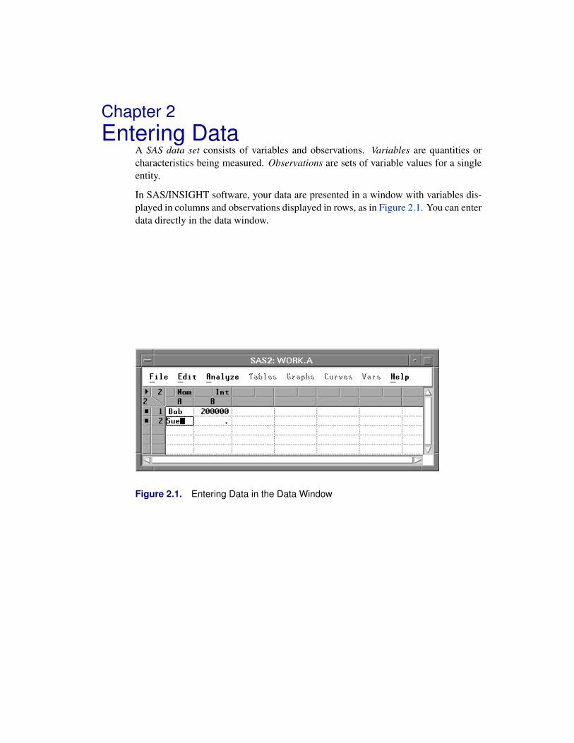
A SAS data set consists of variables and observations. Variables are quantities orcharacteristics being measured. Observations are sets of variable values for a singleentity.
In SAS/INSIGHT software, your data are presented in a window with variables dis-played in columns and observations displayed in rows, as in Figure 2.1. You can enterdata directly in the data window.
Figure 2.1. Entering Data in the Data Window

Techniques � Entering Data
Invoking SAS/INSIGHT SoftwareYou can invoke SAS/INSIGHT software in any of three ways.
=⇒ You can type insight on the command line.
Figure 2.2. Command Line
=⇒ If you have menus, you can choose Solutions:Analyze:Interactive DataAnalysis.
· · · Run Solutions Help
Analysis �
Development & Programming �
Reporting �
Accessories �
ASSISTDesktopEIS / OLAP Application Builder
3D Visual AnalysisAnalystDesign of ExperimentsGeographic Information SystemsGuided Data AnalysisInteractive Data AnalysisInvestment AnalysisMarket ResearchProject ManagementQuality ImprovementQueueing SimulationsTime Series Forecasting SystemTime Series Viewer
Figure 2.3. SAS Analysis Menu
=⇒ You can invoke SAS/INSIGHT software as a SAS procedure.Choose Run:Submit to submit the procedure statement in the Program Editor.
28

Invoking SAS/INSIGHT Software
Figure 2.4. Entering a PROC Statement
29

Techniques � Entering Data
You may want to access SAS data sets that are located in different libraries thanthe standard ones. As an example, if you have SAS data sets in a directory namedmypath, then enter the lines
libname mylib ’mypath’;proc insight;run;
in the Program Editor window and choose Run:Submit. The data set dialog (dis-cussed later) will contain an additional library mylib to choose from.
You can invoke SAS/INSIGHT software from the Program Editor window and auto-matically open a new data window. Enter the lines
proc insight data;run;
in the Program Editor window and choose Run:Submit. The data set dialog isskipped and a new data window appears.
You can specify a data set directly. For example, if you have a SAS data set namedmydata in the mylib directory, enter the lines
libname mylib ’mypath’;proc insight data=mylib.mydata;run;
in the Program Editor window and choose Run:Submit. Again the data set dialogis skipped and a data window appears with the specified SAS data set.
Finally, if you have raw data that you want to analyze, you most likely need to use theINFILE and INPUT statements in a DATA step. Refer to SAS Language Reference:Dictionary for information on how to read in raw data.
† Note: It is best to invoke SAS/INSIGHT software from the command line or from theSolutions menu. This enables you to use SAS/INSIGHT software simultaneouslywith other components in the SAS System. If you invoke it as a procedure, you cannotuse any other SAS component until you exit SAS/INSIGHT.
Upon invoking SAS/INSIGHT software, you are prompted with a data set dialog.
30

Invoking SAS/INSIGHT Software
Figure 2.5. Data Set Dialog
=⇒ Click the New button.This opens a new data window in which you can enter data.
Figure 2.6. New Data Window
31

Techniques � Entering Data
Entering ValuesBy default, the first value in a new data window is selected and is displayed with aframe around it. This active value marks your current location in the data window.To enter data, simply begin typing.
=⇒ Enter the name “Bob” in the active value.
Figure 2.7. Entering a Value
As you type, variables and observations are created for you. The count of variablesand observations is shown in the upper left of the data window.
=⇒ Press the Tab key.
This moves the active value one position to the right.
=⇒ Enter the salary “200000” in the active value.Again, a variable is created.
Figure 2.8. A Second Value
=⇒ Press the down arrow key, then press the left arrow key.
This moves the active value to the first column of the second row.
=⇒ Enter the name “Sue” in the active value.
32

Entering Values
Figure 2.9. A New Observation
A new observation is created, increasing the observations count to 2. The period (.)in the second value indicates a missing value for the numeric variable.
=⇒ Press the Tab key to move to the right.
=⇒ Enter the salary “300000” to replace the missing value. Then press the downarrow key.
Figure 2.10. Replacing the Missing Value
33

Techniques � Entering Data
Navigating the Data WindowYou can use Tab, BackTab, Enter, Return, and arrow keys to navigate the data win-dow. Tab moves the active value to the right. BackTab, usually defined as Shift-Tab,moves the active value to the left. Enter or Return moves the active value down. Upand down arrow keys move the active value up or down.
When you are not editing any value, left and right arrow keys move the active valueleft and right. When you are editing a value, left and right arrow keys move the cursorwithin the active value.
When you have values, variables, or observations selected, the Tab, BackTab, andReturn keys navigate within the selected area. This reduces keystrokes when youenter data.
=⇒ Drag a rectangle through several values to select them.
Figure 2.11. Selected Range
=⇒ Press Tab repeatedly.
=⇒ Press Return repeatedly.
The active value moves within the range you selected. By default, the Tab key navi-gates horizontally, and the Return key navigates vertically.
† Note: See the section “Data Options” at the end of this chapter for information ondefining the direction of Tab and Enter keys.
34

Adding Variables and Observations
Adding Variables and ObservationsWhen you have a lot of data to enter, it is more efficient to specify the approximatenumber of observations rather than to create them one at a time.
=⇒ Click in the upper left corner of the data window.This displays the data pop-up menu.
Find NextMove to FirstMove to LastSort...New ObservationsNew VariablesDefine Variables...Fill Values...ExtractData Options...
Figure 2.12. Data Pop-up Menu
=⇒ Choose New Observations from the pop-up menu.This displays a dialog to prompt you for the number of observations to create.
=⇒ Enter “10” in the observations dialog, then click OK.
Figure 2.13. Observations Dialog
Observations with missing values are added at the bottom of the data window, increas-ing the observations count to 12. In the new observations, character values default toblank, while numeric values default to missing.
35

Techniques � Entering Data
Figure 2.14. New Observations
The New Variables menu works like the New Observations menu. You canchoose New Variables to create several variables at once.
36

Defining Variables
Defining VariablesEach variable has a measurement level shown in the upper right portion of the columnheader. By default, numeric values are assigned an interval (Int) measurement level,indicating values that vary across a continuous range. Character values default to anominal (Nom) measurement level, indicating a discrete set of values.
=⇒ Click on the Int measurement level indicator for variable B.This displays a pop-up menu.
�IntervalNominal
Figure 2.15. Measurement Levels Menu
The radio mark beside Interval shows the current measurement level. Because B isa numeric variable, it can have either interval or nominal measurement level.
=⇒ Choose Nominal in the pop-up menu to change B’s measurement level.
Figure 2.16. Nominal B
You can adjust other variable properties as well. Click in the upper left corner of thedata window to display the data pop-up menu.
Find NextMove to FirstMove to LastSort...New ObservationsNew VariablesDefine Variables...Fill Values...ExtractData Options...
37

Techniques � Entering Data
Figure 2.17. Data Pop-up Menu
=⇒ Choose Define Variables from the pop-up menu.This displays a dialog. Using this dialog, you can assign variable storage type, mea-surement level, default roles, name, and label.
Figure 2.18. Define Variables Dialog
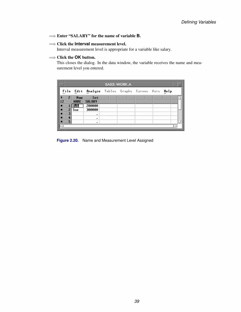
=⇒ Enter “NAME” for the name of variable A.
=⇒ Click the Apply button.In the data window, the variable receives the name you entered.
Figure 2.19. Naming a Variable
=⇒ Select B in the variables list at the left.
38
Defining Variables
=⇒ Enter “SALARY” for the name of variable B.
=⇒ Click the Interval measurement level.Interval measurement level is appropriate for a variable like salary.
=⇒ Click the OK button.This closes the dialog. In the data window, the variable receives the name and mea-surement level you entered.
Figure 2.20. Name and Measurement Level Assigned
39
Techniques � Entering Data
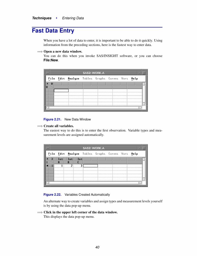
Fast Data EntryWhen you have a lot of data to enter, it is important to be able to do it quickly. Usinginformation from the preceding sections, here is the fastest way to enter data.
=⇒ Open a new data window.You can do this when you invoke SAS/INSIGHT software, or you can chooseFile:New.
Figure 2.21. New Data Window
=⇒ Create all variables.The easiest way to do this is to enter the first observation. Variable types and mea-surement levels are assigned automatically.
Figure 2.22. Variables Created Automatically
An alternate way to create variables and assign types and measurement levels yourselfis by using the data pop-up menu.
=⇒ Click in the upper left corner of the data window.This displays the data pop-up menu.
40

Fast Data Entry
Find NextMove to FirstMove to LastSort...New ObservationsNew VariablesDefine Variables...Fill Values...ExtractData Options...
Figure 2.23. Data Pop-up Menu
=⇒ Choose New Variables from the pop-up menu.This displays a dialog to prompt you for the number of variables to create.
=⇒ Enter “3” in the New Variables dialog, then click OK.
Figure 2.24. New Variables Dialog
The data window should appear as shown in the next figure.
Figure 2.25. Variables Created Manually
The variable names and measurement levels can be selected as shown in the lastsection.
You can create observations using the following steps.
41

Techniques � Entering Data
=⇒ Click in the upper left corner of the data window.This displays the data pop-up menu.
Find NextMove to FirstMove to LastSort...New ObservationsNew VariablesDefine Variables...Fill Values...ExtractData Options...
Figure 2.26. Data Pop-up Menu
=⇒ Choose New Observations.This displays a dialog prompting you for the number of observations to create.
Figure 2.27. Observations Dialog
Enter the number of observations, then click OK. If you don’t know the numberof observations, make it a little larger than you will need. You can delete unusedobservations later.
Figure 2.28. Observations Created
42
Fast Data Entry
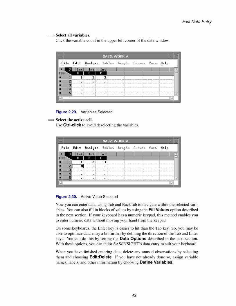
=⇒ Select all variables.Click the variable count in the upper left corner of the data window.
Figure 2.29. Variables Selected
=⇒ Select the active cell.Use Ctrl-click to avoid deselecting the variables.
Figure 2.30. Active Value Selected
Now you can enter data, using Tab and BackTab to navigate within the selected vari-ables. You can also fill in blocks of values by using the Fill Values option describedin the next section. If your keyboard has a numeric keypad, this method enables youto enter numeric data without moving your hand from the keypad.
On some keyboards, the Enter key is easier to hit than the Tab key. So, you may beable to optimize data entry a bit further by defining the direction of the Tab and Enterkeys. You can do this by setting the Data Options described in the next section.With these options, you can tailor SAS/INSIGHT’s data entry to suit your keyboard.
When you have finished entering data, delete any unused observations by selectingthem and choosing Edit:Delete. If you have not already done so, assign variablenames, labels, and other information by choosing Define Variables.
43

Techniques � Entering Data
Other OptionsThe pop-up data menu has a couple of useful options for filling in blocks of data andfor selecting the actions taken by the Enter and Tab keys.
Click on the button at the upper left corner of the data window to display the datapop-up menu. Choose Fill Values to modify selected values in the data window. Ifyou have variables, observations, or values selected, you are prompted to specify aValue and an Increment. If you have no selections, you are prompted to specifyvariables and observations.
Figure 2.31. Fill Values Dialog
In the Fill Values dialog, the Value field can be either character or numeric. If thevalue is numeric, you can use the Increment field to specify an increment or stepvalue. For example, to fill 10 values with ordinals 1 through 10, you can select thevalues, choose Fill Values, and enter 1 for both Value and Increment.
Choose Data Options in the data pop-up menu to set options that control the ap-pearance and operation of the data window. This displays the Data Options dialog,
Figure 2.32. Data Options
The dialog contains the following options:
Show Variable LabelsThis option controls whether variable labels are displayed. The default is off. If youturn on this option, variable labels are displayed.
44

Other Options
Direction of “Enter”This option controls the interpretation of the Enter and Return keys in the data win-dow. By default, the Enter key moves the active value one position down. If youchoose Right, the Enter key moves one position to the right. If you choose Downand Left, the Enter key moves one position down, and left to the first position.
Direction of “Tab”This option controls the interpretation of the Tab and BackTab keys in the data win-dow. By default, the Tab key moves the active value one position to the right. If youchoose Down, the Tab key moves one position down. If you choose Right and Up,the Tab key moves one position to the right, and up to the first position.
The options Down and Left and Right and Up were added in Release 6.11. Notall hosts define a BackTab key, and not all hosts define Enter and Return as the samekey. Consult your host documentation for information on key definitions.
You can save data window options by choosing File:Save:Options. This enablesyou to use your preferred option settings as defaults in future SAS/INSIGHT sessions.
45

Techniques � Entering Data
46
Chapter 3Examining Data
Chapter Contents
INVOKING SAS/INSIGHT SOFTWARE . . . . . . . . . . . . . . . . . . . 50
SCROLLING THE DATA WINDOW . . . . . . . . . . . . . . . . . . . . . 51
ARRANGING VARIABLES . . . . . . . . . . . . . . . . . . . . . . . . . . 52
SORTING OBSERVATIONS . . . . . . . . . . . . . . . . . . . . . . . . . . 56
FINDING OBSERVATIONS . . . . . . . . . . . . . . . . . . . . . . . . . . 59
EXAMINING OBSERVATIONS . . . . . . . . . . . . . . . . . . . . . . . . 63
CLOSING THE DATA WINDOW . . . . . . . . . . . . . . . . . . . . . . . 67

Techniques � Examining Data
48
Chapter 3Examining Data
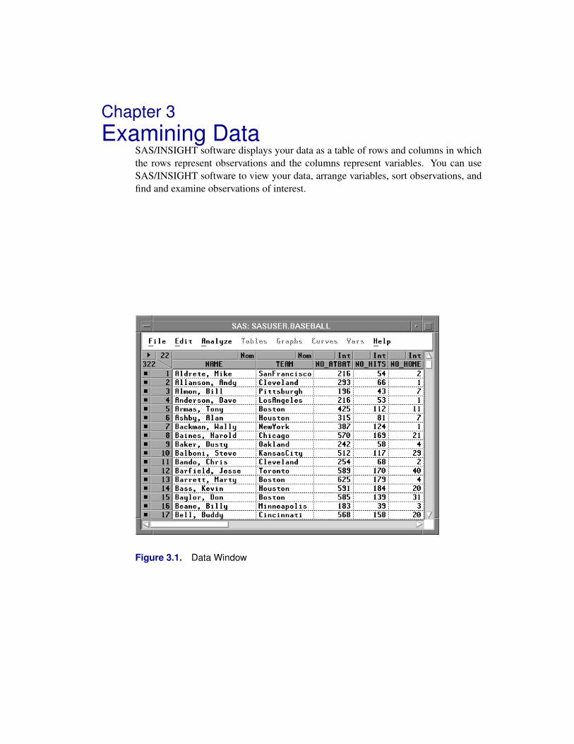
SAS/INSIGHT software displays your data as a table of rows and columns in whichthe rows represent observations and the columns represent variables. You can useSAS/INSIGHT software to view your data, arrange variables, sort observations, andfind and examine observations of interest.
Figure 3.1. Data Window
Techniques � Examining Data
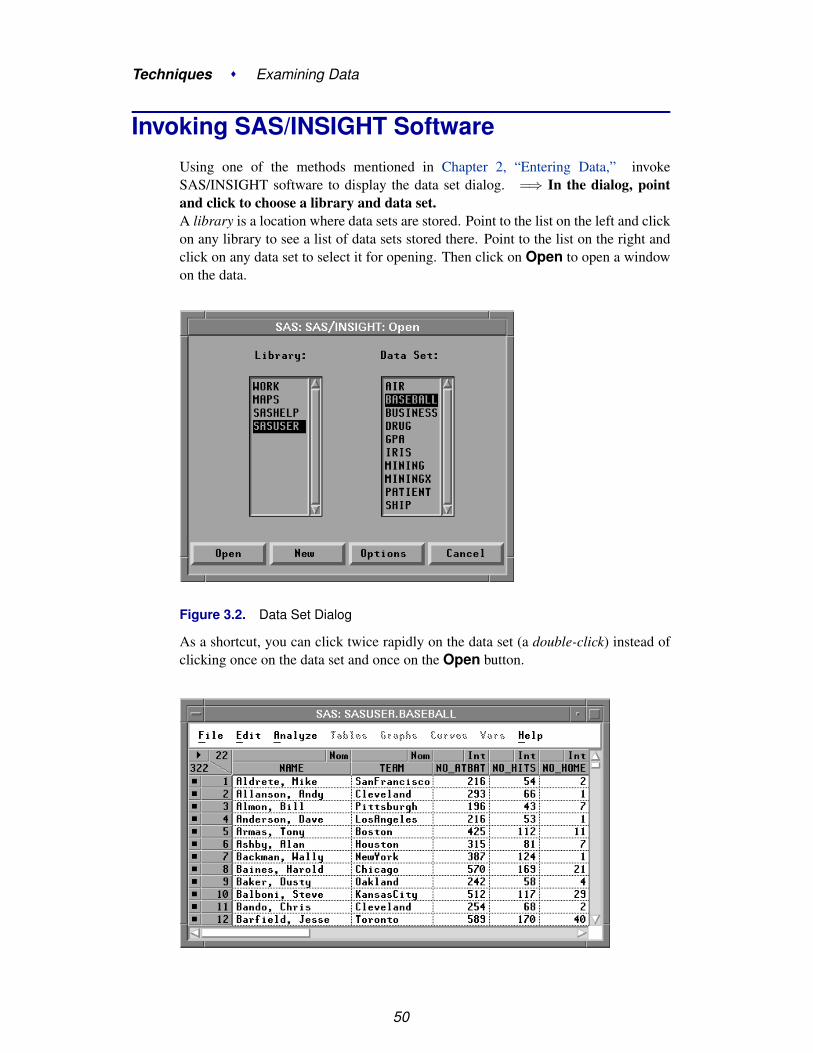
Invoking SAS/INSIGHT SoftwareUsing one of the methods mentioned in Chapter 2, “Entering Data,” invokeSAS/INSIGHT software to display the data set dialog. =⇒ In the dialog, pointand click to choose a library and data set.A library is a location where data sets are stored. Point to the list on the left and clickon any library to see a list of data sets stored there. Point to the list on the right andclick on any data set to select it for opening. Then click on Open to open a windowon the data.
Figure 3.2. Data Set Dialog
As a shortcut, you can click twice rapidly on the data set (a double-click) instead ofclicking once on the data set and once on the Open button.
50

Scrolling the Data Window
Figure 3.3. Data Window
Each variable in SAS/INSIGHT software has a measurement level that determinesthe way it is treated in graphs and analyses. The measurement level for each variableappears above the variable name. You can assign two measurement levels: intervaland nominal.
Interval variables contain values that vary across a continuous range. Forexample, NO–ATBAT is an interval variable in Figure 3.3.
Nominal variables contain a discrete set of values. For example, NAME is anominal variable in Figure 3.3.
Each observation in SAS/INSIGHT software has a marker, a graphic shape that iden-tifies the observation in graphs. The marker for each observation appears to the leftof the observation number.
The number of observations and the number of variables in the data set appear inthe upper left corner of the data window. The data window in Figure 3.3 shows thatSASUSER.BASEBALL has 322 observations and 22 variables.
Scrolling the Data WindowMost data sets are too large to fit in a data window, so the window contains scrollbars to scroll the data through the window. The appearance of scroll bars variesdepending on your host. Most scroll bars have small arrow buttons at the ends anda slider between the buttons to indicate the current position and relative size of thedisplayed area.
=⇒ Click the arrow button at the bottom of the vertical scroll bar.This scrolls down one observation.
Figure 3.4. Scrolling Down One Observation
51

Techniques � Examining Data
=⇒ Drag the slider on the vertical scroll bar all the way down.This scrolls to the last observation.
Figure 3.5. Scrolling to the Last Observation
Similarly, clicking the arrow button at the top of the vertical scroll bar scrolls upone observation, and dragging the slider all the way to the top scrolls to the firstobservation. The horizontal scroll bar works the same way, except that it moves thedata by variable instead of by observation.
† Note: On many hosts you can click within the scroll bar to scroll the width or heightof the window. Some hosts offer additional buttons on the scroll bars, and some hostsrespond to more than one button on the mouse. Refer to your host documentation fordetails and experiment by clicking on the scroll bars in the data window.
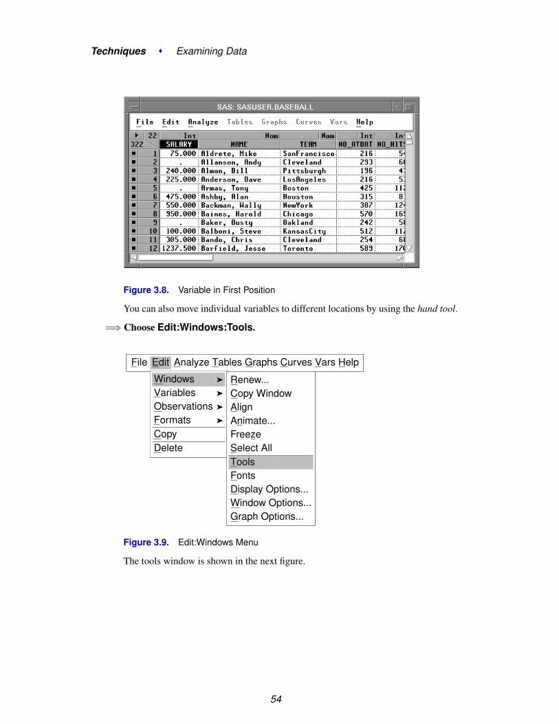
Arranging VariablesUsing scroll bars, you can view all of your data, but the variables and observationsmay not always be arranged as you would like. For example, suppose you are inter-ested in the salaries of the players in the data set SASUSER.BASEBALL. To movethe SALARY variable to the first position in the data window, follow these steps.
=⇒ Scroll the data window to the SALARY variable.SALARY is the last variable, so drag the slider on the horizontal scroll bar all theway to the right.
=⇒ Point to the SALARY variable name.Then click with the mouse to select the variable SALARY. The variable becomeshighlighted when you select it.
52

Arranging Variables
Figure 3.6. Selecting the Last Variable
=⇒ Click on the menu button in the upper left corner.This opens the data pop-up menu. Click on Move to First.
Figure 3.7. Data Pop-up Menu
This moves the selected variable to the first position. Note that the Data menu alsohas a Move to Last choice, so you can easily move variables to the last position.
53
Techniques � Examining Data
Figure 3.8. Variable in First Position
You can also move individual variables to different locations by using the hand tool.
=⇒ Choose Edit:Windows:Tools.
File Edit Analyze Tables Graphs Curves Vars Help
Windows �
Variables �
Observations �
Formats �
CopyDelete
Renew...Copy WindowAlignAnimate...FreezeSelect AllToolsFontsDisplay Options...Window Options...Graph Options...
Figure 3.9. Edit:Windows Menu
The tools window is shown in the next figure.
54

Arranging Variables
Figure 3.10. Tools Window
=⇒ Click the Hand tool at the top of the Tools window.The cursor changes to a hand. Move the hand to the variable named Salary.
=⇒ Press the left mouse button and hold it down.A dotted rectangle should appear as the outline of the variable column.
=⇒ Drag the rectangle so that its middle is on the border between Name and Team.
=⇒ Release the left mouse button.The Salary variable has become the second variable in the data window.
55

Techniques � Examining Data
Figure 3.11. Variable in Second Position
=⇒ Use the Hand tool to move Salary back to the first position.
=⇒ Click the arrow tool in the Tools window to restore the cursor.
Sorting ObservationsIt is often useful to examine data ordered by the values of a variable. Suppose youwant to sort the baseball data by players’ salaries stored in the SALARY variable.Follow these steps.
=⇒ Point and click to select the SALARY variable.
56

Sorting Observations
Figure 3.12. Selecting a Variable
=⇒ Click on the menu button in the upper left corner.This opens the data pop-up menu. Click on Sort.
Figure 3.13. Sorting Observations
The data are now sorted by SALARY in ascending order.
57

Techniques � Examining Data
Figure 3.14. Sorted Data
The periods (.) displayed in the observations for SALARY are missing values.Missing values are placeholders that indicate no data are available. Missing valuesare treated as less than any other value, so when the data are sorted, missing valuesappear first. If you scroll the data, you can see that the missing values are followedby the smallest salaries.
Figure 3.15. Sorted Data, Missing and Nonmissing
58

Finding Observations
Finding ObservationsSometimes you want to find observations that share some characteristic. For example,you might want to find all the baseball players who primarily played first base. To doso, follow these steps. The figures in this section are based on the NAME variableappearing as the first variable. If you just completed the previous two sections onmoving variables and sorting observations, move the SALARY variable to the lastposition and sort the observations on NAME. Make sure no variables are selected.
=⇒ Choose Edit:Observations:Find.
File Edit Analyze Tables Graphs Curves Vars Help
Windows �
Variables �
Observations �
Formats �
CopyDelete
Find...Examine...Label in PlotsUnlabel in PlotsShow in GraphsHide in GraphsInclude in CalculationsExclude in CalculationsInvert Selection
Figure 3.16. Finding Observations
This displays the Find Observations dialog.
Figure 3.17. Find Observations Dialog
59

Techniques � Examining Data
=⇒ Select the POSITION variable.Scroll the list of variables at the left to see the POSITION variable. Then point andclick to select POSITION. Notice that the list of values at the right now contains allthe unique values of the POSITION variable. By default, the equal (=) test and thefirst value are selected.
Figure 3.18. Selecting POSITION
=⇒ Select the values 13, 1B, and 1O.On most hosts, you can either Shift-click or CTRL-click to select these values. Theplayers selected primarily played first base. Note that players with POSITION = O1also played some first base, but they played primarily in the outfield.
=⇒ Click the Apply button to find the data.This selects observations without closing the Find Observations dialog. Clickingthe OK button closes the Find Observations dialog after selecting the observa-tions.
Figure 3.19. Selecting First Basemen
60
Finding Observations
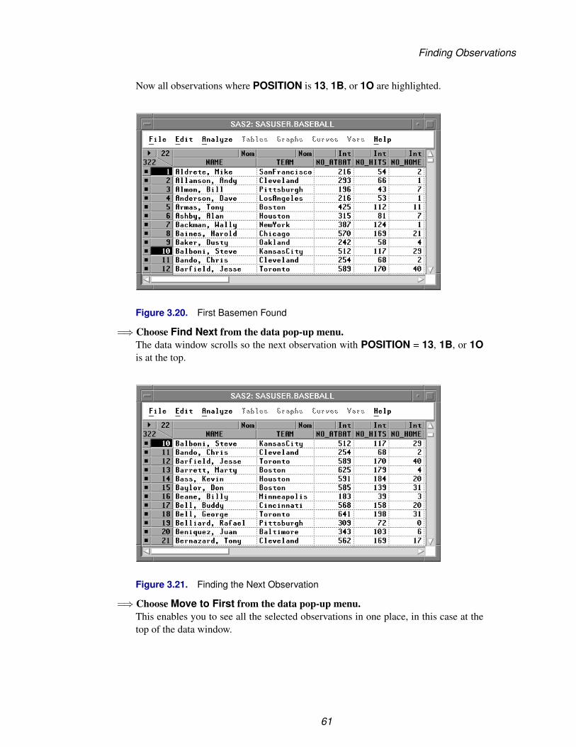
Now all observations where POSITION is 13, 1B, or 1O are highlighted.
Figure 3.20. First Basemen Found
=⇒ Choose Find Next from the data pop-up menu.The data window scrolls so the next observation with POSITION = 13, 1B, or 1Ois at the top.
Figure 3.21. Finding the Next Observation
=⇒ Choose Move to First from the data pop-up menu.This enables you to see all the selected observations in one place, in this case at thetop of the data window.
61

Techniques � Examining Data
Figure 3.22. Collecting the Selected Observations
62

Examining Observations
Examining ObservationsYou can examine selected observations in detail by following these steps. The figuresin this section are based on the data being sorted on the NAME variable and theobservations selected where POSITION is 13, 1B, or 1O. The previous sections onsorting and finding observations provide examples of how to sort and select.
=⇒ Choose Edit:Observations:Examine.
File Edit Analyze Tables Graphs Curves Vars Help
Windows �
Variables �
Observations �
Formats �
CopyDelete
Find...Examine...Label in PlotsUnlabel in PlotsShow in GraphsHide in GraphsInclude in CalculationsExclude in CalculationsInvert Selection
Figure 3.23. Finding Observations
This displays the Examine Observations dialog. The list on the left shows theobservation number for the selected observations: first basemen. The list on the rightdisplays the variable values for the highlighted observation.
63

Techniques � Examining Data
Figure 3.24. Examine Observations Dialog
Scroll down the list on the right to see the rest of Mike Aldrete’s statistics. Point andclick on observation number 58 to see Will Clark’s statistics. Scroll down the list onthe left until you can point and click on observation number 246 to see Pete Rose’sstatistics. Click OK to close the dialog.
You can also use the Examine Observations dialog directly from a graph or chart.To examine observations from a box plot of player salaries, follow these steps.
=⇒ Choose Analyze:Box Plot/Mosaic Plot ( Y ).This calls up the Box Plot/Mosaic Plot dialog.
File Edit Analyze Tables Graphs Curves Vars HelpHistogram/Bar Chart ( Y )Box Plot/Mosaic Plot ( Y )Line Plot ( Y X )Scatter Plot ( Y X )Contour Plot ( Z Y X )Rotating Plot ( Z Y X )Distribution ( Y )Fit ( Y X )Multivariate ( Y X )
Figure 3.25. Creating a Box Plot
=⇒ Assign SALARY the Y role and LEAGUE the X role.Click on SALARY in the variable list on the left, then click on Y at the top. Similarly,click on LEAGUE in the list on the left, then click on X at the top.
=⇒ Click OK to create a box plot of SALARY by LEAGUE.
64

Examining Observations
Figure 3.26. Box Plot Variable Roles
=⇒ Double-click on the marker representing the highest salary in the NationalLeague.
Figure 3.27. Box Plot of SALARY by LEAGUE
Clicking on the observation identifies the point in the graph with its observation num-ber. Double-clicking displays the Examine Observations dialog for the selectedobservation. In 1986, Mike Schmidt had the highest salary in the National League.
65

Techniques � Examining Data
Figure 3.28. Examining Observations
=⇒ Double-click on the upper whisker for the American League.This displays the values for all observations within the whisker. Then click in theObservation list to see the values for each observation.
Figure 3.29. Examining Whisker Observations
=⇒ Click OK to close the dialog.
66

Closing the Data Window
Closing the Data WindowThere are several other features of the data window, and you can find them by explor-ing the data pop-up menu on your own. For detailed information, see Chapter 31,“Data Windows,” in the Reference part of this manual. One more feature importantenough to describe here concerns what happens when you close a data window.
† Note: When you close the data window, you close all windows using that data set.When you close all your data windows, you exit SAS/INSIGHT software.
You can open as many data windows as you like by choosing File:Open. You canclose any window by choosing File:End. Depending on your host, there may beother ways to close windows as well.
You will be prompted with a dialog to confirm that you want to close the data window.In the Confirm dialog, you can click OK to close the data window, or you can clickCancel to abort the action and leave the data window open. Try it to be sure youknow how to exit SAS/INSIGHT software when you are ready, but click Cancel inthe Confirm dialog to abort the closing.
=⇒ Choose File:End.
File Edit Analyze Tables Graphs Curves Vars Help
NewOpen...Save �
Print...Print setup...Print previewEnd
Figure 3.30. File Menu
Choosing File:End displays the Confirm dialog.
Figure 3.31. Confirm Dialog
=⇒ Click Cancel.This aborts the closing and returns you to the data window. If you had clicked OK,you would have closed the data window and exited SAS/INSIGHT software.
67

Techniques � Examining Data
Now that you know how to examine data in a data window, turn to the next chapterto learn how to explore data in one dimension.
⊕ Related Reading: Data Windows, Chapter 31.
68

Chapter 4Exploring Data in One Dimension
Chapter Contents
BAR CHARTS . . . . . . . . . . . . . . . . . . . . . . . . . . . . . . . . . . 72
BOX PLOTS . . . . . . . . . . . . . . . . . . . . . . . . . . . . . . . . . . . 80

Techniques � Exploring Data in One Dimension
70

Chapter 4Exploring Data in One Dimension
In SAS/INSIGHT software, you can explore distributions of one variable using barcharts and box plots. Bar charts display distributions of interval or nominal variables.Box plots display concise summaries of interval variable distributions and show ex-treme values.
Figure 4.1. A Bar Chart and Box Plot

Techniques � Exploring Data in One Dimension
Bar ChartsInterval variables contain values distributed over a continuous range. For example,in Figure 4.2 baseball players’ salaries are stored in SALARY, an interval variable.To create a bar chart of players’ salaries, follow these steps.
=⇒ Select SALARY in the data window.Scroll all the way to the right to find the SALARY variable. Point and click on thevariable name.
Figure 4.2. Selecting the SALARY Variable
=⇒ Choose Histogram/Bar Chart ( Y ) from the Analyze menu.
File Edit Analyze Tables Graphs Curves Vars HelpHistogram/Bar Chart ( Y )Box Plot/Mosaic Plot ( Y )Line Plot ( Y X )Scatter Plot ( Y X )Contour Plot ( Z Y X )Rotating Plot ( Z Y X )Distribution ( Y )Fit ( Y X )Multivariate ( Y X )
Figure 4.3. Creating a Bar Chart
This creates a bar chart, as shown in Figure 4.4.
72

Bar Charts
Figure 4.4. Bar Chart
=⇒ Point and click on any barThis labels the bar with its frequency and selects all the observations in the bar.
Figure 4.5. Clicking on a Bar
73
Techniques � Exploring Data in One Dimension
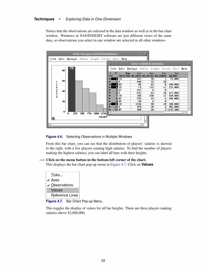
Notice that the observations are selected in the data window as well as in the bar chartwindow. Windows in SAS/INSIGHT software are just different views of the samedata, so observations you select in one window are selected in all other windows.
Figure 4.6. Selecting Observations in Multiple Windows
From this bar chart, you can see that the distribution of players’ salaries is skewedto the right, with a few players earning high salaries. To find the number of playersmaking the highest salaries, you can label all bars with their heights.
=⇒ Click on the menu button in the bottom left corner of the chart.This displays the bar chart pop-up menu in Figure 4.7. Click on Values.
Ticks...� Axes� Observations
ValuesReference Lines
Figure 4.7. Bar Chart Pop-up Menu.
This toggles the display of values for all bar heights. There are three players makingsalaries above $2,000,000.
74
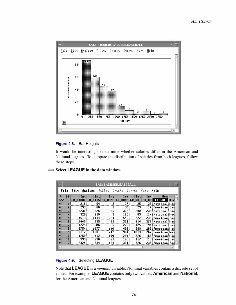
Bar Charts
Figure 4.8. Bar Heights
It would be interesting to determine whether salaries differ in the American andNational leagues. To compare the distribution of salaries from both leagues, followthese steps.
=⇒ Select LEAGUE in the data window.
Figure 4.9. Selecting LEAGUE
Note that LEAGUE is a nominal variable. Nominal variables contain a discrete set ofvalues. For example, LEAGUE contains only two values, American and National,for the American and National leagues.
75

Techniques � Exploring Data in One Dimension
=⇒ Choose Histogram/Bar Chart ( Y ) from the Analyze menu.From the bar chart in Figure 4.10 you can see that the BASEBALL data set has moreobservations from the American League.
Figure 4.10. Bar Chart of LEAGUE
=⇒ Select Values from the bar chart pop-up menu in the new bar chart.This displays the frequencies for each of the leagues at the top of the bars on the barchart.
76

Bar Charts
Figure 4.11. Bar Chart with Frequency Values
77

Techniques � Exploring Data in One Dimension
=⇒ Arrange the windows so you can see both bar charts.
=⇒ Click on the bar that represents the American League.This selects all observations for players in the American League.
Figure 4.12. Selecting American League Observations
=⇒ Click on the bar that represents the National League.This selects all observations for players in the National League.
78
Bar Charts
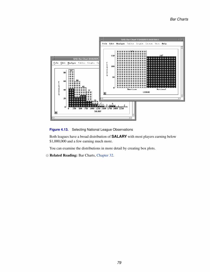
Figure 4.13. Selecting National League Observations
Both leagues have a broad distribution of SALARY with most players earning below$1,000,000 and a few earning much more.
You can examine the distributions in more detail by creating box plots.
⊕ Related Reading: Bar Charts, Chapter 32.
79
Techniques � Exploring Data in One Dimension
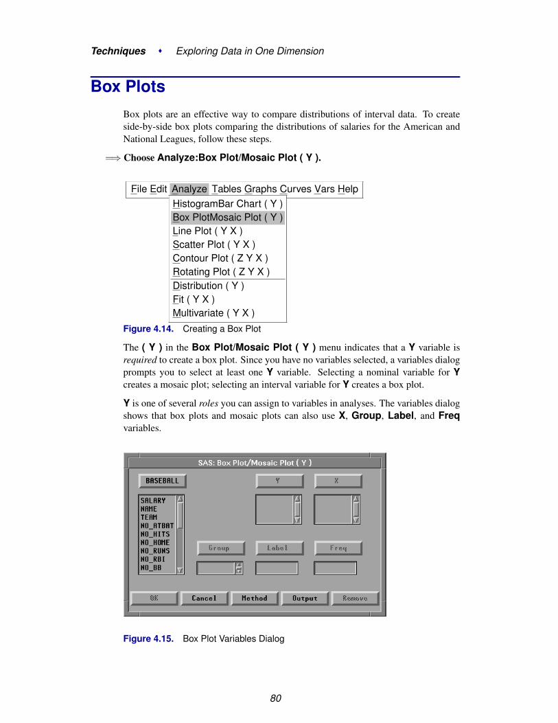
Box PlotsBox plots are an effective way to compare distributions of interval data. To createside-by-side box plots comparing the distributions of salaries for the American andNational Leagues, follow these steps.
=⇒ Choose Analyze:Box Plot/Mosaic Plot ( Y ).
File Edit Analyze Tables Graphs Curves Vars HelpHistogramBar Chart ( Y )Box PlotMosaic Plot ( Y )Line Plot ( Y X )Scatter Plot ( Y X )Contour Plot ( Z Y X )Rotating Plot ( Z Y X )Distribution ( Y )Fit ( Y X )Multivariate ( Y X )
Figure 4.14. Creating a Box Plot
The ( Y ) in the Box Plot/Mosaic Plot ( Y ) menu indicates that a Y variable isrequired to create a box plot. Since you have no variables selected, a variables dialogprompts you to select at least one Y variable. Selecting a nominal variable for Ycreates a mosaic plot; selecting an interval variable for Y creates a box plot.
Y is one of several roles you can assign to variables in analyses. The variables dialogshows that box plots and mosaic plots can also use X, Group, Label, and Freqvariables.
Figure 4.15. Box Plot Variables Dialog
80

Box Plots
† Note: You can select variables before choosing from the Analyze menu, or you canchoose from the Analyze menu before selecting variables. Selecting variables firstis faster. If you select variables first, they are assigned to the required variable roleslisted in the Analyze menu. Choosing the analysis first gives you more flexibility. Ifyou choose the analysis first, you can assign optional variable roles such as Groupand Label.
=⇒ Select SALARY in the list at the left, then click the Y button.This assigns the Y role to SALARY. The box plot displays the distribution of the Yvariable.
=⇒ Select LEAGUE in the list at the left, then click the X button.This assigns the X role to LEAGUE. The box plot displays one schematic distributionplot side-by-side for each unique value of the X variable.
=⇒ Select NAME in the list at the left, then click the Label button.This assigns the Label role to NAME. The label variable is used to identify extremevalues in the box plot.
Figure 4.16. Assigning Variable Roles
=⇒ Click OK to create the Box Plot.
The box plot gives a concise picture of the distributions and places them side-by-sidefor easy comparison. The horizontal line in the middle of a box marks the median or50th percentile. The top and bottom edges of a box mark the quartiles, or the 25th and75th percentiles. The narrow boxes extending above and below are called whiskers.Whiskers extend from the quartiles to the farthest observation not farther than 1.5times the distance between the quartiles. More extreme data values are plotted withindividual markers.
The box plot shows long whiskers above with individual observations beyond thewhiskers indicating severe skewness. These are the players making extremely highsalaries.
81
Techniques � Exploring Data in One Dimension
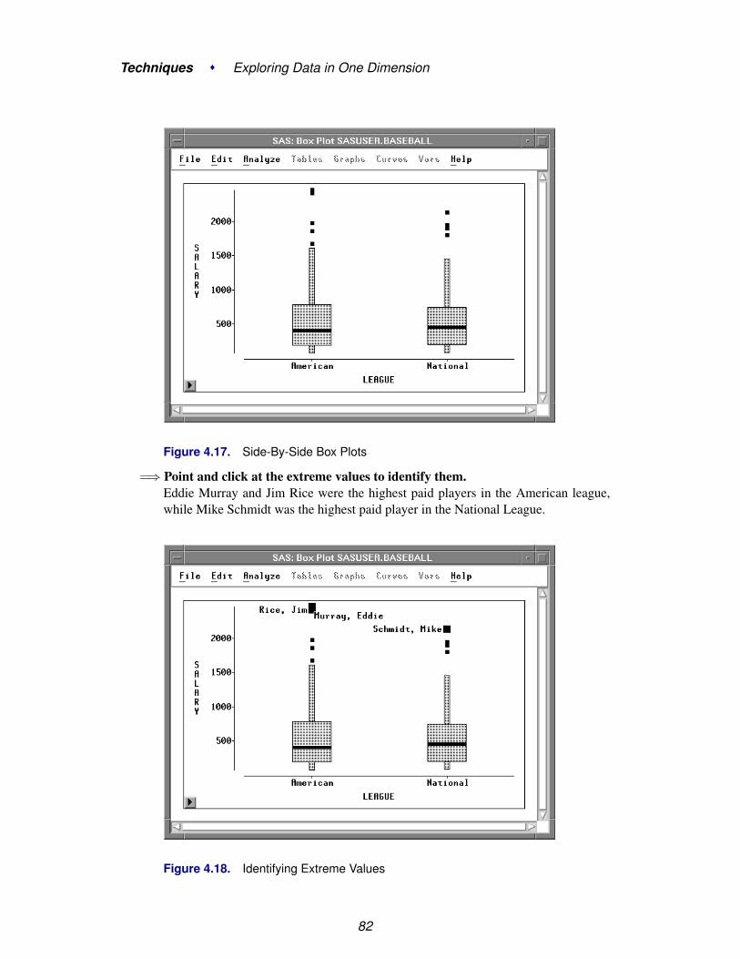
Figure 4.17. Side-By-Side Box Plots
=⇒ Point and click at the extreme values to identify them.Eddie Murray and Jim Rice were the highest paid players in the American league,while Mike Schmidt was the highest paid player in the National League.
Figure 4.18. Identifying Extreme Values
82

Box Plots
You can also use a box plot to see the sample mean of a distribution.
=⇒ Click on the menu button in the lower left corner of the plot.This displays the box plot pop-up menu. Click on Means.
Ticks...� Axes� Observations
MeansComparison CirclesSerifsValuesReference LinesMarker Sizes �
Figure 4.19. Box Plot Pop-up Menu
This toggles the display of mean diamonds on the box plot.
Figure 4.20. Box Plot with Mean Diamonds
The horizontal line in a mean diamond marks the mean salary for each league. Theheight of a mean diamond is two standard deviations (one on either side of the mean).In this case, the means and standard deviations for each league are almost identical.
83

Techniques � Exploring Data in One Dimension
You can use other choices on the box plot pop-up menu to adjust axis tick marks andmarker sizes and to toggle the display of observations, axes, serifs, and values. Whenthere are two or more categories, you can toggle the display of comparison circles,which enable you to graphically compare the means of multiple categories.
⊕ Related Reading: Box Plots, Chapter 33.
84

Chapter 5Exploring Data in Two Dimensions
Chapter Contents
MOSAIC PLOTS . . . . . . . . . . . . . . . . . . . . . . . . . . . . . . . . 88
SCATTER PLOTS . . . . . . . . . . . . . . . . . . . . . . . . . . . . . . . . 91
SCATTER PLOT MATRICES . . . . . . . . . . . . . . . . . . . . . . . . . 94Brushing Observations . . . . . . . . . . . . . . . . . . . . . . . . . . . . . 96
LINE PLOTS . . . . . . . . . . . . . . . . . . . . . . . . . . . . . . . . . . . 100
REFERENCES . . . . . . . . . . . . . . . . . . . . . . . . . . . . . . . . . . 105

Techniques � Exploring Data in Two Dimensions
86

Chapter 5Exploring Data in Two Dimensions
SAS/INSIGHT software provides mosaic plots, scatter plots, and line plots for ex-ploring data in two dimensions. Mosaic plots are pictorial representations of fre-quency counts of nominal variables. Scatter plots are graphic representations of therelationship between two interval variables. Line plots show the relationships of mul-tiple Y variables to a single X variable.
Figure 5.1. A Mosaic Plot, Scatter Plot, and Line Plot

Techniques � Exploring Data in Two Dimensions
Mosaic PlotsThis example illustrates how to create mosaic plots for the BASEBALL data cross-classified by LEAGUE and DIVISION.
=⇒ Open the BASEBALL data set.
=⇒ Choose Analyze:Box Plot/Mosaic Plot ( Y ).
=⇒ Assign LEAGUE the Y role and DIVISION the X role. Then click OK.
Figure 5.2. Assigning Variables for a Mosaic Plot
This creates a mosaic plot containing four boxes. The areas of the boxes in the mosaicplot are proportional to the number of observations in each category. You can see that,for these data, there are more players in the American League than in the NationalLeague and about the same number of players in the East and West Divisions.
You can find out more about specific categories by selecting the boxes.
=⇒ Click on the box at the lower left (American League East).This selects all the observations in the box and labels the box with its frequency andpercentage. For this data, there are 85 players from the East Division of the AmericanLeague, and these are 26.4% of the total.
88

Mosaic Plots
Figure 5.3. Clicking on a Box
=⇒ Double-click on the box to examine the observations.This selects all the observations in the box and displays the Examine Observationsdialog. By clicking in the Examine Observations dialog, you can get detailed infor-mation on all the selected observations.
Figure 5.4. Examine Observation Dialog
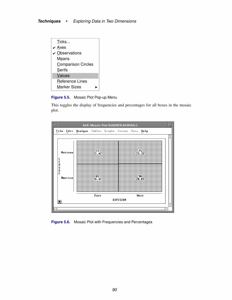
You can add more information to the mosaic plot by displaying frequency counts andpercentages.
=⇒ Choose Values from the pop-up menu.
89
Techniques � Exploring Data in Two Dimensions
Ticks...� Axes� Observations
MeansComparison CirclesSerifsValuesReference LinesMarker Sizes �
Figure 5.5. Mosaic Plot Pop-up Menu
This toggles the display of frequencies and percentages for all boxes in the mosaicplot.
Figure 5.6. Mosaic Plot with Frequencies and Percentages
90

Scatter Plots
Scatter PlotsScatter plots show the relationship between two variables. For example, you canexplore the relationship between students’ scores on standardized tests of math andverbal ability by following these steps.
=⇒ Open the GPA data set.
=⇒ Select both the SATM and SATV variables.To select both variables, press the mouse button on SATM, move the mouse to SATV,then release the mouse button.
Figure 5.7. Selecting Two Variables
=⇒ Choose Analyze:Scatter Plot ( Y X ).
File Edit Analyze Tables Graphs Curves Vars HelpHistogram/Bar Chart ( Y )Box Plot/Mosaic Plot ( Y )Line Plot ( Y X )Scatter Plot ( Y X )Contour Plot ( Z Y X )Rotating Plot ( Z Y X )Distribution ( Y )Fit ( Y X )Multivariate ( Y X )
Figure 5.8. Creating a Scatter Plot
91

Techniques � Exploring Data in Two Dimensions
This creates a scatter plot, as shown in Figure 5.9. Note that the first variable youselected, SATM, is plotted on the Y axis, while the second variable selected, SATV,is plotted on the X axis.
Figure 5.9. Scatter Plot Each marker in the scatter plot represents an observation,and its position shows the values of SATM and SATV for that observation. You canclick on any marker to determine which observation it represents.
=⇒ Click on a marker.This selects the marker and displays its observation number. For example, observa-tion 20 is selected in Figure 5.10.
Clicking also selects the observation in the data window because windows are linkedto their data. Any change to the data is automatically reflected in all windows.
92

Scatter Plots
Figure 5.10. Selecting Observations in Multiple Windows
=⇒ Double-click on a marker.This selects the marker and displays the Examine Observation dialog. You can ex-amine the values of all variables for the selected observation.
Figure 5.11. Examine Observations Dialog
93

Techniques � Exploring Data in Two Dimensions
Scatter Plot MatricesA scatter plot matrix shows relationships among several variables taken two at a time.Scatter plot matrices can reveal a wealth of information, including dependencies,clusters, and outliers.
You can explore the relationships among students’ college grade point averages andstandardized test scores by following these steps.
=⇒ Select SATM, SATV, and GPA in the data window.To select these variables, use noncontiguous selection. On most hosts, you can usethe Ctrl key to make a noncontiguous selection, as described in Chapter 1, “GettingStarted.”
Figure 5.12. Selecting Three Variables
=⇒ Choose Analyze:Scatter Plot ( Y X ).This creates the scatter plot matrix shown in Figure 5.13.
94

Scatter Plot Matrices
Figure 5.13. Scatter Plot Matrix
The plots are organized in a matrix of all pairwise combinations of the variablesSATM, SATV, and GPA. Plots are arranged so that adjacent plots share a commonaxis. All plots in a row share a common Y axis, and all plots in a column share acommon X axis. The diagonal cells of the matrix contain the names of the variablesand their minimum and maximum values.
=⇒ Click on a marker in any scatter plot.The observation label is displayed and corresponding markers in all scatter plots areselected, as shown in Figure 5.14. This enables you to explore observations to see,for example, if an outlier in one scatter plot is an outlier in other scatter plots.
95

Techniques � Exploring Data in Two Dimensions
Figure 5.14. Selecting Observations in a Scatter Plot Matrix
Brushing Observations
Brushing is a dynamic method of selecting groups of observations simultaneously inall views of the data. Brushing is an effective technique for investigating multivariatedata (Becker, Cleveland, and Wilks, 1987). For example, you can use brushing tofind students who performed poorly on their SATs but still had relatively high gradepoint averages.
=⇒ Select observations with low values for SATM and SATV.Press the mouse button down, move the mouse, then release the mouse button tocreate a rectangle in the plot of SATM by SATV. This rectangle is your brush. Theobservations in the rectangle are selected. Notice that corresponding observations arealso highlighted in the other plots.
96

Scatter Plot Matrices
Figure 5.15. Brushing in a Scatter Plot Matrix
Examine one of the scatter plots involving GPA. Several of the selected observationshave GPA values of 4 or above, indicating that SAT scores are not always goodindicators of success in the school’s computer science program.
You can change the size of your brush to select different observations.
=⇒ Place the cursor on the corner of the brush and drag the cursor.The brush changes size as you drag until you release the mouse button.
97

Techniques � Exploring Data in Two Dimensions
Figure 5.16. Changing the Size of a Brush
You can move the brush to select observations dynamically.
=⇒ Place the cursor in the brush and drag the brush across the plot.As observations enter the brush they become selected, and as they leave they aredeselected. The corresponding observations in all the other scatter plots are alsoselected and deselected as you move the brush.
If you release the mouse button while you are moving the brush, the brush continuesto move. Throwing the brush in this way removes the burden of eye-hand coordina-tion, enabling you to take your eyes off the brush and more easily see its effect inother plots.
You can also brush with extended selection. This is a convenient way to select a set ofobservations that does not fit the rectangular shape of the brush. Extended selection,
98

Scatter Plot Matrices
described in Chapter 1, uses the Shift key on most hosts.
=⇒ Using extended selection, create another brush.The observations that were in the previous brush remain selected.
=⇒ Using extended selection, move the brush.Observations become selected as they enter the brush, but they are not deselectedwhen they leave the brush, as illustrated in Figure 5.17.
Figure 5.17. Brushing with Extended Selection
=⇒ To remove the brush, click in any empty area of the window.Clicking on nothing deselects all selected objects.
⊕ Related Reading: Scatter Plots, Chapter 35.
99
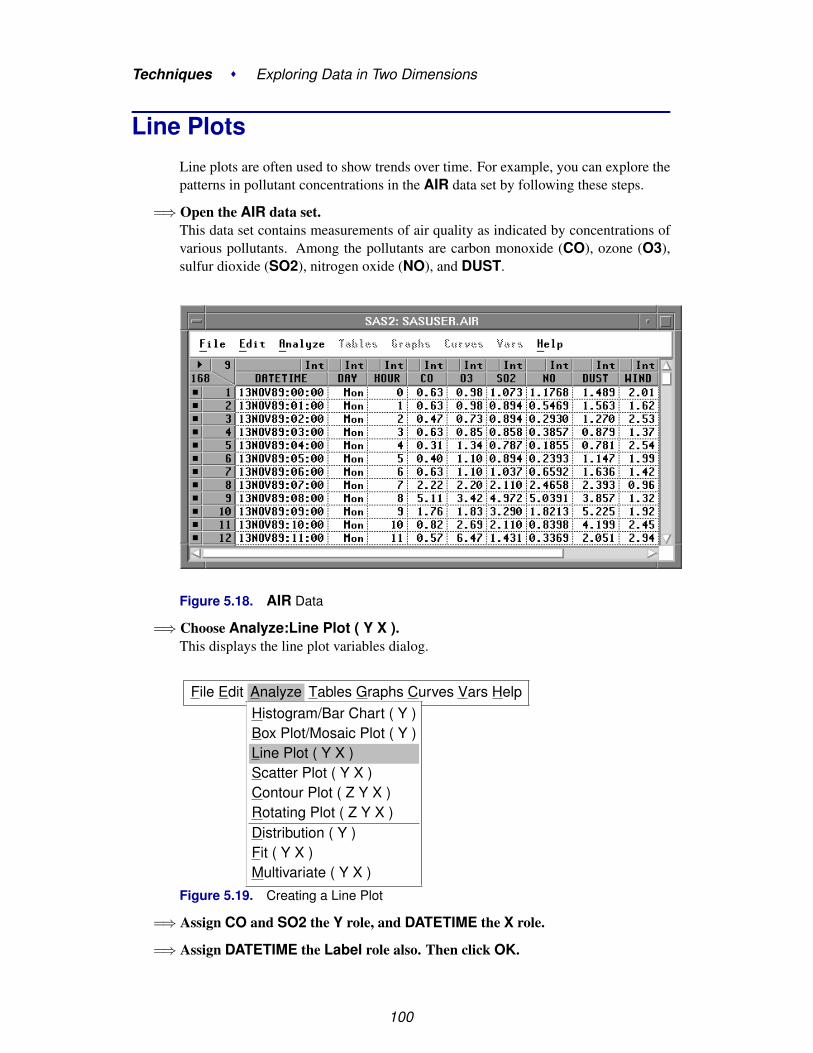
Techniques � Exploring Data in Two Dimensions
Line PlotsLine plots are often used to show trends over time. For example, you can explore thepatterns in pollutant concentrations in the AIR data set by following these steps.
=⇒ Open the AIR data set.This data set contains measurements of air quality as indicated by concentrations ofvarious pollutants. Among the pollutants are carbon monoxide (CO), ozone (O3),sulfur dioxide (SO2), nitrogen oxide (NO), and DUST.
Figure 5.18. AIR Data
=⇒ Choose Analyze:Line Plot ( Y X ).This displays the line plot variables dialog.
File Edit Analyze Tables Graphs Curves Vars HelpHistogram/Bar Chart ( Y )Box Plot/Mosaic Plot ( Y )Line Plot ( Y X )Scatter Plot ( Y X )Contour Plot ( Z Y X )Rotating Plot ( Z Y X )Distribution ( Y )Fit ( Y X )Multivariate ( Y X )
Figure 5.19. Creating a Line Plot
=⇒ Assign CO and SO2 the Y role, and DATETIME the X role.
=⇒ Assign DATETIME the Label role also. Then click OK.
100

Line Plots
Figure 5.20. Assigning Line Plot Variables
This creates a line plot with one line for each Y variable.
Figure 5.21. Line Plot
To associate lines with variables, simply select the variable.
=⇒ Click on the SO2 variable.This highlights both the variable and the corresponding line.
101

Techniques � Exploring Data in Two Dimensions
Figure 5.22. SO2 Selected
By clicking on the variables, you can see that the SO2 concentration rises to a peakon the 17th of November and then falls. The CO concentration shows a regularpattern of peaks and valleys up until the 16th; then it falls also.
To show more information, you can add observation markers to the line plot.
=⇒ Click on the menu button in the lower left corner of the plot. ChooseObservations.
Ticks...� Axes
ObservationsReference LinesMarker Sizes �
Figure 5.23. Line Plot Pop-up Menu
This displays the line plot with observation markers.
102
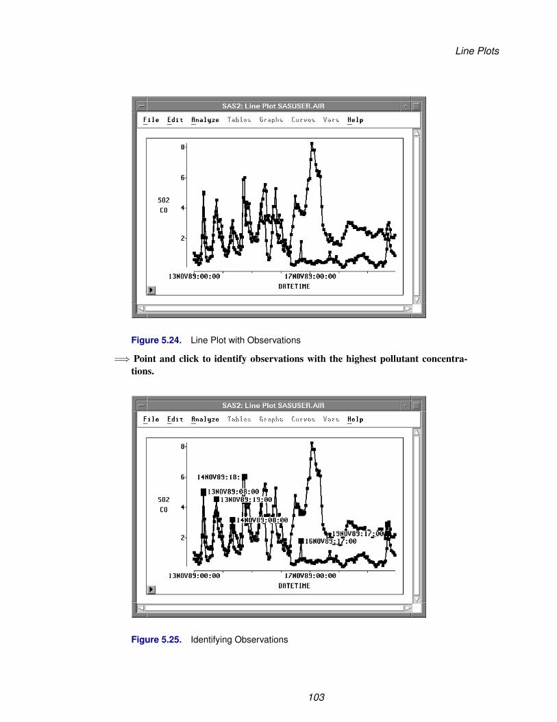
Line Plots
Figure 5.24. Line Plot with Observations
=⇒ Point and click to identify observations with the highest pollutant concentra-tions.
Figure 5.25. Identifying Observations
103

Techniques � Exploring Data in Two Dimensions
Most of the peaks for CO occur in the morning and evening, around hours 08:00 or18:00. Carbon monoxide pollution is often caused by automobiles, so these peaksmight be caused by rush-hour traffic.
The SO2 concentration follows a different pattern. Sulfur dioxide is a pollutant givenoff by power plants. Perhaps there was a peak demand for electricity on the 17th.
The drop in pollutants after the 17th can be partly explained by noting that the 18thand 19th were Saturday and Sunday. The weekend eliminates rush-hour traffic pat-terns. However, the CO level dropped on the 16th also, which was Thursday. Thereis an additional factor at work here.
=⇒ Choose Edit:Windows:Renew to re-create the line plot.
=⇒ Add WIND to the Y variable list. Then click OK.
Figure 5.26. Adding WIND Variable
=⇒ In the line plot, click on the WIND variable.
104
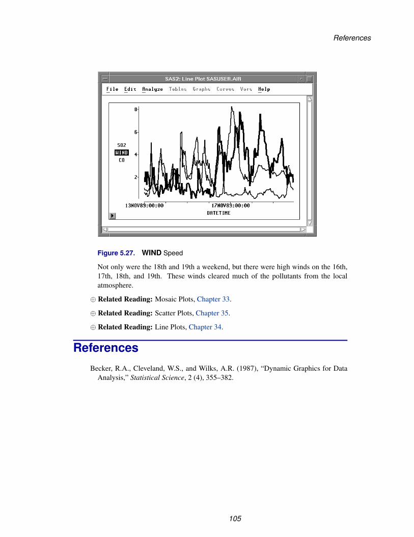
References
Figure 5.27. WIND Speed
Not only were the 18th and 19th a weekend, but there were high winds on the 16th,17th, 18th, and 19th. These winds cleared much of the pollutants from the localatmosphere.
⊕ Related Reading: Mosaic Plots, Chapter 33.
⊕ Related Reading: Scatter Plots, Chapter 35.
⊕ Related Reading: Line Plots, Chapter 34.
ReferencesBecker, R.A., Cleveland, W.S., and Wilks, A.R. (1987), “Dynamic Graphics for Data
Analysis,” Statistical Science, 2 (4), 355–382.
105

Techniques � Exploring Data in Two Dimensions
106
Chapter 6Exploring Data in Three Dimensions
Chapter Contents
ROTATING PLOTS . . . . . . . . . . . . . . . . . . . . . . . . . . . . . . . 110
ROTATING PLOT WITH FITTED SURFACE . . . . . . . . . . . . . . . . 116
CONTOUR PLOTS . . . . . . . . . . . . . . . . . . . . . . . . . . . . . . . 118

Techniques � Exploring Data in Three Dimensions
108

Chapter 6Exploring Data in Three Dimensions
SAS/INSIGHT software provides rotating plots, surface plots, and contour plots forexploring data in three dimensions. A rotating plot is a three-dimensional scatterplot, so it shows a graphic representation of the relationship among three intervalvariables. A surface plot is a rotating plot with a surface that models a third variableas a function of two other variables. A contour plot shows how the values of onevariable may depend on the values of two other variables.
Figure 6.1. A Rotating Plot, Surface Plot, and Contour Plot

Techniques � Exploring Data in Three Dimensions
Rotating PlotsUsing rotation you can obtain unique views into the data that can reveal structure notvisible with static plots or not detectable with analytic methods.
Follow these steps to explore the relationships among students’ SAT verbal scores,SAT math scores, and college grade point averages.
=⇒ Open the GPA data set.
=⇒ Choose Analyze:Rotating Plot ( Z Y X ).
File Edit Analyze Tables Graphs Curves Vars HelpHistogram/Bar Chart ( Y )Box Plot/Mosaic Plot ( Y )Line Plot ( Y X )Scatter Plot ( Y X )Contour Plot ( Z Y X )Rotating Plot ( Z Y X )Distribution ( Y )Fit ( Y X )Multivariate ( Y X )
Figure 6.2. Creating a Rotating Plot
A rotating plot variables dialog appears, as shown in Figure 6.3. The ( Z Y X ) in themenu indicates that Z, Y, and X variables are required to create the rotating plot.
=⇒ Select GPA in the variables list at the left. Then click Z.This assigns the Z role to the GPA variable. Using the same method, assign SATMthe Y role and SATV the X role.
Figure 6.3. Rotating Plot Variables Dialog
110

Rotating Plots
=⇒ Click OK to create a rotating plot.The GPA axis is not visible when the rotating plot first appears on the display becausethe Z dimension is projected into the X-Y plane.
Figure 6.4. Rotating Plot
SAS/INSIGHT software provides both control buttons and a hand tool to rotate theplot. First, examine the control buttons at the left of the plot. The top two buttonsrotate the plot up and down. The next two buttons rotate the plot left and right. Thelast two buttons rotate the plot clockwise and counter-clockwise. You can use thesebuttons by clicking, pressing, Shift-clicking, and Ctrl-clicking.
=⇒ Click the top rotation button and release it.The plot rotates a small increment and stops when you release the button.
=⇒ Press the clockwise rotation button and hold it down.The plot rotates clockwise as long as you hold the button down.
=⇒ Press the Shift key and click any of the buttons.The plot rotates continuously until you click another button.
=⇒ Press the Ctrl key and click any of the buttons.This also rotates the plot continuously until you click another button.
Below the directional buttons is a slider to control the speed of rotation. When theslider is at the top, rotation is at maximum speed.
=⇒ Drag the slider, then try the control buttons again to rotate at different speeds.
111

Techniques � Exploring Data in Three Dimensions
Figure 6.5. Slider at Maximum
The buttons offer precise control of rotation, but the hand tool offers greater flexibil-ity. Using the hand tool, you can rotate about any axis.
=⇒ Choose Edit:Windows:Tools to display the tools window.
Figure 6.6. Tools Window
=⇒ Click the Hand tool at the top of the Tools window.
112

Rotating Plots
The cursor changes to a hand.
=⇒ Click and drag the hand in the rotating plot.
When you use the hand tool, the plot acts as a freely rotating sphere. When you clickwith the hand, the plot rotates a small increment. When you drag the hand, the plotfollows your motion. The plot rotates as long as you press the mouse button and holdit down. If you release the button while you are dragging the hand, the plot continuesrotating in the direction you were dragging.
You can use the hand without displaying the Tools window. The hand is active ineach corner of the plot.
=⇒ Click the Arrow tool at the top of the Tools window.The cursor changes to an arrow.
=⇒ Move the Arrow tool to any corner of the rotating plot.The cursor changes to a hand. Click or drag the hand to rotate the plot.
Figure 6.7. Hand Tool
=⇒ Click on the button in the lower left corner of the plot.This calls up the rotating plot pop-up menu. You can customize the appearance of therotating plot with the choices on this menu.
=⇒ Choose Cube.
113

Techniques � Exploring Data in Three Dimensions
Ticks...Axes �
� ObservationsRaysCubeDepthColor BlendingDrawing Modes �
Marker Sizes �
Figure 6.8. Rotating Plot Pop-up Menu
This draws a cube around the point cloud. The cube shows the range of the data andaids in maintaining visual orientation.
Figure 6.9. Rotating Plot with Bounding Cube
=⇒ Choose Depth from the pop-up menu.This draws distant markers smaller than near markers to serve as a visual cue fordepth perception.
114

Rotating Plots
Figure 6.10. Depth Cueing
Both the Cube and the Depth choices serve as toggles, so you can choose themagain to remove the cube or to return all markers to the same size. You can use otherchoices on the pop-up menu to toggle the display of observations and rays and to setticks, axes, and marker sizes.
You can create a matrix of rotating plots just as you created a matrix of scatter plotsin the preceding chapter. If you select more than three variables in the data windowand then choose Analyze:Rotating Plot ( Z Y X ), you create a matrix containingone rotating plot for every unique combination of three variables.
You can also identify observations in rotating plots just as in other plots. Click onceon an observation marker to select it and to see its label. Double-click on an observa-tion marker to display the examine observations dialog.
⊕ Related Reading: Rotating Plots, Chapter 37.
115

Techniques � Exploring Data in Three Dimensions
Rotating Plot with Fitted SurfaceWhen you suspect that the values of one variable may be predicted by the values oftwo other variables, you can choose to fit a response surface to your data.
Follow these steps to explore how dust concentration varies with the wind speed andwith the time of day in the AIR data set.
=⇒ Open the AIR data set.
=⇒ Choose Analyze:Rotating Plot ( Z Y X ).
File Edit Analyze Tables Graphs Curves Vars HelpHistogram/Bar Chart ( Y )Box Plot/Mosaic Plot ( Y )Line Plot ( Y X )Scatter Plot ( Y X )Contour Plot ( Z Y X )Rotating Plot ( Z Y X )Distribution ( Y )Fit ( Y X )Multivariate ( Y X )
Figure 6.11. Creating a Rotating Plot with Fitted Surface
A rotating plot variables dialog appears, as shown in Figure 6.12.
=⇒ Select DUST in the variables list at the left. Then click Z.This assigns the Z role to the DUST variable. Similarly, assign HOUR the Y roleand WIND the X role.
Figure 6.12. Rotating Plot Variables Dialog
=⇒ Click Output to display the Output dialog, as shown in Figure 6.13.
116

Rotating Plot with Fitted Surface
Figure 6.13. Output Dialog for Rotating Plot
=⇒ Select Fit Surface and click OK.
=⇒ Click Method to display the Method dialog, as shown in Figure 6.14.
Figure 6.14. Method Dialog for Rotating Plot
=⇒ Select Fit:Thin-Plate Smoothing Spline and click OK.
=⇒ Click OK to create a surface plot.
=⇒ Click on the menu button in the lower left corner of the plot.Choose Drawing Modes:Smooth Color and Axes:At Minima.
117

Techniques � Exploring Data in Three Dimensions
=⇒ Rotate the plot as described in the previous section.You see a surface that models the response of dust concentration as a function of thewind speed and the time of day.
Figure 6.15. Rotating Plot with Fitted Surface
Contour PlotsThe contour plot provides an alternative graphical method for examining the vari-ations of a response surface. The contour plot displays the geometric features ofthe response surface as a family of contours or level sets lying in the domain of thepredictor variables.
If the AIR data set is not already open, open it now.
=⇒ Choose Analyze:Contour Plot ( Z Y X ).
File Edit Analyze Tables Graphs Curves Vars HelpHistogram/Bar Chart ( Y )Box Plot/Mosaic Plot ( Y )Line Plot ( Y X )Scatter Plot ( Y X )Contour Plot ( Z Y X )Rotating Plot ( Z Y X )Distribution ( Y )Fit ( Y X )Multivariate ( Y X )
Figure 6.16. Creating a Contour Plot
118

Contour Plots
A contour plot variables dialog appears, as shown in Figure 6.17.
=⇒ Assign the Z role to the DUST variable, assign HOUR the Y role, and assignWIND the X role.
Figure 6.17. Contour Plot Variables Dialog
=⇒ Click Method to display the Method dialog.This dialog looks exactly like the Method dialog for the rotating plot, as shown inFigure 6.14.
=⇒ Select Fit:Thin-Plate Smoothing Spline and click OK.
=⇒ Click OK to create a contour plot.
=⇒ Click on the menu button in the lower left corner of the plot. ChooseObservations.
119

Techniques � Exploring Data in Three Dimensions
Figure 6.18. Contour Plot
By default, the contour lines of the response surface are evenly spaced in the units ofthe response variable. For this example, each contour represents about 1.3 units ofchange in the dust concentration. Note that regions where the contour lines are closetogether indicate regions in which small changes in the wind speed or the time of daywill lead to relatively large changes in the modeled response for dust.
The response model indicates that peak dust concentrations for this data primarilyoccur when there are only gentle winds during the mid-morning and late afternoon.To see if this prediction qualitatively fits the AIR data set, you can examine the ob-servations with high dust values.
=⇒ Select Edit:Observations:Find .The Find Observations dialog appears.
120

Contour Plots
Figure 6.19. Find Observations dialog
=⇒ Select DUST in the left-hand column, the greater-than test (>) in the middlecolumn, and the value 6.763 in the right-hand column.This selects all observations that have dust values greater than 6.763.
Figure 6.20. Selecting High DUST Values
121

Techniques � Exploring Data in Three Dimensions
All but one of the selected observations occur in the mid-morning or late afternoon ondays with light winds. However, note that there are also observations in those regionsthat have small dust concentration values.
Consult Chapter 39, “Fit Analyses,” to determine whether a model response surfaceprovides a good quantitative fit to your data.
⊕ Related Reading: Contour Plots, Chapter 36.
⊕ Related Reading: Fit Analysis, Chapter 39.
122
Chapter 7Adjusting Axes and Ticks
Chapter Contents
ADJUSTING TICKS . . . . . . . . . . . . . . . . . . . . . . . . . . . . . . 126
ADJUSTING 2D AXES . . . . . . . . . . . . . . . . . . . . . . . . . . . . . 129
ADJUSTING 3D AXES . . . . . . . . . . . . . . . . . . . . . . . . . . . . . 131

Techniques � Adjusting Axes and Ticks
124

Chapter 7Adjusting Axes and Ticks
With SAS/INSIGHT software, you have control over the appearance of axes. In allgraphs, you can specify major and minor tick marks. In two-dimensional graphs, youcan adjust axis position dynamically. In three-dimensional graphs, you can place axesat the center or the minimum of the data range.
Figure 7.1. Adjusting Histogram Ticks

Techniques � Adjusting Axes and Ticks
Adjusting TicksMajor tick marks have an associated tick label, if space permits. Minor tick marks aresmaller marks evenly spaced between the major tick marks. By default, the numberof minor tick marks is 0.
You can change the default tick marks in a histogram of verbal SAT scores by follow-ing these steps.
=⇒ Open the GPA data set and create a histogram of verbal SAT scores.
=⇒ Select the variable on the axis of interest.
Figure 7.2. Selecting Variable SATV
=⇒ Click on the button in the lower left corner to display the histogram pop-upmenu.Choose Ticks from the pop-up menu to display the Ticks dialog.
Ticks...� Axes� Observations
Values
Figure 7.3. Histogram Pop-up Menu
Figure 7.4 shows the Ticks dialog for the SATV axis in the histogram.
126

Adjusting Ticks
Figure 7.4. Ticks Dialog
=⇒ Change the values in the Ticks dialog.Set the first tick to 200, the last tick to 800, the axis minimum to 175, and the axismaximum to 825.
Figure 7.5. Changing Ticks
=⇒ Click OK to redraw the histogram with the new tick specifications.
127

Techniques � Adjusting Axes and Ticks
Figure 7.6. Histogram with New Ticks
You can use the Ticks dialog similarly to scale axes in all other two-dimensional andthree-dimensional graphs.
128

Adjusting 2D Axes
Adjusting 2D AxesYou can adjust horizontal and vertical axes in all two-dimensional graphs. For exam-ple, Figure 7.7 shows tick labels truncated because the axis does not have space toshow them completely. To increase the axis space, point to the axis with the mouse.Note that the cursor changes to a hand when it is positioned over the axis.
Figure 7.7. Adjusting an Axis
Press the mouse button and drag the axis to a new position. When you release themouse button, the axis moves to its new position.
129

Techniques � Adjusting Axes and Ticks
Figure 7.8. Axis at New Position
130
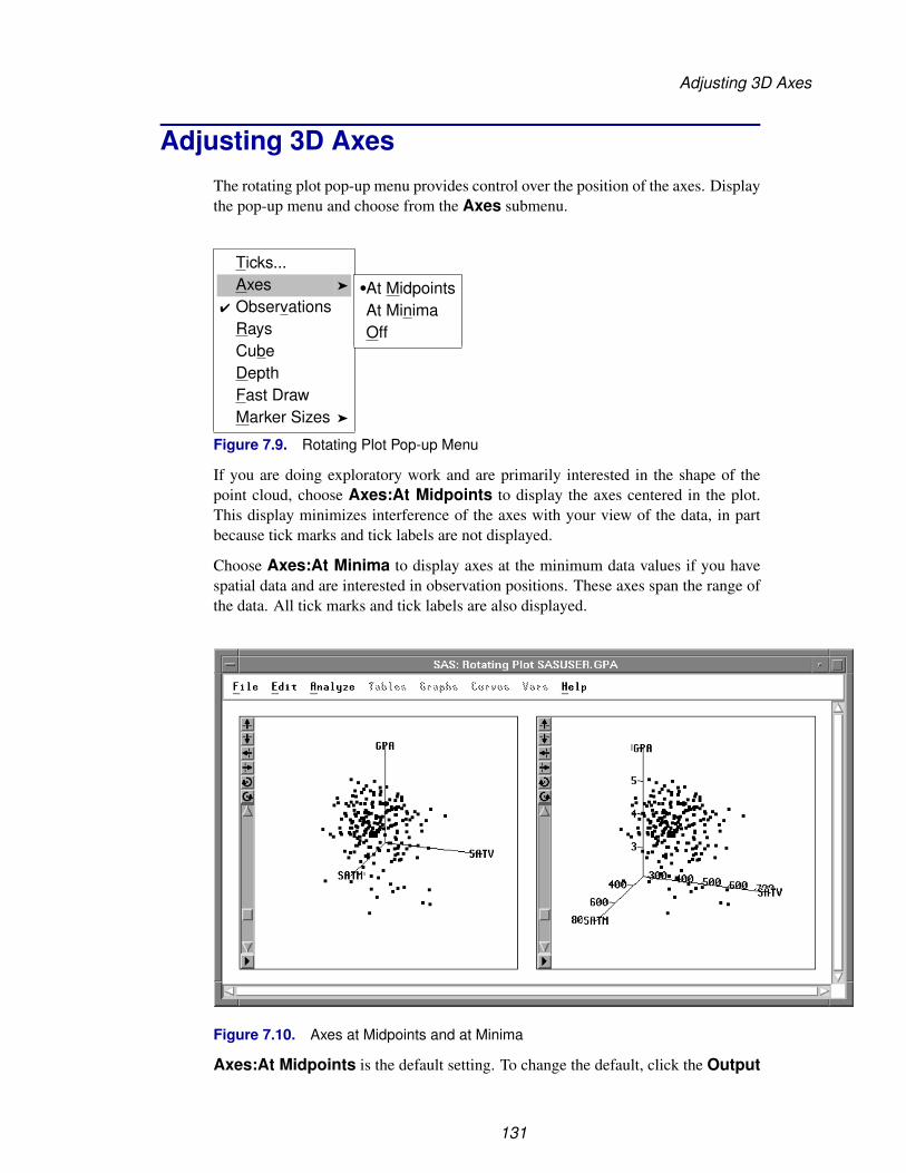
Adjusting 3D Axes
Adjusting 3D AxesThe rotating plot pop-up menu provides control over the position of the axes. Displaythe pop-up menu and choose from the Axes submenu.
Ticks...Axes �
� ObservationsRaysCubeDepthFast DrawMarker Sizes �
�At MidpointsAt MinimaOff
Figure 7.9. Rotating Plot Pop-up Menu
If you are doing exploratory work and are primarily interested in the shape of thepoint cloud, choose Axes:At Midpoints to display the axes centered in the plot.This display minimizes interference of the axes with your view of the data, in partbecause tick marks and tick labels are not displayed.
Choose Axes:At Minima to display axes at the minimum data values if you havespatial data and are interested in observation positions. These axes span the range ofthe data. All tick marks and tick labels are also displayed.
Figure 7.10. Axes at Midpoints and at Minima
Axes:At Midpoints is the default setting. To change the default, click the Output
131

Techniques � Adjusting Axes and Ticks
button in the Rotating Plot Variables dialog and set the Axes:At Minima option.Choose File:Save:Options to save your options.
132
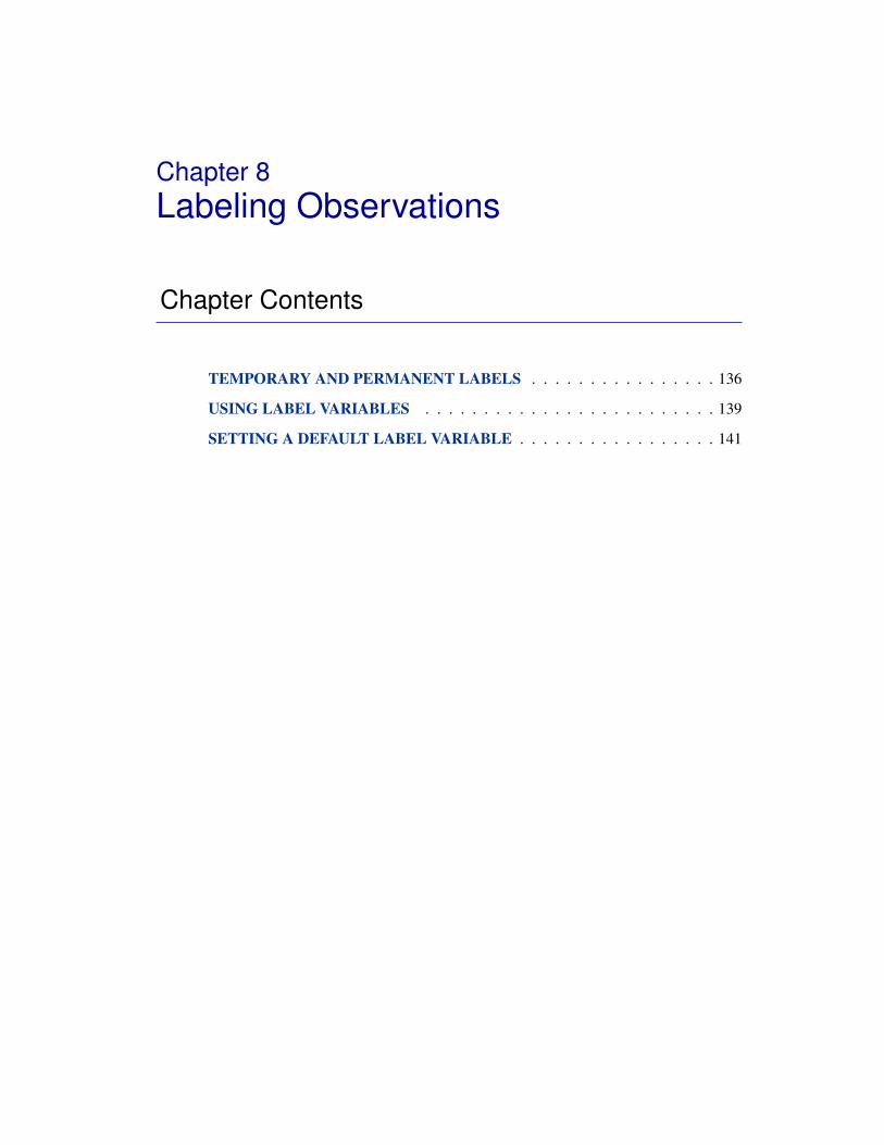
Chapter 8Labeling Observations
Chapter Contents
TEMPORARY AND PERMANENT LABELS . . . . . . . . . . . . . . . . 136
USING LABEL VARIABLES . . . . . . . . . . . . . . . . . . . . . . . . . 139
SETTING A DEFAULT LABEL VARIABLE . . . . . . . . . . . . . . . . . 141

Techniques � Labeling Observations
134

Chapter 8Labeling Observations
Labels identify observations in plots. You can label observations by number or by thevalue of a variable. You can assign temporary or permanent labels.
Figure 8.1. Labeling Observations
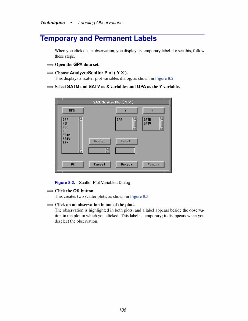
Techniques � Labeling Observations
Temporary and Permanent LabelsWhen you click on an observation, you display its temporary label. To see this, followthese steps.
=⇒ Open the GPA data set.
=⇒ Choose Analyze:Scatter Plot ( Y X ).This displays a scatter plot variables dialog, as shown in Figure 8.2.
=⇒ Select SATM and SATV as X variables and GPA as the Y variable.
Figure 8.2. Scatter Plot Variables Dialog
=⇒ Click the OK button.This creates two scatter plots, as shown in Figure 8.3.
=⇒ Click on an observation in one of the plots.The observation is highlighted in both plots, and a label appears beside the observa-tion in the plot in which you clicked. This label is temporary; it disappears when youdeselect the observation.
136

Temporary and Permanent Labels
Figure 8.3. Temporary Label
You can turn this label into a permanent label.
=⇒ Choose Edit:Observations:Label in Plots.This labels the observation in all plots, and the label remains if you deselect theobservation.
File Edit Analyze Tables Graphs Curves Vars Help
Windows �
Variables �
Observations �
Formats �
CopyDelete
Find...Examine...Label in PlotsUnLabel in PlotsShow in GraphsHide in GraphsInclude in CalculationsExclude in CalculationsInvert Selection
Figure 8.4. Edit: Observations Menu
137

Techniques � Labeling Observations
Figure 8.5. Permanently Labeled Observations
Notice in the data window that the observation is displayed with a picture of a label.This indicates that a label will always be displayed for this observation in all plots.
If you change your mind, you can remove the permanent label by choosingEdit:Observations:UnLabel in Plots.
138

Using Label Variables
Using Label VariablesSAS/INSIGHT software shows the observation number as the label by default. Youcan choose a variable to supply the label text by specifying a label variable.
=⇒ Choose Edit:Windows:Renew to redisplay the scatter plot variables dialog.
File Edit Analyze Tables Graphs Curves Vars Help
Windows �
Variables �
Observations �
Formats �
CopyDelete
Renew...Copy WindowAlignAnimate...FreezeSelect AllToolsFontsDisplay Options...Window Options...Graph Options...
Figure 8.6. Edit:Windows Menu
=⇒ In the dialog, select SEX and then click the Label button.
Figure 8.7. Assigning Label Role
139

Techniques � Labeling Observations
=⇒ Click the OK button.
Now the value of SEX, instead of the observation number, labels the observation.
Figure 8.8. Observation Labeled by SEX
140

Setting a Default Label Variable
Setting a Default Label VariableIn addition to specifying label variables for individual plots, you can specify a labelvariable that will automatically be used in all future plots.
=⇒ Click on the upper left corner of the variable SEX in the data window.This displays a pop-up menu. Choose Label from the pop-up menu.
GroupLabelFreqWeight
Figure 8.9. Variable Role Pop-up Menu
Now SEX is the default label variable, and future plots will use SEX for labels. In thedata window, the word Label appears above the variable name, as shown in Figure8.10.
Figure 8.10. Label Variable Role
⊕ Related Reading: Variable Roles, Chapter 31, “Data Windows.”
141

Techniques � Labeling Observations
142

Chapter 9Hiding Observations
Chapter Contents
HIDING INDIVIDUAL OBSERVATIONS . . . . . . . . . . . . . . . . . . 146
TOGGLING THE DISPLAY OF OBSERVATIONS . . . . . . . . . . . . . 149
SLICING . . . . . . . . . . . . . . . . . . . . . . . . . . . . . . . . . . . . . 153

Techniques � Hiding Observations
144

Chapter 9Hiding Observations
You can hide observations to prevent them from appearing in graphs. You can togglethe display of observations to keep them from appearing in a graph unless they areselected. You can slice observations by dynamically toggling their display. Thesetechniques are useful for adjusting the range of data displayed and for showing sub-sets of your data.
Figure 9.1. Slicing Observations
Techniques � Hiding Observations
Hiding Individual ObservationsYou can adjust the range of data displayed and show subsets of your data by hidingobservations.
† Note: Hiding observations in graphs does not exclude them from calculations. Toexclude observations from calculations, see Chapter 21, “Comparing Analyses.”
=⇒ Open the GPA data set.
=⇒ Create a scatter plot of SATM versus SATV.Use the techniques described in Chapter 5, “Exploring Data in Two Dimensions.”
=⇒ Select the two observations with values of SATM below 400.Use extended selection or drag a rectangle around both observations.
Figure 9.2. Observations Selected
=⇒ Choose Edit:Observations:Hide in Graphs.
146

Hiding Individual Observations
File Edit Analyze Tables Graphs Curves Vars Help
Windows �
Variables �
Observations �
Formats �
CopyDelete
Find...Examine...Label in PlotsUnLabel in PlotsShow in GraphsHide in GraphsInclude in CalculationsExclude in CalculationsInvert Selection
Figure 9.3. Edit: Observations Menu
This causes the selected observations to disappear from the graph. The graph rescalesautomatically. The new SATM axis starts at 400.
Figure 9.4. Observations Hidden
=⇒ Choose Find Next from the data window pop-up menu.This scrolls to the next selected observation and shows that the hidden observationhas no marker. The absence of the marker in the data window indicates that theobservation is hidden in all graphs.
147

Techniques � Hiding Observations
Figure 9.5. Data Window after Hiding Observations
=⇒ Choose Edit:Observations:Show in Graphs.
File Edit Analyze Tables Graphs Curves Vars Help
Windows �
Variables �
Observations �
Formats �
CopyDelete
Find...Examine...Label in PlotsUnLabel in PlotsShow in GraphsHide in GraphsInclude in CalculationsExclude in CalculationsInvert Selection
Figure 9.6. Edit: Observations Menu
This makes the observations visible again. The scatter plot rescales.
148

Toggling the Display of Observations
Toggling the Display of ObservationsYou can show subsets of your data by toggling the display of observations. Thiscauses observations to be displayed only when they are selected.
=⇒ Deselect all observations by clicking in any open area of a graph.
=⇒ Choose Edit:Windows:Renew to redisplay the scatter plot variables dialog.
File Edit Analyze Tables Graphs Curves Vars Help
Windows �
Variables �
Observations �
Formats �
CopyDelete
Renew...Copy WindowAlignAnimate...FreezeSelect AllToolsFontsDisplay Options...Window Options...Graph Options...
Figure 9.7. Edit:Windows Menu
=⇒ Click on GPA in the variables list and then click on the X button.This adds GPA to the X variables list.
Figure 9.8. Variable Roles Assigned
149

Techniques � Hiding Observations
=⇒ Click the OK button.This creates two scatter plots, as shown in Figure 9.9.
Figure 9.9. Scatter Plots
=⇒ Click on the button at the lower left to display the scatter plot pop-up menu.Choose Observations to turn off the display of observations in the scatter plot.
Ticks...� Axes� Observations
Reference LinesMarker Sizes �
Figure 9.10. Scatter Plot Pop-up Menu
Do the same thing for the scatter plot on the right side. All the observation markersdisappear, as shown in Figure 9.11.
150
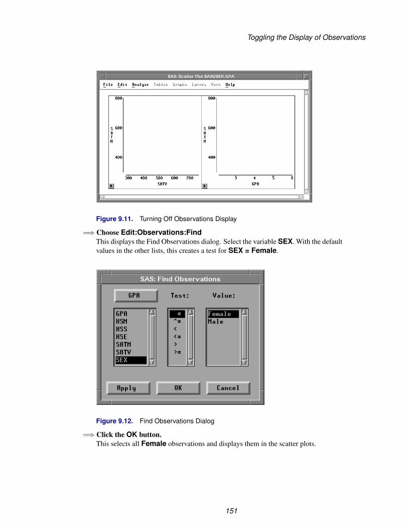
Toggling the Display of Observations
Figure 9.11. Turning Off Observations Display
=⇒ Choose Edit:Observations:FindThis displays the Find Observations dialog. Select the variable SEX. With the defaultvalues in the other lists, this creates a test for SEX = Female.
Figure 9.12. Find Observations Dialog
=⇒ Click the OK button.This selects all Female observations and displays them in the scatter plots.
151

Techniques � Hiding Observations
Figure 9.13. Female Observations
=⇒ Choose Edit:Observations:Invert Selection.Invert Selection deselects all selected observations and selects all deselected ob-servations. Now the scatter plots show all observations where SEX is Male.
Figure 9.14. Male Observations
Toggling observations in the scatter plots shows there are more females than males inthese data. The female students appear to have slightly higher scores on the mathe-matics portion of the SAT exam.
152

Slicing
SlicingSlicing is a dynamic technique for subsetting your data based on a range of values forone variable. You can create a brush both to restrict the range of values in one plot andto select observations in all plots. You can slice dynamically to explore relationshipsin more than two dimensions.
Follow these steps to see how GPA is related to the two SAT scores.
=⇒ Drag a rectangle with the mouse in the scatter plot of SATM versus GPA.This selects the observations within the rectangle and creates a rectangular brush.
=⇒ Move the brush by dragging with the mouse inside the brush.Observations that are selected by the brush become visible in both scatter plots. Thesecond plot shows the conditional distribution of the data as restricted by the positionof the brush in the first plot.
Figure 9.15. Brushing Invisible Observations
=⇒ Drag the corners of the brush to make it tall and thin.This restricts selected observations to a narrow range of values for GPA.
=⇒ Move the brush to the left and right.The scatter plot of SATM versus SATV in Figure 9.16 shows the joint distribution ofthe two SAT scores when GPA is near 4.0. By sliding the brush, you can see whetherthe distributions change significantly as GPA increases or decreases.
153

Techniques � Hiding Observations
Figure 9.16. Slicing Observations
=⇒ Use the scatter plot pop-up menu to make observations visible again.
Ticks...� Axes� Observations
Reference LinesMarker Sizes �
Figure 9.17. Scatter Plot Pop-up Menu
154

Chapter 10Marking Observations
Chapter Contents
MARKING INDIVIDUAL OBSERVATIONS . . . . . . . . . . . . . . . . . 158
MARKING BY NOMINAL VARIABLE . . . . . . . . . . . . . . . . . . . 160
MARKING BY INTERVAL VARIABLE . . . . . . . . . . . . . . . . . . . 161
ADJUSTING MARKER SIZE . . . . . . . . . . . . . . . . . . . . . . . . . 162

Techniques � Marking Observations
156

Chapter 10Marking Observations
You can assign markers to use for displaying observations in box plots, scatter plots,and rotating plots. The markers appear with each observation in the data window.You can assign markers for observations you select, and you can let SAS/INSIGHTsoftware assign markers automatically based on the value of a variable. You cancontrol the size of the markers in any plot.
Figure 10.1. Marking Observations

Techniques � Marking Observations
Marking Individual ObservationsYou can set the marker shape for any observations you select.
=⇒ Open the GPA data set.
=⇒ Create a scatter plot of SATM versus SATV.Use the techniques described in Chapter 5, “Exploring Data in Two Dimensions.”
=⇒ Click on an observation to select it.
Figure 10.2. Scatter Plot
158

Marking Individual Observations
=⇒ Choose Edit:Windows:Tools.This toggles the display of the tools window, as shown in Figure 10.4.
File Edit Analyze Tables Graphs Curves Vars Help
Windows �
Variables �
Observations �
Formats �
CopyDelete
Renew...Copy WindowAlignAnimate...FreezeSelect AllToolsFontsDisplay Options...Window Options...Graph Options...
Figure 10.3. Edit:Windows Menu
=⇒ Click on the upward-pointing triangle in the tools window.This changes the marker for the selected observation from a square to a triangle. Themarker also changes to a triangle in the data window and in any other windows.
Figure 10.4. Changing a Marker
Similarly, you can select a group of observations in a brush and assign markers for thegroup. Markers provide a convenient way to track observations across multiple win-dows. They also enable you to keep track of observations when they are deselected.
159

Techniques � Marking Observations
Marking by Nominal VariableYou can assign markers automatically based on the value of a nominal variable. Thisis a good way to distinguish quickly between groups of observations.
=⇒ Select SEX in the data window.
=⇒ Click on the multiple markers button at the bottom of the markers window.SAS/INSIGHT software assigns a different marker for each value of the nominalvariable. In this case, observations with a value of MALE are displayed with crosses,and observations with a value of FEMALE are displayed with squares.
Figure 10.5. Assigning Markers by SEX
160

Marking by Interval Variable
Marking by Interval VariableYou can also assign markers based on the value of an interval variable.
=⇒ Select GPA in the data window.
=⇒ Click on the multiple markers button at the bottom of the markers window.SAS/INSIGHT software assigns three markers to the observations depending on thevalue of GPA for that observation. Observations with values in the upper third of therange of GPA are assigned upward-pointing triangles. Observations with values inthe middle third of the range of GPA are assigned squares. Observations with valuesin the lower third of the range of GPA are assigned downward-pointing triangles.These markers show a rough picture of the correlation between grade point averageand SAT scores.
Figure 10.6. Assigning Markers by GPA
161

Techniques � Marking Observations
Adjusting Marker SizeYou can adjust marker size by using the scatter plot pop-up menu.
=⇒ Click on the button in the lower left corner of the scatter plot.Choose Marker Sizes:1. This assigns markers their minimum size.
Ticks...� Axes� Observations
Marker Sizes � 12345
�678Size to Fit
Figure 10.7. Marker Sizes Menu
Figure 10.8. Markers at Minimum Size
162

Adjusting Marker Size
=⇒ Choose Marker Sizes:8 from the pop-up menu.This assigns markers their maximum size.
Figure 10.9. Markers at Maximum Size
=⇒ Choose Marker Sizes:Size to Fit from the pop-up menu.This assigns markers their default size.
163

Techniques � Marking Observations
Figure 10.10. Default Marker Size
164

Adjusting Marker Size
The default marker size is determined by the size of your graph, the resolution ofyour display, and the setting of the Marker Size option. You can set the MarkerSize option as described in Chapter 29, “Configuring SAS/INSIGHT Software.”
† Note: For large data sets, markers require plenty of memory. If your data set containshundreds of observations and your host has insufficient memory, you can improveperformance by using the default square marker for all observations.
If you have a color display, it is often clearer to distinguish observations by color.Turn to the next chapter to see how to assign colors.
165

Techniques � Marking Observations
166

Chapter 11Coloring Observations
Chapter Contents
COLORING INDIVIDUAL OBSERVATIONS . . . . . . . . . . . . . . . . 170
COLORING BY NOMINAL VARIABLE . . . . . . . . . . . . . . . . . . . 172
COLORING BY INTERVAL VARIABLE . . . . . . . . . . . . . . . . . . . 173
MULTIPLE COLOR BLENDS . . . . . . . . . . . . . . . . . . . . . . . . . 174

Techniques � Coloring Observations
168

Chapter 11Coloring Observations
You can assign the colors for displaying observations in plots. You can assign colorsfor the observations you select, and you can let SAS/INSIGHT software assign colorsautomatically based on the value of a variable.
Figure 11.1. Coloring Observations

Techniques � Coloring Observations
Coloring Individual ObservationsYou can set the color for any observations you select.
=⇒ Open the GPA data set.
=⇒ Create a scatter plot of SATM versus SATV.Use the techniques described in Chapter 5, “Exploring Data in Two Dimensions.”
=⇒ Click on an observation to select it.
Figure 11.2. Scatter Plot
170

Coloring Individual Observations
=⇒ Choose Edit:Windows:Tools.This toggles the display of the tools window, shown in Figure 11.4.
File Edit Analyze Tables Graphs Curves Vars Help
Windows �
Variables �
Observations �
Formats �
CopyDelete
Renew...Copy WindowAlignAnimate...FreezeSelect AllToolsFontsDisplay Options...Window Options...Graph Options...
Figure 11.3. Edit:Windows Menu
=⇒ Click on the red button in the tools window.This causes the selected observation to turn red. The marker also becomes red in thedata window and in any other windows.
Figure 11.4. Changing a Color
You can similarly select a group of observations in a brush and assign colors for thegroup. Colors, like markers, provide a convenient way to track observations throughmultiple windows.
171

Techniques � Coloring Observations
Coloring by Nominal VariableYou can set observation colors based on the value of a nominal variable. This is agood way to display subsets of the data.
=⇒ Click on SEX in the data window.
=⇒ Click on the large multiple colors button in the tools window.SAS/INSIGHT software automatically assigns a different color for each value of thenominal variable.
Figure 11.5. Assigning Colors by SEX
172
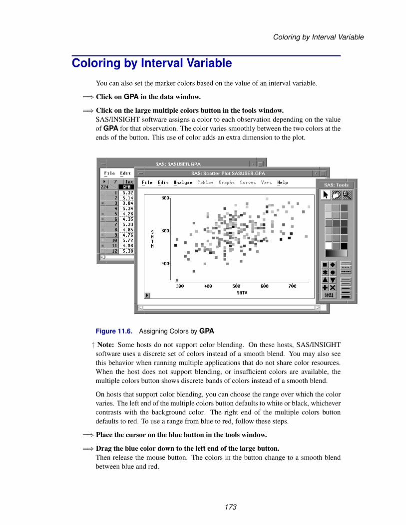
Coloring by Interval Variable
Coloring by Interval VariableYou can also set the marker colors based on the value of an interval variable.
=⇒ Click on GPA in the data window.
=⇒ Click on the large multiple colors button in the tools window.SAS/INSIGHT software assigns a color to each observation depending on the valueof GPA for that observation. The color varies smoothly between the two colors at theends of the button. This use of color adds an extra dimension to the plot.
Figure 11.6. Assigning Colors by GPA
† Note: Some hosts do not support color blending. On these hosts, SAS/INSIGHTsoftware uses a discrete set of colors instead of a smooth blend. You may also seethis behavior when running multiple applications that do not share color resources.When the host does not support blending, or insufficient colors are available, themultiple colors button shows discrete bands of colors instead of a smooth blend.
On hosts that support color blending, you can choose the range over which the colorvaries. The left end of the multiple colors button defaults to white or black, whichevercontrasts with the background color. The right end of the multiple colors buttondefaults to red. To use a range from blue to red, follow these steps.
=⇒ Place the cursor on the blue button in the tools window.
=⇒ Drag the blue color down to the left end of the large button.Then release the mouse button. The colors in the button change to a smooth blendbetween blue and red.
173

Techniques � Coloring Observations
You can also drag colors to the right side of the button to make other blends. Thislets you choose colors that have meaning for your data, for example, blue-to-red forcold-to-hot or brown-to-green for arid-to-tropical.
Multiple Color BlendsColor blending applies to all observations if none are selected. If observations areselected, color blending applies only to the selected observations. This enables youto assign multiple color blends for a single variable.
=⇒ Create a scatter plot of GPA versus SATV.
=⇒ Create a blue-to-yellow blend in the tools window.Drag the blue color to the left end of the multiple colors button, and drag the yellowcolor to the right end.
=⇒ Select observations with values of GPA less than or equal to 4.
Figure 11.7. Selecting Observations Where GPA≤4
=⇒ Click the multiple colors button.This displays a variables dialog, as shown in Figure 11.8.
174

Multiple Color Blends
Figure 11.8. Variables Dialog
=⇒ In the variables dialog, select GPA, then click OK.This assigns the blue-to-yellow blend to observations with values of GPA less thanor equal to 4.
You can use similar steps to assign a yellow-to-red blend to all observations withvalues of GPA greater than 4. To save time, select both observations and variablesusing extended selection instead of using the variables dialog.
=⇒ Create a yellow-to-red blend in the tools window.Drag the yellow color to the left end of the multiple colors button, and drag the redcolor to the right end.
=⇒ Select observations with values of GPA greater than or equal to 4.
=⇒ Using extended selection, select the variable GPA.
175

Techniques � Coloring Observations
Figure 11.9. Selecting Variable GPA and Observations Where GPA≥4
=⇒ Click the multiple colors button.This assigns the yellow-to-red blend to observations with values of GPA greater thanor equal to 4. Now all observations are assigned a color based on their value for GPA,with colors smoothly blended from blue through yellow to red.
† Note: In addition to the two-color blends described above, you can create a blendedcolor strip based on the interpolation of up to five colors.To do this, follow these steps:
• Bring up the tools window by using Edit:Window:Tools.
• Choose a color in the tools window and place the cursor over that color button.For the sake of this example, choose the white button.
• Hold down the shift key.
• Shift-drag the white button onto the large multiple colors button.
• Release the mouse button while the cursor is in the middle of the multiplecolors button. One of the existing colors that make up the multiple color buttonis replaced by white.
• You can further modify the color strip by shift-dragging other color buttons tovarying positions along the length of the multiple color button.
176

Chapter 12Examining Distributions
Chapter Contents
CREATING THE DISTRIBUTION ANALYSIS . . . . . . . . . . . . . . . 180Box Plot . . . . . . . . . . . . . . . . . . . . . . . . . . . . . . . . . . . . 183Histogram . . . . . . . . . . . . . . . . . . . . . . . . . . . . . . . . . . . 185Moments and Quantiles Tables . . . . . . . . . . . . . . . . . . . . . . . . 188
ADDING DENSITY ESTIMATES . . . . . . . . . . . . . . . . . . . . . . . 189Normal Density Curve . . . . . . . . . . . . . . . . . . . . . . . . . . . . . 189Kernel Density Curve . . . . . . . . . . . . . . . . . . . . . . . . . . . . . 191
TESTING DISTRIBUTIONS . . . . . . . . . . . . . . . . . . . . . . . . . . 194
REFERENCES . . . . . . . . . . . . . . . . . . . . . . . . . . . . . . . . . . 197

Techniques � Examining Distributions
178

Chapter 12Examining Distributions
In Chapter 4, “Exploring Data in One Dimension,” you examined distributions usingbar charts and box plots. In this chapter, you examine the distribution of an intervalvariable using graphs and statistical tables.
You can examine box plots and histograms of the data along with Moments andQuantiles tables. You can superimpose density curves on the histogram. You cancarry out tests to determine whether the data are from specific parametric distribu-tions, such as normal or lognormal.
Figure 12.1. Distribution Analysis

Techniques � Examining Distributions
Creating the Distribution AnalysisThe distribution of a variable is the pattern of variation of its numerical values (Mooreand McCabe 1989). In this example, you examine a distribution of scores on themathematics portion of the SAT exam.
=⇒ Open the GPA data set.
=⇒ Select the variable SATM by clicking on its name in the data window.
Figure 12.2. Data Window with SATM Selected
=⇒ Choose Analyze:Distribution ( Y ).
File Edit Analyze Tables Graphs Curves Vars HelpHistogram/Bar Chart ( Y )Box Plot/Mosaic Plot ( Y )Line Plot ( Y X )Scatter Plot ( Y X )Contour Plot ( Z Y X )Rotating Plot ( Z Y X )Distribution ( Y )Fit ( Y X )Multivariate ( Y X )
Figure 12.3. Analyze Menu
This creates a distribution window, as shown in Figure 12.4. A box plot, histogram,Moments table, and Quantiles table appear by default. With these graphs andtables, you can examine important features of a distribution.
180

Creating the Distribution Analysis
181

Techniques � Examining Distributions
Figure 12.4. Distribution Analysis
182
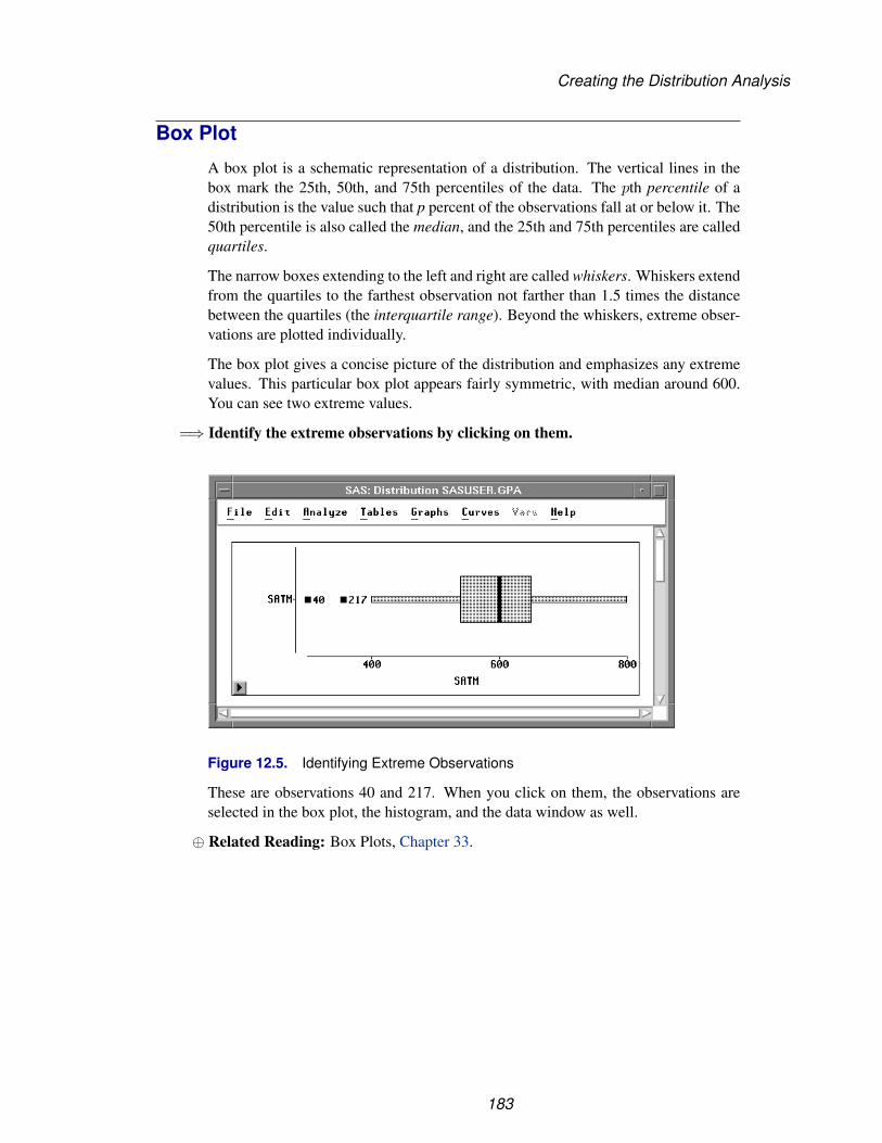
Creating the Distribution Analysis
Box Plot
A box plot is a schematic representation of a distribution. The vertical lines in thebox mark the 25th, 50th, and 75th percentiles of the data. The pth percentile of adistribution is the value such that p percent of the observations fall at or below it. The50th percentile is also called the median, and the 25th and 75th percentiles are calledquartiles.
The narrow boxes extending to the left and right are called whiskers. Whiskers extendfrom the quartiles to the farthest observation not farther than 1.5 times the distancebetween the quartiles (the interquartile range). Beyond the whiskers, extreme obser-vations are plotted individually.
The box plot gives a concise picture of the distribution and emphasizes any extremevalues. This particular box plot appears fairly symmetric, with median around 600.You can see two extreme values.
=⇒ Identify the extreme observations by clicking on them.
Figure 12.5. Identifying Extreme Observations
These are observations 40 and 217. When you click on them, the observations areselected in the box plot, the histogram, and the data window as well.
⊕ Related Reading: Box Plots, Chapter 33.
183
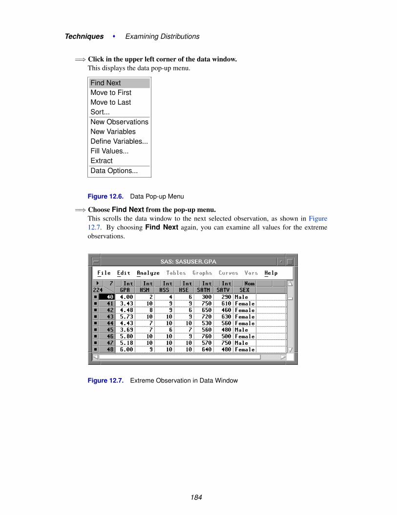
Techniques � Examining Distributions
=⇒ Click in the upper left corner of the data window.This displays the data pop-up menu.
Find NextMove to FirstMove to LastSort...New ObservationsNew VariablesDefine Variables...Fill Values...ExtractData Options...
Figure 12.6. Data Pop-up Menu
=⇒ Choose Find Next from the pop-up menu.This scrolls the data window to the next selected observation, as shown in Figure12.7. By choosing Find Next again, you can examine all values for the extremeobservations.
Figure 12.7. Extreme Observation in Data Window
184

Creating the Distribution Analysis
Histogram
A histogram is a bar chart of an interval variable. In a histogram, the interval repre-sented by a bar is called a bin. Instead of a frequency axis, histograms in a distributionanalysis use a density axis to measure the fractional distribution over a given interval.
Examine the histogram of SATM. The shape of the distribution is fairly symmetricexcept for slight skewing in the left tail. The distribution’s center is around 600.
Figure 12.8. Histogram of SATM
A histogram is a good tool for visually examining the distribution. However, changesin the width and position of the bars can greatly affect your perception of the shape ofthe distribution. The histogram illustrated in Figure 12.8 is only one representationof the distribution of SATM. It is easy to change the bar widths and positions withSAS/INSIGHT software to explore many different histograms.
=⇒ Choose Edit:Windows:Tools.This displays the tools window, as shown in Figure 12.9.
=⇒ Click on the hand in the tools window.The cursor changes shape from an arrow to a hand.
185

Techniques � Examining Distributions
Figure 12.9. Tools Window
=⇒ Move the cursor back to the distribution window and click on the histogram.This changes the width of the bars in proportion to the distance of the hand tool fromthe base of the bars. If the hand tool is close to the base of the bars, the bars are wide,as shown in Figure 12.10.
Figure 12.10. Clicking Close to the Base of the Bars
If the hand tool is far from the base of the bars, clicking makes the bars narrow, as
186

Creating the Distribution Analysis
shown in Figure 12.11.
Figure 12.11. Clicking Far from the Base of the Bars
=⇒ Press the mouse button and hold it down as you move horizontally over the bars.Notice how the histogram changes as you move the hand. As you move horizontally,the bin width does not change, but the bins start at different locations. When the handis at the left of the histogram, the bins start at an integral multiple of the bin width.When the hand moves toward the right, the bins are offset an amount proportional tothe distance of the hand across the histogram.
=⇒ Drag the hand horizontally and vertically in the histogram.Release the mouse button when you find a histogram that captures the dominant shapeof the distribution.
=⇒ Click on the arrow in the tools window before proceeding.
⊕ Related Reading: Bar Charts, Chapter 32.
187
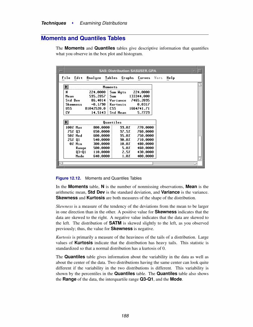
Techniques � Examining Distributions
Moments and Quantiles Tables
The Moments and Quantiles tables give descriptive information that quantifieswhat you observe in the box plot and histogram.
Figure 12.12. Moments and Quantiles Tables
In the Moments table, N is the number of nonmissing observations, Mean is thearithmetic mean, Std Dev is the standard deviation, and Variance is the variance.Skewness and Kurtosis are both measures of the shape of the distribution.
Skewness is a measure of the tendency of the deviations from the mean to be largerin one direction than in the other. A positive value for Skewness indicates that thedata are skewed to the right. A negative value indicates that the data are skewed tothe left. The distribution of SATM is skewed slightly to the left, as you observedpreviously; thus, the value for Skewness is negative.
Kurtosis is primarily a measure of the heaviness of the tails of a distribution. Largevalues of Kurtosis indicate that the distribution has heavy tails. This statistic isstandardized so that a normal distribution has a kurtosis of 0.
The Quantiles table gives information about the variability in the data as well asabout the center of the data. Two distributions having the same center can look quitedifferent if the variability in the two distributions is different. This variability isshown by the percentiles in the Quantiles table. The Quantiles table also showsthe Range of the data, the interquartile range Q3-Q1, and the Mode.
188

Adding Density Estimates
Adding Density EstimatesA cumulative distribution function gives the proportion of the data less than eachpossible value. A density function is the derivative of the cumulative distributionfunction. Density estimation is the construction of an estimate of the density functionfrom the observed data.
Histograms are one type of density estimation. You can also plot the density functionto construct density curves. Density curves are sometimes preferred because they donot contain the discontinuous steps present in histograms.
Distribution ( Y ) provides two types of density estimation: parametric and ker-nel. In parametric estimation, the data are assumed to be from a known parametricfamily of distributions. The normal distribution is one of the most commonly usedparametric distributions. Others include lognormal, exponential, and Weibull.
In kernel estimation, little is assumed about the functional form of the data. The datamore completely determine the shape of the density curve. Kernel estimation is atype of nonparametric estimation.
Normal Density Curve
Begin by adding a normal density curve.
=⇒ Choose Curves:Parametric Density.
File Edit Analyze Tables Graphs Curves Vars Help
Parametric Density...Kernel Density...Empirical CDFCDF Confidence Band �
Parametric CDF...Test for a Specific Distribution...Test for Distribution...QQ Ref Line...
Figure 12.13. Normal Density Menu
This displays the parametric density estimation dialog in Figure 12.14. You can selectone of four distribution families, and you can use sample parameter estimates or youcan specify your own.
189

Techniques � Examining Distributions
Figure 12.14. Parametric Density Estimation Dialog
=⇒ Click OK in the dialog.
This requests the default density estimate: a normal distribution using the sampleestimates as parameter values. The density curve is superimposed on the histogram,as illustrated in Figure 12.15.
Figure 12.15. Parametric Normal Density Estimation
In addition, a Parametric Density Estimation table that contains parameter in-formation appears in the window. You can change the specified parameters and thecorresponding curve using the sliders next to the parameter values.
190

Adding Density Estimates
Note that the values of Mean / Theta and Sigma are equal to the sample Mean andStd Dev displayed in the Moments table illustrated in Figure 12.12. The densitycurve follows the shape of the distribution fairly well.
=⇒ Select the density curve.You can select the curve by clicking on either the curve in the histogram or the legendon the table. Both the curve and the legend become highlighted.
=⇒ Choose Edit:Delete.
The selected curve and its associated table are deleted from the window.
Kernel Density Curve
A kernel density curve may follow the shape of the distribution more closely. Toconstruct a normal kernel density curve, one parameter is required: the bandwidthλ. The value of λ determines the degree of smoothing in the estimate of the densityfunction. You can either specify a value of λ, or you can let SAS/INSIGHT softwarefind a value based on minimizing an estimate of the mean integrated square error(MISE).
=⇒ Choose Curves:Kernel Density.
Figure 12.16. Kernel Density Estimation Dialog
=⇒ Click OK in the dialog.
The kernel density curve is constructed with a bandwidth based on the approximatedmean integrated square error (AMISE), and it provides a good visual representationof the distribution, as illustrated in Figure 12.17. A table containing the bandwidthand the AMISE is also added to the window.
191
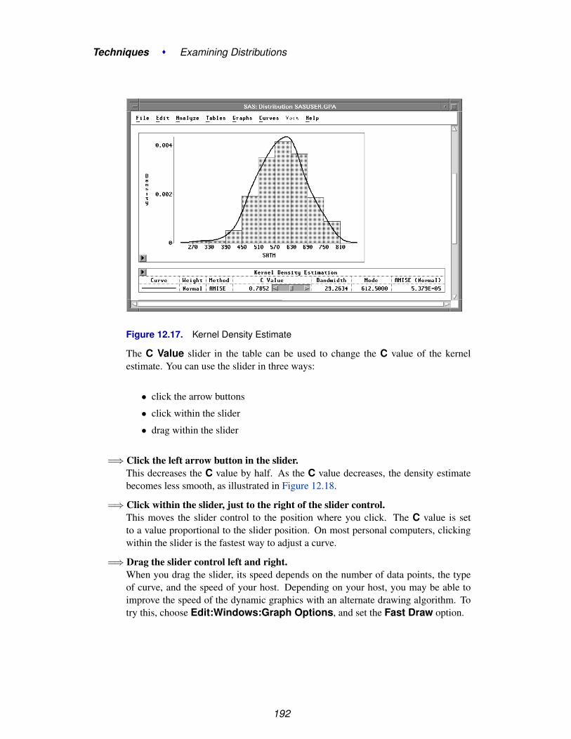
Techniques � Examining Distributions
Figure 12.17. Kernel Density Estimate
The C Value slider in the table can be used to change the C value of the kernelestimate. You can use the slider in three ways:
• click the arrow buttons
• click within the slider
• drag within the slider
=⇒ Click the left arrow button in the slider.This decreases the C value by half. As the C value decreases, the density estimatebecomes less smooth, as illustrated in Figure 12.18.
=⇒ Click within the slider, just to the right of the slider control.This moves the slider control to the position where you click. The C value is setto a value proportional to the slider position. On most personal computers, clickingwithin the slider is the fastest way to adjust a curve.
=⇒ Drag the slider control left and right.When you drag the slider, its speed depends on the number of data points, the typeof curve, and the speed of your host. Depending on your host, you may be able toimprove the speed of the dynamic graphics with an alternate drawing algorithm. Totry this, choose Edit:Windows:Graph Options, and set the Fast Draw option.
192
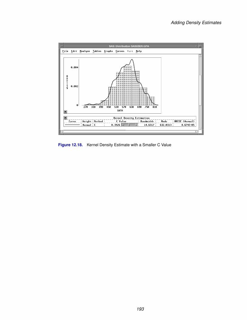
Adding Density Estimates
Figure 12.18. Kernel Density Estimate with a Smaller C Value
193
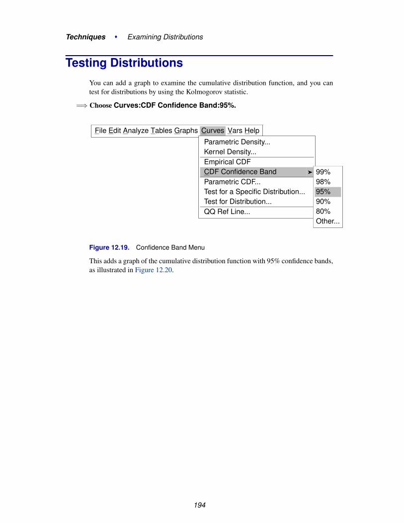
Techniques � Examining Distributions
Testing DistributionsYou can add a graph to examine the cumulative distribution function, and you cantest for distributions by using the Kolmogorov statistic.
=⇒ Choose Curves:CDF Confidence Band:95%.
File Edit Analyze Tables Graphs Curves Vars Help
Parametric Density...Kernel Density...Empirical CDFCDF Confidence Band �
Parametric CDF...Test for a Specific Distribution...Test for Distribution...QQ Ref Line...
99%98%95%90%80%Other...
Figure 12.19. Confidence Band Menu
This adds a graph of the cumulative distribution function with 95% confidence bands,as illustrated in Figure 12.20.
194

Testing Distributions
Figure 12.20. Cumulative Distribution Function
=⇒ Choose Curves:Test for Distribution.This displays the test for distribution dialog. The default settings test whether thedata are from a normal distribution.
Figure 12.21. Test for Distribution Dialog
=⇒ Click OK in the dialog.This adds a curve to the graph and a Test for Distribution table to the window, asillustrated in Figure 12.22.
195

Techniques � Examining Distributions
Figure 12.22. Test for Normal Distribution
The smooth curve in the graph represents the fitted normal distribution. It lies quiteclose to the irregular curve representing the empirical distribution function. The Testfor Distribution table contains the mean (Mean / Theta) and standard deviation(Sigma) for the data along with the results of Kolmogorov’s test for normality. Thistests the null hypothesis that the data come from a normal distribution with unknownmean and variance. The p-value (Prob > D), also referred to as the probability valueor observed significance level, is the probability of obtaining a D statistic greater thanthe computed D statistic when the null hypothesis is true. The smaller the p-value,the stronger the evidence against the null hypothesis. The computed p-value is large(>0.15), so there is no reason to conclude that these data are not normally distributed.
⊕ Related Reading: Distributions, Chapter 38.
196

References
ReferencesMoore, D.S. and McCabe, G.P. (1989), Introduction to the Practice of Statistics, New
York: W.H. Freeman and Company.
197

Techniques � Examining Distributions
198

Chapter 13Fitting Curves
Chapter Contents
PARAMETRIC REGRESSION FITS . . . . . . . . . . . . . . . . . . . . . 202Changing the Polynomial Degree . . . . . . . . . . . . . . . . . . . . . . . 204Adding Curves . . . . . . . . . . . . . . . . . . . . . . . . . . . . . . . . . 207Line Colors, Patterns, and Widths . . . . . . . . . . . . . . . . . . . . . . . 208
NONPARAMETRIC FITS . . . . . . . . . . . . . . . . . . . . . . . . . . . 210Normal Kernel Fit . . . . . . . . . . . . . . . . . . . . . . . . . . . . . . . 211Loess Smoothing . . . . . . . . . . . . . . . . . . . . . . . . . . . . . . . 213
REFERENCES . . . . . . . . . . . . . . . . . . . . . . . . . . . . . . . . . . 215

Techniques � Fitting Curves
200

Chapter 13Fitting Curves
You can use Fit (Y X) to fit curves when you have one X variable. Curve-fittinghelps you identify trends and relationships in two-dimensional data. SAS/INSIGHTsoftware offers both parametric and nonparametric methods to fit curves. You cangenerate confidence ellipses, fit parametric polynomials with confidence curves, andfit nonparametric curves using spline, kernel, and loess estimators.
Figure 13.1. Fit Window with Several Curves

Techniques � Fitting Curves
Parametric Regression FitsFitting a curve produces a visual display that reflects the systematic variation of thedata. In this section, you will fit polynomial curves using a subset of the MININGdata set described in Chapter 1, “Getting Started.”
=⇒ Open the MININGX data set.
=⇒ Choose Analyze:Fit ( Y X ).
File Edit Analyze Tables Graphs Curves Vars HelpHistogram/Bar Chart ( Y )Box Plot/Mosaic Plot ( Y )Line Plot ( Y X )Scatter Plot ( Y X )Contour Plot ( Z Y X )Rotating Plot ( Z Y X )Distribution ( Y )Fit ( Y X )Multivariate ( Y X )
Figure 13.2. Analyze Menu
The fit variables dialog appears, as shown in Figure 13.3.
Figure 13.3. Fit Variables Dialog
202
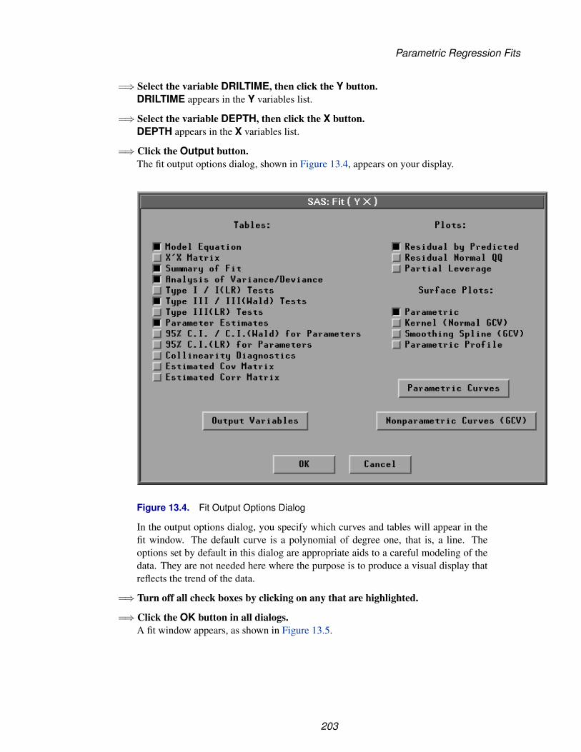
Parametric Regression Fits
=⇒ Select the variable DRILTIME, then click the Y button.DRILTIME appears in the Y variables list.
=⇒ Select the variable DEPTH, then click the X button.DEPTH appears in the X variables list.
=⇒ Click the Output button.The fit output options dialog, shown in Figure 13.4, appears on your display.
Figure 13.4. Fit Output Options Dialog
In the output options dialog, you specify which curves and tables will appear in thefit window. The default curve is a polynomial of degree one, that is, a line. Theoptions set by default in this dialog are appropriate aids to a careful modeling of thedata. They are not needed here where the purpose is to produce a visual display thatreflects the trend of the data.
=⇒ Turn off all check boxes by clicking on any that are highlighted.
=⇒ Click the OK button in all dialogs.A fit window appears, as shown in Figure 13.5.
203
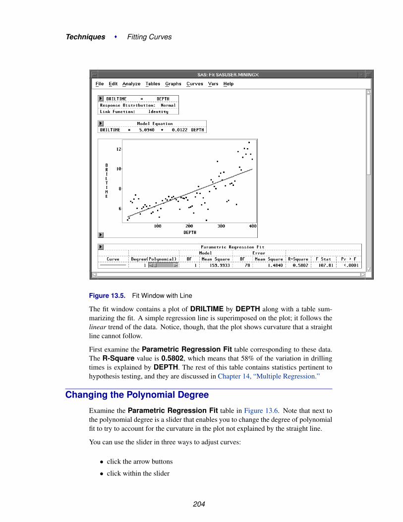
Techniques � Fitting Curves
Figure 13.5. Fit Window with Line
The fit window contains a plot of DRILTIME by DEPTH along with a table sum-marizing the fit. A simple regression line is superimposed on the plot; it follows thelinear trend of the data. Notice, though, that the plot shows curvature that a straightline cannot follow.
First examine the Parametric Regression Fit table corresponding to these data.The R-Square value is 0.5802, which means that 58% of the variation in drillingtimes is explained by DEPTH. The rest of this table contains statistics pertinent tohypothesis testing, and they are discussed in Chapter 14, “Multiple Regression.”
Changing the Polynomial Degree
Examine the Parametric Regression Fit table in Figure 13.6. Note that next tothe polynomial degree is a slider that enables you to change the degree of polynomialfit to try to account for the curvature in the plot not explained by the straight line.
You can use the slider in three ways to adjust curves:
• click the arrow buttons
• click within the slider
204

Parametric Regression Fits
• drag within the slider
=⇒ Click the left arrow button in the slider.This decreases the degree of the polynomial to zero. A zero-degree polynomial fit isjust a mean line.
Figure 13.6. Fit Window with Mean Line
=⇒ Click twice on the right arrow button in the slider.This increases the polynomial degree to 2, a quadratic fit, as shown in Figure 13.7.The quadratic fit does a much better job accounting for the curvature in the plot. Notealso that the R-Square value for the quadratic polynomial has increased to over70%. You can fit successively higher-degree polynomials that continue to increasethe R-Square value; but beyond a certain degree, small increases in R-Square donot compensate for the intuitive appeal in fitting a low degree polynomial.
205
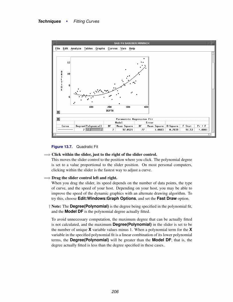
Techniques � Fitting Curves
Figure 13.7. Quadratic Fit
=⇒ Click within the slider, just to the right of the slider control.This moves the slider control to the position where you click. The polynomial degreeis set to a value proportional to the slider position. On most personal computers,clicking within the slider is the fastest way to adjust a curve.
=⇒ Drag the slider control left and right.When you drag the slider, its speed depends on the number of data points, the typeof curve, and the speed of your host. Depending on your host, you may be able toimprove the speed of the dynamic graphics with an alternate drawing algorithm. Totry this, choose Edit:Windows:Graph Options, and set the Fast Draw option.
† Note: The Degree(Polynomial) is the degree being specified in the polynomial fit,and the Model DF is the polynomial degree actually fitted.
To avoid unnecessary computation, the maximum degree that can be actually fittedis not calculated, and the maximum Degree(Polynomial) in the slider is set to bethe number of unique X variable values minus 1. When a polynomial term for the Xvariable in the specified polynomial fit is a linear combination of its lower polynomialterms, the Degree(Polynomial) will be greater than the Model DF; that is, thedegree actually fitted is less than the degree specified in these cases..
206

Parametric Regression Fits
Adding Curves
You can add curves to a scatter plot in the fit window in two ways. You can choosefrom the Curves menu or you can select Edit:Windows:Renew to reset the fitoutput options. When you add a curve from the Curves menu, SAS/INSIGHT addseither a new table entry or a whole new table that contains a summary of the newcurve fit. Suppose you want to compare polynomial fits of different degree directlyon the scatter plot. Begin by adding a second polynomial fit to the plot.
=⇒ Choose Curves:Polynomial.
File Edit Analyze Tables Graphs Curves Vars Help
Confidence Ellipse �
Confidence Curves �
Polynomial...Spline...Kernel...Loess...Local Polynomial, Fixed Bandwidth...
Figure 13.8. Curves Menu
This displays the polynomial fit dialog shown in Figure 13.9.
Figure 13.9. Polynomial Fit Dialog
=⇒ Set the degree for the new polynomial to 3 and click OK.This adds a cubic polynomial fit to the scatter plot, as shown in Figure 13.10.
Now you have two polynomial fits in the window. Note that an entry for the cubicpolynomial has been added to the Parametric Regression Fit table. Each entryin the table has its own slider so that you can adjust the degree of either polynomialto compare any pair of fits.
207

Techniques � Fitting Curves
Figure 13.10. Fit Window with Two Polynomial Fits
Line Colors, Patterns, and Widths
Notice in Figure 13.10 that it is difficult to distinguish the two polynomial curves.On color displays, curve colors are chosen by default to contrast with the windowbackground color and with existing curves. Curves are always drawn as solid linesby default. You can set default curve widths with display options. You can use theTools window to change any of these curve features.
=⇒ Choose Edit:Windows:Tools to display the tools window.The tools window displays a palette of colors, three line patterns, and five curvewidths that you can choose for the selected curve, as shown in Figure 13.11
208

Parametric Regression Fits
Figure 13.11. Tools Window
=⇒ Click on the cubic fit curve legend to select the curve.Clicking on either the legend or the curve highlights both the legend and the curve.
Figure 13.12. Cubic Fit Curve Selected
=⇒ In the Tools window, click on the dotted line pattern.
209

Techniques � Fitting Curves
Again note that the legend in the table matches the new curve pattern.
Figure 13.13. New Pattern for Cubic Fit
=⇒ Click in any blank area of the fit window to deselect the curve.You can select a curve again and try various colors, patterns, or widths.
=⇒ Select the Parametric Regression Fit table.
=⇒ Choose Edit:Delete.The selected parametric regression fit table and its associated curves are deleted fromthe window.
Nonparametric FitsSAS/INSIGHT software provides nonparametric curve-fitting estimates fromsmoothing spline, kernel, loess, and fixed bandwidth local polynomial estimatorsthat are alternatives to fitting polynomials. Because nonparametric methods allowmore flexibility for the functional dependence of Y on X than a typical parametricmodel does, nonparametric methods are well suited for situations where little isknown about the process under study.
To carry out a nonparametric regression, you need first to determine the smooth-ness of the fit. With SAS/INSIGHT software, you can specify a particular valuefor a smoothing parameter, specify a particular degrees of freedom for a smoother,or request a default best fit. The data are then smoothed to estimate the regressioncurve. This is in contrast to the parametric regression where the degree of the poly-nomial controls the complexity of the fit. For the polynomial, additional complexity
210
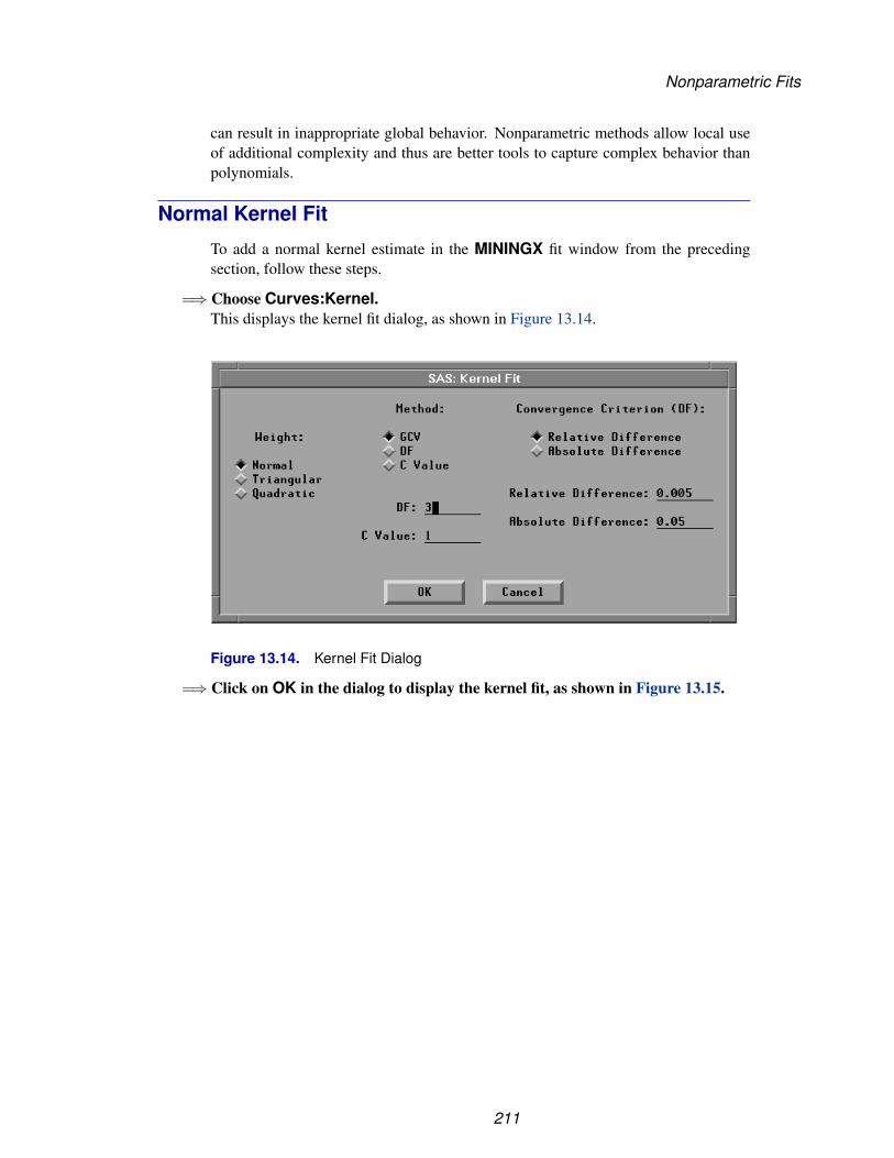
Nonparametric Fits
can result in inappropriate global behavior. Nonparametric methods allow local useof additional complexity and thus are better tools to capture complex behavior thanpolynomials.
Normal Kernel Fit
To add a normal kernel estimate in the MININGX fit window from the precedingsection, follow these steps.
=⇒ Choose Curves:Kernel.This displays the kernel fit dialog, as shown in Figure 13.14.
Figure 13.14. Kernel Fit Dialog
=⇒ Click on OK in the dialog to display the kernel fit, as shown in Figure 13.15.
211

Techniques � Fitting Curves
Figure 13.15. Normal Kernel Fit
By default, the optimal kernel smoothness is estimated based on mean square errorusing generalized cross validation (GCV). Cross validation leaves out points (xi, yi)one at a time and computes the kernel regression at xi based on the remaining n-1observations. Generalized cross validation is a weighted version of cross validationand is easier to compute. This estimation is carried out for a number of differentvalues of the smoothing parameter, and the value that minimizes the estimated meansquare error is selected (Hastie and Tibshirani 1990). This technique is described indetail in Chapter 39, “Fit Analyses.” Note that in Figure 13.15, the Kernel Fit tableshows the Method as GCV.
You can change the degree of smoothness by using the slider in the Kernel Fit tableto change the value of c. Higher values of c result in smoother curves closer toa straight line; smaller values produce more flexible curves. It is often necessary toexperiment with several values before finding one that fits your data well. See Chapter39, “Fit Analyses,” for detailed information about kernels and the c parameter. Notethat if you use the slider to change the value of c, the Method entry also changes.
The Kernel Fit table contains several statistics for comparing the kernel fit to otherfits. The table contains the bandwidth or smoothing parameter of the kernel that cor-responds to the value of c. The column labeled DF gives the approximate degreesof freedom for the kernel fit. Smoother curves have fewer degrees of freedom andresult in lower values of R2 and possibly higher values of mean square error. R-square measures the proportion of the total variation accounted for by the kernel fit.MSE(GCV) is an estimate of the mean square error using generalized cross valida-tion. These statistics are also discussed in Chapter 39, “Fit Analyses.”
This kernel tracks the data fairly well. The fit requires 20.759 degrees of freedom, in-
212
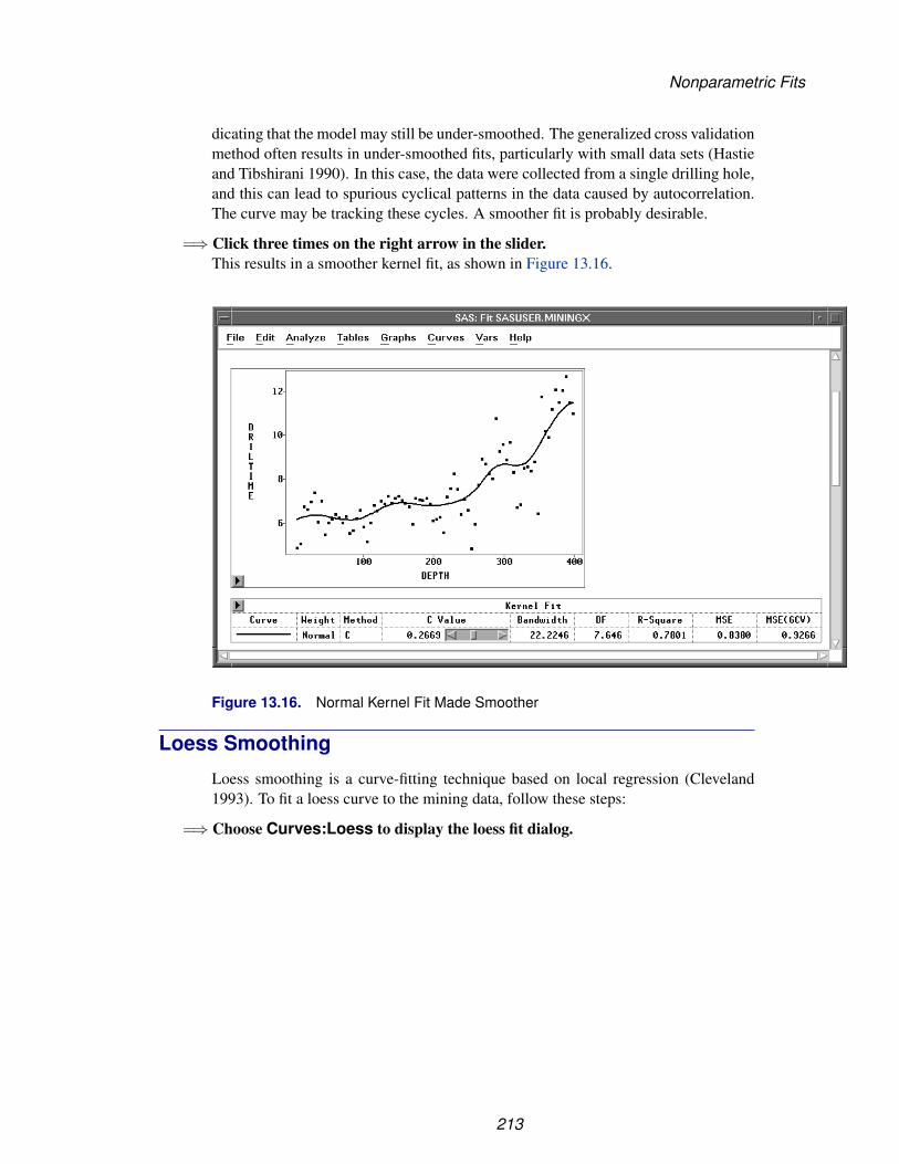
Nonparametric Fits
dicating that the model may still be under-smoothed. The generalized cross validationmethod often results in under-smoothed fits, particularly with small data sets (Hastieand Tibshirani 1990). In this case, the data were collected from a single drilling hole,and this can lead to spurious cyclical patterns in the data caused by autocorrelation.The curve may be tracking these cycles. A smoother fit is probably desirable.
=⇒ Click three times on the right arrow in the slider.This results in a smoother kernel fit, as shown in Figure 13.16.
Figure 13.16. Normal Kernel Fit Made Smoother
Loess Smoothing
Loess smoothing is a curve-fitting technique based on local regression (Cleveland1993). To fit a loess curve to the mining data, follow these steps:
=⇒ Choose Curves:Loess to display the loess fit dialog.
213
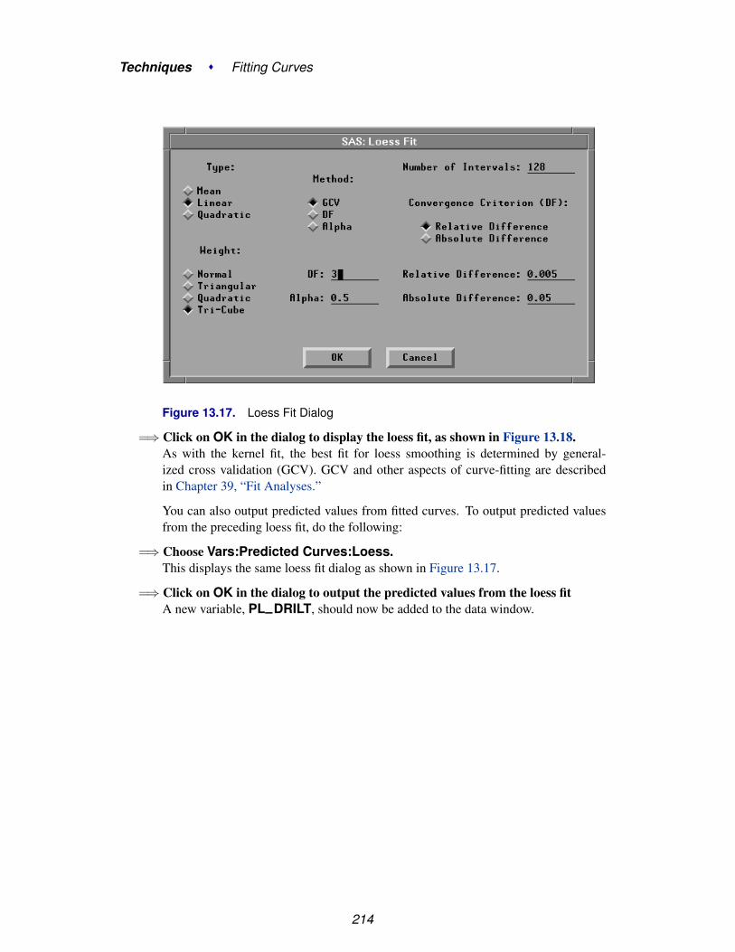
Techniques � Fitting Curves
Figure 13.17. Loess Fit Dialog
=⇒ Click on OK in the dialog to display the loess fit, as shown in Figure 13.18.As with the kernel fit, the best fit for loess smoothing is determined by general-ized cross validation (GCV). GCV and other aspects of curve-fitting are describedin Chapter 39, “Fit Analyses.”
You can also output predicted values from fitted curves. To output predicted valuesfrom the preceding loess fit, do the following:
=⇒ Choose Vars:Predicted Curves:Loess.This displays the same loess fit dialog as shown in Figure 13.17.
=⇒ Click on OK in the dialog to output the predicted values from the loess fitA new variable, PL–DRILT, should now be added to the data window.
214

References
Figure 13.18. Loess Fit
You can use the slider control to adjust the loess curve just as with other curves. Forloess, the slider controls the α value for the fit. The greater the α value, the smootherthe fit.
On rare occasions, you may want to fit a curve for α values outside the bounds of theslider. For loess and other curves, the bounds of the slider are chosen for best fit inmost cases. If you need to fit a curve with unusual parameter values, you can specifythese values in the curve dialog.
⊕ Related Reading: Fit Curves, Chapter 39.
ReferencesCleveland, W.S. (1993), Visualizing Data, Summit, New Jersey: Hobart Press.
Hastie, Y.J. and Tibshirani, R.J. (1990), Generalized Additive Models, New York:Chapman and Hall.
McCullagh, P. and Nelder, J.A. (1989), Generalized Linear Models, Second Edition,London: Chapman and Hall.
Silverman, B.W. (1986), Density Estimation for Statistics and Data Analysis, New York:Chapman and Hall.
215

Techniques � Fitting Curves
216

Chapter 14Multiple Regression
Chapter Contents
CREATING THE ANALYSIS . . . . . . . . . . . . . . . . . . . . . . . . . 220Model Information . . . . . . . . . . . . . . . . . . . . . . . . . . . . . . . 225Summary of Fit . . . . . . . . . . . . . . . . . . . . . . . . . . . . . . . . 225Analysis of Variance . . . . . . . . . . . . . . . . . . . . . . . . . . . . . . 225Type III Tests . . . . . . . . . . . . . . . . . . . . . . . . . . . . . . . . . 226Parameter Estimates . . . . . . . . . . . . . . . . . . . . . . . . . . . . . . 226Residuals-by-Predicted Plot . . . . . . . . . . . . . . . . . . . . . . . . . . 227
ADDING TABLES AND GRAPHS . . . . . . . . . . . . . . . . . . . . . . . 228Collinearity Diagnostics Table . . . . . . . . . . . . . . . . . . . . . . . . 228Partial Leverage Plots . . . . . . . . . . . . . . . . . . . . . . . . . . . . . 229Residual-by-Hat Diagonal Plot . . . . . . . . . . . . . . . . . . . . . . . . 230
MODIFYING THE MODEL . . . . . . . . . . . . . . . . . . . . . . . . . . 235
SAVING THE RESIDUALS . . . . . . . . . . . . . . . . . . . . . . . . . . 238
REFERENCES . . . . . . . . . . . . . . . . . . . . . . . . . . . . . . . . . . 239

Techniques � Multiple Regression
218

Chapter 14Multiple Regression
You can create multiple regression models quickly using the fit variables dialog. Youcan use diagnostic plots to assess the validity of the models and identify potential out-liers and influential observations. You can save residuals and other output variablesfrom your models for future analysis.
Figure 14.1. Multiple Regression Analysis

Techniques � Multiple Regression
Creating the AnalysisThe GPA data set contains data collected to determine which applicants at a largemidwestern university were likely to succeed in its computer science program. Thevariable GPA is the measure of success of students in the computer science program,and it is the response variable. A response variable measures the outcome to beexplained or predicted.
Several other variables are also included in the study as possible explanatory variablesor predictors of GPA. An explanatory variable may explain variation in the responsevariable. Explanatory variables for this example include average high school gradesin mathematics (HSM), English (HSE), and science (HSS) (Moore and McCabe1989).
To begin the regression analysis, follow these steps.
=⇒ Open the GPA data set.
=⇒ Choose Analyze:Fit (Y X).
File Edit Analyze Tables Graphs Curves Vars HelpHistogram/Bar Chart ( Y )Box Plot/Mosaic Plot ( Y )Line Plot ( Y X )Scatter Plot ( Y X )Contour Plot ( Z Y X )Rotating Plot ( Z Y X )Distribution ( Y )Fit ( Y X )Multivariate ( Y X )
Figure 14.2. Analyze Menu
The fit variables dialog appears, as shown in Figure 14.3. This dialog differs fromall other variables dialogs because it can remain visible even after you create the fitwindow. This makes it convenient to add and remove variables from the model. Tomake the variables dialog stay on the display, click on the Apply button when you arefinished specifying the model. Each time you modify the model and use the Applybutton, a new fit window appears so you can easily compare models. Clicking on OKalso displays a new fit window but closes the dialog.
220

Creating the Analysis
Figure 14.3. Fit Variables Dialog
=⇒ Select the variable GPA in the list on the left, then click the Y button.GPA appears in the Y variables list.
=⇒ Select the variables HSM, HSS, and HSE, then click the X button.HSM, HSS, and HSE appear in the X variables list.
221
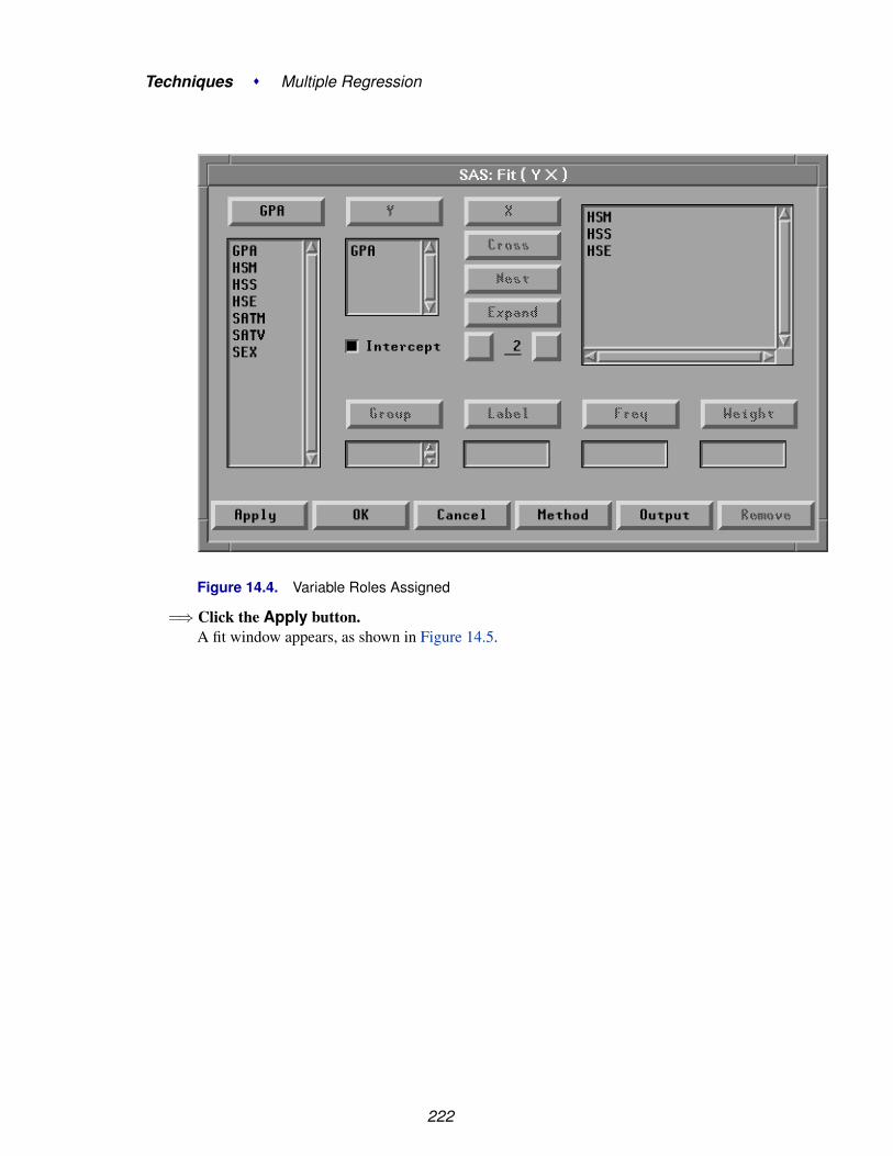
Techniques � Multiple Regression
Figure 14.4. Variable Roles Assigned
=⇒ Click the Apply button.A fit window appears, as shown in Figure 14.5.
222

Creating the Analysis
Figure 14.5. Fit Window
This window shows the results of a regression analysis of GPA on HSM, HSS, andHSE. The regression model for the ith observation can be written as
GPAi = β0 + β1HSMi + β2HSSi + β3HSEi + εi
223

Techniques � Multiple Regression
where GPAi is the value of GPA; β0 to β3 are the regression coefficients (parameters);HSMi, HSSi, and HSEi are the values of the explanatory variables; and εi is the ran-dom error term. The εi’s are assumed to be uncorrelated, with mean 0 and varianceσ2.
224
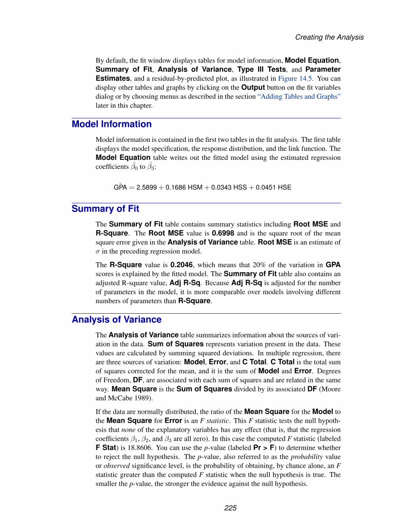
Creating the Analysis
By default, the fit window displays tables for model information, Model Equation,Summary of Fit, Analysis of Variance, Type III Tests, and ParameterEstimates, and a residual-by-predicted plot, as illustrated in Figure 14.5. You candisplay other tables and graphs by clicking on the Output button on the fit variablesdialog or by choosing menus as described in the section “Adding Tables and Graphs”later in this chapter.
Model Information
Model information is contained in the first two tables in the fit analysis. The first tabledisplays the model specification, the response distribution, and the link function. TheModel Equation table writes out the fitted model using the estimated regressioncoefficients β0 to β3:
ˆGPA = 2.5899 + 0.1686 HSM + 0.0343 HSS + 0.0451 HSE
Summary of Fit
The Summary of Fit table contains summary statistics including Root MSE andR-Square. The Root MSE value is 0.6998 and is the square root of the meansquare error given in the Analysis of Variance table. Root MSE is an estimate ofσ in the preceding regression model.
The R-Square value is 0.2046, which means that 20% of the variation in GPAscores is explained by the fitted model. The Summary of Fit table also contains anadjusted R-square value, Adj R-Sq. Because Adj R-Sq is adjusted for the numberof parameters in the model, it is more comparable over models involving differentnumbers of parameters than R-Square.
Analysis of Variance
The Analysis of Variance table summarizes information about the sources of vari-ation in the data. Sum of Squares represents variation present in the data. Thesevalues are calculated by summing squared deviations. In multiple regression, thereare three sources of variation: Model, Error, and C Total. C Total is the total sumof squares corrected for the mean, and it is the sum of Model and Error. Degreesof Freedom, DF, are associated with each sum of squares and are related in the sameway. Mean Square is the Sum of Squares divided by its associated DF (Mooreand McCabe 1989).
If the data are normally distributed, the ratio of the Mean Square for the Model tothe Mean Square for Error is an F statistic. This F statistic tests the null hypoth-esis that none of the explanatory variables has any effect (that is, that the regressioncoefficients β1, β2, and β3 are all zero). In this case the computed F statistic (labeledF Stat) is 18.8606. You can use the p-value (labeled Pr > F) to determine whetherto reject the null hypothesis. The p-value, also referred to as the probability valueor observed significance level, is the probability of obtaining, by chance alone, an Fstatistic greater than the computed F statistic when the null hypothesis is true. Thesmaller the p-value, the stronger the evidence against the null hypothesis.
225

Techniques � Multiple Regression
In this example, the p-value is so small that you can clearly reject the null hypothesisand conclude that at least one of the explanatory variables has an effect on GPA.
Type III Tests
The Type III Tests table presents the Type III sums of squares associated with theestimated coefficients in the model. Type III sums of squares are commonly calledpartial sums of squares (for a complete discussion, refer to the chapter titled “TheFour Types of Estimable Functions” in the SAS/STAT User’s Guide). The Type IIIsum of squares for a particular variable is the increase in the model sum of squaresdue to adding the variable to a model that already contains all the other variables inthe model. Type III sums of squares, therefore, do not depend on the order in whichthe explanatory variables are specified in the model. Furthermore, they do not yieldan additive partitioning of the Model sum of squares unless the explanatory variablesare uncorrelated (which they are not for this example).
F tests are formed from this table as explained previously in the “Analysis ofVariance” section. Note that when DF = 1, the Type III F statistic for a given param-eter estimate is equal to the square of the t statistic for the same parameter estimate.For example, the T Stat value for HSM given in the Parameter Estimates tableis 4.7494. The corresponding F Stat value in the Type III Tests table is 22.5569,which is 4.7494 squared.
Parameter Estimates
The Parameter Estimates table, as shown in Figure 14.5, displays the parameterestimates and the corresponding degrees of freedom, standard deviation, t statistic,and p-values. Using the parameter estimates, you can also write out the fitted model:
ˆGPA = 2.5899 + 0.1686HSM + 0.0343HSS + 0.0451HSE.
The t statistic is used to test the null hypothesis that a parameter is 0 in the model.In this example, only the coefficient for HSM appears to be statistically significant(p ≤ 0.0001). The coefficients for HSS and HSE are not significant, partly becauseof the relatively high correlations among the three explanatory variables. Once HSMis included in the model, adding HSS and HSE does not substantially improve themodel fit. Thus, their corresponding parameters are not statistically significant.
Two other statistics, tolerance and variance inflation, also appear in the ParameterEstimates table. These measure the strength of interrelationships among the ex-planatory variables in the model. Tolerances close to 0 and large variance inflationfactor values indicate strong linear association or collinearity among the explana-tory variables (Rawlings 1988, p. 277). For the GPA data, these statistics signalno problems of collinearity, even for HSE and HSS, which are the two most highlycorrelated variables in the data set.
226

Creating the Analysis
Residuals-by-Predicted Plot
SAS/INSIGHT software provides many diagnostic tools to help you decide if yourregression model fits well. These tools are based on the residuals from the fittedmodel. The residual for the ith observation is the observed value minus the predictedvalue:
GPAi − ˆGPAi.
The plot of the residuals versus the predicted values is a classical diagnostic tool usedin regression analysis. The plot is useful for discovering poorly specified models orheterogeneity of variance (Myers 1986, pp. 138–139). The plot of R–GPA versusP–GPA in Figure 14.5 indicates no such problems. The observations are randomlyscattered above and below the zero line, and no observations appear to be outliers.
227
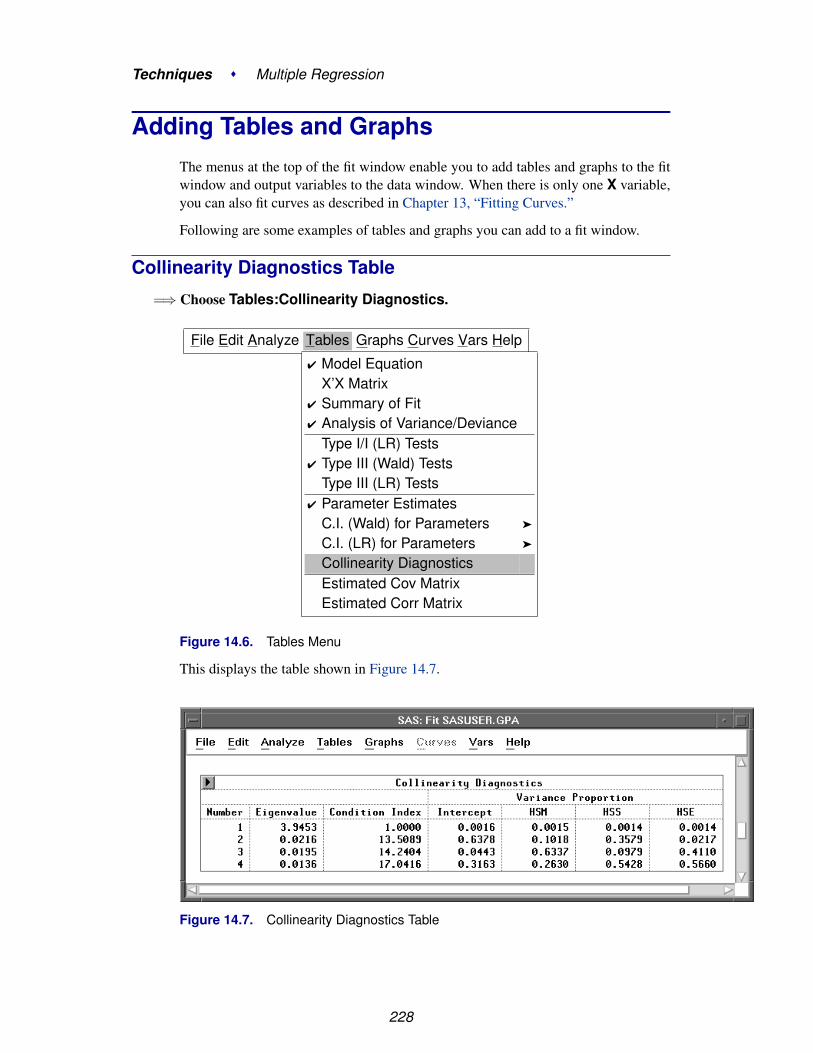
Techniques � Multiple Regression
Adding Tables and GraphsThe menus at the top of the fit window enable you to add tables and graphs to the fitwindow and output variables to the data window. When there is only one X variable,you can also fit curves as described in Chapter 13, “Fitting Curves.”
Following are some examples of tables and graphs you can add to a fit window.
Collinearity Diagnostics Table
=⇒ Choose Tables:Collinearity Diagnostics.
File Edit Analyze Tables Graphs Curves Vars Help
� Model EquationX’X Matrix
� Summary of Fit� Analysis of Variance/Deviance
Type I/I (LR) Tests� Type III (Wald) Tests
Type III (LR) Tests� Parameter Estimates
C.I. (Wald) for Parameters �
C.I. (LR) for Parameters �
Collinearity DiagnosticsEstimated Cov MatrixEstimated Corr Matrix
Figure 14.6. Tables Menu
This displays the table shown in Figure 14.7.
Figure 14.7. Collinearity Diagnostics Table
228

Adding Tables and Graphs
When an explanatory variable is nearly a linear combination of other explanatoryvariables in the model, the estimates of the coefficients in the regression model areunstable and have high standard errors. This problem is called collinearity. TheCollinearity Diagnostics table is calculated using the eigenstructure of the X ′Xmatrix. See Chapter 13, “Fitting Curves,” for a complete explanation.
A collinearity problem exists when a component associated with a high conditionindex contributes strongly to the variance of two or more variables. The highestcondition number in this table is 17.0416. Belsley, Kuh, and Welsch (1980) proposethat a condition index of 30 to 100 indicates moderate to strong collinearity.
Partial Leverage Plots
Another diagnostic tool available in the fit window is partial leverage plots. Whenthere is more than one explanatory variable in a model, the relationship of the resid-uals to one explanatory variable can be obscured by the effects of other explanatoryvariables. Partial leverage plots attempt to reveal these relationships (Rawlings 1988,pp. 265–266).
=⇒ Choose Graphs:Partial Leverage.
File Edit Analyze Tables Graphs Curves Vars Help
� Residual by PredictedResidual Normal QQPartial LeverageSurface Plot
Figure 14.8. Graphs Menu
This displays the graphs shown in Figure 14.9.
Figure 14.9. Partial Leverage Plots
229

Techniques � Multiple Regression
In each plot in Figure 14.9, the x-axis represents the residuals of the explanatory vari-able from a model that regresses that explanatory variable on the remaining explana-tory variables. The y-axis represents the residuals of the response variable calculatedwith the explanatory variable omitted.
Two reference lines appear in each plot. One is the horizontal line Y=0, and theother is the fitted regression line with slope equal to the parameter estimate of thecorresponding explanatory variable from the original regression model. The latterline shows the effect of the variable when it is added to the model last. An explanatoryvariable having little or no effect results in a line close to the horizontal line Y=0.
Examine the slopes of the lines in the partial leverage plots. The slopes for the plotsrepresenting HSS and HSE are nearly 0. This is not surprising since the coefficientsfor the parameter estimates of these two explanatory variables are nearly 0. You willexamine the effect of removing these two variables from the model in the section“Modifying the Model” later in this chapter.
Curvilinear relationships not already included in the model may also be evident ina partial leverage plot (Rawlings 1988). No curvilinearity is evident in any of theseplots.
Residual-by-Hat Diagonal Plot
The fit window contains additional diagnostic tools for examining the effect of ob-servations. One such tool is the residual-by-hat diagonal plot. Hat diagonal refers tothe diagonal elements of the hat matrix (Rawlings 1988). Hat diagonal measures theleverage of each observation on the predicted value for that observation.
Choosing Fit (Y X) does not automatically generate the residual-by-hat diagonal plot,but you can easily add it to the fit window. First, add the hat diagonal variable to thedata window.
=⇒ Choose Vars:Hat Diag.
230

Adding Tables and Graphs
File Edit Analyze Tables Graphs Curves Vars Help
Hat DiagPredictedLinear PredictorPredicted Surface �
Predicted Curves �
ResidualResidual Normal QuantileStandardized ResidualStudentized ResidualGeneralized Residuals �
Partial Leverage XPartial Leverage YCook’s DDffitsCovratioDfbetas
Figure 14.10. Vars Menu
This adds the variable H–GPA to the data window, as shown in Figure 14.11. (Theresidual variable, R–GPA, is added when a residual-by-predicted plot is created.)
Figure 14.11. GPA Data Window with H–GPA Added
=⇒ Drag a rectangle in the fit window to select an area for the new plot.
231

Techniques � Multiple Regression
Figure 14.12. Selecting an Area
=⇒ Choose Analyze:Scatter Plot (Y X).
File Edit Analyze Tables Graphs Curves Vars HelpHistogram/Bar Chart ( Y )Box Plot/Mosaic Plot ( Y )Line Plot ( Y X )Scatter Plot ( Y X )Contour Plot ( Z Y X )Rotating Plot ( Z Y X )Distribution ( Y )Fit ( Y X )Multivariate ( Y X )
Figure 14.13. Analyze Menu
This displays the scatter plot variables dialog.
=⇒ Assign R–GPA the Y role and H–GPA the X role, then click on OK.
232

Adding Tables and Graphs
Figure 14.14. Scatter Plot Variables Dialog
The plot appears in the fit window in the area you selected.
Figure 14.15. Residual by Hat Diagonal Plot
Belsley, Kuh, and Welsch (1980) propose a cutoff of 2p/n for the hat diagonal values,where n is the number of observations used to fit the model and p is the numberof parameters in the model. Observations with values above this cutoff should beinvestigated. For this example, H–GPA values over 0.036 should be investigated.About 15% of the observations have values above this cutoff.
There are other measures you can use to determine the influence of observations.These include Cook’s D, Dffits, Covratio, and Dfbetas. Each of these measures ex-amines some effect of deleting the ith observation.
233

Techniques � Multiple Regression
=⇒ Choose Vars:Dffits.A new variable, F–GPA, that contains the Dffits values is added to the data window.
Large absolute values of Dffits indicate influential observations. A general cutoff toconsider is 2. It is, thus, useful in this example to identify those observations whereH–GPA exceeds 0.036 and the absolute value of F–GPA is greater than 2. One wayto accomplish this is by examining the H–GPA by F–GPA scatter plot.
=⇒ Choose Analyze:Scatter Plot (Y X).This displays the scatter plot variables dialog.
=⇒ Assign H–GPA the Y role and F–GPA the X role, then click on OK.This displays the H–GPA by F–GPA scatter plot.
Figure 14.16. H–GPA by F–GPA Scatter Plot
None of the observations identified as potential influential observations (H–GPA >0.036) are, in fact, influential for this model using the criterion |F–GPA| > 2.
234
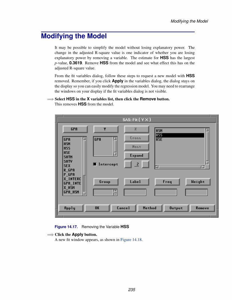
Modifying the Model
Modifying the ModelIt may be possible to simplify the model without losing explanatory power. Thechange in the adjusted R-square value is one indicator of whether you are losingexplanatory power by removing a variable. The estimate for HSS has the largestp-value, 0.3619. Remove HSS from the model and see what effect this has on theadjusted R-square value.
From the fit variables dialog, follow these steps to request a new model with HSSremoved. Remember, if you click Apply in the variables dialog, the dialog stays onthe display so you can easily modify the regression model. You may need to rearrangethe windows on your display if the fit variables dialog is not visible.
=⇒ Select HSS in the X variables list, then click the Remove button.This removes HSS from the model.
Figure 14.17. Removing the Variable HSS
=⇒ Click the Apply button.A new fit window appears, as shown in Figure 14.18.
235

Techniques � Multiple Regression
Figure 14.18. Fit Window with HSM and HSE as Explanatory Variables
Reposition the two fit windows so you can compare the two models. Notice thatthe adjusted R-square value has actually increased slightly from 0.1937 to 0.1943.Little explanatory power is lost by removing HSS. Notice that within this model thep-value for HSE is a modest 0.0820. You can remove HSE from the new fit windowwithout creating a third fit window.
=⇒ Select HSE in the second fit window.
=⇒ Choose Edit:Delete in the second fit window.This recomputes the second fit using only HSM as an explanatory variable.
236
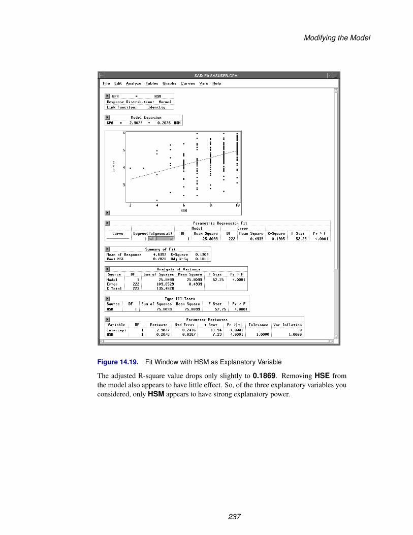
Modifying the Model
Figure 14.19. Fit Window with HSM as Explanatory Variable
The adjusted R-square value drops only slightly to 0.1869. Removing HSE fromthe model also appears to have little effect. So, of the three explanatory variables youconsidered, only HSM appears to have strong explanatory power.
237
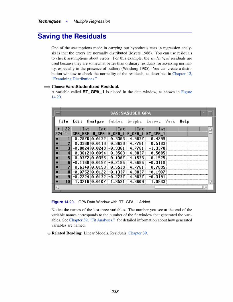
Techniques � Multiple Regression
Saving the ResidualsOne of the assumptions made in carrying out hypothesis tests in regression analy-sis is that the errors are normally distributed (Myers 1986). You can use residualsto check assumptions about errors. For this example, the studentized residuals areused because they are somewhat better than ordinary residuals for assessing normal-ity, especially in the presence of outliers (Weisberg 1985). You can create a distri-bution window to check the normality of the residuals, as described in Chapter 12,“Examining Distributions.”
=⇒ Choose Vars:Studentized Residual.A variable called RT–GPA–1 is placed in the data window, as shown in Figure14.20.
Figure 14.20. GPA Data Window with RT–GPA–1 Added
Notice the names of the last three variables. The number you see at the end of thevariable names corresponds to the number of the fit window that generated the vari-ables. See Chapter 39, “Fit Analyses,” for detailed information about how generatedvariables are named.
⊕ Related Reading: Linear Models, Residuals, Chapter 39.
238

References
ReferencesBelsley, D.A., Kuh, E., and Welsch, R.E. (1980), Regression Diagnostics, New York:
John Wiley and Sons, Inc.
Freedman, D., Pisani, R., and Purves, R. (1978), Statistics, New York: W.W. Norton &Company, Inc.
Moore, D.S. and McCabe, G.P. (1989), Introduction to the Practice of Statistics, NewYork: W.H. Freeman and Company.
Myers, R.H. (1986), Classical and Modern Regression with Applications, Boston, MA:Duxbury Press.
Rawlings, J.O. (1988), Applied Regression Analysis: A Research Tool, Pacific Grove,CA: Wadsworth and Brooks/Cole Advanced Books and Software.
Weisberg, S. (1985), Applied Linear Regression, Second Edition, New York: John Wileyand Sons, Inc.
239

Techniques � Multiple Regression
240

Chapter 15Analysis of Variance
Chapter Contents
ASSIGNING MEASUREMENT LEVELS . . . . . . . . . . . . . . . . . . 245
CREATING THE ANALYSIS OF VARIANCE . . . . . . . . . . . . . . . . 247Model Information . . . . . . . . . . . . . . . . . . . . . . . . . . . . . . . 250Summary of Fit . . . . . . . . . . . . . . . . . . . . . . . . . . . . . . . . 251Analysis of Variance . . . . . . . . . . . . . . . . . . . . . . . . . . . . . . 252Type III Tests . . . . . . . . . . . . . . . . . . . . . . . . . . . . . . . . . 252Parameter Estimates . . . . . . . . . . . . . . . . . . . . . . . . . . . . . . 253Residuals-by-Predicted Plot . . . . . . . . . . . . . . . . . . . . . . . . . . 254
EXAMINING THE MEANS . . . . . . . . . . . . . . . . . . . . . . . . . . 255
REFERENCES . . . . . . . . . . . . . . . . . . . . . . . . . . . . . . . . . . 259

Techniques � Analysis of Variance
242

Chapter 15Analysis of Variance
In this chapter, you consider analyses that use least-squares methods to fit the generallinear model. Such analyses include regression, analysis of variance, and analysis ofcovariance. You can choose Analyze:Fit (Y X) to carry out an analysis of variance.
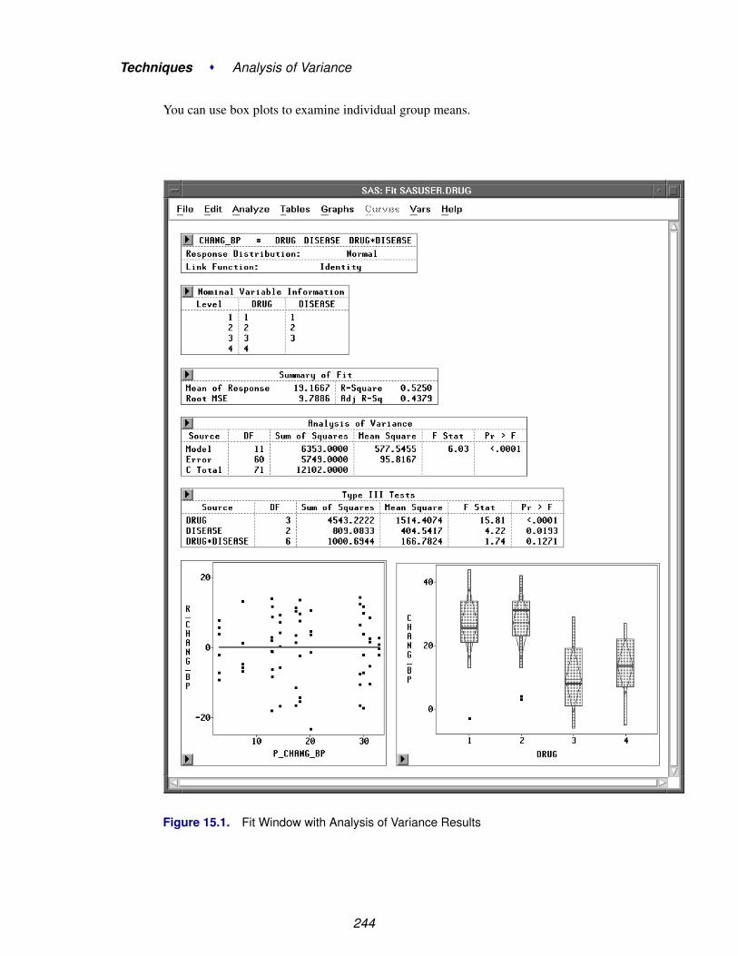
Techniques � Analysis of Variance
You can use box plots to examine individual group means.
Figure 15.1. Fit Window with Analysis of Variance Results
244

Assigning Measurement Levels
Assigning Measurement LevelsThe DRUG data set contains results of an experiment carried out to evaluate the ef-fect of four drugs (DRUG) with three experimentally induced diseases (DISEASE).Each drug by disease combination was applied to six randomly selected dogs. Theresponse variable is the increase in systolic blood pressure (CHANG–BP) due to thedrug treatment. DRUG and DISEASE are classification or class variables; that is,variables that identify distinct levels or groups. DRUG contains four levels or classesand DISEASE contains three.
=⇒ Open the DRUG data set.
Figure 15.2. Data Window
A variable’s measurement level determines the way it is treated in analyses. In thedata window, measurement levels appear above the variable names, in the upper rightportion of the column header. SAS/INSIGHT software supports two measurementlevels: interval (Int) and nominal (Nom).
Interval variables contain values that vary across a continuous range. In this data set,the change in blood pressure (CHANG–BP) is an interval variable.
Nominal variables contain a discrete set of values. In this data set, both DRUGand DISEASE contain a discrete set of values. However, since these are numericvariables, by default they have interval measurement levels (Int).
You need to assign both these variables the nominal measurement level (Nom) inorder to treat them as classification variables. To do so, use the data measurementlevel pop-up menu.
245

Techniques � Analysis of Variance
=⇒ Click on the Int measurement level indicator for the variable DRUG.This displays a pop-up menu.
�IntervalNominal
Figure 15.3. Measurement Levels Menu
The radio mark beside Interval shows the current measurement level. BecauseDRUG is a numeric variable, it can use either an interval or a nominal measurementlevel.
=⇒ Choose Nominal in the pop-up menu to change DRUG’s measurement level.
=⇒ Repeat these steps to change the measurement level for DISEASE.
Check the measurement levels for DRUG and DISEASE in the data window. Bothhave Nom measurement levels.
Figure 15.4. Data with Nominal Variables DRUG and DISEASE
246

Creating the Analysis of Variance
Creating the Analysis of VarianceConsider the two-way analysis of variance model Kutner (1974) proposed for thesedata:
CHANG–BPijk = µ + γi + τj + (γτ)ij + εijk
where µ is the overall mean effect, γi is the effect of the ith level of DRUG, τj isthe effect of the jth level of DISEASE, (γτ)ij is the joint effect of the ith level ofDRUG with the jth level of DISEASE, and εijk is the random error term for thekth observation in the ith level of DRUG and jth level of DISEASE. The εijk’s areassumed to be normally distributed and uncorrelated and to have mean 0 and commonvariance σ2.
The effects for DRUG and DISEASE are often referred to as the main effects inthe model and the DRUG*DISEASE effect as an interaction effect. The interactioneffect enables you to determine whether the level of DRUG affects the change inblood pressure differently for different levels of DISEASE.
To begin the analysis of variance, follow these steps.
=⇒ Choose Analyze:Fit (Y X).
=⇒ Select CHANG–BP in the variables list on the left, then click the Y button.CHANG–BP appears in the Y variables list and is now defined as the response vari-able.
=⇒ Select DRUG and DISEASE, then click the Expand button.Your variables dialog should now appear, as shown in Figure 15.5.
247

Techniques � Analysis of Variance
Figure 15.5. Fit Variables Dialog with Variable Roles Assigned
248

Creating the Analysis of Variance
The Expand button provides a convenient way to specify interactions of any order.The degree of expansion is controlled by the value below the Expand button. Theorder 2 is the default, so clicking Expand constructs all possible effects from theselected variables up to second-order effects. This adds DRUG, DISEASE, andDRUG*DISEASE to the effects list.
† Note: You could have added the same effects by using the X and Cross buttons,but the Expand button is faster. There is also a Nest button for specifying nestedeffects. For more information on the effects buttons, see Chapter 39, “Fit Analyses.”
=⇒ Click the OK button.A fit window appears, as shown in Figure 15.6.
You can control which tables and graphs the fit window contains by clicking theOutput button in the fit variables dialog or by choosing from the Tables andGraphs menus. By default, the fit window contains tables for model specification,Nominal Variable Information, Parameter Information, Model Equation,Summary of Fit, Analysis of Variance, Type III Tests, and ParameterEstimates, as well as a residual-by-predicted plot.
249

Techniques � Analysis of Variance
Figure 15.6. Fit Window - Model Information
Model Information
The first four tables in the fit analysis contain model information. The first tabledisplays the model specification, the response distribution, and the link function. TheNominal Variable Information table shows the levels of the nominal variables.The levels are determined from the formatted values of the nominal variables.
An additional Parameter Information table shows the variable indices for the pa-rameters in the model equation, the X’X matrix, the estimated covariance matrix,
250

Creating the Analysis of Variance
and the estimated correlation matrix. The Model Equation table gives the fittedequation for the model.
Summary of Fit
The Summary of Fit table, as shown in Figure 15.7, contains summary statistics.The Mean of Response 19.1667 is the overall mean of CHANG–BP. The RootMSE 9.7886 is the square root of the mean square error given in the Analysis ofVariance table. Root MSE is an estimate of σ in the preceding analysis of variancemodel.
The R-Square value is 0.5250, which means that 52% of the variation inCHANG–BP is explained by the fitted model. Adj R-Sq is an alternative to R-Square, adjusted for the number of parameters in the model.
Figure 15.7. Fit Window - Summary of Fit
251

Techniques � Analysis of Variance
Analysis of Variance
The Analysis of Variance table summarizes the information related to the sourcesof variation in the data. Sum of Squares measures variation present in the data.It is calculated by summing squared deviations. There are three sources of variation:Model, Error, and C Total. The Model row in the table corresponds to the variationamong class means. The Error row corresponds to ε in the model and representsvariation within class means. C Total is the total sum of squares corrected for themean, and it is the sum of Model and Error. Degrees of Freedom, DF, are associatedwith each sum of squares and are related in the same way. Mean Square is the Sumof Squares divided by its associated DF (Moore and McCabe 1989, p.685).
If the data are normally distributed, the ratio of the Mean Square for the Model tothe Mean Square for Error is an F statistic. This F statistic tests the null hypothesisthat all the class means are the same against the alternative hypothesis that the meansare not all equal. Think of the ratio as a comparison of the variation among classmeans to variation within class means. The larger the ratio, the more evidence thatthe means are not the same. The computed F statistic (labeled F Stat) is 6.0276. Youcan use the p-value (labeled Pr > F) to determine whether to reject the null hypoth-esis. The p-value, also referred to as the probability value or observed significancelevel, is the probability of obtaining (by chance alone) an F statistic greater than thecomputed F statistic when the null hypothesis is true. The smaller the p-value, thestronger the evidence against the null hypothesis.
In this example, the p-value is so small that you can clearly reject the null hypothesisand conclude that at least one of the class means is different. At this point, you havedemonstrated statistical significance but cannot make statements about which classmeans are different.
Type III Tests
The Type III Tests table is a further breakdown of the variation due to MODEL. TheSum of Squares and DF for Model are broken down into terms corresponding tothe main effect for DRUG, the main effect for DISEASE, and the interaction effectfor DRUG*DISEASE. The sum of squares for each term represents the variationamong the means for the different levels of the factors.
The Type III Tests table presents the Type III sums of squares associated with theeffects in the model. The Type III sum of squares for a particular effect is the amountof variation in the response due to that effect after correcting for all other terms inthe model. Type III sums of squares, therefore, do not depend on the order in whichthe effects are specified in the model. Refer to the chapter on “The Four Types ofEstimable Functions,” in the SAS/STAT User’s Guide for a complete discussion ofType I–IV sums of squares.
252

Creating the Analysis of Variance
F tests are formed from this table in the same fashion that was explained previouslyin the section “Analysis of Variance.” In this case, there are three null hypothesesbeing tested: class means are all the same for the main effect DRUG, the main effectDISEASE, and the interaction effect DRUG*DISEASE. Begin by examining thetest for the interaction effect since a strong interaction makes the interpretation ofmain effects difficult if not impossible. The computed F statistic is 1.7406 with ap-value of 0.1271. This gives little evidence for an interaction effect. Now examinethe main effects. The computed F statistic for DRUG is 15.8053 with a p-value lessthan or equal to 0.0001. The computed F statistic for DISEASE is 4.2220 with ap-value of 0.0193. While both effects are significant, the DRUG effect appears to bestronger.
Now you have more information about which means are significantly different. Theresults of the F test in the Analysis of Variance table indicated only that at leastone of the class means is different from the others. Now you know that the differencein means can be associated with the different levels of the main effects, DRUG andDISEASE.
Parameter Estimates
Parameter estimates resulting from analysis of variance models where the effects areall classification variables are different from those observed in a regression model.They represent a non-unique solution to the normal equations, and thus the individualelements in the table are not as easily interpretable as they are in multiple regression.For a complete discussion of parameter estimates involving classification variables,refer to the chapter “Details of the Linear Model: Understanding GLM Concepts,” inSAS System for Linear Models, Third Edition.
253

Techniques � Analysis of Variance
Figure 15.8. Fit Window - Parameter Estimates
Residuals-by-Predicted Plot
It is appropriate to examine the residuals from the fitted model for analysis of variancejust as you did with the multiple regression model you fit in Chapter 14, “MultipleRegression.” The residuals-by-predicted graph illustrated in Figure 15.8, along withseveral other diagnostic plots, are available for examining residuals. Since this topicis discussed in Chapter 14, residual plots are not examined here.
254

Examining the Means
Examining the MeansBefore you can interpret the results for the significant main effects you observed inthe Type III Tests table, you need to examine the means for the different levels ofthese effects. Box plots are an excellent tool for displaying means because means andstandard deviations for each level of a variable can be placed side-by-side for easycomparison.
Follow these steps to add box plots for each level of DRUG to the Fit(Y X) window.
=⇒ Select an area for the box plot.Drag the cursor until you have a rectangle of suitable size.
Figure 15.9. Selecting an Area
=⇒ Choose Analyze:Box Plot/Mosaic Plot ( Y ).
=⇒ Select CHANG–BP in the list at the left, then click the Y button.This assigns the Y role to this variable.
=⇒ Select DRUG in the list at the left, then click the X button.This assigns the X role to this variable and requests a separate box plot for each levelof DRUG. Your variables dialog should now appear, as shown in Figure 15.10.
255

Techniques � Analysis of Variance
Figure 15.10. Box Plot Variables Dialog with Variable Roles Assigned
=⇒ Click the Output button.The output options dialog shown in Figure 15.11 appears on your display. In thisdialog, you can specify options to determine the output produced by the box plot.
Figure 15.11. Box Plot Output Options Dialog
=⇒ Click on Means.Means displays mean diamonds for all boxes. The central line in the mean diamondmarks the mean; the size of the mean diamond is two standard deviations, one aboveand one below the mean.
=⇒ Click OK in both dialogs to create the Box Plots.
256

Examining the Means
Figure 15.12. Box Plots for different DRUG Levels
Examine the box plot representing the four levels of DRUG. Recall that the centralline in each mean diamond marks the mean while the height of the mean diamondshows one standard deviation on either side of the mean. The box and whiskersdisplay percentiles for the data. (See Chapter 4, “Exploring Data in One Dimension,”for a complete description of the parts of the box plot.)
Follow these steps to hide the display of box and whiskers in order to display themeans and standard deviations better.
=⇒ Click on Observations in the box plot pop-up menu.This toggles the display of observations and thus turns off the display of the box,whiskers, and individual observations in the box plot.
Ticks...� Axes� Observations� Means
Comparison CirclesSerifsValuesReference LinesMarker Sizes �
Figure 15.13. Box Plot Pop-up Menu
=⇒ Click on Values in the box plot pop-up menu.This toggles the display of values of the mean for each box plot.
257
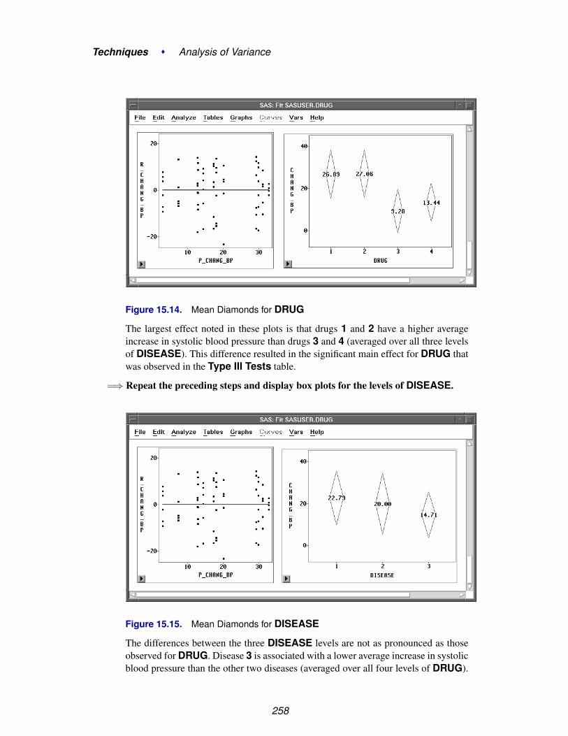
Techniques � Analysis of Variance
Figure 15.14. Mean Diamonds for DRUG
The largest effect noted in these plots is that drugs 1 and 2 have a higher averageincrease in systolic blood pressure than drugs 3 and 4 (averaged over all three levelsof DISEASE). This difference resulted in the significant main effect for DRUG thatwas observed in the Type III Tests table.
=⇒ Repeat the preceding steps and display box plots for the levels of DISEASE.
Figure 15.15. Mean Diamonds for DISEASE
The differences between the three DISEASE levels are not as pronounced as thoseobserved for DRUG. Disease 3 is associated with a lower average increase in systolicblood pressure than the other two diseases (averaged over all four levels of DRUG).
258

References
The smaller p-value observed for the DRUG main effect is more evidence that themean differences for DISEASE are not as pronounced as those for DRUG.
This example illustrates one way to use Analyze:Fit to fit the general linear model.Turn to the next chapter to see how to fit the generalized linear model.
⊕ Related Reading: Box Plots, Chapter 33.
⊕ Related Reading: Linear Models, Chapter 39.
ReferencesKutner, M.H. (1974), “Hypothesis Testing in Linear Models (Eisenhart Model I),” The
American Statistician, 28 (3), 98.
Moore, D.S. and McCabe, G.P. (1989), Introduction to the Practice of Statistics, NewYork: W.H. Freeman and Company.
259

Techniques � Analysis of Variance
260

Chapter 16Logistic Regression
Chapter Contents
DISPLAYING THE LOGISTIC REGRESSION ANALYSIS . . . . . . . . 265Model Equation . . . . . . . . . . . . . . . . . . . . . . . . . . . . . . . . 269Summary of Fit . . . . . . . . . . . . . . . . . . . . . . . . . . . . . . . . 270Analysis of Deviance . . . . . . . . . . . . . . . . . . . . . . . . . . . . . 270Type III (Wald) Tests . . . . . . . . . . . . . . . . . . . . . . . . . . . . . 270Parameter Estimates Table . . . . . . . . . . . . . . . . . . . . . . . . . . . 270Residuals-by-Predicted Plot . . . . . . . . . . . . . . . . . . . . . . . . . . 270
MODIFYING THE MODEL . . . . . . . . . . . . . . . . . . . . . . . . . . 271
REFERENCES . . . . . . . . . . . . . . . . . . . . . . . . . . . . . . . . . . 275

Techniques � Logistic Regression
262

Chapter 16Logistic Regression
In the last two chapters, you used least-squares methods to fit linear models. In thischapter, you use maximum-likelihood methods to fit generalized linear models. Youcan choose Analyze:Fit ( Y X ) to carry out a logistic regression analysis. You canuse the fit variables and method dialogs to specify generalized linear models and toadd and delete variables from the model.

Techniques � Logistic Regression
Figure 16.1. Logistic Regression Analysis
264

Displaying the Logistic Regression Analysis
Displaying the Logistic Regression AnalysisThe PATIENT data set, described by Lee (1974), contains data collected on 27 cancerpatients. The response variable, REMISS, is binary and indicates whether cancerremission occurred:
REMISS = 1 indicates success (remission occurred)
REMISS = 0 indicates failure (remission did not occur)
Several other variables containing patient characteristics thought to affect cancer re-mission were also included in the study. For this example, consider the followingthree explanatory variables: CELL, LI, and TEMP. (You may want to carry out amore complete analysis on your own.)
=⇒ Open the PATIENT data set.
Figure 16.2. Data Window
The generalized linear model has three components:
• a linear predictor function constructed from explanatory variables. For thisexample, the function is
θi = β0 + β1CELLi + β2LIi + β3TEMPi
where β0, β1, β2 and β3 are coefficients (parameters) for the linear predictor,and CELLi, LIi, and TEMPi are the values of the explanatory variables.
• a distribution or probability function for the response variable that depends onthe mean µ and sometimes other parameters as well. For this example, theprobability function is binomial.
265

Techniques � Logistic Regression
• a link function, g(.), that relates the mean to the linear predictor function. Forlogistic regression, the link function is the logit
g(pi) = logit(pi) = log(pi
1 − pi) = θi
where pi = Pr(REMISS=1 | xi) is the response probability to be modeled, andxi is the set of explanatory variables for the ith patient.
You can specify these three components to fit a generalized linear model by followingthese steps.
=⇒ Choose Analyze:Fit ( Y X ) to display the fit variables dialog.
=⇒ Select REMISS in the list at the left, then click the Y button.
=⇒ Select CELL, LI, and TEMP in the variables list, then click the X button.
Your variables dialog should now appear, as shown in Figure 16.3.
Figure 16.3. Fit Variables Dialog with Variable Roles Assigned
To specify the probability distribution for the response variable and the link function,follow these steps.
=⇒ Click the Method button in the variables dialog to display the method dialog.
266

Displaying the Logistic Regression Analysis
Figure 16.4. Fit Method Dialog
=⇒ Click on Binomial under Response Dist to specify the probability distribu-tion.You do not need to specify a Link Function for this example. Canonical, the de-fault, allows Fit ( Y X ) to choose a link dependent on the probability distribution.For the binomial distribution, as in this example, it is equivalent to choosing Logit,which yields a logistic regression.
=⇒ Click the OK button to close the method dialog.
=⇒ Click the Apply button in the variables dialog.This creates the analysis shown in Figure 16.5. Recall that the Apply button causesthe variables dialog to stay on the screen after the fit window appears. This is conve-nient for adding and deleting variables from the model.
By default, the fit window displays tables for model information, Model Equation,Summary of Fit, Analysis of Deviance, Type III (Wald) Tests, andParameter Estimates, and a residual-by-predicted plot. You can control the ta-bles and graphs displayed by clicking on the Output button in the fit variables dialogor by choosing from the Tables and Graphs menus.
The first table displays the model information. The first line gives the model speci-fication. The second and third lines give the error distribution and the link functionyou specified in the Method dialog.
267

Techniques � Logistic Regression
Figure 16.5. Fit Window
268

Displaying the Logistic Regression Analysis
Model Equation
The Model Equation table writes out the fitted model using the estimated regressioncoefficients:
logit(Prob(REMISS = 1))
= 67.6399 + 9.6521*CELL + 3.8671*LI − 82.0737*TEMP
269

Techniques � Logistic Regression
Summary of Fit
The Summary of Fit table contains summary statistics for the fit of the model in-cluding values for Deviance and Pearson’s Chi-Squared statistics. These valuescontrast the fit of your model to that of a saturated model that allows a different fitfor each observation. If the data are sparse in the sense that most observations have adifferent set of explanatory variables, as in this set of data, then the quality of thesemeasures is likely to be poor. Inferences drawn from these measures should be treatedcautiously.
Analysis of Deviance
The Analysis of Deviance table summarizes information about the variation in theresponse for the set of data. Some of the variation can be explained by the Model.The Error is the remainder that is not systematically explained. C Total (the totalcorrected or adjusted for the mean) is the sum of Model and Error. The probabilityvalues give a measure of whether the amount of variation is consistent with chancealone or whether there is evidence of additional variation. In this case the Devianceassociated with the Model shows a significant effect for the model, (p = 0.0061).
Type III (Wald) Tests
Wald tests are Chi-square statistics that test the null hypothesis that a parameter is 0;in other words, that the corresponding variable has no effect given that the other vari-ables are in the model. These are approximate tests that are more accurate with largersample sizes. In this example, only the coefficient for LI is statistically significant (p= 0.0297).
Parameter Estimates Table
The Parameter Estimates table shows the estimate, standard error, Chi-squarestatistic and associated degrees of freedom, and p-value for each of the parametersestimated.
Residuals-by-Predicted Plot
In the diagnostic plot of residuals versus predicted values, you can examine residualsfor the model. You can point and click to identify individual observations. Becausethe observed response must either be 0 or 1, the plot of the residuals versus predictedvalues must lie along two straight lines. Plots of residuals versus the independentvariables and other possible explanatory variables may be more useful. You cancreate scatter plots by selecting the response and explanatory variables in the datawindow and choosing Analyze:Scatter Plot ( Y X ).
270

Modifying the Model
Modifying the ModelPlots of the residuals against other variables may suggest extensions of the model.Alternatively you may be able to remove some variables and thus simplify the modelwithout losing explanatory power. The Type III (Wald) Tests table or the possiblymore accurate Type III (LR) Tests table contains statistics that can help you decidewhether to remove an effect. If the p-value associated with the test is large, then thereis little evidence for any explanatory value of the corresponding variable.
=⇒ Choose Tables:Type III (LR) Tests.
File Edit Analyze Tables Graphs Curves Vars Help
� Model EquationX’X Matrix
� Summary of Fit� Analysis of Variance/Deviance
Type I/I (LR) Tests� Type III (Wald) Tests
Type III (LR) Tests� Parameter Estimates
C.I. (Wald) for Parameters �
C.I. (LR) for Parameters �
Collinearity DiagnosticsEstimated Cov MatrixEstimated Corr Matrix
Figure 16.6. Tables Menu
This displays the table shown in Figure 16.7.
Figure 16.7. Likelihood Ratio Type III Tests
271

Techniques � Logistic Regression
The p-values for TEMP and CELL are relatively large, suggesting these effects couldbe removed. Although the numbers are different, the same conclusions would bereached from the corresponding Wald tests. In the Fit Variables dialog, follow thesesteps to request a new model with TEMP removed.
=⇒ Select TEMP in the effects list, then click the Remove button.TEMP disappears from the effects list.
=⇒ Click on Apply, and a new fit window appears, as shown in Figure 16.8.
272

Modifying the Model
Figure 16.8. Fit Window with CELL and LI as Explanatory Variables
273

Techniques � Logistic Regression
=⇒ Choose Tables:Type III (LR) Tests in the new fit window.This displays a Type III (LR) Tests table in the window.
Figure 16.9. Likelihood Ratio Type III Tests
The p-value for CELL in the LR test suggests that this effect could also be removed.
=⇒ Click on the variable CELL in the effects list in the Fit Dialog.Then click on Remove. CELL disappears from the effects list.
=⇒ Click on Apply, and a new Fit window appears, as shown in Figure 16.10.Since the new model contains only one X variable, the fit window displays a plot ofREMISS versus CELL.
Using the Apply button, you have quickly created three logistic regression models.Logistic regression is only one special case of the generalized linear model. Anothercase, Poisson regression, is described in the next chapter.
⊕ Related Reading: Generalized Linear Models, Chapter 39.
274
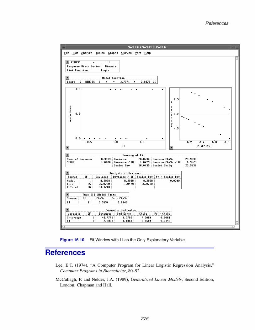
References
Figure 16.10. Fit Window with LI as the Only Explanatory Variable
ReferencesLee, E.T. (1974), “A Computer Program for Linear Logistic Regression Analysis,”
Computer Programs in Biomedicine, 80–92.
McCullagh, P. and Nelder, J.A. (1989), Generalized Linear Models, Second Edition,London: Chapman and Hall.
275

Techniques � Logistic Regression
276

Chapter 17Poisson Regression
Chapter Contents
DISPLAYING THE POISSON REGRESSION ANALYSIS . . . . . . . . . 281Model Information . . . . . . . . . . . . . . . . . . . . . . . . . . . . . . . 287Summary of Fit . . . . . . . . . . . . . . . . . . . . . . . . . . . . . . . . 287Analysis of Deviance . . . . . . . . . . . . . . . . . . . . . . . . . . . . . 287Type III (Wald) Tests . . . . . . . . . . . . . . . . . . . . . . . . . . . . . 287
MODIFYING THE MODEL . . . . . . . . . . . . . . . . . . . . . . . . . . 288Parameter Estimates . . . . . . . . . . . . . . . . . . . . . . . . . . . . . . 290
REFERENCES . . . . . . . . . . . . . . . . . . . . . . . . . . . . . . . . . . 291

Techniques � Poisson Regression
278

Chapter 17Poisson Regression
In Chapter 16, “Logistic Regression,” you examined logistic regression as an exam-ple of a generalized linear model.
In this chapter, you will examine another example of a generalized linear model,Poisson regression. You can choose Analyze:Fit ( Y X ) to carry out a Poissonregression analysis when the response variable represents counts. You can use the fitvariables and methods dialogs to specify this generalized linear model.

Techniques � Poisson Regression
Figure 17.1. Poisson Regression Analysis
280

Displaying the Poisson Regression Analysis
Displaying the Poisson Regression AnalysisThe SHIP data shown in Figure 17.2 represent damage caused by waves to the for-ward section of certain cargo-carrying vessels. The purpose of the investigation wasto set standards for future hull construction. In order to do so, the investigators neededto know the risk of damage associated with five ship types (TYPE), year of con-struction (YEAR), and period of operation (PERIOD). These three variables are theclassification variables. MONTHS is the aggregate number of months in service andis an explanatory variable. Y is the response variable and represents the number ofdamage incidents (McCullagh and Nelder 1989).
Figure 17.2. SHIP Data Set
Recall from Chapter 16 that the generalized linear model has three basic components:
• a linear function of explanatory variables. For this example, the function is
β0 + β1 log(MONTHS) + γi + τj + δk + (γτ)ij + (γδ)ik + (τδ)jk
where log(MONTHS) is a variable whose coefficient β1 is believed to be 1. Aneffect such as this is commonly referred to as an offset. γi is the effect of theith level of TYPE, τj is the effect of the jth level of YEAR, δk is the effectof the kth level of PERIOD, (γτ)ij is the effect of the ijth level of the TYPEby YEAR interaction, (γδ)ik is the effect of the ikth level of the TYPE byPERIOD interaction, and (τδ)jk is the effect of the jkth level of the YEAR byPERIOD interaction.
• a probability function for the response variable that depends on the mean andsometimes other parameters as well. For this example, the probability functionof the response variable is Poisson.
281

Techniques � Poisson Regression
• a link function that relates the mean to the linear function of explanatory vari-ables. For this example, the link function is the log
log(expected number of damage incidents)
= β0 + β1 log(MONTHS) + γi + τj + δk + (γτ)ij + (γδ)ik + (τδ)jk
=⇒ Open the SHIP data set.
Recall from the previous equation that Y is assumed to be directly proportional toMONTHS. Since log(Y ) is being modeled, you need to carry out a log transforma-tion on MONTHS. Follow these steps to create a new variable that represents the logof MONTHS.
=⇒ Select MONTHS in the data window.
=⇒ Choose Edit:Variables:log( Y ).
File Edit Analyze Tables Graphs Curves Vars Help
Windows �
Variables �
Observations �
Formats �
CopyDelete
log( Y )sqrt( Y )1 / YY * Yexp( Y )Other...
Figure 17.3. Edit:Variables Menu
A new variable, L–MONTHS, now appears in the data window.
282

Displaying the Poisson Regression Analysis
Figure 17.4. Data Window with L–MONTHS Added
283

Techniques � Poisson Regression
=⇒ Deselect L–MONTHS in the data window. Some values of MONTHS are 0,meaning that this kind of ship has not seen service. You need to restrict these observa-tions from entering into the model fit. The log transformation does this automaticallysince log(MONTHS) becomes a missing value for the observations with a value of 0for MONTH. Observations with missing values for the explanatory variables or theresponse variable are not used in the model fit.
Now you are ready to begin the analysis.
=⇒ Choose Analyze:Fit ( Y X ) to display the fit variables dialog
=⇒ Select Y in the list at the left, then click the Y button.Y appears in the Y variables list.
=⇒ Select TYPE, YEAR, and PERIOD, then click the Expand button.TYPE, YEAR, and PERIOD, along with all two-way interaction effects, appear inthe X variables list. Your variables dialog should now appear as shown in Figure 17.5.
Figure 17.5. Fit Variables Dialog with Variable Roles Assigned
The Expand button provides a convenient way to specify interactions of any order.The order 2 is the default. You can change the order by entering a different value toreplace the 2 or by clicking on the buttons to the right or left of the 2 to increase ordecrease the order, respectively.
=⇒ Click the Method button to display the fit method dialogThis dialog enables you to specify the probability function or the quasi-likelihoodfunction for the response variable and the link function.
284

Displaying the Poisson Regression Analysis
Overdispersion is a phenomenon that occurs occasionally with binomial and Poissondata. For Poisson data, it occurs when the variance of the response Y exceeds thePoisson variance Var(y)=µ. To account for the overdispersion that might occur in theSHIP data set, a quasi-likelihood function with variance function Var(µ)=µ (Poissonvariance) will be used for the response variable. The variance is given by
Var(y) = σ2µ
where σ2 is the dispersion parameter with value greater than 1 for overdispersion.
=⇒ Select the check box for Quasi-Likelihood.
=⇒ Click on Poisson under Response Dist.This uses the Poisson variance function Var(µ) = µ for the quasi-likelihood function.
=⇒ Click on Pearson under Scale.This uses the scale parameter based on the Pearson χ2 statistic.
=⇒ Select L–MONTHS in the list at the left, then click the Offset button.L–MONTHS appears in the Offset variables list. Your method dialog should nowappear as shown in Figure 17.6.
Figure 17.6. Fit Method Dialog
It is not necessary to specify a Link Function. Canonical is the default and allows
Fit ( Y X ) to choose an appropriate link. For this example, it is equivalent to choosingLog as the Link Function.
285

Techniques � Poisson Regression
=⇒ Click the OK button to close both dialogs and display the analysis.
Figure 17.7. Fit Window
By default, the window includes many tables, but only a few are shown in Figure17.7. These tables are described in the following sections. For more informationabout the other tables and graphs in the window, see Chapter 39, “Fit Analyses.”
† Note: A warning message—The negative of the Hessian is not positive definite. Theconvergence is questionable—appears when the specified model does not converge,as in this example. The output tables, graphs, and variables are based on the resultsfrom the last iteration.
286
Displaying the Poisson Regression Analysis
Model Information
Begin by examining the table at the top of the fit window that describes the model.The first line gives the effects in the model. The second line gives the responsedistribution from which the variance function used in the quasi-likelihood function isobtained. The third line gives the link function of Y. When an Offset variable is alsospecified in the fit method dialog, the fourth line gives the offset in the model.
The Nominal Variable Information table contains the levels of the nominal vari-ables. The Parameter Information table, as displayed in Figure 17.1, shows thevariable indices for the parameters.
Summary of Fit
The Summary of Fit table contains summary statistics including Mean ofResponse, Deviance, and Pearson Chi-Square. SCALE (Pearson) givesthe scale parameter estimated from the Pearson χ2 statistic.
Analysis of Deviance
The Analysis of Deviance table summarizes the information related to the sourcesof variation in the data. Deviance represents variation present in the data. Errorgives the deviance for the current model, and C Total, corrected for an overall mean,is the deviance for the model with intercept only. Model gives the variation modeledby the explanatory variables, and it is the difference between C Total and Errordeviances.
Type III (Wald) Tests
The Type III (Wald) Tests table in this example is a further breakdown of the vari-ation due to MODEL. The DF for Model are broken down into terms correspondingto the main effects for YEAR, TYPE, and PERIOD, and the interaction effects forTYPE*YEAR, YEAR*PERIOD, and TYPE*PERIOD. The composite explanatorypower of the set of parameters associated with each effect is measured by the Chi-Square statistic. The p-value corresponding to each Chi-Square statistic is theprobability of observing a statistic of equal or greater value, given that the corre-sponding parameters are all 0.
287

Techniques � Poisson Regression
Modifying the ModelFor this model and this set of data, there does not appear to be sufficient explanatorypower in the YEAR*PERIOD effect to include it in the model.
=⇒ Click on YEAR*PERIOD in the fit window.
=⇒ Choose Edit:Delete from the menu.
Figure 17.8. Modified Fit Model
288

Modifying the Model
Follow the previous steps to remove the other two interaction terms from the model.The resulting main effects model is shown in Figure 17.9.
Figure 17.9. Main Effects Model
The estimate of the dispersion parameter φ = σ2 = 1.6910 suggests that overdisper-sion exists in the model. Type III (Wald) Tests table shows that all of the maineffects are significant.
289

Techniques � Poisson Regression
Parameter Estimates
Analyses where some effects are classification variables yield different parameterestimates from those observed in a regression setting. They represent a different ad-ditive contribution for each level value (or combination of level values for interactioneffects), and thus the individual elements in the table are not as easily interpretable asthey are in multiple regression.
Figure 17.10. Parameter Estimates TableBecause the overall level is set by the INTERCEPT parameter, the set of parametersassociated with an effect is redundant. This shows up in the Parameter Estimatestable as parameters with degrees of freedom (DF) that are 0 and estimates that are 0.An example of this is the parameter for the e level of the TYPE variable.
From the Parameter Estimates table, ships of types b and c have the lowest risk,and ships of type e the highest. The oldest ships (built between 1960 and 1964) havethe lowest risk and ships built between 1965 and 1974 have the highest risk. Shipsoperated between 1960 to 1974 have a lower risk than ships operated between 1975to 1979.
The analysis provides a table for the complete fitted model, but you should not usethese parameter estimates and their associated statistics individually to determinewhich parameters have an effect. For further information on parameter estimatesand other features of the Fit window, see Chapter 39, “Fit Analyses.”
⊕ Related Reading: Generalized Linear Models, Chapter 39.
290

References
ReferencesMcCullagh, P. and Nelder, J.A. (1989), Generalized Linear Models, Second Edition,
London: Chapman and Hall.
291

Techniques � Poisson Regression
292

Chapter 18Examining Correlations
Chapter Contents
CREATING THE ANALYSIS . . . . . . . . . . . . . . . . . . . . . . . . . 296Correlation Matrix . . . . . . . . . . . . . . . . . . . . . . . . . . . . . . . 299Confidence Ellipses . . . . . . . . . . . . . . . . . . . . . . . . . . . . . . 299
REFERENCES . . . . . . . . . . . . . . . . . . . . . . . . . . . . . . . . . . 301

Techniques � Examining Correlations
294

Chapter 18Examining Correlations
In this chapter you examine relationships between pairs of variables by looking atcorrelations.
You can use correlation coefficients to measure the strength of the linear associationbetween two variables. You can also use confidence ellipses in scatter plots as a visualtest for bivariate normality and an indication of the strength of the correlation.
Figure 18.1. Multivariate Window with Correlation Analysis

Techniques � Examining Correlations
Creating the AnalysisThe GPA data set contains information collected to determine which applicants ata university were likely to succeed in its computer science program. The variableGPA is the grade point average; HSM, HSS, and HSE are average high schoolgrades in mathematics, science, and English; and SATM and SATV are scores on themathematics and verbal portion of the SAT exam (Moore and McCabe 1989).
Follow these steps to create a correlation analysis of the GPA data.
=⇒ Open the GPA data set.
Figure 18.2. GPA Data
=⇒ Choose Analyze:Multivariate ( Y’s ).
File Edit Analyze Tables Graphs Curves Vars HelpHistogram/Bar Chart ( Y )Box Plot/Mosaic Plot ( Y )Line Plot ( Y X )Scatter Plot ( Y X )Contour Plot ( Z Y X )Rotating Plot ( Z Y X )Distribution ( Y )Fit ( Y X )Multivariate ( Y X )
Figure 18.3. Analyze Menu
296

Creating the Analysis
=⇒ Select GPA, HSM, HSS, HSE, SATM, and SATV. Then click the Y button toassign these variables the Y role.Your variables dialog should now appear, as shown in Figure 18.4.
Figure 18.4. Multivariate Variables Dialog
=⇒ Click OK to create the multivariate window.By default, the multivariate window contains tables of Univariate Statistics andthe Correlation Matrix.
297

Techniques � Examining Correlations
Figure 18.5. Multivariate Window
298
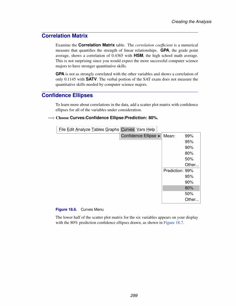
Creating the Analysis
Correlation Matrix
Examine the Correlation Matrix table. The correlation coefficient is a numericalmeasure that quantifies the strength of linear relationships. GPA, the grade pointaverage, shows a correlation of 0.4365 with HSM, the high school math average.This is not surprising since you would expect the more successful computer sciencemajors to have stronger quantitative skills.
GPA is not as strongly correlated with the other variables and shows a correlation ofonly 0.1145 with SATV. The verbal portion of the SAT exam does not measure thequantitative skills needed by computer science majors.
Confidence Ellipses
To learn more about correlations in the data, add a scatter plot matrix with confidenceellipses for all of the variables under consideration.
=⇒ Choose Curves:Confidence Ellipse:Prediction: 80%.
File Edit Analyze Tables Graphs Curves Vars HelpConfidence Ellipse � Mean: 99%
95%90%80%50%Other...
Prediction: 99%95%90%80%50%Other...
Figure 18.6. Curves Menu
The lower half of the scatter plot matrix for the six variables appears on your displaywith the 80% prediction confidence ellipses drawn, as shown in Figure 18.7.
299
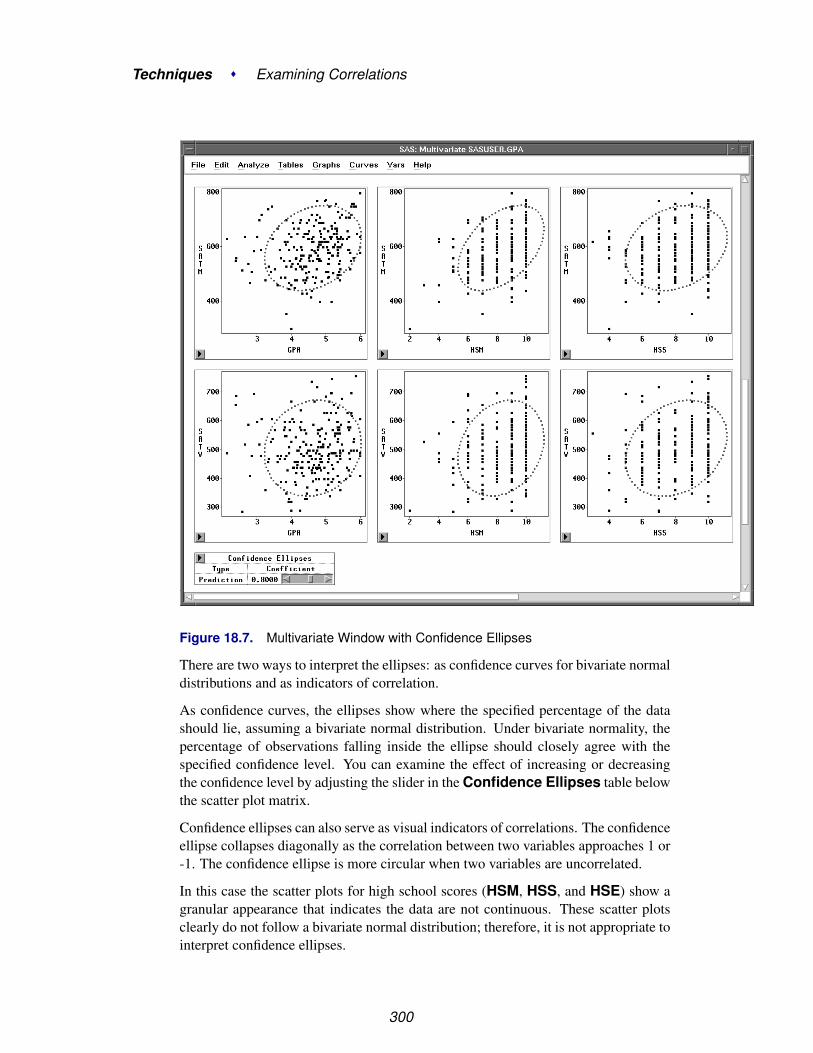
Techniques � Examining Correlations
Figure 18.7. Multivariate Window with Confidence Ellipses
There are two ways to interpret the ellipses: as confidence curves for bivariate normaldistributions and as indicators of correlation.
As confidence curves, the ellipses show where the specified percentage of the datashould lie, assuming a bivariate normal distribution. Under bivariate normality, thepercentage of observations falling inside the ellipse should closely agree with thespecified confidence level. You can examine the effect of increasing or decreasingthe confidence level by adjusting the slider in the Confidence Ellipses table belowthe scatter plot matrix.
Confidence ellipses can also serve as visual indicators of correlations. The confidenceellipse collapses diagonally as the correlation between two variables approaches 1 or-1. The confidence ellipse is more circular when two variables are uncorrelated.
In this case the scatter plots for high school scores (HSM, HSS, and HSE) show agranular appearance that indicates the data are not continuous. These scatter plotsclearly do not follow a bivariate normal distribution; therefore, it is not appropriate tointerpret confidence ellipses.
300

References
The confidence ellipses for GPA, SATM, and SATV can be interpreted. These con-fidence ellipses contain observations appropriate to the 80% confidence level youspecified. The nearly circular appearance of the confidence ellipse in the plot of GPAversus SATV reflects the small correlation you observed in the Correlation Matrixtable. The ellipse in the plot of GPA versus SATM is somewhat more elongated,reflecting a higher correlation.
† Note: Visual interpretation of correlations can be subjective because changes in scaleaffect your perception (Moore and McCabe 1989). When examining correlations,you should use correlation coefficients as well as confidence ellipses.
⊕ Related Reading: Correlation Coefficients, Confidence Ellipses,Chapter 40.
ReferencesMoore, D.S. and McCabe, G.P. (1989), Introduction to the Practice of Statistics, New
York: W.H. Freeman and Company, 179–199.
301

Techniques � Examining Correlations
302

Chapter 19Calculating Principal Components
Chapter Contents
CALCULATING PRINCIPAL COMPONENTS . . . . . . . . . . . . . . . 306Principal Component Tables . . . . . . . . . . . . . . . . . . . . . . . . . . 311Principal Component Plots . . . . . . . . . . . . . . . . . . . . . . . . . . 313
PLOTTING AGAINST ORIGINAL VARIABLES . . . . . . . . . . . . . . 314
SAVING PRINCIPAL COMPONENTS . . . . . . . . . . . . . . . . . . . . 316

Techniques � Calculating Principal Components
304

Chapter 19Calculating Principal Components
Principal component analysis is a technique for reducing the complexity of highdimensional data. You can use principal component analysis to approximate highdimensional data with a few dimensions so you can examine them visually. InSAS/INSIGHT software you can calculate principal components, store them, andplot them in two and three dimensions.
Figure 19.1. Principal Component Analysis
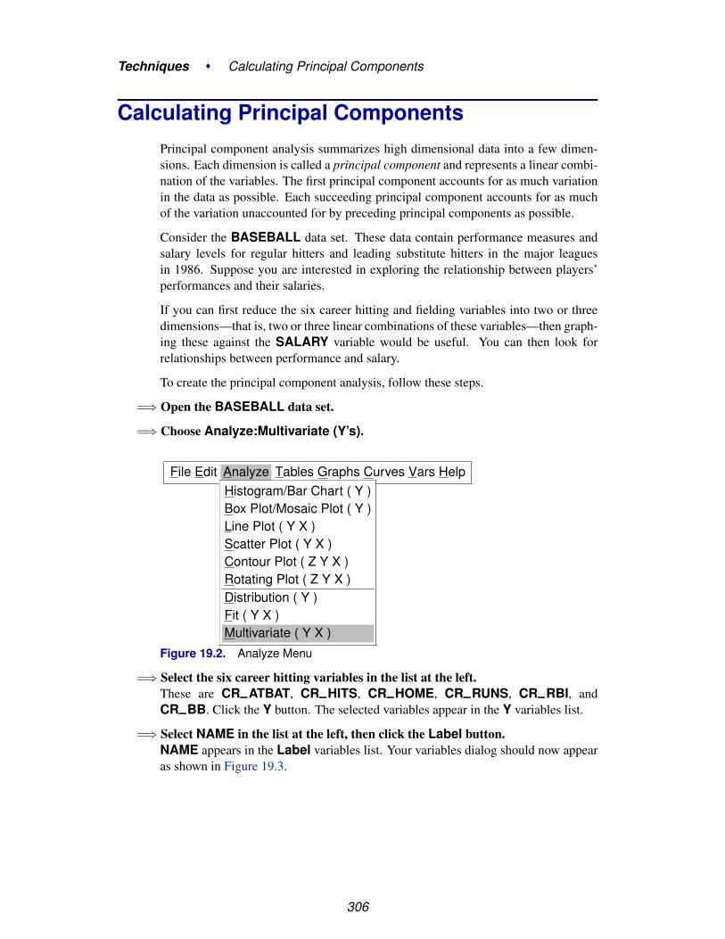
Techniques � Calculating Principal Components
Calculating Principal ComponentsPrincipal component analysis summarizes high dimensional data into a few dimen-sions. Each dimension is called a principal component and represents a linear combi-nation of the variables. The first principal component accounts for as much variationin the data as possible. Each succeeding principal component accounts for as muchof the variation unaccounted for by preceding principal components as possible.
Consider the BASEBALL data set. These data contain performance measures andsalary levels for regular hitters and leading substitute hitters in the major leaguesin 1986. Suppose you are interested in exploring the relationship between players’performances and their salaries.
If you can first reduce the six career hitting and fielding variables into two or threedimensions—that is, two or three linear combinations of these variables—then graph-ing these against the SALARY variable would be useful. You can then look forrelationships between performance and salary.
To create the principal component analysis, follow these steps.
=⇒ Open the BASEBALL data set.
=⇒ Choose Analyze:Multivariate (Y’s).
File Edit Analyze Tables Graphs Curves Vars HelpHistogram/Bar Chart ( Y )Box Plot/Mosaic Plot ( Y )Line Plot ( Y X )Scatter Plot ( Y X )Contour Plot ( Z Y X )Rotating Plot ( Z Y X )Distribution ( Y )Fit ( Y X )Multivariate ( Y X )
Figure 19.2. Analyze Menu
=⇒ Select the six career hitting variables in the list at the left.These are CR–ATBAT, CR–HITS, CR–HOME, CR–RUNS, CR–RBI, andCR–BB. Click the Y button. The selected variables appear in the Y variables list.
=⇒ Select NAME in the list at the left, then click the Label button.NAME appears in the Label variables list. Your variables dialog should now appearas shown in Figure 19.3.
306

Calculating Principal Components
Figure 19.3. Variables Dialog with Variable Roles Assigned
=⇒ Click the Output button.The output options dialog appears.
=⇒ Click the Principal Component Analysis check box in the output optionsdialogThis requests a principal component analysis. Your output options dialog should nowappear as shown in Figure 19.4.
307
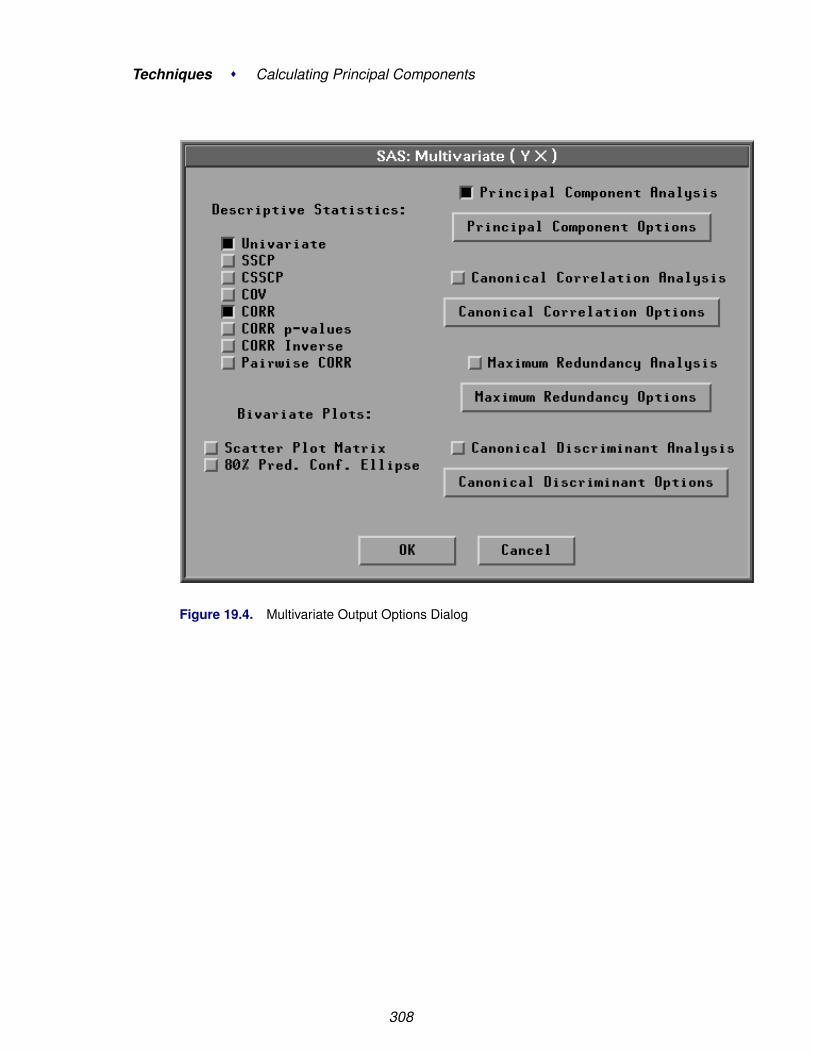
Techniques � Calculating Principal Components
Figure 19.4. Multivariate Output Options Dialog
308

Calculating Principal Components
=⇒ Click the Principal Component Options button in the output options dialogA principal component options dialog should now appear as shown in Figure 19.5.
Figure 19.5. Principal Component Options Dialog
=⇒ Click the Eigenvectors check box in the principal component options dialog
=⇒ Click the radio mark 2 in the options dialogThis requests that the first two principal components are used for tables of eigenvec-tors and correlations.
† Note: By default, the analysis is carried out on the correlation matrix. You canuse the covariance matrix instead by setting options with the Method button in theMultivariate variables dialog. The covariance matrix is recommended only when allthe variables are measured in comparable units.
=⇒ Click OK in all dialogs.A multivariate window appears. At the bottom of the window is the principal com-ponent analysis, as shown in Figure 19.6.
309

Techniques � Calculating Principal Components
Figure 19.6. Multivariate Window
310

Calculating Principal Components
Principal Component Tables
The Eigenvalues (CORR) table illustrated in Figure 19.7 contains all the eigenval-ues of the correlation matrix, differences between successive eigenvalues, the propor-tion of variance explained by each eigenvalue, and the cumulative proportion of thevariance explained. Eigenvalues correspond to each of the principal components andrepresent a partitioning of the total variation in the sample. Because correlations areused, the sum of all the eigenvalues is equal to the number of variables. The first rowof the table corresponds to the first principal component, the second row to the secondprincipal component, and so on. In this example, the first two principal componentsaccount for over 97% of the variation.
311

Techniques � Calculating Principal Components
Figure 19.7. Principal Component Tables
The Eigenvectors (CORR) table illustrated in Figure 19.7 contains the first twoeigenvectors of the correlation matrix. Eigenvectors correspond to each of the eigen-values and associated principal components and are used to form linear combinationsof the Y variables. The first column of the table corresponds to the first principalcomponent, and the second column to the second principal component.
Now examine the coefficients making up the eigenvectors. The first component(PCR1) appears to be a measure of the player’s overall performance as is evidenced
312

Calculating Principal Components
by approximately the same magnitude of the coefficients corresponding to all sixvariables.
Next examine the coefficients making up the eigenvector for the second principalcomponent (PCR2). Only the coefficients associated with the variables CR–HOMEand CR–RBI are positive, and the remaining coefficients are negative. The coef-ficient with the variable CR–HOME is considerably larger than any of the othercoefficients. This indicates a measure of career home runs performance versus otherperformance for 1986.
One way to quantify the strength of the linear relationship between the original Yvariables and principal components is through the Correlations (Structure) table,as shown in Figure 19.7. This correlation matrix contains the correlations betweenthe Y variables and the principal components.
Eigenvector coefficients of a relatively large magnitude translate into larger corre-lations and vice versa. For example, PCR2 has one coefficient substantially largerthan other coefficients in the same eigenvector, CR–HOME. The correlation of thevariable with this PCR2 is also large.
Principal Component Plots
Examine the scatter plot of the first two principal components shown in Figure 19.6.Each marker on the plot represents two principal component scores. The output com-ponent scores are a linear combination of the standardized Y variables with coeffi-cients equal to the eigenvectors of the correlation matrix.
=⇒ Click on the observations with the four highest values for PCR1.The resulting scatter plot should now appear as shown in Figure 19.8.
These four observations correspond to Mike Schmidt, Reggie Jackson, Tony Perez,and Pete Rose. The label for Mike Schmidt is not shown because the observation istoo close to Reggie Jackson. This is not unexpected since the first principal compo-nent is a measure of the player’s overall career performance.
Now examine observations in the second principal component direction on the scatterplot. Recall that the second component appeared to be a measure of the combinedperformance of home runs and runs batted in versus other career performance. Theobservations with large values of PCR2 correspond to Mike Schmidt and ReggieJackson. As one might expect, both players have high career-long home runs andruns batted in.
313

Techniques � Calculating Principal Components
Figure 19.8. Scatter Plot of First Two Principal Components
Plotting Against Original VariablesNow that you have reduced the dimensionality of the career performance variables totwo dimensions, you can easily examine scatter plots of these principal componentsversus the SALARY variable. The two principal component scores are automaticallystored in the data window.
=⇒ Choose Analyze:Scatter Plot ( Y X ).This displays the scatter plot variables dialog.
=⇒ Select SALARY in the list at the left, then click the Y button.SALARY appears in the Y variables list.
=⇒ Select PCR1 and PCR2, then click the X button.PCR1 and PCR2 appear in the X variables list.
=⇒ Select NAME in the list at the left, then click the Label button.NAME appears in the LABEL variables list.
314

Plotting Against Original Variables
A scatter plot variables dialog should now appear as in Figure 19.9.
Figure 19.9. Variable Roles Assigned
=⇒ Click the OK button.A scatter plot window appears, as shown in Figure 19.10.
Figure 19.10. SALARY versus First Two Principal Components
Examine the scatter plot of SALARY versus PCR1, recalling that PCR1 is highlyassociated with overall career performance. The linear trend evident in the plot in-dicates a strong linear relationship between a player’s salary and his overall perfor-
315
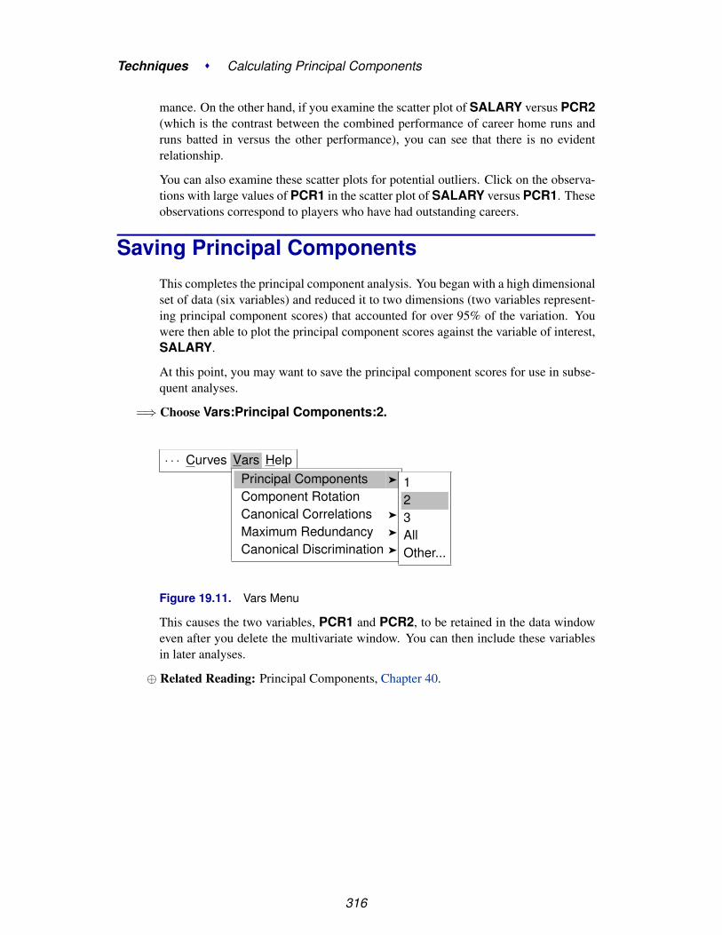
Techniques � Calculating Principal Components
mance. On the other hand, if you examine the scatter plot of SALARY versus PCR2(which is the contrast between the combined performance of career home runs andruns batted in versus the other performance), you can see that there is no evidentrelationship.
You can also examine these scatter plots for potential outliers. Click on the observa-tions with large values of PCR1 in the scatter plot of SALARY versus PCR1. Theseobservations correspond to players who have had outstanding careers.
Saving Principal ComponentsThis completes the principal component analysis. You began with a high dimensionalset of data (six variables) and reduced it to two dimensions (two variables represent-ing principal component scores) that accounted for over 95% of the variation. Youwere then able to plot the principal component scores against the variable of interest,SALARY.
At this point, you may want to save the principal component scores for use in subse-quent analyses.
=⇒ Choose Vars:Principal Components:2.
· · · Curves Vars HelpPrincipal Components �
Component RotationCanonical Correlations �
Maximum Redundancy �
Canonical Discrimination �
123AllOther...
Figure 19.11. Vars Menu
This causes the two variables, PCR1 and PCR2, to be retained in the data windoweven after you delete the multivariate window. You can then include these variablesin later analyses.
⊕ Related Reading: Principal Components, Chapter 40.
316
Chapter 20Transforming Variables
Chapter Contents
COMMON TRANSFORMATIONS . . . . . . . . . . . . . . . . . . . . . . 320
OTHER TRANSFORMATIONS . . . . . . . . . . . . . . . . . . . . . . . . 329
REFERENCES . . . . . . . . . . . . . . . . . . . . . . . . . . . . . . . . . . 335

Techniques � Transforming Variables
318
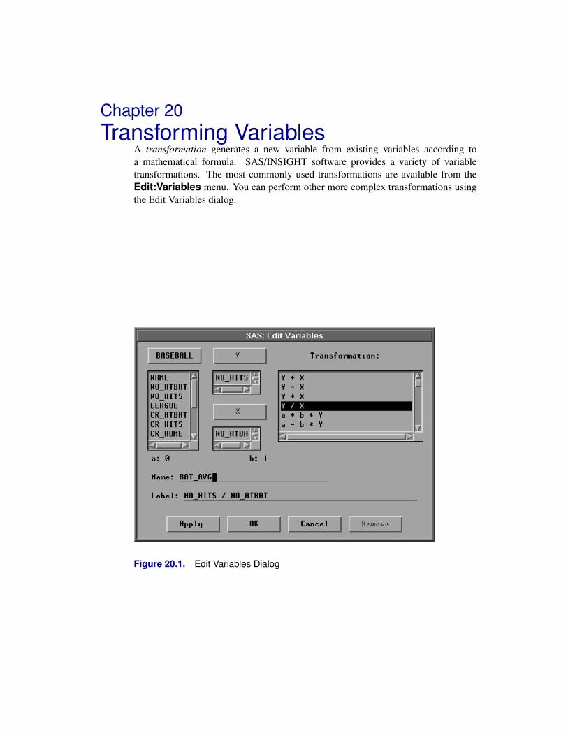
Chapter 20Transforming Variables
A transformation generates a new variable from existing variables according toa mathematical formula. SAS/INSIGHT software provides a variety of variabletransformations. The most commonly used transformations are available from theEdit:Variables menu. You can perform other more complex transformations usingthe Edit Variables dialog.
Figure 20.1. Edit Variables Dialog

Techniques � Transforming Variables
Common TransformationsThe most common transformations are available in the Edit:Variables menu. Forexample, log transformations are commonly used to linearize relationships, stabilizevariances, or reduce skewness. Perform a log transformation in a fit window byfollowing these steps:
=⇒ Open the BASEBALL data set.
=⇒ Create a fit analysis of SALARY versus CR–HOME.
Figure 20.2. Fit Analysis of SALARY versus CR–HOME
You might expect players who hit many home runs to receive high salaries. However,most players do not hit many home runs, and most do not have high salaries. This ob-scures the relationship between SALARY and CR–HOME. Most of the observationsappear in the lower left corner of the scatter plot, and the regression line does not fitthe data well. To make the relationship clearer, apply a logarithmic transformation.
320

Common Transformations
=⇒ Select both variables in the scatter plot.Use your host’s method for noncontiguous selection.
Figure 20.3. SALARY and CR–HOME Selected
=⇒ Choose Edit:Variables:log(Y).
File Edit Analyze Tables Graphs Curves Vars Help
Windows �
Variables �
Observations �
Formats �
CopyDelete
log( Y )sqrt( Y )1 / YY * Yexp( Y )Other...
321

Techniques � Transforming Variables
Figure 20.4. Edit:Variables Menu
322

Common Transformations
This performs a log transformation on both SALARY and CR–HOME and trans-forms the scatter plot to a log-log plot. Now the regression fit is improved, and therelationship between salary and home run production is clearer.
Figure 20.5. Fit Analysis of L–SALARY versus L–CR–HOM
The degrees of freedom (DF) is reduced from 261 to 258. This is due to missingvalues resulting from the log transformation, described in the following step.
=⇒ Scroll the data window to display the last four variables.Notice that in addition to residual and predicted values from the regression, the logtransformations created two new variables: L–SALARY and L–CR–HOM.
323

Techniques � Transforming Variables
Figure 20.6. New Variables
The log transformation is useful in many cases. However, the result of log( Y ) isundefined where Y is less than or equal to 0. In such cases, SAS/INSIGHT softwarecannot transform the value, so a missing value (.) is generated. To see this, sort thedata in the data window.
=⇒ Select L–CR–HOM in the data window, and choose Sort from the data pop-upmenu.
Figure 20.7. Missing Values in Log Transformation
Missing values in the SAS System are considered to be less than any other value, sothey appear first in the sorted variable. These values represent players who have neverhit home runs. Their value for CR–HOME is 0, so the log of this value cannot becalculated. This means the log transformation has removed data from the fit analysis.
324

Common Transformations
The following steps circumvent this problem.
=⇒ Select CR–HOME in the data window.
Figure 20.8. CR–HOME Selected
=⇒ Choose Edit:Variables:Other.
File Edit Analyze Tables Graphs Curves Vars Help
Windows �
Variables �
Observations �
Formats �
CopyDelete
log( Y )sqrt( Y )1 / YY * Yexp( Y )Other...
Figure 20.9. Edit:Variables Menu
This displays the Edit Variables dialog shown in Figure 20.10. In the dialog you cansee that the variable CR–HOME is already assigned as the Y variable.
=⇒ Scroll down the transformation window, and select log( Y + a ).
325

Techniques � Transforming Variables
Figure 20.10. Edit Variables Dialog
=⇒ In the field for a enter the value 1, then press the Return key.Notice that the Label value changes from log( CR–HOME ) to log( CR–HOME+ 1 ) to reflect the new value of a. Setting a to 1 avoids the problem of generatingmissing values because (CR–HOME + 1) is greater than zero in all cases for thisdata.
Figure 20.11. Edit Variables Dialog
=⇒ Click OK to perform the transformation.
=⇒ Scroll all the way to the right to see the new variable, L–CR–H–1.Notice that the new variable contains no missing values.
326

Common Transformations
Figure 20.12. New Variable
=⇒ Select L–SALARY and L–CR–H–1, then choose Analyze:Fit (Y X).At the lower left corner of the scatter plot, you can see observations that were notused in the previous fit analysis. Also note that the degrees of freedom (DF) is backto 261.
327
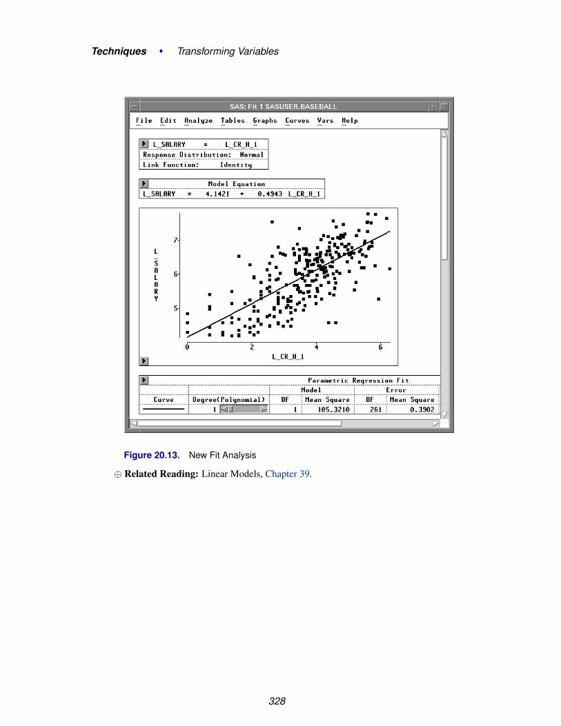
Techniques � Transforming Variables
Figure 20.13. New Fit Analysis
⊕ Related Reading: Linear Models, Chapter 39.
328

Other Transformations
Other TransformationsYou can use the Edit Variables dialog to create other types of transformations. Mosttransformations require one selected variable, as in the previous example. Here is anexample using two variables. Suppose you are interested in batting averages, that is,the number of hits per batting opportunity. Calculate batting averages by followingthese steps.
=⇒ Choose Edit:Variables:Other to display the Edit Variables dialog
=⇒ Assign NO–HITS the Y role and NO–ATBAT the X role.
Figure 20.14. Edit Variables Dialog
=⇒ Click on the Y / X transformation.Notice that the Label value is now NO–HITS / NO–ATBAT. You might want toenter a more mnemonic value for Name.
=⇒ Enter BAT–AVG in the Name field.
329

Techniques � Transforming Variables
Figure 20.15. Creating the Transformation
=⇒ Click the OK button to calculate the batting average.The new BAT–AVG variable appears at the last position in the data window.
Figure 20.16. New BAT–AVG Variable
Now look at the distribution of batting averages for each league by creating a boxplot.
=⇒ Choose Analyze:Box Plot/Mosaic Plot ( Y ).Specify BAT–AVG as the Y variable, LEAGUE as the X variable, and NAME forthe Label role in the box plot variables dialog. Then click on OK.
330
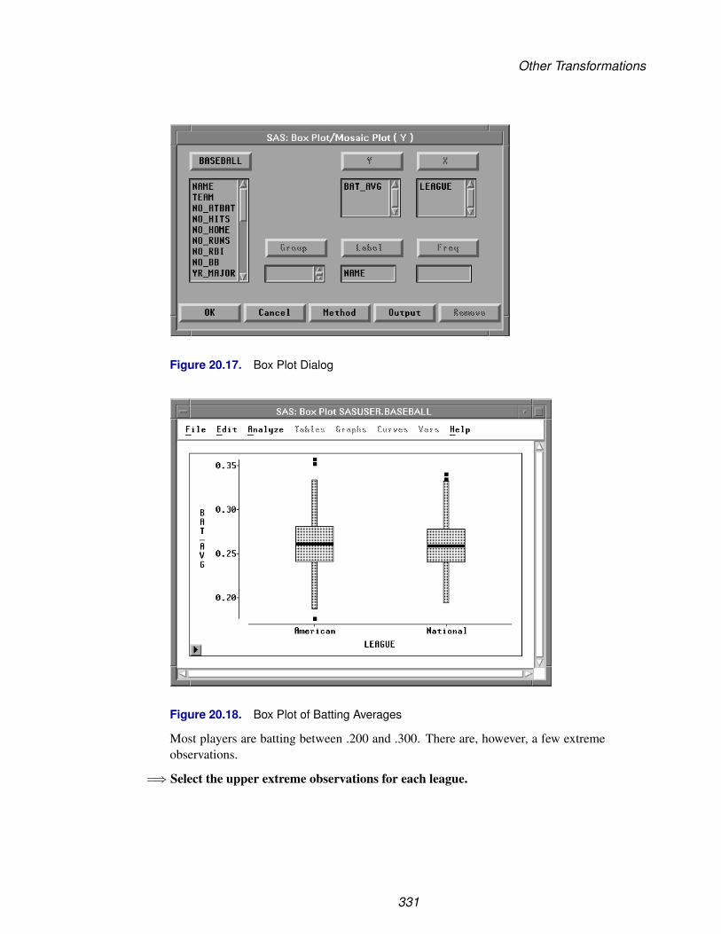
Other Transformations
Figure 20.17. Box Plot Dialog
Figure 20.18. Box Plot of Batting Averages
Most players are batting between .200 and .300. There are, however, a few extremeobservations.
=⇒ Select the upper extreme observations for each league.
331

Techniques � Transforming Variables
Figure 20.19. Examining the Extreme Observations
Don Mattingly and Wade Boggs led the American League in batting, while TimRaines and Hubie Brooks led the National League.
The Edit:Variables menu and dialog offer many other transformations. Here is thecomplete list of transformations in the Edit:Variables menu:
log( Y ) calculates the natural logarithm of the Y variable.
sqrt( Y ) calculates the square root of the Y variable.
1 / Y calculates the reciprocal of the Y variable.
Y * Y calculates the square of the Y variable.
exp( Y ) raises e (2.718...) to the power given by the Y variable.
Here is the complete list of transformations in the Edit:Variables dialog:
Y + XY - XY * XY / X
These four transformations perform addition, subtraction,multiplication, and division on the specified Y and Xvariables.
a + b * Ya - b * Ya + b / Ya - b / Y
These four transformations create linear transformations ofthe Y variable. Using the default values a=0 and b=1, thesecond and third transformations create additive and multi-plicative inverses -Y and 1 / Y.
332

Other Transformations
Y ** b is the power transform. b can be positive or negative.
(( Y + a ) ** b - 1 ) / b is the Box-Cox transformation. This transformation raisesthe sum of the Y variable plus a to the power b, then sub-tracts 1 and divides by b.
a <= Y <= b creates a variable with value 1 when the value of Y is be-tween a and b inclusively, and value 0 for all other valuesof Y. Values for a and b can be character or numeric; char-acter values should not be in quotations. You can use thistransformation to create indicator variables for subsettingyour data.
(Y - mean(Y)) /std(Y)
standardizes the Y variable by subtracting its mean and di-viding by its standard deviation. Standardizing changes themean of the variable to 0 and its standard deviation to 1.
abs( Y ) calculates the absolute value of Y.
arccos( Y ) calculates the arccosine (inverse cosine) of Y. The value isreturned in radians.
arcsin( Y ) calculates the arcsine (inverse sine) of Y. The value is re-turned in radians.
arcsin( sqrt( Y )) calculates the arcsine of the square root of Y. The value isreturned in radians.
arctan( Y ) calculates the arctangent (inverse tangent) of Y. The valueis returned in radians.
ceil( Y ) calculates the smallest integer greater than or equal to Y.
cos( Y ) calculates the cosine of Y.
exp( Y ) raises e (2.718...) to the power given by the Y variable.
floor( Y ) calculates the largest integer less than or equal to Y.
log( Y + a ) calculates the natural logarithm of the Y variable plus anoffset a.
log2( Y + a ) calculates the logarithm base 2 of the Y variable plus anoffset a.
log10( Y + a ) calculates the logarithm base 10 of the Y variable plus anoffset a.
log(( Y - a ) / ( b - Y))
calculates the natural logarithm of the quotient of the Y vari-able minus a divided by b minus the Y variable. When a =0 and b = 1, this is a logit transformation.
333

Techniques � Transforming Variables
ranbin( a, b ) generates a binomial random variable containing values ei-ther 0 or 1. a is the seed value for the random transforma-tion. b is the probability that the generated value will be 1.If a is less than or equal to 0, the time of day is used. Thisis a special case of the SAS function RANBIN where n, thenumber of trials, is 1.
ranexp( a ) generates a random variable from an exponential distribu-tion. a is the seed value for the random transformation. If ais less than or equal to 0, the time of day is used.
rangam( a, b ) generates a random variable from a gamma distribution. ais the seed value for the random transformation, and b is theshape parameter. If a is less than or equal to 0, the time ofday is used.
rannor( a ) generates a random variable from a normal distribution withmean 0 and variance 1. a is the seed value for the randomtransformation. If a is less than or equal to 0, the time ofday is used.
ranpoi( a, b ) generates a random variable from a Poisson distribution. ais the seed value for the random transformation, and b is themean parameter. If a is less than or equal to 0, the time ofday is used.
ranuni( a ) generates a uniform random variable containing values be-tween 0 and 1. a is the seed value for the random transfor-mation. If a is less than or equal to 0, the time of day isused.
round( Y ) calculates the nearest integer to Y.
sin( Y ) calculates the sine of Y.
sqrt( Y + a ) calculates the square root of the Y variable plus an offset a.
tan( Y ) calculates the tangent of Y.
If your work requires other transformations that do not appear in the Edit:Variablesmenu or in the Edit Variables dialog, you can perform many kinds of transfor-mations using the SAS DATA step. For more complete descriptions of the ranbin,ranexp, rangam, rannor, ranpoi, and ranuni transformations and for completeinformation on the DATA step, refer to SAS Language Reference: Dictionary.
334

References
ReferencesChambers, J.M., Cleveland, W.S., Kleiner, B., and Tukey, P.A. (1983), Graphical
Methods for Data Analysis, Belmont, CA: Wadsworth International Group.
335

Techniques � Transforming Variables
336

Chapter 21Comparing Analyses
Chapter Contents
COMPARING ANALYSES OF DIFFERENT OBSERVATIONS . . . . . . 340Extracting Observations . . . . . . . . . . . . . . . . . . . . . . . . . . . . 340Excluding Observations . . . . . . . . . . . . . . . . . . . . . . . . . . . . 344
COMPARING ANALYSES OF DIFFERENT VARIABLES . . . . . . . . . 349Deleting Variables . . . . . . . . . . . . . . . . . . . . . . . . . . . . . . . 349Transforming Variables . . . . . . . . . . . . . . . . . . . . . . . . . . . . 352

Techniques � Comparing Analyses
338
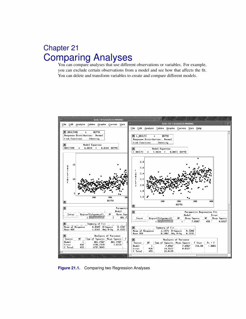
Chapter 21Comparing Analyses
You can compare analyses that use different observations or variables. For example,you can exclude certain observations from a model and see how that affects the fit.You can delete and transform variables to create and compare different models.
Figure 21.1. Comparing two Regression Analyses

Techniques � Comparing Analyses
Comparing Analyses of Different ObservationsThere are two ways to compare analyses that use different observations. You canextract observations or you can exclude them.
Extracting Observations
You can compare analyses made with different observations by extracting a subset,that is, by creating a new data set that contains a subset of observations from theoriginal data set. Then you can request separate analyses for each data set.
Consider the MINING data. This data set contains results of an experiment to ex-amine drilling times (DRILTIME) for different drilling methods (METHOD). As itturned out, the experimenters encountered difficulties due to changing rock types af-ter a depth of about 200 feet. It might be worthwhile to compare the distribution ofDRILTIME for depths greater than 200 feet to the distribution of DRILTIME for theentire data set. To compare the two distributions, you need to select the observationswhere DEPTH is greater than 200 feet and extract them into a new data window.
=⇒ Open the MINING data set.
Figure 21.2. MINING Data
=⇒ Choose Edit:Observations:Find.
340

Comparing Analyses of Different Observations
File Edit Analyze Tables Graphs Curves Vars Help
Windows �
Variables �
Observations �
Formats �
CopyDelete
Find...Examine...Label in PlotsUnlabel in PlotsShow in GraphsHide in GraphsInclude in CalculationsExclude in CalculationsInvert Selection
Figure 21.3. Finding Observations
This displays the Find Observations dialog.
Figure 21.4. Find Observations Dialog
=⇒ Select > in the Test list and 200 in the Value list.
341

Techniques � Comparing Analyses
Figure 21.5. Finding DEPTH > 200
=⇒ Click the OK button.This selects all observations where DEPTH is greater than 200 feet. To see theselected observations, either choose Find Next from the data pop-up menu or scrolldown using the vertical scroll bar on the right (as indicated by the arrow in the figure).
Figure 21.6. Observations where DEPTH > 200
=⇒ Choose Extract from the data pop-up menu.
A new data set containing observations where DEPTH is greater than 200 feet ap-pears, as shown in Figure 21.7. The new data window is named automatically byadding a subscript to the original name. You may have to scroll to the top of the datawindow to duplicate the next figure.
342
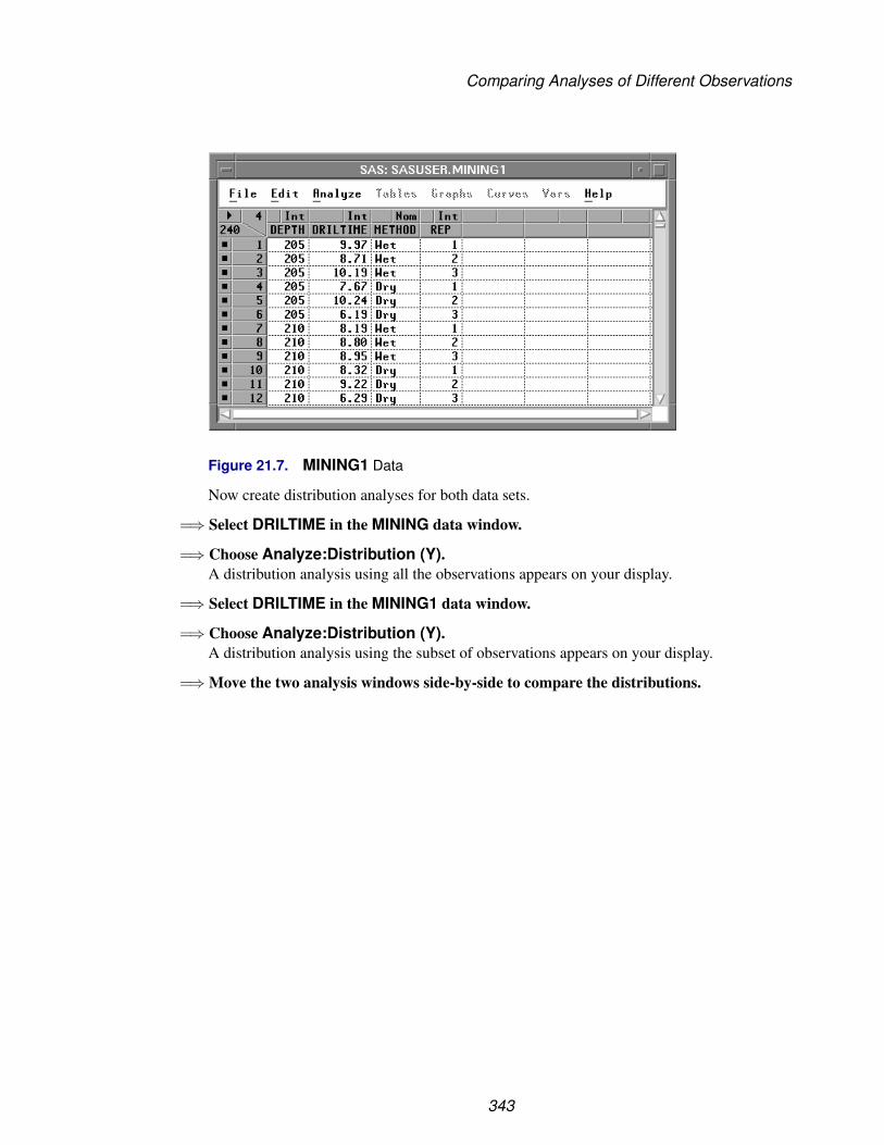
Comparing Analyses of Different Observations
Figure 21.7. MINING1 Data
Now create distribution analyses for both data sets.
=⇒ Select DRILTIME in the MINING data window.
=⇒ Choose Analyze:Distribution (Y).A distribution analysis using all the observations appears on your display.
=⇒ Select DRILTIME in the MINING1 data window.
=⇒ Choose Analyze:Distribution (Y).A distribution analysis using the subset of observations appears on your display.
=⇒ Move the two analysis windows side-by-side to compare the distributions.
343
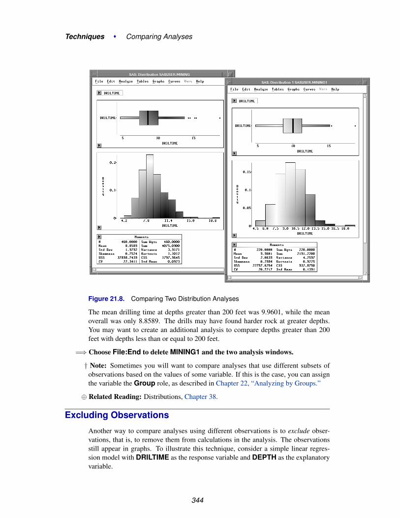
Techniques � Comparing Analyses
Figure 21.8. Comparing Two Distribution Analyses
The mean drilling time at depths greater than 200 feet was 9.9601, while the meanoverall was only 8.8589. The drills may have found harder rock at greater depths.You may want to create an additional analysis to compare depths greater than 200feet with depths less than or equal to 200 feet.
=⇒ Choose File:End to delete MINING1 and the two analysis windows.
† Note: Sometimes you will want to compare analyses that use different subsets ofobservations based on the values of some variable. If this is the case, you can assignthe variable the Group role, as described in Chapter 22, “Analyzing by Groups.”
⊕ Related Reading: Distributions, Chapter 38.
Excluding Observations
Another way to compare analyses using different observations is to exclude obser-vations, that is, to remove them from calculations in the analysis. The observationsstill appear in graphs. To illustrate this technique, consider a simple linear regres-sion model with DRILTIME as the response variable and DEPTH as the explanatoryvariable.
344

Comparing Analyses of Different Observations
=⇒ Select DRILTIME, then DEPTH, then choose Analyze:Fit (Y X).This displays a fit window.
Figure 21.9. Fit Window
=⇒ Choose Edit:Windows:Copy Window in the fit window.This creates a copy of the fit window.
345

Techniques � Comparing Analyses
File Edit Analyze Tables Graphs Curves Vars Help
Windows �
Variables �
Observations �
Formats �
CopyDelete
Renew...Copy WindowAlignAnimate...FreezeSelect AllToolsFontsDisplay Options...Window Options...Graph Options...
Figure 21.10. Edit:Windows Menu
=⇒ Move the two fit windows side by side.
=⇒ Choose Edit:Windows:Freeze in the fit window on the left.
File Edit Analyze Tables Graphs Curves Vars Help
Windows �
Variables �
Observations �
Formats �
CopyDelete
Renew...Copy WindowAlignAnimate...FreezeSelect AllToolsFontsDisplay Options...Window Options...Graph Options...
Figure 21.11. Edit:Windows Menu
This freezes the window, as indicated by the frost in the corners of the window.Freezing a window converts the window to a static image that ignores any changesto the data. Normally, all SAS/INSIGHT windows are linked to their data, and anychanges to the data are automatically reflected in all analyses. By freezing a window,you can compare windows using different observations without creating additionaldata sets.
346

Comparing Analyses of Different Observations
Figure 21.12. Two Windows, One Frozen
Now exclude a few observations from the window on the right.
=⇒ Select the three observations with the largest values of DRILTIME in the scatterplot.
=⇒ Choose Edit:Observations:Exclude in Calculations.
File Edit Analyze Tables Graphs Curves Vars Help
Windows �
Variables �
Observations �
Formats �
CopyDelete
Find...Examine...Label in PlotsUnLabel in PlotsShow in GraphsHide in GraphsInclude in CalculationsExclude in CalculationsInvert Selection
Figure 21.13. Edit: Observations Menu
347

Techniques � Comparing Analyses
This recalculates the fit analysis without the selected observations. Normally, bothwindows would be recalculated, but since the window on the left is frozen, it doesnot change. Now you can compare the two fit windows.
Figure 21.14. Comparing Two Fit Windows
To thaw a frozen window, follow these steps.
=⇒ Choose Edit:Windows:Freeze again.This recalculates the frozen window and restores its dynamic behavior.
=⇒ Close all analysis windows before proceeding to the next section.
348

Comparing Analyses of Different Variables
Comparing Analyses of Different VariablesYou have already seen one easy way to compare analyses using different variables.The Apply button , discussed in Chapter 14, “Multiple Regression,” and Chapter 16,“Logistic Regression,” , enables you to create models quickly with different effects.
In this section, you will see two additional ways to compare analyses using differentvariables. In any analysis, you can delete variables or you can transform them.
Deleting Variables
You can delete any effect in a fit analysis. To see this, do the following:
=⇒ Select DRILTIME, then DEPTH, then METHOD in the data window.
=⇒ Choose Analyze:Fit (Y X).
A fit window appears, as shown in Figure 21.15.
349

Techniques � Comparing Analyses
Figure 21.15. Fit Window
350
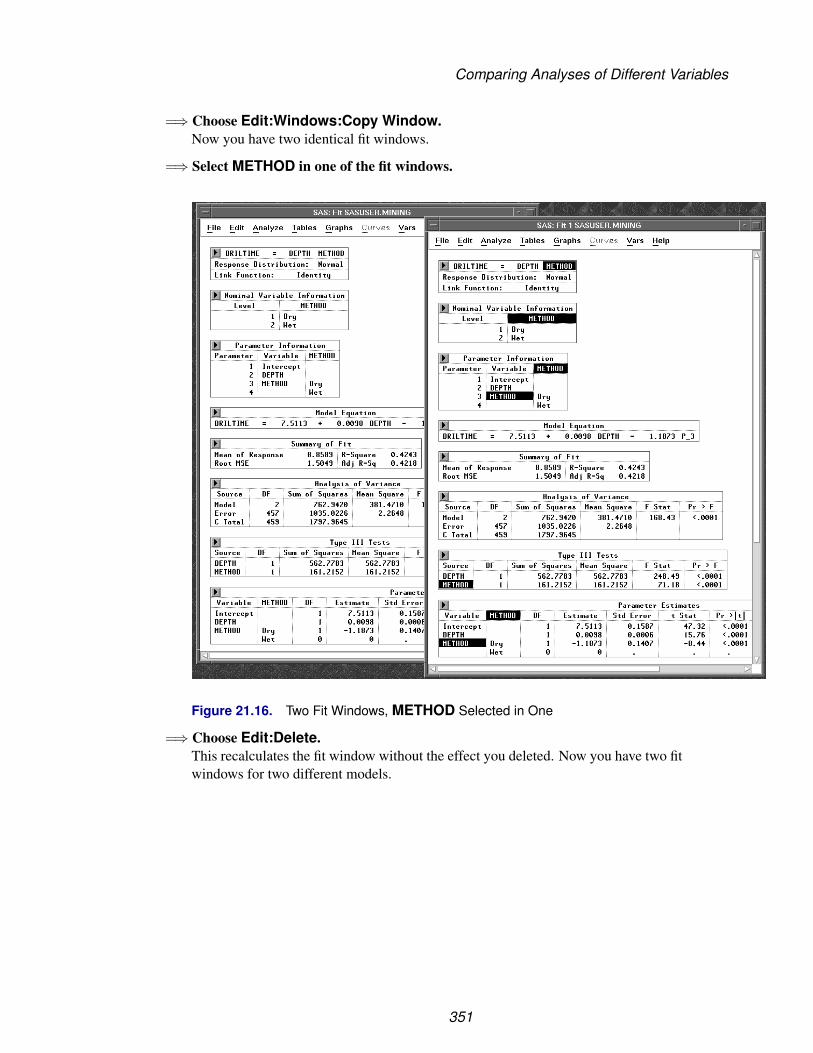
Comparing Analyses of Different Variables
=⇒ Choose Edit:Windows:Copy Window.Now you have two identical fit windows.
=⇒ Select METHOD in one of the fit windows.
Figure 21.16. Two Fit Windows, METHOD Selected in One
=⇒ Choose Edit:Delete.This recalculates the fit window without the effect you deleted. Now you have two fitwindows for two different models.
351

Techniques � Comparing Analyses
Figure 21.17. Comparing Two Models
Deleting METHOD caused the adjusted R-square value to drop from 0.4218 to0.3332. It was expected that different drilling methods might produce differentdrilling times.
Transforming Variables
You can compare analyses by transforming variables in any window.
=⇒ Create identical fit windows for DRILTIME = DEPTH.Either delete METHOD from the first window or choose Edit:Windows:CopyWindow in the second window.
=⇒ Select DRILTIME in one of the fit windows.
352

Comparing Analyses of Different Variables
Figure 21.18. Two Fit Windows, DRILTIME Selected
=⇒ Choose Edit:Variables:log( Y ).
File Edit Analyze Tables Graphs Curves Vars Help
Windows �
Variables �
Observations �
Formats �
CopyDelete
log( Y )sqrt( Y )1 / YY * Yexp( Y )Other...
Figure 21.19. Edit:Variables Menu
This recalculates the fit window using the log of the response variable (L–DRILTI).Now you have two fit windows for two different models.
353

Techniques � Comparing Analyses
Figure 21.20. Comparing Two Fit Analyses
In this case, the log transform did not improve the fit. To undo the log transform, youcan choose Edit:Windows:Renew.
In this chapter you have seen how to compare analysis windows that use differentobservations by extracting and excluding. You have also compared analyses usingdifferent variables by deleting and transforming. In the next chapter, you will seehow to compare analyses using Group variables.
⊕ Related Reading: Transformations, Chapter 20.
⊕ Related Reading: Linear Models, Chapter 39.
354

Chapter 22Analyzing by Groups
Chapter Contents
USING GROUP VARIABLES . . . . . . . . . . . . . . . . . . . . . . . . . 358
COMPARING GROUPS BY COPYING WINDOWS . . . . . . . . . . . . 360
SETTING DEFAULT GROUP VARIABLES . . . . . . . . . . . . . . . . . 363
FORMATTING GROUP VARIABLES . . . . . . . . . . . . . . . . . . . . 366

Techniques � Analyzing by Groups
356

Chapter 22Analyzing by Groups
In SAS/INSIGHT software, you can use a group variable to process your data sepa-rately for each value of the group variable. You can use multiple group variables toprocess your data separately for each unique combination of grouping values.
Figure 22.1. Analyzing by Groups

Techniques � Analyzing by Groups
Using Group VariablesYou can learn more about the distribution of drilling times by constructing a distribu-tion analysis using group variables.
=⇒ Choose Analyze:Distribution (Y).
This displays the distribution variables dialog.
Figure 22.2. Distribution Variables Dialog
=⇒ In the dialog, select DRILTIME, then click the Y button.This assigns DRILTIME the required Y role.
=⇒ Select METHOD and REP, and click the Group button.This assigns METHOD and REP the Group role. You can scroll the Group list tosee both variables. Because there are two values for Method and three values forRep, this produces six groups.
=⇒ Click OK to create the distribution window, as shown in Figure 22.3.
The distribution window shows detailed information on the distributions, includingbox plots, histograms, moments, and quantiles. At the top of the distribution windowis a table indicating the unique combination of values of the two group variables. Youcan scroll the distribution window to the right to see other levels.
358

Using Group Variables
Figure 22.3. Distribution Window with Group Variables
359

Techniques � Analyzing by Groups
Comparing Groups by Copying WindowsBecause there are six groups, it is difficult to compare two groups side by side. Also,the axes are scaled to fit the data, so by default graphs use different axes.
To compare two groups side by side using the same axes, you can create a copy ofthe distribution analysis, set tick marks, and align the axes.
=⇒ Choose Edit:Windows:Copy Window in the Distribution analysis.This creates a copy of the distribution analysis.
=⇒ Move the two analyses side by side.Now you can scroll the windows horizontally to compare any two groups. Figure22.4 shows the first and last groups side by side.
Figure 22.4. Comparing Distribution Analyses
The Moments and Quantiles tables below the histograms present statistics you cancompare. The box plots and histograms, however, are difficult to compare becausethey use different axes. You can customize the axes with the following steps.
360

Comparing Groups by Copying Windows
=⇒ Select DRILTIME in the first distribution window.
=⇒ Choose Ticks from the histogram pop-up menu in the first window.This displays the Ticks dialog.
=⇒ Make the adjustments shown in the following figure, and click the OK button.This scales the DRILTIME axis for all histograms.
Figure 22.5. Ticks Dialog
=⇒ Repeat these steps for the box plots in the first window.This scales the DRILTIME axis for all box plots.
=⇒ Repeat these steps for the second window.Now you can compare box plots and histograms in both windows.
361
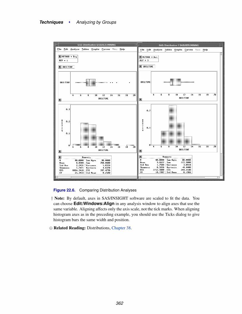
Techniques � Analyzing by Groups
Figure 22.6. Comparing Distribution Analyses
† Note: By default, axes in SAS/INSIGHT software are scaled to fit the data. Youcan choose Edit:Windows:Align in any analysis window to align axes that use thesame variable. Aligning affects only the axis scale, not the tick marks. When aligninghistogram axes as in the preceding example, you should use the Ticks dialog to givehistogram bars the same width and position.
⊕ Related Reading: Distributions, Chapter 38.
362

Setting Default Group Variables
Setting Default Group VariablesOften you will want to assign Group roles to the same group variables throughout aSAS/INSIGHT session. You can save time by setting default Group roles in the datawindow so that you do not have to set them in every variables dialog.
To set default Group roles for SASUSER.MINING, follow these steps.
=⇒ Choose Define Variables from the data pop-up menu.This displays the Define Variables dialog.
=⇒ In the dialog, click on METHOD, then click on Group under Default Role.This assigns the Group role to the METHOD variable.
Figure 22.7. Assigning Group Role
=⇒ Click the Apply button.This assigns the Group role to METHOD but leaves the Define Variables windowopen so that you can assign roles to other variables as well.
=⇒ Click on REP, then click on Group under Default Role.This assigns the Group role to the REP variable as well.
=⇒ Click the OK button to close the dialog
The Group role now appears above both METHOD and REP in the data window.
363
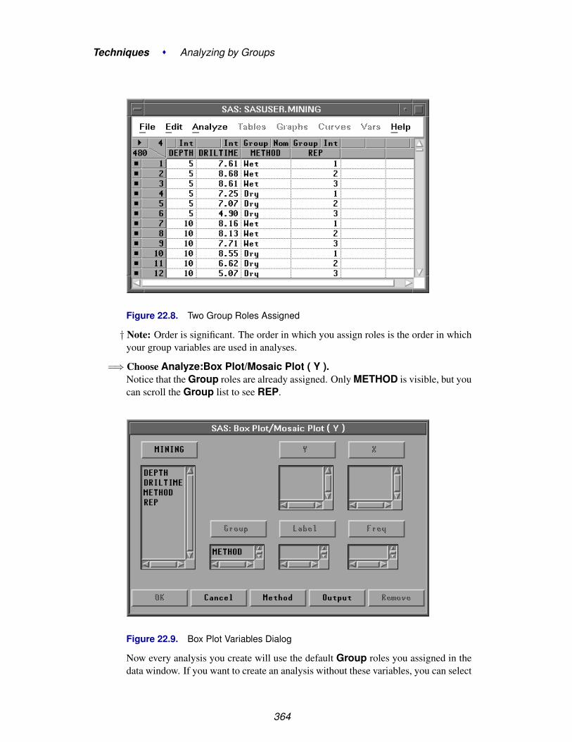
Techniques � Analyzing by Groups
Figure 22.8. Two Group Roles Assigned
† Note: Order is significant. The order in which you assign roles is the order in whichyour group variables are used in analyses.
=⇒ Choose Analyze:Box Plot/Mosaic Plot ( Y ).Notice that the Group roles are already assigned. Only METHOD is visible, but youcan scroll the Group list to see REP.
Figure 22.9. Box Plot Variables Dialog
Now every analysis you create will use the default Group roles you assigned in thedata window. If you want to create an analysis without these variables, you can select
364

Setting Default Group Variables
them in the variables dialog and click the Remove button.
365

Techniques � Analyzing by Groups
Formatting Group VariablesUsually, SAS formats in SAS/INSIGHT software determine only how data are visu-ally displayed. Group variables, however, can use SAS formats to combine differentvalues into a larger group. For example, suppose you are interested only in approxi-mate depths, not in the exact values of DEPTH. You can use a format to combine thevalues of DEPTH into three groups:
• DEPTH ≤ 100
• 100 < DEPTH ≤ 300
• 300 < DEPTH
Once you have assigned this format to DEPTH, you can assign DEPTH a Grouprole and use it as described earlier in this section. Each use of DEPTH creates threegroups containing values in the three ranges you specified.
⊕ Related Reading: Formats, Chapter 24.
366

Chapter 23Animating Graphs
Chapter Contents
ANIMATING SELECTION OF OBSERVATIONS . . . . . . . . . . . . . . 369
ANIMATING SELECTED GRAPHS . . . . . . . . . . . . . . . . . . . . . 373

Techniques � Animating Graphs
368

Chapter 23Animating Graphs
SAS/INSIGHT software provides two ways to animate graphs.
You can animate selected observations in all graphs simultaneously. This producesthe same visual effect as brushing but gives you precise control over the display.
You can animate selected graphs individually. This restricts the animation to onegraph and animates observations and other graph features.
Animating Selection of ObservationsTo animate the selection of observations, follow these steps.
=⇒ Open the AIR data set.This data set contains measurements of carbon monoxide and sulfur dioxide in cityair over various times and dates. Since these data are time-dependent, they are a goodsubject for animation.
Figure 23.1. AIR Data
=⇒ Select CO, then SO2 in the data window using extended selection.
=⇒ Choose Analyze:Scatter Plot ( Y X ).This creates a scatter plot of CO versus SO2.
=⇒ Choose Edit:Windows:Animate.

Techniques � Animating Graphs
File Edit Analyze Tables Graphs Curves Vars Help
Windows �
Variables �
Observations �
Formats �
CopyDelete
Renew...Copy WindowAlignAnimate...FreezeSelect AllToolsFontsDisplay Options...Window Options...Graph Options...
Figure 23.2. Edit:Windows Menu
This displays the animation dialog. The animation dialog contains a list of variables,a list of values, and a slider to control speed.
Figure 23.3. Animation Dialog
=⇒ Select DAY in the list of variables, then click the Apply button.This animates the selection of observations over all values of DAY in the order in
370

Animating Selection of Observations
which they are displayed in the animation dialog. Observations are selected in boththe scatter plot and the data window, and the current value is selected in the animationdialog.
Figure 23.4. Animating Selection of Observations
=⇒ Adjust speed by clicking or dragging on the slider.When the slider is at the extreme left, speed is slowest; at the right, speed is fastest.Animation speed also depends on the speed of your host, the number of observationsin your data set, and the number of graphs displayed.
=⇒ Click the Pause button to stop the animation.
You can make the pattern of animation clearer by toggling the display of observations.
=⇒ Choose Observations from the scatter plot pop-up menu.This turns off the display of all deselected observations.
=⇒ Click the Apply button to restart the animation.You should begin to see the conditional distributions of CO and SO2 as DAY variesover the day of the week.
=⇒ Click in the Value list in the animation dialogThis enables you to stop the animation on particular values. You can click in theValue list to compare pollutant concentrations on different days.
371

Techniques � Animating Graphs
Figure 23.5. Animating Only Selected Observations
The concentrations of CO and SO2 vary widely through most of the days but aremuch lower on Saturday and Sunday. Carbon monoxide is produced primarily byautomobile exhaust, and automobile traffic appears to be reduced on the weekends.Sulfur dioxide concentrations are also lower; this pollutant is produced by powerplants that operate at a reduced rate on weekends.
372

Animating Selected Graphs
Animating Selected GraphsLine plots are an effective way to look at time-dependent data. You can animate lineplots and other graphs by selecting them before using the animation dialog. Thisanimates lines and other features in the graph, not just selected observations.
=⇒ Select CO, then SO2, then HOUR in the data window.The last variable you select, HOUR, will receive the X role in the line plot.
=⇒ Choose Analyze:Line Plot ( Y X ).This creates a plot with two overlaid lines. The lines are jagged because the datacontain seven observations for each hour.
=⇒ Select the line plot by clicking on any edge.
Figure 23.6. Selected Line Plot
=⇒ Select DAY in the animation dialog, then click the Apply button.This animates the line plot, showing pollutant concentrations for each day of theweek.
373

Techniques � Animating Graphs
Figure 23.7. Animating a Line Plot
Notice the peak CO concentrations on weekday mornings and afternoons. Thesemight be caused by increased automobile emissions during rush-hour traffic.
=⇒ When you are finished, click Cancel to close the animation dialog
374
Chapter 24Formatting Variables and Values
Chapter Contents
ASSIGNING FORMATS . . . . . . . . . . . . . . . . . . . . . . . . . . . . 378
CREATING FORMATS . . . . . . . . . . . . . . . . . . . . . . . . . . . . . 385

Techniques � Formatting Variables and Values
376

Chapter 24Formatting Variables and Values
Formats determine how variables and values are displayed. In group variables andmodel effects, formats can also determine how values are used in calculations.
You can use formats to set the width of displayed values, the number of decimalpoints displayed, the handling of blanks, zeroes, and commas, and other details. TheSAS System provides many standard formats for displaying character and numericvalues.
In addition, you can use the FORMAT procedure to create your own formats.
Figure 24.1. Assigning a Format

Techniques � Formatting Variables and Values
Assigning FormatsBy default, SAS/INSIGHT software displays each variable using the format suppliedin your SAS data set. If your data set contains numeric variables with no formats,SAS/INSIGHT software chooses a format based on that variable’s values. Whenyou save the data, formats chosen by SAS/INSIGHT software are not automaticallysaved, but any formats you assign are saved.
You can assign formats by using the Edit:Formats menu.
=⇒ Open the BASEBALL data set.This data set contains statistics and salaries of major league baseball players.
=⇒ Select the variable SALARY.
Figure 24.2. SALARY Selected=⇒ Choose Edit:Formats:9.1.
File Edit Analyze Tables Graphs Curves Vars Help
Windows �
Variables �
Observations �
Formats �
CopyDelete
8.09.110.211.312.413.514.6E12.Other...
Figure 24.3. Edit:Formats Menu
378

Assigning Formats
This gives the variable SALARY a width of nine character positions, including thedecimal and one position after the decimal. The actual data values for SALARYcontinue to be stored with double precision.
Figure 24.4. Format 9.1
=⇒ Choose Edit:Formats:E12.This gives the variable SALARY a width of 12 character positions and expresseseach value in exponential notation.
Figure 24.5. Format E12.
The Edit:Formats menu provides quick access to frequently used formats. Thereare many other standard formats provided by the SAS System.
=⇒ Choose Edit:Formats:Other.
379

Techniques � Formatting Variables and Values
File Edit Analyze Tables Graphs Curves Vars Help
Windows �
Variables �
Observations �
Formats �
CopyDelete
8.09.110.211.312.413.514.6E12.Other...
Figure 24.6. Edit:Formats Menu
This displays the Format dialog. In the dialog, the fields w and d specify the widthand decimal places to be used by the formats. Note that the SALARY variable andthe E12. format are currently selected.
Figure 24.7. Format Dialog
=⇒ Select DOLLARw.d in the Format list.Formats are listed alphabetically, so the DOLLARw.d format is above the Ew. for-mat.
380

Assigning Formats
Figure 24.8. Format DOLLARw.d
The example in the upper right corner of the dialog illustrates the format you have se-lected. DOLLAR is the standard format for display of currency in the United States.There is also a DOLLARX format sometimes preferred in European countries.
=⇒ Click OK to set the format you prefer.
Figure 24.9. SALARY Formatted
Now the variable SALARY uses the format you assigned. By default, this format isalso used for axes in subsequent analyses. You can modify the axes, however, to useother formats.
=⇒ Choose Analyze:Distribution ( Y ).This creates a distribution analysis of SALARY. The box plot and histogram axesuse the format you assigned to the SALARY variable in the data window.
=⇒ Select SALARY in the distribution window.
381

Techniques � Formatting Variables and Values
Figure 24.10. Distribution Analysis, SALARY Selected
=⇒ Choose Edit:Formats:8.0.This assigns the 8.0 format to SALARY on axes in the distribution window. In thedata window, SALARY continues to use the DOLLAR format.
382

Assigning Formats
Figure 24.11. SALARY Axes Formatted
You can also format individual values in analysis tables. For example, suppose youneed to see greater precision for the mean and standard deviation.
=⇒ Select the values for Mean and Std Dev in the Moments table.
383

Techniques � Formatting Variables and Values
Figure 24.12. Moments Table, Values Selected
=⇒ Choose Edit:Formats:14.6.Now the mean and standard deviation show six digits after the decimal.
Figure 24.13. Moments Table, Values Formatted
384

Creating Formats
Creating FormatsAlthough there are many formats available in the SAS System, occasionally you willwant to create your own. To do this, use the FORMAT procedure.
For example, suppose you want to consider certain groupings of baseball playersbased on the length of their careers. You can combine the values of YR–MAJORinto four groups, as follows.
=⇒ Enter PROC FORMAT statements in the Program Editor.
Figure 24.14. Program Editor
=⇒ Choose Run:Submit.
File Edit View Tools Run Solutions HelpSubmitRecall Last SubmittedSubmit Top LineSubmit N Lines...Submit ClipboardSignon...Remote Submit...Remote GetRemote DisplaySignoff...
Figure 24.15. Run Menu
=⇒ Select YR–MAJOR.
385

Techniques � Formatting Variables and Values
Figure 24.16. YR–MAJOR Selected
=⇒ Choose Edit:Formats:Other.This displays the Format Dialog.
Figure 24.17. Format Dialog
=⇒ Enter YEARFMT in the Name field.
=⇒ Enter 12 in the w field, then press the Return key.Now the example in the upper right of the dialog shows a value formatted withYEARFMT.
386
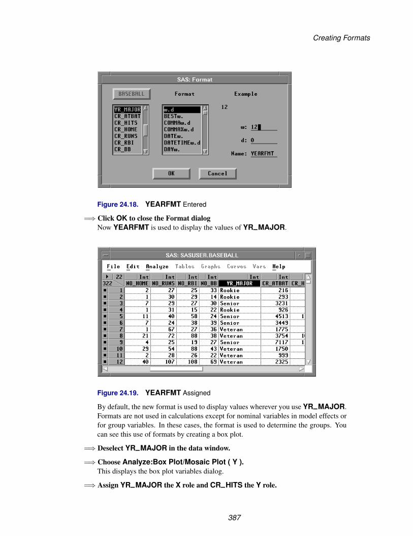
Creating Formats
Figure 24.18. YEARFMT Entered
=⇒ Click OK to close the Format dialogNow YEARFMT is used to display the values of YR–MAJOR.
Figure 24.19. YEARFMT Assigned
By default, the new format is used to display values wherever you use YR–MAJOR.Formats are not used in calculations except for nominal variables in model effects orfor group variables. In these cases, the format is used to determine the groups. Youcan see this use of formats by creating a box plot.
=⇒ Deselect YR–MAJOR in the data window.
=⇒ Choose Analyze:Box Plot/Mosaic Plot ( Y ).This displays the box plot variables dialog.
=⇒ Assign YR–MAJOR the X role and CR–HITS the Y role.
387

Techniques � Formatting Variables and Values
Figure 24.20. Box Plot Variables Dialog
=⇒ Click the OK button to create the box plot.
Figure 24.21. Box Plot of CR–HITS by YR–MAJOR
388

Creating Formats
Since YEARFMT defines four formatted values, there are four boxes in the box plot.One of the boxes has no whiskers because it represents only two observations. PeteRose and Tony Perez, ballplayers of exceptional hitting ability and longevity, are in aclass by themselves.
To learn more about SAS formats, refer to SAS Language Reference: Dictionary. Tolearn more about creating your own formats with PROC FORMAT, refer to the SASProcedures Guide.
⊕ Related Reading: Box Plots, Chapter 33.
389

Techniques � Formatting Variables and Values
390

Chapter 25Editing Windows
Chapter Contents
ZOOMING WINDOWS . . . . . . . . . . . . . . . . . . . . . . . . . . . . . 394
RENEWING WINDOWS . . . . . . . . . . . . . . . . . . . . . . . . . . . . 401
ADDING AND DELETING . . . . . . . . . . . . . . . . . . . . . . . . . . 404
MOVING AND SIZING . . . . . . . . . . . . . . . . . . . . . . . . . . . . . 411
ALIGNING GRAPHS . . . . . . . . . . . . . . . . . . . . . . . . . . . . . . 417

Techniques � Editing Windows
392

Chapter 25Editing Windows
SAS/INSIGHT software provides many ways to edit the contents of your analysiswindows. You can zoom in and out to see more or less detail. You can move, resize,add, and delete graphs and tables. You can align graphs. If you change your mindabout your window layout, you can renew any window to restore its original state.
Figure 25.1. Adding a Graph to a Window

Techniques � Editing Windows
Zooming WindowsZooming a window means adjusting the focus to make objects in the window largeror smaller. Zooming is most useful when you want to see more detail. For example,you may use zooming to explore data in a scatter plot matrix.
=⇒ Open the GPA data set.This data set contains college grade point averages, high school math, science, andEnglish averages, and SAT scores of first-year college students.
=⇒ Select all the variables.Click on the variables count in the upper left corner.
Figure 25.2. Selecting All Variables
=⇒ Choose Analyze:Scatter Plot ( Y X ).This creates a seven-by-seven scatter plot matrix.
394
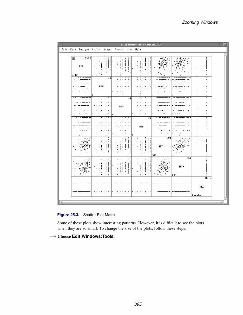
Zooming Windows
Figure 25.3. Scatter Plot Matrix
Some of these plots show interesting patterns. However, it is difficult to see the plotswhen they are so small. To change the size of the plots, follow these steps.
=⇒ Choose Edit:Windows:Tools.
395

Techniques � Editing Windows
File Edit Analyze Tables Graphs Curves Vars Help
Windows �
Variables �
Observations �
Formats �
CopyDelete
Renew...Copy WindowAlignAnimate...FreezeSelect AllToolsFontsDisplay Options...Window Options...Graph Options...
Figure 25.4. Edit:Windows Menu
This displays the Tools window. At the top, the window contains three tools, eachindicating a different mode of operation. To select and identify objects, use the arrow.To manipulate objects, use the hand. To zoom, use the magnifying glass.
=⇒ Click on the magnifying glass in the Tools window.Now the magnifying glass in the window is highlighted, and the cursor changes froman arrow to a magnifying glass.
Figure 25.5. Tools Window
=⇒ Move the magnifying glass to the center of the window and click several times.When it is near the center of the window, the magnifying glass is large.
396

Zooming Windows
Clicking near the center makes objects larger.
Figure 25.6. Zooming In
=⇒ Move the magnifying glass to the edge of the window and click several times.When it is near the edge of the window, the magnifying glass is small.
Clicking near the edge makes objects smaller until all objects fit in the window.
397
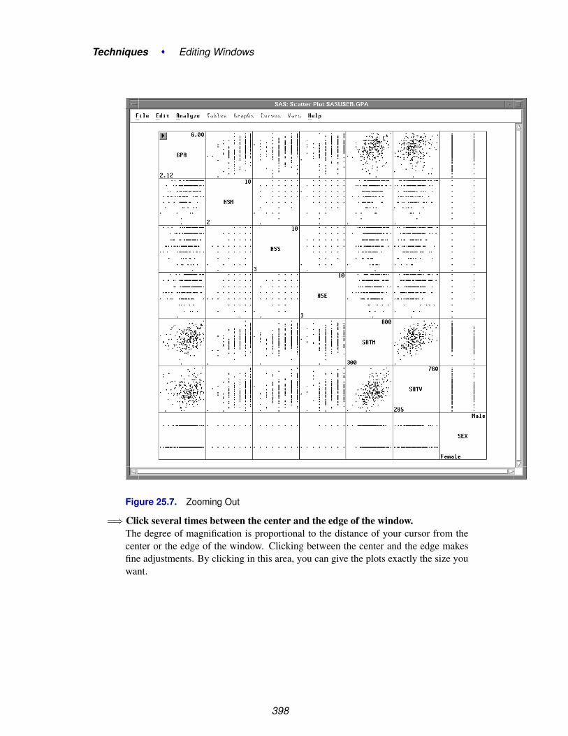
Techniques � Editing Windows
Figure 25.7. Zooming Out
=⇒ Click several times between the center and the edge of the window.The degree of magnification is proportional to the distance of your cursor from thecenter or the edge of the window. Clicking between the center and the edge makesfine adjustments. By clicking in this area, you can give the plots exactly the size youwant.
398

Zooming Windows
Figure 25.8. Making Fine Adjustments
To zoom in on a specific area, you can drag a rectangle with the magnifying glass.
=⇒ Drag a rectangle around the plot of GPA versus HSM.On some hosts, to drag a rectangle it is necessary to begin moving the mouse as soonas you depress the mouse button.
399
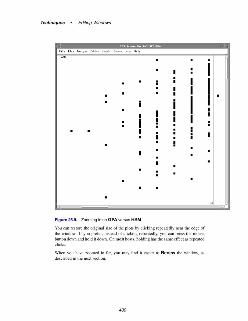
Techniques � Editing Windows
Figure 25.9. Zooming in on GPA versus HSM
You can restore the original size of the plots by clicking repeatedly near the edge ofthe window. If you prefer, instead of clicking repeatedly, you can press the mousebutton down and hold it down. On most hosts, holding has the same effect as repeatedclicks.
When you have zoomed in far, you may find it easier to Renew the window, asdescribed in the next section.
400

Renewing Windows
Renewing WindowsRenewing restores the original state of the window. Renewing also gives you theopportunity to change the variables and options used to create the window.
=⇒ Restore the arrow tool by clicking on the arrow button in the Tools window.
=⇒ Choose Edit:Windows:Renew.
File Edit Analyze Tables Graphs Curves Vars Help
Windows �
Variables �
Observations �
Formats �
CopyDelete
Renew...Copy WindowAlignAnimate...FreezeSelect AllToolsFontsDisplay Options...Window Options...Graph Options...
Figure 25.10. Edit:Windows Menu
This displays the Scatter Plot variables dialog used to create the window.
Figure 25.11. Scatter Plot Variables Dialog
401

Techniques � Editing Windows
=⇒ Click OK to re-create the scatter plot matrix at its original size, as shown inFigure 25.3.
You can also use Edit:Windows:Renew to adjust variables and options associatedwith your window.
=⇒ Choose Edit:Windows:Renew again to display the variables dialog
=⇒ In the dialog, select SATM, SATV, and SEX in both Y and X lists.
=⇒ Click Remove to remove these variables.
Figure 25.12. Removing Variables
=⇒ Click Output to display the output options dialog
=⇒ In the options dialog, click on the Labels button to display variable labels.
Figure 25.13. Setting Variable Labels
402

Renewing Windows
=⇒ Click OK in both dialogs to renew the window.The matrix that was seven-by-seven is now four-by-four, and it displays variable la-bels instead of names.
Figure 25.14. Renewed Window
To reset the scatter plot output to display variable names again, follow the same stepsto display the scatter plot options dialog, then click on the Names button underVariable: in the dialog.
⊕ Related Reading: Scatter Plot Matrix, Chapter 5, Chapter 35.
403

Techniques � Editing Windows
Adding and DeletingMany windows contain Graphs and Tables menus that enable you to add the mostcommonly used graphs and tables to any window. For example, in the Fit window youcan add residual plots; in the Distribution window you can add tests for distributions.
If a graph you need is not listed in the Graphs menu, you can use the Analyze menuto add any graph to any window. For example, suppose you want to create a scatterplot with marginal histograms. To create this combination of graphs, first create adistribution analysis on two variables.
=⇒ Choose Analyze:Distribution ( Y ).
File Edit Analyze Tables Graphs Curves Vars HelpHistogram/Bar Chart ( Y )Box Plot/Mosaic Plot ( Y )Line Plot ( Y X )Scatter Plot ( Y X )Contour Plot ( Z Y X )Rotating Plot ( Z Y X )Distribution ( Y )Fit ( Y X )Multivariate ( Y X )
Figure 25.15. Analyze Menu
This displays the Distribution variables dialog.
=⇒ Select GPA and HSM, then click the Y button.This assigns GPA and HSM the Y role in the Distribution analysis.
Figure 25.16. Distribution Variables Dialog
404

Adding and Deleting
=⇒ Click the Output button.This displays the output options dialog.
=⇒ In the output dialog, turn off all options except Histogram/Bar Chart.
Figure 25.17. Output Options Dialog
405

Techniques � Editing Windows
=⇒ Click OK in both dialogs to create the distribution analysis.
Figure 25.18. Distribution Window
Now you have a distribution window with two histograms. To add a scatter plot ofboth variables, follow these steps.
=⇒ Drag the bottom right corner of the window to the right.
406

Adding and Deleting
This increases the window size to provide blank space to the right of the histograms.
=⇒ Drag a rectangle to select an area in the window.
Figure 25.19. Area Selected
=⇒ Choose Analyze:Scatter Plot ( Y X ).This displays the scatter plot variables dialog.
=⇒ In the dialog, assign GPA the Y role, and HSM the X role.
=⇒ Click OK to add the scatter plot to the distribution window.
407

Techniques � Editing Windows
Figure 25.20. Distribution Window with Scatter Plot
You can delete any graph or table in the distribution window. For example, in thiswindow the two small tables that contain variable names are not needed.
=⇒ Click on any edge of the GPA table to select it.
=⇒ Use extended selection to select the HSM table also.
408

Adding and Deleting
Figure 25.21. Tables Selected
=⇒ Choose Edit:Delete to delete the tables.
File Edit Analyze Tables Graphs Curves Vars Help
Windows �
Variables �
Observations �
Formats �
CopyDelete
Figure 25.22. Edit:Windows Menu
409
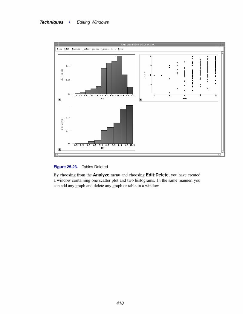
Techniques � Editing Windows
Figure 25.23. Tables Deleted
By choosing from the Analyze menu and choosing Edit:Delete, you have createda window containing one scatter plot and two histograms. In the same manner, youcan add any graph and delete any graph or table in a window.
410

Moving and Sizing
Moving and SizingNow you have a window containing one scatter plot and two histograms. To makemarginal histograms, you should position the graphs so that common axes are paral-lel.
You can move any graph or table by dragging on its side.
=⇒ Drag the HSM histogram below the scatter plot.Press the mouse button down on any side of the histogram. Move the mouse to theright. Release the mouse button when you have the histogram positioned below thescatter plot.
Figure 25.24. Histogram Moved
Now the histogram is in approximately the right place, but it is too large and itsorientation is wrong. A marginal histogram should be smaller and the bars should bepointing downward.
You can resize and reorient any graph by dragging on a corner.
=⇒ Drag the lower right corner of the HSM histogram upward.Press the mouse button down on the lower right corner. Move the mouse upward.Release the mouse button when the histogram is about half its original size.
411

Techniques � Editing Windows
Figure 25.25. Histogram Resized
To change the orientation of the histogram, you can flip it over by dragging one corneracross another.
=⇒ Drag the upper right corner down past the lower right corner.This flips the histogram so that the bars are pointing downward.
412
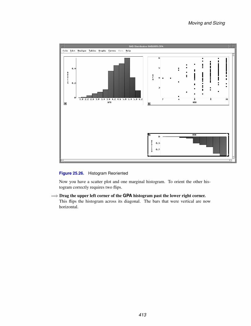
Moving and Sizing
Figure 25.26. Histogram Reoriented
Now you have a scatter plot and one marginal histogram. To orient the other his-togram correctly requires two flips.
=⇒ Drag the upper left corner of the GPA histogram past the lower right corner.This flips the histogram across its diagonal. The bars that were vertical are nowhorizontal.
413

Techniques � Editing Windows
Figure 25.27. Histogram Reoriented
=⇒ Drag the upper right corner left past the upper left corner.This flips the histogram so that the bars are pointing to the left.
414

Moving and Sizing
Figure 25.28. Histogram Reoriented
=⇒ Size and move both histograms to the margins of the scatter plot.
415

Techniques � Editing Windows
Figure 25.29. Scatter Plot with Marginal Histograms
Now both histograms are correctly oriented and placed at the margins of the scatterplot.
416

Aligning Graphs
Aligning GraphsNow that you have created a scatter plot with marginal histograms, you may noticethat the axes are not perfectly aligned. For example, the tick label 1.5 in the HSMhistogram appears to the right of the tick label 2 in the scatter plot. Similarly, the ticklabel 6.20 in the GPA histogram appears below the tick label 6.00 in the scatter plot.This occurs because, by default, axes are chosen to maximize the display of the data.You can override this behavior to align axes in different graphs.
=⇒ Click once in any empty area to deselect the histogram.
=⇒ Choose Edit:Windows:Align.This aligns the HSM and GPA axes in all graphs.
Figure 25.30. Graphs Aligned
You can align any axes that display the same variable. When you do notwant to align all axes in a window, select the axes of interest before choosingEdit:Windows:Align.
Once you have moved, sized, added, deleted, and aligned objects in your windows,you will often want to save and print them. The next three chapters describe how tosave and print data, graphs, and tables.
417

Techniques � Editing Windows
418

Chapter 26Saving and Printing Data
Chapter Contents
SAVING DATA . . . . . . . . . . . . . . . . . . . . . . . . . . . . . . . . . . 422
PRINTING DATA . . . . . . . . . . . . . . . . . . . . . . . . . . . . . . . . 425

Techniques � Saving and Printing Data
420

Chapter 26Saving and Printing Data
Saving a data set means copying the data from a SAS/INSIGHT data window to aSAS data set. SAS/INSIGHT software automatically saves observation colors, mark-ers, and other states as a variable in the SAS data set.
You can print the contents of any SAS data set to the SAS Output window and to ahardcopy device by using the PRINT procedure.
Figure 26.1. PROC PRINT Output

Techniques � Saving and Printing Data
Saving DataAll data analysis in SAS/INSIGHT software uses a copy of a SAS data set stored inmemory. Since your original SAS data set is not stored in memory, it is not affectedby changes you make in the data window.
When you save the data, you copy the data in memory to a SAS data set stored ondisk. Saving the data makes a copy of
• all data values, including any you have edited with the Data:Fill menu
• all variables and observations, including any you have created
• measurement levels for up to 250 variables
• all observation states, including color, marker shape, show/hide, in-clude/exclude, label/nolabel, and select states
Observation states are stored in a special variable –OBSTAT– that is automaticallyread in the next time you open the data set. Thus, if you have colored, marked, hidden,excluded, and labeled observations, you can save all these states, exit SAS/INSIGHTsoftware, and invoke SAS/INSIGHT software again later without losing your work.You can also set the values of the –OBSTAT– variable to initialize observationstates. For an example of this, see Chapter 30, “Working with Other SAS Products.”
The following steps illustrate how to save data to a SAS data set.
=⇒ Open the DRUG data set.
Figure 26.2. DRUG data
=⇒ Choose File:Save:Data.
422

Saving Data
File Edit Analyze Tables Graphs Curves Vars Help
NewOpen...Save �
Print...Print setup...Print previewEnd
Data...Graphics Catalog...Graphics File...TablesInitial TablesStatementsOptions
Figure 26.3. File:Save Menu
This displays a dialog. By default, the data set you save to has the same name as thedata window in your SAS/INSIGHT session. If you prefer, you can select anotherlibrary and enter another data set name in the dialog.
=⇒ Click OK to save the data.
423

Techniques � Saving and Printing Data
Figure 26.4. Save Dialog
424

Printing Data
Printing DataYou can print the contents of the data window by saving it as a SAS data set and usingthe PRINT procedure. PROC PRINT sends its output to the Output window. You cansend the contents of the Output window to a file or printer.
=⇒ Enter a PROC PRINT statement in the Program Editor.
Figure 26.5. Program Editor
=⇒ Choose Run:Submit.
File Edit View Tools Run Solutions HelpSubmitRecall Last SubmittedSubmit Top LineSubmit N Lines...Submit ClipboardSignon...Remote Submit...Remote GetRemote DisplaySignoff...
Figure 26.6. Run Menu
This displays the observations in the Output window.
425

Techniques � Saving and Printing Data
Figure 26.7. Output Window
You can send the contents of the Output window to a file or to a printer by choosingFile:Print in the Output window. On many hosts, the SAS System is installed sothat this menu sends the contents of the Output window to a default printer. You canalso choose this menu to save the window contents to a file and later route them to aprinter using appropriate host commands.
426

Printing Data
File Edit View Tools Solutions HelpNewOpen...Open Object...SaveSave As...Save As Object...Import Data...Export Data...Print Setup...Print Preview...Print utilitiesPrintSend Mail...Close
Figure 26.8. File Menu
427

Techniques � Saving and Printing Data
Alternatively, you can redirect SAS System output from the Output window to a textfile by using the PRINTTO procedure.
For more information on printing from the Output window, refer to the SAS com-panion for your host. For more information on PROC PRINT and PROC PRINTTO,refer to the SAS Procedures Guide.
428

Chapter 27Saving and Printing Graphics
Chapter Contents
CHOOSING FONTS . . . . . . . . . . . . . . . . . . . . . . . . . . . . . . 432
SETTING DISPLAY OPTIONS . . . . . . . . . . . . . . . . . . . . . . . . 435
SAVING GRAPHICS . . . . . . . . . . . . . . . . . . . . . . . . . . . . . . 436Saving Graphics Catalogs . . . . . . . . . . . . . . . . . . . . . . . . . . . 436Saving Graphics Files . . . . . . . . . . . . . . . . . . . . . . . . . . . . . 437
PRINTING . . . . . . . . . . . . . . . . . . . . . . . . . . . . . . . . . . . . 439Printing from the Display . . . . . . . . . . . . . . . . . . . . . . . . . . . 439Printing from the Clipboard . . . . . . . . . . . . . . . . . . . . . . . . . . 439Printing from the Window . . . . . . . . . . . . . . . . . . . . . . . . . . . 440

Techniques � Saving and Printing Graphics
430

Chapter 27Saving and Printing Graphics
If you have SAS/GRAPH software installed, you can save any SAS/INSIGHT win-dow to a graphics catalog. You can modify graphics using the Graphics Editor andprint them on any SAS/GRAPH device. You can save graphics files in bitmap formatsincluding GIF, TIFF, and PostScript™.
On Windows and OS/2 hosts, SAS/INSIGHT software prints using host printing fa-cilities. On other hosts, you can print using SAS/GRAPH software or host-providedscreen-dumping utilities.
To improve your output, you can choose proportional fonts and set display options.
Figure 27.1. Printed Output with Title
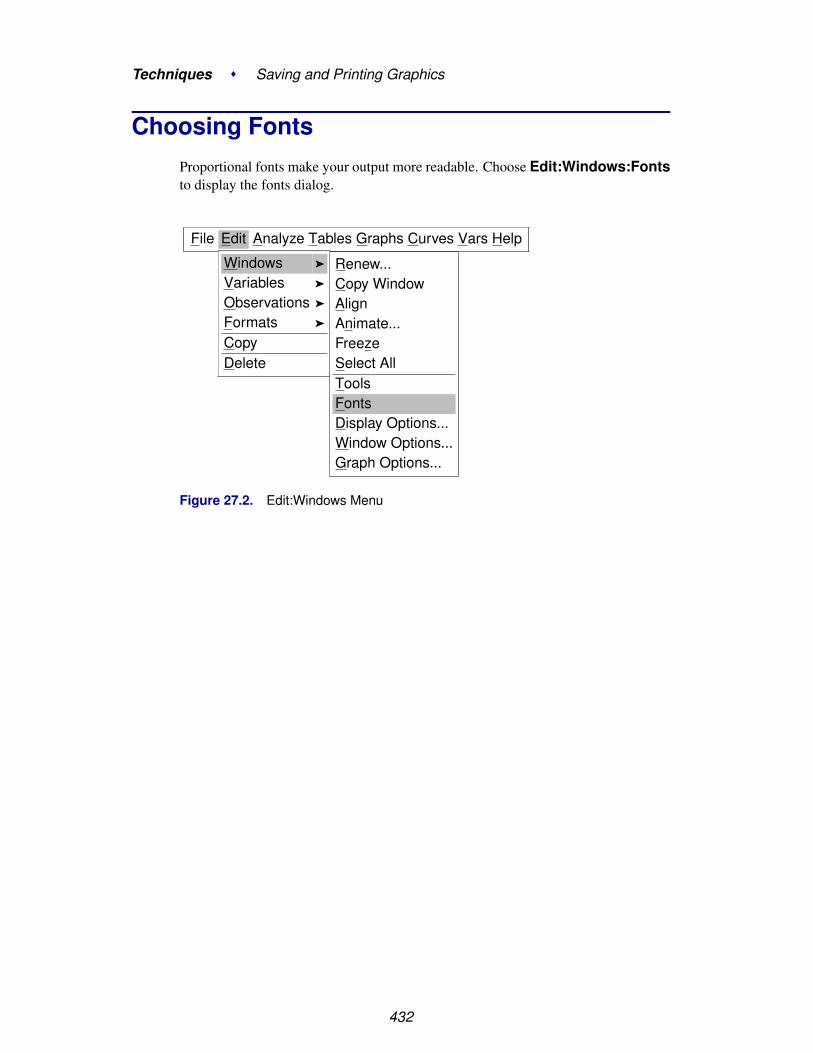
Techniques � Saving and Printing Graphics
Choosing FontsProportional fonts make your output more readable. Choose Edit:Windows:Fontsto display the fonts dialog.
File Edit Analyze Tables Graphs Curves Vars Help
Windows �
Variables �
Observations �
Formats �
CopyDelete
Renew...Copy WindowAlignAnimate...FreezeSelect AllToolsFontsDisplay Options...Window Options...Graph Options...
Figure 27.2. Edit:Windows Menu
432
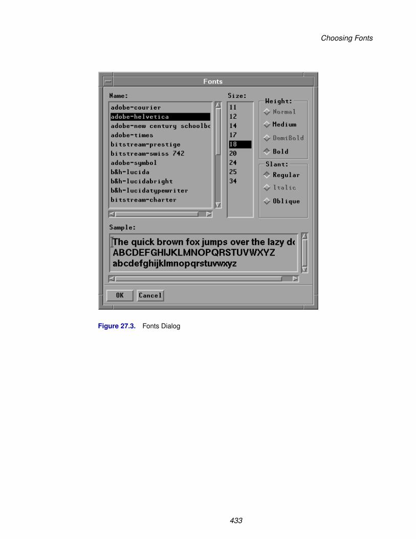
Choosing Fonts
Figure 27.3. Fonts Dialog
433

Techniques � Saving and Printing Graphics
The appearance of the fonts dialog depends on your host, and its contents depend onthe fonts you have installed. On most hosts, you can simply click on a font name,click on other settings if desired, then click OK to set the font.
The font you choose is used to display tables, data values, and axis labels in graphs.
Tick labels in graphs use a slightly smaller font from the same font family.
Figure 27.4. Fit Analysis with Proportional Font
434
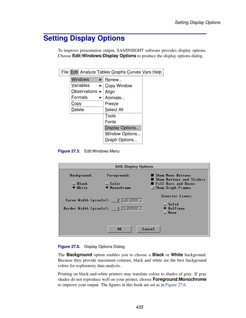
Setting Display Options
Setting Display OptionsTo improve presentation output, SAS/INSIGHT software provides display options.Choose Edit:Windows:Display Options to produce the display options dialog.
File Edit Analyze Tables Graphs Curves Vars Help
Windows �
Variables �
Observations �
Formats �
CopyDelete
Renew...Copy WindowAlignAnimate...FreezeSelect AllToolsFontsDisplay Options...Window Options...Graph Options...
Figure 27.5. Edit:Windows Menu
Figure 27.6. Display Options Dialog
The Background option enables you to choose a Black or White background.Because they provide maximum contrast, black and white are the best backgroundcolors for exploratory data analysis.
Printing on black-and-white printers may translate colors to shades of gray. If grayshades do not reproduce well on your printer, choose Foreground:Monochrometo improve your output. The figures in this book are set as in Figure 27.6.
435
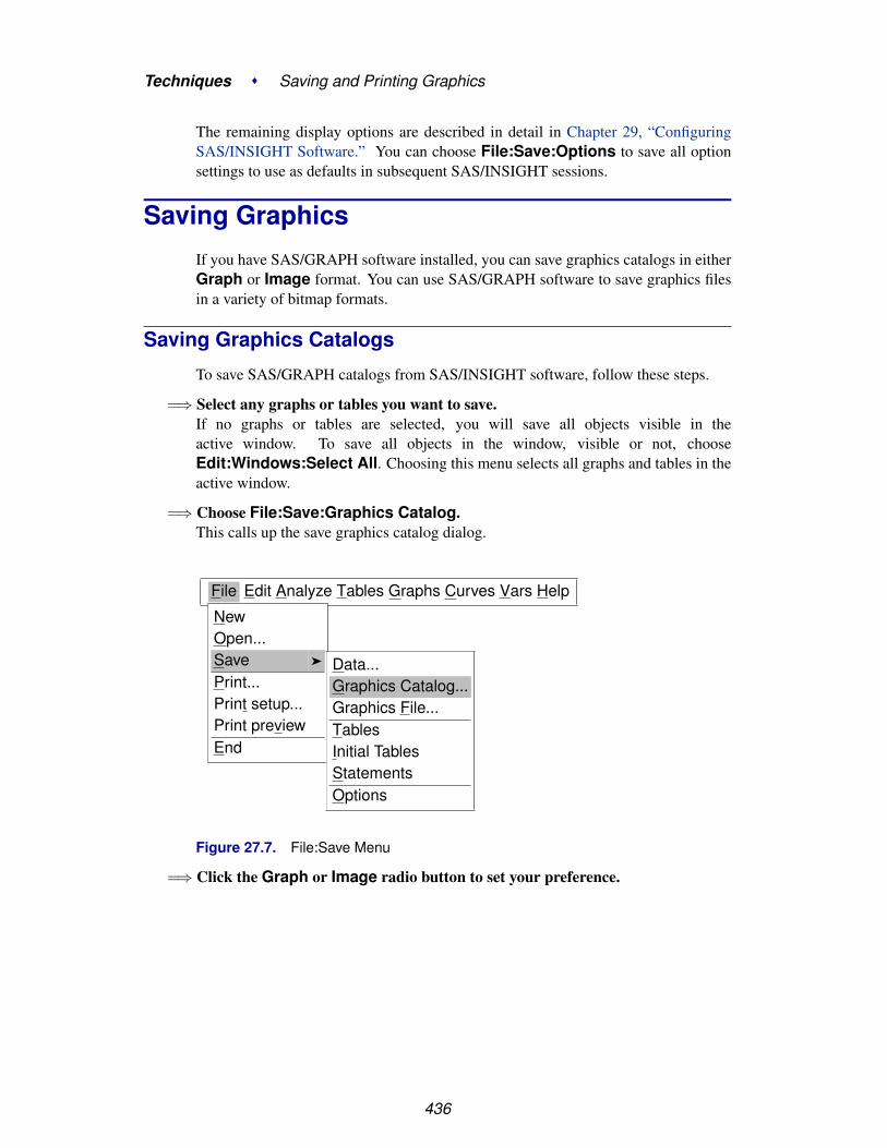
Techniques � Saving and Printing Graphics
The remaining display options are described in detail in Chapter 29, “ConfiguringSAS/INSIGHT Software.” You can choose File:Save:Options to save all optionsettings to use as defaults in subsequent SAS/INSIGHT sessions.
Saving GraphicsIf you have SAS/GRAPH software installed, you can save graphics catalogs in eitherGraph or Image format. You can use SAS/GRAPH software to save graphics filesin a variety of bitmap formats.
Saving Graphics Catalogs
To save SAS/GRAPH catalogs from SAS/INSIGHT software, follow these steps.
=⇒ Select any graphs or tables you want to save.If no graphs or tables are selected, you will save all objects visible in theactive window. To save all objects in the window, visible or not, chooseEdit:Windows:Select All. Choosing this menu selects all graphs and tables in theactive window.
=⇒ Choose File:Save:Graphics Catalog.This calls up the save graphics catalog dialog.
File Edit Analyze Tables Graphs Curves Vars Help
NewOpen...Save �
Print...Print setup...Print previewEnd
Data...Graphics Catalog...Graphics File...TablesInitial TablesStatementsOptions
Figure 27.7. File:Save Menu
=⇒ Click the Graph or Image radio button to set your preference.
436

Saving Graphics
Figure 27.8. Graphics Catalog Dialog
You can also specify catalog, entry, and description for your graphics output.
Set the One Per Entry option if you want to store each graph and table as a separatecatalog entry. Entry names are derived from the name of the graph or table.
Set the Titles and Footnotes option if you want to use SAS titles and footnotes.
If you set both One Per Entry and Titles and Footnotes options, and if yourwindow contains group variables, an additional title is generated to show the group.The group title is similar to the BY-group title in SAS/GRAPH output.
=⇒ Click OK to save the catalog
Saving Graphics Files
You can use SAS/GRAPH software to save graphics files in a variety of bitmap for-mats. To save bitmaps, follow these steps.
=⇒ Select any graphs or tables you want to save.If no graphs or tables are selected, you will save all objects visible in the activewindow.
=⇒ Choose File:Save:Graphics File to display the graphics file dialog
437

Techniques � Saving and Printing Graphics
File Edit Analyze Tables Graphs Curves Vars Help
NewOpen...Save �
Print...End
Data...Graphics Catalog...Graphics File...TablesInitial TablesStatementsOptions
Figure 27.9. File:Save Menu
Figure 27.10. Graphics File Dialog
=⇒ Enter your file name, choose a format, and set additional options.Use the Full Color or Grey Scale options to control the colors stored in graphicsfiles. Usually Grey Scale produces smaller files for faster printing.
Set the One Per File option if you want to store each graph and table in a sepa-rate file. If you set this option, the directory name is derived from the name youenter. Eight-character file names are derived from the name of the graph or table; forexample, “scatter” for scatter plots, or “parametr” for parameter estimates.
Set the Titles and Footnotes option if you want to use SAS titles and footnotes.
If you set both One Per File and Titles and Footnotes options, and if yourwindow contains group variables, an additional title is generated to show the group.The group title is similar to the BY-group title in SAS/GRAPH output.
438
Printing
=⇒ Click OK to save the graphics file.
† Note: Clicking OK overwrites any files with the same file name.
For more information on saving graphics in bitmap formats, refer to the chapter on“Exporting SAS/Graph Output” in SAS/GRAPH Software: Reference.
PrintingMethods of printing vary greatly among different hosts. This section describes brieflythe typical steps in printing on most personal computers and workstations. For moreinformation on printing, refer to your host documentation and to the SAS companionfor your host. See also the host changes and enhancements reports for Releases 6.10and 6.11, as several hosts have improved printing in these releases.
Briefly, SAS/INSIGHT supports three ways of printing. If your host provides screen-dumping utilities, you can print anything that is visible on the display. Alternatively,on many hosts you can copy graphs and tables to the clipboard and then print theclipboard. Finally, you can use host printing facilities or SAS/GRAPH software toprint directly from SAS/INSIGHT windows.
Printing from the Display
Many hosts provide tools or interfaces to print directly from the display. On UNIXhosts, tools such as xwd and xv deliver high-quality output. On Windows hosts, youcan print the active window directly from the display by following these steps.
=⇒ Choose File:Print.
=⇒ Set the Print as Bitmap check box.
=⇒ Click OK.
Printing from the display restricts you to printing objects that are visible. For moreflexibility, you can print from the clipboard.
Printing from the Clipboard
Windows hosts support printing from the clipboard. To print graphs and tables fromthe clipboard, follow these steps.
=⇒ Select any graphs or tables you wish to printDrag a rectangle through the graphs and tables, or click on their edges. If no graphsor tables are selected, you will print all objects visible in the active window.
439

Techniques � Saving and Printing Graphics
Figure 27.11. Selected Graphs and Tables
=⇒ Choose Edit:Copy to copy selected objects to the clipboard.
=⇒ Choose File:Print.
=⇒ Set the Print as Bitmap check box.
=⇒ Set the Contents of list to Clipboard (bitmap).
=⇒ Click OK.
Printing from the clipboard is not supported on all hosts. For a more general way ofprinting, you can print directly from a SAS/INSIGHT window.
Printing from the Window
Printing from the window is the most flexible way to print. To print from aSAS/INSIGHT window, follow these steps.
=⇒ Select any graphs or tables you wish to printIf no graphs or tables are selected, you will print all objects visible in theactive window. To print all objects in the window, visible or not, chooseEdit:Windows:Select All to select all graphs and tables in the window.
440

Printing
=⇒ Choose File:Print.On Windows and OS/2, this displays a host Print dialog, with options such as thePrint as Bitmap option in the preceding sections. If you receive a host Print dialog,click OK. This displays the SAS/INSIGHT Print dialog.
Figure 27.12. SAS/INSIGHT Print Dialog
In the SAS/INSIGHT Print dialog, the Fill Page option expands your output to fillthe area of the page. The One Per Page option prints each graph and table ona separate page. The Titles and Footnotes option prints using SAS titles andfootnotes.
If you set both One Per Page and Titles and Footnotes options, and if yourwindow contains group variables, an additional title is generated to show the group.The group title is similar to the BY-group title in SAS/GRAPH output. An exampleof the group title for histograms of YR–MAJOR by LEAGUE is shown in Figure27.13.
=⇒ Set options as needed, then click OK in the Print dialog
Clicking OK in the Print dialog routes your printing through host printing facilitiesif they are provided. Windows and OS/2 provide such facilities, and they are docu-mented in SAS companions and host changes and enhancements reports.
If your host does not support host printing, your printing is routed throughSAS/GRAPH software. You will be prompted for an output device if you have notspecified one with the GOPTIONS TARGETDEVICE= option.
441
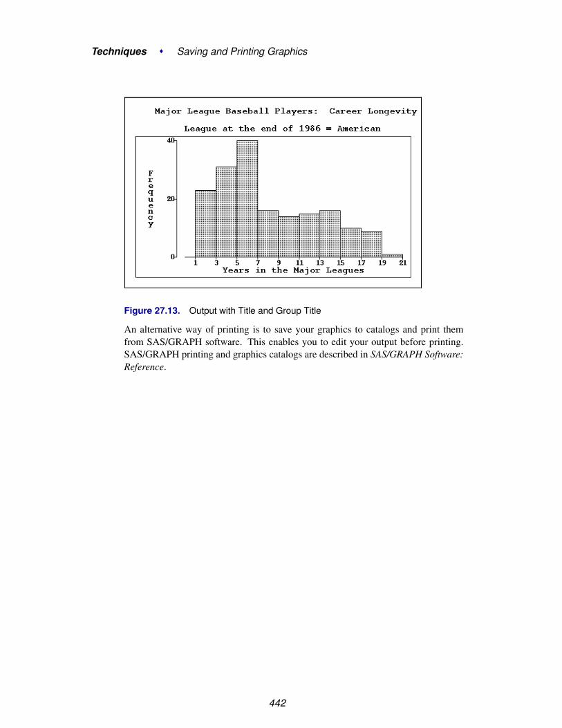
Techniques � Saving and Printing Graphics
Figure 27.13. Output with Title and Group Title
An alternative way of printing is to save your graphics to catalogs and print themfrom SAS/GRAPH software. This enables you to edit your output before printing.SAS/GRAPH printing and graphics catalogs are described in SAS/GRAPH Software:Reference.
442

Chapter 28Saving and Printing Tables
Chapter Contents
SAVING AND PRINTING TABLES AS OUTPUT OBJECTS . . . . . . . 446
OUTPUT OBJECTS . . . . . . . . . . . . . . . . . . . . . . . . . . . . . . . 450

Techniques � Saving and Printing Tables
444

Chapter 28Saving and Printing Tables
SAS/INSIGHT software uses the Output Delivery System (ODS) to save tables. Thusyou can save and print analysis tables to keep records of your SAS/INSIGHT session.You can also save tables as SAS data sets to use them as input for further analysis.
Figure 28.1. Output Tables

Techniques � Saving and Printing Tables
Saving and Printing Tables as Output ObjectsSAS/INSIGHT software saves and prints tables using the Output Delivery System.The Output Delivery System enables you to save tables as output objects. You canedit and manipulate output objects using the OUTPUT procedure, and you can saveoutput objects as text files, catalogs, or SAS data sets.
=⇒ Invoke SAS/INSIGHT software, create analyses, and select any tables of interest.To select tables, drag a rectangle across the tables or click on their edges. If you haveno tables selected, you will save or print all tables in the window.
Figure 28.2. Tables Selected
=⇒ Choose File:Save:Tables.
446

Saving and Printing Tables as Output Objects
File Edit Analyze Tables Graphs Curves Vars Help
NewOpen...Save �
Print...Print setup...Print previewEnd
Data...Graphics Catalog...Graphics File...TablesInitial TablesStatementsOptions
Figure 28.3. File:Save Menu
=⇒ From the Program Editor menu, select View:Results to create the ResultsWindow.
File Edit View Tools Run Solutions HelpProgram EditorLogOutputGraphResultsExplorerContents OnlyMy Favorite Folders
Figure 28.4. View Menu
447

Techniques � Saving and Printing Tables
Figure 28.5. Results Window
=⇒ Selecting the name of a table in the results window displays that table in theOutput window.
You can save all tables at the creation of each analysis by choosing File:Save:InitialTables. This menu is a toggle; choosing it again turns off the automatic saving oftables.
File Edit Analyze Tables Graphs Curves Vars Help
NewOpen...Save �
Print...Print setup...Print previewEnd
Data...Graphics Catalog...Graphics File...TablesInitial TablesStatementsOptions
Figure 28.6. File:Save Menu
Also, each table has a pop-up menu to save just that table. Click on the menu button
448

Saving and Printing Tables as Output Objects
at the upper left of the table to display the pop-up menu.
Format �
Save
Figure 28.7. Table Pop-up Menu
Saving tables to the Output Delivery System converts your tables to output objects.Variables in output objects have names derived from the table headers. Where con-flicts occur, a new unique name is generated. Variables in the output object are as-signed formats derived from the tables.
You can send the contents of the Output window to a file or printer by choosingFile:Print in the Output window. On many hosts, the SAS System is installed sothat this menu sends the contents of the Output window to a default printer. You canalso choose this menu to save the window contents to a file and later route them to aprinter using appropriate host commands.
File Edit View Tools Solutions HelpNewOpen...Open Object...SaveSave As...Save As Object...Import Data...Export Data...Print Setup...Print Preview...Print utilitiesPrintSend Mail...Close
Figure 28.8. File Menu
Alternatively, you can redirect SAS System output from the Output window to a textfile by using the PRINTTO procedure.
For more information on printing from the Output window, refer to the SAS com-panion for your host. For more information on PROC PRINTTO, refer to the SASProcedures Guide.
449

Techniques � Saving and Printing Tables
Output ObjectsBy default, tables are saved in text format. It is also possible to save SAS/INSIGHTtables as SAS data sets, or in other formats such as HTML.
For example, the following steps illustrate how to create a data set from the Momentstable in a distribution analysis.
=⇒ In the Program Editor, submit the following ODS command:
ods output Moments = MOMENTS;
This command instructs ODS to create a SAS data set called MOMENTS from atable named “Moments”.
=⇒ Create a Moments table.One way to do this is to open the DRUG data set, select the CHANG–BP vari-able, and select Analyze:Distribution ( Y ) to obtain a distribution analysis. TheMoments table is generated by default.
=⇒ Open the MOMENTS data set .Select File:Open, and look under the WORK library. Select the MOMENTS dataset and click Open.
† Note: You can find out the name of any table created in SAS/INSIGHT. To dothis, submit the following ODS command in the Program Editor prior to creating thetable.
ods trace output;
When you create a table, the name of that table is printed to the Log window.
You can also redirect all of your SAS/INSIGHT tables to an HTML file. Prior tocreating any tables, submit an ODS command such as
ods html body="tables.htm";
Any tables you now save are written as HTML. When you are finished saving tables,submit the ODS command
ods html close;
To view the table’s values, select View:Results from the Program Editor menu.Then select the name of a table to view.
For more information on the Output Delivery System, refer to the chapter on “Usingthe Output Delivery System” in the SAS/STAT User’s Guide or refer to The CompleteGuide to the SAS Output Delivery System.
450
Chapter 29Configuring SAS/INSIGHT Software
Chapter Contents
SETTING OPTIONS . . . . . . . . . . . . . . . . . . . . . . . . . . . . . . 454Setting Method and Output Options . . . . . . . . . . . . . . . . . . . . . . 454Setting Display, Window, and Graph Options . . . . . . . . . . . . . . . . . 458
SAVING OPTIONS . . . . . . . . . . . . . . . . . . . . . . . . . . . . . . . 466
SETTING HOST RESOURCES . . . . . . . . . . . . . . . . . . . . . . . . 467

Techniques � Configuring SAS/INSIGHT Software
452

Chapter 29Configuring SAS/INSIGHT Software
You can configure SAS/INSIGHT software in two ways. You can tailorSAS/INSIGHT software to the way you work by saving option settings forfuture use. You can also set host resources to improve SAS/INSIGHT software’sperformance on your host.
Figure 29.1. Setting Output Options

Techniques � Configuring SAS/INSIGHT Software
Setting OptionsWith SAS/INSIGHT software, you can set options in two ways. You can set optionsin an analysis window that affect the calculations and output displayed only in thatwindow. Alternatively, you can set options that affect the display of all windows.
Setting Method and Output Options
Method options and output options affect only the individual analysis window forwhich they are set. You can set method options to determine how SAS/INSIGHTsoftware performs calculations for a particular analysis. You can set output optionsto control the output produced in a graph or analysis. To modify method and outputoptions for a box plot, follow these steps.
=⇒ Open the BASEBALL data set.
=⇒ Choose Analyze:Box Plot/Mosaic Plot ( Y ).
File Edit Analyze Tables Graphs Curves Vars HelpHistogram/Bar Chart ( Y )Box Plot/Mosaic Plot ( Y )Line Plot ( Y X )Scatter Plot ( Y X )Contour Plot ( Z Y X )Rotating Plot ( Z Y X )Distribution ( Y )Fit ( Y X )Multivariate ( Y X )
Figure 29.2. Analyze Menu
This displays the box plot variables dialog, as shown in Figure 29.3. Note that botha Method and an Output button are displayed in this dialog. You can set Outputoptions for each of the choices in the Analyze menu in Figure 29.2. You can setMethod options for each of these choices except for line plots, scatter plots, androtating plots. You can find details on options for each analysis in the referencechapters.
=⇒ Assign NO–RBI the Y role by clicking on NO–RBI, then on Y.
454

Setting Options
Figure 29.3. Box Plot Variables Dialog
=⇒ Click the OK button to create the box plot.
Figure 29.4. Box Plot
=⇒ Choose Edit:Windows:Renew in the box plot window.This redisplays the box plot variables dialog.
455

Techniques � Configuring SAS/INSIGHT Software
File Edit Analyze Tables Graphs Curves Vars Help
Windows �
Variables �
Observations �
Formats �
CopyDelete
Renew...Copy WindowAlignAnimate...FreezeSelect AllToolsFontsDisplay Options...Window Options...Graph Options...
Figure 29.5. Edit:Windows Menu
=⇒ Click on the Method button to display the box plot method dialog
Figure 29.6. Variables and Method Dialogs
=⇒ Change the whisker length to 1.0 and click the OK button in the method dialog
=⇒ Click the Output button to display the box plot output dialog
=⇒ Click the Means, Labels, and Y Axis Vertical buttons.The Means and Y Axis Vertical buttons are toggles. The display of a means dia-mond is now on, and the Y axis is set to be displayed horizontally instead of vertically.The Labels button is a state indicator showing that variable labels are set to be dis-played.
456

Setting Options
Figure 29.7. Box Plot Output Dialog
=⇒ Click OK in both the output dialog and the variables dialogThis displays the new box plot in Figure 29.8. Note that the box plot is displayedhorizontally with a mean diamond. The upper whisker is now only the same lengthas the box, showing more points as individual outliers. Also, the RBI axis shows thevariable label instead of the variable name.
Figure 29.8. Modified Box Plot
457

Techniques � Configuring SAS/INSIGHT Software
Setting Display, Window, and Graph Options
Display options, window options, and graph options modify aspects of the softwarethat affect every analysis. To set display options, choose Edit:Windows:DisplayOptions. Note that you also set window options and graph options from theEdit:Windows menu.
File Edit Analyze Tables Graphs Curves Vars Help
Windows �
Variables �
Observations �
Formats �
CopyDelete
Renew...Copy WindowAlignAnimate...FreezeSelect AllToolsFontsDisplay Options...Window Options...Graph Options...
Figure 29.9. Edit:Windows Menu
This displays the display options dialog, as shown in Figure 29.10.
Figure 29.10. Display Options Dialog
458
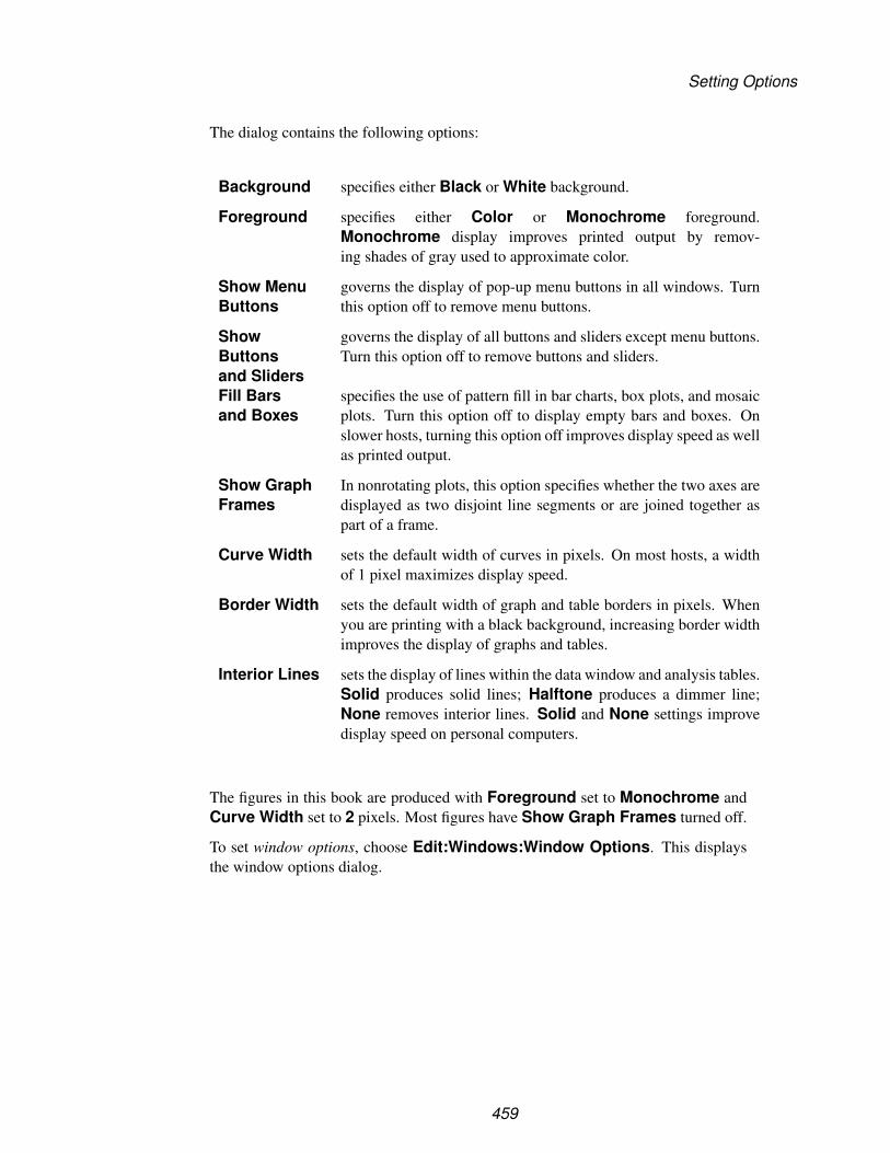
Setting Options
The dialog contains the following options:
Background specifies either Black or White background.
Foreground specifies either Color or Monochrome foreground.Monochrome display improves printed output by remov-ing shades of gray used to approximate color.
Show MenuButtons
governs the display of pop-up menu buttons in all windows. Turnthis option off to remove menu buttons.
ShowButtonsand Sliders
governs the display of all buttons and sliders except menu buttons.Turn this option off to remove buttons and sliders.
Fill Barsand Boxes
specifies the use of pattern fill in bar charts, box plots, and mosaicplots. Turn this option off to display empty bars and boxes. Onslower hosts, turning this option off improves display speed as wellas printed output.
Show GraphFrames
In nonrotating plots, this option specifies whether the two axes aredisplayed as two disjoint line segments or are joined together aspart of a frame.
Curve Width sets the default width of curves in pixels. On most hosts, a widthof 1 pixel maximizes display speed.
Border Width sets the default width of graph and table borders in pixels. Whenyou are printing with a black background, increasing border widthimproves the display of graphs and tables.
Interior Lines sets the display of lines within the data window and analysis tables.Solid produces solid lines; Halftone produces a dimmer line;None removes interior lines. Solid and None settings improvedisplay speed on personal computers.
The figures in this book are produced with Foreground set to Monochrome andCurve Width set to 2 pixels. Most figures have Show Graph Frames turned off.
To set window options, choose Edit:Windows:Window Options. This displaysthe window options dialog.
459

Techniques � Configuring SAS/INSIGHT Software
Figure 29.11. Window Options
The dialog contains the following options:
Layout sets the algorithm for positioning windows. Spreadspreads the windows so that the maximum number of ta-bles and graphs are visible. Cascade causes each windowto be offset a small distance from the previous window. Onsome hosts, the effect of this option is overridden by thehost window manager.
Show Tools at Startup causes the Tools window to display automatically whenyou invoke SAS/INSIGHT software.
Zoom/Scroll Speed (%) sets the speed of the zoom tool and the speed of auto-matic scrolling when you drag a selection past the windowborder. The speed is a percentage value between 0 and100. Some hosts override this option.
Default Margin (mm.) sets the spacing in millimeters between graphs and tablesin analysis windows. If your display is small, reduce thisvalue to maximize the display of information.
Number of Groups sets the number of groups you can use in an analysis with-out getting a request for confirmation.
Zoom/Scroll Speed, Default Margin, and Number of Groups can be con-trolled by sliders to the right of the option. To set these options, either click or dragon the sliders or type in the entry field.
To set graph options, choose Edit:Windows:Graph Options. This displays thegraph options dialog.
460

Setting Options
Figure 29.12. Graph Options
The dialog contains the following options:
Default Marker sets the default marker shape. On personal computers, Squareand Plus are the best choices; these markers are the fastest todisplay. On fast workstations, Circle is preferable to minimizeinterference between plotted observations.
Excluded Marker sets the marker shape for observations that are excluded fromcalculations. X is the default. If you choose None, marker shapeis not affected by exclusion.
Fast Draw sets display algorithms for rotation, brushing, manipulation ofhistograms, and dynamic curve fitting. By default, this option isoff, which produces slower but smoother dynamic effects. If thisoption is on, speed is improved but, on some hosts, the displaymay flicker. The better choice of algorithms depends on yourhost, the size of your graphs, and the number of observations.
Marker Size (%) sets the default size of markers in plots. This is the marker sizeused when you choose Marker Sizes:Size to Fit. This is apercentage value between 0 and 100.
Graph Size (%) sets the default size of windows and graphs. This is a percentagevalue between 0 and 100. If your display is small, reduce thisvalue to display more graphs.
To see the effects of various display, window, and graph options, follow these steps.
=⇒ Create a fit analysis for the model NO–RBI = NO–HITS.Use the techniques described in Chapter 13, “Fitting Curves.” This creates the fitanalysis shown in Figure 29.13.
461

Techniques � Configuring SAS/INSIGHT Software
Figure 29.13. Fit Analysis
=⇒ Choose Edit:Windows:Display Options to display the display options dialog
=⇒ Click on the toggle button for Show Menu Buttons.
462

Setting Options
Recall that the figures here already have Foreground set to Monochrome andCurve Width set to 2 pixels.
Figure 29.14. Setting Display Options
=⇒ Click OK to set the display options and close the dialog
=⇒ Choose Edit:Windows:Window Options to display the window options dialog
=⇒ Set the Default Margin to 1 mm.
Figure 29.15. Setting Window Options
=⇒ Click OK to set the window options and close the dialog
=⇒ Choose Edit:Windows:Graph Options to display the graph options dialog
=⇒ Set the Marker Size to 100%.
463

Techniques � Configuring SAS/INSIGHT Software
Figure 29.16. Setting Graph Options
=⇒ Click OK to set the graph options and close the dialog
=⇒ Choose Edit:Windows:Renew in the fit analysis window.This displays the fit analysis variables dialog.
464

Setting Options
=⇒ Click OK in the variables dialogThis redisplays the fit analysis with the modified option settings. Contrast Figure29.17 with Chapter 39. Note that the menu buttons are no longer displayed, the spacebetween the tables and graphs is reduced, and the marker size is increased.
Figure 29.17. Modified Fit Analysis
465
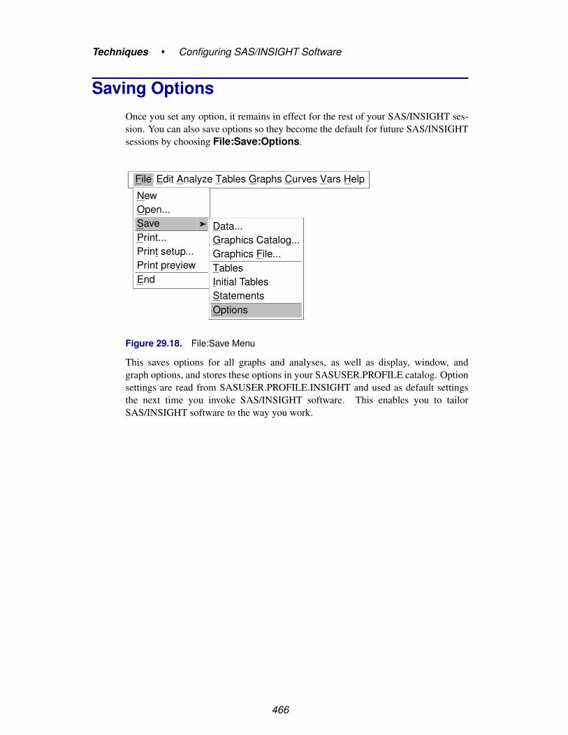
Techniques � Configuring SAS/INSIGHT Software
Saving OptionsOnce you set any option, it remains in effect for the rest of your SAS/INSIGHT ses-sion. You can also save options so they become the default for future SAS/INSIGHTsessions by choosing File:Save:Options.
File Edit Analyze Tables Graphs Curves Vars Help
NewOpen...Save �
Print...Print setup...Print previewEnd
Data...Graphics Catalog...Graphics File...TablesInitial TablesStatementsOptions
Figure 29.18. File:Save Menu
This saves options for all graphs and analyses, as well as display, window, andgraph options, and stores these options in your SASUSER.PROFILE catalog. Optionsettings are read from SASUSER.PROFILE.INSIGHT and used as default settingsthe next time you invoke SAS/INSIGHT software. This enables you to tailorSAS/INSIGHT software to the way you work.
466

Setting Host Resources
Setting Host ResourcesYou can modify the operation and appearance of SAS/INSIGHT software in waysthat are specific to your host by setting host resources. For details on host resources,refer to the SAS companion for your host.
If you are on a UNIX host running X Windows, the behavior of the SAS System isdetermined by X resources. The following X resources improve the performance ofSAS/INSIGHT software.
# SAS resourcesSAS.windowUnitType: percentageSAS.windowHeight: 90SAS.windowWidth: 100SAS.maxWindowHeight: 90SAS.maxWindowWidth: 100SAS.sessionGravity: NorthWestGravity
# Motif resourcesMwm*IconPlacement: right bottomMwm*InteractivePlacement: falseMwm*ClientAutoPlace: falseMwm*KeyboardFocusPolicy: pointer
These SAS resources and Motif resources enable the SAS System to use 90% of thedisplay and enable SAS/INSIGHT software to place windows efficiently when youset the Window Layout:Spread option. If your host does not use the Motif win-dow manager, it may use another window manager with similarly named resources.
Resource names are case-sensitive. You can load X resources at system initializationor use the UNIX xrdb command. For more information on X resources, refer to theSAS companion for the UNIX environment or your host documentation.
467

Techniques � Configuring SAS/INSIGHT Software
468

Chapter 30Working with Other SAS Products
Chapter Contents
VIEWING RESULTS FROM SAS/STAT SOFTWARE . . . . . . . . . . . 472
SUBMITTING SAS/INSIGHT STATEMENTS . . . . . . . . . . . . . . . . 478
RECORDING SAS/INSIGHT STATEMENTS . . . . . . . . . . . . . . . . 481
REFERENCES . . . . . . . . . . . . . . . . . . . . . . . . . . . . . . . . . . 482

Techniques � Working with Other SAS Products
470
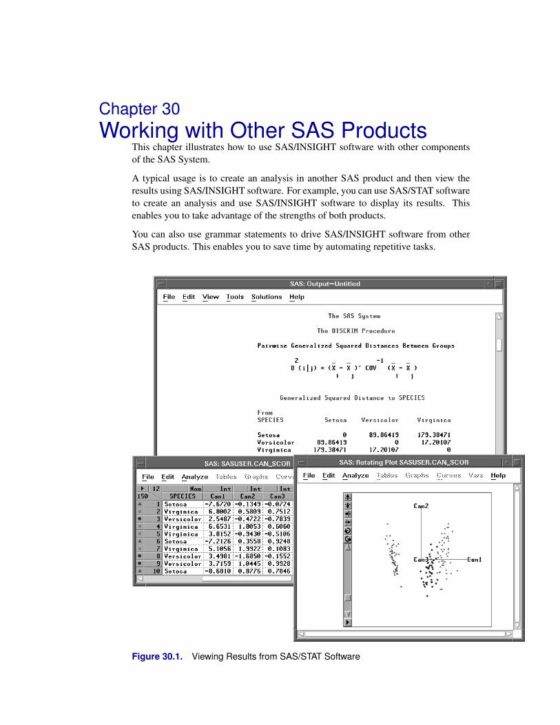
Chapter 30Working with Other SAS Products
This chapter illustrates how to use SAS/INSIGHT software with other componentsof the SAS System.
A typical usage is to create an analysis in another SAS product and then view theresults using SAS/INSIGHT software. For example, you can use SAS/STAT softwareto create an analysis and use SAS/INSIGHT software to display its results. Thisenables you to take advantage of the strengths of both products.
You can also use grammar statements to drive SAS/INSIGHT software from otherSAS products. This enables you to save time by automating repetitive tasks.
Figure 30.1. Viewing Results from SAS/STAT Software

Techniques � Working with Other SAS Products
Viewing Results from SAS/STAT SoftwareThe IRIS data, published by Fisher (1936), have been used widely for examples indiscriminant analysis. The goal of the analysis is to find functions of a set of quan-titative variables that best summarize the differences among groups of observationsdetermined by the classification variable. The IRIS data contain four quantitativevariables measured on 150 specimens of iris plants. These include sepal length(SEPALLEN), sepal width (SEPALWID), petal length (PETALLEN), and petalwidth (PETALWID). The classification variable, SPECIES, represents the speciesof iris from which the measurements were taken. There are three species in the data:Iris setosa, Iris versicolor, and Iris virginica.
Figure 30.2. IRIS Data Set
Linear combinations of the four measurement variables best summarize the differ-ences among the three species, assuming multivariate normality with covariance con-stant among groups. This requires a canonical discriminant analysis that is availablein both SAS/INSIGHT software and SAS/STAT software. The following steps illus-trate how to create an output data set that contains scores on the canonical variablesin SAS/STAT software and how to use SAS/INSIGHT software to plot them.
=⇒ If you are running the SAS System in interactive line mode, exit the SAS Systemand reenter under the display manager.You must invoke SAS/INSIGHT software from a command line or from theSolutions menu to use SAS/INSIGHT software and the Program Editor concur-rently.
=⇒ In the Program Editor, enter the statements shown in Figure 30.3.
472

Viewing Results from SAS/STAT Software
Figure 30.3. Program Editor with PROC Statement
The OUT= option in the PROC DISCRIM statement puts the scores and the originalvariables in the SASUSER library in a data set called CAN–SCOR. For completedocumentation on the DISCRIM procedure, refer to the chapter titled “The DISCRIMProcedure,” in the SAS/STAT User’s Guide.
=⇒ In the Program Editor, enter the statements in Figure 30.4.These statements create the –OBSTAT– variable, which stores observation colors,shapes, and other states. If you create the –OBSTAT– variable as shown, SETOSAobservations will be red triangles, VERSICOLOR observations will be blue circles,and VIRGINICA observations will be magenta squares.
Figure 30.4. Program Editor with DATA Step
–OBSTAT– is a character variable. You can use it to set other observation states inaddition to color and shape. The format of the –OBSTAT– variable is as follows.
Character 1 stores the observation’s selection state. It is ’1’ for selected obser-vations and ’0’ for observations that are not selected.
Character 2 stores the observation’s Show/Hide state. It is ’1’ for observationsthat are displayed in graphs and ’0’ for observations that are notdisplayed in graphs.
473

Techniques � Working with Other SAS Products
Character 3 stores the observation’s Include/Exclude state. It is ’1’ for observa-tions that are included in calculations and ’0’ for observations thatare excluded from calculations.
Character 4 stores the observation’s Label/UnLabel state. It is ’1’ for observa-tions whose label is displayed by default, and ’0’ for observationswhose label is not displayed by default.
Character 5 stores the observation’s marker shape, a value between ’1’ and ’8’:
1 Square
2 Plus
3 Circle
4 Diamond
5 X
6 Up Triangle
7 Down Triangle
8 Star
Characters 6–20 store the observation’s color as Red-Green-Blue (RGB) compo-nents. The RGB color model represents colors as combinationsof the colors red, green, and blue. You can obtain intermediatecolors by varying the proportion of these primary colors.
Each component is a 5-digit decimal number between 0 and 65535.Characters 6–10 store the red component. Characters 11–15 storethe green component. Characters 16–20 store the blue component.
The –OBSTAT– variable can be used to create color blends as well as discrete col-ors. For an example of this usage, refer to Robinson (1995).
=⇒ Choose Run:Submit to submit the SAS statements.
File Edit View Tools Run Solutions HelpSubmitRecall Last SubmittedSubmit Top LineSubmit N Lines...Submit ClipboardSignon...Remote Submit...Remote GetRemote DisplaySignoff...
Figure 30.5. Run Menu
474
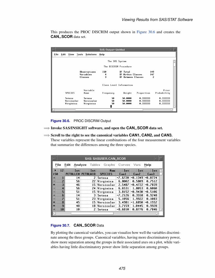
Viewing Results from SAS/STAT Software
This produces the PROC DISCRIM output shown in Figure 30.6 and creates theCAN–SCOR data set.
Figure 30.6. PROC DISCRIM Output
=⇒ Invoke SAS/INSIGHT software, and open the CAN–SCOR data set.
=⇒ Scroll to the right to see the canonical variables CAN1, CAN2, and CAN3.These variables represent the linear combinations of the four measurement variablesthat summarize the differences among the three species.
Figure 30.7. CAN–SCOR Data
By plotting the canonical variables, you can visualize how well the variables discrimi-nate among the three groups. Canonical variables, having more discriminatory power,show more separation among the groups in their associated axes on a plot, while vari-ables having little discriminatory power show little separation among groups.
475

Techniques � Working with Other SAS Products
=⇒ Choose Analyze:Rotating Plot ( Z Y X ). Assign CAN3 the Z role, CAN2 theY role, and CAN1 the X role.This produces a plot with the CAN3 axis pointing toward you, showing clear separa-tion of the species.
Figure 30.8. Rotating Plot Dialog
=⇒ Click OK in the dialog to create the rotating plot.
Figure 30.9. Rotating Plot, CAN3 Toward Viewer
476

Viewing Results from SAS/STAT Software
=⇒ Rotate the plot so the axis representing CAN1 points toward you.Refer to Chapter 6, “Exploring Data in Three Dimensions,” for information on howto rotate plots. This orientation shows little, if any, differentiation among species.This is because CAN2 and CAN3 contribute little information towards separatingthe groups.
Figure 30.10. Rotating Plot, CAN1 Toward Viewer
Another way of illustrating this would be to create a scatter plot matrix of CAN1,CAN2, and CAN3. Only plots involving CAN1 would show much group differenti-ation. The CAN2-by-CAN3 plot would show little or no group differentiation.
⊕ Related Reading: Rotating Plots, Chapter 6, Chapter 37.
477
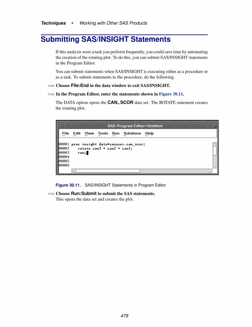
Techniques � Working with Other SAS Products
Submitting SAS/INSIGHT StatementsIf this analysis were a task you perform frequently, you could save time by automatingthe creation of the rotating plot. To do this, you can submit SAS/INSIGHT statementsin the Program Editor.
You can submit statements when SAS/INSIGHT is executing either as a procedure oras a task. To submit statements to the procedure, do the following.
=⇒ Choose File:End in the data window to exit SAS/INSIGHT.
=⇒ In the Program Editor, enter the statements shown in Figure 30.11.
The DATA option opens the CAN–SCOR data set. The ROTATE statement createsthe rotating plot.
Figure 30.11. SAS/INSIGHT Statements in Program Editor
=⇒ Choose Run:Submit to submit the SAS statements.This opens the data set and creates the plot.
478

Submitting SAS/INSIGHT Statements
Figure 30.12. Data Window and Rotating Plot
It is often preferable to invoke SAS/INSIGHT as a task instead of a procedure.It is sometimes preferable to open a data set without displaying it. To invokeSAS/INSIGHT as a task and display a rotating plot without a data window, followthese steps.
=⇒ Store the following three statements in a text file called myfile.
open sasuser.can_scor / nodisplay;rotate can3 * can2 * can1;run;
=⇒ In the Program Editor, enter the FILENAME statement shown in Figure 30.13.The FILENAME statement assigns a fileref.
479

Techniques � Working with Other SAS Products
Figure 30.13. Submitting a FILENAME statement
=⇒ Choose Run:Submit to submit the statement
=⇒ Invoke SAS/INSIGHT as a task with the INFILE= option.You can invoke SAS/INSIGHT on the command line with the statement
insight infile=test
This opens the data set SASUSER.CAN–SCOR without displaying it and thencreates a rotating plot of CAN3 versus CAN2 versus CAN1.
Figure 30.14. Rotating Plot
480

Recording SAS/INSIGHT Statements
You can use grammar statements such as these to drive SAS/INSIGHT software fromSAS/AF software. For portability, statements can be stored in catalog entries by usinga FILENAME statement with the keyword LIBRARY. For example, if you storedstatements in a catalog entry sasuser.insight.test.source, you could assign thefileref with the statement
filename test library ’sasuser.insight.test.source’;
For SAS/AF applications, you can improve the display of SAS/INSIGHT windowsby suppressing the display of menus, buttons, and confirmation dialogs. You canalso save options to configure your graphs and analyses. These techniques are de-scribed in Chapter 41, “SAS/INSIGHT Statements,” and Chapter 29, “ConfiguringSAS/INSIGHT Software.”
Recording SAS/INSIGHT StatementsSAS/INSIGHT statements also provide a record of the analyses you create, in-cluding model equations. You can record your SAS/INSIGHT session using theFile:Save:Statements menu or the FILE= option.
To create a record of your SAS/INSIGHT session, follow these steps.
=⇒ Invoke SAS/INSIGHT and open the BUSINESS data set.
=⇒ Choose File:Save:Statements.This toggles the recording of statements to the SAS log.
File Edit Analyze Tables Graphs Curves Vars Help
NewOpen...Save �
Print...Print setup...Print previewEnd
Data...Graphics Catalog...Graphics File...TablesInitial TablesStatementsOptions
Figure 30.15. File:Save Menu
=⇒ Create graphs and analyses as you like.The Log window displays a record of your actions. For example, a record of threemodel fits might look like the following.
481
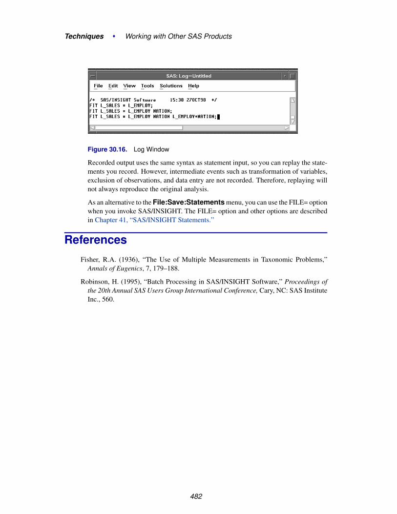
Techniques � Working with Other SAS Products
Figure 30.16. Log Window
Recorded output uses the same syntax as statement input, so you can replay the state-ments you record. However, intermediate events such as transformation of variables,exclusion of observations, and data entry are not recorded. Therefore, replaying willnot always reproduce the original analysis.
As an alternative to the File:Save:Statements menu, you can use the FILE= optionwhen you invoke SAS/INSIGHT. The FILE= option and other options are describedin Chapter 41, “SAS/INSIGHT Statements.”
ReferencesFisher, R.A. (1936), “The Use of Multiple Measurements in Taxonomic Problems,”
Annals of Eugenics, 7, 179–188.
Robinson, H. (1995), “Batch Processing in SAS/INSIGHT Software,” Proceedings ofthe 20th Annual SAS Users Group International Conference, Cary, NC: SAS InstituteInc., 560.
482

Part 3Reference
Contents
Chapter 31. Data Windows . . . . . . . . . . . . . . . . . . . . . . . . . . . . . . . . 485
Chapter 32. Histograms and Bar Charts . . . . . . . . . . . . . . . . . . . . . . . . . . 497
Chapter 33. Box Plots and Mosaic Plots . . . . . . . . . . . . . . . . . . . . . . . . . . 505
Chapter 34. Line Plots . . . . . . . . . . . . . . . . . . . . . . . . . . . . . . . . . . . 519
Chapter 35. Scatter Plots . . . . . . . . . . . . . . . . . . . . . . . . . . . . . . . . . . 525
Chapter 36. Contour Plot . . . . . . . . . . . . . . . . . . . . . . . . . . . . . . . . . 533
Chapter 37. Rotating Plot . . . . . . . . . . . . . . . . . . . . . . . . . . . . . . . . . 543
Chapter 38. Distribution Analyses . . . . . . . . . . . . . . . . . . . . . . . . . . . . . 553
Chapter 39. Fit Analyses . . . . . . . . . . . . . . . . . . . . . . . . . . . . . . . . . . 611
Chapter 40. Multivariate Analyses . . . . . . . . . . . . . . . . . . . . . . . . . . . . . 705
Chapter 41. SAS/INSIGHT Statements . . . . . . . . . . . . . . . . . . . . . . . . . . 777

Reference
484

Chapter 31Data Windows
Chapter Contents
OPENING A DATA WINDOW . . . . . . . . . . . . . . . . . . . . . . . . . 488
VARIABLES . . . . . . . . . . . . . . . . . . . . . . . . . . . . . . . . . . . 489
OBSERVATIONS . . . . . . . . . . . . . . . . . . . . . . . . . . . . . . . . 491
THE DATA MENU . . . . . . . . . . . . . . . . . . . . . . . . . . . . . . . 493

Reference � Data Windows
486

Chapter 31Data Windows
A data window displays a SAS data set as a table, with columns of the table contain-ing variables and rows containing observations.
In a data window, you can sort, search, edit, and extract subsets of your data. You canalso assign measurement levels and default roles that determine how your variablesare used in graphs and analyses.
Figure 31.1. Data Window

Reference � Data Windows
Opening a Data WindowYou can open data windows in several ways. One way is to specify a data set withthe DATA= option when you invoke SAS/INSIGHT software. If you do not specifya data set, a data set dialog appears.
Figure 31.2. Data Set Dialog
This dialog displays two lists: Library and Data Set. A library is a locationwhere data sets are stored. The Library list always contains the standard librariesWORK, MAPS, SASHELP, and SASUSER. You can define other libraries usingthe LIBNAME statement. For more information on the LIBNAME statement, referto SAS Language Reference: Dictionary.
By default, SASUSER is selected in the Library list. To see the data sets in anyother library, click on the library’s name. This causes the Data Set list to display alldata sets in that library. For information on how to create SAS data sets, see Chapter2, “Entering Data.”
By default, the first data set in the Data Set list is selected. To select another dataset, click on its name. Then click on OK to display the data window. On many hosts,instead of clicking on the data set name, then on OK, you can double-click on thedata set name to open the data set and close the dialog.
The Options button on the dialog enables you to enter WHERE clauses and otherSAS data set options. For information on data set options, refer to SAS LanguageReference: Dictionary.
You can also open a data window with the File:Open menu.
488

Variables
File Edit Analyze Tables Graphs Curves Vars Help
NewOpen...Save �
Print...Print setup...Print previewEnd
Figure 31.3. File Menu
This displays the data set dialog as described previously.
You can open any number of data windows on different data sets, but you can openonly one data window on each data set.
VariablesThe column headings in a data window give information on each variable, includ-ing the name, label, default roles, and measurement level. The number of variablesappears in the upper left corner of the data window.
Figure 31.4. Variables
A variable’s default role assigns the role a variable plays by default in graphs andanalyses. Click in the upper left portion of the variable header to display a pop-upmenu of variable roles.
Group� Label
FreqWeight
Figure 31.5. Variable Roles Pop-up Menu
489

Reference � Data Windows
You can assign four default roles:
Group enables you to process your data by groups. You can use multiplegroup variables to process your data by groups for each uniquecombination of values of the group variables.
Label labels observations in scatter plots, rotating plots, and box plots.
Frequency represents the frequency of occurrence for other values in each ob-servation.
Weight supplies weights for each observation.
You can assign Freq, Weight, and Label roles to only one variable at a time. Youcan assign the Group role to more than one variable. The order in which you assignthe group role determines the order in which the variables are used to define groups.
A variable’s measurement level determines the way it is treated in graphs and analy-ses.
� IntervalNominal
Figure 31.6. Measurement Levels Pop-up Menu
You can assign two measurement levels:
Interval contains values that vary across a continuous range. For example,a variable measuring temperature would likely be an interval vari-able. Numeric variables default to the interval measurement levelbut can be changed to nominal.
Nominal contains a discrete set of values. For example, a variable indicatinggender would be a nominal variable. Character variables can useonly the nominal measurement level.
Up to 250 variable measurement levels can be stored with a data set.
Default roles and measurement levels are displayed in the column headings abovethe variable names. The default role appears at the upper left of the column headingand the measurement level appears at the upper right. If a variable has more than onedefault role, then only the first character of each role appears.
In Figure 31.4, NAME has a label default role, and TEAM has a group default role.NAME and TEAM both have a nominal measurement level, while the remainingvariables have an interval measurement level.
† Note: Up to 250 measurement levels can be stored in the SAS data set. You canuse the data pop-up menu to create new variables or to change the default role ormeasurement level of existing variables. For more information, see the section“Data Menu” later in this chapter.
490
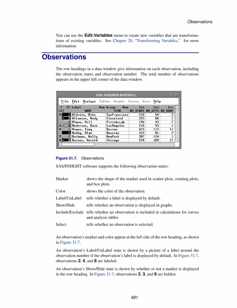
Observations
You can use the Edit:Variables menu to create new variables that are transforma-tions of existing variables. See Chapter 20, “Transforming Variables,” for moreinformation.
ObservationsThe row headings in a data window give information on each observation, includingthe observation states and observation number. The total number of observationsappears in the upper left corner of the data window.
Figure 31.7. Observations
SAS/INSIGHT software supports the following observation states:
Marker shows the shape of the marker used in scatter plots, rotating plots,and box plots.
Color shows the color of the observation.
Label/UnLabel tells whether a label is displayed by default.
Show/Hide tells whether an observation is displayed in graphs.
Include/Exclude tells whether an observation is included in calculations for curvesand analysis tables.
Select tells whether an observation is selected.
An observation’s marker and color appear at the left side of the row heading, as shownin Figure 31.7.
An observation’s Label/UnLabel state is shown by a picture of a label around theobservation number if the observation’s label is displayed by default. In Figure 31.7,observations 2, 4, and 8 are labeled.
An observation’s Show/Hide state is shown by whether or not a marker is displayedin the row heading. In Figure 31.7, observations 2, 3, and 6 are hidden.
491

Reference � Data Windows
An observation’s Include/Exclude state is shown by the way the observation numberis displayed. The observation number is grayed-out for observations that are excludedfrom calculations. In Figure 31.7, observations 5 and 6 are excluded.
An observation’s select state is shown by whether the row heading is highlighted ornot. In Figure 31.7, observations 1, 2, 6, and 8 are selected.
You can use the Edit:Observations menu to set all of these observation states. Thismenu also enables you to find observations meeting a specific search criterion or toexamine observations in detail.
File Edit Analyze Tables Graphs Curves Vars Help
Windows �
Variables �
Observations �
Formats �
CopyDelete
Find...Examine...Label in PlotsUnlabel in PlotsShow in GraphsHide in GraphsInclude in CalculationsExclude in CalculationsInvert Selection
Figure 31.8. Edit Observations Menu
You can also use the observation pop-up menu to set observation states. To see thismenu for a particular observation, click on the observation’s marker.
Label in Plots� Show in Graphs� Include in Calculations
Figure 31.9. Observation Pop-up Menu
† Note: SAS/INSIGHT software saves observation states when you save a data set andrestores them when you read a data set.
⊕ Related Reading: Label/Unlabel, Chapter 8.
⊕ Related Reading: Show/Hide, Chapter 9.
⊕ Related Reading: Include/Exclude, Chapter 21.
⊕ Related Reading: Saving Observation States, Chapter 30.
492

The Data Menu
The Data MenuThe data pop-up menu provides a variety of ways to manipulate your data. Displaythe data pop-up menu by clicking on the button in the upper left corner of the datawindow.
Figure 31.10. Displaying the Data Pop-up Menu
Find NextMove to FirstMove to LastSort...New ObservationsNew VariablesDefine Variables...Fill Values...ExtractData Options...
Figure 31.11. Data Pop-up Menu
Choose Find Next to scroll the data window to the next selected observation. If noobservations are selected, it scrolls the data window one observation.
Choose Move to First to move selected observations to the top of the data windowand to move selected variables to the left side of the data window.
Choose Move to Last to move selected observations to the bottom of the data win-dow and to move selected variables to the right side of the data window.
† Note: In addition to Move to First and Move to Last, you can use the hand toolto move variables and observations. Drag on the column or row heading, then releasethe mouse at the new location.
Choose Sort to sort observations on one or more variables. If any variables areselected, your data are sorted in ascending order on the unformatted values of thosevariables. If no variables are selected, you are prompted with a dialog to select some.
493

Reference � Data Windows
Figure 31.12. Sort Dialog
In the dialog, select variables and click the Y button to assign variables to the sort list.You can select variables in the sort list and click the Asc/Des and Unf/For buttonsto toggle the sort order and formatting. If you select multiple variables for the sort,they are used in the order in which you select them.
Choose New Observations to add space to enter values for new observations.
Choose New Variables to add space To enter values for new variables.
Choose Define Variables to display the dialog in Figure 31.13. Use this dialog toset variable type, default roles, measurement level, name, and label.
Figure 31.13. Define Variables Dialog
Choose Fill Values to modify data values in the data window.
494
The Data Menu
Choose Extract to create a new data window from an existing data window. Youcan Extract any subset of your data. If you have variables, observations, or valuesselected, your selections are extracted to fill the new data window. If you have noselections, you are prompted to select variables.
Choose Data Options to set options that control the appearance and operation ofthe data window.
⊕ Related Reading: Fill Values, Data Options, Chapter 2.
⊕ Related Reading: Find, Move to First, Sort, Chapter 3.
⊕ Related Reading: Define Variables, Chapter 8, Chapter 15, Chapter 22.
⊕ Related Reading: Extract, Chapter 21.
495

Reference � Data Windows
496
Chapter 32Histograms and Bar Charts
Chapter Contents
VARIABLES . . . . . . . . . . . . . . . . . . . . . . . . . . . . . . . . . . . 500
METHOD . . . . . . . . . . . . . . . . . . . . . . . . . . . . . . . . . . . . 501
OUTPUT . . . . . . . . . . . . . . . . . . . . . . . . . . . . . . . . . . . . . 502
REFERENCES . . . . . . . . . . . . . . . . . . . . . . . . . . . . . . . . . . 504

Reference � Histograms and Bar Charts
498
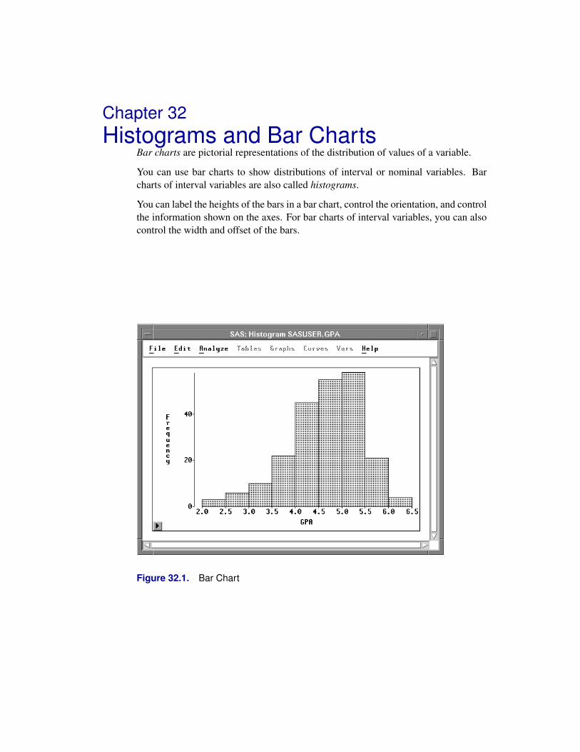
Chapter 32Histograms and Bar Charts
Bar charts are pictorial representations of the distribution of values of a variable.
You can use bar charts to show distributions of interval or nominal variables. Barcharts of interval variables are also called histograms.
You can label the heights of the bars in a bar chart, control the orientation, and controlthe information shown on the axes. For bar charts of interval variables, you can alsocontrol the width and offset of the bars.
Figure 32.1. Bar Chart

Reference � Histograms and Bar Charts
VariablesTo create a bar chart, choose Analyze:Histogram/Bar Chart ( Y ). Bar chartsrequire a Y variable. If you have already selected one or more variables, they areassigned the Y variable role, and a bar chart is created for each selected variable. Ifyou have not selected any variables, a variables dialog appears.
Figure 32.2. Bar Chart Variables Dialog
In the dialog, select at least one Y variable. A separate bar chart is created for each Yvariable you select.
You can select one or more Group variables if you have grouped data. This createsone bar chart for each group.
You can select a Freq variable. If you select a Freq variable, each observation isassumed to represent n observations, where n is the value of the Freq variable.
500

Method
MethodObservations with missing values for Y variables are not used. Observations withFreq values that are missing or that are less than or equal to 0 are not used. Only theinteger part of Freq values is used.
For nominal variables, values that represent less than 4% of the total frequency aregrouped together in an “Other” category by default. Clicking on the Method buttonin the variables dialog displays the dialog in Figure 32.3. This dialog enables you tochange the threshold at which values are grouped into the Other category.
Figure 32.3. Bar Chart Method Options Dialog
For interval variables, values that fall on the boundary between two bars are added tothe upper bar. For example, if two bars span ranges ( 1 to 2 ) and ( 2 to 3 ), the value2 is considered to fall in the range ( 2 to 3 ).
By default, bar width and offset are calculated using an algorithm developed fromTerrell and Scott (1985). Bar width is the distance along the Y axis represented byone bar. Bar offset is the distance from the start of the bar to the nearest multiple ofthe bar width. For example, if a bar starts at 1.2 and has a width of 1, then the offsetis 0.2.
501

Reference � Histograms and Bar Charts
OutputFor nominal variables, bars are distinguished by different colors. For interval vari-ables, all bars have the same color.
To view or modify output options associated with your bar chart, click on the Outputbutton of the variables dialog. This displays the options dialog shown in Figure 32.4.
Figure 32.4. Bar Chart Output Options Dialog
Bar Heights labels all bars with their heights.
Variable:Names labels the Y axis with variable names.
Variable:Labels labels the Y axis with variable labels.
Variable:Both labels the Y axis with both names and labels.
Orientation:Y Axis Vertical
draws the axis for the Y variable vertically. If this option isturned off, the Y axis is horizontal.
Orientation:Vertical Axis atLeft
places the vertical axis at the left side of the chart. If thisoption is turned off, the vertical axis is at the right side of thechart.
Orientation:Horizontal Axis atBottom
places the horizontal axis at the bottom of the chart. If thisoption is turned off, the horizontal axis is at the top of thechart.
You can modify other aspects of the bar chart using the bar chart pop-up menu. Clickon the button at the lower left corner of the bar chart to display the pop-up menu.
502
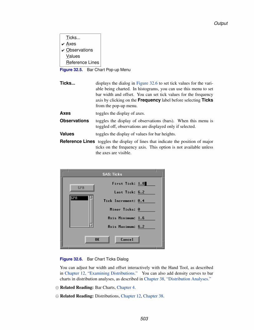
Output
Ticks...� Axes� Observations
ValuesReference Lines
Figure 32.5. Bar Chart Pop-up Menu
Ticks... displays the dialog in Figure 32.6 to set tick values for the vari-able being charted. In histograms, you can use this menu to setbar width and offset. You can set tick values for the frequencyaxis by clicking on the Frequency label before selecting Ticksfrom the pop-up menu.
Axes toggles the display of axes.
Observations toggles the display of observations (bars). When this menu istoggled off, observations are displayed only if selected.
Values toggles the display of values for bar heights.
Reference Lines toggles the display of lines that indicate the position of majorticks on the frequency axis. This option is not available unlessthe axes are visible.
Figure 32.6. Bar Chart Ticks Dialog
You can adjust bar width and offset interactively with the Hand Tool, as describedin Chapter 12, “Examining Distributions.” You can also add density curves to barcharts in distribution analyses, as described in Chapter 38, “Distribution Analyses.”
⊕ Related Reading: Bar Charts, Chapter 4.
⊕ Related Reading: Distributions, Chapter 12, Chapter 38.
503

Reference � Histograms and Bar Charts
ReferencesTerrell, G.R. and Scott, D.W. (1985), “Oversmoothed Nonparametric Density
Estimates,” Journal of the American Statistical Association, 80 (389), 209–214.
504

Chapter 33Box Plots and Mosaic Plots
Chapter Contents
VARIABLES . . . . . . . . . . . . . . . . . . . . . . . . . . . . . . . . . . . 509
METHOD . . . . . . . . . . . . . . . . . . . . . . . . . . . . . . . . . . . . 511
OUTPUT . . . . . . . . . . . . . . . . . . . . . . . . . . . . . . . . . . . . . 512Multiple Comparison Options . . . . . . . . . . . . . . . . . . . . . . . . . 514Multiple Comparison Circles . . . . . . . . . . . . . . . . . . . . . . . . . 516
REFERENCES . . . . . . . . . . . . . . . . . . . . . . . . . . . . . . . . . . 517

Reference � Box Plots and Mosaic Plots
506
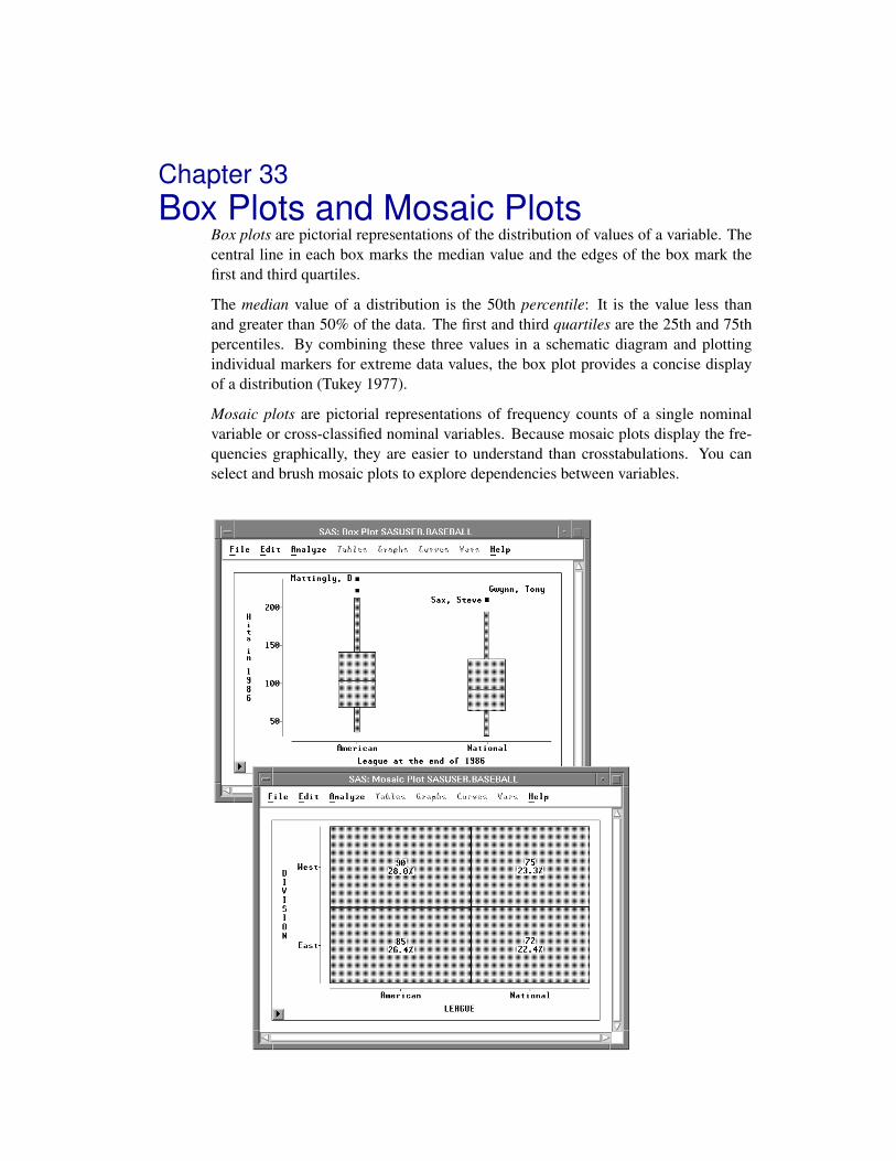
Chapter 33Box Plots and Mosaic Plots
Box plots are pictorial representations of the distribution of values of a variable. Thecentral line in each box marks the median value and the edges of the box mark thefirst and third quartiles.
The median value of a distribution is the 50th percentile: It is the value less thanand greater than 50% of the data. The first and third quartiles are the 25th and 75thpercentiles. By combining these three values in a schematic diagram and plottingindividual markers for extreme data values, the box plot provides a concise displayof a distribution (Tukey 1977).
Mosaic plots are pictorial representations of frequency counts of a single nominalvariable or cross-classified nominal variables. Because mosaic plots display the fre-quencies graphically, they are easier to understand than crosstabulations. You canselect and brush mosaic plots to explore dependencies between variables.

Reference � Box Plots and Mosaic Plots
Figure 33.1. Box Plot and Mosaic Plot
508

Variables
VariablesTo create a box plot or mosaic plot, choose Analyze:Box Plot/Mosaic Plot ( Y ).If you have previously selected one or more variables, they are assigned the requiredY variable role. A single plot is created containing a separate schematic diagram foreach Y variable selected. For interval Y variables, box plots are created. For nominalY variables, mosaic plots are created.
If you have not selected any variables, a variables dialog appears.
Figure 33.2. Box Plot/Mosaic Plot Variables Dialog
In the dialog, select at least one Y variable.
You can select one or more X variables to compare distributions. If you do not selectX variables, you get one plot containing one schematic diagram for each Y variable.If you select X variables, you get one plot for each Y variable, and each plot containsone schematic diagram for each combination of X values. For example, Figure 33.3shows the box plot created using the BASEBALL data set with NO–HITS as the Yvariable and LEAGUE as the X variable.
You can select one or more Group variables if you have grouped data. This creates aseparate box or mosaic plot for each group. For example, Figure 33.4 shows the boxplots created using the BASEBALL data set with NO–HITS as the Y variable andLEAGUE as the Group variable.
You can select a Label variable to label extreme values in box plots.
If you select a Freq variable, each observation is assumed to represent n observations,where n is the value of the Freq variable.
You can identify extreme values in the box plot and display the mean or averagevalue. You can also control the marker size of extreme values and the informationshown in the box plot axes.
509

Reference � Box Plots and Mosaic Plots
Figure 33.3. Box Plot Using X Variable
Figure 33.4. Box Plot Using Group Variable
510

Method
MethodObservations with missing values for Y variables are not used. Observations withFreq values that are missing or that are less than or equal to 0 are not used. Only theinteger part of Freq values is used.
The following method is used to compute the median and quartiles. Let
n be the number of data values
y1, y2, . . . , yn be the data values listed in increasing order
p be the desired percentile (25, 50, or 75)
i be the integer part, and f the fractional part, of the ordinal of the desired per-centile:
i + f = n ∗ p/100
Then the value of the desired percentile is
(yi + yi+1)/2 if f = 0yi+1 if f > 0
You can adjust three calculation methods by clicking on the Method button in thevariables dialog. This displays the method options dialog.
Figure 33.5. Box Plot/Mosaic Plot Method Options Dialog
By default, whiskers on the box plot are drawn from the quartiles to the farthestobservation not farther than 1.5 times the distance between the quartiles. Type yourpreferred whisker length factor in the entry field. The figures in this chapter werecreated using whisker lengths that were 1.0 times the distance between the quartiles;this results in more observations being classified as outliers.
By default, for variables in mosaic plots, values that represent less than 4% of the totalfrequency are grouped together in an “Other” category. The Method dialog enablesyou to change the threshold at which values are grouped in the Other category.
By default, X variable values are sorted by their formatted value. Turn off the SortX Formatted check box to sort X variable values by their unformatted value.
511

Reference � Box Plots and Mosaic Plots
OutputTo view or modify output options associated with your plot, click on the Outputbutton of the variables dialog. This displays the output options dialog.
Figure 33.6. Box Plot/Mosaic Plot Output Options Dialog
Values:Frequency labels mosaic boxes with the frequency of observations rep-resented in each box.
Values:Percentage labels mosaic boxes with the percentage of observationsrepresented in each box.
Values:Both labels mosaic boxes with both frequency and percentage.
Means displays mean diamonds on box plots. The central line inthe diamond marks the mean. The size of the diamond istwo standard deviations, one on either side of the mean.
Serifs displays serifs at the ends of box plot whiskers.
MultipleComparison ofMeans
displays a comparison circle (Sall 1992) for each box. Thecenter of each circle marks the mean of each box. The colorand line style of each circle indicates how the mean valueof one box compares with the means of other boxes. Aselected circle is highlighted and is drawn in red on colormonitors. Circles corresponding to categories whose meanvalues are significantly different from a selected group aredrawn in cyan on color monitors. Circles corresponding tocategories whose mean values are not different are drawnwith a dashed line and are red on color monitors. See thesection “Multiple Comparison Circles” later in this chapter.
512

Output
MultipleComparisonOptions
displays the Multiple Comparison Options dialog window.
Variable:Names labels the axes with variable names.
Variable:Labels labels the axes with variable labels.
Variable:Both labels the axes with both names and labels.
Orientation:Y Axis Vertical
draws the axis for the Y variable vertically. If this option isoff, the Y axis is horizontal.
Orientation:Vertical Axis at Left
places the vertical axis at the left side of the plot. If thisoption is off, the vertical axis is at the right side.
Orientation:Horizontal Axis atBottom
places the horizontal axis at the bottom of the plot. If thisoption is off, the horizontal axis is at the top.
You can modify other aspects of box and mosaic plots with the pop-up menu.
Ticks...� Axes� Observations
MeansComparison CirclesSerifsValuesReference LinesMarker Sizes � 1
234
� 5678
� Size to Fit
Figure 33.7. Box Plot/Mosaic Plot Pop-up Menu
Ticks... specifies tick labels on the Y axis.
Axes toggles the display of axes.
Observations toggles the display of observations (boxes and extreme val-ues). When this menu is toggled off, observations are dis-played only if selected.
513

Reference � Box Plots and Mosaic Plots
Means toggles the display of mean diamonds in box plots.
Comparison Circles toggles the display of comparison circles in box plots.
Serifs toggles the display of serifs at the ends of box plot whiskers.
Values toggles the display of values for means, medians, quartiles,and ends of whiskers in box plots. Toggles the display of fre-quency and percentage counts in mosaic plots.
Reference Lines toggles the display of lines that indicate the position of majorticks on the Y axis. This option is not available unless the axesare visible.
Marker Sizes sets the size of markers that display extreme values in boxplots.
Multiple Comparison Options
Box plots enable you to examine means in different groups. Statistical questions youmight have about the group means include
• Which underlying group means are likely to be different?
• Which group means are better than the mean of a standard group?
• Which group means are statistically indistinguishable from the best?
From the Multiple Comparison Options dialog, you can select a multiple com-parison of means test and a confidence level for the test. Multiple comparison testsenable you to infer differences between means and also to construct simultaneousconfidence intervals for these differences.
All of the tests implemented in SAS/INSIGHT software are constructed assumingthat the displayed variables are independent and normally distributed with identicalvariance. For details, refer to Hsu (1996).
Each of the tests available in SAS/INSIGHT software is described below. In thedescriptions that follow, k is the number of categories (that is, the number of boxes inthe box plot), ni is the number of observations for the ith category, µi is the true meanfor the ith category, µi is the sample mean for the ith category, ν =
∑ki=1(ni − 1) is
the total degrees of freedom, and σ is the root mean square error, also known as thepooled standard deviation. Each test creates a table showing 100(1−α)% confidenceintervals for the difference µi − µj , i �= j, i = 1 . . . k.
514
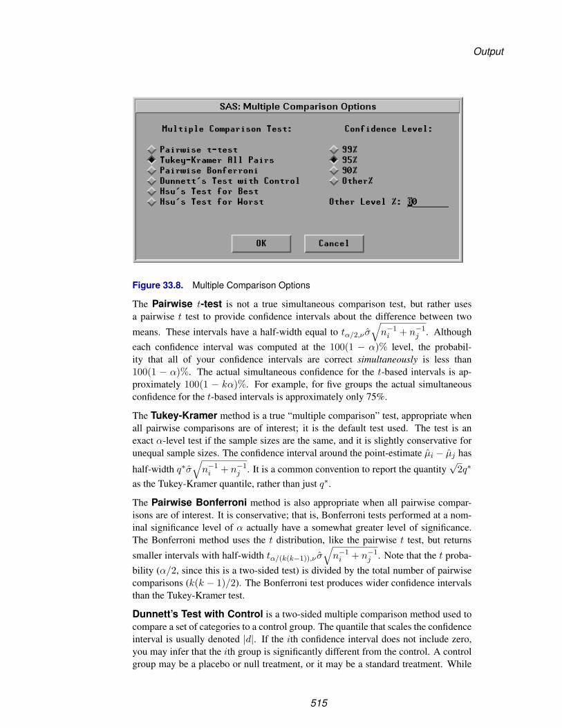
Output
Figure 33.8. Multiple Comparison Options
The Pairwise t-test is not a true simultaneous comparison test, but rather usesa pairwise t test to provide confidence intervals about the difference between two
means. These intervals have a half-width equal to tα/2,ν σ√
n−1i + n−1
j . Althougheach confidence interval was computed at the 100(1 − α)% level, the probabil-ity that all of your confidence intervals are correct simultaneously is less than100(1 − α)%. The actual simultaneous confidence for the t-based intervals is ap-proximately 100(1 − kα)%. For example, for five groups the actual simultaneousconfidence for the t-based intervals is approximately only 75%.
The Tukey-Kramer method is a true “multiple comparison” test, appropriate whenall pairwise comparisons are of interest; it is the default test used. The test is anexact α-level test if the sample sizes are the same, and it is slightly conservative forunequal sample sizes. The confidence interval around the point-estimate µi − µj has
half-width q∗σ√
n−1i + n−1
j . It is a common convention to report the quantity√
2q∗
as the Tukey-Kramer quantile, rather than just q∗.
The Pairwise Bonferroni method is also appropriate when all pairwise compar-isons are of interest. It is conservative; that is, Bonferroni tests performed at a nom-inal significance level of α actually have a somewhat greater level of significance.The Bonferroni method uses the t distribution, like the pairwise t test, but returns
smaller intervals with half-width tα/(k(k−1)),ν σ√
n−1i + n−1
j . Note that the t proba-bility (α/2, since this is a two-sided test) is divided by the total number of pairwisecomparisons (k(k − 1)/2). The Bonferroni test produces wider confidence intervalsthan the Tukey-Kramer test.
Dunnett’s Test with Control is a two-sided multiple comparison method used tocompare a set of categories to a control group. The quantile that scales the confidenceinterval is usually denoted |d|. If the ith confidence interval does not include zero,you may infer that the ith group is significantly different from the control. A controlgroup may be a placebo or null treatment, or it may be a standard treatment. While
515

Reference � Box Plots and Mosaic Plots
the interactive nature of SAS/INSIGHT enables you to select any category to use asthe basis of comparison in Dunnett’s test, you should select a category only if it trulyis the control group. To select a category, click on the corresponding comparisoncircle.
Hsu’s Test for Best can be used to screen out group means that are statistically lessthan the (unknown) largest true mean. It forms nonsymmetric confidence intervalsaround the difference between the largest sample mean and each of the others. Ifan interval does not properly contain zero in its interior, then you may infer that theassociated group is not among the best.
Similary, Hsu’s Test for Worst can be used to screen out group means that arestatistically greater than the (unknown) smallest true mean. If an interval does notproperly contain zero in its interior, then you may infer that the true mean of thatgroup is not equal to the (unknown) smallest true mean.
Multiple Comparison Circles
In addition to a table that summarizes the statistics for simultaneous multiple com-parison of means, SAS/INSIGHT software provides a graphical technique to helpvisualize which groups are significantly different from a selected group. Each test isaccompanied by a comparison circles plot that graphically illustrates the comparisons(Sall 1992).
There is a circle next to the box plot and centered at each category’s sample mean.The radius of the ith circle is qσ/
√ni, where q is a quantile used to scale the circles
according to the test being used. For details on how each quantile is computed, seerefer to Hsu (1996).
If the jth group is selected (by clicking on its circle), then its circle is highlighted.This circle is red on color monitors. You can determine whether another group issignificantly different than the selected group based on how much their correspondingcircles overlap. If their circles are nested or nearly overlap so that the external angleof intersection is greater than 90 degrees, then you cannot claim that the means ofthe two groups are different. If, however, the two circles are disjoint or just barelyoverlap so that their external angle of intersection is less than 90 degrees, then youcan conclude that the means of the two groups are significantly different at the givenconfidence level.
Circles corresponding to categories that are significantly different from the selectedgroup are drawn in cyan on color monitors. Circles corresponding to categories thatare not different are drawn with a dashed line and are red on color monitors.
The geometry behind comparison circles is based on the Pythagorean Theorem: sincethe radius of the ith circle is ri = qσ/
√ni, and since the circle is centered at µi, then
if the two circles meet at right angles, the distance between centers is the hypotenuseof the right triangle formed by the circles’ radii. Therefore, when the circles meet at
right angles, |µi − µj | = qσ√
n−1i + n−1
j . Statistically, this geometry correspondsto the critical case in which zero happens to fall on the boundary of the confidence
interval about µi − µj . If |µi − µj | > qσ√
n−1i + n−1
j , then the external intersection
516
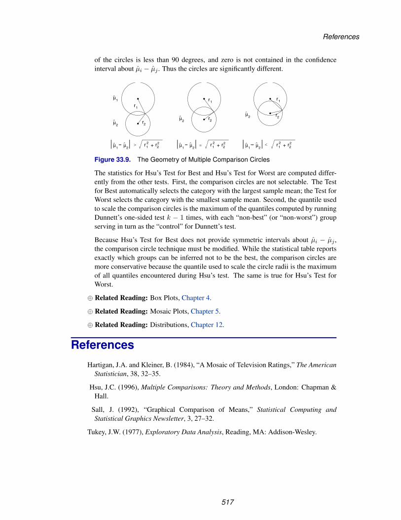
References
of the circles is less than 90 degrees, and zero is not contained in the confidenceinterval about µi − µj . Thus the circles are significantly different.
r1
r2
r1
r2
r12 r2
2+
r1
r2
r12 r2
2+ r12 r2
2+
µ1
µ2
µ2
µ2
µ1
µ2
µ1
µ2
µ1
µ2
Figure 33.9. The Geometry of Multiple Comparison Circles
The statistics for Hsu’s Test for Best and Hsu’s Test for Worst are computed differ-ently from the other tests. First, the comparison circles are not selectable. The Testfor Best automatically selects the category with the largest sample mean; the Test forWorst selects the category with the smallest sample mean. Second, the quantile usedto scale the comparison circles is the maximum of the quantiles computed by runningDunnett’s one-sided test k − 1 times, with each “non-best” (or “non-worst”) groupserving in turn as the “control” for Dunnett’s test.
Because Hsu’s Test for Best does not provide symmetric intervals about µi − µj ,the comparison circle technique must be modified. While the statistical table reportsexactly which groups can be inferred not to be the best, the comparison circles aremore conservative because the quantile used to scale the circle radii is the maximumof all quantiles encountered during Hsu’s test. The same is true for Hsu’s Test forWorst.
⊕ Related Reading: Box Plots, Chapter 4.
⊕ Related Reading: Mosaic Plots, Chapter 5.
⊕ Related Reading: Distributions, Chapter 12.
ReferencesHartigan, J.A. and Kleiner, B. (1984), “A Mosaic of Television Ratings,” The American
Statistician, 38, 32–35.
Hsu, J.C. (1996), Multiple Comparisons: Theory and Methods, London: Chapman &Hall.
Sall, J. (1992), “Graphical Comparison of Means,” Statistical Computing andStatistical Graphics Newsletter, 3, 27–32.
Tukey, J.W. (1977), Exploratory Data Analysis, Reading, MA: Addison-Wesley.
517

Reference � Box Plots and Mosaic Plots
518

Chapter 34Line Plots
Chapter Contents
VARIABLES . . . . . . . . . . . . . . . . . . . . . . . . . . . . . . . . . . . 522
METHOD . . . . . . . . . . . . . . . . . . . . . . . . . . . . . . . . . . . . 522
OUTPUT . . . . . . . . . . . . . . . . . . . . . . . . . . . . . . . . . . . . . 523

Reference � Line Plots
520

Chapter 34Line Plots
You can create line plots to show the path of a variable over time. You can control theorientation of the plot, the information shown on the axes, and the color of the lines.
Figure 34.1. Line Plot

Reference � Line Plots
VariablesTo assign variables for a line plot, choose Analyze:Line Plot ( Y X ). If you havealready selected two or more variables, you obtain a line plot. The last variable youselected is assigned the X role, and all other variables are assigned the Y role.
If you have not selected any variables, a variables dialog appears.
Figure 34.2. Line Plot Variables Dialog
In the dialog, select at least one Y variable and at least one X variable. You will obtainone line plot for each X variable, while multiple Y variables are represented on eachplot as multiple lines.
You can select one or more Group variables if you have grouped data. This createsline plots for each group.
You can select a Label variable to label observations in the plots.
MethodObservations with missing values for X variables are not used. Observations withmissing values for a Y variable are not used in the line for that Y variable but are usedin lines for other Y variables.
522

Output
OutputTo view or modify output options associated with your line plot, click on the Outputbutton of the variables dialog. This displays the options dialog.
Figure 34.3. Line Plot Output Options Dialog
Variable:Names labels the axes with variable names.
Variable:Labels labels the axes with variable labels.
Variable:Both labels the axes with both names and labels.
Orientation:Y Axis Vertical
draws the axis for the Y variable vertically. If this option isturned off, the Y axis is horizontal.
Orientation:Vertical Axis atLeft
places the vertical axis at the left side of the plot. If this optionis turned off, the vertical axis appears at the right side of theplot.
Orientation:Horizontal Axis atBottom
places the horizontal axis at the bottom of the plot. If thisoption is turned off, the horizontal axis appears at the top ofthe plot.
523
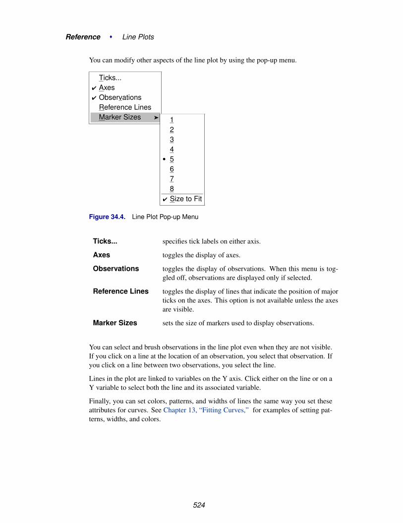
Reference � Line Plots
You can modify other aspects of the line plot by using the pop-up menu.
Ticks...� Axes� Observations
Reference LinesMarker Sizes � 1
234
� 5678
� Size to Fit
Figure 34.4. Line Plot Pop-up Menu
Ticks... specifies tick labels on either axis.
Axes toggles the display of axes.
Observations toggles the display of observations. When this menu is tog-gled off, observations are displayed only if selected.
Reference Lines toggles the display of lines that indicate the position of majorticks on the axes. This option is not available unless the axesare visible.
Marker Sizes sets the size of markers used to display observations.
You can select and brush observations in the line plot even when they are not visible.If you click on a line at the location of an observation, you select that observation. Ifyou click on a line between two observations, you select the line.
Lines in the plot are linked to variables on the Y axis. Click either on the line or on aY variable to select both the line and its associated variable.
Finally, you can set colors, patterns, and widths of lines the same way you set theseattributes for curves. See Chapter 13, “Fitting Curves,” for examples of setting pat-terns, widths, and colors.
524

Chapter 35Scatter Plots
Chapter Contents
VARIABLES . . . . . . . . . . . . . . . . . . . . . . . . . . . . . . . . . . . 528
METHOD . . . . . . . . . . . . . . . . . . . . . . . . . . . . . . . . . . . . 528
OUTPUT . . . . . . . . . . . . . . . . . . . . . . . . . . . . . . . . . . . . . 529

Reference � Scatter Plots
526

Chapter 35Scatter Plots
A scatter plot is a graphic representation of the relationship between two variables.
You can identify and label observations in the scatter plot, control the orientation ofthe plot, and control the information shown on the axes. You can explore multivariatedata in a scatter plot matrix.
Figure 35.1. Scatter Plot and Scatter Plot Matrix

Reference � Scatter Plots
VariablesTo create a scatter plot, choose Analyze:Scatter Plot ( Y X ). If you have alreadyselected two or more variables, you obtain a scatter plot matrix. A scatter plot matrixconsists of all pairwise scatter plots of the selected variables. If you assign Y and Xroles to the same set of variables, variable names and minimum and maximum valuesappear in the diagonal panels.
If you have not selected any variables, a variables dialog appears.
Figure 35.2. Scatter Plot Variables Dialog
In the dialog, select at least one Y variable and at least one X variable.
You can select one or more Group variables if you have grouped data. This createsscatter plots for each group.
You can select a Label variable to label observations in the plots.
MethodObservations with missing values for Y or X variables are not used.
528

Output
OutputTo view or modify output options associated with your scatter plot, click on theOutput button of the variables dialog. This displays the options dialog shown inFigure 35.3.
Figure 35.3. Scatter Plot Output Options Dialog
Variable:Names labels the axes with variable names.
Variable:Labels labels the axes with variable labels.
Variable:Both labels the axes with both names and labels.
Orientation:Y Axis Vertical
draws the axis for the Y variable vertically. If this option isturned off, the Y axis is horizontal.
Orientation:Vertical Axis atLeft
places the vertical axis at the left side of the plot. If this optionis turned off, the vertical axis is at the right side of the plot.
Orientation:Horizontal Axis atBottom
places the horizontal axis at the bottom of the plot. If thisoption is turned off, the horizontal axis is at the top of theplot.
You can modify other aspects of a scatter plot or scatter plot matrix using the pop-upmenu. For scatter plots, the pop-up menu has the following choices.
529

Reference � Scatter Plots
Ticks...� Axes� Observations
Reference LinesMarker Sizes � 1
234
� 5678
� Size to Fit
Figure 35.4. Scatter Plot Pop-up Menu
Ticks... specifies tick labels on either axis.
Axes toggles the display of axes.
Observations toggles the display of observations. When this menu is tog-gled off, observations are displayed only if selected.
Reference Lines toggles the display of lines that indicate the position of majorticks on the axes. This option is not available unless the axesare visible.
Marker Sizes sets the size of markers used to display observations.
When Marker Sizes:Size to Fit is checked, marker sizes are chosen to fit thegraph.
You can manipulate square scatter plot matrices as a unit. For example, you can resizethe entire matrix by dragging a corner. Pop-up menus act on all plots in the matrix.
If you have created a brush, an additional pop-up menu is available, as shown inFigure 35.5. (See Chapter 5, “Exploring Data in Two Dimensions,” for more infor-mation on brushing.)
� uniformfisheye
Figure 35.5. Scatter Plot Lens Pop-up Menu
uniform specifies that observations beneath the brush are seen as if thebrush were a typical camera lens. The relative positions ofbrushed observations are not distorted by the presence of thebrush.
530

Output
fisheye specifies that observations beneath the brush are seen as ifthe brush were a fisheye camera lens. The relative positionsof brushed observations are transformed so that observationsnear the center of the brush are magnified, whereas observa-tions away from the center appear small. The fisheye lensmay be useful for discerning individual observations withindensely clustered data.
⊕ Related Reading: Scatter Plots, Chapter 5.
⊕ Related Reading: Fitting Curves, Chapter 13.
⊕ Related Reading: Confidence Ellipses, Chapter 18.
531

Reference � Scatter Plots
532
Chapter 36Contour Plot
Chapter Contents
VARIABLES . . . . . . . . . . . . . . . . . . . . . . . . . . . . . . . . . . . 537
METHOD . . . . . . . . . . . . . . . . . . . . . . . . . . . . . . . . . . . . 538
OUTPUT . . . . . . . . . . . . . . . . . . . . . . . . . . . . . . . . . . . . . 539

Reference � Contour Plot
534

Chapter 36Contour Plot
A contour plot is a graphic representation of the relationships among three numericvariables in two dimensions. Two variables are for X and Y axes, and a third variableZ is for contour levels. The contour levels are plotted as curves; the area betweencurves can be color coded to indicate interpolated values.
You can interactively identify, label, color, and move contour levels, and change theresolutions of rectangular grids to get better contouring quality and performance. Youcan choose linear interpolation or thin-plat smoothing spline to fit contour surfacefunctions.
You can also toggle, identify and label observations in the contour plot, control theorientation of the plot, and control the information shown on the axes.

Reference � Contour Plot
Figure 36.1. Contour Plot
536
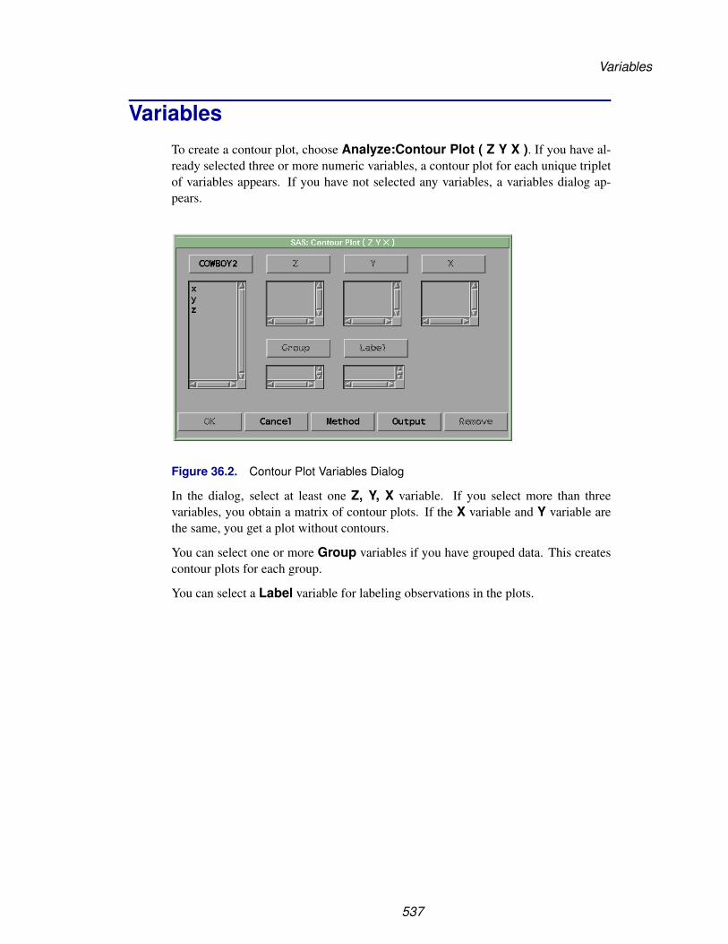
Variables
VariablesTo create a contour plot, choose Analyze:Contour Plot ( Z Y X ). If you have al-ready selected three or more numeric variables, a contour plot for each unique tripletof variables appears. If you have not selected any variables, a variables dialog ap-pears.
Figure 36.2. Contour Plot Variables Dialog
In the dialog, select at least one Z, Y, X variable. If you select more than threevariables, you obtain a matrix of contour plots. If the X variable and Y variable arethe same, you get a plot without contours.
You can select one or more Group variables if you have grouped data. This createscontour plots for each group.
You can select a Label variable for labeling observations in the plots.
537
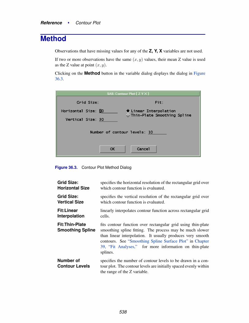
Reference � Contour Plot
MethodObservations that have missing values for any of the Z, Y, X variables are not used.
If two or more observations have the same (x, y) values, their mean Z value is usedas the Z value at point (x, y).
Clicking on the Method button in the variable dialog displays the dialog in Figure36.3.
Figure 36.3. Contour Plot Method Dialog
Grid Size:Horizontal Size
specifies the horizontal resolution of the rectangular grid overwhich contour function is evaluated.
Grid Size:Vertical Size
specifies the vertical resolution of the rectangular grid overwhich contour function is evaluated.
Fit:LinearInterpolation
linearly interpolates contour function across rectangular gridcells.
Fit:Thin-PlateSmoothing Spline
fits contour function over rectangular grid using thin-platesmoothing spline fitting. The process may be much slowerthan linear interpolation. It usually produces very smoothcontours. See “Smoothing Spline Surface Plot” in Chapter39, “Fit Analyses,” for more information on thin-platesplines.
Number ofContour Levels
specifies the number of contour levels to be drawn in a con-tour plot. The contour levels are initially spaced evenly withinthe range of the Z variable.
538
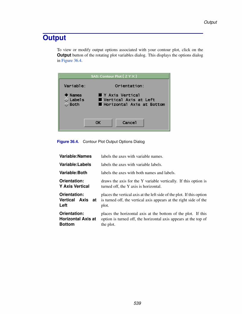
Output
OutputTo view or modify output options associated with your contour plot, click on theOutput button of the rotating plot variables dialog. This displays the options dialogin Figure 36.4.
Figure 36.4. Contour Plot Output Options Dialog
Variable:Names labels the axes with variable names.
Variable:Labels labels the axes with variable labels.
Variable:Both labels the axes with both names and labels.
Orientation:Y Axis Vertical
draws the axis for the Y variable vertically. If this option isturned off, the Y axis is horizontal.
Orientation:Vertical Axis atLeft
places the vertical axis at the left side of the plot. If this optionis turned off, the vertical axis appears at the right side of theplot.
Orientation:Horizontal Axis atBottom
places the horizontal axis at the bottom of the plot. If thisoption is turned off, the horizontal axis appears at the top ofthe plot.
539
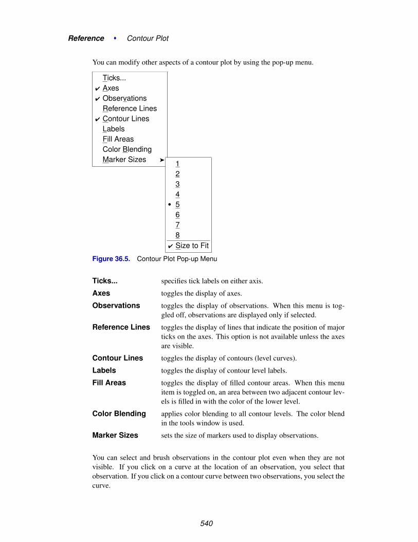
Reference � Contour Plot
You can modify other aspects of a contour plot by using the pop-up menu.
Ticks...� Axes� Observations
Reference Lines� Contour Lines
LabelsFill AreasColor BlendingMarker Sizes � 1
234
� 5678
� Size to Fit
Figure 36.5. Contour Plot Pop-up Menu
Ticks... specifies tick labels on either axis.
Axes toggles the display of axes.
Observations toggles the display of observations. When this menu is tog-gled off, observations are displayed only if selected.
Reference Lines toggles the display of lines that indicate the position of majorticks on the axes. This option is not available unless the axesare visible.
Contour Lines toggles the display of contours (level curves).
Labels toggles the display of contour level labels.
Fill Areas toggles the display of filled contour areas. When this menuitem is toggled on, an area between two adjacent contour lev-els is filled in with the color of the lower level.
Color Blending applies color blending to all contour levels. The color blendin the tools window is used.
Marker Sizes sets the size of markers used to display observations.
You can select and brush observations in the contour plot even when they are notvisible. If you click on a curve at the location of an observation, you select thatobservation. If you click on a contour curve between two observations, you select thecurve.
540

Output
You can use the hand tool to add contour curves at new locations. To add a new levelcurve, click at some (x, y) position; the level curve that passes through that locationis computed and displayed. To move a contour level, drag on the level curve, thenrelease the mouse at a new location (x′, y′). Mathematically, this process results inseeing the level set that passes through (x′, y′).
Finally, you can set colors, patterns, and widths of contour lines the same way youset these attributes for curves. See Chapter 13, “Fitting Curves,” for examples ofsetting patterns, widths, and colors. See also Chapter 11, “Coloring Observations,”for instructions on color blending.
541

Reference � Contour Plot
542
Chapter 37Rotating Plot
Chapter Contents
VARIABLES . . . . . . . . . . . . . . . . . . . . . . . . . . . . . . . . . . . 547
METHOD . . . . . . . . . . . . . . . . . . . . . . . . . . . . . . . . . . . . 548
OUTPUT . . . . . . . . . . . . . . . . . . . . . . . . . . . . . . . . . . . . . 549
REFERENCES . . . . . . . . . . . . . . . . . . . . . . . . . . . . . . . . . . 552

Reference � Rotating Plot
544
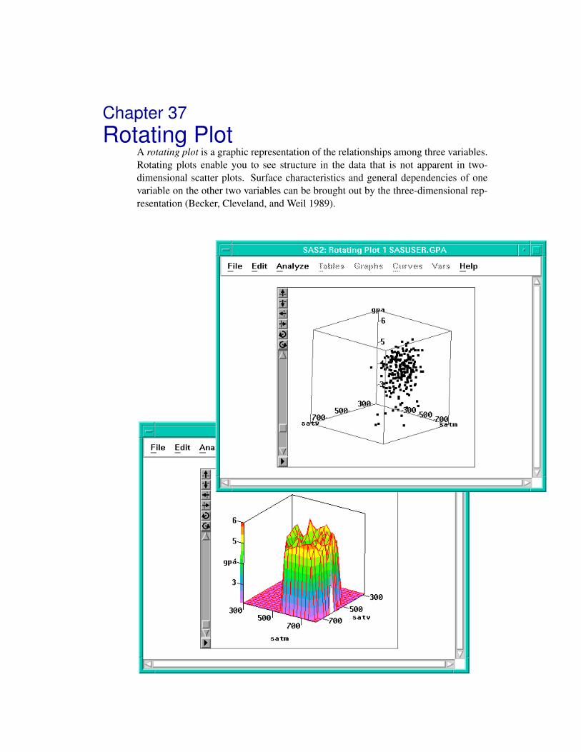
Chapter 37Rotating Plot
A rotating plot is a graphic representation of the relationships among three variables.Rotating plots enable you to see structure in the data that is not apparent in two-dimensional scatter plots. Surface characteristics and general dependencies of onevariable on the other two variables can be brought out by the three-dimensional rep-resentation (Becker, Cleveland, and Weil 1989).

Reference � Rotating Plot
Figure 37.1. Rotating Plot
546

Variables
A surface plot is a rotating plot with a fit surface. It is a graphic representation of therelationships among three or four variables. A fourth variable can be used to colorsurface contours along Z direction in three-dimensional space. You can use linearinterpolation or a thin-plate smoothing spline to fit surface functions.
Various drawing modes are provided to view a surface. For example, you can interac-tively color contour levels, and you can control the resolution of the rectangular gridused to compute a fitted surface.
You can toggle the display of axes and rays in any rotating plot. You can add abounding cube to the display to show the range of the data and to provide perspectiveto the axes. You can adjust parameters that control depth cueing, the use of color, andthe algorithm used for rotation.
VariablesTo create a rotating plot, choose Analyze:Rotating Plot ( Z Y X ). If you havealready selected three or more variables, a rotating plot for each unique triplet ofvariables appears. If you have not selected any variables, a variables dialog appears.
Figure 37.2. Rotating Plot Variables Dialog
In the dialog, select at least one Z, Y, X variable. If you select more than threevariables, you obtain a matrix of rotating plots.
You can select one or more Group variables if you have grouped data. This createsrotating plots for each group.
You can select a Label variable for labeling observations in the plots.
To create a surface plot, select the Fit Surface option in the Output dialog as shownin Figure 37.3. If the X variable and Y variable are the same, you get a rotating plotwithout surface.
547

Reference � Rotating Plot
You can select one or more ZColor variables to color surfaces. This creates surfaceplots for each color variable. The hues in the multiple colors button in the toolswindow are applied to the surface, according to interpolated values of the ZColorvariable.
MethodObservations with missing values for Z, Y, X variables are not used.
If there are observations that all share the same values for the X and Y variables, thenthe mean Z value of the set is used for the purpose of fitting a surface to the data set.
Clicking on the Method button in the variables dialog displays the dialog in Figure37.3.
Figure 37.3. Rotating Plot Methods Dialog
Grid Size:Horizontal Size
specifies the horizontal resolution of the rectangular grid overwhich surface and ZColor functions are evaluated.
Grid Size:Vertical Size
specifies the vertical resolution of the rectangular grid overwhich surface and ZColor functions are evaluated.
Fit:LinearInterpolation
linearly interpolates surface and ZColor functions acrossrectangular grid cells.
Fit:Thin-PlateSmoothing Spline
fits surface and ZColor functions over the rectangular gridusing thin-plate smoothing spline fitting. The process maybe much slower than linear interpolation. It usually producesvery smooth surfaces and colors.
Number ofContour Levels
specifies the number of contour levels to be drawn on the sur-face. The contour levels are spaced evenly within the rangeof the ZColor variable, or the range of the Z variable if noZColor variable is specified.
548
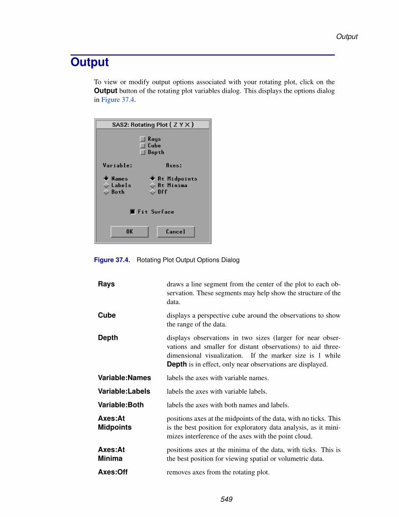
Output
OutputTo view or modify output options associated with your rotating plot, click on theOutput button of the rotating plot variables dialog. This displays the options dialogin Figure 37.4.
Figure 37.4. Rotating Plot Output Options Dialog
Rays draws a line segment from the center of the plot to each ob-servation. These segments may help show the structure of thedata.
Cube displays a perspective cube around the observations to showthe range of the data.
Depth displays observations in two sizes (larger for near obser-vations and smaller for distant observations) to aid three-dimensional visualization. If the marker size is 1 whileDepth is in effect, only near observations are displayed.
Variable:Names labels the axes with variable names.
Variable:Labels labels the axes with variable labels.
Variable:Both labels the axes with both names and labels.
Axes:AtMidpoints
positions axes at the midpoints of the data, with no ticks. Thisis the best position for exploratory data analysis, as it mini-mizes interference of the axes with the point cloud.
Axes:AtMinima
positions axes at the minima of the data, with ticks. This isthe best position for viewing spatial or volumetric data.
Axes:Off removes axes from the rotating plot.
549

Reference � Rotating Plot
Fit Surface fits a surface in the rotating plot.
You can modify other aspects of the rotating plot by using the rotating plot pop-upmenu. Click the menu button at the lower left corner of the plot to display the pop-upmenu.
The pop-up menu for a rotating plot without surface is shown in Figure 37.5.
Ticks...Axes �
� ObservationsRaysCubeDepthFast DrawMarker Sizes �
�At MidpointsAt MinimaOff
Figure 37.5. Rotating Plot without Surface Pop-up Menu
Ticks... specifies tick labels on any axis.
Axes, Rays,Cube, Depth
set the display of axes, observation vectors, perspective cube,and depth cueing as described in the previous section on out-put options.
Observations toggles the display of observations. When this menu item istoggled off, observations are displayed only if selected.
Fast Draw toggles the use of drawing algorithms that may be faster, de-pending on your host. The effect of these algorithms also de-pends on the size of your data set. On some hosts, this menuimproves rotation speed for large data sets.
Marker Sizes sets the size of markers used to display observations.
550

Output
The pop-up menu of a rotating plot with a fitted surface is shown in Figure 37.6.
Ticks...Axes �
� ObservationsRaysCubeDepthColor BlendingDrawing Modes �
Marker Sizes �
Fast Draw�Hidden Line RemovalBlock ColorSmooth ColorOff
Figure 37.6. Rotating Plot with Surface Pop-up Menu
In addition to the menu items shown in Figure 37.5, the following items are specificfor the surface plot.
Axes:ThreeSections
positions axes, with ticks, on the edges of a bounding cubesurrounding the data and fitted surface. The axes are placedso that the tick labels minimally interfere with viewing thedata.
Color Blending applies color blending to all contour levels. The color blendsin the tools window are used. The surface is colored when theBlock Color or Smooth Color display modes are on.
Drawing Modes:Fast Draw
toggles the use of drawing algorithms that may be faster, de-pending on your host. The effect of these algorithms also de-pends on the size of your data set. On some hosts, this menuimproves rotation speed for large data sets.
Drawing Modes:Hidden LineRemoval
draws the surface in wireframe with hidden line removal. Thefront and back faces are in two different colors.
Drawing Modes:Block Color
fills each surface grid cell with a color block by using colorinterpolation at the grid cell level.
Drawing Modes:Smooth Color
fills the surface by using smooth color interpolation at thescreen pixel level.
Drawing Modes:Off
toggles the display of the fitted surface.
551

Reference � Rotating Plot
† Note: In color drawing modes, a color legend bar is drawn along the Z axis in 3Dspace if no ZColor variable is specified. Otherwise, a 2D color bar is drawn at theright side of the plot for the ZColor variable.
† Note: You can create a blended color strip based on the interpolation of up to fivecolors, as described in Chapter 11, “Coloring Observations.”
With large data sets, rotation speed can be slow. The most reliable ways to optimizerotation speed are as follows:
• Use only square observation markers.
• Use only one color for observations.
• Use a small marker size, 1 if possible.
• Use Fast Draw or Hidden Line Removal drawing modes for surface.
When modeling with two explanatory variables, you may want to display a fittedplane in the rotating plot. You can write SAS statements to add planes and surfacesto the data set and rotate them with the original data. Muenchen (1992) has developedand documented a flexible set of SAS statements for this purpose.
ReferencesBecker, R.A., Cleveland, W.S., and Weil, G. (1989), “An Interactive System for
Multivariate Data Display,” Proceedings of the 11th Conference on Probability andStatistics, Boston: American Meteorological Society.
Muenchen, R.A. (1992), “INSIGHT into Multiple Regression,” Proceedings of theSeventeenth Annual SAS Users Group International Conference, 17, 1407–1410.
552
Chapter 38Distribution Analyses
Chapter Contents
PARAMETRIC DISTRIBUTIONS . . . . . . . . . . . . . . . . . . . . . . 556Normal Distribution . . . . . . . . . . . . . . . . . . . . . . . . . . . . . . 556Lognormal Distribution . . . . . . . . . . . . . . . . . . . . . . . . . . . . 556Exponential Distribution . . . . . . . . . . . . . . . . . . . . . . . . . . . . 557Weibull Distribution . . . . . . . . . . . . . . . . . . . . . . . . . . . . . . 557
VARIABLES . . . . . . . . . . . . . . . . . . . . . . . . . . . . . . . . . . . 558
METHOD . . . . . . . . . . . . . . . . . . . . . . . . . . . . . . . . . . . . 559
OUTPUT . . . . . . . . . . . . . . . . . . . . . . . . . . . . . . . . . . . . . 563
TABLES . . . . . . . . . . . . . . . . . . . . . . . . . . . . . . . . . . . . . 568Moments . . . . . . . . . . . . . . . . . . . . . . . . . . . . . . . . . . . . 568Quantiles . . . . . . . . . . . . . . . . . . . . . . . . . . . . . . . . . . . . 570Basic Confidence Intervals . . . . . . . . . . . . . . . . . . . . . . . . . . 571Tests for Location . . . . . . . . . . . . . . . . . . . . . . . . . . . . . . . 572Frequency Counts . . . . . . . . . . . . . . . . . . . . . . . . . . . . . . . 574Robust Measures of Scale . . . . . . . . . . . . . . . . . . . . . . . . . . . 576Tests for Normality . . . . . . . . . . . . . . . . . . . . . . . . . . . . . . 578Trimmed and Winsorized Means . . . . . . . . . . . . . . . . . . . . . . . 580
GRAPHS . . . . . . . . . . . . . . . . . . . . . . . . . . . . . . . . . . . . . 584Box Plot/Mosaic Plot . . . . . . . . . . . . . . . . . . . . . . . . . . . . . 584Histogram/Bar Chart . . . . . . . . . . . . . . . . . . . . . . . . . . . . . . 584QQ Plot . . . . . . . . . . . . . . . . . . . . . . . . . . . . . . . . . . . . 585
CURVES . . . . . . . . . . . . . . . . . . . . . . . . . . . . . . . . . . . . . 589Parametric Density . . . . . . . . . . . . . . . . . . . . . . . . . . . . . . . 590Kernel Density . . . . . . . . . . . . . . . . . . . . . . . . . . . . . . . . . 592Empirical CDF . . . . . . . . . . . . . . . . . . . . . . . . . . . . . . . . . 594CDF Confidence Band . . . . . . . . . . . . . . . . . . . . . . . . . . . . . 595Parametric CDF . . . . . . . . . . . . . . . . . . . . . . . . . . . . . . . . 597Test for a Specific Distribution . . . . . . . . . . . . . . . . . . . . . . . . 599Test for Distribution . . . . . . . . . . . . . . . . . . . . . . . . . . . . . . 601QQ Ref Line . . . . . . . . . . . . . . . . . . . . . . . . . . . . . . . . . . 603
ANALYSIS FOR NOMINAL VARIABLES . . . . . . . . . . . . . . . . . . 605

Reference � Distribution Analyses
REFERENCES . . . . . . . . . . . . . . . . . . . . . . . . . . . . . . . . . . 608
554

Chapter 38Distribution Analyses
Choosing Analyze:Distribution ( Y ) gives you access to a variety of distributionanalyses. For nominal Y variables, you can generate bar charts, mosaic plots, andfrequency counts tables.
For interval variables, you can generate univariate statistics, such as moments, quan-tiles, confidence intervals for the mean, standard deviation, and variance, tests forlocation, frequency counts, robust measures of the scale, tests for normality, andtrimmed and Winsorized means.
You can use parametric estimation based on normal, lognormal, exponential, orWeibull distributions to estimate density and cumulative distribution functions andto generate quantile-quantile plots. You can also generate nonparametric density es-timates based on normal, triangular, or quadratic kernels.
You can use Kolmogorov statistics to generate confidence bands for the cumulativedistribution and to test the hypothesis that the data are from a completely specifieddistribution with known parameters. You can also test the hypothesis that the data arefrom a specific family of distributions but with unknown parameters.
Figure 38.1. Distribution Analysis

Reference � Distribution Analyses
Parametric DistributionsA parametric family of distributions is a collection of distributions with a known formthat is indexed by a set of quantities called parameters. Methods based on parametricdistributions of normal, lognormal, exponential, and Weibull are available in a distri-bution analysis. This section describes the details of each of these distributions. Useof these distributions is described in the sections “Graphs” and “Curves” later in thischapter.
You can use both the density function and the cumulative distribution function toidentify the distribution. The density function is often more easily interpreted thanthe cumulative distribution function.
Normal Distribution
The normal distribution has the probability density function
f(y) =1√2πσ
exp
(−1
2
(y − µ
σ
)2)
for −∞ < y < ∞
where µ is the mean and σ is the scale parameter.
The cumulative distribution function is
F (y) = Φ(
y − µ
σ
)where the function Φ is the cumulative distribution function of the standard normalvariable: Φ(z) = 1√
2π
∫ z−∞ exp
(−u2/2)du
Lognormal Distribution
The lognormal distribution has the probability density function
f(y) =1
y − θ
1√2πσ
exp
(−1
2
(log(y − θ) − ζ
σ
)2)
for y > θ
where θ is the threshold parameter, ζ is the scale parameter, and σ is the shape pa-rameter.
The cumulative distribution function is
F (y) = Φ(
log(y − θ) − ζ
σ
)for y > θ
556

Parametric Distributions
Exponential Distribution
The exponential distribution has the probability density function
f(y) =1σ
exp(−y − θ
σ
)for y > θ
where θ is the threshold parameter and σ is the scale parameter.
The cumulative distribution function is
F (y) = 1 − exp(−y − θ
σ
)for y > θ
Weibull Distribution
The Weibull distribution has the probability density function
f(y) =c
σ
(y − θ
σ
)c−1
exp(−
(y − θ
σ
)c)for y > θ, c > 0
where θ is the threshold parameter, σ is the scale parameter, and c is the shape pa-rameter.
The cumulative distribution function is
F (y) = 1 − exp(−
(y − θ
σ
)c)for y > θ
557

Reference � Distribution Analyses
VariablesTo create a distribution analysis, choose Analyze:Distribution ( Y ). If you have al-ready selected one or more variables, a distribution analysis for each selected variableappears. If you have not selected any variables, a variables dialog appears.
Figure 38.2. Distribution Variables Dialog
Select at least one Y variable for each distribution analysis.
You can select one or more Group variables if you have grouped data. This createsone distribution analysis for each group.
You can select a Label variable to label observations in the plots.
You can select a Freq variable. If you select a Freq variable, each observation isassumed to represent n observations, where n is the value of the Freq variable.
You can select a Weight variable to specify relative weights for each observation inthe analysis. The details of weighted analyses are explained in the individual sectionsof this chapter.
558

Method
MethodObservations with missing values for a Y variable are not used in the analysis for thatvariable. Observations with Weight or Freq values that are missing or that are lessthan or equal to zero are not used. Only the integer part of Freq values is used.
The following notation is used in the rest of this chapter:
• n is the number of nonmissing values.
• yi is the ith observed nonmissing value.
• y(i)is the ith ordered nonmissing value, y(1)≤y(2)≤ . . .≤y(n).
• y is the sample mean,∑
i yi/n.
• d is the variance divisor.
• s2 is the sample variance,∑
i (yi − y)2/d.
• zi is the standardized value, (yi − y)/s.
The summation∑
i represents a summation of∑n
i=1.
Based on the variance definition, vardef, the variance divisor d is computed as
• d = n − 1 for vardef=DF, degrees of freedom
• d = n for vardef=N, number of observations
The skewness is a measure of the tendency of the deviations from the mean to belarger in one direction than in the other. The sample skewness is calculated as
• g1 = c3n∑
i z3i for vardef=DF
• g1 = 1n
∑i z3
i for vardef=N
where c3n = n(n−2)
1(n−1) .
The kurtosis is primarily a measure of the heaviness of the tails of a distribution. Thesample kurtosis is calculated as
• g2 = c4n∑
i z4i − 3cn for vardef=DF
• g2 = 1n
∑i z4
i − 3 for vardef=N
where c4n = n(n+1)(n−2)(n−3)
1(n−1) and cn = (n−1)2
(n−2)(n−3) .
559

Reference � Distribution Analyses
When the observations are independently distributed with a common mean and un-equal variances, σ2
i = σ2/wi, where wi are individual weights, weighted analysesmay be appropriate. You select a Weight variable to specify relative weights foreach observation in the analysis.
The following notation is used in weighted analyses:
• wi is the weight associated with yi.
• w(i) is the weight associated with y(i).
• w is the average observation weight,∑
i wi/n.
• yw is the weighted sample mean,∑
i wiyi/∑
i wi.
• s2w is the weighted sample variance,
∑i wi(yi − yw)2/d.
• zwi is the standardized value, (yi − yw)/(sw/√
wi).
In addition to vardef=DF and vardef=N, the variance divisor is also computed as
• d =∑
i wi − 1 for vardef=WDF, sum of weights minus 1
• d =∑
i wi for vardef=WGT, sum of weights
With V ar(yi) = σ2i = σ2/wi, V ar(yw) = σ2/
∑i wi and the expected value
E
(∑i
wi(yi − yw)2)
= E
(∑i
wi(yi − µ)2 −∑
i
wi(yw − µ)2)
= (n − 1)σ2
† Note: The use of vardef=WDF/WGT may not be appropriate since it is the weightedaverage of individual variances, σ2
i , which have unequal expected values.
For vardef=DF/N, s2w is the variance of observations with unit weight and may not be
informative in the weighted plots of parametric normal distributions. SAS/INSIGHTsoftware uses the weighted sample variance for an observation with average weight,s2a = s2
w/w, to replace s2w in the plots.
The weighted skewness is computed as
• gw1 = c3n∑
i zwi3 = c3n
∑i w
32i (yi−y
sw)3 for DF
• gw1 = 1n
∑i zwi
3 = 1n
∑i w
32i (yi−y
sw)3 for N
The weighted kurtosis is computed as
560

Method
• gw2 = c4n∑
i zwi4 − 3cn = c4n
∑i w2
i (yi−ysw
)4 − 3cn for DF
• gw2 = 1n
∑i zwi
4 − 3 = 1n
∑i w2
i (yi−ysw
)4 − 3 for N
561

Reference � Distribution Analyses
The formulations are invariant under the transformation w∗i = cwi, c > 0. The sam-
ple skewness and kurtosis are set to missing if vardef=WDF or vardef=WGT.
To view or change the divisor d used in the calculation of variances, or to view orchange the use of observations with missing values, click on the Method buttonfrom the variables dialog to display the method options dialog.
Figure 38.3. Distribution Method Options Dialog
By default, SAS/INSIGHT software uses vardef=DF, degrees of freedom to com-pute the variance divisor.
When multiple Y variables are analyzed, and some Y variables have missing values,the Use Obs with Missing Values option uses all observations with nonmissingvalues for the Y variable being analyzed. If the option is turned off, observations withmissing values for any Y variable are not used for any analysis.
562
Output
OutputTo view or change the options associated with your distribution analysis, click on theOutput button from the variables dialog. This displays the output options dialog.
Figure 38.4. Distribution Output Options Dialog
The options you set in this dialog determine which tables and graphs appear inthe distribution window. A distribution analysis can include descriptive statistics,graphs, density estimates, and cumulative distribution function estimates. By default,SAS/INSIGHT software displays a moments table, a quantiles tables, a box plot, anda histogram. Individual tables and graphs are described following this section.
You can specify the α coefficient in the Parameters:Alpha: entry field. The100(1 − α)% confidence level is used in the basic confidence intervals and thetrimmed/Winsorized means tables. You can specify µ0 in the Parameters: Mu0:entry field. µ0 is used in the tests for location and the trimmed/Winsorized meanstables. You can also specify θ in the Parameters: Theta: entry field. The pa-rameter θ is used in the parametric density estimation and cumulative distribution forlognormal, exponential, and Weibull distributions.
If you select a Weight variable, tables of weighted moments, weighted quan-tiles, weighted confidence intervals, weighted tests for location, and weighted fre-quency counts can be generated. Robust measures of scale, tests for normality,
563

Reference � Distribution Analyses
and trimmed/Winsorized means are not computed. Graphs of weighted box plot,weighted histogram, and weighted normal QQ plot can also be generated.
564
Output
The Trimmed/Winsorized Means button enables you to view or changethe options associated with trimmed and Winsorized means. Click onTrimmed/Winsorized Means to display the Trimmed/Winsorized Meansdialog.
Figure 38.5. Trimmed / Winsorized Means Dialog
In the dialog, you choose the number of observations trimmed or Winsorized in eachtail in (1/2)N and the percent of observations trimmed or Winsorized in each tail in(1/2)Percent. If you specify a percentage, the smallest integer greater than or equalto np is trimmed or Winsorized.
The Density Estimation button enables you to set the options associated with bothparametric density and nonparametric kernel density estimation. Click on DensityEstimation to display the Density Estimation dialog.
565
Reference � Distribution Analyses
Figure 38.6. Density Estimation Dialog
If you select Parametric Estimation:Normal, a normal distribution with thesample mean and standard deviation is created. For the lognormal, exponen-tial, and Weibull distributions, you specify the threshold parameter θ in theParameters:Theta: entry field in the distribution output options dialog, as shownin Figure 38.4, and have the remaining parameters estimated by the maximum-likelihood estimates.
566

Output
If you select a Weight variable, the weighted parametric normal density andweighted kernel density are generated. The parametric lognormal, exponential, andWeibull density are not computed.
The Cumulative Distribution button enables you to set the options associated withcumulative distribution estimation. Click on Cumulative Distribution to displaythe Cumulative Distribution dialog.
Figure 38.7. Cumulative Distribution Dialog
If you select Fit Parametric:Normal, a normal distribution with the sample meanand standard deviation is created. For the lognormal, exponential, and Weibull dis-tributions, you specify the threshold parameter θ in the Parameters:Theta: entryfield in the distribution output options dialog, as shown in Figure 38.4, and have theremaining parameters estimated by the maximum-likelihood estimates.
If you select a Weight variable, weighted empirical and normal cumulative distri-bution functions can be generated. The confidence bands, the parametric lognormal,exponential, and Weibull cumulative distributions, and tests for distribution are notcomputed.
Click on OK to close the dialogs and create your distribution analysis.
567

Reference � Distribution Analyses
TablesYou can generate distribution tables by setting the options in the output options dialogor by choosing from the Tables menu.
File Edit Analyze Tables Graphs Curves Vars Help� Moments� Quantiles
Basic Confidence Intervals �
Tests for Location...Frequency CountsRobust Measures of ScaleTests for NormalityTrimmed/Winsorized Mean �
Figure 38.8. Tables Menu
The tables of robust measures of scale, tests for normality, and trimmed/Winsorizedmean are not created for weighted analyses.
Moments
The Moments table, as shown in Figure 38.9, includes the following statistics:
• N is the number of nonmissing values, n.
• Sum Wgts is the sum of weights and is equal to n if no Weight variable isspecified.
• Mean is the sample mean, y.
• Sum is the variable sum,∑
i yi.
• Std Dev is the standard deviation, s.
• Variance is the variance, s2.
• Skewness is the sample skewness, g1.
• Kurtosis is the sample kurtosis, g2.
• USS is the uncorrected sum of squares,∑
i y2i .
• CSS is the sum of squares corrected for the mean,∑
i (yi − y)2.
• CV is the percent coefficient of variation, 100s/y.
• Std Mean is the standard error of the mean, s/√
n. The value is set to missingif vardef �=DF.
568

Tables
Figure 38.9. Moments and Quantiles Tables
For weighted analyses, the Weighted Moments table includes the following statis-tics:
• N is the number of nonmissing values, n.
• Sum Wgts is the sum of weights,∑
i wi.
• Mean is the weighted sample mean, yw.
• Sum is the weighted variable sum,∑
i wiyi.
• Std Dev is the weighted standard deviation, sw.
• Variance is the weighted variance, s2w.
• Skewness is the weighted sample skewness, gw1.
• Kurtosis is the weighted sample kurtosis, gw2.
• USS is the uncorrected weighted sum of squares,∑
i wiy2i .
• CSS is the weighted sum of squares corrected for the mean,∑
i wi(yi − yw)2.
• CV is the percent coefficient of variation, 100sw/yw .
• Std Mean is the standard error of the weighted mean, sw/∑
i wi.
The value is set to missing if vardef�=DF.
569
Reference � Distribution Analyses
Quantiles
It is often convenient to subdivide the area under a density curve so that the area tothe left of the dividing value is some specified fraction of the total unit area. For agiven value of p between 0 and 1, the pth quantile (or 100pth percentile) is the valuesuch that the area to the left of it is p.
The pth quantile is computed from the empirical distribution function with averaging:
y =
⎧⎨⎩ 12(y(i) + y(i+1)) if f = 0
y(i+1) if f > 0
where i is the integer part and f is the fractional part of np = i + f .
If you specify a Weight variable, the pth quantile is computed as
y =
⎧⎪⎨⎪⎩12(y(i) + y(i+1)) if
∑ij=1 w(j) = p
∑nj=1 w(j)
y(i+1) if∑i
j=1 w(j) < p∑n
j=1 w(j) <∑i+1
j=1 w(j)
When each observation has an identical weight, the weighted quantiles are identicalto the unweighted quantiles.
The Quantiles table, as shown in Figure 38.9, includes the following statistics:
• 100% Max is the maximum, y(n).
• 75% Q3 is the upper quartile (the 75th percentile).
• 50% Med is the median.
• 25% Q1 is the lower quartile (the 25th percentile).
• 0% Min is the minimum, y(1).
• 99%, 97.5%, 95%, 90%, 10%, 5%, 2.5%, and 1% give the correspondingpercentiles.
• Range is the range, y(n) − y(1).
• Q3-Q1, the interquartile range, is the difference between the upper and lowerquartiles.
• Mode is the most frequently occurring value. When there is more than onemode, the lowest mode is displayed. When all the distinct values have fre-quency one, the value is set to missing.
570

Tables
Basic Confidence IntervalsAssuming that the population is normally distributed, the Confidence Intervalstable gives confidence intervals for the mean, standard deviation, and variance at theconfidence coefficient specified. You specify the confidence intervals either in thedistribution output options dialog or from the Tables menu.
File Edit Analyze Tables Graphs Curves Vars Help� Moments� Quantiles
Basic Confidence Intervals �
Tests for Location...Frequency CountsRobust Measures of ScaleTests for NormalityTrimmed/Winsorized Mean �
99%98%95%90%80%Other...
Figure 38.10. Basic Confidence Intervals Menu
The 100(1 − α)% confidence interval for the mean has upper and lower limits
y±t(1−α/2)s√n
where t(1−α/2) is the (1 − α/2) critical value of the Student’s t statistic with n − 1degrees of freedom.
For weighted analyses, the limits are
yw±t(1−α/2)sw√∑
i wi
For large values of n, t(1−α/2) acts as z(1−α/2), the (1 − α/2) critical value of thestandard normal distribution.
The 100(1− α)% confidence interval for the standard deviation has upper and lowerlimits
s
√n − 1cα/2
and s
√n − 1
c(1−α/2)
where cα/2 and c(1−α/2) are the α/2 and (1 − α/2) critical values of the chi-squaredistribution with n − 1 degrees of freedom.
For weighted analyses, the limits are
sw
√n − 1cα/2
and sw
√n − 1
c(1−α/2)
571

Reference � Distribution Analyses
The 100(1 − α)% confidence interval for the variance has upper and lower limitsequal to the squares of the corresponding upper and lower limits for the standarddeviation.
Figure 38.11 shows a table of the 95% confidence intervals for the mean, standarddeviation, and variance.
Figure 38.11. Basic Confidence Intervals and Tests for Location Tables
† Note: The confidence intervals are set to missing if vardef�=DF.
Tests for Location
The location tests include the Student’s t, sign, and signed rank tests of the hypothesisthat the mean/median is equal to a given value µ against the two-sided alternative thatthe mean/median is not equal to µ. The Student’s t test is appropriate when the dataare from an approximately normal population; otherwise, nonparametric tests suchas the sign or signed rank test should be used.
The Student’s t gives a Student’s t statistic
t =y − µ0
s /√
n
572

Tables
For weighted analyses, the t statistic is computed as
t =yw − µ0
sw /√∑
i wi
Assuming that the null hypothesis (H0: mean = µ) is true and the population is nor-mally distributed, the t statistic has a Student’s t distribution with n − 1 degrees offreedom. The p-value is the probability of obtaining a Student’s t statistic greater inabsolute value than the absolute value of the observed statistic t.
† Note: The t statistic and p-value are set to missing if vardef�=DF.
The Sign statistic is
M =12(n+ − n−)
where n+ is the number of observations with values greater than µ, and n− is thenumber of observations with values less than µ.
Assuming that the null hypothesis (H0: median = µ0) is true, the p-value for theobserved statistic M is
Prob{|M| >= |M|} = (12)nt−1
min(n+,n−)∑i=0
(nt
i
)
where nt = n+ + n− is the number of yi values not equal to µ0.
The Signed Rank test assumes that the distribution is symmetric. The signed rankstatistic is computed as S = Σr+
i − nt(nt + 1)/4 where r+i is the rank of |yi − µ0|
after discarding yi values equal to µ0, and the sum is calculated for values of yi > µ0.Average ranks are used for tied values.
The p-value is the probability of obtaining a signed rank statistic greater in absolutevalue than the absolute value of the observed statistic S. If nt <= 20, the p-valueof the statistic S is computed from the exact distribution of S. When nt > 20, thesignificance level of S is computed by treating
√nt − 1
S√ntV − S2
as a Student’s t variate with nt − 1 degrees of freedom, where V is computed as
V =124
{nt(nt + 1)(2nt + 1) − 12
n∑j=1
tj(tj + 1)(tj − 1)}.
The sum is calculated over groups tied in absolute value, and tj is the number of tiedvalues in the jth group (Iman 1974, Lehmann 1975).
573

Reference � Distribution Analyses
You can specify location tests either in the distribution output options dialog or inthe Location Tests dialog after choosing Tables:Tests for Location from themenu.
Figure 38.12. Location Tests Dialog
In the dialog, you can specify the parameter µ0. Figure 38.11 shows a table of thethree location tests for µ0 = 60. Here, Num Obs != Mu0 is the number of ob-servations with values not equal to µ0, and Num Obs > Mu0 is the number ofobservations with values greater than µ0.
For weighted analyses, the sign and signed rank tests are not generated.
Frequency Counts
The Frequency Counts table, a portion of which is shown in Figure 38.13, in-cludes the variable values, counts, percentages, and cumulative percentages. You cangenerate frequency tables for both interval and nominal variables.
If you specify a Weight variable, the table also includes the weighted counts. Theseweighted counts are used to compute the percentages and cumulative percentages.
574

Tables
Figure 38.13. Frequency Counts Table
575

Reference � Distribution Analyses
Robust Measures of Scale
The sample standard deviation is a commonly used estimator of the population scale.However, it is sensitive to outliers and may not remain bounded when a single datapoint is replaced by an arbitrary number. With robust scale estimators, the estimatesremain bounded even when a portion of the data points are replaced by arbitrarynumbers.
A simple robust scale estimator is the interquartile range, which is the difference be-tween the upper and lower quartiles. For a normal population, the standard deviationσ can be estimated by dividing the interquartile range by 1.34898.
Gini’s mean difference is also a robust estimator of the standard deviation σ. It iscomputed as
G =1(n2
) ∑i<j
|yi − yj |
If the observations are from a normal distribution, then√
πG/2 is an unbiased esti-mator of the standard deviation σ.
A very robust scale estimator is the median absolute deviation (MAD) about the me-dian (Hampel 1974).
MAD = medi(|yi − medj(yj)|)
where the inner median, medj(yj), is the median of the n observations and the outermedian, medi, is the median of the n absolute values of the deviations about themedian.
For a normal distribution, 1.4826 MAD can be used to estimate the standard deviationσ.
The MAD statistic has low efficiency for normal distributions and it may not be ap-propriate for symmetric distributions. Rousseeuw and Croux (1993) proposed twonew statistics as alternatives to the MAD statistic, Sn and Qn.
Sn = 1.1926 medi( medj(|yi − yj |))
where the outer median, medi, is the median of the n medians of
{|yi − yj |; j = 1, 2, .., n}.
To reduce small-sample bias, csnSn is used to estimate the standard deviation σ,where csn is a correction factor (Croux and Rousseeuw 1992).
576

Tables
The second statistic is computed as
Qn = 2.2219{|yi − yj |; i < j}(k)
where k =(h2
), h = [n/2] + 1 and [n/2] is the integer part of n/2. That is, Qn is
2.2219 times the kth order statistic of the(n2
)distances between data points.
The bias-corrected statistic cqnQn is used to estimate the standard deviation σ, wherecqnis the correction factor.
A Robust Measures of Scale table includes the interquartile range, Gini’s meandifference, MAD, Sn, and Qn, with their corresponding estimates of σ, as shown inFigure 38.14.
Figure 38.14. Robust Measures of Scale and Tests for Normality
577

Reference � Distribution Analyses
Tests for Normality
SAS/INSIGHT software provides tests for the null hypothesis that the input data val-ues are a random sample from a normal distribution. These test statistics include theShapiro-Wilk statistic (W) and statistics based on the empirical distribution function:the Kolmogorov-Smirnov, Cramer-von Mises, and Anderson-Darling statistics.
The Shapiro-Wilk statistic is the ratio of the best estimator of the variance (based onthe square of a linear combination of the order statistics) to the usual corrected sumof squares estimator of the variance. W must be greater than zero and less than orequal to one, with small values of W leading to rejection of the null hypothesis ofnormality. Note that the distribution of W is highly skewed. Seemingly large valuesof W (such as 0.90) may be considered small and lead to the rejection of the nullhypothesis.
The W statistic is computed when the sample size is less than or equal to 2000. Whenthe sample size is greater than three, the coefficients for computing the linear combi-nation of the order statistics are approximated by the method of Royston (1992).
With a sample size of three, the probability distribution of W is known and is used todetermine the significance level. When the sample size is greater than three, simula-tion results are used to obtain the approximate normalizing transformation (Royston1992)
Zn =
⎧⎪⎪⎨⎪⎪⎩(− log(γ − log(1 − Wn)) − µ)/σ if 4 ≤ n ≤ 11
(log(1 − Wn) − µ)/σ if 12 ≤ n ≤ 2000
where γ, µ, and σ are functions of n, obtained from simulation results, and Zn is astandard normal variate with large values indicating departure from normality.
The Kolmogorov statistic assesses the discrepancy between the empirical distributionand the estimated hypothesized distribution. For a test of normality, the hypothesizeddistribution is a normal distribution function with parameters µ and σ estimated bythe sample mean and standard deviation. The probability of a larger test statistic isobtained by linear interpolation within the range of simulated critical values given byStephens (1974).
578

Tables
The Cramer-von Mises statistic ( W 2) is defined as
W 2 = n
∫ ∞
−∞(Fn(x) − F (x))2dF (x)
and it is computed as
W 2 =n∑
i=1
(U(i) −
2i − 12n
)2
+1
12n
where U(i) = F (y(i)) is the cumulative distribution function value at y(i), the ith or-dered value. The probability of a larger test statistic is obtained by linear interpolationwithin the range of simulated critical values given by Stephens (1974).
The Anderson-Darling statistic (A2) is defined as
A2 = n
∫ ∞
−∞(Fn(x) − F (x))2{F (x)(1 − F (x))}−1dF (x)
and it is computed as
A2 = −n − 1n
n∑i=1
{(2i − 1)(log(U(i) + log(1 − U(n+1−i)))}
The probability of a larger test statistic is obtained by linear interpolation within therange of simulated critical values in D’Agostino and Stephens (1986).
A Tests for Normality table includes the Shapiro-Wilk, Kolmogorov, Cramer-vonMises, and Anderson-Darling test statistics, with their corresponding p-values, asshown in Figure 38.14.
579

Reference � Distribution Analyses
Trimmed and Winsorized MeansWhen outliers are present in the data, trimmed and Winsorized means are robust es-timators of the population mean that are relatively insensitive to the outlying values.Therefore, trimming and Winsorization are methods for reducing the effects of ex-treme values in the sample.
The k-times trimmed mean is calculated as
ytk =1
n − 2k
n−k∑i=k+1
y(i)
The trimmed mean is computed after the k smallest and k largest observations aredeleted from the sample. In other words, the observations are trimmed at each end.
The k-times Winsorized mean is calculated as
ywk =1n{(k + 1)y(k+1) +
n−k−1∑i=k+2
y(i) + (k + 1)y(n−k)}
The Winsorized mean is computed after the k smallest observations are replaced bythe (k + 1)st smallest observation, and the k largest observations are replaced by the(k +1)st largest observation. In other words, the observations are Winsorized at eachend.
For a symmetric distribution, the symmetrically trimmed or Winsorized mean is anunbiased estimate of the population mean. But the trimmed or Winsorized mean doesnot have a normal distribution even if the data are from a normal population.
The Winsorized sum of squared deviations is defined as
s2wk = (k + 1)(y(k+1) − ywk)
2 +n−k−1∑i=k+2
(y(i) − ywk)2 + (k + 1)(y(n−k) − ywk)
2
A robust estimate of the variance of the trimmed mean ytk can be based on theWinsorized sum of squared deviations (Tukey and McLaughlin 1963). The result-ing trimmed t test is given by
ttk =ytk
STDERR(ytk)
where STDERR(ytk) is the standard error of ytk:
STDERR(ytk) =swk√
(n − 2k)(n − 2k − 1)
A Winsorized t test is given by
twk =ywk
STDERR(ywk)
where STDERR(ywk) is the standard error of ywk:
STDERR(ywk) =n − 1
n − 2k − 1swk√
n(n − 1)
580

Tables
When the data are from a symmetric distribution, the distribution of the trimmedt statistic ttk or the Winsorized t statistic twk can be approximated by a Student’st distribution with n − 2k − 1 degrees of freedom (Tukey and McLaughlin 1963,Dixon and Tukey 1968).
You can specify the number or percentage of observations to be trimmed orWinsorized from each end either by using the Trimmed/Winsorized Means op-tions dialog or by using the Trimmed/Winsorized Means dialog after choosingTables:Trimmed/Winsorized Mean:(1/2)N or Tables:Trimmed/WinsorizedMean:(1/2)Percent from the menus.
Figure 38.15. (1/2)N Menu
581
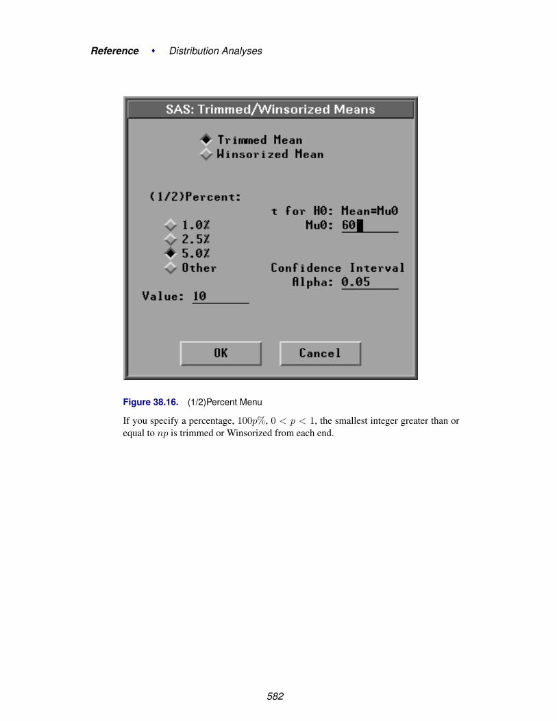
Reference � Distribution Analyses
Figure 38.16. (1/2)Percent Menu
If you specify a percentage, 100p%, 0 < p < 1, the smallest integer greater than orequal to np is trimmed or Winsorized from each end.
582

Tables
The Trimmed Mean and Winsorized Mean tables, as shown in Figure 38.17,contain the following statistics:
• (1/2)Percent is the percentage of observations trimmed or Winsorized at eachend.
• (1/2)N is the number of observations trimmed or Winsorized at each end.
• Mean is the trimmed or Winsorized mean.
• Std Mean is the standard error of the trimmed or Winsorized mean.
• DF is the degrees of freedom used in the Student’s t test for the trimmed orWinsorized mean.
• Confidence Interval includes Level (%): the confidence level, LCL: lowerconfidence limit, and UCL: upper confidence limit.
• t for H0: Mean=Mu0 includes Mu0: the location parameter µ0, t Stat:the trimmed or Winsorized t statistic for testing the hypothesis that the pop-ulation mean is µ0, and p-value: the approximate p-value of the trimmed orWinsorized t statistic.
Figure 38.17. Trimmed Means and Winsorized Means Tables
583

Reference � Distribution Analyses
GraphsYou can generate a histogram, a box plot, or a quantile-quantile plot in the distributionoutput options dialog or from the Graphs menu.
File Edit Analyze Tables Graphs Curves Vars Help� Box Plot/Mosaic Plot� Histogram/Bar Chart
QQ Plot...
Figure 38.18. Graphs Menu
If you select a Weight variable, a weighted box plot/mosaic plot, a weighted his-togram/bar chart, and a weighted normal QQ plot can be generated.
Box Plot/Mosaic Plot
The box plot is a stylized representation of the distribution of a variable, and it isshown in Figure 38.19. You can also display mosaic plots for nominal variables, asshown in Figure 38.37.
In a box plot, the sample mean and sample standard deviation computed withvardef=DF are used in the construction of the mean diamond, as shown in Figure38.19.
If you select a Weight variable, a weighted box plot based on weighted quantiles iscreated. The weighted sample mean and the weighted sample standard deviation ofan observation with average weight for vardef=DF is used in the construction of themean diamond.
⊕ Related Reading: Box Plots, Chapter 33.
Histogram/Bar Chart
The histogram is the most widely used density estimator, and it is shown in Figure38.19. You can also display bar charts for nominal variables, as shown in Figure38.37.
⊕ Related Reading: Bar Charts, Chapter 32.
584
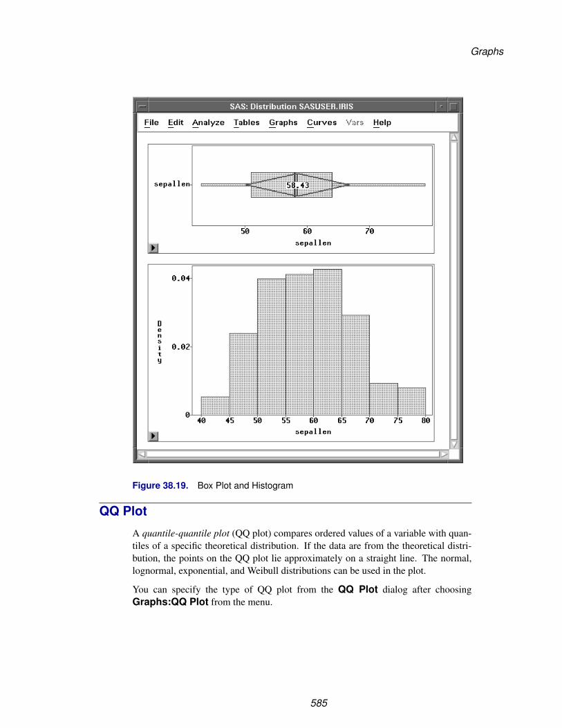
Graphs
Figure 38.19. Box Plot and Histogram
QQ Plot
A quantile-quantile plot (QQ plot) compares ordered values of a variable with quan-tiles of a specific theoretical distribution. If the data are from the theoretical distri-bution, the points on the QQ plot lie approximately on a straight line. The normal,lognormal, exponential, and Weibull distributions can be used in the plot.
You can specify the type of QQ plot from the QQ Plot dialog after choosingGraphs:QQ Plot from the menu.
585
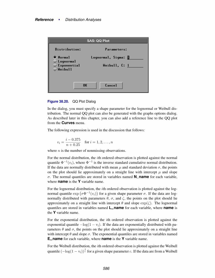
Reference � Distribution Analyses
Figure 38.20. QQ Plot Dialog
In the dialog, you must specify a shape parameter for the lognormal or Weibull dis-tribution. The normal QQ plot can also be generated with the graphs options dialog.As described later in this chapter, you can also add a reference line to the QQ plotfrom the Curves menu.
The following expression is used in the discussion that follows:
vi =i − 0.375n + 0.25
for i = 1, 2, . . . , n
where n is the number of nonmissing observations.
For the normal distribution, the ith ordered observation is plotted against the normalquantile Φ−1(vi), where Φ−1 is the inverse standard cumulative normal distribution.If the data are normally distributed with mean µ and standard deviation σ, the pointson the plot should lie approximately on a straight line with intercept µ and slopeσ. The normal quantiles are stored in variables named N–name for each variable,where name is the Y variable name.
For the lognormal distribution, the ith ordered observation is plotted against the log-normal quantile exp
(σΦ−1(vi)
)for a given shape parameter σ. If the data are log-
normally distributed with parameters θ, σ, and ζ, the points on the plot should lieapproximately on a straight line with intercept θ and slope exp(ζ). The lognormalquantiles are stored in variables named L–name for each variable, where name isthe Y variable name.
For the exponential distribution, the ith ordered observation is plotted against theexponential quantile −log(1 − vi). If the data are exponentially distributed with pa-rameters θ and σ, the points on the plot should lie approximately on a straight linewith intercept θ and slope σ. The exponential quantiles are stored in variables namedE–name for each variable, where name is the Y variable name.
For the Weibull distribution, the ith ordered observation is plotted against the Weibullquantile (−log(1 − vi))
1c for a given shape parameter c. If the data are from a Weibull
586

Graphs
distribution with parameters θ, σ, and c, the points on the plot should lie approx-imately on a straight line with intercept θ and slope σ. The Weibull quantiles arestored in variables named W–name for each variable, where name is the Y vari-able name.
A normal QQ plot is shown in Figure 38.21. You can also add a reference line tothe QQ plot from the Curves menu. You specify the intercept and slope for thereference line from the Curves menu.
Figure 38.21. Normal QQ Plot
Further information on interpreting quantile-quantile plots can be found in Chamberset al. (1983).
If you select a Weight variable, a weighted normal QQ plot can be generated.Lognormal, exponential, and Weibull QQ plots are not computed.
For a weighted normal QQ plot, the ith ordered observation is plotted against thenormal quantile Φ−1(vi), where
vi =(∑i
j=1 w(j))(1 − 0.375/i)W (1 + 0.25/n)
587

Reference � Distribution Analyses
When each observation has an identical weight, w(j) = w0, the formulation reducesto the usual expression in the unweighted normal probability plot
vi =i − 0.375n + 0.25
If the data are normally distributed with mean µ and standard deviation σ and ifeach observation has approximately the same weight (w0), then, as in the unweightednormal QQ plot, the points on the plot should lie approximately on a straight linewith intercept µ and slope σ for vardef=WDF/WGT and with slope σ/
√w0 for
vardef=DF/N.
588
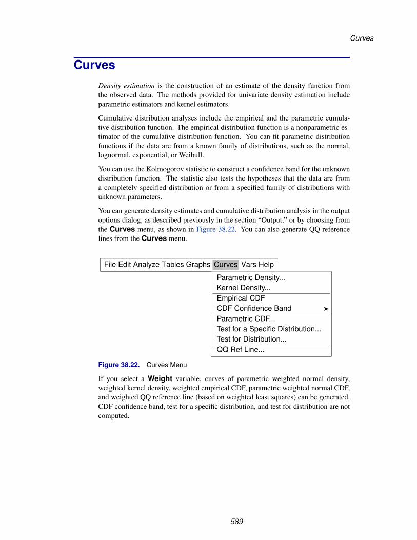
Curves
CurvesDensity estimation is the construction of an estimate of the density function fromthe observed data. The methods provided for univariate density estimation includeparametric estimators and kernel estimators.
Cumulative distribution analyses include the empirical and the parametric cumula-tive distribution function. The empirical distribution function is a nonparametric es-timator of the cumulative distribution function. You can fit parametric distributionfunctions if the data are from a known family of distributions, such as the normal,lognormal, exponential, or Weibull.
You can use the Kolmogorov statistic to construct a confidence band for the unknowndistribution function. The statistic also tests the hypotheses that the data are froma completely specified distribution or from a specified family of distributions withunknown parameters.
You can generate density estimates and cumulative distribution analysis in the outputoptions dialog, as described previously in the section “Output,” or by choosing fromthe Curves menu, as shown in Figure 38.22. You can also generate QQ referencelines from the Curves menu.
File Edit Analyze Tables Graphs Curves Vars Help
Parametric Density...Kernel Density...Empirical CDFCDF Confidence Band �
Parametric CDF...Test for a Specific Distribution...Test for Distribution...QQ Ref Line...
Figure 38.22. Curves Menu
If you select a Weight variable, curves of parametric weighted normal density,weighted kernel density, weighted empirical CDF, parametric weighted normal CDF,and weighted QQ reference line (based on weighted least squares) can be generated.CDF confidence band, test for a specific distribution, and test for distribution are notcomputed.
589

Reference � Distribution Analyses
Parametric Density
Parametric density estimation assumes that the data are from a known family of dis-tributions, such as the normal, lognormal, exponential, and Weibull. After choosingCurves:Parametric Density from the menu, you specify the family of distribu-tions in the Parametric Density Estimation dialog, as shown in Figure 38.23.
Figure 38.23. Parametric Density Dialog
The default uses a normal distribution with the sample mean and standard deviationas estimates for µ and σ. You can also specify your own µ and σ parameters for thenormal distribution by choosing Method:Specification in the dialog.
For the lognormal, exponential, and Weibull distributions, you can specify yourown threshold parameter θ in the Parameter:MLE, Theta entry field and havethe remaining parameters estimated by the maximum-likelihood estimates (MLE) bychoosing Method:Sample Estimates/MLE. Otherwise, you can specify all theparameters in the Specification fields and choose Method:Specification in thedialog.
If you select a Weight variable, only normal density can be created. ForMethod:Sample Estimates/MLE, yw and sw are used to display the den-sity with vardef=WDF/WGT; yw and sa are used with vardef=DF/N. ForMethod:Specification, the values in the entry fields Mean/Theta and Sigmaare used to display the density with vardef=WDF/WGT; the values of Mean/Thetaand Sigma/
√w are used with vardef=DF/N.
590

Curves
Figure 38.24 displays a normal density estimate with µ = 58.4333 (the sample mean)and σ = 8.2807 (the sample standard deviation). It also displays a lognormal densityestimate with θ = 30 and with σ and ζ estimated by the MLE.
Figure 38.24. Parametric Density Estimation
The Mode is the point with the largest estimated density. Use sliders in the table tochange the density estimate. When MLE is used for the lognormal, exponential, andWeibull distributions, changing the value of θ in the Mean/Theta slider also causesthe remaining parameters to be estimated by the MLE for the new θ.
591

Reference � Distribution Analyses
Kernel Density
Kernel density estimation provides normal, triangular, and quadratic kernel densityestimators. The general form of a kernel estimator is
fλ(y) =1
nλ
n∑i=1
K0
(y − yi
λ
)
where K0 is a kernel function and λ is the bandwidth.
Some symmetric probability density functions commonly used as kernel functionsare
• Normal K0(t) = 1√2π
exp(−t2/2
)for −∞ < t < ∞
• Triangular K0(t) =
⎧⎨⎩ 1 − |t|0
for |t| ≤ 1
otherwise
• Quadratic K0(t) =
⎧⎨⎩ 34(1 − t2)
0
for |t| ≤ 1
otherwise
Both theory and practice suggest that the choice of a kernel function is not crucialto the statistical performance of the method (Epanechnikov 1969). With a specifickernel function, the value of λ determines the degree of averaging in the estimate ofthe density function and is called a smoothing parameter. You select a bandwidth λfor each kernel estimator by specifying c in the formula
λ = n− 15 Qc
where Q is the sample interquartile range of the Y variable. This formulation makesc independent of the units of Y.
For a specific kernel function, the discrepancy between the density estimator fλ(y)and the true density f(y) can be measured by the mean integrated square error
MISE(λ) =∫
y{E(fλ(y)) − f(y)}2dy +
∫yVar(fλ(y)) dy
which is the sum of the integrated square bias and the integrated variance.
An approximate mean integrated square error based on the bandwidth λ is
AMISE(λ) =14λ4(
∫tt2K(t)dt)2
∫y(f ′′(y))2 dy +
1nλ
∫tK(t)2dt
592

Curves
If f(y) is assumed normal, then a bandwidth based on the sample mean and variancecan be computed to minimize AMISE. The resulting bandwidth for a specific kernel isused when the associated kernel function is selected in the density estimation optionsdialog. This is equivalent to choosing MISE from the normal, triangular, or quadratickernel menus. If f(y) is not roughly normal, this choice may not be appropriate.
SAS/INSIGHT software divides the range of the data into 128 evenly spaced inter-vals, then approximates the data on this grid and uses the fast Fourier transformation(Silverman 1986) to estimate the density.
If you select a Weight variable, the kernel estimator is modified to include the indi-vidual observation weights.
fλ(y) =1∑
i wiλ
n∑i=1
wiK0
(y − yi
λ
)
You can specify the kernel function in the density estimation options dialog or fromthe Curves menu. When you specify the kernel function in the density estimationoptions dialog, AMISE is used. After choosing Curves:Kernel Density from themenu, you can specify the kernel function and use either AMISE or a specified Cvalue in the Kernel Density Estimation dialog.
Figure 38.25. Kernel Density Dialog
The default uses a normal kernel density with a c value that minimizes the AMISE.Figure 38.26 displays normal kernel estimates with c = 0.7852 (the AMISE value)and c = 0.25. Small values of c (and hence small values of the smoothing parameterλ) provide jagged estimates as the curve more closely follows the data points. Largevalues of c provide smoother estimates. The Mode is the point with the largestestimated density. Use the slider to change the smoothing parameter, c.
593

Reference � Distribution Analyses
Figure 38.26. Kernel Density Estimation
Empirical CDFThe empirical distribution function of a sample, Fn(y), is the proportion of observa-tions less than or equal to y.
Fn(y) =1n
n∑i=1
I(yi≤y)
where n is the number of observations, and I(yi ≤ y) is an indicator function withvalue 1 if yi ≤ y and with value 0 otherwise.
The Kolmogorov statistic D is a measure of the discrepancy between the empiricaldistribution and the hypothesized distribution.
D = Maxy|Fn(y) − F(y)|where F (y) is the hypothesized cumulative distribution function. The statistic is themaximum vertical distance between the two distribution functions. The Kolmogorovstatistic can be used to construct a confidence band for the unknown distributionfunction, to test for a hypothesized completely known distribution, and to test for aspecific family of distributions with unknown parameters.
If you select a Weight variable, the weighted empirical distribution function is theproportion of observation weights for observations less than or equal to y.
Fw(y) =1∑i wi
n∑i=1
wiI(yi≤y)
594

Curves
CDF Confidence Band
The confidence band gives a confidence region for the population distribution. Thecritical values given by Feller (1948) for the completely specified hypothesized distri-bution are used to generate the confidence band. All parameters in the hypothesizeddistribution are known. The null hypothesis that the population distribution is equalto a given completely specified distribution is rejected if the hypothesized distributionfalls outside the confidence band at any point.
You specify the confidence coefficient in the cumulative distribution options dialogor by choosing Curves:CDF Confidence Band.
File Edit Analyze Tables Graphs Curves Vars Help
Parametric Density...Kernel Density...Empirical CDFCDF Confidence Band �
Parametric CDF...Test for a Specific Distribution...Test for Distribution...QQ Ref Line...
99%98%95%90%80%Other...
Figure 38.27. CDF Confidence Band MenuFigure 38.28 displays an empirical distribution function and a 95% confidence bandfor the cumulative distribution function. Use the Coefficient slider to change thecoefficient for the confidence band.
595

Reference � Distribution Analyses
Figure 38.28. CDF Confidence Band
596

Curves
Parametric CDF
You can fit the normal, lognormal, exponential, and Weibull distributions to yourdata. You specify the family of distributions either in the cumulative distributionoptions dialog or from the Parametric CDF Estimation dialog after choosingCurves:Parametric CDF from the menu.
Figure 38.29. Parametric CDF Dialog
For the normal distribution, you can specify your own µ and σ parameters fromthe Fit Parametric menu. Otherwise, you can use the sample mean and stan-dard deviation as estimates for µ and σ by selecting Fit Parametric:Normal inthe cumulative distribution options dialog or by choosing Distribution:Normal andMethod:Sample Estimates/MLE in the Parametric CDF Estimation dialog.
For the lognormal, exponential, and Weibull distributions, you can specify yourown threshold parameter θ and have the remaining parameters estimated by themaximum- likelihood method, or you can specify all the distribution parametersin the Parametric CDF Estimation dialog. Otherwise, you can have thethreshold parameter set to 0 and the remaining parameters estimated by themaximum-likelihood method. To do this, select Lognormal, Exponential, orWeibull in the Cumulative Distribution Output dialog or choose Method:SampleEstimates/MLE and Parameter:MLE, Theta:0 in the Parametric CDFEstimation dialog.
If you select a Weight variable, only normal CDF can be created. ForMethod:Sample Estimates/MLE, yw and sw are used to display the cu-mulative distribution function with vardef=WDF/WGT; yw and sa are usedwith vardef=DF/N. For Method:Specification, the values in the entry fieldsMean/Theta and Sigma are used to display the cumulative distribution functionwith vardef=WDF/WGT; the values of Mean/Theta and Sigma/
√w are used with
vardef=DF/N.
597

Reference � Distribution Analyses
Figure 38.30 displays a normal distribution function with µ = 58.4333 (the samplemean) and σ = 8.2807 (the sample standard deviation); it also displays a lognormaldistribution function with θ = 30 and σ and ζ estimated by the MLE.
Figure 38.30. Parametric CDF
Use sliders to change the CDF estimate. When MLE is used for the lognormal, ex-ponential, and Weibull distributions, changing the value of θ in the slider also causesthe remaining parameters to be estimated by the MLE for the new θ.
598

Curves
Test for a Specific Distribution
You can test whether the data are from a specific distribution with known parametersby using the Kolmogorov statistic. The probability of a larger Kolmogorov statistic isgiven in Feller (1948). After choosing Curves:Test for a Specific Distributionfrom the menu, you can specify the distribution and its parameters in the Test for aSpecific Distribution dialog.
Figure 38.31. Test for a Specific Distribution Dialog
The default tests that the data are from a normal distribution with µ = 0 and σ = 1.Figure 38.32 shows a test for a specified normal distribution (µ = 60, σ = 10).Use sliders to change the distribution parameters and have the test results updatedaccordingly.
599

Reference � Distribution Analyses
Figure 38.32. Test for a Specific Distribution
600
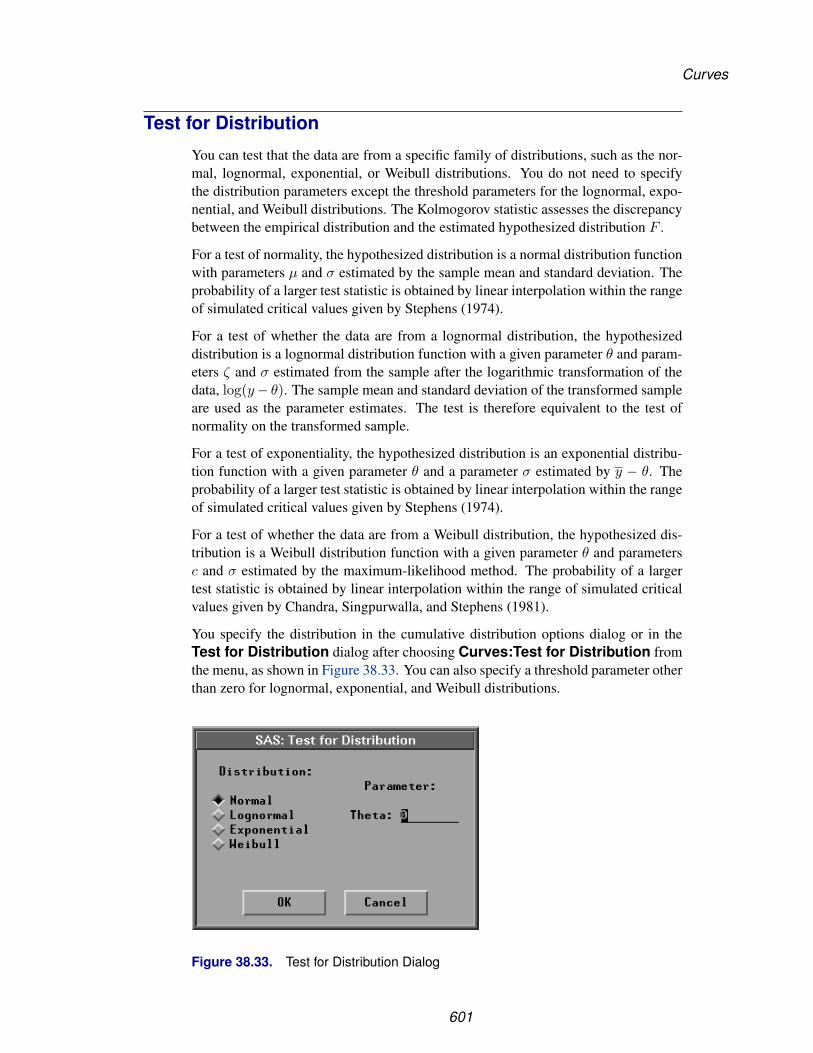
Curves
Test for Distribution
You can test that the data are from a specific family of distributions, such as the nor-mal, lognormal, exponential, or Weibull distributions. You do not need to specifythe distribution parameters except the threshold parameters for the lognormal, expo-nential, and Weibull distributions. The Kolmogorov statistic assesses the discrepancybetween the empirical distribution and the estimated hypothesized distribution F .
For a test of normality, the hypothesized distribution is a normal distribution functionwith parameters µ and σ estimated by the sample mean and standard deviation. Theprobability of a larger test statistic is obtained by linear interpolation within the rangeof simulated critical values given by Stephens (1974).
For a test of whether the data are from a lognormal distribution, the hypothesizeddistribution is a lognormal distribution function with a given parameter θ and param-eters ζ and σ estimated from the sample after the logarithmic transformation of thedata, log(y− θ). The sample mean and standard deviation of the transformed sampleare used as the parameter estimates. The test is therefore equivalent to the test ofnormality on the transformed sample.
For a test of exponentiality, the hypothesized distribution is an exponential distribu-tion function with a given parameter θ and a parameter σ estimated by y − θ. Theprobability of a larger test statistic is obtained by linear interpolation within the rangeof simulated critical values given by Stephens (1974).
For a test of whether the data are from a Weibull distribution, the hypothesized dis-tribution is a Weibull distribution function with a given parameter θ and parametersc and σ estimated by the maximum-likelihood method. The probability of a largertest statistic is obtained by linear interpolation within the range of simulated criticalvalues given by Chandra, Singpurwalla, and Stephens (1981).
You specify the distribution in the cumulative distribution options dialog or in theTest for Distribution dialog after choosing Curves:Test for Distribution fromthe menu, as shown in Figure 38.33. You can also specify a threshold parameter otherthan zero for lognormal, exponential, and Weibull distributions.
Figure 38.33. Test for Distribution Dialog
601

Reference � Distribution Analyses
The default tests that the data are from a normal distribution. A test for normalityand a test for lognormal distribution with θ = 30 are given in Figure 38.34. Youcan use the Mean/Theta slider to adjust the threshold parameter, θ, for lognormal,exponential, and Weibull distributions.
Figure 38.34. Tests for Distribution
602

Curves
QQ Ref Line
After choosing Curves:QQ Ref Line, you can use the QQ Ref Line dialog to adddistribution reference lines to QQ plots.
Figure 38.35. QQ Ref Line DialogThe default adds a least squares regression line. You can also specify your ownreference line by choosing Method:Specification and specifying both the interceptand slope.
If you select a Weight variable, you can add a weighted least squares regressionline to the normal QQ plot. If the data are normally distributed with mean µ andstandard deviation σ and if each observation has approximately the same weight (w0),then the least squares regression line has approximately intercept µ and slope σ forvardef=WDF/WEIGHT and slope σ/
√w0 for vardef=DF/N.
A normal QQ plot with a least squares reference line is shown in Figure 38.36. Usethe sliders to change the intercept and slope of the reference line.
603

Reference � Distribution Analyses
Figure 38.36. Normal QQ Plot with a Reference Line
604

Analysis for Nominal Variables
Analysis for Nominal VariablesYou can generate a frequency table, display a bar chart, and display a mosaic plot foreach nominal variable in the distribution analysis, as shown in Figure 38.37.
605
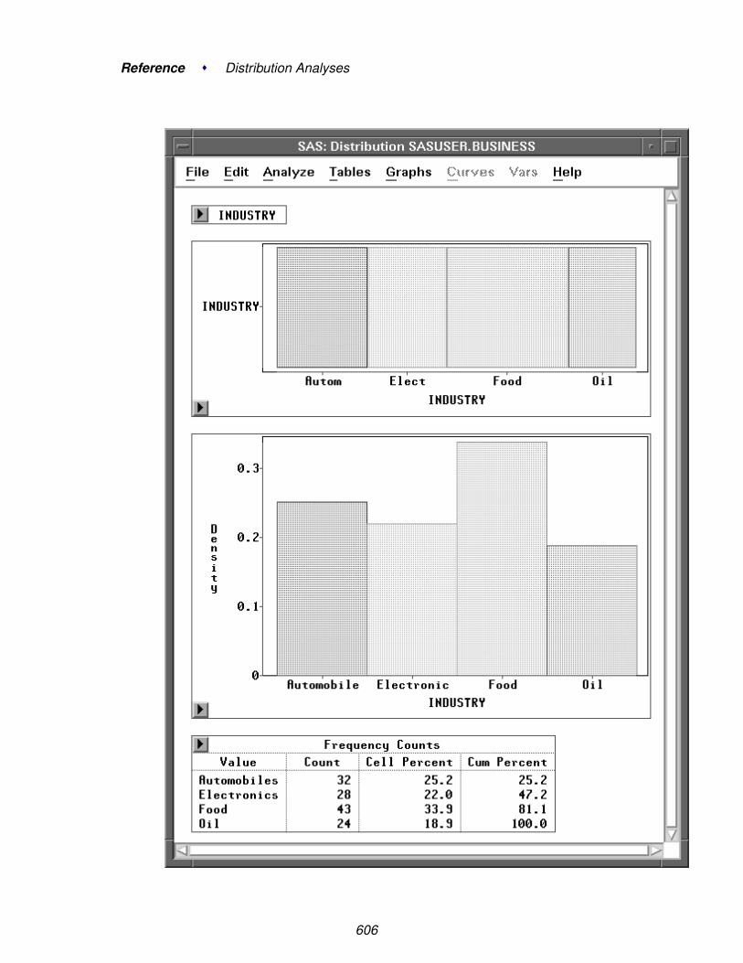
Reference � Distribution Analyses
606

Analysis for Nominal Variables
Figure 38.37. Nominal Variable Output
⊕ Related Reading: Bar Charts, Chapter 32.
⊕ Related Reading: Mosaic Plots, Chapter 33.
607

Reference � Distribution Analyses
ReferencesChambers, J.M., Cleveland, W.S., Kleiner, B., and Tukey, P.A. (1983), Graphical
Methods for Data Analysis, Belmont, CA: Wadsworth International Group.
Chandra, M., Singpurwalla, N.D., and Stephens, M.A. (1981), “Kolmogorov Statisticsfor Tests of Fit for the Extreme-Value and Weibull Distributions,” Journal of theAmerican Statistical Association, 76, 729–731.
Conover, W.J. (1980), Practical Nonparametric Statistics, Second Edition, New York:John Wiley & Sons, Inc.
Croux, C. and Rousseeuw, P.J. (1992), “Time-Efficient Algorithms for Two HighlyRobust Estimators of Scale,” Computational Statistics, Volume 1, 411–428.
D’Agostino, R.B. and Stephens, M.A., Eds. (1986), Goodness-of-Fit Techniques, NewYork: Marcel Dekker, Inc.
Dixon, W.J. and Tukey, J.W. (1968), “Approximate Behavior of the Distribution ofWinsorized t (Trimming/Winsorization 2),” Technometrics, 10, 83–98.
Epanechnikov, V.A. (1969), “Nonparametric Estimation of a Multivariate ProbabilityDensity,” Theory of Probability and Its Applications, 14, 153–158.
Feller, W. (1948), “On the Kolomogorov-Smirnov Limit Theorems for EmpiricalDistributions,” Annals of Math. Stat., 19, 177–189.
Fisher, R.A. (1936), “The Use of Multiple Measurements in Taxonomic Problems,”Annals of Eugenics, 7, 179–188.
Hahn, G.J. and Meeker, W.Q. (1991), Statistical Intervals: A Guide for Practitioners,New York: John Wiley & Sons, Inc.
Hampel, F.R. (1974), “The Influence Curve and its Role in Robust Estimation,” Journalof the American Statistical Association, 69, 383–393.
Iman, R.L. (1974), “Use of a t-statistic as an Approximation to the Exact Distribution ofthe Wilcoxon Signed Ranks Test Statistic,” Communications in Statistics, 3, 795–806.
Johnson, N.L. and Kotz, S. (1970), Continuous Univariate Distributions —I, New York:John Wiley & Sons, Inc.
Lehmann, E.L. (1975), Nonparametric: Statistical Methods Based on Ranks, SanFrancisco: Holden-Day, Inc.
Rosenberger, J.L. and Gasko, M. (1983), “Comparing Location Estimators: TrimmedMeans, Medians, and Trimean,” in Understanding Robust and Exploratory DataAnalysis, eds. D.C. Hoaglin, F. Mosteller, and J.W. Tukey, New York: John Wiley &Sons, Inc., 297–338.
608

References
Rousseeuw, P.J. and Croux, C. (1993), “Alternatives to the Median Absolute Deviation,”Journal of the American Statistical Association, 88, 1273–1283.
Royston, P. (1992), “Approximating the Shapiro-Wilk W-Test for non-normality,”Statistics and Computing, 2, 117–119.
Silverman, B.W. (1982), “Kernel Density Estimation using the Fast Fourier Transform,”Applied Statistics, 31, 93–99.
Silverman, B.W. (1986), Density Estimation for Statistics and Data Analysis, New York:Chapman and Hall.
Smirnov, N. (1948) “Table for Estimating the Goodness of Fit of EmpiricalDistributions,” Annals of Math. Stat., 19, 279.
Stephens, M.A. (1974), “EDF Statistics for Goodness of Fit and Some Comparisons,”Journal of the American Statistical Association, 69, 730–737.
Tukey, J.W. (1977), Exploratory Data Analysis, Reading, MA: Addison-Wesley.
Tukey, J.W. and McLaughlin, D.H. (1963), “Less Vulnerable Confidenceand Significance Procedures for Location Based on a Single Sample:Trimming/Winsorization 1,” Sankhya A, 25, 331–352.
609

Reference � Distribution Analyses
610

Chapter 39Fit Analyses
Chapter Contents
STATISTICAL MODELS . . . . . . . . . . . . . . . . . . . . . . . . . . . . 614
LINEAR MODELS . . . . . . . . . . . . . . . . . . . . . . . . . . . . . . . 615
GENERALIZED LINEAR MODELS . . . . . . . . . . . . . . . . . . . . . 618The Exponential Family of Distributions . . . . . . . . . . . . . . . . . . . 618Link Function . . . . . . . . . . . . . . . . . . . . . . . . . . . . . . . . . 619The Likelihood Function and Maximum-Likelihood Estimation . . . . . . . 620Scale Parameter . . . . . . . . . . . . . . . . . . . . . . . . . . . . . . . . 622Goodness of Fit . . . . . . . . . . . . . . . . . . . . . . . . . . . . . . . . 622Quasi-Likelihood Functions . . . . . . . . . . . . . . . . . . . . . . . . . . 623
NONPARAMETRIC SMOOTHERS . . . . . . . . . . . . . . . . . . . . . . 626Smoother Degrees of Freedom . . . . . . . . . . . . . . . . . . . . . . . . 627Smoother Generalized Cross Validation . . . . . . . . . . . . . . . . . . . . 628
VARIABLES . . . . . . . . . . . . . . . . . . . . . . . . . . . . . . . . . . . 629
METHOD . . . . . . . . . . . . . . . . . . . . . . . . . . . . . . . . . . . . 631
OUTPUT . . . . . . . . . . . . . . . . . . . . . . . . . . . . . . . . . . . . . 634
TABLES . . . . . . . . . . . . . . . . . . . . . . . . . . . . . . . . . . . . . 638Model Information . . . . . . . . . . . . . . . . . . . . . . . . . . . . . . . 638Model Equation . . . . . . . . . . . . . . . . . . . . . . . . . . . . . . . . 638X’X Matrix . . . . . . . . . . . . . . . . . . . . . . . . . . . . . . . . . . 639Summary of Fit for Linear Models . . . . . . . . . . . . . . . . . . . . . . 640Summary of Fit for Generalized Linear Models . . . . . . . . . . . . . . . 642Analysis of Variance for Linear Models . . . . . . . . . . . . . . . . . . . . 643Analysis of Deviance for Generalized Linear Models . . . . . . . . . . . . 644Type I Tests . . . . . . . . . . . . . . . . . . . . . . . . . . . . . . . . . . 644Type III Tests . . . . . . . . . . . . . . . . . . . . . . . . . . . . . . . . . 646Parameter Estimates for Linear Models . . . . . . . . . . . . . . . . . . . . 649Parameter Estimates for Generalized Linear Models . . . . . . . . . . . . . 651C.I. for Parameters . . . . . . . . . . . . . . . . . . . . . . . . . . . . . . . 652Collinearity Diagnostics . . . . . . . . . . . . . . . . . . . . . . . . . . . . 657Estimated COV Matrix and Estimated CORR Matrix . . . . . . . . . . . . . 658
RESIDUAL AND SURFACE PLOTS . . . . . . . . . . . . . . . . . . . . . 659

Reference � Fit Analyses
Residual-by-Predicted Plot . . . . . . . . . . . . . . . . . . . . . . . . . . 659Residual Normal QQ Plot . . . . . . . . . . . . . . . . . . . . . . . . . . . 661Partial Leverage Plots . . . . . . . . . . . . . . . . . . . . . . . . . . . . . 661Parametric Surface Plot . . . . . . . . . . . . . . . . . . . . . . . . . . . . 662Smoothing Spline Surface Plot . . . . . . . . . . . . . . . . . . . . . . . . 663Kernel Surface Plot . . . . . . . . . . . . . . . . . . . . . . . . . . . . . . 667Parametric Profile Surface Plot . . . . . . . . . . . . . . . . . . . . . . . . 670
FIT CURVES . . . . . . . . . . . . . . . . . . . . . . . . . . . . . . . . . . . 671Parametric Curves: Confidence Ellipses . . . . . . . . . . . . . . . . . . . 671Parametric Curves: Polynomial . . . . . . . . . . . . . . . . . . . . . . . . 674Parametric Curves: Confidence Curves . . . . . . . . . . . . . . . . . . . . 677Nonparametric Smoothing Spline . . . . . . . . . . . . . . . . . . . . . . . 679Nonparametric Kernel Smoother . . . . . . . . . . . . . . . . . . . . . . . 682Nonparametric Local Polynomial Smoother . . . . . . . . . . . . . . . . . 684
OUTPUT VARIABLES . . . . . . . . . . . . . . . . . . . . . . . . . . . . . 691Hat Matrix Diagonal . . . . . . . . . . . . . . . . . . . . . . . . . . . . . . 692Predicted Values . . . . . . . . . . . . . . . . . . . . . . . . . . . . . . . . 693Linear Predictor . . . . . . . . . . . . . . . . . . . . . . . . . . . . . . . . 693Residuals . . . . . . . . . . . . . . . . . . . . . . . . . . . . . . . . . . . . 693Residual Normal Quantiles . . . . . . . . . . . . . . . . . . . . . . . . . . 693Predicted Surfaces . . . . . . . . . . . . . . . . . . . . . . . . . . . . . . . 694Predicted Curves . . . . . . . . . . . . . . . . . . . . . . . . . . . . . . . . 695Standardized and Studentized Residuals . . . . . . . . . . . . . . . . . . . 696Deviance Residuals . . . . . . . . . . . . . . . . . . . . . . . . . . . . . . 697Pearson Residuals . . . . . . . . . . . . . . . . . . . . . . . . . . . . . . . 697Anscombe Residuals . . . . . . . . . . . . . . . . . . . . . . . . . . . . . . 698Partial Leverage Variables . . . . . . . . . . . . . . . . . . . . . . . . . . . 699Cook’s D . . . . . . . . . . . . . . . . . . . . . . . . . . . . . . . . . . . . 700Dffits . . . . . . . . . . . . . . . . . . . . . . . . . . . . . . . . . . . . . . 700Covratio . . . . . . . . . . . . . . . . . . . . . . . . . . . . . . . . . . . . 701Dfbetas . . . . . . . . . . . . . . . . . . . . . . . . . . . . . . . . . . . . . 701
WEIGHTED ANALYSES . . . . . . . . . . . . . . . . . . . . . . . . . . . . 702
REFERENCES . . . . . . . . . . . . . . . . . . . . . . . . . . . . . . . . . . 703
612

Chapter 39Fit Analyses
Choosing Analyze:Fit ( Y X ) gives you access to a variety of techniques for fittingmodels to data. These provide methods for examining the relationship between aresponse (dependent) variable and a set of explanatory (independent) variables.
You can use least-squares methods for simple and multiple linear regression withvarious diagnostic capabilities when the response is normally distributed.
You can use generalized linear models to analyze the data when the response is from adistribution of the exponential family and a function can be used to link the responsemean to a linear combination of the explanatory variables.
You can use spline and kernel smoothers for nonparametric regression when themodel has one or two explanatory variables.
Figure 39.1. Fit Analysis

Reference � Fit Analyses
Statistical ModelsThe relationship between a response variable and a set of explanatory variables canbe studied through a regression model
yi = f(xi) + εi
where yi is the ith observed response value, xi is the ith vector of explanatory values,and εi’s are uncorrelated random variables with zero mean and a common variance.
If the form of the regression function f is known except for certain parameters, themodel is called a parametric regression model. Furthermore, if the regression func-tion is linear in the unknown parameters, the model is called a linear model.
In the case of linear models with the error term εi assumed to be normally distributed,you can use classical linear models to explore the relationship between the responsevariable and the explanatory variables.
A nonparametric model generally assumes only that f belongs to some infinite- di-mensional collection of functions. For example, f may be assumed to be differen-tiable with a square-integrable second derivative.
When there is only one explanatory X variable, you can use nonparametric smooth-ing methods, such as smoothing splines, kernel estimators, and local polynomialsmoothers. You can also request confidence ellipses and parametric fits (mean, linearregression, and polynomial curves) with a linear model. These are added to a scatterplot generated from Y by a single X and are described in the “Fit Curves” section.
When there are two explanatory variables in the model, you can create parametricand nonparametric (kernel and thin-plate smoothing spline) response surface plots.With more than two explanatory variables in the model, a parametric profile responsesurface plot with two selected explanatory variables can be created.
When the response yi has a distribution from the exponential family (normal, inverseGaussian, gamma, Poisson, binomial), and the mean µi of the response variable yi isassumed to be related to a linear predictor through a monotone function g
g(µi) = x′iβ
where β is a vector of unknown parameters, you can explore the relationship by usinggeneralized linear models.
614
Linear Models
Linear ModelsSAS/INSIGHT fit analysis provides the traditional parametric regression analysis as-suming that the regression function is linear in the unknown parameters. The rela-tionship is expressed as an equation that predicts a response variable from a linearfunction of explanatory variables.
Besides the usual estimators and test statistics produced for a regression, a fit analysiscan produce many diagnostic statistics. Collinearity diagnostics measure the strengthof the linear relationship among explanatory variables and how this affects the stabil-ity of the estimates. Influence diagnostics measure how each individual observationcontributes to determining the parameter estimates and the fitted values.
In matrix algebra notation, a linear model is written as
y = Xβ + ε
where y is the n × 1 vector of responses, X is the n × p design matrix (rows areobservations and columns are explanatory variables), β is the p×1 vector of unknownparameters, and ε is the n × 1 vector of unknown errors.
Each effect in the model generates one or more columns in a design matrix X. Thefirst column of X is usually a vector of 1’s used to estimate the intercept term. Ingeneral, no-intercept models should be fit only when theoretical justification exists.Refer to the chapter on the GLM procedure in the SAS/STAT User’s Guide for adescription of the model parameterization.
The classical theory of linear models is based on some strict assumptions. Ideally, theresponse is measured with all the explanatory variables controlled in an experimen-tally determined environment. If the explanatory variables do not have experimen-tally fixed values but are stochastic, the conditional distribution of y given X must benormal in the appropriate form.
Less restrictive assumptions are as follows:
• The form of the model is correct (all important X variables have been included).
• Explanatory variables are measured without error.
• The expected value of the errors is 0.
• The variance of the errors (and thus the response variable) is constant acrossobservations (denoted by σ2).
• The errors are uncorrelated across observations.
If all the necessary assumptions are met, the least-squares estimates of β are thebest linear unbiased estimates (BLUE); in other words, the estimates have minimumvariance among the class of estimators that are unbiased and are linear functions ofthe responses. In addition, when the error term is assumed to be normally distributed,sampling distributions for the computed statistics can be derived. These samplingdistributions form the basis for hypothesis tests on the parameters.
615

Reference � Fit Analyses
The method used to estimate the parameters is to minimize the sum of squares of thedifferences between the actual response values and the values predicted by the model.An estimator b for β is generated by solving the resulting normal equations
(X′X)b = X′y
yielding
b = (X′X)−1X′y
Let H be the projection matrix for the space spanned by X, sometimes called the hatmatrix,
H = X(X′X)−1X′
Then the predicted mean vector of the n observation responses is
y = Xb = Hy
The sum of squares for error is
SSE = (y − y)′(y − y) =n∑
i=1
(yi − xib)2
where xi is the ith row of the X matrix.
Assume that X is of full rank. The variance σ2 of the error is estimated by the meansquare error
s2 = MSE =SSE
n − p
The parameter estimates are unbiased:
E(b) = β
E(s2) = σ2.
The covariance matrix of the estimates is
Var(b) = (X′X)−1σ2
The estimate of the covariance matrix, Var(b), is obtained by replacing σ2 with itsestimate, s2, in the preceding formula:
Var(b) = (X′X)−1s2
616

Linear Models
The correlations of the estimates,
S−1/2(X′X)−1S−1/2
are derived by scaling to one on the diagonal, where S = diag ( (X′X)−1).
If the model is not full rank, the matrix X’X is singular. A generalized (g2) inverse(Pringle and Raynor 1971), denoted as (X′X)−, is then used to solve the normalequations, as follows:
b = (X′X)−X′Y
However, this solution is not unique, and there are an infinite number of solutionsusing different generalized inverses. In SAS/INSIGHT software, the fit analysischooses a basis of all variables that are linearly independent of previous variablesand a zero solution for the remaining variables.
⊕ Related Reading: Multiple Regression, Chapter 14.
⊕ Related Reading: Analysis of Variance, Chapter 15.
617

Reference � Fit Analyses
Generalized Linear ModelsGeneralized linear models assume that the response yi has a distribution from the ex-ponential family (normal, inverse Gaussian, gamma, Poisson, binomial) and a func-tion can be used to link the expected response mean and a linear function of the Xeffects. In SAS/INSIGHT software, a generalized linear model is written as
y = µ + ε
η = g(µ) = η0 + Xβ
where y is the n×1 vector of responses, µ is the n×1 expected response means, andε is the n × 1 vector of unknown errors.
The monotone function g links the response mean µ with a linear predictor η fromthe effects, and it is called the link function. The n× 1 vector η0 is the offset, X is then × p design matrix, and β is the p × 1 vector of unknown parameters. The designmatrix is generated the same way as for linear models.
You specify the response distribution, the link function, and the offset variable in thefit method options dialog.
The Exponential Family of Distributions
The distribution of a random variable Y belongs to the exponential family if its prob-ability (density) function can be written in the form
f(y; θ, φ) = exp(
yθ − b(θ)a(φ)
+ c(y, φ))
where θ is the natural or canonical parameter, φ is the dispersion parameter, and a, band c are specific functions.
The mean and variance of Y are then given by (McCullagh and Nelder 1989)
E(y) = µ = b′(θ)
Var(y) = a(φ)b′′(θ)
The function b′′(θ) can be expressed as a function of µ, b′′(θ) = V (µ), and it iscalled the variance function. Different choices of the function b(θ) generate differentdistributions in the exponential family. For a binomial distribution with m trials, thefunction a(φ) = φ/m. For other distributions in the exponential family, a(φ) = φ.
618

Generalized Linear Models
SAS/INSIGHT software includes normal, inverse Gaussian, gamma, Poisson, and bi-nomial distributions for the response distribution. For these response distributions,the density functions f(y), the variance functions V (µ), and the dispersion parame-ters φ with function a(φ) are
Normal f(y) = 1√2πσ
exp(−1
2(y−µσ )2
)for −∞ < y < ∞
V (µ) = 1
a(φ) = φ = σ2
Inverse Gaussian f(y) = 1√2πy3σ
exp(− 1
2µ2y(y−µ
σ )2)
for y > 0
V (µ) = µ3
a(φ) = φ = σ2
Gamma f(y) = 1yΓ(ν)(
νyµ )ν exp(−νy
µ ) for y > 0
V (µ) = µ2
a(φ) = φ = ν−1
Poisson f(y) = µye−µ
y! for y = 0, 1, 2, . . .
V (µ) = µ
a(φ) = φ = 1
Binomial f(y) =(mr
)µr(1 − µ)m−r for y = r/m, r = 0, 1, 2, ..., m
V (µ) = µ(1 − µ)
a(φ) = φ/m = 1/m
Link Function
The link function links the response mean µ to the linear predictor η. SAS/INSIGHTsoftware provides six types of link functions:
Identity g(µ) = µ
Log g(µ) = log(µ)
Logit g(µ) = log( µ1−µ)
Probit g(µ) = Φ−1(µ)
Comp. Log-log g(µ) = log(− log(1 − µ))
Power g(µ) = µλ where λ is the value in the Power entry field.
619

Reference � Fit Analyses
For each response distribution in the exponential family, there exists a special linkfunction, the canonical link, for which θ = η. The canonical links expressed in termsof the mean parameter µ are
Normal g(µ) = µ
Inverse Gaussian g(µ) = µ−2
Gamma g(µ) = µ−1
Poisson g(µ) = log(µ)
Binomial g(µ) = log( µ1−µ)
† Note: Some links are not appropriate for all distributions. For example, logit, probit,and complementary log-log links are only appropriate for the binomial distribution.
The Likelihood Function and Maximum-LikelihoodEstimation
The log-likelihood function
l(θ, φ; y) = log f(y; θ, φ) =yθ − b(θ)
a(φ)+ c(y, φ)
can be expressed in terms of the mean µ and the dispersion parameter φ:
Normal l(µ, φ; y) = −12 log(φ) − 1
2φ(y − µ)2 for −∞ < y < ∞
Inverse Gaussian l(µ, φ; y) = − log(y3φ) − (y−µ)2
2yµ2φfor y > 0
Gamma l(µ, φ; y) = − log(yΓ( 1φ)) + 1
φ log( yµφ) − y
µφ for y > 0
Poisson l(µ, φ; y) = y log(µ) − µ for y = 0, 1, 2, . . .
Binomial l(µ, φ; y) = r log(µ) + (m − r) log(1 − µ)
for y = r/m, r = 0, 1, 2, ..., m
† Note: Some terms in the density function have been dropped in the log-likelihoodfunction since they do not affect the estimation of the mean and scale parameters.
620

Generalized Linear Models
SAS/INSIGHT software uses a ridge stabilized Newton-Raphson algorithm to maxi-mize the log-likelihood function l(µ , φ ; y) with respect to the regression parameters.On the rth iteration, the algorithm updates the parameter vector b by
b(r) = b(r−1) − H−1(r−1)u(r−1)
where H is the Hessian matrix and u is the gradient vector, both evaluated atβ = b(r−1).
H = (hjk) =(
∂2l
∂βj∂βk
)
u = (uj) =(
∂l
∂βj
).
The Hessian matrix H can be expressed as
H = −X′WoX
where X is the design matrix, Wo is a diagonal matrix with ith diagonal element
woi = wei + (yi − µi)Vig
′′i + V ′
i g′iV 2
i (g′i)3ai(φ)
wei = E(woi) =1
ai(φ)Vi(g′i)2
where gi is the link function, Vi is the variance function, and the primes denote deriva-tives of g and V with respect to µ. All values are evaluated at the current meanestimate µi. ai(φ) = φ/wi, where wi is the prior weight for the ith observation.
SAS/INSIGHT software uses either the full Hessian matrix H = - X’ Wo X or theFisher’s scoring method in the maximum-likelihood estimation. In the Fisher’s scor-ing method, Wo is replaced by its expected value We with ith element wei.
H = X′WeX
The estimated variance-covariance matrix of the parameter estimates is
Σ = −H−1
where H is the Hessian matrix evaluated at the model parameter estimates.
The estimated correlation matrix of the parameter estimates is derived by scaling theestimated variance-covariance matrix to 1 on the diagonal.
† Note: A warning message appears when the specified model fails to converge. Theoutput tables, graphs, and variables are based on the results from the last iteration.
621

Reference � Fit Analyses
Scale Parameter
A scale parameter is related to the dispersion parameter φ and is given by
Normal σ =√
φ
Inverse Gaussian σ =√
φ
Gamma ν = 1/φ
Poisson 1
Binomial 1
The scale parameter is 1 for Poisson and binomial distributions. SAS/INSIGHT soft-ware provides different scale parameter estimates for normal, inverse Gaussian, andgamma distributions:
MLE the maximum-likelihood estimate
Deviance the mean deviance
Pearson the mean Pearson χ2
Constant the value in the Constant entry field
When maximum-likelihood estimation is used, the Hessian H and the gradient u alsoinclude the term for the scale parameter.
† Note: You can request an exponential distribution for the response variable by spec-ifying a gamma distribution with scale parameter set to 1.
Goodness of Fit
The log-likelihood can be expressed in terms of the mean parameter µ and the log-likelihood-ratio statistic is the scaled deviance
D∗(y; µ) = −2(l(µ; y) − l(µmax; y))
where l(µ; y) is the log-likelihood under the model and l(µmax; y) is the log-likelihood under the maximum achievable (saturated) model.
For generalized linear models, the scaled deviance can be expressed as
D∗(y; µ) =1φ
D(y; µ)
where D(y; µ) is the residual deviance for the model and is the sum of individualdeviance contributions.
622

Generalized Linear Models
The forms of the individual deviance contributions, di, are
Normal (y − µ)2
Inverse Gaussian (y − µ)2/(µ2y)
Gamma −2 log(y/µ) + 2(y − µ)/µ
Poisson 2y log(y/µ) − 2(y − µ)
Binomial 2(r log(y/µ) + (m − r) log((1 − y)/(1 − µ))
where y=r/m, r is the number of successes in m trials.
For a binomial distribution with mi trials in the ith observation, the Pearson χ2 statis-tic is
χ2 =n∑
i=1
mi(yi − µi)2
V (µi)
For other distributions, the Pearson χ2 statistic is
χ2 =n∑
i=1
(yi − µi)2
V (µi)
The scaled Pearson χ2 statistic is χ2 / φ. Either the mean deviance D(y; µ)/(n − p)or the mean Pearson χ2 statistic χ2/(n − p) can be used to estimate the dispersionparameter φ. The χ2 approximation is usually quite accurate for the differences ofdeviances for nested models (McCullagh and Nelder 1989).
Quasi-Likelihood Functions
For binomial and Poisson distributions, the scale parameter has a value of 1. Thevariance of Y is Var(y) = µ(1 − µ)/m for the binomial distribution and Var(y) = µfor the Poisson distribution. Overdispersion occurs when the variance of Y exceedsthe Var(y) above. That is, the variance of Y is σ2V (µ), where σ>1.
With overdispersion, methods based on quasi-likelihood can be used to estimate theparameters β and σ. A quasi-likelihood function
Q(µ; y) =∫ µ
y
y − t
σ2V (t)dt
is specified by its associated variance function.
623
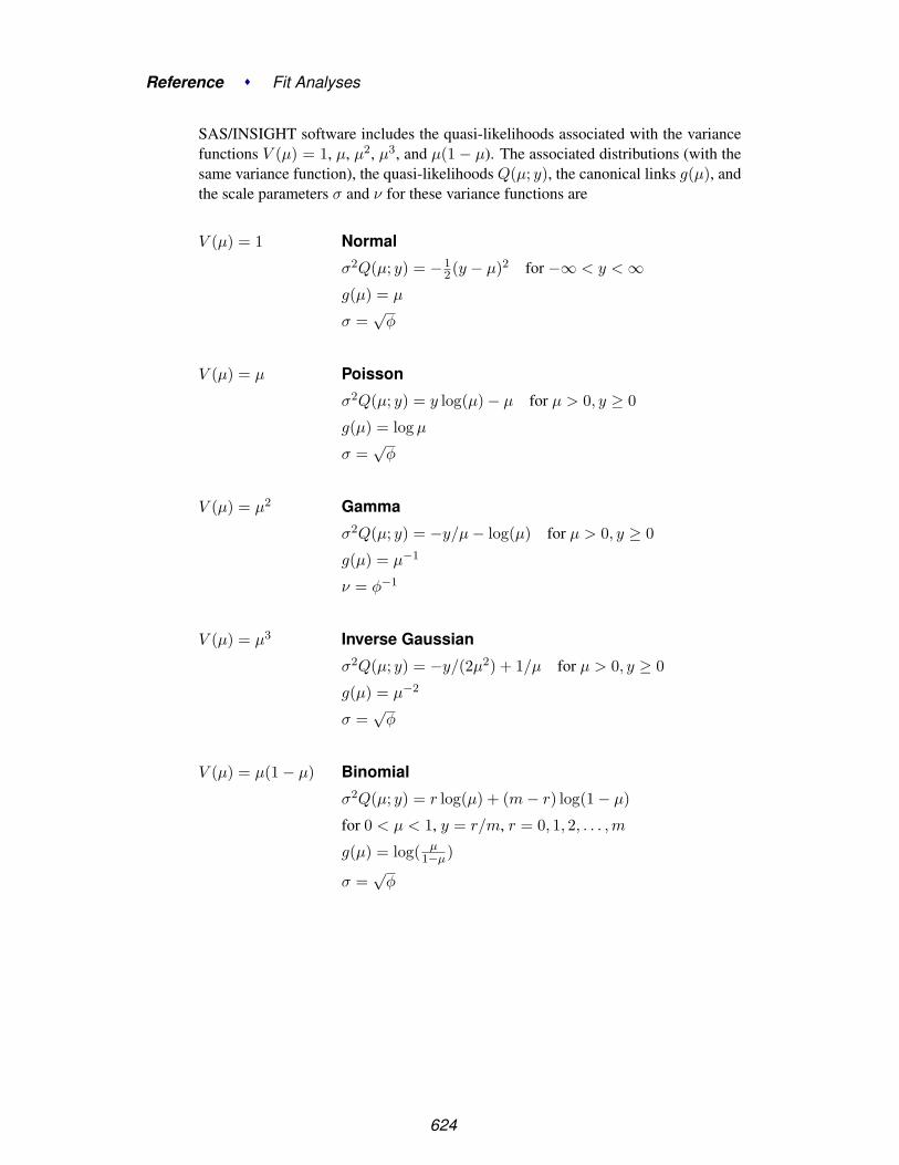
Reference � Fit Analyses
SAS/INSIGHT software includes the quasi-likelihoods associated with the variancefunctions V (µ) = 1, µ, µ2, µ3, and µ(1 − µ). The associated distributions (with thesame variance function), the quasi-likelihoods Q(µ; y), the canonical links g(µ), andthe scale parameters σ and ν for these variance functions are
V (µ) = 1 Normal
σ2Q(µ; y) = −12(y − µ)2 for −∞ < y < ∞
g(µ) = µ
σ =√
φ
V (µ) = µ Poisson
σ2Q(µ; y) = y log(µ) − µ for µ > 0, y ≥ 0
g(µ) = log µ
σ =√
φ
V (µ) = µ2 Gamma
σ2Q(µ; y) = −y/µ − log(µ) for µ > 0, y ≥ 0
g(µ) = µ−1
ν = φ−1
V (µ) = µ3 Inverse Gaussian
σ2Q(µ; y) = −y/(2µ2) + 1/µ for µ > 0, y ≥ 0
g(µ) = µ−2
σ =√
φ
V (µ) = µ(1 − µ) Binomial
σ2Q(µ; y) = r log(µ) + (m − r) log(1 − µ)
for 0 < µ < 1, y = r/m, r = 0, 1, 2, . . . , m
g(µ) = log( µ1−µ)
σ =√
φ
624

Generalized Linear Models
SAS/INSIGHT software uses the mean deviance, the mean Pearson χ2, or the valuein the Constant entry field to estimate the dispersion parameter φ. The conventionalestimate of φ is the mean Pearson χ2 statistic.
Maximum quasi-likelihood estimation is similar to ordinary maximum-likelihood es-timation and has the same parameter estimates as the distribution with the same vari-ance function. These estimates are not affected by the dispersion parameter φ, but φis used in the variance-covariance matrix of the parameter estimates. However, thelikelihood-ratio based statistics, such as Type I (LR), Type III (LR), and C.I.(LR)for Parameters tables, are not produced in the analysis.
⊕ Related Reading: Logistic Regression, Chapter 16.
⊕ Related Reading: Poisson Regression, Chapter 17.
625

Reference � Fit Analyses
Nonparametric SmoothersFor a simple regression model with one or two explanatory variables,
yi = f(xi) + εi
a smoother fλ(x) is a function that summarizes the trend of Y as a function of X. Itcan enhance the visual perception of either a Y-by-X scatter plot or a rotating plot.The smoothing parameter λ controls the smoothness of the estimate.
With one explanatory variable in the model, fλ(x) is called a scatter plot smoother.SAS/INSIGHT software provides nonparametric curve estimates from smoothingspline, kernel, loess (nearest neighbors local polynomial), and fixed bandwidth lo-cal polynomial smoothers.
For smoothing spline, kernel, and fixed bandwidth local polynomial smoothers,SAS/INSIGHT software derives the smoothing parameter λ from a constant c thatis independent of the units of X. For a loess smoother, the smoothing parameter λ isa positive constant α.
With two explanatory variables in the model, fλ(x) is called a surface smoother.SAS/INSIGHT software provides nonparametric surface estimates from thin-platesmoothing spline and kernel smoothers. The explanatory variables are scaled by theircorresponding sample interquartile ranges. The smoothing parameter λ is derivedfrom a constant c and both are independent of the units of X.
Similar to parametric regression, the R2 value for an estimate is calculated as
R2 = 1 −∑n
i=1 (yi − fλ(xi))2∑ni=1 (yi − y)2
You can use the following methods to choose the λ value:
DF uses the λ value that makes the resulting smoothing estimate havethe specified degrees of freedom (df).
GCV uses the λ value that minimizes the generalized cross validation(GCV) mean squared error.
C Value uses the λ value derived from the specified c value for nonparamet-ric smoothers other than the loess smoother.
Alpha uses the specified α value for the loess estimator.
626

Nonparametric Smoothers
If you specify a DF value for a smoother, an iterative procedure is used to find theestimate with the specified df. You can choose a convergence criterion γ based oneither the relative difference or the absolute difference. A smoother satisfying thefollowing conditions is then created:
|df(fitted) − df(specified)|df(specified)
< γ for relative difference
|df(fitted) − df(specified)| < γ for absolute difference
Smoother Degrees of Freedom
For a nonparametric smoother with a parameter λ, the fitted values can be written as
y = Hλy
where y is the n × 1 vector of observed responses yi, y is the n × 1 vector of fittedvalues yi = fλ(xi), and the smoother matrix Hλ is an n × n matrix that depends onthe value of λ.
The degrees of freedom, or the effective number of parameters, of a smoother can beused to compare different smoothers and to describe the flexibility of the smoother.SAS/INSIGHT software defines the degrees of freedom of a smoother as
dfλ = trace(Hλ)
which is the sum of the diagonal elements of Hλ.
† Note: Two other popular definitions of degrees of freedom for a smoother aretrace(HλH′
λ) and trace(2Hλ − HλH′λ) (Hastie and Tibshirani 1990).
627

Reference � Fit Analyses
Smoother Generalized Cross Validation
With the degrees of freedom of an estimate dfλ, the mean squared error is given as
MSE(λ) =1
n − dfλ
n∑i=1
(yi − fλ(xi))2
Cross-validation (CV) estimates the response at each xi from the smoother that usesonly the remaining n − 1 observations. The resulting cross validation mean squarederror is
MSECV(λ) =1n
n∑i=1
(yi − fλ(i)(xi))2
where fλ(i)(xi) is the fitted value at xi computed without the ith observation.
The cross validation mean squared error can also be written as
MSECV(λ) =1n
n∑i=1
(yi − fλ(xi)
1 − hλi
)2
where hλi is the ith diagonal element of the Hλ matrix (Hastie and Tibshirani 1990).
Generalized cross validation replaces hλi by its average value, 1ndfλ. The generalized
cross validation mean squared error is
MSEGCV(λ) =1
n(1 − dfλ/n)2
n∑i=1
(yi − fλ(xi))2
† Note: The function MSEGCV(λ) may have multiple minima, so the value estimatedby SAS/INSIGHT software may be only a local minimum, not the global minimum.
628
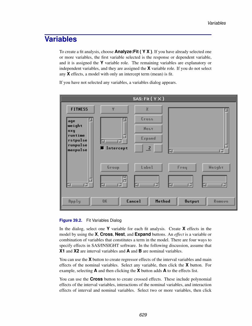
Variables
VariablesTo create a fit analysis, choose Analyze:Fit ( Y X ). If you have already selected oneor more variables, the first variable selected is the response or dependent variable,and it is assigned the Y variable role. The remaining variables are explanatory orindependent variables, and they are assigned the X variable role. If you do not selectany X effects, a model with only an intercept term (mean) is fit.
If you have not selected any variables, a variables dialog appears.
Figure 39.2. Fit Variables Dialog
In the dialog, select one Y variable for each fit analysis. Create X effects in themodel by using the X, Cross, Nest, and Expand buttons. An effect is a variable orcombination of variables that constitutes a term in the model. There are four ways tospecify effects in SAS/INSIGHT software. In the following discussion, assume thatX1 and X2 are interval variables and A and B are nominal variables.
You can use the X button to create regressor effects of the interval variables and maineffects of the nominal variables. Select any variable, then click the X button. Forexample, selecting A and then clicking the X button adds A to the effects list.
You can use the Cross button to create crossed effects. These include polynomialeffects of the interval variables, interactions of the nominal variables, and interactioneffects of interval and nominal variables. Select two or more variables, then click
629

Reference � Fit Analyses
the Cross button. For example, selecting X1 and X2 and then clicking the Crossbutton generates the crossed effect X1*X2.
You can use the Nest button to create nested effects. In a nested effect, a variable orcrossed effect is nested within the effects of one or more nominal variables. Selecta variable or crossed effect and one or more nominal variables, then click the Nestbutton. For example, selecting X1*X2, A, and B and then clicking the Nest buttongenerates the nested effect X1*X2(A B).
You can use the Expand button and the associated entry field to create expandedeffects. These include response surface effects for interval variables and factorialeffects for nominal variables. The Expand button expands all possible effects to thedegree of expansion specified in the entry field below the Expand button. The value2 is the default degree of expansion. You can click the right button of the entry fieldto increase the expansion degree by 1 or the left button to decrease it by 1.
Choose the degree of expansion, then select variables or effects and click the Expandbutton. For example, with degree of expansion 2 and variables A and B selected,clicking the Expand button generates three effects
A B A*B
With degree of expansion 2 and variables X1 and X2 selected, clicking the Expandbutton generates five effects
X1 X2 X1*X1 X1*X2 X2*X2
Intercept is checked by default to include the intercept term in the model. As ageneral rule, no-intercept models should be fit only when theoretical justificationexists.
You can select one or more Group variables if you have grouped data. This createsa fit analysis for each group.
You can select a Label variable to label observations in the plots.
You can select a Freq variable. If you select a Freq variable, each observation isassumed to represent n observations, where n is the value of the Freq variable.
You can select a Weight variable to assign relative weights for each observationin the analysis. The details of weighted analyses are explained in the “WeightedAnalyses” section at the end of this chapter.
The fit variables dialog provides an Apply button. The Apply button displays thefit window without closing the fit variables dialog. This makes it easy to modify themodel by adding or removing variables. Each time you modify the model using theApply button, a new fit window is displayed so you can easily compare models. TheOK button also displays a new fit window but closes the dialog.
630

Method
MethodObservations with missing values for Y, X, Weight, or Freq variables are not used.Observations with nonpositive Weight or Freq values are not used. Only the integerpart of Freq values is used.
To view or change the response distribution and link function, click the Methodbutton in the variables dialog. This displays the dialog shown in Figure 39.3.
Figure 39.3. Fit Method Options Dialog
You can choose the response distribution and link function of the Y variables. If youchoose a binomial distribution, specify either
• a Y variable with values 1 or 0 indicating success or failure
• a Y variable giving the number of successes in a certain number of trials, and aBinomial variable to give the corresponding number of trials
If you choose a power link function, specify the power value in the Power entryfield.
If you select an Offset variable, it is treated as an X variable with coefficient fixed at1.0.
You can choose the scale parameter for the response distribution. If you choose aConstant scale, specify the constant value in the Constant entry field.
631

Reference � Fit Analyses
With overdispersion in the model, you can specify the Quasi-Likelihood option tofit the generalized linear model using the quasi-likelihood functions.
632

Method
If you choose a normal response distribution with a canonical link (identity for normaldistributions), you can specify the Exact Distribution option to fit the linear modelusing the usual exact distributions for the test statistics.
You can specify the Fisher’s Scoring option to use the Fisher’s scoring method inthe maximum-likelihood estimation for the regression parameters.
By default, SAS/INSIGHT software uses the Normal response distribution andCanonical link with the Exact Distribution option to perform a fit analysis forthe linear model.
633

Reference � Fit Analyses
OutputTo view or change the options associated with your fit analysis, click the Outputbutton in the variables dialog. This displays the output options dialog shown in Figure39.4.
Figure 39.4. Fit Output Options Dialog
The options you set in this dialog determine the tables and graphs that appear inthe fit window. Provided by default are tables of the model equation, summary offit, analysis of variance or deviance, type III or type III (Wald) tests, and parameterestimates and a plot of residuals by predicted values.
When there are two explanatory variables in the model, a parametric response surfaceplot is created by default. You can also generate a nonparametric kernel or a thin-platesmoothing spline response surface plot. With more than two explanatory variables inthe model, a parametric profile response surface plot with the first two explanatoryvariables can be created. The values of the remaining explanatory variables are set totheir corresponding means in the plot. You can use the sliders to change these valuesof the remaining explanatory variables.
634

Output
Click on the Output Variables button in the fit dialog to display the OutputVariables dialog shown in Figure 39.5. The Output Variables dialog enablesyou to specify variables that can be saved in the data window. Output variables in-clude predicted values and several influence diagnostic variables based on the modelyou fit.
Figure 39.5. Output Variables Dialog
When there is only one explanatory variable in the model, a Y-by-X scatter plot isgenerated. The Parametric Curves and Nonparametric Curves (GCV) buttonsdisplay dialogs that enable you to fit parametric and nonparametric curves to thisscatter plot.
Click on Parametric Curves to display the Parametric Curves dialog.
635

Reference � Fit Analyses
Figure 39.6. Parametric Curves Dialog
636

Output
A regression line fit is provided by default. You can request an 80% prediction el-lipse and other polynomial fits in the dialog. You can also request polynomial equa-tion tables, parameter estimates tables, and 95% mean confidence curves for fittedpolynomials.
The Nonparametric Curves (GCV) dialog in Figure 39.7 includes a smoothingspline, a kernel smoother, and a local polynomial smoother. You must specify themethod, regression type, and weight function for a local polynomial fit.
Figure 39.7. Nonparametric Curves Dialog
637

Reference � Fit Analyses
TablesYou can generate tables that present the results of a model fit and diagnostics for as-sessing how well the model fits the data. Set options in the output dialog as describedin the “Output” section or choose from the Tables menu.
File Edit Analyze Tables Graphs Curves Vars Help
� Model EquationX’X Matrix
� Summary of Fit� Analysis of Variance/Deviance
Type I / I(LR) Tests� Type III / III(Wald) Tests
Type III(LR) Tests� Parameter Estimates
C.I. / C.I.(Wald) for Parameters �
C.I.(LR) for Parameters �
Collinearity DiagnosticsEstimated Cov MatrixEstimated Corr Matrix
Figure 39.8. Tables Menu
Model Information
The first table in the fit analysis contains the model specification, the response distri-bution, and the link function, as illustrated in Figure 39.9.
When the model contains nominal variables in its effects, the levels of the nominalvariables are displayed in the Nominal Variable Information table, as shown inFigure 39.9. The levels are determined from the formatted values of the nominalvariables. An additional Parameter Information table, as illustrated in Figure39.9, shows the variable indices for the parameters in the model equation, the X’Xmatrix, the estimated covariance matrix, and the estimated correlation matrix.
Model Equation
The model equation table gives the fitted equation for the model. Figure 39.9 showsan equation for a model with nominal variables, and Chapter 39 shows an equationfor a model without nominal variables
638

Tables
Figure 39.9. Model Information Tables
X’X Matrix
The X’X matrix table, as illustrated by Figure 39.10, contains the X’X crossproductsmatrix for the model.
639
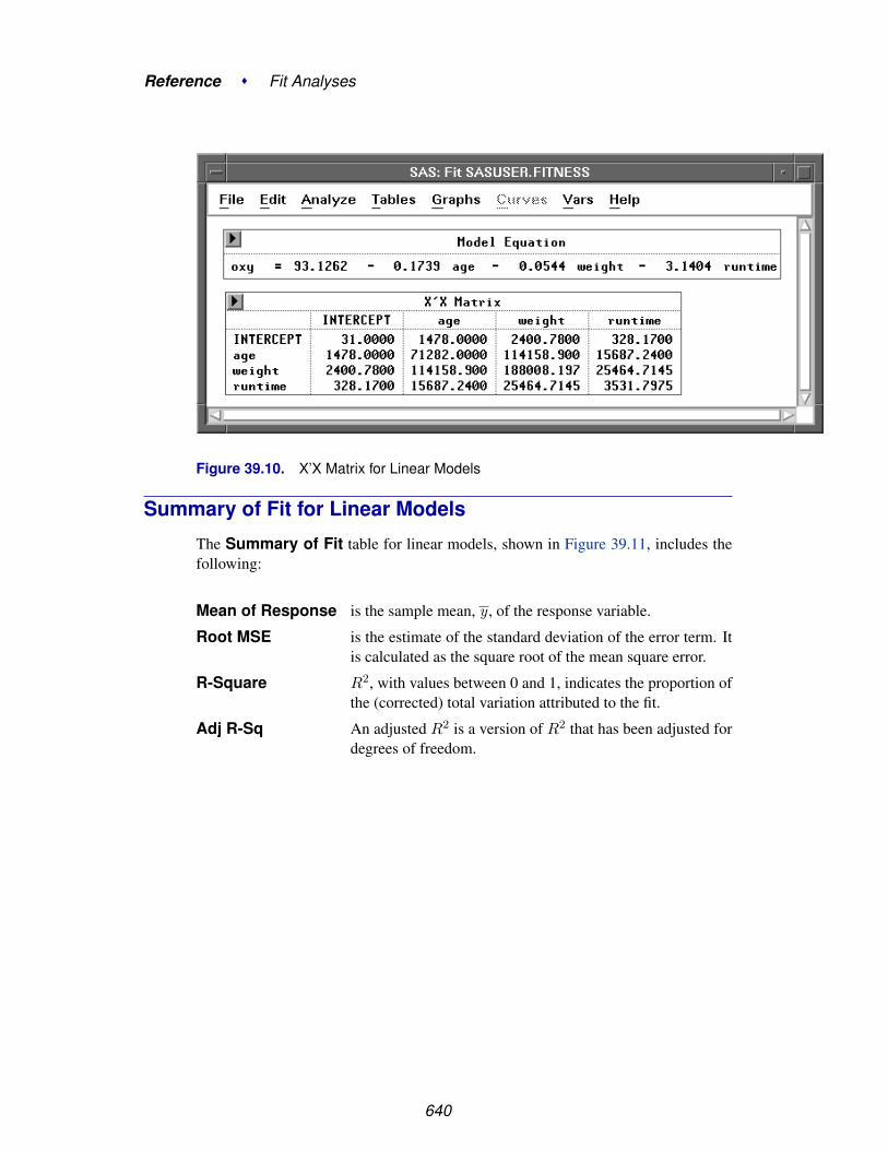
Reference � Fit Analyses
Figure 39.10. X’X Matrix for Linear Models
Summary of Fit for Linear Models
The Summary of Fit table for linear models, shown in Figure 39.11, includes thefollowing:
Mean of Response is the sample mean, y , of the response variable.
Root MSE is the estimate of the standard deviation of the error term. Itis calculated as the square root of the mean square error.
R-Square R2, with values between 0 and 1, indicates the proportion ofthe (corrected) total variation attributed to the fit.
Adj R-Sq An adjusted R2 is a version of R2 that has been adjusted fordegrees of freedom.
640
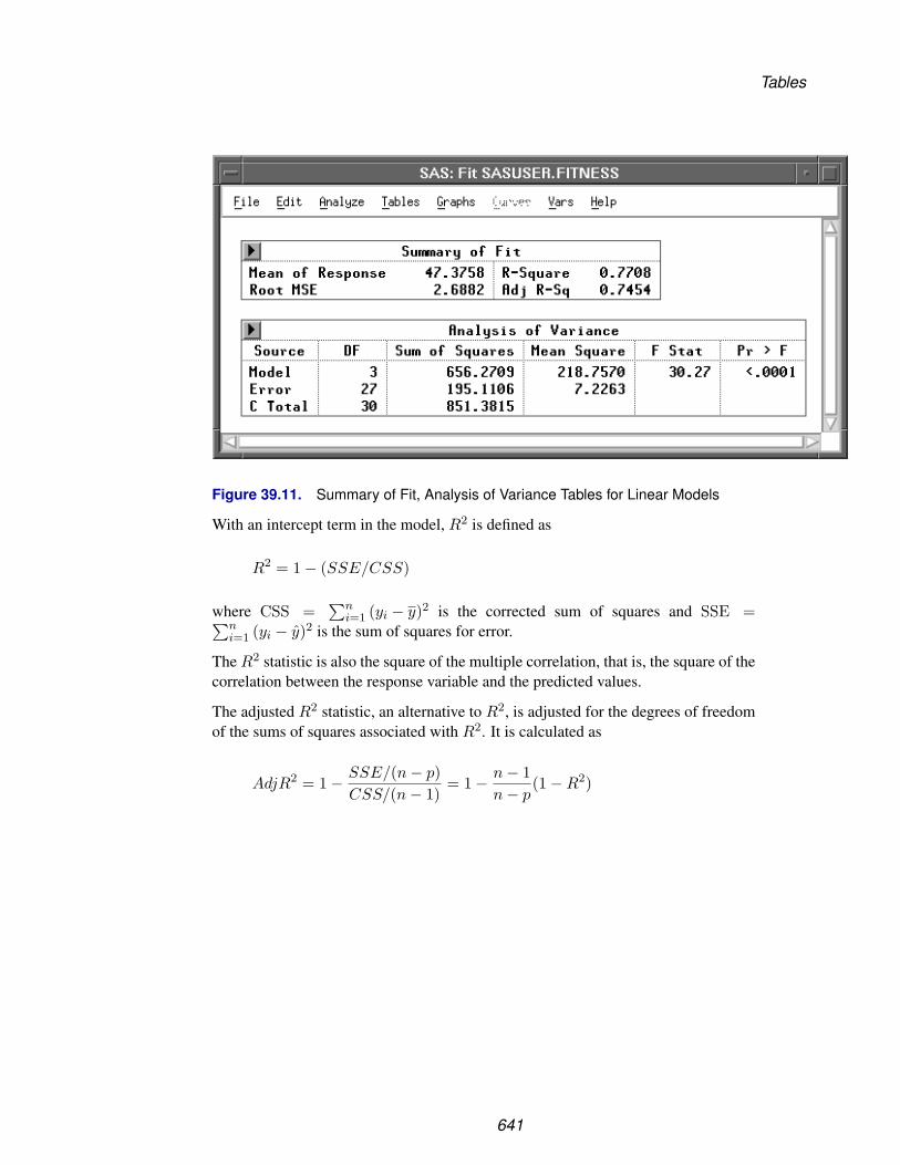
Tables
Figure 39.11. Summary of Fit, Analysis of Variance Tables for Linear Models
With an intercept term in the model, R2 is defined as
R2 = 1 − (SSE/CSS)
where CSS =∑n
i=1 (yi − y)2 is the corrected sum of squares and SSE =∑ni=1 (yi − y)2 is the sum of squares for error.
The R2 statistic is also the square of the multiple correlation, that is, the square of thecorrelation between the response variable and the predicted values.
The adjusted R2 statistic, an alternative to R2, is adjusted for the degrees of freedomof the sums of squares associated with R2. It is calculated as
AdjR2 = 1 − SSE/(n − p)CSS/(n − 1)
= 1 − n − 1n − p
(1 − R2)
641

Reference � Fit Analyses
Without an intercept term in the model, R2 is defined as
R2 = 1 − (SSE/TSS)
where TSS =∑n
i=1 y2i is the uncorrected total sum of squares.
The adjusted R2 statistic is then calculated as
AdjR2 = 1 − SSE/(n − p)TSS/n
= 1 − n
n − p(1 − R2)
† Note: Other definitions of R2 exist for models with no intercept term. Care shouldbe taken to ensure that this is the definition desired.
Summary of Fit for Generalized Linear Models
For generalized linear models, the Summary of Fit table, as illustrated by Figure39.12, includes the following:
Mean of Response is the sample mean, y , of the response variable.
SCALE is the constant scale parameter specified in the method dia-log or a value of 1.0 for maximum-likelihood estimation forPoisson or binomial distributions.
SCALE (MLE) is the maximum-likelihood estimate of the scale parameterfor normal, gamma, and inverse Gaussian distributions.
SCALE (Deviance) is the scale parameter estimated by the mean error deviance.
SCALE (Pearson) is the scale parameter estimated by the mean Pearson χ2.
Deviance is the error deviance.
Deviance/DF is the mean error deviance, the error deviance divided by itsassociated degrees of freedom.
Pearson ChiSq is the Pearson χ2 statistic.
Pearson ChiSq / DF is the mean Pearson χ2, the Pearson χ2 divided by its asso-ciated degrees of freedom.
When the scale parameter is a constant specified in the method dialog, or when theresponse has a Poisson or binomial distribution, the table also contains the scaleddeviance and the scaled Pearson χ2:
Scaled Dev is the error deviance divided by the dispersion parameter.
Scaled ChiSq is the Pearson χ2 divided by the dispersion parameter.
642

Tables
Figure 39.12. Summary of Fit and Analysis of Deviance Tables for GeneralizedLinear Models
Analysis of Variance for Linear Models
The Analysis of Variance table for linear models, shown in Figure 39.11, includesthe following:
Source indicates the source of the variation. Sources include Modelfor the fitted regression and Error for the residual error. CTotal is the sum of the Model and Error components, and itis the total variation after correcting for the mean. When themodel does not have an intercept term, the uncorrected totalvariation (U Total) is displayed.
DF is the degrees of freedom associated with each source of varia-tion.
Sum of Squares is the sum of squares for each source of variation.
Mean Square is the sum of squares divided by its associated degrees of free-dom.
F Stat is the F statistic for testing the null hypothesis that all param-eters are 0 except for the intercept. This is formed by dividingthe mean square for model by the mean square for error.
Pr > F is the probability of obtaining a greater F statistic than thatobserved if the null hypothesis is true. This quantity is alsocalled a p-value. A small p-value is evidence for rejecting thenull hypothesis.
643

Reference � Fit Analyses
Analysis of Deviance for Generalized Linear Models
The Analysis of Deviance table for generalized linear models, as illustrated byFigure 39.12, includes the following:
Source indicates the source of the variation. Sources include Model forthe fitted regression and Error for the residual error. C Total isthe sum of the Model and Error components, and it is the totalvariation after correcting for the mean. When the model does nothave an intercept term, the uncorrected total variation (U Total) isprinted.
DF is the degrees of freedom associated with each source of variation.
Deviance is the deviance for each source of variation.
Deviance/DF is the deviance divided by its associated degrees of freedom.
When the scale parameter is a constant specified in the method dialog, or when theresponse has a Poisson or binomial distribution, the table also contains the following:
Scaled Dev is the deviance divided by the dispersion parameter.
Pr>Scaled Dev is the probability of obtaining a greater scaled deviance statisticthan that observed if the null hypothesis is true. Under the nullhypothesis, all parameters are 0 except for the intercept, and thescaled deviance has an approximate χ2 distribution.
Type I Tests
Type I tests examine the sequential incremental improvement in the fit of the modelas each effect is added. They can be computed by fitting the model in steps andrecording the difference in error sum of squares (linear models) and log-likelihoodstatistics (generalized linear models). The Type I Tests table for linear models, asillustrated by Figure 39.13, includes the following:
Source is the name for each effect.
DF is the degrees of freedom associated with each effect.
Sum of Squares is the incremental error sum of squares for the model as eacheffect is added.
Mean Square is the sum of squares divided by its associated degrees of free-dom.
F Stat is the F statistic for testing the null hypothesis that the param-eters for the added effect are 0. This is formed by dividing themean square for the effect by the mean square for error from thecomplete model.
Pr > F is the probability of obtaining a greater F statistic than that ob-served if the null hypothesis is true.
644

Tables
Figure 39.13. Type I Tests Table
The Type I (LR) Tests table for generalized linear models, as illustrated by Figure39.14, includes the following:
Source is the name for each effect.
DF is the degrees of freedom associated with each effect.
ChiSq is the χ2 value for testing the null hypothesis that the parameters forthe added effect are 0. This is evaluated as twice the incrementallog-likelihood for the model as each effect is added, and it has anasymptotic χ2 distribution under the null hypothesis.
Pr > ChiSq is the probability of obtaining a greater χ2 statistic than that ob-served, if the null hypothesis is true.
Figure 39.14. Type I Likelihood Ratio Tests
645

Reference � Fit Analyses
Type III Tests
Type III tests examine the significance of each partial effect, that is, the significanceof an effect with all the other effects in the model. They are computed by constructinga type III hypothesis matrix L and then computing statistics associated with the hy-pothesis Lβ = 0. Refer to the chapter titled “The Four Types of Estimable Functions,”in the SAS/STAT User’s Guide for the construction of the matrix L.
For linear models, the type III or partial sum of squares
(Lb)′(L(X′X)−1L′)−1(Lb)
is used to test the hypothesis Lβ = 0.
The Type III Tests table for linear models, as illustrated by Figure 39.15, includesthe following:
Source is the name for each effect.
DF is the degrees of freedom associated with each effect.
Sum of Squares is the partial sum of squares for each effect in the model.
Mean Square is the sum of squares divided by its associated degrees of free-dom.
F Stat is the F statistic for testing the null hypothesis that the linearcombinations of parameters described previously for the hy-pothesis matrix L are 0. This is formed by dividing the meansquare for the hypothesis matrix L by the mean square for errorfrom the complete model.
Pr > F is the probability of obtaining a greater F statistic than thatobserved if the null hypothesis is true.
Figure 39.15. Type III Tests Table for Linear Models
646

Tables
For generalized linear models, either the Wald statistic or the likelihood-ratio statisticcan be used to test the hypothesis Lβ = 0. For the linear model, the two tests areequivalent.
The Wald statistic is given by
(Lb)′(LVar(b)L′)−1(Lb)
where Var(b) is the estimated covariance matrix of the parameters. Thelikelihood-ratio statistic is computed as twice the difference between the maximumlog-likelihood achievable under the unconstrained model and the maximum log-likelihood for the model under the restriction or constraint Lβ = 0. Both the Waldstatistic and the likelihood-ratio statistic have an asymptotic χ2 distribution.
The Type III (Wald) Tests and Type III (LR) Tests tables, as illustrated by Figure39.16, include the following:
Source is the name for each effect.
DF is the degrees of freedom associated with each effect.
ChiSq is the Wald statistic for the Wald tests or the likelihood-ratio statis-tic for the LR tests of the null hypothesis that the parameters forthe effect are 0. This has an asymptotic χ2 distribution.
Pr > ChiSq is the probability of obtaining a greater χ2 statistic than that ob-served, if the null hypothesis is true.
647

Reference � Fit Analyses
Figure 39.16. Type III Tests Tables for Generalized Linear Models
648

Tables
Parameter Estimates for Linear Models
The Parameter Estimates table for linear models, as illustrated by Figure 39.17,includes the following:
Variable names the variable associated with the estimated parameter. Thename INTERCEPT represents the estimate of the intercept param-eter.
DF is the degrees of freedom associated with each parameter estimate.There is one degree of freedom unless the model is not of full rank.In this case, any parameter whose definition is confounded withprevious parameters in the model has its degrees of freedom set to0.
Estimate is the parameter estimate.
Std Error is the standard error, the estimate of the standard deviation of theparameter estimate.
t Stat is the t statistic for testing that the parameter is 0. This is computedas the parameter estimate divided by the standard error.
Pr > |t| is the probability of obtaining (by chance alone) a t statistic greaterin absolute value than that observed given that the true parameteris 0. This is referred to as a two-sided p-value. A small p-value isevidence for concluding that the parameter is not 0.
Tolerance is the tolerance of the explanatory variable on the other variables.
Var Inflation is the variance inflation factor of the explanatory variable.
Figure 39.17. Parameter Estimates Table for Linear Models
649

Reference � Fit Analyses
The standard error of the jth parameter estimate bj is computed using the equation
STDERR(bj) =√
(X′X)−1jj s2
where (X′X)−1jj is the jth diagonal element of (X′X)−1.
Under the hypothesis that βj is 0, the ratio
t =bj
STDERR(bj)
is distributed as Student’s t with degrees of freedom equal to the degrees of freedomfor the mean square error.
When an explanatory variable is nearly a linear combination of other explanatoryvariables in the model, the affected estimates are unstable and have high standarderrors. This problem is called collinearity or multicollinearity. A fit analysis providesseveral methods for detecting collinearity.
Tolerances (TOL) and variance inflation factors (VIF) measure the strength of inter-relationships among the explanatory variables in the model. Tolerance is 1 − R2
for the R2 that results from the regression of the explanatory variable on the otherexplanatory variables in the model. Variance inflation factors are diagonal elementsof (X′X)−1 after X’X is scaled to correlation form. The variance inflation measuresthe inflation in the variance of the parameter estimate due to collinearity between theexplanatory variable and other variables. These measures are related by VIF = 1 /TOL.
If all variables are orthogonal to each other, both tolerance and variance inflation are1. If a variable is closely related to other variables, the tolerance goes to 0 and thevariance inflation becomes large.
When the X’X matrix is singular, least-squares solutions for the parameters are notunique. An estimate is 0 if the variable is a linear combination of previous explana-tory variables. The degrees of freedom for the zeroed estimates are reported as 0. Thehypotheses that are not testable have t tests printed as missing.
650

Tables
Parameter Estimates for Generalized Linear Models
The Parameter Estimates table for generalized linear models, as illustrated byFigure 39.18, includes the following:
Variable names the variable associated with the estimated parameter. Thename INTERCEPT represents the estimate of the intercept param-eter.
DF is the degrees of freedom associated with each parameter estimate.There is one degree of freedom unless the model is not full rank. Inthis case, any parameter that is confounded with previous parame-ters in the model has its degrees of freedom set to 0.
Estimate is the parameter estimate.
Std Error is the estimated standard deviation of the parameter estimate.
ChiSq is the χ2 test statistic for testing that the parameter is 0. This iscomputed as the square of the ratio of the parameter estimate di-vided by the standard error.
Pr > ChiSq is the probability of obtaining an χ2 statistic greater than that ob-served given that the true parameter is 0. A small p-value is evi-dence for concluding that the parameter is not 0.
Figure 39.18. Parameter Estimates Table for Generalized Linear Models
651
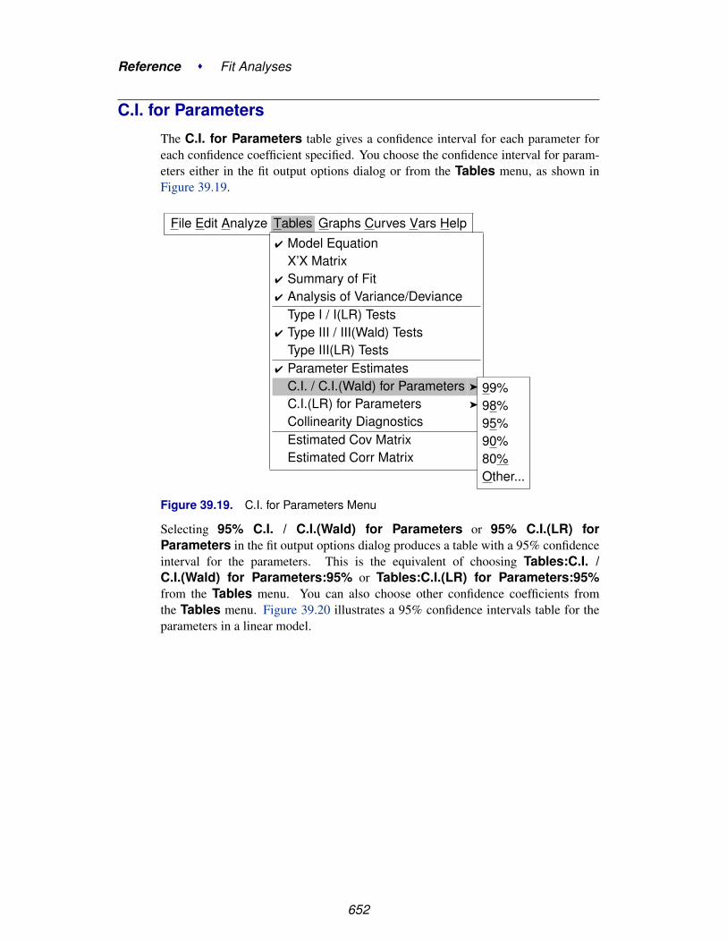
Reference � Fit Analyses
C.I. for Parameters
The C.I. for Parameters table gives a confidence interval for each parameter foreach confidence coefficient specified. You choose the confidence interval for param-eters either in the fit output options dialog or from the Tables menu, as shown inFigure 39.19.
File Edit Analyze Tables Graphs Curves Vars Help� Model Equation
X’X Matrix� Summary of Fit� Analysis of Variance/Deviance
Type I / I(LR) Tests� Type III / III(Wald) Tests
Type III(LR) Tests� Parameter Estimates
C.I. / C.I.(Wald) for Parameters �
C.I.(LR) for Parameters �
Collinearity DiagnosticsEstimated Cov MatrixEstimated Corr Matrix
99%98%95%90%80%Other...
Figure 39.19. C.I. for Parameters Menu
Selecting 95% C.I. / C.I.(Wald) for Parameters or 95% C.I.(LR) forParameters in the fit output options dialog produces a table with a 95% confidenceinterval for the parameters. This is the equivalent of choosing Tables:C.I. /C.I.(Wald) for Parameters:95% or Tables:C.I.(LR) for Parameters:95%from the Tables menu. You can also choose other confidence coefficients fromthe Tables menu. Figure 39.20 illustrates a 95% confidence intervals table for theparameters in a linear model.
652

Tables
Figure 39.20. C.I. for Parameters Table
653

Reference � Fit Analyses
For linear models, a 100(1 − α)% confidence interval has upper and lower limits
bj ± t(1−α/2)sj
where t(1−α/2) is the (1−α/2) critical value of the Student’s t statistic with degrees offreedom n-p, used in computing sj , the estimated standard deviation of the parameterestimate bj .
For generalized models, you can specify the confidence interval based on either aWald type statistic or the likelihood function.
A 100(1 − α)% Wald type confidence interval is constructed from
(βj − bj
sj
)2
≤ χ2(1−α),1
where χ2(1−α),1 is the (1 − α) critical value of the χ2 statistic with one degree of
freedom, and sj is the estimated standard deviation of the parameter estimate bj .
Thus, 100(1 − α)% upper and lower limits are
bj ± z(1−α/2)sj
where z(1−α/2) is the (1 − α/2) critical value of the standard normal statistic.
A table of 95% Wald type confidence intervals for the parameters is shown in Figure39.21.
654
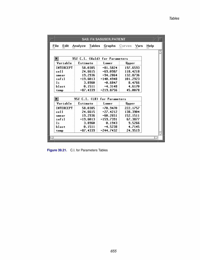
Tables
Figure 39.21. C.I. for Parameters Tables
655

Reference � Fit Analyses
The likelihood ratio test statistic for the null hypothesis
H0: βj = βj0
where βj0 is a specified value, is
λ = −2(l(β0) − l(β))
where l(β0) is the maximized log likelihood under H0 and l(β) is the maximized loglikelihood over all β.
In large samples, the hypothesis is rejected at level α if the test statistic λ is greaterthan the (1−α) critical value of the chi-squared statistic with one degree of freedom.
Thus a 100(1 − α)% likelihood-based confidence interval is constructed using re-stricted maximization to find upper and lower limits satisfying
l(β0) = l(β) − 12χ2
(1−α),1
An iterative procedure is used to obtain these limits. A 95% likelihood-based confi-dence interval table for the parameters is illustrated in Figure 39.21.
656

Tables
Collinearity Diagnostics
The Collinearity Diagnostics table is illustrated by Figure 39.22.
Figure 39.22. Collinearity Diagnostics Table
Number is the eigenvalue number.
Eigenvalue gives the eigenvalues of the X’X matrix.
Condition Index is the square root of the ratio of the largest eigenvalue to thecorresponding eigenvalue.
Variance Proportion is the proportion of the variance of each estimate accountedfor by each component.
Detailed collinearity diagnostics use the eigenstructure of X’X, which can be writtenas
X′X = VD2V′ where V is an orthogonal matrix whose columns are the eigenvec-tors of X’X, and D2 is a diagonal matrix of eigenvalues
d21≥d2
2≥ . . .≥d2p
After scaling (X’X) to correlation form, Belsley, Kuh, and Welsch (1980) constructthe condition indices as the square roots of the ratio of the largest eigenvalue to eachindividual eigenvalue, d1/dj , j = 1, 2, . . . , p.
The condition number of the X matrix is defined as the largest condition index, d1/dp.When this number is large, the data are said to be ill conditioned. A condition indexof 30 to 100 indicates moderate to strong collinearity.
For each variable, the proportion of the variance of its estimate accounted for by eachcomponent dj can be evaluated. A collinearity problem occurs when a componentassociated with a high condition index contributes strongly to the variance of twoor more variables. Thus, for a high condition index (>30), the corresponding rowshould be examined to see which variables have high values. Those would indicatenear-linear dependence.
657
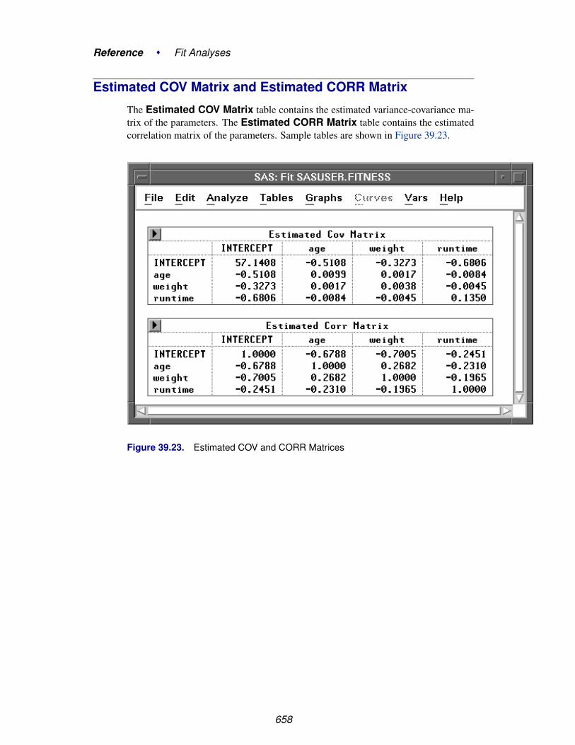
Reference � Fit Analyses
Estimated COV Matrix and Estimated CORR Matrix
The Estimated COV Matrix table contains the estimated variance-covariance ma-trix of the parameters. The Estimated CORR Matrix table contains the estimatedcorrelation matrix of the parameters. Sample tables are shown in Figure 39.23.
Figure 39.23. Estimated COV and CORR Matrices
658

Residual and Surface Plots
Residual and Surface PlotsResidual plots provide visual displays for assessing how well the model fits the data,for evaluating the distribution of the residuals, and for identifying influential observa-tions. Surface plots are three-dimensional displays of continuous response surfaceson the regular grids of the explanatory variables. They are much easier to comprehendthan rotating plots.
File Edit Analyze Tables Graphs Curves Vars HelpResidual by PredictedResidual Normal QQPartial LeverageSurface Plot � Parametric
Spline...Kernel...Parametric Profile
Figure 39.24. Graphs Menu
Residual-by-Predicted Plot
A residual-by-predicted plot is commonly used to diagnose nonlinearity or noncon-stant error variance. It is also used to find outliers. A residual-by-predicted plot, asillustrated by the plot on the left in Figure 39.25, is a plot of residuals versus predictedresponse for each observation. See the “Predicted Values” and “Residuals” sectionsfor a further explanation of the axis variables.
659

Reference � Fit Analyses
Figure 39.25. Residual-by-Predicted and Residual Normal QQ Plots
660
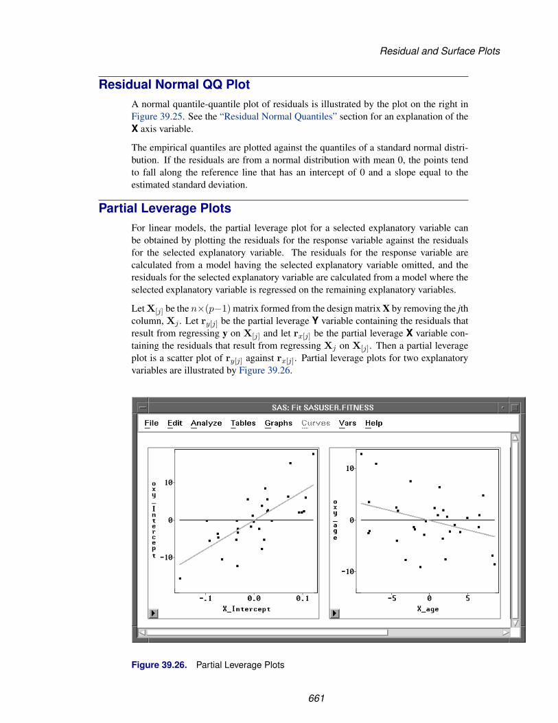
Residual and Surface Plots
Residual Normal QQ PlotA normal quantile-quantile plot of residuals is illustrated by the plot on the right inFigure 39.25. See the “Residual Normal Quantiles” section for an explanation of theX axis variable.
The empirical quantiles are plotted against the quantiles of a standard normal distri-bution. If the residuals are from a normal distribution with mean 0, the points tendto fall along the reference line that has an intercept of 0 and a slope equal to theestimated standard deviation.
Partial Leverage PlotsFor linear models, the partial leverage plot for a selected explanatory variable canbe obtained by plotting the residuals for the response variable against the residualsfor the selected explanatory variable. The residuals for the response variable arecalculated from a model having the selected explanatory variable omitted, and theresiduals for the selected explanatory variable are calculated from a model where theselected explanatory variable is regressed on the remaining explanatory variables.
Let X[j] be the n×(p−1) matrix formed from the design matrix X by removing the jthcolumn, Xj . Let ry[j] be the partial leverage Y variable containing the residuals thatresult from regressing y on X[j] and let rx[j] be the partial leverage X variable con-taining the residuals that result from regressing Xj on X[j]. Then a partial leverageplot is a scatter plot of ry[j] against rx[j]. Partial leverage plots for two explanatoryvariables are illustrated by Figure 39.26.
Figure 39.26. Partial Leverage Plots
661

Reference � Fit Analyses
In a partial leverage plot, the partial leverage Y variable ry[j] can also be computed as
ry[j]i = rx[j]ibj + (yi − µi)
For generalized linear models, the partial leverage Y is also computed as
ry[j]i = rx[j]ibj + (yi − µi)g′(µi)
Two reference lines are also displayed in the plots. One is the horizontal line of Y =0, and the other is the fitted regression of ry[j] against rx[j]. The latter has an interceptof 0 and a slope equal to the parameter estimate associated with the explanatory vari-able in the model. The leverage plot shows the changes in the residuals for the modelwith and without the explanatory variable. For a given data point in the plot, its resid-ual without the explanatory variable is the vertical distance between the point andthe horizontal line; its residual with the explanatory variable is the vertical distancebetween the point and the fitted line.
Parametric Surface Plot
With two explanatory interval variables in the model, a parametric surface plot is acontinuous surface plot of the predicted responses from the fitted parametric modelon a set of regular grids of the explanatory variables. Figure 39.27 shows a responsesurface plot of oxy as a quadratic function of age and weight.
662
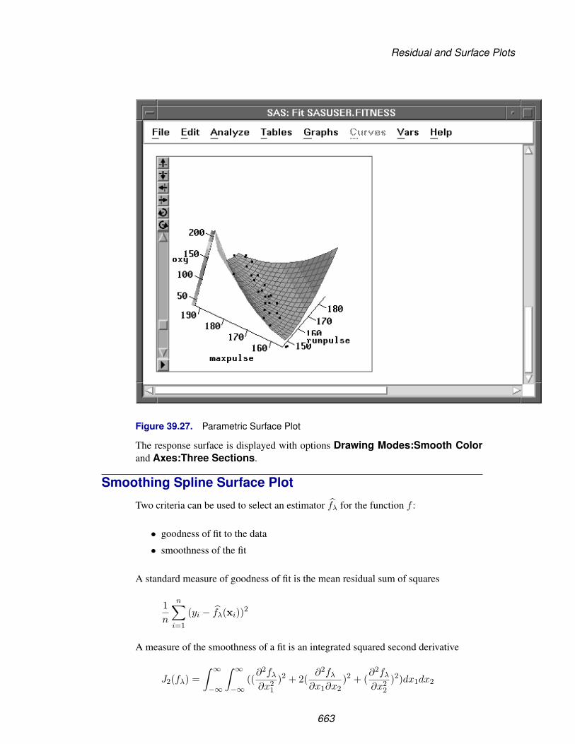
Residual and Surface Plots
Figure 39.27. Parametric Surface Plot
The response surface is displayed with options Drawing Modes:Smooth Colorand Axes:Three Sections.
Smoothing Spline Surface Plot
Two criteria can be used to select an estimator fλ for the function f :
• goodness of fit to the data
• smoothness of the fit
A standard measure of goodness of fit is the mean residual sum of squares
1n
n∑i=1
(yi − fλ(xi))2
A measure of the smoothness of a fit is an integrated squared second derivative
J2(fλ) =∫ ∞
−∞
∫ ∞
−∞((
∂2fλ
∂x21
)2 + 2(∂2fλ
∂x1∂x2)2 + (
∂2fλ
∂x22
)2)dx1dx2
663

Reference � Fit Analyses
A single criterion that combines the two criteria is then given by
S (λ) =1n
n∑i=1
(yi − fλ(xi))2 + λJ2(fλ)
where fλ belongs to the set of all continuously differentiable functions with squareintegrable second derivatives, and λ is a positive constant.
The estimator that results from minimizing S(λ) is called a thin-plate smoothingspline estimator. Wahba and Wendelberger (1980) derived a closed form expressionfor the thin-plate smoothing spline estimator.
† Note: The computations for a thin-plate smoothing spline are time intensive, espe-cially for large data sets.
The smoothing parameter λ controls the amount of smoothing; that is, it controls thetrade-off between the goodness of fit to the data and the smoothness of the fit. Youselect a smoothing parameter λ by specifying a constant c in the formula
λ = c/100
The values of the explanatory variables are scaled by their corresponding interquartileranges before the computations. This makes the computations independent of theunits of X1 and X2.
664

Residual and Surface Plots
After choosing Graphs:Surface Plot:Spline from the menu, you specify asmoothing parameter selection method in the Spline Fit dialog.
Figure 39.28. Spline Surface Fit Dialog
The default Method:GCV uses a c value that minimizes the generalized cross val-idation mean squared error MSEGCV(λ). Figure 39.29 displays smoothing splineestimates with c values of 0.0000831 (the GCV value) and 0.4127 (DF=6). Use theslider in the table to change the c value of the spline fit.
665
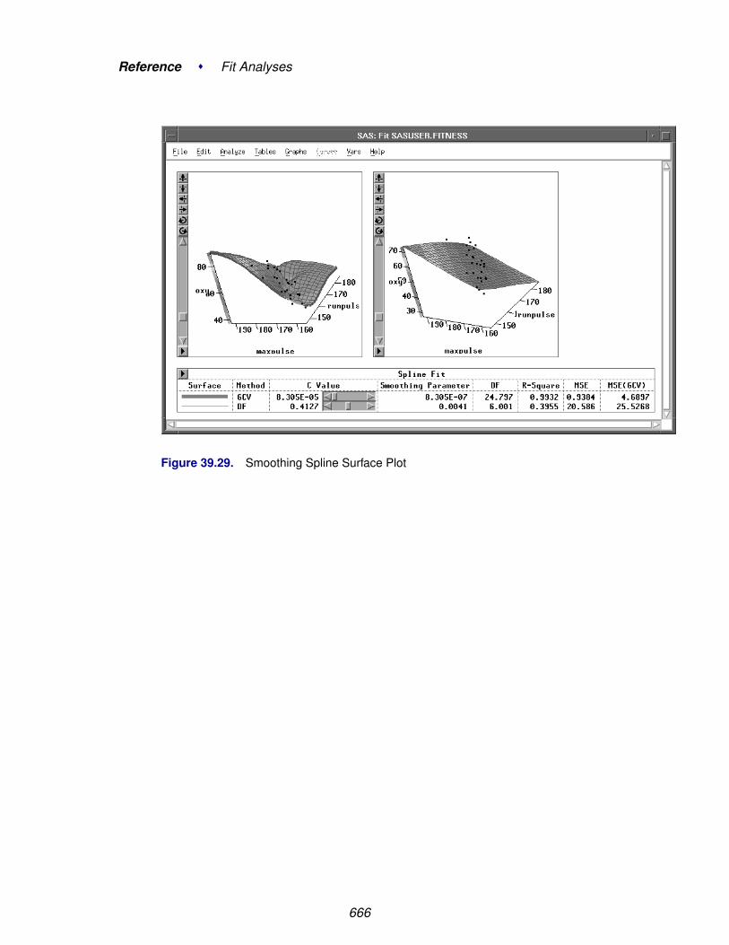
Reference � Fit Analyses
Figure 39.29. Smoothing Spline Surface Plot
666

Residual and Surface Plots
Kernel Surface Plot
A kernel estimator uses an explicitly defined set of weights at each point x to producethe estimate at x. The kernel estimator of f has the form
fλ(x) =n∑
i=1
W (x,xi; λ,Vx)yi
where W(x,xi; λ,Vx) is the weight function that depends on the smoothing param-eter λ and the diagonal matrix Vx of the squares of the sample interquartile ranges.
The weights are derived from a single function that is independent of the design
W (x,xi; λ,Vx) =K0((x − xi)/λ,Vx)∑n
j=1 K0((x − xj)/λ,Vx)
where K0 is a kernel function and λ is the bandwidth or smoothing parameter. Theweights are nonnegative and sum to 1.
Symmetric probability density functions commonly used as kernel functions are
• Normal K0(t,V) = 12π exp(−1
2t′V−1t) for all t
• Quadratic K0(t,V) =
⎧⎨⎩ 2π (1 − t′V−1t)
0
for t′V−1t ≤ 1
otherwise
• Biweight K0(t,V) =
⎧⎨⎩ 3π (1 − t′V−1t)2
0
for t′V−1t ≤ 1
otherwise
• Triweight K0(t,V) =
⎧⎨⎩ 4π (1 − t′V−1t)3
0
for t′V−1t ≤ 1
otherwise
You select a bandwidth λ for each kernel estimator by specifying c in the formula
λ = n− 16 c
where n is the sample size. Both λ and c are independent of the units of X.
SAS/INSIGHT software divides the range of each explanatory variable into a numberof evenly spaced intervals, then estimates the kernel fit on this grid. For a data pointxi that lies between two grid points, a linear interpolation is used to compute thepredicted value. For xi that lies inside a square of grid points, a pair of points that lieon the same vertical line as xi and each lying between two grid points can be found.A linear interpolation of these two points is used to compute the predicted value.
667

Reference � Fit Analyses
After choosing Graphs:Surface Plot:Kernel from the menu, you specify a kerneland smoothing parameter selection method in the Kernel Fit dialog.
Figure 39.30. Kernel Surface Fit Dialog
By default, SAS/INSIGHT software divides the range of each explanatory variableinto 20 evenly spaced intervals, uses a normal weight, and uses a c value that min-imizes MSEGCV(λ). Figure 39.31 illustrates normal kernel estimates with c valuesof 0.5435 (the GCV value) and 1.0. Use the slider to change the c value of the kernelfit.
668

Residual and Surface Plots
Figure 39.31. Kernel Surface Plot
669

Reference � Fit Analyses
Parametric Profile Surface Plot
With more than two explanatory interval variables in the model, a parametric profilesurface plot is a continuous surface plot of the predicted responses from the fittedparametric model on a set of regular grids of a pair of explanatory variables. Thevalues of the remaining explanatory variables are initially set at their means and canbe adjusted with the sliders.
By default, the first two explanatory variables are used in the surface plot. Youcan also create profile surface plots for other explanatory variables by selecting thetwo variables before choosing Graphs:Surface Plot:Parametric profile. Figure39.32 shows a parametric profile surface plot of oxy as a quadratic function of run-pulse and maxpulse with rstpulse = 53.4516.
Figure 39.32. Parametric Profile Surface Plot
670
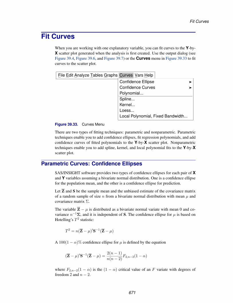
Fit Curves
Fit CurvesWhen you are working with one explanatory variable, you can fit curves to the Y-by-X scatter plot generated when the analysis is first created. Use the output dialog (seeFigure 39.4, Figure 39.6, and Figure 39.7) or the Curves menu in Figure 39.33 to fitcurves to the scatter plot.
File Edit Analyze Tables Graphs Curves Vars Help
Confidence Ellipse �
Confidence Curves �
Polynomial...Spline...Kernel...Loess...Local Polynomial, Fixed Bandwidth...
Figure 39.33. Curves Menu
There are two types of fitting techniques: parametric and nonparametric. Parametrictechniques enable you to add confidence ellipses, fit regression polynomials, and addconfidence curves of fitted polynomials to the Y-by-X scatter plot. Nonparametrictechniques enable you to add spline, kernel, and local polynomial fits to the Y-by-Xscatter plot.
Parametric Curves: Confidence Ellipses
SAS/INSIGHT software provides two types of confidence ellipses for each pair of Xand Y variables assuming a bivariate normal distribution. One is a confidence ellipsefor the population mean, and the other is a confidence ellipse for prediction.
Let Z and S be the sample mean and the unbiased estimate of the covariance matrixof a random sample of size n from a bivariate normal distribution with mean µ andcovariance matrix Σ.
The variable Z − µ is distributed as a bivariate normal variate with mean 0 and co-variance n−1Σ, and it is independent of S. The confidence ellipse for µ is based onHotelling’s T 2 statistic:
T 2 = n(Z − µ)′S−1(Z − µ)
A 100(1 − α)% confidence ellipse for µ is defined by the equation
(Z − µ)′S−1(Z − µ) =2(n − 1)n(n − 2)
F2,n−2(1 − α)
where F2,n−2(1 − α) is the (1 − α) critical value of an F variate with degrees offreedom 2 and n − 2.
671

Reference � Fit Analyses
A confidence ellipse for prediction is a confidence region for predicting a new obser-vation in the population. It also approximates a region containing a specified percent-age of the population.
Consider Z as a bivariate random variable for a new observation. The variable Z−Zis distributed as a bivariate normal variate with mean 0 and covariance (1 + 1/n)Σ,and it is independent of S.
A 100(1 − α)% confidence ellipse for prediction is then given by the equation
(Z − Z)′S−1(Z − Z) =2(n + 1)(n − 1)
n(n − 2)F2,n−2(1 − α)
The family of ellipses generated by different F critical values has a common center(the sample mean) and common major and minor axes.
The ellipses graphically indicate the correlation between two variables. When thevariable axes are standardized (by dividing the variables by their respective standarddeviations), the ratio of the two axis lengths (in Euclidean distances) reflects themagnitude of the correlation between the two variables. A ratio of 1 between themajor and minor axes corresponds to a circular confidence contour and indicates thatthe variables are uncorrelated. A larger value of the ratio indicates a larger positiveor negative correlation between the variables.
You can choose the level of the confidence region from the Confidence Ellipsemenus, as illustrated by Figure 39.34.
· · · Graphs Curves Vars HelpConfidence Ellipse �
Confidence Curves �
Polynomial...Spline...Kernel...Loess...Local Polynomial, Fixed Bandwidth...
Mean: 99%95%90%80%50%Other...
Prediction: 99%95%90%80%50%Other...
Figure 39.34. Confidence Ellipse Menu
672

Fit Curves
A confidence ellipse for the population mean is displayed with dashed lines, and aconfidence ellipse for prediction is displayed with dotted lines. Figure 39.35 displaysa scatter plot with 50% and 80% confidence ellipses for prediction. Use the sliders inthe Confidence Ellipses table to change the coefficient of the confidence ellipses.
Figure 39.35. Confidence Ellipses for Prediction
673

Reference � Fit Analyses
Parametric Curves: Polynomial
Choose Curves:Polynomial from the menu to add a polynomial regression fit tothe Y-by-X scatter plot. This displays the Polynomial Fit dialog in Figure 39.36.
Figure 39.36. Polynomial Fit Dialog
In the Polynomial Fit dialog, you enter the degree for the polynomial fit. Select thePolynomial Equation or Parameter Estimates options to create a PolynomialEquation or Parameter Estimates table for the fitted curve.
Information about the polynomial fit is displayed in a table, as illustrated by Figure39.37 The information includes the R2 value and an F statistic and its associated p-value for testing the null hypothesis that all parameters are 0 except for the intercept.A parametric regression fit table includes the following:
Curve is the curve in the Y-by-X scatter plot.
Degree(Polynomial) is the degree for the polynomial fit.
Model DF is the degrees of freedom for model.
Model Mean Square is the mean square for model.
Error DF is the degrees of freedom for error.
Error Mean Square is the mean square for error.
R-Square is the proportion of the (corrected) total variation attributedto the fit.
674

Fit Curves
F Stat is the F statistic for testing the null hypothesis that all pa-rameters are zero except for the intercept. This is formedby dividing the mean square for model by the mean squarefor error.
Pr > F is the probability under the null hypothesis of obtaining agreater F statistic than that observed.
675

Reference � Fit Analyses
Figure 39.37 displays a quadratic polynomial fit with Polynomial Equation andParameter Estimates tables.
Figure 39.37. A Quadratic Polynomial Fit
You can use the Degree(Polynomial) slider in the Parametric Regression Fittable to change the degree of the polynomial curve fit. However, these will not changethe Polynomial Equation and Parameter Estimates tables. You can producea new Polynomial Equation or Parameter Estimates table by selecting thePolynomial Equation or Parameter Estimates option from the PolynomialFit dialog.
676

Fit Curves
Parametric Curves: Confidence Curves
You can add two types of confidence curves for the predicted values. One curveis for the mean value of the response, and the other is for the prediction of a newobservation.
For the ith observation, a confidence interval that covers the expected value of theresponse with probability 1 − α has upper and lower limits
xib± t(1−α/2)
√his
where t(1−α/2) is the (1− α/2) critical value of the Student’s t statistic with degreesof freedom equal to the degrees of freedom for the mean squared error and hi is theith diagonal element of the hat matrix H. The hat matrix H is described in the section“Output Variables” later in this chapter.
The 100(1 − α)% upper and lower limits for prediction are
xib± t(1−α/2)
√1 + his
You can generate confidence curves for a parametric regression fit by choosing theconfidence coefficient from the Curves:Confidence Curves menu.
· · · Graphs Curves Vars HelpConfidence Ellipse �
Confidence Curves �
Polynomial...Spline...Kernel...Loess...Local Polynomial, Fixed Bandwidth...
Mean: 99%95%90%80%50%Other...
Prediction: 99%95%90%80%50%Other...
Figure 39.38. Confidence Curves Menu
677

Reference � Fit Analyses
Figure 39.39 displays a quadratic polynomial fit with 95% mean confidence curvesfor the response. Use the Coefficient slider to change the confidence coefficient.
Figure 39.39. A Quadratic Polynomial Fit with 99% Mean Confidence Curves
678

Fit Curves
Nonparametric Smoothing Spline
Two criteria can be used to select an estimator fλ for the function f :
• goodness of fit to the data
• smoothness of the fit
A standard measure of goodness of fit is the mean residual sum of squares
1n
n∑i=1
(yi − fλ(xi))2
A measure of the smoothness of a fit is the integrated squared second derivative∫ ∞
−∞(fλ
′′(x))2dx
A single criterion that combines the two criteria is then given by
S (λ) =1n
n∑i=1
(yi − fλ(xi))2 + λ
∫ ∞
−∞(fλ
′′(x))2dx
where fλ belongs to the set of all continuously differentiable functions with squareintegrable second derivatives, and λ is a positive constant.
The estimator that results from minimizing S(λ) is called the smoothing spline esti-mator. This estimator fits a cubic polynomial in each interval between points. Ateach point xi, the curve and its first two derivatives are continuous (Reinsch 1967).
The smoothing parameter λ controls the amount of smoothing; that is, it controls thetrade-off between the goodness of fit to the data and the smoothness of the fit. Youselect a smoothing parameter λ by specifying a constant c in the formula
λ = (Q/10)3c
where Q is the interquartile range of the explanatory variable. This formulation makesc independent of the units of X.
679

Reference � Fit Analyses
After choosing Curves:Spline, you specify a smoothing parameter selectionmethod in the Spline Fit dialog.
Figure 39.40. Spline Fit Dialog
The default Method:GCV uses a c value that minimizes the generalized cross val-idation mean squared error MSEGCV(λ). Figure 39.41 displays smoothing splineestimates with c values of 0.0017 (the GCV value) and 15.2219 (DF=3). Use theslider in the table to change the c value of the spline fit.
680
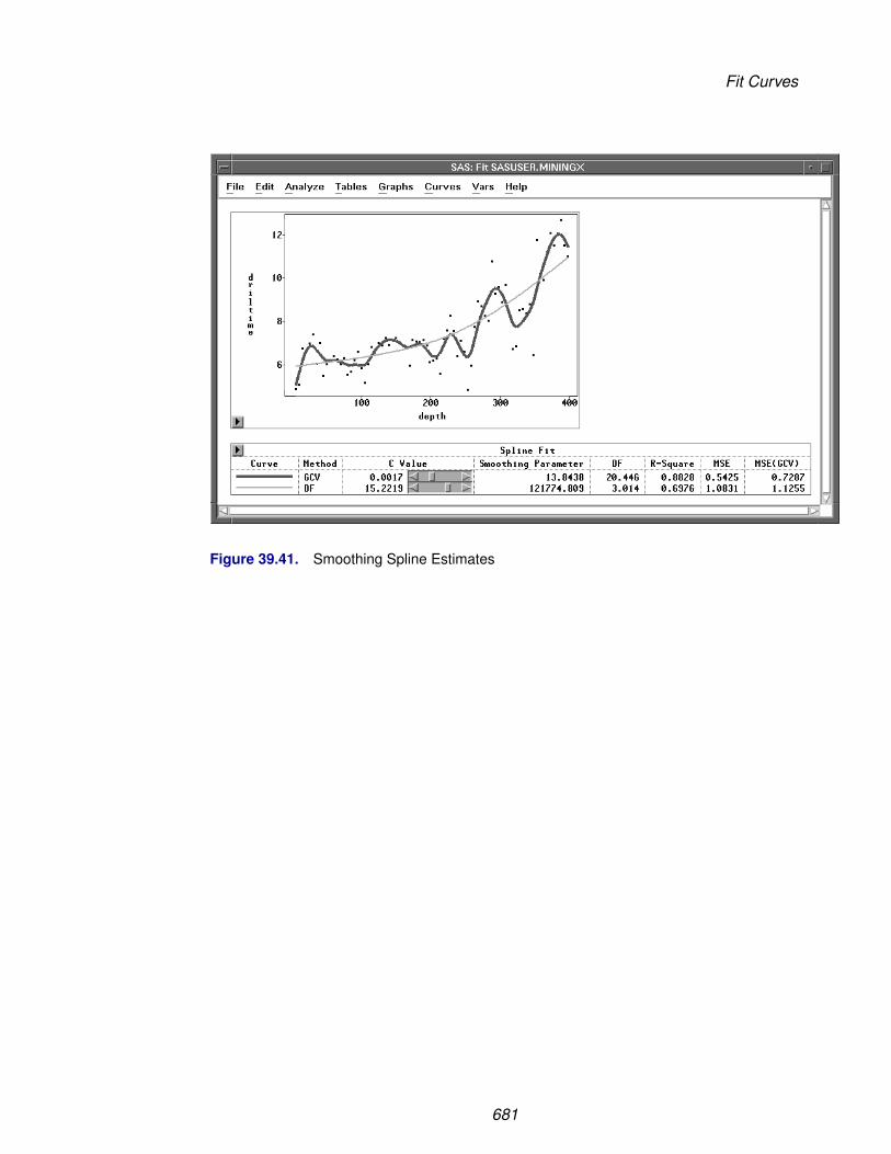
Fit Curves
Figure 39.41. Smoothing Spline Estimates
681

Reference � Fit Analyses
Nonparametric Kernel Smoother
A kernel estimator uses an explicitly defined set of weights at each point x to producethe estimate at x. The kernel estimator of f has the form
fλ(x) =n∑
i=1
W (x, xi; λ)yi
where W(x, xi; λ) is the weight function that depends on the smoothing parameter λ.
The weights are derived from a single function that is independent of the design
W (x, xi; λ) =K0(x−xi
λ )∑nj=1 K0(
x−xj
λ )
where K0 is a kernel function and λ is the bandwidth or smoothing parameter. Theweights are nonnegative and sum to 1.
Symmetric probability density functions commonly used as kernel functions are
• Normal K0(t) = 1√2π
exp(−t2/2) for −∞ < t < ∞
• Triangular K0(t) =
⎧⎨⎩ 1 − |t|0
for |t| ≤ 1
otherwise
• Quadratic K0(t) =
⎧⎨⎩ 34(1 − t2)
0
for |t| ≤ 1
otherwise
You select a bandwidth λ for each kernel estimator by specifying c in the formula
λ = n− 15 Qc
where Q is the sample interquartile range of the explanatory variable and n is thesample size. This formulation makes c independent of the units of X.
SAS/INSIGHT software divides the range of the explanatory variable into 128 evenlyspaced intervals, then approximates the data on this grid and uses the fast Fouriertransformation (Silverman 1986) to estimate the kernel fit on this grid. For a datapoint xi that lies between two grid points, a linear interpolation is used to computethe predicted value. A small value of λ (relative to the width of the interval) may giveunstable estimates of the kernel fit.
682

Fit Curves
After choosing Curves:Kernel, you specify a kernel and smoothing parameter se-lection method in the Kernel Fit dialog.
Figure 39.42. Kernel Fit Dialog
The default Weight:Normal uses a normal weight, and Method:GCV uses a cvalue that minimizes MSEGCV(λ). Figure 39.43 illustrates normal kernel estimateswith c values of 0.0944 (the GCV value) and 0.7546 (DF=3). Use the slider to changethe c value of the kernel fit.
Figure 39.43. Kernel Estimates
683

Reference � Fit Analyses
Nonparametric Local Polynomial Smoother
The kernel estimator fits a local mean at each point x and thus cannot even estimatea line without bias (Cleveland, Cleveland, Devlin and Grosse 1988). An estimatorbased on locally-weighted regression lines or locally-weighted quadratic polynomialsmay give more satisfactory results.
A local polynomial smoother fits a locally-weighted regression at each point x toproduce the estimate at x. Different types of regression and weight functions are usedin the estimation.
SAS/INSIGHT software provides the following three types of regression:
• Mean a locally-weighted mean
• Linear a locally-weighted regression line
• Quadratic a locally-weighted quadratic polynomial regression
The weights are derived from a single function that is independent of the design
W (x, xi; λi) = K0(x − xi
λi)
where K0 is a weight function and λi is the local bandwidth at xi.
SAS/INSIGHT software uses the following weight functions:
• Normal K0(t) =
⎧⎨⎩ exp(−t2/2)
0
for |t| ≤ 3.5
otherwise
• Triangular K0(t) =
⎧⎨⎩ 1 − |t|0
for |t| ≤ 1
otherwise
• Quadratic K0(t) =
⎧⎨⎩ 1 − t2
0
for |t| ≤ 1
otherwise
• Tri − Cube K0(t) =
⎧⎨⎩ (1 − |t|3)3
0
for |t| ≤ 1
otherwise
† Note: The normal weight function is proportional to a truncated normal densityfunction.
SAS/INSIGHT software provides two methods to compute the local bandwidth λi.The loess estimator (Cleveland 1979; Cleveland, Devlin and Grosse 1988) evaluatesλi based on the furthest distance from k nearest neighbors. A fixed bandwidth localpolynomial estimator uses a constant bandwidth λ at each xi.
684

Fit Curves
For a loess estimator, you select k nearest neighbors by specifying a positive constantα. For α ≤ 1, k is αn truncated to an integer, where n is the number of observations.For α > 1, k is set to n.
685

Reference � Fit Analyses
The local bandwidth λi is then computed as
λi =
⎧⎨⎩ d(k)(xi) for 0 < α ≤ 1
αd(n)(xi) for α > 1
where d(k)(xi) is the furthest distance from xi to its k nearest neighbors.
† Note: For α ≤ 1, the local bandwidth λi is a function of k and thus a step functionof α.
For a fixed bandwidth local polynomial estimator, you select a bandwidth λ by spec-ifying c in the formula
λ = n− 15 Qc
where Q is the sample interquartile range of the explanatory variable and n is thesample size. This formulation makes c independent of the units of X.
† Note: A fixed bandwidth local mean estimator is equivalent to a kernel smoother.
By default, SAS/INSIGHT software divides the range of the explanatory variable into128 evenly spaced intervals, then it fits locally-weighted regressions on this grid. Asmall value of c or α may give the local polynomial fit to the data points near the gridpoints only and may not apply to the remaining points.
For a data point xi that lies between two grid points xi[j] ≤ xi < xi[j+1], the predictedvalue is the weighted average of the two predicted values at the two nearest gridpoints:
(1 − dij)yi[j] + dij yi[j+1]
where yi[j] and yi[j+1] are the predicted values at the two nearest grid points and
dij =xi − xi[j]
xi[j+1] − xi[j]
A similar algorithm is used to compute the degrees of freedom of a local polynomialestimate, dfλ = trace(Hλ). The ith diagonal element of the matrix Hλ is
(1 − dij)hi[j] + dijhi[j+1]
where hi[j] and hi[j+1] are the ith diagonal elements of the projection matrices of thetwo regression fits.
686

Fit Curves
After choosing Curves:Loess from the menu, you specify a loess fit in the LoessFit dialog.
Figure 39.44. Loess Fit Dialog
In the dialog, you can specify the number of intervals, the regression type, theweight function, and the method for choosing the smoothing parameter. The defaultType:Linear uses a linear regression, Weight:Tri-Cube uses a tri-cube weightfunction, and Method:GCV uses an α value that minimizes MSEGCV(λ).
Figure 39.45 illustrates loess estimates with Type=Linear, Weight=Tri-Cube, andα values of 0.0930 (the GCV value) and 0.7795 (DF=3). Use the slider to change theα value of the loess fit.
687

Reference � Fit Analyses
Figure 39.45. Loess Estimates
688

Fit Curves
The loess degrees of freedom is a function of local bandwidth λi. For α ≤ 1, λi isa step function of α and thus the loess df is a step function of α. The convergencecriterion applies only when the specified df is less than df (α=1), the loess df forα = 1. When the specified df is greater than df (α=1), SAS/INSIGHT software usesthe α value that has its df closest to the specified df.
Similarly, you can choose Curves:Local Polynomial, Fixed Bandwidth fromthe menu to specify a fixed bandwidth local polynomial fit.
Figure 39.46. Fixed Bandwidth Local Polynomial Fit Dialog
Figure 39.47 illustrates fixed bandwidth local polynomial estimates withType=Linear, Weight=Tri-Cube, and c values of 0.2026 (the GCV value)and 2.6505 (DF=3). Use the slider to change the c value of the local polynomial fit.
689

Reference � Fit Analyses
Figure 39.47. Fixed Bandwidth Local Polynomial Estimates
690
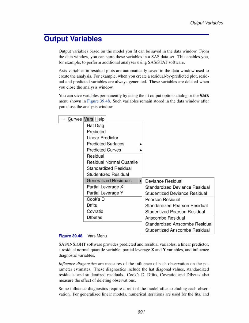
Output Variables
Output VariablesOutput variables based on the model you fit can be saved in the data window. Fromthe data window, you can store these variables in a SAS data set. This enables you,for example, to perform additional analyses using SAS/STAT software.
Axis variables in residual plots are automatically saved in the data window used tocreate the analysis. For example, when you create a residual-by-predicted plot, resid-ual and predicted variables are always generated. These variables are deleted whenyou close the analysis window.
You can save variables permanently by using the fit output options dialog or the Varsmenu shown in Figure 39.48. Such variables remain stored in the data window afteryou close the analysis window.
· · · Curves Vars HelpHat DiagPredictedLinear PredictorPredicted Surfaces �
Predicted Curves �
ResidualResidual Normal QuantileStandardized ResidualStudentized ResidualGeneralized Residuals �
Partial Leverage XPartial Leverage YCook’s DDffitsCovratioDfbetas
Deviance ResidualStandardized Deviance ResidualStudentized Deviance ResidualPearson ResidualStandardized Pearson ResidualStudentized Pearson ResidualAnscombe ResidualStandardized Anscombe ResidualStudentized Anscombe Residual
Figure 39.48. Vars Menu
SAS/INSIGHT software provides predicted and residual variables, a linear predictor,a residual normal quantile variable, partial leverage X and Y variables, and influencediagnostic variables.
Influence diagnostics are measures of the influence of each observation on the pa-rameter estimates. These diagnostics include the hat diagonal values, standardizedresiduals, and studentized residuals. Cook’s D, Dffits, Covratio, and Dfbetas alsomeasure the effect of deleting observations.
Some influence diagnostics require a refit of the model after excluding each obser-vation. For generalized linear models, numerical iterations are used for the fits, and
691

Reference � Fit Analyses
the process can be expensive. One-step methods are used to approximate these diag-nostics after each fit. The process involves doing one iteration of the fit without theexcluded observation, starting with the final parameter estimates and weights fromthe complete fit.
You can also create generalized residuals such as Pearson, deviance, and Anscomberesiduals with generalized linear models. These residuals are applicable to the non-normal response distributions.
Generated variables use the naming conventions described later in this section. If aresulting variable name has more than 32 characters, only the first 32 characters areused. Generated variables also follow the same numbering convention as the analysiswindow when you create more than one fit analysis from the same data window. Ifthe generated variable name is longer than 32 characters, the original variable nameis truncated to the necessary length.
Hat Matrix Diagonal
Data points that are far from the centroid of the X-space are potentially influential. Ameasure of the distance between a data point, xi, and the centroid of the X-space isthe data point’s associated diagonal element hi in the hat matrix. Belsley, Kuh, andWelsch (1980) propose a cutoff of 2p/n for the diagonal elements of the hat matrix,where n is the number of observations used to fit the model, and p is the numberof parameters in the model. Observations with hi values above this cutoff should beinvestigated.
For linear models, the hat matrix
H = X(X′X)−1X′
can be used as a projection matrix. The hat matrix diagonal variable contains thediagonal elements of the hat matrix
hi = xi(X′X)−1x′i
For generalized linear models, an approximate projection matrix is given by
H = W1/2X(X′WX)−1X′W1/2
where W = Wo when the full Hessian is used and W = We when Fisher’s scoringmethod is used.
The values of hi are stored in a variable named H–yname, where yname is theresponse variable name.
692
Output Variables
Predicted Values
After the model has been fit, the predicted values are calculated from the estimatedregression equation.
For linear models, the predicted mean vector of the n observation responses is
µ = Xb = Hy
µi = xib
For generalized linear models,
µi = g−1(η0i + xib)
where η0i is the offset for the ith observation.
The predicted values are stored in variables named P–yname for each responsevariable, where yname is the response variable name.
Linear Predictor
The linear predictor values are the linear function values, xib, in the predicted val-ues. The linear predictor values are stored in variables named LP–yname for eachresponse variable, where yname is the response variable name.
Residuals
The residuals are calculated as actual response minus predicted value,
ri = yi − µi
The residuals are stored in variables named R–yname for each response variable,where yname is the response variable name.
Residual Normal Quantiles
The normal quantile of the ith ordered residual is computed as
Φ−1
(i − 0.375n + 0.25
)
where Φ−1 is the inverse standard cumulative normal distribution.
693

Reference � Fit Analyses
If the residuals are normally distributed, the points on the residual normal quantile-quantile plot should lie approximately on a straight line with residual mean as theintercept and residual standard deviation as the slope.
The normal quantiles of the residuals are stored in variables named RN–yname foreach response variable, where yname is the response variable name.
Predicted Surfaces
You can output predicted values from fitted kernel and thin-plate smoothing splinesurfaces by choosing Vars:Predicted Surfaces from the menu.
· · · Curves Vars HelpHat DiagPredictedLinear PredictorPredicted Surfaces �
Predicted Curves �
ResidualResidual Normal QuantileStandardized ResidualStudentized ResidualGeneralized Residuals �
Partial Leverage XPartial Leverage YCook’s DDffitsCovratioDfbetas
Spline...Kernel...
Figure 39.49. Predicted Surfaces Menu
For predicted values from a spline or kernel fit, you specify the surface fit in thedialogs, as shown in Figure 39.28 or Figure 39.30, respectively.
The predicted values for each response variable are stored in variables namedPS–yname for spline and PK–yname for kernel, where yname is the responsevariable name.
694
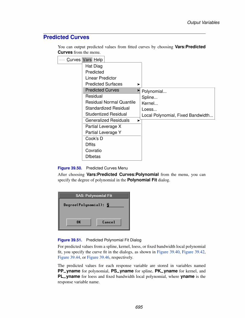
Output Variables
Predicted Curves
You can output predicted values from fitted curves by choosing Vars:PredictedCurves from the menu.
· · · Curves Vars HelpHat DiagPredictedLinear PredictorPredicted Surfaces �
Predicted Curves �
ResidualResidual Normal QuantileStandardized ResidualStudentized ResidualGeneralized Residuals �
Partial Leverage XPartial Leverage YCook’s DDffitsCovratioDfbetas
Polynomial...Spline...Kernel...Loess...Local Polynomial, Fixed Bandwidth...
Figure 39.50. Predicted Curves Menu
After choosing Vars:Predicted Curves:Polynomial from the menu, you canspecify the degree of polynomial in the Polynomial Fit dialog.
Figure 39.51. Predicted Polynomial Fit Dialog
For predicted values from a spline, kernel, loess, or fixed bandwidth local polynomialfit, you specify the curve fit in the dialogs, as shown in Figure 39.40, Figure 39.42,Figure 39.44, or Figure 39.46, respectively.
The predicted values for each response variable are stored in variables namedPP–yname for polynomial, PS–yname for spline, PK–yname for kernel, andPL–yname for loess and fixed bandwidth local polynomial, where yname is theresponse variable name.
695
Reference � Fit Analyses
Standardized and Studentized Residuals
For linear models, the variance of the residual ri is
Var(ri) = σ2(1 − hi)
and an estimate of the standard error of the residual is
STDERR(ri) = s√
1 − hi
Thus, the residuals can be modified to better detect unusual observations. The ratioof the residual to its standard error, called the standardized residual, is
rsi =ri
s√
1 − hi
If the residual is standardized with an independent estimate of σ2, the result has aStudent’s t distribution if the data satisfy the normality assumption. If you estimateσ2 by s2
(i), the estimate of σ2 obtained after deleting the ith observation, the result isa studentized residual:
rti =ri
s(i)
√1 − hi
Observations with |rti| > 2 may deserve investigation.
For generalized linear models, the standardized and studentized residuals are
rsi =ri√
φ(1 − hi)
rti =ri√
φ(i)(1 − hi)
where φ is the estimate of the dispersion parameter φ, and φ(i) is a one-step approxi-mation of φ after excluding the ith observation.
The standardized residuals are stored in variables named RS–yname and theStudentized residuals are stored in variables named RT–yname for each responsevariable, where yname is the response variable name.
696
Output Variables
Deviance Residuals
The deviance residual is the measure of deviance contributed from each observationand is given by
rDi = sign(ri)√
di
where di is the individual deviance contribution.
The deviance residuals can be used to check the model fit at each observation for gen-eralized linear models. These residuals are stored in variables named RD–ynamefor each response variable, where yname is the response variable name.
The standardized and studentized deviance residuals are
rDsi =rDi√
φ(1 − hi)
rDti =rDi√
φ(i)(1 − hi)
The standardized deviance residuals are stored in variables named RDS–yname andthe studentized deviance residuals are stored in variables named RDT–yname foreach response variable, where yname is the response variable name.
Pearson Residuals
The Pearson residual is the raw residual divided by the square root of the variancefunction V (µ).
The Pearson residual is the individual contribution to the Pearson χ2 statistic. For abinomial distribution with mi trials in the ith observation, it is defined as
rPi =√
miri√
V (µi)
For other distributions, the Pearson residual is defined as
rPi =ri√
V (µi)
The Pearson residuals can be used to check the model fit at each observation for gen-eralized linear models. These residuals are stored in variables named RP–ynamefor each response variable, where yname is the response variable name.
697

Reference � Fit Analyses
The standardized and studentized Pearson residuals are
rPsi =rPi√
φ(1 − hi)
rPti =rPi√
φ(i)(1 − hi)
The standardized Pearson residuals are stored in variables named RPS–yname andthe studentized Pearson residuals are stored in variables named RPT–yname foreach response variable, where yname is the response variable name.
Anscombe Residuals
For nonnormal response distributions in generalized linear models, the distributionof the Pearson residuals is often skewed. Anscombe proposed a residual using afunction A(y) in place of y in the residual derivation (Anscombe 1953, McCullaghand Nelder 1989). The function A(y) is chosen to make the distribution of A(y) asnormal as possible and is given by
A(µ) =∫ µ
−∞V −1/3(t)dt
where V (t) is the variance function.
For a binomial distribution with mi trials in the ith observation, the Anscombe resid-ual is defined as
rAi =√
miA(yi) − A(µi)A′(µi)
√V (µi)
For other distributions, the Anscombe residual is defined as
rAi =A(yi) − A(µi)A′(µi)
√V (µi)
where A′(µ) is the derivative of A(µ).
698

Output Variables
For the response distributions used in the fit analysis, Anscombe residuals are
Normal rAi = yi − µi
Inverse Gaussian rAi = (log(yi) − log(µi))/µi1/2
Gamma rAi = 3((yi/µi)1/3 − 1)
Poisson rAi = 32(y2/3
i µi−1/6 − µi
1/2)
Binomial rAi =√
mi
(B(yi,
23 , 2
3) − B(µi,23 , 2
3))(µi(1 − µi))−1/6
where B(z, a, b) =∫ z0 ta−1(1 − t)b−1 dt
You can save Anscombe residuals to your data set by using the Output Variablesdialog, as shown in Figure 39.5, or the Vars menu, as shown in Figure 39.48. Theseresiduals are stored in variables named RA–yname for each response variable,where yname is the response variable name.
The standardized and studentized Anscombe residuals are
rAsi =rAi√
φ(1 − hi)
rAti =rAi√
φ(i)(1 − hi)
where φ is the estimate of the dispersion parameter φ, and φ(i) is a one-step approxi-mation of φ after excluding the ith observation.
The standardized Anscombe residuals are stored in variables named RAS–ynameand the studentized Anscombe residuals are stored in variables named RAT–ynamefor each response variable, where yname is the response variable name.
Partial Leverage Variables
The partial leverage output variables are variables used in the partial leverage plots.For each interval X variable, the corresponding partial leverage X variable is namedX–xname, where xname is the X variable name. For each pair of Y and Xvariables, the corresponding partial leverage Y variable is named yname–xname,where yname is the Y variable name and xname is the X variable name. Up to thefirst three characters of the response variable name are used to create the new variablename.
699

Reference � Fit Analyses
Cook’s D
Cook’s D measures the change in the parameter estimates caused by deleting eachobservation. For linear models,
Di =1
ps2(b − b(i))
′(X′X)(b − b(i))
where b(i) is the vector of parameter estimates obtained after deleting the ith obser-vation.
Cook (1977) suggests comparing Di to the F distribution with p and n − p degreesof freedom.
For generalized linear models,
Di =1
pφ(b − b(i))
′(X′WX)(b − b(i))
where W = Wo when the full Hessian is used and W = We when Fisher’s scoringmethod is used.
Cook’s D statistics are stored in variables named D–yname for each response vari-able, where yname is the response variable name.
Dffits
The Dffits statistic is a scaled measure of the change in the predicted value for the ithobservation. For linear models,
Fi =µi − µ(i)
s(i)
√hi
where µ(i) is the ith value predicted without using the ith observation.
Large absolute values of Fi indicate influential observations. A general cutoff toconsider is 2; a recommended size-adjusted cutoff is 2
√p/n.
For generalized linear models,
Fi =µi − µ(i)√
φ(i)hi
The Dffits statistics are stored in variables named F–yname for each response vari-able, where yname is the response variable name.
700

Output Variables
Covratio
Covratio measures the effect of observations on the covariance matrix of the param-eter estimates. For linear models,
Ci =|s2
(i)(X′(i)X(i))−1|
|s2(X′X)−1|
where X(i) is the X matrix without the ith observation.
Values of Ci near 1 indicate that the observation has little effect on the precision of theestimates. Observations with |Ci − 1|≥3p/n suggest a need for further investigation.
For generalized linear models,
Ci =|φ(i)(X′
(i)W(i)X(i))−1||φ(X′WX)−1|
where W(i) is the W matrix without the ith observation, W = Wo when the fullHessian is used, and W = We when Fisher’s scoring method is used.
The Covratio statistics are stored in variables named C–yname for each responsevariable, where yname is the response variable name.
Dfbetas
Dfbetas is a normalized measure of the effect of observations on the estimated regres-sion coefficients. For linear models,
Bj,i =bj − bj(i)
s(i)
√(X′X)−1
jj
where (X′X)−1jj is the jth diagonal element of (X′X)−1. Values of Bj,i > 2 indicate
observations that are influential in estimating a given parameter. A recommendedsize-adjusted cutoff is 2/
√n.
For generalized linear models,
Bj,i =bj − bj(i)√
φ(i)(X′WX)−1jj
where W = Wo when the full Hessian is used and W = We when the Fisher’sscoring method is used.
The dfbetas statistics are stored in variables named Byname–xname for each pairof response and explanatory variables, where yname is the response variable nameand xname is the explanatory variable name. Up to the first two characters of theresponse variable name are used to create the new variable name.
701
Reference � Fit Analyses
Weighted AnalysesIf the errors εi do not have a common variance in the regression model
yi = f(xi) + εi
a weighted analysis may be appropriate. The observation weights are the values ofthe Weight variable you specified.
In parametric regression, the linear model is given by
y = Xβ + ε
Let W be an n × n diagonal matrix consisting of weights w1 > 0, w2 > 0, . . ., andwn > 0 for the observations, and let W1/2 be an n×n diagonal matrix with diagonalelements w
1/21 , w
1/22 , . . ., and w
1/2n .
The weighted fit analysis is equivalent to the usual (unweighted) fit analysis of thetransformed model
y∗ = X∗β + ε∗
where y∗ = W1/2y, X∗ = W1/2X, and ε∗ = W1/2ε.
The estimate of β is then given by
bw = (X′WX)−1X′Wy
For nonparametric weighted regression, the minimizing criterion in spline estimationis given by
S(λ) =1∑n
i=1 wi
n∑i=1
wi{yi − fλ(xi)}2 + λ
∫ ∞
−∞{fλ
′′(x)}2dx
In kernel estimation, individual weights are
W (x, xi; λ) =wiK0(x−xi
λ )∑nj=1 wjK0(
x−xj
λ )
For generalized linear models, the function ai(φ) = φ/(miwi) for binomial distribu-tion with mi trials in the ith observation, ai(φ) = φ/wi for other distributions. Thefunction ai(φ) is used to compute the likelihood function and the diagonal matricesWo and We.
702
References
The individual deviance contribution di is obtained by multiplying the weight wi bythe unweighted deviance contribution. The deviance is the sum of these weighteddeviance contributions.
The Pearson χ2 statistic is
χ2 =n∑
i=1
wimi(yi − µi)2/V (µi)
for binomial distribution with mi trials in the ith observation,
χ2 =n∑
i=1
wi(yi − µi)2/V (µi)
for other distributions.
ReferencesAnscombe, F.J. (1953), “Contribution to the Discussion of H. Hotelling’s Paper,”
Journal of the Royal Statistical Society, Series B, 15, 229–230.
Belsley, D.A., Kuh, E., and Welsch, R.E. (1980), Regression Diagnostics, New York:John Wiley & Sons, Inc.
Cleveland, W.S. (1979), “Robust Locally-Weighted Regression and SmoothingScatterplots,” Journal of the American Statistical Association, 74, 829–836.
Cleveland, W.S., Devlin, S.J., and Grosse, E. (1988), “Regression by Local Fitting:Methods, Properties, and Computational Algorithms,” Journal of Econometrics, 37,87–114.
Cleveland, W.S. and Grosse, E. (1991), “Computational Methods for Local Regression,”Journal of Statistics and Computing, 1, 47–62.
Cleveland, W.S. (1993), Visualizing Data, Summit, New Jersey: Hobart Press.
Cook, R.D. (1977), “Detection of Influential Observations in Linear Regression,”Technometrics, 19, 15–18.
Cook, R.D. and Weisberg, S. (1982), Residuals and Influence in Regression, New York:Chapman and Hall.
Cox, D.R. and Snell, E.J. (1968), “A General Definition of Residuals,” Journal of theRoyal Statistical Society, Series B, 30, 248–275.
Dobson, A.J. (1990), An Introduction to Generalized Linear Models, New York:Chapman and Hall.
Eubank, R.L. (1988), Spline Smoothing and Nonparametric Regression, New York:Marcel Dekker, Inc.
Hastie, Y.J. and Tibshirani, R.J. (1990), Generalized Additive Models, New York:Chapman and Hall.
703

Reference � Fit Analyses
Hinkley, D.V., Reid, N., and Snell, E.J. (1991), Statistical Theory and Modelling, NewYork: Chapman and Hall.
Hoaglin, D.C. and Welsch, R.E. (1978), “The Hat Matrix in Regression and ANOVA,”The American Statistician, 32, 17–22.
Kvalseth, T.O. (1985), “Cautionary Note About R2,” The American Statistician, 39,279.
McCullagh, P. and Nelder, J.A. (1989), Generalized Linear Models, Second Edition,London: Chapman and Hall.
Pringle, R.M. and Raynor, A.A. (1971), Generalized Inverse Matrices with Applicationsto Statistics, New York: Hafner Publishing Co.
Rawlings, J.O. (1988), Applied Regression Analysis: A Research Tool, Pacific Grove,CA: Wadsworth & Brooks.
Reinsch, C. (1967), “Smoothing by Spline Functions,” Numerische Mathematik, 10,177–183.
Silverman, B.W. (1982), “Kernel Density Estimation using the Fast Fourier Transform,”Applied Statistics, 31, 93–99.
Silverman, B.W. (1986), Density Estimation for Statistics and Data Analysis, New York:Chapman and Hall.
Velleman, P.F. and Welsch, R.E. (1981), “Efficient Computing of RegressionDiagnostics,” The American Statistician, 35, 234–242.
Wahba, G. and Wendelberger, J.G. (1980), “Some New Mathematical Methods forVariational Objective Analysis using Splines and Cross Validation,” Monthly WeatherReview, 108, 1122–1143.
704

Chapter 40Multivariate Analyses
Chapter Contents
VARIABLES . . . . . . . . . . . . . . . . . . . . . . . . . . . . . . . . . . . 708
METHOD . . . . . . . . . . . . . . . . . . . . . . . . . . . . . . . . . . . . 710Principal Component Analysis . . . . . . . . . . . . . . . . . . . . . . . . 713Principal Component Rotation . . . . . . . . . . . . . . . . . . . . . . . . 715Canonical Correlation Analysis . . . . . . . . . . . . . . . . . . . . . . . . 717Maximum Redundancy Analysis . . . . . . . . . . . . . . . . . . . . . . . 718Canonical Discriminant Analysis . . . . . . . . . . . . . . . . . . . . . . . 718
OUTPUT . . . . . . . . . . . . . . . . . . . . . . . . . . . . . . . . . . . . . 720Principal Component Analysis . . . . . . . . . . . . . . . . . . . . . . . . 722Principal Component Rotation . . . . . . . . . . . . . . . . . . . . . . . . 723Canonical Correlation Analysis . . . . . . . . . . . . . . . . . . . . . . . . 724Maximum Redundancy Analysis . . . . . . . . . . . . . . . . . . . . . . . 725Canonical Discriminant Analysis . . . . . . . . . . . . . . . . . . . . . . . 726
TABLES . . . . . . . . . . . . . . . . . . . . . . . . . . . . . . . . . . . . . 727Univariate Statistics . . . . . . . . . . . . . . . . . . . . . . . . . . . . . . 727Sums of Squares and Crossproducts . . . . . . . . . . . . . . . . . . . . . . 727Corrected Sums of Squares and Crossproducts . . . . . . . . . . . . . . . . 728Covariance Matrix . . . . . . . . . . . . . . . . . . . . . . . . . . . . . . . 728Correlation Matrix . . . . . . . . . . . . . . . . . . . . . . . . . . . . . . . 729P-Values of the Correlations . . . . . . . . . . . . . . . . . . . . . . . . . . 729Inverse Correlation Matrix . . . . . . . . . . . . . . . . . . . . . . . . . . . 731Pairwise Correlations . . . . . . . . . . . . . . . . . . . . . . . . . . . . . 732Principal Component Analysis . . . . . . . . . . . . . . . . . . . . . . . . 733Principal Components Rotation . . . . . . . . . . . . . . . . . . . . . . . . 737Canonical Correlation Analysis . . . . . . . . . . . . . . . . . . . . . . . . 740Maximum Redundancy Analysis . . . . . . . . . . . . . . . . . . . . . . . 745Canonical Discriminant Analysis . . . . . . . . . . . . . . . . . . . . . . . 749
GRAPHS . . . . . . . . . . . . . . . . . . . . . . . . . . . . . . . . . . . . . 753Scatter Plot Matrix . . . . . . . . . . . . . . . . . . . . . . . . . . . . . . . 753Principal Component Plots . . . . . . . . . . . . . . . . . . . . . . . . . . 754Component Rotation Plots . . . . . . . . . . . . . . . . . . . . . . . . . . . 758Canonical Correlation Plots . . . . . . . . . . . . . . . . . . . . . . . . . . 760Maximum Redundancy Plots . . . . . . . . . . . . . . . . . . . . . . . . . 763

Reference � Multivariate Analyses
Canonical Discrimination Plots . . . . . . . . . . . . . . . . . . . . . . . . 765
CONFIDENCE ELLIPSES . . . . . . . . . . . . . . . . . . . . . . . . . . . 768Scatter Plot Confidence Ellipses . . . . . . . . . . . . . . . . . . . . . . . . 769Canonical Discriminant Confidence Ellipses . . . . . . . . . . . . . . . . . 770
OUTPUT VARIABLES . . . . . . . . . . . . . . . . . . . . . . . . . . . . . 771Principal Components . . . . . . . . . . . . . . . . . . . . . . . . . . . . . 772Principal Component Rotation . . . . . . . . . . . . . . . . . . . . . . . . 772Canonical Variables . . . . . . . . . . . . . . . . . . . . . . . . . . . . . . 772Maximum Redundancy . . . . . . . . . . . . . . . . . . . . . . . . . . . . 772Canonical Discriminant . . . . . . . . . . . . . . . . . . . . . . . . . . . . 772
WEIGHTED ANALYSES . . . . . . . . . . . . . . . . . . . . . . . . . . . . 773
REFERENCES . . . . . . . . . . . . . . . . . . . . . . . . . . . . . . . . . . 774
706

Chapter 40Multivariate Analyses
Choosing Analyze:Multivariate ( Y X ) gives you access to a variety of multivari-ate analyses. These provide methods for examining relationships among variablesand between two sets of variables.
You can calculate correlation matrices and scatter plot matrices with confidence el-lipses to explore relationships among pairs of variables. You can use principal compo-nent analysis to examine relationships among several variables, canonical correlationanalysis and maximum redundancy analysis to examine relationships between twosets of interval variables, and canonical discriminant analysis to examine relation-ships between a nominal variable and a set of interval variables.
Figure 40.1. Multivariate Analysis

Reference � Multivariate Analyses
VariablesTo create a multivariate analysis, choose Analyze:Multivariate ( Y’s ). If you havealready selected one or more interval variables, these selected variables are treatedas Y variables and a multivariate analysis for the variables appears. If you have notselected any variables, a variables dialog appears.
Figure 40.2. Multivariate Variables Dialog
Select at least one Y variable. With canonical correlation analysis and maximumredundancy analysis, you need to select a set of X variables. With canonical discrim-inant analysis, you need to select a nominal Y variable and a set of X variables.
Without X variables, sums of squares and crossproducts, corrected sums of squaresand crossproducts, covariances, and correlations are displayed as symmetric matriceswith Y variables as both the row variables and the column variables. With a nominalY variable, these statistics are displayed as symmetric matrices with X variables asboth the row variables and the column variables. When both interval Y variables andinterval X variables are selected, these statistics are displayed as rectangular matriceswith Y variables as the row variables and X variables as the column variables.
You can select one or more Partial variables. The multivariate analysis analyzes Yand X variables using their residuals after partialling out the Partial variables.
You can select one or more Group variables, if you have grouped data. This createsone multivariate analysis for each group. You can select a Label variable to labelobservations in the plots.
You can select a Freq variable. If you select a Freq variable, each observation isassumed to represent ni observations, where ni is the value of the Freq variable.
708

Variables
You can select a Weight variable to specify relative weights for each observation inthe analysis. The details of weighted analyses are explained in the “Method” section,which follows, and the “Weighted Analyses” section at the end of this chapter.
709

Reference � Multivariate Analyses
MethodObservations with missing values for any of the Partial variables are not used.Observations with Weight or Freq values that are missing or that are less than orequal to 0 are not used. Only the integer part of Freq values is used.
Observations with missing values for Y or X variables are not used in the analysis ex-cept for the computation of pairwise correlations. Pairwise correlations are computedfrom all observations that have nonmissing values for any pair of variables.
The following notation is used in this chapter:
• n is the number of nonmissing observations.
• np, ny, and nx are the numbers of Partial, Y, and X variables.
• d is the variance divisor.
• wi is the ith observation weight (values of the Weight variable).
• yi and xi are the ith observed nonmissing Y and X vectors.
• y and x are the sample mean vectors,∑n
i=1 yi/n,∑n
i=1 xi/n.
The sums of squares and crossproducts of the variables are
• Uyy =∑n
i=1 yiy′i
• Uyx =∑n
i=1 yix′i
• Uxx =∑n
i=1 xix′i
The corrected sums of squares and crossproducts of the variables are
• Cyy =∑n
i=1 (yi − y)(yi − y)′
• Cyx =∑n
i=1 (yi − y)(xi − x)′
• Cxx =∑n
i=1 (xi − x)(xi − x)′
If you select a Weight variable, the sample mean vectors are
y =∑n
i=1 wiyi/∑n
i=1 wi x =∑n
i=1 wixi/∑n
i=1 wi
The sums of squares and crossproducts with a Weight variable are
• Uyy =∑n
i=1 wiyiy′i
• Uyx =∑n
i=1 wiyix′i
• Uxx =∑n
i=1 wixix′i
710

Method
The corrected sums of squares and crossproducts with a Weight variable are
• Cyy =∑n
i=1 wi(yi − y)(yi − y)′
• Cyx =∑n
i=1 wi(yi − y)(xi − x)′
• Cxx =∑n
i=1 wi(xi − x)(xi − x)′
The covariance matrices are computed as
Syy = Cyy/d Syx = Cyx/d Sxx = Cxx/d
To view or change the variance divisor d used in the calculation of variances andcovariances, or to view or change other method options in the multivariate analysis,click on the Method button from the variables dialog to display the method optionsdialog.
Figure 40.3. Multivariate Method Options Dialog
The variance divisor d is defined as
711

Reference � Multivariate Analyses
• d = n − np − 1 for vardef=DF, degrees of freedom
• d = n for vardef=N, number of observations
• d =∑
i wi − np − 1 for vardef=WDF, sum of weights minus numberof partial variables minus 1
• d =∑
i wi for vardef=WGT, sum of weights
By default, SAS/INSIGHT software uses DF, degrees of freedom.
712

Method
The correlation matrices Ryy, Ryx, and Rxx, containing the Pearson product-moment correlations of the variables, are derived by scaling their corresponding co-variance matrices:
• Ryy = D−1yy SyyD−1
yy
• Ryx = D−1yy SyxD−1
xx
• Rxx = D−1xx SxxD−1
xx
where Dyy and Dxx are diagonal matrices whose diagonal elements are the squareroots of the diagonal elements of Syy and Sxx:
• Dyy = (diag(Syy))1/2
• Dxx = (diag(Sxx))1/2
Principal Component Analysis
Principal component analysis was originated by Pearson (1901) and later developedby Hotelling (1933). It is a multivariate technique for examining relationships amongseveral quantitative variables. Principal component analysis can be used to summa-rize data and detect linear relationships. It can also be used for exploring polynomialrelationships and for multivariate outlier detection (Gnanadesikan 1997).
Principal component analysis reduces the dimensionality of a set of data while try-ing to preserve the structure. Given a data set with ny Y variables, ny eigenvaluesand their associated eigenvectors can be computed from its covariance or correlationmatrix. The eigenvectors are standardized to unit length.
The principal components are linear combinations of the Y variables. The coefficientsof the linear combinations are the eigenvectors of the covariance or correlation matrix.Principal components are formed as follows:
• The first principal component is the linear combination of the Y variables thataccounts for the greatest possible variance.
• Each subsequent principal component is the linear combination of the Y vari-ables that has the greatest possible variance and is uncorrelated with the previ-ously defined components.
For a covariance or correlation matrix, the sum of its eigenvalues equals the trace ofthe matrix, that is, the sum of the variances of the ny variables for a covariance matrix,and ny for a correlation matrix. The principal components are sorted by descendingorder of their variances, which are equal to the associated eigenvalues.
713

Reference � Multivariate Analyses
Principal components can be used to reduce the number of variables in statisticalanalyses. Different methods for selecting the number of principal components toretain have been suggested. One simple criterion is to retain components with associ-ated eigenvalues greater than the average eigenvalue (Kaiser 1958). SAS/INSIGHTsoftware offers this criterion as an option for selecting the numbers of eigenvalues,eigenvectors, and principal components in the analysis.
Principal components have a variety of useful properties (Rao 1964; Kshirsagar1972):
• The eigenvectors are orthogonal, so the principal components represent jointlyperpendicular directions through the space of the original variables.
• The principal component scores are jointly uncorrelated. Note that this prop-erty is quite distinct from the previous one.
• The first principal component has the largest variance of any unit-length linearcombination of the observed variables. The jth principal component has thelargest variance of any unit-length linear combination orthogonal to the firstj − 1 principal components. The last principal component has the smallestvariance of any linear combination of the original variables.
• The scores on the first j principal components have the highest possible gen-eralized variance of any set of unit-length linear combinations of the originalvariables.
• In geometric terms, the j-dimensional linear subspace spanned by the first jprincipal components gives the best possible fit to the data points as measuredby the sum of squared perpendicular distances from each data point to the sub-space. This is in contrast to the geometric interpretation of least squares re-gression, which minimizes the sum of squared vertical distances. For example,suppose you have two variables. Then, the first principal component minimizesthe sum of squared perpendicular distances from the points to the first princi-pal axis. This is in contrast to least squares, which would minimize the sum ofsquared vertical distances from the points to the fitted line.
SAS/INSIGHT software computes principal components from either the correlationor the covariance matrix. The covariance matrix can be used when the variablesare measured on comparable scales. Otherwise, the correlation matrix should beused. The new variables with principal component scores have variances equal tocorresponding eigenvalues (Variance=Eigenvalues) or one (Variance=1). Youspecify the computation method and type of output components in the method op-tions dialog, as shown in Figure 40.3. By default, SAS/INSIGHT software uses thecorrelation matrix with new variable variances equal to corresponding eigenvalues.
714
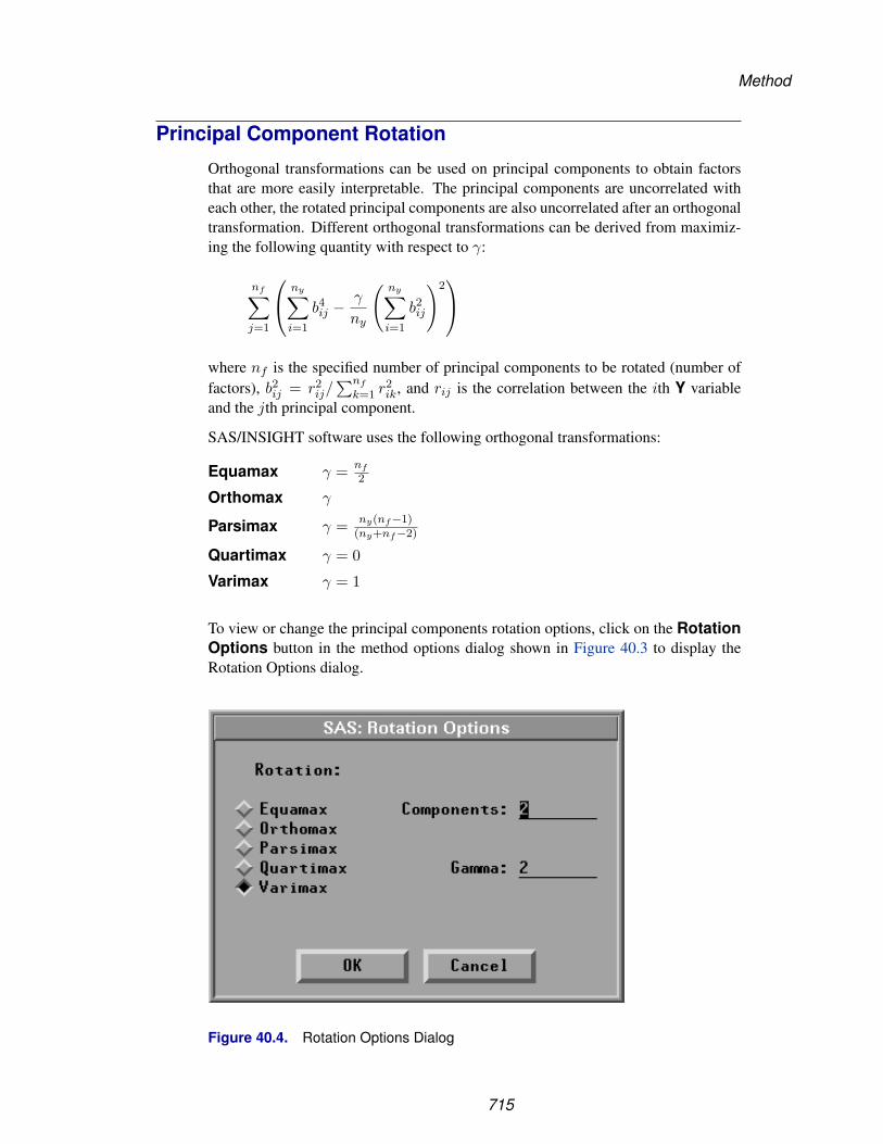
Method
Principal Component Rotation
Orthogonal transformations can be used on principal components to obtain factorsthat are more easily interpretable. The principal components are uncorrelated witheach other, the rotated principal components are also uncorrelated after an orthogonaltransformation. Different orthogonal transformations can be derived from maximiz-ing the following quantity with respect to γ:
nf∑j=1
⎛⎝ ny∑i=1
b4ij −
γ
ny
( ny∑i=1
b2ij
)2⎞⎠
where nf is the specified number of principal components to be rotated (number offactors), b2
ij = r2ij/
∑nf
k=1 r2ik, and rij is the correlation between the ith Y variable
and the jth principal component.
SAS/INSIGHT software uses the following orthogonal transformations:
Equamax γ = nf
2
Orthomax γ
Parsimax γ = ny(nf−1)(ny+nf−2)
Quartimax γ = 0
Varimax γ = 1
To view or change the principal components rotation options, click on the RotationOptions button in the method options dialog shown in Figure 40.3 to display theRotation Options dialog.
Figure 40.4. Rotation Options Dialog
715

Reference � Multivariate Analyses
You can specify the type of rotation and number of principal components to be rotatedin the dialog. By default, SAS/INSIGHT software uses Varimax rotation on the firsttwo components. If you specify Orthomax, you also need to enter the γ value forthe rotation in the Gamma: field.
716

Method
Canonical Correlation Analysis
Canonical correlation was developed by Hotelling (1935, 1936). Its application isdiscussed by Cooley and Lohnes (1971), Kshirsagar (1972), and Mardia, Kent, andBibby (1979). It is a technique for analyzing the relationship between two sets ofvariables. Each set can contain several variables. Multiple and simple correlationare special cases of canonical correlation in which one or both sets contain a singlevariable, respectively.
Given two sets of variables, canonical correlation analysis finds a linear combina-tion from each set, called a canonical variable, such that the correlation between thetwo canonical variables is maximized. This correlation between the two canonicalvariables is the first canonical correlation. The coefficients of the linear combina-tions are canonical coefficients or canonical weights. It is customary to normalize thecanonical coefficients so that each canonical variable has a variance of 1.
The first canonical correlation is at least as large as the multiple correlation betweenany variable and the opposite set of variables. It is possible for the first canonicalcorrelation to be very large while all the multiple correlations for predicting one ofthe original variables from the opposite set of canonical variables are small.
Canonical correlation analysis continues by finding a second set of canonical vari-ables, uncorrelated with the first pair, that produces the second highest correlationcoefficient. The process of constructing canonical variables continues until the num-ber of pairs of canonical variables equals the number of variables in the smaller group.
Each canonical variable is uncorrelated with all the other canonical variables of ei-ther set except for the one corresponding canonical variable in the opposite set. Thecanonical coefficients are not generally orthogonal, however, so the canonical vari-ables do not represent jointly perpendicular directions through the space of the origi-nal variables.
The canonical correlation analysis includes tests of a series of hypotheses that eachcanonical correlation and all smaller canonical correlations are zero in the population.SAS/INSIGHT software uses an F approximation (Rao 1973; Kshirsagar 1972) thatgives better small sample results than the usual χ2 approximation. At least one of thetwo sets of variables should have an approximately multivariate normal distributionin order for the probability levels to be valid.
Canonical redundancy analysis (Stewart and Love 1968; Cooley and Lohnes 1971;van den Wollenberg 1977) examines how well the original variables can be predictedfrom the canonical variables. The analysis includes the proportion and cumulativeproportion of the variance of the set of Y and the set of X variables explained by theirown canonical variables and explained by the opposite canonical variables. Eitherraw or standardized variance can be used in the analysis.
717
Reference � Multivariate Analyses
Maximum Redundancy Analysis
In contrast to canonical redundancy analysis, which examines how well the origi-nal variables can be predicted from the canonical variables, maximum redundancyanalysis finds the variables that can best predict the original variables.
Given two sets of variables, maximum redundancy analysis finds a linear combi-nation from one set of variables that best predicts the variables in the opposite set.SAS/INSIGHT software normalizes the coefficients of the linear combinations sothat each maximum redundancy variable has a variance of 1.
Maximum redundancy analysis continues by finding a second maximum redundancyvariable from one set of variables, uncorrelated with the first one, that produces thesecond highest prediction power for the variables in the opposite set. The process ofconstructing maximum redundancy variables continues until the number of maximumredundancy variables equals the number of variables in the smaller group.
Either raw variances (Raw Variance) or standardized variances (Std Variance)can be used in the analysis. You specify the selection in the method options dialog asshown in Figure 40.3. By default, standardized variances are used.
Canonical Discriminant Analysis
Canonical discriminant analysis is a dimension-reduction technique related to princi-pal component analysis and canonical correlation. Given a classification variable andseveral interval variables, canonical discriminant analysis derives canonical variables(linear combinations of the interval variables) that summarize between-class variationin much the same way that principal components summarize total variation.
Given two or more groups of observations with measurements on several intervalvariables, canonical discriminant analysis derives a linear combination of the vari-ables that has the highest possible multiple correlation with the groups. This maximalmultiple correlation is called the first canonical correlation. The coefficients of thelinear combination are the canonical coefficients or canonical weights. The variabledefined by the linear combination is the first canonical variable or canonical compo-nent. The second canonical correlation is obtained by finding the linear combinationuncorrelated with the first canonical variable that has the highest possible multiplecorrelation with the groups. The process of extracting canonical variables can be re-peated until the number of canonical variables equals the number of original variablesor the number of classes minus one, whichever is smaller.
The first canonical correlation is at least as large as the multiple correlation betweenthe groups and any of the original variables. If the original variables have high within-group correlations, the first canonical correlation can be large even if all the multiplecorrelations are small. In other words, the first canonical variable can show substan-tial differences among the classes, even if none of the original variables does.
718

Method
For each canonical correlation, canonical discriminant analysis tests the hypothesisthat it and all smaller canonical correlations are zero in the population. An F ap-proximation is used that gives better small-sample results than the usual χ2 approx-imation. The variables should have an approximate multivariate normal distributionwithin each class, with a common covariance matrix in order for the probability levelsto be valid.
The new variables with canonical variable scores in canonical discriminant analysishave either pooled within-class variances equal to one (Std Pooled Variance) ortotal-sample variances equal to one (Std Total Variance). You specify the selectionin the method options dialog as shown in Figure 40.3. By default, canonical variablescores have pooled within-class variances equal to one.
719

Reference � Multivariate Analyses
OutputTo view or change the output options associated with your multivariate analysis, clickon the Output button from the variables dialog. This displays the output optionsdialog.
Figure 40.5. Multivariate Output Options Dialog
The options you set in this dialog determine which tables and graphs appear in themultivariate window. SAS/INSIGHT software provides univariate statistics and cor-relation matrix tables by default.
Descriptive statistics provide tables for examining the relationships among quantita-tive variables from univariate, bivariate, and multivariate perspectives.
Plots can be more informative than tables when you are trying to understand multi-variate data. You can display a matrix of scatter plots for the analyzing variables. Youcan also add a bivariate confidence ellipse for mean or predicted values to the scatterplots. Using the confidence ellipses assumes each pair of variables has a bivariatenormal distribution.
With appropriate variables chosen, you can generate principal component analysis(interval Y variables), canonical correlation analysis (interval Y, X variables), maxi-
720

Output
mum redundancy analysis (interval Y, X variables), and canonical discriminant anal-ysis (one nominal Y variable, interval X variables) by selecting the correspondingcheckbox in the Output Options dialog.
721

Reference � Multivariate Analyses
Principal Component Analysis
Clicking the Principal Component Options button in the Output Options dialogshown in Figure 40.5 displays the dialog shown in Figure 40.6.
Figure 40.6. Principal Components Options Dialog
The dialog enables you to view or change the output options associated with principalcomponent analyses and save principal component scores in the data window.
In the dialog, you need to specify the number of components when selecting tables ofEigenvectors, Correlations (Structure), Covariances, Std Scoring Coefs,and Raw Scoring Coefs. Automatic uses principal components with correspond-ing eigenvalues greater than the average eigenvalue. By default, SAS/INSIGHT soft-ware displays a plot of the first two principal components, a table of all the eigen-values, and a table of correlations between the Y variables and principal componentswith corresponding eigenvalues greater than the average eigenvalue.
You can generate principal component rotation analysis by selecting theComponent Rotation checkbox in the dialog.
722

Output
Principal Component Rotation
Clicking the Rotation Options button in the Principal Components Optionsdialog shown in Figure 40.6 displays the Rotation Options dialog shown in Figure40.7.
Figure 40.7. Principal Components Rotation Options Dialog
The number of components rotated is specified in the Principal ComponentsRotation Options dialog shown in Figure 40.4. By default, SAS/INSIGHT soft-ware displays a plot of the rotated components (when the specified number is two orthree), a rotation matrix table, and a table of correlations between the Y variables androtated principal components.
723
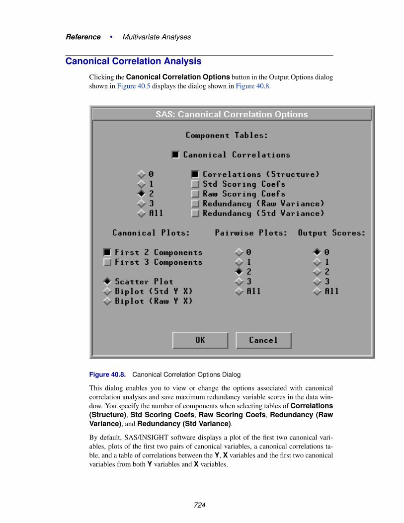
Reference � Multivariate Analyses
Canonical Correlation Analysis
Clicking the Canonical Correlation Options button in the Output Options dialogshown in Figure 40.5 displays the dialog shown in Figure 40.8.
Figure 40.8. Canonical Correlation Options Dialog
This dialog enables you to view or change the options associated with canonicalcorrelation analyses and save maximum redundancy variable scores in the data win-dow. You specify the number of components when selecting tables of Correlations(Structure), Std Scoring Coefs, Raw Scoring Coefs, Redundancy (RawVariance), and Redundancy (Std Variance).
By default, SAS/INSIGHT software displays a plot of the first two canonical vari-ables, plots of the first two pairs of canonical variables, a canonical correlations ta-ble, and a table of correlations between the Y, X variables and the first two canonicalvariables from both Y variables and X variables.
724

Output
Maximum Redundancy Analysis
Clicking the Maximum Redundancy Options button in the Output Options dia-log shown in Figure 40.5 displays the dialog shown in Figure 40.9.
Figure 40.9. Maximum Redundancy Options Dialog
This dialog enables you to view or change the options associated with canonicalcorrelation analyses and save maximum redundancy variable scores in the data win-dow. You specify the number of components when selecting tables of Correlations(Structure), Covariances, Std Scoring Coefs, and Raw Scoring Coefs.
By default, SAS/INSIGHT software displays a plot of the first two canonical redun-dancy variables, a canonical redundancy table, and a table of correlations between theY, X variables and the first two canonical redundancy variables from both Y variablesand X variables.
725

Reference � Multivariate Analyses
Canonical Discriminant Analysis
Clicking the Canonical Discriminant Options button in the Output Options dia-log shown in Figure 40.5 displays the dialog shown in Figure 40.10.
Figure 40.10. Canonical Discriminant Options Dialog
You specify the number of components when selecting tables of Correlations(Structure), Std Scoring Coefs, and Raw Scoring Coefs.
By default, SAS/INSIGHT software displays a plot of the first two canonical vari-ables, a bar chart for the nominal Y variable, a canonical correlation table, and a tableof correlations between the X variables and the first two canonical variables.
726

Tables
TablesYou can generate tables of descriptive statistics and output from multivariate analysesby setting options in output options dialogs, as shown in Figure 40.5 to Figure 40.10,or by choosing from the Tables menu shown in Figure 40.11.
File Edit Analyze Tables Graphs Curves Vars Help
� UnivariateSSCPCSSCPCOV
� CORRCORR P-ValuesCORR InversePairwise CORRPrincipal Components...Component Rotation...Canonical Correlations...Maximum Redundancy...Canonical Discrimination...
Figure 40.11. Tables Menu
Univariate Statistics
The Univariate Statistics table, as shown in Figure 40.12 contains the followinginformation:
• Variable is the variable name.
• N is the number of nonmissing observations, n.
• Mean is the variable mean, y or x.
• Std Dev is the standard deviation of the variable, the square root of the corre-sponding diagonal element of Syy or Sxx.
• Minimum is the minimum value.
• Maximum is the maximum value.
• Partial Std Dev (with selected Partial variables) is the partial standard devi-ation of the variable after partialling out the Partial variables.
Sums of Squares and Crossproducts
The Sums of Squares and Crossproducts (SSCP) table, as illustrated byFigure 40.12, contains the sums of squares and crossproducts of the variables.
727

Reference � Multivariate Analyses
Corrected Sums of Squares and Crossproducts
The Corrected Sums of Squares and Crossproducts (CSSCP) table, asshown in Figure 40.12, contains the sums of squares and crossproducts of the vari-ables corrected for the mean.
Figure 40.12. Univariate Statistics, SSCP, and CSSCP Tables
Covariance Matrix
The Covariance Matrix (COV) table, as shown in Figure 40.13, contains the es-timated variances and covariances of the variables, with their associated degrees offreedom. The variance measures the spread of the distribution around the mean, andthe covariance measures the tendency of two variables to linearly increase or decreasetogether
728

Tables
Correlation MatrixThe Correlation Matrix (CORR) table contains the Pearson product-moment cor-relations of the Y variables, as shown in Figure 40.13. Correlation measures thestrength of the linear relationship between two variables. A correlation of 0 meansthat there is no linear association between two variables. A correlation of 1 (-1) meansthat there is an exact positive (negative) linear association between the two variables.
Figure 40.13. COV and CORR Tables
P-Values of the CorrelationsThe P-Values of the Correlations table contains the p-value of each correla-tion under the null hypothesis that the correlation is 0, assuming independent andidentically distributed (unless weights are specified) observations from a bivariatedistribution with at least one variable normally distributed. This table is shown inFigure 40.14. Each p-value in this table can be used to assess the significance of thecorresponding correlation coefficient.
The p-value of a correlation r is obtained by treating the statistic
t =√
n − 2r√
1 − r2
as having a Student’s t distribution with n − 2 degrees of freedom. The p-value of thecorrelation r is the probability of obtaining a Student’s t statistic greater in absolutevalue than the absolute value of the observed statistic t.
729

Reference � Multivariate Analyses
With partial variables, the p-value of a correlation is obtained by treating the statistic
t =√
n − np − 2r√
1 − r2
as having a Student’s t distribution with n − np − 2 degrees of freedom.
730

Tables
Inverse Correlation Matrix
For a symmetric correlation matrix, the Inverse Correlation Matrix table containsthe inverse of the correlation matrix, as shown in Figure 40.14.
The diagonal elements of the inverse correlation matrix, sometimes referred to asvariance inflation factors, measure the extent to which the variables are linear com-binations of other variables. The jth diagonal element of the inverse correlation ma-trix is 1/(1 − R2
j ), where R2j is the squared multiple correlation of the jth variable
with the other variables. Large diagonal elements indicate that variables are highlycorrelated.
When a correlation matrix is singular (less than full rank), some variables are linearfunctions of other variables, and a g2 inverse for the matrix is displayed. The g2inverse depends on the order in which you select the variables. A value of 0 in the jthdiagonal indicates that the jth variable is a linear function of the previous variables.
Figure 40.14. P-values of Correlations and Inverse Correlation Matrix
731

Reference � Multivariate Analyses
Pairwise Correlations
SAS/INSIGHT software drops an observation with a missing value for any variableused in the analysis from all calculations. The Pairwise CORR table gives corre-lations that are computed from all observations that have nonmissing values for anypair of variables. Figure 40.15 shows a table of pairwise correlations.
Figure 40.15. Pairwise CORR Table
732

Tables
Principal Component Analysis
You can generate tables of output from principal component analyses by setting op-tions in the principal component options dialog shown in Figure 40.6 or from theTables menu shown in Figure 40.11. Select Principal Components from theTables menu to display the principal component tables dialog shown in Figure 40.16.
Figure 40.16. Principal Component Tables Dialog
Choose Automatic to display principal components with eigenvalues greater thanthe average eigenvalue. Selecting 1, 2, or 3 gives you 1, 2, or 3 principal components.All gives you all eigenvalues. Selecting 0 in the principal component options dialogsuppresses the principal component tables.
The Eigenvalues (COV) or Eigenvalues (CORR) table includes the eigenvaluesof the covariance or correlation matrix, the difference between successive eigenval-ues, the proportion of variance explained by each eigenvalue, and the cumulativeproportion of variance explained.
Eigenvalues correspond to each of the principal components and represent a parti-tioning of the total variation in the sample. The sum of all eigenvalues is equal tothe sum of all variable variances if the covariance matrix is used or to the number ofvariables, p, if the correlation matrix is used.
The Eigenvectors (COV) or Eigenvectors (CORR) table includes the eigenvec-tors of the covariance or correlation matrix. Eigenvectors correspond to each of theprincipal components and are used as the coefficients to form linear combinations ofthe Y variables (principal components).
733

Reference � Multivariate Analyses
Figure 40.17 shows tables of all eigenvalues and eigenvectors for the first two princi-pal components.
Figure 40.17. Eigenvalues and Eigenvectors Tables
The Correlations (Structure) and Covariances tables include the correlationsand covariances, respectively, between the Y variables and principal components. Thecorrelation and covariance matrices measure the strength of the linear relationshipbetween the derived principal components and each of the Y variables. Figure 40.18shows the correlations and covariances between the Y variables and the first twoprincipal components.
734
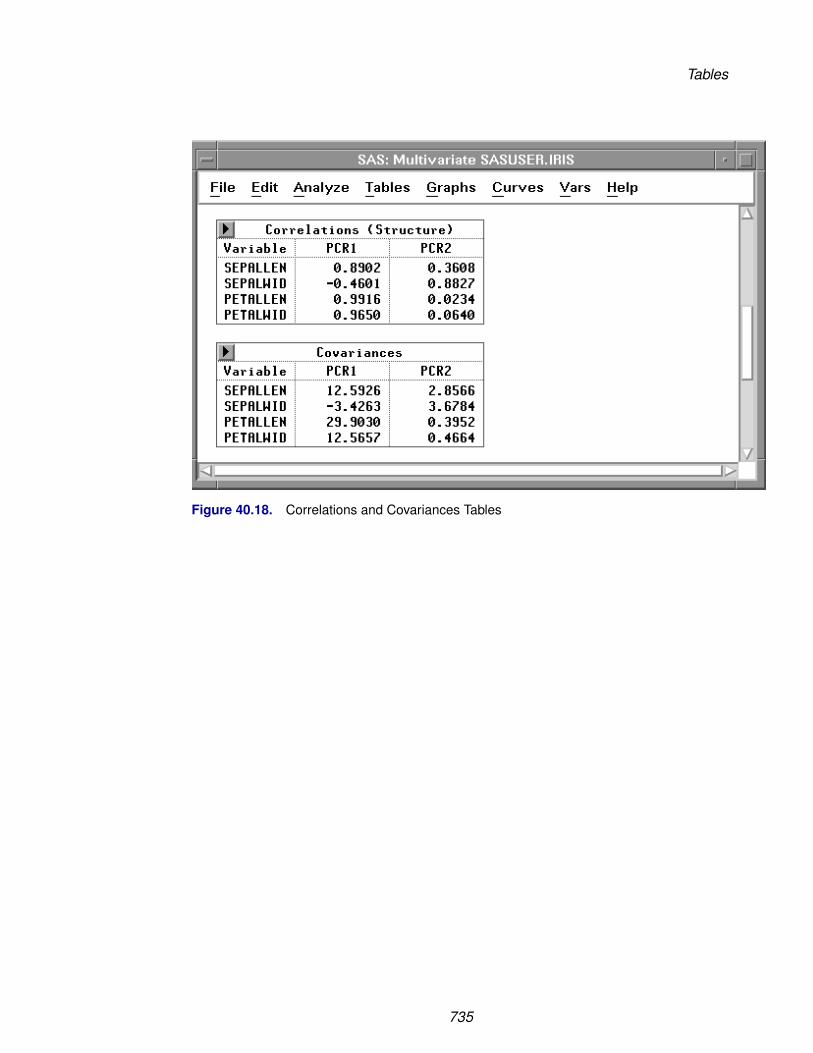
Tables
Figure 40.18. Correlations and Covariances Tables
735

Reference � Multivariate Analyses
The scoring coefficients are the coefficients of the Y variables used to generate prin-cipal components. The Std Scoring Coefs table includes the scoring coefficientsof the standardized Y variables, and the Raw Scoring Coefs table includes thescoring coefficients of the centered Y variables.
The regression coefficients are the coefficients of principal components used to gen-erate estimated Y variables. The Std Reg Coefs (Pattern) and Raw Reg Coefstables include the regression coefficients of principal components used to generateestimated standardized and centered Y variables. Figure 40.19 shows the regressioncoefficients of the principal components for the standardized Y variables, as wellas the scoring coefficients of the standardized Y variables for the first two principalcomponents.
Figure 40.19. Regression Coefficients and Scoring Coefficients Tables
736

Tables
Principal Components Rotation
You can generate tables of output from principal component rotation by setting op-tions in the Rotation Options dialog shown in Figure 40.7 or from the Tablesmenu shown in Figure 40.11. Select Component Rotation from the Tables menuto display the principal component rotation dialog shown in Figure 40.20.
Figure 40.20. Principal Components Rotation Dialog
You specify the number of components and type of rotation in the RotationOptions dialog, as shown in Figure 40.4.
The Orthogonal Rotation Matrix is the orthogonal rotation matrix used to com-pute the rotated principal components from the standardized principal components.
The Correlations (Structure) and Covariances tables include the correlationsand covariances between the Y variables and the rotated principal components.
Figure 40.21 shows the rotation matrix and correlations and covariances between theY variables and the first two rotated principal components.
The scoring coefficients are the coefficients of the Y variables used to generate rotatedprincipal components. The Std Scoring Coefs table includes the scoring coeffi-cients of the standardized Y variables, and the Raw Scoring Coefs table includesthe scoring coefficients of the centered Y variables.
The Communality Estimates table gives the standardized variance of each Y vari-able explained by the rotated principal components.
The Redundancy table gives the variances of the standardized Y variables ex-plained by each rotated principal component.
737

Reference � Multivariate Analyses
Figure 40.22 shows the scoring coefficients of the standardized Y variables, commu-nality estimates for the Y variables, and redundancy for each rotated component.
Figure 40.21. Rotation Matrix, Correlation, and Covariance Tables
738

Tables
Figure 40.22. Scoring Coefficients, Communality, and Redundancy Tables
739

Reference � Multivariate Analyses
Canonical Correlation Analysis
You can generate tables of output from canonical correlation analyses by setting op-tions in the Canonical Correlation Options dialog shown in Figure 40.8 or from theTables menu shown in Figure 40.11. Select Canonical Correlations from theTables menu to display the canonical correlation dialog shown in Figure 40.23.
Figure 40.23. Canonical Correlation Dialog
The Canonical Correlations table contains the following:
• CanCorr, the canonical correlations, which are always nonnegative
• Adj. CanCorr, the adjusted canonical correlations, which are asymptoticallyless biased than the raw correlations and may be negative. The adjusted canon-ical correlations may not be computable, and they are displayed as missingvalues if two canonical correlations are nearly equal or if some are close tozero. A missing value is also displayed if an adjusted canonical correlation islarger than a previous adjusted canonical correlation.
• Approx Std. Error, the approximate standard errors of the canonical corre-lations
• CanRsq, the squared canonical correlations
• Eigenvalues, the eigenvalues of the matrix R−1yy RyxR−1
xx R′yx. These eigen-
values are equal to CanRsq/(1−CanRsq), where CanRsq is the correspond-ing squared canonical correlation. Also printed for each eigenvalue is the dif-ference from the next eigenvalue, the proportion of the sum of the eigenvalues,and the cumulative proportion.
740

Tables
• Test for H0: CanCorrj=0, j>=k, the likelihood ratio for the hypothesis thatthe current canonical correlation and all smaller ones are zero in the population
• Approx F based on Rao’s approximation to the distribution of the likelihoodratio
• Num DF and Den DF (numerator and denominator degrees of freedom) andPr > F (probability level) associated with the F statistic
741

Reference � Multivariate Analyses
Figure 40.24 shows tables of canonical correlations.
Figure 40.24. Canonical Correlations Tables
The Correlations (Structure) table includes the correlations between the input Y,X variables and canonical variables.
The scoring coefficients are the coefficients of the Y or X variables that are used tocompute canonical variable scores. The Std Scoring Coefs table includes the scor-ing coefficients of the standardized Y or X variables and the Raw Scoring Coefstable includes the scoring coefficients of the centered Y or X variables.
Figure 40.25 shows a table of correlations between the Y, X variables and the first twocanonical variables from the Y and X variables and the tables of scoring coefficientsof the standardized Y and X variables.
742
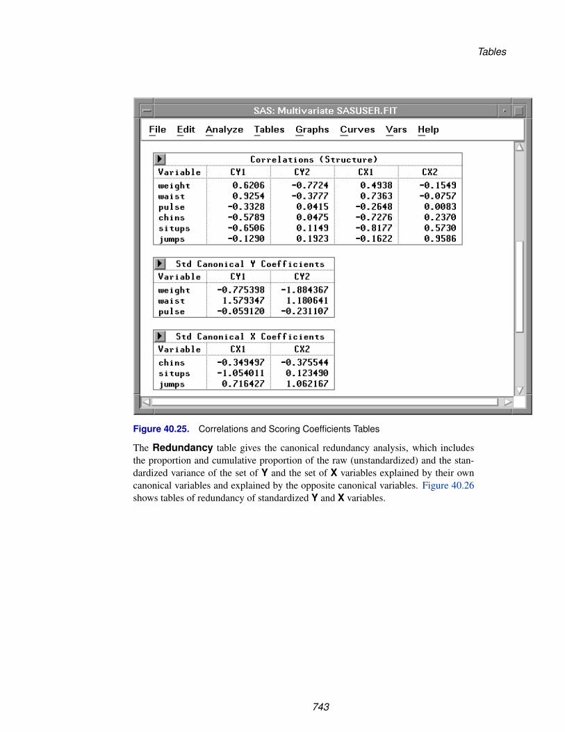
Tables
Figure 40.25. Correlations and Scoring Coefficients Tables
The Redundancy table gives the canonical redundancy analysis, which includesthe proportion and cumulative proportion of the raw (unstandardized) and the stan-dardized variance of the set of Y and the set of X variables explained by their owncanonical variables and explained by the opposite canonical variables. Figure 40.26shows tables of redundancy of standardized Y and X variables.
743

Reference � Multivariate Analyses
Figure 40.26. Redundancy Tables
744
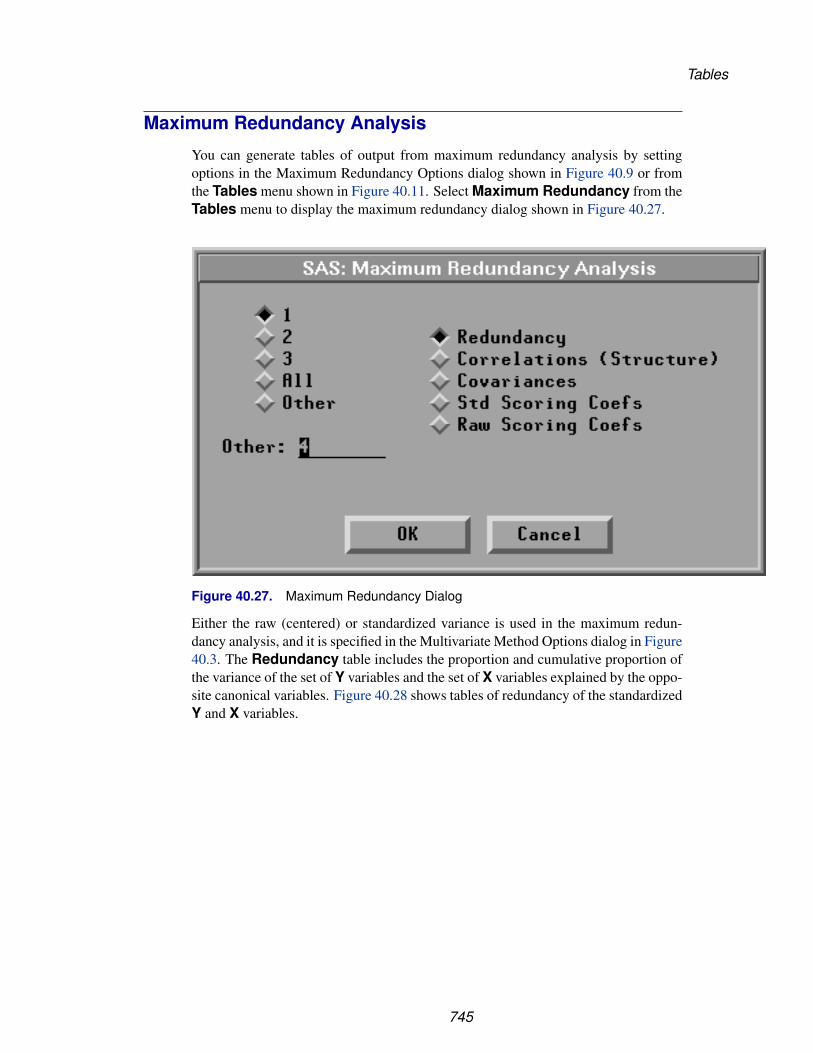
Tables
Maximum Redundancy Analysis
You can generate tables of output from maximum redundancy analysis by settingoptions in the Maximum Redundancy Options dialog shown in Figure 40.9 or fromthe Tables menu shown in Figure 40.11. Select Maximum Redundancy from theTables menu to display the maximum redundancy dialog shown in Figure 40.27.
Figure 40.27. Maximum Redundancy Dialog
Either the raw (centered) or standardized variance is used in the maximum redun-dancy analysis, and it is specified in the Multivariate Method Options dialog in Figure40.3. The Redundancy table includes the proportion and cumulative proportion ofthe variance of the set of Y variables and the set of X variables explained by the oppo-site canonical variables. Figure 40.28 shows tables of redundancy of the standardizedY and X variables.
745

Reference � Multivariate Analyses
Figure 40.28. Maximum Redundancy Tables
746

Tables
The Correlations (Structure) or Covariances table includes the correlationsor covariances between the Y, X variables and the maximum redundancy variables.Figure 40.29 shows the correlations and covariances between the Y, X variables andthe first two maximum redundancy variables from the Y variables and the X variables.
Figure 40.29. Correlation and Covariance Tables
The scoring coefficients are the coefficients of the Y or X variables that are used tocompute maximum redundancy variables. The Std Scoring Coefs table includesthe scoring coefficients of the standardized Y or X variables, and the Raw ScoringCoefs table includes the scoring coefficients of the centered Y or X variables. Figure40.30 shows tables of the scoring coefficients of the standardized Y and X variables.
747

Reference � Multivariate Analyses
Figure 40.30. Standardized Scoring Coefficients Tables
748

Tables
Canonical Discriminant Analysis
You can generate tables of output from canonical discriminant analyses by setting op-tions in the Canonical Discriminant Options dialog shown in Figure 40.10 or from theTables menu shown in Figure 40.11. Select Canonical Discrimination from theTables menu to display the canonical discriminant analysis dialog shown in Figure40.31.
Figure 40.31. Canonical Discriminant Analysis Dialog
The Canonical Correlations table, as shown in Figure 40.32, contains the follow-ing:
• CanCorr, the canonical correlations, which are always nonnegative
• Adj. CanCorr, the adjusted canonical correlations, which are asymptoticallyless biased than the raw correlations and may be negative. The adjusted canon-ical correlations may not be computable and are displayed as missing valuesif two canonical correlations are nearly equal or if some are close to zero. Amissing value is also displayed if an adjusted canonical correlation is largerthan a previous adjusted canonical correlation.
• Approx Std. Error, the approximate standard errors of the canonical corre-lations
• CanRsq, the squared canonical correlations
• Eigenvalues, eigenvalues of the matrix E−1H , where E is the matrix ofthe within-class sums of squares and crossproducts and H is the matrix of thebetween-class sums of squares and crossproducts. These eigenvalues are equal
749

Reference � Multivariate Analyses
to CanRsq/(1−CanRsq), where CanRsq is the corresponding squared canon-ical correlation. Also displayed for each eigenvalue is the difference from thenext eigenvalue, the proportion of the sum of the eigenvalues, and the cumula-tive proportion.
750
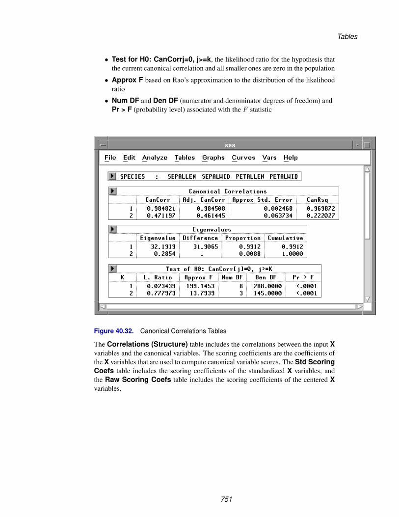
Tables
• Test for H0: CanCorrj=0, j>=k, the likelihood ratio for the hypothesis thatthe current canonical correlation and all smaller ones are zero in the population
• Approx F based on Rao’s approximation to the distribution of the likelihoodratio
• Num DF and Den DF (numerator and denominator degrees of freedom) andPr > F (probability level) associated with the F statistic
Figure 40.32. Canonical Correlations Tables
The Correlations (Structure) table includes the correlations between the input Xvariables and the canonical variables. The scoring coefficients are the coefficients ofthe X variables that are used to compute canonical variable scores. The Std ScoringCoefs table includes the scoring coefficients of the standardized X variables, andthe Raw Scoring Coefs table includes the scoring coefficients of the centered Xvariables.
751

Reference � Multivariate Analyses
Figure 40.33 shows tables of correlations between the X variables and the first twocanonical variables, and the scoring coefficients of the standardized X variables.
Figure 40.33. Correlations and Scoring Coefficients Tables
752

Graphs
GraphsYou can create a scatter plot matrix and plots corresponding to various multivariateanalyses by setting options in the Output Options dialogs, as shown in Figure 40.5 toFigure 40.10, or by choosing from the Graphs menu, as shown in Figure 40.34.
File Edit Analyze Tables Graphs Curves Vars Help
Scatter Plot MatrixPrincipal Components...Component Rotation �
Canonical Correlations �
Maximum Redundancy...Canonical Discrimination �
Figure 40.34. Graphs Menu
Scatter Plot Matrix
Scatter plots are displayed for pairs of variables. Without X variables, scatter plots aredisplayed as a symmetric matrix containing each pair of Y variables. With a nominalY variable, scatter plots are displayed as a symmetric matrix containing each pair of Xvariables. When both interval Y variables and interval X variables are selected, scatterplots are displayed as a rectangular matrix with Y variables as the row variables andX variables as the column variables.
753
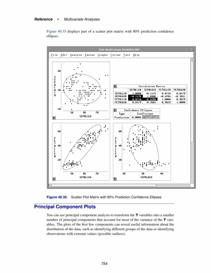
Reference � Multivariate Analyses
Figure 40.35 displays part of a scatter plot matrix with 80% prediction confidenceellipses.
Figure 40.35. Scatter Plot Matrix with 80% Prediction Confidence Ellipses
Principal Component Plots
You can use principal component analysis to transform the Y variables into a smallernumber of principal components that account for most of the variance of the Y vari-ables. The plots of the first few components can reveal useful information about thedistribution of the data, such as identifying different groups of the data or identifyingobservations with extreme values (possible outliers).
754

Graphs
You can request a plot of the first two principal components or the first three principalcomponents from the Principal Components Options dialog, shown in Figure 40.6, orfrom the Graphs menu, shown in Figure 40.34. Select Principal Componentsfrom the Graphs menu to display the Principal Component Plots dialog.
Figure 40.36. Principal Component Plots Dialog
In the dialog, you choose a principal component scatter plot (Scatter Plot), a princi-pal component biplot with standardized Y variables (Biplot (Std Y)), or a principalcomponent biplot with centered Y variables (Biplot (Raw Y)).
A biplot is a joint display of two sets of variables. The data points are first displayedin a scatter plot of principal components. With the approximated Y variable axesalso displayed in the scatter plot, the data values of the Y variables are graphicallyestimated.
The Y variable axes are generated from the regression coefficients of the Y variableson the principal components. The lengths of the axes are approximately proportionalto the standard deviations of the variables. A closer parallel between a Y variableaxis and a principal component axis indicates a higher correlation between the twovariables.
755

Reference � Multivariate Analyses
For a Y variable Y1, the Y1 variable value of a data point y in a principal componentbiplot is geometrically evaluated as follows:
• A perpendicular is dropped from point y onto the Y1 axis.
• The distance from the origin to this perpendicular is measured.
• The distance is multiplied by the length of the Y1 axis; this gives an approxi-mation of the Y1 variable value for point y.
756

Graphs
Two sets of variables are used in creating principal component biplots. One set is theY variables. Either standardized or centered Y variables are used, as specified in thePrincipal Component Plots dialog, shown in Figure 40.36.
The other set is the principal component variables. These variables have varianceseither equal to one or equal to corresponding eigenvalues. You specify the principalcomponent variable variance in the Multivariate Method Options dialog, shown inFigure 40.3.
† Note: A biplot with principal component variable variances equal to one is called aGH’ biplot, and a biplot with principal component variable variances equal to corre-sponding eigenvalues is called a JK’ biplot.
A biplot is a useful tool for examining data patterns and outliers. Figure 40.37 showsa biplot of the first two principal components from the correlation matrix and a ro-tating plot of the first three principal components. The biplot shows that the variableSEPALWID (highlighted axis) has a moderate negative correlation with PCR1 and ahigh correlation with PCR2.
Figure 40.37. Principal Component Plots
757
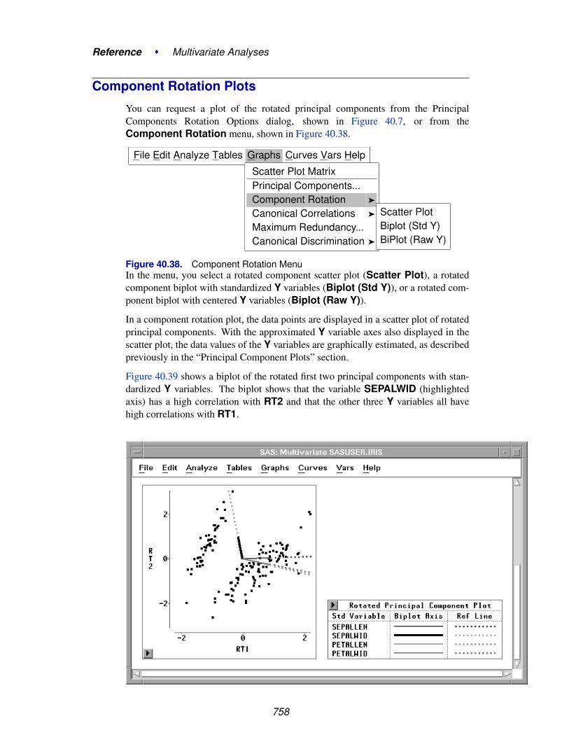
Reference � Multivariate Analyses
Component Rotation Plots
You can request a plot of the rotated principal components from the PrincipalComponents Rotation Options dialog, shown in Figure 40.7, or from theComponent Rotation menu, shown in Figure 40.38.
File Edit Analyze Tables Graphs Curves Vars Help
Scatter Plot MatrixPrincipal Components...Component Rotation �
Canonical Correlations �
Maximum Redundancy...Canonical Discrimination �
Scatter PlotBiplot (Std Y)BiPlot (Raw Y)
Figure 40.38. Component Rotation MenuIn the menu, you select a rotated component scatter plot (Scatter Plot), a rotatedcomponent biplot with standardized Y variables (Biplot (Std Y)), or a rotated com-ponent biplot with centered Y variables (Biplot (Raw Y)).
In a component rotation plot, the data points are displayed in a scatter plot of rotatedprincipal components. With the approximated Y variable axes also displayed in thescatter plot, the data values of the Y variables are graphically estimated, as describedpreviously in the “Principal Component Plots” section.
Figure 40.39 shows a biplot of the rotated first two principal components with stan-dardized Y variables. The biplot shows that the variable SEPALWID (highlightedaxis) has a high correlation with RT2 and that the other three Y variables all havehigh correlations with RT1.
758

Graphs
Figure 40.39. Rotated Principal Component Biplots
759

Reference � Multivariate Analyses
Canonical Correlation Plots
You can request pairwise canonical variable plots and a plot of the first two canon-ical variables or the first three canonical variables from each variable set from theCanonical Correlation Options dialog, shown in Figure 40.8, or from the Graphsmenu, shown in Figure 40.40.
· · · Graphs Curves Vars HelpScatter Plot MatrixPrincipal Components...Component Rotation �
Canonical Correlations �
Maximum Redundancy...Canonical Discrimination �
Pairwise Plot �
Canonical Plot...123AllOther...
Figure 40.40. Canonical Correlations Menu
Figure 40.41 shows scatter plots of the first two pairs of canonical variables. The firstscatter plot shows a high canonical correlation (0.7956) between canonical variablesCX1 and CY1 and the second scatter plot shows a low correlation (0.2005) betweenCX2 and CY2.
Figure 40.41. Canonical Correlation Pairwise Plots
760

Graphs
Select Canonical Plot from the Canonical Correlations menu in Figure 40.40to display a Canonical Correlation Component Plots dialog.
Figure 40.42. Canonical Correlation Component Plots Dialog
In the dialog, you choose a canonical correlation component scatter plot (ScatterPlot), a component biplot with standardized Y and X variables (Biplot (Std Y X)),or a component biplot with centered Y and X variables (Biplot (Raw Y X)).
In a canonical correlation component biplot, the data points are displayed in a scatterplot of canonical correlation components. With the approximated Y and X variableaxes also displayed in the scatter plot, the data values of the Y and X variables aregraphically estimated, as described previously in the “Principal Component Plots”section.
761

Reference � Multivariate Analyses
Figure 40.43 shows a biplot of the first two canonical variables from the Y vari-able sets with standardized Y and X variables. The biplot shows that the variablesWEIGHT and WAIST (highlighted axes) have positive correlations with CY1 andnegative correlations with CY2. The other four variables have negative correlationswith CY1 and positive correlations with CY2.
Figure 40.43. Canonical Correlation Component Biplot
762
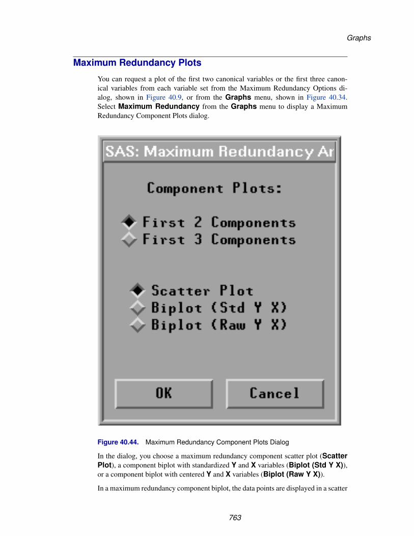
Graphs
Maximum Redundancy Plots
You can request a plot of the first two canonical variables or the first three canon-ical variables from each variable set from the Maximum Redundancy Options di-alog, shown in Figure 40.9, or from the Graphs menu, shown in Figure 40.34.Select Maximum Redundancy from the Graphs menu to display a MaximumRedundancy Component Plots dialog.
Figure 40.44. Maximum Redundancy Component Plots Dialog
In the dialog, you choose a maximum redundancy component scatter plot (ScatterPlot), a component biplot with standardized Y and X variables (Biplot (Std Y X)),or a component biplot with centered Y and X variables (Biplot (Raw Y X)).
In a maximum redundancy component biplot, the data points are displayed in a scatter
763
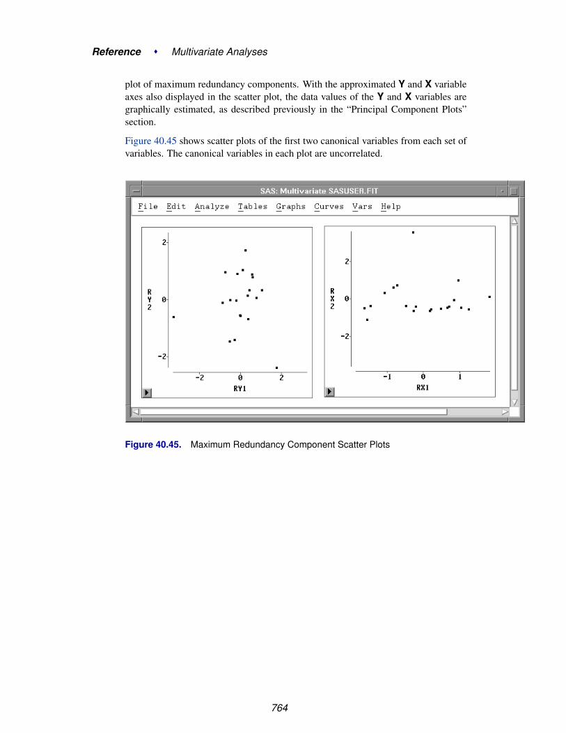
Reference � Multivariate Analyses
plot of maximum redundancy components. With the approximated Y and X variableaxes also displayed in the scatter plot, the data values of the Y and X variables aregraphically estimated, as described previously in the “Principal Component Plots”section.
Figure 40.45 shows scatter plots of the first two canonical variables from each set ofvariables. The canonical variables in each plot are uncorrelated.
Figure 40.45. Maximum Redundancy Component Scatter Plots
764

Graphs
Canonical Discrimination Plots
You can request a bar chart for the Y variable and a plot of the first two canonicalvariables or the first three canonical variables from the canonical discriminant optionsdialog, shown in Figure 40.10, or from the Graphs menu, shown in Figure 40.46.
File Edit Analyze Tables Graphs Curves Vars Help
Scatter Plot MatrixPrincipal Components...Component Rotation �
Canonical Correlations �
Maximum Redundancy...Canonical Discrimination � Y Var Bar Chart
Component Plot...
Figure 40.46. Canonical Discrimination Menu
Figure 40.47 shows a bar chart for the variable SPECIES.
Figure 40.47. Y Var Bar Chart
765

Reference � Multivariate Analyses
Select Component Plot from the Canonical Discriminant menu in Figure 40.48to display a Canonical Discriminant Component Plots dialog.
Figure 40.48. Canonical Discriminant Component Plots Dialog
In the dialog, you choose a canonical discriminant component scatter plot (ScatterPlot), a component biplot with standardized X variables (Biplot (Std X)), or a com-ponent biplot with centered X variables (Biplot (Raw X)).
In a canonical discriminant component biplot, the data points are displayed in a scat-ter plot of canonical discriminant components. With the approximated X variableaxes also displayed in the scatter plot, the data values of the X variables are graphi-cally estimated, as described previously in the “Principal Component Plots” section.
Figure 40.49 shows a biplot of the first two canonical variables from the X vari-
766

Graphs
able set with centered X variables. The biplot shows that the variable SEPALWID(highlighted axis) has a moderate negative correlation with CX1 and the other threevariables have high correlation with CX1.
† Note: Use caution when evaluating distances in the biplot when the axes do not havecomparable scales.
Figure 40.49. Canonical Discrimination Component Plot
767

Reference � Multivariate Analyses
Confidence EllipsesSAS/INSIGHT software provides two types of confidence ellipses for pairs of anal-ysis variables. One is a confidence ellipse for the population mean, and the other isa confidence ellipse for prediction. A confidence ellipse for the population mean isdisplayed with dashed lines, and a confidence ellipse for prediction is displayed withdotted lines.
Using these confidence ellipses assumes that each pair of variables has a bivariatenormal distribution. Let Z and S be the sample mean and the unbiased estimate of thecovariance matrix of a random sample of size n from a bivariate normal distributionwith mean µ and covariance matrix Σ.
The variable Z − µ is distributed as a bivariate normal variate with mean 0 and co-variance n−1Σ, and it is independent of S. The confidence ellipse for µ is based onHotelling’s T 2 statistic:
T 2 = n(Z − µ)′S−1(Z − µ)
A 100(1 − α)% confidence ellipse for µ is defined by the equation
(Z − µ)′S−1(Z − µ) =2(n − 1)n(n − 2)
F2,n−2(1 − α)
where F2,n−2(1 − α) is the (1 − α) critical value of an F variate with degrees offreedom 2 and n − 2.
A confidence ellipse for prediction is a confidence region for predicting a new obser-vation in the population. It also approximates a region containing a specified percent-age of the population.
Consider Z as a bivariate random variable for a new observation. The variable Z−Zis distributed as a bivariate normal variate with mean 0 and covariance (1 + 1/n)Σ,and it is independent of S.
A 100(1 − α)% confidence ellipse for prediction is then given by the equation
(Z − Z)′S−1(Z − Z) =2(n + 1)(n − 1)
n(n − 2)F2,n−2(1 − α)
The family of ellipses generated by different F critical values has a common center(the sample mean) and common major and minor axes.
The ellipses graphically indicate the correlation between two variables. When thevariable axes are standardized (by dividing the variables by their respective standarddeviations), the ratio of the two axis lengths (in Euclidean distances) reflects themagnitude of the correlation between the two variables. A ratio of 1 between themajor and minor axes corresponds to a circular confidence contour and indicates thatthe variables are uncorrelated. A larger value of the ratio indicates a larger positiveor negative correlation between the variables.
768

Confidence Ellipses
Scatter Plot Confidence Ellipses
You can generate confidence ellipses by setting the options in the multivariate outputoptions dialog, shown in Figure 40.5, or by choosing from the Curves menu, shownin Figure 40.50.
· · · Curves Vars Help
Scatter Plot Conf. Ellipse �
Canonical Discrim. Conf. Ellipse �
Mean: 99%95%90%80%50%Other...
Prediction: 99%95%90%80%50%Other...
Figure 40.50. Curves Menu
Only 80% prediction confidence ellipses can be selected in the multivariate outputoptions dialog. You must use the Curves menu to display mean confidence ellipses.You can use the confidence coefficient slider in the Confidence Ellipses table tochange the coefficient for these ellipses.
Figure 40.35 displays part of a scatter plot matrix with 80% prediction confidenceellipses and the Correlation Matrix table with corresponding correlations high-lighted. The ellipses graphically show a small negative correlation (−0.1176) be-tween variables SEPALLEN and SEPALWID, a moderate negative correlation(−0.4284) between variables SEPALWID and PETALLEN, and a large positive cor-relation (0.8718) between variables SEPALLEN and PETALLEN.
† Note: The confidence ellipses displayed in this illustration may not be appropriatesince none of the scatter plots suggest bivariate normality.
769

Reference � Multivariate Analyses
Canonical Discriminant Confidence Ellipses
You can also generate class-specific confidence ellipses for the first two canonicalcomponents in canonical discriminant analysis by setting the options in the CanonicalDiscriminant Options dialog, shown in Figure 40.10, or by choosing from the pre-deeding Curves menu.
Figure 40.51 displays a scatter plot of the first two canonical components with class-specific 80% prediction confidence ellipses. The figure shows that the first canonicalvariable CX1 has most of the discriminntory power between the two canonical vari-ables.
Figure 40.51. Canonical Discriminant Confidence Ellipses
770

Output Variables
Output VariablesYou can save component scores from principal component analysis, component ro-tation, canonical correlation analysis, maximum redundancy analysis, and canonicaldiscriminant analysis in the data window for use in subsequent analyses. For compo-nent rotation, the number of component output variables is the number of componentsrotated, as specified in Figure 40.4. For other analyses, you specify the number ofcomponent output variables in the Output Options dialogs, shown in Figure 40.6 toFigure 40.10, or from the Vars menu, shown in Figure 40.52. For component rota-tion, you specify the number of output rotated components in the Rotation Optionsdialog, shown in Figure 40.4.
· · · Curves Vars HelpPrincipal Components �
Component RotationCanonical Correlations �
Maximum Redundancy �
Canonical Discrimination �
123AllOther...
Figure 40.52. Vars Menu
Selecting 1, 2, or 3 gives you 1, 2, or 3 components. All gives you all components.Selecting 0 in the component options dialogs suppresses the output variables in thecorresponding analysis. Selecting Other in the Vars menu displays the dialog shownin Figure 40.53. You specify the number of components you want to save in thedialog.
Figure 40.53. Output Components Dialog
771

Reference � Multivariate Analyses
Principal Components
For principal components from a covariance matrix, the names of the variables con-taining principal component scores are PCV1, PCV2, PCV3, and so on. The outputcomponent scores are a linear combination of the centered Y variables with coeffi-cients equal to the eigenvectors of the covariance matrix.
For principal components from a correlation matrix, the names of the variables con-taining principal component scores are PCR1, PCR2, PCR3, and so on. The outputcomponent scores are a linear combination of the standardized Y variables with co-efficients equal to the eigenvectors of the correlation matrix.
If you specify Variance=Eigenvalues in the multivariate method options dialog,the new variables of principal component scores have mean zero and variance equalto the associated eigenvalues. If you specify Variance=1, the new variables havevariance equal to one.
Principal Component Rotation
The names of the variables containing rotated principal component scores are RT1,RT2, RT3, and so on. The new variables of rotated principal component scores havemean zero and variance equal to one.
Canonical Variables
The names of the variables containing canonical component scores are CY1, CY2,CY3, and so on, from the Y variable list, and CX1, CX2, CX3, from the X variablelist. The new variables of canonical component scores have mean zero and varianceequal to one.
Maximum Redundancy
The names of the variables containing maximum redundancy scores are RY1, RY2,RY3, and so on, from the Y variable list, and RX1, RX2, RX3, from the X variablelist. The new variables of maximum redundancy scores have mean zero and varianceequal to one.
Canonical Discriminant
The names of the variables containing canonical component scores are CX1, CX2,CX3, and so on. If you specify Std Pooled Variance in the multivariate methodoptions dialog, the new variables of canonical component scores have mean zero andpooled within-class variance equal to one. If you specify Std Total Variance, thenew variables have total-sample variance equal to one.
772

Weighted Analyses
Weighted AnalysesWhen the observations are independently distributed with a common mean and un-equal variances, a weighted analysis may be appropriate. The individual weights arethe values of the Weight variable you specify.
The following statistics are modified to incorporate the observation weights:
• Mean yw, xw
• SSCP Uyy, Uyx, Uxx
• CSSCP Cyy, Cyx, Cxx
• COV Syy, Syx, Sxx
• CORR Ryy, Ryx, Rxx
The formulas for these weighted statistics are given in the “Method” section earlierin this chapter. The resulting weighted statistics are used in the multivariate analyses.
773
Reference � Multivariate Analyses
ReferencesCooley, W.W. and Lohnes, P.R. (1971), Multivariate Data Analysis, New York: John
Wiley & Sons, Inc.
Dillon, W.R. and Goldstein, M. (1984), Multivariate Analysis, New York: John Wiley& Sons, Inc.
Fisher, R.A. (1936), “The Use of Multiple Measurements in Taxonomic Problems,”Annals of Eugenics, 7, 179–188.
Gabriel, K.R. (1971), “The Biplot Graphical Display of Matrices with Application toPrincipal Component Analysis,” Biometrika, 58, 453–467.
Gnanadesikan, R. (1997), Methods for Statistical Data Analysis of MultivariateObservations, Second Edition, New York: John Wiley & Sons, Inc.
Gower, J.C. and Hand, D.J. (1996), Biplots, New York: Chapman and Hall.
Hotelling, H. (1933), “Analysis of a Complex of Statistical Variables into PrincipalComponents,” Journal of Educational Psychology, 24, 417–441, 498–520.
Hotelling, H. (1935), “The Most Predictable Criterion,” Journal of EducationalPsychology, 26, 139–142.
Hotelling, H. (1936), “Relations Between Two Sets of Variables,” Biometrika, 28,321–377.
Jobson, J.D. (1992), Applied Multivariate Data Analysis, Vol 2: Categorical andMultivariate Methods, New York: Springer-Verlag.
Kaiser, H.F. (1958), “The Varimax Criterion of Analytic Rotation in Factor Analysis,”Psychometrika, 23, 187–200.
Krzanowski, W.J. (1988), Principles of Multivariate Analysis: A User’s Perspective,New York: Oxford University Press.
Kshirsagar, A.M. (1972), Multivariate Analysis, New York: Marcel Dekker, Inc.
Mardia, K.V., Kent, J.T., and Bibby, J.M. (1979), Multivariate Analysis, New York:Academic Press.
Morrison, D.F. (1976), Multivariate Statistical Methods, Second Edition, New York:McGraw-Hill Book Co.
Pearson, K. (1901), “On Lines and Planes of Closest Fit to Systems of Points in Space,”Philosophical Magazine, 6(2), 559–572.
Pringle, R.M. and Raynor, A.A. (1971), Generalized Inverse Matrices with Applicationsto Statistics, New York: Hafner Publishing Co.
Rao, C.R. (1964), “The Use and Interpretation of Principal Component Analysis inApplied Research,” Sankhya A, 26, 329–358.
Rao, C.R. (1973), Linear Statistical Inference, New York: John Wiley & Sons, Inc.
774

References
Stewart, D.K. and Love, W.A. (1968), “A General Canonical Correlation Index,”Psychological Bulletin, 70, 160–163.
van den Wollenberg, A.L. (1977), “Redundancy Analysis—An Alternative to CanonicalCorrelation Analysis,” Psychometrika, 42, 207–219.
775

Reference � Multivariate Analyses
776

Chapter 41SAS/INSIGHT Statements
Chapter Contents
DETAILS . . . . . . . . . . . . . . . . . . . . . . . . . . . . . . . . . . . . . 780PROC INSIGHT Statement . . . . . . . . . . . . . . . . . . . . . . . . . . 781WINDOW Statement . . . . . . . . . . . . . . . . . . . . . . . . . . . . . 782OPEN Statement . . . . . . . . . . . . . . . . . . . . . . . . . . . . . . . . 782BY Statement . . . . . . . . . . . . . . . . . . . . . . . . . . . . . . . . . 783CLASS Statement . . . . . . . . . . . . . . . . . . . . . . . . . . . . . . . 783BAR Statement . . . . . . . . . . . . . . . . . . . . . . . . . . . . . . . . 783BOX Statement . . . . . . . . . . . . . . . . . . . . . . . . . . . . . . . . 784LINE Statement . . . . . . . . . . . . . . . . . . . . . . . . . . . . . . . . 784SCATTER Statement . . . . . . . . . . . . . . . . . . . . . . . . . . . . . 785CONTOUR Statement . . . . . . . . . . . . . . . . . . . . . . . . . . . . . 785ROTATE Statement . . . . . . . . . . . . . . . . . . . . . . . . . . . . . . 786DIST Statement . . . . . . . . . . . . . . . . . . . . . . . . . . . . . . . . 786MULT Statement . . . . . . . . . . . . . . . . . . . . . . . . . . . . . . . 786FIT Statement . . . . . . . . . . . . . . . . . . . . . . . . . . . . . . . . . 787TABLES statement . . . . . . . . . . . . . . . . . . . . . . . . . . . . . . 788RUN statement . . . . . . . . . . . . . . . . . . . . . . . . . . . . . . . . . 788QUIT statement . . . . . . . . . . . . . . . . . . . . . . . . . . . . . . . . 789

Reference � SAS/INSIGHT Statements
778
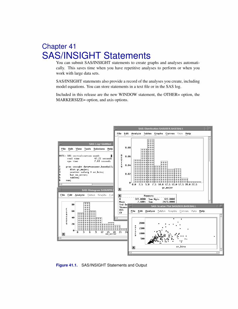
Chapter 41SAS/INSIGHT Statements
You can submit SAS/INSIGHT statements to create graphs and analyses automati-cally. This saves time when you have repetitive analyses to perform or when youwork with large data sets.
SAS/INSIGHT statements also provide a record of the analyses you create, includingmodel equations. You can store statements in a text file or in the SAS log.
Included in this release are the new WINDOW statement, the OTHER= option, theMARKERSIZE= option, and axis options.
Figure 41.1. SAS/INSIGHT Statements and Output

Reference � SAS/INSIGHT Statements
DetailsYou can use the following statements when invoking SAS/INSIGHT either as a pro-cedure or as a task. Brackets (<>) denote optional parameters.
PROC INSIGHT < INFILE=fileref > < FILE<=fileref> >< DATA=SAS-data-set > < TOOLS >< NOMENU > < NOBUTTON > < NOCONFIRM >;
WINDOW < x y width height > < / NOSCROLL >;OPEN SAS-data-set < / NODISPLAY >;BY < variable-list >;CLASS variable-list;BAR variable-list
< / < FREQ=variable > < OTHER=value >< XAXIS=axis > < YAXIS=axis > >;
BOX variable-list < * variable-list >< / < FREQ=variable > < LABEL=variable >< OTHER=value > < < MARKERSIZE | MS >=value >< YAXIS=axis > >;
LINE variable-list * variable< / < LABEL=variable > < < MARKERSIZE | MS >=value >< XAXIS=axis > < YAXIS=axis > >;
SCATTER variable-list * variable-list< / < LABEL=variable > < < MARKERSIZE | MS >=value >< XAXIS=axis > < YAXIS=axis > >;
ROTATE variable-list * variable-list * variable-list< / < LABEL=variable > < < MARKERSIZE | MS >=value >< XAXIS=axis > < YAXIS=axis > < ZAXIS=axis > >;
DIST variable-list< / < FREQ=variable > < WEIGHT=variable >< LABEL=variable > >;
MULT variable-list< / < FREQ=variable > < WEIGHT=variable >< LABEL=variable > >;
FIT variable-list < = effects-list >< / < FREQ=variable > < WEIGHT=variable >< LABEL=variable > < NOINT >< RESP=response > < BINOM=variable >< OFFSET=variable > < LINK=link >< POWER=value > < NOEXACT > < FISHER >< QUASI > < SCALE=scale > < CONSTANT=value > >;
TABLES;RUN;QUIT;
780

Details
Unless you override them with the options listed above, graph and analysis statementsuse options stored in your SASUSER.PROFILE catalog. For more information onSAS/INSIGHT options, see Chapter 30, “Working with Other SAS Products.”
The WINDOW statement and the NODISPLAY, OTHER=, MARKERSIZE=, andaxis options can be used as input, but they are not recordable.
PROC INSIGHT Statement
PROC INSIGHT < INFILE=fileref > < FILE<=fileref > >
< DATA=SAS-data-set > < TOOLS >
< NOMENU > < NOBUTTON > < NOCONFIRM >;
PROC INSIGHT options apply to both the procedure and the task. When invokingSAS/INSIGHT from the command line, you can follow the INSIGHT command withany of the PROC INSIGHT options.
INFILE=filerefThe INFILE= option directs SAS/INSIGHT software to read additional statementsfrom the specified text file. For examples using the INFILE= option, see Chapter 30,“Working with Other SAS Products.”
FILE | FILE=filerefThe FILE option directs SAS/INSIGHT software to write statements to the SAS log.FILE=fileref directs SAS/INSIGHT software to write statements to the text file fil-eref. For examples using the FILE option, see Chapter 30, “Working with Other SASProducts.”
DATA | DATA=SAS-data-setThe DATA option opens a SAS data set and displays it in a window. If DATA is usedwithout =SAS-data-set, a new data window is created. You can use either the DATAoption or the OPEN statement to specify an initial data set. If you use neither, butsimply enter “insight” or “proc insight; run;”, a data set dialog prompts you to choosean initial data set.
You can specify data set options in parentheses after the data set name. For example,to see all businesses that had large profits, you might enter
insight data=sasuser.business(where=(profits>=2000))
Alternatively, you can enter data set options by pressing the Options button inthe data set dialog. Data set options are described in SAS Language Reference:Dictionary.
TOOLSThe TOOLS option causes the Tools window to be displayed by default. If you usetools frequently, this option saves the step of choosing Edit:Windows:Tools.
781
Reference � SAS/INSIGHT Statements
NOMENU | NOMENThe NOMENU option suppresses the display of menu bars. If your host defines apop-up key, menu bars are still available when you press the pop-up key in an areacontaining no graphs or tables.
NOBUTTON | NOBUTThe NOBUTTON option suppresses the display of pop-up menu buttons. If your hostdefines a pop-up key, pop-up menus are still available when you press the pop-up keyon graphs or tables.
NOCONFIRM | NOCONThe NOCONFIRM option suppresses the display of confirmation dialogs for poten-tially harmful user actions. Such actions include deleting variables, closing data win-dows, and exiting SAS/INSIGHT. By default, confirmation dialogs provide a chanceto cancel these actions.
WINDOW Statement
WINDOW < x y width height > < / NOSCROLL >;
The WINDOW statement specifies the position of subsequently created windows.Parameters are percentage values between 0 and 100. If parameters are omitted, thenext created window uses a default position.
For example, to position a window in the upper left corner, covering one quarter ofthe display, you might enter
window 0 0 50 50;
To restore default positioning, use
window;
You can use the NOSCROLL option to create windows without scroll bars. On mosthosts, this option simplifies your display. However, it should be used only whencreating single graphs for which scrolling is not needed.
OPEN Statement
OPEN SAS-data-set < / NODISPLAY >;
The OPEN statement opens a SAS data set and displays it in a window. An OPENstatement with the NODISPLAY option opens a data set without displaying a win-dow.
You can use the OPEN statement to open multiple data sets at the same time. BY,CLASS, graph, and analysis statements apply only to the most recently opened dataset.
782

Details
You can specify data set options in parentheses after the data set name. For example,to see all businesses that had large profits, you might enter
open sasuser.business(where=(profits>=2000));
Data set options are described in SAS Language Reference: Dictionary.
BY Statement
BY < variable-list >;
The BY statement assigns variables the group role in subsequent graphs and analyses.
To de-assign group roles, use the BY statement without specifying variables.
CLASS Statement
CLASS variable-list;
The CLASS statement sets the measurement level of the specified variables to nomi-nal. Use this statement to override the default interval measurement level of numericvariables.
BAR Statement
BAR variable-list
< / < FREQ=variable > < OTHER=value >
< XAXIS=axis > < YAXIS=axis > >;
The BAR statement creates bar charts or histograms for the specified Y variables.You can use the FREQ= option to assign a Frequency variable.
Use the OTHER= option to set the “Other” threshold for nominal bar charts. The“Other” threshold is a percentage between 0 and 100.
Use the XAXIS= and YAXIS= options to specify axes for numeric variables withinterval measurement level. The axis specification is a list of six numeric values:First Tick, Last Tick, Tick Increment, Number of Minor Ticks, Axis Minimum, andAxis Maximum.
For example, to specify tick marks ranging from 2 to 8, with tick increment 2, 1 minortick, and Y axis ranging from 0 to 10, you could use
bar age / yaxis = 2 8 2 1 0 10;
783

Reference � SAS/INSIGHT Statements
Note that the “X” and “Y” prefixes refer to variable roles, not vertical or horizontalorientation. For the BAR statement, the YAXIS= option specifies the axis of the Yvariable, and the XAXIS= option specifies the Frequency axis.
BOX Statement
BOX variable-list < * variable-list >
< / < FREQ=variable > < LABEL=variable >
< OTHER=value > < < MARKERSIZE | MS >=value >
< YAXIS=axis > >;
The BOX statement creates box or mosaic plots. The BOX statement requires at leastone list of Y variables, optionally followed by an asterisk (*) and a list of X variables.If the Y variables have interval measurement level, the BOX statement creates boxplots. If the Y variables are nominal, the BOX statement creates mosaic plots.
If you use X variables, you get one plot for each Y variable, and each plot containsone schematic diagram for each combination of X values. If you use no X variables,you get one plot containing one schematic diagram for each Y variable.
You can use the FREQ= and LABEL= options to assign Frequency and Labelvariables.
Use the OTHER= option to set the “Other” threshold for mosaic plots. The “Other”threshold is a percentage between 0 and 100.
Use the MARKERSIZE= or MS= option to specify the size of observation markers.Marker size is a number between 1 and 8.
Use the YAXIS= option to specify a numeric axis for the Y variable. The syntax foraxis options is described under the BAR statement.
LINE Statement
LINE variable-list * variable
< / < LABEL=variable > < < MARKERSIZE | MS >=value >
< XAXIS=axis > < YAXIS=axis > >;
The LINE statement creates overlaid line plots, with one line for each Y variable.
Use at least one Y variable, followed by an asterisk, followed by a single X variable.You can use the LABEL= option to assign a Label variable.
Use the MARKERSIZE= or MS= option to specify the size of observation markers.Marker size is a number between 1 and 8.
Use the XAXIS= and YAXIS= options to specify numeric axes. The syntax for axisoptions is described under the BAR statement.
784

Details
SCATTER Statement
SCATTER variable-list * variable-list
< / < LABEL=variable > < < MARKERSIZE | MS >=value >
< XAXIS=axis > < YAXIS=axis > >;
The SCATTER statement creates two-dimensional scatter plots.
Use at least one Y variable, followed by an asterisk, followed by at least one X vari-able. Use multiple Y and X variables to create a scatter plot matrix. For example, youmight use
scatter a b c * a b c;
to create a 3 × 3 scatter plot matrix for the variables a, b, and c.
You can use the LABEL= option to assign a Label variable.
Use the MARKERSIZE= or MS= option to specify the size of observation markers.Marker size is a number between 1 and 8.
Use the XAXIS= and YAXIS= options to specify numeric axes. The syntax for axisoptions is described under the BAR statement.
CONTOUR Statement
CONTOUR variable-list * variable-list *variable-list
< / < LABEL=variable > < < MARKERSIZE | MS >=value >
< XAXIS=axis > < YAXIS=axis > < ZAXIS=axis > >;
The CONTOUR statement creates level curves of a surface that fits the data, assumingthat the Z variable is a function of the X and Y variables.
Use at least one Z variable, followed by an asterisk, followed by at least one Y vari-able, followed by an asterisk, followed by at least one X variable. Use multiple Z, Y,and X variables to create a matrix of contour plots.
You can use the LABEL= option to assign a Label variable.
Use the MARKERSIZE= or MS= option to specify the size of observation markers.Marker size is a number between 1 and 8.
Use the XAXIS=, YAXIS=, and ZAXIS= options to specify numeric axes. The syntaxfor axis options is described under the BAR statement.
785

Reference � SAS/INSIGHT Statements
ROTATE Statement
ROTATE variable-list * variable-list * variable-list
< / < LABEL=variable > < < MARKERSIZE | MS >=value >
< XAXIS=axis > < YAXIS=axis > < ZAXIS=axis > >;
The ROTATE statement creates three-dimensional rotating plots.
Use at least one Z variable, followed by an asterisk, followed by at least one Y vari-able, followed by an asterisk, followed by at least one X variable. Use multiple Z, Y,and X variables to create a rotating plot matrix. For example, you might use
rotate a b c d * a b c d * a b c d;
to create a matrix displaying all possible three-dimensional plots for the variables a,b, c, and d.
You can use the LABEL= option to assign a Label variable.
Use the MARKERSIZE= or MS= option to specify the size of observation markers.Marker size is a number between 1 and 8.
Use the XAXIS=, YAXIS=, and ZAXIS= options to specify numeric axes. Syntax ofaxis options is described under the BAR statement.
DIST Statement
DIST variable-list
< / < FREQ=variable > < WEIGHT=variable >
< LABEL=variable > >;
The DIST statement creates a distribution analysis of the specified Y variables. Youcan use the FREQ=, WEIGHT=, and LABEL= options to assign Freq, Weight, andLabel variables.
MULT Statement
MULT variable-list
< / < FREQ=variable > < WEIGHT=variable >
< LABEL=variable > >;
The MULT statement creates a multivariate analysis of the specified Y variables. Youcan use the FREQ=, WEIGHT=, and LABEL= options to assign Freq, Weight, andLabel variables.
786

Details
FIT Statement
FIT variable-list < = effects-list >
< / < FREQ=variable > < WEIGHT=variable >
< LABEL=variable > < NOINT >
< RESP=response > < BINOM=variable >
< OFFSET=variable > < LINK=link >
< POWER=value > < NOEXACT > < FISHER >
< QUASI > < SCALE=scale > < CONSTANT=value > >;
The FIT statement creates a fit analysis.
You must specify at least one Y variable. You can follow the Y variables with an equalsign (=) and a list of model effects, including simple, crossed, and nested effects:
Y = XY = X1 * X2Y = X( A B )
If you do not specify an effects list, a model with only an intercept term (mean) is fit.
You can use the FREQ=, WEIGHT=, and LABEL= options to assign Freq, Weight,and Label variables.
FIT statement options default to fit classical linear models, but you can set them to fitthe generalized linear model.
NOINTUse the NOINT option to fit a model without an intercept term.
RESP=responseFor response distribution, choose NORMAL, INVGAUSS, GAMMA, POISSON, orBINOMIAL. By default, RESP= is NORMAL.
BINOM=variableUse the BINOM= option to specify a Binomial variable when RESP=Binomial.When RESP is not Binomial, the BINOM= option is not used.
OFFSET=variableUse the OFFSET= option to specify an Offset variable.
LINK=linkFor link function, choose CANONICAL, IDENTITY, LOG, LOGIT, PROBIT,CLOGCLOG, or POWER. By default, LINK= is CANONICAL.
POWER=valueUse the POWER= option to set a value for the POWER link function. If LINK= isnot set to POWER, the POWER= option is not used.
787

Reference � SAS/INSIGHT Statements
NOEXACTUse the NOEXACT option to fit a linear model without using exact distributions forthe test statistics.
FISHERUse the FISHER option to use Fisher’s scoring method in the maximum-likelihoodestimation for the regression parameters.
QUASIIf overdispersion is present in the model, you can use the QUASI option to fit thegeneralized linear model using the quasi-likelihood functions. To use the QUASI op-tion, you must also set the SCALE= option to a scale other than MLE.SCALE=scaleFor scale, choose MLE, DEVIANCE, PEARSON, or CONSTANT. By default,SCALE= is MLE (maximum-likelihood estimate).
CONSTANT=valueUse the CONSTANT= option to set a constant value when SCALE=CONSTANT. IfSCALE= is not set to CONSTANT, the CONSTANT= option is not used.
TABLES statement
TABLES;
The TABLES statement saves and prints all tables in the most recent analysis, usingthe Output Delivery System.
You can redirect output to a text file by using the PRINTTO procedure.
For more information on PROC PRINTTO, refer to the SAS Procedures Guide.
RUN statement
RUN;
The RUN statement invokes SAS/INSIGHT software and executes all precedingSAS/INSIGHT statements.
Use the RUN statement if you want SAS/INSIGHT to remain available after execut-ing your statements. You must terminate the list of statements with either a RUN ora QUIT statement.
788

Details
QUIT statement
QUIT;
The QUIT statement invokes SAS/INSIGHT software, executes all preceding state-ments, and exits SAS/INSIGHT software.
Use the QUIT statement if you do not want SAS/INSIGHT to remain available afterexecuting your statements. You must terminate the list of statements with either aQUIT or a RUN statement.
789

Reference � SAS/INSIGHT Statements
790

Index
Default–OBSTAT– variable, 422, 474
Aadding
curves, 207effects, 220, 247, 249, 630graphs, 228observations, 35tables, 228variables, 35
adding graphs, 404, 406, 407to fit window, 230, 255
adding tables and graphsmultiple regression, 228
Adj R-Sq,see adjusted R-square
adjustspeed of animation, 371
Adjusted R-Square, 640, 642adjusted R-square, 225, 251, 352
in multiple regression, 235adjusting
axes, 129, 131, 361ticks, 126, 361
adjusting axes,see aligning axessee ticks
Afifi, A.A., 19AIR data set, 18, 100, 116, 118, 369algorithm,
see methodAlign, 362, 417aligning
axes, 417graphs, 417ticks, 417
AMISE,see approximate mean integrated square error
analysescomparing, 339
analysis, 5analysis of covariance, 244analysis of deviance, 643
logistic regression, 270Poisson regression, 287
analysis of deviance for generalized linear modelsfit analyses, 644
analysis of variance, 244
analysis of variance table, 252assigning measurement levels, 245examining the means, 255multiple regression, 225parameter estimates, 253residuals-by-predicted plot, 254summary of fit, 251type III tests, 252
analysis of variance for linear modelsfit analyses, 643
analysis of variance tableanalysis of variance, 252
Analyze, 81, 410Analyze:Bar Chart ( Y ), 500Analyze:Box Plot ( Y ), 387Analyze:Box Plot (Y), 330Analyze:Box Plot/Mosaic Plot ( Y ), 80, 88,
255, 364, 454, 509Analyze:Contour Plot ( Z Y X ), 118, 537Analyze:Distribution ( Y ), 381, 404, 555, 558Analyze:Distribution (Y), 343, 358Analyze:Fit ( Y X ), 202, 263, 266, 279, 284, 613,
629Analyze:Fit (Y X), 220, 244, 327, 345, 349Analyze:Histogram/Bar Chart ( Y ), 72, 76Analyze:Line Plot ( Y X ), 100, 522Analyze:Multivariate ( Y’s ), 296, 707, 708Analyze:Multivariate (Y’s), 306Analyze:Rotating Plot ( Z Y X ), 110, 115,
116, 547Analyze:Scatter Plot ( Y X ), 91, 94, 136, 270,
314, 394, 407, 528Analyze:Scatter Plot (Y X), 232analyzing by
groups, 357analyzing by groups, 357and group variables
formats, 366Animate, 369animating
graphs, 373selections, 369
ANOVA,see analysis of variance
Anscombe residualsfit analyses, 698
Anscombe, F.J., 704Apply button, 220, 267, 274
animation dialog, 371

Index
fit analyses, 630approximate mean integrated square error
kernel estimation, 592arranging,
see movingarranging observations, 493arrow buttons
on scroll bar, 51arrow keys, 32arrow tool, 396Asc/Des button, 494assigning
formats, 378assigning measurement levels
analysis of variance, 245assigning observation states, 474assumptions
in linear models, 615automatic
marker size, 163Axes, 503, 549axes
adjusting, 129, 131, 361aligning, 362, 417default scale, 362in bar chart, 503in rotating plot, 131
axis labelsin bar chart, 502in box plots, 513in contour plots, 539in line plot, 523in rotating plots, 549in scatter plots, 529
Azen, S.P., 19
Bbackground, 435bandwidth
kernel estimation, 592, 667, 682bar chart, 499
distribution analyses, 584graphs, 584method, 501orientation, 502output, 502variables, 500
Bar Chart ( Y ), 500bar charts, 71, 72
bar heights in, 74clicking in, 73, 78features of, 74labeling bars, 74
bar heights inbar charts, 74
BAR statement, 783Base SAS Software, 446BASEBALL data set, 18, 306, 320, 378, 454batting averages, 329
Becker, R.A., 96, 545Belsley, D.A., 233, 239, 657, 692, 704Bibby, J.M., 775BINOM option, 787Binomial, 619binomial
deviance, 623log-likelihood function, 620response distribution, 619
binomial deviancegeneralized linear models, 623
binomial distributiongeneralized linear models, 619
binomial log-likelihood functiongeneralized linear models, 620
Binomial variablefit analyses, 631
bivariate plotsconfidence ellipses, 768scatter plot matrix, 753
blending colors, 173, 174, 176blends
five colors, 176two colors, 173
Bonferroni method, 515Both, 502, 513, 523, 529, 539, 549box,
see cubebox plot
distribution analyses, 584formatted values in, 387graphs, 584
Box Plot ( Y ), 387Box Plot (Y), 330Box Plot/Mosaic Plot ( Y ), 80, 88, 255, 364,
454, 509box plots, 71, 80, 507, 509
clicking in, 82comparing distributions, 509comparison circles, 84, 516features of, 81, 83mean diamonds, 83method, 511multiple comparison tests, 514orientation, 513output, 512variables, 509
BOX statement, 784brush, 96, 153
changing size of, 153deleting, 99dragging, 98moving, 98resizing, 97throwing, 98
brushing, 96, 98in scatter plots, 531with extended selection, 99
brushing observations, 153
792
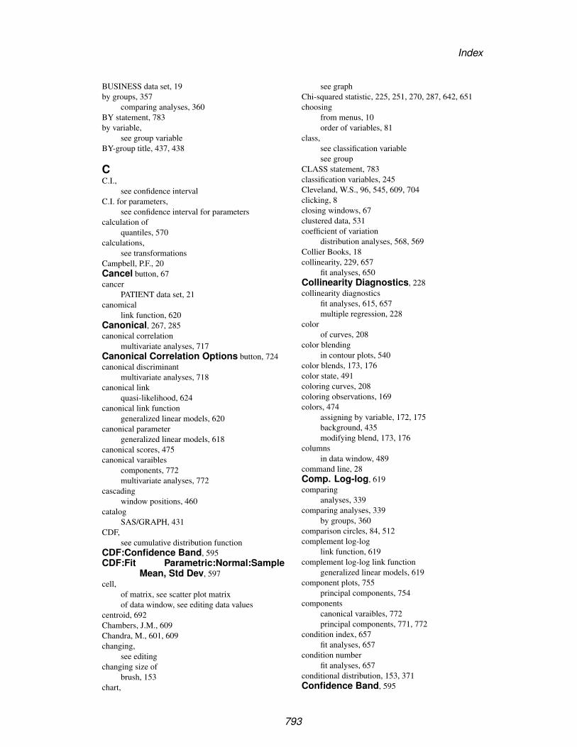
Index
BUSINESS data set, 19by groups, 357
comparing analyses, 360BY statement, 783by variable,
see group variableBY-group title, 437, 438
CC.I.,
see confidence intervalC.I. for parameters,
see confidence interval for parameterscalculation of
quantiles, 570calculations,
see transformationsCampbell, P.F., 20Cancel button, 67cancer
PATIENT data set, 21canomical
link function, 620Canonical, 267, 285canonical correlation
multivariate analyses, 717Canonical Correlation Options button, 724canonical discriminant
multivariate analyses, 718canonical link
quasi-likelihood, 624canonical link function
generalized linear models, 620canonical parameter
generalized linear models, 618canonical scores, 475canonical varaibles
components, 772multivariate analyses, 772
cascadingwindow positions, 460
catalogSAS/GRAPH, 431
CDF,see cumulative distribution function
CDF:Confidence Band, 595CDF:Fit Parametric:Normal:Sample
Mean, Std Dev, 597cell,
of matrix, see scatter plot matrixof data window, see editing data values
centroid, 692Chambers, J.M., 609Chandra, M., 601, 609changing,
see editingchanging size of
brush, 153chart,
see graphChi-squared statistic, 225, 251, 270, 287, 642, 651choosing
from menus, 10order of variables, 81
class,see classification variablesee group
CLASS statement, 783classification variables, 245Cleveland, W.S., 96, 545, 609, 704clicking, 8closing windows, 67clustered data, 531coefficient of variation
distribution analyses, 568, 569Collier Books, 18collinearity, 229, 657
fit analyses, 650Collinearity Diagnostics, 228collinearity diagnostics
fit analyses, 615, 657multiple regression, 228
colorof curves, 208
color blendingin contour plots, 540
color blends, 173, 176color state, 491coloring curves, 208coloring observations, 169colors, 474
assigning by variable, 172, 175background, 435modifying blend, 173, 176
columnsin data window, 489
command line, 28Comp. Log-log, 619comparing
analyses, 339comparing analyses, 339
by groups, 360comparison circles, 84, 512complement log-log
link function, 619complement log-log link function
generalized linear models, 619component plots, 755
principal components, 754components
canonical varaibles, 772principal components, 771, 772
condition index, 657fit analyses, 657
condition numberfit analyses, 657
conditional distribution, 153, 371Confidence Band, 595
793

Index
confidence bandcumulative distribution, 595
confidence curvesmean, 677predicted, 677
confidence ellipsemean, 768prediction, 672, 768
Confidence Ellipses, 672confidence ellipses, 295, 299
bivariate plots, 768creating, 299fit analyses, 671interpreting, 300mean, 673multivariate analyses, 768predicted, 673
confidence intervalgeneralized linear models, 654likelihood-based, 656linear models, 654Wald, 654
confidence interval for meandescriptive statistics, 571
confidence interval for parametersfit analyses, 652
confidence interval for std devdescriptive statistics, 571
confidence interval for variancedistribution analyses, 571
confidence intervalsdistribution analyses, 571
confidence levels, 514configuring
axes, 131SAS/INSIGHT software, 453
configuring SAS/INSIGHT software, 453Confirm dialog
exiting SAS/INSIGHT software, 67Conover, W.J., 609Constant, 622, 631
fit analyses, 631constant
scale parameter estimates, 622constant for scale parameter
generalized linear models, 622CONSTANT option, 788continuous variable,
see interval variableContour Plot ( Z Y X ), 118, 537contour plots, 118, 535
method, 538output, 539variables, 537
CONTOUR statement, 785conventions
of user’s guide, 15Cook’s D, 233
fit analyses, 700
Cook, R.D., 700, 704Copy Window, 345, 351, 352, 360copying
data to disk, 422windows, 345
CORR,see correlation
corrected sums of squares and crossproducts, 728correlation, 295, 296, 729
and confidence ellipses, 672, 768correlation coefficient, 299correlation coefficients
in principal component analysis, 313Correlation Matrix, 299correlation matrix, 313, 773
descriptive statistics, 729in principal component analysis, 309multivariate analyses, 729
correlation matrix of the parameter estimatesgeneralized linear models, 621
correlations of the parameter estimatesfit analyses, 617
COV,see covariance
covariance matrix, 773descriptive statistics, 728in principal component analysis, 309
covariance matrix of the parameter estimatesfit analyses, 616generalized linear models, 621
Covratio, 233fit analyses, 701
Cox, D.R., 704creating
bar chart, 500bar charts, 72box plots, 80confidence ellipses, 299contour plots, 118distribution analysis, 558fit analysis, 629formats, 385line plots, 100mosaic plots, 88multivariate analysis, 708rotating plots, 110scatter plots, 91surface plots, 116variables, 319
creating custom color blends, 176Cross button, 249, 630cross validation, 628
fitting curves, 212crossed effects
fit analyses, 630CSS,
see corrected sums of squaresdistribution analyses, 568, 569
CSSCP, 773,
794
Index
see corrected sums of squares and crossproductsCtrl key, 10Cube, 113, 549cube, 113cubic spline estimator, 679Cumulative Distribution, 567cumulative distribution
confidence band, 595empirical, 594empirical distribution, 594fit parametric, 597Kolmogorov statistic, 594parametric distribution, 597test for a specific distribution, 599test for distribution, 601
cumulative distribution function, 556exponential distribution, 557lognormal distribution, 556normal distribution, 556Weibull distribution, 557
currency format, 380cursor, 8
distance from, 460shape of, 396, 397
curve-fitting, 201Curves, 207, 769curves, 201, 671
adding, 207colors, 208distribution analyses, 589fitting, 207nonparametric, 210patterns, 208width, 208
Curves:Confidence Curves, 677Curves:Kernel, 668, 683Curves:Polynomial, 207Curves:Prediction Confidence Ellipse,
299Curves:Spline, 665, 680CV,
see coefficient of variationdistribution analyses, 568, 569
DD,
see Cook’s Dsee Kolmogorov’s Dsee Kolmogorov statistic
Data, 422data
entering, 27examining, 49exploring, 71extracting, 495fast entry, 40fill, 44printing, 421, 425saving, 421, 422
size of, 51sorting, 56subset of, 495windows, 50
data analysis, 5data exploration, 5DATA option, 781Data Set, 488data set, 27, 487, 488,
see saving datadata set dialog, 50, 488data values
editing, 494data window, 487
opening, 488scrolling, 51
Data:Fill, 422Data:Move to Last, 53Data:Sort, 494DATA=, 488decimal format, 378default
variable role, 141default options,
see configuring SAS/INSIGHT softwaredefault role, 490default roles
group variables, 363default values,
see configuring SAS/INSIGHT softwaredefault variables
group, 363defaults
marker size, 165Define Variables, 141, 363deflist,
see markersdegree
of polynomial fit, 205degree of expansion, 630degrees of freedom, 212, 270, 323, 643, 644, 646, 647,
649, 651Delete, 236, 288, 349, 351, 409, 410deleting
brush, 99effects, 349, 351graphs, 408, 410tables, 408, 410variables, 349
densityparametric estimation, 590
Density Estimation, 565density estimation
kernel estimation, 592density function, 556, 619
exponential distribution, 557lognormal distribution, 556normal distribution, 556Weibull distribution, 557
795

Index
dependent variable,see response variable
Depth, 114, 549depth cueing, 114descriptive statistics
confidence interval for mean, 571confidence interval for std dev, 571correlation matrix, 729covariance matrix, 728frequency table, 574inverse correlation matrix, 731location tests, 572moments, 568p-values of the correlations, 729quantiles, 570univariate statistics, 727
deselecting, 99design matrix, 615, 661Deviance, 622deviance, 225, 251, 270, 287, 642–644
binomial, 623gamma, 623generalized linear models, 622inverse Gaussian, 623normal, 623Poisson, 623
deviance residualsfit analyses, 697
Devlin, S.J., 704DF,
see degrees of freedomDfbetas, 233
fit analyses, 701Dffits, 233, 234
fit analyses, 700diagnostic statistics, 615differing means, 514Dillon, W.R., 775dimension
reducing, 306dimensionality
reducing, 713discrete variable,
see nominal variableDISCRIM procedure, 473discriminant analysis, 472disease,
see DRUG data setdispersion parameter, 619, 620
generalized linear models, 618, 622quasi-likelihood, 625
display, 8options, 458
Display Options, 435Display options, 458DIST statement, 786distance from
cursor, 460distribution
of response variable, 618Distribution ( Y ), 381, 404, 555, 558Distribution (Y), 343, 358distribution analyses, 555
bar chart, 584box plot, 584coefficient of variation, 568, 569confidence interval for variance, 571confidence intervals, 571CSS, 568, 569curves, 589CV, 568, 569exponential distribution, 557exponential quantile, 586frequency table, 574Gini’s mean difference, 576histogram, 584interquartile range, 570kernel estimation, 592kurtosis, 559, 568, 569location tests, 572lognormal distribution, 556lognormal quantile, 586maximum, 570median, 570method, 559minimum, 570mode, 570moments, 568mosaic plot, 584nominal variable, 605normal distribution, 556normal quantile, 586output, 563parametric density, 590parametric distributions, 556Q1, 570Q3, 570QQ plot, 585QQ ref line, 603quantile-quantile plot, 585quantiles, 570range, 570skewness, 559, 568, 569standard error of the mean, 568, 569sum of squares corrected for the mean, 568, 569tables, 568test for a specific distribution, 599test for distribution, 601trimmed mean, 580trimmed means, 580trimmed t statistic, 580uncorrected sum of squares, 568, 569USS, 568, 569variables, 558Weibull distribution, 557Weibull quantile, 587Weight variable, 558Winsorized mean, 580
796

Index
Winsorized means, 580Winsorized sum of squared deviations, 580Winsorized t statistic, 580
distribution analysisgroups, 358
distribution location testssign statistic, 573signed rank statistic, 573Student’s t statistic, 573
distributionscomparing in box plots, 509
Dixon, W.J., 581, 609Dobson, A.J., 704DOLLAR format, 380double-click, 50double-clicking, 488draftsman’s display,
see scatter plot matrixdragging, 9, 91
brush, 98creating a brush, 96
drillingMINING data set, 20
DRUG data set, 19, 245, 422Dunnett’s test with control, 516
EE,
see exponential formatEdit:Delete, 236, 288, 351, 409Edit:Formats, 378, 379, 382, 384Edit:Formats:Other, 379, 386Edit:Observations:Exclude in
Calculations, 347Edit:Observations:Find, 59, 340Edit:Observations:Hide in Graphs, 146Edit:Observations:Invert Selection, 152Edit:Observations:Label in Plots, 137Edit:Observations:Show in Graphs, 148Edit:Observations:UnLabel in Plots, 138Edit:Variables, 320, 332Edit:Variables:log( Y ), 282, 353Edit:Variables:log(Y), 321Edit:Variables:Other, 325, 329Edit:Windows:Align, 362, 417Edit:Windows:Animate, 369Edit:Windows:Copy Window, 345, 351, 352,
360Edit:Windows:Delete, 410Edit:Windows:Display Options, 435, 458Edit:Windows:Fonts, 432Edit:Windows:Freeze, 346Edit:Windows:Renew, 139, 149, 354, 401, 402Edit:Windows:Tools, 159, 171, 395editing
data values, 494variables, 319
editing formats,see formats
editing graphs,see graphs
editing marker sizes,see markers
editing observationsexcluding, 347hiding, 146labeling, 137showing in graphs, 148
editing windows, 393effects
deleting, 236, 349in model, 247nominal, 251, 638removing from model, 235, 272specifying, 629
Eigenvalue, 657Eigenvalues, 311eigenvalues, 713Eigenvectors, 312eigenvectors, 713ellipses
confidence, 299empirical
cumulative distribution, 594empirical distribution
cumulative distribution, 594End, 67, 344entering
numeric data with keypad, 43Epanechnikov, V.A., 592, 609error term
in linear model, 614estimated CORR matrix
fit analyses, 658estimated COV matrix
fit analyses, 658Eubank, R.L., 704Exact Distribution, 631, 633
fit analyses, 631, 633examining
data, 49examining the means
analysis of variance, 255Exclude in Calculations, 347excluding observations, 347excluding observations from calculations, 344exiting SAS/INSIGHT software, 67Expand button, 249, 284, 630expanded effects
fit analyses, 630explanatory variable, 614, 615, 629explanatory variables, 220exploration, 5exploring data, 71, 87, 110exponential
quantile, 586test for distribution, 601
exponential distribution
797

Index
distribution analyses, 557fit parametric, 597parametric distributions, 557testing for, 601
exponential family of distributionsfit analyses, 618generalized linear models, 618
exponential format, 379exponential quantile
distribution analyses, 586extended
selection, 9, 10extended selection, 10
and color blends, 175brushing, 99
Extract, 342, 495extracted data windows
names of, 342extracting
observations, 340extracting data, 495
FF statistic
in analysis of variance, 252, 253in multiple regression, 225, 226
F testin analysis of variance, 226, 253
F-statisticin analysis of variance, 643in type I tests, 644in type III tests, 646
factorial expansion, 630features of
bar charts, 74box plots, 81SAS/INSIGHT software, 6
Feller, W., 609FILE option, 781File:End, 67, 344File:Open, 67, 488File:Print, 426File:Print:Print file, 449File:Save:Data, 422File:Save:Initial Tables, 448File:Save:Options, 45File:Save:Tables, 446files
printing, 449Fill Areas, 540Fill Values, 494Find, 59, 340Find Next, 61, 493finding
observations, 151finding observations, 59, 340, 493First 2 Components Plot, 755First 3 Components Plot, 755Fisher
IRIS data set, 20FISHER option, 788Fisher’s Scoring, 633
fit analyses, 633Fisher’s scoring method
generalized linear models, 621Fisher, R.A., 20, 472, 609, 775fisheye lens, 531Fit ( Y X ), 202, 263, 266, 279, 284, 613, 629Fit (Y X), 220, 244, 327, 345, 349fit analyses, 613
analysis of deviance for generalized linear mod-els, 644
analysis of variance for linear models, 643Anscombe residuals, 698Apply button, 630Binomial variable, 631collinearity, 650collinearity diagnostics, 615, 657condition index, 657condition number, 657confidence ellipses, 671confidence interval for parameters, 652Constant, 631Cook’s D, 700correlations of the parameter estimates, 617covariance matrix of the parameter estimates,
616Covratio, 701crossed effects, 630deviance residuals, 697Dfbetas, 701Dffits, 700estimated CORR matrix, 658estimated COV matrix, 658Exact Distribution, 631, 633expanded effects, 630exponential family of distributions, 618Fisher’s Scoring, 633fit curves, 671Freq variable, 630generalized linear models, 618goodness of fit, 622Group variables, 630hat matrix, 616hat matrix diagonal, 692influence diagnostics, 691kernel estimator, 667, 682kernel function, 667, 682Label variable, 630leverage plots, 661leverage variables, 699likelihood function, 620linear model, 614, 615linear models, 615link function, 619maximum-likelihood estimation, 620mean confidence curves, 677mean square error, 616
798

Index
method, 631model equation, 251, 638model information, 250, 638multicollinearity, 650nested effects, 630nominal variable information, 251, 638nonparametric model, 614nonparametric smoothers, 626normal equation, 616normal kernel, 667, 682normal weight, 684Offset variable, 631output, 634parameter estimates for generalized linear mod-
els, 651parameter estimates for linear models, 649parameter information, 251, 638parametric confidence curves, 677parametric polynomial, 674parametric regression model, 614partial leverage plots, 661partial leverage variables, 699Pearson residuals, 697predicted curves, 695predicted mean vector, 616predicted surfaces, 694predicted values, 693prediction confidence curves, 677prediction confidence ellipses, 672, 768projection matrix, 616quadratic kernel, 667, 682quadratic weight, 684Quasi-Likelihood, 632quasi-likelihood functions, 623residual normal QQ Plot, 661residual normal quantiles, 693residual plots, 659residual-by-predicted plot, 659residuals, 693scale parameter, 622scatter plot smoother, 626smoother degrees of freedom, 627smoother generalized cross validation, 628smoothing spline, 663, 679standardized residuals, 696statistical models, 614studentized residuals, 696sum of squares for error, 616summary of fit for generalized linear models,
642summary of fit for linear models, 640tables, 638tolerance, 650tri-cube weight, 684triangular kernel, 667, 682triangular weight, 684type I tests, 644type III tests, 646variables, 629, 691
variance, 616variance inflation factor, 650Weight variable, 630weighted analyses, 702X variable, 629X variable effects, 629X’X matrix, 639Y variable, 629
fit curvesfit analyses, 671kernel, 682nonparametric local polynomial smoother, 684nonparametric smoothers, 626parameter estimates, 674parametric confidence curves, 677parametric confidence ellipses, 671parametric polynomial, 674polynomial equation, 674smoother degrees of freedom, 627smoother generalized cross validation, 628smoothing spline, 663, 679
fit parametriccumulative distribution, 597
Fit Parametric:Normal:Sample Mean, StdDev, 597
FIT statement, 787fitting curves, 201
cross validation, 212generalized cross validation, 212loess smoother, 213loess smoother fit, 213normal kernel fit, 211parametric regression, 202polynomial, 202
fitting techniques, 671five-color blends, 176flipping graphs, 412–414focus,
see zoomingfonts
choosing, 432footnotes, 437, 438, 441FORMAT procedure, 377, 385Formats, 378, 379, 382, 384formats
and group variables, 366assigning, 378creating, 385currency, 380decimal, 378exponential, 379in analysis tables, 383in data window, 382in groups, 387of axes, 381, 382of values, 383scientific, 379sorting by, 494use in calculations, 387
799

Index
Formats:Other, 379, 386formatting, 377
group variables, 366formula,
see transformationFreedman, D., 239Freeze, 346freezing windows, 346Freq,
see frequencyFREQ option, 784, 786, 787Freq variable
fit analyses, 630multivariate analyses, 708
frequency role, 490frequency table
descriptive statistics, 574distribution analyses, 574
frequency valuesin bar charts, 501in box plots, 511in distribution analyses, 559in fit analyses, 631in multivariate analyses, 710
frequency variablein box plot, 500in box plots, 509in distribution analyses, 558
GGamma, 619gamma
deviance, 623log-likelihood function, 620response distribution, 619
gamma deviancegeneralized linear models, 623
gamma distributiongeneralized linear models, 619
gamma log-likelihood functiongeneralized linear models, 620
GCV,see generalized cross validation
general linear model, 244,see linear model
generalized cross validationfitting curves, 212
generalized linear model, 613, 614components of, 265, 266, 281, 282logistic regression, 263Poisson regression, 279specifying, 266, 284
generalized linear models, 618binomial deviance, 623binomial distribution, 619binomial log-likelihood function, 620canonical link function, 620canonical parameter, 618complement log-log link function, 619
confidence interval, 654constant for scale parameter, 622correlation matrix of the parameter estimates,
621covariance matrix of the parameter estimates,
621deviance, 622dispersion parameter, 618, 622exponential family of distributions, 618Fisher’s scoring method, 621fit analyses, 618gamma deviance, 623gamma distribution, 619gamma log-likelihood function, 620goodness of fit, 622gradient vector, 621Hessian matrix, 621identity link function, 619inverse Gaussian deviance, 623inverse Gaussian distributions, 619inverse Gaussian log-likelihood function, 620likelihood function, 620linear predictor, 618link function, 618, 619log link function, 619logit link function, 619maximum quasi-likelihood estimation, 625maximum-likelihood estimate for scale parame-
ter, 622maximum-likelihood estimation, 620mean deviance, 623mean deviance for scale parameter, 622mean Pearson chi-squared, 623mean Pearson chi-squared for scale parameter,
622natural parameter, 618normal deviance, 623normal distribution, 619normal log-likelihood function, 620offset, 618overdispersion, 623Pearson chi-squared, 623Poisson deviance, 623Poisson distribution, 619Poisson log-likelihood function, 620power link function, 619probit link function, 619quasi-likelihood functions, 623response distribution, 619scale parameter, 622scale parameter estimates, 622scaled deviance, 622scaled Pearson chi-squared, 623variance function, 618
generalized residuals, 692Gini’s mean difference
distribution analyses, 576robust estimation, 576
Goldstein, M., 775
800

Index
goodness of fit, 622, 663, 679fit analyses, 622generalized linear models, 622
GPA data set, 91, 110, 146, 158, 220, 296, 394grade point average, 19
grabber,see hand tool
grade point averageGPA data set, 19
gradient vectorgeneralized linear models, 621
graphoptions, 458
Graph options, 458graphics
printing, 431saving, 431
Graphs, 249, 267, 584, 753graphs
adding, 404, 406, 407aligning, 417bar chart, 584box plot, 584deleting, 408, 410flipping, 412–414growing, 411histogram, 584margin between, 460mosaic plot, 584moving, 411multivariate analyses, 753orienting, 412–414QQ plot, 585shrinking, 411size of, 460sizing, 411
Graphs:First 2 Components Plot, 755Graphs:First 3 Components Plot, 755Graphs:Partial Leverage, 229Graphs:QQ Plot, 585, 587Grosse, E., 704group
default variables, 363group role, 490group variable
in box plots, 509in line plot, 522in rotating plots, 547
Group variablesfit analyses, 630multivariate analyses, 708
group variables, 357, 358default roles, 363formatting, 366in contour plots, 537in distribution analyses, 558in rotating plots, 528order of, 364
groups
analyzing by, 357order of, 490
Hhand
adjusting axes, 129hand tool, 54, 493Hastie, Y.J., 212, 213, 704Hat Diag, 230hat diagonal, 230hat matrix
fit analyses, 616hat matrix diagonal
fit analyses, 692heights
of bars, 502Help, 15help
context-sensitive, 16Help key, 16help system, 15, 18
index, 17SAS/INSIGHT software, 15, 18
Help:Index, 17Help:Introduction, 17Help:Reference, 17Help:Techniques, 17Hessian matrix
generalized linear models, 621Hide in Graphs, 146hiding observations, 145, 146Hinkley, D.V., 704histogram, 499
distribution analyses, 584graphs, 584
Histogram/Bar Chart ( Y ), 72, 76Hoaglin, D.C., 704holding the mouse button, 400horizontal,
see orientationHorizontal Axis at Bottom, 502, 513, 523, 529,
539host, 8
available colors, 173host resources, 453, 467Hotelling’s T-squared statistic, 671, 768Hotelling, H., 775Hsu’s test for best, 516Hsu’s test for worst, 516Hsu, J. C., 514, 516HTML, 450hypothesis testing, 225, 226, 252, 253, 270, 555, 572,
589, 594, 595, 615, 643–647, 650, 656
Iidentifying observations, 92, 135, 313
in box plots, 82Identity, 619identity
801

Index
link function, 619identity link function
generalized linear models, 619ill conditioned, 657Iman, R.L., 573, 609in analysis of variance
mean, 255in distribution analyses
frequency variable, 558group variables, 558label variable, 558
in multiple regressionparameter estimates, 226
in Multivariate analysisscatter plot matrix, 299
in principal component analysiscorrelation coefficients, 313
Include/Exclude state, 491include/exclude state, 474independent variable,
see explanatory variableIndex, 17index
help system, 17SAS/INSIGHT User’s Guide, 15
INFILE option, 781influence diagnostics
fit analyses, 691influential observations, 234, 692, 700, 701Initial Tables, 448initial values,
see default valuesinitializing,
see configuring SAS/INSIGHT softwareinput data set,
see DATA= optionINSIGHT, 23interaction effect, 247interaction effects
specifying, 284Interactive Data Analysis, 28Intercept, 630intercept
QQ ref line, 603interpreting
confidence ellipses, 300interquartile range
distribution analyses, 570interval variable, 490interval variables, 51, 72
in analysis of variance, 245Introduction, 17inverse correlation matrix
descriptive statistics, 731multivariate analyses, 731
Inverse Gaussian, 619inverse Gaussian
deviance, 623log-likelihood function, 620
response distribution, 619inverse Gaussian deviance
generalized linear models, 623inverse Gaussian distributions
generalized linear models, 619inverse Gaussian log-likelihood function
generalized linear models, 620Invert Selection, 152invisible observations, 148invoking
SAS/INSIGHT software, 50IRIS data set, 472
Fisher, 20
JJobson, J.D., 775Johnson, N.L., 609joint distribution, 153journaling SAS/INSIGHT session,
see saving tables
KKaiser, H.F., 714, 775Kent, J.T.„ 775kernel
fit curves, 682normal, 211
kernel estimationapproximate mean integrated square error, 592bandwidth, 592, 667, 682density estimation, 592distribution analyses, 592mean integrated square error, 592normal, 592normal distribution, 592quadratic, 592quadratic distribution, 592triangular, 592triangular distribution, 592
kernel estimatorfit analyses, 667, 682in fit analyses, 614
kernel functionchoice of, 592fit analyses, 667, 682normal, 667, 682quadratic, 667, 682triangular, 667, 682
Kleiner, B., 609Kolmogorov statistic, 599
cumulative distribution, 594Kotz, S., 609Krzanowski, W.J., 775Kuh, E., 233, 239, 657, 692, 704kurtosis, 568, 569
distribution analyses, 559, 568, 569Kutner, M.H., 247Kvalseth, T.O., 704
802

Index
Llabel
in data window, 138observations, 135permanent, 137removing, 138temporary, 136, 137
Label button, 139Label in Plots, 137LABEL option, 784–787label role, 490Label variable
fit analyses, 630multivariate analyses, 708
label variable, 139, 141in box plot, 500in box plots, 509in contour plots, 537in distribution analyses, 558in line plot, 522in rotating plots, 547
label variablesin box plots, 81in rotating plots, 528
Label/UnLabel state, 491label/unlabel state, 474labeling observations, 92Labels, 502, 513, 523, 529, 539, 549labels
bar chart axes, 502box plot axes, 513contour plot axes, 539line plot axes, 523of transformed variables, 329rotating plot axes, 549scatter plot axes, 529
lack of fit,see goodness of fit
layoutscatter plot matrix, 95
learningSAS/INSIGHT software, 15
least-squares estimates, 615Lee, E.T., 21Lehmann, E.L., 573, 609level,
see measurement levelsee classification variablesee group
level sets, 118leverage plots
fit analyses, 661leverage variables
fit analyses, 699LIBNAME statement, 488Library, 488library, 50likelihood function
fit analyses, 620
generalized linear models, 620likelihood ratio, 656likelihood ratio test, 271likelihood-based
confidence interval, 656likelihood-ratio statistic
type III tests, 647line fit, 204line plot, 521
method, 522output, 523variables, 522
Line Plot ( Y X ), 100, 522line plots, 87LINE statement, 784linear model, 614
fit analyses, 614, 615linear models
confidence interval, 654fit analyses, 615
linear predictorgeneralized linear models, 618
linear regression, 204Link Function, 631link function, 618, 631, 638
canomical, 620complement log-log, 619fit analyses, 619generalized linear models, 618, 619identity, 619log, 619logit, 619power, 619probit, 619
LINK option, 787linking of windows, 92, 346local polynomial fit
weight function, 684locating observations,
see finding observationsLocation Tests, 574location tests, 574
descriptive statistics, 572distribution analyses, 572
loess fitweight function, 684
loess smootherfitting curves, 213
loess smoother fitfitting curves, 213
Log, 619log, 353
link function, 619log link function
generalized linear models, 619log transformation, 282, 320log( Y ), 282, 353log(Y), 321log-likelihood function
803

Index
binomial, 620gamma, 620inverse Gaussian, 620normal, 620Poisson, 620
logistic regression, 263analysis of deviance, 270model equation, 269modifying the model, 271parameter estimates, 270residuals-by-predicted plot, 270summary of fit, 270type III (LR) tests, 271type III (Wald) tests, 270
Logit, 619logit
link function, 619logit link function
generalized linear models, 619lognormal
quantile, 586test for distribution, 601
lognormal distributiondistribution analyses, 556fit parametric, 597parametric distributions, 556testing for, 601
lognormal quantiledistribution analyses, 586
LR,see likelihood ratio
Mmagnifying glass tool, 394–396main effect, 247major ticks, 126manager, 471Mardia, K.V.„ 775margin between
graphs, 460marginal histograms, 404, 416marker, 51Marker Sizes, 162, 163marker sizes
in bar chart, 503marker state, 491markers, 92, 157, 159, 474
assigning by variable, 160size of, 162
MARKERSIZE option, 784–786matrix
of rotating plots, 115matrix, correlation,
see correlation matrixmatrix, covariance,
see covariance matrixmatrix, design,
see design matrixmatrix, hat,
see hat matrixmatrix, Hessian,
see Hessian matrixmatrix, patter,
see pattern matrixmatrix, X’X,
see X’X matrixmaximum, 727
distribution analyses, 570maximum quasi-likelihood estimation
generalized linear models, 625maximum redundancy
multivariate analyses, 718maximum-likelihood estimate
scale parameter estimates, 622maximum-likelihood estimate for scale parameter
generalized linear models, 622maximum-likelihood estimation
fit analyses, 620generalized linear models, 620
McCabe, G.P., 20, 225, 239, 252, 296, 301McCullagh, P., 21, 275, 281, 618, 623, 704McLaughlin, D.H, 580, 581McLaughlin, D.H., 609Mean, 256, 512mean, 225, 251, 270, 287, 383, 509, 568, 569, 597,
620, 640, 727, 773box plot, 256confidence curves, 677confidence ellipse, 768in analysis of variance, 255
mean confidence curvesfit analyses, 677
mean confidence ellipsemultivariate analyses, 768
mean confidence ellipses, 673mean deviance
generalized linear models, 623scale parameter estimates, 622
mean deviance for scale parametergeneralized linear models, 622
mean diamonds, 83, 258, 259mean integrated square error
kernel estimation, 592mean line fit, 205mean Pearson chi-squared
generalized linear models, 623scale parameter estimates, 622
mean Pearson chi-squared for scale parametergeneralized linear models, 622
mean square error, 212fit analyses, 616
means, 83measurement level, 51, 245, 490
assigning, 246variables, 490
median, 81, 507, 511distribution analyses, 570
memory
804

Index
storing data set in, 422memory, optimizing, 165menu, 8, 10
pulldown, 10menu bar, 10method
bar chart, 501box plots, 511contour plots, 538distribution analyses, 559fit analyses, 631line plot, 522multivariate analyses, 710options, 454, 456rotating plots, 548scatter plots, 528
Method button, 284, 511, 562, 631, 711, 715Method dialog
Fit window, 266, 284method options, 454, 456minimum, 727
distribution analyses, 570MINING data set, 340
drilling, 20MININGX data set, 20, 202minor ticks, 126MISE, 593,
see mean integrated square errormissing values, 58, 325
in bar charts, 501in box plots, 511in contour plots, 538in distribution analyses, 559, 562in fit analyses, 631in line plots, 522in multivariate analyses, 710in rotating plots, 548in scatter plots, 528
MLE, 622,see maximum-likelihood estimate
MLE, Theta=0, 597mode
distribution analyses, 570parametric density, 591
modelmodifying, 630removing effects, 235, 272specifying effects, 629
model effects, 247model equation
fit analyses, 251, 638logistic regression, 269multiple regression, 225, 313
model informationfit analyses, 250, 638in Fit window, 267, 287
modifying,see editing
modifying the model
logistic regression, 271multiple regression, 235poisson regression, 288
moments, 570descriptive statistics, 568distribution analyses, 568
monochrome images, 435Moore, D.S., 225, 239, 252, 296, 301Morrison, D.F., 775mosaic plot
distribution analyses, 584graphs, 584
mosaic plots, 87, 509Motif window manager
setting X resources, 467mouse, 8mouse button, 8Move to First, 493Move to Last, 53, 493moving
columns, 56graphs, 411tables, 411
moving observations, 493MSE,
see mean square errorMuenchen, R.A., 552MULT statement, 786multicollinearity
fit analyses, 650multiple
selection, 9multiple color blends, 174multiple comparison circles, 516Multiple Comparison of Means, 512multiple comparison of means, 84Multiple Comparison Options, 513, 514Multiple Comparison Test, 514multiple comparison tests
Dunnett’s test with control, 516Hsu’s test for best, 516Hsu’s test for worst, 516pairwise Bonferroni, 515pairwise t-test, 515Tukey-Kramer all pairs, 515
multiple regression, 219adding tables and graphs, 228analysis of variance, 225collinearity diagnostics, 228model equation, 225, 313modifying the model, 235parameter estimates, 226partial leverage plots, 229residual-by-hat diagonal plot, 230residual-by-predicted plot, 227saving the residuals, 238summary of fit, 225type III tests, 226
Multivariate ( Y’s ), 296, 707, 708
805

Index
Multivariate (Y’s), 306multivariate analyses, 707
canonical correlation, 717canonical discriminant, 718canonical varaibles, 772confidence ellipses, 768corrected sums of squares and crossproducts,
728correlation matrix, 729Freq variable, 708graphs, 753Group variables, 708inverse correlation matrix, 731Label variable, 708maximum redundancy, 718mean confidence ellipse, 768method, 710output, 720p-values of the correlations, 729prediction confidence ellipse, 768principal component plots, 754principal components, 713, 771, 772principal components rotation, 715scatter plot matrix, 753sums of squares and crossproducts, 727tables, 727univariate statistics, 727variables, 708variance divisor, 712Weight variable, 709weighted analyses, 773
Multivariate analysis, 305Myers, R.H., 238, 239
NN, 727,
see number of observationsname mangling, 438Names, 502, 513, 523, 529, 539, 549names
of data windows, 342of transformed variables, 329
names ofextracted data windows, 342
names of tables, 450naming
catalog entries, 437, 438Cook’s D variables, 700Covratio variables, 701data sets, 423dfbetas variables, 701Dffits variables, 700partial leverage variables, 699residual variables, 694, 696–699variables, 692
natural parametergeneralized linear models, 618
navigating, 34Nelder, J.A., 21, 275, 281, 618, 623, 704
Nest button, 630nested effects
fit analyses, 630New Observations, 494New Variables, 494NOBUTTON option, 782NOCONFIRM option, 782NOEXACT option, 788NOINT option, 787NOMENU option, 782nominal variable, 490
distribution analyses, 605nominal variable information
fit analyses, 251, 638nominal variables, 51, 75
in analysis of variance, 245noncontiguous
selection, 10noncontiguous selection, 10nonparametric curves, 210Nonparametric Curves button, 635nonparametric local polynomial smoother
fit curves, 684nonparametric model
fit analyses, 614nonparametric regression, 211nonparametric smoothers
fit analyses, 626fit curves, 626
Normal, 619normal
deviance, 623kernel estimation, 592kernel function, 667, 682log-likelihood function, 620quantile, 586response distribution, 619test for distribution, 601weight function, 684
normal deviancegeneralized linear models, 623
normal distribution, 300distribution analyses, 556fit parametric, 597generalized linear models, 619kernel estimation, 592parametric distributions, 556testing for, 601
normal equationfit analyses, 616
normal kernelfit analyses, 667, 682
normal kernel fitfitting curves, 211
normal log-likelihood functiongeneralized linear models, 620
normal quantiledistribution analyses, 586
normal quantile-quantile plot
806

Index
fit analyses, 661normal quantiles, 694normal weight
fit analyses, 684NOSCROLL option, 782null hypothesis,
see hypothesis testingnumber of observations
as label, 137as observation label, 92in data window, 491in Moments table, 568, 569
number of variablesin data window, 489
Oobjects, 446
output, 450observation, 27observation number
as label, 137as observation label, 92
observation state, 474observation states, 474, 491
saving, 422, 492Observations, 257, 503observations, 491,
number of, see number of observationsadding, 35brushing, 96, 153coloring, 169deselecting, 147excluding, 344extracting, 340finding, 59, 151, 340, 493hiding, 145, 146identifying, 92in bar chart, 503invisible, 151labeling, 92markers, 51, 92marking, 157new, 494querying for, 59selecting, 92slicing, 145, 153sorting, 56, 494states, 491toggling display of, 145, 149, 257
Observations:Exclude in Calculations,347
Observations:Hide in Graphs, 146Observations:Invert Selection, 152Observations:Label in Plots, 137Observations:Show in Graphs, 148Observations:UnLabel in Plots, 138ODS,
see Output Delivery Systemof data windows
names, 342offset
generalized linear models, 618of bars, 501, 503
OFFSET option, 787Offset variable
fit analyses, 631OK button, 220Open, 67, 488OPEN statement, 782opening
data set, 488data window, 488
operation ofSAS/INSIGHT software, 8
optimizing memory, 165optional variables, 81Options, 458options, 454, 456
BINOM, 787box plot, 256CONSTANT, 788DATA, 781display, 435, 458distribution, 405FILE, 781FISHER, 788FREQ, 784, 786, 787graph, 458grey scale graphics, 438in fit analysis, 203INFILE, 781LABEL, 784–787LINK, 787MARKERSIZE, 784–786method, 454, 456NOBUTTON, 782NOCONFIRM, 782NOEXACT, 788NOINT, 787NOMENU, 782NOSCROLL, 782OFFSET, 787OTHER, 783, 784output, 454, 456POWER, 787QUASI, 788RESP, 787SAS/INSIGHT, 454saving, 453, 466SCALE, 788setting default, 45TOOLS, 781used in this book, 435WEIGHT, 786, 787window, 458, 459XAXIS, 783–786YAXIS, 783–786ZAXIS, 785, 786
807

Index
order of expansion,see degree of expansion
order of observations,see moving, sorting
order of polynomial,see degree of polynomial
order of variables,see moving
orientationof bar chart, 502of box plots, 513of contour plots, 539of line plot, 523of scatter plots, 529
Orientation:Horizontal Axis at Bottom,502, 513, 523, 529, 539
Orientation:Vertical Axis at Left, 502, 513,523, 529, 539
Orientation:Y Axis Vertical, 502, 513, 523,529, 539
orienting graphs, 412–414OTHER option, 783, 784outlier, 580, 659, 754outliers, 95, 316output
bar chart, 502box plots, 512contour plots, 539distribution analyses, 563fit analyses, 634line plot, 523multivariate analyses, 720objects, 450options, 454, 456rotating plots, 549scatter plots, 529
Output button, 225, 502, 512, 523, 529, 549, 563,634, 720
Output Components, 771Output Delivery System, 446, 449Output Principal Components:2, 316Output Variables button, 635output window, 425overdispersion, 289
generalized linear models, 623Poisson regression, 285
Pp-value
for F statistic, 225, 252p-values
for likelihood ratio type III tests, 271p-values of the correlations
descriptive statistics, 729multivariate analyses, 729
pairwise Bonferroni, 515pairwise t-test, 515parameter estimates, 649
analysis of variance, 253
fit curves, 674in multiple regression, 226logistic regression, 270multiple regression, 226Poisson regression, 290
parameter estimates for generalized linear modelsfit analyses, 651
parameter estimates for linear modelsfit analyses, 649
parameter informationfit analyses, 251, 638
parametricregression, 202
parametric confidence curvesfit analyses, 677fit curves, 677
parametric confidence ellipsesfit curves, 671
Parametric Curves button, 635parametric density
distribution analyses, 590mode, 591
parametric distributioncumulative distribution, 597
parametric distributionsdistribution analyses, 556exponential distribution, 557lognormal distribution, 556normal distribution, 556Weibull distribution, 557
parametric estimationdensity, 590
parametric polynomialfit analyses, 674fit curves, 674
parametric regression, 202, 204fitting curves, 202
parametric regression modelfit analyses, 614
Partial Leverage, 229partial leverage plots
fit analyses, 661multiple regression, 229residual plots, 661
partial leverage variablesfit analyses, 699
paste buffer,see clipboard
PATIENT data set, 265cancer, 21
patternof curves, 208
pause animation, 371PC,
see principal componentPCA,
see principal component analysisPearson, 622Pearson chi-squared
808

Index
generalized linear models, 623Pearson chi-squared statistic,
see chi-squared statisticPearson product-moment correlations, 729Pearson residuals
fit analyses, 697Pearson, K., 775Penner, R., 20percentile, 507permanent
label, 137perspective,
see depth cueingPisani, R., 239plane, rotating, 552players, 18,
see BASEBALL data setplot,
see graphquantile-quantile, 585
plotting symbols,see markers
pointer,see cursor
pointing, 8Poisson, 619
deviance, 623log-likelihood function, 620response distribution, 619
Poisson deviancegeneralized linear models, 623
Poisson distributiongeneralized linear models, 619
Poisson log-likelihood functiongeneralized linear models, 620
Poisson regression, 279analysis of deviance, 287overdispersion, 285parameter estimates, 290summary of fit, 287type III (Wald) tests, 287
poisson regressionmodifying the model, 288
pollutants, 18Polynomial, 207polynomial
fitting curves, 202polynomial curves, 202polynomial equation
fit curves, 674polynomial expansion, 630polynomial fit, 202position of
windows, 460position of windows, 460Power, 619, 631power
fit analyses, 631link function, 619
power link functiongeneralized linear models, 619
POWER option, 787precision
of formatted values, 380predicted
confidence curves, 677predicted confidence ellipses, 673predicted curves
fit analyses, 695predicted mean vector
fit analyses, 616predicted surfaces
fit analyses, 694predicted values
fit analyses, 693prediction
confidence ellipse, 672, 768prediction confidence curves
fit analyses, 677Prediction Confidence Ellipse, 299prediction confidence ellipse
multivariate analyses, 768prediction confidence ellipses
fit analyses, 672, 768pressing the mouse button, 400principal component analysis, 305principal component options, 720Principal Component Options button, 722principal component plots
multivariate analyses, 754principal components, 306
component plots, 754components, 771, 772multivariate analyses, 713, 771, 772saving, 316
principal components rotationmultivariate analyses, 715
Principal Components:OutputComponents, 771
Pringle, R.M., 704, 775Print, 426Print file, 449PRINT procedure, 421, 425Print:Print file, 449printing, 439
all contents of window, 436, 440color images, 435data, 421files, 426, 449from clipboard, 439from window, 440graphics, 431selected portion of window, 436, 440tables, 445
PRINTTO procedure, 428, 449Probit, 619probit
link function, 619
809

Index
probit link functiongeneralized linear models, 619
PROC DISCRIM, 473,see DISCRIM procedure
PROC FORMAT, 377, 385,see FORMAT procedure
proc insight, 28PROC INSIGHT statement, 781PROC OUTPUT,
see OUTPUT procedurePROC PRINT, 421, 425,
see PRINT procedurePROC PRINTTO, 428, 449,
see PRINTTO procedurePROFILE catalog, 466program editor, 385, 425, 471, 473
invoking SAS/INSIGHT software from, 28projection matrix
fit analyses, 616properties,
see variable propertiespulldown
menu, 10pulldown menu, 10purpose of
SAS/INSIGHT Software, 5Purves, R., 239Pythagorean theorem, 516
QQ1
distribution analyses, 570Q3
distribution analyses, 570QQ Plot,
see quantile-quantile plotQQ plot
distribution analyses, 585graphs, 585
QQ ref line, 603distribution analyses, 603intercept, 603slope, 603
quadratickernel estimation, 592kernel function, 667, 682weight function, 684
quadratic distributionkernel estimation, 592
quadratic kernelfit analyses, 667, 682
quadratic polynomial fit, 205quadratic weight
fit analyses, 684qualitative variable,
see nominal variablequantile
exponential, 586lognormal, 586
normal, 586Weibull, 587
quantile-quantile plot, 694distribution analyses, 585fit analyses, 661
quantilescalculation of, 570descriptive statistics, 570distribution analyses, 570
quantitative variable,see interval variable
quartiles, 81, 507, 511QUASI option, 788Quasi-Likelihood, 632
fit analyses, 632quasi-likelihood, 285, 623, 624
canonical link, 624dispersion parameter, 625scale parameter, 624variance function, 624
quasi-likelihood functionsfit analyses, 623generalized linear models, 623
querying, 493querying for observations, 59QUIT statement, 789
RR-Square, 640, 642R-square, 204, 225, 251range
distribution analyses, 570of data displayed, 146
Rawlings, J.O., 230, 239, 704Raynor, A.A., 704, 775Rays, 549recording SAS/INSIGHT session,
see saving tablesrecording statements, 481recreating,
see RenewReference, 17reference, 15Reference Lines, 503reference lines
in bar chart, 503regression, 244, 613–615
linear, 204multiple, 219nonparametric, 211parametric, 202, 204simple, 204
Reid, N., 704Reinsch, C., 679, 704removing,
see deletingremoving variable from model, 272removing variables from model, 235Renew, 139, 149, 354, 401, 402
810

Index
renewing windows, 401repeated points
in contour plots, 538required variables, 80, 110residual, 227residual normal QQ Plot
fit analyses, 661residual plots, 661
residual normal quantilesfit analyses, 693
residual plotsfit analyses, 659partial leverage plots, 661residual normal QQ Plot, 661residual-by-predicted plot, 659
residual-by-hat diagonal plotmultiple regression, 230
residual-by-predicted plotfit analyses, 659multiple regression, 227residual plots, 659
residuals, 691fit analyses, 693generalized, 692saving, 238studentized, 238
residuals-by-predicted plotanalysis of variance, 254logistic regression, 270
resizing,see sizing
resources, 467RESP option, 787Response Dist., 631response distribution, 618, 631, 638
binomial, 619gamma, 619generalized linear models, 619inverse Gaussian, 619normal, 619Poisson, 619
response surface, 116response variable, 220, 614, 615, 629results window, 447robust estimation
Gini’s mean difference, 576trimmed means, 580Winsorized means, 580
role, 490variables, 80
root mean square error, 225, 251, 640Root MSE,
see root mean square errorROTATE statement, 786rotating planes and surfaces, 552rotating plot, 110
features of, 114matrix of, 115of principal components, 754
Rotating Plot ( Z Y X ), 110, 115, 116, 547rotating plots, 545
method, 548of canonical scores, 476output, 549variables, 547
rowsin data window, 491
RUN statement, 788Run:Submit, 28, 385, 425, 474
SSall, J., 512, 516sample mean, 640, 642
in box plots, 83Sample Mean, Std Dev, 597SAS data set, 27SAS/GRAPH software, 431, 436SAS/INSIGHT, 23
options, 454SAS/INSIGHT Software
purpose of, 5SAS/INSIGHT software
configuring, 453exiting, 67features of, 6help system, 15, 18invoking, 28, 50learning, 15operation of, 8
SAS/INSIGHT statements, 779SAS/STAT software, 472SASHELP library, 488SASUSER library, 488SASUSER.PROFILE catalog, 466Save:Data, 422Save:Tables, 446saving
bitmaps, 437catalogs, 436colors, 474data, 421, 422defaults, 131formats, 378graphics, 431, 436graphics files, 437include/exclude state, 474label/unlabel state, 474markers, 474observation states, 422, 492options, 453, 466principal components, 316residuals, 238select state, 474show/hide state, 474tables, 445, 449, 450tables as data sets, 450tables as html, 450variables, 316, 691
811

Index
Scale, 631scale
of graphs, 147SCALE option, 788scale parameter, 642
fit analyses, 622generalized linear models, 622quasi-likelihood, 624
scale parameter estimatesconstant, 622generalized linear models, 622maximum-likelihood estimate, 622mean deviance, 622mean Pearson chi-squared, 622
scale parameters, 624scaled deviance
generalized linear models, 622scaled Pearson chi-squared
generalized linear models, 623scatter plot
adding curves, 207confidence ellipses, 299, 768of principal components, 314, 754
Scatter Plot ( Y X ), 91, 94, 136, 270, 314, 394,407, 528
Scatter Plot (Y X), 232scatter plot matrix, 94, 394, 527, 528
bivariate plots, 753in Multivariate analysis, 299layout, 95multivariate analyses, 753
scatter plot smootherfit analyses, 626
scatter plots, 87, 91, 527clicking in, 92method, 528output, 529variables, 528viewing brushed observations, 531
SCATTER statement, 785schematic plot,
see box plotscientific format, 379scientific notation,
see exponential formatScott, D.W, 501screen,
see displayscroll bar, 51, 52scrolling, 52
data window, 51searching, 493searching for observations, 59seed, random,
see randomselect state, 474, 491selecting, 8
area, 255, 406comparison circles, 516
contours, 540level curves, 540observations, 92tables, 446values in tables, 383
selection, 8extended, 9, 10, 99multiple, 9noncontiguous, 10order of, 81
Serifs, 512set properties, 141,
see variable propertiessetting
default window options, 45shape,
of observation markers, see markerof cursor, see cursor
shape parameter, 586Shift key, 9SHIP data set, 281, 282, 434
wave damage, 21Show in Graphs, 148Show/Hide state, 491show/hide state, 474sign statistic
distribution location tests, 573signed rank statistic
distribution location tests, 573significance, 226, 252Silverman, B.W., 593, 609, 704simple regression, 204simultaneous confidence intervals, 515Singpurwalla, N.D., 601, 609size of
graphs, 460size of markers, 162Size to Fit, 165sizing
graphs, 411skewness, 559, 568, 569
distribution analyses, 559, 568, 569in box plots, 81
slicingobservations, 145, 153
sliderin scroll bar, 51
slopeQQ ref line, 603
Smirnov, N., 609smoother degrees of freedom
fit analyses, 627fit curves, 627
smoother generalized cross validationfit analyses, 628fit curves, 628
smoothing parameter, 626kernel estimation, 592of kernel curve, 212
812

Index
smoothing spline, 538, 548, 664, 679fit analyses, 663, 679fit curves, 663, 679
smoothness of fit, 664Snell, E.J., 704Solutions, 472Sort, 494sorting
data, 56observations, 56, 494order of, 494
spinning,see rotating
spline, 614Spread, 467spreading
window positions, 460, 467spreadsheet,
see data windowSqrt,
see square rootSSCP, 773,
see sums of squares and crossproductsstandard deviation, 383, 512, 568, 569, 597, 651, 727
in box plots, 83standard error, 270, 649, 650
trimmed mean, 580Winsorized mean, 580
standard error of the meandistribution analyses, 568, 569
standardized residualsfit analyses, 696
statementsBAR, 783BOX, 784BY, 783CLASS, 783CONTOUR, 785DIST, 786FIT, 787LINE, 784MULT, 786OPEN, 782PROC INSIGHT, 781QUIT, 789recording, 481ROTATE, 786RUN, 788SAS/INSIGHT, 779SCATTER, 785TABLES, 788WINDOW, 782
states,see observation states
statistical modelsfit analyses, 614
statistical significance, 226, 252statistics, descriptive,
see descriptive statistics
statistics, diagnostic,see diagnostic statistics
statistics, summary,see summary statistics
statistics, univariate,see univariate statistics
Std Dev,see standard deviation
Stephens, M.A., 601, 609storing,
see savingStudent’s t statistic
distribution location tests, 573studentized residuals, 238
fit analyses, 696Submit, 28, 385, 425, 474subsets
coloring observations, 172group variables, 357hiding observations, 146marking observations, 160of data, 495of observations, 340toggling display of observations, 149
sum, 568, 569sum of squares, 225, 252, 643, 646sum of squares corrected for the mean
distribution analyses, 568, 569sum of squares for error
fit analyses, 616sum of weights, 568, 569summary of fit, 225, 251, 270, 643
analysis of variance, 251logistic regression, 270multiple regression, 225Poisson regression, 287
summary of fit for generalized linear modelsfit analyses, 642
summary of fit for linear modelsfit analyses, 640
summary statistics, 225, 251, 270, 287sums of squares
Type III, 226, 252sums of squares and crossproducts, 727surface plots, 116, 547surface, rotating, 552symbols,
see markers
TTab key, 32, 44Tables, 249, 267, 446, 571, 638, 652, 727tables
deleting, 408, 410distribution analyses, 568fit analyses, 638html, 450moving, 411multivariate analyses, 727
813

Index
printing, 445saving, 445, 450
TABLES statement, 788Tables:Collinearity Diagnostics, 228Tables:Location Tests, 574Tables:Type III (LR) Tests, 271, 274Techniques, 17techniques, 15temporary
label, 137Terrell, G.R., 501test for a specific distribution
cumulative distribution, 599distribution analyses, 599
test for distributioncumulative distribution, 601distribution analyses, 601exponential, 601lognormal, 601normal, 601Weibull, 601
teststype I, 644type I (LR), 645type III, 645, 646type III (LR), 648type III (Wald), 648
thin-plate smoothing spline, 664thin-plate splines, 538, 548threshold parameter, 597throwing, 98Tibshirani, R.J., 212, 213, 704Ticks, 361, 503ticks
adjusting, 126, 361aligning, 417font for labels, 434in bar chart, 503major, 126minor, 126size of labels, 434
titles, 437, 438, 441toggling display of
observations, 145, 149TOL,
see tolerancetolerance, 649
fit analyses, 650in multiple regression, 226
Tools, 159, 171, 395tools
magnifying glass, 395windows, 54
TOOLS option, 781tools window, 395, 396trace, 713transformation, 319
log, 282transformations, 332
transforming variables, 319, 352, 353tri-cube weight
fit analyses, 684triangular
kernel estimation, 592kernel function, 667, 682weight function, 684
triangular distributionkernel estimation, 592
triangular kernelfit analyses, 667, 682
triangular weightfit analyses, 684
trimmed meandistribution analyses, 580standard error, 580
trimmed meansdistribution analyses, 580robust estimation, 580
trimmed t statisticdistribution analyses, 580
Trimmed/Winsorized Means, 565Tukey, J.W., 507, 580, 581, 609Tukey, P.A., 609Tukey-Kramer method, 515two-color blends, 173type I tests
fit analyses, 644Type III (LR) Tests, 271, 274type III (LR) tests
logistic regression, 271type III (Wald) tests
logistic regression, 270Poisson regression, 287
type III testsanalysis of variance, 252fit analyses, 646likelihood-ratio statistic, 647multiple regression, 226Wald statistic, 647
Uuncorrected sum of squares
distribution analyses, 568, 569undo,
see RenewRenew, 354
Unf/For button, 494uniform lens, 531univariate statistics
descriptive statistics, 727multivariate analyses, 727
UNIX operating systemsetting X resources, 467
UnLabel in Plots, 138Use Obs with Missing Values, 562user’s guide
conventions of, 15using, 15
814

Index
USS,see uncorrected sums of squaresdistribution analyses, 568, 569
VValues, 257, 503values
in bar chart, 503variable roles, 500, 509Variable:Both, 502, 513, 523, 529, 539, 549Variable:Labels, 502, 513, 523, 529, 539, 549Variable:Names, 502, 513, 523, 529, 539, 549Variables, 320variables, 27, 489
adding, 35arranging, 52bar chart, 500box plots, 509contour plots, 537default role, 141defining, 37deleting, 349distribution analyses, 558editing, 319explanatory, 220fit analyses, 629, 691frequency, 500, 509, 558, 630, 708generated, 692group, 509, 522, 528, 537, 547, 558, 630, 708in box plot, 509in scatter plots, 528influence diagnostics, 691interval, 51, 72label, 500, 509, 522, 528, 537, 547, 548, 558,
630, 708line plot, 522measurement level, 51, 490moving, 52multivariate analyses, 708names of, 692new, 494nominal, 51, 75optional, 81removing from model, 235, 272response, 220role, 80, 490rotating plots, 547saving, 316, 691selected, 43selecting, 53transforming, 319, 352, 353weight, 558, 630, 709X, 522, 528, 537, 547Y, 500, 509, 522, 528, 537, 547, 558Z, 537, 547
Variables:log( Y ), 282, 353Variables:log(Y), 321Variables:Other, 325, 329variance, 559, 568, 569
fit analyses, 616variance divisor
multivariate analyses, 712variance function, 619
generalized linear models, 618quasi-likelihood, 624
variance inflationin multiple regression, 226
variance inflation factor, 649fit analyses, 650
variance proportion, 657variation
sources of, 225, 252, 643, 644Vars, 691Vars:Dffits, 234Vars:Hat Diag, 230Vars:Output Principal Components:2, 316Vars:Studentized Residual, 238Velleman, P.F., 704vertical,
see orientationVertical Axis at Left, 502, 513, 523, 529, 539View:Results, 447viewing clustered data, 531VIF,
see variance inflation factorvisualization, 549
WWald
confidence interval, 654Wald statistic
type III tests, 647Wald tests, 270, 287Watts, D.G., 20wave damage
SHIP data set, 21Weibull
quantile, 587test for distribution, 601
Weibull distributiondistribution analyses, 557fit parametric, 597parametric distributions, 557testing for, 601
Weibull quantiledistribution analyses, 587
weight functionlocal polynomial fit, 684loess fit, 684normal, 684quadratic, 684triangular, 684
WEIGHT option, 786, 787weight role, 490weight values
in distribution analyses, 559in fit analyses, 631in multivariate analyses, 710
815

Index
Weight variabledistribution analyses, 558fit analyses, 630multivariate analyses, 709
weight variable, 773weighted analyses
fit analyses, 702multivariate analyses, 773
Weil, G., 545Weisberg, S., 238, 239, 704Welsch, R.E., 233, 239, 657, 692, 704Whisker Length, 511whiskers, 81, 511width
of bars, 501, 503of curves, 208of formattted values, 380
Wilks, A.R., 96window, 8
options, 458, 459Window Layout:Spread, 467Window options, 458, 459WINDOW statement, 782windows
closing, 67copying, 345data, 50, 488editing, 393output, 425position of, 460printing, 440renewing, 401, 402results, 447tools, 54, 396zooming, 394
Windows:Align, 362, 417Windows:Animate, 369Windows:Copy Window, 345, 351, 352, 360Windows:Delete, 410Windows:Display Options, 435Windows:Freeze, 346Windows:Options, 458Windows:Renew, 139, 149, 354, 401, 402Windows:Tools, 159, 171, 395Winsorized mean
distribution analyses, 580standard error, 580
Winsorized meansdistribution analyses, 580robust estimation, 580
Winsorized sum of squared deviationsdistribution analyses, 580
Winsorized t statisticdistribution analyses, 580
WORK library, 488working with other SAS products, 471
XX button, 629
X resources, 467X variable
fit analyses, 629in contour plots, 537in line plot, 522in rotating plots, 547
X variable effectsfit analyses, 629
X variablesin scatter plots, 528
X’X matrix, 650, 657fit analyses, 639
XAXIS option, 783–786
YY Axis Vertical, 502, 513, 523, 529, 539Y variable
fit analyses, 629in box plot, 500in box plots, 509in contour plots, 537in distribution analyses, 558in line plot, 522in rotating plots, 547
Y variablesin scatter plots, 528
YAXIS option, 783–786
ZZ variable
in contour plots, 537in rotating plots, 547
ZAXIS option, 785, 786ZColor variable
in rotating plots, 548zooming, 394, 397–399
816

Your Turn
We welcome your feedback.
• If you have comments about this book, please send them to [email protected]. Include the full title and page numbers (if applicable).
• If you have comments about the software, please send them to [email protected].


SAS® Publishing delivers!Whether you are new to the workforce or an experienced professional, you need to distinguish yourself in this rapidly changing and competitive job market. SAS® Publishing provides you with a wide range of resources to help you set yourself apart.
SAS® Press Series Need to learn the basics? Struggling with a programming problem? You’ll find the expert answers that you need in example-rich books from the SAS Press Series. Written by experienced SAS professionals from around the world, these books deliver real-world insights on a broad range of topics for all skill levels.
s u p p o r t . s a s . c o m / s a s p r e s sSAS® Documentation To successfully implement applications using SAS software, companies in every industry and on every continent all turn to the one source for accurate, timely, and reliable information—SAS documentation. We currently produce the following types of reference documentation: online help that is built into the software, tutorials that are integrated into the product, reference documentation delivered in HTML and PDF—free on the Web, and hard-copy books.
s u p p o r t . s a s . c o m / p u b l i s h i n gSAS® Learning Edition 4.1 Get a workplace advantage, perform analytics in less time, and prepare for the SAS Base Programming exam and SAS Advanced Programming exam with SAS® Learning Edition 4.1. This inexpensive, intuitive personal learning version of SAS includes Base SAS® 9.1.3, SAS/STAT®, SAS/GRAPH®, SAS/QC®, SAS/ETS®, and SAS® Enterprise Guide® 4.1. Whether you are a professor, student, or business professional, this is a great way to learn SAS.
s u p p o r t . s a s . c o m / L E
SAS and all other SAS Institute Inc. product or service names are registered trademarks or trademarks of SAS Institute Inc. in the USA and other countries. ® indicates USA registration. Other brand and product names are trademarks of their respective companies. © 2008 SAS Institute Inc. All rights reserved. 474059_1US.0108


