25
scNMT-seq enables joint profiling of chromatin accessibility DNA methylation and transcription in single cells Stephen J. Clark et al

scNMT-seq enables joint profiling of chromatin accessibility DNA
methylation and transcription in single cells
Stephen J. Clark et al

Supplementary figure 1. Empirical coverage of scNMT-seq applied to 61 mouse ES
cells. (a) Distribution of the percentage of loci covered by at least 5 cytosines across 61 cells,
considering different genomic contexts. Boxes display median coverage and the first and third
quartile, whiskers show 1.5 x the interquartile range above and below the box. (b) Effect of
reduced sequencing depth on coverage – number of loci covered by at least 5 cytosines,
comparing data from two cells sequenced at equivalent depth, however using alternative
protocols (M&T-seq A02 = 3.41M uniquely aligned reads, NMT-seq E03 = 3.43M uniquely
aligned reads). Shown is the coverage of loci as a function of increasing down sampling factors
(down to 1/10th of the CpG coverage in intervals of 1/10th).
Active enhancers
CGI
CTCF
DHS
genebody
IAP
Nanog
Oct4
p300
Super enhancers
0 25 50 75 100
Percentage of loci covered with at least 5 cytosines
Ge
nom
ic fe
atu
re
CpG Methylation
GpC Accessibility
p300 Promoters Super enhancers
Gene bodies Nanog Oct4
Active enhancers CGI DHS
2.5 5.0 7.5 10.0 2.5 5.0 7.5 10.0 2.5 5.0 7.5 10.0
0
25
50
75
0
25
50
75
0
25
50
75
Downsampling factor
Pe
rce
nta
ge o
f lo
ci cove
red
CellM&Tseq_A02
NMTseq_E03
Loci covered at matched sequencing deptha b

Supplementary figure 2. Accessibility and methylation profiles in regulatory genomic contexts. Shown are running averages of the CpG methylation (red) and the GpC accessibility (blue) in consecutive non-overlapping 50bp windows, pooling information from all cells and all genomic elements in different regulatory contexts. Solid line displays the mean across all cells and loci and shading displays the corresponding standard deviation.
0
20
40
60
−1000 0 1000
Rat
eCpG methylation GpC accessibility
Super enhancers
Distance from center of region (bp)
0
20
40
60
−1000 0 1000Distance from center of region (bp)
Rat
eCpG methylation GpC accessibility
CTCF
0
20
40
60
−1000 0 1000
Rat
e
CpG methylation GpC accessibility
Nanog
Distance from center of region (bp)
0
20
40
60
−1000 0 1000
Rat
e
CpG methylation GpC accessibility
Oct4
Distance from center of region (bp)
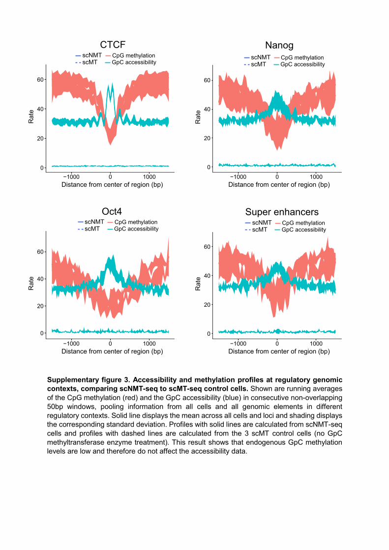
Supplementary figure 3. Accessibility and methylation profiles at regulatory genomic contexts, comparing scNMT-seq to scMT-seq control cells. Shown are running averages of the CpG methylation (red) and the GpC accessibility (blue) in consecutive non-overlapping 50bp windows, pooling information from all cells and all genomic elements in different regulatory contexts. Solid line displays the mean across all cells and loci and shading displays the corresponding standard deviation. Profiles with solid lines are calculated from scNMT-seq cells and profiles with dashed lines are calculated from the 3 scMT control cells (no GpC methyltransferase enzyme treatment). This result shows that endogenous GpC methylation levels are low and therefore do not affect the accessibility data.
0
20
40
60
−1000 0 1000Distance from center of region (bp)
Rat
e
scMTscNMT CpG methylation
GpC accessibility
CTCF
0
20
40
60
−1000 0 1000Distance from center of region (bp)
Rat
e
Nanog
0
20
40
60
−1000 0 1000Distance from center of region (bp)
Rat
e
Oct4
0
20
40
60
−1000 0 1000Distance from center of region (bp)
Rat
e
Super enhancers
scMTscNMT CpG methylation
GpC accessibility
scMTscNMT CpG methylation
GpC accessibilityscMTscNMT CpG methylation
GpC accessibility

Supplementary figure 4. Accessibility (blue) and methylation (red) profiles at regulatory genomic contexts, stratified by expression of the nearest gene. Shown are local GpC accessibility and CpG methylation profiles for different genomic contexts. Features are stratified by average expression level of the corresponding gene (log normalised counts less than 2 (low), between 2 and 6 (medium) and higher than 5 (high). The profile is generated by computing a running average across all cells and loci in 50bp windows.
20
40
60
−1000 0 1000Genomic distance from TSS
Met
hyla
tion/
Acc
essi
bilit
y ra
teCG methylation GC accessibilityLow Medium High
p300
10
20
30
40
50
60
−1000 0 1000Genomic distance from TSS
Met
hyla
tion/
Acc
essi
bilit
y ra
te
Nanog
20
30
40
50
−1000 0 1000Genomic distance from TSS
Met
hyla
tion/
Acc
essi
bilit
y ra
te
CTCF
20
30
40
50
−1000 0 1000Genomic distance from TSS
Met
hyla
tion/
Acc
essi
bilit
y ra
teSuper enhancers
CG methylation GC accessibilityLow Medium High
CG methylation GC accessibilityLow Medium High
CG methylation GC accessibilityLow Medium High

Supplementary figure 5. Comparison of RNA-seq data to previously published data
from Angermueller et al 20161. (a) ZIFA dimensionality reduction2 highlighting culture
conditions and method used (scNMT-seq or scMTseq). (b) Heatmap showing expression of
three gene sets: pluripotency genes that have previously been used to classify ESCs as more
or less pluripotent3, differentiation marker genes and housekeeping genes as a control. Serum
cells processed in our previous study1 have a higher degree of transcriptional heterogeneity.
This is not likely to be due to protocol differences, since the scMT-seq control cells do not
cluster apart from scNMT-seq cells. We suggest that it may reflect differences in the cell lines
used for the two studies (male E14 previously versus female EL16 used here). In particular,
serum cells in this study appear to belong entirely to a fairly homogeneous sub-population with
pluripotency levels closer to the 2i cells from Angermueller at al1.

Supplementary figure 6. Comparison of scNMT-seq to published bulk and single-cell
methylation profiles. PCA of gene body methylation (all genes) comparing scNMT-seq to
published datasets of serum and 2i grown ESCs. Missing sites were imputed using the
average methylation rate across cells at a given locus. Serum cells processed in this study
overlap with 2i cells in previously published data, which is consistent with the observed
clustering of RNA-seq data (Supplementary Fig. 2), indicating that the population of cells
considered in this study was more pluripotent than cells in Angermueller et al1. These
differences likely reflect variation in the cell lines used (male E14 versus female EL16; see
Supplementary Fig. 2). Female ESCs are reported to have lower global methylation levels4
and we find a mean global methylation level of 61% versus 78% in E14 cells1.

Supplementary figure 7. Scatter plot of GpC accessibility data and published DNase-
seq in random 10kb windows. GpC accessibility data show mean GpC methylation rates
across all cells in 100,000 random 10kb windows. DNase-seq is log2 reads per bp within the
same windows. Pearson correlation coefficient was calculated using a weighting of the GpC
coverage (number of observations in the 10kb window), thereby accounting for variation in the
coverage of scNMT-seq data, which is sparse (61 cells at ~15% genome-wide coverage each)
and dependent on GpC density.
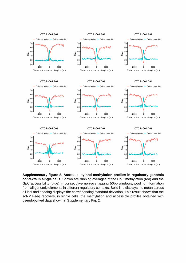
Supplementary figure 8. Accessibility and methylation profiles in regulatory genomic
contexts in single cells. Shown are running averages of the CpG methylation (red) and the
GpC accessibility (blue) in consecutive non-overlapping 50bp windows, pooling information
from all genomic elements in different regulatory contexts. Solid line displays the mean across
all loci and shading displays the corresponding standard deviation. This result shows that the
scNMT-seq recovers, in single cells, the methylation and accessible profiles obtained with
pseudobulked data shown in Supplementary Fig. 2.

Supplementary figure 9. Visualisation of RNA-seq profiles of 43 embryoid body cells. Shown are bivariate visualizations using t-SNE, with expression profiles of canonical (a) pluripotency and (b) differentiation markers genes, overlaid in colour. Cells cluster into two main populations, which we subsequently labelled as pluripotent (high expression of pluripotency genes) and differentiated (low expression levels of pluripotency genes).
−20
−10
0
10
20
30
−20 −10 0 10 20 30t−SNE Dimension 1
t−S
NE
Dim
ensi
on 2
02468
Expression
Esrrb
−20
−10
0
10
20
30
−20 −10 0 10 20 30t−SNE Dimension 1
t−S
NE
Dim
ensi
on 2
0.02.55.07.5
Expression
Rex1 (Zfp42)
−20
−10
0
10
20
30
−20 −10 0 10 20 30t−SNE Dimension 1
t−S
NE
Dim
ensi
on 2
0.02.55.07.5
Expression
T
−20
−10
0
10
20
30
−20 −10 0 10 20 30t−SNE Dimension 1
t−S
NE
Dim
ensi
on 2
02468
Expression
Prtg
a
b
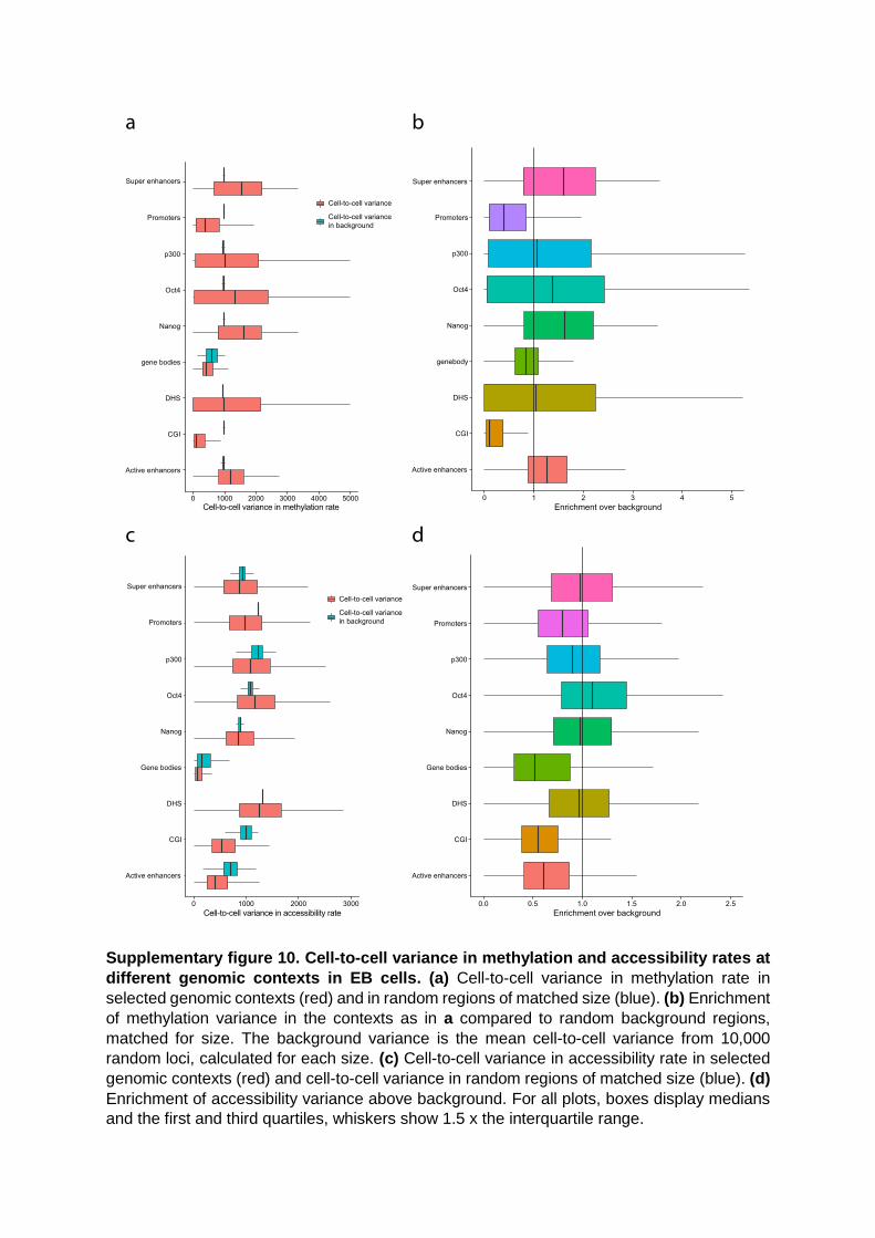
Supplementary figure 10. Cell-to-cell variance in methylation and accessibility rates at
different genomic contexts in EB cells. (a) Cell-to-cell variance in methylation rate in
selected genomic contexts (red) and in random regions of matched size (blue). (b) Enrichment
of methylation variance in the contexts as in a compared to random background regions,
matched for size. The background variance is the mean cell-to-cell variance from 10,000
random loci, calculated for each size. (c) Cell-to-cell variance in accessibility rate in selected
genomic contexts (red) and cell-to-cell variance in random regions of matched size (blue). (d)
Enrichment of accessibility variance above background. For all plots, boxes display medians
and the first and third quartiles, whiskers show 1.5 x the interquartile range.

Supplementary figure 11. Association tests between molecular layers in selected
genomic contexts. Shown are correlation analysis across cells (one test per loci) between
(a) CpG Methylation and RNA expression, (b) GpC accessibility and RNA expression and (c)
CpG methylation and GpC accessibility. Volcano plots display Pearson correlation coefficients
and adjusted p-values (Benjamini-Hochberg correction). The orange vertical lines show the
position of r=0. Red dots denote features that pass threshold of statistical significance
(FDR=10%). Q-Q plots show the distribution of observed p-values (black and red dots), the
uniform distribution (grey lines, with solid line showing the mean and the dashed line showing
the 95% confidence interval) and p-values obtained after 100 permutations of both features
and samples (blue crosses)

Supplementary figure 12. Zoom-in view within the gene locus of Prtg for embryoid body
data. Shown from top to bottom are: Pairwise Pearson correlation coefficients between each
pair of the three layers (Met, methylation; Acc, accessibility; Expr, expression). Accessibility
(blue) and methylation (red) profiles are shown separately for the pluripotent and differentiated
sub-populations; mean rates (solid line) and standard deviation (shade) were calculated
across cells using a running window of 10kb with a step size of 1000bp; Track with genomic
annotations, highlighting the position of several regulatory elements: promoters, super
enhancers, and p300 binding sites.
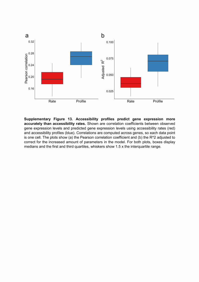
Supplementary Figure 13. Accessibility profiles predict gene expression more accurately than accessibility rates. Shown are correlation coefficients between observed gene expression levels and predicted gene expression levels using accessibility rates (red) and accessibility profiles (blue). Correlations are computed across genes, so each data point is one cell. The plots show (a) the Pearson correlation coefficient and (b) the R^2 adjusted to correct for the increased amount of parameters in the model. For both plots, boxes display medians and the first and third quartiles, whiskers show 1.5 x the interquartile range.
0.16
0.20
0.24
0.28
0.32
Rate Profile
Pear
son
corr
elat
ion
a
0.025
0.050
0.075
0.100
Rate ProfileA
djus
ted
R2
b

Supplementary figure 14. Example of single-cell accessibility profiles at transcription start sites. Shown are profiles generated from four arbitrary cells in two example genes, (a) Tmem54 and (b) Tns1. Each red dot represents a GpC site, with binary accessibility value (1=accessible, 0=inaccessible). Blue line represents the mean of the posterior distribution of the inferred non-linear function, and the shading represents the corresponding 80% credible interval. Inference was done using the BPRMeth package5. Axis ticks display windows of +-200bp around the TSS. We observe periodic patterns in the GC accessibility data, which likely indicate positions of nucleosomes
0.00.20.40.60.81.0
−200bp TSS +200bp
Acc
essi
bilit
yCell Plate1_D01
0.00.20.40.60.81.0
−200bp TSS +200bp
Cell Plate1_G06
0.00.20.40.60.81.0
−200bp TSS +200bp
Acc
essi
bilit
y
Cell Plate1_H07
0.00.20.40.60.81.0
−200bp TSS +200bp
Cell Plate1_E11
0.00.20.40.60.81.0
−200bp TSS +200bp
Acc
essi
bilit
y
Cell Plate1_E11
0.00.20.40.60.81.0
−200bp TSS +200bp
Cell Plate1_D07
0.00.20.40.60.81.0
−200bp TSS +200bp
Acc
essi
bilit
y
Cell Plate1_H05
0.00.20.40.60.81.0
−200bp TSS +200bp
Cell Plate1_F02
Tmem54
Tns1b
a
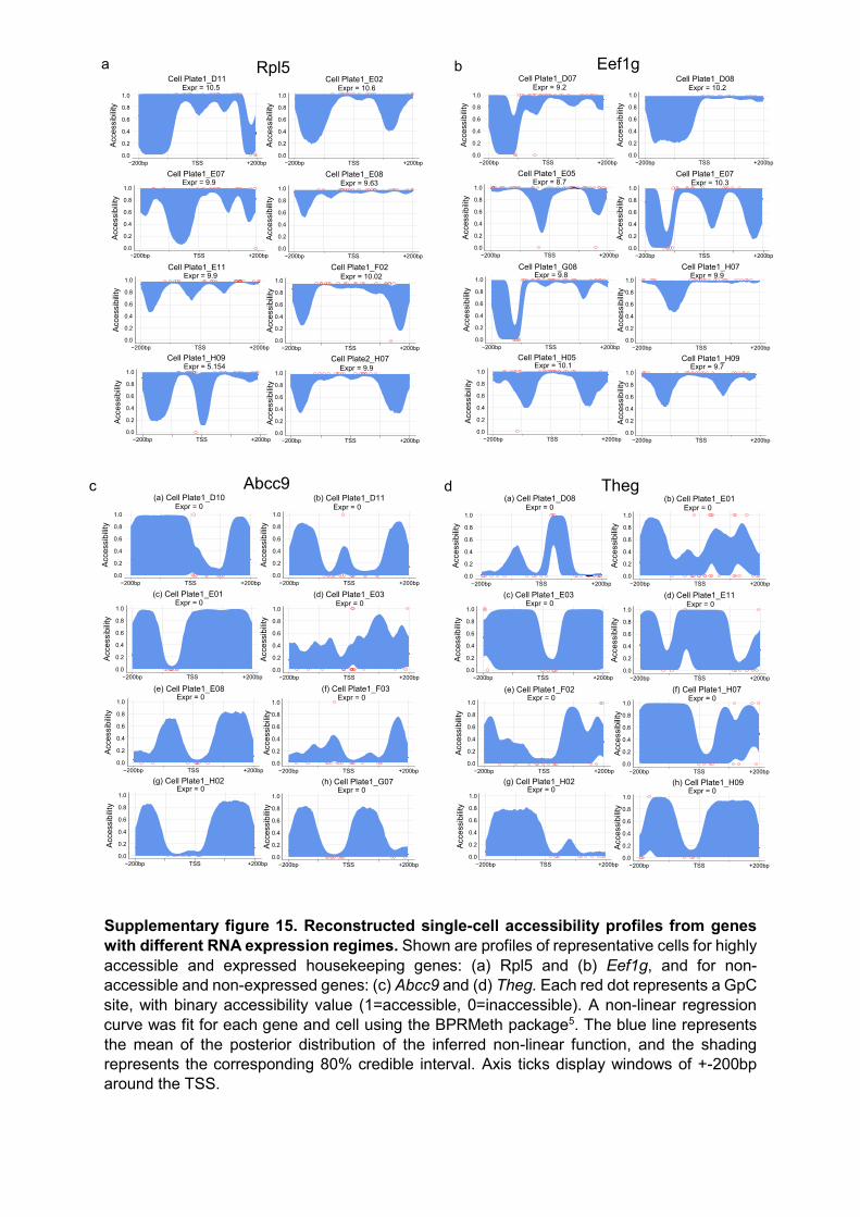
Supplementary figure 15. Reconstructed single-cell accessibility profiles from genes with different RNA expression regimes. Shown are profiles of representative cells for highly accessible and expressed housekeeping genes: (a) Rpl5 and (b) Eef1g, and for non-accessible and non-expressed genes: (c) Abcc9 and (d) Theg. Each red dot represents a GpC site, with binary accessibility value (1=accessible, 0=inaccessible). A non-linear regression curve was fit for each gene and cell using the BPRMeth package5. The blue line represents the mean of the posterior distribution of the inferred non-linear function, and the shading represents the corresponding 80% credible interval. Axis ticks display windows of +-200bp around the TSS.
Cell Plate1_D07 Cell Plate1_D08
Cell Plate1_E05 Cell Plate1_E07
Cell Plate1_G08 Cell Plate1_H07
Cell Plate1_H05 Cell Plate1_H09
0.0
0.2
0.4
0.6
0.8
1.0
−200bp TSS +200bp
Acc
essi
bilit
y
0.0
0.2
0.4
0.6
0.8
1.0
−200bp TSS +200bp
Acc
essi
bilit
y
0.0
0.2
0.4
0.6
0.8
1.0
−200bp TSS +200bp
Acc
essi
bilit
y
Expr = 8.7
0.0
0.2
0.4
0.6
0.8
1.0
−200bp TSS +200bp
Acc
essi
bilit
y
Expr = 10.3
0.0
0.2
0.4
0.6
0.8
1.0
−200bp TSS +200bp
Acc
essi
bilit
y
Expr = 9.8
0.0
0.2
0.4
0.6
0.8
1.0
−200bp TSS +200bp
Acc
essi
bilit
y
Expr = 9.9
0.0
0.2
0.4
0.6
0.8
1.0
−200bp TSS +200bp
Acc
essi
bilit
y
Expr = 10.1
0.0
0.2
0.4
0.6
0.8
1.0
−200bp TSS +200bp
Acc
essi
bilit
y
Expr = 9.7
Expr = 9.2 Expr = 10.2
Eef1gbCell Plate1_D11 Cell Plate1_E02
Cell Plate1_E07 Cell Plate1_E08
Cell Plate1_E11 Cell Plate1_F02
Cell Plate1_H09 Cell Plate2_H07
0.0
0.2
0.4
0.6
0.8
1.0
−200bp TSS +200bp
Acc
essi
bilit
y
0.0
0.2
0.4
0.6
0.8
1.0
−200bp TSS +200bp
Acc
essi
bilit
y
0.0
0.2
0.4
0.6
0.8
1.0
−200bp TSS +200bp
Acc
essi
bilit
y
Expr = 9.9
0.0
0.2
0.4
0.6
0.8
1.0
−200bp TSS +200bp
Acc
essi
bilit
y
Expr = 9.63
0.0
0.2
0.4
0.6
0.8
1.0
−200bp TSS +200bp
Acc
essi
bilit
y
Expr = 9.9
0.0
0.2
0.4
0.6
0.8
1.0
−200bp TSS +200bp
Acc
essi
bilit
yExpr = 10.02
0.0
0.2
0.4
0.6
0.8
1.0
−200bp TSS +200bp
Acc
essi
bilit
y
Expr = 5.154
0.0
0.2
0.4
0.6
0.8
1.0
−200bp TSS +200bp
Acc
essi
bilit
y
Expr = 9.9
Expr = 10.5 Expr = 10.6
Rpl5a
c(a) Cell Plate1_D08 (b) Cell Plate1_E01
(c) Cell Plate1_E03 (d) Cell Plate1_E11
(e) Cell Plate1_F02 (f) Cell Plate1_H07
(g) Cell Plate1_H02 (h) Cell Plate1_H09
0.0
0.2
0.4
0.6
0.8
1.0
−200bp TSS +200bp
Acc
essi
bilit
y
0.0
0.2
0.4
0.6
0.8
1.0
−200bp TSS +200bp
Acc
essi
bilit
y
0.0
0.2
0.4
0.6
0.8
1.0
−200bp TSS +200bp
Acc
essi
bilit
y
Expr = 0
0.0
0.2
0.4
0.6
0.8
1.0
−200bp TSS +200bp
Acc
essi
bilit
yExpr = 0
0.0
0.2
0.4
0.6
0.8
1.0
−200bp TSS +200bp
Acc
essi
bilit
y
Expr = 0
0.0
0.2
0.4
0.6
0.8
1.0
−200bp TSS +200bp
Acc
essi
bilit
y
Expr = 0
0.0
0.2
0.4
0.6
0.8
1.0
−200bp TSS +200bp
Acc
essi
bilit
y
Expr = 0
0.0
0.2
0.4
0.6
0.8
1.0
−200bp TSS +200bp
Acc
essi
bilit
y
Expr = 0
Expr = 0 Expr = 0
Thegd(a) Cell Plate1_D10 (b) Cell Plate1_D11
(c) Cell Plate1_E01 (d) Cell Plate1_E03
(e) Cell Plate1_E08 (f) Cell Plate1_F03
(g) Cell Plate1_H02 (h) Cell Plate1_G07
0.0
0.2
0.4
0.6
0.8
1.0
−200bp TSS +200bp
Acc
essi
bilit
y
0.0
0.2
0.4
0.6
0.8
1.0
−200bp TSS +200bp
Acc
essi
bilit
y
0.0
0.2
0.4
0.6
0.8
1.0
−200bp TSS +200bp
Acc
essi
bilit
y
Expr = 0
0.0
0.2
0.4
0.6
0.8
1.0
−200bp TSS +200bp
Acc
essi
bilit
y
Expr = 0
0.0
0.2
0.4
0.6
0.8
1.0
−200bp TSS +200bp
Acc
essi
bilit
y
Expr = 0
0.0
0.2
0.4
0.6
0.8
1.0
−200bp TSS +200bp
Acc
essi
bilit
y
Expr = 0
0.0
0.2
0.4
0.6
0.8
1.0
−200bp TSS +200bp
Acc
essi
bilit
y
Expr = 0
0.0
0.2
0.4
0.6
0.8
1.0
−200bp TSS +200bp
Acc
essi
bilit
y
Expr = 0
Expr = 0 Expr = 0
Abcc9

Supplementary figure 16. Example of GpC accessibility profiles at genes with K=2 clusters associated with differential gene expression Shown are accessibility profiles for two representative genes with K=2 clusters that display cluster-driven changes in gene expression: (a) Alox15 and (b) Tex19.1. The average pseudo-bulked profiles per gene and cluster (green and orange lines) are represented at the top, together with the corresponding average RNA expression levels. Representative examples of the single-cell profiles are shown at the bottom. Each red dot represents a GpC site, with binary accessibility value (1=accessible, 0=inaccessible). A non-linear regression curve was fit for each gene and cell using the BPRMeth package5. The blue line represents the mean of the posterior distribution of the inferred non-linear function, and the shading represents the corresponding 80% credible interval. Axis ticks display windows of +-200bp around the TSS.
Cell Plate1_G08
Cell Plate1_H05
Cell Plate1_D01
0.0
0.2
0.4
0.6
0.8
1.0
−200bp TSS +200bp
Acc
essi
bilit
y
0.0
0.2
0.4
0.6
0.8
1.0
−200bp TSS +200bp
Acc
essi
bilit
y
0.0
0.2
0.4
0.6
0.8
1.0
−200bp TSS +200bp
Acc
essi
bilit
y
Expr = 0Expr = 8.25
Expr = 0
Cell Plate1_G09
Cell Plate1_H02
Cell Plate1_E05
0.0
0.2
0.4
0.6
0.8
1.0
−200bp TSS +200bp
Acc
essi
bilit
y
0.0
0.2
0.4
0.6
0.8
1.0
−200bp TSS +200bp
Acc
essi
bilit
y
0.0
0.2
0.4
0.6
0.8
1.0
−200bp TSS +200bp
Acc
essi
bilit
y
Expr = 0Expr = 7.11
Expr = 6.39
0.0
0.2
0.4
0.6
0.8
1.0
−200bp TSS +200bp
Acc
essi
bilit
y
C1 4.78C2 1.97
Alox15 Mean expressiona
Cell Plate1_D08
Cell Plate1_G09
Cell Plate1_F01
0.0
0.2
0.4
0.6
0.8
1.0
−200bp TSS +200bp
Acc
essi
bilit
y
0.0
0.2
0.4
0.6
0.8
1.0
−200bp TSS +200bp
Acc
essi
bilit
y
0.0
0.2
0.4
0.6
0.8
1.0
−200bp TSS +200bp
Acc
essi
bilit
y
Expr = 8.54Expr = 0
Expr = 7.04
Cell Plate1_E01
Cell Plate1_E02
Cell Plate1_G01
0.0
0.2
0.4
0.6
0.8
1.0
−200bp TSS +200bp
Acc
essi
bilit
y
0.0
0.2
0.4
0.6
0.8
1.0
−200bp TSS +200bp
Acc
essi
bilit
y
0.0
0.2
0.4
0.6
0.8
1.0
−200bp TSS +200bp
Acc
essi
bilit
y
Expr = 9.83Expr = 0
Expr = 2.9
0.0
0.2
0.4
0.6
0.8
1.0
−200bp TSS +200bp
Acc
essi
bilit
y
C1 2.49C2 5.09
Tex19.1 Mean expressionb
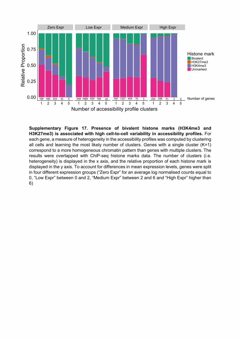
Supplementary Figure 17. Presence of bivalent histone marks (H3K4me3 and H3K27me3) is associated with high cell-to-cell variability in accessibility profiles. For each gene, a measure of heterogeneity in the accessibility profiles was computed by clustering all cells and learning the most likely number of clusters. Genes with a single cluster (K=1) correspond to a more homogeneous chromatin pattern than genes with multiple clusters. The results were overlapped with ChiP-seq histone marks data. The number of clusters (i.e. heterogeneity) is displayed in the x axis, and the relative proportion of each histone mark is displayed in the y axis. To account for differences in mean expression levels, genes were split in four different expression groups (“Zero Expr” for an average log normalised counts equal to 0, “Low Expr” between 0 and 2, “Medium Expr” between 2 and 6 and “High Expr” higher than 6)
Zero Expr Low Expr Medium Expr High Expr
1 2 3 4 5 1 2 3 4 5 1 2 3 4 5 1 2 3 4 50.00
0.25
0.50
0.75
1.00
Number of accessibility profile clusters
Rel
ativ
e P
ropo
rtion
Histone markBivalentH3K27me3H3K4me3Unmarked
254 298 51 3 0787 1327 405 70 3549 1689 834 169 25168 490 203 33 5 Number of genes
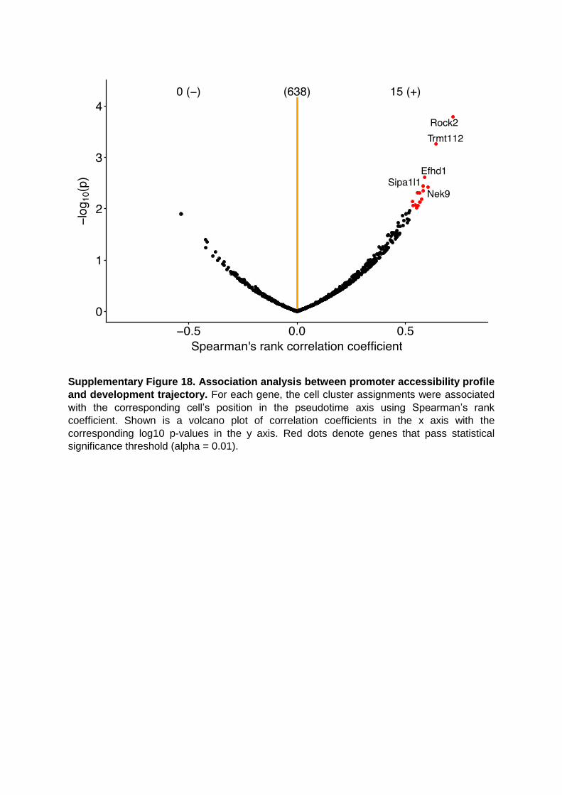
Supplementary Figure 18. Association analysis between promoter accessibility profile
and development trajectory. For each gene, the cell cluster assignments were associated
with the corresponding cell’s position in the pseudotime axis using Spearman’s rank
coefficient. Shown is a volcano plot of correlation coefficients in the x axis with the
corresponding log10 p-values in the y axis. Red dots denote genes that pass statistical
significance threshold (alpha = 0.01).

Supplementary figure 19. Reconstructed dynamics of chromatin accessibility profiles along the developmental trajectory. Shown are profiles of representative cells for genes that show dynamic behaviour along the pseudotime in their accessibility profile: (a) Nek9 and (b) Trmt112. Each red dot represents a GpC site, with binary accessibility value (1=accessible, 0=inaccessible). A non-linear regression curve is fit for each gene and cell using the BPRMeth package5. The blue line represents the mean of the posterior distribution of the inferred non-linear function, and the shading represents the corresponding 80% credible interval. Axis ticks display windows of +-200bp around the TSS. Yellow shading is used to highlight the relevant region of dynamic changes.
(a) Cell H05 (b) Cell H09
(c) Cell D03 (d) Cell E01
(e) Cell E08 (f) Cell F02
(g) Cell F07 (h) Cell F02
Pluripotent Differentiateda b c d e f g h
0.0
0.2
0.4
0.6
0.8
1.0
−200bp TSS +200bp
Acc
essi
bilit
y
0.0
0.2
0.4
0.6
0.8
1.0
−200bp TSS +200bp
Acc
essi
bilit
y
0.0
0.2
0.4
0.6
0.8
1.0
−200bp TSS +200bp
Acc
essi
bilit
y
0.0
0.2
0.4
0.6
0.8
1.0
−200bp TSS +200bp
Acc
essi
bilit
y
0.0
0.2
0.4
0.6
0.8
1.0
−200bp TSS +200bp
Acc
essi
bilit
y
0.0
0.2
0.4
0.6
0.8
1.0
−200bp TSS +200bp
Acc
essi
bilit
y
0.0
0.2
0.4
0.6
0.8
1.0
−200bp TSS +200bp
Acc
essi
bilit
y
0.0
0.2
0.4
0.6
0.8
1.0
−200bp TSS +200bp
Acc
essi
bilit
y
Tmrt112b
(a) Cell H05 (b) Cell D11
(c) Cell E07 (d) Cell H07
(e) Cell D10 (f) Cell G06
(g) Cell F02 (h) Cell D07
Pluripotent Differentiateda b c d e f g h
0.0
0.2
0.4
0.6
0.8
1.0
−200bp TSS +200bp
Acc
essi
bilit
y
0.0
0.2
0.4
0.6
0.8
1.0
−200bp TSS +200bp
Acc
essi
bilit
y
0.0
0.2
0.4
0.6
0.8
1.0
−200bp TSS +200bp
Acc
essi
bilit
y
0.0
0.2
0.4
0.6
0.8
1.0
−200bp TSS +200bp
Acc
essi
bilit
y
0.0
0.2
0.4
0.6
0.8
1.0
−200bp TSS +200bp
Acc
essi
bilit
y
0.0
0.2
0.4
0.6
0.8
1.0
−200bp TSS +200bp
Acc
essi
bilit
y
0.0
0.2
0.4
0.6
0.8
1.0
−200bp TSS +200bp
Acc
essi
bilit
y
0.0
0.2
0.4
0.6
0.8
1.0
−200bp TSS +200bp
Acc
essi
bilit
y
Nek9a

Supplementary figure 20. RNA-seq quality control for (a) ESC and (b) EB dataset. Left
displays the number of aligned reads per cell (library size) and right is the number of expressed
genes (log2 normalised read counts>0) detected per cell. Cells below a set threshold (dotted
lines) were removed (axis text in red).
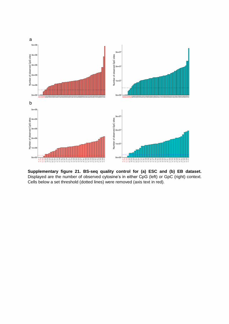
Supplementary figure 21. BS-seq quality control for (a) ESC and (b) EB dataset.
Displayed are the number of observed cytosine’s in either CpG (left) or GpC (right) context.
Cells below a set threshold (dotted lines) were removed (axis text in red).
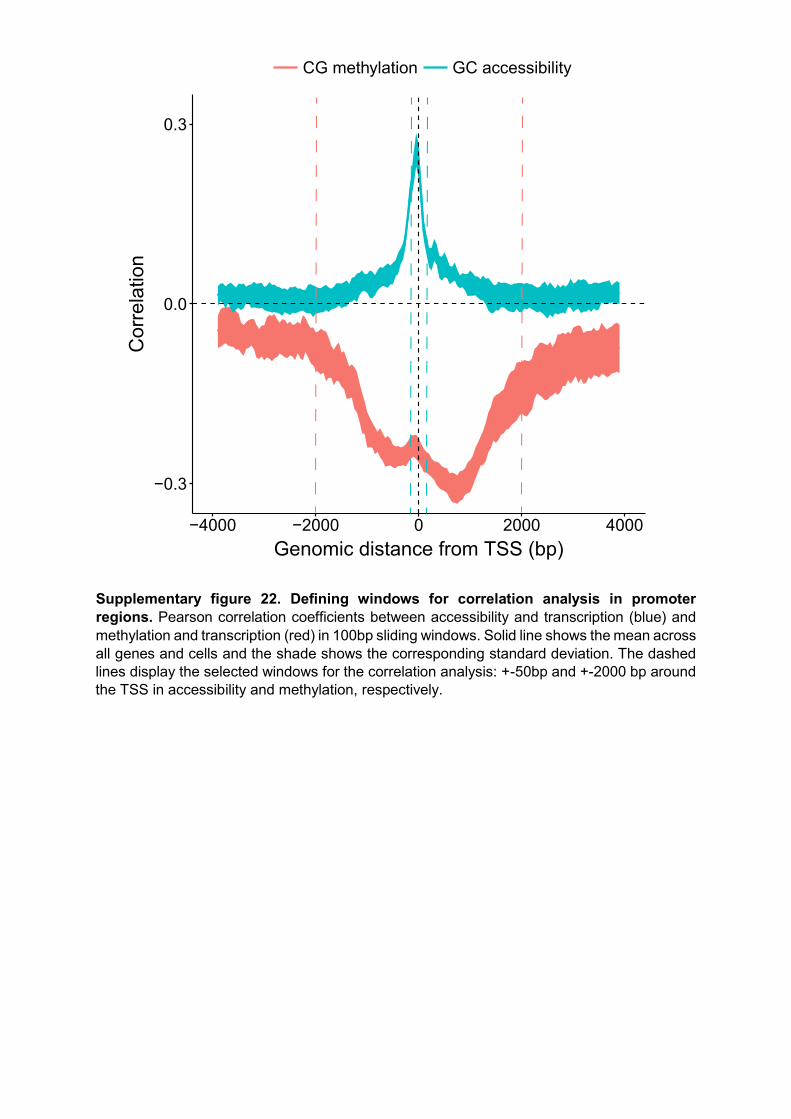
Supplementary figure 22. Defining windows for correlation analysis in promoter regions. Pearson correlation coefficients between accessibility and transcription (blue) and methylation and transcription (red) in 100bp sliding windows. Solid line shows the mean across all genes and cells and the shade shows the corresponding standard deviation. The dashed lines display the selected windows for the correlation analysis: +-50bp and +-2000 bp around the TSS in accessibility and methylation, respectively.
−0.3
0.0
0.3
−4000 −2000 0 2000 4000Genomic distance from TSS (bp)
Cor
rela
tion
CG methylation GC accessibility

Supplementary References
1. Angermueller, C. et al. Nat Meth 13, 229-232 (2016). 2. Pierson, E. & Yau, C. Genome Biology 16, 241 (2015). 3. Kolodziejczyk, Aleksandra A. et al. Cell Stem Cell 17, 471-485 (2015). 4. Zvetkova, I. et al. Nat Genet 37, 1274-1279 (2005). 5. Kapourani, C.A. & Sanguinetti, G. Bioinformatics (Oxford, England) 32, i405-i412
(2016).


![File name: Supplementary Information Description ...10.1038/s41467-017...File name: Supplementary Information ... elements. All physical ... 11 Idehara [2011] ScP Philippines 12 Rost](https://static.documents.pub/doc/80x56/5ad93dce7f8b9a3e578e69d9/file-name-supplementary-information-description-101038s41467-017file-name.jpg)


