14
Click to edit Master subtitle style 07/04/14 Screenshots of photoshop front cover Rebecca Walsh.
| Date post: | 20-Jul-2015 |
| Category: |
Education |
| Upload: | beckywalsh |
| View: | 242 times |
| Download: | 2 times |
Click to edit Master subtitle style
07/04/14
Screenshots of photoshop front cover
Rebecca Walsh.

07/04/14
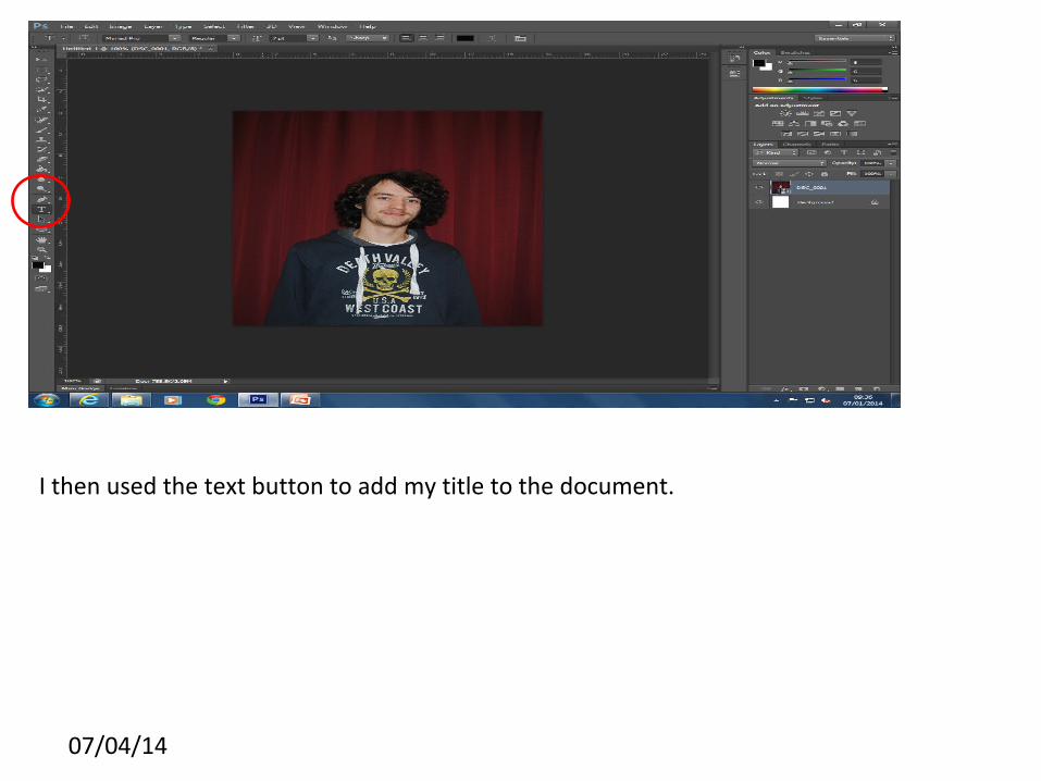
First I imported my chosen image to photoshop.
07/04/14
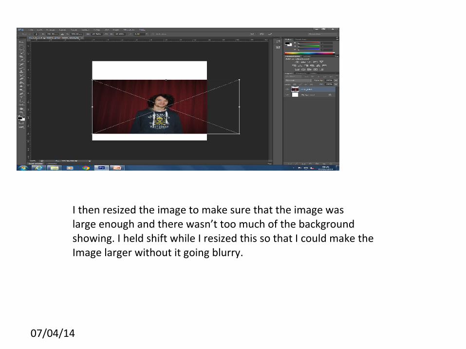
I then resized the image to make sure that the image waslarge enough and there wasn’t too much of the background showing. I held shift while I resized this so that I could make the Image larger without it going blurry.
07/04/14
I then used the text button to add my title to the document.
07/04/14
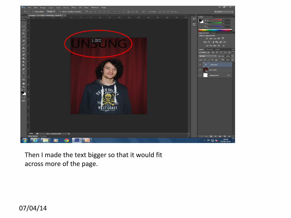
Then I made the text bigger so that it would fit across more of the page.
07/04/14
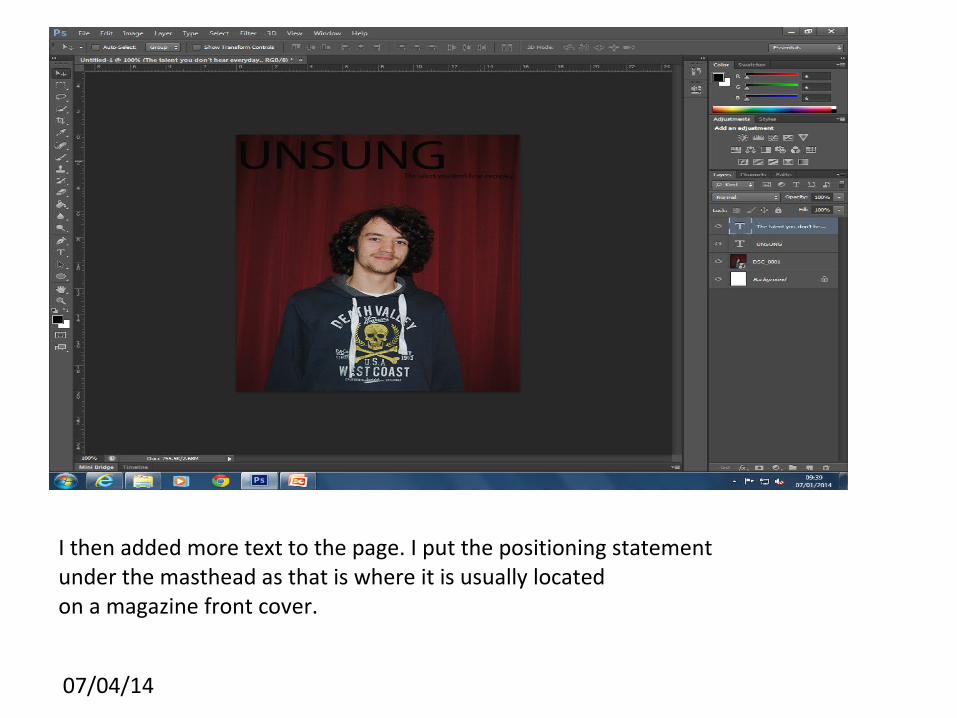
I then added more text to the page. I put the positioning statementunder the masthead as that is where it is usually locatedon a magazine front cover.
07/04/14
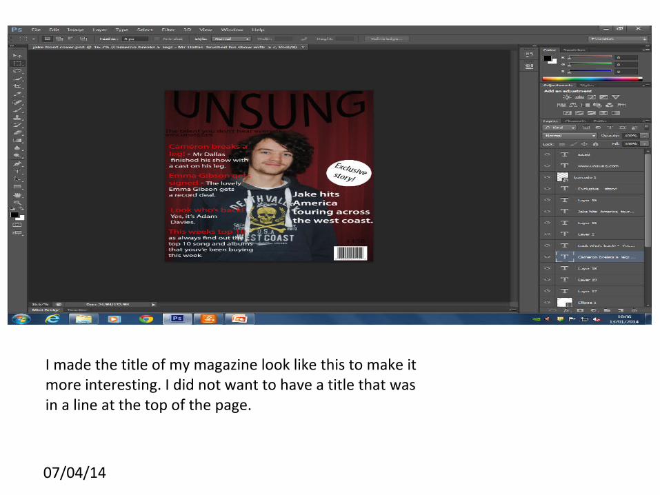
I made the title of my magazine look like this to make it more interesting. I did not want to have a title that was in a line at the top of the page.
07/04/14
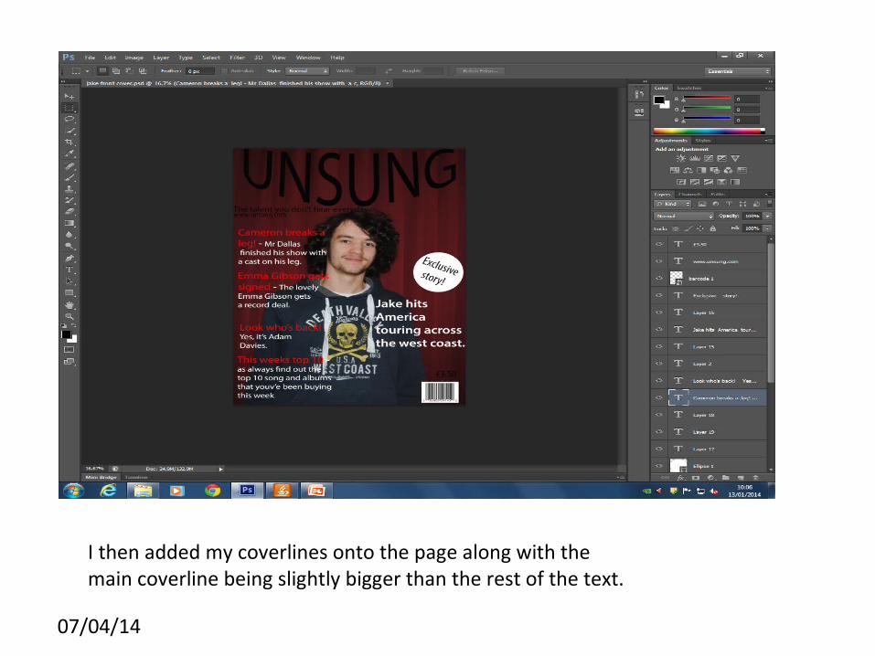
I then added my coverlines onto the page along with the main coverline being slightly bigger than the rest of the text.
07/04/14
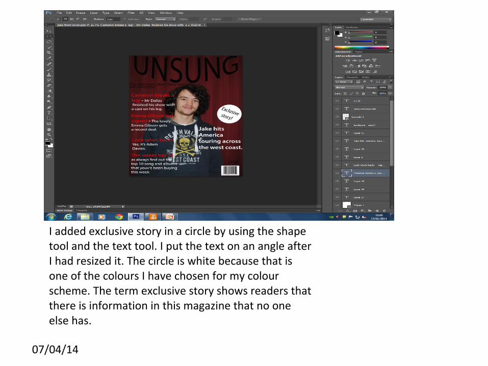
I added exclusive story in a circle by using the shape tool and the text tool. I put the text on an angle after I had resized it. The circle is white because that is one of the colours I have chosen for my colour scheme. The term exclusive story shows readers that there is information in this magazine that no one else has.
07/04/14
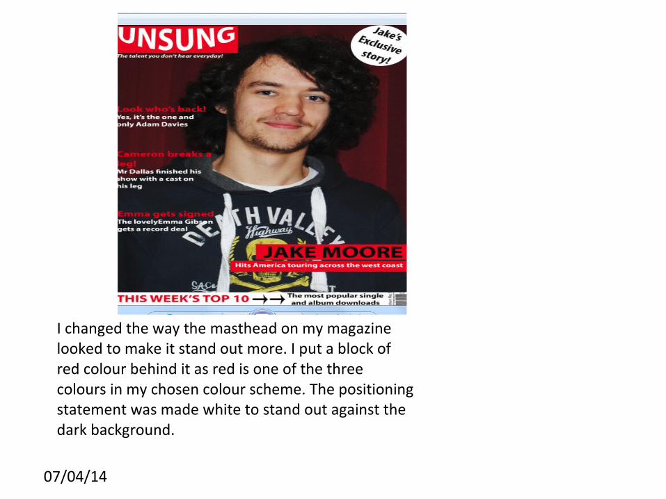
I changed the way the masthead on my magazine looked to make it stand out more. I put a block of red colour behind it as red is one of the three colours in my chosen colour scheme. The positioning statement was made white to stand out against the dark background.
07/04/14
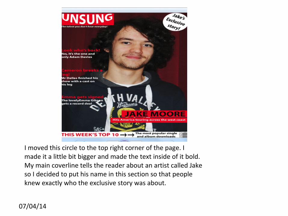
I moved this circle to the top right corner of the page. I made it a little bit bigger and made the text inside of it bold. My main coverline tells the reader about an artist called Jake so I decided to put his name in this section so that people knew exactly who the exclusive story was about.
07/04/14
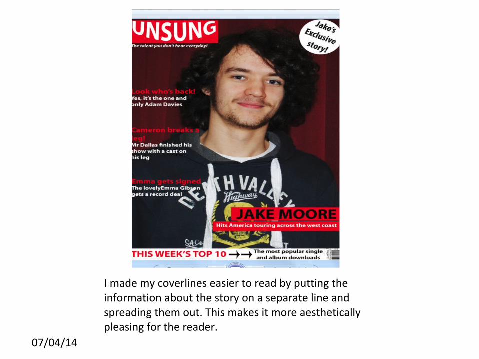
I made my coverlines easier to read by putting the information about the story on a separate line and spreading them out. This makes it more aesthetically pleasing for the reader.

07/04/14
I put a red background behind the main coverline. This clearly shows that this is the main story in my magazine. The main coverline was a bigger font than the rest of the coverlines and I made them all bold so they would be easier to read.
07/04/14
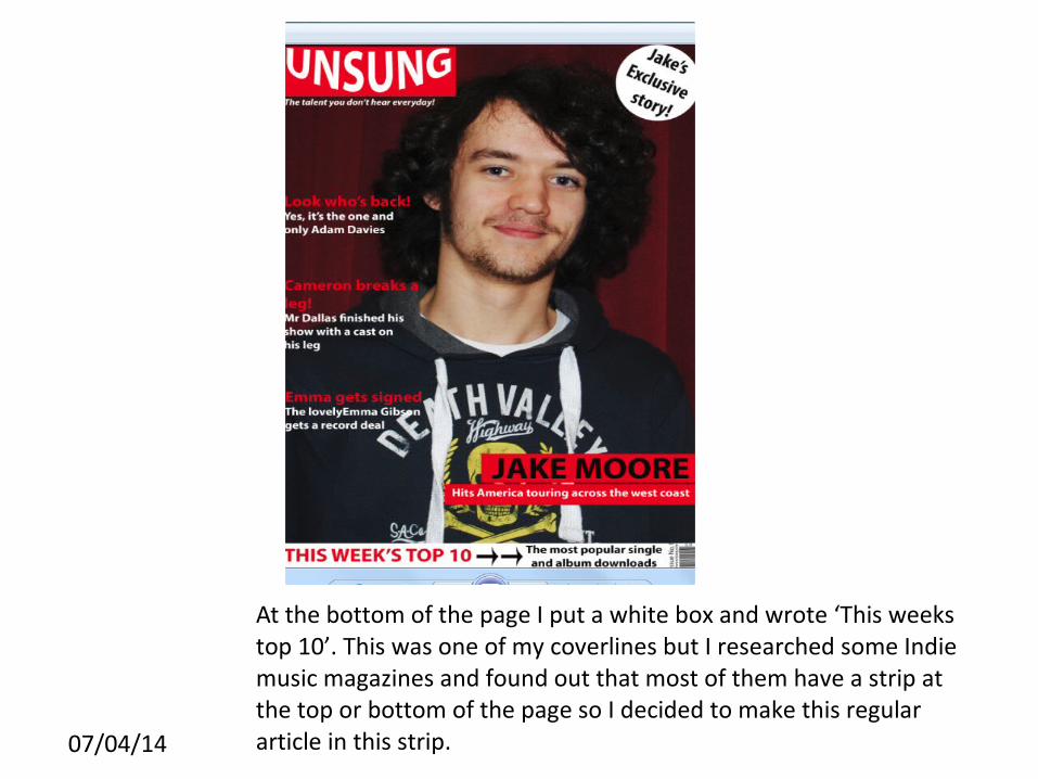
At the bottom of the page I put a white box and wrote ‘This weeks top 10’. This was one of my coverlines but I researched some Indie music magazines and found out that most of them have a strip at the top or bottom of the page so I decided to make this regular article in this strip.


