161 Section 4. Medicare Risk HMOs Managed care encompasses a wide variety of arrangements, including health maintenance organizations (HMOs) and preferred provider organizations (PPOs). Typically managed care plans control costs by restricting an enrollee's choice of provider or by giving enrollees strong financial incentives to choose particular providers. They also reduce costs by managing enrollees' use of services. In 1983, Congress authorized payment to qualified "risk-contract" HMOs or similar entities that enrolled Medicare beneficiaries. The intent was to give Medicare beneficiaries the opportunity to enroll in HMOs as a more cost efficient alternative to fee-for- service health care. In December 1996, about 13% of Medicare beneficiaries were enrolled in HMOs, most of whom were in risk contract plans. (The remainder were in HMOs paid on a cost basis, or in demonstration HMOs.) An HMO accepts financial responsibility for a defined set of health care benefits in return for a capitation payment, or a fixed monthly per capita premium paid by or on behalf of each enrolled member. In return for the capitation payment, the HMO agrees to provide or arrange for the full range of Medicare services through an organized system of affiliated physicians, hospitals, and other providers. With certain exceptions, Medicare beneficiaries must obtain all covered services through the qualified HMO, except in emergencies. Some in Congress believe that Medicare could achieve substantial savings by increasing the managed care options available to beneficiaries and changing the payment methodology to take greater advantage of the forces of market competition. This perspective is, in part, encouraged by the experiences of the private sector, where the rapid movement of large group health plans from fee-for-service into managed care has helped to slow the rate of medical care inflation. While these changes are not regarded by everyone as positive (concerns exist, for example, that the growth of managed care has reduced access to services for lower-income populations), substantial support exists for trying to restructure Medicare to make it work more like the large group private insurance market. This section provides information on the number and location of Medicare risk HMOs and the number, geographic distribution, and characteristics of beneficiaries enrolled in HMOs. Comparisons are drawn between Medicare HMO enrollees and beneficiaries in Medicare fee-for-service. Information is also provided on Medicare payments to risk HMOs and geographic variation in these payments.
Transcript
161
Section 4. Medicare Risk HMOs
Managed care encompasses a wide variety of arrangements, including healthmaintenance organizations (HMOs) and preferred provider organizations (PPOs).Typically managed care plans control costs by restricting an enrollee's choice ofprovider or by giving enrollees strong financial incentives to choose particularproviders. They also reduce costs by managing enrollees' use of services. In 1983,Congress authorized payment to qualified "risk-contract" HMOs or similar entitiesthat enrolled Medicare beneficiaries. The intent was to give Medicare beneficiariesthe opportunity to enroll in HMOs as a more cost efficient alternative to fee-for-service health care.
In December 1996, about 13% of Medicare beneficiaries were enrolled inHMOs, most of whom were in risk contract plans. (The remainder were in HMOspaid on a cost basis, or in demonstration HMOs.) An HMO accepts financialresponsibility for a defined set of health care benefits in return for a capitationpayment, or a fixed monthly per capita premium paid by or on behalf of eachenrolled member. In return for the capitation payment, the HMO agrees to provideor arrange for the full range of Medicare services through an organized system ofaffiliated physicians, hospitals, and other providers. With certain exceptions,Medicare beneficiaries must obtain all covered services through the qualified HMO,except in emergencies.
Some in Congress believe that Medicare could achieve substantial savings byincreasing the managed care options available to beneficiaries and changing thepayment methodology to take greater advantage of the forces of market competition.This perspective is, in part, encouraged by the experiences of the private sector,where the rapid movement of large group health plans from fee-for-service intomanaged care has helped to slow the rate of medical care inflation. While thesechanges are not regarded by everyone as positive (concerns exist, for example, thatthe growth of managed care has reduced access to services for lower-incomepopulations), substantial support exists for trying to restructure Medicare to make itwork more like the large group private insurance market.
This section provides information on the number and location of Medicare riskHMOs and the number, geographic distribution, and characteristics of beneficiariesenrolled in HMOs. Comparisons are drawn between Medicare HMO enrollees andbeneficiaries in Medicare fee-for-service. Information is also provided on Medicarepayments to risk HMOs and geographic variation in these payments.
162
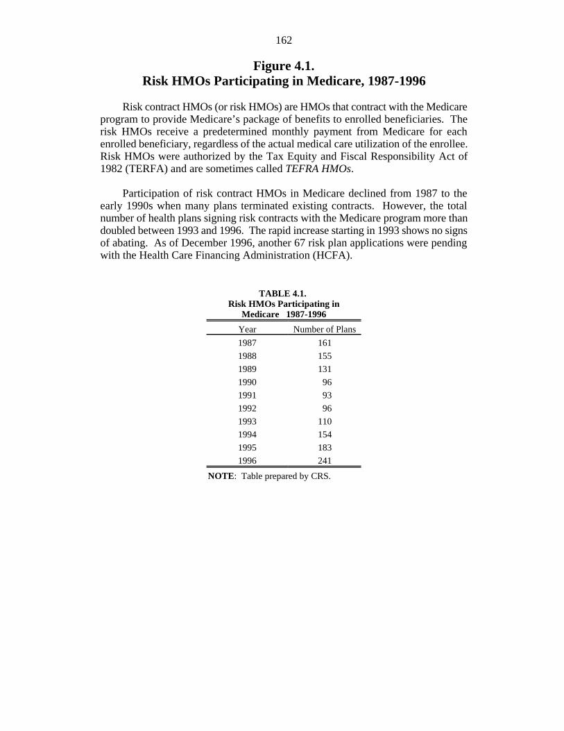
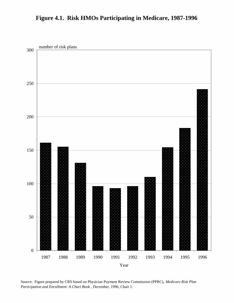
Figure 4.1.Risk HMOs Participating in Medicare, 1987-1996
Risk contract HMOs (or risk HMOs) are HMOs that contract with the Medicareprogram to provide Medicare’s package of benefits to enrolled beneficiaries. Therisk HMOs receive a predetermined monthly payment from Medicare for eachenrolled beneficiary, regardless of the actual medical care utilization of the enrollee.Risk HMOs were authorized by the Tax Equity and Fiscal Responsibility Act of1982 (TERFA) and are sometimes called TEFRA HMOs.
Participation of risk contract HMOs in Medicare declined from 1987 to theearly 1990s when many plans terminated existing contracts. However, the totalnumber of health plans signing risk contracts with the Medicare program more thandoubled between 1993 and 1996. The rapid increase starting in 1993 shows no signsof abating. As of December 1996, another 67 risk plan applications were pendingwith the Health Care Financing Administration (HCFA).
TABLE 4.1. Risk HMOs Participating in
Medicare 1987-1996
Year Number of Plans
1987 161
1988 155
1989 131
1990 96
1991 93
1992 96
1993 110
1994 154
1995 183
1996 241
NOTE: Table prepared by CRS.
Figure 4.1. Risk HMOs Participating in Medicare, 1987-1996
Source: Figure prepared by CRS based on Physician Payment Review Commission (PPRC), Medicare Risk Plan Participation and Enrollment: A Chart Book , December, 1996, Chart 1.
0
50
100
150
200
250
300
1987 1988 1989 1990 1991 1992 1993 1994 1995 1996
Year
number of risk plans
164
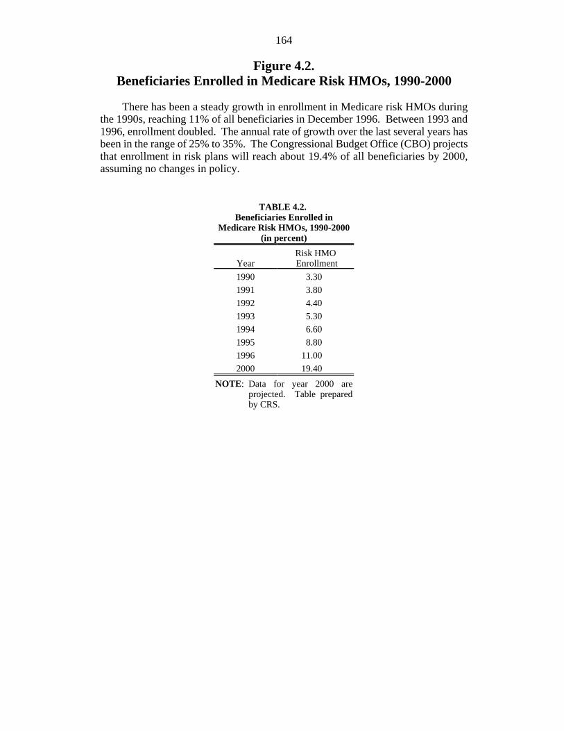
Figure 4.2.Beneficiaries Enrolled in Medicare Risk HMOs, 1990-2000
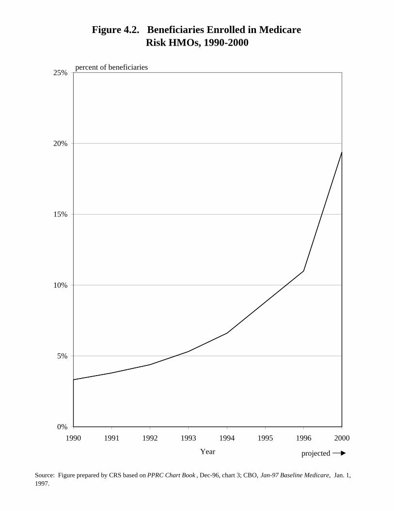
There has been a steady growth in enrollment in Medicare risk HMOs duringthe 1990s, reaching 11% of all beneficiaries in December 1996. Between 1993 and1996, enrollment doubled. The annual rate of growth over the last several years hasbeen in the range of 25% to 35%. The Congressional Budget Office (CBO) projectsthat enrollment in risk plans will reach about 19.4% of all beneficiaries by 2000,assuming no changes in policy.
TABLE 4.2. Beneficiaries Enrolled in
Medicare Risk HMOs, 1990-2000(in percent)
Year EnrollmentRisk HMO
1990 3.30
1991 3.80
1992 4.40
1993 5.30
1994 6.60
1995 8.80
1996 11.00
2000 19.40
NOTE: Data for year 2000 areprojected. Table preparedby CRS.
Figure 4.2. Beneficiaries Enrolled in MedicareRisk HMOs, 1990-2000
Source: Figure prepared by CRS based on PPRC Chart Book , Dec-96, chart 3; CBO, Jan-97 Baseline Medicare, Jan. 1, 1997.
0%
5%
10%
15%
20%
25%
1990 1991 1992 1993 1994 1995 1996 2000
Year projected
percent of beneficiaries
166
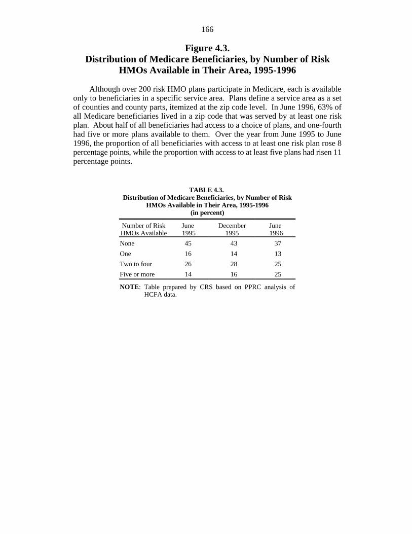
Figure 4.3.Distribution of Medicare Beneficiaries, by Number of Risk
HMOs Available in Their Area, 1995-1996
Although over 200 risk HMO plans participate in Medicare, each is availableonly to beneficiaries in a specific service area. Plans define a service area as a setof counties and county parts, itemized at the zip code level. In June 1996, 63% ofall Medicare beneficiaries lived in a zip code that was served by at least one riskplan. About half of all beneficiaries had access to a choice of plans, and one-fourthhad five or more plans available to them. Over the year from June 1995 to June1996, the proportion of all beneficiaries with access to at least one risk plan rose 8percentage points, while the proportion with access to at least five plans had risen 11percentage points.
TABLE 4.3. Distribution of Medicare Beneficiaries, by Number of Risk
HMOs Available in Their Area, 1995-1996(in percent)
Number of Risk June December JuneHMOs Available 1995 1995 1996
None 45 43 37
One 16 14 13
Two to four 26 28 25
Five or more 14 16 25
NOTE: Table prepared by CRS based on PPRC analysis ofHCFA data.
Figure 4.3. Distribution of Medicare Beneficiaries, by Number of Risk HMOs Available in Their Area, 1995-1996
Source: Figure prepared by CRS based on PPRC Chart Book, Dec. 1996, Chart 2.
0%
5%
10%
15%
20%
25%
30%
35%
40%
45%
50%
None One Two to Four Five or More
Number of risk HMOs
Jun-95 Dec-95 Jun-96
percent of beneficiaries
168
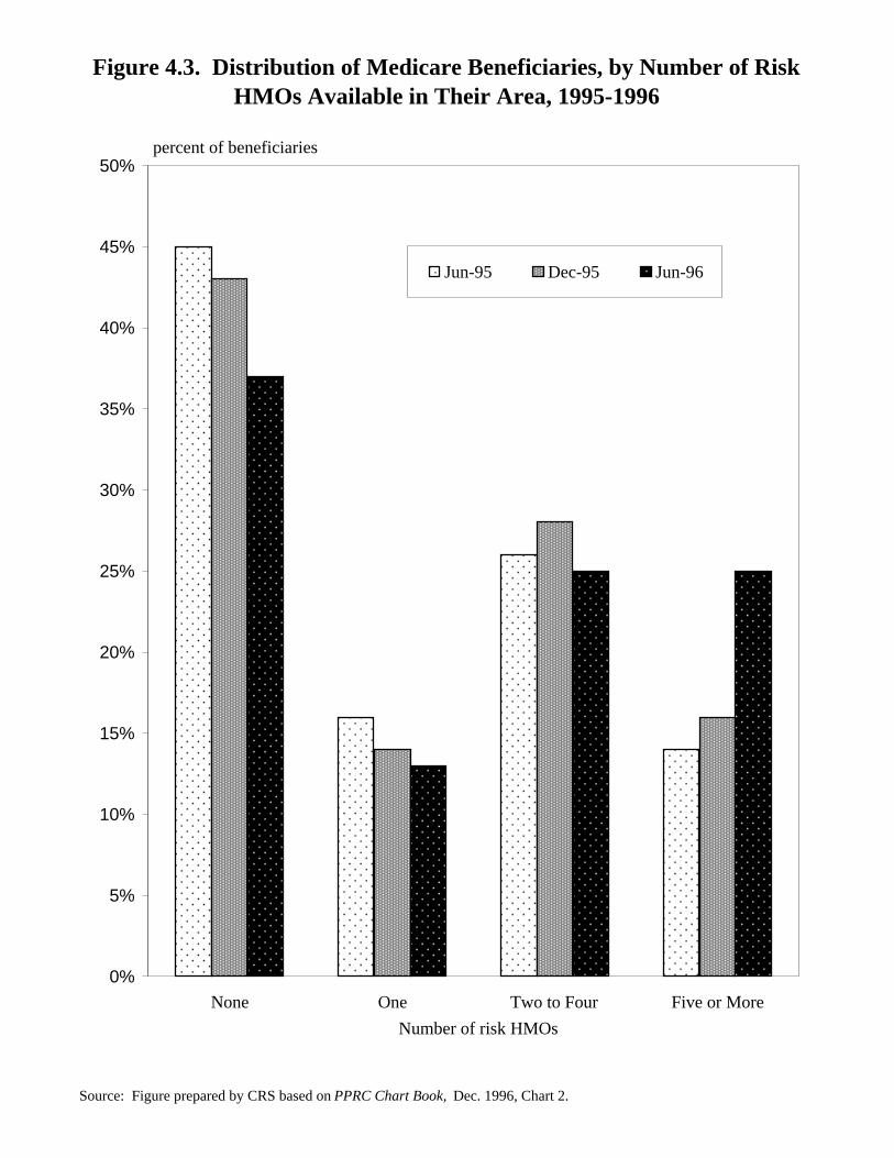
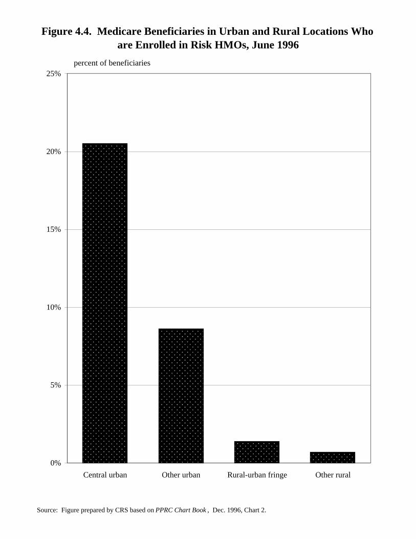
Figure 4.4.Medicare Beneficiaries in Urban and Rural Locations
Who Are Enrolled in Risk HMOs, June 1996
Patterns of enrollment in risk contract HMOs are not uniform across urban andrural locales. Risk plan enrollment in central urban areas (generally, the cities at thecore of metropolitan areas) was about 20% in June 1996, about twice the level ofenrollment in outlying urban areas. Risk HMO enrollment in rural areas is about 1%.
TABLE 4.4.Medicare Beneficiaries in Urban andRural Locations Who Are Enrolled
in Risk HMOs, June 1996(in percent)
Risk-Contract Plans
Central urban 20.5
Other urban 8.6
Rural-urban fringe 1.4
Other rural 0.7
NOTE: Table prepared by CRS based onPPRC analysis of HCFA data.
Figure 4.4. Medicare Beneficiaries in Urban and Rural Locations Who are Enrolled in Risk HMOs, June 1996
Source: Figure prepared by CRS based on PPRC Chart Book , Dec. 1996, Chart 2.
0%
5%
10%
15%
20%
25%
Central urban Other urban Rural-urban fringe Other rural
percent of beneficiaries
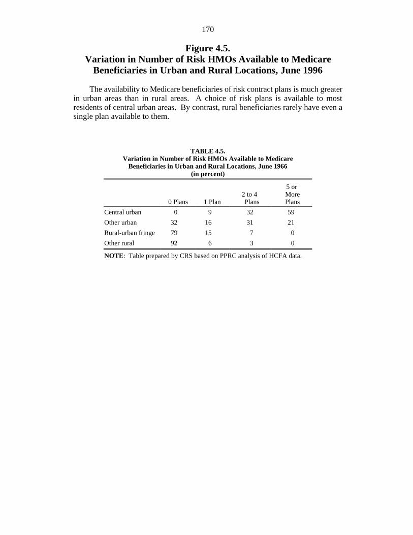
170
Figure 4.5.Variation in Number of Risk HMOs Available to Medicare
Beneficiaries in Urban and Rural Locations, June 1996
The availability to Medicare beneficiaries of risk contract plans is much greaterin urban areas than in rural areas. A choice of risk plans is available to mostresidents of central urban areas. By contrast, rural beneficiaries rarely have even asingle plan available to them.
TABLE 4.5.Variation in Number of Risk HMOs Available to Medicare
Beneficiaries in Urban and Rural Locations, June 1966(in percent)
0 Plans 1 Plan Plans Plans2 to 4 More
5 or
Central urban 0 9 32 59
Other urban 32 16 31 21
Rural-urban fringe 79 15 7 0
Other rural 92 6 3 0
NOTE: Table prepared by CRS based on PPRC analysis of HCFA data.
Figure 4.5. Variation in Number of Risk HMOs Available to Medicare Beneficiaries in Urban and Rural Locations, June 1996
Source: Figure prepared by CRS based on PPRC Chart Book , Dec. 1996, Chart 4.
0%
10%
20%
30%
40%
50%
60%
70%
80%
90%
100%
Rural-urban fringe Other rural Other urban Central urban
0 plans
1 plan
2 to 4 plans
5 or more plans
percent of beneficiaries
172
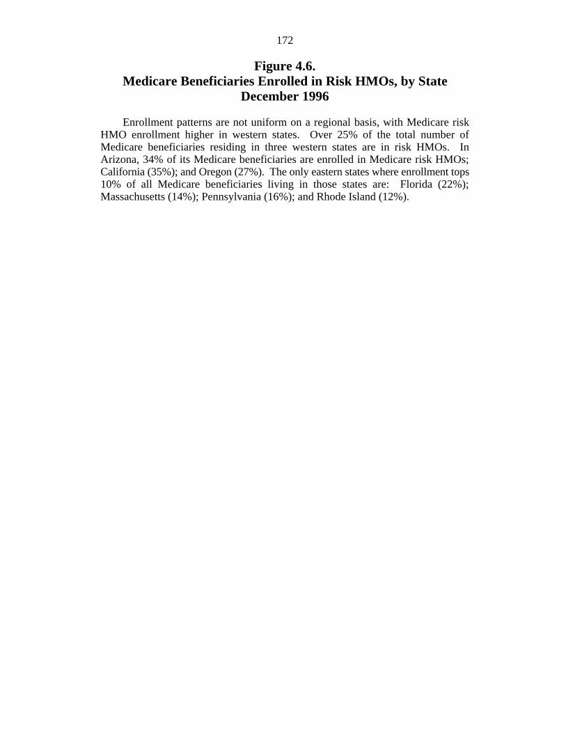
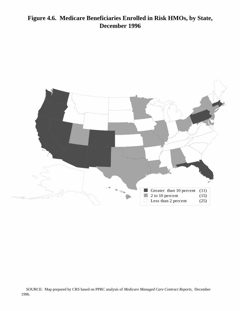
Figure 4.6.Medicare Beneficiaries Enrolled in Risk HMOs, by State
December 1996
Enrollment patterns are not uniform on a regional basis, with Medicare riskHMO enrollment higher in western states. Over 25% of the total number ofMedicare beneficiaries residing in three western states are in risk HMOs. InArizona, 34% of its Medicare beneficiaries are enrolled in Medicare risk HMOs;California (35%); and Oregon (27%). The only eastern states where enrollment tops10% of all Medicare beneficiaries living in those states are: Florida (22%);Massachusetts (14%); Pennsylvania (16%); and Rhode Island (12%).
Figure 4.6. Medicare Beneficiaries Enrolled in Risk HMOs, by State, December 1996
Greater than 10 percent (11)2 to 10 percent (15)Less than 2 percent (25)
SOURCE: Map prepared by CRS based on PPRC analysis of Medicare Managed Care Contract Reports, December 1996.
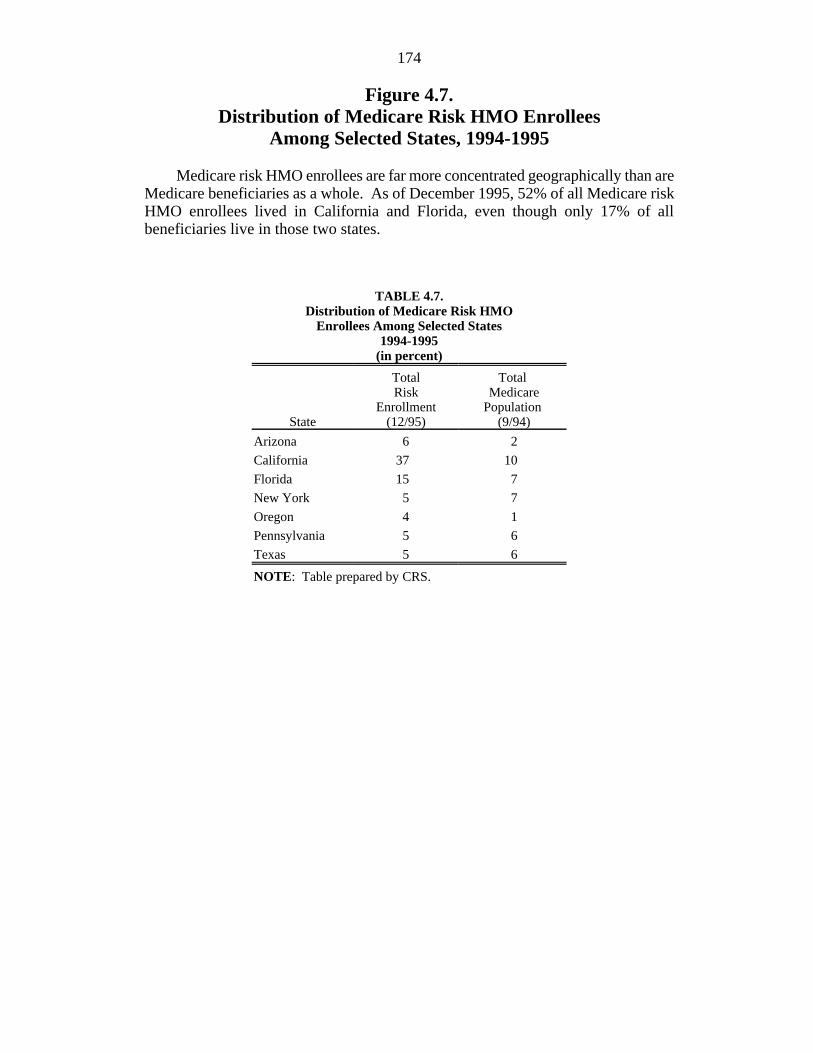
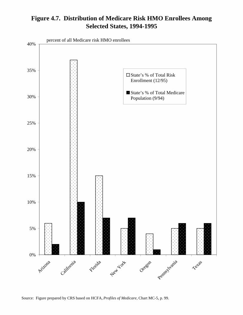
174
Figure 4.7.Distribution of Medicare Risk HMO Enrollees
Among Selected States, 1994-1995
Medicare risk HMO enrollees are far more concentrated geographically than areMedicare beneficiaries as a whole. As of December 1995, 52% of all Medicare riskHMO enrollees lived in California and Florida, even though only 17% of allbeneficiaries live in those two states.
TABLE 4.7.Distribution of Medicare Risk HMO
Enrollees Among Selected States1994-1995
(in percent)
State (12/95) (9/94)
Total Total Risk Medicare
Enrollment Population
Arizona 6 2
California 37 10
Florida 15 7
New York 5 7
Oregon 4 1
Pennsylvania 5 6
Texas 5 6
NOTE: Table prepared by CRS.
Figure 4.7. Distribution of Medicare Risk HMO Enrollees Among Selected States, 1994-1995
Source: Figure prepared by CRS based on HCFA, Profiles of Medicare, Chart MC-5, p. 99.
0%
5%
10%
15%
20%
25%
30%
35%
40%
Arizon
a
Califo
rnia
Florid
a
New Y
ork
Oregon
Penns
ylvan
ia
Texas
State’s % of Total RiskEnrollment (12/95)
State’s % of Total MedicarePopulation (9/94)
percent of all Medicare risk HMO enrollees
176
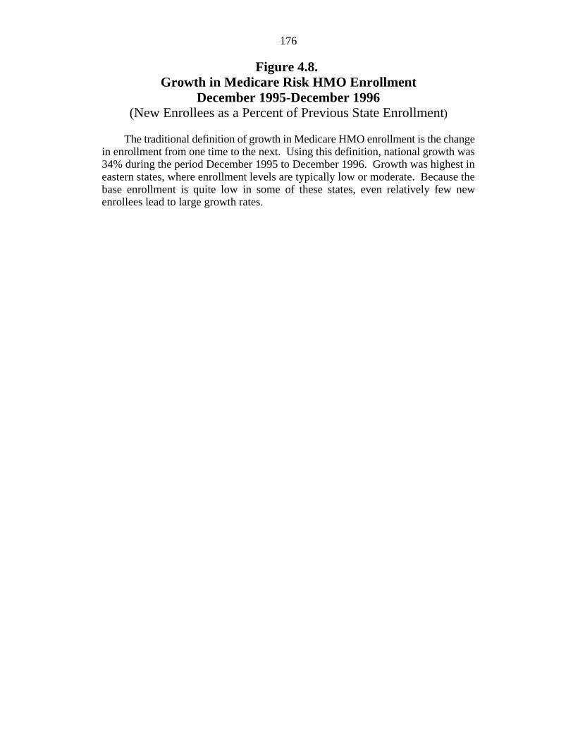
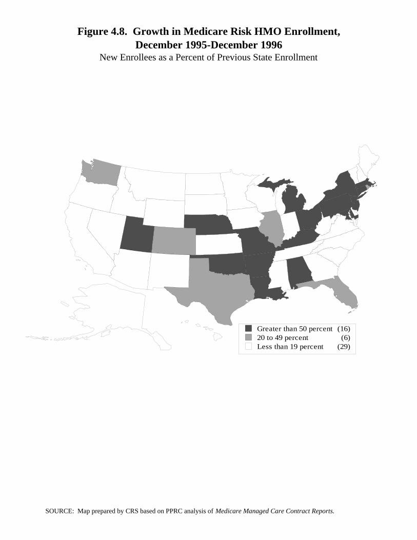
Figure 4.8. Growth in Medicare Risk HMO Enrollment
December 1995-December 1996(New Enrollees as a Percent of Previous State Enrollment)
The traditional definition of growth in Medicare HMO enrollment is the changein enrollment from one time to the next. Using this definition, national growth was34% during the period December 1995 to December 1996. Growth was highest ineastern states, where enrollment levels are typically low or moderate. Because thebase enrollment is quite low in some of these states, even relatively few newenrollees lead to large growth rates.
Figure 4.8. Growth in Medicare Risk HMO Enrollment,December 1995-December 1996
New Enrollees as a Percent of Previous State Enrollment
Greater than 50 percent (16)20 to 49 percent (6)Less than 19 percent (29)
SOURCE: Map prepared by CRS based on PPRC analysis of Medicare Managed Care Contract Reports.
178
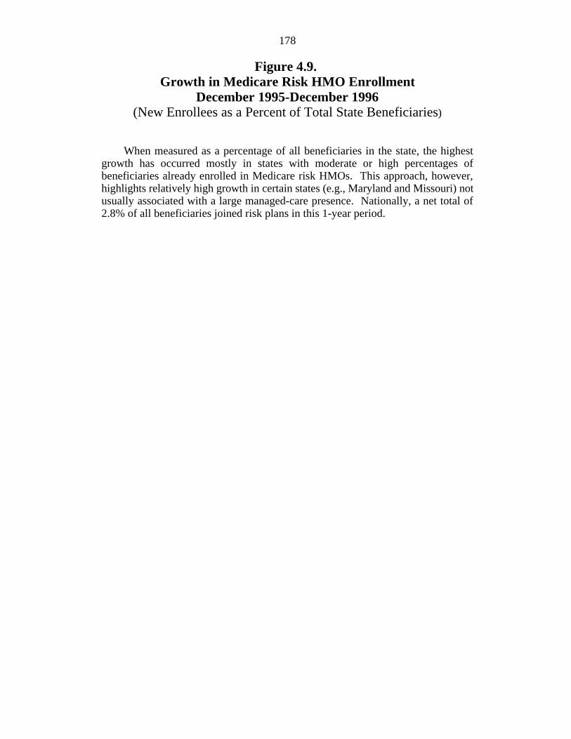
Figure 4.9. Growth in Medicare Risk HMO Enrollment
December 1995-December 1996(New Enrollees as a Percent of Total State Beneficiaries)
When measured as a percentage of all beneficiaries in the state, the highestgrowth has occurred mostly in states with moderate or high percentages ofbeneficiaries already enrolled in Medicare risk HMOs. This approach, however,highlights relatively high growth in certain states (e.g., Maryland and Missouri) notusually associated with a large managed-care presence. Nationally, a net total of2.8% of all beneficiaries joined risk plans in this 1-year period.
Figure 4.9. Growth in Medicare Risk HMO Enrollment,December 1995-December 1996
New Enrollees as a Percent of Total State Beneficiaries
3 percent or greater (15)1 to 3 percent (8)Less than 1 percent (28)
SOURCE: Map prepared by CRS based on PPRC analysis of Medicare Managed Care Contract Reports, December 1996.
180
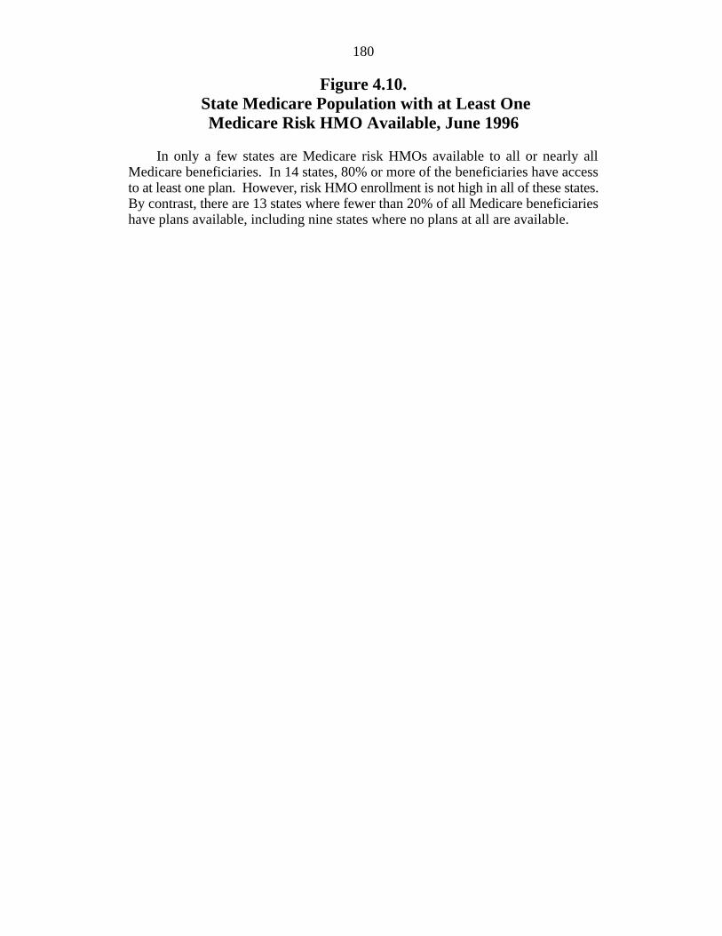
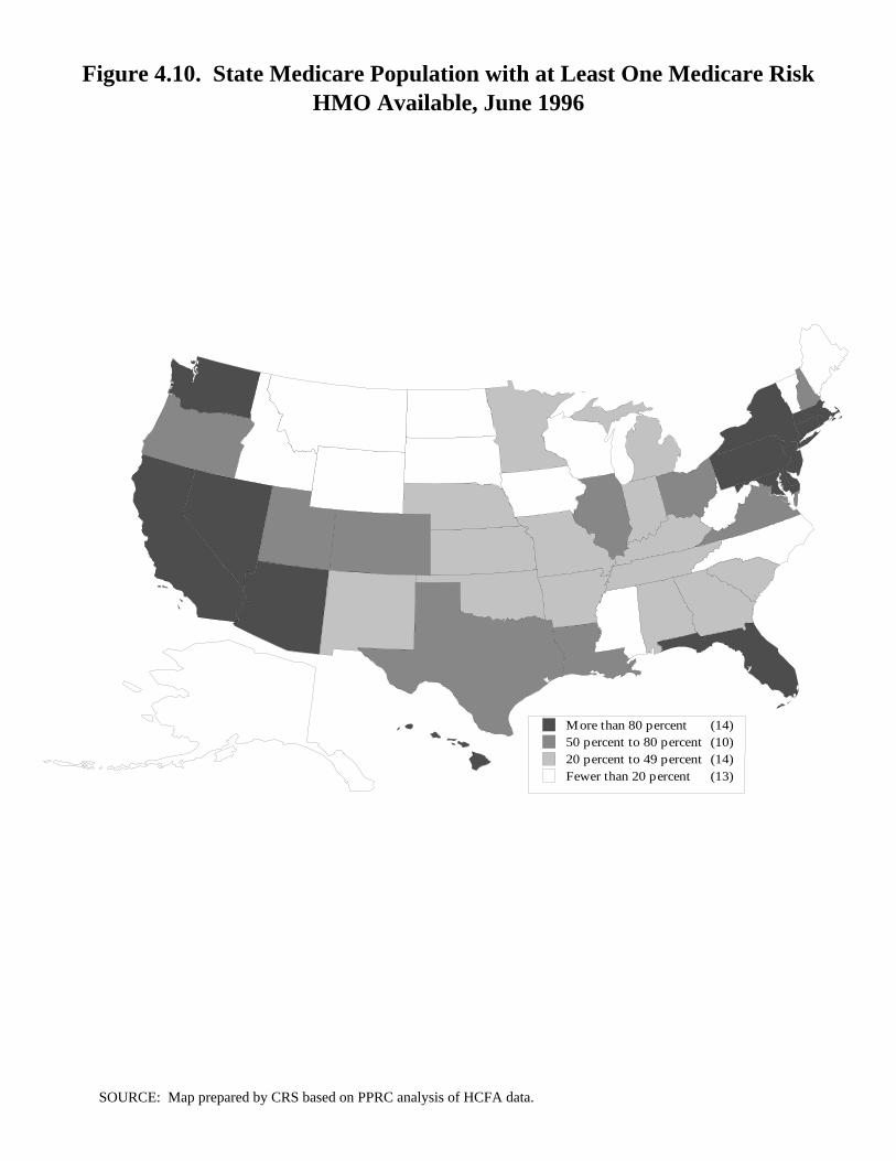
Figure 4.10. State Medicare Population with at Least One
Medicare Risk HMO Available, June 1996
In only a few states are Medicare risk HMOs available to all or nearly allMedicare beneficiaries. In 14 states, 80% or more of the beneficiaries have accessto at least one plan. However, risk HMO enrollment is not high in all of these states.By contrast, there are 13 states where fewer than 20% of all Medicare beneficiarieshave plans available, including nine states where no plans at all are available.
Figure 4.10. State Medicare Population with at Least One Medicare Risk HMO Available, June 1996
More than 80 percent (14)50 percent to 80 percent (10)20 percent to 49 percent (14)Fewer than 20 percent (13)
SOURCE: Map prepared by CRS based on PPRC analysis of HCFA data.
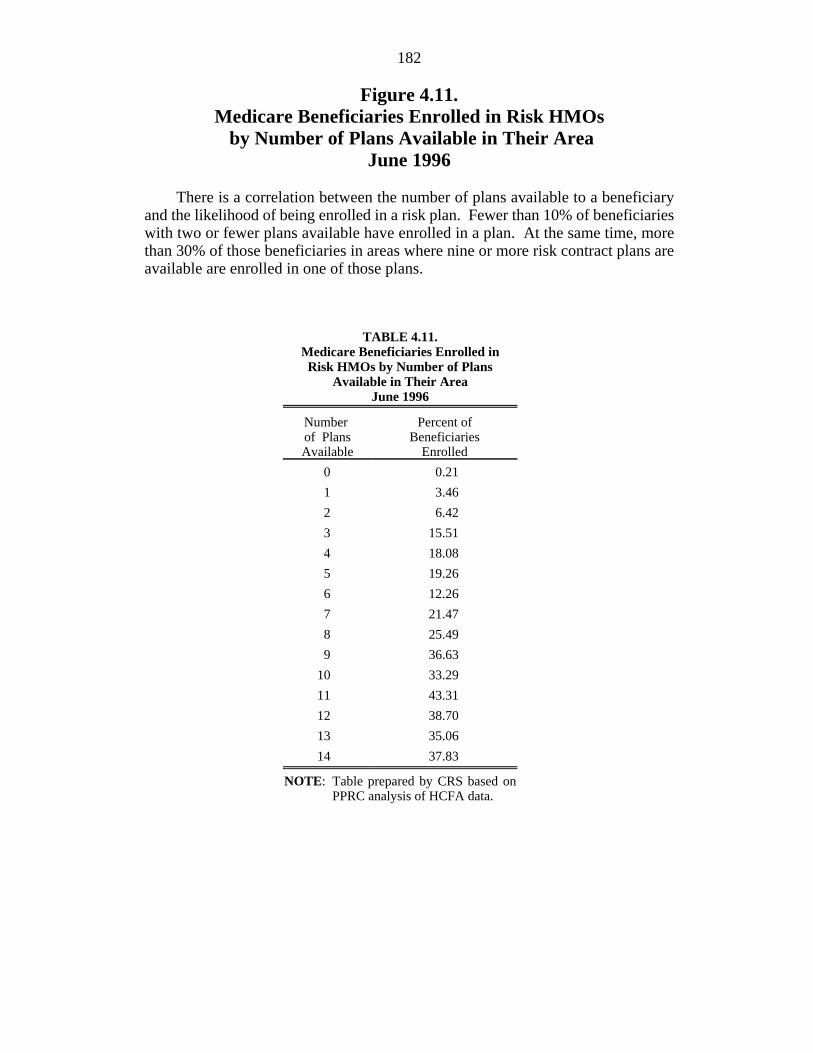
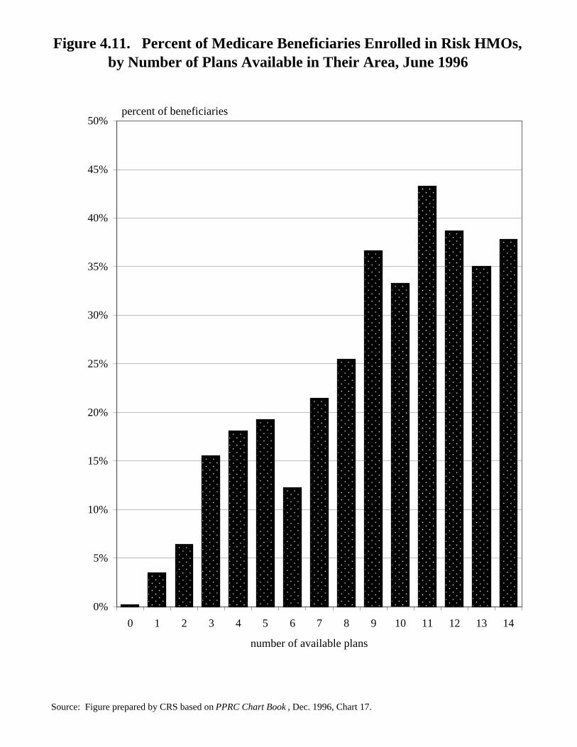
182
Figure 4.11.Medicare Beneficiaries Enrolled in Risk HMOs by Number of Plans Available in Their Area
June 1996
There is a correlation between the number of plans available to a beneficiaryand the likelihood of being enrolled in a risk plan. Fewer than 10% of beneficiarieswith two or fewer plans available have enrolled in a plan. At the same time, morethan 30% of those beneficiaries in areas where nine or more risk contract plans areavailable are enrolled in one of those plans.
TABLE 4.11.Medicare Beneficiaries Enrolled in Risk HMOs by Number of Plans
Available in Their AreaJune 1996
Number Percent ofof Plans BeneficiariesAvailable Enrolled
0 0.21
1 3.46
2 6.42
3 15.51
4 18.08
5 19.26
6 12.26
7 21.47
8 25.49
9 36.63
10 33.29
11 43.31
12 38.70
13 35.06
14 37.83
NOTE: Table prepared by CRS based onPPRC analysis of HCFA data.
Figure 4.11. Percent of Medicare Beneficiaries Enrolled in Risk HMOs, by Number of Plans Available in Their Area, June 1996
Source: Figure prepared by CRS based on PPRC Chart Book , Dec. 1996, Chart 17.
percent of beneficiaries
0%
5%
10%
15%
20%
25%
30%
35%
40%
45%
50%
0 1 2 3 4 5 6 7 8 9 10 11 12 13 14
number of available plans
184
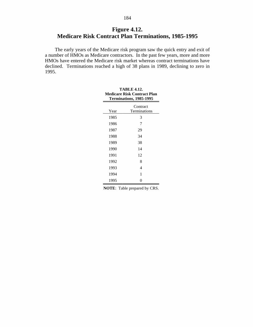
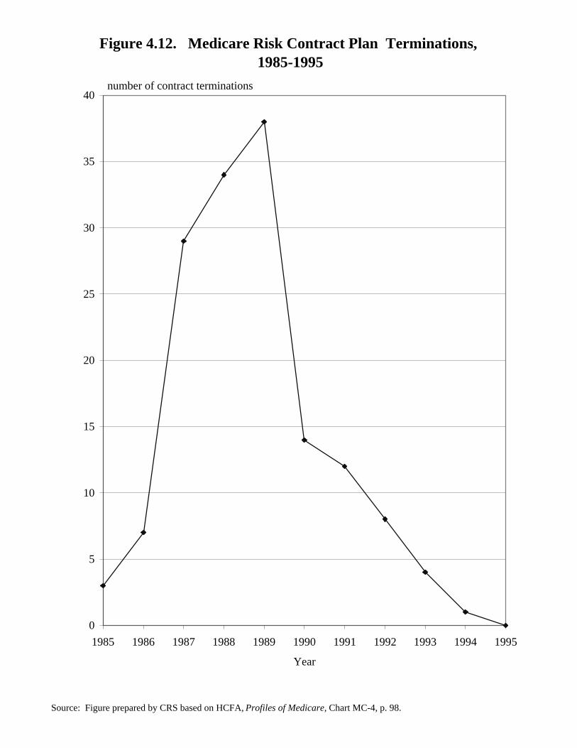
Figure 4.12.Medicare Risk Contract Plan Terminations, 1985-1995
The early years of the Medicare risk program saw the quick entry and exit ofa number of HMOs as Medicare contractors. In the past few years, more and moreHMOs have entered the Medicare risk market whereas contract terminations havedeclined. Terminations reached a high of 38 plans in 1989, declining to zero in1995.
TABLE 4.12.Medicare Risk Contract Plan
Terminations, 1985-1995
Year TerminationsContract
1985 3
1986 7
1987 29
1988 34
1989 38
1990 14
1991 12
1992 8
1993 4
1994 1
1995 0
NOTE: Table prepared by CRS.
Figure 4.12. Medicare Risk Contract Plan Terminations, 1985-1995
Source: Figure prepared by CRS based on HCFA, Profiles of Medicare, Chart MC-4, p. 98.
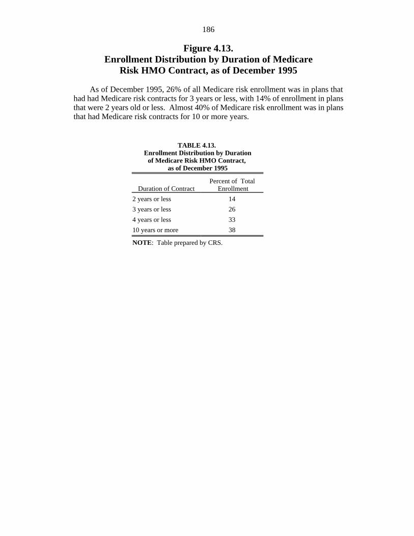
Figure 4.13.Enrollment Distribution by Duration of Medicare
Risk HMO Contract, as of December 1995
As of December 1995, 26% of all Medicare risk enrollment was in plans thathad had Medicare risk contracts for 3 years or less, with 14% of enrollment in plansthat were 2 years old or less. Almost 40% of Medicare risk enrollment was in plansthat had Medicare risk contracts for 10 or more years.
TABLE 4.13. Enrollment Distribution by Duration
of Medicare Risk HMO Contract, as of December 1995
Duration of Contract EnrollmentPercent of Total
2 years or less 14
3 years or less 26
4 years or less 33
10 years or more 38
NOTE: Table prepared by CRS.
Figure 4.13. Enrollment Distribution by Duration of MedicareRisk HMO Contract, as of December 1995
Source: Figure prepared by CRS based on HCFA, Profiles of Medicare, Chart MC-18, p. 114.
percent of total enrollment
0%
5%
10%
15%
20%
25%
30%
35%
40%
2 Years or less 3 Years or less 4 Years or less 10 Years or more
Duration of contract
188
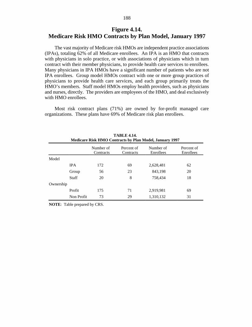
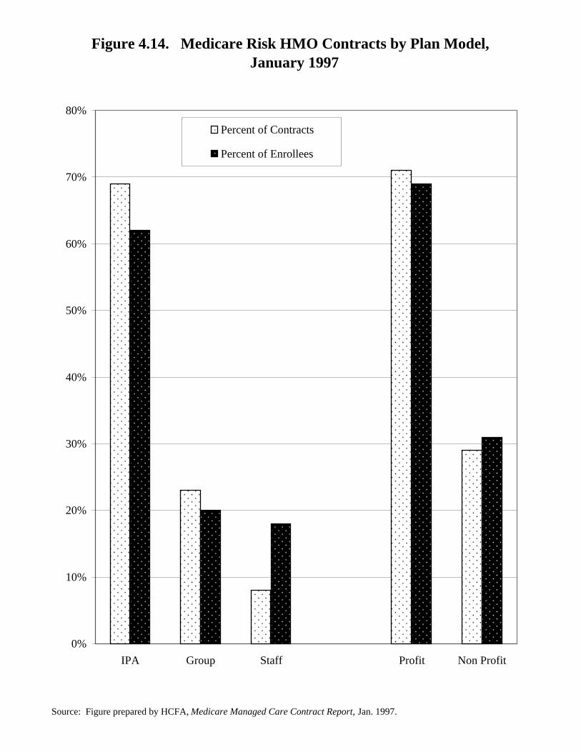
Figure 4.14.Medicare Risk HMO Contracts by Plan Model, January 1997
The vast majority of Medicare risk HMOs are independent practice associations(IPAs), totaling 62% of all Medicare enrollees. An IPA is an HMO that contractswith physicians in solo practice, or with associations of physicians which in turncontract with their member physicians, to provide health care services to enrollees.Many physicians in IPA HMOs have a significant number of patients who are notIPA enrollees. Group model HMOs contract with one or more group practices ofphysicians to provide health care services, and each group primarily treats theHMO’s members. Staff model HMOs employ health providers, such as physiciansand nurses, directly. The providers are employees of the HMO, and deal exclusivelywith HMO enrollees.
Most risk contract plans (71%) are owned by for-profit managed careorganizations. These plans have 69% of Medicare risk plan enrollees.
TABLE 4.14.Medicare Risk HMO Contracts by Plan Model, January 1997
Number of Percent of Number of Percent of Contracts Contracts Enrollees Enrollees
Model
IPA 172 69 2,628,481 62
Group 56 23 843,198 20
Staff 20 8 758,434 18
Ownership
Profit 175 71 2,919,981 69
Non Profit 73 29 1,310,132 31
NOTE: Table prepared by CRS.
Figure 4.14. Medicare Risk HMO Contracts by Plan Model, January 1997
Source: Figure prepared by HCFA, Medicare Managed Care Contract Report, Jan. 1997.
0%
10%
20%
30%
40%
50%
60%
70%
80%
IPA Group Staff Profit Non Profit
Percent of Contracts
Percent of Enrollees
190
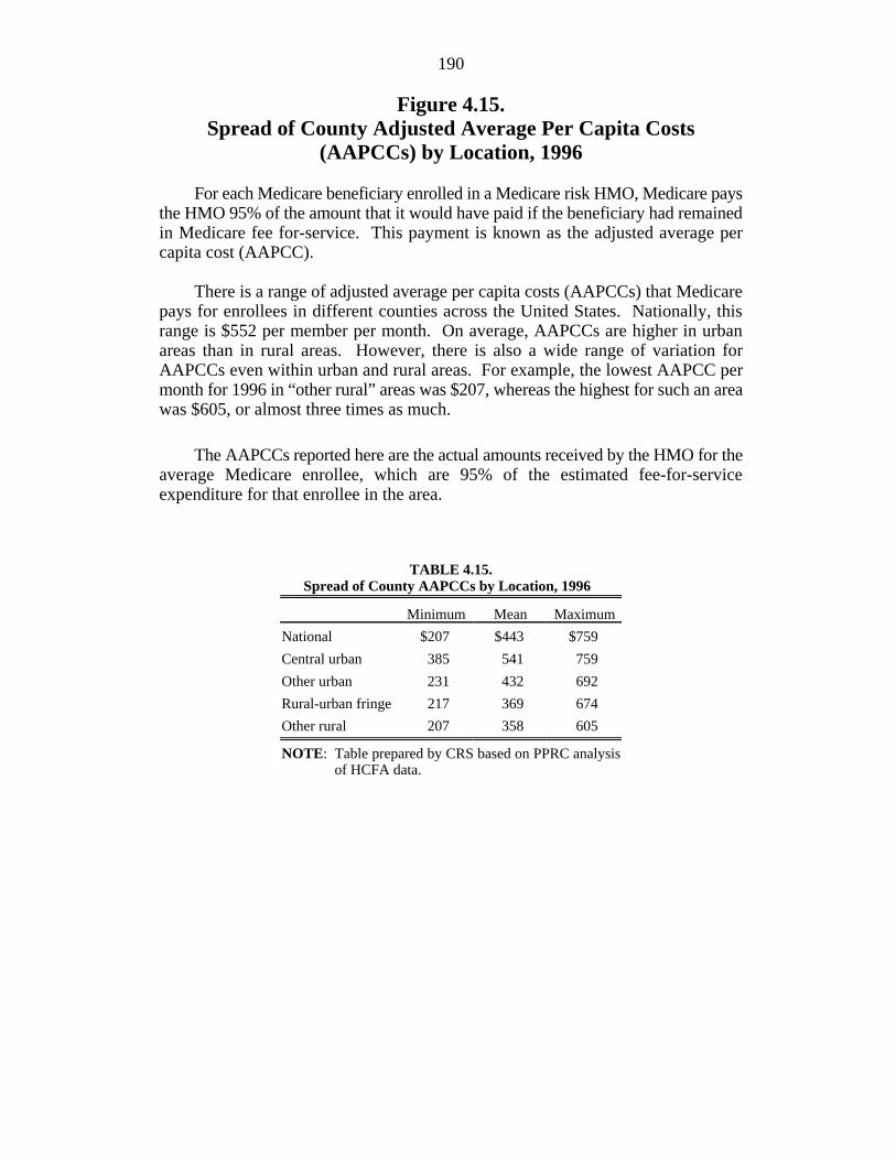
Figure 4.15.Spread of County Adjusted Average Per Capita Costs
(AAPCCs) by Location, 1996
For each Medicare beneficiary enrolled in a Medicare risk HMO, Medicare paysthe HMO 95% of the amount that it would have paid if the beneficiary had remainedin Medicare fee for-service. This payment is known as the adjusted average percapita cost (AAPCC).
There is a range of adjusted average per capita costs (AAPCCs) that Medicarepays for enrollees in different counties across the United States. Nationally, thisrange is $552 per member per month. On average, AAPCCs are higher in urbanareas than in rural areas. However, there is also a wide range of variation forAAPCCs even within urban and rural areas. For example, the lowest AAPCC permonth for 1996 in “other rural” areas was $207, whereas the highest for such an areawas $605, or almost three times as much.
The AAPCCs reported here are the actual amounts received by the HMO for theaverage Medicare enrollee, which are 95% of the estimated fee-for-serviceexpenditure for that enrollee in the area.
TABLE 4.15.Spread of County AAPCCs by Location, 1996
Minimum Mean Maximum
National $207 $443 $759
Central urban 385 541 759
Other urban 231 432 692
Rural-urban fringe 217 369 674
Other rural 207 358 605
NOTE: Table prepared by CRS based on PPRC analysisof HCFA data.
Figure 4.15. Spread of County AAPCCs by Location, 1996
Source: Figure prepared by CRS based on PPRC, Medicare Risk Plan Participation and Enrollment: A Chart Book , Chart 18, December 1996.
$207
$385
$231$217
$207
$443
$541
$432
$369$358
$759 $759
$692$674
$605
$-
$100
$200
$300
$400
$500
$600
$700
$800
National Central urban Other urban Rural-urbanfringe
Other rural
Maximum
Minimum
Mean
AAPCC (in dollars per month)
192
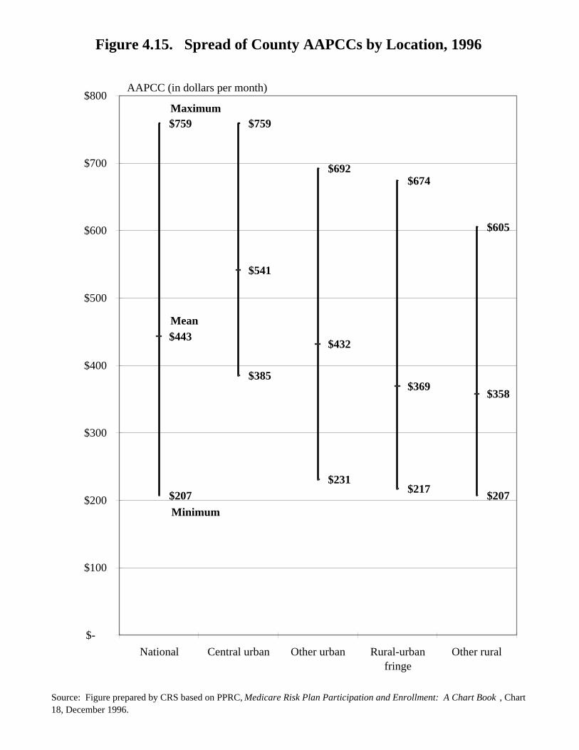
Figure 4.16.Spread of County Adjusted Average Per Capita Costs
(AAPCCs) Within Selected Primary MetropolitanStatistical Areas (PMSAs), 1996
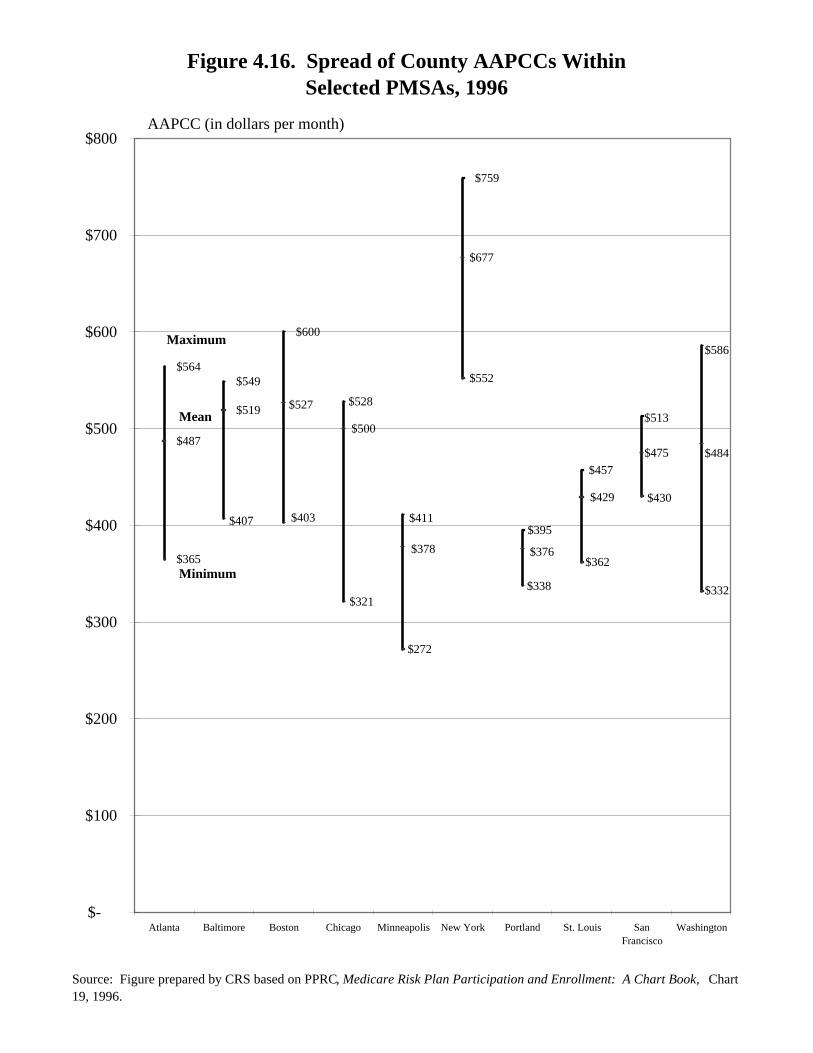
Within primary metropolitan statistical areas (PMSAs) that consist of more thana single county, there is a range of AAPCCs that Medicare pays for enrollees in thosecounties. In many PMSAs, the range of AAPCCs is $100 or greater per month.(The means shown in the figure are weighted by beneficiaries as opposed toenrollees.) In most PMSAs, enrollment in risk HMOs is disproportionately higherin counties where the AAPCC is higher.
TABLE 4.16.Spread of County AAPCCs Within
Selected PMSAs, 1996
Minimum Mean Maximum
Atlanta $365 $487 $564
Baltimore 407 519 549
Boston 403 527 600
Chicago 321 500 528
Minneapolis 272 378 411
New York 552 677 759
Portland 338 376 395
St. Louis 362 429 457
San Francisco 430 475 513
Washington 332 484 586
NOTE: Table prepared by CRS based on PPRC analysis ofHCFA data.
Figure 4.16. Spread of County AAPCCs WithinSelected PMSAs, 1996
Source: Figure prepared by CRS based on PPRC, Medicare Risk Plan Participation and Enrollment: A Chart Book, Chart 19, 1996.
$365
$487
$564$549
$600
$759
$407 $403
$321
$272
$338
$362
$332
$430
$552
$519 $527
$500
$378 $376
$484$475
$429
$677
$528
$411$395
$586
$513
$457
$-
$100
$200
$300
$400
$500
$600
$700
$800
Atlanta Baltimore Boston Chicago Minneapolis New York Portland St. Louis SanFrancisco
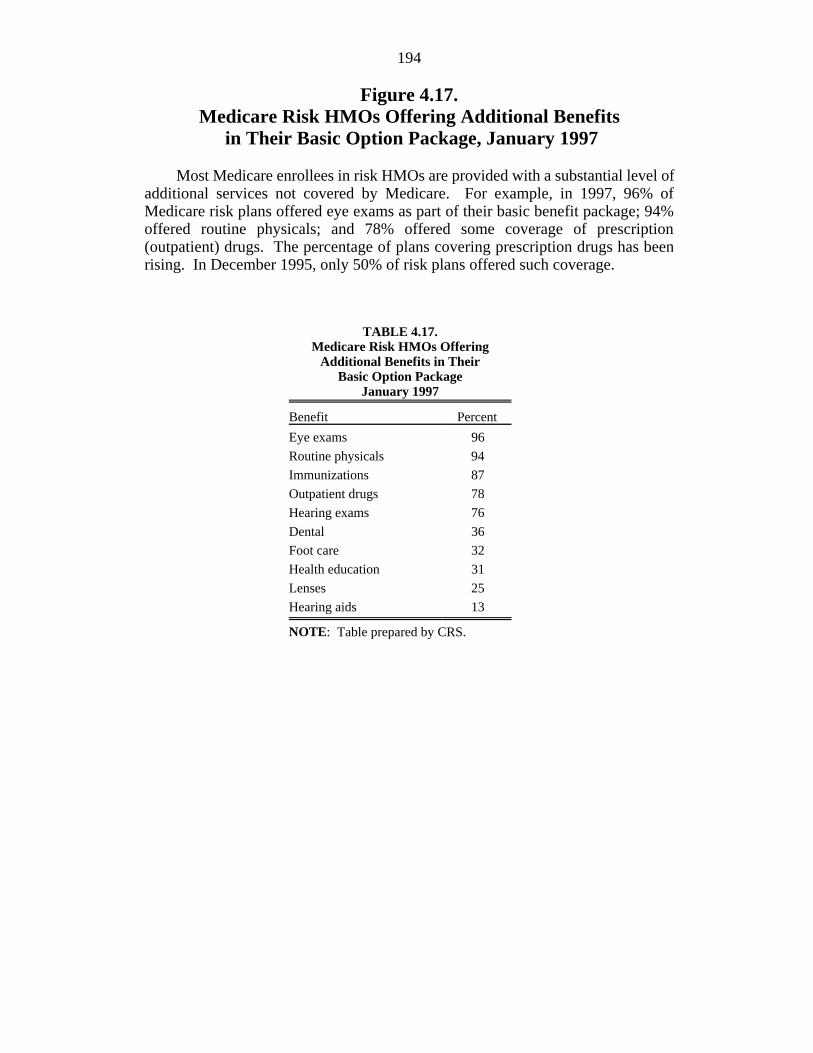
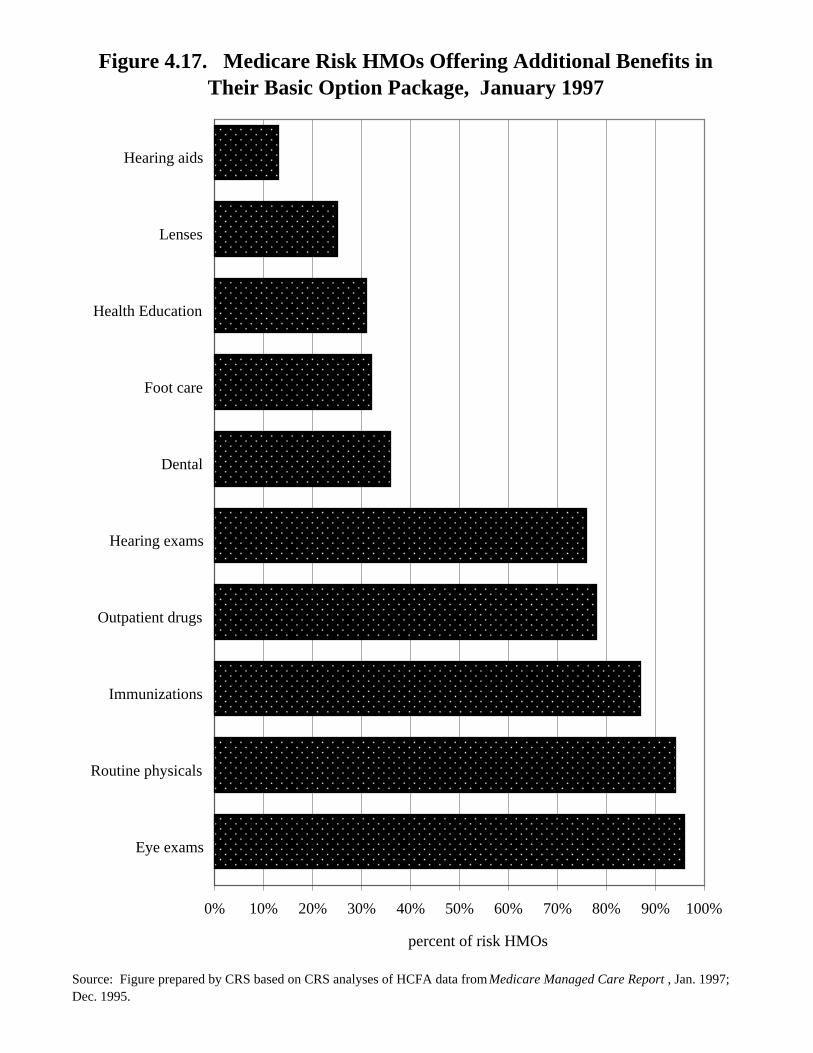
Most Medicare enrollees in risk HMOs are provided with a substantial level ofadditional services not covered by Medicare. For example, in 1997, 96% ofMedicare risk plans offered eye exams as part of their basic benefit package; 94%offered routine physicals; and 78% offered some coverage of prescription(outpatient) drugs. The percentage of plans covering prescription drugs has beenrising. In December 1995, only 50% of risk plans offered such coverage.
TABLE 4.17.Medicare Risk HMOs Offering
Additional Benefits in TheirBasic Option Package
January 1997
Benefit Percent
Eye exams 96
Routine physicals 94
Immunizations 87
Outpatient drugs 78
Hearing exams 76
Dental 36
Foot care 32
Health education 31
Lenses 25
Hearing aids 13
NOTE: Table prepared by CRS.
Figure 4.17. Medicare Risk HMOs Offering Additional Benefits in Their Basic Option Package, January 1997
Source: Figure prepared by CRS based on CRS analyses of HCFA data from Medicare Managed Care Report , Jan. 1997; Dec. 1995.
0% 10% 20% 30% 40% 50% 60% 70% 80% 90% 100%
Eye exams
Routine physicals
Immunizations
Outpatient drugs
Hearing exams
Dental
Foot care
Health Education
Lenses
Hearing aids
percent of risk HMOs
196
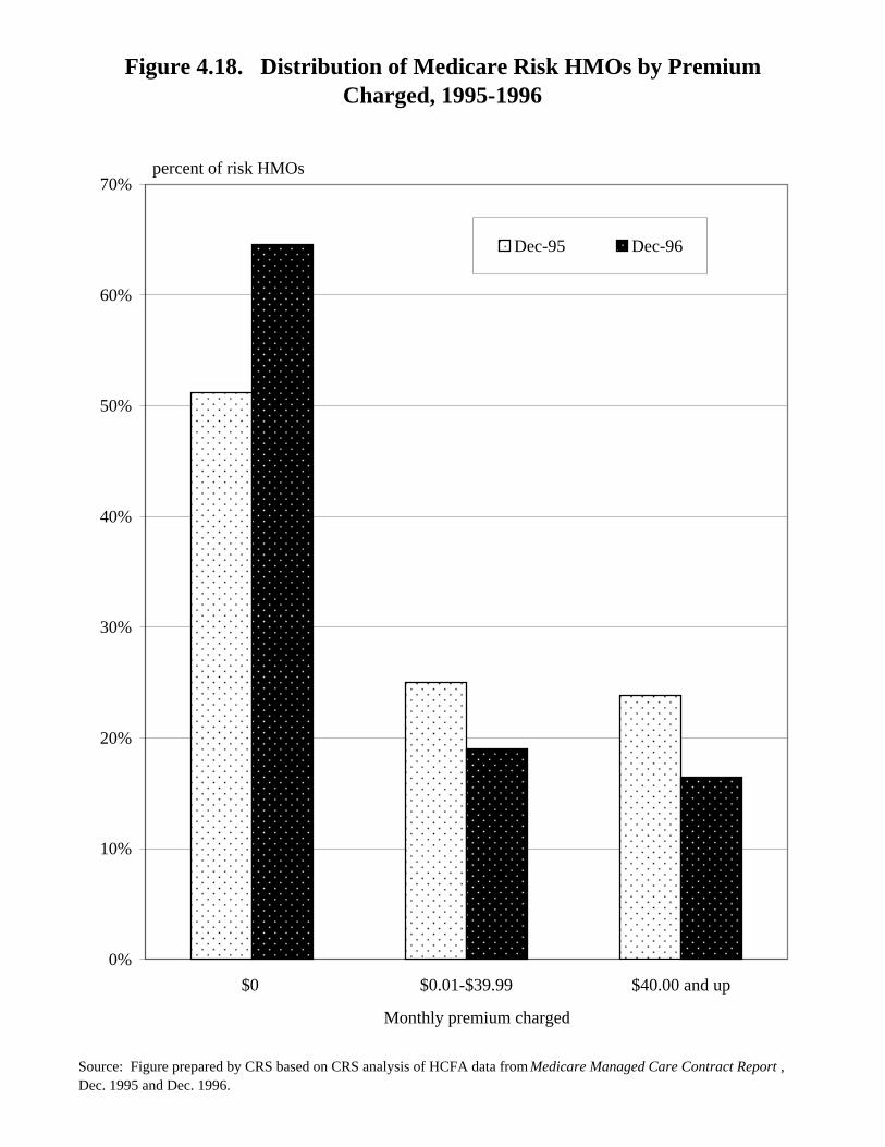
Figure 4.18.Distribution of Medicare Risk HMOs by Premiums Charged
1995-1996
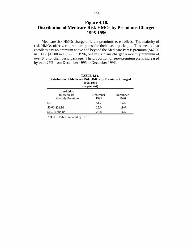
Medicare risk HMOs charge different premiums to enrollees. The majority ofrisk HMOs offer zero-premium plans for their basic package. This means thatenrollees pay no premium above and beyond the Medicare Part B premium ($42.50in 1996; $43.80 in 1997). In 1996, one in six plans charged a monthly premium ofover $40 for their basic package. The proportion of zero-premium plans increasedby over 25% from December 1995 to December 1996.
TABLE 4.18. Distribution of Medicare Risk HMOs by Premiums Charged
1995-1996(in percent)
In Additionto Medicare December December
Monthly Premium 1995 1996
$0 51.2 64.6
$0.01-$39.99 25.0 19.0
$40.00 and up 23.8 16.5
NOTE: Table prepared by CRS.
Figure 4.18. Distribution of Medicare Risk HMOs by Premium Charged, 1995-1996
Source: Figure prepared by CRS based on CRS analysis of HCFA data from Medicare Managed Care Contract Report , Dec. 1995 and Dec. 1996.
0%
10%
20%
30%
40%
50%
60%
70%
$0 $0.01-$39.99 $40.00 and up
Monthly premium charged
Dec-95 Dec-96
percent of risk HMOs
198
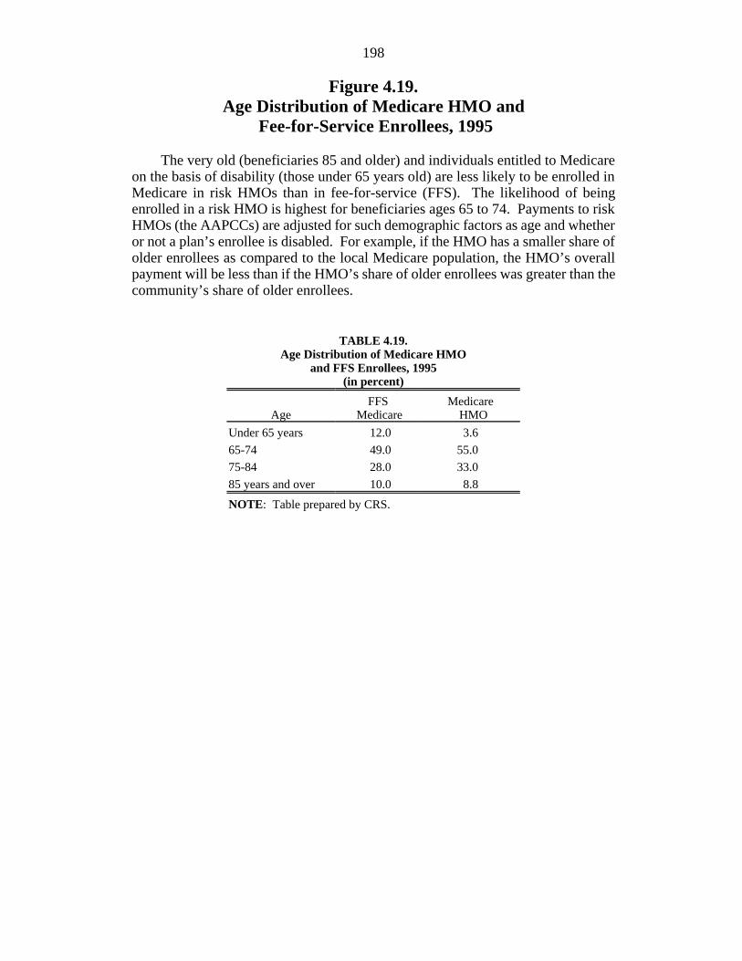
Figure 4.19.Age Distribution of Medicare HMO and
Fee-for-Service Enrollees, 1995
The very old (beneficiaries 85 and older) and individuals entitled to Medicareon the basis of disability (those under 65 years old) are less likely to be enrolled inMedicare in risk HMOs than in fee-for-service (FFS). The likelihood of beingenrolled in a risk HMO is highest for beneficiaries ages 65 to 74. Payments to riskHMOs (the AAPCCs) are adjusted for such demographic factors as age and whetheror not a plan’s enrollee is disabled. For example, if the HMO has a smaller share ofolder enrollees as compared to the local Medicare population, the HMO’s overallpayment will be less than if the HMO’s share of older enrollees was greater than thecommunity’s share of older enrollees.
TABLE 4.19.Age Distribution of Medicare HMO
and FFS Enrollees, 1995(in percent)
Age Medicare HMOFFS Medicare
Under 65 years 12.0 3.6
65-74 49.0 55.0
75-84 28.0 33.0
85 years and over 10.0 8.8
NOTE: Table prepared by CRS.
Figure 4.19. Age Distribution of Medicare HMO and Fee-for-Service Enrollees, 1995
Source: Figure prepared by CRS based on HCFA, Profiles of Medicare , Chart MC-12, p. 108.
0%
10%
20%
30%
40%
50%
60%
Under 65 years 65-74 75-84 85 years and over
FFS Medicare
Medicare HMO
percent of beneficiaries
200
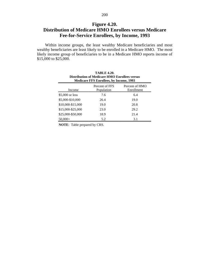
Figure 4.20.Distribution of Medicare HMO Enrollees versus Medicare
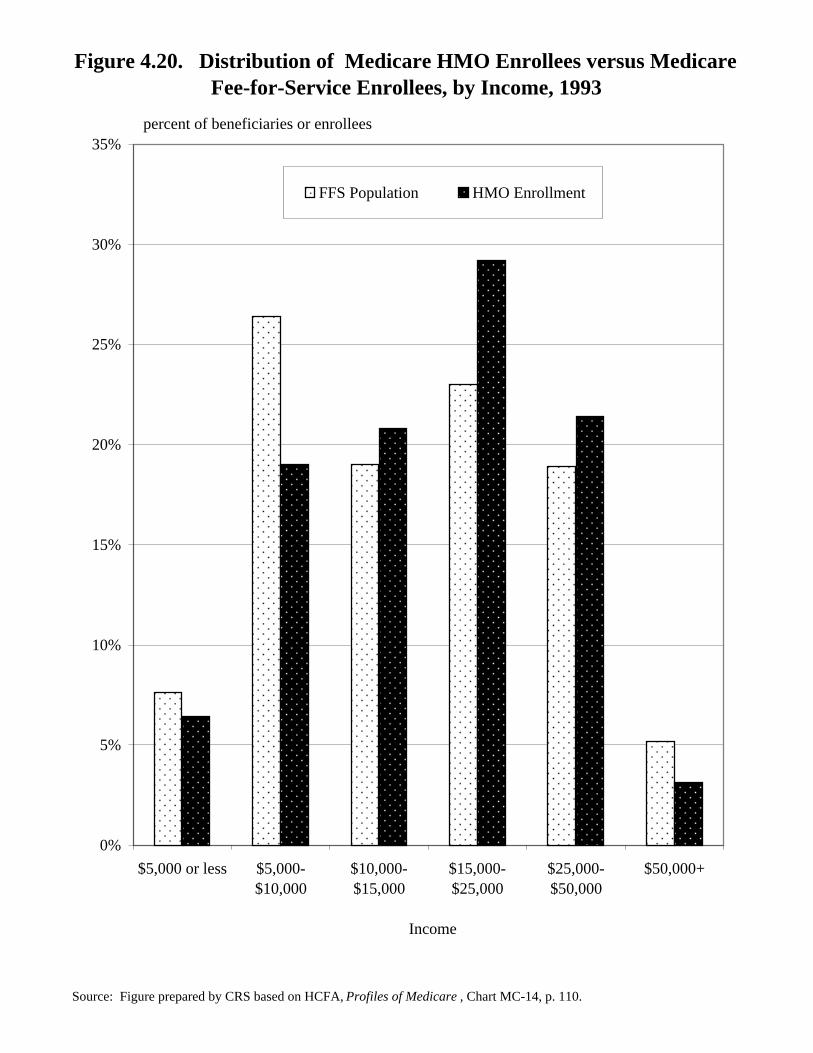
Fee-for-Service Enrollees, by Income, 1993
Within income groups, the least wealthy Medicare beneficiaries and mostwealthy beneficiaries are least likely to be enrolled in a Medicare HMO. The mostlikely income group of beneficiaries to be in a Medicare HMO reports income of$15,000 to $25,000.
TABLE 4.20.Distribution of Medicare HMO Enrollees versus
Medicare FFS Enrollees, by Income, 1993
Income Population EnrollmentPercent of FFS Percent of HMO
$5,000 or less 7.6 6.4
$5,000-$10,000 26.4 19.0
$10,000-$15,000 19.0 20.8
$15,000-$25,000 23.0 29.2
$25,000-$50,000 18.9 21.4
50,000+ 5.2 3.1
NOTE: Table prepared by CRS.
Figure 4.20. Distribution of Medicare HMO Enrollees versus Medicare Fee-for-Service Enrollees, by Income, 1993
Source: Figure prepared by CRS based on HCFA, Profiles of Medicare , Chart MC-14, p. 110.
0%
5%
10%
15%
20%
25%
30%
35%
$5,000 or less $5,000-$10,000
$10,000-$15,000
$15,000-$25,000
$25,000-$50,000
$50,000+
Income
FFS Population HMO Enrollment
percent of beneficiaries or enrollees
202
Figure 4.21.Medicare HMOs: Costs as a Percentage
of Average Medicare Spending Per Beneficiary
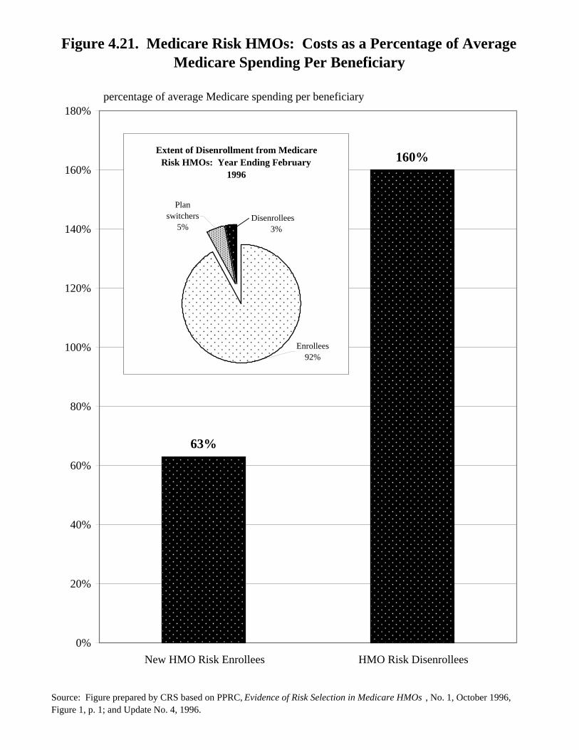
Several studies have found that Medicare beneficiaries who enroll in HMOs usefewer Medicare-covered services than those who are in the fee-for-service program.Such differences are also reflected in studies that show that Medicare beneficiarieswho enroll in HMOs have relatively low costs prior to enrollment. Using datathrough mid-1994, the Physician Payment Review Commission (PPRC) found thatnew HMO enrollees’ costs were 37% below average Medicare spending perbeneficiary during the 6 months prior to HMO enrollment. Moreover, as shown inthe figure, beneficiaries who enrolled and then disenrolled from an HMO (andreturned to fee-for-service) had costs that were 60% above the average expenditurefor fee-for-service individuals. However, it should be noted that within the 1 yearperiod ending February 1996, the vast majority (97%) of HMO enrollees did notdisenroll. (As shown in the inset, 3% of beneficiaries disenrolled and 5% switchedfrom one HMO to another.)
Figure 4.21. Medicare Risk HMOs: Costs as a Percentage of Average Medicare Spending Per Beneficiary
Source: Figure prepared by CRS based on PPRC, Evidence of Risk Selection in Medicare HMOs , No. 1, October 1996, Figure 1, p. 1; and Update No. 4, 1996.
percentage of average Medicare spending per beneficiary
63%
160%
0%
20%
40%
60%
80%
100%
120%
140%
160%
180%
New HMO Risk Enrollees HMO Risk Disenrollees
Extent of Disenrollment from Medicare Risk HMOs: Year Ending February
1996
Enrollees92%
Plan switchers
5%Disenrollees 3%
204
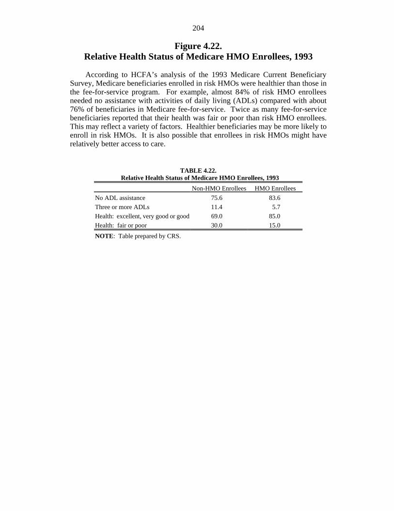
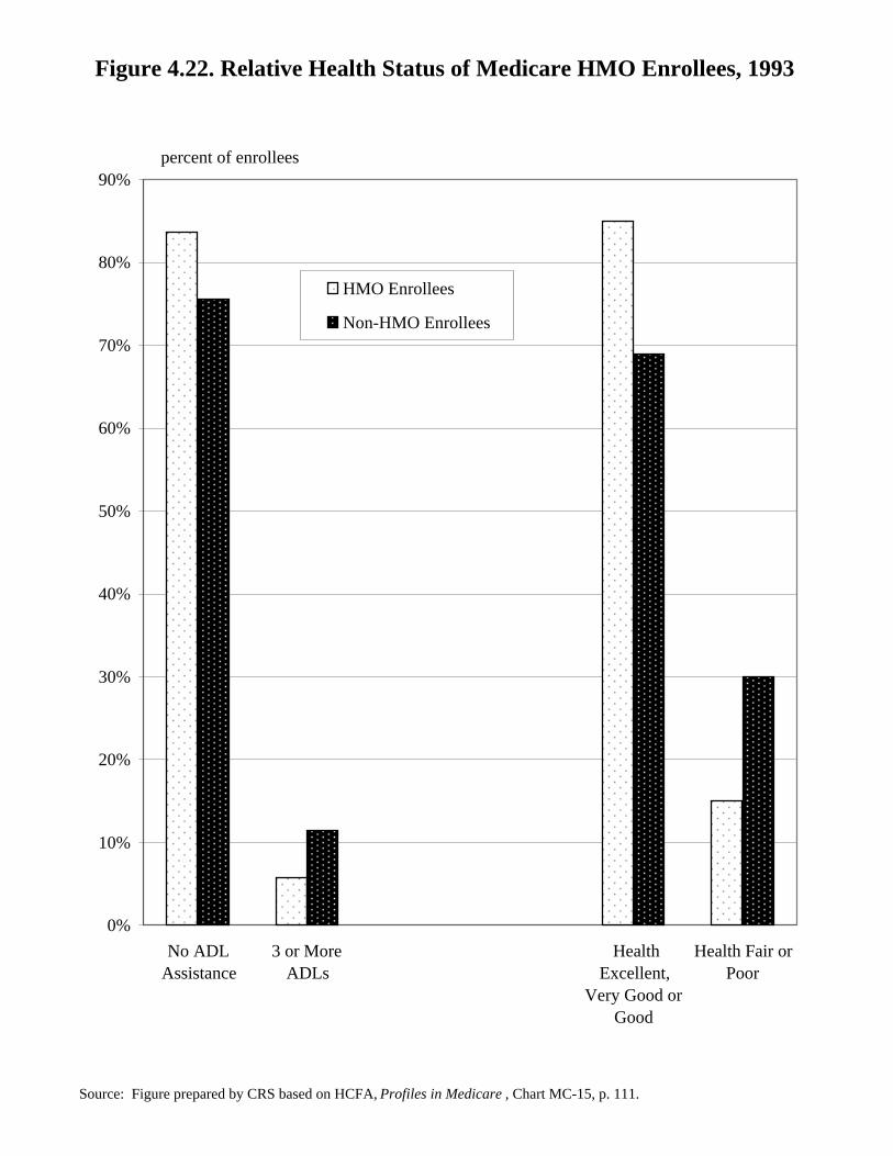
Figure 4.22.Relative Health Status of Medicare HMO Enrollees, 1993
According to HCFA’s analysis of the 1993 Medicare Current BeneficiarySurvey, Medicare beneficiaries enrolled in risk HMOs were healthier than those inthe fee-for-service program. For example, almost 84% of risk HMO enrolleesneeded no assistance with activities of daily living (ADLs) compared with about76% of beneficiaries in Medicare fee-for-service. Twice as many fee-for-servicebeneficiaries reported that their health was fair or poor than risk HMO enrollees.This may reflect a variety of factors. Healthier beneficiaries may be more likely toenroll in risk HMOs. It is also possible that enrollees in risk HMOs might haverelatively better access to care.
TABLE 4.22. Relative Health Status of Medicare HMO Enrollees, 1993
Non-HMO Enrollees HMO Enrollees
No ADL assistance 75.6 83.6
Three or more ADLs 11.4 5.7
Health: excellent, very good or good 69.0 85.0
Health: fair or poor 30.0 15.0
NOTE: Table prepared by CRS.
Figure 4.22. Relative Health Status of Medicare HMO Enrollees, 1993
Source: Figure prepared by CRS based on HCFA, Profiles in Medicare , Chart MC-15, p. 111.
0%
10%
20%
30%
40%
50%
60%
70%
80%
90%
No ADLAssistance
3 or MoreADLs
HealthExcellent,
Very Good orGood
Health Fair orPoor
HMO Enrollees
Non-HMO Enrollees
percent of enrollees
206
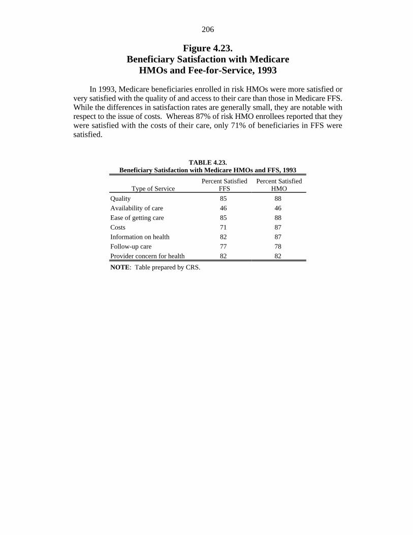
Figure 4.23.Beneficiary Satisfaction with Medicare
HMOs and Fee-for-Service, 1993
In 1993, Medicare beneficiaries enrolled in risk HMOs were more satisfied orvery satisfied with the quality of and access to their care than those in Medicare FFS.While the differences in satisfaction rates are generally small, they are notable withrespect to the issue of costs. Whereas 87% of risk HMO enrollees reported that theywere satisfied with the costs of their care, only 71% of beneficiaries in FFS weresatisfied.
TABLE 4.23.Beneficiary Satisfaction with Medicare HMOs and FFS, 1993
Type of Service FFS HMOPercent Satisfied Percent Satisfied
Quality 85 88
Availability of care 46 46
Ease of getting care 85 88
Costs 71 87
Information on health 82 87
Follow-up care 77 78
Provider concern for health 82 82
NOTE: Table prepared by CRS.
Figure 4.23. Beneficiary Satisfaction with Medicare HMOs and Fee-for-Service, 1993
Source: Figure prepared by CRS based on HCFA, Profiles of Medicare , Chart MC-16, p. 112.
0%
10%
20%
30%
40%
50%
60%
70%
80%
90%
100%
Quality Availability ofCare
Ease of gettingCare
Costs Information onHealth
Follow UpCare
ProviderConcern for
Health
FFS Beneficiary HMO Beneficiary
percent satisfied
208
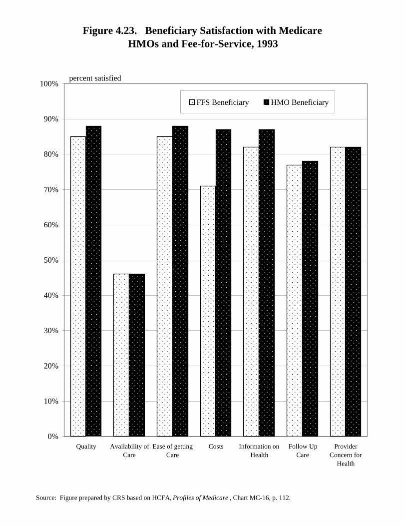
Figure 4.24.Beneficiary Dissatisfaction with Medicare
HMOs and Fee-for-Service, 1993
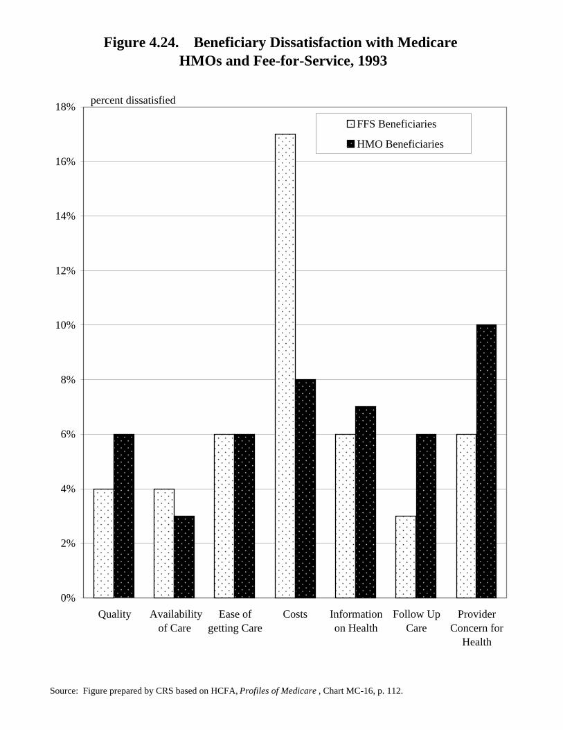
Only a small percentage of Medicare beneficiaries reported being dissatisfiedor very dissatisfied with their Medicare coverage in 1993. However, risk contractenrollees were somewhat more likely to report being dissatisfied about quality,quality follow-up care, and their providers’ concern for their health thanbeneficiaries with Medicare fee-for-service (FFS) coverage. The dissatisfaction ratesare again notable for the differences on the issue of costs. More than twice as manyfee-for-service enrollees were dissatisfied or very dissatisfied with the costs of theircare than enrollees in risk HMOs.
TABLE 4.24.Beneficiary Dissatisfaction with Medicare HMOs and FFS, 1993
Type of Service FFS HMOPercent Dissatisfied Percent Dissatisfied
Quality 4 6
Availability of care 4 3
Ease of getting care 6 6
Costs 17 8
Information on health 6 7
Follow-up care 3 6
Provider concern for health 6 10
NOTE: Table prepared by CRS.
Figure 4.24. Beneficiary Dissatisfaction with Medicare HMOs and Fee-for-Service, 1993
Source: Figure prepared by CRS based on HCFA, Profiles of Medicare , Chart MC-16, p. 112.
0%
2%
4%
6%
8%
10%
12%
14%
16%
18%
Quality Availabilityof Care
Ease ofgetting Care
Costs Informationon Health
Follow UpCare
ProviderConcern for
Health
FFS Beneficiaries
HMO Beneficiaries
percent dissatisfied
210
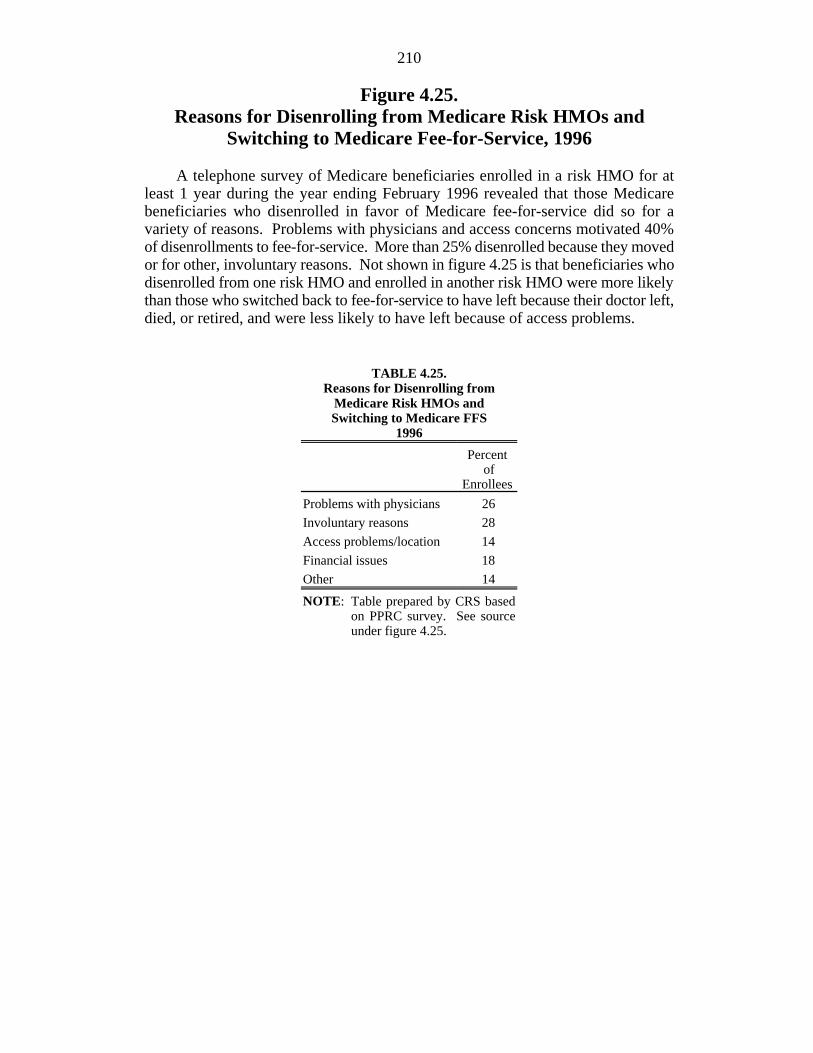
Figure 4.25.Reasons for Disenrolling from Medicare Risk HMOs and
Switching to Medicare Fee-for-Service, 1996
A telephone survey of Medicare beneficiaries enrolled in a risk HMO for atleast 1 year during the year ending February 1996 revealed that those Medicarebeneficiaries who disenrolled in favor of Medicare fee-for-service did so for avariety of reasons. Problems with physicians and access concerns motivated 40%of disenrollments to fee-for-service. More than 25% disenrolled because they movedor for other, involuntary reasons. Not shown in figure 4.25 is that beneficiaries whodisenrolled from one risk HMO and enrolled in another risk HMO were more likelythan those who switched back to fee-for-service to have left because their doctor left,died, or retired, and were less likely to have left because of access problems.
TABLE 4.25.Reasons for Disenrolling from
Medicare Risk HMOs andSwitching to Medicare FFS
1996
Percent of
Enrollees
Problems with physicians 26
Involuntary reasons 28
Access problems/location 14
Financial issues 18
Other 14
NOTE: Table prepared by CRS basedon PPRC survey. See sourceunder figure 4.25.
Figure 4.25. Reasons for Disenrolling from Medicare Risk HMOsand Switching to Medicare Fee-for-Service, 1996
Source: PPRC: How Do Medicare Beneficiaries Fare in HMOs? Preliminary Results from PPRC Access Survey , Update No. 4, Oct. 1996.
0%
5%
10%
15%
20%
25%
30%
Problems withPhysicians
Involuntary Reasons AccessProblems/Location
Financial Issues Other
percent of enrollees
212
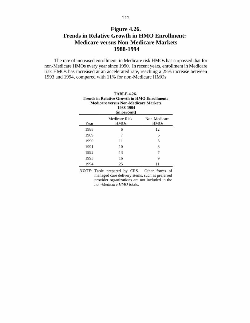
Figure 4.26.Trends in Relative Growth in HMO Enrollment:
Medicare versus Non-Medicare Markets 1988-1994
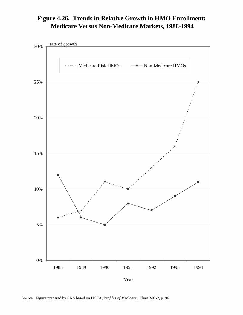
The rate of increased enrollment in Medicare risk HMOs has surpassed that fornon-Medicare HMOs every year since 1990. In recent years, enrollment in Medicarerisk HMOs has increased at an accelerated rate, reaching a 25% increase between1993 and 1994, compared with 11% for non-Medicare HMOs.
TABLE 4.26. Trends in Relative Growth in HMO Enrollment:
Medicare versus Non-Medicare Markets 1988-1994(in percent)
Year HMOs HMOsMedicare Risk Non-Medicare
1988 6 12
1989 7 6
1990 11 5
1991 10 8
1992 13 7
1993 16 9
1994 25 11
NOTE: Table prepared by CRS. Other forms ofmanaged care delivery stems, such as preferredprovider organizations are not included in thenon-Medicare HMO totals.
Figure 4.26. Trends in Relative Growth in HMO Enrollment: Medicare Versus Non-Medicare Markets, 1988-1994
Source: Figure prepared by CRS based on HCFA, Profiles of Medicare , Chart MC-2, p. 96.
0%
5%
10%
15%
20%
25%
30%
1988 1989 1990 1991 1992 1993 1994
Year
Medicare Risk HMOs Non-Medicare HMOs
rate of growth
214
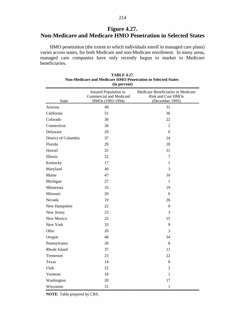
Figure 4.27.Non-Medicare and Medicare HMO Penetration in Selected States
HMO penetration (the extent to which individuals enroll in managed care plans)varies across states, for both Medicare and non-Medicare enrollment. In many areas,managed care companies have only recently begun to market to Medicarebeneficiaries.
TABLE 4.27.Non-Medicare and Medicare HMO Penetration in Selected States
(in percent)
State HMOs (1993-1994) (December 1995)
Insured Population in Medicare Beneficiaries in Medicare Commercial and Medicaid Risk and Cost HMOs
Arizona 49 31
California 51 36
Colorado 30 22
Connecticut 36 2
Delaware 29 0
District of Columbia 37 14
Florida 29 18
Hawaii 25 31
Illinois 22 7
Kentucky 17 1
Maryland 49 3
Maine 47 10
Michigan 27 1
Minnesota 33 19
Missouri 20 6
Nevada 19 26
New Hampshire 22 0
New Jersey 23 3
New Mexico 25 15
New York 33 9
Ohio 26 3
Oregon 48 34
Pennsylvania 30 8
Rhode Island 37 11
Tennessee 23 22
Texas 14 8
Utah 22 2
Vermont 18 1
Washington 20 17
Wisconsin 31 1
NOTE: Table prepared by CRS.
Figure 4.27. Non-Medicare and Medicare HMOPenetration in Selected States, 1993-1995
Source: Figure prepared by CRS based on HCFA, Profiles in Medicare , Chart MC-6a-b, pp.100-101.
0% 10% 20% 30% 40% 50% 60%
WI
WA
VT
UT
TX
TN
RI
PA
OR
OH
NY
NM
NJ
NH
NV
MO
MN
MI
MD
MA
KY
IL
HI
FL
DC
DE
CT
CO
CA
AZ
Percentage of MedicareBeneficiaries in Medicare Riskand Cost HMOs
Percentage of InsuredPopulation in Commercial andMedicaid HMOs
percent enrollment in managed care plans
216
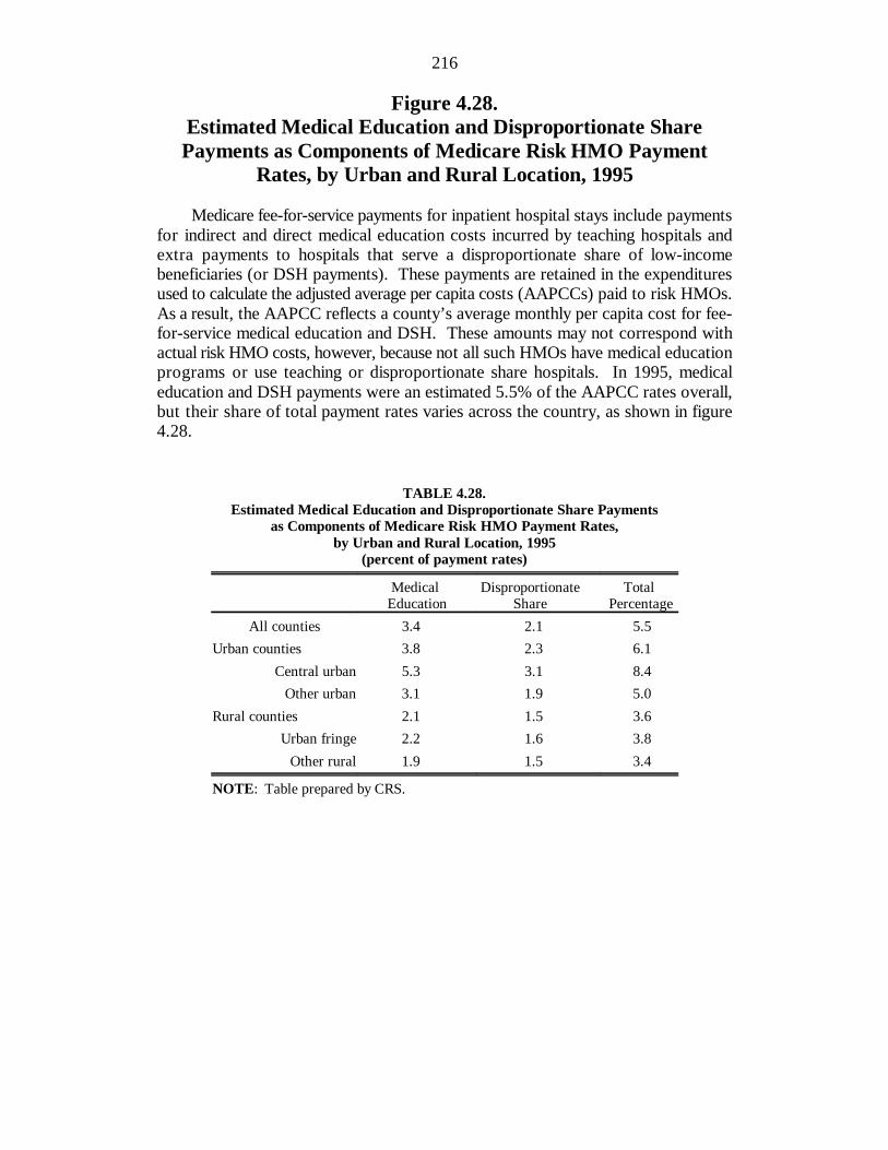
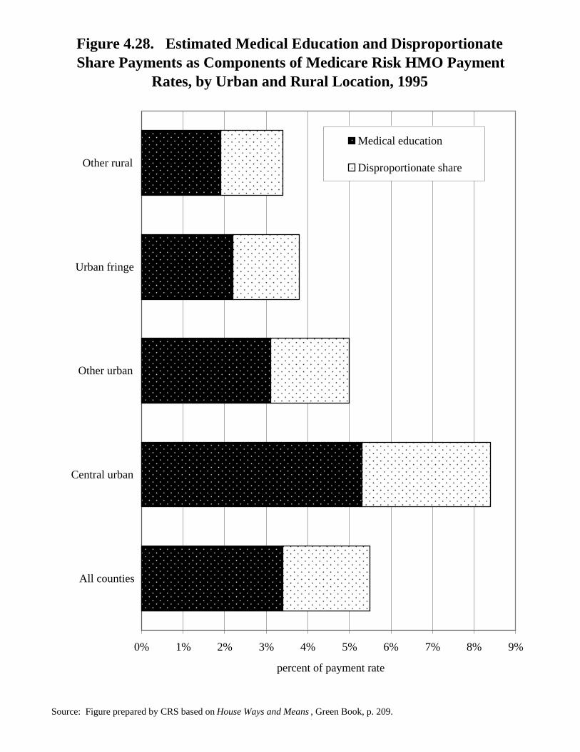
Figure 4.28.Estimated Medical Education and Disproportionate SharePayments as Components of Medicare Risk HMO Payment
Rates, by Urban and Rural Location, 1995
Medicare fee-for-service payments for inpatient hospital stays include paymentsfor indirect and direct medical education costs incurred by teaching hospitals andextra payments to hospitals that serve a disproportionate share of low-incomebeneficiaries (or DSH payments). These payments are retained in the expendituresused to calculate the adjusted average per capita costs (AAPCCs) paid to risk HMOs.As a result, the AAPCC reflects a county’s average monthly per capita cost for fee-for-service medical education and DSH. These amounts may not correspond withactual risk HMO costs, however, because not all such HMOs have medical educationprograms or use teaching or disproportionate share hospitals. In 1995, medicaleducation and DSH payments were an estimated 5.5% of the AAPCC rates overall,but their share of total payment rates varies across the country, as shown in figure4.28.
TABLE 4.28.Estimated Medical Education and Disproportionate Share Payments
as Components of Medicare Risk HMO Payment Rates,by Urban and Rural Location, 1995
(percent of payment rates)
Medical Disproportionate TotalEducation Share Percentage
All counties 3.4 2.1 5.5
Urban counties 3.8 2.3 6.1
Central urban 5.3 3.1 8.4
Other urban 3.1 1.9 5.0
Rural counties 2.1 1.5 3.6
Urban fringe 2.2 1.6 3.8
Other rural 1.9 1.5 3.4
NOTE: Table prepared by CRS.
Figure 4.28. Estimated Medical Education and DisproportionateShare Payments as Components of Medicare Risk HMO Payment
Rates, by Urban and Rural Location, 1995
Source: Figure prepared by CRS based on House Ways and Means , Green Book, p. 209.