33
© 2013 IBM Corporation Social Business Guidelines for developing a responsive Digital eXperience October 2013
© 2013 IBM Corporation
Social BusinessGuidelines for developing a responsive Digital eXperience
October 2013
© 2013 IBM Corporation2
Disclaimer
IBM’s statements regarding its plans, directions, and intent are subject to change or withdrawal without notice at IBM’s sole discretion.
Information regarding potential future products is intended to outline our general product direction and it should not be relied on in making a purchasing decision.
The information mentioned regarding potential future products is not a commitment, promise, or legal obligation to deliver any material, code or functionality. Information about potential future products may not be incorporated into any contract. The development, release, and timing of any future features or functionality described for our products remains at our sole discretion.
Performance is based on measurements and projections using standard IBM benchmarks in a controlled environment. The actual throughput or performance that any user will experience will vary depending upon many factors, including considerations such as the amount of multiprogramming in the user's job
stream, the I/O configuration, the storage configuration, and the workload processed. Therefore, no assurance can be given that an individual user will achieve results similar to those stated here.

© 2013 IBM Corporation3
Introduction
In developing the latest digital experience template we had a number of goals, one of which was to produce a multi-channel responsive user experience. We were aided in doing so by the release of the Portal 8.0.0.1 upgrade which included responsive design and by the Content Template Catalog version 4.1 which provided base web content artifacts on which we could expand.
The goal of this deck is to highlight the areas we targeted to ensure that the final experience was as responsive and nimble as possible across all of the target devices and that we had a consistent and seamless user experience (UX) irrespective of where our content was originating.

© 2013 IBM Corporation4
Theme
Modules and Profiles
Responsiveness
Stylesheets
Javascript
© 2013 IBM Corporation5
Theme – Modules and Profiles
The Portal 8 theme provides a flexible modular framework that helps us achieve our twin goals of minimising page download size and minimising the number of HTTP requests per page.
The framework achieves this by using modules and profiles.
Modules define the capabilities that the theme will provide to a page. Examples of modules include Tagging and Rating, Dojo versions and Sametime Proxy support.
Modules are bundled together into Profiles and these profiles can then be applied on a per page basis. A default profile is defined in a theme and is used on all pages where an explicit profile has not been set.
We developed a customised theme and profile for our project to meet our styling requirements and to provide just what is needed on our pages. The is based on the out of the box deferred profile.
More detailed information on the modular theme can be found at:– www-10.lotus.com/ldd/portalwiki.nsf/dx/The_module_framework_wp8
– http://www-10.lotus.com/ldd/portalwiki.nsf/dx/Response_rendering_for_themes_wp8

© 2013 IBM Corporation6
Example – Modules and Profiles

© 2013 IBM Corporation7
Theme – Responsiveness
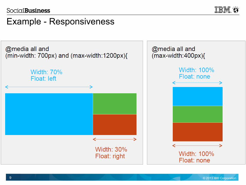
Portal 8 provides a responsive theme out of the box. Two main parts of providing this responsiveness are:– Media queries
Media queries enable the use of CSS based on orientation, screen size, and other attributes of the device. Using queries is similar to writing if conditions to tell a browser when to enable a certain set of styles.
– Fluid elements A fluid element uses percentages, instead of fixed values, to define container widths. Percentages
create an elastic container that will optimize for different form factors.
Whilst we build on top of the responsiveness of the theme we had to ensure that we followed the same principles when creating our own content. Therefore any sub-containers we used were fluid and when providing lists of content we also used media queries for the major media types – desktop, smartphone, and tablet
More information can be found at– http://www.w3.org/TR/css3-mediaqueries/
– http://www.ibm.com/developerworks/mobile/library/mo-responsive-design-1/
– http://googlewebmastercentral.blogspot.ie/2012/04/responsive-design-harnessing-power-of.html

© 2013 IBM Corporation8
Example - Responsiveness
© 2013 IBM Corporation9
Example - Responsiveness

© 2013 IBM Corporation10
Theme - Stylesheets
As with all other components of our web application we need our stylesheets to be as small as possible to ensure the quickest load times of our pages.
In conjunction we also want our CSS to be human readable during development and maintenance so our recommendation here is that uncompressed copies of the files be used initially and compressed versions be provided with the shipping application. This approach is taken by the Portal theme whereby the compressed versions are used by default to aid performance and the uncompressed files are available for maintenance and debugging.
Compressed files reduce overall page size but we also want to minimise HTTP requests. Portal resource aggregation helps us here. Portal performs this aggregation by default and CSS files are combined to minimise the number of requests required.
For globalization we recommend to keep the number of files to three, one general, one for Left to Right (LTR) and one for Right to Left (RTL). Then at runtime two of the three should get downloaded depending on the type of language in use by the browser
More information is available at:– http://www-10.lotus.com/ldd/portalwiki.nsf/dx/Response_rendering_for_themes_wp8

© 2013 IBM Corporation11
Example - Aggregation

© 2013 IBM Corporation12
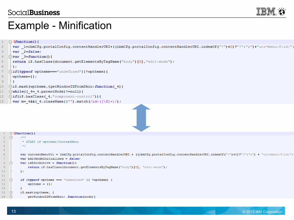
Theme - JavaScript
Similar to the case for stylesheets JavaScript files also need to be as small as possible and loaded in as few requests as possible to ensure the best response from our pages.
As for our CSS resources we want our JavaScript files to be human readable during development and maintenance as well. Our recommendation here is that normal versions of the scripts be used initially and minified versions be provided with the shipping application. This approach is taken by Portal theme whereby the minified files are used by default to aid performance and the full files are available for maintenance and debugging.
Minifying the JavaScript reduces the overall page size but we also need Portal resource aggregation to minimise our server requests. This aggregation is done automatically and script files are combined to minimise the number of requests required.
More information is available at:– http://www-10.lotus.com/ldd/portalwiki.nsf/dx/Basic_artifacts_and_their_relation_wp8
– http://www-10.lotus.com/ldd/portalwiki.nsf/dx/Contribution_types_wp8
© 2013 IBM Corporation13
Example - Minification

© 2013 IBM Corporation14
Content
Seamlessness
Page Composition
Interaction
Images
Device Classes
Custom Portlets
Content Targetting
Packaging
Settings and Debug
© 2013 IBM Corporation15
Content - Seamlessness
In a seamless digital experience, it is impossible to tell where one technology ends and another begins. There are three main things to remember to achieve this seamlessness– Don't Box up your pages, don't have visual boundaries between portlets– Use the same visual and interaction system across all assets (content to applications)– Use in-context integration so that a users does not have to retrace navigation steps
The other content in this deck detail the technologies and techniques that can be used to create a seamless digital experience, all of which are built upon the following:– Content Template Catalog– Social Rendering– Forms Experience Builder– Responsive Theme
More information can be found at:– http://www-10.lotus.com/ldd/portalwiki.nsf/dx/TECH-D14_Constructing_the_Exceptional_Web_Experiencecol_Best_Practices_in_Creating_a_Multichannel_Personalized_Web_Experience

© 2013 IBM Corporation16
Example - Seamlessness

© 2013 IBM Corporation17
Content – Page CompositionWhat we put on the pages of our application was guided by a number of usual concerns from feature requirements to UX input. In conjunction with these we adhered to the following general guidelines:
– Web Content Pages built on top of Content Template Catalog page templates and customised where necessary. Customisation included new columns or rows and additional portlets to integrate for example Forms Experience Builder or IBM
Connections content
– Page Weight Balance number of portlets on page, not too many portlets with remote content Balance portlet type on page especially when multiple backend data sources were involved
– Social Infusion Used social rendering for read only IBM Connections integration Used Connections portlets for more complex IBM Connections integration
– Interaction Inline content for desktop, typically less concerned with page size Dialog based for mobile channels where page weight is typically more of an issue
Further information can be found at– www-10.lotus.com/ldd/portalwiki.nsf/dx/Social_rendering_wp8001\
– http://www-10.lotus.com/ldd/portalwiki.nsf/dx/Content_Template_Catalog_4_V8

© 2013 IBM Corporation18
Example – Page Composition
© 2013 IBM Corporation19
Content – Interaction
There are many different patterns dictating how content on a page responds to user interaction. We've used 3 main types in our application:– Discrete
This simple pattern has all content laid down on a page and clicks on various links simply taking the user to another discrete page of content
– Dialog This is a pop-up pattern where a new window of content is presented to the user. We do this modally and expect that the user to
interact with the content before continuing. For us the content here is form based from a number of backend systems. This pattern keeps page size to a minimum and is best suited to low bandwidth sessions.
– Embedded Our use of the embedded pattern is to present the same content as the dialog pattern but unobtrusively, inline on the page. This
allows the user to interact with other parts of the page but does increase the page size and is perhaps better suited to larger bandwidth sessions.
Implementation– Discrete
This pattern simply uses WCM content and the Content Template Catalog
– Dialog and Embedded We leveraged the portal Dialog Framework to provide a non dojo dialog. We then use a custom PoCResolver to dtermin what
content should be rendered in that dialog. The key to the PoCResolver being supplied in piece of WCM content.
More information can be found at:– http://www.ibm.com/developerworks/websphere/library/techarticles/0710_koeth/0710_koeth.html– <PortalRoot>\PortalServer\theme\wp.theme.modules\webapp\installedApps\ThemeModules.ear\ThemeModules.war\mo
dules\dialog\js

© 2013 IBM Corporation20
Example – Interaction, Embedded
Embedded

© 2013 IBM Corporation21
Example – Interaction, Dialog

© 2013 IBM Corporation22
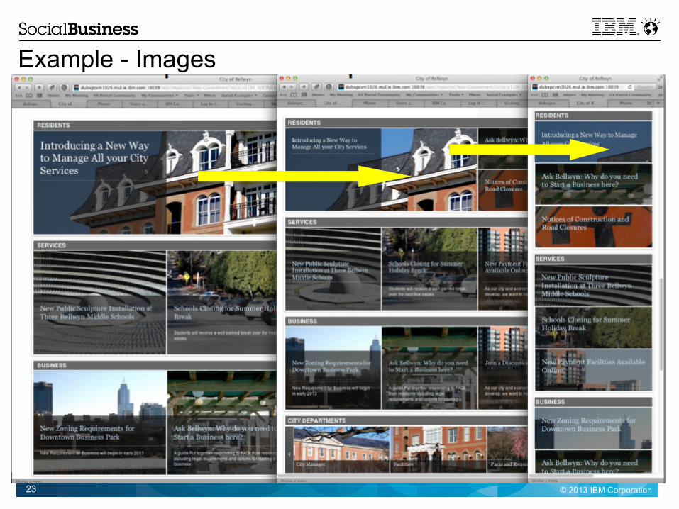
Content - Images
Continuing our theme of less is more we need any images we use to be as small a size as possible whilst maintaining a high enough quality across our set of access devices. In some cases we can get a good balance between image quality and image size but in others we need to have more than one version of an image depending on channel with desktop typically being more responsive with larger images (this is true not just of the file size of the image but also of the dimensions)
There is a real challenge in catering for all device types, screen sizes, and resolutions so image optimisation will be iterative and subjective.
That said some image encodings handle image types better than others and opinions vary but broadly speaking jpg is better for photographic content and png better for charts, text and illustrations.
In our project we also needed to be aware of the number of images on a page and to try to keep the balance between overall page size and the need for these images. We did things like vary the number of items shown in lists and reduce the number of images in a carousel for example to keep the overall page weight to an acceptable level.
© 2013 IBM Corporation23
Example - Images

© 2013 IBM Corporation24
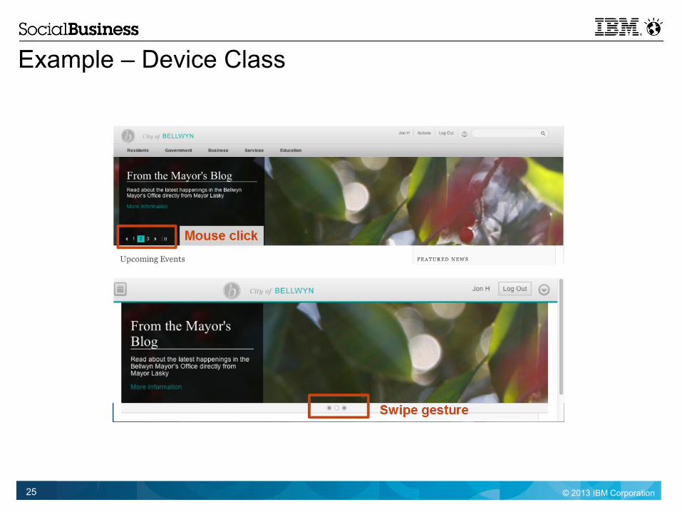
Content – Device Classes
Device classes provide us with a way to render different content based on the type of device sending us the request. Both our theme and our content can respond to the device type of the requester.
Our traditional web content is stored in WCM and based on the the Content Template Catalog (CTC) asset and these components react appropriately to the requesting device. For example the slideshows use mouse clicks for navigation on desktop clients and the familiar swipe gesture navigation on mobile devices.
Similarly our reporting portlet shows a file upload dialog when used on a desktop but when launched via a worklight hybrid app on a mobile device we get access to that devices camera.
When combined with media queries we have powerful capabilities for intelligent sites that respond to the access device of the site user.
Related information can be found at:– http://www.ibm.com/developerworks/library/mo-responsive-design-2/
– http://www-10.lotus.com/ldd/portalwiki.nsf/dx/Device_classes_wp8001– https://greenhouse.lotus.com/plugins/plugincatalog.nsf/assetDetails.xsp?action=editDocument&documentId=6506DAAAF92F201585257AFA0005B9E7
– http://www.ibm.com/developerworks/mobile/library/mo-aim1301-worklight-portal-4/
© 2013 IBM Corporation25
Example – Device Class

© 2013 IBM Corporation26
Content – Custom Portlets
Custom portlets we provide in our solution are developed using the IBM Web Experience Factory and our device specific reporting function is provided as a hybrid application using IBM Worklight and the multi-channel feature pack for Web Experience Factory.
This feature is a responsive portlet that recognises the presence of camera capability and uses it to take a photo when creating a report. In the absence of a camera it simply provides a file upload dialog.
Web Experience Factory gives you very rapid development of complete mobile and multi-channel applications using model-based, data-driven tools.
Worklight gets you applications that can be installed onto a device (for example, from an app store), with application access to native device features, notifications, and so on.
• More information including best practices can be found at– http://www-10.lotus.com/ldd/pfwiki.nsf/dx/performance-best-practices
– http://www.ibm.com/developerworks/mobile/library/mo-aim1301-worklight-portal-4/– https://greenhouse.lotus.com/plugins/plugincatalog.nsf/assetDetails.xsp?action=editDocument&documentId=2698B8341B424AA785257AEE004CDF71

© 2013 IBM Corporation27
Example – Custom Portlets

© 2013 IBM Corporation28
Content – Targeting
Content Targeting applies Personalization concepts to a new user interface where you create rules as you work to target content to selected segments.
It provides a simple in-context rule editor for matching segments (audiences) with content.
Our solution uses targeting content to display such things as geographically specific service lists to citizens on a government portal. We do this using targeting rules and targeted content spots that the server system populates with the appropriate WCM resident web content based on attributes of the page visitor.
This is just a basic example and more complex patterns can easily be achieved including integration with Web Marketing services such as Unica.
More information can be found at:– www-10.lotus.com/ldd/portalwiki.nsf/dx/Overview_of_content_targeting_wp8001– http://www-10.lotus.com/ldd/portalwiki.nsf/dx/TECH-B08_Applying_Content_Targeting_Strategies_in_Web_Content_Manager_and_WebSphere_Portal_solutions_Best_Practices

© 2013 IBM Corporation29
Example – Content Targeting
© 2013 IBM Corporation30
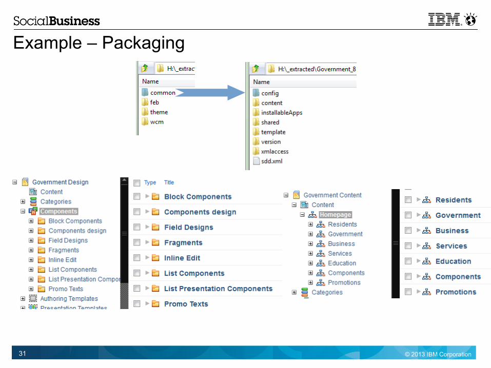
Content - Packaging
Our solution has artifacts that need installation and deployment to a number of places. For maximum automation in the most compact deliverable we deliver a Portal Application Archive (paa) which uses the Portal Solution installer to do most of the work for us.
The solution paa file contains a custom theme, PoCResolver EAR, Custom portlet WAR, WCM Libraries, FEB forms and deployment scripts
Within the paa we organise our WCM content into two libraries– Design Library
Follows the CTC pattern and contains a copy of the CTC design components many of which were customised to meet the design requirements of our solution
– Content Library Contains all the solution specific web content built on top of the design components within the partner
design library
More details can be found at:– www-10.lotus.com/ldd/portalwiki.nsf/dx/Using_the_Solution_Installer_wp8
© 2013 IBM Corporation31
Example – Packaging

© 2013 IBM Corporation32
Development – Settings and DebuggingEnable Developer Mode– Portal Developer mode improves server (re)start time
www-10.lotus.com/ldd/portalwiki.nsf/dx/Changing_to_developer_mode_wp8
Disable Resource Caching– Usually, the theme profiles and contributions are determined once, when the portal server is started and then they are used
unchanged. Updates to the system are not included until a server restart occurs, for performance reasons.
On a development system we want to see the changes immediately by setting the resourceaggregation.development.mode property to true within the WP ConfigService resource environment provider to disable caching.
Disable Resource Aggregation– When debugging it is useful to see individual file contributions. The following link causes modules to be loaded using individual link
and script tags enhancing our ability to debug.– www-10.lotus.com/ldd/portalwiki.nsf/dx/Debugging_modules_wp8001
Useful Debug Traces– CSS Issues:
Request traces for com.ibm.wps.resourceaggregator.split.* and com.ibm.wps.resourceaggregator.css.*– Contribution Issues:
Request traces for com.ibm.wps.resourceaggregator.contribution.* and the contribution file that is not working– Profile Issues:
Request traces for com.ibm.wps.resourceaggregator.profile.* and the profile file that is not working
Web Content Manager– http://www-10.lotus.com/ldd/portalwiki.nsf/dx/ibm-lotus-web-content-management-tracings-and-common-exceptions-
–
–

© 2013 IBM Corporation33
Suggested Toolkit
This slide lists some of the tools and applications/plugins we used in developing our solution.
Theme Optimisation Analyser -– A portlet that provides a means to examine all parts of the theme optimization framework including profiles and module hierarchy– https://greenhouse.lotus.com/plugins/plugincatalog_draft.nsf/assetDetailsForSubmission.xsp?action=editDocument&documentId=6F106EACA45124D685257B9400682966
Firebug– We used the Firebug extension on our Firefox browsers (and internal tools on IE, Safari, and Chrome)– http://en.wikipedia.org/wiki/Firebug_%28software%29
YSlow– We used YSlow (available on all our test browsers) to analyse page performance– http://yslow.org/
Bitknex– We used Bitknex as a standalone WebDAV client for our theme development– http://www.bitkinex.com/


