18
“Mobilegeddon”… or is it? A Briefing: What Google’s Algorithm Change Really Means for Brands MAY 1, 2015
| Date post: | 19-Jul-2015 |
| Category: |
Mobile |
| Upload: | socialogilvy |
| View: | 1,815 times |
| Download: | 1 times |

“Mobilegeddon”… or is it? A Briefing: What Google’s Algorithm Change Really Means for Brands MAY 1, 2015
2
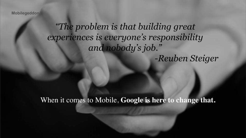
Mobilegeddon
“The problem is that building great experiences is everyone’s responsibility
and nobody’s job.” -Reuben Steiger
When it comes to Mobile, Google is here to change that.
3
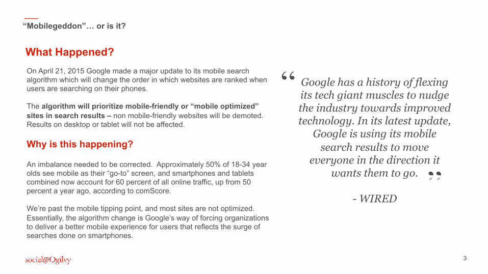
What Happened? On April 21, 2015 Google made a major update to its mobile search algorithm which will change the order in which websites are ranked when users are searching on their phones. The algorithm will prioritize mobile-friendly or “mobile optimized” sites in search results – non mobile-friendly websites will be demoted. Results on desktop or tablet will not be affected. Why is this happening? An imbalance needed to be corrected. Approximately 50% of 18-34 year olds see mobile as their “go-to” screen, and smartphones and tablets combined now account for 60 percent of all online traffic, up from 50 percent a year ago, according to comScore. We’re past the mobile tipping point, and most sites are not optimized. Essentially, the algorithm change is Google’s way of forcing organizations to deliver a better mobile experience for users that reflects the surge of searches done on smartphones.
“Mobilegeddon”… or is it?
Google has a history of flexing its tech giant muscles to nudge the industry towards improved technology. In its latest update,
Google is using its mobile search results to move
everyone in the direction it wants them to go.
- WIRED
“
”
4
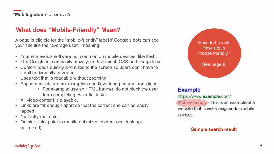
What does “Mobile-Friendly” Mean?
“Mobilegeddon”… or is it?
A page is eligible for the “mobile-friendly” label if Google’s bots can see your site like the “average user,” meaning: • Your site avoids software not common on mobile devices, like flash. • The Googlebot can easily crawl your Javascript, CSS and image files. • Content loads quickly and sizes to the screen so users don't have to
scroll horizontally or zoom. • Uses text that is readable without zooming. • App interstitials are not disruptive and flow during natural transitions.
• For example: use an HTML banner, do not block the user from completing essential tasks.
• All video content is playable. • Links are far enough apart so that the correct one can be easily
tapped. • No faulty redirects. • Outside links point to mobile optimized content (vs. desktop-
optimized). Sample search result
How do I check if my site is
mobile friendly?
See page 8!
5
What does it mean for brands?
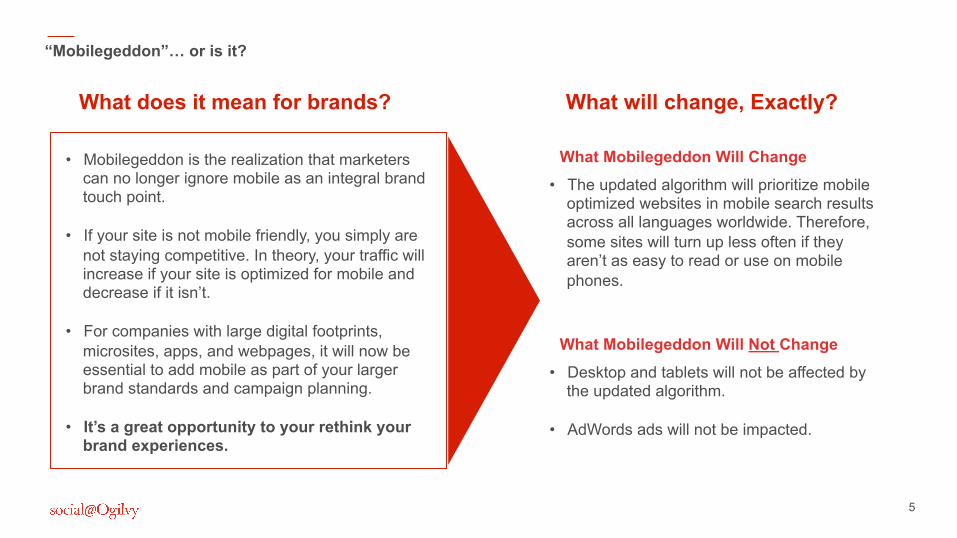
• Mobilegeddon is the realization that marketers can no longer ignore mobile as an integral brand touch point.
• If your site is not mobile friendly, you simply are not staying competitive. In theory, your traffic will increase if your site is optimized for mobile and decrease if it isn’t.
• For companies with large digital footprints,
microsites, apps, and webpages, it will now be essential to add mobile as part of your larger brand standards and campaign planning.
• It’s a great opportunity to your rethink your brand experiences.
“Mobilegeddon”… or is it?
What will change, Exactly?
• The updated algorithm will prioritize mobile optimized websites in mobile search results across all languages worldwide. Therefore, some sites will turn up less often if they aren’t as easy to read or use on mobile phones.
What Mobilegeddon Will Change
• Desktop and tablets will not be affected by the updated algorithm.
• AdWords ads will not be impacted.
What Mobilegeddon Will Not Change

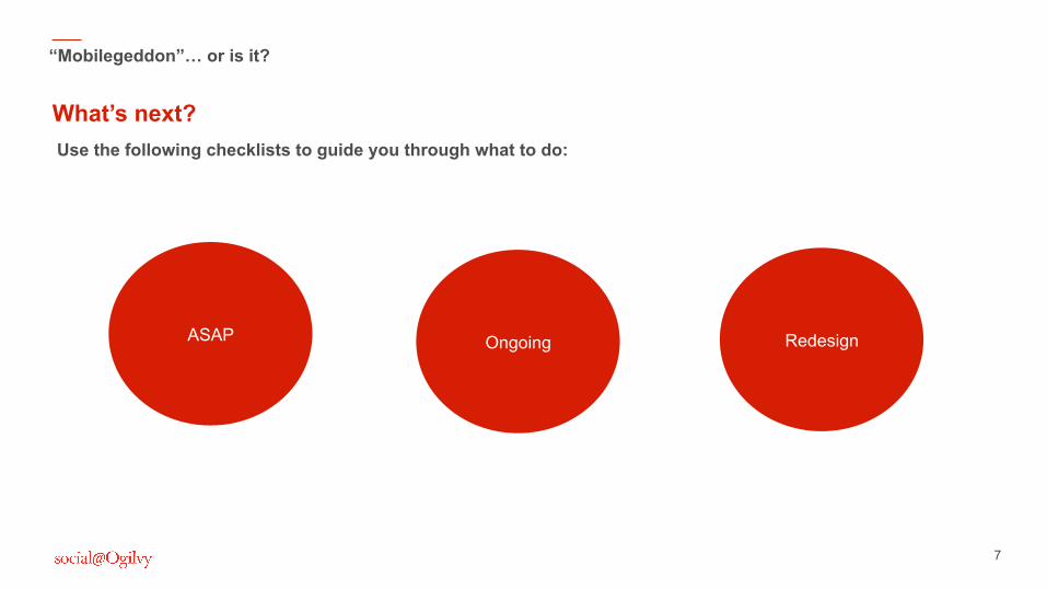
What do I do next?!? Read on for check lists to guide you through.
7
Use the following checklists to guide you through what to do:
What’s next?
“Mobilegeddon”… or is it?
ASAP Ongoing Redesign
8
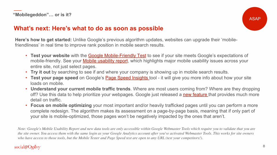
Here’s how to get started: Unlike Google’s previous algorithm updates, websites can upgrade their ‘mobile-friendliness’ in real time to improve rank position in mobile search results.
• Test your website with the Google Mobile-Friendly Test to see if your site meets Google’s expectations of mobile-friendly. See your Mobile usability report, which highlights major mobile usability issues across your entire site, not just select pages.
• Try it out by searching to see if and where your company is showing up in mobile search results. • Test your page speed on Google’s Page Speed Insights tool - it will give you more info about how your site
loads on mobile. • Understand your current mobile traffic trends. Where are most users coming from? Where are they dropping
off? Use this data to help prioritize your webpages. Google just released a new feature that provides much more detail on traffic.
• Focus on mobile optimizing your most important and/or heavily trafficked pages until you can perform a more complete redesign. The algorithm makes its assessment on a page-by-page basis, meaning that if only part of your site is mobile-optimized, those pages won’t be negatively impacted by the ones that aren’t.
What’s next: Here’s what to do as soon as possible
“Mobilegeddon”… or is it?
Note: Google's Mobile Usability Report and new data tools are only accessible within Google Webmaster Tools which require you to validate that you are the site owner. You access them with the same login as your Google Analytics account after you've activated Webmaster Tools. This works for site owners who have access to those tools, but the Mobile Tester and Page Speed test are open to any URL (test your competitors!).
ASAP
9
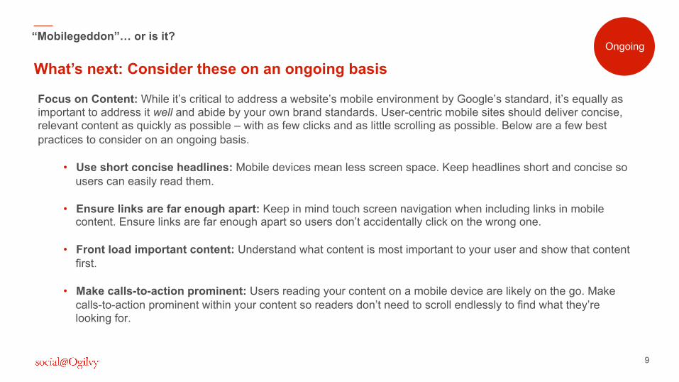
Focus on Content: While it’s critical to address a website’s mobile environment by Google’s standard, it’s equally as important to address it well and abide by your own brand standards. User-centric mobile sites should deliver concise, relevant content as quickly as possible – with as few clicks and as little scrolling as possible. Below are a few best practices to consider on an ongoing basis.
• Use short concise headlines: Mobile devices mean less screen space. Keep headlines short and concise so users can easily read them.
• Ensure links are far enough apart: Keep in mind touch screen navigation when including links in mobile
content. Ensure links are far enough apart so users don’t accidentally click on the wrong one. • Front load important content: Understand what content is most important to your user and show that content
first. • Make calls-to-action prominent: Users reading your content on a mobile device are likely on the go. Make
calls-to-action prominent within your content so readers don’t need to scroll endlessly to find what they’re looking for.
What’s next: Consider these on an ongoing basis
“Mobilegeddon”… or is it? Ongoing
10
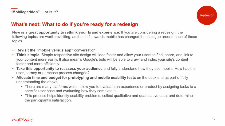
Now is a great opportunity to rethink your brand experience: If you are considering a redesign, the following topics are worth revisiting, as the shift towards mobile has changed the dialogue around each of these topics. • Revisit the “mobile versus app” conversation. • Think simple. Simple responsive site design will load faster and allow your users to find, share, and link to
your content more easily. It also mean’s Google’s bots will be able to crawl and index your site’s content faster and more efficiently.
• Take this opportunity to reassess your audience and fully understand how they use mobile. How has the user journey or purchase process changed?
• Allocate time and budget for prototyping and mobile usability tests on the back end as part of fully understanding the above.
• There are many platforms which allow you to evaluate an experience or product by assigning tasks to a specific user base and evaluating how they complete it.
• This process helps identify usability problems, collect qualitative and quantitative data, and determine the participant’s satisfaction.
What’s next: What to do if you’re ready for a redesign
“Mobilegeddon”… or is it? Redesign
What else has this stirred up?
Spotlight on the local search opportunity.
12
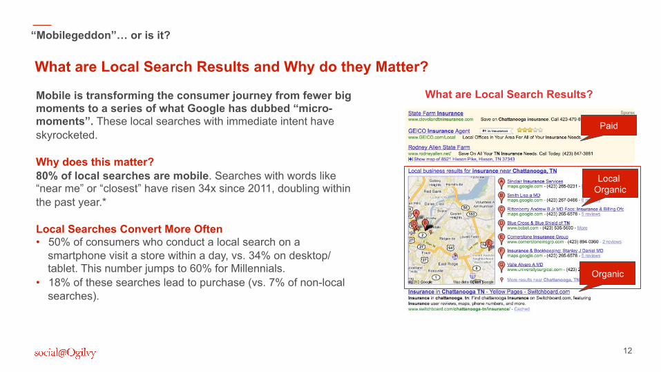
Mobile is transforming the consumer journey from fewer big moments to a series of what Google has dubbed “micro-moments”. These local searches with immediate intent have skyrocketed. Why does this matter? 80% of local searches are mobile. Searches with words like “near me” or “closest” have risen 34x since 2011, doubling within the past year.* Local Searches Convert More Often • 50% of consumers who conduct a local search on a
smartphone visit a store within a day, vs. 34% on desktop/tablet. This number jumps to 60% for Millennials.
• 18% of these searches lead to purchase (vs. 7% of non-local searches).
What are Local Search Results and Why do they Matter?
“Mobilegeddon”… or is it? Redesign
What are Local Search Results?
Organic
Local Organic
Paid
13
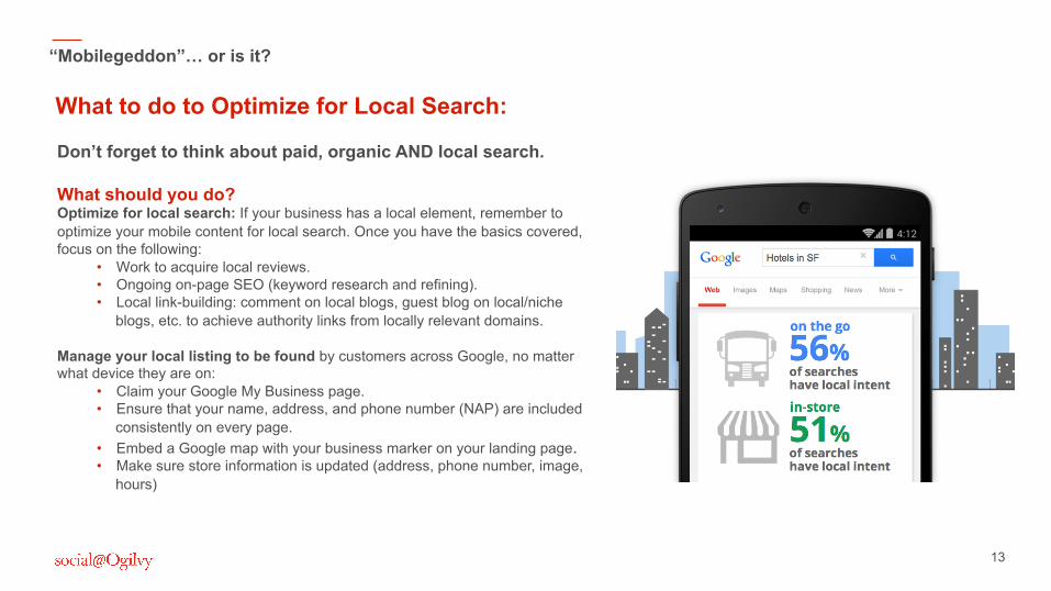
Don’t forget to think about paid, organic AND local search. What should you do? Optimize for local search: If your business has a local element, remember to optimize your mobile content for local search. Once you have the basics covered, focus on the following:
• Work to acquire local reviews. • Ongoing on-page SEO (keyword research and refining). • Local link-building: comment on local blogs, guest blog on local/niche
blogs, etc. to achieve authority links from locally relevant domains. Manage your local listing to be found by customers across Google, no matter what device they are on:
• Claim your Google My Business page. • Ensure that your name, address, and phone number (NAP) are included
consistently on every page. • Embed a Google map with your business marker on your landing page. • Make sure store information is updated (address, phone number, image,
hours)
What to do to Optimize for Local Search:
“Mobilegeddon”… or is it? Redesign

In Summary… Is it really “Mobilegeddon”?
15
“Mobilegeddon”… or is it?
While many people worried about the changes “Mobilegeddon” would bring about, turns out it’s just the catalyst to help brands fully adapt to the already mobile-centric consumer base. “Mobilegeddon” is nothing to panic about as long as you take the steps outlined in this briefing, including:
It’s a helpful nudge to push brands into the mobile-friendly age.
ASAP • Test your site for mobile
friendliness and page speed. • Understand your current
mobile trends. • Focus on mobile optimizing.
Ongoing • Use short, concise headlines. • Ensure links are far enough apart. • Front load important content. • Make important calls-to-action.
Long-term Redesign • Revisit the “mobile versus app”
conversation. • Think simple. • Take this opportunity to reassess
your audience • Allocate time and budget for
prototyping and mobile usability tests
16
Thanks. Questions? Thoughts? Lindsey Brylow, Account Executive – Digital Strategist [email protected] Monica Ceballos, Senior Account Executive – Digital Strategist [email protected] Amy Brown, Vice President – Digital Strategist [email protected] Learn more on the Social@Ogilvy blog: social.ogilvy.com/thinking

18
Further Reading
Sources: https://www.thinkwithgoogle.com/features/i-want-to-go-micro-moments.html. http://googlewebmastercentral.blogspot.com/2014/11/helping-users-find-mobile-friendly-pages.html The Content Strategist, “6 Tips Content Marketers Need to Know About Mobilegeddon, Google’s Big SEO Change.” Venture Beat, “Google’s Mobilegeddon: Everything You Need to Know.” The SEM Post, “Google’s Mobile Friendly Ranking Signal Will Not Affect Local Pack Listings.” Inc.,“What Mobilegeddon Really Means for Your Business.” Search Engine Land, “Local SEO: How to Rank Your Local Business.”


