96
Solving Layout problems with CSS Grid & friends Rachel Andrew @ #WEBU17
| Date post: | 23-Jan-2018 |
| Category: |
Technology |
| Upload: | rachel-andrew |
| View: | 257 times |
| Download: | 1 times |
Solving Layout problems with CSS Grid & friends
Rachel Andrew @ #WEBU17

Rachel Andrew
▸ @rachelandrew on Twitter
▸ https://rachelandrew.co.uk
▸ Invited Expert to the CSS Working Group
▸ Google Developer Expert
▸ co-founder Perch and Perch Runway CMS - https://grabaperch.com
… why not use Flexbox?
So, about this Grid thing …

Do you need layout in one dimension or two?
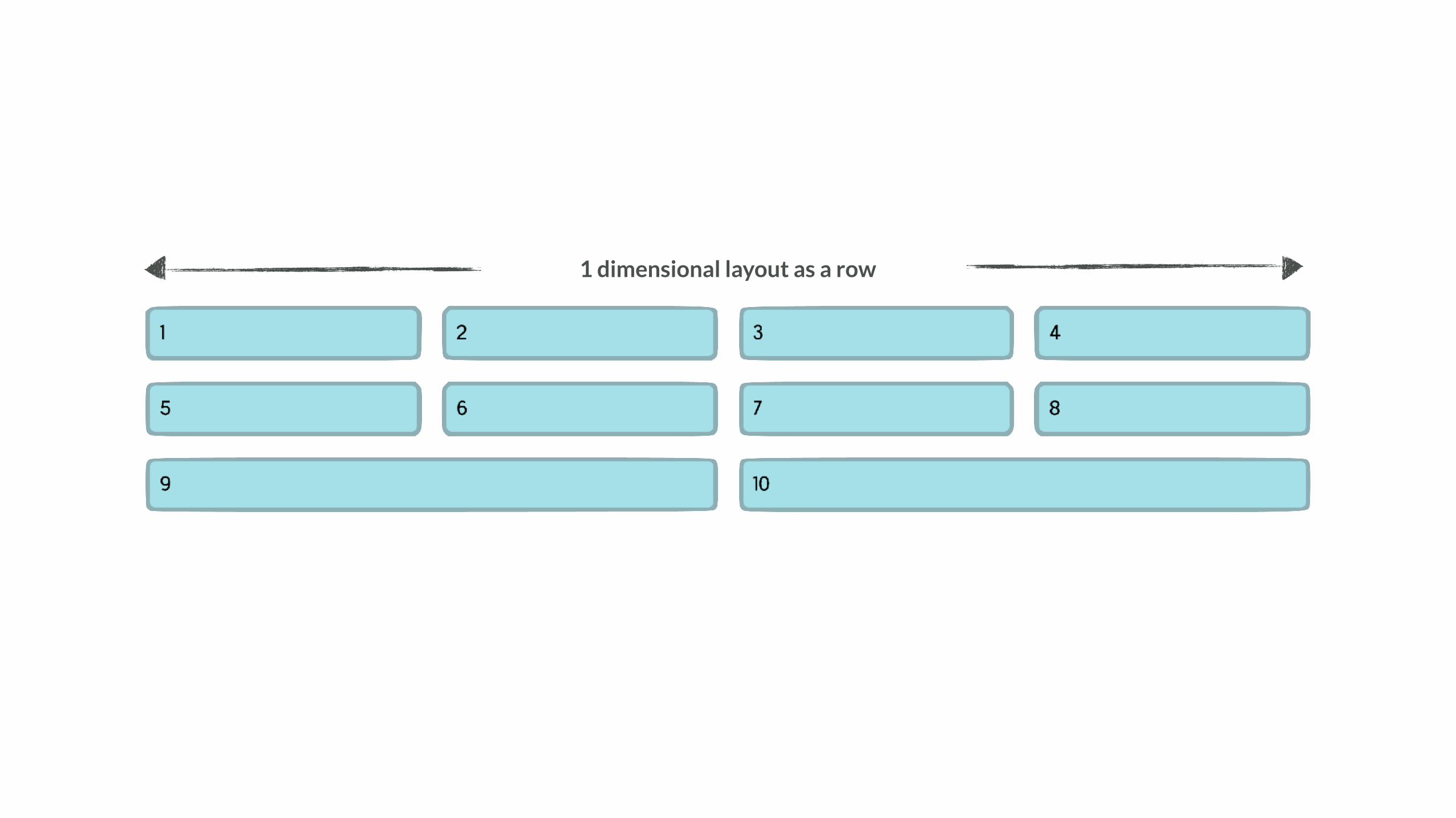
1 dimensional layout as a row
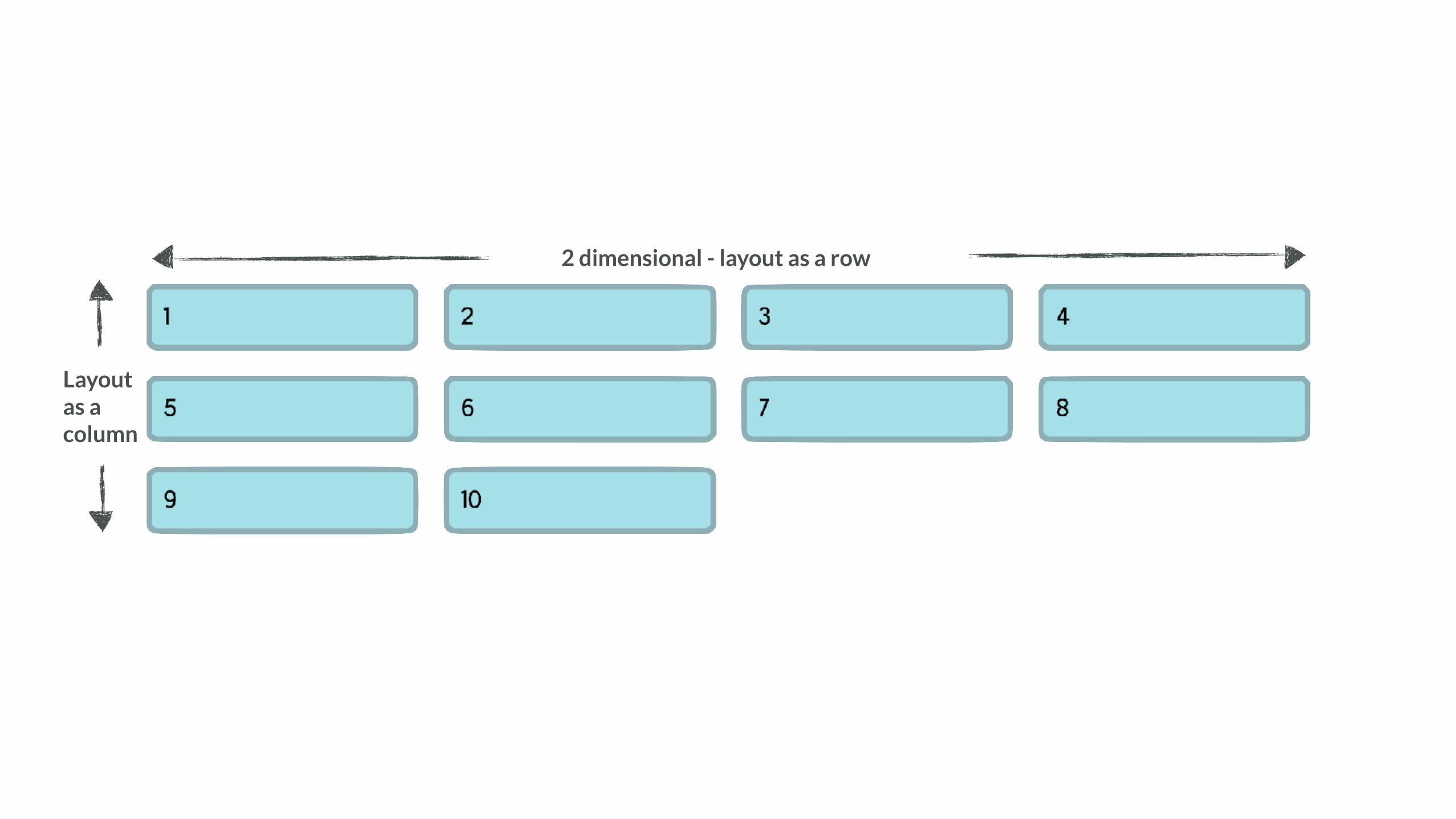
2 dimensional - layout as a row
Layout as a column
Grid works from the container in
Every other method of creating a grid, involves sizing the individual items.
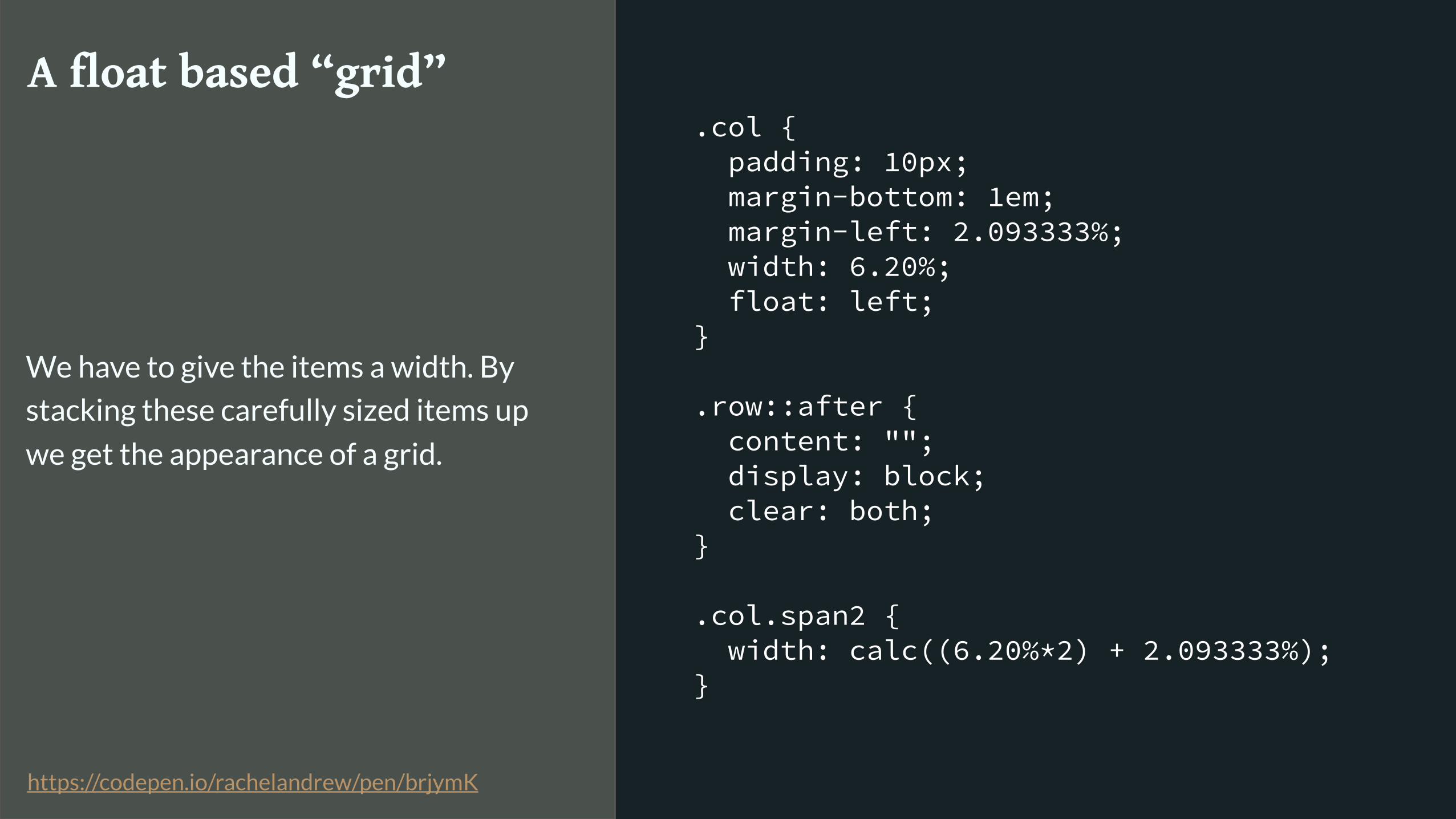
.col { padding: 10px; margin-bottom: 1em; margin-left: 2.093333%; width: 6.20%; float: left; }
.row::after { content: ""; display: block; clear: both; }
.col.span2 { width: calc((6.20%*2) + 2.093333%); }
A float based “grid”
We have to give the items a width. By
stacking these carefully sized items up
we get the appearance of a grid.
https://codepen.io/rachelandrew/pen/brjymK

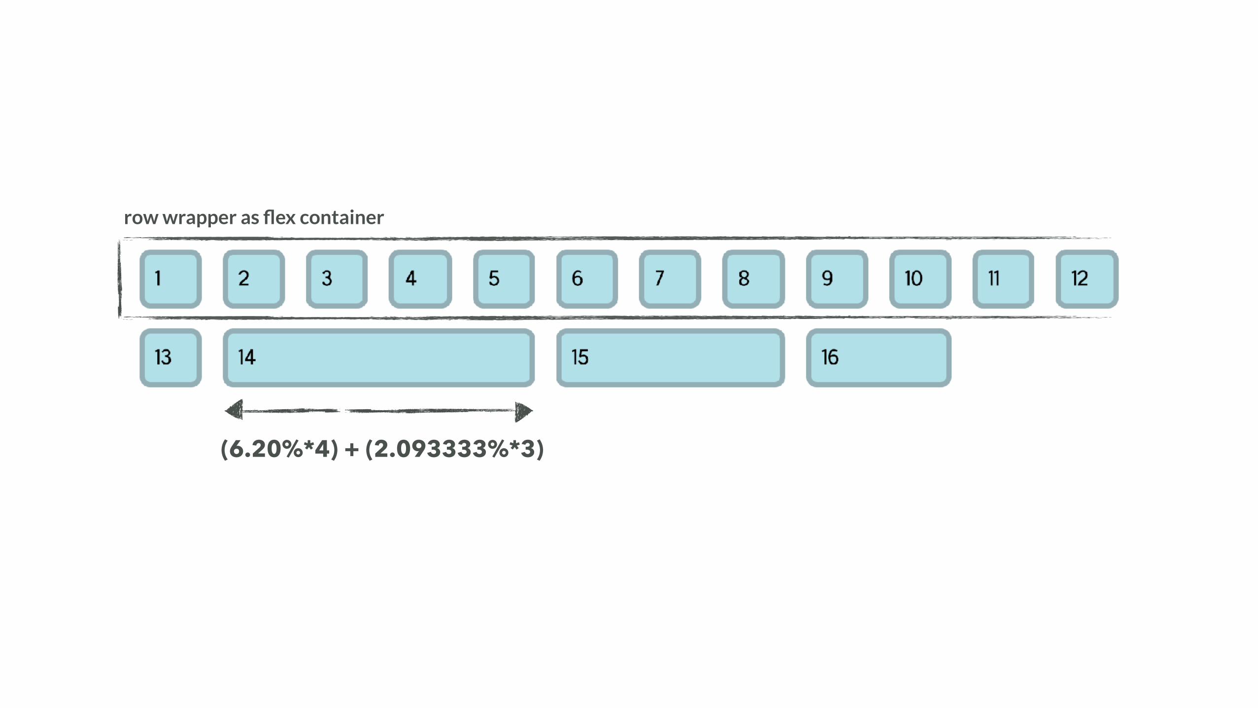
row wrapper
(6.20%*4) + (2.093333%*3)
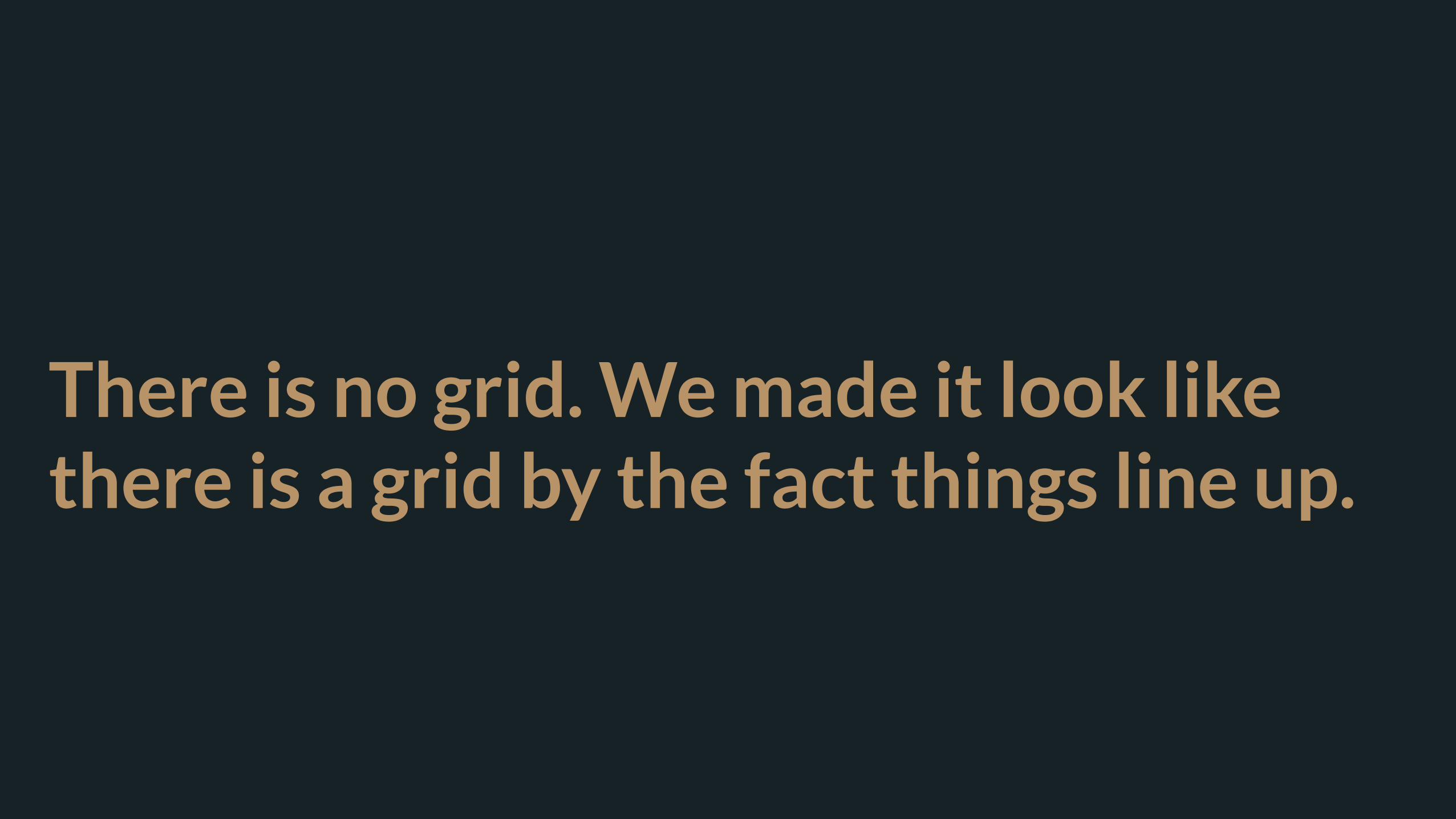
There is no grid. We made it look like there is a grid by the fact things line up.
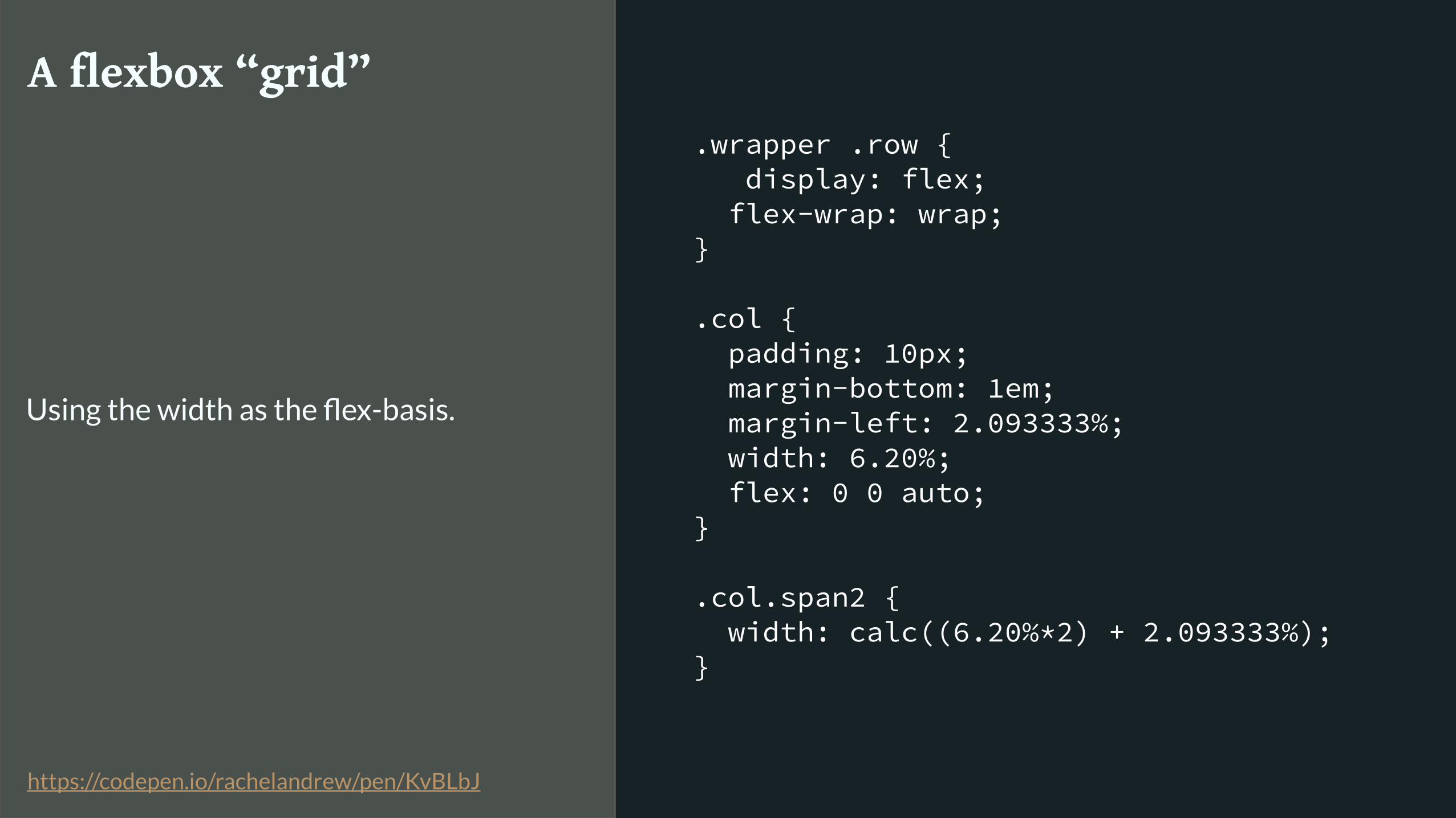
.wrapper .row { display: flex; flex-wrap: wrap; }
.col { padding: 10px; margin-bottom: 1em; margin-left: 2.093333%; width: 6.20%; flex: 0 0 auto; }
.col.span2 { width: calc((6.20%*2) + 2.093333%); }
A flexbox “grid”
Using the width as the flex-basis.
https://codepen.io/rachelandrew/pen/KvBLbJ
row wrapper as flex container
(6.20%*4) + (2.093333%*3)
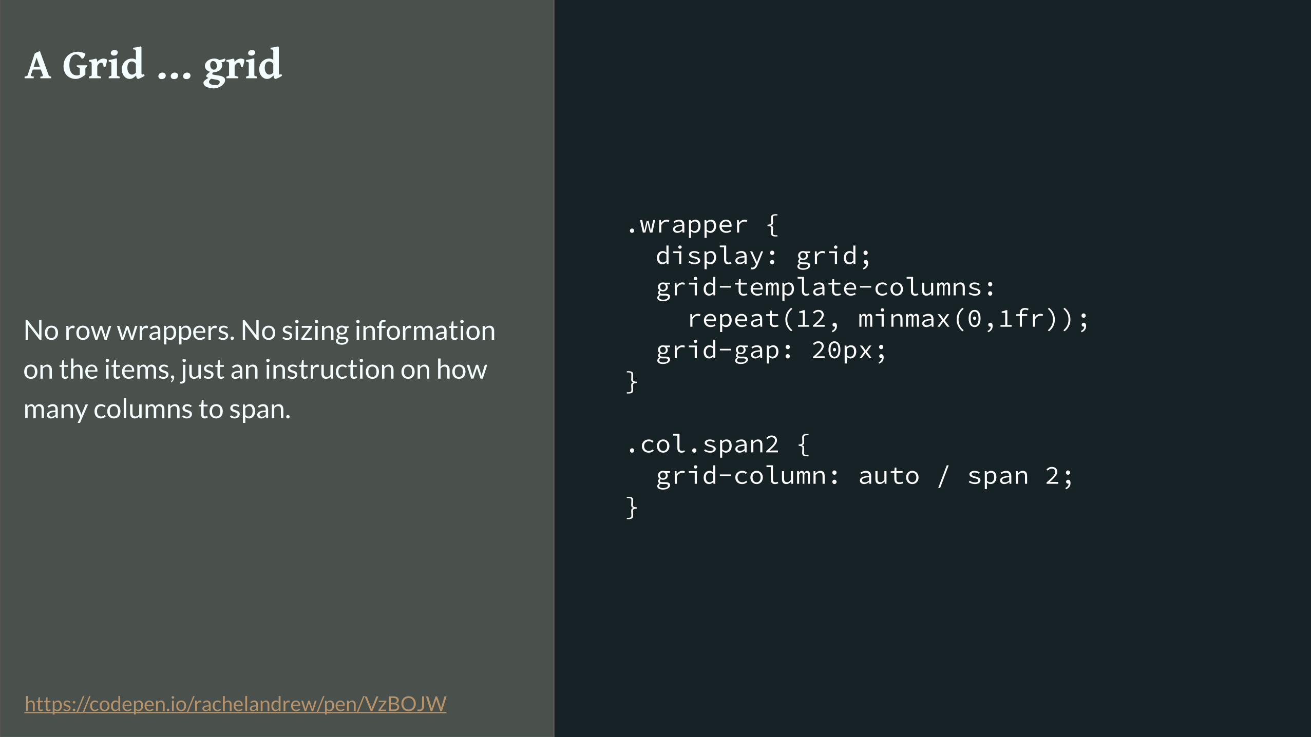
.wrapper { display: grid; grid-template-columns: repeat(12, minmax(0,1fr)); grid-gap: 20px; }
.col.span2 { grid-column: auto / span 2; }
A Grid … grid
No row wrappers. No sizing information
on the items, just an instruction on how
many columns to span.
https://codepen.io/rachelandrew/pen/VzBOJW
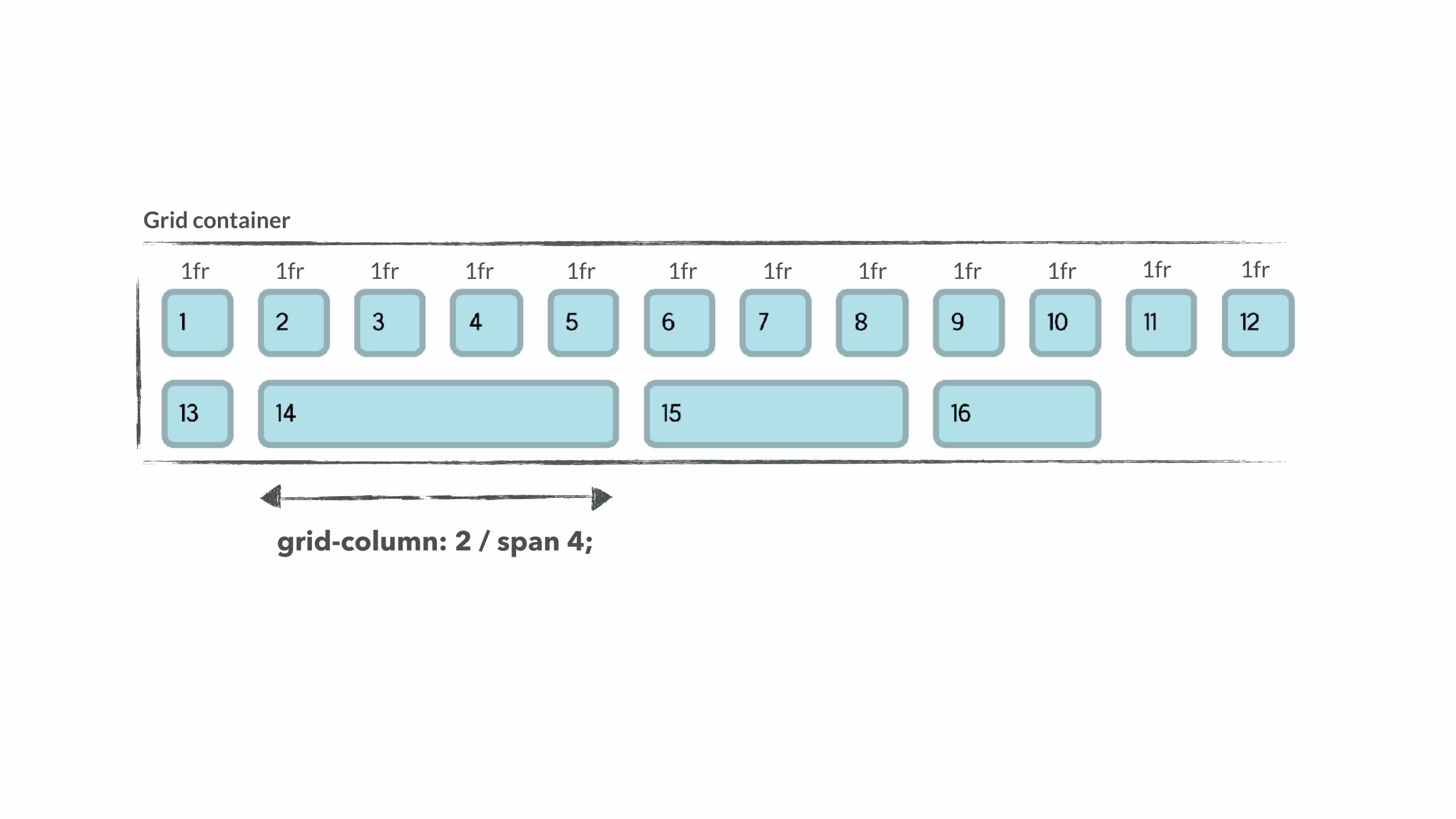
Grid container
grid-column: 2 / span 4;
1fr 1fr 1fr 1fr 1fr 1fr 1fr 1fr 1fr 1fr 1fr 1fr
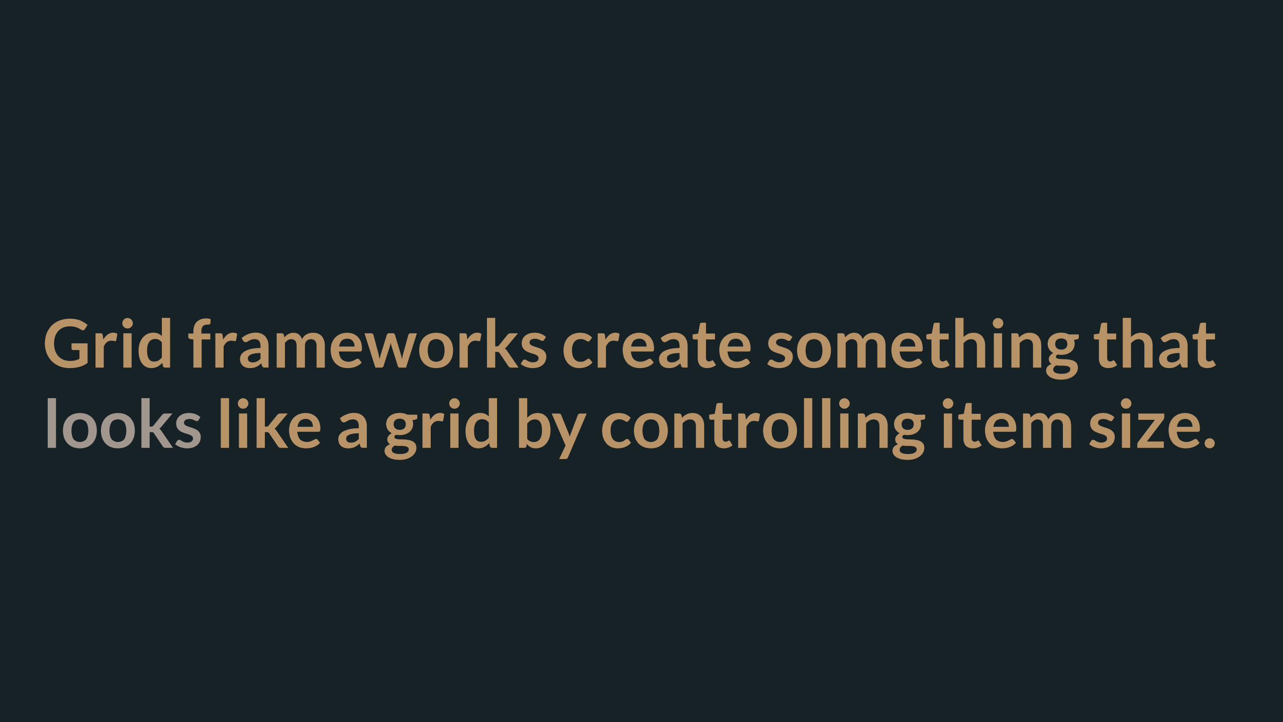
Grid frameworks create something that looks like a grid by controlling item size.

CSS Grid Layout creates an actual grid and you place items into it.
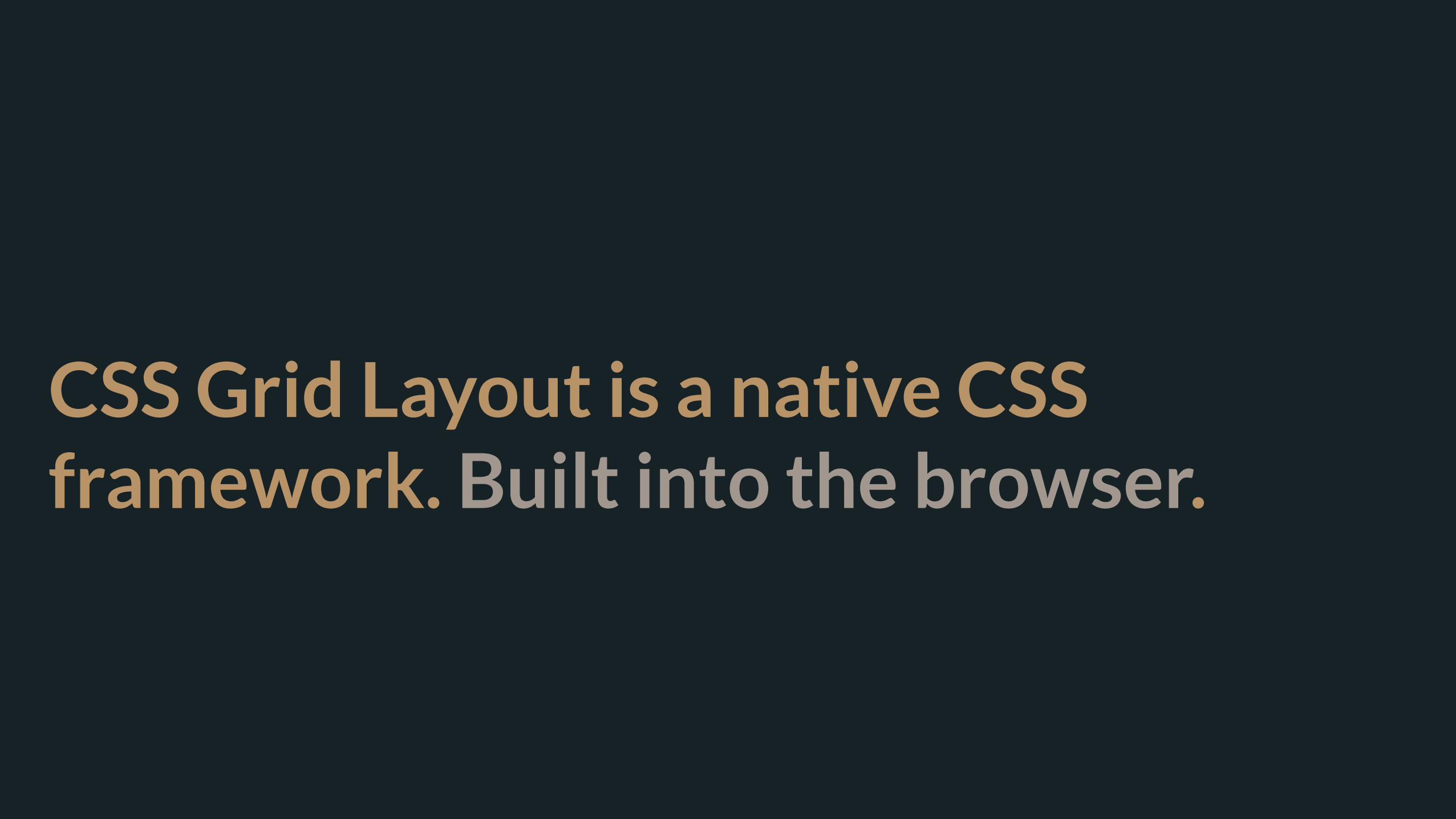
CSS Grid Layout is a native CSS framework. Built into the browser.
Sizing Grid Tracks
Precision & Flexibility
Grid container width
minmax(200px, 1fr)
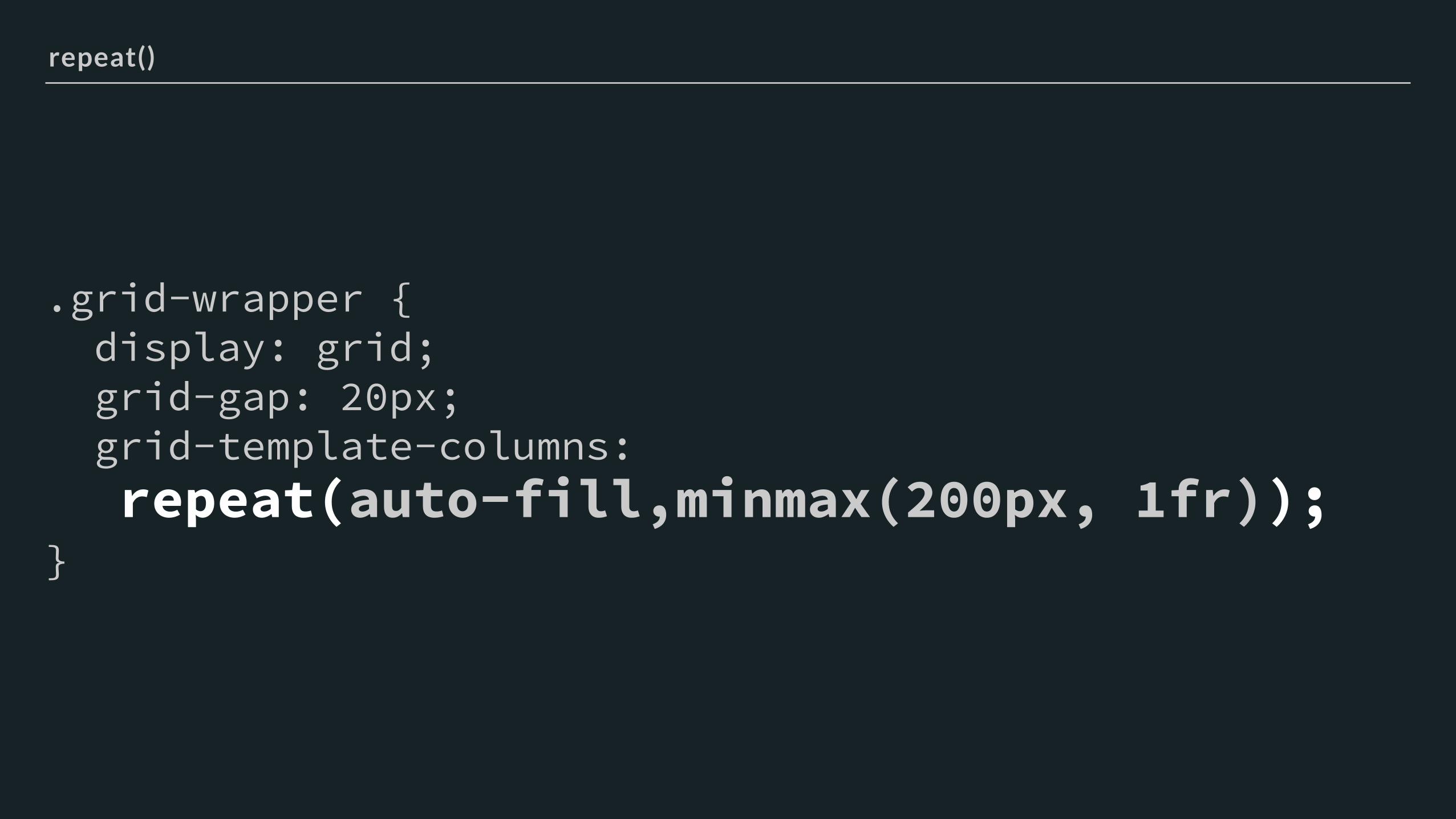
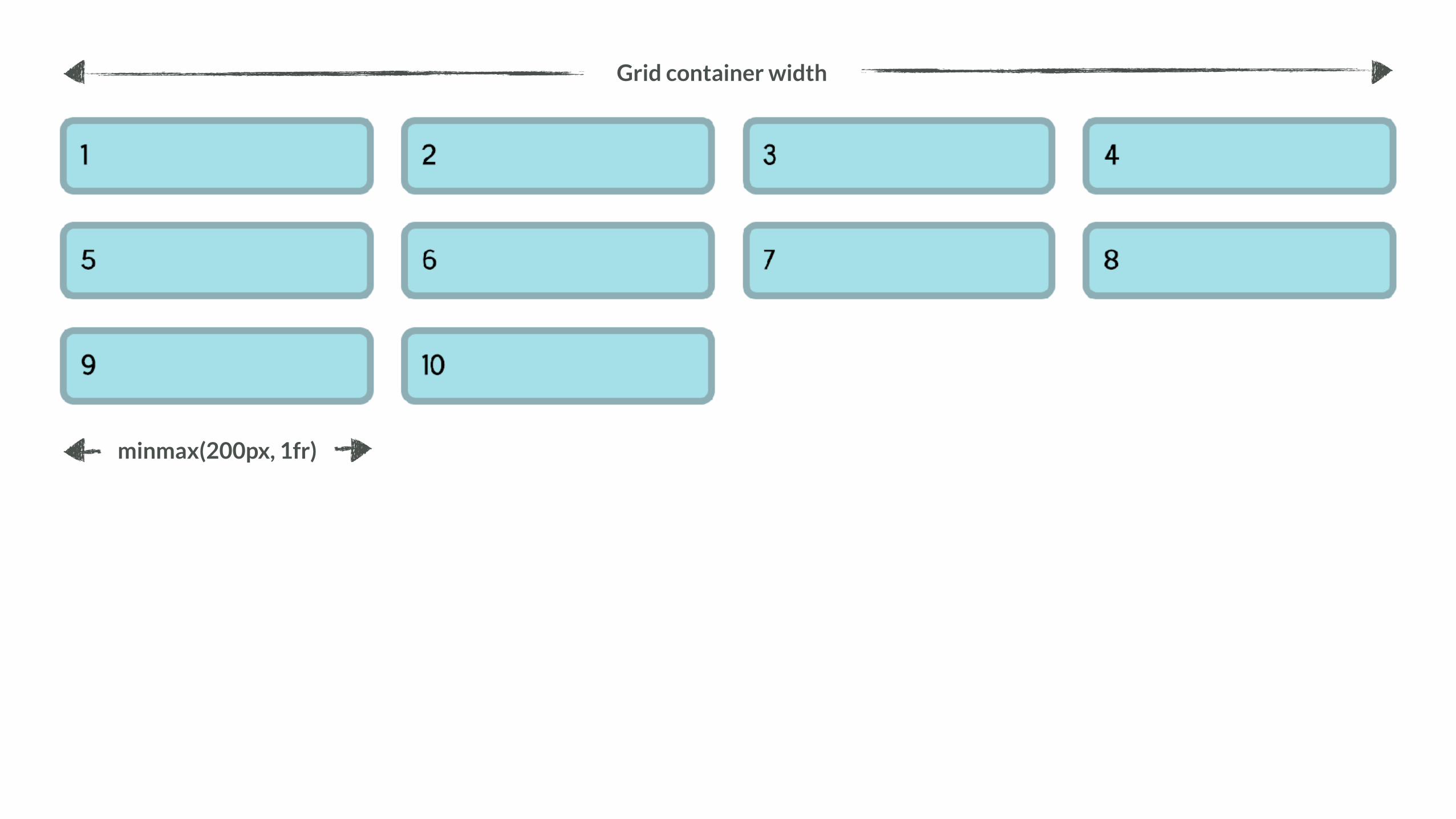
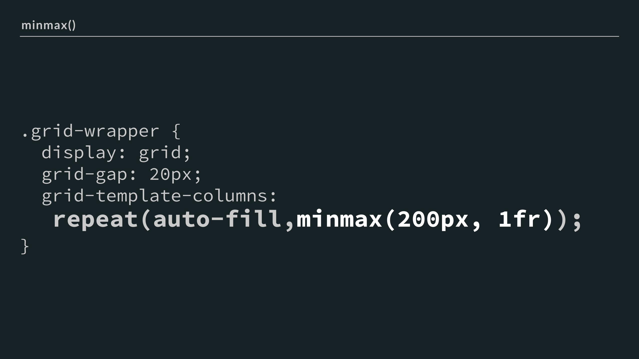
.grid-wrapper { display: grid; grid-gap: 20px; grid-template-columns: repeat(auto-fill,minmax(200px, 1fr)); }
repeat()
.grid-wrapper { display: grid; grid-gap: 20px; grid-template-columns: repeat(auto-fill,minmax(200px, 1fr)); }
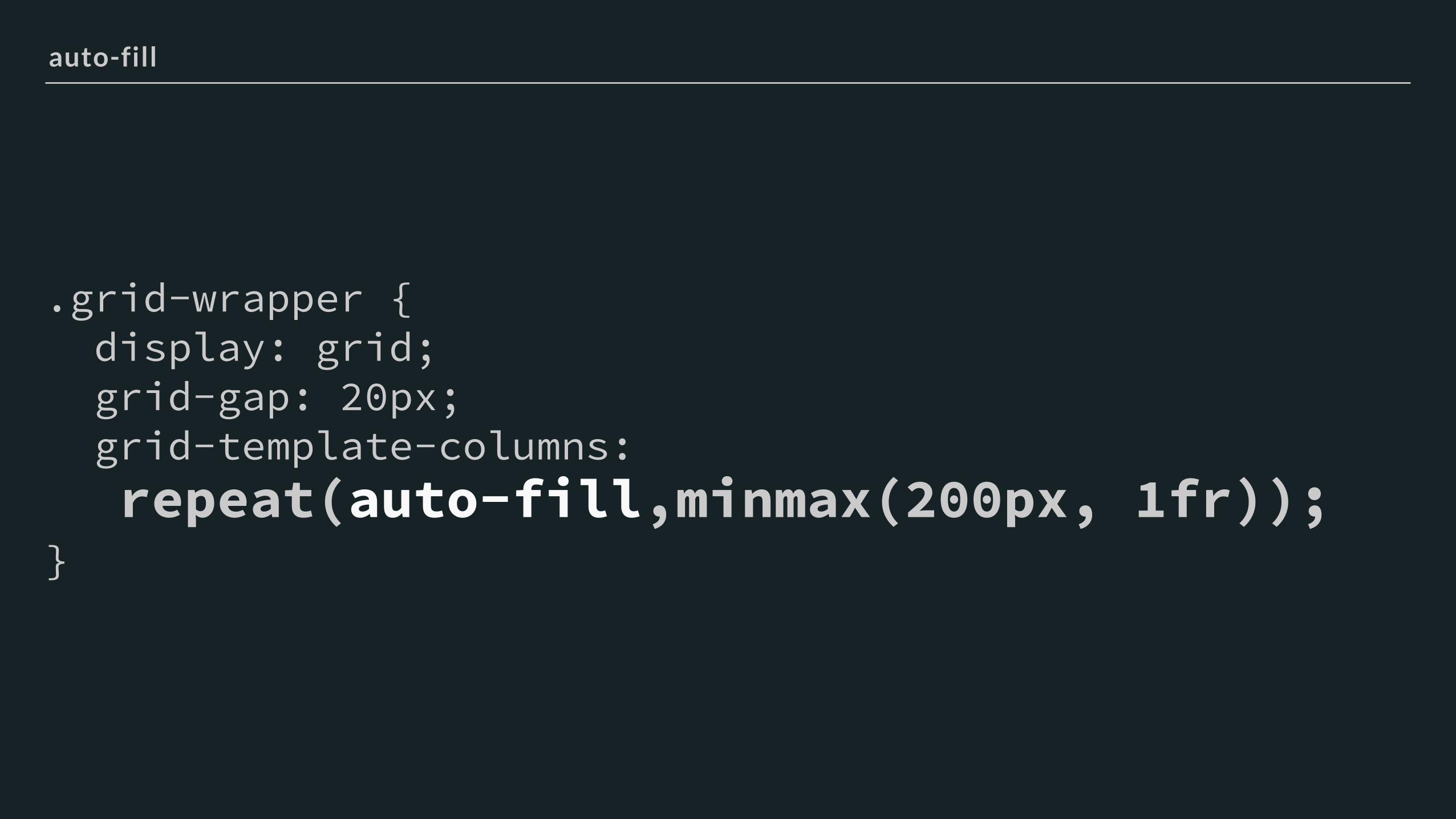
auto-fill
.grid-wrapper { display: grid; grid-gap: 20px; grid-template-columns: repeat(auto-fill,minmax(200px, 1fr)); }
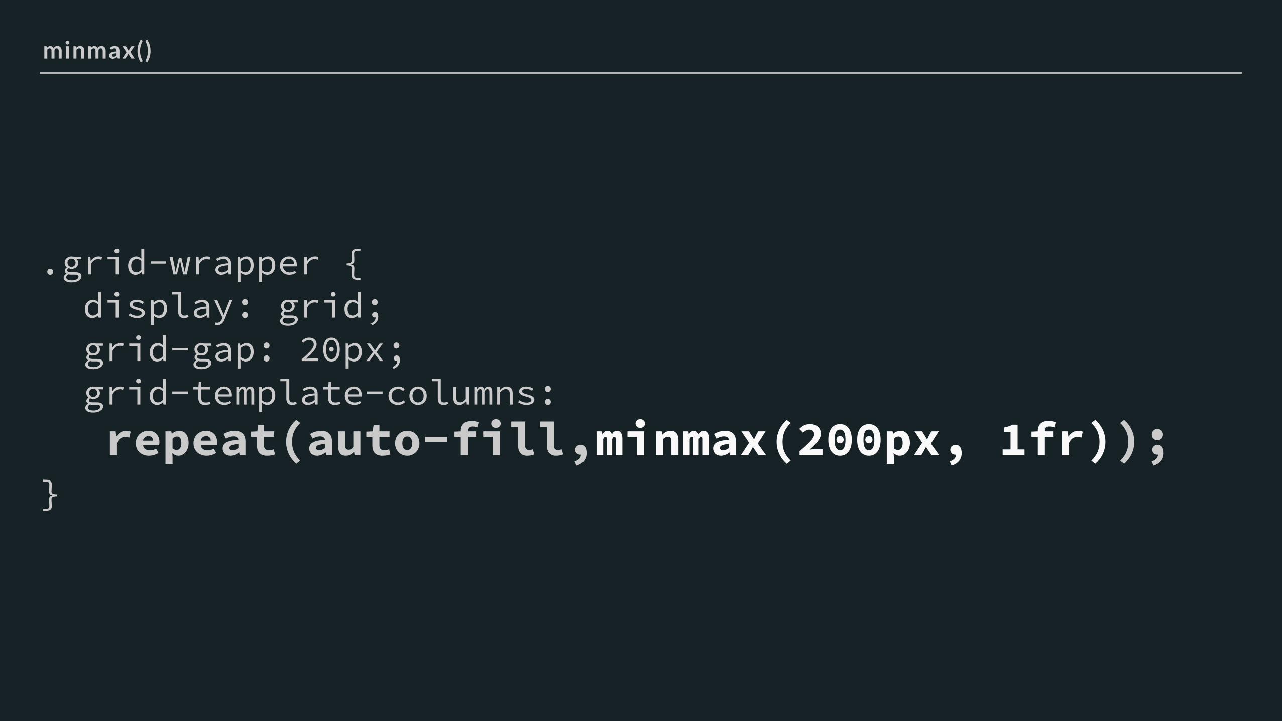
minmax()
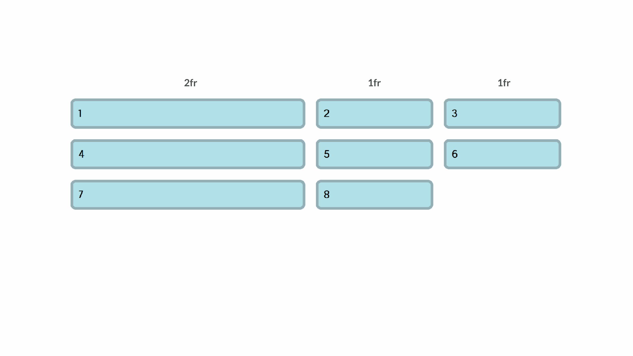
The fr unit - distributing available space
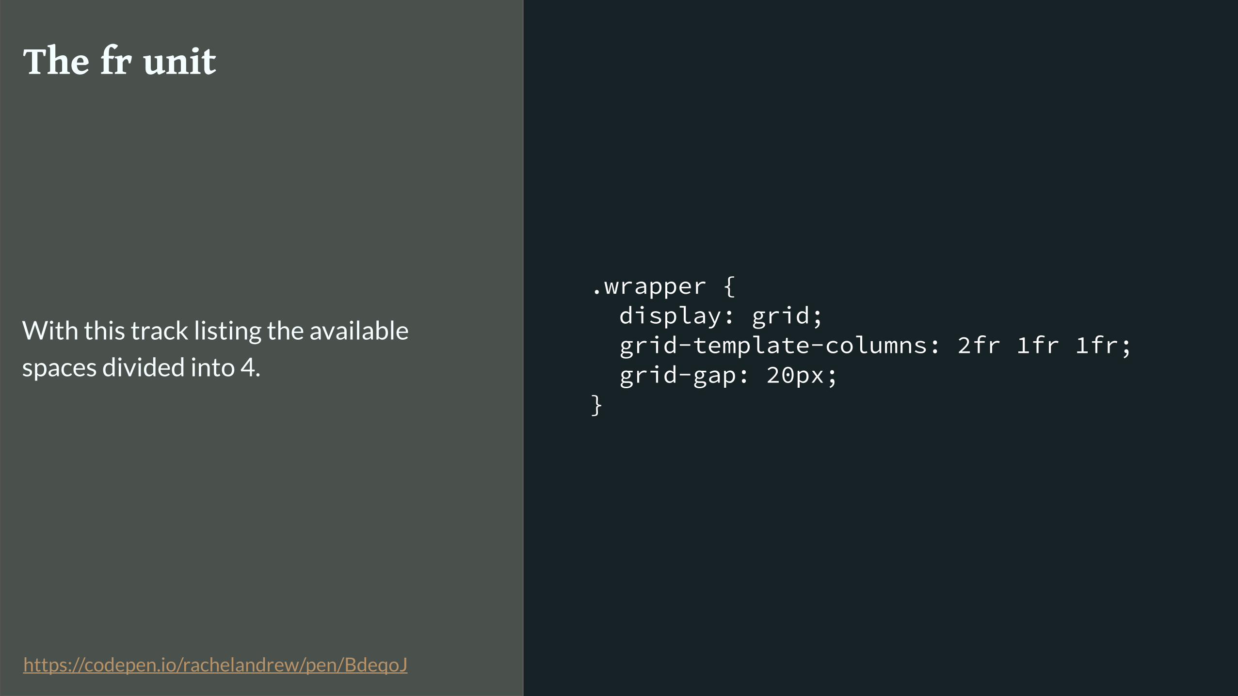
.wrapper { display: grid; grid-template-columns: 2fr 1fr 1fr; grid-gap: 20px; }
The fr unit
With this track listing the available
spaces divided into 4.
https://codepen.io/rachelandrew/pen/BdeqoJ
1fr1fr2fr
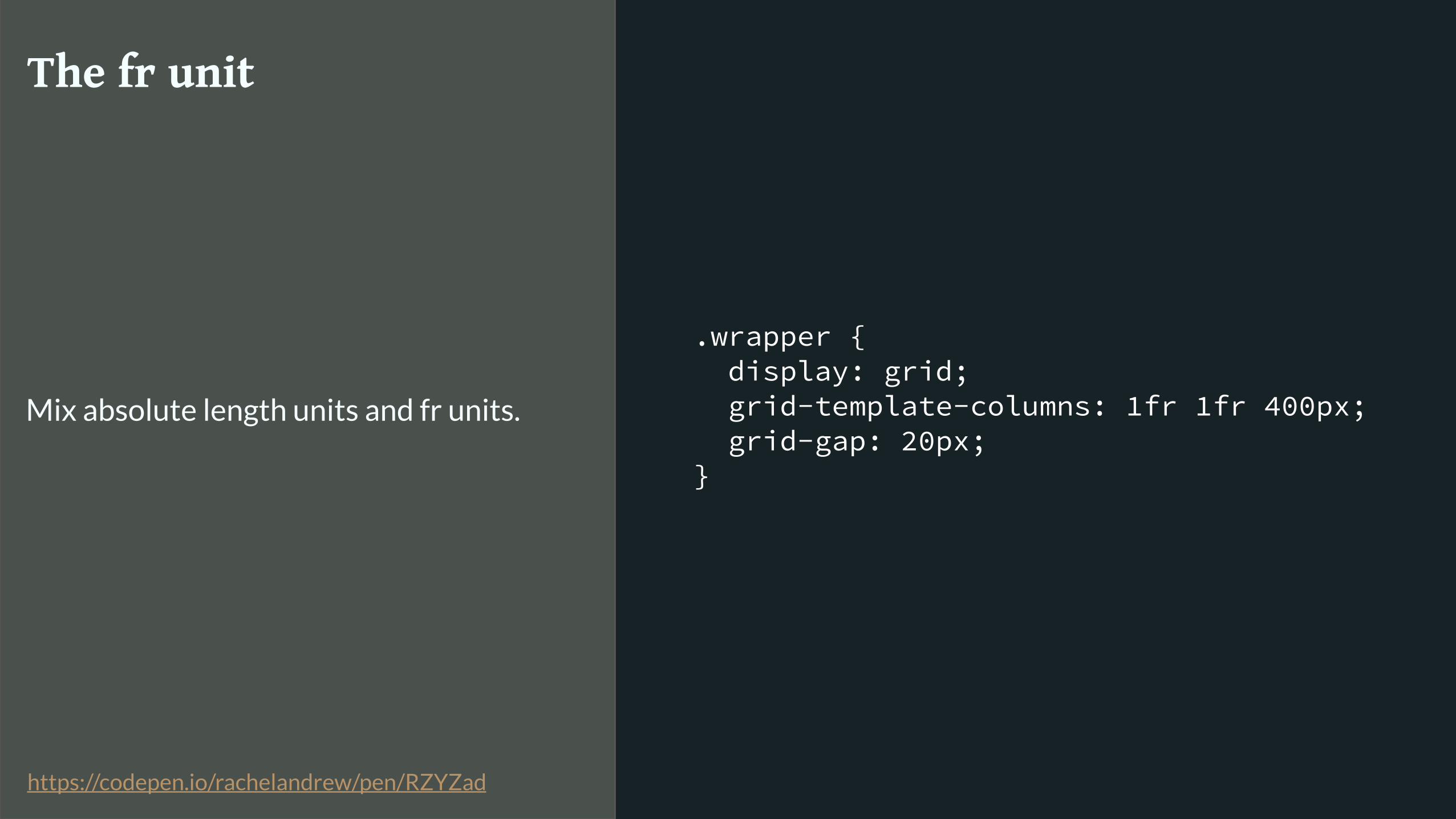
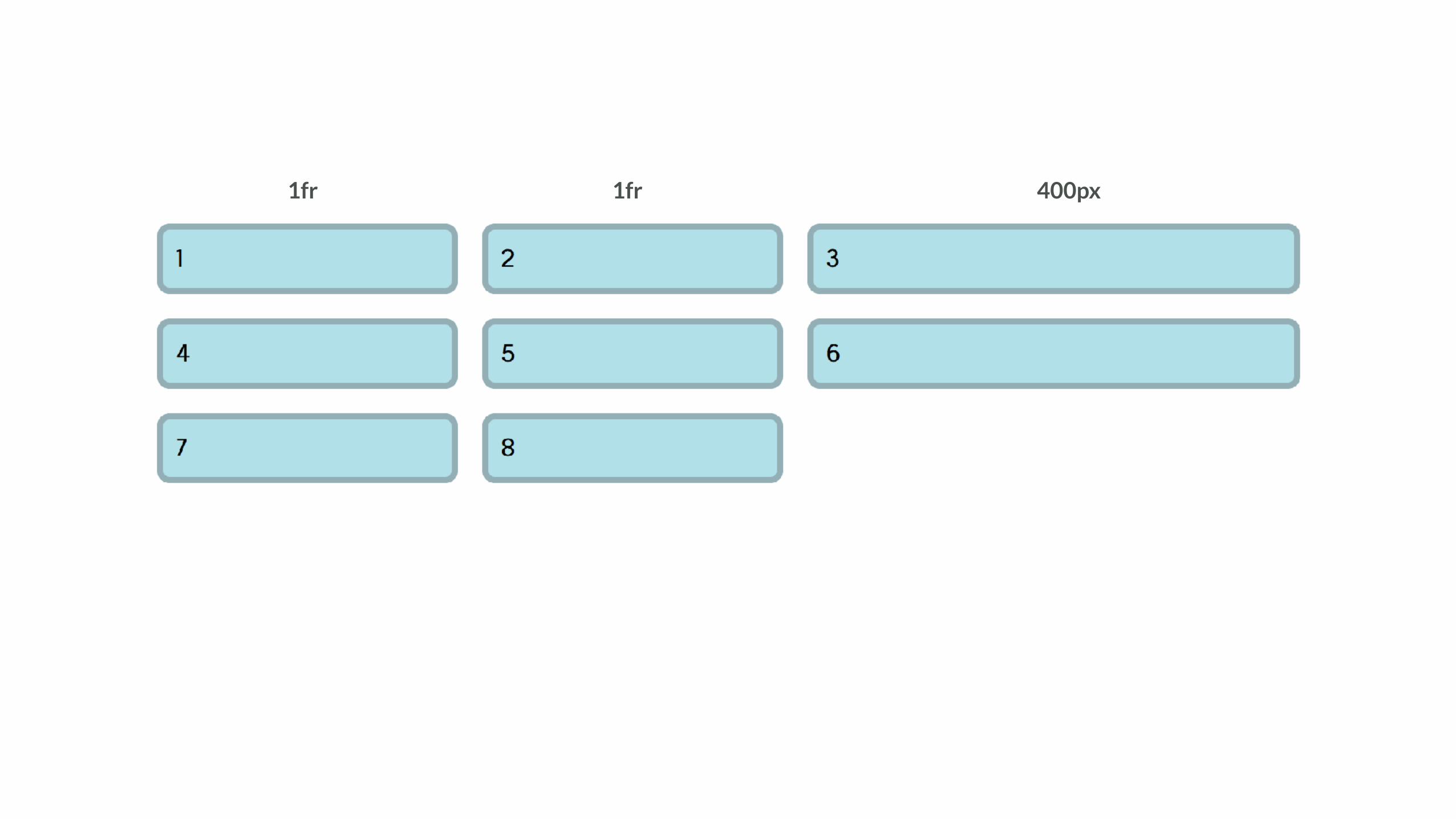
.wrapper { display: grid; grid-template-columns: 1fr 1fr 400px; grid-gap: 20px; }
The fr unit
Mix absolute length units and fr units.
https://codepen.io/rachelandrew/pen/RZYZad
400px1fr1fr

.wrapper { display: grid; grid-template-columns: repeat(12, minmax(0,1fr)); grid-gap: 20px; }
The fr unit
Creating a 12 column flexible grid with
no percentage calculations.
https://codepen.io/rachelandrew/pen/VzBOJW

grid-template-columns: repeat(12,minmax(0,1fr));
1fr 1fr 1fr 1fr 1fr 1fr 1fr 1fr 1fr 1fr 1fr 1fr
The fr unit replaces percentages in most cases when using grid layout.
.grid-wrapper { display: grid; grid-gap: 20px; grid-template-columns: repeat(auto-fill,minmax(200px, 1fr)); }
minmax()

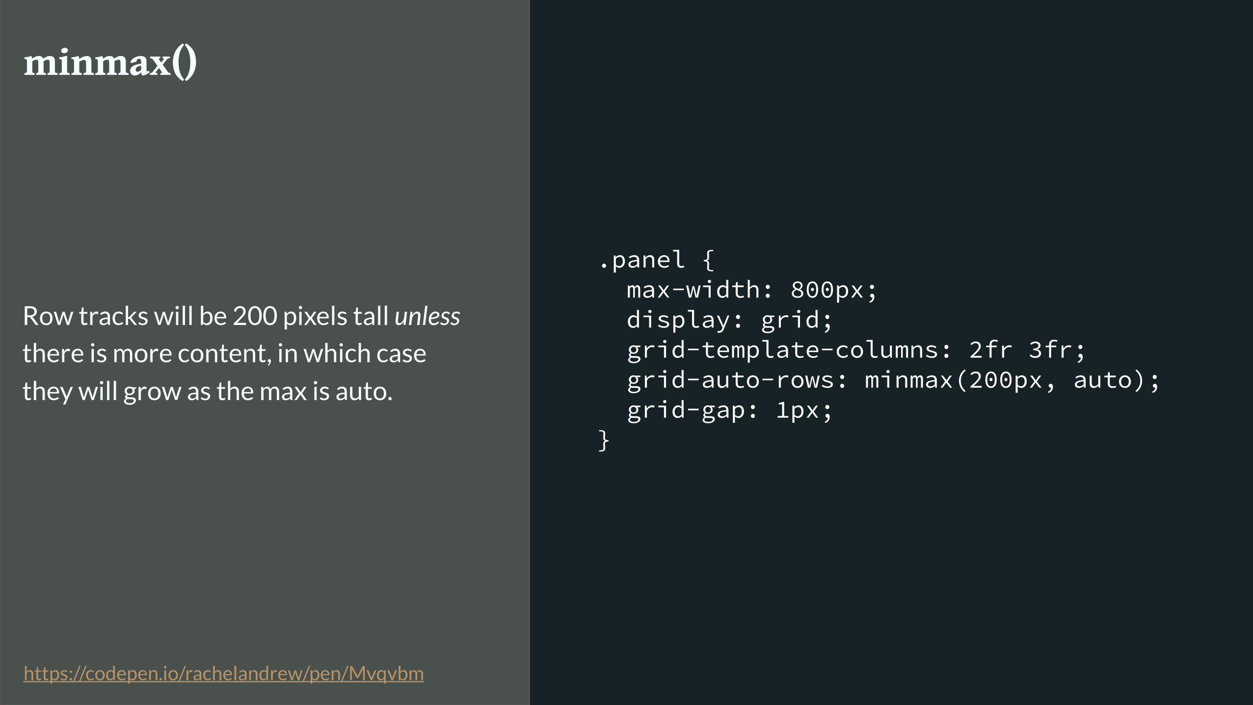
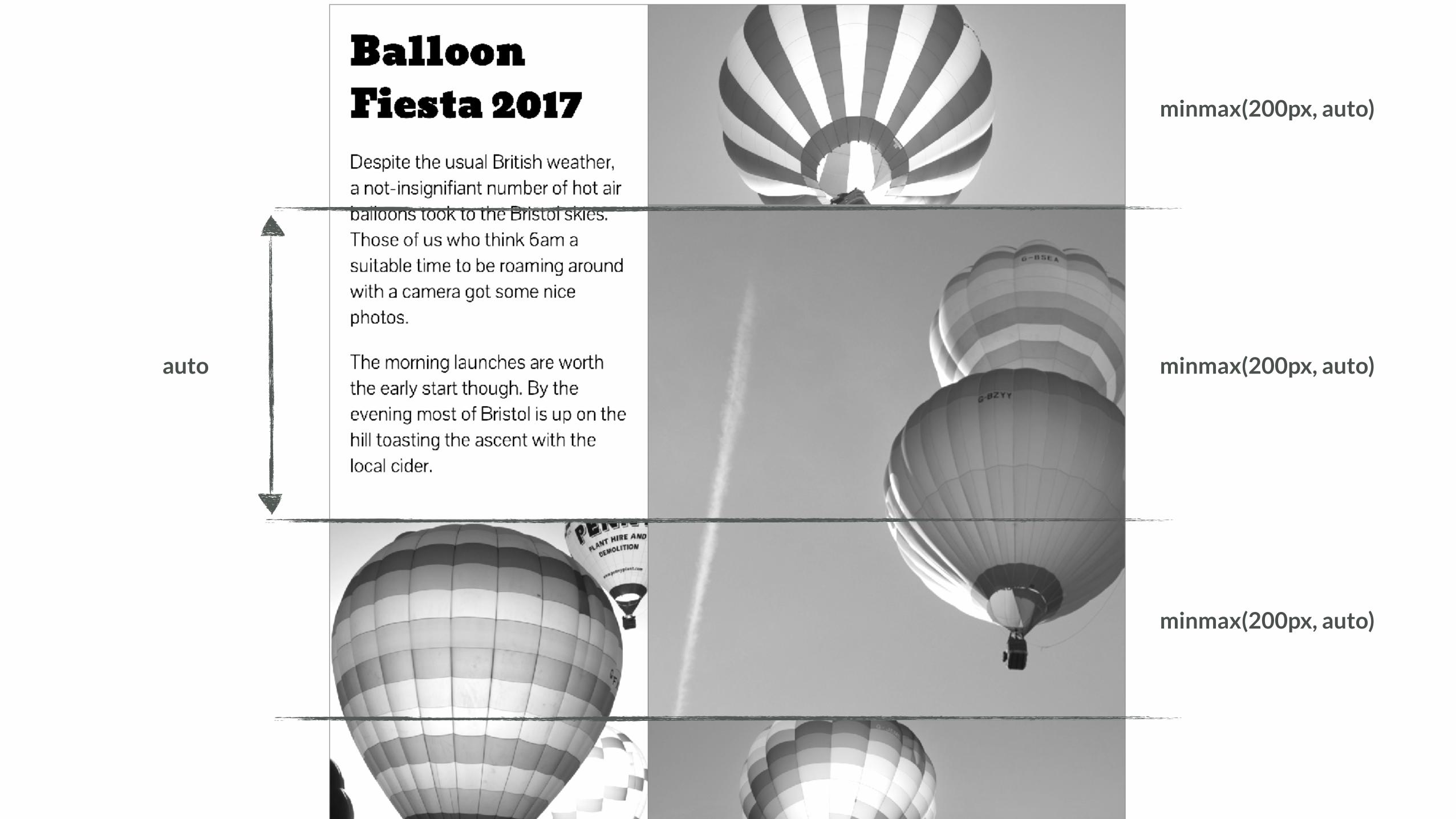
.panel { max-width: 800px; display: grid; grid-template-columns: 2fr 3fr; grid-auto-rows: minmax(200px, auto); grid-gap: 1px; }
minmax()
Row tracks will be 200 pixels tall unless
there is more content, in which case
they will grow as the max is auto.
https://codepen.io/rachelandrew/pen/Mvqvbm

minmax(200px, auto)
minmax(200px, auto)
minmax(200px, auto)
minmax(200px, auto)
200px
minmax(200px, auto)
minmax(200px, auto)
minmax(200px, auto)
auto
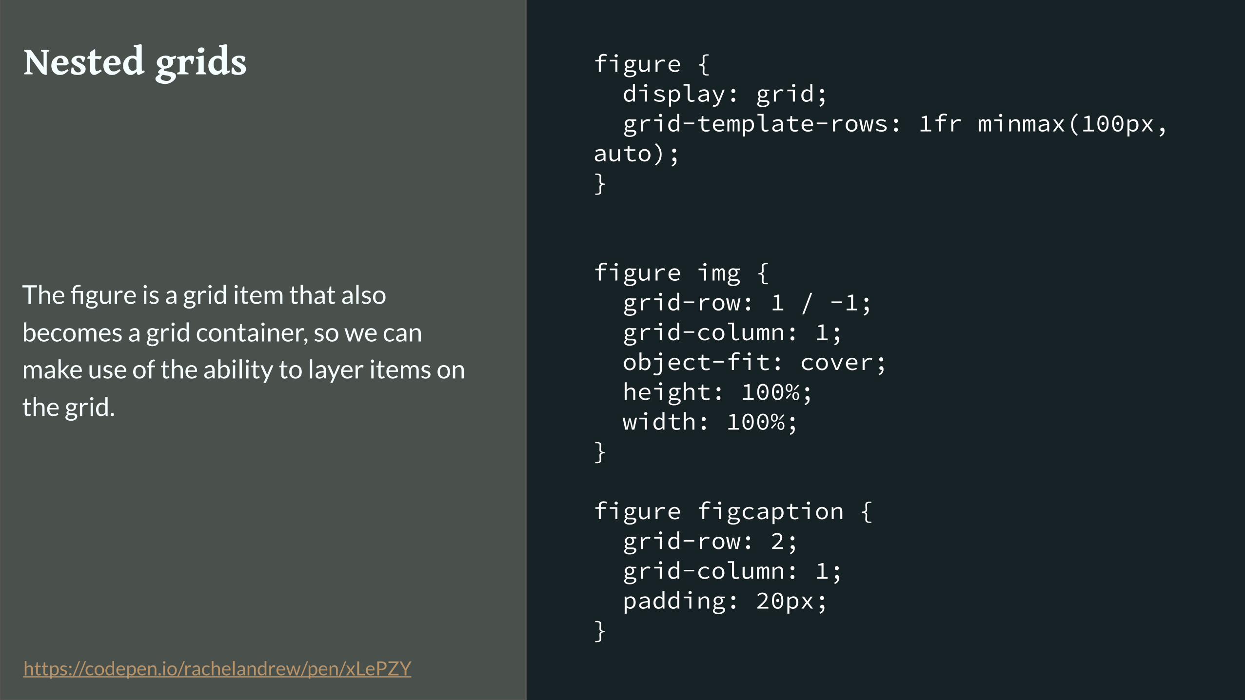
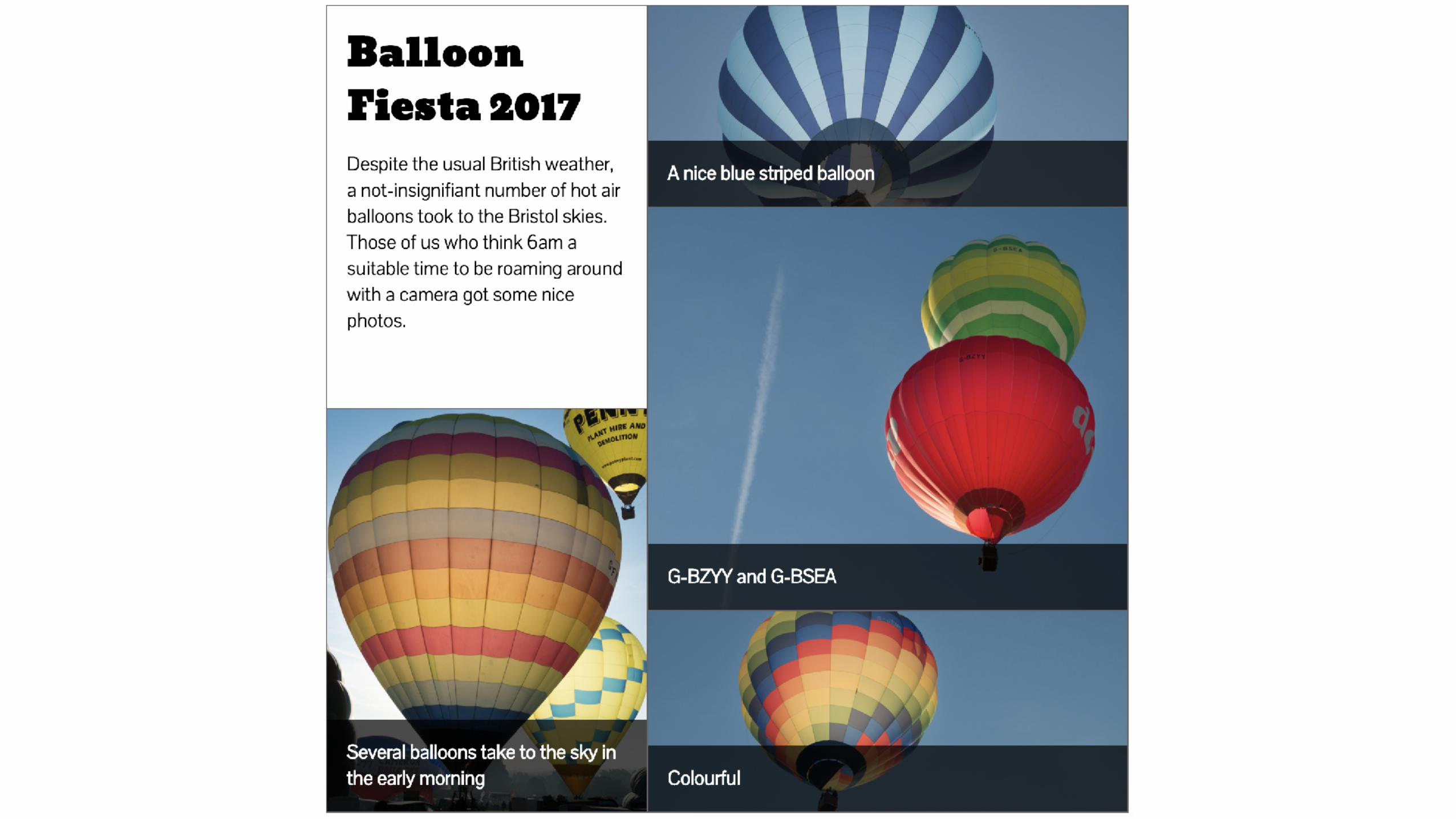
figure { display: grid; grid-template-rows: 1fr minmax(100px, auto); }
figure img { grid-row: 1 / -1; grid-column: 1; object-fit: cover; height: 100%; width: 100%; }
figure figcaption { grid-row: 2; grid-column: 1; padding: 20px; }
Nested grids
The figure is a grid item that also
becomes a grid container, so we can
make use of the ability to layer items on
the grid.
https://codepen.io/rachelandrew/pen/xLePZY
New sizing keywords from the CSS Sizing specification

CSS Intrinsic & Extrinsic Sizing Module Level 3: https://www.w3.org/TR/css-sizing-3/
▸ min-content
▸ max-content
▸ fit-content
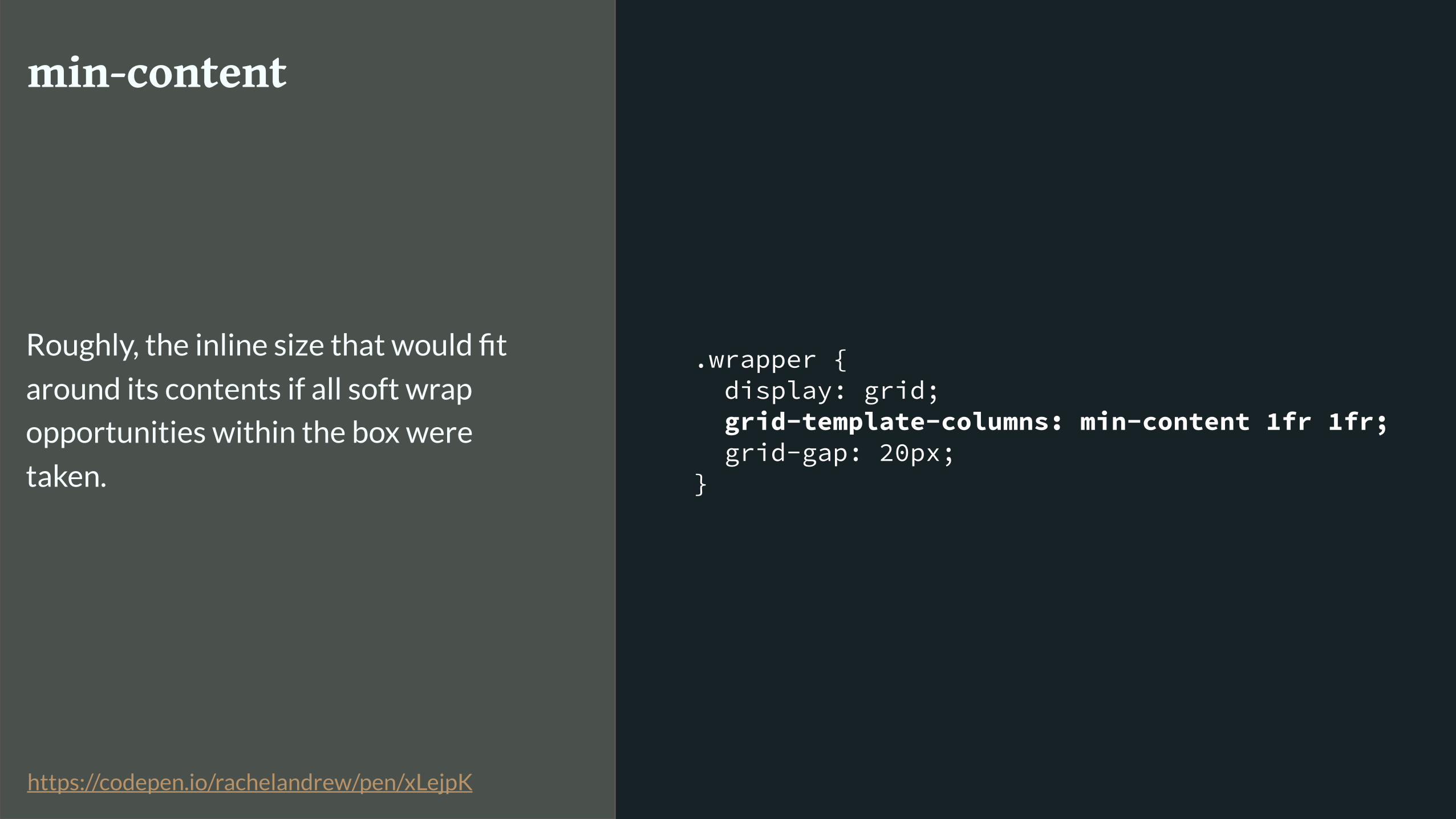
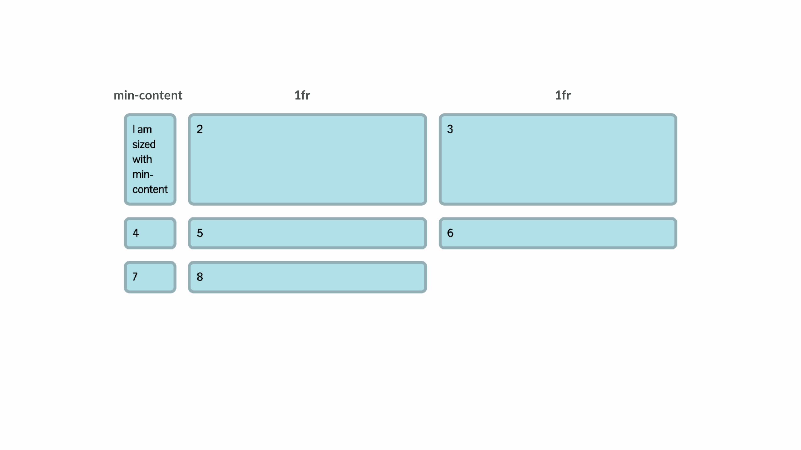
.wrapper { display: grid; grid-template-columns: min-content 1fr 1fr; grid-gap: 20px; }
min-content
Roughly, the inline size that would fit
around its contents if all soft wrap
opportunities within the box were
taken.
https://codepen.io/rachelandrew/pen/xLejpK
1fr1frmin-content
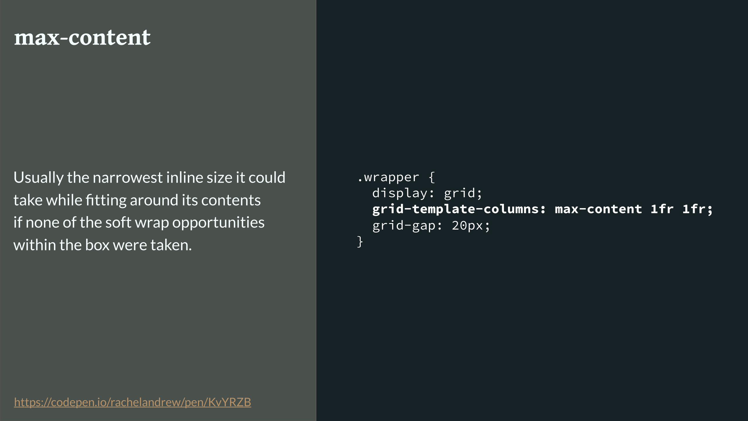
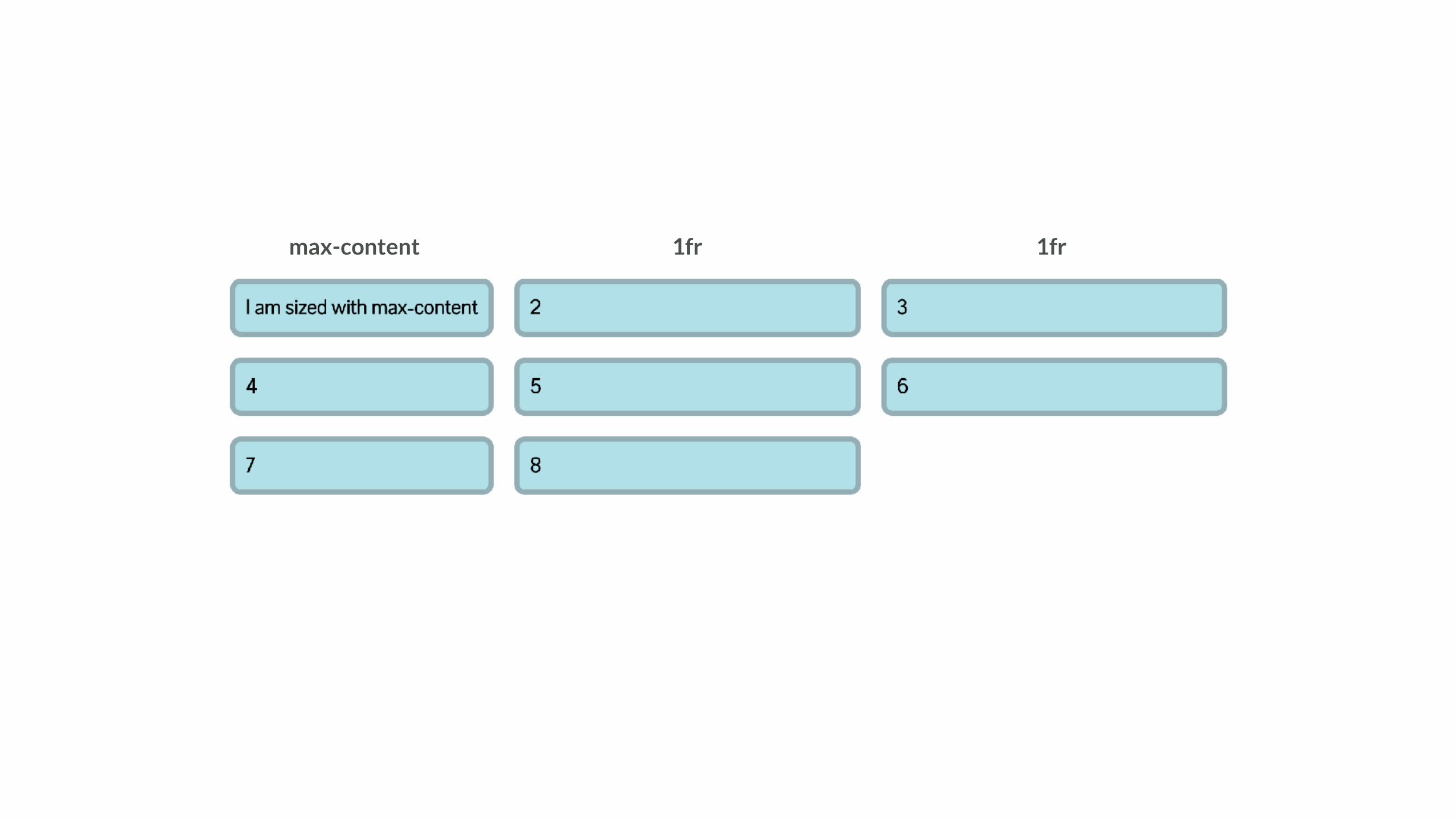
.wrapper { display: grid; grid-template-columns: max-content 1fr 1fr; grid-gap: 20px; }
max-content
Usually the narrowest inline size it could
take while fitting around its contents
if none of the soft wrap opportunities
within the box were taken.
https://codepen.io/rachelandrew/pen/KvYRZB
1fr1frmax-content

.wrapper { display: grid; grid-template-columns: fit-content(200px) fit-content(200px) 1fr; grid-gap: 20px; }
fit-content
If the available space in a given axis is
finite, equal to min(max-content size,
max(min-content size,stretch-fit size)).
Otherwise, equal to the max-content
size in that axis.
https://codepen.io/rachelandrew/pen/NvLvRG
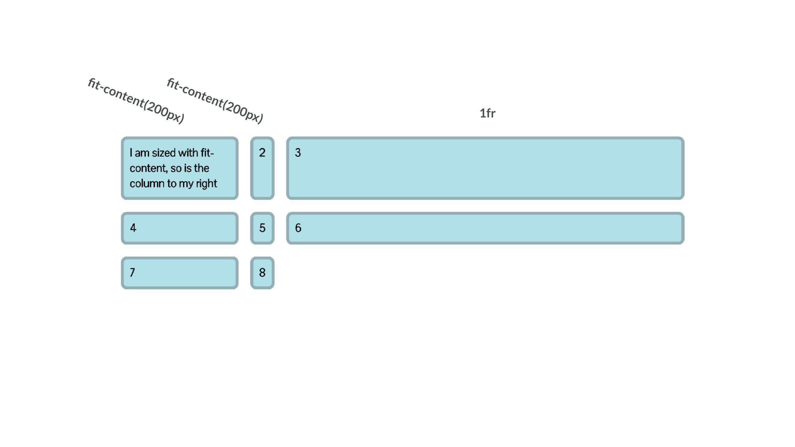
1fr
fit-content(200px)
fit-content(200px)

CSS is here to help
Dealing with old browsers
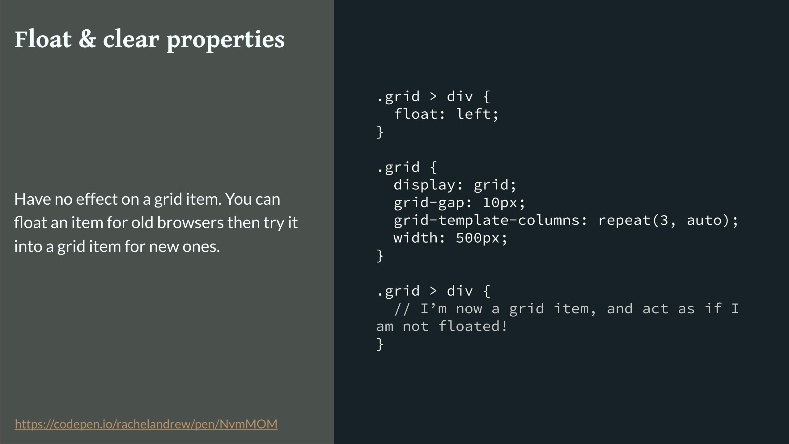
.grid > div { float: left; }
.grid { display: grid; grid-gap: 10px; grid-template-columns: repeat(3, auto); width: 500px; }
.grid > div { // I’m now a grid item, and act as if I am not floated! }
Float & clear properties
Have no effect on a grid item. You can
float an item for old browsers then try it
into a grid item for new ones.
https://codepen.io/rachelandrew/pen/NvmMOM
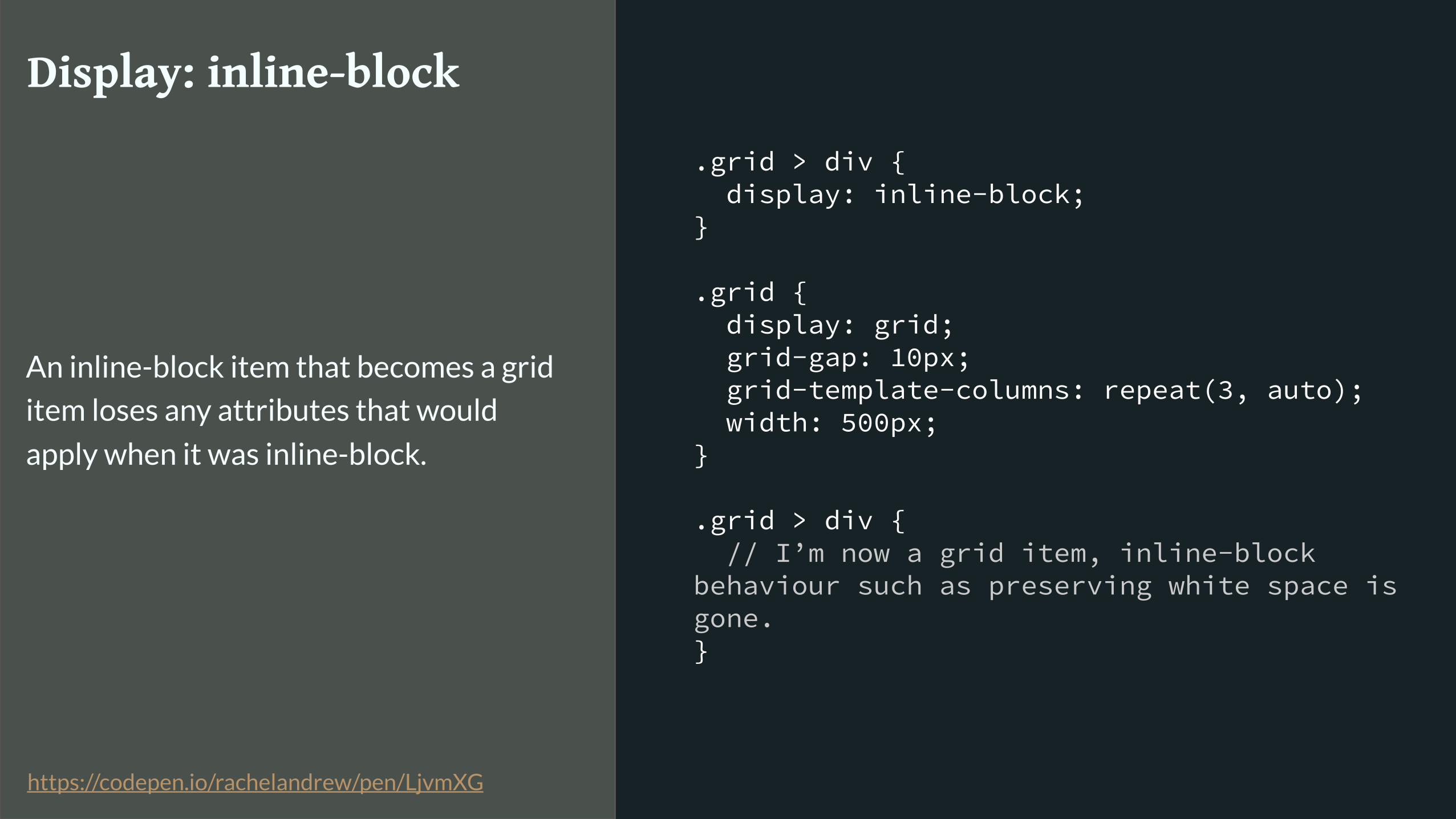
.grid > div { display: inline-block; }
.grid { display: grid; grid-gap: 10px; grid-template-columns: repeat(3, auto); width: 500px; }
.grid > div { // I’m now a grid item, inline-block behaviour such as preserving white space is gone. }
Display: inline-block
An inline-block item that becomes a grid
item loses any attributes that would
apply when it was inline-block.
https://codepen.io/rachelandrew/pen/LjvmXG
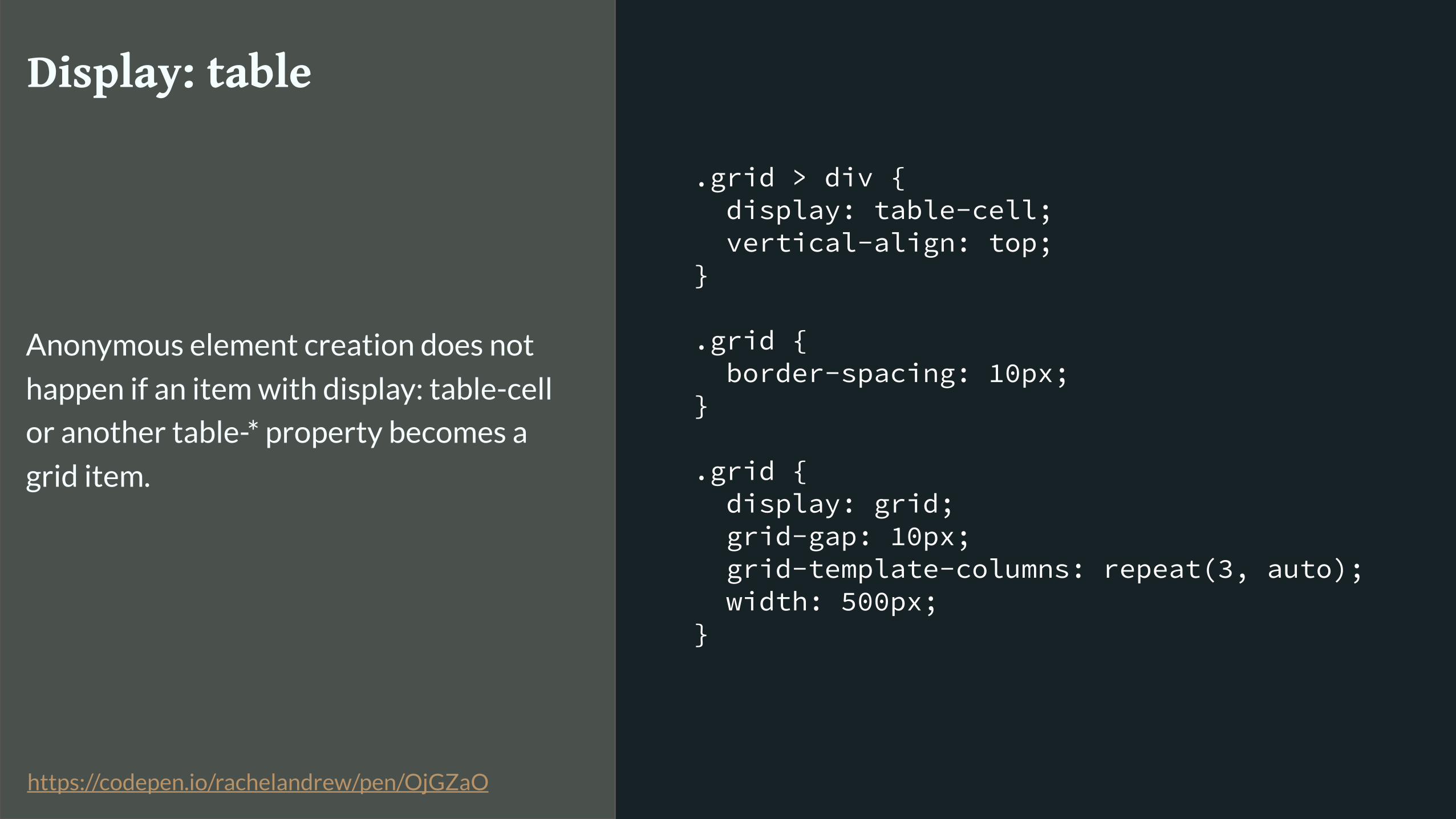
.grid > div { display: table-cell; vertical-align: top; }
.grid { border-spacing: 10px; }
.grid { display: grid; grid-gap: 10px; grid-template-columns: repeat(3, auto); width: 500px; }
Display: table
Anonymous element creation does not
happen if an item with display: table-cell
or another table-* property becomes a
grid item.
https://codepen.io/rachelandrew/pen/OjGZaO

.grid > div { display: inline-block; vertical-align: top; }
.grid { display: grid; grid-gap: 10px; grid-template-columns: repeat(3, auto); width: 500px; }
vertical-align
Can be used as a fallback for the Box
Alignment properties in inline-block or
table layout and stops applying when
the item becomes a grid item.
https://codepen.io/rachelandrew/pen/NvmMEM
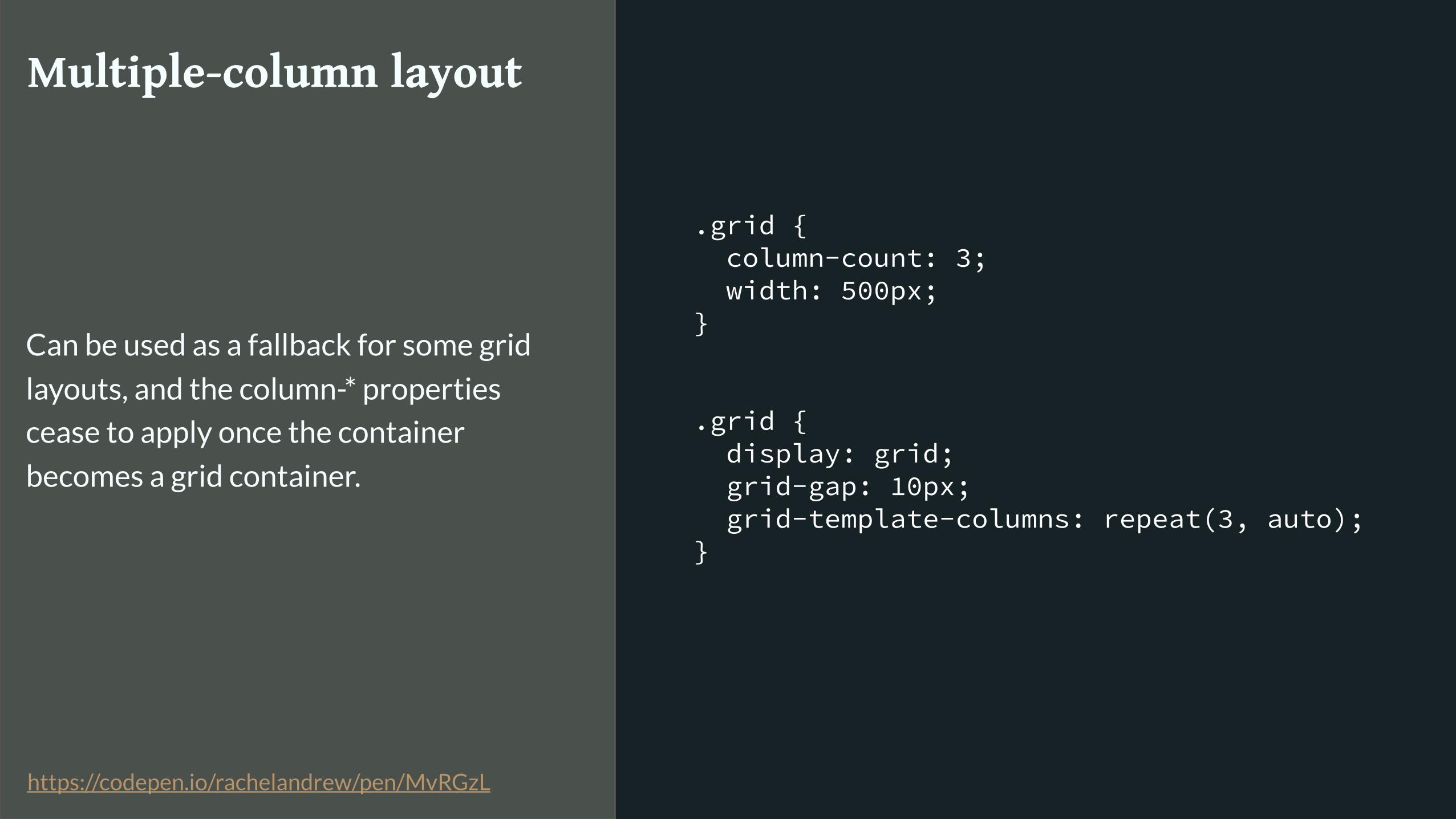
.grid { column-count: 3; width: 500px; }
.grid { display: grid; grid-gap: 10px; grid-template-columns: repeat(3, auto); }
Multiple-column layout
Can be used as a fallback for some grid
layouts, and the column-* properties
cease to apply once the container
becomes a grid container.
https://codepen.io/rachelandrew/pen/MvRGzL
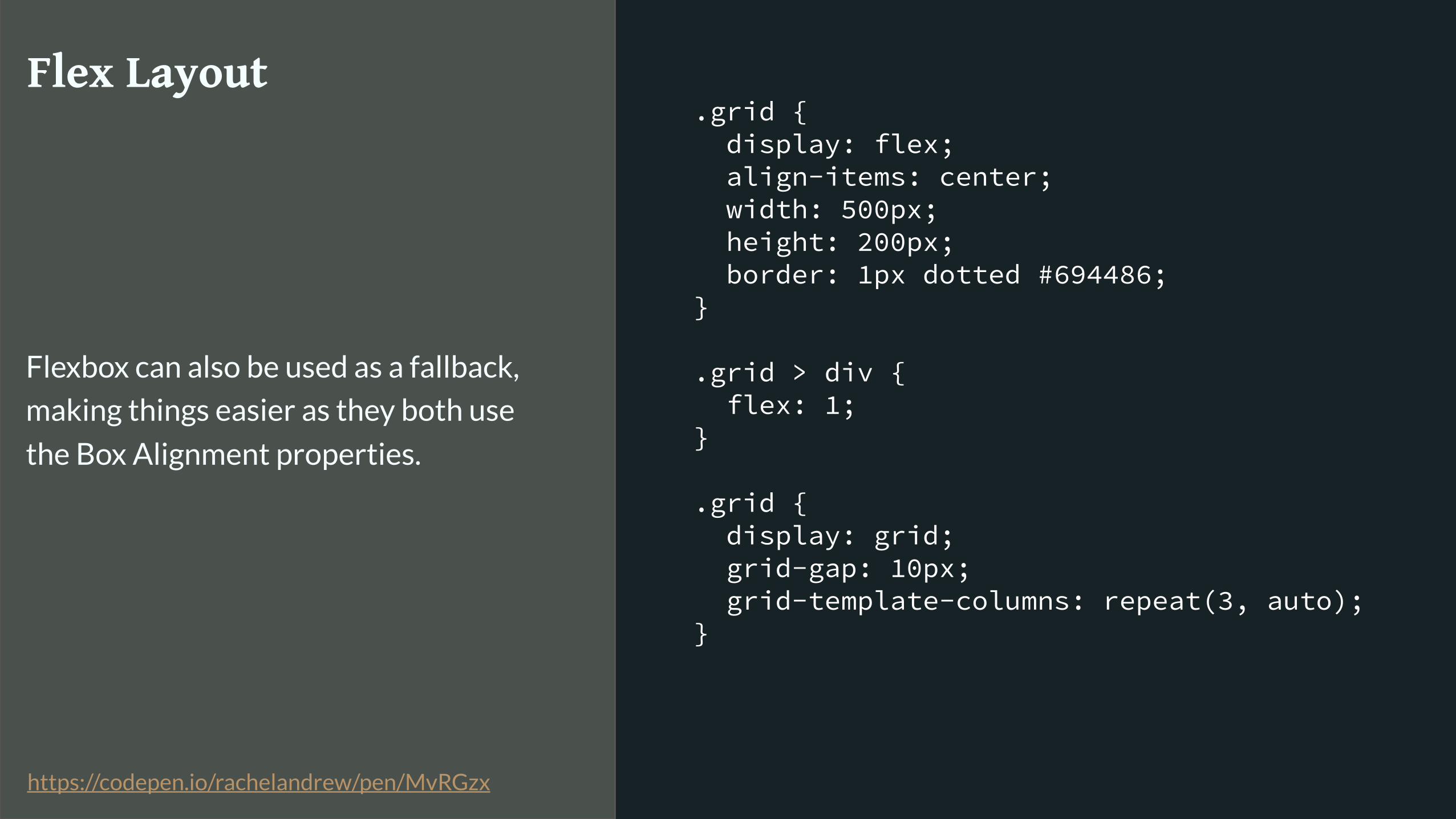
.grid { display: flex; align-items: center; width: 500px; height: 200px; border: 1px dotted #694486; }
.grid > div { flex: 1; }
.grid { display: grid; grid-gap: 10px; grid-template-columns: repeat(3, auto); }
Flex Layout
Flexbox can also be used as a fallback,
making things easier as they both use
the Box Alignment properties.
https://codepen.io/rachelandrew/pen/MvRGzx

Use the cascade. Write code for old browsers then code for new browsers.
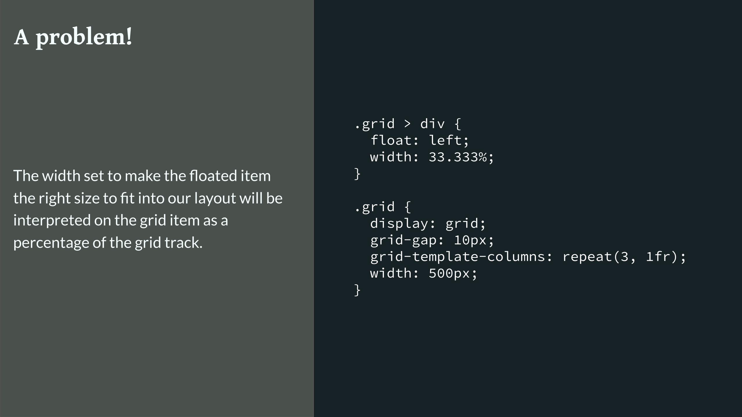
.grid > div { float: left; width: 33.333%; }
.grid { display: grid; grid-gap: 10px; grid-template-columns: repeat(3, 1fr); width: 500px; }
A problem!
The width set to make the floated item
the right size to fit into our layout will be
interpreted on the grid item as a
percentage of the grid track.

.grid > div { float: left; width: 33.333%; }
@supports (display: grid) { .grid > div { width: auto; } }
.grid { display: grid; grid-gap: 10px; grid-template-columns: repeat(3, 1fr); width: 500px; }
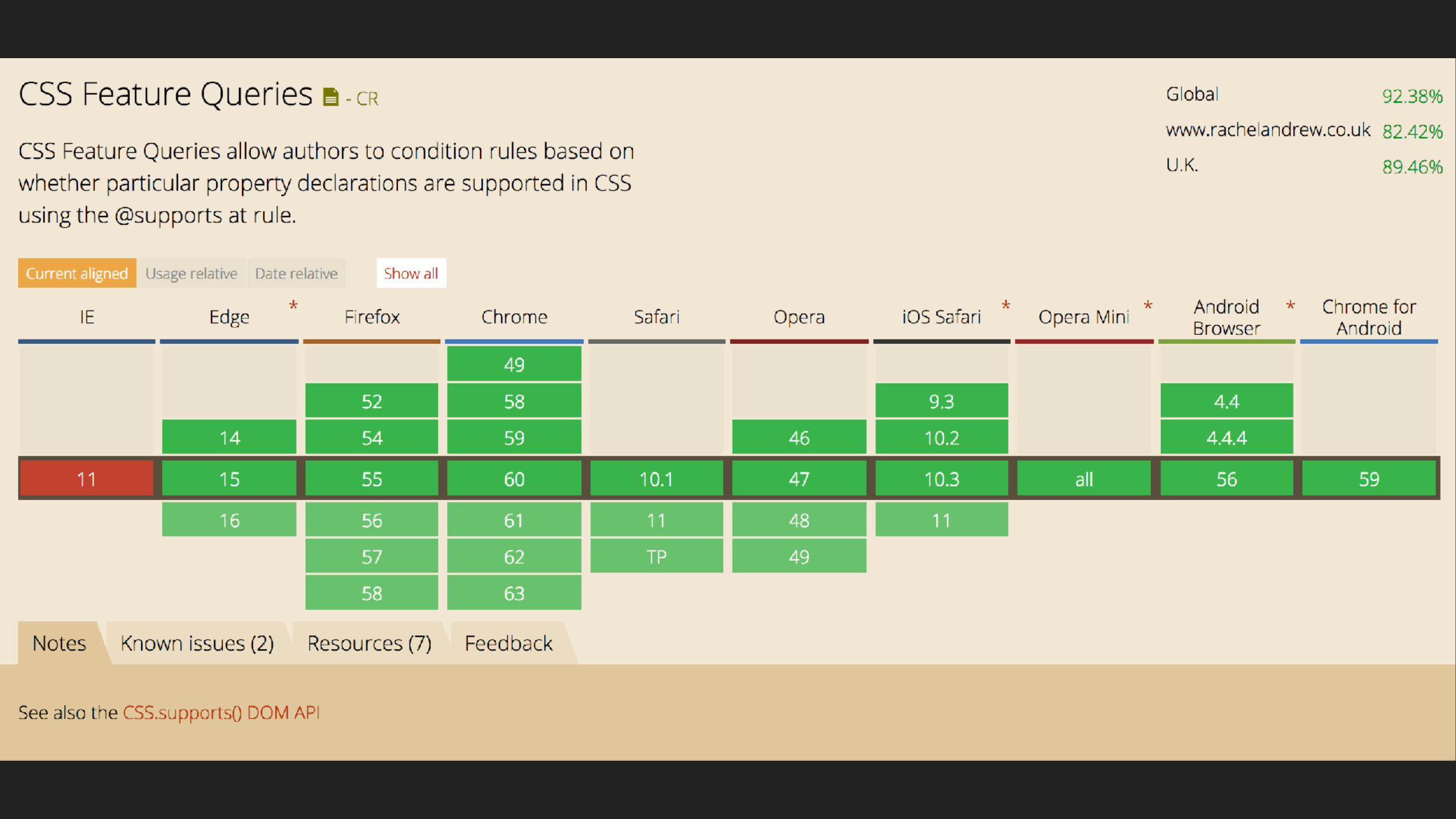
Feature Queries
Test for support of a property and value.
Inside the Feature Query add code only
for browsers that claim support.
https://codepen.io/rachelandrew/pen/ayxGPz

You need to understand CSS
The fundamentals of CSS haven’t changed
Subgrids?Next for Grid
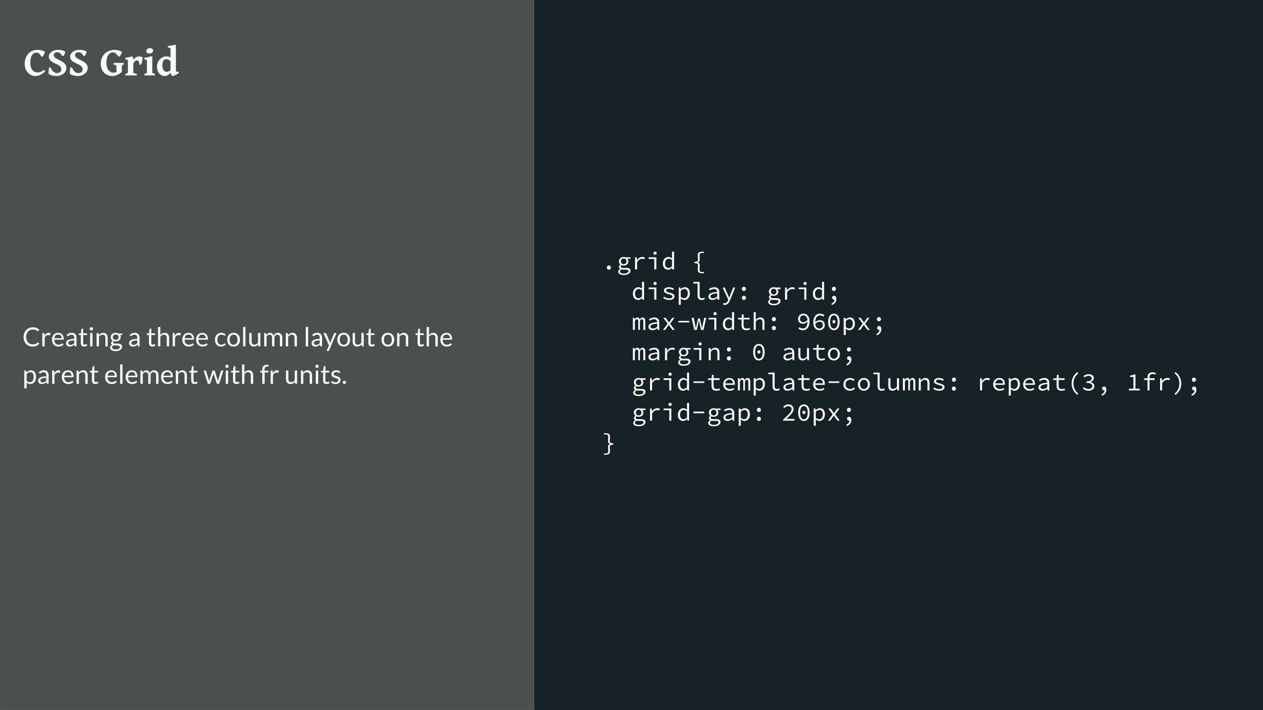
.grid { display: grid; max-width: 960px; margin: 0 auto; grid-template-columns: repeat(3, 1fr); grid-gap: 20px; }
CSS Grid
Creating a three column layout on the
parent element with fr units.
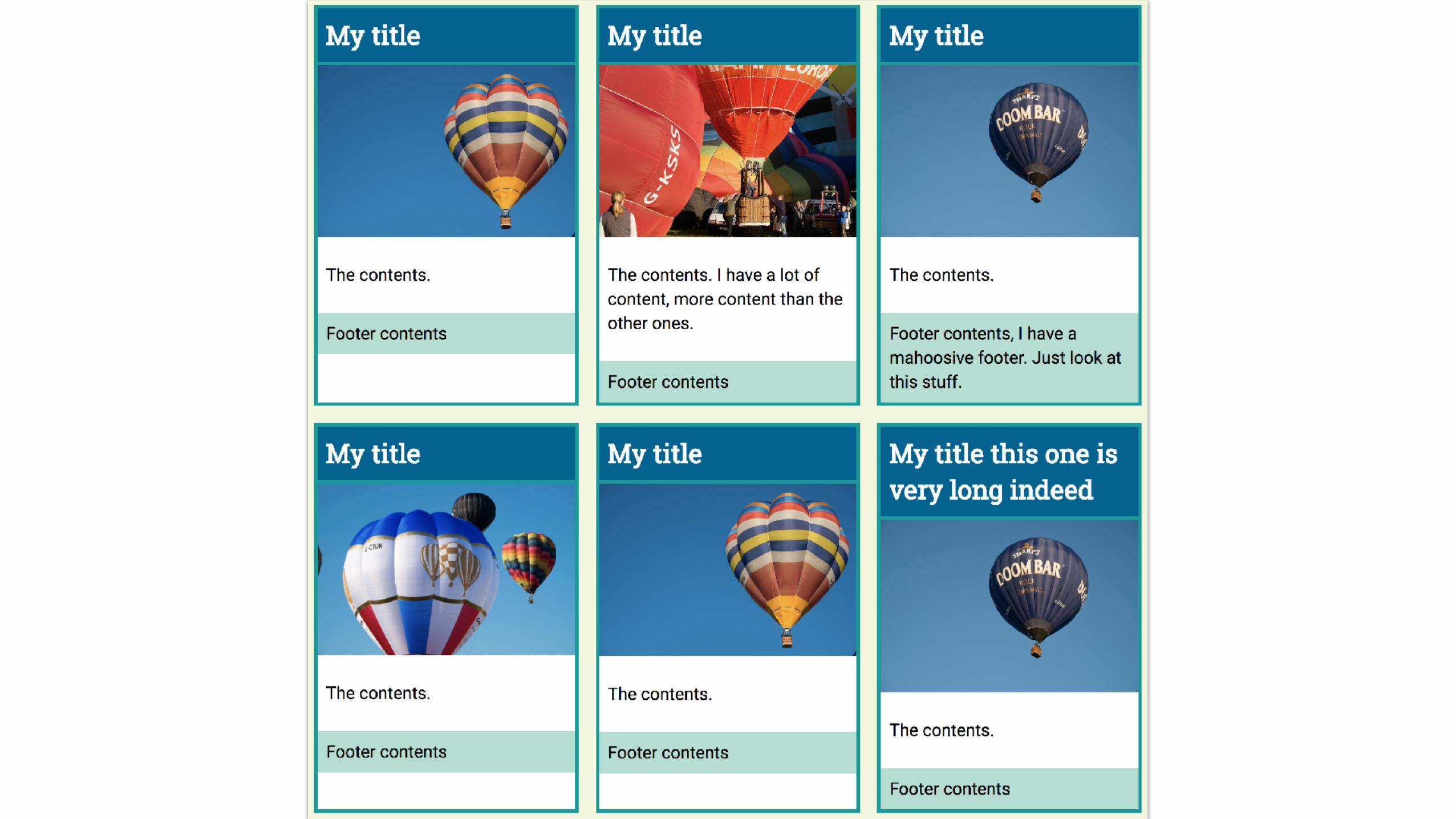

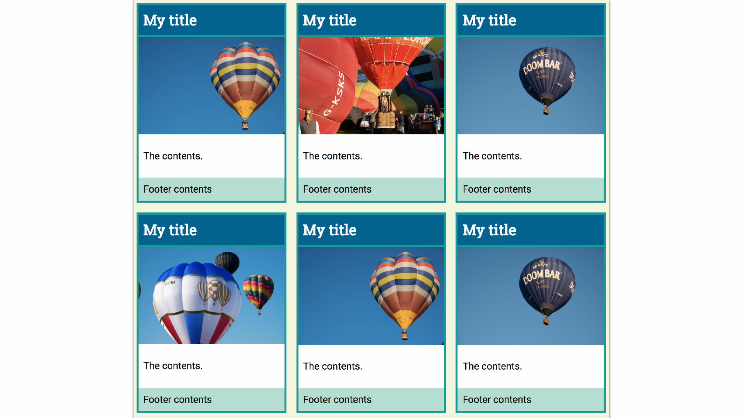
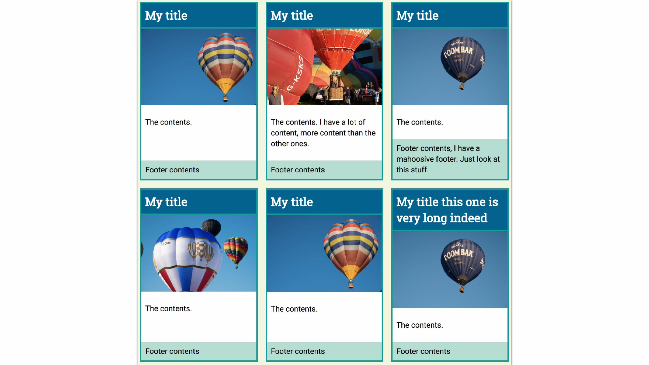
.card { display: flex; flex-direction: column; }
.card .inner { flex: 1; }
Make the card a flex item
Allow the inner to grow, it pushes the
footer down to the bottom of the cards
https://codepen.io/rachelandrew/pen/XgdydE

1
2
3
4
5
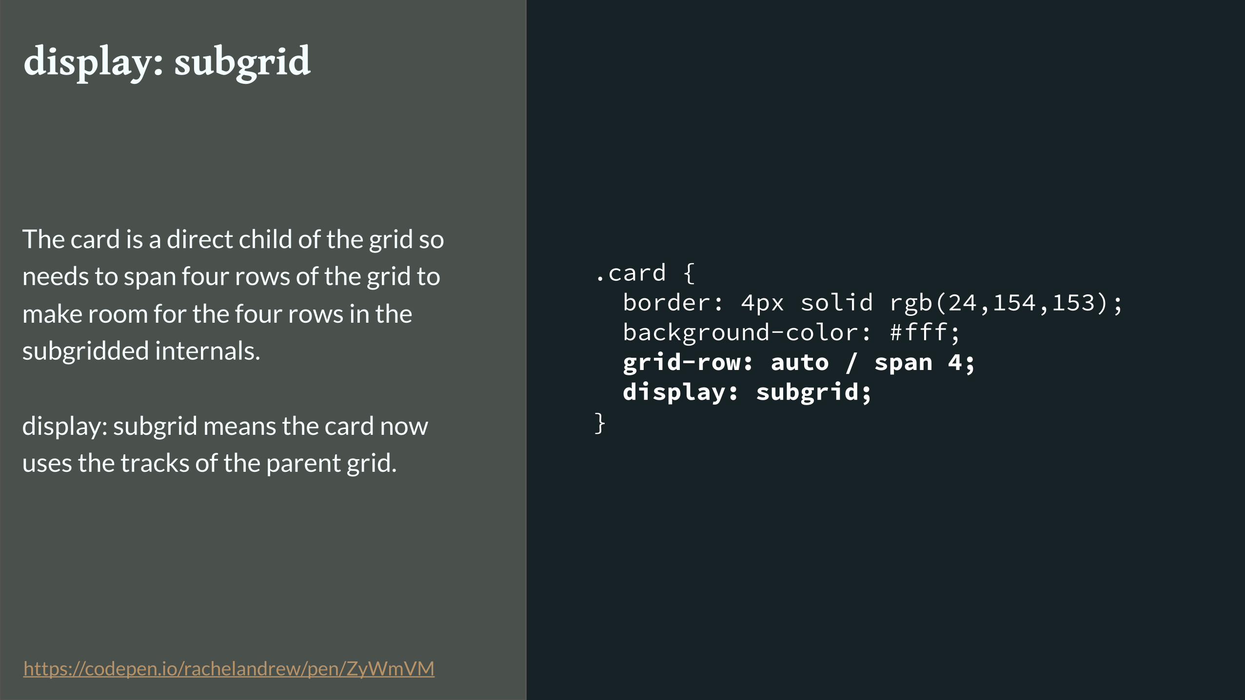
.card { border: 4px solid rgb(24,154,153); background-color: #fff; grid-row: auto / span 4; display: subgrid; }
display: subgrid
The card is a direct child of the grid so
needs to span four rows of the grid to
make room for the four rows in the
subgridded internals. display: subgrid means the card now
uses the tracks of the parent grid.
https://codepen.io/rachelandrew/pen/ZyWmVM

Subgrid Links & Thoughts
▸ https://rachelandrew.co.uk/archives/2017/03/16/subgrid-moved-to-level-2-of-the-css-grid-specification/
▸ https://github.com/w3c/csswg-drafts/issues/958
▸ https://github.com/rachelandrew/cssgrid-ama/issues/13
▸ http://meyerweb.com/eric/thoughts/2016/01/15/subgrids-considered-essential/
Masonry Layout
Next for Grid
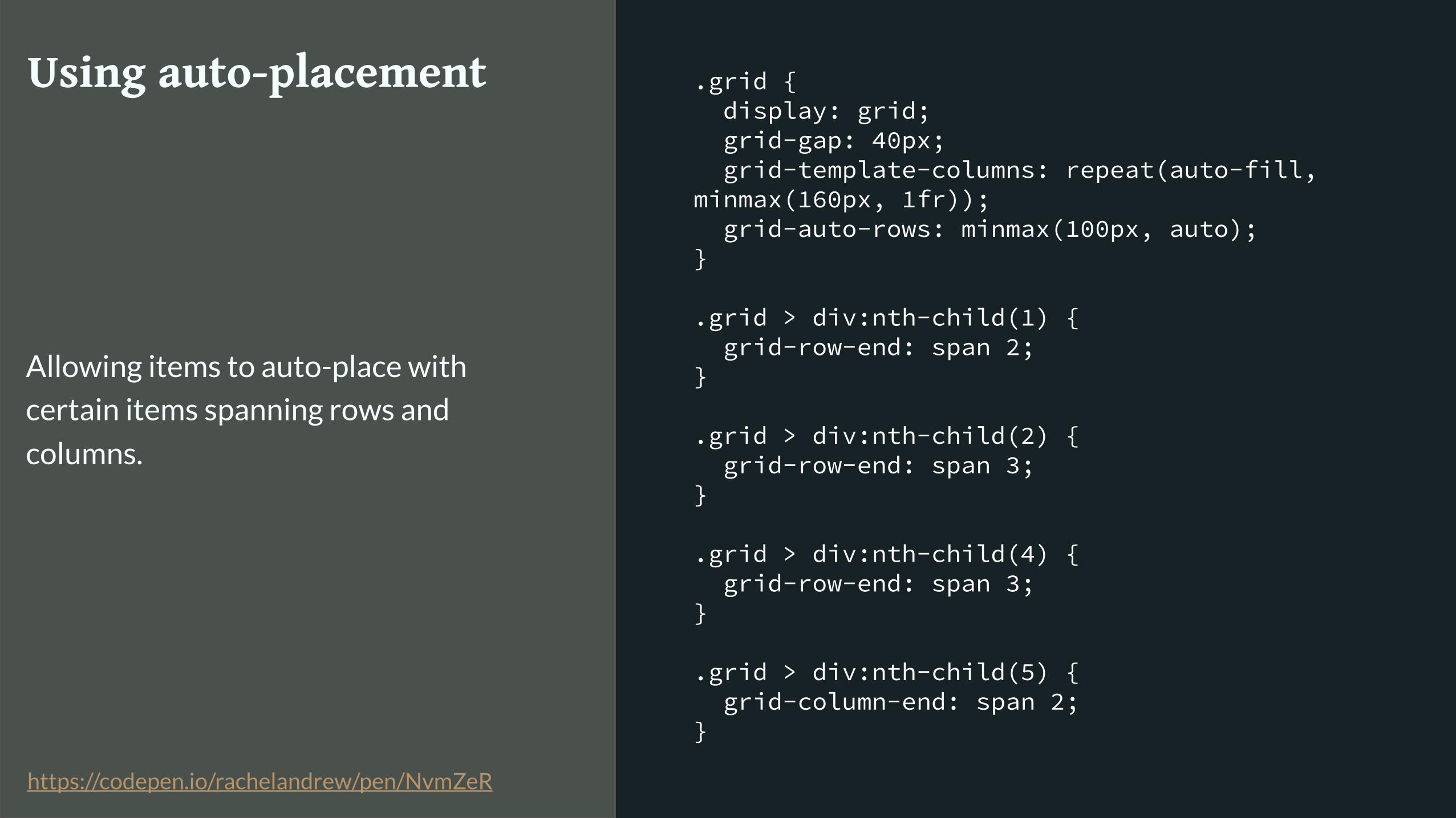
.grid { display: grid; grid-gap: 40px; grid-template-columns: repeat(auto-fill, minmax(160px, 1fr)); grid-auto-rows: minmax(100px, auto); }
.grid > div:nth-child(1) { grid-row-end: span 2; }
.grid > div:nth-child(2) { grid-row-end: span 3; }
.grid > div:nth-child(4) { grid-row-end: span 3; }
.grid > div:nth-child(5) { grid-column-end: span 2; }
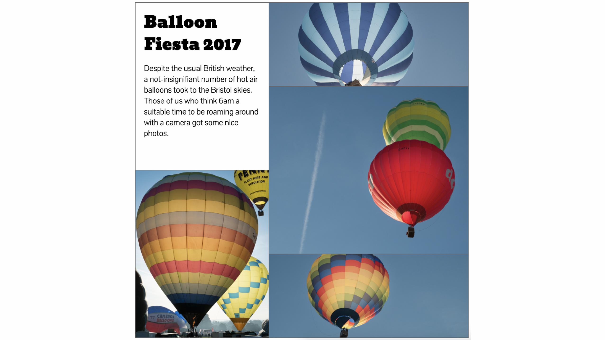
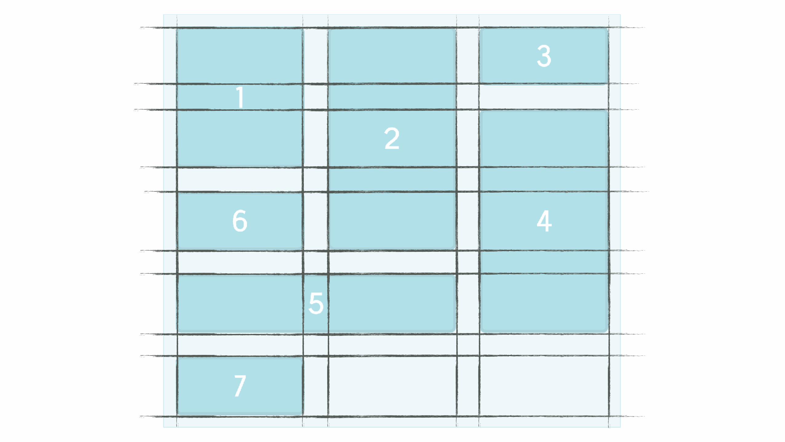
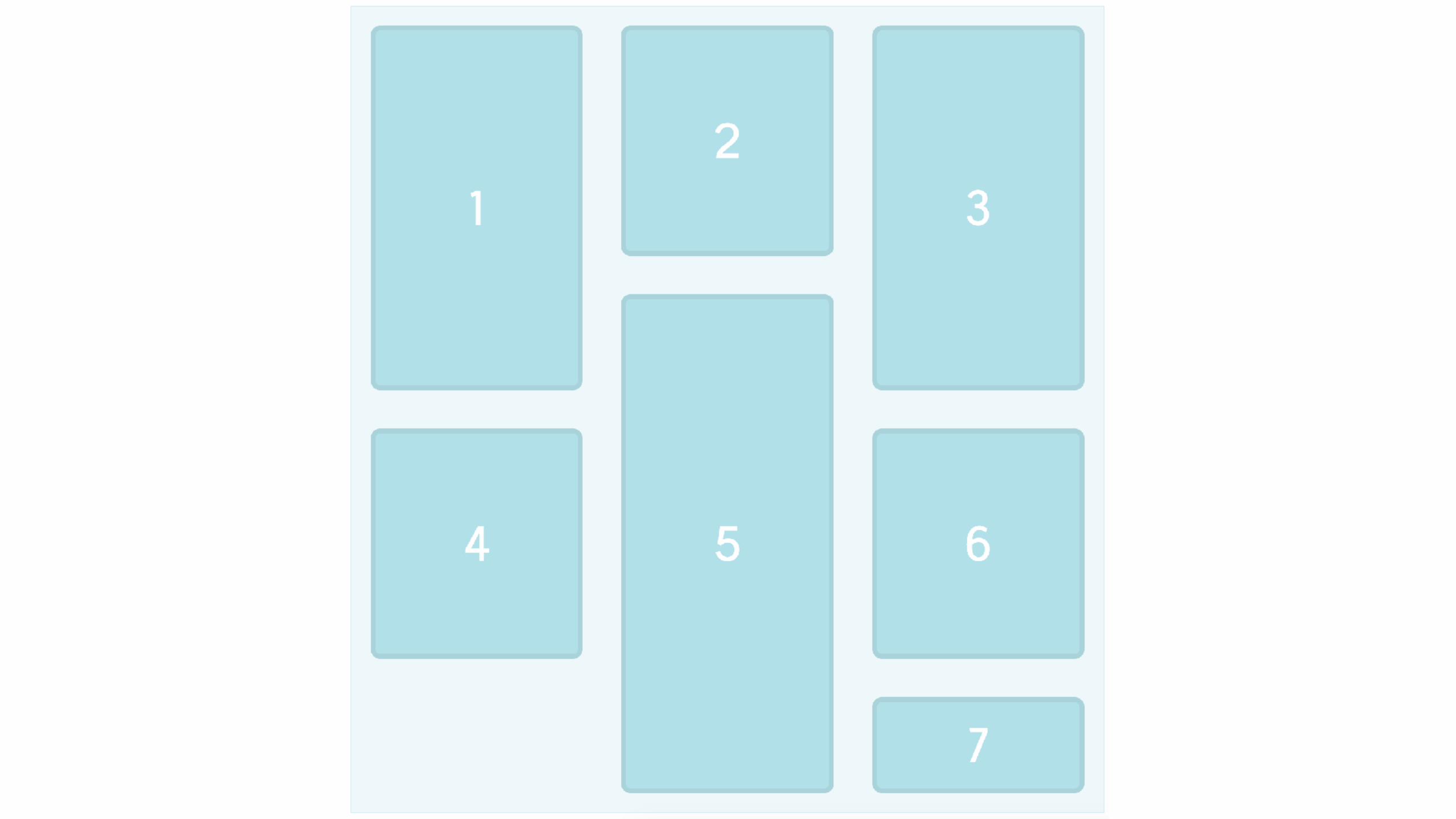
Using auto-placement
Allowing items to auto-place with
certain items spanning rows and
columns.
https://codepen.io/rachelandrew/pen/NvmZeR

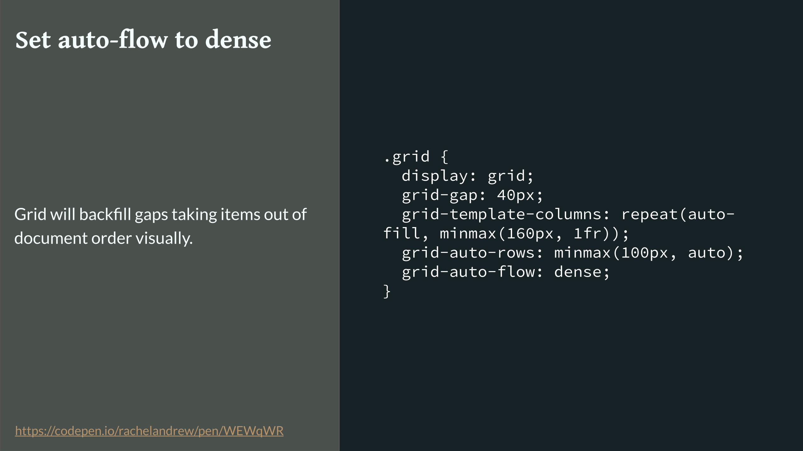
.grid { display: grid; grid-gap: 40px; grid-template-columns: repeat(auto-fill, minmax(160px, 1fr)); grid-auto-rows: minmax(100px, auto); grid-auto-flow: dense; }
Set auto-flow to dense
Grid will backfill gaps taking items out of
document order visually.
https://codepen.io/rachelandrew/pen/WEWqWR

Masonry Layouts
▸ https://rachelandrew.co.uk/archives/2017/01/18/css-grid-one-layout-method-not-the-only-layout-method/
▸ https://github.com/w3c/csswg-drafts/issues/945
Styling grid cells
Next for Grid

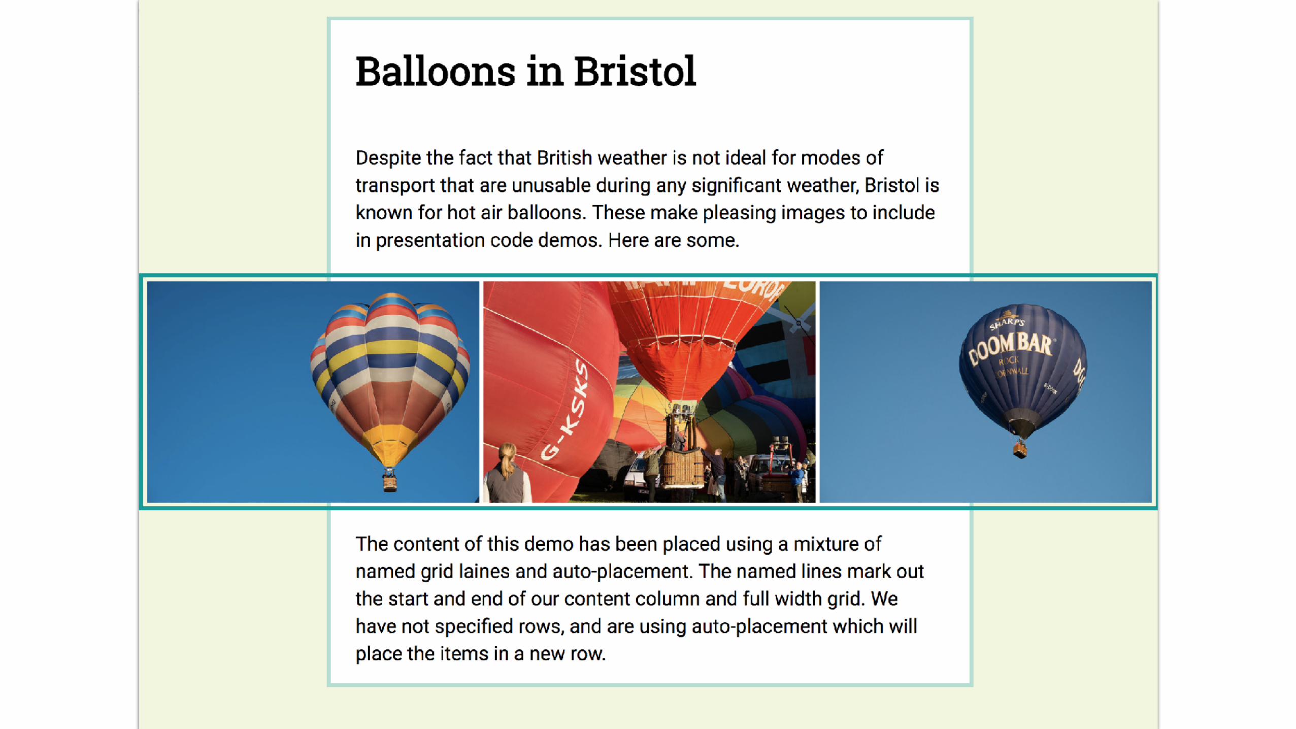
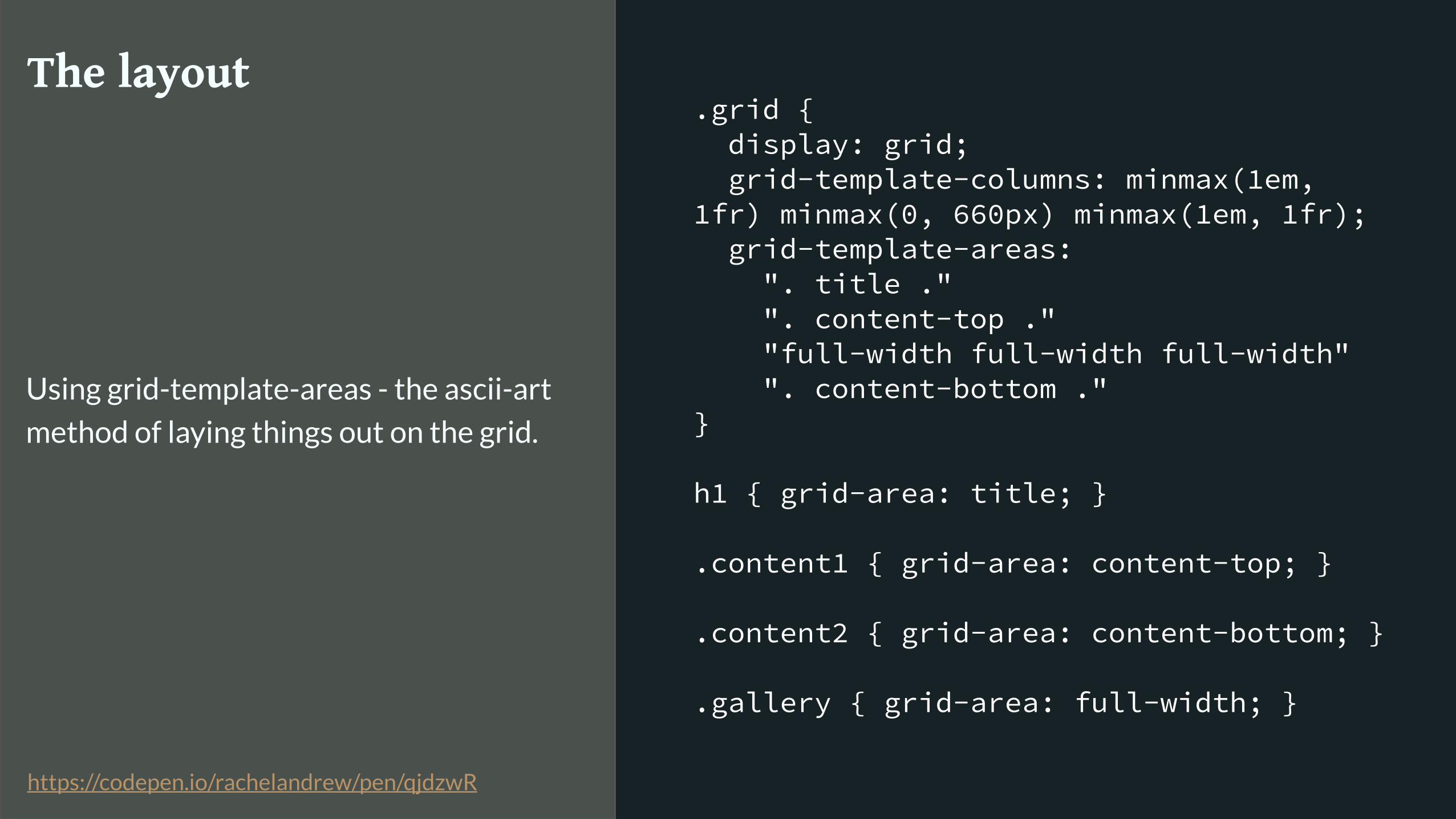
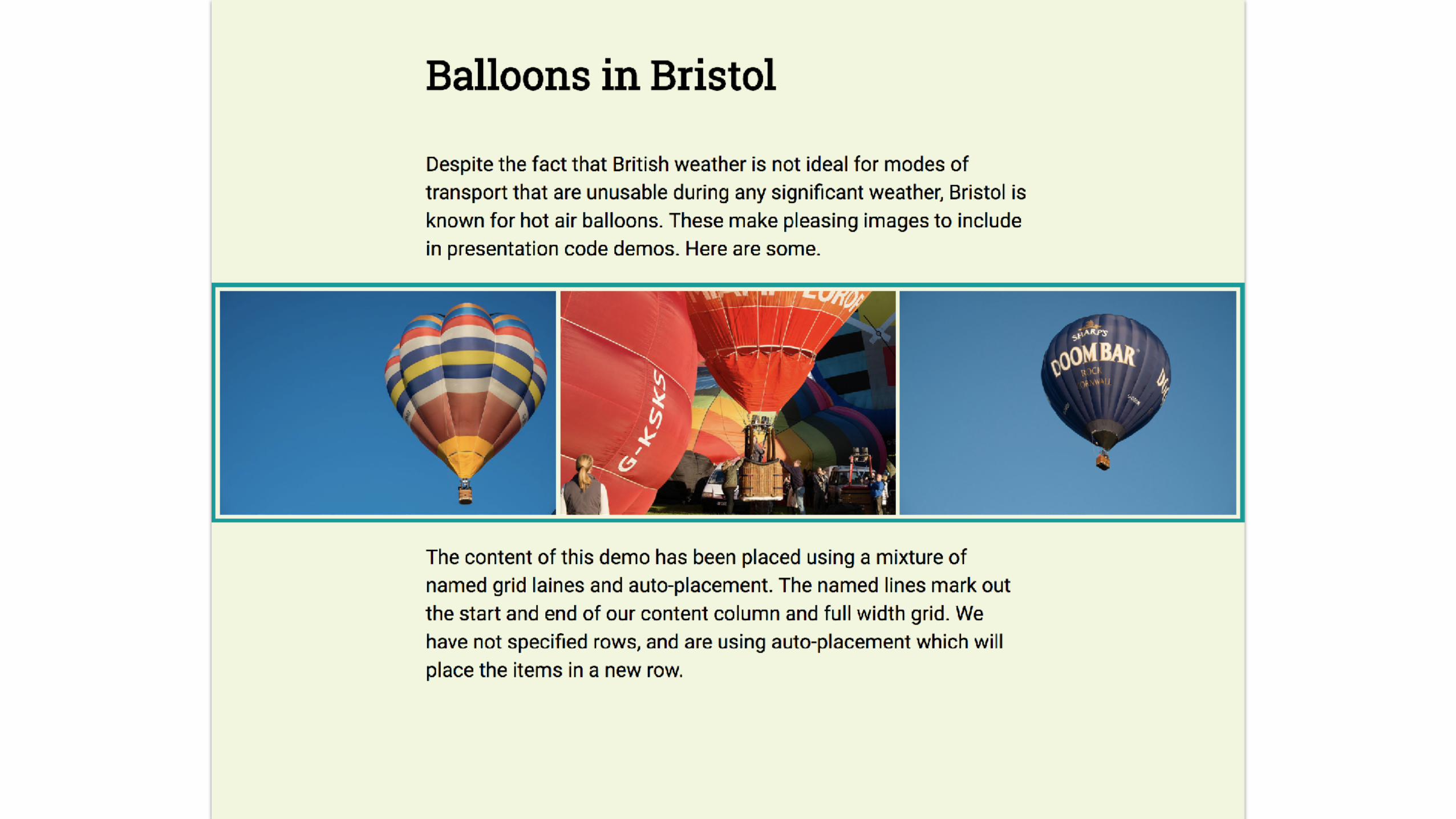
.grid { display: grid; grid-template-columns: minmax(1em, 1fr) minmax(0, 660px) minmax(1em, 1fr); grid-template-areas: ". title ." ". content-top ." "full-width full-width full-width" ". content-bottom ." }
h1 { grid-area: title; }
.content1 { grid-area: content-top; }
.content2 { grid-area: content-bottom; }
.gallery { grid-area: full-width; }
The layout
Using grid-template-areas - the ascii-art
method of laying things out on the grid.
https://codepen.io/rachelandrew/pen/qjdzwR

title
content-top
full-width
content-bottom
full-widthfull-width
.grid { display: grid; grid-template-columns: minmax(1em, 1fr) minmax(0, 660px) minmax(1em, 1fr); grid-template-areas: ". title ." ". content-top ." "full-width full-width full-width" ". content-bottom ." }
h1 { grid-area: title; }
.content1 { grid-area: content-top; }
.content2 { grid-area: content-bottom; }
.gallery { grid-area: full-width; }
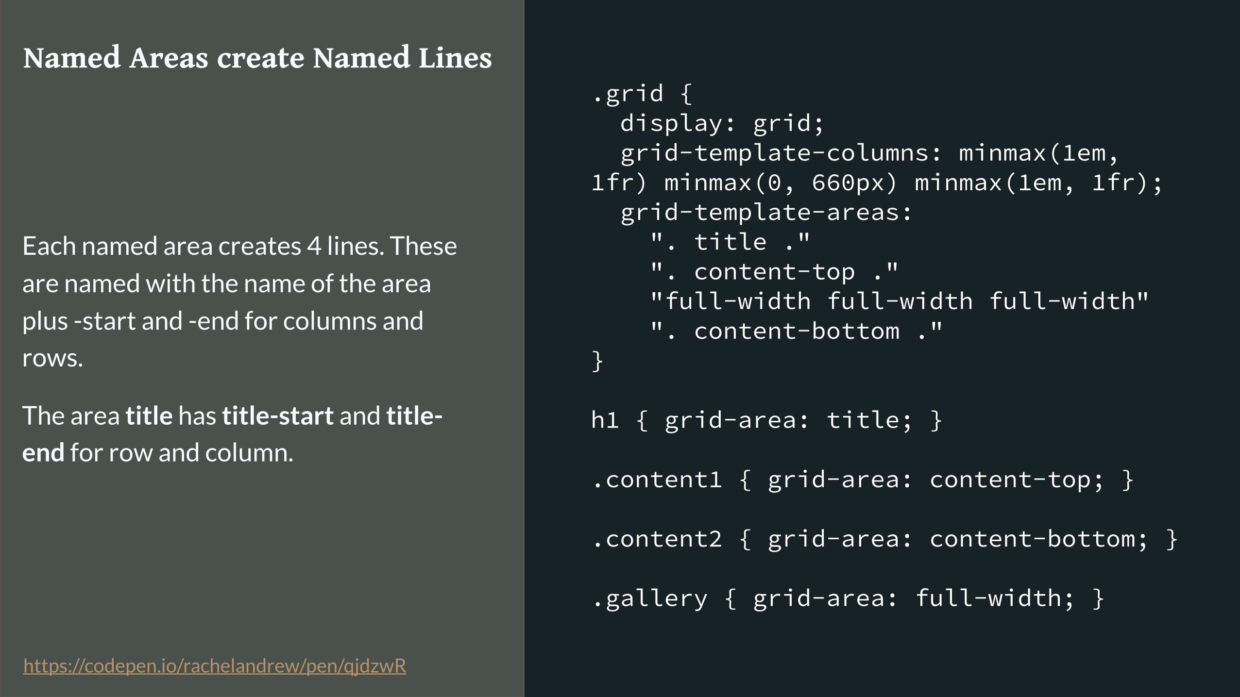
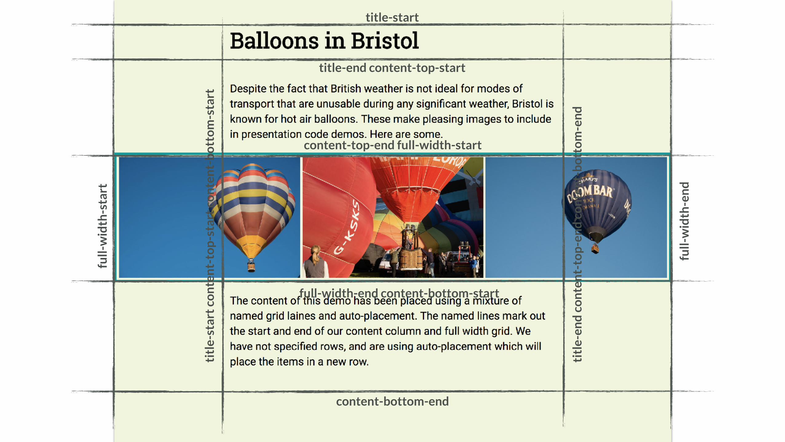
Named Areas create Named Lines
Each named area creates 4 lines. These
are named with the name of the area
plus -start and -end for columns and
rows.
The area title has title-start and title-
end for row and column.
https://codepen.io/rachelandrew/pen/qjdzwR
full-
wid
th-s
tart
title-start
titl
e-en
d c
on
ten
t-to
p-e
nd
co
nte
nt-
bo
tto
m-e
nd
title-end content-top-start
content-top-end full-width-start
full-width-end content-bottom-start
content-bottom-end
titl
e-st
art
con
ten
t-to
p-s
tart
co
nte
nt-
bo
tto
m-s
tart
full-
wid
th-e
nd

title-start
con
ten
t-to
p-e
nd
content-bottom-end
con
ten
t-to
p-s
tart
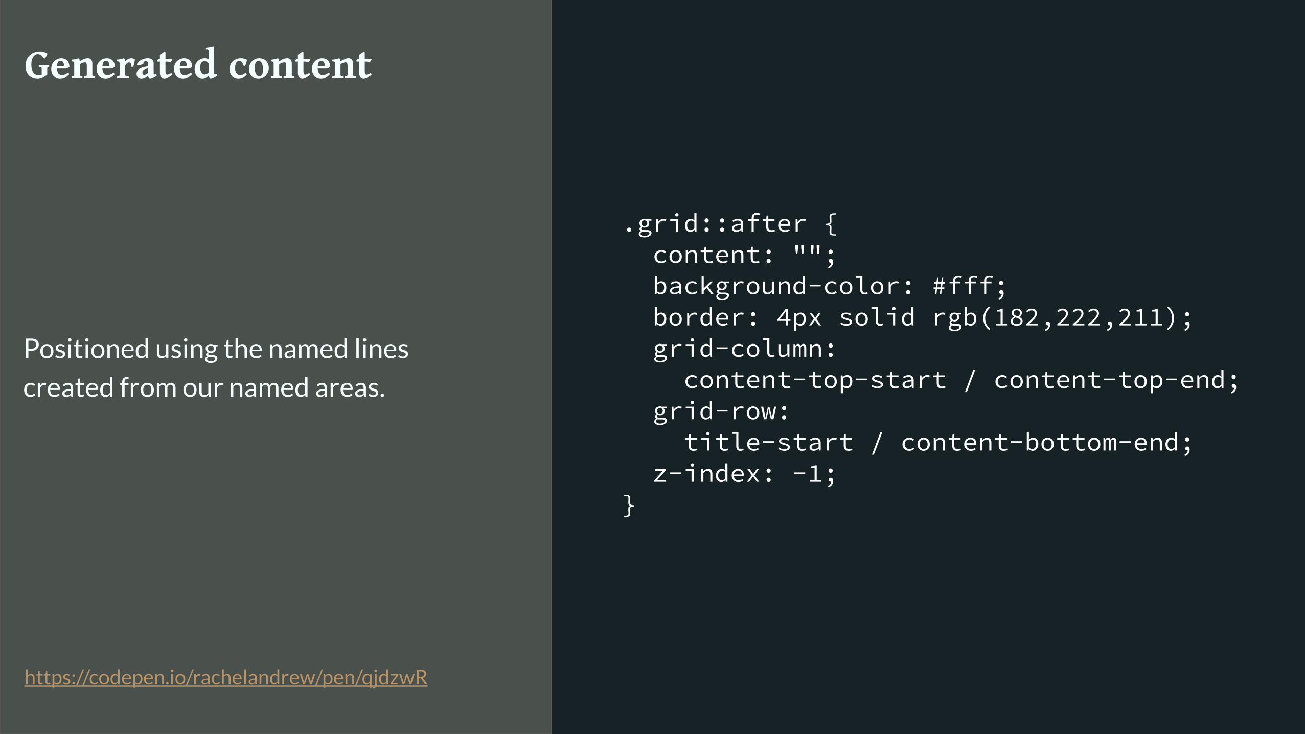
.grid::after { content: ""; background-color: #fff; border: 4px solid rgb(182,222,211); grid-column: content-top-start / content-top-end; grid-row: title-start / content-bottom-end; z-index: -1; }
Generated content
Positioned using the named lines
created from our named areas.
https://codepen.io/rachelandrew/pen/qjdzwR


This is all new.

We are all learning.

Solve problems and share what you find out.
Grid Resources
▸ Visit Grid by Example for worked examples, patterns with fallbacks, and a free video tutorial: https://gridbyexample.com
▸ I created a huge set of guides for MDN: https://developer.mozilla.org/en-US/docs/Web/CSS/CSS_Grid_Layout
▸ Over 5 years of grid thoughts on my site at: https://rachelandrew.co.uk/archives/tag/cssgrid
▸ GridBugs! I’m collecting and trying to get fixed interop issues: https://github.com/rachelandrew/gridbugs

The New CSS Layout
October 10, 2017

Thank you!
@rachelandrew
Slides & Resources: https://rachelandrew.co.uk/speaking/event/fitc2017


