42
BRAND IDENTITY GUIDELINES
| Date post: | 26-Nov-2015 |
| Category: |
Documents |
| Upload: | eduardo-nunes |
| View: | 303 times |
| Download: | 0 times |
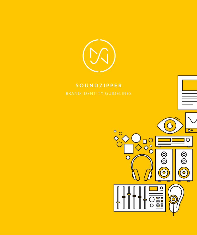
B R A N D I D E N T I T Y G U I D E L I N E S

2
3
THE SOUNDZIPPER BRAND.This document defines the major usage guidelines
for Soundzipper’s visual identity. It should be seen as
the ultimate resource for designers and collaborators
looking to make use of our brand, as it allows everyone
to take part in shaping the values and principles the
company exudes to its current and future partners.
All collaborators working with the Soundzipper brand
should seek to always adhere to the guidelines set forth
by this document. However, because our company is
a living thing, that we do expect to evolve, we know
this book may fail to account for all possible future
use cases. Whenever that happens, we ask that you
please refer to the last section of this document, where
instructions on how to proceed in those situations are
provided.
Because these guidelines are subject to change over
time, we also advise that you seek to download the
most up-to-date version of these guidelines from
Soundzipper’s website.
SOUNDZIPPER BRAND GUIDELINES
© 2013 Soundzipper
All rights reserved
The current version of this document
has been published September 6 2013.
To download the most recent version
of these guidelines, please refer to
Soundzipper’s corporate website.
The Soundzipper brand and guidelines
have been designed in 2013 by
Eduardo Nunes, in collaboration with
Soundzipper’s in-house design team,
under supervision from its creative
director, Tah Wei Hoon.

4
5
TABLE OF CONTENTS.
THE SOUNDZIPPER BRAND. 3
TABLE OF CONTENTS. 4
INTRODUCING SOUNDZIPPER. 6
HOW DID WE GET HERE? 6
HERE’S TO A BRAND NEW FACE 8
AND A MATCHING TYPE(FACE) 11
ALL TOGETHER NOW 12
BUILDING OUR LOGO. 15
COMMON VARIATIONS 16
CONSTRUCTION RULES 17
MARK STROKE WEIGHT 20
FONT WEIGHT AND TRACKING 22
READY-MADES 24
IN GLORIOUS TECHNICOLOR. 26
KEEPING IT BALANCED 28
ACOUSTICS ILLUSTRATED. 30
ILLUSTRATION GUIDELINES 32
BEHAVIOR ON BACKGROUNDS 36
COMBINING ILLUSTRATIONS 38
ILLUSTRATION ARCHIVE 43
SAY IT IN WRITTING. 45
CORPORATE FONT 46
BODY COPY AND SUBHEADINGS 49
ONE MORE FOR ADDED CLASS 53
MAKING SENSE OF IT ALL. 56
SLOGANS & SUBHEADINGS 58
PROTECTION AREAS 60
MINIMUM ACCEPTABLE SIZE 62
USE OVER BACKGROUNDS 63
WHAT NOT TO DO 64
EXAMPLE APPLICATIONS 68
GETTING IN TOUCH. 80

6
7
INTRODUCING SOUNDZIPPER.
Soundzipper’s logo consists of an abstraction of two
different types of sound waves (a sine and a sawtooth),
which resemble, respectively, an uppercase S and a
Z (as in SoundZipper... get it?). These two shapes are
superimposed and enclosed together in an open circle.
Sine
Triangle
Square
Sawtooth
HOW DID WE GET HERE?

8
9
HERE’S TO A BRAND NEW FACE
It’s around the combination of these three elements
that Soundzipper’s new visual identity is built: a
strictly geometric shape, inspired by traditional visual
depictions of sound waves, that come together to form
a stencil-friendly and unique seal.
Although it uses single-width strokes, the generous
spacing on the inside allows for very flexible uses: the
stroke’s weight can be freely adjusted (but hey, be
reasonable!) according to the features of each specific
medium — for more on how to do that, you can skip a
few pages ahead.
10
11
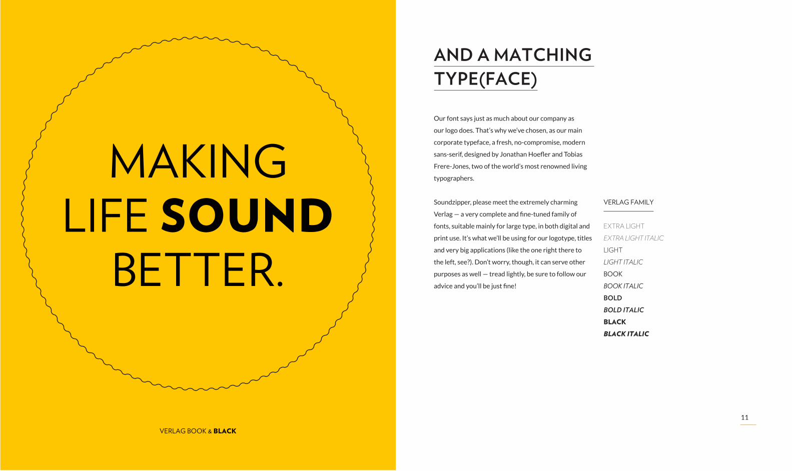
AND A MATCHING TYPE(FACE)
Our font says just as much about our company as
our logo does. That’s why we’ve chosen, as our main
corporate typeface, a fresh, no-compromise, modern
sans-serif, designed by Jonathan Hoefler and Tobias
Frere-Jones, two of the world’s most renowned living
typographers.
Soundzipper, please meet the extremely charming
Verlag — a very complete and fine-tuned family of
fonts, suitable mainly for large type, in both digital and
print use. It’s what we’ll be using for our logotype, titles
and very big applications (like the one right there to
the left, see?). Don’t worry, though, it can serve other
purposes as well — tread lightly, be sure to follow our
advice and you’ll be just fine!
VERLAG FAMILY
EXTRA LIGHT
EXTRA LIGHT ITALIC
LIGHT
LIGHT ITALIC
BOOK
BOOK ITALIC
BOLD
BOLD ITALIC
BLACK
BLACK ITALIC
MAKING LIFE SOUND
BETTER.
VERLAG BOOK & BLACK
12
13
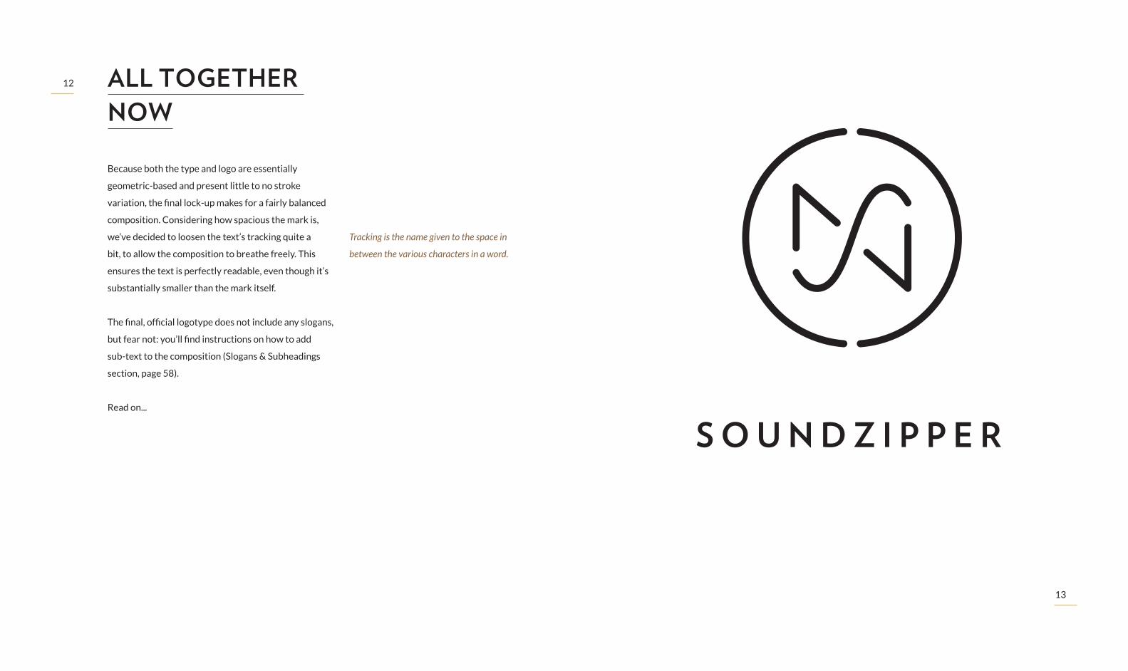
ALL TOGETHER NOW
Because both the type and logo are essentially
geometric-based and present little to no stroke
variation, the final lock-up makes for a fairly balanced
composition. Considering how spacious the mark is,
we’ve decided to loosen the text’s tracking quite a
bit, to allow the composition to breathe freely. This
ensures the text is perfectly readable, even though it’s
substantially smaller than the mark itself.
The final, official logotype does not include any slogans,
but fear not: you’ll find instructions on how to add
sub-text to the composition (Slogans & Subheadings
section, page 58).
Read on...
Tracking is the name given to the space in
between the various characters in a word.

14
15
BUILDING OUR LOGO.Right now, you should be saying “that’s all fine and
dandy, but how do I use this thing?”. It’s a good
question but, really, who says things like fine and dandy
anymore?! Fear not, though, our dear idiomatically
obsolete friend, we’re here to help!
We understand a good logo should stand its ground
on any occasion, regardless of medium, scale, context
and orientation. That’s why we’re not just offering
you logo variations for the most popular use cases, we
want to teach you how to account for those unforeseen
situations, when you just have to take matters into
your own hands. Simply follow our lead and you’ll
be applying the logo blindfolded in no time. Just
remember: in case something goes wrong, be quick to
hide all evidence you tried and politely ask someone
else do it for you.
Just kidding, please do not attempt to use
our logo while blindfolded.
16
17
y8y
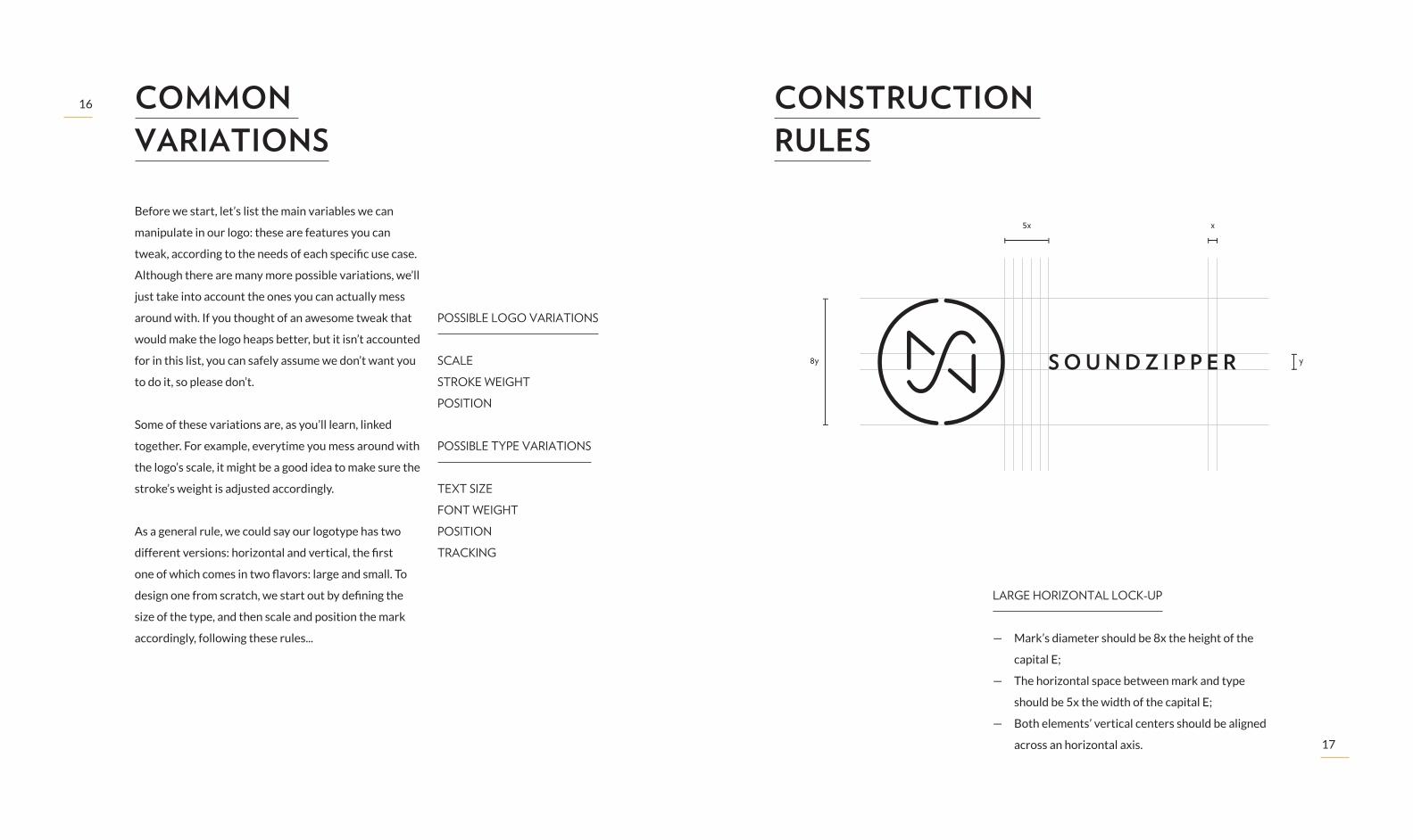
5x xBefore we start, let’s list the main variables we can
manipulate in our logo: these are features you can
tweak, according to the needs of each specific use case.
Although there are many more possible variations, we’ll
just take into account the ones you can actually mess
around with. If you thought of an awesome tweak that
would make the logo heaps better, but it isn’t accounted
for in this list, you can safely assume we don’t want you
to do it, so please don’t.
Some of these variations are, as you’ll learn, linked
together. For example, everytime you mess around with
the logo’s scale, it might be a good idea to make sure the
stroke’s weight is adjusted accordingly.
As a general rule, we could say our logotype has two
different versions: horizontal and vertical, the first
one of which comes in two flavors: large and small. To
design one from scratch, we start out by defining the
size of the type, and then scale and position the mark
accordingly, following these rules...
POSSIBLE LOGO VARIATIONS
SCALE
STROKE WEIGHT
POSITION
POSSIBLE TYPE VARIATIONS
TEXT SIZE
FONT WEIGHT
POSITION
TRACKING
COMMON VARIATIONS
CONSTRUCTION RULES
LARGE HORIZONTAL LOCK-UP
— Mark’s diameter should be 8x the height of the
capital E;
— The horizontal space between mark and type
should be 5x the width of the capital E;
— Both elements’ vertical centers should be aligned
across an horizontal axis.

18
19
y3y
2x x
8y
8y
y
3y
SMALL HORIZONTAL LOCK-UP
— Mark’s diameter should be 3x the height of the
capital E;
— The horizontal space between mark and type
should be 2x the width of the capital E;
— Both elements’ vertical centers should be aligned
across an horizontal axis.
VERTICAL LOCK-UP
— Mark’s diameter should be 8x the height of the
capital E;
— The vertical space between mark and type should
be 3x the height of the capital E;
— Both elements’ horizontal centers should be
aligned across a vertical axis.
20
21
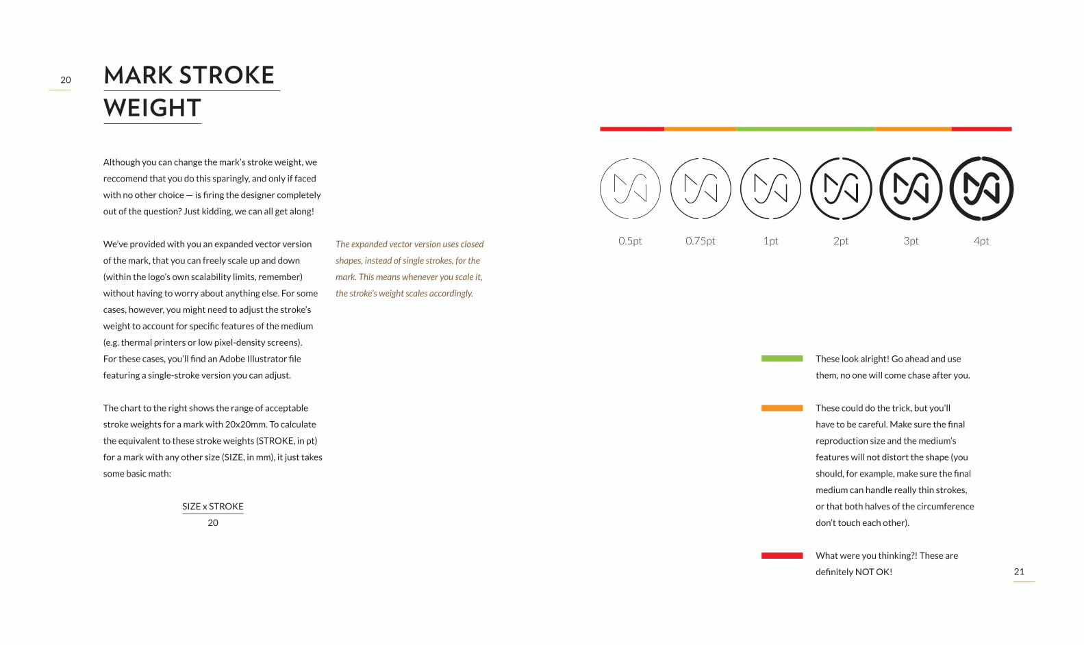
MARK STROKE WEIGHT
Although you can change the mark’s stroke weight, we
reccomend that you do this sparingly, and only if faced
with no other choice — is firing the designer completely
out of the question? Just kidding, we can all get along!
We’ve provided with you an expanded vector version
of the mark, that you can freely scale up and down
(within the logo’s own scalability limits, remember)
without having to worry about anything else. For some
cases, however, you might need to adjust the stroke’s
weight to account for specific features of the medium
(e.g. thermal printers or low pixel-density screens).
For these cases, you’ll find an Adobe Illustrator file
featuring a single-stroke version you can adjust.
The chart to the right shows the range of acceptable
stroke weights for a mark with 20x20mm. To calculate
the equivalent to these stroke weights (STROKE, in pt)
for a mark with any other size (SIZE, in mm), it just takes
some basic math:
SIZE x STROKE
20
These look alright! Go ahead and use
them, no one will come chase after you.
These could do the trick, but you’ll
have to be careful. Make sure the final
reproduction size and the medium’s
features will not distort the shape (you
should, for example, make sure the final
medium can handle really thin strokes,
or that both halves of the circumference
don’t touch each other).
What were you thinking?! These are
definitely NOT OK!
The expanded vector version uses closed
shapes, instead of single strokes, for the
mark. This means whenever you scale it,
the stroke’s weight scales accordingly.
0.5pt 0.75pt 1pt 2pt 3pt 4pt

22
23
FONT WEIGHT AND TRACKING
We really shouldn’t be saying this, but we’ve met more
than twenty pages ago, so what the hell: there will be
times when you’ll want to trash this logo completely.
That’s just the way it is. We’ve tried to think about all
potential use case scenarios, but we’re only human —
...or are we?! Just kidding, we are... — so it’s more than
likely that, sometimes, those large spaces in between
all of the letters just seem like a terrible idea. Like,
for example, when you’re trying to cram it into a tiny
space on the bottom of some poster you’re designing —
we’re sure it’s turning out really nice, by the way! Well,
we wouldn’t want to just go ahead and destroy your
wonderful work, so here’s the deal: if you’re really,
really cautious with our baby, you can go ahead and
tweak the tracking a little bit and, if you really feel like
there’s absolutely no other way, you can even bring
the text weight up or down a little bit.
Of course, there are a few rules. First of all, you can’t
do this for really large applications, or situations
where the logo is being shown for the first time or
any application in which the Soundzipper logo plays a
central role (e.g. business cards, social media profiles,
our own website, etc.) Secondly, you should only
manipulate the tracking, and not the spacing between
each individual character (also known as kerning). And,
finally, to ensure the final result is within the limits of
brand recognition, you should only use combinations
of font weight + tracking within the following chart:
S O U N D Z I P P E RS O U N D Z I P P E RS O U N D Z I P P E RS O U N D Z I P P E RS O U N D Z I P P E R120
VERLAG BOOK VERLAG BOLD VERLAG BLACK
140
160
180
200 S O U N D Z I P P E RS O U N D Z I P P E RS O U N D Z I P P E RS O U N D Z I P P E RS O U N D Z I P P E R
S O U N D Z I P P E RS O U N D Z I P P E RS O U N D Z I P P E RS O U N D Z I P P E RS O U N D Z I P P E R
TRAC
KIN
G
24
25
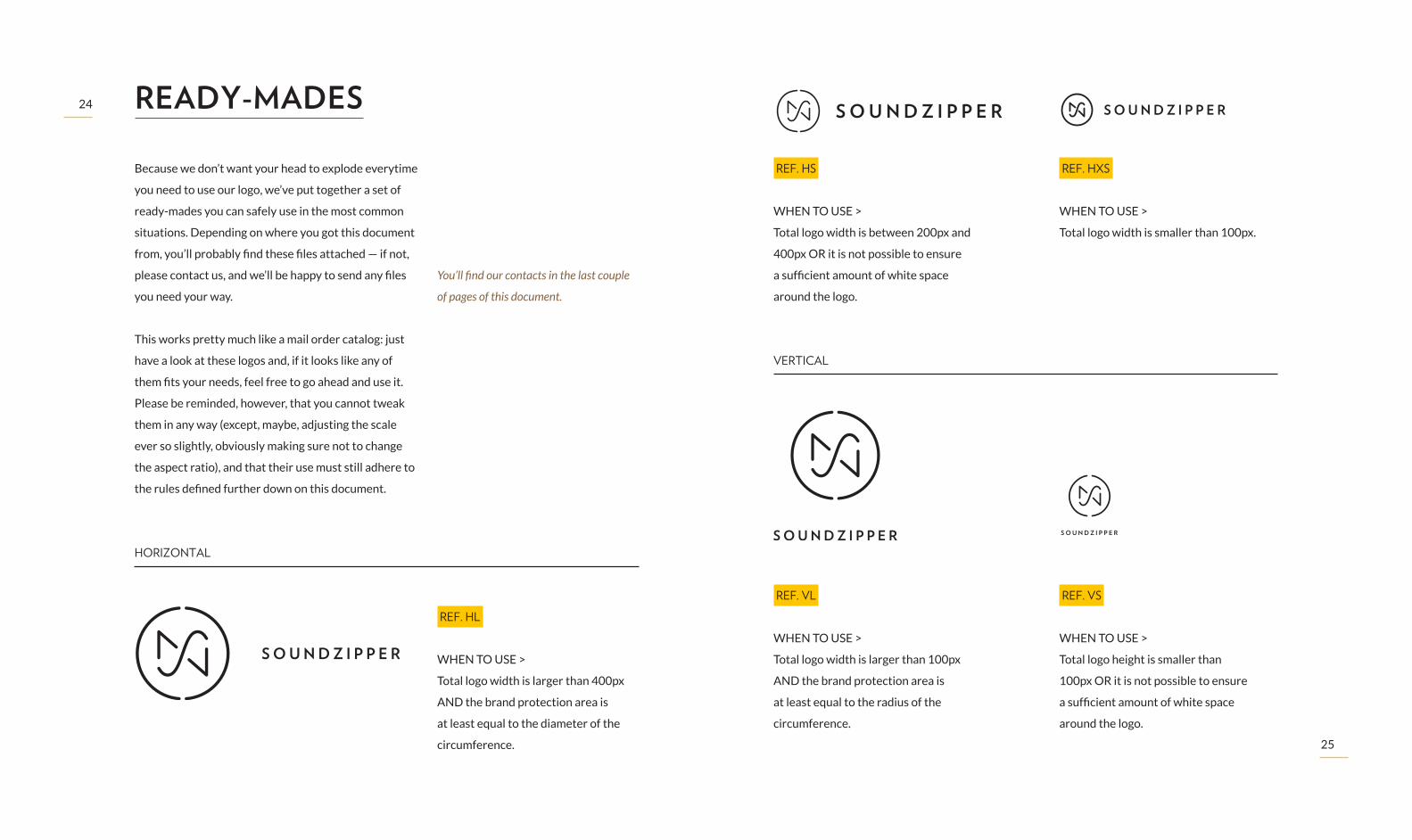
Because we don’t want your head to explode everytime
you need to use our logo, we’ve put together a set of
ready-mades you can safely use in the most common
situations. Depending on where you got this document
from, you’ll probably find these files attached — if not,
please contact us, and we’ll be happy to send any files
you need your way.
This works pretty much like a mail order catalog: just
have a look at these logos and, if it looks like any of
them fits your needs, feel free to go ahead and use it.
Please be reminded, however, that you cannot tweak
them in any way (except, maybe, adjusting the scale
ever so slightly, obviously making sure not to change
the aspect ratio), and that their use must still adhere to
the rules defined further down on this document.
READY-MADES
You’ll find our contacts in the last couple
of pages of this document.
HORIZONTAL
VERTICAL
REF. HL
WHEN TO USE >
Total logo width is larger than 400px
AND the brand protection area is
at least equal to the diameter of the
circumference.
REF. HS
WHEN TO USE >
Total logo width is between 200px and
400px OR it is not possible to ensure
a sufficient amount of white space
around the logo.
REF. HXS
WHEN TO USE >
Total logo width is smaller than 100px.
REF. VL
WHEN TO USE >
Total logo width is larger than 100px
AND the brand protection area is
at least equal to the radius of the
circumference.
REF. VS
WHEN TO USE >
Total logo height is smaller than
100px OR it is not possible to ensure
a sufficient amount of white space
around the logo.
S O U N D Z I P P E R

26
27
IN GLORIOUS TECHNICOLOR.Our brand new corporate color scheme draws
inspiration from what has long been our legacy:
brown and beige. It’s worked fine for us in the past,
because it portrays us as a serious, dedicated and
very professional bunch of people. So we’re keeping
that. But because we’re also fun and easy-going, and
because we truly love what we do, we’ve introduced the
wonderful, bright yolky yellow you’ll find in the cover of
this document and made it our main corporate color.
We spent a good deal of time finding the color
combination that we believed portrays our company’s
core values, so feel free to use any of these colours any
way you like, when you’re working our brand. If you’re
unsure, this very simple motto will help you in your
journey: if it looks good, it probably is — but, when in
doubt, you can always ask around. It doesn’t rhyme, but it’s true nonetheless.
YOLK YELLOW
PANTONE: 7548 C
HEX : #FFC600
R: 255 G: 198 B: 0
C: 0 M: 22 Y: 100 K: 0
LIGHT IVORY
PANTONE: 70/30 4545 C + White
HEX : #E3D9BA
R: 227 G: 217 B: 186
C: 11 M: 11 Y: 28 K: 0
DARK NUT BROWN
PANTONE: 7533 C
HEX : #483627
R: 72 G: 54 B: 39
C: 53 M: 64 Y: 76 K: 57
SULFUR BEIGE
PANTONE: 50/50 7548 C + White
HEX : #FFF0A6
R: 255 G: 240 B: 166
C: 1 M: 2 Y: 43 K: 0
CLAY BROWN
PANTONE: 7505 C
HEX : #83603F
R: 131 G: 96 B: 63
C: 40 M: 57 Y: 78 K: 25
PURE BLACK
HEX : #000000
R: 0 G: 0 B: 0
C: 70 M: 50 Y: 30 K: 100
28
29
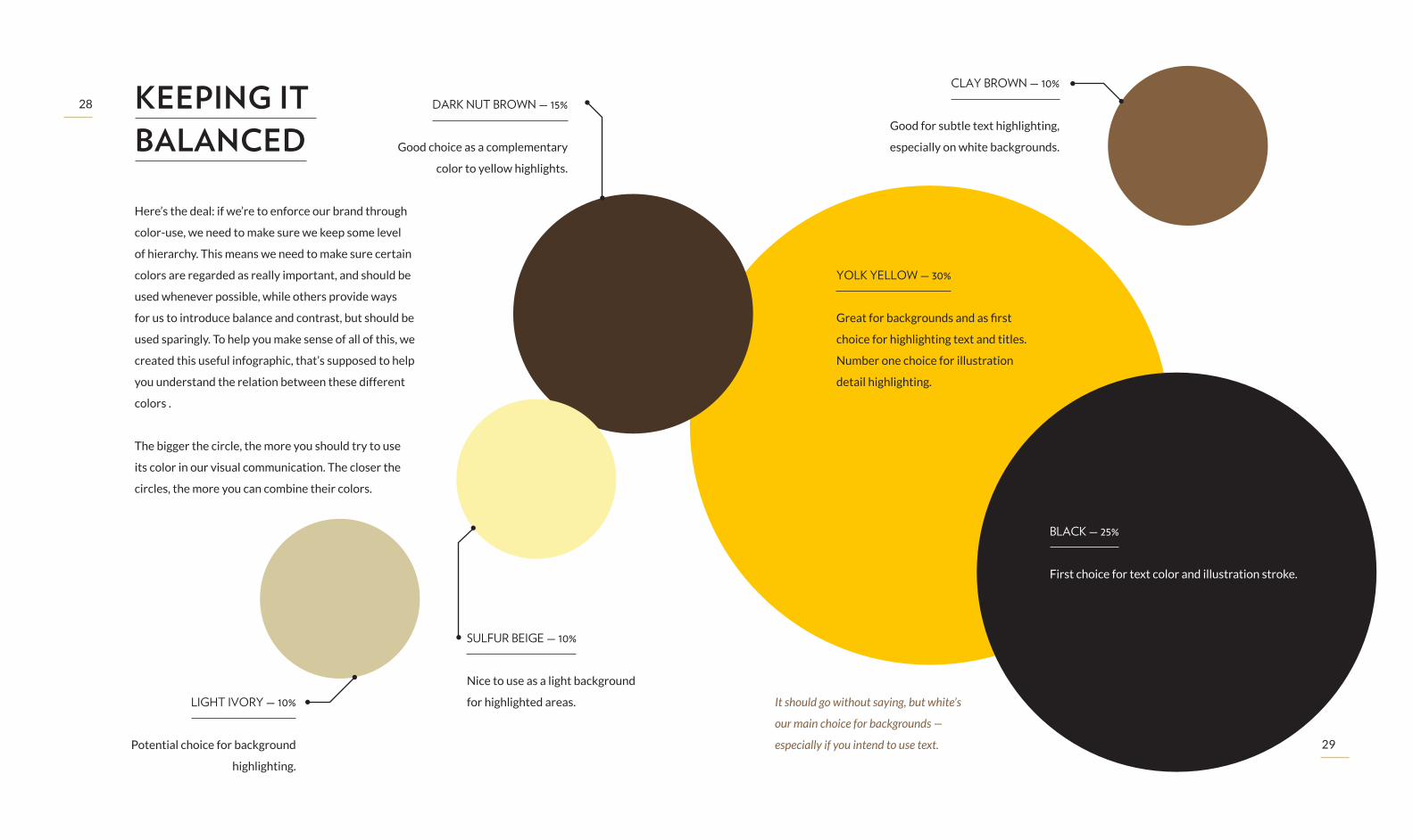
Here’s the deal: if we’re to enforce our brand through
color-use, we need to make sure we keep some level
of hierarchy. This means we need to make sure certain
colors are regarded as really important, and should be
used whenever possible, while others provide ways
for us to introduce balance and contrast, but should be
used sparingly. To help you make sense of all of this, we
created this useful infographic, that’s supposed to help
you understand the relation between these different
colors .
The bigger the circle, the more you should try to use
its color in our visual communication. The closer the
circles, the more you can combine their colors.
KEEPING IT BALANCED
YOLK YELLOW — 30%
Great for backgrounds and as first
choice for highlighting text and titles.
Number one choice for illustration
detail highlighting.
DARK NUT BROWN — 15%
Good choice as a complementary
color to yellow highlights.
BLACK — 25%
First choice for text color and illustration stroke.
CLAY BROWN — 10%
Good for subtle text highlighting,
especially on white backgrounds.
LIGHT IVORY — 10%
Potential choice for background
highlighting.
SULFUR BEIGE — 10%
Nice to use as a light background
for highlighted areas. It should go without saying, but white’s
our main choice for backgrounds —
especially if you intend to use text.
30
31
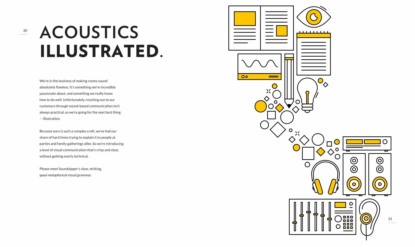
ACOUSTICS ILLUSTRATED.We’re in the business of making rooms sound
absolutely flawless. It’s something we’re incredibly
passionate about, and something we really know
how to do well. Unfortunately, reaching out to our
customers through sound-based communication isn’t
always practical, so we’re going for the next best thing
— illustration.
Because ours is such a complex craft, we’ve had our
share of hard times trying to explain it to people at
parties and family gatherings alike. So we’re introducing
a level of visual communication that’s crisp and clear,
without getting overly technical.
Please meet Soundzipper’s clear, striking,
quasi‑metaphorical visual grammar.
32
33
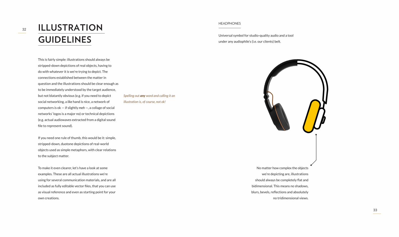
This is fairly simple: illustrations should always be
stripped -down depictions of real objects, having to
do with whatever it is we’re trying to depict. The
connections established between the matter in
question and the illustrations should be clear enough as
to be immediately understood by the target audience,
but not blatantly obvious (e.g. if you need to depict
social networking, a like hand is nice, a network of
computers is ok — if slightly meh —, a collage of social
networks’ logos is a major no) or technical depictions
(e.g. actual audiowaves extracted from a digital sound
file to represent sound).
If you need one rule of thumb, this would be it: simple,
stripped-down, duotone depictions of real-world
objects used as simple metaphors, with clear relations
to the subject matter.
To make it even clearer, let’s have a look at some
examples. These are all actual illustrations we’re
using for several communication materials, and are all
included as fully editable vector files, that you can use
as visual reference and even as starting point for your
own creations.
ILLUSTRATION GUIDELINES
Spelling out any word and calling it an
illustration is, of course, not ok!
HEADPHONES
Universal symbol for studio-quality audio and a tool
under any audiophile’s (i.e. our clients) belt.
No matter how complex the objects
we’re depicting are, illustrations
should always be completely flat and
bidimensional. This means no shadows,
blurs, bevels, reflections and absolutely
no tridimensional views.
34
35
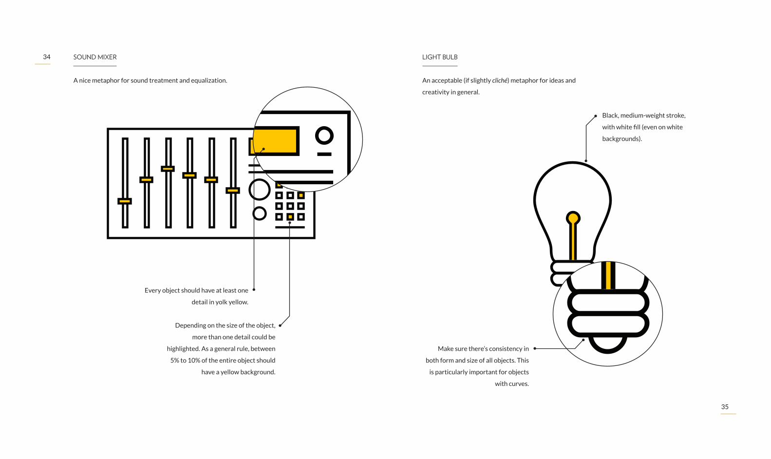
Every object should have at least one
detail in yolk yellow.
Depending on the size of the object,
more than one detail could be
highlighted. As a general rule, between
5% to 10% of the entire object should
have a yellow background.
SOUND MIXER
A nice metaphor for sound treatment and equalization.
Make sure there’s consistency in
both form and size of all objects. This
is particularly important for objects
with curves.
Black, medium-weight stroke,
with white fill (even on white
backgrounds).
LIGHT BULB
An acceptable (if slightly cliché) metaphor for ideas and
creativity in general.

36
37
Illustrations will often be the most striking visual
feature of our brand communication, so please make
sure to only use them when it’s safe. And, in this case,
the rule is simple: these can only be used on white or
yolk yellow backgrounds — no exceptions.
When using them over yellow backgrounds, make sure
the insides are filled with white.
BEHAVIOR ON BACKGROUNDS
38
39
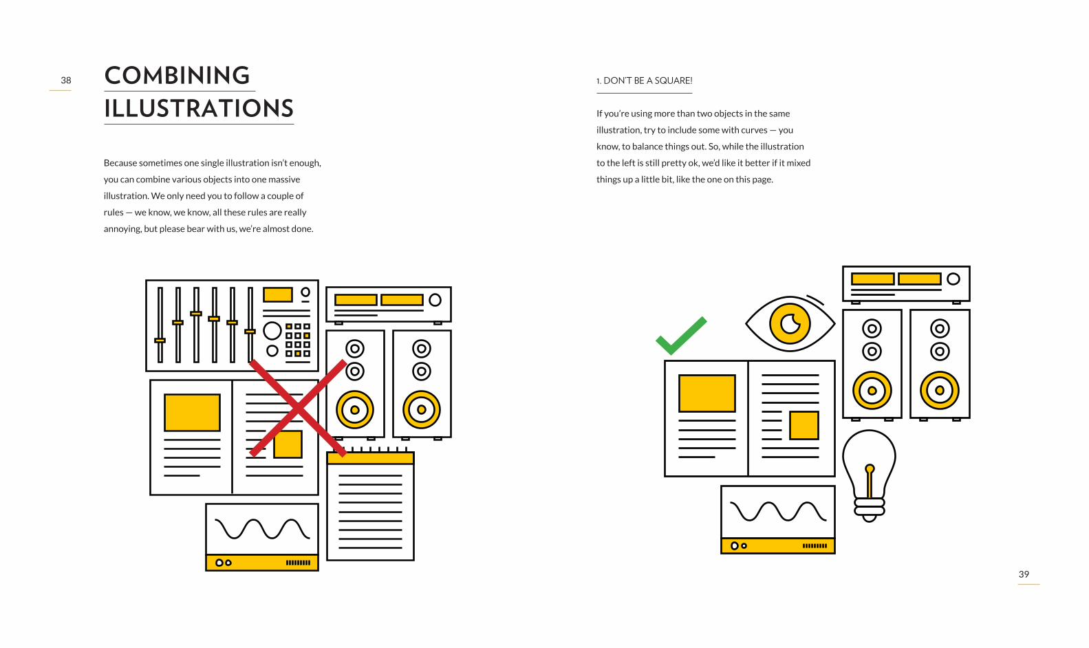
Because sometimes one single illustration isn’t enough,
you can combine various objects into one massive
illustration. We only need you to follow a couple of
rules — we know, we know, all these rules are really
annoying, but please bear with us, we’re almost done.
COMBINING ILLUSTRATIONS
1. DON’T BE A SQUARE!
If you’re using more than two objects in the same
illustration, try to include some with curves — you
know, to balance things out. So, while the illustration
to the left is still pretty ok, we’d like it better if it mixed
things up a little bit, like the one on this page.
40
41
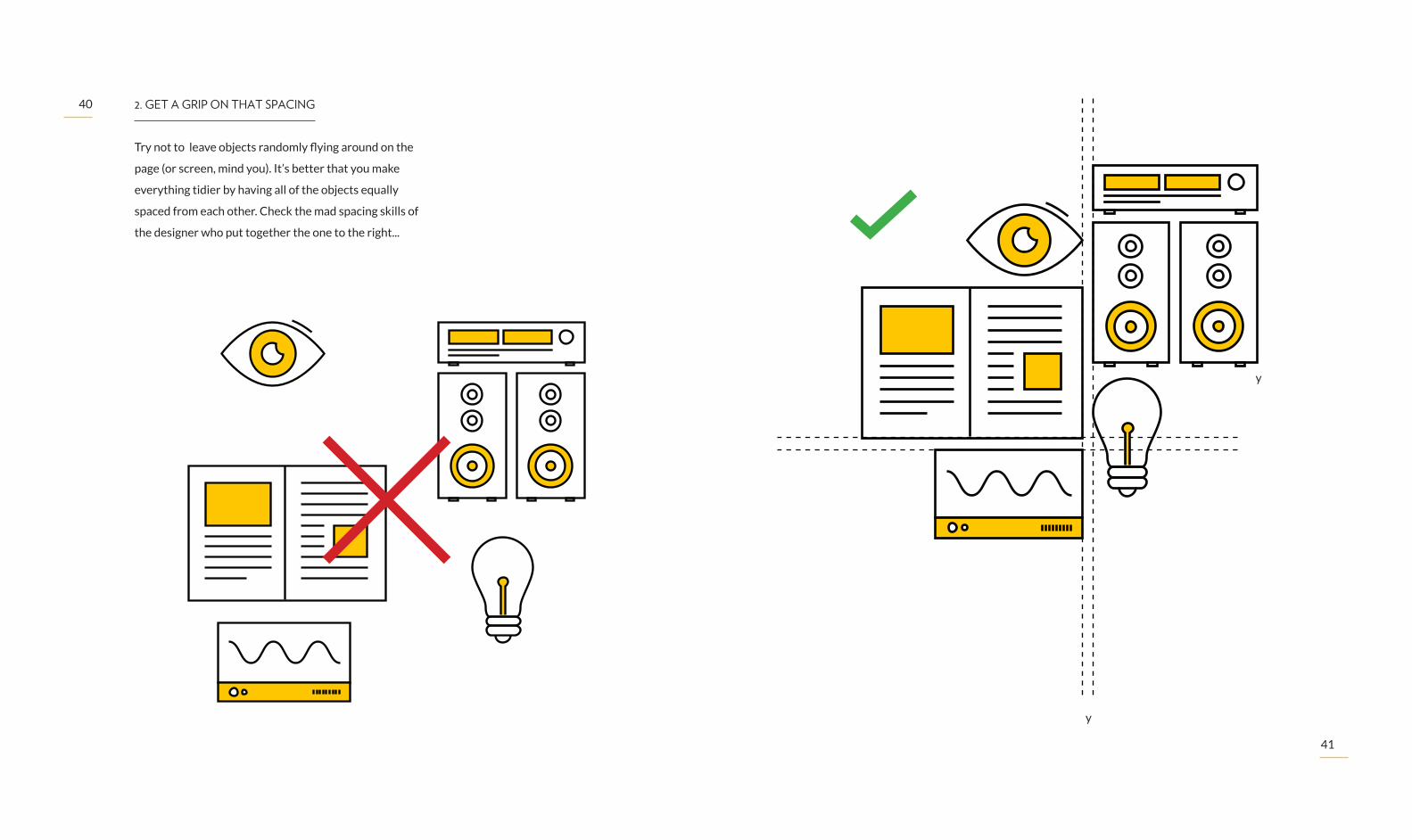
2. GET A GRIP ON THAT SPACING
Try not to leave objects randomly flying around on the
page (or screen, mind you). It’s better that you make
everything tidier by having all of the objects equally
spaced from each other. Check the mad spacing skills of
the designer who put together the one to the right...
y
y
42
43
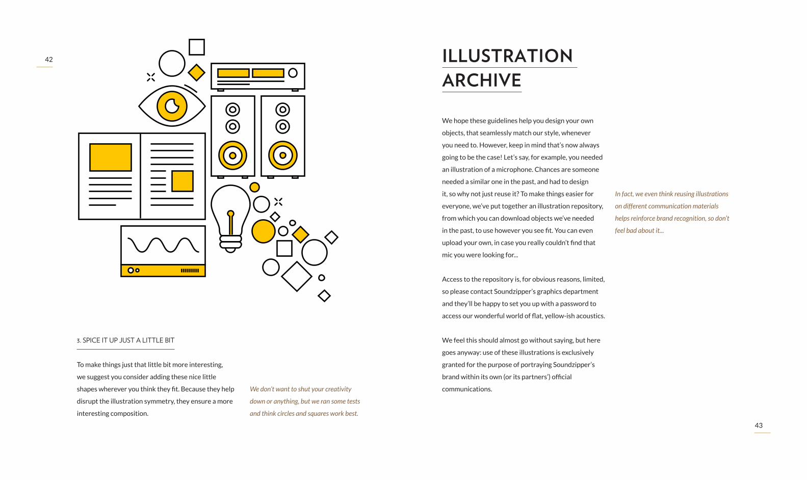
3. SPICE IT UP JUST A LITTLE BIT
To make things just that little bit more interesting,
we suggest you consider adding these nice little
shapes wherever you think they fit. Because they help
disrupt the illustration symmetry, they ensure a more
interesting composition.
We don’t want to shut your creativity
down or anything, but we ran some tests
and think circles and squares work best.
We hope these guidelines help you design your own
objects, that seamlessly match our style, whenever
you need to. However, keep in mind that’s now always
going to be the case! Let’s say, for example, you needed
an illustration of a microphone. Chances are someone
needed a similar one in the past, and had to design
it, so why not just reuse it? To make things easier for
everyone, we’ve put together an illustration repository,
from which you can download objects we’ve needed
in the past, to use however you see fit. You can even
upload your own, in case you really couldn’t find that
mic you were looking for...
Access to the repository is, for obvious reasons, limited,
so please contact Soundzipper’s graphics department
and they’ll be happy to set you up with a password to
access our wonderful world of flat, yellow-ish acoustics.
We feel this should almost go without saying, but here
goes anyway: use of these illustrations is exclusively
granted for the purpose of portraying Soundzipper’s
brand within its own (or its partners’) official
communications.
ILLUSTRATION ARCHIVE
In fact, we even think reusing illustrations
on different communication materials
helps reinforce brand recognition, so don’t
feel bad about it...

44
45
SAY IT IN WRITTING.Picture this: you’re at a club, trying to make your way
through the dancefloor, and you stumble into this guy
dancing aimlessly in front of you. You want to ask him
to move, but the music’s really loud, so it’s hard to get
to him. You’re not mad or anything, but you’re probably
gonna have to scream right at the guy’s ear, if you want
him to even notice you’re there. Now imagine you’re in
one of our own expertly designed, acoustically perfect
rooms, and you’re trying to say something to a friend
sitting across the room. Anything slightly louder than a
whisper will probably do the trick.
Moral of the story is: different conditions call for
different approaches. And that’s as true for your tone
of voice, as it is for our style of writing and typefaces.
That’s why we have not one, but three different
typefaces: so our brand can scream just as much as it
can whisper.
A SOUND
Don’t take it literally — screaming is rude.
46
47
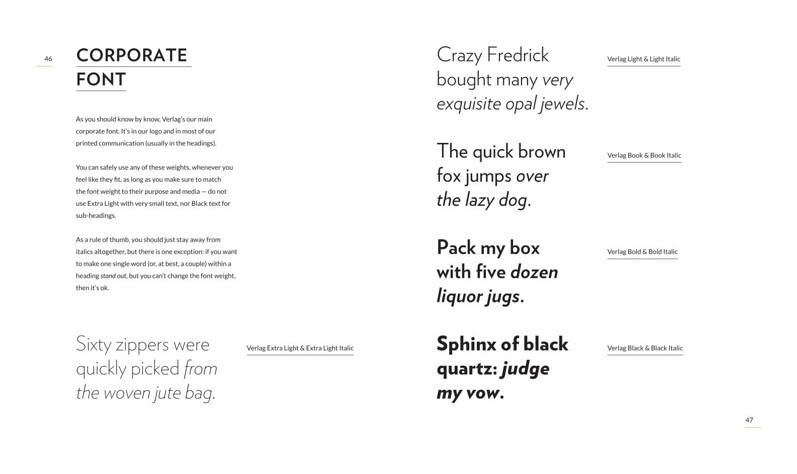
As you should know by know, Verlag’s our main
corporate font. It’s in our logo and in most of our
printed communication (usually in the headings).
You can safely use any of these weights, whenever you
feel like they fit, as long as you make sure to match
the font weight to their purpose and media — do not
use Extra Light with very small text, nor Black text for
sub-headings.
As a rule of thumb, you should just stay away from
italics altogether, but there is one exception: if you want
to make one single word (or, at best, a couple) within a
heading stand out, but you can’t change the font weight,
then it’s ok.
Verlag Extra Light & Extra Light Italic
Verlag Light & Light Italic
Verlag Book & Book Italic
Verlag Bold & Bold Italic
Verlag Black & Black Italic
CORPORATE FONT
Sixty zippers were quickly picked from the woven jute bag.
Crazy Fredrick bought many very exquisite opal jewels.
The quick brown fox jumps over the lazy dog.
Pack my box with five dozen liquor jugs.
Sphinx of black quartz: judge my vow.

48
49
When using Verlag for headings, we think it works
better if you use all caps, or capitalize sentences (not
words). We’re not just being picky: because Verlag has
a relatively small x-height, mixing upper and lower-case
a lot causes sentences to produce uneven shapes, that
look unbalanced and, most of the time, require the
brain to work harder to read the text.
This is nasty. There’s a huge contrast between upper
and lowercase characters’ heights, so stay away.
That’s nice. There’s a very tall capital S at the start, but
the sentence is, overall, very balanced.
For smaller sentences, or for very small uses, consider
using all-caps. It looks good and makes for a very
uniform outline. Keep in mind, however, that it’ll take
up more space than a lower-cased sentence.
Sixty Zippers Were Quickly Picked From the Woven Jute Bag
Sixty zippers were quickly picked from the woven jute bag
SIXTY QUICK ZIPPERS
x-height is the value used to define the
lower‑case characters’ height, and is
usually defined by the height of the
lowercase x.
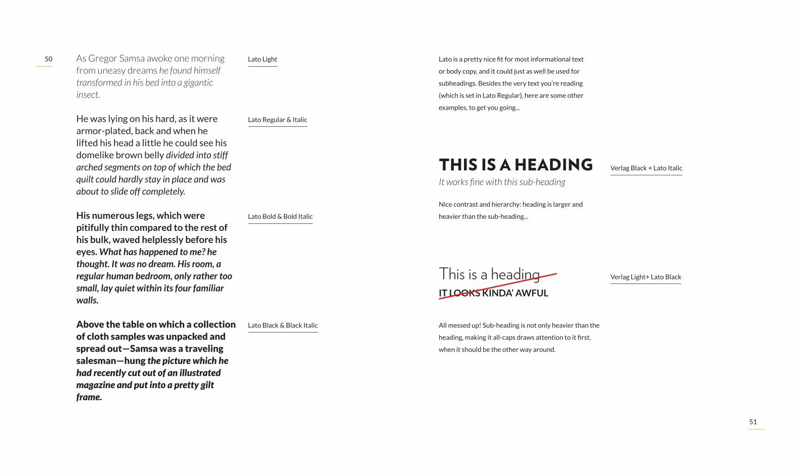
Despite being a charming and efficient modern sans,
Verlag doesn’t just work everywhere, so we need
something else: a typeface for body copy, that works
in print as it does on the Web, and that is balanced
and readable at tiny sizes. For that, we chose Lato,
an open-source sans-serif with a considerably larger
x-height and a couple of features that make it quirky
yet highly flexible.
Use it for body copy, in print or on the Web. It can go
up to relatively large sizes, but try not to use it for
headings. Also, whenever possible, do not leave it all by
itself; try to pair it up with one of our other typefaces.
BODY COPY AND SUBHEADINGS
Lato HairlineOne morning, when Gregor Samsa woke from troubled dreams, he found himself transformed in his bed into a horrible vermin. He lay on his armour-like back, and if he lifted his head a little he could see his brown belly, slightly domed and divided by arches into stiff sections.
50
51
Lato Light
Verlag Black + Lato Italic
Verlag Light+ Lato Black
Lato Black & Black Italic
Lato Regular & Italic
Lato Bold & Bold Italic
As Gregor Samsa awoke one morning from uneasy dreams he found himself transformed in his bed into a gigantic insect.
He was lying on his hard, as it were armor-plated, back and when he lifted his head a little he could see his domelike brown belly divided into stiff arched segments on top of which the bed quilt could hardly stay in place and was about to slide off completely.
His numerous legs, which were pitifully thin compared to the rest of his bulk, waved helplessly before his eyes. What has happened to me? he thought. It was no dream. His room, a regular human bedroom, only rather too small, lay quiet within its four familiar walls.
Above the table on which a collection of cloth samples was unpacked and spread out—Samsa was a traveling salesman—hung the picture which he had recently cut out of an illustrated magazine and put into a pretty gilt frame.
It works fine with this sub-heading
IT LOOKS KINDA’ AWFUL
Lato is a pretty nice fit for most informational text
or body copy, and it could just as well be used for
subheadings. Besides the very text you’re reading
(which is set in Lato Regular), here are some other
examples, to get you going...
THIS IS A HEADING
This is a heading
Nice contrast and hierarchy: heading is larger and
heavier than the sub-heading...
All messed up! Sub-heading is not only heavier than the
heading, making it all-caps draws attention to it first,
when it should be the other way around.
52
53
As Gregor Samsa awoke one morning from
uneasy dreams he found himself transformed
in his bed into a gigantic insect.
As Gregor Samsa awoke one morning from
uneasy dreams he found himself transformed
in his bed into a gigantic insect.
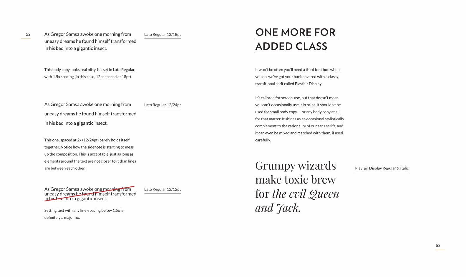
As Gregor Samsa awoke one morning from uneasy dreams he found himself transformed in his bed into a gigantic insect.
Lato Regular 12/18pt
Lato Regular 12/24pt
Lato Regular 12/12pt
This body copy looks real nifty. It’s set in Lato Regular,
with 1.5x spacing (in this case, 12pt spaced at 18pt).
This one, spaced at 2x (12/24pt) barely holds itself
together. Notice how the sidenote is starting to mess
up the composition. This is acceptable, just as long as
elements around the text are not closer to it than lines
are between each other.
Setting text with any line-spacing below 1.5x is
definitely a major no.
It won’t be often you’ll need a third font but, when
you do, we’ve got your back covered with a classy,
transitional serif called Playfair Display.
It’s tailored for screen-use, but that doesn’t mean
you can’t occasionally use it in print. It shouldn’t be
used for small body copy — or any body copy at all,
for that matter. It shines as an occasional stylistically
complement to the rationality of our sans serifs, and
it can even be mixed and matched with them, if used
carefully.
ONE MORE FOR ADDED CLASS
Playfair Display Regular & ItalicGrumpy wizards make toxic brew for the evil Queen and Jack.

54
55
Playfair Display Bold & Bold Italic
Playfair Display Black & Black Italic
Playfair Display Regular, Bold & Black
Grumpy wizards make toxic brew for the evil Queen and Jack.
Grumpy wizards make toxic brew for the evil Queen and Jack.
Making life sound better.
& & &
Use Playfair sparingly, and only in very specific use
cases — quotations, large slogans, headings or tiny
details come to mind.
A balanced lock-up of our name and slogan. Because
the fonts have contrasting features and weights, they
complement each other nicely.
One lone ampersand set in Playfair, in an otherwise
Verlag text, can make all the difference, adding a dash
of unexpected sophistication.
Ouch! We did say contrast is nice, but this is just
ridiculous. Tone it down a little bit, please. Also, don’t
use Playfair in all-caps — especially in italic! Ugh...
S O U N D Z I P P E R
TIPS & TRICKS
HERE’S SOUNDZIPPER
Verlag Light + Playfair Display Black
Verlag Black + Playfair Display Black
Verlag Black + Playfair Italic

56
57
MAKING SENSE OF IT ALL.We understand all of the stuff we’ve covered so far
may be a bit overwhelming, so allow us to try and
make things easier on you. This section will hopefully
help you make sense of all the information we’ve been
bombing you with, so you can go and do amazing things
with our brand.
Besides laying out the DO’s and DON’Ts, we’re going to
put the brand in context, so you can see how all of this is
actually used in real-world scenarios. We’ll even throw
in a couple of application examples, so you can see how
we’ve done it in the past. Make us proud!
58
59
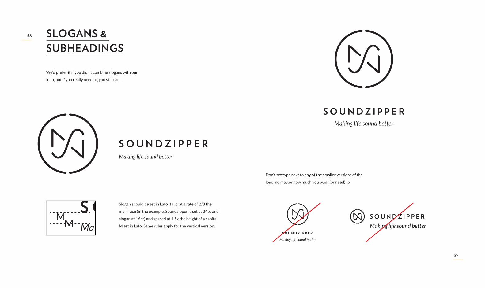
We’d prefer it if you didn’t combine slogans with our
logo, but if you really need to, you still can.
Don’t set type next to any of the smaller versions of the
logo, no matter how much you want (or need) to.
Slogan should be set in Lato Italic, at a rate of 2/3 the
main face (in the example, Soundzipper is set at 24pt and
slogan at 16pt) and spaced at 1.5x the height of a capital
M set in Lato. Same rules apply for the vertical version.
SLOGANS & SUBHEADINGS
Making life sound better
Making life sound better
Making life sound betterMaking life sound better
Making life sound better
S O U N D Z I P P E R
Making life sound better
Making life sound better
S O U N D Z I P P E R

60
61
Our brand is sensitive, so we’d appreciate it if you could
give it some space to breath. When using it next to
text, images or other logos, you can make sure ours is
comfortable by keeping a safe distance. And the rules
are simple: you should keep a distance equivalent to the
mark’s radius from the outermost point on each side,
regardless of the logo version you’re using.
PROTECTION AREAS
LOGO
LOGO
LOGO
LOGO

62
63
Whenever space is extremely limited, you can scale
down the logotype to its minimum acceptable size. We
reccomend, however, that you seek to use it at larger
sizes whenever possible.
Please bear in mind that, at such a small scale, you
should always use the S (REF. VS) version of the vertical
lockup and the XS version (REF. HXS) of the horizontal
lockup. If you have no idea what we’re talking about,
please refer to the Ready Mades section on page 24.
34mm
80px
20mm
60px
MINIMUM ACCEPTABLE SIZE
S O U N D Z I P P E R
When using the logo over photo or color backgrounds,
always make sure our logo’s perfectly readable.
USE OVER BACKGROUNDS
If the photo has such a hue and contrast variation,
that you can’t seem to find a way to add our logo, you
may add a background frame, at least the size of the
logotype’s protection area (see page 60).

64
65soundzipper
soundzipper
soundzipperWe’re fairly flexible with our brand, but there’s some
stuff you simply shouldn’t do.
Do not stretch our logo or change its proportions in any
way. If you need to change the size, make sure it scales
proportionally.
Do not mix colors; logo and type should be the exact
same color at all times.
Do not set our name in any font other than Verlag (not
even our two other official fonts) nor in lower-case.
Do not add drop shadows, bevels or any other type of
special effect to our logo. Flat’s just fine, thank you.
WHAT NOT TO DO

66
67
soundzipper
soundzipper
soundzippersoundzipper
Do not use a logotype scale ratio not covered under
Construction Rules (page 17).
Do not mix type and mark in any way.
Do not position our logo within rules or frames.
Do not rotate, skew or otherwise distort the logo shape
or the type in any way.
Because orientation is important to decoding the logo,
try not to use it on its side.soundzipperDo not create an outline around the logo or type.
68
69
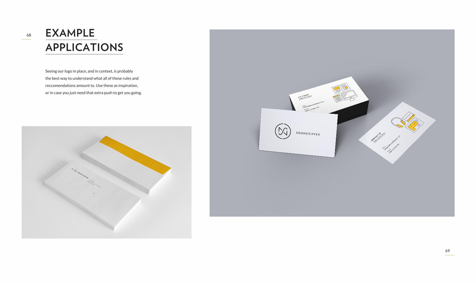
Seeing our logo in place, and in context, is probably
the best way to understand what all of these rules and
reccomendations amount to. Use these as inspiration,
or in case you just need that extra push to get you going.
EXAMPLE APPLICATIONS
70
71
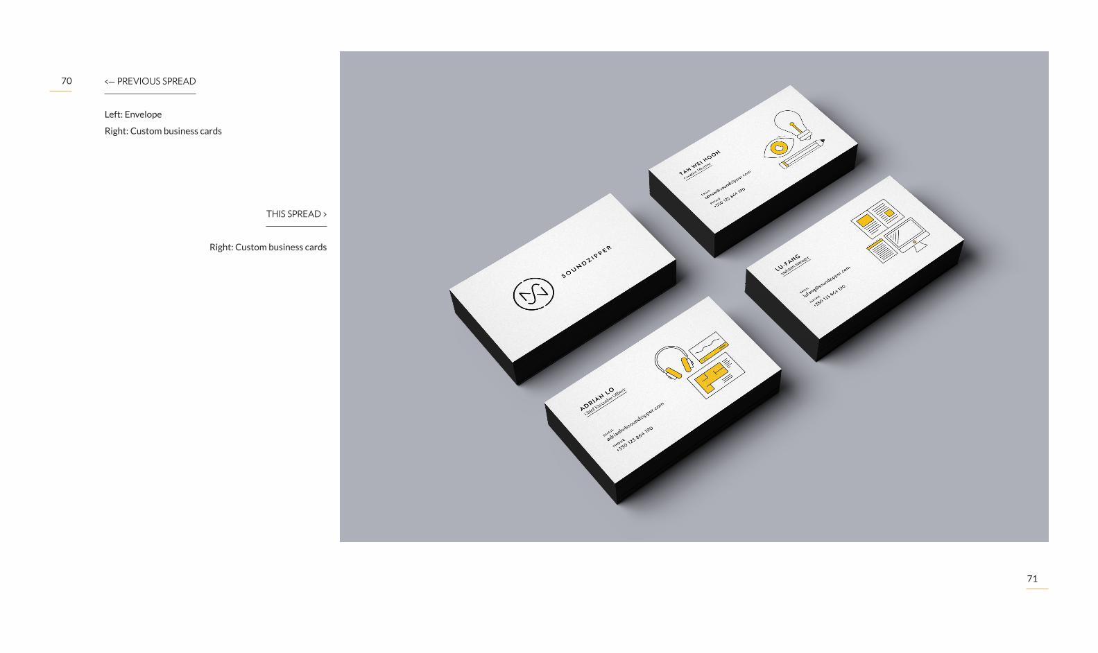
THIS SPREAD >
Right: Custom business cards
<— PREVIOUS SPREAD
Left: Envelope
Right: Custom business cards

72
73
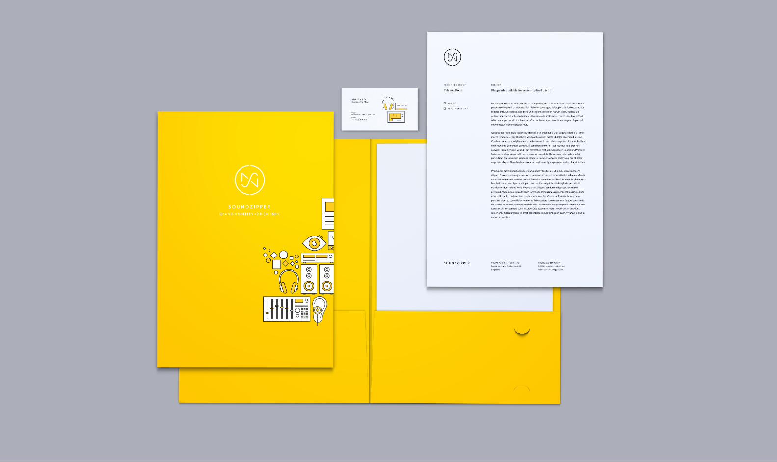
NEXT SPREAD —>
Brand guidelines book, business card,
letterhead and folder
< THIS SPREAD
Left: Envelope & Letterhead
74
75

76
77
< THIS SPREAD
Left: Use on social media platform
NEXT SPREAD —>
Use on corporate website

78
79

80
81
GETTING IN TOUCH.If you got this far without skimming though the
document too much, you should be prepared to tackle
the challenge of using our visual identity. However,
because there will always be those cases when you
can’t tell whether some idea you’ve just come up with
is ok or not, you can be sure we’ll be around to help you
out. Just get in touch, using one of the contacts to the
right, and we’ll do our best to work through your doubts
and suggestions together.
We truly respect and appreciate anyone who’s willing
to tackle the challenge of helping shape our company’s
future, and we’re eager to see what you make of it.
Thank you!
GENERAL ENQUIRIES
8 Ubi Road 2
Zervex Industrial Building, #08-03
Singapore, 408538
(65) 6509 3529
GRAPHICS DEPARTMENT
Tah Wei Hoon
Soundzipper Creative Director
Eduardo Nunes
Visual Identity Designer
(351) 93 480 81 91
We hereby award you the honorary, and
very fictional, title of Soundzipper Brand
Expert.


