6
School Magazine Evaluation By Spencer Waller Max Jos h Betha n
| Date post: | 04-Aug-2015 |
| Category: |
Education |
| Upload: | spencerwaller16 |
| View: | 40 times |
| Download: | 0 times |
School Magazine EvaluationBy Spencer Waller
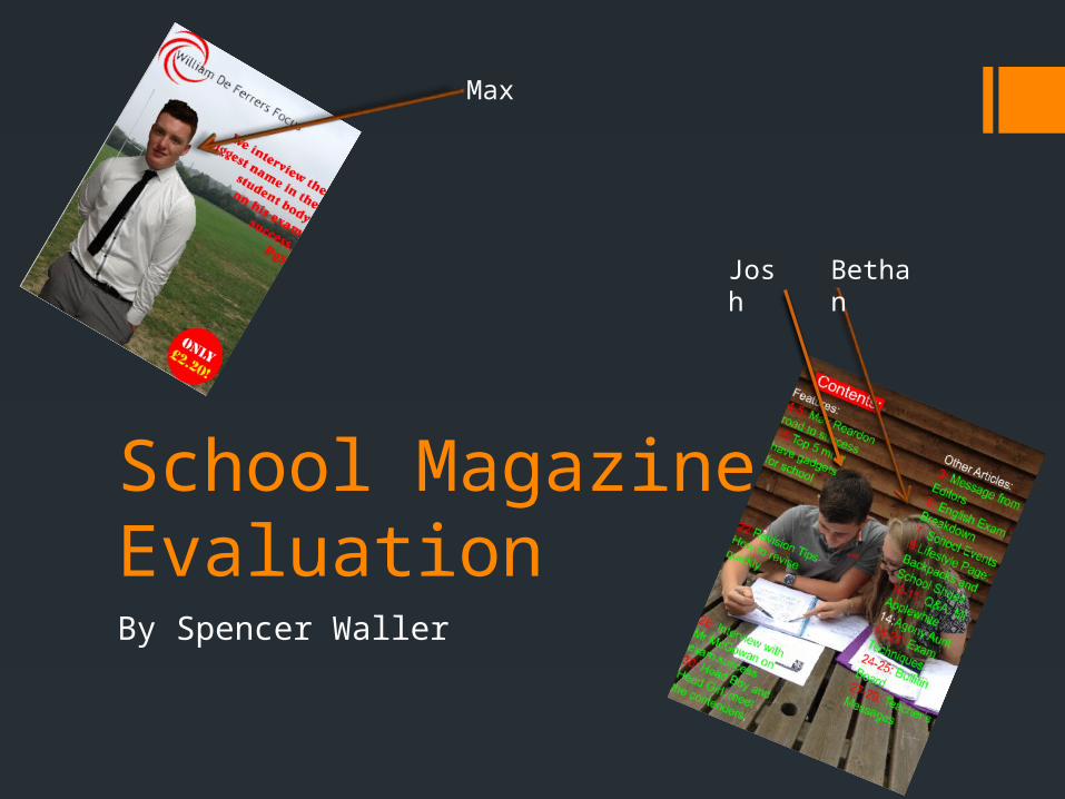
Max
Josh Bethan
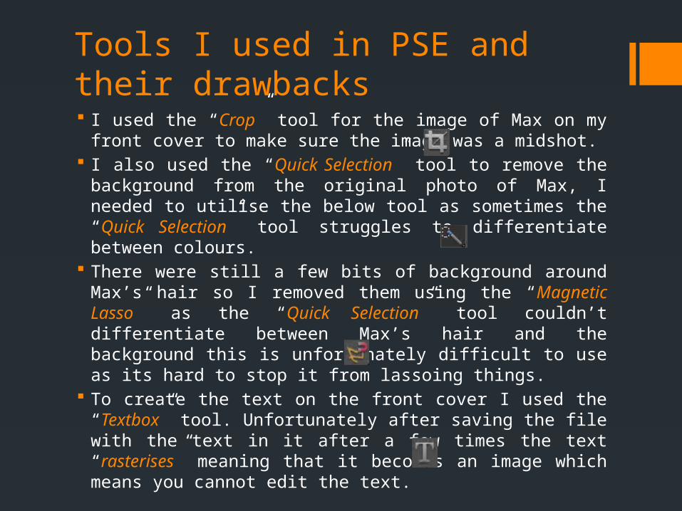
Tools I used in PSE and their drawbacks I used the “Crop” tool for the image of Max on my front cover
to make sure the image was a midshot. I also used the “Quick Selection” tool to remove the
background from the original photo of Max, I needed to utilise the below tool as sometimes the “Quick Selection” tool struggles to differentiate between colours.
There were still a few bits of background around Max’s hair so I removed them using the “Magnetic Lasso” as the “Quick Selection” tool couldn’t differentiate between Max’s hair and the background this is unfortunately difficult to use as its hard to stop it from lassoing things.
To create the text on the front cover I used the “Textbox” tool. Unfortunately after saving the file with the text in it after a few times the text “rasterises” meaning that it becomes an image which means you cannot edit the text.
Tools I used in PSE and their drawbacks, continued
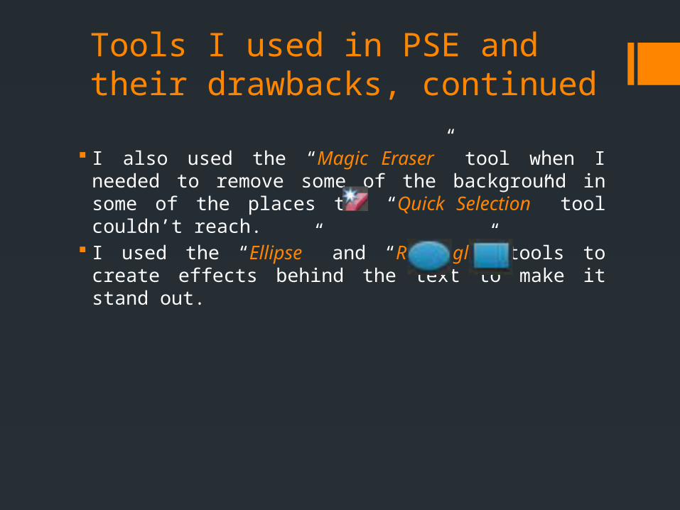
I also used the “Magic Eraser” tool when I needed to remove some of the background in some of the places the “Quick Selection” tool couldn’t reach.
I used the “Ellipse” and “Rectangle” tools to create effects behind the text to make it stand out.
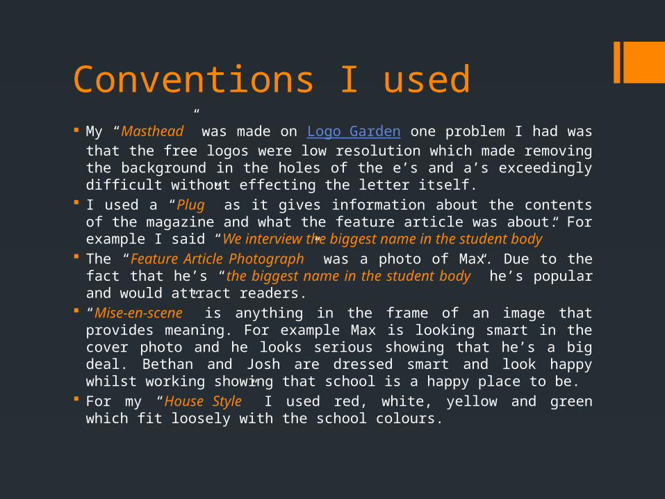
Conventions I used My “Masthead” was made on Logo Garden one problem I had was
that the free logos were low resolution which made removing the background in the holes of the e’s and a’s exceedingly difficult without effecting the letter itself.
I used a “Plug” as it gives information about the contents of the magazine and what the feature article was about. For example I said “We interview the biggest name in the student body”
The “Feature Article Photograph” was a photo of Max. Due to the fact that he’s “the biggest name in the student body” he’s popular and would attract readers.
“Mise-en-scene” is anything in the frame of an image that provides meaning. For example Max is looking smart in the cover photo and he looks serious showing that he’s a big deal. Bethan and Josh are dressed smart and look happy whilst working showing that school is a happy place to be.
For my “House Style” I used red, white, yellow and green which fit loosely with the school colours.
What I would change Firstly, I would add a “puff” on the front cover to make the
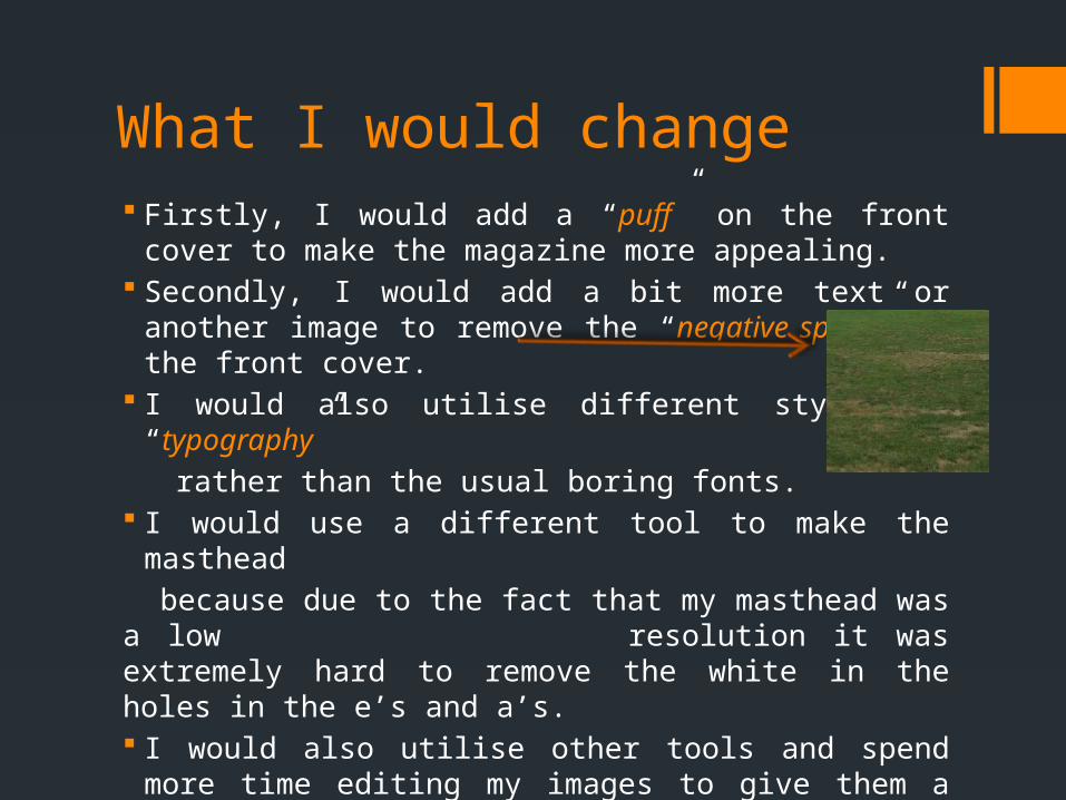
magazine more appealing. Secondly, I would add a bit more text or another image to
remove the “negative space” on the front cover. I would also utilise different styles of “typography”
rather than the usual boring fonts. I would use a different tool to make the masthead
because due to the fact that my masthead was a low resolution it was extremely hard to remove the white in the holes in the e’s and a’s. I would also utilise other tools and spend more time editing
my images to give them a more clean, professional and less jagged look.
What I would change continued On my front cover I would use more conventions like a “puff”
to grab the reader’s attention. I would also make the “demographic” clearer as although I
mentioned “exam success” it wasn’t clear who I was aiming the magazine at (the upper years).
For my contents page I would use a better darker image so that the “house style” worked better.
For the “background image” I’d use a better image purely because the field doesn’t look overly “photogenic” and I want to make the magazine look smart.


