129
SPSS Manual for Introductory Applied Statistics: A Variable Approach John Gabrosek Department of Statistics Grand Valley State University Allendale, MI USA August 2013

SPSS Manual forIntroductory Applied Statistics:
A Variable Approach
John GabrosekDepartment of Statistics
Grand Valley State UniversityAllendale, MI USA
August 2013

2
Copyright 2013 – John Gabrosek. All rights reserved. No part of this pub-lication may be reproduced, stored in a retrieval system, or transmitted, inany form or by any means, electronic, mechanical, photocopying, recording,or otherwise, without the prior written permission of the copyright holder.
Contents
0 Introduction to SPSS 10.1 Accessing SPSS and Opening Files . . . . . . . . . . . . . . . 10.2 SPSS Data Entry . . . . . . . . . . . . . . . . . . . . . . . . . 30.3 SPSS Data View Menu . . . . . . . . . . . . . . . . . . . . . . 100.4 SPSS Output Window . . . . . . . . . . . . . . . . . . . . . . 110.5 SPSS Saving and Copying . . . . . . . . . . . . . . . . . . . . 130.6 SPSS Chart Editor . . . . . . . . . . . . . . . . . . . . . . . . 16
1 SPSS One Categorical Variable 191.1 Taking a Simple Random Sample . . . . . . . . . . . . . . . . 191.2 Sorting a Dataset . . . . . . . . . . . . . . . . . . . . . . . . . 231.3 Frequency Table . . . . . . . . . . . . . . . . . . . . . . . . . . 251.4 Bar Graph . . . . . . . . . . . . . . . . . . . . . . . . . . . . . 271.5 Editing a Bar Graph . . . . . . . . . . . . . . . . . . . . . . . 281.6 Pie Graph . . . . . . . . . . . . . . . . . . . . . . . . . . . . . 341.7 Editing a Pie Graph . . . . . . . . . . . . . . . . . . . . . . . 36
2 SPSS One Quantitative Variable 392.1 Numerical Summaries . . . . . . . . . . . . . . . . . . . . . . . 392.2 Boxplot . . . . . . . . . . . . . . . . . . . . . . . . . . . . . . 432.3 Editing a Boxplot . . . . . . . . . . . . . . . . . . . . . . . . . 442.4 Histogram . . . . . . . . . . . . . . . . . . . . . . . . . . . . . 472.5 Editing a Histogram . . . . . . . . . . . . . . . . . . . . . . . 492.6 Normal Distribution Probabilities . . . . . . . . . . . . . . . . 532.7 CI for the Population Mean . . . . . . . . . . . . . . . . . . . 572.8 HT for the Population Mean . . . . . . . . . . . . . . . . . . . 58
3 SPSS Two Categorical Variables 633.1 Two-Way Tables . . . . . . . . . . . . . . . . . . . . . . . . . 633.2 Clustered Bar Graph . . . . . . . . . . . . . . . . . . . . . . . 66
i
ii CONTENTS
3.3 Editing a Clustered Bar Graph . . . . . . . . . . . . . . . . . 683.4 χ2 Test . . . . . . . . . . . . . . . . . . . . . . . . . . . . . . . 723.5 CI for two Proportions . . . . . . . . . . . . . . . . . . . . . . 74
4 SPSS Two Quantitative Variables 754.1 Scatterplots . . . . . . . . . . . . . . . . . . . . . . . . . . . . 754.2 Editing a Scatterplot . . . . . . . . . . . . . . . . . . . . . . . 774.3 Linear Correlation r . . . . . . . . . . . . . . . . . . . . . . . 794.4 Simple Linear Regression . . . . . . . . . . . . . . . . . . . . . 814.5 Hypothesis Test for the Slope . . . . . . . . . . . . . . . . . . 864.6 Confidence Interval for the Slope . . . . . . . . . . . . . . . . 88
5 SPSS for Independent Two-Group Data 915.1 Numerical Summaries Two-Groups . . . . . . . . . . . . . . . 915.2 Comparative Boxplot . . . . . . . . . . . . . . . . . . . . . . . 955.3 Editing a Comparative Boxplot . . . . . . . . . . . . . . . . . 965.4 Comparative Histogram . . . . . . . . . . . . . . . . . . . . . 995.5 Editing a Comparative Histogram . . . . . . . . . . . . . . . . 1005.6 Independent T-Test . . . . . . . . . . . . . . . . . . . . . . . . 1015.7 CI for µ1 − µ2 . . . . . . . . . . . . . . . . . . . . . . . . . . . 105
6 SPSS Paired Data 1076.1 Selecting Data . . . . . . . . . . . . . . . . . . . . . . . . . . . 1076.2 Finding the Paired Differences . . . . . . . . . . . . . . . . . . 1106.3 Summaries for Paired Data . . . . . . . . . . . . . . . . . . . . 1126.4 CI for µd . . . . . . . . . . . . . . . . . . . . . . . . . . . . . . 1146.5 Paired T-Test . . . . . . . . . . . . . . . . . . . . . . . . . . . 114
7 SPSS for One-Way ANOVA Data 1197.1 Numerical and Graphical Summaries For ANOVA Data . . . . 1197.2 Sums of Squares and the ANOVA Table . . . . . . . . . . . . 1227.3 ANOVA F-Test . . . . . . . . . . . . . . . . . . . . . . . . . . 1247.4 Post Hoc Comparisons for ANOVA . . . . . . . . . . . . . . . 125

Chapter 0
Introduction to SPSS
0.1 Accessing SPSS and Opening Existing Data
Files
On the Grand Valley State University (GVSU) campuses SPSS is availablefrom the student network. To open SPSS do the following:
Accessing the SPSS Program
• On the desktop, click on the Applications folder. This will bring up alist of folders, one for each department.
• Scroll down to the folder named Statistics. Click on this folder. You willsee a list of programs used by Statistics Department faculty.
• Find the icon for SPSS 20. Click on this icon.
After clicking on the SPSS 20 icon, the dialog box in Figure 0.1 opens. Noticethat the default choice is “Open an existing data source.” Use this option ifyou are opening a data file that already exists. The other common choice is“Type in data.” Use this option (by clicking on the circle next to it), if youare going to type in data.
Message! In Figure 0.1 we have cutoff part of the bottom of thedialog box to save space. We will often do that in this SPSS manual.
1

2 CHAPTER 0. INTRODUCTION TO SPSS
Figure 0.1: Dialog box for opening a data file or entering data.
Opening an Existing Data File
Existing data files are usually in either SPSS format, Excel format, or Textformat. SPSS data files have the file extension .sav. Excel data files have thefile extension .xls or .xlsx. Text files have the file extension .txt. Most of thefiles used in the textbook are saved in SPSS format.
Files used in this course are generally saved on the campus-wide R:drive underthe folder gabrosek.
Accessing the R:drive
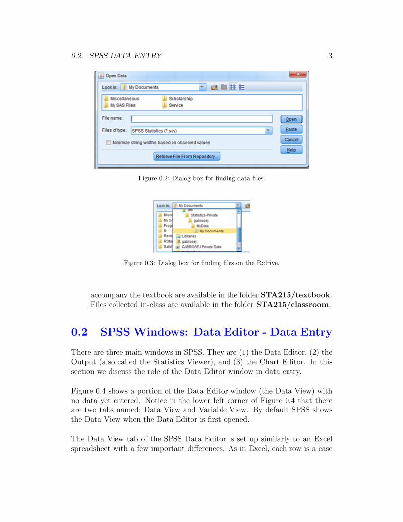
• To access the R:Drive we click OK when the dialog box in Figure 0.1is open. This results in the dialog box in Figure 0.2. The default foryou will not look the same as for anyone else because each student has adifferent account on the student network. However, you will be able toget to the R:drive in a similar way to any other student.
• Click on the downward arrow next to Look In:. You will get a separatedialog box that lists all the directories to which you have access. (SeeFigure 0.3.) Scroll until you locate the R:drive. This is named GVSU-LABDATA. . . (R:).
• Clicking on the R:drive will open up a list of folders. Scroll and click onthe folder named STA then gabrosek. From this point on you need tonavigate to find the particular data file you want to open. Data files that
0.2. SPSS DATA ENTRY 3
Figure 0.2: Dialog box for finding data files.
Figure 0.3: Dialog box for finding files on the R:drive.
accompany the textbook are available in the folder STA215/textbook.Files collected in-class are available in the folder STA215/classroom.
0.2 SPSS Windows: Data Editor - Data Entry
There are three main windows in SPSS. They are (1) the Data Editor, (2) theOutput (also called the Statistics Viewer), and (3) the Chart Editor. In thissection we discuss the role of the Data Editor window in data entry.
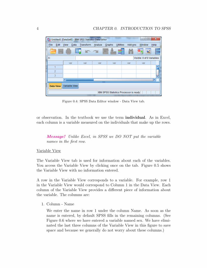
Figure 0.4 shows a portion of the Data Editor window (the Data View) withno data yet entered. Notice in the lower left corner of Figure 0.4 that thereare two tabs named; Data View and Variable View. By default SPSS showsthe Data View when the Data Editor is first opened.
The Data View tab of the SPSS Data Editor is set up similarly to an Excelspreadsheet with a few important differences. As in Excel, each row is a case
4 CHAPTER 0. INTRODUCTION TO SPSS
Figure 0.4: SPSS Data Editor window - Data View tab.
or observation. In the textbook we use the term individual. As in Excel,each column is a variable measured on the individuals that make up the rows.
Message! Unlike Excel, in SPSS we DO NOT put the variablenames in the first row.
Variable View
The Variable View tab is used for information about each of the variables.You access the Variable View by clicking once on the tab. Figure 0.5 showsthe Variable View with no information entered.
A row in the Variable View corresponds to a variable. For example, row 1in the Variable View would correspond to Column 1 in the Data View. Eachcolumn of the Variable View provides a different piece of information aboutthe variable. The columns are:
1. Column - Name
We enter the name in row 1 under the column Name. As soon as thename is entered, by default SPSS fills in the remaining columns. (SeeFigure 0.6 where we have entered a variable named sex. We have elimi-nated the last three columns of the Variable View in this figure to savespace and because we generally do not worry about these columns.)
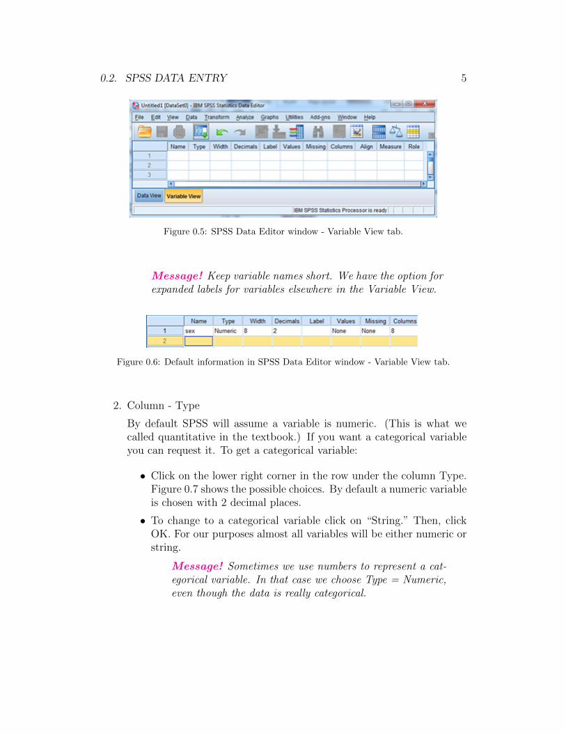
0.2. SPSS DATA ENTRY 5
Figure 0.5: SPSS Data Editor window - Variable View tab.
Message! Keep variable names short. We have the option forexpanded labels for variables elsewhere in the Variable View.
Figure 0.6: Default information in SPSS Data Editor window - Variable View tab.
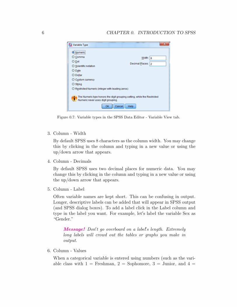
2. Column - Type
By default SPSS will assume a variable is numeric. (This is what wecalled quantitative in the textbook.) If you want a categorical variableyou can request it. To get a categorical variable:
• Click on the lower right corner in the row under the column Type.Figure 0.7 shows the possible choices. By default a numeric variableis chosen with 2 decimal places.
• To change to a categorical variable click on “String.” Then, clickOK. For our purposes almost all variables will be either numeric orstring.
Message! Sometimes we use numbers to represent a cat-egorical variable. In that case we choose Type = Numeric,even though the data is really categorical.
6 CHAPTER 0. INTRODUCTION TO SPSS
Figure 0.7: Variable types in the SPSS Data Editor - Variable View tab.
3. Column - Width
By default SPSS uses 8 characters as the column width. You may changethis by clicking in the column and typing in a new value or using theup/down arrow that appears.
4. Column - Decimals
By default SPSS uses two decimal places for numeric data. You maychange this by clicking in the column and typing in a new value or usingthe up/down arrow that appears.
5. Column - Label
Often variable names are kept short. This can be confusing in output.Longer, descriptive labels can be added that will appear in SPSS output(and SPSS dialog boxes). To add a label click in the Label column andtype in the label you want. For example, let′s label the variable Sex as“Gender.”
Message! Don′t go overboard on a label′s length. Extremelylong labels will crowd out the tables or graphs you make inoutput.
6. Column - Values
When a categorical variable is entered using numbers (such as the vari-able class with 1 = Freshman, 2 = Sophomore, 3 = Junior, and 4 =
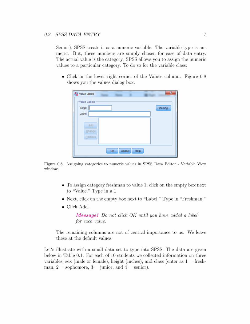
0.2. SPSS DATA ENTRY 7
Senior), SPSS treats it as a numeric variable. The variable type is nu-meric. But, these numbers are simply chosen for ease of data entry.The actual value is the category. SPSS allows you to assign the numericvalues to a particular category. To do so for the variable class:
• Click in the lower right corner of the Values column. Figure 0.8shows you the values dialog box.
Figure 0.8: Assigning categories to numeric values in SPSS Data Editor - Variable Viewwindow.
• To assign category freshman to value 1, click on the empty box nextto “Value.” Type in a 1.
• Next, click on the empty box next to “Label.” Type in “Freshman.”
• Click Add.
Message! Do not click OK until you have added a labelfor each value.
The remaining columns are not of central importance to us. We leavethese at the default values.
Let′s illustrate with a small data set to type into SPSS. The data are givenbelow in Table 0.1. For each of 10 students we collected information on threevariables; sex (male or female), height (inches), and class (enter as 1 = fresh-man, 2 = sophomore, 3 = junior, and 4 = senior).

8 CHAPTER 0. INTRODUCTION TO SPSS
Table 0.1: Small dataset to illustrate data entry in SPSS.
Sex Height Class
male 70.00 Seniorfemale 61.25 Sophomorefemale 66.00 Freshmanfemale 69.00 Juniormale 70.00 Sophomorefemale 66.50 Sophomorefemale 64.50 Sophomoremale 73.00 Seniormale 68.00 Juniormale 65.00 Junior
Start with the variable Sex
1. Make Sex the Name.
2. Change Type to String.
3. Label the variable Gender.
Next the variable Height
1. Make Height the Name.
2. Label the variable Height (inches).
End with the variable Class
1. Make Class the Name.
2. Change Decimals to 0.
3. Add Values so that 1 = Freshman, 2 = Sophomore, 3 = Junior, and 4= Senior.
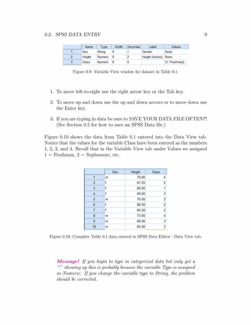
The completed variable view should look like Figure 0.9.
Entering Data into the Data View tab
Once the variables have been set up in the Variable View tab, you are readyto type in data into the Data View tab. Typing data is very simple. You justtype as you would into an Excel spreadsheet. Just keep in mind the following:
0.2. SPSS DATA ENTRY 9
Figure 0.9: Variable View window for dataset in Table 0.1.
1. To move left-to-right use the right arrow key or the Tab key.
2. To move up and down use the up and down arrows or to move down usethe Enter key.
3. If you are typing in data be sure to SAVE YOUR DATA FILE OFTEN!!!(See Section 0.5 for how to save an SPSS Data file.)
Figure 0.10 shows the data from Table 0.1 entered into the Data View tab.Notice that the values for the variable Class have been entered as the numbers1, 2, 3, and 4. Recall that in the Variable View tab under Values we assigned1 = Freshman, 2 = Sophomore, etc.
Figure 0.10: Complete Table 0.1 data entered in SPSS Data Editor - Data View tab.
Message! If you begin to type in categorical data but only get a“.” showing up this is probably because the variable Type is assignedas Numeric. If you change the variable type to String, the problemshould be corrected.
10 CHAPTER 0. INTRODUCTION TO SPSS
0.3 SPSS Windows: Data Editor - The Data
View Menu
To analyze data using SPSS we access the menu in the Data Editor - DataView tab. (This menu is also displayed in the SPSS Output Viewer windowas we mention in Section 0.4.) Figure 0.4 shows the menu bar at the top.The menu bar includes the following options listed below. We discuss manyof these in more detail later in future sections of this manual.
1. File - Includes options to open new files, save files, and print.
2. Edit - Includes options to insert variables (i.e., columns in the DataEditor) and insert cases (i.e., rows in the Data Editor).
3. View - Includes option to view assigned Values for variables rather thanwhat was typed in. For example, in Section 0.2 we assigned valuesFreshman, Sophomore, . . . to the values 1, 2, . . . for the Class variablein Table 0.1. By default SPSS will display the 1, 2,. . . . The optionValue Labels under View has SPSS display Freshman, Sophomore,. . .
4. Data - Includes options for sorting data, selecting only a portion of thedata, and weighting the number of values by a second variable.
5. Transform - Includes options to set up SPSS to take a random sampleand to create new variables.
6. Analyze - Most of the numerical summaries, confidence intervals, andhypothesis tests we perform can be done in SPSS under this menu item.
7. Graphs - Most of the graphs we create can be done in SPSS under thismenu item.
8. Utilities - We have no need of this menu item.
9. Add-ons - We have no need of this menu item.
10. Window - Allows you to split the screen or toggle between windows.
11. Help - Hopefully this manual will be your first reference for Help!

0.4. SPSS OUTPUT WINDOW 11
0.4 SPSS Windows: Statistics Viewer - Out-
put Window
At the beginning of Section 0.2 we mentioned that there are three SPSS win-dows. We have already discussed the Data Editor window in detail. In thissection we introduce you to the Statistics Viewer window. Most people callthis the Output window. That is how we refer to it in this manual.
To be able to describe the Output window we need to produce some out-put. At this point don′t worry about the steps we took to make the output.Just follow the instructions exactly so that we have some output to talk about.
You need to have the SPSS data file for Table 0.1 open. In other words, thisdata needs to be typed into SPSS as described in Section 0.2. See Figure 0.10for how the Data View of the Data Editor window for this data set.
Let′s produce a table and a graph to use for illustrating SPSS output.
• On the Data Editor menu bar, click on Analyze→ Descriptive Statistics→ Frequencies.
• The Frequency dialog box appears. Highlight variable Class on the leftside and click on the right arrow. This should move Class under Vari-able(s). (See Figure 0.11.)
Figure 0.11: Frequency table dialog box
12 CHAPTER 0. INTRODUCTION TO SPSS
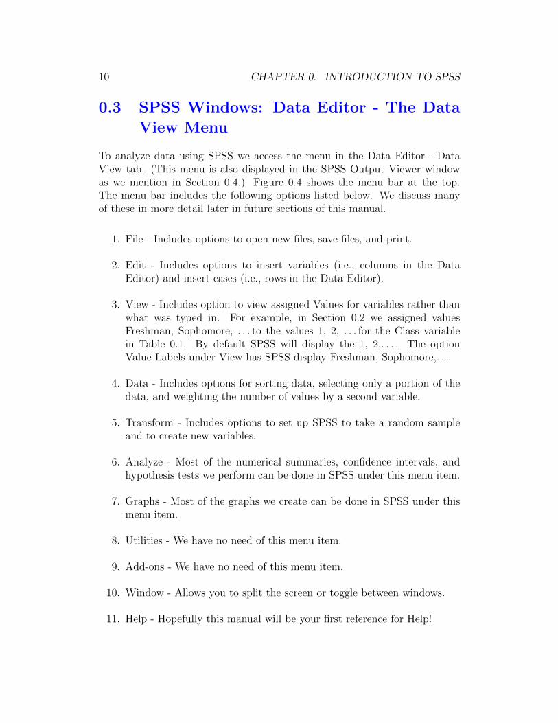
• Click OK.
SPSS should jump to the Output window. The two tables in Figure 0.12 areproduced. At this point, we are not concerned with interpretation of the ta-bles. We simply want to show you how numerical output looks in SPSS. SPSSproduces one piece of output at a time. You scroll up and down to see theindiviudual pieces of output (in this case two tables).
Notice that even though the variable Class was entered with values 1, 2, 3, and4 the output shows Freshman, Sophomore, Junior, and Senior because that ishow we assigned Value Labels in Section 0.2.
Figure 0.12: Frequency table of Class variable for data in Table 0.1
Message! When SPSS jumps to the Output window a menu barappears that is similar to, but not exactly the same, as the menubar for the Data Editor window. Any menu item with the samename, such as Analyze and Graphs, has the same options. Thismeans you can create SPSS output from the Data Editor windowor the Output window.
Now, let′s produce a graph.
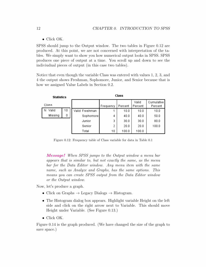
• Click on Graphs → Legacy Dialogs → Histogram.
• The Histogram dialog box appears. Highlight variable Height on the leftside and click on the right arrow next to Variable. This should moveHeight under Variable. (See Figure 0.13.)
• Click OK.
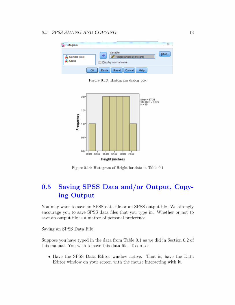
Figure 0.14 is the graph produced. (We have changed the size of the graph tosave space.)
0.5. SPSS SAVING AND COPYING 13
Figure 0.13: Histogram dialog box
Figure 0.14: Histogram of Height for data in Table 0.1
0.5 Saving SPSS Data and/or Output, Copy-
ing Output
You may want to save an SPSS data file or an SPSS output file. We stronglyencourage you to save SPSS data files that you type in. Whether or not tosave an output file is a matter of personal preference.
Saving an SPSS Data File
Suppose you have typed in the data from Table 0.1 as we did in Section 0.2 ofthis manual. You wish to save this data file. To do so:
• Have the SPSS Data Editor window active. That is, have the DataEditor window on your screen with the mouse interacting with it.
14 CHAPTER 0. INTRODUCTION TO SPSS
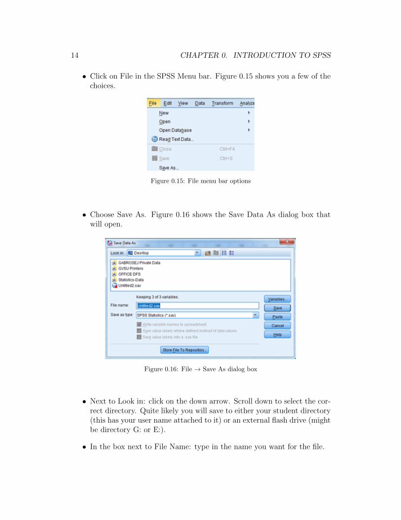
• Click on File in the SPSS Menu bar. Figure 0.15 shows you a few of thechoices.
Figure 0.15: File menu bar options
• Choose Save As. Figure 0.16 shows the Save Data As dialog box thatwill open.
Figure 0.16: File → Save As dialog box
• Next to Look in: click on the down arrow. Scroll down to select the cor-rect directory. Quite likely you will save to either your student directory(this has your user name attached to it) or an external flash drive (mightbe directory G: or E:).
• In the box next to File Name: type in the name you want for the file.
0.5. SPSS SAVING AND COPYING 15
• Click on Save. Since this is a data file, SPSS will automatically attach a.sav extension to the file name. When you see this .sav extension, thenyou know this is a SPSS data file.
Once you have saved the file the name appears in the upper left corner of theData Editor window. See Figure 0.4. The upper left corner reads “Untitled1”because at that point we had not saved the data file under a different name.
Message! SPSS data files that accompany the textbook are alreadysaved for you on the text website and on the student network atGVSU in the gabrosek/textbook folder. You cannot “save over”these data files. If you could, then you would have the ability tochange the file for everyone else! However, you can save these filesto your personal directory following the instructions from above.
Saving an SPSS Output File
If you choose to save an SPSS Output file, then you are saving all of the outputin the Output window. This includes any graphs or tables that you made bymistake or that were later redone. Everything in the Output window is saved.For this reason it is sometimes better to copy and paste individual pieces ofoutput into a Word file and then to save the Word file. But, let′s begin withsaving the SPSS Output file.
To save an SPSS Output file:
• Have the SPSS Output Window active. That is, have the Output windowon your screen with the mouse interacting with it.
• Follow the same set of directions from the second bullet onward as forsaving an SPSS data file. The only difference is that since this is anoutput file, SPSS will automatically attach a .spv extension to the filename. When you see this .spv extension, then you know this is a SPSSoutput file.
Message! Often if you are going to save SPSS output you don′twant all of the output you have produced during a session. Youcan eliminate portions of SPSS output. There are several ways todo this. The easiest way is to click once on the table or graph thatyou wish to delete. The piece of output will be boxed. Then simplyclick on the Delete key.

16 CHAPTER 0. INTRODUCTION TO SPSS
Copying SPSS Output
There are many instances where you may want to copy a portion of the outputproduced by SPSS into a Word file. The easiest way to do this is the following:
• Open the Word processing program document. If the graph or table is inanswer to a numbered question (such as 1. Make a histogram), be sureto place the cursor two lines below the number. With Word′s automaticnumbering system, if you paste a graph or table on the same line as thenumber, the numbering and placement of the output will get messed up.
• In the SPSS Output window click once on the piece of output to copyso that it is boxed. (Note: You can use the CTRL key to copy multiplepieces of output at a time.)
• Click on Edit → Copy (or use CTRL C) to copy the output.
• In Word, click on Edit → Paste (or use CTRL V) to paste the output.
Message! We have found that it is better to paste tables as pic-tures (unless you plan on editing them inside Word). Within Word,click on the Home tab. Then, click on Paste → Paste Special →Picture.
0.6 SPSS Windows: Chart Editor - Editing
Graphs
At the beginning of Section 0.2 we mentioned that there are three SPSS win-dows. We have already discussed the Data Editor window and the Outputwindow. In this section we introduce you to the Chart Editor window.
The Chart Editor window is used to modify an SPSS graph. When you haveSPSS make a graph it will produce a default graph with certain characteristicsincluding color, numbering of axes, and many other attributes we describelater in the manual. For now we just want you to get familiar with the ChartEditor window.
To modify a graph in SPSS you must be in the Output window. Once in theOutput window click twice, in rapid succession, on the graph you wish to edit.
0.6. SPSS CHART EDITOR 17
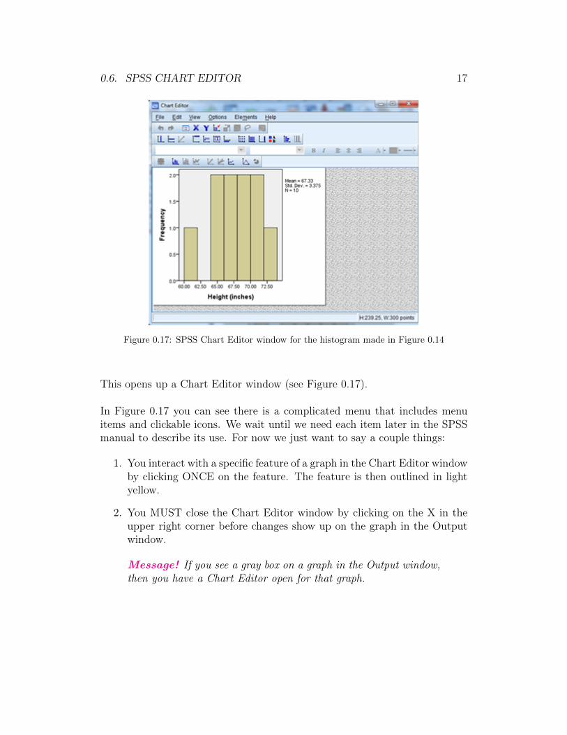
Figure 0.17: SPSS Chart Editor window for the histogram made in Figure 0.14
This opens up a Chart Editor window (see Figure 0.17).
In Figure 0.17 you can see there is a complicated menu that includes menuitems and clickable icons. We wait until we need each item later in the SPSSmanual to describe its use. For now we just want to say a couple things:
1. You interact with a specific feature of a graph in the Chart Editor windowby clicking ONCE on the feature. The feature is then outlined in lightyellow.
2. You MUST close the Chart Editor window by clicking on the X in theupper right corner before changes show up on the graph in the Outputwindow.
Message! If you see a gray box on a graph in the Output window,then you have a Chart Editor open for that graph.

18 CHAPTER 0. INTRODUCTION TO SPSS

Chapter 1
SPSS for Analysis of One Cate-gorical Variable
Throughout Chapter 1 of this SPSS manual we work with the dataset sur-vey215 that is saved on the text website and in the folder gabrosek/textbook.Refer to Section 0.1 to access SPSS and to open the data file survey215. Theexamples in this chapter use this dataset for illustration.
The dataset survey215 includes information on 15 variables collected on 536individuals who took introductory applied statistics from author Gabrosekover the past ten years. Not all variables were collected on all individuals.
1.1 Taking a Simple Random Sample
Suppose we consider the 536 individuals in the survey215 dataset to representthe population of all students who have taken introductory applied statisticsfrom Gabrosek over the past ten years. We want to take a simple randomsample (SRS) of individuals from this population. Taking a SRS involves twosteps:
Step 1. Enter a random seed
Step 2. Take sample.
Enter a random seed
To enter a random seed do the following:
• Have the Data Editor window open.
19
20 CHAPTER 1. SPSS ONE CATEGORICAL VARIABLE
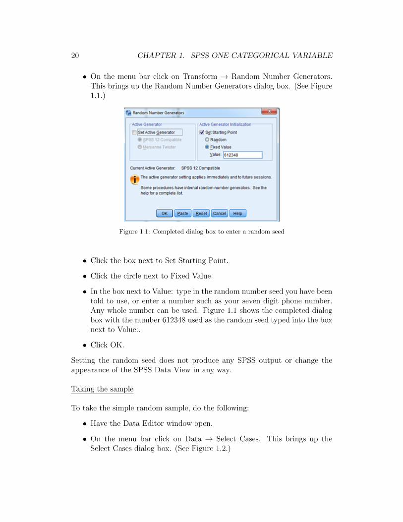
• On the menu bar click on Transform → Random Number Generators.This brings up the Random Number Generators dialog box. (See Figure1.1.)
Figure 1.1: Completed dialog box to enter a random seed
• Click the box next to Set Starting Point.
• Click the circle next to Fixed Value.
• In the box next to Value: type in the random number seed you have beentold to use, or enter a number such as your seven digit phone number.Any whole number can be used. Figure 1.1 shows the completed dialogbox with the number 612348 used as the random seed typed into the boxnext to Value:.
• Click OK.
Setting the random seed does not produce any SPSS output or change theappearance of the SPSS Data View in any way.
Taking the sample
To take the simple random sample, do the following:
• Have the Data Editor window open.
• On the menu bar click on Data → Select Cases. This brings up theSelect Cases dialog box. (See Figure 1.2.)
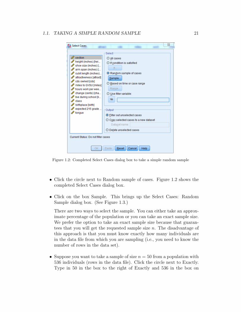
1.1. TAKING A SIMPLE RANDOM SAMPLE 21
Figure 1.2: Completed Select Cases dialog box to take a simple random sample
• Click the circle next to Random sample of cases. Figure 1.2 shows thecompleted Select Cases dialog box.
• Click on the box Sample. This brings up the Select Cases: RandomSample dialog box. (See Figure 1.3.)
There are two ways to select the sample. You can either take an approx-imate percentage of the population or you can take an exact sample size.We prefer the option to take an exact sample size because that guaran-tees that you will get the requested sample size n. The disadvantage ofthis approach is that you must know exactly how many individuals arein the data file from which you are sampling (i.e., you need to know thenumber of rows in the data set).
• Suppose you want to take a sample of size n = 50 from a population with536 individuals (rows in the data file). Click the circle next to Exactly.Type in 50 in the box to the right of Exactly and 536 in the box on
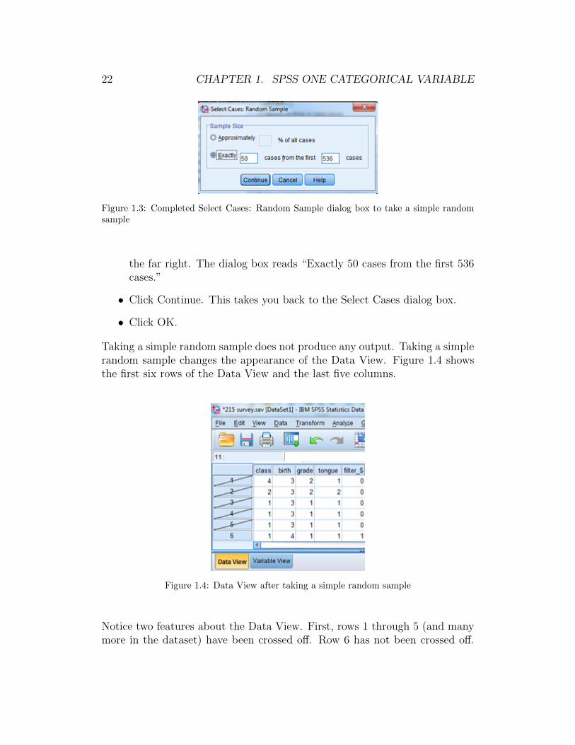
22 CHAPTER 1. SPSS ONE CATEGORICAL VARIABLE
Figure 1.3: Completed Select Cases: Random Sample dialog box to take a simple randomsample
the far right. The dialog box reads “Exactly 50 cases from the first 536cases.”
• Click Continue. This takes you back to the Select Cases dialog box.
• Click OK.
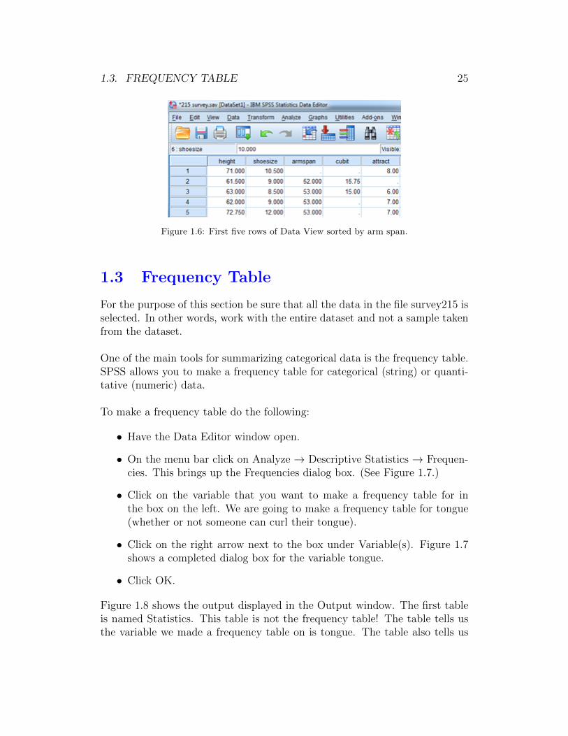
Taking a simple random sample does not produce any output. Taking a simplerandom sample changes the appearance of the Data View. Figure 1.4 showsthe first six rows of the Data View and the last five columns.
Figure 1.4: Data View after taking a simple random sample
Notice two features about the Data View. First, rows 1 through 5 (and manymore in the dataset) have been crossed off. Row 6 has not been crossed off.

1.2. SORTING A DATASET 23
This means that row 6 was selected for the sample and rows 1 through 5 werenot. Because rows 1 through 5 are crossed off, they will not be used in anysubsequent analysis that you do! Second, SPSS has created a new variablecalled filter $ that takes on the value 0 if the row was not selected (i.e., therow is crossed off) and 1 if the row was selected (i.e., the row is not crossed off).
To see what individuals have been chosen for the sample you have a coupleoptions. You could simply scroll through the Data View. This is tedious andprone to error. A second option is that you could sort in ascending order bythe filter $ variable. (See Section 1.2 for instructions on sorting.)
Message! Always check the Data View to be sure that the activedata corresponds to what you want. Any rows crossed off are notin use.
Message! Notice in Figure 1.2 that there is an option under Selectnamed All cases. If you want to return to using the entire datasetselect this option.
1.2 Sorting a Dataset
In Section 1.1 we described how to take a simple random sample in SPSS. Westated that to see what individuals were selected for the sample you can sortby the filter $ variable created. That is just one of many instances in whichyou may want to sort data in the Data View tab.
For the purpose of this section be sure that all the data in the file survey215 isselected. In other words, work with the entire dataset and not a sample takenfrom the dataset.
To sort data do the following:
• Have the Data Editor window open.
• On the menu bar click on Data → Sort Cases. This brings up the SortCases dialog box. (See Figure 1.5.)
• Click on the variable that you want to sort by in the box on the left. Weare going to sort by arm span.

24 CHAPTER 1. SPSS ONE CATEGORICAL VARIABLE
Figure 1.5: Completed Sort Cases dialog box
• Click on the right arrow next to the box under Sort by:
• Under Sort Order click on the circle next to either Ascending (e.g. 1,2, 3 for numeric data and A, B, C for categorical data) or Descending.Here we sort in Ascending order.
• Click OK.
Sorting does not produce any output. Sorting changes the appearance of theData View by moving the rows around to match the sorting. Figure 1.6 showsthe first five rows and first five columns of the survey215 dataset sorted inascending order by arm span. Notice that missing values (represented by a .)are at the top of the sorted dataset after sorting in ascending order.
Message! Unlike Excel, highlighting the part of the spreadsheetyou want to sort DOES NOTHING in SPSS.
Message! To analyze data using options from the menu bar thereis no need to sort data first.
Message! You can sort by multiple variables. SPSS first sorts bythe first variable chosen, then by the second variable chosen, andso on.
1.3. FREQUENCY TABLE 25
Figure 1.6: First five rows of Data View sorted by arm span.
1.3 Frequency Table
For the purpose of this section be sure that all the data in the file survey215 isselected. In other words, work with the entire dataset and not a sample takenfrom the dataset.
One of the main tools for summarizing categorical data is the frequency table.SPSS allows you to make a frequency table for categorical (string) or quanti-tative (numeric) data.
To make a frequency table do the following:
• Have the Data Editor window open.
• On the menu bar click on Analyze → Descriptive Statistics → Frequen-cies. This brings up the Frequencies dialog box. (See Figure 1.7.)
• Click on the variable that you want to make a frequency table for inthe box on the left. We are going to make a frequency table for tongue(whether or not someone can curl their tongue).
• Click on the right arrow next to the box under Variable(s). Figure 1.7shows a completed dialog box for the variable tongue.
• Click OK.
Figure 1.8 shows the output displayed in the Output window. The first tableis named Statistics. This table is not the frequency table! The table tells usthe variable we made a frequency table on is tongue. The table also tells us

26 CHAPTER 1. SPSS ONE CATEGORICAL VARIABLE
Figure 1.7: Completed dialog box to make a frequency table
that 518 of the individuals had a value for tongue and 18 did not.
Figure 1.8: Output for frequency table of tongue curling
The frequency table is the table named tongue in Figure 1.8. The first columnlists the possible values (yes, no) and whether there are any missing values.The second column named Frequency is the count. There were 412 individualswho can curl their tongue and 106 who cannot. We are missing informationfor 18 individuals. The Percent column tells us that 76.9% of the 536 indi-viduals can curl their tongue, 19.8% cannot and we are missing informationon 3.4% of the individuals. The column Valid Percent ignores the 18 missing.Of the 518 individuals on whom we have information, 79.5% can curl theirtongue and 20.5% cannot. The column Cumulative Percent adds up the ValidPercent values as you move down the table.
1.4. BAR GRAPH 27
Message! You can choose more than one variable at a time tomake a frequency table for. Each variable′s frequency table will beseparate in the output.
Message! Notice in Figure 1.7 that there are many options thatwould allow more user control of the output that we could haveclicked on when making a frequency table. Usually the SPSS defaultoptions are sufficient for what we want to do throughout the text.When we need something other than the SPSS default, we explicitlyshow you how to do that in this manual.
1.4 Bar Graph
For the purpose of this section be sure that all the data in the file survey215 isselected. In other words, work with the entire dataset and not a sample takenfrom the dataset.
One of the main tools for graphing categorical data is the bar graph. To makea bar graph do the following:
• Have the Data Editor window open.
• On the menu bar click on Graphs→ Legacy Dialogs→ Bar. This bringsup the Bar Charts dialog box. (See Figure 1.9.)
• Click on Simple so that it is boxed. (By default SPSS has Simple boxed.)
• Click on the circle next to Summaries for groups of cases.
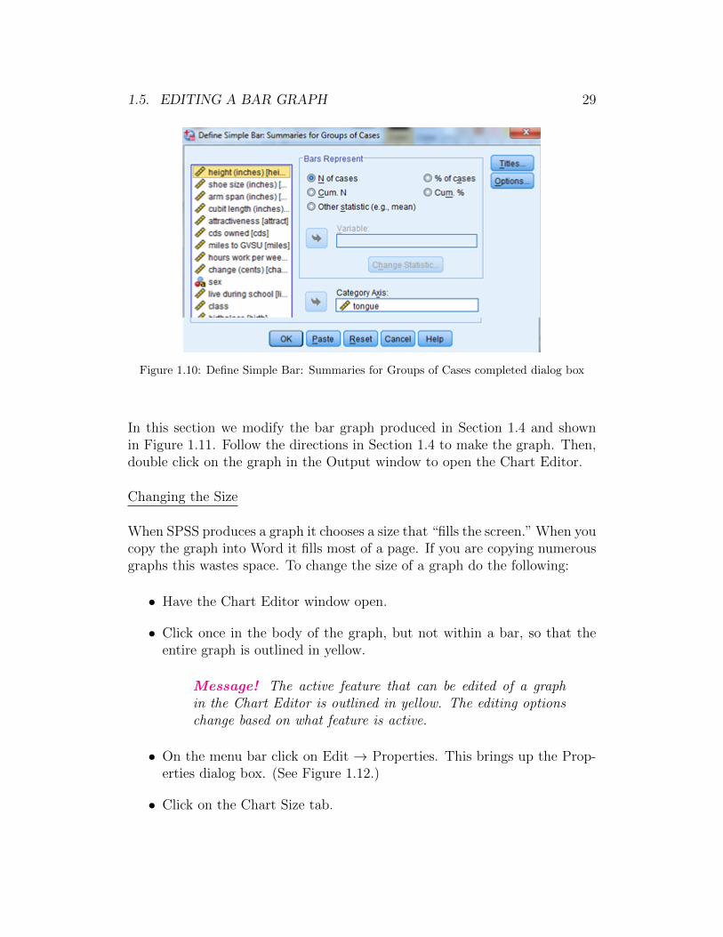
• Click on Define. This brings up the Define Simple Bar: Summaries forGroups of Cases dialog box. (See Figure 1.10.)
• Click on the variable that you want to make a bar graph for in the boxon the left. We are going to make a bar graph for tongue (whether ornot someone can curl their tongue).
• Click on the right arrow next to the box under Category Axis. Figure1.10 shows the completed dialog box to make a bar graph of the variabletongue.

28 CHAPTER 1. SPSS ONE CATEGORICAL VARIABLE
Figure 1.9: Bar graph dialog box
• Click OK.
Figure 1.11 shows the default bar graph output (that we have re-sized to savespace). The vertical axis displays the frequency (SPSS calls it Count) in eachcategory. The horizontal axis displays the categories. Notice that the bars arenot connected. Missing values are ignored.
Message! By default SPSS makes a bar graph using frequency. Ifyou want to use relative frequency (SPSS calls it Percent), then inFigure 1.10 under Bars Represent click on the circle next to % ofcases. SPSS will use the Valid Percent column from the frequencytable in Figure 1.8.
1.5 Editing a Bar Graph
In Section 0.6 we introduced the Chart Editor window that allows you to mod-ify a graph. In this section we detail a few common modifications for a barchart. Note that there are many, many more possible modifications that youcan make within the Chart Editor. We highlight only the most commonlyused edits.
1.5. EDITING A BAR GRAPH 29
Figure 1.10: Define Simple Bar: Summaries for Groups of Cases completed dialog box
In this section we modify the bar graph produced in Section 1.4 and shownin Figure 1.11. Follow the directions in Section 1.4 to make the graph. Then,double click on the graph in the Output window to open the Chart Editor.
Changing the Size
When SPSS produces a graph it chooses a size that “fills the screen.” When youcopy the graph into Word it fills most of a page. If you are copying numerousgraphs this wastes space. To change the size of a graph do the following:
• Have the Chart Editor window open.
• Click once in the body of the graph, but not within a bar, so that theentire graph is outlined in yellow.
Message! The active feature that can be edited of a graphin the Chart Editor is outlined in yellow. The editing optionschange based on what feature is active.
• On the menu bar click on Edit → Properties. This brings up the Prop-erties dialog box. (See Figure 1.12.)
• Click on the Chart Size tab.
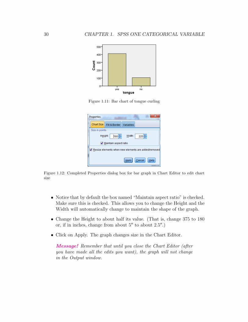
30 CHAPTER 1. SPSS ONE CATEGORICAL VARIABLE
Figure 1.11: Bar chart of tongue curling
Figure 1.12: Completed Properties dialog box for bar graph in Chart Editor to edit chartsize
• Notice that by default the box named “Maintain aspect ratio” is checked.Make sure this is checked. This allows you to change the Height and theWidth will automatically change to maintain the shape of the graph.
• Change the Height to about half its value. (That is, change 375 to 180or, if in inches, change from about 5′′ to about 2.5′′.)
• Click on Apply. The graph changes size in the Chart Editor.
Message! Remember that until you close the Chart Editor (afteryou have made all the edits you want), the graph will not changein the Output window.

1.5. EDITING A BAR GRAPH 31
Changing the Vertical Axis Numbering
Sometimes you may not be happy with the default numbering on the verticalaxis for a bar graph. To change the numbering do the following:
• Have the Chart Editor window open.
• Click once on any number on the vertical axis, so that all the numberson the vertical axis are outlined in yellow.
• On the menu bar click on Edit → Properties. This brings up the Prop-erties dialog box. (See Figure 1.13.)
Figure 1.13: Completed Properties dialog box for bar graph in Chart Editor to edit verticalaxis numbering
• Click on the Scale tab.
• You can change the Minimum (starting point of the vertical axis), Max-imum (ending point of the vertical axis), or Major Increment (amountof jump on the vertical axis). Generally, you want the Minimum at 0(which SPSS defaults to) and the Maximum at the SPSS chosen default.The only change that is common is the Major Increment.
• Change the Major Increment to 50. Do this by clicking anywhere in thebox next to Major Increment where 100 is entered. Then, backspaceover 100 and type in 50.
• Click on Apply. The vertical axis is now numbered 100, 150, . . . , 500.That is not good. The vertical axis should start at 0.

32 CHAPTER 1. SPSS ONE CATEGORICAL VARIABLE
• Change the Minimum to 0.
• Click on Apply. The vertical axis is now numbered 0, 50, . . . , 500. Verynice!
Changing the Background Color
By default SPSS colors the background of most graphs gray. To change thebackground color do the following:
• Have the Chart Editor window open.
• Click once on the background inside the graph. The entire graph shouldbe outlined in yellow.
• On the menu bar click on Edit → Properties. This brings up the Prop-erties dialog box. (See Figure 1.14.)
Figure 1.14: Completed Properties dialog box for bar graph in Chart Editor to changebackground color
• Click on the Fill & Border tab.

1.5. EDITING A BAR GRAPH 33
• You′ll see that the small square box next to the word Fill is gray. Clickon this box. It should now have a small dashed square inside it.
• Click on the color you want on the right side. Generally, it is commonto make the background white. Let′s do that. Figure 1.14 shows thecompleted dialog box.
• Click on Apply. The background is now white.
Changing the Fill Color in the Bars
By default SPSS colors the bars putrid beige. To change the fill color do thefollowing:
• Have the Chart Editor window open.
• Click once on any bar inside the graph. All the bars should be outlinedin yellow.
• On the menu bar click on Edit → Properties. This brings up the Prop-erties dialog box.
• Follow the directions from above for changing the background color start-ing at Click on the Fill & Border tab to change the color. Let′s changethe fill color to yellow.
Add count or % in bars
For some bar graphs you might want to add the frequency numbers or percentfalling into each category into the bars. To do this:
• Have the Chart Editor window open.
• Click once on any bar inside the graph. All the bars should be outlinedin yellow.
• The little bar chart icon (see Figure 1.15) is active (i.e., it is “turned on”by becoming dark). Click once on this icon. If you used count on thevertical axis the counts now show up in the bars. If you used percent onthe vertical axis the percents now show up in the bars.
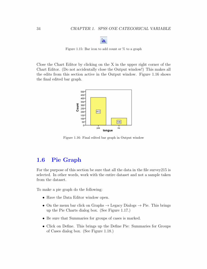
34 CHAPTER 1. SPSS ONE CATEGORICAL VARIABLE
Figure 1.15: Bar icon to add count or % to a graph
Close the Chart Editor by clicking on the X in the upper right corner of theChart Editor. (Do not accidentally close the Output window!) This makes allthe edits from this section active in the Output window. Figure 1.16 showsthe final edited bar graph.
Figure 1.16: Final edited bar graph in Output window
1.6 Pie Graph
For the purpose of this section be sure that all the data in the file survey215 isselected. In other words, work with the entire dataset and not a sample takenfrom the dataset.
To make a pie graph do the following:
• Have the Data Editor window open.
• On the menu bar click on Graphs→ Legacy Dialogs→ Pie. This bringsup the Pie Charts dialog box. (See Figure 1.17.)
• Be sure that Summaries for groups of cases is marked.
• Click on Define. This brings up the Define Pie: Summaries for Groupsof Cases dialog box. (See Figure 1.18.)
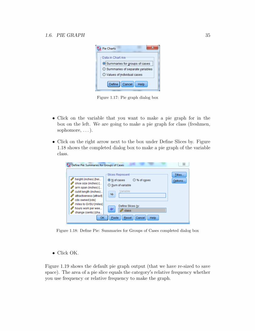
1.6. PIE GRAPH 35
Figure 1.17: Pie graph dialog box
• Click on the variable that you want to make a pie graph for in thebox on the left. We are going to make a pie graph for class (freshmen,sophomore, . . . ).
• Click on the right arrow next to the box under Define Slices by. Figure1.18 shows the completed dialog box to make a pie graph of the variableclass.
Figure 1.18: Define Pie: Summaries for Groups of Cases completed dialog box
• Click OK.
Figure 1.19 shows the default pie graph output (that we have re-sized to savespace). The area of a pie slice equals the category′s relative frequency whetheryou use frequency or relative frequency to make the graph.

36 CHAPTER 1. SPSS ONE CATEGORICAL VARIABLE
Figure 1.19: Pie chart of class
1.7 Editing a Pie Graph
In this section we modify the graph produced in Section 1.6 and shown inFigure 1.19. Follow the directions in Section 1.6 to make the graph. Then,double click on the graph in the Output window to open the Chart Editor.
Changing the Size - Follow the same directions as in Section 1.5 to chnage thesize of a bar graph. In this example, change the Height from 375 to 270 andlet the Width change automatically.
Changing the Pie Colors
By default SPSS chooses a color scheme for the pie slices. You can change thecolor of a pie slice one slice at a time. To change the color of a pie slice do thefollowing:
• Have the Chart Editor window open.
• Click once in the box next to the category of the pie slice you want tochange. The box and pie slice should be outlined in yellow. Let′s changethe color for Juniors.
• On the menu bar click on Edit → Properties. This brings up the Prop-erties dialog box. (See Figure 1.20.)
• Click on the Fill & Border tab.

1.7. EDITING A PIE GRAPH 37
Figure 1.20: Completed Properties dialog box for pie graph to change fill color and fillpattern for juniors
• You′ll see that the small square box next to the word Fill is in the colorof the pie slice. Click on this box. It should now have a small dashedsquare inside it.
• Click on the color you want on the right side. Let′s change the color forJuniors to red. Figure 1.20 shows the completed dialog box.
• Click on Apply. The Junior slice is now red.
Changing the Fill Pattern
By default SPSS chooses a color scheme for the pie slices and fills each piewith that color solidly. If you are printing in black & white this is a problembecause it is very difficult to determine which slice goes with which category(i.e., the colors all show up as different shades of gray). In that case you willwant to use a different fill pattern for each pie slice. To change the fill patternof a pie slice do the following:
• Have the Chart Editor window open.
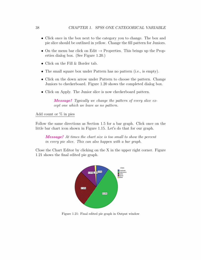
38 CHAPTER 1. SPSS ONE CATEGORICAL VARIABLE
• Click once in the box next to the category you to change. The box andpie slice should be outlined in yellow. Change the fill pattern for Juniors.
• On the menu bar click on Edit → Properties. This brings up the Prop-erties dialog box. (See Figure 1.20.)
• Click on the Fill & Border tab.
• The small square box under Pattern has no pattern (i.e., is empty).
• Click on the down arrow under Pattern to choose the pattern. ChangeJuniors to checkerboard. Figure 1.20 shows the completed dialog box.
• Click on Apply. The Junior slice is now checkerboard pattern.
Message! Typically we change the pattern of every slice ex-cept one which we leave as no pattern.
Add count or % in pies
Follow the same directions as Section 1.5 for a bar graph. Click once on thelittle bar chart icon shown in Figure 1.15. Let′s do that for our graph.
Message! At times the chart size is too small to show the percentin every pie slice. This can also happen with a bar graph.
Close the Chart Editor by clicking on the X in the upper right corner. Figure1.21 shows the final edited pie graph.
Figure 1.21: Final edited pie graph in Output window

Chapter 2
SPSS for Analysis of One Quan-titative Variable
Throughout Chapter 2 of this SPSS manual we work with the dataset sur-vey215 that is saved on the text website and in the folder gabrosek/textbook.Refer to Section 0.1 to access SPSS and to open the data file survey215.
The dataset survey215 includes information on 15 variables collected on 536individuals who took introductory applied statistics from author Gabrosekover the past ten years. Not all variables were collected on all individuals.
2.1 Numerical Summaries
For quantitative data there are many numerical summaries that might be ofinterest. In this section we detail how to get the standard measures of cen-ter (mean and median), variability (range, interquartile range, variance, andstandard deviation), and percentiles (five-number summary).
Numerical measures of center and variability
To get numerical measures of center and variability do the following:
• Have the Data Editor window open.
• On the menu bar click on Analyze → Descriptive Statistics → Explore.This brings up the Explore dialog box. (See Figure 2.1.)
• Click on the desired variable name in the left box. We will use thevariable Height.
39

40 CHAPTER 2. SPSS ONE QUANTITATIVE VARIABLE
Figure 2.1: Completed dialog box to find numerical summaries for a quantitative variable
• Click the right arrow next to the box under Dependent List. Figure 2.1shows the completed dialog box.
• Click OK.
Message! Notice in Figure 2.1 that under Display there are threeoptions; Both, Statistics, Plots. These options do exactly whatyou would expect. When Both is marked you will get numericalsummaries and graphical summaries. When Statistics is markedyou will only get numerical summaries. When Plots is marked youwill only get graphical summaries.
SPSS produces quite a bit of output. Figure 2.2 shows the Case ProcessingSummary table. There are 535 individuals for whom we have a height valueand one individual for whom we do not.
The second table produced is the Descriptives table shown in Figure 2.3. Thistable includes many different numerical summaries, some of which we havedeleted to save space. We highlight the following:
• The mean is 67.76 inches. This is boxed in red.
• The median is 67.75 inches. This is boxed in yellow.
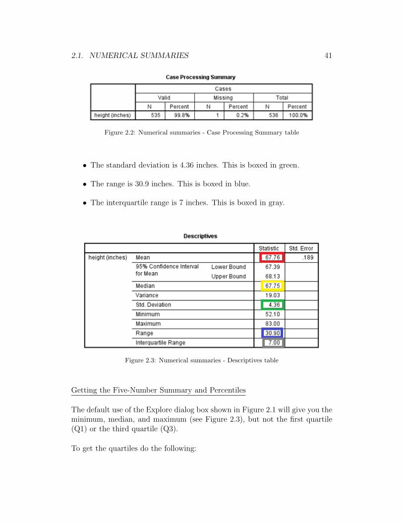
2.1. NUMERICAL SUMMARIES 41
Figure 2.2: Numerical summaries - Case Processing Summary table
• The standard deviation is 4.36 inches. This is boxed in green.
• The range is 30.9 inches. This is boxed in blue.
• The interquartile range is 7 inches. This is boxed in gray.
Figure 2.3: Numerical summaries - Descriptives table
Getting the Five-Number Summary and Percentiles
The default use of the Explore dialog box shown in Figure 2.1 will give you theminimum, median, and maximum (see Figure 2.3), but not the first quartile(Q1) or the third quartile (Q3).
To get the quartiles do the following:
42 CHAPTER 2. SPSS ONE QUANTITATIVE VARIABLE
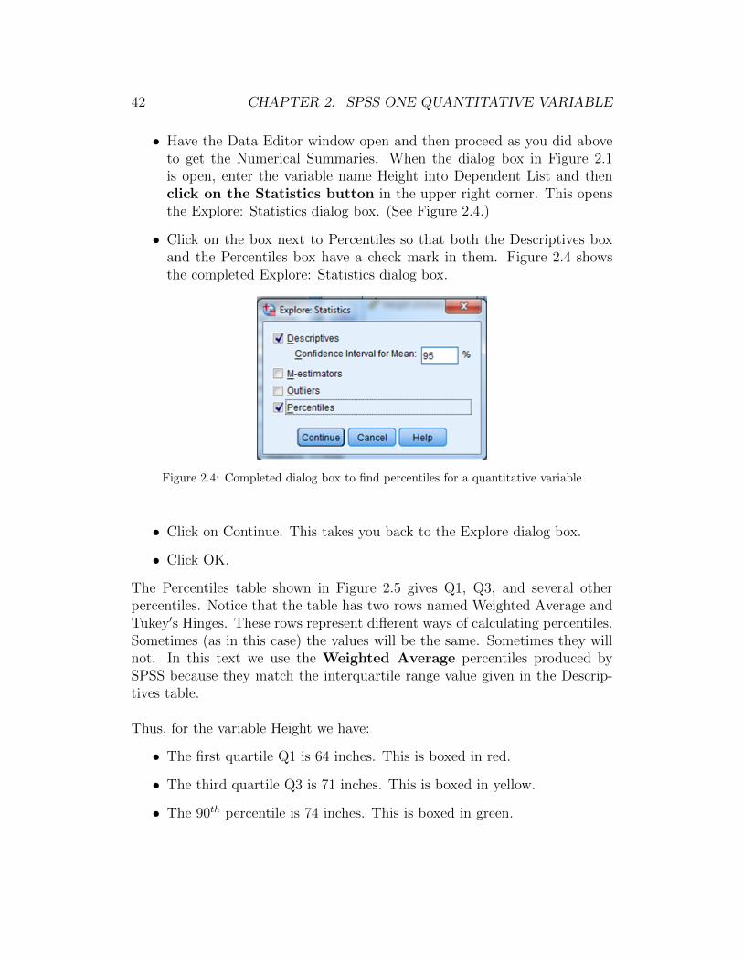
• Have the Data Editor window open and then proceed as you did aboveto get the Numerical Summaries. When the dialog box in Figure 2.1is open, enter the variable name Height into Dependent List and thenclick on the Statistics button in the upper right corner. This opensthe Explore: Statistics dialog box. (See Figure 2.4.)
• Click on the box next to Percentiles so that both the Descriptives boxand the Percentiles box have a check mark in them. Figure 2.4 showsthe completed Explore: Statistics dialog box.
Figure 2.4: Completed dialog box to find percentiles for a quantitative variable
• Click on Continue. This takes you back to the Explore dialog box.
• Click OK.
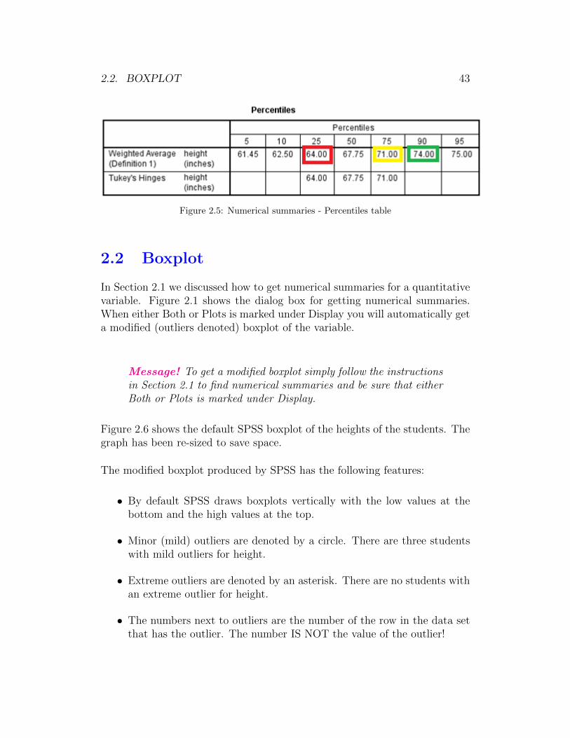
The Percentiles table shown in Figure 2.5 gives Q1, Q3, and several otherpercentiles. Notice that the table has two rows named Weighted Average andTukey′s Hinges. These rows represent different ways of calculating percentiles.Sometimes (as in this case) the values will be the same. Sometimes they willnot. In this text we use the Weighted Average percentiles produced bySPSS because they match the interquartile range value given in the Descrip-tives table.
Thus, for the variable Height we have:
• The first quartile Q1 is 64 inches. This is boxed in red.
• The third quartile Q3 is 71 inches. This is boxed in yellow.
• The 90th percentile is 74 inches. This is boxed in green.
2.2. BOXPLOT 43
Figure 2.5: Numerical summaries - Percentiles table
2.2 Boxplot
In Section 2.1 we discussed how to get numerical summaries for a quantitativevariable. Figure 2.1 shows the dialog box for getting numerical summaries.When either Both or Plots is marked under Display you will automatically geta modified (outliers denoted) boxplot of the variable.
Message! To get a modified boxplot simply follow the instructionsin Section 2.1 to find numerical summaries and be sure that eitherBoth or Plots is marked under Display.
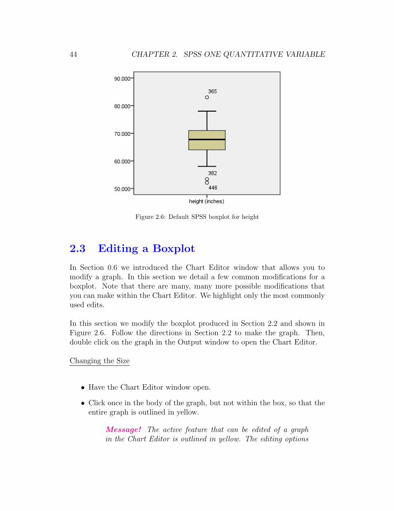
Figure 2.6 shows the default SPSS boxplot of the heights of the students. Thegraph has been re-sized to save space.
The modified boxplot produced by SPSS has the following features:
• By default SPSS draws boxplots vertically with the low values at thebottom and the high values at the top.
• Minor (mild) outliers are denoted by a circle. There are three studentswith mild outliers for height.
• Extreme outliers are denoted by an asterisk. There are no students withan extreme outlier for height.
• The numbers next to outliers are the number of the row in the data setthat has the outlier. The number IS NOT the value of the outlier!
44 CHAPTER 2. SPSS ONE QUANTITATIVE VARIABLE
Figure 2.6: Default SPSS boxplot for height
2.3 Editing a Boxplot
In Section 0.6 we introduced the Chart Editor window that allows you tomodify a graph. In this section we detail a few common modifications for aboxplot. Note that there are many, many more possible modifications thatyou can make within the Chart Editor. We highlight only the most commonlyused edits.
In this section we modify the boxplot produced in Section 2.2 and shown inFigure 2.6. Follow the directions in Section 2.2 to make the graph. Then,double click on the graph in the Output window to open the Chart Editor.
Changing the Size
• Have the Chart Editor window open.
• Click once in the body of the graph, but not within the box, so that theentire graph is outlined in yellow.
Message! The active feature that can be edited of a graphin the Chart Editor is outlined in yellow. The editing options

2.3. EDITING A BOXPLOT 45
change based on what feature is active.
• To change the size of a boxplot follow the directions in Section 1.5 forchanging the size of a bar graph. Let′s change the height to 210 (orabout 3 inches).
• Click on Apply. The graph changes size in the Chart Editor.
Message! Remember that until you close the Chart Editor (afteryou have made all the edits you want), the graph will not changein the Output window.
Changing the Vertical Axis Numbering/Decimal Places
Sometimes you may not be happy with the default numbering on the verticalaxis for a boxplot or you may want to change the number of decimal placesshown. To change the numbering do the following:
• Have the Chart Editor window open.
• Click once on any number on the vertical axis, so that all the numberson the vertical axis are outlined in yellow.
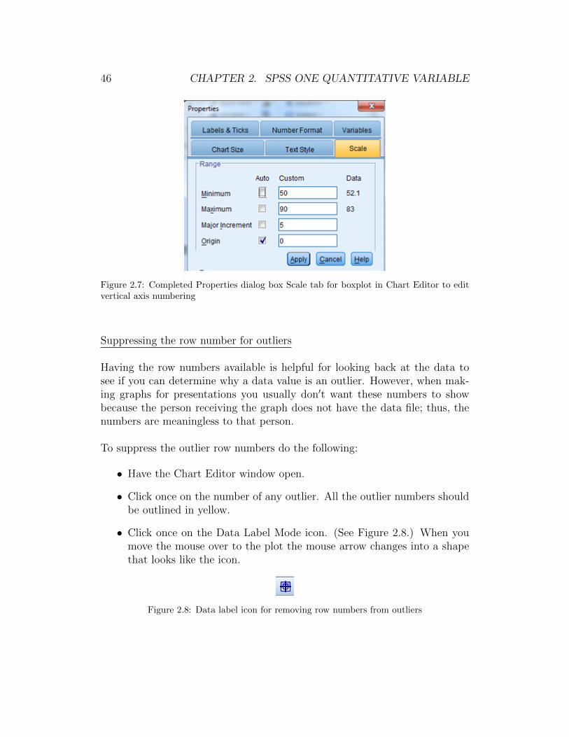
• To change the vertical axis numbering follow the directions in Section1.5. Let′s change the numbering so that the minimum = 50, maximum= 90, and major increment = 5. Figure 2.7 shows the completed dialogbox for the Scale tab. Be sure to Click Apply after you have completedthe dialog box.
• To change the number of decimal places Click on the Number Formattab. Let′s change Decimal Places from 3 to 0. Click Apply.
Changing the Background Color
Follow the instructions in Section 1.5 to change the background color of theboxplot to white.
Changing the Fill Color in the Box
Follow the instructions in Section 1.5 titled “Changing the Fill Color in theBars”to change the color of the box to yellow.
46 CHAPTER 2. SPSS ONE QUANTITATIVE VARIABLE
Figure 2.7: Completed Properties dialog box Scale tab for boxplot in Chart Editor to editvertical axis numbering
Suppressing the row number for outliers
Having the row numbers available is helpful for looking back at the data tosee if you can determine why a data value is an outlier. However, when mak-ing graphs for presentations you usually don′t want these numbers to showbecause the person receiving the graph does not have the data file; thus, thenumbers are meaningless to that person.
To suppress the outlier row numbers do the following:
• Have the Chart Editor window open.
• Click once on the number of any outlier. All the outlier numbers shouldbe outlined in yellow.
• Click once on the Data Label Mode icon. (See Figure 2.8.) When youmove the mouse over to the plot the mouse arrow changes into a shapethat looks like the icon.
Figure 2.8: Data label icon for removing row numbers from outliers
2.4. HISTOGRAM 47
• To eliminate a row number from an outlier click once on it. You canonly eliminate one row number at a time. Eliminate all the outlier rownumbers from this graph.
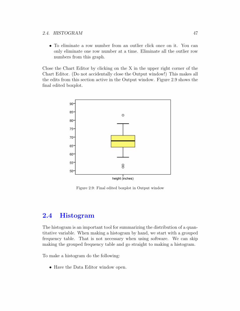
Close the Chart Editor by clicking on the X in the upper right corner of theChart Editor. (Do not accidentally close the Output window!) This makes allthe edits from this section active in the Output window. Figure 2.9 shows thefinal edited boxplot.
Figure 2.9: Final edited boxplot in Output window
2.4 Histogram
The histogram is an important tool for summarizing the distribution of a quan-titative variable. When making a histogram by hand, we start with a groupedfrequency table. That is not necessary when using software. We can skipmaking the grouped frequency table and go straight to making a histogram.
To make a histogram do the following:
• Have the Data Editor window open.
48 CHAPTER 2. SPSS ONE QUANTITATIVE VARIABLE
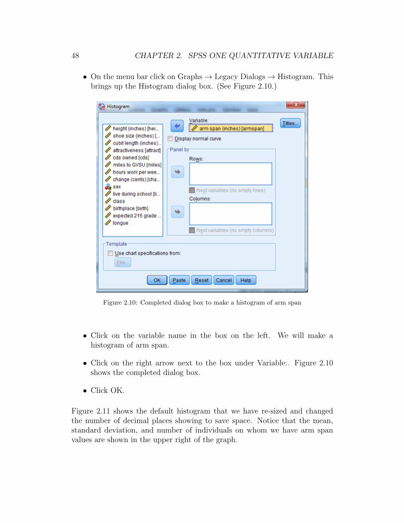
• On the menu bar click on Graphs→ Legacy Dialogs→ Histogram. Thisbrings up the Histogram dialog box. (See Figure 2.10.)
Figure 2.10: Completed dialog box to make a histogram of arm span
• Click on the variable name in the box on the left. We will make ahistogram of arm span.
• Click on the right arrow next to the box under Variable:. Figure 2.10shows the completed dialog box.
• Click OK.
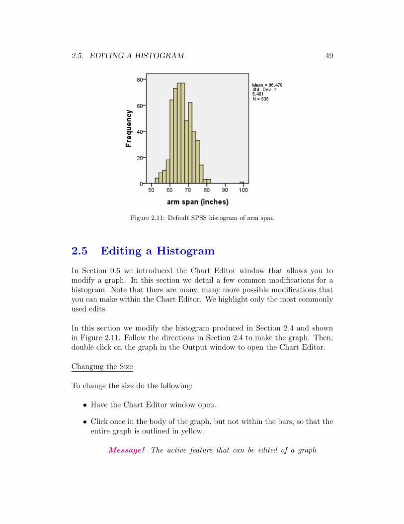
Figure 2.11 shows the default histogram that we have re-sized and changedthe number of decimal places showing to save space. Notice that the mean,standard deviation, and number of individuals on whom we have arm spanvalues are shown in the upper right of the graph.
2.5. EDITING A HISTOGRAM 49
Figure 2.11: Default SPSS histogram of arm span
2.5 Editing a Histogram
In Section 0.6 we introduced the Chart Editor window that allows you tomodify a graph. In this section we detail a few common modifications for ahistogram. Note that there are many, many more possible modifications thatyou can make within the Chart Editor. We highlight only the most commonlyused edits.
In this section we modify the histogram produced in Section 2.4 and shownin Figure 2.11. Follow the directions in Section 2.4 to make the graph. Then,double click on the graph in the Output window to open the Chart Editor.
Changing the Size
To change the size do the following:
• Have the Chart Editor window open.
• Click once in the body of the graph, but not within the bars, so that theentire graph is outlined in yellow.
Message! The active feature that can be edited of a graph
50 CHAPTER 2. SPSS ONE QUANTITATIVE VARIABLE
in the Chart Editor is outlined in yellow. The editing optionschange based on what feature is active.
• To change the size of a histogram follow the directions in Section 1.5for changing the size of a bar graph. Let′s change the height to 210 (orabout 3 inches).
• Click on Apply. The graph changes size in the Chart Editor.
Message! Remember that until you close the Chart Editor (afteryou have made all the edits you want), the graph will not changein the Output window.
Changing the Vertical Axis Numbering
Sometimes you may not be happy with the default numbering on the verticalaxis for a histogram. To change the numbering do the following:
• Have the Chart Editor window open.
• Click once on any number on the vertical axis, so that all the numberson the vertical axis are outlined in yellow.
• To change the vertical axis numbering follow the directions in Section1.5. Let′s change the numbering so that the minimum = 0, maximum =80, and major increment = 10. Figure 2.12 shows the completed dialogbox for the Scale tab. Be sure to Click Apply after you have completedthe dialog box.
Changing the Background Color
Follow the instructions in Section ?? to change the background color of theboxplot to white.
Changing the Fill Color in the Bars
To change the fill color of the bars do the following:
• Have the Chart Editor window open.
• Click once inside the bars so that all the bars are outlined in yellow.

2.5. EDITING A HISTOGRAM 51
Figure 2.12: Completed Properties dialog box for histogram in Chart Editor to edit verticalaxis numbering
• Follow the directions in Section 2.3 “Changing the Fill Color in the Box.”Let′s change the bar color to orange.
• Click Apply.
Changing Decimal Places on Horizontal Axis
• Have the Chart Editor window open.
• Follow the instructions in Section 2.3 “Changing the Vertical Axis Num-bering/Decimal Places ”
Changing the Horizontal Axis Numbering
Generally it is not a good idea to change the horizontal axis numbering ina histogram produced by SPSS. The reason is that SPSS has chosen a classwidth that matches the numbering used on the horizontal axis. What we meanis that the numbers shown on the horizontal axis will be at the end point ofa class. If you change the numbering without changing the class width, thenthese may not line up. And, changing the class width is not that easy to do.
Message! Our recommendation is not to change the horizontalaxis numbering or the class width in a histogram.

52 CHAPTER 2. SPSS ONE QUANTITATIVE VARIABLE
Deleting the numerical summaries from the upper right corner
Having the numerical summaries is helpful for a quick look at center andvariability. However, it is often better to delete them from the graph beforeprinting, copying, or saving.
To delete the numerical summaries do the following:
• Have the Chart Editor window open.
• Click once on the numerical summaries so they are boxed in yellow.
• Click once on the Delete key on the keyboard. (Backspace does notwork.) The numerical summaries will disappear and the graph will re-size to fit the space.
Close the Chart Editor by clicking on the X in the upper right corner of theChart Editor. (Do not accidentally close the Output window!) This makes allthe edits from this section active in the Output window. Figure 2.13 showsthe final edited histogram.
Figure 2.13: Final edited histogram in Output window
2.6. NORMAL DISTRIBUTION PROBABILITIES 53
2.6 Normal Distribution Probabilities
SPSS can be used to find probabilities for a normal distribution (the “Forwardproblem”) and to find values of normal variables (the “Backward problem”).When using SPSS there is no need to transform the variable into a standardnormal Z variable. Unfortunately, SPSS is a little clunky for doing normaldistribution calculations.
Finding normal probabilities - “Forward problem”
Suppose a random variable has a normal distribution with mean µ = 100 andstandard deviation σ = 15. We want to find the probability that the randomvariable will be less than 90.
To complete the “Forward problem” do the following:
• Have the Data Editor window open.
Message! At least one row of the Data View must have atleast one value typed in a column. The value can just be a 1.SPSS needs something typed in so that it “has a place” to putthe normal probability answer.
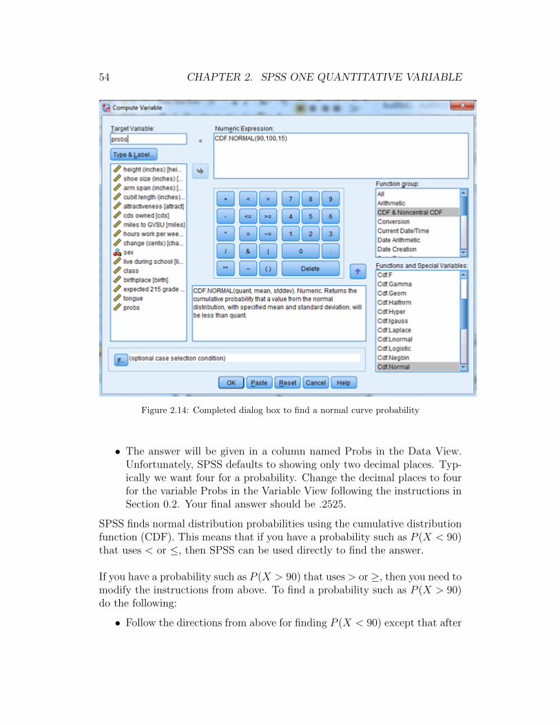
• On the menu bar click on Transform → Compute Variable. This bringsup the Compute Variable dialog box. (See Figure 2.14.)
• In the box under Target Variable type in a name such as Probs. Thiswill create a new variable (column) in the Data View.
• In the box under Function group click on CDF & Noncentral CDF.
• In the box under Functions and Special Variables scroll down and doubleclick on Cdf.Normal.
• In Figure 2.14 under Numeric Expression you will see CDF.Normal(?,?,?).The first ? is the value for which you want a probability; here 90. Thesecond ? is the population mean; here 100. The third ? is the popula-tion standard deviation; here 15. Type these values in so that you haveCDF.Normal(90,100,15).
• Click OK.
54 CHAPTER 2. SPSS ONE QUANTITATIVE VARIABLE
Figure 2.14: Completed dialog box to find a normal curve probability
• The answer will be given in a column named Probs in the Data View.Unfortunately, SPSS defaults to showing only two decimal places. Typ-ically we want four for a probability. Change the decimal places to fourfor the variable Probs in the Variable View following the instructions inSection 0.2. Your final answer should be .2525.
SPSS finds normal distribution probabilities using the cumulative distributionfunction (CDF). This means that if you have a probability such as P (X < 90)that uses < or ≤, then SPSS can be used directly to find the answer.
If you have a probability such as P (X > 90) that uses > or ≥, then you need tomodify the instructions from above. To find a probability such as P (X > 90)do the following:
• Follow the directions from above for finding P (X < 90) except that after
2.6. NORMAL DISTRIBUTION PROBABILITIES 55
you type the name in the Target Variable (third bullet) and before youclick on CDF & Noncentral CDF (fourth bullet) click in the box underNumeric Expression and type in 1 - .
• If you do this correctly and follow the directions from above your expres-sion under Numeric Expression should be 1− CDF.NORMAL(90, 100, 15).Your answer should be .7475.
The problem is a little trickier if you have a probability such as P (90 < X <110). The easiest way to do this type of forward problem is to think of itas P (X < 110) − P (X < 90). Then, you can use the directions from aboveto get P (X < 90) = .2525 and P (X < 110) = .7475. The probability isP (90 < X < 110) = .7475− .2525 = .4950.
Message! To use SPSS for the “forward problem” the key is towrite the problem as P (X < some number) or P (X ≤ some number).SPSS can be used to directly find these probabilities.
Finding normal variable values - “Backward problem”
Suppose a random variable has a normal distribution with mean µ = 100 andstandard deviation σ = 15. We want to find the value x of the random variablesuch that the probability of being less than x is 0.75. (Another way of sayingthis is that we want to find the third quartile Q3 or the 75th percentile.)
• Have the Data Editor window open.
Message! At least one row of the Data View must have atleast one value typed in a column. The value can just be a 1.SPSS needs something typed in so that it “has a place” to putthe answer.
• On the menu bar click on Transform → Compute Variable. This bringsup the Compute Variable dialog box. (See Figure 2.15.)
• In the box under Target Variable type in a name such as Probs2. Thiswill create a new variable (column) in the Data View.
• In the box under Function Group click on Inverse DF.
• In the box under Functions and Special Variables double click on Idf.Normal.

56 CHAPTER 2. SPSS ONE QUANTITATIVE VARIABLE
Figure 2.15: Completed dialog box to find a normal curve variable value
• In Figure 2.15 under Numeric Expression you will see IDF.Normal(?,?,?).The first ? is the probability to the left of the value; here .75. The second? is the population mean; here 100. The third ? is the populationstandard deviation; here 15. Type these values in so that you haveIDF.Normal(.75,100,15).
• Click OK. The answer will be given in a column named Probs2 in theData View as 110.12.
SPSS finds normal distribution values of the variable using the cumulativedistribution function (CDF). This means that if you have a problem such asP (X < x) = probability that uses < or ≤, then SPSS can be used directly tofind the value x. In the example above, we found P (X < x) = .75 results inx = 110.12.

2.7. CI FOR THE POPULATION MEAN 57
If you have a problem such as P (X > x) = probability that uses > or ≥, thenyou need to use 1 − probability instead of probability in the IDF.NORMAL.For example, suppose we wanted to find x such that P (X > x) = 0.75. Wewould use IDF.NORMAL(.25,100,15) and the answer would be 89.88.
Message! To use SPSS for the “backward problem” the key isto write the problem as P (X < x) = probability or P (X ≤ x) =probability.
2.7 Confidence Interval for the Population Mean
SPSS can do the numerical calculations to do a confidence interval for thepopulation mean. SPSS does not determine whether or not doing such aninterval makes sense. In other words, SPSS does not automatically check theconditions necessary for the confidence interval to produce a valid result.
Making a confidence interval for µ is very easy. In Section 2.1 we describedhow to get numerical summaries including percentiles. Notice in Figure 2.4that the Explore: Statistics dialog box includes a Confidence Interval for theMean box. As long as Descriptives is checked you will automatically get aconfidence interval for the mean. By default SPSS will make this a 95% con-fidence interval. You may change the percentage by typing a new confidencelevel in this box.
To make a confidence interval on µ do the following:
• Have the Data Editor window open.
• Follow the instructions in Section 2.1 to find numerical measures of centerand variability. We will make a 99% confidence interval on the variablearm span. (Notice that Figure 2.3 includes a 95% confidence interval forthe variable Height that goes from 67.39 inches to 68.13 inches.)
• If you want a confidence level different from 95%, then follow the in-structions in Section 2.1 under “Getting the five-number summary andpercentiles” to open the Explore: Statistics dialog box. Type in theconfidence level you desire. Figure 2.16 shows the completed Exploredialog box and Explore: Statistics dialog box to make a 99% confidenceinterval for the variable arm span.
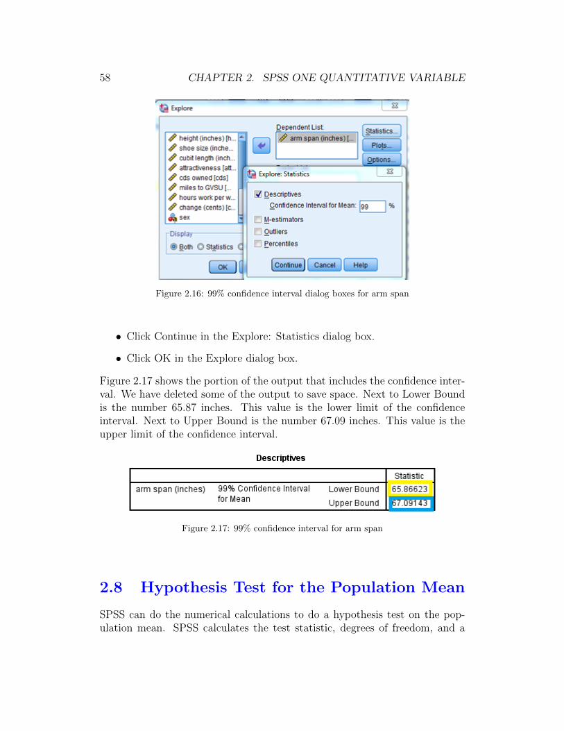
58 CHAPTER 2. SPSS ONE QUANTITATIVE VARIABLE
Figure 2.16: 99% confidence interval dialog boxes for arm span
• Click Continue in the Explore: Statistics dialog box.
• Click OK in the Explore dialog box.
Figure 2.17 shows the portion of the output that includes the confidence inter-val. We have deleted some of the output to save space. Next to Lower Boundis the number 65.87 inches. This value is the lower limit of the confidenceinterval. Next to Upper Bound is the number 67.09 inches. This value is theupper limit of the confidence interval.
Figure 2.17: 99% confidence interval for arm span
2.8 Hypothesis Test for the Population Mean
SPSS can do the numerical calculations to do a hypothesis test on the pop-ulation mean. SPSS calculates the test statistic, degrees of freedom, and a
2.8. HT FOR THE POPULATION MEAN 59
two-tailed p-value. SPSS does not determine whether or not doing such a testmakes sense. In other words, SPSS does not automatically check the condi-tions necessary for the hypothesis test to produce a valid result. SPSS alsodoes not make a decision for you.
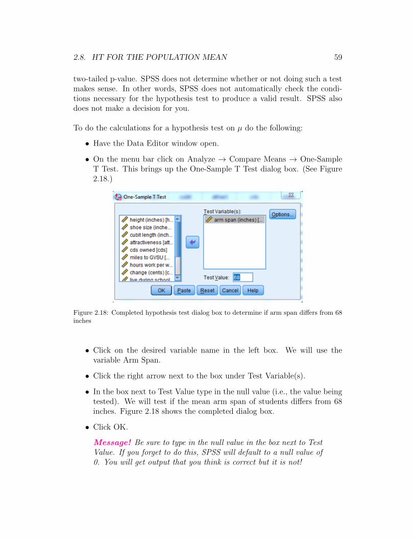
To do the calculations for a hypothesis test on µ do the following:
• Have the Data Editor window open.
• On the menu bar click on Analyze → Compare Means → One-SampleT Test. This brings up the One-Sample T Test dialog box. (See Figure2.18.)
Figure 2.18: Completed hypothesis test dialog box to determine if arm span differs from 68inches
• Click on the desired variable name in the left box. We will use thevariable Arm Span.
• Click the right arrow next to the box under Test Variable(s).
• In the box next to Test Value type in the null value (i.e., the value beingtested). We will test if the mean arm span of students differs from 68inches. Figure 2.18 shows the completed dialog box.
• Click OK.
Message! Be sure to type in the null value in the box next to TestValue. If you forget to do this, SPSS will default to a null value of0. You will get output that you think is correct but it is not!
60 CHAPTER 2. SPSS ONE QUANTITATIVE VARIABLE
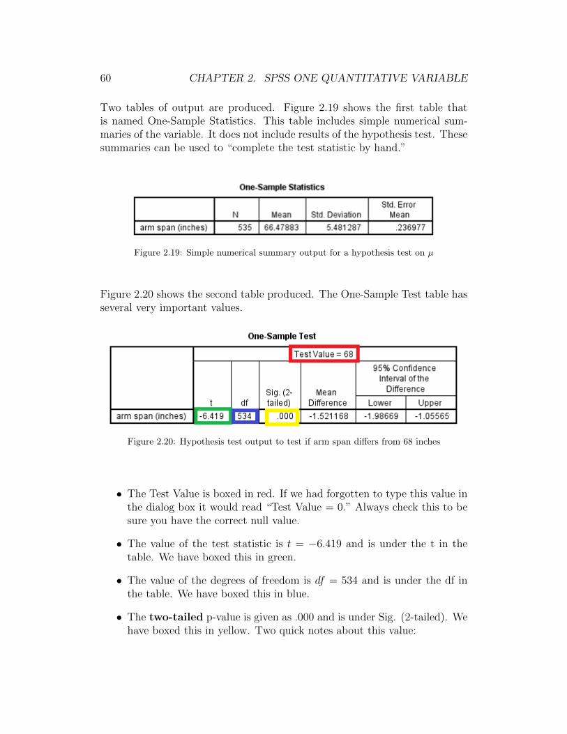
Two tables of output are produced. Figure 2.19 shows the first table thatis named One-Sample Statistics. This table includes simple numerical sum-maries of the variable. It does not include results of the hypothesis test. Thesesummaries can be used to “complete the test statistic by hand.”
Figure 2.19: Simple numerical summary output for a hypothesis test on µ
Figure 2.20 shows the second table produced. The One-Sample Test table hasseveral very important values.
Figure 2.20: Hypothesis test output to test if arm span differs from 68 inches
• The Test Value is boxed in red. If we had forgotten to type this value inthe dialog box it would read “Test Value = 0.” Always check this to besure you have the correct null value.
• The value of the test statistic is t = −6.419 and is under the t in thetable. We have boxed this in green.
• The value of the degrees of freedom is df = 534 and is under the df inthe table. We have boxed this in blue.
• The two-tailed p-value is given as .000 and is under Sig. (2-tailed). Wehave boxed this in yellow. Two quick notes about this value:

2.8. HT FOR THE POPULATION MEAN 61
(i) SPSS always reports a two-tailed p-value.
If you want a one-tailed p-value and the sign of the test statisticmatches the sign of the alternative hypothesis (i.e., test statistic is< 0 and Ha is µ <, or test statistic is > 0 and Ha is µ >), then thep-value is one-half the value reported in the table.
If you want a one-tailed p-value and the sign of the test statis-tic does not match the sign of the alternative hypothesis (i.e., teststatistic is < 0 and Ha is µ >, or test statistic is > 0 and Ha isµ <), then the p-value is 1 minus one-half the value reported in thetable.
(ii) When the p-value < 0.001 SPSS reports a value of .000 to threedecimal places. It is better to report this as p-value < 0.001.
Message! The columns labeled Mean Difference and 95% Confi-dence Interval of the Difference are not of importance to us. Notethat the column 95% Confidence Interval of the Difference is NOTa 95% confidence interval for the population mean.
As you can see SPSS automates the calculations of a hypothesis test on themean, but it does not replace thinking and following through the processdiscussed in the text.

62 CHAPTER 2. SPSS ONE QUANTITATIVE VARIABLE

Chapter 3
SPSS for Analysis of Two Cate-gorical Variables
Throughout Chapter 3 of this SPSS manual we work with the dataset sur-vey215 that is saved on the text website and in the folder gabrosek/textbook.Refer to Section 0.1 to access SPSS and to open the data file survey215.
The dataset survey215 includes information on 15 variables collected on 536individuals who took introductory applied statistics from author Gabrosekover the past ten years. Not all variables were collected on all individuals.
3.1 Two-Way Tables
The main numerical summary for two categorical variables collected on thesame individuals is the two-way table.
To get a two-way table do the following:
• Have the Data Editor window open.
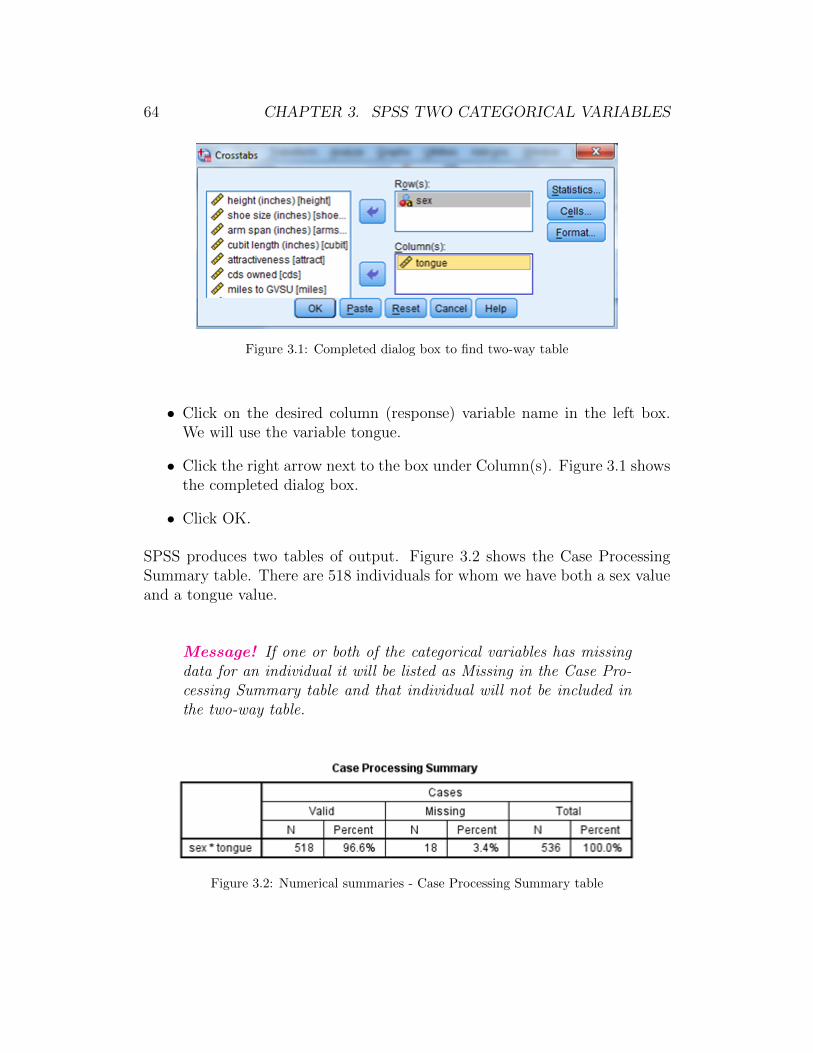
• On the menu bar click on Analyze→ Descriptive Statistics→ Crosstabs.This brings up the Crosstabs dialog box. (See Figure 3.1.)
• Click on the desired row (explanatory) variable name in the left box. Wewill use the variable sex.
• Click the right arrow next to the box under Row(s).
63
64 CHAPTER 3. SPSS TWO CATEGORICAL VARIABLES
Figure 3.1: Completed dialog box to find two-way table
• Click on the desired column (response) variable name in the left box.We will use the variable tongue.
• Click the right arrow next to the box under Column(s). Figure 3.1 showsthe completed dialog box.
• Click OK.
SPSS produces two tables of output. Figure 3.2 shows the Case ProcessingSummary table. There are 518 individuals for whom we have both a sex valueand a tongue value.
Message! If one or both of the categorical variables has missingdata for an individual it will be listed as Missing in the Case Pro-cessing Summary table and that individual will not be included inthe two-way table.
Figure 3.2: Numerical summaries - Case Processing Summary table

3.1. TWO-WAY TABLES 65
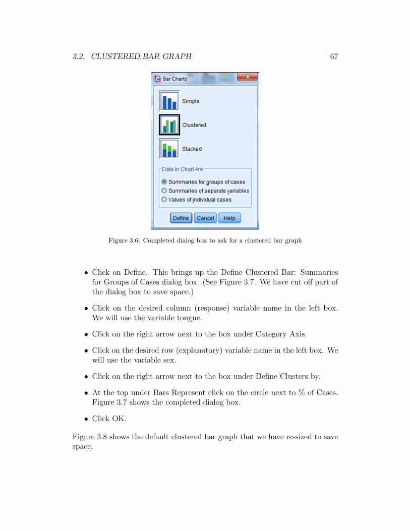
The second table produced is the sex*tongue Crosstabulation table shown inFigure 3.3. This is the two-way table that includes the observed cell counts.For example, 229 students were female and could curl their tongue.
Figure 3.3: Default two-way table for explanatory variable sex and response variable tongue
Finding the Conditional Distribution Given the Row Variable
You can also have SPSS find the conditional distribution of the response vari-able given the row variable. In other words, for this example, you can haveSPSS find the percentage of females who can curl their tongue and the per-centage of males who can curl their tongue.
To find the conditional distribution do the following:
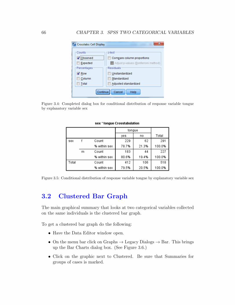
• Have the Data Editor window open and then proceed as you did aboveto get the two-way table. When the dialog box in Figure 3.1 is openclick on the Cells button in the upper right corner. This opens theCrosstabs: Cell Display dialog box. (See Figure 3.4 for the completeddialog box. We have cut off the lower part of the dialog box to savespace.)
• Click on the box under Percentages next to Row so that it is checked.
• Click on Continue. This takes you back to the Crosstabs dialog box.
• Click OK.
Figure 3.5 shows the two-way table that includes the row percentages. We seethat 78.7% of the females could curl their tongue. 80.6% of the males couldcurl their tongue.
66 CHAPTER 3. SPSS TWO CATEGORICAL VARIABLES
Figure 3.4: Completed dialog box for conditional distribution of response variable tongueby explanatory variable sex
Figure 3.5: Conditional distribution of response variable tongue by explanatory variable sex
3.2 Clustered Bar Graph
The main graphical summary that looks at two categorical variables collectedon the same individuals is the clustered bar graph.
To get a clustered bar graph do the following:
• Have the Data Editor window open.
• On the menu bar click on Graphs→ Legacy Dialogs→ Bar. This bringsup the Bar Charts dialog box. (See Figure 3.6.)
• Click on the graphic next to Clustered. Be sure that Summaries forgroups of cases is marked.
3.2. CLUSTERED BAR GRAPH 67
Figure 3.6: Completed dialog box to ask for a clustered bar graph
• Click on Define. This brings up the Define Clustered Bar: Summariesfor Groups of Cases dialog box. (See Figure 3.7. We have cut off part ofthe dialog box to save space.)
• Click on the desired column (response) variable name in the left box.We will use the variable tongue.
• Click on the right arrow next to the box under Category Axis.
• Click on the desired row (explanatory) variable name in the left box. Wewill use the variable sex.
• Click on the right arrow next to the box under Define Clusters by.
• At the top under Bars Represent click on the circle next to % of Cases.Figure 3.7 shows the completed dialog box.
• Click OK.
Figure 3.8 shows the default clustered bar graph that we have re-sized to savespace.

68 CHAPTER 3. SPSS TWO CATEGORICAL VARIABLES
Figure 3.7: Completed dialog box to make a clustered bar graph
Message! It is important to use % of cases instead of N of caseswhen you make a clustered bar graph to account for unequal num-bers of individuals in the values of the explanatory variable (i.e.,rows of the two-way table).
3.3 Editing a Clustered Bar Graph
In this section we modify the clustered bar graph produced in Section 3.2 andshown in Figure 3.8. Follow the directions in Section 3.2 to make the graph.Then, double click on the graph in the Output window to open the ChartEditor.
Changing the Size
• Have the Chart Editor window open.
• Click once in the body of the graph, but not within the bars, so that theentire graph is outlined in yellow.
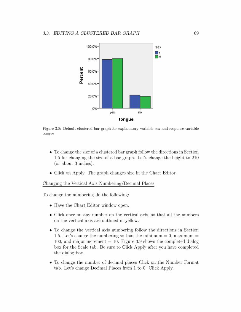
3.3. EDITING A CLUSTERED BAR GRAPH 69
Figure 3.8: Default clustered bar graph for explanatory variable sex and response variabletongue
• To change the size of a clustered bar graph follow the directions in Section1.5 for changing the size of a bar graph. Let′s change the height to 210(or about 3 inches).
• Click on Apply. The graph changes size in the Chart Editor.
Changing the Vertical Axis Numbering/Decimal Places
To change the numbering do the following:
• Have the Chart Editor window open.
• Click once on any number on the vertical axis, so that all the numberson the vertical axis are outlined in yellow.
• To change the vertical axis numbering follow the directions in Section1.5. Let′s change the numbering so that the minimum = 0, maximum =100, and major increment = 10. Figure 3.9 shows the completed dialogbox for the Scale tab. Be sure to Click Apply after you have completedthe dialog box.
• To change the number of decimal places Click on the Number Formattab. Let′s change Decimal Places from 1 to 0. Click Apply.
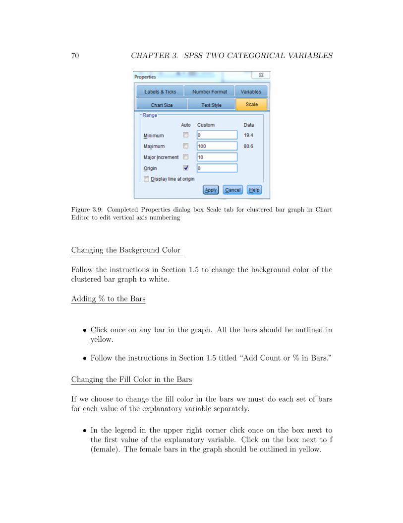
70 CHAPTER 3. SPSS TWO CATEGORICAL VARIABLES
Figure 3.9: Completed Properties dialog box Scale tab for clustered bar graph in ChartEditor to edit vertical axis numbering
Changing the Background Color
Follow the instructions in Section 1.5 to change the background color of theclustered bar graph to white.
Adding % to the Bars
• Click once on any bar in the graph. All the bars should be outlined inyellow.
• Follow the instructions in Section 1.5 titled “Add Count or % in Bars.”
Changing the Fill Color in the Bars
If we choose to change the fill color in the bars we must do each set of barsfor each value of the explanatory variable separately.
• In the legend in the upper right corner click once on the box next tothe first value of the explanatory variable. Click on the box next to f(female). The female bars in the graph should be outlined in yellow.
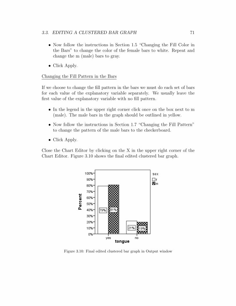
3.3. EDITING A CLUSTERED BAR GRAPH 71
• Now follow the instructions in Section 1.5 “Changing the Fill Color inthe Bars” to change the color of the female bars to white. Repeat andchange the m (male) bars to gray.
• Click Apply.
Changing the Fill Pattern in the Bars
If we choose to change the fill pattern in the bars we must do each set of barsfor each value of the explanatory variable separately. We usually leave thefirst value of the explanatory variable with no fill pattern.
• In the legend in the upper right corner click once on the box next to m(male). The male bars in the graph should be outlined in yellow.
• Now follow the instructions in Section 1.7 “Changing the Fill Pattern”to change the pattern of the male bars to the checkerboard.
• Click Apply.
Close the Chart Editor by clicking on the X in the upper right corner of theChart Editor. Figure 3.10 shows the final edited clustered bar graph.
Figure 3.10: Final edited clustered bar graph in Output window

72 CHAPTER 3. SPSS TWO CATEGORICAL VARIABLES
3.4 The χ2 Test and Expected Counts
SPSS can do the numerical calculations to do a χ2 hypothesis test on the as-sociation between two categorical variables collected on the same individuals.SPSS calculates the expected cell counts, test statistic, degrees of freedom,and p-value. SPSS does not determine whether or not doing such a test makessense. SPSS also does not make a decision for you.
To do the calculations for the χ2 hypothesis test do the following:
• Have the Data Editor window open.
• On the menu bar click on Analyze→ Descriptive Statistics→ Crosstabs.This brings up the Crosstabs dialog box. (See Figure 3.1.)
• Follow the directions in Section 3.1 to make a two-way table with sex asthe row variable and tongue as the column variable.
• After completing the dialog box, and before clicking on Apply, click onthe Cells button. This opens the Crosstabs: Cells Display dialog box.
• Click the box under Counts next to Expected so that it is checked. Thiswill calculate the expected counts and add them to the two-way table.
• Click Continue. This returns you to the Crosstabs dialog box.
• Click on the Statistics button. This opens the Crosstabs: Statisticsdialog box. (See Figure 3.11.)
Figure 3.11: Completed dialog box to get the χ2 test statistic and p-value
• Click the box next to Chi-Square.
• Click Continue. This returns you to the Crosstabs dialog box.
• Click OK.

3.4. χ2 TEST 73
The first table produced is the Case Processing Summary table previouslyshown in Figure 3.2.
The second table produced is the sex*tongue two-way table shown in Figure3.12. This table looks similar to Figure 3.3 except that the expected countsare included in the table. For example, the observed number of females whocould curl their tongue was 229. If there was no association between sex andthe ability to curl one′s tongue, we would expect about 231.5 females able tocurl their tongue.
Figure 3.12: Two-way table with expected counts of sex and tongue curling
Figure 3.13 shows the third table produced. The Chi-Square Tests table hasseveral rows. We are only concerned with the first row named “Pearson Chi-Square.” (We have deleted the last two columns of the table because they donot have values for the Pearson Chi-Square row.) Consider the following val-ues:
• The value of the test statistic is χ2 = .290 and is under the Value columnin the table. We have boxed this in green.
• The value of the degrees of freedom is df = 1 and is under the df columnin the table. We have boxed this in blue.
• The p-value is given as .590 and is under Asymp. Sig. (2-sided). Wehave boxed this in yellow.
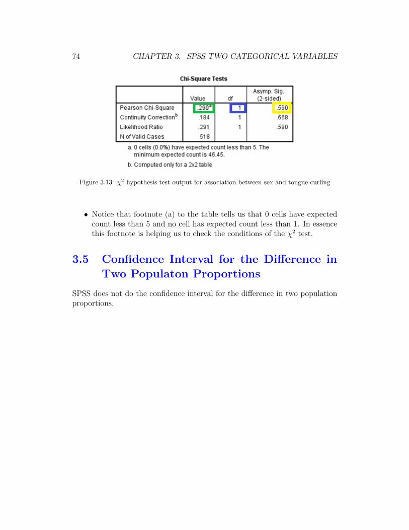
74 CHAPTER 3. SPSS TWO CATEGORICAL VARIABLES
Figure 3.13: χ2 hypothesis test output for association between sex and tongue curling
• Notice that footnote (a) to the table tells us that 0 cells have expectedcount less than 5 and no cell has expected count less than 1. In essencethis footnote is helping us to check the conditions of the χ2 test.
3.5 Confidence Interval for the Difference in
Two Populaton Proportions
SPSS does not do the confidence interval for the difference in two populationproportions.
Chapter 4
SPSS for Analysis of Two Quan-titative Variables
Throughout Chapter 4 of this SPSS manual we work with the dataset sur-vey215 that is saved on the text website and in the folder gabrosek/textbook.Refer to Section 0.1 to access SPSS and to open the data file survey215.
The dataset survey215 includes information on 15 variables collected on 536individuals who took introductory applied statistics from author Gabrosekover the past ten years. Not all variables were collected on all individuals.
4.1 Scatterplots
The main graphical summary for two quantitative variables collected on thesame individuals is the scatterplot.
To get a scatterplot do the following:
• Have the Data Editor window open.
• On the menu bar click on Graphs→ Legacy Dialog→ Scatter/Dot. Thisbrings up the Scatter/Dot dialog box. (See Figure 4.1.) Be sure thatSimple Scatter is outlined with a bold black line.
• Click on Define. This brings up the Simple Scatter dialog box. (SeeFigure 4.2 for a completed dialog box. The bottom of the dialog box hasbeen cut off to save space.)
75

76 CHAPTER 4. SPSS TWO QUANTITATIVE VARIABLES
Figure 4.1: Dialog box to request a scatterplot
Figure 4.2: Completed dialog box for a scatterplot
• Click on the desired explanatory variable name in the left box. We willuse the variable height.
• Click the right arrow next to the box under X Axis.
• Click on the desired response variable name in the left box. We will usethe variable shoe size.
• Click the right arrow next to the box under Y Axis. Figure 4.2 showsthe completed dialog box.
• Click OK.
Figure 4.3 shows the default scatterplot produced by SPSS.
Message! If one or both of the quantitative variables has missingdata for an individual it will be not be included in the scatterplot.
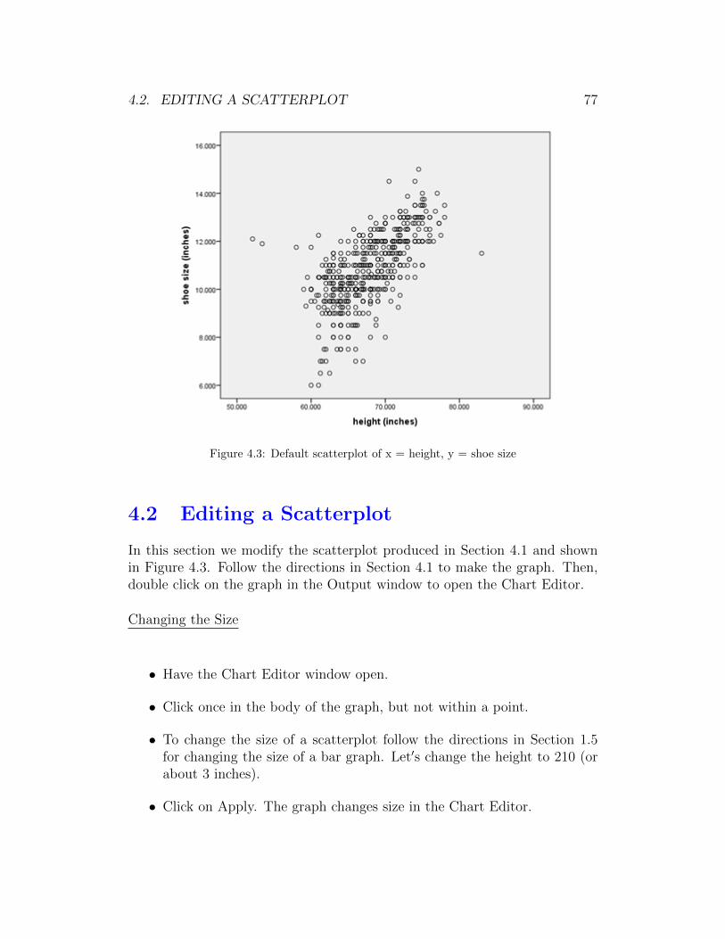
4.2. EDITING A SCATTERPLOT 77
Figure 4.3: Default scatterplot of x = height, y = shoe size
4.2 Editing a Scatterplot
In this section we modify the scatterplot produced in Section 4.1 and shownin Figure 4.3. Follow the directions in Section 4.1 to make the graph. Then,double click on the graph in the Output window to open the Chart Editor.
Changing the Size
• Have the Chart Editor window open.
• Click once in the body of the graph, but not within a point.
• To change the size of a scatterplot follow the directions in Section 1.5for changing the size of a bar graph. Let′s change the height to 210 (orabout 3 inches).
• Click on Apply. The graph changes size in the Chart Editor.
78 CHAPTER 4. SPSS TWO QUANTITATIVE VARIABLES
Changing the Y or X Axis Numbering/Decimal Places
To change the numbering do the following:
• Have the Chart Editor window open.
• Click once on any number on the Y Axis, so that all the numbers on theY Axis are outlined in yellow.
• To change the Y Axis numbering follow the directions in Section 1.5under “Changing the Vertical Axis Numbering.” Remember to click onthe Scale tab. Let′s change the numbering so that the minimum = 6,maximum = 18, and major increment = 3. Be sure to Click Apply afteryou have completed the dialog box.
• To change the number of decimal places Click on the Number Formattab. Let′s change Decimal Places from 3 to 0. Click Apply.
• Also change the X Axis numbering so that the minimum = 50, maximum= 90, and major increment = 5. Change the X Axis Decimal Places from3 to 0.
Changing the Background Color
Follow the instructions in Section 1.5 to change the background color of thescatterplot to white.
Changing the Fill Pattern in the Points
Generally, we use either open circles or solid circles to represent the points. Bydefault SPSS uses open circles. This is preferred for relatively large datasets.Since we have more than 500 observations in this dataset we should not usesolid circles; however, we use solid circles just to show the process of changingthe default points fill pattern.
• Click once on any point. All the points should be outlined in yellow.
• Click on Edit → Properties to bring up the Properties dialog box.
• Click on the Marker tab. (Figure 4.4 shows the completed dialog box.)
• Click in the box under Color next to Fill.
4.3. LINEAR CORRELATION R 79
Figure 4.4: Completed dialog box to change points to solid circles in scatterplot
• On the right hand side click on the solid black rectangle. In Figure 4.4notice that the square next to Fill is now solid black.
• Click Apply.
Close the Chart Editor by clicking on the X in the upper right corner of theChart Editor. Figure 4.5 shows the final edited scatterplot.
4.3 Linear Correlation r
The linear correlation r measures the strength and direction of the linear rela-tionship between two quantitative variables measured on the same individuals.
Message! If you ask SPSS to calculate r for two quantitativevariables it will do so, even if the scatterplot shows that there is anon-linear relationship or no relationship between the variables.
To find r do the following:
• Have the Data Editor window open.

80 CHAPTER 4. SPSS TWO QUANTITATIVE VARIABLES
Figure 4.5: Final edited scatterplot in Output window
• Click on Analyze→ Correlate→ Bivariate. This brings up the BivariateCorrelations dialog box. (See Figure 4.6 for the completed dialog box.)
• In the box on the left click on the response variable name. Here, we useshoe size as the response.
• Click on the right arrow next to the Variables box.
• In the box on the left click on the explanatory variable name. Here, weuse height as the explanatory variable.
• Click on the right arrow next to the Variables box. (Note: In correlationit actually doesn′t matter which variable you click in first - response orexplanatory.)
• Click OK.
Figure 4.7 shows the Correlations table produced as output. The value of thelinear correlation r is the top number in the upper right cell. For this example,r = 0.655.

4.4. SIMPLE LINEAR REGRESSION 81
Figure 4.6: Completed dialog box for finding the correlation between height and shoe size
4.4 Simple Linear Regression
When a scatterplot and the linear correlation both suggest that there is a lin-ear relationship between two quantitative variables, then it is appropriate touse regression to find the equation of the line.
To get the equation of the regression line do the following:
• Have the Data Editor window open.
• On the menu bar click on Analyze → Regression → Linear. This bringsup the Linear Regression dialog box. (See Figure 4.8 for the completeddialog box.)
• Click on the name of the response variable in the box on the left. Here,we use shoe size.
• Click on the right arrow under Dependent. SPSS calls the response (Y)variable the Dependent variable in regression.
• Click on the name of the explanatory variable in the box on the left.Here, we use height.
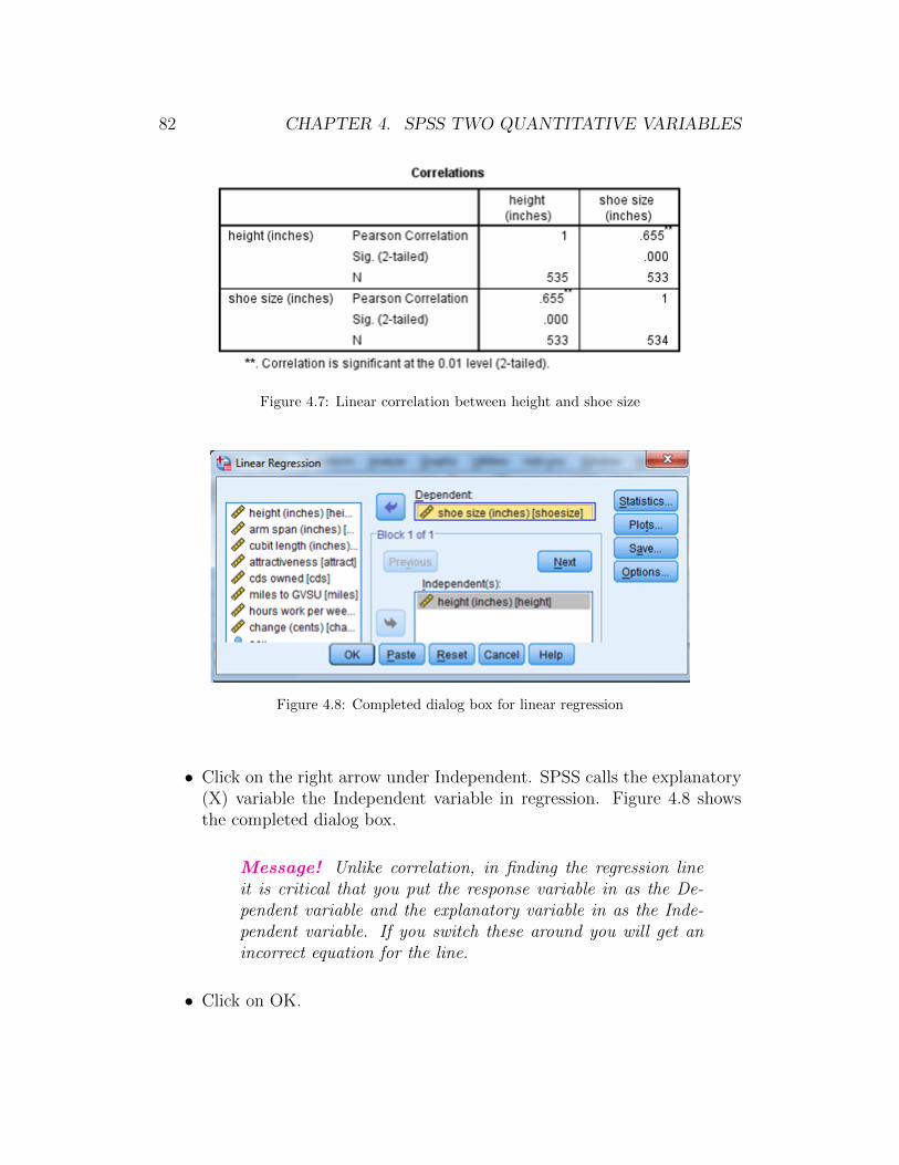
82 CHAPTER 4. SPSS TWO QUANTITATIVE VARIABLES
Figure 4.7: Linear correlation between height and shoe size
Figure 4.8: Completed dialog box for linear regression
• Click on the right arrow under Independent. SPSS calls the explanatory(X) variable the Independent variable in regression. Figure 4.8 showsthe completed dialog box.
Message! Unlike correlation, in finding the regression lineit is critical that you put the response variable in as the De-pendent variable and the explanatory variable in as the Inde-pendent variable. If you switch these around you will get anincorrect equation for the line.
• Click on OK.
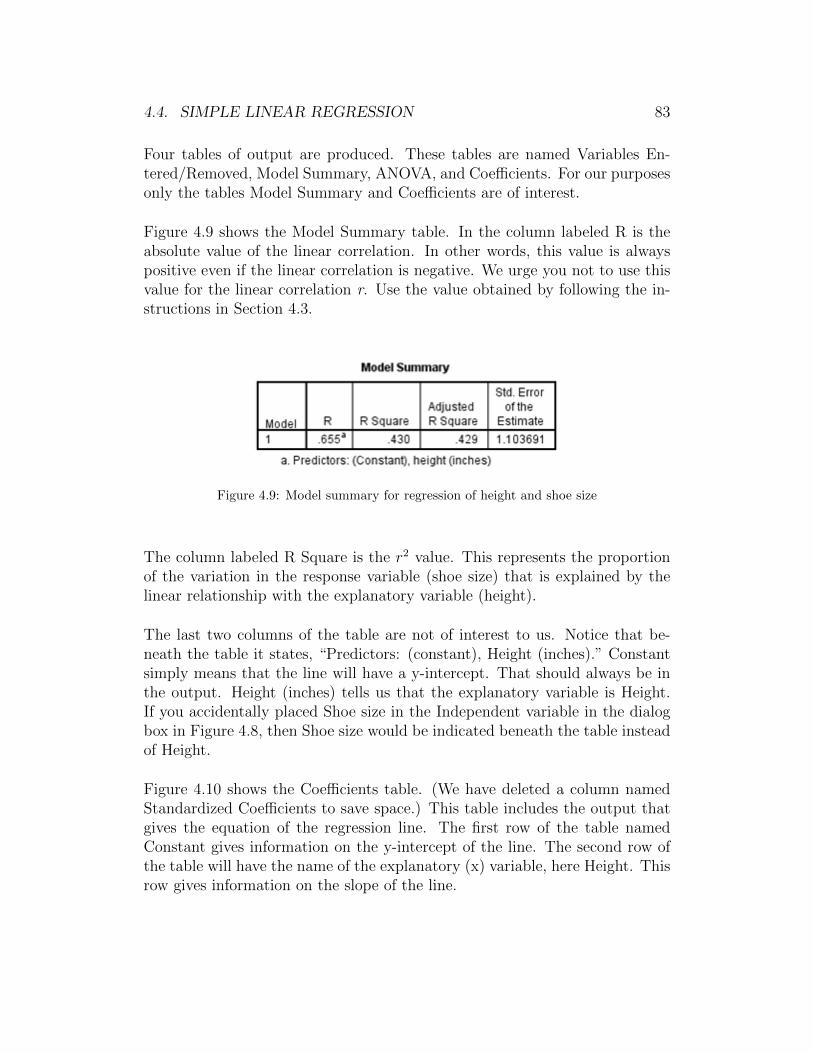
4.4. SIMPLE LINEAR REGRESSION 83
Four tables of output are produced. These tables are named Variables En-tered/Removed, Model Summary, ANOVA, and Coefficients. For our purposesonly the tables Model Summary and Coefficients are of interest.
Figure 4.9 shows the Model Summary table. In the column labeled R is theabsolute value of the linear correlation. In other words, this value is alwayspositive even if the linear correlation is negative. We urge you not to use thisvalue for the linear correlation r. Use the value obtained by following the in-structions in Section 4.3.
Figure 4.9: Model summary for regression of height and shoe size
The column labeled R Square is the r2 value. This represents the proportionof the variation in the response variable (shoe size) that is explained by thelinear relationship with the explanatory variable (height).
The last two columns of the table are not of interest to us. Notice that be-neath the table it states, “Predictors: (constant), Height (inches).” Constantsimply means that the line will have a y-intercept. That should always be inthe output. Height (inches) tells us that the explanatory variable is Height.If you accidentally placed Shoe size in the Independent variable in the dialogbox in Figure 4.8, then Shoe size would be indicated beneath the table insteadof Height.
Figure 4.10 shows the Coefficients table. (We have deleted a column namedStandardized Coefficients to save space.) This table includes the output thatgives the equation of the regression line. The first row of the table namedConstant gives information on the y-intercept of the line. The second row ofthe table will have the name of the explanatory (x) variable, here Height. Thisrow gives information on the slope of the line.
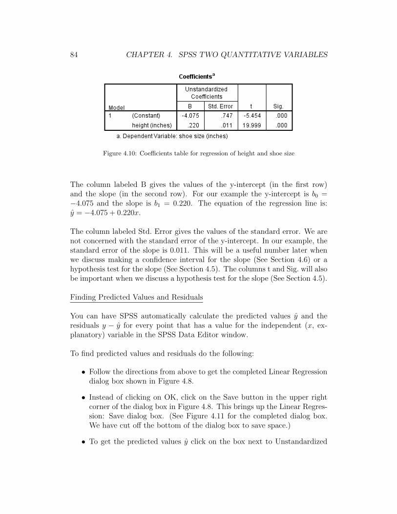
84 CHAPTER 4. SPSS TWO QUANTITATIVE VARIABLES
Figure 4.10: Coefficients table for regression of height and shoe size
The column labeled B gives the values of the y-intercept (in the first row)and the slope (in the second row). For our example the y-intercept is b0 =−4.075 and the slope is b1 = 0.220. The equation of the regression line is:y = −4.075 + 0.220x.
The column labeled Std. Error gives the values of the standard error. We arenot concerned with the standard error of the y-intercept. In our example, thestandard error of the slope is 0.011. This will be a useful number later whenwe discuss making a confidence interval for the slope (See Section 4.6) or ahypothesis test for the slope (See Section 4.5). The columns t and Sig. will alsobe important when we discuss a hypothesis test for the slope (See Section 4.5).
Finding Predicted Values and Residuals
You can have SPSS automatically calculate the predicted values y and theresiduals y − y for every point that has a value for the independent (x, ex-planatory) variable in the SPSS Data Editor window.
To find predicted values and residuals do the following:
• Follow the directions from above to get the completed Linear Regressiondialog box shown in Figure 4.8.
• Instead of clicking on OK, click on the Save button in the upper rightcorner of the dialog box in Figure 4.8. This brings up the Linear Regres-sion: Save dialog box. (See Figure 4.11 for the completed dialog box.We have cut off the bottom of the dialog box to save space.)
• To get the predicted values y click on the box next to Unstandardized

4.4. SIMPLE LINEAR REGRESSION 85
Figure 4.11: Completed dialog box to get predicted values and residuals for regression
under Predicted Values.
• To get the residuals y− y click on the box next to Unstandardized underResiduals. (See Figure 4.11 for the completed dialog box.)
• Click Continue. This returns you to the Linear Regression dialog box.(See Figure 4.8.)
• Click OK.
No output is produced. Instead two additional columns are added at the endof the SPSS Data Editor window. Figure 4.12 shows the first five rows, thefirst two columns (height and shoe size), and the last two columns (namedPRE 1 and RES 1) of the Data Editor window.
Figure 4.12: Predicted values and residuals for regression of shoe size and height
The column labeled PRE 1 are the predicted values y. Notice that all fiverows have a predicted value, because all you need to find the predicted value
86 CHAPTER 4. SPSS TWO QUANTITATIVE VARIABLES
is the value of the explanatory variable (height). The column labeled RES 1are the residuals y − y. Notice that the first two rows do not have a residualvalue, because they do not have a value for the response (y) variable (shoe size).
4.5 Hypothesis Test for the Slope
SPSS can do the numerical calculations to test if the population slope of theregression line is 0. In fact, when you ask for the regression line you automat-ically get the two-tailed p-value to test if the population slope is 0.
To do the calculations for the hypothesis test on the slope do the following:
• Have the Data Editor window open.
• Follow the directions in Section 4.4 to get the regression line between x= height and y = shoe size.
The output for the hypothesis test is contained in the Coefficients table shownin Figure 4.10. The two crucial values are in the row Height (remember thesecond row is the one that contains information on the slope). In the column tthe value 19.999 is the value of the test statistic. This value can be calculated
from the output as: t =0.220
0.011= 19.999.
The value in the column Sig. is the two-tailed p-value. Two quick notes aboutthis value:
(i) SPSS always reports a two-tailed p-value.
If you want a one-tailed p-value and the sign of the test statistic matchesthe sign of the alternative hypothesis (i.e., test statistic is < 0 and Hais β1 < 0, or test statistic is > 0 and Ha is β1 > 0), then the p-value isone-half the value reported in the table.
If you want a one-tailed p-value and the sign of the test statistic doesnot match the sign of the alternative hypothesis (i.e., test statistic is < 0and Ha is β1 > 0, or test statistic is > 0 and Ha is β1 < 0), then thep-value is 1 minus one-half the value reported in the table.
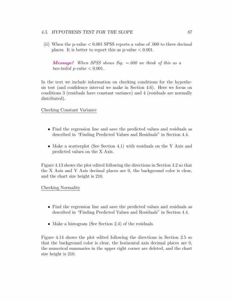
4.5. HYPOTHESIS TEST FOR THE SLOPE 87
(ii) When the p-value < 0.001 SPSS reports a value of .000 to three decimalplaces. It is better to report this as p-value < 0.001.
Message! When SPSS shows Sig. =.000 we think of this as atwo-tailed p-value < 0.001.
In the text we include information on checking conditions for the hypothe-sis test (and confidence interval we make in Section 4.6). Here we focus onconditions 3 (residuals have constant variance) and 4 (residuals are normallydistributed).
Checking Constant Variance
• Find the regression line and save the predicted values and residuals asdescribed in “Finding Predicted Values and Residuals” in Section 4.4.
• Make a scatterplot (See Section 4.1) with residuals on the Y Axis andpredicted values on the X Axis.
Figure 4.13 shows the plot edited following the directions in Section 4.2 so thatthe X Axis and Y Axis decimal places are 0, the background color is clear,and the chart size height is 210.
Checking Normality
• Find the regression line and save the predicted values and residuals asdescribed in “Finding Predicted Values and Residuals” in Section 4.4.
• Make a histogram (See Section 2.4) of the residuals.
Figure 4.14 shows the plot edited following the directions in Section 2.5 sothat the background color is clear, the horizontal axis decimal places are 0,the numerical summaries in the upper right corner are deleted, and the chartsize height is 210.
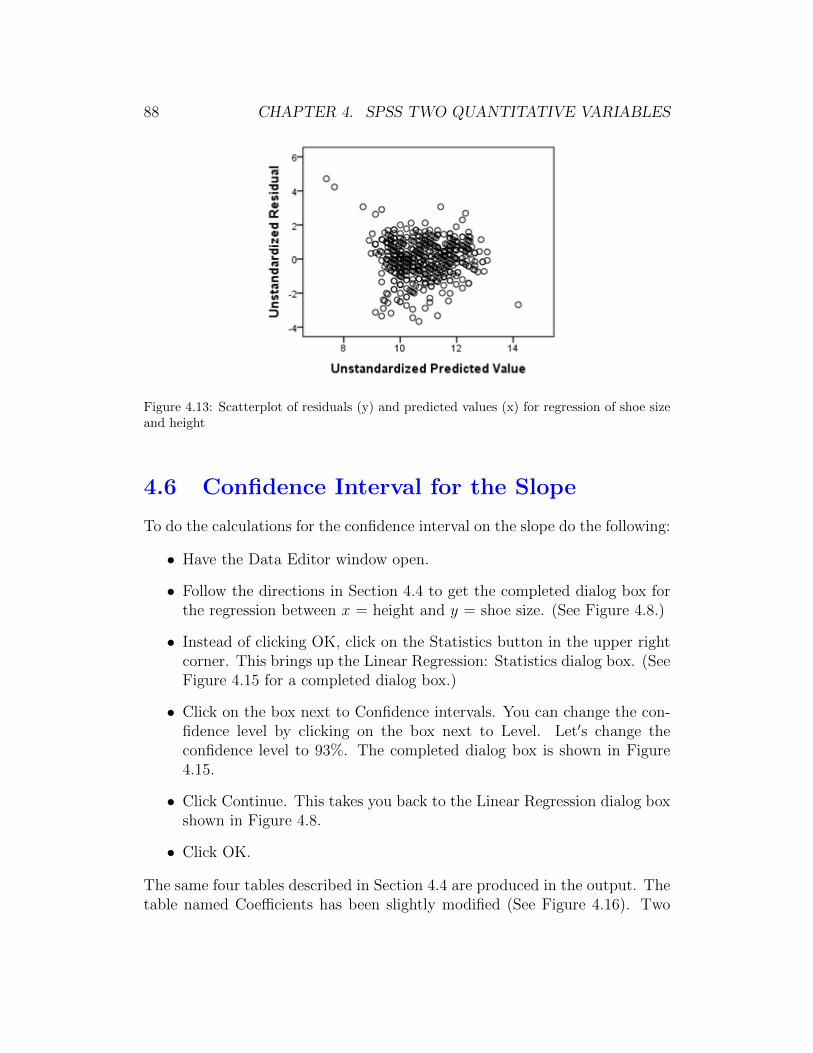
88 CHAPTER 4. SPSS TWO QUANTITATIVE VARIABLES
Figure 4.13: Scatterplot of residuals (y) and predicted values (x) for regression of shoe sizeand height
4.6 Confidence Interval for the Slope
To do the calculations for the confidence interval on the slope do the following:
• Have the Data Editor window open.
• Follow the directions in Section 4.4 to get the completed dialog box forthe regression between x = height and y = shoe size. (See Figure 4.8.)
• Instead of clicking OK, click on the Statistics button in the upper rightcorner. This brings up the Linear Regression: Statistics dialog box. (SeeFigure 4.15 for a completed dialog box.)
• Click on the box next to Confidence intervals. You can change the con-fidence level by clicking on the box next to Level. Let′s change theconfidence level to 93%. The completed dialog box is shown in Figure4.15.
• Click Continue. This takes you back to the Linear Regression dialog boxshown in Figure 4.8.
• Click OK.
The same four tables described in Section 4.4 are produced in the output. Thetable named Coefficients has been slightly modified (See Figure 4.16). Two

4.6. CONFIDENCE INTERVAL FOR THE SLOPE 89
Figure 4.14: Histogram of residuals for regression of shoe size and height
Figure 4.15: Completed dialog box to find a confidence interval on the slope
additional columns labeled 93.0% Confidence Interval for B are included. TheLower Bound column is the lower limit of the confidence interval. The UpperBound column is the upper limit of the confidence interval. Our concern iswith the second row which shows the confidence interval on the slope. In ourexample, the 93% confidence interval for the slope relating how average shoesize changes as height increases by 1 inch goes from 0.200 to 0.240.
Figure 4.16: 93% CI on the slope output for regression of shoe size and height

90 CHAPTER 4. SPSS TWO QUANTITATIVE VARIABLES
Chapter 5
SPSS for Analysis of IndependentTwo-Group Data
Throughout Chapter 5 of this SPSS manual we work with the dataset sur-vey215 that is saved on the text website and in the folder gabrosek/textbook.Refer to Section 0.1 to access SPSS and to open the data file survey215.
The dataset survey215 includes information on 15 variables collected on 536individuals who took introductory applied statistics from author Gabrosekover the past ten years. Not all variables were collected on all individuals.
5.1 Numerical Summaries for Two-Groups
For two-group independent quantitative data any numerical summary that iscalculated for one quantitative variable can be found for each of the two groupsseparately. In SPSS we can request that numerical summaries be done for eachgroup separately, provided the data have been entered correctly.
Message! To be able to use the techniques of this chapter of theSPSS manual to find numerical summaries for each of the twogroups separately, all of the quantitative values must be enteredinto the same column and a second column must specify which ofthe two groups the individual belongs to. Figure 5.1 shows the firstthree rows of the survey215 dataset with the variables CDs (numberof CD music discs owned) and tongue (whether or not the personcan curl their tongue). Notice that the variable tongue can be usedto separate the CD values into two groups.
91

92 CHAPTER 5. SPSS FOR INDEPENDENT TWO-GROUP DATA
Figure 5.1: Example SPSS data window for two-group independent data
Numerical measures of center and variability
To get numerical measures of center and variability for each group separatelydo the following:
• Have the Data Editor window open.
• On the menu bar click on Analyze → Descriptive Statistics → Explore.This brings up the Explore dialog box. (See Figure 5.2 for the completeddialog box.)
Figure 5.2: Completed dialog box to find numerical summaries for two-group independentdata
• Click on the desired quantitative variable name in the left box. We willuse the variable CDs.

5.1. NUMERICAL SUMMARIES TWO-GROUPS 93
• Click the right arrow next to the box under Dependent List.
• Click on the desired categorical variable name in the left box that repre-sents the two groups. We will use the variable Tongue, where 1 = Yes,the person can curl their tongue and 2 = no, the person cannot curl theirtongue.
Message! It is better to enter the categorical two-groups vari-able using the numerical values 1 and 2 or 0 and 1 and thenassigning these a value as done in Section 0.2 under “Vari-able View #6,” rather than as the actual category values suchas Yes/No. The reason is that when using numbers missingvalues are not included in the analysis, while when using thecategorical values missing values are treated as a separate cat-egory.
• Click the right arrow next to the box under Factor List. Figure 5.2 showsthe completed dialog box.
• Click OK.
Message! Notice in Figure 5.2 that under Display there are threeoptions; Both, Statistics, Plots. These options do exactly whatyou would expect. When Both is marked you will get numericalsummaries and graphical summaries. When Statistics is markedyou will only get numerical summaries. When Plots is marked youwill only get graphical summaries.
SPSS produces quite a bit of output. Figure 5.3 shows the Case ProcessingSummary table. There are 506 individuals for whom we have a CDs value anda tongue curling value.
Message! If either the quantitative variable or the categoricalgrouping variable is missing for an observation, then the observa-tion will not be used in the analysis and will not be part of the CaseProcessing Summary table.
The second table produced is the Descriptives table shown in Figure 5.4. Thistable includes many different numerical summaries for each group separately.Some numerical summaries have been deleted to save space. Notice that the
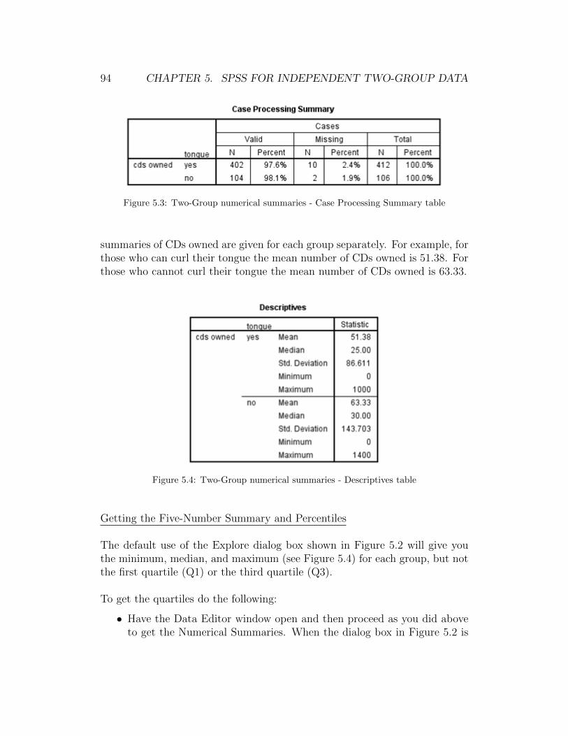
94 CHAPTER 5. SPSS FOR INDEPENDENT TWO-GROUP DATA
Figure 5.3: Two-Group numerical summaries - Case Processing Summary table
summaries of CDs owned are given for each group separately. For example, forthose who can curl their tongue the mean number of CDs owned is 51.38. Forthose who cannot curl their tongue the mean number of CDs owned is 63.33.
Figure 5.4: Two-Group numerical summaries - Descriptives table
Getting the Five-Number Summary and Percentiles
The default use of the Explore dialog box shown in Figure 5.2 will give youthe minimum, median, and maximum (see Figure 5.4) for each group, but notthe first quartile (Q1) or the third quartile (Q3).
To get the quartiles do the following:
• Have the Data Editor window open and then proceed as you did aboveto get the Numerical Summaries. When the dialog box in Figure 5.2 is

5.2. COMPARATIVE BOXPLOT 95
complete, click on the Statistics button in the upper right corner.This opens the Explore: Statistics dialog box as seen in Figure 2.4 ofSection 2.1.
• Click on the box next to Percentiles so that both the Descriptives boxand the Percentiles box have a check mark in them.
• Click Continue. This returns you to the Explore dialog box shown inFigure 5.2.
• Click OK.
The Percentiles table shown in Figure 5.5 gives Q1, Q3, and several other per-centiles. Recall that in this text we use the Weighted Average percentilesproduced by SPSS.
Figure 5.5: Two-Group numerical summaries - Percentiles table
When Both is marked in the Explore dialog box (Figure 5.2), you will also getsome graphical summaries including a comparative boxplot. We discuss thisin the next section.
5.2 Comparative Boxplot
In Section 5.1 we discussed how to get separate numerical summaries for aquantitative variable for each of two groups. Figure 5.2 shows the dialog boxfor getting numerical summaries. When either Both or Plots is marked underDisplay you will automatically get a modified (outliers denoted) comparativeboxplot of the quantitative variable.

96 CHAPTER 5. SPSS FOR INDEPENDENT TWO-GROUP DATA
Message! To get a modified comparative boxplot simply followthe instructions in Section 5.1 to find numerical summaries andbe sure that either Both or Plots is marked under Display. Thereis another way to get a comparative boxplot in SPSS. We do notdiscuss this alternative method.
Figure 5.6 shows the default SPSS comparative boxplot created with the nu-merical summaries in Section 5.1. The plot shows CDs owned for those whocan curl their tongue and those who cannot separately. The graph has beenre-sized to save space.
Figure 5.6: Default SPSS boxplot for CDs owned by tongue curl
The features of the modified comparative boxplot are the same as for the box-plot for one quantitative variable discussed in Section 2.2. The only differenceis that you have separate boxplots for each of the two groups drawn on thesame vertical axis for easy comparison.
5.3 Editing a Comparative Boxplot
Editing a comparative boxplot is very similar to editing a boxplot as discussedin Section 2.3. In that section we described how to complete each of thefollowing edits:
• “Changing the Size,”

5.3. EDITING A COMPARATIVE BOXPLOT 97
• “Changing the Vertical Axis Numbering/Decimal Places,”
• “Changing the Background Color,”
• “Suppressing the Row Numbers for Outliers.”
The one edit we made for a boxplot in Section 2.3 that we might want to alterslightly for a comparative boxplot is “Changing the Fill Color in the Box.”With two different boxes we may want them to have different fill colors.
Changing the Fill Color in Each Box
To change the fill color in each box do the following:
• Have the Chart Editor window open.
• Click TWICE (with a slight time pause in-between clicks) inside the boxwhose color you want to change. The box should be outlined in yellow.If you only click once or you click too quickly both boxes will be outlined.Let′s start with the tongue = No box.
• On the menu bar click on Edit → Properties. This brings up the Prop-erties dialog box.
• Click on the Fill & Border tab. (See Figure 5.7 for the completed dialogbox.)
Figure 5.7: Completed dialog box to edit the color of the tongue = No box for CDs owned
• Click once on the box next to the word Fill. The box should now beoutlined in black.

98 CHAPTER 5. SPSS FOR INDEPENDENT TWO-GROUP DATA
• Click on the color you want on the right side. Let′s make the box orange.
• Click on Apply.
• Repeat the above process with tongue = Yes and make the box blue.
Message! When you change the fill color of the box it will alsochange the color of any denoted outliers for that group.
Make the following additional edits to the graph.
• Change the size so that Height = 210.
• Change the vertical axis numbering to Minimum = 0, Maximum = 1400,Major Increment = 200.
• Change the background color to white.
• Suppress the row numbers on all outliers.
The final edited boxplot as seen in the Output window is shown in Figure 5.8.
Figure 5.8: Completed edited comparative boxplot of CDs owned by tongue curl

5.4. COMPARATIVE HISTOGRAM 99
5.4 Comparative Histogram
The comparative histogram has separate histograms for each group with thesame classes (i.e., the horizontal axis numbering is the same) and the samefrequency jumps (i.e., the vertical axis numbering is the same).
To make a comparative histogram do the following:
• Have the Data Editor window open.
• On the menu bar click on Graphs→ Legacy Dialogs→ Histogram. Thisbrings up the Histogram dialog box first seen in Figure 2.10.
• Click on the quantitative variable name in the box on the left. We willmake a histogram of CDs.
• Click on the right arrow next to the box under Variable.
• Click on the grouping categorical variable; here, tongue.
Message! Notice that the variable sex (also a categorical vari-able that can be used for grouping into two groups) is not anoption in the box on the left. The reason is that sex was enteredas string into the dataset (m or f) while tongue was enteredwith values 1, 2 which were then assigned categories Yes andNo. SPSS will not allow you to use a string variable as thegrouping variable when making a comparative histogram.
• Click on the right arrow under Rows. The completed dialog box is shownin Figure 5.9.
• Click OK.
Figure 5.10 shows the default histogram that we have re-sized to save space.Notice that the size of each group′s histogram is rather small. This is an issuewith making a comparative histogram. When we change the height to 210that makes the entire graph have height 210 - not each histogram separately.
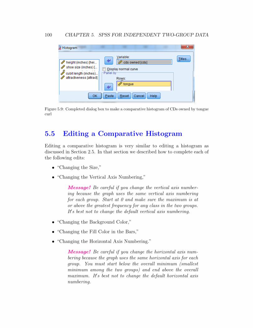
100 CHAPTER 5. SPSS FOR INDEPENDENT TWO-GROUP DATA
Figure 5.9: Completed dialog box to make a comparative histogram of CDs owned by tonguecurl
5.5 Editing a Comparative Histogram
Editing a comparative histogram is very similar to editing a histogram asdiscussed in Section 2.5. In that section we described how to complete each ofthe following edits:
• “Changing the Size,”
• “Changing the Vertical Axis Numbering,”
Message! Be careful if you change the vertical axis number-ing because the graph uses the same vertical axis numberingfor each group. Start at 0 and make sure the maximum is ator above the greatest frequency for any class in the two groups.It′s best not to change the default vertical axis numbering.
• “Changing the Background Color,”
• “Changing the Fill Color in the Bars,”
• “Changing the Horizontal Axis Numbering.”
Message! Be careful if you change the horizontal axis num-bering because the graph uses the same horizontal axis for eachgroup. You must start below the overall minimum (smallestminimum among the two groups) and end above the overallmaximum. It′s best not to change the default horizontal axisnumbering.
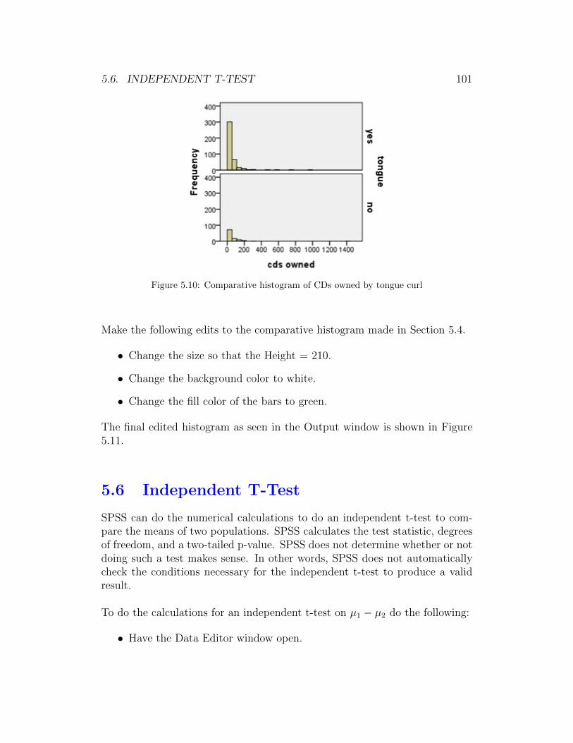
5.6. INDEPENDENT T-TEST 101
Figure 5.10: Comparative histogram of CDs owned by tongue curl
Make the following edits to the comparative histogram made in Section 5.4.
• Change the size so that the Height = 210.
• Change the background color to white.
• Change the fill color of the bars to green.
The final edited histogram as seen in the Output window is shown in Figure5.11.
5.6 Independent T-Test
SPSS can do the numerical calculations to do an independent t-test to com-pare the means of two populations. SPSS calculates the test statistic, degreesof freedom, and a two-tailed p-value. SPSS does not determine whether or notdoing such a test makes sense. In other words, SPSS does not automaticallycheck the conditions necessary for the independent t-test to produce a validresult.
To do the calculations for an independent t-test on µ1 − µ2 do the following:
• Have the Data Editor window open.

102 CHAPTER 5. SPSS FOR INDEPENDENT TWO-GROUP DATA
Figure 5.11: Completed edited comparative histogram of CDs owned by tongue curl
• On the menu bar click on Analyze → Compare Means → Independent-Samples T Test. This brings up the Independent-Samples T Test dialogbox. (See Figure 5.12 for the completed dialog box.)
Figure 5.12: Completed Independent-Samples T Test dialog box to determine if CDs owneddiffers by tongue curl
• Click on the quantitative variable name in the left box. We will use thevariable CDs.
• Click the right arrow next to the box under Test Variable(s).
• Click on the categorical grouping variable name in the left box. We will
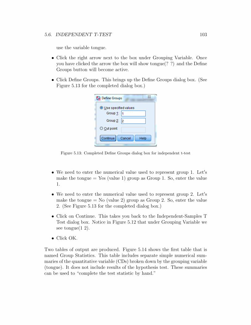
5.6. INDEPENDENT T-TEST 103
use the variable tongue.
• Click the right arrow next to the box under Grouping Variable. Onceyou have clicked the arrow the box will show tongue(? ?) and the DefineGroups button will become active.
• Click Define Groups. This brings up the Define Groups dialog box. (SeeFigure 5.13 for the completed dialog box.)
Figure 5.13: Completed Define Groups dialog box for independent t-test
• We need to enter the numerical value used to represent group 1. Let′smake the tongue = Yes (value 1) group as Group 1. So, enter the value1.
• We need to enter the numerical value used to represent group 2. Let′smake the tongue = No (value 2) group as Group 2. So, enter the value2. (See Figure 5.13 for the completed dialog box.)
• Click on Continue. This takes you back to the Independent-Samples TTest dialog box. Notice in Figure 5.12 that under Grouping Variable wesee tongue(1 2).
• Click OK.
Two tables of output are produced. Figure 5.14 shows the first table that isnamed Group Statistics. This table includes separate simple numerical sum-maries of the quantitative variable (CDs) broken down by the grouping variable(tongue). It does not include results of the hypothesis test. These summariescan be used to “complete the test statistic by hand.”
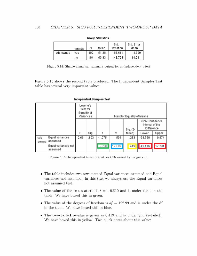
104 CHAPTER 5. SPSS FOR INDEPENDENT TWO-GROUP DATA
Figure 5.14: Simple numerical summary output for an independent t-test
Figure 5.15 shows the second table produced. The Independent Samples Testtable has several very important values.
Figure 5.15: Independent t-test output for CDs owned by tongue curl
• The table includes two rows named Equal variances assumed and Equalvariances not assumed. In this text we always use the Equal variancesnot assumed test.
• The value of the test statistic is t = −0.810 and is under the t in thetable. We have boxed this in green.
• The value of the degrees of freedom is df = 122.99 and is under the dfin the table. We have boxed this in blue.
• The two-tailed p-value is given as 0.419 and is under Sig. (2-tailed).We have boxed this in yellow. Two quick notes about this value:
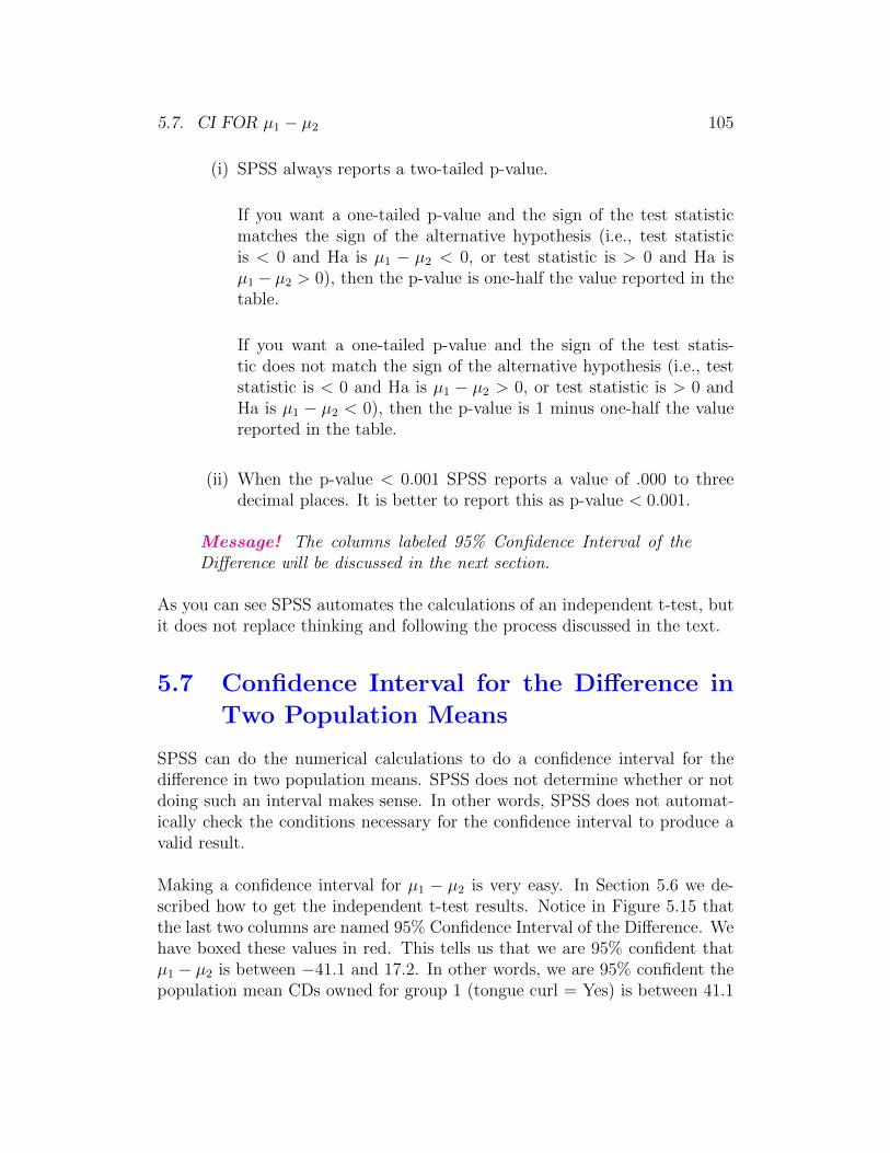
5.7. CI FOR µ1 − µ2 105
(i) SPSS always reports a two-tailed p-value.
If you want a one-tailed p-value and the sign of the test statisticmatches the sign of the alternative hypothesis (i.e., test statisticis < 0 and Ha is µ1 − µ2 < 0, or test statistic is > 0 and Ha isµ1 − µ2 > 0), then the p-value is one-half the value reported in thetable.
If you want a one-tailed p-value and the sign of the test statis-tic does not match the sign of the alternative hypothesis (i.e., teststatistic is < 0 and Ha is µ1 − µ2 > 0, or test statistic is > 0 andHa is µ1 − µ2 < 0), then the p-value is 1 minus one-half the valuereported in the table.
(ii) When the p-value < 0.001 SPSS reports a value of .000 to threedecimal places. It is better to report this as p-value < 0.001.
Message! The columns labeled 95% Confidence Interval of theDifference will be discussed in the next section.
As you can see SPSS automates the calculations of an independent t-test, butit does not replace thinking and following the process discussed in the text.
5.7 Confidence Interval for the Difference in
Two Population Means
SPSS can do the numerical calculations to do a confidence interval for thedifference in two population means. SPSS does not determine whether or notdoing such an interval makes sense. In other words, SPSS does not automat-ically check the conditions necessary for the confidence interval to produce avalid result.
Making a confidence interval for µ1 − µ2 is very easy. In Section 5.6 we de-scribed how to get the independent t-test results. Notice in Figure 5.15 thatthe last two columns are named 95% Confidence Interval of the Difference. Wehave boxed these values in red. This tells us that we are 95% confident thatµ1 − µ2 is between −41.1 and 17.2. In other words, we are 95% confident thepopulation mean CDs owned for group 1 (tongue curl = Yes) is between 41.1
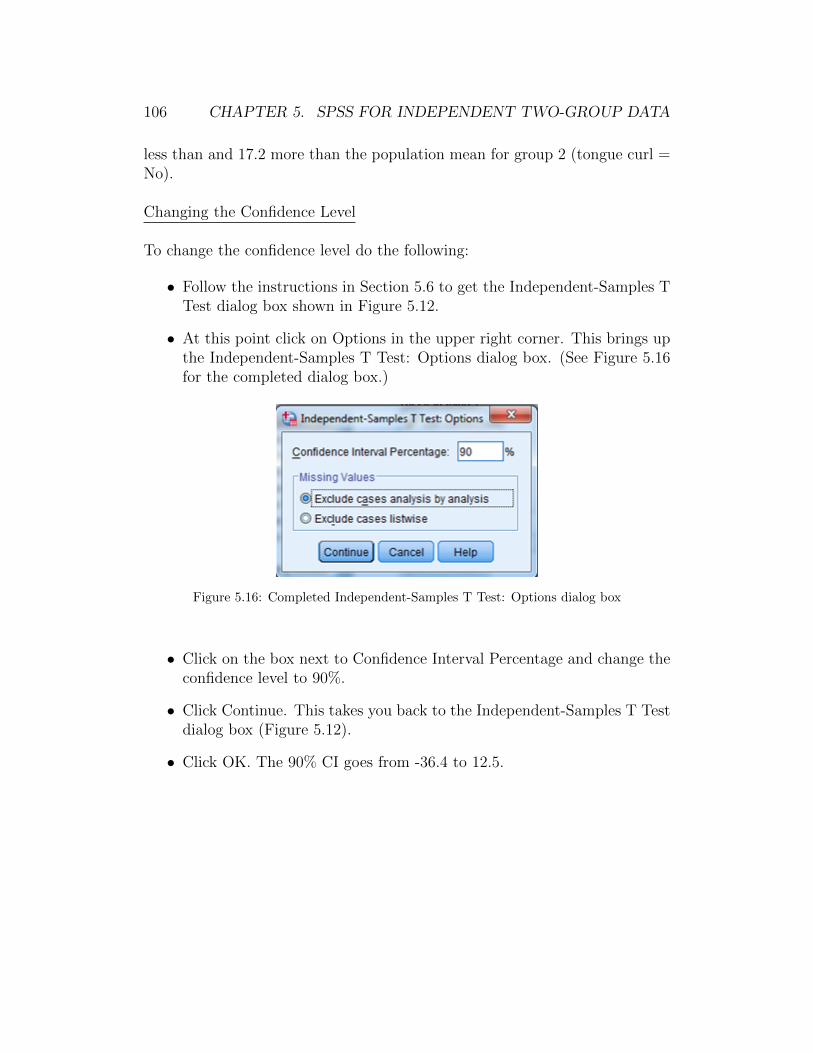
106 CHAPTER 5. SPSS FOR INDEPENDENT TWO-GROUP DATA
less than and 17.2 more than the population mean for group 2 (tongue curl =No).
Changing the Confidence Level
To change the confidence level do the following:
• Follow the instructions in Section 5.6 to get the Independent-Samples TTest dialog box shown in Figure 5.12.
• At this point click on Options in the upper right corner. This brings upthe Independent-Samples T Test: Options dialog box. (See Figure 5.16for the completed dialog box.)
Figure 5.16: Completed Independent-Samples T Test: Options dialog box
• Click on the box next to Confidence Interval Percentage and change theconfidence level to 90%.
• Click Continue. This takes you back to the Independent-Samples T Testdialog box (Figure 5.12).
• Click OK. The 90% CI goes from -36.4 to 12.5.
Chapter 6
SPSS for Analysis of Paired Data
Throughout Chapter 6 of this SPSS manual we work with the dataset organicfoods that is saved on the text website and in the folder gabrosek/textbook.Refer to Section 0.1 to access SPSS and to open the data file organic foods.
The dataset organic foods includes information on 29 variables collected on 62individuals under three experimental conditions.
Throughout this chapter we use only the data corresponding to con-dition = 3 (subjects are shown pictures of “comfort” foods such asice cream and brownies). Subjects rate these foods on a 1 = not at alldesirable to 7 = very desirable scale.
6.1 Selecting a Subset of Data
Often data sets have many individuals (rows) and/or many variables (columns).Sometimes we want to work with only a subset (portion of) the individuals.It is easy to select a subset of the individuals in the data set when we have avariable to select by. In this chapter we want to select only those individualsfrom the organic foods data set that where given condition = 3 (shown comfortfoods such as ice cream or brownies).
To select a subset of the individuals in a data set do the following:
• Have the Data Editor window open.
107
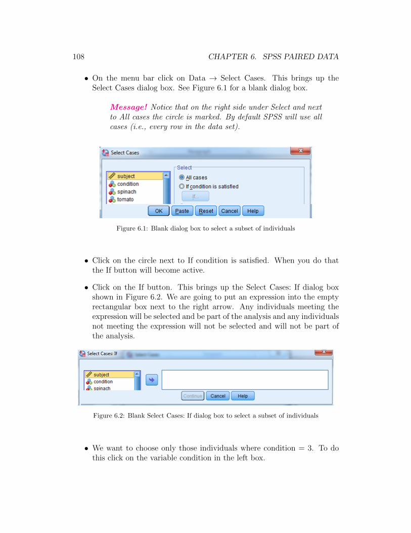
108 CHAPTER 6. SPSS PAIRED DATA
• On the menu bar click on Data → Select Cases. This brings up theSelect Cases dialog box. See Figure 6.1 for a blank dialog box.
Message! Notice that on the right side under Select and nextto All cases the circle is marked. By default SPSS will use allcases (i.e., every row in the data set).
Figure 6.1: Blank dialog box to select a subset of individuals
• Click on the circle next to If condition is satisfied. When you do thatthe If button will become active.
• Click on the If button. This brings up the Select Cases: If dialog boxshown in Figure 6.2. We are going to put an expression into the emptyrectangular box next to the right arrow. Any individuals meeting theexpression will be selected and be part of the analysis and any individualsnot meeting the expression will not be selected and will not be part ofthe analysis.
Figure 6.2: Blank Select Cases: If dialog box to select a subset of individuals
• We want to choose only those individuals where condition = 3. To dothis click on the variable condition in the left box.
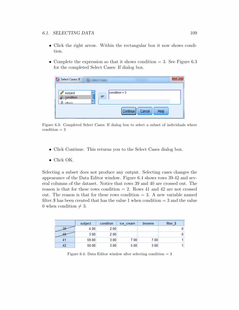
6.1. SELECTING DATA 109
• Click the right arrow. Within the rectangular box it now shows condi-tion.
• Complete the expression so that it shows condition = 3. See Figure 6.3for the completed Select Cases: If dialog box.
Figure 6.3: Completed Select Cases: If dialog box to select a subset of individuals wherecondition = 3
• Click Continue. This returns you to the Select Cases dialog box.
• Click OK.
Selecting a subset does not produce any output. Selecting cases changes theappearance of the Data Editor window. Figure 6.4 shows rows 39-42 and sev-eral columns of the dataset. Notice that rows 39 and 40 are crossed out. Thereason is that for these rows condition = 2. Rows 41 and 42 are not crossedout. The reason is that for these rows condition = 3. A new variable namedfilter $ has been created that has the value 1 when condition = 3 and the value0 when condition 6= 3.
Figure 6.4: Data Editor window after selecting condition = 3
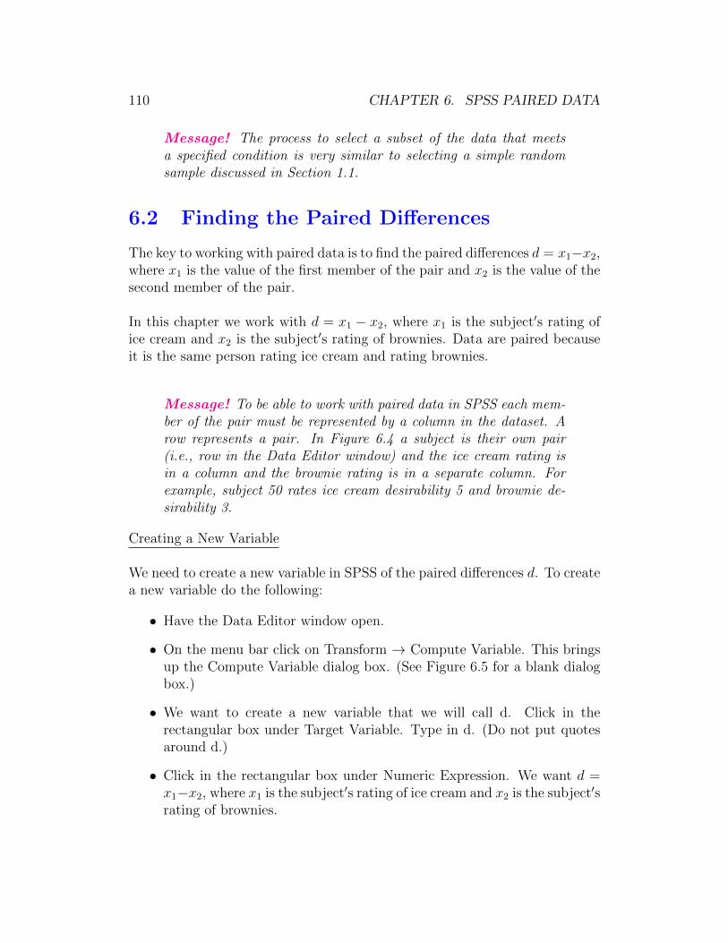
110 CHAPTER 6. SPSS PAIRED DATA
Message! The process to select a subset of the data that meetsa specified condition is very similar to selecting a simple randomsample discussed in Section 1.1.
6.2 Finding the Paired Differences
The key to working with paired data is to find the paired differences d = x1−x2,where x1 is the value of the first member of the pair and x2 is the value of thesecond member of the pair.
In this chapter we work with d = x1 − x2, where x1 is the subject′s rating ofice cream and x2 is the subject′s rating of brownies. Data are paired becauseit is the same person rating ice cream and rating brownies.
Message! To be able to work with paired data in SPSS each mem-ber of the pair must be represented by a column in the dataset. Arow represents a pair. In Figure 6.4 a subject is their own pair(i.e., row in the Data Editor window) and the ice cream rating isin a column and the brownie rating is in a separate column. Forexample, subject 50 rates ice cream desirability 5 and brownie de-sirability 3.
Creating a New Variable
We need to create a new variable in SPSS of the paired differences d. To createa new variable do the following:
• Have the Data Editor window open.
• On the menu bar click on Transform → Compute Variable. This bringsup the Compute Variable dialog box. (See Figure 6.5 for a blank dialogbox.)
• We want to create a new variable that we will call d. Click in therectangular box under Target Variable. Type in d. (Do not put quotesaround d.)
• Click in the rectangular box under Numeric Expression. We want d =x1−x2, where x1 is the subject′s rating of ice cream and x2 is the subject′srating of brownies.

6.2. FINDING THE PAIRED DIFFERENCES 111
Figure 6.5: Blank dialog box to find paired differences d
• In the variable list on the left click on ice cream.
• Click on the right arrow next to Numeric Expression.
• Click on the - (minus sign) on the keypad.
• In the variable list on the left click on brownie.
• Click on the right arrow next to Numeric Expression. Figure 6.6 showsthe completed dialog box. The numeric expression reads: d = ice cream −brownie.
• Click OK.
Creating a new variable does not produce any output. Creating a new vari-able changes the appearance of the Data Editor window by adding a columnfor the new variable. Figure 6.7 shows rows 41-42 and several columns of thedataset. Notice that the column d has been added to the dataset and thatd = ice cream − brownie.
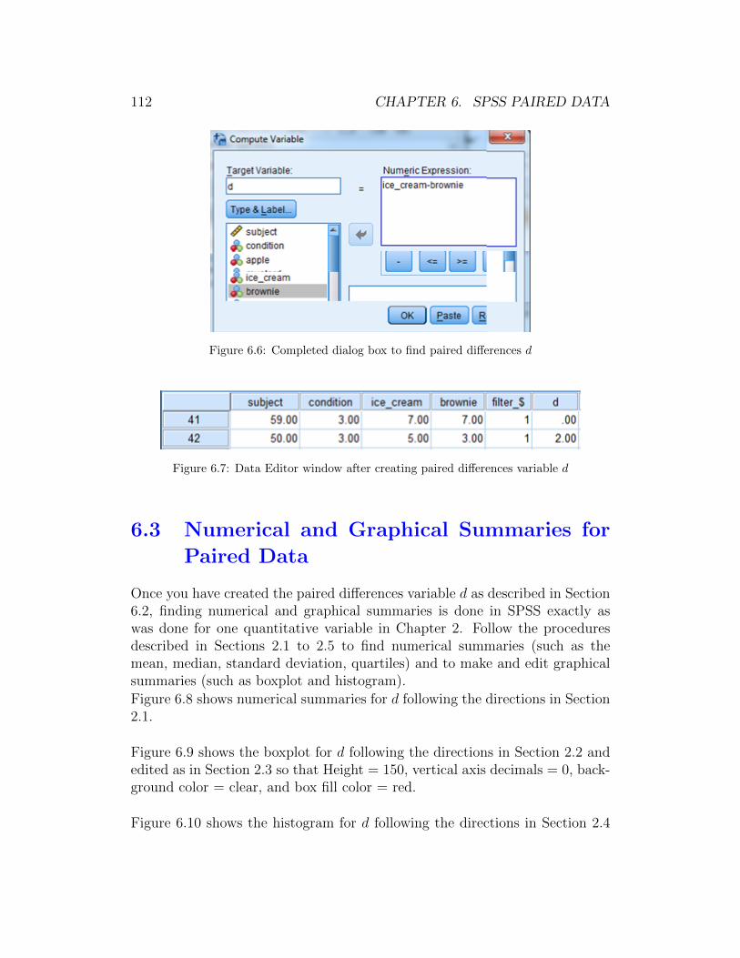
112 CHAPTER 6. SPSS PAIRED DATA
Figure 6.6: Completed dialog box to find paired differences d
Figure 6.7: Data Editor window after creating paired differences variable d
6.3 Numerical and Graphical Summaries for
Paired Data
Once you have created the paired differences variable d as described in Section6.2, finding numerical and graphical summaries is done in SPSS exactly aswas done for one quantitative variable in Chapter 2. Follow the proceduresdescribed in Sections 2.1 to 2.5 to find numerical summaries (such as themean, median, standard deviation, quartiles) and to make and edit graphicalsummaries (such as boxplot and histogram).
Figure 6.8 shows numerical summaries for d following the directions in Section2.1.
Figure 6.9 shows the boxplot for d following the directions in Section 2.2 andedited as in Section 2.3 so that Height = 150, vertical axis decimals = 0, back-ground color = clear, and box fill color = red.
Figure 6.10 shows the histogram for d following the directions in Section 2.4
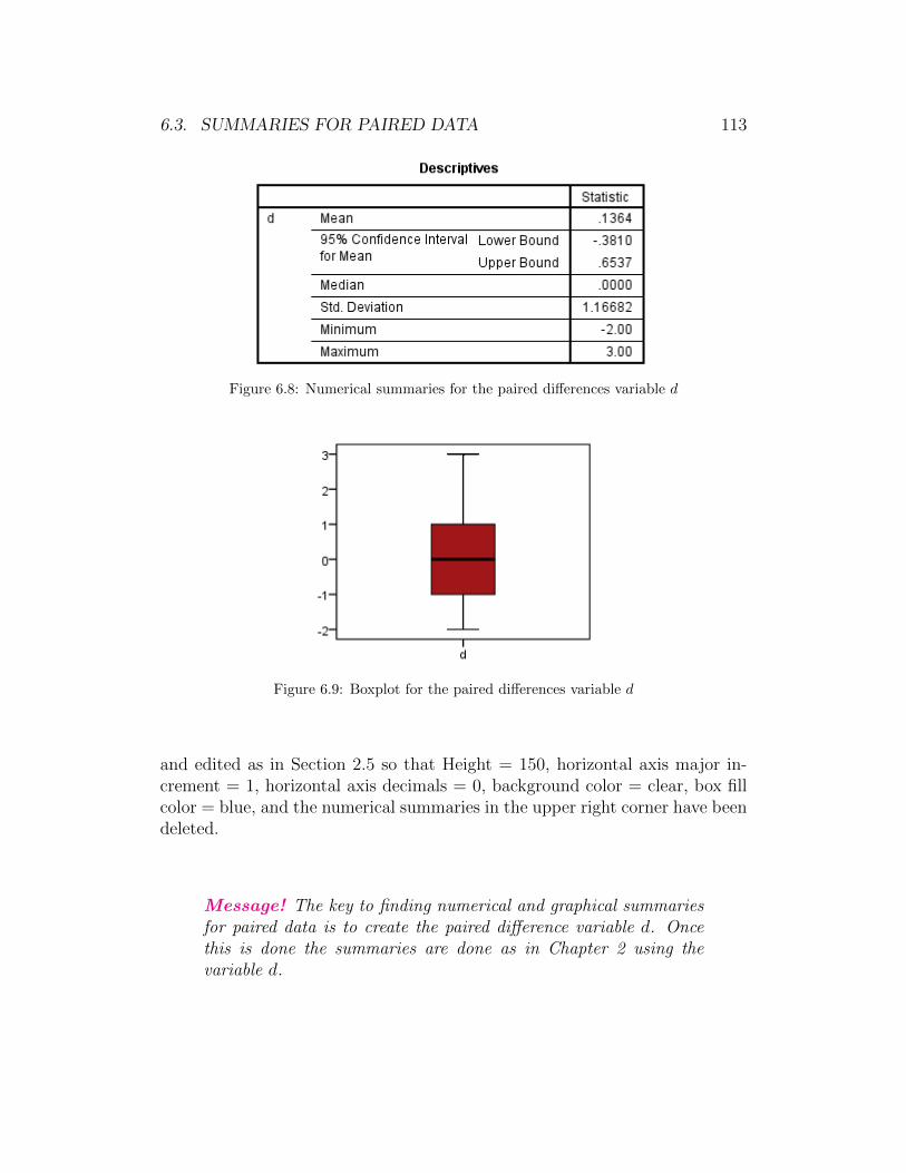
6.3. SUMMARIES FOR PAIRED DATA 113
Figure 6.8: Numerical summaries for the paired differences variable d
Figure 6.9: Boxplot for the paired differences variable d
and edited as in Section 2.5 so that Height = 150, horizontal axis major in-crement = 1, horizontal axis decimals = 0, background color = clear, box fillcolor = blue, and the numerical summaries in the upper right corner have beendeleted.
Message! The key to finding numerical and graphical summariesfor paired data is to create the paired difference variable d. Oncethis is done the summaries are done as in Chapter 2 using thevariable d.
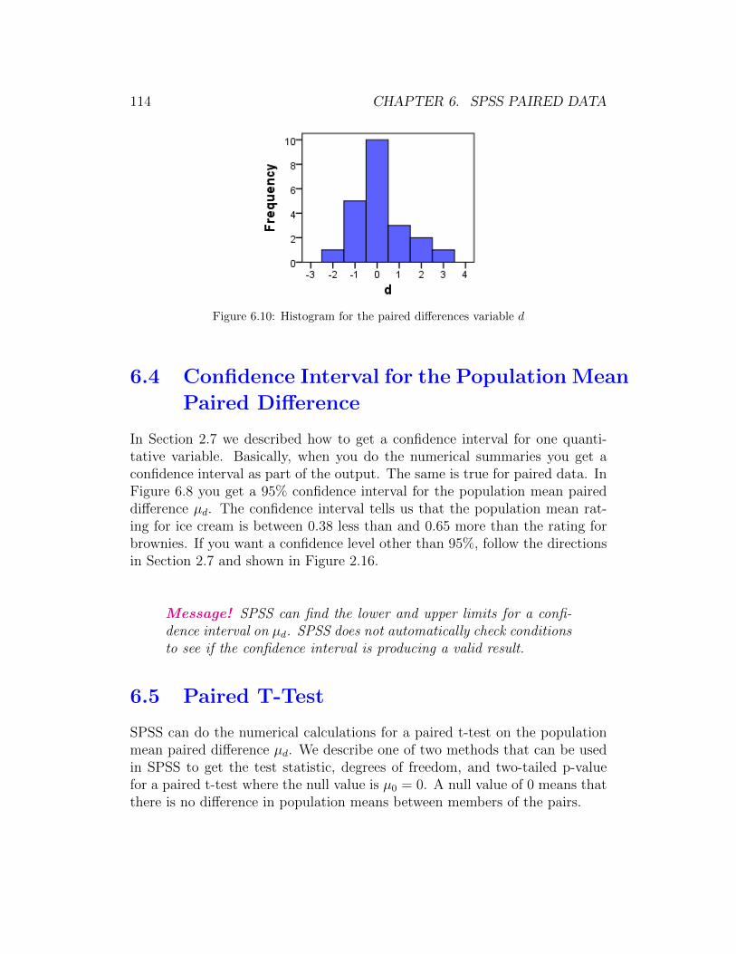
114 CHAPTER 6. SPSS PAIRED DATA
Figure 6.10: Histogram for the paired differences variable d
6.4 Confidence Interval for the Population Mean
Paired Difference
In Section 2.7 we described how to get a confidence interval for one quanti-tative variable. Basically, when you do the numerical summaries you get aconfidence interval as part of the output. The same is true for paired data. InFigure 6.8 you get a 95% confidence interval for the population mean paireddifference µd. The confidence interval tells us that the population mean rat-ing for ice cream is between 0.38 less than and 0.65 more than the rating forbrownies. If you want a confidence level other than 95%, follow the directionsin Section 2.7 and shown in Figure 2.16.
Message! SPSS can find the lower and upper limits for a confi-dence interval on µd. SPSS does not automatically check conditionsto see if the confidence interval is producing a valid result.
6.5 Paired T-Test
SPSS can do the numerical calculations for a paired t-test on the populationmean paired difference µd. We describe one of two methods that can be usedin SPSS to get the test statistic, degrees of freedom, and two-tailed p-valuefor a paired t-test where the null value is µ0 = 0. A null value of 0 means thatthere is no difference in population means between members of the pairs.
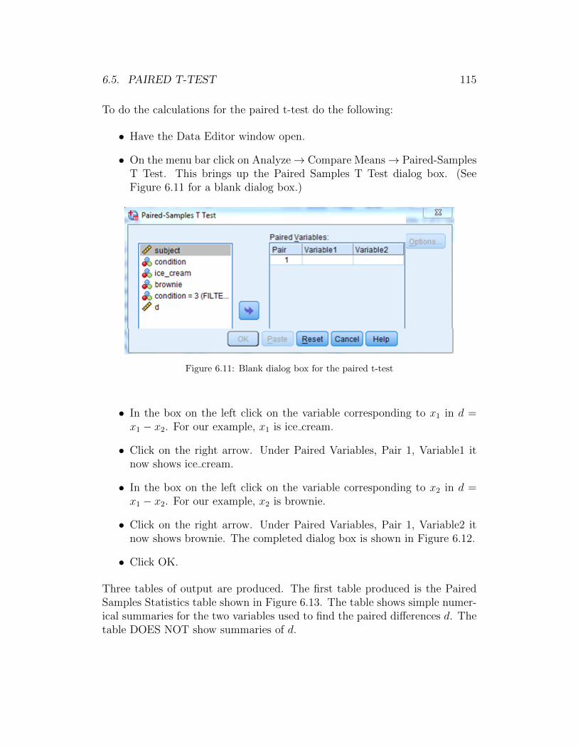
6.5. PAIRED T-TEST 115
To do the calculations for the paired t-test do the following:
• Have the Data Editor window open.
• On the menu bar click on Analyze→ Compare Means→ Paired-SamplesT Test. This brings up the Paired Samples T Test dialog box. (SeeFigure 6.11 for a blank dialog box.)
Figure 6.11: Blank dialog box for the paired t-test
• In the box on the left click on the variable corresponding to x1 in d =x1 − x2. For our example, x1 is ice cream.
• Click on the right arrow. Under Paired Variables, Pair 1, Variable1 itnow shows ice cream.
• In the box on the left click on the variable corresponding to x2 in d =x1 − x2. For our example, x2 is brownie.
• Click on the right arrow. Under Paired Variables, Pair 1, Variable2 itnow shows brownie. The completed dialog box is shown in Figure 6.12.
• Click OK.
Three tables of output are produced. The first table produced is the PairedSamples Statistics table shown in Figure 6.13. The table shows simple numer-ical summaries for the two variables used to find the paired differences d. Thetable DOES NOT show summaries of d.
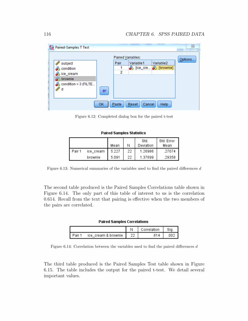
116 CHAPTER 6. SPSS PAIRED DATA
Figure 6.12: Completed dialog box for the paired t-test
Figure 6.13: Numerical summaries of the variables used to find the paired differences d
The second table produced is the Paired Samples Correlations table shown inFigure 6.14. The only part of this table of interest to us is the correlation0.614. Recall from the text that pairing is effective when the two members ofthe pairs are correlated.
Figure 6.14: Correlation between the variables used to find the paired differences d
The third table produced is the Paired Samples Test table shown in Figure6.15. The table includes the output for the paired t-test. We detail severalimportant values.

6.5. PAIRED T-TEST 117
Figure 6.15: Output for the paired t-test
• The value of the test statistic is t = 0.548 and is under the t column inthe table. We have boxed this in green.
• The value of the degrees of freedom is df = 21 and is under the df columnin the table. We have boxed this in blue.
• The two-tailed p-value is given as 0.589 and is under the Sig. (2-sided)column. We have boxed this in yellow.
(i) SPSS always reports a two-tailed p-value.
If you want a one-tailed p-value and the sign of the test statisticmatches the sign of the alternative hypothesis (i.e., test statistic is< 0 and Ha is µd < 0, or test statistic is > 0 and Ha is µd > 0),then the p-value is one-half the value reported in the table.
If you want a one-tailed p-value and the sign of the test statis-tic does not match the sign of the alternative hypothesis (i.e., teststatistic is < 0 and Ha is µd > 0, or test statistic is > 0 and Ha isµd < 0), then the p-value is 1 minus one-half the value reported inthe table.
(ii) When the p-value < 0.001 SPSS reports a value of .000 to threedecimal places. It is better to report this as p-value < 0.001.
Message! Notice that the paired t-test output gives a 95% confi-dence interval on µd. In Figure 6.15 the 95% confidence interval

118 CHAPTER 6. SPSS PAIRED DATA
is boxed in orange. This matches the confidence interval given inFigure 6.8.

Chapter 7
SPSS for ANOVA
Throughout Chapter 7 of this SPSS manual we work with the dataset sur-vey215 that is saved on the text website and in the folder gabrosek/textbook.Refer to Section 0.1 to access SPSS and to open the data file survey215.
The dataset survey215 includes information on 15 variables collected on 536individuals who took introductory applied statistics from author Gabrosekover the past ten years. Not all variables were collected on all individuals.
7.1 Numerical and Graphical Summaries for
ANOVA
In Chapter 5 we discussed using SPSS for the analysis of two-group indepen-dent data. Since One-Way ANOVA data is simply independent data with threeor more groups, finding numerical and graphical summaries for ANOVA datafollows the instructions in Sections 5.1 through 5.5 for two-group independentdata. The only difference is that in the output instead of results for each oftwo groups we have results for each of the three or more groups.
Numerical Summaries for ANOVA Data
Message! To find numerical summaries for ANOVA follow thedirections in Section 5.1 for two-group independent data.
Let′s find numerical summaries for the quantitative variable arm span brokendown by the categorical grouping variable class. The variable class has five
119
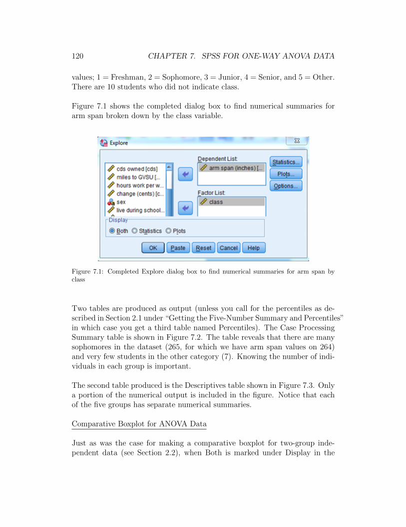
120 CHAPTER 7. SPSS FOR ONE-WAY ANOVA DATA
values; 1 = Freshman, 2 = Sophomore, 3 = Junior, 4 = Senior, and 5 = Other.There are 10 students who did not indicate class.
Figure 7.1 shows the completed dialog box to find numerical summaries forarm span broken down by the class variable.
Figure 7.1: Completed Explore dialog box to find numerical summaries for arm span byclass
Two tables are produced as output (unless you call for the percentiles as de-scribed in Section 2.1 under “Getting the Five-Number Summary and Percentiles”in which case you get a third table named Percentiles). The Case ProcessingSummary table is shown in Figure 7.2. The table reveals that there are manysophomores in the dataset (265, for which we have arm span values on 264)and very few students in the other category (7). Knowing the number of indi-viduals in each group is important.
The second table produced is the Descriptives table shown in Figure 7.3. Onlya portion of the numerical output is included in the figure. Notice that eachof the five groups has separate numerical summaries.
Comparative Boxplot for ANOVA Data
Just as was the case for making a comparative boxplot for two-group inde-pendent data (see Section 2.2), when Both is marked under Display in the
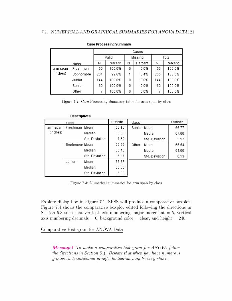
7.1. NUMERICAL ANDGRAPHICAL SUMMARIES FOR ANOVADATA121
Figure 7.2: Case Processing Summary table for arm span by class
Figure 7.3: Numerical summaries for arm span by class
Explore dialog box in Figure 7.1, SPSS will produce a comparative boxplot.Figure 7.4 shows the comparative boxplot edited following the directions inSection 5.3 such that vertical axis numbering major increment = 5, verticalaxis numbering decimals = 0, background color = clear, and height = 240.
Comparative Histogram for ANOVA Data
Message! To make a comparative histogram for ANOVA followthe directions in Section 5.4. Beware that when you have numerousgroups each individual group′s histogram may be very short.

122 CHAPTER 7. SPSS FOR ONE-WAY ANOVA DATA
Figure 7.4: Edited comparative boxplot for arm span by class
Figure 7.5 shows the comparative histogram edited following the directions inSection 5.5 such that the background color = clear, the bar fill color is orange,the horizontal axis numbering major increment = 5, and the horizontal axisnumbering decimals places = 0. (Some of the groups upper part of the graphhave been cutoff to save space. For example, the portion of the Other verticalaxis above Frequency 10 has been cutoff).
Notice that because the graph uses frequency and there are so many moresophomores than most of the groups, the bars for sophomore are much higherthan the other classes.
7.2 The ANOVA Table
As was seen in the text, the key to completing the analysis for ANOVA is toget the ANOVA table which includes the sums of squares, necessary degrees offreedom, the F statistic, and the p-value. These can then be used to completea hypothesis test for ANOVA data.
To get the ANOVA table do the following:
• Have the Data Editor window open.
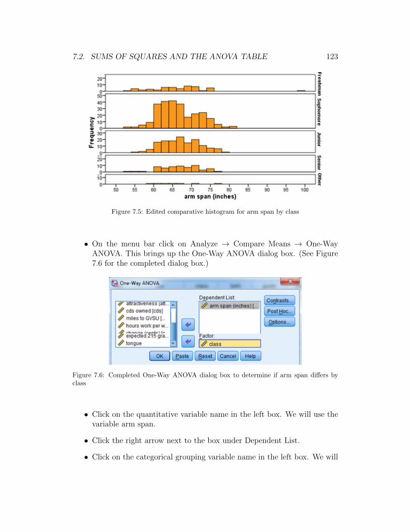
7.2. SUMS OF SQUARES AND THE ANOVA TABLE 123
Figure 7.5: Edited comparative histogram for arm span by class
• On the menu bar click on Analyze → Compare Means → One-WayANOVA. This brings up the One-Way ANOVA dialog box. (See Figure7.6 for the completed dialog box.)
Figure 7.6: Completed One-Way ANOVA dialog box to determine if arm span differs byclass
• Click on the quantitative variable name in the left box. We will use thevariable arm span.
• Click the right arrow next to the box under Dependent List.
• Click on the categorical grouping variable name in the left box. We will
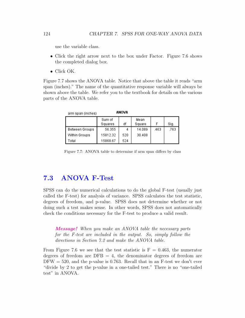
124 CHAPTER 7. SPSS FOR ONE-WAY ANOVA DATA
use the variable class.
• Click the right arrow next to the box under Factor. Figure 7.6 showsthe completed dialog box.
• Click OK.
Figure 7.7 shows the ANOVA table. Notice that above the table it reads “armspan (inches).” The name of the quantitative response variable will always beshown above the table. We refer you to the textbook for details on the variousparts of the ANOVA table.
Figure 7.7: ANOVA table to determine if arm span differs by class
7.3 ANOVA F-Test
SPSS can do the numerical calculations to do the global F-test (usually justcalled the F-test) for analysis of variance. SPSS calculates the test statistic,degrees of freedom, and p-value. SPSS does not determine whether or notdoing such a test makes sense. In other words, SPSS does not automaticallycheck the conditions necessary for the F-test to produce a valid result.
Message! When you make an ANOVA table the necessary partsfor the F-test are included in the output. So, simply follow thedirections in Section 7.2 and make the ANOVA table.
From Figure 7.6 we see that the test statistic is F = 0.463, the numeratordegrees of freedom are DFB = 4, the denominator degrees of freedom areDFW = 520, and the p-value is 0.763. Recall that in an F-test we don′t ever“divide by 2 to get the p-value in a one-tailed test.” There is no “one-tailedtest” in ANOVA.

7.4. POST HOC COMPARISONS FOR ANOVA 125
7.4 Post Hoc Comparisons for ANOVA
If and only if you reject Ho in the F-test for ANOVA, then you should com-plete a post hoc comparison of each pair of groups to identify which groupshave different population means. In the textbook we use the approach of doinga series of independent t-tests using the Bonferroni adjustment for the levelof significance. Thus, using SPSS to do the post hoc analysis following thetechnique discussed in the textbook involves following the directions in Section5.6 to do a separate independent t-test for each pair of groups.
For our example there are five groups (i.e., five values for the grouping cate-gorical variable class). Thus, we need to do 10 separate independent t-tests.Figure 7.8 shows the output for one of the 10 independent t-tests; namely,comparison of Freshman and Sophomores. The p-value is 0.948.
Figure 7.8: Post hoc independent t-test of arm span comparing freshman and sophomores
A couple notes regarding the post hoc procedure:
• Since the p-value for the F-test was found to be 0.463 (see Figure 7.6)we did not reject Ho. Thus, we should not have done any post hoc testsfor this example. We did so merely to illustrate the process.
• We generally only do two-tailed tests when doing a post hoc procedure.The reason is that the null hypothesis for the F-test is that all grouppopulation means are equal (i.e., µ1 = µ2 = . . . = µk).
Message! There are numerous different methods for doing posthoc tests using SPSS. We have described only the method used inthe textbook.


