19
Pictures of the stages of production
| Date post: | 08-Aug-2015 |
| Category: |
Internet |
| Upload: | rosiebmedia |
| View: | 30 times |
| Download: | 0 times |

Pictures of the stages of production

Front cover

Stage 1. • I added a yellow background
with a gradient.• I put the image onto the cover
and made sure it fit the page. • I then put the masthead on the
top of the page in a bright pink colour. I had to make sure the font was a bold thick one so that it stood out.
• I then but a blue band at the top of the page and a thicker yellow band on the bottom of the page.
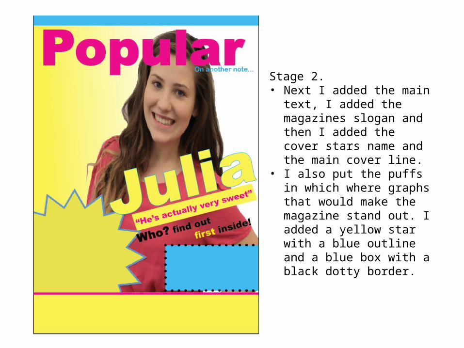
Stage 2. • Next I added the main text, I
added the magazines slogan and then I added the cover stars name and the main cover line.
• I also put the puffs in which where graphs that would make the magazine stand out. I added a yellow star with a blue outline and a blue box with a black dotty border.

Stage 3.• Then I added the rest of the
text. This was the other cover lines. They where at the top of the page, the sides of the page, the bottom of the page, and in the blue box.
• I also added another puff and some text which was a cover line about fashion. This was in a pink circle with a blue border.

Stage 4. • Next I added the barcode, issue
number and date. As well as a pink arrow at the bottom of the page

Stage 5.• Finally I added pictures of
clothes that I had taken and removed the back ground of.
• I then also added 3 other pictures at the bottom of the page that where acting as posters in the magazine. I had put a pink filter on them so they fitted with the colour scheme of the magazine.

Contents page

Stage 1. • Firstly I made the background of
the contents page. I wanted it to be white with a thick pink border. And have random parts of pink on it as well
• Next I added the website at the bottom of the page and the page number
• I then added a box for the list of pages with their numbers
• I also added a box for the editors note and put a fairly thick blue border on it
• I then started outlining where I wanted the pictures down the side of the page to go.
• I then put a yellow band at the bottom of the page
• The final thing here was to add the title. The hardest part of this was to come up with the play on words and chose a font that I liked.

Stage 2. • Next I added the main text, I added
the editors note, which I wrote on Microsoft Word and then copied it in so I knew that it had been spell checked correctly.
• Then I added the artists names down the side of the page.
• I then added the list of pages and their page numbers
• Next I added a few articles such as the one about Katy Perry and the one about Zoella. For the one with Zoella I used the tool that allows you to follow the path of a shape and type around it, so I put the circle on the page and then typed Zoella around it.
• I then added the picture of Julia onto the page and made sure it was on a pink back ground with a black box round it, with her name on it so it stood out on the page.

Stage 3. • This stage was all about putting
the page numbers on the page.• I made sure they were in a thick
font, with bright colour and a border around them in contrasting colours. This will help them stand out which is important as the main function of the contents page is so you know what articles are on what pages.

Stage 4. • Finally I added my photos in. I
put them on the side of the page and also a picture of a friend that is meant to be Zoella and of another friend that is part of the summer hunks page.
• Lastly I made sure all the layout was right on the page and added some competitions and text to fill the space
• I also added some more information across the yellow band such as the magazines twitter page and Instagram.

Double page spread


Stage 1. • Firstly I created the background for the
page. I made it pink and used the gradient tool so that it was lighter where the majority of the writing will be. This should make it easier so the audience to read as well as making the page look nicer.
• I then put a white box on the page at an angle to make the page look more interesting. I had seen this done on We love pop’s double page spread and so I wanted to do this on mine.
• I also added the picture in and made sure I was happy with its placing and size on the page
• I then added the website and page number onto the bottom of the page
• Next I added a blue box into the middle of the right hand page with a thick pink border, this was to put a picture in later in the production that related to one of the artist’s answers.

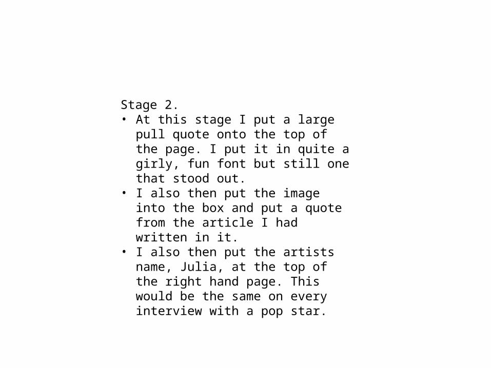
Stage 2. • At this stage I put a large pull quote onto
the top of the page. I put it in quite a girly, fun font but still one that stood out.
• I also then put the image into the box and put a quote from the article I had written in it.
• I also then put the artists name, Julia, at the top of the right hand page. This would be the same on every interview with a pop star.
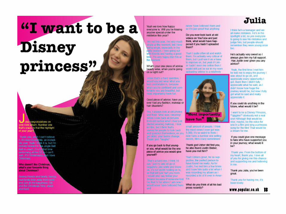

Stage 3. • Lastly I added in the interview that I wrote.
I put this into columns as this is very conventional of magazine interviews.
• I also changed the colours so that the questions and answers where in different colours.
• I also added a drop capital at the start of the interview.


