Stat 3355 Statistical Methods for Statisticians and Actuaries The notes and scripts included here are copyrighted by their author, Larry P. Ammann, and are intended for the use of students currently registered for Stat 3355. They may not be copied or used for any other purpose without permission of the author. Software for Statistical Analysis Examples presented in class are obtained using the statistical programming language and environment R. This is freely available software with binaries for Linux, MacIntosh, Windows that can be obtained from: http://cran.r-project.org A very useful extension for R is another freely available open-source package, RStudio. There are versions available for Windows, Mac, and Linux which can be downloaded from: https://www.rstudio.com/products/rstudio/download/ Be sure to download the free version of this software. This package provides an intelligent editor for script files, it allows specific projects to be assigned to their own directories to aid in organization of your work, RStudio includes an interactive debugger to help identify and correct errors, and it provides an interactive GUI for easily exporting graphics to image files for incorporation into documents. Examples in class will be done using RStudio. Syllabus Stat 3355 Course Information Instructor: Dr. Larry P. Ammann Office hours: Wed, 2:00-3:30 pm, others by appt. Email: [email protected]Office: FO 2.402C Phone: (972) 883-2164 Text: Course notes and web resources Topics • Graphical tools • Numerical summaries • Bivariate summaries • Simulation 1
Transcript
Stat 3355
Statistical Methods for Statisticians and Actuaries
The notes and scripts included here are copyrighted by their author, Larry P. Ammann,and are intended for the use of students currently registered for Stat 3355. They may notbe copied or used for any other purpose without permission of the author.
Software for Statistical AnalysisExamples presented in class are obtained using the statistical programming language
and environment R. This is freely available software with binaries for Linux, MacIntosh,Windows that can be obtained from:http://cran.r-project.org
A very useful extension for R is another freely available open-source package, RStudio.There are versions available for Windows, Mac, and Linux which can be downloaded from:https://www.rstudio.com/products/rstudio/download/
Be sure to download the free version of this software. This package provides an intelligenteditor for script files, it allows specific projects to be assigned to their own directories to aidin organization of your work, RStudio includes an interactive debugger to help identify andcorrect errors, and it provides an interactive GUI for easily exporting graphics to image filesfor incorporation into documents. Examples in class will be done using RStudio.
Syllabus
Stat 3355 Course Information
Instructor: Dr. Larry P. AmmannOffice hours: Wed, 2:00-3:30 pm, others by appt.Email: [email protected]: FO 2.402CPhone: (972) 883-2164Text: Course notes and web resources
Topics
• Graphical tools
• Numerical summaries
• Bivariate summaries
• Simulation
1
• Sampling distributions
• One sample estimation and hypothesis tests
• Two sample estimation and hypothesis tests
• Introduction to inference for regression and ANOVA
Notes1. Very little course time will be spent on probability theory. The basic concepts of proba-bility will be illustrated instead via simulations of Binomial and Normal distributions.2. This course includes an introduction to R, a computer platform for data visualizationand analysis. Bring your laptops to class on Thursdays until further notice. Those classeswill be devoted to using R.
Grading PolicyCourse grade will be based on quizzes, homework projects and the final project.
Note: the complete syllabus is available here:http://www.utdallas.edu/~ammann/stat3355_syllabus.pdf
2
R Notes
The following links provide an excellent introduction to the use of R:https://cran.r-project.org/doc/contrib/Owen-TheRGuide.pdf
https://cran.r-project.org/doc/contrib/Robinson-icebreaker.pdf (somewhat moreadvanced)Other contributed books about R can be found on the CRAN site. Use the Contributedlink under Documentation on the left side of the CRAN web page. Additional notes areprovided below.
The S language was developed at Bell labs as a high-level computer language for sta-tistical computations and graphics. It has some similarities with Matlab, but has somestructures that Matlab does not have, such as data frames, that are natural data structuresfor statistical models. There are two implementations of this language currently available:a commercial product, S-Plus, and a freely available open-source product, R. R is availableathttp://cran.r-project.org
These implementations are mostly, but not completely, compatible.Note: in the examples below the R prompt, > , is included but this would not be typed
on the command line. It is used here to differentiate between input to R and output that isreturned to the console after a command is entered.
On Linux or Macs, R can be run from a shell by enteringR
at a shell prompt. The R session is ended by enteringq()
This will generate a query from R whether to save the workspace image. Enter n.On Windows and Macs R is packaged as a windowed application that starts with a
command window. RStudio also is a windowed application that includes a window forentering commands, a window that describes the property of objects that have been createdduring the session, and a window for graphics.
R’s Workspace. The Workspace contains all the objects created or loaded during anR session. These objects only exist in the computer’s memory, not on the physical harddrive and will disappear when R is exited. R offers a choice to the user when exiting: savethe workspace or do not save it. If the Workspace is not saved, all objects created duringthe session will be lost. That’s no problem if you are using it only as a mathematical orstatistical calculator. If you are performing an analysis, but must exit before completingit, then you don’t want to lose what you have already done. There is an alternative that Irecommend instead of saving the workspace: write the commands you wish to enter into atext file and then copy/paste from the edit window into the R console. Even though thismay seem like extra work, it has three advantages:
• Any mistakes can be corrected immediately with the editor.
• You won’t have to remember what the objects in a workspace represent since the file
3
contains the commands that created those objects.
• If you need to perform a similar analysis at a later time, you can just copy the originalfile to a new name and modify/extend the commands in the new file to complete theanalysis.
You must use a plain text editor to edit command files, not a document editorlike Word. Both R and Rstudio include an editor for scripts that is accessed from theirFile menu.
Rstudio has an extensive set of resources to help users. Go to the Help tab on theright-hand window and click on An Introduction to R under Manuals. See section 2.1-2.7for details about the following.
1. The basic data structure in R is a vector. This is a set of objects all of which musthave the same mode, either numeric, logical, character, or complex.
2. Assignment is performed with the character = or the two characters <-. The secondassignment operator is older but = is used more commonly now since it is just a singlecharacter. When an assignment is made, its value is not echoed to the terminal. Lineswith no assignment do result in the value of the expression being echoed to the terminal.
3. Sequences of integers can be generated by the colon expression,
> x = 2:20
> y = 15:1
More general sequences can be generated with the seq() function. These operationsproduce vectors. Some examples:
> seq(5)
[1] 1 2 3 4 5
> x = seq(2,20,length=5)
> x
[1] 2.0 6.5 11.0 15.5 20.0
> y = seq(5,18,by=3)
> y
[1] 5 8 11 14 17
The function c can be used to combine different vectors into a single vector.
> c(x,y)
[1] 2.0 6.5 11.0 15.5 20.0 5.0 8.0 11.0 14.0 17.0
All vectors have an attribute named length which can be obtained by the functionlength()
4
> length(c(x,y))
[1] 10
A scalar is just a vector of length 1.
4. A useful function for creating strings is paste(). This function combines its argumentsinto strings. If all arguments have length 1, then the result is a single string. If allarguments are vectors with the same length, then the pasting is done element-wiseand the result is a vector with the same length as the arguments. However, if somearguments are vectors with length greater than 1, and the others all have length 1, thenthe other arguments are replicated to have the same length and then pasted togetherelement-wise. Numeric arguments are coerced to strings before pasting. Floating pointvalues usually need to be rounded to control the number of decimal digits that are used.The default separator between arguments is a single space, but a different separatorcan be specified with the argument, sep=.
> s = sum(x)
> paste("Sum of x =",s)
[1] "Sum of x = 55"
> paste(x,y,sep=",")
[1] "2,5" "6.5,8" "11,11" "15.5,14" "20,17"
> paste("X",seq(length(x)),sep="")
[1] "X1" "X2" "X3" "X4" "X5"
5. Vectors can have names which is useful for printing and for referencing particularelements of a vector. The function names() returns the names of a vector as well asassigning names to a vector.
> names(x) = paste("X",seq(x),sep="")
> x
X1 X2 X3 X4 X5
2.0 6.5 11.0 15.5 20.0
Elements of a vector are referenced by the function []. Arguments can be a vector ofindices that refer to specific positions within the vector:
> x[2:4]
X2 X3 X4
6.5 11.0 15.5
> x[c(2,5)]
X2 X5
6.5 20.0
5
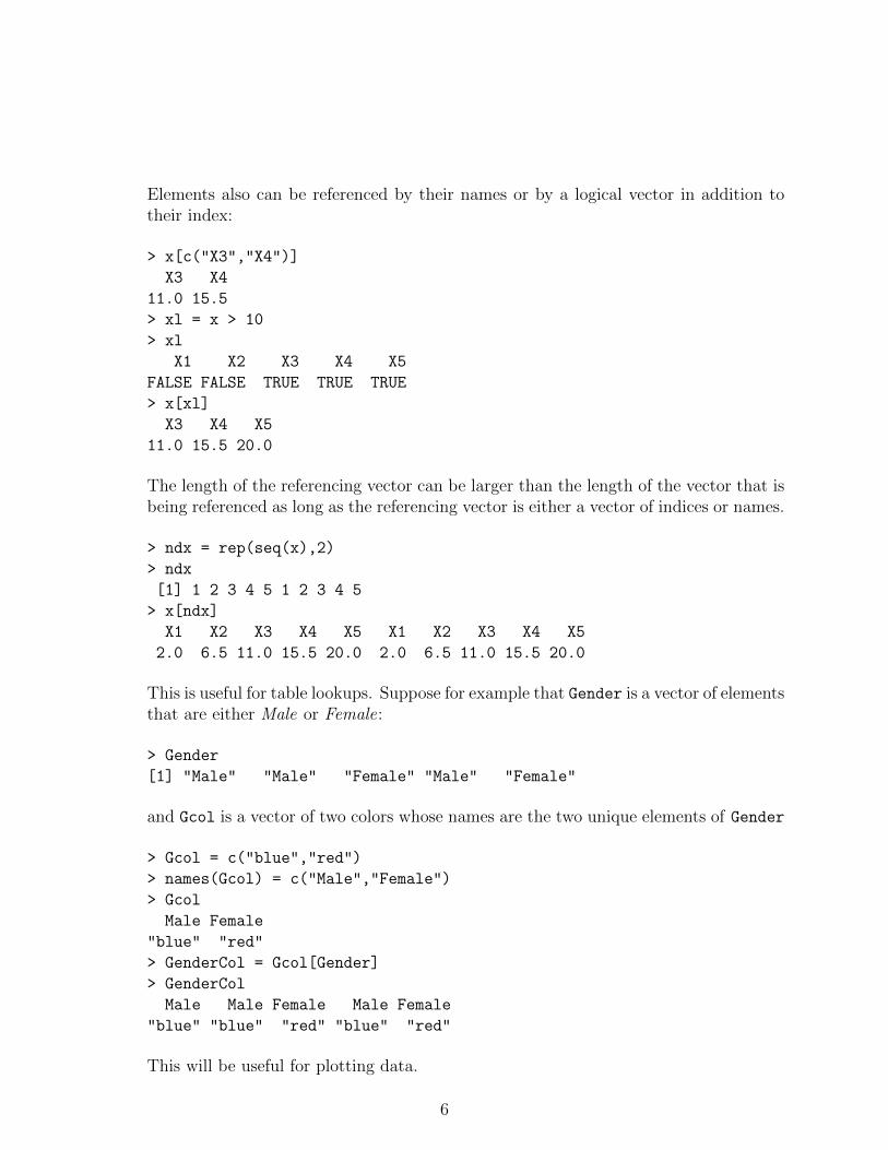
Elements also can be referenced by their names or by a logical vector in addition totheir index:
> x[c("X3","X4")]
X3 X4
11.0 15.5
> xl = x > 10
> xl
X1 X2 X3 X4 X5
FALSE FALSE TRUE TRUE TRUE
> x[xl]
X3 X4 X5
11.0 15.5 20.0
The length of the referencing vector can be larger than the length of the vector that isbeing referenced as long as the referencing vector is either a vector of indices or names.
> ndx = rep(seq(x),2)
> ndx
[1] 1 2 3 4 5 1 2 3 4 5
> x[ndx]
X1 X2 X3 X4 X5 X1 X2 X3 X4 X5
2.0 6.5 11.0 15.5 20.0 2.0 6.5 11.0 15.5 20.0
This is useful for table lookups. Suppose for example that Gender is a vector of elementsthat are either Male or Female:
> Gender
[1] "Male" "Male" "Female" "Male" "Female"
and Gcol is a vector of two colors whose names are the two unique elements of Gender
> Gcol = c("blue","red")
> names(Gcol) = c("Male","Female")
> Gcol
Male Female
"blue" "red"
> GenderCol = Gcol[Gender]
> GenderCol
Male Male Female Male Female
"blue" "blue" "red" "blue" "red"
This will be useful for plotting data.
6
6. R supports matrices and arrays of arbitrary dimensions. These can be created withthe matrix and array functions. Arrays and matrices are stored internally in column-major order. For example,
X = 1:10
assigns to the object X the vector consisting of the integers 1 to 10.
M = matrix(X,nrow=5)
puts the entries of X into a matrix named M that has 5 rows and 2 columns. The firstcolumn of M contains the first 5 elements of X and the second column of M containsthe remaining 5 elements. If a vector does not fit exactly into the dimensions of thematrix, then a warning is returned.
> M
[,1] [,2]
[1,] 1 6
[2,] 2 7
[3,] 3 8
[4,] 4 9
[5,] 5 10
The dimensions of a matrix are obtained by the function dim() which returns thenumber of rows and number of columns as a vector of length 2.
> dim(M)
[1] 5 2
7. Elements of matrices and arrays are referenced using [] but with the number of argu-ments equal to the number of dimensions. A matrix has two dimensions, so M[2,1]
refers to the element in row 2 and column 1.
> X = matrix(runif(100),nrow=20)
> X[2:5,2:4]
[1,] 0.731622617 0.6578677 0.7446229
[2,] 0.023472598 0.2111300 0.7775343
[3,] 0.001858455 0.2887734 0.8103568
[4,] 0.269611100 0.7527248 0.2127048
Note: the function runif(n) returns a vector of n random numbers between 0 and1. Each time the function runif is called it will return a new set of values. So if therunif() function is run again, a different set of values will be returned.Note: ff one of the arguments to [,] is empty, then all elements of that dimension arereturned. So X[2:4,] gives all columns of rows 2,3,4 and so is a matrix with 3 rowsand the same number of columns as X.
7
8. Example. The file http://www.utdallas.edu/~ammann/stat3355scripts/sunspots.txtcontains yearly sunspot numbers since 1700. Note that the first row of this file is notdata but represents names for the columns. This file is an example of tabular data.Such data can be imported into R using the function read.table(). Further detailsabout his function are given below.
Note that the filename argument in this case is a web address. The argument also canbe the name of a file on your computer. The second argument indicates that the firstrow of this file contains names for the columns. These are accessed by
names(Sunspots)
Suppose we wish to plot sunspot numbers versus year. There are several ways toaccomplish this.
plot(Sunspots[,1],Sunspots[,2])
plot(Sunspots[,1],Sunspots[,2], type="l")
plot(Number ~ Year, data=Sunspots, type="l")
The last method uses what is referred to as the formula interface for the plot function.Now let’s add a title to make the plot more informative.
title("Yearly mean total sunspot numbers")
To be more informative, add the range of years contained in this data set.
title("Yearly mean total sunspot numbers, 1700-2016")
The title can be split into two lines as follows
title("Yearly mean total sunspot numbers\n1700-2016")
using the newline character \n. Note that this requires that we already know the rangeof years contained in the data. Alternatively, we could obtain that range from the data.That would make our command file more general. The following file contains thesecommands:http://www.utdallas.edu/~ammann/stat3355scripts/sunspots.r
8
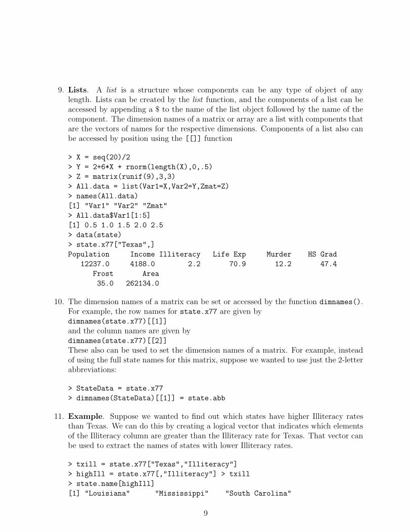
9. Lists. A list is a structure whose components can be any type of object of anylength. Lists can be created by the list function, and the components of a list can beaccessed by appending a $ to the name of the list object followed by the name of thecomponent. The dimension names of a matrix or array are a list with components thatare the vectors of names for the respective dimensions. Components of a list also canbe accessed by position using the [[]] function
> X = seq(20)/2
> Y = 2+6*X + rnorm(length(X),0,.5)
> Z = matrix(runif(9),3,3)
> All.data = list(Var1=X,Var2=Y,Zmat=Z)
> names(All.data)
[1] "Var1" "Var2" "Zmat"
> All.data$Var1[1:5]
[1] 0.5 1.0 1.5 2.0 2.5
> data(state)
> state.x77["Texas",]
Population Income Illiteracy Life Exp Murder HS Grad
12237.0 4188.0 2.2 70.9 12.2 47.4
Frost Area
35.0 262134.0
10. The dimension names of a matrix can be set or accessed by the function dimnames().For example, the row names for state.x77 are given bydimnames(state.x77)[[1]]
and the column names are given bydimnames(state.x77)[[2]]
These also can be used to set the dimension names of a matrix. For example, insteadof using the full state names for this matrix, suppose we wanted to use just the 2-letterabbreviations:
> StateData = state.x77
> dimnames(StateData)[[1]] = state.abb
11. Example. Suppose we wanted to find out which states have higher Illiteracy ratesthan Texas. We can do this by creating a logical vector that indicates which elementsof the Illiteracy column are greater than the Illiteracy rate for Texas. That vector canbe used to extract the names of states with lower Illiteracy rates.
> txill = state.x77["Texas","Illiteracy"]
> highIll = state.x77[,"Illiteracy"] > txill
> state.name[highIll]
[1] "Louisiana" "Mississippi" "South Carolina"
9
12. Matrix Operations. Matrix-matrix multiplication can be performed only when thetwo matrices are conformable, that is, their inner dimensions are the same. For exam-ple, if A is n×r and B is r×m, then matrix-matrix multiplication of A and B is definedand results in a matrix C whose dimensions are n × m. Elementwise multiplicationof two matrices can be performed when both dimensions of the two matrices are thesame. If for example D,E are n×m matrices, then
F = D*E
results in an n×m matrix F whose elements are
F [i, j] = D[i, j] ∗ E[i, j], 1 ≤ i ≤ n, 1 ≤ j ≤ m.
These two different types of multiplication operations must be differentiated by usingdifferent symbols, since both types would be possible if the matrices have the samedimensions. Matrix-matrix multiplication is denoted by A%∗%B and returns a matrix.
13. Factors. A factor is a special type of character vector that is used to representcategorical variables. This structure is especially useful in statistical models such asANOVA or general linear models. Associated with a factor variable are its levels, theset of unique character values in the vector. Although print methods for a factor willby default print a factor as a character vector, it is stored internally using integerpositions of the values corresponding to the levels.
14. A fundamental structure in the S language is the data frame. A data frame is like amatrix in that it is a two-dimensional array, but the difference is that the columns canbe different data types. The following code generates a data frame named SAMP thathas two numeric columns, one character column, and one logical column. It uses thefunction rnorm which generates a random sample for the standard normal distribution(bell-curve). Each time this code is run, different values will be obtained since eachuse of runif() and rnorm() produces new random samples.
> y = matrix(rnorm(20),ncol=2)
> x = rep(paste("A",1:2,sep=""),5)
> z = runif(10) > .5
> SAMP = data.frame(y,x,z)
Y1 Y2 x z
1 0.2402750 1.3561348 A1 FALSE
2 0.3669875 -1.4239780 A2 FALSE
3 -1.5042563 1.2929657 A1 TRUE
4 1.2329026 0.3838835 A2 TRUE
5 -0.1241536 -0.5596217 A1 TRUE
6 -0.1784147 1.2920853 A2 FALSE
10
7 -1.2848231 1.7107087 A1 TRUE
8 0.7731956 0.6520663 A2 FALSE
9 -0.3515564 0.3169168 A1 TRUE
10 -1.3513955 1.3663698 A2 TRUE
Note that the rows and columns have names, referred to as dimnames. Arrays anddata frames can be addressed through their names in addition to their position. Alsonote that variable x is a character vector, but the data.frame function automaticallycoerces that component to be a factor:
> is.factor(x)
[1] FALSE
> is.factor(SAMP$x)
[1] TRUE
15. The S language is an object-oriented language. Many fundamental operations behavedifferently for different types of objects. For example, if the argument to the functionsum() is a numeric vector, then the result will be the sum of its elements, but if theargument is a logical vector, then the result will be the number of TRUE elements.Also, the plot function will produce an ordinary scatterplot if its x,y arguments areboth numeric vectors, but will produce a boxplot if the x argument is a factor:
> plot(SAMP$Y1,SAMP$Y2)
> plot(SAMP$x,SAMP$Y2)
A better way to produce these plots is to use the formula interface along with thedata= argument if the variables are contained within a data frame.
> plot(Y2 ~ Y1, data=SAMP)
> plot(Y2 ~ x, data=SAMP)
16. Reading Data from files. The two main functions to read data that is contained ina file are scan() and read.table().scan(Fname) reads a file whose name is the value of Fname. All values in the file mustbe the same type (numeric, string, logical). By default, scan() reads numeric data.If the values in this file are not numeric, than the optional argument what= must beincluded. For example, if the file contains strings, thenx = scan(Fname,what=character(0))
will read this data. Note that Fname as used here is an R object whose value is thename of the file that contains the data.Note: if the file is not located in the working directory, then full path names mustbe used to specify the file. R uses unix conventions for path names regardless of theoperating system. So, for example, in Windows a file located on the C-drive in folderStatData named Data1.txt would be scanned by
11
x = scan("c:/StatData/Data1.txt")
The file name argument also can be a web address.
Data Frames and read.table(). Tabular data contained in a file can be read byR using the read.table() function. Each column in the table is treated as a separatevariable and variables can be numeric, logical, or character (strings). That is, differentcolumns can be different types, but each column must be the same type. An exampleof such a file ishttp://www.utdallas.edu/~ammann/stat3355scripts/Temperature.dataNote that the first few lines begin with the character #. This is the comment character.R ignores that character and the remainder of the line. The first non-comment linecontains names for the columns. In that case we must include the optional argumentheader=TRUE as follows:
The value returned by read.table() is a data.frame. This type of object can be thoughtof as an enhanced matrix. It has a dimension just like a matrix, the value of which is avector containing the number of rows and number of columns. However, a data frameis intended to represent a data set in which each row is the set of variables obtained foreach subject in the sample and each column contains the observations for each variablebeing measured. In the case of the Temperature data, these variables are:JanTemp, Lat, LongUnlike a matrix, a data frame can have different types of variables, but each variable(column) must contain the same type.
Individual variables in a data frame can be accessed several ways.
(a) Using $
Latitude = Temp$Lat
(b) Name:
Latitude = Temp[["Lat"]]
(c) Number:
Latitude = Temp[[2]]
12
Note that the object named Latitude is a vector. If you want to extract a subset ofthe variables with all rows included, then use []. The result is a data frame. If theoriginal data frame has names, these are carried over to the new data frame. If youonly want some of the rows, then specify these the way it is done with matrices:
LatLong = Temp[2:3] #extract variables 2 through 3
LatLong = Temp[c("Lat","Long")] #extract Lat and Long
LatLong1 = Temp[1:20,c("Lat","Long")] #extract first 20 rows for Lat and Long
Although it may seem like more work to use names, the advantage is that one doesnot need to know the index of the desired column, just its name.
Additional variables can be added to a data frame as follows.
#create new variable named Region with same length as other variables in Temp
17. The plot() function is a top-level function that generates different types of plotsdepending on the types of its arguments. The formula interface is the recommendedway to use this function, especially if the variables you wish to plot are contained withina data frame. When a plot() command (or any other top-level graphics function) isentered, then R closes any graphic device that currently is open and begins a newgraphics window or file. Optional arguments include:
• xlim= A vector of length 2 that specifies x-axis limits. If not specified, then Rcomputes limits from the range of the x-data.
• ylim= A vector of length 2 that specifies y-axis limits. If not specified, then Rcomputes limits from the range of the y-data.
13
• xlab= A string that specifies a label for the x-axis, default is name of x argument.
• ylab= A string that specifies a label for the y-axis, default is name of y argument.
• col= A color name or vector of names for the colors of plot elements.
• type= A 1-character string that specifies the type of plot: type=”p” plots points(default); type=”l” plots lines; type=”n” sets up plot region and adds axes butdoes not plot anything.
• main= Adds a main title. This also can be done separately using the title()
function.
• sub= Adds a subtitle. This also can be done separately using the title() func-tion.
18. Other functions add components to an existing graphic. These functions include
a. title() Add a main title to the top of an existing graphic. Optional argumentsub= adds a subtitle to the bottom.
b. points(x,y) Add points at locations specified by the x,y coordinates. Optionalarguments include pch= to use different plotting symbols, col= to use differentcolors for the points.
c. lines(x,y) Add lines that join the points specified by x,y arguments. Optionalarguments include lty= to use different line types, col= to use different colors forthe points.
d. text(x,y,labels=) Add strings at the locations specified by x,y arguments.
e. mtext() Add text to margins of a plot.
19. Accessing data in a spreadsheet. If a table of data is contained in a spreadsheetlike Excel, then the easiest way to import it into R is to save the table as a comma-separated-values file. Then use read.table() to read the file with separator argumentsep=",". The filehttp://www.utdallas.edu/~ammann/SmokeCancer.csv
Note that 2 of the entries in this table are NA. These denote types of cancer that werenot reported in that state during the time period covered by the data. We can changethose entries to 0 as follows.
Smoke[is.na(Smoke)] = 0
14
There is a companion function, write.table(), that can be used to write a matrix ordata frame to a file that then can be imported into a spreadsheet.
20. Saving graphics. By default R uses a separate graphical window for the displayof graphic commands. A graphic can be saved to a file using any of several differentgraphical file types. The most commonly used are pdf() and png() since these typescan be imported into documents created by Word or LATEX. The first argument forthese functions is the filename. Arguments width=,height= give the dimensions ofthe graphic. For pdf() the dimension units are inches, for png() the units are pixels.pdf() supports multi-page graphics, but png() only allows one page per file unless thefile name has the form Myplot%d.png. For example,
pdf("TempPlot.pdf",width=6,height=6)
plot(JanTemp ~ Lat,data=Temp)
plot(JanTemp ~ Region,data=Temp1)
graphics.off()
#creates a 2-page pdf document
png("TempPlot%d.png",width=480,height=480)
plot(JanTemp ~ Lat,data=Temp)
plot(JanTemp ~ Region,data=Temp1)
graphics.off()
#creates two files: TempPlot1.png and TempPlot2.png
The function graphics.off() writes any closing material required by the graphic file typeand then closes the graphics file.
21. RStudio includes a plot tab where plots are displayed. After creating a plot, it canbe exported to a graphic file that can be added to a Word document. This is donevia the Export link on the plot tab using the Save as image selecion. The most widelyused image file type is png.
There are a number of datasets included in the R distribution along with examples oftheir use in the help pages. One example is given below.
# load cars data frame
data(cars)
# plot braking distance vs speed with custom x-labels and y-labels,
# plot the diagnostic residual plots associated with a regression fit.
plot(fm1)
# restore the original plotting parameters
par(opar)
16
Class Notes
Graphical tools
The computer tools that we have available today give us access to a wide array of graphicaltechniques and tools that can be used for effective presentation of complex data. However,we must first understand what type of data we wish to present, since the presentation toolthat should be used for a set of data depends on the questions we wish to answer and thetype of data we are using to answer those questions.
Categorical (qualitative) data
Categorical data is derived from populations that consist of some number of subpopulationsand we record only the subpopulation membership of selected individuals. In such cases thebasic data summary is a frequency table that counts the number of individuals within eachcategory. If there is more than one set of categories, then we can summarize the data usinga multi-dimensional frequency table. For example, here is part of a dataset that records thehair color, eye color, and sex of a group of 592 students.
Hair Eye Sex
Black Brown Female
Red Green Male
Blond Blue Male
Brown Hazel Female
...
In the past numerical codes were used in place of names because of memory limitations, butin that case it is important to remember that codes are just labels. R does that internallyby representing categorical data as a factor. This is a special type of vector that has anattribute names levels which represent the unique set of categories of the variable.
The frequency table for hair color in this dataset is:
Black Brown Red Blond
108 286 71 127
The basic graphical tool for categorical data is the barplot. This plots bars for eachcategory, the height of which is the frequency or relative frequency of that category. Barplotsare more effective than pie charts because we can more readily make a visual comparison ofheights of rectangles than angles in a pie.
17
18
19
If a second categorical variable also is observed, for example hair color and sex, a barplotwith side-by-side bars for each level of the first variable plotted contiguously, and each suchgroup plotted with space between groups, is most effective to compare each level of the firstvariable across levels of the second. For example, the following plot shows how hair color isdistributed for a sample of males and females. A comparison of the relative frequencies formales and females shows that a relatively higher proportion of females have blond hair andsomewhat lower proportion of females have black or brown hair.
20
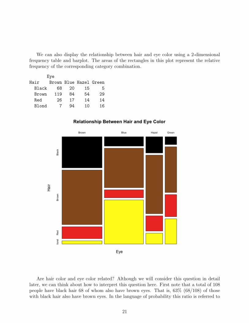
We can also display the relationship between hair and eye color using a 2-dimensionalfrequency table and barplot. The areas of the rectangles in this plot represent the relativefrequency of the corresponding category combination.
Eye
Hair Brown Blue Hazel Green
Black 68 20 15 5
Brown 119 84 54 29
Red 26 17 14 14
Blond 7 94 10 16
Are hair color and eye color related? Although we will consider this question in detaillater, we can think about how to interpret this question here. First note that a total of 108people have black hair 68 of whom also have brown eyes. That is, 63% (68/108) of thosewith black hair also have brown eyes. In the language of probability this ratio is referred to
21
as a conditional probability and would be expressed as
P (Brown eyes | Black hair) =68
108= 0.63.
First note the correspondence between the structure of the sentence, 63% of those withblack hair also have brown eyes, and the arithmetic that goes with it. The reference groupfor this percentage is defined by the prepositional phrase, of those with black hair, and thecount for this group is the denominator. The verb plus object in this sentence is have browneyes. The count of people who have brown eyes within the reference group (those with blackhair) is the numerator of this percentage. So those who are counted for the numeratormust satisfy both requirements, have brown eyes and have black hair. The correspondingprobability statement is
P (Brown eyes | Black hair) =P ({Brown eyes} ∩ {Black hair})
P ({Black hair})
=68/592
108/592
=68
108= 0.63.
It is important to remember that the reference group for ordinary probability such as
P ({Black hair})
is the total group, whereas the reference group for conditional probability is the subgroupspecified after the | symbol.
The total counts for eye color are:
Brown Blue Hazel Green
220 215 93 64
so 220 of the 592 people in this data have brown eyes. That is, 220/592 = 37% of all peoplein this data set have brown eyes, but brown eyes occur much more frequently among peoplewith black hair, 63%. The corresponding probabiity statements are
P ({Brown eyes}) =220
592= 0.37
P (Brown eyes | Black hair) =68/592
108/592= 0.63
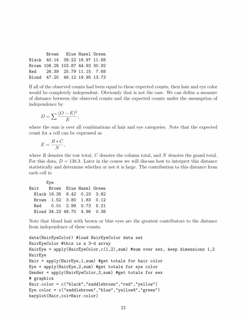
This shows that the percentage of people who have brown eyes depends on whether ornot they have black hair. If the two percentages had been equal, that is, if 37% of peoplewith black hair also had brown eyes, then we would say that having brown eyes does notdepend on whether or not a person has black hair since those percentages would have beenthe same. Therefore, for those two outcomes to be independent, there should have been 40people (37% of 108) with black hair and brown eyes. This is the expected count under theassumption of independence between brown eyes and black hair. We can do the same foreach combination of categories in this table to give the expected frequencies:
22
Brown Blue Hazel Green
Black 40.14 39.22 16.97 11.68
Brown 106.28 103.87 44.93 30.92
Red 26.39 25.79 11.15 7.68
Blond 47.20 46.12 19.95 13.73
If all of the observed counts had been equal to these expected counts, then hair and eye colorwould be completely independent. Obviously that is not the case. We can define a measureof distance between the observed counts and the expected counts under the assumption ofindependence by
D =∑ (O − E)2
E,
where the sum is over all combinations of hair and eye categories. Note that the expectedcount for a cell can be expressed as
E =R ∗ CN
,
where R denotes the row total, C denotes the column total, and N denotes the grand total.For this data, D = 138.3. Later in the course we will discuss how to interpret this distancestatistically and determine whether or not it is large. The contribution to this distance fromeach cell is:
Eye
Hair Brown Blue Hazel Green
Black 19.35 9.42 0.23 3.82
Brown 1.52 3.80 1.83 0.12
Red 0.01 2.99 0.73 5.21
Blond 34.23 49.70 4.96 0.38
Note that blond hair with brown or blue eyes are the greatest contributors to the distancefrom independence of these counts.
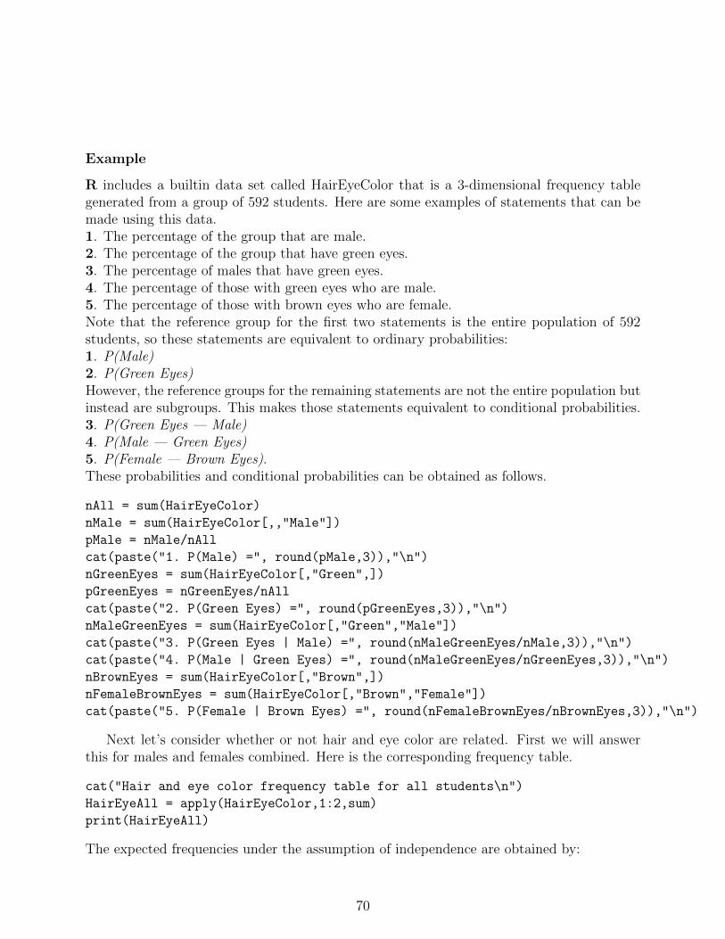
data(HairEyeColor) #load HairEyeColor data set
HairEyeColor #this is a 3-d array
HairEye = apply(HairEyeColor,c(1,2),sum) #sum over sex, keep dimensions 1,2
HairEye
Hair = apply(HairEye,1,sum) #get totals for hair color
Eye = apply(HairEye,2,sum) #get totals for eye color
Gender = apply(HairEyeColor,3,sum) #get totals for sex
barplot(HairGenderP,col=Hair.color,legend.text=TRUE,xlim=c(0,3),main="Relative Frequencies of Hair Color")
barplot(HairGenderP,beside=TRUE,col=Hair.color,legend.text=TRUE,main="Relative Frequencies of Hair Color")
# find distances from independence
# there are several ways to compute R*C. The easiest way is to use the
# function outer() which is a generalized outer product
# this function takes two vectors as arguments and generates a matrix
# with number of rows = length of first argument and
# number of columns = length of second argument.
# Elements of the matrix are obtained by multiplying each element of the first
# vector by each element of the second vector.
N = sum(HairEyeColor)
ExpHairEye = outer(Hair,Eye)/N
round(ExpHairEye,2) #note that outer preserves names of Hair and Eye
# now get distance from independence
D = ((HairEye - ExpHairEye)^2)/ExpHairEye
round(D,2) # gives contribution from each cell
sum(D) # print total distance
# now use R function paste to combine text and value
paste("Distance of Hair-Eye data from Independence =",round(sum(D),2))
# if round is not used then lots of decimal places will be printed!
paste("Distance of Hair-Eye data from Independence =",sum(D))
We will see later that this data is very far from independence!R has several ways to save the graphics into files so they can be added to a document.
After a graphic is created in Rstudio, use the Export menu to interactively save the graphicas an image file. The default file type is PNG which is the recommended image format to use.Be sure to change the name of the image file from the default name Rplot.png. Another
24
way is to use the graphics function png() to specify the file name along with options thatspecify the size in pixels of image. After all comnmands for a particular graphic have beenentered, finish the graphic by entering
graphics.off()
Try to use informative file names for saved graphics. The folowing script creates text outputand image files for the hair-eye color example. These can be imported into a documentprocessor such as Word.http://www.utdallas.edu/~ammann/stat3355scripts/HairEye1.r
25
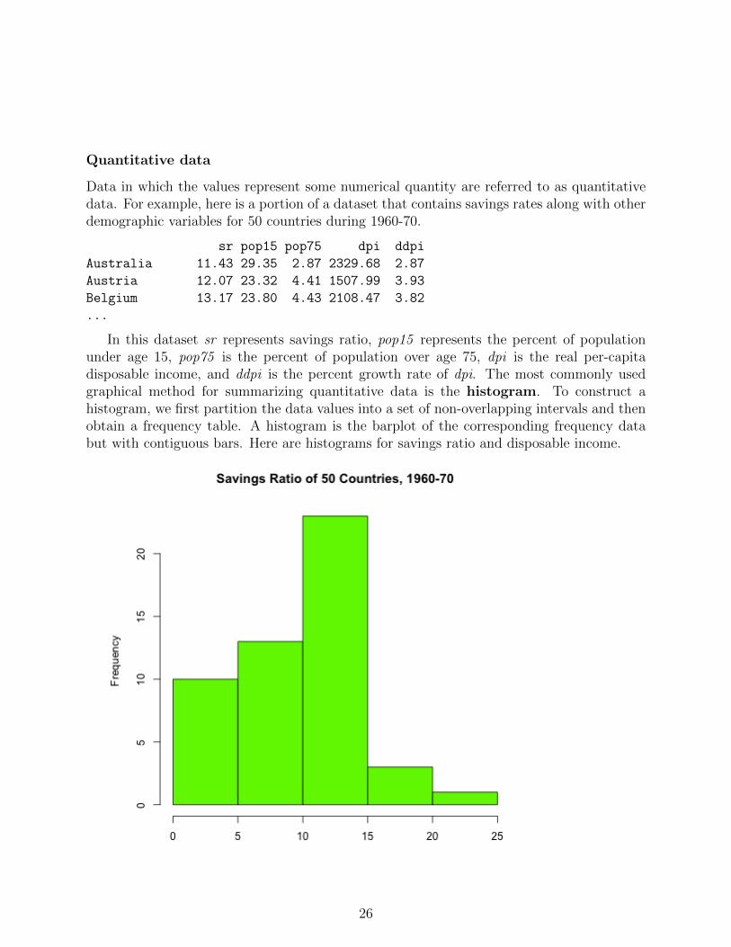
Quantitative data
Data in which the values represent some numerical quantity are referred to as quantitativedata. For example, here is a portion of a dataset that contains savings rates along with otherdemographic variables for 50 countries during 1960-70.
sr pop15 pop75 dpi ddpi
Australia 11.43 29.35 2.87 2329.68 2.87
Austria 12.07 23.32 4.41 1507.99 3.93
Belgium 13.17 23.80 4.43 2108.47 3.82
...
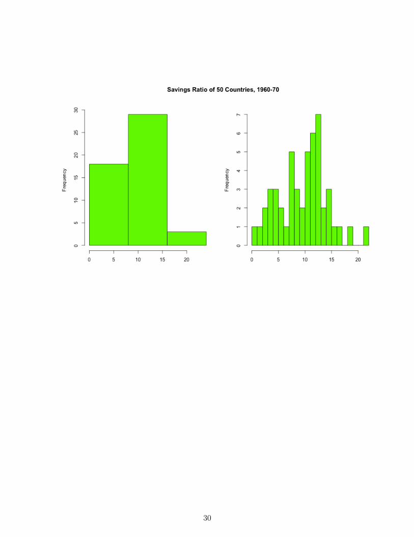
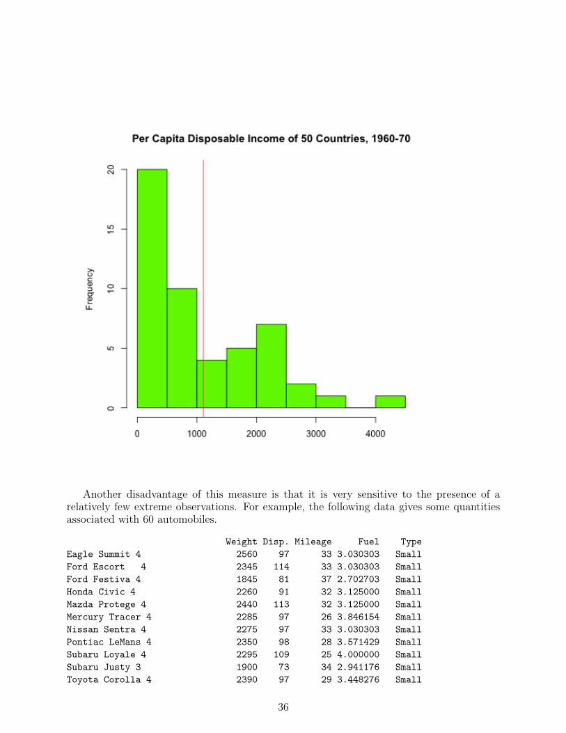
In this dataset sr represents savings ratio, pop15 represents the percent of populationunder age 15, pop75 is the percent of population over age 75, dpi is the real per-capitadisposable income, and ddpi is the percent growth rate of dpi. The most commonly usedgraphical method for summarizing quantitative data is the histogram. To construct ahistogram, we first partition the data values into a set of non-overlapping intervals and thenobtain a frequency table. A histogram is the barplot of the corresponding frequency databut with contiguous bars. Here are histograms for savings ratio and disposable income.
hist(LifeCycleSavings$dpi,xlab="",main="Per-Capita Disposable Income of 50 Countries, 1960-70",col="green")
graphics.off()
In some applications, proportions within the sub-intervals are of greater interest than thefrequencies. In such cases a relative frequency histogram can be used instead. In this casethe y-axis is re-scaled by dividing the frequencies by the total number of observations. Theshape of a relative frequency histogram is unchanged; the only quantity that changes is thescale of the y-axis. R can generate probability histograms in which the y-axis is scaled tomake total area of the histogram equal to 1. Changing the scale of the y-axis to representproportions takes a little extra work.
28
These histograms were generated by the following code:
mtext("Relative Frequency Histogram of Per-Capita Disposable Income\n50 Countries, 1960-70",
outer=T,line=-3,cex=1.25,font=2)
ycnt = savhist$counts # heights of histogram bars
n = sum(ycnt) # number of observations
yrelf = pretty(range(ycnt/n)) # obtain new labels for tick marks
# y-axis scale in hist represents counts
# locations of new tick labels need to correspond to counts so they are located at yrelf*n
axis(side=2,at=yrelf*n,labels=yrelf) # put new labels where marks f
graphics.off()
There is no fixed number of sub-intervals that should be used. A large number of sub-intervals corresponds to less summarization of the data, and a small number of sub-intervalscorresponds to more summarization.
When two or more variables are measured for each individual in the dataset, then wemay be interested in the relationship between these variables. The type of graphical displaywe use depends on the types of the variables. We have already seen an example of a 2-dimensional barplot for the case in which both variables are categorical. If both variablesare quantitative, then the basic graphical tool is the scatterplot. For example, here is ascatterplot of pop15 versus pop75.
29
30
The relationships among all 5 of the variables in this dataset can be displayed simulta-neously by constructing pairwise scatterplots on the same graphic.
31
Note: we will defer until later in the course a discussion of numerical descriptions ofthese relationships.
R functions
See help pages for detailed descriptions of the functions used in this section.barplot(): construct bar plots for categorical variables.pie(): construct pie charts for categorical variables.title(): add titles to an existing plot.par(): set graphical parameters.scale(): center and scale each column of a numeric matrix.margin.table(): obtain margin totals for an array of frequency counts.mosaicplot(): mosaic plot for 2-d frequency table.assocplot(): plot deviations from independence for 2-d frequency table.hist(): histogram for continuous variables.pairs(): plot on one page all pairwise scatter plots of multivariate data matrix.mtext(): add text to margins of an existing plot.plot(): generic function for plotting. The type of plot produced depends on the type ofdata specified by its arguments. names(): returns or sets the names of a vector or dataframe. The names of a data frame correspond to the column names of the matrix.
Examples
Some of the functions used in this section are described below.read.table(). If the data set for a project is not small, it is most convenient to enter
the data into R from a tabular data file in which each row corresponds to an individual andcolumns contain various measurements associated with each individual. These files must beplain text (not created by a document processor such as Word). If the data comes from adatabase or spreadsheet, the simplest way to have R read the data is to have the database orspreadsheet export the data into a comma-separated values file (csv). An example is givenby the filehttp://www.utdallas.edu/~ammann/stat3355scripts/crabs.csv
a. The first argument is the name of the data file. This must be a string that containsthe full path to the file if it is not in the startup directory, or it may be an internetaddress if the file is on a remote server.
b. The first row of the crabs.csv file contains names for the columns. This row is referredto as a header and requires use of the
header=TRUE
argument.
32
c. The values in each row are separated by a comma. The default separator is whitespace, so the argument
sep=","
is needed for the crabs data file. The following R code performs this task.
Note: read.table() will return an error message if it finds that the rows don’t all containthe same number of values. This can occur, for example, if a csv file was created from anExcel file that had some extraneous blank cells. Otherwise, read.table() returns a data framethat is assigned to the name Crabs.
Note that the first two columns, named Species and Sex, respectively, contain strings,not numeric values. In such cases, read.table() assumes these are categorical variables andthen converts each of them automatically to a factor. The unique values of a factor arereferred to as its levels. The levels of Species are B,O (for blue and orange), and the levelsof Sex are M,F.
A particular column of a data frame can be accessed by name of the data frame followedby a dollar sign followed by the name of the column. So, for example,
Crabs$FL
refers to the column named FL within the Crabs data frame. We can obtain a histogram ofthat column by
hist(Crabs$FL)
Example script used in class for this data is here:http://www.utdallas.edu/~ammann/stat3355scripts/crabsExample.r
Another example using this data is given at the end of this section.Some of the graphical tools available in R are illustrated in the script file
Although graphical techniques are useful visualization tools, they are not very good formaking decisions or inferences based on data. For those situations we need to considernumerical measures. Numerical measures describe various attributes of a dataset, the mostcommon of which are measures of location and measures of dispersion.
Note: graphics for this section are generated by the script filehttp://www.utdallas.edu/~ammann/stat3355scripts/NumericGraphics.r
33
Measures of Location
We used a histogram to describe the distribution of savings rate and per capita disposableincome. Now suppose instead we would like to know where the middle of the savings rateand disposable income is located. This requires that we first define what we mean by themiddle of a dataset. There are three such measures in common use: the mean, median,and mode.
The mean usually refers to the arithmetic mean or average. This is just the sum of themeasurements divided by the number of measurements. We make a notational distinctionbetween the mean of a population and the mean of a sample. The general rule is thatgreek letters are used for population characteristics and latin letters are used for samplecharacteristics. Therefore,
µ =1
N
N∑i=1
Xi,
denotes the (arithmetic) mean of a population of N observations, and
X =1
n
n∑i=1
Xi,
denotes the mean of a sample of size n selected from a population. The mean can be thoughtof as a center of gravity of the data values. That is, the histogram of the data would balanceat the location defined by the mean. We can express this property mathematically by notingthat the mean is the solution to the equation,
n∑i=1
(Xi − c) = 0.
This property of the mean has advantages and disadvantages. The mean is a naturalmeasure of location for data that have a well-defined middle of high concentration withthe frequency decreasing more or less evenly as we move away from the middle in eitherdirection. The mean is not as useful when the data is heavily skewed. This is illustratedin the following two histograms. The first is the histogram of savings ratio with its meansuperimposed, and the second is the histogram of disposable income.
34
35
Another disadvantage of this measure is that it is very sensitive to the presence of arelatively few extreme observations. For example, the following data gives some quantitiesassociated with 60 automobiles.
Weight Disp. Mileage Fuel Type
Eagle Summit 4 2560 97 33 3.030303 Small
Ford Escort 4 2345 114 33 3.030303 Small
Ford Festiva 4 1845 81 37 2.702703 Small
Honda Civic 4 2260 91 32 3.125000 Small
Mazda Protege 4 2440 113 32 3.125000 Small
Mercury Tracer 4 2285 97 26 3.846154 Small
Nissan Sentra 4 2275 97 33 3.030303 Small
Pontiac LeMans 4 2350 98 28 3.571429 Small
Subaru Loyale 4 2295 109 25 4.000000 Small
Subaru Justy 3 1900 73 34 2.941176 Small
Toyota Corolla 4 2390 97 29 3.448276 Small
36
Toyota Tercel 4 2075 89 35 2.857143 Small
Volkswagen Jetta 4 2330 109 26 3.846154 Small
Chevrolet Camaro V8 3320 305 20 5.000000 Sporty
Dodge Daytona 2885 153 27 3.703704 Sporty
Ford Mustang V8 3310 302 19 5.263158 Sporty
Ford Probe 2695 133 30 3.333333 Sporty
Honda Civic CRX Si 4 2170 97 33 3.030303 Sporty
Honda Prelude Si 4WS 4 2710 125 27 3.703704 Sporty
Nissan 240SX 4 2775 146 24 4.166667 Sporty
Plymouth Laser 2840 107 26 3.846154 Sporty
Subaru XT 4 2485 109 28 3.571429 Sporty
Audi 80 4 2670 121 27 3.703704 Compact
Buick Skylark 4 2640 151 23 4.347826 Compact
Chevrolet Beretta 4 2655 133 26 3.846154 Compact
Chrysler Le Baron V6 3065 181 25 4.000000 Compact
Ford Tempo 4 2750 141 24 4.166667 Compact
Honda Accord 4 2920 132 26 3.846154 Compact
Mazda 626 4 2780 133 24 4.166667 Compact
Mitsubishi Galant 4 2745 122 25 4.000000 Compact
Mitsubishi Sigma V6 3110 181 21 4.761905 Compact
Nissan Stanza 4 2920 146 21 4.761905 Compact
Oldsmobile Calais 4 2645 151 23 4.347826 Compact
Peugeot 405 4 2575 116 24 4.166667 Compact
Subaru Legacy 4 2935 135 23 4.347826 Compact
Toyota Camry 4 2920 122 27 3.703704 Compact
Volvo 240 4 2985 141 23 4.347826 Compact
Acura Legend V6 3265 163 20 5.000000 Medium
Buick Century 4 2880 151 21 4.761905 Medium
Chrysler Le Baron Coupe 2975 153 22 4.545455 Medium
Chrysler New Yorker V6 3450 202 22 4.545455 Medium
Eagle Premier V6 3145 180 22 4.545455 Medium
Ford Taurus V6 3190 182 22 4.545455 Medium
Ford Thunderbird V6 3610 232 23 4.347826 Medium
Hyundai Sonata 4 2885 143 23 4.347826 Medium
Mazda 929 V6 3480 180 21 4.761905 Medium
Nissan Maxima V6 3200 180 22 4.545455 Medium
Oldsmobile Cutlass Ciera 4 2765 151 21 4.761905 Medium
Oldsmobile Cutlass Supreme V6 3220 189 21 4.761905 Medium
Toyota Cressida 6 3480 180 23 4.347826 Medium
Buick Le Sabre V6 3325 231 23 4.347826 Large
Chevrolet Caprice V8 3855 305 18 5.555556 Large
Ford LTD Crown Victoria V8 3850 302 20 5.000000 Large
Chevrolet Lumina APV V6 3195 151 18 5.555556 Van
Dodge Grand Caravan V6 3735 202 18 5.555556 Van
Ford Aerostar V6 3665 182 18 5.555556 Van
37
Mazda MPV V6 3735 181 19 5.263158 Van
Mitsubishi Wagon 4 3415 143 20 5.000000 Van
Nissan Axxess 4 3185 146 20 5.000000 Van
Nissan Van 4 3690 146 19 5.263158 Van
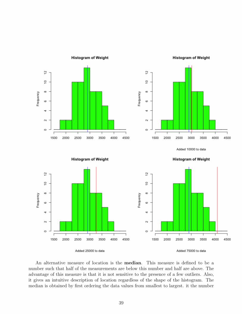
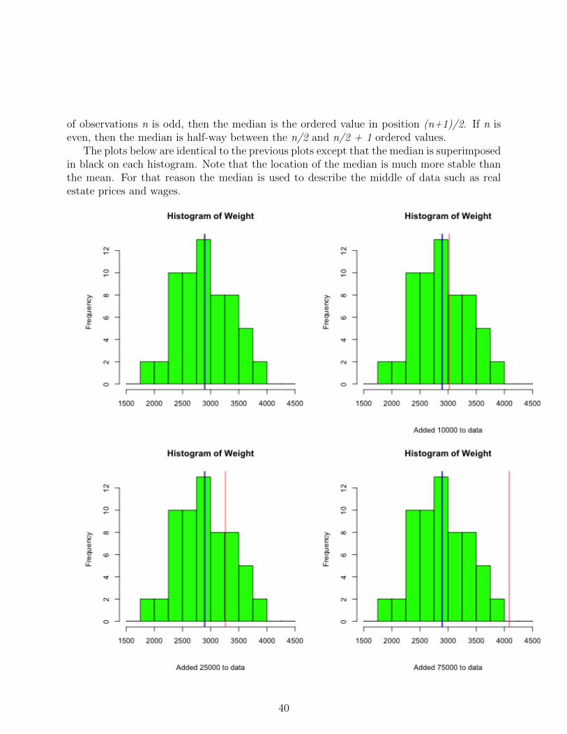
The 4 plots given below represent histograms of Weight with the mean of Weight su-perimposed. The second, third, and fourth plots are histograms of Weight with the values10000, 25000, and 70000, respectively, added to the dataset. The blue line is the originalmean and the red lines are the means of the modified data.
38
An alternative measure of location is the median. This measure is defined to be anumber such that half of the measurements are below this number and half are above. Theadvantage of this measure is that it is not sensitive to the presence of a few outliers. Also,it gives an intuitive description of location regardless of the shape of the histogram. Themedian is obtained by first ordering the data values from smallest to largest. it the number
39
of observations n is odd, then the median is the ordered value in position (n+1)/2. If n iseven, then the median is half-way between the n/2 and n/2 + 1 ordered values.
The plots below are identical to the previous plots except that the median is superimposedin black on each histogram. Note that the location of the median is much more stable thanthe mean. For that reason the median is used to describe the middle of data such as realestate prices and wages.
40
The mode is simply the most frequently occurring measurement or category. It is notused much except for some very specialized applications.
R notes:There is a dataset named state.x77 in R that is a matrix with 50 rows and 8 columns.
We can obtain the means for each column using the function colMeans :
state.means = colMeans(state.x77)
This function is a shortcut for:
state.means = apply(state.x77,2,mean)
There also is a vector named state.region giving the geographic region (Northeast, South,North Central, West) for each state. We can use this to extract data for states belonging toa particular region as follows.
Suppose we wanted to build a matrix that contains the means for each variable within eachregion so that rows correspond to region and columns correspond to variables. We couldaccomplish that as follows.
# add a horizontal line at the overall mean income
abline(h=state.means["Income"])
# add title and sub-title
title("Per Capita Income vs Illiteracy")
title(sub="Horizontal line is at overall mean income")
Note that state.x77 is a matrix, not a data frame.
is.data.frame(state.x77)
# make a data frame from this matrix
State77 = data.frame(state.x77)
# compare the following two plot commands:
plot(Income ~ Illiteracy, data=State77)
plot(State77$Income ~ Illiteracy,ylab="Income")
Measures of Dispersion
It is possible to have two very different datasets with the same means and medians. Forthat reason, measures of the middle are useful but limited. Another important attribute
42
of a dataset is its dispersion or variability about its middle. The most useful measures ofdispersion are the range, percentiles, and the standard deviation. The range is thedifference between the largest and the smallest data values. Therefore, the more spreadout the data values are, the larger the range will be. However, if a few observations arerelatively far from the middle but the rest are relatively close to the middle, the range cangive a distorted measure of dispersion.
Percentiles are positional measures for a dataset that enable one to determine therelative standing of a single measurement within the dataset. In particular, the pth %ileis defined to be a number such that p% of the observations are less than or equal to thatnumber and (100− p)% are greater than that number. So, for example, an observation thatis at the 75th %ile is less than only 25% of the data. In practice, we often cannot satisfythe definition exactly. However, the steps outlined below at least satisfies the spirit of thedefinition.
1. Order the data values from smallest to largest; include ties.
2. Determine the position,
k.ddd = 1 +p(n− 1)
100.
3. The pth %ile is located between the kth and the (k + 1)th ordered value. Use thefractional part of the position, .ddd as an interpolation factor between these values.If k = 0, then take the smallest observation as the percentile and if k = n, then takethe largest observation as the percentile. For example, if n = 75 and we wish to findthe 35th percentile, then the position is 1 + 35 ∗ 74/100 = 26.9. The percentile is thenlocated between the 26th and 27th ordered values. Suppose that these are 57.8 and61.3, respectively. Then the percentile would be
57.8 + .9 ∗ (61.3− 57.8) = 60.95.
Note. Quantiles are equivalent to percentiles with the percentile expressed as a proportion(70th %ile is the .70 quantile).
The 50th percentile is the median and partitions the data into a lower half (below median)and upper half (above median). The 25th, 50th, 75th percentiles are referred to as quartiles.They partition the data into 4 groups with 25% of the values below the 25th percentile (lowerquartile), 25% between the lower quartile and the median, 25% between the median and the75th percentile (upper quartile), and 25% above the upper quartile. The difference betweenthe upper and lower quartiles is referred to as the inter-quartile range. This is the range ofthe middle 50% of the data.
The third measure of dispersion we will consider here is associated with the concept ofdistance between a number and a set of data. Suppose we are interested in a particulardataset and would like to summarize the information in that data with a single value that
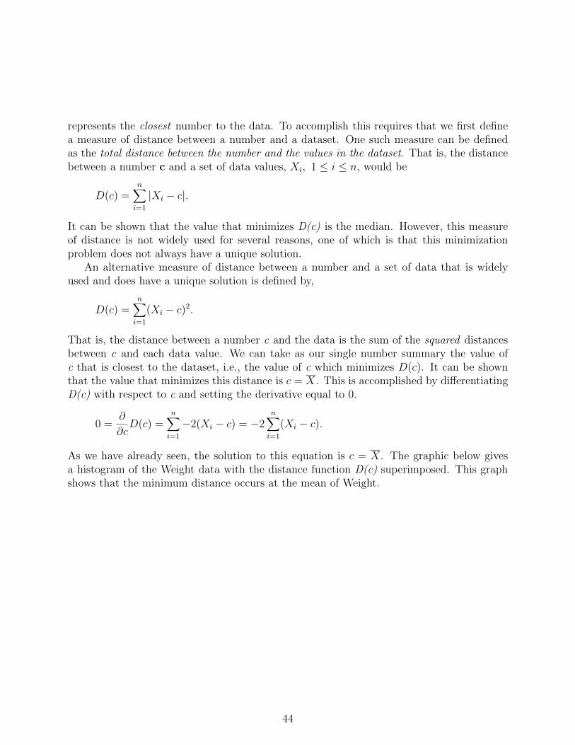
43
represents the closest number to the data. To accomplish this requires that we first definea measure of distance between a number and a dataset. One such measure can be definedas the total distance between the number and the values in the dataset. That is, the distancebetween a number c and a set of data values, Xi, 1 ≤ i ≤ n, would be
D(c) =n∑i=1
|Xi − c|.
It can be shown that the value that minimizes D(c) is the median. However, this measureof distance is not widely used for several reasons, one of which is that this minimizationproblem does not always have a unique solution.
An alternative measure of distance between a number and a set of data that is widelyused and does have a unique solution is defined by,
D(c) =n∑i=1
(Xi − c)2.
That is, the distance between a number c and the data is the sum of the squared distancesbetween c and each data value. We can take as our single number summary the value ofc that is closest to the dataset, i.e., the value of c which minimizes D(c). It can be shownthat the value that minimizes this distance is c = X. This is accomplished by differentiatingD(c) with respect to c and setting the derivative equal to 0.
0 =∂
∂cD(c) =
n∑i=1
−2(Xi − c) = −2n∑i=1
(Xi − c).
As we have already seen, the solution to this equation is c = X. The graphic below givesa histogram of the Weight data with the distance function D(c) superimposed. This graphshows that the minimum distance occurs at the mean of Weight.
44
The mean is the closest single number to the data when we define distance by the square ofthe deviation between the number and a data value. The average distance between the dataand the mean is referred to as the variance of the data. We make a notational distinctionand a minor arithmetic distinction between variance defined for populations and variance
45
defined for samples. We use
σ2 =1
N
N∑i=1
(Xi − µ)2,
for population variances, and
s2 =1
n− 1
n∑i=1
(Xi −X)2,
for sample variances. Note that the unit of measure for the variance is the square of the unitof measure for the data. For that reason (and others), the square root of the variance, calledthe standard deviation, is more commonly used as a measure of dispersion,
σ =
√√√√ N∑i=1
(Xi − µ)2/N,
s =
√√√√ n∑i=1
(Xi −X)2/(n− 1).
Note that datasets in which the values tend to be far away from the middle have a largevariance (and hence large standard deviation), and datasets in which the values clusterclosely around the middle have small variance. Unfortunately, it is also the case that a dataset with one value very far from the middle and the rest very close to the middle also willhave a large variance.
The standard deviation of a dataset can be interpreted by Chebychev’s Theorem:
for any k > 1, the proportion of observations within the interval µ ± kσ is atleast (1− 1/k2).
For example, the mean of the Mileage data is 24.583 and the standard deviation is 4.79.Therefore, at least 75% of the cars in this dataset have weights between 24.583− 2 ∗ 4.79 =15.003 and 24.583 + 2 ∗ 4.79 = 34.163. Chebychev’s theorem is very conservative since it isapplicable to every dataset. The actual number of cars whose Mileage falls in the interval(15.003,34.163) is 58, corresponding to 96.7%. Nevertheless, knowing just the mean andstandard deviation of a dataset allows us to obtain a rough picture of the distribution of thedata values. Note that the smaller the standard deviation, the smaller is the interval that isguaranteed to contain at least 75% of the observations. Conversely, the larger the standarddeviation, the more likely it is that an observation will not be close to the mean. Fromthe point of view of a manufacturer, reduction in variability of some product characteristicwould correspond to an increase of consistency of the product. From the point of view of afinancial manager, variability of a portfolio’s return is referred to as volatility.
Note that Chebychev’s Theorem applies to all data and therefore must be conservative.In many situations the actual percentages contained within these intervals are much higher
46
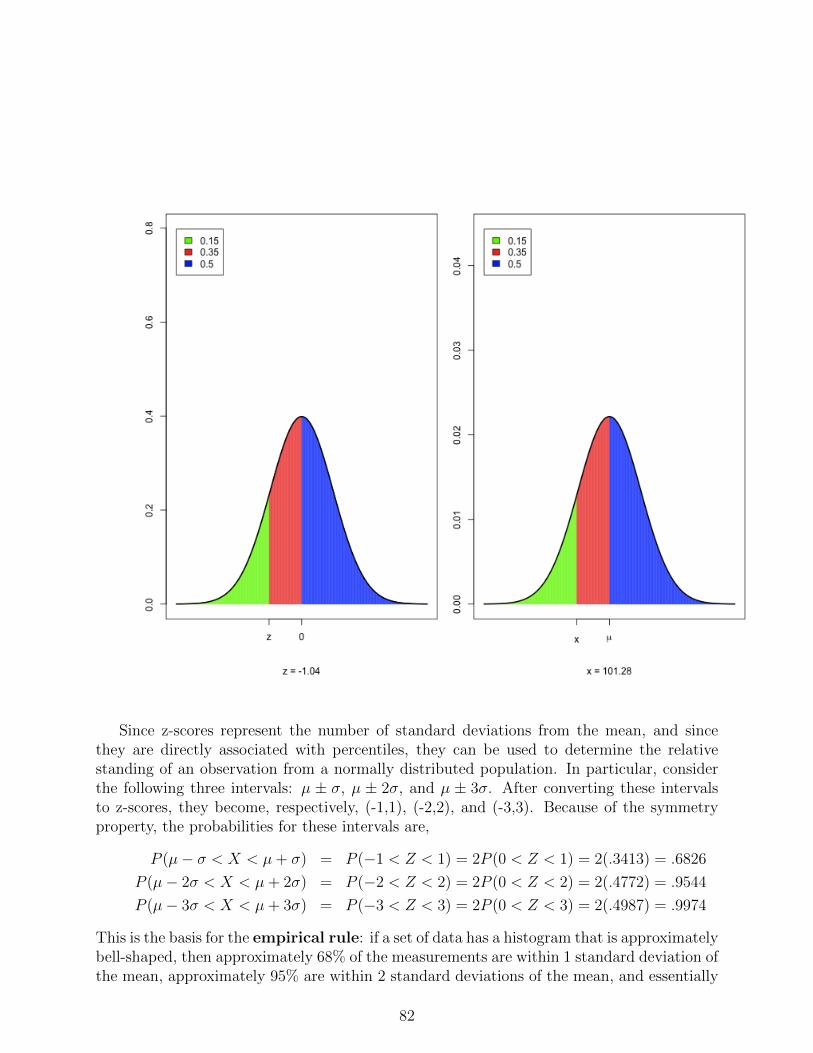
than the minimums specified by this theorem. If the shape of the data histogram is known,then better results can be given. In particular, if it is known that the data histogram isapproximately bell-shaped, then we can sayµ± σ contains approximately 68%,µ± 2σ contains approximately 95%,µ± 3σ contains essentially allof the data values. This set of results is called the empirical rule. Later in the course wewill study the bell-shaped curve (known as the normal distribution) in more detail.
The relative position of an observation in a data set can be represented by its distancefrom the mean expressed in terms of the s.d. That is,
z =x− µσ
,
and is referred to as the z-score of the observation. NPositive z-scores are above the mean,negative z-scores are below the mean. Z-scores greater than 2 are more than 2 s.d.’s abovethe mean. From Chebychev’s theorem, at least 75% of observations in any dataset will havez-scores between -2 and 2
Since z-scores are dimension-less, then we can compare the relative positions of obser-vations from different populations or samples by comparing their respective z-scores. Forexample, directly comparing the heights of a husband and wife would not be appropriatesince males tend to be taller than females. However, if we knew the means and s.d.’s ofmales and females, then we could compare their z-scores. This comparison would be moremeaningful than a direct comparison of their heights.
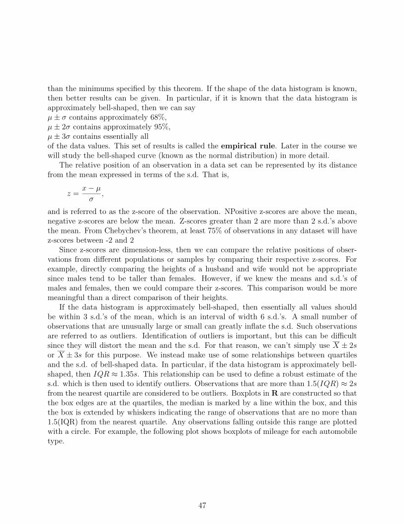
If the data histogram is approximately bell-shaped, then essentially all values shouldbe within 3 s.d.’s of the mean, which is an interval of width 6 s.d.’s. A small number ofobservations that are unusually large or small can greatly inflate the s.d. Such observationsare referred to as outliers. Identification of outliers is important, but this can be difficultsince they will distort the mean and the s.d. For that reason, we can’t simply use X ± 2sor X ± 3s for this purpose. We instead make use of some relationships between quartilesand the s.d. of bell-shaped data. In particular, if the data histogram is approximately bell-shaped, then IQR ≈ 1.35s. This relationship can be used to define a robust estimate of thes.d. which is then used to identify outliers. Observations that are more than 1.5(IQR) ≈ 2sfrom the nearest quartile are considered to be outliers. Boxplots in R are constructed so thatthe box edges are at the quartiles, the median is marked by a line within the box, and thisthe box is extended by whiskers indicating the range of observations that are no more than1.5(IQR) from the nearest quartile. Any observations falling outside this range are plottedwith a circle. For example, the following plot shows boxplots of mileage for each automobiletype.
47
Note that this plot shows how the quantitative variable Mileage and the categorical variableType are related.
R Notes. The data sethttp://www.utdallas.edu/~ammann/stat3355scripts/BirthwtSmoke.csv
is used to illustrate Chebychev’s Theorem and the empirical rule. This is a csv file thatcontains two columns: BirthWeight gives weight of babies born to 1226 mothers and Smokerindicates whether or not the mother was a smoker.
title(sub=paste("Non-smoking Mothers: n =",Smoke.tab["No"]))
graphics.off()
A more effective way to visualize the differences in birth weights between mothers whosmoke and those who do not is to use boxplots. These can be obtained through the plot()function. This function is what is referred to in R as a generic function. For this data whatwe would like to show is how birth weights depend on smoking status of mothers. We cando this using the formula interface of plot() as follows.
plot(BirthWeight ~ Smoker, data=BW)
The first argument is the formula which can be read as: BirthWeight depends on Smoker.The data=BW argument tells R that the names used in the formula are variables in a dataframe named BW. In this case the response variable BirthWeight is a numeric variable andthe independent variable Smoker is a factor. For this type of formula plot() generatesseparate boxplots for each level of the factor. The box contains the middle 50% of theresponses for a group (lower quartile - upper quartile) and the middle line within the boxrepresents the group mean. The dashed lines and whisker represent a robust estimate of a95% coverage interval derived from the median and inter-quartile range instead of the meanand s.d. Now let’s create a stand-alone script that makes this plot look better by addingcolor, a title, and group sizes.
The automobile dataset given above includes both Weight and Mileage of 60 automobiles.In addition to describing location and dispersion for each variable separately, we also may beinterested in what kind of relationship exists between these variables. The following figurerepresents a scatterplot of these variables with the respective means superimposed. Thisshows that for a high percentage of cars, those with above average Weight tend to havebelow average Mileage, and those with below average Weight have above average Mileage.This is an example of a decreasing relationship, and most of the data points in the plot fallin the upper left/lower right quadrants. In an increasing relationship, most of the points willfall in the lower left/upper right quadrants.
51
We can derive a measure of association for two variables by considering the deviations ofthe data values from their respective means. Note that the product of deviations for a datapoint in the lower left or upper right quadrants is positive and the product of deviationsfor a data point in the upper left or lower right quadrants is negative. Therefore, most ofthese products for variables with a strong increasing relationship will be positive, and mostof these products for variables with a strong decreasing relationship will be negative. Thisimplies that the sum of these products will be a large positive number for variables that havea strong increasing relationship, and the sum will be a large negative number for variablesthat have a strong decreasing relationship. This is the motivation for using
r =1N
∑Ni=1(Xi − µx)(Yi − µy)
σxσy.
as a measure of association between two variables. This quantity is called the correlationcoefficient. The denominator of r is a scale factor that makes the correlation coefficient
52
dimension-less and scales so that 0 ≤ |r| ≤ 1. Note that this can be expressed equivalentlyas
r =1
n−1∑ni=1(Xi −X)(Yi − Y )
sxsy.
If the correlation coefficient is close to 1, then the variables have a strong increasingrelationship and if the correlation coefficient is close to -1, then the variables have a strongdecreasing relationship. If the correlation is exactly 1 or -1, then the data must fall exactlyon a straight line. The correlation coefficient is limited in that it is only valid for linearrelationships. A correlation coefficient close to 0 indicates that there is no linear relationship.There may be a strong relationship in this case, just not linear. Furthermore, the correlationmay understate the strength of the relationship even when r is large, if the relationship isnon-linear.
The correlation coefficient between Weight and Mileage is -0.848. This is a fairly largenegative number, and so there is a fairly strong linear, decreasing relationship betweenWeight and Mileage. This is confirmed by the scatterplot. Since these variables are sostrongly related, we can ask how well can we predict Mileage just by knowing the Weight ofa vehicle. To answer this question, we first define a measure of distance between a datasetand a line.
Suppose we have measured two variables for each individual in a sample, denoted by{(X1, Y1), · · · , (Xn, Yn)}, and we wish to predict the value of Y given the value of X for aparticular individual using a straight line for the prediction. A reasonable approach wouldbe to use the line that comes closest to the data for this prediction. Let Y=a+bX denote theequation of a prediction line, and let Yi = a + bXi denote the predicted value of Y for Xi.The difference between an actual and predicted Y-value represents the error of prediction forthat data point. We define the distance between a prediction line and a point in the datasetto be the square of the prediction error for that observation. The total distance between theactual and predicted Y-values is then the sum of the squared errors, which is the varianceof the prediction errors multiplied by n. Since the predicted values, and hence the errors,depend on the slope and intercept of the prediction line, we can express this total distanceby
D(a, b) =n∑i=1
(Yi − Yi)2 =n∑i=1
(Yi − a− bXi)2.
Our goal now is to find the line that is closest to the data using this definition of distance.This line has slope and intercept that minimize D(a, b). We can use differential calculus tofind the minimum.
∂
∂aD(a, b) = −2
n∑i=1
(Yi − a− bXi),
∂
∂bD(a, b) = −2
n∑i=1
Xi(Yi − a− bXi).
53
Setting these equal to 0 gives the system of equations
0 =n∑i=1
(Yi − a− bXi) = n(Y − bX − a),
0 =n∑i=1
XiYi − naX − bn∑i=1
X2i .
Therefore,
a = Y − bX,
and, after substituting for a in the second equation and solving for b,
b =
∑ni=1XiYi − nXY∑ni=1X
2i − nX
2 .
It can be shown that the numerator equals (n−1)rsxsy and the denominator equals (n− 1)s2x.Hence,
b = rsysx, a = Y − bX.
The prediction line, referred to as the least squares regression line, is then
Y = a+ bX.
54
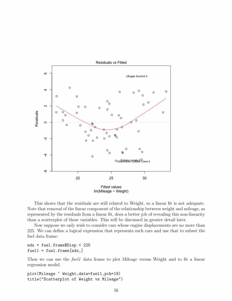
To help judge the adequacy of a linear regression fit, we can plot the residuals vs thepredictor variable X. The residuals are the prediction errors, ei = Yi − Yi, 1 ≤ i ≤ n. Ifa linear fit is reasonable, then the residuals should have no discernable relationship with Xand should be essentially noise. This plot for a linear fit to predict Mileage based on Weightis shown below.
55
This shows that the residuals are still related to Weight, so a linear fit is not adequate.Note that removal of the linear component of the relationship between weight and mileage, asrepresented by the residuals from a linear fit, does a better job of revealing this non-linearitythan a scatterplot of these variables. This will be discussed in greater detail later.
Now suppose we only wish to consider cars whose engine displacements are no more than225. We can define a logical expression that represents such cars and use that to subset thefuel data frame:
ndx = fuel.frame$Disp < 225
fuel1 = fuel.frame[ndx,]
Then we can use the fuel1 data frame to plot Mileage versus Weight and to fit a linearregression model.
The ideal situation is that the only thing left after we remove the linear relationship fromthe response variable, Mileage, is noise.
# qqnorm plot
qqnorm(residuals(Disp.lm),pch=19)
qqline(residuals(Disp.lm),col="red")
It is important to remember that correlation is a mathematical concept that says nothingabout causation. The presence of a strong correlation between two variables indicates thatthere may be a causal relationship, but does not prove that one exists, nor does it indicatethe direction of any causality.
The next question that can be asked related to this prediction problem is how welldoes the prediction line predict? We can’t answer that question completely yet becausethe full answer requires inference tools that we have not yet covered, but we can give adescriptive answer to this question. The distance measure, D(a,b), represents the varianceof the prediction errors. One way of describing how well the prediction line performs is tocompare it to the best prediction we could obtain without using the X values to predict. Inthat case, our predictor would be a single number. We have already seen that the closestsingle number to a dataset is the mean of the data, so in this case, the best predictor basedonly on the Y values is Y . This corresponds to a horizontal line with intercept Y , and sothe distance between this line and the data is D(Y , 0). This quantity represents the errorvariance for the best predictor that does not make use of the X values, and so the difference,
D(Y , 0)−D(a, b),
represents the reduction in error variance (improvement in prediction) that results from useof the X values to predict. If we express this as a percent,
100D(Y , 0)−D(a, b)
D(Y , 0),
then this is the percent of the error variance that can be removed if we use the least squaresregression line to predict as opposed to simply using the mean of the Y’s. It can be shownthat this quantity is equal to the square of the correlation coefficient,
r2 =D(Y , 0)−D(a, b)
D(Y , 0).
57
R-squared also can be interpreted as the proportion of variability in the Y -variable that canbe explained by the presence of a linear relationship between X and Y.
The file,http://www.utdallas.edu/~ammann/stat3355scripts/MPG.csv
contains weight, city mileage, and highway mileage. A plot of each pair of variables in thisdata set can be displayed and the corresponding correlation coefficients obtained as follows:
The correlation between Weight and MPG.highway is -0.8033 and so r-squared is 0.6453.This implies the relationship between these variables is decreasing and 64.53% of the variabil-ity in MPG.highwway can be explained by the presence of a linear relationship between thesevariables. If we use the regression line to predict MPG.highway based on Weight, we canremove 64.53% of the variability in MPG.highway by using Weight to predict MPG.highway.Another way of expressing this is to ask: Why don’t all cars have the same mileage? Partof the answer to that question is that cars don’t all weigh the same and there is a fairlystrong linear relationship between weight and highway mileage that accounts for 64.53% ofthe variability in mileage. This leaves 35.47% of this variability that is related to otherfactors, including the possibility of a non-linear relationship between these variables. Thisreduction in variability can be seen in the following plot. The first plot at upper left is ahistogram of the deviations of MPG.highway about its mean. These represent the residualswhen we use Y to predict highway mileage. The plot below it is a histogram of the residualswhen we use the least squares regression line to predict highway mileage based on weight.The second column of histograms compares the residuals about the mean to the regressionresiduals when MPG.city is used to predict highway mileage.
58
The R code to generate the graphics in this section can be found at:http://www.utdallas.edu/~ammann/stat3355scripts/NumericGraphics.r
An example using the crabs data can be found at:http://www.utdallas.edu/~ammann/stat3355scripts/crabs02042016.r
Introduction to Probability Models
Probability is a mathematical description of a process whose outcome is uncertain. We callsuch a process an experiment. This could be something as simple as tossing a coin or ascomplicated as a large-scale clinical trial consisting of three phases involving hundreds ofpatients and a variety of treatments. The sample space of an experiment is the set of allpossible outcomes of the experiment, and an event is a set of possible outcomes, that is, a
59
subset of the sample space.For example, the sample space of an experiment in which three coins are tossed consists
of the outcomes
{HHH,HHT,HTH, THH,HTT, THT, TTH, TTT}
while the sample space of an experiment in which a disk drive is selected and the time untilfirst failure is observed would consist of the positive real numbers. In the first case, the eventthat exactly one head is observed is the set {HHT,HTH, THH}. In the second case, theevent that the time to first failure of the drive exceeds 1000 hours is the interval (1000,∞).
Probability arose originally from descriptions of games of chance – gambling – that havetheir origins far back in human history. It is usually interpreted as the proportion or percent-age of times a particular outcome is observed if the experiment is repeated a large numberof times. We can think of this proportion as representing the likelihood of that outcomeoccurring whenever the experiment is performed. Probability is formally defined to be afunction that assigns a real number to each event associated with an experiment accordingto a set of basic rules. These rules are designed to coincide with our intuitive notions oflikelihood, but they must also be mathematically consistent.
This mathematical representation is simplest when the sample space contains a finite orcountably infinite number of elements. However, our mathematics and our intuition collidewhen working with an experiment that has an uncountable sample space, for example aninterval of real numbers. Consider for example the following experiment. You purchase aspring driven clock, set it at 12:00 (ignore AM and PM), wind the clock and let it run untilit stops. We can represent the sample space of this experiment as the interval, [0, 12), andwe can ask questions such as
1. What is the probability the clock stops between 1:00 and 2:00?
2. What is the probability the clock stops between 4:00 and 4:30?
3. What is the probability the clock stops between 7:05 and 7:06?
We can answer each of these questions using our intuitive ideas of likelihood. For the firstquestion, since we know nothing about the clock, we can assume that there is no preferenceof one interval of time over any other interval of time for the clock to stop. Therefore, wewould expect that each of the 12 intervals of length one hour are equally likely to contain thestopping time of the clock, and so the likelihood that it stops between 1:00 and 2:00 would be1/12. Similarly, the likelihood that it stops between 4:00 and 4:30 would be 1/24 since thereare 24 intervals of length 1/2 hour, and the likelihood that it stops between 7:05 and 7:06would be 1/720 since there are 720 intervals of length one minute. In each case our intuitiontells us that the likelihood of an event for this experiment is the reciprocal of the numberof non-overlapping intervals of the same length, since each such interval is assumed to beequally likely to contain the stopping point of the clock. Note also that the interval [1, 2),corresponding to the times between 1:00 and 2:00, contains the non-overlapping intervals,
60
[1, 1.5) and [1.5, 2). Each of these intervals would have likelihoods 1/24 and the sum ofthese two likelihoods equals the likelihood of the entire interval. This illustrates the additivenature of likelihood that we have for this concept.
A problem occurs if we ask a question such as what is the probability that the clock stopsat precisely
√2 minutes past 1? In this case there is an uncountably infinite number of such
times in the interval [0, 12), so that the likelihood we would assign to such an event wouldbe 1/∞ = 0. However, the sum of the likelihoods for all such events between 1:00 and 2:00would be 0, not 1/12 as we have derived above. This inconsistency requires that we modifythe rules somewhat. In the case of uncountably infinite sample spaces, we only require thatprobability be defined for an interesting set of events. In the case of the clock experiment,this interesting set of events would consist of all interval subsets of the sample space withpositive length along with events that can be formed from countable unions and intersectionsof such intervals. This collection of events is referred to as the probability space for theexperiment. In the case of finite or countably infinite sample spaces, the probability spacecan be the set of all possible subsets of the sample space. Unless specified otherwise, allevents used here are assumed to be in the probability space.
The basic rules or axioms of probability are then:
1. Probability is a function P : F → [0, 1], where F is the probability space. That is, theprobability function assigns a number between 0 and 1 to each event in the probabilityspace.
2. P (S) = 1, where S is the sample space. That is, the probability that an outcome inthe sample space occurs is 1.
3. For any countable collection of mutually exclusive events in F , Ai, i ≥ 1, we have
P (∞⋃i=1
Ai) =∞∑i=1
P (Ai).
That is, the probability of the union of non-overlapping events equals the sum of theindividual probabilities.
All other properties of probability derive from these basic axioms along with any additionaldefinitions we construct.
As noted previously, when working with experiments that have equally likely outcomes,it is only necessary to count the number of outcomes contained in events to determine theirprobabilities. Events in many such experiments involve the selection of objects from a popu-lation. There are different methods used for counting outcomes for such situations dependingon whether or not the selection order of the selected objects is recognized and whether a se-lected object is returned (selection with replacement) to the population before the nextselection is made or not returned (selection without replacement). We use the termpermutation to refer to selection of objects in which selection order is distinguished anduse the term combinations to refer to the case in which selection order is not distinguished.
61
We will consider here three of these methods, permutations with and without replacement,and combinations without replacement.
Permutations without replacement
If the object selected is not returned to the population before the next object is selected,then an object can appear in the selected subset no more than once. There are n choices inthe population to fill the first position, but then that leaves n-1 choices in the populationto fill the second position. Therefore, there are n(n− 1) ways to fill the first two positions.Continuing this argument, we can see that there are n(n − 1) . . . (n + 1 − k) ways to se-lect k objects without replacement from a population of n objects when selection order isdistinguished. This number is commonly expressed using factorial notation,
n(n− 1) . . . (n+ 1− k) =n!
(n− k)!
Permutations with replacement
This case occurs when we wish to select k objects with replacement from a population ofn objects and selection order is distinguished. Replacement implies that the same objectcould be selected multiple times. What is required is to count the number of distinct sets ofk objects could be selected in this way. We can view this selection process by consideringthe ways in which each of the positions, 1, . . . , n, of the set are filled. Note that there aren choices in the population to fill the first position, and since the object selected for thisfirst position is then returned to the population, there are n choices available for the secondselection as well. Therefore, there are n2 ways to fill the first two positions. Continuing thisargument, we can see that there are nk ways to select k objects with replacement from apopulation of n distinguishable objects.
Combinations without replacement
The only difference between this case and the case of permutations without replacement isthat the selection order of the k selected objects is not distinguished here. This implies thata different arrangement of the same objects is not counted for this case and so this caseinvolves simply selecting a subset of size k from the population. Therefore, we can view thenumber of permutations without replacement as a two-stage process: first select a subset(combinations without replacement) and then generate every possible rearrangement of eachof these subsets. Note that the number of ways to generate every possible rearrangementof k objects is equivalent to counting the number of permutations without replacement ofk objects selected from a population of size k, and so is equal to k!. Denote by C(n,k) thenumber of combinations without replacement. Then we have,
n!
(n− k)!= C(n, k)k!.
62
Hence,
C(n, k) =n!
k!(n− k)!.
This quantity is usually denoted by(n
k
)
Examples
Birthday Problem. This is a classic example of how probability in some applicationsdoes not coincide with our intuition. Suppose we have a class of n individuals and wantto determine the probability that there is at least one pair of individuals who have thesame birthday. To simplify this problem, we will ignore birthdays that occurred on Feb. 29during a leap year and count those as occurring on March 1. The model we will assumefor this problem treats an individual’s birthdate as if it was randomly selected from theset of 365 possible birthdays. Therefore, the experiment in which each individual selectsa birthdate is an experiment with equally likely outcomes. Therefore, we must count thenumber of ways to select n birthdays from the population of 365 possible birthdays, andthen count the number of ways to select n birthdays with at least one matching pair. Itturns out to be easier to count the number of ways to select n birthdays with no matches.This is equivalent to counting the number of permutations without replacement of k objectsselected from a population of 365 objects. This number is therefore 365!/(365-n)!. The totalnumber of possible birthdates for this group is equivalent to the number of permutationswith replacement of n birthdates from the population of 365 possible birthdates. This gives,
P (no birthdate matches) =365!/(365− n)!
365n.
A plot of this probability as a function of n is given below. Note that when n=23, there isabout a 50% probability of no matches in the group, and when n=50, there is about a 3%chance of no matches in the group.
63
64
Binomial coefficients. Note that the number of combinations without replacementoccurs in the binomial series,
(a+ b)n =n∑k=0
(n
k
)akbn−k.
Now consider an experiment in which two gamblers play a series of 10 games, the results ofwhich are independent. That is, the event that the first gambler wins (or loses) on gamer is independent of the event that he wins (or loses) any other game. Suppose that theprobability that the first gambler wins a particular game is p, and his probability of winningany other game is the same. Find the probability that the first gambler wins exactly 4games. To solve this problem, first note that an arbitrary outcome of this experiment canbe represented by a string of 10 characters, each of which is either W or L, denoting theoutcomes of each game. The event that the first gambler wins 4 games consists of all possiblestrings in which W occurs 4 times and L occurs 6 times. Each such string can be specifiedby the 4 positions of W in this string. For example, the outcome WWWWLLLLLL couldbe specified by the positions, 1234 of W. Since the games are independent, the probabilityof observing this outcome would be
Any other outcome with exactly 4 wins would just be a rearrangement of the 10 charactersin the string, and so would have the same probability. Therefore, the probability that thefirst gambler wins exactly 4 games is this probability times the number of such outcomes.We can obtain this number by counting the number of combinations of 4 positions takenfrom the possible 10 positions for W in the string. Hence,
P (4 wins) =
(10
4
)p4(1− p)6.
Using the same arguments, we can see that
P (k wins in 10 games) =
(10
k
)pk(1− p)10−k, 0 ≤ k ≤ 10.
We can easily extend this to n games to obtain
P (k wins in n games) =
(n
k
)pk(1− p)n−k, 0 ≤ k ≤ n.
Finally, note that these probabilities are terms in a binomial series, and that
n∑k=0
P (k wins in n games) =n∑k=0
(n
k
)pk(1− p)n−k = (p+ 1− p)n = 1.
Subpopulation selection. Suppose a committee consists of 40 males and 20 femalesand must select a subcommittee of 5 members. It decides to make this selection randomly.
65
What is the probability that all 5 members of the subcommittee will be female? What isthe probability that at least 2 member of the subcommittee will be male? First note thatan outcome of this experiment is a set of 5 members selected without replacement from thecommittee, and this experiment has equally likely outcomes. To answer the questions, wewill first obtain the probability that exactly k members of the subcommittee will be femalefor 0 ≤ k ≤ 5.. Note that if k members are female, then 5-k members will be male. Hence,the number of outcomes contained in the event that exactly k members are female can beobtained by counting the number of ways to select a subset of size k from the 20 females andmultiplying that times the number of ways to select a subset of size 5-k from the 40 males.Since order of selection does not count, this number is then(
20
k
)(40
5− k
).
The number of outcomes in the sample space is the total number of ways to select a subsetof size 5 from the 60 committee members, so the probability that exactly k are female is,
P (k) =
(20k
)(405−k
)(605
) .
We can now answer the questions.
P (5 females) = P (5) =
(205
)(400
)(605
)=
20!5!55!
5!15!60!
=20 · 19 · 18 · 17 · 16
60 · 59 · 58 · 57 · 56= 0.0028.
P (at least 2 males) = P (no more than 3 females) = P (0) + P (1) + P (2) + P (3)
= 1− P (4)− P (5).
P (4) =
(204
)(401
)(605
)=
20 · 19 · 18 · 17 · 40 · 560 · 59 · 58 · 57 · 56
= 0.0355.
So, P (at least 2 males) = 1− 0.0355− 0.0028 = 1− 0.0383 = .9617.
66
Additional Properties of Probability
The complement of an event is defined to be the set of all outcomes contained in the samplespace that are not contained in the event. It is denoted by Ac. Note that the complement ofthe sample space is defined to be the empty set, ∅, the set with no elements. Also, A
⋃ ∅ = Aand A
⋂ ∅ = ∅ for any event A. Therefore, if we set A1 = A, Ai = ∅, i ≥ 2, then {Ai} is acountable collection of mutually exclusive events. Hence, from axiom 3 we have,
P (A) = P (∞⋃i=1
Ai) = P (A) +∞∑i=2
P (∅).
Since P (∅) ≥ 0 from Axiom 1, then this equation implies that P (∅) = 0.Note: mathematical equations are sentences with the same syntax as English and can be
read as such. The set operations, intersection, union, and complement are often read as theEnglish equivalents, and, or, and not, respectively. Also, the word or used in this context isassumed to mean the inclusive or.
Now let Ai, 1 ≤ i ≤ n be a finite collection of mutually exclusive events and set Ai = ∅for i > n. Then from Axiom 3, we have
P (n⋃i=1
Ai) = P (∞⋃i=1
Ai)
=∞∑i=1
P (Ai) =n∑i=1
P (Ai) +∞∑
i=n+1
P (∅)
=n∑i=1
P (Ai).
That is, the probability of a finite union of mutually exclusive events equals the sum of theprobabilities.
Suppose we are interested in an experiment in which the sample space consists of a finitecollection of n outcomes, Oi, 1 ≤ i ≤ n, and that each outcome is equally likely withprobability p. Then the previous result implies that
1 =n∑i=1
P (Oi) = np.
Therefore, we must have p = 1/n. Furthermore, since an event for such an experiment maybe written as the union of the individual outcomes contained in the event, then
P (A) =#{A}n
,
where #{A} represents the number of elements in the set A. For experiments with equallylikely outcomes, the probability of an event is just the number of outcomes in the eventdivided by the total number of outcomes.
67
Next note that A and Ac are mutually exclusive and A⋃Ac = S. Therefore, from the
previous result we have,
1 = P (A⋃Ac) = P (A) + P (Ac).
So, the probability of the complement of an event is one minus the probability of the event.This result is useful for situations in which an event of interest is very complicated and itsprobability is difficult to obtain directly, but the complement of the event is simple with aneasily obtainable probability.
The axioms of probability tell us how to find the probability of the union of mutuallyexclusive events, but not how to find the probability of the union of arbitrary, not necessarilymutually exclusive, events. We can use the results derived thus far to solve this problem.Suppose we are interested in two events, A and B. We need to write the union of thesetwo events as the union of two mutually exclusive events. This can be done by noting thatA⋃B = A
⋃{B ⋂Ac}. Since A and B⋂Ac are mutually exclusive, then
P (A⋃B) = P (A) + P (B
⋂Ac).
Next note that B = {A⋂B}⋃{B ⋂Ac}, which is a disjoint union. Therefore,
P (B) = P (A⋂B) + P (B
⋂Ac)
and so,
P (B⋂Ac) = P (B)− P (A
⋂B).
Combining this with the previous result gives,
P (A⋃B) = P (A) + P (B)− P (A
⋂B),
the probability of A union B equals the sum of the probabilities minus the probability ofthe intersection.
In a similar way, we can show that probability is a monotone function. Suppose thatA ⊂ B. Then we may express B as a disjoint union, B = A
⋃(B
⋂Ac) and apply the
additivity property of probability,
P (B) = P (A⋃
(B⋂Ac))
= P (A) + P (B⋂Ac)
≥ P (A),
since P (B⋂Ac) ≥ 0. Hence, if A ⊂ B, then P (A) ≤ P (B).
Another extension that can be derived directly from the axioms is an extremely usefulresult called the Law of Total Probability. A partition of the sample space is definedto be a collection, finite or countably infinite, of mutually exclusive events in the probabilityspace whose union is the sample space. Suppose that {Bi} is partition and A is an arbitrary
68
event. Then A =⋃{A⋂Bi}, and the events, A
⋂Bi are mutually exclusive. The Law of
Total Probability is just the application of Axiom 3 to this expression,
P (A) =∑
P (A⋂Bi).
This property allows us to breakdown a complicated event A into more manageable pieces,A⋂Bi.Example. Suppose a standard card deck (13 denominations in 4 suits) is well-shuffled
and then the top card is discarded. What is the probability that the 2nd card (the new topcard) is an ace? Let A enote the event that the 2nd card is an ace. The partitioning eventswe will use are the events
B1 = {1st card is Ace}, B2 = {1st card is not Ace}
Then,
P (A) = P (A⋂B1) + P (A
⋂B2)
= P (1st card is Ace⋂
2nd card is Ace) + P (1st card is not Ace⋂
2nd card is Ace).
The first term has numerator which is the number of ways the first card is an ace and thesecond card is an ace, and has denominator which is the total number of different outcomesfor the first two cards. We can use permutations to count the number of outcomes for bothnumerator and denominator. The numerator is 4 · 3 and the denominator is 52 · 51. Hence,
P (1st card is Ace⋂
2nd card is Ace) =(4)(3)
(52)(51).
Similarly, the second term is
P (1st card is not Ace⋂
2nd card is Ace) =(48)(4)
(52)(51).
These give
P (A) =(4)(3)
(52)(51)+
(48)(4)
(52)(51)
=(4)(3 + 48)
(52)(51)
=(4)(51)
(52)(51)
=4
52=
1
13.
Note that this probability is the same as the probability that the first card is an ace.
69
Example
R includes a builtin data set called HairEyeColor that is a 3-dimensional frequency tablegenerated from a group of 592 students. Here are some examples of statements that can bemade using this data.1. The percentage of the group that are male.2. The percentage of the group that have green eyes.3. The percentage of males that have green eyes.4. The percentage of those with green eyes who are male.5. The percentage of those with brown eyes who are female.Note that the reference group for the first two statements is the entire population of 592students, so these statements are equivalent to ordinary probabilities:1. P(Male)2. P(Green Eyes)However, the reference groups for the remaining statements are not the entire population butinstead are subgroups. This makes those statements equivalent to conditional probabilities.3. P(Green Eyes — Male)4. P(Male — Green Eyes)5. P(Female — Brown Eyes).These probabilities and conditional probabilities can be obtained as follows.
cat(paste("5. P(Female | Brown Eyes) =", round(nFemaleBrownEyes/nBrownEyes,3)),"\n")
Next let’s consider whether or not hair and eye color are related. First we will answerthis for males and females combined. Here is the corresponding frequency table.
cat("Hair and eye color frequency table for all students\n")
HairEyeAll = apply(HairEyeColor,1:2,sum)
print(HairEyeAll)
The expected frequencies under the assumption of independence are obtained by:
70
R = apply(HairEyeAll,1,sum)
C = apply(HairEyeAll,2,sum)
Eall = outer(R,C)/nAll
cat("Expected frequencies under independence\n")
print(riound(Eall,1))
Distance from independence is given by
Dall = ((HairEyeAll - Eall)^2)/Eall
cat(paste("Total distance from independence =",round(sum(Dall),3)),"\n")
cat("Individual distances are given by:\n")
print(round(Dall,3))
Let’s repeat this just for males.
cat("Hair and eye color frequency table for males\n")
HairEyeMale = HairEyeColor[,,"Male"]
print(HairEyeMale)
R = apply(HairEyeMale,1,sum)
C = apply(HairEyeMale,2,sum)
Emale = outer(R,C)/nMale
cat("Expected frequencies under independence for males\n")
print(round(Emale,1))
Dmale = ((HairEyeMale - Emale)^2)/Emale
cat(paste("Total distance from independence for males =",round(sum(Dmale),3)),"\n")
cat("Individual distances for males are given by:\n")
print(round(Dmale,3))
Now repeat just for females.
cat("Hair and eye color frequency table for females\n")
HairEyeFemale = HairEyeColor[,,"Female"]
print(HairEyeFemale)
nFemale = sum(HairEyeFemale)
R = apply(HairEyeFemale,1,sum)
C = apply(HairEyeFemale,2,sum)
Efemale = outer(R,C)/nFemale
cat("Expected frequencies under independence for females\n")
print(round(Efemale,1))
Dfemale = ((HairEyeFemale - Efemale)^2)/Efemale
cat(paste("Total distance from independence for females =",round(sum(Dfemale),3)),"\n")
cat("Individual distances for females are given by:\n")
print(round(Dfemale,3))
Note that the distances from independence of Blond hair are much higher for females thanfor males.
71
Continuous Random Variables
Continuous random variables are variables that take values that could be any real numberwithin some interval. One common example of such variables is time, for example, the timeto failure of a system or the time to complete some task. Other examples include physicalmeasurements such as length or diameter. As will be seen, continuous random variables alsocan be used to approximate discrete random variables.
To develop probability models for continuous r.v.’s, it is necessary to make one importantrestriction: we only consider events associated with these r.v.’s that are defined in terms ofintervals of real numbers, including intersections and unions of intervals. Probability modelsare constructed by representing the probability that a r.v. is contained within an intervalas the area under a curve over that interval. That curve is called the density function ofthe r.v. To satisfy the laws of probability, density functions must satisfy the following twoconditions:
1. f(t) ≥ 0, ∀ t,
2.∫ ∞−∞
f(t)dt = 1.
The second condition corresponds to the requirement that the probability of the entire samplespace must be 1. Any function that satisfies these two conditions is the density function ofsome r.v.
The probability that the r.v. is contained within an interval is then
P (a < X ≤ b) =∫ b
af(t)dt.
Note that in the case of continuous r.v.’s,
P (a < X ≤ b) = P (a < X < b) = P (a ≤ X < b) = P (a ≤ X ≤ b),
since the area under a curve at a point is 0. The distribution function of a continuous r.v.is given by
F (x) = P (X ≤ x) =∫ x
−∞f(t)dt.
Note that the Fundamental Theorem of Calculus implies that
f(x) =d
dxF (x).
Also note that the value of a density function is not a probability; nor is a density necessarilybounded by 1. It can be thought of as the concentration of likelihood at a point.
The expected value of a continuous r.v. is defined analogously to the expected value ofa discrete r.v. with the p.m.f. replaced by the density function and the sum replaced by anintegral:
E(X) =∫ ∞−∞
xf(x)dx.
72
Also, the variance of a continuous r.v. is defined by
V ar(X) =∫ ∞−∞
(x− µ)2f(x)dx,
where µ = E(X). Note that the additive property of integrals gives
V ar(X) =∫ ∞−∞
(x2 − 2µx+ µ2)f(x)dx
=∫ ∞−∞
x2f(x)dx− 2µ∫ ∞−∞
xf(x)dx+ µ2
=∫ ∞−∞
x2f(x)dx− µ2
= E(X2)− µ2,
where µ = E(X).To construct probability models for continuous r.v.’s, it is only necessary to find a density
function that models appropriately the concentration of likelihood.
Normal Distribution
The normal distribution, also known as the Bell Curve, has been used (and abused)as a model for a wide variety of phenomena to the point that some have the impressionthat any data that does not fit this model is in some way abnormal. That is not thecase. The name normal distribution comes from the title of the paper Carl Friedrich Gausswrote that first described the mathematical properties of the bell curve, “On the NormalDistribution of Errors”. For this reason, the distribution is sometimes referred to as thegaussian distribution. Perhaps that name would be less misleading. The main importanceof this model comes from the central role it plays in the behavior of many statistics that arederived from large samples.
The normal distribution represents a family of distribution functions, parametrized by themean and standard deviation, denoted by N(µ, σ). The density function for this distributionis
f(x;µ, σ) = (2πσ2)−1/2 exp{−(x− µ)2/(2σ2)}.
The mean is referred to as a location parameter since it determines the location of the peakof the curve. The standard deviation is referred to as a scale parameter since it determineshow spread out or concentrated the curve is. The plots below illustrate these properties. Inthe first plot, the means differ but the standard deviations are all the same. In the secondplot, both the means and the standard deviations differ.
73
74
75
Probability that a continuous random variable is contained within an interval is modeledby the area under the curve corresponding to the interval. Suppose for example we have arandom variable that has a N(50, 5) distribution and we are interested in the probabilitythat this r.v. takes a value between 45 and 60. The problem now is to determine this area.Unfortunately (or perhaps fortunately from the point of view of students) the normal densityfunction does not have an explicit integral. This implies that we must either use a set oftabulated values to obtain areas under the curve or use a computer routine to determine theareas. One property satisfied by the family of normal distributions is closure under lineartransformations. That is, if X ∼ N(µ, σ), and if Y = a+ bX, then Y ∼ N(a+ bµ, |b|σ). Wecan make use of this property by noting that
Z =X − µσ
= −µσ
+1
σX
has a N(0, 1) distribution. This distribution is referred to as the standard normal distri-bution, and the value of Z corresponding to X is referred to as the standardized scoreor Z-score for X. This property implies that the probability of any interval can be trans-formed into a probability involving the standard normal distribution. The interpretation ofthe Z-score can seen by expressing X in terms of Z,
X = µ+ Zσ.
This shows that the z-score represents the number of standard deviations X is from its mean.
76
For example, if X ∼ N(50, 5), then
P (45 < X < 60) = P (45− 50
5<X − 50
5<
60− 50
5)
= P (−1 < Z < 2).
As can be seen by comparing these two plots, the areas for P (45 < X < 60) andP (−1 < Z < 2) are the same. Therefore, it is only necessary to tabulate areas for thestandard normal distribution. The textbook contains such a table on page 789. This tablegives areas under the standard normal curve below z for z > 0. This table requires anadditional property of normal distributions called symmetry:
P (Z < −z) = P (Z > z), P (0 < Z < z) = P (−z < Z < 0).
77
78
Example. Suppose a questionnaire designed to assess employee satisfaction with work-ing conditions is given to the employees of a large corporation, and that the scores on thisquestionnaire are approximately normally distributed with mean 120 and standard deviation18.a) Find the proportion of employees who scored below 150.b) Find the proportion of employees who scored between 140 and 160.c) What proportion scored above 105?d) What proportion scored between 90 and 145?These areas are represented in the plots given below.e) 15% of employees scored below what value?
Solutions
79
a) First transform to N(0, 1).
z =150− 120
18= 1.67,
P (X < 150) = P (Z < 1.67).
From the table on the inside back cover of the text, the area below 1.67 is 0.9525. Therefore,
P (X < 150) = P (Z < 1.67) = 0.9525.
b) Transform to N(0, 1).
z1 =140− 120
18= 1.11
z2 =160− 120
18= 2.22.
In this case we must subtract the area below 1.11 from the area below 2.22. From the tablethese areas are, respectively, .8665 and .9868. This gives
P (140 < X < 160) = P (1.11 < Z < 2.22) = 0.9868− 0.8665 = 0.1203.
c) Transform to N(0, 1).
z =105− 120
18= −0.83.
The symmetry property of the normal distribution implies that the area above -0.83 is thesame as the area below 0.83, which we get from the table.
P (X > 105) = P (Z > −0.83) = P (Z < 0.83) = 0.7967.
d) Transform to N(0, 1).
z1 =90− 120
18= −1.67
z2 =145− 120
18= 1.39
The area we require is the difference between the area below 1.39 and the area below -1.67.By symmetry, the area below -1.67 is the same as the area above 1.67.
P (90 < X < 145) = P (Z < 1.39)− P (Z < −1.67)
= 0.9177− [1− P (Z < 1.67)]
= 0.9177− [1− 0.9525]
= 0.8702.
80
e) This problem is different than the others because we are given an area and must use thisto determine the appropriate value. The first step is to determine on which side of the meanthe required value is located. This is determined by two quantities: whether the area is lessthan 0.5 or greater than 0.5, and the direction relative to the required value occupied bythe specified area. In this case, the area (15%=0.15) is less than 0.5 and the direction isspecified by scored below what value. These imply that the required value must be less thanthe mean. A picture of this area is given below. To answer this question, we first answerthe corresponding question for the standard normal distribution. What z-value has an areaof 0.15 below it? This z-value must be negative since the area is less than 0.15 and thedirection is below (or to the left of) the required value. Since the table gives areas below z,the area we must find in the table is 1− 0.15 = 0.85. The closest area in the table to 0.85 is0.8508 which corresponds to a z-score of 1.04. Since the z-score for this problem is negative,then the answer to this question for the standard normal distribution is z = −1.04. Finally,we must convert this z-score to the x-value,
x = µ+ zσ = 120 + (−1.04)(18) = 101.28.
If you check this answer by finding the area below 101.28, you will see that the steps we justfollowed are the same steps we used to find areas but applied in reverse order. Also notethat the value of 101.28 represents the 15th percentile of this normal distribution. Otherpercentiles can be obtained similarly.
81
Since z-scores represent the number of standard deviations from the mean, and sincethey are directly associated with percentiles, they can be used to determine the relativestanding of an observation from a normally distributed population. In particular, considerthe following three intervals: µ ± σ, µ ± 2σ, and µ ± 3σ. After converting these intervalsto z-scores, they become, respectively, (-1,1), (-2,2), and (-3,3). Because of the symmetryproperty, the probabilities for these intervals are,
P (µ− σ < X < µ+ σ) = P (−1 < Z < 1) = 2P (0 < Z < 1) = 2(.3413) = .6826
P (µ− 2σ < X < µ+ 2σ) = P (−2 < Z < 2) = 2P (0 < Z < 2) = 2(.4772) = .9544
P (µ− 3σ < X < µ+ 3σ) = P (−3 < Z < 3) = 2P (0 < Z < 3) = 2(.4987) = .9974
This is the basis for the empirical rule: if a set of data has a histogram that is approximatelybell-shaped, then approximately 68% of the measurements are within 1 standard deviation ofthe mean, approximately 95% are within 2 standard deviations of the mean, and essentially
82
all (makes more sense than approximately 99.74%) are within 3 standard deviations of themean.
Suppose that in the previous example an employee scored 82 on the employee satisfactionsurvey. The z-score for 82 is (82-120)/18 = -2.11. So this score is more than 2 standarddeviations below the mean. Since 95% of the scores are within 2 standard deviations of themean, this is a relatively low score. We could be more specific by determining the percentilerank for this score. From the table of normal curve areas, the area below 2.11 is 0.9826, sothe area below z = −2.11 is 1− 0.9826 = 0.0174. That is, only 1.74% of those who took thisquestionnaire scored this low or lower.
Large Sample Approximations
The main importance of the normal distribution is associated with the Central LimitTheorem. This theoem was originally derived as a large sample approximation for thebinomial distribution when n is large and p is not extreme. In this case we may approximatethe binomial distribution function by the normal distribution with mean np and standard
deviation√np(1− p).
Suppose for example that in a very large population of voters, 48% favor Candidate Afor president, and that a sample of 500 is randomly selected from this population. What isthe probability that more than 250 in the sample will favor Candidate A? We can model thenumber in the sample who favor Candidate A with a binomial distribution with n=500 andp=0.48. Since n is large, we can approximate this distribution with a normal distribution
with mean µ = 500(.48) = 240 and standard deviation σ =√
500(.48)(.52) = 11.2. Since thebinomial is a discrete distribution, we can improve this approximation slightly by extendingthe interval of values whose probability we wish obtain by 0.5 at each end of the interval. Forexample, if we want to find P (N = 230), then we approximate it by P (229.5 < X < 230.5,where X has the appropriate approximate normal distribution. Similarly,
P (N < a) ≈ P (X < a− .5)
P (N ≤ a) ≈ P (X < a+ .5)
P (N > a) ≈ P (X > a+ .5)
P (N ≥ a) ≈ P (X > a− .5)
P (a < N < b) ≈ P (a+ .5 < X < b− .5)
P (a ≤ N ≤ b) ≈ P (a− .5 < X < b+ .5)
Therefore, from the table of areas under the normal curve, we obtain
P (N > 250) ≈ P (X > 250.5)
= P (Z > (250.5− 240)/11.2)
= P (Z > 0.94)
= = 1− 0.8264 = 0.1736.
83
Note that we could also express this event in terms of the sample proportion who favorCandidate A. Let p = N/500 denote the sample proportion. Then the probability we ob-tained above could be expressed as P (p > 0.5). Since p is a linear function of N , thenwe can use the normal distribution with mean µ = 240/500 = 0.48 and standard deviationσ = 11.2/500 = 0.022 to approximate the distribution of p. Note that the standard deviation
can be obtained directly as σ =√p(1− p)/n =
√(.48)(.52)/500 = 0.022.
The Central Limit Theorem extends this result to a sampling situation in which asample of size n is randomly selected from a very large population with mean µ and standarddeviation σ. Let X denote the mean of this sample. We can treat the sample mean as arandom variable that is the numerical value associated with the particular sample we obtainwhen we perform the sampling experiment. The Central Limit Theorem states that thedistribution of this random variable is approximately a normal distribution with mean µand standard deviation σ/
√n. Suppose we looked at every possible sample of size n that
could be obtained from the population, and we computed the sample mean for each of thesesamples. What the CLT implies is that the histogram of all these sample means would beapproximately a normal curve with mean µ and standard deviation σ/
√n. The following
plots illustrate this.
84
Note that there is less asymmetry in the histogram of X with n = 10 than in thepopulation histogram, but some asymmetry still remains. However, that asymmetry is notpresent in the histograms corresponding to the larger sample sizes. Note also that thevariability decreases with increasing sample size. This theorem holds for any distribution,but the more non-normal the distribution, the larger n must be for the distribution of X tobe close to the normal distribution. However, if the population distribution is itself a normaldistribution, then the Central Limit Theorem holds for all n ≥ 1.
85
One remaining question that will also be applicable to methods discussed later is theproblem of determining how far a data set is from normality. This is accomplished mostcommonly by a Quantile-Quantile plot. Let n denote the sample size and let y = ((1 :n) − .5)/n. Then y represents the quantiles of the ordered values of the data. That is, y[i]represents, up to a correction factor, the proportion of the sample that is at or below theith ordered value of the sample. Now let x[i] = zy[i]. Then x[i] represents the z-score suchthat the area below it equals the proportion of the sample that is at or below the data valuecorresponding to the ith ordered value. If the data has a normal distribution, then thesepoints should fall on a line with slope equal to the s.d. and intercept equal to the mean.The following plots show quantile-quantile plots for four distributions: normal, heavy-tailed,very heavy-tailed, and asymmetric.
86
Estimation
Many important statistical problems can be expressed as the problem of determining somecharacteristic of a population when it is not possible or feasible to measure every individualin the population. For example, political candidates may wish to determine the proportionof voters in a state who intend to vote for them; an advertising agency may wish to determinethe proportion of a target population who react favorably to an ad campaign; a manufacturer
87
may wish to determine the mean cost per unit associated with warranty costs of a product.Since it is not possible or feasible to contact every individual in the respective populations,the only reasonable alternative is to select in some way a sample from the population anduse the information contained within the sample to estimate the population characteristicof interest.
At first thought, it would seem that what should be done here is to select a represen-tative sample from the population, since such a sample would mirror the properties of thepopulation. Suppose, for example, that we would like to determine the proportion of votersin a state who intend to vote for a particular candidate for governor. Let π denote thisproportion. A representative sample selected from this population should have a sampleproportion that is close to π. The problem though is how to select such a sample. In fact, itis not possible to do this, for even if the proportion in the sample were close to π, we wouldnot know it because we don’t know the value of π.
Furthermore, an estimate derived from a sample has no value unless we can make somestatement about its accuracy. Suppose that p is the proportion in the sample who favor thatcandidate. Then the error of prediction would be ε = p− π. Obviously we cannot make anexact statement about this error since we don’t know π. However, if the sample is selectedrandomly so that each individual in the population has the same chance of being selected,then it is possible to make a probability statement about the estimation error. Randomsampling is the only type of sampling with which we can make reasonable state-ments about the prediction error.
Large Sample Estimation of a Population Proportion
Suppose we randomly select n individuals from the population of voters and let N denote theproportion in the sample who favor a particular candidate. Then p = N/n is our estimate ofπ. The value of this estimate depends on the individuals who are selected for the sample. Tounderstand how we can make use of this fact to make a statement about estimation error,consider the following thought experiment (an experiment that we don’t actually perform, butcan think about). Suppose we select every possible sample of size n from the population andfor each sample we obtain the sample proportion who favor this candidate. These estimateswill vary from 0 to 1 and the actual sampling experiment we perform, selecting a randomsample of size n and obtaining its sample proportion, is equivalent to randomly selecting oneproportion from the population of proportions obtained from all possible samples of size n.Although we could not perform this experiment in reality, we can perform it mathematically.If we can determine the distribution of the population of all possible sample proportions,then we can use this distribution to make a probability statement about the estimationerror. The Central Limit theorem states that if n is large, then the distribution of N isapproximately a normal distribution with mean nπ and variance nπ(1− π). Therefore, thedistribution of p = N/n has approximately a normal distribution with mean π and varianceπ(1 − π)/n (see the plot below). This distribution is called the sampling distributionof p. One of the properties of normal curves is that approximately 95% of a normally
88
distributed population lies within 2 standard deviations of the mean. In this case that meansthat approximately 95% of all possible samples of size n have sample proportions that arewithin 2 standard deviations of their mean π. Therefore, when we randomly select oursample proportion from the population of all possible sample proportions, the probabilityis approximately 0.95 that the error of estimation, the difference between the estimate and
the actual proportion, will be no more than 2 standard deviations, 2√π(1− π)/n. This
represents a bound on the error of estimation. It is not an absolute bound, but is a reasonablebound in the sense that there is only a 5% chance that the error of estimation will exceedthis bound.
89
90
For example, suppose we randomly select 500 voters and find that 260 of these votersfavor this candidate. Then our estimate of the population proportion is p = 260/500 = 0.520.
We are about 95% certain that the error of this estimate is no more than 2√π(1− π)/n.
The problem that remains to be solved is that this error bound depends on the value of π,which is unknown. There are two approaches we can take to solve this problem. The firstapproach is to note that the function
h(π) =√π(1− π), 0 ≤ π ≤ 1,
is a bounded function of π with upper bound h(π) ≤ 0.5. The plot below shows how thisfunction depends on π.
91
92
This implies that the bound on the error of estimation is at most
2(.5)/√n = 1/
√n.
Therefore, we can make the following statement about the proportion of voters who favorour candidate based on the information contained in our sample: the estimated proportionwho favor our candidate is 0.520 and we are about 95% certain that this estimate is no morethan
1/√
500 = 0.045
from the actual population proportion. Another way of stating this is that we are about 95%certain that the population proportion is within the interval 0.520± 0.045, that is, between0.475 and 0.565.
This bound on the error of estimation of a population proportion is conservative in thesense that it does not depend on the actual population proportion. However, if π is closeto 0 or 1, then it will be too conservative because in this case, the value of h(π) would bemuch smaller than the upper bound. It can be seen from the plot that if .2 ≤ π ≤ .8,then .4 ≤ h(π) ≤ .5, so the upper bound becomes too conservative when the populationproportion is below .2 or above .8. In some situations, we may have prior information in theform of a bound on π that allows us to place a bound on h(π). Suppose, for example, thatwe wish to estimate the proportion of memory chips that do not meet specifications, and weknow from past history that this proportion has never exceeded 0.15. In that case, we cansay that
h(π) ≤√
(.15)(.85) = .357.
If a sample of 400 memory chips is randomly selected from a production run, and it is foundthat 32 fail to meet specifications, then the estimated population proportion is p = .080, anda bound on the error of estimation would be 2(.357)/
√400 = 0.036. We could present these
results as follows: The estimated proportion of memory chips that do not meet specificationsis 0.080. With 95% certainty, this proportion could be as low as 0.044 or as high as 0.116.
If we do not have available any prior bounds on the population proportion, then wecould use p in place of π in the error bound. That is, the estimated bound on the error ofestimation would be
2√p(1− p)/n.
One of the interpretations of the estimated proportion of voters who favor our candidateis that we are 95% confident that this proportion is between 0.475 and 0.565. This intervalrepresents a range of reasonable values for the population proportion. The confidence level of95% is determined by the use of 2 standard deviations for the error bound and the propertyof normal curves that approximately 95% of a population falls within 2 standard deviationsfrom the mean. However, this also implies that there is a 5% chance that the estimationerror is greater than the stated bound, or that there is a 5% chance that the interval does
93
not contain the population proportion. If there are very serious consequences of reportingan error bound that turns out to be too small, then we should decide what is an acceptablerisk that the error bound is too small. We can then use the appropriate number of standarddeviations so that the risk is acceptably small. Suppose for example that we are willingto accept a risk of 1% that the error bound is too small or that the resulting interval ofreasonable values does not include the population proportion. To accomplish this, we mustfind the z-score such that the area between -z and z is 0.99. To find this z-score, note thatto area above z must be 0.005 and so the total area below z is 0.995. We can use the Rquantile function qnorm for the normal distribution to obtain this value,
z = qnorm(.995)
This gives z=2.576 and so the 99% confidence interval is
In this case we are 99% confident that the proportion of voters who favor our candidateis somewhere within this interval. Such intervals are called confidence intervals. Tosummarize the discussion above, a confidence interval for a population proportion based ona random sample of size n is
p± zσ,
where z is selected so that the area between -z and z is the required level of confidence, andσ is
σ =√p0(1− p0)/n, if prior bound p0 is given
=√p(1− p)/n, if no prior bound is given
In practice we can just use the estimated standard deviation for confidence intervals. Thisgives the confidence interval,
p± z√p(1− p)/n
The standard deviation based on a prior bound is used for sample size determination.Confidence intervals have two inter-related properties: the level of confidence and the
precision as measured by the width of the confidence interval. These properties are inverselyrelated. If the confidence level is increased, then the width is increased and so its precisionis decreased. The only way to increase the confidence level while maintaining or increasingprecision is to use a larger sample size. The sample size can be determined by specifyingthe confidence level and the required precision. Suppose for example that we would like toestimate the proportion who favor our candidate to within 0.025 with 95% confidence. Thesegoals require that the confidence interval has the form p ± e, where e denotes the requiredprecision, 0.02. Since there is no prior bound available for the population proportion, we must
94
use the conservative standard deviation for the confidence interval, p± z/(2√n). Therefore,
to attain these goals we must have
z
2√n
= e⇐⇒ n =(z
2e
)2
,
where z is chosen so that the area between -z and z is 0.95 and e=0.02. Using R gives
z = qnorm(.975)
e = .02
n = (z/(2*e))^2
n
[1] 2400.912
If the actual population proportion is close to 0 or 1, then this sample size will be muchlarger than is required for the stated goals. In such situations if we have a prior boundon the population proportion, we can incorporate that bound to improve the sample sizedetermination. If we would like to estimate the proportion of memory chips that do not meetspecifications and we have a prior bound, p ≤ p0 for the proportion, then the confidenceinterval will have the form,
p± z√p0(1− p0)/n.
This gives
z√p0(1− p0)√
n= e⇐⇒ n =
(z
e
)2
p0(1− p0).
If we require that the estimate of this proportion be within .02 of the population proportionwith 90% confidence, and we have a prior bound p ≤ 0.15, then z=1.645, p0 = 0.15, and sothe sample size would be
n =(
1.645
.02
)2
(.15)(.85) = 863.
Estimation of a Population Mean
The results of the previous section are derived from the Central Limit Theorem for pro-portions. We can use similar methods to estimate the mean of a population. We will firstconsider this estimation problem when the population has a normal distribution, and then wewill examine the extension of these methods to populations that are not necessarily normallydistributed.
The CLT for sample means states that if the population has approximately a normal dis-tribution with mean µ and standard deviation σ, then the distribution of X is approximatelyN(µ, σ/
√n). We can interpret this the same way we interpreted the CLT for proportions.
Imagine taking every possible sample of size n from the population and finding the mean
95
for each sample. The histogram of these sample means will be approximately a normal dis-tribution with mean µ and s.d. σ/
√n. This implies that we can use X as an estimate of µ.
The error of estimation is then X −µ, and we can make the following probability statementabout this error,
P (|X − µ| >zα/2σ√n
) = P (|Z| > zα/2) = α,
where zα/2 is the z-score such that the area to the right of zα/2 under the normal curve isα/2. We use α/2 so that the total area in both extremes is α. Therefore, the probabilitythat the error of estimation exceeds zα/2σ/
√n is α and so, a 1 − α confidence interval for
the population mean is
X ± zα/2σ√n.
The problem here is that this confidence interval depends on σ, the population standarddeviation. In most situations, σ is unknown as well as µ. Sometimes we may have priorinformation available that gives an upper bound for σ, σ ≤ σ0, which can be incorporatedinto the confidence interval,
X ± zα/2σ0√n.
Situations where no such upper bound is available require that we estimate σ with the samplestandard deviation. However, using s in place of σ changes the sampling distribution of X.What is required is to determine the distribution of
tn =X − µs/√n.
This problem was solved around 100 years ago by a statistician named William Gossett,who solved it while working for Guinness brewery. Because of non-disclosure agreements inhis employment contract, Gossett had to publish his solution under the pseudonym Student.For this reason, the distribution of tn when X1, · · · , Xn is a random sample from a normaldistribution is called Student’s t distribution. This distribution is similar to the standardnormal distribution and represents an adjustment to the sampling distribution ofX caused byreplacing the constant σ with a random variable s. As the sample size increases, s becomesa better estimate of σ, and so less adjustment is required. Therefore, the t-distributiondepends on the sample size. This dependence is expressed by a function of the samplesize called degrees of freedom, which for this problem is n-1. That is, the samplingdistribution of tn is a t-distribution with n-1 degrees of freedom. A plot that comparesseveral t-distributions with the standard normal distribution is given below. Note that thet-distribution is symmetric and has relatively more area in the extremes and less area inthe central region compared to the standard normal distribution. Also, as the degrees offreedom increases, the t-distribution converges to the standard normal distribution.
96
97
We now can make use of Gossett’s result to obtain a confidence interval for µ,
X ± tn−1,α/2s√n,
where tn−1,α/2 is the value from the t-distribution with n-1 degrees of freedom such that thearea to the right of this value is α/2. The interpretation of this interval is that it containsreasonable values for the population mean, reasonable in the sense that the probability thatthe interval does not contain the mean is α.
We can find the appropriate t-values in R using the quantile for the t-distribution,qt(p,df), which has two arguments. Suppose we obtain a random sample of size 20 from apopulation that is approximately normal and wish to estimate the population mean using a95% confidence interval. If the sample mean is 45 and the sample s.d. is 12, then the t-valuehas 19 d.f. and so the confidence interval is given by interval is
n = 20
alpha = .05
xm = 45
xs = 12
t = qt(1-alpha/2,n-1)
conf.int = xm + c(-t,t)*xs/sqrt(n)
conf.int
[1] 39.38383 50.61617
Note that the t-value in this case is 2.093 which is greater than the corresponding z-value of1.96. This reflects the added uncertainty caused by needing to estimate the population s.d.Note that if the sample size had been 80 instead of 20, then the confidence interval wouldhave been more narrow.
n = 80
alpha = .05
xm = 45
xs = 12
t = qt(1-alpha/2,n-1)
conf.int = xm + c(-t,t)*xs/sqrt(n)
conf.int
[1] 42.32953 47.67047
The probability statement associated with this confidence interval,
P
(X − tn−1,α/2
s√n≤ µ ≤ X + tn−1,α/2
s√n
)= 1− α,
appears to imply that the mean µ is the random element of this statement. However, that isincorrect; what is random is the interval itself. This is illustrated by the following graphics.The first simulates the selection of 200 random samples each of size 25 from a population
98
that has a normal distribution and the second performs the simulation with samples of size100. Each vertical bar represents the confidence interval associated with one of these randomsamples. Green bars contain the actual mean and red bars do not. Note that the increasedsample size does not change the probability that an interval contains the mean. Instead,what is different about the second graphic is that the confidence intervals are shorter thanthe intervals based on samples of size 25.
99
100
101
Sample size determination. If our estimate must satisfy requirements both for thelevel of confidence and for the precision of the estimate, then it is necessary to have someprior information that gives a bound on σ or an estimate of σ. Let σ0 denote this bound orestimate, and let e denote the required precision. Then the confidence interval must havethe form,
X ± e
which implies that
zα/2σ0√n
= e⇐⇒ n =(zα/2σ0e
)2
.
Example. A random sample of 22 existing home sales during the last month showed thatthe mean difference between list price and sales price was $4580 with a standard deviationof $1150. Assume that the differences between list and sales prices have approximately anormal distribution and construct a 95% confidence interval for the mean difference for allexisting home sales. What would you say if the mean difference between list and sales pricesfor the same month last year had been $5500? Suppose you wish to estimate this meanto within $250 with 99% confidence. What sample size would be required if you use thestandard deviation of this sample as an estimate of σ?Solution. The confidence interval can be obtained using R
alpha = .05
n = 22
m = 4580
s = 1150
t = qt(1-alpha/2,n-1)
conf.int = m + c(-t,t)*s/sqrt(n)
conf.int
[1] 4070.119 5089.881
The interpretation of this interval is that it contains reasonable values for the populationmean, reasonable in the sense that we are risking a 5% chance that the actual populationmean is not one of these values. If the mean difference between list and sales prices for thesame month last year had been $5500, then we could say that the difference between listand sales price this year is less than last year since all of the reasonable values for this year’smean difference are lower than last year’s mean. There is a risk of 5% that this conclusionis wrong. Also, if we need to make projections based on the value of the population mean,we could use the projection based on the sample mean as a nominal-case projection and usethe endpoints of the interval as best-case/worst-case projections.
Note that the precision of this confidence interval is 510 with 95% confidence. If werequire a precision of 250 with 99% confidence, then we must use a larger sample size. Wecan use the sample standard deviation, s=1150, as an estimate of the σ for the purpose ofsample size determination, but we can’t use t-values here since we don’t yet know the sample
102
size. This implies that we must use the corresponding z-value instead a t-value to determinen.
alpha = .01
e = 250
s = 1150
z = qnorm(1-alpha/2)
n = (z*s/e)^2
n
[1] 140.3944
So a sample of size 141 would be required to meet these specifications. The actual precisionattained by a confidence interval based on a sample of this size may not have a precisionthat is very close to 250 if the sample standard deviation in our preliminary sample of size22 is not a good estimate of the actual population standard deviation or if the distributionof the data is not approximately normal.
Since the results discussed above are based on the Central Limit Theorem, we can applythem in the same way to the problem of estimating the mean of a population that does notnecessarily have a normal distribution. This would lead to the same confidence interval forµ,
X ± tn−1,α/2s√n.
The only difference is that such an interval would only be valid if the sample size is sufficientlylarge for the Central Limit Theorem to be applicable. Some caution must be used here, sincethe definition of sufficiently large depends on the distribution of the population. It alwaysis a good idea to look at the quantile-quantile plot of the data to see how close is the datato a normal distribution.
Simulation of confidence intervals
This script illustrates how confidence intervals vary from sample to sample. It also showsthat the middle of a confidence interval, which is the sample estimate, is not really important,it is the interval itself that is important.http://www.UTDallas.edu/~ammann/stat3355scripts/confint.r
Estimation of a Population Variance
In the previous section we used the sample standard deviation as an estimate of the pop-ulation standard deviation, so it is natural to consider how good is this estimate. Note:this section is only applicable if the population is approximately normally distributed or thesample size is large.
Suppose we have a population of measurements with mean µ and s.d. σ and we haverandomly selected a sample of size n from this population. To determine how to construct
103
confidence intervals for σ we can use a similar thought experiment to what we considered forthe estimation of a population proportion. Suppose we could obtain every possible sampleof size n from this population and computed the sample s.d. for each of these samples. Theexperiment in which we randomly select a single sample of size n and compute the samples.d. of this sample would be equivalent to randomly selecting a single sample s.d. fromthe population of sample s.d.’s from all possible samples of size n. Therefore, probabilitystatements about the sample s.d. could be derived from the distribution of all possible samples.d.’s in a way that is similar to how we constructed confidence intervals for a populationproportion and population mean. In this case, however, statistical theory doesn’t answer thatdirectly for the s.d. Instead, it tells us that if the population distribution is approximatelya normal curve or if the sample size is large, then the distribution of
Sn =(n− 1)s2
σ2
has a distribution that is referred to as a Chi-square distribution with n-1 degrees offreedom.
104
105
Since the chi-square distribution is not symmetric, we need to find upper and lower valuesfrom this distribution such that the area between them is the required level of confidence forthe confidence interval. Let Clower denote the value from the chi-square distribution withn-1 degrees of freedom such that the area below it is α/2 and let Cupper denote the valuefrom the chi-square distribution such that the area above it is α/2. Then we can make thefollowing probability statement,
P (Clower ≤ (n− 1)s2
σ2≤ Cupper) = 1− α.
The confidence interval for σ2 is derived by manipulating the inequality in this probabilityso that σ2 is between the inequalities. We can do this as follows:
Clower ≤ (n− 1)s2
σ2⇐⇒ σ2 ≤ (n− 1)s2
Clower,
and
(n− 1)s2
σ2≤ Cupper ⇐⇒ σ2 ≥ (n− 1)s2
Cupper.
Combine these inequalities to obtain
P ((n− 1)s2
Cupper≤ σ2 ≤ (n− 1)s2
Clower) = 1− α.
Therefore a 1− α confidence interval for σ2 is[(n− 1)s2
Cupper,(n− 1)s2
Clower
].
Suppose for example that we wish to construct a 95% confidence interval for the popu-lation variance of the difference between list and sales price based on the sample of size 22in the example above. In this case we would use a chi-square distribution with 21 degrees offreedom. Quantiles from the Chi-square distribution are obtained in R using the functionqchisq().
alpha = .05
n = 22
s = 1150
Cl = qchisq(alpha/2,n-1)
Cu = qchisq(1-alpha/2,n-1)
conf.int = (n-1)*s^2/c(Cu,Cl)
conf.int
[1] 782789.7 2700843.7
We can convert this to a confidence interval for σ by taking square roots of the interval.This gives
sqrt(conf.int)
[1] 884.7541 1643.4244
106
Other Estimation Problems
The estimation problems discussed thus far were solved in the same general way. We firstobtain a statistic computed from the data that is an estimator of the population parameter ofinterest. Then apply appropriate statistical theory to determine the sampling distribution ofthe statistic. The sampling distribution can be described as the result of a thought experimentin which we imagine obtaining every possible sample of size n from the population. Wecompute this for each possible sample and then ask what is and appropriate model for thehistogram of all those values. That model should be a function of the population parameter.If the model includes additional parameters, then those must be estimated from the data aswell.
Statistical Decisions
We have seen that confidence intervals can be used to make inferences about a populationparameter since confidence intervals represent a range of plausible values for the parameter.In this section we will expand these ideas to construct methods for statistical decision-makingbased on information contained in a randomly selected sample from the population.
Consider a situation in which a manufacturer currently has a 10% defective rate for oneof its products. Suppose that you are assigned the task of improving the production processto reduce this rate. After studying the problem your workgroup propose a solution that willrequire an initial outlay of $500,000 for new equipment and retraining of production staff.However, before agreeing to these changes, the COO asks you undertake a pilot productionrun to answer two questions: (1) Will the new process actually reduce the defective rate?(2) How long will it take to recover the initial cost of implementing the new process throughreduced warranty claims on the product? Suppose that after the pilot program is performedyou find that in a production run of 400 units, 20 fail to meet specification. We will treatthis set of 400 units as a random sample from the population of all units produced by thisprocess and the answers to the two questions will be based on the information contained inthe sample.
The first question represents a decision problem in which you are asked to decide betweentwo actions: implement the new process or don’t implement it. If the pilot study shows strongevidence that the new process will reduce the defective rate, then it will be implemented. If,however, the evidence provided by the pilot study is weak or shows no change, then the newprocess will not be implemented. These actions correspond to two possible sets of values forthe defective rate: π ≥ 0.10 and π < 0.10. The second set has the burden of proof for ourdecision. That is, we will only believe it, and take the corresponding action to implementthe new process, if the evidence provided by the pilot study indicates strongly that this istrue. In the language of statistics, the hypothesis that has the burden of proof is referred toat the alternative hypothesis.
This implies that we initially assume that nothing has changed, that is, the defective rateunder the new process is the same as before, π = 0.10. This hypothesis is referred to as thenull hypothesis since it is presumed to be true by default. It is possible that a random
107
sample of 400 units will contain fewer than 10% defectives when π = 0.10, but we would notexpect this proportion to be very much less than 0.10.
Our random sample of 400 units contained 20 defectives, a sample proportion of 0.05.This is less than what we would expect to see if the defective rate is the same as before, andso leads to some doubt that our initial assumption is true. Since an outcome of the pilotstudy that gave fewer than 20 defectives would provide even greater doubt about the initialassumption, this doubt can be expressed as the likelihood of observing a sample proportionthat is at least as far below π = 0.10 as we have in our sample. That is, we must evaluate,
P (p ≤ 0.05)
under the assumption that π = 0.10. We know from our derivation of confidence intervalsfor a population proportion that under this assumption, p has approximately a normaldistribution with mean π = 0.10 and s.d.√
π(1− π)/n =√
(.1)(.9)/400 = 0.015.
Therefore, the doubt concerning the assumption that π = 0.10 is given by
P (p ≤ 0.05) ≈ P (Z ≤ (.05− .10)/.015) = P (Z ≤ −3.33) = 0.0004.
Therefore, if we assume the defective rate using the new process is unchanged, then wemight see a sample proportion of 0.05 or lower in a random sample of size 400, but thechance of that happening is only 0.0004. It would be much more reasonable to reject thatassumption and believe that the defective rate with the new process is lower than 0.10. Ifwe take the action to implement the new process based on this data, the probability we havetaken the wrong action is only 0.0004.
Now that we believe the new process will reduce the defection rate, we can answer theCOO’s second question by constructing a confidence interval for the proportion of defectivesusing the new process,
.05± 1.96√
(.05)(.95)/400 ⇔ .05± .011 ⇔ [.039, .061].
Example. Currently the market share of a company’s brand for a particular productin the DFW metropolitan area is 25%. An advertising campaign based on social mediaplacements is run for one month. A random sample of 750 potential purchasers of thisproduct contained 225 who planned to buy this company’s brand. Do you believe the marketshare of this company’s brand has increased? Why or why not? Construct a 90% confidenceinterval for this company’s market share after the advertising campaign.
Solution The sample proportion of potential purchasers who plan to buy this brand is225/750 = 0.30 which is higher than the current market share. Under the assumption thatthis market share has not changed, the probability of seeing a sample proportion of 0.30 orhigher in a random sample of n=750 is given by
108
P (p ≥ 0.30) = P (Z ≥ (0.30− 0.25)/sqrt(0.25)(0.75)/750
= P (Z ≥ 3.16)
= 1− 0.9992
= 0.0008.
It is highly unlikely that this would happen, so we should believe that the market share hasincreased. A 90% confidence interval for the market share after this advertising campaign is
0.30± (1.645)√
(0.3)(0.7)/750 ⇔ .30± .028 ⇔ [.272, .328].
Hypothesis tests for a population proportion
The discussion above is an example of a hypothesis test for a population proportion. Thereare three basic sets of hypotheses that can be tested. In all cases we make use of the centrallimit theorem for proportions: if the sample size is large, then the sampling distribution of
the sample proportion is approximately normal with mean π and s.d.√π(1− π)/n where π
is the population proportion and n is the sample size.
1.H0 : π ≤ π0H1 : π > π0The burden of proof is to show that π > π0, where π0 is the reference value that isinitially assumed to be true. The test statistic for this test is
z =p− π0√
π0(1− π0)/n.
The p-value is P (Z > z), the area to the right of z under the standard normal density.Note that the s.d. used for the test statistic is not the same as what we used forconfidence intervals.
2.H0 : π ≥ π0H1 : π < π0The burden of proof is to show that π < π0, where π0 is the reference value that isinitially assumed to be true. The test statistic for this test is
z =p− π0√
π0(1− π0)/n.
The p-value is P (Z < z), the area to the left of z under the standard normal density.Note that evidence for the alternative hypothesis would be a sample proportion thatis less than π0 in which case the test statistic would be negative.
109
3. The previous two sets of hypotheses are examples of one-sided tests - we only are inter-ested in detecting the possibility that the population proportion falls on one particularside of the reference value. In the first case, we only are interested in showing thatπ > π0. The possibility that πmight be less than π0 instead of equal to π0 is of noconcern and so these two are lumped together into the null hypothesis that π ≤ π0.However, there are situations in which three separate actions would be taken depend-ing on whether π < π0, π > π0, or π = π0. In this case we must proceed in two steps.The first is to test two-sided hypotheses,H0 : π = π0H1 : π 6= π0If the null hypothesis is not rejected, then we take the action associated with the hy-pothesis π = π0. If the null hypothesis is rejected, then we take the action associatedwith the hypothesis π < π0 if p < π0 and we take the action associated with the hy-pothesis π > π0 if p > π0. The test statistic is |z| and the p-value for this two-sidedtest includes both tail areas,
P (Z > |z) + P (Z < −z).
One important characteristic of a hypothesis test is its power function which representsthe probability that the test will reject the null hypothesis expressed as a function of theactual population proportion. Suppose in the example above the level of significance was5%. In this case the null hypothesis, π > 0.25, would be rejected if z ≥ 1.645 since P (Z ≥1.645) = 0.05. This is equivalent to
p ≥ 0.25 + 1.645√
(.25)(.75)/750 = 0.276.
If the actual population proportion is π1, then the central limit theorem tells us that thesamping distribution is approximately normal with mean π1 and s.d. π1(1−π1)/n. Therefore
Power(π1) = P (p ≥ 0.276)
≈ P (Z ≥ (0.276− π1)/√π1(1− π1)/n.
For example, if π1 = 0.30, then the probability this test will reject the null hypothesis is
Power(0.30) = P (Z ≥ −1.434) = 0.924.
That is, if the population proportion is actually π1 = 0.30, then there is a 92.4% chance thistest will end up rejecting the null hypothesis. Note that the power function evaluated at thenull hypothesis value (in this example, 0.25 ) is equal to the level of significance of the test,α. Power functions for the other sets of hypotheses are obtained similarly.
110
Hypothesis tests for a population mean
For this problem we use the same sampling theory derived for confidence intervals of popu-lation means. If the population is approximately normally distributed or if the sample sizeis large, then the sampling distribution of
t =X − µ0
s/√n
is a t-distribution with n-1 degrees of freedom.
1.H0 : µ ≤ µ0
H1 : µ > µ0
The burden of proof is to show that µ > µ0, where µ0 is the reference value for thepopulation mean that is initially assumed to be true. The test statistic for this test is
t =X − µ0
s/√n.
The p-value is P(T ¿ t), the area to the right of t under the t-density with n-1 d.f.
2.H0 : µ ≥ µ0
H1 : µ < µ0
The test statistic for this test is
t =X − µ0
s/√n.
The p-value is P(T ¡ t), the area to the left of t under the t-density with n-1 d.f.
3. For the two-sided test,H0 : µ = µ0
H1 : µ 6= µ0
the test statistic is —t— and the p-value is the total area under both tails of thet-density,
P (T < −|t|) + P (T > |t|),
More advanced tools are required to obtain the power function of the t-test. The theorybehind this power function is illustrated here by a large sample approximation. First considera one-sided test of the hypotheses:H0 : µ ≤ µ0
111
H1 : µ > µ0
with level of significance α. We would reject the null hypothesis if the t-statistic,
T =X − µ0
s/√n,
is greater than or equal to the critical value, tn−1,1−α, chosen so that the area to the right ofthis value under the t-distribution with n-1 degrees of freedom equals α. In the large samplecase, this critical value is approximately equal to the corresponding value from the standardnormal distribution. In R the approximate critical value can be obtained by
tn−1,1−α = qt(1− α, n− 1) ≈ z1−α = qnorm(1− α).
This is equivalent to rejecting the null hypothesis if
X ≥ µ0 + z1−αs/√n.
Therefore, the power function for this test is given by
Pµ(X ≥ µ0 + z1−αs/√n),
where µ represents the actual population mean. In the large sample case, we can use thestandard normal distribution to approximate the distribution of
T =X − µs/√n,
This gives
Power(µ) = Pµ(X ≥ µ0 + z1−αs/√n)
= Pµ(X − µs/√n≥ µ0 − µ
s/√n
+ z1−α)
≈ P (Z ≥ µ0 − µs/√n
+ z1−α)
= 1− pnorm(µ0 − µs/√n
+ z1−α)
Suppose we have a random sample of size n=80 with sample mean 65, sample s.d. 12, andwe wish to testH0 : µ ≤ 60H1 : µ > 60at 5% level of significance. In R a plot of this power function can be obtained by
s = 12
n = 80
alpha = .05
mu0 = 60
112
criticalValue = qnorm(1-alpha)
mu = seq(58,68,length=201)
power = 1 - pnorm(criticalValue + (mu0 - mu)*sqrt(n)/s)
Note that the power function at the null hypothesis is always equal to the level of significance.This plot also shows that if the population mean is 63.9, then the probability this test willreject the null hypothesis is 0.9.
R has a function for power of t-tests that uses the exact distribution of the test statisticwhich is the non-central t-distribution. This function, power.t.test() can be used to obtainpower, sample sizes, and observable differences for t-tests. For the example above, the powerfunction is obtained by
Note that the result is essentially the same as the large sample approximation because thesample size is relatively large. Now suppose the sample size had been smaller, say 20 insteadof 80.
s = 12
n = 20
alpha = .05
mu0 = 60
criticalValue = qnorm(1-alpha)
mu = seq(58,72,length=201)
power = 1 - pnorm(criticalValue + (mu0 - mu)*sqrt(n)/s)
The power function involves four basic components of the test: sample size, delta, sigma,and power. The argument delta represents the difference between the value of µ at whichpower is to be computed and the null hypothesis value of the mean, δ = µ − µ0. Thepower.t.test function is written so that if three of those components are specified, then thefunction returns the fourth. For example, suppose we would like to determine the samplesize needed to give a 90% probability that the null hypothesis would be rejected when µ = 63using the same s.d. as before. This is obtained as follows.
Another example: what values of the mean can be detected with 80% probability if thesample size is 100 and the population s.d. is 15?
n = 100
s = 15
pwr = 0.8
del = power.t.test(n, sd=s, power=pwr, type="one.sample", alternative="one.sided")$delta
mu1 = mu0 + del
cat(paste("Detectable mean when n = ",n,",sigma = ",s,", power = ",pwr,":",sep=""),"\n")
cat("mu1 =",round(mu1,1),"\n")
Hypothesis tests to compare means of two populations - independent samples
The tests described in the previous section involve a comparison between a population meanand a standard. More commonly occurring situations involve a comparison of the means intwo populations. Suppose for example we would like to compare the mean salaries of femaleand male financial analysts. This comparison can be expressed as a test of the hypotheses
H0 : µ1 = µ2
H1 : µ1 6= µ2,
where µ1 represents the population mean salary of all male financial analysts and µ2 rep-resents the population mean salary of all female financial analysts. This problem is statedas a two-sided hypothesis so that we can detect an increase as well as a decrease in femalesalaries compared to male salaries. We will assume that these populations have approx-imately normal distributions or that we have large sample sizes so that the central limittheorem can be applied. The simplest way to make this comparison is to separately selectrandom samples from each group. This sampling method produces independent samples. Letµ1, σ1 denote the population mean and standard deviation of male salaries, let µ2, σ2 denotethe population mean and standard deviation of female salaries, and let n1, X1, s1, n2, X2, s2
114
denote the sample sizes, sample means, and sample standard deviations for the respectivesamples. It would be reasonable to base our decision on X1− X2, the difference between thesample means. To construct a test statistic based on this difference, we need to determineits sampling distribution. That is, we must find the distribution of X1− X2 from all possiblesamples of size n1 for males and n2 for females. Let
V1 =s21n1
, V2 =s22n2
.
Statistical theory shows that if the populations are approximately normal or if the samplesizes are large, then the distribution of
(X1 − X2)− (µ1 − µ2)√V1 + V2
has approximately a t-distribution with degrees of freedom given by
ν =(V1 + V2)
2
V 21
n1−1 +V 22
n2−1
.
Under the assumption that the null hypothesis is true, then
X1 − X2√V1 + V2
has approximately a t-distribution with degrees of freedom ν. Strong evidence for thistwo-sided alternative would be sample means that are far apart. Therefore, the p-value isP (T ≥ |T0|), where
T0 =X1 − X2√V1 + V2
.
This test is referred to as Welch’s approximation to the two-sample t-test.Care should be taken with one sided-alternatives, since only one direction indicates strong
evidence for the alternative. If the hypotheses are
H0 : µ1 ≤ µ2
H1 : µ1 > µ2,
then strong evidence for the alternative hypothesis would be a value of X1−X2 that is a largepositive number. If X2 is much larger than X1, then the decision should be to not rejectthe null hypothesis even though the sample means are far apart. Likewise, if the hypothesesare
H0 : µ1 ≥ µ2
H1 : µ1 < µ2,
115
then strong evidence for the alternative hypothesis would be a value of X1 − X2 that is alarge negative number. If X1 is much larger than X2, then the decision should be to notreject the null hypothesis. The easiest way to handle these one-sided hypotheses is the formthe test statistic according to the alternative hypothesis. If the hypotheses are
H0 : µ1 ≤ µ2
H1 : µ1 > µ2,
then let
T0 =X1 − X2√V1 + V2
.
The p-value is P (T > T0). If X2 is larger than X1, then T0 would be negative and sothis p-value would be greater than 0.5 and we would not reject the null hypothesis. If thehypotheses are
H0 : µ1 ≥ µ2
H1 : µ1 < µ2,
then let
T0 =X2 − X1√V1 + V2
.
The p-value in this case is P (T > T0). If X1 is larger than X2, then T0 would be negativeand so this p-value would be greater than 0.5 and we would not reject the null hypothesis.
The validity of this two-sample test depends on the assumption of normality of thepopulation. If the populations are not normally distributed and if the sample sizes are notsufficiently large to compensate for this non-normality via the Central Limit Theorem, thenthe p-values obtained as described above will not be valid. There is a non-parametric testcalled the Wilcoxon Mann-Whitney rank sum test that can be used in place of thetwo-sample t-test. Most statistical computer packages include this test as part of their setof two-sample test methods, but this method will not be discussed here.
Example. Suppose we wish to test the hypotheses
H0 : µ1 = µ2
H1 : µ1 6= µ2,
based on a random sample of 25 male financial analysts and a random sample of 18 femalefinancial analysts using a 10% level of significance. Suppose that the salaries in these samplesgive X1 = 77500, s1 = 6000, X2 = 72000, s2 = 9000. It will be easier to express the salariesin $1000 dollar units rather than dollars, so the data becomes X1 = 77.5, s1 = 6, X2 = 72,s2 = 9. Then
V1 = 62/25 = 1.44, V2 = 92/18 = 4.5,
116
T0 =77.5− 72√1.44 + 4.5
= 2.257.
The degrees of freedom are
ν =(1.44 + 4.5)2
1.442
24+ 4.52
17
= 27.6.
2*pt(-2.257,27.6),
which gives 0.032. So our decision is to reject the null hypothesis at the 10% level ofsignificance. Since we now believe that there is a difference between the means, we couldask how great is that difference. This can be accomplished with a confidence interval for thedifference between the population means. This confidence interval has the form
(X1 − X2)± tνsind,
where the degrees of freedom for the t-value is the same as for the test statistic, and thestandard deviation sind is the denominator of the test statistic,
sind =√V1 + V2.
A 95% confidence interval for the difference between the mean salaries for males and femalesis
(77.5− 72)± 2.052√
1.44 + 4.5 ⇐⇒ 5.5± 5.00⇐⇒ [0.5, 10.5].
This confidence interval expressed in dollars is [$500,$10,500]. That is, we are 95% confidentthat the difference between the means is within this interval. Note that all of these valuesare positive, indicating that the mean for males is greater than the mean for females.
Comparison of Population Variances
There are situations in which we may wish to compare the variances of two populations withindependent samples. In that case, the test statistic is the ratio of the sample variances, s21/s
22.
Statistical theory implies that if the populations are approximately normally distributed orthe sample sizes are large, then under the assumption the population variances are equal, thesampling distribution of this ratio is an F-distribution. This distribution has two parameters,called numerator and denominator degrees of freedom, respectively, which are given by n1−1, n2 − 1. This implies that a test of the hypotheses,
H0 : σ1 ≤ σ2
H1 : σ1 > σ2,
can be constructed based on the ratio of sample variances,
F =s21s22.
117
Strong evidence for this one-sided alternative would be an F-ratio that is much greater than1. The p-value therefore would be
pvalue = 1− pf(F, n1 − 1, n2 − 1).
Note that we could have used
F21 =s22s21
in which case strong evidence for the alternative would be a value for this F-ratio that ismuch smaller than 1. The p-value then would be
then in practice we could divide the larger sample variance by the smaller sample variance.The corresponding p-value would be two times the area to the right of this ratio under thecorresponding F-distribution.
For example, the data given above for the comparison of male and female financial ana-lysts reported sample sd’s s1 = 6000, s2 = 9000 based on sample sizes of 25,18. Suppose wewish to test the two-sided hypotheses,
H0 : σ1 = σ2
H1 : σ1 6= σ2,
Then the test statistic is(9000
6000
)2
= 2.25.
The p-value is taken from the F-distribution with 17,24 degrees of freedom. This can beobtained using R as follows:
pvalue = 2*(1 - pf(2.25,17,24))
which gives pvalue = 0.0673. Therefore, we would reject the null hypothesis at the 10%level of significance. This conclusion is based on the assumption that the populations areapproximately normal, so that assumption should be checked.
118
Hypothesis tests to compare means of two populations – paired samples
Although separate samples selected from the two populations seems like a natural experi-mental design for this problem, this design may not produce the best results. In the salarycomparison example discussed in the previous section, it would be reasonable to assumethat the salaries of individuals in both populations would be related to experience. It mayhave been the case that the differences we saw in salaries was due to the fact that salary isstrongly related to experience and there was a significant difference in experience betweenthe two groups. We cannot eliminate the possible effect of experience and the confusion ininterpretation that it causes by our independent sampling design.
By incorporating this additional variable into our experimental design we can reducevariability and potential confusion, thereby increasing the sensitivity of our test. There aretwo ways this can be accomplished. One way is to include a measure of experience as asecond variable that is recorded for each person selected in the two samples. This designinvolves a type of analysis called Analysis of Covariance which is beyond the scope of thiscourse. The second way to incorporate this additional variable into the analysis is to design amatched pairs sampling process. In this sampling design we randomly select one individualfrom the first population, determine the experience level of the person selected, then identifyfrom the second population all individuals who have the same experience and randomlyselect one of those to be matched with the first individual selected. This selecting andmatching process is continued to we obtain nmatched pairs of individuals, matched accordingto experience. This paired sampling design removes the effect of experience on salaries,and so any differences that remain between the two groups cannot be due to differences inexperience.
Other comparison problems involve naturally occurring pairs. A common experimentaldesign to test for the effect of some treatment is to give a pre-treatment test to a group, applythe treatment, and then give a post-treatment test. The test scores are naturally paired –one pre-treatment and one post-treatment score for each individual. In another example, wemay wish to obtain a sample of married couples and then compare the scores of the husbandsand wives on a questionnaire each takes. The key difference here between paired samplingand independent sampling is that in this case we are randomly selecting a sample of marriedcouples rather than randomly selecting a sample of males who are husbands and separatelyselecting a sample of females who happen to be wives.
Let (X1, Y1), · · · , (Xn, Yn) denote the pairs of measurements that are obtained from apaired-sample experiment, and suppose that we wish to test the hypotheses
H0 : µ1 = µ2
H1 : µ1 6= µ2,
where the first population has mean µ1 and the second population has mean µ2. In paired-sample experiments the pair differences, di = Xi − Yi, 1 ≤ i ≤ n, contain the relevantinformation about the hypotheses. Therefore, we can express the hypotheses in terms of the
119
pair differences by defining µd = µ1 − µ2. Then we have
H0 : µd = 0
H1 : µd 6= 0.
This has the effect of transforming the problem to a one-sample problem, and so we canuse the one-sample t-test applied to the pair differences to test these hypotheses. This testis based on the mean and standard deviation of the pair differences, d1, · · · , dn. While itis possible to obtain the mean of the pair differences by computing the difference betweenthe sample means, there is no such shortcut to obtain the standard deviation of the pairdifferences. It must be computed from the pair differences directly. The resulting test iscalled a paired-sample t-test, and the sample size for the test is the number of pairs.
Example Suppose that we implement a matched pairs sampling design for the compar-ison of salaries, matching on experience, and find that in a sample of 18 matched males andfemales, their salary information isX1 = 75200, s1 = 5800, X2 = 72700, s2 = 7000, sd = 4000.Note that the individual group standard deviations, s1, s2, are not part of the paired-sampletest, and the sample mean of the pair differences is
Xd = X1 − X2 = 2500.
Therefore, the test statistic is
T0 =2500
4000/√
18= 2.652
We use the t-distribution with 17 degrees of freedom since the data for this test consistsof the 18 pair differences. The test statistic is between the t-values 2.567 and 2.898 whichcorrespond to t.010 and t.005, respecively. Since this is a two-sided test, the p-value is between0.02 and 0.01. Therefore, our decision is to reject the null hypothesis at the 5% level ofsignificance. We might make a Type I error with this decision, but the chance of thathappening is between 1% and 2%. A 95% confidence interval for the difference between themean salaries is
Xd ± tsd/√n ⇐⇒ 2500± (2.110)(4000/
√18) ⇐⇒ 2500± 1989 ⇐⇒ [611, 4489].
We are 95% confident that the difference between the mean salary for males and the meansalary for females is in this interval. We can also say that this difference is not due to possibledifferences in experience between the two groups since the effect of that variable has beenremoved by our matched-pair sampling design.
Chi-square test for independence in two-way frequency tables
Suppose a large corporation has 20 open positions for entry-level accountants and all ap-plications are initially screened to identify those who satisfy the job requirements. Suppose
120
there were 200 qualified applicants, 110 of which were male and 90 were female, and thatof those hired, 16 were male and 4 were female. These results can be summarized in thefollowing table:
Hired Not Hired TotalM 16 94 110F 4 86 90
Total 20 180 200Note that 10% of all qualified applicants were hired, but 14.5% (16/110) of qualified
male applicants were hired and 4.4% (4/90) of qualified female applicants were hired. Sothe chances of being hired appear to differ between males and females. We say that hiringand gender are independent if the probabilities of being hired for males and females are thesame as the overall probability, 0.10. Therefore, to have exact independence between hiringand gender in this case, the company would needed to have hired 10% of qualified maleapplicants and 10% of qualified female applicants. The table of expected frequencies in thiscase would be
Hired Not Hired TotalM 11 98 110F 9 81 90
Total 20 180 200We can construct a measure of distance between the actual frequencies and the expected
frequencies under independence given by
D =∑ (O − E)2
E,
where O represents the observed frequency, E represents the expected frequency underindependence, and the sum is over the interior cells of the frequency table. In this example,
D =(16− 11)2
11+
(94− 98)2
98+
(4− 9)2
9+
(86− 81)2
81= 5.612.
The sampling distribution for this distance is approximately a chi-square distribution withdegrees of freedom given by (r-1)(c-1) where r is the number of rows and c is the numberof columns of the frequency table, not counting the margin totals. The p-value for a test ofthe hypotheses
H0 : categories are independent
HA : categories are not independent
is the area to the right of D under the chi-square density with (r-1)(c-1) d.f. From R, thep-value is
1 - pchisq(5.612,1) = 0.0178.
If we use 5% level of significance for this test, then we would reject the null hypothesis andconclude that hiring and gender are not independent.
121
0.0.1 Nonparametric tests
Although the central limit theorem is a powerful tool that allows us to make decisions andobtain estimates with large sample sizes, it does not tell us how large the sample must befor the hypothesis tests and confidence intervals to be valid. Also there may be situationsin which normality is difficult to assess due to relatively small sample sizes, or you are notwilling to make that assumption. Alternative methods have been developed for such casesthat are referred to as non-parametric tests. These tests make minimal assumptions aboutthe population distributions and generally rely on the ranks of the data. As a result, theyare applicable where t-tests are not, but they tend to be less powerful than t-tests if thepopulations are approximately normal.
One-sample test for location. The mean and median are both measures of location,or middle, of a population. We have seen how a one-sample t-test can be used to testhypotheses about the mean of a population. The non-parametric analogue is the mediantest. Let q.5 denote the median of a population (.5 quantile) and suppose we wish to test
H0 : q.5 ≤ m0
H1 : q.5 > m0,
Let π denote the proportion of the population less than or equal tom0. Ifm0 is the populationmedian, then π = .5, but if the population median is greater than m0, then π < .5. So thismedian test is equivalent to a test of a population proportion:
H0 : π ≥ 0.5
H1 : π < 0.5,
The sample proportion for this test is the proportion of the sample that are less than orequal to m0. However, since tests for population proportions generally require very largesample sizes, the median test is not used much in practice.
Signed Rank TestA more powerful non-parametric test that requires the assumption of symmetry for thepopulation distribution was proposed by Frank Wilcoxon, a chemist with a strong intuitionabout statistics. His test is referred to as the signed rank test. Not that for symmetricpopulations the mean and median are the same. Let Yi = |Xi −m0|, let Si denote the signof Xi −m0, and let Ri denote the rank of Yi in the sample, where the smallest observationreceives rank 1 and the largest receives rank n. Ties are given the average of the ranksthey would have received if they had been different. If m0 is the median, then the ranksof the absolute deviations corresponding to observations above m0 (signs = 1) should becomparable to the ranks of the absolute deviations for observations below m0 (signs = -1).Therefore, in that case
W =
∣∣∣∣∣n∑i=1
SiRi
∣∣∣∣∣
122
should be around 0. If m0 is not the median, then W should be large. Wilcoxon was able toderive the sampling distribution of W under the null hypothesis. This test is implementedin R using the wilcox.test function.
This test also can be used for paired samples in which case m0 = 0 and Xi is replacedby the pair differences. Consider the paired data,http://www.utdallas.edu/~ammann/stat3355scripts/anorexia.txt
Suppose we wish to test the null hypothesis that the medians of Prewt and Postwt are thesame for patients who received the control treatment, Cont. A t-test requires the assumptionof normality, but the signed rank test only requires symmetry. These tests are performed asfollows.
Wilcoxon Rank Sum TestThere also is an analogue to the two-sample t-test for independent samples, discoveredindependently by Wilcoxon, Mann and Whitney, the rank sum test. For this test the ranksof the combined samples are obtained. Under the null hypothesis that the middles of thetwo populations are the same, the ranks from sample 1 should be comparable to the ranksfrom sample 2. The test statistic is the sum of the ranks from sample 1. This test also isimplemented in R with the wilcox.test function. Suppose for example we wish to comparethe pretreatment weights for Cont patients to the pretreatment weights of patients whoreceived treatment CBT.
123
x = Anorexia[Anorexia$Treat == "Cont","Prewt"]
y = Anorexia[Anorexia$Treat == "CBT","Prewt"]
wilcox.test(x,y)
Now compare weight gains for these two groups.
WtGain = Anorexia$Postwt - Anorexia$Prewt
x = WtGain[Anorexia$Treat == "Cont"]
y = WtGain[Anorexia$Treat == "CBT"]
wilcox.test(x,y)
What about FT ?
z = WtGain[Anorexia$Treat == "FT"]
wilcox.test(x,z)
Inference for Regression and ANOVA
In the first part of the course we discussed how to fit a least squares regression line fromdata, and how to use that line to make predictions. In this section we will continue thatdiscussion with the goal of deriving confidence intervals for these predictions. As is the casewith every statistical method, estimates of population characteristics are only as good as thestatistical models that are the bases for the estimation process.
The situation we are addressing here is one in which we are interested in two charac-teristics, or variables, associated with a population, and we would like to use one of thesevariables to predict the value of the other for some individuals in the population. The processwe must follow to accomplish this is outlined here.
1. Construct a mathematical model for the relationship between the two variables in thepopulation.
2. Randomly select a sample from the population and use this sample to fit the model.
3. Determine if the model adequately expresses the relationship between the variablesbased on the random sample. That is, determine whether or not the assumptionsmade to construct the model are reasonably satisfied for the random sample that isused for the fit. This step is absolutely critical to the success of the process, but themethods involved in the step are beyond the scope of this course. Part of the difficultywith this step is that it requires us to determine whether the model is wrong or thedata is wrong if there are problems with the assumptions. This is not a straight-forward process that can be automated. Since these methods are beyond the scopeof the course, we will not discuss them, but you should always be aware that BestProfessional Practice requires that this step be performed. No statistical predictionsare valid without this step.
124
4. If the model is not adequate, then the model must be modified and refit, which returnsus to the previous step.
5. Once we have constructed a model whose assumptions are reasonable for the data ofinterest, we can use it to make predictions and to make inferences about the relationshipbetween the variables.
For this course we assume that the relationship between the two variables of interest islinear, which can be expressed by the population model,
Y = α + βX + ε.
This model describes the values of the three variables X, Y, ε for a randomly selected indi-vidual in the population. Y is the variable whose value we wish to predict and X is thevariable that is used to make this prediction. The variable ε is referred to as error. It doesnot necessarily represent measurement error, but instead represents the cumulative effect ofall unmeasured variables on the response variable Y, in addition to any measurement errorsthat may have occurred.
The basic assumptions that we make about this model and the population are that allof the relationship between X and Y can be represented by the linear equation,
Y = α + βX,
and that individual deviations from this relationship are unrelated to the values of X andto the values and errors of other individuals in the population. For the purpose of statisticalestimation and inference, we also assume that the distribution of the errors can be approx-imated by a normal distribution with mean 0 and some s.d. σ. Specifically, we assumethat
1. The errors are statistically independent.
2. The distribution of the error variables in the population is approximately normal,N(0, σ2).
In particular, the error variance, σ2, is assumed to be the same for all X. This assumptionis referred to as homogeneity of variance.
Since the behavior of the errors does not involve the X variables, then the linear function,Y = α + βX, must contain all of the relationship between X and Y. Methods to identifyappropriate prediction models and to verify their conditions are beyond the scope of thiscourse. Nevertheless, reports that make inferences based on such prediction models shouldinclude a description of the results of these steps.
Now suppose we have a random sample of size n from the population and use leastsquares regression to fit this linear model,
Yi = a+ bXi + ei, 1 ≤ i ≤ n,
125
where
b = rsysx, a = Y − bX.
The differences between the actual and predicted Y-values, denoted by ei, are referredto as the model residuals and represent estimates of the actual errors. Verification of modelassumptions involves checking to see if the behavior of these residuals is related to X andto compare their distribution to the normal distribution. This is accomplished by plottingresiduals versus X (or the fitted values) to check for curvature and homogeneity of varianceand by a quantile-quantile plot of the residuals to check for normality. How to do this in Ris shown below. Let Y.lm represent the result of fitting a linear regression model to predictY from X.
Y.lm = lm(Y ~ X)
Y.res = residuals(Y.lm)
#check for homogeneity of variance
plot(Y.res ~ X, pch=19,ylab="Residuals")
#check for normality
qqnorm(Y.res,pch=19)
If the model assumptions are reasonable, then we can ask whether or not X is useful forpredicting Y. This question can be answered by a test of the hypotheses:
H0 : β = 0
HA : β 6= 0.
To test these hypotheses we need to consider three sums of squared deviations:
TSS =∑
(Yi − Y )2
SSE =∑
(Yi − Yi)2
SSR =∑
(Yi − Y )2
These are referred to as total sum of squares, error sum of squares, regression sum of squares,respectfully. It can be shown that TSS = SSR + SSE and SSR, SSE are statisticallyindependent. Also,
E(TSS) = (n− 1)σ2
E(SSE) = (n− 2)σ2
E(SSR) = σ2 + β2SSX
where
SSX =∑
(Xi −X)2 = (n− 1)s2X .
126
Therefore, under the null hypothesis,
s2e = SSE/(n− 2)
and SSR are independent estimates of σ2. However, under the alternative hypothesis, SSRis an estimate of
σ2 + β2SSX > σ2.
This implies that we can test those hypotheses using a 1-sided F-test with test statistic
F =SSR
s2e.
The p-value for this test is the area to the right of F in the F-distribution with d.f. (1, n-2).In R this is obtained by
1− pf(F, 1, n− 2).
The test statistic and p-value are reported in R by the summary of a linear model fit,
summary(Y.lm)
Example. The file,http://www.utdallas.edu/~ammann/stat3355scripts/mileage.csv
contains weights, engine displacements, and gas mileages for 60 cars. Suppose we wish toexamine how mileage depends on weight.
qqnorm(residuals(Mileage.lm),pch=19,main="Quantile-Quantile Plot of Residuals") #check assumptions
qqline(residuals(Mileage.lm))
#print summary
summary(Mileage.lm)
The residual plots look reasonable. The summary reports that the F-statistic is 148.3 with1, 58 d.f. and the p-value is essentially 0. So we reject the null hypothesis that the slopeof the linear relationship is 0. R-squared is 0.7189 so about 72% of the variability in gasmileage can be explained by this linear relationship and 28% is due to other factors.
Now consider using the linear regression model for prediction. The predicted Y-value isan estimate of two population quantities.
127
1. The expected response, E(Y0) = α+ βX0. This represents the population mean valueof Y for all individuals with X = X0.
2. The value of Y for an individual in the population with X = X0,
Y0 = α + βX0 + ε0.
Since we have no information about ε0 for an individual, our best estimate of it is 0, so ourestimates of these two quantities are the same.
We can describe the accuracy of these predicted values by constructing confidence inter-vals for them. In both cases, these confidence intervals have the form,
Y ± tn−2se,
where tn−2 is the appropriate value from the t-distribution with n-2 d.f. corresponding tothe required level of confidence and se is the standard error for the prediction. However,the standard errors for these confidence intervals are different depending on whether theestimate is for the mean response or for the response of a particular individual. Note thatthe uncertainty about the mean response at a particular value of X is due entirely to theuncertainty about the regression coefficients, but the uncertainty about the response for aparticular individual also must include the uncertainty about the error for that individualin addition to the uncertainty about the regression coefficients.
Specifically, a confidence interval for the mean response at X = X0 is given by
Y ± tn−2sm,
where
s2m = s2e
[1
n+
(X0 −X)2
(n− 1)s2x
],
and s2x is the sample variance of the X ’s. The confidence interval for an individual response(referred to as a prediction interval), at X = X0 is
Y ± tn−2sp,
where
s2p = s2e + s2m.
It is important to remember that these intervals can be calculated for any set of data.However, they are confidence or prediciton intervals only if the underlying assumptionsare satisfied. If not, these intervals are meaningless.
These confidence intervals can be obtained in R using the predict() function. Bydefault, this returns just the predicted values for the data when its argument is a linearmodel object. Confidence and prediction intervals require additional arguments.
128
predict(Y.lm,interval="confidence") #confidence interval for mean responses in the data
predict(Y.lm,interval="prediction") #confidence interval for individual responses in the data
The value returned in each case is a matrix with columns, "fit", "lwr", "upr".We also can obtain confidence intervals for predictions of new observations not in the
original data. This requires construction of a new data frame that contains a componentwith the same name as the name of the predictor variable in the original data. This isillustrated using the Mileage data. Suppose we wish to obtain confidence intervals for a carwhose weight is 2500.
W = data.frame(Weight=2500)
#obtain 95% confidence interval for mean mileage of all cars whose weight is 2500
Note that the prediction interval is much wider than the confidence interval.Now suppose we wish to plot the data and superimpose the regression line along with
curves representing the confidence intervals and prediction intervals for this data. We needto obtain predictions for a grid of values that cover the range of weights in the data. Thiscan be accomplished as follows.
wgt.range = range(Cars$Weight)
W = data.frame(Weight=seq(wgt.range[1],wgt.range[2],length=250))
It is interesting to compare these intervals with what could be done if we only had thesample of 60 gas mileages for these cars. In that case we only can estimate the overallmean mileage and the estimate of the mileage for all cars would be the same. However,the standard errors would be different. The standard error for the mean is sy/
√n and the
standard error for an individual is sy. We can obtain these in R by fitting a null model thatonly includes the intercept.
M0.lm = lm(Mileage ~ 1, data=Cars) #1 indicates intercept only model
The plot of Residuals versus Weight for the Cars data shows some curvature in the formof a possible quadratic component in the relatiohship between Weight and Mileage, so let’sconsider adding that to our model. The regression model now has the form,
Y = β0 + β1X + β2X2 + ε
with the same assumptions regarding ε as before. This can be accomplished by constructinga new variable,
Note that the residual plots now look very consistent with the standard assumptions. Thenext question to consider is whether or not the quadratic term in the model is statisticallysignificant. This corresponds to testing the hypotheses,
H0 : β2 = 0
HA : β2 6= 0
with no restrictions on β0, β1. This is accomplished using a partial F-test. This test has thegeneral form:
SSE(reduced)−SSE(full)df(reduced)−df(full)
SSE(full)df(full)
,
where the full model refers to the quadratic model in this case and the reduced model is thelinear model. The sampling distribution of this test statistic is F with numerator d.f.
df(reduced)− df(full)
which is equivalent to the difference in number of parameters for the two models, and withdenominator d.f. given by df(full) = n-3 in this case. This test is performed in R using theanova() function,
anova(Mileage1.lm,Mileage2.lm)
133
This shows that the quadratic term is statistically significant with p-value = 0.001577. Sincethe residual plots show no remaining curvature, we can stop with this quadratic model. Ifwe wanted to consider a cubic model, we can follow the same process. and adding it to themodel formula.
In regression we are dealing with a situation in which the response variable is quantitativeand the independent variable also is quantitative. If the independent variable is categoricalthen we must use a different approach referred to as analysis of variance (AOV). The initialapproach is to compare the response across different subpopulations identified by the cate-gorical variable. For example, the data set inhttp://www.utdallas.edu/~ammann/stat3355scripts/anorexia.txt
represents the results of an experiment to compare effectiveness of different treatments foranorexia patients. These patients were randomly assigned to one of 3 treatments: Cont(control), CBT, and FT. Each patient was weighed at the beginning of the treatment pe-riod, participated in the assigned treatment program, and then was weighed again at theconclusion of the study. The goal of treatment for anorexia is to increase a patient’s weight.
The basic research question of interest here is to determine what differences, if any, existamong these treatments. Initially this question will be considered by comparing the meanresponse among treatments, and a model that represents this can be expressed as:
Yij = µi + εij,
where Yij represents the increase in weight (Postwt - Prewt) of the j-th patient in treatmentgroup i, µi represents the mean increase for treatment group i, and εij, referred to as theerror term, is the deviation of this patient from the group mean. This is the means modelrepresentation of this problem. The standard statistical assumption for this model is that theerrors are independent, identically normally distributed with mean 0 and common varianceσ2. The assumption of identical variances within the groups is called homogeneity of variance.The basic research question then can be expressed as a test of hypotheses in which the nullhypothesis is that all means are the same versus the alternative that some means differ.
This model can be reformulated to enable use of regression algorithms for the analysis.This is done by changing to an effects model in which
µi = µ+ αi.
This model is over-specified, that is, there is one more paramter than groups, so we mustadd a constraint on the parameters. The default constraint used in R requires that α1 = 0,but other constraints are sometimes used. The null hypothesis for this parameterization isthat all of the alphas equal 0. In the default case, µ represents the mean of the first groupand αi represents the difference between the mean of the first group and the mean of groupi. The type of constraint used has no impact on how the hypotheses are tested, just on howthe parameters are interpreted.
The process used to test these hypotheses can be summarized as follows.
1. Test for homogeneity of variance using Levene’s test:
library(lawstat)
levene.test(Y,Group)
136
where Y is the name of the response variable and Group is the name of the groupingvariable. If this test fails to reject, then there is not strong evidence against homo-geneity of variance and so we proceed under this assumption.
2. If variances are reasonably homogeneous, then fit an AOV model and check residualplots.
Y.aov = aov(Y ~ Group)
plot(Y.aov,which=1:2)
If normality assumption is reasonable, then perform overall F-test of equality of means.The default summary function returns standard analysis of variance table. Parameterestimates can be obtained using summary.lm. The (Intercept) term in this summaryrefers to the mean of the first level of the grouping variable. The other terms representdeviations of the corresponding group means from the first group mean.
summary(Y.aov)
summary.lm(Y.aov)
If the overall F-test is significant, then pairwise comparisons of group means can be ob-tained with the pairwise.t.test function. Assuming reasonably homogeneous variances,then we can use the pooled s.d. The overall F-test controls experiment-wise error, sop-values don’t need to be adjusted.
3. If Levene’s test rejects, then homogeneity of variance is not a reasonable assumption. Inthat case we can make pairwise comparisons of group means using two-sample t-tests.However, since we no longer have the overall F-test available to control experiment-wise error then we must adjust p-values of the individual two-sample t-tests. In mostsituations adjustment method holm gives the best results.
An example of AOV is given in the following script: http://www.utdallas.edu/~ammann/stat3355scripts/anorexia.r
Homework and Project Assignments
Homework assignments can be submitted to me by email. Please do not send Word docu-ments. Instead, save it as pdf and send the pdf file. Graphics should be saved and importedinto your Word document, not sent separately.
137
Homework 1
Due date: Fwb. 5. Homework assignments should be submitted to me by email. Pleasedo not send a Word document. Instead, save the Word file as pdf and send the pdf file. Putstat3355 hw1 on the subject line.
Instructions. Graphics should be imported into your document, not submitted sepa-rately. Plots should be informative with titles, appropriate axis labels, and legends if needed.
Use data contained in the filehttp://www.utdallas.edu/~ammann/stat3355scripts/SmokeCancer1.csv
This data gives information related to smoking and cancer rates by state for 2010. Thefirst column of this file gives state abbreviations and should be used as row names using therow.names=1 argument to read.table()
1. Create a new data frame that contains the following variables:CigSalesRate = FY2010 Sales per 100,000 population,CigPrice, CigYouthRate, CigAdultRate, LungCancerRate, Region.2. Construct plots that show how lung cancer rates depend on each of the variables:CigSalesRate, CigPrice, CigYouthRate, CigAdultRate. Put these plots on the same graphicpage using the graphical parameter mfrow. Use filled circles for the plotting characters andcolor these points black for all states except Texas which should be red.3. Construct plots that show how CigSalesRate, CigYouthRate, CigAdultRate, and Lung-CancerRate depend on Region. Put these plots on the same graphic page.4. Find the means and standard deviations for CigSalesRate, CigYouthRate, CigAdultRate,and LungCancerRate. Put them into a table that includes variable names in addition to themeans and s.d.’s.5. Which states are more than 2 sd’s above the mean for CigSalesRate?6. Which states are in the lowest 10% of LungCancerRate? (see documentation for R func-tion quantile()) Which state has the highest LungCancerRate?7. What are the percentile rankings of Texas for the variables CigSalesRate, CigPrice,CigYouthRate, CigAdultRate, LungCancerRate?
Script for Homework 1
Here are some of the code I used for Homework 1.
### problem 1
X = read.table("http://www.utdallas.edu/~ammann/stat3355scripts/SmokeCancer1.csv",
This data represents the national record times for males in track races. The first columngives records for the 100 meter race, etc.a) Find the means, medians, and standard deviations for each race.b) Which countries are more than 2 sd’s below the mean for the 100 meter race? Which aremore than 2 sd’s above the mean for the 400 meter race?c) Which countries are in the lowest 10% of record times for the 800 meter race? Which arein the highest 10% for the Marathon?d) Plot 400 meter record times versus 100 meter record times and add an informative title.Use filled circles colored red for USA and black for other countries. Find and interpretthe correlation between these times. Obtain the least squares regression line to predict 400meter record times based on 100 meter times and superimpose this line on the plot (seedocumentation for the R function abline()). Add text below your main title that reportsr-squared for these variables.
Problem 2. Use the data contained in the filehttp://www.utdallas.edu/~ammann/stat3355scripts/Sleep.data
A description of this data is given inhttp://www.utdallas.edu/~ammann/stat3355scripts/Sleep.txt
The Species column should be used as row names.a) Construct histograms of each variable and put them on the same graphics page.b The strong asymmetry for all variables except Sleep indicates that a log transformationis appropriate for those variables. Construct a new data frame that contains Sleep, re-places BodyWgt, BrainWgt, LifeSpan by their log-transformed values, and then constructhistograms of each variable in this new data frame.c) Plot LifeSpan vs BrainWgt with LifeSpan on the y-axis and include an informative title.Repeat but use the log-transformed variables instead. Superimpose lines corresponding tothe respective means of the variables for each plot.d) What proportion of species are within 2 s.d.’s of mean LifeSpan? What proportion arewith 2 s.d.’s of mean BrainWgt? Answer these for the original variables and for the log-transformed variables.e) Obtain and interpret the correlation between LifeSpan and BrainWgt. Repeat for log(LifeSpan)and log(BrainWgt).f) Obtain the least squares regression line to predict LifeSpan based on BrainWgt. Repeatto predict log(LifeSpan) based on log(BrainWgt). Predict LifeSpan of Homo sapiens basedon each of these regression lines. Which would you expect to have the best overall accuracy?Which prediction is closest to the actual LifeSpan of Homo sapiens?
Note: if X is the name of a data frame in R that contains two variables, say x1, x2 andyou would like to create a new data frame with log-transformed values of the variables in X,then you can create a new object, named for example Xl, that is assigned the value X andthen log-transform variables in this new data frame.
Kl = X
names(X1) = paste("logx",1:2,sep="")
140
X1$logx1 = log(X$x1)
X1$logx2 = log(X$x2)
Homework 3
Due date: March 19, 2018
1. Questionnaires designed to assess initial quality of new car models are sent to randomlyselected samples of buyers and overall quality scores are derived from responses tothis questionnaire. Suppose that scores among cars in the luxury sedan category hadapproximately a normal distribution with mean 92 and s.d. 6.(a) What proportion of scores in this category were greater than 100?(b) What proportion were between 80 and 90?(c) What is the upper 20% of initial quality scores in this category?(d) Suppose the scores of cars in the economy sedan category were approximatelynormally distributed with mean 84 and s.d. 8. If the initial quality score of a particularluxury sedan model was 94 and the score of a particular economy sedan model was 89,which model was relatively higher within its category? Explain.
2. A market study for a particular consumer product reported that your company’s ver-sion of this product was favored by 20% of prospective purchasers. In response, yourcompany has initiated a new advertising strategy to increase market share and it hasbeen implemented in a test market region. A survey is then conducted in which 600randomly selected consumers who have seen the new ads are asked for their preferenceamong competing brands for this product. Suppose 25% of those in this sample favoryour company’s product.(a) If your company’s market share remains at 20% with the new ads, approximatelywhat proportion of all possible samples of size 600 would have sample percentages thatare at least 25%?(b) If your market share has increased to 30% with the new ads, approximately whatproportion of all possible samples of size 600 would have sample percentages that areat least 25%?
3. Use the R function rnorm() to simulate selecting a random sample of size 25 from apopulation with mean 80 and s.d. 20. The goal here is to show how contaminationaffects the mean, s.d., and z-scores.(a) Obtain the sample mean and sample sd of the simulated sample and use them toobtain the z-score for 100.(b) Create the vector
contam = c(0,seq(1000,10000,length=21))
141
To show the effects of contamination, separately add each value of contam to the largestvalue in the simulated data set, and then recompute the sample mean, sd, and z-scoreof 100 for each of these contaminated samples. This will result in vectors of length 22that contain the recomputed means, sd’s, and z-scores. Note that the first element ofeach of these vectors will be the corresponding mean, sd, and z-score of the originalsimulated data.For the following plots use
type = "b"
so that the points are connected by lines.(c) Plot the recomputed means versus the values of contam.(d) Plot the recomputed s.d.’s versus the values of contam.(e) Plot the recomputed z-scores versus the values of contam.Note: the sorted data can be obtained by
xs = sort(x,decreasing=TRUE)
You need to add each value of contam to the largest value in the sample which isxs[1]. So you will end up with 22 recomputed means, 22 recomputed s.d.’s, and 22recomputed z-scores. An efficient way to setup this problem is to create a matrix thatcontains 22 columns each of which is the sorted vector xs.
nc = length(contam)
xmat = matrix(rep(xs,nc),ncol=nc)
Then add contam to the first row of that matrix to obtain the contaminated samples(the first column will be unchanged since the first element of contam is 0). Next usethe apply function to obtain column means and sd’s.
4. Use the data inhttp://www.utdallas.edu/~ammann/stat3355scripts/BirthwtSmoke.csv
(a) Construct a 95% confidence interval for the proportion of mothers who don’t smoke.(b) What sample size would be required to estimate this proportion to within 0.02 ofthe population proportion with 90% confidence if no prior bounds are used. What isthis sample size if the sample proportion from part (a) is used as the prior bound?
Homework 4
Due date: April 9, 2018.
Note: all hypothesis testing problems must include the null and alternative hypotheses andreport the p-value of the data.
142
1. A company is said to be out of compliance if more than 8% of all invoices containerrors, and it is said to be seriously out of compliance if more than 12% of all invoicescontain errors. Suppose an auditor randomly selects a sample of 800 invoices and findsthat 104 contained errors.
• Construct a 90% confidence interval for this company’s error rate.
• How should the company be rated if statements about being out of complianceor seriously out of compliance require 5% level of significance?
• What is the probability a company would be rated as seriously out of complianceby this test if 15% of all invoices at that company contain errors?
• What sample size should the auditor use to estimate the error rate to within 2%with 95% confidence if it is assumed that the error rate will be no more than 15%?
• Suppose the 104 erroneous invoices can be treated as a random sample from thepopulation of all erroneous invoices. The error amounts are contained in the filehttp://www.UTDallas.edu/~ammann/stat3355scripts/InvoiceErr.txt
Note: since this file just contains a single set of numeric values, you can use thescan() function in R to read this data. For example,
Construct a 95% confidence interval for the mean error amount. Also obtain andinterpret a quantile-quantile plot of these invoice errors compared to the normaldistribution.
2. A large corporation has a plant that has started a pilot program to give stock optionsfor its assembly line workers as part of their benefits package. The corporation wouldlike to determine if the mean quality score for this plant exceeds the current averagequality measure of 87. A random sample of 40 production units is selected from thisplant and the quality scores for these units are obtained. The sample mean score forthese units is 91.4 with a sample s.d. of 8.6.
• Does this plant have a higher mean score at the 5% level of significance?
• Construct a 90% confidence interval for the mean score of this plant.
• Use this data as a preliminary sample to determine the sample size requiredto estimate the mean quality score under this program to within 2.0 with 95%confidence.
3. A random sample of 45 students took an SAT preparation course prior to taking theSAT. The sample mean of their quantitative SAT scores was 550 with a s.d. of 90, andthe sample mean of their verbal SAT scores was 525 with a s.d. of 105.
• Construct 95% confidence intervals for the mean quantitative SAT and the meanverbal SAT scores of all students who take this course.
143
• Construct 95% confidence intervals for the standard deviations of the QSAT andVSAT scores of all students who take this course.
• What sample size would be needed to estimate the mean VSAT score with 95%confidence and with error of no more than 10 if it is assumed that the s.d. is nomore than 110?
• Suppose the mean scores for all students who took the SAT at that time was 535for the quantitative and 505 for the verbal? Do the means for students who takethis course differ from the means for all students at the 10% level of significance?
4. A fabrication plant has just completed a contract to supply memory chips to a computermanufacturer that requires the defective rate of these chips to be no more than 5%. Theplant has just installed new equipment to produce these chips. An initial productionrun of 400 chips will be obtained and one of three actions will be taken depending onthe results of this run. If it is shown that more than 5% of the chips are defective, thenthe equipment will be recalibrated to reduce the defective rate; if it is shown that fewerthan 5% of chips are defective, then cheaper raw material will be used to reduce costs;otherwise, the equipment will be unchanged and production will begin. Suppose thatamong the initial production of 400 chips it was found that 16 chips were defective.
• What action should plant management take at the 5% level of significance?
• What is the probability that the null hypothesis would be rejected if the popula-tion defective rate is actually 8%?
• Estimate the current defective rate with a 95% confidence interval.
• In the future plant management would like to estimate the defective rate to within2% using 95% confidence intervals. What sample size would be required to ac-complish this if it is assumed that the defective rate would be no more than8%?
Homework 5
Due date: Monday, April 23, 2018.
Note: all hypothesis testing problems should include the null and alternative hypothesesand report the p-value of the data.
1. The Human Resources Department of a large corporation would like to determine if amajority of its employees were satisfied with their treatment by the corporation’s healthcare provider. A random sample of 400 employees was selected, and 248 indicated thatthey were satisfied with their treatment.a) Does this data show at the 1% level of significance that a majority of all employeesare satisfied?
144
b) What is the probability that this test would reject the null hypothesis if the actualproportion of satisfied employees is 0.55?c) Suppose the Corporation’s president requires that more than 60% of employeesshould be satisfied. Does this data support that requirement at the 10% level ofsignificance?d) Construct a 95% confidence interval for the proportion of all employees who aresatisfied.e) What sample size would be required to estimate this proportion to within ±2% with90% confidence if no prior bounds are placed on the population proportion?
2. Suppose a research article reported that a large population of 12-year-olds with aparticular learning disability had a mean score of 67 on a math skills test. You wishto determine if a new protocol for educating these students can improve their mathskills. A random sample of 28 such children receive this new protocol and are tested 1month after completion. Suppose the mean score for these 28 students is 73.4 with astandard deviation of 9.4.a) What decision should you make at the 5% level of significance?b) Which type of error might you make with this decision?c) Construct a 95% confidence interval for the mean score of all students with thislearning disability who receive the protocol. You may assume that the test scores haveapproximately a normal distribution.d) What is the probability this test would reject the null hypothesis if the populationmean for children who receive the new protocol is 70 and we assume the s.d. is nomore than 10?e) What sample size would be required so that the probability of rejecting the nullhypothesis is 0.80 when the population mean is 70 and we assume the s.d. is no morethan 10?
3. Use the data in the filehttp://www.utdallas.edu/~ammann/stat3355scripts/Shoes.csv
This data comes from an experiment in which each of 10 boys wore shoes with differentmaterial, A and B, on the soles of their left and right shoes, respectively, for one monthafter which the amount of wear for each sole was measured.a) Determine if there is a difference between the mean wear amounts of the materialsat the 5% level of significance.b) Construct a 95% confidence interval for the mean difference in wear amounts forthe two materials.c) Use the s.d. of the pair differences to determine the sample size needed to estimatethe mean difference in wear amounts to within 0.20 with 99% confidence.Note: In an actual experiment designed to answer these questions we should considerthe possibility that individuals may put more pressure on one foot than the other whenwalking. To allow for that the experiment could be designed so that we randomly assignmaterial A to the left foot or right foot and then record that assignment. That way
145
we could check to see if that assignment has an effect on differences in wear amounts.This could be taken a step further by also recording handedness of the individuals.This more detailed experimental design would require more advanced methods thatare beyond the scope of this course.
4. A large corporation would like to determine if employee job satisfaction will improveif it includes profit sharing based on quality scores for its factory workers. To answerthis question, a pilot program was begun at one of its factories. A random sampleof 32 workers from this factory was selected and, separately, a random sample of 32workers was selected from another of its factories that did not implement this program.Prior to the start of the program each worker in these samples was given a test of jobsatisfaction as part of their normal review process. This test was then administeredto the same employees six months after the start of the new program. Use 5% level ofsignificance for the following questions. The data is contained in the filehttp://www.UTDallas.edu/~ammann/stat3355scripts/Pilot0.csv
a) Is there a difference between the mean satisfaction scores of these two factoriesbefore the pilot program is started?b) Let SatisImprov be defined as SatisImprov = After - Before. Is there a differencebetween the means of SatisImprov at these factories at the 5% level of significance?c) Construct a 95% confidence interval for SatisImprov at the pilot factory.
5. The filehttp://www.UTDallas.edu/~ammann/stat3355scripts/BirthwtSmoke.csv
contains two variables: BirthWeight and Smoker. BirthWeight is the weight of babiesat birth in ounces and Smoker indicates whether or not the mother is a smoker. Doesthis data show at the 5% level of significance that the mean birth weight of babieswhose mothers smoke is less than the mean birth weight of babies whose mothers donot smoke? Construct a 90% confidence interval for the difference in mean birthweightsbetween mothers who don’t smoke and mothers who do.
Homework 6
Due date: Monday, May 7, 2018.
Note: all hypothesis testing problems must include the null and alternative hypotheses andreport the p-value of the data.
1. A pharmaceutical company would like to compare the levels of low-density lipids (LDL)in patients who have been treated with its drug to the levels in patients who havereceived a placebo. A random sample of 40 patients was selected from a populationof patients with high cholesterol. This sample was randomly split into two groups of20 patients to give two independent samples of 20 patients each. The control groupreceived the placebo and the experimental group received the drug. The goal was to
146
determine if the mean LDL for patients in the experimental group is lower than themean LDL for the control group. The data is contained in the file:http://www.utdallas.edu/~ammann/stat3355scripts/LDL.csv
a) What decision should you make at the 5% level of significance?b) Is the assumption of normality for these groups reasonable?c) Construct a 90% confidence interval for the difference between mean LDL of thecontrol group and the experimental group.d) Construct an informative plot that compares the LDL levels of these two groups.
2. Current methods for identification of malignant kidney tumors that require surgicalremoval are imprecise and result in misidentification of non-malignant fatty tumorsas malignant 30% of the time. A new method for this identification based on NMRIspectroscopy is being tested in a large clinical trial to determine if its misidentificationrate is lower than current methods. Suppose a random sample of 300 patients with non-malignant kidney tumors is tested with the NMRI method and 66 were misidentifiedas malignant.a) Is the misidentification rate for the new method lower than 30% at the 5% level ofsignificance?b) Construct a 90% confidence interval for the misidentification rate of the new method.c) What is the probability the null hypothesis would be rejected with a sample of size300 if the misidentification rate in the population is 25%?d) What sample size would be required to estimate this rate to within 0.03 of the actualvalue with 95% confidence if it is assumed the rate is no more than 0.25?
3. The filehttp://www.utdallas.edu/~ammann/stat3355scripts/HappyPlanet1.csv
contains information about 151 countries grouped into 7 regions. We would like todetermine at the 5% level of significance if there are any differences in means of Well-Being among the regions.a) Construct an informative plot that shows how WellBeing depends on Region.b) Are there some differences among the means for these regions? Are the assumptionsfor this test reasonable? If you decide that there are some differences among regions,perform pairwise comparisons of the region means at the overall 5% level of signifi-cance.c) Repeat a) and b) for HappyLifeYears.d) GDP (Gross Domestic Product) generally has a multiplicative effect, if any, whichimplies that a log-transformation of GDP should be used. Construct an informativeplot that shows how WellBeing depends on log(GDP) using different plot symbolsand/or colors for different regions.e) Interpret the correlation between WellBeing and log(GDP).
4. Standards for automated filling of bulk coffee bean bags require that the mean fillamount should be 50 kg and the s.d. of fill amounts should be no more than 0.1 kg.
147
A random sample of 32 bags was weighed and their weights are given in the file:http://www.utdallas.edu/~ammann/stat3355scripts/Coffee.txt
a) Use this data to determine if the mean fill amount differs from 50 at the 5% levelof significance. Are the assumptions for this test reasonable?b) What is the probability this test would show a difference if the mean fill amount is50.1, assuming that the s.d. is no more than 0.15.c) What sample size would be required to show a difference with probability 0.90 if themean fill amount is 49.9 assuming that the s.d. is no more than 0.15.? Use 5% levelof significance.d) Construct a 95% confidence interval for the s.d. of fill amounts.