TECHNION TECHNICAL REPORT, JANUARY 1997) Stretching letter and slanted-baseline formatting for Arabic, Hebrew, and Persian with ditroff/ffortid and Dynamic POSTSCRIPT Fonts DANIEL BERRY ( , , ) Computer Science Department Technion Haifa 32000 Israel SUMMARY This paper describes an extension to ditroff/ffortid, a system for formatting bi-directional text in Arabic, Hebrew, and Persian. The previous version of the system is able to format mixed left-to-right and right-to-left text using fonts with separated letters or with connecting letters and only connection stretching, achieved by repeating fixed lenth baseline fillers. The latest extension adds the abilities to stretch letters themselves, as is common in Arabic, Hebrew, and Persian calligraphic printing, and to slant the baselines of words, as is common in Persian calligraphic printing. The extension consists of modifications in ffortid that allow it to interface with (1) dynamic POSTSCRIPT fonts to which one can pass to the outline pro- cedure for any stretchable and/or connected letter, parameters specifying the amounts of stretch for the letter itself and/or for the connecting parts of the letter and (2) POSTSCRIPT fonts whose characters are slanted so that merely applying show to a word ends up printing that entire word on a single slanted baseline. As a self-test, this paper was formatted using the described system, and it contains many examples of text written in Arabic, Hebrew, and Persian. ditroff/ffortid ffortid POSTSCRIPT POSTSCRIPT show ditroff/ffortid Received 1 January 1997 1997 by Daniel M. Berry Revised 1 Whenever 199?
Transcript
TECHNION TECHNICAL REPORT, JANUARY 1997)
Stretching letter and slanted-baseline formatting forArabic, Hebrew, and Persian with ditroff/ffortid andDynamic POSTSCRIPT Fonts
This paper describes an extension to ditroff/ffortid, a system for formatting bi-directionaltext in Arabic, Hebrew, and Persian. The previous version of the system is able to formatmixed left-to-right and right-to-left text using fonts with separated letters or with connectingletters and only connection stretching, achieved by repeating fixed lenth baseline fillers. Thelatest extension adds the abilities to stretch letters themselves, as is common in Arabic,Hebrew, and Persian calligraphic printing, and to slant the baselines of words, as is commonin Persian calligraphic printing. The extension consists of modifications in ffortid that allow itto interface with (1) dynamic POSTSCRIPT fonts to which one can pass to the outline pro-cedure for any stretchable and/or connected letter, parameters specifying the amounts ofstretch for the letter itself and/or for the connecting parts of the letter and (2) POSTSCRIPTfonts whose characters are slanted so that merely applying show to a word ends up printingthat entire word on a single slanted baseline.
As a self-test, this paper was formatted using the described system, and it contains manyexamples of text written in Arabic, Hebrew, and Persian.
תקvיר
הקודמת הגרסה ופרסית. עברית, בערבית, דו-כיווני כתב של סדר-דפוס מערכת ,ditroff/ffortid של הרחבה מתאר זה מאמר
מחוברות אותיות mע או נפרדות, אותיות mע mגופני של בשימוש לשמאל, oומימי oלימי משמאל לסדרכתב יכולה המערכת של
את מאפשרת החדשה ההרחבה .mקבועי mבאורכי בסיס קו- לוי מי על חזרה ת באמvעו המתאפשרת בלבד mהקישורי ומתיחת
כמקובל ,mמילי של קו-בסיס הטיית את oוכ ופרסית, עברית, ערבית, בשפות קליגרפי בדפוס כמקובל ,oמvע האותיות מתיחת
ב- m דינמיי m גופני (1) m ע מימשק m המאפשרי ,ffortid-ב m שינוי ה מכיל ה ההרחב ת. פרסי ת בשפ קליגרפי דפוס ב
מידת את mשמגדירי mפרמטרי מקושרת, ו/או נמתחת אות עבורכל הגבול קו שגרת אל להעביר oאשרנית ,POSTSCRIPT
שרק jכ ת, מוטו mאותיותיה אשר POSTSCRIPT-ב m גופני ו-(2) m המקושרי ת האו לקי ח של ו/או עvמה ת האו של המתיחה
מוטה. קו-בסיס על השלמה המילה של הדפסה יוvרת show אל פנייה
בערבית, כתב של דוגמאותרבות כולל והוא לעיל, שתוארה המערכת נסדרבאמvעות זה מאמר עvמית, בדיקה jרוvל
KEY WORDS Arabic Bidirectional Formatting Multilingual Troff Stretching Keshide Slanted-baseline
1 INTRODUCTION
The reader is assumed to be familiar with the paper “Arabic Formatting withditroff/ffortid” Published in Electronic Publishing in December, 1992 [1]. This paperdescribed an Arabic formatting system that is able to format multilingual scientific docu-ments that contains text in Arabic or Persian, as well as other languages, plus pictures,graphs, formulae, tables, bibliographical citations, and bibliographies. The system is anextension of ditroff/ffortid that is already capable of handling Hebrew in the context ofmultilingual scientific documents. ditroff/ffortid itself is a collection of pre- and postpro-cessors for the UNIX ditroff (Device Independent Typesetter RunOFF) [2] formatter. Thesystem was built without changing ditroff itself. The extension consists of a new prepro-cessor, fonts, and a modified existing postprocessor.
The preprocessor transliterates from a phonetic rendition of Arabic using only thetwo cases of the Latin alphabet. The preprocessor assigns a position, stand-alone,connected-previous, connected-after, or connected-both, to each letter. It recognizes liga-tures and assigns vertical positions to the optional diacritical marks. The preprocessoralso permits input from a standard Arabic keyboard using the standard ASMO [3] encod-ing. In any case, the output has each positioned letter or ligature and each diacriticalmark encoded according to the font’s encoding scheme.
The fonts are assumed to be designed to connect letters that should be connectedwhen they are printed adjacent to each other.
The postprocessor is an enhancement of the ffortid [4] program that arranges forright-to-left printing of identified right-to-left fonts. The major enhancement is stretchingthe final connection to letters of lines or words, using a fixed-sized baseline filler, insteadof inserting extra inter-word spaces, in order to justify the text.
This ffortid does not handle letter stretching, and the Srouji and Berry paper observesin its conclusion that adding the ability to stretch letters would be left for future work.That future work, applied to Arabic, Hebrew, and Persian, together with the abilities tostretch connections without a filler and to slant the baseline of words as in Persian is thesubject of the present paper.
As usual for papers dealing with formatting issues, this paper was typeset with thesoftware described herein. The commands that cause the printing of this paper are:
refer -d -e -n -p /home/dberry/.refsidx paper > paper.ref
g 13 is a stretchable Hebrew font called Frank Ruehl (hF),g 14 is a non-stretched mounting of that on position 13,g 23 is a non-stretchable Hebrew font called David (hD), which is also not reversed,g 42 is a stretchable Arabic font called Naskh (AN),g 22 is a non-stretched mounting of that on position 42,g 21 is a non-stretched mounting of that on position 42, which is also not reversed,g 43 is a stretchable slanted Persian font called Persian-Naskh (PN) with no space
between words,g 44 is a stretchable non-slanted Persian font called Persian-Unslanted (PU) with
space between words,g 45 is an unslanted version of that on position 43 (pn), andg 20 is the Logo font (LG) for the word METAFONT.
2 STRETCHING
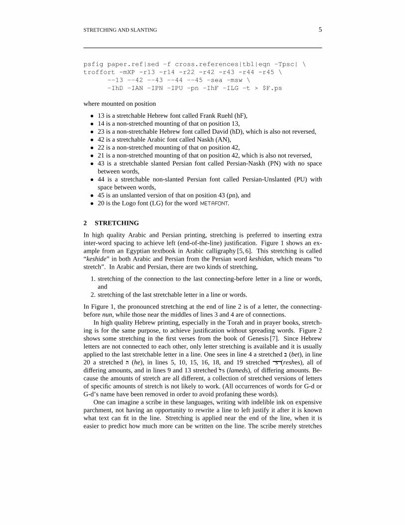
In high quality Arabic and Persian printing, stretching is preferred to inserting extrainter-word spacing to achieve left (end-of-the-line) justification. Figure 1 shows an ex-ample from an Egyptian textbook in Arabic calligraphy [5, 6]. This stretching is called“keshide” in both Arabic and Persian from the Persian word keshidan, which means “tostretch”. In Arabic and Persian, there are two kinds of stretching,
1. stretching of the connection to the last connecting-before letter in a line or words,and
2. stretching of the last stretchable letter in a line or words.
In Figure 1, the pronounced stretching at the end of line 2 is of a letter, the connecting-before nun, while those near the middles of lines 3 and 4 are of connections.
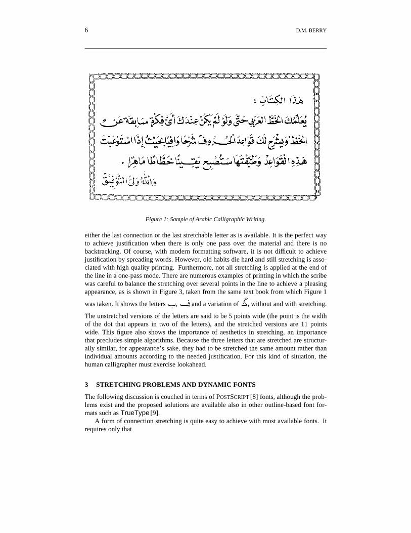
In high quality Hebrew printing, especially in the Torah and in prayer books, stretch-ing is for the same purpose, to achieve justification without spreading words. Figure 2shows some stretching in the first verses from the book of Genesis [7]. Since Hebrewletters are not connected to each other, only letter stretching is available and it is usuallyapplied to the last stretchable letter in a line. One sees in line 4 a stretched ב (bet), in line20 a stretched ה (he), in lines 5, 10, 15, 16, 18, and 19 stretched sר (reshes), all ofdiffering amounts, and in lines 9 and 13 stretched sל (lameds), of differing amounts. Be-cause the amounts of stretch are all different, a collection of stretched versions of lettersof specific amounts of stretch is not likely to work. (All occurrences of words for G-d orG-d’s name have been removed in order to avoid profaning these words).
One can imagine a scribe in these languages, writing with indelible ink on expensiveparchment, not having an opportunity to rewrite a line to left justify it after it is knownwhat text can fit in the line. Stretching is applied near the end of the line, when it iseasier to predict how much more can be written on the line. The scribe merely stretches
6 D.M. BERRY
Figure 1: Sample of Arabic Calligraphic Writing.
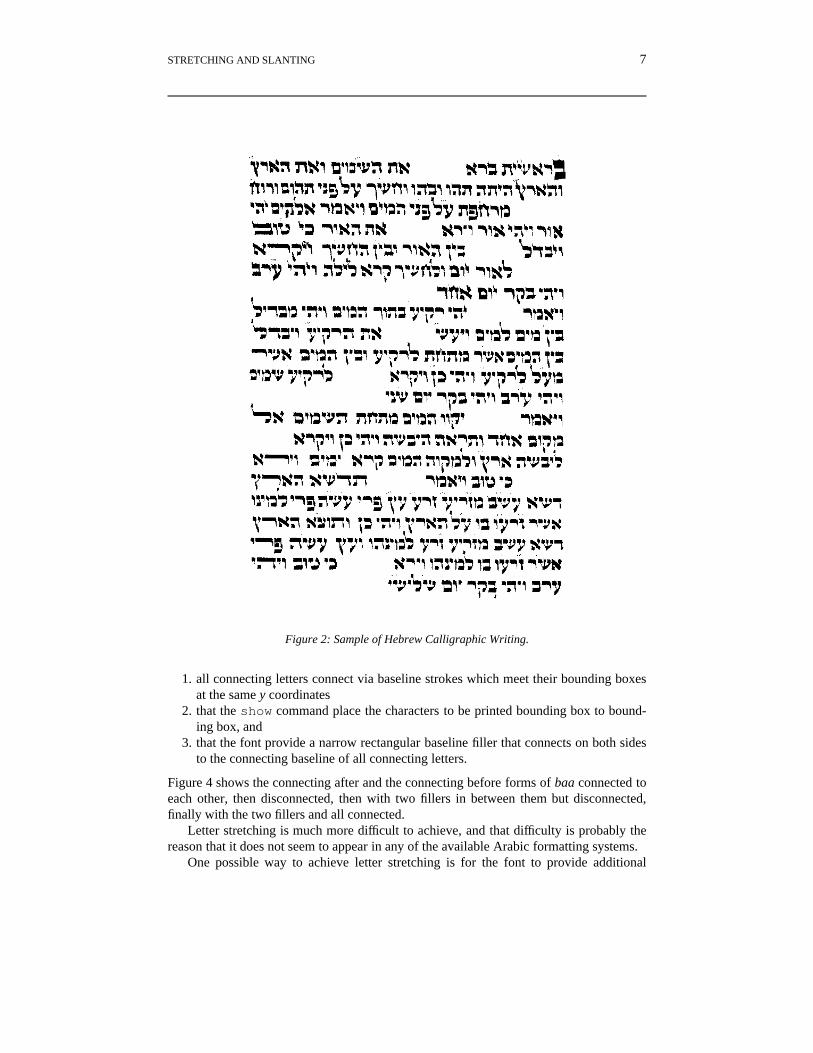
either the last connection or the last stretchable letter as is available. It is the perfect wayto achieve justification when there is only one pass over the material and there is nobacktracking. Of course, with modern formatting software, it is not difficult to achievejustification by spreading words. However, old habits die hard and still stretching is asso-ciated with high quality printing. Furthermore, not all stretching is applied at the end ofthe line in a one-pass mode. There are numerous examples of printing in which the scribewas careful to balance the stretching over several points in the line to achieve a pleasingappearance, as is shown in Figure 3, taken from the same text book from which Figure 1
was taken. It shows the lettersF,a, and a variation ofe, without and with stretching.
The unstretched versions of the letters are said to be 5 points wide (the point is the widthof the dot that appears in two of the letters), and the stretched versions are 11 pointswide. This figure also shows the importance of aesthetics in stretching, an importancethat precludes simple algorithms. Because the three letters that are stretched are structur-ally similar, for appearance’s sake, they had to be stretched the same amount rather thanindividual amounts according to the needed justification. For this kind of situation, thehuman calligrapher must exercise lookahead.
3 STRETCHING PROBLEMS AND DYNAMIC FONTS
The following discussion is couched in terms of POSTSCRIPT [8] fonts, although the prob-lems exist and the proposed solutions are available also in other outline-based font for-mats such as TrueType [9].
A form of connection stretching is quite easy to achieve with most available fonts. Itrequires only that
STRETCHING AND SLANTING 7
Figure 2: Sample of Hebrew Calligraphic Writing.
1. all connecting letters connect via baseline strokes which meet their bounding boxesat the same y coordinates
2. that the show command place the characters to be printed bounding box to bound-ing box, and
3. that the font provide a narrow rectangular baseline filler that connects on both sidesto the connecting baseline of all connecting letters.
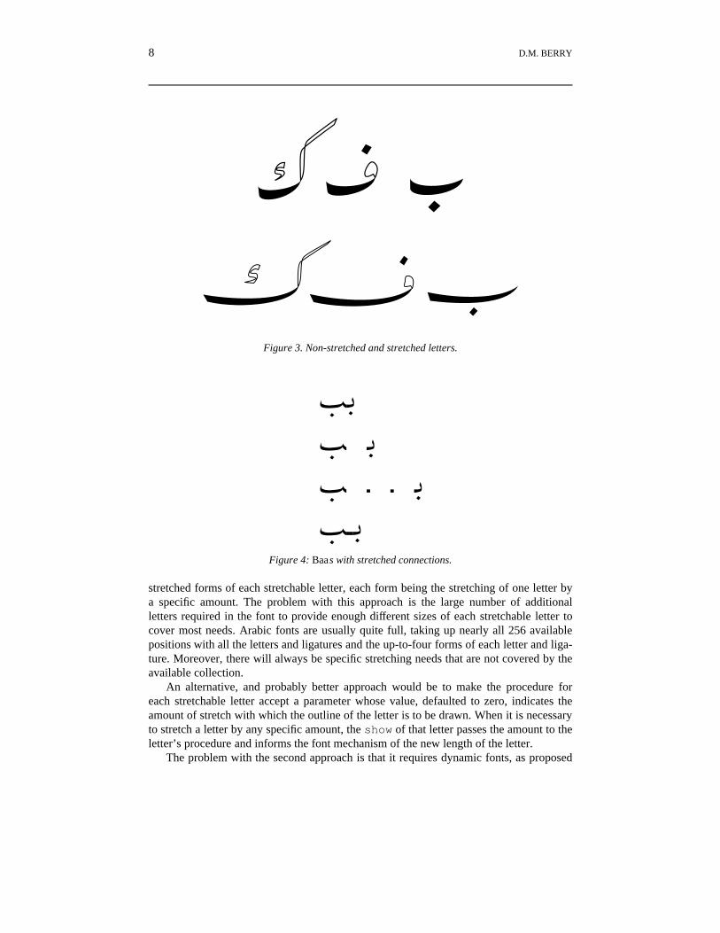
Figure 4 shows the connecting after and the connecting before forms of baa connected toeach other, then disconnected, then with two fillers in between them but disconnected,finally with the two fillers and all connected.
Letter stretching is much more difficult to achieve, and that difficulty is probably thereason that it does not seem to appear in any of the available Arabic formatting systems.
One possible way to achieve letter stretching is for the font to provide additional
8 D.M. BERRY
Figure 3. Non-stretched and stretched letters.
¼q¼ q¼ · · q¼··q
Figure 4: Baas with stretched connections.
stretched forms of each stretchable letter, each form being the stretching of one letter bya specific amount. The problem with this approach is the large number of additionalletters required in the font to provide enough different sizes of each stretchable letter tocover most needs. Arabic fonts are usually quite full, taking up nearly all 256 availablepositions with all the letters and ligatures and the up-to-four forms of each letter and liga-ture. Moreover, there will always be specific stretching needs that are not covered by theavailable collection.
An alternative, and probably better approach would be to make the procedure foreach stretchable letter accept a parameter whose value, defaulted to zero, indicates theamount of stretch with which the outline of the letter is to be drawn. When it is necessaryto stretch a letter by any specific amount, the show of that letter passes the amount to theletter’s procedure and informs the font mechanism of the new length of the letter.
The problem with the second approach is that it requires dynamic fonts, as proposed
STRETCHING AND SLANTING 9
by J. Andre and B. Borghi [10]. Such dynamic fonts violate the basic assumption fortype 1 fonts [11], namely that for any given character code, scale (point size), and fontname, the bitmap obtained by executing the character’s procedure is constant. The hold-ing of this assumption allows caching the bitmap so that it does not need to be computedagain when a request to print the same character in the same scale and font comes later.Dynamic fonts thus print slower because it is useless to cache a character’s bitmap wheneach time it is printed, it will have a different amount of stretch and thus a different bit-map. Such dynamic fonts need to be type 3, that is, allowing use of the full POSTSCRIPT
language, and thus are slower to print and lose other benefits of type 1, i.e., the ability toprovide hints to improve low resolution or small point size rasterization and the ability tobe handled by the Adobe Type Manager (ATM). However, in this author’s opinion, thebeauty of what can be done with dynamic fonts, including dynamic optical scaling [12],outweigh the disadvantages. Moreover, as the use of dynamic fonts grows, Adobe will beprovided an incentive to extend hinting and the ATM mechanism to cover the neededdynamism, perhaps through a type 2 font providing just enough capability from the fullPOSTSCRIPT to cover most needs for dynamic fonts. Note that multi-master fonts(MMFs) do not fill the bill. Each can be thought of as a font definition macro, whichwhen supplied with widths of the font to be simulated, generates a proper type 1 fontdefinition, each of whose characters prints to the specified width.
4 OPERATION OF ffortid
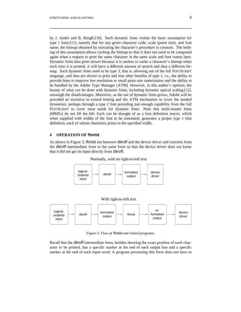
As shown in Figure 5, ffortid sits between ditroff and the device driver and converts fromthe ditroff intermediate form to the same form so that the device driver does not knowthat it did not get its input directly from ditroff.
With right-to-left text
Normally, with no right-to-left text
ditroff
ditroff ffortid
logical-ordered
input
formattedoutput
devicedriver
devicedriver
re-formatted
output
formattedoutput
logical-ordered
input
Figure 5: Flow of ffortid and related programs.
Recall that the ditroff intermediate form, besides showing the exact position of each char-acter to be printed, has a specific marker at the end of each output line and a specificmarker at the end of each input word. A program processing this form does not have to
10 D.M. BERRY
guess, and possibly be wrong, where the ends of lines and ends of words are. Recallfinally, that the characters come out of ditroff broken into lines but in logical ord-er [13, 14, 4], that is from left to right in the order that one hears the characters as they arespoken.
The main job of ffortid is to reorganize the characters so that the text is in visual ord-er, in which the text of each language is written in its own direction and the flow of thesingle-directional chunks in each line is consistent with the current document direction.ffortid works by totally reformatting each line as a function of the current documentdirection and the font of each character. At the top level of abstraction, it reads the char-acters of each line, delimited by the end-of-line marker, and permutes characters so thatthe single-directional chunks of a line flow in the current document direction which thecharacters in each chunk flow in the chunks single direction.
for each line in the file doif the current document direction is LR then
reverse each contiguous sequence of RL characters in the lineelse (the current document direction is RL)
reverse the whole line;reverse each contiguous sequence of LR characters in the line
fiod
An RL (LR) character is a character in any RL (LR) font. This simple procedure falls flaton its face when presented with an embedded LR numeral inside RL text inside a LR do-cument, e.g., inside an English document, a Hebrew address containing a Latin housenumber; the LR numeral splits the RL text into two pieces and the two pieces end up be-ing in the document’s LR order relative to each other rather than the required RL orderrelative to each other. This anomaly is prevented by applying the algorithm recursivelyon the RL text. Before the introduction of the stretching capability, the original ffortid, asa last step, applied ditroff’s normal word-spreading algorithm to increase the inter-wordwhite space in each line to cause the text to be justified at both margins. To be concrete,without this provision, the time-ordered input:
He lives at אישנה 15בא49 הפיח in Israel.
would appear as:
He lives at הנשיא 15אב49 חיפה in Israel.
instead of the correct:
He lives at חיפה 49אב15 הנשיא in Israel.
Note that the logical ordering of the house number is “4-9-alef-bet-1-5”. and that the thisnumber must come after the name of the street, הנשיא and before the name of the cityחיפה in the right-to-left flow of the Hebrew text that is embedded in an English sentencein a left-to-right document.
STRETCHING AND SLANTING 11
It is clear that the total amount of white spave between the words in a line, δ, is cal-culable as the difference between the current line length and the sums of the lengths ofthe words and the minimal spacing. Stretching is achieved by not spreading the wordsand dividing δ by the number of stretching places to get an amount, σ, to stretch at eachstretching place. When connection stretching is used, then a number of these fillerswhose total length is greater than equal to σ is put in each connection to be stretched. Thelast of these can be made to overlap its predecessor so that its end is precisely at the be-ginning of the character to which it connects. Clearly, if stretching of letters is added,then the simple strategy is to pass this σ amount as the length increase parameter to theletters to be stretched. Therefore the problem is to modify the POSTSCRIPT definitions ofthe fonts so that the procedure for a stretchable letter takes the amount of stretch as aparameter and modifies the outline appropriately.
5 DYNAMIC FONTS
With the general strategy laid out, the step of highest technological risk was the produc-tion of the dynamic fonts with the parameterized stretchable characters. Hence, this wasthe first step to work on.
In Arabic, Hebrew, and Persian, all stretching is across horizontal portions of a lettersuch that stretching them does not cause the result to look like another letter. Letters,such as the alif in Arabic and Persian and the vav in Hebrew, that are entirely verticalcannot be stretched. In Hebrew, all horizontal portions involve sections bounded byparallel horizontal straight line segments. In Arabic and Persian, the horizontal portionsare not straight; they involve smooth curves that are mostly horizontal. Thus stretchingHebrew letters is rather straightforward, but stretching Arabic and Persian letters in-volves stretching curves in such a way that the curvature, in the vernacular sense of theword, is somehow preserved and that the stretched sections flow smoothly to the rest ofthe letter. Therefore, it was decided to build a stretchable Hebrew font first. This way, thedetails of the parameterization could be worked out independently of dealing with theæsthetics of curve stretching.
6 DYNAMIC HEBREW FONTS
The stretchable Hebrew letters are those with horizontal portions for which stretching thehorizontal portion would not cause the result to look like another letter. Therefore, thestretchable letters are ב (bet), ד (daled), ה (heh), ח (khet), j (khaph sofit), כ (kaph), ל
(lamed), m (mem sofit), ,(resh)ר and ת (tav). This author has seen א (aleph), מ (mem), andק (quf) stretched in some documents. Note that ו (vav) is not stretchable bacause stretch-ing its small horizontal portion would cause the result to look like .(resh)ר
It was decided to stick to the definite set for now. Once the technique is understood, itis easy to add additional stretchable letters. Indeed, the software has been carefullydesigned so that the parts affected by adding additional letters to the stretchable set arecompletely table-driven from human-editable ASCII tables.
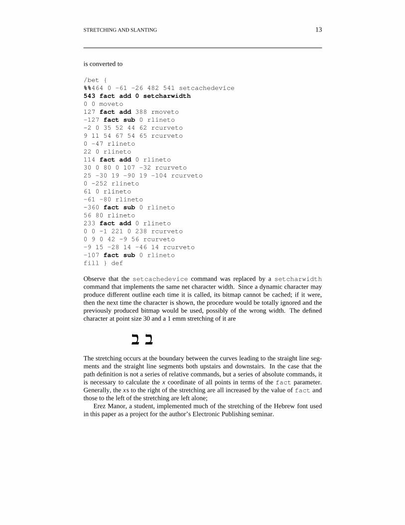
First it was necessary to decide how to pass the amount of stretch to each letter to bestretched. It was decided that before the show of the letter to be stretched, a global vari-able called fact would be set to the amount of stretch. The procedure for this lettercould use this value as it sees fit to adjust the values of mostly x coordinates in the outline
12 D.M. BERRY
path. Following this show, fact would be reset to zero, with the intention that a stretch-able letter finding fact set to zero would end up not being stretched. Initially, the unitsof fact were those of the FontMatrix of the font. However, such a unit requires theinvoker to know the FontMatrix of the font, which is normally considered a hiddenimplementation detail. Later, it was decided to make the unit of fact be emms. Theletter’s procedure is required to convert the value of fact into FontMatrix units bymultiplying fact by the x value in the FontMatrix, and does so with the POSTSCRIPT
code
/fact fact Name-of-font-definition-dictionary/FontMatrix get 0 get div def
To stretch a character, it is necessary to examine its outline and to find the pointsdefining the straight line segments to be stretched. The simplest situation is when thedefinition of a character’s outline does an absolute move to a starting point and thendraws the path using only relative commands thereafter. Recall that all stretching in He-brew is across straight line segments; if the path is described with relative commands,each such segment is defined with an rlineto whose prefix arguments are the x and yof the ending point, the starting point assumed to be where the current point is at the startof the command. Therefore, it suffices to decide which rlineto segments are to bestretched and to add or subtract fact, depending on the direction in which the segmentis being drawn, to the x argument of the rlineto. Thus, the definition of the Hebrewletter bet from one font,
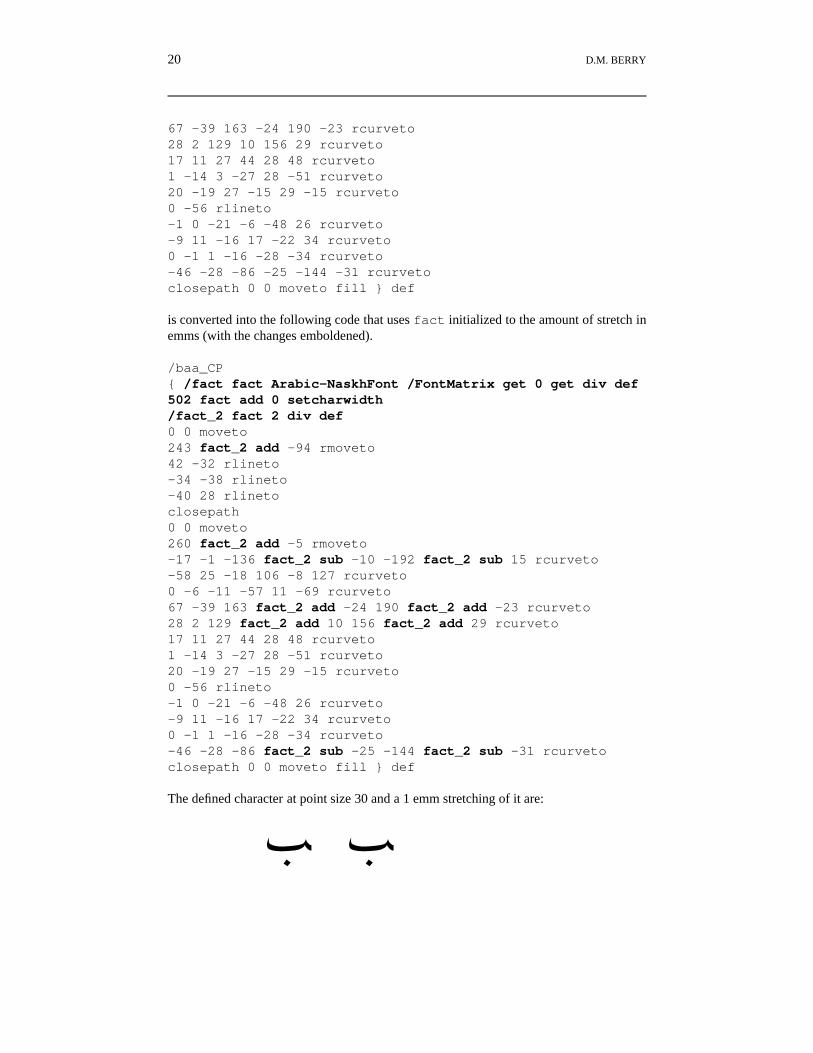
Observe that the setcachedevice command was replaced by a setcharwidthcommand that implements the same net character width. Since a dynamic character mayproduce different outline each time it is called, its bitmap cannot be cached; if it were,then the next time the character is shown, the procedure would be totally ignored and thepreviously produced bitmap would be used, possibly of the wrong width. The definedcharacter at point size 30 and a 1 emm stretching of it are
ב ב
The stretching occurs at the boundary between the curves leading to the straight line seg-ments and the straight line segments both upstairs and downstairs. In the case that thepath definition is not a series of relative commands, but a series of absolute commands, itis necessary to calculate the x coordinate of all points in terms of the fact parameter.Generally, the xs to the right of the stretching are all increased by the value of fact andthose to the left of the stretching are left alone;
Erez Manor, a student, implemented much of the stretching of the Hebrew font usedin this paper as a project for the author’s Electronic Publishing seminar.
14 D.M. BERRY
7 DYNAMIC ARABIC FONTS
There are two parts of Arabic and Persian letters to be stretched, the letter itself in thecases of stand-alone as well as connecting letters, and the connecting parts in the cases ofconnecting letters only.
7.1 Stretching Letters
In Arabic and Persian, the situation is more complex than in Hebrew. No letter has por-tions bounded by horizontal straight line segments. There are letters with curved strokesin which the predominant flow of the stroke is horizontal. It is more correct to say thatthere are forms of letters with these predominantly horizontal curved strokes; not allforms of the same letter have these strokes. Therefore a form is stretchable if it has apredominantly horizontal curved stroke such that stretching it does not yield a result that
looks like a form of another letter. On this basis, the stretchable forms are F (stand-a-
lone baa), S (stand-alone seen), U (stand-alone sad), a(stand-alone faa), b(stand-alone qaf), d (stand-alone caf), e (stand-alone Gaf), f (stand-alone lam),
lone lam_alefmaksura), ë(connecting-before lam_alefmaksura), and all other forms
that vary from these by additional or fewer dots or hamzas. In particular, B (stand-alonealef) is not stretchable because it has no horizontal strokes.
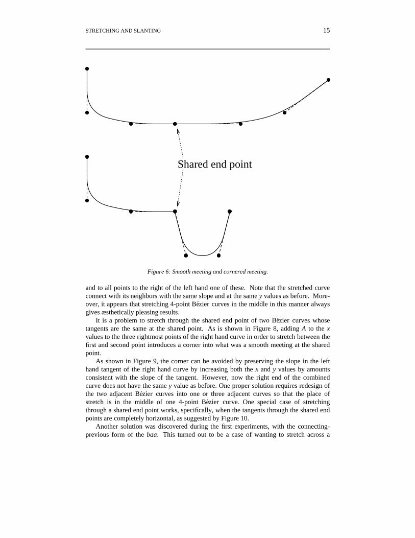
The outline of any character is a series of elements, each of which is a line, four-pointBezier curve, circle, or arc. As is shown in Figure 6, elements that share an end point pare tangent to the same line which passes through p if the outline is supposed to besmooth through p, and elements that share an end point p have tangents at an angle at p ifthe outline is supposed to have a corner at p. As a rule, stretching should not introduce,remove, or change any corner. Therefore, tangents at end points of all elements shouldnot change. While horizontal stretching will definitely change x values in the outline, forother reasons, it is not good that y values change. For example, it should be possible tovertically position a diacritical over or under a stretched character as it is positioned overor under the unstretched version. Furthermore, it should not be necessary to have to ad-just vertical spacing dynamically as a part of stretching.
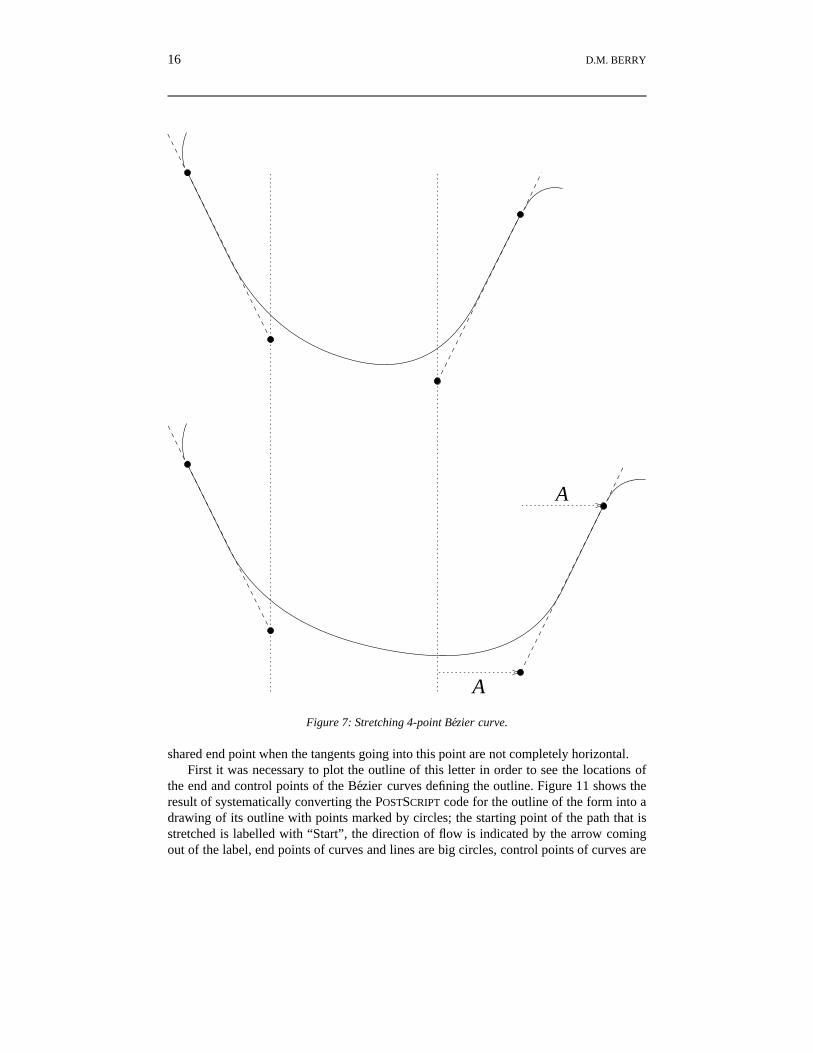
With Arabic and Persian, all stretching is across curved portions of letters. Therefore,the issue is how to stretch curves that are described in the font definition as four-pointBezier curves. A four-point Bezier curve is easy to stretch, if as is shown in Figure 7, thestretching is in the interior of the curve between the two middle, control points. Tostretch such a curve by A units, simply add A to the x values of the two right hand points
STRETCHING AND SLANTING 15
Shared end point
Figure 6: Smooth meeting and cornered meeting.
and to all points to the right of the left hand one of these. Note that the stretched curveconnect with its neighbors with the same slope and at the same y values as before. More-over, it appears that stretching 4-point Bezier curves in the middle in this manner alwaysgives æsthetically pleasing results.
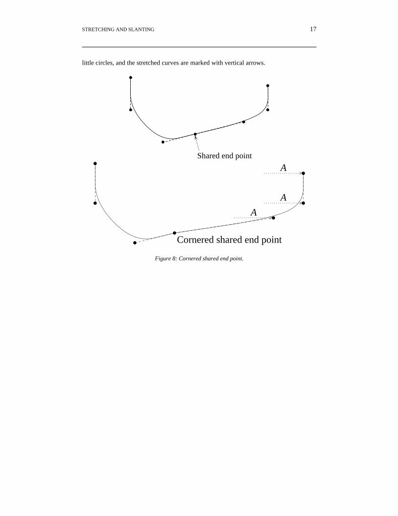
It is a problem to stretch through the shared end point of two Bezier curves whosetangents are the same at the shared point. As is shown in Figure 8, adding A to the xvalues to the three rightmost points of the right hand curve in order to stretch between thefirst and second point introduces a corner into what was a smooth meeting at the sharedpoint.
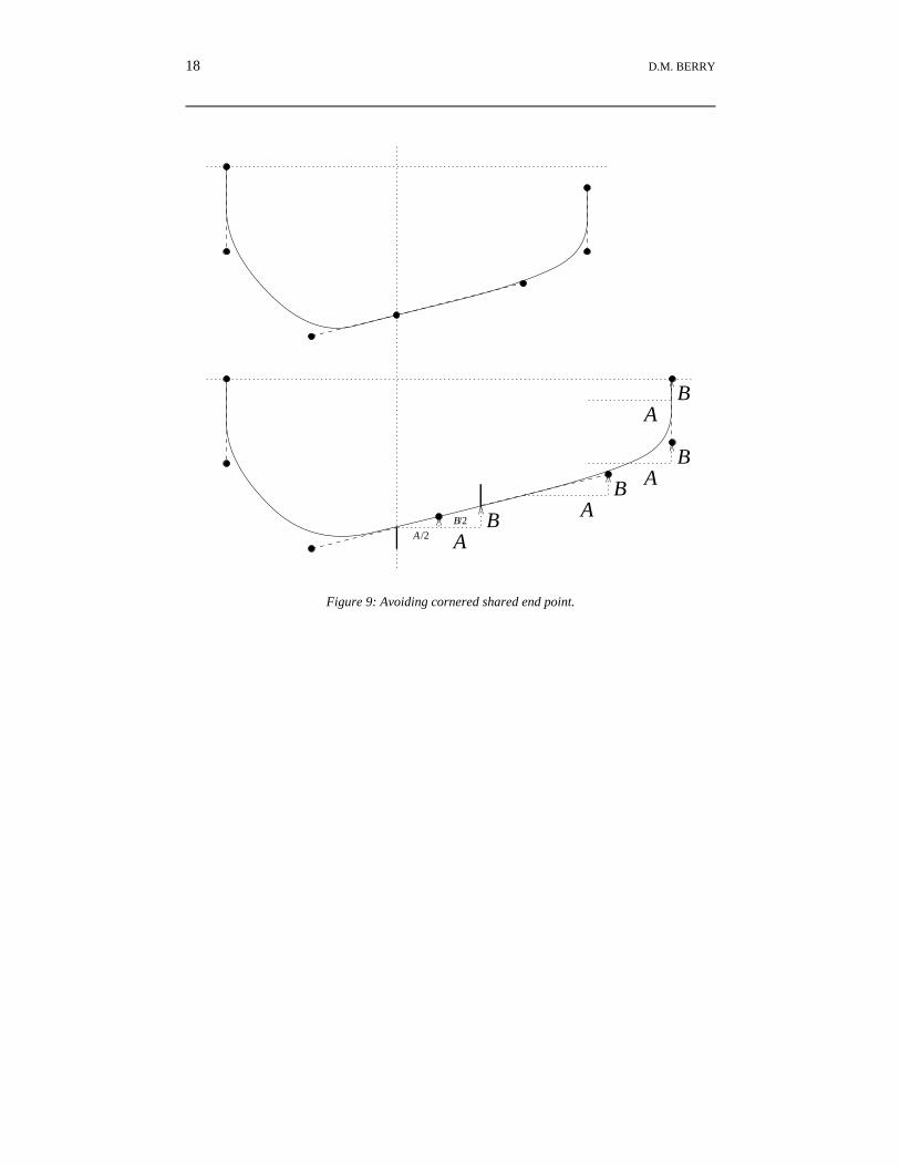
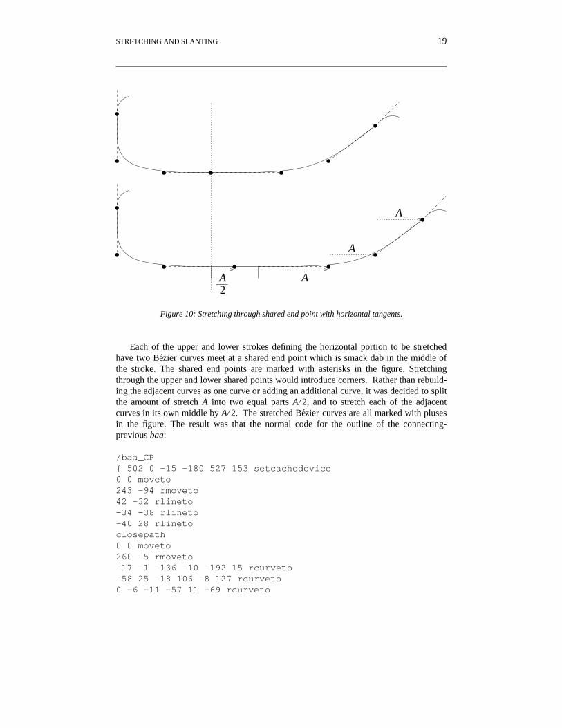
As shown in Figure 9, the corner can be avoided by preserving the slope in the lefthand tangent of the right hand curve by increasing both the x and y values by amountsconsistent with the slope of the tangent. However, now the right end of the combinedcurve does not have the same y value as before. One proper solution requires redesign ofthe two adjacent Bezier curves into one or three adjacent curves so that the place ofstretch is in the middle of one 4-point Bezier curve. One special case of stretchingthrough a shared end point works, specifically, when the tangents through the shared endpoints are completely horizontal, as suggested by Figure 10.
Another solution was discovered during the first experiments, with the connecting-previous form of the baa. This turned out to be a case of wanting to stretch across a
16 D.M. BERRY
A
A
Figure 7: Stretching 4-point Bezier curve.
shared end point when the tangents going into this point are not completely horizontal.First it was necessary to plot the outline of this letter in order to see the locations of
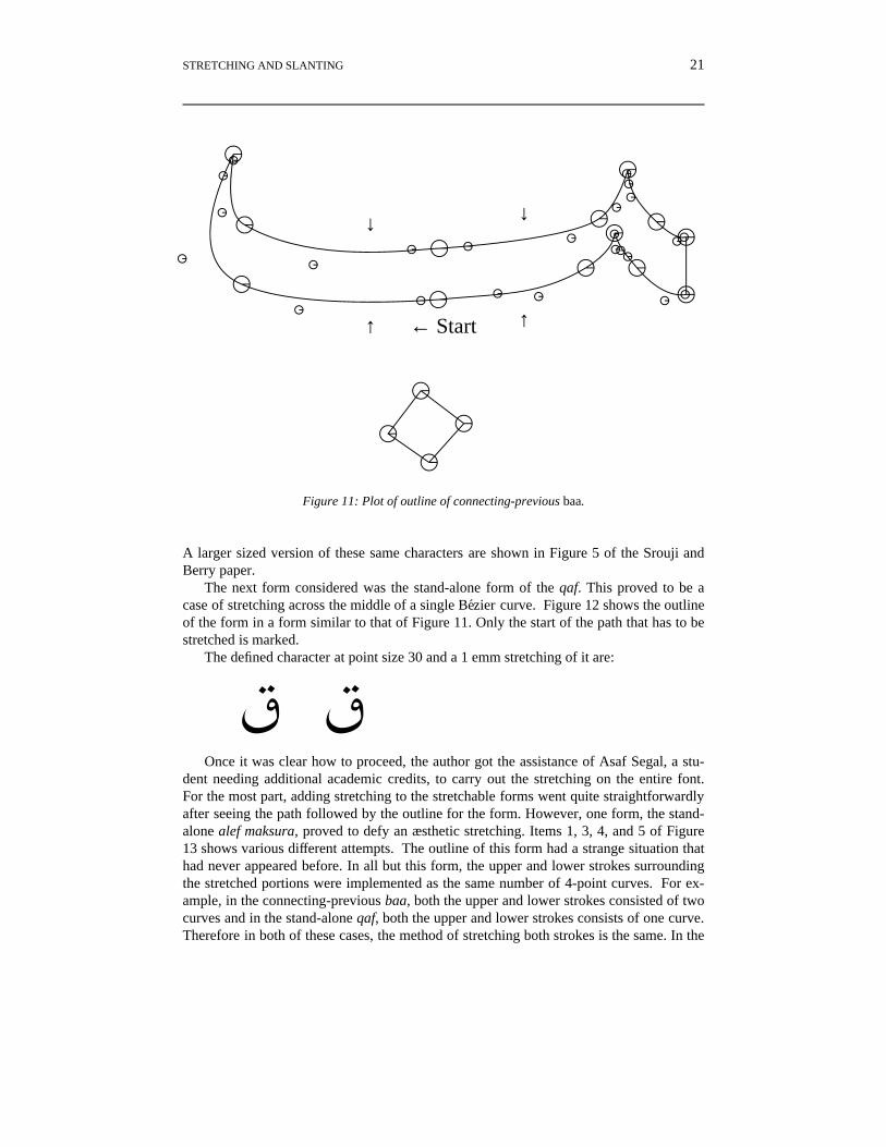
the end and control points of the Bezier curves defining the outline. Figure 11 shows theresult of systematically converting the POSTSCRIPT code for the outline of the form into adrawing of its outline with points marked by circles; the starting point of the path that isstretched is labelled with “Start”, the direction of flow is indicated by the arrow comingout of the label, end points of curves and lines are big circles, control points of curves are
STRETCHING AND SLANTING 17
little circles, and the stretched curves are marked with vertical arrows.
Shared end point
A
A
A
Cornered shared end point
Figure 8: Cornered shared end point.
18 D.M. BERRY
A
A
AB
B
B
AB
A
B/2
/2
Figure 9: Avoiding cornered shared end point.
STRETCHING AND SLANTING 19
A
A
A
A2
Figure 10: Stretching through shared end point with horizontal tangents.
Each of the upper and lower strokes defining the horizontal portion to be stretchedhave two Bezier curves meet at a shared end point which is smack dab in the middle ofthe stroke. The shared end points are marked with asterisks in the figure. Stretchingthrough the upper and lower shared points would introduce corners. Rather than rebuild-ing the adjacent curves as one curve or adding an additional curve, it was decided to splitthe amount of stretch A into two equal parts A/ 2, and to stretch each of the adjacentcurves in its own middle by A/ 2. The stretched Bezier curves are all marked with plusesin the figure. The result was that the normal code for the outline of the connecting-previous baa:
The defined character at point size 30 and a 1 emm stretching of it are:
¼ ¼
STRETCHING AND SLANTING 21
¼← Start↑ ↑
↓ ↓
Figure 11: Plot of outline of connecting-previous baa.
A larger sized version of these same characters are shown in Figure 5 of the Srouji andBerry paper.
The next form considered was the stand-alone form of the qaf. This proved to be acase of stretching across the middle of a single Bezier curve. Figure 12 shows the outlineof the form in a form similar to that of Figure 11. Only the start of the path that has to bestretched is marked.
The defined character at point size 30 and a 1 emm stretching of it are:
b bOnce it was clear how to proceed, the author got the assistance of Asaf Segal, a stu-
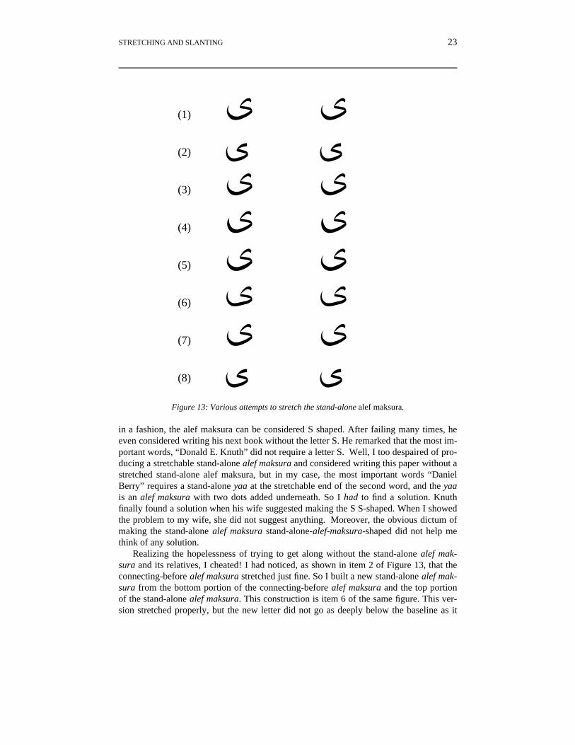
dent needing additional academic credits, to carry out the stretching on the entire font.For the most part, adding stretching to the stretchable forms went quite straightforwardlyafter seeing the path followed by the outline for the form. However, one form, the stand-alone alef maksura, proved to defy an æsthetic stretching. Items 1, 3, 4, and 5 of Figure13 shows various different attempts. The outline of this form had a strange situation thathad never appeared before. In all but this form, the upper and lower strokes surroundingthe stretched portions were implemented as the same number of 4-point curves. For ex-ample, in the connecting-previous baa, both the upper and lower strokes consisted of twocurves and in the stand-alone qaf, both the upper and lower strokes consists of one curve.Therefore in both of these cases, the method of stretching both strokes is the same. In the
22 D.M. BERRY
bStart ↑
↓
↑
Figure 12: Plot of outline of stand-alone qaf.
stand-alone alef maksura, the lower stroke consists of one curve while the upper curveconsists of two curves. It appeared that no matter how stretch in these curves was divid-ed, the results were ugly.
After I had failed to get a pleasing stretch for the stand-alone alef maksura, I recalledDon Knuth’s difficulties with getting a pleasing letter S when he was building the firstversion of the computer modern fonts with his then new METAFONT system. Interestingly,
STRETCHING AND SLANTING 23
m m
× ×
n n
o o
p p
q q
r r
v v
(1)
(2)
(3)
(4)
(5)
(6)
(7)
(8)
Figure 13: Various attempts to stretch the stand-alone alef maksura.
in a fashion, the alef maksura can be considered S shaped. After failing many times, heeven considered writing his next book without the letter S. He remarked that the most im-portant words, “Donald E. Knuth” did not require a letter S. Well, I too despaired of pro-ducing a stretchable stand-alone alef maksura and considered writing this paper without astretched stand-alone alef maksura, but in my case, the most important words “DanielBerry” requires a stand-alone yaa at the stretchable end of the second word, and the yaais an alef maksura with two dots added underneath. So I had to find a solution. Knuthfinally found a solution when his wife suggested making the S S-shaped. When I showedthe problem to my wife, she did not suggest anything. Moreover, the obvious dictum ofmaking the stand-alone alef maksura stand-alone-alef-maksura-shaped did not help methink of any solution.
Realizing the hopelessness of trying to get along without the stand-alone alef mak-sura and its relatives, I cheated! I had noticed, as shown in item 2 of Figure 13, that theconnecting-before alef maksura stretched just fine. So I built a new stand-alone alef mak-sura from the bottom portion of the connecting-before alef maksura and the top portionof the stand-alone alef maksura. This construction is item 6 of the same figure. This ver-sion stretched properly, but the new letter did not go as deeply below the baseline as it
24 D.M. BERRY
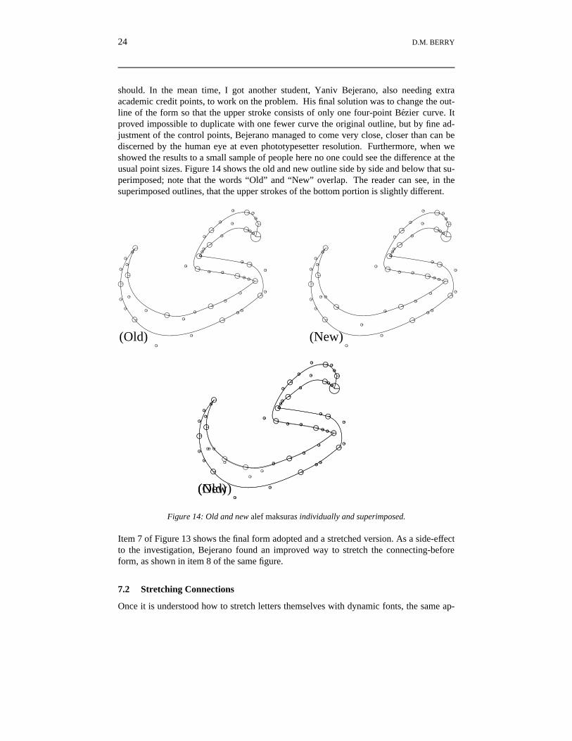
should. In the mean time, I got another student, Yaniv Bejerano, also needing extraacademic credit points, to work on the problem. His final solution was to change the out-line of the form so that the upper stroke consists of only one four-point Bezier curve. Itproved impossible to duplicate with one fewer curve the original outline, but by fine ad-justment of the control points, Bejerano managed to come very close, closer than can bediscerned by the human eye at even phototypesetter resolution. Furthermore, when weshowed the results to a small sample of people here no one could see the difference at theusual point sizes. Figure 14 shows the old and new outline side by side and below that su-perimposed; note that the words “Old” and “New” overlap. The reader can see, in thesuperimposed outlines, that the upper strokes of the bottom portion is slightly different.
l
(Old)
m
(New)
l
(Old)
m
(New)
Figure 14: Old and new alef maksuras individually and superimposed.
Item 7 of Figure 13 shows the final form adopted and a stretched version. As a side-effectto the investigation, Bejerano found an improved way to stretch the connecting-beforeform, as shown in item 8 of the same figure.
7.2 Stretching Connections
Once it is understood how to stretch letters themselves with dynamic fonts, the same ap-
STRETCHING AND SLANTING 25
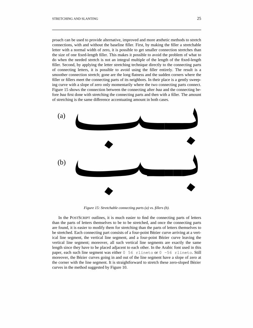
proach can be used to provide alternative, improved and more æsthetic methods to stretchconnections, with and without the baseline filler. First, by making the filler a stretchableletter with a normal width of zero, it is possible to get smaller connection stretches thanthe size of one fixed-length filler. This makes it possible to avoid the problem of what todo when the needed stretch is not an integral multiple of the length of the fixed-lengthfiller. Second, by applying the letter stretching technique directly to the connecting partsof connecting letters, it is possible to avoid using the filler entirely. The result is asmoother connection stretch; gone are the long flatness and the sudden corners where thefiller or fillers meet the connecting parts of its neighbors. In their place is a gently sweep-ing curve with a slope of zero only momentarily where the two connecting parts connect.Figure 15 shows the connection between the connecting after baa and the connecting be-fore baa first done with stretching the connecting parts and then with a filler. The amountof stretching is the same difference accentuating amount in both cases.
¿¾¿····q
(a)
(b)
Figure 15: Stretchable connecting parts (a) vs. fillers (b).
In the POSTSCRIPT outlines, it is much easier to find the connecting parts of lettersthan the parts of letters themselves to be to be stretched, and once the connecting partsare found, it is easier to modify them for stretching than the parts of letters themselves tobe stretched. Each connecting part consists of a four-point Bezier curve arriving at a vert-ical line segment, the vertical line segment, and a four-point Bezier curve leaving thevertical line segment; moreover, all such vertical line segments are exactly the samelength since they have to be placed adjacent to each other. In the Arabic font used in thispaper, each such line segment was either 0 56 rlineto or 0 -56 rlineto. Stillmoreover, the Bezier curves going in and out of the line segment have a slope of zero atthe corner with the line segment. It is straightforward to stretch these zero-sloped Beziercurves in the method suggested by Figure 10.
26 D.M. BERRY
8 MODIFICATIONS TO ffortid
The major changes required to ffortid are
1. the addition of the possibility of stretchable letters when replacing justification bystretching,
2. the addition of the possibility to stretch connections via a single stretchable filler ofzero length rather than via sequences of fixed-length fillers,
3. the addition of the possibility to stretch connections by stretching the connectingparts of letters, say by putting half of the stretch amount into the connecting part ofthe before letter and the other half into the connecting part of the after letter,
4. the addition of some more command line options to control the nature of stretching,5. the addition of some new fields to the width tables shared by ditroff and ffortid.6. the addition of recursive reversing to deal with embedded X text inside Y text inside
a X document, where X and Y are opposite directions of flow.
The description of the changes is driven by explaining the new command line options andthe new width table fields. The changes to the algorithm is apparent in this discussion.
The command line to invoke ffortid is of the form:
The job of ffortid is to take the ditroff output which is formatted strictly left-to-right,to find occurrences of text in a right-to-left font and to rearrange each line so that the textin each font is written in its proper direction.
In the command line, the −rfont-position-list argument is used to specify which fontpositions are to be considered right-to-left.
In addition to the specified font directions, the results of ffortid’s reformatting alsodepends on the document’s current formatting direction, which can be either left-to-rightor right-to-left. The default formatting direction is left-to-right and can be changed by theuser at any point in the document through the use of the
\X’PL’
and
\X’PR’
escapes in the ditroff input.If the current formatting direction is left-to-right, all formatting, filling, adjusting, in-
denting, etc. is to appear as occurring from left to right. In each ditroff output line, anysequence of contiguous right-to-left font characters is reversed in place.
If the current formatting direction is right-to-left, all formatting, filling, adjusting, in-denting, etc. is to appear as occurring from right to left. Each ditroff output line is re-versed, including both the left and right margins. Then, any sequence of contiguous left-to-right font characters is reversed in place.
Sometimes right-to-left text contains some embedded left-to-right text, such as a
STRETCHING AND SLANTING 27
street address in Hebrew contains a numeral using traditional western digits with themost significant digit to the left. If this right-to-left text were embedded inside left-to-right text, e.g., an English sentence announcing a Hebrew street address, inside a left-to-right document, then the numeral, being left-to-right text, would be treated as left-to-righttext that separates two right-to-left chunks inside a left-to-right document and the twochunks would end up flowing from left to right rather than being a single right-to-leftchunk. The same problem occurs in the opposite directions as well. Let X and Y be twoopposite directions. The user can announce embedded X text inside Y text in order to in-sure that its visual ordering is what is intended even when inside a X document by sur-rounding the embedded X text with the
\X’{’
and
\X’}’
escapes. The time-ordered input that produces the correct street address example of Sec-tion 4 is (with each input character showin in its output font).
He lives at \f(hDאישנה \fR\X’{’49\X’}’\f(hDבא\fR\X’{’15\X’}’ \f(hDהפיח
\fRin Israel.
The −wpaperwidth argument is used to specify the width of the paper, in inches, onwhich the document will be printed. ffortid uses the specified paper width to determinethe width of the right margin. The default paper width is 8.5 inches and like the fontdirections, it remains in effect throughout the entire document.
The −-font-position-list argument is used to indicate which fonts positions, generallya subset of those designated as right-to-left, contain fonts for Arabic, Hebrew, Persian, orrelated languages. For these fonts, left and right justification of a line can be achieved bystretching instead of inserting extra white space between the words in the line. If request-ed by use of the −s argument described below, stretching is done on a line only if the linecontains at least one word in a −- designated font. If so, stretching is used in place of thenormal distributed extra white space insertion for the entire line. The intention is thatstretching soak up all the excess white space inserted by ditroff to adjust the line. If thereare no opportunities for stretching or there are too few to soak up all the excess whitespace, what is not soaked up is distributed in between the words according to ditroff’s al-gorithm. There are several kinds of stretching, and which is in effect for all −- designat-ed fonts is specified with the −s argument, described below. If it is desired not to stretcha particular Arabic, Hebrew, Persian, or other font, while still stretching others, then theparticular font should not be listed in the −-font-position-list. Words in such fonts willnot be stretched and will be spread with extra white space if the containing line is spreadwith extra white space.
The −r and the −- specifications are independent. If a font is in the −-font-position-list but not in the −rfont-position-list, then its text will be stretched but not reversed. Thisindependence can be used to advantage when it is necessary to designate a particularArabic, Hebrew, Persian, or other font as left-to-right for examples or to get around prob-
28 D.M. BERRY
lems in the use of eqn, ideal, pic, or tbl.The kind of stetching to be done for all fonts designated in the −-font-position-list is
indicated by the −s argument. There are two relatively independent dimensions thatmust be set to describe the stretching, what is stretched and the places that are stretched.A stretch argument is of the form
−smp
or
−sn
where m specifies the stretching mode, i.e, what is stretched, and p specifies the placesthat are stretched. The m and p must be given in that order and with no interveningspaces. The −sn means that there is no stretching and normal spreading of words is usedeven in −- designated fonts. The choices for the mode m are:
1. l (letter ell): In the words designated by the p, stretch the last stretchable letter.2. c: In the words designated by the p, stretch the last connection to a letter.3. e: In the words designated by the p, stretch either the last stretchable letter or the
last connection to a letter, whichever comes later.4. b: In the words designated by the p, stretch either the last stretchable letter or the
last connection to a letter, whichever comes later, and if it is a letter that is stretchedand it is a connect-previous letter then also stretch the connection to the letter.
Not all modes are available for all fonts. For example, fonts for Hebrew, whoseletters are not connected do not support connection stretching. While Arabic, Hebrew,and Persian traditionally do have letter stretching, not all fonts for them support letterstretching. ffortid attempts to stretch all −- designated fonts in the specified modes, butin any text, ends up doing only those stretches that are possible given in the text’s currentfont. To allow ffortid to know what stretches are possible, the width tables for stretchablefonts have some additional lines that must come somewhere after the name line and be-fore the charset line.
Each such stretchable font must have one of the first four lines. We now discuss the vari-ous ways that different kinds of stretch are achieved in the available fonts and how ffortiddeals with each.
To our knowledge, all Arabic and Persian fonts, have a base-line filler that can beused to achieve the stretching of connections. It is fairly easy for such a filler to be addedto any font definition that does not have it, and moreover to make it the character that isaddressed by \(hy, which is normally the code for the hyphen character. Since Arabicand Persian do not have a hyphen and hyphenation is turned off when in an Arabic orPersian font, it is safe to use \(hy to name the filler. Of course, this requires that the
STRETCHING AND SLANTING 29
width table for Arabic and Persian fonts have an entry for hy designating the filler char-acter in the font, for example:
hy 15 0 0267 filler
Giving the filler character an explicit ditroff two-character name allows ditroff to dealwith it uniformly despite that it might be in a different position in each font.
On the other hand, stretching of letters requires a dynamic font which, by its very na-ture of not having a constant bitmap for a given font name, point size, and charactername, cannot be type 1, in POSTSCRIPT terminology, and cannot be a bitmapped font.Therefore, not all Arabic and Persian fonts support stretching of letters. Moreover, withina dynamic font, not all characters are stretchable. Historically, only characters withstrong horizontal components are stretchable, such as those in the stand-alone andconnect-previous forms of the baa family. Obviously, one cannot stretch totally verticalcharacters such as alif. Therefore, it is necessary to specify by additional information inthe ditroff width table for a font which characters are stretchable. In the width table foran Arabic or Persian font, for each character that is not also an ASCII character, i.e., notalso a digit or punctuation, and thus is neither connected or stretchable, one specifiesafter the name, width, ascender-descender information, and code, two additional fields,the connectivity and the stretchability of the character, in that order. The connectivity iseither
N for stand alone,A for connect after,P for connect previous,B for connect both, orU for unconnected, because it is punctuation or a diacritical, etc.,
and the stretchability is either
N for not stretchable,S for stretchable,
Some examples of width table lines are:
%% 125 2 045 percent
--- 55 0 0101 U N comma--- 70 0 0105 U N hamza
--- 129 0 0106 N S baa_SA--- 36 2 0102 N N alef_SA
--- 113 0 0177 A N sad_CA--- 66 2 0215 A S caf_CA
--- 43 2 0225 P N alef_CP
30 D.M. BERRY
--- 120 0 0274 P S baa_CP
--- 53 0 0230 B N baa_CB--- 73 2 0261 B S caf_CB
Recall that --- in the name field of a character means that it can be addressed only by\N’n’, where n is the decimal equivalent of the character’s code. Only such lines willhave the connectivity and stretchability fields. Also in the character name which is acomment in the table , _SA means “stand alone”, _CA means “connecting after”, _CPmeans “connecting previous or before”, and _CB means “connecting both”.
For a Hebrew font, for which there is no notion of connectivity of letters, and there-fore, the position of the letters is irrelevant for deciding stretching, there is only the possi-bility of stretching letters. Some examples of width table lines for such fonts are:
% 132 3 045 percent
--- 95 3 0140 U N quoteleft=alef--- 92 3 0141 U S a=bet
In a dynamic font, there are two additional, alternative ways that stretching of con-nections can be achieved.
g The filler is a stretchable letter, normally of width zero, to which the total width ofthe filler is passed as the stretch amount.
g The connecting portions of all connecting letters are themselves stretchable in thesame way as the stretchable letters are. In this situation to achieve a total connectionstretch of x, one would pass x/2 to each of the connecting-after portion of the beforeletter and the connecting-before portion of the after letter.
The use of the first of these solves the problems caused by the fact that amount of agiven connection stretch may not be integrally divisible by the width of the filler. Astretchable filler can be stretched to any amount. The use of the second improves the ap-pearance of the connection stretch. While letter stretching is done with nice, smoothcurves, connection stretching using the very straight filler is noticeably flatter and thereare observable corners where the filler meets the generally curved connecting parts of itsadjacent letters. While the fixed-size filler seems to be available on all Arabic and Per-sian fonts, stretchable fillers and stretchable connecting parts are available only with type3 POSTSCRIPT fonts, although it would be possible to provide a stretchable filler as theonly locally defined character in a type 3 font that falls to another type 1 font for all theother characters, which are only virtual in the type 3 font.
The ditroff width table for any font providing a stretchable filler or stretchable con-necting parts must have an additional line to specify the nature of the connection stretchin the font, which must be one of the following.
This line must come somewhere after the name line and before the charset line. Ifnone is specified, it is assumed to be the first. Therefore, it is not necessary to say any-thing new for the typical type 1 or bitmapped font with a fixed-sized filler. Note that if afont allows different kinds of connection stretching, only one can be specified per mount-ing of the font specified in a single width table. If one wants to use the same font withdifferent ways of stretching connections, one must mount the same font under differentnames in different width tables, each specifying a different kind of connection strecthing.
ffortid implements the connection stretching that is requested by the −s command-line arguement as well as it can using the kind of connection stretching available for thefont being used. Thus, if one is not using fixed-sized fillers, ffortid ignores the various op-tions put in to deal with the fact that an integral number of fillers may not fulfill the need-ed stretch.
Below, “stretchable unit refers to what is a candidate for stretching according to themode. The choices for p, which specifies places of stretching, are:
1. f: In any line, stretch the last stretchable unit.2. 2: Assuming that the mode is b (both), in any line, stretch the last two stretchable
units, if they are the connection leading to a stretchable connect-previous letter andthat letter, and stretch only the last stretchable unit otherwise. If the mode is not b,then this choice of places is illegal.
3. mn or m: In any line, stretch the last stretchable unit by an amount not exceeding nemms. If that does not exhaust the available white space, then stretch the next laststretchable unit by an amount not exceeding n emms, and so on until all the avail-able white space is exhausted. If n is not given, it is assumed to be 2.0. In general,n can be any number in floating point format.
4. a, ad, or al: In any line, stretch all stretchable units. In this case, the total amountavailable for stretching is divided evenly over all stretchable units on the lineidentified according to the mode. Since the units of stretching are the units of deviceresolution, the amount available might not divide evenly over the number of places.Therefore, it is useful to be able to specify what to do with the remainder of thisdivision. This specification is given as an extension of the stretching argument. Thechoices are d or l, with the former indicating that the excess be distributed as even-ly as possible to the spaces between words and the latter indicating that the excessbe distributed as evenly as possible in stretchable letters only. The latter is the de-fault if no choice is specified.
Sometimes, it is desirable to be able to manually stretch connections or letters toachieve special effects, e.g., more balanced stretching or stretching in lines that are nototherwise adjusted, e.g., centered lines. Stretching a connection can be achieved by us-ing the base-line filler character explicitly as many times as necessary to achieve thedesired length. Note that the ditroff line drawing function can be used to get a series ofadjacent fillers to any desired length, e.g.,
\l’2m\(hy’
will draw a string of adjacent base-line fillers of length 2 emms.To achieve stretching of letters, one should immdiately preceed, with no intervening
white space, the letter to be stretched by
32 D.M. BERRY
\X’stretch’\h’n’
where n is a valid length expression in ditroff’s input language. ffortid is prepared to dealwith the output from ditroff generated by this input to generate output that will cause theletter immediately following it to be stretched by the length specified in n. For example,
\X’stretch’\h’1m’\N’70’’
will cause the character whose decimal code is 70 to be stretched by 1 emm. The outputwill fail to have the desired effect if the letter following is not a stretchable letter.
If connection stretching is achieved by having a stretching filler, then one manuallystretches the filler character by the desired amount as if it were a letter.
\X’stretch’\h’n’\(hy
Here, though the stretch parameter n is the total length of the filler, as the filler is oflength zero if it is not stretched.
To stretch the connecting parts of letters, two additional escape sequences are provid-ed that may be placed before, with no intervening printable text, the letter to which theyapply,
\X’BCstretch’\h’nb’\X’ACstretch’\h’na’
where nb and na are valid length expressions in troff’s input language. These specify theamounts of stretch in the before and after connecting parts of the immediately followingletter. The order in which the \X’stretch’\h’n’, \X’BCstretch’\h’nb’, and\X’ACstretch’\h’na’ for a letter appear is irrelevant, but in between them andafter the last of them, there is no printable text, including white space (including newlines), and the letter to which they apply immediately follows the last. Suppose that twoconsecutive, in logical order, letters have decimal codes 70 and 80. Suppose also that 70connects after to the connecting before 80. Suppose finally that this connection from 70to 80 is to be stretched by 1 emm and the letter 80 is to be stretched by 2 emms. Then theinput would look as follows (but not split into two lines, in fact with no internal whitespace at all):
Note that the connection stretch of 1 emm was split into two stretches of .5 emm for eachof the connecting after and the connecting before parts.
For finer control over stretching, it may be desirable to inhibit automatic stretching onmanually stretched connections and letters. Accordingly, two command line flags areprovided for this purpose:
1. −msc: Do not automatically stretch manually stretched connections.2. −msl: Do not automatically stretch manually stretched letters.
STRETCHING AND SLANTING 33
3. −msw: Do not automatically stretch any word containing any manual stretching.
9 EXAMPLES
All of these samples use a very narrow column width in order to exaggerate thedifferences and to force whatever stretching that is done to be very pronounced. In all thesamples, the last line has no stretching since it is not full and in the normal word-spreading realm, no additional space would appear between the words. Because only onesetting of the stretch option applies for the whole of a given document, all the sampleswere typeset as other documents and were included in this paper as encapsulated POST-
SCRIPT figures. Finally, each example is designated by its language and the stretch optionthat was used to typeset it.
In Hebrew, letters are not connected. Therefore, only letters are stretchable, and thewidth tables reflect this fact. Therefore, all −scPs for any place P, look line −sn, each−sbP and −seP looks like the corresponding −slP, with the special case of −sb2 lookinglike −slf. Therefore, only the −sla and the −slf examples are shown.
זה מאמר עvמית, בדיקה jרוvל
ת המערכ ת באמvעו נסדר
ל כול הוא ו ל, לעי ה שתואר
ב כת ל ש ת תרבו דוגמאו
ופרסית. עברית, בערבית,
Figure 16: Hebrew with −sla.
ה ז מאמר עvמית, בדיקה jרוvל
ת המערכ באמvעות נסדר
ל כול והוא לעיל, שתוארה
ב כת של דוגמאותרבות
ופרסית. עברית, בערבית,
Figure 17: Hebrewwith−slf.
In Arabic, both letters and connections are stretched. The first group of examples, the−sMfs, show stretching in final places in a line and the second group, the −sMas showsstretching in all places on a line. As expected, the stretching is more pronounced in the−sMfs. For −scf, in all non-last lines, the connections absorb all of the stretch. The effectis most pronounced in lines 2 and 3.
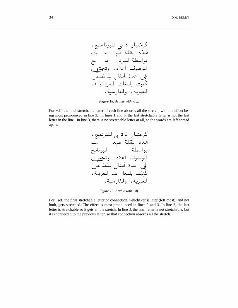
For −slf, the final stretchable letter of each line absorbs all the stretch, with the effect be-ing most pronounced in line 2. In lines 1 and 6, the last stretchable letter is not the lastletter in the line. In line 3, there is no stretchable letter at all, so the words are left spreadapart.
,À���¢�³� Õ rBO P���w��ð½ ¬��î ð ï Ö��¯ìB i¡�À���¢��B ÖªyB¸qk��rj ,iÜ�C a �¸ìBÆ ¨µ�ï ï ð f���C l � ë�,Ö¹q¢¬�B G �³��q ½���î ð ï
.Ö¹yP�®�Bj ,Ö�¢�¬�BFigure 19: Arabic with −slf.
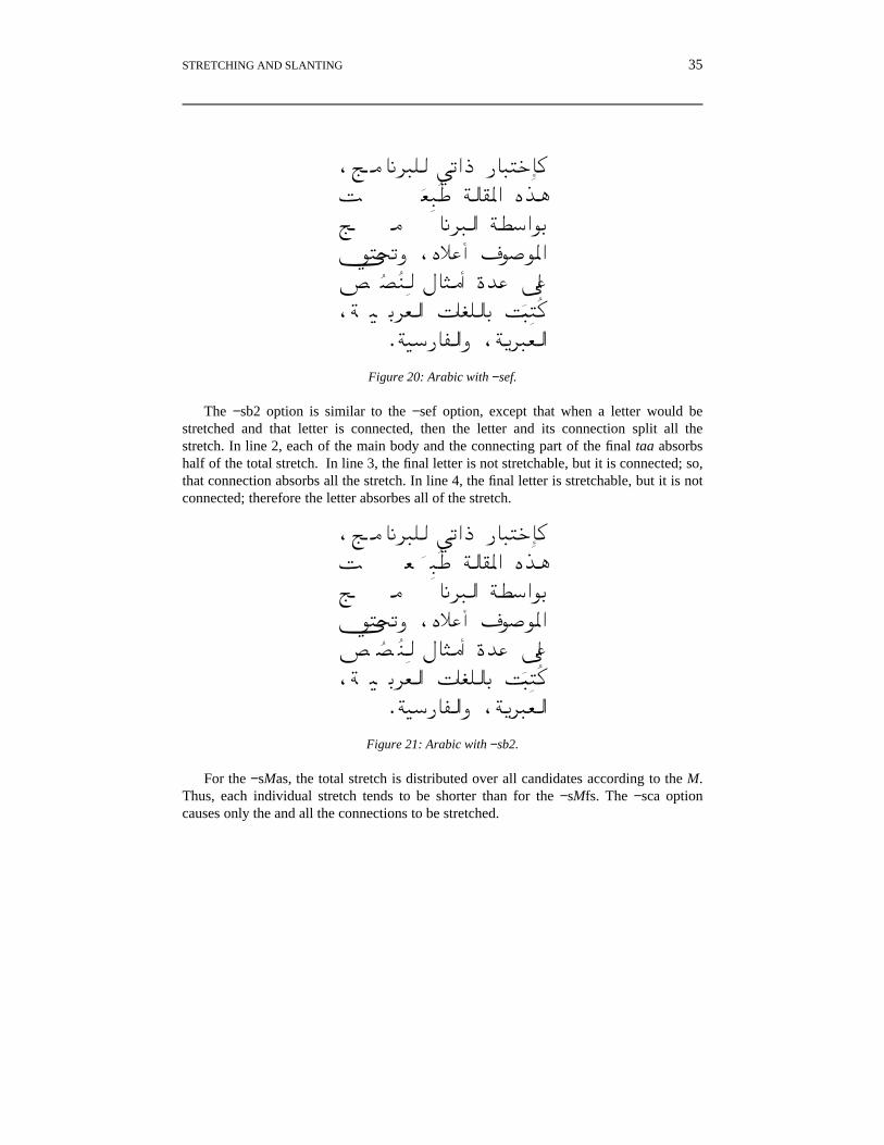
For −sef, the final stretchable letter or connection, whichever is later (left most), and notboth, gets stretched. The effect is most pronounced in lines 2 and 3. In line 2, the lastletter is stretchable so it gets all the stretch. In line 3, the final letter is not stretchable, butit is connected to the previous letter, so that connection absorbs all the stretch.
The −sb2 option is similar to the −sef option, except that when a letter would bestretched and that letter is connected, then the letter and its connection split all thestretch. In line 2, each of the main body and the connecting part of the final taa absorbshalf of the total stretch. In line 3, the final letter is not stretchable, but it is connected; so,that connection absorbs all the stretch. In line 4, the final letter is stretchable, but it is notconnected; therefore the letter absorbes all of the stretch.
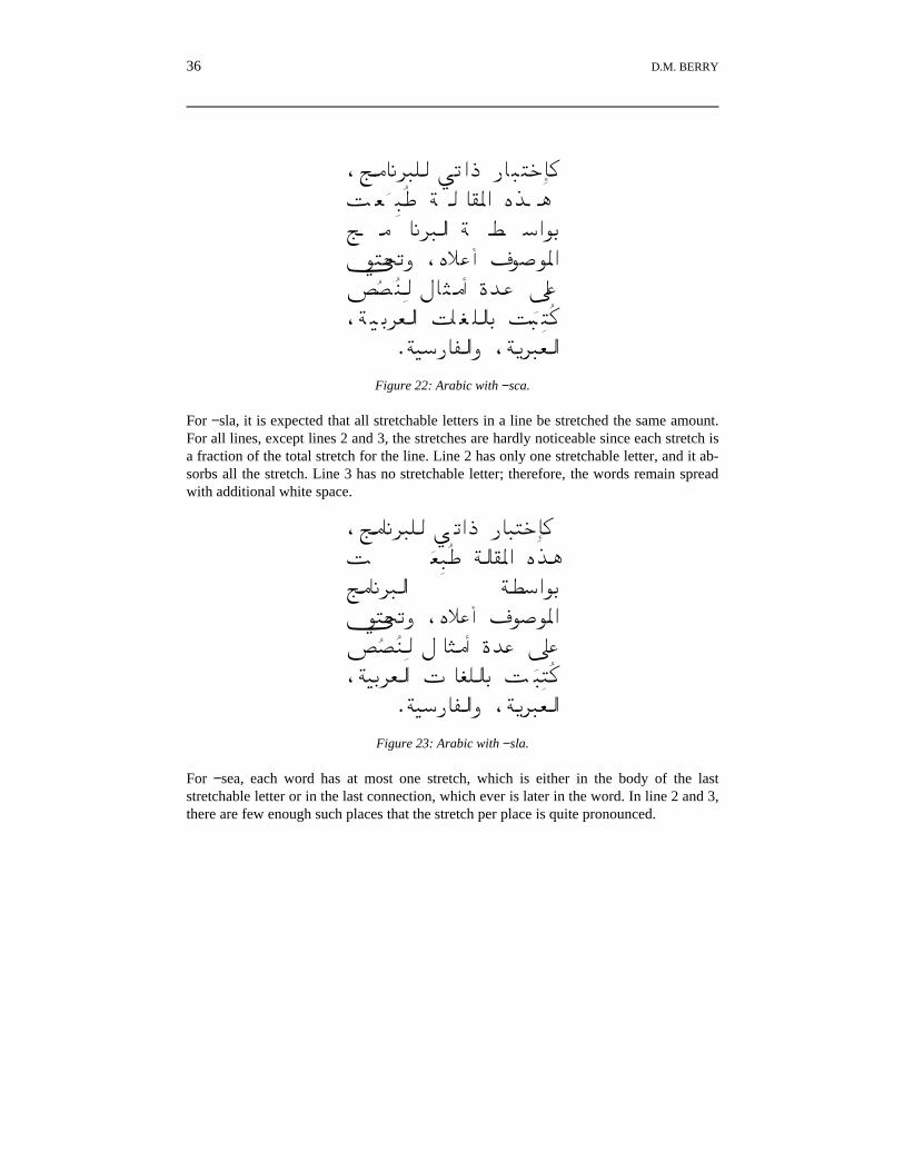
For the −sMas, the total stretch is distributed over all candidates according to the M.Thus, each individual stretch tends to be shorter than for the −sMfs. The −sca optioncauses only the and all the connections to be stretched.
For −sla, it is expected that all stretchable letters in a line be stretched the same amount.For all lines, except lines 2 and 3, the stretches are hardly noticeable since each stretch isa fraction of the total stretch for the line. Line 2 has only one stretchable letter, and it ab-sorbs all the stretch. Line 3 has no stretchable letter; therefore, the words remain spreadwith additional white space.
,À���¢�³� Õ rBO P���w��ð½ ¬��î ð ï Ö��¯ìB i¡�À���¢��B ÖªyB¸qk��rj ,iÜ�C a¸�¸ìBƨµ�ï ï ð f ���C l � ë�,Ö¹q¢¬�B G �³��q ½ ���î ð ï
.Ö¹yP�®�Bj ,Ö�¢�¬�BFigure 23: Arabic with −sla.
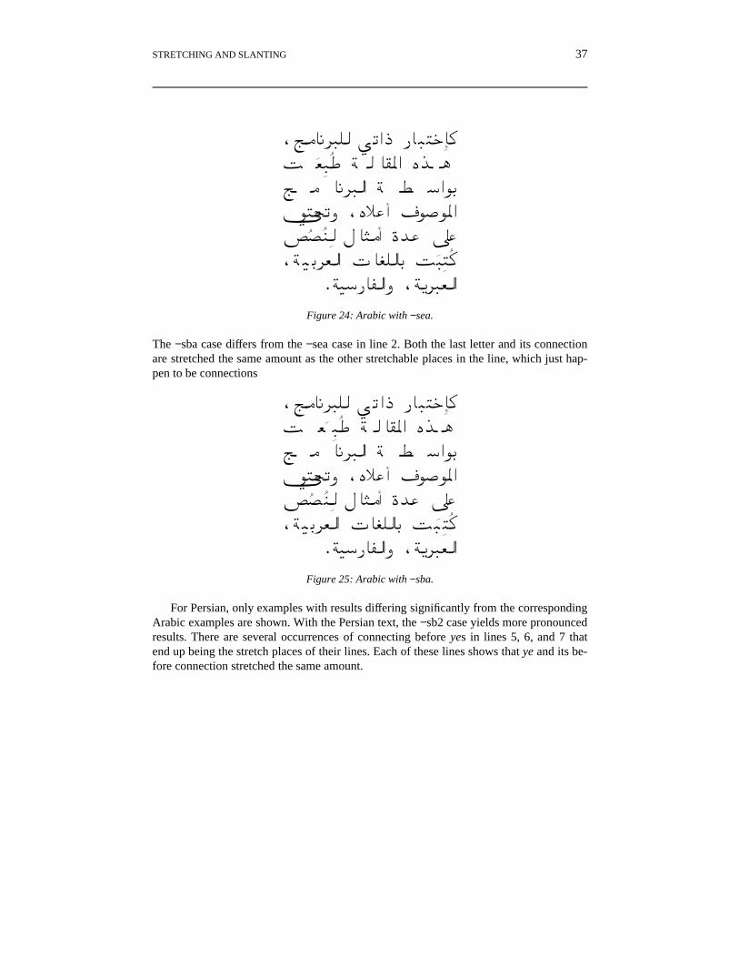
For −sea, each word has at most one stretch, which is either in the body of the laststretchable letter or in the last connection, which ever is later in the word. In line 2 and 3,there are few enough such places that the stretch per place is quite pronounced.
The −sba case differs from the −sea case in line 2. Both the last letter and its connectionare stretched the same amount as the other stretchable places in the line, which just hap-pen to be connections
For Persian, only examples with results differing significantly from the correspondingArabic examples are shown. With the Persian text, the −sb2 case yields more pronouncedresults. There are several occurrences of connecting before yes in lines 5, 6, and 7 thatend up being the stretch places of their lines. Each of these lines shows that ye and its be-fore connection stretched the same amount.
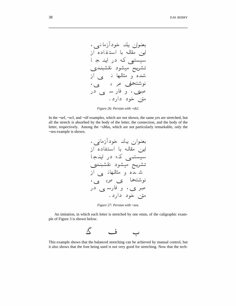
In the −sef, −scf, and −slf examples, which are not shown, the same yes are stretched, butall the stretch is absorbed by the body of the letter, the connection, and the body of theletter, respectively. Among the −sMas, which are not particularly remarkable, only the−sea example is shown.
,Õ���QãN¸w Ï� hB¸µ¬qQB iN�®�yB �q Ô��¯� Ó�B� � µ�B PN Ô � Õ´�¦¹yk µ�§¯� N¸§¹� Á�¢§rQB Õ ��¶���� j i z,Õ q¢� k ��Ô�z¸�PN Õ yP�� j ,k ¢��
.NPBN N¸w Ó��Figure 27: Persian with −sea.
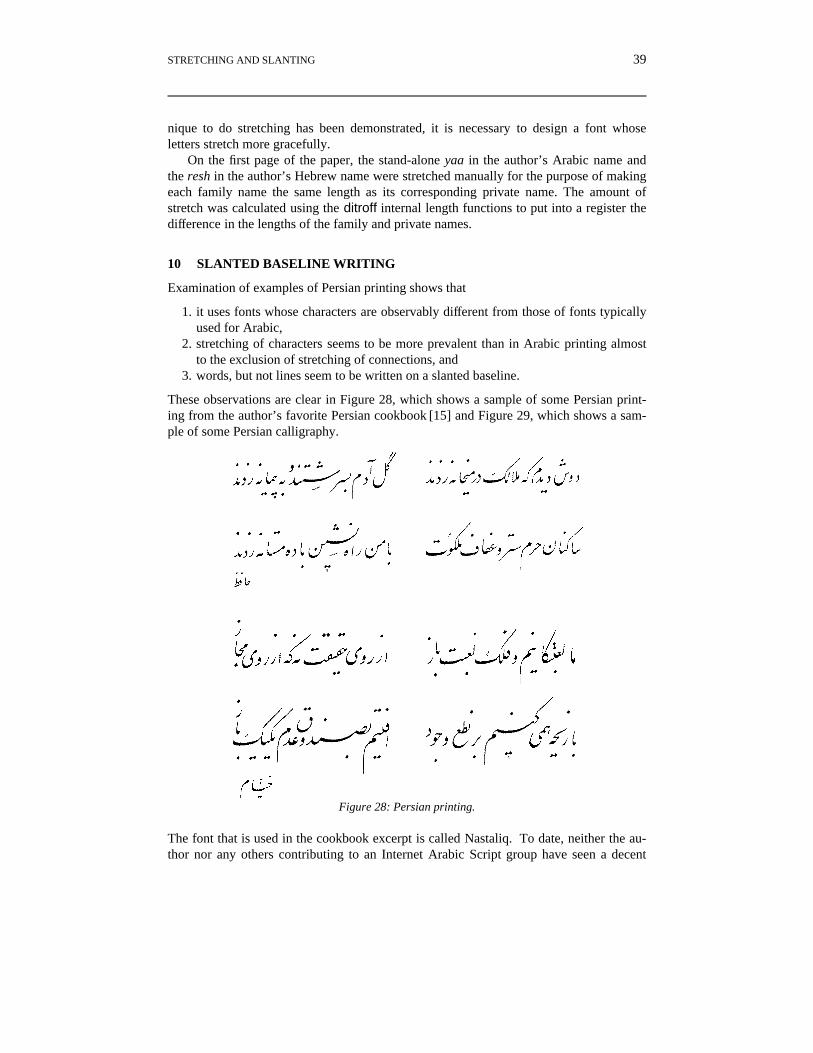
An imitation, in which each letter is stretched by one emm, of the caligraphic exam-ple of Figure 3 is shown below.
e a FThis example shows that the balanced stretching can be achieved by manual control, butit also shows that the font being used is not very good for stretching. Now that the tech-
STRETCHING AND SLANTING 39
nique to do stretching has been demonstrated, it is necessary to design a font whoseletters stretch more gracefully.
On the first page of the paper, the stand-alone yaa in the author’s Arabic name andthe resh in the author’s Hebrew name were stretched manually for the purpose of makingeach family name the same length as its corresponding private name. The amount ofstretch was calculated using the ditroff internal length functions to put into a register thedifference in the lengths of the family and private names.
10 SLANTED BASELINE WRITING
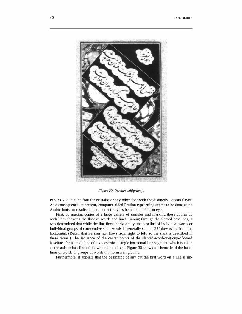
Examination of examples of Persian printing shows that
1. it uses fonts whose characters are observably different from those of fonts typicallyused for Arabic,
2. stretching of characters seems to be more prevalent than in Arabic printing almostto the exclusion of stretching of connections, and
3. words, but not lines seem to be written on a slanted baseline.
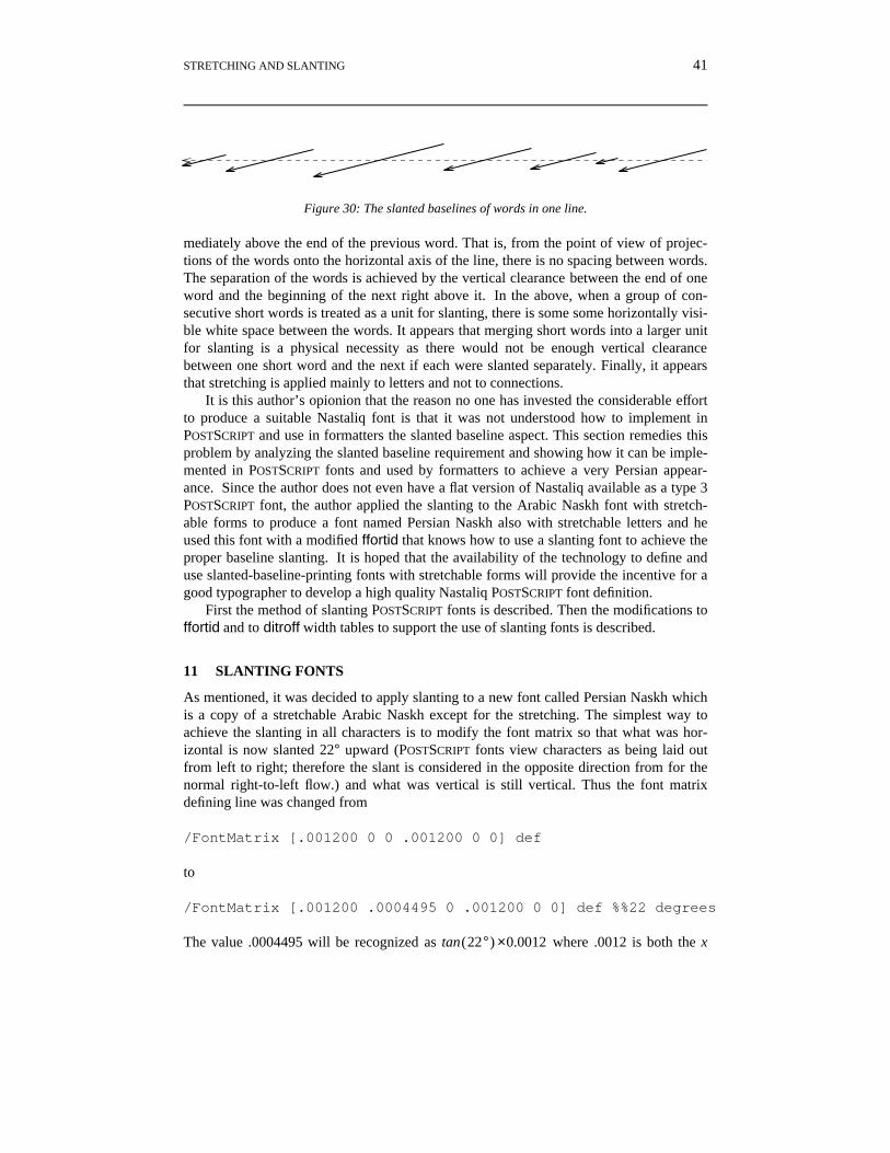
These observations are clear in Figure 28, which shows a sample of some Persian print-ing from the author’s favorite Persian cookbook [15] and Figure 29, which shows a sam-ple of some Persian calligraphy.
Figure 28: Persian printing.
The font that is used in the cookbook excerpt is called Nastaliq. To date, neither the au-thor nor any others contributing to an Internet Arabic Script group have seen a decent
40 D.M. BERRY
Figure 29: Persian calligraphy.
POSTSCRIPT outline font for Nastaliq or any other font with the distinctly Persian flavor.As a consequence, at present, computer-aided Persian typesetting seems to be done usingArabic fonts for results that are not entirely æsthetic to the Persian eye.
First, by making copies of a large variety of samples and marking these copies upwith lines showing the flow of words and lines running through the slanted baselines, itwas determined that while the line flows horizontally, the baseline of individual words orindividual groups of consecutive short words is generally slanted 22° downward from thehorizontal. (Recall that Persian text flows from right to left, so the slant is described inthese terms.) The sequence of the center points of the slanted-word-or-group-of-wordbaselines for a single line of text describe a single horizontal line segment, which is takenas the axis or baseline of the whole line of text. Figure 30 shows a schematic of the base-lines of words or groups of words that form a single line.
Furthermore, it appears that the beginning of any but the first word on a line is im-
STRETCHING AND SLANTING 41
Figure 30: The slanted baselines of words in one line.
mediately above the end of the previous word. That is, from the point of view of projec-tions of the words onto the horizontal axis of the line, there is no spacing between words.The separation of the words is achieved by the vertical clearance between the end of oneword and the beginning of the next right above it. In the above, when a group of con-secutive short words is treated as a unit for slanting, there is some some horizontally visi-ble white space between the words. It appears that merging short words into a larger unitfor slanting is a physical necessity as there would not be enough vertical clearancebetween one short word and the next if each were slanted separately. Finally, it appearsthat stretching is applied mainly to letters and not to connections.
It is this author’s opionion that the reason no one has invested the considerable effortto produce a suitable Nastaliq font is that it was not understood how to implement inPOSTSCRIPT and use in formatters the slanted baseline aspect. This section remedies thisproblem by analyzing the slanted baseline requirement and showing how it can be imple-mented in POSTSCRIPT fonts and used by formatters to achieve a very Persian appear-ance. Since the author does not even have a flat version of Nastaliq available as a type 3POSTSCRIPT font, the author applied the slanting to the Arabic Naskh font with stretch-able forms to produce a font named Persian Naskh also with stretchable letters and heused this font with a modified ffortid that knows how to use a slanting font to achieve theproper baseline slanting. It is hoped that the availability of the technology to define anduse slanted-baseline-printing fonts with stretchable forms will provide the incentive for agood typographer to develop a high quality Nastaliq POSTSCRIPT font definition.
First the method of slanting POSTSCRIPT fonts is described. Then the modifications toffortid and to ditroff width tables to support the use of slanting fonts is described.
11 SLANTING FONTS
As mentioned, it was decided to apply slanting to a new font called Persian Naskh whichis a copy of a stretchable Arabic Naskh except for the stretching. The simplest way toachieve the slanting in all characters is to modify the font matrix so that what was hor-izontal is now slanted 22° upward (POSTSCRIPT fonts view characters as being laid outfrom left to right; therefore the slant is considered in the opposite direction from for thenormal right-to-left flow.) and what was vertical is still vertical. Thus the font matrixdefining line was changed from
The value .0004495 will be recognized as tan(22°) ×0.0012 where .0012 is both the x
42 D.M. BERRY
and the y value from the matrix
[.001200 .0004495 0 .001200 0 0] .
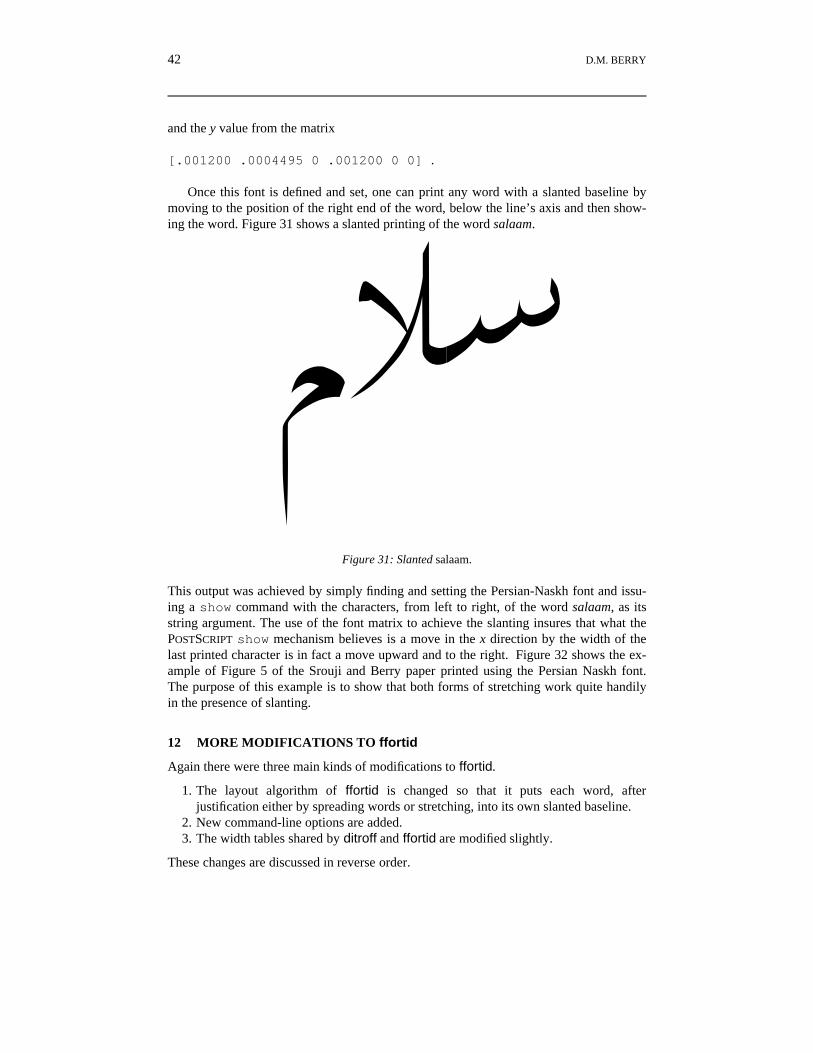
Once this font is defined and set, one can print any word with a slanted baseline bymoving to the position of the right end of the word, below the line’s axis and then show-ing the word. Figure 31 shows a slanted printing of the word salaam.
gÜyFigure 31: Slanted salaam.
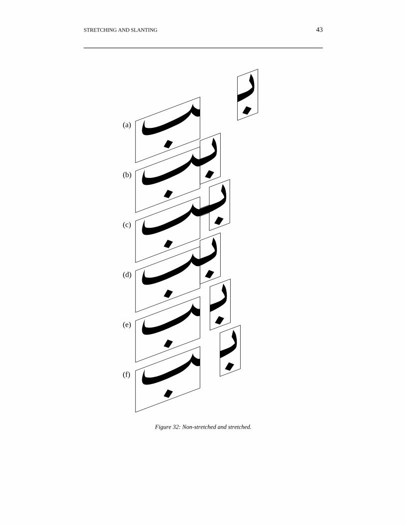
This output was achieved by simply finding and setting the Persian-Naskh font and issu-ing a show command with the characters, from left to right, of the word salaam, as itsstring argument. The use of the font matrix to achieve the slanting insures that what thePOSTSCRIPT show mechanism believes is a move in the x direction by the width of thelast printed character is in fact a move upward and to the right. Figure 32 shows the ex-ample of Figure 5 of the Srouji and Berry paper printed using the Persian Naskh font.The purpose of this example is to show that both forms of stretching work quite handilyin the presence of slanting.
12 MORE MODIFICATIONS TO ffortid
Again there were three main kinds of modifications to ffortid.
1. The layout algorithm of ffortid is changed so that it puts each word, afterjustification either by spreading words or stretching, into its own slanted baseline.
2. New command-line options are added.3. The width tables shared by ditroff and ffortid are modified slightly.
These changes are discussed in reverse order.
STRETCHING AND SLANTING 43
¼ q
¼q
¼·q
½q
½q
½q
(a)
(b)
(c)
(d)
(e)
(f)
Figure 32: Non-stretched and stretched.
44 D.M. BERRY
The width tables have to be modified slightly so that there is a line announcing thatthe font described by the table is slanted and that line gives the amount of slant in de-grees, which must agree with the angle implicit in the font matrix of the font. In addition,in order to cause the beginning of one word to be just above the end of the previous withno horizontal movement, it is necessary to lie to ditroff and tell it that the normal inter-word space is 0, while providing another unpaddable space to be used explicitly by theinput document to group short words together into a single slantable unit. First, ditroffwould not accept a width of 0 for the space; it took it as the default width of 1⁄3 emm. So,a space of width 1 was tried and it both was accepted by ditroff and produced visually ac-ceptable results which the human eye could not distinguish from a space width of 0. Re-call that the units of the space width is the unit of device resolution. Thus, for Adobetranscript’s psc device, a width of 1 is a width of 1/576 inches. Figure 33 shows thesecond paragraph of the Persian abstract with the same spacing between the words butwith nothing slanted. The reader can see that the words appear run together with no spacebetween them. The unpaddable space was provided as the character named by the ditroffspecial character \(ps, for “permanent space” whose width is set to what was the widthof the space before setting it to 1. The name for the unpaddable space had to be a two-character name that is mnemonic and is not in the special font; if it were in the specialfont, then it would not be possible to address the like-named special font characterwithout explicitly mounting the special font.
k µ�§¯�N¸§¹�Á�¢§r��µ�BPNÔ�Õ´�¦¹yQBiN�®�yB�qÔ��¯�Ó�B,Õ���QãN¸wÏ�hB¸µ¬q
.NPBNN¸wÓ��PNÕyP��j,k¢��,Õq¢�k��Ô�z¸�QBÕ��¶����ji z
33: Unslanted Persian text spaced as for slanted printing.
The new command-line option is to indicate which font positions contain slantedfonts. Of course, it will not work to attempt, through the setting of this option, to slant afont whose width table does not say that it is slanted. However, the slanting algorithm,described in the next paragraph, does not happen to a font not in this list.
The change to the ffortid layout algorithm is that after all characters have been put invisual order and all justification and stretching requested by the user have been applied,the projection of the starting position of each word on its text line’s axis is known. Notethat the justification and stretching are affected by the fact that the space is of width 1. Ofcourse, if stretching is not indicated, then as a result of justification, words may be morethan 1 unit apart as a result of the additional white space inserted by the spreading of thewords. If stretching is specified, then if there are stretchable places none of the interwordgaps should be spread, as stretching should absorb all of the excess white space.
At this point ffortid calculates the width of each word and then inserts before the be-ginning of each word, of length len_word, a vertical movement to
v = tan(α) ×2
len_wordhhhhhhhhh units below the line’s horizontal axis, where α is the angle of
slant, usually 22°, determined from the font’s width table. In order to avoid the line’saxis drifting as a result of round-off error in digitizing the floating point tangent values,the vertical positioning before the printing of each word is accomplished by using the ab-solute vertical positioning instruction with an argument that is the sum of the y of the
STRETCHING AND SLANTING 45
line’s axis and the calculated movement v for the word.The Persian abstract of this paper was typeset in this slanted pseudo-Persian font. In
preparing this example, it was learned that it is not a good idea to slant text that containsnon-slantable text such as that in Latin letters. However, if one is going to slant such textanyway, then Persian text which is immediately adjacent to Latin text, such asparentheses and other punctuation or a single letter grammatical article or conjunction,should be in a non-slanting font whose appearance is coordinated to the slanting font. Inthis case, since the slanting Persian Naskh is a slanting version of Arabic Naskh, ArabicNaskh was used as the non-slanting font whose appearance is coordinated to that of Per-sian Naskh!
13 EXAMPLES
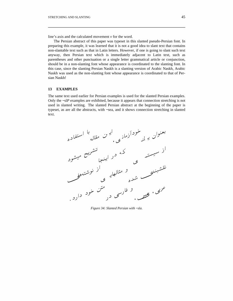
The same text used earlier for Persian examples is used for the slanted Persian examples.Only the −slP examples are exhibited, because it appears that connection stretching is notused in slanted writing. The slanted Persian abstract at the beginning of the paper istypeset, as are all the abstracts, with −sea, and it shows connection stretching in slantedtext.
iN�®�yB �q
Ô��¯� Ó �B
,Õ ���QãN¸w
Ï � hB¸µ¬q
N¸§¹� Á�¢
§r
��µ�B PN
Ô �Õ
´�¦¹y QB
k��Ô�z¸� QB
Õ ��¶���� j
i z k µ�§
¯�
.NPBN N¸w
��
PN ÕyP��
j
,k¢�� ,Õq¢�
Figure 34: Slanted Persian with −sla.
46 D.M. BERRY
iN�®�yB �q
Ô��¯� Ó
�B,���
QãN¸wÏ� h
B¸µ¬q
N¸§¹� Á�¢
§r
��µ�B PN
Ô �Õ �¦¹y
QB
k���z
¸� QB
Õ��¶���� j
i z k µ�§
¯�
.NPBN N¸w
��
PN ÕyP��
j
,k¢�� ,Õq¢�
Figure 35: Slanted Persian with −slf.
In these examples, consecutive words are grouped together as single slanted units, in ord-er that all slanted units in a line are approximately the same length. This way, no indivi-dual word extends far beyond the others and no individual word is so short that it doesnot have a clear separation from its neighbors. Between two consecutive words of a sin-gle slanted unit is an unpaddable space built into the slanted persian font, addressed by\(ps in ditroff. These unpaddable blanks are not candidates for stretching if there isnothing stretchable in the line and are not candidates for shrinking to give way to stretch-ing. They insure horizontal separation of the words that make up a single slanted unit.
14 RELATED WORK
As far as this author has been able to determine, no other Arabic, Hebrew, or Persian for-matting system provides letter stretching and slanting the baselines of words. This authoris aware of Yannis Haralambous’s ScholarTEX [16], Klaus Lagally’s ArabTEX [17], andDon Knuth and Pierre MacKay’s TEX-XET [18]. The closest that this author has seen aresystems that provide multiple forms of stretchable forms that can be selected by the user.TEX systems typically use fonts generated by METAFONT, which are usually bitmaps.Bitmap-based formatters would be hard put to provide dynamically stretchable charactersthat are necessary to implement the solution outlined in this paper and implemented withditroff/ffortid, a system that supports easy use of POSTSCRIPT outline fonts. There are op-tions to use POSTSCRIPT outline fonts with TEX, but to date, only type 1 fonts seem to beavailiable for the METAFONT-generated fonts. It would be necessary to obtain type 3 ver-sions of these fonts so that the character definitions can be edited to make them dynamic.
STRETCHING AND SLANTING 47
15 CONCLUSIONS
This paper has described the addition of full stretching and slanting to Hebrew, Arabic,and Persian typesetting with ditroff/ffortid. The changes necessary to the POSTSCRIPT
fonts and the ffortid ditroff postprocessor were described. As to whether the results areæsthetically pleasing is left to the reader. However, if the æsthetics are lacking, perhapsapplying the techniques described in this paper to better designed fonts, perhaps designedspecifically to be stretched and slanted, will yield more pleasing results. It is hoped thatthe proof of principle given in this paper increases the incentive for developing thesebetter fonts.
ACKNOWLEDGEMENTS
The author thanks Jacques Andre, Bijan Arbab (F�qPB h ¥¹q), Farhad Arbab (N� � ¢�F�qPB), Yaniv Begerano בג’רנו) ,(יניב Avron Cohen (oכה oאברו), Gershon Elber (oגרשו,(אלבר Achi Gvirtzman (oמvגביר ,(אחי Yannis Haralambous, Ziv Horesh חורש) ,(זיבNir Katz (u’’כ ,(ניר Don Knuth, Eli Leiba לייבה) ,(אלי Erez Manor מנור) ,(ארזShahrzade Mazaher (¢ � �«� NBQ¢ ¶ z), Asaf Segal סגל) sאס), Johny Srouji (Õ �¸uÕuj¢y), and Uri Yifrah יפרח) (אורי for their help and suggestions.
REFERENCES
1. J. Srouji and D.M. Berry, ‘Arabic Formatting with ditroff/ffortid’, Electronic Publishing, 5 (4),163–208 (1992).
2. B.W. Kernighan, ‘A Typesetter-independent TROFF’, Computing Science Technical ReportNo. 97, Bell Laboratories (1982).
3. ‘Arab Standards and Metrology Organization, 8-Bit Coded Arabic/Latin Character Set for In-formation Interchange’, ASMO DS 708, Amman, Jordan (1985).
4. C. Buchman, D.M. Berry, and J. Gonczarowski, ‘DITROFF/FFORTID, An Adaptation of theUNIX DITROFF for Formatting Bi-Directional Text’, ACM Transactions on Office Informa-tion Systems, 3 (4), 380–397 (1985).
7. ‘Genesis ת) ,’(בראשי Torah Scrolls ,(ספרי-תורה) Found in any synagogue (Unknown).8. POSTSCRIPT Language Reference Manual, Second Edition, Adobe Systems Incorporated,
Addison-Wesley, Reading, MA, 1992.9. D. Weise and D. Adler, ‘TrueType and Microsoft Windows Version 3.1’, Technical Report,
Microsoft Corporation, Redmond, WA (1992).10. J. Andre and B. Borghi, ‘Dynamic Fonts’, POSTSCRIPT Language Journal, 2 (3), 4–6 (1990).11. ‘Adobe Type 1 Font Format’, Part No. LPS0064, Adobe Systems, Inc. (1990).12. J. Andre and I. Vatton, ‘Dynamic Optical Scaling and Variable Sized Characters’, Electronic
Publishing—Origination, Dissemination, and Design, 7 (4), 231–250 (1994).13. J.D. Becker, ‘Multilingual Word Processing’, Scientific American, 251 (1), 96–107 (1984).14. J.D. Becker, ‘Arabic Word Processing’, Communications of the ACM, 30 (7), 600–611 (1987).
48 D.M. BERRY
15. N. Batmanglij, Food of Life, Mage, Washington, DC, 1986.16. Y. Haralambous, Scholar TEX, Y. Haralambous, Lille, France, 1991.17. K. Lagally, ‘ArabTEX, a System for Typesetting Arabic, User Manual Version 3.00’, Report
Nr. 1993/11, Fakultat Informatik, Universitat Stuttgart, Stuttgart, Germany (1993).18. D.E. Knuth and P. MacKay, ‘Mixing Right-to-left Texts with Left-to-right Texts’, TUGboat,