Page 1
innovativeindicators.biz [email protected]
Support Resistance
Strength Analyzer
Thank you for your interest in the Support Resistance Strength Analyzer!
This unique indicator analyzes historical price data to identify
horizontal support and resistance levels, as well as determines how
strong they were based on how many times price reversed at those
levels.
It doesn’t provide trade entry and exit signals, but it may increase the
chance of successful trades when combined with other methods
designed to work at support and resistance levels, such as candle stick
patterns or indicators which detect trend direction changes.
A support level is an area where price falls to and reverses direction from. A resistance level
is just the opposite – price rises to a level and reverses downwards.
How it works Support Resistance Strength Analyzer (SRSA) uses three concepts:
reversal threshold
support/resistance zone
zone strength.
Reversal threshold
This is the minimum acceptable
distance which price must
move away from a level for it
to be defined as a support or
resistance zone. This value can
be customized.
This user manual refer to FXCM’s Trading Station version of the indicator
Price exceeded the reversal threshold distance from up to down, so the level is drawn as a resistance zone (red rectangle above)
Price didn’t reach the reversal threshold distance, so the reversal level above is not drawn as a resistance zone
Page 2
innovativeindicators.biz [email protected]
Support/resistance zone
Reversals usually occur within zones
rather than at exact price levels. To
accommodate this, SRSA divides the
chart area vertically into zones of a specific height. These are
displayed as rectangles when reversals occur within them. Zone heights can be customized
and the zones can be shown using boundary lines.
Zone strength
One of SRSA’s powerful features is that it can count, and display, how often price reverses
from support/resistance zones.
If price moves into a zone and reverses direction by at least the reversal
threshold amount, then this is considered to be a successful reversal
and the zone’s support/resistance ‘strength’ is incremented by 1.
If price moves through a zone without reversing by the threshold
amount, then it is considered a ‘reversal failure’ and 1 is subtracted
from that zone’s strength. Strength values go up and down based on
reversal successes or failures and can be shown on the chart.
Reversals at support levels are calculated using a candle or bar’s
low. Highs are used to calculate reversals at resistance levels.
Strength is represented by the intensity of a rectangle’s color. Green
is used for support, red for resistance and blue for areas which have
recently acted as both support and resistance. On a light chart background, light green
means weak support and a more intense green means stronger support. On a dark
background, a dark color is weak and a brighter color is stronger. Remember that the size of
a rectangle shows the height of a zone, not the strength.
A resistance zone (red) with dashed boundary lines displayed
Strength value displayed in a resistance zone
Candle highs are used to calculate reversals from resistance zones
Page 3
innovativeindicators.biz [email protected]
A strength value has a minimum of 1 and no maximum. However, strengths of 5 and above
are shown using the maximum intensity for that color. When a value reduces to zero, it is no
longer shown on the chart and can’t go lower than zero. You can turn ‘Show strength values’
on to view the actual values which will be written in each zone.
Definition of terms used in these instructions
These terms are used throughout the instructions and have specific meanings.
Zone: a colored rectangle which can be drawn on the chart defining an area used to
measure price reversals.
Region: an area which has several overlapping zones of different heights.
Strength: the number of times that price has reversed by the threshold amount in a zone.
Support is green Both resistance and support is blue
Resistance is red
A reversal in this zone caused the zone’s strength to increase from 4 to 5
Price later went through the zone without reversing, causing its strength to reduce back to 4
Page 4
innovativeindicators.biz [email protected]
How to use SRSA
SRSA has three main settings which change how support/resistance zones are displayed.
‘Single zone height only’, ‘Multi-zone heat map’ and ‘Both’.
Single zone height only
When the ‘Mode’ is set to ‘Single zone height only’, a single zone height is used for
calculations and rectangles are displayed for one height only.
The zone height can be changed, as well as the size of the threshold needed to determine a
reversal.
Increasing the zone height will enable a more macro analysis, as larger zones will likely
encompass more reversals.
Multi-zone heat map
Analyzing support/resistance regions is often time consuming because a number of price
‘magnifications’ need to be considered to increase the chance of finding significant zones.
To address this, SRSA has incorporated the multi-range heat map display which does this
automatically.
Setting ‘Mode’ to ‘Multi-zone heat map’ draws four different zone heights on top of each
other from largest to smallest. It can provide a quick overview of where the strongest
support/resistance levels may be.
Zone height set to ‘Small’ Zone height set to ‘Very large’
Page 5
innovativeindicators.biz [email protected]
Different threshold settings and display options can be used (support, resistance, both, or
all) with heat map mode,
but zone boundary lines
and strength values are
not shown due to the
overlapping nature of the
different sized zones.
Because all zone heights
are displayed, changing
the zone height setting
won’t have any effect with
heat map.
Both setting
This setting will display a single range
over the top of the multi-ranges. The
multi-ranges show all four range
heights and the single range shows
one of those range heights with
bordered rectangles, so you can
examine it in more detail.
Later in this user manual, a
suggestion is provided on how to
analyse a chart using these settings.
Using zone threshold
Increasing the zone threshold size will require price to move further in the opposite
direction before it is considered a reversal. Larger values display fewer reversals and tend to
pick the levels which resulted in the larger moves.
Zone threshold set to ‘Small (1 zone height)’ Zone threshold set to ‘Very large (20% of entire
vertical price range)’
Page 6
innovativeindicators.biz [email protected]
Choosing ‘Small (1 zone height)’ will only require price to move by one zone height in the
opposite direction for the move to be considered a reversal. The zone where the reversal
occurred will be considered a support/resistance zone. This setting will likely give many
zones.
Choosing ‘Very large (20% of entire vertical price range)’ will require price to move by 20%
of the entire vertical price range of loaded data from the point of the reversal. This setting
will likely give few, if any, zones.
It is recommended that you experiment with this setting and choose a zone threshold to suit
the size of moves you are looking for, and your trading style, and leave it at that setting.
Filtering zone strengths
The ‘Minimum strength to display’ setting allows you to filter which zones to display based
on their strength value, from 1 to 4. One will display all zones and 4 will only show those
with strengths of 4 and above.
It is recommended to use at least 2 to avoid too many zones on the chart and to help you
focus on the stronger ones, however you can use 1 if you want to see them all.
Contextual menu
Some of the most commonly used settings are
available in a pop-up menu which can be accessed
by right clicking anywhere on the chart.
Calculation line
The dotted vertical line near current price marks the place where zone
calculations are up to for the single zone display. A certain amount of data
is needed from the current bar, before calculations can be carried out, so
it will update when enough data is available. Usually the larger zone
heights and larger thresholds need more data to calculate.
When multi-range heat map is displayed, the line won’t be shown, as different zone heights
are calculated to different points.
Only strengths of 2 and above are shown when ‘Minimum strength to display’ is set to 2
Page 7
innovativeindicators.biz [email protected]
How available price data changes zone appearance
SRSA uses all available price data to calculate zones. If you scroll a chart to the right to cause
more price data to load, the indicator will use the new data and refresh all calculations
causing zones to redraw. Some zones may disappear and new ones may form. This generally
happens with the ‘weaker’ zones (strength 1 or 2). An area identified as a signficant
support/resistance region will likely remain or may just change size or more up or down as
the chart adjusts to the new data.
The indicator divides the entire vertical price area into a set number of zones depending on
the zone height you chose. If more data is loaded, or price makes new highs or lows, then
the vertical range will increase and so will the zone heights after recalculation.
To improve consistency, it is recommended that you work with a similar amount of data
each time you use that chart.
Thinking in terms of reversal regions rather than levels
As mentioned earlier, reversals tend to occur repeatedly in regions rather than at absolute
price levels. The indicator can only draw zones with absolute upper and lower boundaries,
but it is important to try to think in terms of support/resistance ‘regions’ rather than
absolute values. To assist with this concept, SRSA provides the multi-zone heat map display
to help identify strong regions where different sized zones overlap. Such a region is likely to
remain even if some zones within it change due to recalculation.
Page 8
innovativeindicators.biz [email protected]
Setting up SRSA
Color scheme
After installing Support Resistance Strength Analyzer, ensure you choose the appropriate
color scheme for your chart background.
Display settings
Support resistance type – leave on ‘All’ unless you only want to see support or resistance
levels, or only those which have acted as both.
Display zone boundary lines – shows upper and lower zone
boundaries. Can be useful to extrapolate zones to the current
price bar when calculations haven’t yet gone that far.
Display zone height – will show the actual height of zones at the
top right corner of the screen.
Display strength values – it’s useful to have this on so that zones show the strength values
as numbers drawn inside the rectangles.
Display data for first 200 bars only – should be turned on if you find that the chart draws
too slowly, or you want to reduce clutter on the chart. All loaded price data will still be used
for calculations, even if this setting is on.
Always show borders for single strength zones – borders will be drawn for the single
strength zone when both single zone and multi-zones are displayed, to distinguish between
them. They won’t be drawn by default when single height is drawn alone to reduce
interference with the display of price data. You can set rectangle borders to always be
drawn if you prefer.
Page 9
innovativeindicators.biz [email protected]
How to analyze a chart
SRSA can be used in various ways. The method below is one suggestion for how a chart can be
analysed using this indicator.
The aim of this process is to find the strongest support/resistance region on a chart near current
price and choose appropriate boundaries for this region if needed.
1. Load chart and choose threshold
The first step is to choose a trading instrument and timeframe, and load enough data to work with.
As described earlier, the zone threshold size should be chosen based on what size reversals a trader
is looking for. This setting will determine which zones are shown. Generally, once a setting is chosen
that the trader is comfortable with, it can be left at that setting.
Remember that the term ‘zone’ in this user manual refers to a rectangle of a specific height and a
‘region’ refers to an area of multiple overlapping zones.
2. Use multi-zone heat map to find a strong support/resistance region near
current price
It is suggested to have the ‘Minimum strength display’ set to at least 2, otherwise it may give too
many zones on the chart, with many being ‘weak’ zones of 1 strength only.
Choose ‘Mode: multi-zone heat map only’ from the settings or contextual menu (right click on the
chart). This will display all four zone heights at once and give an overview of where the
support/resistance regions may be on the chart. Strength values aren’t shown in this mode due to
the overlapping zones. When zones overlap, the smallest one is drawn on top. On a light background
chart, the darker areas have the strongest strength values and on a dark background, the lighter
areas will be the strongest.
Different sized overlapping zones of strong colors are likely to be the regions with the highest
support/resistance strength values. If nothing takes the trader’s interest near current price, they
may want to choose another instrument or timeframe.
Page 10
innovativeindicators.biz [email protected]
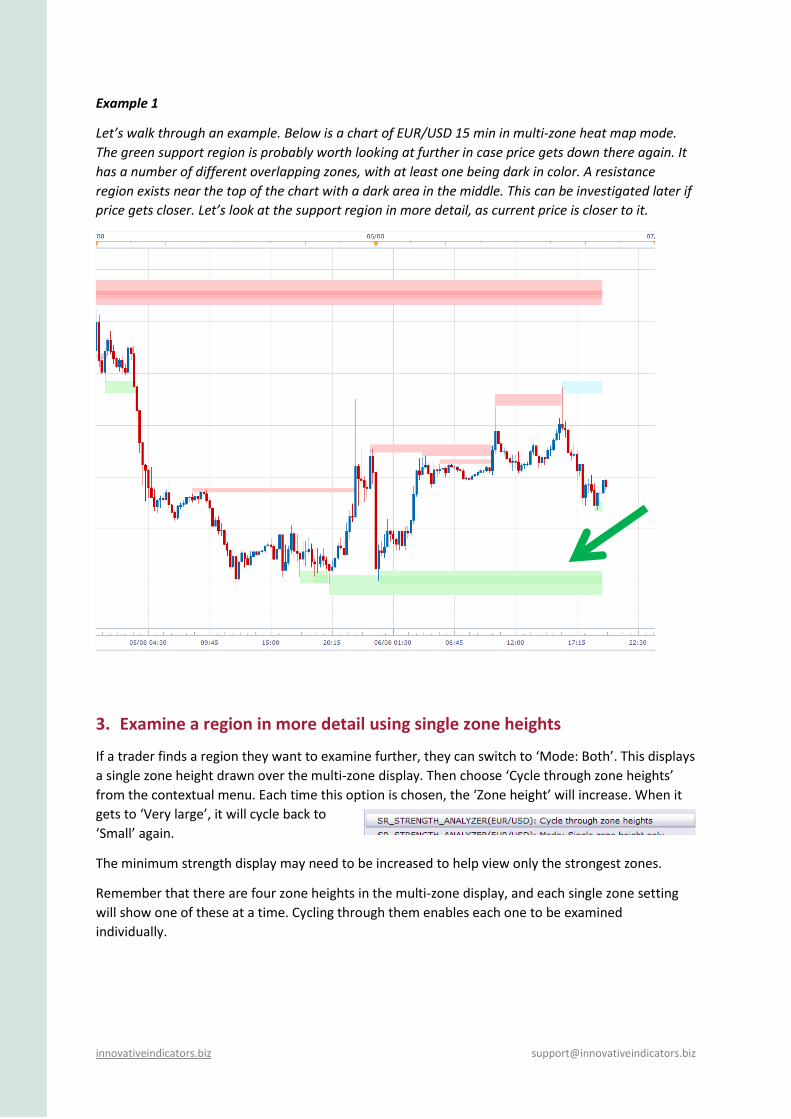
Example 1
Let’s walk through an example. Below is a chart of EUR/USD 15 min in multi-zone heat map mode.
The green support region is probably worth looking at further in case price gets down there again. It
has a number of different overlapping zones, with at least one being dark in color. A resistance
region exists near the top of the chart with a dark area in the middle. This can be investigated later if
price gets closer. Let’s look at the support region in more detail, as current price is closer to it.
3. Examine a region in more detail using single zone heights
If a trader finds a region they want to examine further, they can switch to ‘Mode: Both’. This displays
a single zone height drawn over the multi-zone display. Then choose ‘Cycle through zone heights’
from the contextual menu. Each time this option is chosen, the ‘Zone height’ will increase. When it
gets to ‘Very large’, it will cycle back to
‘Small’ again.
The minimum strength display may need to be increased to help view only the strongest zones.
Remember that there are four zone heights in the multi-zone display, and each single zone setting
will show one of these at a time. Cycling through them enables each one to be examined
individually.
Page 11
innovativeindicators.biz [email protected]
4. Use a strength selection criteria
The following criteria could be considered while cycling through the zone heights:
1) How large the strength values are close to current price.
2) How this zone has behaved going back in time and if this zone has repeatedly maintained high
strength values which have been increasing.
3) How many of the four zone heights have large strength values which overlap. This region should
have been chosen due to the strong overlapping multi-zone colors, so the strength of each
individual zone height can now be evaluated.
If a region is found which has multiple sized zones with high overlapping strength values and these
zones have shown strength going back in time, then it may be considered to be a region with strong
support/resistance characteristics. Only the trader can decide if they want to use this level for
trading if price comes back to it. Looking back at the past performance of similar support/resistance
levels on that timeframe, for that trading instrument, may be useful in assessing probabilities using
the trading method that the trader has decided to use.
It may also be useful using this analysis method on a higher timeframe (example given later). If a
similar support/resistance region exists on a higher timeframe, then it could add strength to the
identified region. In this case the boundaries may need to be expanded to incorporate the larger
area, or trading could be based solely on the higher timeframe if that region looks more attractive.
Going back to our example, let’s cycle through the four zone heights to examine each one.
‘Small’ zone height with a minimum strength setting of 2.
‘Medium’ zone height
Page 12
innovativeindicators.biz [email protected]
‘Large’ zone height
‘Very large’ zone height
Let’s now consider this region using the example selection criteria.
1) Only one zone has a value of 3, the others are 2.
2) On this 15 min chart, the region formed about a day ago. It held a few times back then but
price hasn’t been near the level since.
3) All zone heights have strengths of at least 2, but only one has a strength of 3. Larger would
be better.
5. Choose support/resistance region boundaries
Depending on how a trader wants to use this information in their trading, they may need to decide
on an upper and lower boundary for the region they have identified.
Ultimately the trader will have to decide on these, but the multi-zone heat map could be used with a
suitable minimum strength display to filter out the low strength zones. The boundaries could be set
to encompass the highest strength zones as shown below.
The final step would require back testing to see how this instrument has reacted at similar support
levels in the past using the trading method the trader plans to use.
Page 13
innovativeindicators.biz [email protected]
Going back to our example, the boundaries could be the upper and lower region from the multi-range
heat map.
Or the strongest zone can be used to create a tighter area, as this zone had to most reversals going
back in time.
If this instrument showed examples in the past of repeated profitable reversals from similar regions
with strengths of 2 and 3, then it may be worth trading. If higher strengths gave better results, then
it may be worth waiting for a better setup.
6. Managing new price data
Once a region has been identified, it is important to check it regularly for changes. As discussed
previously, SRSA will use all loaded price information for its price calculations. If more historical price
data appears, then the indicator will recalculate. It is therefore recommended to use the same
amount of loaded data each time to produce consistent results.
The second instance which will cause regular recalculations is when price makes new highs or lows.
In this case, price won’t be approaching any support or resistance regions based on loaded data, so
there won’t be any trading opportunities available. It is therefore best to wait for price to start
retracing to an existing region before starting analysis.
Page 14
innovativeindicators.biz [email protected]
While price is between the high and low of all the loaded data, the
support/resistance zones should be relatively stable. A reminder to take note of the
calculation line which shows where calculations are up to. It will progressively move
forward and update recent price data as new price bars form (see example at right).
Example 2
This is GBP/USD on a 4 hour timeframe in multi-zone mode. A number of resistance zones appear to
overlap with at least one being a strong red color. Price is currently close to this region. A couple of
support areas exist below, but they don’t look very strong. Let’s examine them further.
Mode: ‘Both’ setting with ‘Small’ zone height and a minimum strength setting of 2. Several resistance
zones show up with the most recent having a strength of 3.
Page 15
innovativeindicators.biz [email protected]
Changing the zone height to ‘Medium’ only shows the recently formed support area with a strength
of 2.
Increasing the zone height to ‘Large’ reveals two resistance zones near current price. One just
recently formed which has a strength of 2 and just above it is a strength 3 zone which has persisted
for a while, changing between 3 and 2.
Page 16
innovativeindicators.biz [email protected]
Increasing the zone height to ‘Very large’ shows the resistance area increasing progressively from 2
to 5.
Using the strength selection criteria, the resistance area looks quite strong because it has resulted in
price reversing from it several times with three of the four zone heights being able to detect the
reversals. The ‘Very large’ zone height was able to capture all the reversals with the most recent
strength of 5. The support area was only detected by one zone height and only had a strength of 2,
which doesn’t give it much strength. The resistance zone therefore shows some characteristics of
being a strong resistance region. The boundary which could assist with trading could be set at just
above and just below the ‘Very large’ zone setting area.
Again, the final step would be to back test similar regions using the trading method the trader choses
to determine the probabilities of a profitable trade. This may include appropriate stops and targets.
Considering higher timeframes
Even though SRSA doesn’t use timeframes other than the one currently chosen, it may be worth
looking at a higher timeframe to see if the same support/resistance area shows up.
The chart at left is the multi-zone heat map daily
timeframe of Example 2 (which was a 4 hour timeframe of
GBP/USD). The same support/resistance region showed up
on this timeframe too.
The next four charts show each zone height using the
‘Mode: Both’ setting.
Page 17
innovativeindicators.biz [email protected]
‘Small’ zone height ‘Medium’ zone height
‘Large’ zone height ‘Very large’ zone height
The ‘Small’ zone height shows a strength of 4 and ‘Very large’ a strength of 3 right up to the
calculation line. ‘Small’ on this time zone is probably equivalent to ‘Very large’ on the 4 hour
timeframe. This suggests that this resistance region is probably visible to traders looking at the daily
timeframe as well. This adds strength to the region on the 4 hour chart. The trader has the option of
using the daily timeframe or the 4 hour timeframe if they decide to trade this region. If using the
daily timeframe, the boundary could be expanded to encompass most of the region including the
‘Very large’ zone height.
Summary
The analysis technique described is only one example of how SRSA can be used. The main points
were to try to develop a consistent approach and ensure that it is back tested with the trading
instrument and timeframe and using the trading method that the trader choses, to get an idea of the
probabilities of the setup working.
SRSA doesn’t give trade signals, but rather tries to provide support/resistance regions which may
increase probabilities of reversals from those regions. Using these regions for trading could be
achieved by combining them with other trading methods designed for use at support and resistance
levels. Examples may include candle stick patterns, trend line convergence or other indicators which
signal trend direction changes.
Page 18
innovativeindicators.biz [email protected]
FAQ The indicator draws very dark (or very light) zones and the text is hard to read
Change the ‘Color scheme’ setting in the ‘Style’ section to ‘For light background’ or ‘For dark
background’ to match your chart.
Why has nothing drawn on the chart?
A notification at the top right corner of the screen will advise you
when no zones were found to draw. This is more likely to occur with
a large threshold setting, a large zone height and/or a ‘Support
resistance type - Both at once’ setting.
The other possibility is that not enough data values were loaded. At least 200 values are
needed before calculations can be made. Again, you will be notified if not enough data is
available.
My chart draws slowly and is difficult to scroll
This indicator carries out a lot of calculations behind
the scenes which may slow down drawing. Setting the
‘Display data for first 200 bars only’ to ‘Yes’ should
speed up chart drawing. All loaded data will still be
used in calculations.
When I scroll the chart, the zones appear to get larger
Zones are calculated by using all the loaded data and dividing the vertical price chart range
into a set number of zones. If more data is loaded, and the vertical range increases, then the
zones will get larger. To be consistent, work with a set number of loaded data bars.
How do I choose what threshold setting to use?
Generally a small zone threshold will suit people who are more interested in analyzing the
smaller moves. Larger zone thresholds detect levels over larger price ranges with reversals
which moved a long way from the zone. This setting is most suitable for people interested in
analyzing the larger moves. The table below summarises what happens at different settings.
Page 19
innovativeindicators.biz [email protected]
Small Large
Zone threshold
A small setting will result in price only needing to reverse by a small amount to be considered a reversal and will likely result in many zones. Suitable for people wanting to gain a detailed view of support and resistance levels with small moves from those levels.
A large setting means price needs to reverse a long way to be considered a reversal and will likely result in fewer zones. Suitable for people interested in analyzing larger moves and getting a more macro view of support and resistance levels.
Price needs to move further from a zone to be considered a reversal
Why does an obvious price peak not show a support or resistance level?
You probably have ‘Minimum strength to display’ set to a value larger than 1. If you set it to
1, you will likely see a single strength level there. If you don’t, then the move away from this
zone was smaller than the threshold and didn’t satisfy the reversal criteria.
Why do the zones change when price is making new highs or lows?
SRSA works by dividing the entire vertical price range of loaded data into zones of a
particular size. Therefore, if price makes new lows or highs (relative to the loaded data), the
zones will recalculate. As the vertical price range increases, so do the zone sizes, as they
expand slightly to include the new data. If you are watching a lower timeframe chart (such
as 1 or 5 minute), you will see the zones changing when price makes new highs or lows.
During this time, it is normal for a support or resistance zone to change size or strength as
the zone adjusts to the new data.
As price makes new highs or lows (relative to the loaded data), no support or resistance
regions will have been identified outside of the current price range, and be available for
trading, so the fact that the indicator keeps readjusting shouldn’t be an issue. When price
moves back into areas it has been before, the indicator will have stabilized and
readjustments will only occur if data scrolling changes the amount of data available for
calculation.
A reversal is expected at this point
It becomes visible when ‘Minimum strength to display’ is changed to 1
Page 20
innovativeindicators.biz [email protected]
Why do zones end at different places?
All single height zones are drawn to the same place, but the zones which
are part of the multi-zone display may end at different points. A certain
amount of data is needed before calculations can be made, therefore a
zone is drawn to the last place that calculations were carried out at,
which may not always be the current bar. The dotted vertical line shows
the point where calculations are up to for the single zone display. It isn’t
shown when only multi-zones are displayed.
Can I use this indicator for trading signals?
The Support Resistance Strength Analyzer was designed to provide general information on
support and resistance levels and does not provide entry and exit signals. It is therefore not
recommended to be used solely as a method to base trading decisions on.
The powerful analysis provided by this indicator reveals that support and resistance zones
may hold for a number of sequential reversals, but may then fail a number of times
degrading the zone’s strength. The point at which a zone starts to fail is likely to be difficult
to predict. Therefore a trader should not blindly place trades at every level, but rather add
methods to increase the probabilities of detecting reversals.
This may be achieved by combining other trading methods designed for use at support and
resistance levels. Examples may include candle stick patterns, trend line convergence or
other indicators which signal trend direction changes. A signal given by one of these
methods at an area identified as a strong support or resistance region may provide higher
probability signals. Thorough back and forward testing of any new system, using a particular
trading instrument and timeframe, is recommended before using it with real trades.
Page 21
innovativeindicators.biz [email protected]
Settings
Calculation
Mode
Single zone height only – divides the chart into zones of a particular height.
Multi-zone heat map – draws four different zone heights on top of each other from
largest to smallest. This option is designed to provide an overview of
support/resistance strength before examining a region in more detail.
Both – draws a single zone overlayed on the multi-zones. Zones within the single
zone setting will be visible as bordered rectangles.
Zone threshold
Small (1 zone height) – price needs to reverse by at least one zone height to be
considered a reversal. Useful for a detailed analysis.
Medium (2 zone heights) – price needs to reverse by at least two zone heights to be
considered a reversal.
Large (10% of entire vertical price range) – price needs to reverse by at least 10% of
the entire vertical price range of loaded data to be considered a reversal.
Very large (20% of entire vertical price range) – price needs to reverse by at least
20% of the entire vertical price range of loaded data to be considered a reversal.
Useful to detect support/resistance zones which have resulted in relatively large
moves and likely to have held the longest.
Zone height
Small, Medium, Large, Very large (default is ‘Small’).
A setting of ‘Small’ will use a small zone height which is likely to result in many zones
being drawn. You can select the ‘Display zone height’ setting to view the actual
height value displayed at the top right of the screen.
A setting of ‘Very large’ will use a very large zone height which will likely result in
fewer zones.
Display
Support resistance type
Support only – only displays zones which have acted as support (green).
Resistance only – only displays zones which have acted as resistance (red).
Page 22
innovativeindicators.biz [email protected]
Both at once – only displays zones which have acted as both support and resistance
(blue). This will likely result in few (if any) zones being displayed.
All – displays all the options above together.
Display zone boundary lines (Yes/No) – draws lines to show where the zone boundaries are.
Display zone height (Yes/No) – will display the zone height as a value at the top right of the
screen.
Minimum strength to display (1-4) – filters the number of strengths which a zone must have
to be drawn. ‘2’ means that only zones of strength 2 and above will be drawn.
Display strength values (Yes/No) – will display numbers in the zones representing the
number of times a support or resistance area has held (by the threshold amount).
Display data for first 200 bars only (Yes/No) – this setting is available to speed up chart
drawing if needed. If set to ‘Yes’, zones for only the first 200 bars will be drawn, however all
loaded data will still be used in calculations.
Always show borders for single strength zones (Yes/No) – by default borders around the
single height zones will only be drawn when single height and multi-zone are both drawn to
distinguish between them. They won’t be drawn by default when single height is drawn
alone to reduce interference with the display of price data. If this option is set to ‘Yes’,
borders will always be drawn around zones for single height display.
Style
Color scheme – allows the color scheme most suitable for a light or dark chart background
to be set.
Zone boundary line style – enables a choice between various styles for the zone boundary
lines.
Zone boundary line color – enables the zone boundary line color to be set.
Page 23
innovativeindicators.biz [email protected]
Important Information:
The Support Resistance Strength Analyzer indicator was designed to provide general information on support and
resistance levels and does not provide entry and exit signals. It is therefore not recommended to be used solely
as a method to base trading decisions on.
Financial trading, especially involving leveraged instruments such as foreign exchange, involves considerable
exposure to risk of financial loss. Depending on individual circumstances, this loss may be more than the trader’s
initial investment. You should therefore carefully consider your investment objectives, level of experience and
risk exposure. Most importantly, do not invest money you cannot afford to lose.
It is the trader’s responsibility to fully understand the trading instruments they plan to use, the markets they are
going to trade in, and any tools or systems they plan to base trading decisions on. It is recommended that they
seek the advice of a professional financial advisor before undertaking any form of trading.
The software products provided by Innovative Indicators are to be used entirely at the trader’s own risk. It is
recommended that any trading decisions which are based on information provided by the indicators are only
made after extensive risk analysis is undertaken by the user, using methods such as back and forward testing and
trading using a demonstration account. Past performance, whether actual or indicated by historical tests of
strategies, is no guarantee of future performance or success.
Innovative Indicators undertakes all reasonable efforts to provide high quality products, however due to the
nature of software development, it cannot guarantee that any of its products are free from bugs or are fit for any
purpose. It also cannot guarantee that any of its products will result in any minimum level of performance when
used.
The user of the software products provided by Innovative Indicators agrees to accept all risk and responsibility
associated with the use of the software. Innovative Indicators cannot be held liable for any loss or damage, be it
financial or otherwise, which may be caused by the use of the software.
FXCM is an independent legal entity and is not affiliated with Innovative Indicators. FXCM does not endorse any
product or service described on this website. Innovative Indicators acts as a developer for FXCM and the FXCM
platform is able to support Innovative Indicator’s apps.
innovativeindicators.biz [email protected]
Document version: 1.1


![Support and-resistance-simplified[1]](https://static.documents.pub/doc/80x56/5553baa1b4c905d4448b4f90/support-and-resistance-simplified1.jpg)


