Emma Davenport Drs. Astrid Giugni and Hubert Bray Data Expedition: Twitter Analytics and the 2018 Florida Midterm Election Recount TABLEAU EXERCISES (This material heavily borrows and quotes from exercises developed by Brian Norberg of Duke University [[email protected]], and by the QUT Digital Media Research Center’s Social Media Analysis MOOC.) As you complete these exercises, pause frequently to ask yourself: • What do you notice about the data? • What story can you tell about the event based on what you notice? • How can visualizing quantitative data lead you into focused exploration of the qualitative, detailed information about individual tweets? Getting Started • Go to our Duke Box site: https://duke.box.com/v/FloridaElectionTwitter • Download onto your laptop the Tableau Workbook: “Elections-Twitter-Data-final.twbx” • Open the Workbook Exploring Temporal Patterns • We’re starting with a blank worksheet (Sheet 1) o The measure called Id (Count (Distinct)) is the number of distinct tweets in our dataset (based on the unique ID—the Twitter “snowflake”—of each tweet in our dataset). Drag it to rows. o Now you have the total number of distinct tweets. o The date and time that each tweet was posted is contained in the Parsed Created At field, which you can find in Dimensions. Drag Parsed Created At from dimensions to columns. o Now you have the total number of distinct tweets in year 2018. o Hover your mouse over the one data point displayed to see how many tweets are contained in the dataset. o It makes more sense for us to use days, hours, or even minutes, as Twitter is a fast-moving medium. Mouse over the YEAR(Parsed Created At) field in columns and click the down arrow that appears. The drop-down menu has a number of options for the unit of time. Each unit (Year, Quarter, Month, Day, etc.) appears twice, and the examples explain the difference between the two options. The top set of options uses only that unit of time; it can be used to examine, for example, the number of tweets on the first, second, third (etc.) day of every
Transcript
Emma Davenport Drs. Astrid Giugni and Hubert Bray
Data Expedition: Twitter Analytics and the 2018 Florida Midterm Election Recount
TABLEAU EXERCISES
(This material heavily borrows and quotes from exercises developed by Brian Norberg of Duke University [[email protected]],
and by the QUT Digital Media Research Center’s Social Media Analysis MOOC.)
As you complete these exercises, pause frequently to ask yourself: • What do you notice about the data? • What story can you tell about the event based on what you notice? • How can visualizing quantitative data lead you into focused exploration of the
qualitative, detailed information about individual tweets? Getting Started
• Go to our Duke Box site: https://duke.box.com/v/FloridaElectionTwitter • Download onto your laptop the Tableau Workbook: “Elections-Twitter-Data-final.twbx” • Open the Workbook
Exploring Temporal Patterns
• We’re starting with a blank worksheet (Sheet 1) o The measure called Id (Count (Distinct)) is the number of distinct tweets in our
dataset (based on the unique ID—the Twitter “snowflake”—of each tweet in our dataset). Drag it to rows.
o Now you have the total number of distinct tweets. o The date and time that each tweet was posted is contained in the Parsed
Created At field, which you can find in Dimensions. Drag Parsed Created At from dimensions to columns.
o Now you have the total number of distinct tweets in year 2018. o Hover your mouse over the one data point displayed to see how many tweets
are contained in the dataset. o It makes more sense for us to use days, hours, or even minutes, as Twitter is a
fast-moving medium. Mouse over the YEAR(Parsed Created At) field in columns and click the down arrow that appears. The drop-down menu has a number of options for the unit of time. Each unit (Year, Quarter, Month, Day, etc.) appears twice, and the examples explain the difference between the two options. The top set of options uses only that unit of time; it can be used to examine, for example, the number of tweets on the first, second, third (etc.) day of every
2
month. The bottom set of options uses the exact date instead; it can be used to create exact counts for every distinct day, hour, minute, or second. We will use the second set of options, but you can try both to see the difference. Select Day as the unit of time.
o Now you have a picture of the total number of distinct tweets per day over time. o Toggle over the graph to see the count for each day.
§ To inspect the data represented by these points, click on a data point or click and drag your mouse pointer to select a number of them.
§ In the popup menu, click the View Data button on the far right. § Click the tab for Full Data. § Use the scroll bar at the bottom of the window to scroll sideways until
the Text field is visible. You’ll now see the texts of all the tweets in your selection. Click Text to organize it alphabetically.
§ (To analyze further, you could do manual formatting, highlighting, or coding in order to identify themes and topics. To do this, click in the table then hit cmd + A (Mac) or cntl + A (PC) followed by cmd + C (Mac) or cntl + C (PC) and paste the results in to your preferred spreadsheet software.)
o Go back to the main graph. Practice changing the time unit. o Return to day as the time unit. o Finally, let’s break down the total dataset into different tweet types.
§ Drag “Tweet Type” from dimensions to the color box. § Your graph has now changed. Instead of one line showing the total
volume of tweets, you now have four, comparing the volume of original tweets, retweets, replies (@mentions), and quotes.
§ (You can explore any notable patterns again by viewing the underlying data.)
o Change “Sheet 1” to a more descriptive title (like “Tweets Per Day”). o Now is also a good time to save your work thus far. File > Save. o Practice exporting this visualization
§ Worksheet menu > Export > Image > Save § Name the image file “Tweets Per Day” § Choose a location (like your desktop) § Save
3
4
Examining Retweets • Create a new worksheet in Tableau by clicking the New Worksheet button next to the
list of existing sheets. This will be Sheet 2. o Drag Id (Count (Distinct)) onto columns, and Text onto rows. Tableau alerts you
that Text contains a large number of “members” (ie, tweets), but that’s fine. Click Add all members.
o Hover your mouse over the white space at the top of the graph, and click on the sort icon that appears, in order to sort the tweets in descending order of ID count.
o You’re now looking at a list of the most prominent tweets in your dataset. Note that the most frequent posts are all retweets.
§ To see more of the tweet text in the list, position your mouse on the left edge of the blue bars and drag the divider between the text and the bars sideways. Position it further to the right so you can see more of the tweet texts.
§ Usually, the distribution of attention will roughly form a “long tail” or power-law shape, where a handful of messages get the vast majority of attention. This distribution is common in other areas of human activity as well, and is reinforced on Twitter by the fact that retweets make posts more visible and therefore also more likely to be retweeted even further.
§ Rename Sheet 2 to “Most Frequent Tweets.” § Save your work thus far.
5
Measuring User Activity • Create a new worksheet in Tableau by clicking the New Worksheet button next to the
list of existing sheets (Sheet 3). o Drag User Screen Name onto rows and Id (Count (Distinct)) onto columns.
Select Add all members if Tableau asks for confirmation. o Sort the list in descending order of the number of tweets for each user, by
hovering your mouse over the list and clicking the sort icon that appears. o This list shows the most active users in your dataset. o To distinguish between different activity types, drag Tweet Type onto the color
box. o To explore the activities of these highly active accounts, click on any one of them
and click the View Data icon that appears. If you click on any of the colored bars, you’ll see the tweets only for that user and tweet type. To see tweets of all types for the same user, click on the user name instead.
o To explore the activity patterns for specific types of tweets only, click on a tweet type in the Tweet Type legend and select Keep Only.
o When you’re finished exploring your data, remove any Tweet Type filters from the Filters box by dragging them out of the box and back onto the Dimensions sidebar.
o Rename the current worksheet to “User Activity.” o Save your work thus far.
6
Measuring User Visibility • Create a new worksheet in Tableau by clicking the New Worksheet button next to the
list of existing sheets (Sheet 4). o Drag In Reply To Screen Name onto rows (confirm to Add all members), and
drag Id (Count (Distinct)) onto columns. o You are seeing all the users who are @mentioned in other user’s tweets. o Near the top of the graph, you’ll see a large bar labeled Null. This captures all
those tweets that do not @mention another user, and are not useful for our analysis. Click on the bar and select Exclude.
o Sort the list by descending count of the number of tweets, by hovering your mouse over the list and clicking the sort icon that appears.
o Drag Tweet type onto color, to distinguish kinds of @mentions. o Your graph indicates the most @mentioned users in your dataset. o (By clicking on one of the tweet types in the legend, and selecting Keep Only, you
can explore the patterns for that tweet type in isolation.) o Rename the sheet to “User Visibility: @Mentions”
7
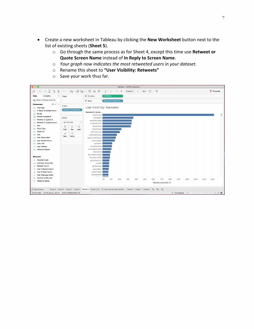
• Create a new worksheet in Tableau by clicking the New Worksheet button next to the
list of existing sheets (Sheet 5). o Go through the same process as for Sheet 4, except this time use Retweet or
Quote Screen Name instead of In Reply to Screen Name. o Your graph now indicates the most retweeted users in your dataset. o Rename this sheet to “User Visibility: Retweets” o Save your work thus far.
8
Comparing Graphs: Dashboards • To compare graphs, create a new dashboard by clicking the middle icon in the button
bar at the bottom of the Tableau window. A dashboard is a space to visualize and filter multiple graphs in one place, helping us to explore and connect ideas across different data sets.
o The dashboard editor enables you to compile multiple graphs into one visualization. First, drag the User Activity graph (Sheet 3) from “Sheets” in the left-hand column into the blank dashboard canvas.
o Now, drag each of the User Visibility sheets (Sheet 4 and then Sheet 5) next to it. As you drag, Tableau will offer various compositing options. Position the graphs next to each other in separate columns.
o Explore the similarities and differences between the two lists. o Double-click on the dashboard tab at the bottom of the Tableau window and
rename it “User Activity and Visibility.” o Save your work thus far.
9
Follower Metrics • Create a new worksheet in Tableau by clicking the New Worksheet button next to the
list of existing sheets (Sheet 6). o Drag User Screen Name onto rows (clicking Add all members if Tableau prompts
you to do so) and User Followers Count onto columns. o Sort the list in descending order by hovering your mouse over the list and
clicking the sort icon that appears. o You may have noticed we have a problem: the numbers shown in this new graph
are vastly inflated. This is because the Twitter API reports the current follower count of an account with each tweet posted from that account. By default, Tableau adds up all those values to create the graph we’re now looking at now, using the SUM function. A user with 1000 followers who has three tweets in our dataset would therefore now have a SUM(User Followers Count) value of 3000. This is useful if we want to see how the follower count has changed from one tweet to another, but here we’re only interested in seeing which of our users has the highest number of followers. For our purposes, we can use the maximum of all the follower count values the Twitter API has reported for each user. Hover your mouse over SUM(User Followers Count) in columns, click the down arrow that appears and choose Measure (Sum) > Maximum.
o Sort the list in descending order again, by hovering your mouse over the list and clicking the sort icon that appears.
o Drag Id (Count (Distinct)) onto Label in the Marks box, to show the number of counts.
o We now have a list of prominent Twitter users as measured by their number of followers, which also shows the number of tweets they have contributed to the dataset.
o Rename the sheet to “Most Followed Users.” o Save your work thus far.
10
11
• Create a new worksheet in Tableau by clicking the New Worksheet button next to the list of existing sheets (Sheet 7).
o We’ve already explored which tweets have received the greatest number of retweets. But a single tweet or retweet by a widely followed user could have more impact than a large number of retweets by many users with few followers. Let’s calculate the number of followers that each tweet potentially could have reached.
o Drag the Text dimension onto rows (clicking Add all members if Tableau asks for confirmation) and drag User Followers Count onto columns. Tableau will automatically calculate the sum of all follower count values.
o Also drag User Followers Count from the sidebar onto the Filters box, choose Sum as the filter option and select Next.
§ Adjust the minimum filter value to around 1 million. Apply. Save. o As usual, sort the list in descending order by hovering your mouse over the list
and clicking the sort icon that appears. o We have now calculated the theoretical maximum reach for each tweet, by
adding together the follower counts for each account that tweeted or retweeted the message. This is a common measure in social media marketing, but it has its flaws. It assumes that the followers of each account actually received and viewed the tweet, and that there are no overlaps between individual accounts’ follower networks. So, the maximum reach numbers we’re seeing — in our example, more than 15 million users reached by the most widely tweeted message — are very likely to be inflated. We can correct this by introducing a probability factor.
§ Hover your mouse over SUM(User Followers Count) in Columns, click the down arrow that appears and select Edit in Shelf.
§ Adjust the maximum reach value by a factor of 0.1 by typing in “*0.1”, and press Enter.
§ This assumes that only 10% of the potential audience for a tweet will actually receive it. What adjustment factors are accurate here is widely disputed, and may also depend on the context; for instance, breaking news events may attract more readers than everyday discussion, for instance. But whatever the values, the overall shape and order of the graph we’ve created remains intact and shows the tweets that are most likely to have been widely viewed.
§ Compare this list with the list of retweets you’ve created in a previous step.
o Rename this worksheet to “Tweet Reach.” o Save your work thus far.
12
13
Hashtag Trends • Create a new worksheet in Tableau by clicking the New Worksheet button next to the
list of existing sheets (Sheet 8). o Drag Hashtags onto rows (confirm to Add all members) and drag Id (Count
(Distinct)) onto columns. o You’ll now see a large Null bar at the top of your graph. Click on the bar and
Exclude it from your graph. o Sort the hashtags in descending order, by hovering your mouse pointer over the
top of the list and clicking the sort icon that appears. o We’re interested in the dynamics of these topics over time. Move Hashtag from
rows to colors. o Move CNTD(Id) from columns to rows. o Move Parsed Created At from the sidebar to columns. Hover over YEAR(Parsed
Created At), click the downward arrow and select the second Day option in the popup menu.
o Your graph will contain a large number of very minor hashtags that are rarely used. We’ll exclude them from further analysis.
§ Hover over Hashtags in the filters box, click on the downward arrow that appears and choose Edit Filter.
§ Go to the Top tab in the window that appears, select By field, and instruct Tableau to select the top 20 hashtags. Click OK to confirm the selection. Tableau remembers that we’ve already excluded the tweets containing no hashtags from our analysis, and retains that filter.
o This has significantly uncluttered our graph, and now points to the fluctuations in the use of these hashtags. Explore these developments. Select a line to use the View Data option and see if you can identify what might be driving these.
o Rename your sheet to “Hashtags Per Day.” o Save your work thus far.
14
15
Userbase Trends • Next, we want to examine the dynamics in the userbase of the dataset. You can build on
your analyses so far. Find the worksheet where you’ve analyzed retweets of users (Sheet 5, “User Visibility: Retweets”), right-click on its tab at the bottom of the Tableau window and select Duplicate (Sheet 5(2)).
o In the filters box, hover over Retweet or Quote Screen Name, click on the downward arrow and select Edit Filter.
o Again, find the Top tab and select the top 20 users. Select OK. o Move Retweet or Quote Screen Name from rows onto color. o Move CNTD(Id) to rows. o Move Parsed Created At from dimensions to columns. o Hover over YEAR(Time), click the downward arrow and select the second Day
option in the menu that appears. o Select the Area graph from the drop-down menu in the Marks box. o When you’re finished, rename worksheet to “User Visibility Per Day” o Save your work.