Tableau Public Tutorial April 2017 Get the data (URL is case sensitive): http://mjwebster.github.io/DataJ/Visualizations/MLBpayrolls2009_2016.xlsx Goal of this tutorial: Introduce very basic concepts in Tableau – bringing in data, creating bar charts and line charts, putting together a dashboard and adding basic interactivity with filters. Open up Tableau Public. When you first launch Tableau, it will ask you to either “Connect” to a data source or “Open” an existing project. If you’re new to Tableau, you won’t have any existing projects to open. For this tutorial, we’re going to connect to an Excel file, so choose “Excel” from the list on the left side of the Tableau screen. Navigate to where you saved the “MLBpayrolls2009_2016.xlsx” file and select it.
Transcript
Tableau Public Tutorial April 2017
Get the data (URL is case sensitive): http://mjwebster.github.io/DataJ/Visualizations/MLBpayrolls2009_2016.xlsx
Goal of this tutorial: Introduce very basic concepts in Tableau – bringing in data, creating bar charts and line charts, putting together a dashboard and adding basic interactivity with filters.
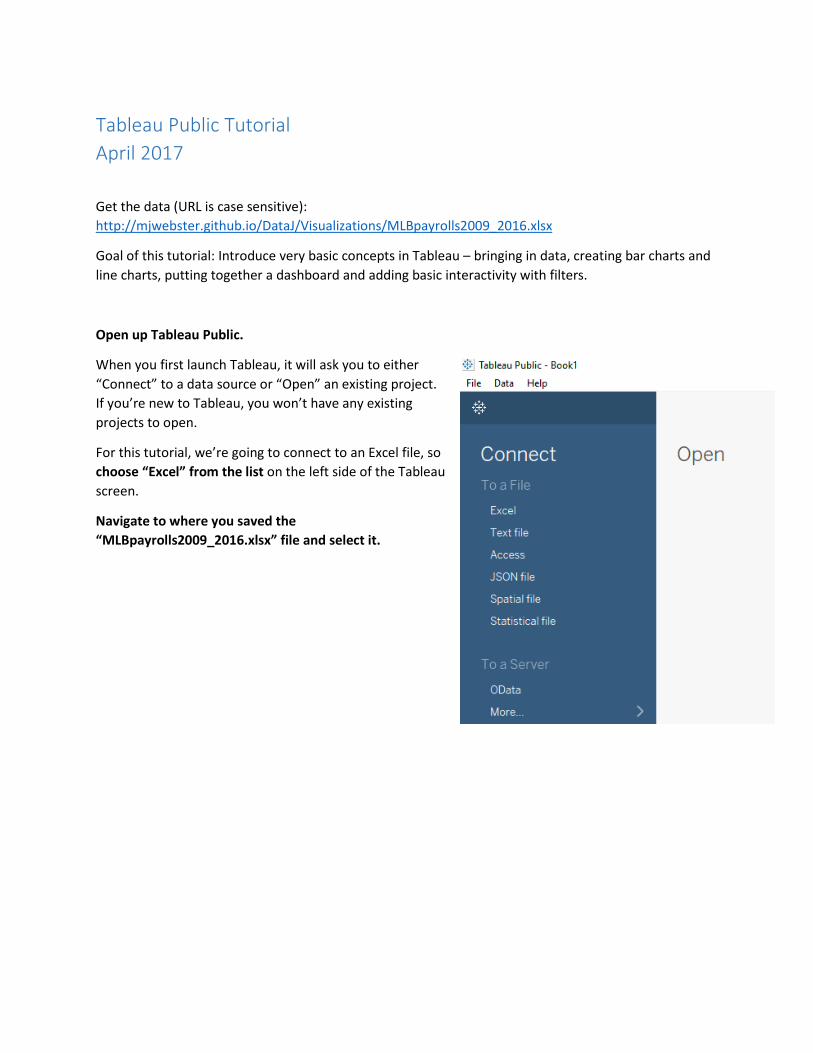
Open up Tableau Public.
When you first launch Tableau, it will ask you to either “Connect” to a data source or “Open” an existing project. If you’re new to Tableau, you won’t have any existing projects to open.
For this tutorial, we’re going to connect to an Excel file, so choose “Excel” from the list on the left side of the Tableau screen.
Navigate to where you saved the “MLBpayrolls2009_2016.xlsx” file and select it.
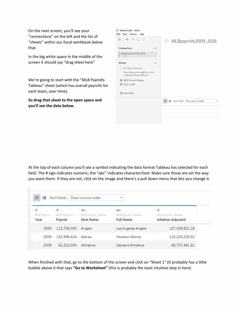
On the next screen, you’ll see your “connections” on the left and the list of “sheets” within our Excel workbook below that.
In the big white space in the middle of the screen it should say “drag sheet here”
We’re going to start with the “MLB Payrolls-Tableau” sheet (which has overall payrolls for each team, over time).
So drag that sheet to the open space and you’ll see the data below.
At the top of each column you’ll see a symbol indicating the data format Tableau has selected for each field. The # sign indicates numeric; the “abc” indicates character/text. Make sure those are set the way you want them. If they are not, click on the image and there’s a pull down menu that lets you change it.
When finished with that, go to the bottom of the screen and click on “Sheet 1” (It probably has a little bubble above it that says “Go to Worksheet” (this is probably the least intuitive step in here)
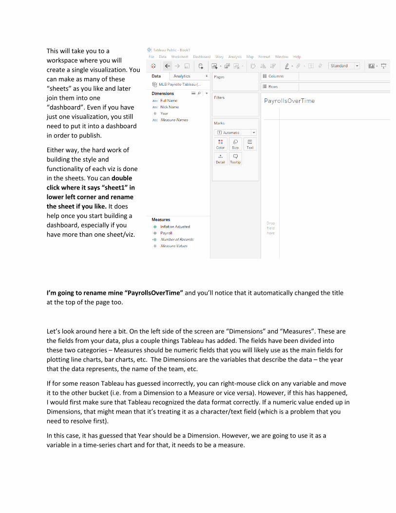
This will take you to a workspace where you will create a single visualization. You can make as many of these “sheets” as you like and later join them into one “dashboard”. Even if you have just one visualization, you still need to put it into a dashboard in order to publish.
Either way, the hard work of building the style and functionality of each viz is done in the sheets. You can double click where it says “sheet1” in lower left corner and rename the sheet if you like. It does help once you start building a dashboard, especially if you have more than one sheet/viz.
I’m going to rename mine “PayrollsOverTime” and you’ll notice that it automatically changed the title at the top of the page too.
Let’s look around here a bit. On the left side of the screen are “Dimensions” and “Measures”. These are the fields from your data, plus a couple things Tableau has added. The fields have been divided into these two categories – Measures should be numeric fields that you will likely use as the main fields for plotting line charts, bar charts, etc. The Dimensions are the variables that describe the data – the year that the data represents, the name of the team, etc.
If for some reason Tableau has guessed incorrectly, you can right-mouse click on any variable and move it to the other bucket (i.e. from a Dimension to a Measure or vice versa). However, if this has happened, I would first make sure that Tableau recognized the data format correctly. If a numeric value ended up in Dimensions, that might mean that it’s treating it as a character/text field (which is a problem that you need to resolve first).
In this case, it has guessed that Year should be a Dimension. However, we are going to use it as a variable in a time-series chart and for that, it needs to be a measure.
Drag the Year variable down to Measures. Then click on Year and choose “change data type” and then choose “number(decimal)”. I know that seems weird, but it’s the only way we can get the chart to plot correctly.
Note regarding dates: If you have a true date field (i.e. 1/1/2016), Tableau can parse it apart and display your data based on just the year or just the month or even what quarter of the year it fell in. We don’t have a date field here, so we won’t encounter that here.
In the column just to the right of the dimensions and measures, you’ll see “Pages”, “Filters” and “Marks”. And then to the right of that you have the designer field, including the “Columns” and “Rows” sections at the top. This is where we’re going to build our visualization. The pages, filters and marks areas, in particular, are where we’re going to control things like colors, sizes, what shows up in the tooltip, whether users can filter the data to change what is displayed, etc. One more useful feature is on the far right – the “Show Me” tool.
If you don’t see this on your page, go up to the upper right corner and click where it says “Show Me”
It probably is all greyed out when you first see it. But you can click on any one of the options and at the bottom it will tell you what you need “1 or more dimensions” “0 to 2 measures”, etc.
To start using the Show Me box, you have to go into Dimensions and Measures and click on at least one variable from each.
So if I select “Nick Name”, “Year” and “Inflation Adjusted” (holding control key while you go; you want them to stay highlighted in green or blue)
Then you’ll see some of the options in the Show Me box light up. Click on one that’s lit up and it will attempt to make a viz.
If you want to try something different, go to the Worksheet menu at the top of the page and choose “Clear>Sheet”
One thing that’s important to know is that Tableau will automatically assume you want to SUM your data.
Remember that this worksheet has one row for each team, each year?
Clear your worksheet and this time select “Year” from the Dimensions and then “Inflation Adjusted” from the Measures. Then click on the line chart option from Show Me box.
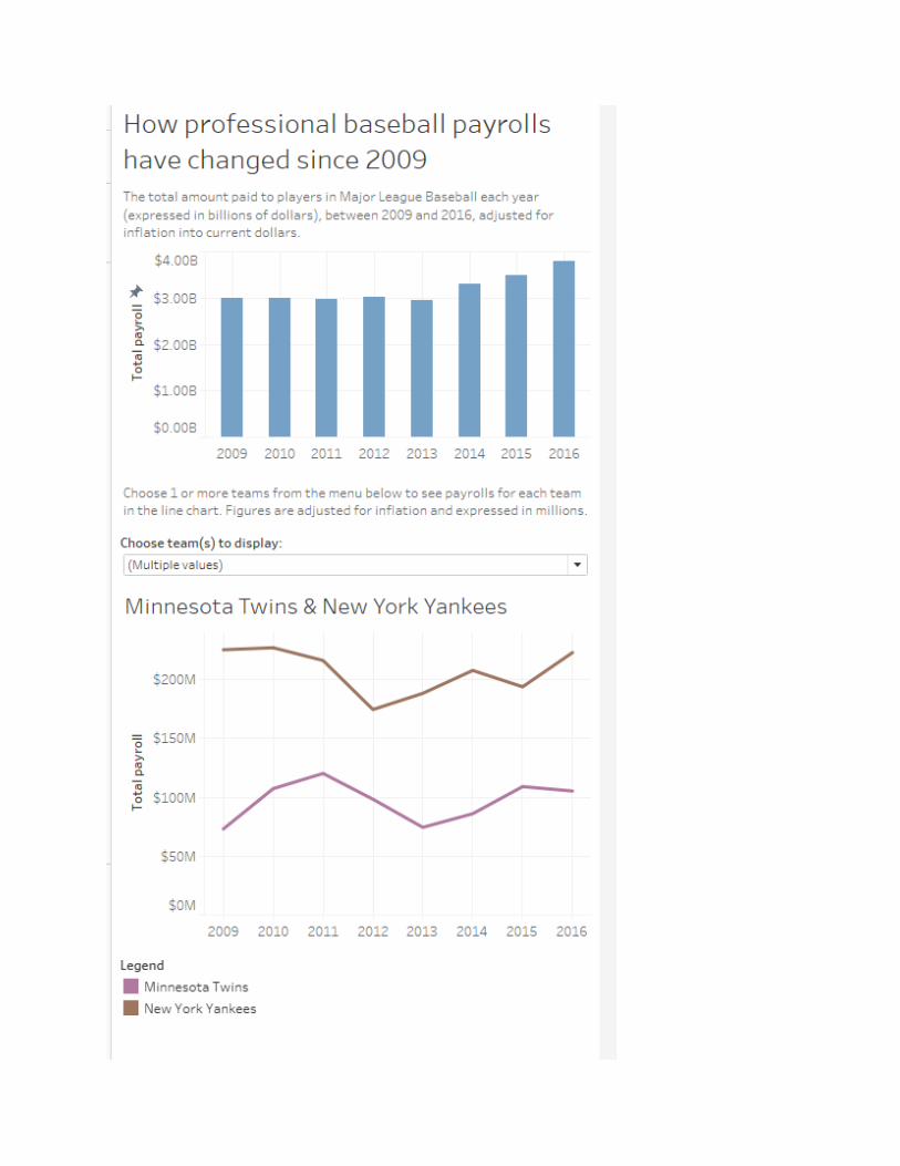
You’ll get this – it has summarized all the payrolls from each team, according to year. So this is the total amount paid in salaries across the whole MLB each year (and because we’re using the inflation adjusted figures, it’s showing the trend above and beyond the rate of inflation).
If you look on the “Marks” card, you’ll see that it shows that we’re doing a line chart. If you pull down on that menu, you can change what it’s displaying. Try choosing “bar” or “area” or “square” or any others to see the various ways that it’s depicting your data.
Then you can click on “Colors” in the Marks card and change the color of your bars or line or whatever is displayed.
The size tool in the Marks card allows you to make the bars or line bigger or smaller.
Label tool in the Marks card allows you to put labels on, including adjusting where it goes.
The Tooltip button allows you to customize what shows up when the user hovers over a bar or a point. Click on the Tooltip button and this edit tooltip window comes up:
Anything that is inside <> symbols is a field from your data. You can add additional fields from your data using the Insert pull-down menu in upper right corner. Notice that I have a label “Total Payroll:” in front of the amount, but I’ve deleted the label that was in front of year. Then I added a little footnote to say this was adjusted for inflation.
Using the buttons at the top of the edit tooltip window you can do all kinds of things including changing the font, size and color of the text.
Click OK and go back to the viz. Hover over one of the bars and you’ll see the tooltip you just made. Ugh, look at the number. It doesn’t have dollars signs!
To fix that, we need to go to the Measures section and right-mouse click on “Inflation Adjusted”
Go to Default Properties >>> Number Format
This will bring up a menu where you can set the format to Currency. If you choose “Currency (custom)” you can eliminate decimal places.
Now when you go back to your viz, you’ll see that not only the tooltips now have dollars signs, but so does the vertical axis.
Let’s look at the axis labeling next. You’ll see that going up the vertical axis, it has “Inflation Adjusted” along the side. Double-click on that and it will allow you to edit it in the spot called “Title”. The edit axis box that comes up has lots of other options too.
Do the same for the horizontal axis, if necessary. In this case, we have the word “Year” as our label. That’s pretty straightforward, so we’ll just leave it.
If we don’t want our visualization to be interactive, then the only thing we have left to do here is to change the title. Right now it says “PayrollsOverTime” which is the name of our sheet. If you double-click on it, you can edit the title.
You’ll see it’s just automatically putting the Sheet Name in there.
You can delete that and type of a fixed headline – for now, we’ll just say “MLB Payrolls 2009 to 2016”
Later in this tutorial, we’re going to make this viz interactive (letting users switch from team to team) and we’ll set the title to the name of the team, so that the title changes each time the user switches to a different team.
So now that our basic visualization is done, let’s put it in a dashboard and get it ready to publish.
Go to the Dashboard menu and choose “New Dashboard” (alternatively, there are buttons at the bottom left that let you add a dashboard). You’ll get something like this:
Notice that it’s showing your sheet “PayrollsOverTime” in the left column.
Just above that is where you can set the size of your dashboard (this is how big it will appear on your website). It’s a good idea to find out the best width for your website.
At the bottom of the left column you’ll see “Objects” that you can add to your dashboard. We’ll use a few of those.
Notice that it says “Tiled” or “Floating”. Tiled means that if you put one of those objects in your dashboard, it will fit all the elements together like a puzzle. Floating means you could have that element sit on top of another element.
To start, drag your sheet over to the white space where it says “drop sheets here”
Notice that it takes up the entire dashboard and looks pretty funny. We can add some other elements – like title and chatter – and then also reduce the size of the dashboard to make it look better.
To add a title, click on “Show dashboard title” in the Objects section. I’m going to change my title to “How professional baseball payrolls have grown.”
Now we’ve got a dashboard headline butting up against our sheet title. Looks kind of funny. A couple ways you could handle this. One would be to put chatter text between the two headlines; you could leave the sheet headline (maybe make it a little smaller). Or you could delete the sheet headline altogether.
To delete it, right-mouse click on “MLB Payrolls 2009-2016” and choose “Hide title”
To make it smaller, right-mouse click on it and choose “Edit Title”
Let’s put some chatter in our dashboard. Drag Text from the Objects box and drop it between your dashboard headline and your viz. It will then give you a chance to edit it. Type up some chatter.
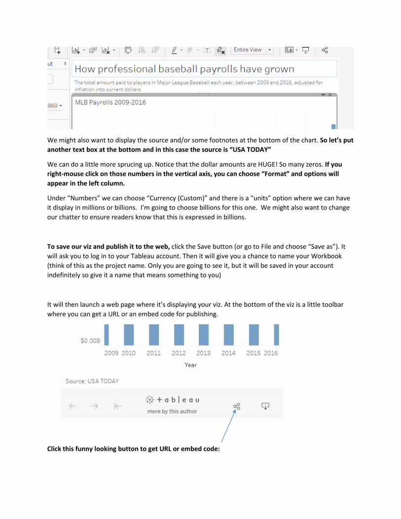
We might also want to display the source and/or some footnotes at the bottom of the chart. So let’s put another text box at the bottom and in this case the source is “USA TODAY”
We can do a little more sprucing up. Notice that the dollar amounts are HUGE! So many zeros. If you right-mouse click on those numbers in the vertical axis, you can choose “Format” and options will appear in the left column.
Under “Numbers” we can choose “Currency (Custom)” and there is a “units” option where we can have it display in millions or billions. I’m going to choose billions for this one. We might also want to change our chatter to ensure readers know that this is expressed in billions.
To save our viz and publish it to the web, click the Save button (or go to File and choose “Save as”). It will ask you to log in to your Tableau account. Then it will give you a chance to name your Workbook (think of this as the project name. Only you are going to see it, but it will be saved in your account indefinitely so give it a name that means something to you)
It will then launch a web page where it’s displaying your viz. At the bottom of the viz is a little toolbar where you can get a URL or an embed code for publishing.
Click this funny looking button to get URL or embed code:
Adding interactivity:
Let’s go back and revise our dataviz to make it more interactive and robust. The ultimate goal will be to add an element to the bottom of our dashboard with a viz that lets users switch between teams and see how each team’s payroll has changed over time.
To do that, we need to start by making a new SHEET. You can do that with the buttons at the bottom of the page or in the Worksheet menu, choose “new worksheet”
Give this sheet a name – double click on “sheet 2” (at the bottom of the page) and call this “Teams”
You’ll see that it has automatically guessed that we want to use the same data. If you want to use different data, you can click on the data source (in upper left corner where it says “MLB Payrolls-Tableau) and it will take you back to the start page where you can Add a connection.
For this, we’re going to stick with the same data. We’ll build it fairly similar to the previous one, but perhaps this time instead of bars, we could use a line chart to make it visually different than the other viz on our dashboard.
So start by repeating the steps we did above, except this time select the “Full Name” of the team, the “Year” and the “Inflation Adjusted” fields – and set it up as a line chart.
You’ll see that when it first comes up it has probably given each team its own area. It’s pretty ugly.
If we want all the teams on the same chart, drag the “full name” out of the Rows box at the top and drop it on top of the Detail button in the Marks box. Then also drop the name of the team on top of the Color button in the Marks box and all the lines will go to a distinct color. Of course, we’ve got way too many teams here for this to work. It’s such a jumble to look at.
Instead, let’s filter our viz so that it only shows one team at a time.
To do that, drag the Full Name into the Filters Box (just above the Marks box). It will pop up a little box where all the teams are listed and there’s a check box in front of each one. Here you can choose to permanently eliminate data from your viz, but we don’t want to do that. So leave all of them checked. Click OK.
Then go back to the Filters box and click on “Full Name” – it will bring up a little menu. Choose the option that says “Show Filter”
It will put a list of the teams on the right side of the screen.
There’s a little pull-down menu in the upper right corner of that new list where you can change what this filter looks like for your readers. Right now it’s showing “Multiple values (list)”. This allows users to pick multiple teams and have them display at the same time. Try it out by unchecking All and then checking two or three teams.
If you want your readers to be able to do this --- essentially compare teams – you can keep this option. Or because this list of teams is so long, you can choose “Multiple values (dropdown)” to make a more compact filter. (Keep in mind this is going to show up on your dashboard – so this is what it will look like)
Also from that same pull-down menu you can “edit title” (I’m changing mine to “Choose team(s) to display:”)
Notice that right below your filter, you should also have a legend. It probably says “Full Name” as the title. You can click the pull-down menu on there to edit that title. I changed mine to just “Legend”
Whatever you have selected in that filter is what will be the default display on your viz when readers first find it. So for mine, I’m selecting the Minnesota Twins (our home team) as the only team displayed.
Be sure to edit your tooltips, axis titles, color of the lines, etc. like we did in the first viz.
For the title of the viz, though, let’s have it display the team name(s) of whatever teams the user has selected. It will show the first three or maybe four and then say “1 more” or “2 more”, etc. if the user has selected too many to display all.
Click on the title to edit it. In the Edit Title box, delete the sheet name and go to the Insert menu and choose “Full Name” from the very bottom of the list (note: there is a “full name” option right above that which is actually a Tableau default that puts your computer user name in there; just a coincidence that I named the team name field “Full Name – and probably was a bad idea on my part). You can edit the font, size, color, etc. of the title if you like. When finished hit ok. Then try it out by adding a few more teams to the viz.
When you’re happy with this viz, let’s go back to the Dashboard.
To put more stuff in our dashboard, we probably want to make it a little bigger first. Click on Size in the left column and make the maximum height 960 pixels. We’ll tweak it as we go.
Then drag the “Teams” worksheet so that it falls below your existing viz.
It’ll look something like this – Note that it put the filter and legend into a column on the right side.
If you click on the filter, you’ll see that it’s an object that is movable. Same with the legend. However, they are contained within a Vertical box (that’s the things called “Horizontal” and “Vertical” in the Objects list). You can also move the whole container.
One of the challenges is that you need space for your legend to grow bigger as you add more teams to the bottom dataviz.
Another challenge is that right now the filter is way up at the top – far away from the viz that it actually controls. That will make it harder for the user to understand what to do.
There are probably a bunch of ways to do this. One thought I have is to put the filter between the two dataviz and put the legend below the bottom viz.
To do that, we need to move the container so that it is between the two viz. Then create new Vertical container below the bottom viz (but above the source text box)
You may need to make both the minimum and maximum height settings larger to accommodate everything. And then you can drag the bottom of each object up to make it smaller.
I also put some chatter between the two viz to give readers guidance about what to do with the second chart.
And then you might want to revisit your axis labels. For example I noticed that having the “Year” label at the bottom of each chart took up a lot of space and didn’t seem necessary. Also the vertical axis had “Total payroll (inflation adjusted)” and it no longer fit. So I deleted the “inflation adjusted” part – that information is in the chatter.
I also left some extra space at the bottom for the legend to get bigger as readers add more teams.
That just scratches the surface of what you can do in Tableau. You can find lots more tutorials, tipsheets and other helpful information on Tableau’s website.
Free Training videos: https://www.tableau.com/learn/training