6
In what ways does your media product use, develop or challenge forms and conventions of real media products?
| Date post: | 15-Aug-2015 |
| Category: |
Education |
| Upload: | tahmidur98 |
| View: | 61 times |
| Download: | 0 times |
In what ways does your media product use, develop or challenge
forms and conventions of real media products?
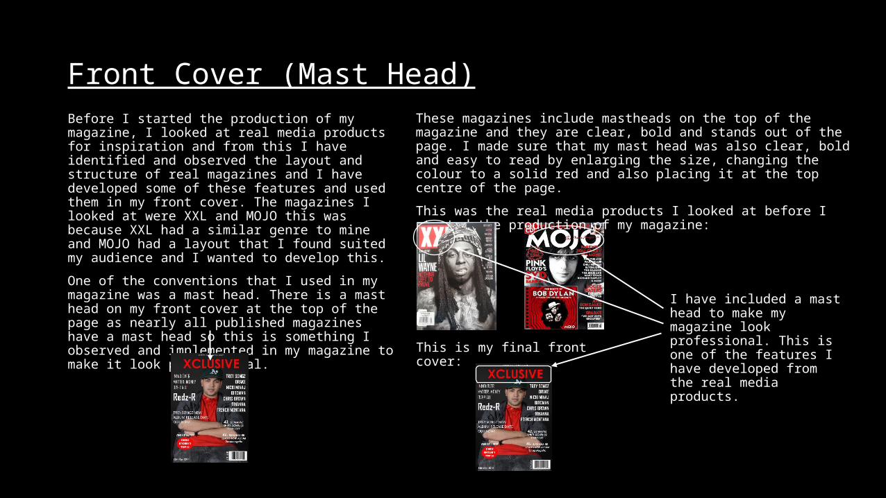
Front Cover (Mast Head)Before I started the production of my magazine, I looked at real media products for inspiration and from this I have identified and observed the layout and structure of real magazines and I have developed some of these features and used them in my front cover. The magazines I looked at were XXL and MOJO this was because XXL had a similar genre to mine and MOJO had a layout that I found suited my audience and I wanted to develop this.
One of the conventions that I used in my magazine was a mast head. There is a mast head on my front cover at the top of the page as nearly all published magazines have a mast head so this is something I observed and implemented in my magazine to make it look professional.
These magazines include mastheads on the top of the magazine and they are clear, bold and stands out of the page. I made sure that my mast head was also clear, bold and easy to read by enlarging the size, changing the colour to a solid red and also placing it at the top centre of the page.
This was the real media products I looked at before I started the production of my magazine:
This is my final front cover:
I have included a mast head to make my magazine look professional. This is one of the features I have developed from the real media products.

Front Cover (Strap Lines)Another convention I have included on my magazine that was inspired by real media products is the strap lines. I have included many cover lines to give the reader a little teaser of what is inside the magazine. This is another convention that I have decided to include in my magazine.
The strap lines on my real media products is spread out across the front page as shown below:
I have developed this feature and I have positioned my strap lines all over the cover page to make it look interesting and professional:
The strap lines are little teasers of what is inside the magazine to get the reader interested in my magazine and also to promote artists and other contents within the magazine.
This feature is one of the many features I have used in my product that was inspired by real media products that was developed and improved to make my product comparable to the published/real magazines.
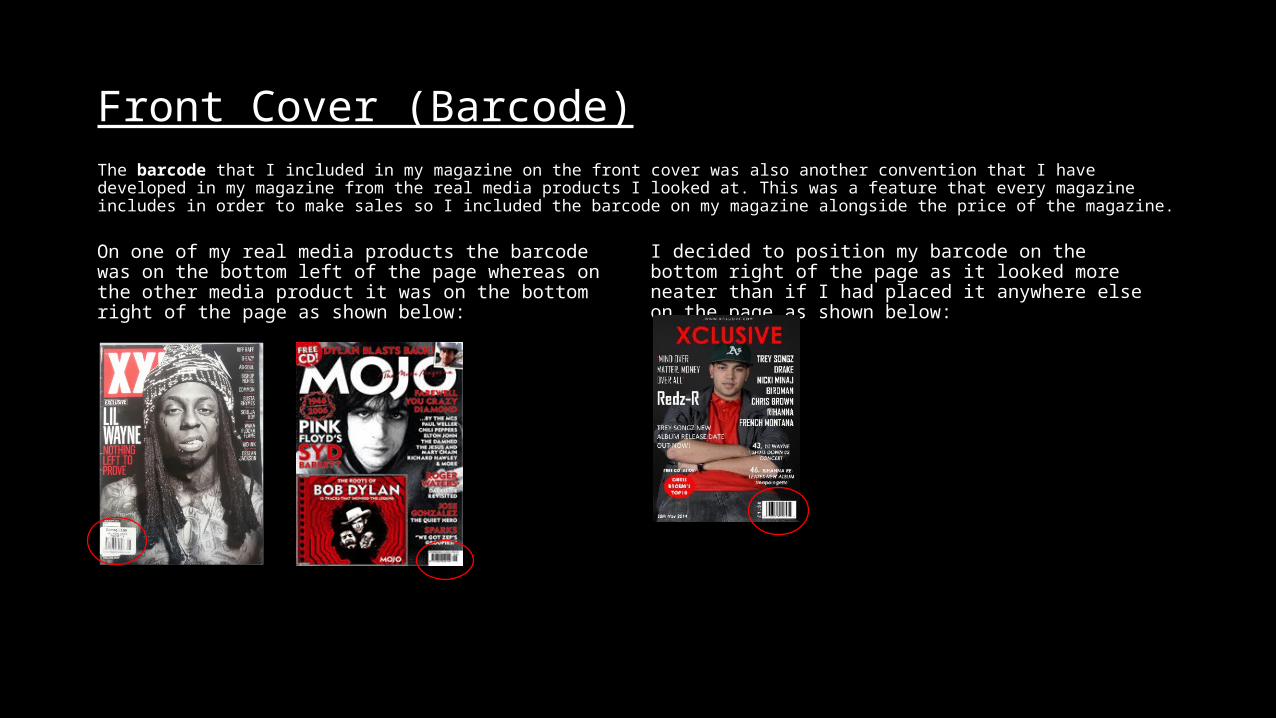
Front Cover (Barcode)The barcode that I included in my magazine on the front cover was also another convention that I have developed in my magazine from the real media products I looked at. This was a feature that every magazine includes in order to make sales so I included the barcode on my magazine alongside the price of the magazine.
On one of my real media products the barcode was on the bottom left of the page whereas on the other media product it was on the bottom right of the page as shown below:
I decided to position my barcode on the bottom right of the page as it looked more neater than if I had placed it anywhere else on the page as shown below:
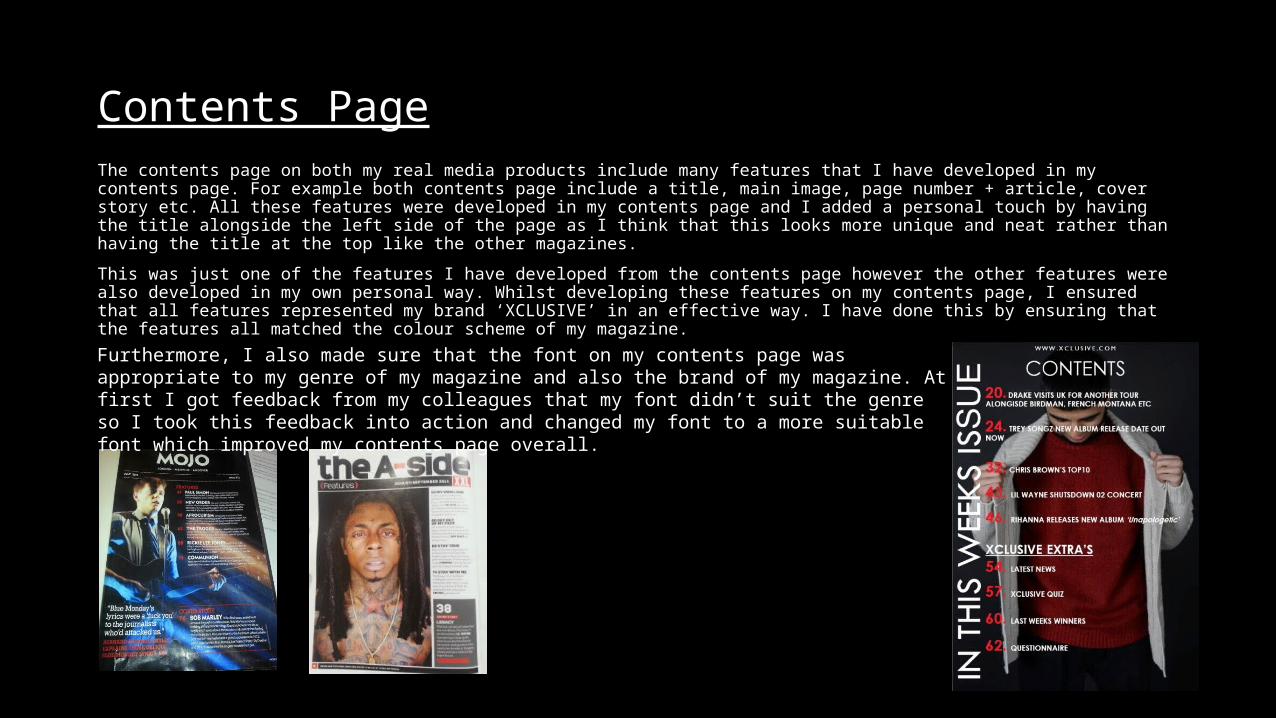
Contents PageThe contents page on both my real media products include many features that I have developed in my contents page. For example both contents page include a title, main image, page number + article, cover story etc. All these features were developed in my contents page and I added a personal touch by having the title alongside the left side of the page as I think that this looks more unique and neat rather than having the title at the top like the other magazines.
This was just one of the features I have developed from the contents page however the other features were also developed in my own personal way. Whilst developing these features on my contents page, I ensured that all features represented my brand ‘XCLUSIVE’ in an effective way. I have done this by ensuring that the features all matched the colour scheme of my magazine.
Furthermore, I also made sure that the font on my contents page was appropriate to my genre of my magazine and also the brand of my magazine. At first I got feedback from my colleagues that my font didn’t suit the genre so I took this feedback into action and changed my font to a more suitable font which improved my contents page overall.
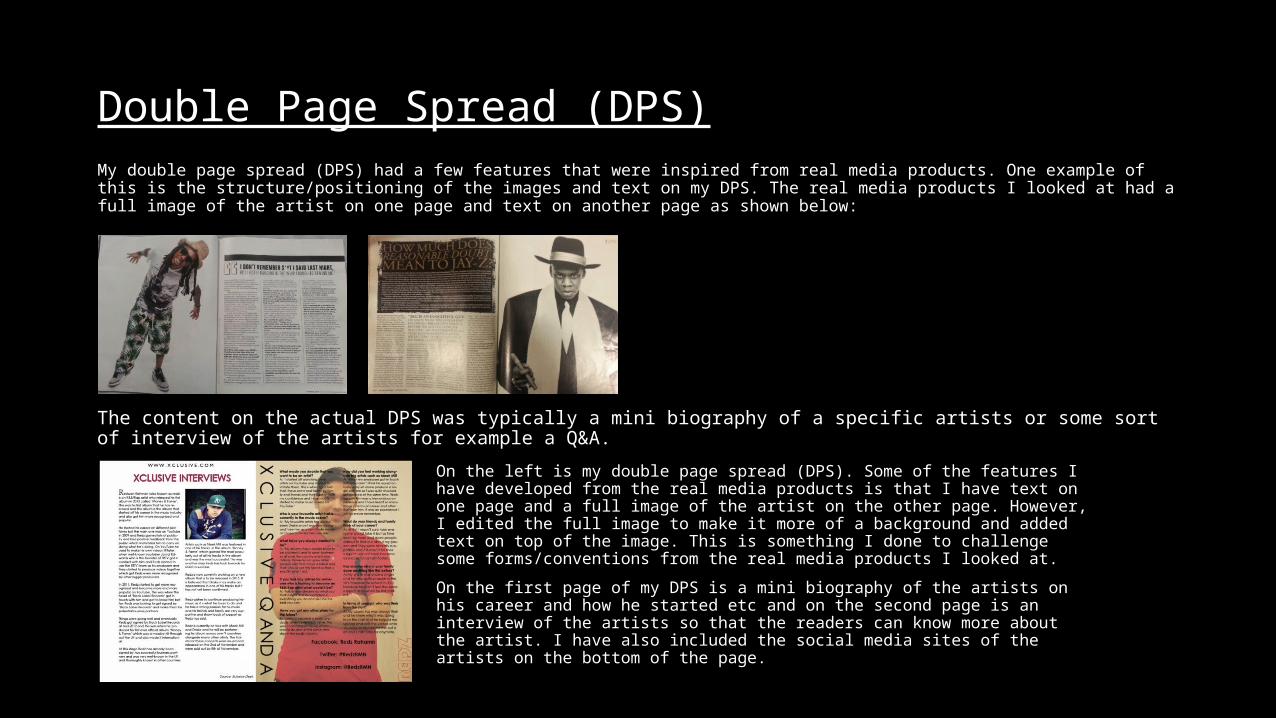
Double Page Spread (DPS)My double page spread (DPS) had a few features that were inspired from real media products. One example of this is the structure/positioning of the images and text on my DPS. The real media products I looked at had a full image of the artist on one page and text on another page as shown below:
The content on the actual DPS was typically a mini biography of a specific artists or some sort of interview of the artists for example a Q&A.
On the left is my double page spread (DPS). Some of the features I have developed from the real media products is that I have text on one page and a full image of the artist on the other page. However, I edited the full image to make it more of a background and added text on top of the image. This is something I done to challenge some forms/conventions from the real media products I looked at.
On the first page of my DPS is a mini biography of the artists on his career and how he started etc and on the second page is an interview of the artists so that the readers can know more about the artist. I have also included the social media sites of the artists on the bottom of the page.


