19
Membership Form Richard Burn
| Date post: | 17-Jul-2015 |
| Category: |
Education |
| Upload: | richardburnn |
| View: | 128 times |
| Download: | 0 times |

Membership FormRichard Burn

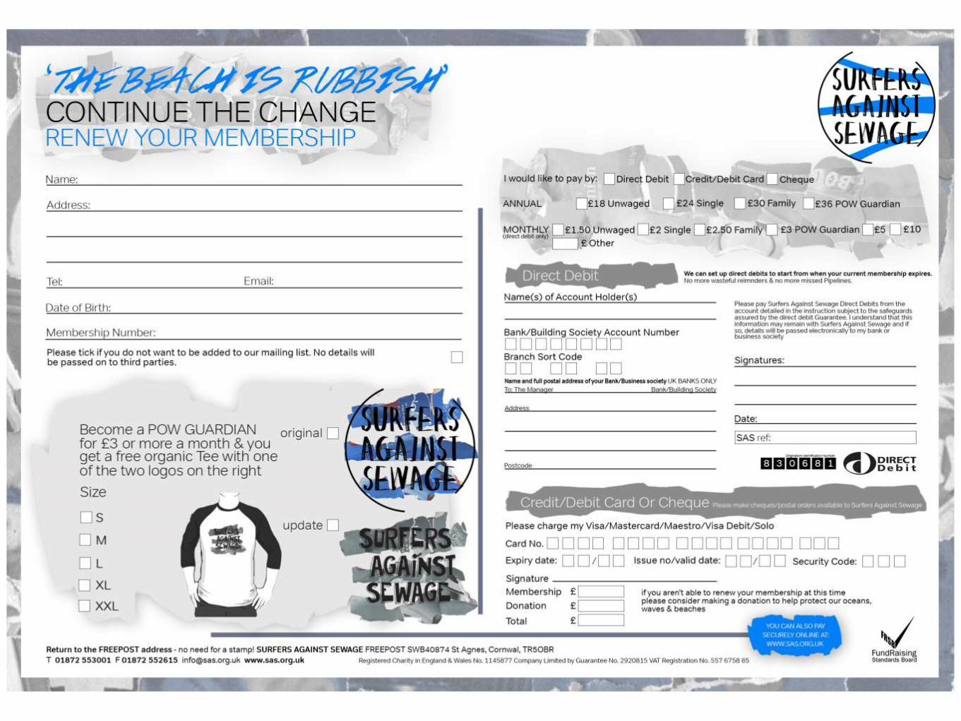
Ideas• I want the membership form to fit in with this whole campaign I have done with the poster & merchandise so I
am following the same elements that can be found on them
• The SAS membership forms work perfectly well and allow all the relevant information to be found very easily so
I am going to follow a similar design to what theres looks like on the back as I need to make sure I feature all
the relevant information like the direct debit logo, SAS logo & all the relevant banking information that needs to
be 100% correct.
• I want to produce two separate membership forms, one for membership & one for re-membership. These will
both look very similar but may feature different words. The current re-membership form my SAS is very simple
A5 landscape page and works very well. For the new membership form I may open this up more and have two
pages dedicated to what SAS are.

To save money, most of the elements on the membership will
be black and white with blue elements seen throughout. I also
want to use black and white surfing imagery somewhere as I
haven’t at this moment in time. The blue rubbish collage will
again be used with some possible black and white elements
used for that.
The fonts I am going to use are Tondo and
Hapole Markerpen, which is the same font I have
used throughout the whole of my work as it is
important to stick to a coherent theme throughout
that all look similar to one another. I’ve also used
a simple font next to a not so simple one as they
work very well together & don’t clash
On the next slides you will find flat plans of what
the layouts could look like and feature these
separate elements.

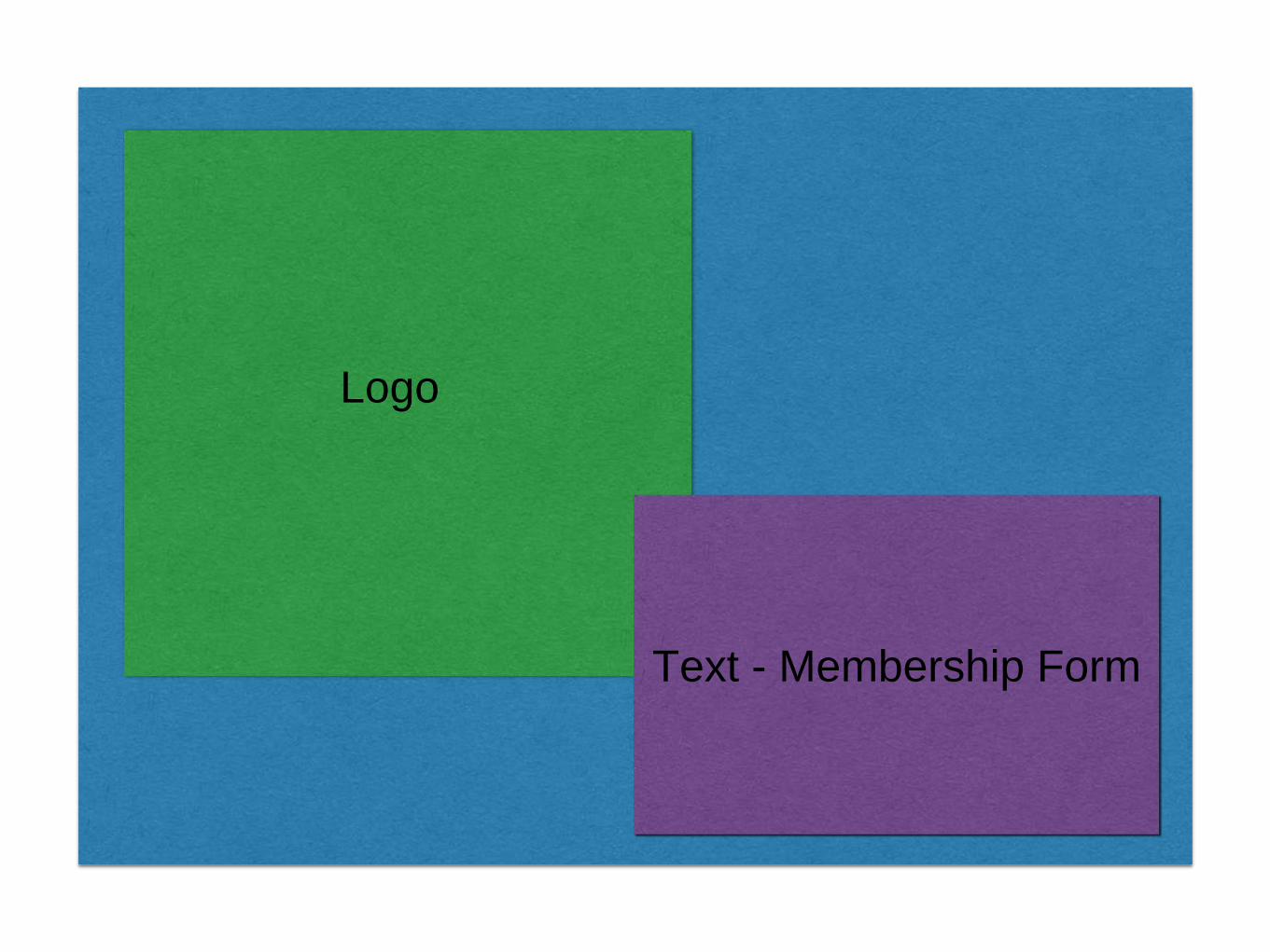
Logo
Text - Membership FormText - Card Details
Text - Name &
Address Details
Text - Introduction

Logo
Text - Membership Form
Text - Card Details
Text - Name &
Address Details
Text - Introduction
Text - Thank you
Logo
Text - Membership Form

LogoText - Title of
Membership card
Text - Name &
Address
Text - Merch
Text - Card Details

Logo Text - Membership Form
Text -introduction

Image - surfing images
Text - facts
Logo

Image - surfing images
Text -why, how, when, what & who SAS are
Basically explaining everything

LogoText - Title of
Membership card
Text - Name &
AddressText - Card Details

Logo
Text - Membership Form
Text - Card
Details
Text - Name
&
Address
Details
Text - Introduction