12
SAS Research Richard Burn
| Date post: | 17-Jul-2015 |
| Category: |
Education |
| Upload: | richardburnn |
| View: | 341 times |
| Download: | 3 times |

SAS ResearchRichard Burn
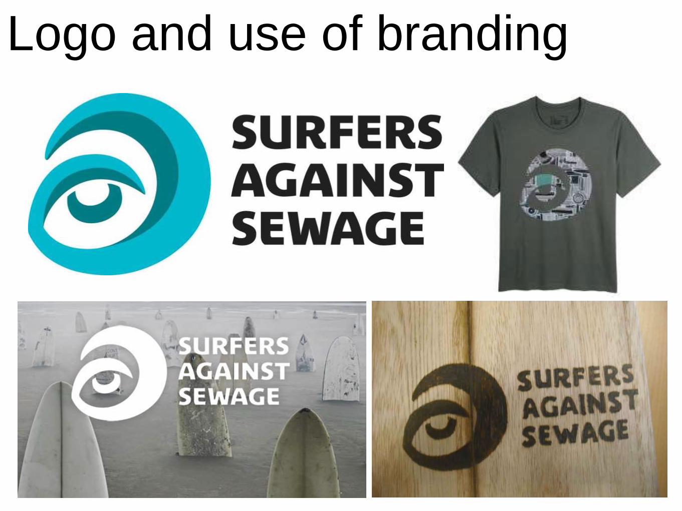
Logo and use of branding

Logo and use of brandingThe SAS have a very strong logo that is used on most of their products. You can see one example that shows the logo clearly on a t-
shirt (which is part of their merchandising - one way they also make money). This use of the logo spreads the word about the
charity/social action campaign, as people that see someone wearing this t-shirt may ask them where they got it from or say that it
looks interesting. A strong logo that is distinctive from others is important when you are branding something: e,g, a social action
campaign. All of this works tougher to create a strong brand. Their original logo consists of a curved shape, that could be liked to a
backwards capital G. You can assume this is meant to look like a wave, which links strongly with what the SAS are all about. The logo
also has a shape in the centre, liken it to a upside down C, which makes this aspect of the logo look like an eye. This could of been
used to promote that the company is vigilant with what they do, which is to clear sewage from beaches. The shape was obviously used
as that is what surfers use to surf. It is clear that they wanted this theme to run in their logo & an aspect like this could be used in the
logo I will produce. The fact the logo links strongly with what the company is fighting to stay clean, or as an objective, again creates a
strong branding for the soil action campaign as, like mentioned before, the logo is distinctive for the company. The colour blue was an
obvious choice to use for something sea-related. They used to different tones: a lighter blue & a darker blue that have slight green
tones to them. Two tones make the logo catch the eye more. Although this is their traditional coloured logo, they also have different
variations of them, which use just one solid colour or design, but because the shape of the graphic itself (also by using SAS alongside
it) allow the consumer to still know who the product was produced by just with a simple glance.
Other social action campaigners, like SAS, take advantage of a strong logo. For example the WWF has a very basic yet incredibly
effective logo that most consumers will recognise for their company. Like with SAS, WWF feature a graphic as part of their logo that is
linked strongly to what the company does. In this case it is a World Wide Fund for Nature. The black & white logo works very well as
the colours are the perfect contrast, plus ver simple, with one another. The logo will be used on most, if not all, of their products, which
creates a very strong brand for the company.
With the SAS, they usually use the name of the social action campaign (Surfers Against Sewage) next to their logo. Although I believe
this can be useful to include, If I was to produce a logo for them, I wouldn’t include the name next to the logo as the logo should be
strong by itself. Their branding needs to be stronger if they feel the need to include the name right next to the logo. With their posters &
leaflets they produce, they could instead include the name written somewhere else within it, allowing then the logo to speak for itself
(like on the t-shirt on the previous slide).
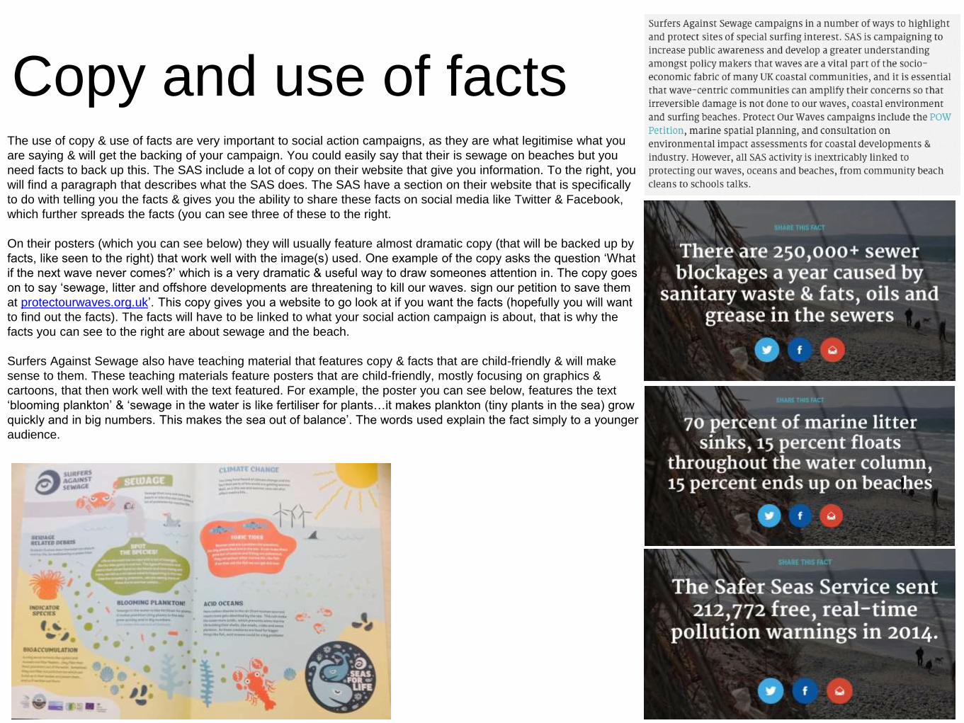
Copy and use of factsThe use of copy & use of facts are very important to social action campaigns, as they are what legitimise what you
are saying & will get the backing of your campaign. You could easily say that their is sewage on beaches but you
need facts to back up this. The SAS include a lot of copy on their website that give you information. To the right, you
will find a paragraph that describes what the SAS does. The SAS have a section on their website that is specifically
to do with telling you the facts & gives you the ability to share these facts on social media like Twitter & Facebook,
which further spreads the facts (you can see three of these to the right.
On their posters (which you can see below) they will usually feature almost dramatic copy (that will be backed up by
facts, like seen to the right) that work well with the image(s) used. One example of the copy asks the question ‘What
if the next wave never comes?’ which is a very dramatic & useful way to draw someones attention in. The copy goes
on to say ‘sewage, litter and offshore developments are threatening to kill our waves. sign our petition to save them
at protectourwaves.org.uk’. This copy gives you a website to go look at if you want the facts (hopefully you will want
to find out the facts). The facts will have to be linked to what your social action campaign is about, that is why the
facts you can see to the right are about sewage and the beach.
Surfers Against Sewage also have teaching material that features copy & facts that are child-friendly & will make
sense to them. These teaching materials feature posters that are child-friendly, mostly focusing on graphics &
cartoons, that then work well with the text featured. For example, the poster you can see below, features the text
‘blooming plankton’ & ‘sewage in the water is like fertiliser for plants…it makes plankton (tiny plants in the sea) grow
quickly and in big numbers. This makes the sea out of balance’. The words used explain the fact simply to a younger
audience.

Imagery (positive, negative, aspirational,
emotive, photographs, illustration)
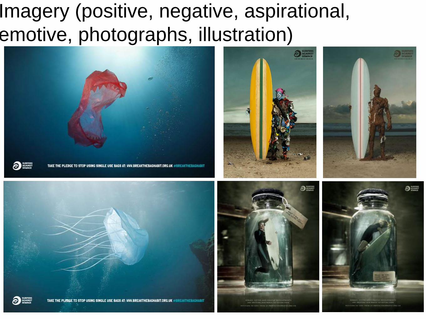
Imagery (positive, negative, aspirational,
emotive, photographs, illustration)

Imagery (positive, negative, aspirational,
emotive, photographs, illustration)
Imagery (positive, negative, aspirational,
emotive, photographs, illustration)
The imagery used is very important. The main way SAS use imagery is in their posters. Imagery can also be
found on their website, although the image used on the website are the same. For most of their posters, they
will use photography in the images that usually have been edited in post-production using software like
Photoshop. An example of this is the top right image. This shows part of the equipment used in surfing & the
way the image is set up, it almost looks like a nose (which is most commonly accosted with suicide). This is
very emotive as suicide is a very emotional subject matter & using it in this campaign poster effectively shows
how we are killing the environment ourselves (reference to suicide again). The way the photograph has been
edited to look very grey & dark, like a very gloomy day at the beach, links with the negatives of sewage in the
sea.
The next image looks like, at first glance, a plastic bag floating in the sea. Once you look closer, you can see
that the bag have teeth on them, made to replicate a sea life animal (like a shark). It is meant to show how
damaging & killing a plastic bag can be to sea life animals. This is for a specific campaign SAS had that also
included the hashtag #breakthebaghabit. The image clearly shows how negative the plastic bags are as they
have made a comparison between between sharks & plastic bags, as most people are afraid of sharks & they
are usually classed as the most dangerous animal in the sea.
The next image is a logo/sticker graphic that is very child friendly & works well for that audience. The whales
link well with the SAS campaign. It is also useful to have this graphic available for a younger audience as they
may be prompted to use the sticker, thus promoting the campaign more. The cartoon graphics and blue tones,
which connote the sea and water, work well together. The contrast between the imagery when something is
targeted towards a younger audience & an older audience are very different, but overall work effectively to gain
each audiences attention for the reasons mentioned above.
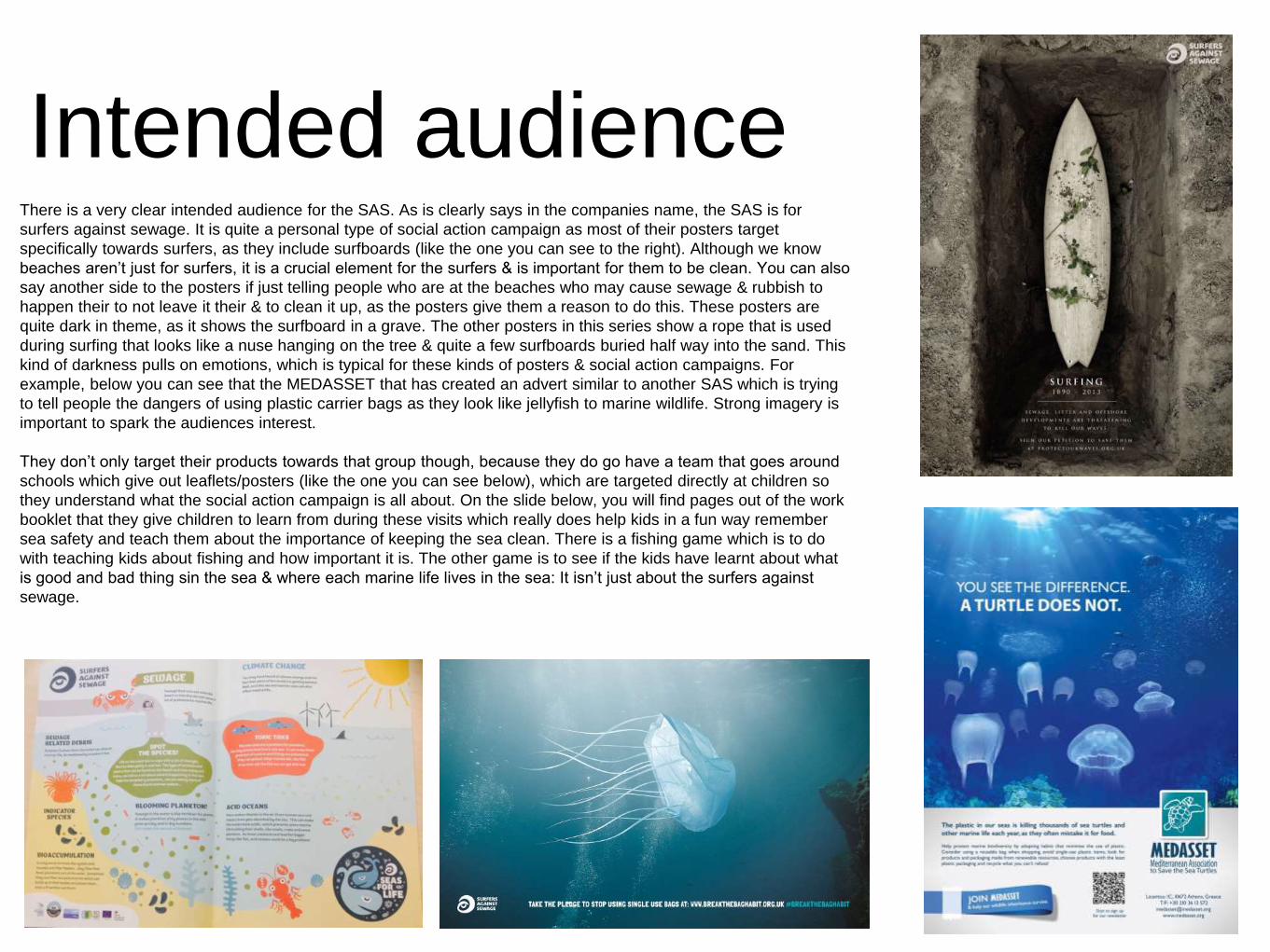
Intended audienceThere is a very clear intended audience for the SAS. As is clearly says in the companies name, the SAS is for
surfers against sewage. It is quite a personal type of social action campaign as most of their posters target
specifically towards surfers, as they include surfboards (like the one you can see to the right). Although we know
beaches aren’t just for surfers, it is a crucial element for the surfers & is important for them to be clean. You can also
say another side to the posters if just telling people who are at the beaches who may cause sewage & rubbish to
happen their to not leave it their & to clean it up, as the posters give them a reason to do this. These posters are
quite dark in theme, as it shows the surfboard in a grave. The other posters in this series show a rope that is used
during surfing that looks like a nuse hanging on the tree & quite a few surfboards buried half way into the sand. This
kind of darkness pulls on emotions, which is typical for these kinds of posters & social action campaigns. For
example, below you can see that the MEDASSET that has created an advert similar to another SAS which is trying
to tell people the dangers of using plastic carrier bags as they look like jellyfish to marine wildlife. Strong imagery is
important to spark the audiences interest.
They don’t only target their products towards that group though, because they do go have a team that goes around
schools which give out leaflets/posters (like the one you can see below), which are targeted directly at children so
they understand what the social action campaign is all about. On the slide below, you will find pages out of the work
booklet that they give children to learn from during these visits which really does help kids in a fun way remember
sea safety and teach them about the importance of keeping the sea clean. There is a fishing game which is to do
with teaching kids about fishing and how important it is. The other game is to see if the kids have learnt about what
is good and bad thing sin the sea & where each marine life lives in the sea: It isn’t just about the surfers against
sewage.

Intended audience

Purpose (raising awareness, generating
money, education, promoting and event)
The purpose of all of these posters, merchandise & teaching leaflets/posters for children are aimed at raising awareness,
educating & promoting the social action campaign overall. The posters promote & raise awareness to the campaign,
which in a way is also education. This is all done to generate the money needs for the campaign to actually make the
difference they want to make, You will find that most social action campaigns will do things like what you have seen on
previous slides.
Education is a big part of teaching children about the sea & that it needs to be looked after. SAS have a purpose to
educate these kids from a young age on the topics they cover so that they grow up having an understanding and respect
for the sea.

Font, colour scheme, layout, tone
This is another poster created by the SAS to campaign against the sewage found on the beaches. The photograph shows mess and rubbish in human-form holding up
the surf board: I believe this is to depict how the rubbish had so much control over the surfing and the waves. The catch phrase on the poster is ‘stop this mess at
sas.org.uk’ which really works well with the image as the rubbish can be very easily described as mess. The copy used for this part of the poster is in capitals which
gives the slogan more impact, the font also extenuates this as it is bold and slightly longer than your usual font. Although the text is small, the poster itself makes you
want to find out more so you would be more likely to look further into the image & find out about the website. There isn’t a particular colour scheme to be found on this
poster, although their is a slight cool tone the whole image we can make it look more icy & chilling, which is important for a social action campaign to pull on these
factors because you need to gain an emotion from the audience, The layout is very simple as the main focus is on the image. In the image you can see the surfboard
and the human made of rubbish directly in the middle. The sand takes up the bottom third of the image, see and sky the other two (landscape) The writing is in the
right-hand third & the surfboard & rubbish man in the middle third. Rule-of-Thirds has been used.
This is a sticker and the logo for the children's education packs. As you can see, it is very
clearly targeted at a different audience than the poster to the left. The same font has been used
as the logo of the campaign, which creates a coherent piece of work. The colour scheme is
very much centred around mostly blues & greens, which are the two colours most associated
with the sea. The different blue & green tones work with one another well & allow different
sections to have attention drawn to them. The layout all fits into a circle which works nicely as a
logo & sticker. The eye/wave logo along with the copy ‘SEAS FOR LIFE’ are to the right of
sicker, next to this you will see two whales (one larger & two different blue tones). Both of these
elements take up the most space on the sticker. In the background you can see several
different shapes of various sea-life like plankton. in the left top hand corner it says ‘Surfers
against sewage’, which is the campaigns name. The tone overall is quite childish & draws the
attention of a child.


