Microsoft Excel doesn’t offer a built-in waterfall chart, but a few extra columns of formulas added to your data can easily produce a cash flow waterfall chart. In a waterfall chart, the column begins with the previous month’s balance and travels up for positive amounts or down for neg- ative amounts (see Figure 1). To create the chart, you will add sev- eral quick columns to the original data set shown in Figure 1. First, add a bal- ance column. Though this isn’t absolute- ly necessary, it makes the remaining formulas much easier. For 10 years, I built waterfall charts without this extra column and would beat my head against my desk as I tried to decode the formu- las needed for the additional columns. The first row in the balance column is simply =Amount. Then each new row adds that month’s amount to the previ- ous balance (=Previous Balance + Amount). Figure 2 shows the formula for the January cell. Now copy the month names to the next column. Then add four new columns: Invisible, Down, Up, and Grey. The Grey column is for the values that need to touch the x-axis. In this example, the first and last rows (Start and End) touch the baseline. The formula for the Grey column is =Balance. The Up column needs to pull all of the positive amounts over. While you could use =IF(Amount>0,Amount,0), it’s quicker to use =MAX(0,Amount). This clever formula is handy for getting posi- tive amounts. If the amount is greater than zero, then the amount “wins” in the MAX function. If the amount is neg- ative, then the zero wins. It will hardly matter in this example, but the calcula- tion time for MAX is a tiny bit faster than IF. The Down column needs the absolute value of all negative amounts. While you might use =IF(Amount<0,ABS(Amount), 0), you can also use =MIN(Amount,0)*-1. Formulating the Invisible Column The Invisible column is the magic that 52 STRATEGIC FINANCE I December 2011 TECHNOLOGY EXCEL Cash Flow Waterfall Chart By Bill Jelen Figure 1. Cash Flow Waterfall Chart
Transcript
Microsoft Excel doesn’t offer a built-in
waterfall chart, but a few extra columns
of formulas added to your data can easily
produce a cash flow waterfall chart. In a
waterfall chart, the column begins with
the previous month’s balance and travels
up for positive amounts or down for neg-
ative amounts (see Figure 1).
To create the chart, you will add sev-
eral quick columns to the original data
set shown in Figure 1. First, add a bal-
ance column. Though this isn’t absolute-
ly necessary, it makes the remaining
formulas much easier. For 10 years, I
built waterfall charts without this extra
column and would beat my head against
my desk as I tried to decode the formu-
las needed for the additional columns.
The first row in the balance column is
simply =Amount. Then each new row
adds that month’s amount to the previ-
ous balance (=Previous Balance +
Amount). Figure 2 shows the formula for
the January cell.
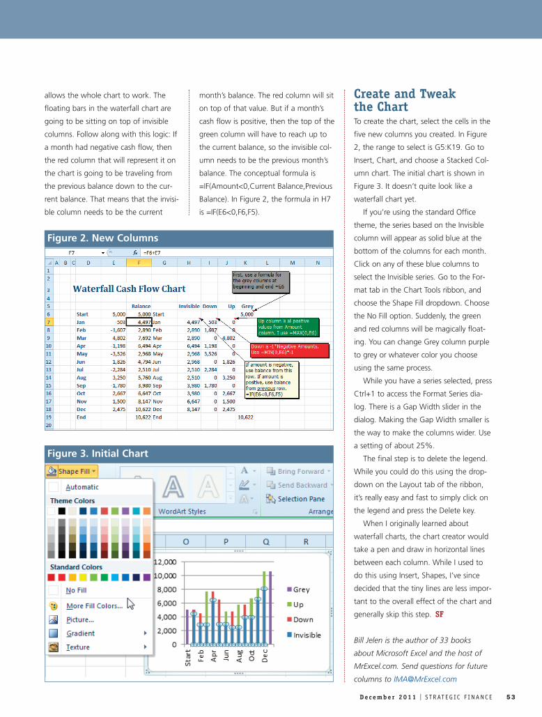
Now copy the month names to the
next column. Then add four new
columns: Invisible, Down, Up, and Grey.
The Grey column is for the values that
need to touch the x-axis. In this example,
the first and last rows (Start and End)
touch the baseline. The formula for the
Grey column is =Balance.
The Up column needs to pull all of
the positive amounts over. While you
could use =IF(Amount>0,Amount,0), it’s
quicker to use =MAX(0,Amount). This
clever formula is handy for getting posi-
tive amounts. If the amount is greater
than zero, then the amount “wins” in
the MAX function. If the amount is neg-
ative, then the zero wins. It will hardly
matter in this example, but the calcula-
tion time for MAX is a tiny bit faster
than IF.
The Down column needs the absolute
value of all negative amounts. While you
might use =IF(Amount<0,ABS(Amount),
0), you can also use =MIN(Amount,0)*-1.
Formulating theInvisible ColumnThe Invisible column is the magic that
52 S T R AT E G IC F I N A N C E I D e c e m b e r 2 0 1 1
TECHNOLOGY
EXCELCash Flow Waterfall Chart
By Bill Jelen
Figure 1. Cash Flow Waterfall Chart
allows the whole chart to work. The
floating bars in the waterfall chart are
going to be sitting on top of invisible
columns. Follow along with this logic: If
a month had negative cash flow, then
the red column that will represent it on
the chart is going to be traveling from
the previous balance down to the cur-
rent balance. That means that the invisi-
ble column needs to be the current
month’s balance. The red column will sit
on top of that value. But if a month’s
cash flow is positive, then the top of the
green column will have to reach up to
the current balance, so the invisible col-
umn needs to be the previous month’s
balance. The conceptual formula is
=IF(Amount<0,Current Balance,Previous
Balance). In Figure 2, the formula in H7
is =IF(E6<0,F6,F5).
Create and Tweak the ChartTo create the chart, select the cells in the