11
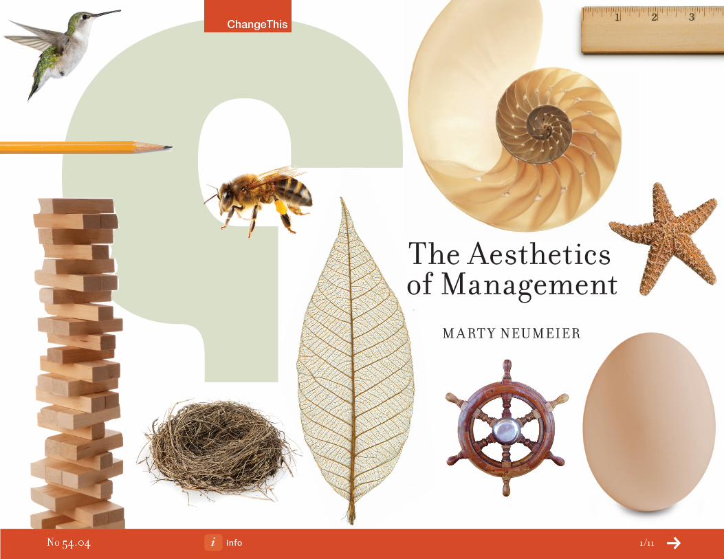
The Aesthetics of Management MARTY NEUMEIER Info 1/11
Info 2/11
i’m not a big fan of the 13th-century philosopher Thomas Aquinas, but I
have to admit, when I first read Ad pulcritudenum tria requiruntur integritas, consonantia, claritas, I was right there with him. Roughly
translated, he was saying beauty needs three qualities: integrity,
harmony, and radiance. Integrity is the quality of standing out clearly
from the background. Harmony is about how the parts relate to the whole. Radiance refers to
the pleasure we feel when we experience it. And the language of beauty, as we’ve known since
Aristotle, is aesthetics.
But what does aesthetics have to do with 21st-century business? Didn’t it die out with the Medici? Isn’t beauty in the eye of the beholder? Not so fast. If business today is about creating emotional ties with customers, then aesthetics is the superglue that binds them to your brand. When you under-stand integrity, you can increase strategic differentiation. When you understand harmony, you can optimize organizational synergy. When you understand radiance, you can enhance customer experi-ence. You probably already have an unconscious grasp of aesthetic principles, but you can double their effectiveness by employing them deliberately and skillfully.
Some modern philosophers believe that beauty is universal, connecting our senses with deep evolution-ary tides. Others say it’s associative, drawing its power from ephemeral signals. My experience is that it’s both. There are shapes, sounds, scents, juxtapositions, and patterns that push our emotional buttons no matter who we are, where we live, or what we believe in. And there are others that shift with each person’s viewpoint or situation. The round proportions of a baby’s face hold appeal for all of us, but the round proportions of VW Beetle may only hold appeal to those who belong to the Beetle tribe. The person who understands both types of beauty is a powerful ally, especially when competing against a field of me-too products, ho-hum services, and business-as-usual companies.
Info 3/11
Aesthetics is alive and well. But we need to retrieve it from the mothballs and rediscover it’s magic. The more technological our culture becomes, the more we need the sensual and metaphorical power of beauty.
Renowned architect Moshe Safdie noted that, in nature, beauty is a by-product of function.
The color and shape of a flower is derived from its need to attract insects. The color and structure
of an insect is derived from its need to camouflage itself against flowers.
Often what makes a thing beautiful is our appreciation of its benefits. The blue sky is beautiful
because it promises clean air. A muscular body is beautiful because it signals good health. An oak
tree is beautiful because it offers shade, shelter, and food. By the same token, an Aston Martin
is beautiful because it offers aerodynamic efficiency. An Aeron chair is beautiful because it offers
exceptional comfort. Einstein’s relativity theory is beautiful because it offers profound simplicity.
We ascribe beauty to things we admire, then we begin to admire other things that exhibit the same
beauty. At first the Aeron chair was scoffed at for its “weird” look. Later, when its look became
identified with comfort, people began to find it beautiful, and less discriminating people began seek-
ing the same look in knock-off chairs, expecting to get the same comfort—and the same status—
for a lower price. We often use beauty as a proxy for quality.
The more technological our culture becomes, the more we need the sensual and metaphorical power of beauty.
Info 4/11
Buckminster Fuller once said, “When I’m working on a problem, I never think about beauty. But when
I have finished, if the solution is not beautiful, I know it is wrong.” In mathematics, Poincare could
judge the quality of a solution solely on its aesthetic elegance. Software developers can spot a great
algorithm by the shape and efficiency of its coding lines. There’s ample evidence of mathematical
beauty in nature, too, including the breathtaking complexity of fractals, the surprising consilience
of theories across disciplines, and the ancient sacred ratios in geometry.
Take the Fibonacci sequence. The formula is like a children’s game: Each number in the sequence is
the sum of the previous two, giving you a progression that looks like 1, 1, 2, 3, 5, 8, 13, 21, 34, and so
on. It describes what Renaissance mathematicians called the golden spiral. In nature, this progression
shows up in the patterns of pinecones and palm trees. It shows up in artichoke leaves and broccoli
florets. It shows up in fingerprints, whirlpools, and the shape of the Milky Way. And it shows up in the
shapes of nautilus shells, whose walls curve outward according to the same laws. A company called
PAX has borrowed the golden spiral to reinvent the shape of fan blades. Guess what? Their fan blades
are 15-30% more energy efficient, 50-75% quieter, and often cheaper to produce. This is beauty with
its sleeves rolled up.
There’s ample evidence of mathematical beauty in nature, too, including the breathtaking complexity of fractals, the surprising consilience of theories across disciplines, and the ancient sacred ratios in geometry.

Info 5/11
Writing in his notebook, Leonardo da Vinci said that we “will never discover an invention more beauti-ful, easier, or more economical than nature’s ... In her inventions nothing is wanting and nothing is superfluous.” Biomimicry expert Janine Benyus explains that nature designs its products using very few materials. Instead, it uses shape to create function. She notes that any natural material that looks like plastic is one of five simple polymers. Organisms are hungry for these polymers, so they go back into the ground cycle easily. In the manufacturing world, by contrast, we use 350 complex polymers, which is why recycling is so difficult. “The design challenge,” she says, “is to learn how to shape them.”
Klipsch Audio Technologies designs horn-loaded loudspeakers that draw inspiration from the shape of the human ear. This approach has led to speakers that can accurately produce both soft and loud sounds, produce a highly directional sound pattern, deliver unaccented bass, mid-range and treble ranges, and are highly efficient. Founder Paul Klipsch often said, “Quality is directly propor-tionate to efficiency.”
Simplicity and efficiency are twin threads that run through the discipline of aesthetics. All living things have an instinct to economize. The efficient use of energy, materials, and food are the best defense against entropy, the tendency for all systems to lose energy. Since aesthetics is rein-forced by simplicity and efficiency, it offers a powerful tool for thriving in an era of diminishing natural resources.
“It’s amazing to watch the design mind work,” says Benyus. “I can tell you how life works, and then a designer will take it and remake the world.”
Okay. Everyone knows you can apply aesthetics to the curve of a fender, or the typography of a web page, or the textures in a clothing line. But it can be even more effective when you apply it to deci-sion-making, upstream strategy, or organizational change. When you use the principles of aesthetics to address wicked problems, you can more easily navigate through the fog of complexity. Aesthetics confers a kind of visibility.

Info 6/11
Let’s look at a few of the principles that artists have used successfully, and see how they might apply to management:
Shape. Painters often squint at their work to separate objects from the surrounding field. By
getting a good read on the edges of things, they can better focus the viewer’s attention. Perceptual
psychologists call this phenomenon figure and ground. In management, figure and ground can help
you separate the real issues from the red herrings. What’s the problem we’re trying to solve? Where
do we draw the edges of our business? How can we separate ourselves from the competition?
Line. A line is a simple device to connect one thing with another—to lead a viewer’s eye, a listener’s
ear, or a reader’s thoughts from point A to point B. It creates a sense of trajectory that suggests
motion. Where is our company headed? How do our products and services connect? What does this
year’s performance say about next year’s? If the connections among decisions, products, and events
are not clearly delineated, your sense of aesthetics will reveal the problem before the market does.
Texture. In all forms of art, texture is used to organize complexity and add depth. The composer
overlaps chords and melodies to wrap the listener in layers of sound. An artist layers brushstroke
over brushstroke to create the intrigue of visual detail. The novelist weaves a spell by threading
together plots, subplots, dialogue, and description. Texture is a fact of life, for better or worse, in
every company. How can we thread together our businesses, processes, brands, products, features,
and communications to create a tapestry instead of a train wreck? How can we organize complexity
to give it resonance?
Scale. Every artist knows that large scale is the shortcut to shattering power. It’s not just whimsy
that inspired sculptor Claes Oldenburg to take a wooden clothespin and scale it up to the size of a
building. Picasso knew exactly what he was doing when he painted Guernica on a mural-sized canvas.
When Beethoven needed to confront the huge themes of day, he scaled up the orchestra and moved
the center of gravity down to the level of cello to get a fuller, darker sound. But scale can also mean
Info 7/11
small scale. How big must our business be to beat the competition and serve our customers?
Where should we upscale? Where should we downscale? What are we doing today that, by increasing
our investment in it, would give us a competitive edge or a decisive victory?
Proportion. The principle of proportion weighs the relationship of one element to another.
Artists of all kinds grapple with this issue, but so do business leaders. It’s a question of balance.
How should the various parts of our business relate to each other? When is it strategically sound
to be out of balance? How do we know if we’re investing the right amounts in the right innovations?
When we make a decision, how should we give weight to conflicting concerns so we don’t throw
the baby out with the bath water? By developing a corporate sense of proportion, these judgments
get easier.
Variety. With large-scale artworks, such as symphonies, movies, novels, buildings, and towns, it’s
variety that holds people’s interest. In time-based experiences, this also implies pacing. Variety and
pacing make it possible to sit though a three-hour movie without checking our watches. Variety in
systems performs a different function. It gives the system enough complexity to correct itself and
stay healthy. How can variety help us create a culture of perpetual innovation? How can we use it to
spread our exposure to risk? How can we use pacing to keep our customers on the edge of their
seats, wondering what delights we’ll prepare for them next?
rhythm. Of course, rhythm is essential in music. But it crosses over into other art forms as
well. Renaissance architect Leone Battista Alberti recommended the use of musical intervals
for the pleasing design of buildings. Sony CEO Howard Stringer expects the “rhythm of innovation”
to restore the company to its former glory. What kind of rhythm is right for our company? When
should we release our new products? How should we change speeds to harness a good economy?
A bad economy?

Info 8/11
Depth. Shakespeare understood the market-maximizing power of depth. His plays communicated
to every level of audience, from the royals sitting in the top-tier boxes to the groundlings standing
in the ale-and-urine-soaked sawdust. His dialogue would shift rhythmically from high philosophy to
low humor; his action would alternate between soliloquies and sword fights. Did the strategy pro-
duce profits? It seems likely, since at the end of his career he owned the biggest house in London.
Yet the principle of depth can be applied with equal success to businesses and brands. The diagram
opposite shows how each part of the business, from the internal vision to the external brand, can
operate at multiple levels of understanding. Are we communicating our mission and message to
every audience? How about our product stories? Do they resonate across regions, segments, and
cultures?
Harmony. Harmony is based on the principle of synergy, or how the parts work together to do
more than they could do separately. In music, it might be how the notes sound together. In painting,
how the colors look together. In cuisine, how the flavors taste together. In business, it’s how people
work together. How can we achieve synergy among functions, departments, and divisions? How can
we remove dissonance and emphasize alignment? How can we get a complex organization to execute
a simple idea?
Contrast. In business, cash is king. In aesthetics, it’s contrast. Contrast gives artists a way to
create drama. Big vs. small, dark vs. light, loud vs. soft, fast vs. slow, straight vs. curved, smooth vs.
rough, old vs. new, and so on. It’s contrast that makes art both emotional and memorable. When a
company creates vivid differentiation between itself and its competitors, it’s using the principle of
contrast. Avis vs. Hertz. Mini vs. Hummer. Tom’s Natural vs. Crest. How can we increase the contrast
between our brand and those of our competitors? How can we design our products and services so
they stand out in a crowded marketplace? How can we make sure that our communications hook into
in people’s minds like Velcro?

Info 9/11
I could go on, but that’s another manifesto. Suffice it to say that the best management decisions are
also aesthetic decisions: They satisfy our deep intuitive sense of what’s right, what’s good, and
what’s beautiful. Aesthetics serve as a compass to keep you from getting lost as you design the way
forward. What is good design? This is the question that has haunted the design community for
decades. Whenever the conversation comes up, the “eye of the beholder” argument shuts it down.
Someone says that good design is design that “works,” and someone else adds that the arbiter of
“what works” is the individual user. At this point everyone nods and the conversation ends. But the
question is never fully put to rest.
I believe there’s a more universal answer. It’s this: Good design does not depend so much on the
eye of the beholder, but on a combination of aesthetics and ethics. Good design is design that
exhibits virtues. What virtues? You know, good old human virtues like generosity, courage, diligence,
honesty, substance, clarity, curiosity, thriftiness, helpfulness, and wit. By contrast, bad design exhib-
its human vices like selfishness, fear, laziness, deceit, pettiness, confusion, apathy, wastefulness,
harmfulness, and stupidity. In other words, we want the same things from design that we want from
our fellow humans. When we combine ethical virtues with aesthetic virtues, we get good design.
Good design does not depend so much on the eye of the beholder, but on a combination of aesthetics and ethics. Good design is design that exhibits virtues.

Info 10/11
The ancient Greeks framed this ideal in the context of knowing, making, and doing: “To know truth.
To make beauty. To do good.” Apple’s Steve Jobs framed it this way: “Design is the soul of a man-
made creation.”
Soul, like beauty, is one of those evanescent qualities that disappears under the microscope, but it’s
clearly visible when you meet it on the street. It’s a quality that’s been missing in a 20th-century
business tradition that overvalues narrow, short-term success, and undervalues broad, long-term
success. Sumantra Ghoshal, a global business leader and author, called corporate business “under-
socialized and one-dimensional.” He said that spreadsheet management has only led to resentful
customers, dispirited employees, and a divided society.
Why would this change? Because it has to. In an era when customers are not only omnipotent but
omniscient, when over-production leads to an ecological box canyon, a selfish focus on the bottom
line is bad design. Good design, in contrast, is a new management model that deliberately includes
a moral dimension. It’s a model that not only serves shareholders but employees, customers, part-
ners, and communities. For the first time since the Industrial Age, successful businesses will be
designful businesses. They’ll combine knowing, making, and doing to strive for truth, beauty, and
the public good. At last, the bottom line will begin to trace the shape of who we want to be.

Info 11/11
About the Author
Marty Neumeier is president of San Francisco think tank Neutron and author of Zag and The Brand Gap.
His latest book, The Designful Company, considers the challenge of building a corporate culture of innovation.
send this
Pass along a copy of this manifesto to others.
subscribe
Sign up for our free e-newsletter to learn about our latest manifestos as soon as they are available.
born on dAte
This document was created on January 14, 2009 and is based on the best information available at that time.
Check here for updates.
info
buy the bookGet more details or buy a copy of Marty Neumeier’s The Designful Company.
About chAnGethis
ChangeThis is a vehicle, not a publisher. We make it easy for big ideas to spread. While the authors we work with are responsible for their own work, they don’t necessarily agree with everything available in ChangeThis format. But you knew that already.
ChangeThis is supported by the love and tender care of 800-CEO-READ. Visit us at 800-CEO-READ or at our daily blog.
copyriGht info
The copyright of this work belongs to the author, who is solely responsible for the content.
This work is licensed under the Creative Commons Attribution-NonCommercial-NoDerivs License. To view a copy of this license, visit Creative Commons or send a letter to Creative Commons, 559 Nathan Abbott Way, Stanford, California 94305, USA.
Cover image from iStockphoto®
WhAt you cAn do
You are given the unlimited right to print this manifesto and to distribute it electronically (via email, your website, or any other means). You can print out pages and put them in your favorite coffee shop’s windows or your doctor’s waiting room. You can transcribe the author’s words onto the sidewalk, or you can hand out copies to everyone you meet. You may not alter this manifesto in any way, though, and you may not charge for it.