The Analysis of Covid-19 Surveillance Data: What can we Learn from Limited Information? * Carlos Uribe-Teran School of Economics Universidad San Francisco de Quito [email protected]Santiago J. Gangotena School of Economics Universidad San Francisco de Quito [email protected]First Version: April 20, 2020 This Version: June 12, 2020 Abstract What can we learn about the transmission process as the Covid-19’s pandemic unfolds when the only available information is daily counts of confirmed cases and tests? In this paper we propose to go old school and apply simple time series treatments to filter away sea- sonality and atypical values. Then, we use the trend and cycle components of the resulting time series to emulate the underlying infection process (the data-generating process) that gave rise to the noisy signal we observe in the data. We use these trends to compute the effective reproduction number R t and the test positivity rate ρ t , and propose a joint analysis of trajec- tories over (R t ,ρ t ) space to have a graphical assessment of the current status of the infection process. Before applying our method to country data, we test it using simulations. We find that although the level of epidemiological indicators is systematically biased when based only on surveillance data, our method allows us to reduce the root mean squared error and the probability of type II errors, particularly when testing strategies are poor. Moreover, the joint analysis of R t and ρ t manages to reduce the probability of type I and type II classification errors to below 0.5% in our simulations. Our country analysis, on the other hand, shows that daily counts of cases and tests exhibit strong seasonal and atypical components, two types of stochastic innovations that are orthogonal to the infection process and that, if left untreated, can produce spurious dynamics in the behaviour of R t and ρ t . Keywords: Covid-19, Statistical Simulation, Time Series Analysis, Agent-Based Modeling, Health. JEL Codes: C15, C22, C69, I10. * We are extremely grateful to Julio Acuña for useful comments on an early version of this paper, and Sebastian Jimenez for outstanding and expedite research assistance. 1 Electronic copy available at: https://ssrn.com/abstract=3625319
Transcript
The Analysis of Covid-19 Surveillance Data: What can weLearn from Limited Information?*
First Version: April 20, 2020This Version: June 12, 2020
Abstract
What can we learn about the transmission process as the Covid-19’s pandemic unfoldswhen the only available information is daily counts of confirmed cases and tests? In thispaper we propose to go old school and apply simple time series treatments to filter away sea-sonality and atypical values. Then, we use the trend and cycle components of the resultingtime series to emulate the underlying infection process (the data-generating process) that gaverise to the noisy signal we observe in the data. We use these trends to compute the effectivereproduction number Rt and the test positivity rate ρt, and propose a joint analysis of trajec-tories over (Rt, ρt) space to have a graphical assessment of the current status of the infectionprocess. Before applying our method to country data, we test it using simulations. We findthat although the level of epidemiological indicators is systematically biased when based onlyon surveillance data, our method allows us to reduce the root mean squared error and theprobability of type II errors, particularly when testing strategies are poor. Moreover, the jointanalysis of Rt and ρt manages to reduce the probability of type I and type II classificationerrors to below 0.5% in our simulations. Our country analysis, on the other hand, shows thatdaily counts of cases and tests exhibit strong seasonal and atypical components, two types ofstochastic innovations that are orthogonal to the infection process and that, if left untreated,can produce spurious dynamics in the behaviour of Rt and ρt.
Keywords: Covid-19, Statistical Simulation, Time Series Analysis, Agent-Based Modeling,Health.JEL Codes: C15, C22, C69, I10.
*We are extremely grateful to Julio Acuña for useful comments on an early version of this paper, and SebastianJimenez for outstanding and expedite research assistance.
1
Electronic copy available at: https://ssrn.com/abstract=3625319
1. Introduction
One of the main strengths of economics is that the discipline has developed very potent tools
to extract valuable information from complex data structures. When we look at surveillance statis-
tics gathered as the Covid-19 pandemic unfolds, we are not only thinking about the underlying
infection process (epidemiologists are much better trained than us for this task), but are also think-
ing about data gathering, selection bias, measurement error, and other sources of endogeneity. We
worry about this because we are trained to work with phenomena where data is often scarce and of
less than ideal quality. This is a particularly important skill when governments are secretive about
information, hindering the monitoring role of private institutions.
With this in mind, we ask what can we learn about the transmission process as the Covid-
19’s pandemic unfolds when the only available information is daily counts of confirmed cases
and tests? Our main goal is to design an assessment methodology to have a clear idea of the
current situation of the transmission process when the quality of data is poor. For this, instead
of going ballistic on Bayesian methods, we go back to the basics. We propose to go old school
and apply simple time series treatment to filter away seasonality and atypical values, two types of
stochastic innovations that can produce severe bias in any type of analysis. Then, we use the trend
and cycle components of the resulting time series to emulate the underlying infection process (the
data-generating process) that gave rise to the noisy signal we observe in the data.
During the seasonal adjustment stage, we apply the Hodrick-Prescott filter using a smoothing
parameter of 1600 to obtain the stationary error term in each series. This calibration of the HP filter
is not standard, since it is usually recommended for quarterly data. For daily data (which is the case
for Covid-19 statistics) we should be setting the smoothing parameter much higher. However, we
are aware that the data-generating process is extremely non-linear, and these non-linearities occur
in a very short period of time (changes that in economics, on the other hand, usually occur in the
very long run). We believe that this initial calibration gives the filter enough flexibility to detect
the seasonal and atypical components in the series. Moreover, we take advantage of this first stage
to endogenize the value of the smoothing parameter as a function of the variance of the seasonally
adjusted error term. Specifically, we allow lower values of the smoothing parameter for error terms
that exhibit lower variances. We use these smoothing parameters to estimate the trends of the test
positivity rate and the daily count of tests.
Then, we combine the estimated trend of the test positivity rate with the trend of testing to
emulate the infection process, and build confidence intervals around this trend by block bootstrap-
ping, following Gallego and Johnson (2005). Using this result and external estimations of the
generation time (Abbott et al., 2020), we produce a simple estimate of the effective reproduction
number Rt and produce its confidence interval using the bootstrapped versions of the emulated
infection process and log-normally distributed random numbers calibrated to replicate the mean
and standard deviation of the generation time.
Due to our data limitations (we do everything only with daily counts of confirmed cases
and tests), the value that we find for Rt is downward biased when Rt ≥ 1 and upward biased
when Rt < 1. We are also worried about the possibility of having type II errors, that is, estimating
2
Electronic copy available at: https://ssrn.com/abstract=3625319
Rt < 1 when the realRt ≥ 1. Because of this, we complement this estimation with a joint analysis
of Rt and the test positivity rate ρt. We divide (Rt, ρt) space into four quadrants that allow us to
classify trajectories in terms of adequacy of testing (threshold at ρt = 0.10) and dynamics of the
infection process (threshold at Rt = 1).
Trajectories in the first quadrant (top-right) represent a buoyant infection process (Rt ≥ 1 and
ρt ≥ 0.10). Those in the second quadrant, despite having Rt < 1, still have high test positivity
rates, a very dangerous combination if decisions about relaxing Non Pharmaceutical Interventions
have to be made. The third quadrant defines the only case in which it can be assumed that trans-
mission is temporarily under control, since Rt < 1 and ρt < 0.10, although close monitoring is
needed, particularly for trajectories that entered this quadrant recently. Finally we have the fourth
quadrant where Rt ≥ 1 and ρt < 0.10. In this case, specific trajectories are crucial. If the tra-
jectory is moving towards the third quadrant, then although there is latent transmission, there is
evidence to believe that the testing scale is adequate and Non Pharmaceutical Interventions are
effective, since the test positivity rate is below 10%. However, further outbreaks can be identified
when trajectories originate in the third quadrant and move from right to left.
To check the robustness of our estimation procedure and assess how well it is able to repro-
duce the true dynamics of the infection, we apply our method to simulated data. For this we build
a simple Agent Based Model (ABM) that in addition to the infection process, explicitly models
data collection under different testing strategies. This way we can assess the performance of our
estimation strategy and investigate how the parameters that govern testing (scale, testing growth
rate, testing noise, and the probability of testing symptomatic patients) affect the quality of data
gathered from tests, and the results we obtain with our method.
Once we understand how our methodology works in a controlled environment, we apply
it to Covid-19 data for 56 countries obtained from Our World in Data dataset (Max Roser and
Hasell, 2020) and official reports of Ecuador’s Ministry of Public Health. The result is a sample
that exhibits significant heterogeneity regarding data quality, something that is evident when we
study the dynamic consistency of our estimates. Although we apply the methodology to the entire
sample, we show intermediate results for a subsample of 15 countries. The last update for this data
occurred on June 4th.
In our simulated environments we find that for a given growth rate in the number of daily
tests, the scale of testing and the strategy used to administer tests have a significant impact on
the information about the dynamics of infection that can be estimated using testing data. As
can be expected, we find that the effective reproductive number calculated using testing data is
systematically biased, with the bias falling when the real effective reproductive number is in the
vicinity of one. Increasing the scale of testing significantly reduces this bias as does random
testing. Classification of simulated trajectories in (Rt, ρt) space allows us to reduce classification
errors with respect to the true trajectory to 0.35%. This is orders of magnitude less than the
classification error of 6.1% and 23.6% we respectively obtain when looking at the reproduction
number or test positivity rate separately.
Our country analysis shows that Covid-19 surveillance data exhibit strong seasonal com-
ponents. Moreover, most countries atypical values are concentrated at the initial stages of the
3
Electronic copy available at: https://ssrn.com/abstract=3625319
transmission process. This is expected, since countries experience an adjustment period (import
more tests, adapt laboratories to process them, etc.). However, there are countries for which atypi-
cal values occur at more recent dates, and this is worrying, since it is at this time that political and
social pressure might be in place to end confinement or other Non-Pharmaceutical Interventions.
Notice that if these sources of variation are not controlled for, then daily count data might exhibit
periodic or unexpected falls (or peaks), showing variations that are completely orthogonal to the
infection process.
We also find that the dynamic consistency of our estimation heavily relies on the quality of
data, something that is true even for more complicated Bayesian methods. The reason for this is
that our estimation might confuse new atypical innovations with changes in the trend, especially
if these atypical innovations do not meet the cut to be eliminated in the cleaning phase of our
method. Among the countries we consider we have cases where new observations are in line with
previously estimated trends, cases where new observations produce monotonic adjustments to
previously estimated trends, and cases where these adjustments are not monotonic. Particularly in
these cases, the estimation of the effective reproduction number should be assessed with caution,
and extra attention should be paid to cases that cross the Rt = 1 threshold.
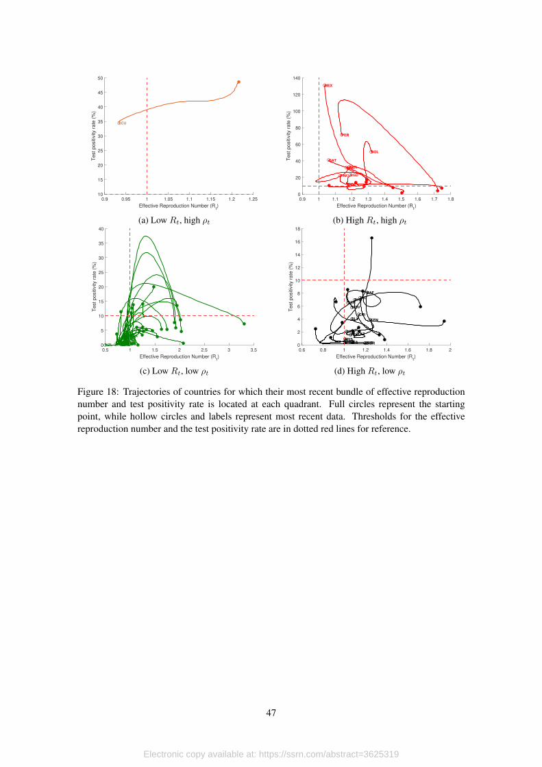
In our joint analysis of the effective reproduction number and the test positivity rate, we find
that most countries have their infection process relatively under control at this time. At the last
update of our data (June 5th), our method was able to pick up potential secondary outbreaks in 4
out of the 56 countries we consider for analysis (movements from third to fourth quadrant).
To our surprise, from the 4.300 observations scattered over the (Rt, ρt) space, only 85 are lo-
cated in the second quadrant, making it a very unlikely position for countries’ trajectories. More-
over, we find that among our sample of observations, this quadrant is characterized by case fatality
and mortality rates that are at least twice the average that we find in other quadrants. What is
interesting is that in our simulations, which have an underlying transmission process without any
intervention, this quadrant is much more likely to occur. Moreover, we find that the odds of ob-
serving data in this quadrant fall as the testing scale increases, and increases as the probability of
testing symptomatic patients increase.
We organize this paper as follows. In the next section we look at the literature on the eco-
nomics of the pandemic and present our contribution. In section 3 we motivate our methodology
with a detailed description of Covid-19 data management in Ecuador, a country that was hit hard
by the pandemic. In section 4 we describe the model and in section 5 we present the Agent-Based-
Model that we use to assess the performance of our model. In section 6 we apply the methodology
to country data. Section 7 concludes.
2. Economics and Epidemiology
The unfolding of the Covid-19 pandemic has awaken the interest of many economists in mod-
elling and understanding the details of disease transmission, and contributions can be classified in,
at least, two different groups. First, there are papers that are worried about the economic effects
of the pandemic. Within this group, there are two different strategies. Early on the onset of the
4
Electronic copy available at: https://ssrn.com/abstract=3625319
pandemic, Correia et al. (2020) studied how public health interventions might affect the economy.
Using data from the 1918 Influenza Pandemic in the U.S., they show that areas that were more ex-
posed to the disease experience sharper and more persistent declines in economic activity. These
results have been tested again by Lilley et al. (2020), who find that such effects are driven by pop-
ulation growth and once differential trends are considered, positive effects of NPIs on economic
activity are non-significant. Moreover Barro (2020) shows that NPIs did not have significant ef-
fects on curtailing mortality either, and explain that the most likely reason is that NPIs were not in
place long enough.
The second strategy consists on using standard macroeconomic models augmented with SIR
frameworks to analyze optimal policy responses to the pandemic. In this regard, one of the first
papers to appear was Eichenbaum et al. (2020a), where the authors find that the endogenous house-
holds’ response to cut back on consumption and work reduces the impact of the epidemic in terms
of its death toll. Moreover, they find that although containment policy increases the severity of
the recession, it saves about half a million lives in the U.S. In another effort, Eichenbaum et al.
(2020b) show that testing without quarantining might have negative effects, both economic and
related to public health. Moreover, a policy that optimally combines testing with quarantining
infected individuals reduces significantly the trade-off between declines in economic activity and
health outcomes that is triggered by general lockdowns. In the same line, Arellano et al. (2020)
study how the pandemic might affect emerging markets, in particular, how lockdown policies
might trigger prolonged debt crises.
Other papers look at endogenous reallocation of economic activity and the distributional ef-
fects triggered by the containment policy applied to control the pandemic. Again, incorporating
SIR frameworks within macroeconomic models, Krueger et al. (2020) show that rational decisions
to cut back on consumption and implement additional hygiene measures might allow infections
to decline entirely on their own. More on the redistributive part of the story, Glover et al. (2020)
study optimal lockdown policies in an environment where the redistributive effects triggered by
the intervention between young and old cohorts is explicitly modelled.
The second group includes papers written by economists that attempt to contribute directly to
the epidemiology literature. The most salient example in this group is Manski and Molinari (2020),
where the authors study the measurement errors involved in estimating the Covid-19 infection rate,
and propose a methodology to reduce this bias. Another attempt is made by Fernández-Villaverde
and Jones (2020) that put forward economists’ worry regarding the way the transmission process is
modeled under the SIR framework. In particular, the assumption that the rate of transmission is an
structural parameter. In this line, the authors start from the observation that the rate of transmission
is actually endogenous, since it depends on consumption and work decisions made by households,
and use information on death counts to recover the rate of transmission and, from here, estimate
the effective reproduction number. In line with this contribution, to the best of our knowledge (and
to our surprise), there is only one paper in the epidemiology literature that considers how agent’s
behavior might affect the transmission of disease (Eksin et al., 2019).
We contribute to this branch of the literature, by proposing an estimation framework that
relies on daily counts of confirmed cases and tests (widely available) to monitor public policy in
5
Electronic copy available at: https://ssrn.com/abstract=3625319
environments where access to more complete and perfect information is lacking. We also propose
a variation to the SIERD model in which we add a layer with explicit modelling of the data-
gathering process, that allows us to have a clearer view on how different testing strategies might
trigger bias in the analysis of the transmission process when such analysis is based on surveillance
data.
We also contribute to the epidemiology literature that deals with the measurement of the ef-
fective reproduction number. In this regard, our methodology relies on simple time-series analysis,
contrary to most recent epidemiological papers that rely on more complex Bayesian methods to
estimate the real-time dynamics of the effective reproduction number (Wallinga and Teunis, 2004;
Bettencourt and Ribeiro, 2008; Obadia et al., 2012; Thompson et al., 2019; Abbott et al., 2020;
Kubinec, 2020). These efforts make important contributions in terms of the epidemiological man-
agement of the data and real-time estimation of the generation time, which is fundamental for
estimating Rt. However, to the best of our knowledge, no effort has been made in the direction of
taking into consideration the data-gathering process that is involved in producing incidence data.1
3. Information Limitations in Emerging Markets
The limited access to Covid-19 data in Ecuador is a clear example of this. The type of public
information to monitor the unfold of the pandemic in the country has varied significantly since
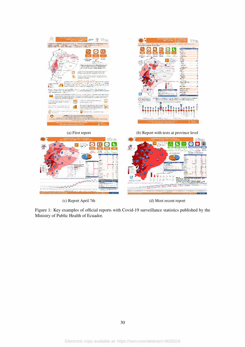
the first report available was published on March 13, 2020 (see Figure 1a). At this point, there
were no daily counts of tests, but only limited national information about confirmed cases and
its geographical distribution at the province level, total deaths and contact tracing. On March 16
the official report also included information on confirmed cases disaggregated at the municipality
level. On March 18 we started having information on testing, and on March 19 this information
was reported at the province level as well (see Figure 1b).
[Figure 1 about here.]
This was the structure of daily reports until April 6. Up to this date, reports were very
complete, with testing data being reported at the province level and daily count of positives sliced
by age and gender. However, on March 21 a new health minister was appointed by president
Moreno (Dr. Juan Carlos Cevallos). Among the changes made by the new administration, there
were major modifications to the form in which data was reported to the public, but the most
important one was that the daily counts on testing at the province level was replaced by daily
counts of positives ordered according to the onset of symptoms dates (see Figures 1c and 1d for a
simple comparison).
From an epidemiological point of view, this change made sense, because one could build the
daily count of positives according to the confirmation date, and the new information on the onset1Other approaches heavily rely on the SIR framework to produce estimates for Rt. Shim et al. (2020) compute
a generalized growth model based on the equations of the SIR model and estimate the effective reproduction rate forSouth Korea. In a similar vein, Kucharski et al. (2020) use a stochastic transmission dynamic model to estimate earlydynamics of the transmission process in Wuhan. They find an effective reproduction number that moves between 2.35and 1.05.
6
Electronic copy available at: https://ssrn.com/abstract=3625319
date allowed the estimation of processing delays, which is a key variable for the analysis of this
data. However, the series on the province distribution of tests was lost, and this prevented the
estimation of the test positivity rate, which is another important indicator to consider. Then, on
April 24 the Health Ministry stopped reporting daily counts at the municipality level, producing a
black veil that lasted for several weeks regarding this information.
However, the major break to the series occurred on May 8th, when major revisions to the data
gathering process were made. Among other things, data management was migrated to another
software platform, and in the process officials at the Ministry discovered several duplicated cases.
Because of this, the daily count of positives at the national level fell from 30,298 cases reported on
April 7th to 28,818 on April 8th and more revisions until April 12th. This way, the series based on
confirmation dates were completely broken, and with it the possibility to track delays with respect
to the onset of symptoms. Moreover, while the national daily count of confirmed cases included
results of rapid tests, information at the province level only considered PCRs.2
This is a detailed account of data management in a developing country. Similar problems
might occur in other countries, and this not only affects data reported within their territories,
but also the data that is included in global reports, such as the dataset of Our World in Data.
In the specific case of Ecuador, for example, this dataset has a major issue in their account of
daily tests: Although the daily count of positives corresponds to the national aggregate (which
includes confirmations by rapid tests and PCRs), the daily count of tests only consider PCRs. This
type of issues can generate serious biases in important indicators, such as the test positivity rate.
Moreover, although analysts can request access to the microdata, confidentiality clauses do not
allow researchers to publish any result. In this setting, is there any relevant information that can be
extracted from publicly available official reports? A positive answer to this questions is key for the
system of democratic checks and balances, since this implies that not all monitoring possibilities
are hindered, even in the presence of doubtful data management by governments.
4. The Model
The idea is simple: We are dealing with a dynamic process that, due to data gathering and the
data generating process itself, is subject to several sources of noise. Before going into the specifics
of the problem we have at hand, consider any finite time series yt. In economics usually yt has
three components: its trend τt, its cycle εt, and a seasonal component ηt. However, since typical
Covid-19 data is reported daily, we need to account for two additional problems: there might be
large atypical values νt, and there might be days when there are no official reports, so the series
have missing values. Thus, yt can be written as
yt = Nt(τt + εt + ηt + νt), (1)
2All the official reports and detailed explanations of data revisions madein Ecuador are available in https://www.gestionderiesgos.gob.ec/informes-de-situacion-covid-19-desde-el-13-de-marzo-del-2020/.
7
Electronic copy available at: https://ssrn.com/abstract=3625319
where Nt is a missing value operator that takes a value of 1 if the data point exists, and it is the
empty set ∅ if data is not available. What we would like to do is to filter away the atypical and
seasonal components, clear all missing values, and use bootstrapping on estimated trends to build
confidence intervals.
To accomplish this, the first step is to eliminate missing values by linear interpolation. This
process can be applied as long as there are no long periods without data, because if this is the
case, linear interpolation might cause severe bias in the behavior of the underlying dynamics of yt.
Thus, suppose there is a small, finite set of time periods n ∈ Nt in an otherwise long time series.
Also, let L(·) be a linear function that takes as input two consecutive data points to build a linear
function. Then, we can write
yn = L(yn|n ∈ Nt, yn−1, yn+1), (2)
where yn−1 and yn+1 are two consecutive non-missing data points in yt. If yn occurs at any of
the extremes, then we use linear extrapolation based on the linear function defined by the first (or
last) two data points in the time series. For the sake of precision, we only extrapolate one period,
if necessary. With this operation we can define
yt = N0t yt + (1−N0
t )yn = τt + εt + ηt + νt, (3)
where N0t is the same missing operator with zeroes instead of the empty set and xt is xt after linear
interpolation.
The next item we tackle is the seasonal component. For this, we apply an S(m,n) seasonal
filter. Then, we sort the cycle and the atypical values and eliminate the top and bottom quintiles.
This step allows to to obtain ε∗t , which corresponds to a seasonally adjusted-atypical free error
term.
Even though we already have the adjusted cycle component, we still need to compute the
trend, which is the hart of our procedure. To do this, we compute the seasonally adjusted-atypical
corrected series as
y∗t = τt + ε∗t , (4)
where τt is still the trend component that was calculated when the time series was not adjusted nor
corrected. To solve this issue, we filter y∗t again. We use ε∗t to compute endogenous smoothing
parameters. In particular, we set λ∗ = ζσ2ε , where σ2ε is the variance of the adjusted and corrected
error term, and ζ is a scaling parameter. Notice that the smoothing parameter implies a more rigid
filter as σ2ε increases.3 In this case, by applying the HP Filter with smoothing parameter λ∗ we
obtain τ∗t . Since both τ∗t and ε∗t are random variables, we follow Gallego and Johnson (2005) to
build confidence intervals around both components using block bootstrapping.
The use of the HP-filter deserve a few words. By design, the filter is built having in mind
business cycles and macroeconomic time series (Hodrick and Prescott, 1997). One particular3This approach clearly differs from the original definition for the smoothing parameter, where λ = σ2
τ/σ2ε .
8
Electronic copy available at: https://ssrn.com/abstract=3625319
process that the authors have in mind is GDP deviations from long term growth, so they interpret
the trend as the long term component, and the deviations from trend as short term business cycles.
Thus, the authors recommend different values for λ depending on the periodicity of the data (100
for yearly data, 1600 for quarterly data and 14400 for monthly data). That is, lambda should
increase substantially with the periodicity of data, so for high frequency data (as the one for Covid),
λ should approach infinity.
However, the problem with this approach is that as λ → ∞, the HP filter converges to a
linear trend, and this is something that we want to avoid at all costs, specially for countries with
stable data. The reason for this is that, despite its high frequency, the series of daily positives and
test positivity rate are highly non-linear processes (it follows the infection process, which exhibits
Gaussian-like behavior). Another alternative would be to use ad-hoc values for the smoothing
parameter, as is done by Fernández-Villaverde and Jones (2020). However, this might be prob-
lematic, since the quality of surveillance data is very heterogeneous.
Now we apply this procedure to Covid-19 data. Let pt and st denote the series of daily
reported positives and tests performed, both measured in logarithms. We apply linear interpolation,
seasonally adjustment and atypical correction to both series. Thus, after this step we obtain
p∗t = τpt + ε∗pt,
s∗t = τst + ε∗st.
With Covid-19 data, p∗t and s∗t are highly correlated, and p∗t is downward biased because it is
unfeasible to test the entire population. Moreover, τpt is not a good estimate of the dynamics of the
infection process, since it was computed with the data before any correction was made; something
similar happens with τst. To tackle the first issue, we compute the test positivity rate. We do this
because this indicator is more stable than p∗t or s∗t on their own. Remembering that both series are
in logs, we can write the test positivity rate ρt, as
ρ∗t = p∗t − s∗t ,
= τpt − τst + ε∗pt − ε∗st,
= τρt + ε∗ρt,
where τρt is the trend of the test positivity rate, and ε∗ρt its error term. We use the latter to compute
the endogenous smoothing parameter to estimate τ∗ρt. In the same way, and to tackle the second is-
sue regarding the slope of the testing procedure, we use ε∗st to compute the endogenous smoothing
parameter to estimate τ∗st.
However, we are not done yet. Given that ρ∗t is computed with data based on testing, we need
to be aware that testing cannot be performed over the entire population and that some countries
experience severe delays in processing samples, so ρ∗t is a biased estimator of the true infection
probability. Following Manski and Molinari (2020), we can reduce this bias by computing the
9
Electronic copy available at: https://ssrn.com/abstract=3625319
appropriate adjustment for each period. In particular, we could obtain
ρ∗at = ωtρ∗t = ωtτ
∗ρt + ωtε
∗ρt. (5)
Then, we use ρa∗t to compute bias-corrected daily positives as
p∗at = ρa∗t + s∗t ,
= ωt(τ∗ρt + ε∗ρt) + s∗t ,
= ωtτ∗ρt + τ∗st + ωtε
∗pt + (1− ωt)ε∗st, (6)
In a first approach, we set ωt = 1 for all t, so no adjustment is made. Of course, all our
results are still biased, but at least we can use the limited data that we have at hand to present
the method. Moreover, in spite of the limitations, we believe that this exercise provides valuable
lessons regarding the limitations that many countries have in terms of data management. With
richer data, we could make further adjustments to correct this bias, similar to what is done by
Abbott et al. (2020).
We use p∗at to compute the effective reproduction rate Rt applying the Lotka-Euler equation
(Dublin and Lotka, 1925; Feller, 2015; Metz and Diekmann, 2014; Keyfitz and Caswell, 2005)4.
For this, we consider only the trend component of pa∗t which is given by
τ∗pat = ωtτ∗ρt + τ∗st,
and compute the exponential growth rate of positive cases γt by means of a linear regression which
can be written as
τ∗pat = β0 + γtt+ εt,
for all t ∈ Tw = [t, t], where Tw is a sliding time window of 10 periods. Form here, we compute
Rt as
Rt = exp{θγt}, (7)
where θ denote the time between successive cases of infection (generation time) estimated by
(Abbott et al., 2020). Again, we apply block bootstrapping and assume that θ is log-normally
distributed to estimate confidence intervals for Rt. As before, if ωt = 1 then the level of Rt is
downward biased when Rt ≥ 1 and upward biased when Rt < 1. However, what is important to
check is how likely it is for Rt to be below 1.4We opt for using this equation. However, since the time period that we are considering involves days, weeks
and months, we assume total population remains constant, so the results are approximately equal to what would beobtained using the equation proposed by Anderson et al. (1992); Pybus et al. (2001); Ferguson et al. (2005); Wallingaand Lipsitch (2007) where Rt = 1 + γtτ .
10
Electronic copy available at: https://ssrn.com/abstract=3625319
5. Application to Agent-Based-Model with an underlying SEIRD In-fection Scheme
To assess the dynamics of an unfolding epidemic we need to understand how the noisy data
collected from testing relates to the true infection curve under different testing strategies. To do
this we construct a simple Agent Based Model (ABM) that explicitly simulates both the infection
process and noisy data collected from different testing strategies applied to our simulated popula-
tion. Daily testing data and the true epidemiological curves from our ABM allows us to assess the
performance of our model for estimating the dynamics of an unfolding epidemic. In addition, it
allows us to investigate how the parameters that govern testing affect the quality of data gathered
from tests, and the limitations this data may have in providing information about the true dynamics
of an unfolding epidemic for any model that attempts to estimate its dynamics.
While we use a SEIRD setup for our simulation, we are agnostic as to whether compartment
differential equation models give an accurate representation of the spread of an epidemic when
compared to models that incorporate behavioral responses (see Eksin et al., 2019; Fernández-
Villaverde and Jones, 2020, for example). Unlike other equation and agent based models of con-
tagion, the purpose of our model is not to represent contagion in a real population in order to
predict the true trajectory of an epidemic. The purpose of our model is to generate noisy data that
plausibly follow real testing strategies in order to compare the data generated by those tests with
the true infection curve given an underlying epidemiological process.
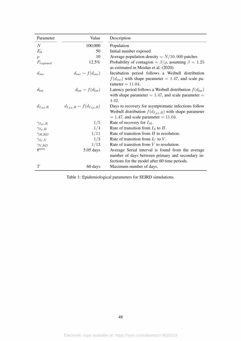
5.1. Simulation Setup
Our simulation is implemented in the NetLogo platform (Wilensky, 1999), and can be di-
vided into two layers. The first layer simulates the epidemiological process, and the second layer
simulates testing. The epidemiological layer is a straightforward agent based implementation of
the equation based SEIRD model in Meidan et al. (2020) and uses similar parameters values. In
our simulation, an initial population of exposed individuals moves about randomly among a pop-
ulation of susceptible individuals. The epidemic spreads through a population of N agents as E0
exposed individuals make contact with those who are susceptible S0 = N − E0. Once agents
become exposed they undergo a progression of disease that evolves stochastically. We simulate
the progression of disease for symptomatic as well as asymptomatic individuals as this will be
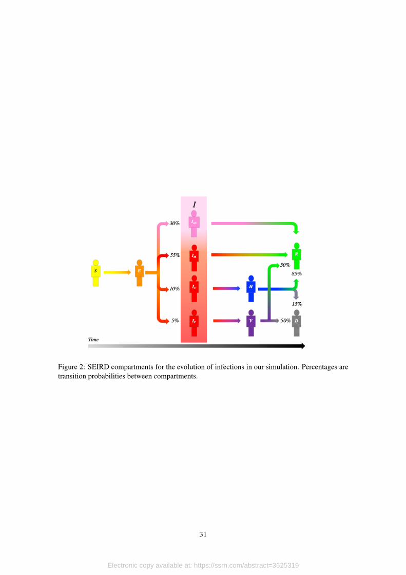
necessary when we apply testing strategies to a sample of the population. Figure 2 presents all
the compartments used in the simulation and the progression of the disease as it unfolds for each
individual.
In the epidemiological layer agents walk randomly on the surface of a toriod with 10,000
patches. Agents become exposed with probability, Pcontagion, when a susceptible and an infectious
agent share the same patch. The probability of contagion Pexposed is calibrated to match the β
parameter of the SEIRD model of Meidan et al. (2020). Recall that in a standard SIR model
β = ρ∗Pcontagion, where ρ is the average population density. Once an agent becomes exposed the
11
Electronic copy available at: https://ssrn.com/abstract=3625319
agent transitions between stages of disease following the probabilities in figure 2 and in table 1.5
We model the onset of symptoms and the onset of infectiousness separately with their respective
incubation and latency periods. In order to focus our attention on the effect of testing strategies on
the quality of data, we run the epidemiological layer with the same parameters and same random
number generator seed to keep the true underlying epidemiological process identical between runs.
[Table 1 about here.]
[Figure 2 about here.]
The focus of our simulation is not the epidemiological layer but testing. Each time period a
number of tests are performed on a sample of the population. Three parameters, the scale of testing
scale, the growth rate of testing gtests, and a shock to the growth rate σu determine the number of
tests. One parameter, Ptests, determines how the sample that undergoes testing is selected. These
four parameters define the space that we explore to see the effect of different testing strategies
in the simulation and how this relates to the performance of our model. The number of tests in
each period of the simulation follows a function with exponential growth trend with a normal i.i.d.
stochastic shock with mean µu = 0, and standard deviation σu. Formally,
testst = scale ∗N exp{gtestst+ ut}. (8)
The way the sample of the population that is tested is selected is very important because
testing strategies can bias what we can learn about the true epidemiological curves from testing
data. While others have looked at the important social benefits of testing as an integral part of
mitigation strategies (Eichenbaum et al., 2020b, for example), there is relatively little work on
the differences between testing strategies when there are binding constraints on the number of
tests that can be deployed each day. Testing of symptomatic infections for diagnostic purposes is
very important, but the data gathered from diagnostic tests is probably biased due to the higher
probability of a positive result if one presents symptoms. Many countries, especially those with
limited testing capacity have prioritized testing of symptomatic individuals. On the other hand,
random samples of the population may give unbiased data, but certainly sacrifice resources that
could be used for diagnostic purposes. Thus countries with limited testing scale and constrained
growth rate at which this scale can be expanded face this trade-off when it comes to selecting a
testing strategy.
In our simulation the sample of the population that is selected for testing is as follows. Each
period the pool of individuals that can be tested is composed of those individuals that have not been
previously tested or, if they had, the have not had a positive result. The parameter Ptests determines
the proportion of tests that are performed on individuals that are infected and show symptoms.
We explore two testing strategies, random testing (Ptests = 0) and testing where symptomatic
individuals have higher priority to be tested. Thus for Ptests > 0, at each time period t we test
testssymptomst = min{Ptests ∗ testst, Isymptomsct } symptomatic individuals, where Isymptomsct is
5All tables and figures are placed at the end of the document.
12
Electronic copy available at: https://ssrn.com/abstract=3625319
the total number of symptomatic individuals in the population. The remainder of tests given by
testst − testssymptomst , corresponds to a random sample from the pool of individuals that can be
tested.
We do not account for background rates of symptoms that are present in SARS-CoV 2 and
other diseases. A more realistic model should include this aspect. Furthermore we assume testing
is perfect such that there are zero false positives and false negatives. We take this approach to focus
on the effect of testing strategies and not on the accuracy of the tests being used. We also assume
sampling and testing is carried out and processed instantaneously to focus on the effects of testing
strategy and abstract away from processing capacity, although the testing and test processing delay
distribution probably varies widely by country.
To assess the performance of our model we construct measures of its performance for our
simulated data. First we find the true effective reproduction number for our simulation,
Rsimt = Rsim0
StS0
= βsimθsimStS0
(9)
to use as our benchmark (Nishiura and Chowell, 2009)6. The parameter βsim = 1.25 is the simu-
lation parameter that controls how fast the infection spreads in its initial phase, and θsim = 5.05
is the serial interval for the epidemiological parameters of the model. Then we calculate a naive
effective reproduction number that is based solely on observed daily positive tests Rnaivet , and the
effective reproduction number, Rmodelt obtained applying the estimation model from section 4.
Both Rnaivet and Rmodelt are found using equation (7).
We first define two performance measures that compare Rnaivet and Rmodelt to the true effec-
tive reproduction number from our simulation, Rsimt . Our first measure ηj captures the probability
of type II error when using Rjt to asses when the true reproductive number is smaller than one.
In the language of hypothesis tests let H0 : Rsimt ≥ 1. Then we compute the percentage of time
periods in the simulation when Rjt < 1 and Rsimt ≥ 1. Formally,
ηj = P[Rjt < 1 ∧Rsimt ≥ 1], (10)
for j = {naive,model}, where the probability is found from the observed values for each sim-
ulation run. This is our most important performance measure because in dealing with noisy data,
we would like our model to do as little harm as possible and thus we seek to have η2 be as close
to 0 as possible. This performance measure allows us to assess how well alternative estimations
of Rjt capture the dynamic behavior of the infection process.
6We find the true effective reproduction number for the simulation using its definition given in Nishiura and Chowell(2009) because have time invariant epidemiological parameters in our simulation. We could also estimate the trueeffective reprudtion number using the infection curve and Euler Lotcka equation as in equation 7, but this change playsin our favor
13
Electronic copy available at: https://ssrn.com/abstract=3625319
Our second performance measure is the root mean squared error between Rjt and Rsimt for
each model run, which can be written as
RMSEj =
√√√√ 1
T
T∑t=0
(Rjt −Rsimt )2. (11)
As noted before we don’t expect either the naive or the model reproductive numbers to equal
the true value due to testing bias. However the RMSEj allows us to see how the naive and model
reproductive values deviate from the true reproductive number in the simulation as a function of
the testing parameters. With this measure we assess both the dynamic behavior and how well the
estimation alternatives fit the true value. Thus RMSEj is the average measurement error of the
estimation of Rjt based on testing data.
5.2. Simulation Results
We run the model for T = 60 days, N = 100, 000 agents, and an initial exposed population
of E0 = 50 agents. We run each of the 40 parameter combinations 100 times giving us a total of
4,000 observations. The parameter space is given by all the combinations of parameters in table 2.
We do not vary the growth rate in testing to focus on situations where the testing rate cannot be
increased by a large amount due to binding capacity constraints.
[Table 2 about here.]
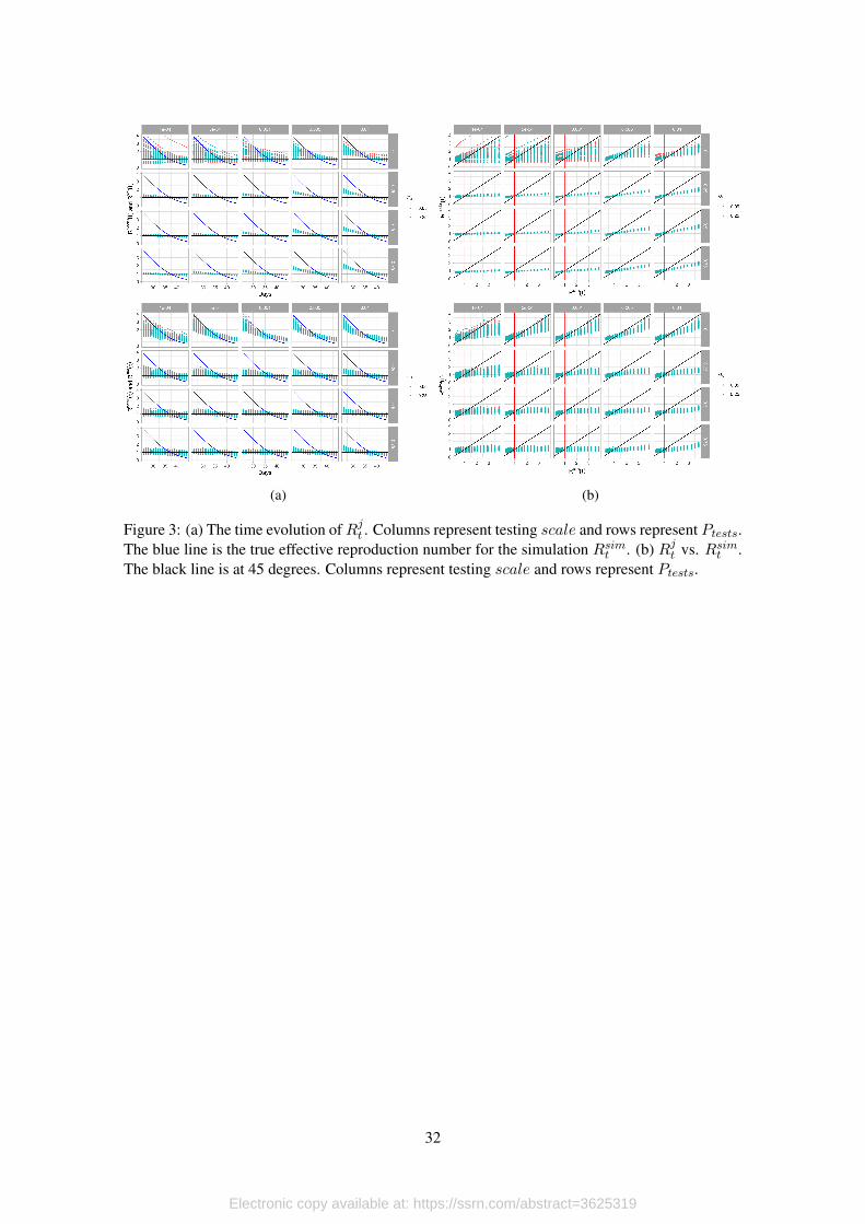
To obtain an overall picture of our simulations we first graph the evolution of Rjt and Rsimtover the course of the simulation. Figures 3a and 3b show the evolution of the effective repro-
duction number with respect to time and with respect to the true reproduction number. As is
immediately apparent, both model and naive reproductive numbers are systematically biased, un-
derestimating the true reproductive number before Rsimt = 1, and overestimating after this point.
The bias can be seen to be larger for smaller testing scales (scale) and for testing strategies that
prioritize testing symptomatic individuals (i.e. larger values of Ptests), while the size of the dis-
turbance to the testing error trend (σu) seems to play a very small, if any role.
[Figure 3 about here.]
[Figure 4 about here.]
[Figure 5 about here.]
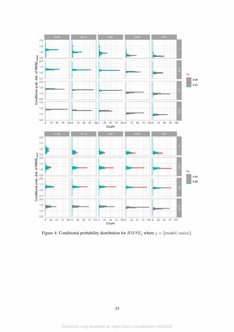
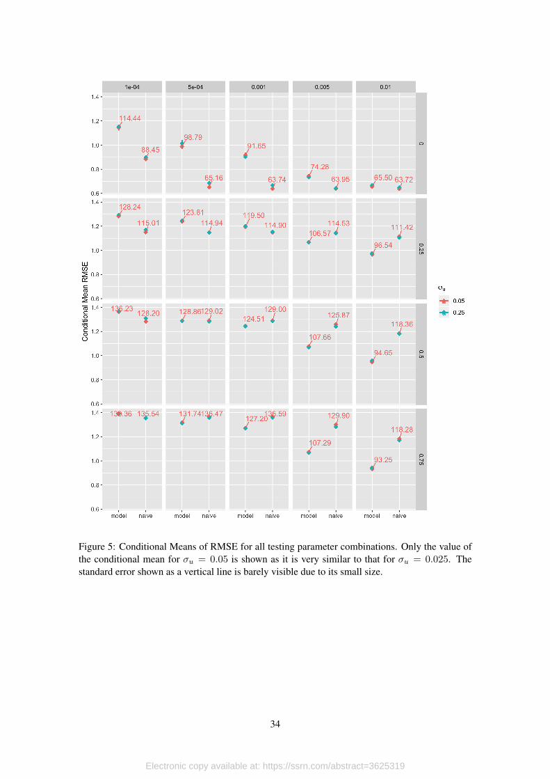
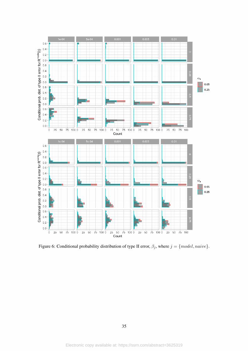
To quantify the effects of testing scale and testing strategy on the systematic bias in the
effective reproduction number we find the conditional mean and standard error of RMSEj and
ηj7. The conditional probability distribution for RMSEj and ηj can be respectively seen in
figure 4 and figure 6. The conditional means for each parameter combination can be seen in
figure 5 and figure 7.7This is equivalent to regressing RMSEj and βj with respect to all the the parameters and their interactions.
14
Electronic copy available at: https://ssrn.com/abstract=3625319
Both performance measures exhibit very similar behavior with respect to the testing param-
eters. As can be seen in fugure 5 for the lowest testing scale, the naive model outperforms our
model, but this gap falls sharply as the testing strategy switches from random testing to prioritize
symptomatic patients. As expected, increasing testing scale reduces theRMSE for both the naive
and the model. Under random testing the fall in RMSEj due to increasing testing scale is greater
for the naive calculation ofRj(t) than for the model. However as soon as testing strategies become
non-random (Ptests > 0) the fall in RMSEj from increased testing scale is much greater for the
model than for the naive effective reproduction number. This is significant because most countries
with binding testing constraints probably prioritize symptomatic patients. While this is good in
terms of diagnostics, there is a trade-off involved in the precision of the effective reproductive
number.
[Figure 6 about here.]
[Figure 7 about here.]
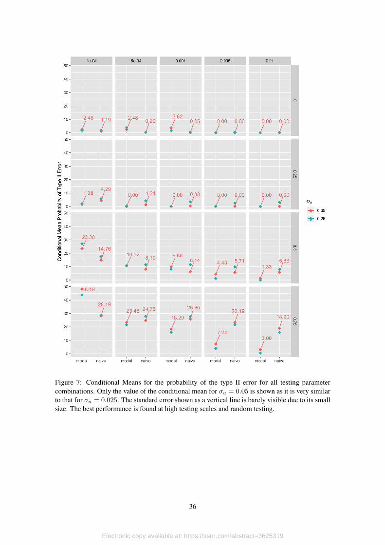
Our analysis of the effect of testing parameters on the probability of type II error follow a
similar pattern to the RMSE. Figure 7 shows the conditional mean of the probability of type II
error. As can be seen under random testing (Ptests = 0) we have the lowest rate of type II error.
Under non-random testing, increasing the testing scale reduces the probability of type II error
more for the model than for the naive estimation of Rj(t). For example the average rate of type II
error at the largest testing scale (scale = 0.01, one percent of the testable population is tested each
day) is 3% for the model while it is more than 6 times larger , 18.9%, for the naive calculation of
Rj(t). This is significant if the effective reproduction number is to be used as an indication if the
epidemiological process is entering its waning phase.
While these results show that both the naive, and model estimations of the effective reproduc-
tion number are biased, the size and direction of this bias is sensible to the parameters that govern
the data gathering process. As we have taken the epidemiological process as given, this bias is
independent of the data generating process (i.e. the epidemiological process) and due solely to the
data gathering process (i.e. testing).
5.2.1. Trajectories Over the (Rt, ρt) Space
As the pandemic unfolds, the data-gathering process produces volatile information that is
subject to selection bias (testing patients with symptoms with higher probability) and measure-
ment error (systematic bias in the measure of Rt). Because of this, it is important to look at a
combination of indicators to assess the current situation in specific territories. In this section we
argue that looking at the effective reproduction number is not enough to assess whether or not the
infection process is contained.
The reason for this is simple. In spite of all data corrections that can potentially be made
(ours and delay corrections such as in Abbott et al., 2020), the value and dynamics of the effective
reproduction number depend on testing and the test positivity rate. Thus, there could be cases
in which Rt < 1 because there is an premature reduction in the testing scale (daily tests fall on
15
Electronic copy available at: https://ssrn.com/abstract=3625319
average) combined with constant (or just marginal reductions) in the test positivity rate. If this
occurs, then Rt < 1 does not imply that transmission is under control, but that the testing strategy
is not correctly designed (i.e. the testing scale is not appropriate given the size of the outbreak).
To rule out this wrong assessment, in this section we propose to look at the joint trajectory
of the effective reproduction number and the test positivity rate, and argue that there is evidence
of a contained infection process only when both indicators are sufficiently low. In fact, while Rtmeasures how fast the pathogen is spreading, the test positivity rate provides a measure of the level
of infection at a given point in time.
For the design of this assessment scheme we consider two thresholds. For the effective repro-
duction number we take Rt = 1 as our point of reference. The reason is simple: When Rt < 1 the
exponential growth rate of daily new infections is negative, so daily counts of new cases are falling
over time. For the test positivity rate, we set the threshold of ρt = 0.10, or a test positivity rate of
10%, which is a goal set by the World Health Organization (public statement by Dr. Michael Ryan,
Executive Director of the WHO, cited by Bult, 2020). The reason for this is that, as we mentioned
before, the test positivity rate is highly correlated to the true infection process, so as the disease
spreads over susceptible population at positive exponential growth rates, test positivity rates are
expected to be high. However, as the infection process is contained with effective interventions,
and if testing is done correctly (i.e. the scale of the testing scheme is enough to cover the size of
the outbreak), the test positivity rate should be low.8
We apply this idea to our simulated data to study how this methodology allows us to reduce
the probability of type I and type II errors that can be triggered by the data gathering process. We
present the density plot of trajectories in Figure 8. Lighter colors represent a higher concentra-
tion of points in a given area. For reference, we also present the true trajectory followed by the
simulated infection process. For this, we use the Rt derived directly from the simulated process,
and we compute the true positivity rate as the ratio of infected individuals with respect to total
population at a given point in time. Moreover, black dotted lines delimit the four quadrants that
are defined by the combination of thresholds.
[Figure 8 about here.]
This plot shows that, even in the presence of significant variation, it seems like trajectories
based on testing data follow the true trajectory and coincide in their passing through the four possi-
ble quadrants. This result is encouraging because it implies that, even in the presence measurement
and error and selection bias in the estimates of Rt and ρt, looking a its joint distribution could be a
reasonable approach to minimize the probability of wrongly confirm that the transmission process
is under control.
To formalize this evidence, we define three errors that occur due to measurement error and
selection bias. The first error term aims to analyzing deviations in Rt. Differently to the previous
section were we only considered type II errors, in this section we count situations were R2t is
8In fact, according to the Johns Hopkins University Coronavirus Resource Center, the WHO advice for governmentsis to make sure that testing positivity remains below 5% during, at least, 14 weeks before ending confinement measures(https://coronavirus.jhu.edu/testing/testing-positivity).
16
Electronic copy available at: https://ssrn.com/abstract=3625319
below (above) 1 while Rsimt is above (below) 1. Formally, we have
δR = 1[(R2t < 1 ∧Rsimt ≥ 1) ∨ (R2
t ≥ 1 ∧Rsimt < 1)],
where 1 is an inicator function that takes the value of 1 if the condition in square brackets holds
and 0 otherwise, so δR is a dummy variable. Following the same idea, we count deviations from
the true positivity rate considering the 10% threshold, so we can write
Finally, we define a fail when δR = δρ = 1 which corresponds to situations in which both
estimates (Rt and ρt) are deviating from their true values at the same time. formally, we have
δ(R,ρ) = 1[δR = 1 ∧ δρ = 1].
We compute these three dummy variables for time periods in (5, 60) for the 4,000 runs that we
simulated using our ABM, giving us a total of 215,933 observations. To see how the joint analysis
of Rt and ρt reduces the probability of type I and type II errors, we compute the probability of
error in Rt, ρt and (Rt, ρt). We show the results of these calculations in Table 3 and present
standard deviations in parenthesis.
[Table 3 about here.]
In all three cases, the percentage of classification errors is statistically different from zero,
and much higher for the test positivity rate (23.6%) than for the effective reproduction number
(6.06%). However, when we look at the joint analysis, classification errors fall drastically to
0.34%.
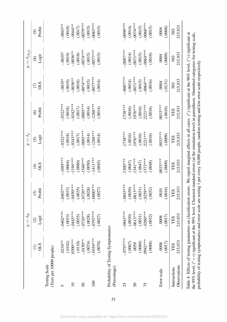
How do testing affect these errors? To answer this question we take advantage of the exo-
geneity provided by our simulations, and estimate the following equation,
δitj = βj + γγγjDsci +αααjD
sympi + λλλj(D
sci )′Dsymp
i + κjDεi + µitj , (12)
where i corresponds to each simulation, t denotes the time period, j = {R, ρ, (R, ρ)}, βj is the
constant term, Dsci are dummy variables for the four possible values that testing scale can take
in the simulations, Dsympi are dummies for the probability testing symptomatics, Dε
i is a dummy
variable that takes the value of one when the scale of the innovation in the testing process is high
and (Dsci )′Dsymp
i is a set of interactions which is included as long as the model can be estimated.
In principle, we estimate equation (12) by OLS with standard errors clustered at the simu-
lation level. Notice that, since parameters do not vary within simulations, we are automatically
accounting for fixed effects in our regression. Moreover, since we have complete control over the
parameters in each simulation, the correlation between the error term and the regressors is zero,
so we are in fact estimating causal effects. The only limitation with our strategy is that we are
assuming linearlity. To see how this assumption might affect our results, we estimate (12) assum-
17
Electronic copy available at: https://ssrn.com/abstract=3625319
ing cumulative logistic (logit) and normal (probit) distributions, and estimate the parameters by
maximum likelihood. We present the marginal effects of these estimations in Table 4.
[Table 4 about here.]
Our results are sensible to the linearity assumption, particularly for classification errors in Rtand ρt although we do not find significant difference when we look at the joint analysis. Nonethe-
less, we choose non-linear estimations over the linear model and report the results of all the esti-
mations. Moreover, due to the small number of observations in which the joint analysis produces
classification errors, we are not able to include interaction terms. In every case we estimate our
models with 215,933 observations and 4,000 clusters.
The effects of the scale of testing over wrong classifications regarding the effective reproduc-
tion number are monotonic, while the effects of the probability of testing symptomatics seem to
have a non-linearity when testing is closer to being random. In particular, increasing the scale of
testing reduces the probability of classification error according to the Rt threshold; while testing
some proportion of symptomatic patients reduces the probability of this classification error in at
least 2.6% with respect to totally random testing. Although this last result might seem counterin-
tuitive, remember that the measurement in Rt originates in attenuation bias that we generate when
we estimate the exponential growth rate using confirmed cases. As we test more symptomatics,
this growth rate increases (other things equal), alleviating the attenuation bias triggered by limited
testing.
The effects of the testing strategy over classification errors regarding the postivity rate are
completely monotonic. In this case, increasing the testing scale reduces this probability in up to
13%, while increasing the probability of testing symptomatics increases the probability of type I
and type II error in this classification by as much as 22%.
Finally, when we look at classification errors looking at the joint analysis, it is interesting to
see that, although all coefficients are significant at, at least, 95% confidence level, the magnitudes
are really low. This result is important, because provide us with evidence that although there might
be systematic bias in Rt and ρt separately, when analyzed jointly the effects of different testing
schemes over the probability of wrong classification are negligible.
The results in this section are relevant for the analysis of the current state of the transmission
process in environments with limited information and poor testing strategies. What we have shown
is that the joint analysis of the test positivity rate and the effective reproduction number provides
a safe assessment, and should be considered during the discussion on containment measures.
6. Application to Country Data
Once we have explored our methodology’s limitations in controlled environments, in this
section we apply it to Covid-19 data to extract information about infection curves for 56 different
countries. From this sample, we choose 15 countries for which we show explicitly how each step
of our model is applied.
18
Electronic copy available at: https://ssrn.com/abstract=3625319
The 15 countries that we consider include 5 developed economies and 10 emerging markets:
the United States, Canada, Italy, Switzerland, United Kingdom, Peru, Mexico, Chile, Colombia,
Japan, India, Bolivia, Ecuador, Uruguay and Israel. The quality of data in this group is very
heterogeneous and ranges from high quality data based on massive testing, proper data registries
and short sample processing delays (as is the case for United States), to extremely bad quality
data that reflects poor data gathering practices, long delays in samples processing and very limited
testing, usually clustered among people presenting symptoms (as is the case of Ecuador).
Another feature that makes these event studies interesting is that we also have heterogeneity
regarding the stage of the infection process at which each country is at the last date that we updated
the model, from countries that have been through the worst part of the outbreak, such as Italy
or Switzerland, going through countries that have remained for some time in a plateau-like part
of the infection curve, such as United States or Canada, to countries that are still experiencing
exponential growth such as Chile, Colombia or Bolivia. We also look at the case of Uruguay,
a country that was very successful at tackling the pandemic at very early stages, so they never
experienced exponential growth in the number of confirmed positives.
We use data available from the Our World in Data Covid-19 Dataset (OWD) Max Roser
and Hasell (2020), except for Ecuador. For the latter we build the time series by hand using
the information that Ecuador’s Health Ministry (MSP) publishes daily in the presidency’s Risk
Management Commission web page. The latest update for each country included in this paper
was June 1st, except for Ecuador, for which we have information until June 2nd.
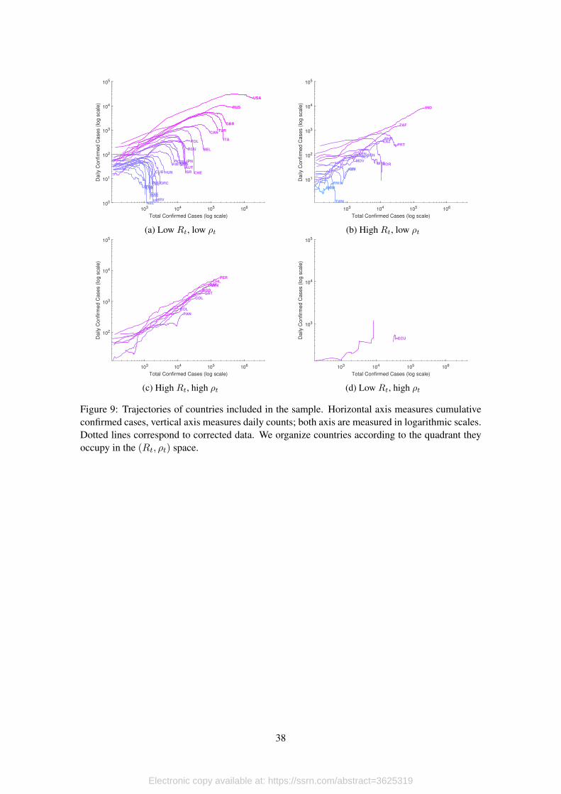
[Figure 9 about here.]
In general, data that is widely available for analysis is subject to several reporting issues that
trigger variations that are not necessarily related to the infection process. In Figure 9 we show
infection trajectories according to reported data for the 56 countries included in our sample. Hor-
izontal axis measure total confirmed cases until the last update, while vertical axis measure daily
counts of confirmed cases. Both axis are in logarithmic scales, and countries are classified accord-
ing to the quadrant they occupy in the (Rt, ρt) space considering its most updated observations.
This type of trajectories are quite informative. First, it is possible to identify countries that
have left exponential growth trends, as the group of countries we observe in Figure 9a, countries
that continue to expand on exponential trends like in Figure 9c, or countries with serious data
issues, like what we observe in Figure 9d for the case of Ecuador. In every case, missing values
occur either because data was not available for given dates, there are dates where daily positives
were zero, or dates where the evolution of confirmed cases imply negative values9 Something
similar occurs with daily counts on tests.
With this in mind, in the sections to follow we illustrate how we apply our method to the
data we have at hand and being aware that we are not making necessary adjustments that are
complementary to our method. This process is divided in three stages: First we extract the seasonal
and atypical components, and then use the adjusted series to compute the smoothing parameter of9This occurs in the case of Ecuador due to massive data revisions that have been occurring since May 4th.
19
Electronic copy available at: https://ssrn.com/abstract=3625319
the HP filter as a function of the standard deviation of the cycle component. Second, we rebuild
the series of daily positives using the estimated trends and cycles for daily positives and tests.
Finally, we estimate Rt.
6.1. Extracting the Seasonal and Atypical Components
To be able to work with additive components we transform everything to logarithms. Since
there are days when neither positives are detected nor tests are applied, we use linear interpolation
to fill these gaps. Then we detrend all series using the HP filter setting λ = 1600 for positives (we
change this later) and a linear trend for tests (testing monotonicity assumption, see Manski and
Molinari, 2020, for details).
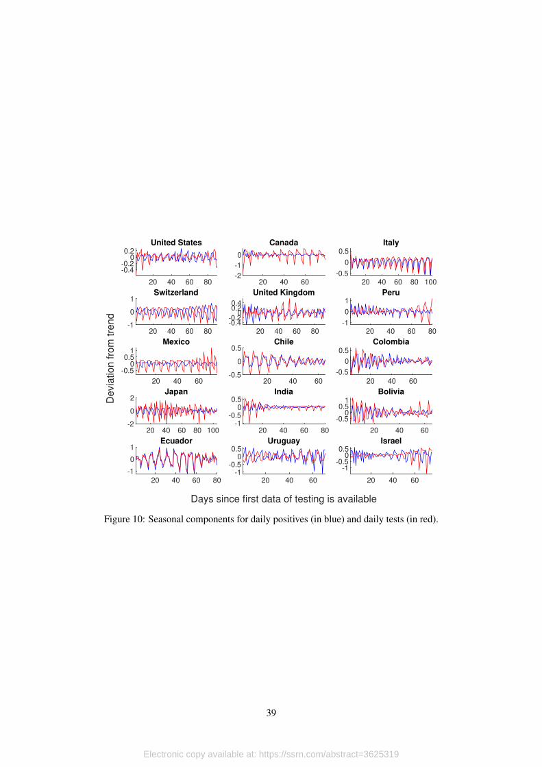
The next step consists on cleaning the error terms from the seasonal component; for this, we
apply an S(3, 3) filter. Figure 10 shows the estimated seasonal components for daily positives
(blue) and daily tests (red) for each country. We measure these in percent deviations from trend
since the first day for which we have information on tests being performed.
[Figure 10 about here.]
To our surprise, we find strong seasonal components for 13 out of the 15 countries we study,
and it is particularly important for countries in Europe, Latin America and Japan. It is clear that
this type of noise can be extremely misleading for the analysis of the infection dynamics, since
seasonality generates peaks and valleys that are solely explained by factors that are completely
exogenous, like the fact that testing processing and sampling can be limited to hospitals during the
weekend.
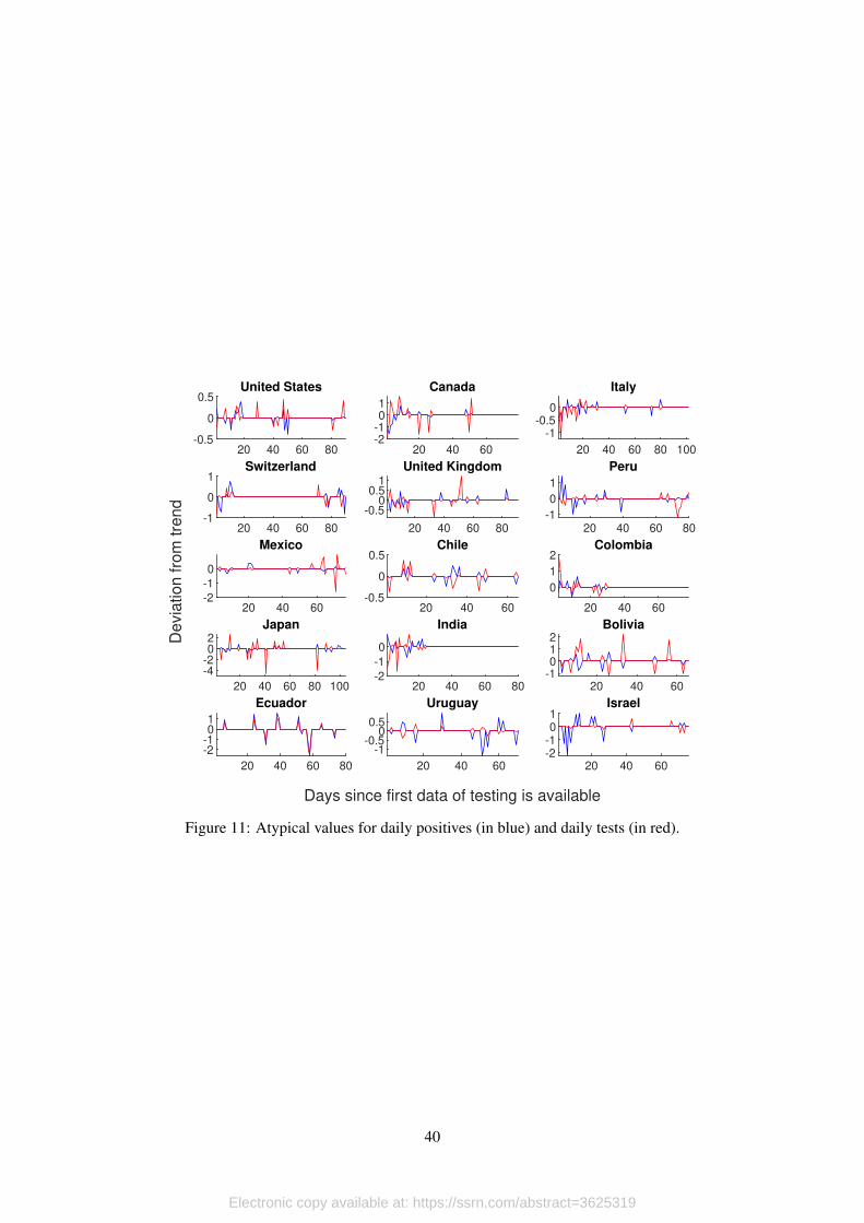
Once we have the error terms clear of seasonality, we move towards identifying atypical
values. These events are characterized by sudden increases (or decreases) that occur very limited
times during the time we observe data. In the case of Ecuador, for example, we have such events
explained by unexpected increases in test processing capacities, or data revisions performed by
the authorities.
To detect these events in a systematic manner, we take the seasonally adjusted error terms for
positives and tests, order them, and eliminate the first and last quintiles. To fill the gaps generated
by this procedure, we use linear interpolation. Figure 11 shows the identified atypical values for
daily positives (blue) and daily tests (red).
[Figure 11 about here.]
In general we find that atypical values occur at the beginning of the outbreak. This result
makes sense, since it is expected for countries to experience an adjustment period regarding testing
capacities, which can be quite erratic. Moreover, investment on testing infrastructure made during
early stages of the infection process payoff at the moment that politicians need to start making
decisions about confinement measures.
However, there are cases like Ecuador, Mexico or Chile where atypical values occur in the
second half of the period that we observe. This should be a source of concern, since we are talking
20
Electronic copy available at: https://ssrn.com/abstract=3625319
that this occurs 40 or 50 days into the infection process. At this point, usually there is economic,
political, and social pressure triggered by confinement measures and its secondary effects, that
pushes politicians towards hasty decision making. If this process comes in hand with increased
levels of noise in the data that are solely explained by events that are completely uncorrelated to
the infection process, then wrong decisions can easily trigger new outbreaks.
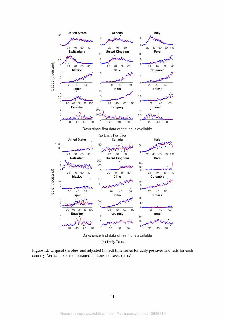
Once we have the seasonally adjusted error terms without extreme values, we rebuild the
series for positives and tests, and use these series for the dynamics estimations that we describe in
the next section. We present the results in Figure 12, Panel 12a for daily positives and Panel 12b
for daily testing. Blue dots correspond to original data, red lines are the adjusted versions.
[Figure 12 about here.]
The final step in this stage is related to the estimation of the trend of the probability of detect-
ing positives among people tested and testing itself. In both cases we use the HP filter calibrated
with endogenous smoothing parameters that are directly correlated with the level of volatility in
the error term of each series. The corresponding values of λ∗ for the probability of positive re-
sults and daily tested are presented in Table 5. Notice that these parameters change every time the
model is updated.
[Table 5 about here.]
6.2. Estimating the Infection Dynamics
We use the adjusted time series of daily positives and tests performed to compute the prob-
ability of a positive result among those tested (all in logarithms). We treat this as a new time
series that only has a trend and the cycle component, since both positives and tests are already the
adjusted versions. Then, we filter the trend component for each variable using the endogenous
smoothing parameters that we found in the previous section.
With these elements, we reconstruct the trend and cycle components of daily positives from
the trend and cycles that we obtained for the probability of positive results and daily testing.
Notice that these do not coincide with the trend and cycle that we obtained in the cleaning stage.
The reason for this is that we are not using the same smoothing parameters. Then, we use block
bootstraping to build confidence intervals for the estimated trend.
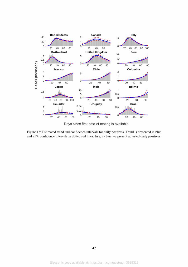
[Figure 13 about here.]
We show the estimated trend and confidence intervals for each country in Figure 14. The
estimated trend corresponds to the blue line, with 95% confidence intervals in dotted red lines.
For comparison, we also include the adjusted daily positives time series (in gray bars). These
results show that our method does a good job sorting the data.
The usual practice (see Abbott et al., 2020, for example) consists on assuming delay distri-
butions to adjust reported positives according to onset of symptoms and actual date of infection.
Given the data that we have at hand, we are not able to perform these adjustments, so our estimates
21
Electronic copy available at: https://ssrn.com/abstract=3625319
are lagged behind. Nonetheless, a feature that makes our approach appealing is that our infection
curves are continuous and smooth (something that is not obtained just by adjusting the temporal
framework).
This is important, because the computation of the effective reproduction number Rt (i.e. the
rate at which the disease spreads among the population) is based on the exponential growth rate
of daily positives. Even if this curve is subject to delay adjustments (the usual practice), it still
exhibits sudden variations, and this affects significantly the dynamics of Rt: You can easily have
periods of Rt < 1 that do not respond the the infection process itself, but to other exogenous
factors.
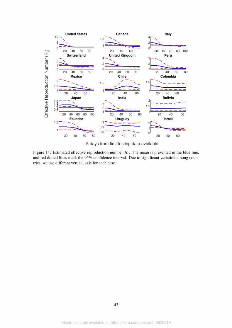
[Figure 14 about here.]
To compute Rt we fit a linear trend to the logarithm of the trend of adjusted daily positives in
sliding windows of 10 days. We do this for each of the bootstrapped trend, so we can account for
this variation the moment that we build the confidence interval.
But this is not the only source of uncertainty. As we mentioned before, the generation time is
also a random variable. In this case, we take Abbott et al. (2020) estimate (mean of 3.6 days and a
standard deviation of 3.0) and assume that the generation number is log-normally distributed. We
simulate 1000 different samples with these characteristics so, together with the 1000 bootstrapped
trends, gives a grand total of 1,000,000 simulated values for Rt at each point in time. We sort
these simulations and compute the 95% confidence interval.
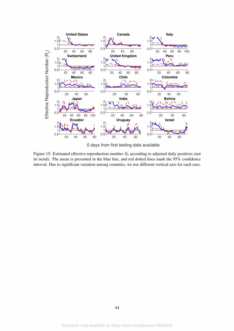
[Figure 15 about here.]
We present the results of our estimations in Figure 14, where the blue solid line represents
the mean, and the red dotted lines each of the 95% confidence bounds. For comparison, Figure 15
presents the results of the computation of Rt using only seasonally adjusted series once atypical
values have been filtered (i.e. we do not apply the filtering process to the probability of positive
results and testing that we did previously).
Our results show that, as long as data quality permits, both approaches arrive to the same
conclusions. For example, consider the cases of Canada, Switzerland or Israel, where the infection
process seems to be controlled in both figures. However, in every other case, Figure 15 does not
provide a clear picture.
In Chile, for example, there seems to be a second outbreak at the end of the period (which is,
in fact, the way the authorities read the data). However, when we look at the smooth version of Rtin Figure 14 we see that the first outbreak never was really under control. In other words, it seems
like Chile’s authorities lifted contention measures too soon.
Ecuador is an extreme example of a country in which considering only official data makes any
type of analysis impossible. Figure 15 shows that, even after adjusting the series and eliminating
atypical values, it is very hard to draw any conclusion using the effective reproduction number
because of its extremely erratic behavior. However, our approach allows us to conclude that there is
evidence that the infection process in Ecuador has been quite stable, with an effective reproduction
number that only in the most recent days has been approaching 1.
22
Electronic copy available at: https://ssrn.com/abstract=3625319
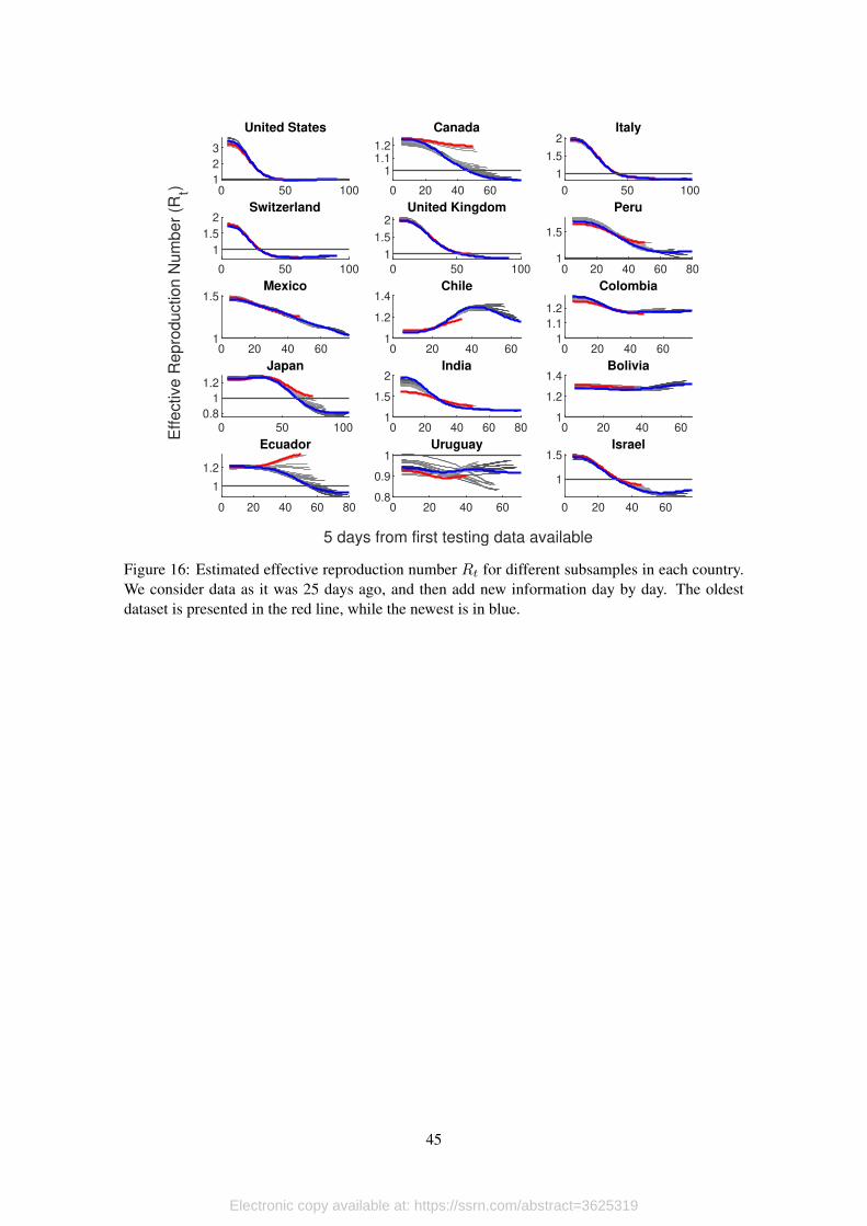
6.3. Dynamic Consistency of the Methodology
A valid worry with our methodology is how new data might affect past and current trends. In
particular, our model could easily confuse atypical values with a change in the underlying trend,
specially in countries where data is very noisy. Its clear that this will have a significant effect in
the trend itself, but how much does new data affect the dynamics and the value of the effective
reproduction number?
To answer this question, we apply our methodology to data 25 days ago, and then add more
recent observations, one at the time. We present the results of this exercise in Figure 16. In red we
show the behavior of Rt in the oldest dataset, while the blue line corresponds to the newest. Then,
gray lines show intermediate cases, from lighter (older) to darker (newer).
[Figure 16 about here.]
This exercise shows how new information is incorporated to the model with each new ob-
servation we obtain from the data, and reflects the quality of data in each country. For example,
for cases like United States, Italy, Switzerland or United Kingdom, the quality of the data that is
produced is good enough, so new observations maintain the trend implied by previous data. Thus,
each new observation provides valuable information.
In countries like Canada, Peru, Mexico, Chile, Japan or Israel, data contains more noise.
However, in spite of being subject to significant corrections, the adjustment of the curve over time
is monotonic. In these countries it is necessary to have more data (i.e. wait for longer) until one can
assess the current situation. For example, 25 days ago the estimation of Rt for Japan was above
1, but the most updated estimation shows that by that time the infection process might have been
already under control. Something similar happens with Canada, which shows important variation
but, again, the adjustment is monotonic.
This is not the case with Uruguay or Ecuador. In both cases information is so noisy (even
after all the cleaning process that it is subject to in our methodology), that each new release has the
potential to completely change the main trend. Thus, results with these countries are very volatile,
and takes much longer to be sure about what is going on. In the case of Uruguay this does not
represents a serious concern because all estimations of Rt lie below 1.
For Ecuador, on the other hand, the behavior that we show in this paper should be seriously
considered by authorities, and important efforts should be made in the direction of improving data
management. The problem in this case is that adjustment is not monotonic and complementary
analysis (shown in the next section) shows evidence that Rt could be, in fact, higher than one.
This level of variation can produce analysis that have the potential to misinform the decision
making process, and can put population under serious risk.10 The reason for this is that due to
data quality, it is possible to have a second outbreak alarm on one day followed by a controlled
infection picture the following day. Thus, the estimation is not stable over time.10It is worth noticing that this is an important limitation of the model we propose, but it also affects significantly
any analysis based on Bayesian methods, since the prior distribution might be very volatile from day to day, makingBayesian updating quite challenging.
23
Electronic copy available at: https://ssrn.com/abstract=3625319
6.4. Countries Trajectories Over the (Rt, ρt) Space
For this analysis we use the filtered trend of the test positivity rate and the effective reproduc-
tion number. Then, we compute the joint density of both indicators over a two-dimensional grid
with 101 points. For this we use the information for all countries and all time periods. We present
the results using two-dimensional contour plots and heat maps instead of using a three-dimensional
plot to have a better view of the implied dynamics. Figure 17 show the results.
There is one obvious difference between the data-generating process in our country data and
our simulations: most countries in our sample have applied different measures to contain the
spread of the virus; some have been successful, some have been ineffective. But a first conclusion
rises from this difference: Countries with ineffective contention measures are more likely to end
up with trajectories that look like our simulations. This can be seen in Figure 17, which is similar
to figure 8, but in this case we consider trajetories defined by the 56 countries that we include in
our sample.
[Figure 17 about here.]
We divide plots in Figure 17 in four quadrants. Countries in the bottom-left quadrant (Rt < 1
and ρt < 0.10) can be said to have the situation under control, since the rate of spread of the virus
is below 1 and the testing scale is large enough considering the size of the outbreak.
The situation for countries in the bottom-right quadrant (Rt ≥ 1 and ρt < 0.10) is very het-
erogenous. Here we might have cases of countries that are at the beginning of an outbreak and they
are adjusting their testing strategy, countries in the middle of an outbreak with appropriate testing
schemes and adequate containment measures, or countries that are facing a second outbreak.
Countries in the top-right quadrant (Rt ≥ 1 and ρt ≥ 0.10) are in a delicate situation, since
they are facing an outbreak with exponential growth rates. Countries in this situation need to pay
special attention to their testing strategies because, although high test positivity rates could be
related to the infection process itself, can also be a warning of insufficient testing. This can be the
case specially in countries where testing is highly targeted to people with severe symptoms and
personal working in the front line.
Then, we have the top-left quadrant (Rt < 1 and ρt ≥ 0.10). In our sample of countries,
it is very unlikely to be in this position (we only have one observation, Ecuador). However, as it
will be shown in our simulation section, this area of the plot turns out to be a likely outcome in
situations where contention measures are nonexistent and the testing scheme is insufficient.
[Figure 18 about here.]
The analysis with the joint density of the effective reproduction number and the test positivity
rate provides information about the current state of the countries we have in the sample, as well
as showing the most common paths followed during the pandemic. However, for this analysis to
be complete we need to look at the joint trajectories that countries have followed in the (Rt, ρt)
space. Figure 18 show the trajectories followed by each country according to the Cartesian order.
Countries are classified according to their most recent state, which is marked with countries’ labels
24
Electronic copy available at: https://ssrn.com/abstract=3625319
and hollow circles. Full circles mark the starting point for each country. As in the heat maps
that we presented before, we mark thresholds for the effective reproduction number and the test
positivity rate are in dotted red lines for reference.
Trajectories carry a lot of information. Panel 18c show the trajectories followed by countries
tha currently are in a low Rt, low ρt state. Within this group of countries, we can distinguish two
sub groups. There are countries, like Italy, that where in the bottom-right corner of the plot at
the beginning of the pandemic, and then passed through the top quadrants before controlling the
infection process. Part of the reason why these countries registered high positivity rates could be
related either to wrong testing strategies or a strong infection process which affected most of their
population within a very small time frame.
For countries that currently are located in the bottom-right quadrant we have, again, three
types of trajectories. First, there are countries like India or Polonia that are moving to the bottom-
left quadrant; that is, the effective reproduction number is still high, but is falling, and the test
positivity rate is under control. A second subgroup are those that started in the bottom-left quadrant
(controlled infection process) and are experiencing a second outbreak. An example in this group
is South Korea.
Countries in the top-right quadrant are experiencing exponential growth infection processes.
The most worrying case is Bolivia, a country that is going through an explosive infection process
with an estimated effective reproduction number that is above 1.3 (and growing), and a test pos-
itivity rate over 50% (and growing). In similar positions are Peru and Mexico that, although in
these cases the effective reproduction number has been falling, it is still significantly over 1 and
register very large test positivity rates, especially in the case of Peru.
Finally, we have the top-left quadrant which currently includes only Ecuador, but there are
some other countries with trajectories that passed through this quadrant, which is characterized by
low Rt but test positivity rates that are still above 10%. One thing that all these countries have in
common (Ecuador and countries that went through this quadrant such as the United States, United
Kingdom or Italy), is that non-pharmaceutical interventions where either set too late, or they were
just not effective. Moreover, in the case of Ecuador, there is evidence of a poorly designed testing
strategy that targeted people with severe symptoms and workers in the front line; we can infer this
from Ecuador’s trajectory, that started with a test positivity rate of about 50% and in 77 days since
case 100 have not been able to reduce this rate below 30%.
[Table 6 about here.]
Due to the characteristics of countries that go through the top-left quadrant, it turns out that
the case fatality rate and the mortality rate are significantly higher (at least 2.2 times higher) than in
other quadrants. In Table 6 we present the case fatality and the mortality rates computed for each
quadrant. For this, we consider the section of trajectories of each country that goes through and
compute the average case fatality and mortality rates. We present standard errors in parenthesis. in
the top-left quadrant (Q4: Rt < 1, ρt >= 0.10) the case fatality and mortality rates are 1.45% and
2.00 per 10,000 inhabitants, respectively, which are higher than what is found in the first quadrant
25
Electronic copy available at: https://ssrn.com/abstract=3625319
(which include all countries at the end of the infection process), with corresponding rates of 0.67%
and 0.66 per 10,000 inhabitants.
7. Conclusion
Management of the Covid-19 pandemic around the world have not been free from political
calculations, which in most countries implied changes in the way surveillance data is released to
the public, methodological changes improvised in the unfold of the pandemic, and information
gaps that can last for several days. This lack of information hinders the ability of agents external
to the government (such as academics) to fulfill their role as monitoring agencies. In this paper
we have attempted to reduce this information gap by proposing a simple method that allows us
to form a clear picture of the infection process when the only data available corresponds to daily
counts of confirmed cases and tests.
Our method consisted in subjecting the available data to old school time series filtering pro-
cesses that allows us to abstract the underlying infection process from stochastic innovations that
are orthogonal to the transmission process. In particular, before computing any epidemiological
indicator, we introduce a data cleaning process in which we eliminate the seasonal and atypical
components that affect the time series of daily counts. Then, using the filtered trend of daily posi-
tives, which we calculate imputing endogenously calibrated smoothing parameters to the HP filter,
we compute the effective reproduction number Rt and the test postivity rate ρt.
We applied our method to simulated data before using it on real Covid-19 surveillance data.
From this exercise we learned that any epidemiological indicator computed from daily counts of
confirmed cases and tests alone will produce systematically biased indicators. However, our data
treatment methodology managed to reduce the root mean squared error between the true effective
and the estimated reproduction number, and the probability of type II error (that is, having an
estimation of the effective reproduction number that is below 1, when the real process implies an
Rt that is still above 1). In other words our simulations show that, although there is uncertainty
about the true level of the infection process, there is much that we can learn just by studying the
dynamics of the process. This information is highly valuable particularly for public policy.
Further, we argued that the joint analysis of these two indicators allowed us to control for
the systematic bias present in Rt and to control for cases in which type II errors are more likely.
Moreover, studying the trajectories followed by countries over the (Rt, ρt) space we were able
to find dangerous situations in which Rt < 1 in spite of having test postivity rates that are well
above 10%. The reason for our worry is that our country analysis showed higher mortality and
case fatality rates compared to the other quadrants. Moreover, this analysis also allowed us to
pin down trajectories that might be related to outbreaks in countries that already had the situation
under control in previous weeks.
Among the limitations of our analysis, the most salient one is related to the method we use
to estimate Rt. In particular, we do not make use of Bayesian statistics for this task, which is the
most common method in the epidemiological literature for the estimation of this indicator. How-
ever, since these methods use the same surveillance data to build prior distributions, we strongly
26
Electronic copy available at: https://ssrn.com/abstract=3625319
believe that the data-cleaning process that we propose would improve its performance. In fact, our
recommendation is to add our data treatment to the corrections that are already being applied by,
for example, Abbott et al. (2020).
References
ABBOTT, S., J. HELLEWELL, J. MUNDAY, J. YOUNG CHUN, R. THOMPSON, N. BOSSE, Y.-W.
DESMOND, T. RUSSELL, C. JARVIS, S. FLASCHE, A. KUCHARSKI, R. EGGO, AND S. FUNK
(2020): “Temporal variation in transmission during the Covid-19 outbreak,” Centre for Mathe-
matical Modelling of Infectious Diseases, London School of Hygine and Tropial Medicine.
ANDERSON, R. M., B. ANDERSON, AND R. M. MAY (1992): Infectious diseases of humans:
dynamics and control, Oxford university press.
ARELLANO, C., Y. BAI, AND G. MIHALACHE (2020): “Deadly Debt Crises: COVID-19 in
Emerging Markets,” Mimeo.
BARRO, R. (2020): “Non-Pharmaceutical Interventions and Mortality in U.S. Cities during the
Great Influenza Pandemic, 1918-1919,” NBER Working Paper.
BETTENCOURT, L. M. AND R. M. RIBEIRO (2008): “Real time bayesian estimation of the epi-
demic potential of emerging infectious diseases,” PLoS One, 3.
BULT, L. (2020): “The US Tested the Wrong People for the Coronavirus,” Vox Explanatory Jour-
nalism.
CORREIA, S., L. STEPHAN, AND E. VERNER (2020): “Pandemics Depress the Economy, Public
Health Interventions Do Not: Evidence from the 1918 Flu,” SSRN Working Paper.
DUBLIN, L. I. AND A. J. LOTKA (1925): “On the true rate of natural increase: As exemplified
by the population of the United States, 1920,” Journal of the American statistical association,
20, 305–339.
EICHENBAUM, M., M. TRABANDT, AND S. REBELO (2020a): “The Macroeconomics of Epi-
demics,” Mimeo.
——— (2020b): “The Macroeconomics of Testing and Quarantining,” Mimeo.
EKSIN, C., K. PAARPORN, AND J. S. WEITZ (2019): “Systematic biases in disease forecasting–
The role of behavior change,” Epidemics, 27, 96–105.
FELLER, W. (2015): “On the integral equation of renewal theory,” in Selected Papers I, Springer,
567–591.
FERGUSON, N. M., D. A. CUMMINGS, S. CAUCHEMEZ, C. FRASER, S. RILEY, A. MEEYAI,
S. IAMSIRITHAWORN, AND D. S. BURKE (2005): “Strategies for containing an emerging
influenza pandemic in Southeast Asia,” Nature, 437, 209–214.
27
Electronic copy available at: https://ssrn.com/abstract=3625319
FERNÁNDEZ-VILLAVERDE, J. AND C. JONES (2020): “Estimating and Simulating a SIRD
Model of COVID-19 for Many Countries, States and Cities,” Mimeo.
GALLEGO, F. A. AND C. A. JOHNSON (2005): “Building confidence intervals for band-pass and
Hodrick–Prescott filters: an application using bootstrapping,” Applied Economics, 37, 741–749.
GLOVER, A., J. HEATHCOTE, D. KRUEGER, AND V. RÍOS-RULL (2020): “Health versus
Wealth: On the Distributional Effects of Controlling a Pandemic,” CEPR DP 14606 Working
Paper.
HODRICK, R. J. AND E. C. PRESCOTT (1997): “Postwar US business cycles: an empirical inves-
tigation,” Journal of Money, credit, and Banking, 1–16.
KEYFITZ, N. AND H. CASWELL (2005): Applied mathematical demography, vol. 47, Springer.
KRUEGER, D., H. UHLIG, AND T. XIE (2020): “Macroeconomic Dynamics and Reallocation in
an Epidemic,” CEPR DP 14607 Working Paper.
KUBINEC, R. (2020): “A Retrospective Bayesian Model for Measuring Covariate Effects on Ob-
served COVID-19 Test and Case Counts,” SocArXiv. April, 1.
KUCHARSKI, A. J., T. W. RUSSELL, C. DIAMOND, Y. LIU, J. EDMUNDS, S. FUNK, R. M.
EGGO, F. SUN, M. JIT, J. D. MUNDAY, ET AL. (2020): “Early dynamics of transmission and
control of COVID-19: a mathematical modelling study,” The lancet infectious diseases.
LILLEY, A., M. LILLEY, AND G. RINALDI (2020): “Public Health Interventions and Economic
Growth: Revisiting The Spanish Flu Evidence,” SSRN Working Paper.
MANSKI, C. F. AND F. MOLINARI (2020): “Estimating the covid-19 infection rate: Anatomy of
an inference problem,” Journal of Econometrics.
MAX ROSER, HANNAH RITCHIE, E. O.-O. AND J. HASELL (2020): “Coronavirus Pandemic
(COVID-19),” Our World in Data, https://ourworldindata.org/coronavirus.
MEIDAN, D., R. COHEN, S. HABER, AND B. BARZEL (2020): “An alternating lock-down strat-
egy for sustainable mitigation of COVID-19,” arXiv preprint arXiv:2004.01453.
METZ, J. A. AND O. DIEKMANN (2014): The dynamics of physiologically structured popula-
tions, vol. 68, Springer.
NISHIURA, H. AND G. CHOWELL (2009): “The effective reproduction number as a prelude to
statistical estimation of time-dependent epidemic trends,” in Mathematical and statistical esti-
mation approaches in epidemiology, Springer, 103–121.
OBADIA, T., R. HANEEF, AND P.-Y. BOËLLE (2012): “The R0 package: a toolbox to estimate
reproduction numbers for epidemic outbreaks,” BMC medical informatics and decision making,
12, 147.
28
Electronic copy available at: https://ssrn.com/abstract=3625319
PYBUS, O. G., M. A. CHARLESTON, S. GUPTA, A. RAMBAUT, E. C. HOLMES, AND P. H.
HARVEY (2001): “The epidemic behavior of the hepatitis C virus,” Science, 292, 2323–2325.
SHIM, E., A. TARIQ, W. CHOI, Y. LEE, AND G. CHOWELL (2020): “Transmission potential and
severity of COVID-19 in South Korea,” International Journal of Infectious Diseases.
THOMPSON, R., J. STOCKWIN, R. [VAN GAALEN], J. POLONSKY, Z. KAMVAR, P. DEMARSH,
E. DAHLQWIST, S. LI, E. MIGUEL, T. JOMBART, J. LESSLER, S. CAUCHEMEZ, AND
A. CORI (2019): “Improved inference of time-varying reproduction numbers during infectious
disease outbreaks,” Epidemics, 29, 100356.
WALLINGA, J. AND M. LIPSITCH (2007): “How generation intervals shape the relationship be-
tween growth rates and reproductive numbers,” Proceedings of the Royal Society B: Biological
Sciences, 274, 599–604.
WALLINGA, J. AND P. TEUNIS (2004): “Different epidemic curves for severe acute respiratory
syndrome reveal similar impacts of control measures,” American Journal of epidemiology, 160,
509–516.
WILENSKY, U. (1999): “NetLogo,” http://ccl.northwestern.edu/netlogo/, Center for Connected
Learning and Computer-Based Modeling, Northwestern University, Evanston, IL.
29
Electronic copy available at: https://ssrn.com/abstract=3625319
(a) First report (b) Report with tests at province level
(c) Report April 7th (d) Most recent report
Figure 1: Key examples of official reports with Covid-19 surveillance statistics published by theMinistry of Public Health of Ecuador.
30
Electronic copy available at: https://ssrn.com/abstract=3625319
Figure 2: SEIRD compartments for the evolution of infections in our simulation. Percentages aretransition probabilities between compartments.
31
Electronic copy available at: https://ssrn.com/abstract=3625319
(a) (b)
Figure 3: (a) The time evolution ofRjt . Columns represent testing scale and rows represent Ptests.The blue line is the true effective reproduction number for the simulation Rsimt . (b) Rjt vs. Rsimt .The black line is at 45 degrees. Columns represent testing scale and rows represent Ptests.
32
Electronic copy available at: https://ssrn.com/abstract=3625319
Figure 4: Conditional probability distribution for RMSEj where j = {model, naive}.
33
Electronic copy available at: https://ssrn.com/abstract=3625319
Figure 5: Conditional Means of RMSE for all testing parameter combinations. Only the value ofthe conditional mean for σu = 0.05 is shown as it is very similar to that for σu = 0.025. Thestandard error shown as a vertical line is barely visible due to its small size.
34
Electronic copy available at: https://ssrn.com/abstract=3625319
Figure 6: Conditional probability distribution of type II error, βj , where j = {model, naive}.
35
Electronic copy available at: https://ssrn.com/abstract=3625319
Figure 7: Conditional Means for the probability of the type II error for all testing parametercombinations. Only the value of the conditional mean for σu = 0.05 is shown as it is very similarto that for σu = 0.025. The standard error shown as a vertical line is barely visible due to its smallsize. The best performance is found at high testing scales and random testing.
36
Electronic copy available at: https://ssrn.com/abstract=3625319
Figure 8: Density of the joint dynamics of the effective reproduction number and the test positivityrate. Warmer colors correspond to areas with a higher concentration of simulated trajectories.
37
Electronic copy available at: https://ssrn.com/abstract=3625319
103 104 105 106
Total Confirmed Cases (log scale)
100
101
102
103
104
105
Da
ily C
on
firm
ed
Ca
se
s (
log
sca
le)
USA
CAN
ITA
CHE
GBR
JPN
URY
ISR
AUT
BEL
CUB
CZEDNK
EST
FIN
GRC
HRV
HUN
ISL
LTU
LVA
NZL
POL
ROU
RUS
SRB
SVKSVN
TUN
TUR
(a) Low Rt, low ρt
103 104 105 106
Total Confirmed Cases (log scale)
101
102
103
104
105
Da
ily C
on
firm
ed
Ca
se
s (
log
sca
le)
IND
CRI
KAZ
KEN
KORMDV
MMR
PRT
PRY
RWA
SENSLV
TWN
ZAF
BHR
MYS
(b) High Rt, low ρt
103 104 105 106
Total Confirmed Cases (log scale)
102
103
104
105
Da
ily C
on
firm
ed
Ca
se
s (
log
sca
le)
PER
MEX
CHL
COL
BOL
BGD
PAK
PAN
QAT
(c) High Rt, high ρt
103 104 105 106
Total Confirmed Cases (log scale)
103
104
105
Da
ily C
on
firm
ed
Ca
se
s (
log
sca
le)
ECU
(d) Low Rt, high ρt
Figure 9: Trajectories of countries included in the sample. Horizontal axis measures cumulativeconfirmed cases, vertical axis measures daily counts; both axis are measured in logarithmic scales.Dotted lines correspond to corrected data. We organize countries according to the quadrant theyoccupy in the (Rt, ρt) space.
38
Electronic copy available at: https://ssrn.com/abstract=3625319
20 40 60 80
-0.4-0.2
00.2
United States
20 40 60-2
-1
0
Canada
20 40 60 80 100-0.5
0
0.5Italy
20 40 60 80-1
0
1Switzerland
20 40 60 80-0.4-0.2
00.20.4
United Kingdom
20 40 60 80-1
0
1Peru
20 40 60
-0.50
0.51
Mexico
20 40 60-0.5
0
0.5Chile
20 40 60
-0.5
0
0.5Colombia
20 40 60 80 100-2
0
2Japan
20 40 60 80-1
-0.50
0.5India
20 40 60
-0.50
0.51
Bolivia
20 40 60 80
-1
0
1Ecuador
20 40 60-1
-0.50
0.5Uruguay
20 40 60
-1-0.5
00.5
Israel
Days since first data of testing is available
De
via
tio
n f
rom
tre
nd
Figure 10: Seasonal components for daily positives (in blue) and daily tests (in red).
39
Electronic copy available at: https://ssrn.com/abstract=3625319
20 40 60 80-0.5
0
0.5United States
20 40 60-2-101
Canada
20 40 60 80 100
-1-0.5
0
Italy
20 40 60 80-1
0
1Switzerland
20 40 60 80
-0.50
0.51
United Kingdom
20 40 60 80-1
0
1
Peru
20 40 60-2
-1
0
Mexico
20 40 60-0.5
0
0.5Chile
20 40 60
0
1
2Colombia
20 40 60 80 100
-4-202
Japan
20 40 60 80-2
-1
0
India
20 40 60-1012
Bolivia
20 40 60 80
-2-101
Ecuador
20 40 60
-1-0.5
00.5
Uruguay
20 40 60-2-101
Israel
Days since first data of testing is available
De
via
tio
n f
rom
tre
nd
Figure 11: Atypical values for daily positives (in blue) and daily tests (in red).
40
Electronic copy available at: https://ssrn.com/abstract=3625319
20 40 60 800
50United States
20 40 600
1
2
Canada
20 40 60 80 1000
5
Italy
20 40 60 800
0.5
1
Switzerland
20 40 60 800
5
10United Kingdom
20 40 60 800
5
10Peru
20 40 600
2
4Mexico
20 40 600
5Chile
20 40 600
1
Colombia
20 40 60 80 1000
0.5
1
Japan
20 40 60 800
5
10India
20 40 600
0.5
1Bolivia
20 40 60 800
1
2
3Ecuador
20 40 600
0.02
0.04Uruguay
20 40 600
0.5
1
Israel
Days since first data of testing is available
Cases (
thousand)
(a) Daily Positives
20 40 60 800
500
1000
United States
20 40 600
50
Canada
20 40 60 80 1000
50
Italy
20 40 60 800
5
10Switzerland
20 40 60 800
100
200United Kingdom
20 40 60 800
10
20
Peru
20 40 600
10
20
Mexico
20 40 600
10
20Chile
20 40 600
5
10
Colombia
20 40 60 80 100
0
5
10
Japan
20 40 60 800
50
100
India
20 40 600
5
10Bolivia
20 40 60 800
5Ecuador
20 40 600
1
2Uruguay
20 40 600
10
20Israel
Days since first data of testing is available
Tests
(th
ousand)
(b) Daily Tests
Figure 12: Original (in blue) and adjusted (in red) time series for daily positives and tests for eachcountry. Vertical axis are measured in thousand cases (tests).
41
Electronic copy available at: https://ssrn.com/abstract=3625319
Figure 13: Estimated trend and confidence intervals for daily positives. Trend is presented in blueand 95% confidence intervals in dotted red lines. In gray bars we present adjusted daily positives.
42
Electronic copy available at: https://ssrn.com/abstract=3625319
20 40 60 800
5
10United States
20 40 60
1
1.5
Canada
20 40 60 80 1000
2
4Italy
20 40 60 800
1
2
Switzerland
20 40 60 800
2
4United Kingdom
20 40 60 801
2
3Peru
20 40 601
1.5
2
Mexico
20 40 601
1.5
Chile
20 40 601
1.5
Colombia
20 40 60 80 100
0.81
1.21.41.6
Japan
20 40 60 801
2
3
India
20 40 601
1.5
2Bolivia
20 40 60 80
1
1.5Ecuador
20 40 600.8
0.9
1Uruguay
20 40 600
1
2
Israel
5 days from first testing data available
Eff
ective
Re
pro
du
ctio
n N
um
be
r (R
t)
Figure 14: Estimated effective reproduction number Rt. The mean is presented in the blue line,and red dotted lines mark the 95% confidence interval. Due to significant variation among coun-tries, we use different vertical axis for each case.
43
Electronic copy available at: https://ssrn.com/abstract=3625319
20 40 60 800.5
1
1.5
2United States
20 40 600.5
1
1.5
2Canada
20 40 60 80 1000.5
1
1.5
2Italy
20 40 60 800.5
11.5
2Switzerland
20 40 60 800.5
11.5
2United Kingdom
20 40 60 800.5
11.5
2Peru
20 40 600.5
1
1.5
2Mexico
20 40 600.5
1
1.5
2Chile
20 40 600.5
1
1.5
2Colombia
20 40 60 80 1000.5
11.5
2Japan
20 40 60 800.5
11.5
2India
20 40 600.5
11.5
2Bolivia
20 40 60 800.5
1
1.5
2Ecuador
20 40 600.5
1
1.5
2Uruguay
20 40 600.5
1
1.5
2Israel
5 days from first testing data available
Eff
ective
Re
pro
du
ctio
n N
um
be
r (R
t)
Figure 15: Estimated effective reproduction number Rt according to adjusted daily positives (notits trend). The mean is presented in the blue line, and red dotted lines mark the 95% confidenceinterval. Due to significant variation among countries, we use different vertical axis for each case.
44
Electronic copy available at: https://ssrn.com/abstract=3625319
0 50 1001
2
3
United States
0 20 40 60
11.11.2
Canada
0 50 100
1
1.5
2Italy
0 50 100
1
1.5
2Switzerland
0 50 100
1
1.5
2United Kingdom
0 20 40 60 801
1.5
Peru
0 20 40 601
1.5Mexico
0 20 40 601
1.2
1.4Chile
0 20 40 601
1.1
1.2
Colombia
0 50 1000.8
1
1.2
Japan
0 20 40 60 801
1.5
2India
0 20 40 601
1.2
1.4Bolivia
0 20 40 60 80
1
1.2
Ecuador
0 20 40 600.8
0.9
1Uruguay
0 20 40 60
1
1.5Israel
5 days from first testing data available
Eff
ective
Re
pro
du
ctio
n N
um
be
r (R
t)
Figure 16: Estimated effective reproduction number Rt for different subsamples in each country.We consider data as it was 25 days ago, and then add new information day by day. The oldestdataset is presented in the red line, while the newest is in blue.
45
Electronic copy available at: https://ssrn.com/abstract=3625319
0.6 0.7 0.8 0.9 1 1.1 1.2 1.3 1.4 1.5
Effective Reproduction Number (Rt)
0
20
40
60
80
100
120T
est
po
sitiv
ity r
ate
(%
)
USACANITACHE
GBR
PER
MEX
CHL
COL
JPN
IND
BOL
ECU
URYISR AUTBEL
BGD
CRICUBCZEDNK ESTFINGRCHRV HUN ISL KAZ
KENKORLTULVA
MDV
MMRNZL
PAK
PAN
POLPRTPRY
QAT
ROURUSRWA
SENSLV
SRBSVK SVNTUNTUR
TWN
ZAFBHR
MYS
Zoomed area
102
Den
sity (
log
sca
le)
(a) All Countries. Black lines delimit the zoomed areathat is presented in panel 17b.
0.6 0.7 0.8 0.9 1 1.1 1.2 1.3
Effective Reproduction Number (Rt)
1
2
3
4
5
6
7
8
9
10
11
12
Te
st
po
sitiv
ity r
ate
(%
)
USA
CAN
ITACHE
GBR
COL
JPN
IND
URYISR AUT
BEL
CRI
CUBCZE
DNK EST
FIN
GRCHRVHUN ISL
KAZ
KEN
KORLTULVA
MDV
MMRNZL
POLPRT
PRYROU
RUS
RWA
SEN
SLV
SRB
SVKSVNTUN
TUR
TWN
ZAF
BHR
MYS
102
Den
sity (
log
sca
le)
(b) Zoomed Section
Figure 17: Density of the joint dynamics of the effective reproduction number and the test positiv-ity rate. Warmer colors correspond to areas with a higher concentration of countries’ trajectories.Countries’ labels are located at the most recent location.
46
Electronic copy available at: https://ssrn.com/abstract=3625319
0.9 0.95 1 1.05 1.1 1.15 1.2 1.25
Effective Reproduction Number (Rt)
10
15
20
25
30
35
40
45
50
Te
st
po
sitiv
ity r
ate
(%
)
ECU
(a) Low Rt, high ρt
0.9 1 1.1 1.2 1.3 1.4 1.5 1.6 1.7 1.8
Effective Reproduction Number (Rt)
0
20
40
60
80
100
120
140
Te
st
po
sitiv
ity r
ate
(%
)
PER
MEX
CHL
COL
BOL
BGDPAK
PAN
QAT
(b) High Rt, high ρt
0.5 1 1.5 2 2.5 3 3.5
Effective Reproduction Number (Rt)
0
5
10
15
20
25
30
35
40
Te
st
po
sitiv
ity r
ate
(%
)
USACAN
ITACHE
GBR
JPNURYISR AUT
BEL
CUBCZEDNKESTFIN
GRCHRVHUNISLLTULVANZL
POLROU
RUS
SRBSVK SVNTUN
TUR
(c) Low Rt, low ρt
0.6 0.8 1 1.2 1.4 1.6 1.8 2
Effective Reproduction Number (Rt)
0
2
4
6
8
10
12
14
16
18
Te
st
po
sitiv
ity r
ate
(%
)
IND
CRI
KAZ
KEN
KOR
MDV
MMR
PRTPRY
RWA
SEN
SLV
TWN
ZAF
BHR
MYS
(d) High Rt, low ρt
Figure 18: Trajectories of countries for which their most recent bundle of effective reproductionnumber and test positivity rate is located at each quadrant. Full circles represent the startingpoint, while hollow circles and labels represent most recent data. Thresholds for the effectivereproduction number and the test positivity rate are in dotted red lines for reference.
47
Electronic copy available at: https://ssrn.com/abstract=3625319
Parameter Value Description
N 100,000 PopulationE0 50 Initial number exposedρ 10 Average population density = N/10, 000 patchesPexposed 12.5% Probability of contagion = β/ρ, assuming β = 1.25
as estimated in Meidan et al. (2020).dinc dinc ∼ f(dinc) Incubation period follows a Weibull distribution
f(dinc) with shape parameter = 1.47, and scale pa-rameter = 11.04.
dlat dlat ∼ f(dlat) Latency period follows a Weibull distribution f(dlat)with shape parameter = 1.47, and scale parameter =4.42.
dIAS ,R dIAS ,R ∼ f(dIAS ,R) Days to recovery for asymptomatic infections followWeibull distribution f(dIAS ,R) with shape parameter= 1.47, and scale parameter = 11.04.
γIM ,R 1/5 Rate of recovery for IM .γIS ,H 1/4 Rate of transition from IS to H .γH,RD 1/11 Rate of transition from H to resolution.γIC ,V 1/3 Rate of transition from IC to V .γV,RD 1/13 Rate of transition from V to resolution.θsim 5.05 days Average Serial interval is found from the average
number of days between primary and secondary in-fections for the model after 60 time periods.
T 60 days Maximum number of days.
Table 1: Epidemiological parameters for SEIRD simulations.
48
Electronic copy available at: https://ssrn.com/abstract=3625319
Table 2: Testing parameter values used for the simluations.
49
Electronic copy available at: https://ssrn.com/abstract=3625319
Error in Rt Error in ρt Error in (Rt, ρt)
Mean 6.06 23.64 0.34Standard Deviation (0.239) (0.425) (0.058)
Table 3: Errors inRt, ρt and its joint analysis. We present means and standard deviations measuredin percentages.
50
Electronic copy available at: https://ssrn.com/abstract=3625319
y:=
δ Ry
:=δ ρ
y:=
δ (R,ρ)
(1)
(2)
(3)
(4)
(5)
(6)
(7)
(8)
(9)
OL
SL
ogit
Prob
itO
LS
Log
itPr
obit
OL
SL
ogit
Prob
it
Test
ing
Scal
e(T
ests
per1
0000
peop
le)
5.0
234*
*–.
0402
***
–.04
02**
*–.
1095
***
–.03
22**
*–.
0322
***
–.00
35*
–.00
35*
–.00
43**
(.010
2)(.0
033)
(.003
3)(.0
064)
(.001
8)(.0
018)
(.001
9)(.0
019)
(.001
8)10
.030
0***
–.04
45**
*–.
0450
***
–119
4***
–.03
43**
*–.
0342
***
–.00
36**
–.00
36**
–.00
44**
(.011
0)(.0
035)
(.003
5)(.0
060)
(.001
7)(.0
017)
(.001
8)(.0
018)
(.001
7)50
–.01
50**
–.07
20**
*–.
0720
***
–154
0***
–.08
85**
*–.
0885
***
–.00
74**
*–.
0074
***
–.00
79**
*(.0
074)
(.002
8)(.0
028)
(.005
0)(.0
014)
(.001
4)(.0
015)
(.001
5)(.0
015)
100
–.03
54**
*–.
0797
***
–.08
00**
*–.
1411
***
–.12
88**
*–.
1288
***
–.00
77**
*–.
0077
***
–.00
83**
*(.0
070)
(.002
7)(.0
027)
(.004
5)(.0
014)
(.001
4)(.0
014)
(.001
5)(.0
015)
Prob
abili
tyof
Test
ing
Sym
ptom
atic
s(P
erce
ntag
e)
25–.
0797
***
–.08
43**
*–.
0843
***
.130
0***
.173
8***
.173
8***
–.00
87**
*–.
0087
***
–.00
90**
*(.0
067)
(.003
0)(.0
030)
(.004
7)(.0
016)
(.001
6)(.0
014)
(.001
4)(.0
014)
50.0
059
–.06
13**
*–.
0613
***
.134
1***
.197
6***
.197
6***
–.00
71**
*–.
0071
***
–.00
74**
*(.0
080)
(.003
1)(.0
031)
(.004
7)(.0
016)
(.001
6)(.0
015)
(.001
5)(.0
015)
75.0
942*
**–.
0260
***
–.02
59**
*.1
372*
**.2
221*
**.2
221*
**–.
0064
***
–.00
64**
*–.
0068
***
(.008
8)(.0
032)
(.003
2)(.0
048)
(.001
6)(.0
016)
(.001
6)(.0
016)
(.001
5)
Err
orsc
ale
.000
8.0
008
.001
0.0
033*
**.0
033*
**.0
033*
**.0
004
.000
4.0
004
(.001
7)(.0
017)
(.001
6)(.0
009)
(.000
9)(.0
010)
(.013
1)(.0
009)
(.000
8)
Inte
ract
ions
YE
SY
ES
YE
SY
ES
YE
SY
ES
NO
NO
NO
Obs
erva
tions
215,
933
215,
933
215,
933
215,
933
215,
933
215,
933
215,
933
215,
933
215,
933
Tabl
e4:
Eff
ects
ofte
stin
gpa
ram
eter
son
clas
sific
atio
ner
rors
.W
ere
port
mar
gina
leff
ects
inal
lcas
es.
(∗)
sign
ifica
ntat
the
90%
leve
l,(∗∗)
sign
ifica
ntat
the
95%
leve
l,(∗∗∗)
sign
ifica
ntat
the
99%
leve
l.C
lust
ered
stan
dard
erro
rs(a
tthe
sim
ulat
ion
leve
l)in
pare
nthe
sis.
Om
mitt
edca
tego
ries
fort
estin
gsc
ale,
prob
abili
tyof
test
ing
sym
ptom
atic
san
der
rors
cale
are
test
ing
1pe
reve
ry10
,000
peop
le,r
ando
mte
stin
gan
dlo
wer
rors
cale
resp
ectiv
ely.
51
Electronic copy available at: https://ssrn.com/abstract=3625319
Country λ∗ρ λ∗s Country λ∗ρ λ∗s
United States 945.8 680.4 Colombia 4,430.4 3,843.6Canada 10,087.1 7,991.4 Japan 13,370.5 7,984.6Italy 1,441.7 1,652.8 India 3,041.7 1,728.9Switzerland 2,645.1 1,025.7 Bolivia 11,882.7 7,093.4United Kingdom 1,980.9 1,905.0 Ecuador 17,399.9 4,263.7Peru 4,960.4 1,924.2 Uruguay 9,349.0 1,909.2Mexico 7,685.4 6,568.0 Israel 4,042.0 912.0Chile 807.3 490.2
Table 5: Estimated smoothing parameters for the probability of detecting positives λ∗ρ and dailytesting λ∗s for each country. The scaling parameter used to compute these numbers was ζ =50, 000. Keep in mind that, since these parameters are endogenous, they change every time thatdata is updated.
52
Electronic copy available at: https://ssrn.com/abstract=3625319
Table 6: Case fatality rate and mortality rate average within each quadrant. Average is computedwith the portion of trajectory of each country that passes through quadrants. Standard errors inparenthesis. Legend: Q1, low Rt, low ρy; Q2, high Rt, low ρy; Q3, high Rt, high ρy; Q1, low Rt,high ρy.
53
Electronic copy available at: https://ssrn.com/abstract=3625319