16
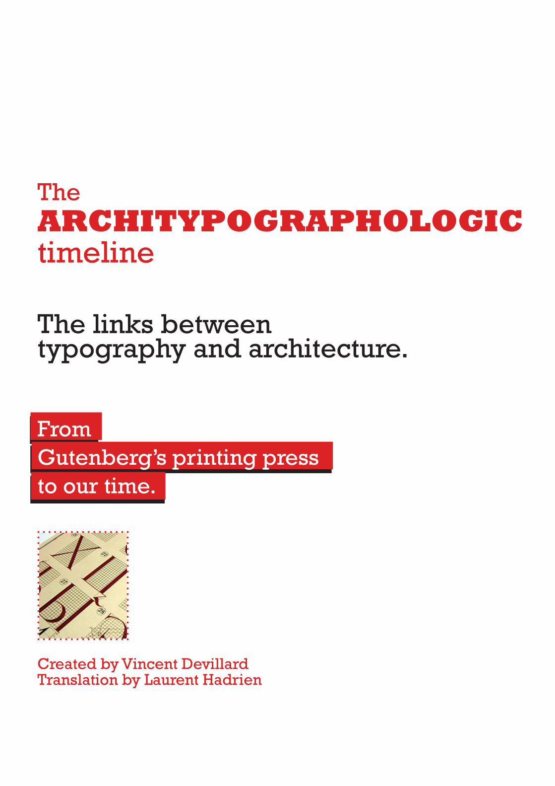
Created by Vincent Devillard Translation by Laurent Hadrien The ARCHITYPOGRAPHOLOGIC timeline From Gutenberg’s printing press to our time. The links between typography and architecture.
Created by Vincent DevillardTranslation by Laurent Hadrien
TheARCHITYPOGRAPHOLOGICtimeline
From Gutenberg’s printing press to our time.
The links between typography and architecture.
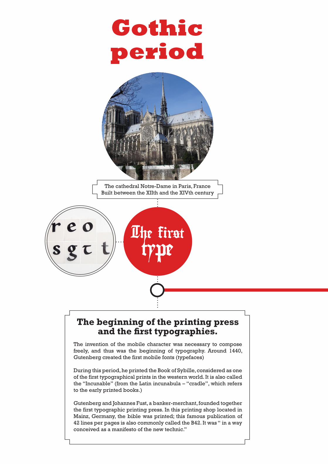
The beginning of the printing press and the first typographies.
The invention of the mobile character was necessary to compose freely, and thus was the beginning of typography. Around 1440, Gutenberg created the first mobile fonts (typefaces)
During this period, he printed the Book of Sybille, considered as one of the first typographical prints in the western world. It is also called the “Incunable” (from the Latin incunabula – “cradle”, which refers to the early printed books.)
Gutenberg and Johannes Fust, a banker-merchant, founded together the first typographic printing press. In this printing shop located in Mainz, Germany, the bible was printed; this famous publication of 42 lines per pages is also commonly called the B42. It was “ in a way conceived as a manifesto of the new technic.”
The first type
The cathedral Notre-Dame in Paris, FranceBuilt between the XIIth and the XIVth century
Gothicperiod
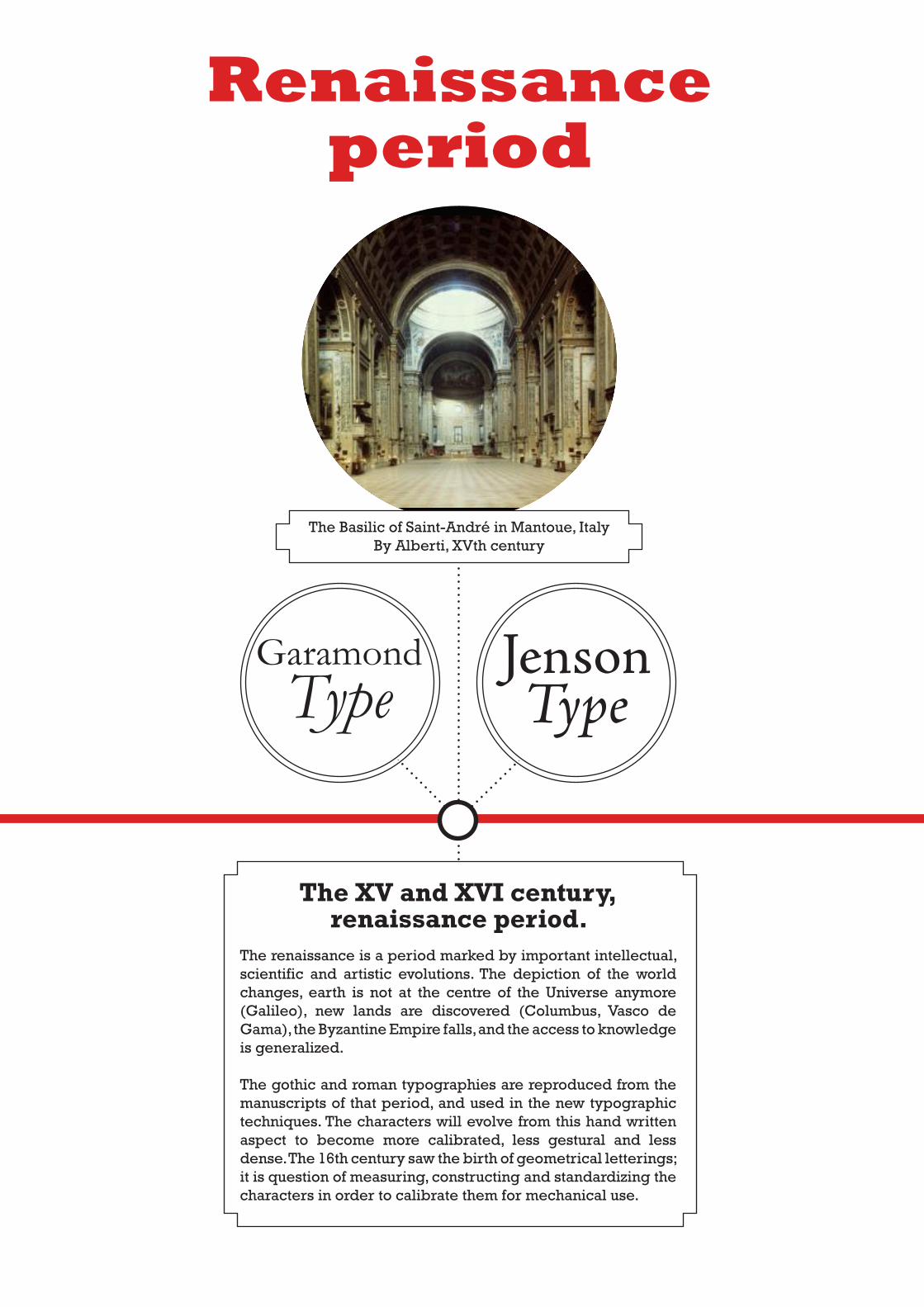
The XV and XVI century, renaissance period.
The renaissance is a period marked by important intellectual, scientific and artistic evolutions. The depiction of the world changes, earth is not at the centre of the Universe anymore (Galileo), new lands are discovered (Columbus, Vasco de Gama), the Byzantine Em pire falls, and the access to knowledge is generalized.
The gothic and roman typographies are reproduced from the man uscripts of that period, and used in the new typographic techniques. The characters will evolve from this hand written aspect to be come more calibrated, less gestural and less dense. The 16th century saw the birth of geometrical letterings; it is question of measuring, constructing and standardizing the characters in order to calibrate them for mechanical use.
The Basilic of Saint-André in Mantoue, ItalyBy Alberti, XVth century
GaramondType
Jenson Type
Renaissanceperiod
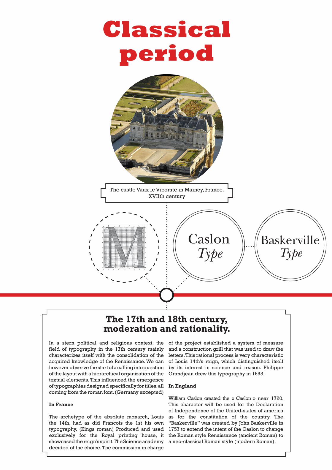
The 17th and 18th century, moderation and rationality.
The castle Vaux le Vicomte in Maincy, France.XVIIth century
CaslonType
BaskervilleType
In a stern political and religious context, the field of typography in the 17th century mainly characterizes itself with the consolidation of the acquired knowledge of the Renaissance. We can however observe the start of a calling into question of the layout with a hierarchical organization of the textual elements. This influenced the emergence of typographies designed specifically for titles, all coming from the roman font. (Germany excepted)
In France
The archetype of the absolute monarch, Louis the 14th, had as did Francois the 1st his own typography. (Kings roman) Produced and used exclusively for the Royal printing house, it showcased the reign’s spirit. The Science academy decided of the choice. The commission in charge
of the project established a system of measure and a construction grill that was used to draw the letters. This rational process is very characteristic of Louis 14th’s reign, which distinguished itself by its interest in science and reason. Philippe Grandjean drew this typography in 1693.
In England
William Caslon created the « Caslon » near 1720. This character will be used for the Declaration of Independence of the United-states of america as for the constitution of the country. The “Baskerville” was created by John Baskerville in 1757 to extend the intent of the Caslon to change the Roman style Renaissance (ancient Roman) to a neo-classical Roman style (modern Roman).
Classicalperiod
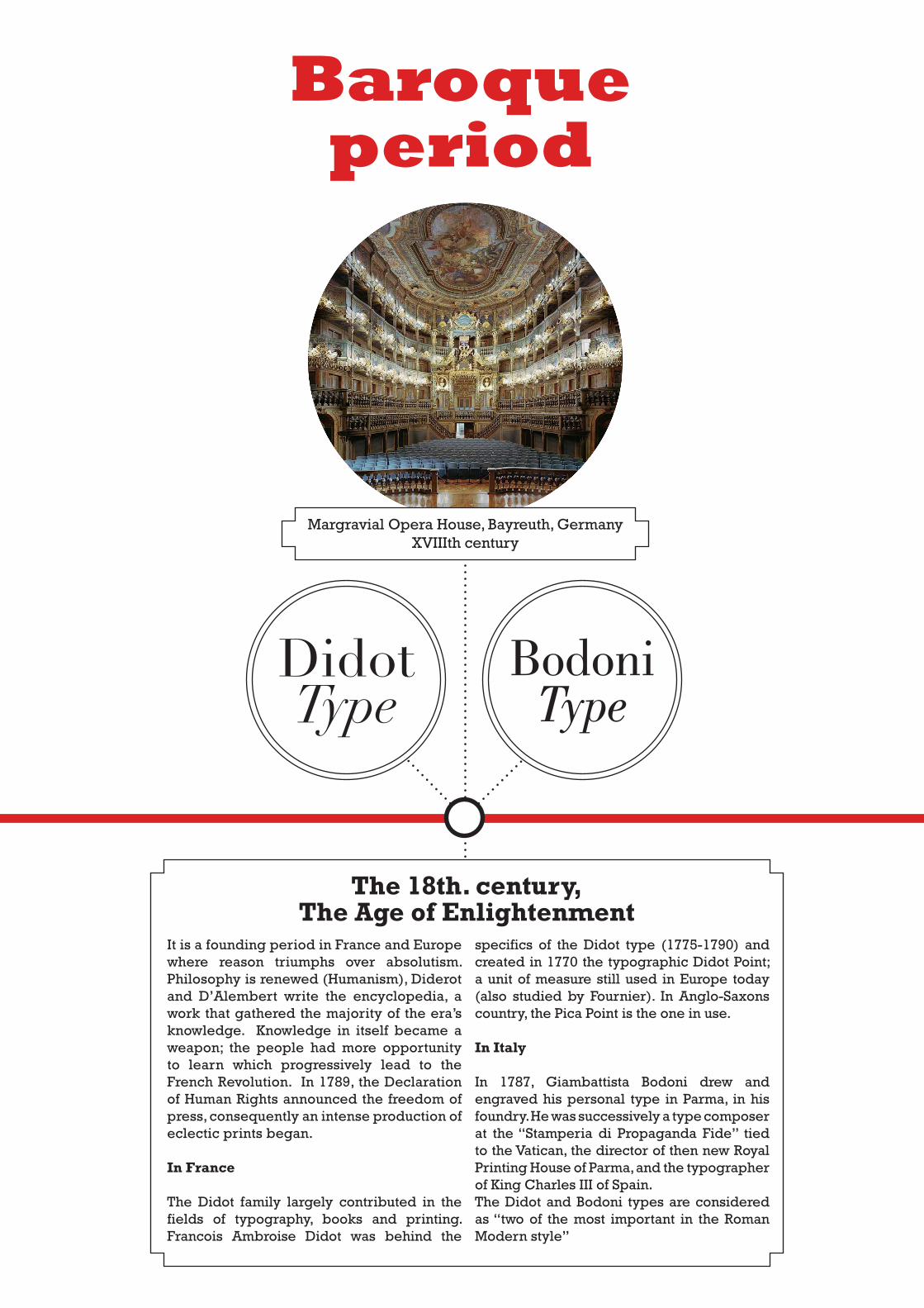
Margravial Opera House, Bayreuth, GermanyXVIIIth century
DidotType
BodoniType
The 18th. century,The Age of Enlightenment
It is a founding period in France and Europe where reason triumphs over absolutism. Philosophy is renewed (Humanism), Diderot and D’Alembert write the encyclopedia, a work that gathered the majority of the era’s knowledge. Knowledge in itself became a weapon; the people had more opportunity to learn which progressively lead to the French Revolution. In 1789, the Declaration of Human Rights announced the freedom of press, consequently an intense production of eclectic prints began.
In France
The Didot family largely contributed in the fields of typography, books and printing. Francois Ambroise Didot was behind the
specifics of the Didot type (1775-1790) and created in 1770 the typographic Didot Point; a unit of measure still used in Europe today (also studied by Fournier). In Anglo-Saxons country, the Pica Point is the one in use.
In Italy
In 1787, Giambattista Bodoni drew and engraved his personal type in Parma, in his foundry. He was successively a type composer at the “Stamperia di Propaganda Fide” tied to the Vatican, the director of then new Royal Printing House of Parma, and the typographer of King Charles III of Spain.The Didot and Bodoni types are considered as “two of the most important in the Roman Modern style”
Baroqueperiod
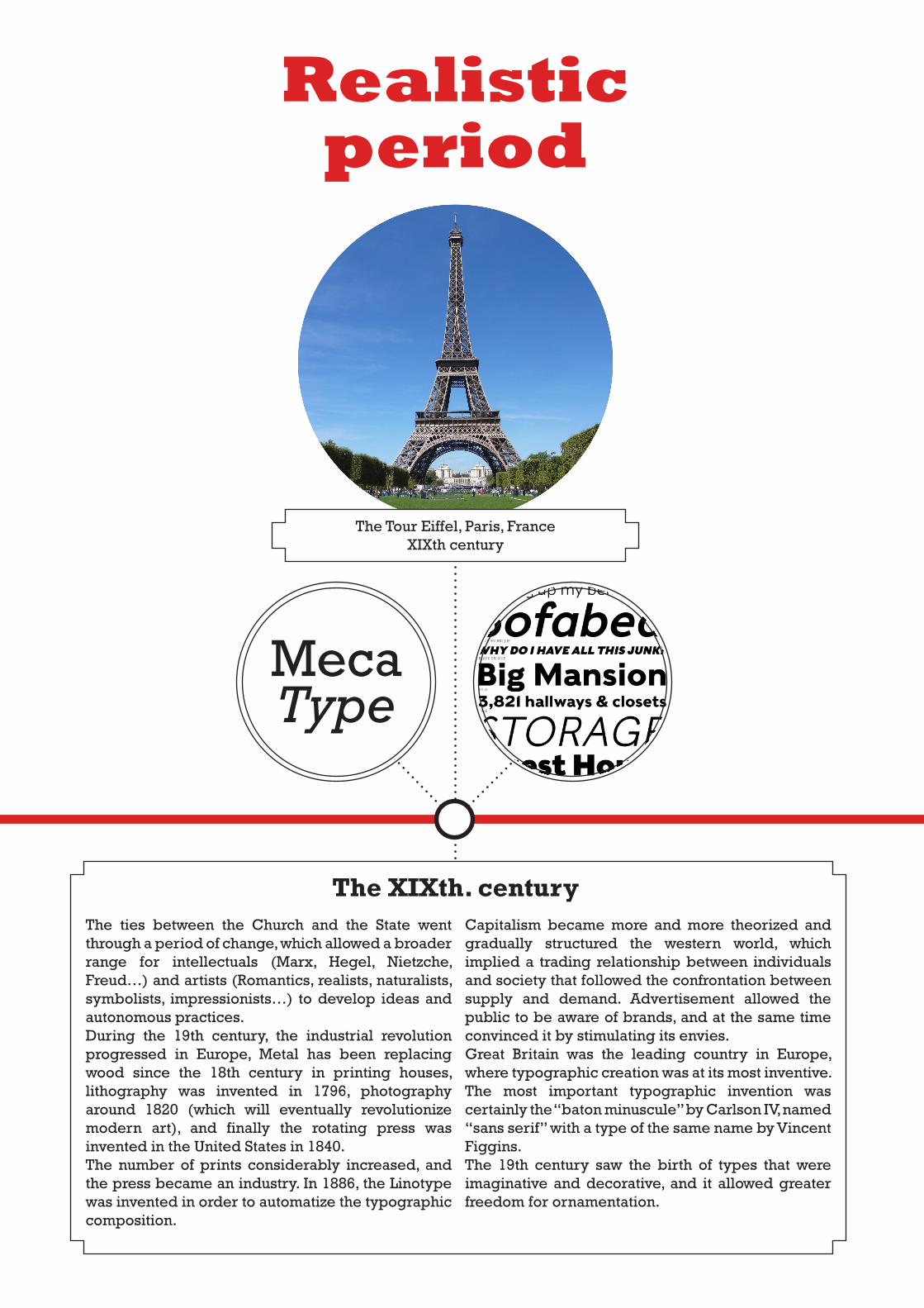
The Tour Eiffel, Paris, FranceXIXth century
The XIXth. centuryThe ties between the Church and the State went through a period of change, which allowed a broader range for intellectuals (Marx, Hegel, Nietzche, Freud…) and artists (Romantics, realists, naturalists, symbolists, impressionists…) to develop ideas and autonomous practices. During the 19th century, the industrial revolution progressed in Europe, Metal has been replacing wood since the 18th century in printing houses, lithography was invented in 1796, photography around 1820 (which will eventually revolutionize modern art), and finally the rotating press was invented in the United States in 1840. The number of prints considerably increased, and the press became an industry. In 1886, the Linotype was invented in order to automatize the typographic composition.
Capitalism became more and more theorized and gradually structured the western world, which implied a trading relationship between individuals and society that followed the confrontation between supply and demand. Advertisement allowed the public to be aware of brands, and at the same time convinced it by stimulating its envies. Great Britain was the leading country in Europe, where typographic creation was at its most inventive. The most important typographic invention was certainly the “baton minuscule” by Carlson IV, named “sans serif” with a type of the same name by Vincent Figgins. The 19th century saw the birth of types that were imaginative and decorative, and it allowed greater freedom for ornamentation.
MecaType
Realisticperiod
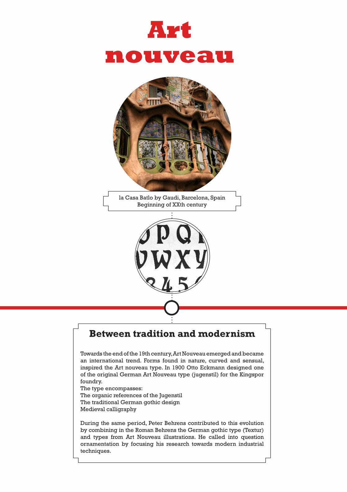
la Casa Batlo by Gaudi, Barcelona, SpainBeginning of XXth century
Between tradition and modernism
Towards the end of the 19th century, Art Nouveau emerged and became an international trend. Forms found in nature, curved and sensual, inspired the Art nouveau type. In 1900 Otto Eckmann designed one of the original German Art Nouveau type (jugenstil) for the Kingspor foundry. The type encompasses:The organic references of the JugenstilThe traditional German gothic designMedieval calligraphy
During the same period, Peter Behrens contributed to this evolution by combining in the Roman Behrens the German gothic type (Textur) and types from Art Nouveau illustrations. He called into question ornamentation by focusing his research towards modern industrial techniques.
Art nouveau
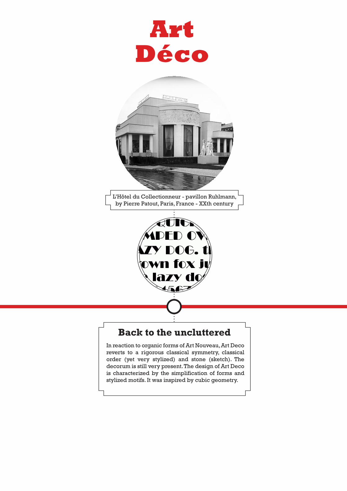
L’Hôtel du Collectionneur - pavillon Ruhlmann, by Pierre Patout, Paris, France - XXth century
Back to the unclutteredIn reaction to organic forms of Art Nouveau, Art Deco reverts to a rigorous classical symmetry, classical order (yet very stylized) and stone (sketch). The decorum is still very present. The design of Art Deco is characterized by the simplification of forms and stylized motifs. It was inspired by cubic geometry.
Art Déco
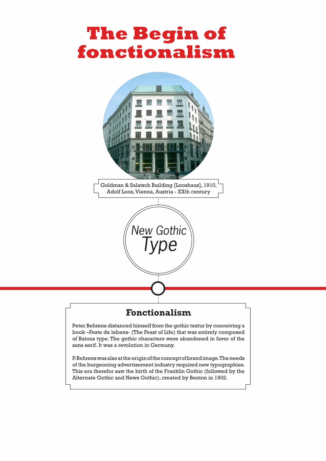
Goldman & Salatsch Building [Looshaus], 1910, Adolf Loos, Vienna, Austria - XXth century
FonctionalismPeter Behrens distanced himself from the gothic textur by conceiving a book –Feste de lebens- (The Feast of Life) that was entirely composed of Batons type. The gothic characters were abandoned in favor of the sans serif. It was a revolution in Germany.
P. Behrens was also at the origin of the concept of brand image. The needs of the burgeoning advertisement industry required new typographies. This era therefor saw the birth of the Franklin Gothic (followed by the Alternate Gothic and News Gothic), created by Benton in 1902.
The Begin offonctionalism
New GothicType
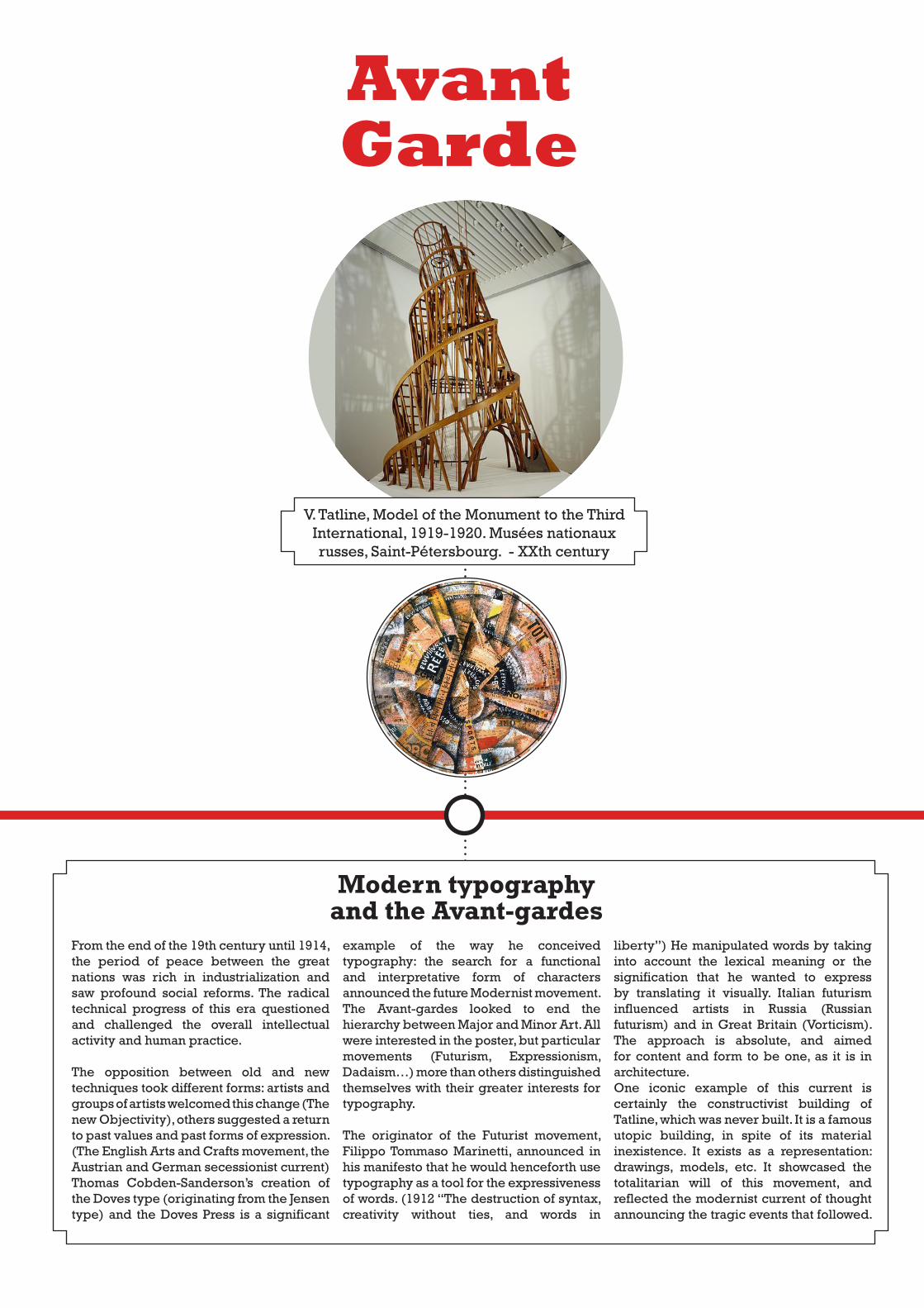
V. Tatline, Model of the Monument to the Third International, 1919-1920. Musées nationaux russes, Saint-Pétersbourg. - XXth century
Modern typography and the Avant-gardes
From the end of the 19th century until 1914, the period of peace between the great nations was rich in industrialization and saw profound social reforms. The radical technical progress of this era questioned and challenged the overall intellectual activity and human practice.
The opposition between old and new techniques took different forms: artists and groups of artists welcomed this change (The new Objectivity), others suggested a return to past values and past forms of expression. (The English Arts and Crafts movement, the Austrian and German secessionist current)Thomas Cobden-Sanderson’s creation of the Doves type (originating from the Jensen type) and the Doves Press is a significant
example of the way he conceived typography: the search for a functional and interpretative form of characters announced the future Modernist movement.The Avant-gardes looked to end the hierarchy between Major and Minor Art. All were interested in the poster, but particular movements (Futurism, Expressionism, Dadaism…) more than others distinguished themselves with their greater interests for typography.
The originator of the Futurist movement, Filippo Tommaso Marinetti, announced in his manifesto that he would henceforth use typography as a tool for the expressiveness of words. (1912 “The destruction of syntax, creativity without ties, and words in
liberty”) He manipulated words by taking into account the lexical meaning or the signification that he wanted to express by translating it visually. Italian futurism influenced artists in Russia (Russian futurism) and in Great Britain (Vorticism). The approach is absolute, and aimed for content and form to be one, as it is in architecture. One iconic example of this current is certainly the constructivist building of Tatline, which was never built. It is a famous utopic building, in spite of its material inexistence. It exists as a representation: drawings, models, etc. It showcased the totalitarian will of this movement, and reflected the modernist current of thought announcing the tragic events that followed.
AvantGarde
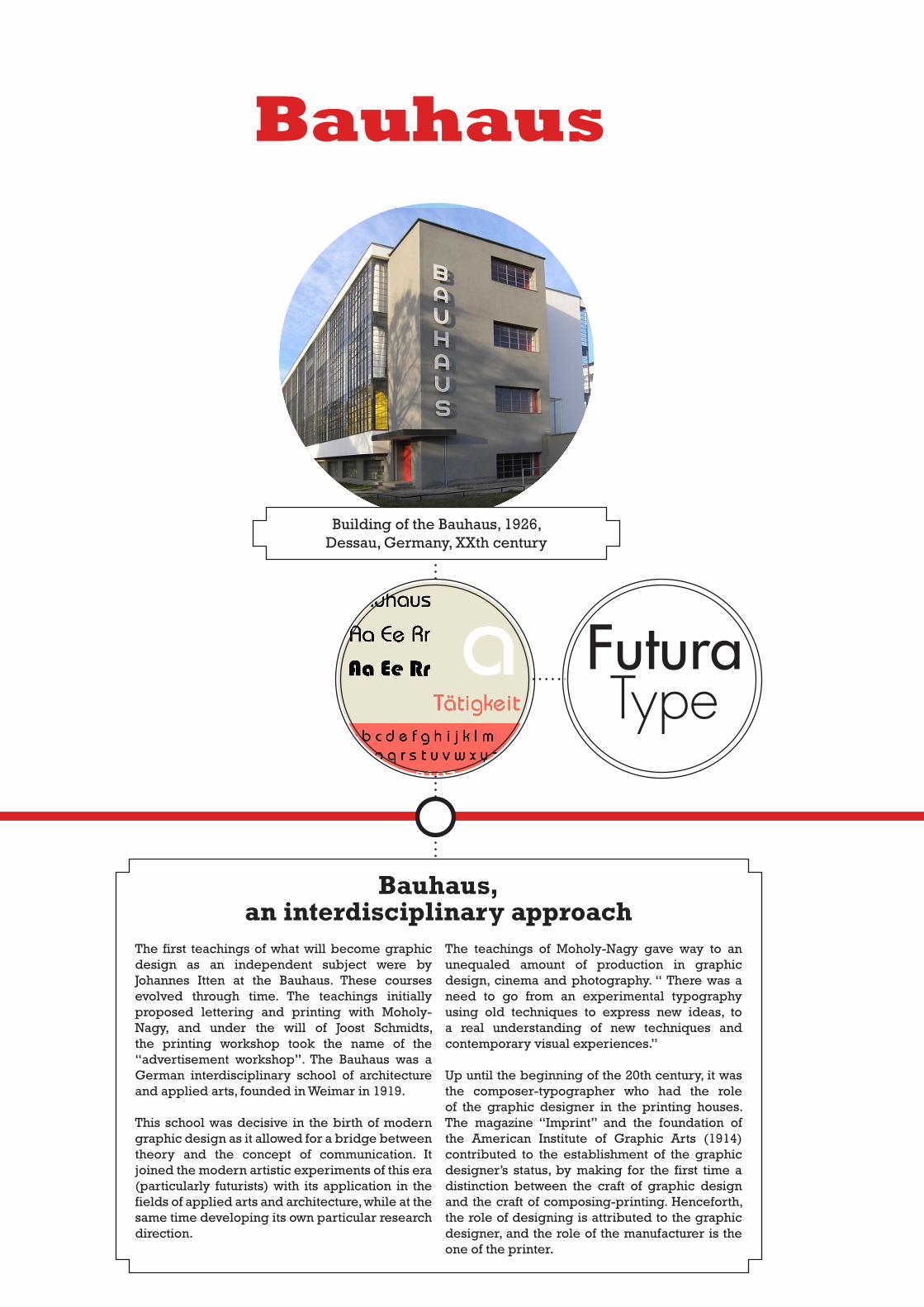
Building of the Bauhaus, 1926, Dessau, Germany, XXth century
Bauhaus,an interdisciplinary approach
The first teachings of what will become graphic design as an independent subject were by Johannes Itten at the Bauhaus. These courses evolved through time. The teachings initially proposed lettering and printing with Moholy-Nagy, and under the will of Joost Schmidts, the printing workshop took the name of the “advertisement workshop”. The Bauhaus was a German interdisciplinary school of architecture and applied arts, founded in Weimar in 1919.
This school was decisive in the birth of modern graphic design as it allowed for a bridge between theory and the concept of communication. It joined the modern artistic experiments of this era (particularly futurists) with its application in the fields of applied arts and architecture, while at the same time developing its own particular research direction.
The teachings of Moholy-Nagy gave way to an unequaled amount of production in graphic design, cinema and photography. “ There was a need to go from an experimental typography using old techniques to express new ideas, to a real understanding of new techniques and contemporary visual experiences.”
Up until the beginning of the 20th century, it was the composer-typographer who had the role of the graphic designer in the printing houses. The magazine “Imprint” and the foundation of the American Institute of Graphic Arts (1914) contributed to the establishment of the graphic designer’s status, by making for the first time a distinction between the craft of graphic design and the craft of composing-printing. Henceforth, the role of designing is attributed to the graphic designer, and the role of the manufacturer is the one of the printer.
Bauhaus
FuturaType
Typography of political propaganda posters in the 30’s and 40’s
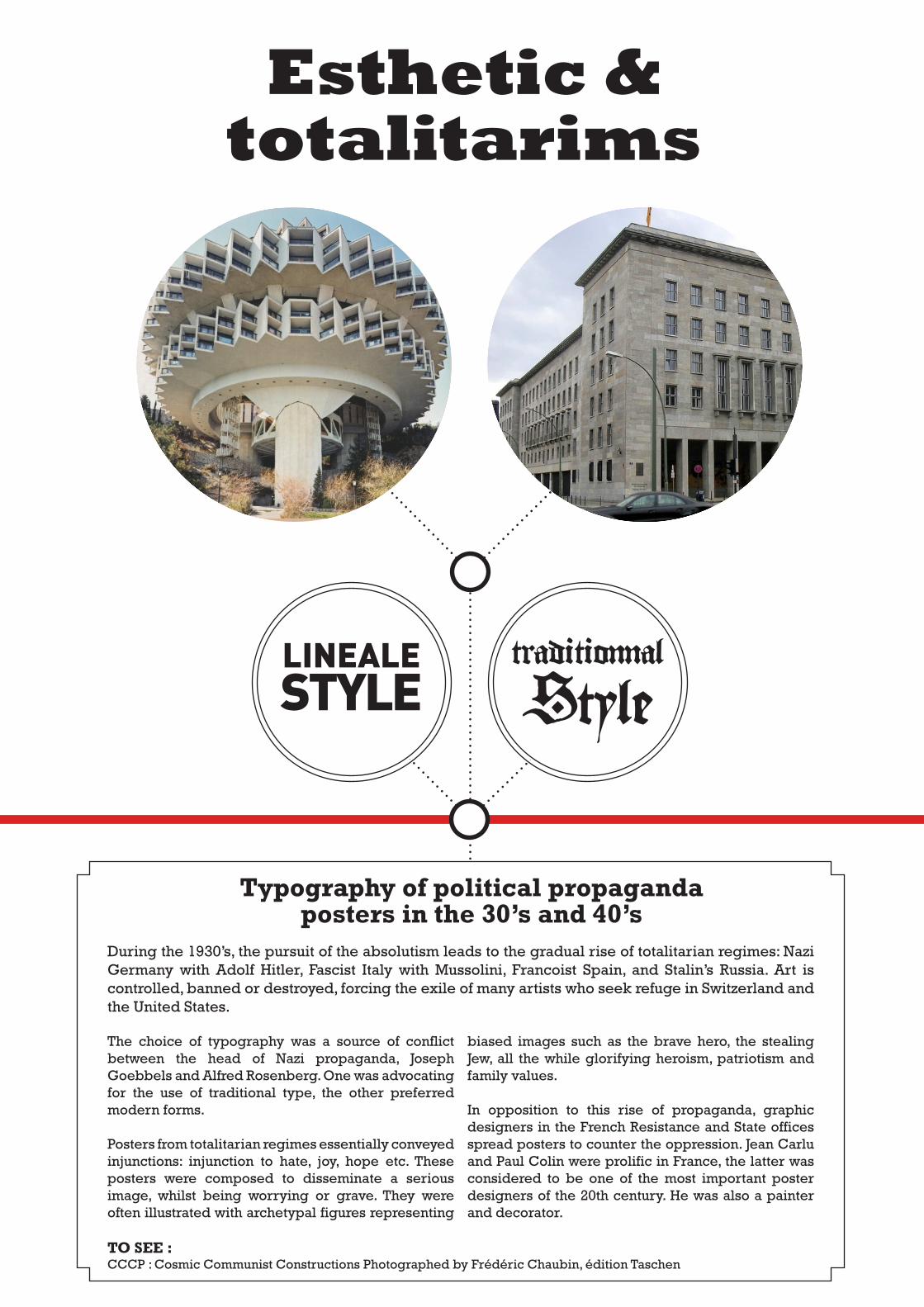
During the 1930’s, the pursuit of the absolutism leads to the gradual rise of totalitarian regimes: Nazi Germany with Adolf Hitler, Fascist Italy with Mussolini, Francoist Spain, and Stalin’s Russia. Art is controlled, banned or destroyed, forcing the exile of many artists who seek refuge in Switzerland and the United States.
The choice of typography was a source of conflict between the head of Nazi propaganda, Joseph Goebbels and Alfred Rosenberg. One was advocating for the use of traditional type, the other preferred modern forms.
Posters from totalitarian regimes essentially conveyed injunctions: injunction to hate, joy, hope etc. These posters were composed to disseminate a serious image, whilst being worrying or grave. They were often illustrated with archetypal figures representing
biased images such as the brave hero, the stealing Jew, all the while glorifying heroism, patriotism and family values.
In opposition to this rise of propaganda, graphic designers in the French Resistance and State offices spread posters to counter the oppression. Jean Carlu and Paul Colin were prolific in France, the latter was considered to be one of the most important poster designers of the 20th century. He was also a painter and decorator.
Esthetic & totalitarims
traditionnalStyle
LINEALESTYLE
TO SEE : CCCP : Cosmic Communist Constructions Photographed by Frédéric Chaubin, édition Taschen
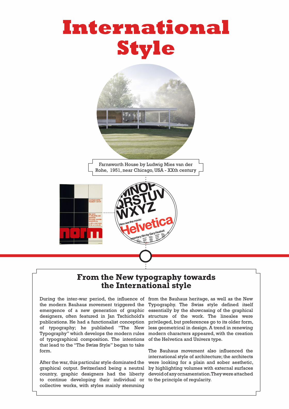
Farnsworth House by Ludwig Mies van der Rohe, 1951, near Chicago, USA - XXth century
From the New typography towards the International style
During the inter-war period, the influence of the modern Bauhaus movement triggered the emergence of a new generation of graphic designers, often featured in Jan Tschichold’s publications. He had a functionalist conception of typography; he published “The New Typography” which develops the modern rules of typographical composition. The intentions that lead to the “The Swiss Style” began to take form.
After the war, this particular style dominated the graphical output. Switzerland being a neutral country, graphic designers had the liberty to continue developing their individual or collective works, with styles mainly stemming
from the Bauhaus heritage, as well as the New Typography. The Swiss style defined itself essentially by the showcasing of the graphical structure of the work. The lineales were privileged, but preferences go to its older form, less geometrical in design. A trend in renewing modern characters appeared, with the creation of the Helvetica and Univers type.
The Bauhaus movement also influenced the international style of architecture; the architects were looking for a plain and sober aesthetic, by highlighting volumes with external surfaces devoid of any ornamentation. They were attached to the principle of regularity.
International Style
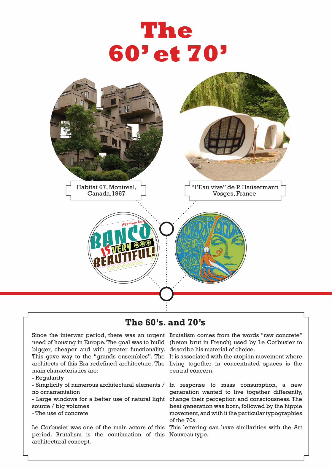
Since the interwar period, there was an urgent need of housing in Europe. The goal was to build bigger, cheaper and with greater functionality. This gave way to the “grands ensembles”. The architects of this Era redefined architecture. The main characteristics are:- Regularity- Simplicity of numerous architectural elements / no ornamentation- Large windows for a better use of natural light source / big volumes- The use of concrete
Le Corbusier was one of the main actors of this period. Brutalism is the continuation of this architectural concept.
Brutalism comes from the words “raw concrete” (beton brut in French) used by Le Corbusier to describe his material of choice.It is associated with the utopian movement where living together in concentrated spaces is the central concern.
In response to mass consumption, a new generation wanted to live together differently, change their perception and consciousness. The beat generation was born, followed by the hippie movement, and with it the particular typographies of the 70s. This lettering can have similarities with the Art Nouveau type.
The60’ et 70’
Habitat 67, Montreal, Canada,1967
“l’Eau vive” de P. HaüsermannVosges, France
The 60’s. and 70’s
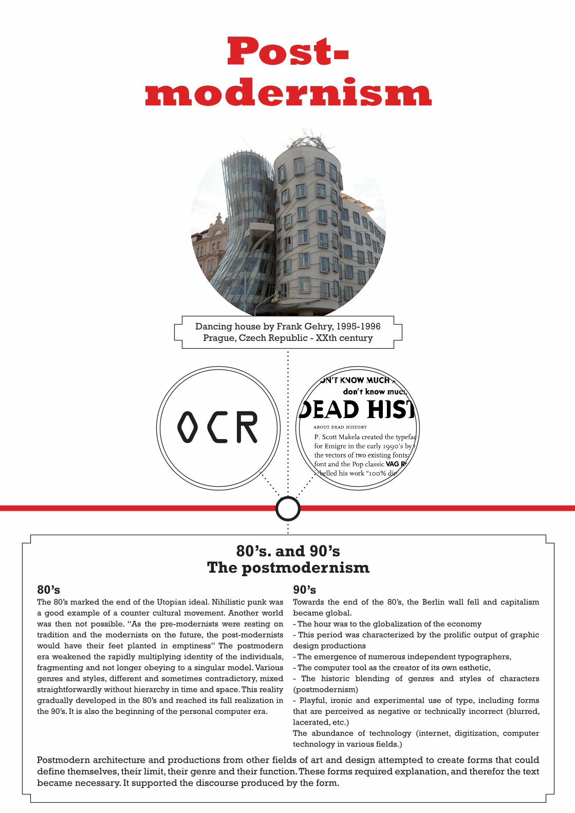
Dancing house by Frank Gehry, 1995-1996Prague, Czech Republic - XXth century
80’s. and 90’sThe postmodernism
Post-modernism
80’sThe 80’s marked the end of the Utopian ideal. Nihilistic punk was a good example of a counter cultural movement. Another world was then not possible. “As the pre-modernists were resting on tradition and the modernists on the future, the post-modernists would have their feet planted in emptiness” The postmodern era weakened the rapidly multiplying identity of the individuals, fragmenting and not longer obeying to a singular model. Various genres and styles, different and sometimes contradictory, mixed straightforwardly without hierarchy in time and space. This reality gradually developed in the 80’s and reached its full realization in the 90’s. It is also the beginning of the personal computer era.
90’sTowards the end of the 80’s, the Berlin wall fell and capitalism became global. - The hour was to the globalization of the economy- This period was characterized by the prolific output of graphic design productions- The emergence of numerous independent typographers, - The computer tool as the creator of its own esthetic, - The historic blending of genres and styles of characters (postmodernism)- Playful, ironic and experimental use of type, including forms that are perceived as negative or technically incorrect (blurred, lacerated, etc.)The abundance of technology (internet, digitization, computer technology in various fields.)
Postmodern architecture and productions from other fields of art and design attempted to create forms that could define themselves, their limit, their genre and their function. These forms required explanation, and therefor the text became necessary. It supported the discourse produced by the form.
OCR
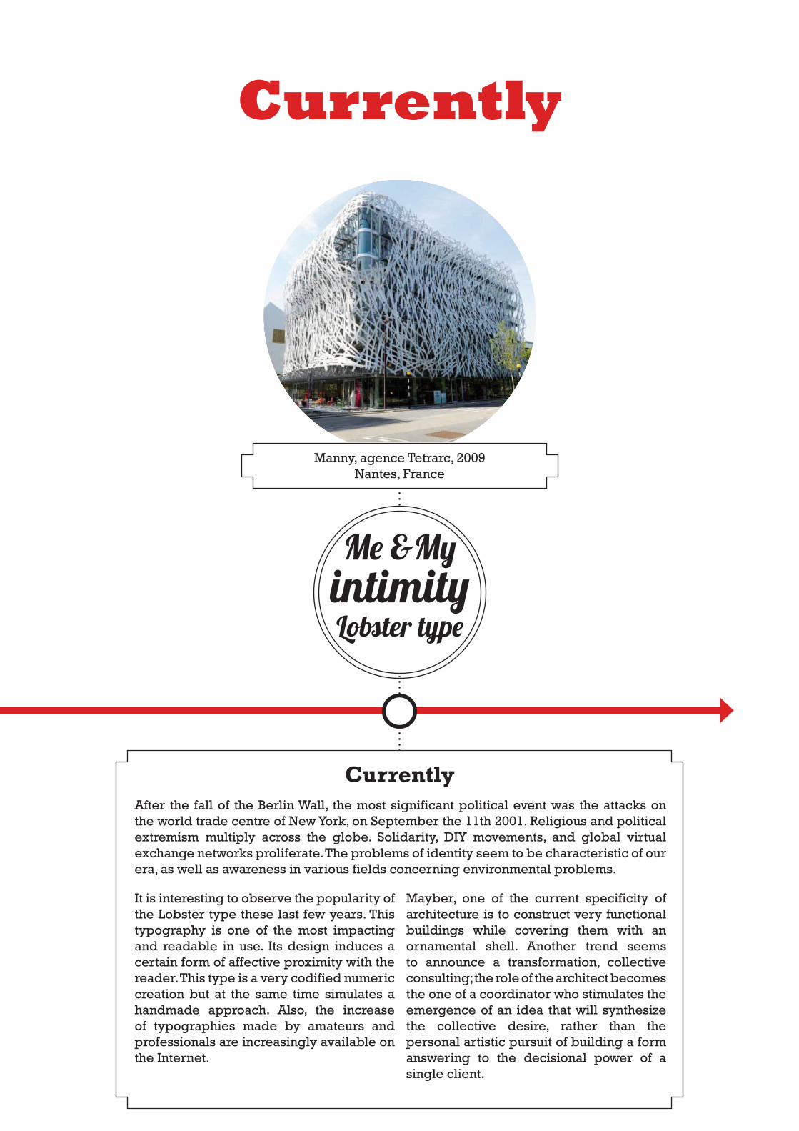
Manny, agence Tetrarc, 2009Nantes, France
Currently
Me &My intimityLobster type
Currently
It is interesting to observe the popularity of the Lobster type these last few years. This typography is one of the most impacting and readable in use. Its design induces a certain form of affective proximity with the reader. This type is a very codified numeric creation but at the same time simulates a handmade approach. Also, the increase of typographies made by amateurs and professionals are increasingly available on the Internet.
Mayber, one of the current specificity of architecture is to construct very functional buildings while covering them with an ornamental shell. Another trend seems to announce a transformation, collective consulting; the role of the architect becomes the one of a coordinator who stimulates the emergence of an idea that will synthesize the collective desire, rather than the personal artistic pursuit of building a form answering to the decisional power of a single client.
After the fall of the Berlin Wall, the most significant political event was the attacks on the world trade centre of New York, on September the 11th 2001. Religious and political extremism multiply across the globe. Solidarity, DIY movements, and global virtual exchange networks proliferate. The problems of identity seem to be characteristic of our era, as well as awareness in various fields concerning environmental problems.


