17
The Briefest Excel The Briefest Excel Tutorial You’ll Ever Tutorial You’ll Ever See See
| Date post: | 31-Dec-2015 |
| Category: |
Documents |
| Upload: | brett-stone |
| View: | 221 times |
| Download: | 0 times |

The Briefest Excel The Briefest Excel Tutorial You’ll Ever SeeTutorial You’ll Ever See

Microsoft Excel, or any spreadsheet for that matter, is an incredibly rich calculation program
In this most skimpy of lessons, we will discuss only:◦Labels◦Numbers◦Formulas◦Graphs

Excel is like a map: each cell has an addressColumns use letters, rows use numbersAddresses therefore are like A3, F89, CC34, etc.

A label is simple text◦ In this case the word ‘Label’ is in cell A1◦ Excel cannot do math if any letters are in a cell
You can edit a label by clicking in the edit bar
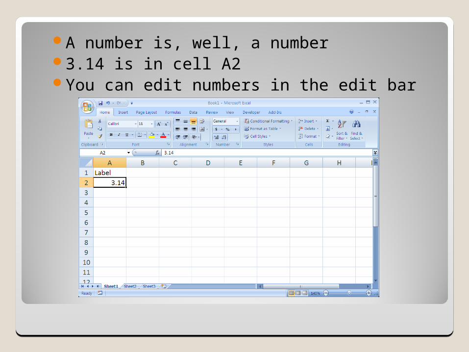
A number is, well, a number3.14 is in cell A2You can edit numbers in the edit bar

A formula is what make a spreadsheet powerful◦It’ll blow your TI Eighty-Whatever out of the room!
Formulas always start with =You can enter numbers in a formula, but…Sometimes it’s better to point to a cell
◦However, you can mix numbers and cell addressesSome simple math functions are:
◦Addition +◦Subtraction –◦Multiplication *◦Division /◦Powers ^

Here the formula adds 1 to the contents of cell A2

No surprise: 4.14See the option to edit in the edit bar?
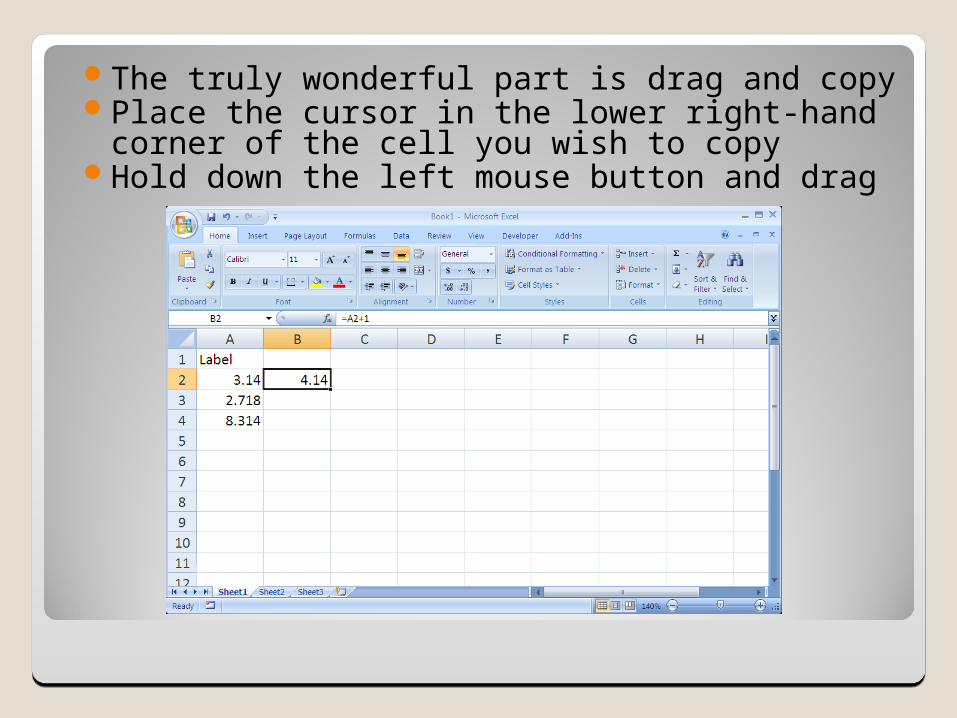
The truly wonderful part is drag and copyPlace the cursor in the lower right-hand corner of
the cell you wish to copyHold down the left mouse button and drag
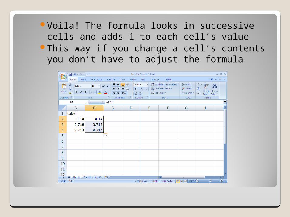
Voila! The formula looks in successive cells and adds 1 to each cell’s value
This way if you change a cell’s contents you don’t have to adjust the formula

Now let’s graph◦Highlight the values you wish to graph◦Click on the scatter chart icon in the toolbar

For the XY sub-type choose the one that does not connect the dots
Click it and the graph will pop into existence

Right click on a data point. A dialog box opens
Choose “Add Trendline…”

Choose the type that best fits your data, meaning that the line/curve hits the maximum number of points◦N.B. Sometimes
you will be directed to use a Linear trendline
◦If so, choose Display Equation

Click on your chart and go to Chart Tools/Layout
Add a Chart Title
Add both Axis Titles

This just touches the surface of what Excel can do. I encourage you to explore the program; you can do no harm and it will only enhance your abilities

Three ExercisesThree Exercises
Exercise 1Exercise 2Exercise 3 (For Teacher TRaC students)Exercise 3A (for Astronomy Students)


