111
MobileTech Conference 2015 The Future is now! Flexbox und fancy Stuff im Response Webdesign Peter Rozek @webinterface
| Date post: | 15-Feb-2017 |
| Category: |
Design |
| Upload: | peter-rozek |
| View: | 878 times |
| Download: | 0 times |
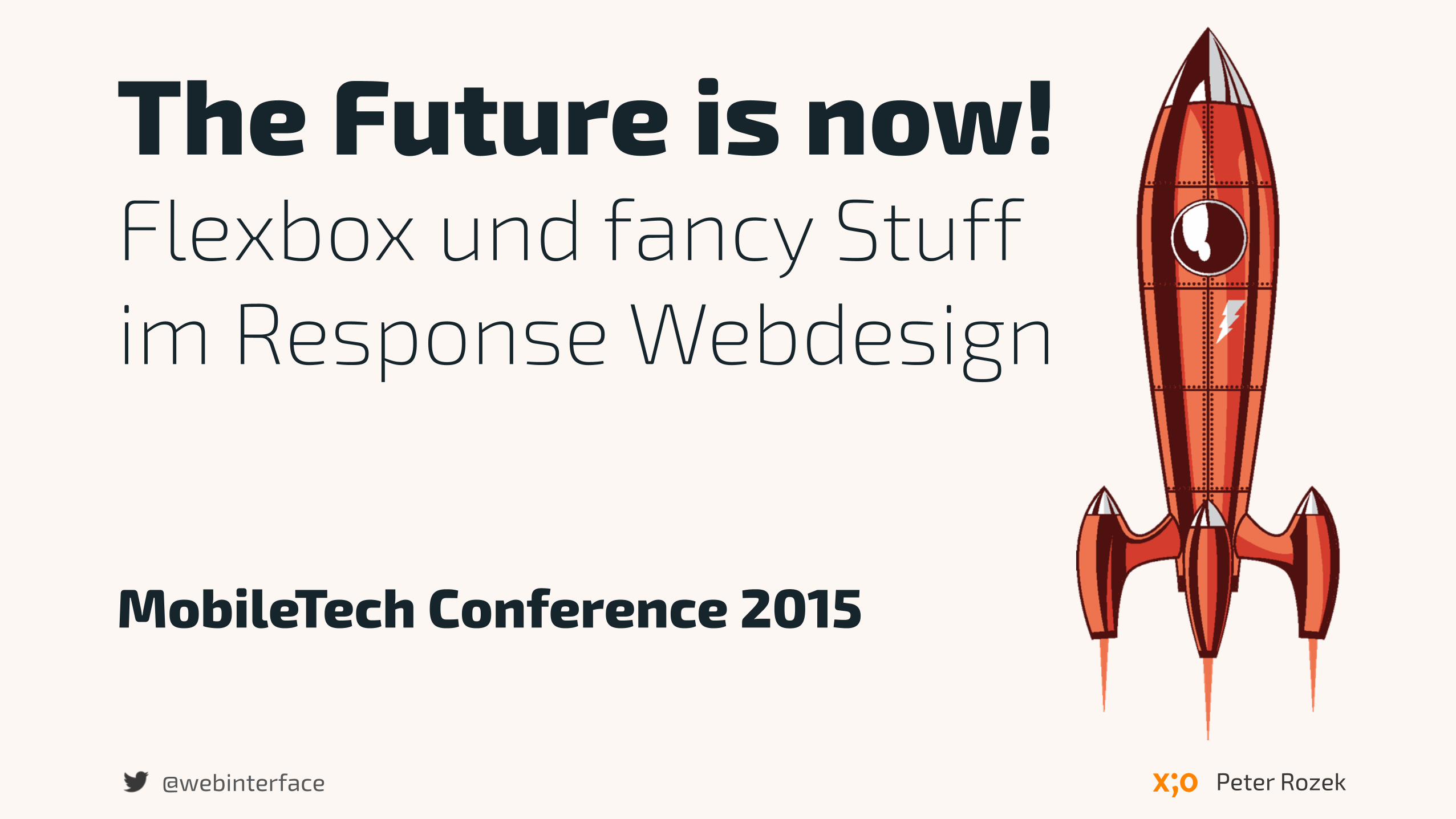
MobileTech Conference 2015
The Future is now! Flexbox und fancy Stuff im Response Webdesign
Peter Rozek@webinterface
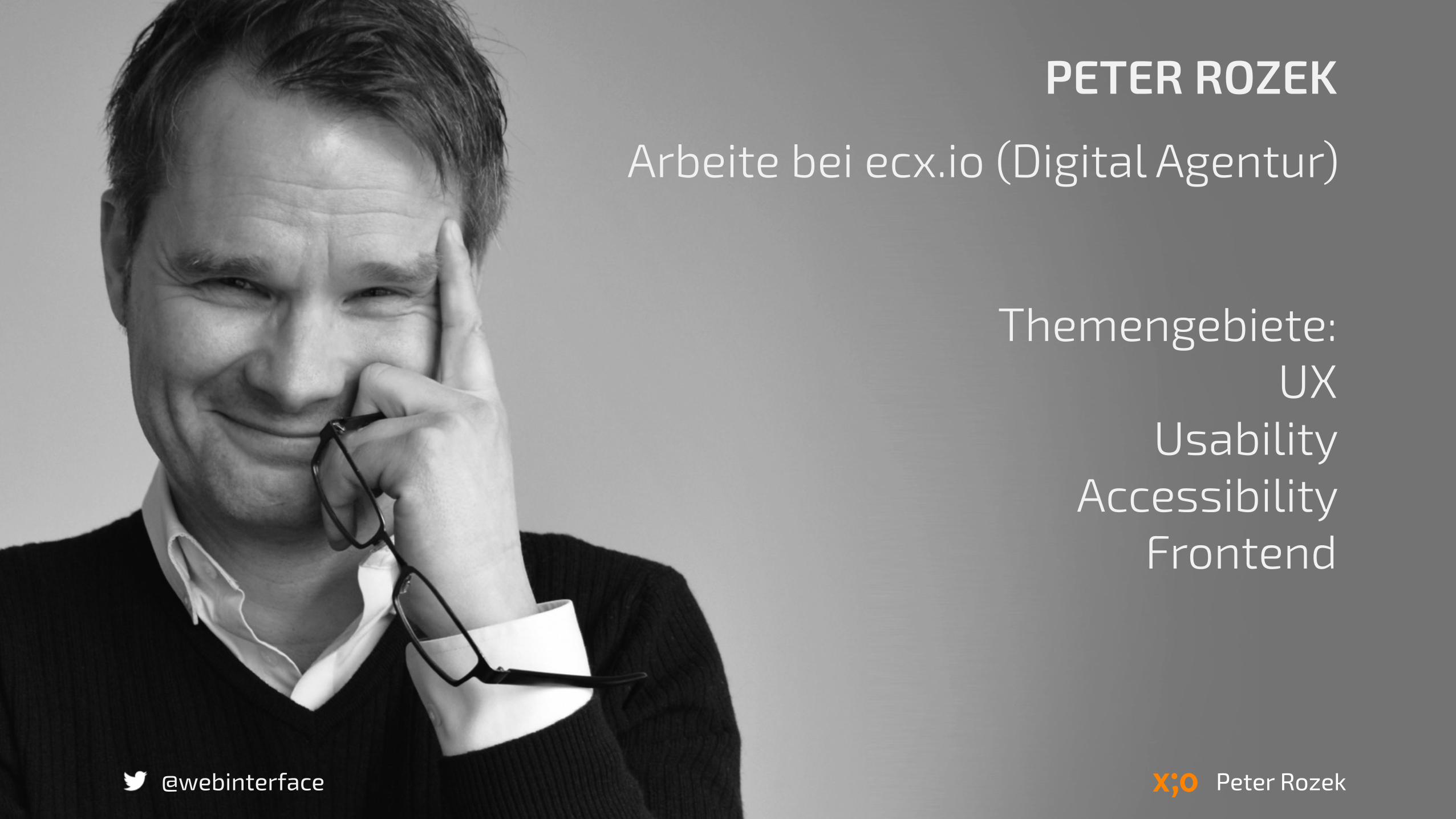
PETER ROZEK
Arbeite bei ecx.io (Digital Agentur)
Themengebiete: UX
Usability Accessibility
Frontend
Peter Rozek@webinterface

"The limits of my language are the limits of my world."
Ludwig Wittgenstein
@webinterface
1. Flexbox 2. and more Stuff…
@webinterface

Zukunft?
Big Bot, by Benedict Campbell@webinterface
„Where No Man Has Gone Before…“
@webinterface
DesigningProgressive Enhancement!
@webinterface
@webinterface
Progressive Enhancement adressiert Responsive Webdesign.
@webinterface
Responsive Webdesign vereint Prinzipien von Coherence, Adaptability und Fluidity.
Coherence, Adaptability und Fluidity ergänzen sich zum Meta Prinzip Fluid Experience.
@webinterface@webinterface

@webinterface
Enhance deinen Code und du schreibst sexy Code.
http://stuffpoint.com/

@webinterface
Werde zum Superheld.
browsergames-testen.de

@webinterface
Werde zum Coding Ninja.
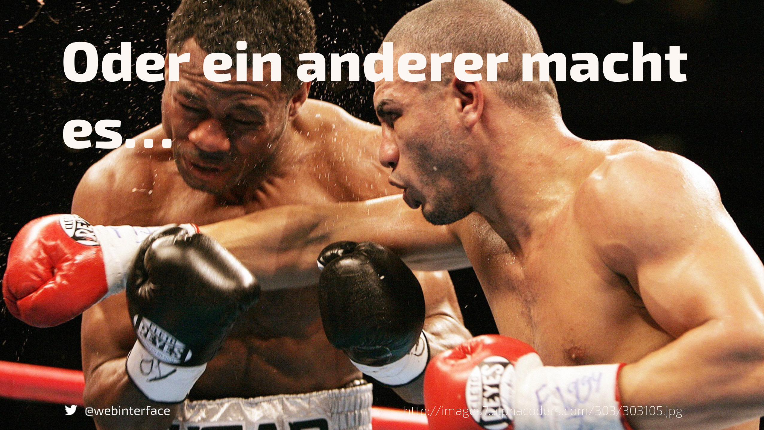
Oder ein anderer macht es…
@webinterface http://images7.alphacoders.com/303/303105.jpg

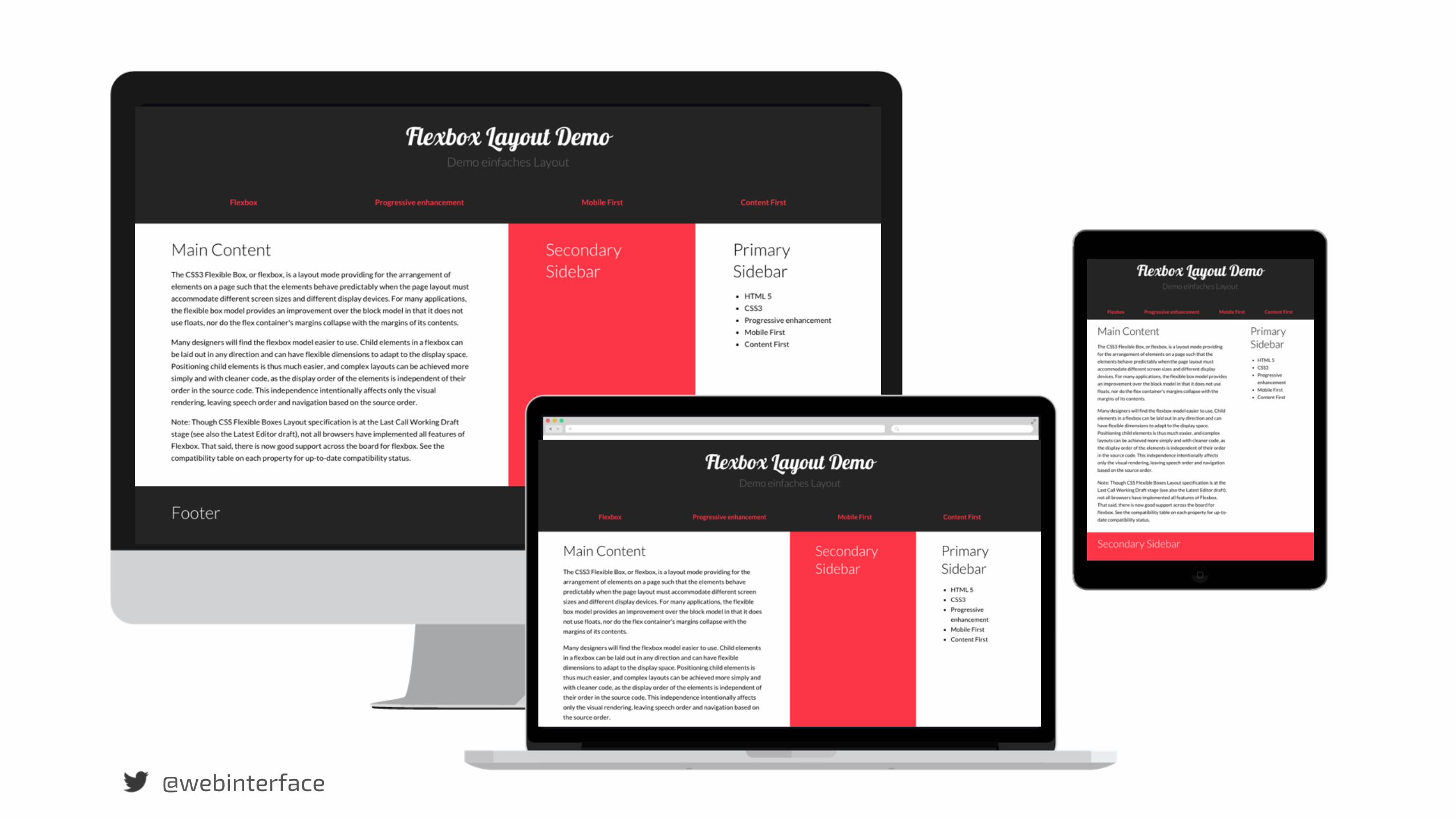
Content Choreography mit Flexbox.
@webinterface
@webinterface
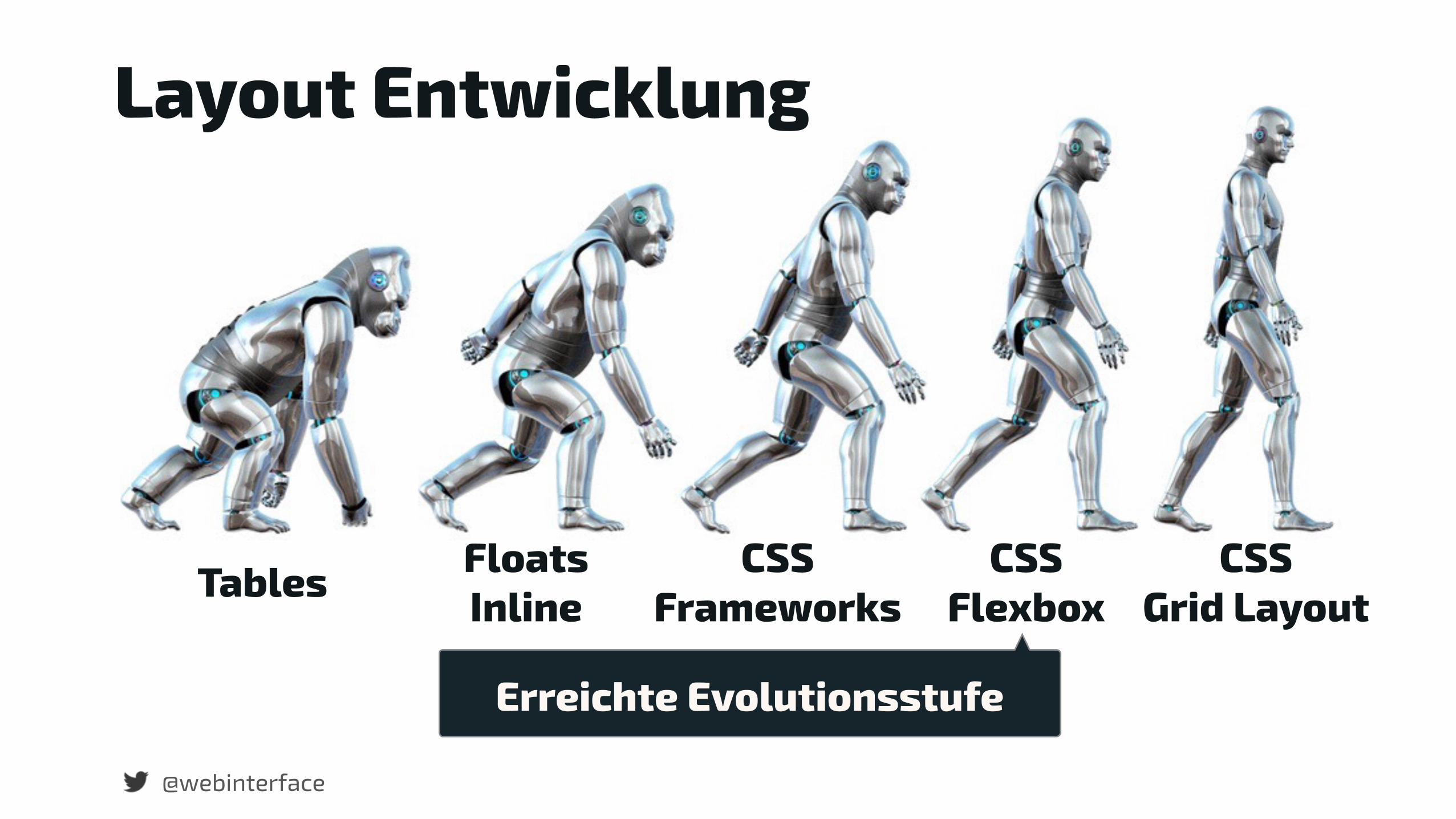
Tables Floats Inline
CSS Frameworks
CSS Flexbox
CSS Grid Layout
Layout Entwicklung
Erreichte Evolutionsstufe
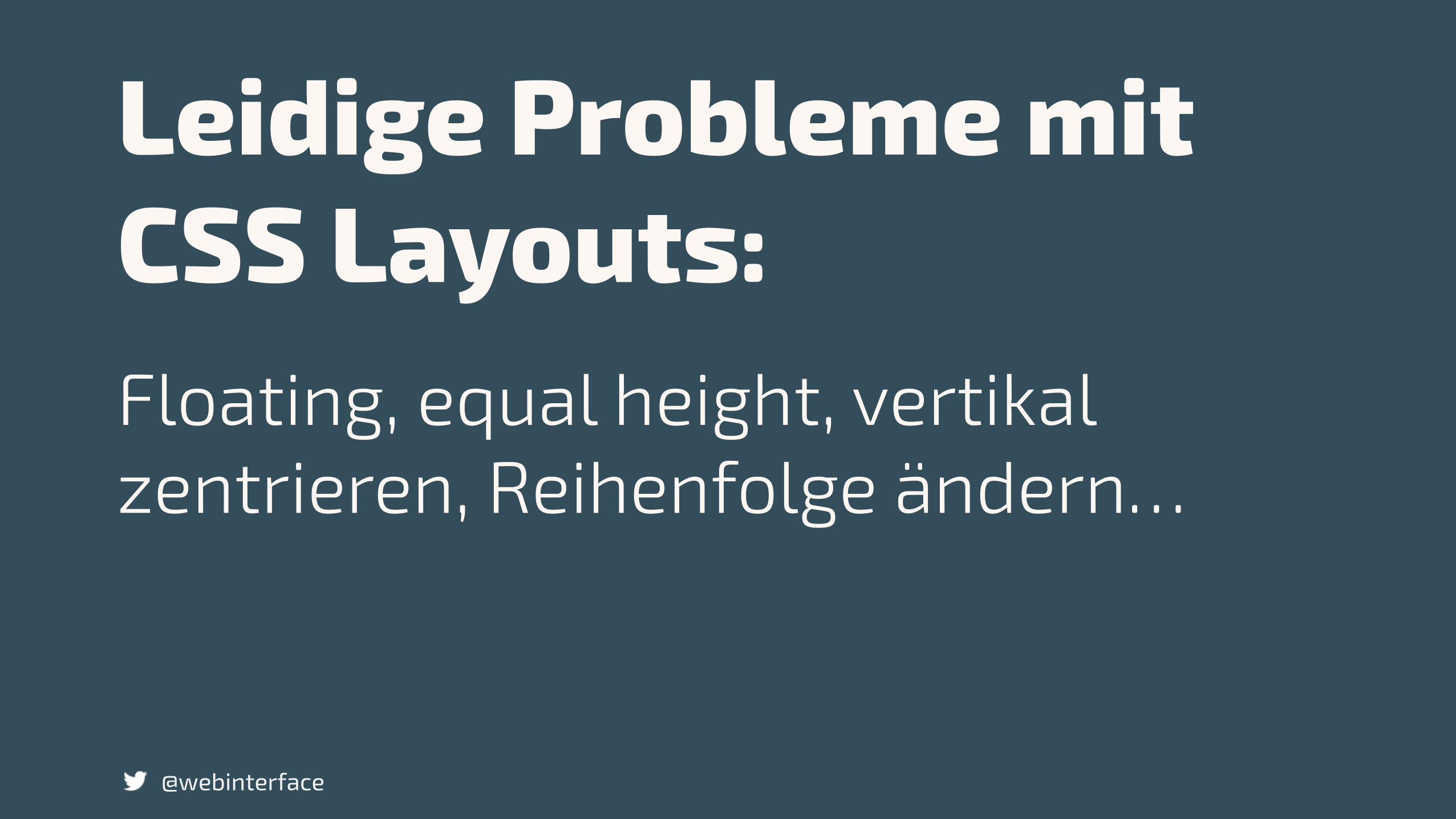
Leidige Probleme mit CSS Layouts:
@webinterface
Floating, equal height, vertikal zentrieren, Reihenfolge ändern…

Du kannst die Flexbox nutzen!
@webinterface
Progressive enhancement für UI Komponenten.

Du musst den IE8 supporten?
@webinterface
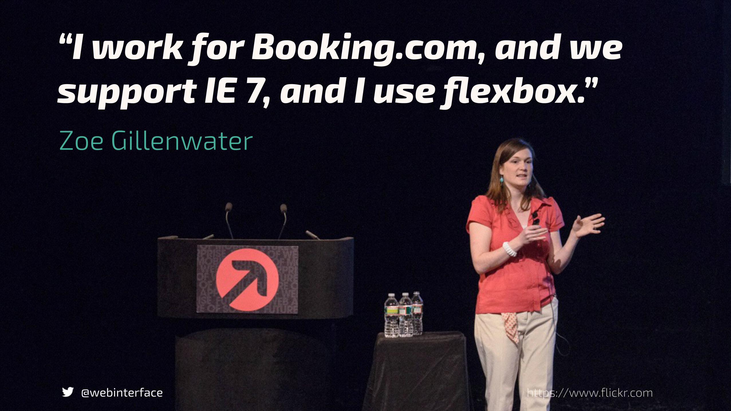
“I work for Booking.com, and we support IE 7, and I use flexbox.”
@webinterface
Zoe Gillenwater
https://www.flickr.com

„Viel zu lernen du noch hast.“Joda
@webinterface www.wall321.com/
Flexbox adressiert progressive enhancement!
@webinterface
Layouts die zuvor eine Herausforderung waren, sind nun verständlicher.
@webinterface
Flexible Layouts erstellen und die Berechnungen macht der Browser.
@webinterface
Elemente lassen sich beliebig positionieren und aneinander ausrichten.
@webinterface
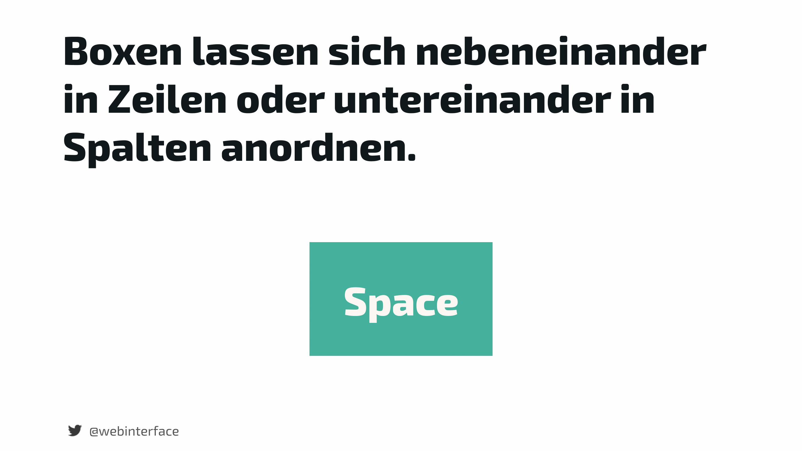
Boxen lassen sich nebeneinander in Zeilen oder untereinander in Spalten anordnen.
@webinterface
Space
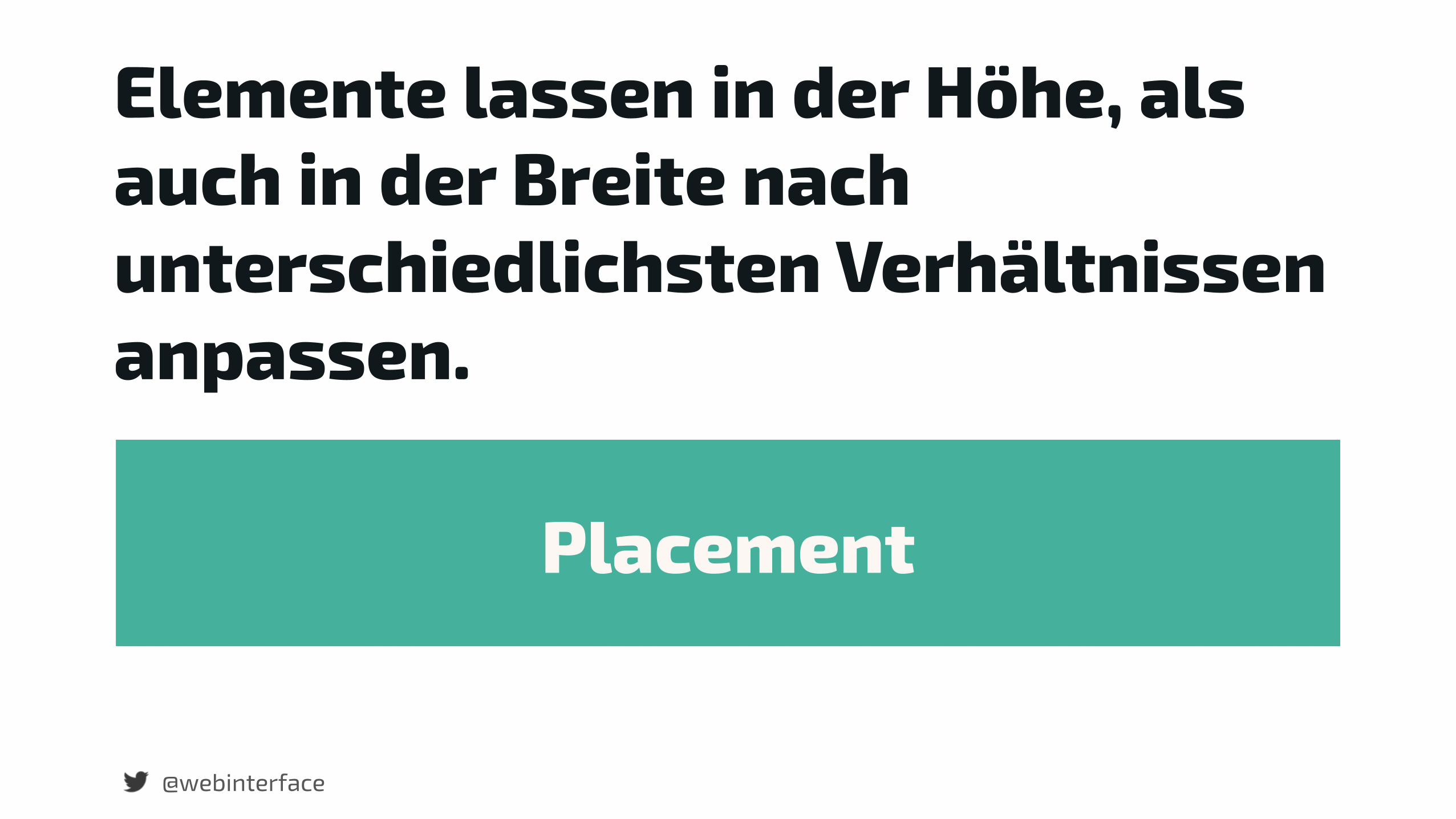
Elemente lassen in der Höhe, als auch in der Breite nach unterschiedlichsten Verhältnissen anpassen.
@webinterface
Placement
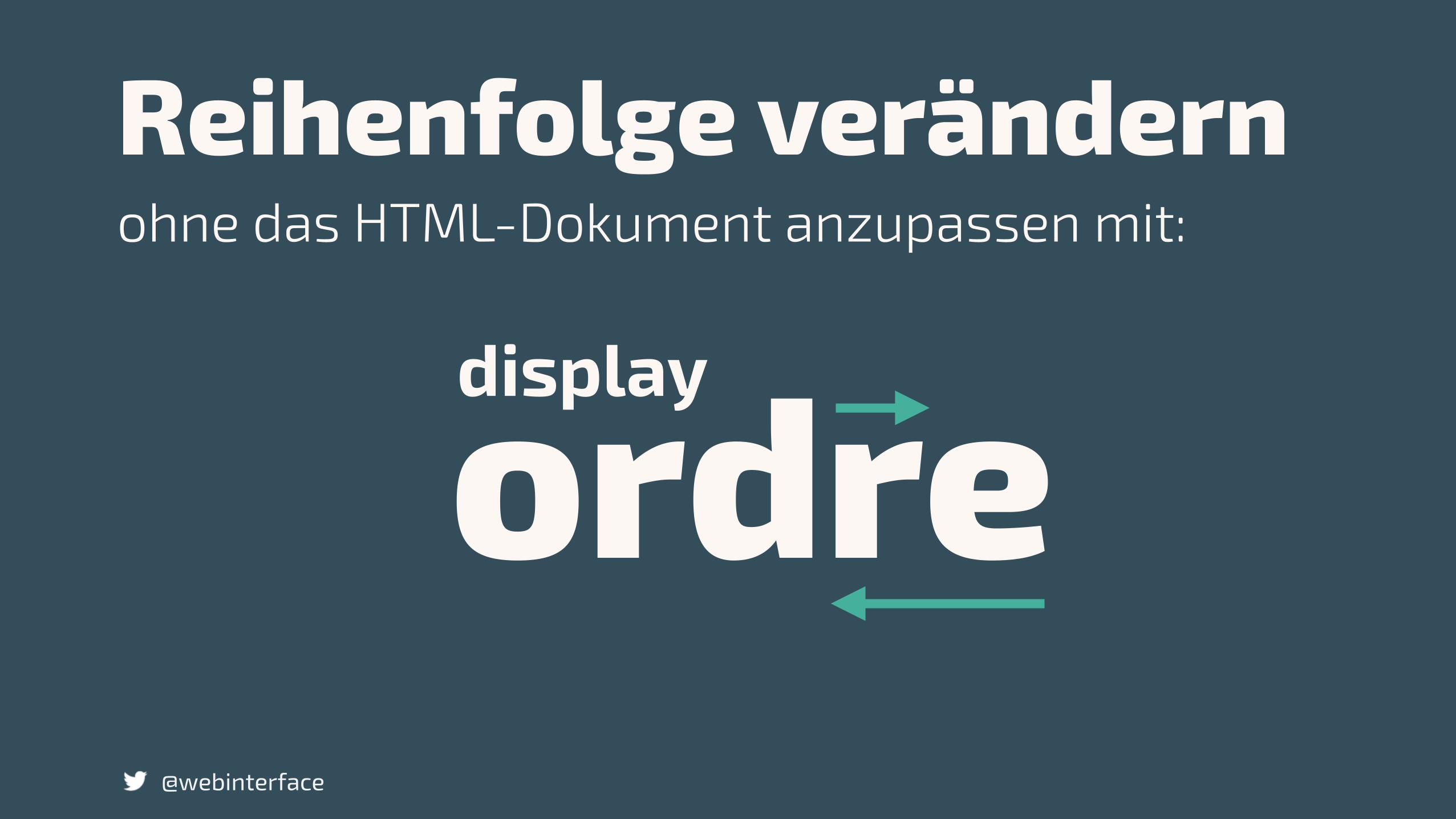
Reihenfolge verändern
@webinterface
ordredisplay
ohne das HTML-Dokument anzupassen mit:

Start the Engine
@webinterface
selektor { display: flex;
}
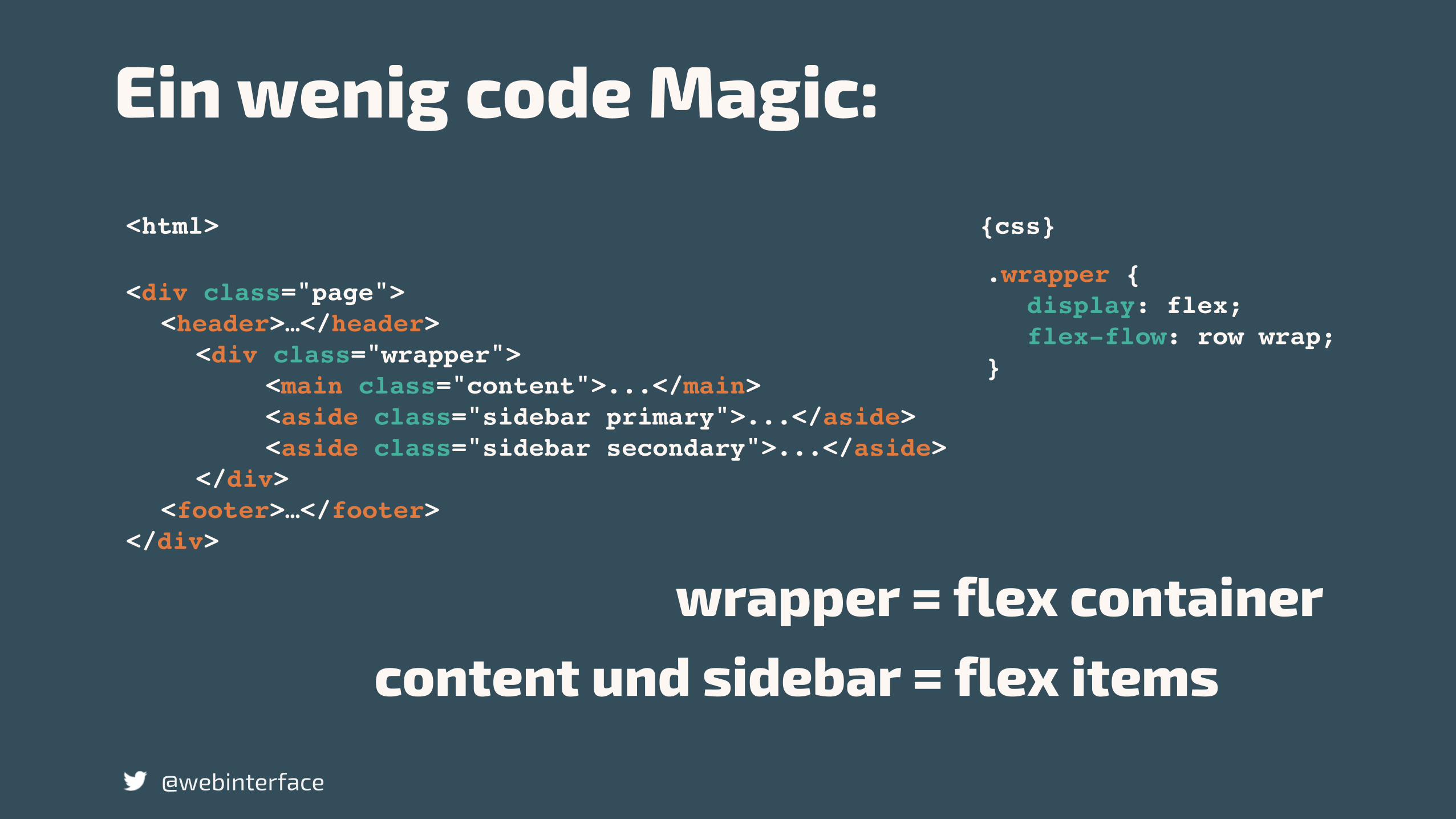
<div class="page"><header>…</header>
<div class="wrapper"> <main class="content">...</main> <aside class="sidebar primary">...</aside> <aside class="sidebar secondary">...</aside>
</div><footer>…</footer>
</div>
.wrapper {display: flex;flex-flow: row wrap;
}
wrapper = flex containercontent und sidebar = flex items
<html> {css}
Ein wenig code Magic:
@webinterface
@webinterface
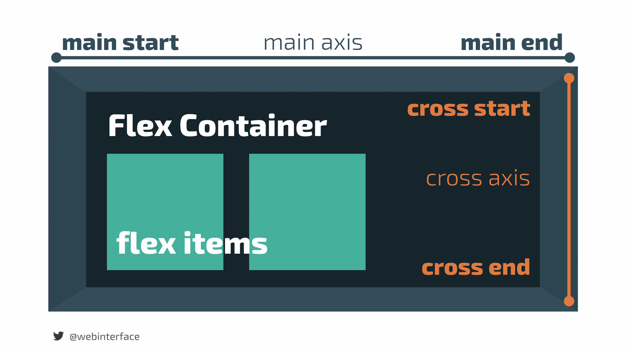
main start main endmain axis
@webinterface
cross start
cross end
cross axis
Flex Container
flex items

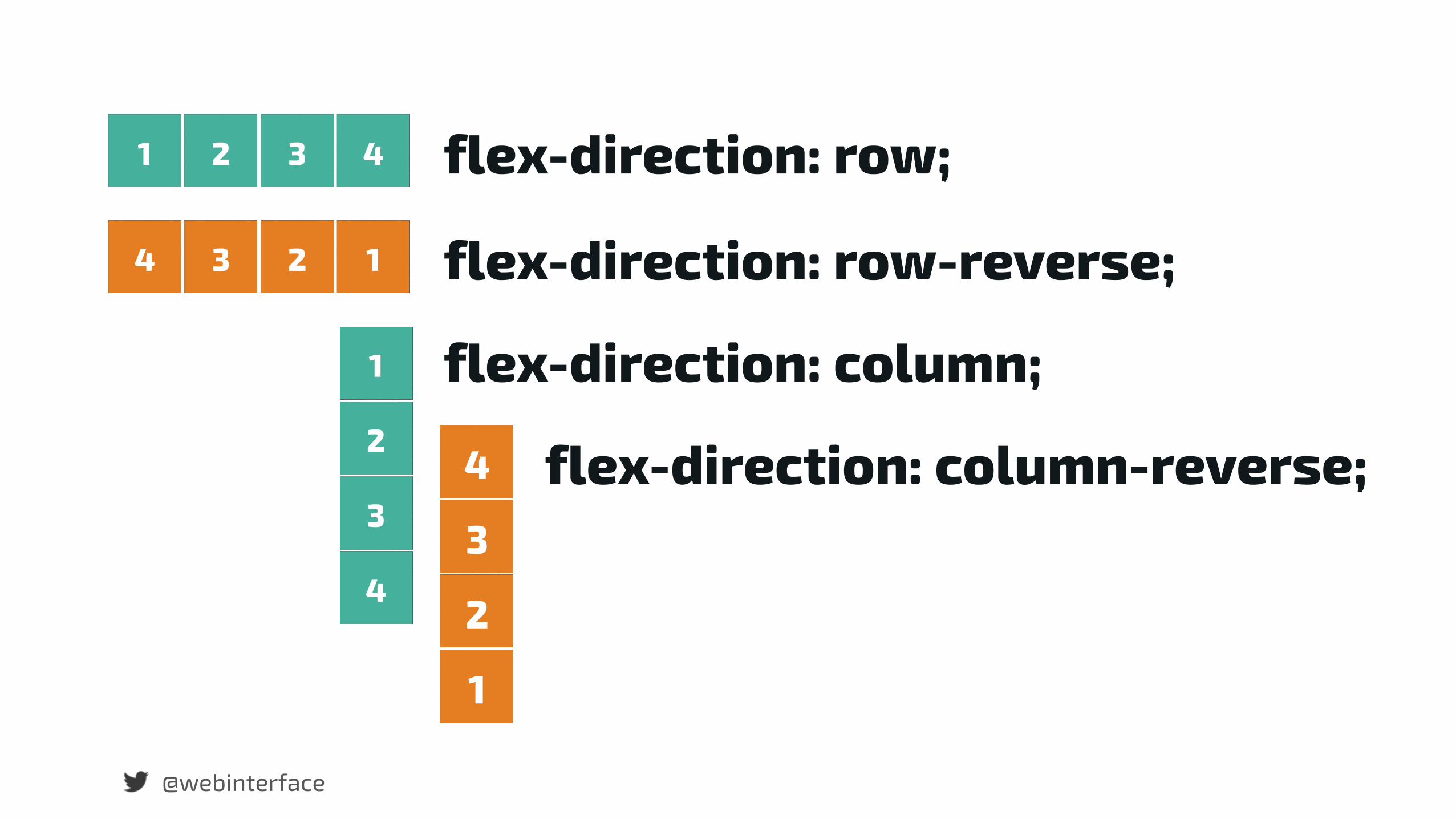
Reihenfolge umkehren oder beliebig ändern.
@webinterface
@webinterface
4 3 2 1
1 2 3 4
4
3
2
1
1
2
3
4
flex-direction: column;
flex-direction: row-reverse;
flex-direction: row;
flex-direction: column-reverse;

@webinterface
Horizontale Ausrichtung
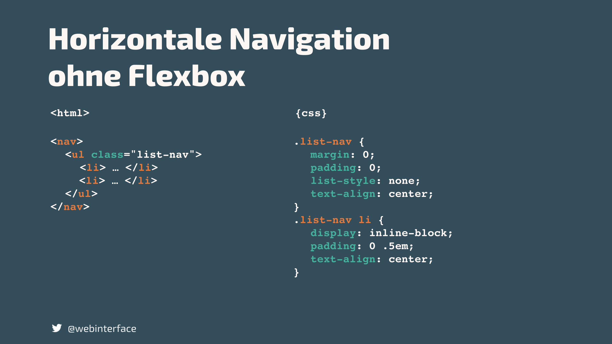
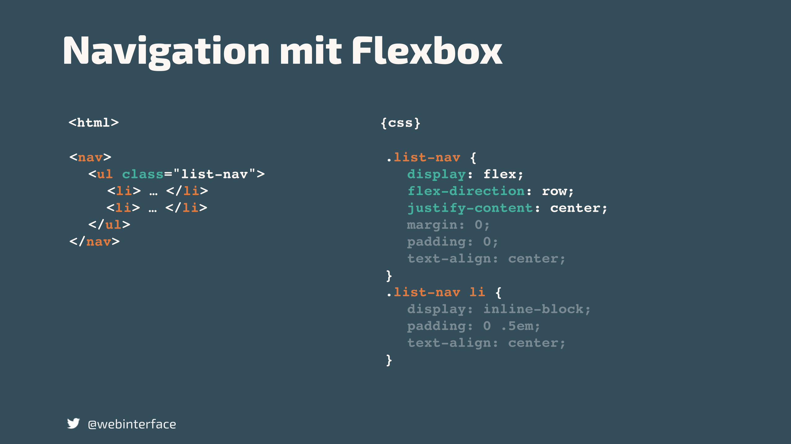
<nav><ul class="list-nav">
<li> … </li><li> … </li>
</ul></nav>
.list-nav {margin: 0;padding: 0;list-style: none;text-align: center;
}.list-nav li {
display: inline-block;padding: 0 .5em;text-align: center;
}
<html> {css}
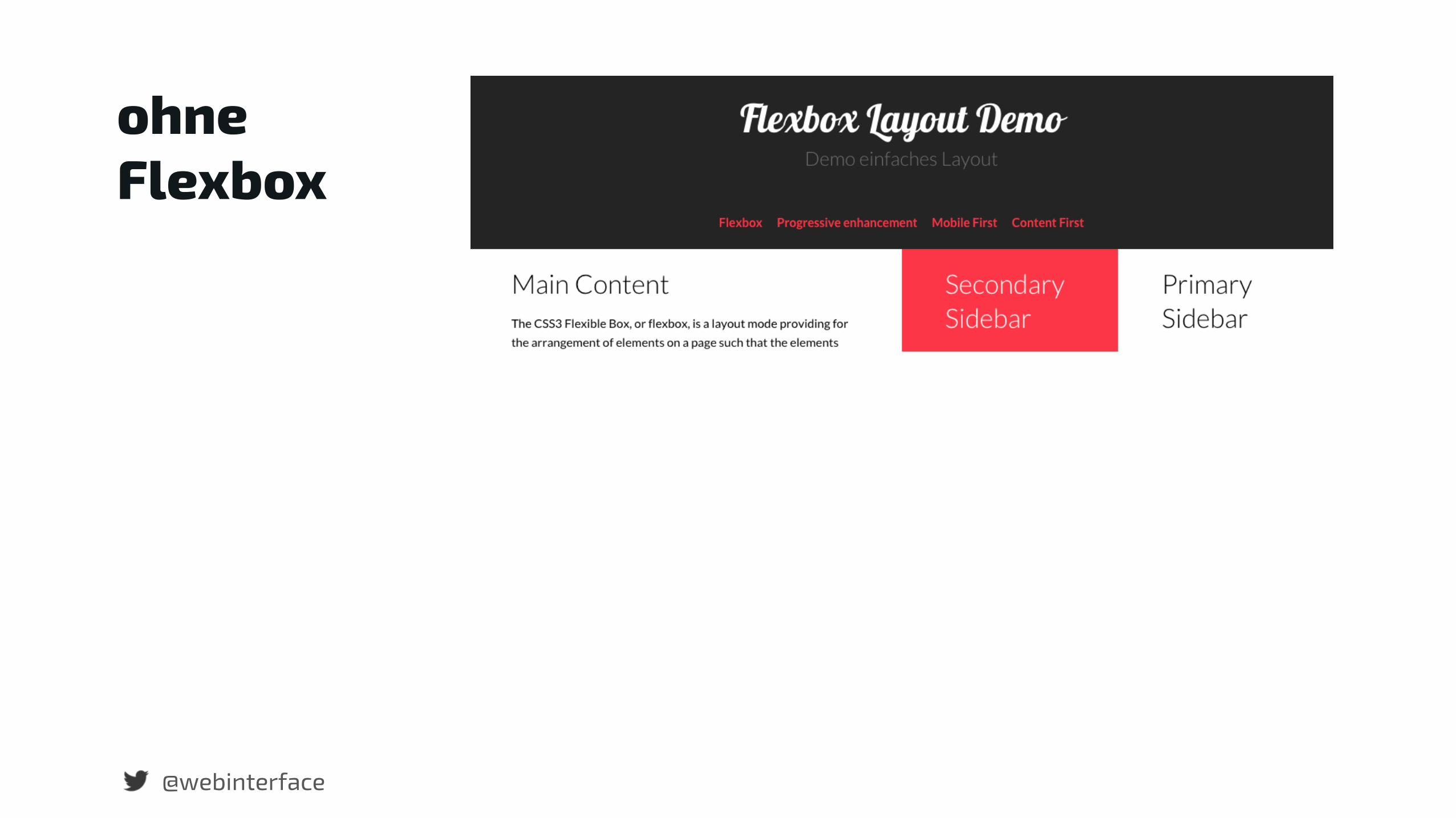
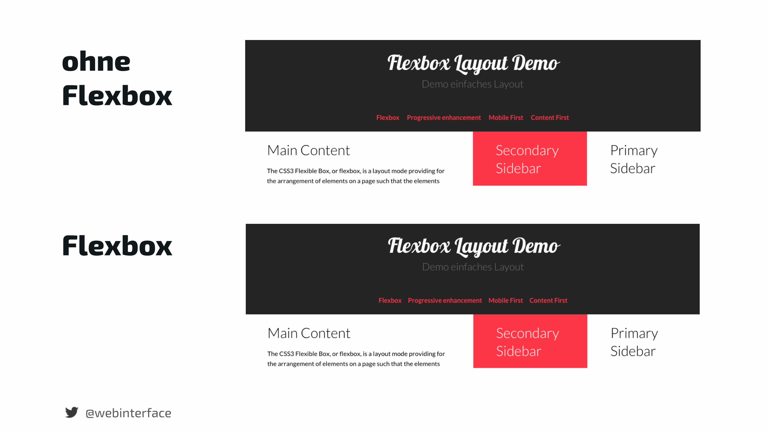
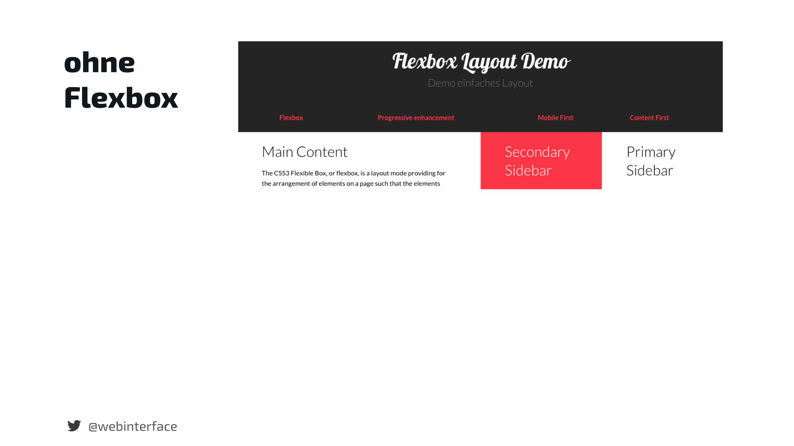
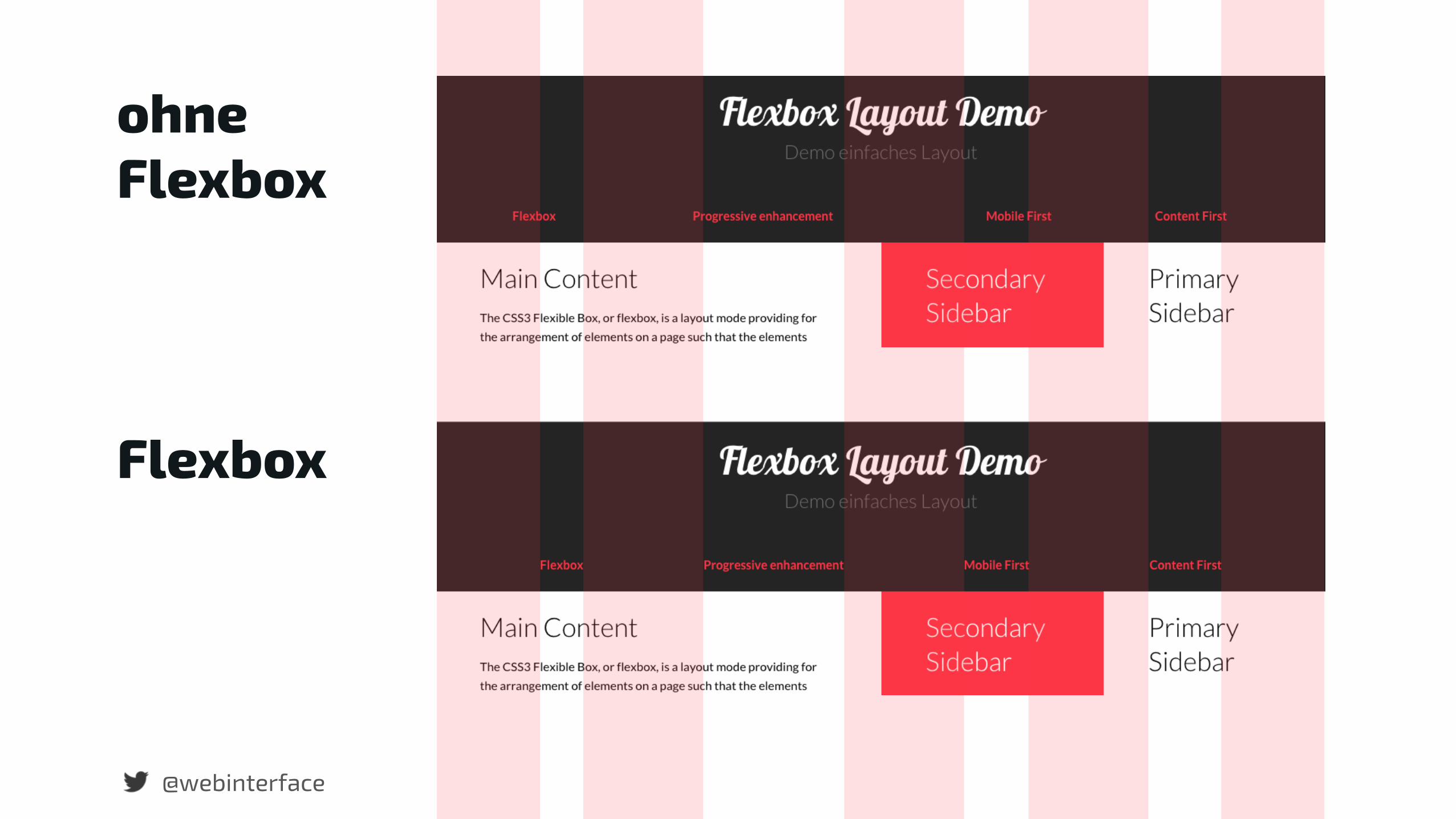
Horizontale Navigation ohne Flexbox
@webinterface
@webinterface
ohneFlexbox
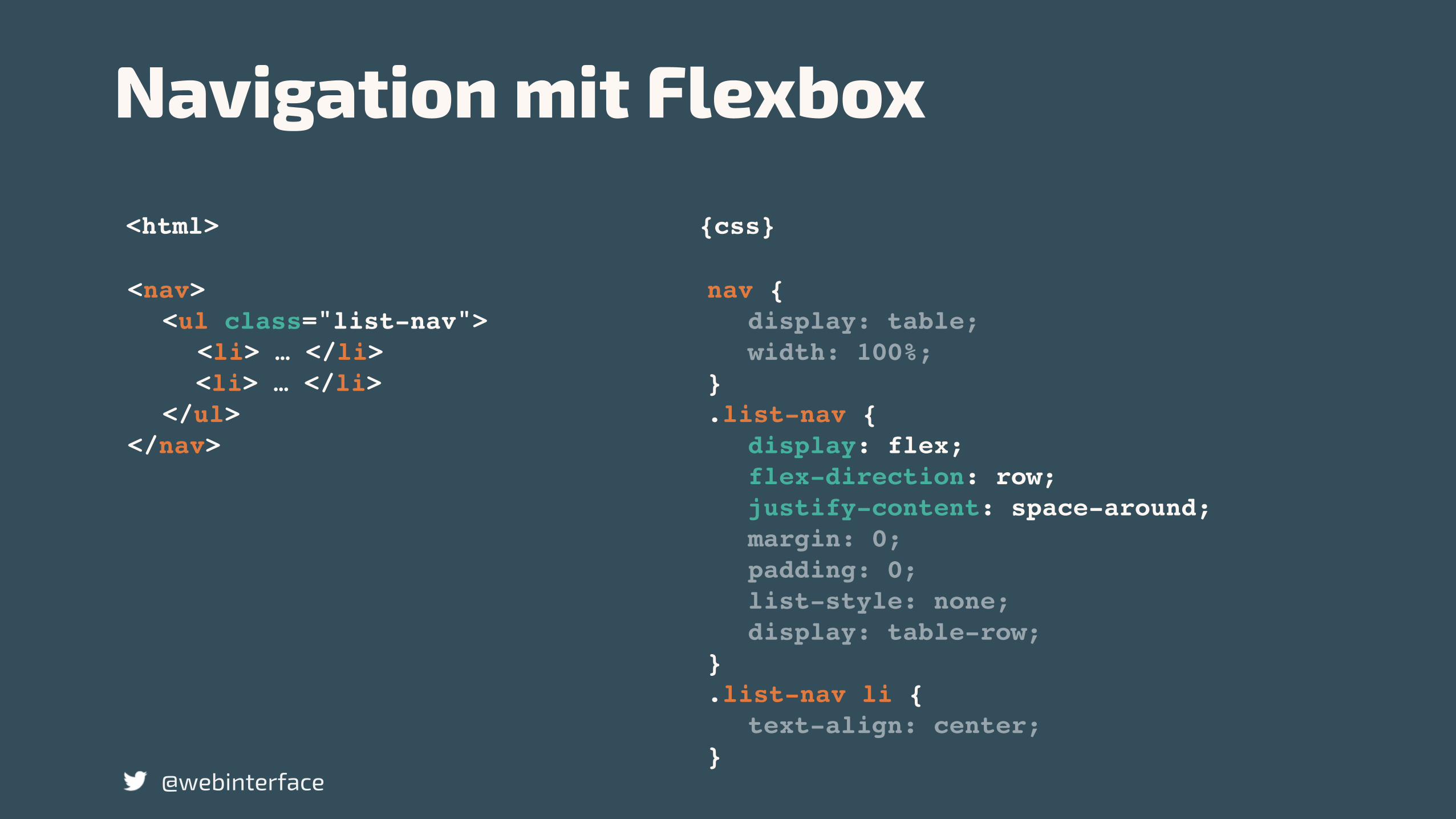
.list-nav {display: flex;flex-direction: row;justify-content: center;margin: 0;padding: 0;text-align: center;
}.list-nav li {
display: inline-block;padding: 0 .5em;text-align: center;
}
<html> {css}
Navigation mit Flexbox
@webinterface
<nav><ul class="list-nav">
<li> … </li><li> … </li>
</ul></nav>
@webinterface
Flexbox
ohneFlexbox
<html> {css}
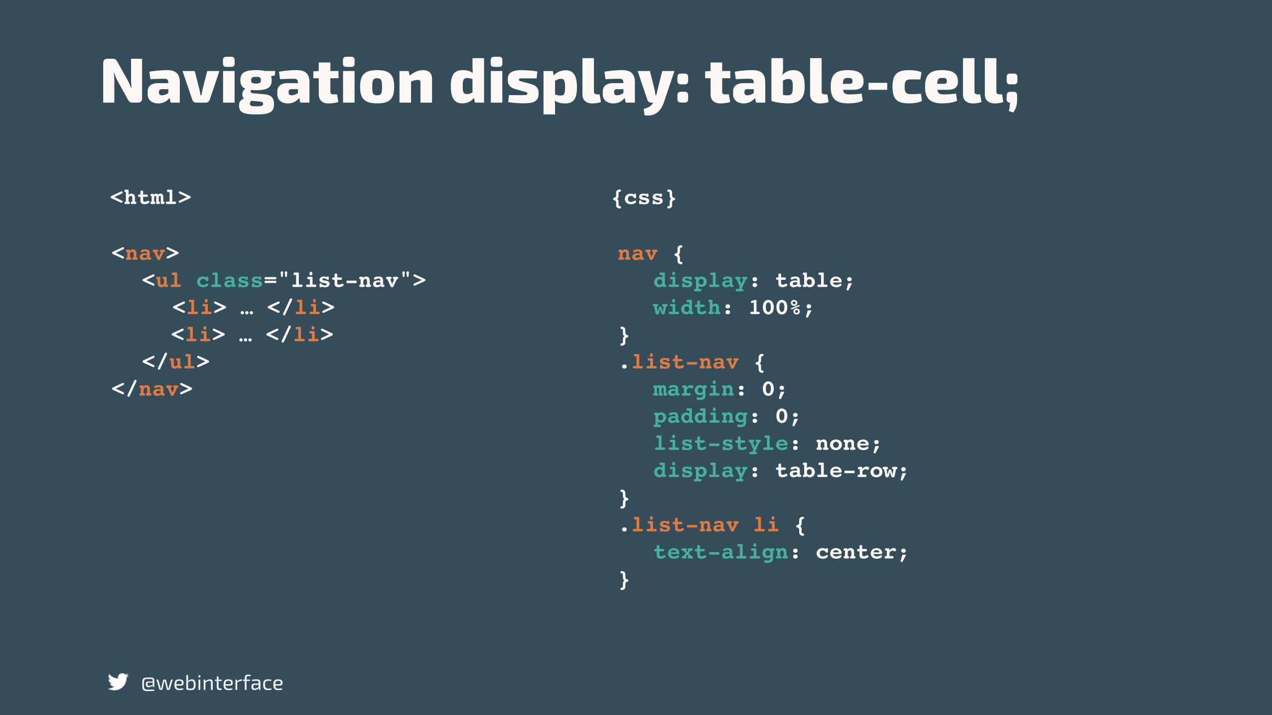
Navigation display: table-cell;
@webinterface
nav {display: table;width: 100%;
}.list-nav {
margin: 0;padding: 0;list-style: none;display: table-row;
}.list-nav li {
text-align: center;}
<nav><ul class="list-nav">
<li> … </li><li> … </li>
</ul></nav>
@webinterface
ohneFlexbox
<html> {css}
Navigation mit Flexbox
@webinterface
nav {display: table;width: 100%;
}.list-nav {
display: flex;flex-direction: row;justify-content: space-around;margin: 0;padding: 0;list-style: none;display: table-row;
}.list-nav li {
text-align: center;}
<nav><ul class="list-nav">
<li> … </li><li> … </li>
</ul></nav>
@webinterface
ohneFlexbox
Flexbox
@webinterface
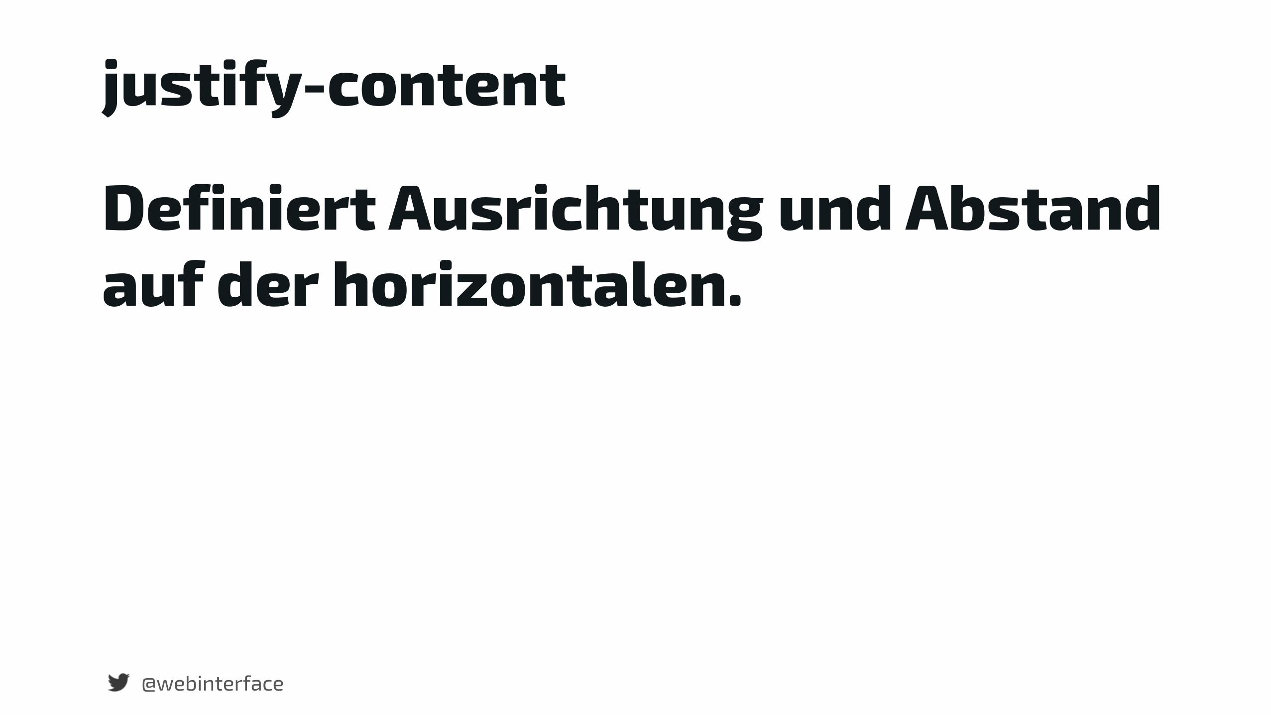
justify-content
Definiert Ausrichtung und Abstand auf der horizontalen.
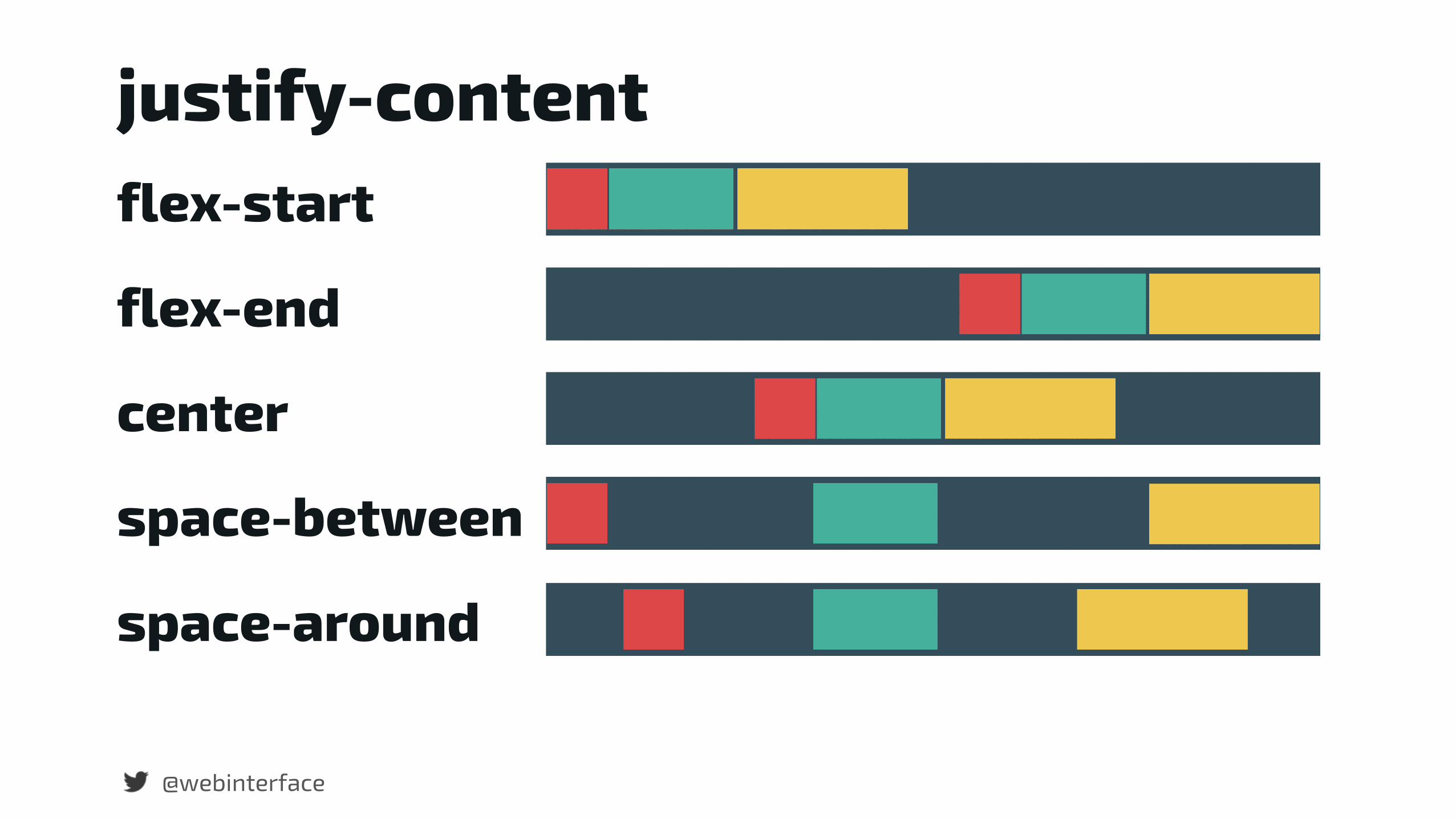
flex-start
flex-end
center
space-between
space-around
@webinterface
justify-content

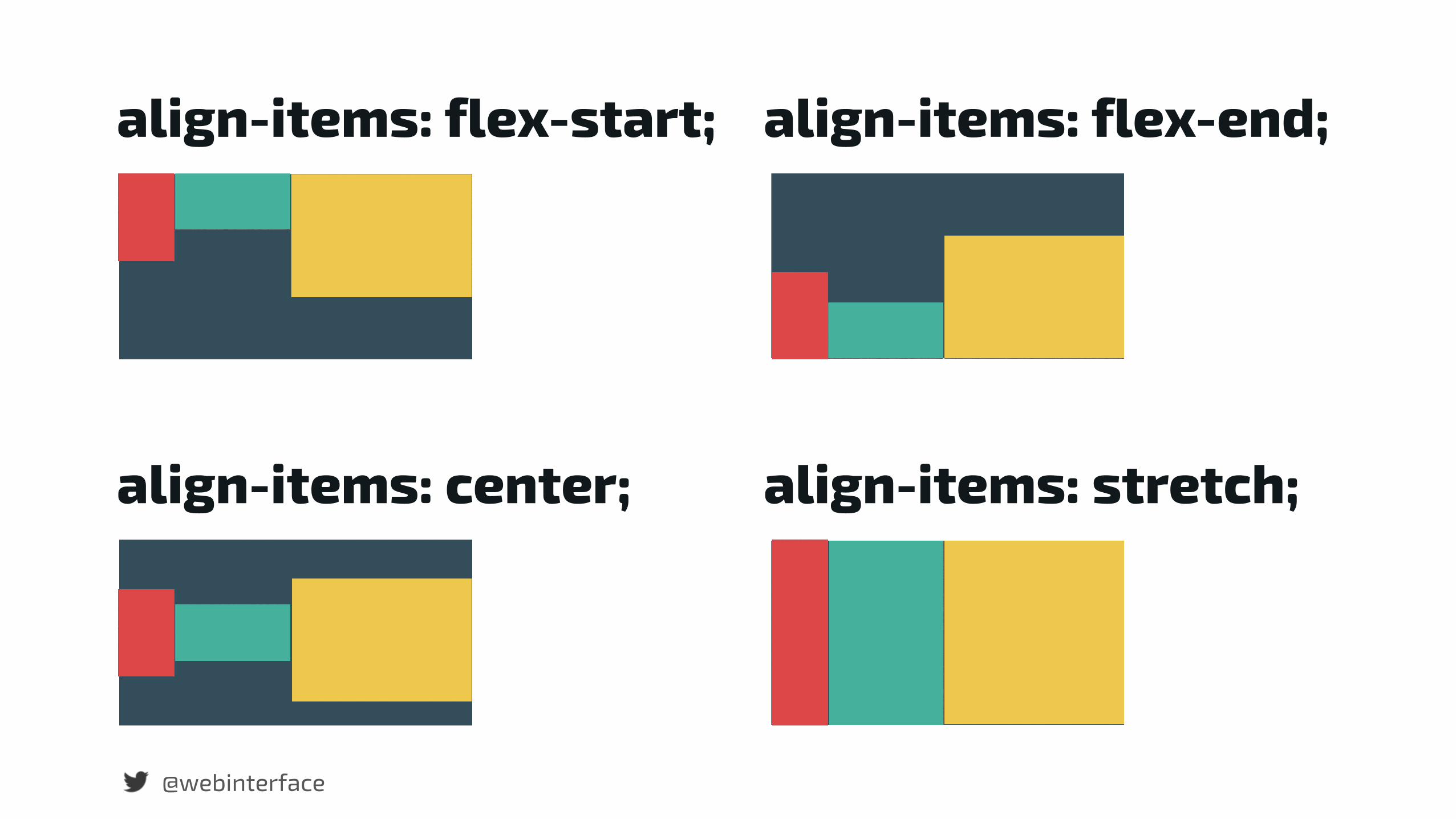
Vertikale Ausrichtung
@webinterface
@webinterface
align-items: flex-start; align-items: flex-end;
align-items: center; align-items: stretch;

Enhance Responsive Form
@webinterface
mit flex-grow, flex-shrink und flex-basis
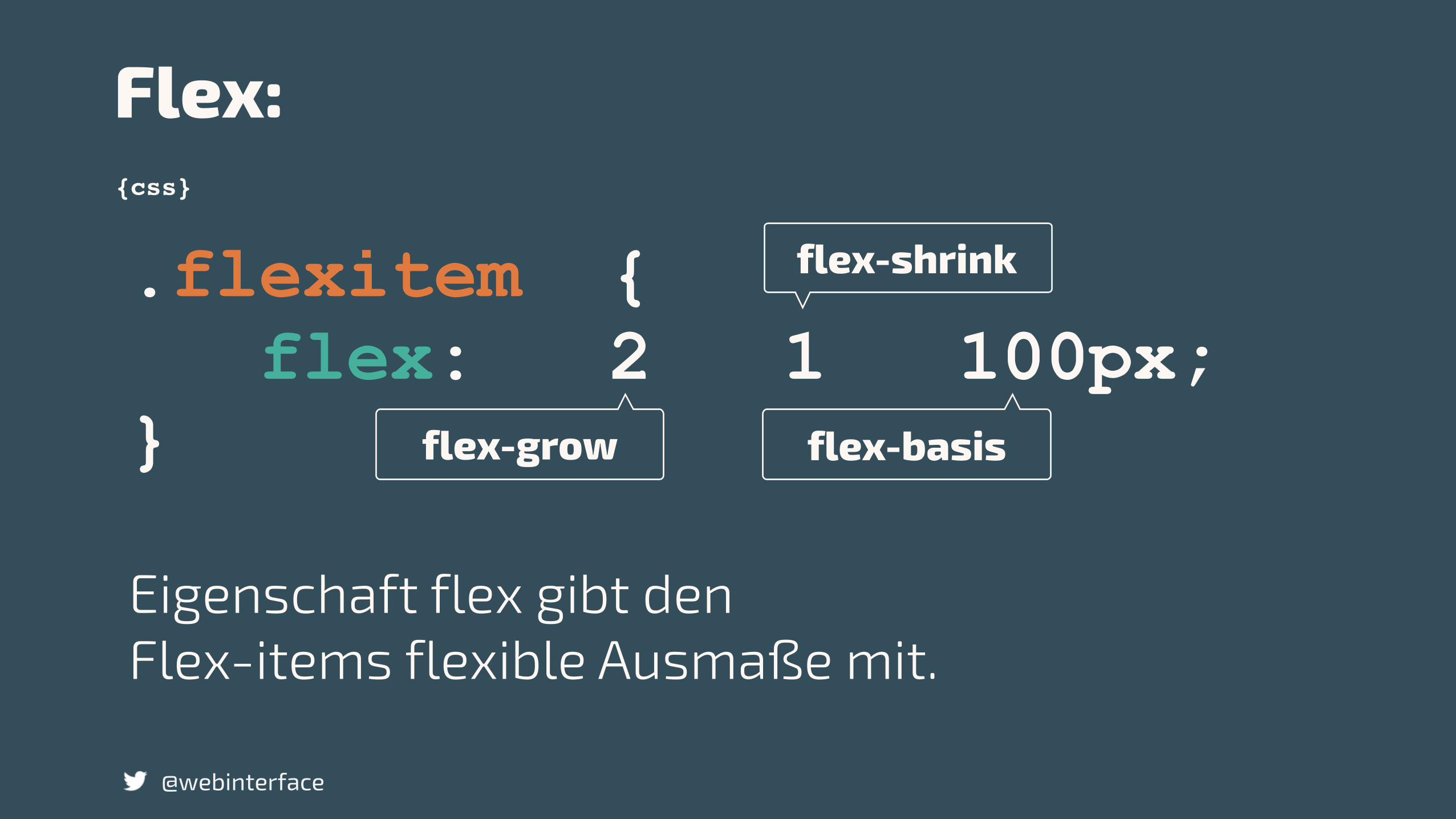
.flexitem { flex: 2 1 100px; } flex-grow flex-basis
flex-shrink
{css}
Flex:
@webinterface
Eigenschaft flex gibt den Flex-items flexible Ausmaße mit.
@webinterface
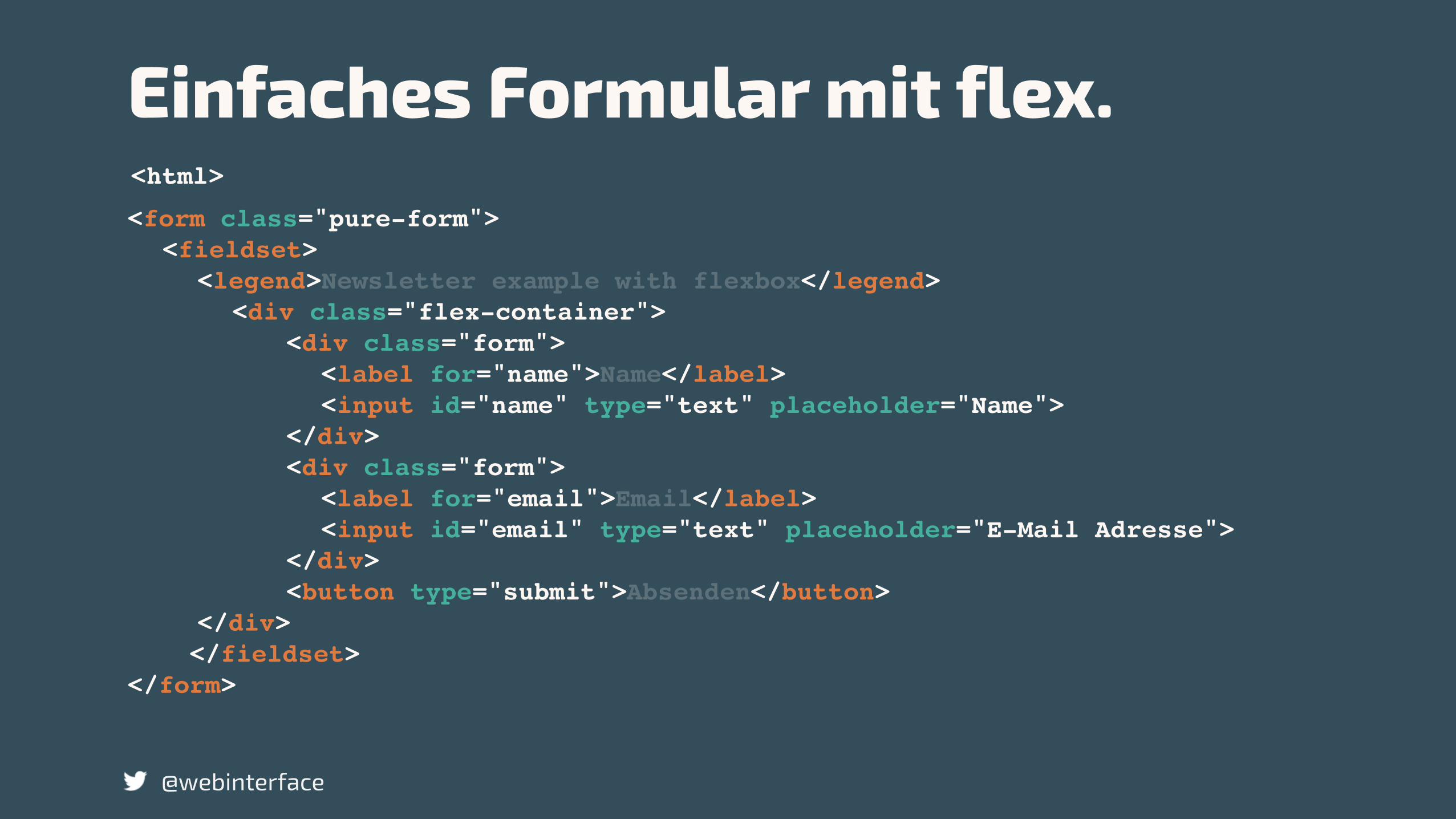
<form class="pure-form"><fieldset>
<legend>Newsletter example with flexbox</legend> <div class="flex-container">
<div class="form"> <label for="name">Name</label> <input id="name" type="text" placeholder="Name">
</div> <div class="form">
<label for="email">Email</label> <input id="email" type="text" placeholder="E-Mail Adresse">
</div> <button type="submit">Absenden</button>
</div> </fieldset></form>
<html>
Einfaches Formular mit flex.
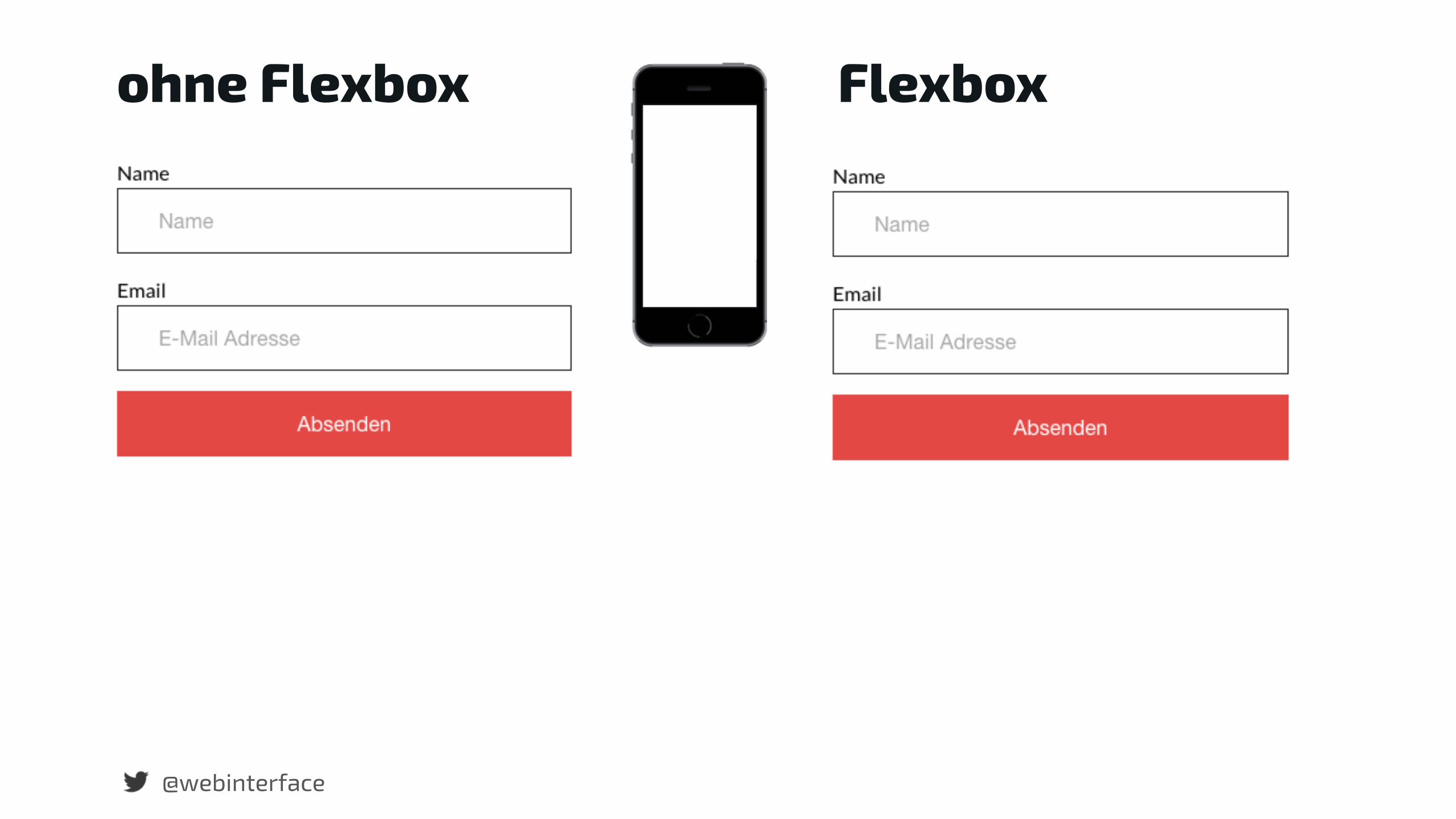
@webinterface
ohne Flexbox Flexbox
{css}
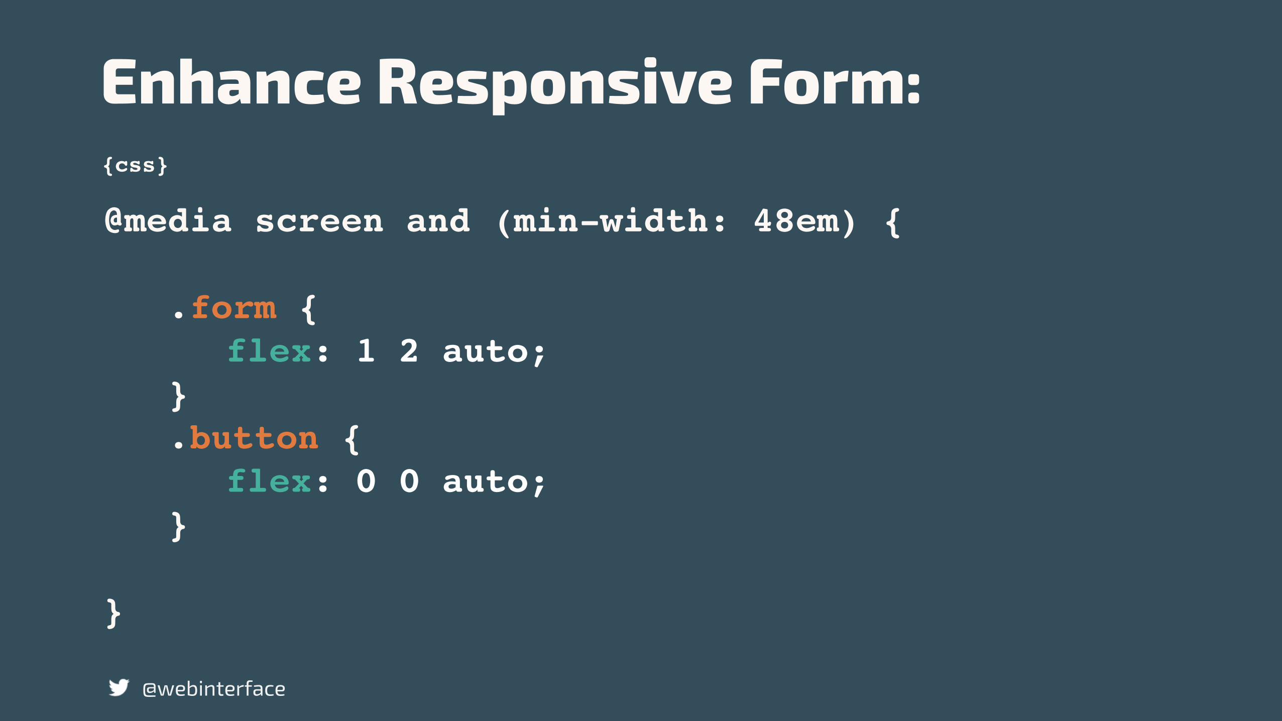
Enhance Responsive Form:
@webinterface
@media screen and (min-width: 48em) {
.form { flex: 1 2 auto;
} .button { flex: 0 0 auto;
}
}
@webinterface
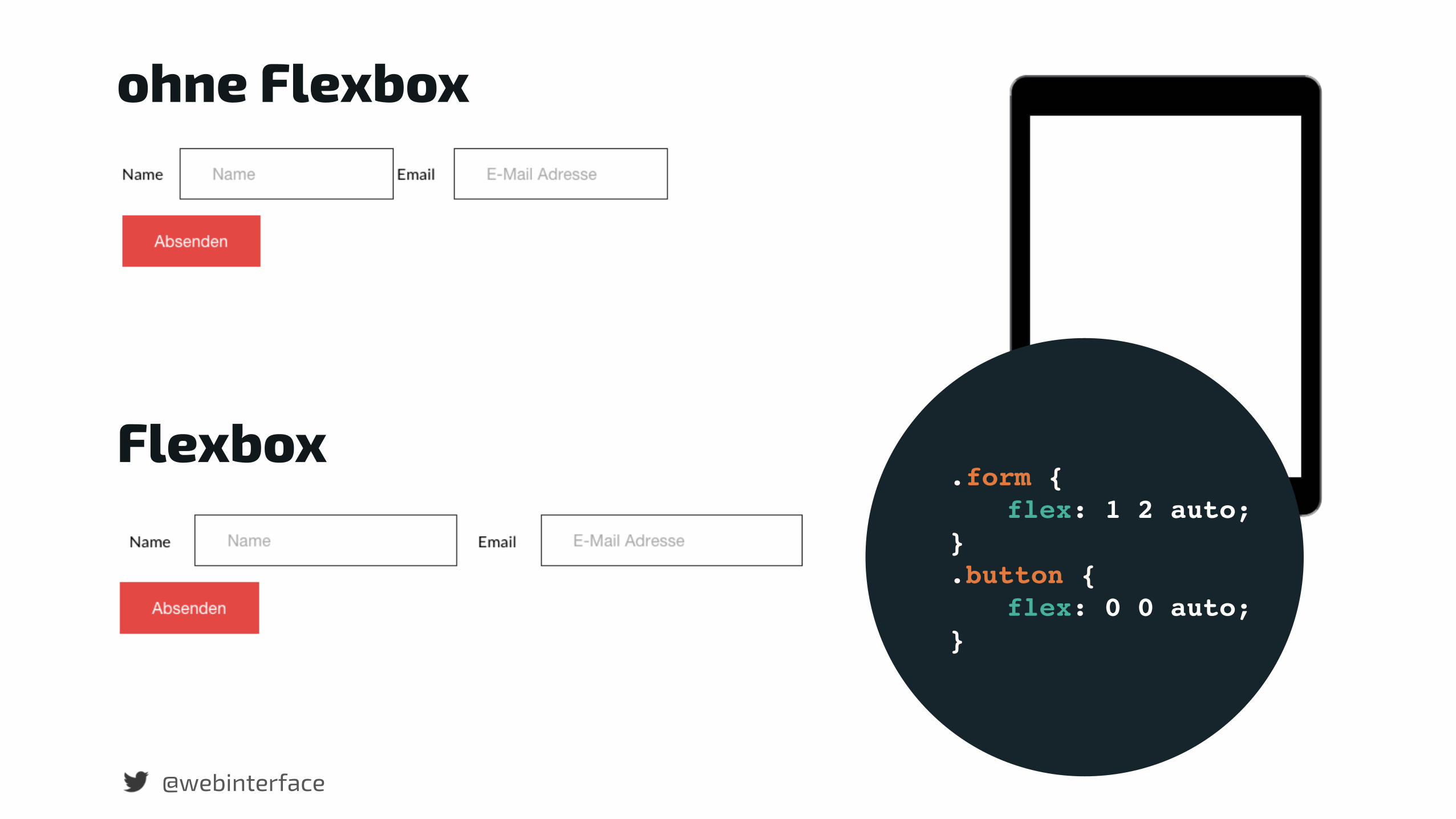
ohne Flexbox
Flexbox .form {
flex: 1 2 auto; } .button {
flex: 0 0 auto; }
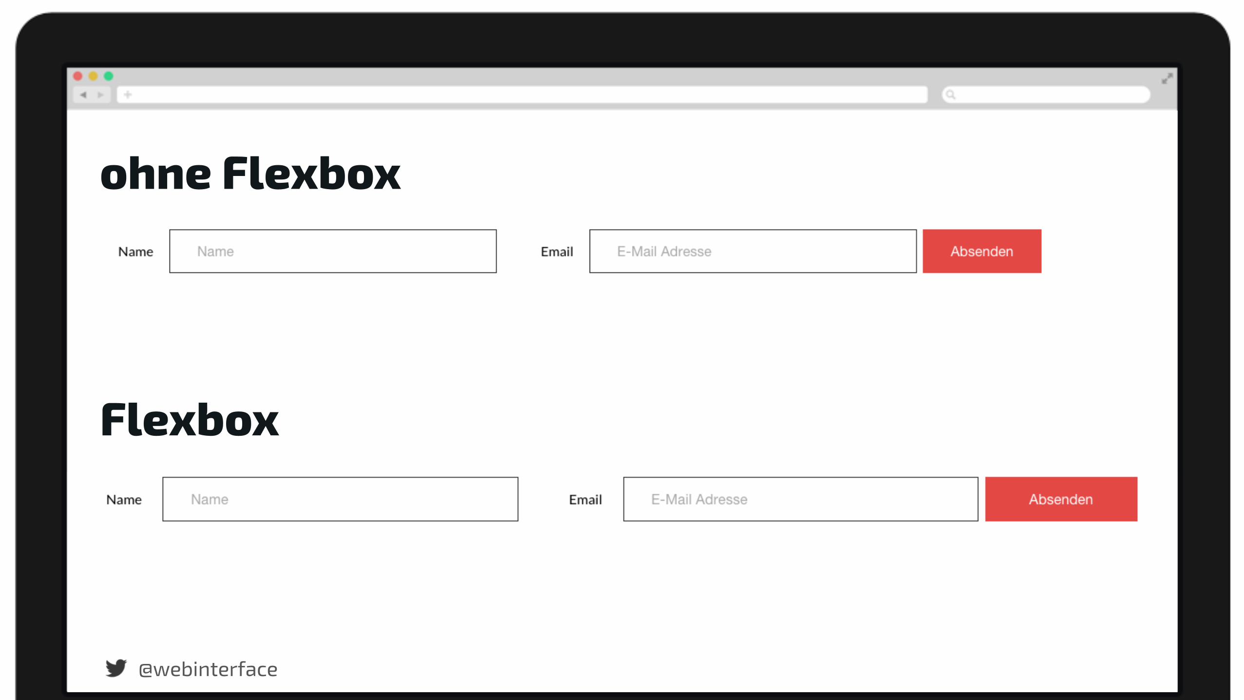
@webinterface
ohne Flexbox
Flexbox
Browsersupport Flexbox?
@webinterface
@webinterface
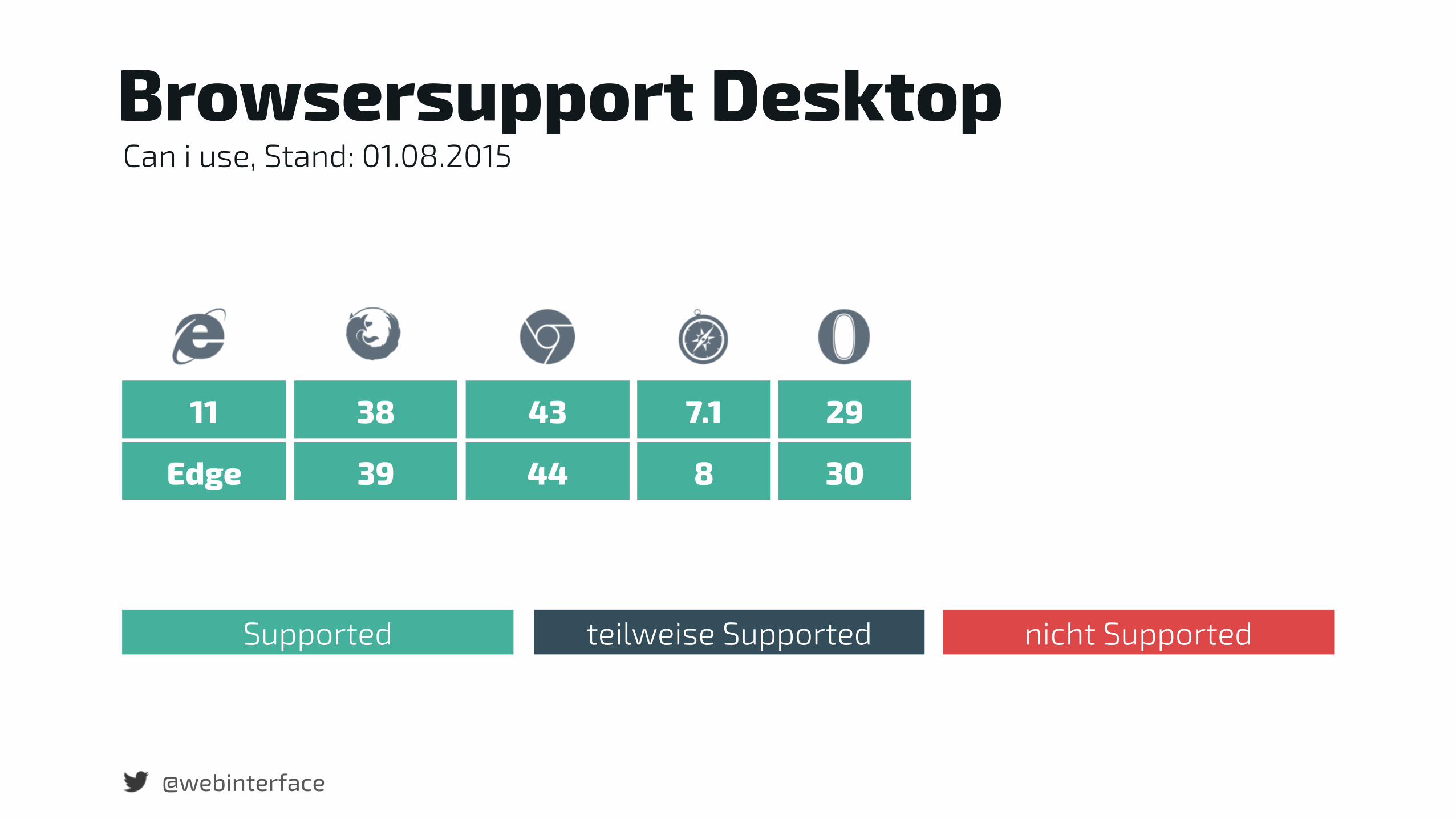
Edge 39 44 8 30
Browsersupport Desktop
11 38 43 7.1 29
Can i use, Stand: 01.08.2015
Supported teilweise Supported nicht Supported
Supported teilweise Supported nicht Supported
@webinterface
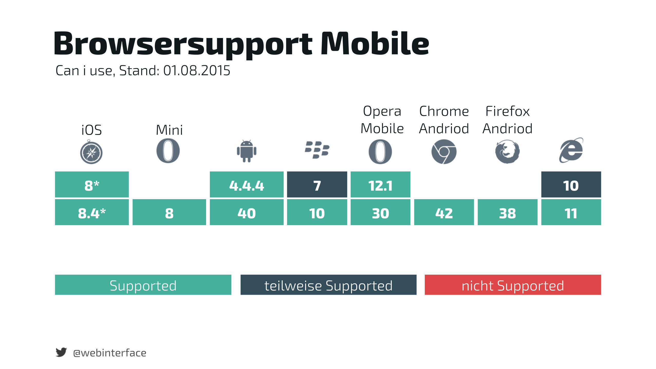
8.4* 8 40 10 30 42 38 11
iOS MiniOpera Mobile
Chrome Andriod
Firefox Andriod
Browsersupport Mobile
8* 4.4.4 7 12.1 10
Can i use, Stand: 01.08.2015

@webinterface
CSS Fallback
Flexbox überschreibt SpaceFlexbox wird nicht
überschrieben
floats
display: inline-block
table-cell
position: absolute;
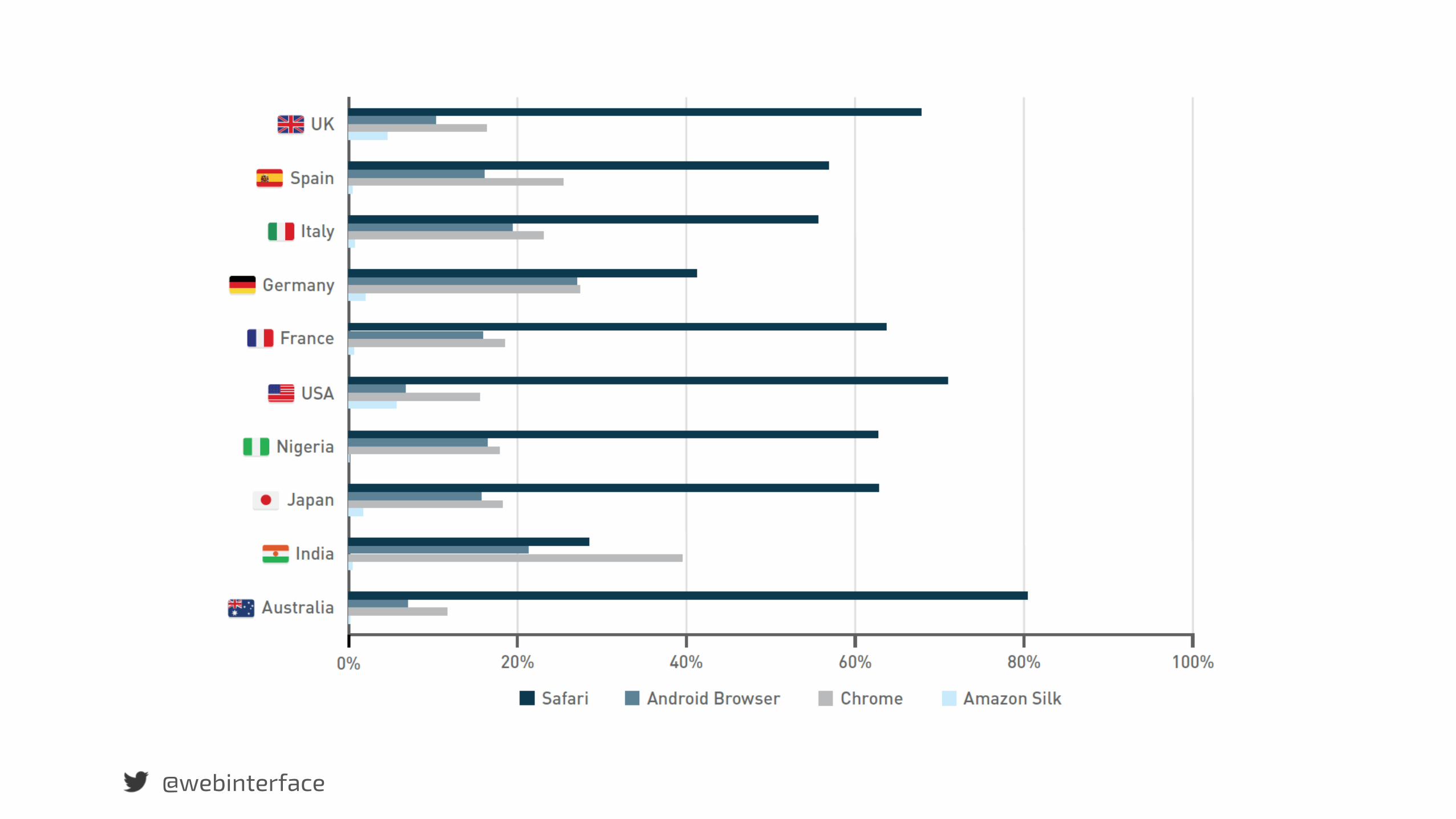
Browser Traffic.
@webinterface

Safari ist der am meisten genutzte Browser auf Tablets.
@webinterface
@webinterface
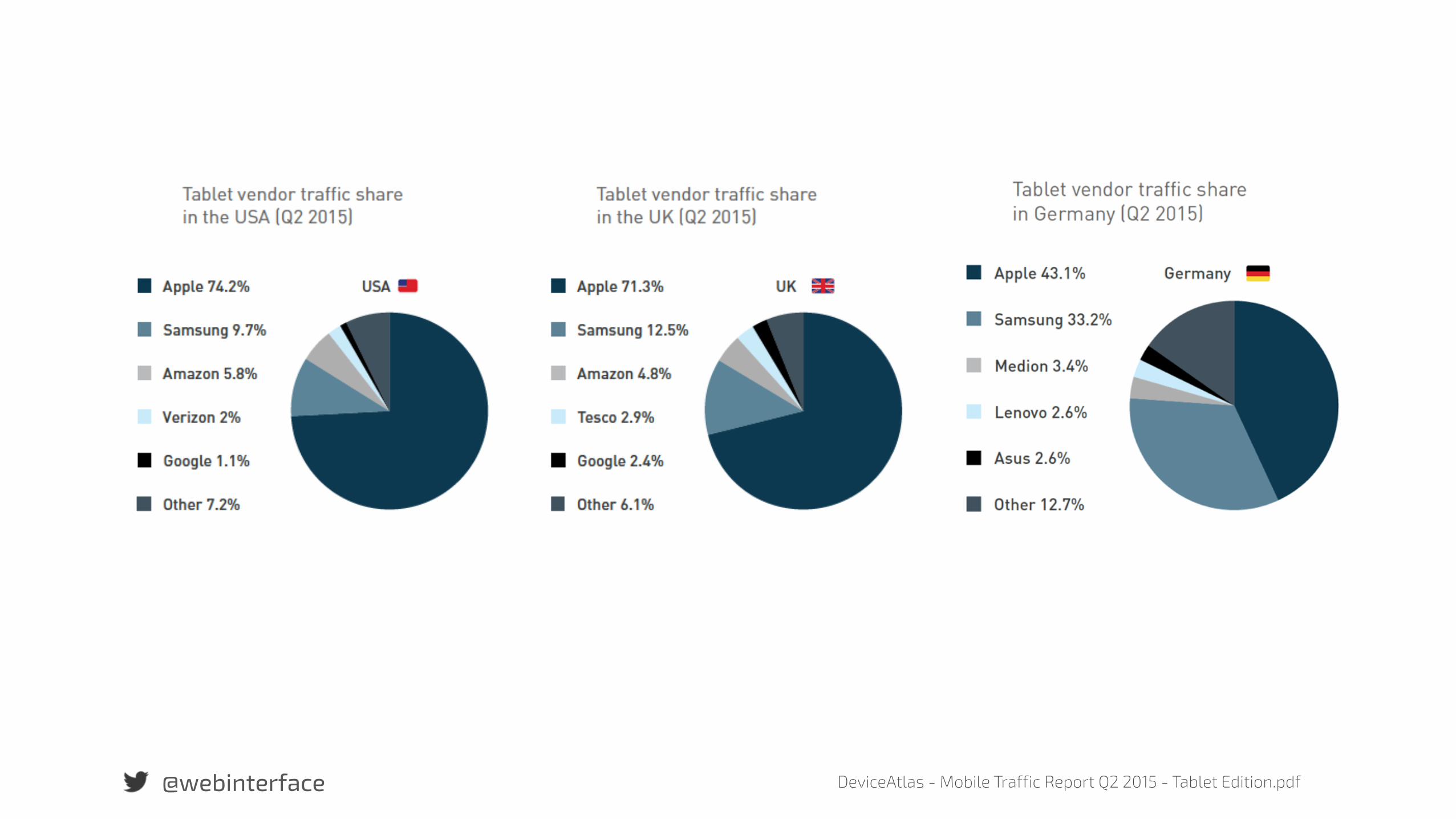
@webinterface DeviceAtlas - Mobile Traffic Report Q2 2015 - Tablet Edition.pdf

Bei Smartphones liegt Android in 73 von 90 Ländern vor iOS.
@webinterface
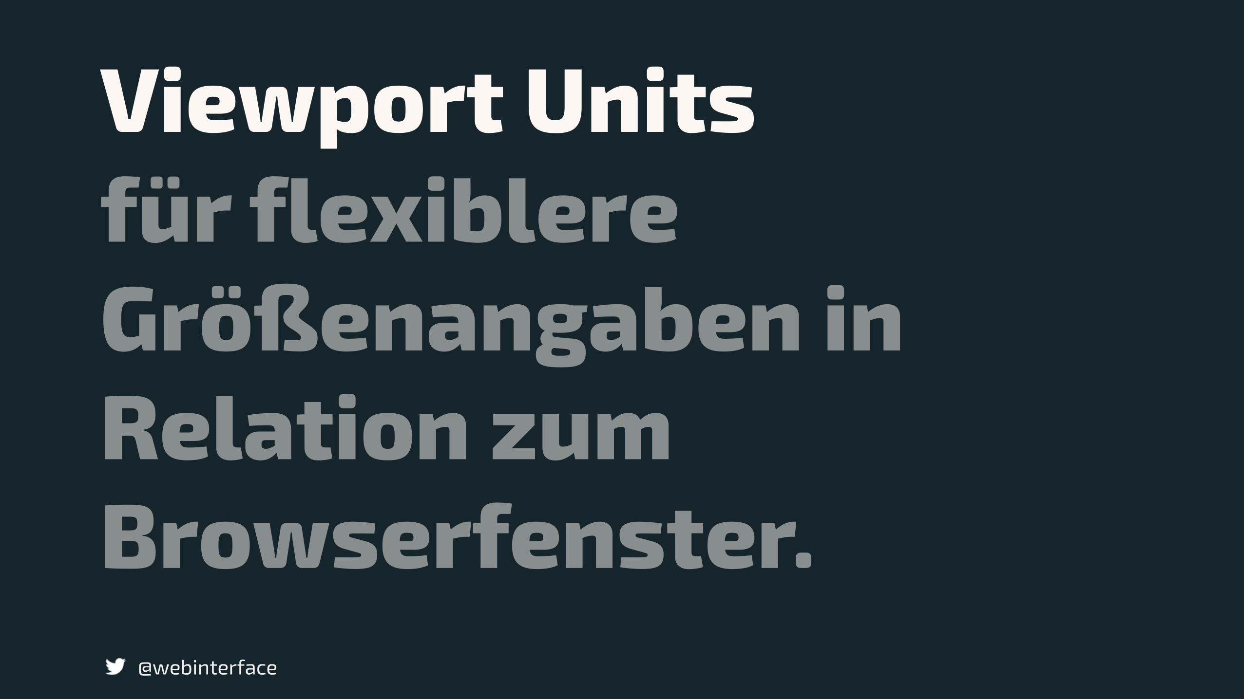
Viewport Units
@webinterface
für flexiblere Größenangaben in Relation zum Browserfenster.
@webinterface
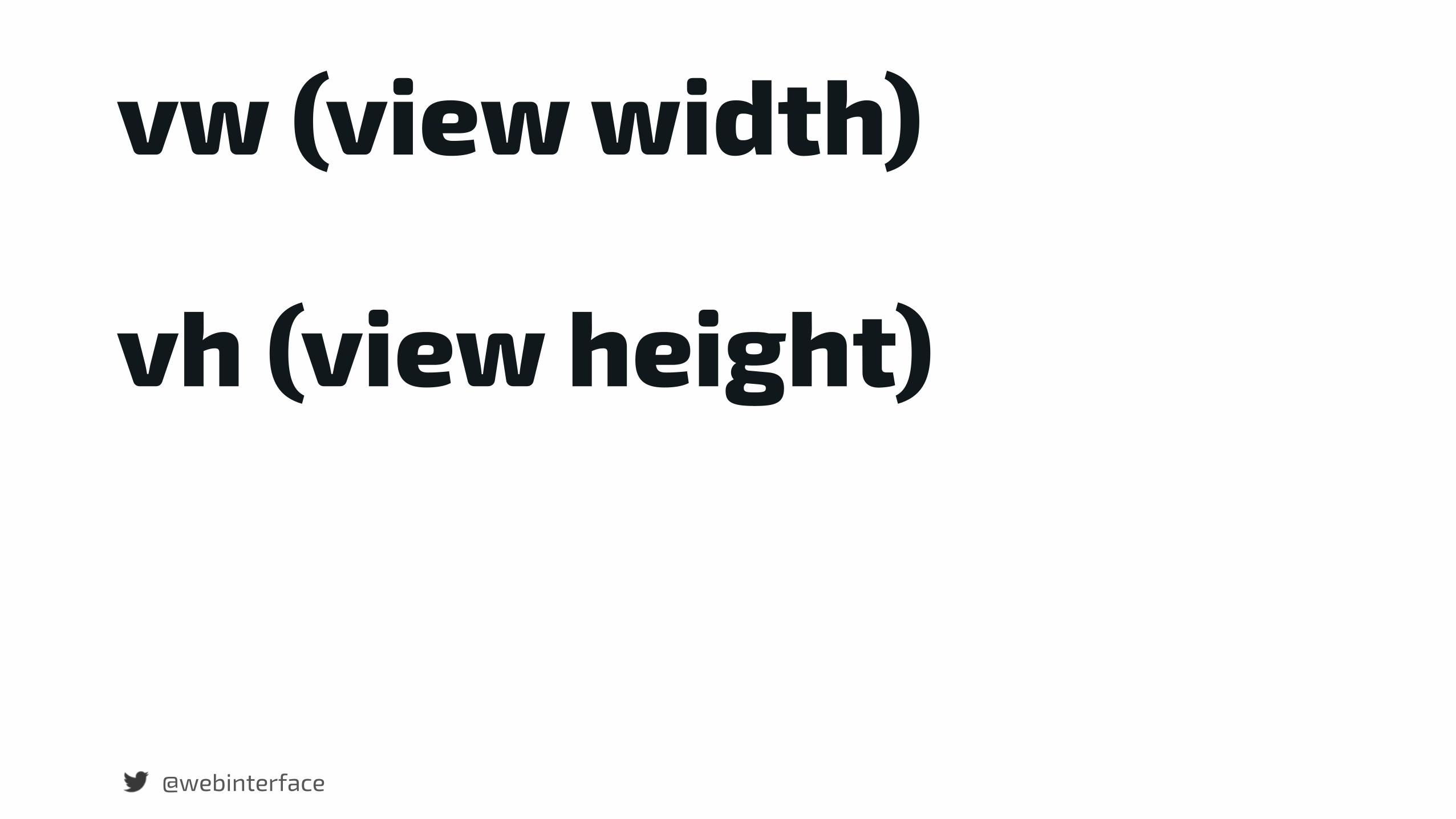
vw (view width)
vh (view height)
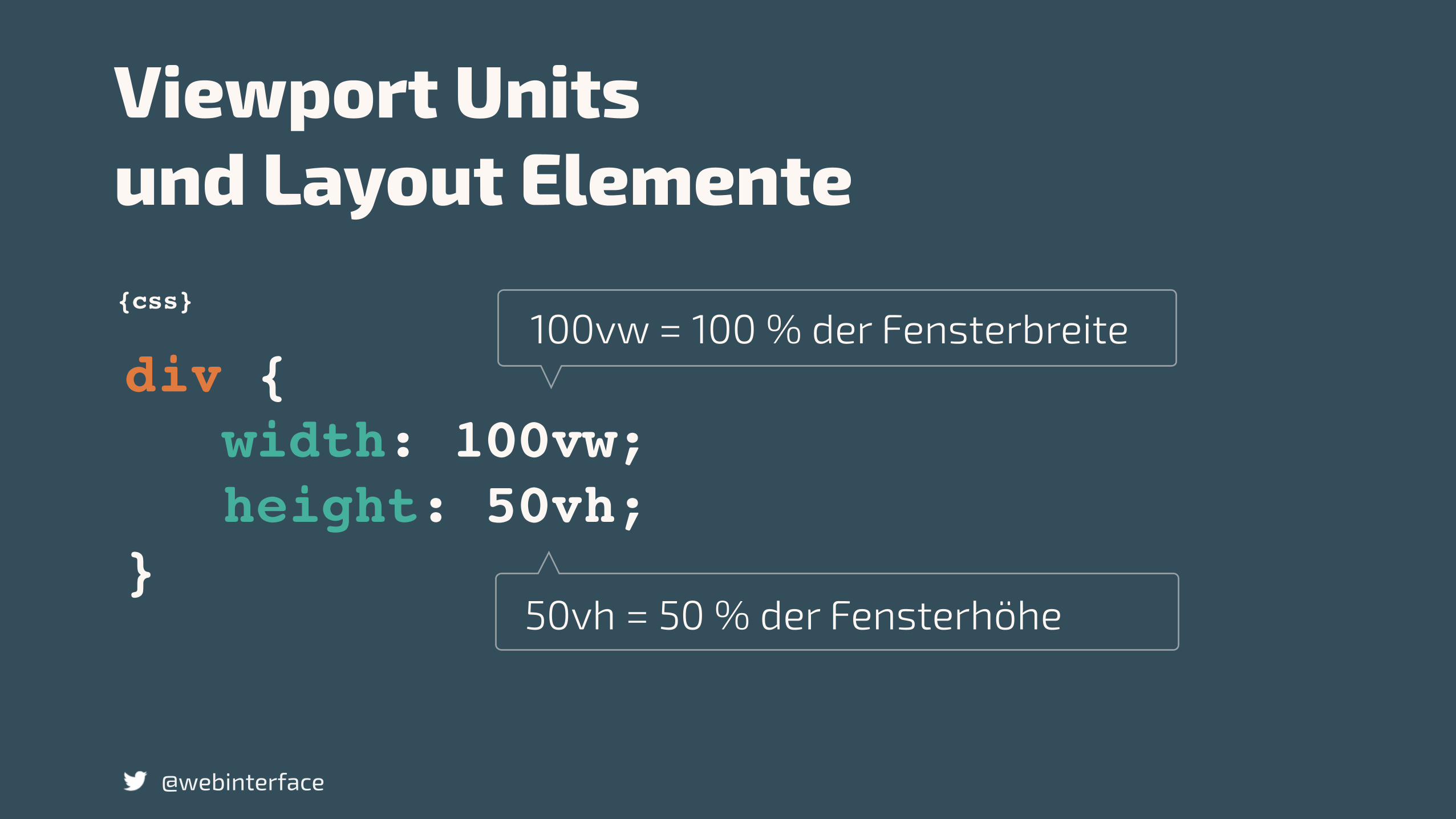
div { width: 100vw; height: 50vh;}
{css}
Viewport Units und Layout Elemente
@webinterface
50vh = 50 % der Fensterhöhe
100vw = 100 % der Fensterbreite
@webinterface
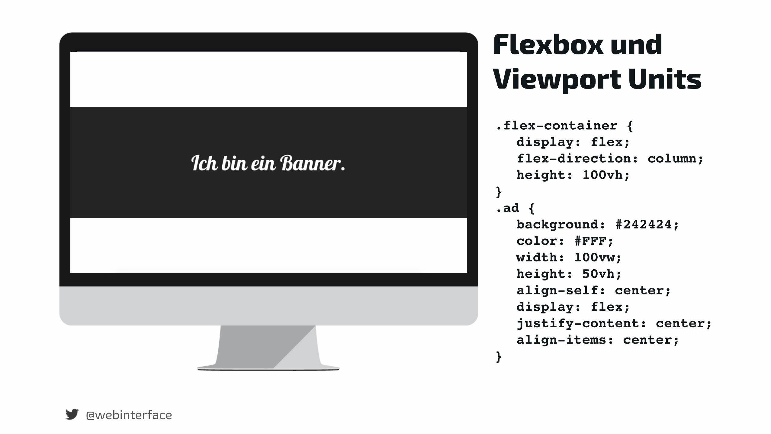
Flexbox und Viewport Units.flex-container {
display: flex;flex-direction: column;height: 100vh;
}.ad {
background: #242424;color: #FFF;width: 100vw;height: 50vh;align-self: center;display: flex;justify-content: center;align-items: center;
}
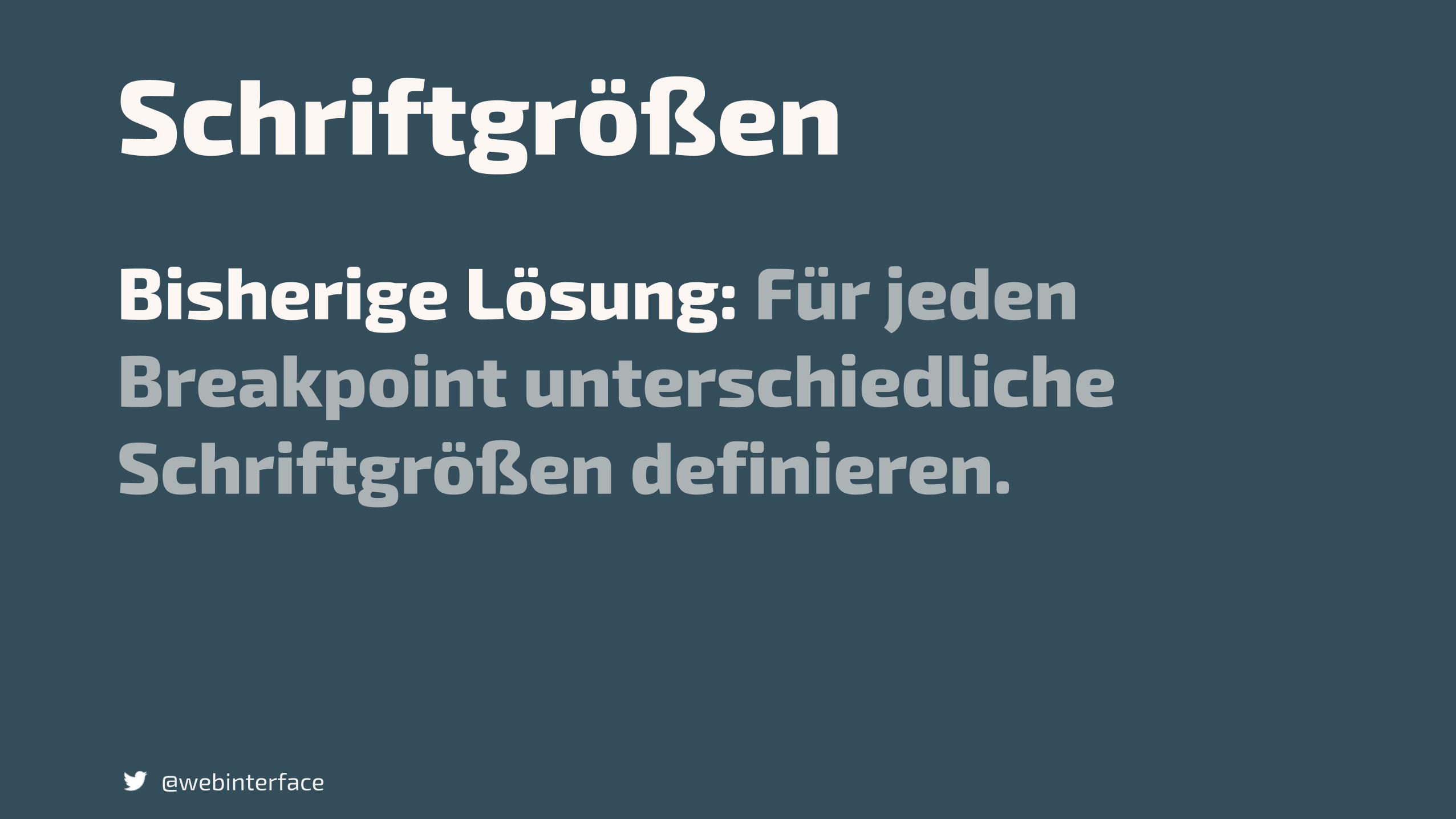
SchriftgrößenBisherige Lösung: Für jeden Breakpoint unterschiedliche Schriftgrößen definieren.
@webinterface
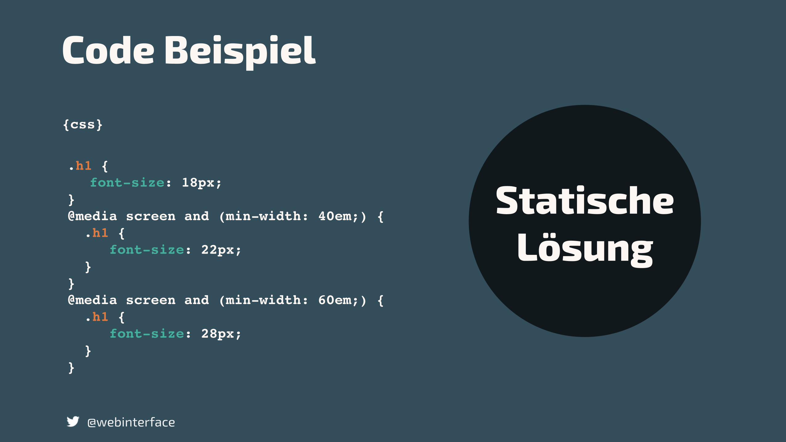
.h1 {font-size: 18px;
}@media screen and (min-width: 40em;) { .h1 { font-size: 22px; }}@media screen and (min-width: 60em;) { .h1 { font-size: 28px; }}
{css}
Code Beispiel
@webinterface
Statische Lösung
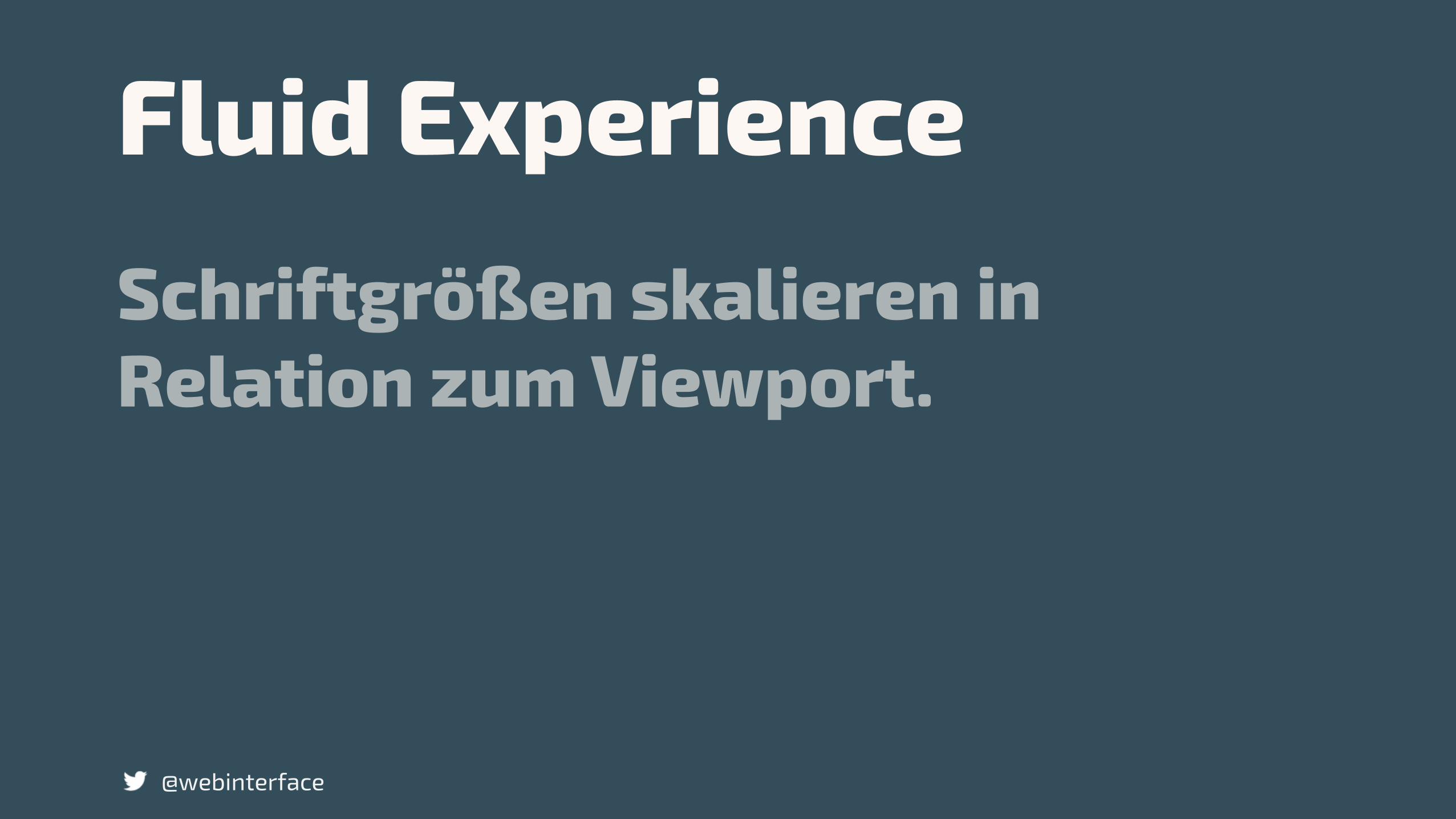
Fluid ExperienceSchriftgrößen skalieren in Relation zum Viewport.
@webinterface
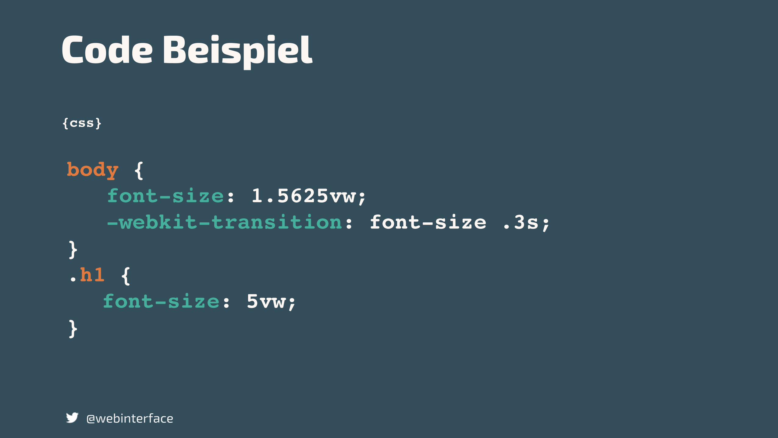
body { font-size: 1.5625vw; -webkit-transition: font-size .3s;}.h1 { font-size: 5vw;
}
{css}
Code Beispiel
@webinterface
@webinterface
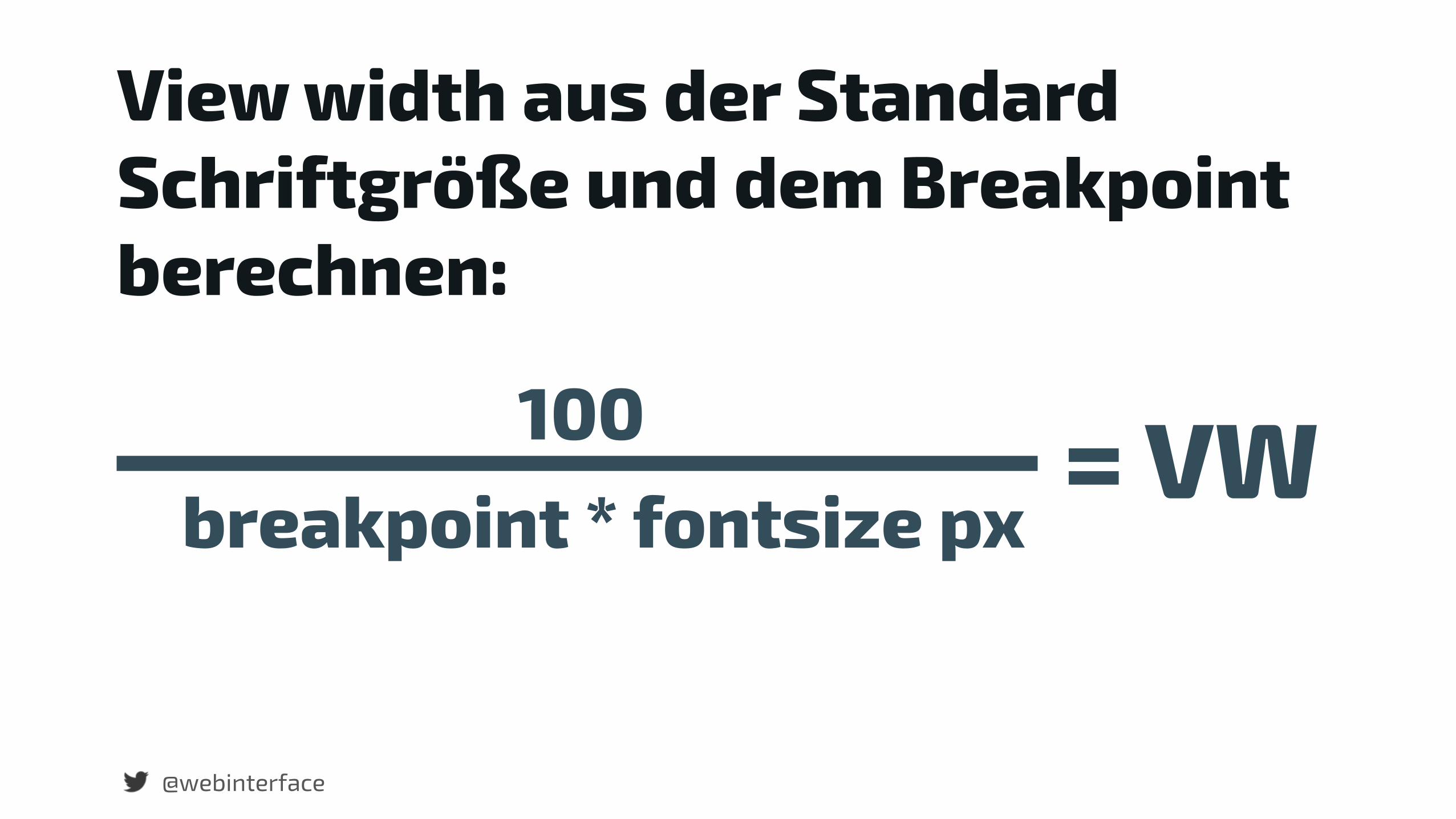
View width aus der Standard Schriftgröße und dem Breakpoint berechnen:
breakpoint * fontsize px100 = VW
@webinterface
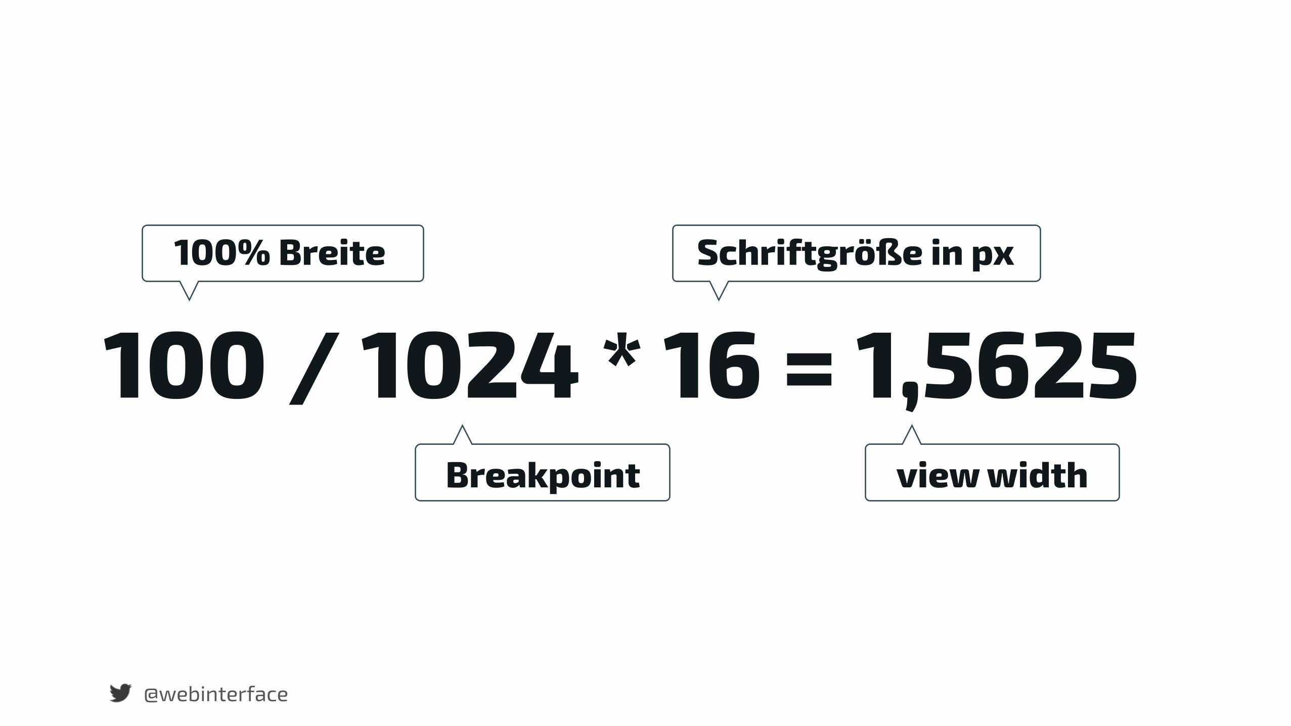
100 / 1024 * 16 = 1,5625Breakpoint
Schriftgröße in px
view width
100% Breite

{css}
Schriftgröße wird in Relation zum Viewport größer.
@webinterface
@media width and (min: 1024px) {
body { font-size: 1.5625vw;}
}
{css}
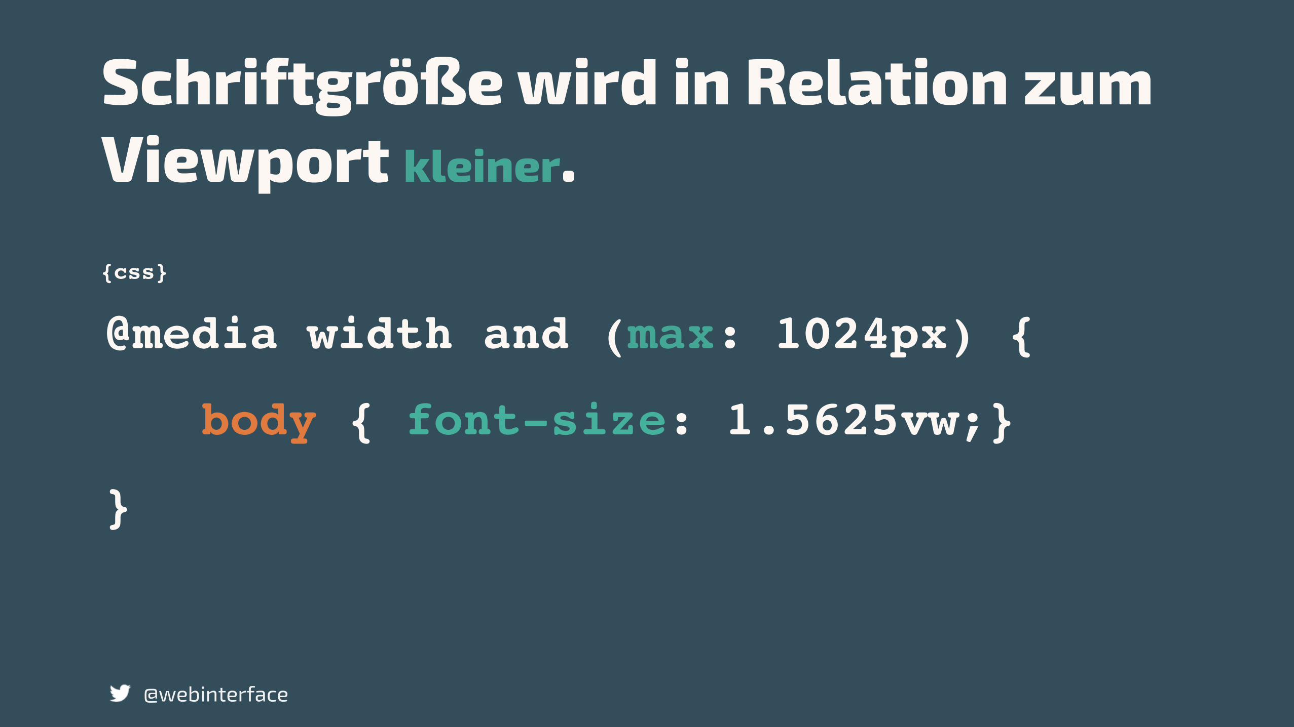
Schriftgröße wird in Relation zum Viewport kleiner.
@webinterface
@media width and (max: 1024px) {
body { font-size: 1.5625vw;}
}
Browsersupport?
@webinterface
@webinterface
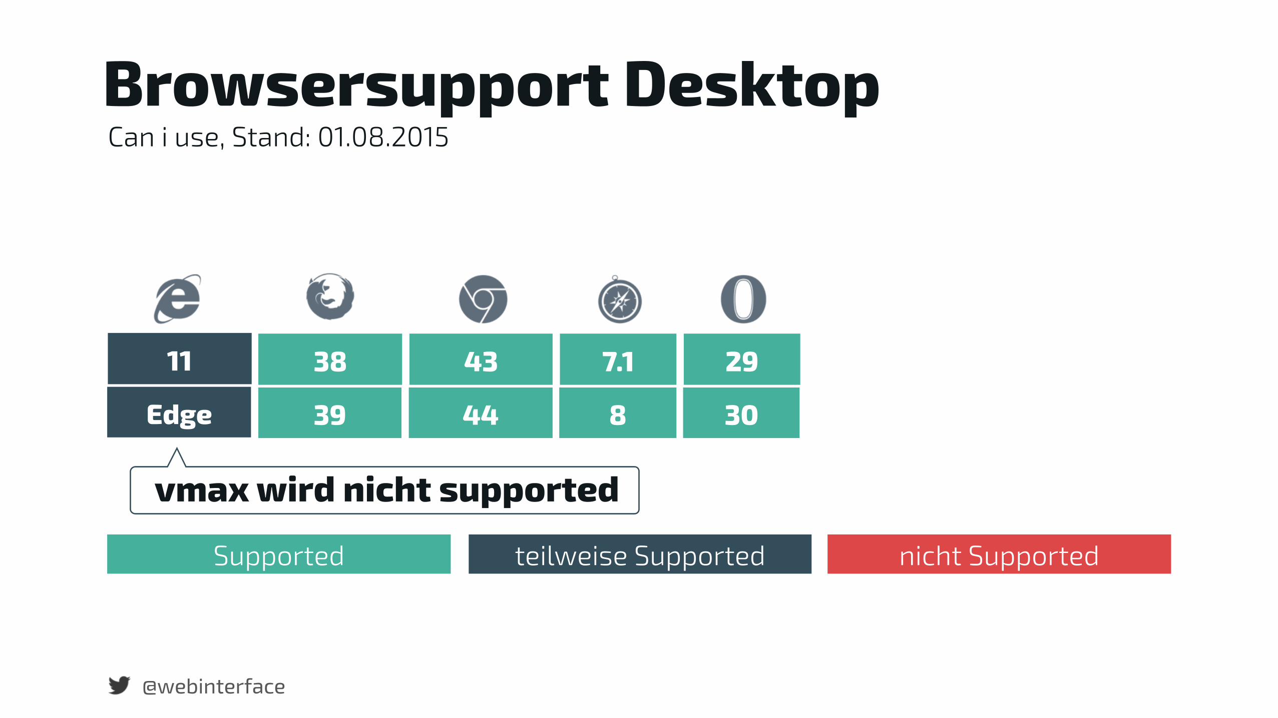
Edge 39 44 8 30
Browsersupport Desktop
11 38 43 7.1 29
vmax wird nicht supported
Can i use, Stand: 01.08.2015
Supported teilweise Supported nicht Supported
@webinterface
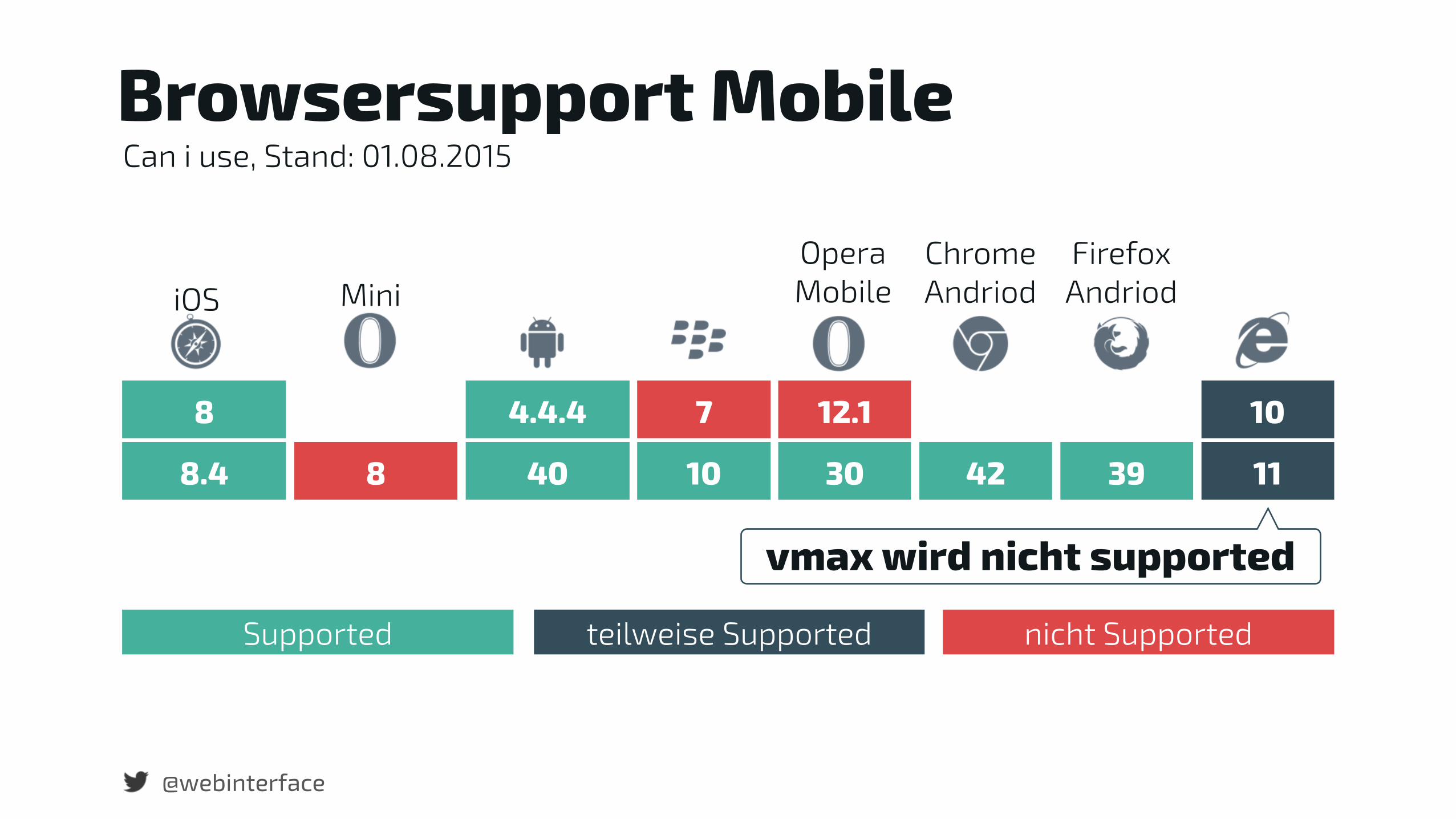
8.4 8 40 10 30 42 39 11
iOS MiniOpera Mobile
Chrome Andriod
Firefox Andriod
Browsersupport Mobile
vmax wird nicht supported
8 4.4.4 7 12.1 10
Can i use, Stand: 01.08.2015
Supported teilweise Supported nicht Supported
@webinterface
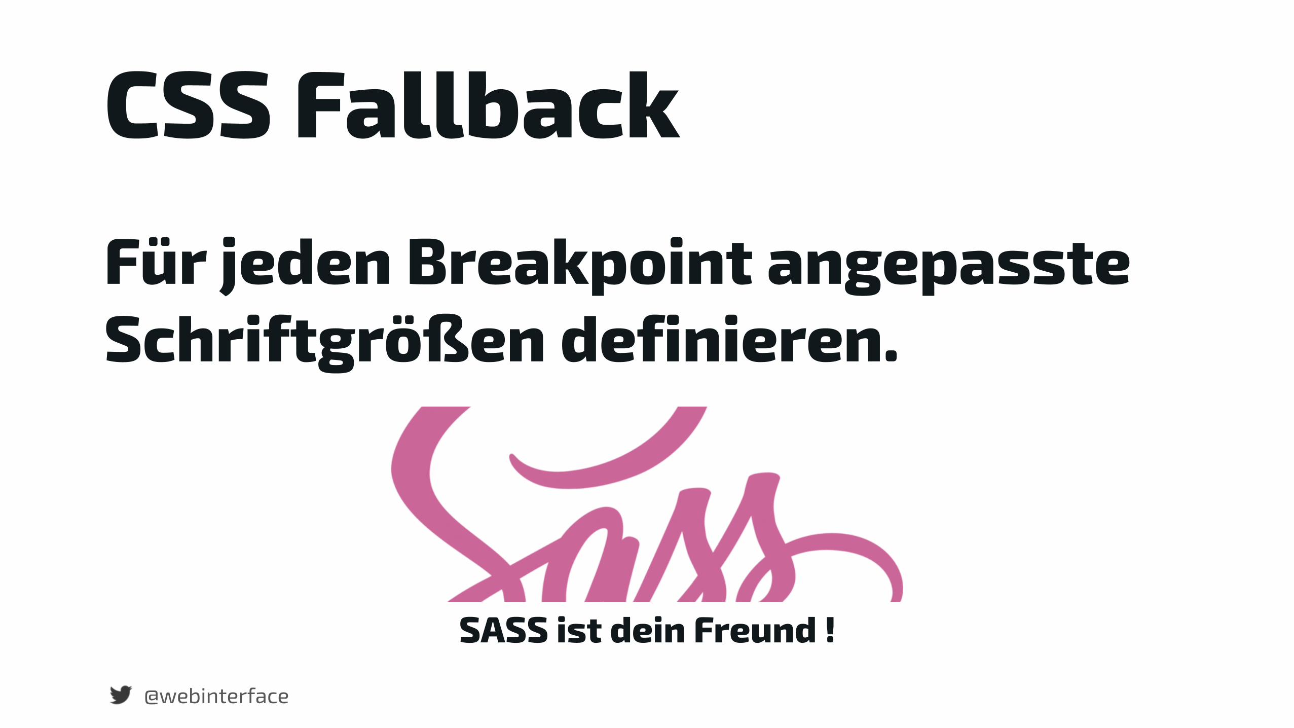
CSS FallbackFür jeden Breakpoint angepasste Schriftgrößen definieren.
SASS ist dein Freund !
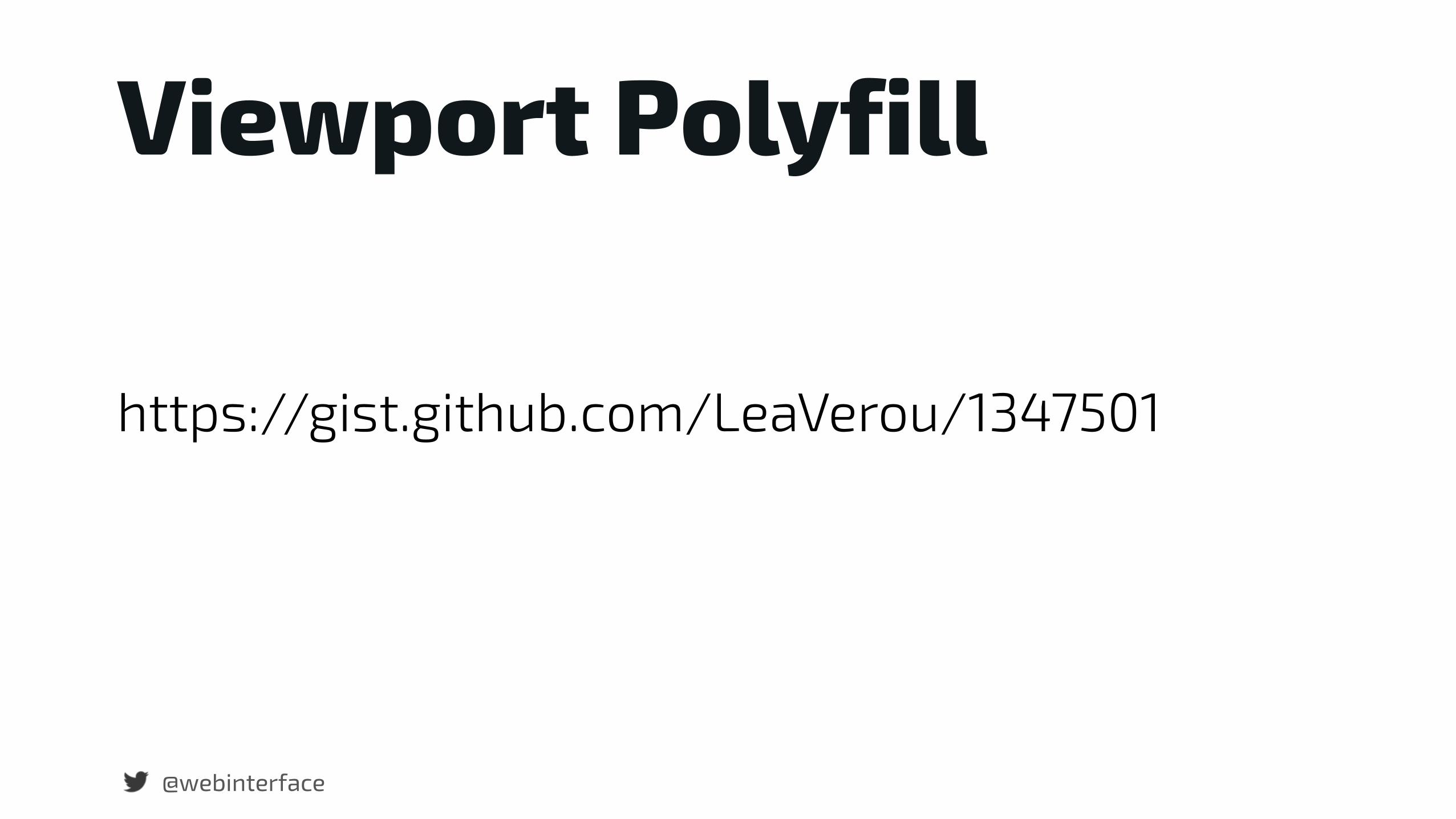
Viewport Polyfill
@webinterface
https://gist.github.com/LeaVerou/1347501
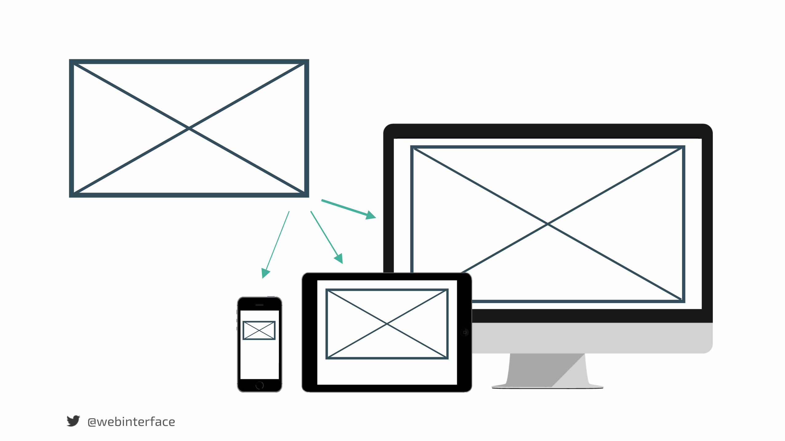
Responsive Image mit dem Picture Element.
@webinterface
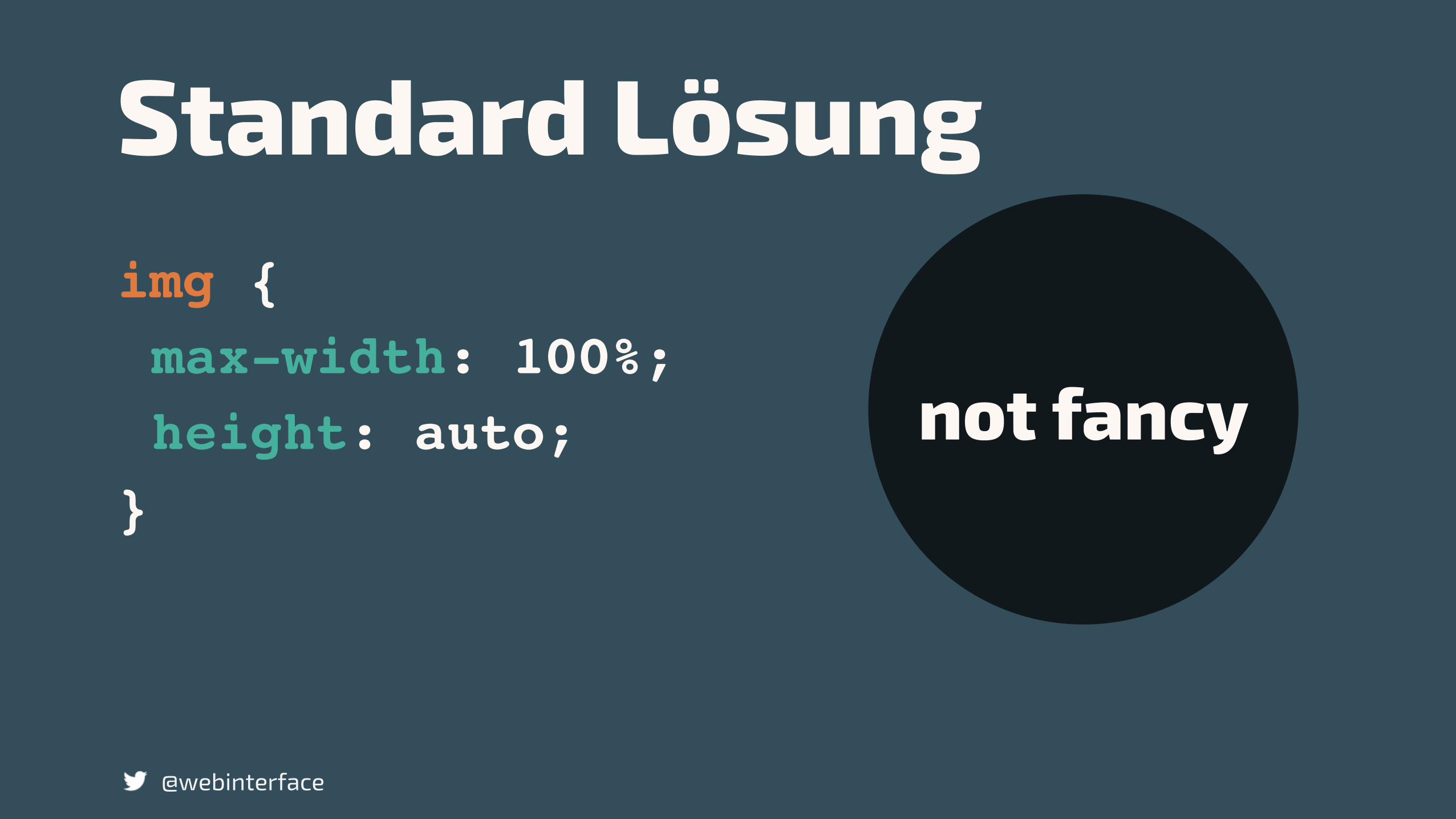
Standard Lösungimg {max-width: 100%;height: auto;
}
@webinterface
not fancy
@webinterface
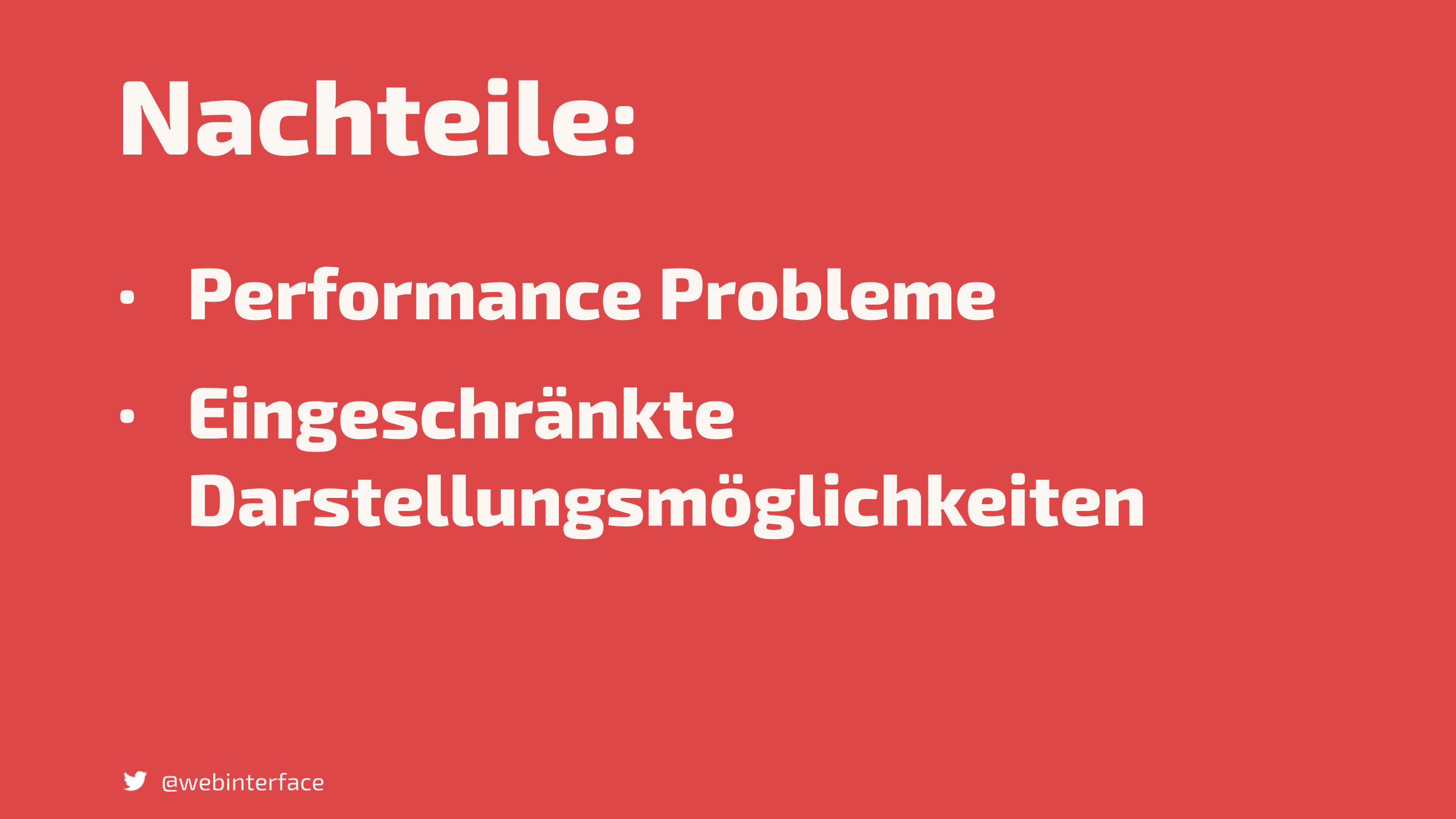
Nachteile:• Performance Probleme • Eingeschränkte
Darstellungsmöglichkeiten
@webinterface
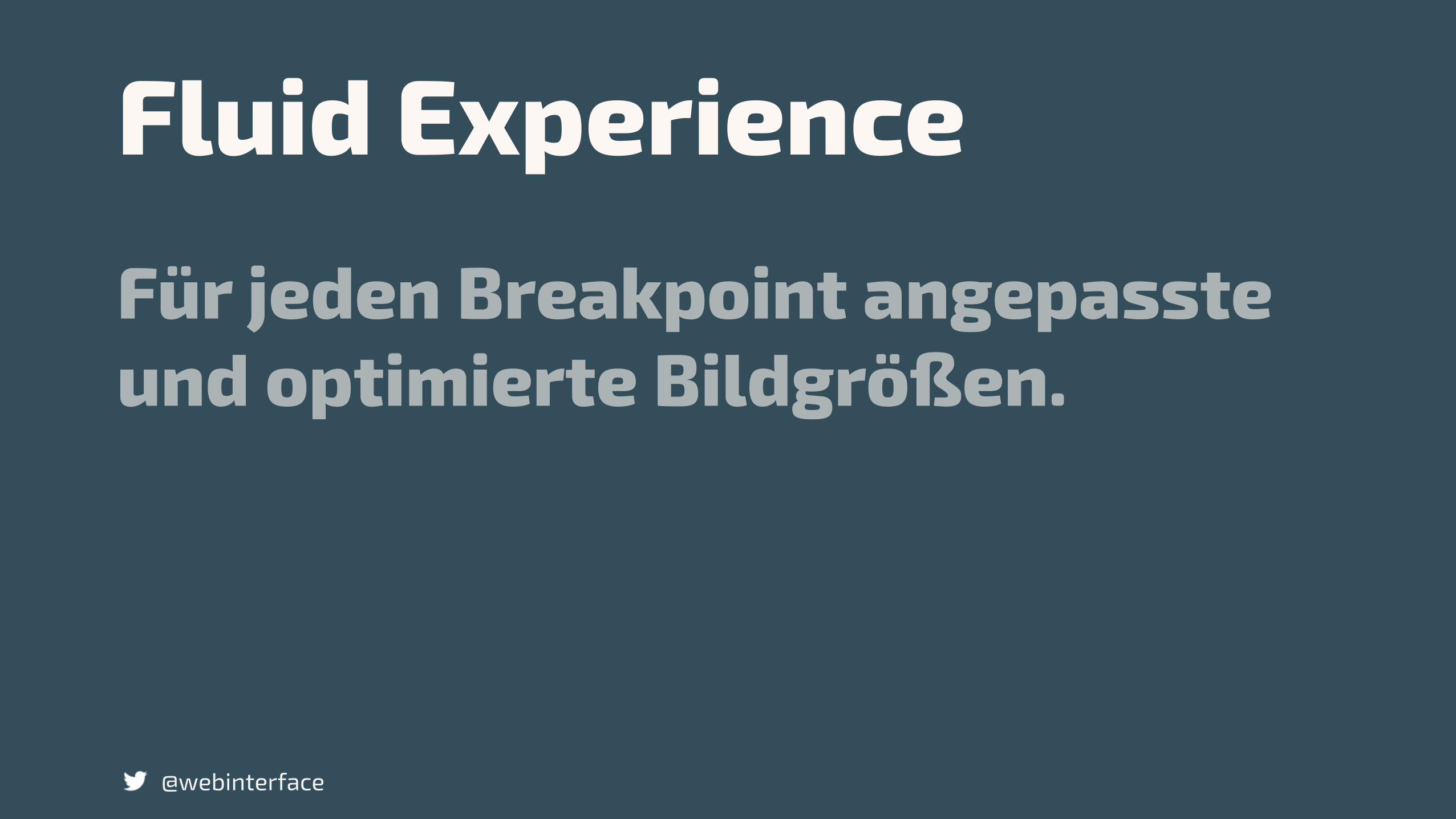
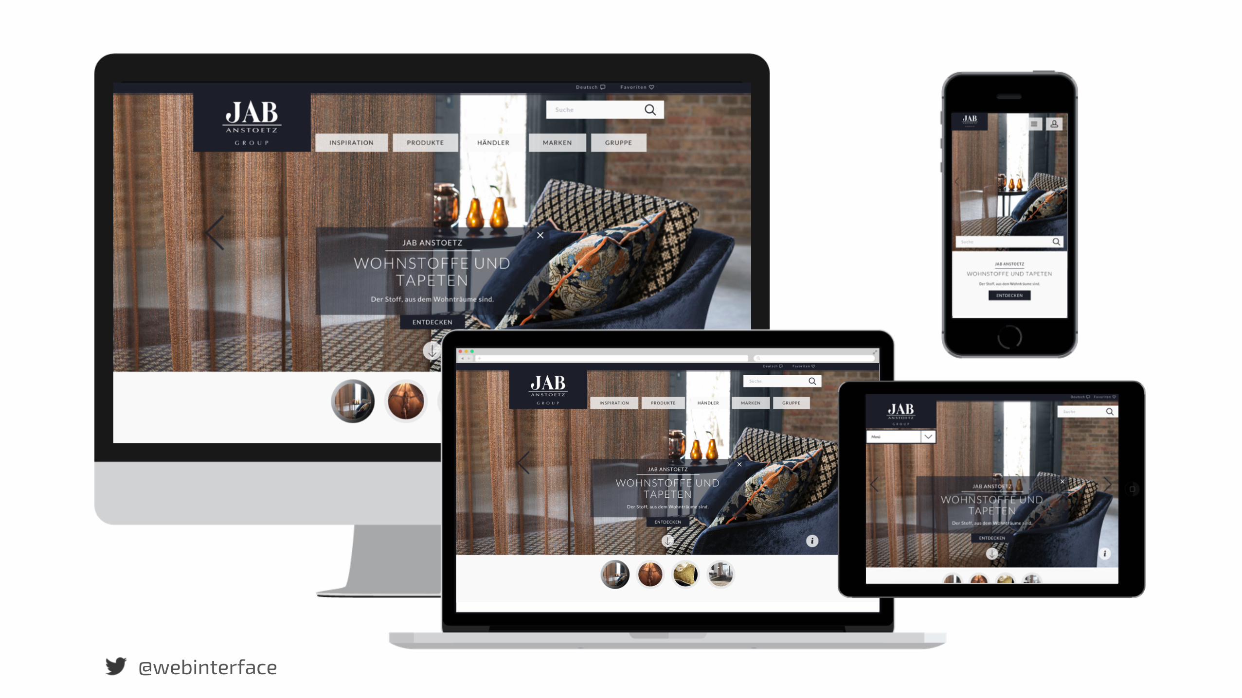
Für jeden Breakpoint angepasste und optimierte Bildgrößen.
@webinterface
Fluid Experience
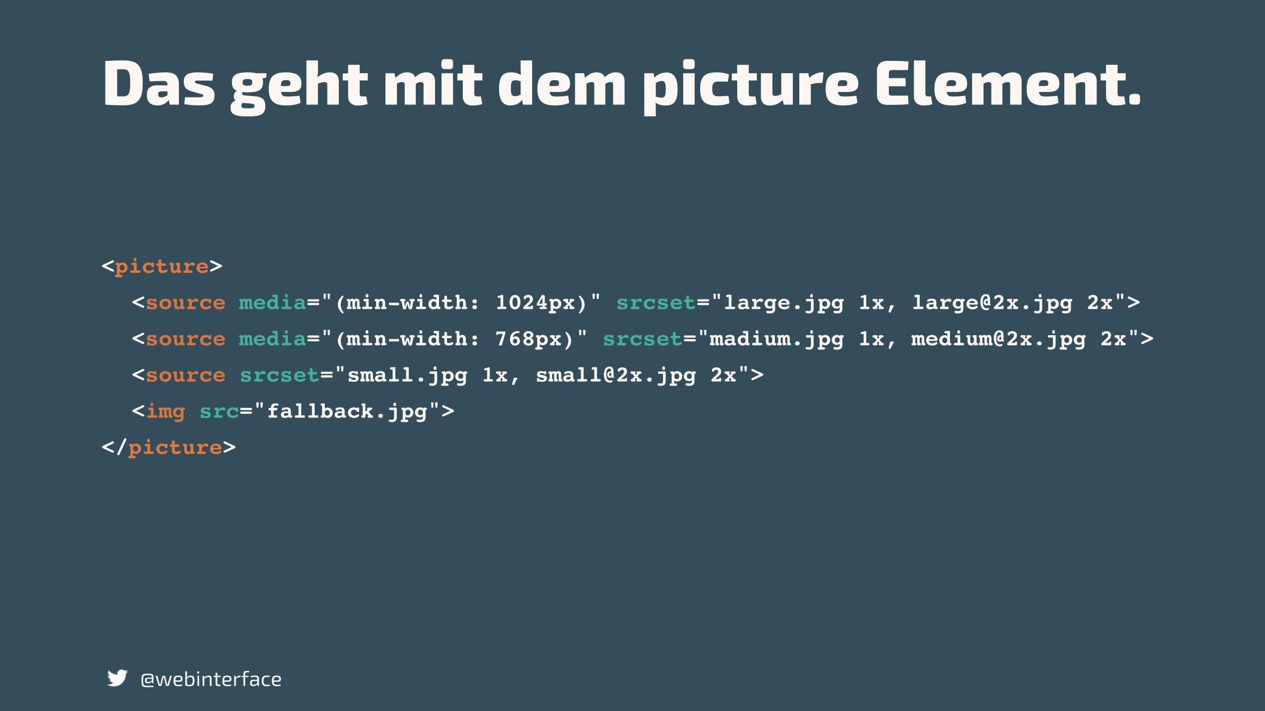
<picture>
<source media="(min-width: 1024px)" srcset="large.jpg 1x, [email protected] 2x">
<source media="(min-width: 768px)" srcset="madium.jpg 1x, [email protected] 2x">
<source srcset="small.jpg 1x, [email protected] 2x">
<img src="fallback.jpg">
</picture>
@webinterface
Das geht mit dem picture Element.
<picture>
<source media="(min-width: 1024px)" srcset="large.jpg 1x, [email protected] 2x">
<source media="(min-width: 768px)" srcset="madium.jpg 1x, [email protected] 2x">
<source srcset="small.jpg 1x, [email protected] 2x">
<img src="fallback.jpg">
</picture>
@webinterface
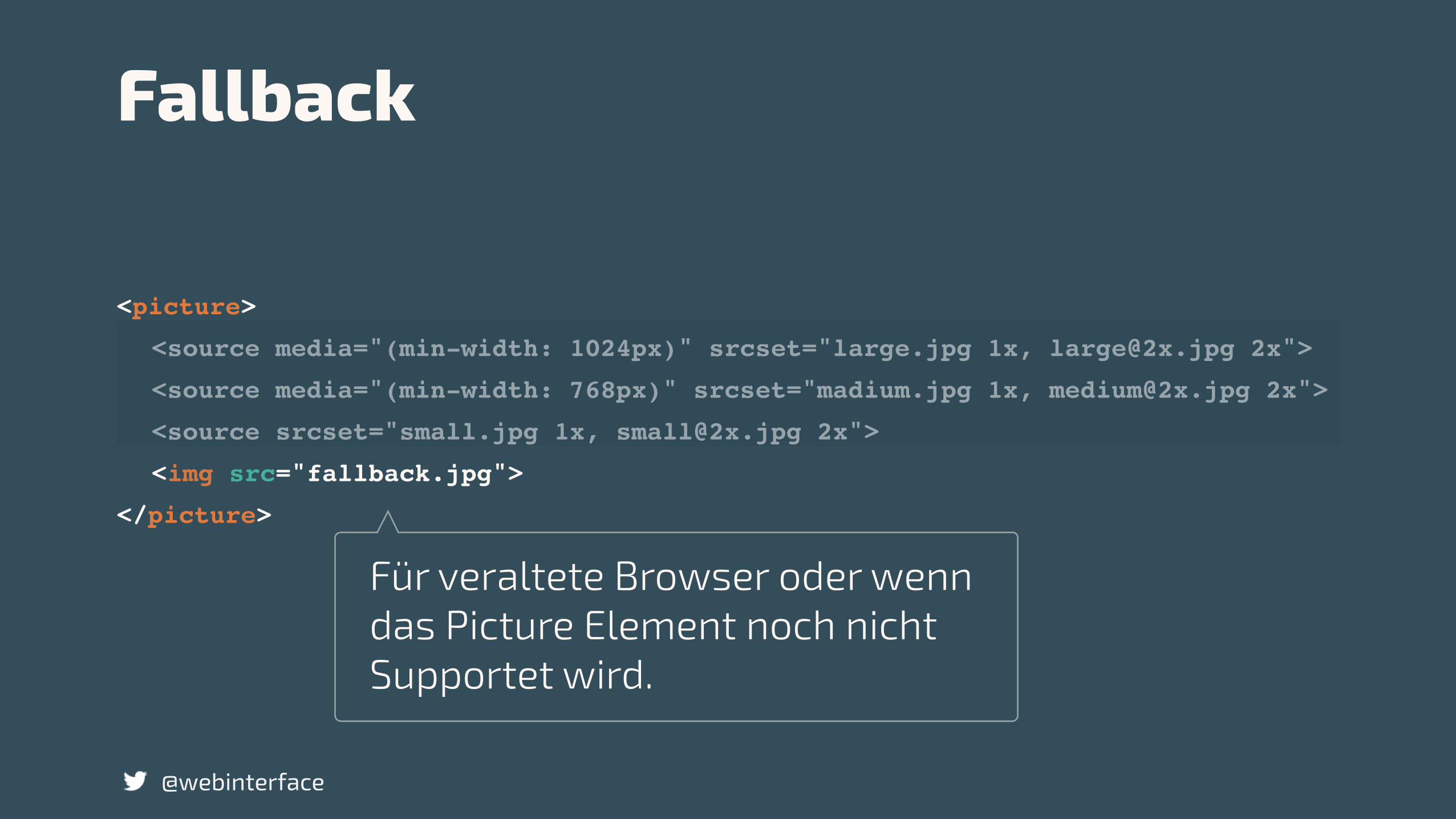
Fallback
Für veraltete Browser oder wenn das Picture Element noch nicht Supportet wird.
<picture>
<source media="(min-width: 1024px)" srcset="large.jpg 1x, [email protected] 2x">
<source media="(min-width: 768px)" srcset="madium.jpg 1x, [email protected] 2x">
<source srcset="small.jpg 1x, [email protected] 2x">
<img src="fallback.jpg">
</picture>
@webinterface
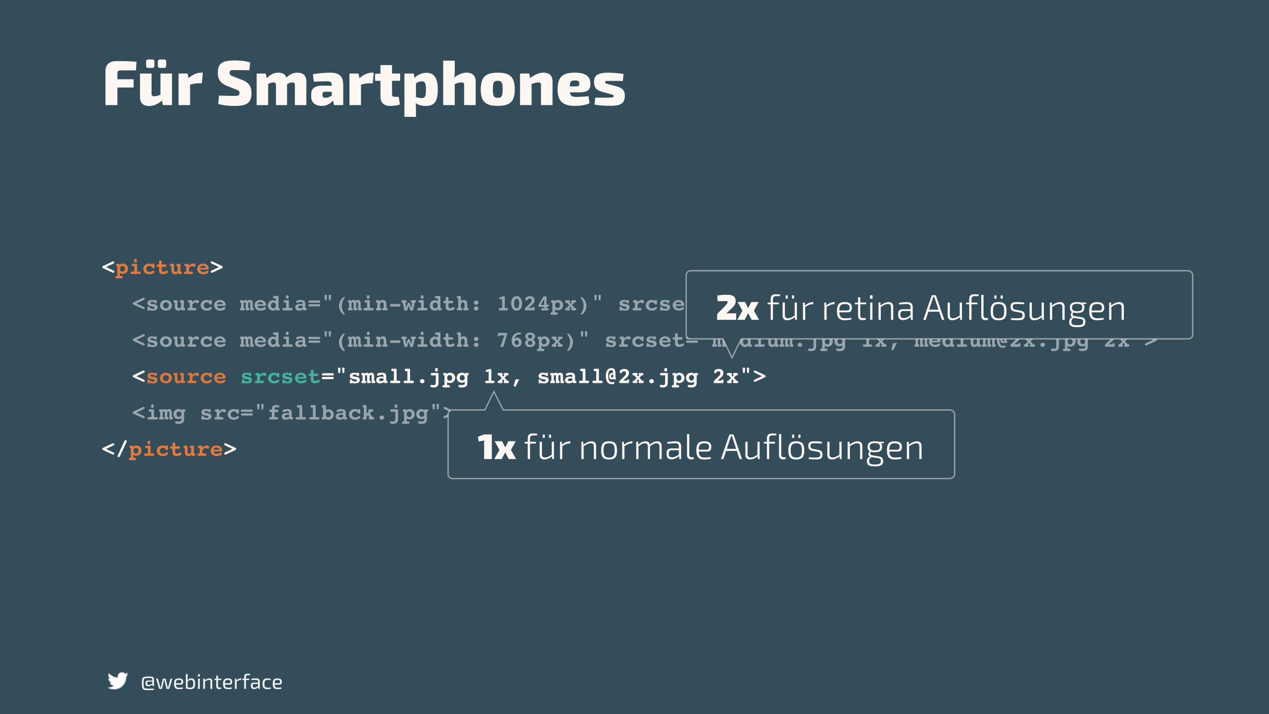
Für Smartphones
1x für normale Auflösungen
2x für retina Auflösungen
<picture>
<source media="(min-width: 1024px)" srcset="large.jpg 1x, [email protected] 2x">
<source media="(min-width: 768px)" srcset="madium.jpg 1x, [email protected] 2x">
<source srcset="small.jpg 1x, [email protected] 2x">
<img src="fallback.jpg">
</picture>
@webinterface
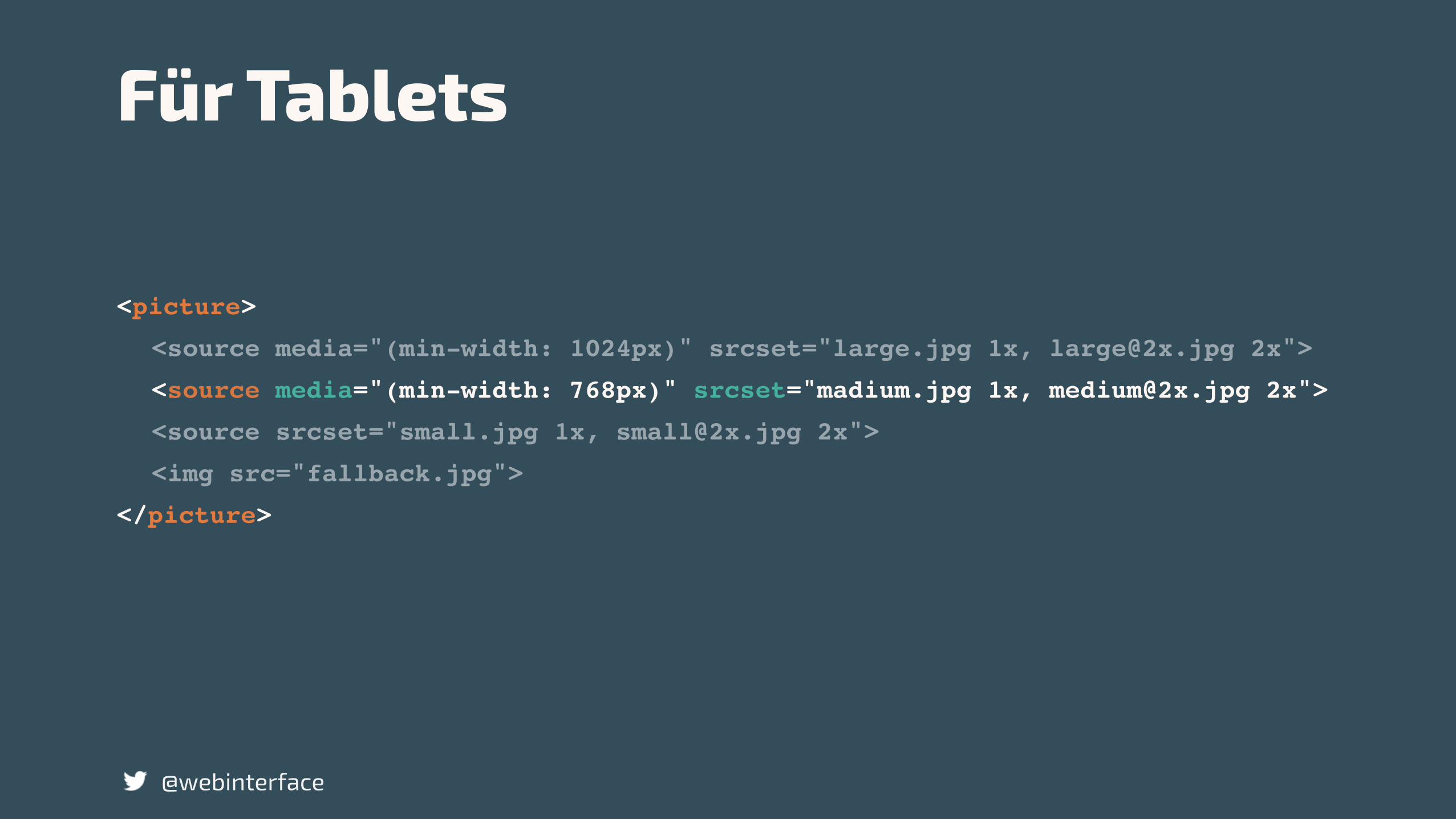
Für Tablets
<picture>
<source media="(min-width: 1024px)" srcset="large.jpg 1x, [email protected] 2x">
<source media="(min-width: 768px)" srcset="madium.jpg 1x, [email protected] 2x">
<source srcset="small.jpg 1x, [email protected] 2x">
<img src="fallback.jpg">
</picture>
@webinterface
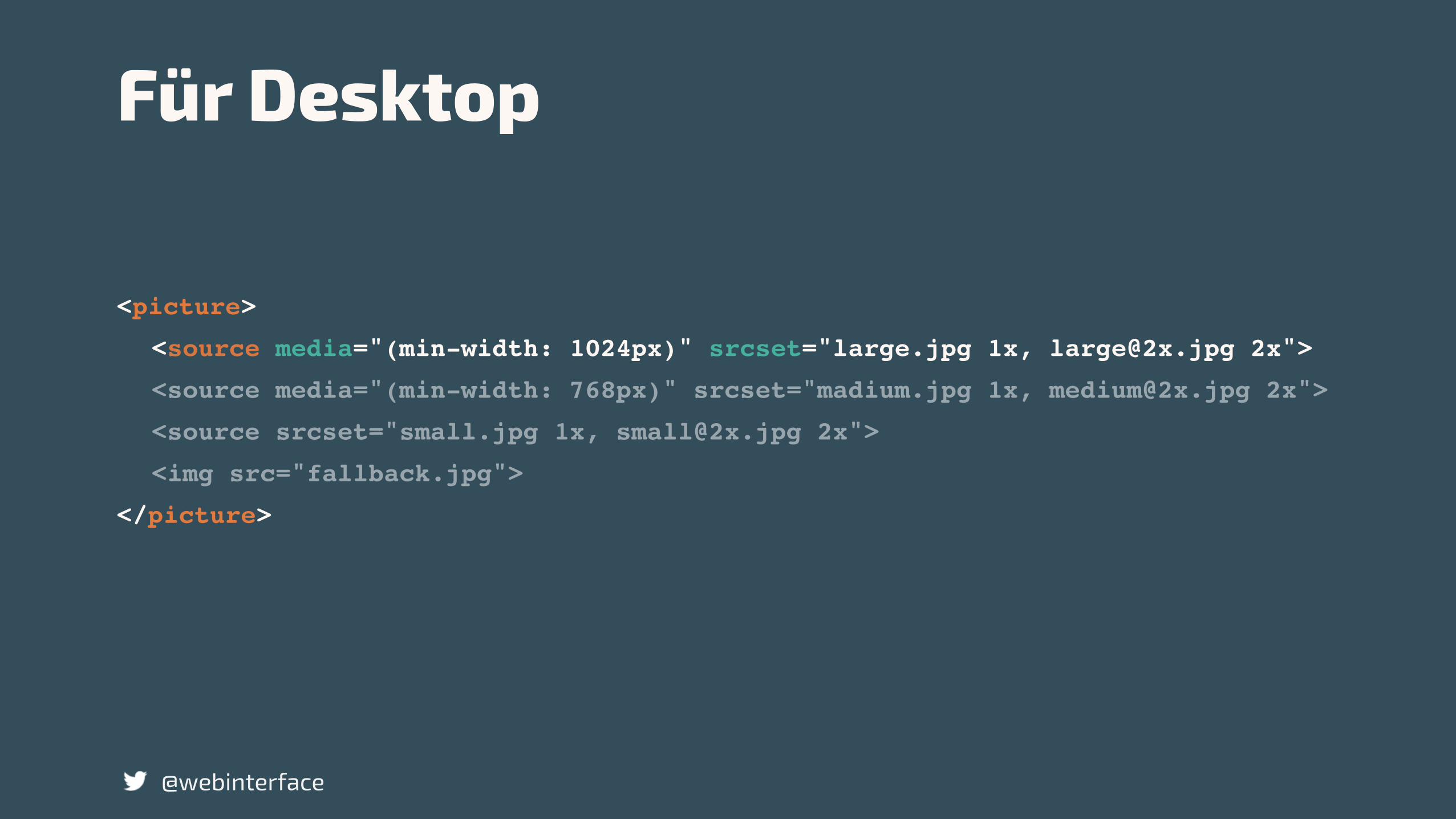
Für Desktop
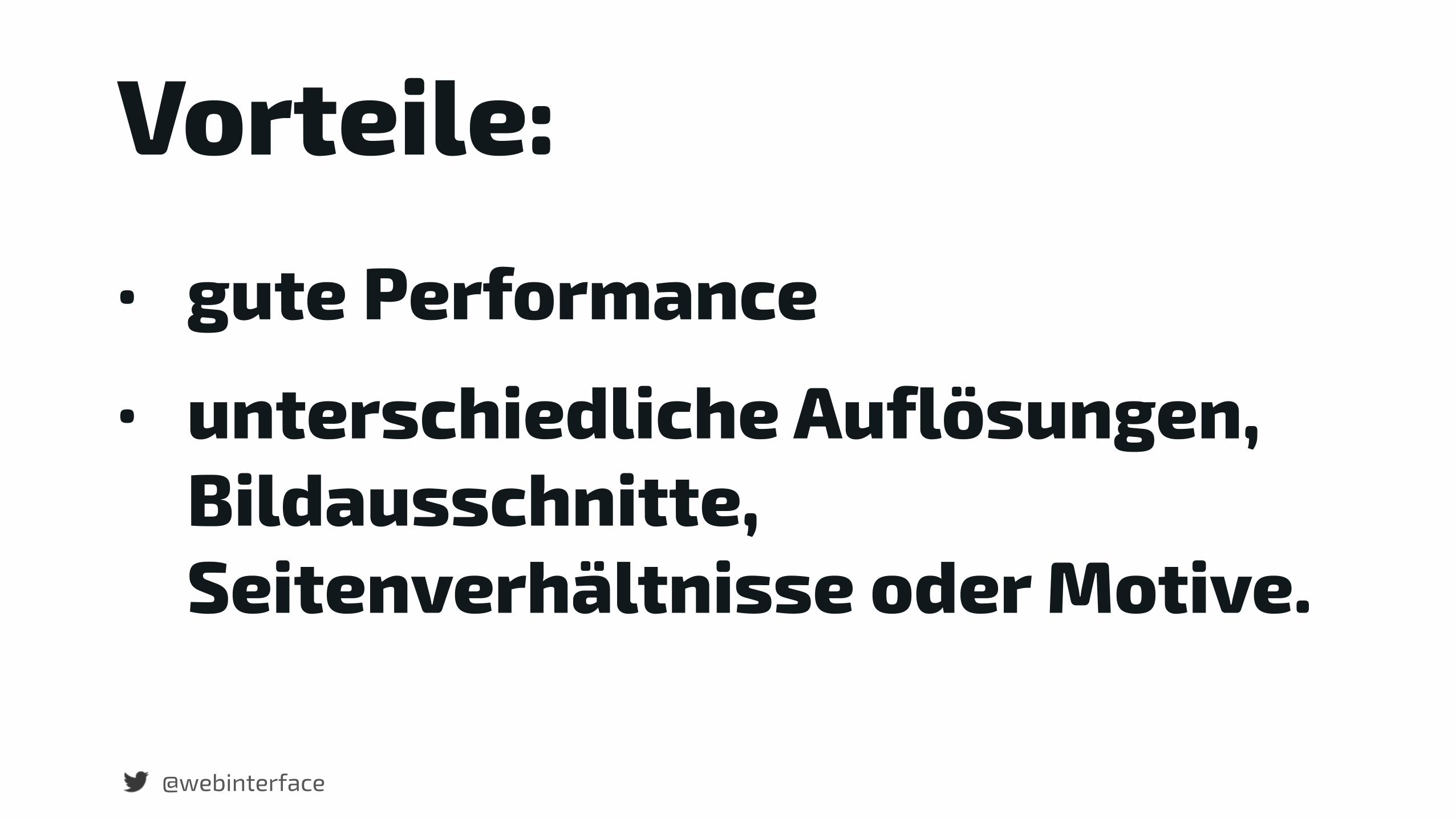
Vorteile:• gute Performance • unterschiedliche Auflösungen,
Bildausschnitte, Seitenverhältnisse oder Motive.
@webinterface
@webinterface
Nachteile:• Welche Nachteile ?
@webinterface
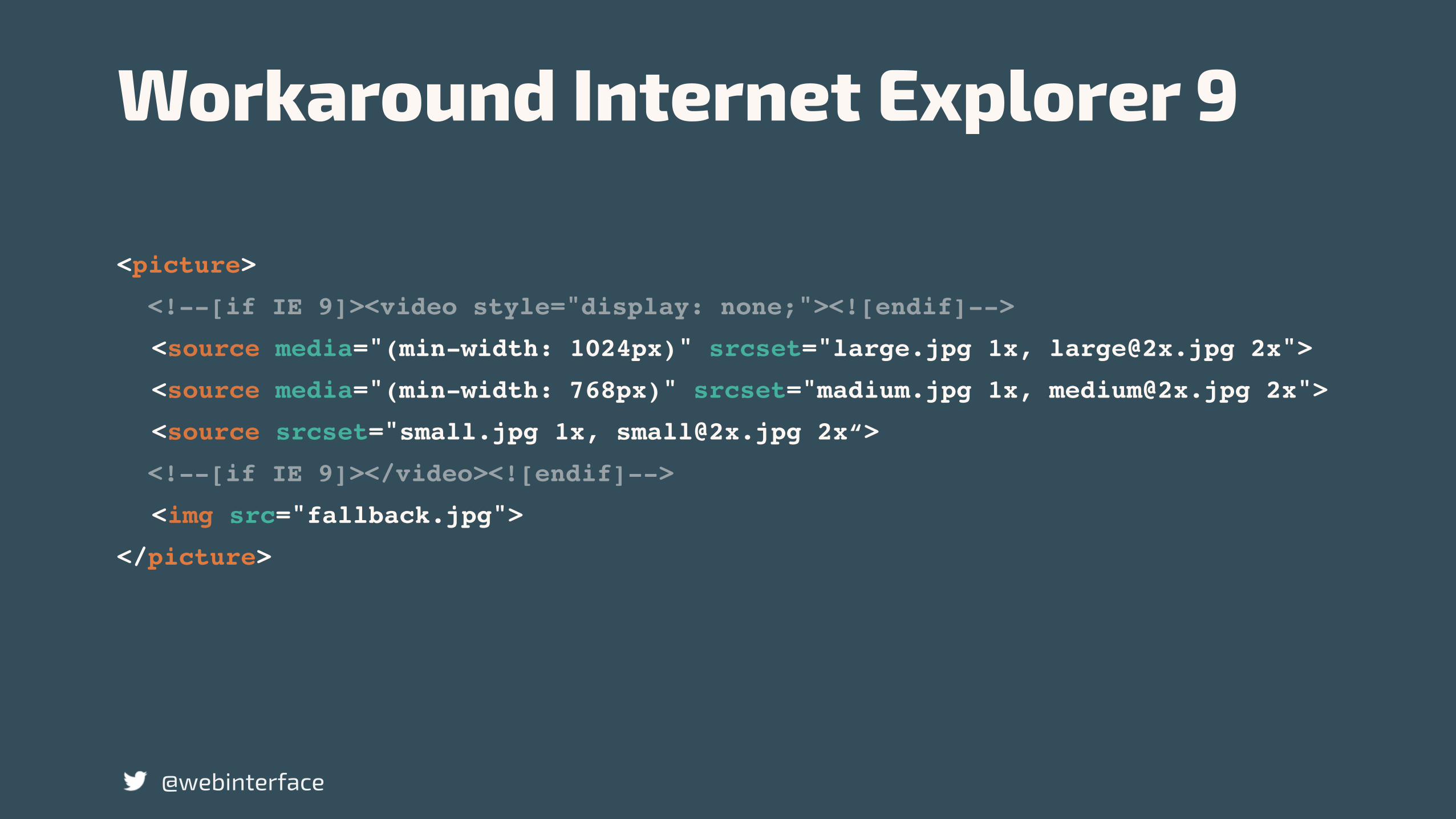
<picture>
<!--[if IE 9]><video style="display: none;"><![endif]-->
<source media="(min-width: 1024px)" srcset="large.jpg 1x, [email protected] 2x">
<source media="(min-width: 768px)" srcset="madium.jpg 1x, [email protected] 2x">
<source srcset="small.jpg 1x, [email protected] 2x“>
<!--[if IE 9]></video><![endif]-->
<img src="fallback.jpg">
</picture>
@webinterface
Workaround Internet Explorer 9
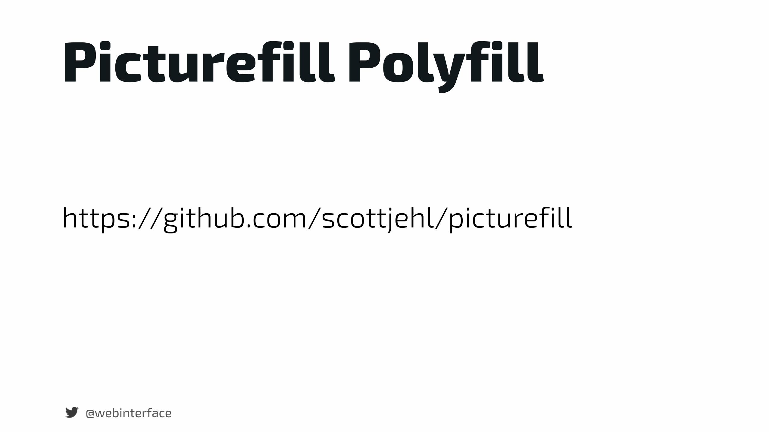
Picturefill Polyfill
https://github.com/scottjehl/picturefill
@webinterface

Resumé
@webinterface
Progressive Enhancement ist der Schlüssel zur Fluid Experience.
@webinterface

Simplifikation
@webinterface http://images-cdn.moviepilot.com

@webinterface
… lesen Sie bei Marc Aurel nach. Bei jedem einzelnen Ding die Frage, was ist es in sich selbst?
http://images-cdn.moviepilot.com
„Responsive design is not about mobile. Its not about tablets. Its not about desktops. Its about The Web.“
@webinterface
Jeremy Keith

„It is the nature of the web to be flexible, and it should be our role as designers and developers to embrace this flexibility, and produce pages which, by being flexible, are accessible to all. The journey begins by letting go of control, and becoming flexible.“
@webinterface
John Allsopp, A dao of webdesign
„Responsive design is not about mobile. Its not about tablets. Its not about desktops. Its about The Web.“
@webinterface
Jeremy Keith
„Understandig your users, their devices and how they use them should be every designer’s first step.“
Andy Gilliland
Adaptability, Fluidity und Peformance ist wichtiger als Aussehen.
@webinterface
Mach es anders als erwarten. Selbst wenn deine Aktivität in eine falsche Richtung geht, erhältst Du wertvolle Informationen daraus. Jeder Fehler ist der Beginn einer neuen Idee.
@webinterface

@webinterface
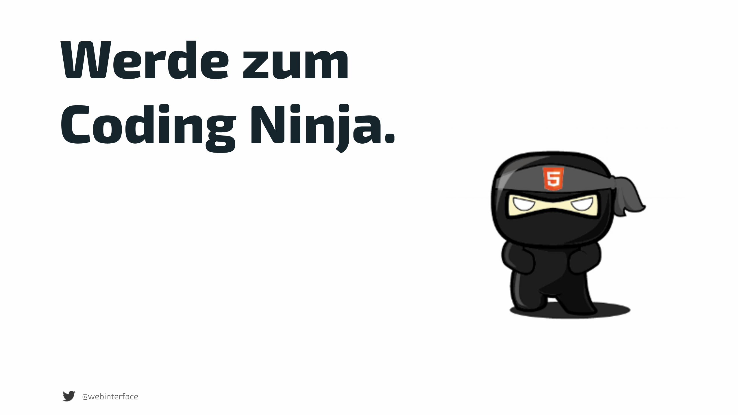
Enhance deinen Code und du schreibst sexy Code.
http://stuffpoint.com/

@webinterface
Werde zum Superheld.
browsergames-testen.de
@webinterface
Werde zum Coding Ninja.

Oder ein anderer macht es…
@webinterface http://images7.alphacoders.com/303/303105.jpg

Vielen Dank
@webinterface Peter Rozek
…für meine Ellen
@webinterface

@webinterface Peter Rozek
Fragen?E-Mail: [email protected]
Twitter: @webinterface
Präsentation bei Slideshare
Bildnachweis Rocket: http://www.planningforaliens.com/


