DanielWariya 1 A Brief Rhetoric of Infographic Design As part of the standard assignment sequence for English 1213 at Oklahoma State University, all students will design, draft, and revise an infographic. This project is situated before your final research paper, and it requires you to visually represent different points of view on your selected research topic. You will need 4-6 secondary sources to complete this assignment, and by the end of the unit you should have a solid grasp of your topic’s key issues. Essentially, you should think of this assignment as a visual summary of your selected sources. This chapter will introduce you to the important concepts and practices you will need to complete your infographic. In this chapter, you will learn about: • Infographics and their key features; • Different types of infographics and their rhetorical purposes; • The difference between discursive and non-discursive rhetorics, and how they are both utilized in infographics. • Basic design principles to help you draft and revise infographics. Key Terms and Concepts By the end of this chapter, you should be able to define and explain the following terms and concepts: • Infographics • Timeline infographics • Comparison infographics • Block-style infographics • Discursive rhetoric • Non-Discursive rhetoric • Visual design • Contrast • Repetition • Alignment • Proximity Key Features of Infographics • Minimal text • Maximum information, minimum space • Quickly readable • General audience An Introduction to Infographics Even if you are unfamiliar with the term, you have likely read many infographics, as they often appear in the form of colorful charts and graphs seen on the news or online. Although we often think of infographics as a new phenomenon, as the authors of White Space is Not Your Enemy state, even “ancient peoples documented themselves and the world around them in pictographs (160). Human beings have communicated with visual information far longer than with alphabetic text. Although you have certainly read infographics, you may be unaware of
Transcript
Daniel-‐Wariya 1
A Brief Rhetoric of Infographic Design As part of the standard assignment sequence for English 1213 at Oklahoma State
University, all students will design, draft, and revise an infographic. This project is situated before your final research paper, and it requires you to visually represent different points of view on your selected research topic. You will need 4-6 secondary sources to complete this assignment, and by the end of the unit you should have a solid grasp of your topic’s key issues. Essentially, you should think of this assignment as a visual summary of your selected sources. This chapter will introduce you to the important concepts and practices you will need to complete your infographic.
In this chapter, you will learn about:
• Infographics and their key features; • Different types of infographics and their rhetorical purposes; • The difference between discursive and non-discursive rhetorics, and how they are both
utilized in infographics. • Basic design principles to help you draft and revise infographics.
Key Terms and Concepts By the end of this chapter, you should be able to define and explain the following terms and concepts:
• Minimal text • Maximum information, minimum space • Quickly readable • General audience
An Introduction to Infographics
Even if you are unfamiliar with the term, you have likely read many infographics, as they often appear in the form of colorful charts and graphs seen on the news or online. Although we often think of infographics as a new phenomenon, as the authors of White Space is Not Your Enemy state, even “ancient peoples documented themselves and the world around them in pictographs (160). Human beings have communicated with visual information far longer than with alphabetic text. Although you have certainly read infographics, you may be unaware of
Daniel-‐Wariya 2
exactly how and why they purposefully visualize information for particular rhetorical effects. This chapter is designed to raise your awareness of how infographics work so that you can begin designing them yourself. The remaining pages of this section will define infographics, explain their key features, and introduce you to a few different types, including timelines, comparisons, and block-style infographics.
An infographic is a visual representation of information—such as a chart, graphic, or icon— accompanied by minimal text and intended to be understood quickly by a general audience. While a well-designed infographic will often appear simple and easy to read, designers must know their research subject well and spend significant time drafting and revising to create that effect. Although infographics can vary widely in their overall approach and appearance, they tend to share four common features. Infographics have 1) minimal text, 2) maximum information in minimal space, 3) quick readability, and 4) are usually intended for a generalized audience.
First, infographics tend to have minimal text. Although most infographics do contain some writing, they rely mostly on visualizations to communicate. While a complex written text will take time for a reader to understand, infographic designers typically do not expect a heavy time investment from their readers. Written language is exceptional at expressing complex ideas—particularly theories and arguments intended for specialized audiences—but the icons, graphics, and images in infographics can effectively communicate vast sums of information succinctly.
Second, infographics privilege maximum information in minimal space. In fact, a well-designed infographic appears so simple that, upon first glance, it may seem to have little information. Upon closer analysis, however, we can see that it actually expresses a great deal. For example, consider a common type of infographic: weather maps displayed in news broadcasts. When a reporter discusses the forecast, consider all the information displayed on screen: geography, temperature, wind and climate patterns, cloud cover and precipitation, and time. Because the information is visualized in easy-to-understand graphics and icons, rather than described in written form, much less space is required to express that information.
Third, infographics tend to be quickly readable. This is partially because of the rhetorical situation in which they are often encountered. Consider one common situation where we often see infographics: visualizations in a doctor’s office. Think of posters you might see on the walls designed to raise awareness about anything from flu shots to descriptions of common symptoms for various illnesses. When you think about sitting in a doctor’s office, how much time would you have to absorb the information from an infographic? Likely no more than a few minutes. Therefore, infographic designers use a variety of design strategies to help audiences glean their meaning very quickly.
Fourth, infographics are usually adapted for a general audience. Unlike academic arguments meant primarily for experts or particular readers, infographics can be more effective at communicating with non-experts. While academic arguments usually have formal language and a specialized vocabulary, infographics tend toward more common, informal language so that the average reader can grasp their intended message easily. However, as an infographic designer, you must know your subject very well in order to communicate it clearly to non-experts. Only by thoroughly researching a particular subject can you understand how to effectively explain that subject to others.
Daniel-‐Wariya 3
A Few Types of Infographics Infographics exist in a wide variety of forms, including many types of charts and graphs, concept maps, word clouds, and dynamically-generated interactive visualizations like Lev Manovich’s “Selfie City” project, which creates visualizations drawn from thousands of data points about the ways people all over the world take selfies. During the course of the infographic unit, your instructor will show you many types of infographics, and the university library has a number of resources to help you understand topics such as citation and credibility. This chapter by no means offers an exhaustive discussion of each and every type of infographic, but it does briefly explain three types that can work well in English 1213: 1) timeline, 2) comparison, and 3) block-style infographics. Timeline Infographics According to Hagen and Golombisky, timeline infographics are especially effective for writing history and giving context about particular subjects (White Space 176). Remember that your primary rhetorical purpose in the infographic assignment for English 1213 is to visually represent various points of view about your research topic. So, for example, if you were researching a controversial topic such as the legalization of marijuana, the challenge of your infographic is to not argue a particular point of view or favor one side. Instead, you want to illustrate different points of view in the debate as evenly and fairly as possible. For this particular rhetorical task, timelines can be quite effective. As an example, check out the infographic titled, “A Road to the Future” (infographic number 8 when you follow the link). Notice how simply and clearly this infographic presents its information: when and where advancements in road technology have been made and are expected to be made in the future. Small amounts of text are placed next to important places on the timeline, and this organizing principle guides the reader through the infographic. As the rhetorical purpose of the infographic is to point out specific technological advancements in place and time, the timeline is an effective format to present information without necessarily making an explicit argument. Going back to the previous example of legalized marijuana as a research topic, how might you present particular changes to state or federal laws on a timeline? Comparison Infographics When we think of comparisons, we sometimes assume that the end goal is to decide which side is best. Infographics, however, can be an effective way to make comparisons for the purpose of closely listening to different perspectives. While comparing points of view in traditional writing without taking a side can be quite challenging—particularly if it is a subject the author cares deeply about—the visual design of infographics can be helpful with such a task. Imagine a particular subject people often argue over, such as the often-contentious debate over Pro-Choice and Pro-Life politics. Comparison infographics can help illustrate both sides clearly. As an example of such an infographic, check out “Left Government/Right Government.” Especially in today’s political climate, we can struggle understanding where the other side is coming from and locating common ground. Although difficult work, this infographic attempts to do just that. As a proponent of the political left or the political right, we might quibble with particular pieces of data contained in this infographic. However, notice how it uses visual design as a means to give both sides fair treatment. Each side of the infographic mirrors the other, and the same type of information is presented through the same type of text and graphics in repeated places. In this way the infographic attempts to present the information fairly, without favoring
either side. Going back to the example from the previous paragraph, how might you present both sides of that debate fairly in a comparison infographic? Block-Style Infographics Block-style infographics are longer, vertically organized texts that embed information into a series of equally sized blocks, and they typify infographics made with free software such as Piktochart. While timelines and comparisons are useful for illustrating how an issue has changed over time or presenting different sides of a contentious debate fairly, block-style infographics effectively showcase a plethora of information about a particular subject. For example, imagine that you wanted to research and understand all the different ways drone technology is currently being utilized in private, commercial, and military sectors. A block-style infographic would be an effective way of organizing all the information you find. As an example, check out “Why Gaming is Good For You.” While videogames could certainly be a topic discussed as a pro/con or good/bad debate, the purpose of this infographic is to simply present all the available information on the ways videogames can be good for someone. Notice how each block provides a consistent organizational strategy. As the reader proceeds down, they are presented information on how games benefit therapy, socialization, pain management, and so on. Block-style infographics are in this way good for presenting and organizing tremendous amounts of information on a particular subject or point of view. Going back to the previous example, how might you organize all the information you found on current applications of drone technology in different sectors in a block-style infographic? Discursive and Non-Discursive Rhetoric
During your English 1213 course at Oklahoma State University, you have likely been introduced to the term rhetoric on more than one occasion. Rhetoric can often be a tricky term to define because it appears in many different forms in various times and cultures. According to the most famous definition of rhetoric by the Greek philosopher and educator, Aristotle, rhetoric is the ability for a person in any given situation to discover the “available means of persuasion.” In other words, in any given situation, what are the possible resources a speaker might use to persuade an audience? That possibility space of persuasive appeals and strategies generally marks the territory of rhetoric. But what do those possibility spaces actually look like? In one sense, rhetoric’s forms change depending on the material circumstances of a culture. For instance, in ancient Greece, people who were accused of crimes had to defend themselves in front of a jury of their peers. Unlike criminal trials today where a person is found guilty if a jury unanimously finds them so beyond a reasonable doubt, in the trials of ancient Greece, much larger juries voted on if the defendant was likely guilty. As such, speakers needed strategies to persuade jurors of their innocence. In such circumstances, rhetoric takes the form of persuasive speeches that are logically organized. In Medieval Europe, philosophers such as Augustine of Hippo were concerned with interpreting and explaining sacred texts, as well as with persuading people of the correctness of their particular interpretation. As such, rhetoric’s forms included written interpretations and explanations of those texts. Both of these examples rely heavily on what many scholars refer to as discursive rhetoric. According to rhetorical theorist Joddy Murray (Non-Discursive Rhetoric), discursive rhetoric refers to all those kinds of expression we traditionally associate with speech and writing: a politician giving a speech to their supporters, or a literary author writing carefully constructed sentences, or a mathematician writing a formula to help their students determine the radius of a
circle. Discursive rhetoric proceeds in an abstract, linear form over time. For example, consider the sentence, “The mouse ran under the table.” The literal word “m-o-u-s-e” is abstract. It has nothing to do with what an actual mouse is, but when speakers of the English language read the word, it evokes to them a mental concept of a mouse. The sentence is also linear, which means that people must read in a particular, straightforward order over time to interpret the sentence’s meaning. If you read the words in a different order, “The table the mouse ran under,” you would likely arrive at a different meaning. Discursive rhetoric, which covers the persuasive appeals of written and spoken language, is what people generally associate with the word rhetoric. But ask yourself: do written and spoken words even come close to covering all the things you find persuasive? What about music? What about gesture? Images? Play? Philosopher Susanne Langer (Philosophy in a New Key) has suggested that, while academics tend to be obsessed with discursive rhetoric, the vast majority of human experience is actually expressed through non-discursive rhetorical forms. Read the way she describes how silly it is to consider written and spoken language as the only meaningful kinds of human expression:
At best, human thought is but a tiny, grammar-bound island, in the midst of a sea of feeling expressed by “Oh-oh” and sheer babble. The island has a periphery, perhaps, of mud—factual and hypothetical concepts broken down by emotional tides into the “material mode,” a mixture of meaning and nonsense. Most of us live the better part of our lives on this mudflat; but in artistic moods we take to the deep, where we flounder about with the symptomatic cries that sound like propositions about life and death, good and evil, substance, beauty, and other non-existent topics. (88-89)
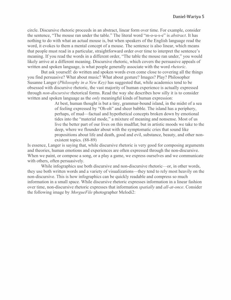
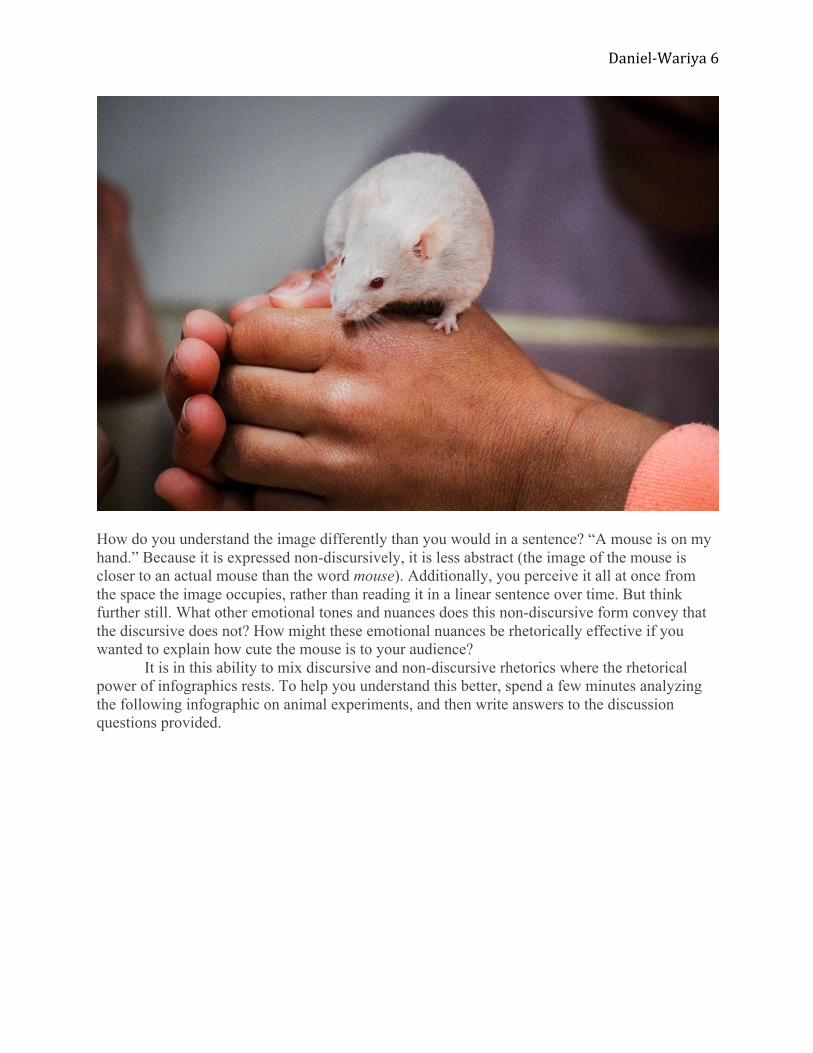
Is essence, Langer is saying that, while discursive rhetoric is very good for composing arguments and theories, human emotions and experiences are often expressed through the non-discursive. When we paint, or compose a song, or a play a game, we express ourselves and we communicate with others, often persuasively. While infographics use both discursive and non-discursive rhetoric—or, in other words, they use both written words and a variety of visualizations—they tend to rely most heavily on the non-discursive. This is how infographics can be quickly readable and compress so much information in a small space. While discursive rhetoric expresses information in a linear fashion over time, non-discursive rhetoric expresses that information spatially and all-at-once. Consider the following image by MorgueFile photographer Melodi2:
Daniel-‐Wariya 6
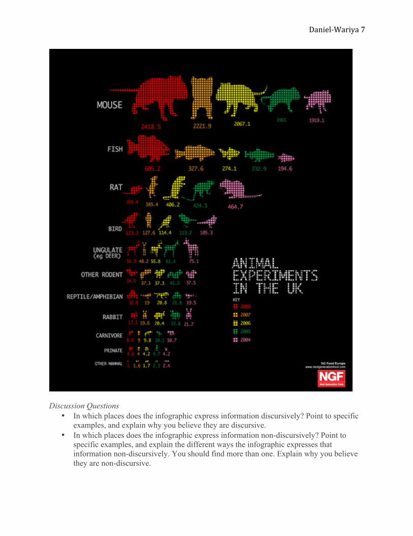
How do you understand the image differently than you would in a sentence? “A mouse is on my hand.” Because it is expressed non-discursively, it is less abstract (the image of the mouse is closer to an actual mouse than the word mouse). Additionally, you perceive it all at once from the space the image occupies, rather than reading it in a linear sentence over time. But think further still. What other emotional tones and nuances does this non-discursive form convey that the discursive does not? How might these emotional nuances be rhetorically effective if you wanted to explain how cute the mouse is to your audience? It is in this ability to mix discursive and non-discursive rhetorics where the rhetorical power of infographics rests. To help you understand this better, spend a few minutes analyzing the following infographic on animal experiments, and then write answers to the discussion questions provided.
Daniel-‐Wariya 7
Discussion Questions
• In which places does the infographic express information discursively? Point to specific examples, and explain why you believe they are discursive.
• In which places does the infographic express information non-discursively? Point to specific examples, and explain the different ways the infographic expresses that information non-discursively. You should find more than one. Explain why you believe they are non-discursive.
Daniel-‐Wariya 8
• Imagine taking the non-discursive rhetorics you find in this infographic and expressing them discursively. How would that look? What are the advantages and disadvantages of discursive and non-discursive rhetorics?
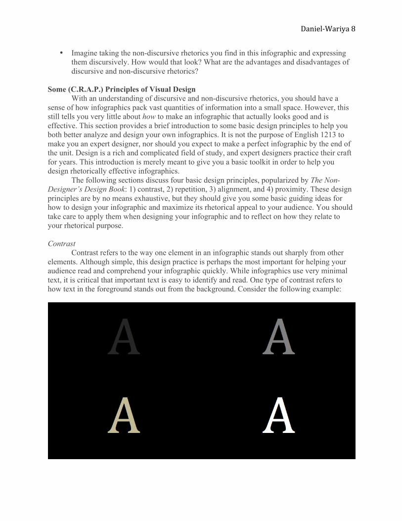
Some (C.R.A.P.) Principles of Visual Design With an understanding of discursive and non-discursive rhetorics, you should have a sense of how infographics pack vast quantities of information into a small space. However, this still tells you very little about how to make an infographic that actually looks good and is effective. This section provides a brief introduction to some basic design principles to help you both better analyze and design your own infographics. It is not the purpose of English 1213 to make you an expert designer, nor should you expect to make a perfect infographic by the end of the unit. Design is a rich and complicated field of study, and expert designers practice their craft for years. This introduction is merely meant to give you a basic toolkit in order to help you design rhetorically effective infographics. The following sections discuss four basic design principles, popularized by The Non-Designer’s Design Book: 1) contrast, 2) repetition, 3) alignment, and 4) proximity. These design principles are by no means exhaustive, but they should give you some basic guiding ideas for how to design your infographic and maximize its rhetorical appeal to your audience. You should take care to apply them when designing your infographic and to reflect on how they relate to your rhetorical purpose. Contrast Contrast refers to the way one element in an infographic stands out sharply from other elements. Although simple, this design practice is perhaps the most important for helping your audience read and comprehend your infographic quickly. While infographics use very minimal text, it is critical that important text is easy to identify and read. One type of contrast refers to how text in the foreground stands out from the background. Consider the following example:
Daniel-‐Wariya 9
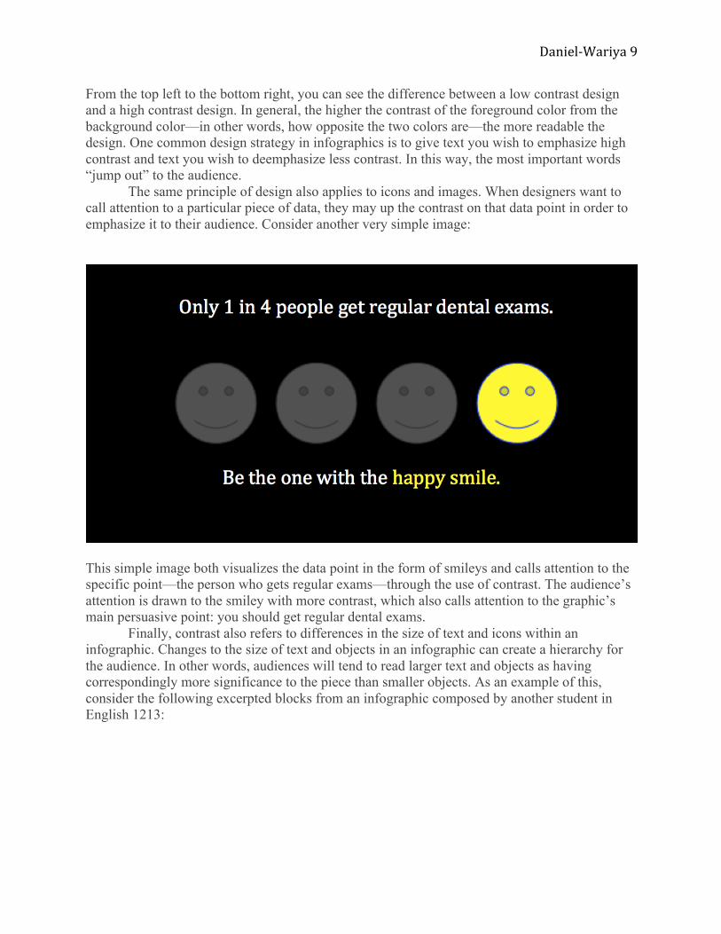
From the top left to the bottom right, you can see the difference between a low contrast design and a high contrast design. In general, the higher the contrast of the foreground color from the background color—in other words, how opposite the two colors are—the more readable the design. One common design strategy in infographics is to give text you wish to emphasize high contrast and text you wish to deemphasize less contrast. In this way, the most important words “jump out” to the audience. The same principle of design also applies to icons and images. When designers want to call attention to a particular piece of data, they may up the contrast on that data point in order to emphasize it to their audience. Consider another very simple image:
This simple image both visualizes the data point in the form of smileys and calls attention to the specific point—the person who gets regular exams—through the use of contrast. The audience’s attention is drawn to the smiley with more contrast, which also calls attention to the graphic’s main persuasive point: you should get regular dental exams. Finally, contrast also refers to differences in the size of text and icons within an infographic. Changes to the size of text and objects in an infographic can create a hierarchy for the audience. In other words, audiences will tend to read larger text and objects as having correspondingly more significance to the piece than smaller objects. As an example of this, consider the following excerpted blocks from an infographic composed by another student in English 1213:
Daniel-‐Wariya 10
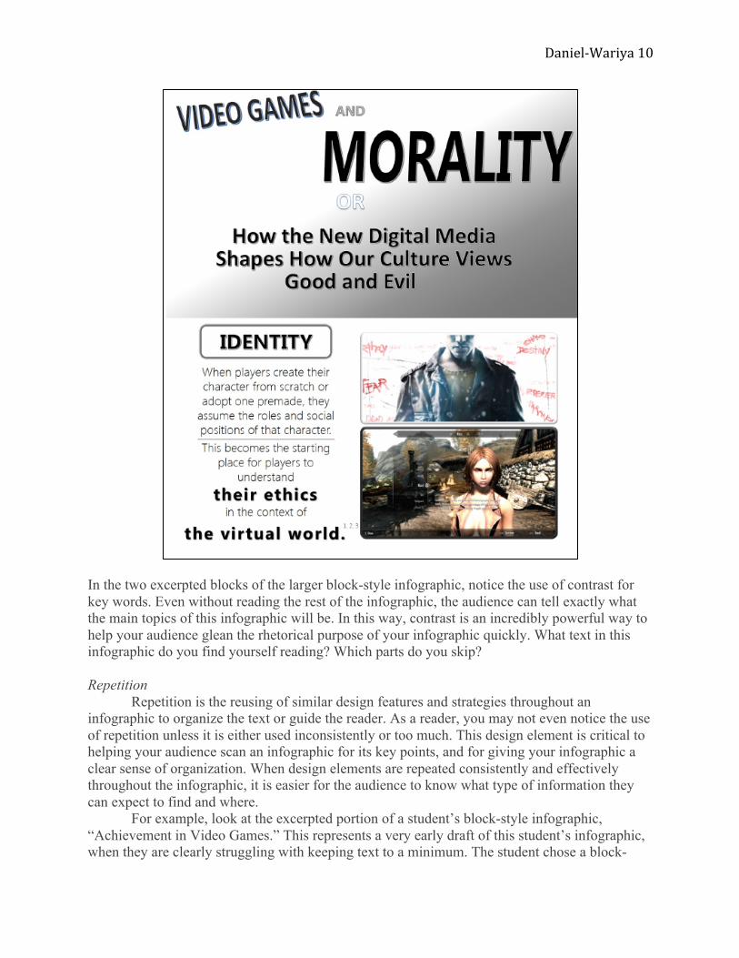
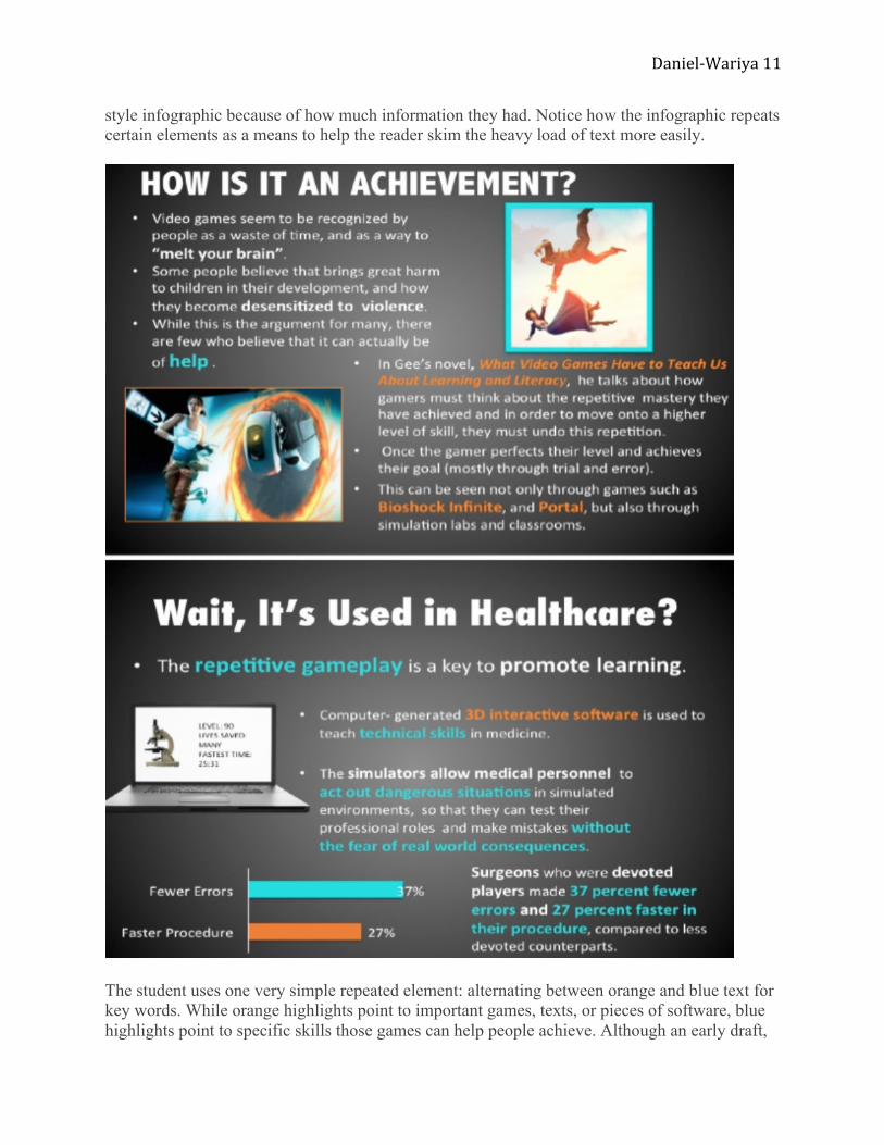
In the two excerpted blocks of the larger block-style infographic, notice the use of contrast for key words. Even without reading the rest of the infographic, the audience can tell exactly what the main topics of this infographic will be. In this way, contrast is an incredibly powerful way to help your audience glean the rhetorical purpose of your infographic quickly. What text in this infographic do you find yourself reading? Which parts do you skip? Repetition Repetition is the reusing of similar design features and strategies throughout an infographic to organize the text or guide the reader. As a reader, you may not even notice the use of repetition unless it is either used inconsistently or too much. This design element is critical to helping your audience scan an infographic for its key points, and for giving your infographic a clear sense of organization. When design elements are repeated consistently and effectively throughout the infographic, it is easier for the audience to know what type of information they can expect to find and where. For example, look at the excerpted portion of a student’s block-style infographic, “Achievement in Video Games.” This represents a very early draft of this student’s infographic, when they are clearly struggling with keeping text to a minimum. The student chose a block-
Daniel-‐Wariya 11
style infographic because of how much information they had. Notice how the infographic repeats certain elements as a means to help the reader skim the heavy load of text more easily.
The student uses one very simple repeated element: alternating between orange and blue text for key words. While orange highlights point to important games, texts, or pieces of software, blue highlights point to specific skills those games can help people achieve. Although an early draft,
Daniel-‐Wariya 12
this simple use of repetition helps make the large amount of text more manageable. What advice might you give this student to help minimize text even further? When repetition is not used, or used poorly, infographics will tend to appear sloppy and disorganized. In this way, a reader may have no sense of where to start and where to end. By using repetition effectively, you can signal to your reader a particular pathway you want them to follow to best understand your rhetorical purpose. At the same time, just as with discursive writing, you want to be careful of overusing repetition to avoid having your information seem redundant. Alignment Alignment refers to the way designers visually organize elements on a page to line up with one another on horizontal or vertical lines. Like repetition, good alignment often goes unnoticed, but bad alignment will leap off the page. Even slight errors in alignment can make an infographic look incomplete or unprofessional. The two examples below show the difference between aligned and misaligned elements.
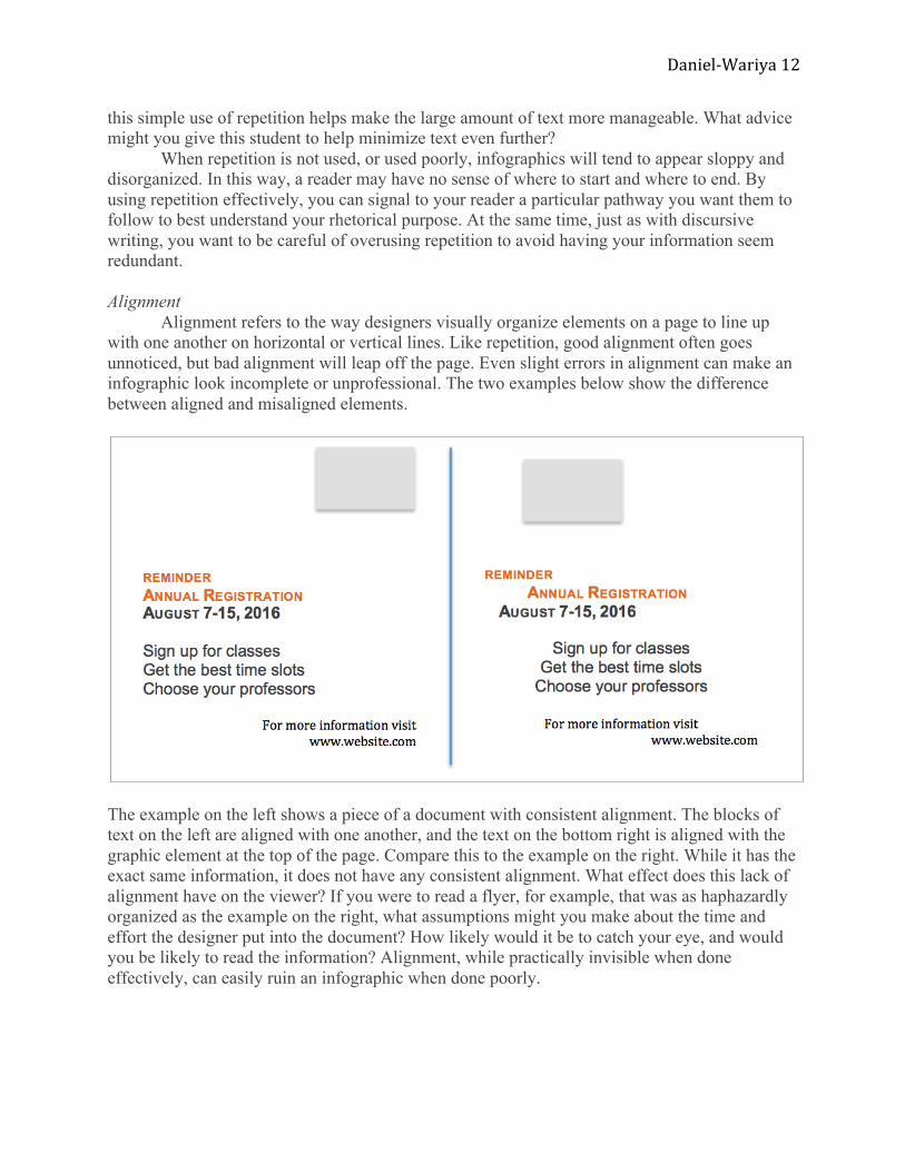
The example on the left shows a piece of a document with consistent alignment. The blocks of text on the left are aligned with one another, and the text on the bottom right is aligned with the graphic element at the top of the page. Compare this to the example on the right. While it has the exact same information, it does not have any consistent alignment. What effect does this lack of alignment have on the viewer? If you were to read a flyer, for example, that was as haphazardly organized as the example on the right, what assumptions might you make about the time and effort the designer put into the document? How likely would it be to catch your eye, and would you be likely to read the information? Alignment, while practically invisible when done effectively, can easily ruin an infographic when done poorly.
Daniel-‐Wariya 13
Proximity The final design principle covered in this chapter, proximity, refers to how close together
or far apart elements on the page are from one another. Just as readers are trained to understand that sentences in one paragraph are more closely related to one another than they are to sentences in other paragraphs, the audience of an infographic will assume that close proximity elements are more closely related than distant elements. Proximity, then, is critical for moments when you want your viewer to read the text on your infographic as related to a particular image or icon. As an example of proximity, check out the infographic “The Dangers of Sleep Deprivation.” You probably notice right away that this infographic is a bit busy. In other words, because it has so many icons and so much text crammed into a small space, it could potentially be difficult for a reader to glean much information from it. However, it makes consistent use of proximity so that the viewer immediately knows which chunks of texts are related to particular headings and icons. While the reader might not glean everything from this infographic that is intended, even from a glance they can get a few chunks of the available information. Based on your understanding of design principles from previous sections of this chapter, what recommendations might you make to improve the overall readability of this infographic? As you likely see by now, these design principles are all closely related. Bad alignment, for instance, will influence a designer’s use of proximity. As you begin working on the infographic unit, use the following activities to help get make sure you understand and can apply the concepts from this chapter. Activities and Discussion Questions Activity I - Discursive and Non-Discursive Rhetorics Individually or in groups, watch the video, “200 Counties, 200 Years, 4 Minutes.” This video is an excellent example of the capacity for non-discursive rhetorics to express tremendous amounts of information in a very small space. After watching the video, work through the following questions and discuss them as a class.
1. Attempt to identify all the various non-discursive rhetorics used in the video, such as color and shape. What does each one represent, and what makes it effective?
2. Focus on one particular example of non-discursive rhetoric in the video. For five minutes, freewrite about what it would look like if that information were written discursively. What problems would traditional writing pose for expressing that information in four minutes?
3. How do the discursive and non-discursive interact and compliment one another in the video? How might you apply what you see here to your own infographic?
Activity II - Communicating through Data Visualization After spending some time researching and reading about your topic, brainstorm a list of the various points of view that you want to represent in your infographic. Once you have your list, think about how you might represent that point of view visually. Write each point of view on its own piece of paper, and then sketch and/or write ideas for how you could visualize them. Try to push yourself on this task by not allowing yourself any text at all. Once you have a good list of ideas, go back through any sample infographics you have used either in this chapter or in class. Try to find elements in those infographics that approximate your
ideas. Now, in whatever program you are using to make your infographic (such as Piktochart) attempt to create that element on your own. You might even try creating those elements using the basic shapes and colors in a program such as Microsoft Word or PowerPoint. Activity III - Trying Different Types of Infographics This chapter covered three types of infographics. Once you know your research topic, get out a few sheets of paper and try sketching a design of your idea as a timeline, a comparison, and as a block-style infographic. Once you have done so, spend 5-10 minutes freewriting about each possible design. What works well for each one, and what does not? Which elements might you change or combine? As an alternative to sketching, or as an addition, you might also try creating your ideas in digital form, using Piktochart or some other infographic maker.
Daniel-‐Wariya 15
Works Cited GDS Infographics. Animal Experiments in the UK. Retrieved from Flickr. Web. 10 Aug. 2016. Hagen, Rebecca, and Kim Golombisky. White Space Is Not Your Enemy: A Beginner’s Guide to
Langer, Susanne K. Philosophy in a New Key: A Study in the Symbolism of Reason, Rite, and Art. 3rd ed. Cambridge: Harvard University Press, 1996. Print.
Melodi2. Mouse. 2016. Photograph. Retrieved from MorgueFile. Web. 10 Aug. 2016. Murray, Joddy. Non-Discursive Rhetoric: Image and Affect in Multimodal Composition. New York:
SUNI Press, 2010. Print. Williams, Robin. The Non-Designer’s Design Book: Design and Typographic Principles for the
Visual Novice. 4th ed. San Francisco: Peachpit Press, 2014. Print.