69
The prehistory of UX design
| Date post: | 13-Apr-2017 |
| Category: |
Documents |
| Upload: | cheryl-metzger |
| View: | 288 times |
| Download: | 0 times |

The prehistory of UX design

Recently, I was lucky enough to experience a once-in-a-lifetime trip with National Geographic to
explore the prehistoric cave paintings of France and Spain.

The backdrop was breathtaking.

The caves themselves were magical, massive, and millions of years old.


We visited the sites where our modern ancestors emerged from
prehistory.


We saw that they looked just like us.

And they had rich cultures—with language, music, trade,
technology, ritual, art—just as we have.

And they had art.
Art that reveals principles applicable to any UX designer today.

The prehistory of UX design

1—Iconography & Symbols.

The common design language of cave art breaks out into two areas:
images and icons (“tectiforms”).

Images predominate—including the majestic, massive animals of the Ice Age, human hands, and human-animal hybrids.
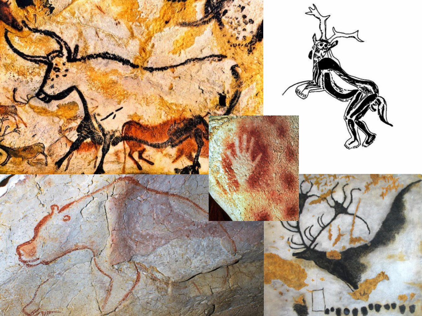

These images from 40,000 years ago—they are still all around us today.


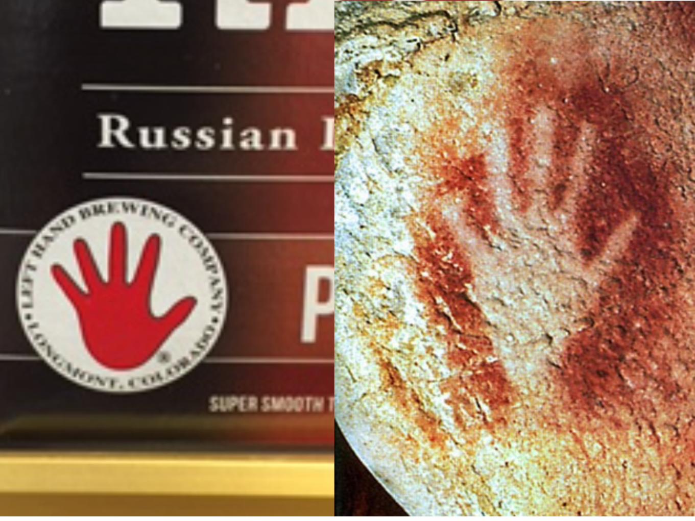

Incredibly, tectiforms (symbols and shapes) have been discovered to form a common, global language.
In other words, the same symbols and shapes were used—in cave art
around the world —for 30,000 years.

That’s 30,000 years.
The span of recorded human history so far?
5,000 years.
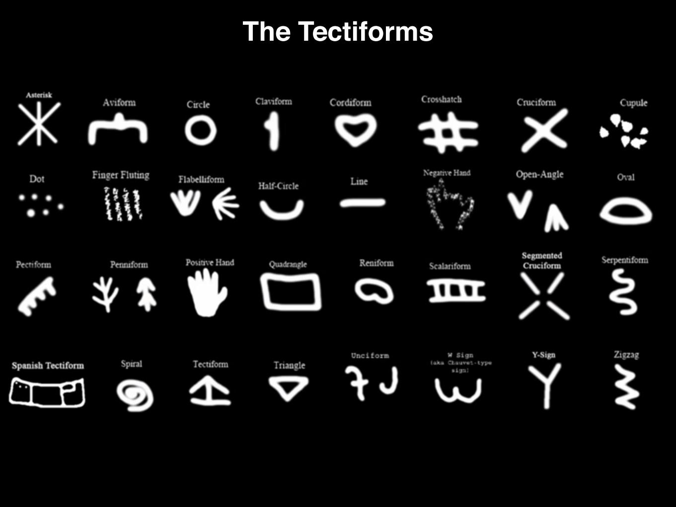
The Tectiforms

But these tectiforms are still with us today.
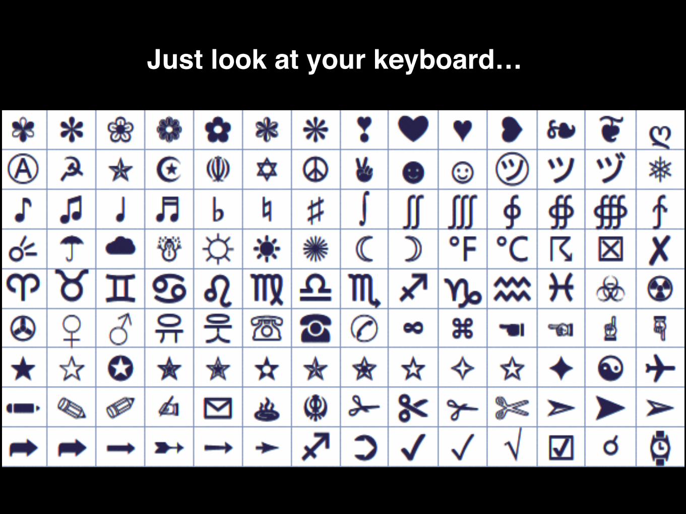
Just look at your keyboard…
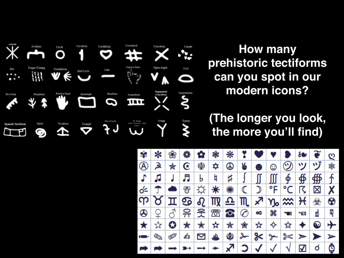
How many prehistoric tectiforms can you spot in our
modern icons?
(The longer you look, the more you’ll find)

The takeaway for UX designers?
Icons can (often) be more powerful than words
because they are also deeply human in nature

2—simplicity
Unlike what many people expect, not all cave paintings are bright, elaborate, or large.

Many are hidden, intimate, delicate—mere wisps of the core idea.

Like these famous mammoths from deep within the Rouffignac cave.
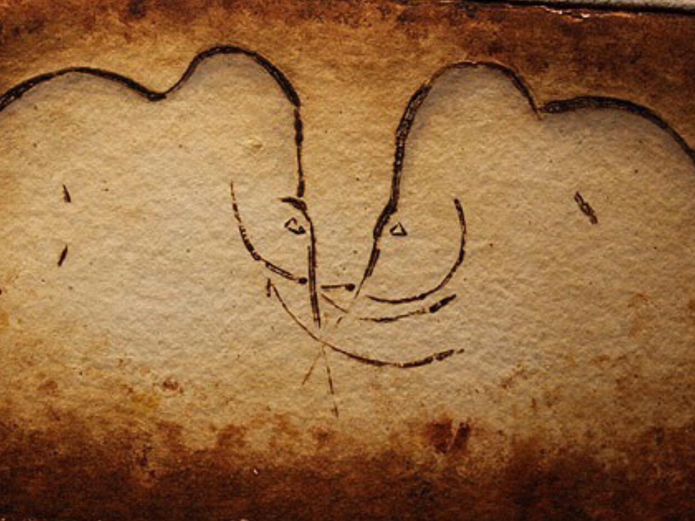

These weren’t unfinished paintings. They were simply all that was needed to convey
the idea.

The takeaway for UX designers?
Strive for simplicity
in conveying an idea or designing a task.

3—AdaptABILITY.

The ingenuity of prehistoric cave painters went far beyond
conveying an image.

They often searched the shape of the rocks around them, looking for what formations naturally seemed
to evoke that of an animal.

Like this famous crouched bull from Altamira cave in Spain.


From afar, it looks flat.

But from the close distance a cave painter would have stood, the unique form of the
rock wall brings the painting to life.
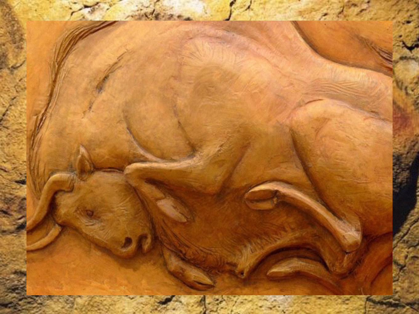

The takeaway for UX designers?
Match content to context.
Look for ways to adapt content to its context and platform, to
enhance its value.

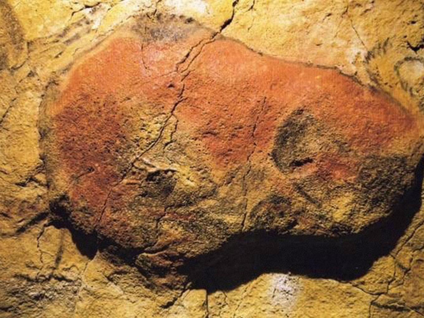
4—Perspective

We often don’t see cave paintings in the right light.

Literally.


While most of us see cave paintings exposed in direct lighting,
the artists themselves would have experienced their art very differently, bathed in the light of small lamps in
otherwise complete darkness.

And they worked with the interplay of light and shadow.
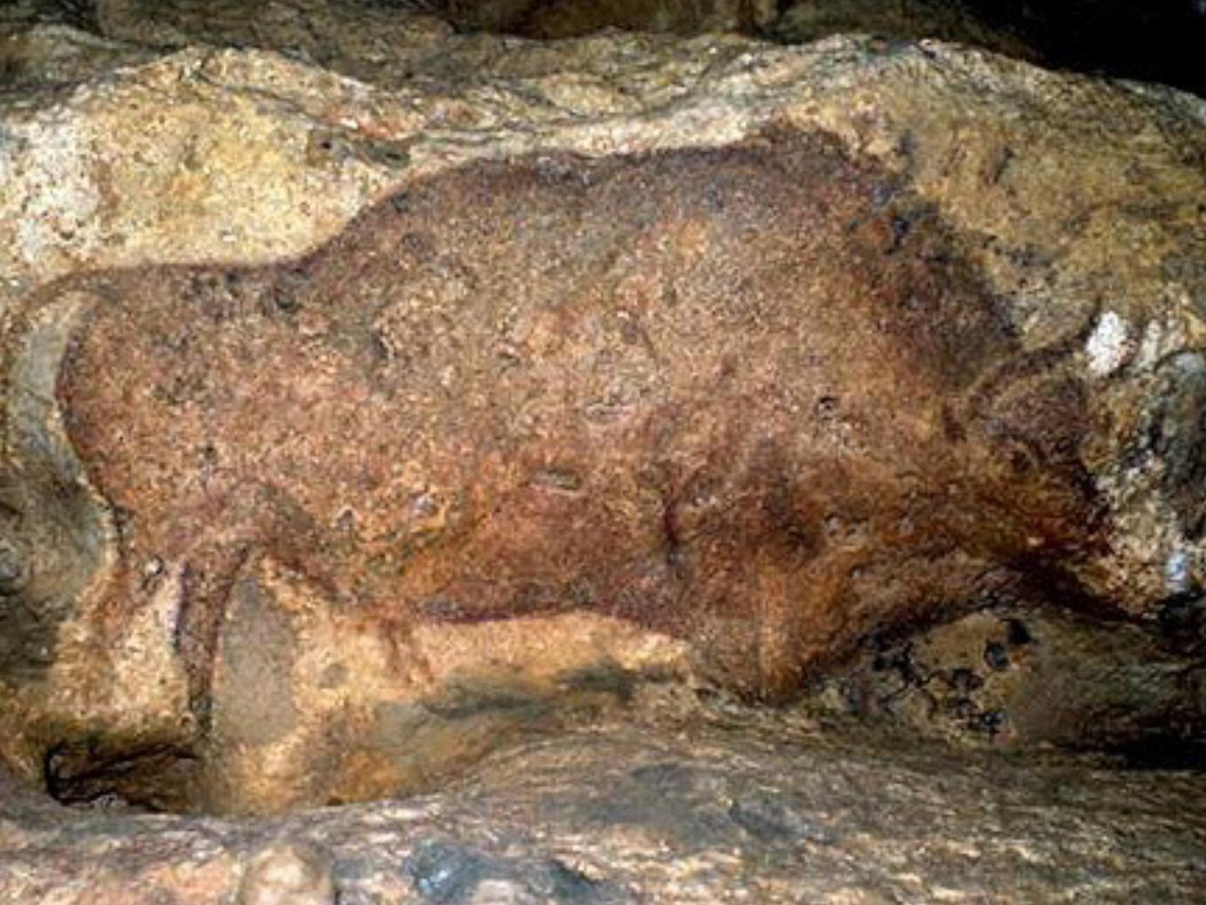

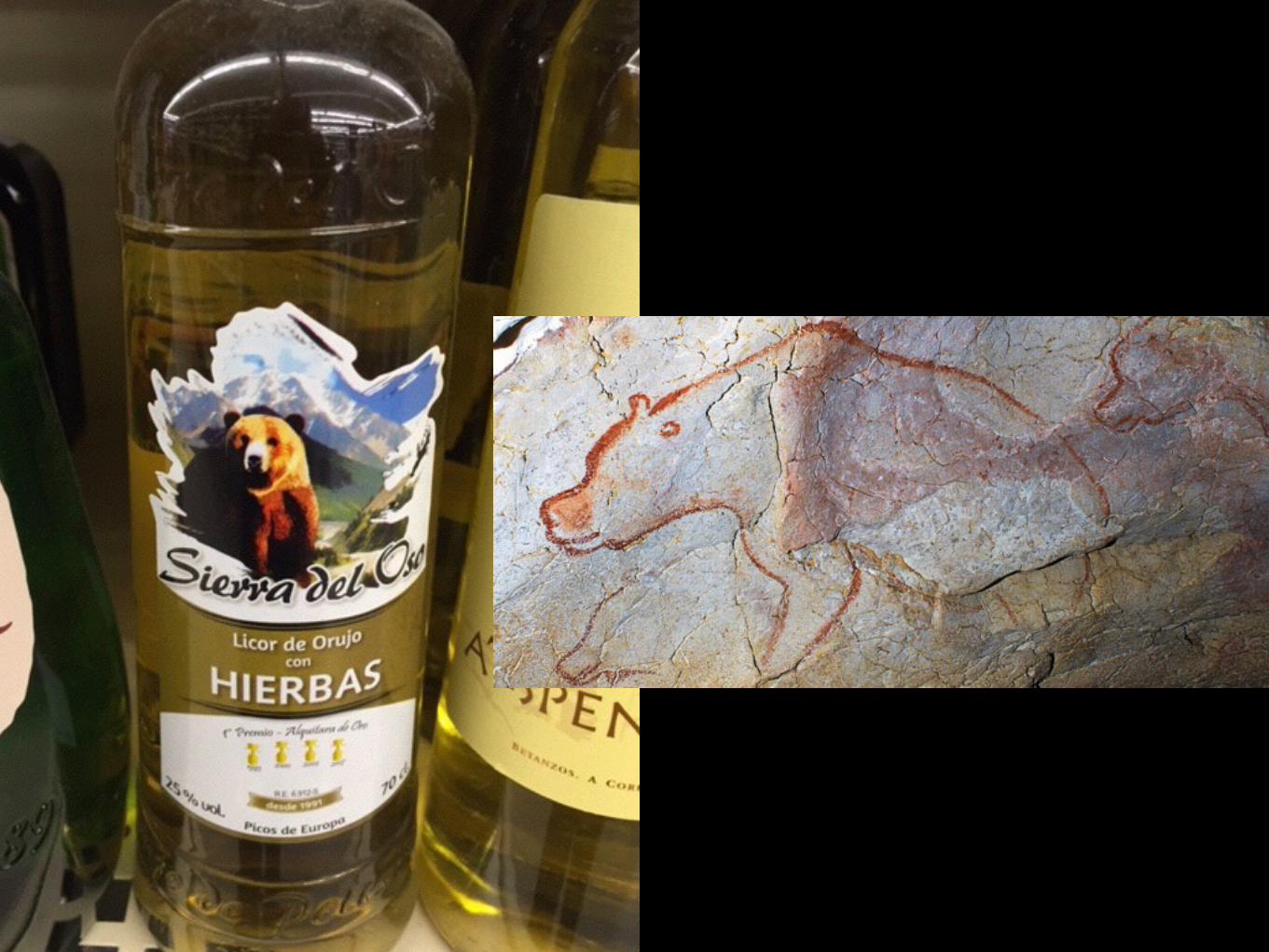
In direct light from modern sources, the
lower half of this bull appears
almost monochromatic with the top half.

But with the flickering light of a
prehistoric lamp, the shadows cast by the rocky overhang add
a sophisticated depth of color—and dimensionality that modern eyes often
fail to perceive.

The takeaway for UX designers?
The end-user defines the experience, not the designer.
Design ultimately is in the hands of the end-user, who may find unintended
ways to experience the work.

5—Utility
What would an exploration of our prehistoric ancestors be without
understanding the tools they used everyday?


Though seemingly intuitive and simple in design,
they actually were nuanced and complex, capable of a diverse array of functions
and were perfectly adapted to a mobile, nomadic lifestyle.

Sound familiar?
As a core tool was being shaped, chips were
created in an intentional way—so that they, too,
would be usable as tools.
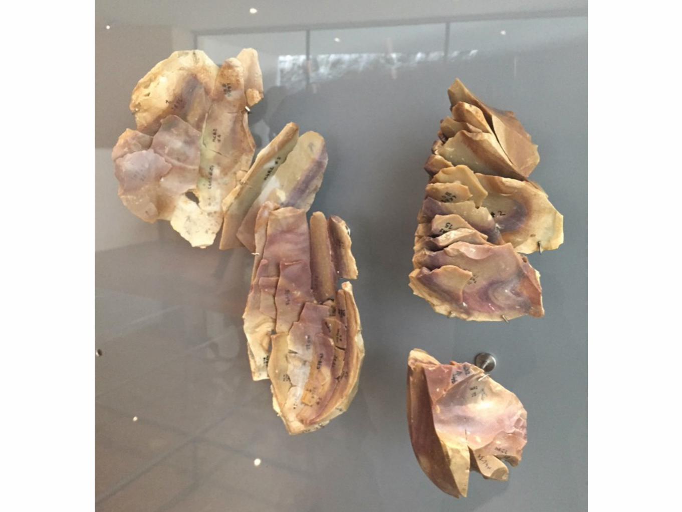

It was the first modular design.

Sound familiar?

The takeaway for UX designers?
Beauty, portability, and modular design enhance utility.
When these three elements come together, you have the kind of customizable tool
that can shape societies.
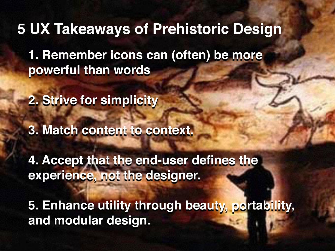
1. Remember icons can (often) be more powerful than words
2. Strive for simplicity
3. Match content to context.
4. Accept that the end-user defines the experience, not the designer.
5. Enhance utility through beauty, portability, and modular design.
5 UX Takeaways of Prehistoric Design
Thank you.
Comments? Tweet @TheRealCherylM


